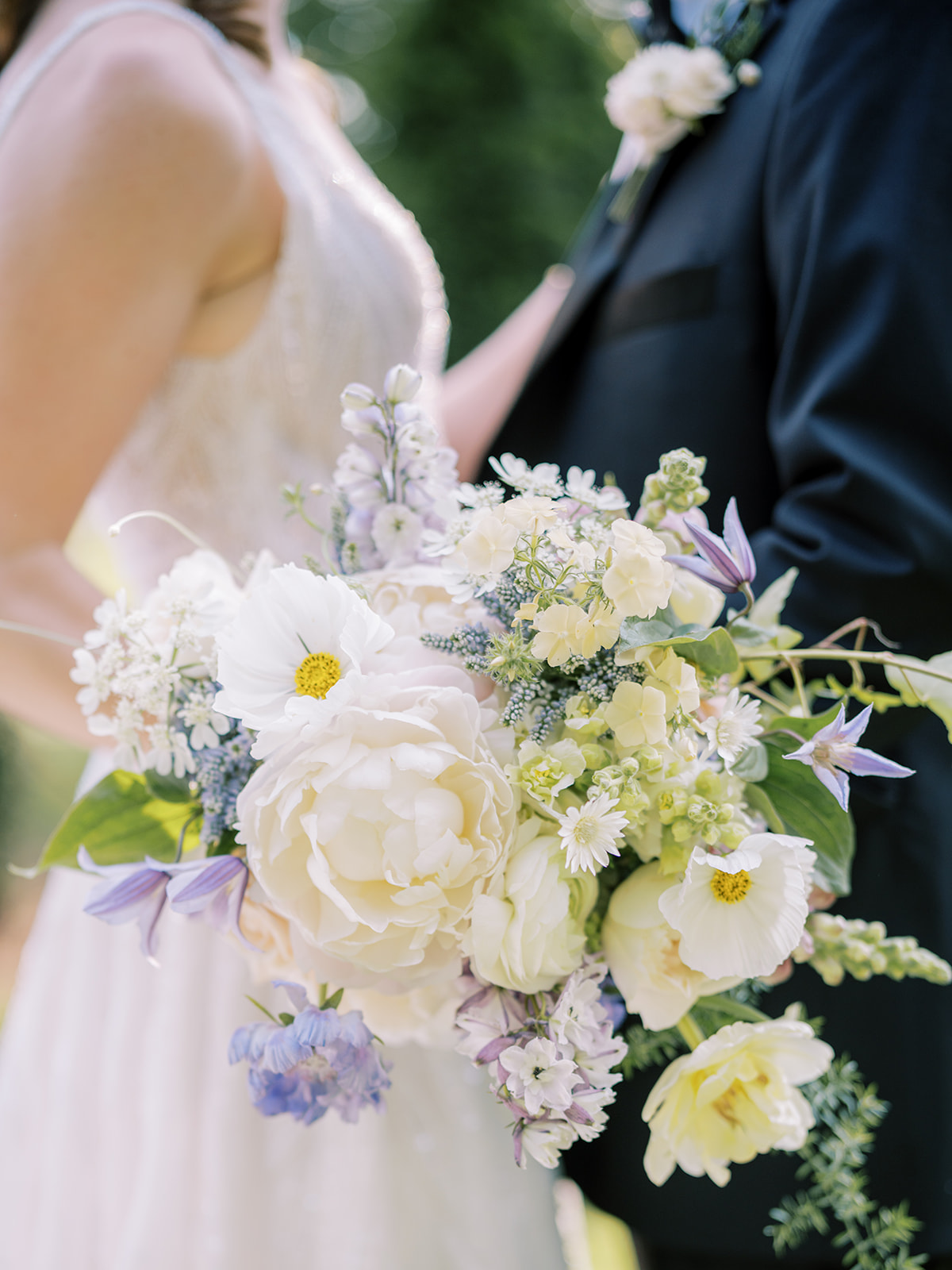
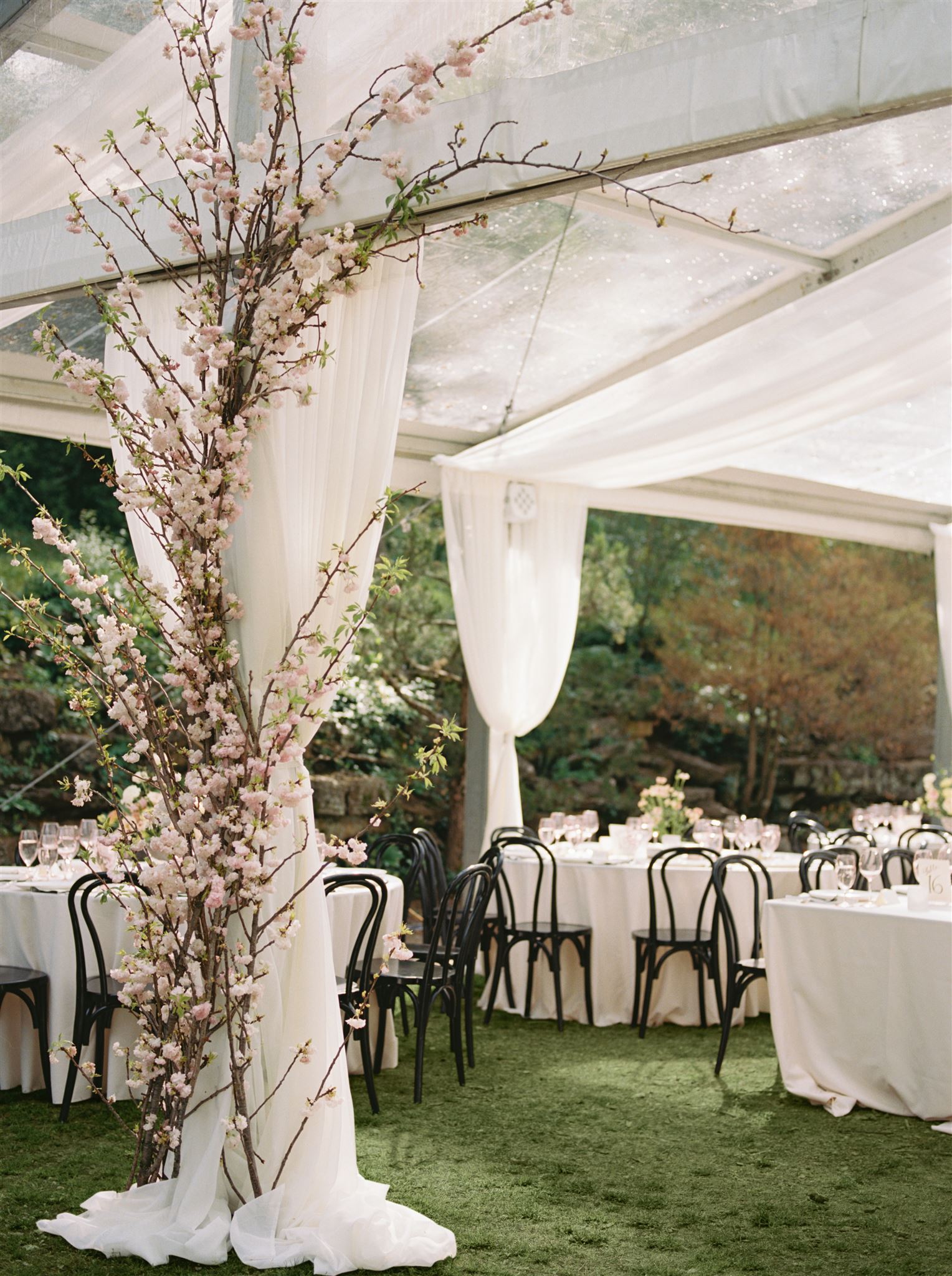
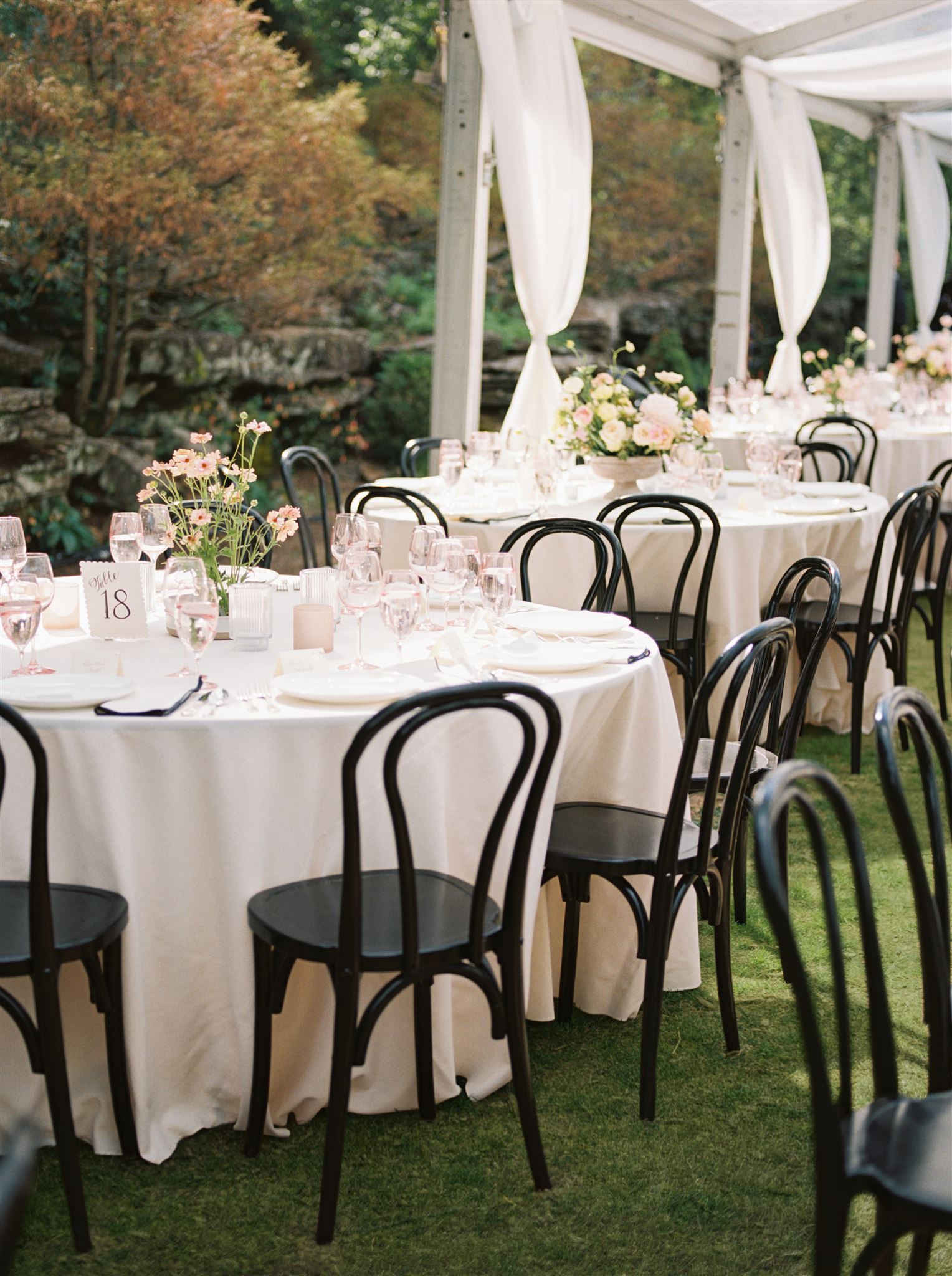
Every moment of planning with this sweet couple was a true joy for all of us at White Ink. Morgan and Tommy chose an incredible balance of boldness and gentleness throughout their wedding details making this dreamy garden-inspired summer wedding unforgettable for all in attendance. Truly, it was stunning-a dream day from start to finish.
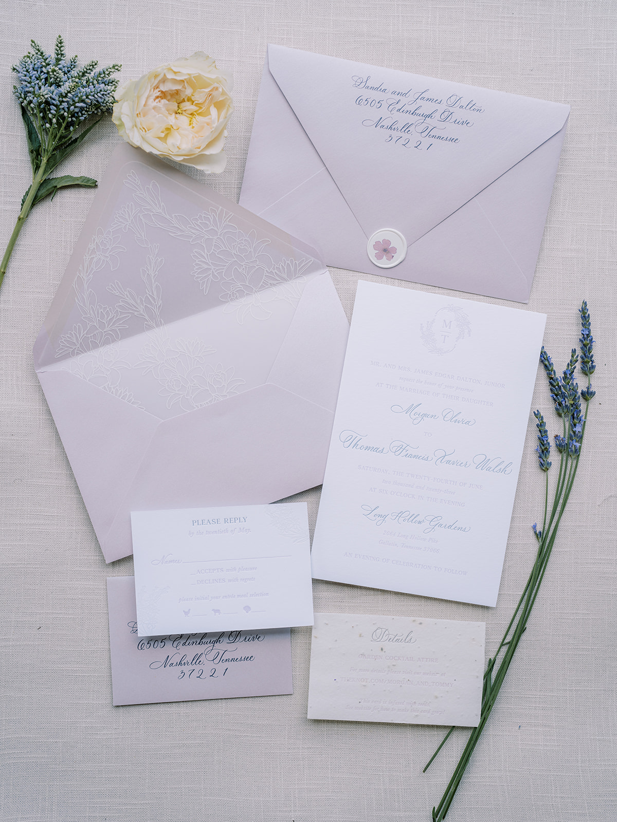
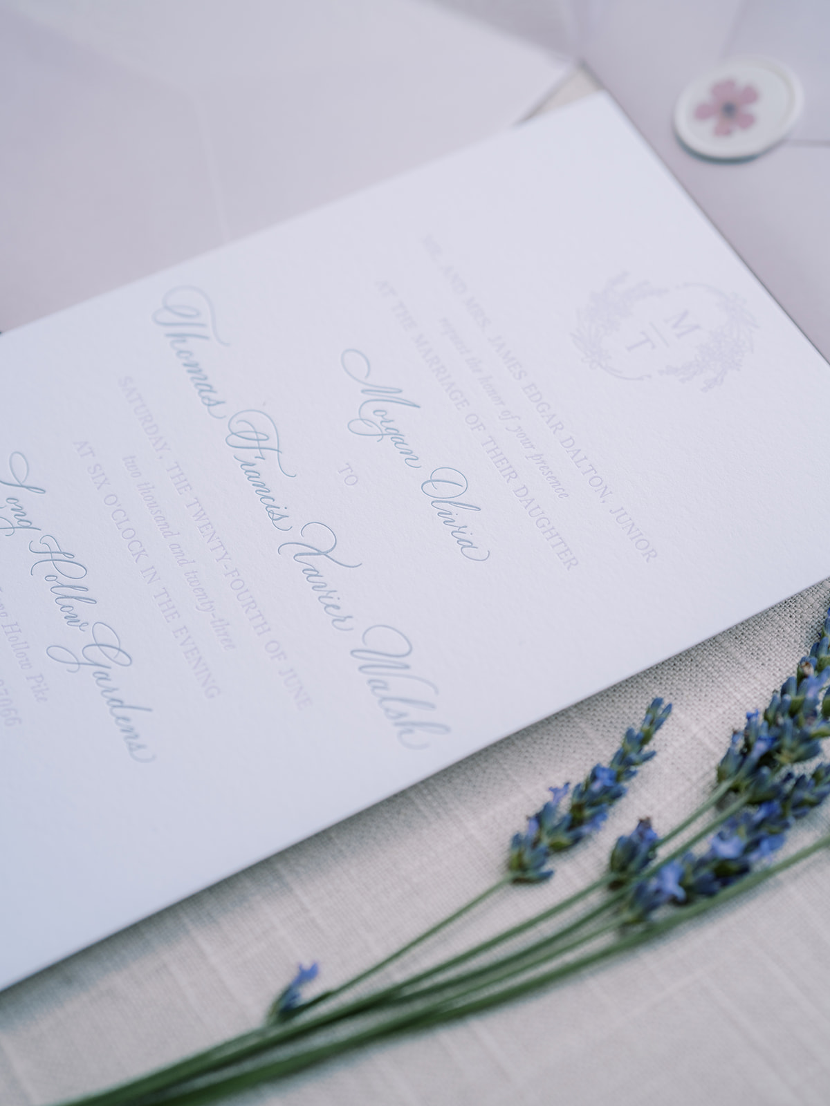
Dreamy Lavender Invitation Suite
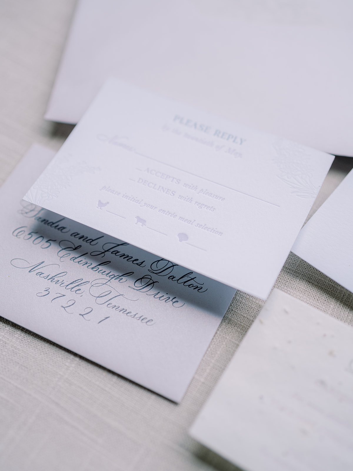
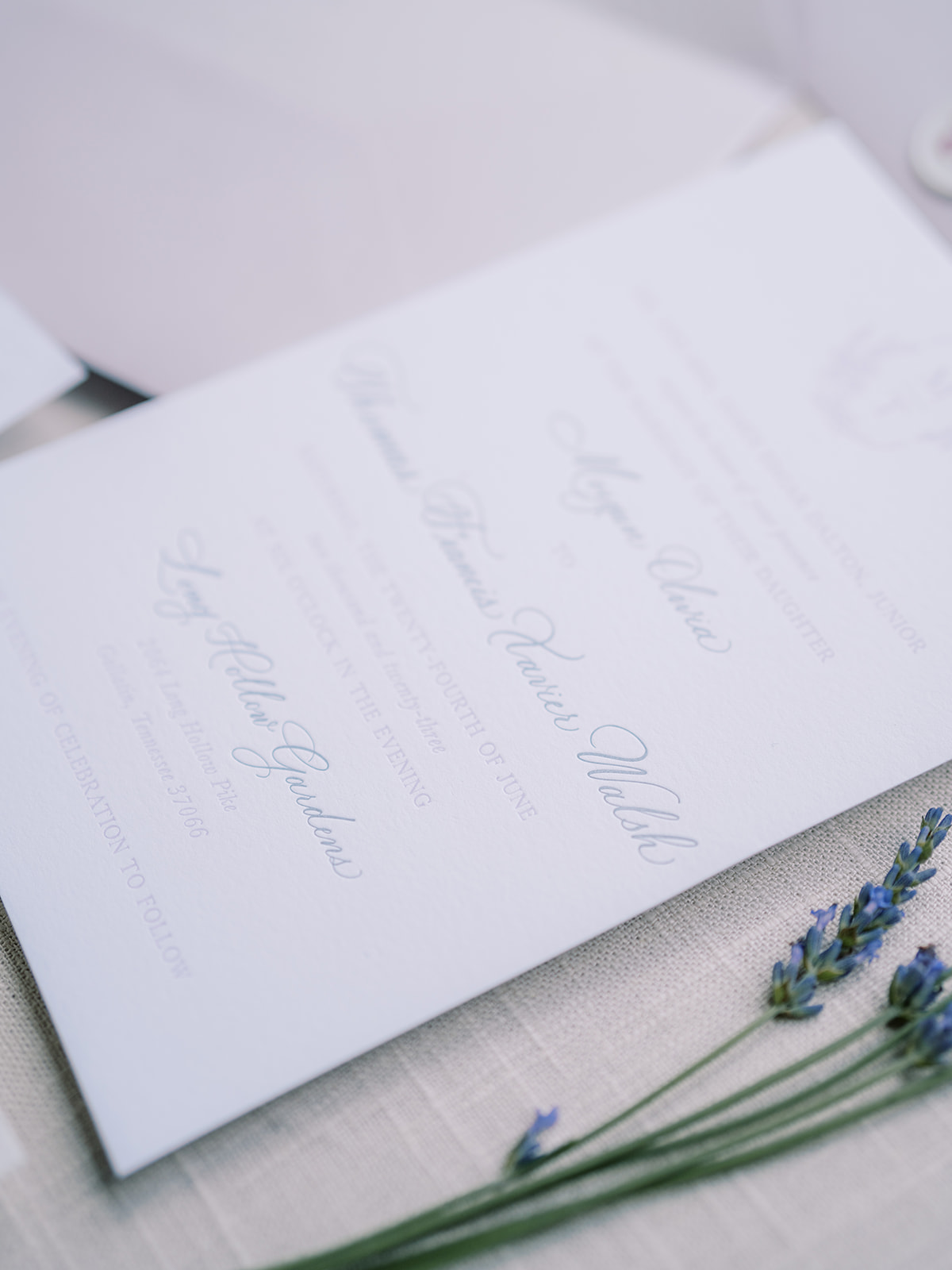
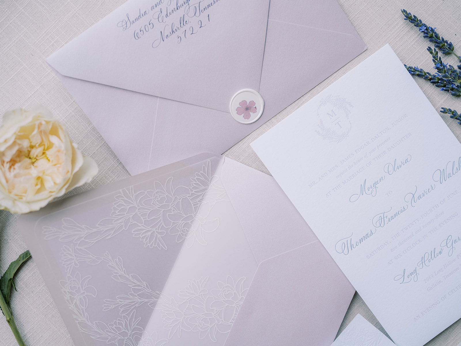
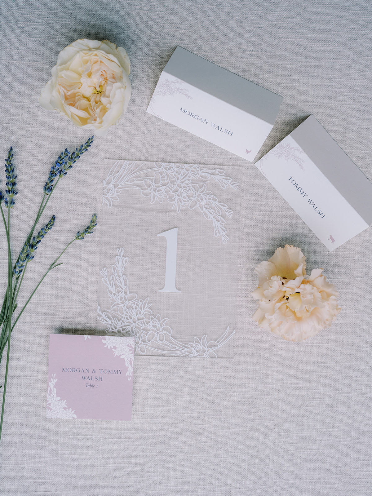
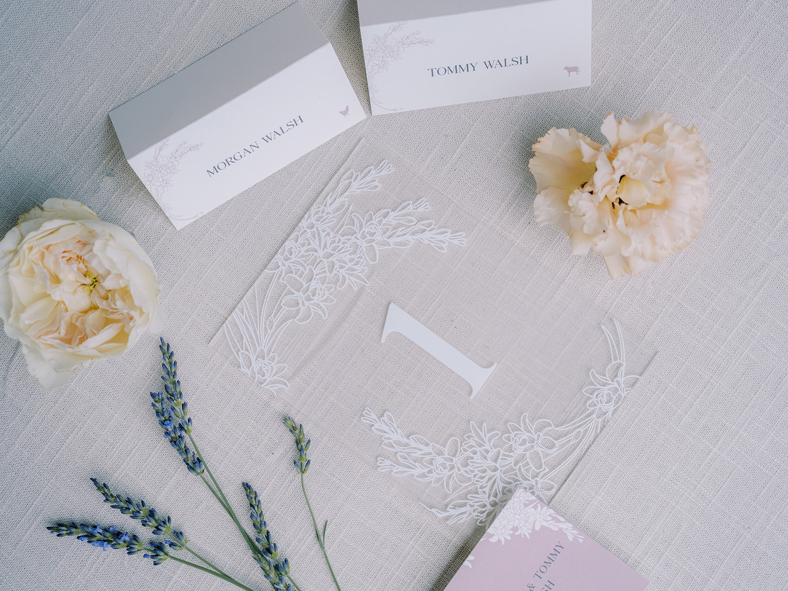
Morgan and Tommy’s invitation suites delicately showcased a beautiful lavender color and theme, a detail that was laced throughout the entire ceremony and reception! Our friends at Clover Calligraphy Co. did the beautiful letterpress work on the card stock paper, which comes at no surprise as they always do impressive work! A soft lavender hue was chosen for the envelopes in addition to the vellum envelope liners with a dainty tuber rose print. I also want to draw attention to the pressed flowers in the custom wax seals! Is this not the dreamiest invitation suite?
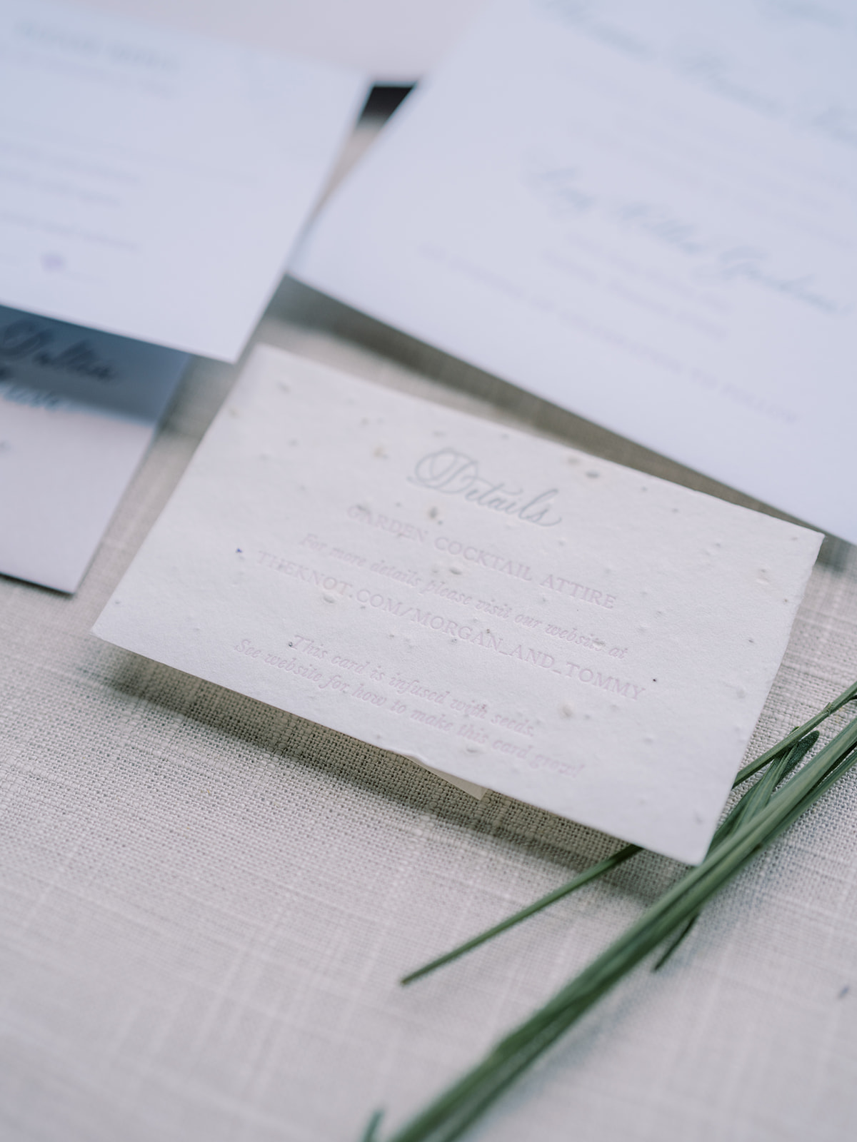
If you look closely at the details card from our bride and groom’s invitation suite, you can see that this textured card is actually seed paper! The cards were infused with wildflower seeds so that wherever guests planted their cards, wildflowers would grow! Talk about a memorable detail!
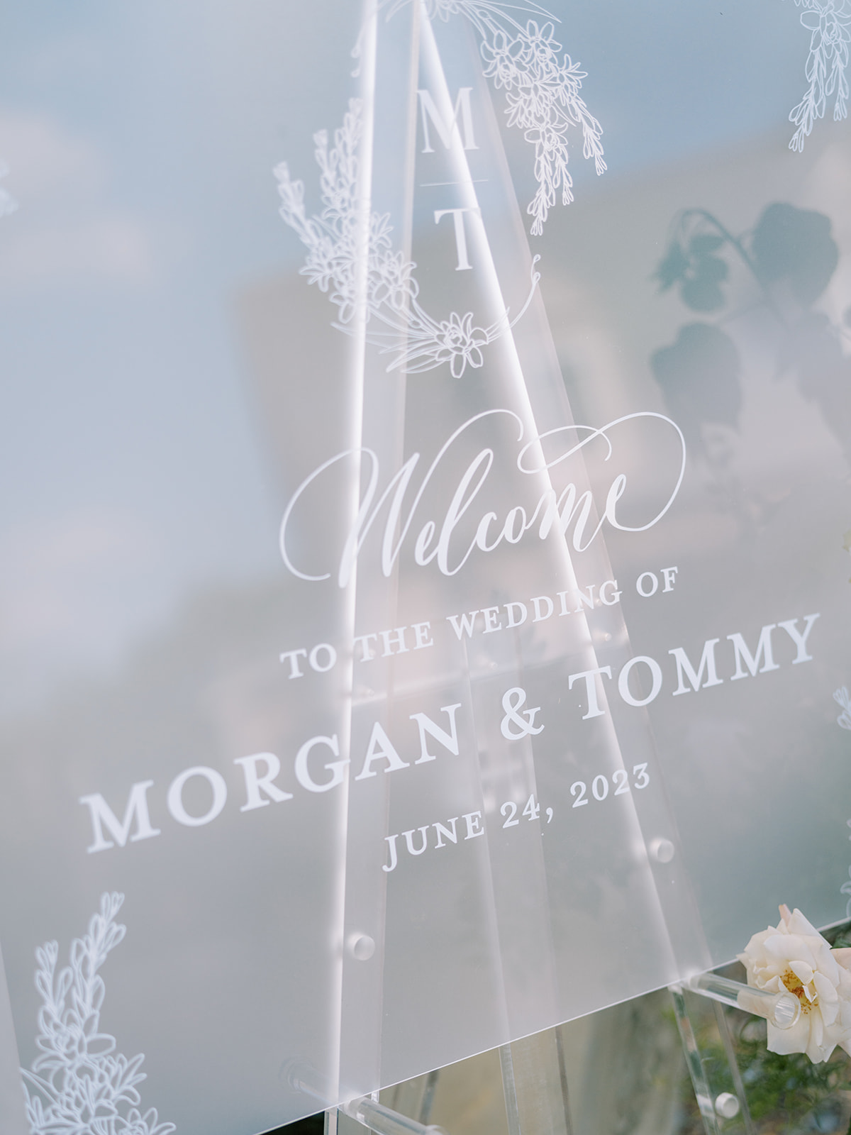
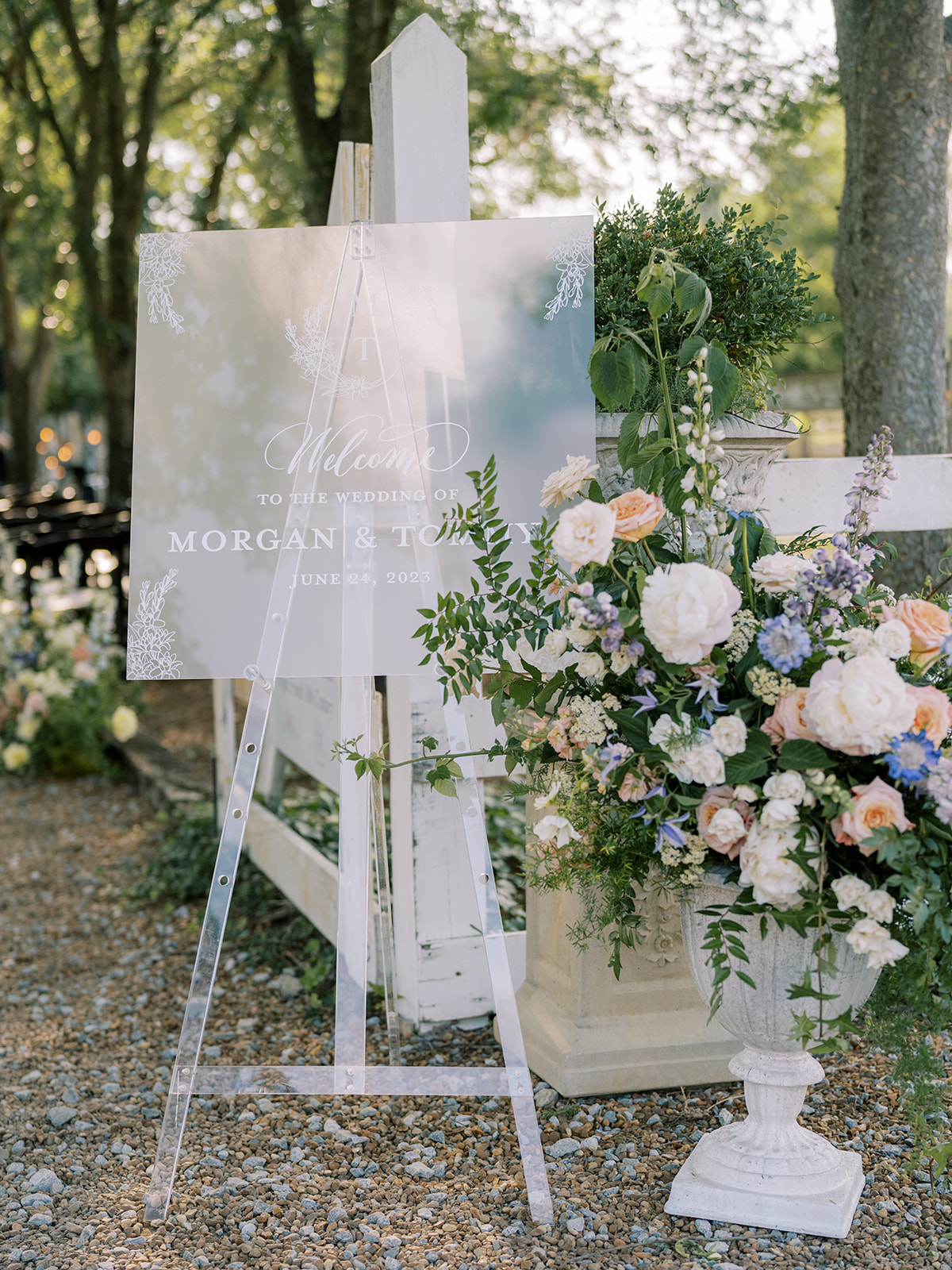
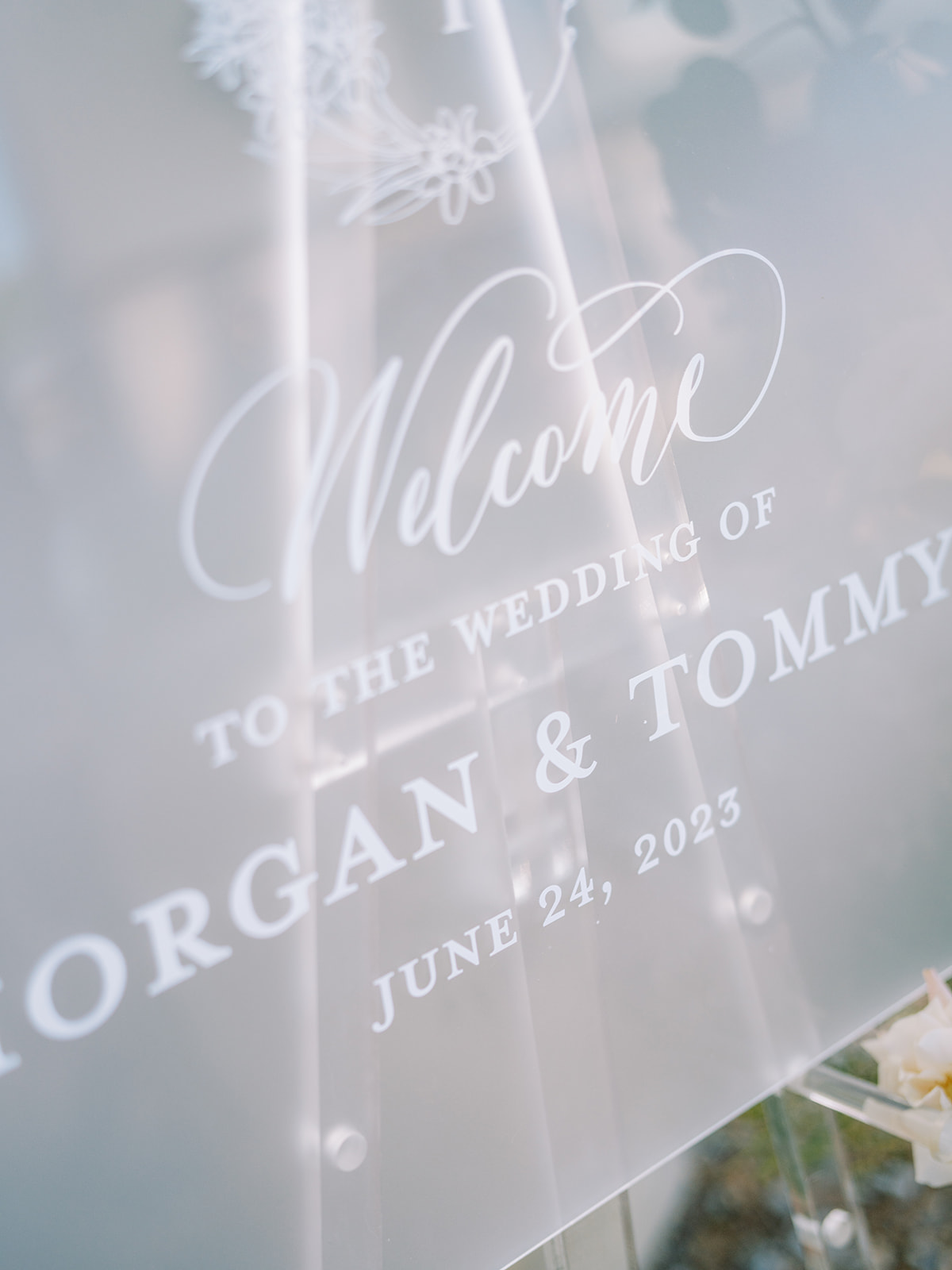
Frosted Acrylic Welcome Sign
The elegant frosted acrylic wedding welcome sign brought me back to the invitation suite details, as guests could see the same custom monogram from the invite, as well as the beautiful tuber rose print on the vellum envelope liner. Connecting details throughout an event, especially a wedding, can easily elevate your special day.
Thoughtful Summer Wedding Details
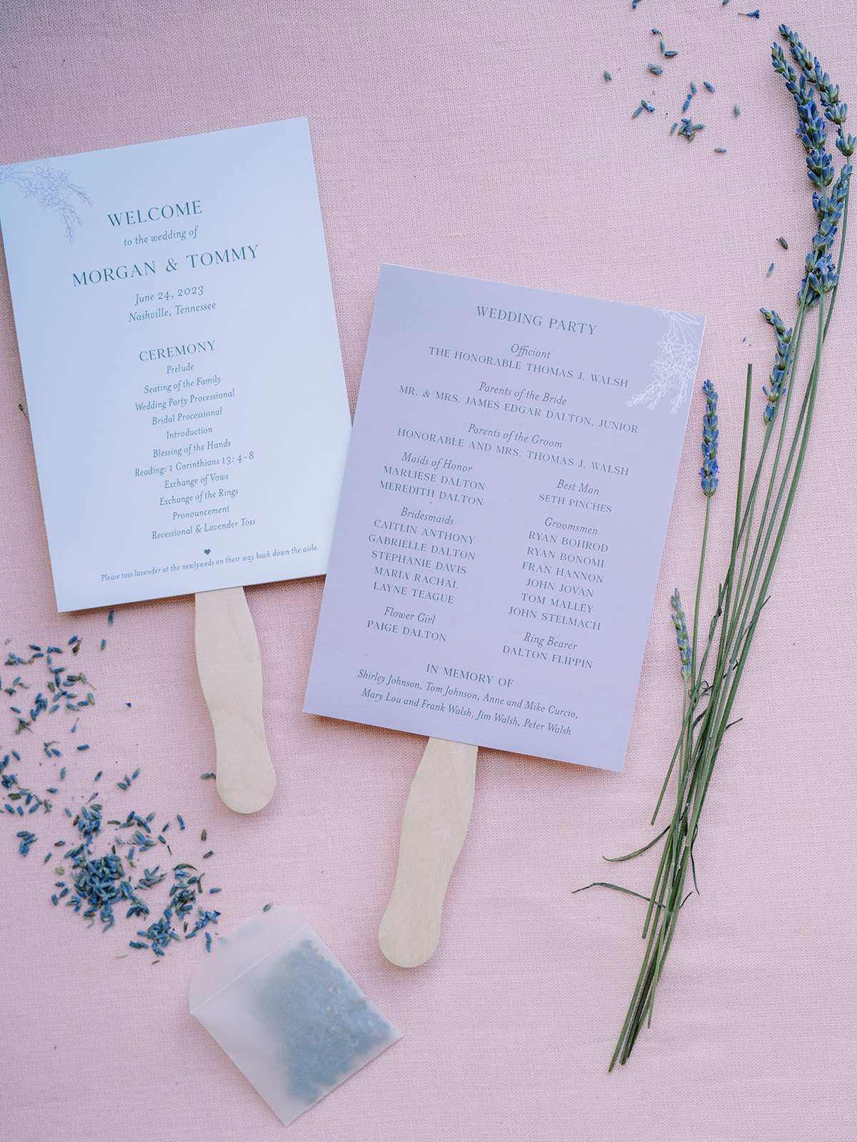
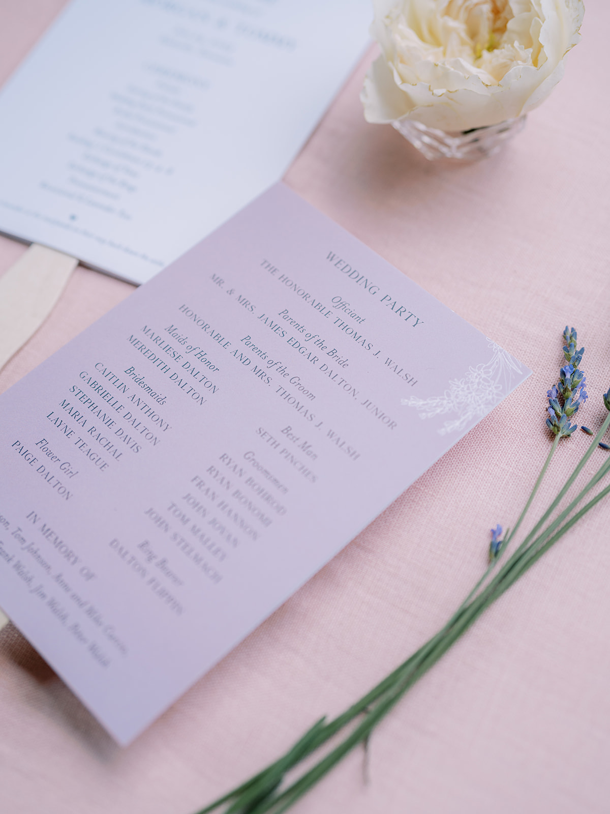
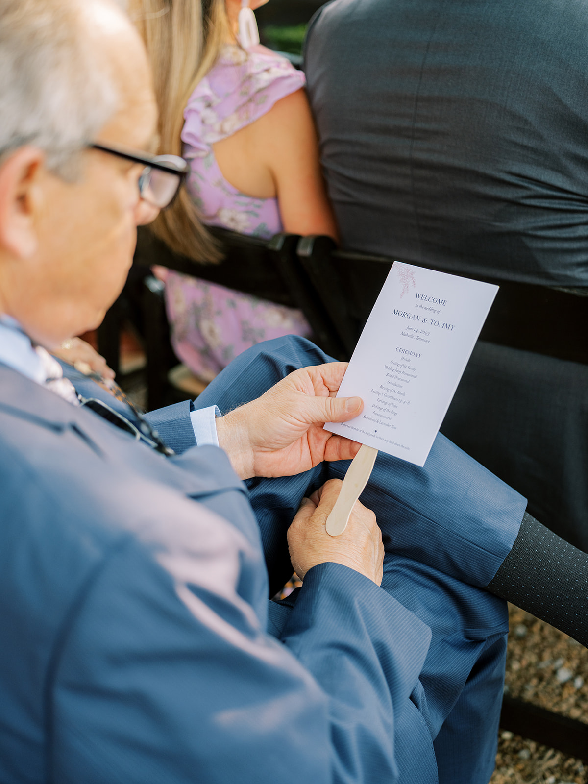
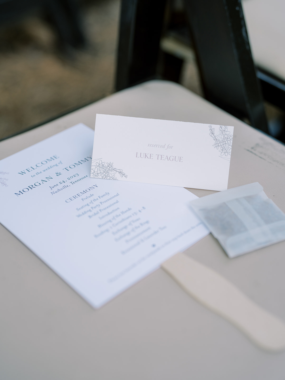
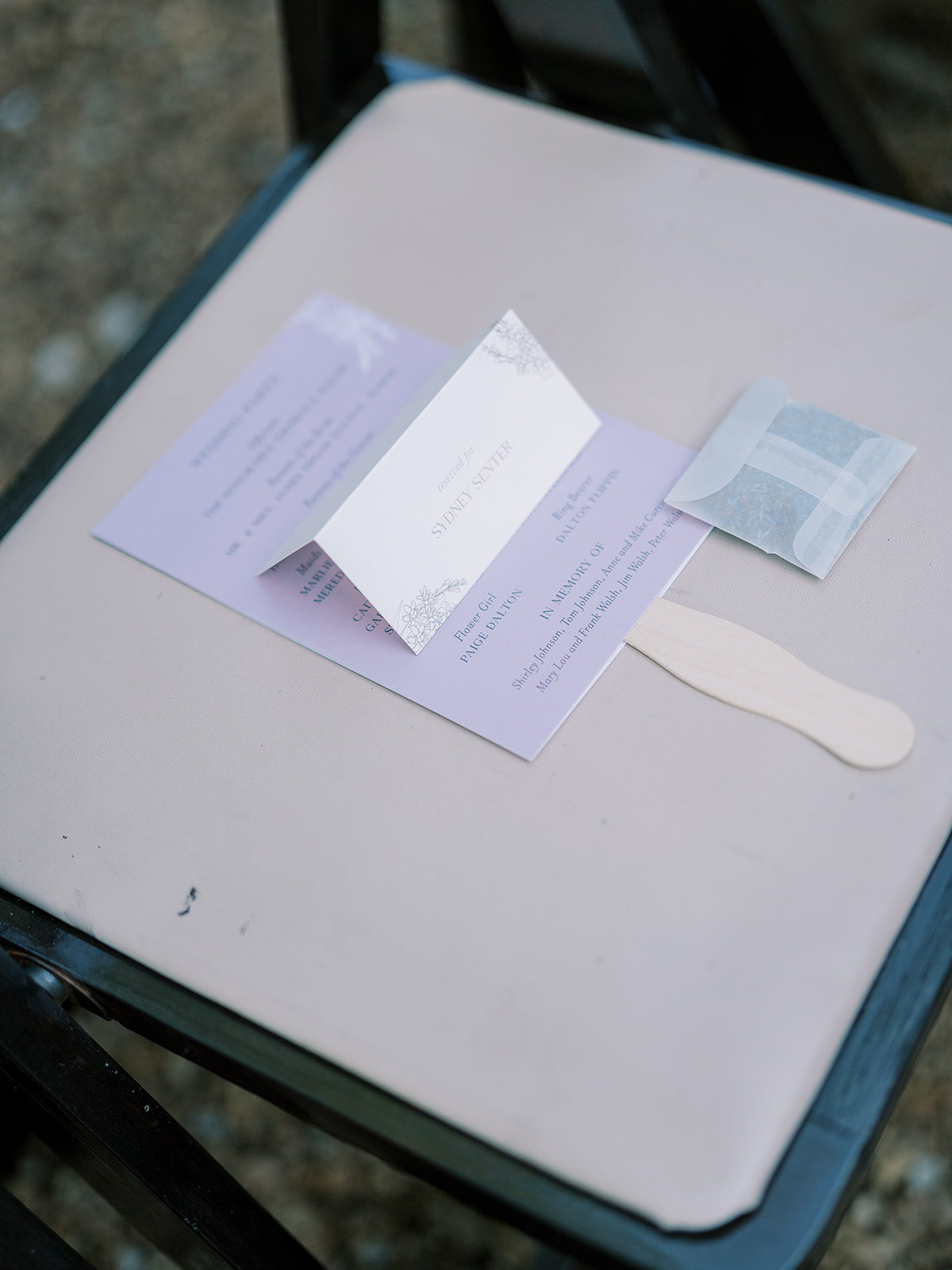
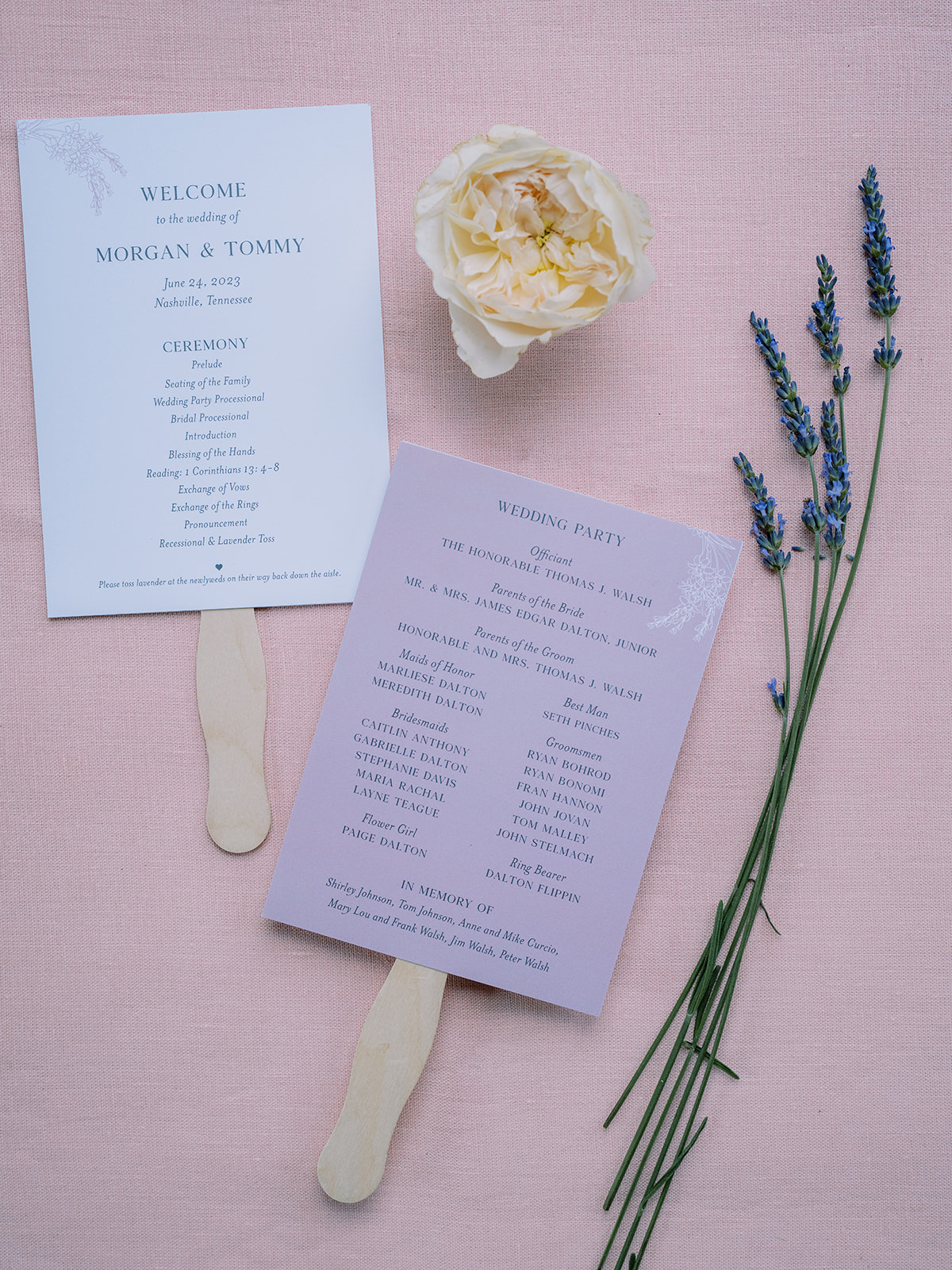
A very thoughtful detail that Morgan and Tommy added to their June wedding was letting us create these adorable fan programs which, of course, included the stunning lavender color theme and floral prints that blanketed the details of their wedding. This is a perfect example of making parts of your ceremony details functional for your guests while maintaining a delicate theme.
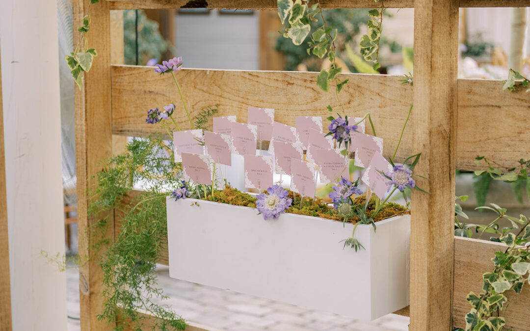
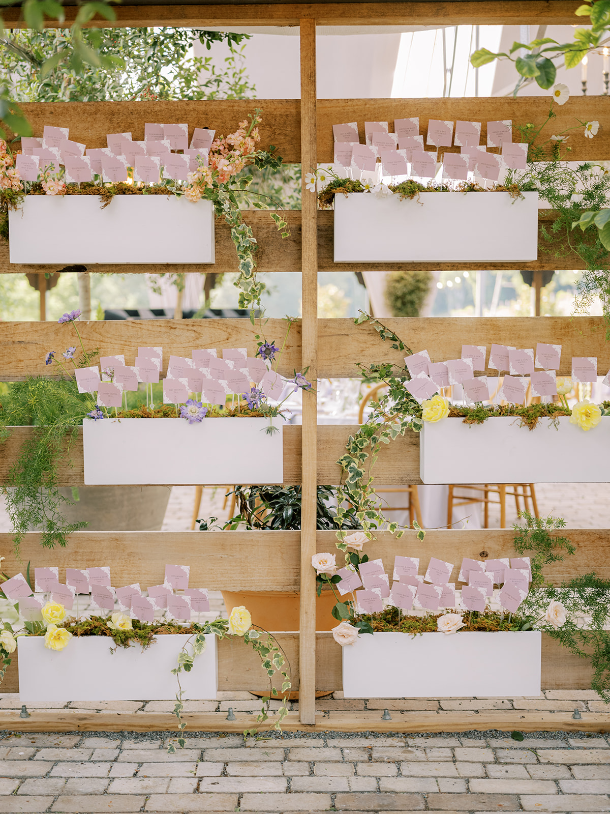
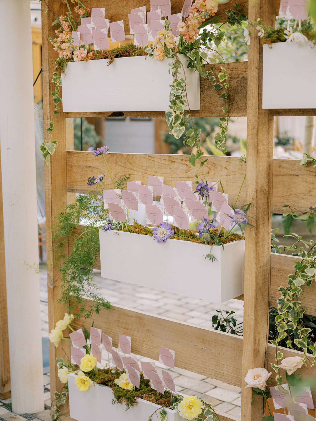
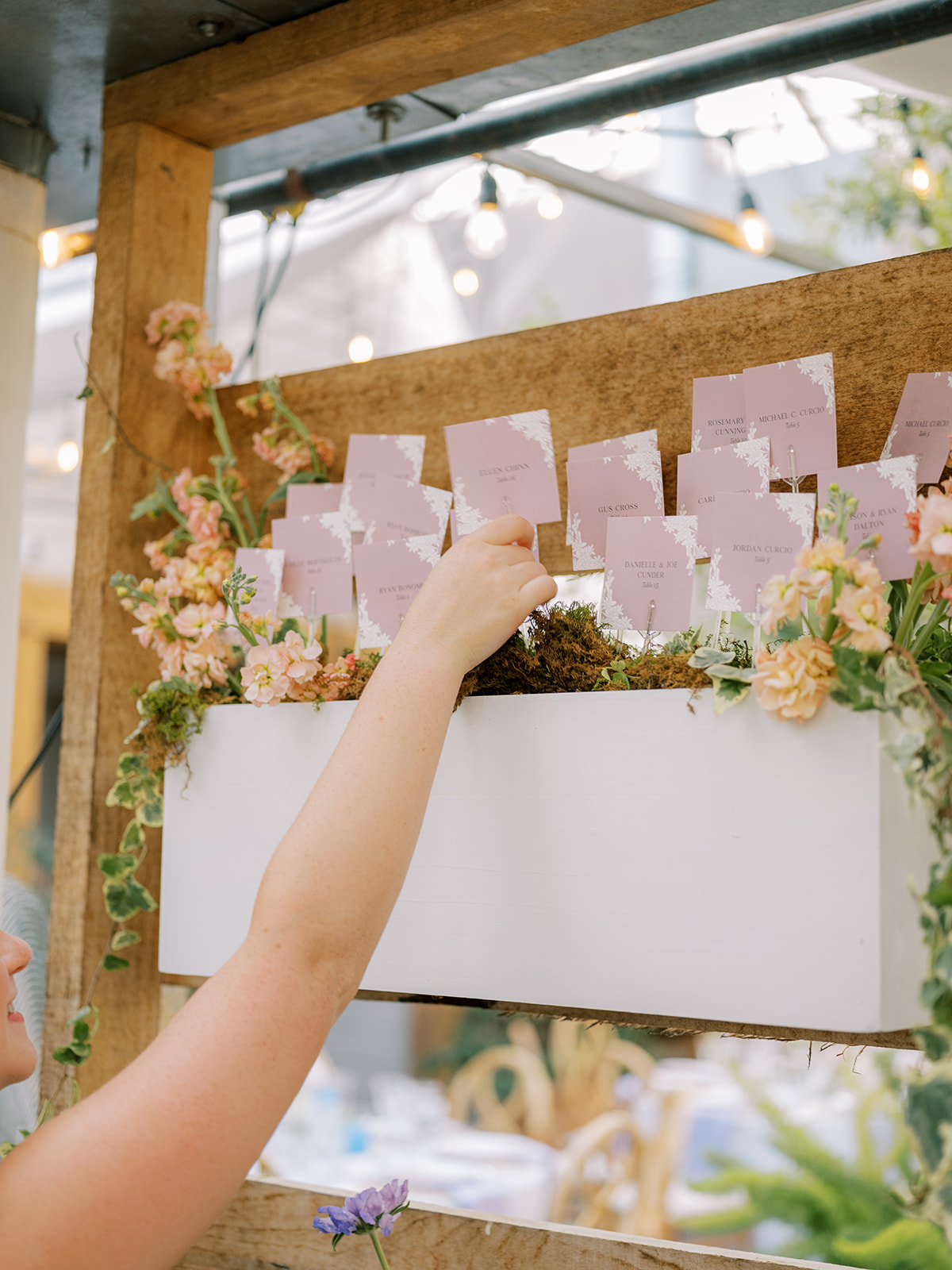
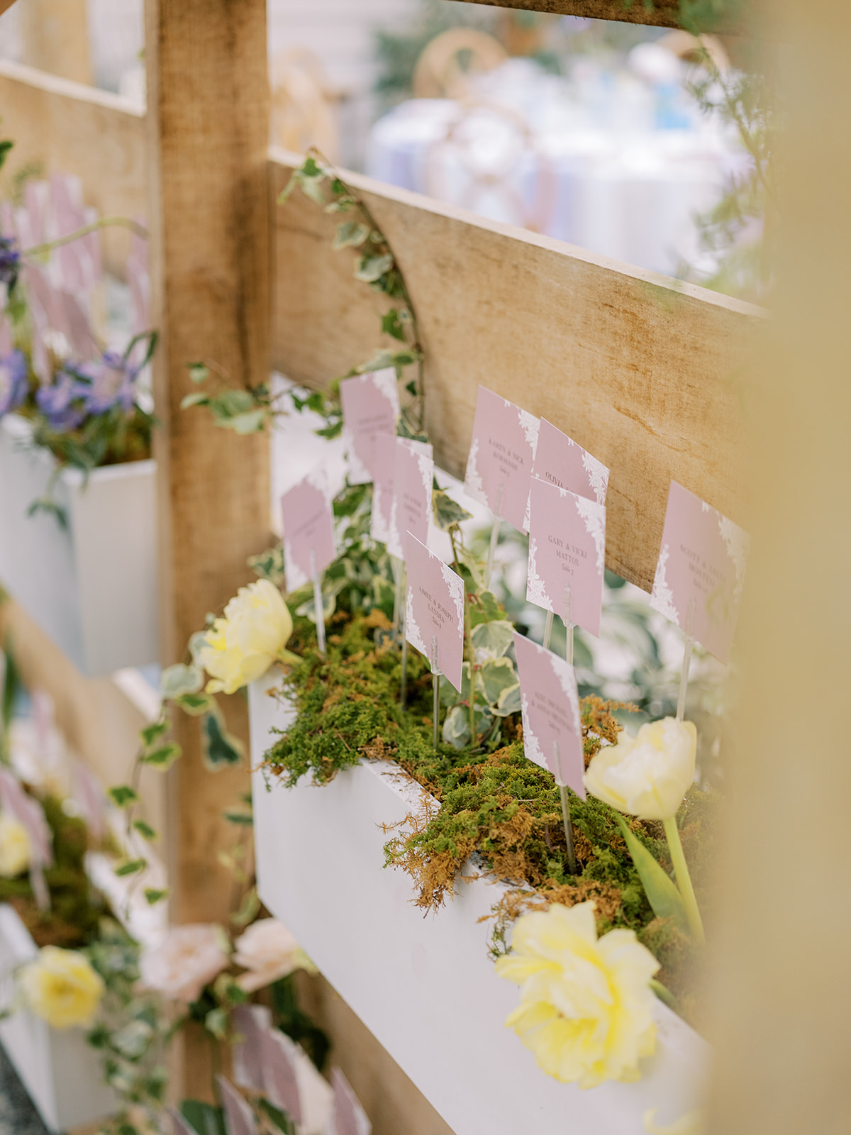
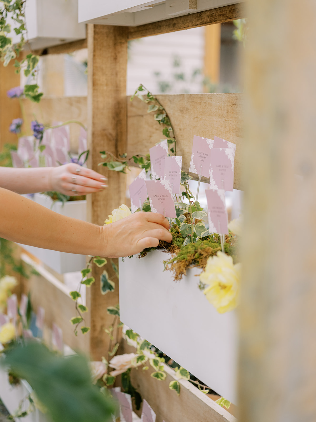
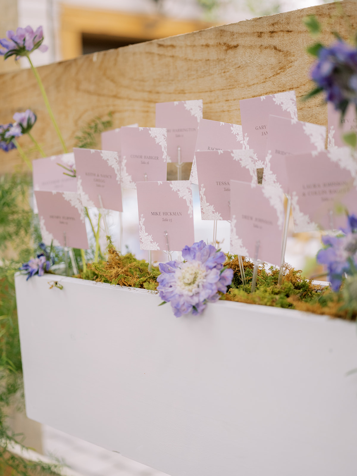
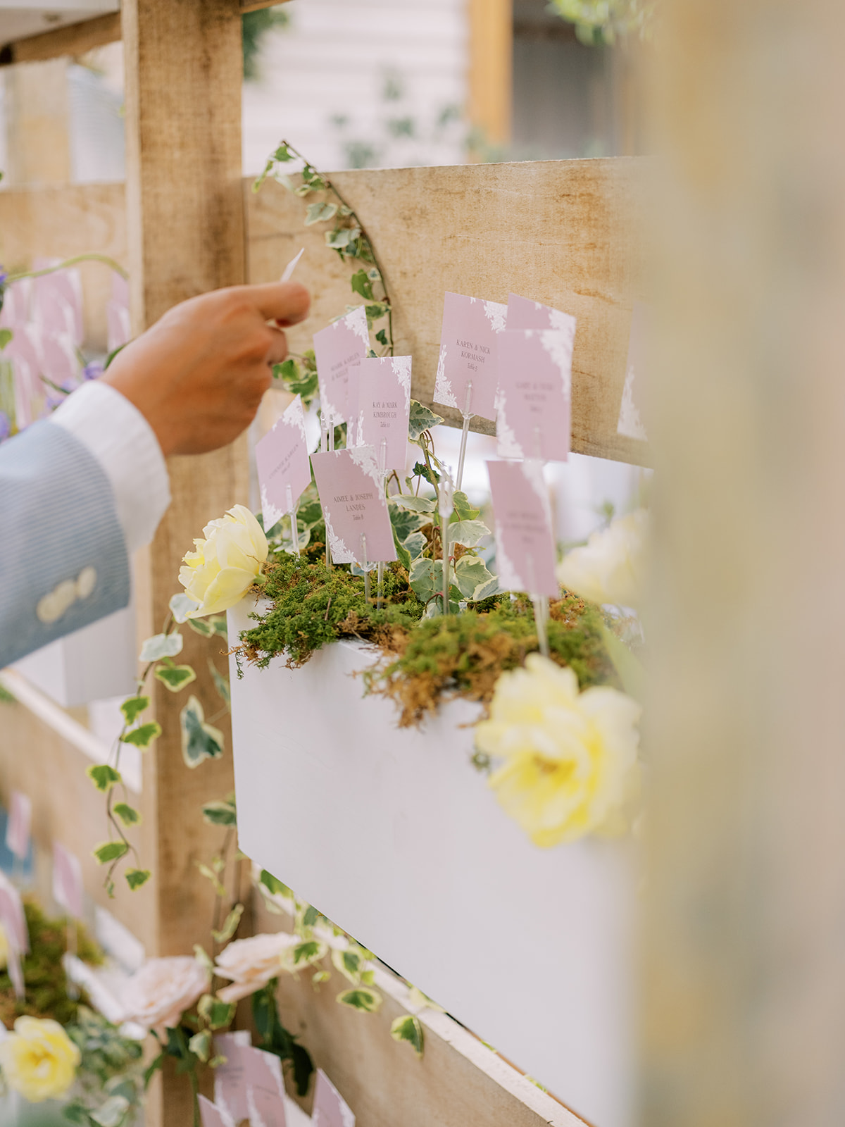
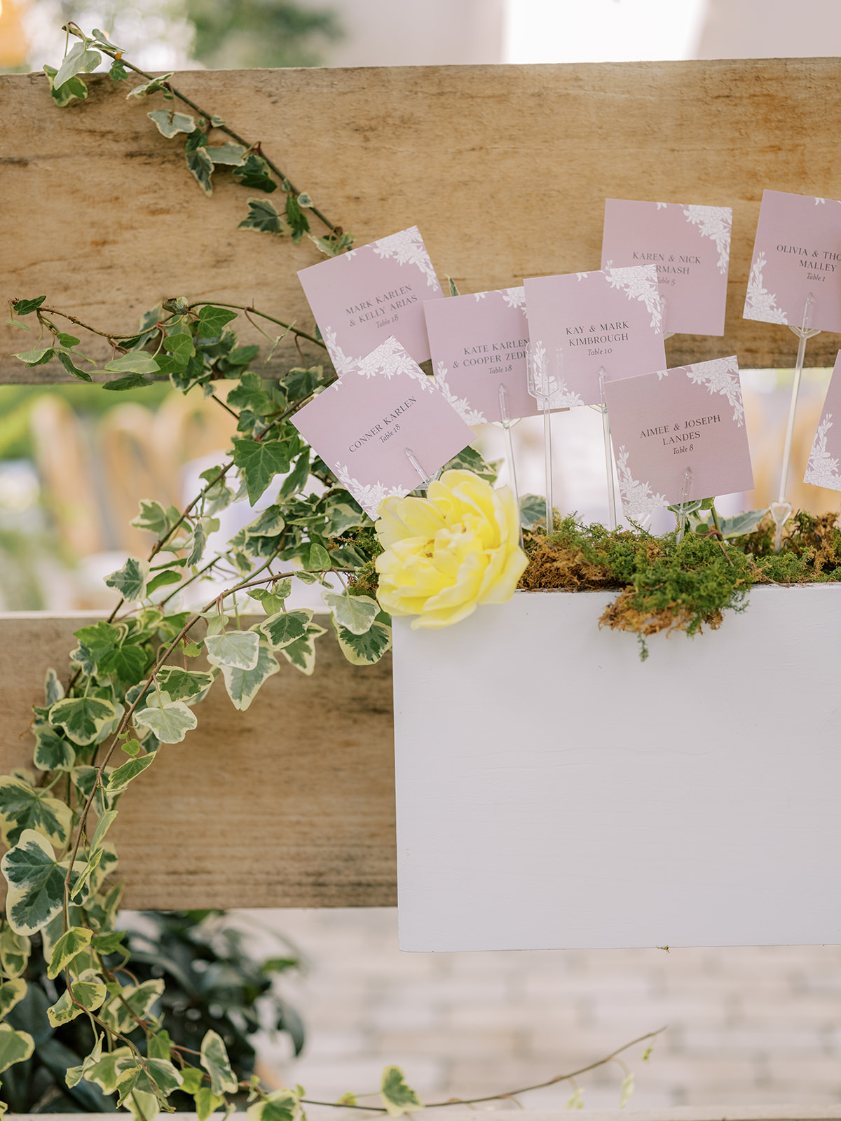
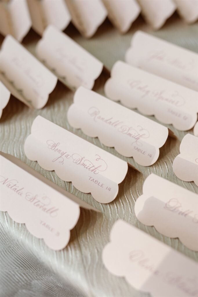
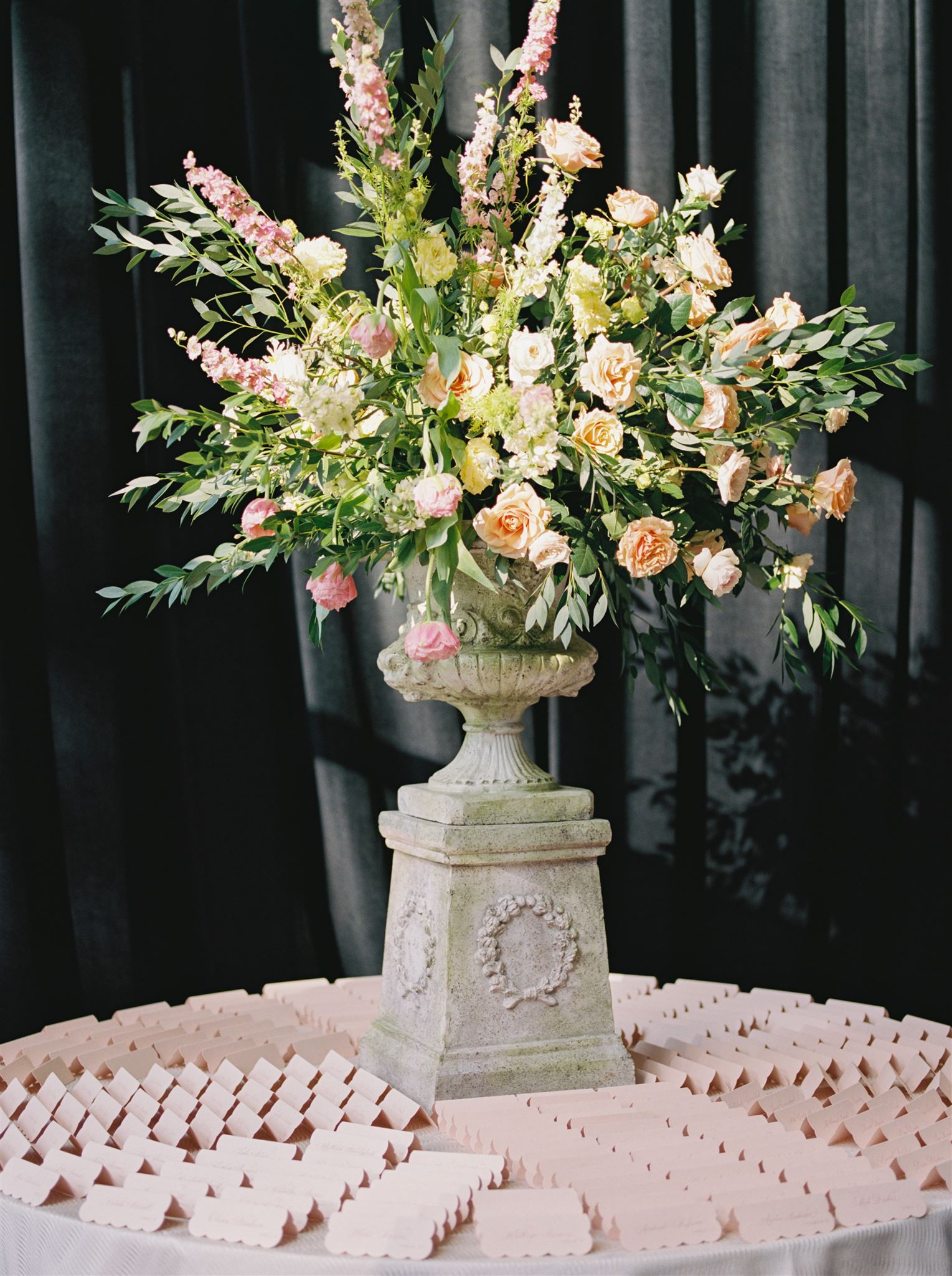
Garden Party Inspired Seating Chart
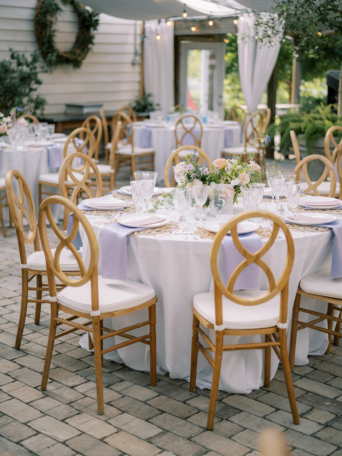
Alright, now it’s time to talk about this stunning, garden-party inspired seating chart! Guests could find their escort cards in these adorable little wooden garden boxes that were appropriately filled with gorgeous florals and greenery. This is one of the sweetest seating charts I’ve ever taken part in. It was a true showstopper!
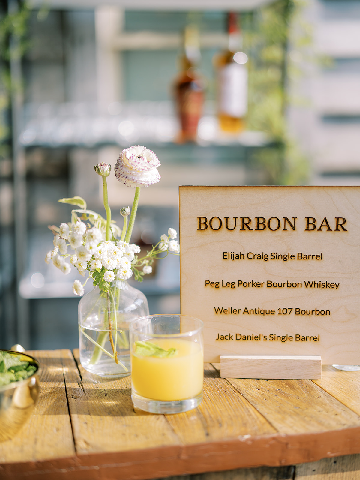
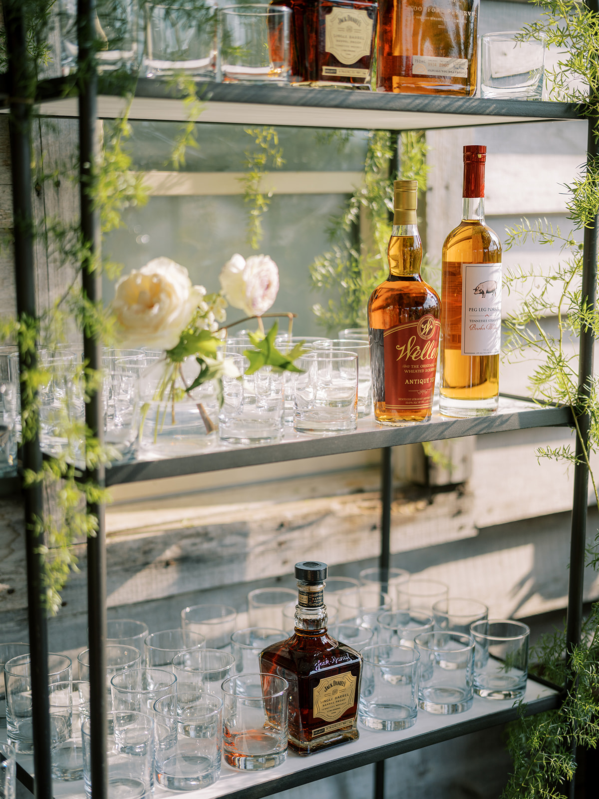
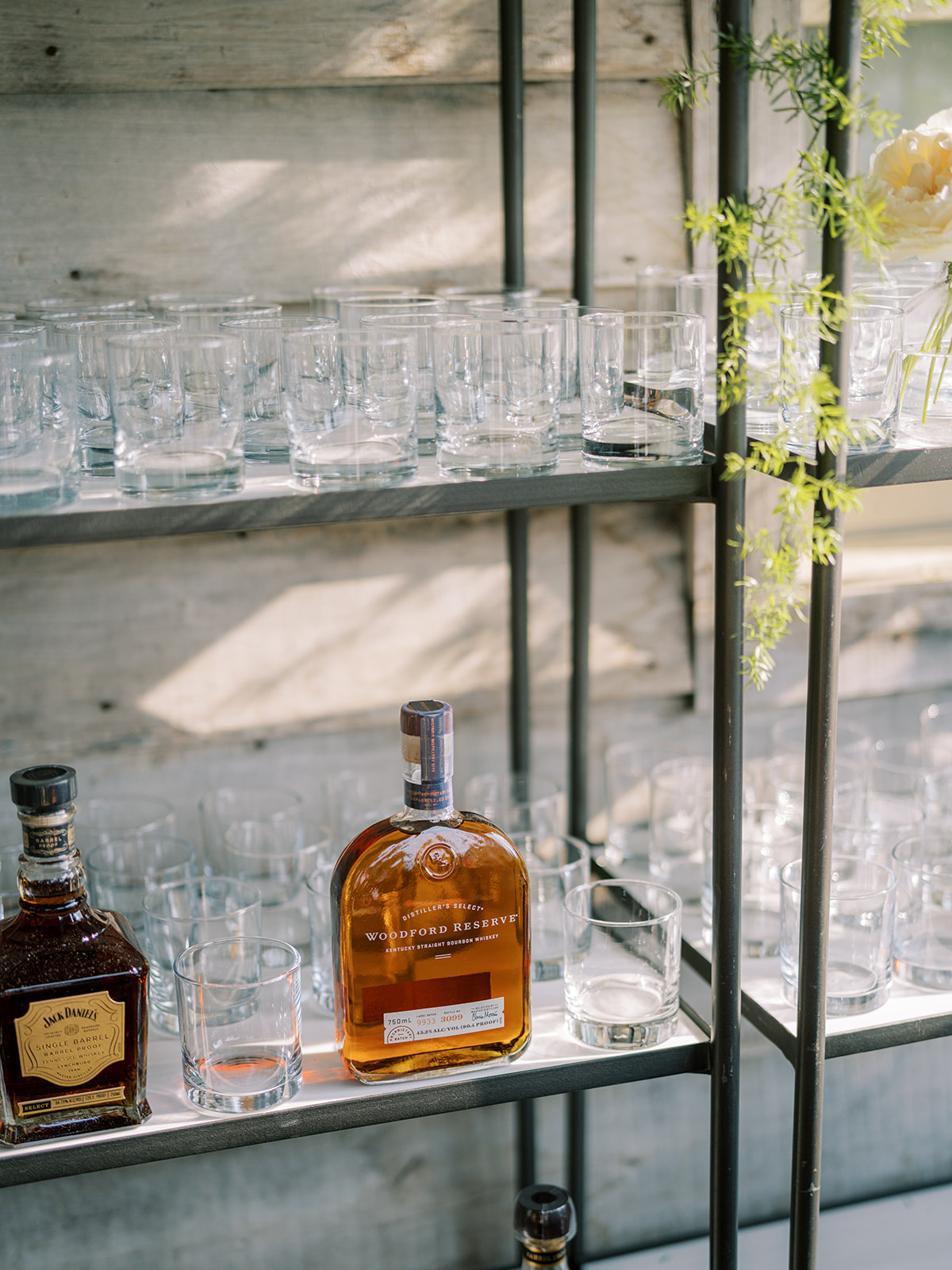
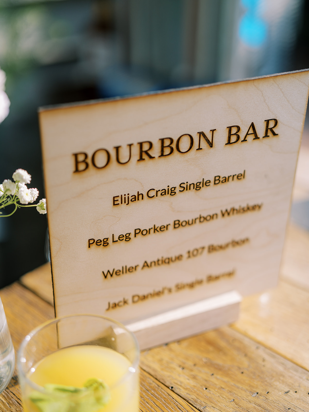
Custom Laser-Engraved Bar Sign
Among all of the delicate designs of the day, Morgan and Tommy still maintained a wonderful balance of boldness, like this one-of-a-kind bourbon bar. We got to create this awesome, laser-engraved, wooden bourbon bar sign, which matched incredibly well with the rustic look they wanted for this setting. I’m really proud of how great this sign turned out. It made for a great conversation piece among guests too!
White Ink also created the custom cocktail sign using the same frosted acrylic as the wedding welcome sign. YES to matching signage!
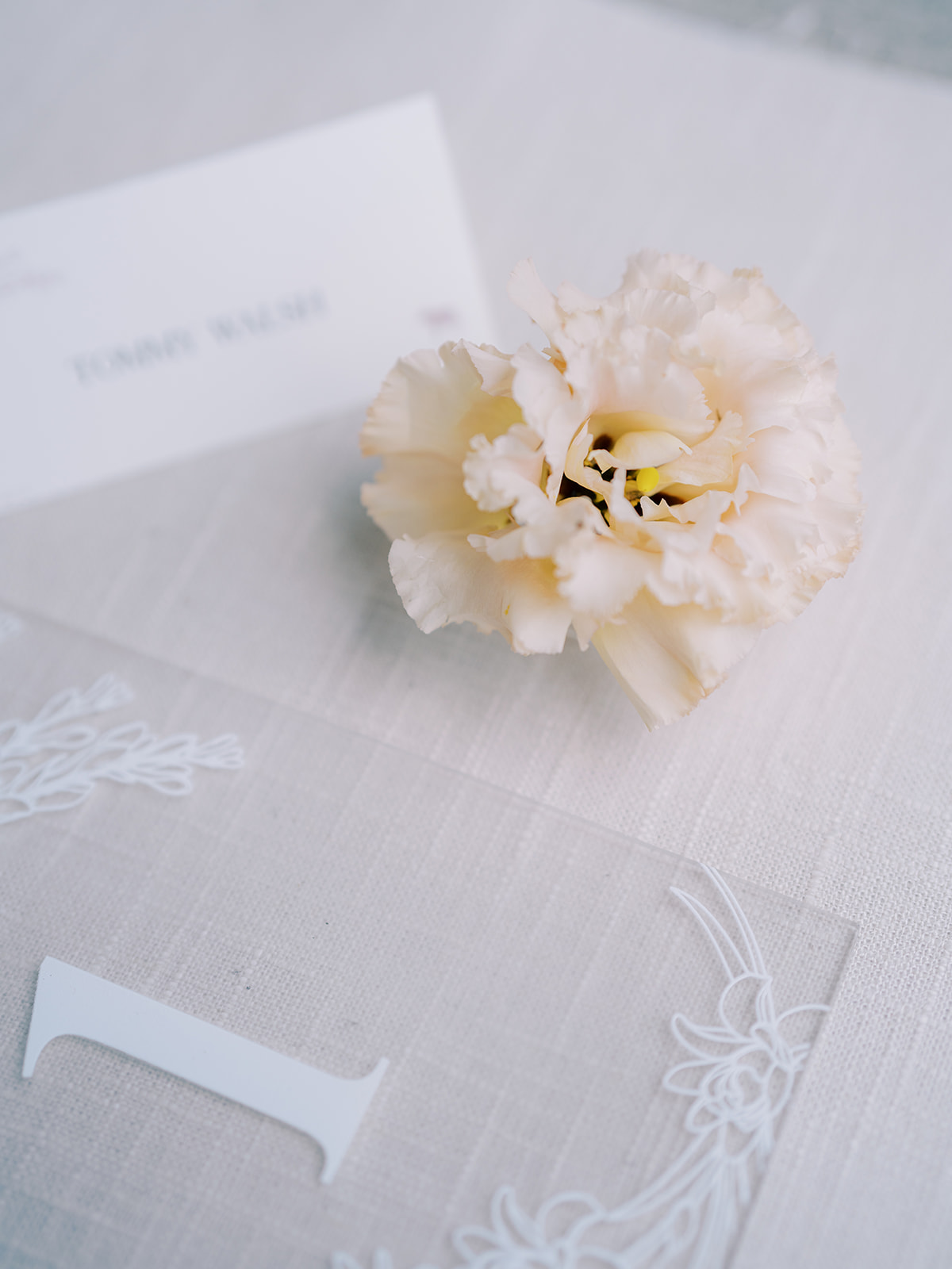
The table signage, place cards, and escort cards were not left out of this lavender garden-inspired theme. Look at how well all of the finer details fit together! Also, notice more of the tuber rose print throughout. I’m obsessed.
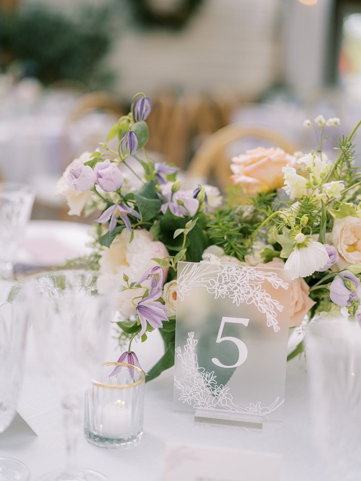
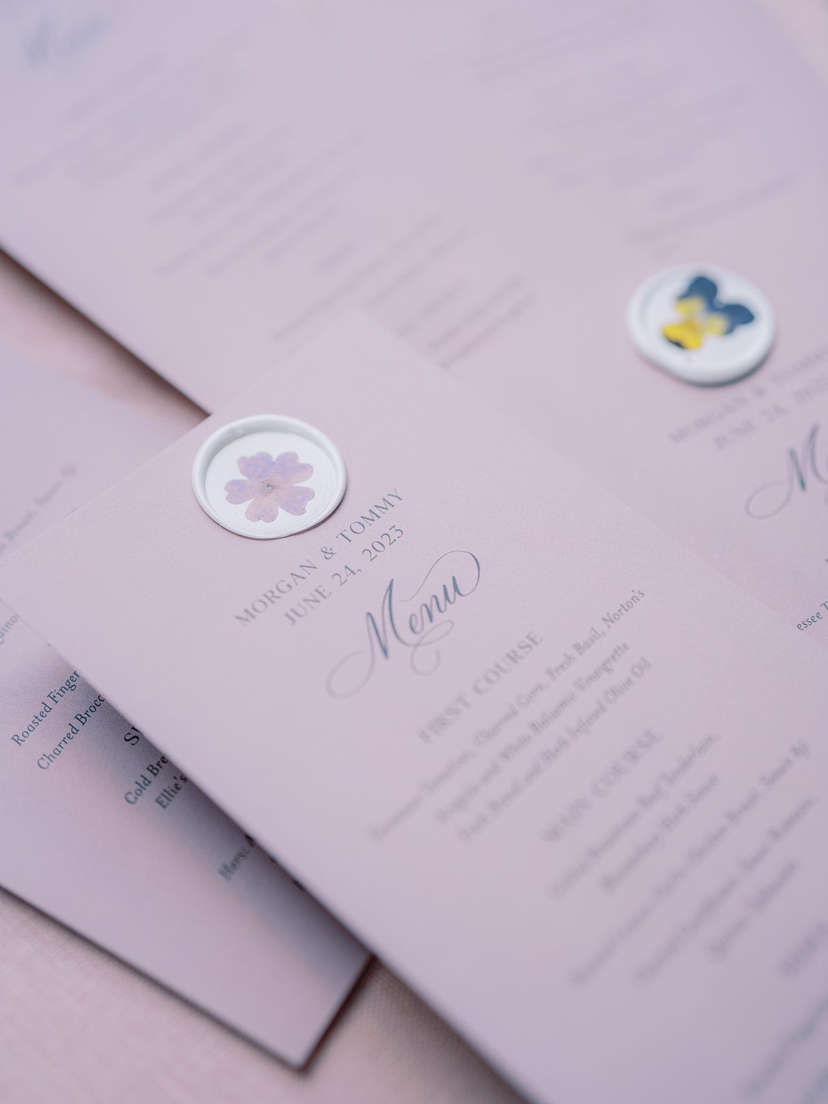
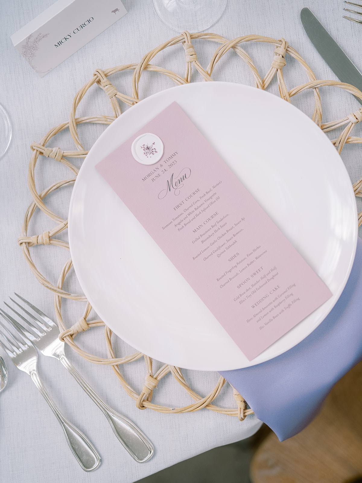
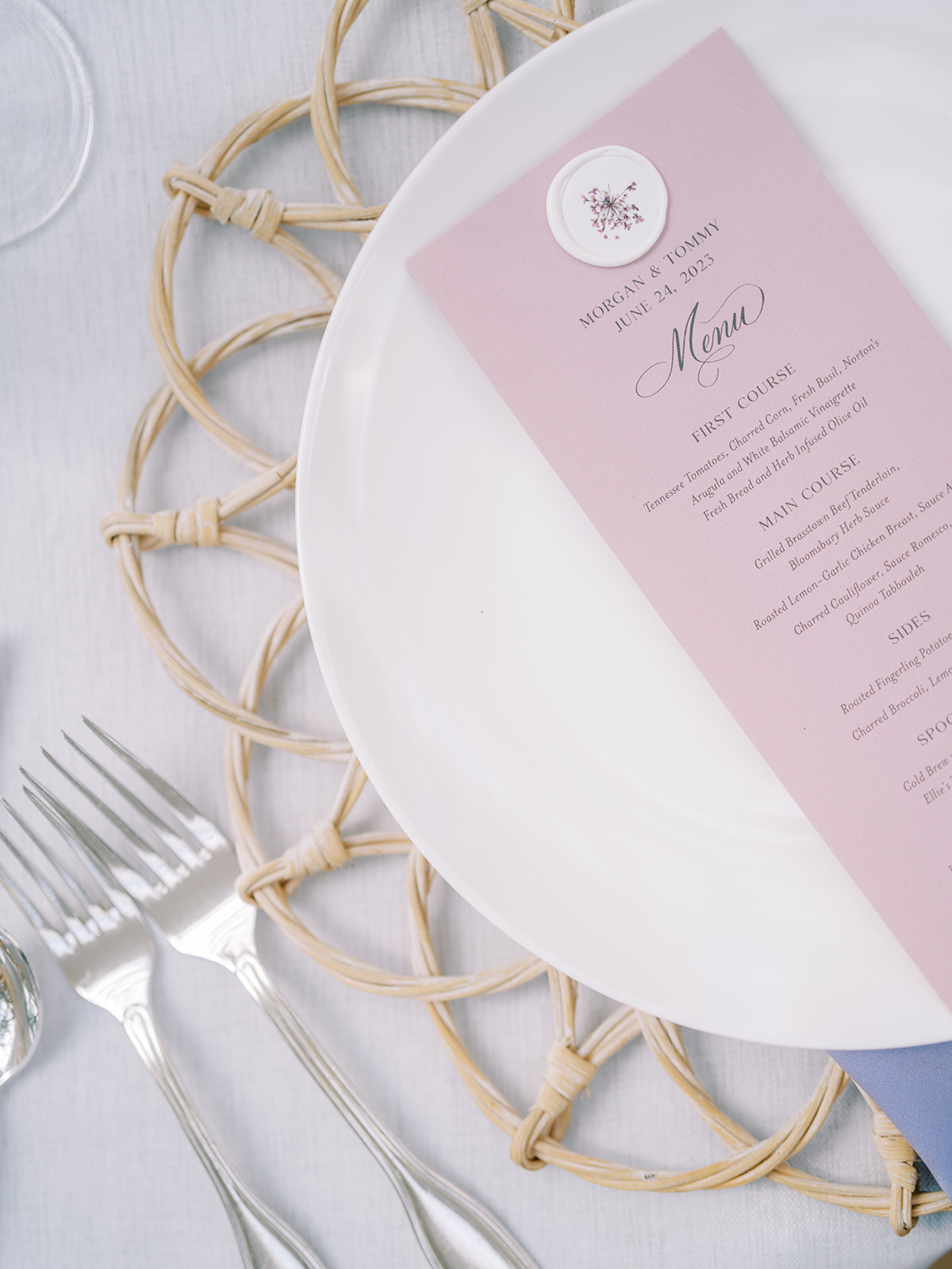
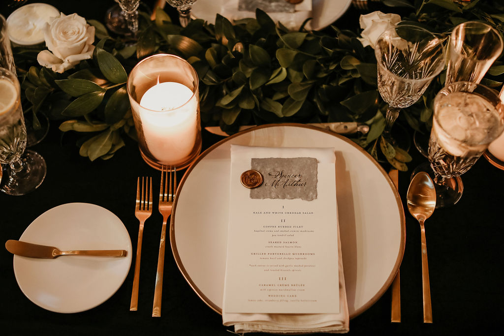
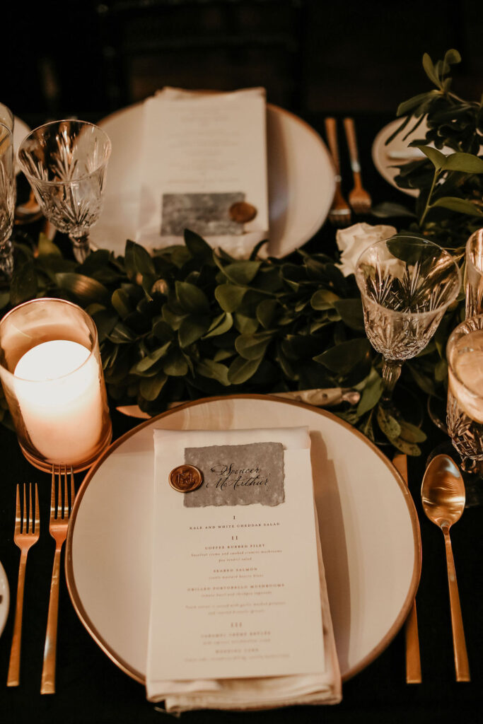
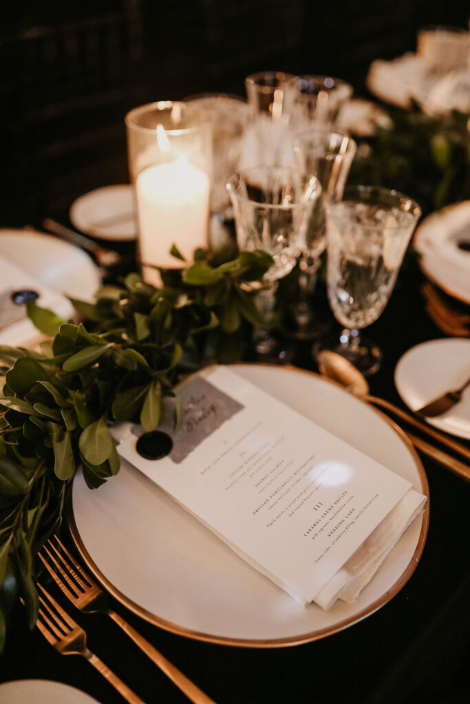
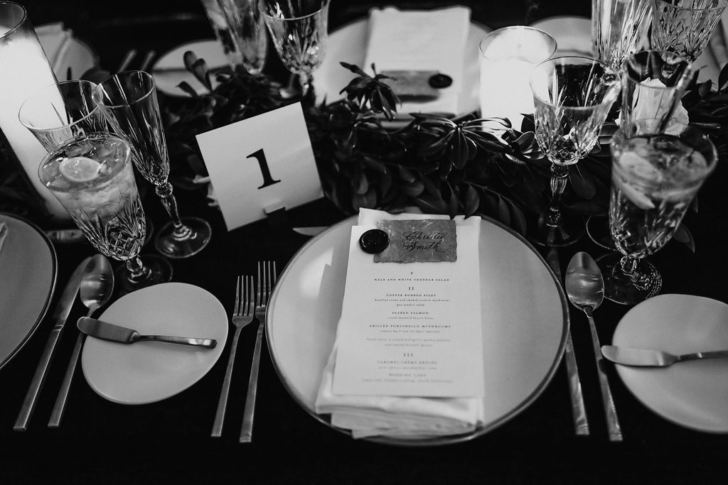
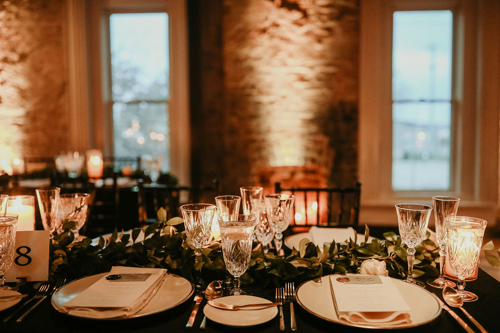
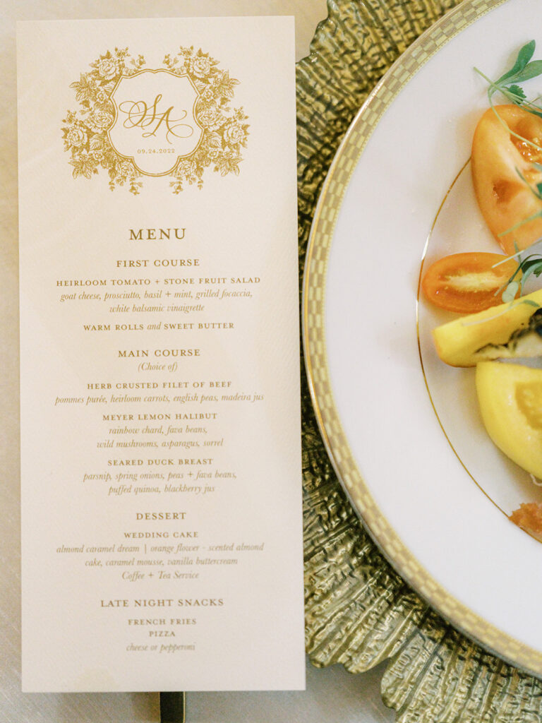
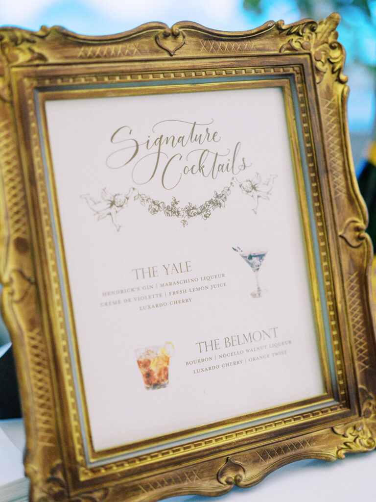
Summer Lavender-Inspired Menus
I loved getting to create these summer-perfect, lavender menus for Morgan and Tommy’s reception. Does the wax seal look familiar? It’s the same custom wax seal with pressed flowers that sealed the guests’ invitation suites! These looked so amazing among the beautiful tablescapes.
I am so proud of the work we were able to accomplish for Morgan and Tommy! This dreamy garden-inspired summer wedding was one for the books and certainly one I will remember for years to come. When it comes to summer wedding inspiration, I guess you could say, this couple has planted the seed! Cheers!
If you’re looking to add custom, thoughtful touches to your wedding or event, we would love to help make your vision a reality. Reach out today to learn more about our full-service design offerings—we can’t wait to create something unforgettable for you!
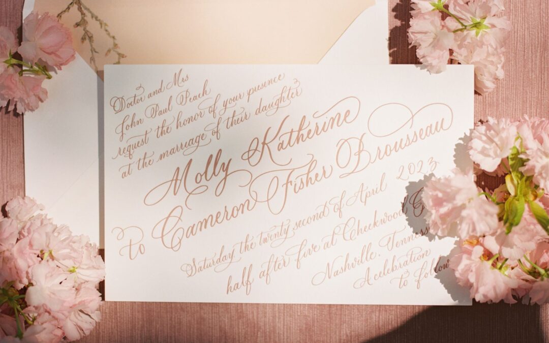
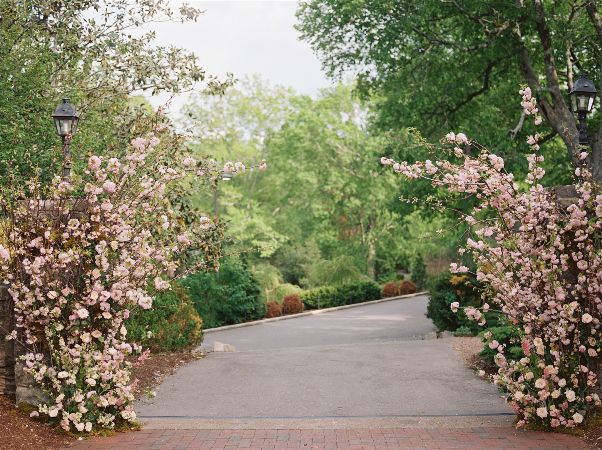
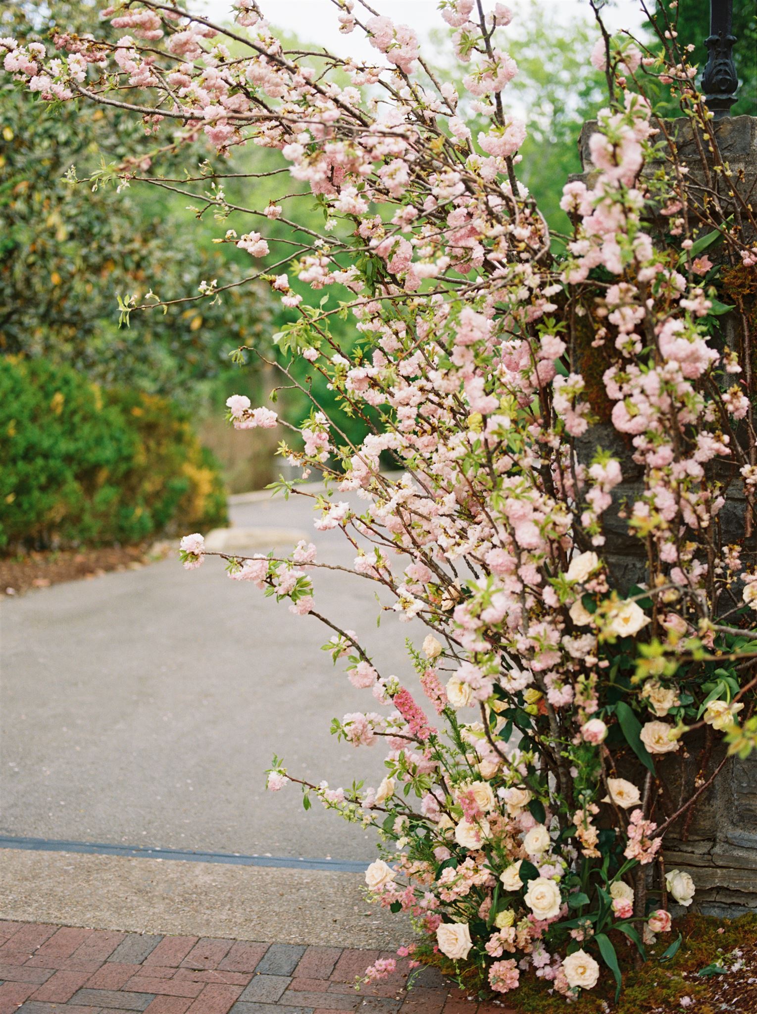
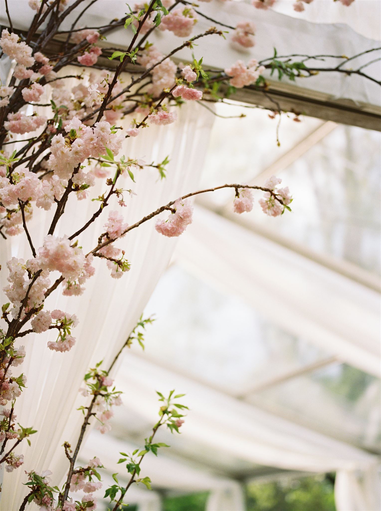
When it comes to planning a spring wedding in Nashville that can deliver an enchanting array of florals, Cheekwood Estate reigns supreme. If you know me, then you probably know about my obsession with florals, especially when it comes to invitations. There is nothing better than using the florals in an invitation suite that match the florals at the event, as well as the decor throughout the day! That is the cherry on top when designing invites and day-of-details.
Cheekwood Spring Wedding Details
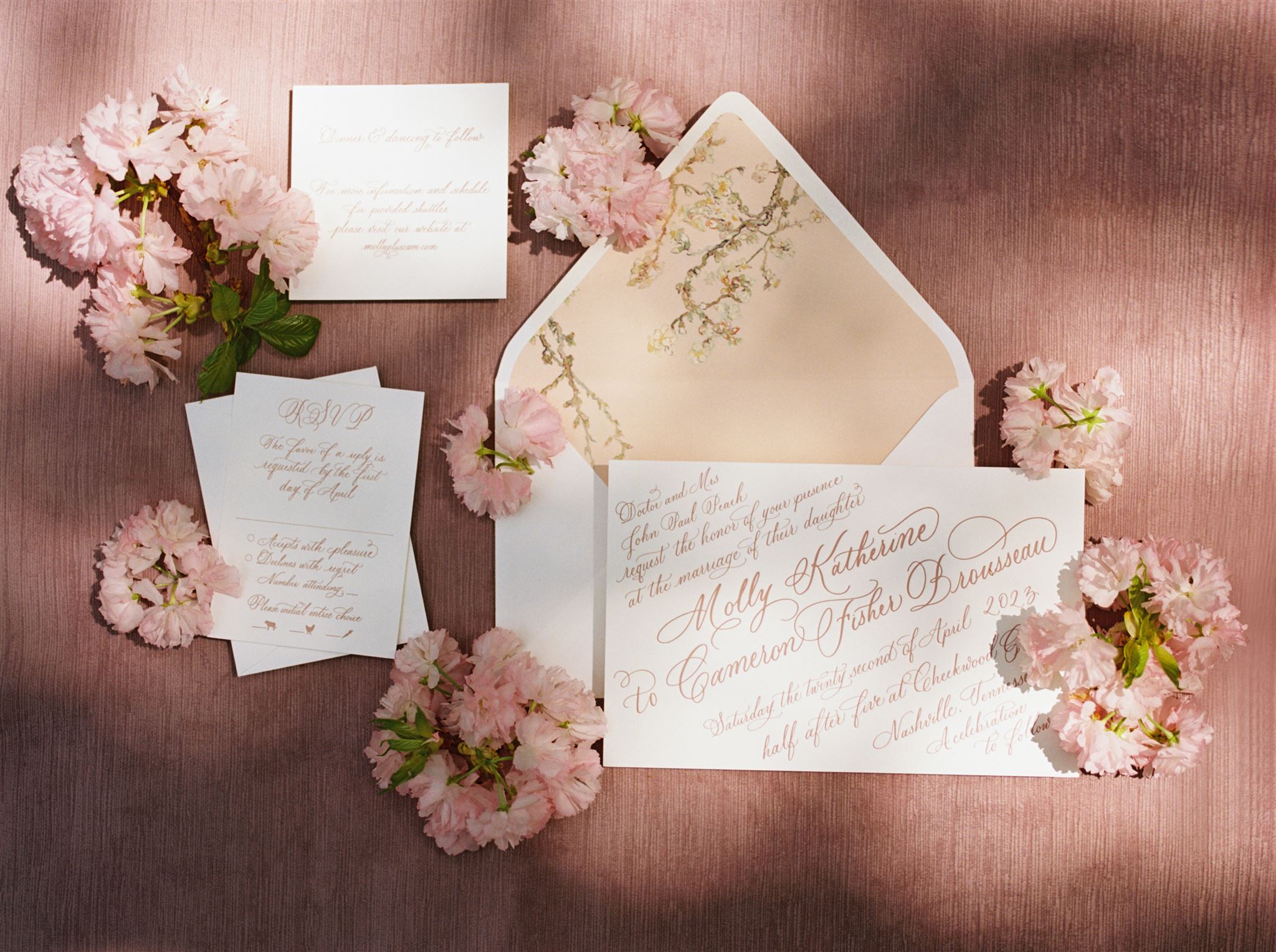
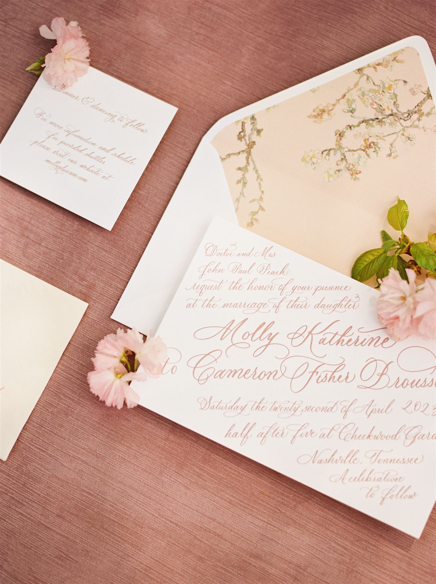
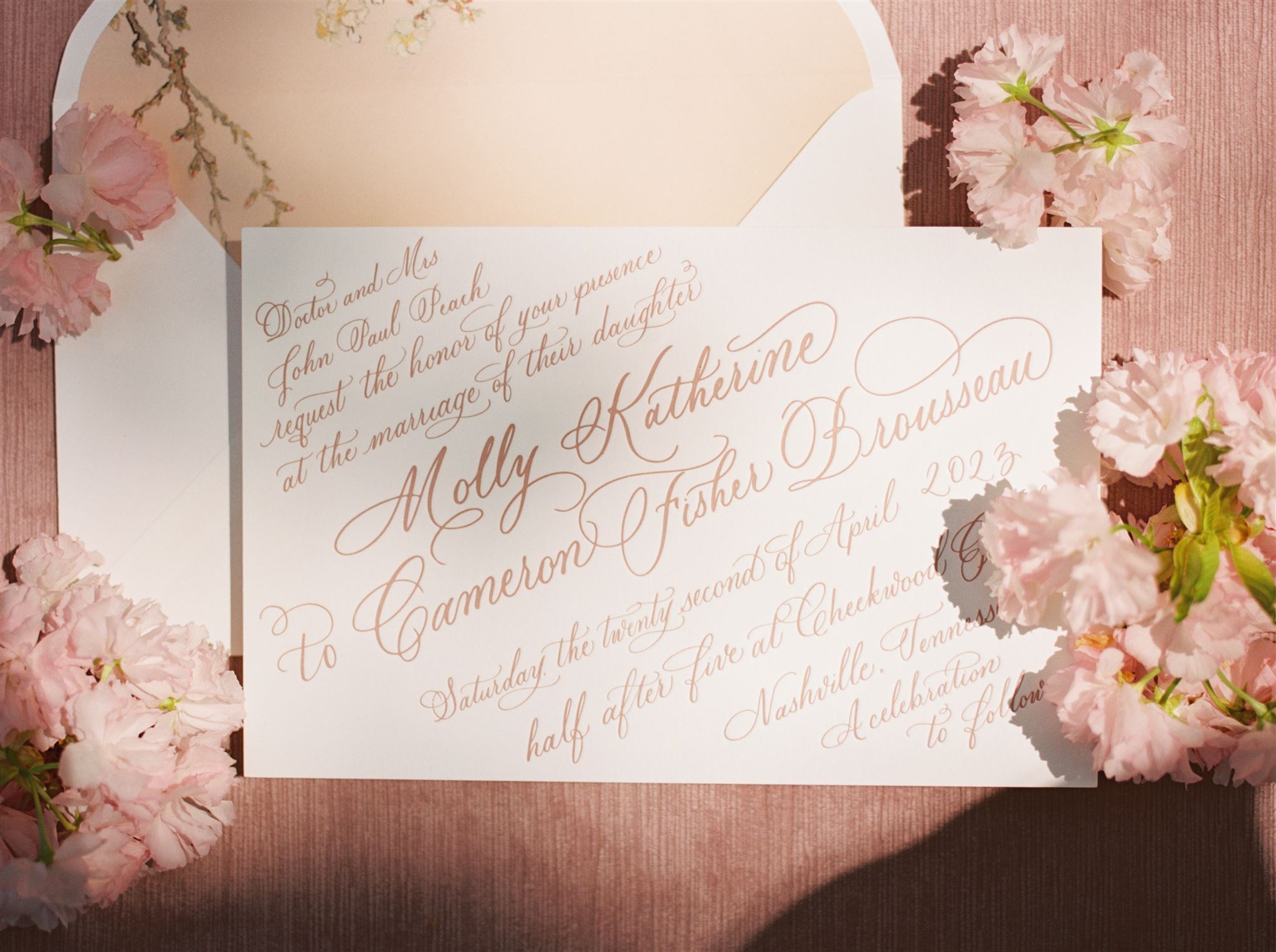
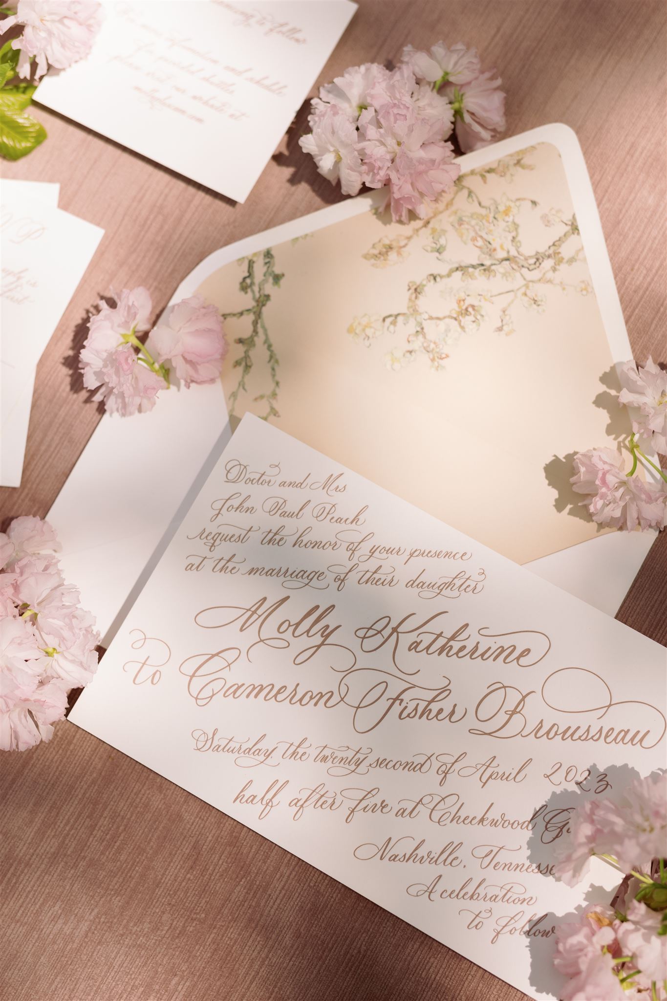
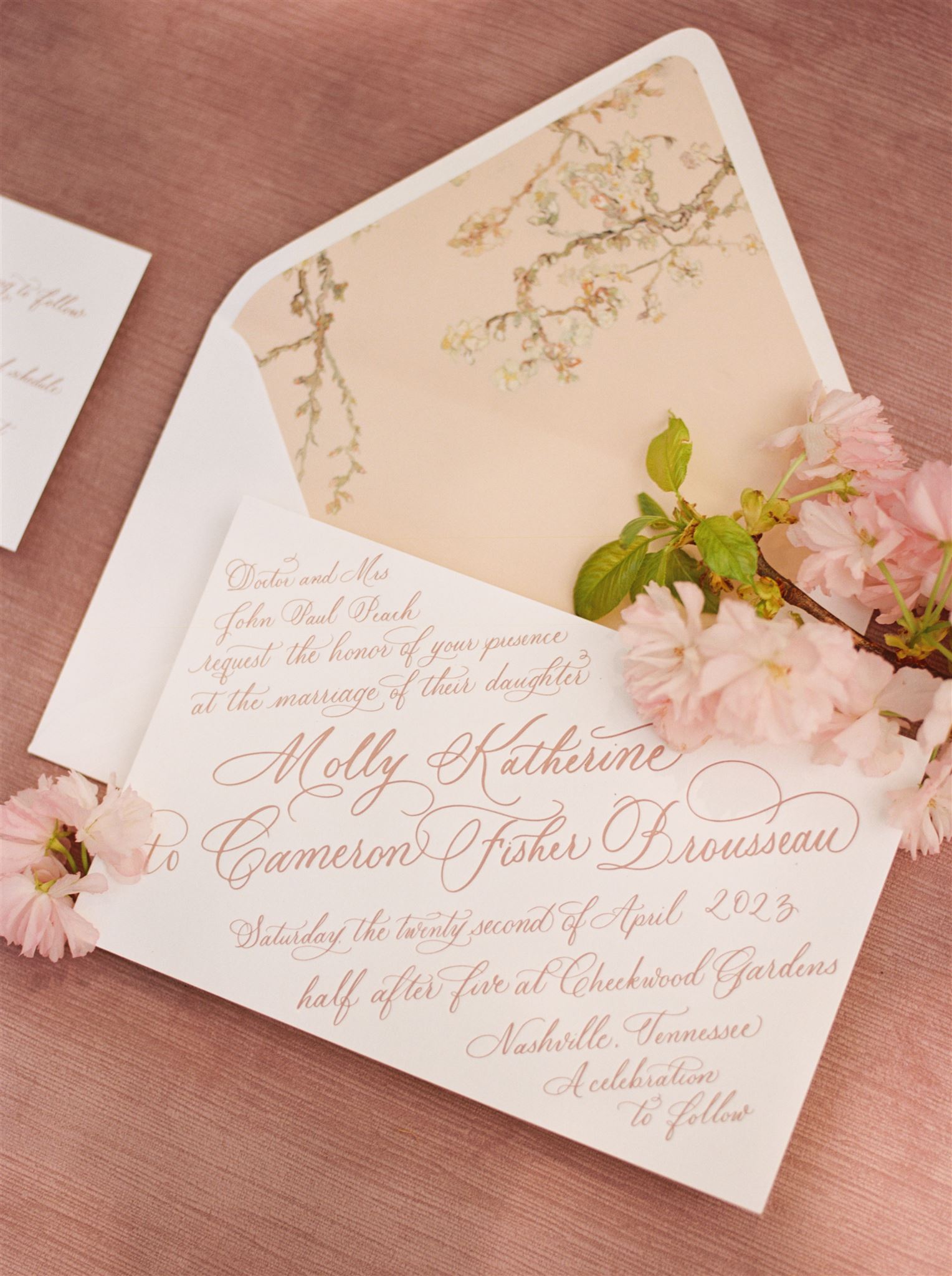
This past April, White Ink had the honor of working with the sweetest couple on their wedding day stationary details. Molly and Cam share the same love for florals that I do! Together, we created one of my favorite suites to date. I’m so excited to share this one.
This invitation suite was so inspiring for me and the White Ink team to create. We loved having the chance to let the beauty of florals and calligraphy interlace in the most magnificent ways.
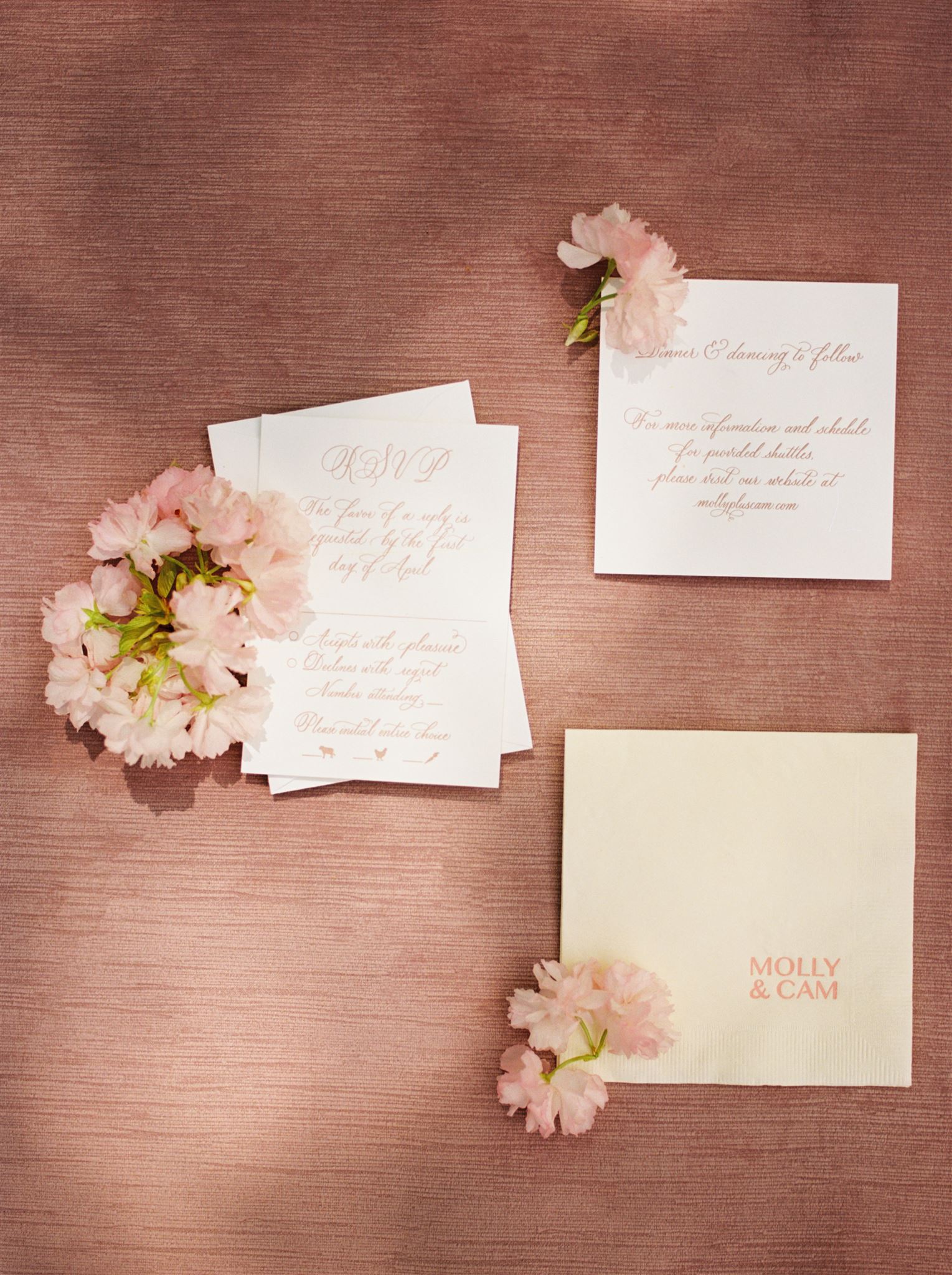
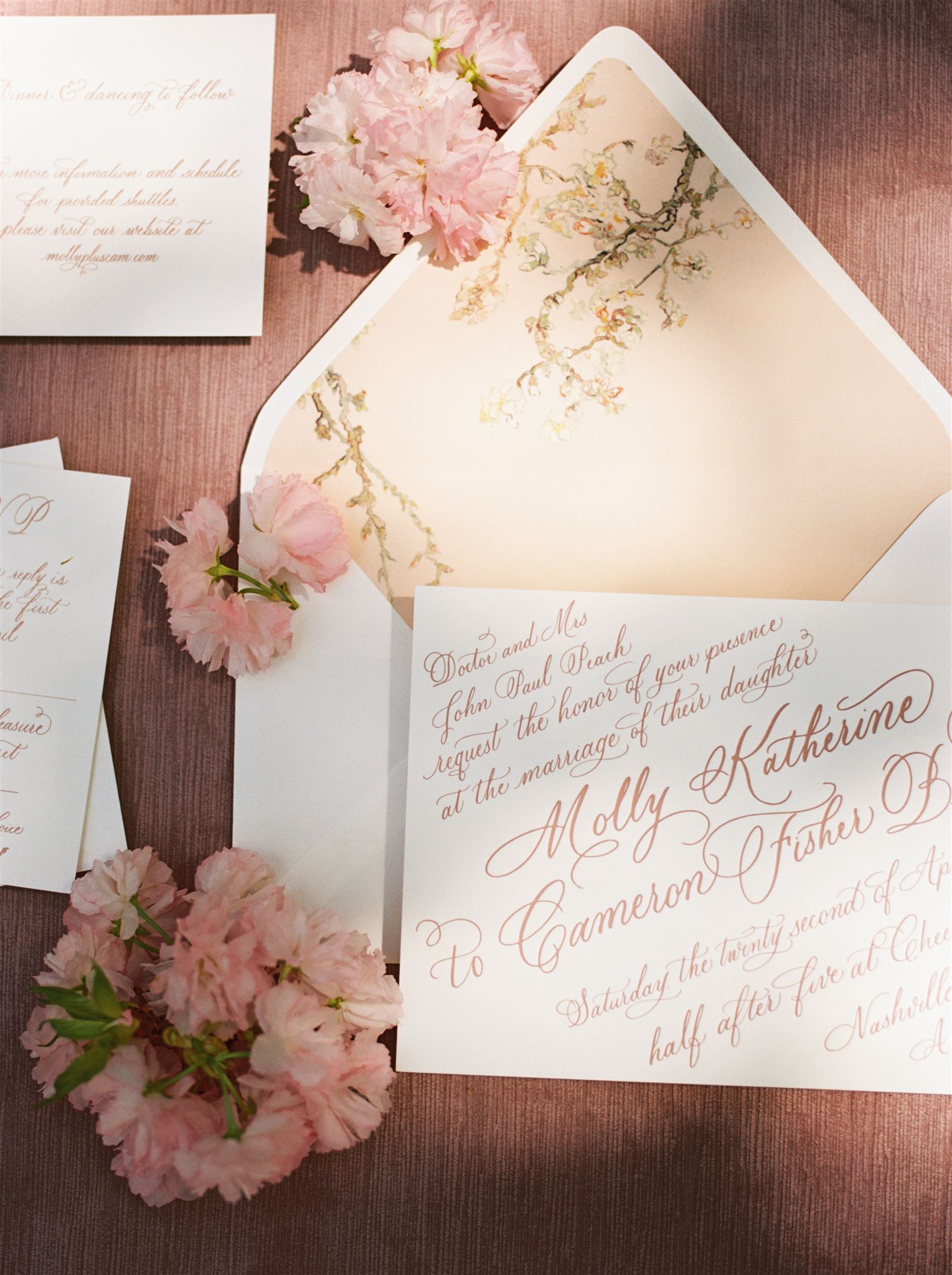
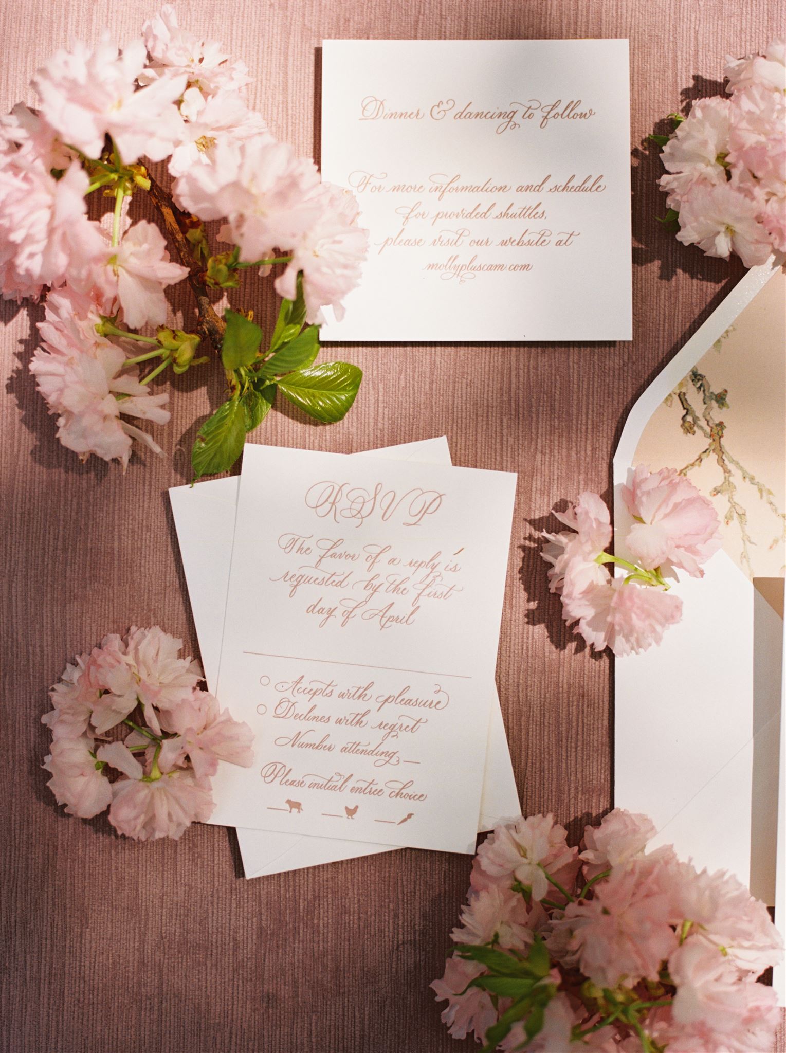
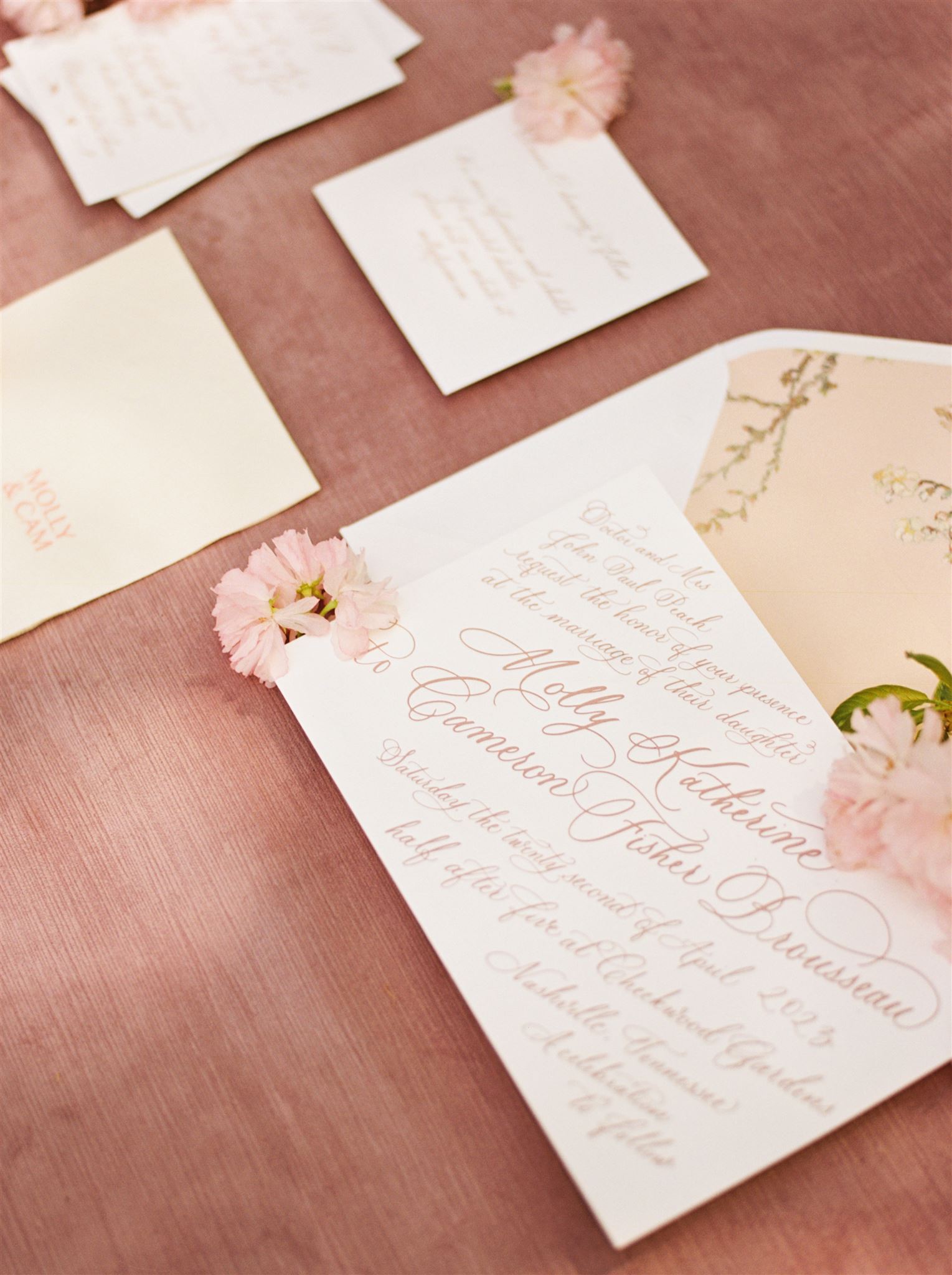
Dusty Rose Invitation Suite
To design this invitation suite we used full spot calligraphy in dusty rose ink and letter pressed onto beautiful, white stock card. I love the unique, tilted orientation of the print. Each of these details makes this invite very memorable to the guests receiving them.
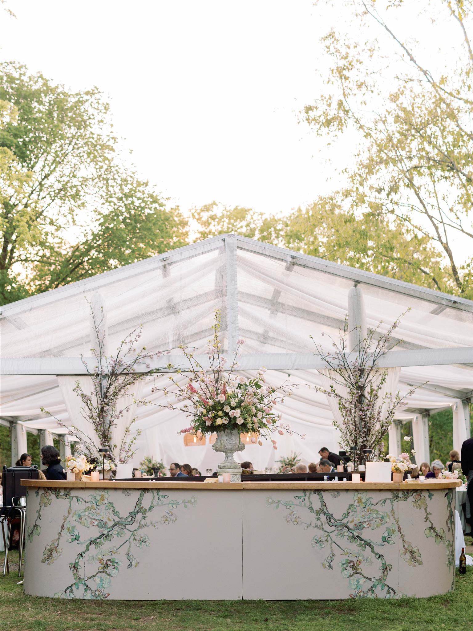
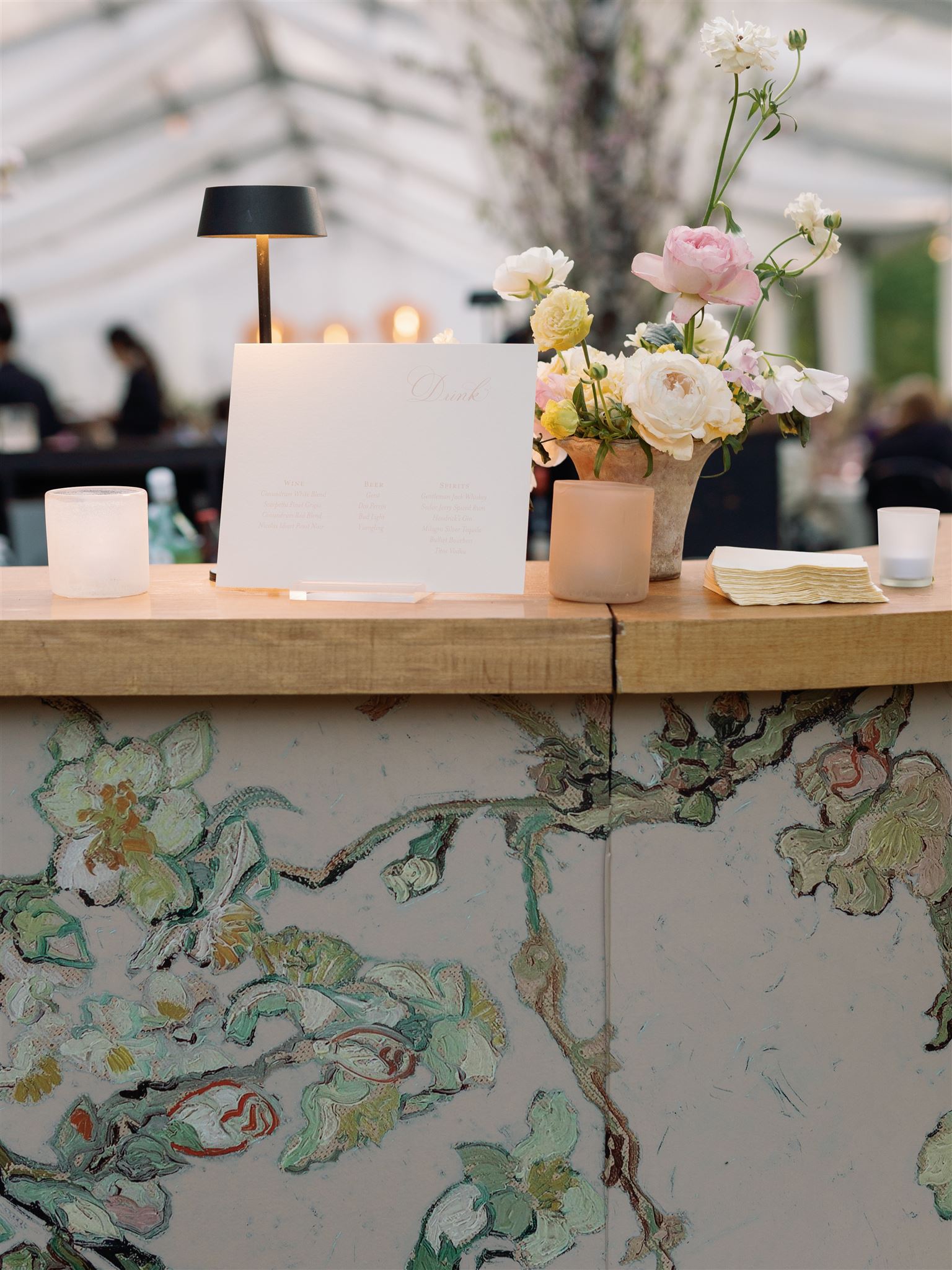
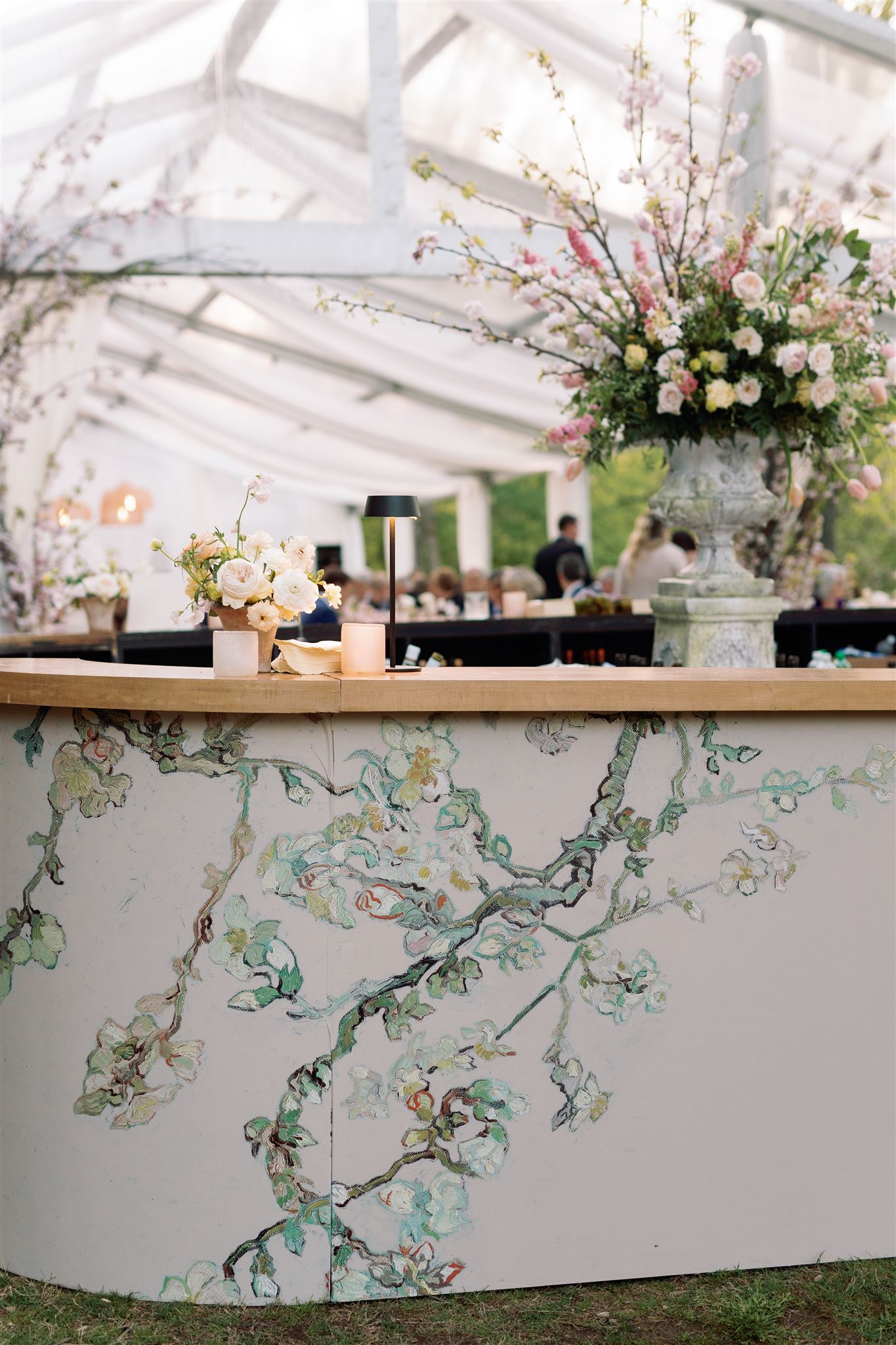
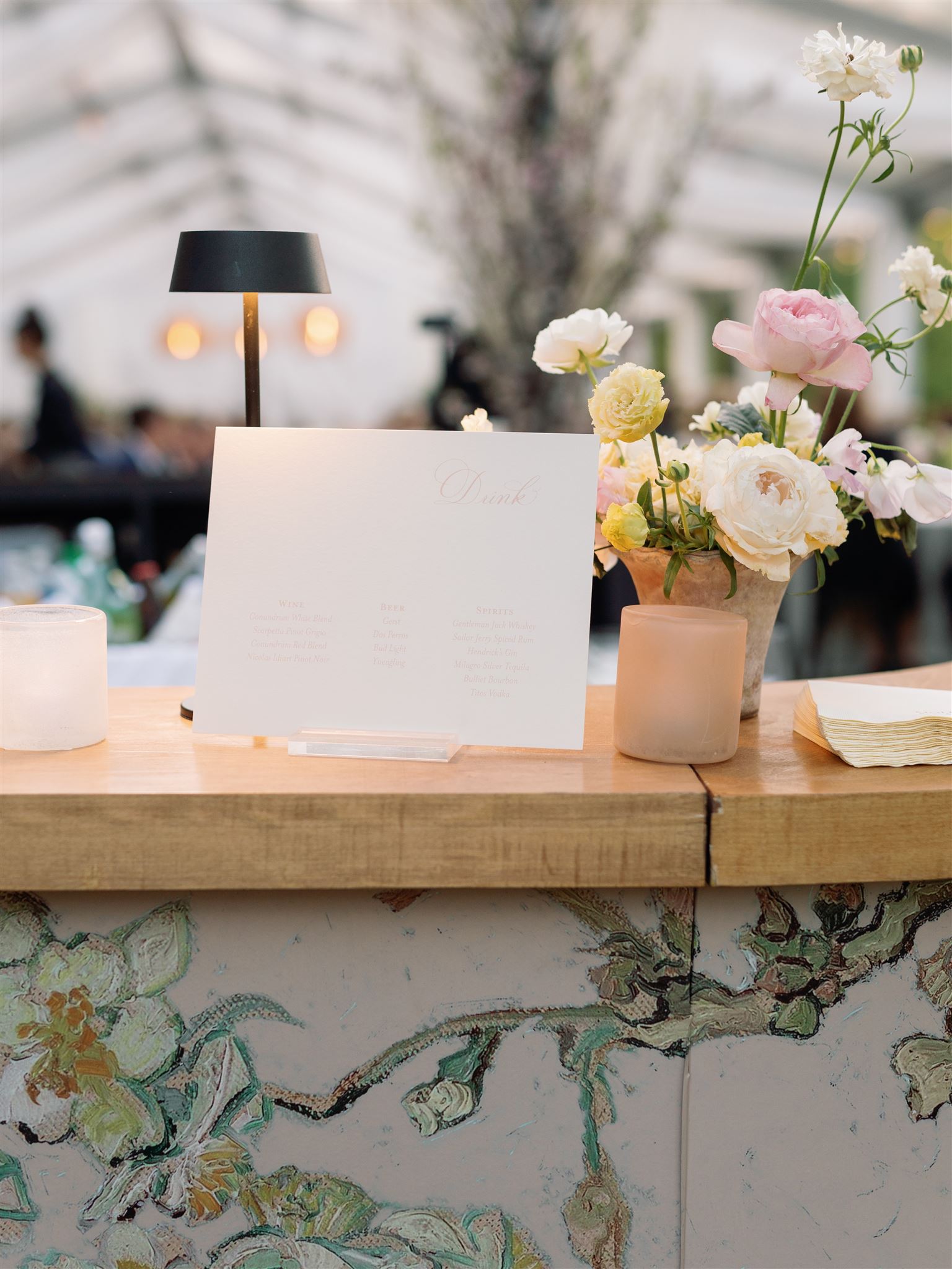
I also want to point out one of the best parts about this suite: the floral design that is printed on the beautiful dusty rose envelope liner is the very floral print that lined the bar at the reception area of the wedding day. Tying together wedding day details is a top-tier move. Tying together floral details is magical.
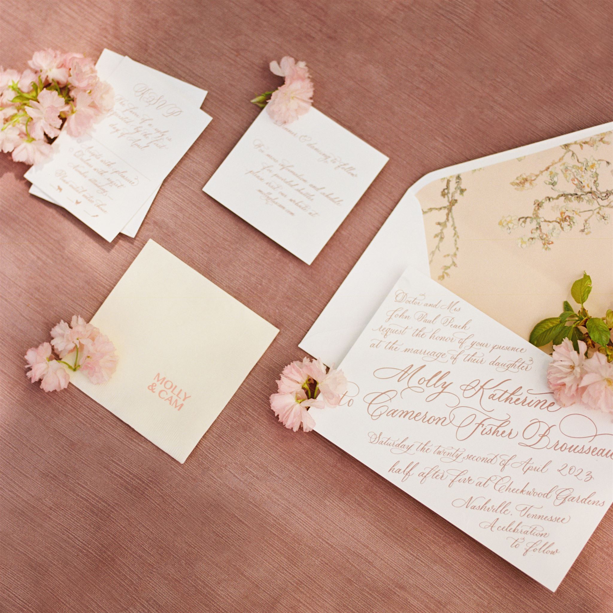
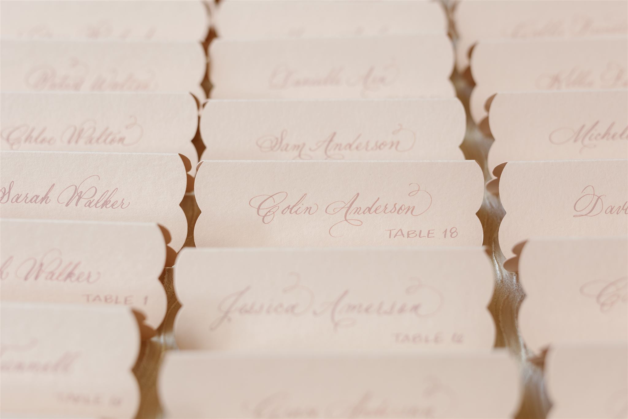
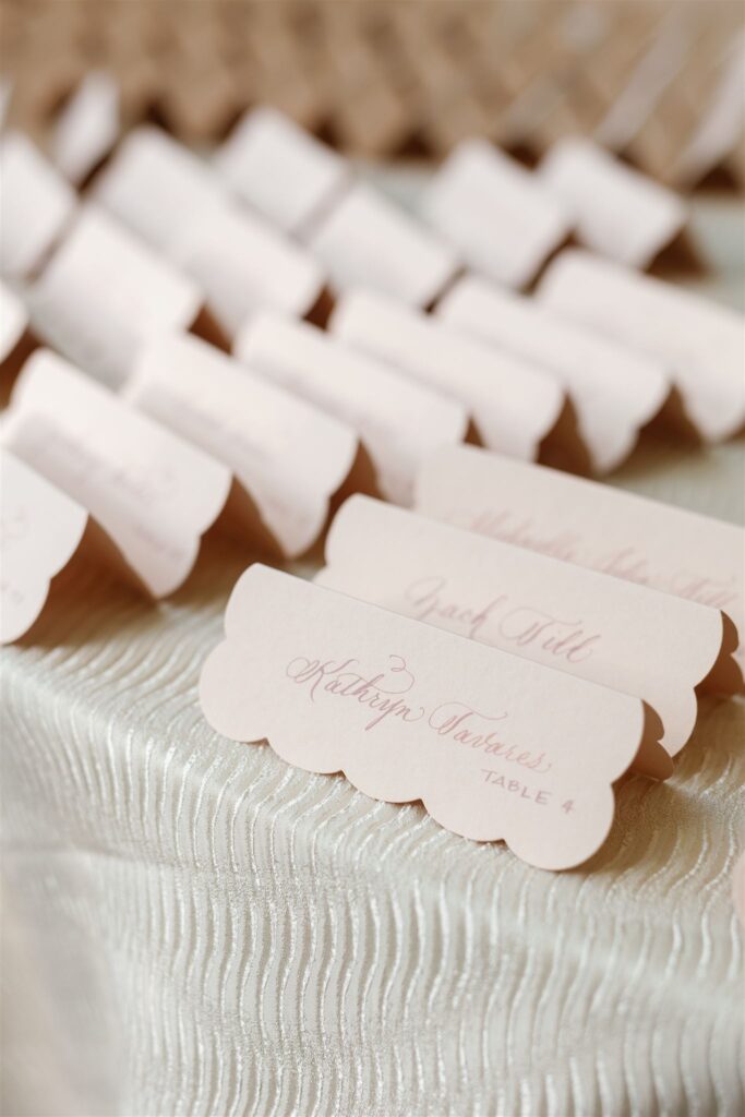
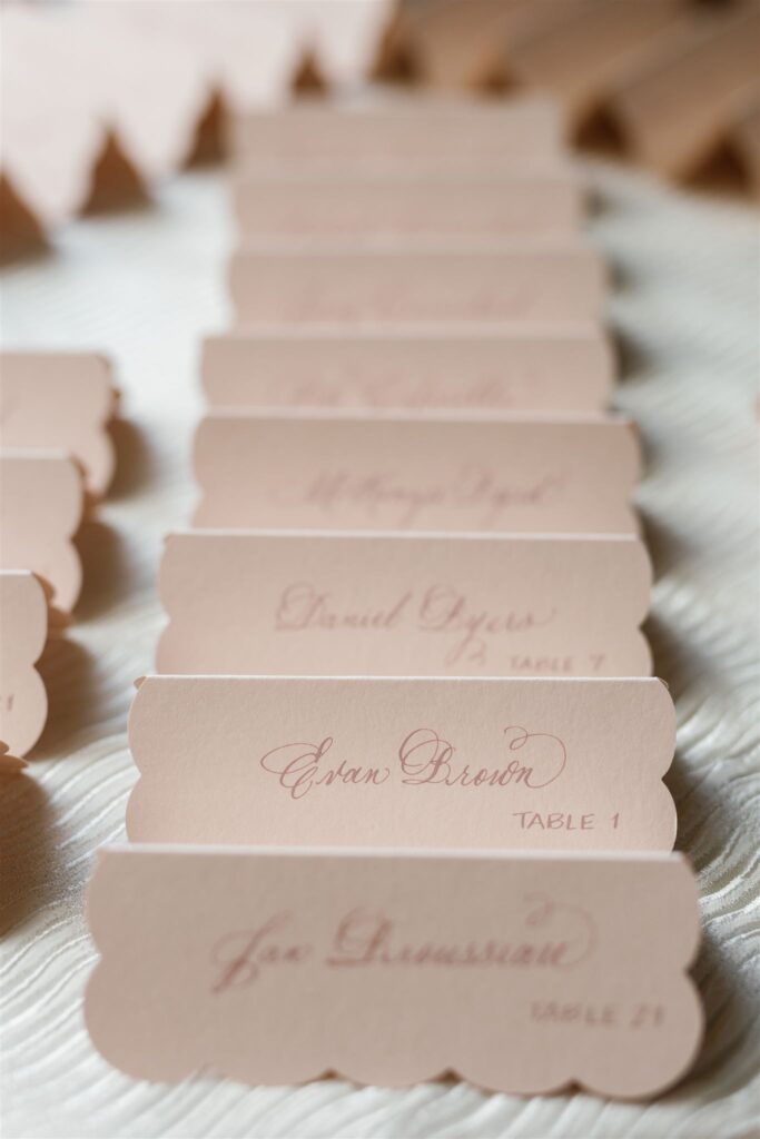
Custom Escort Cards
Our fun continued with Molly and Cam’s guest escort cards. These cards were done using delicate scalloped cardstock in a dusty rose color (a fast favorite for many of our clients!), with Spot calligraphy.
A grand, round, linen table topped with bold florals in the center displayed these gently designed escort cards, which I personally loved! It’s all about balance, and this is a gorgeously perfect example.
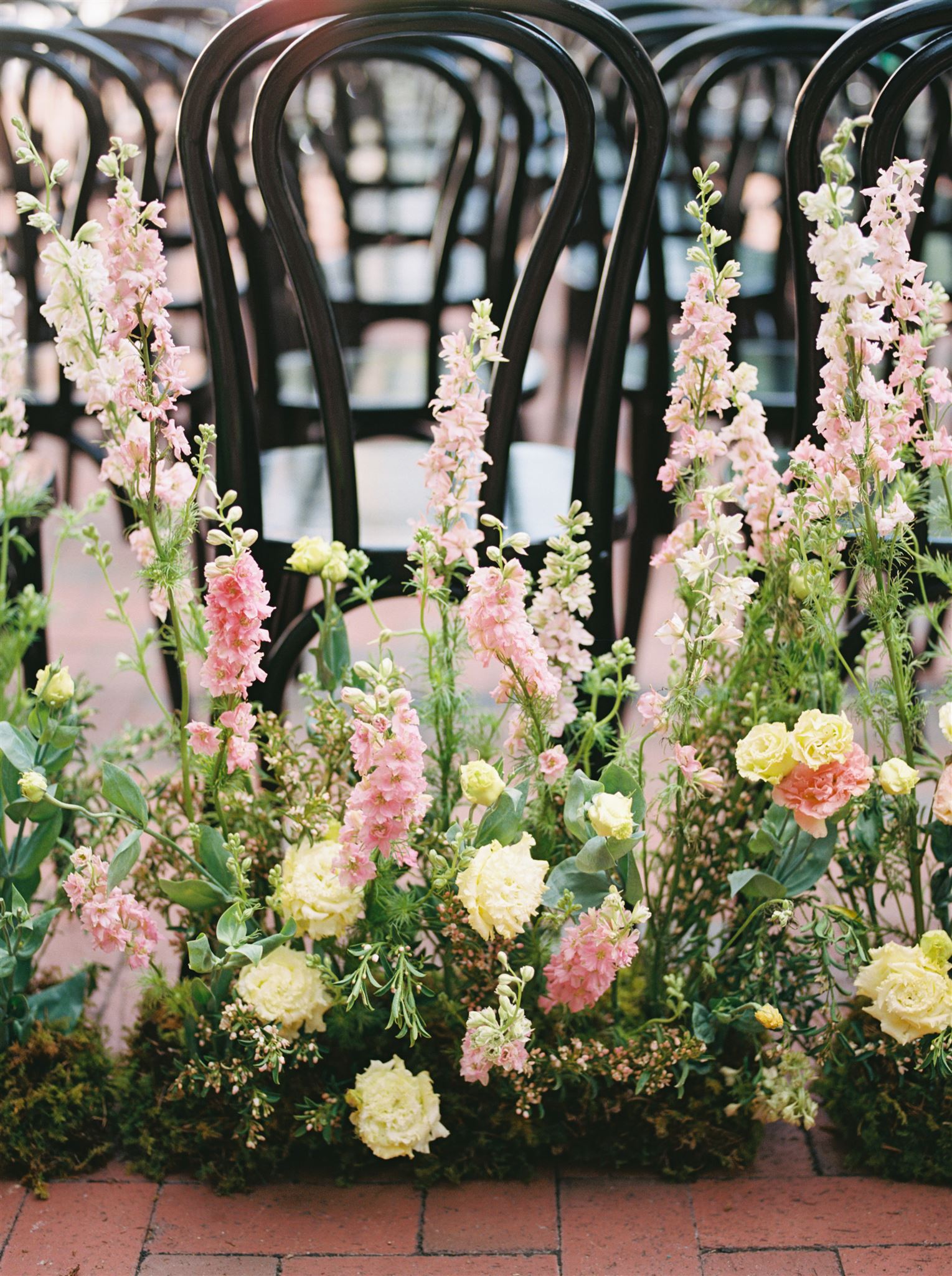
Molly and Cam took the time to bring in florals throughout the wedding day decor. The remarkable scenery of Cheekwood only enhanced these beautiful details. I look back on this project fondly and I am so proud of how wonderfully it all came together for our amazing couple. The florals seem to speak their own special language that people intuitively understand. Florals represent life and love. Florals are forever.
If you’re looking to add custom, thoughtful touches to your wedding or event, we would love to help make your vision a reality. Reach out today to learn more about our full-service design offerings—we can’t wait to create something unforgettable for you!
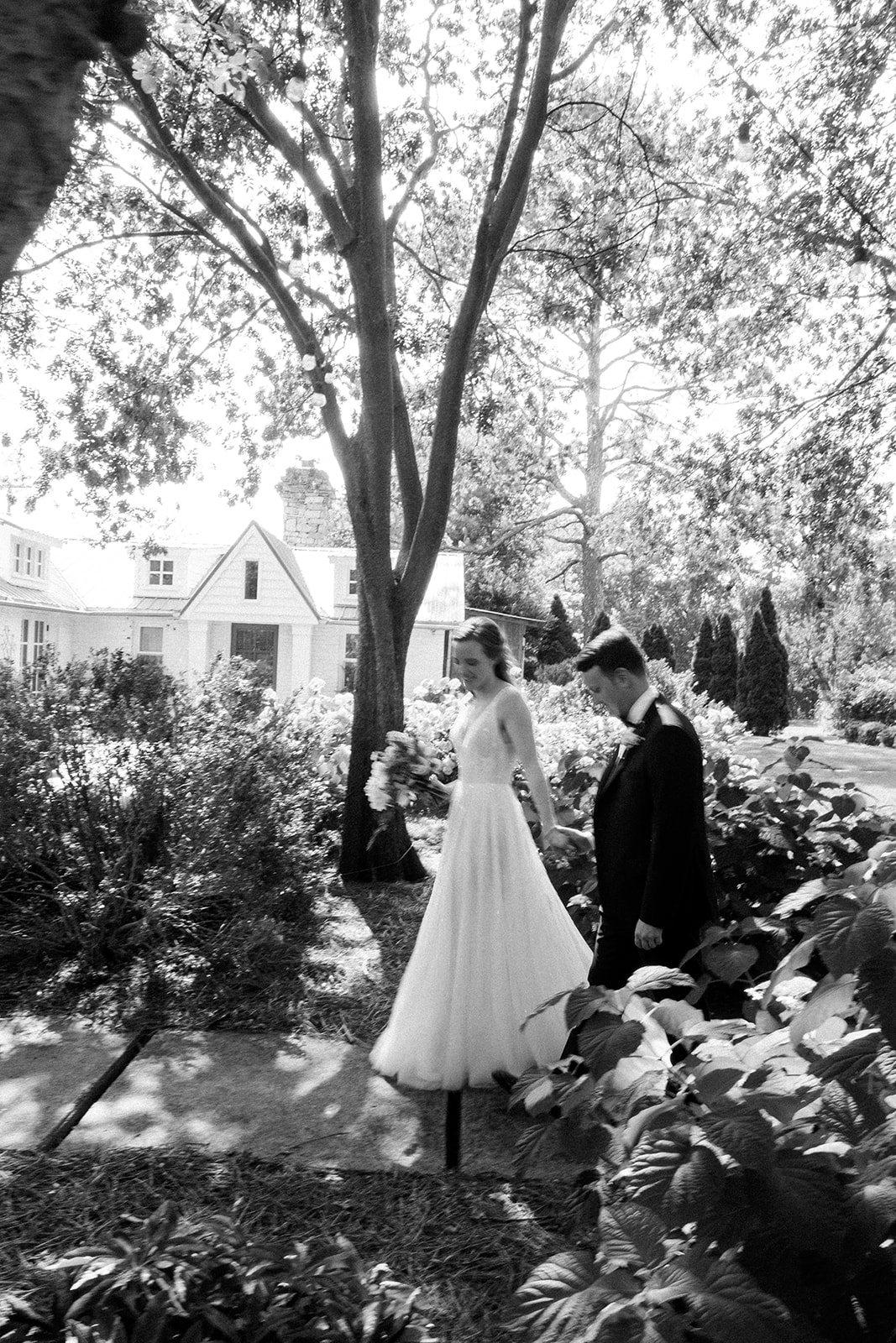
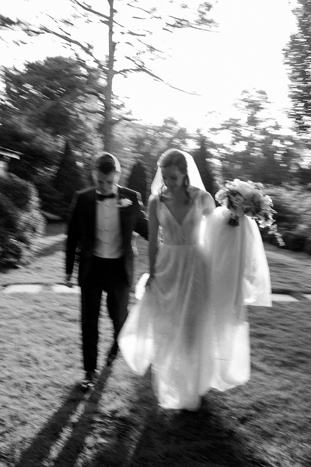
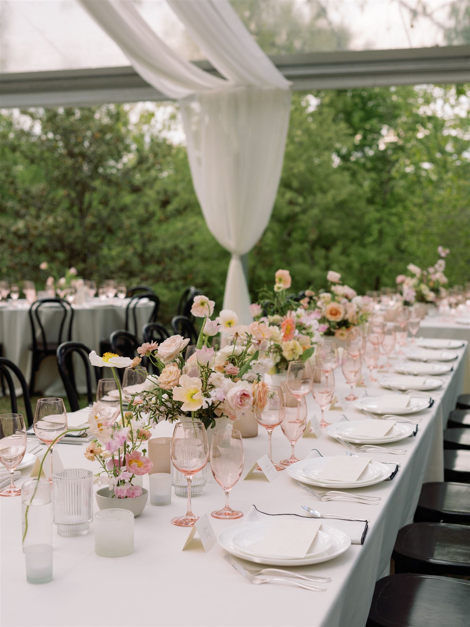
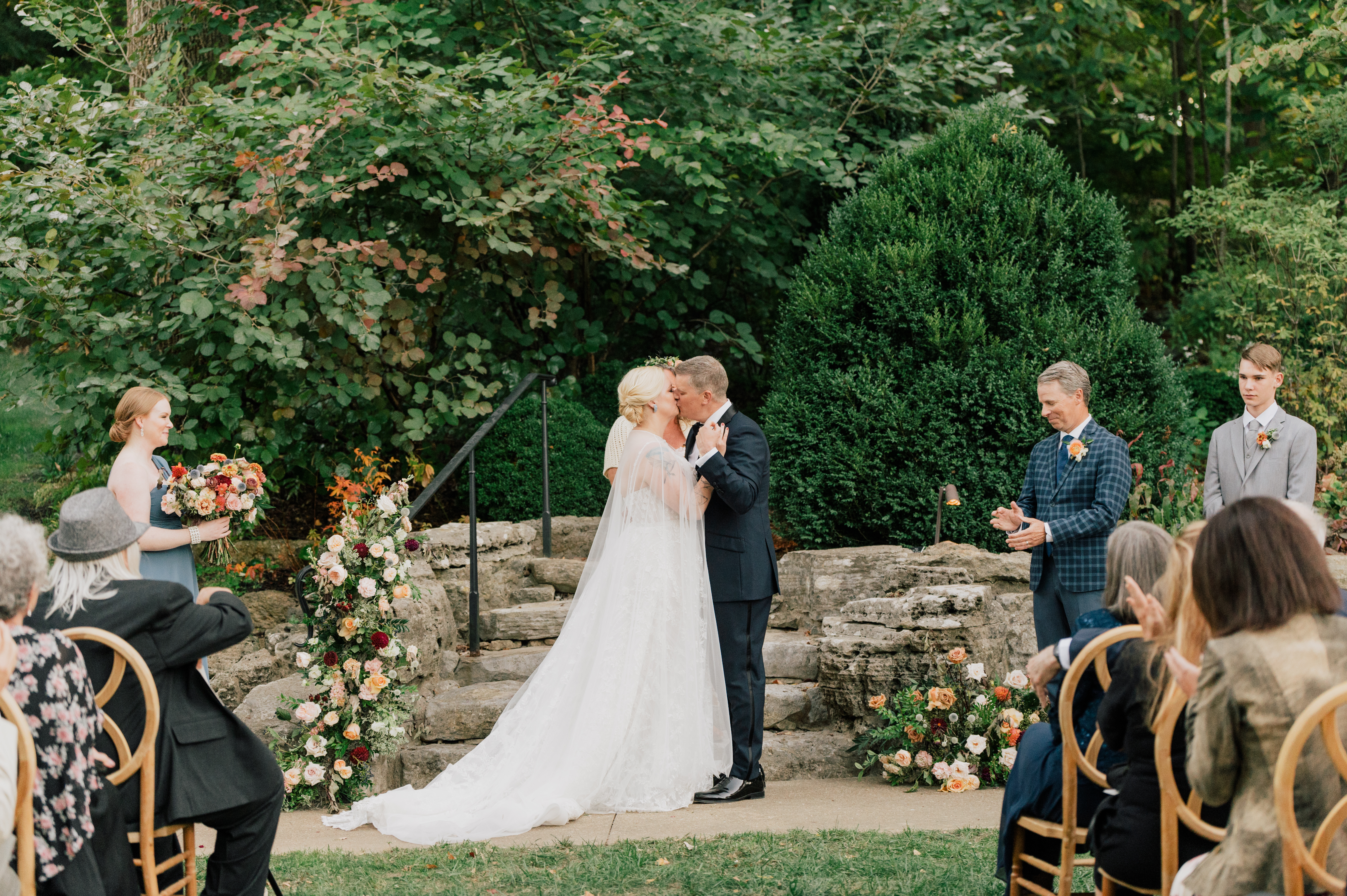
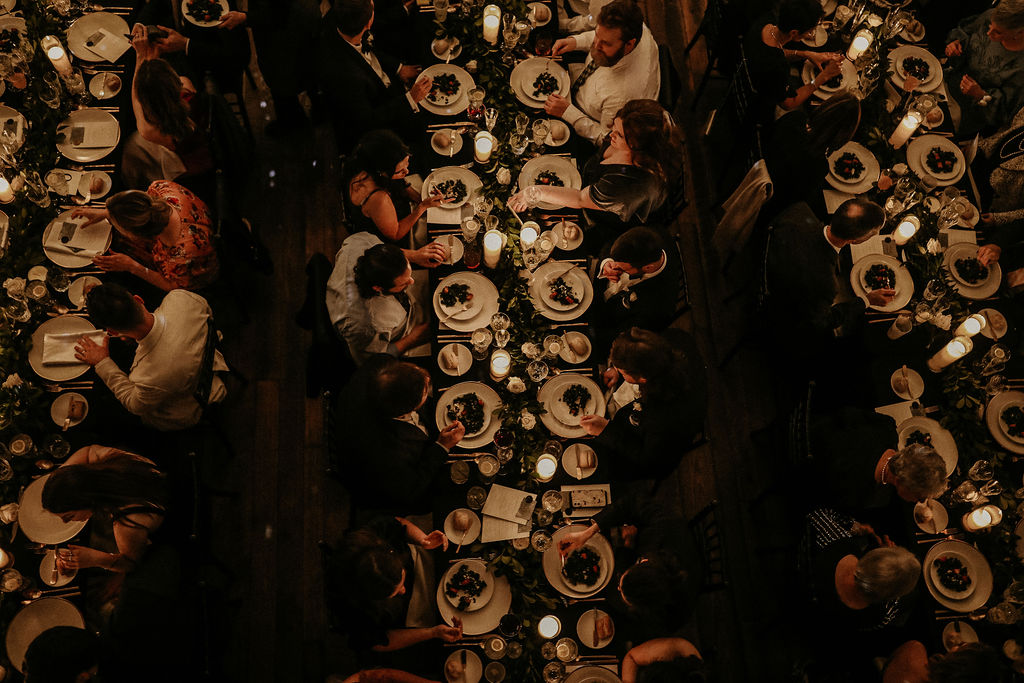
I am honored beyond words that I get to work alongside so many amazing vendors for weddings and other major events. It is a community that I never knew I needed. We all may have different jobs, but in the end, we are working towards one goal- giving our clients the wedding/event of their dreams! Taking part in the beautiful nuptials of our couple, Emma and John, last October gave us a front-row seat to one of the dreamiest weddings we had the pleasure of being a part of. I’ve been excited to show you all of the personalized details that made this wedding exceptional. In truth, there is a lot of hard work that goes into a wedding day, but the effects of that dedication last far longer than just a single day; we help create the details that are put into memories that last forever.
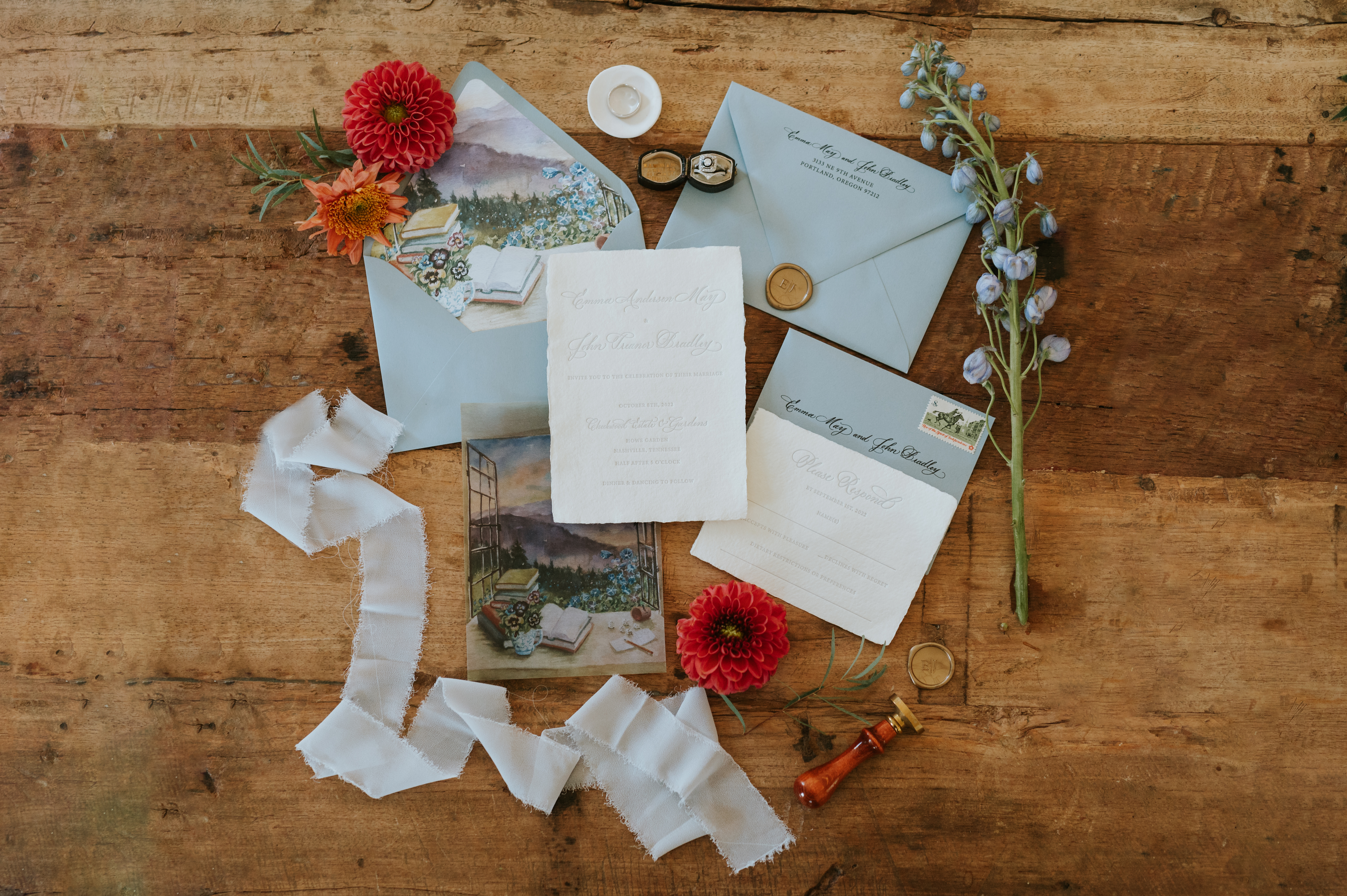
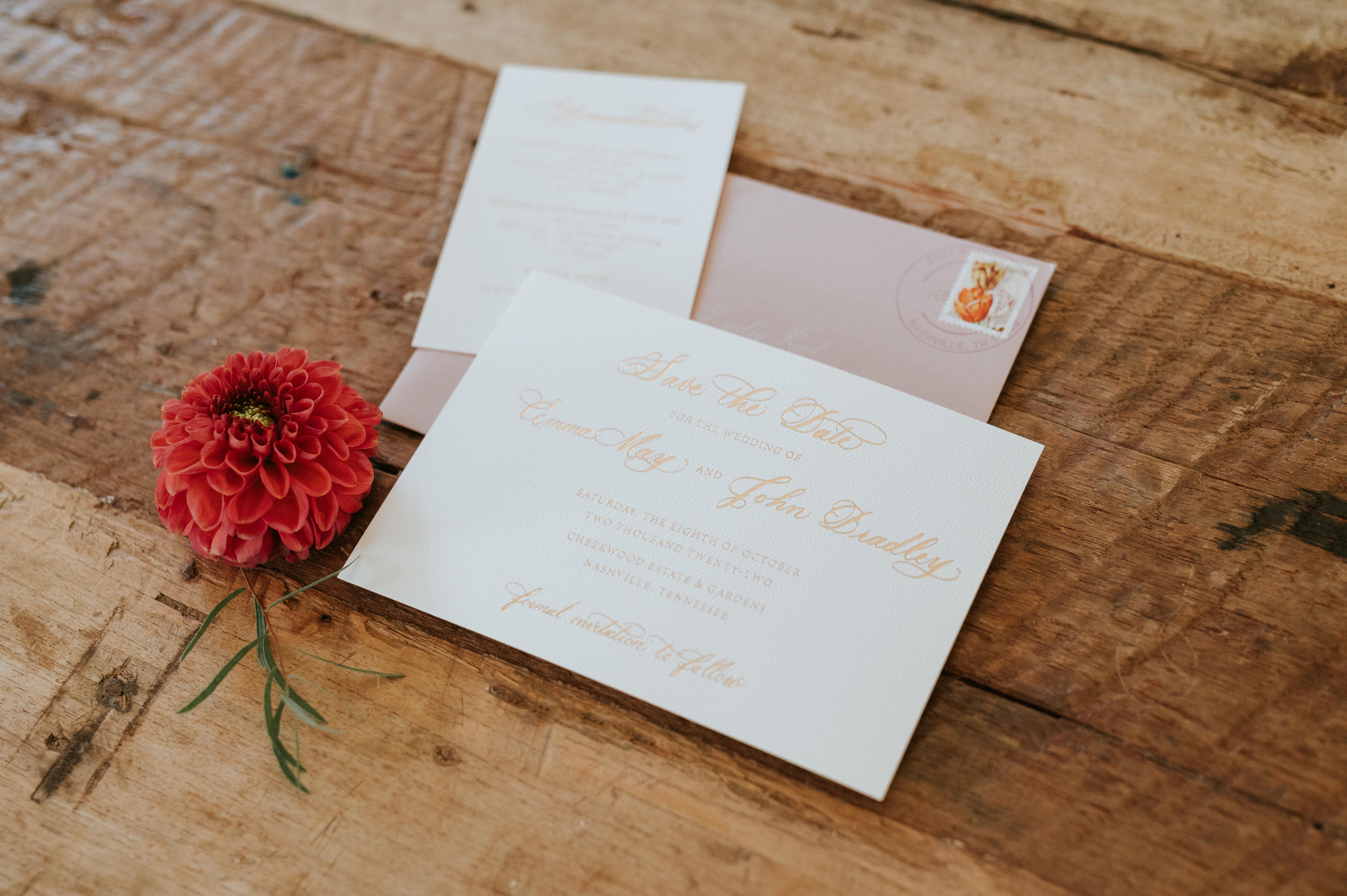
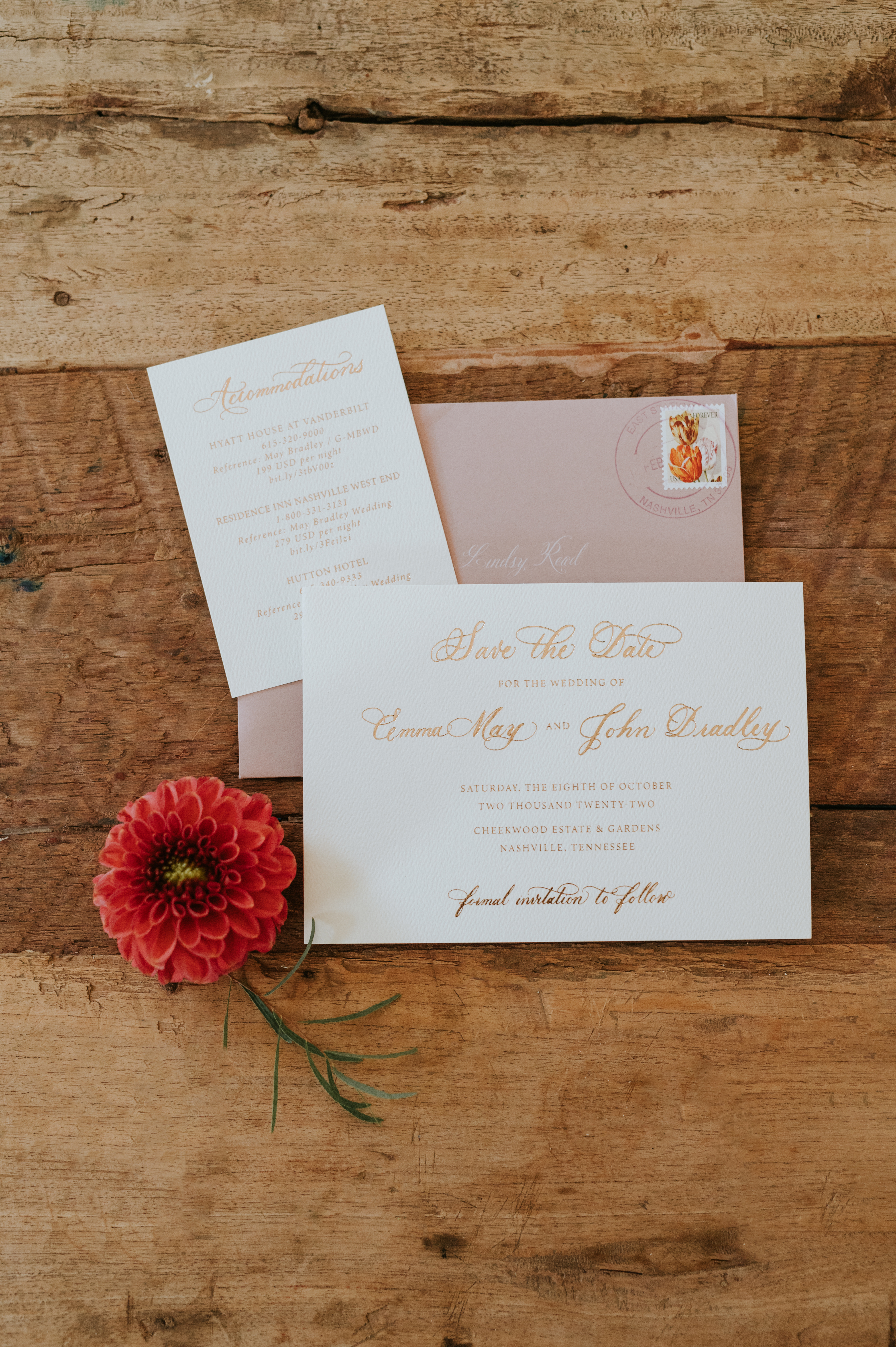
Emma and John’s save-the-date was done using card stock topped with gold calligraphy and tucked into a warm, dusty rose envelope giving it a most delicate and inviting feel. I like to imagine the smiles people give when opening up these happy color combos.
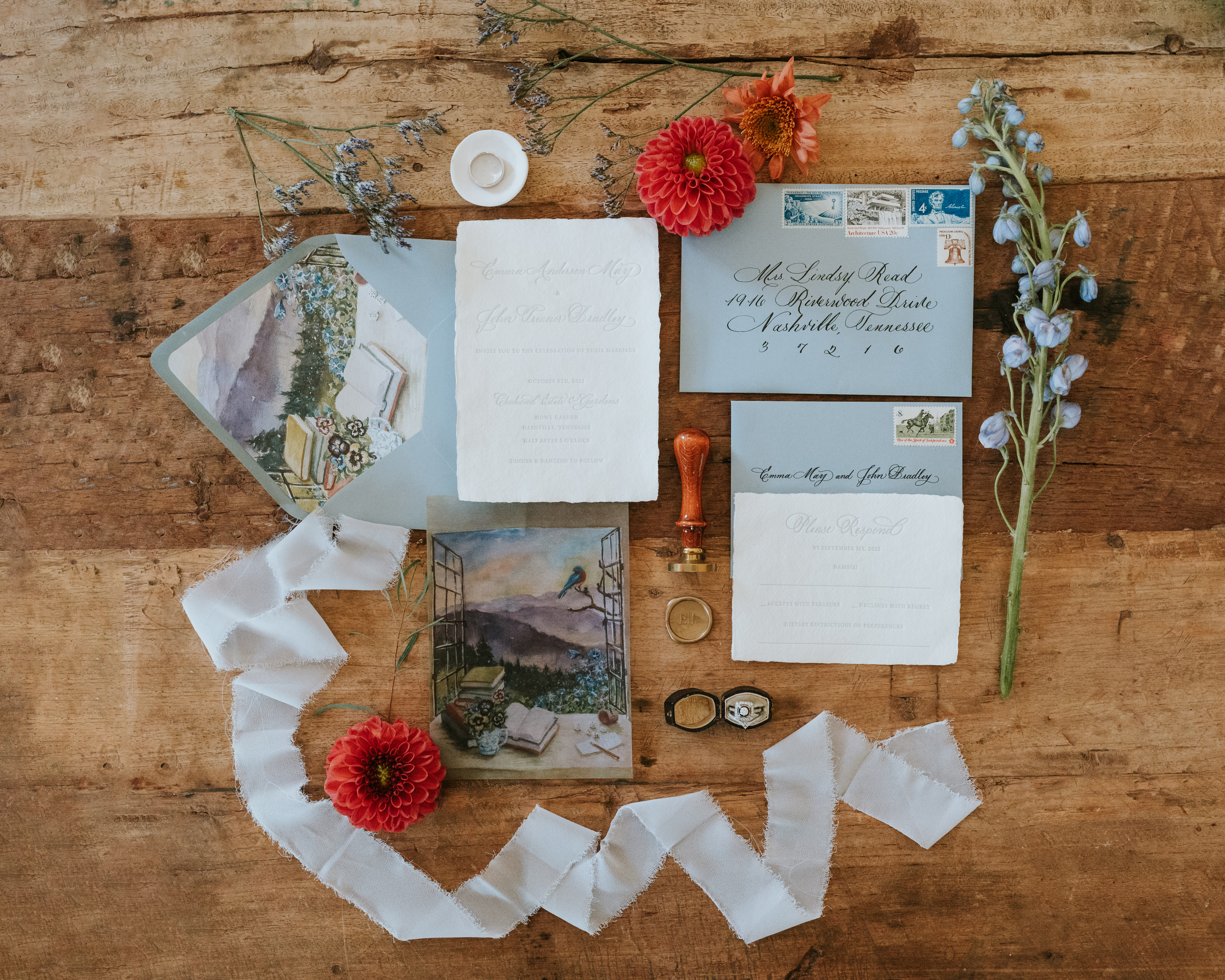
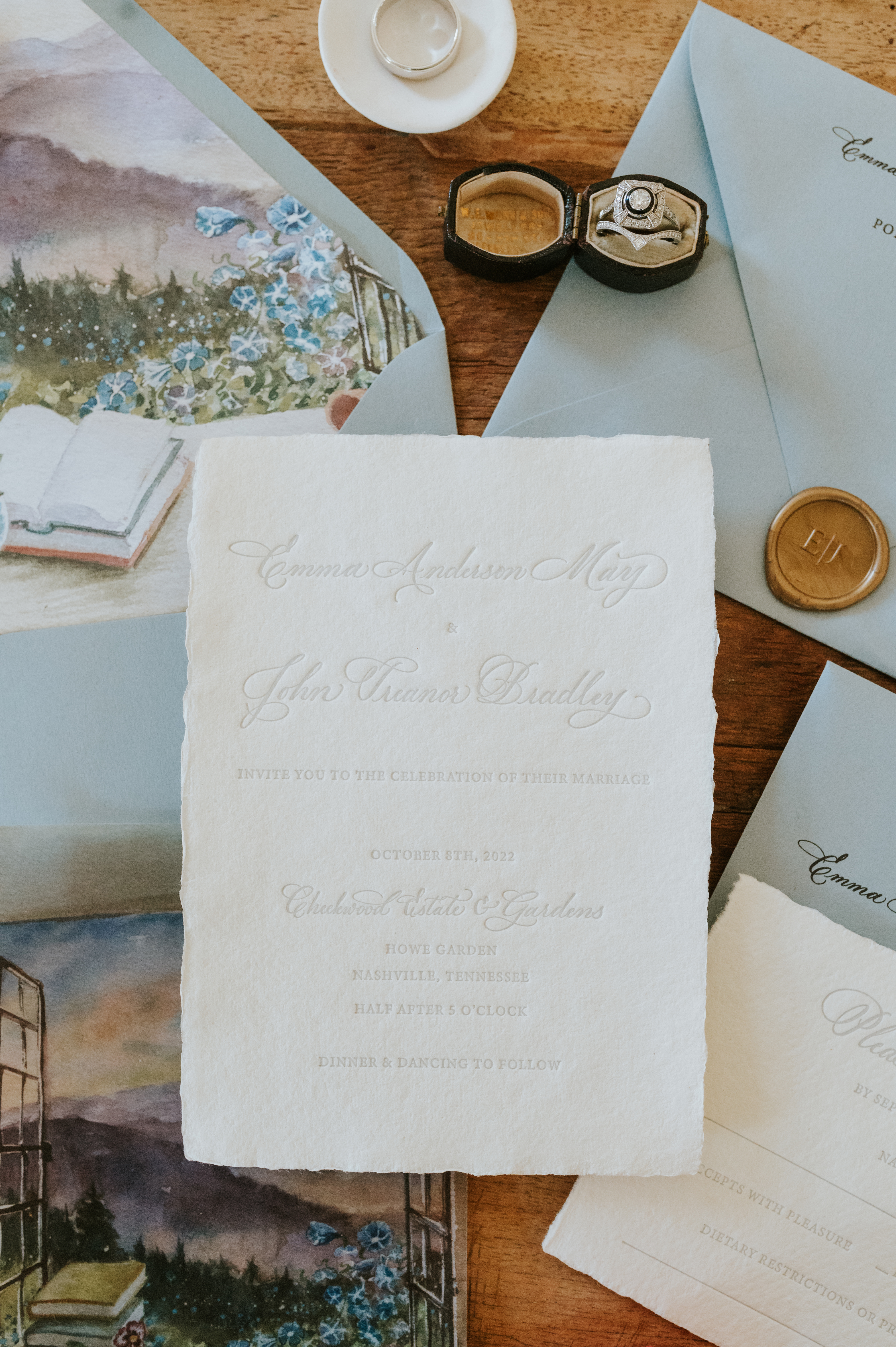
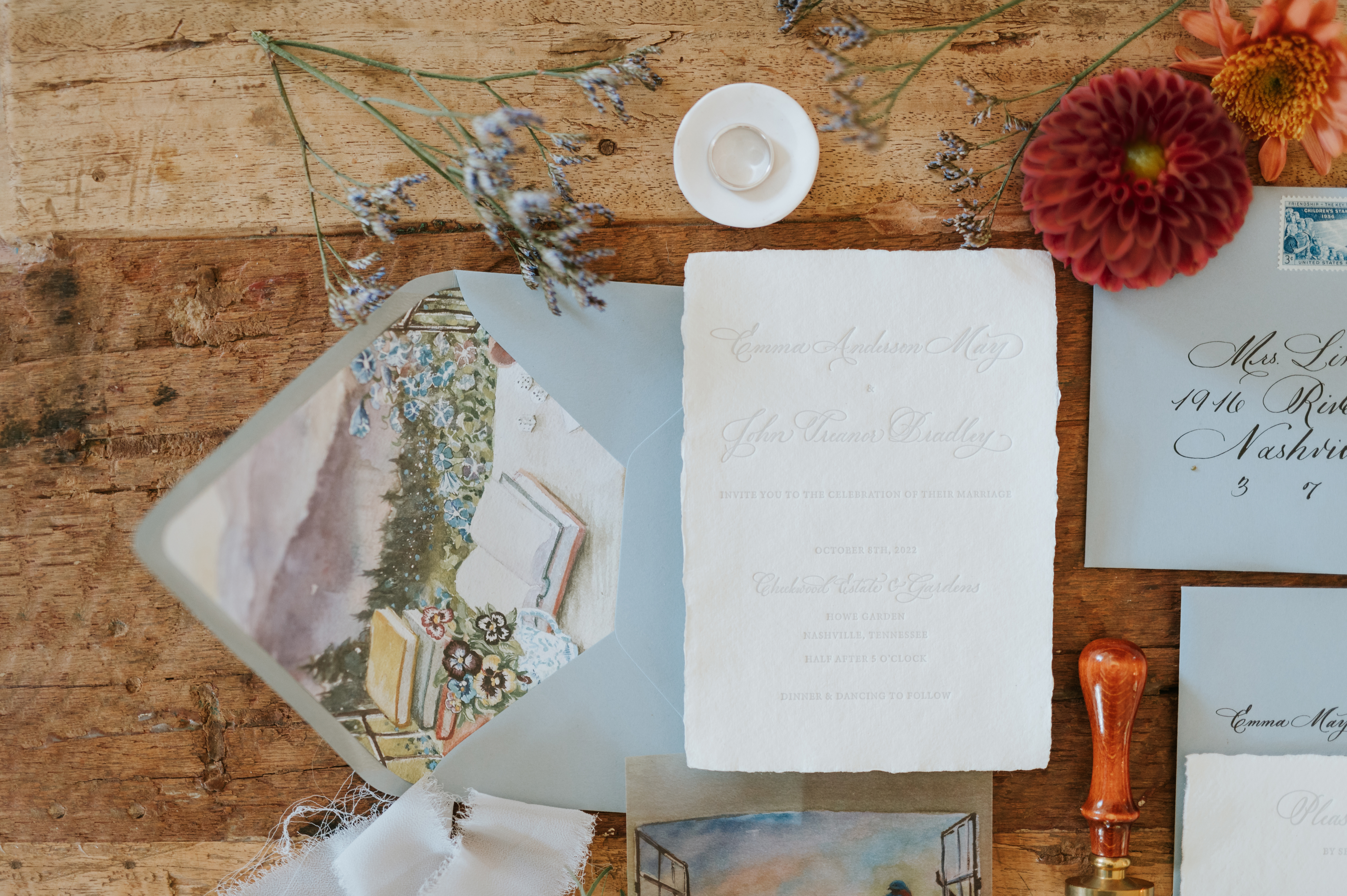
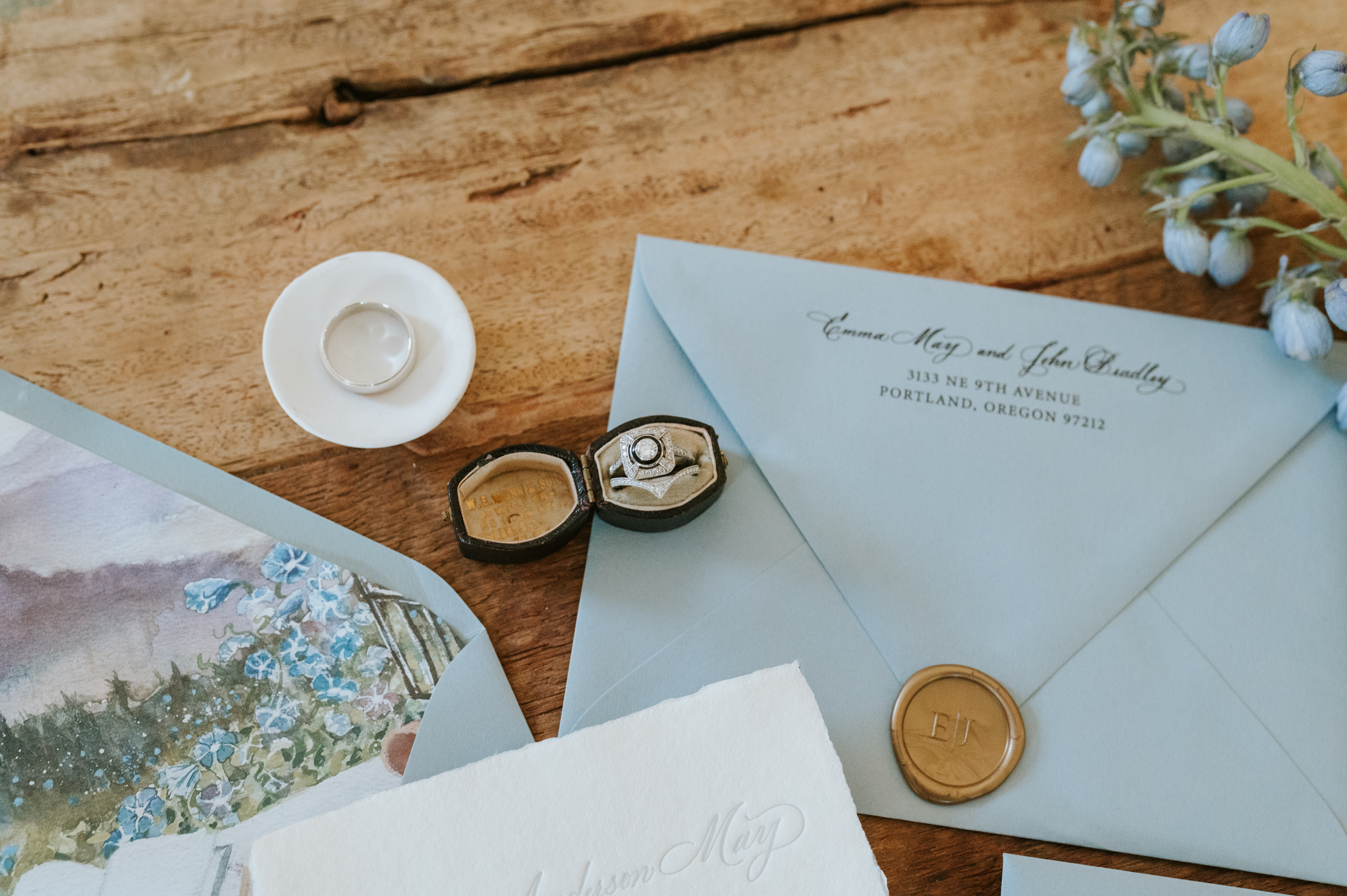
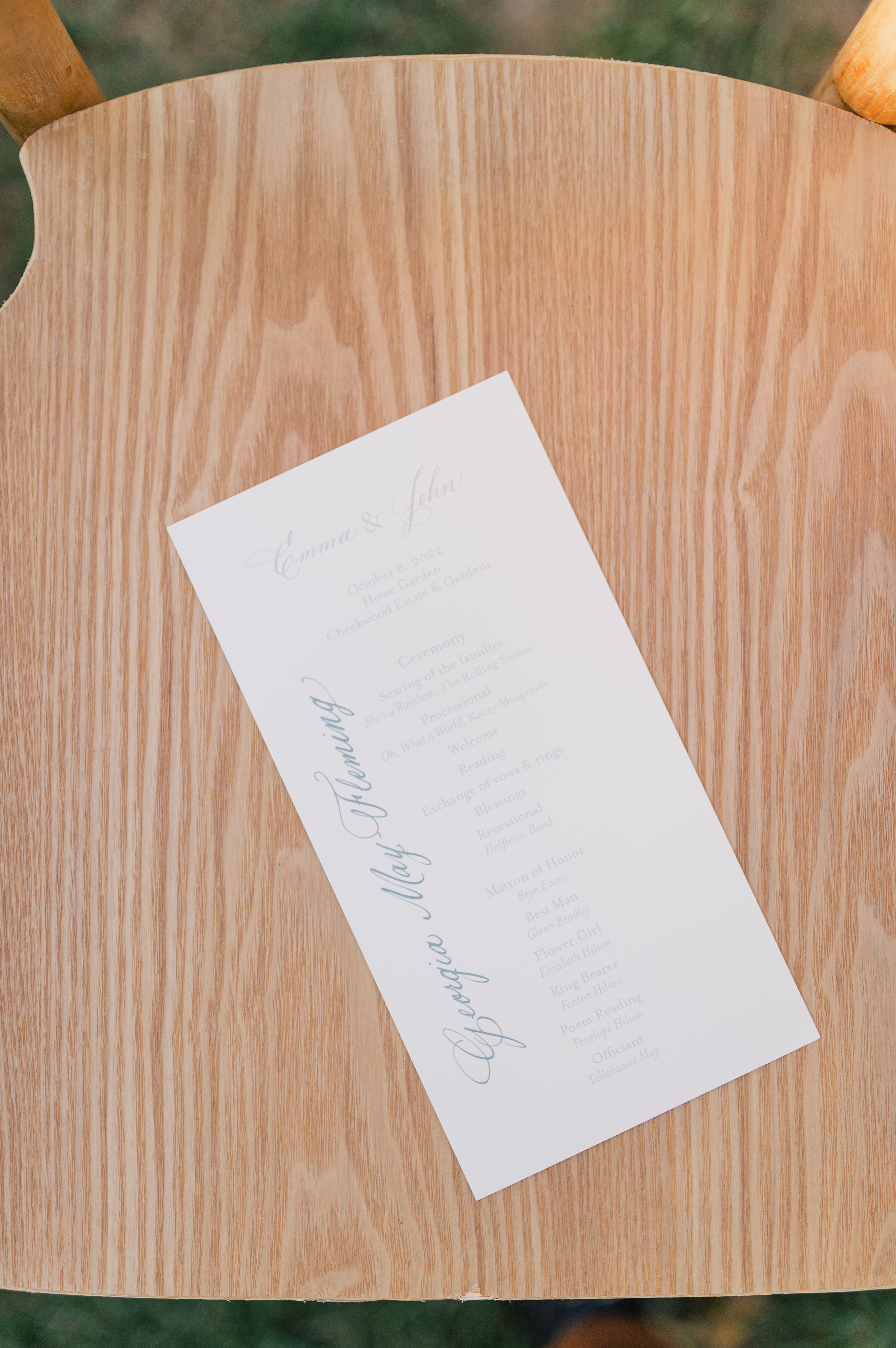
This invitation suite steals the show. For me, this is about as good as it gets. The invitation was done in letterpress on handmade paper (yes, handmade paper). I especially love how Emma and John went from a dusty rose save-the-date envelope to dusty blue invitation suite envelopes. The envelopes were closed with a gold, custom, monogrammed wax seal. (Icing on the cake!)
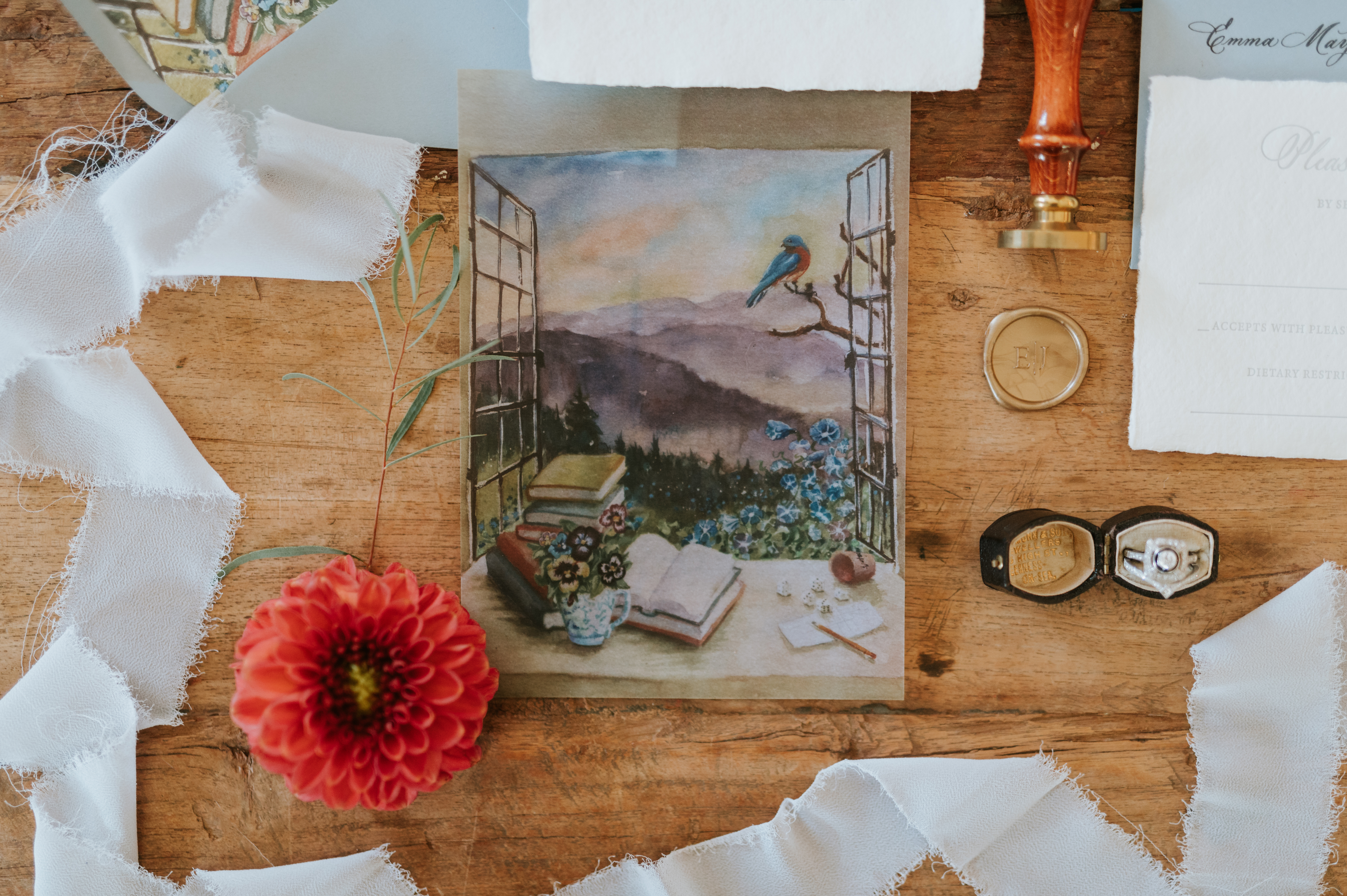
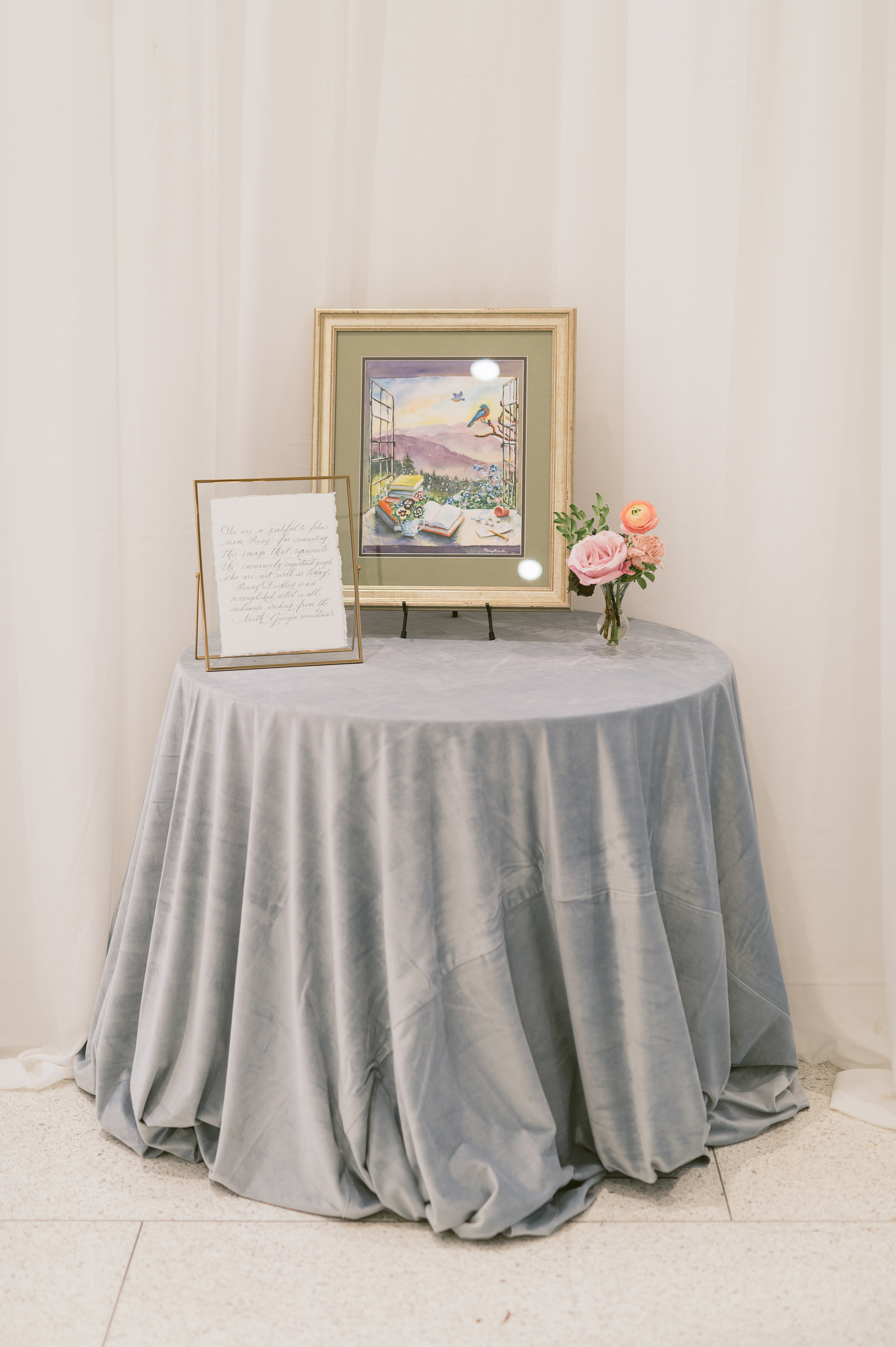
Emma and John personalized their invitation suite to include a liner that had a print which was actually hand-painted by John’s mother. The same print was also used on the suite’s vellum overlay. THIS is what I mean when I say we help create memories that last forever. How special is this gorgeous detail?
John’s mother, Penny, is an artist who took on the role of creating this piece for her son and daughter-in-law as a way to include those who were with them in spirit. She used very special and specific details in this image to represent those loved ones. We were honored to pen the letter that went along with the beautiful picture display.
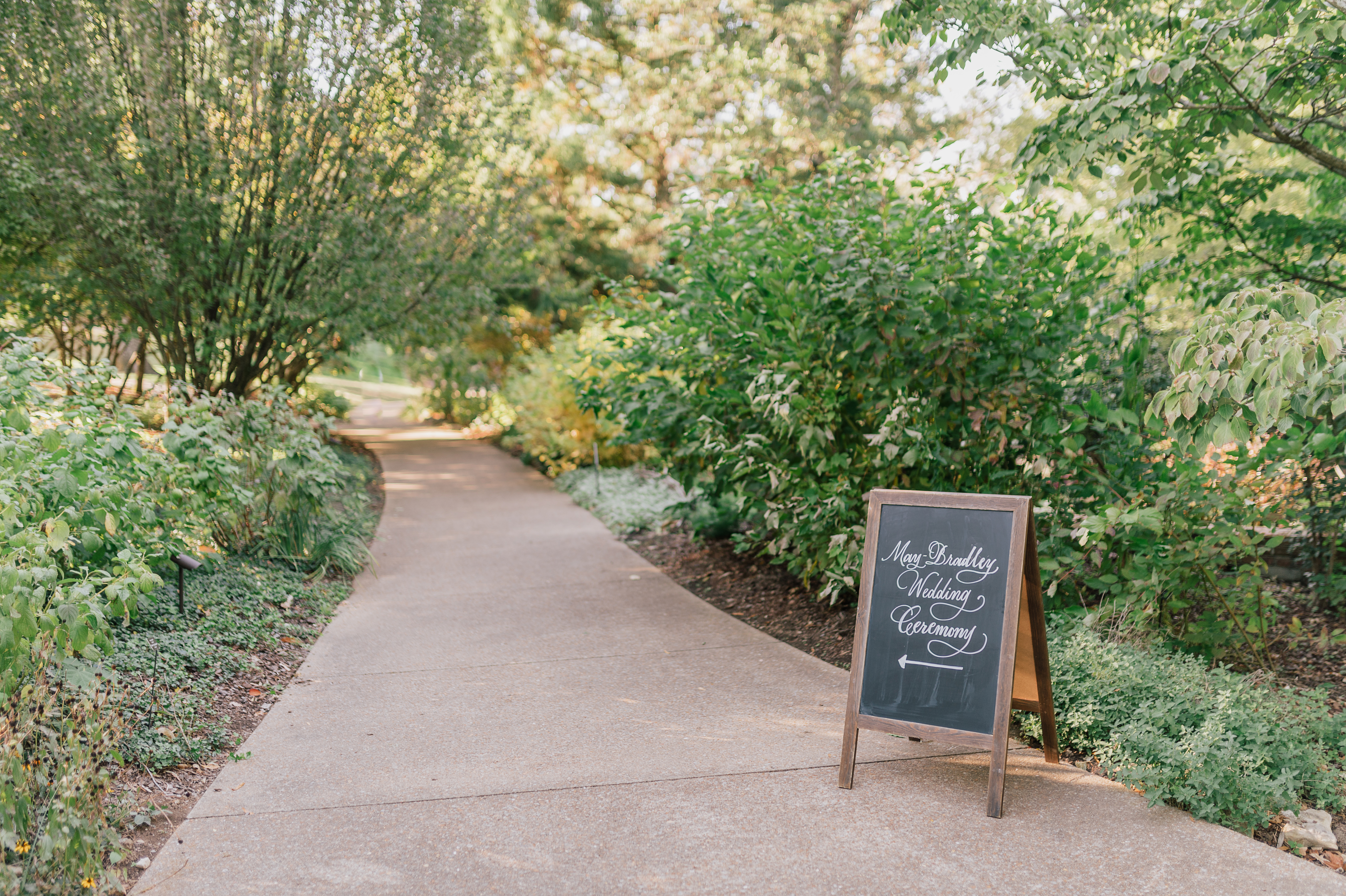
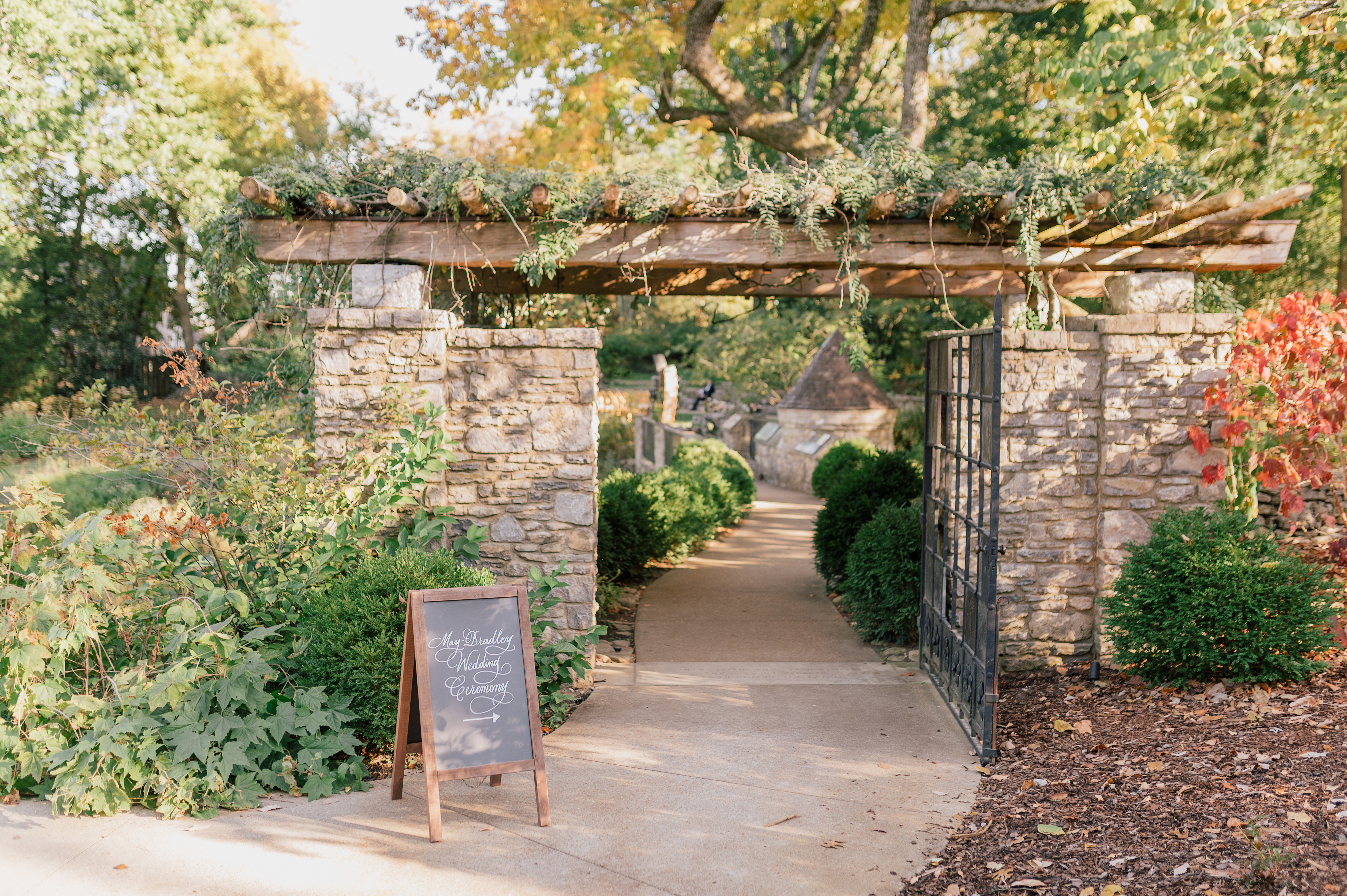
The chalkboard directional signs fit perfectly within the woodsy scenery of this Cheekwood venue. They stand out just enough to guide guests to their seats.
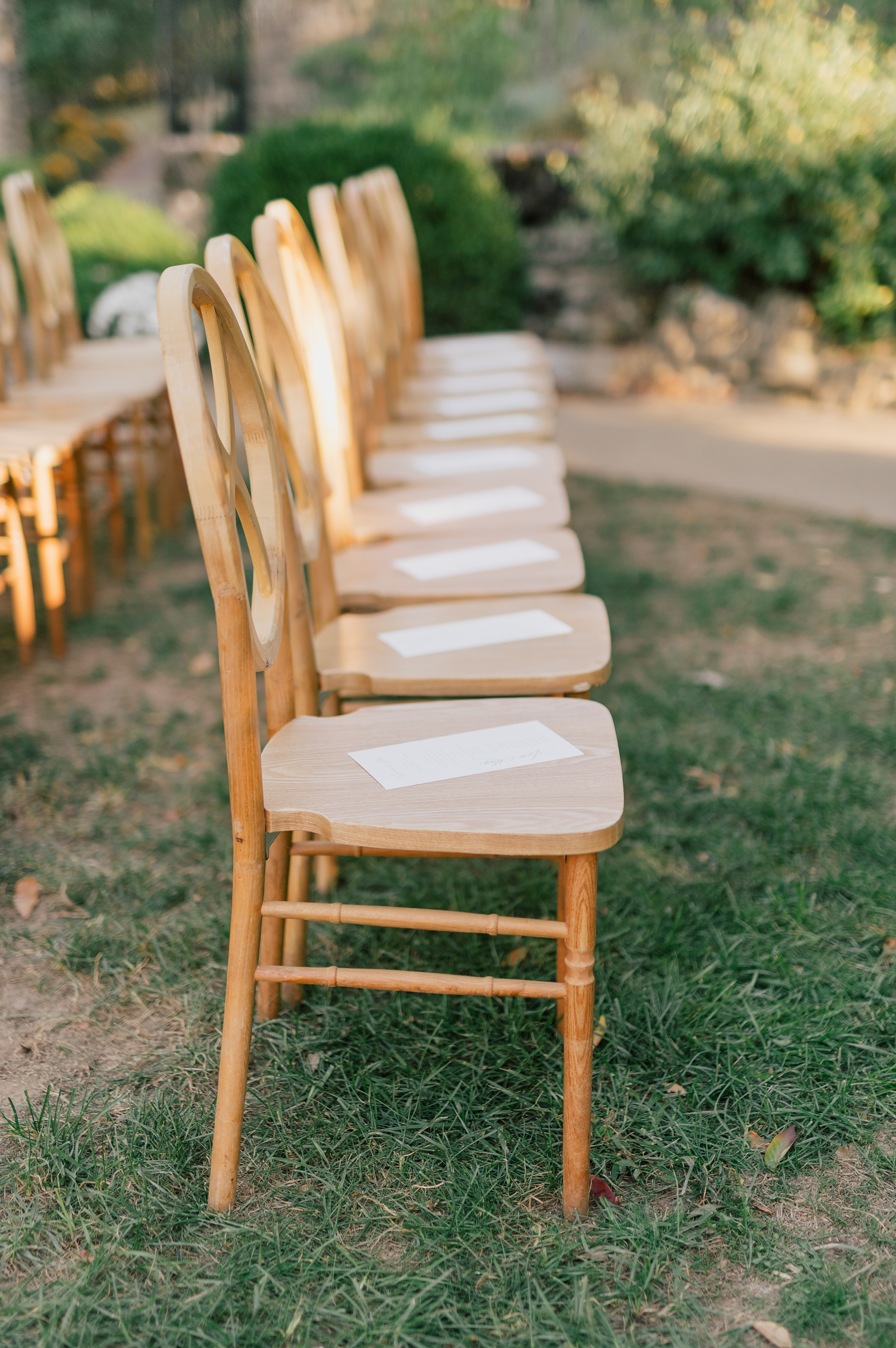
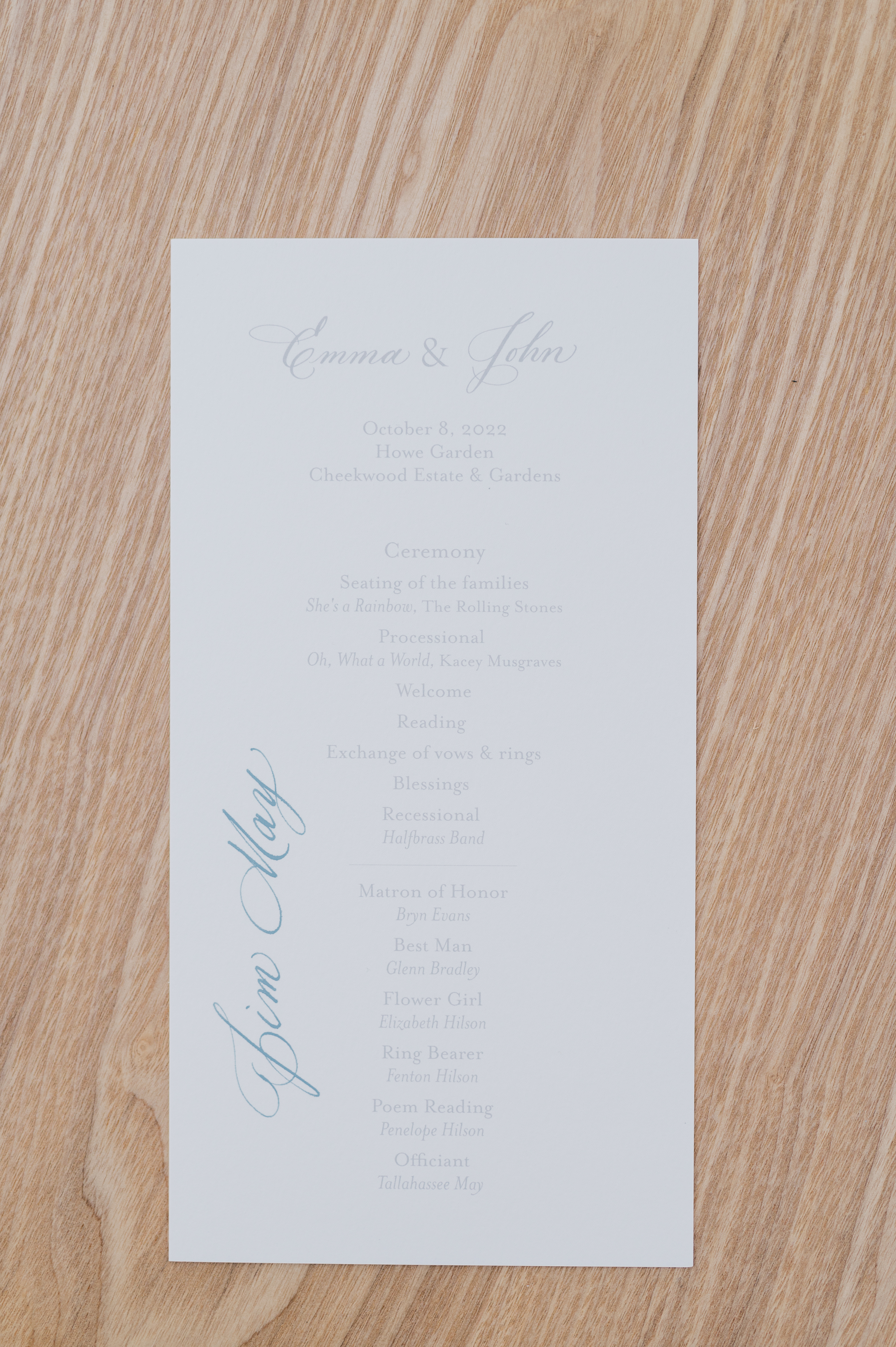
Here is a refreshing new detail that we don’t see very often. The couple wanted to have special seating for the ceremony portion of the wedding. We did that by taking the printed programs and writing the names of each guest so they knew where to find their seat. This was a beautiful example of how much thought went into each moment of Emma and John’s big day.
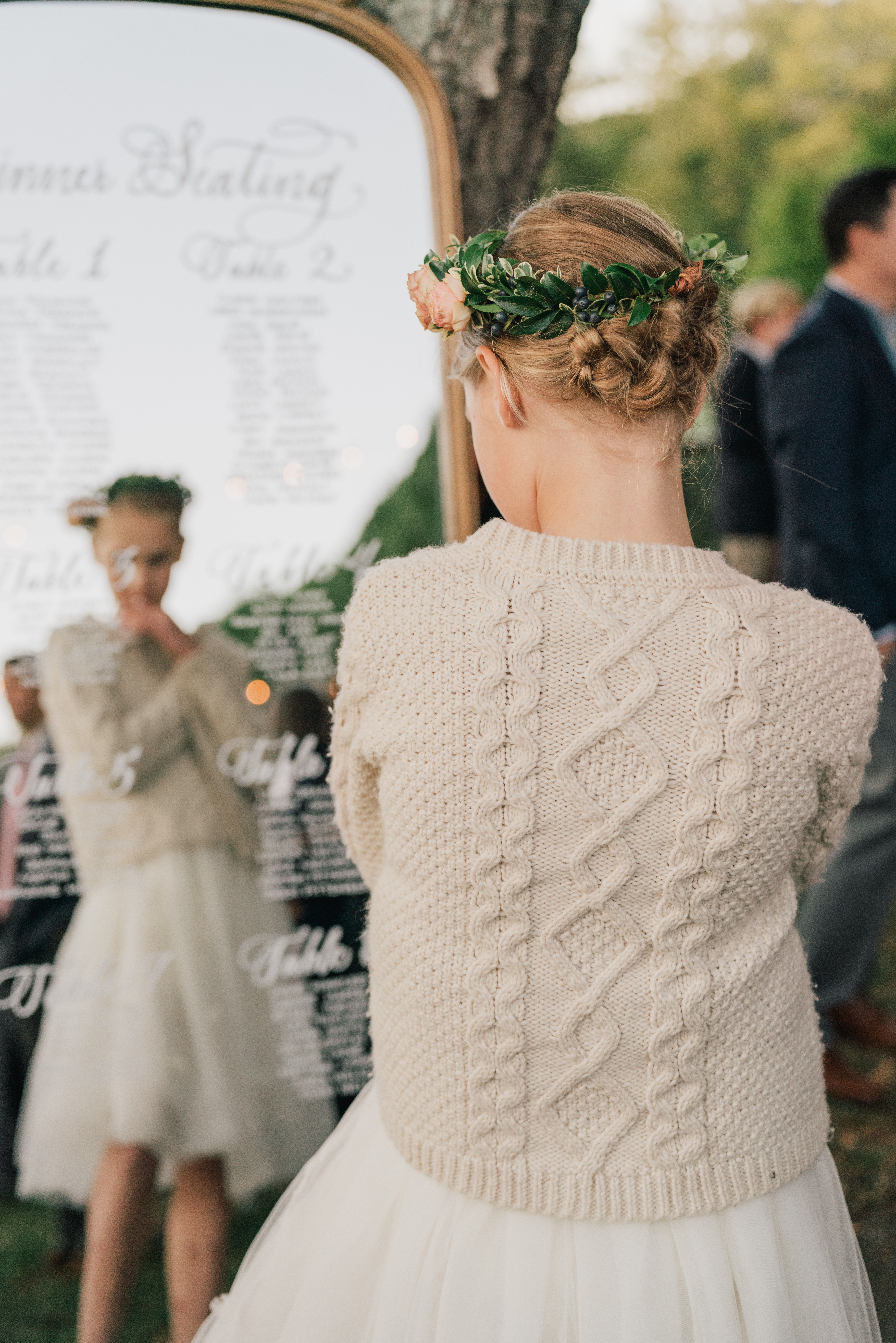
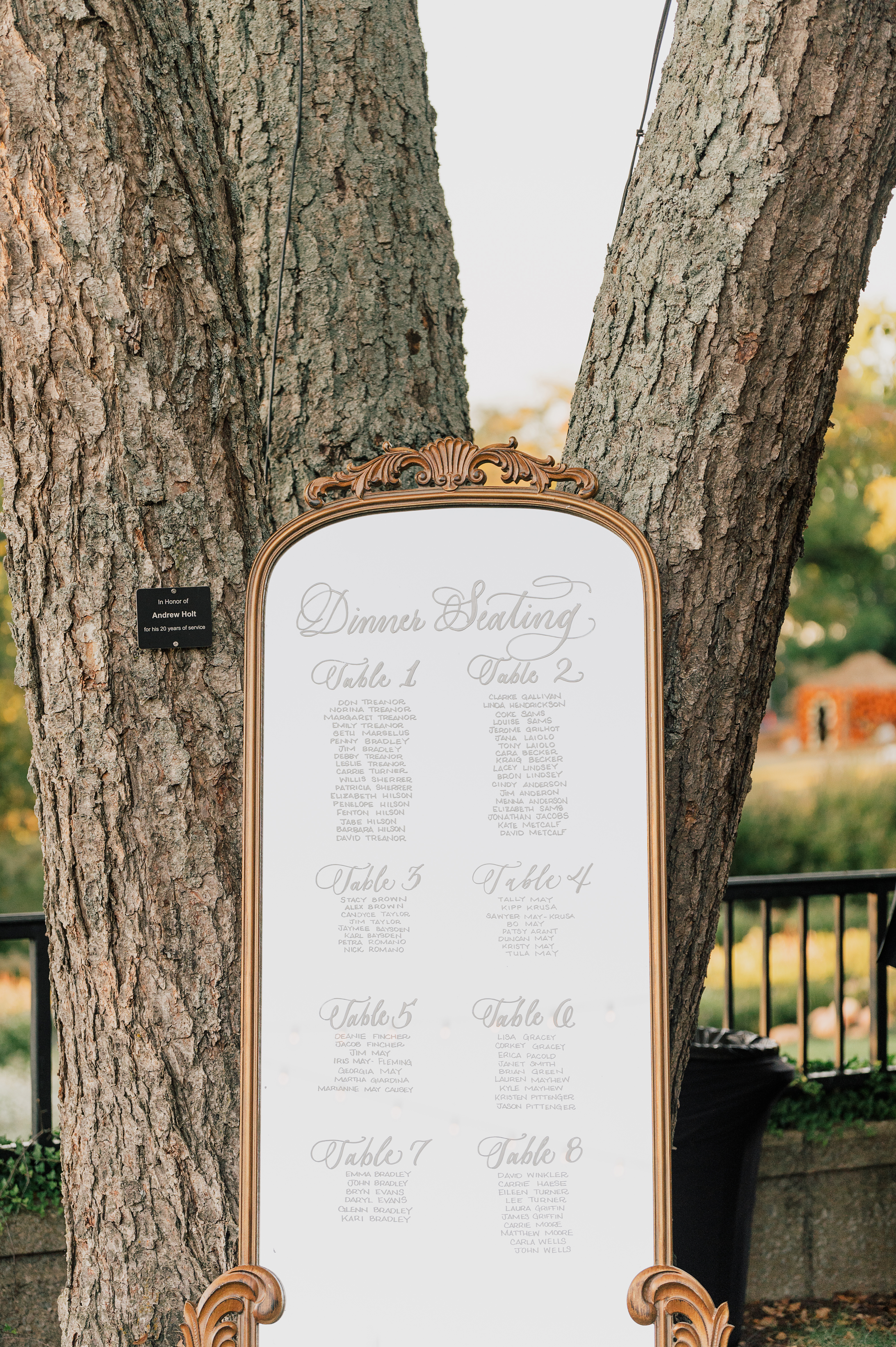
You can never go wrong with a classically beautiful, mirrored seating chart. Although this is a very popular seating chart display, there was something especially whimsical about seeing the textural differences of the glass mirror against the beautiful trees in the garden.
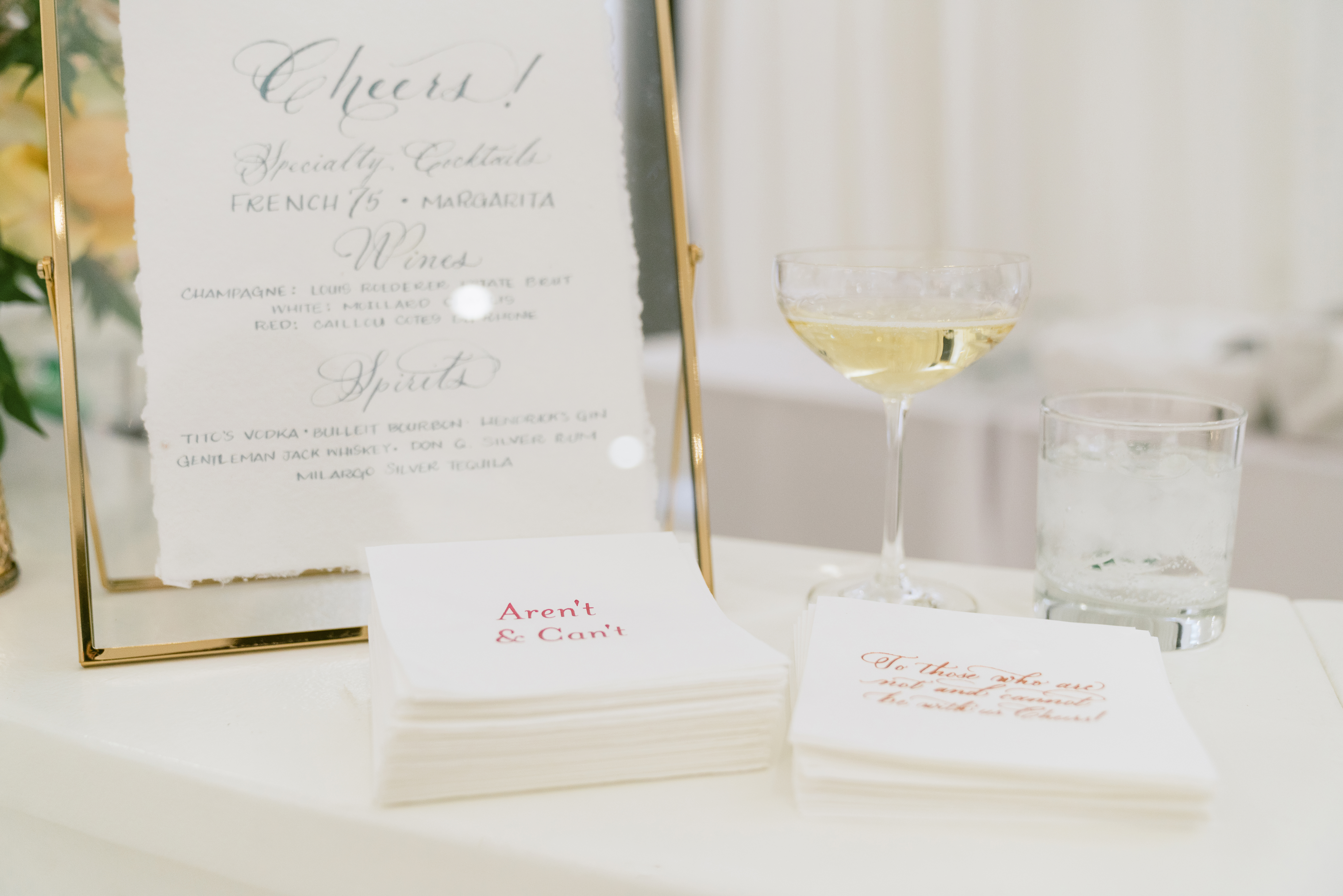
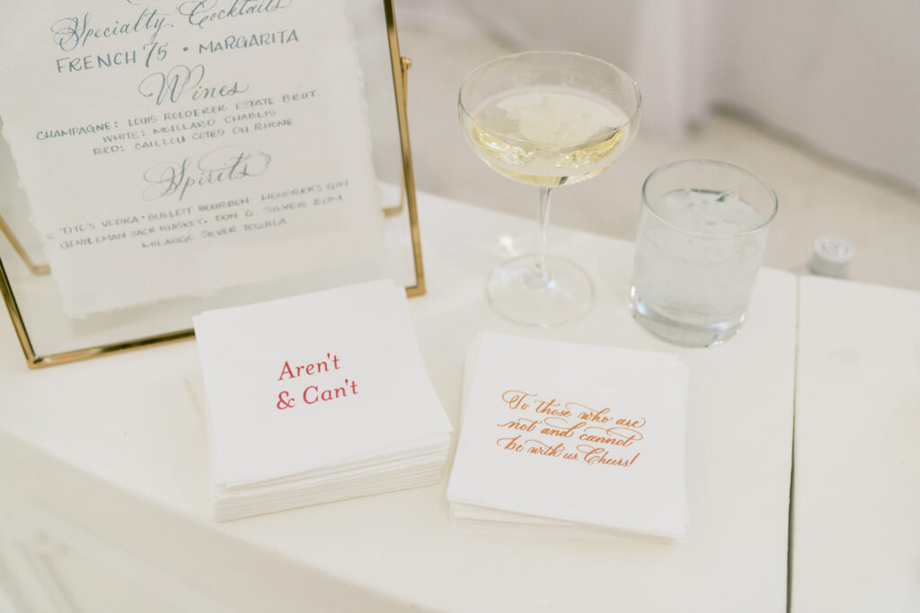
White Ink is always happy to put our touch on table signage like we did for Emma and John’s bar sign. But what we loved most was getting to make the super awesome cocktail napkins that displayed several of the couple’s favorite sayings. Taking it to the next level and making it your own, is what’s it’s all about. I hope you enjoy these!
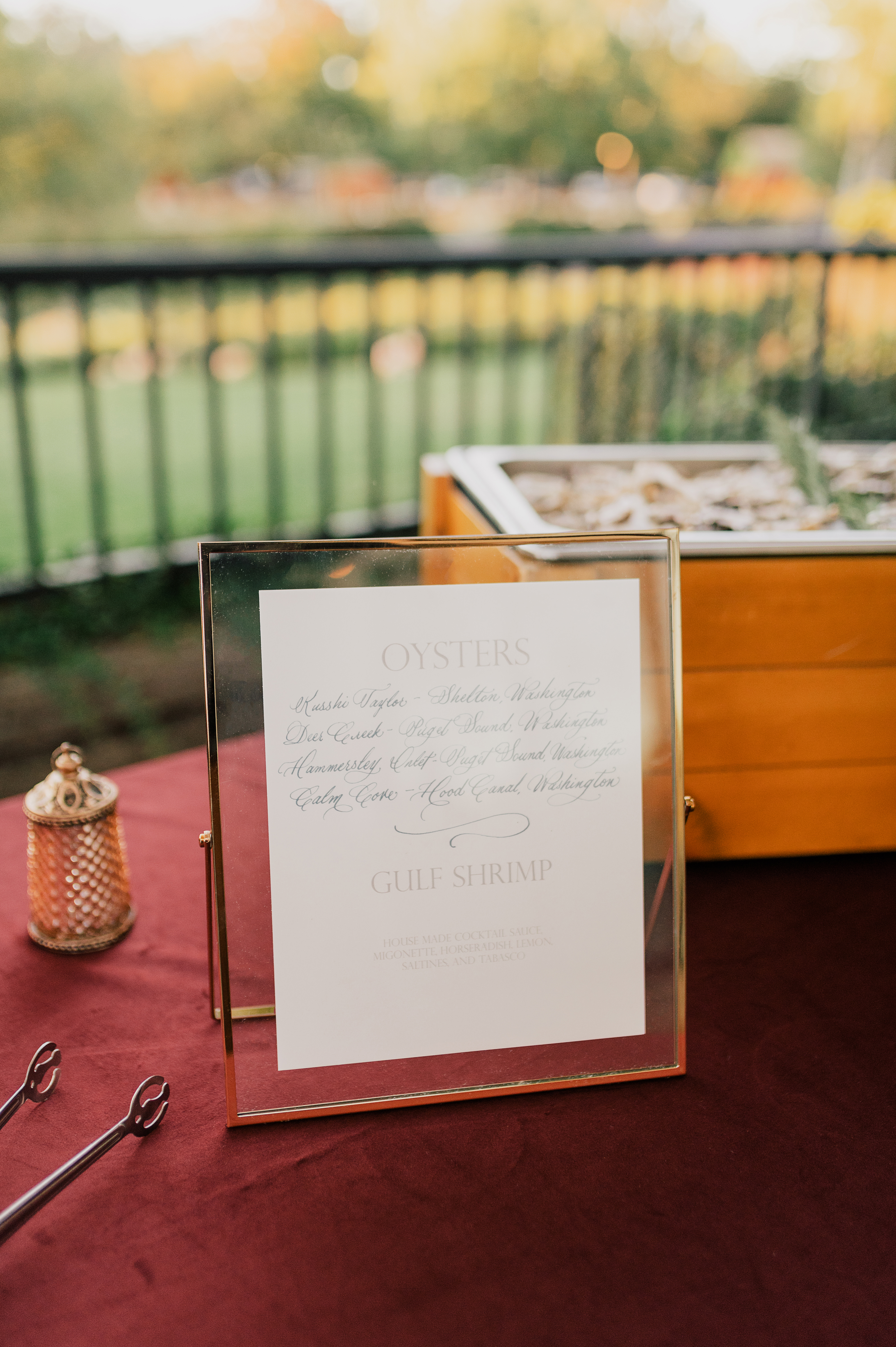
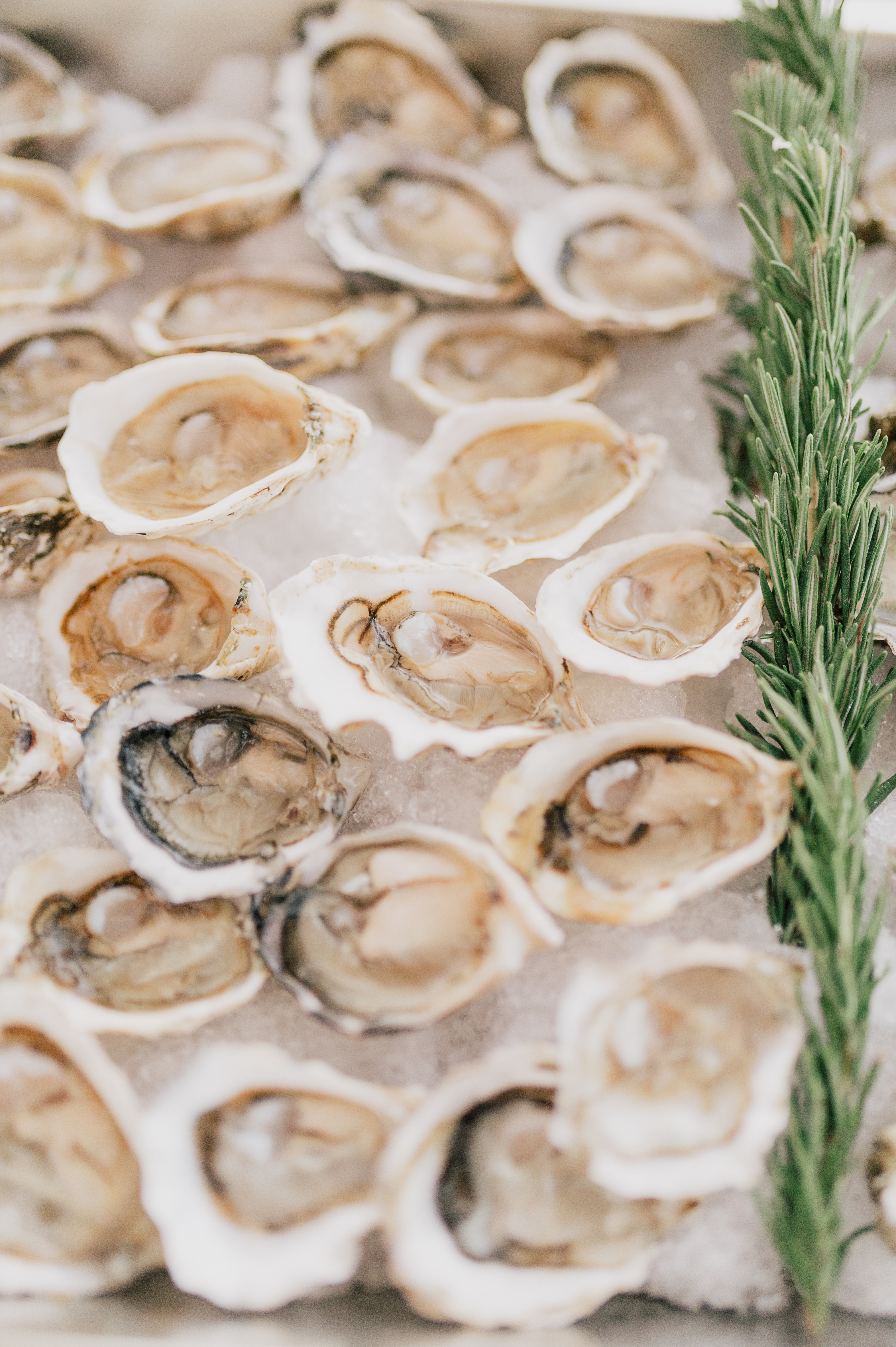
Another table-top sign was for the deliciously showstopping oyster and shrimp bar! Yum!
Every single wedding White Ink gets to be a part of is always so special to us. We loved the deeply personal touches that Emma and John made room for on their big day. A gem of a wedding, indeed! Cheers to the happy couple! Check out some of the amazing vendors who took part in this event.
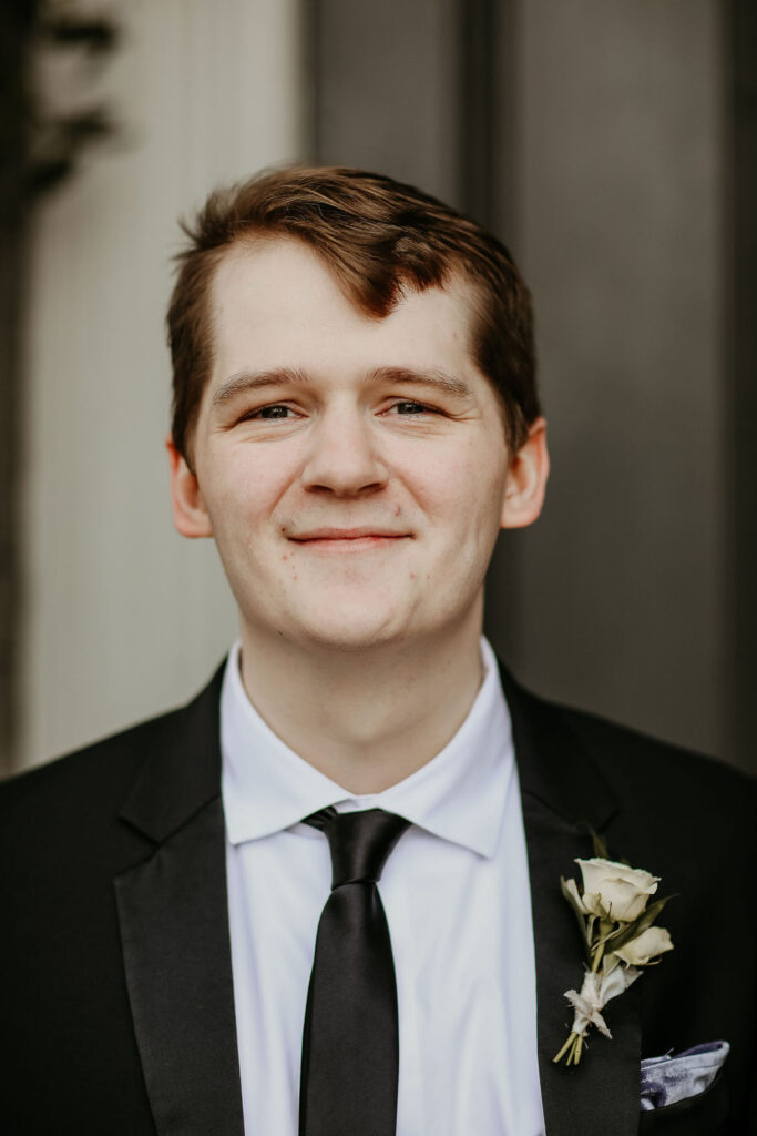
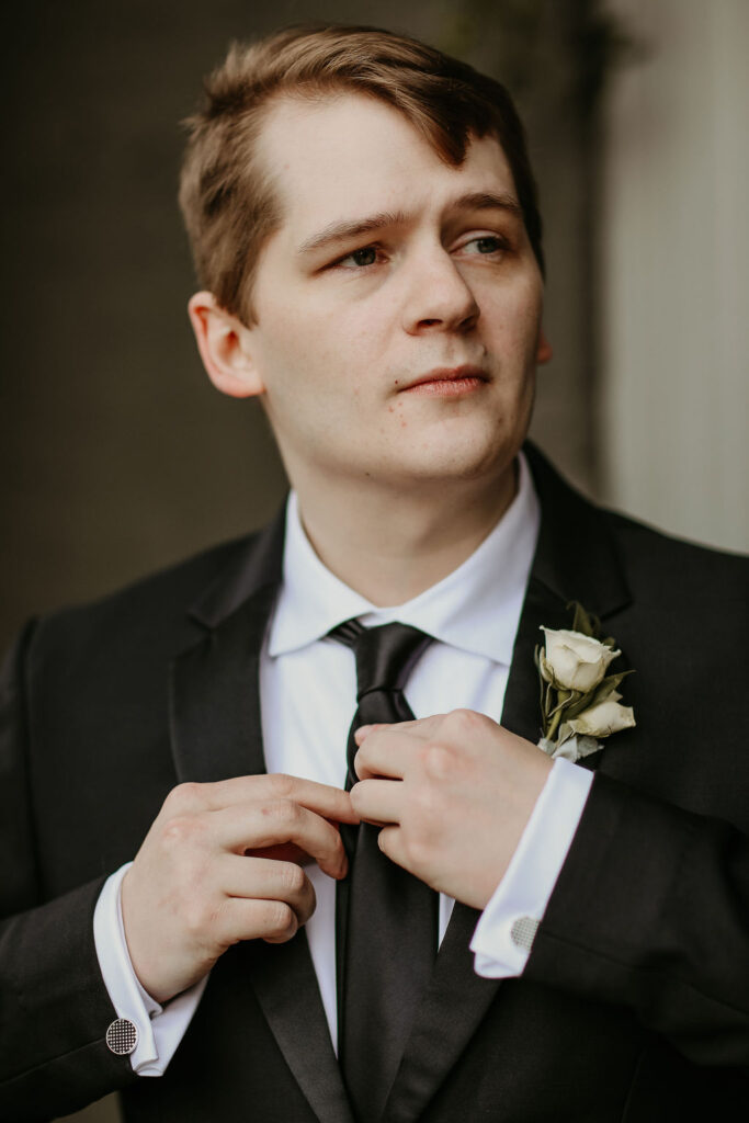
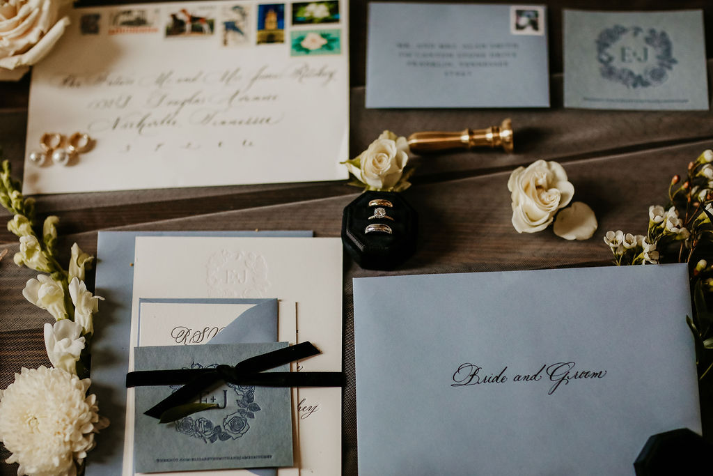
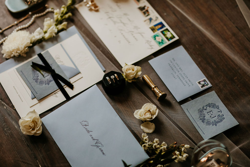
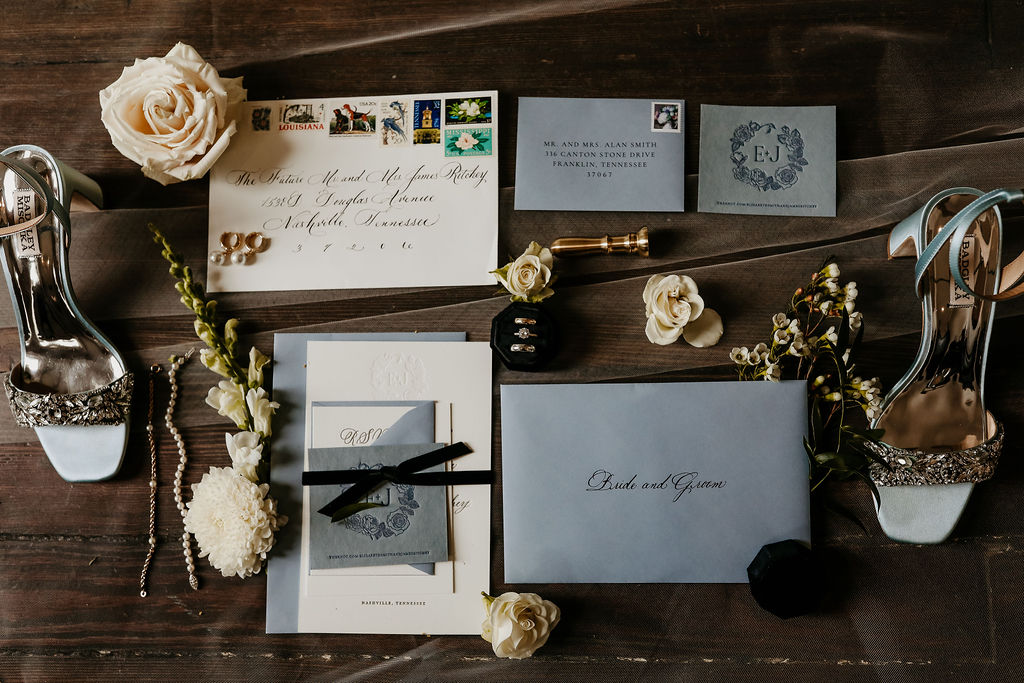
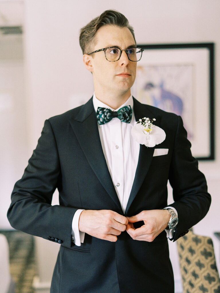
There is something really special about getting to be a part of an entire wedding process all the way from the invitation suites down to the monogrammed wax seals on the menu cards. It means so much to us at White Ink when our brides and grooms trust us to help bring their big day to life! It’s why we’re here, and it’s why we’re never leaving. I hope you enjoy the beautiful recap of Elizabeth and James’s wedding day as much as we enjoyed being a part of it.
We made our way to the stunning Cordelle in downtown Nashville to help bring together the finer details of Elizabeth and James unforgettable wedding day. The energy from this couple was genuine and light. They were such a delight to work with the entire way.
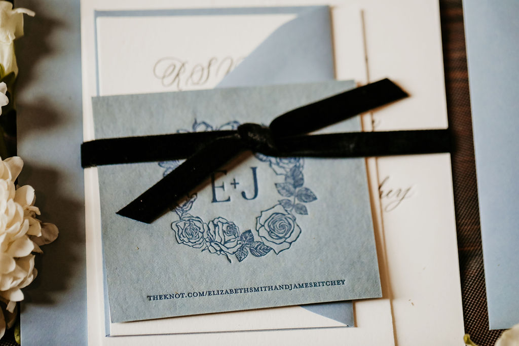
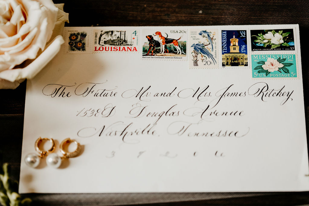
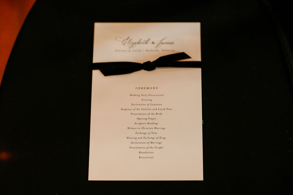
We’ll start with the invitation suite. Each detail was carefully selected. Spot Calligraphy, vintage postage, hand-made paper with custom monogram (my personal favorite), envelope calligraphy, all wrapped in a delicate black velvet ribbon and tucked into the always classy dusty-blue hue envelopes. I am on cloud nine every time I look at these beauties. Simply stunning! Fun fact: dusty blue has been one of our most popular colors this year by far.
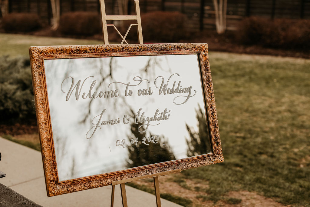
“Welcome to our Wedding,” simply put and warmly welcoming, the welcome sign we did for Elizabeth and James was elegant and perfectly placed inside this timeless, ornamented frame. Fun tip: mirrors will work with absolutely ANY event style- I promise.
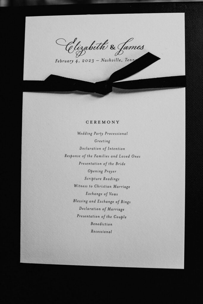
White Ink created the chic program for our couple’s nuptials. You can see the same black velvet ribbon that bound the gorgeous invitation suites was also used around Elizabeth and James’s ceremony programs. Raise your hand if you love details that can carry over!
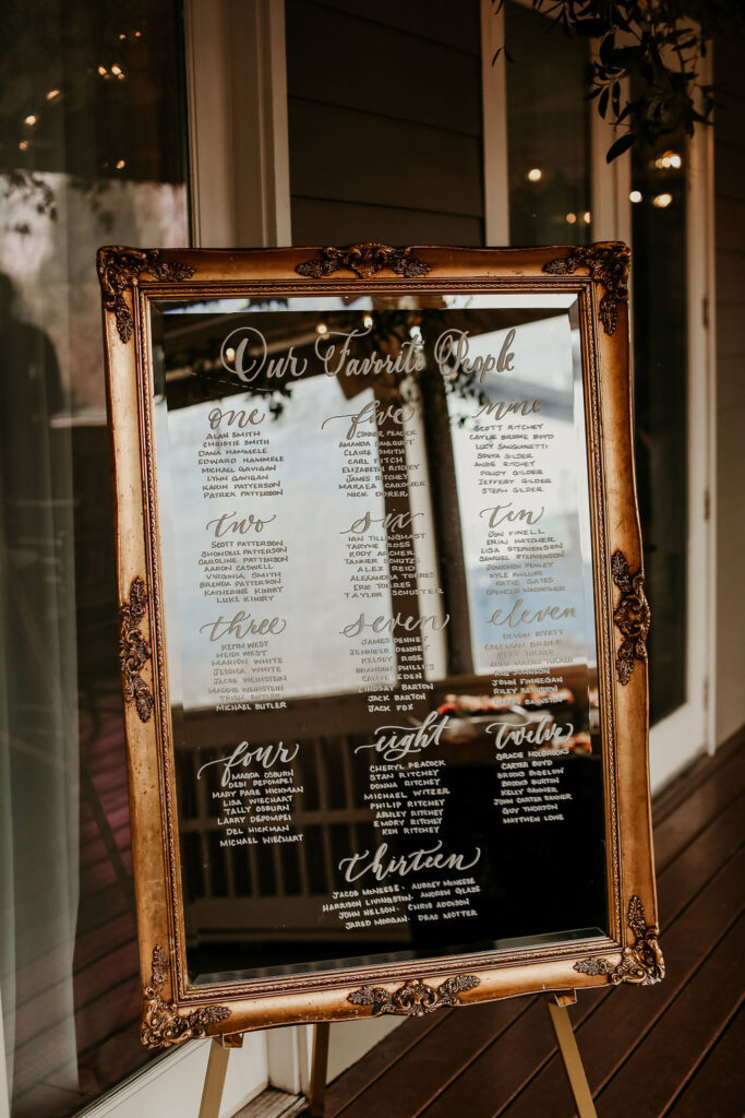
Another beautifully mirrored sign in a thick, distressed, gold ornamented frame that we used for the couple’s seating chart. “Our Favorite People” is quickly becoming one of my favorite titles for seating charts. So warm and inviting!
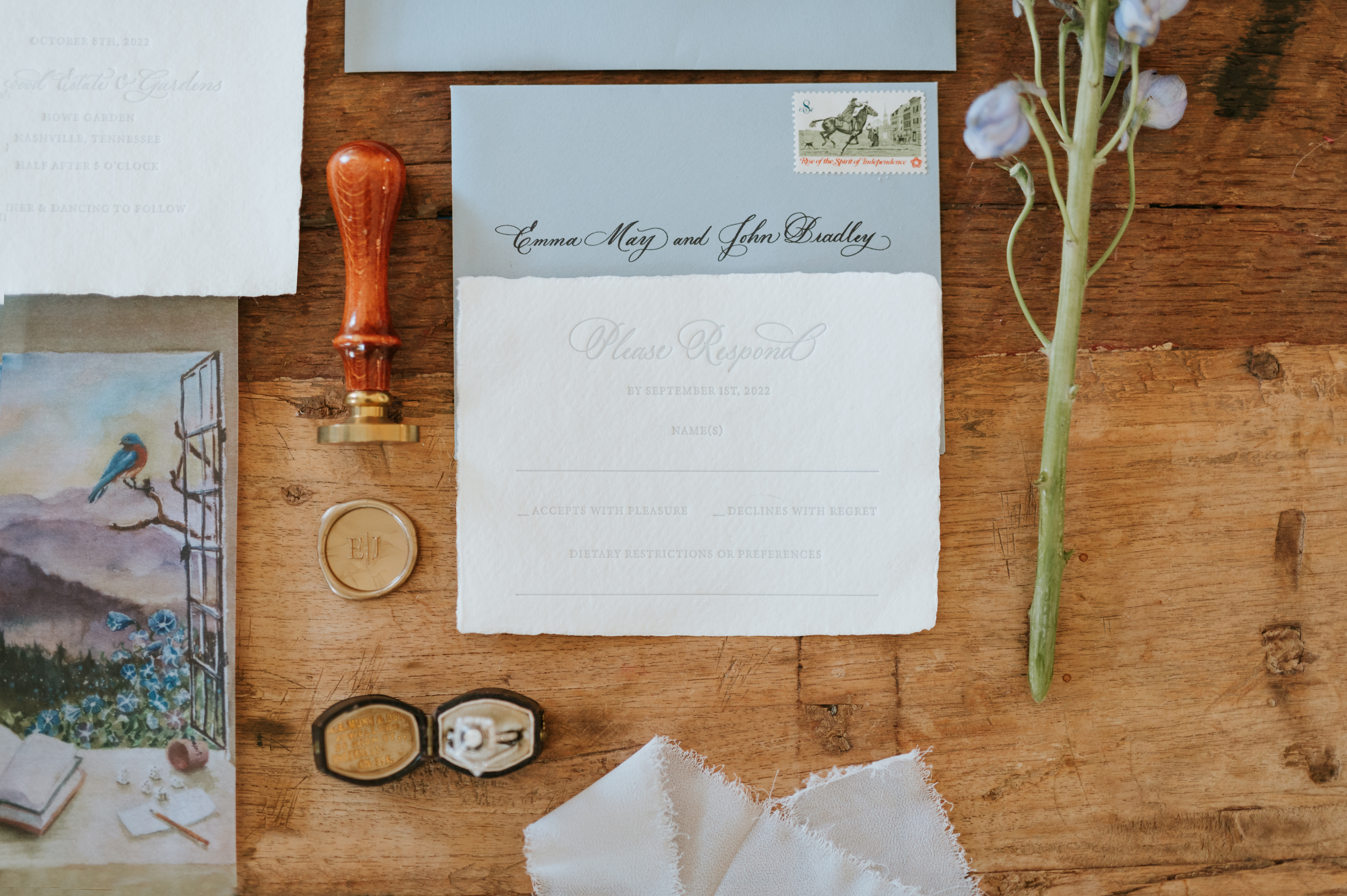
White Ink menus are always top-notch menus. The best part about working with Elizabeth and James is how they really wanted to tie together so many delicate details. They chose to use the same hand-made paper for their menus that was also used to create their invitation suites. A solid decision for a bold and timeless wedding. The wax seal used to combine the place cards and menus boasts a custom monogram as well. Fun tip: Elevate your place cards with custom spot calligraphy.
We also supplied Elizabeth and James with our super sleek table numbers that fit effortlessly into the dreamy tablescape.
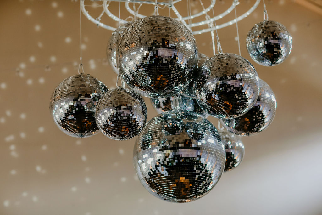
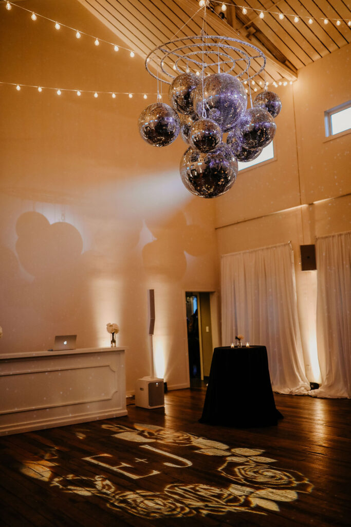
If you don’t think disco balls and custom monograms belong together, I’m here to tell you- Oh yes, they do! The monogram we used with the handmade invite paper was carried over to the dance floor, illuminated by a chandelier of disco balls. I can’t stop looking. This is just the best thing ever and really gives you a peek into the fun energetic style of our beautiful couple.
I am so happy we finally got a chance to bring you into one of the most fun nights we’ve had in a long time. Elizabeth and James allowed us to show off our creativity and interlace this entire journey with distinctive details and style. They made my job easy, and I love my job! Cheers!
Take a look at White Ink’s journey to Rhode Island as our creativity made its way up the coast! Everything about Andrei and Sean’s wedding was top notch and we are in LOVE with how well the details turned out for this spectacular event.
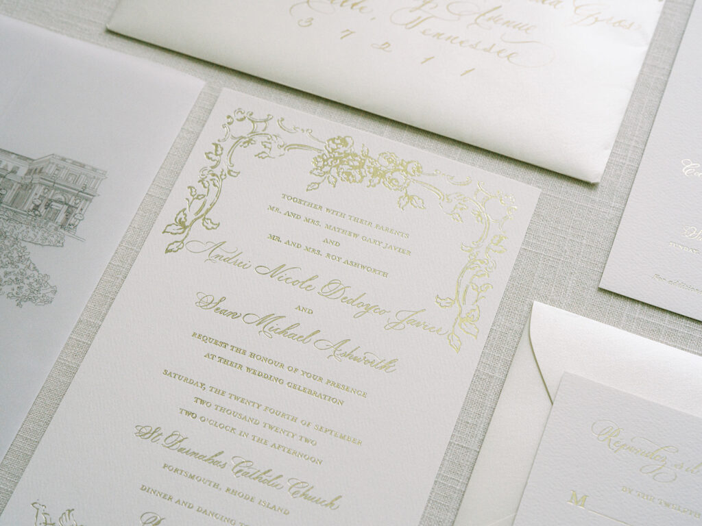
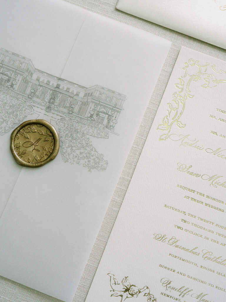
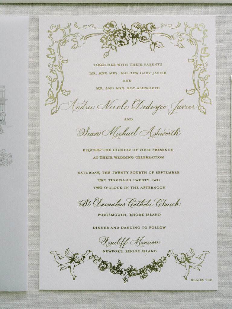
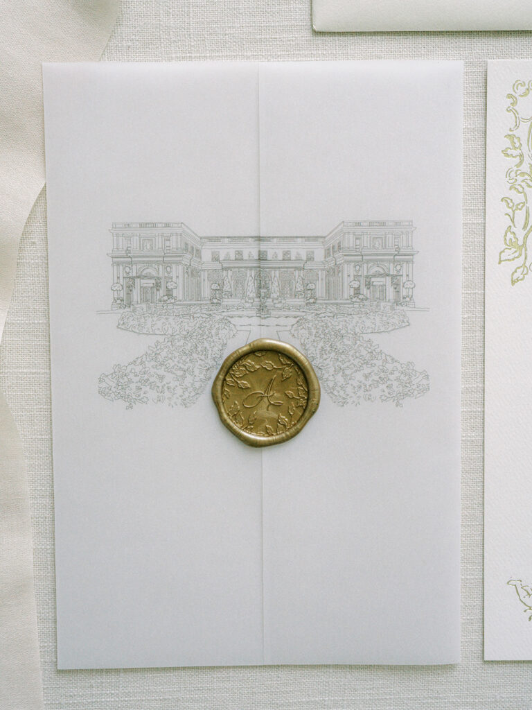
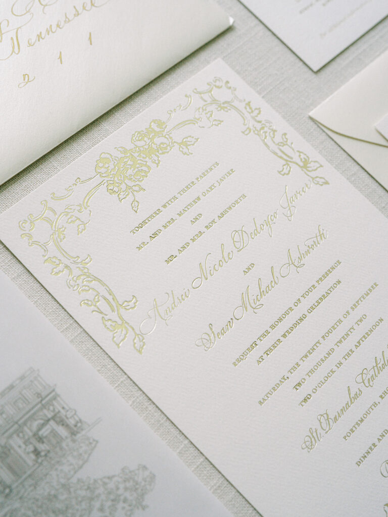
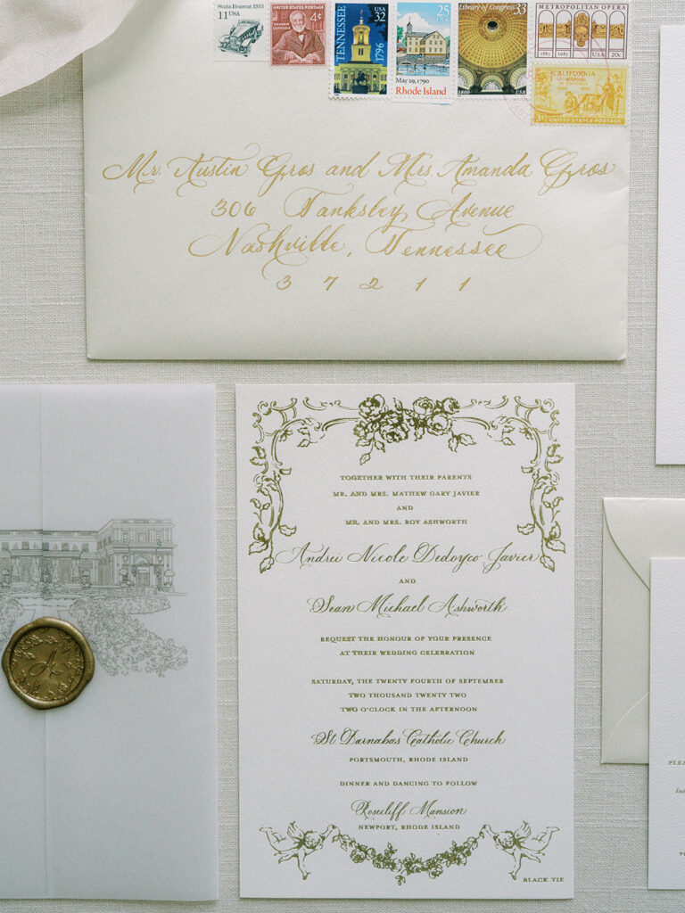
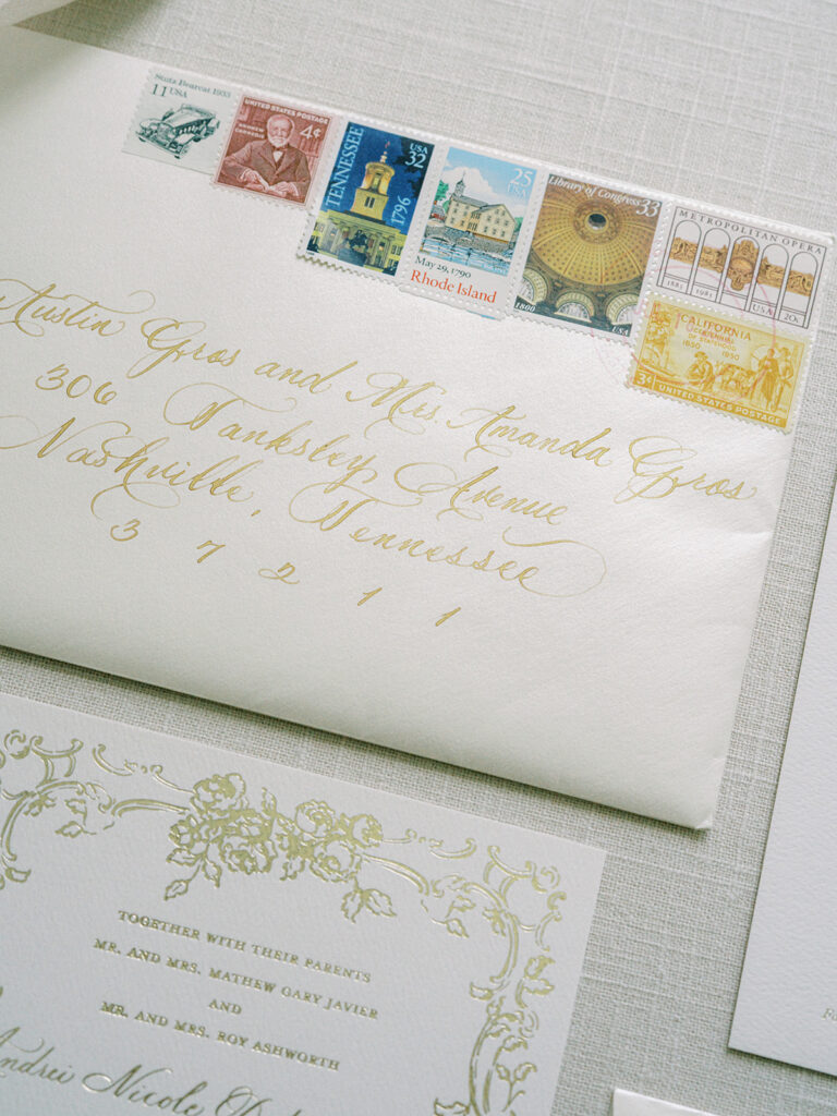
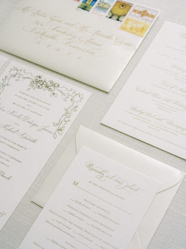
As far as invitation suites go, there was no stone unturned. Andrei and Sean selected the most beautiful gold ink pressed into white cardstock. The suite was wrapped together by a stunning vellum jacket complete with a gold, custom monogramed wax seal. On the vellum jacket you will notice a print of the historic Rosecliff Mansion in Newport, Rhode Island which would be the location of our couple’s reception. Fun Fact: Rosecliff Mansion was featured in the 1974 film, The Great Gatsby.
If you want your invitation suites to embody elegance, we cannot recommend envelope calligraphy enough! The gold calligraphy on these white envelopes shines like the treasure they are.
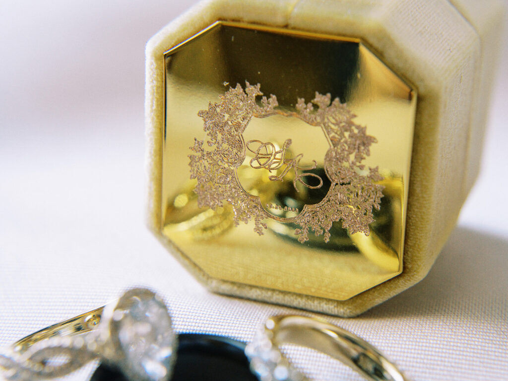
How stunning is this engraved, custom monogramed ring box?!
White Ink also designed the wedding programs for Andrei and Sean. The ceremony took place at the gorgeous St. Barnabas Catholic Church located in Portsmouth, Rhode Island.
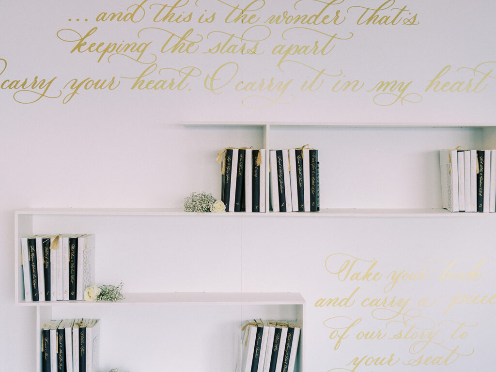
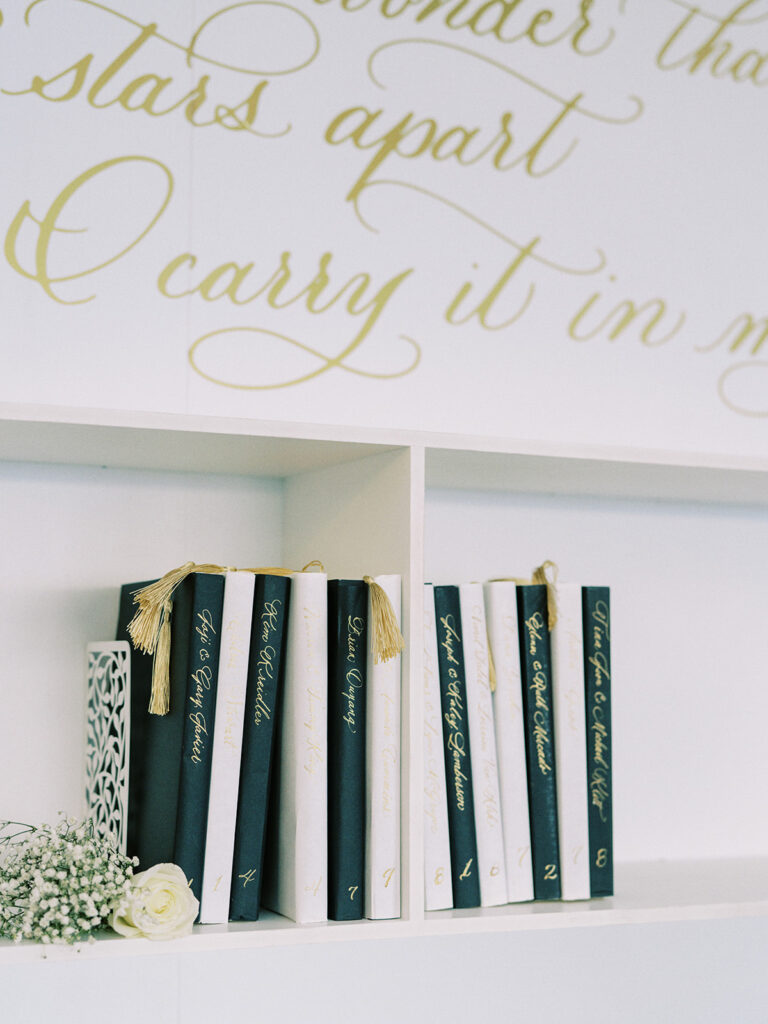
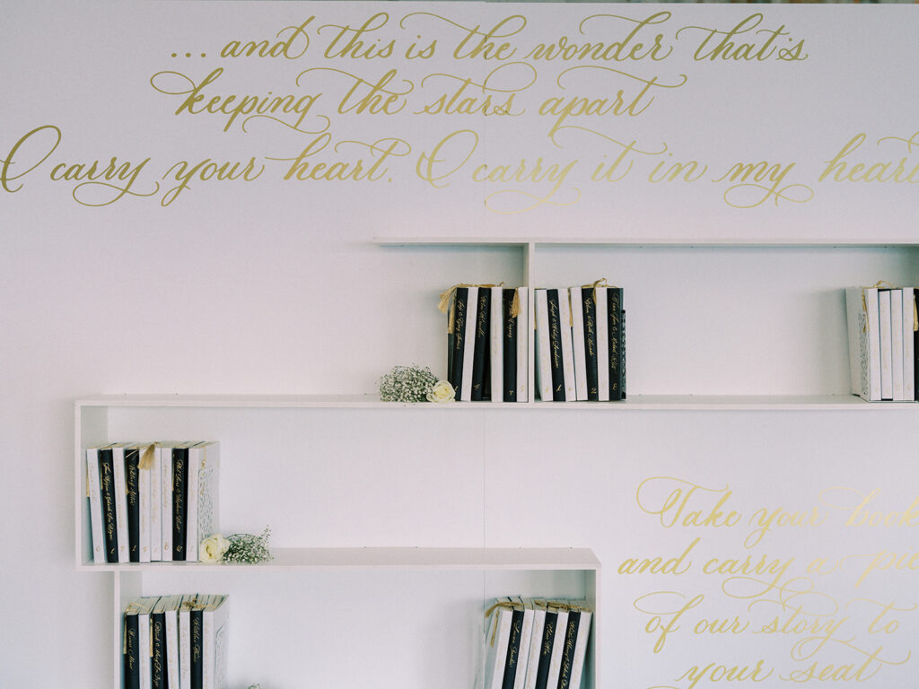
I have been SO excited to show you guys what we did for Andrei and Sean’s seating chart for their reception! I know we have shown you some unique seating chart pieces, but this one is definitely one I will always remember.
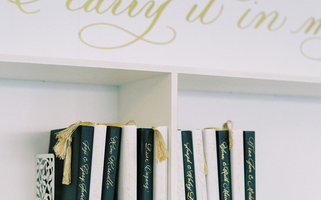
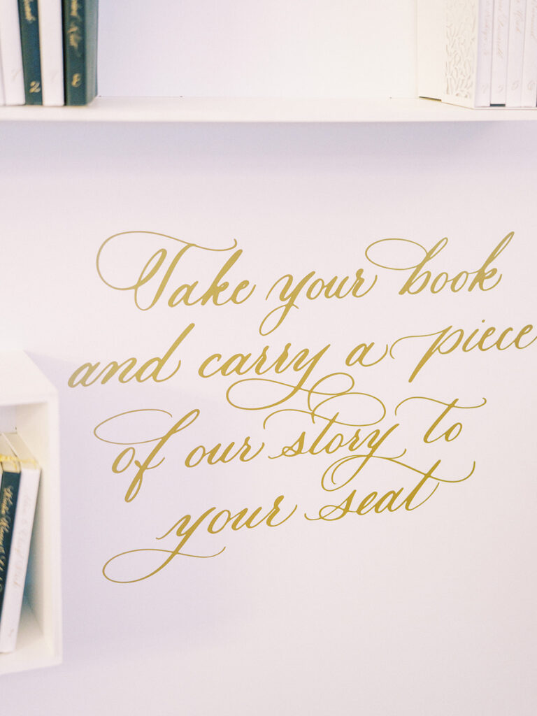
Each guest was gifted a book of poems where they could find their names followed by their table number written in custom gold calligraphy down the spine of their individual book. (I mean… I have no words). Inside the books, White Ink designed custom bookmarks that marked the page where Andrei and Sean’s favorite love poem was written. You could also enjoy excerpts of the famous E.E. Cummings poem, I Carry Your Heart with Me, written on the wall of the shelves. Honestly, it’s enough to turn you into a puddle!
Andrei and Sean asked White Ink to help create the menus for the reception which carried the same delicate combination of gold and white just as their wedding invitation suites did. I say it every time, connecting even the smallest details together can really be the thing that separates your wedding apart.
Ellegant or not, you know White Ink is going to show up at the bar! We love the look of this bar menu inside the distressed gold frame.
The perfect little place cards we did for Andrei and Sean blended effortlessly into the stunning tablescapes.
I especially love when White Ink gets to leave a mark in destinations beyond Nashville. It’s always a beautiful journey and a fantastic opportunity to represent our little corner of the wedding world. Couples like Andrei and Sean remind us of why we love what we do. This couple put so much effort and thought into every single part of their wedding day. We were honored to connect with them in such a memorable way. You could say, we will carry them in our hearts. Cheers!
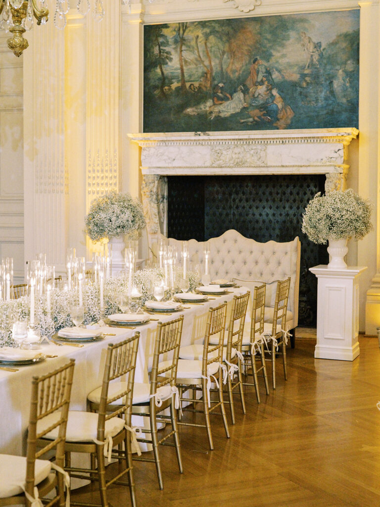
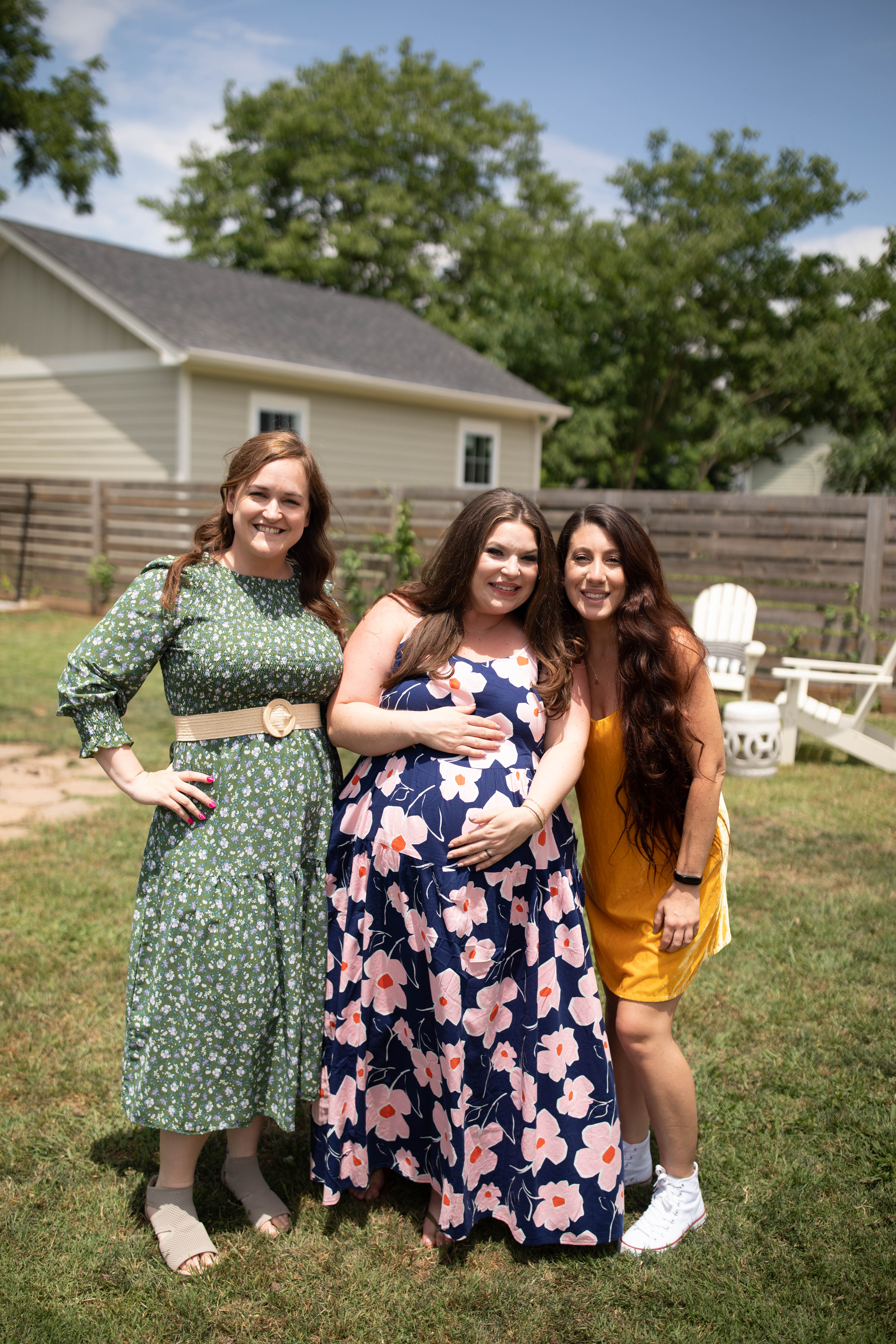
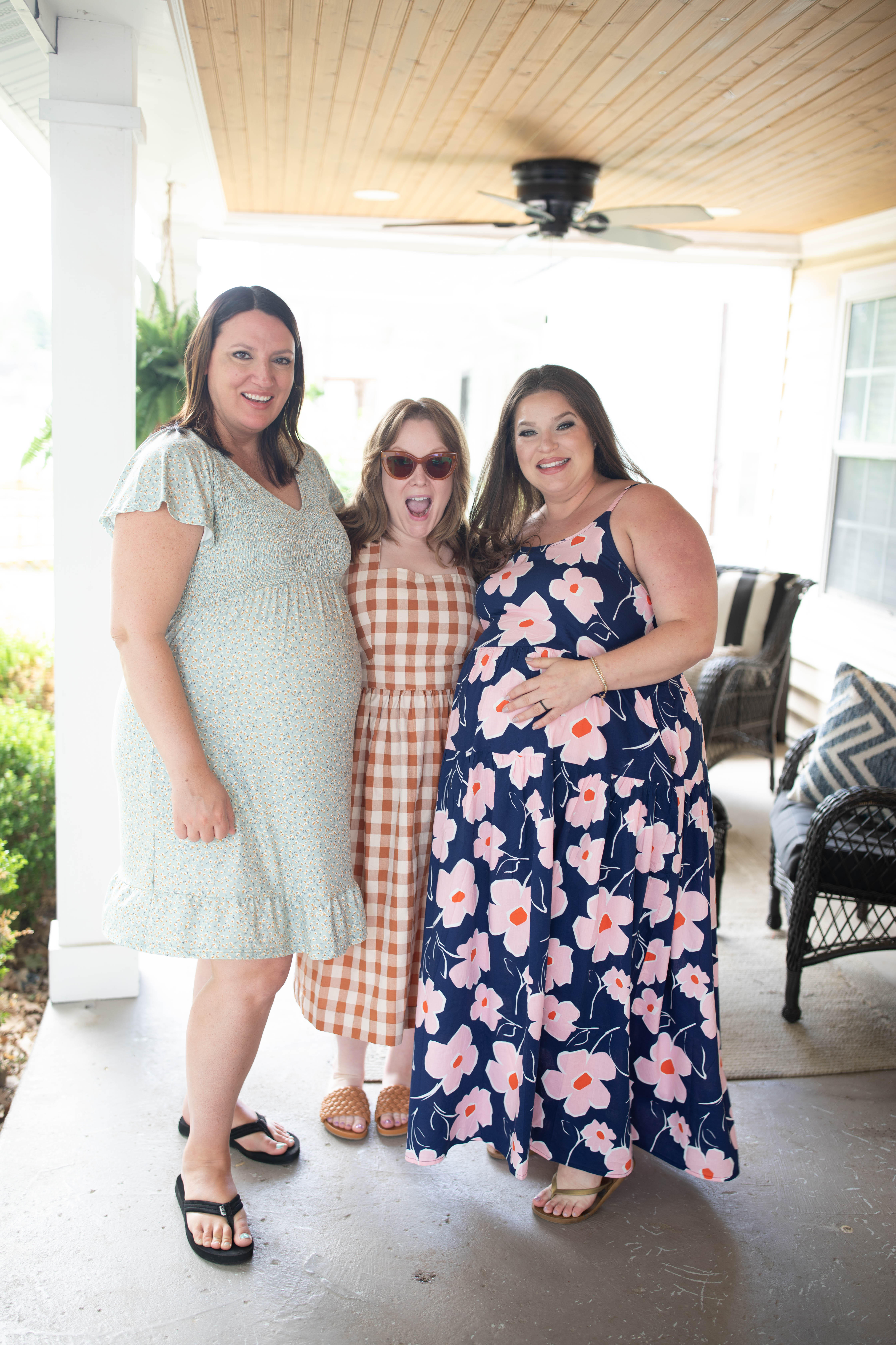
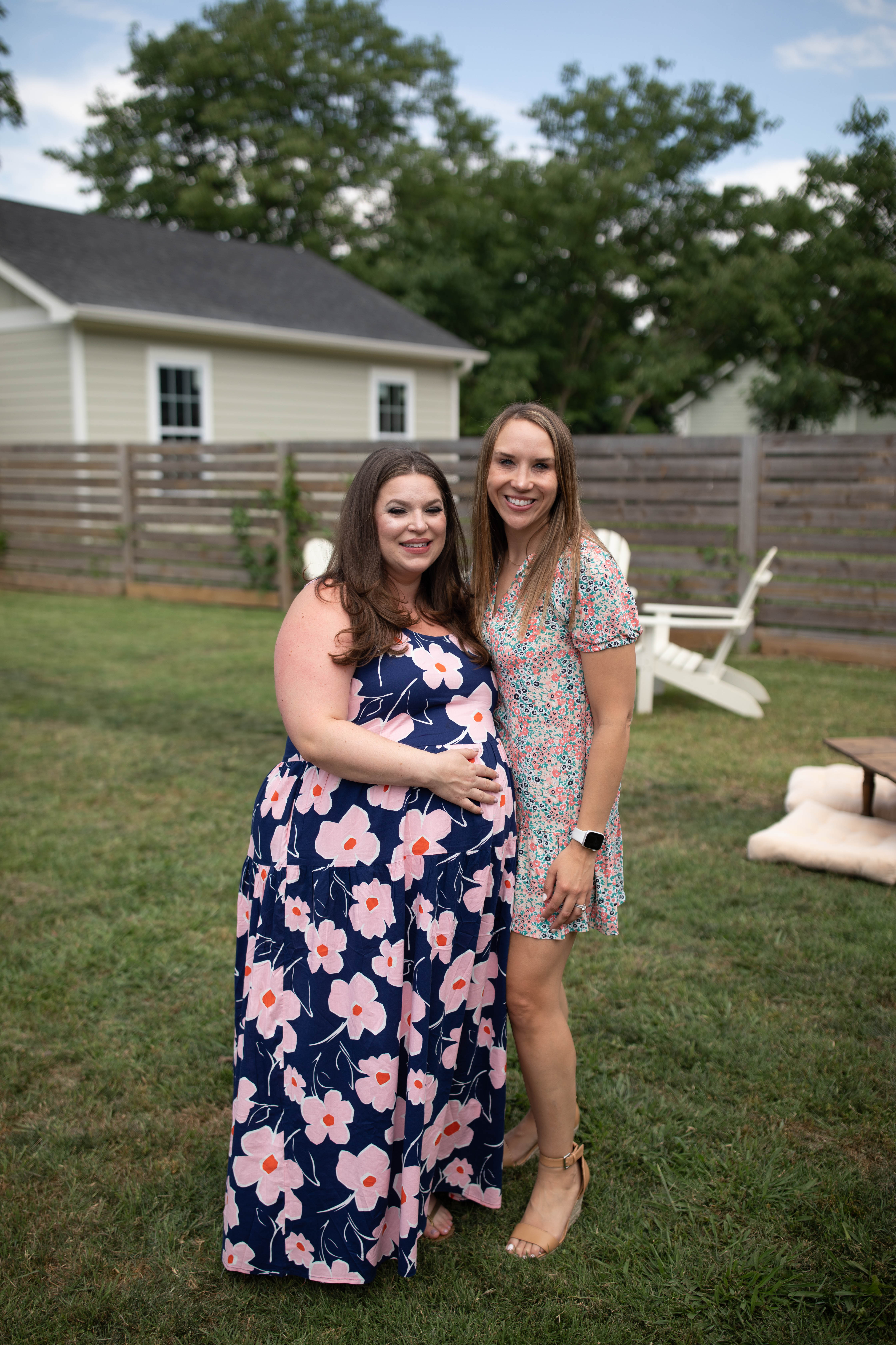
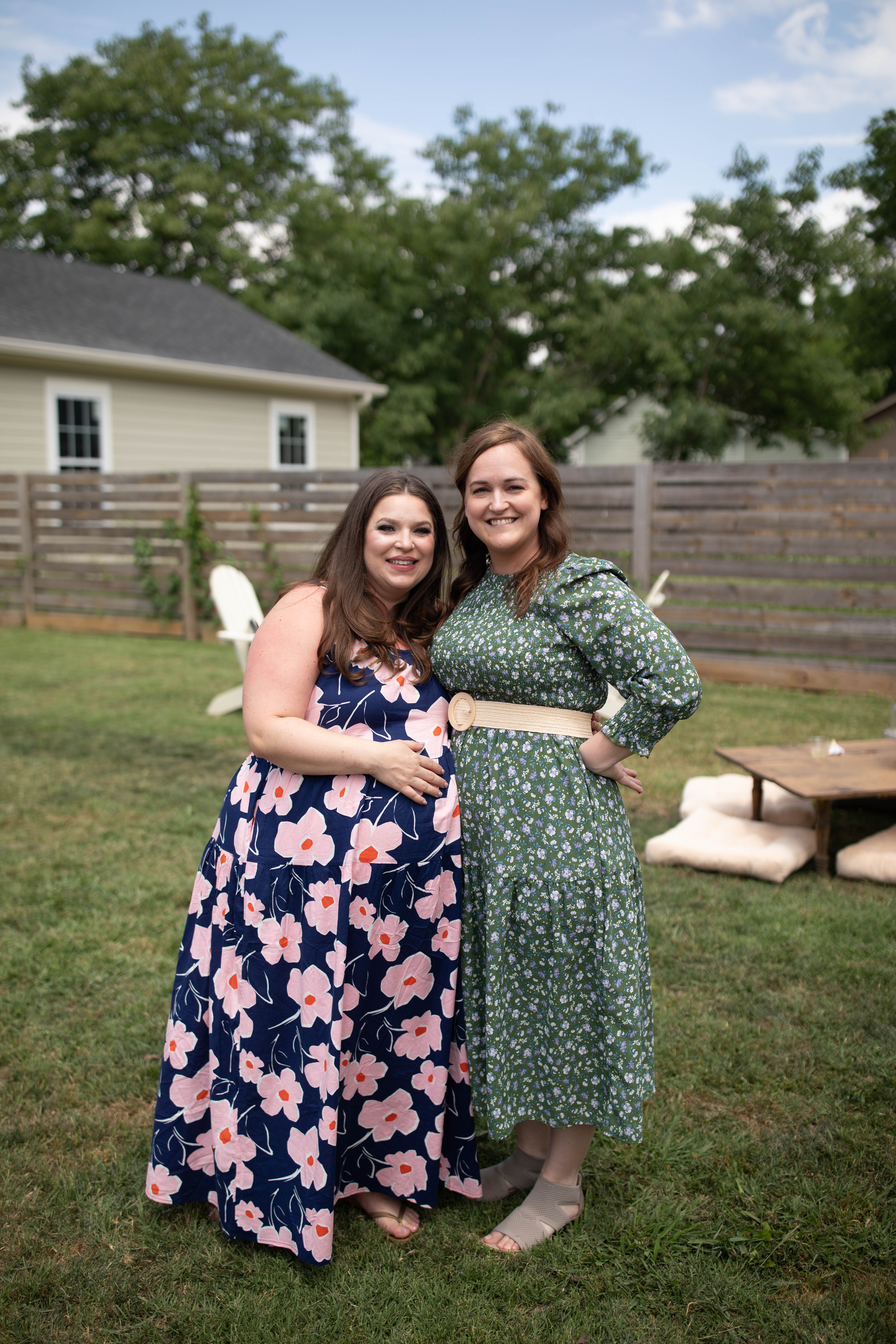
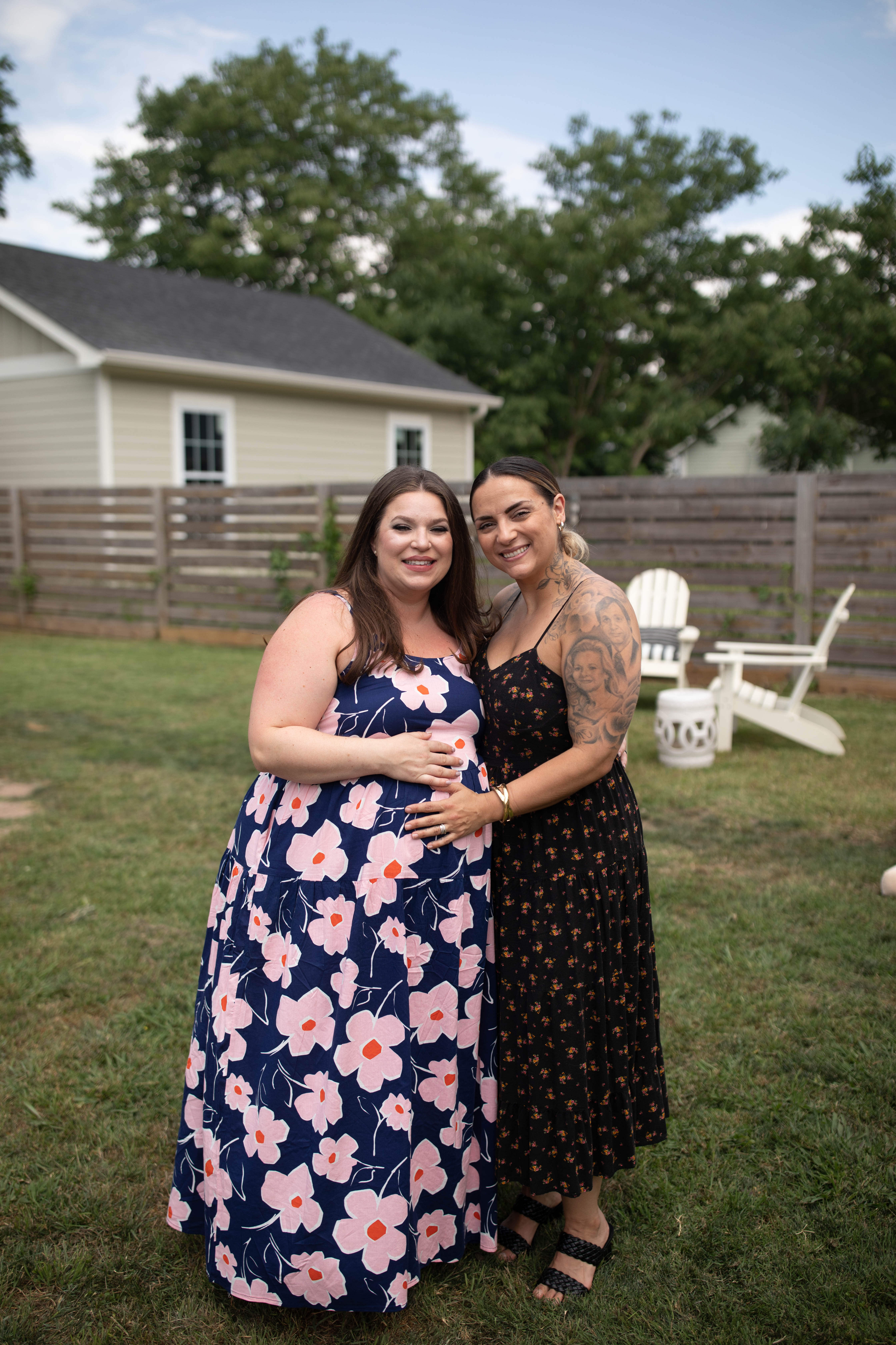
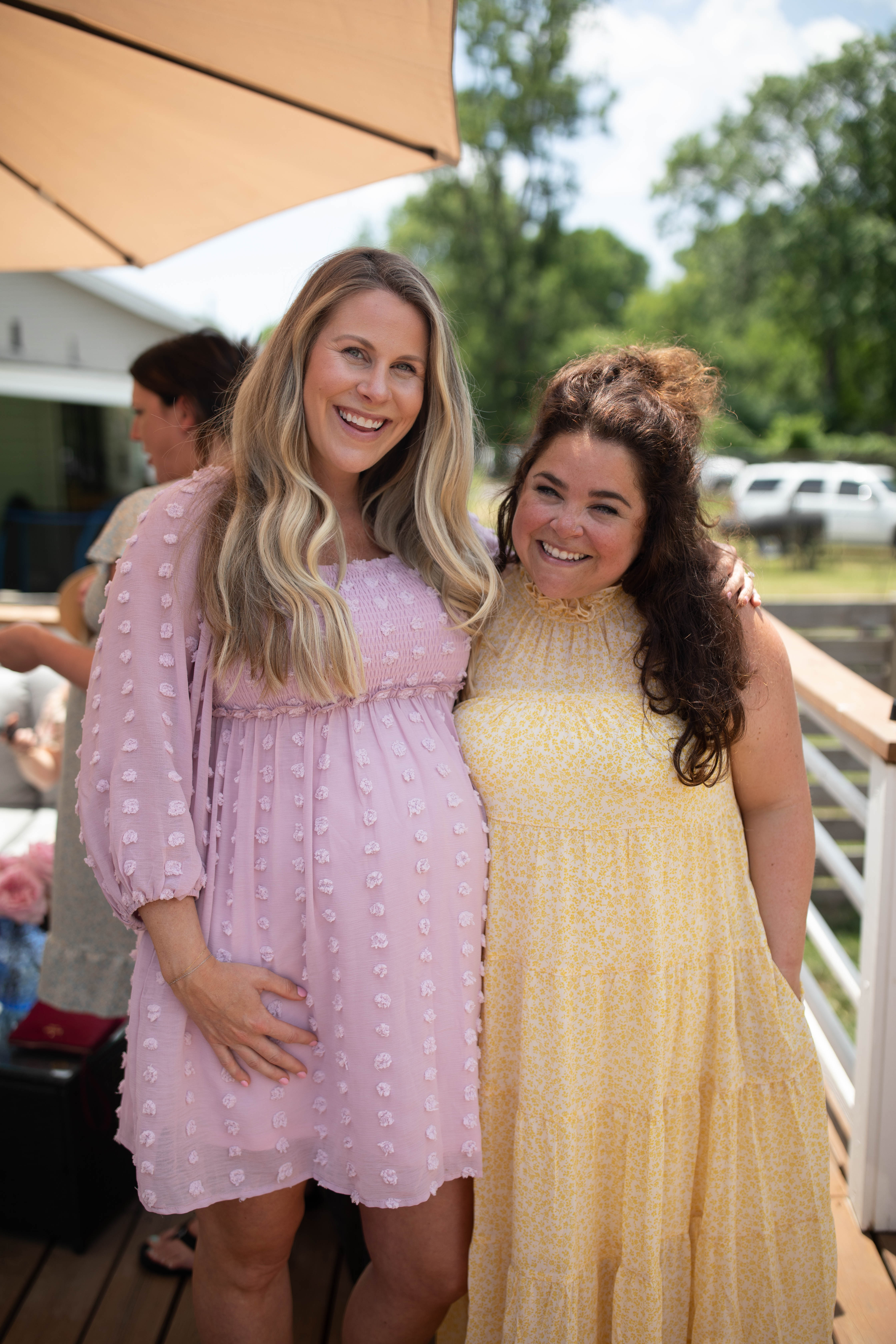
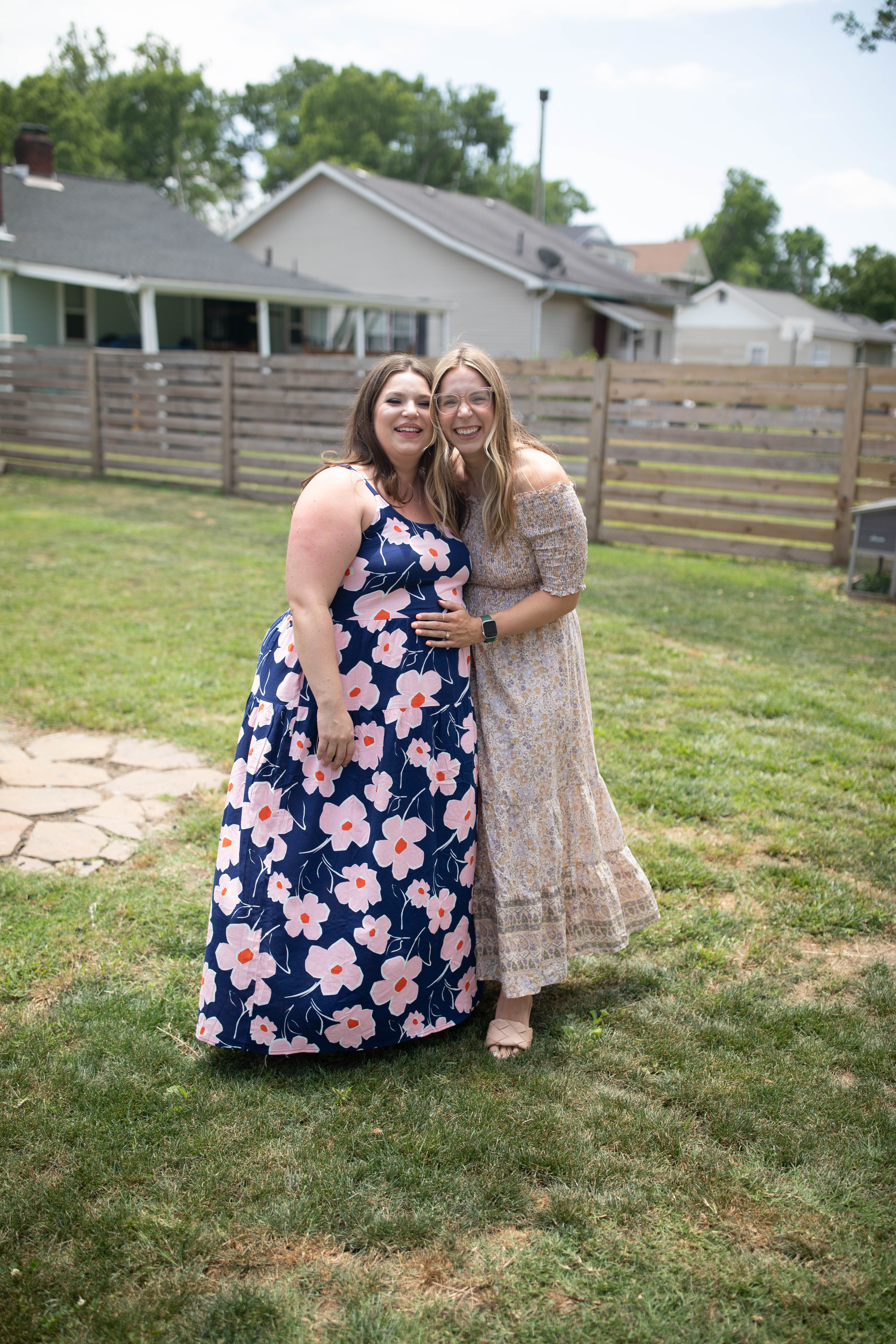
This June I had the honor of hosting the sweetest baby shower for my sister, Townley! Guys, I CANNOT wait to be an aunt. This feels so surreal, and I am drinking up every moment. So many of our clients have had the joy of working with Townley throughout the years as she is a machine behind the scenes at White Ink Calligraphy! She is the heart and soul of our stationary department. Townley continuously dedicates her time assisting our clients with graphic designing and printing services. Whether our couples want a custom wedding invitation suite or one-of-a-kind cocktail napkins, Townley makes it happen! So, now it’s time to celebrate Townley as she glides effortlessly into the beauty of a new role- mother. Enjoy this little peek inside what was an incredibly happy day for us all.
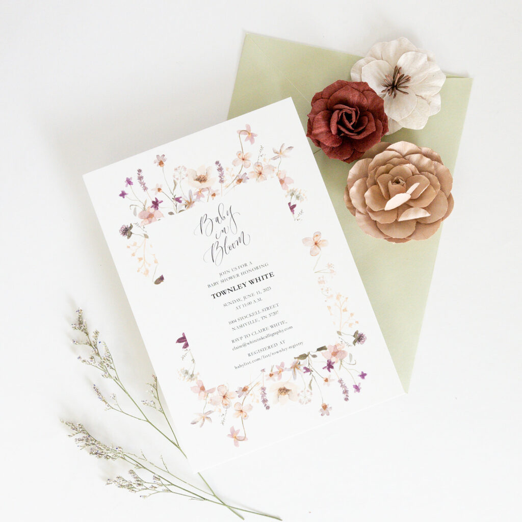
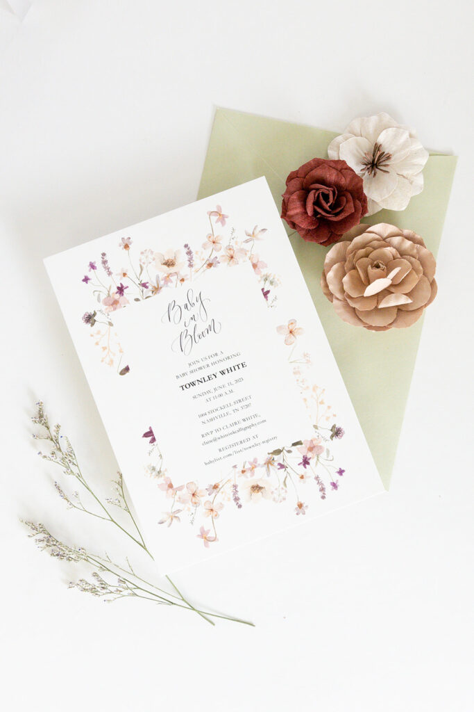
LOVE the invites that we sent out for Townley’s shower. It’s no surprise to anyone that I have always been huge fan of florals on invitations. The flowers bordering the event details are so beautiful and create the most delicate frame. We also really loved using this muted green for the envelopes.
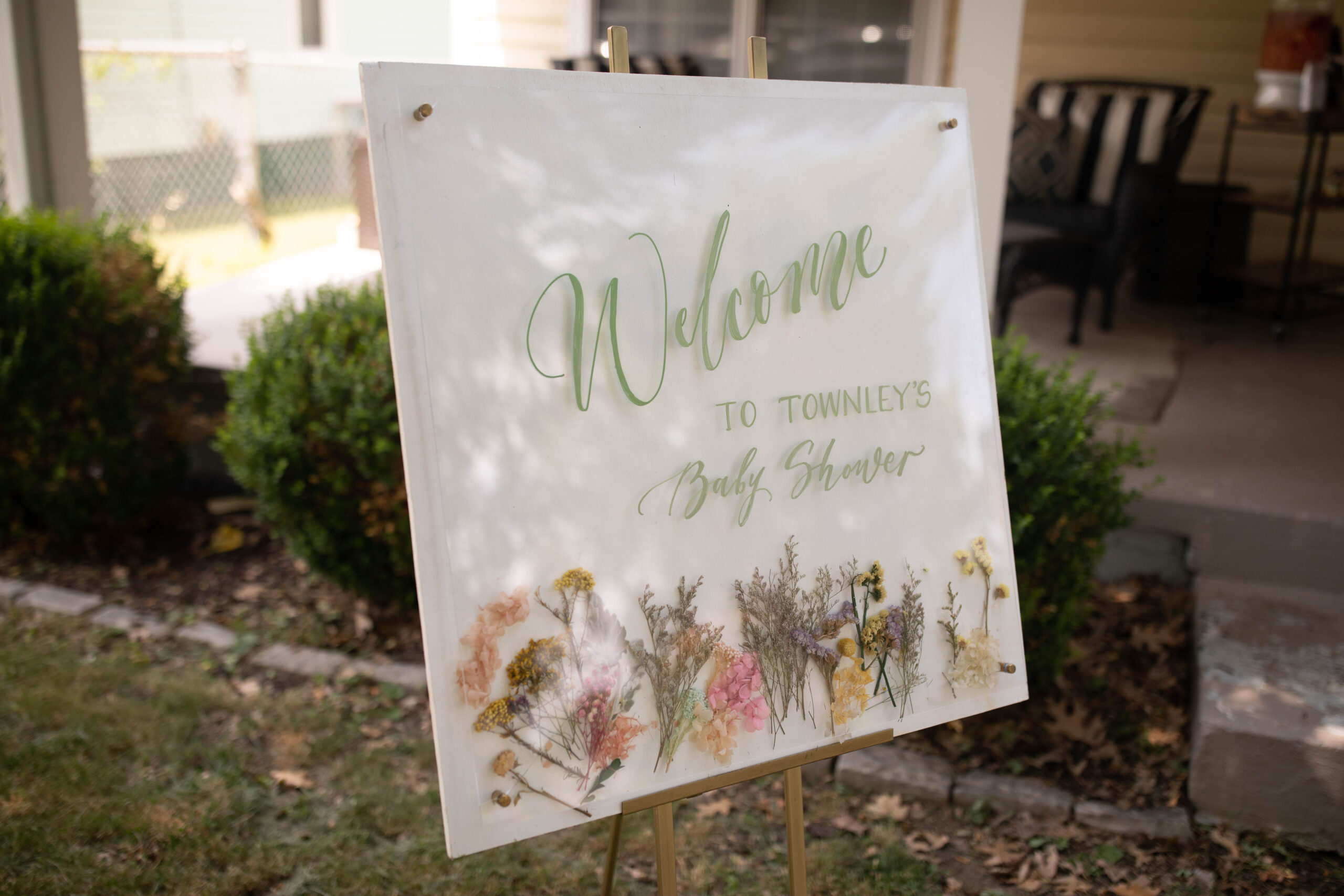
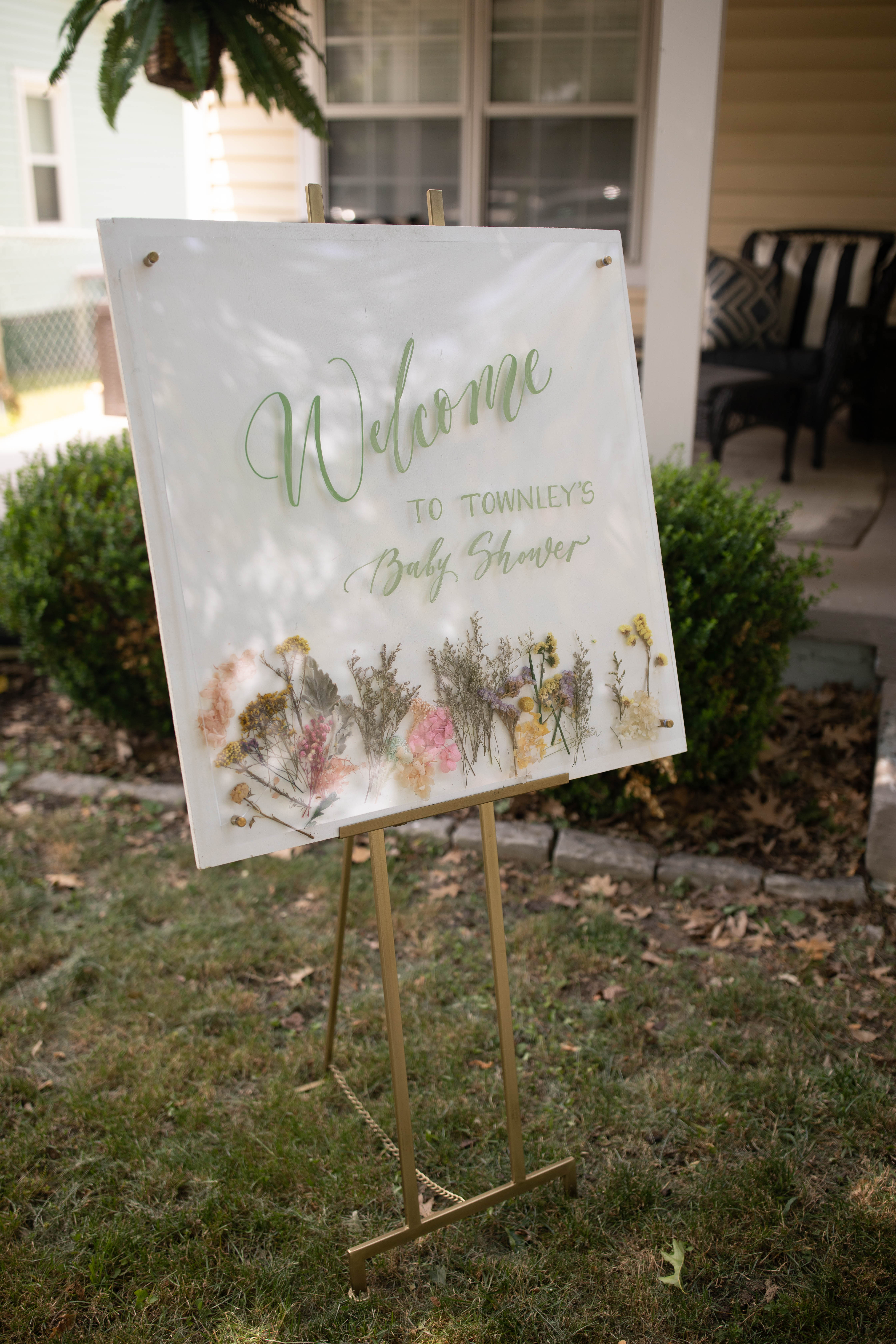
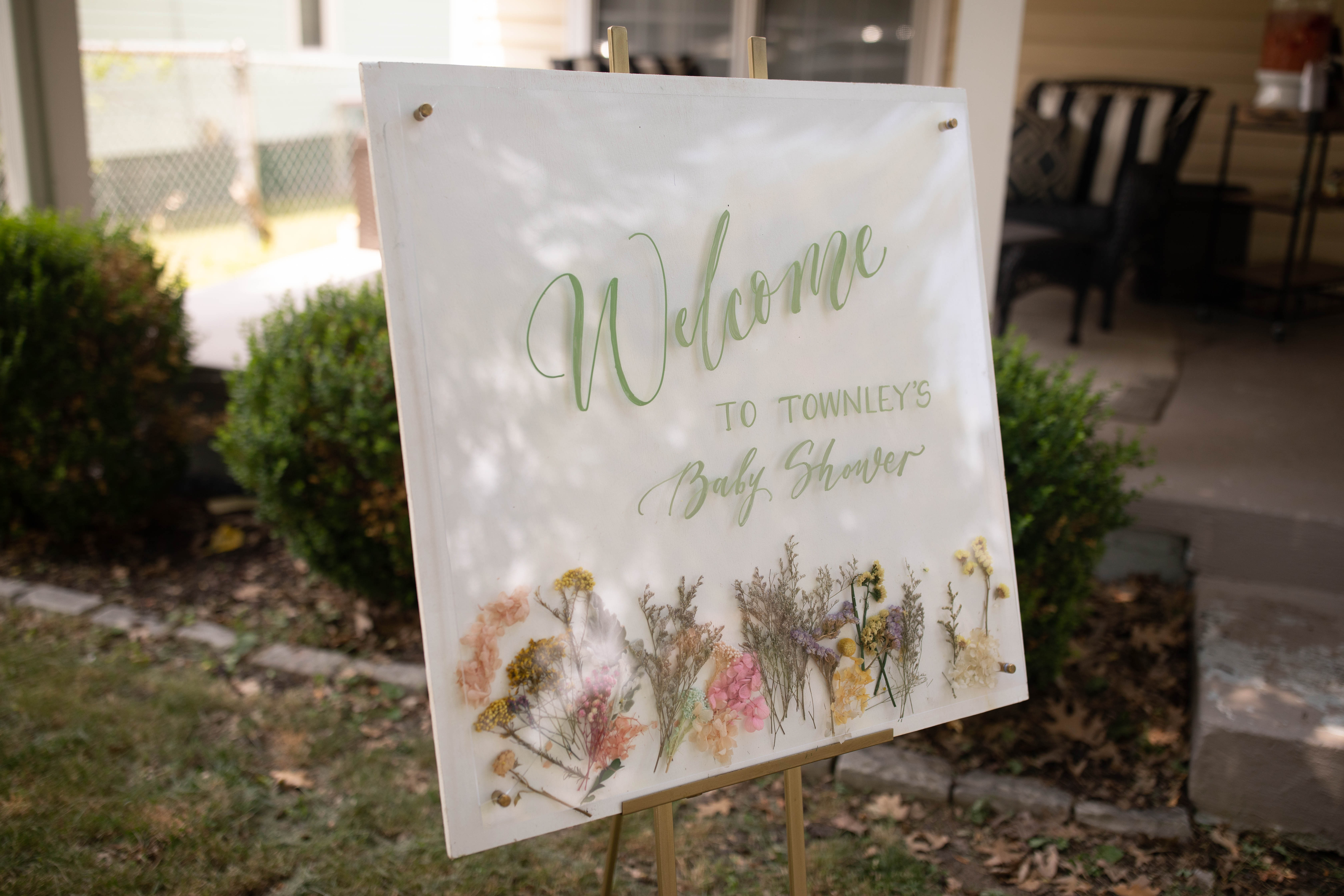
The welcome sign was a true joy to create! The pressed florals between the glass resembles the florals from the invites and the lettering takes on the same muted green from the invitation envelopes. I love when small details connect like this!
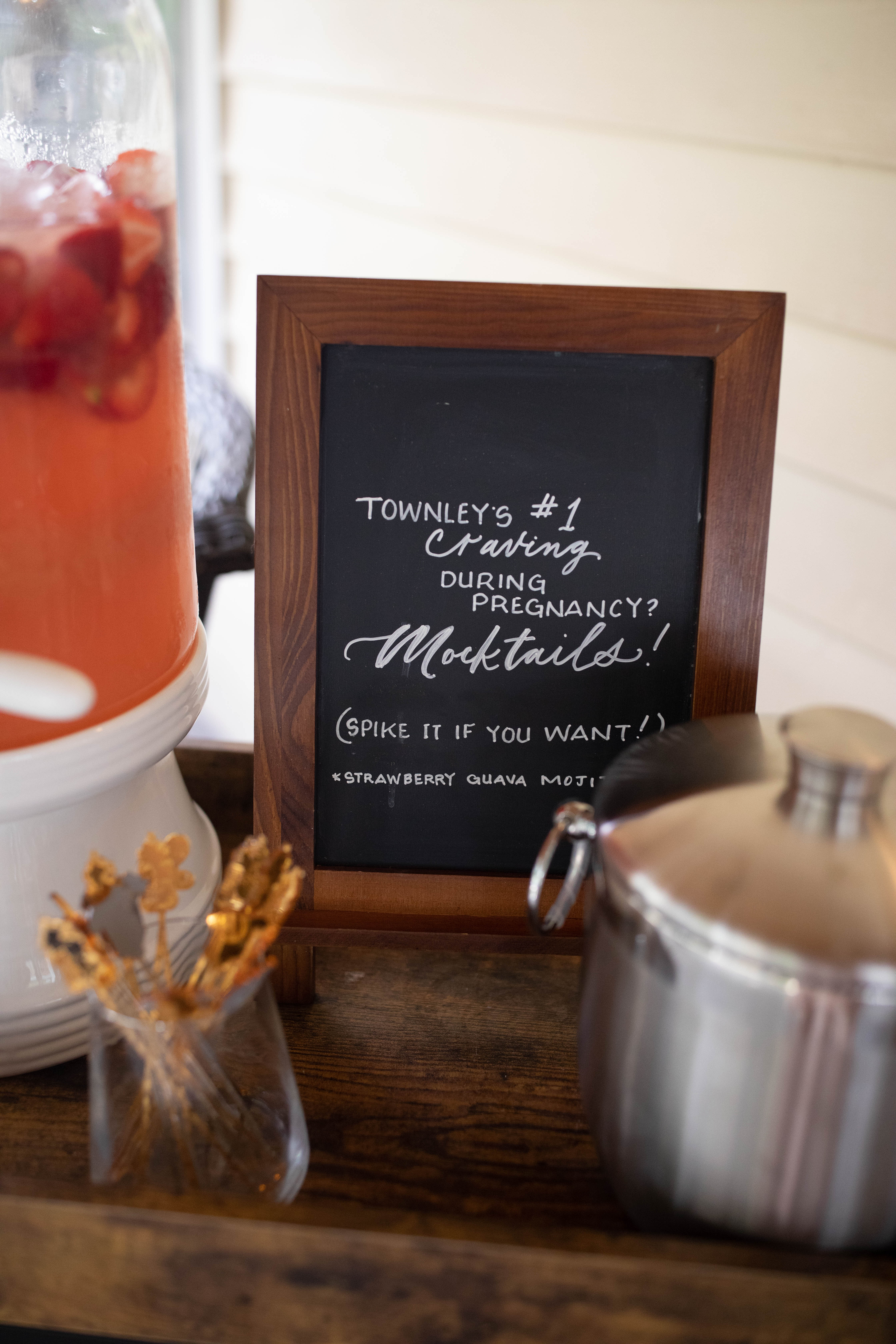
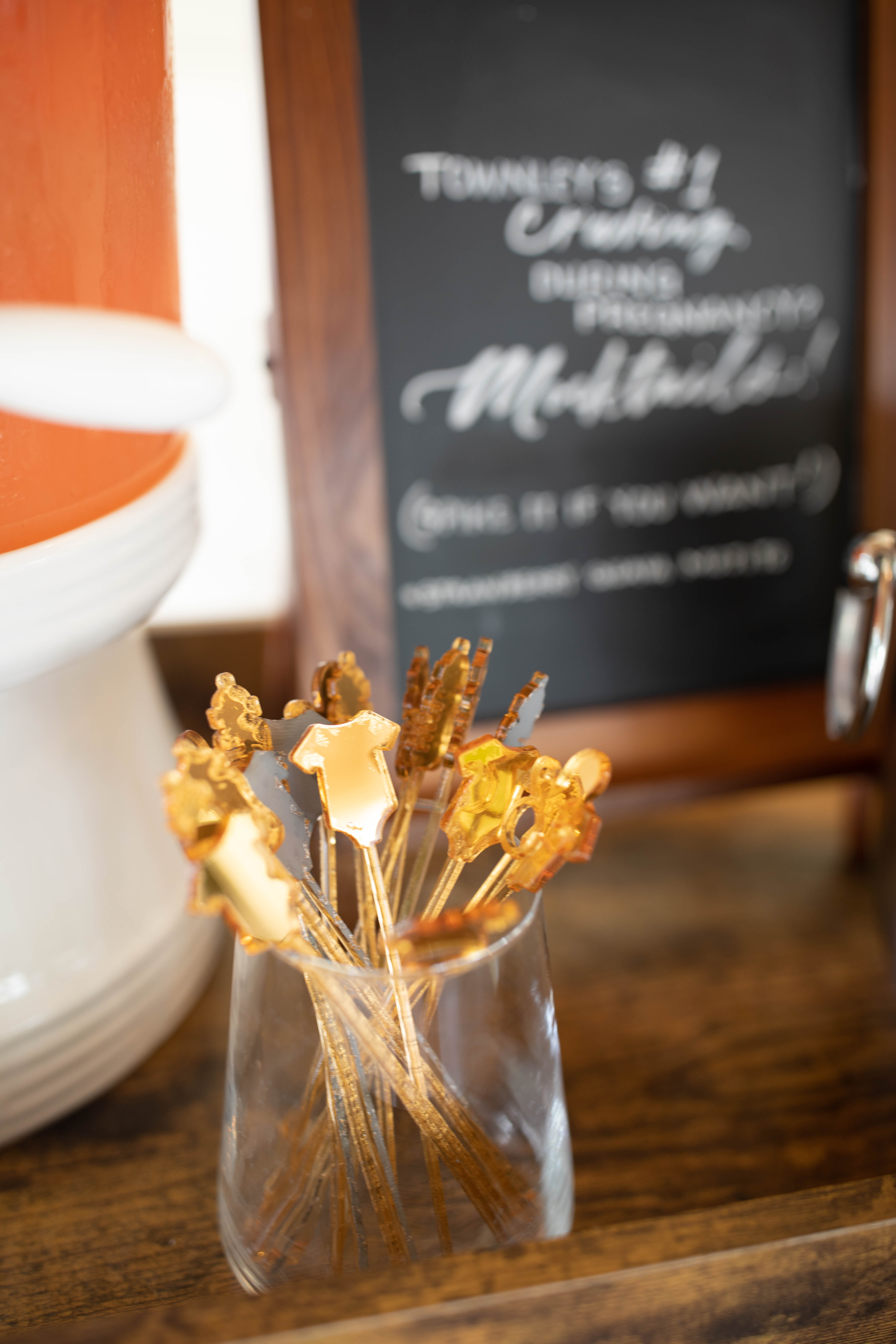
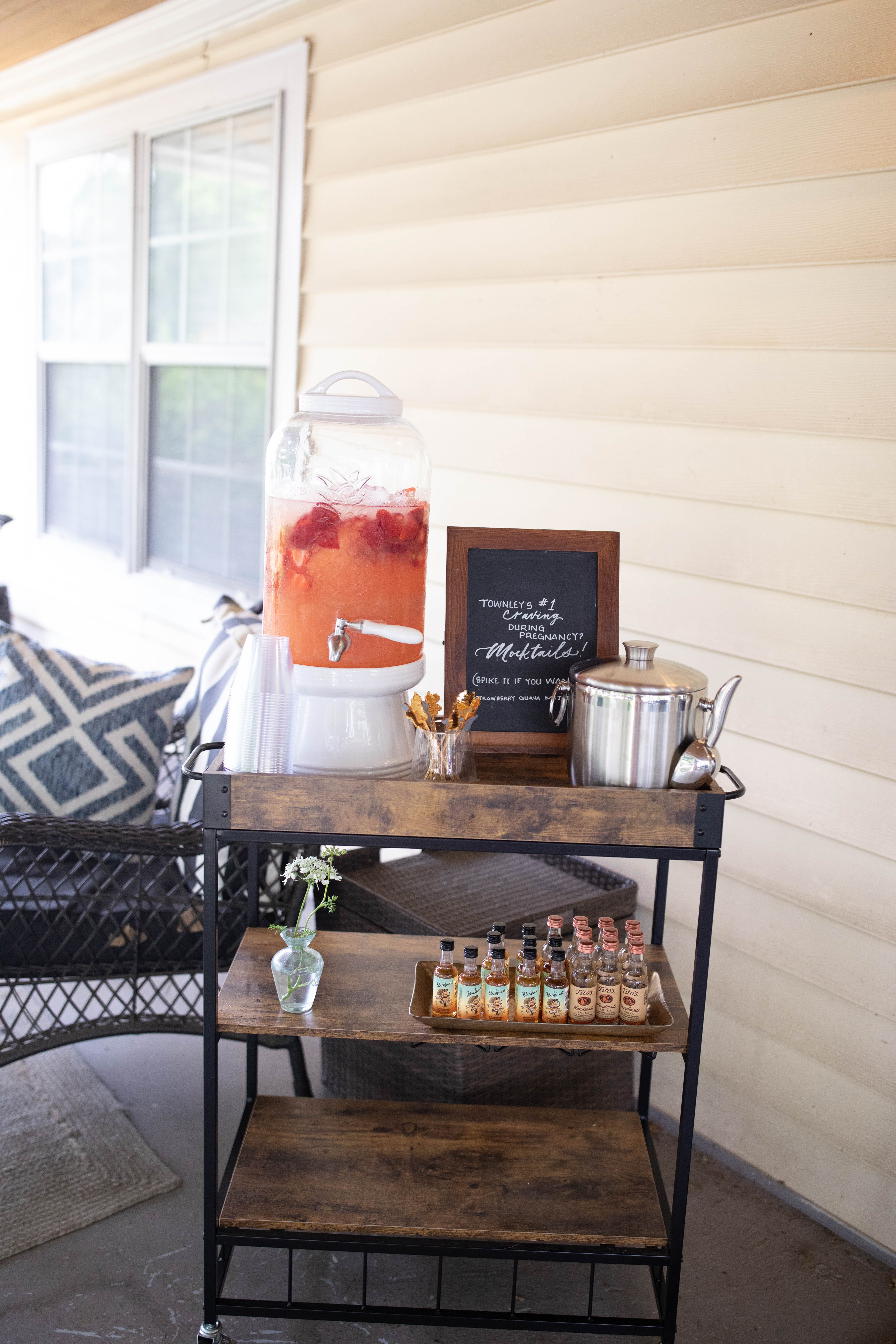
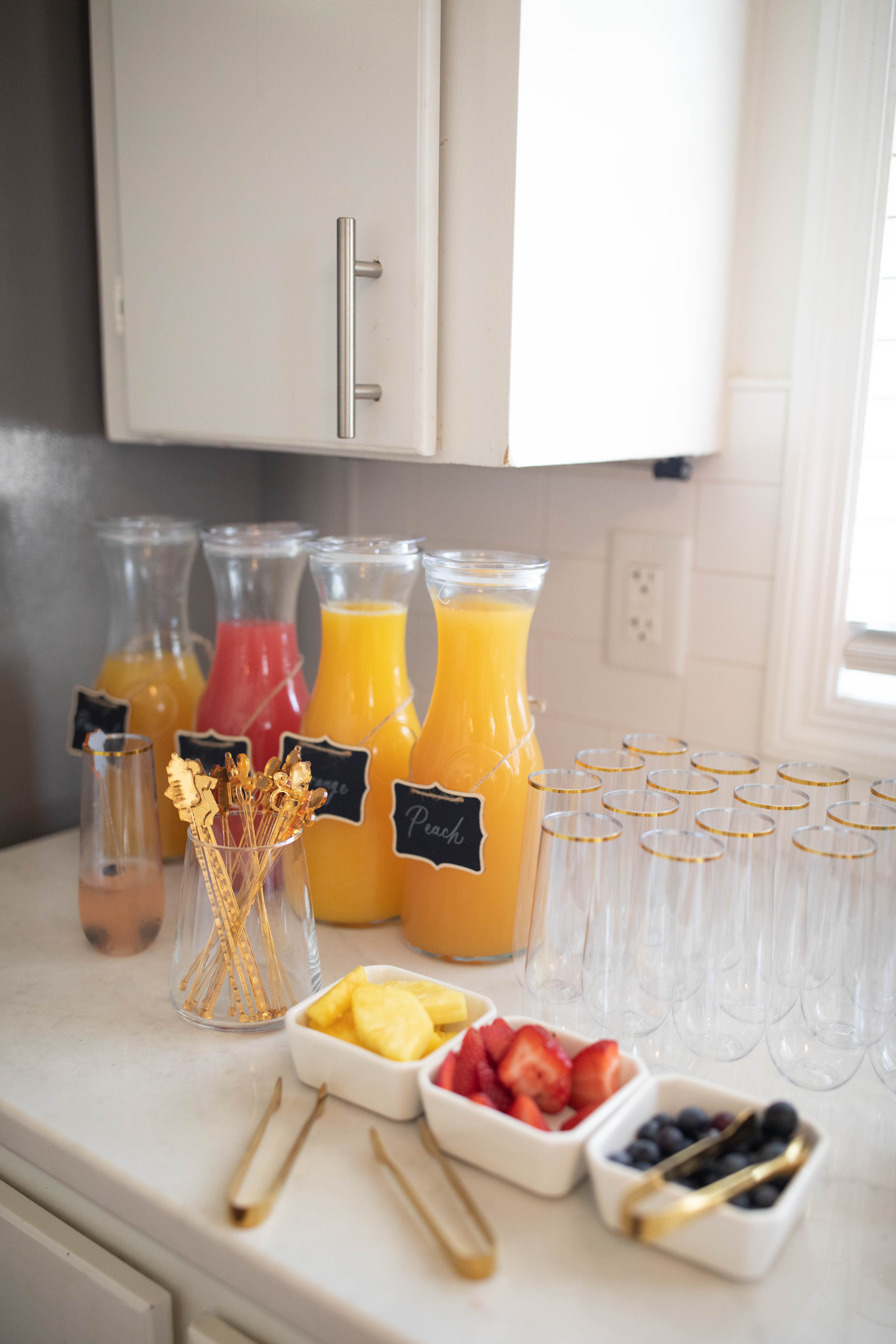
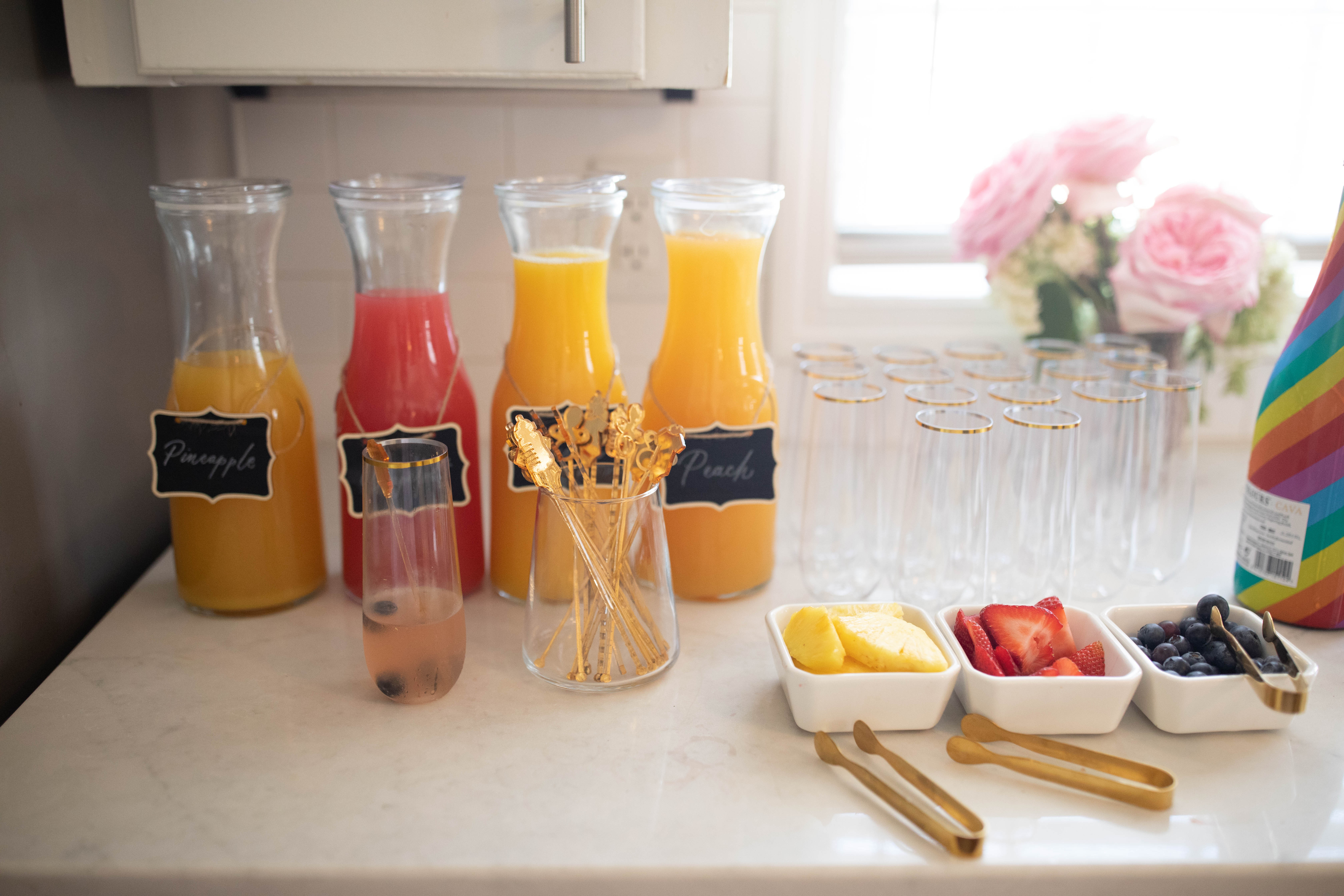
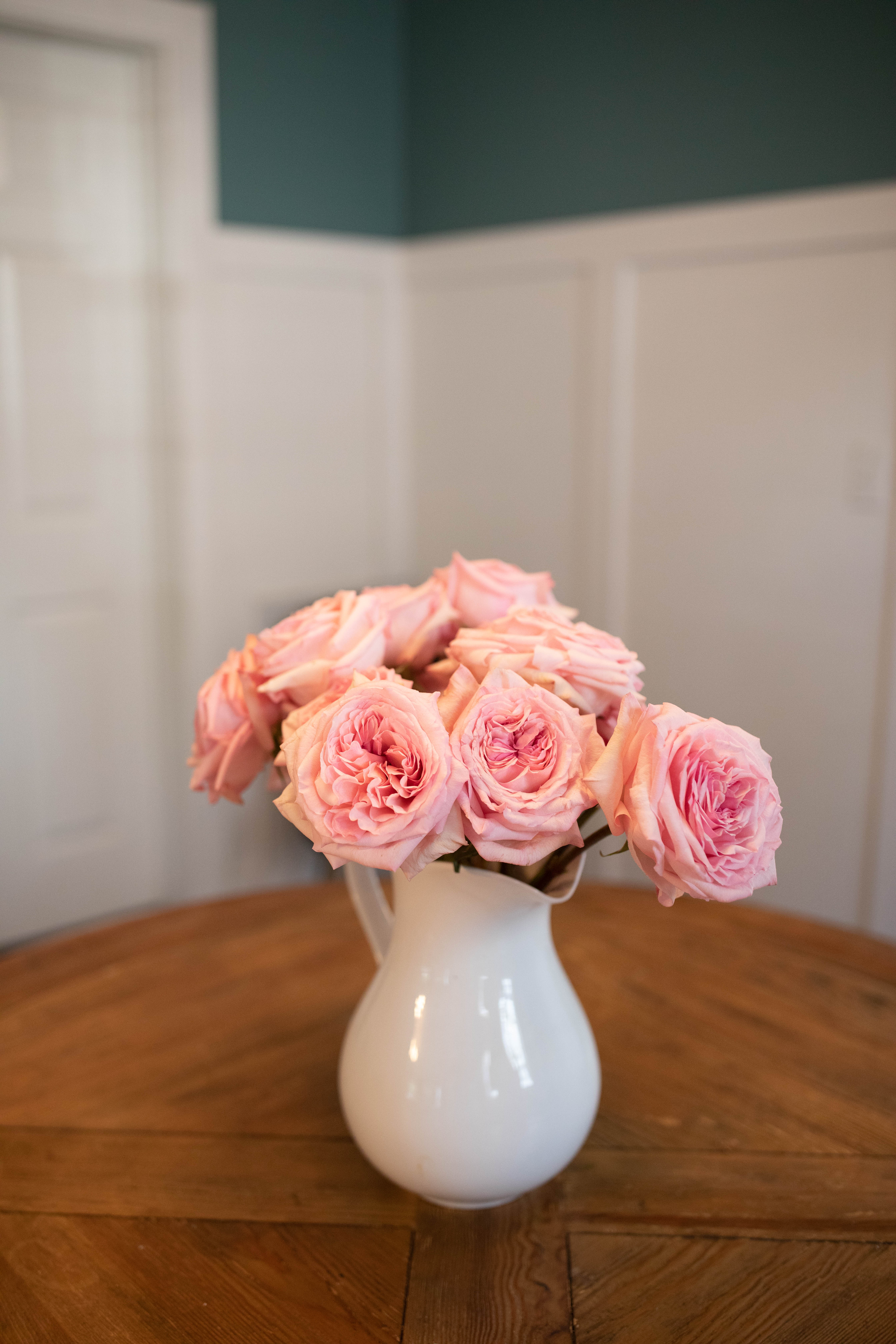
For the mamas out there who experienced pregnancy, did you ever have any food cravings? Townley definitely did….she craved mocktails! That has been her number one food craving throughout her pregnancy. So, naturally, we set up a mocktail bar so she could mocktail to her heart’s content. I especially loved the little onesie, paci, and bottle stirrers!
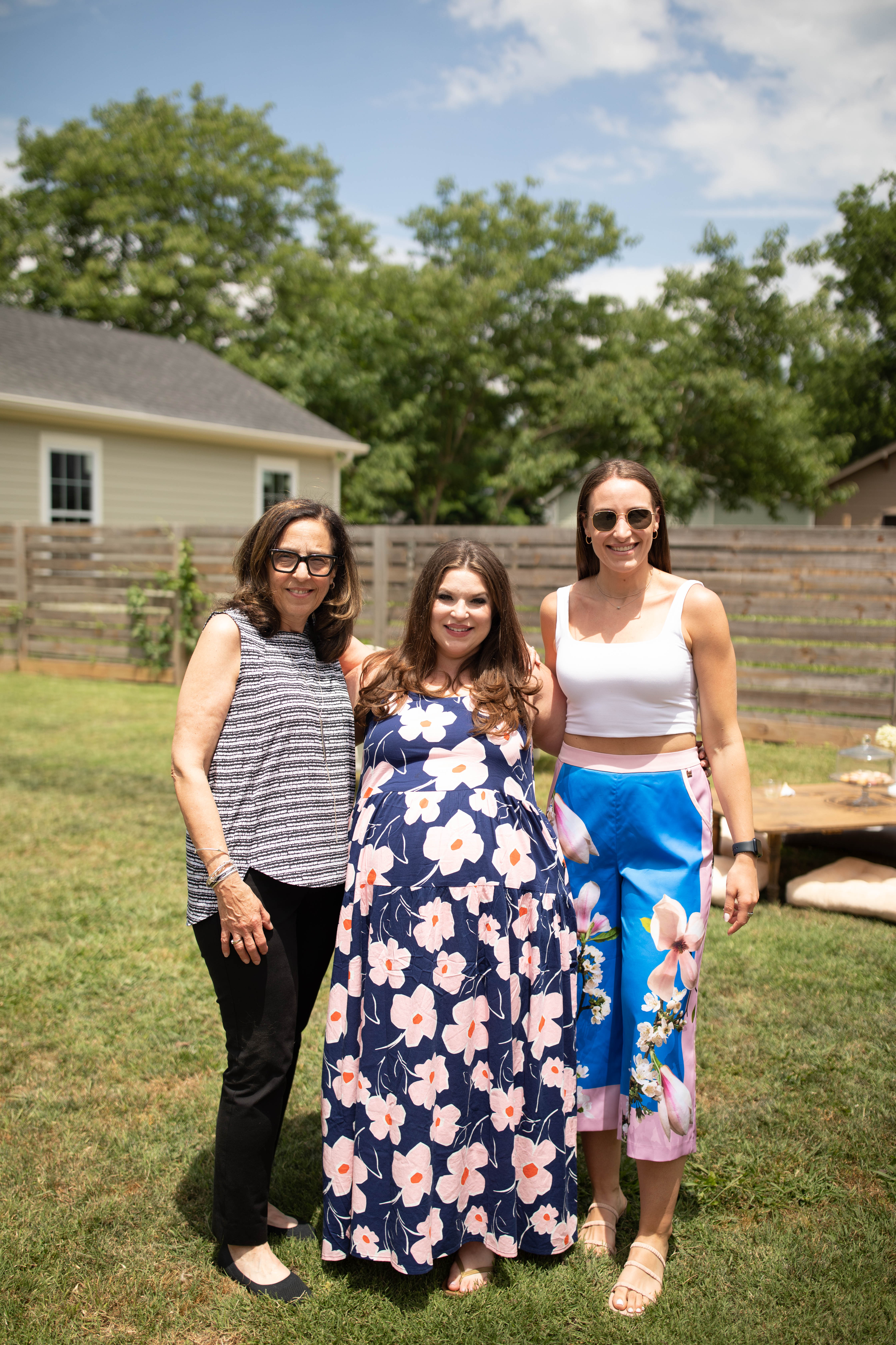
Friends and family surrounded Townley and showed so much support. We were so excited to celebrate baby Goldberg!
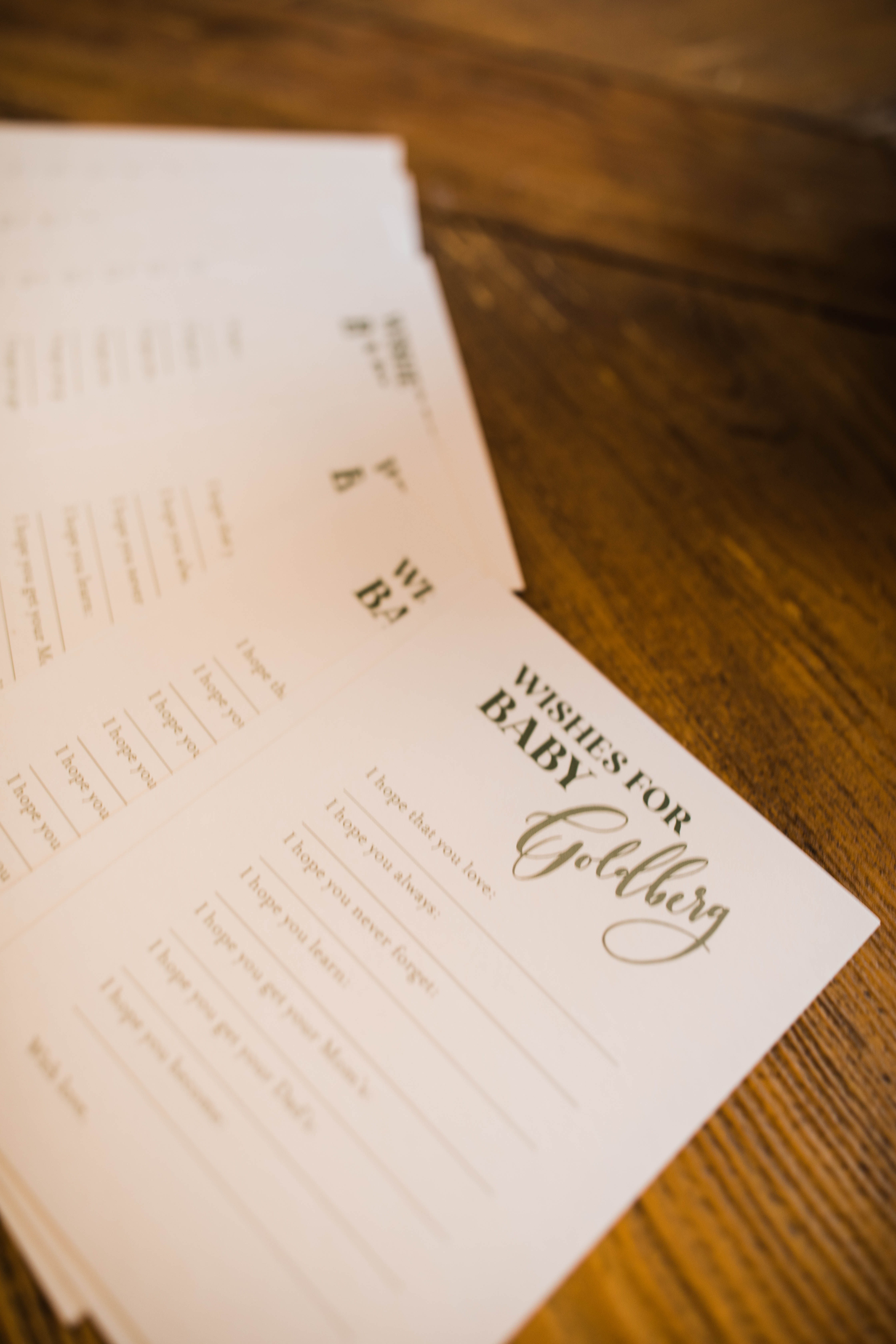
It was so fun having everyone fill out these personal message cards for baby Goldberg. There was so much love shared through these sweet notes! – I hope that you love – I hope you always- I hope you never forget – I hope you learn – I hope you get your mama’s – I hope you get your dad’s – I hope you become –
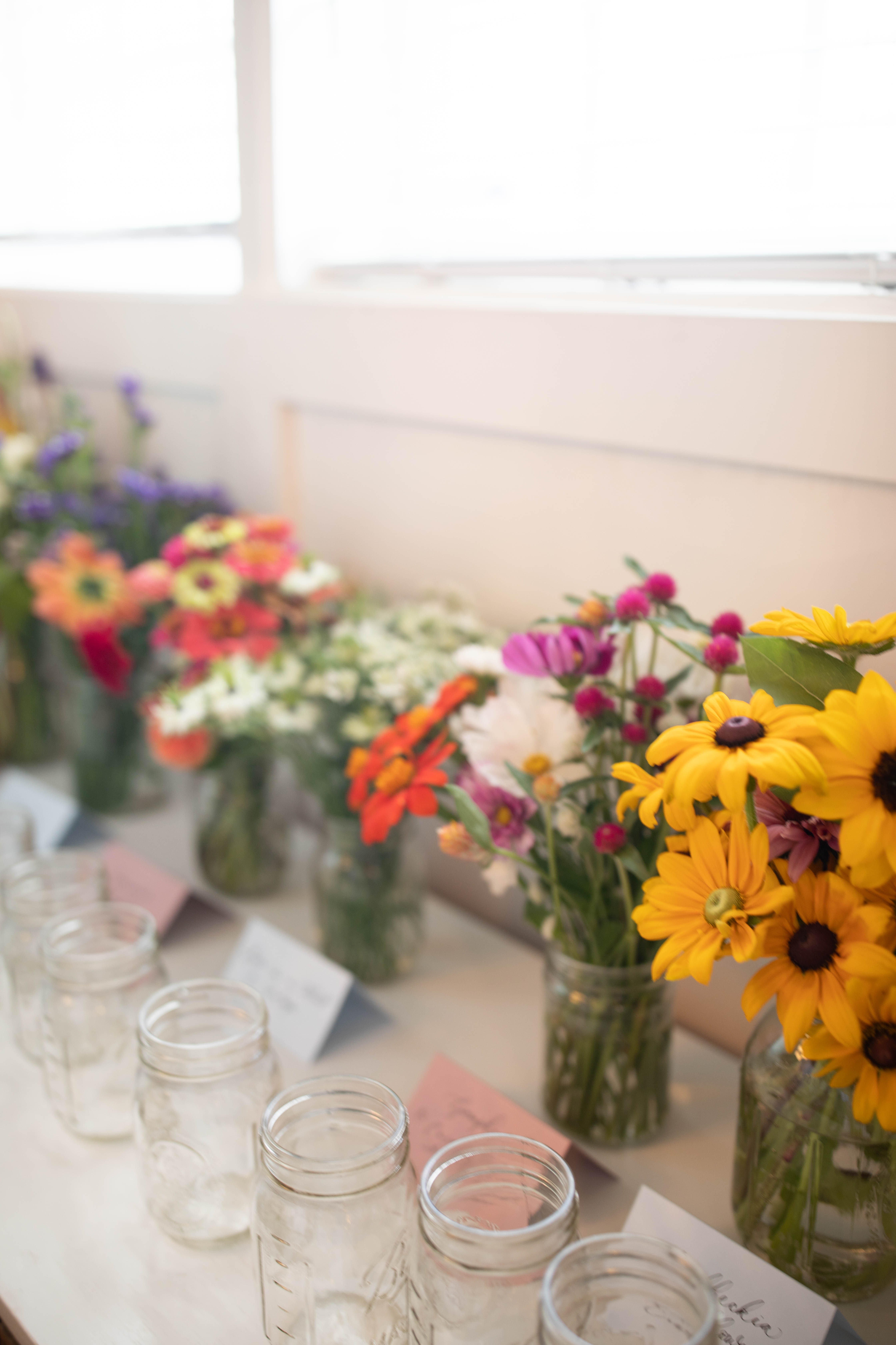
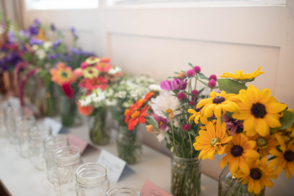
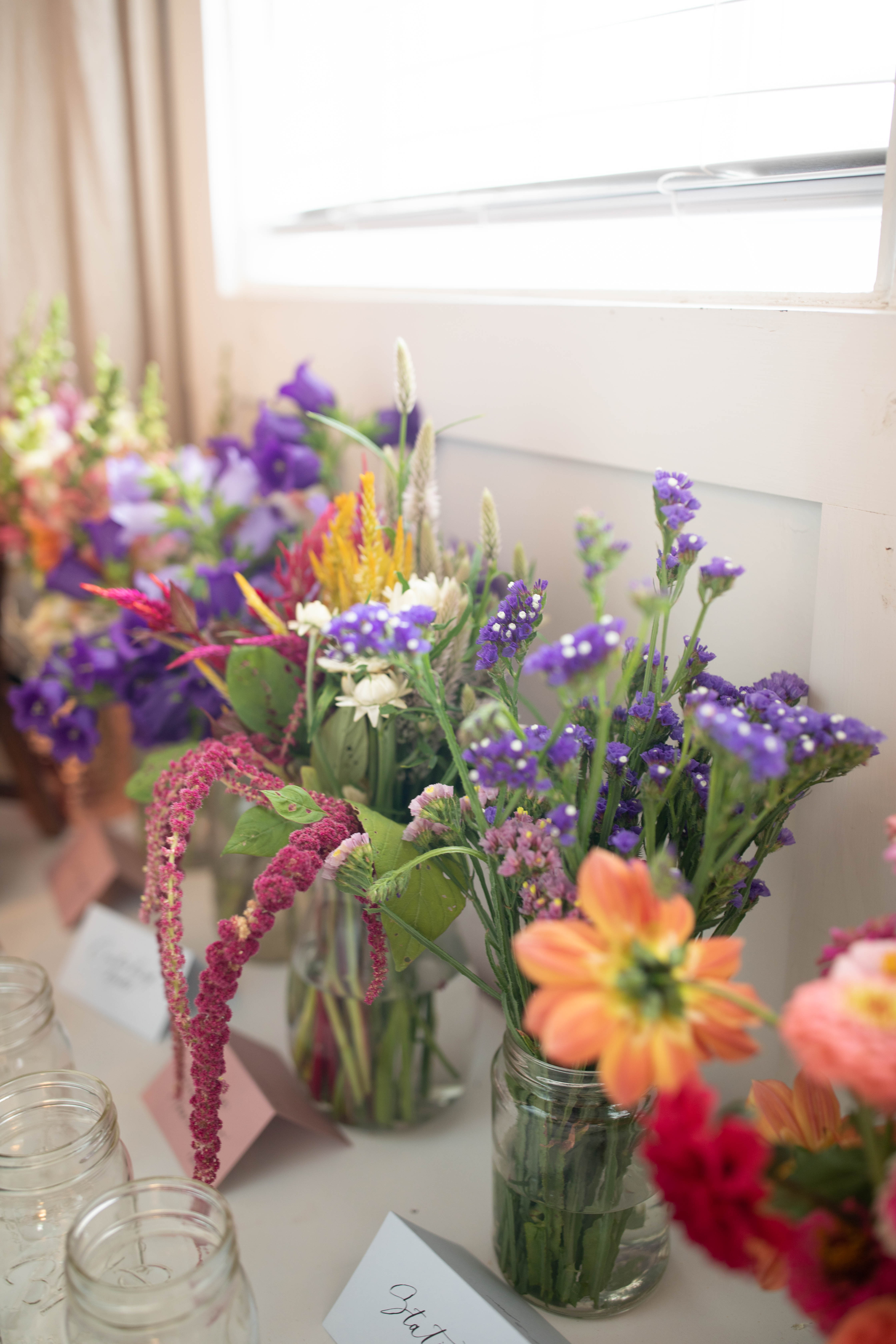
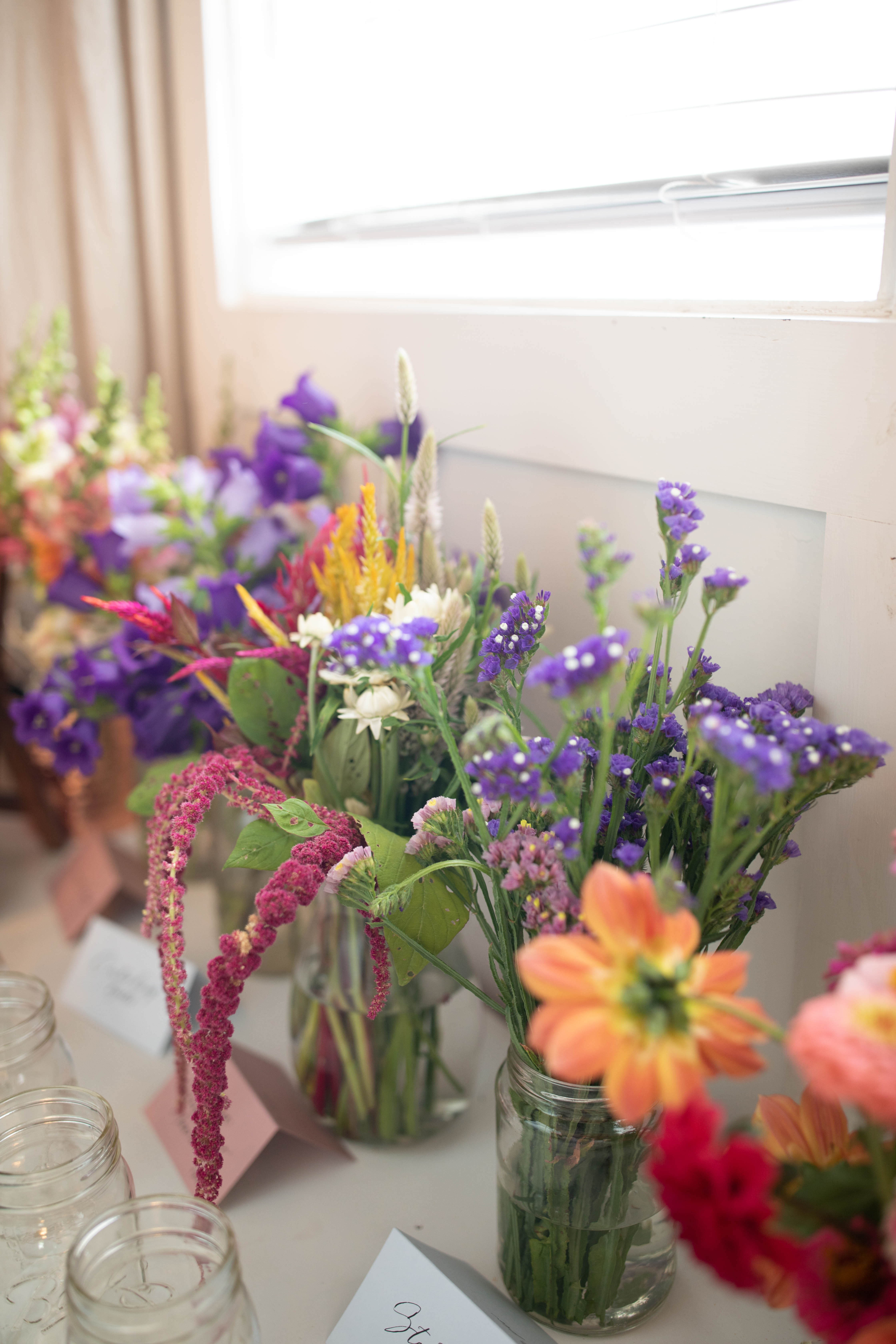
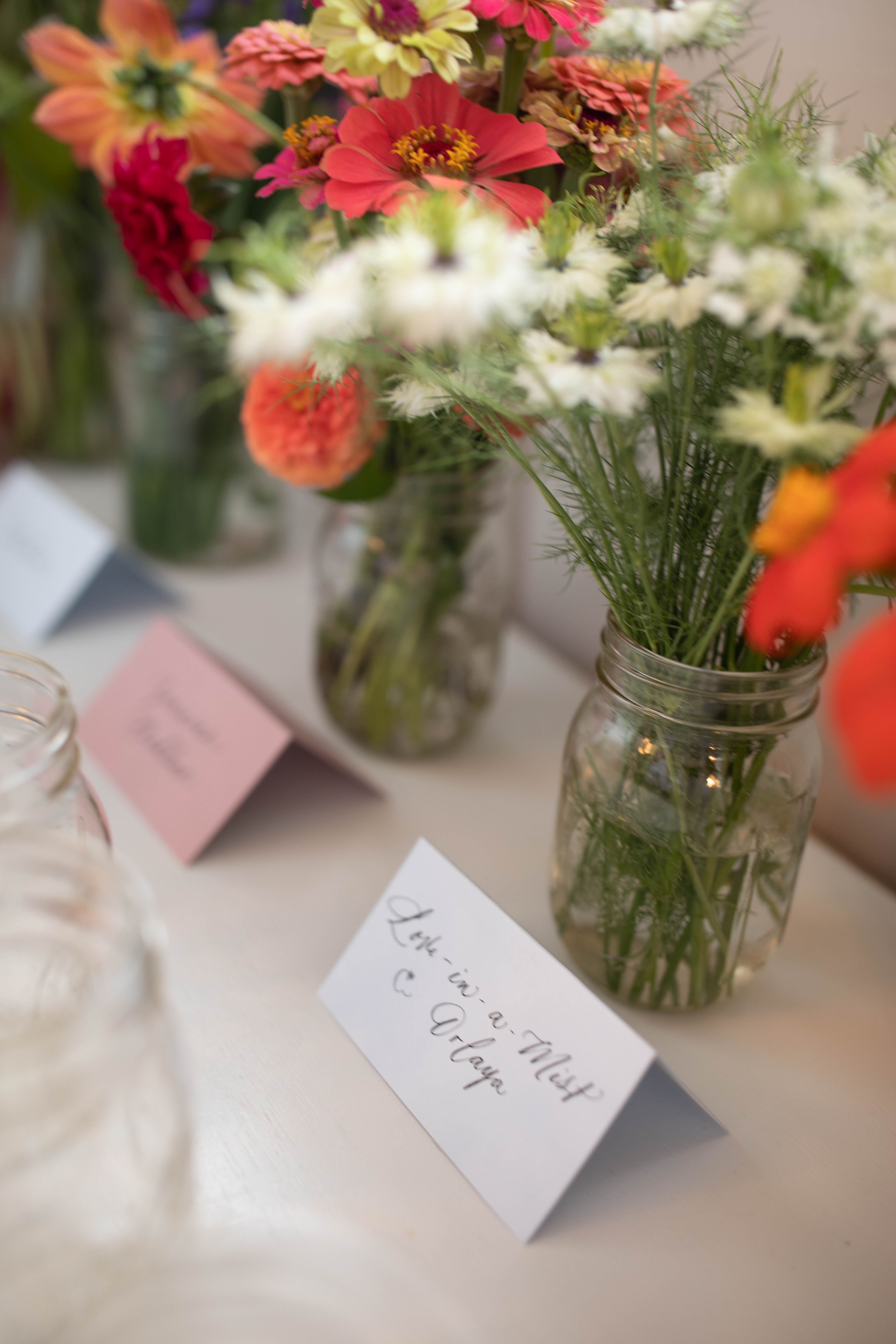
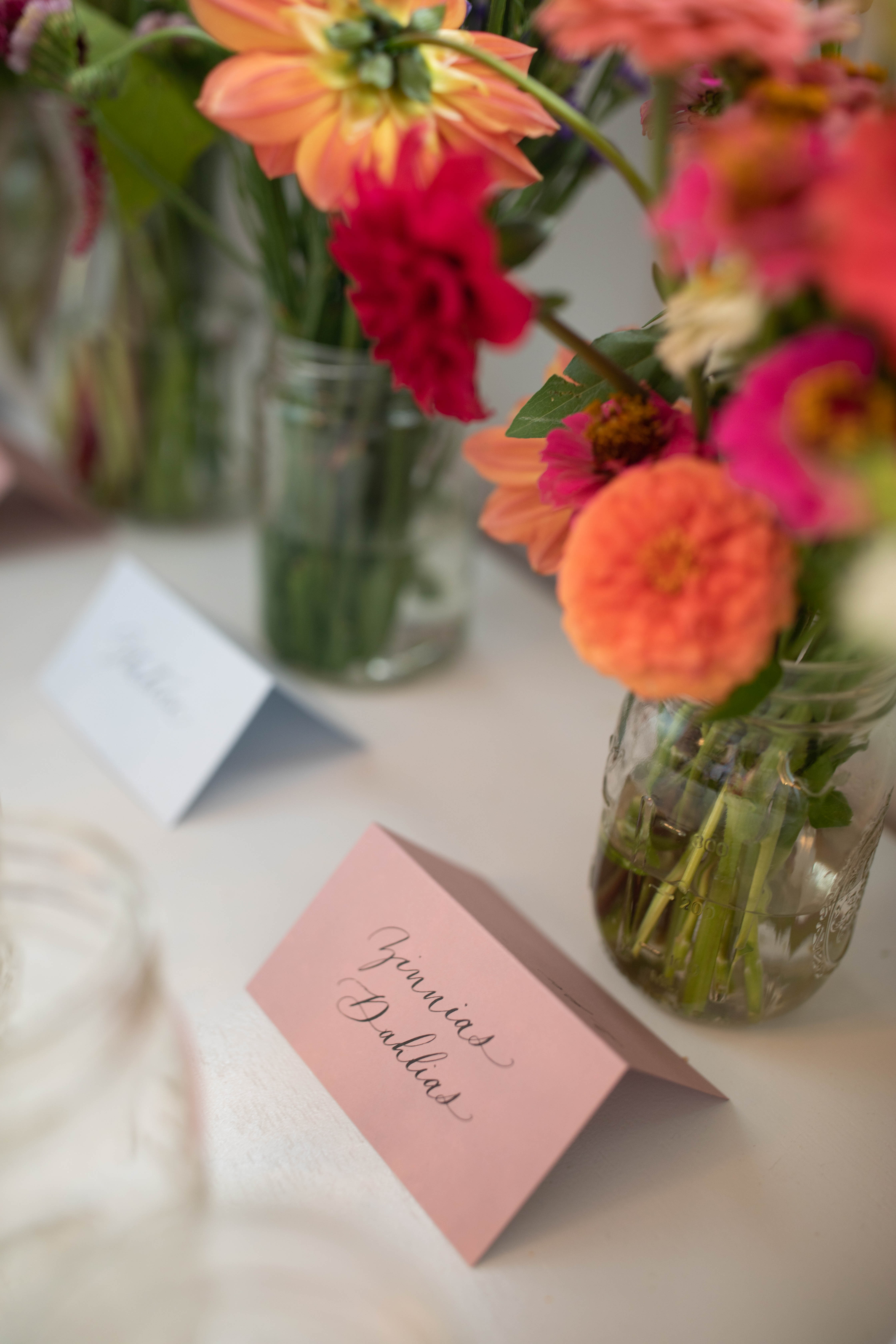
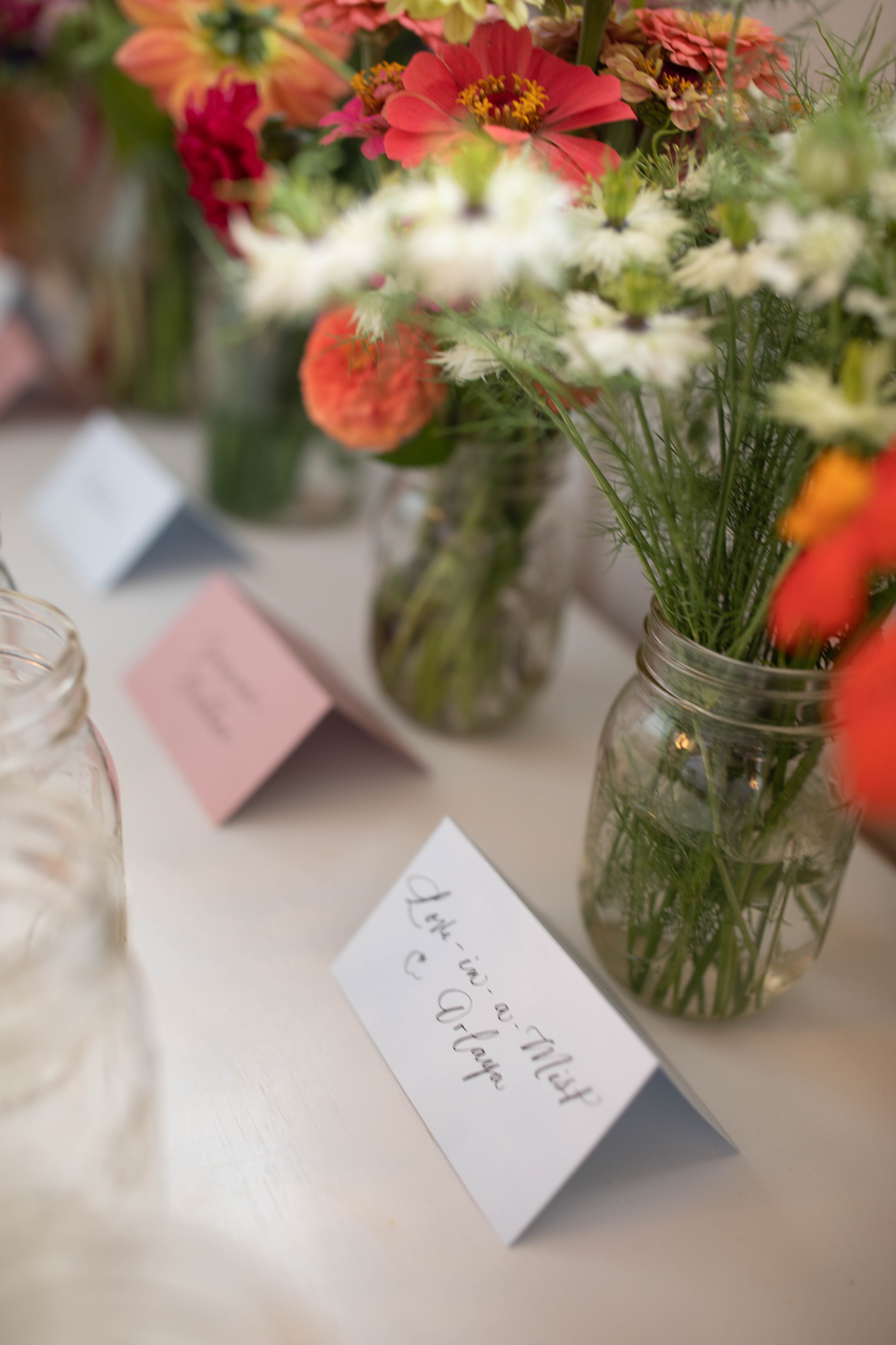
I am so lucky to have a local urban farm right in my neighborhood! Joy House Blooms supplied us with the most GORGEOUS selection of flowers which we used to create a “floral bar”. Guests were encouraged to make their own arrangements that they could take back home with them using this amazing selection of flowers!
The place cards used to identify the flowers looked so good here! The colors, the place cards, the flowers, the mason jars- it’s all just perfection!
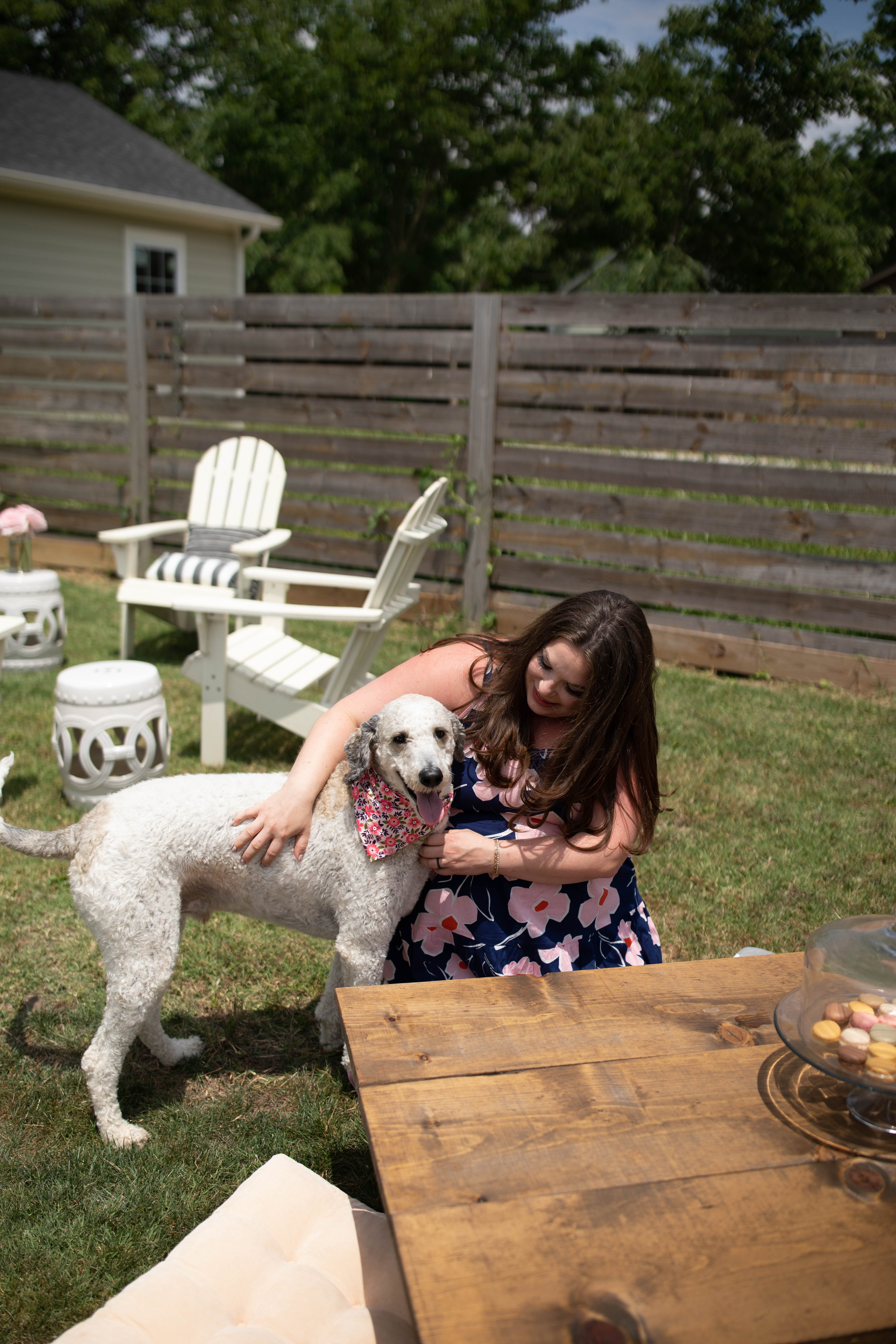
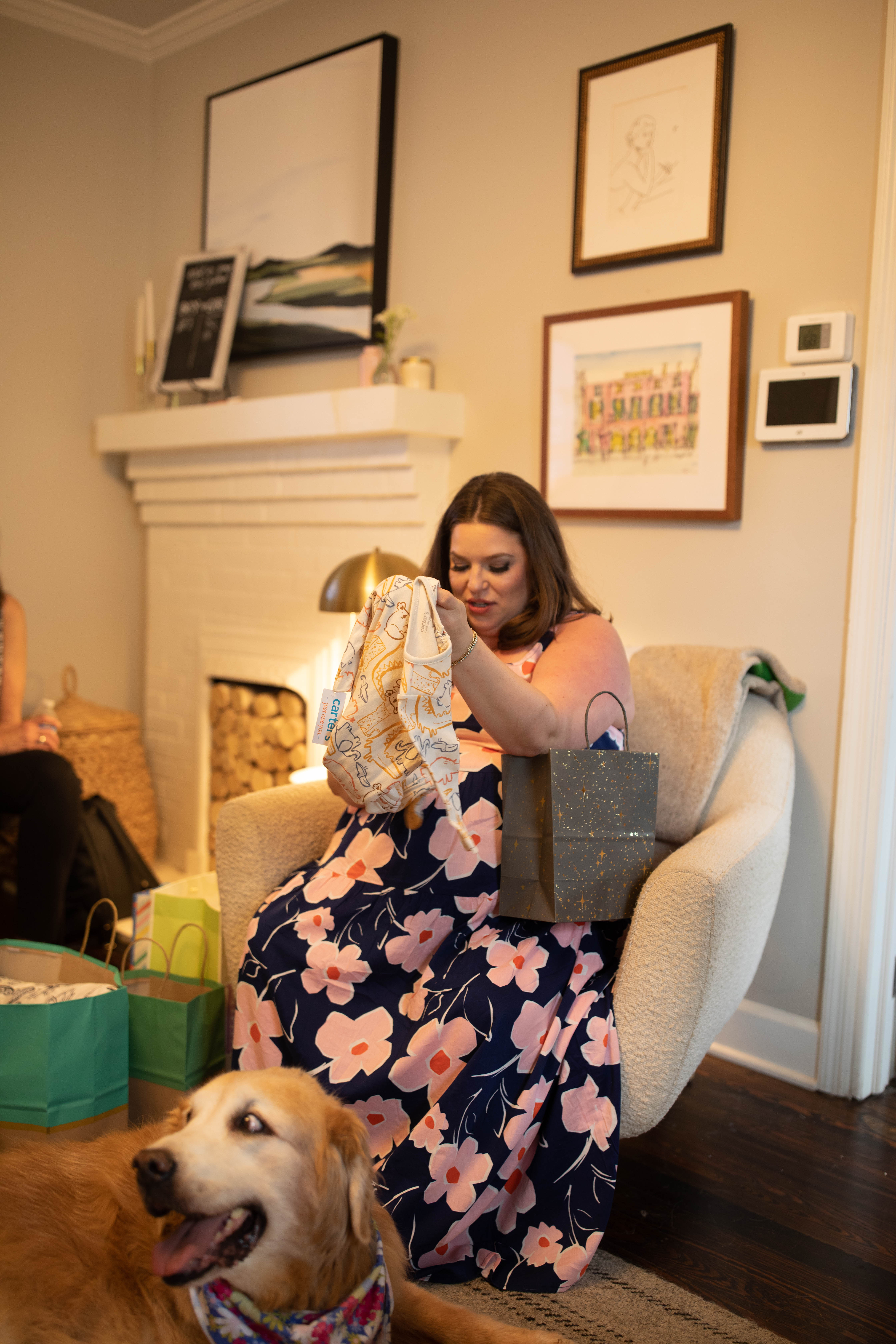
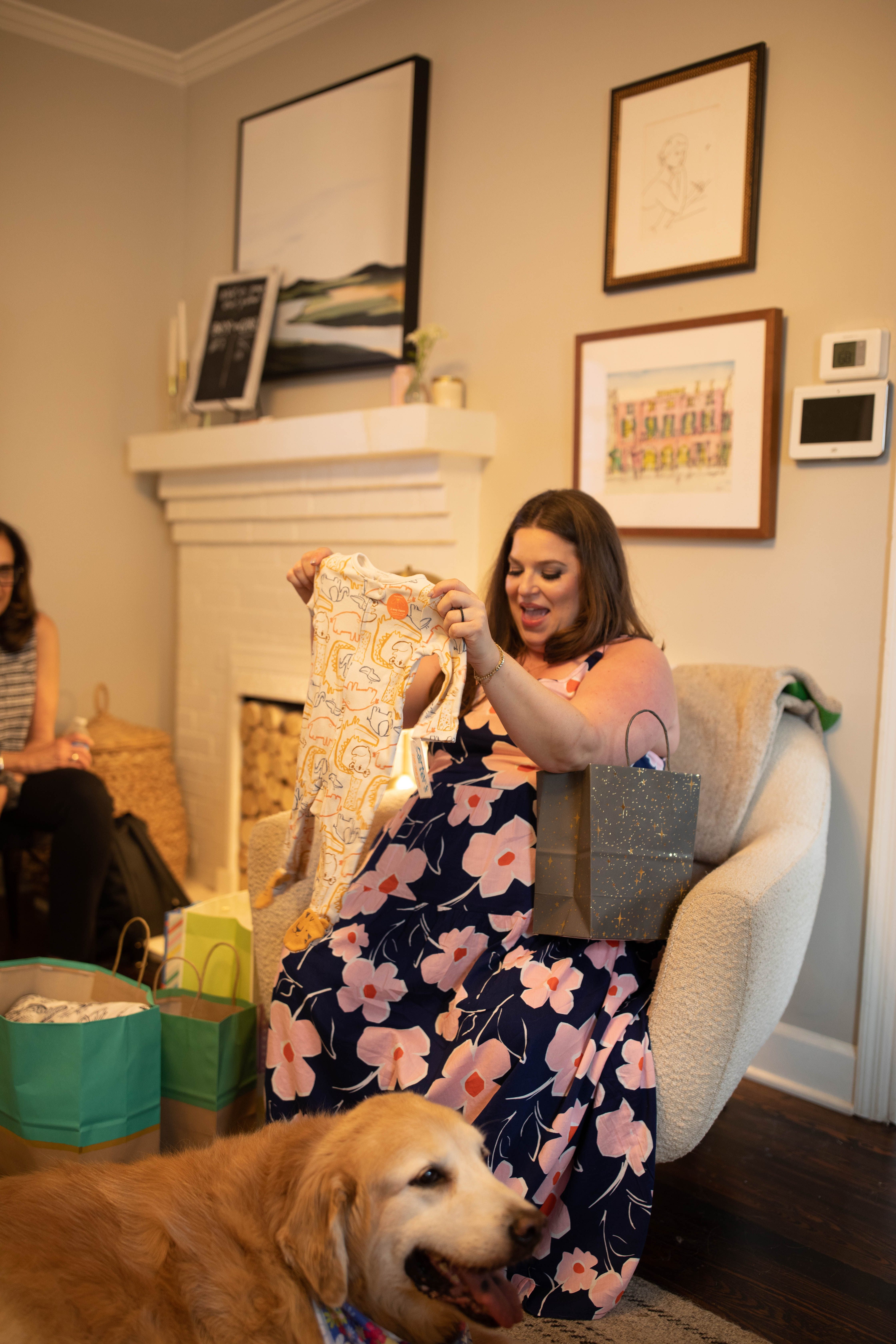
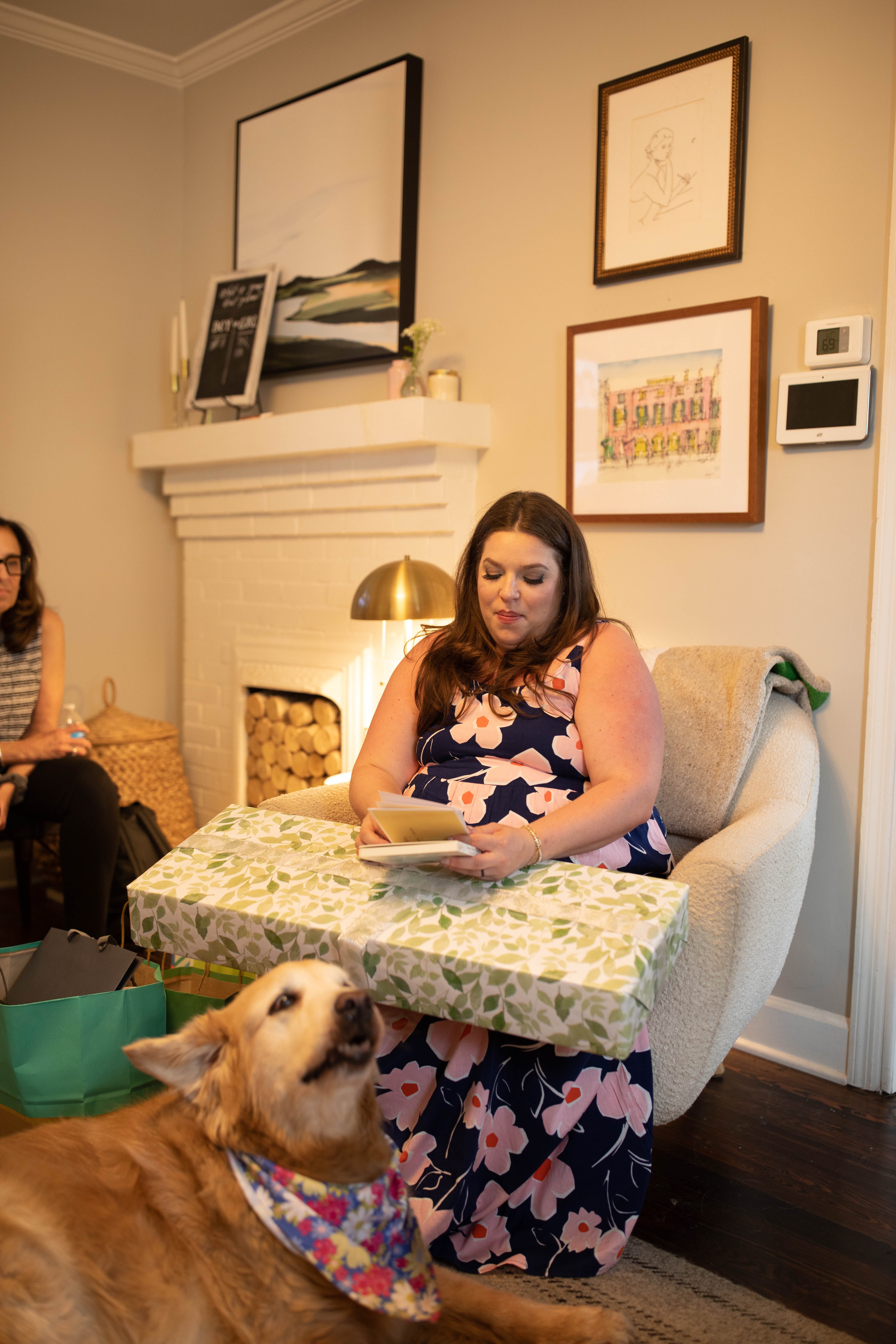
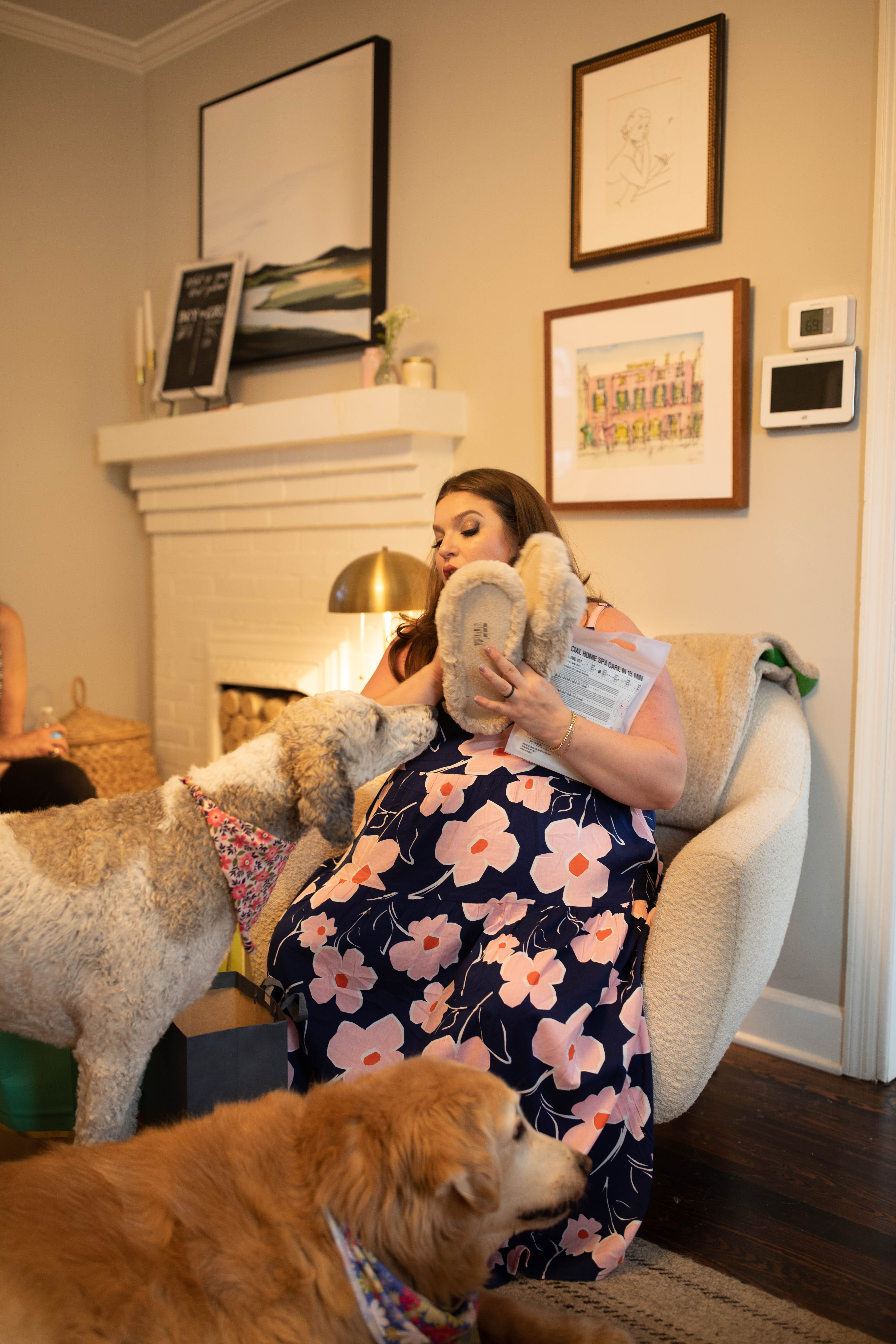
Our dogs definitely tried to steal the spotlight during the gift opening. They’re the cutest little attention stealers though aren’t they?
This will be a day I will always cherish. My sister is like my right hand. White Ink wouldn’t be what it is today without her diligence and dedication. But making me an aunt is the best gift by far! I can’t wait to meet baby Goldberg.