Every wedding we work on is such a different experience and always such a treat to see everything come together. For Anna and Ross’s wedding we had the joy of not only creating their wedding day paper goods and day of details, but also had a hand in designing items for their rehearsal dinner too! I love when we have the opportunity to design items for an entire wedding weekend as it really allows for an immersive experience as details are intentionally woven throughout the events.
Rehearsal Dinner Details
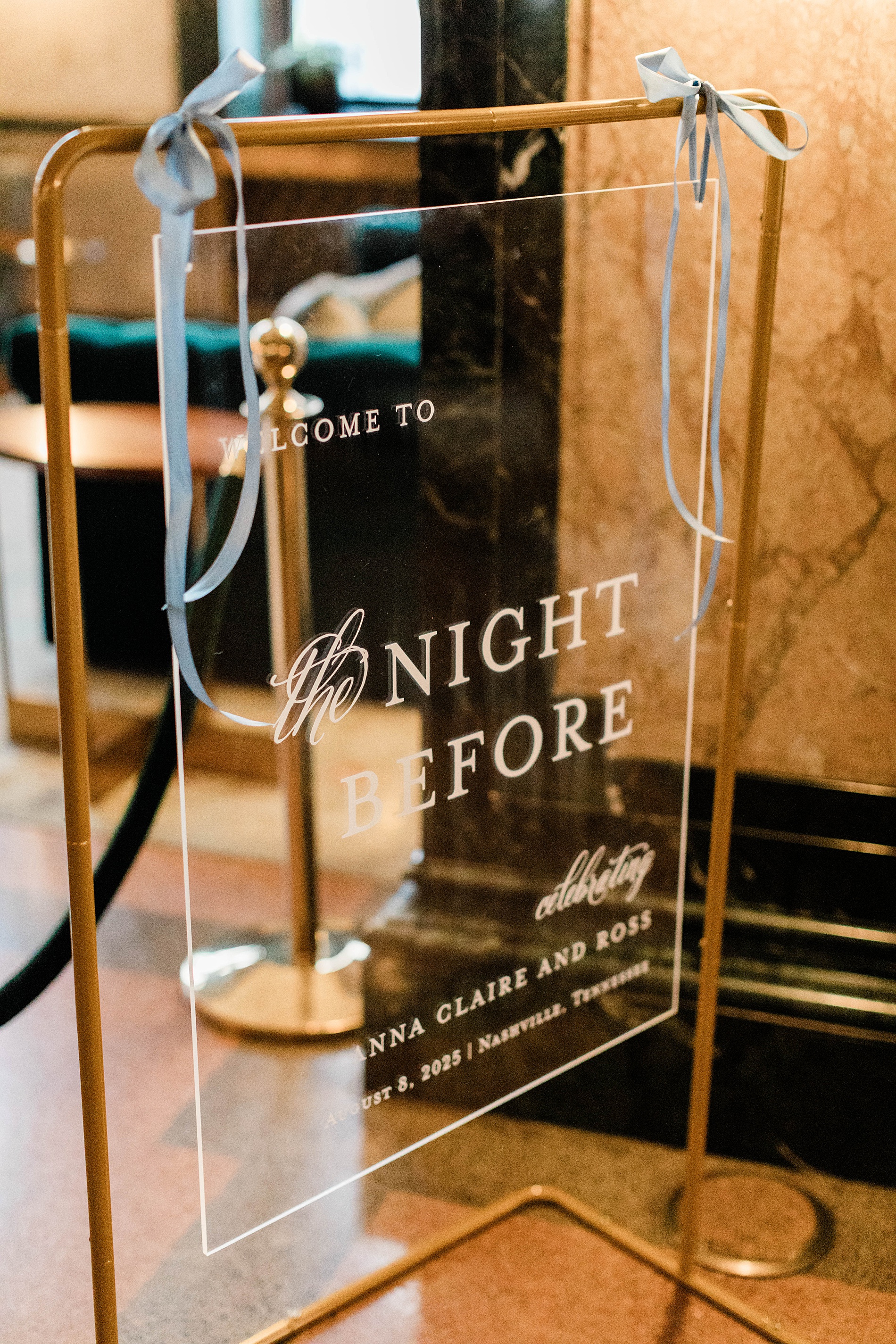
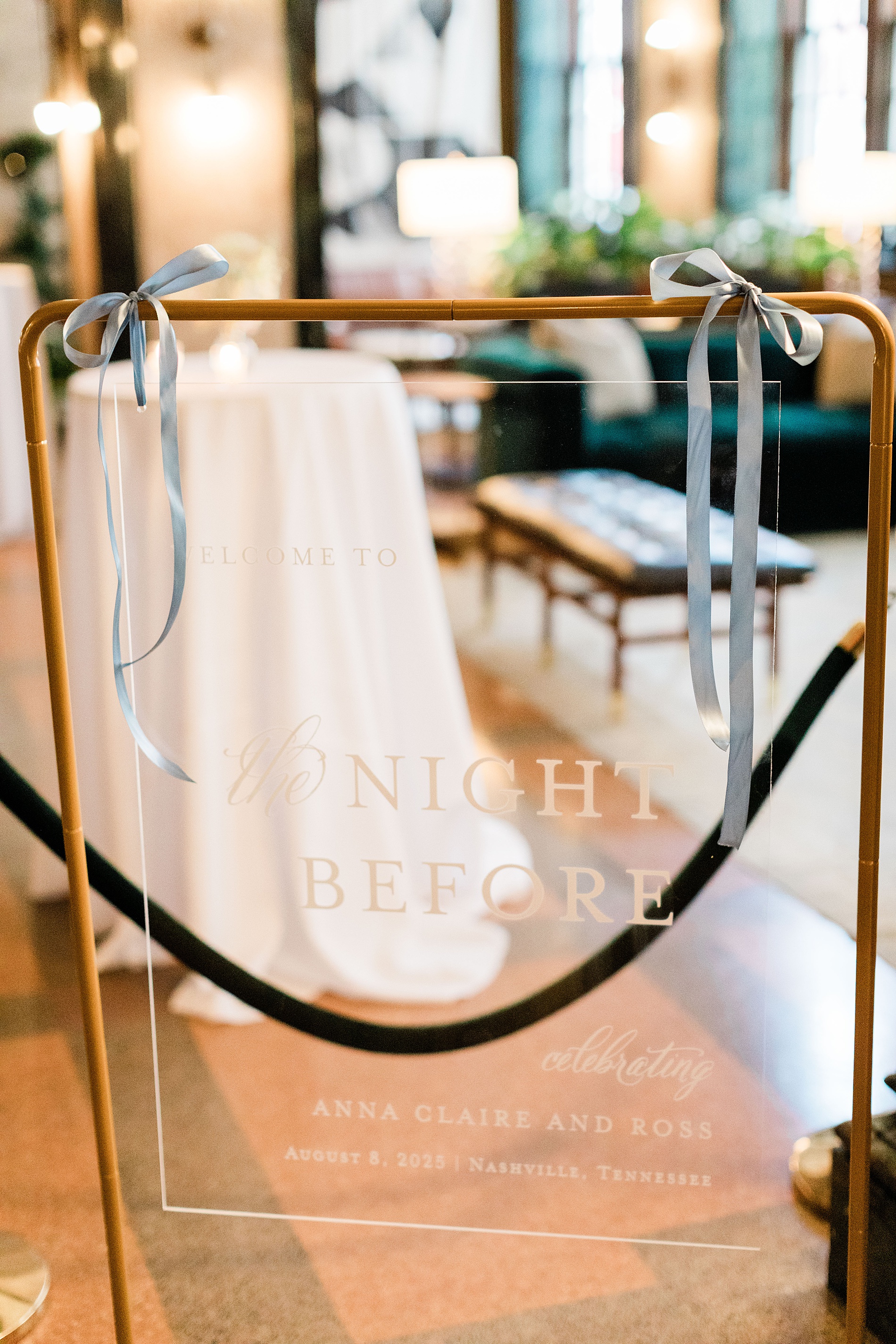
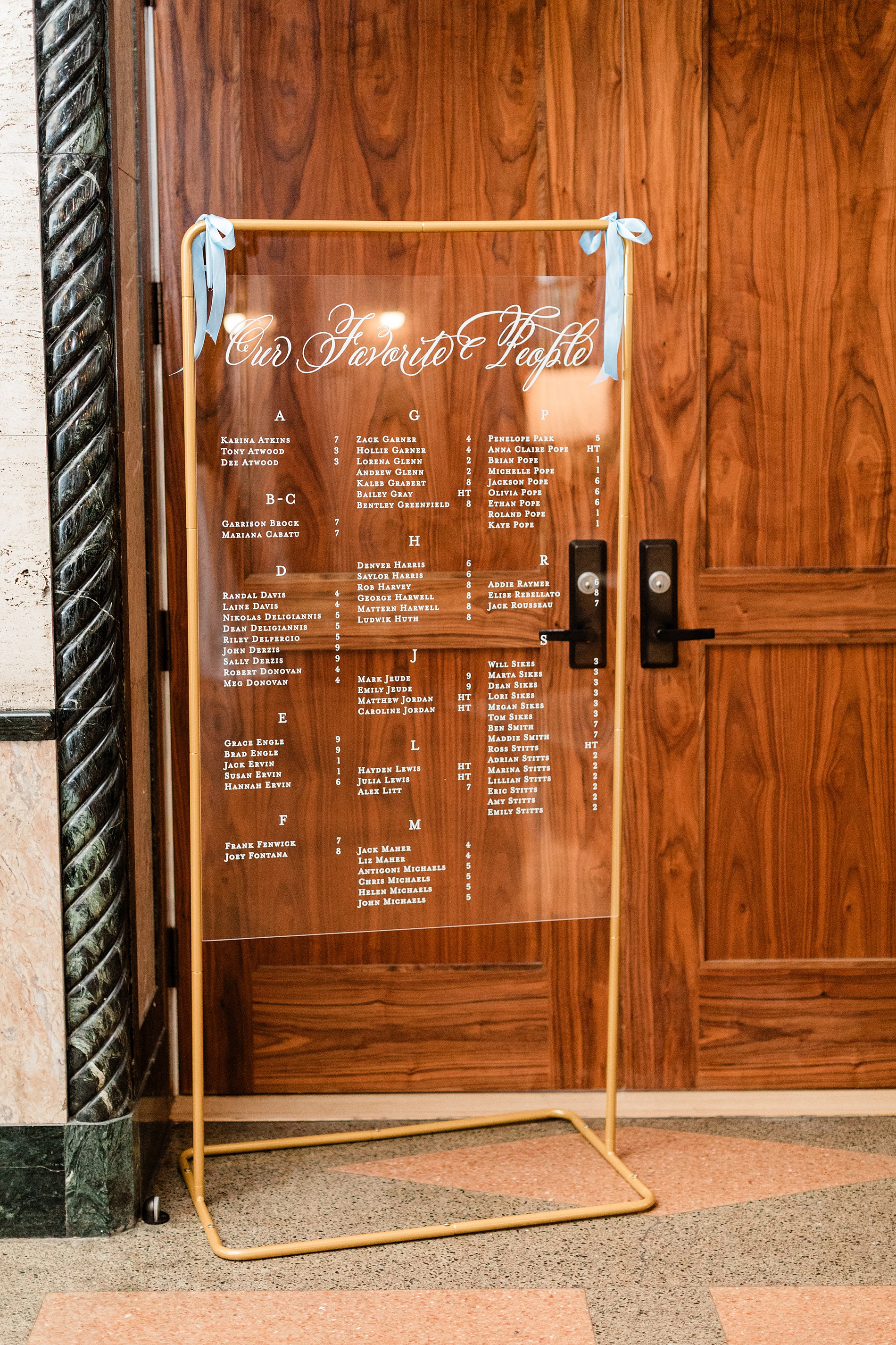
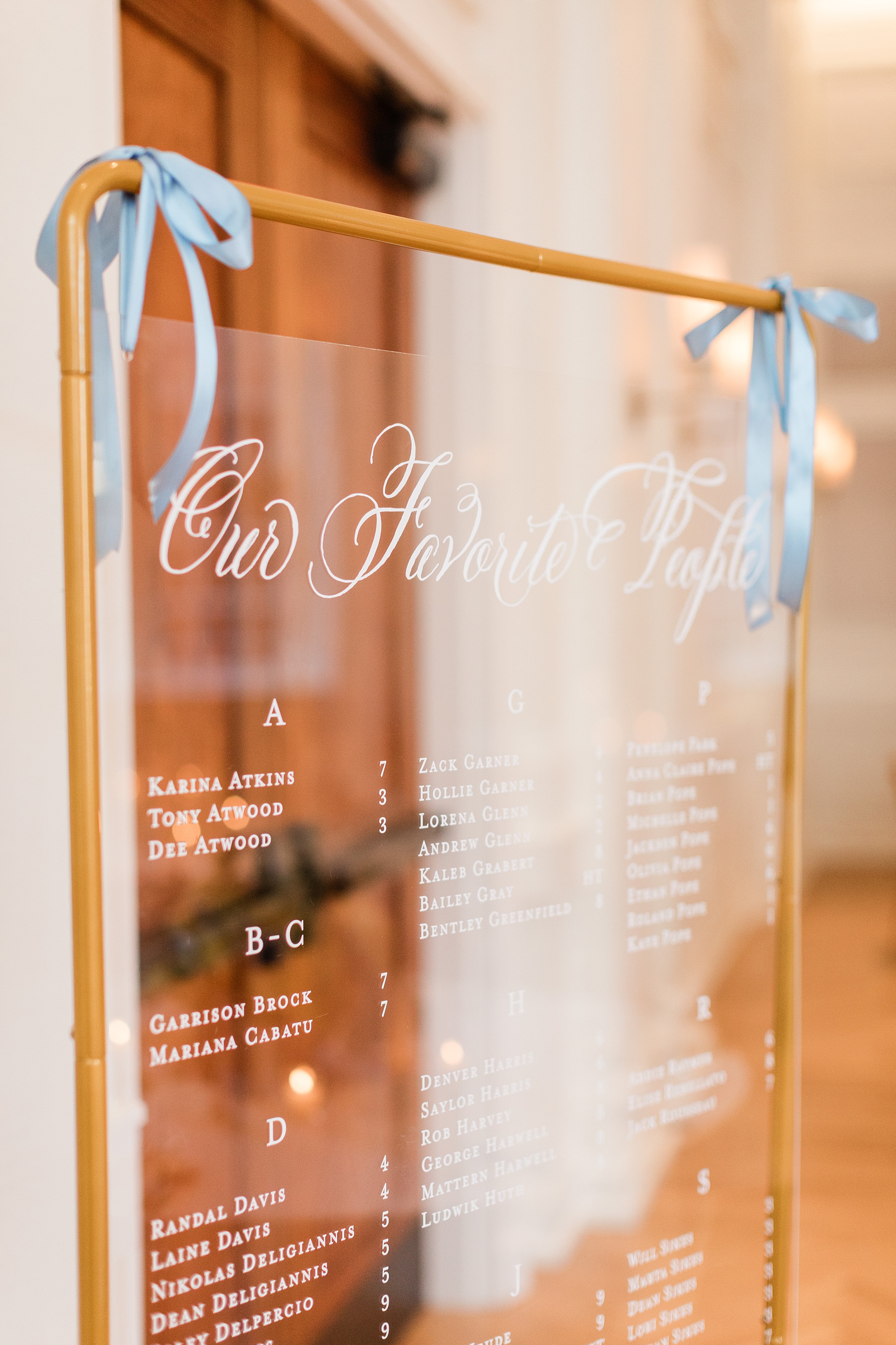
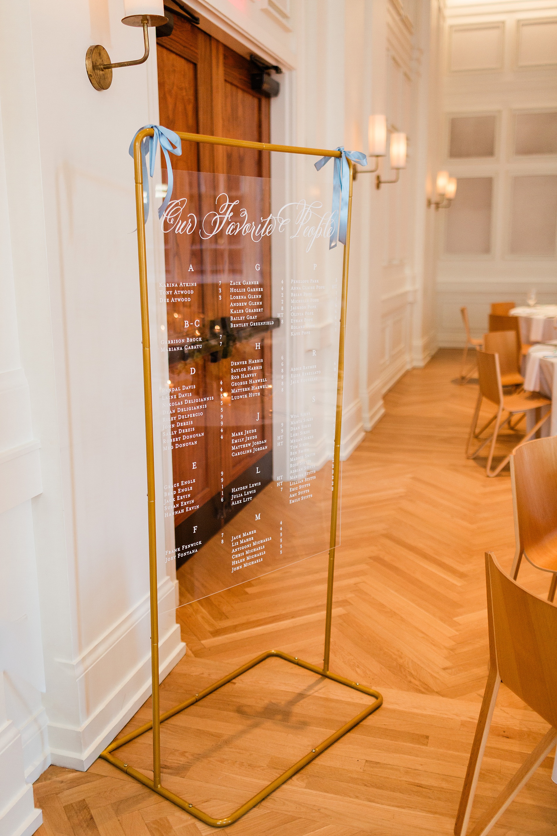
The rehearsal dinner took place at Noelle Hotel Nashville, which is a gorgeous boutique hotel in downtown. A clear welcome sign with a gold frame greeted guests that read “Welcome to the Night Before”. Light blue ribbons tied at the top corners of the sign gave a subtle hint to the colors that would be seen throughout the evening. We also created the seating chart that mimicked the clear welcome sign with a gold frame and blue ribbons. This was a lovely touch and a foreshadowing of the details to come on their wedding day.
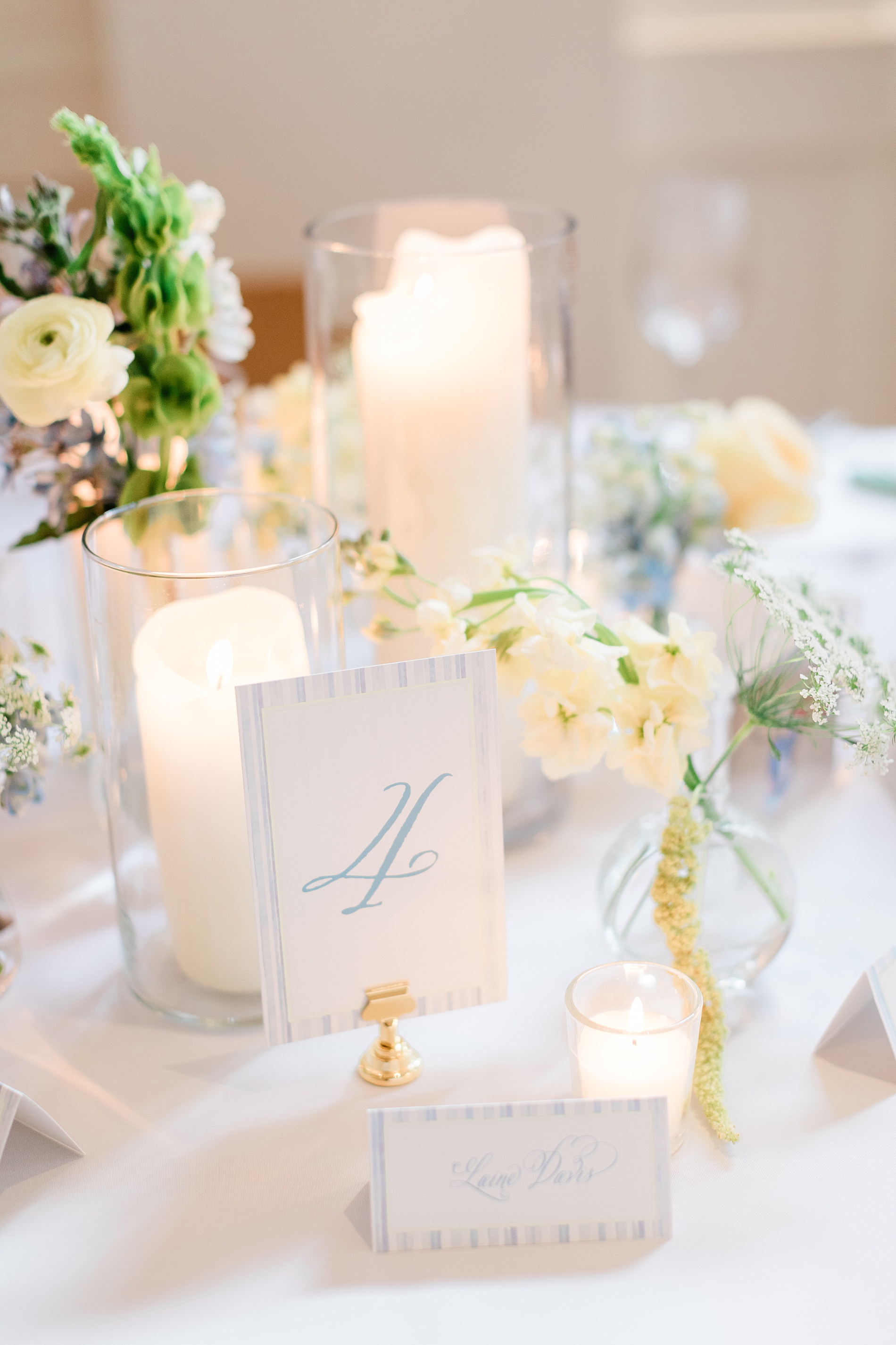
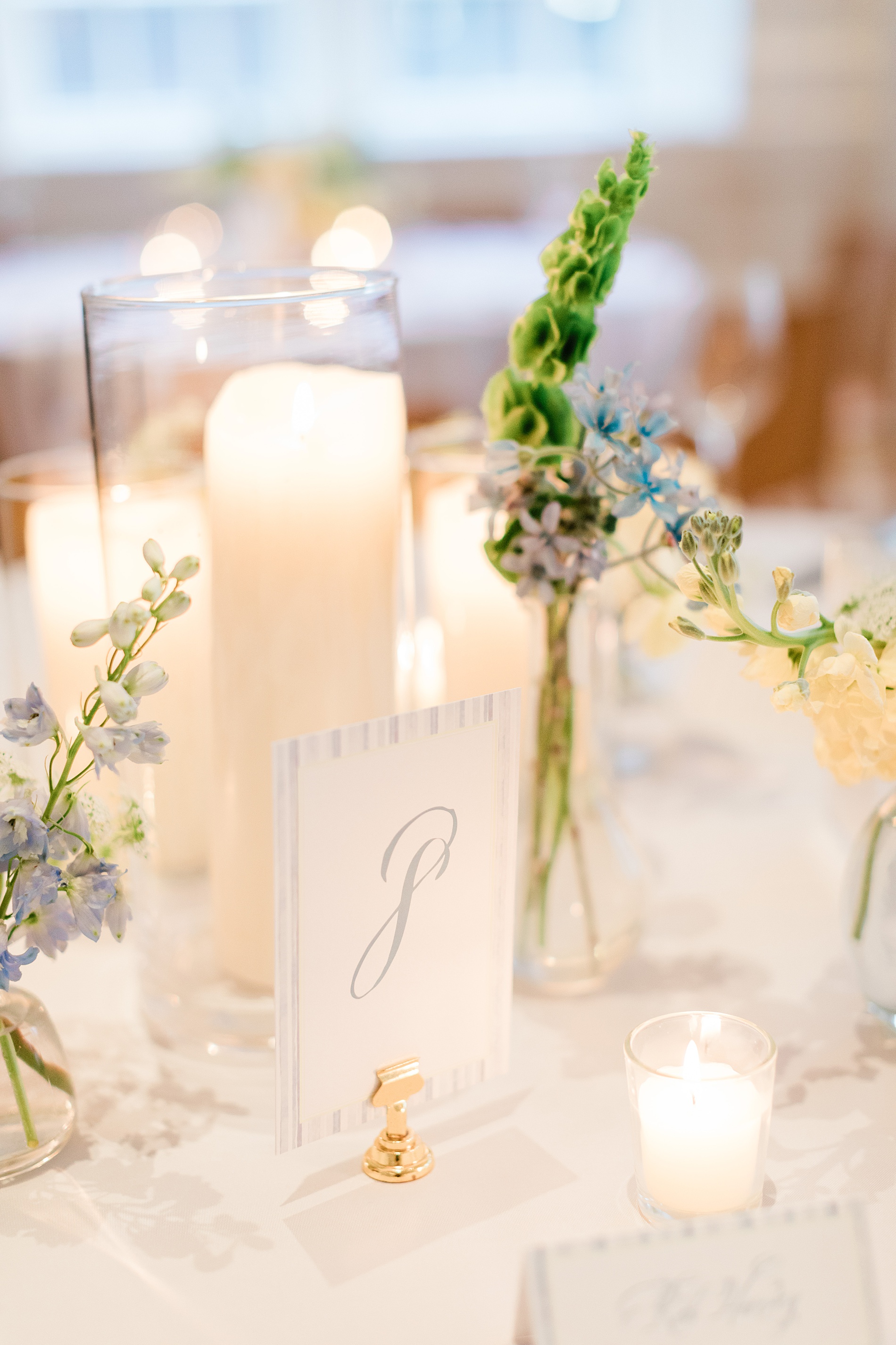
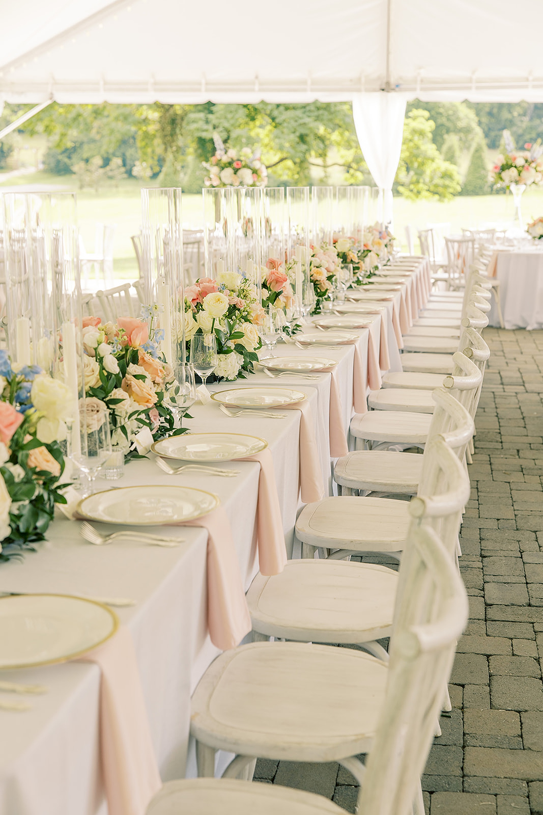
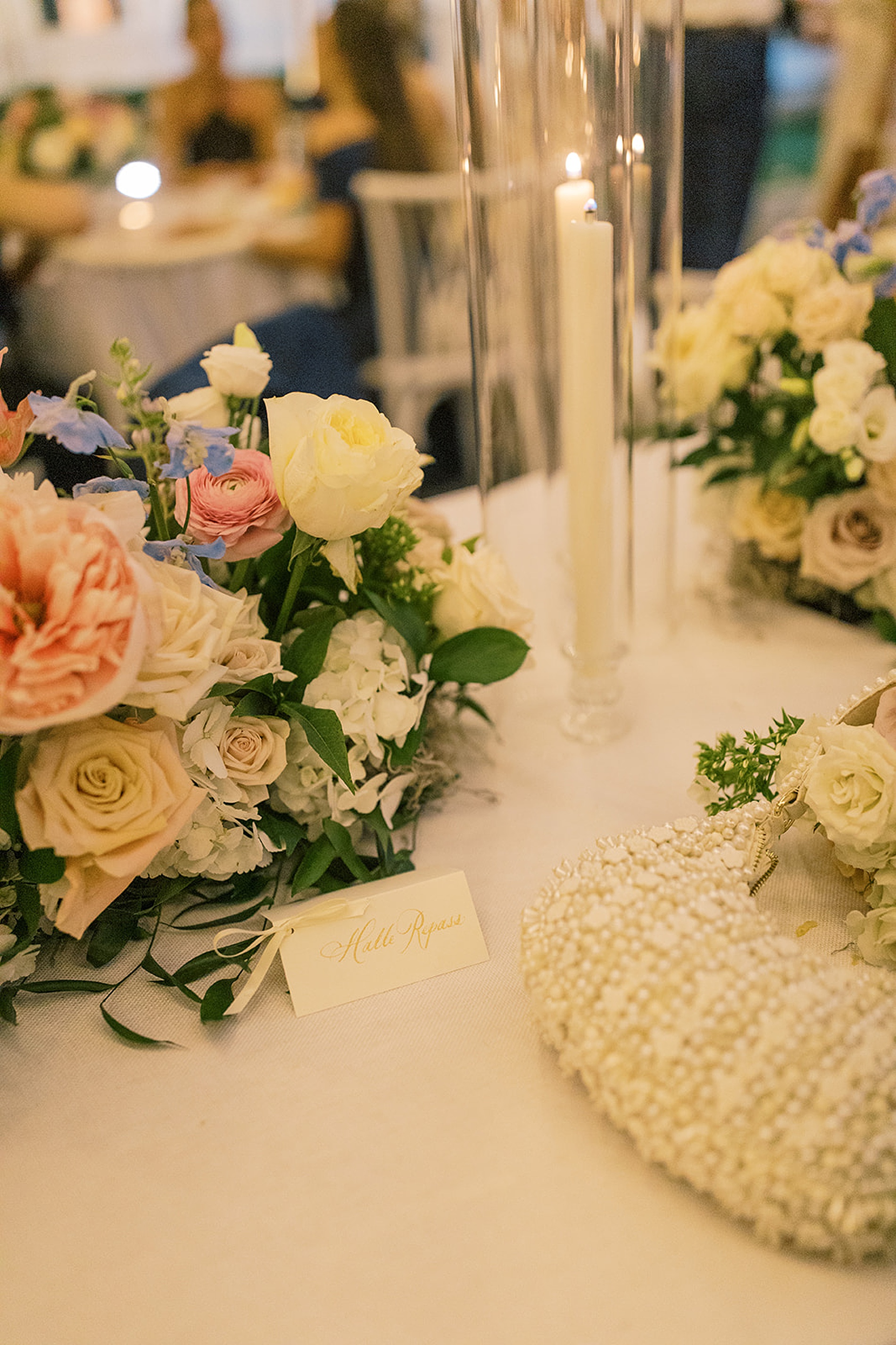
As guests sat down to the rehearsal dinner, the tables were decorated with fresh flowers, greenery, and flickering candle light, which made the light blue and white table numbers and place cards we created stand out beautifully. The entire evening unfolded seamlessly and was a perfect prelude to the wedding day ahead.
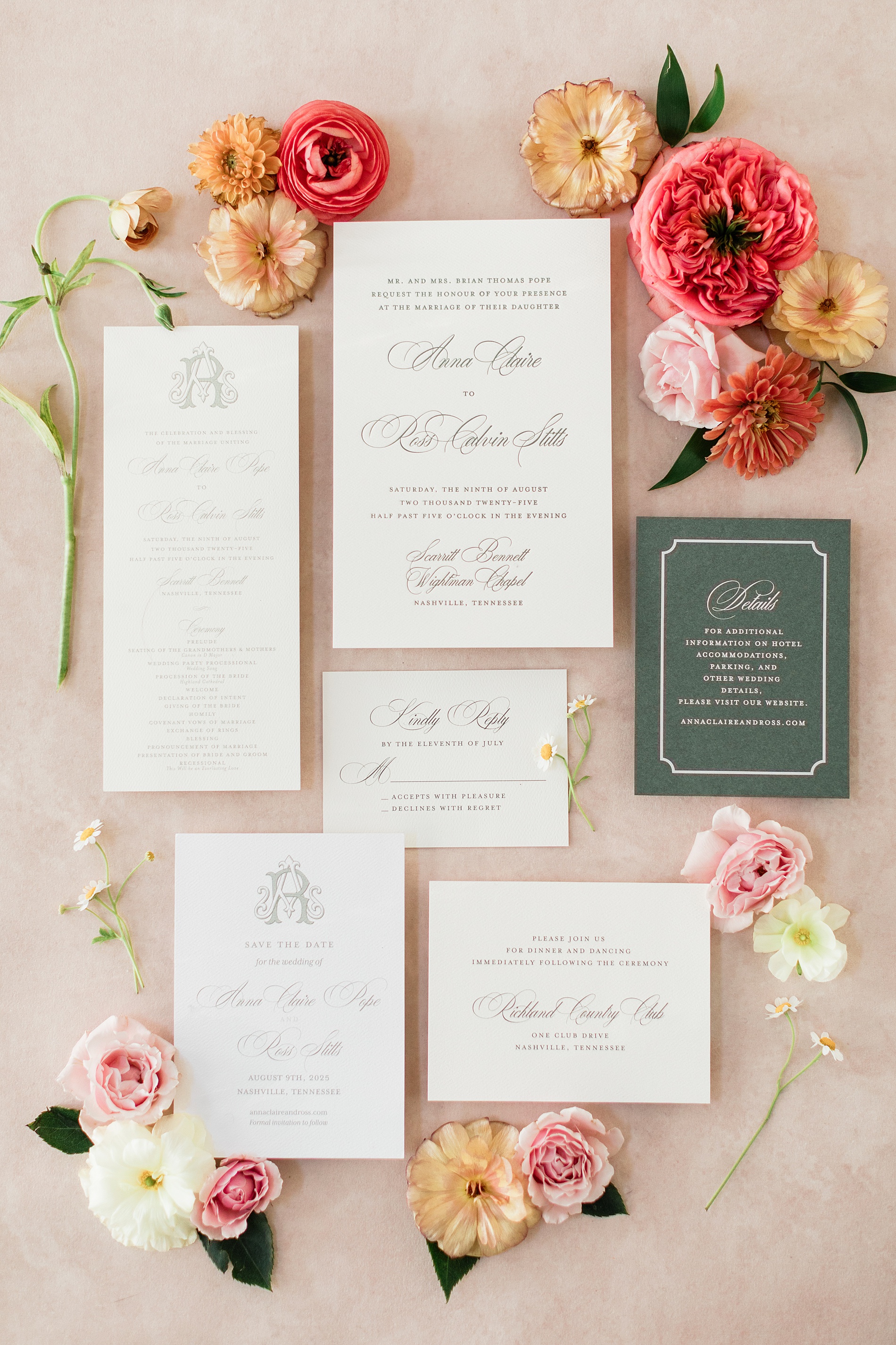
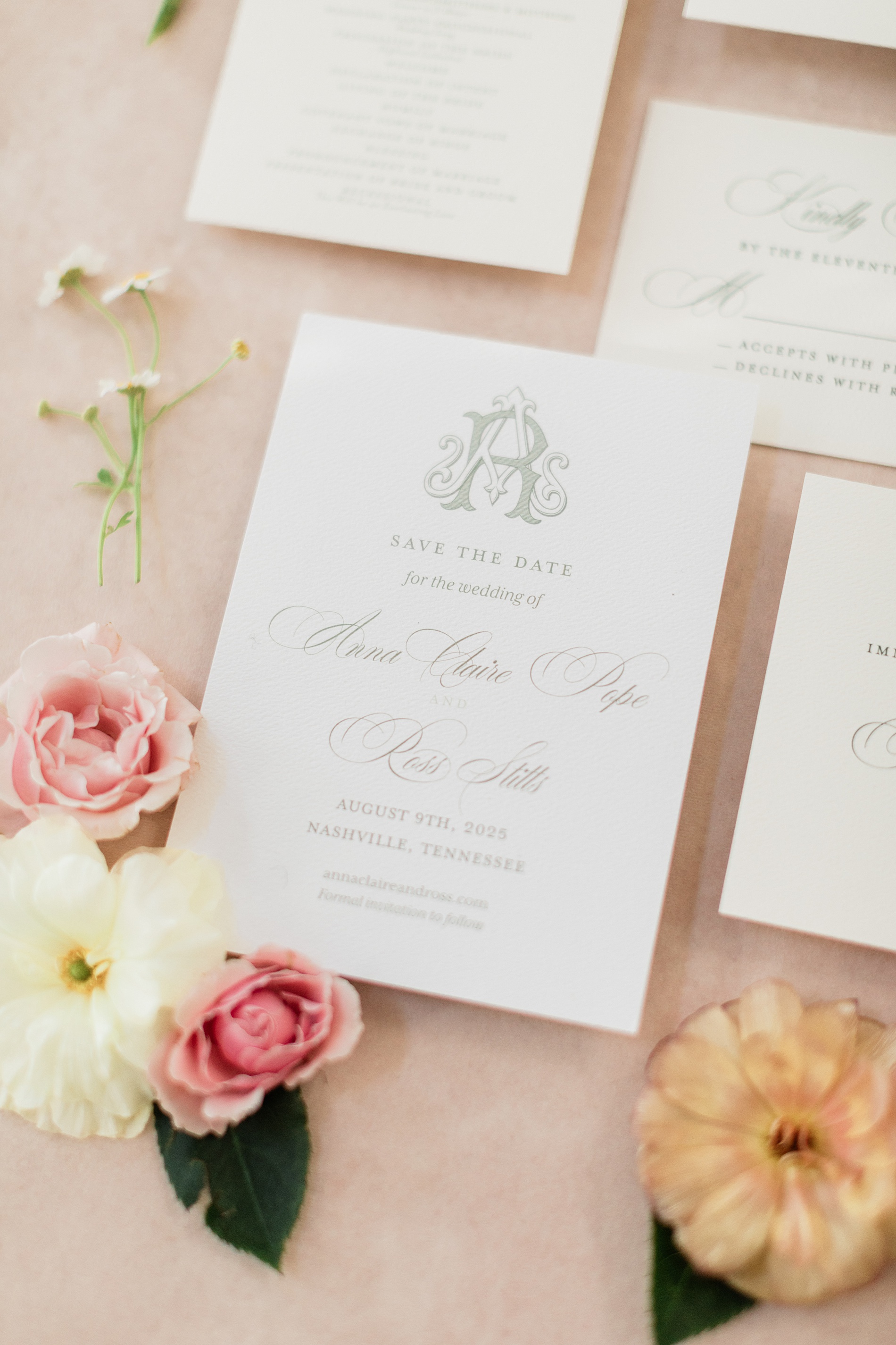
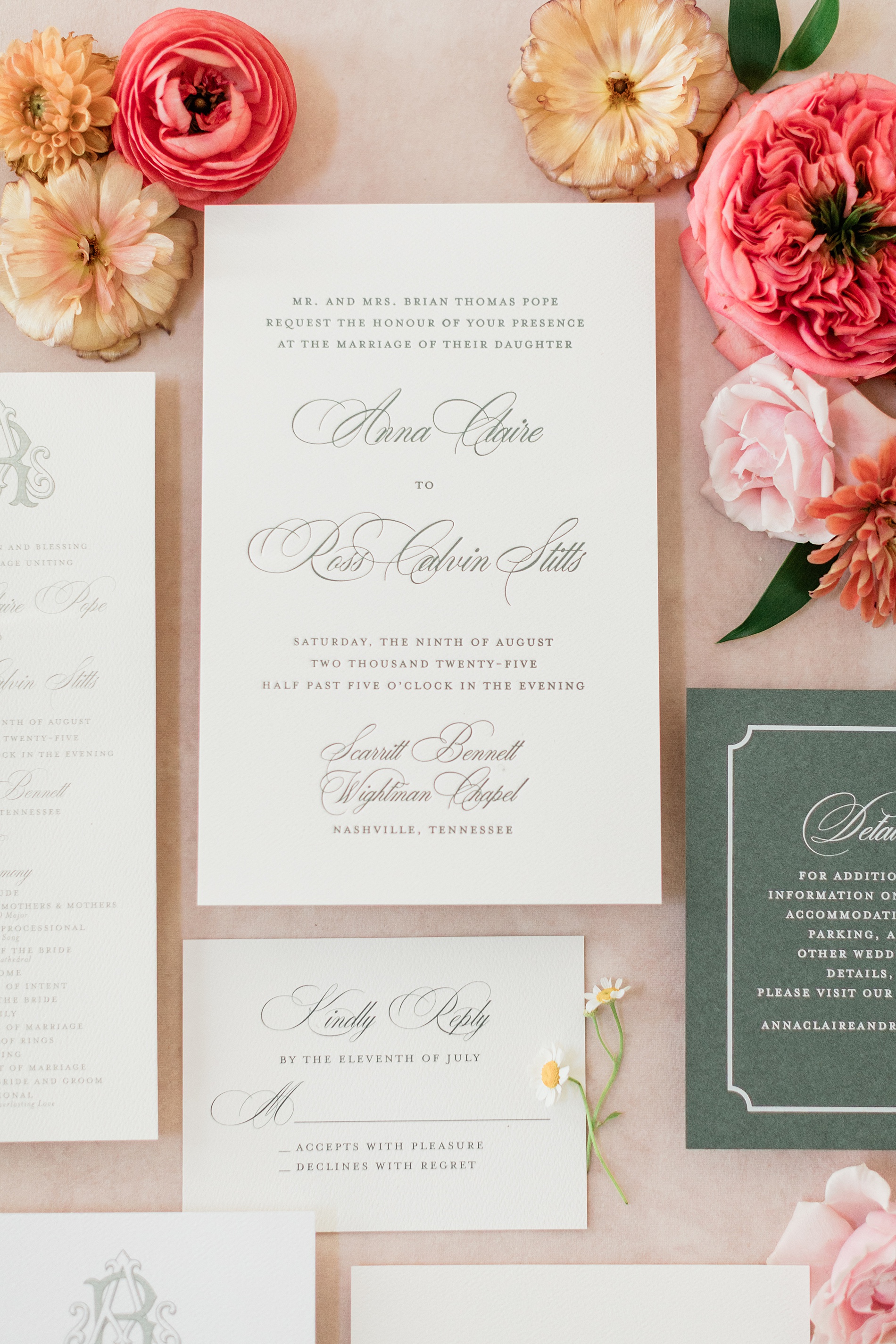
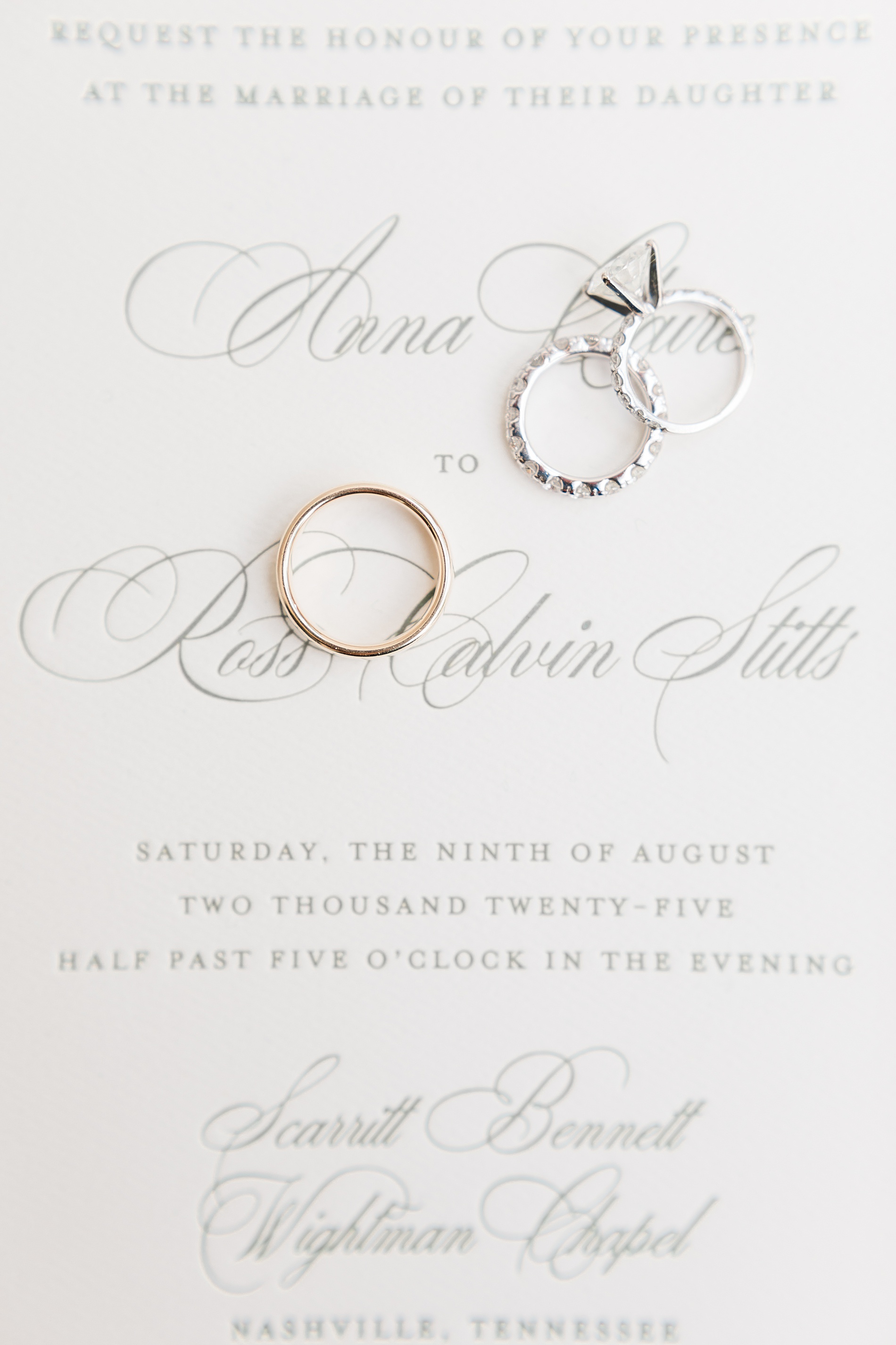
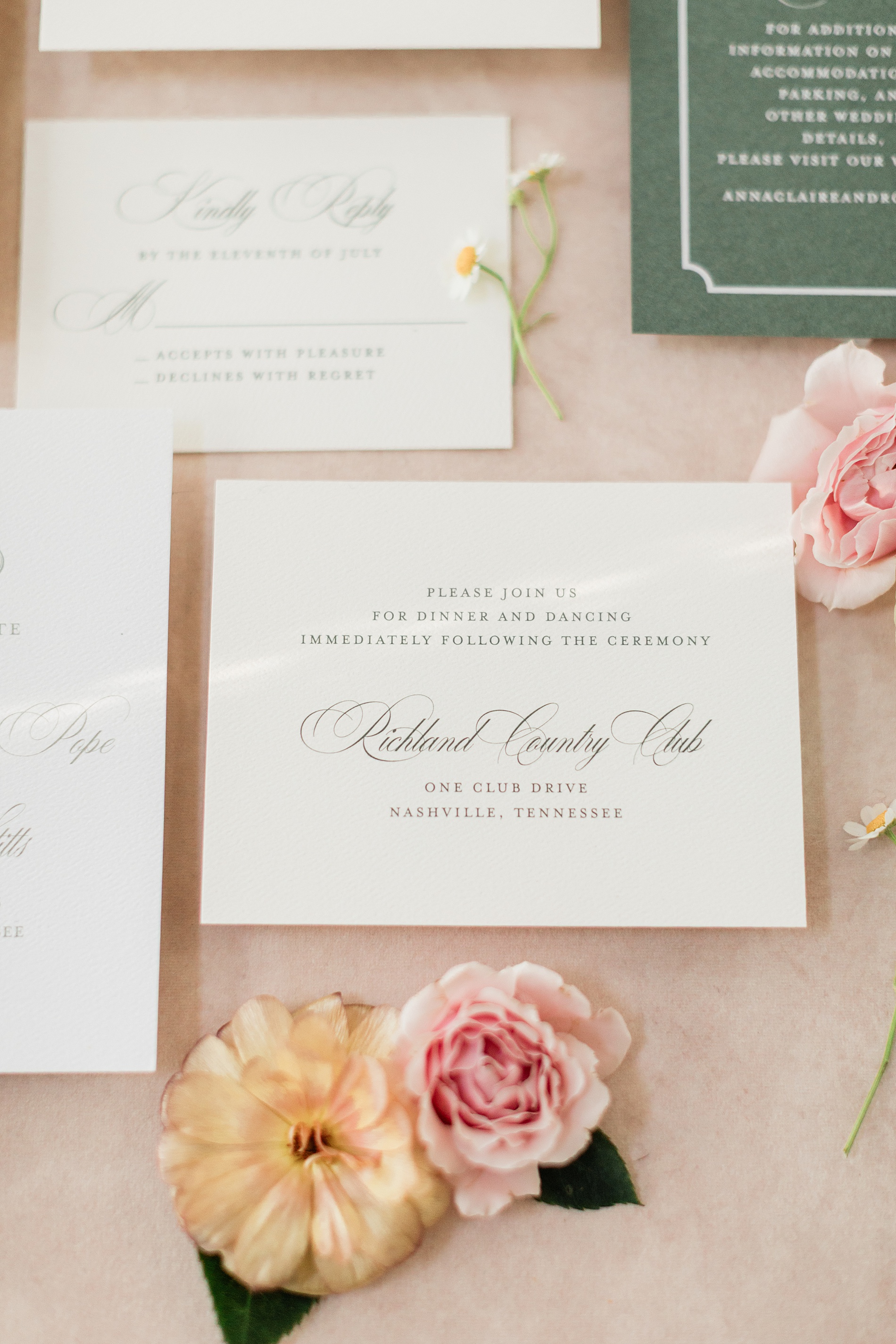
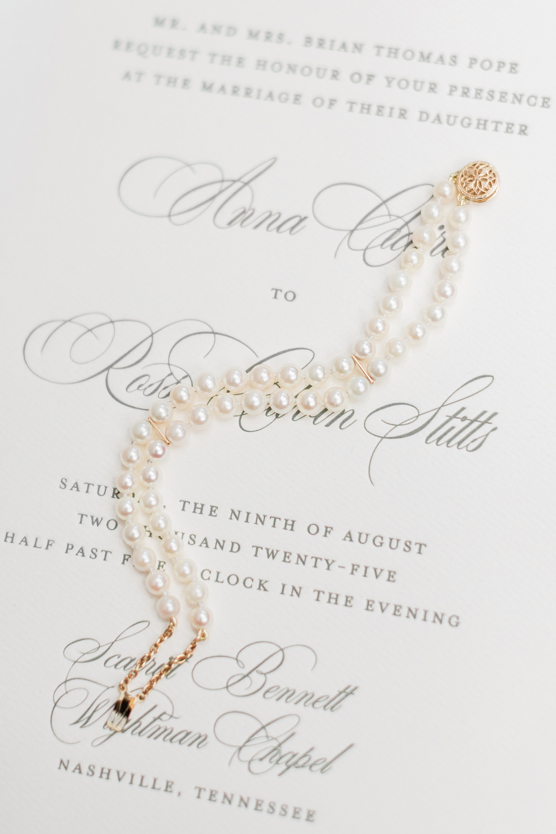
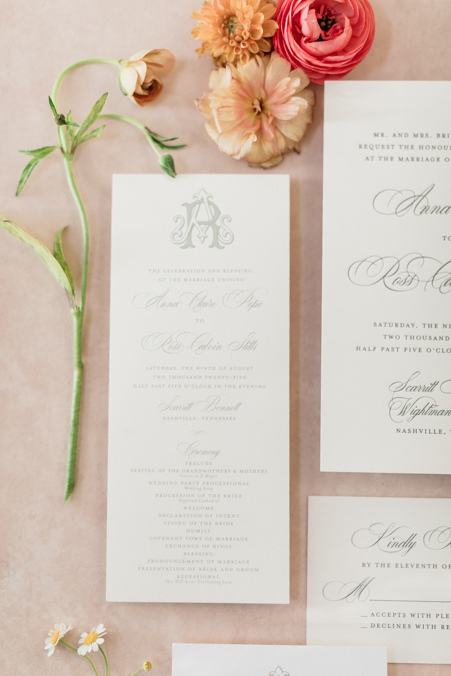
Elegant Letter-Pressed Wedding Invitations
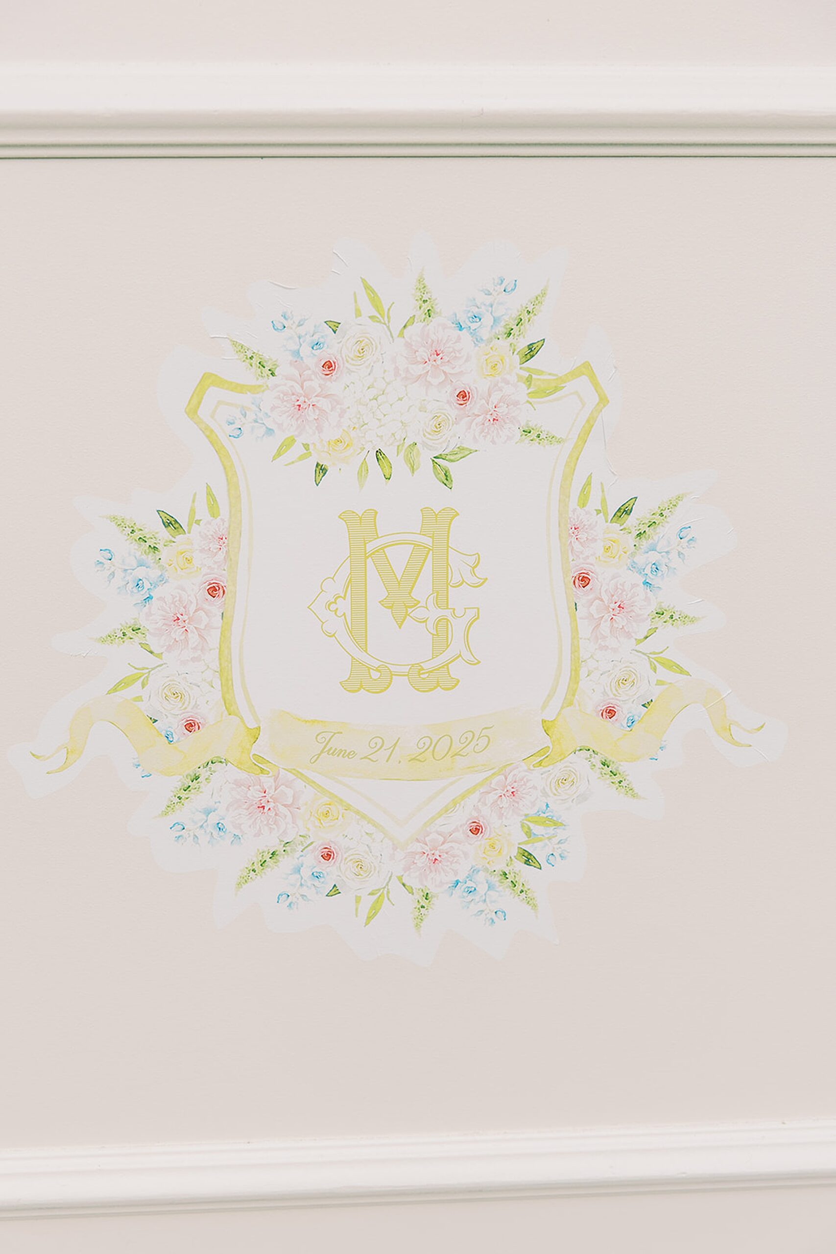
Their classic, letter-pressed wedding invitations set the tone for an elegant evening. The custom monogram on their Save The Dates and Wedding Programs would also make an appearance on other wedding details we created, creating a cohesive design that we just love!
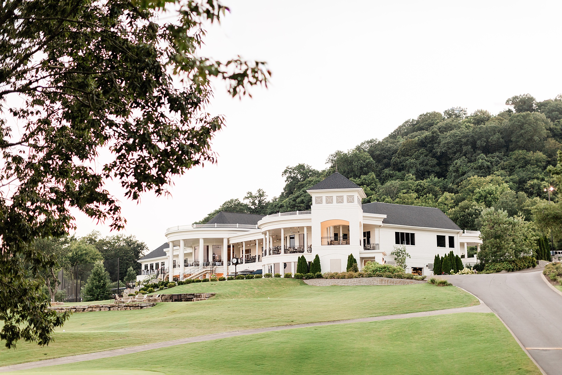
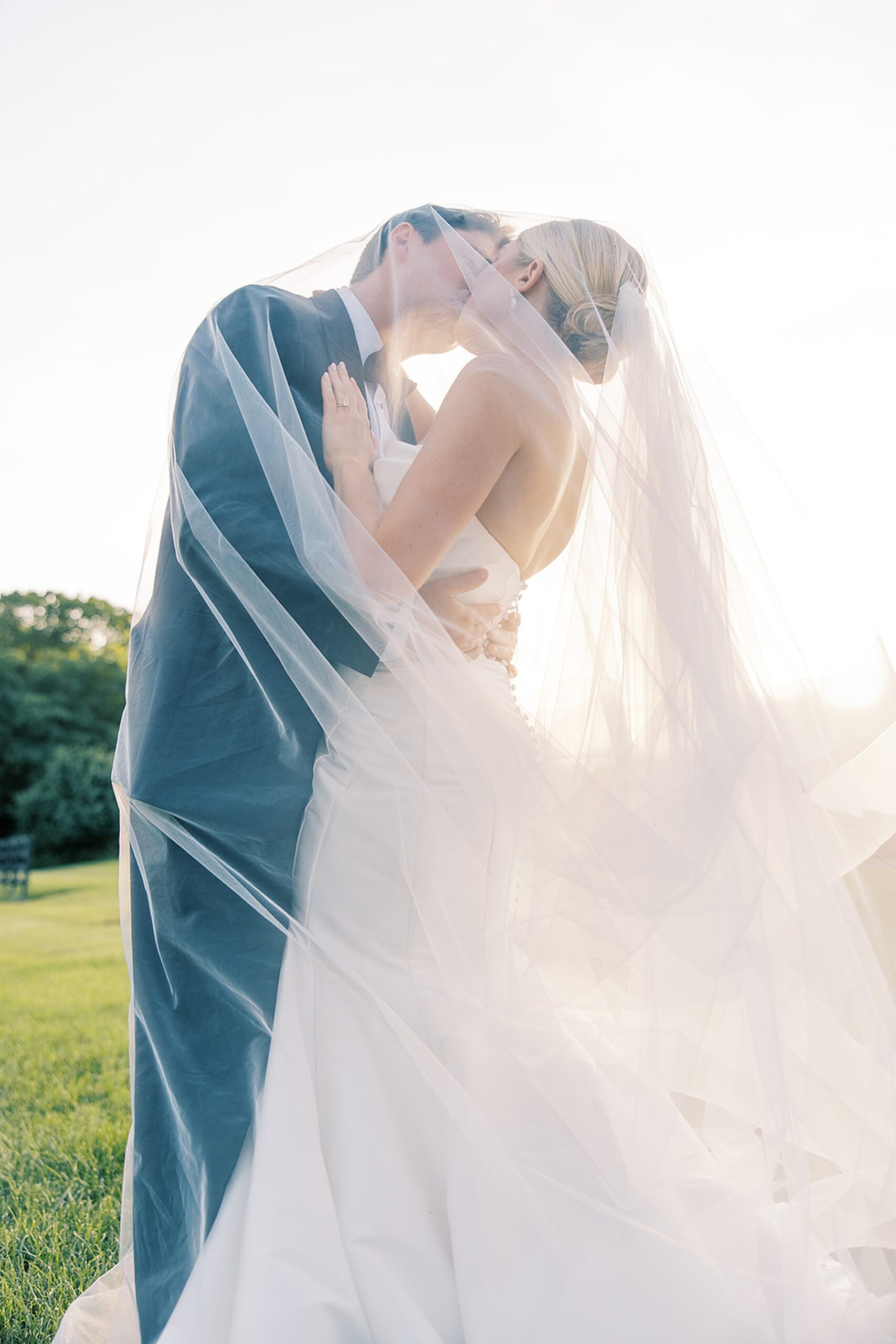
Their wedding took place at the stunning Richland Country Club in Nashville, TN, which is a beautiful venue with a breathtaking property.
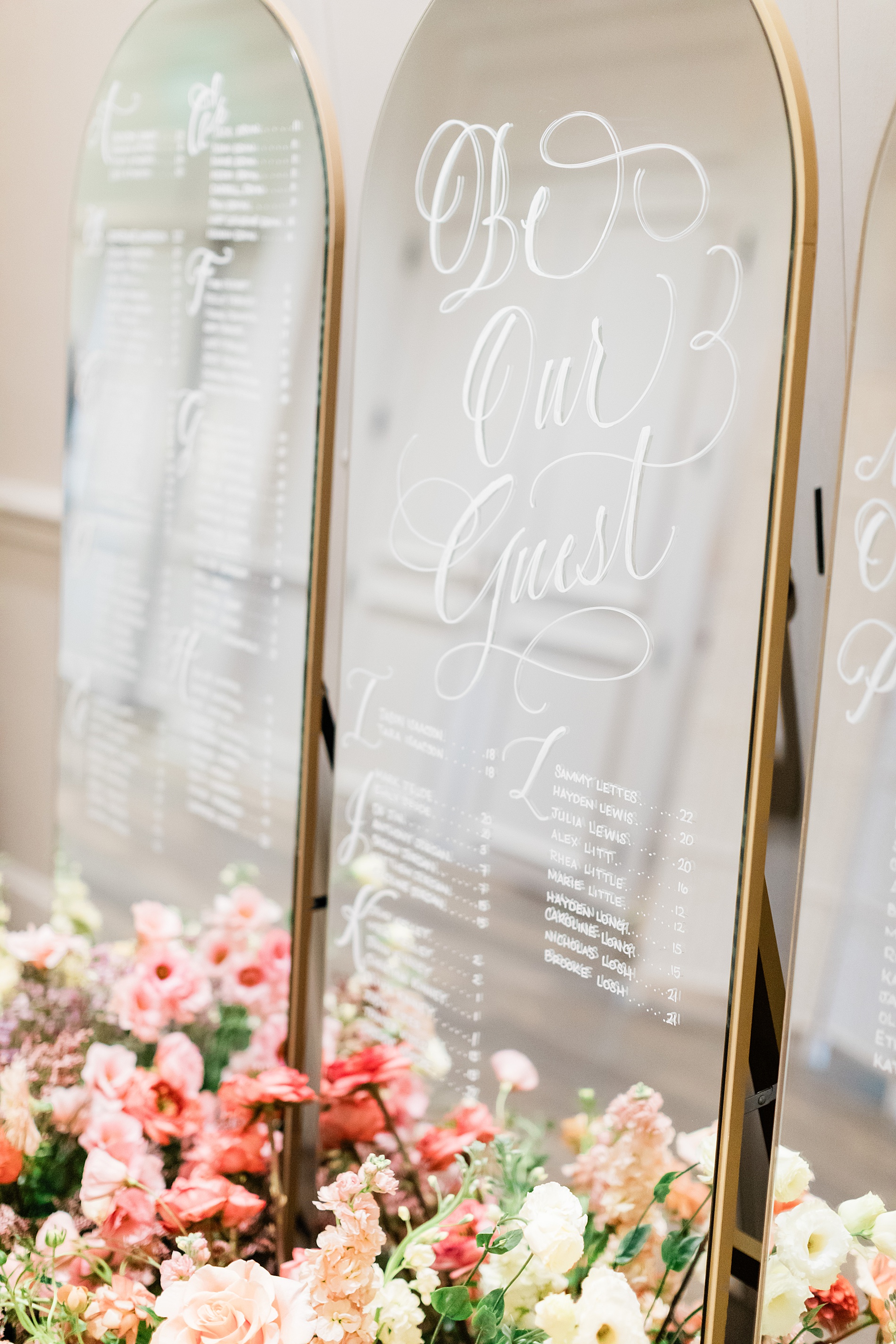
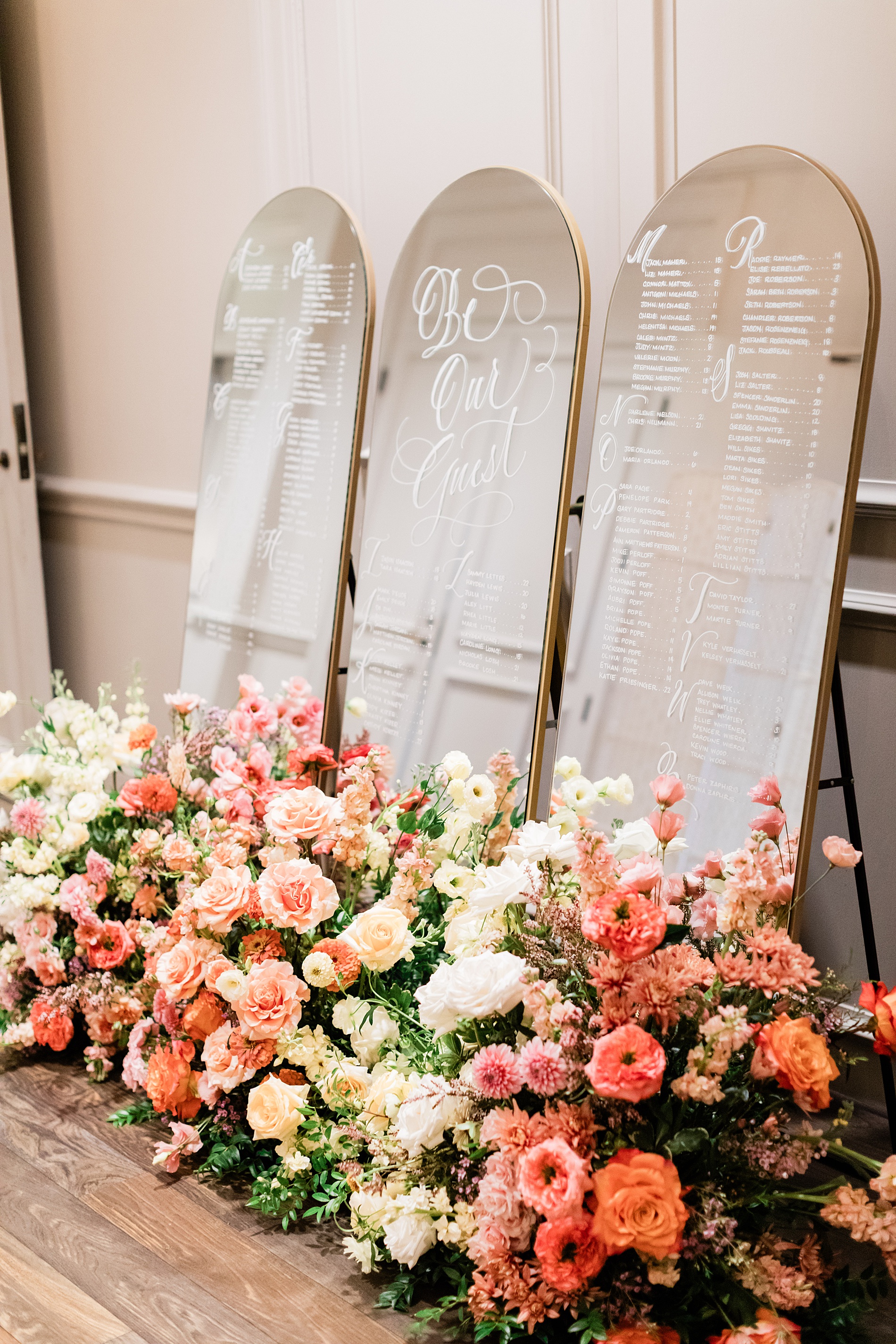
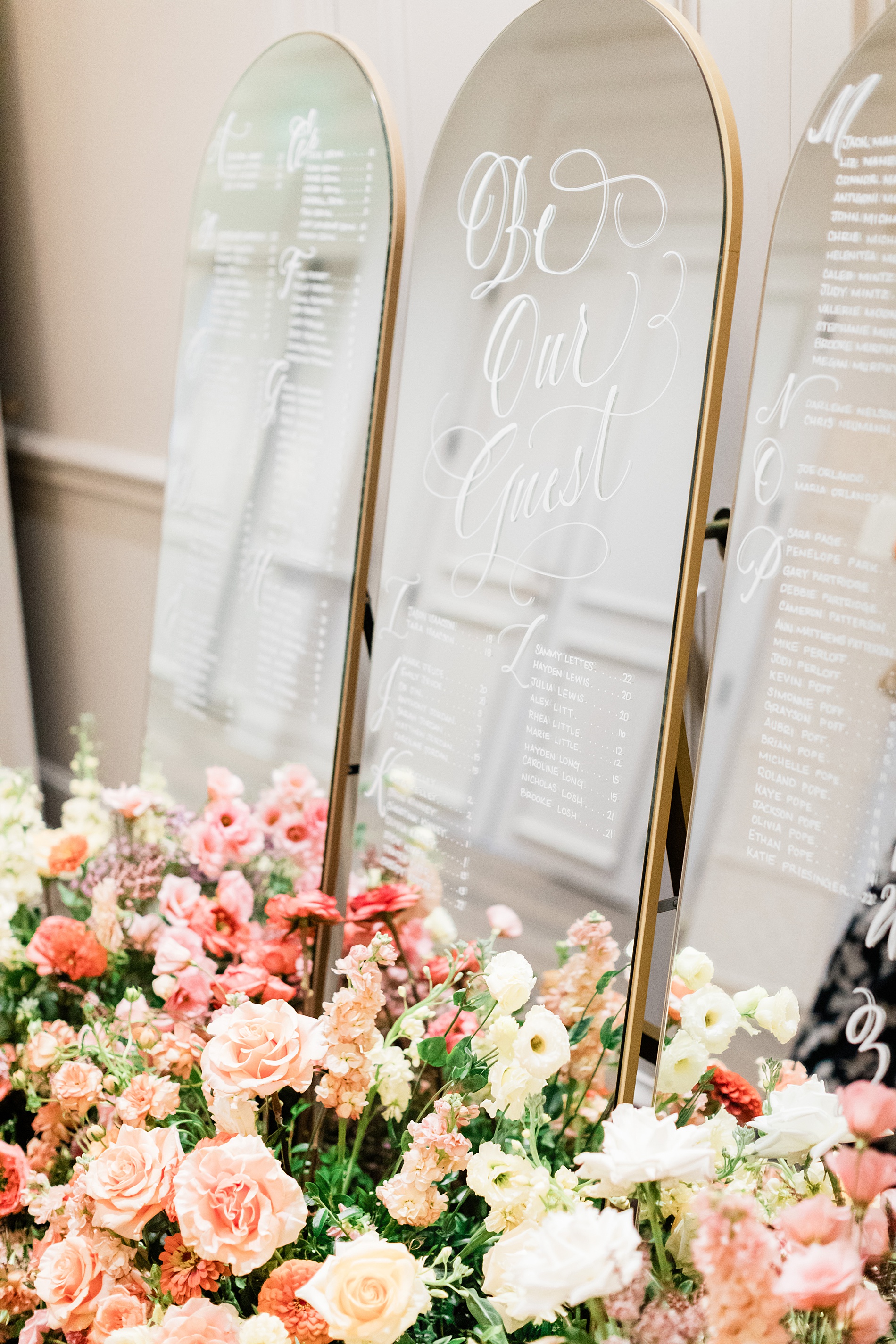
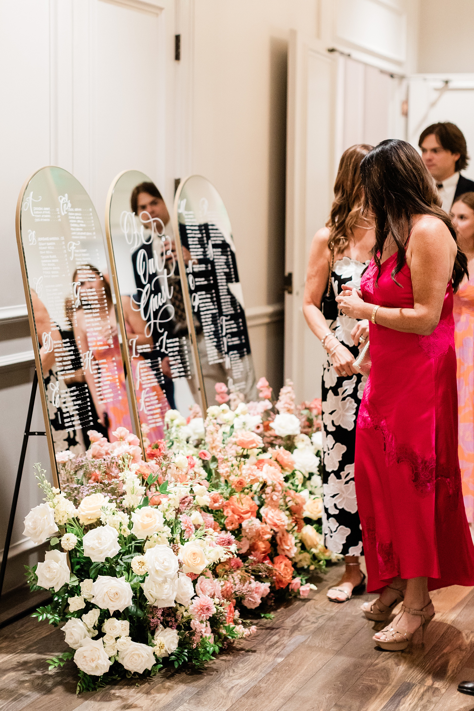
Mirrored Wedding Seating Chart
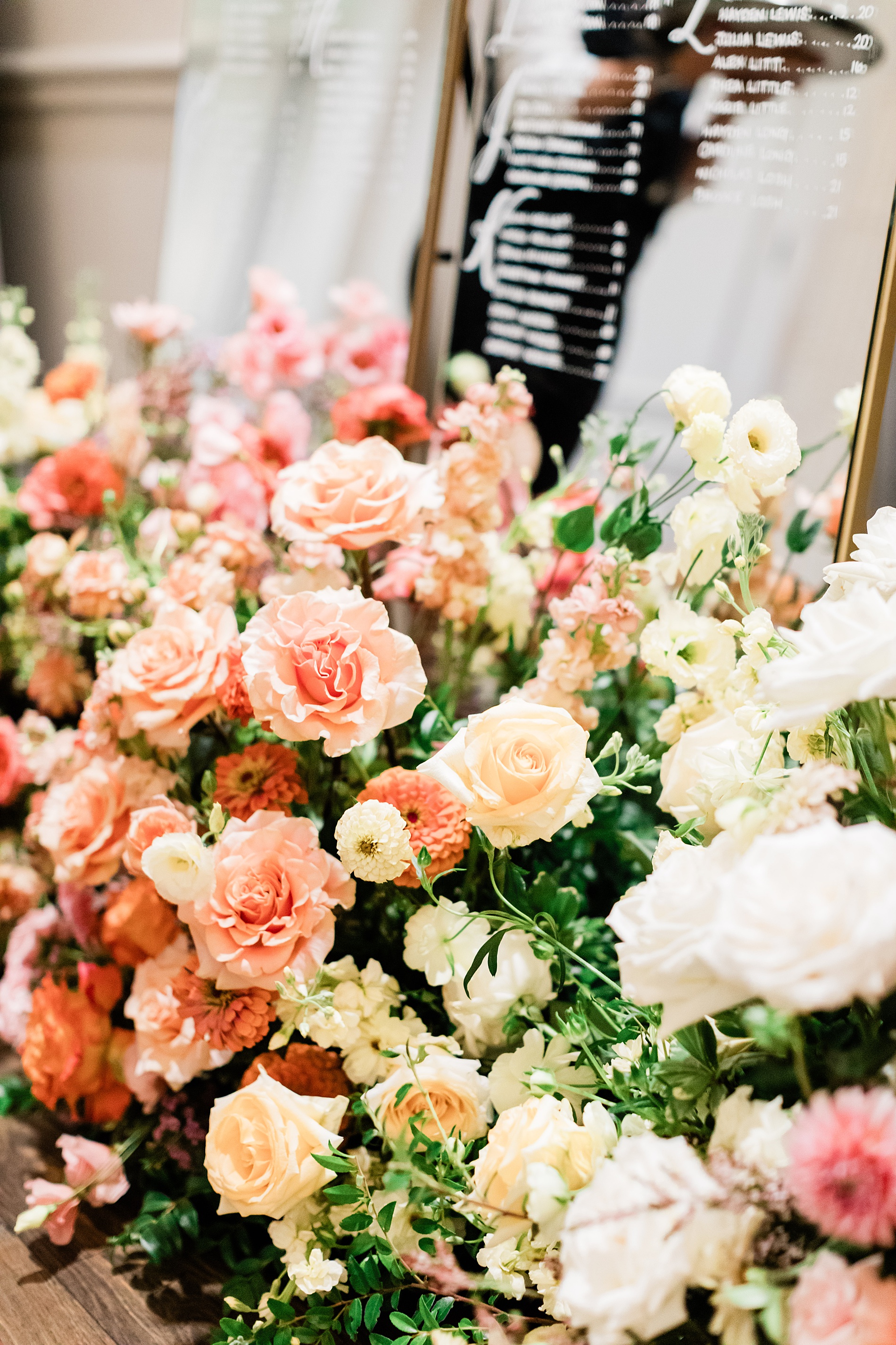
Their wedding reception featured a three-piece mirrored seating chart. The arched mirrors with gold frames were lettered by hand. A fresh flower display of white, cream, and various pink flowers sat at the base of the seating chart making it an eye-catching display.
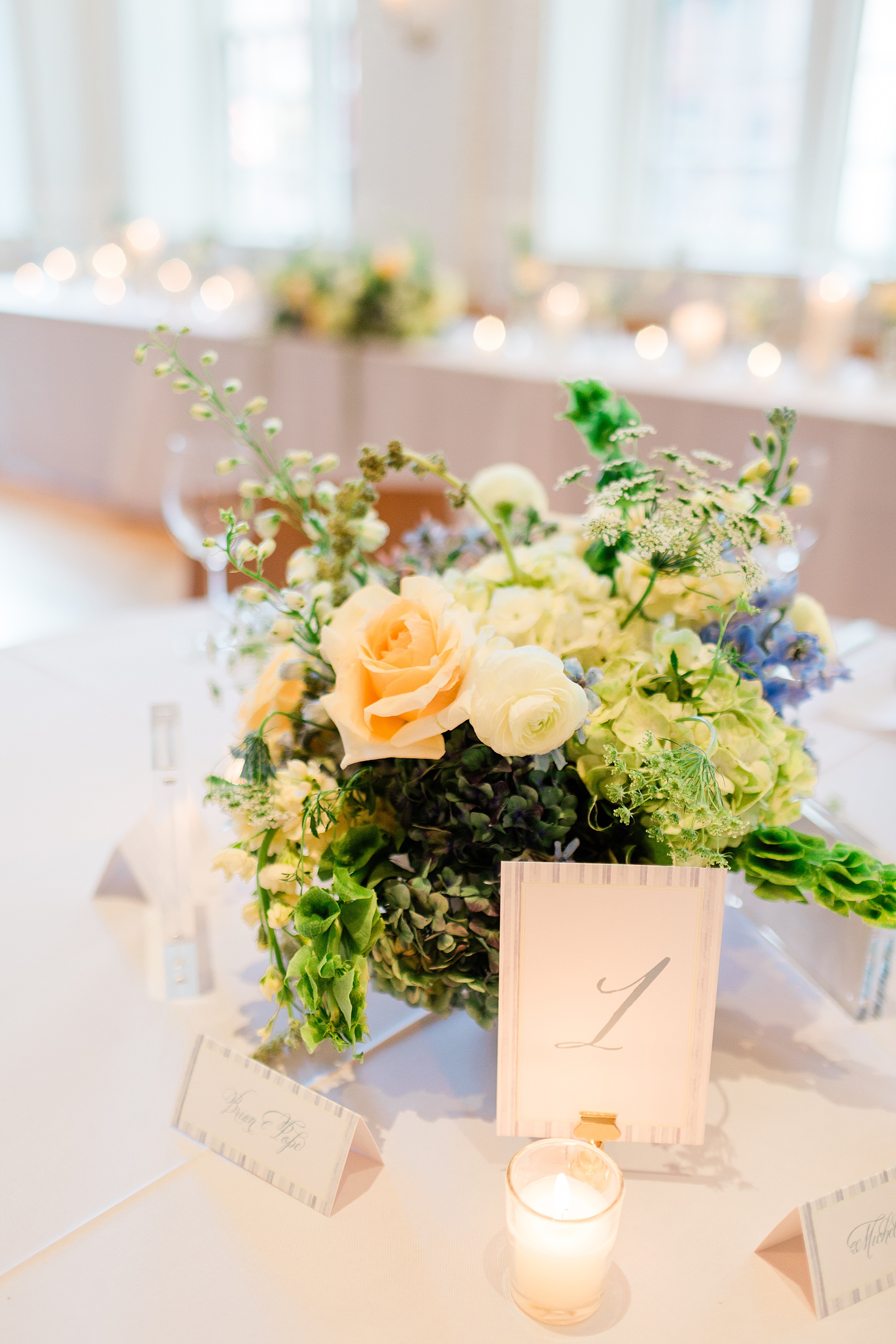
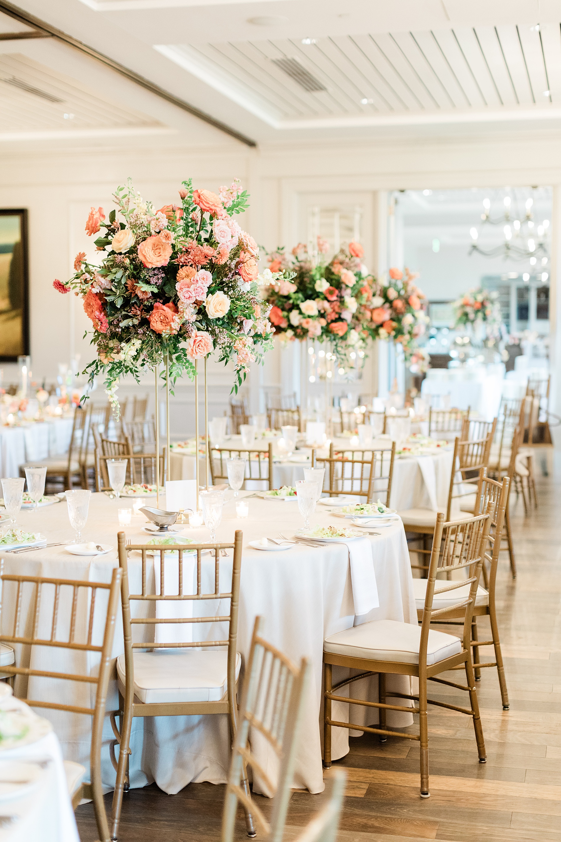
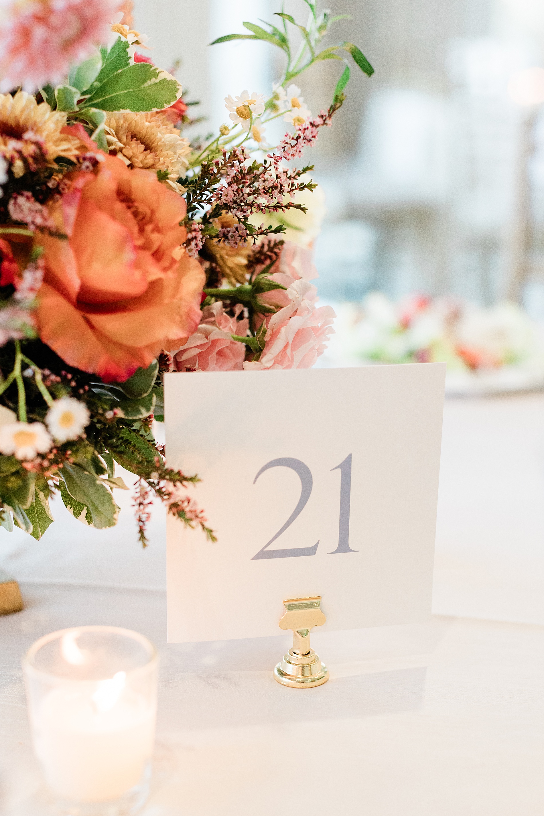
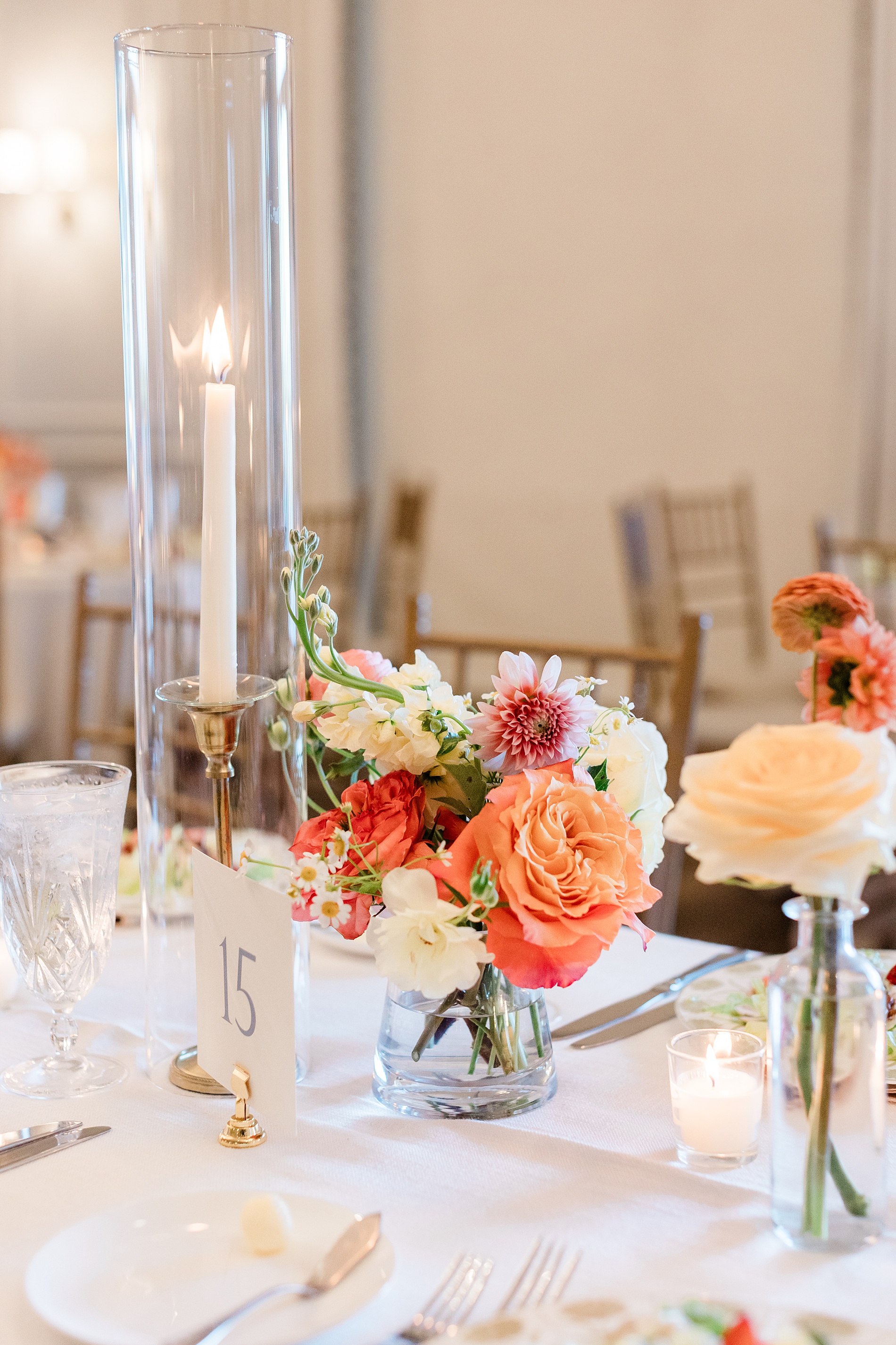
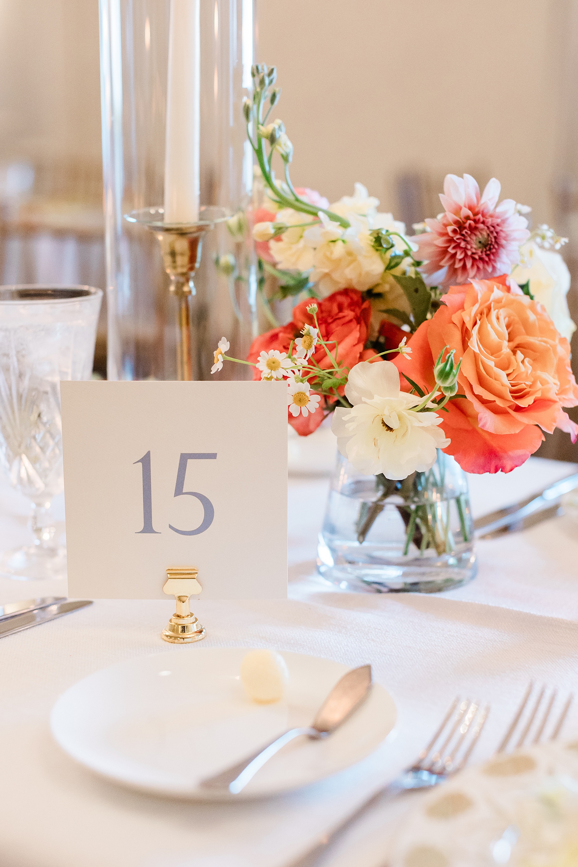
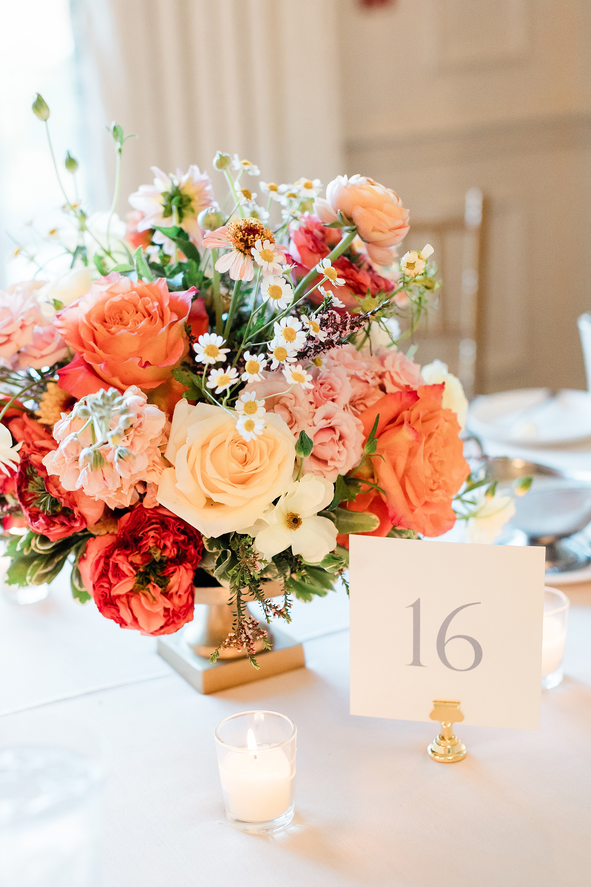
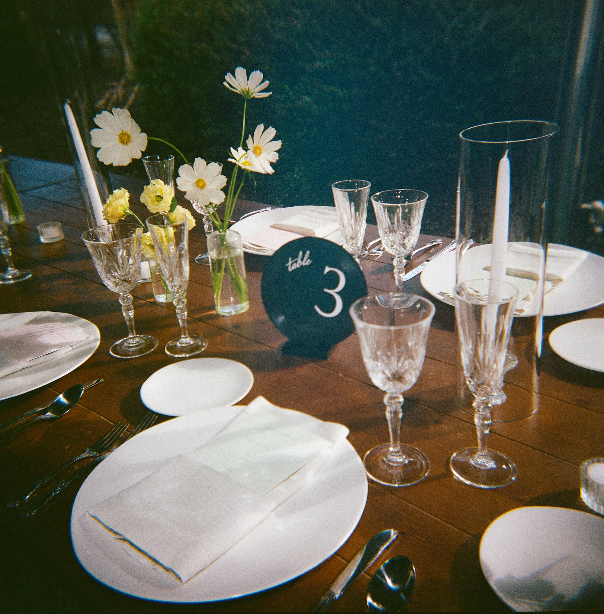
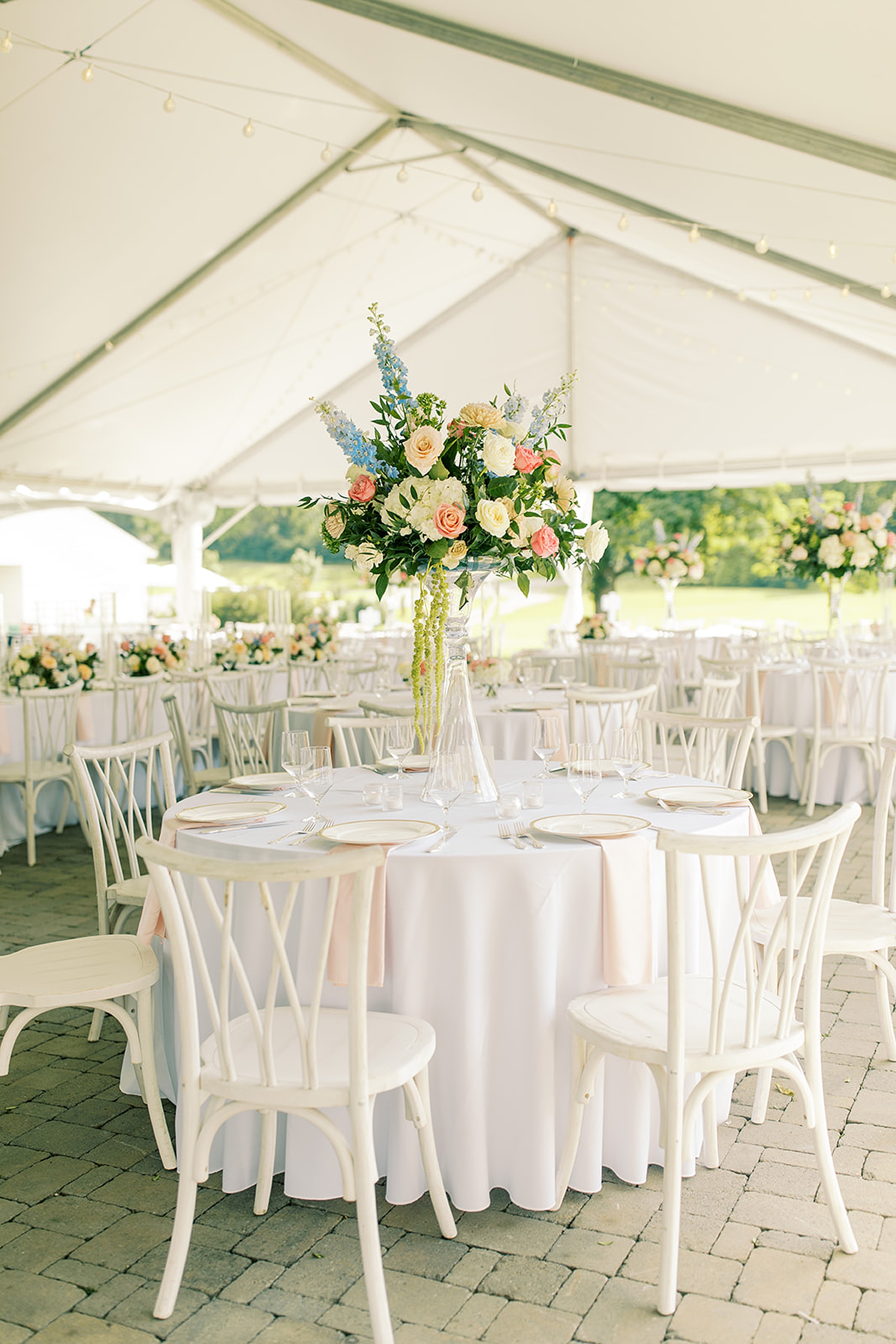
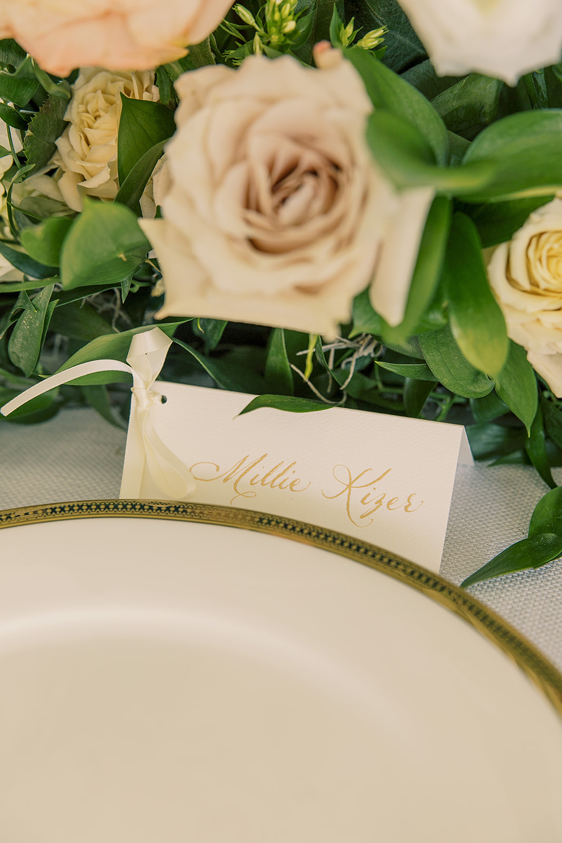
Table Numbers
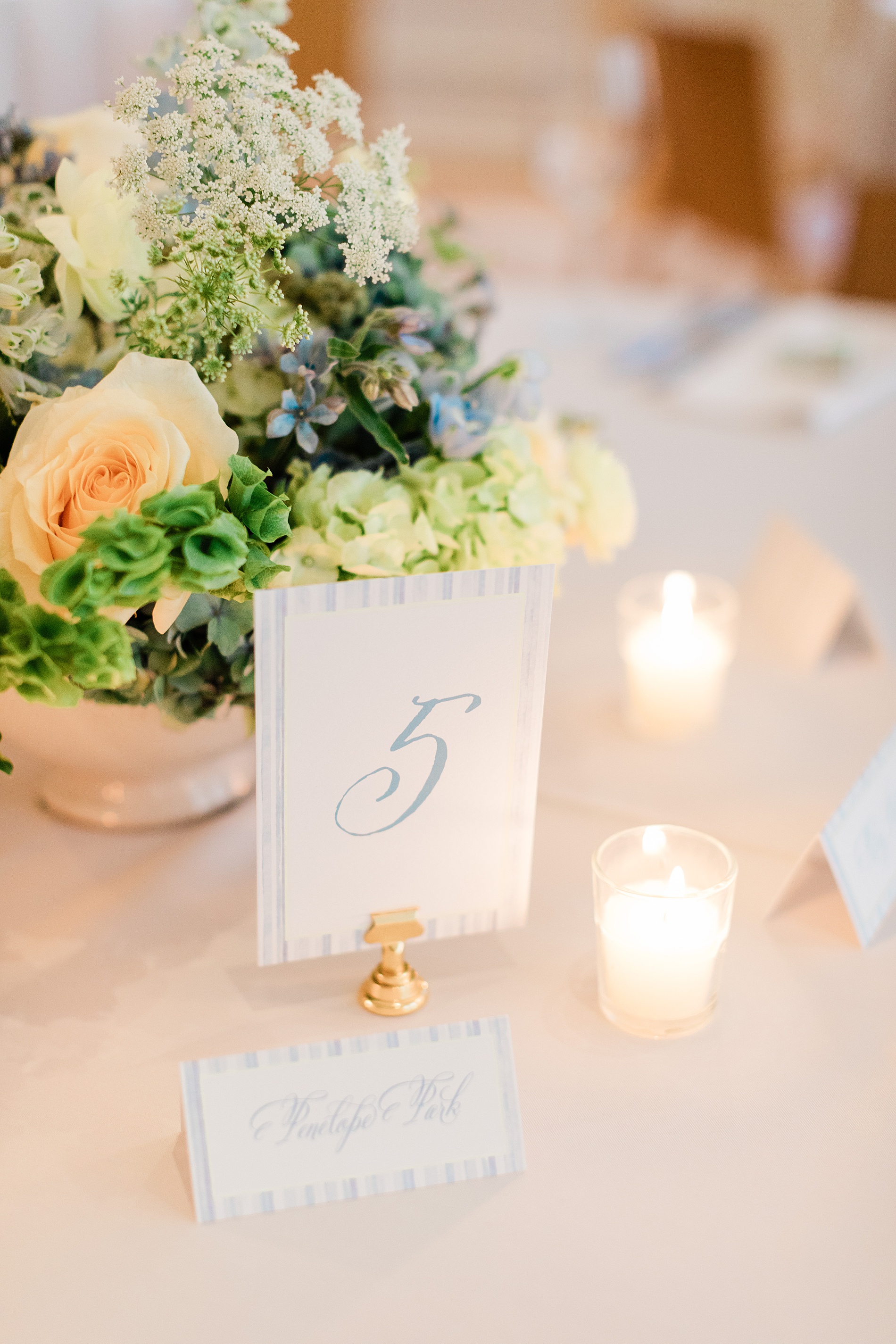
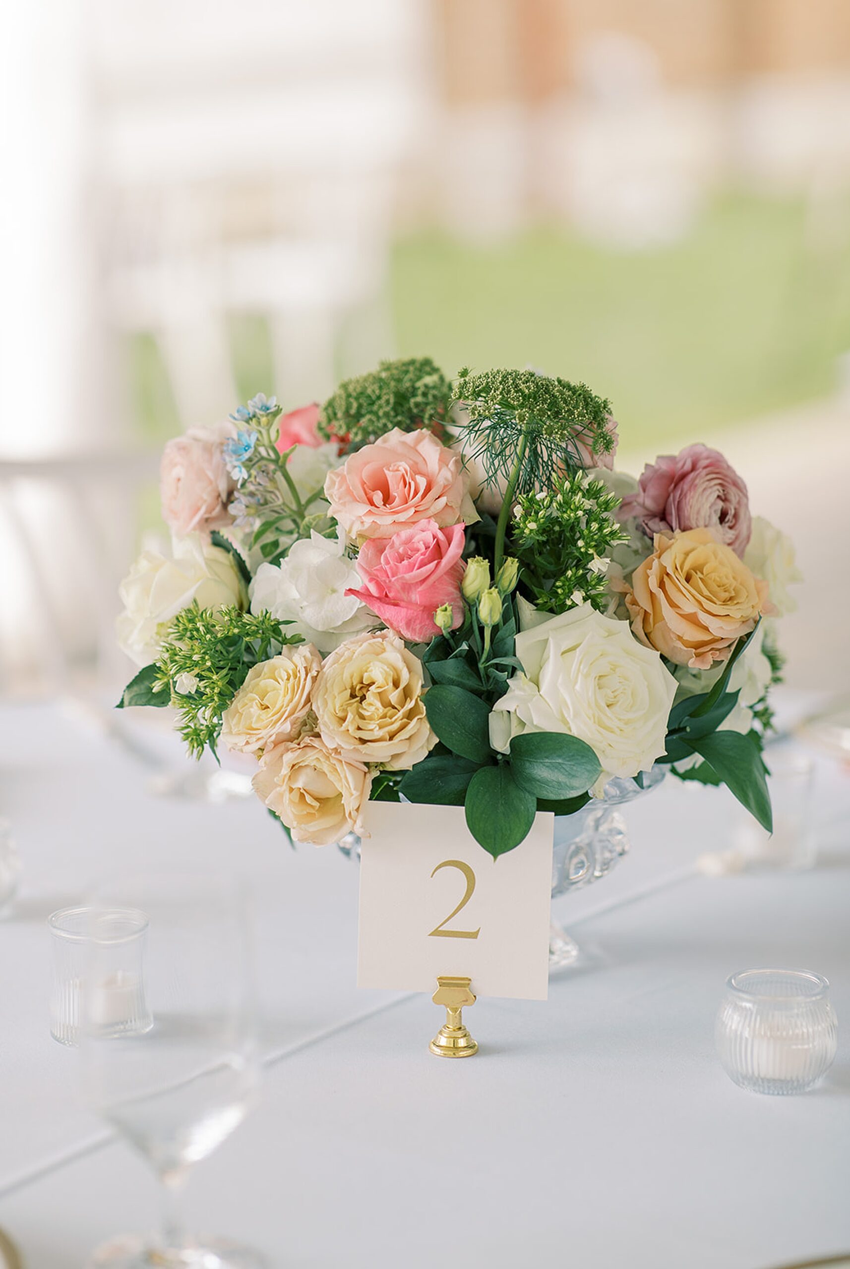
Colorful flower centerpieces decorated the center of each table. The table numbers we designed elegantly completed the tablescape. The white cards with numbers in a dusty blue color were displayed in gold holders tying the look together.
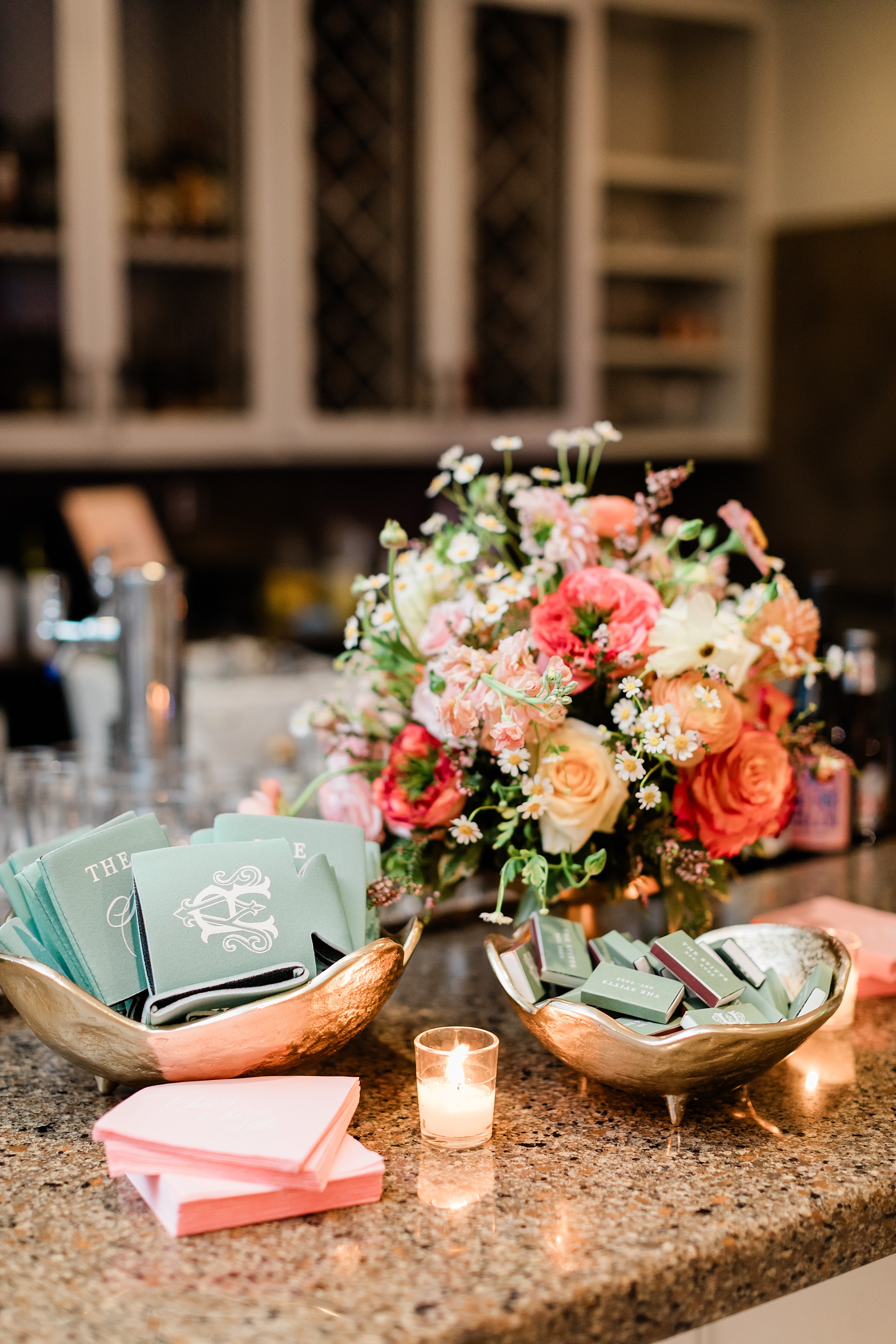
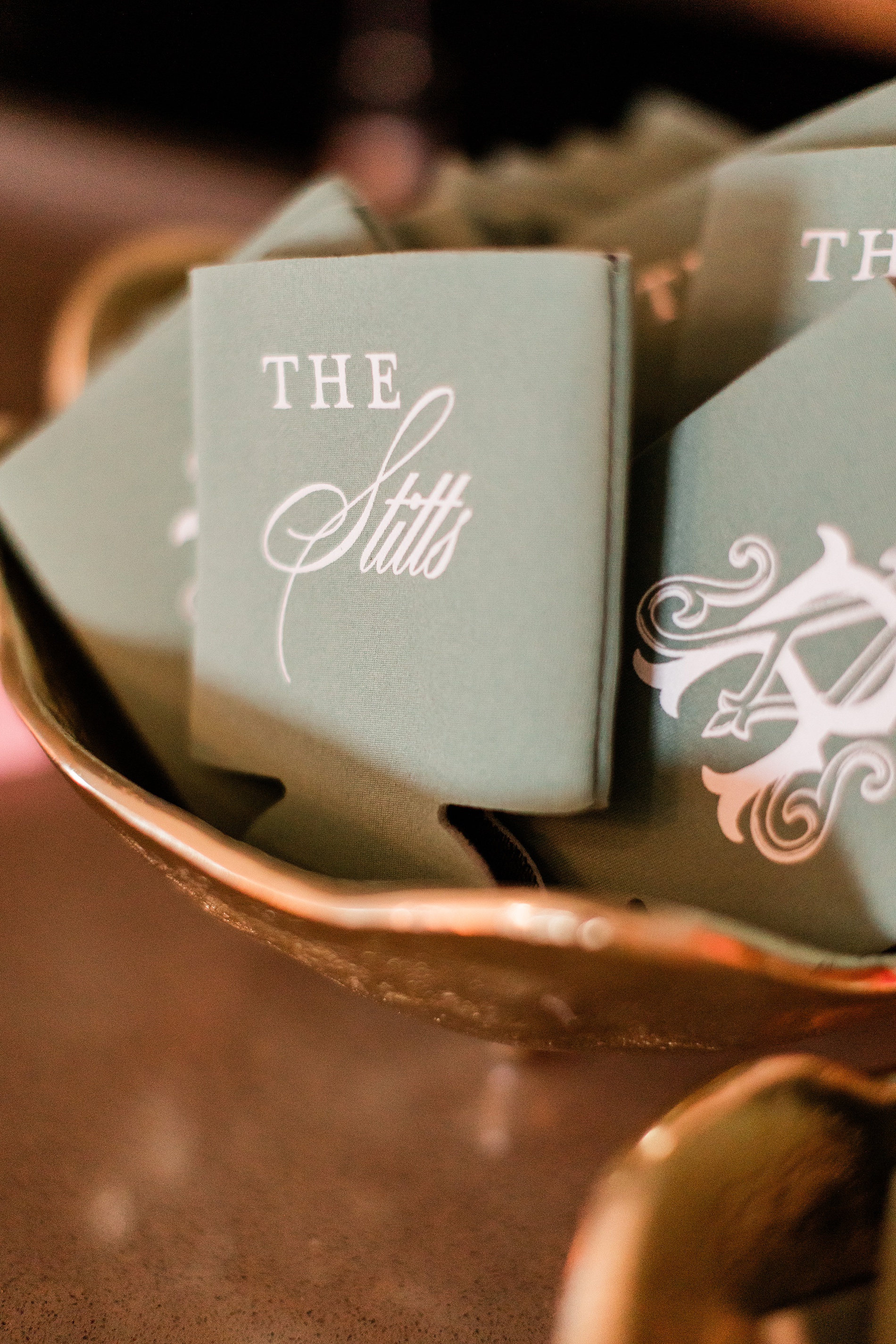
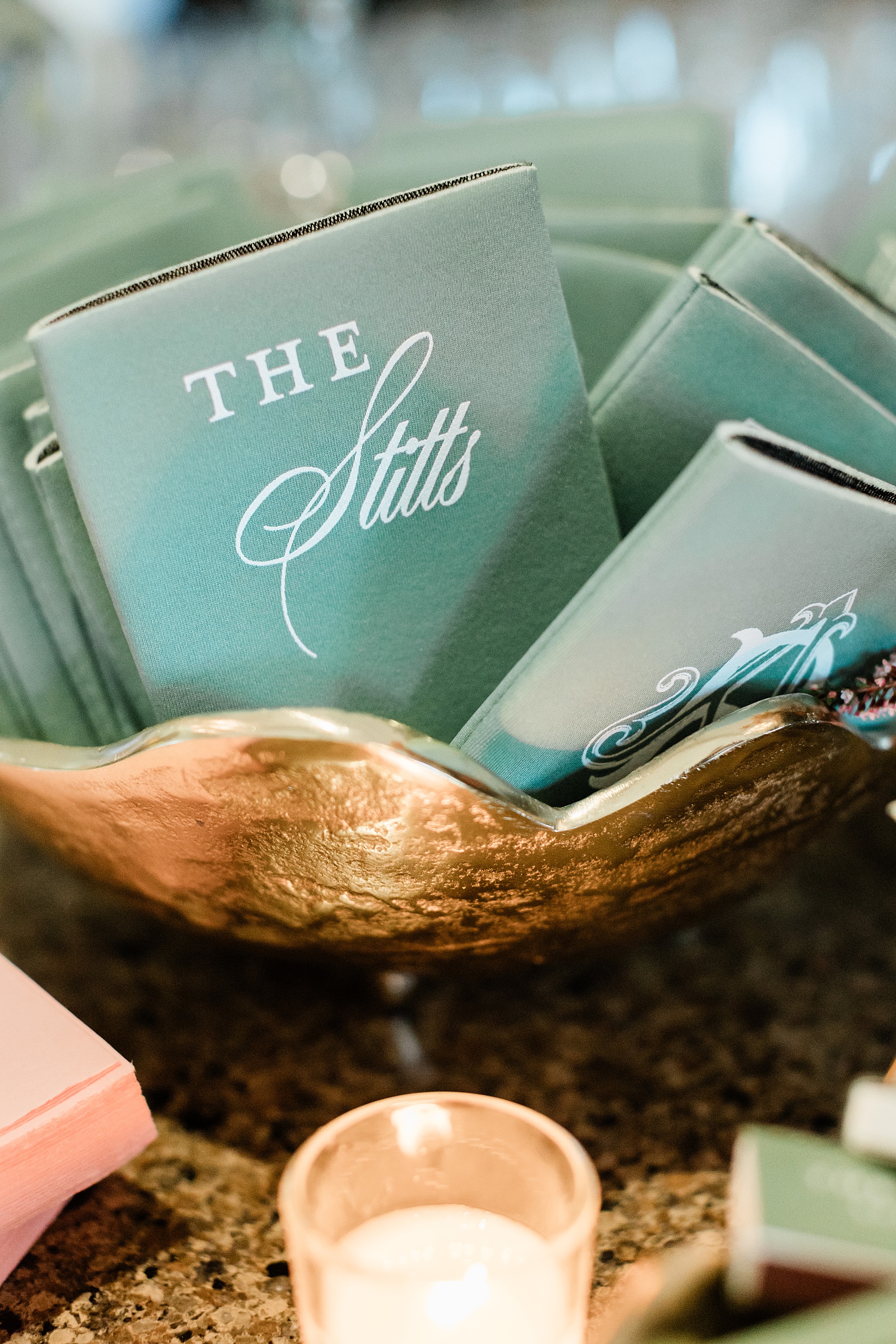
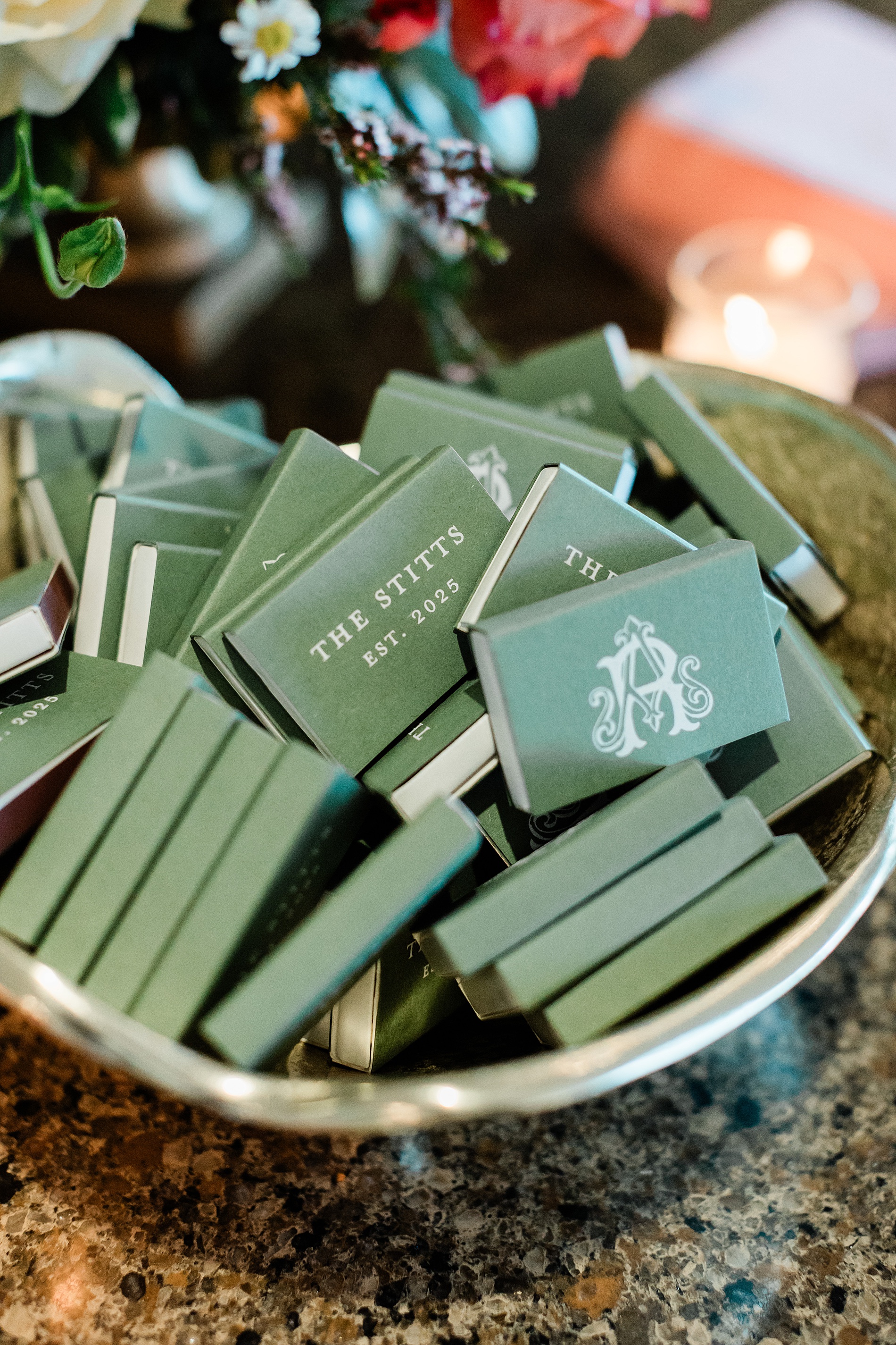
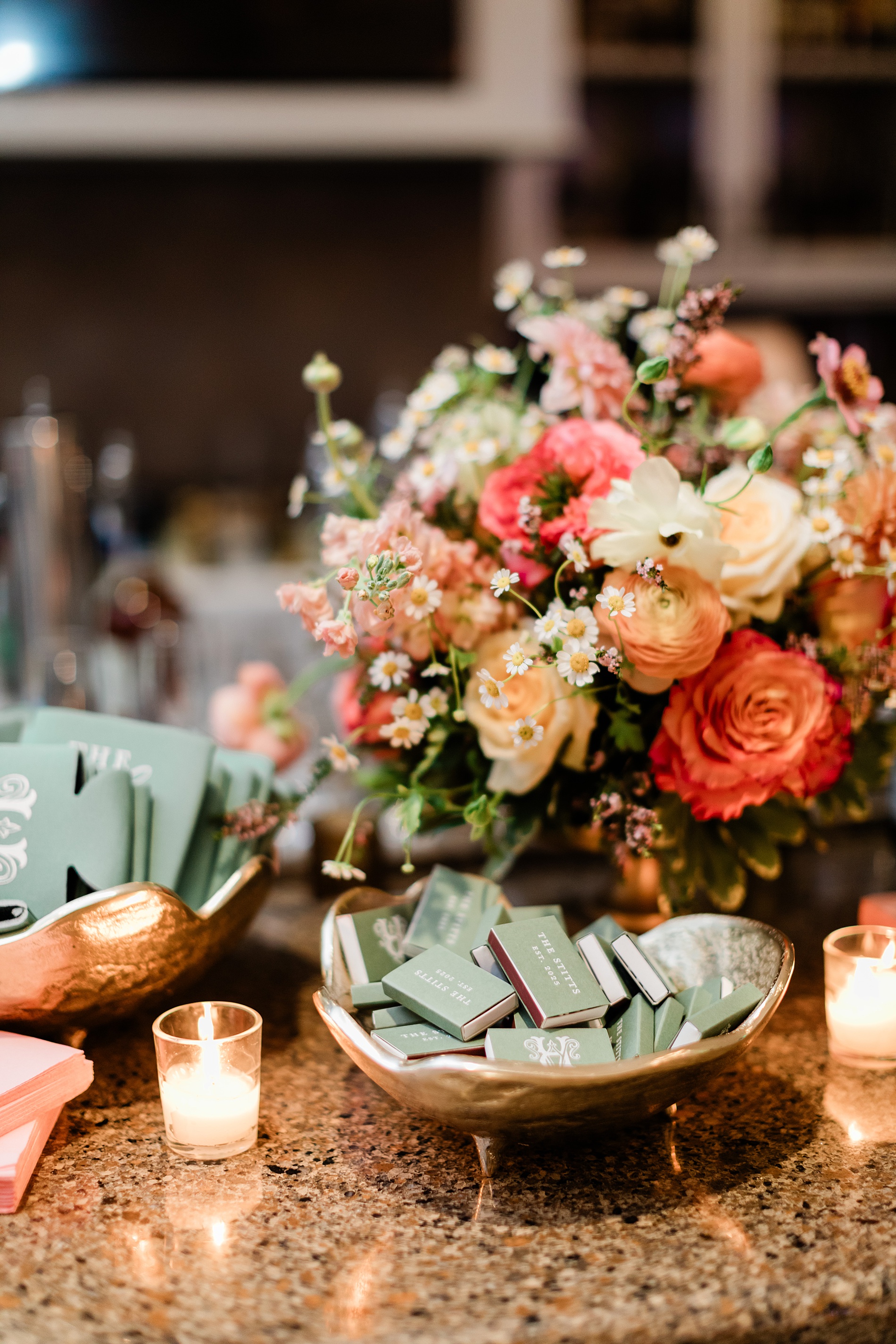
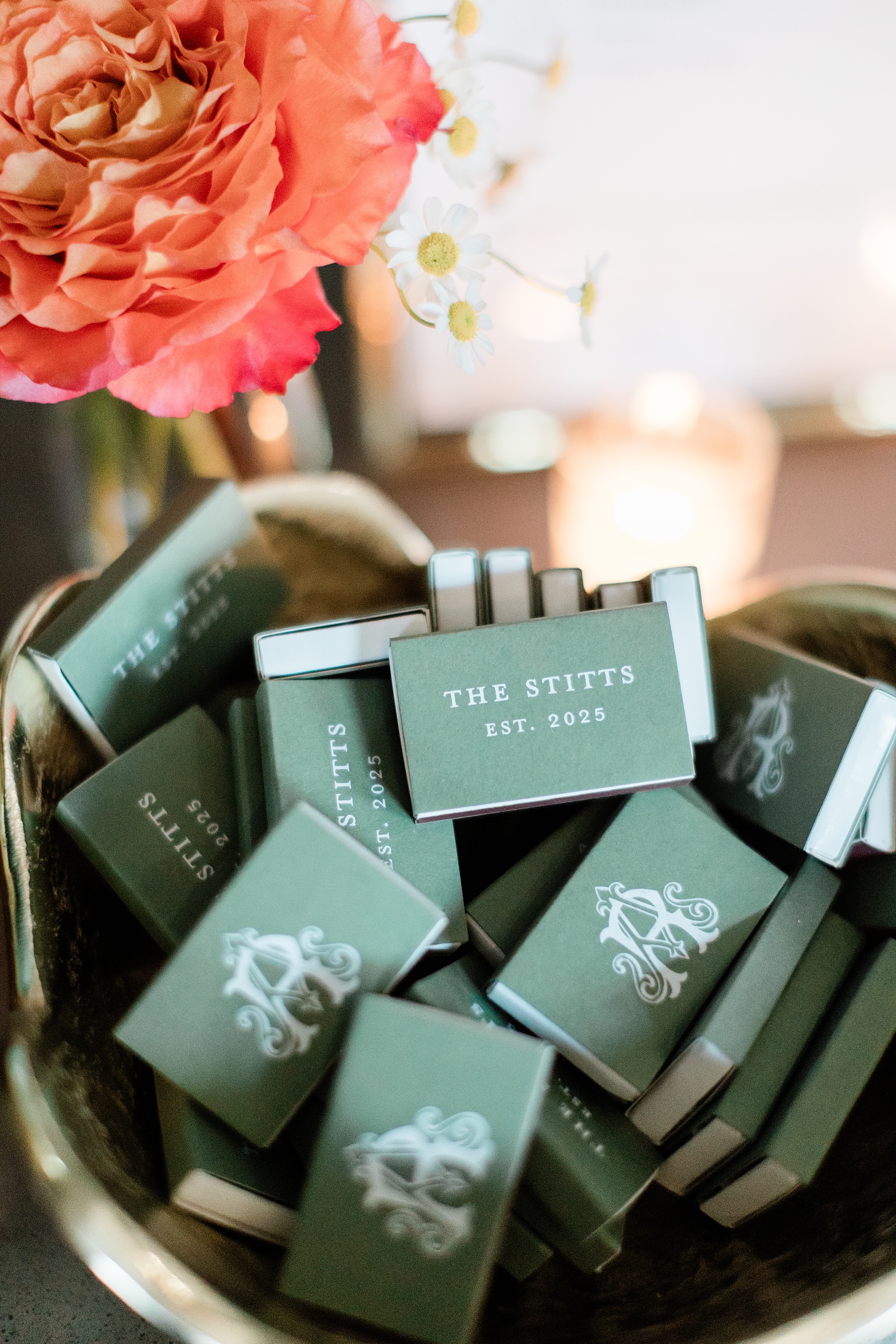
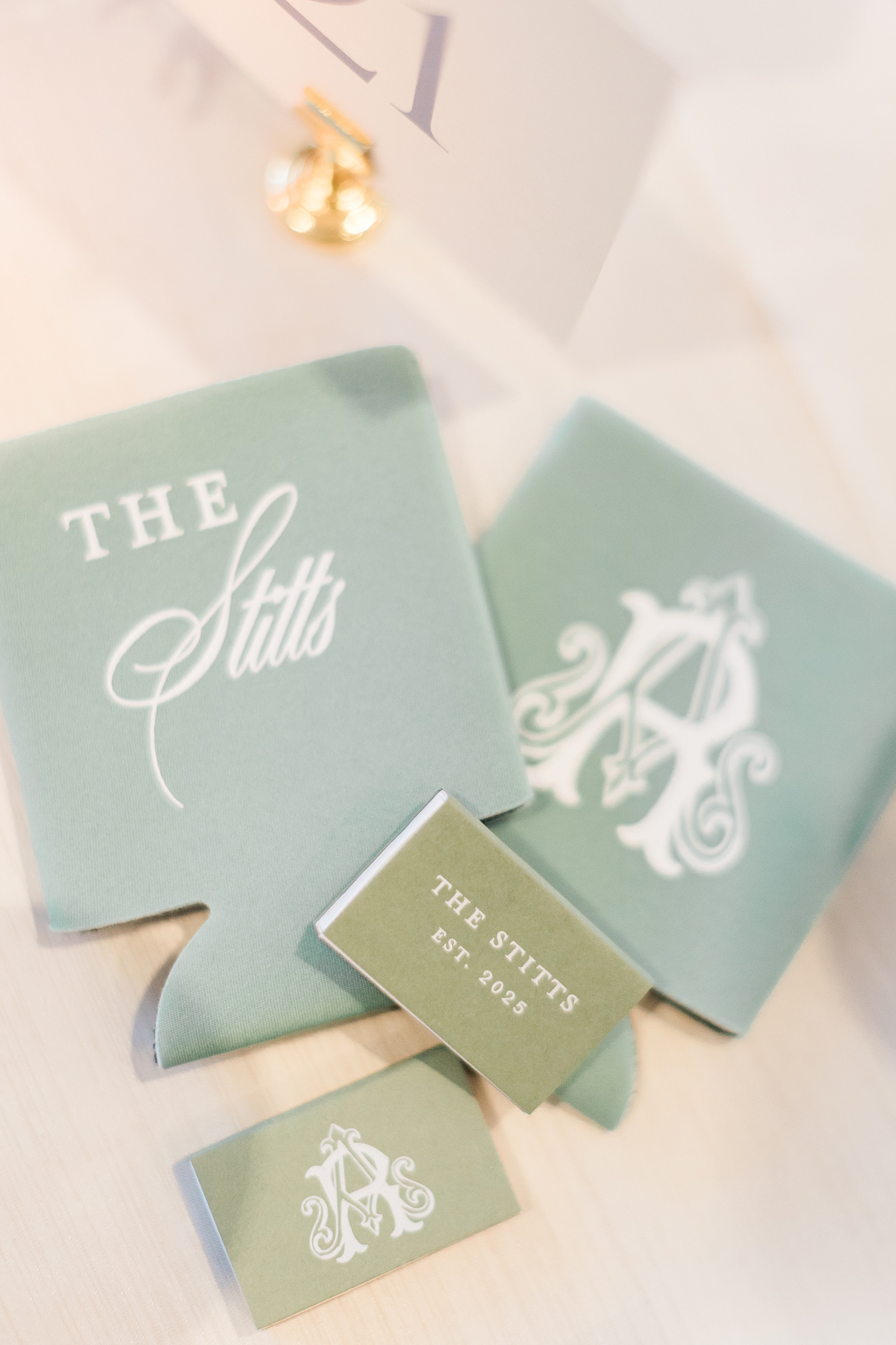
Custom Wedding Favors
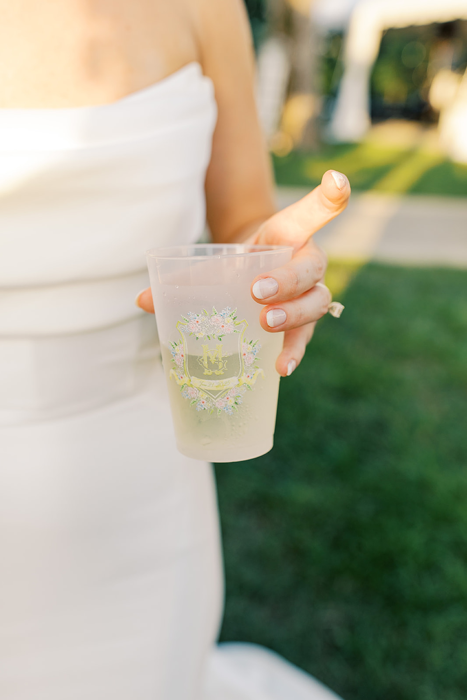
Anna and Ross decided on custom drink koozies and matches for their wedding favors. To make them stand out, we put their custom monogram as seen on the invitations and programs on one side of the koozie and match box, and the other side featured their new shared name, The Stitts.
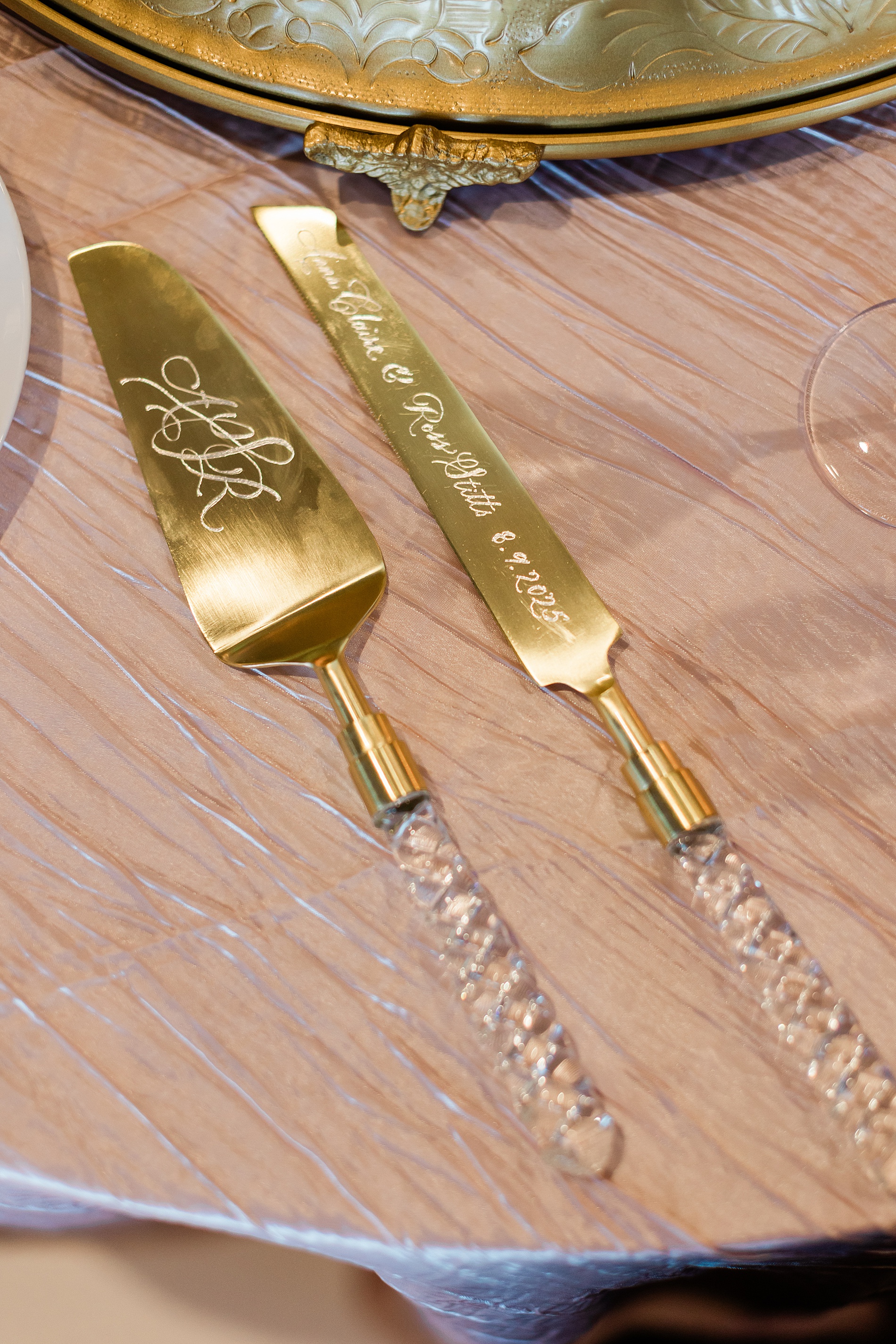
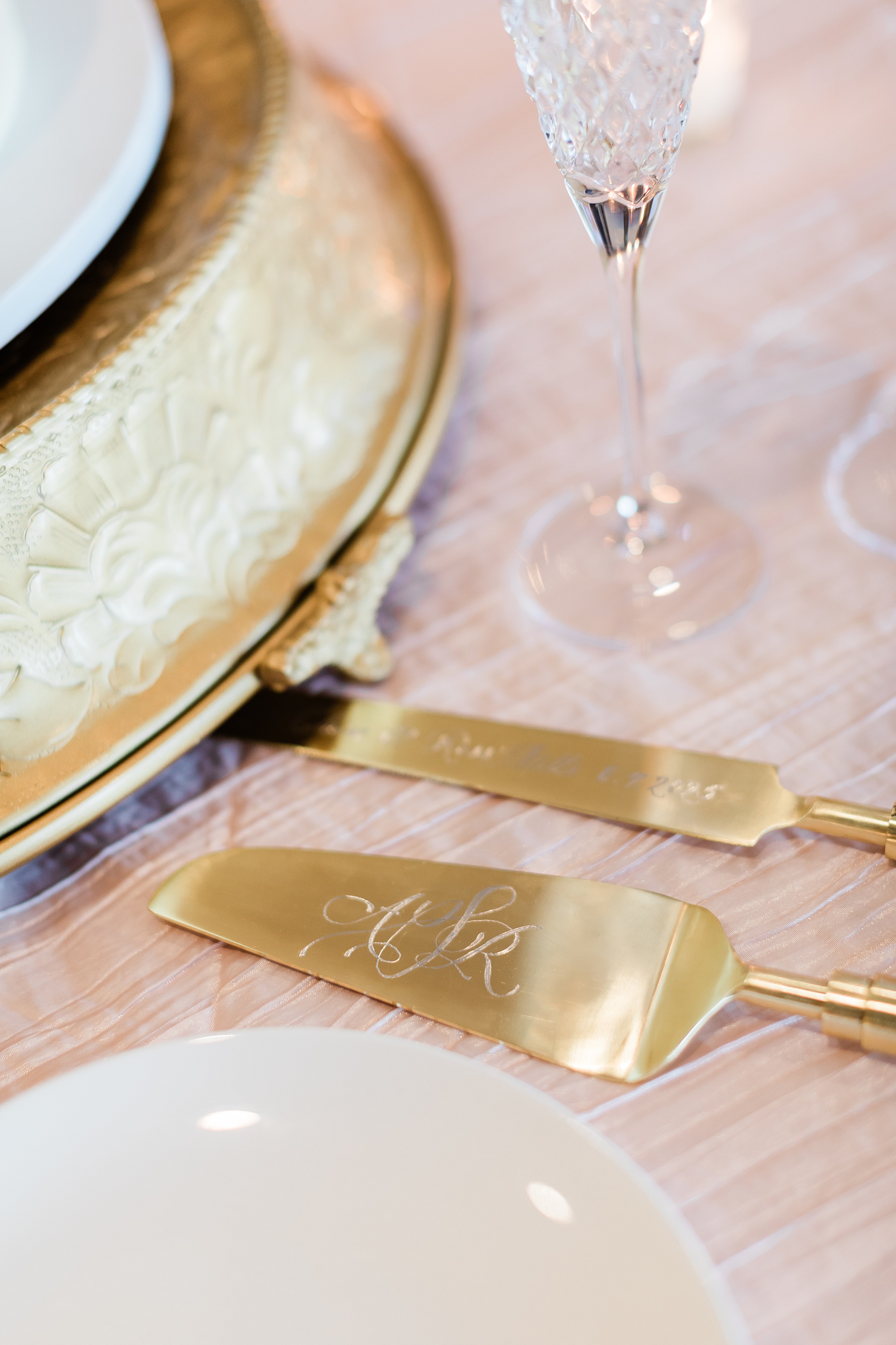
Engraved Cake Serving Set
One of my favorite items from this wedding was the hand-engraved cake serving set, which was a gift from the Mother of the Bride to the couple. The knife was engraved with their names and wedding date, while the cake server was hand engraved with a custom monogram.
Tying all the details together for this wedding weekend was so fun. At White Ink Calligraphy, we love creating experiences for our couples and their guests by artfully weaving threads of the design throughout the weddding day to create a cohesive look.
Congratulations, Anna and Ross, and thank you for trusting us with your wedding invitations and day of details for both your wedding day and the night before!
If you’re planning a wedding in Nashville, or anywhere in the world, we’d love to help you create meaningful, personalized stationery and event details that tell your story. We work with couples worldwide to design details you and your guests will remember forever.
Reach out today to learn more about our full-service wedding and event design offerings! We can’t wait to create something unforgettable for you!
If you enjoyed this post, you’ll love these other blogs!
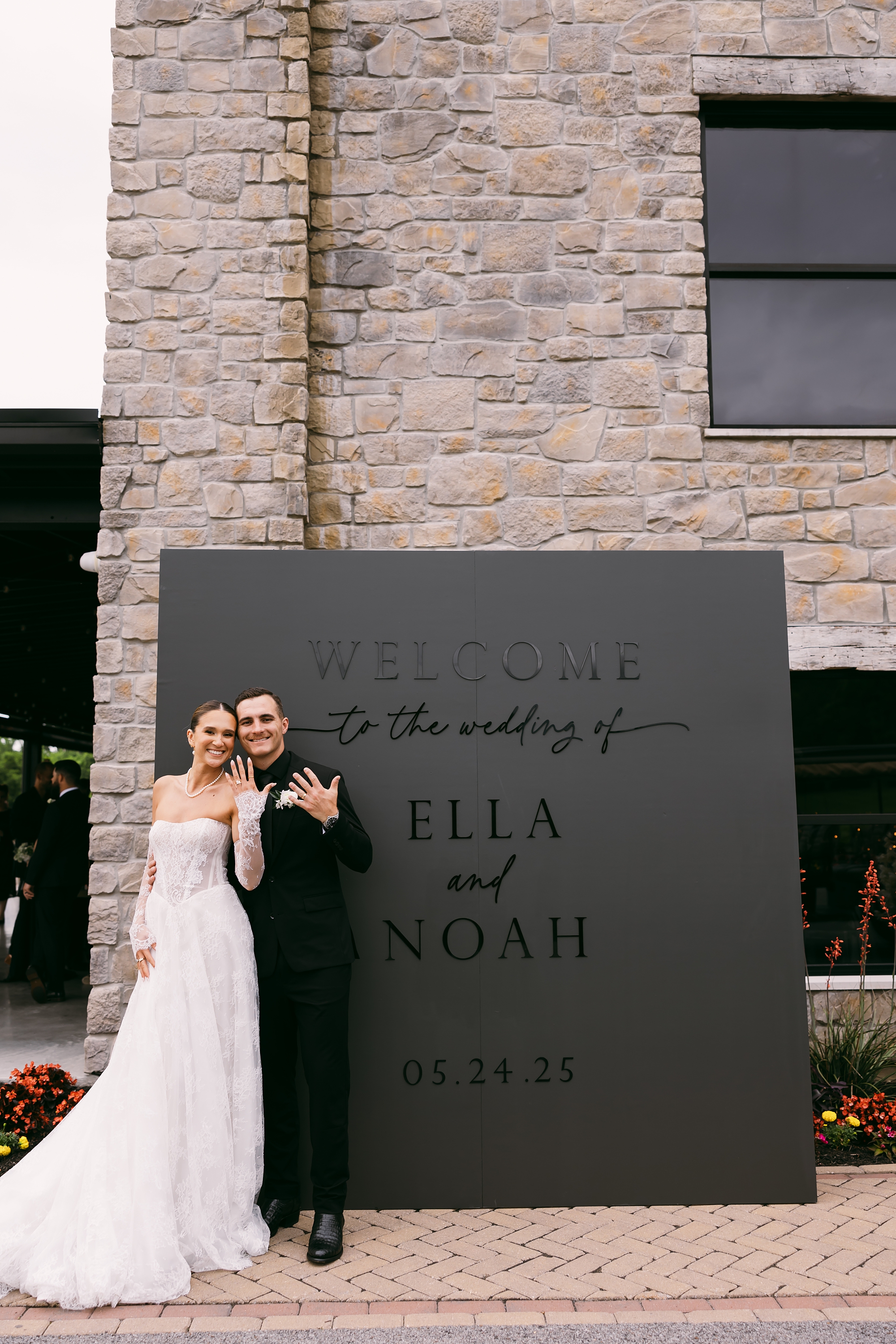
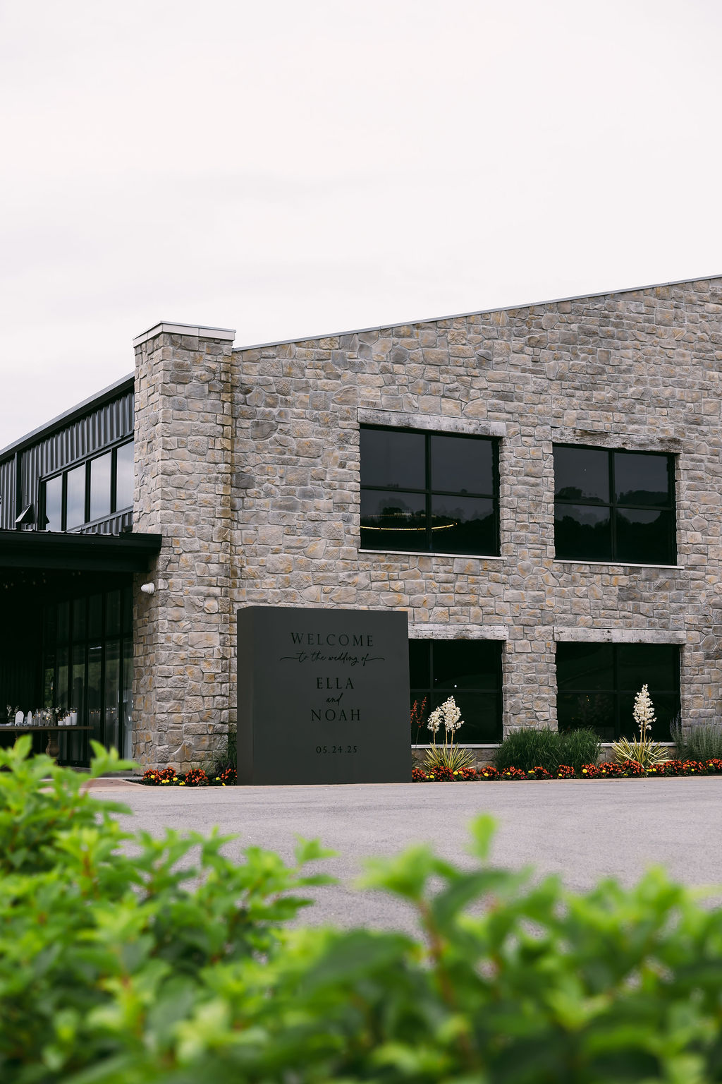
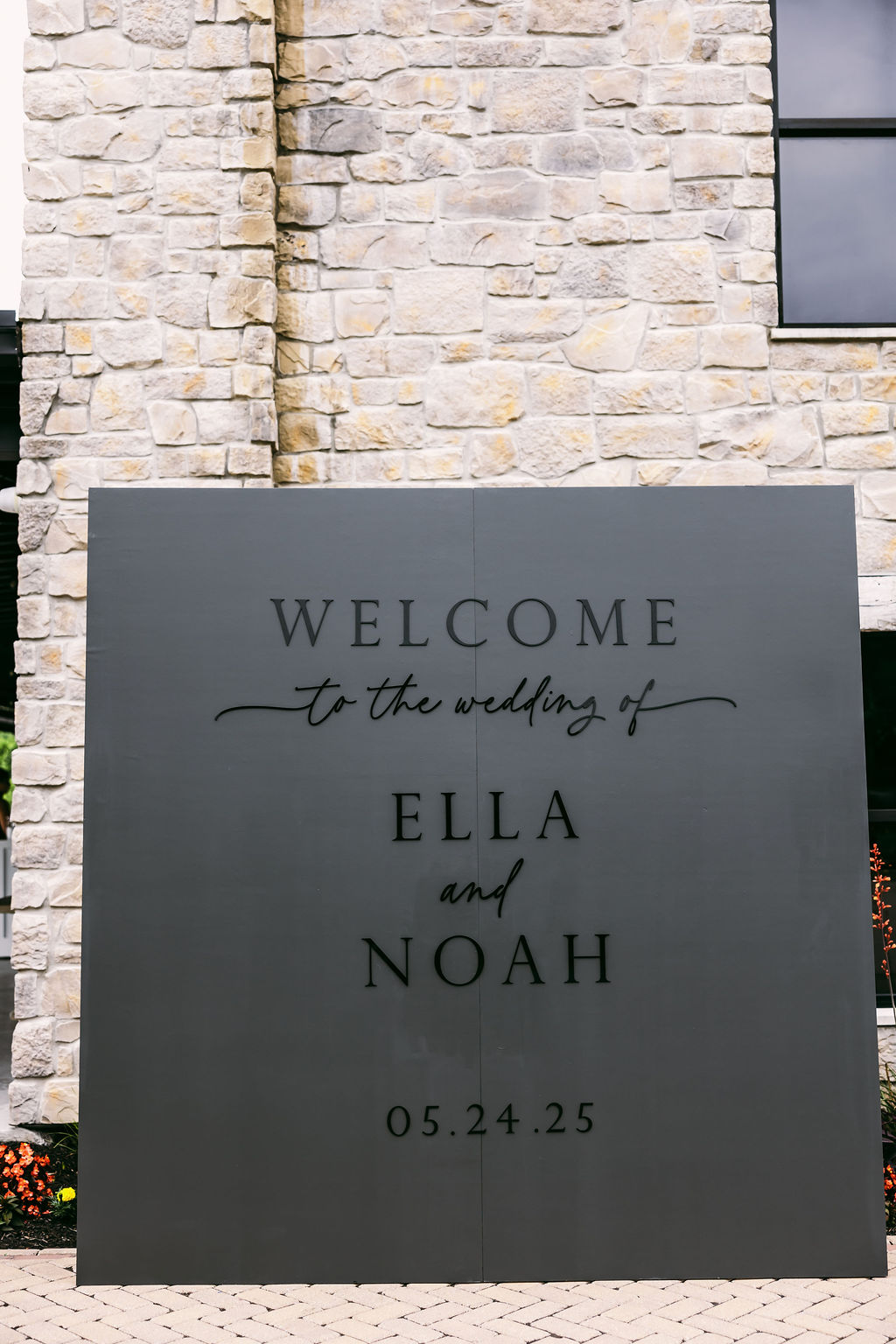
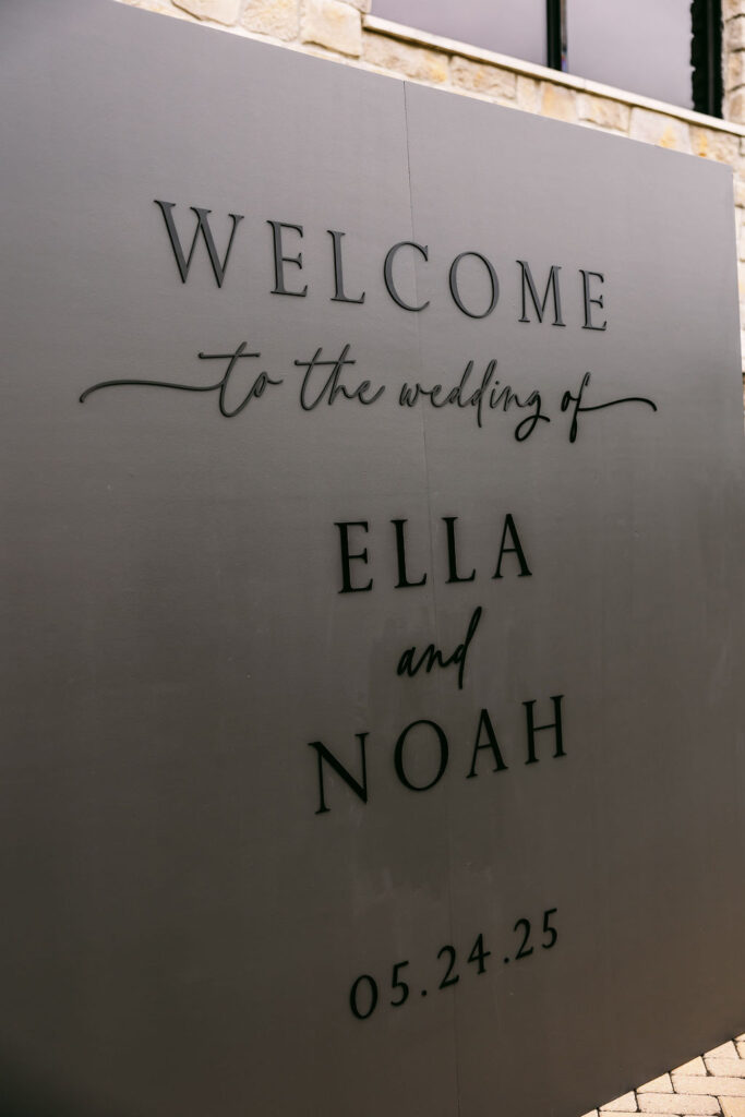
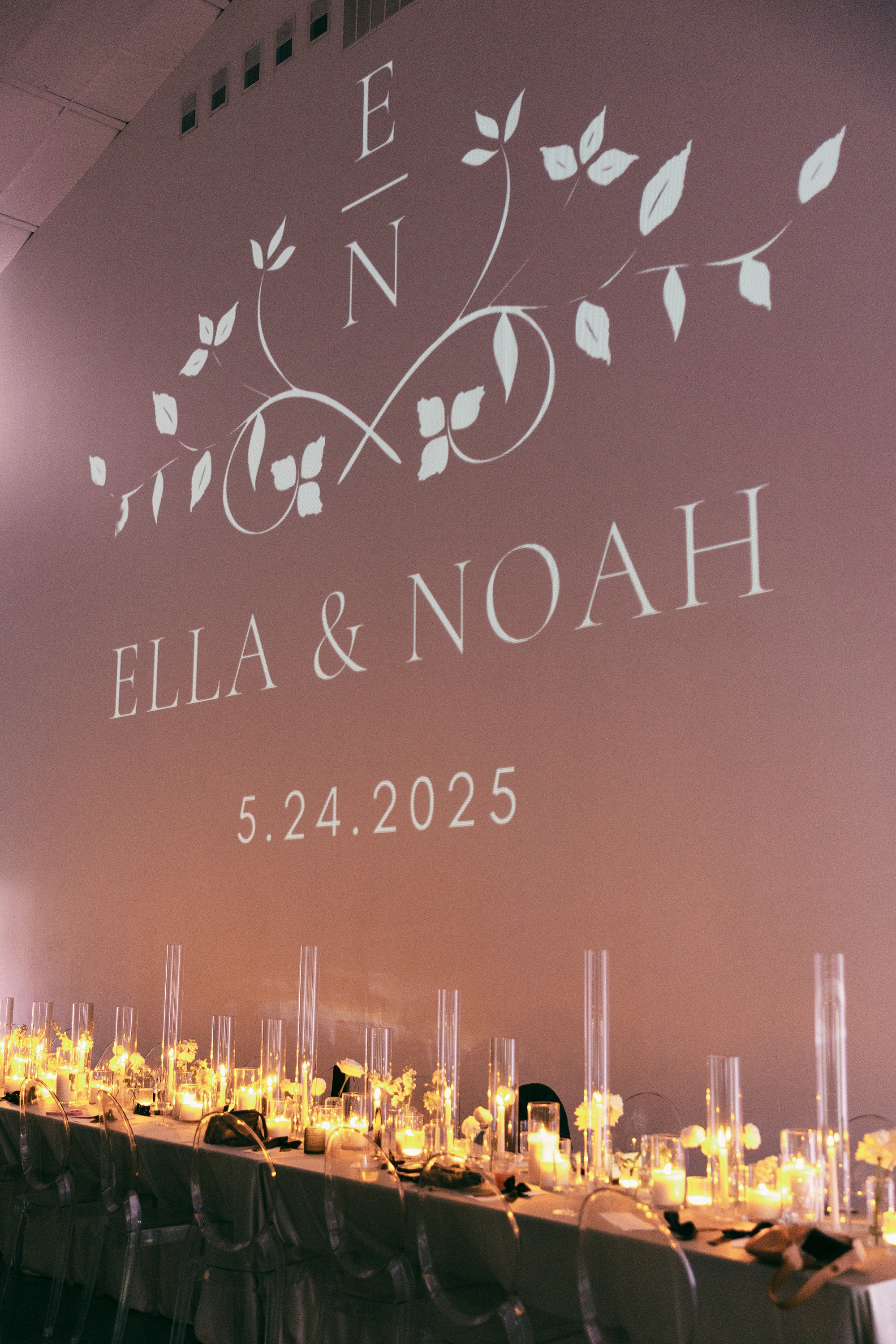
Designing the signage and other day-of wedding details for Ella and Noah’s Diamond Creek Farm wedding was such a joy. Their celebration was timeless, refined, and modern in all the right ways, and every detail reflected that. From the first impression as guests arrived to the final touches inside the ballroom, their design embraced a classic black-and-white palette with subtle Southern elegance.
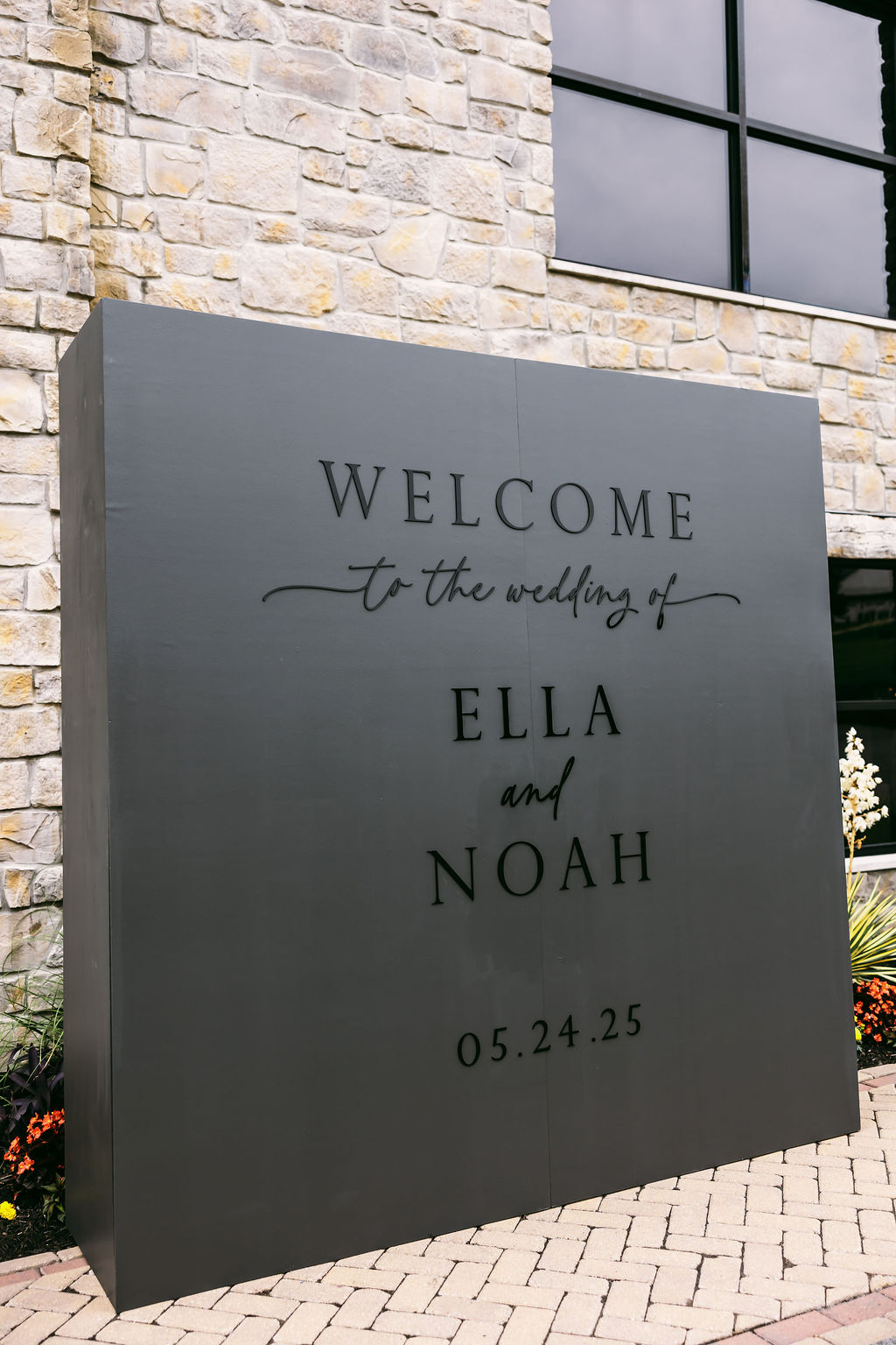
A Striking First Impression: The Black-on-Black Welcome Wall
The second guests arrived, they were greeted to an unforgettable moment. We designed a large black-on-black welcome wall, which stood outside against the venue’s light brick exterior. The contrast made it an instant focal point, and it quickly became a favorite photo backdrop throughout the evening. This installation set the tone for the wedding day: modern, stylish, and beautifully intentional.
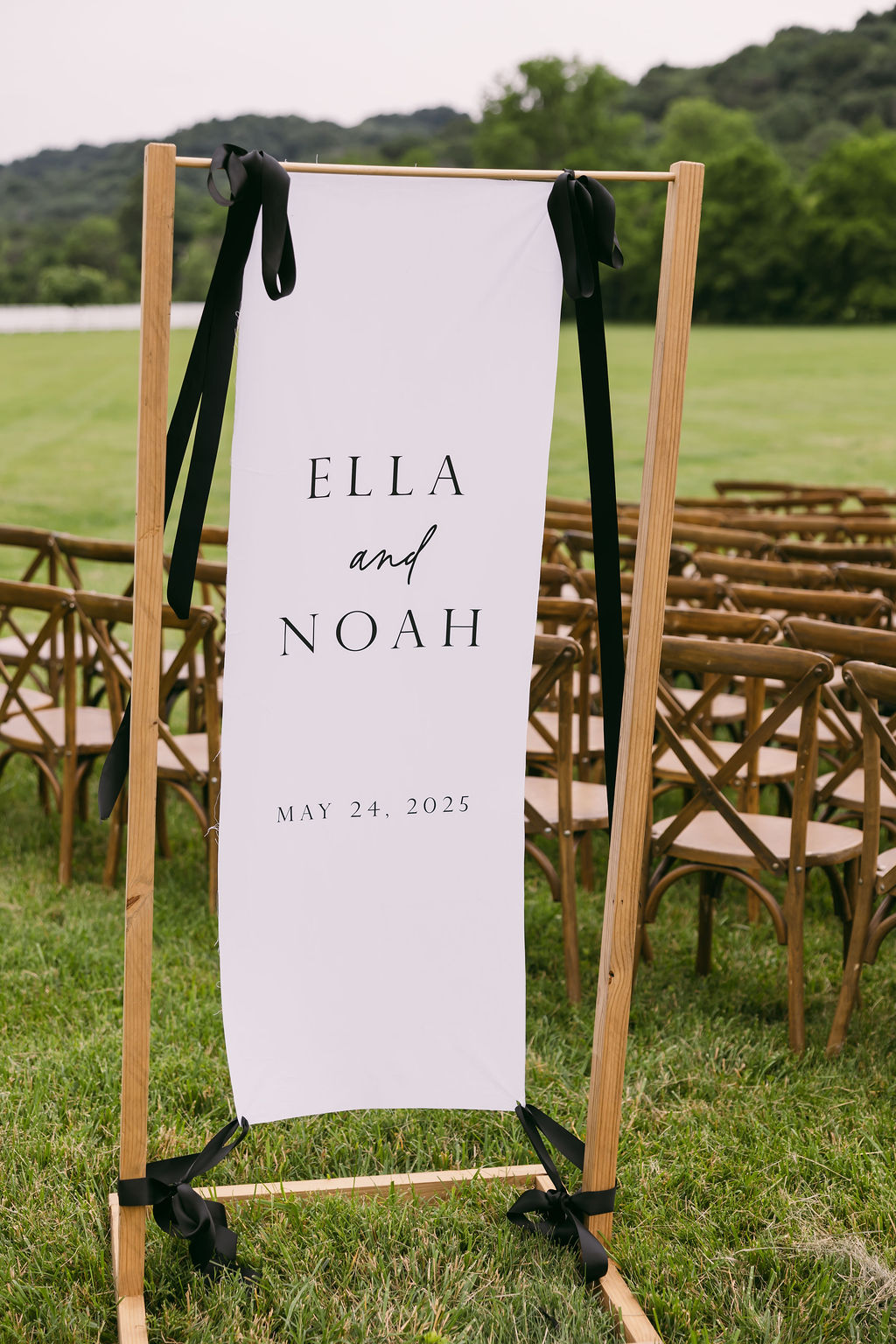
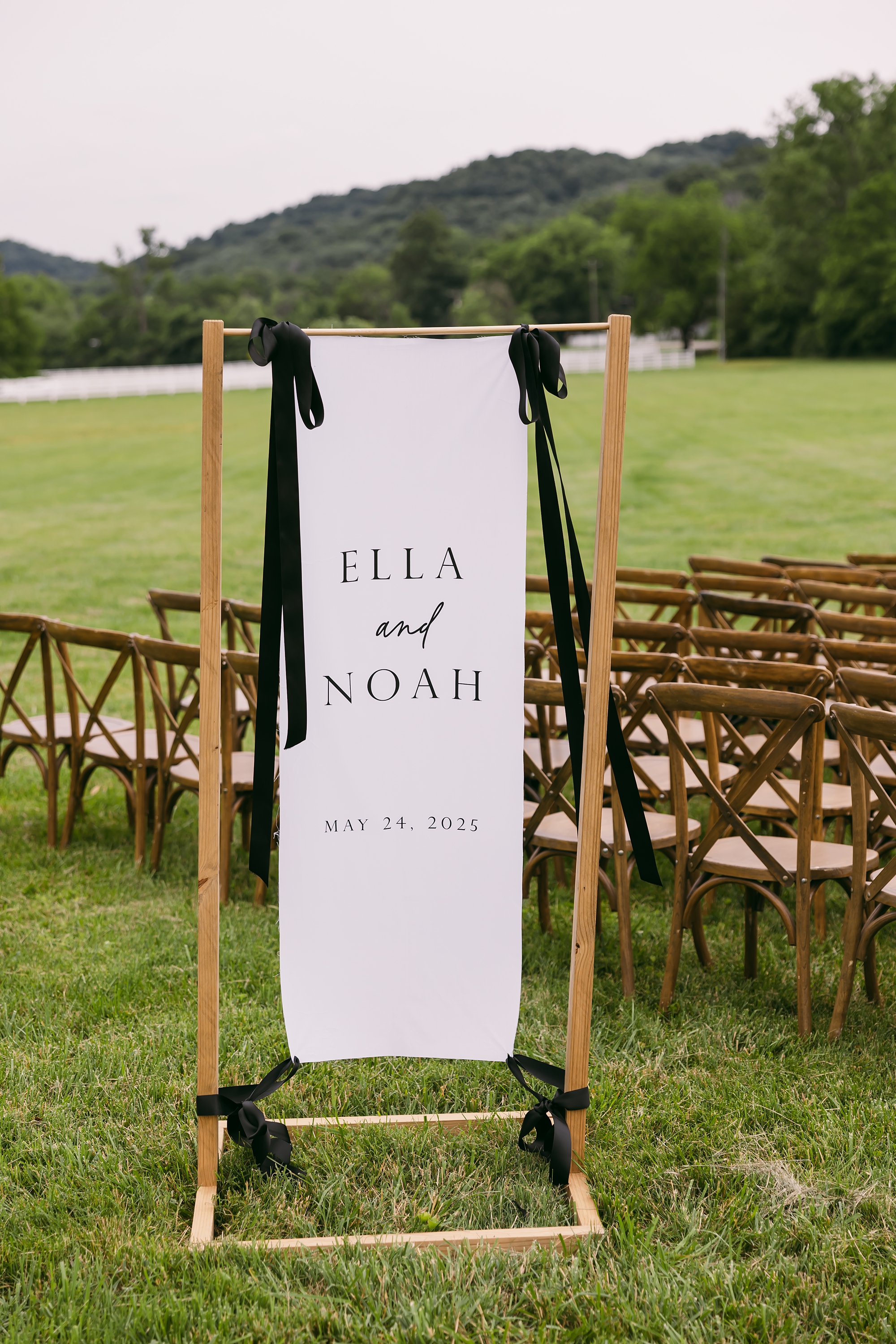
Fabric Welcome Sign for Outdoor Ceremony
For their ceremony overlooking the rolling Tennessee hills, we created a white fabric welcome sign that added softness and movement to the space. A custom wooden frame displayed the sign that attached at the top and bottom with black ribbon so it could still catch the breeze. The gentle movement of the fabric against the natural landscape added a romantic, organic touch that complemented the outdoor setting perfectly.
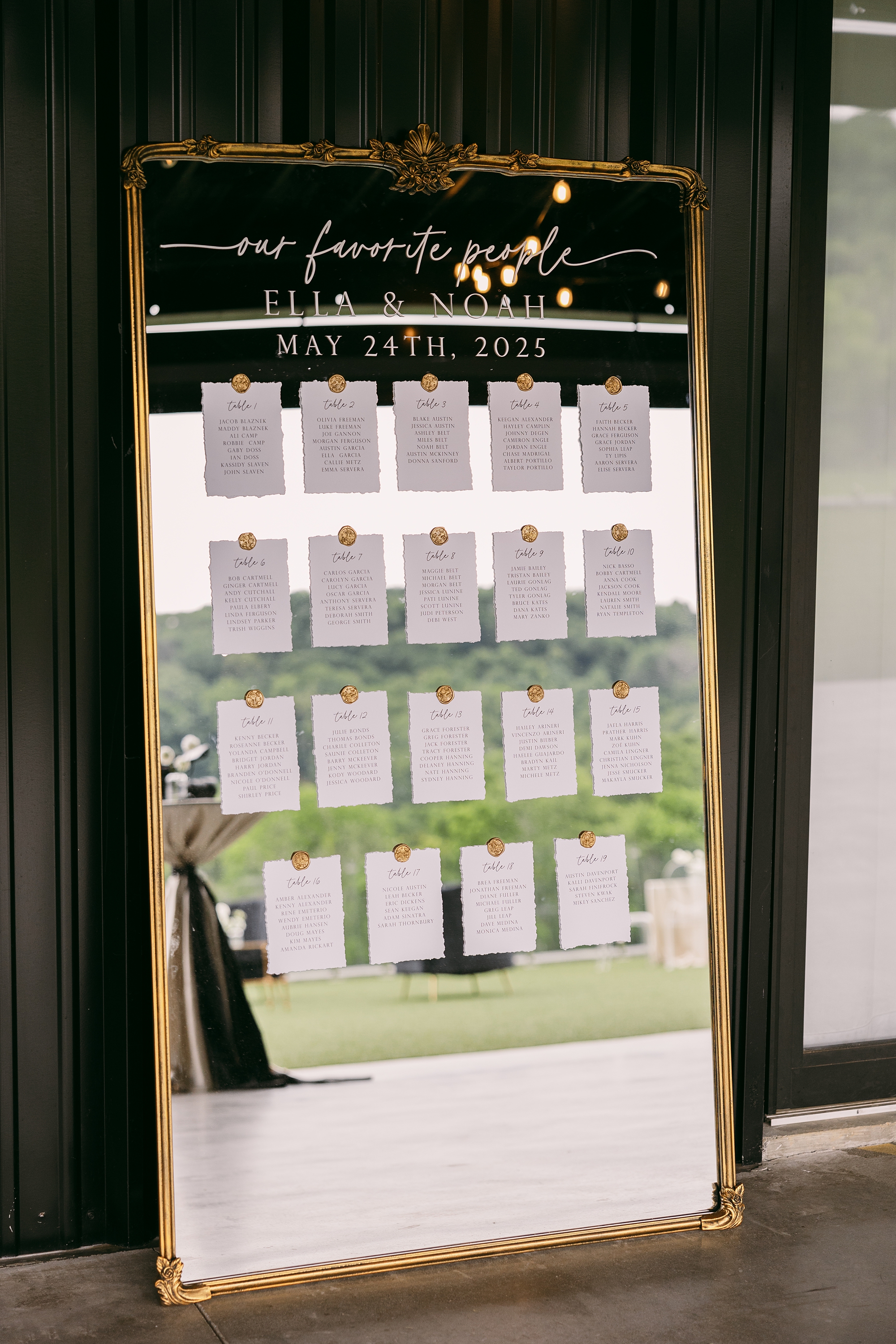
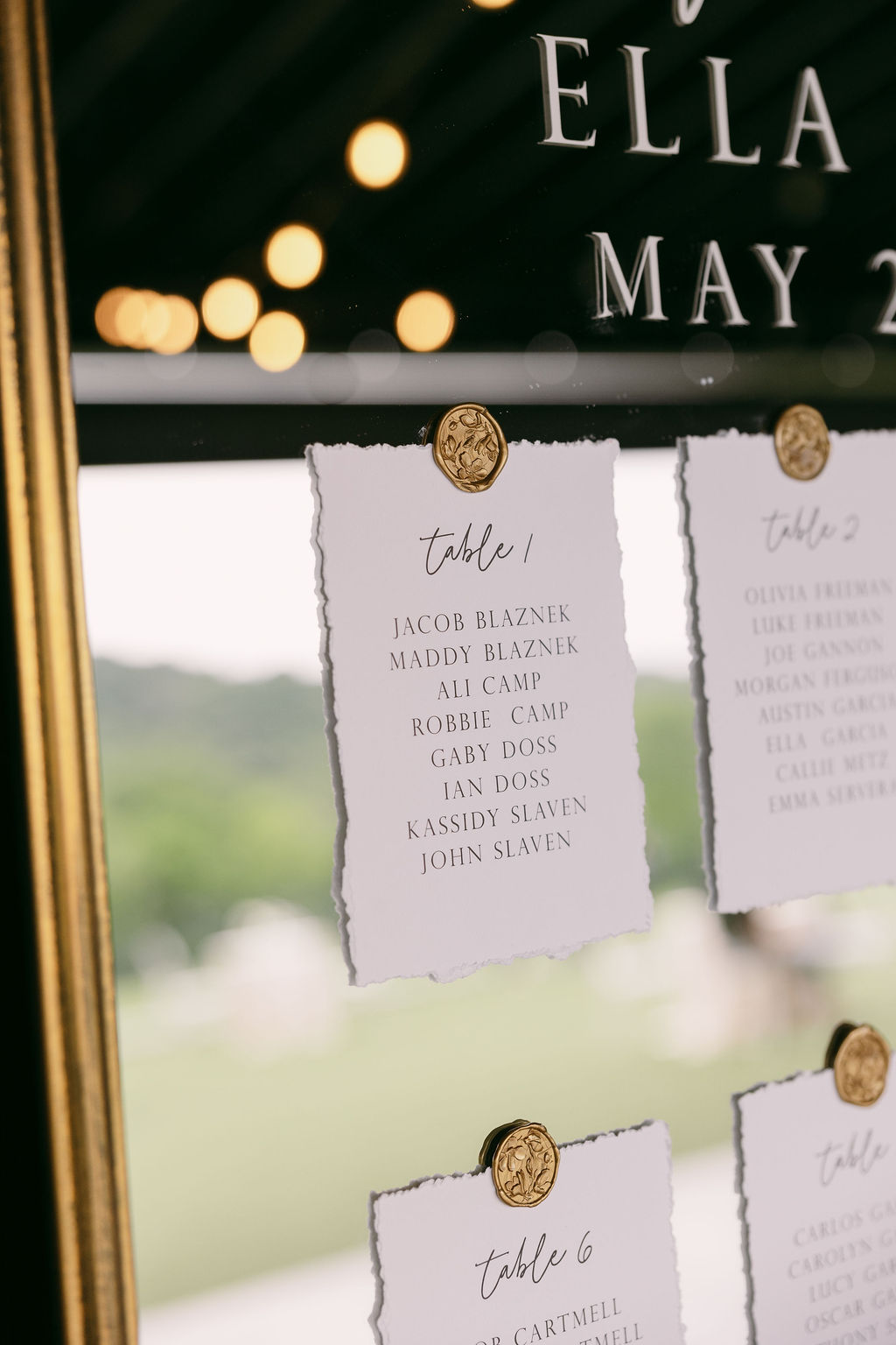
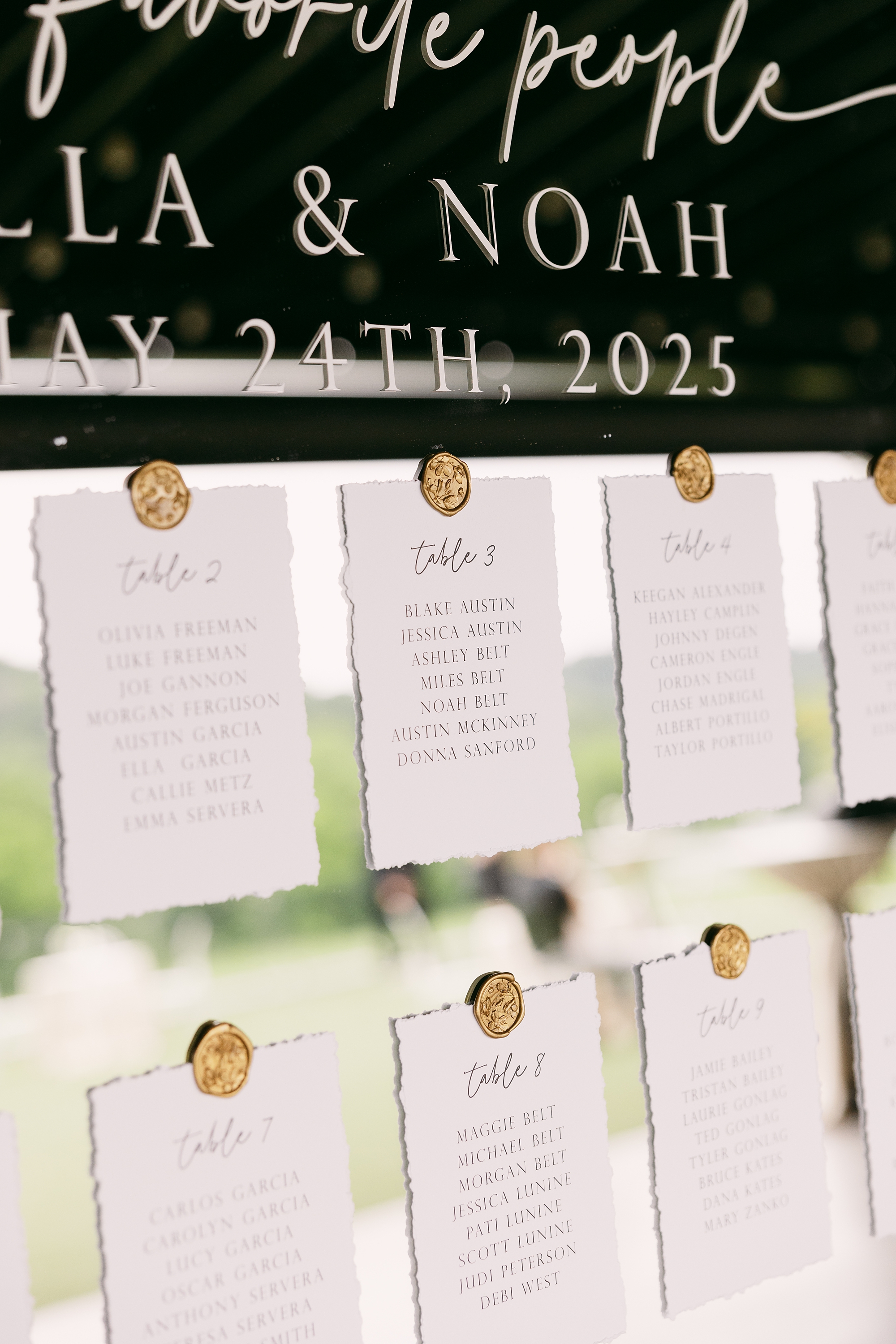
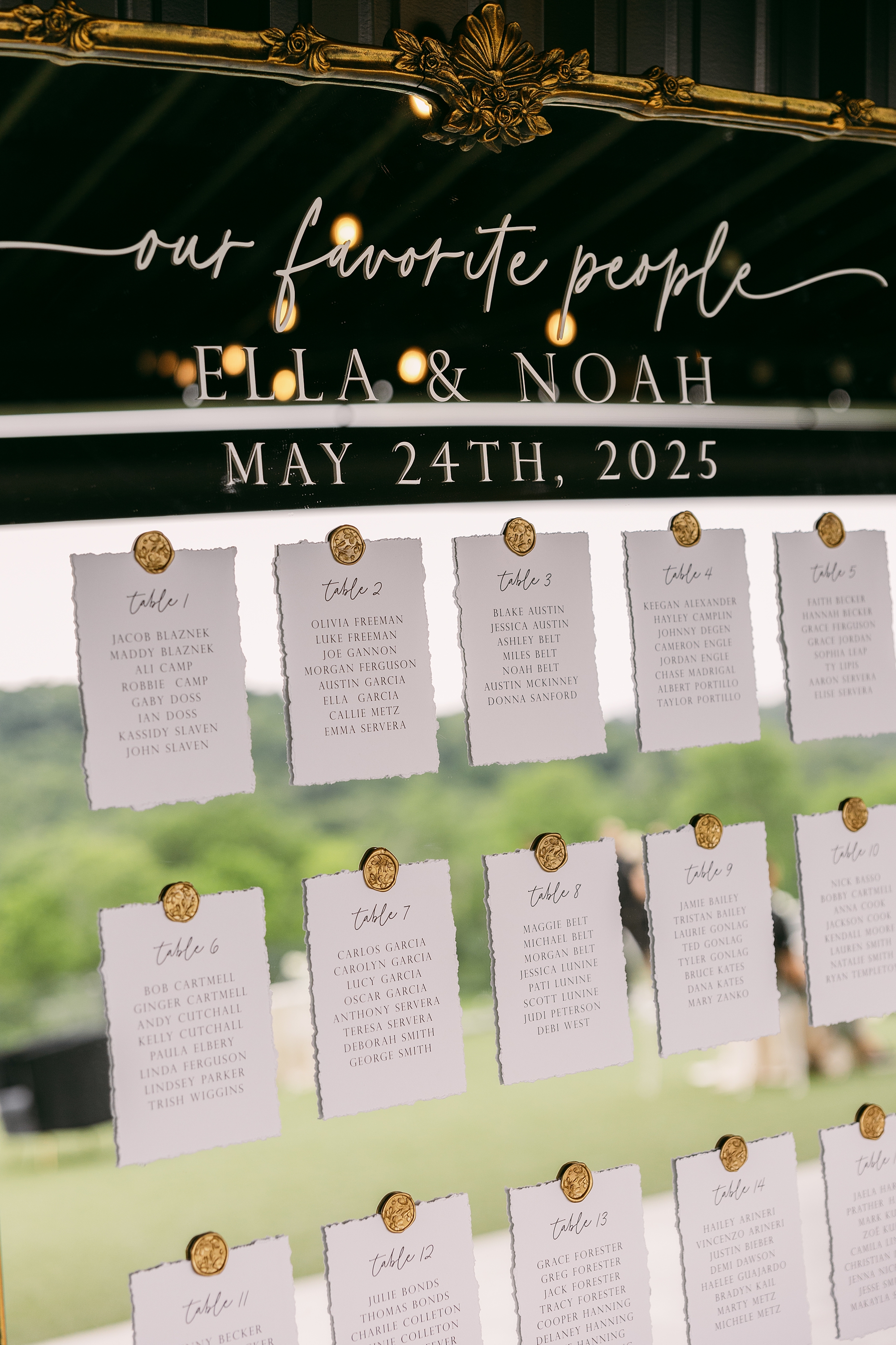
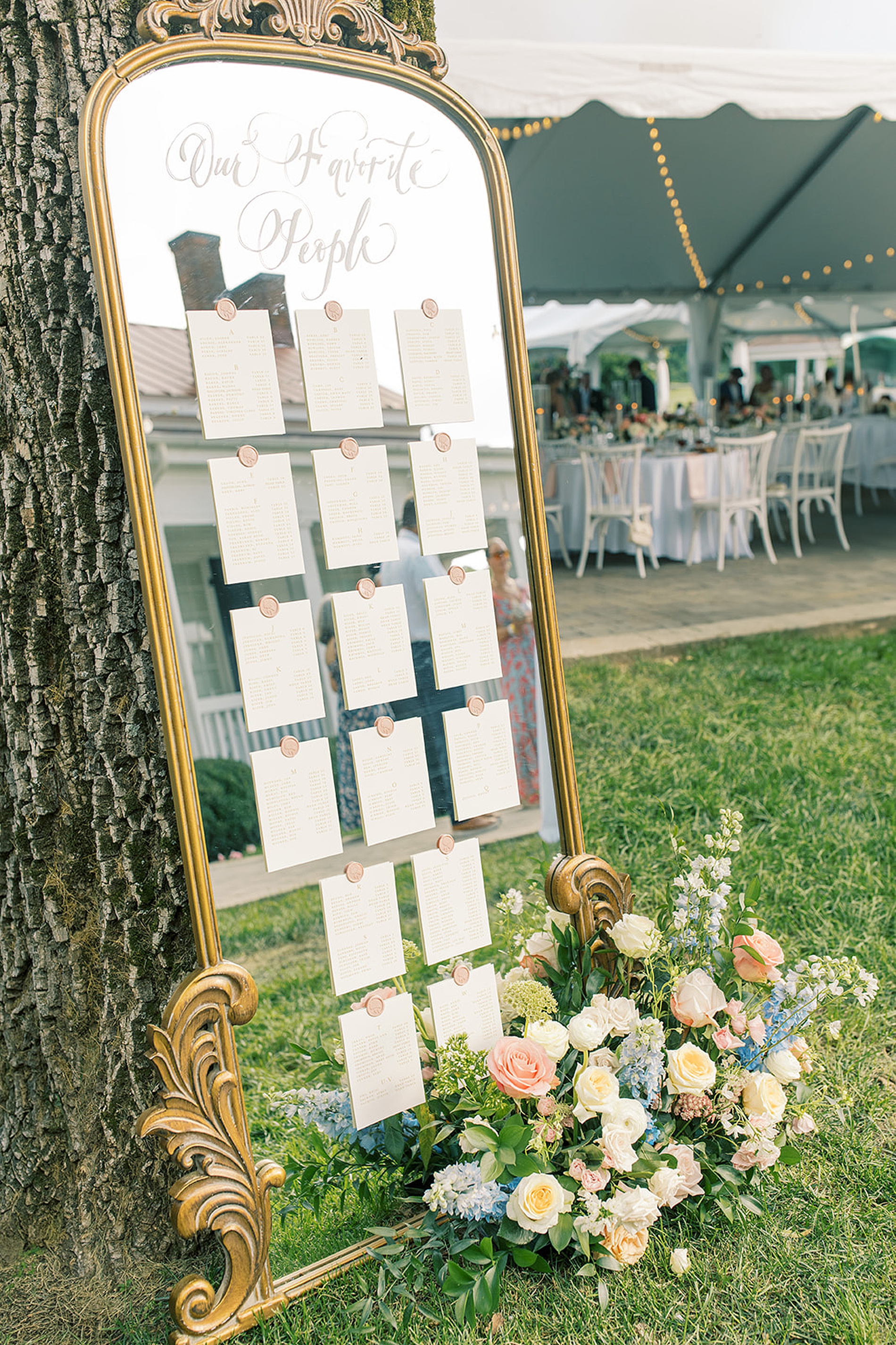
Gold-Framed Mirror Seating Chart
After the ceremony, guests made their way back toward the building, where they found their seating assignments displayed in one of my favorite design moments of the day. We created a seating chart using an oversized gold-framed mirror. In white calligraphy across the glass, it read: “Our Favorite People” followed by the couple’s names and wedding date.
Each table assignment was displayed on handmade paper and attached to the mirror with gold wax seals, creating a layered, elegant look. The combination of textures and warm gold tones made this piece both functional and beautifully timeless.
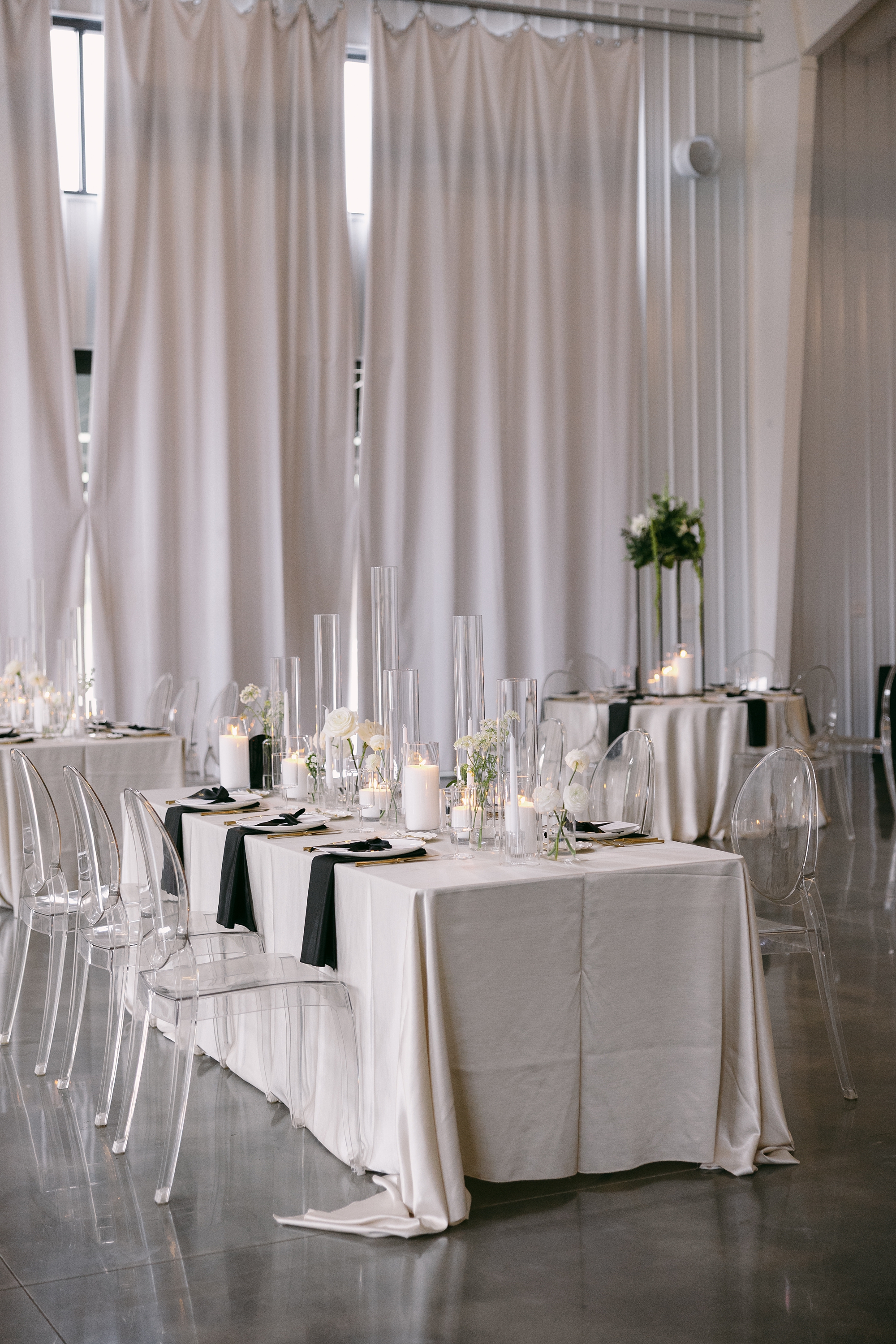
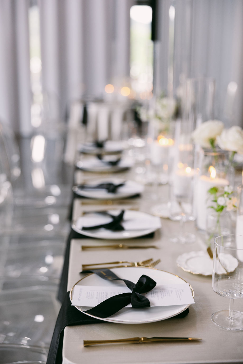
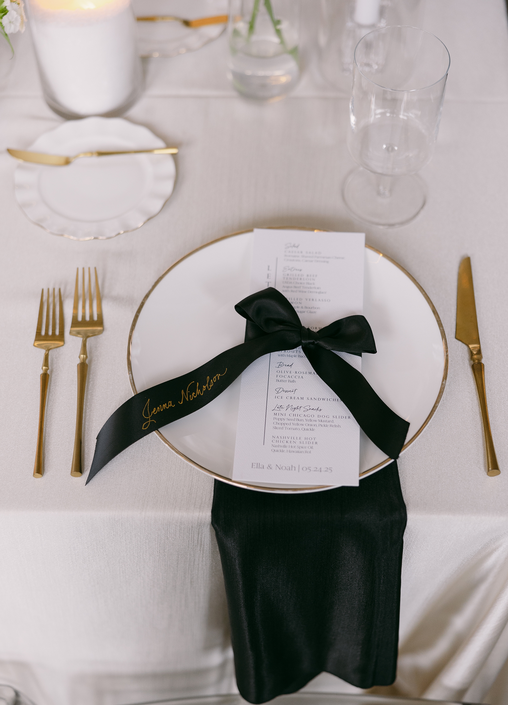
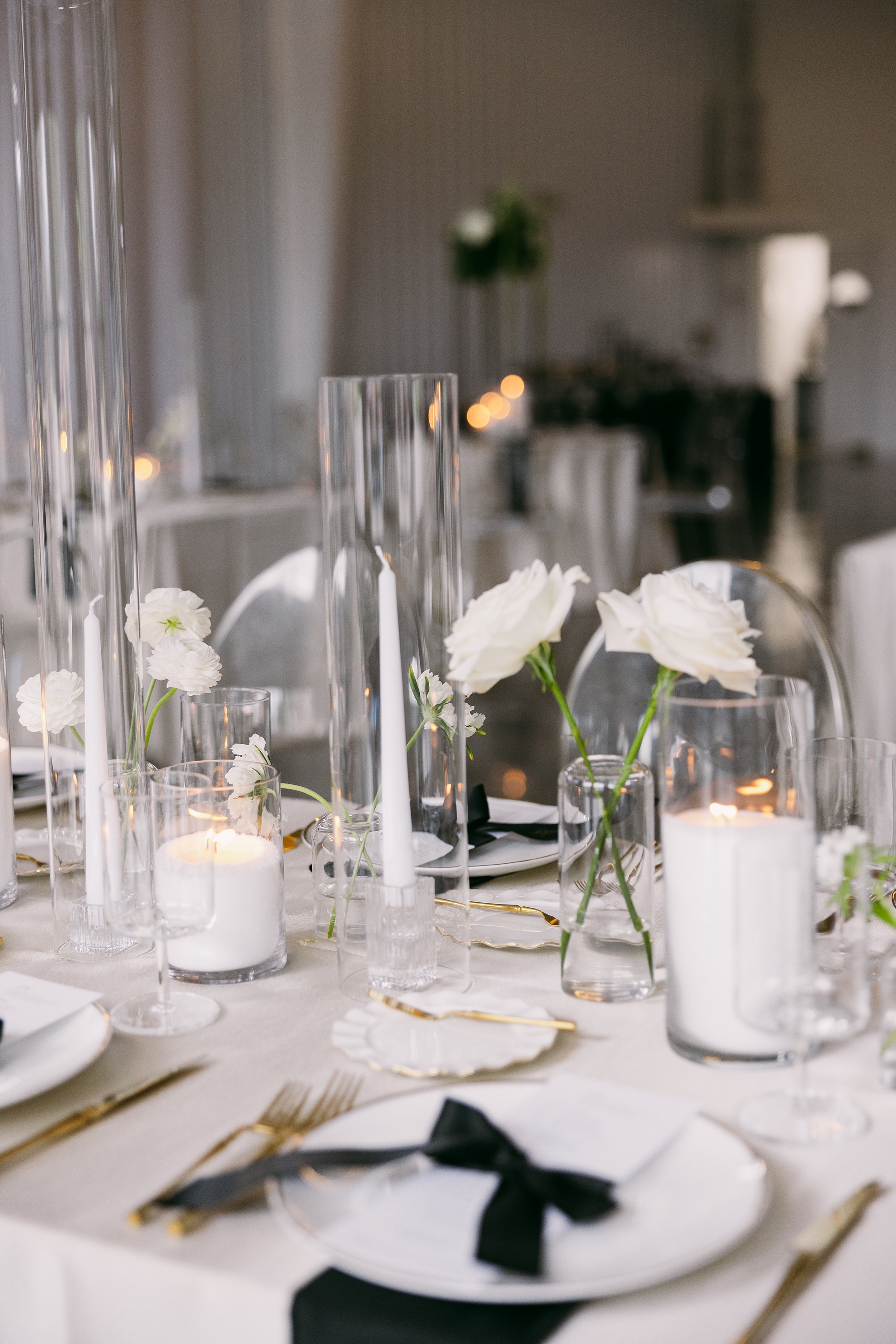
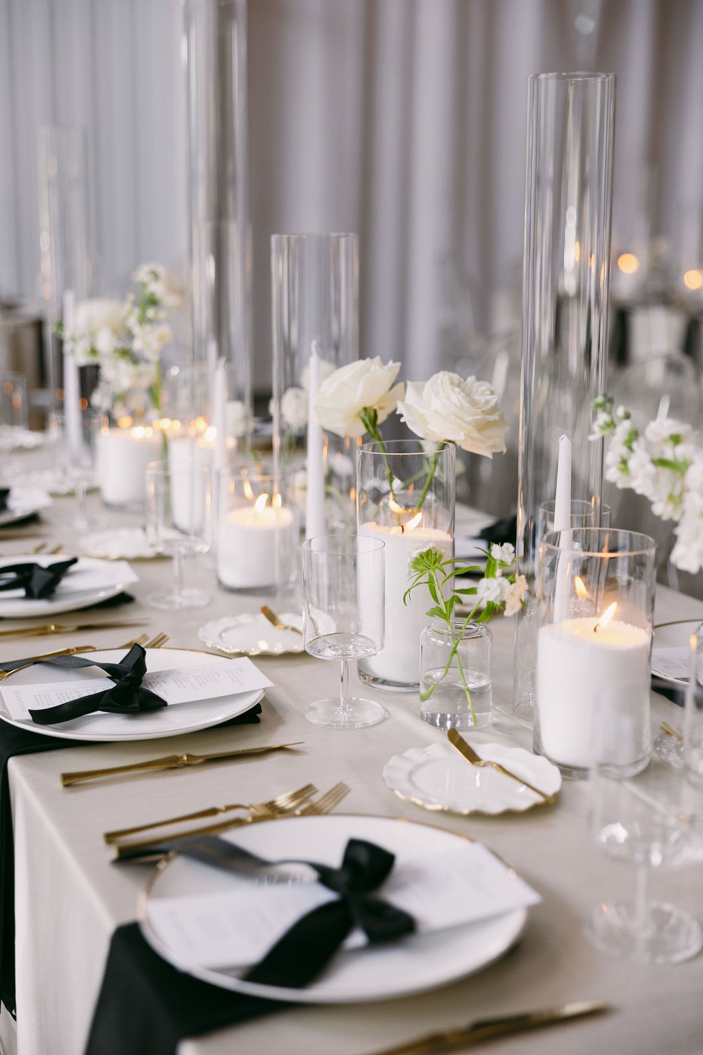
Black-and-White Reception Details
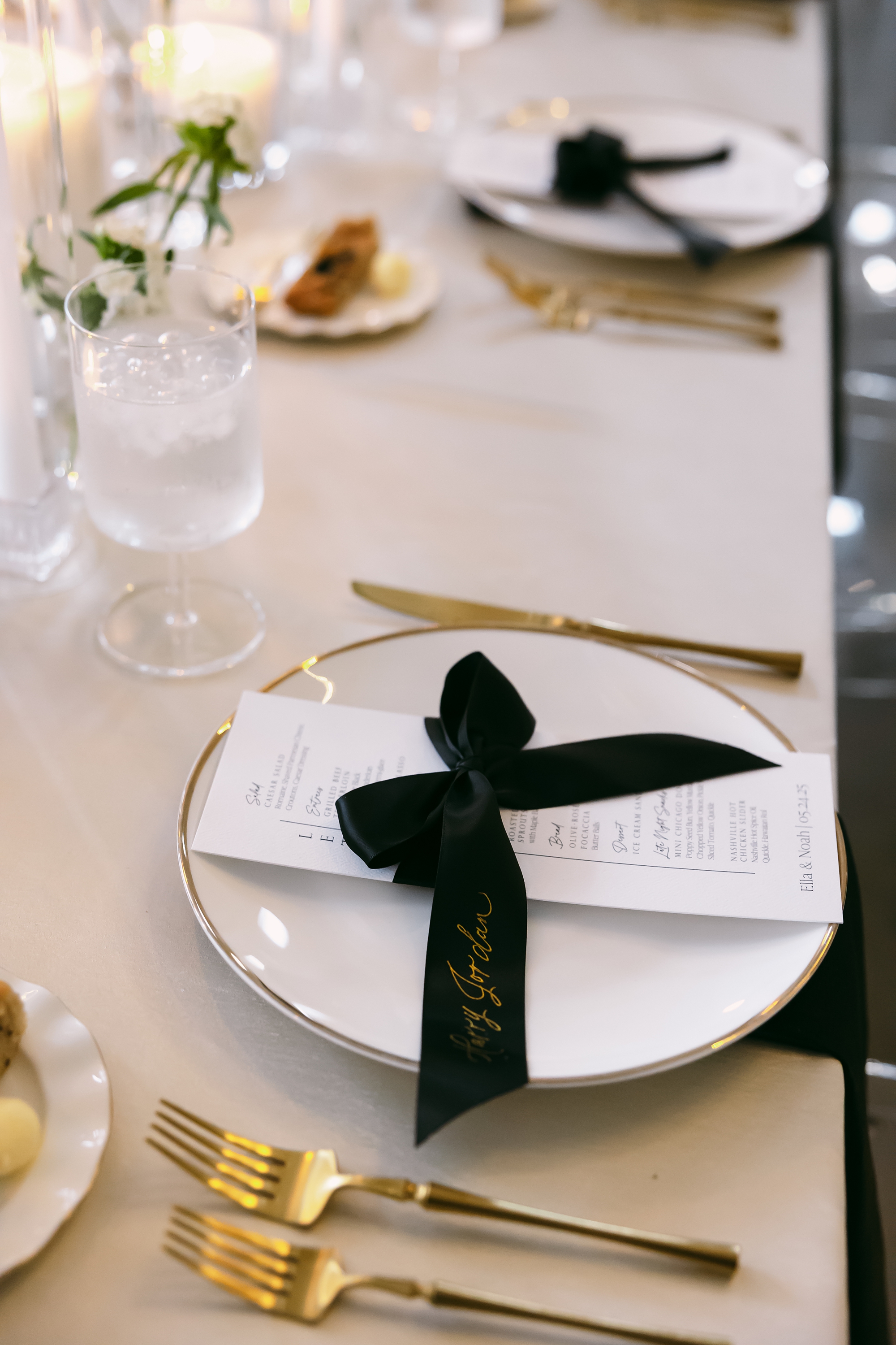
Inside the grand ballroom, the monochrome palette truly came to life. White and black details filled the room and elevated the already stunning space. White drapery and linens covered the space allowing the black napkin and other details to pop.
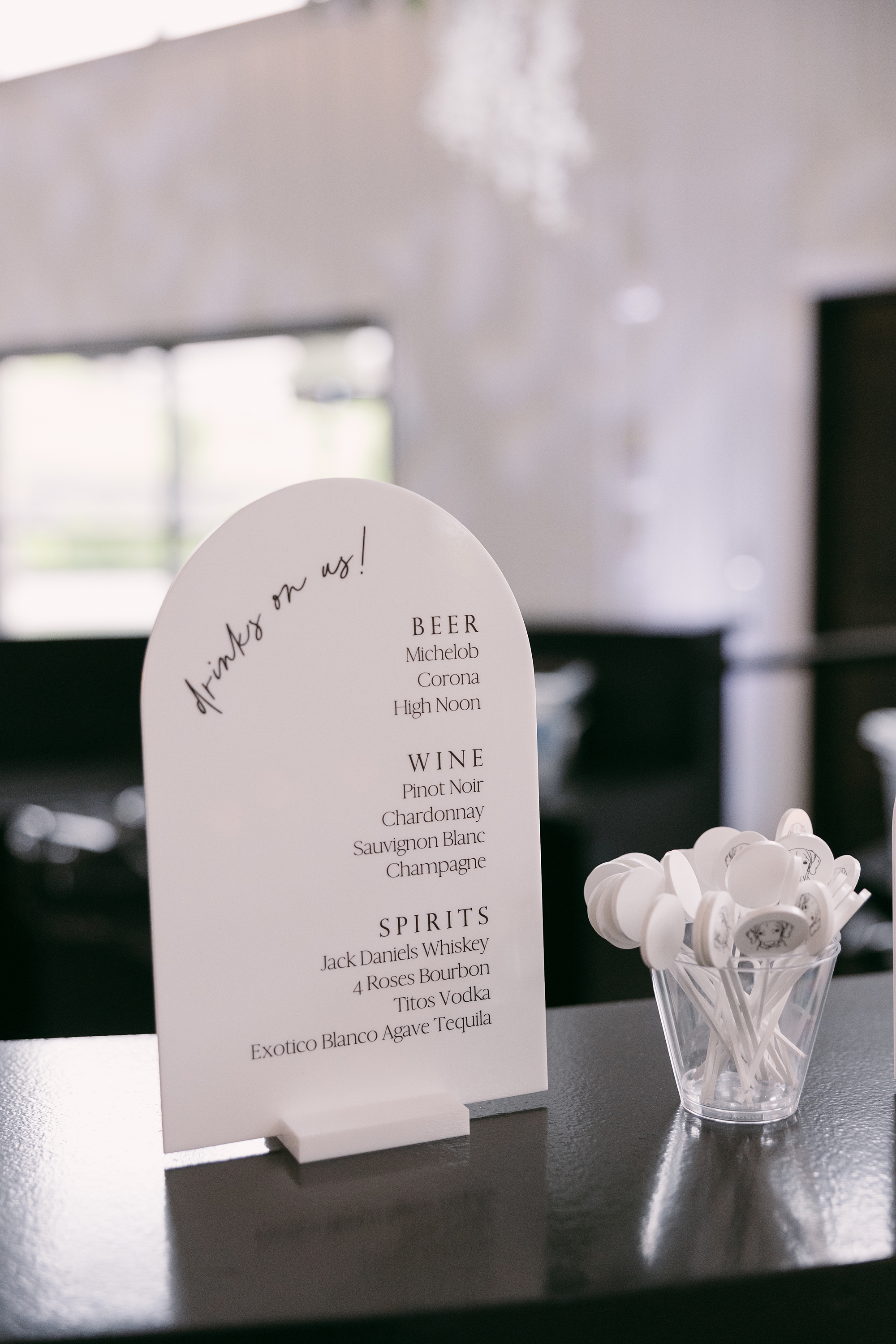
Guests visited the bar where our tombstone-shaped bar signage in white with black calligraphy added a modern touch that tied seamlessly into the overall theme.
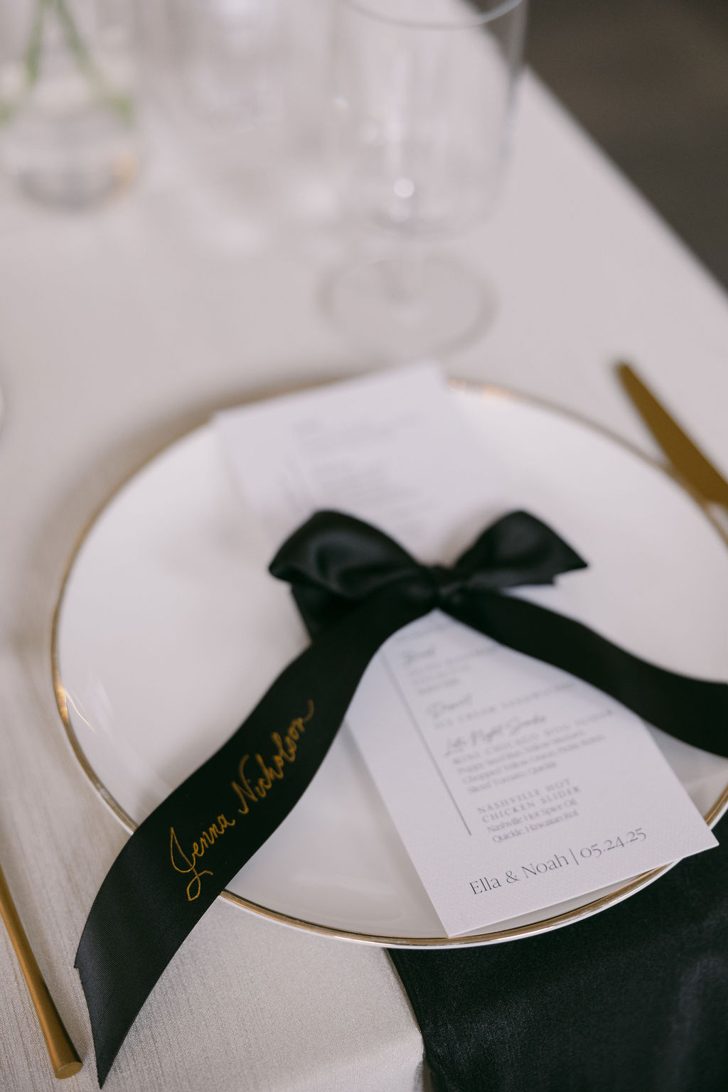
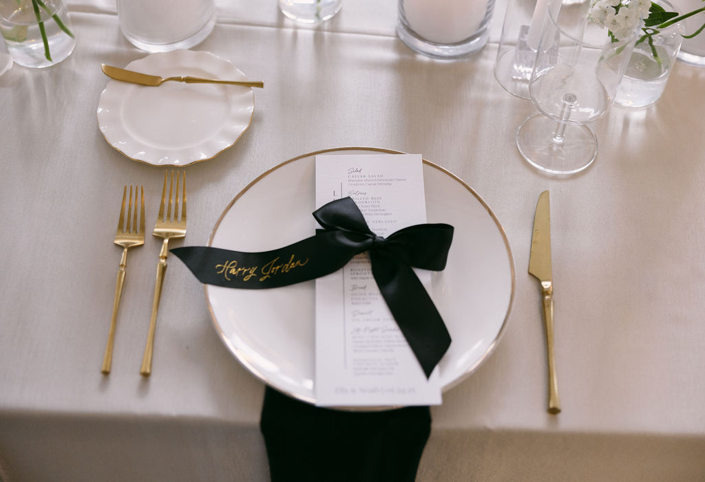
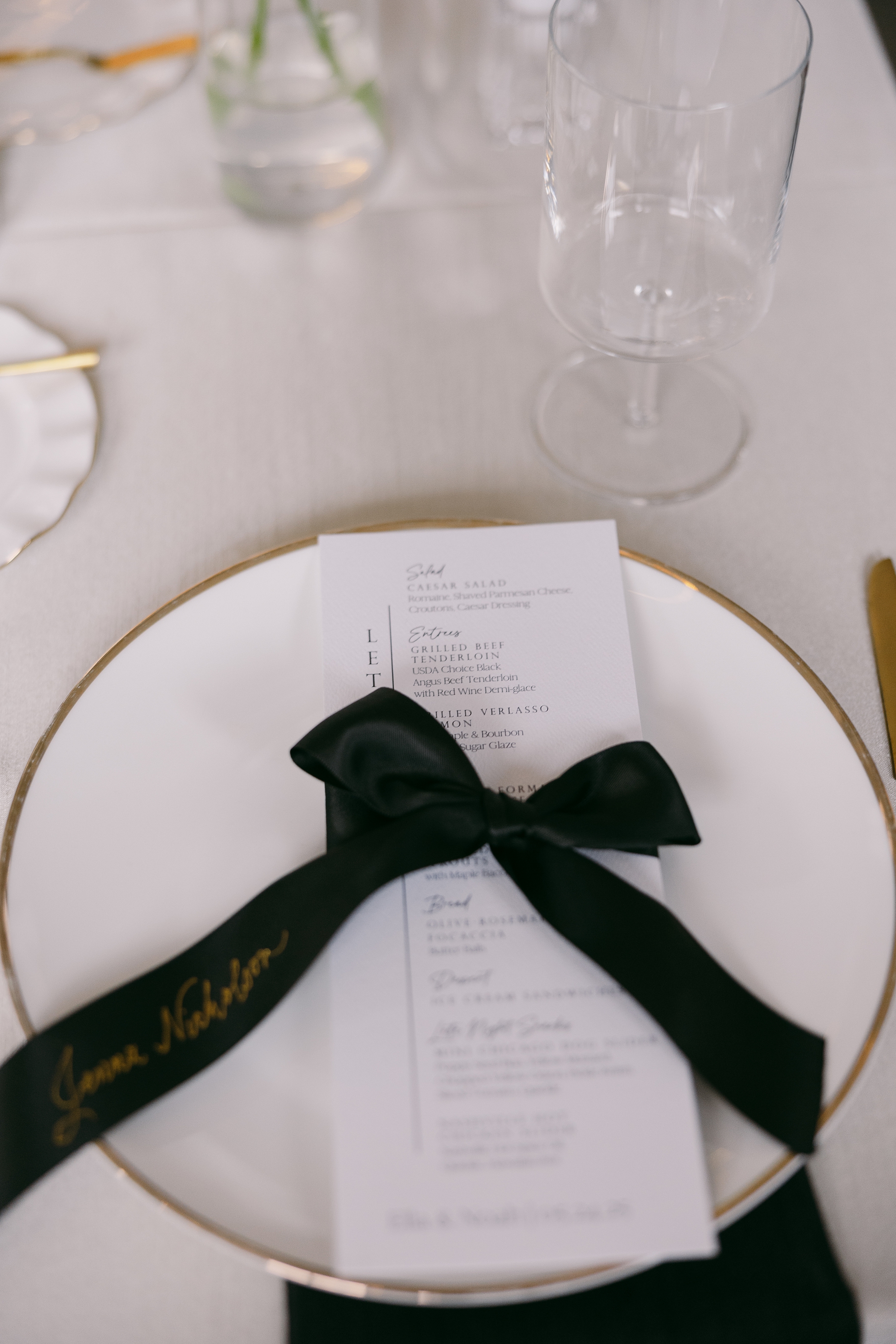
At each place setting, we designed white menus paired with satin, black ribbon place cards tied in delicate bows around the menus. The ribbons featured each guest’s name in gold foil calligraphy. This small but meaningful detail tied together the gold accents, black elements, and classic white foundation for a cohesive, thoughtfully curated look.
Ella and Noah’s wedding was a perfect blend of modern minimalism and elevated Southern charm. Every wedding detail was designed to enhance the atmosphere of Diamond Creek Farm while reflecting the couple’s elegant vision. It was an honor to create these pieces for such a beautiful celebration.
If you’re planning a wedding in Nashville, or anywhere in the world, we’d love to help you create meaningful, personalized stationery and event details that tell your story. We work with couples worldwide to design details you and your guests will remember forever.
Reach out today to learn more about our full-service wedding and event design offerings! We can’t wait to create something unforgettable for you!
If you enjoyed this post, you’ll love these other blogs!
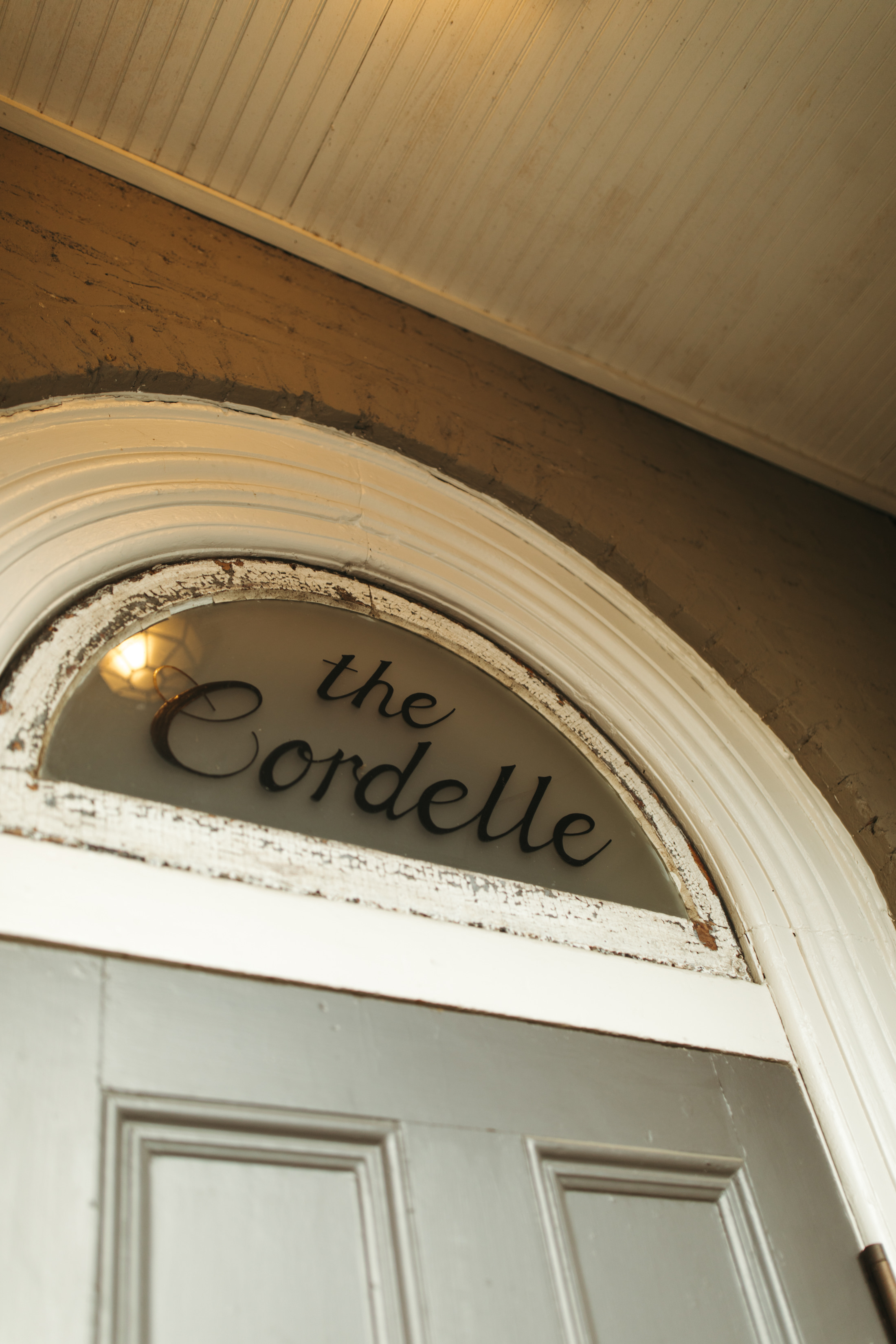
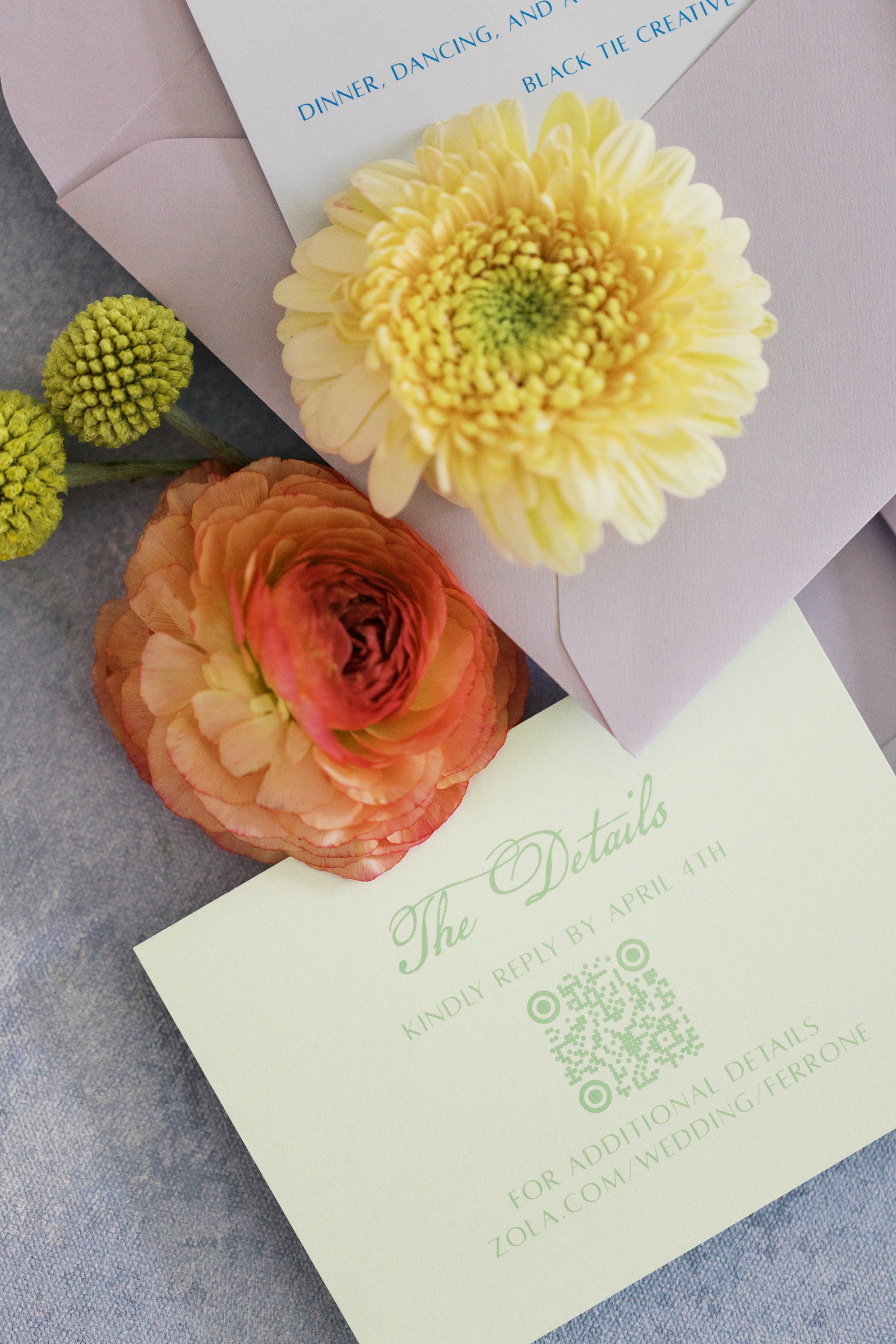
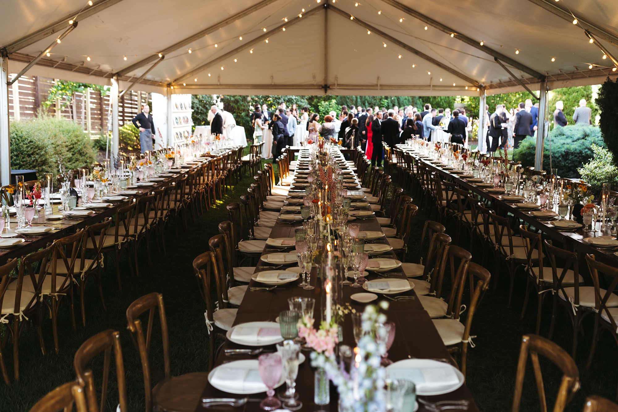
This Nashville wedding at The Cordelle was full of personality, color, and creative design. It perfectly reflected the couple’s playful spirit and love for music. As a team that loves weaving meaning into every detail, we had the best time bringing their vision to life through a collection of custom stationery and day-of details that felt both fun and elevated.
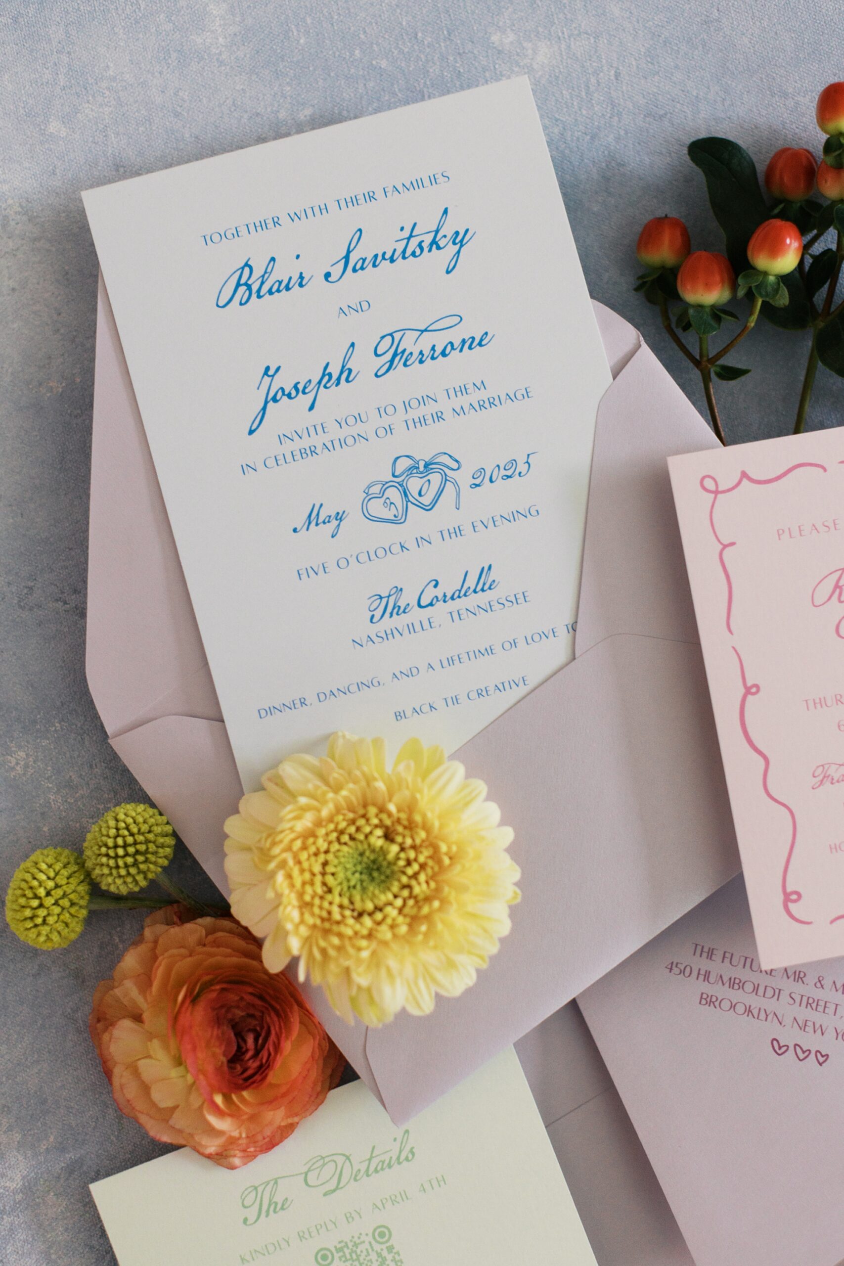
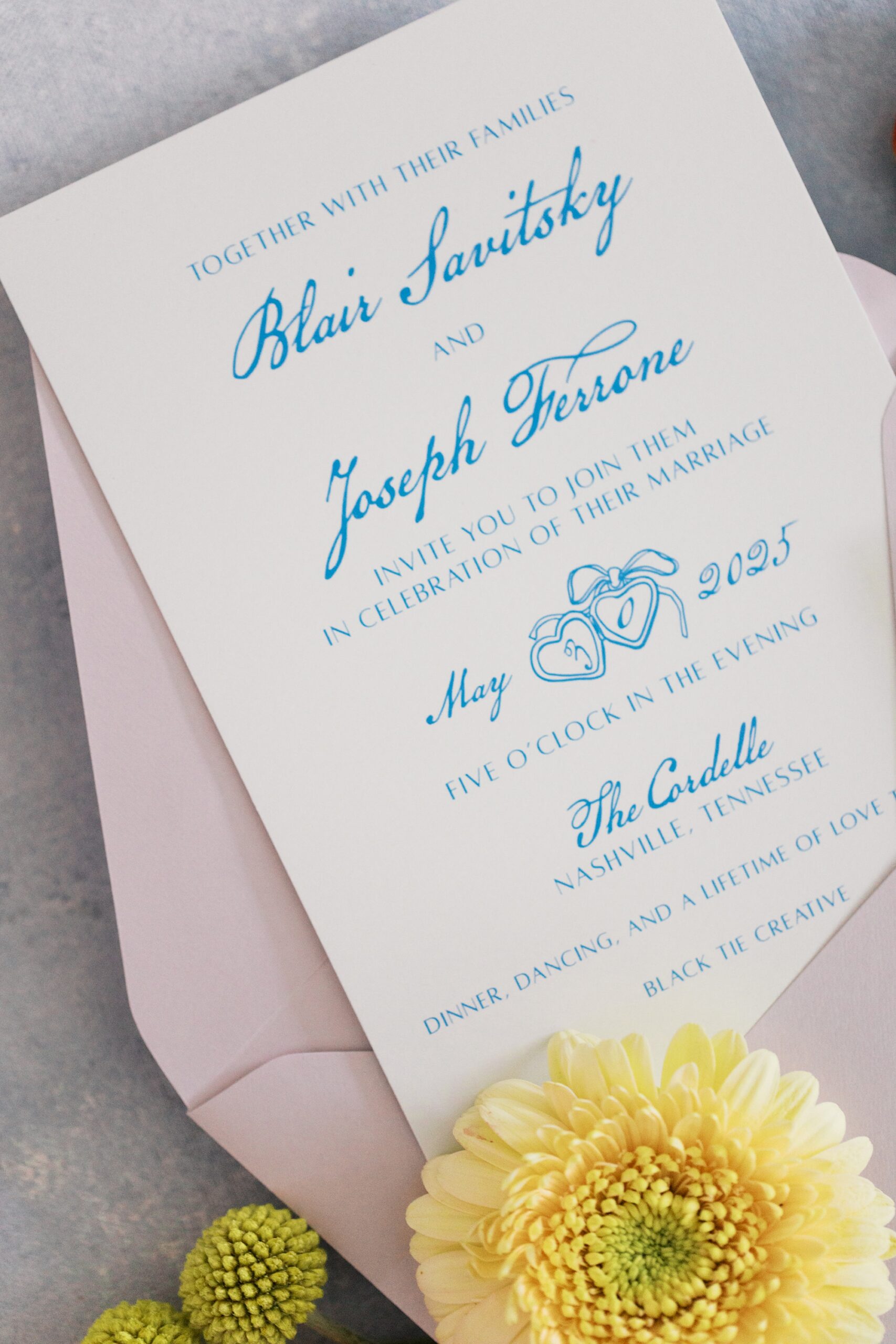
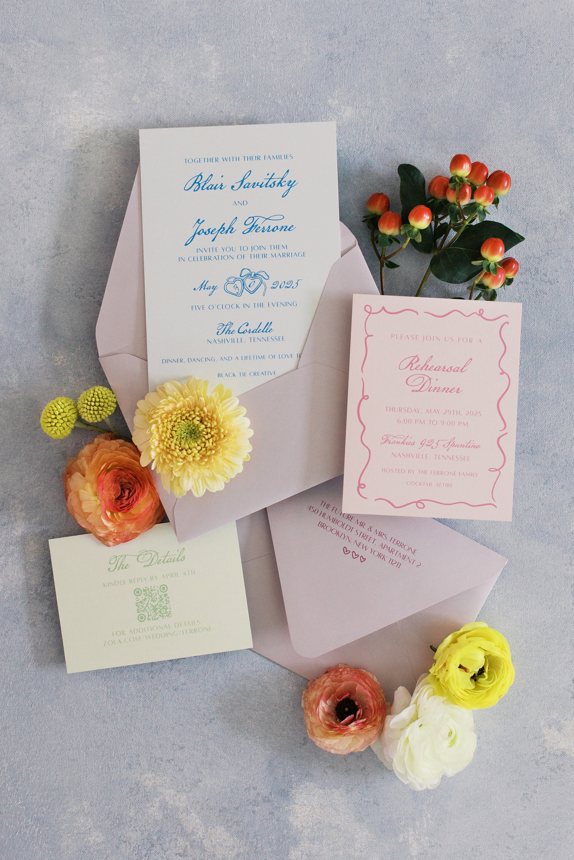
Fun and Playful Invitations
The couple lives in New York but loves the city of Nashville, and chose it as their wedding destination! Their invitation suite set the tone from the very beginning. We combined blue calligraphy on crisp white paper and lavender envelopes. The light green details card and soft pink rehearsal dinner card added pops of color and gave the suite a fresh, fun, playful feel.
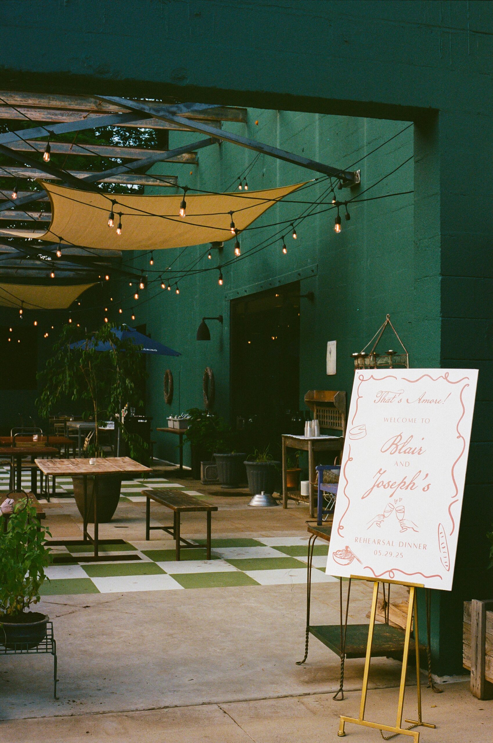
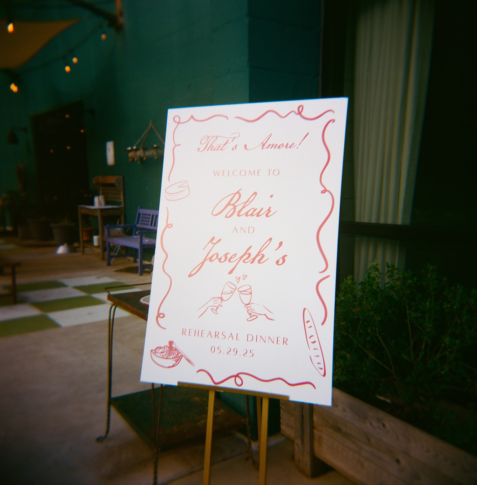
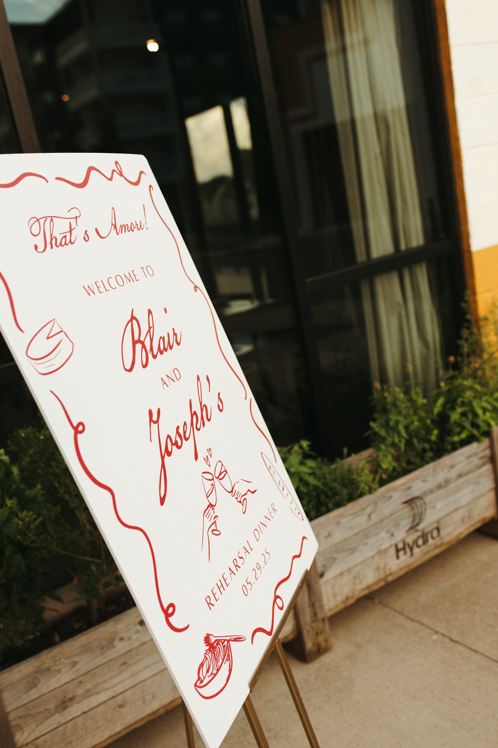
Rehearsal Dinner Welcome Sign
For the rehearsal dinner, guests were welcomed with a custom sign that introduced the weekend’s colorful aesthetic. The border design on the welcome sign also mirrored the border found on the rehearsal dinner card from the invitation suite. It’s truly these tiny details that make your wedding day and that we love to include.
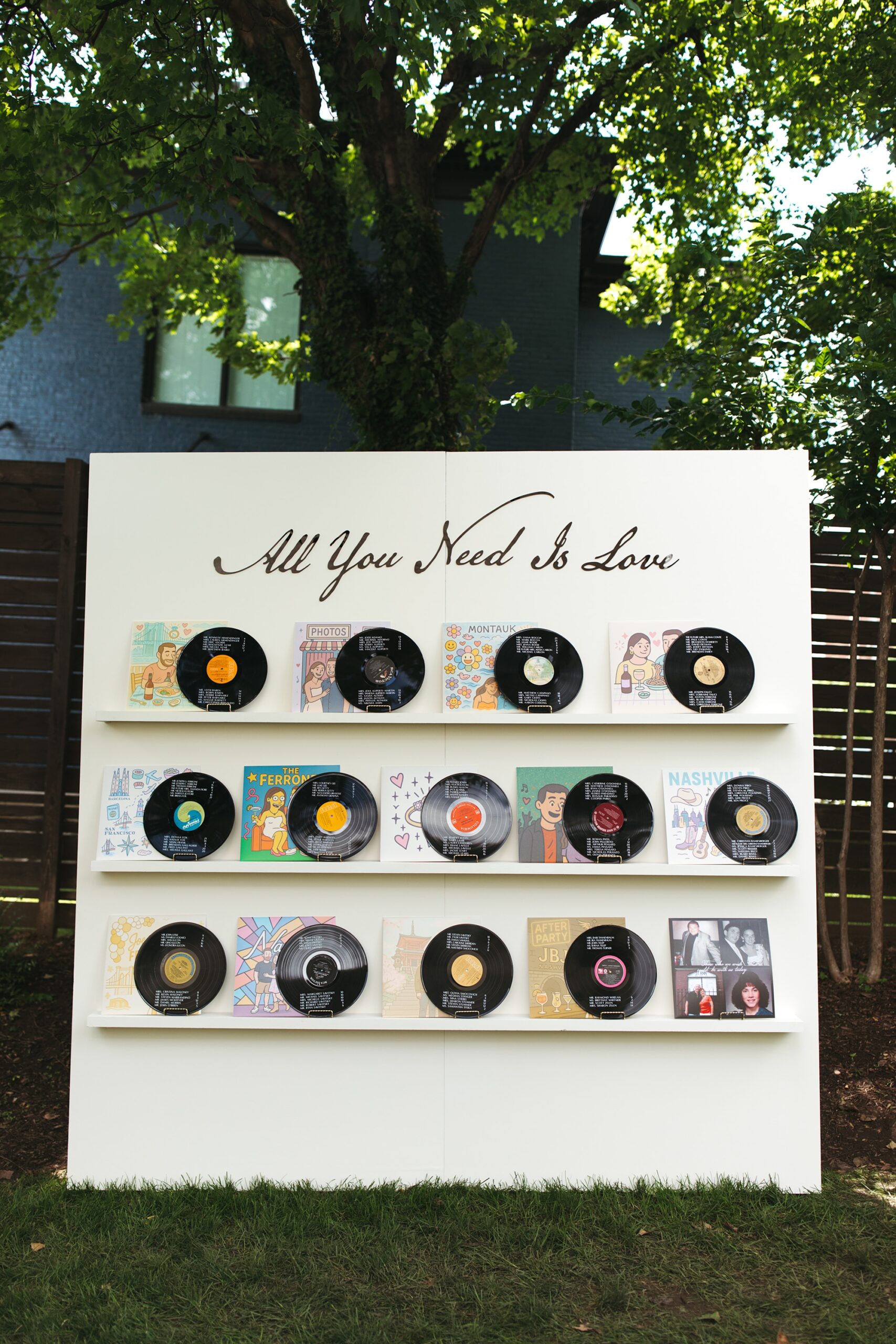
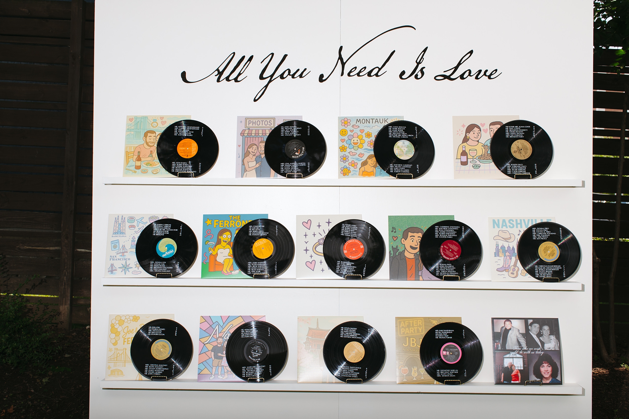
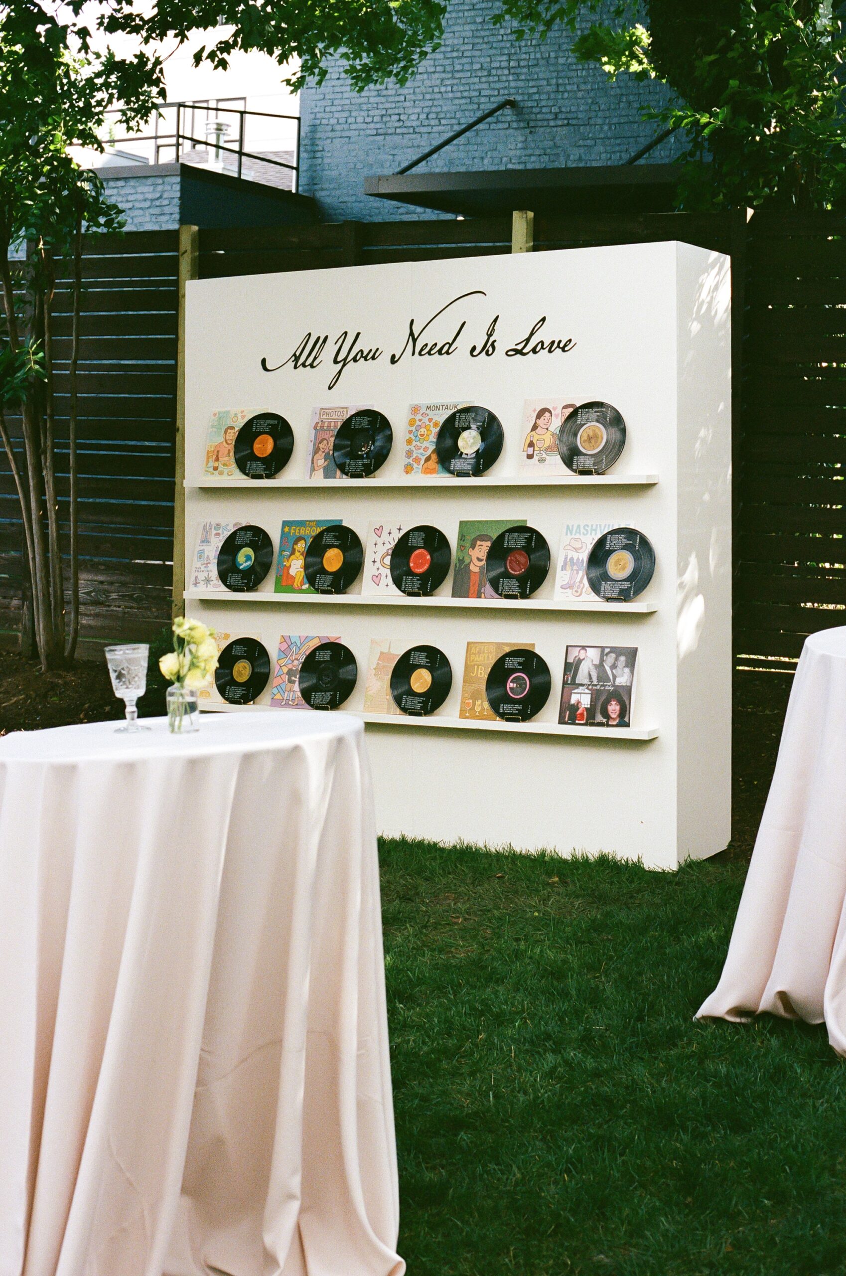
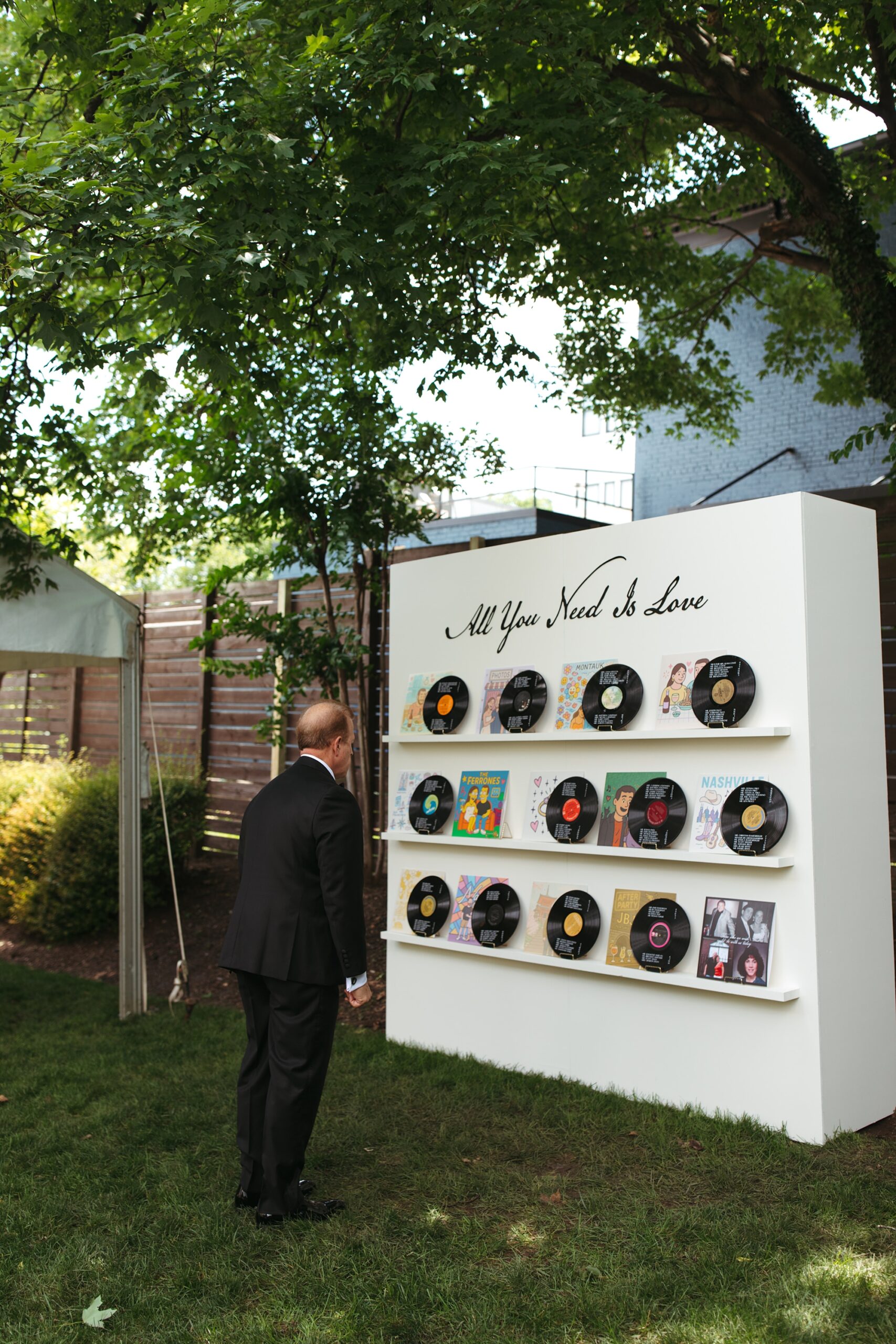
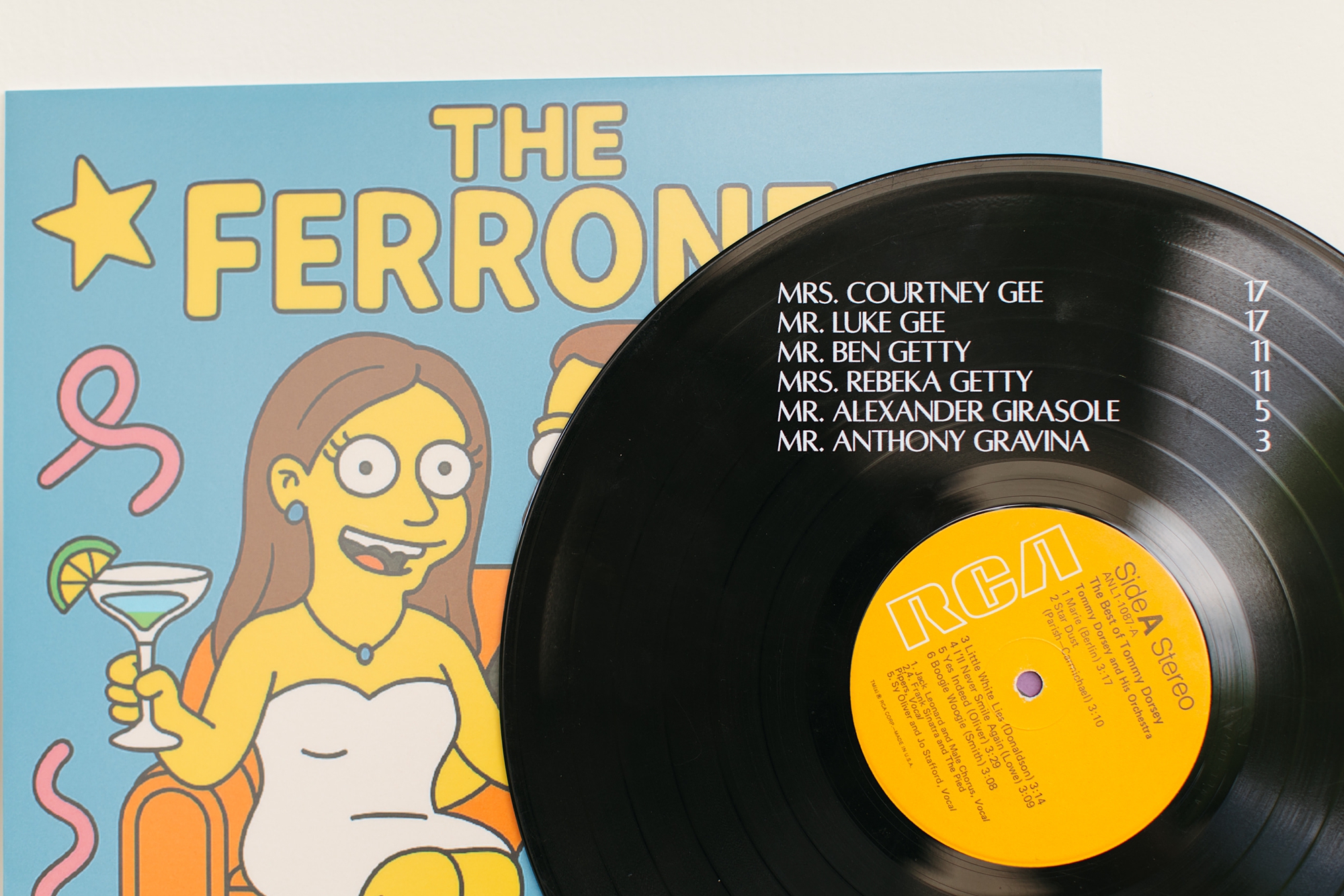
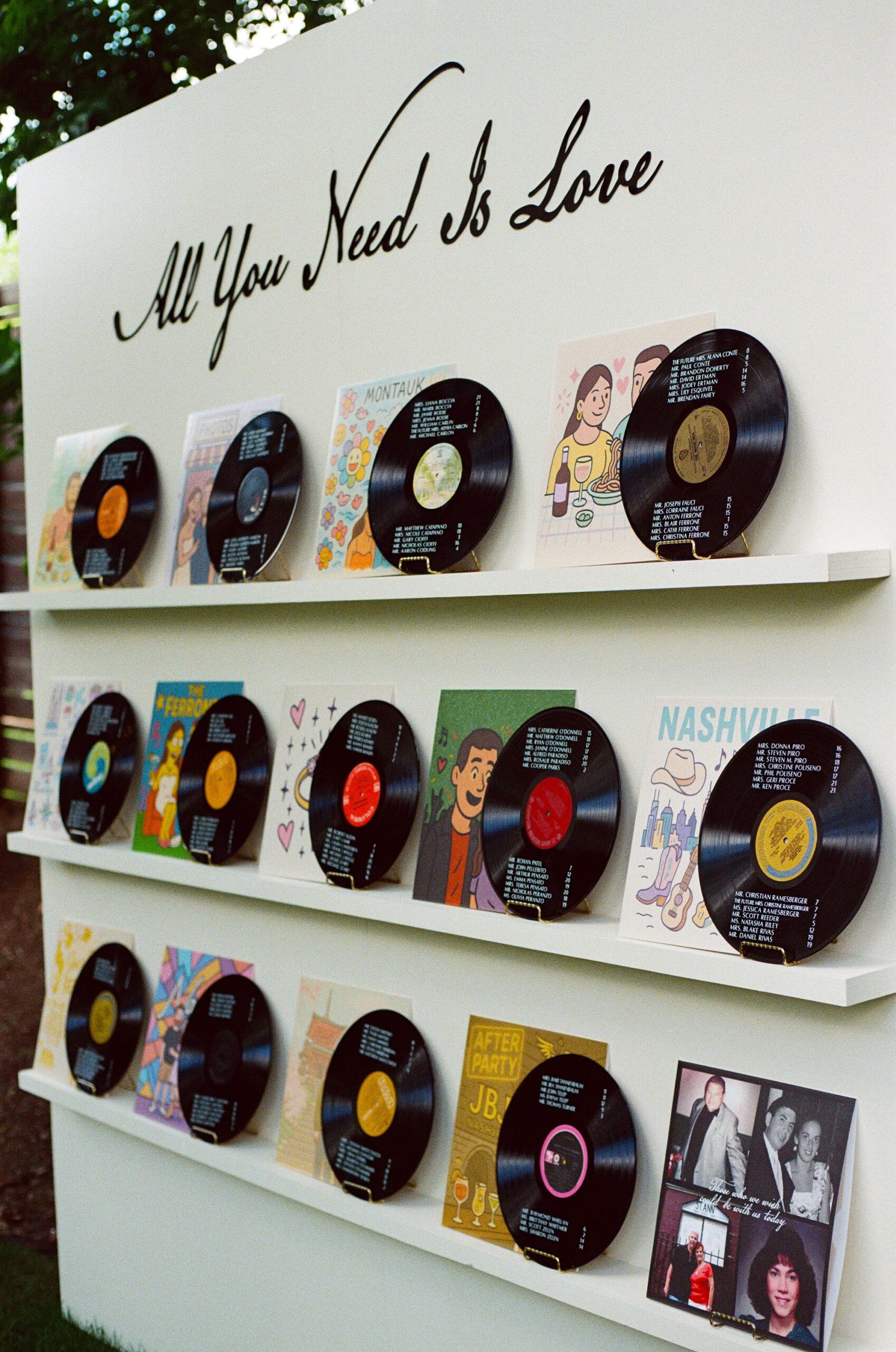
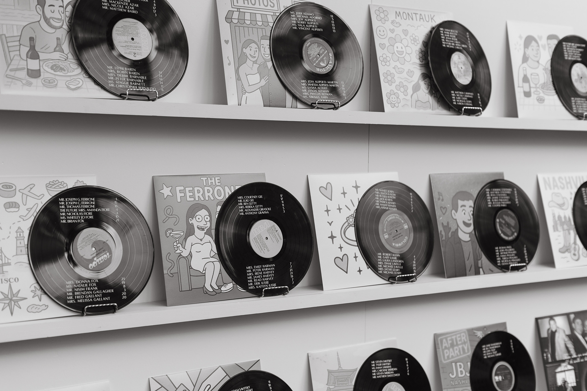
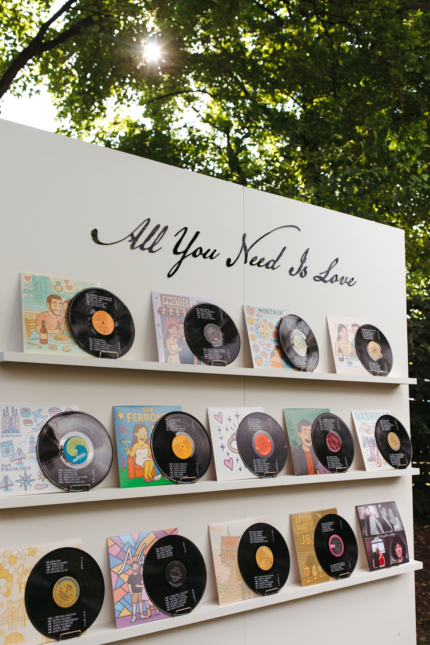
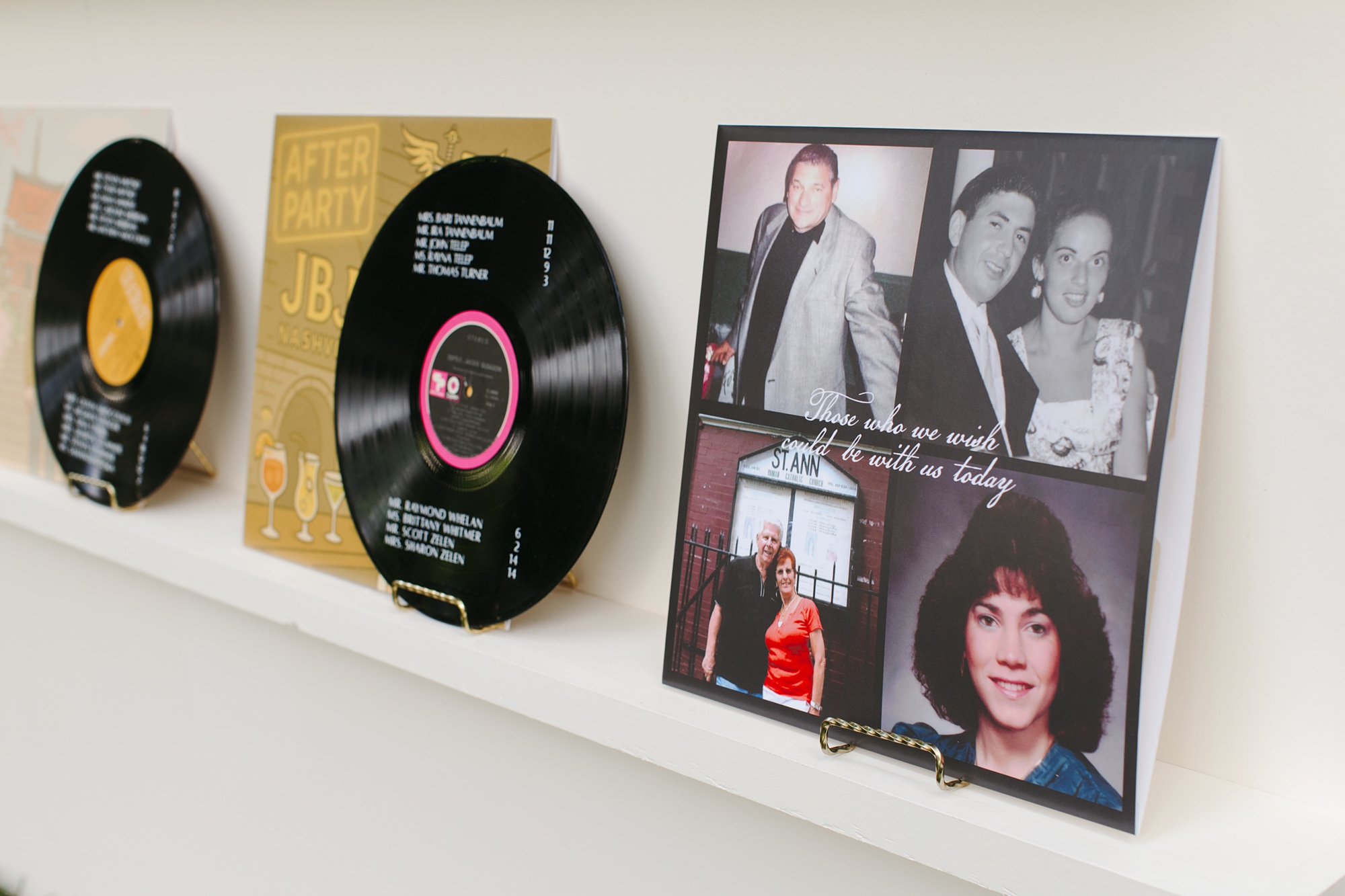
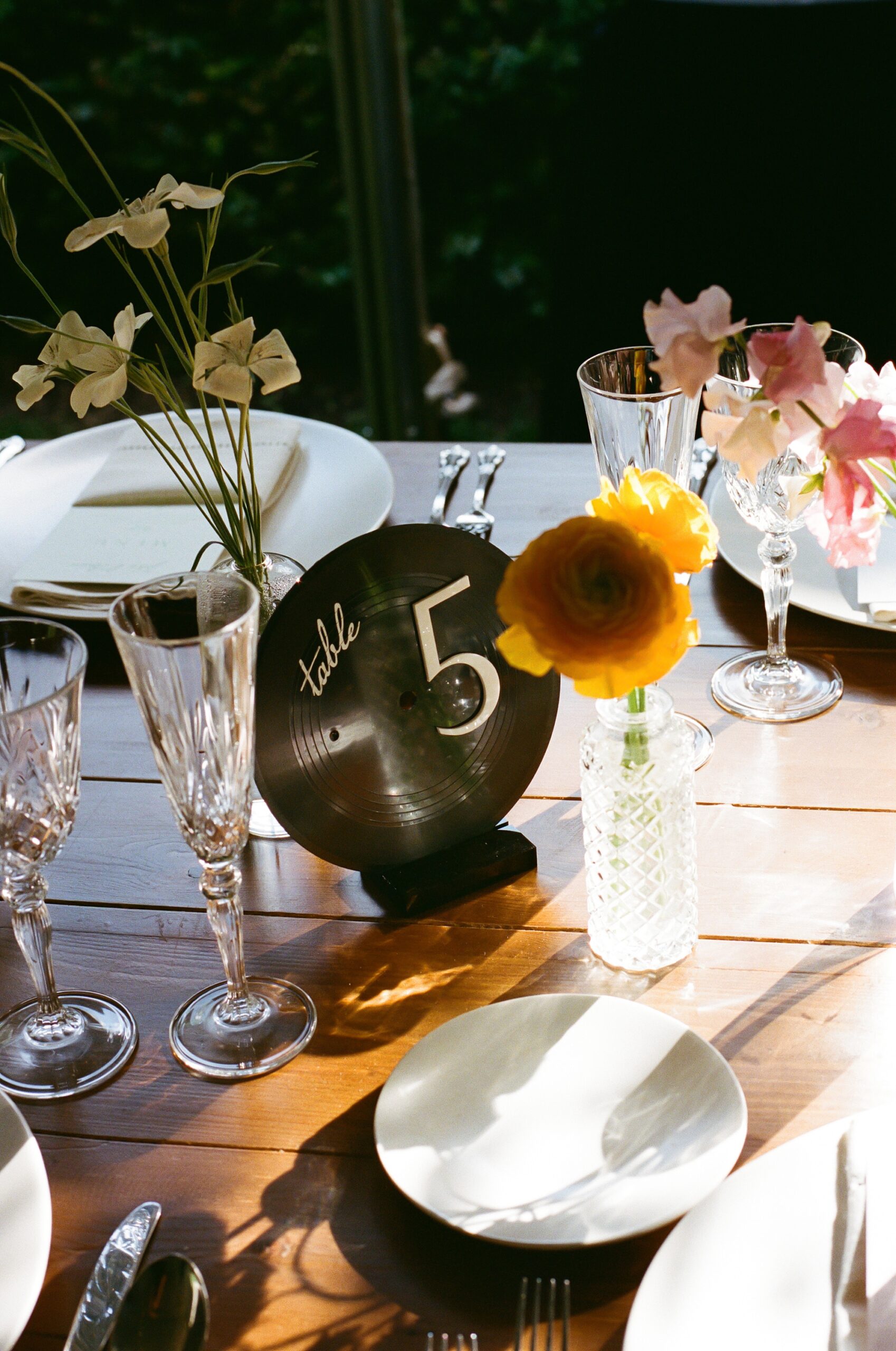
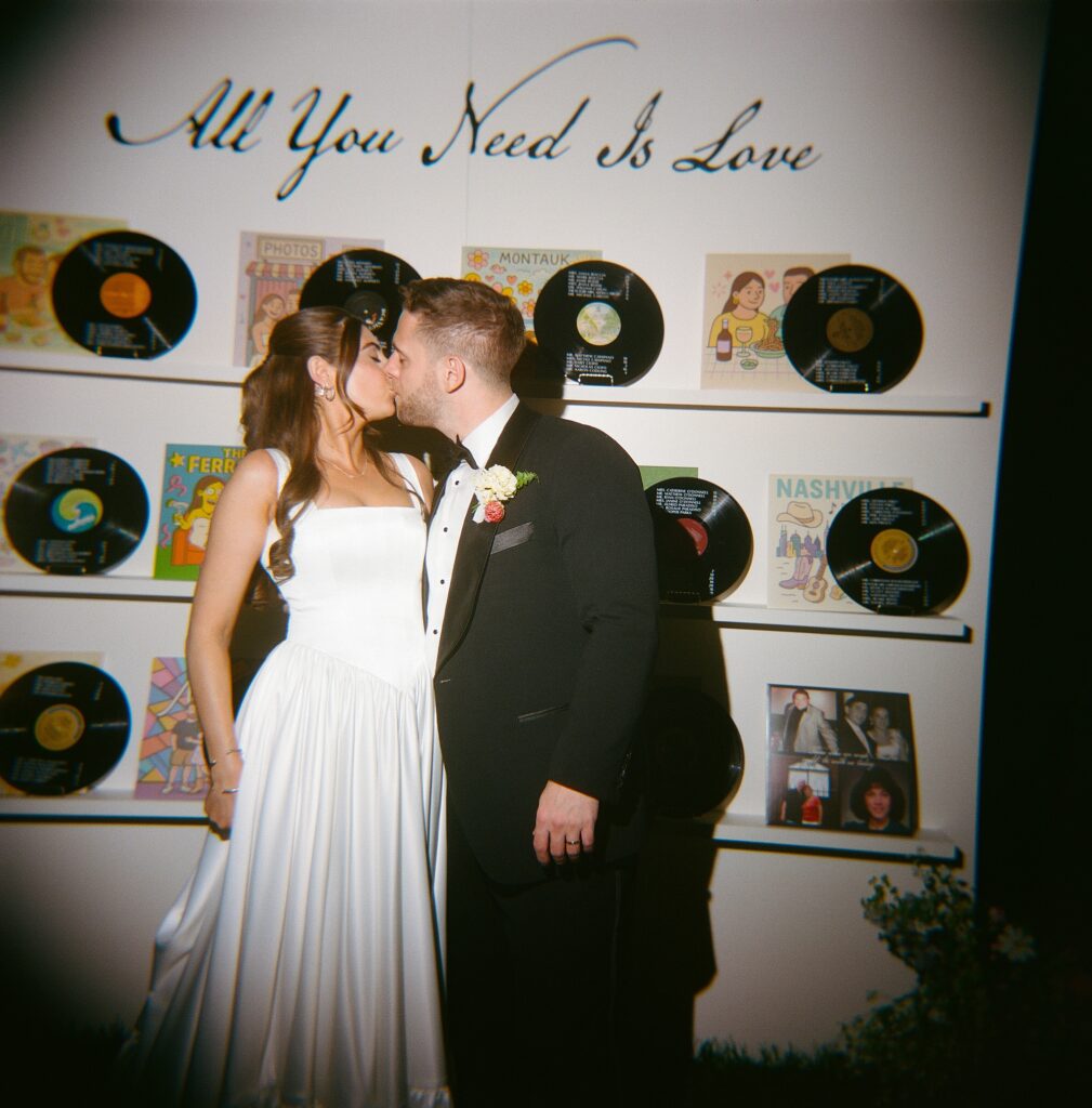
Vinyl Record Wedding Details at The Cordelle
One of our favorite elements was the seating chart wall, which we created entirely from real vinyl records. The couple love vinyl records and color, so naturally we paired the two and leaned into the city’s musical energy while highlighting their love story. Each guest’s name and table assignment were displayed on the vinyl record, and each album cover artwork depicted a special moment in their love story! All of this was beautifully displayed on a white installation with The Beatles song lyrics “All you need is love” written above the display.
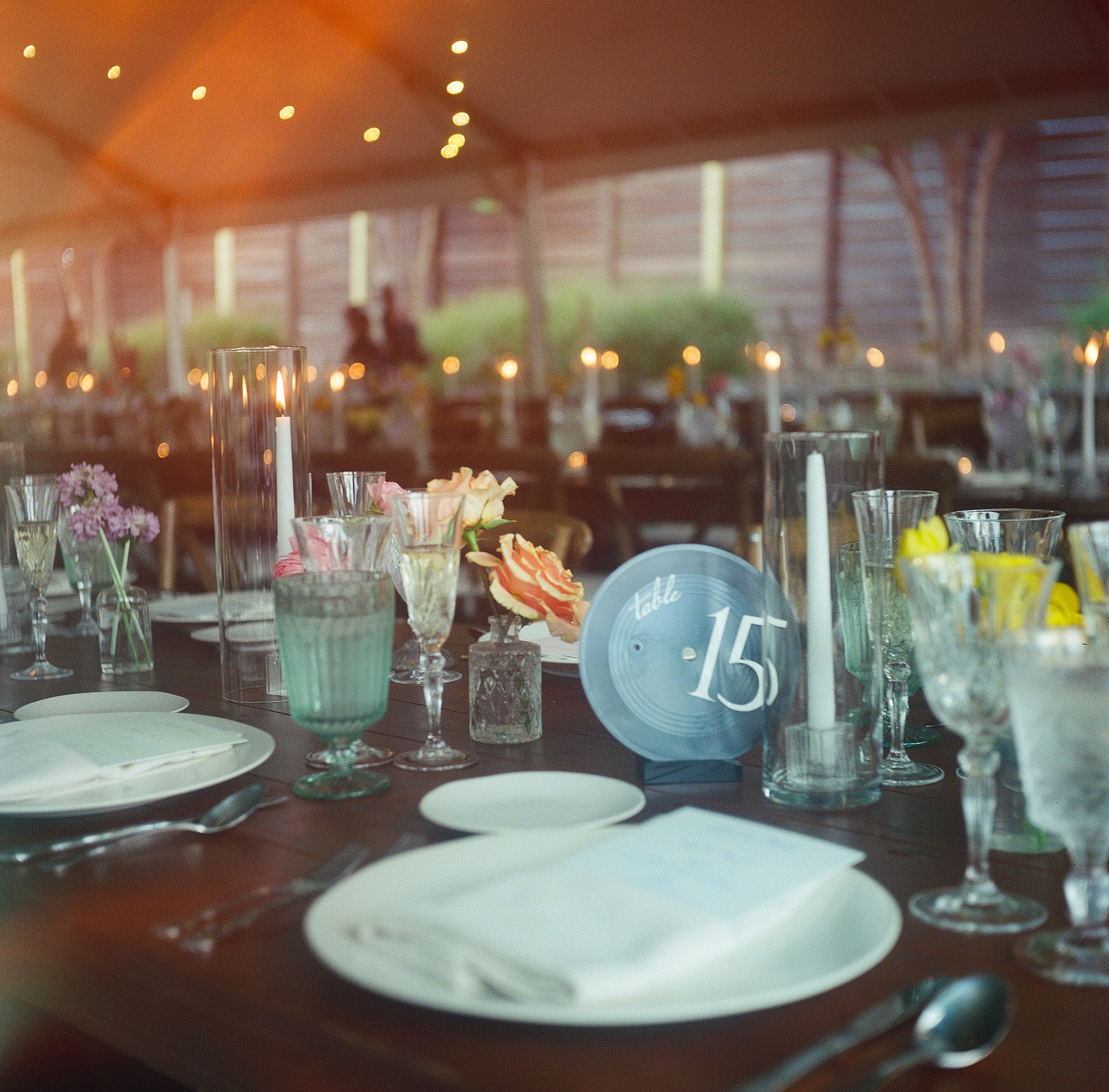
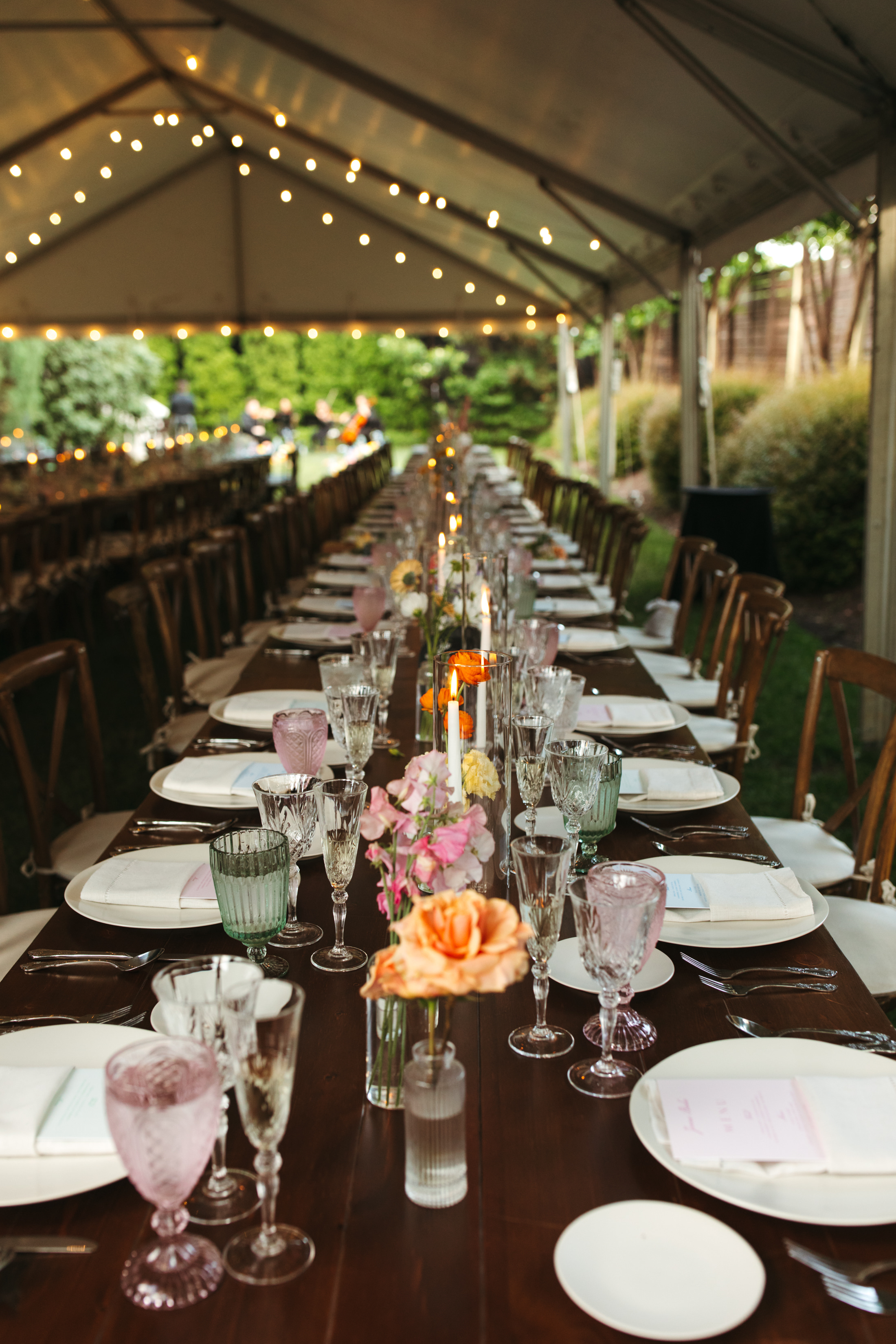
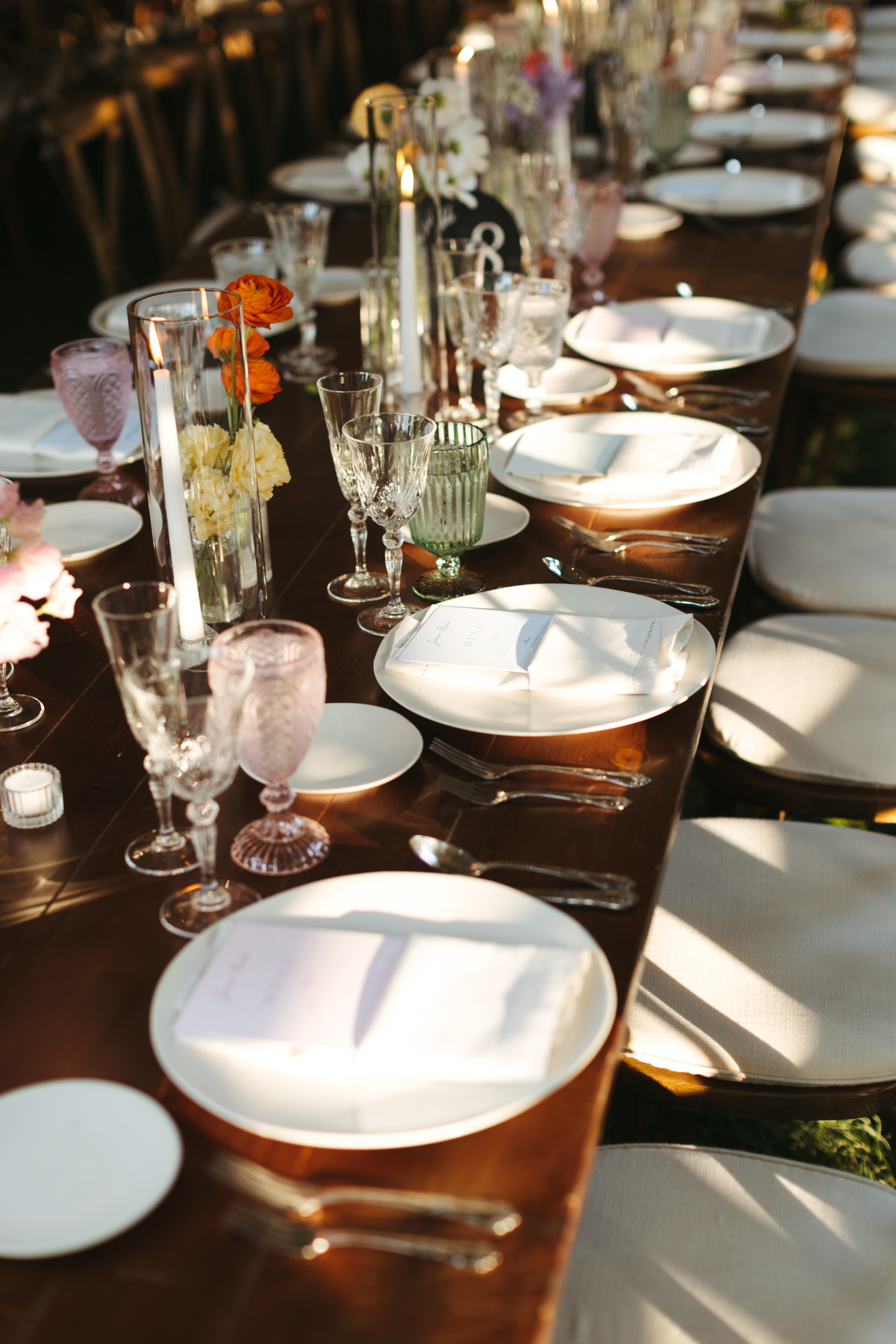
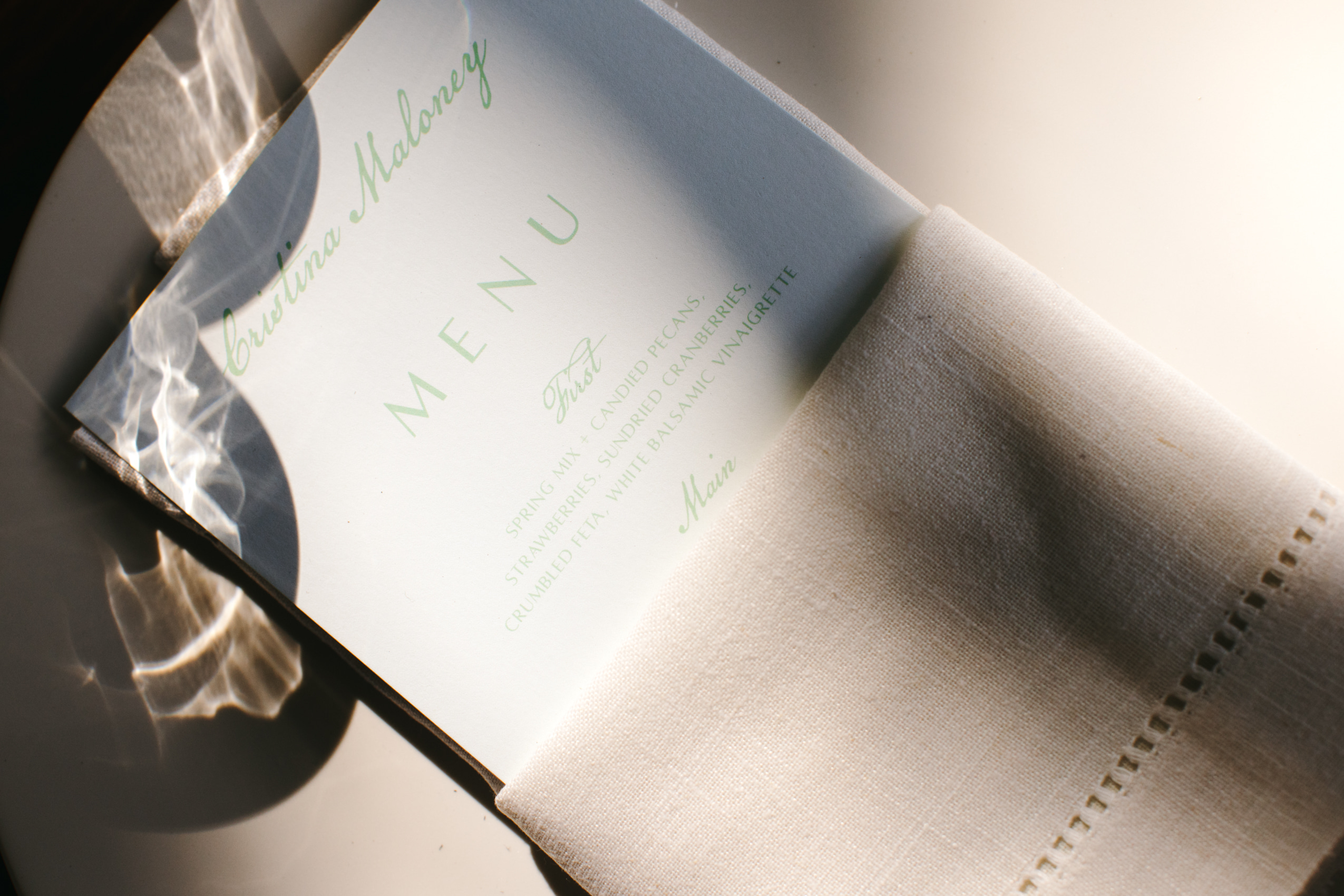
We kept the vinyl record theme going by using them as table numbers as well, tying the whole concept together beautifully. I just love these design concepts that are carried throughout the day! At the dinner table, you could also find the custom menus we created tucked into light pink napkins.
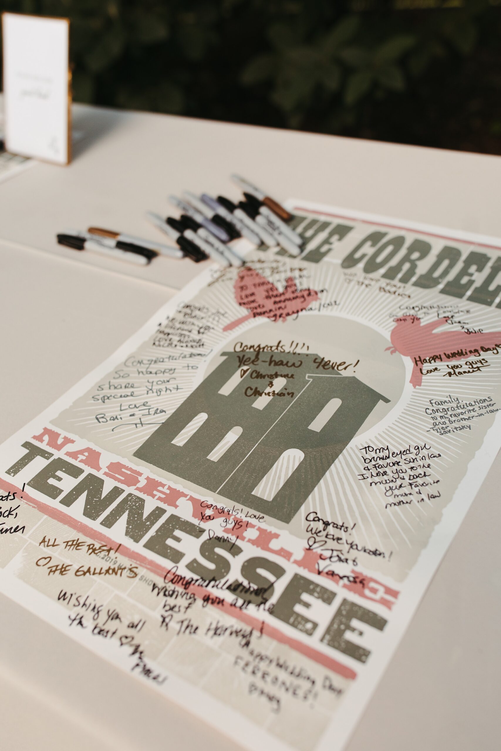
To honor Nashville’s creative roots, we also designed a hatch print–inspired poster for the guestbook. Guests were able to sign the poster as a keepsake for the couple.
This wedding was such a joy to design! We love creating wedding details that reflect the couple and tell a story from beginning to end, and this Cordelle wedding was the perfect example of that.
If you’re planning a wedding in Nashville, or anywhere in the world, we’d love to help you create meaningful, personalized stationery and event details that tell your story. We work with couples worldwide to design details you and your guests will remember forever.Reach out today to learn more about our full-service wedding and event design offerings! We can’t wait to create something unforgettable for you!
If you enjoyed this post, you’ll love these other blogs!
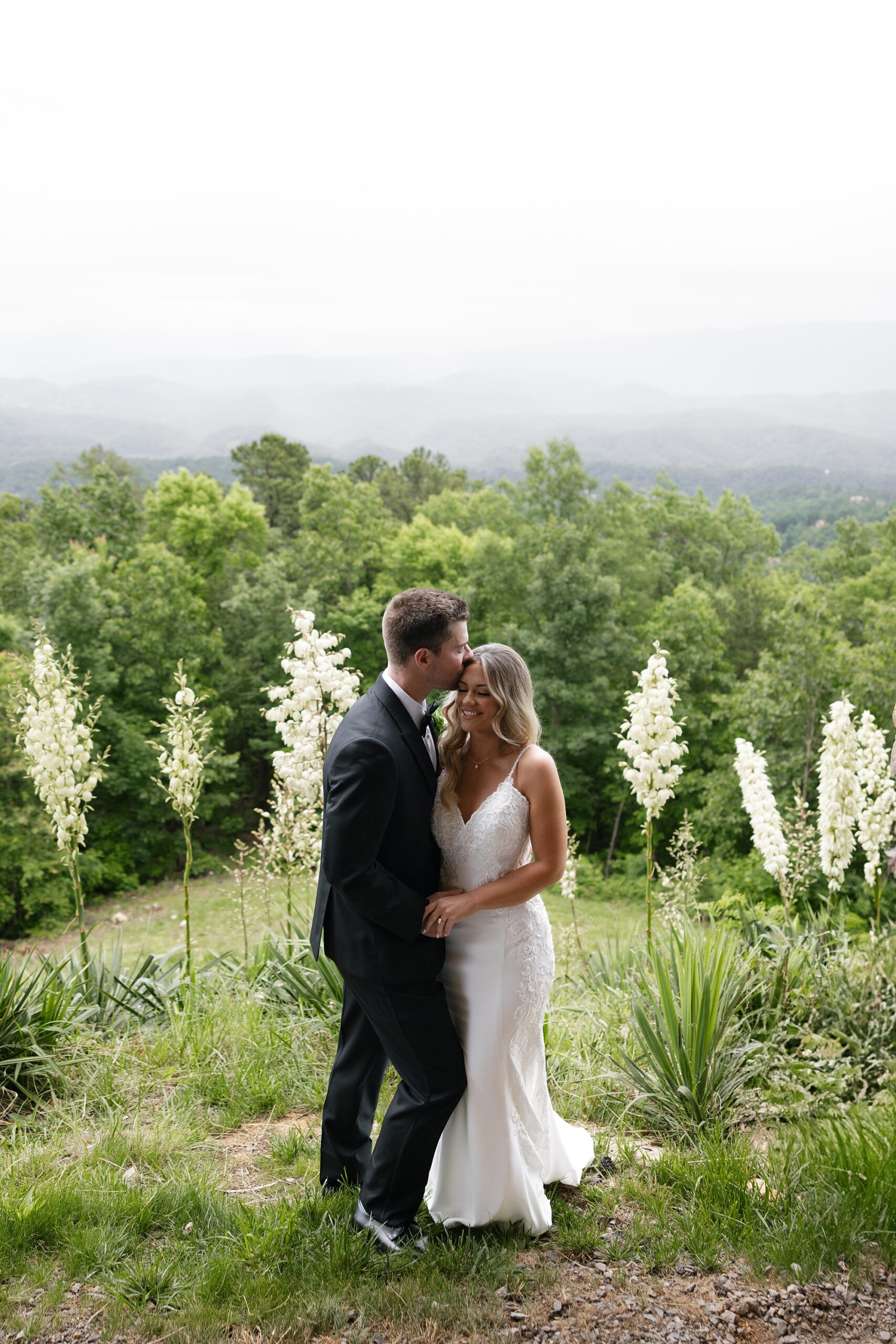
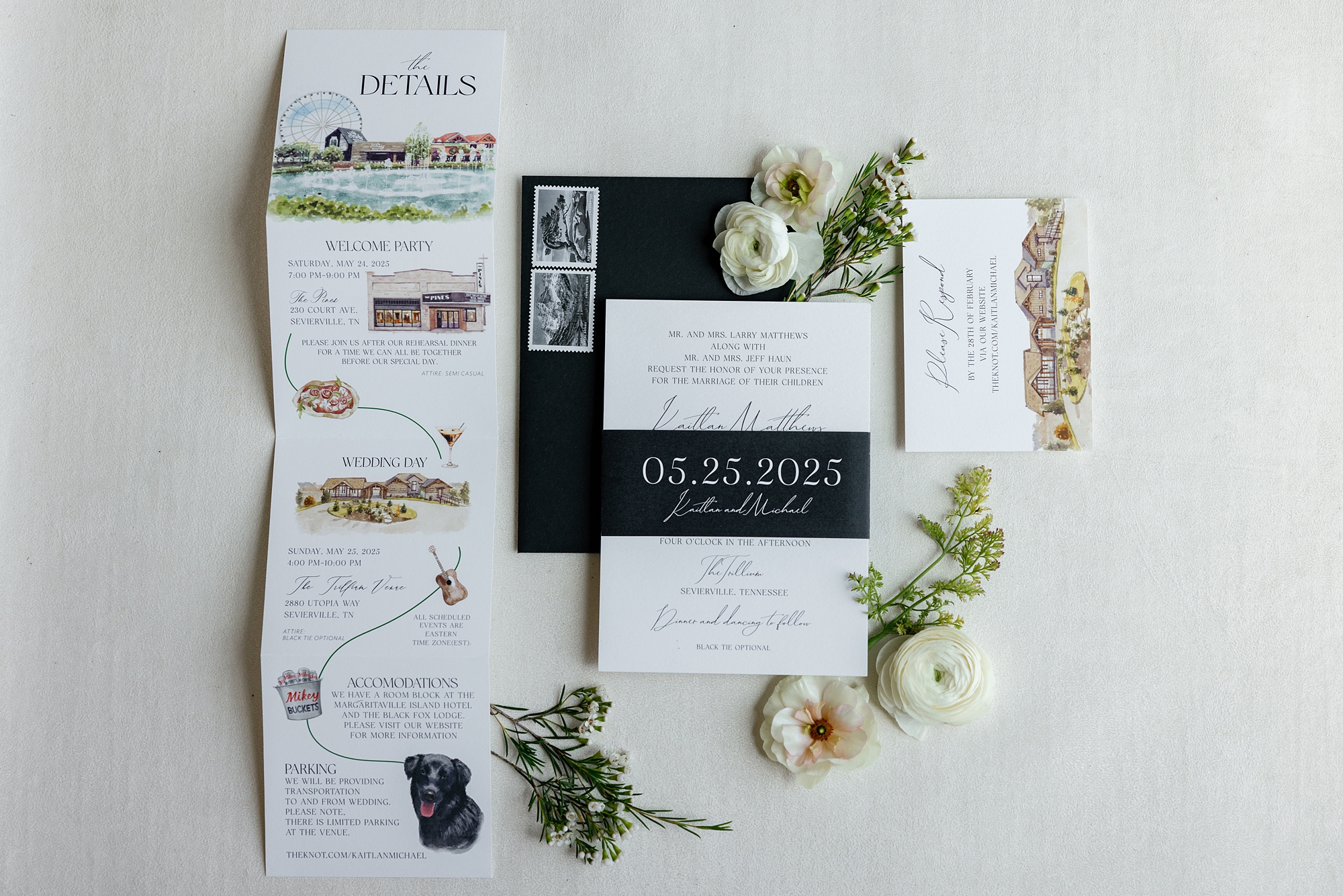
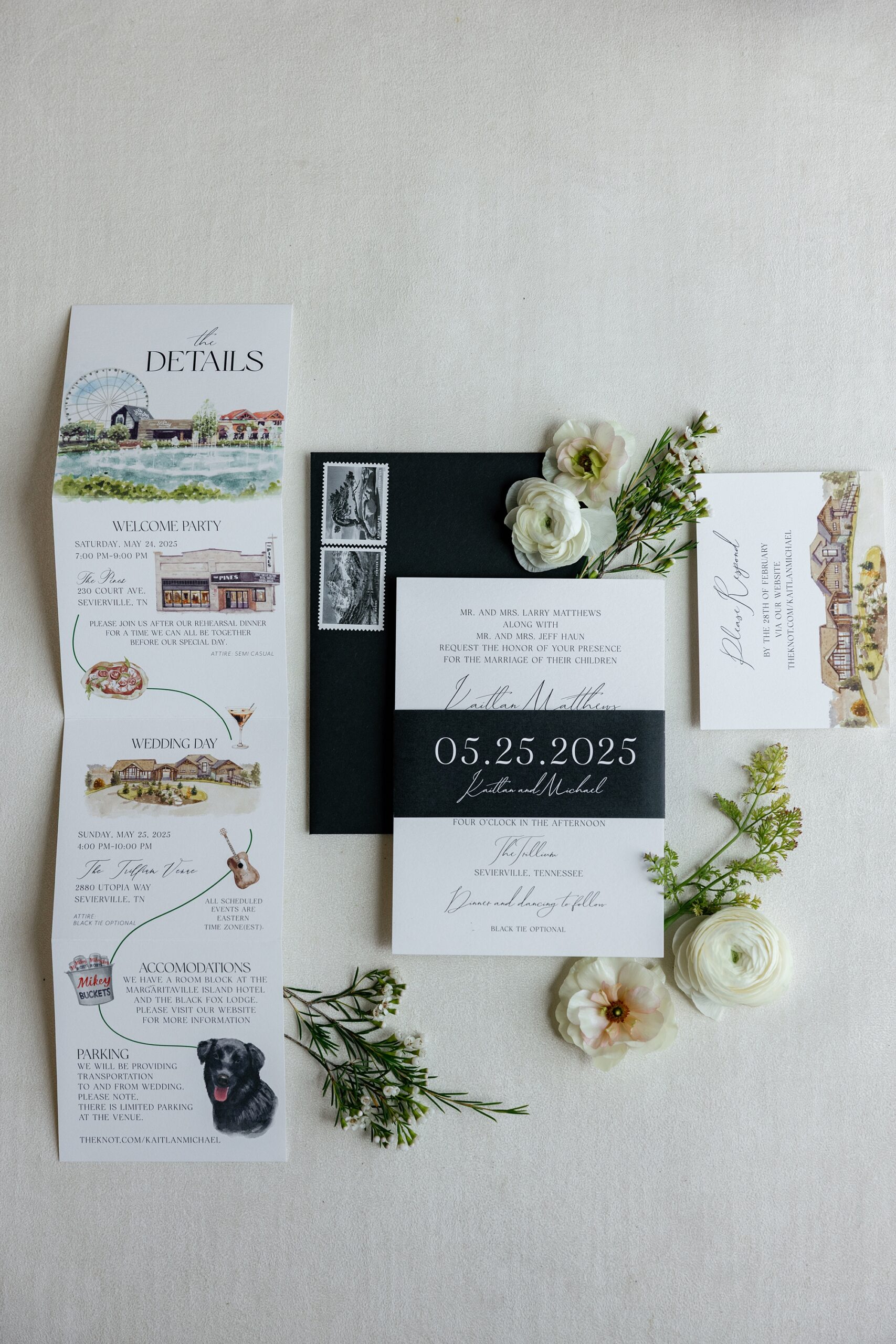
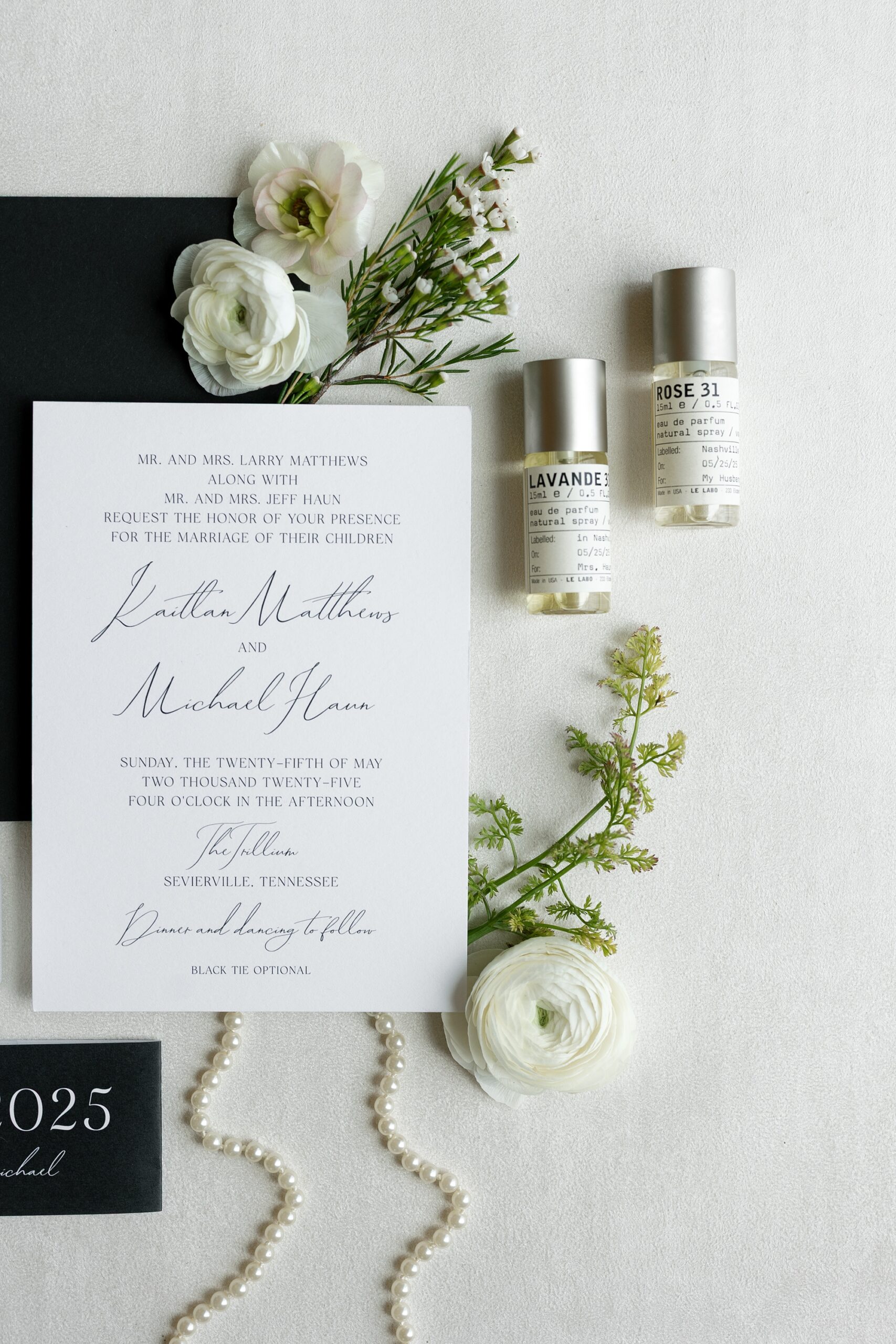
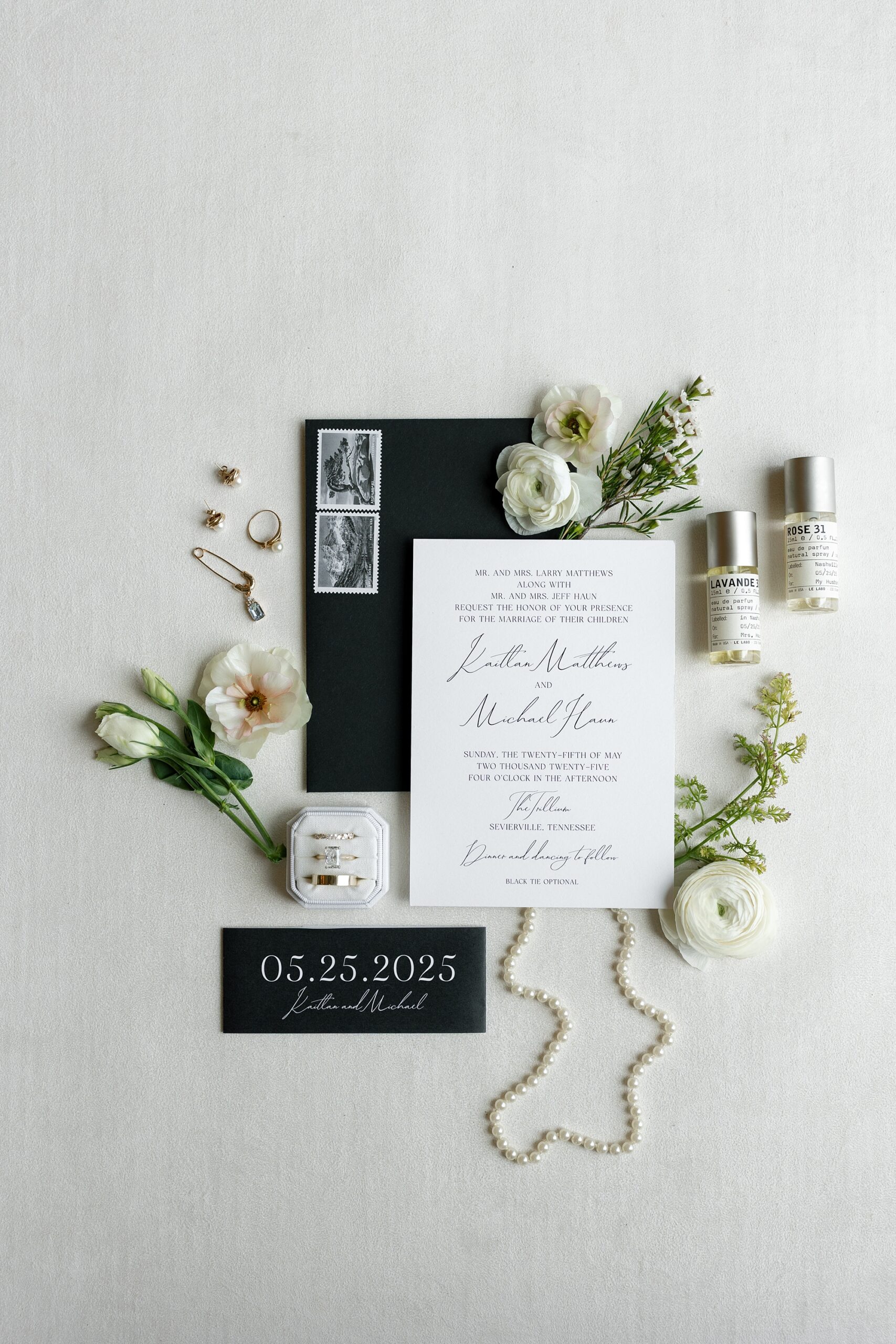
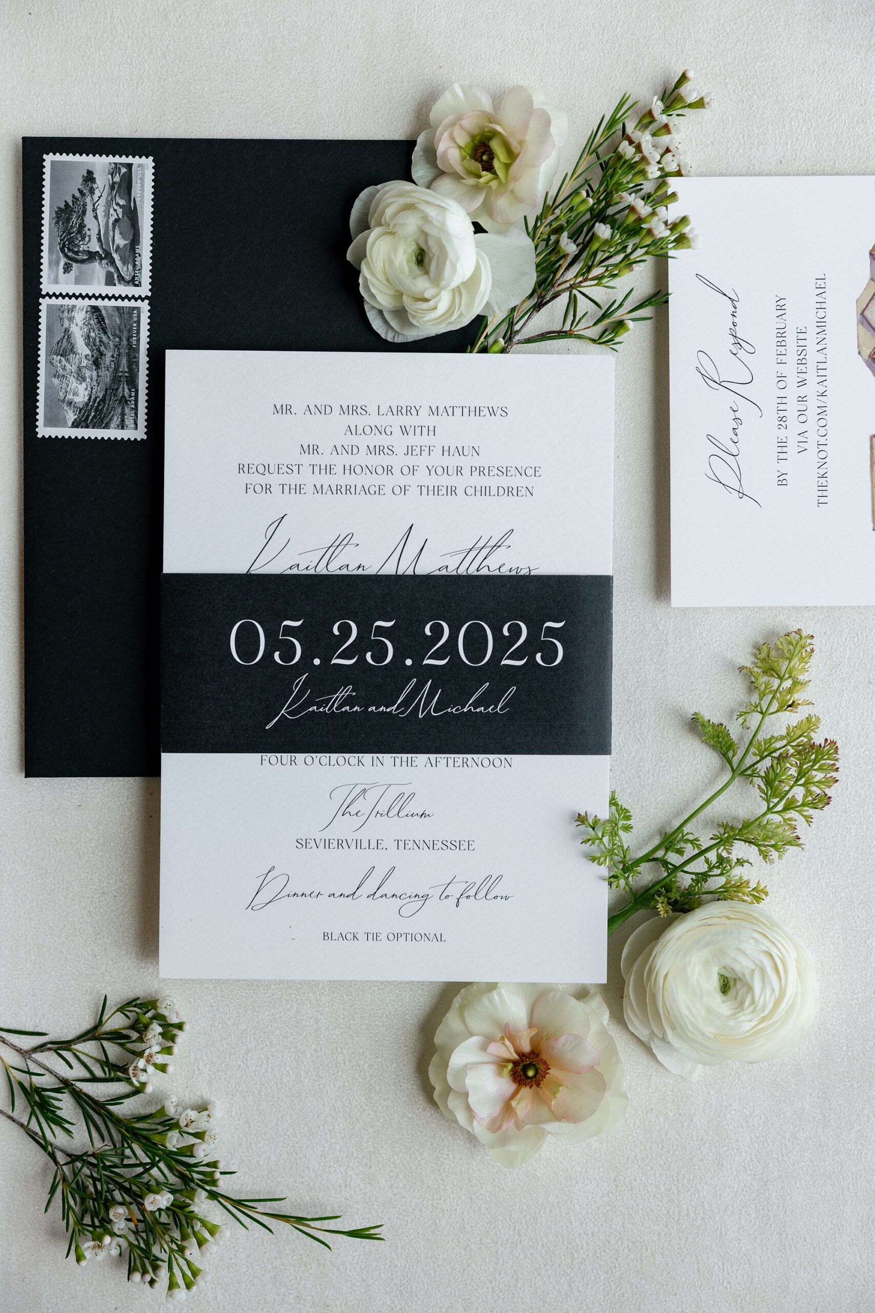
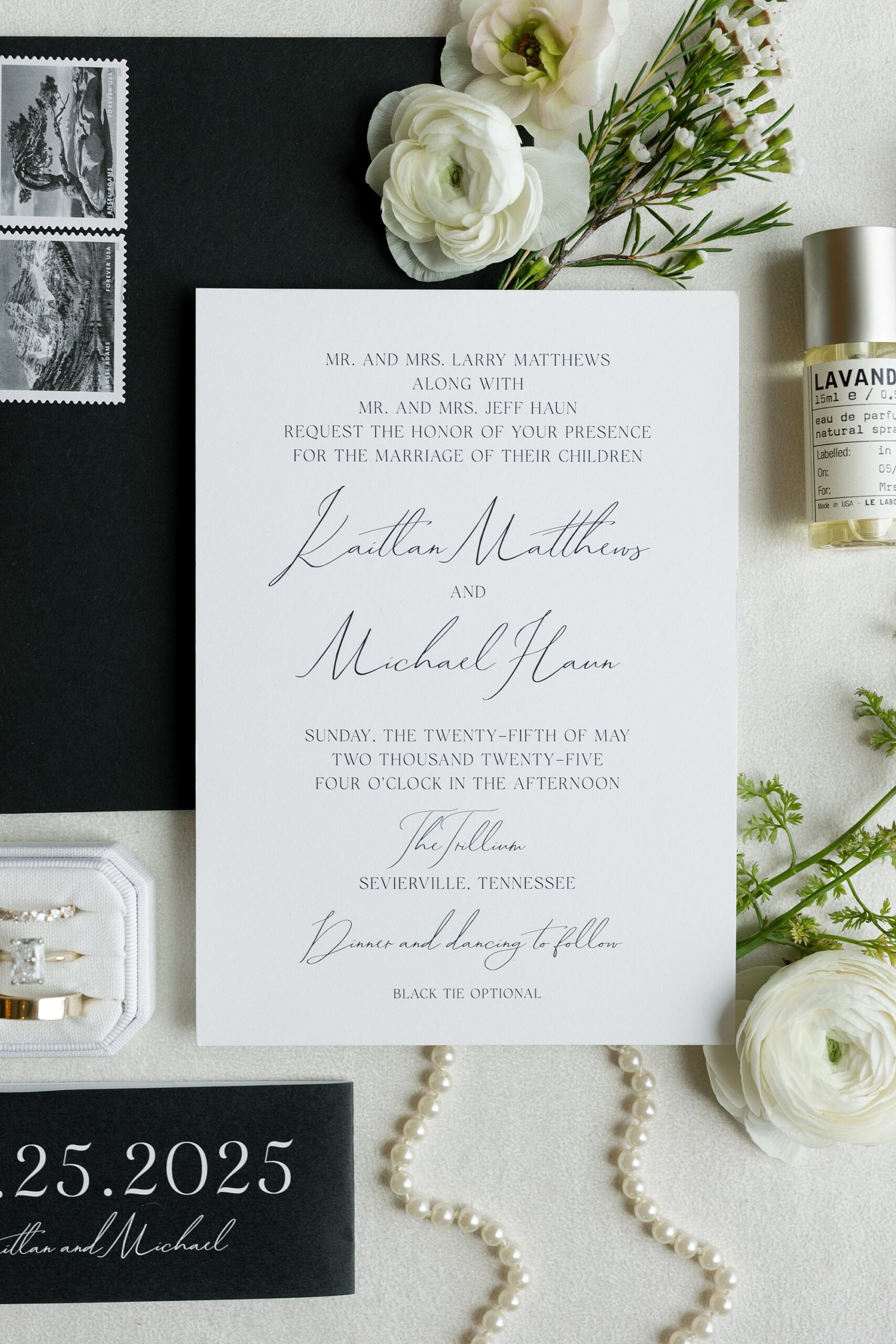
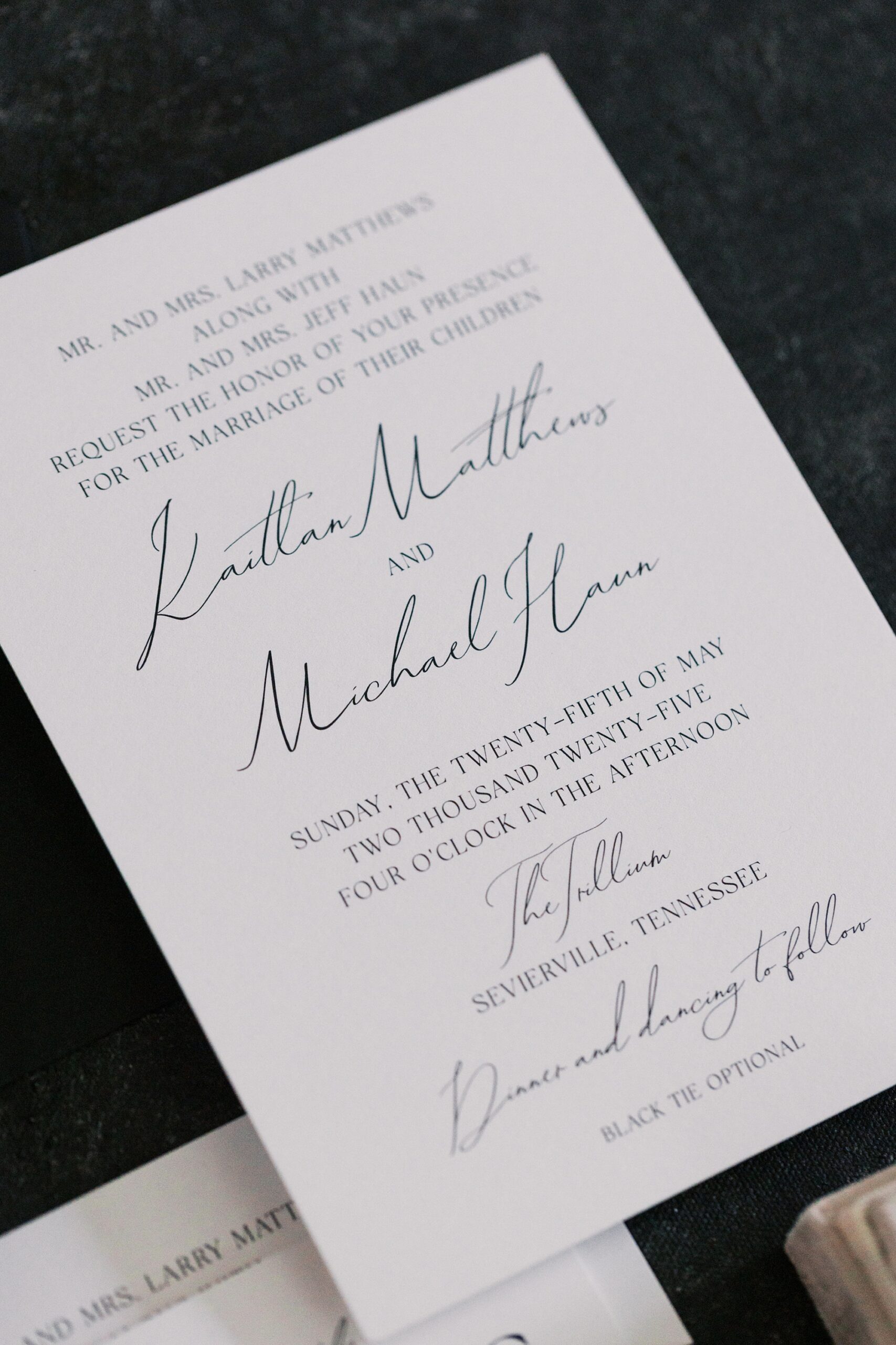
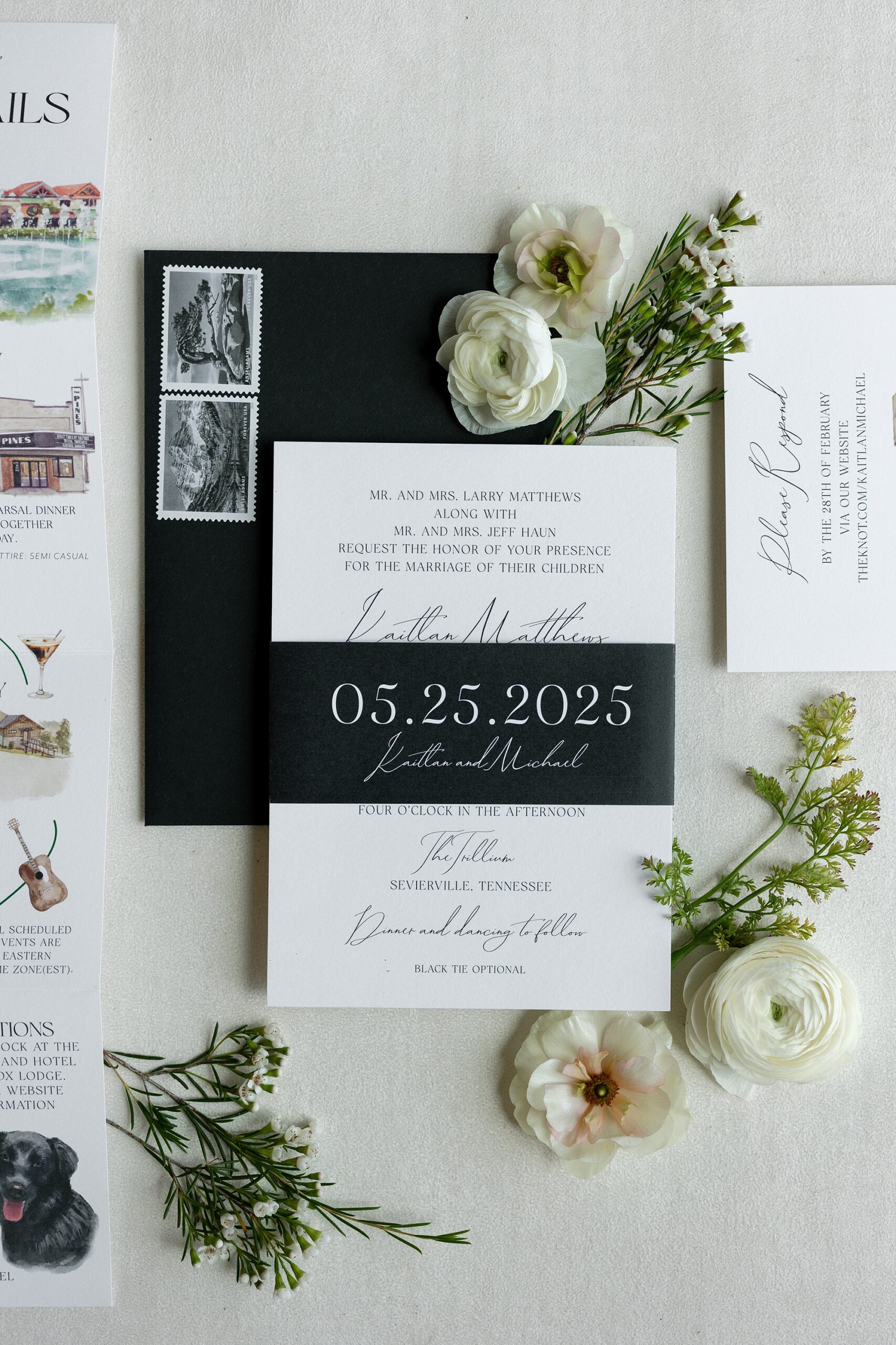
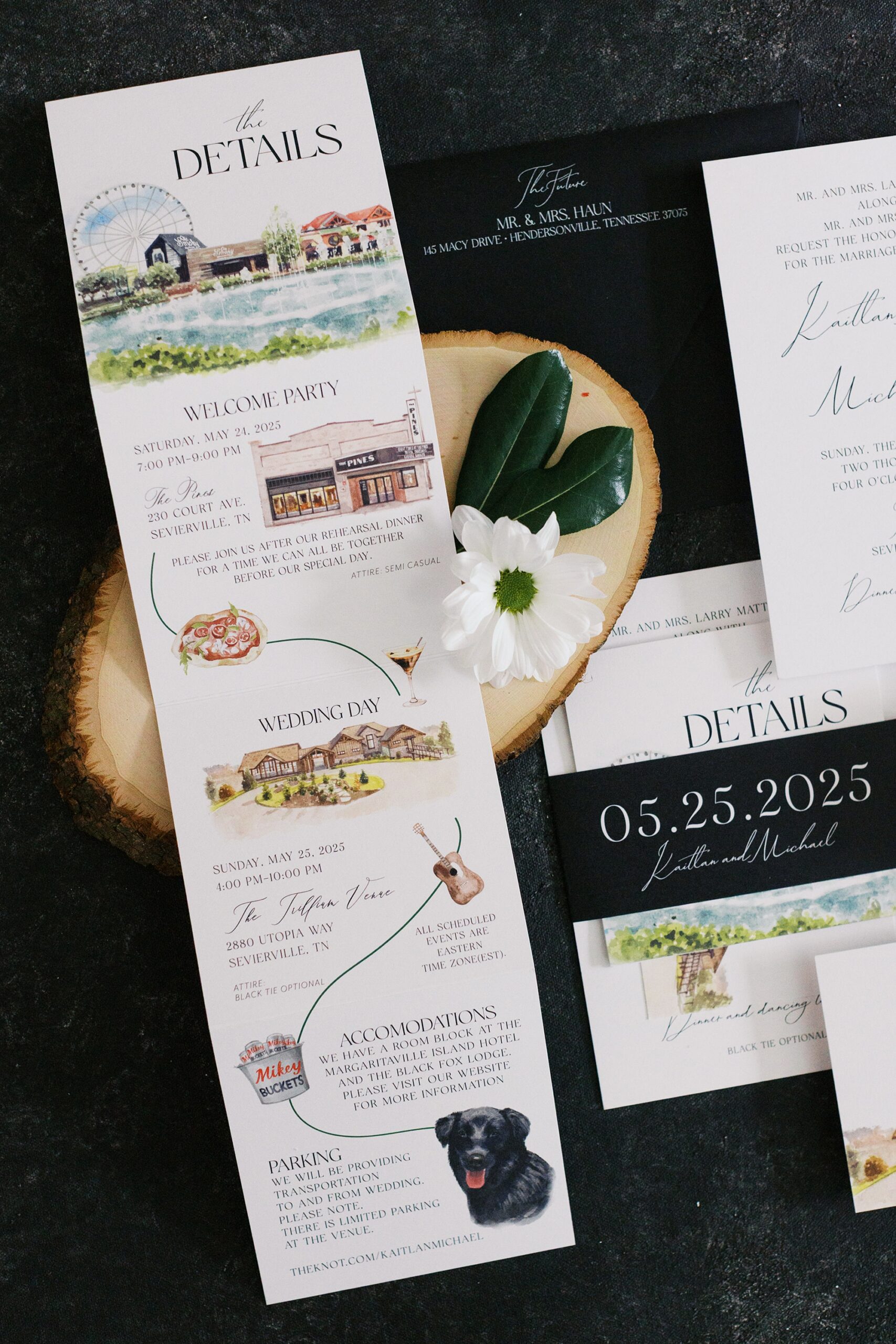
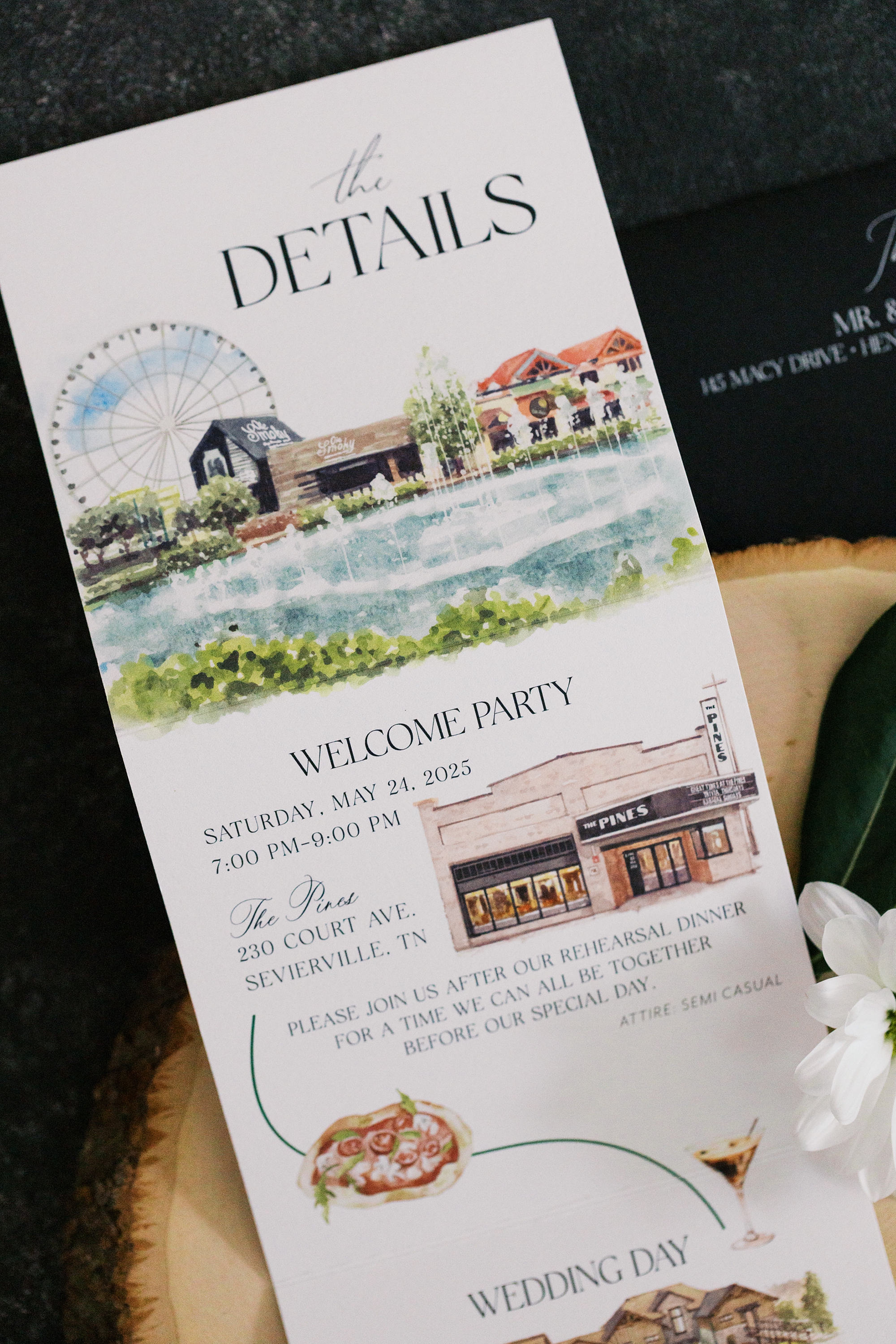
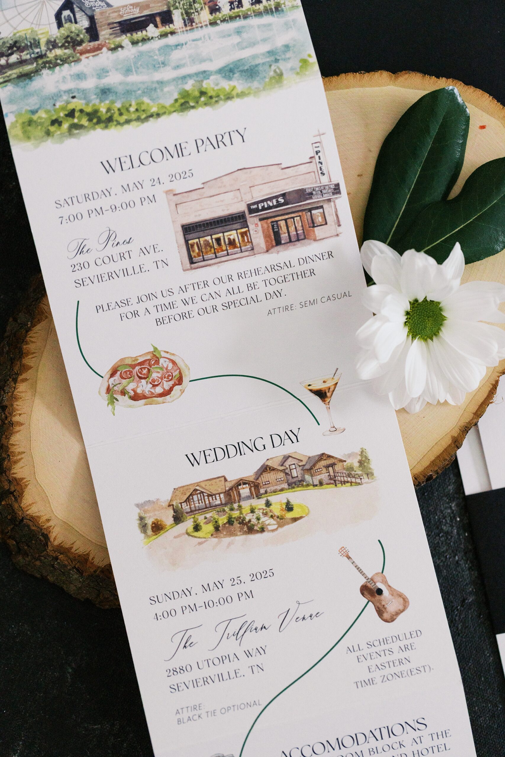
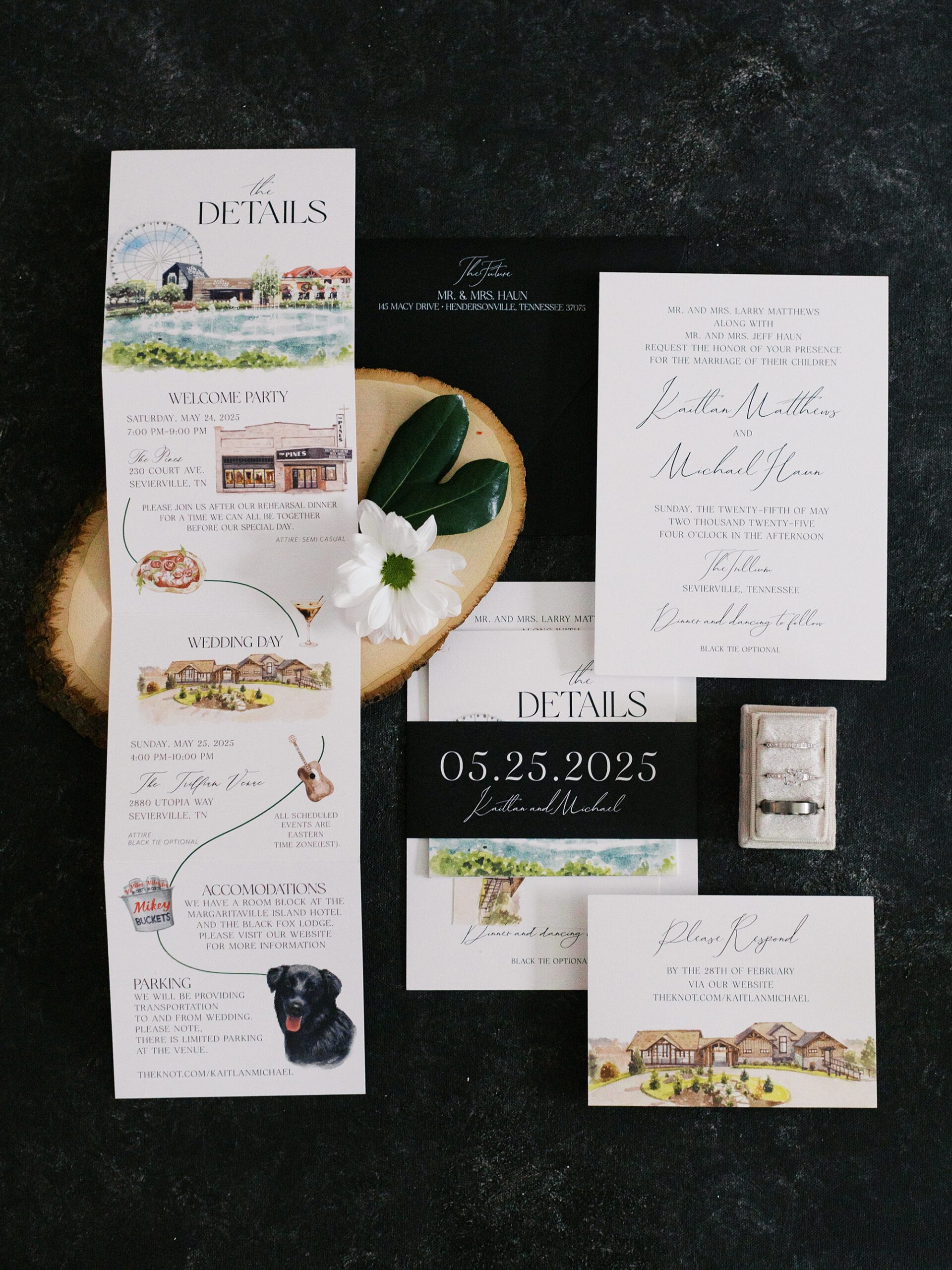
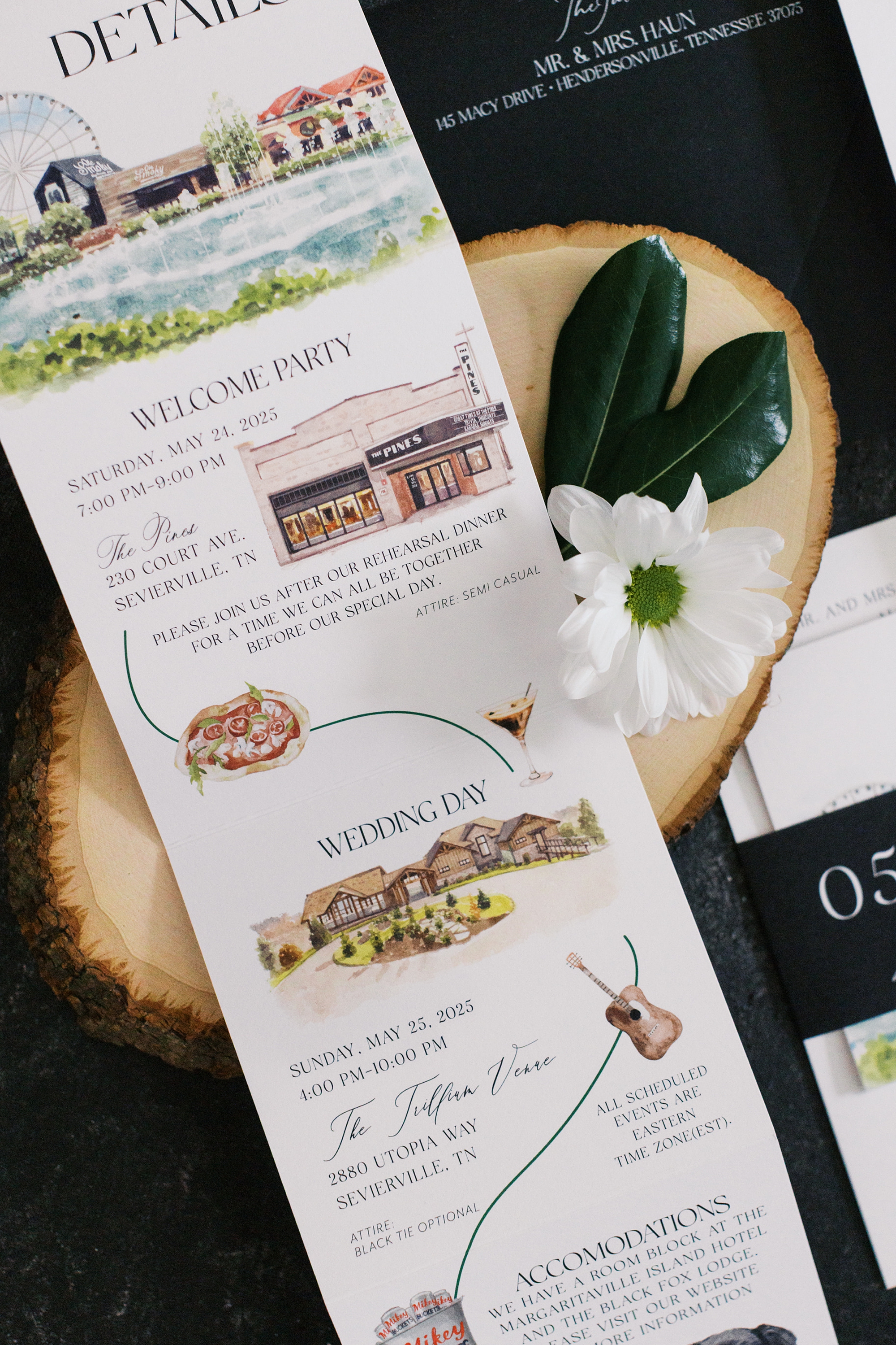
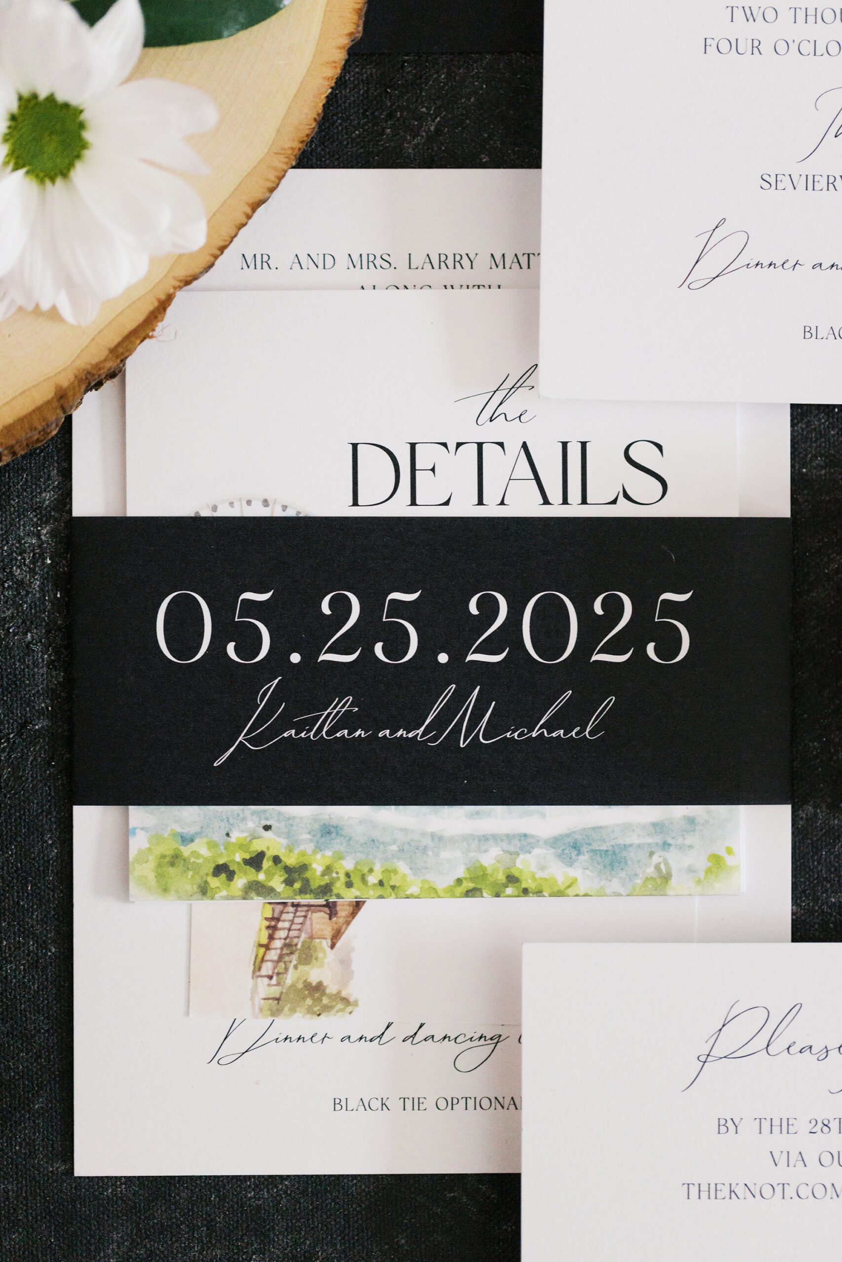
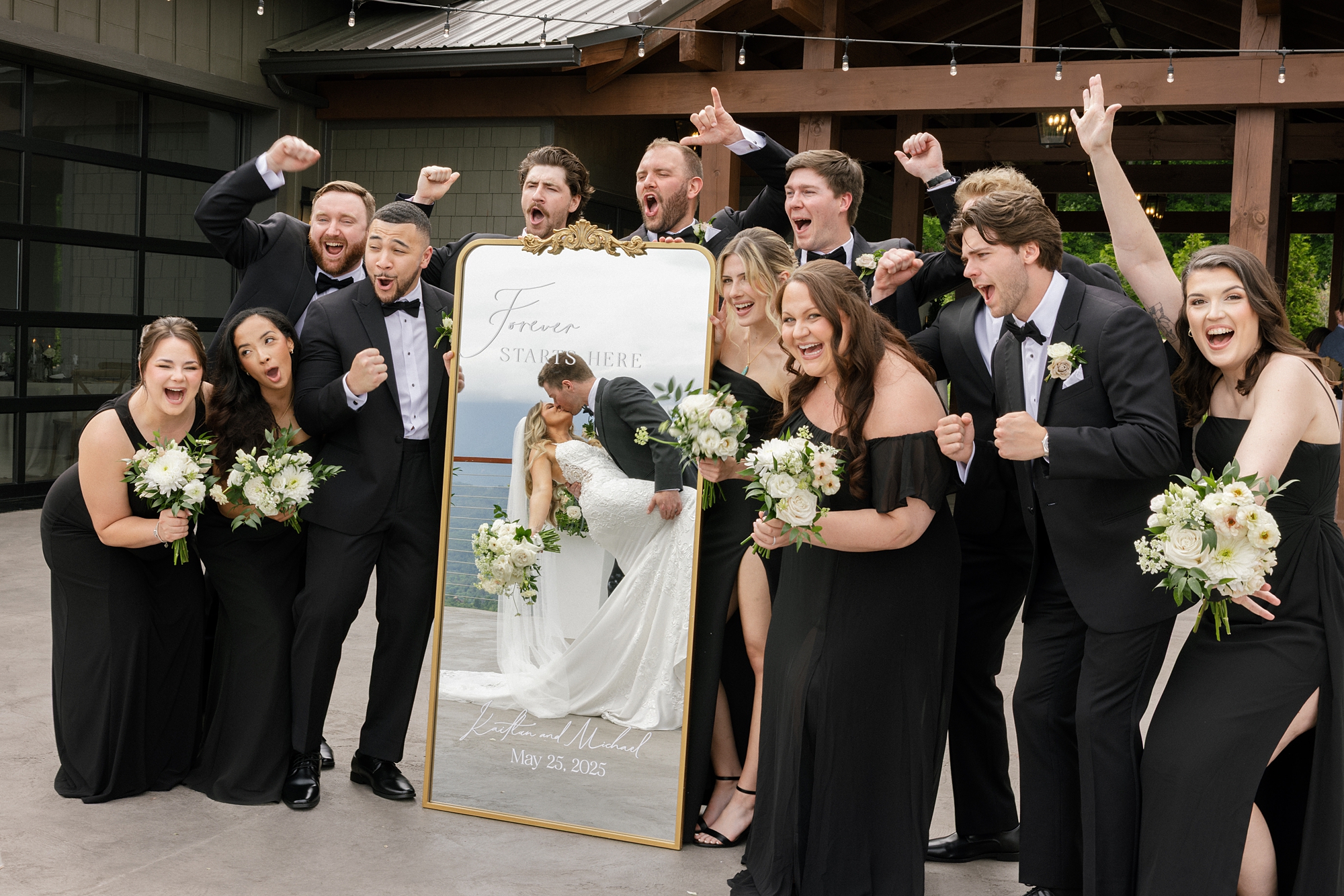
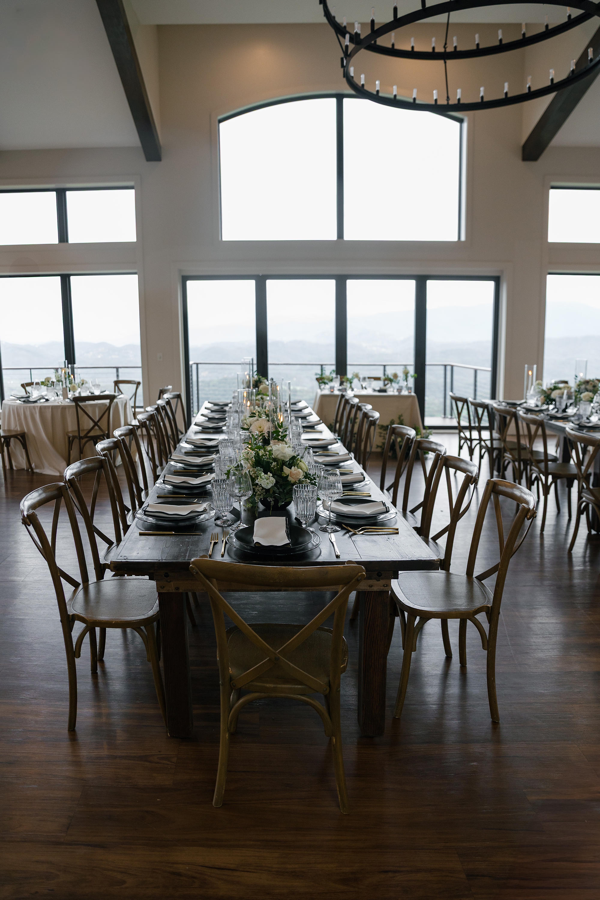
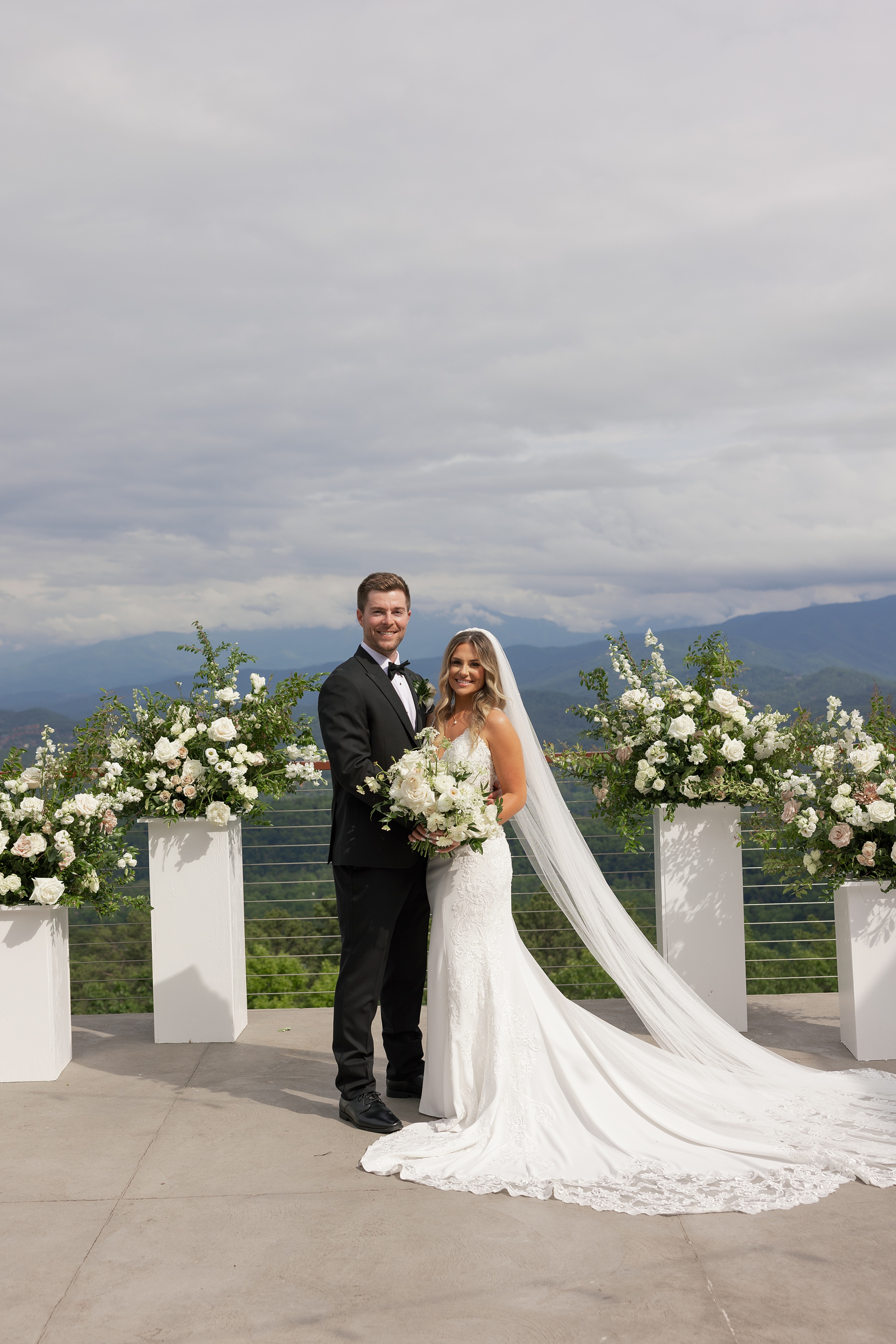
I am so excited to share the details from this timeless black and white wedding at The Trillium Venue in East Tennessee. There is so much to love about this wedding, from the breathtaking views of the Great Smoky Mountains to the detailed artwork and wine seating chart we had the joy of designing. This wedding had a modern, romantic vibe that paired effortlessly with the venue’s architecture, floor-to-ceiling windows, and panoramic backdrop. It’s easy to see why Kaitlan and Michael chose The Trillium as the setting for their gorgeous wedding day.
We had the honor of designing the couple’s custom invitations and day-of wedding details. Every element reflected the elegant, timeless, and classic vision they had for their day.
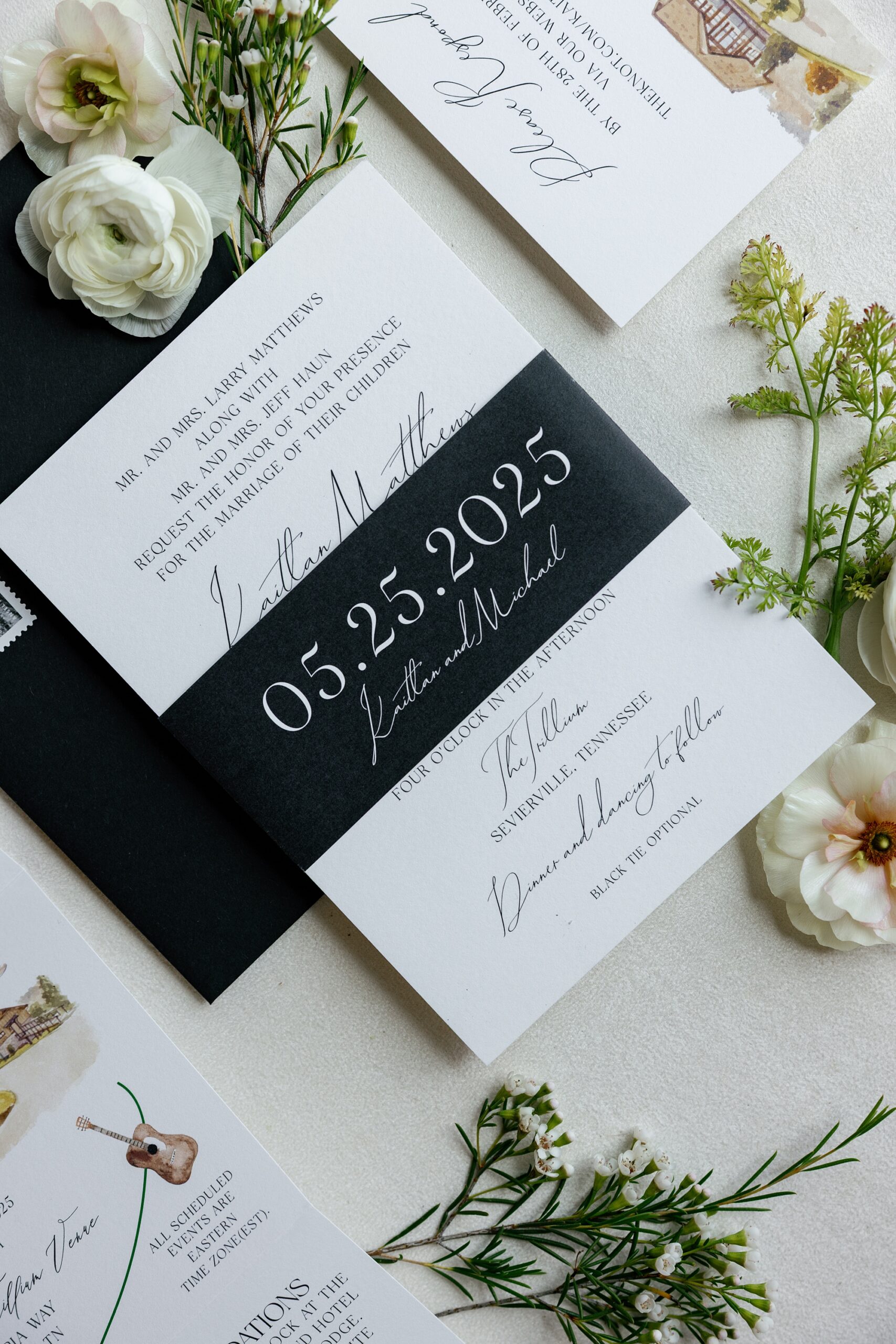
Black and White Invitation Suite with Custom Artwork
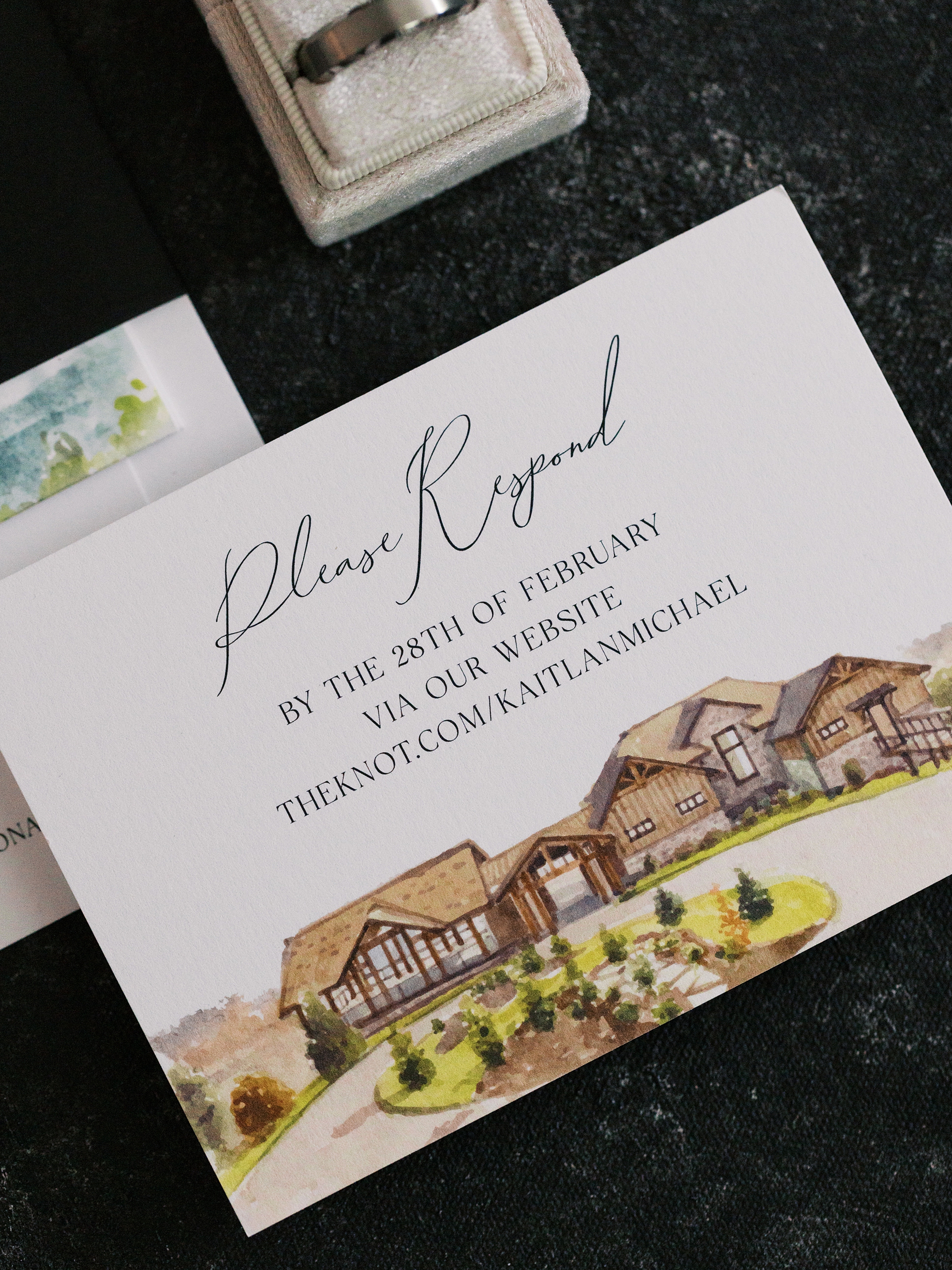
The invitation suite was truly a work of art. Designed in a classic black-and-white palette, the suite featured elegant typography and a custom details card with artwork of significant places from the couple’s wedding weekend.
We designed artwork of The Pines, the charming venue where the rehearsal dinner took place, and The Trillium, where their wedding day unfolded. The event timeline included playful illustrations for food, cocktails, music, and more, giving guests a preview of all that was to come.
A sleek black band held the suite together featuring the couple’s names and wedding date in white. It was simple, refined, and elevated and just like the celebration itself. I love how this wedding invitation set the tone for their wedding day.
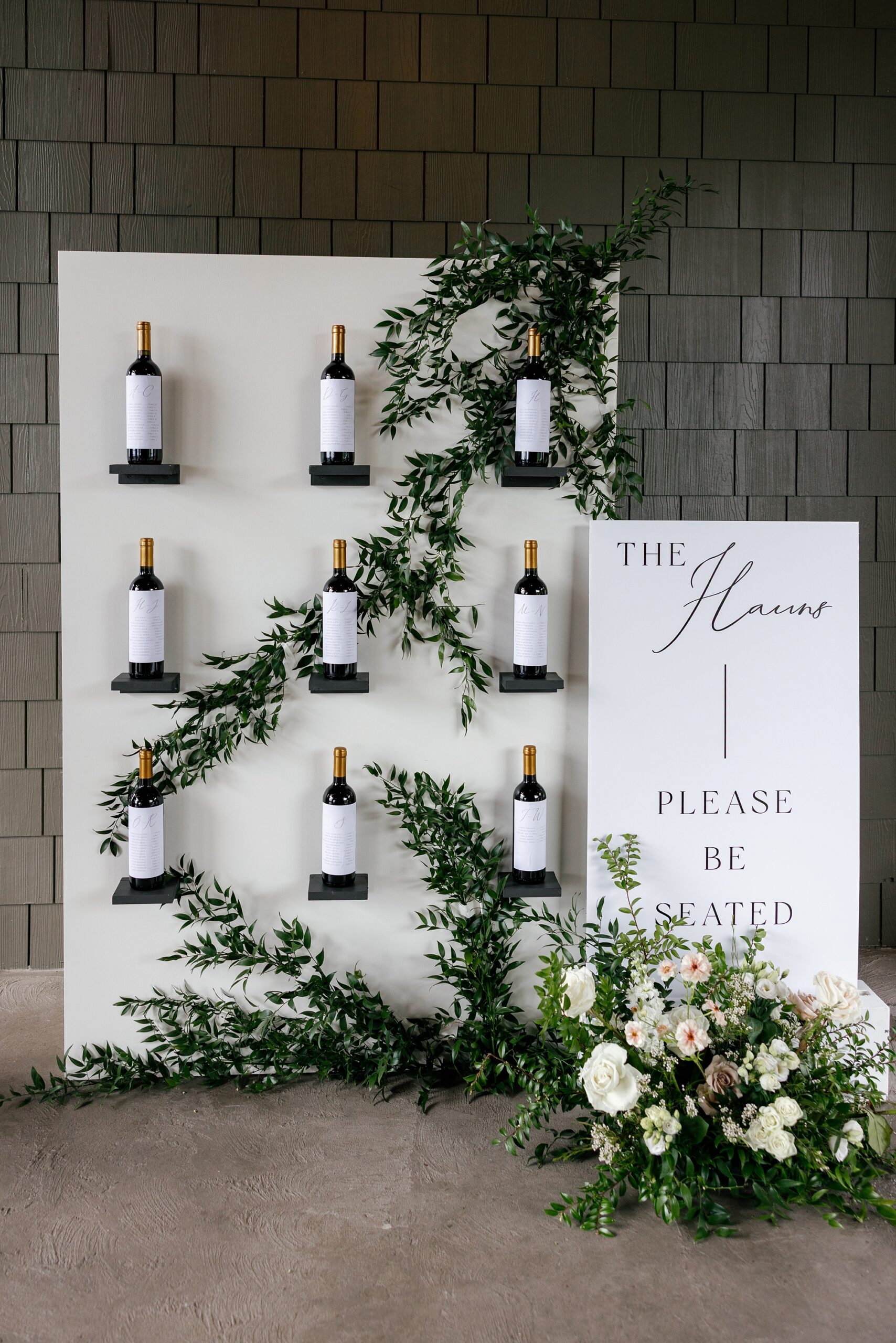
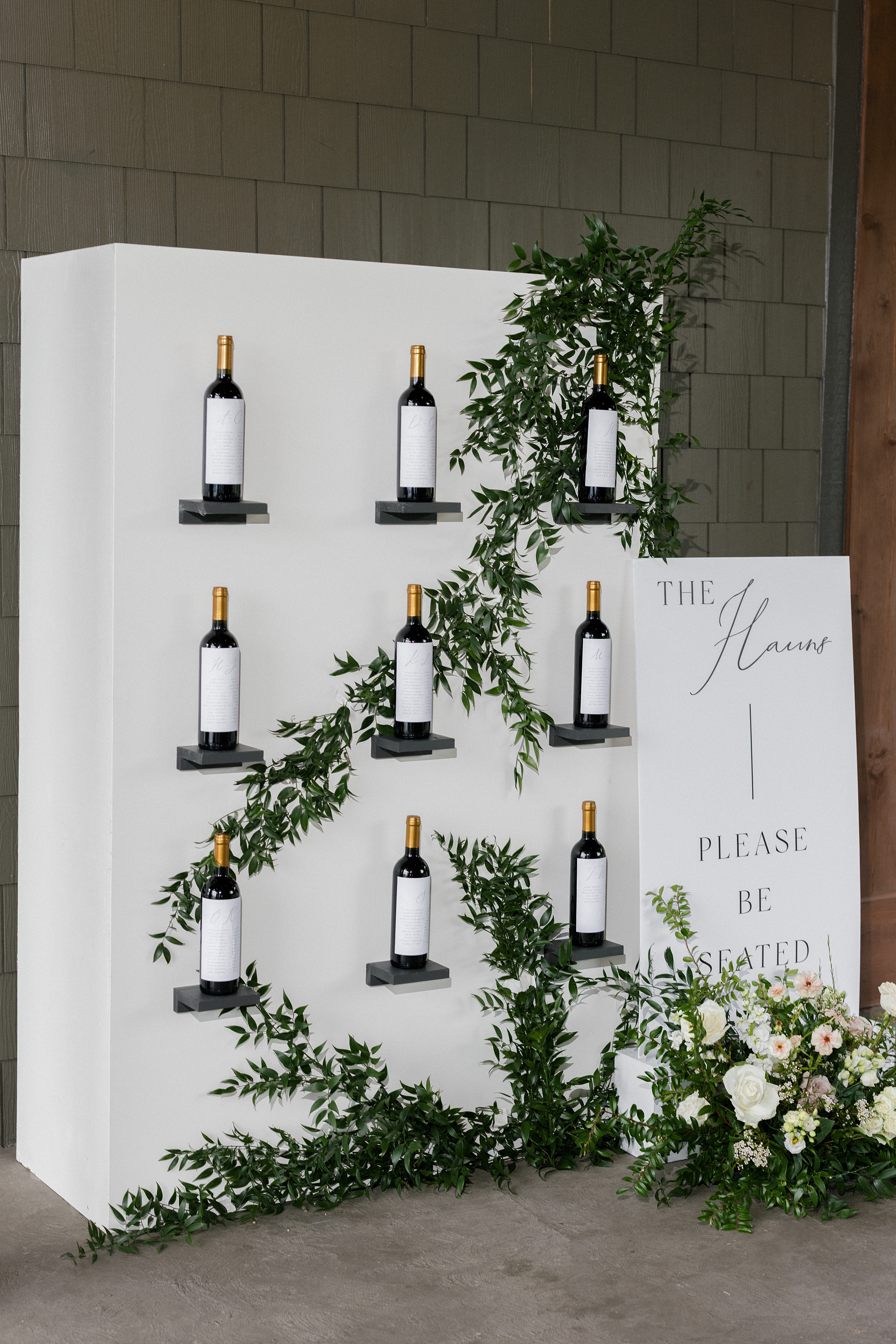
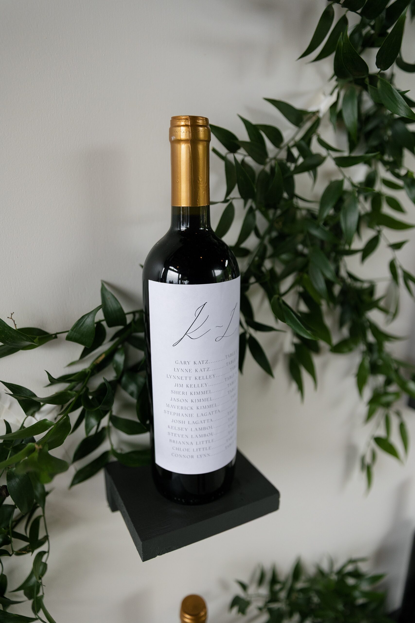
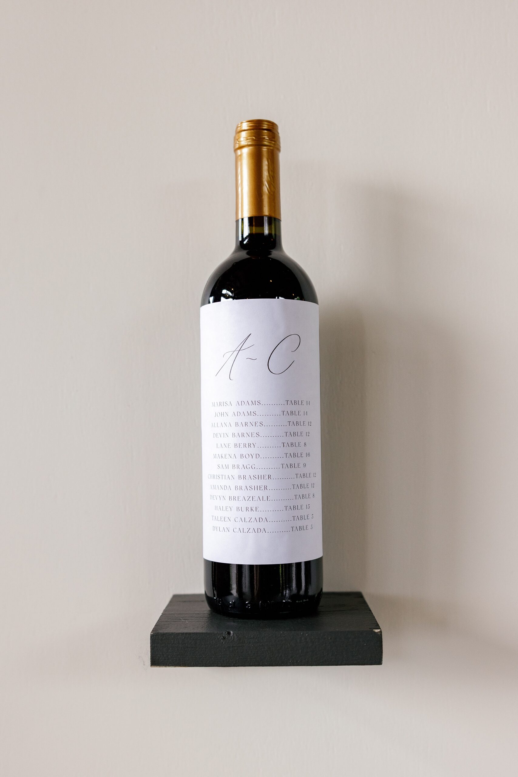
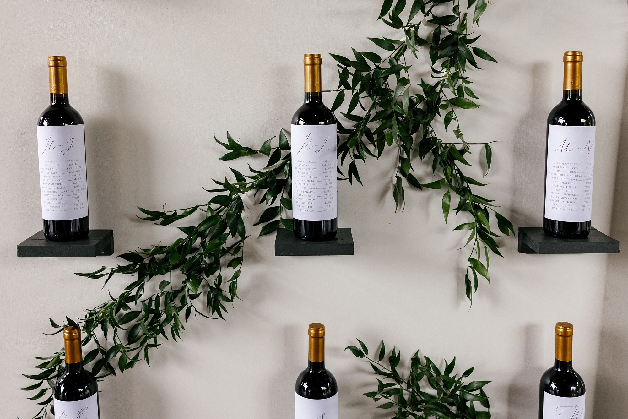
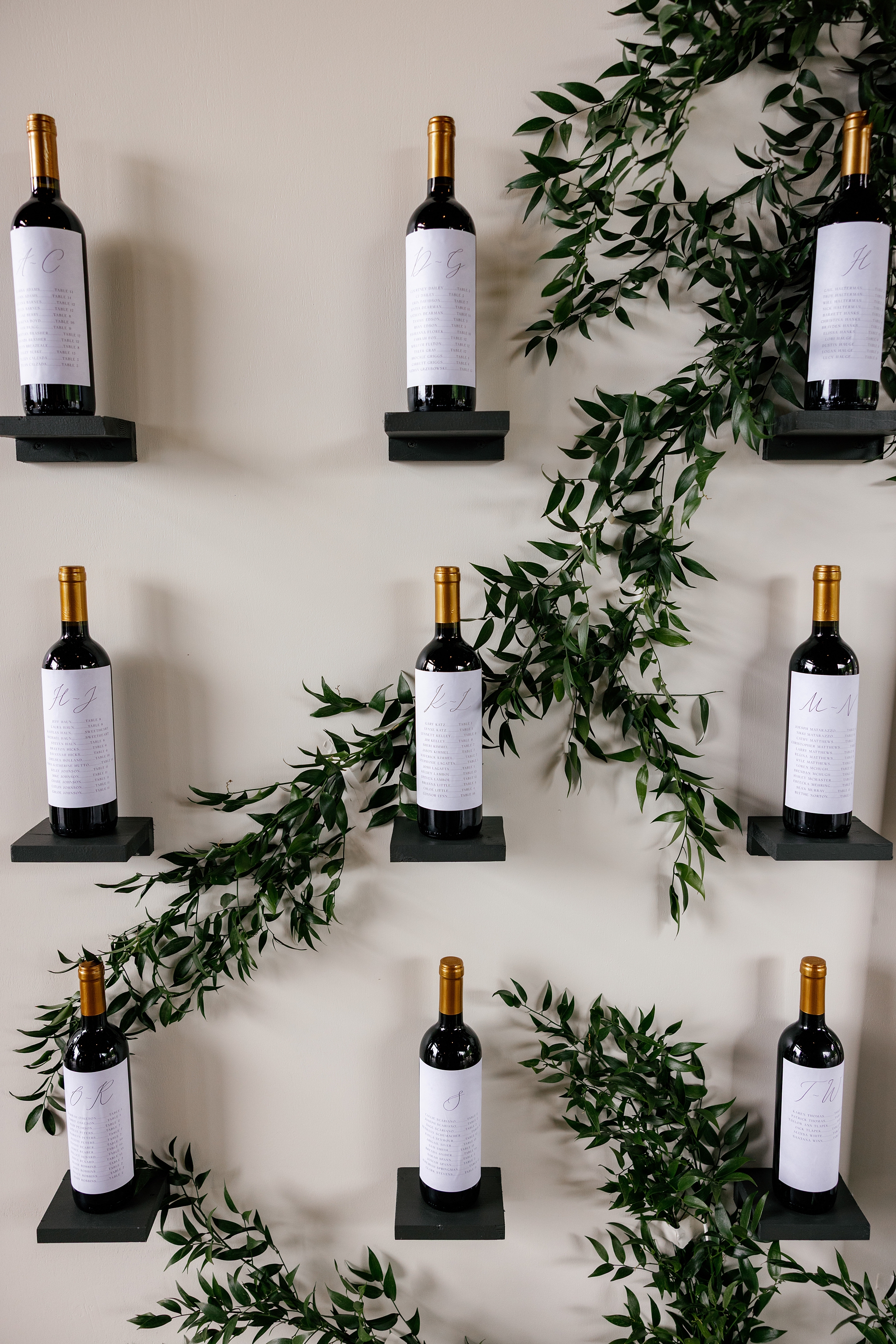
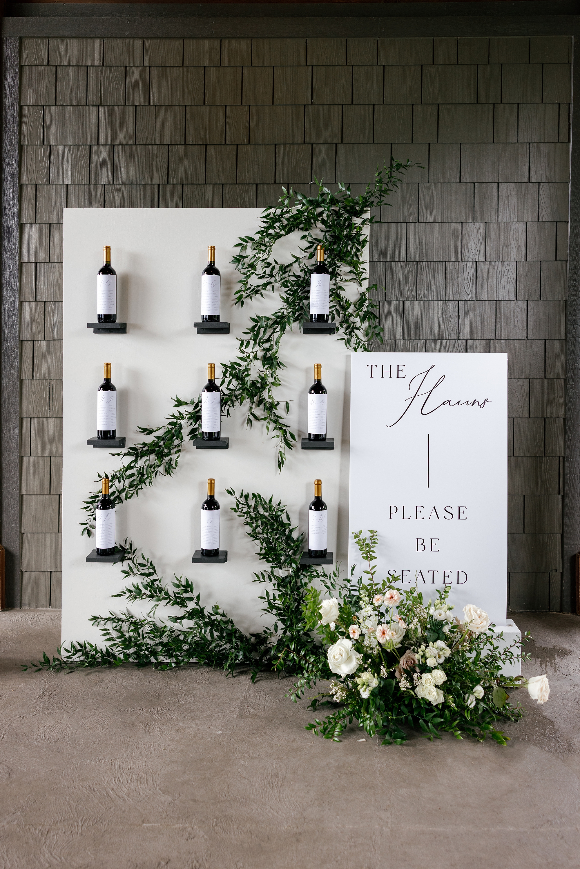
Wine-Inspired Seating Chart
One of our favorite details was the wine bottle seating chart wall, inspired by the bride’s vision. She expressed early on that she dreamed of having a wine seating chart. And we always try to make our clients’ dreams a reality! To make her vision to come to life, we designed and created a packable display that could be transported from Nashville to East Tennessee.
The bride’s father and the groom came to pick up the display before the wedding day, and you could tell it was bonding time for them! They were the absolute sweetest. The father of the bride even shared a little about his upcoming speech for the wedding leaving us all teary-eyed!
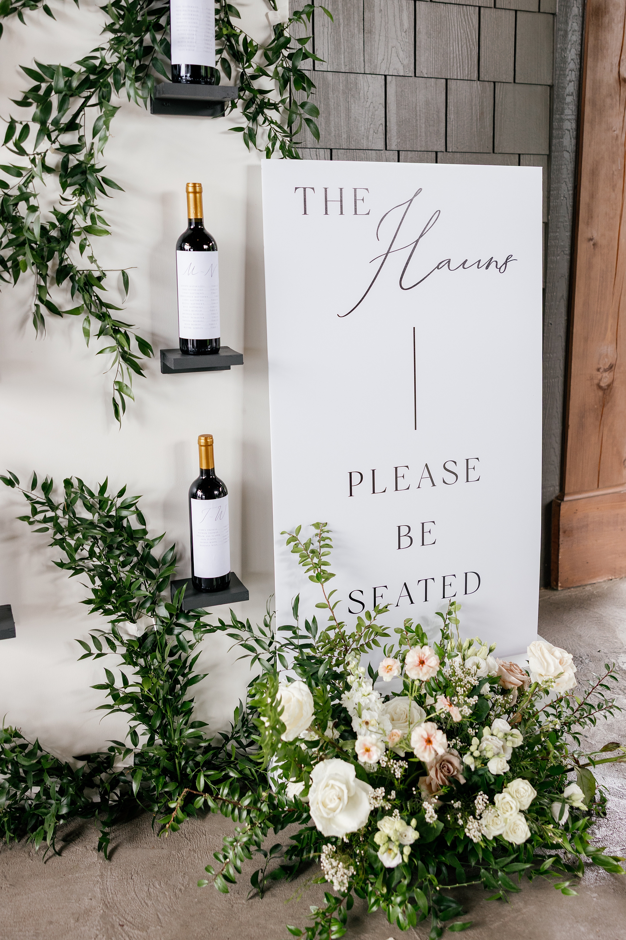
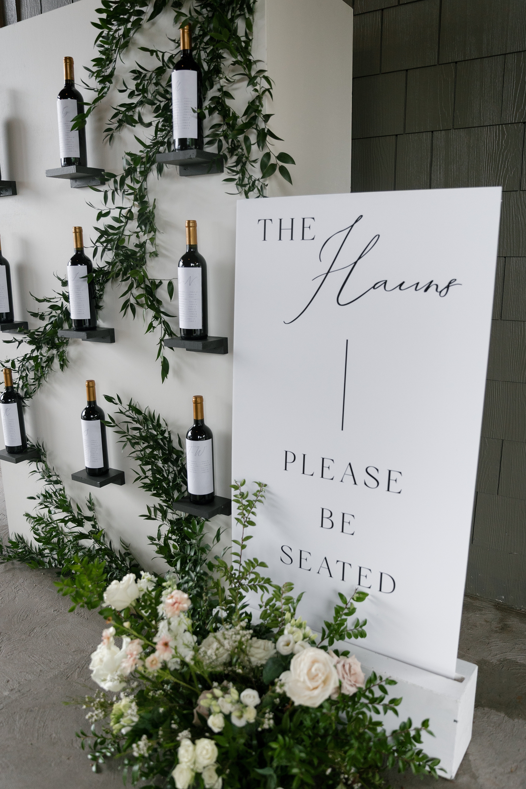
At the wedding, the display featured three rows of three sleek black shelves mounted on a crisp white wall. The nine wine bottles featured each guest’s name in alphabetical order along with their assigned on a custom wine label. Greenery was woven throughout the display for a natural, romantic finish. Beside it stood a clean white title sign with the couple’s last name, The Hauns, and the words “Please Be Seated” in classic black lettering.
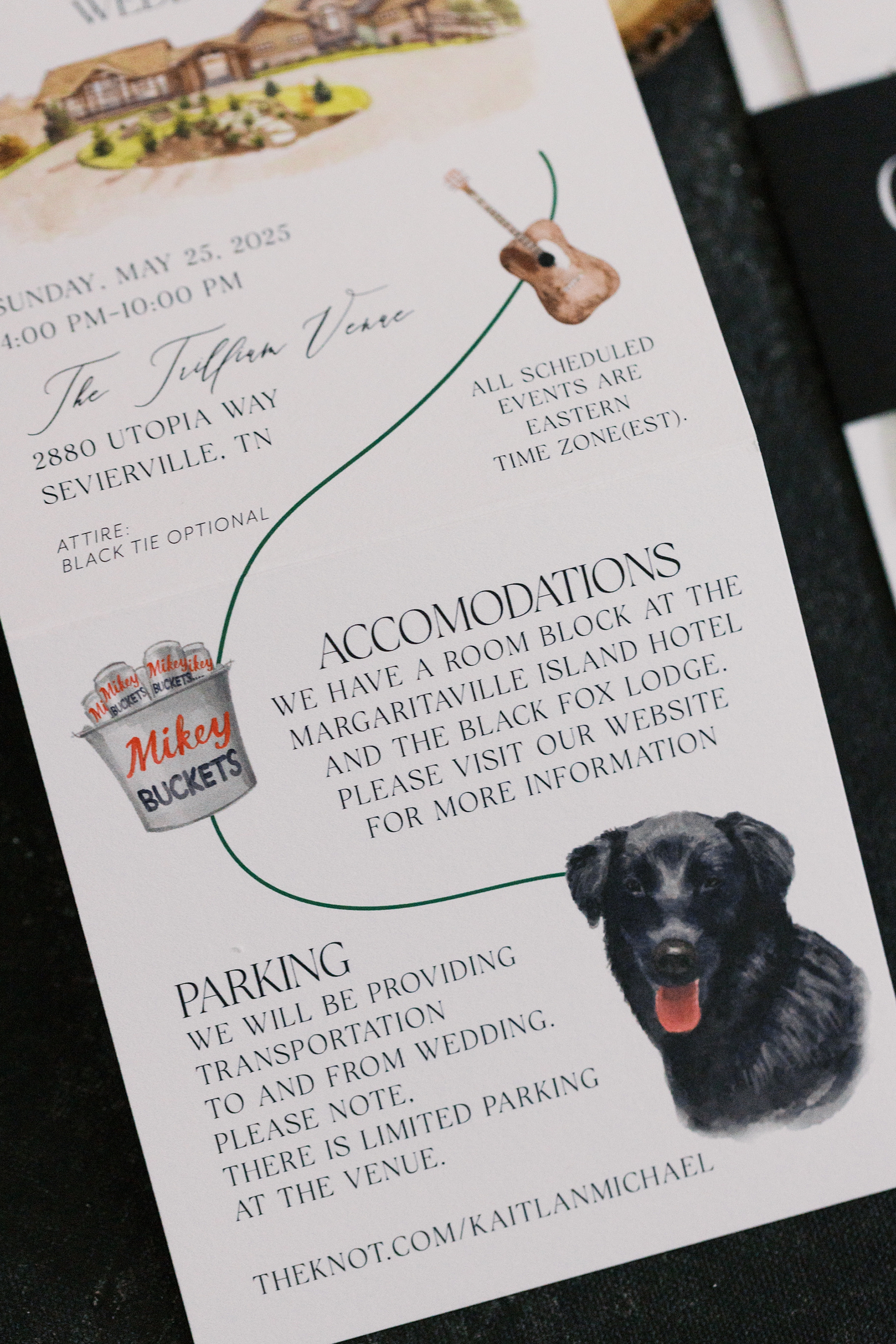
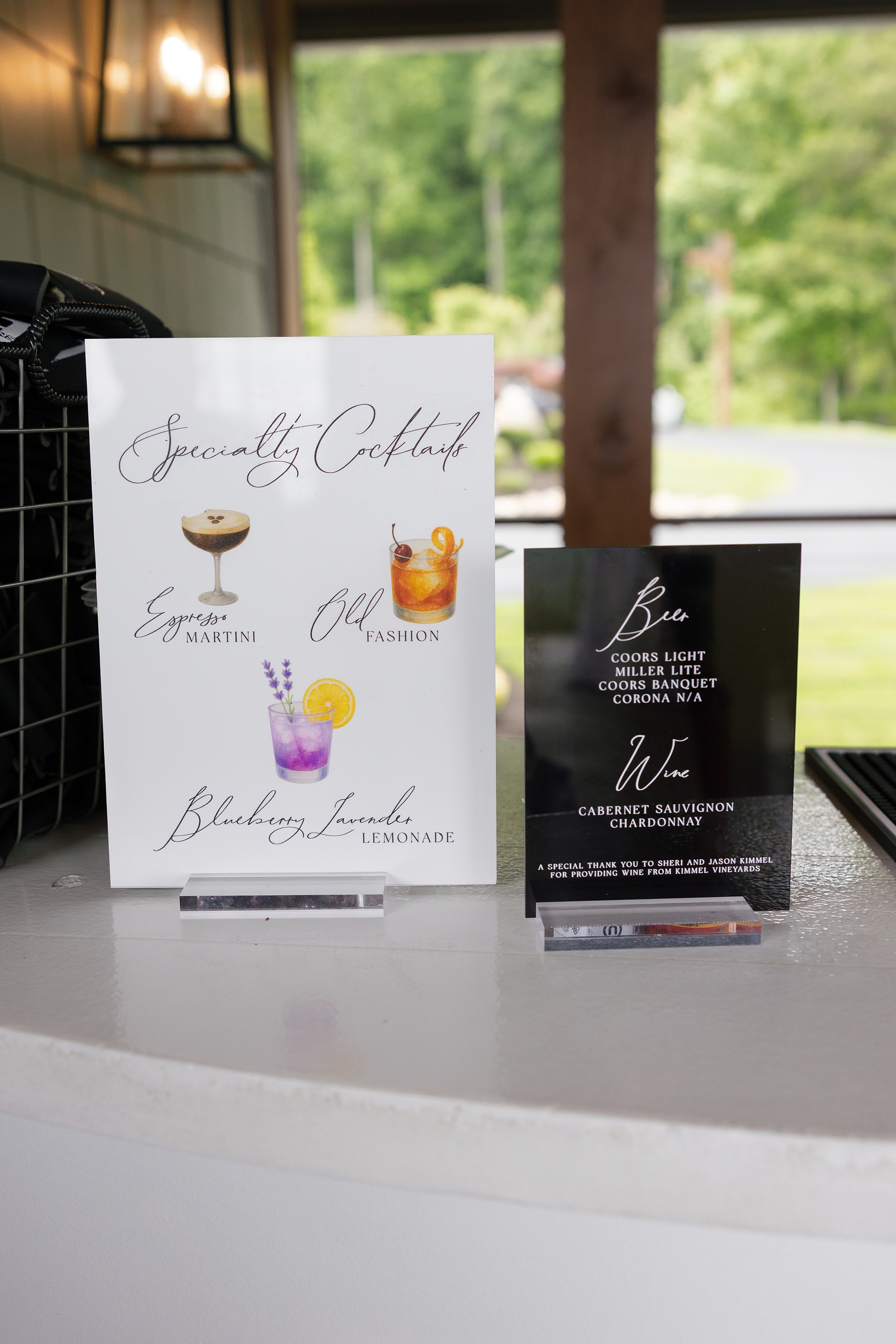
Day-of Details: Wedding Signage
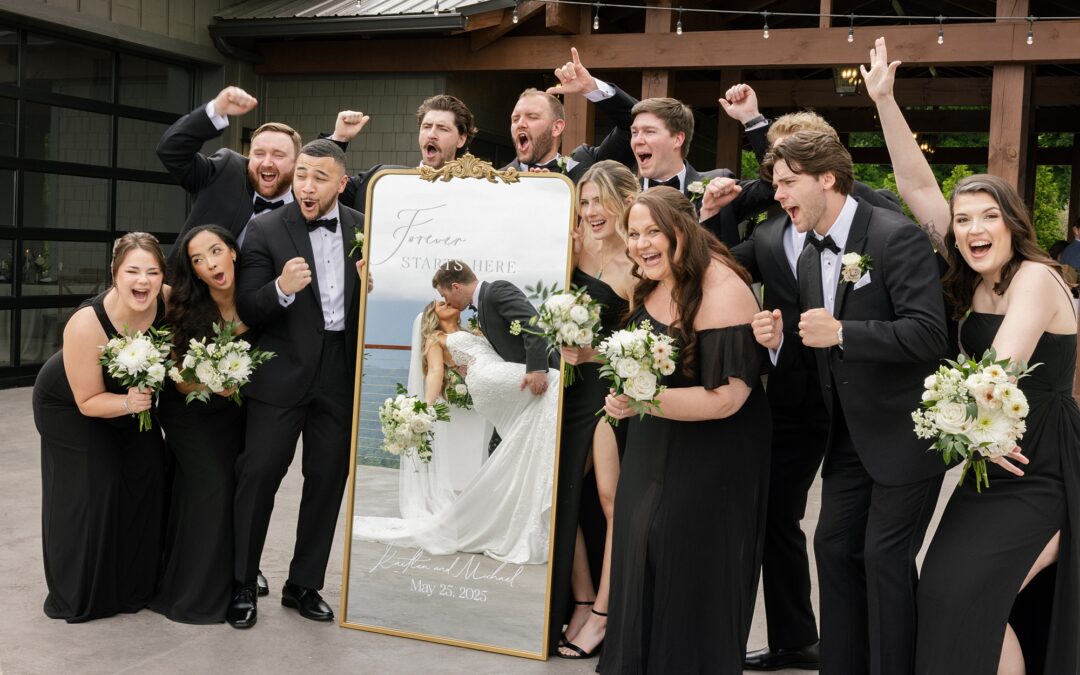
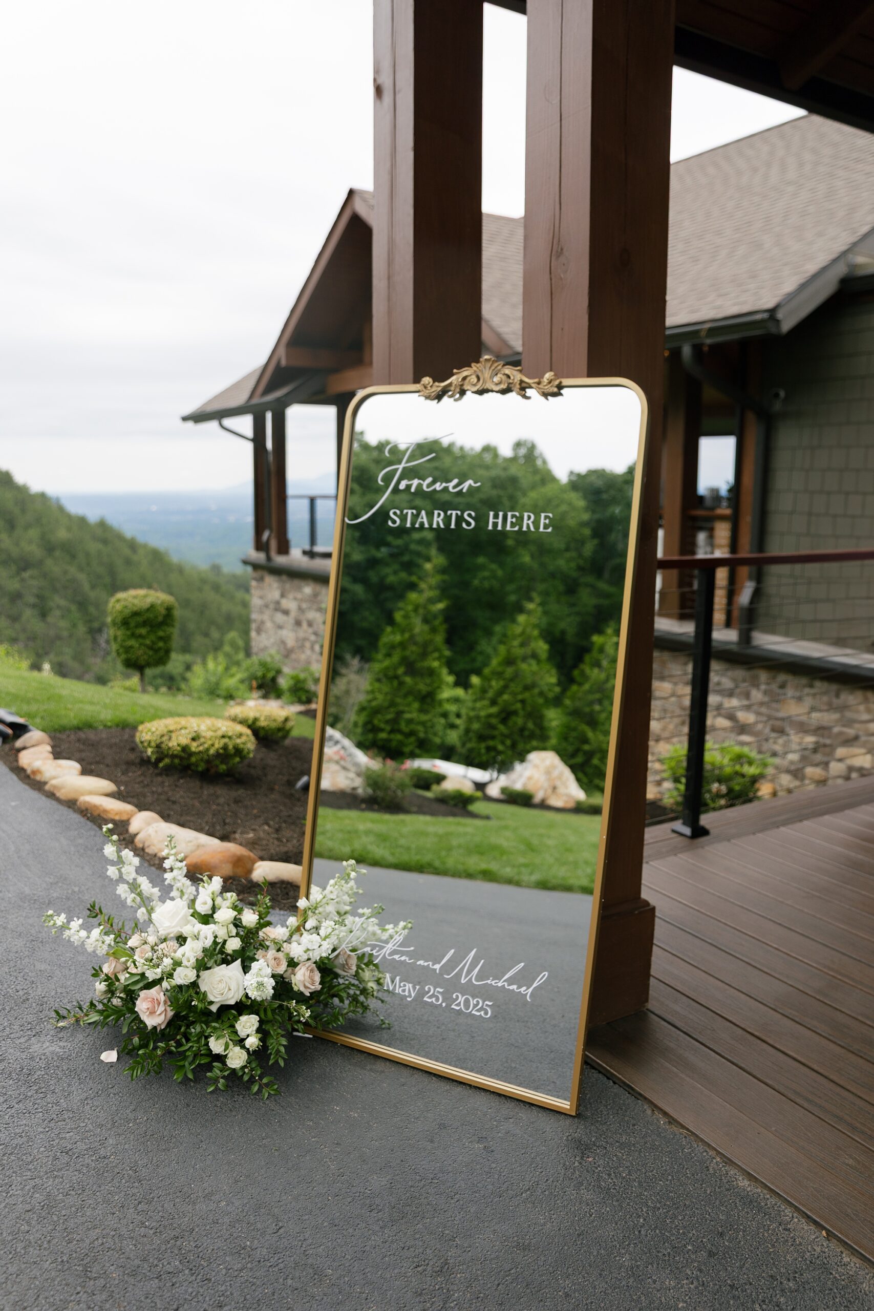
Every detail carried through the couple’s timeless aesthetic. Greeting guests with elegance was the wedding welcome sign, which was a gold-framed mirrored sign featuring “Forever Starts Here” in white calligraphy at the top, along with the couple’s names and wedding date at the bottom.
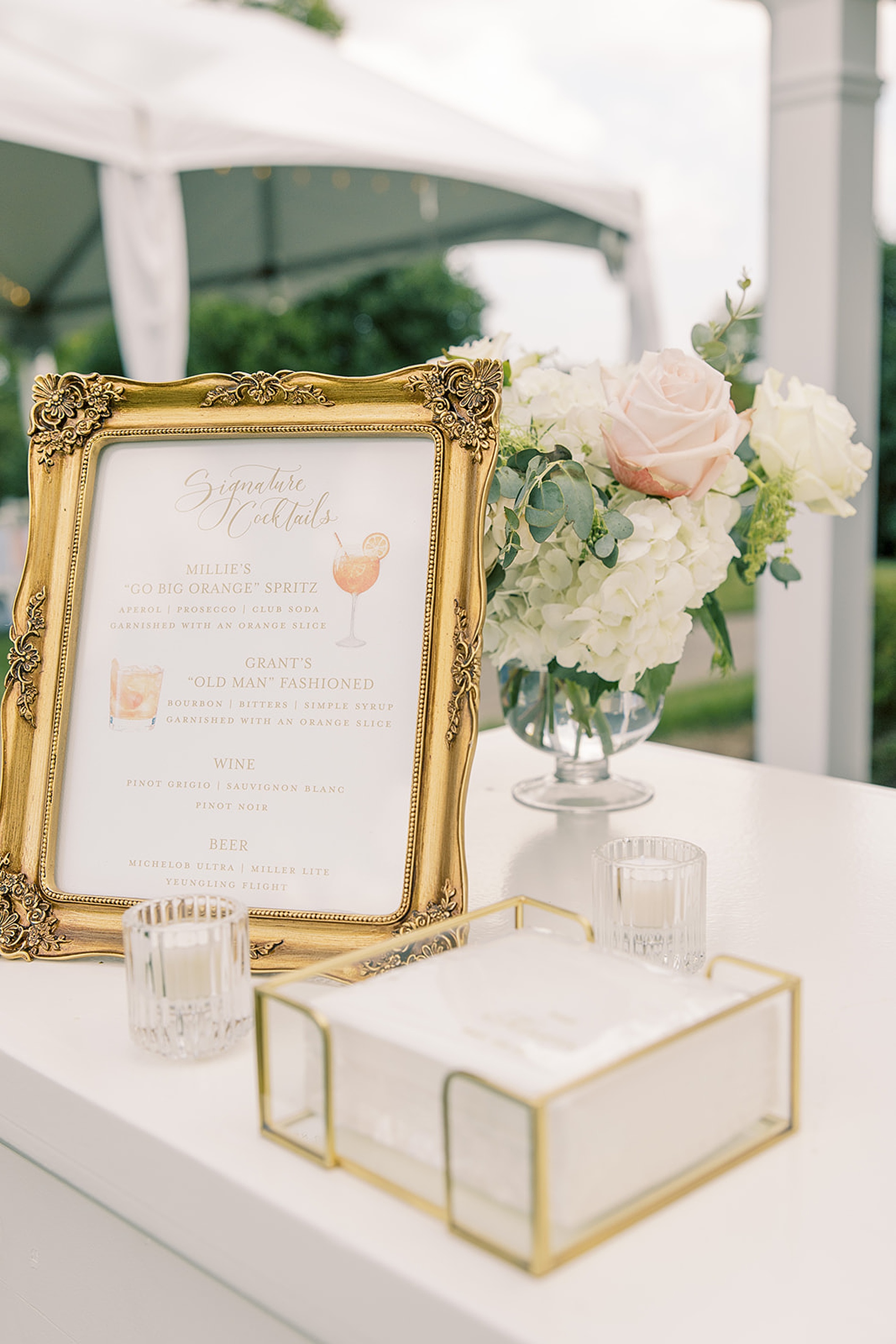
We also created two different bar signs. One was a modern black acrylic sign that listed available drink options in white lettering, keeping things sleek.
The other was a white specialty cocktail sign with black lettering and illustrations of the couple’s signature drinks, which included an Espresso Martini, Old Fashioned, and Blackberry Lemonade.
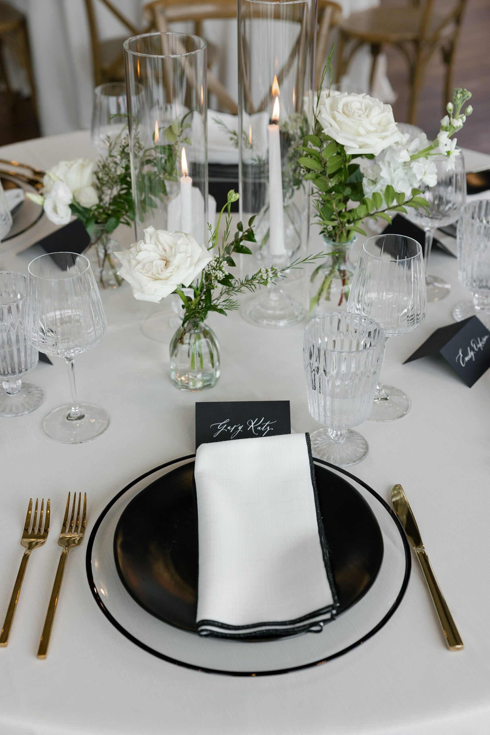
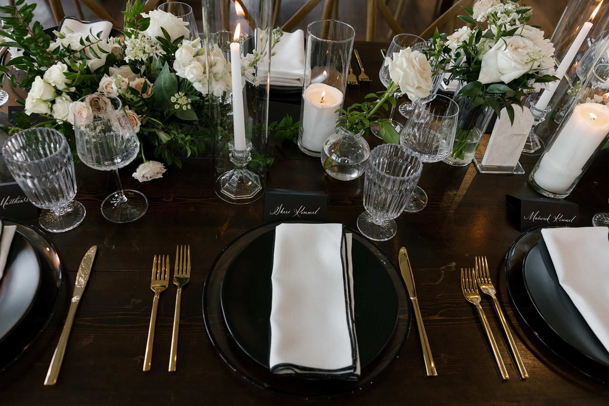
Timeless Black and White Wedding Details
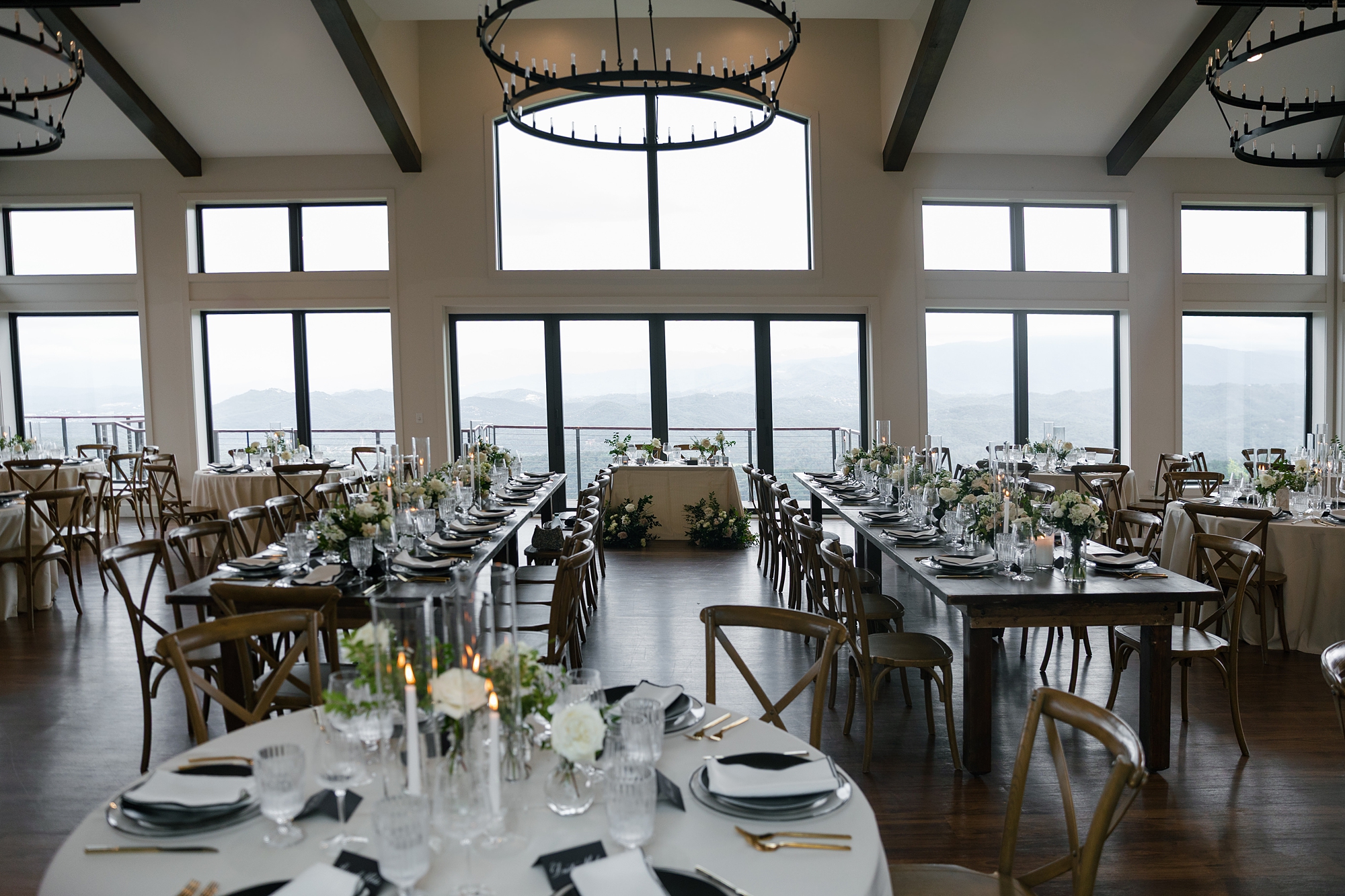
The Trillium Venue is truly stunning inside and out. Even from inside, guests can still take in the scenic mountain views through the floor-to-ceiling windows.
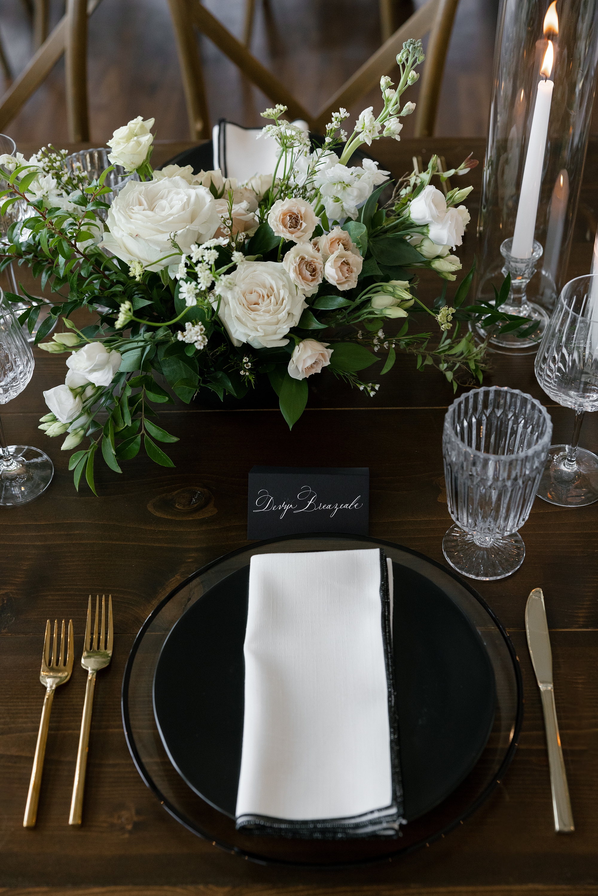
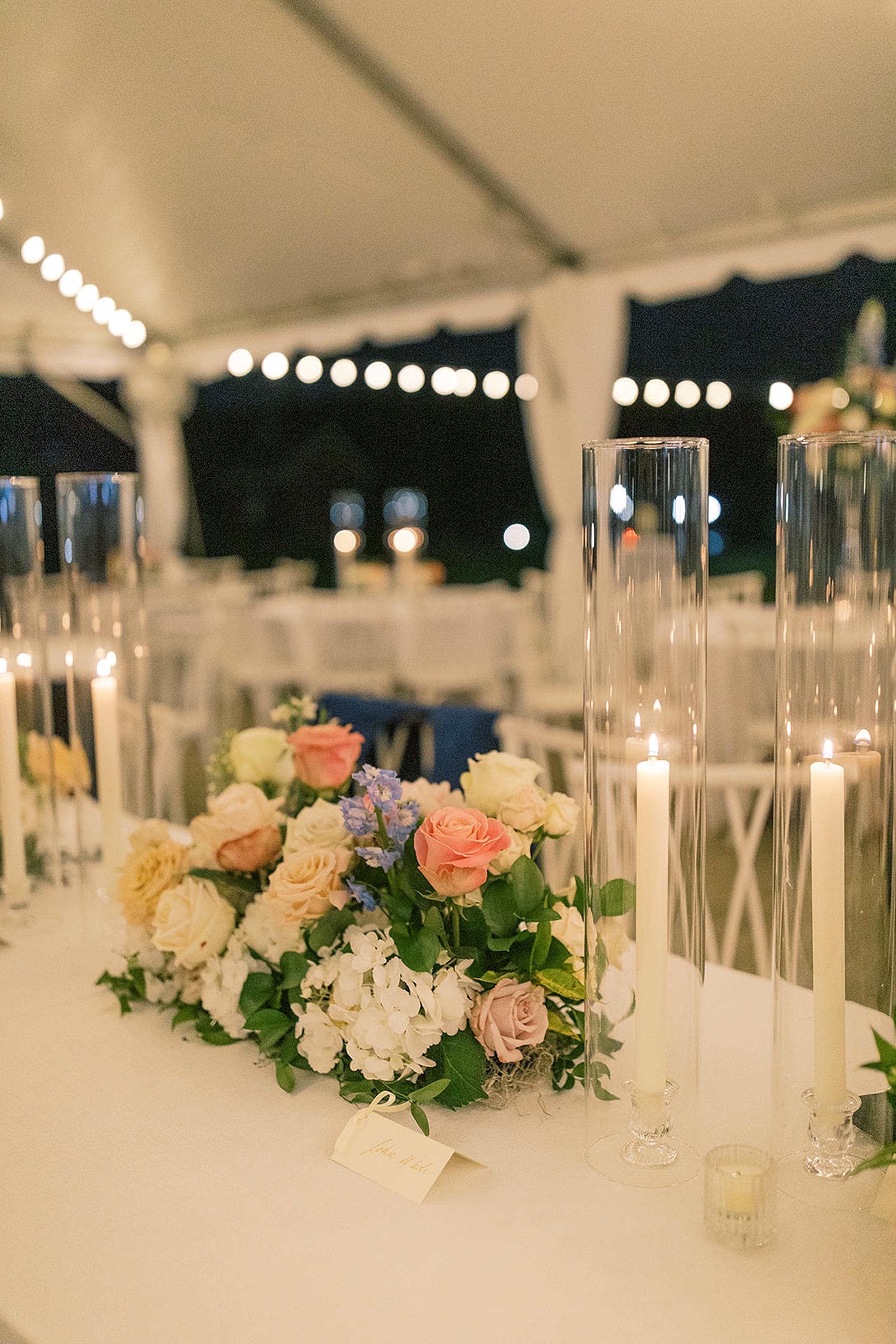
The tablescapes at the reception wove their timeless black and white theme with crisp white napkins sitting atop black plates. black place cards with white calligraphy created a striking contrast. White floral centerpieces and flickering candlelight elevated the romance of the setting.
Every piece of stationery and signage was designed to reflect the couple’s elegant and classic vision, while also including a touch of personality. Weaving in custom details throughout their wedding day added personality, shared their story, and set the stage for a truly unforgettable wedding day.
Kaitlan and Michael, thank you for letting us be a part of your special day!
If you’re planning a wedding in Nashville, or anywhere in the world, we’d love to help you create meaningful, personalized stationery and event details that tell your story. We work with couples worldwide to design details you and your guests will remember forever. Reach out today to learn more about our full-service wedding and event design offerings! We can’t wait to create something unforgettable for you!
If you enjoyed this post, you’ll love these other blogs!
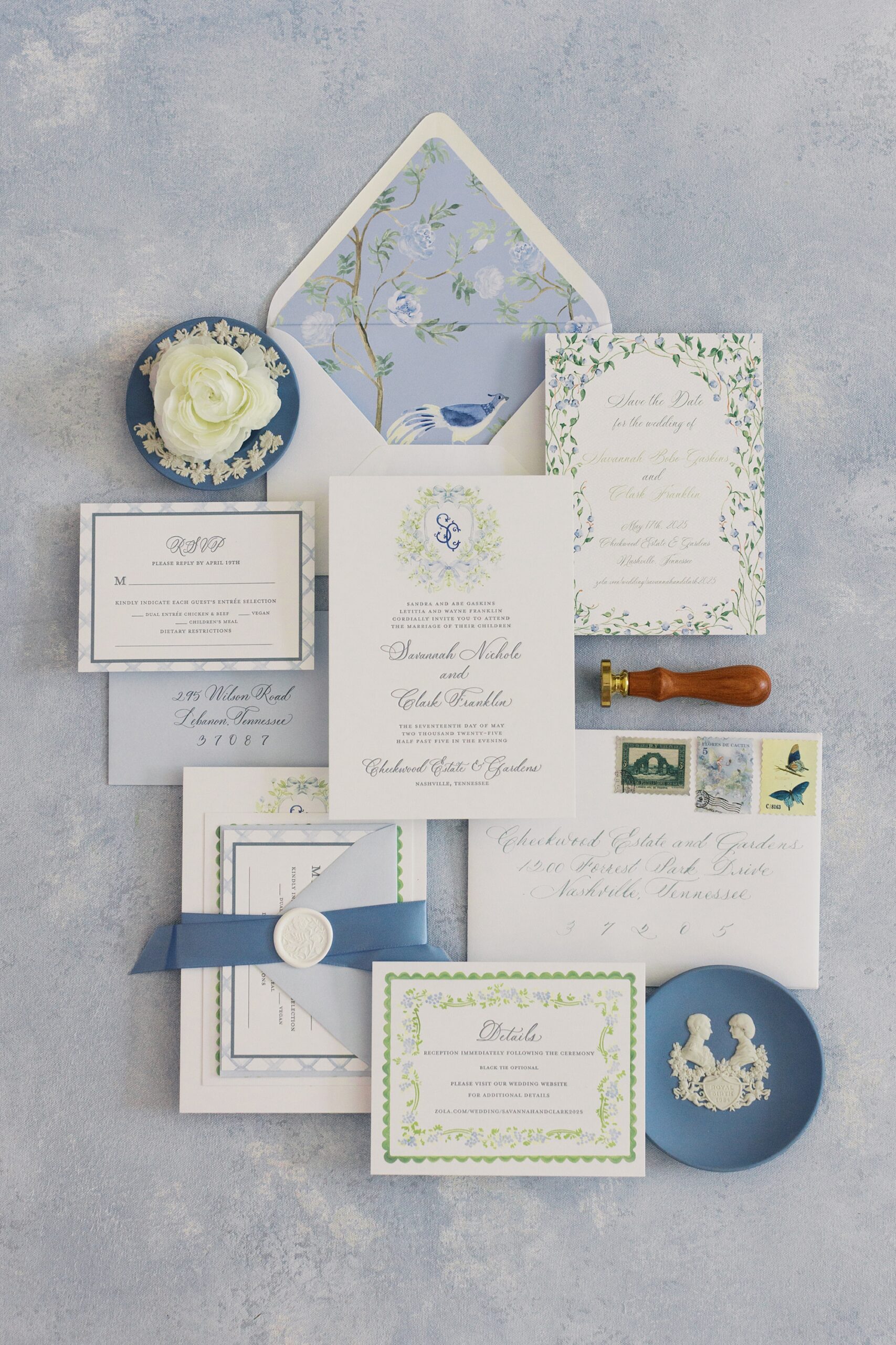
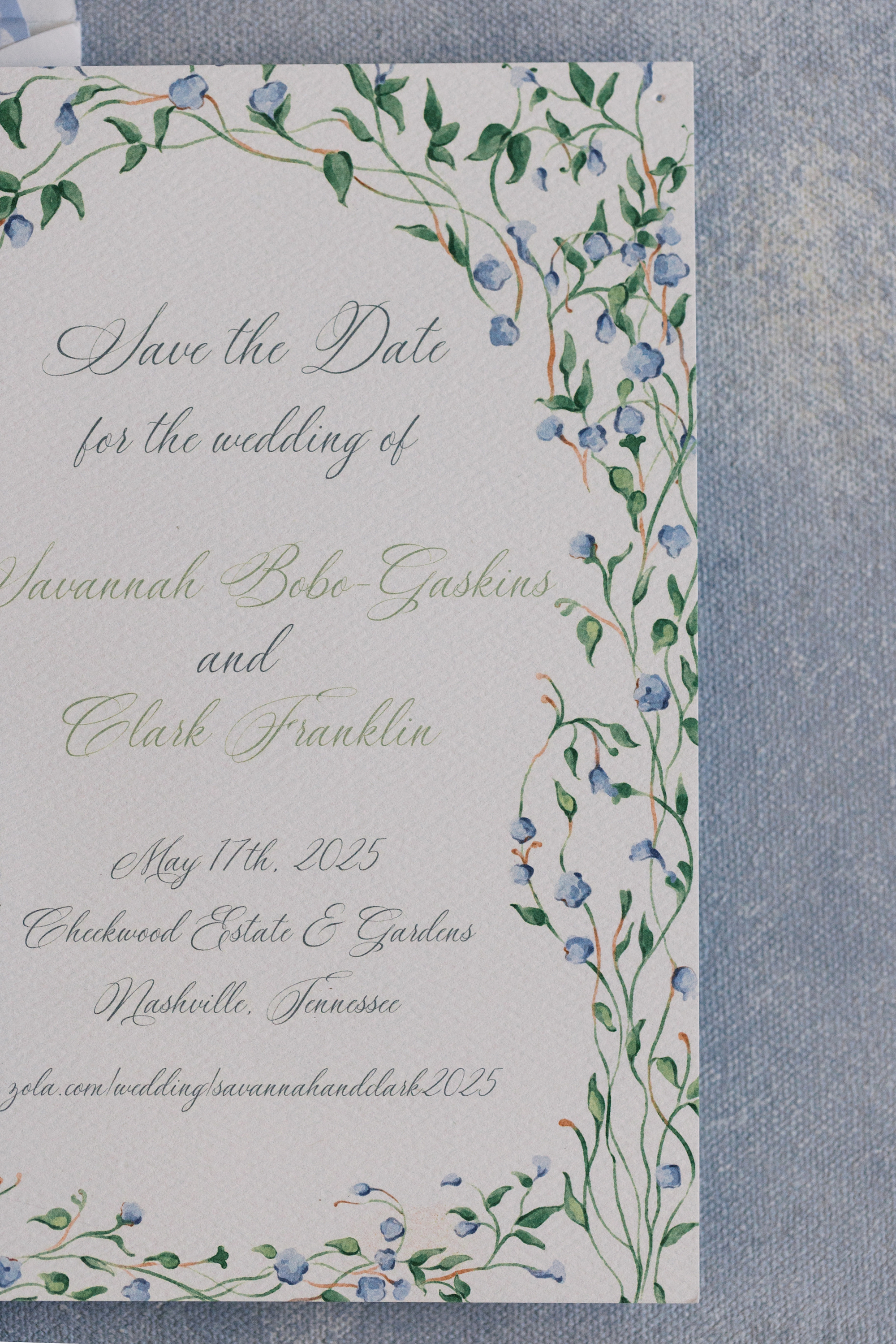
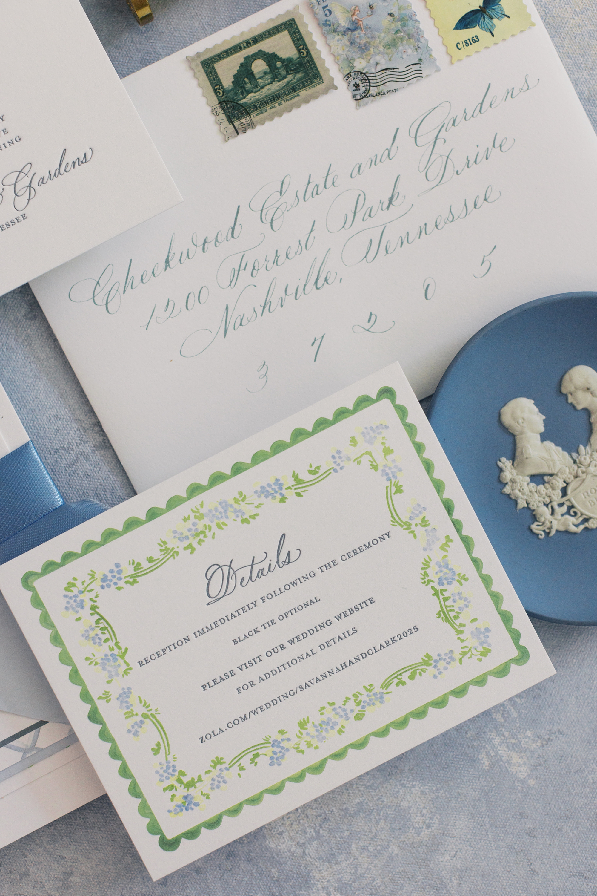
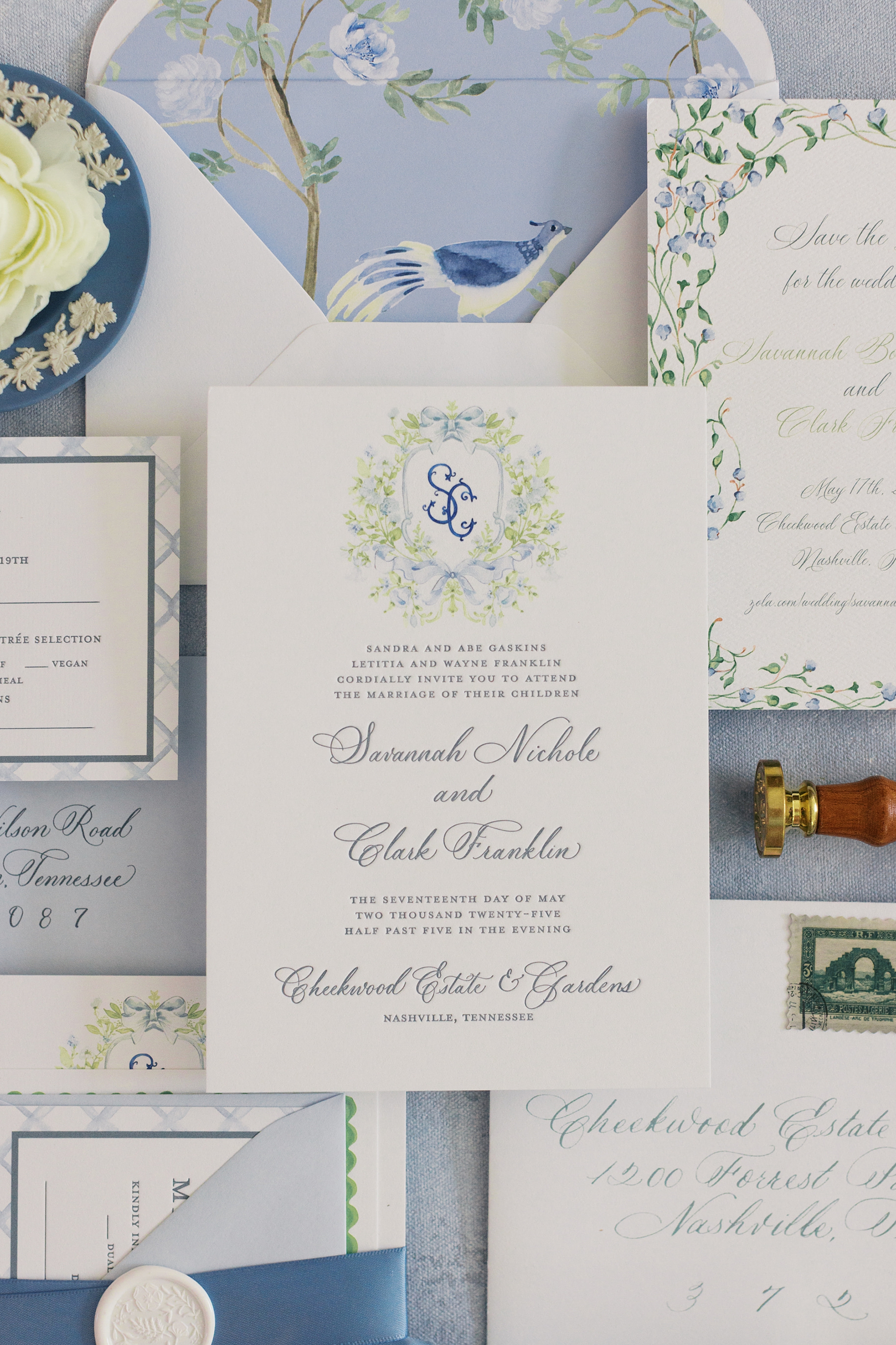
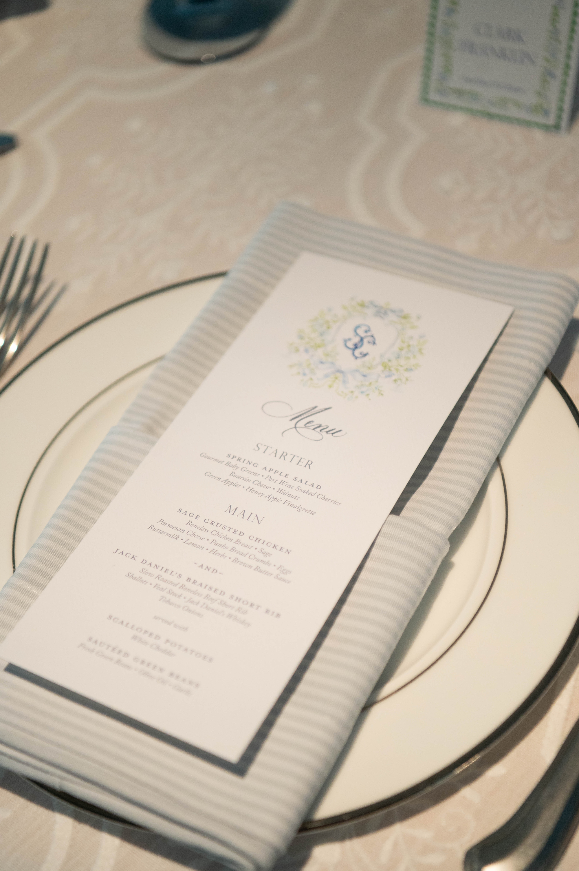
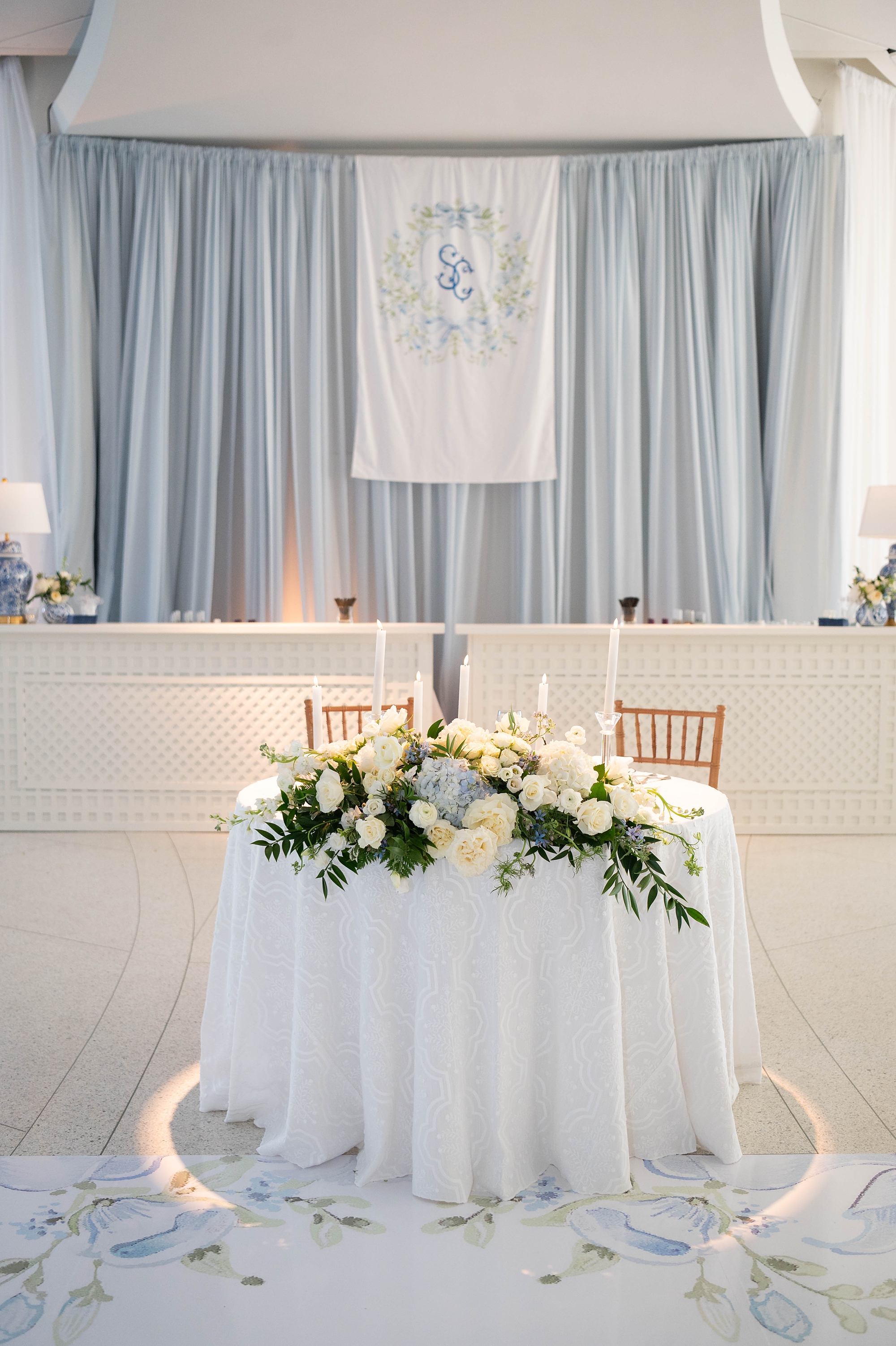
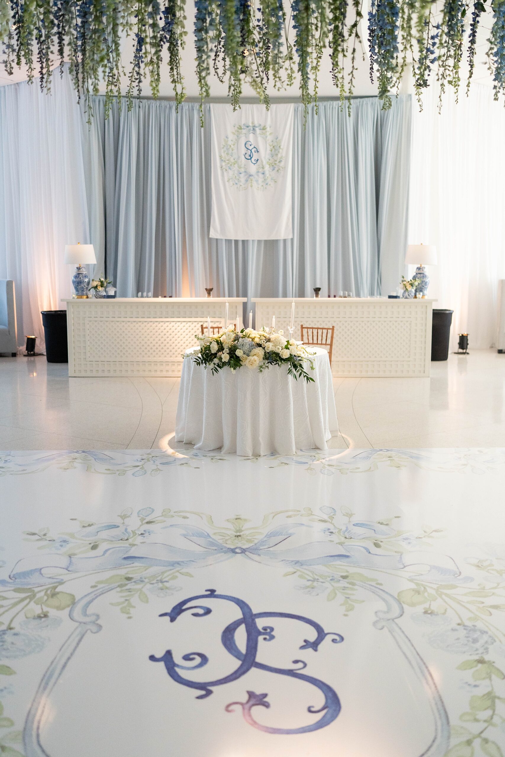
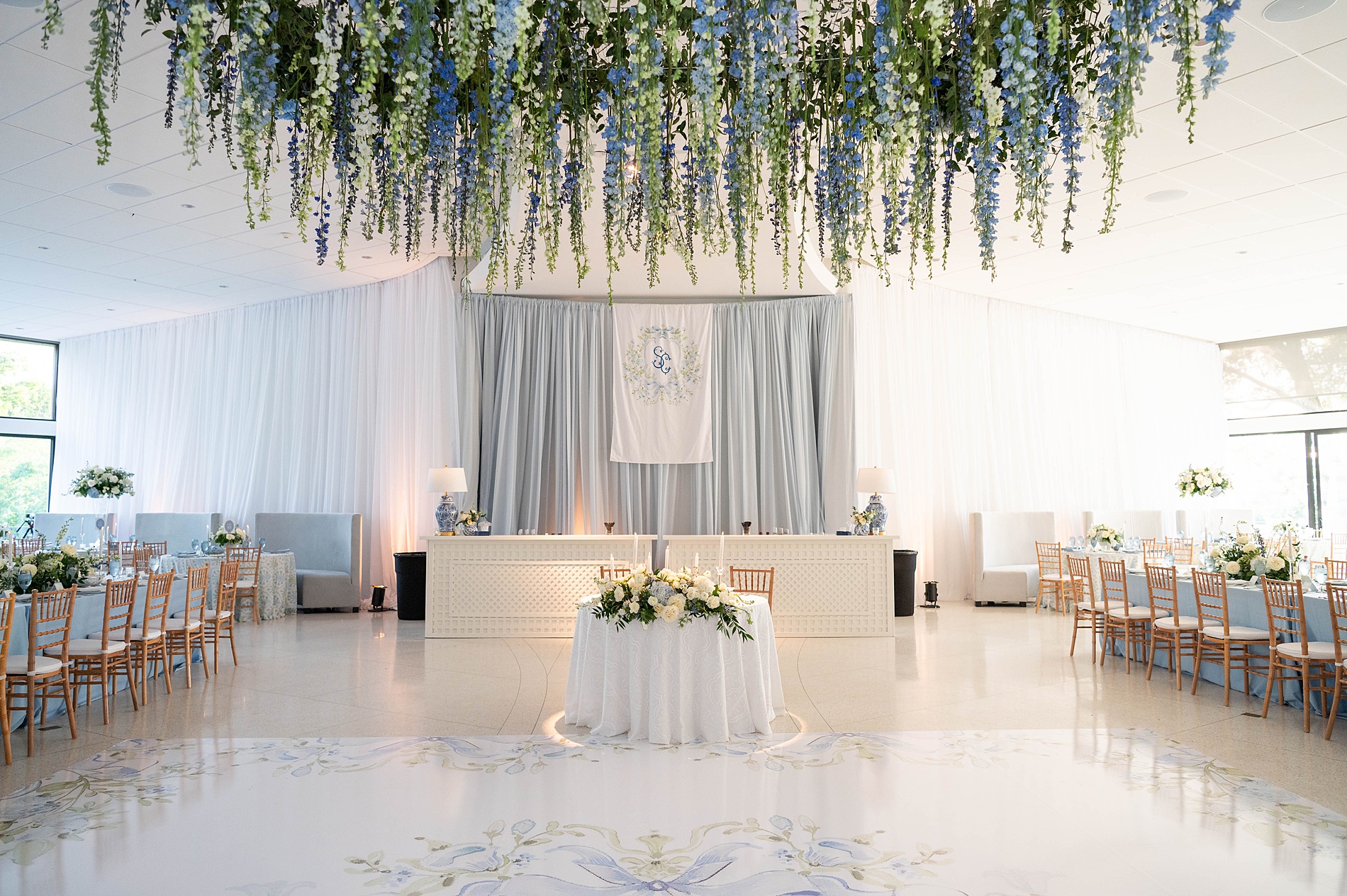
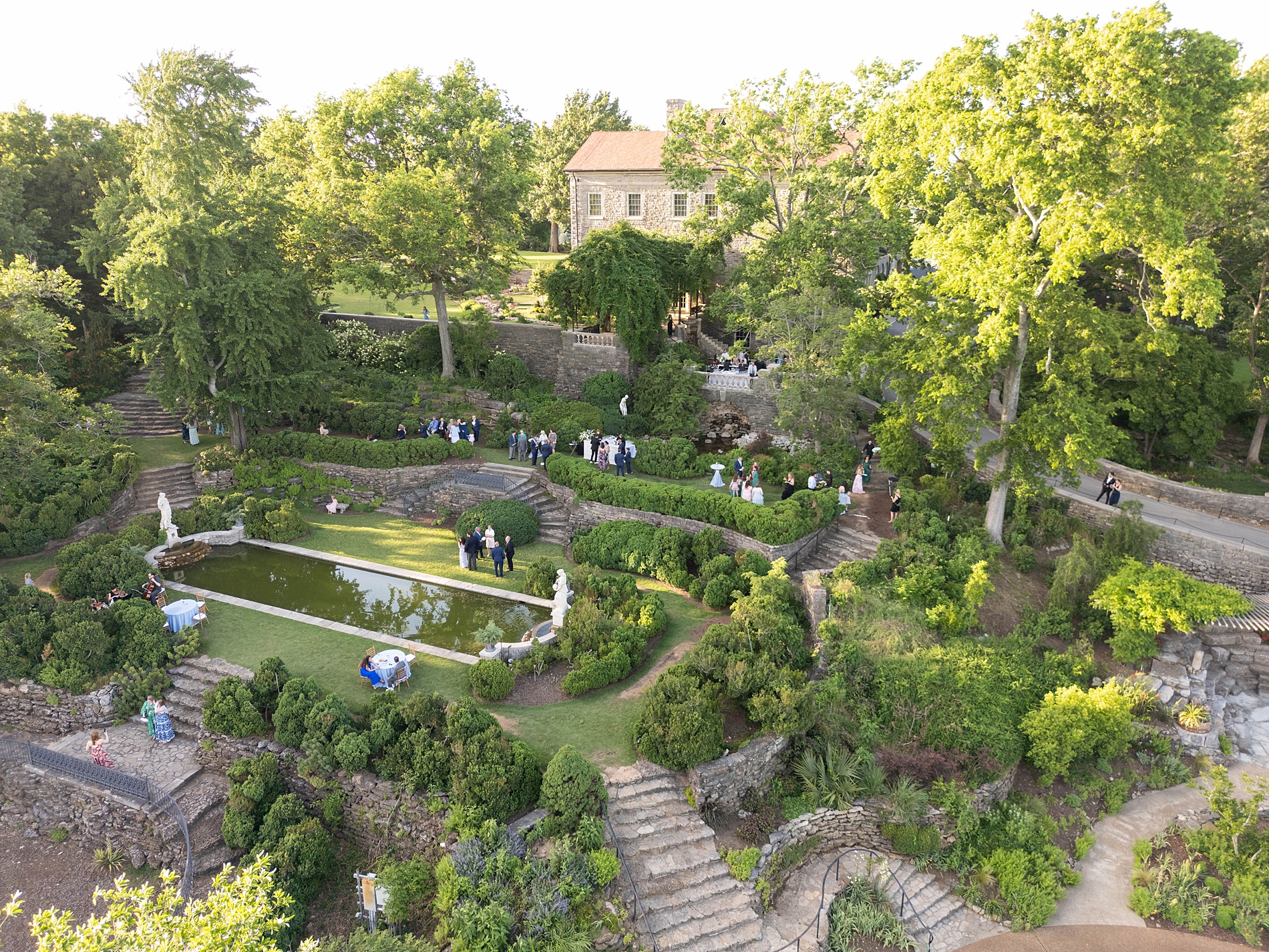
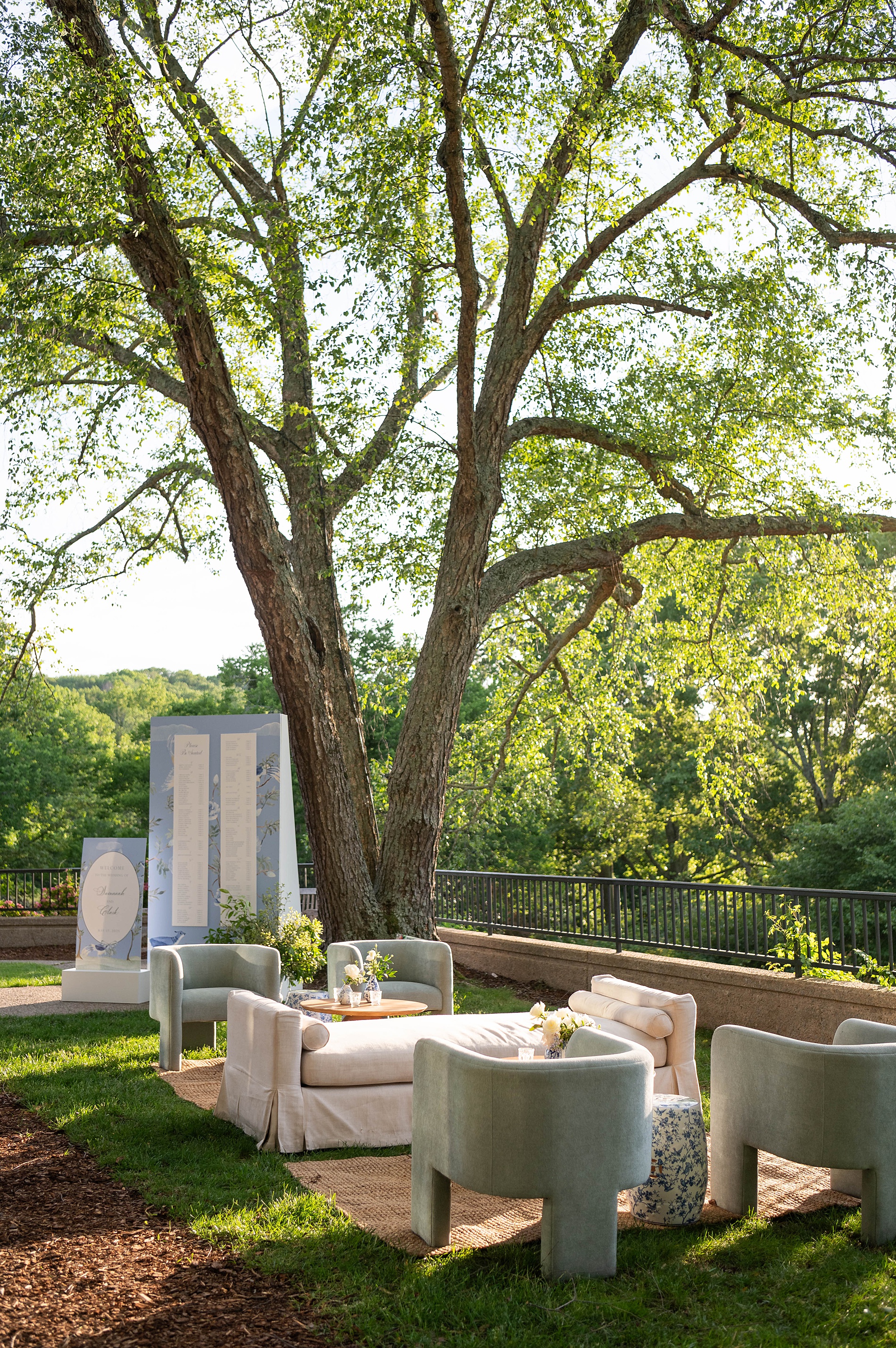
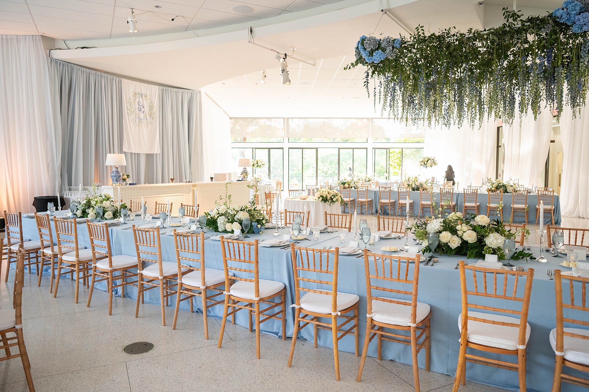
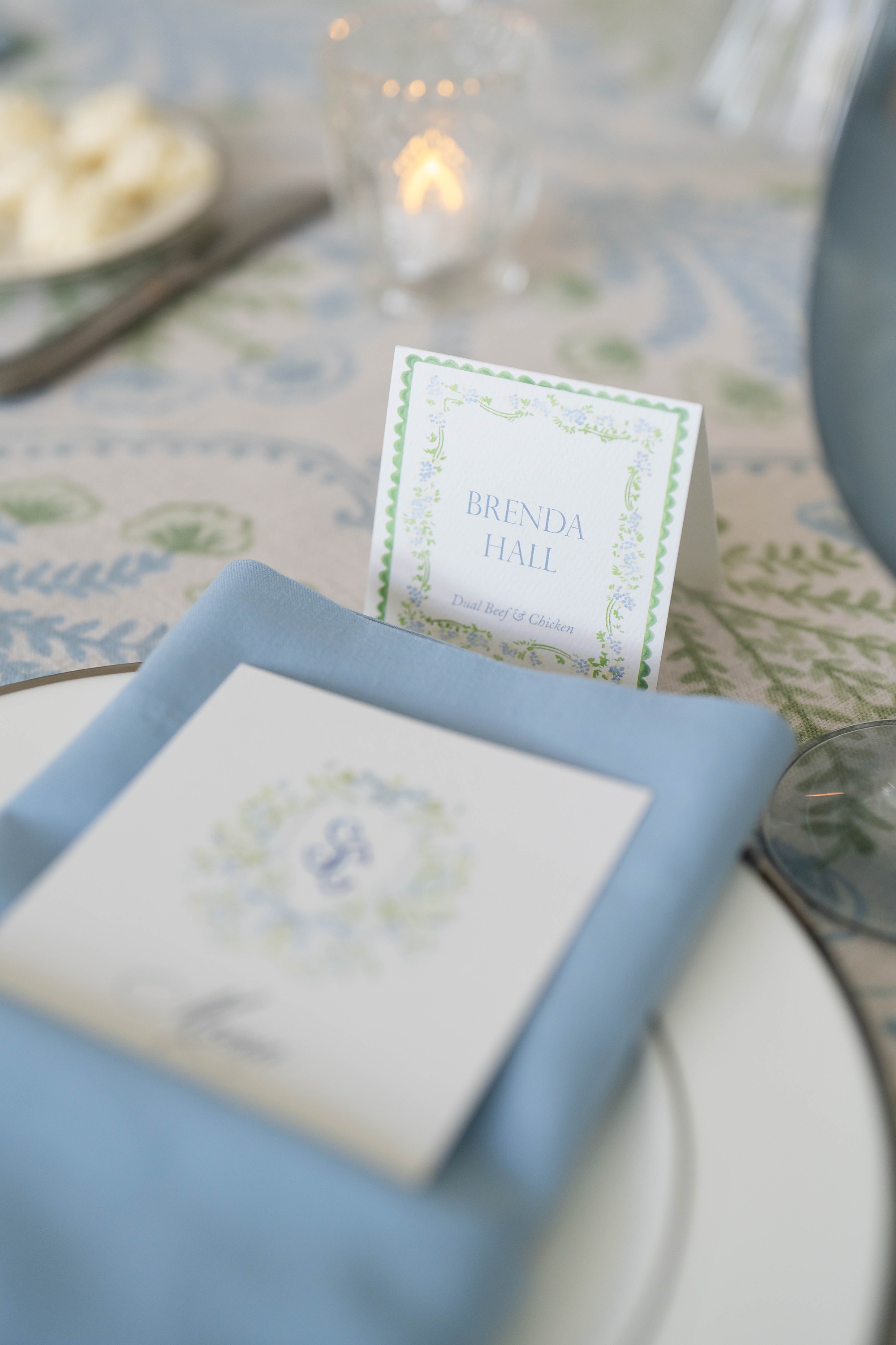
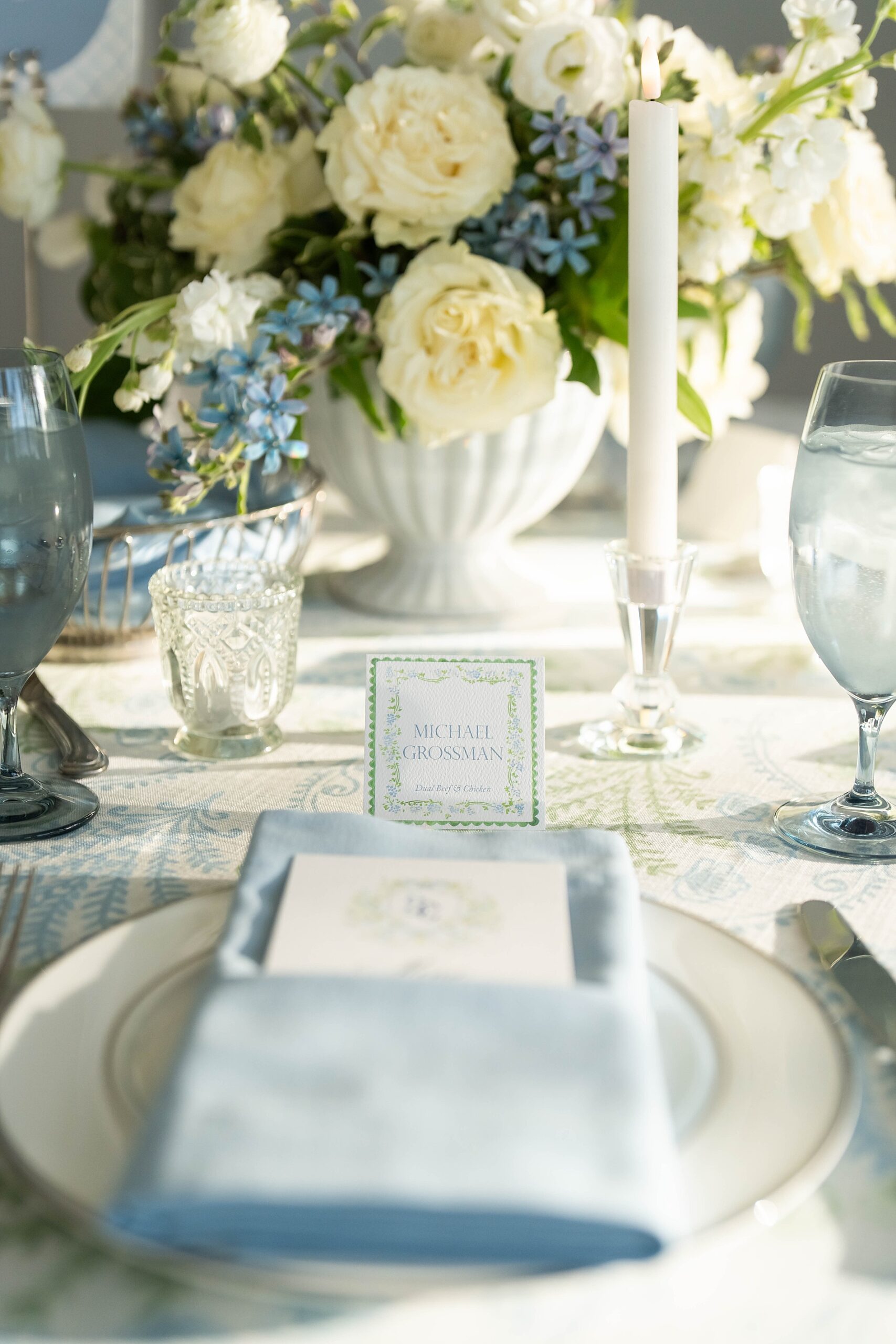
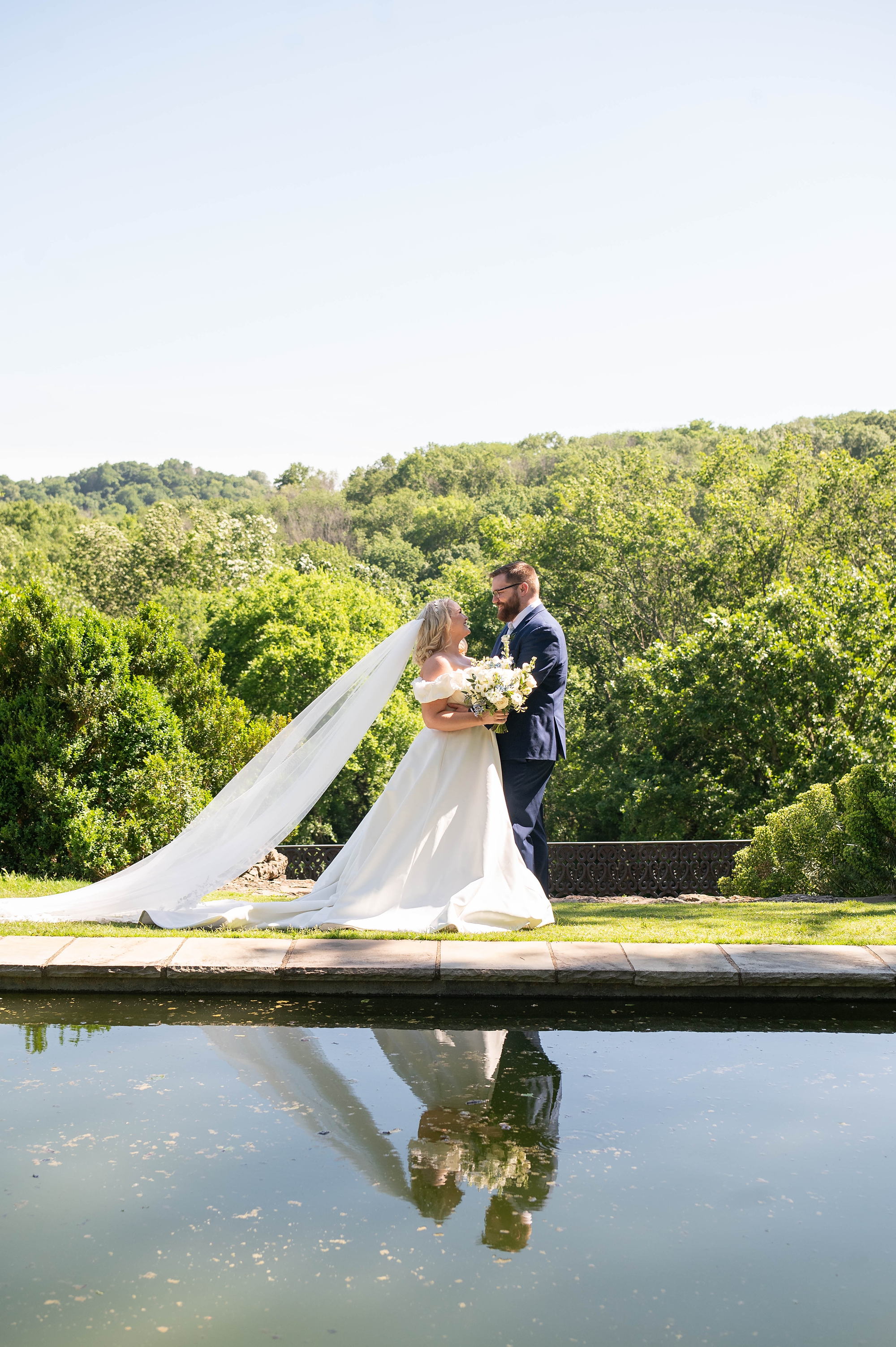
At White Ink Calligraphy + Co., we specialize in creating custom wedding stationery and event details that tell your love story from the very first impression to the last dance of the evening. This elegant spring wedding at Cheekwood Estate and Gardens in Nashville was a perfect example of how thoughtful design can transform a celebration into something unforgettable.
Elegant Spring Wedding Details
The couple chose a dreamy palette of light blue, white, and soft green accents, perfectly suited for Cheekwood’s lush spring gardens. We carried these colors throughout their entire wedding stationery suite and event signage for a cohesive, elevated look.
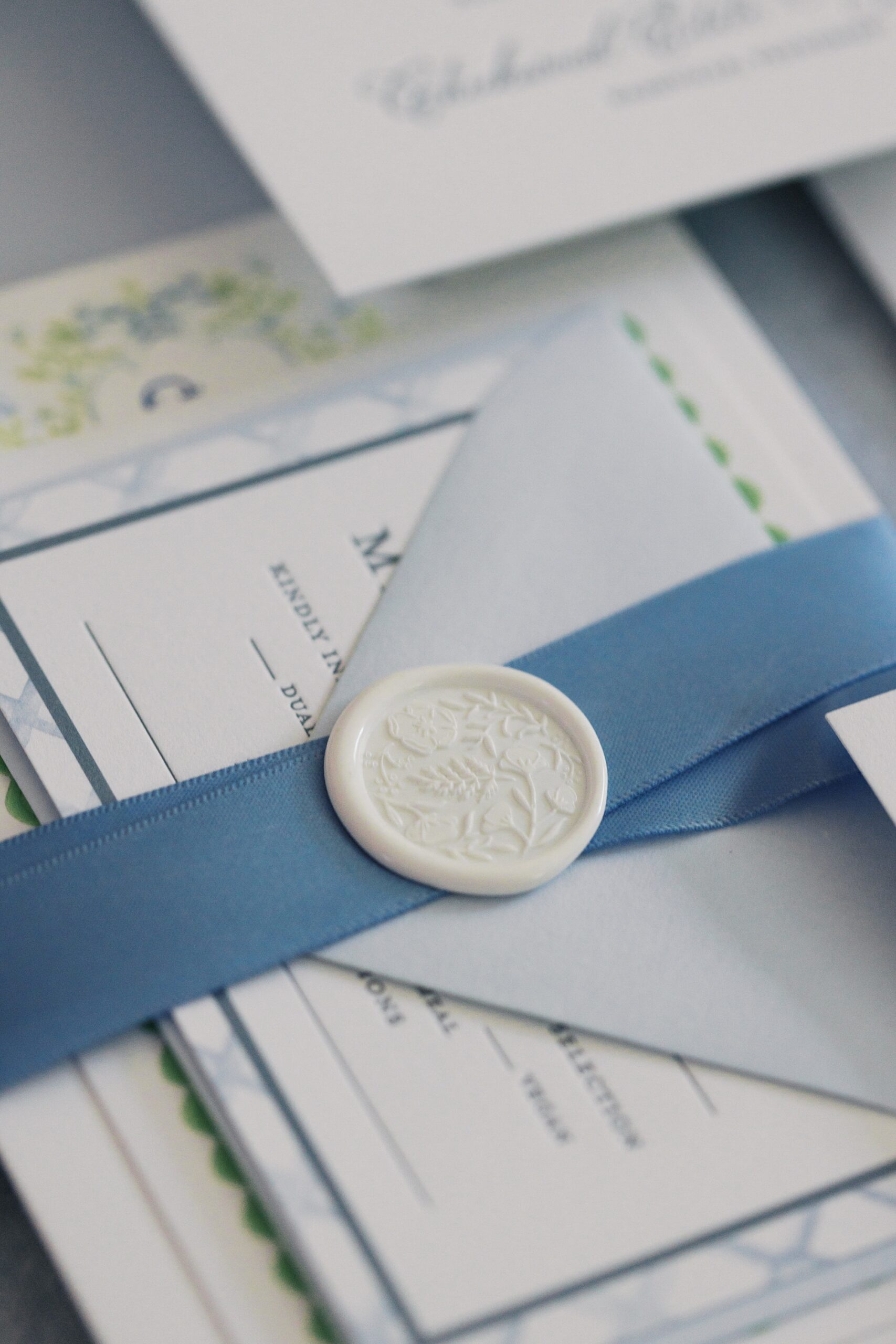
Wedding Invitations | Grand Millennial Maximalism Meets Timeless Elegance
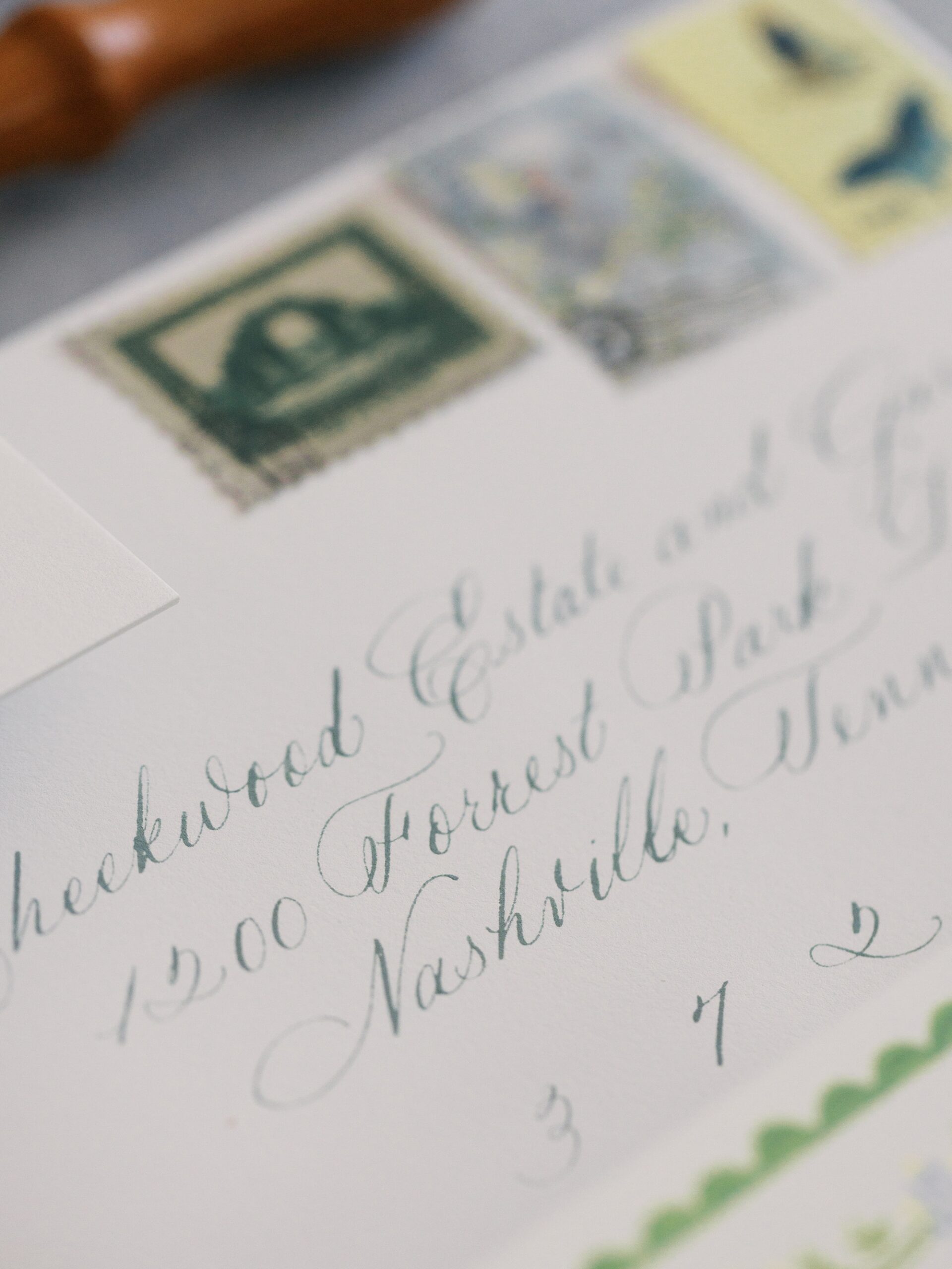
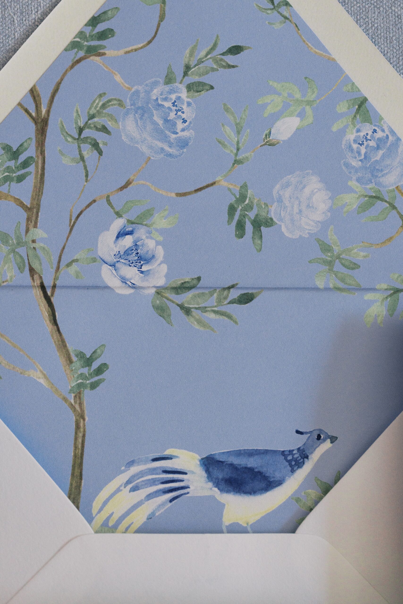
We started with their invitation suite. Featuring letterpress printing, a custom monogram, and an intricate envelope liner adorned with a bird illustration, the design was a nod to grand millennial maximalism. If you aren’t familiar with this design term, it is a trending style right now that combines more traditional elements with a modern twist, creating a detailed, yet polished and refined style.
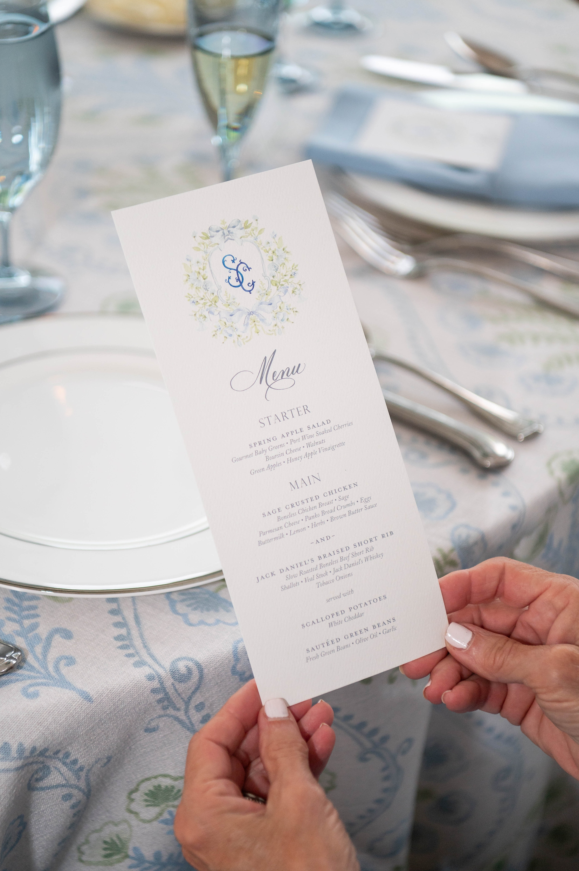
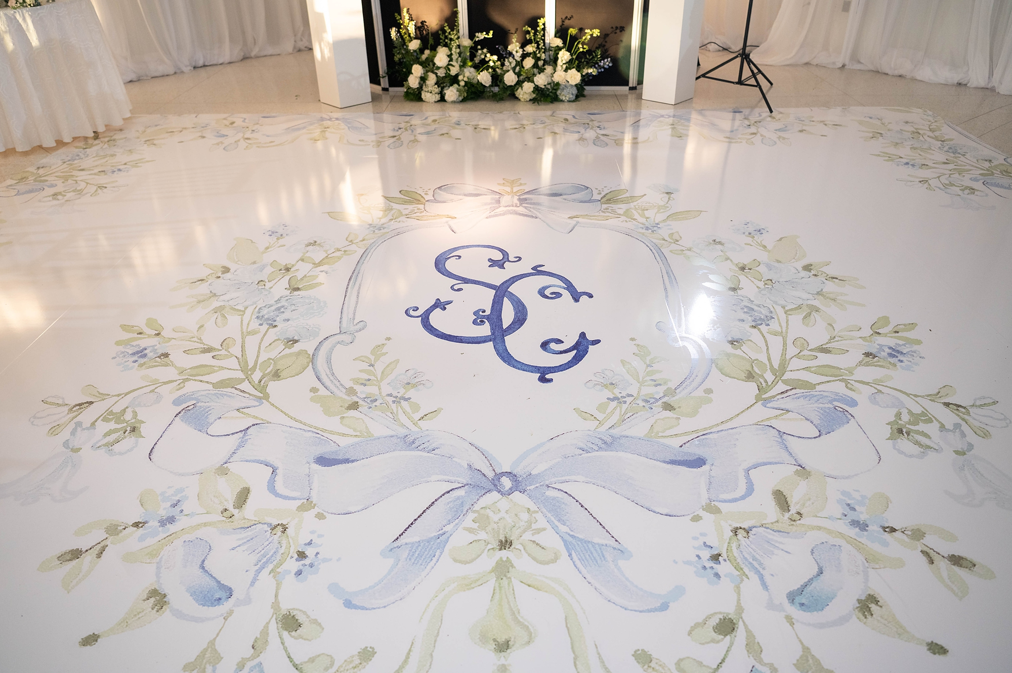
The Custom Monogram
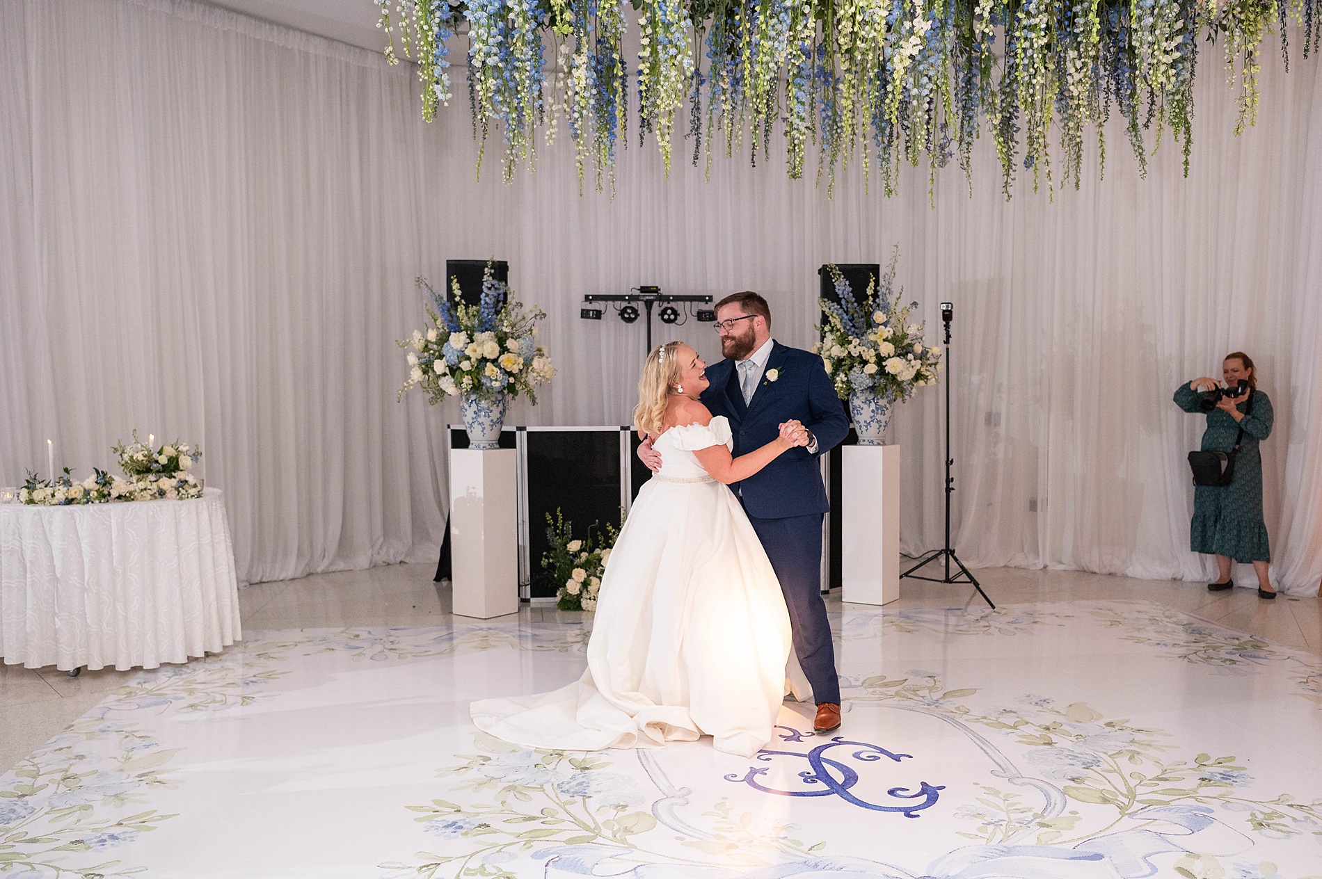
That custom monogram we designed on the invite became a signature design element for the wedding day. It appeared on the menus at each guest’s place setting, a stunning fabric backdrop at the reception, and, my favorite, on the dance floor wrap itself! Seeing our design come to life in such a grand format was a true “pinch-me” moment.
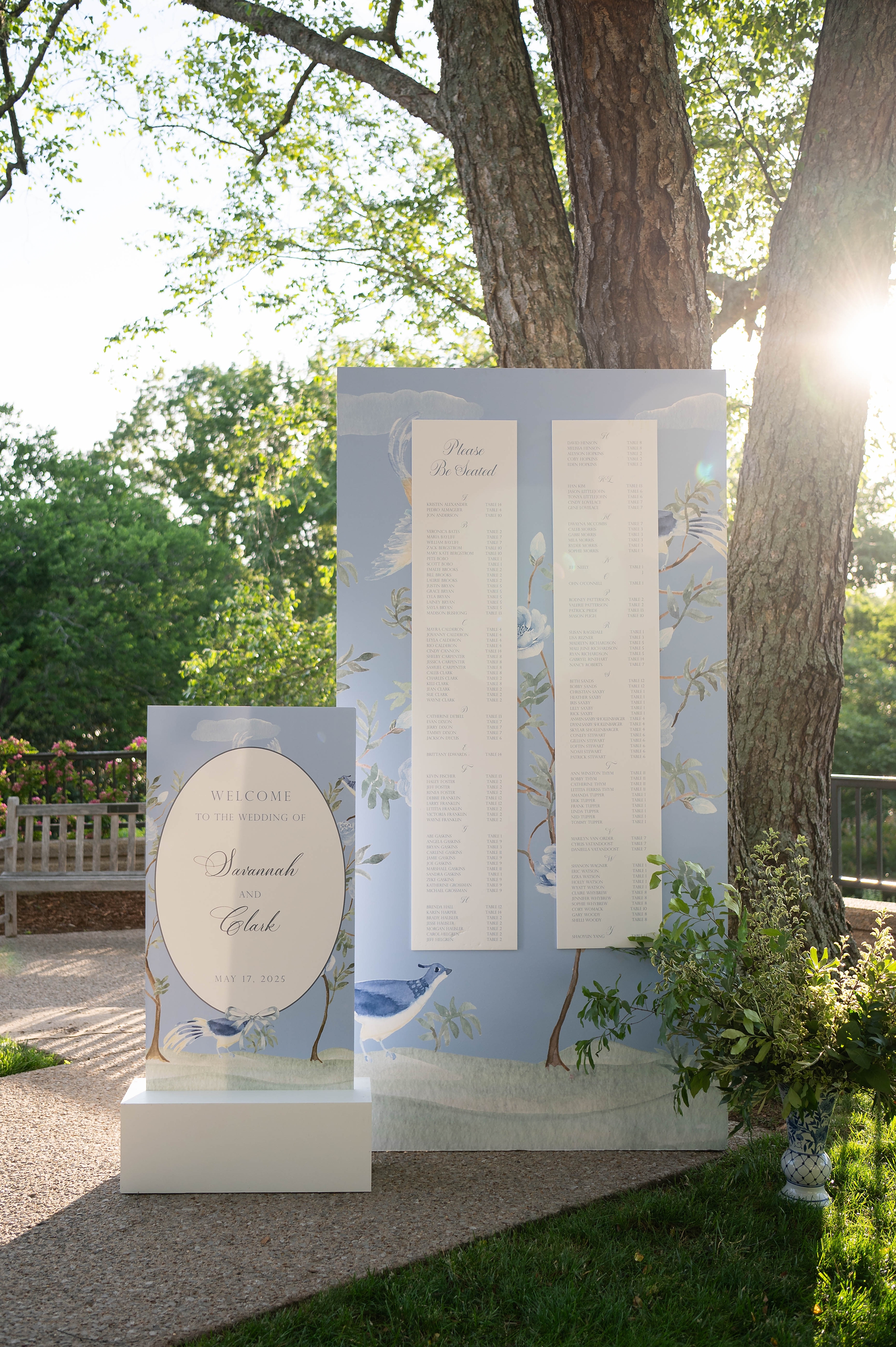
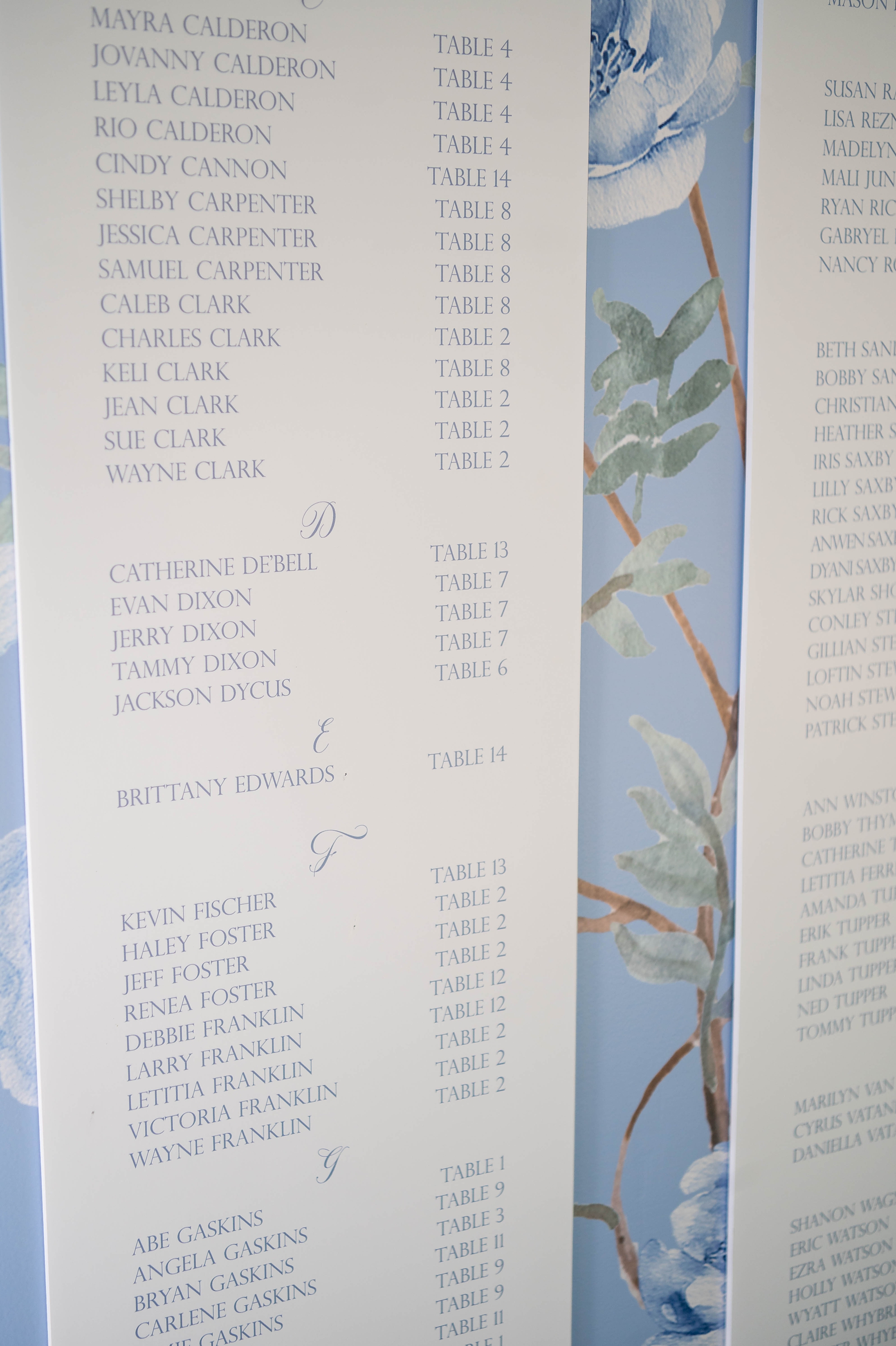
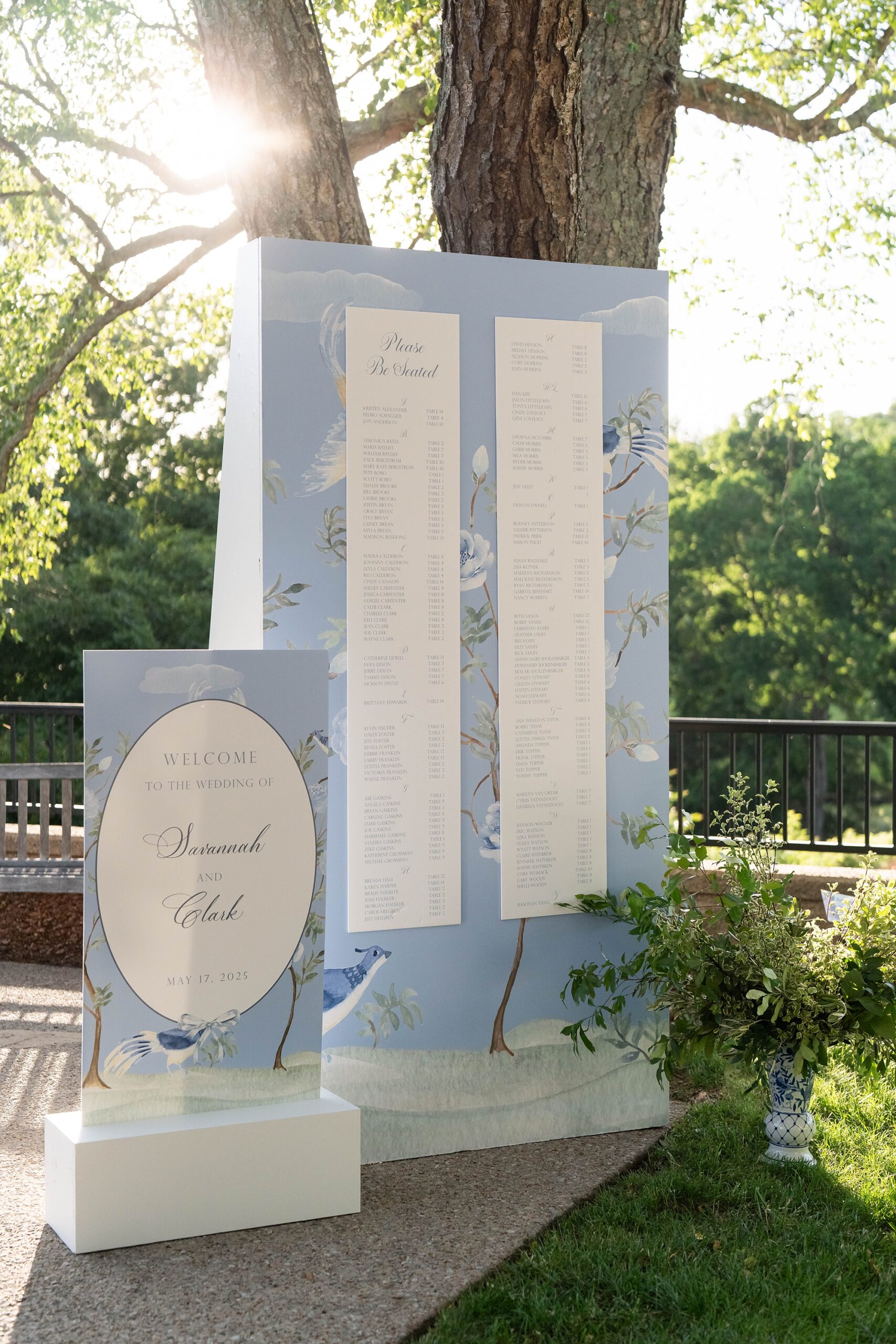
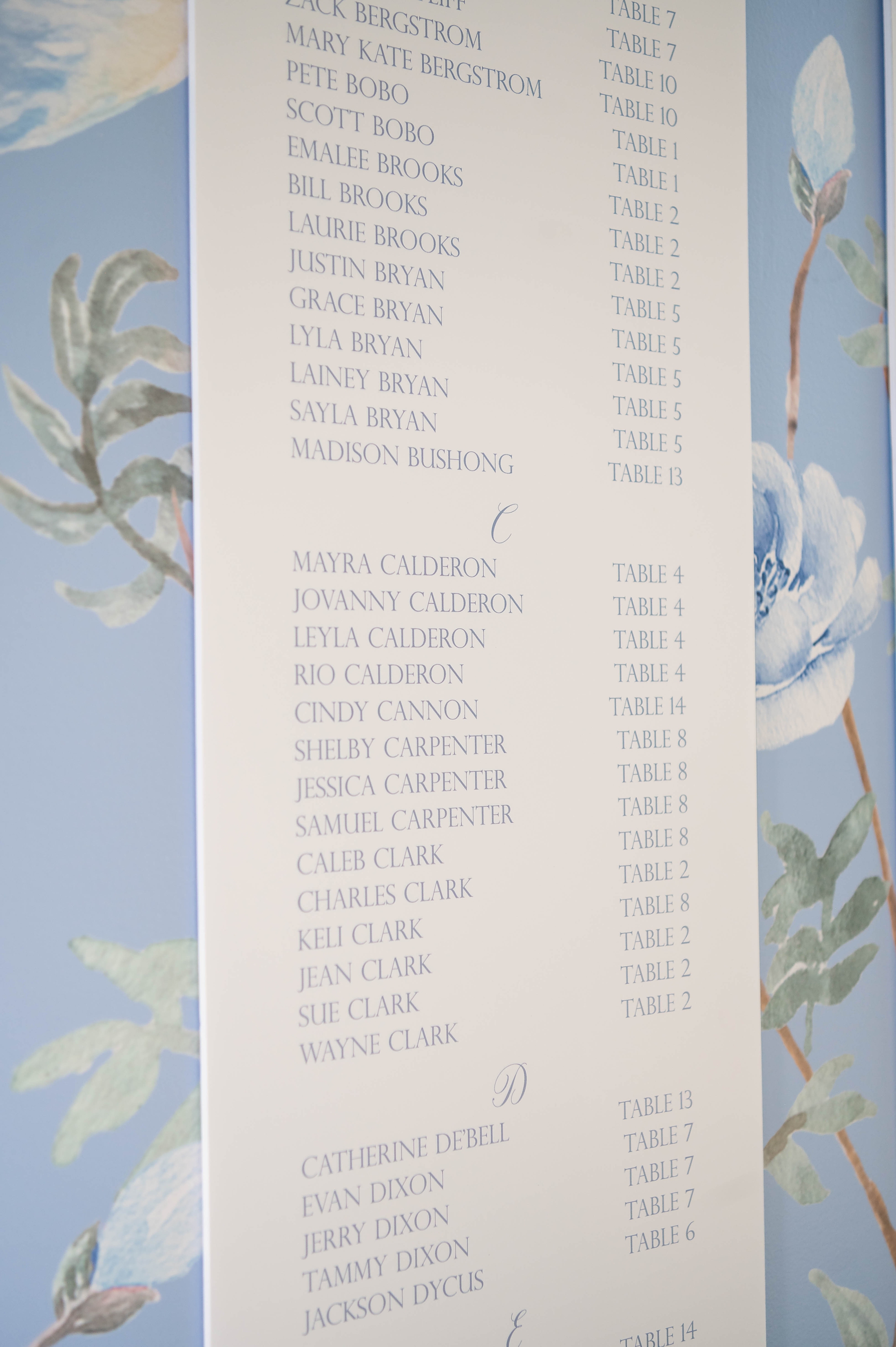
Statement Seating Chart & Welcome Sign
The seating chart was a showstopper! This elegant, tall display had guest names written in light blue calligraphy on a crisp white background. We framed the chart with the same floral-and-bird artwork from the envelope liner, creating a sense of connection between the invitations and the reception space.
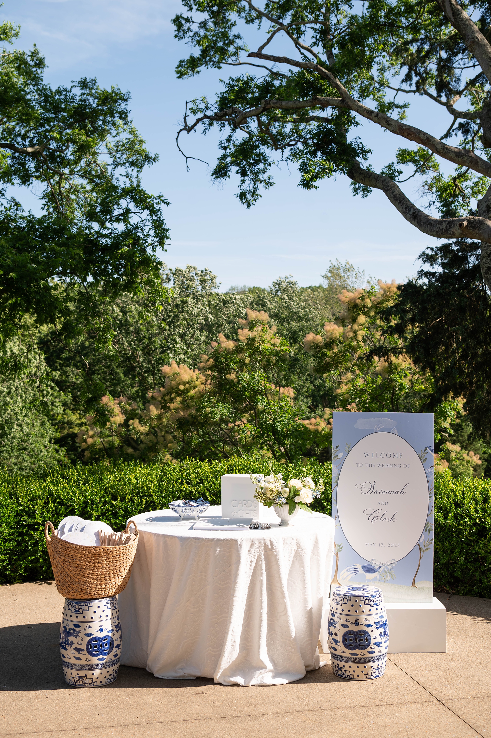
The welcome sign echoed this same border detail, featuring a white oval center with the wording placed inside. It greeted guests and set the tone for the celebration ahead.
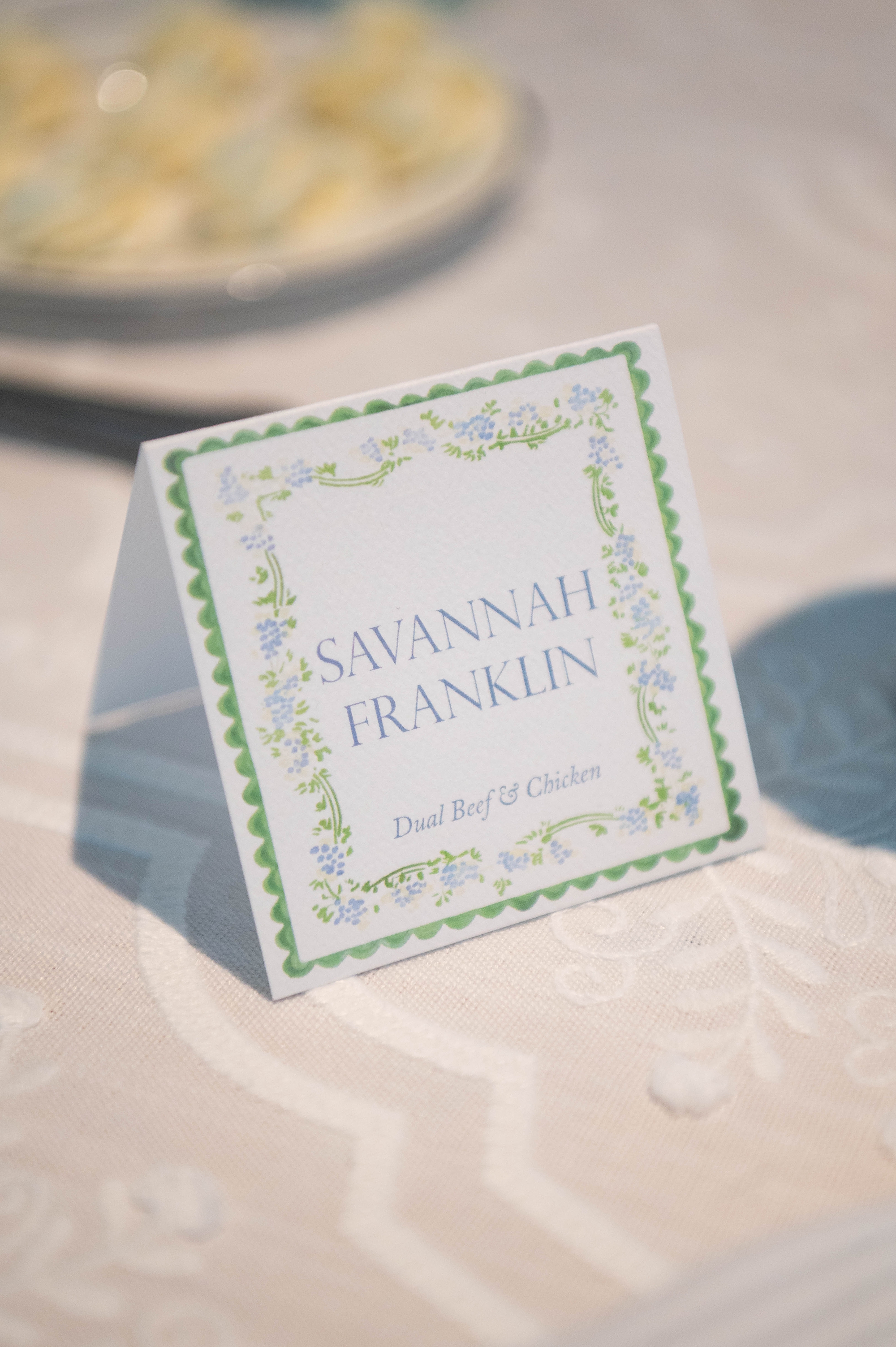
Place Cards with a Pop of Color
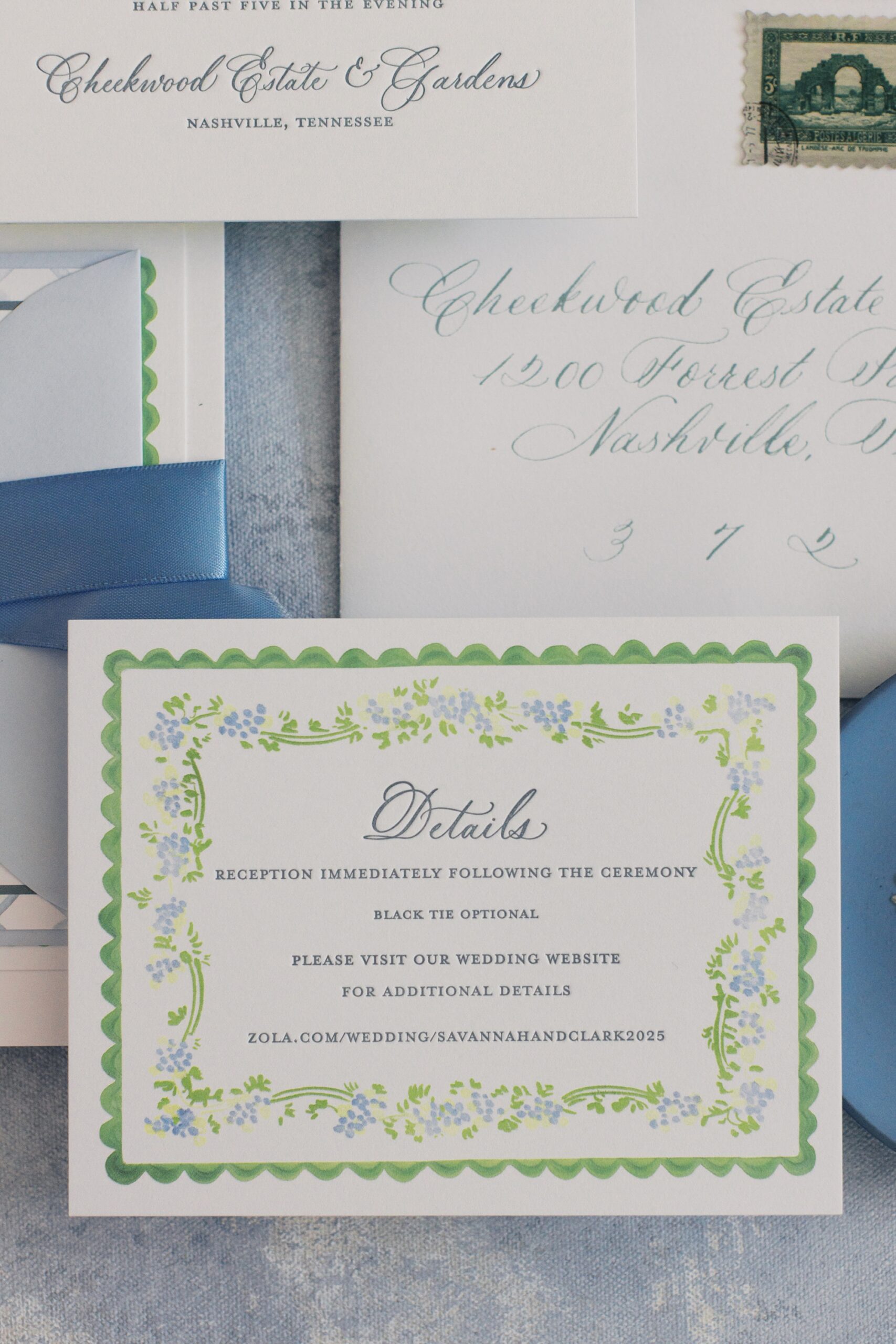
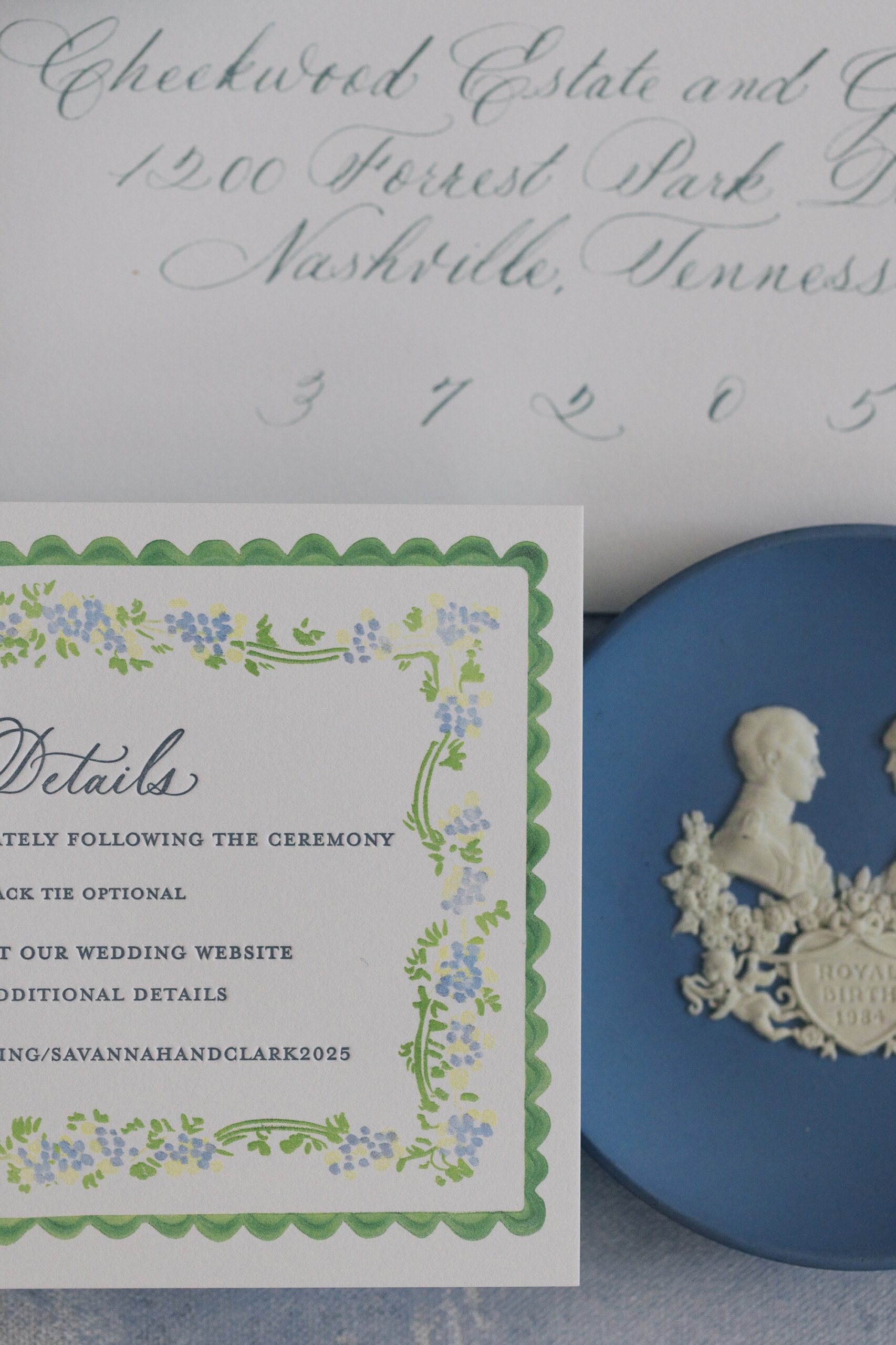
For the place cards, folded squares featured guests names in light blue with a soft floral and green border. Peep- The same border design can also be seen on the details card from their invitation suite! This subtle color combination perfectly tied into the tablescape’s springtime elegance, offering a fresh and cheerful finishing touch.
Designing for the Spring Season
When we began designing this suite, it was still the middle of winter, but these invitations gave us serious spring fever and got us SO EXCITED for spring weddings! This wedding was just as beautiful as we imagined and it was an honor to create so many elegant and beautiful details for their Cheekwood wedding day.
If you’re planning a wedding in Nashville, or anywhere in the world, we’d love to help you create meaningful, personalized stationery and event details that tell your story. We work with couples worldwide to design details you and your guests will remember forever. Reach out today to learn more about our full-service wedding and event design offerings! We can’t wait to create something unforgettable for you!
If you enjoyed this post, you’ll love these other blogs:
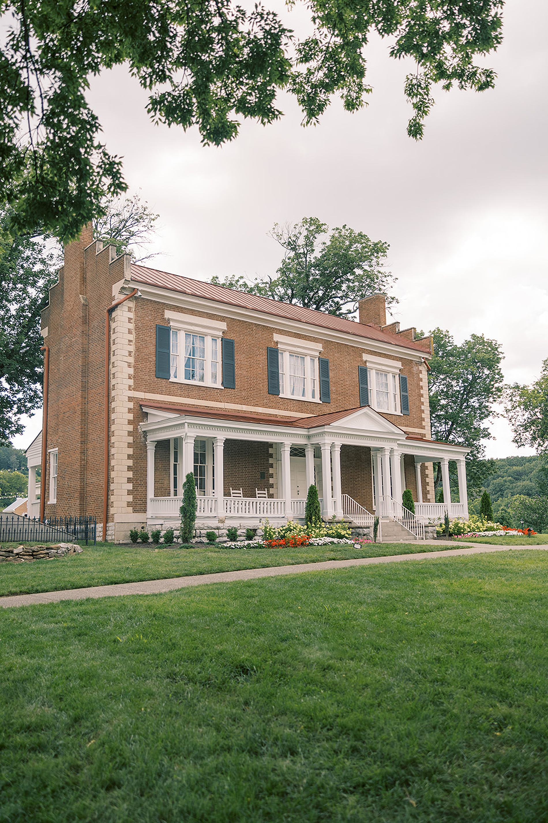
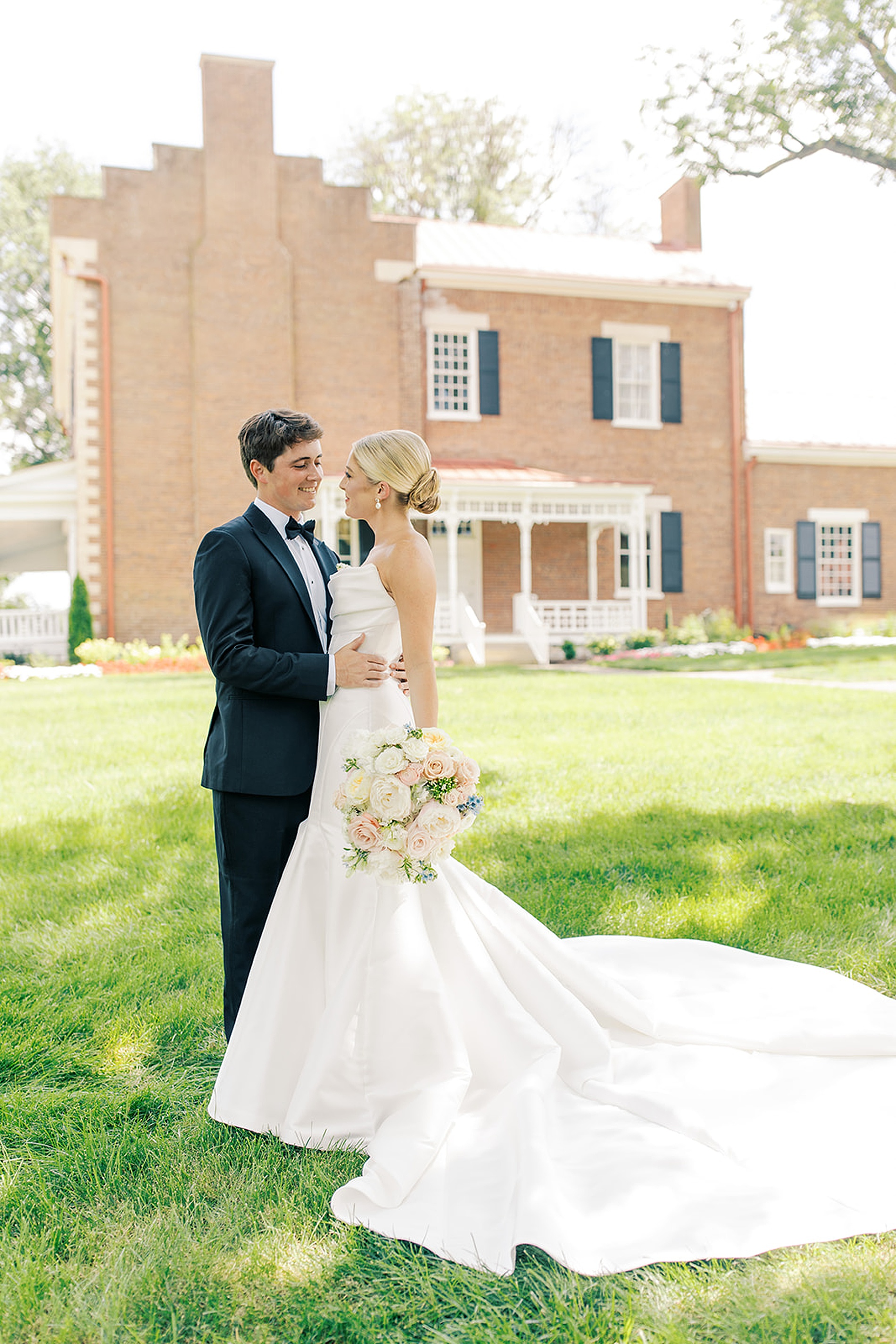
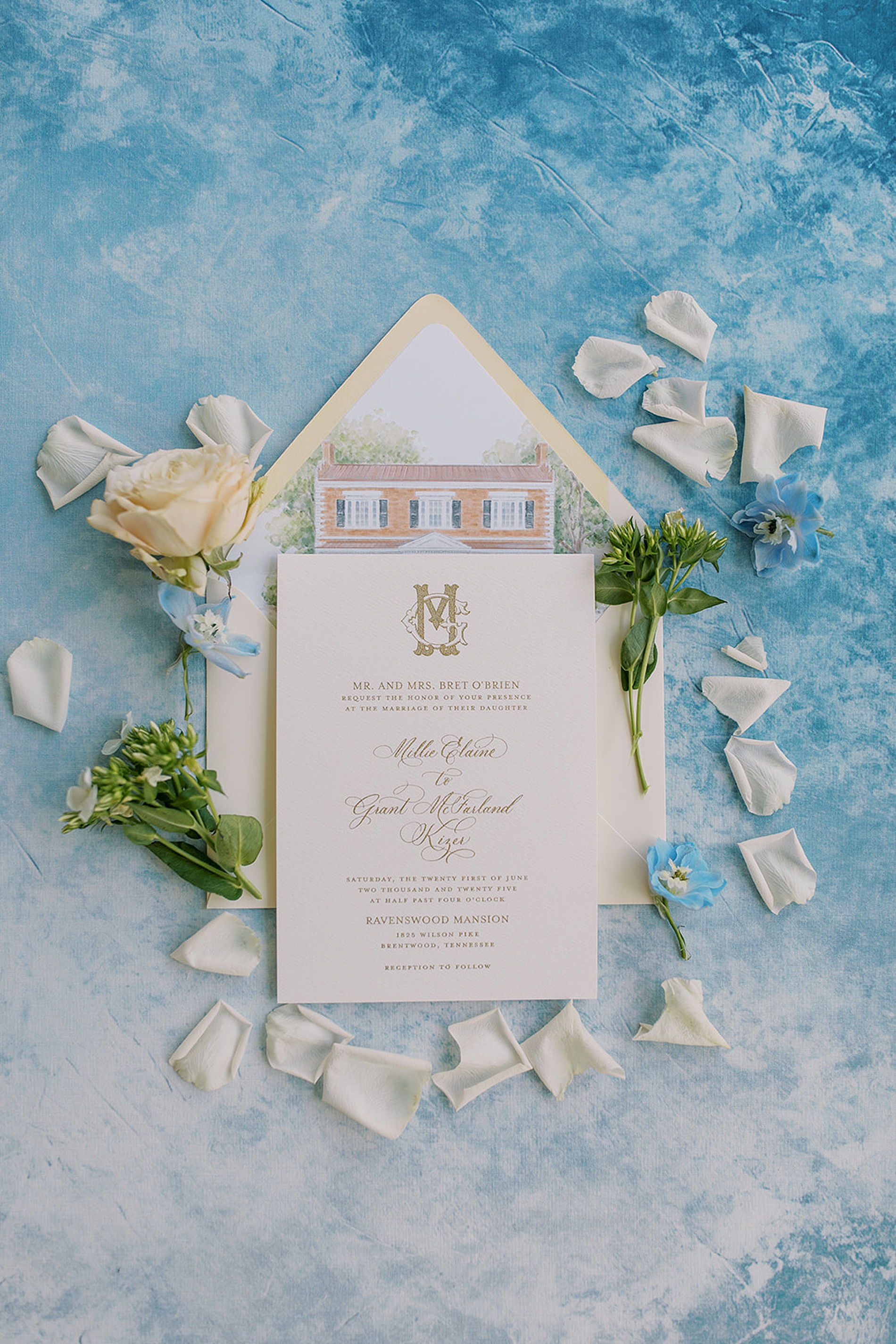
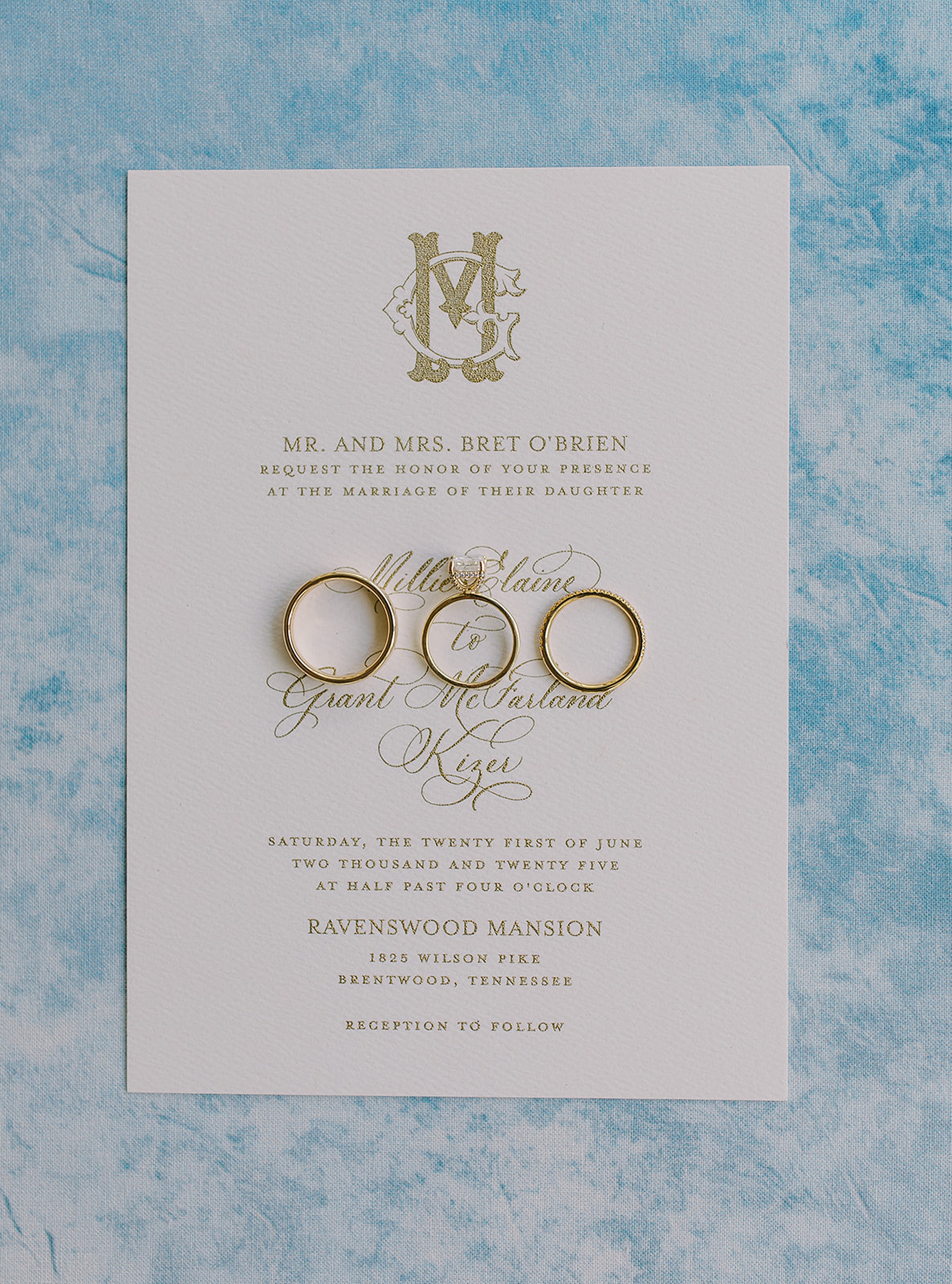
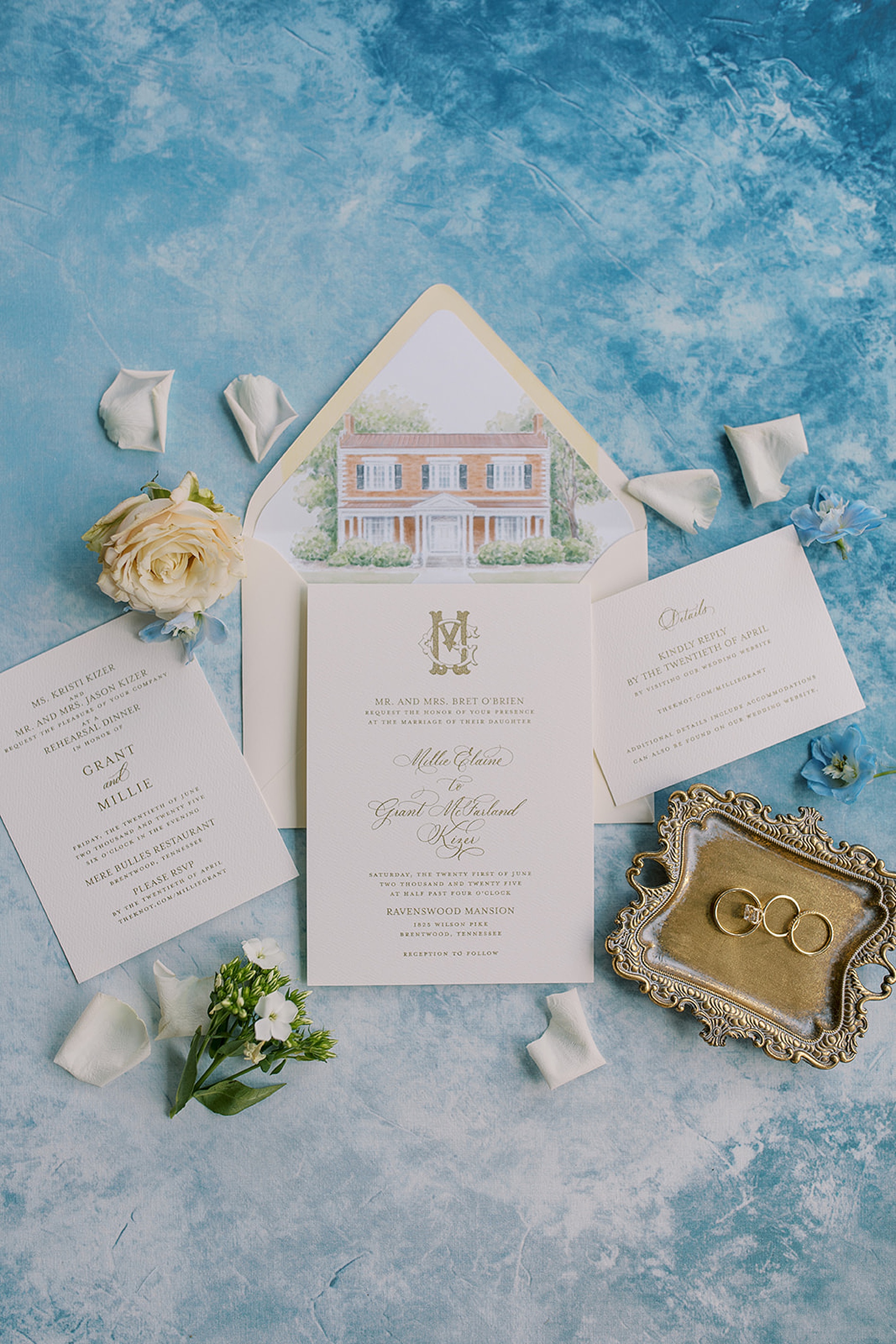
Set against the stately backdrop of Ravenswood Mansion in Brentwood, TN, this colorful garden wedding was a breathtaking blend of timeless design and heartfelt celebration. We had the joy of designing a variety of paper goods and signage for this stunning wedding day. Gold took center stage in all the designs and was thoughtfully woven into a variety of elements. Classic gold wedding details and accents played a part in bringing this stunning, garden-inspired wedding to life.
A Gold-Kissed Invitation Suite
The invitation suite truly set the tone for the day with an elegant mix of gold calligraphy and classic styling. One of our favorite moments from this invite was the custom sketch of Ravenswood Mansion that lined each envelope! It was an inviting nod to the historic beauty of the venue. The couple’s custom monogram added a layer of sophistication, making its debut on the invitation and reappearing throughout the wedding day for a cohesive, elevated look.
Day-of Details
That same monogram reappeared on the couple’s wedding programs, which echoed the gold-ink design of the invitation but with a soft floral border that added a romantic, garden-inspired flair.
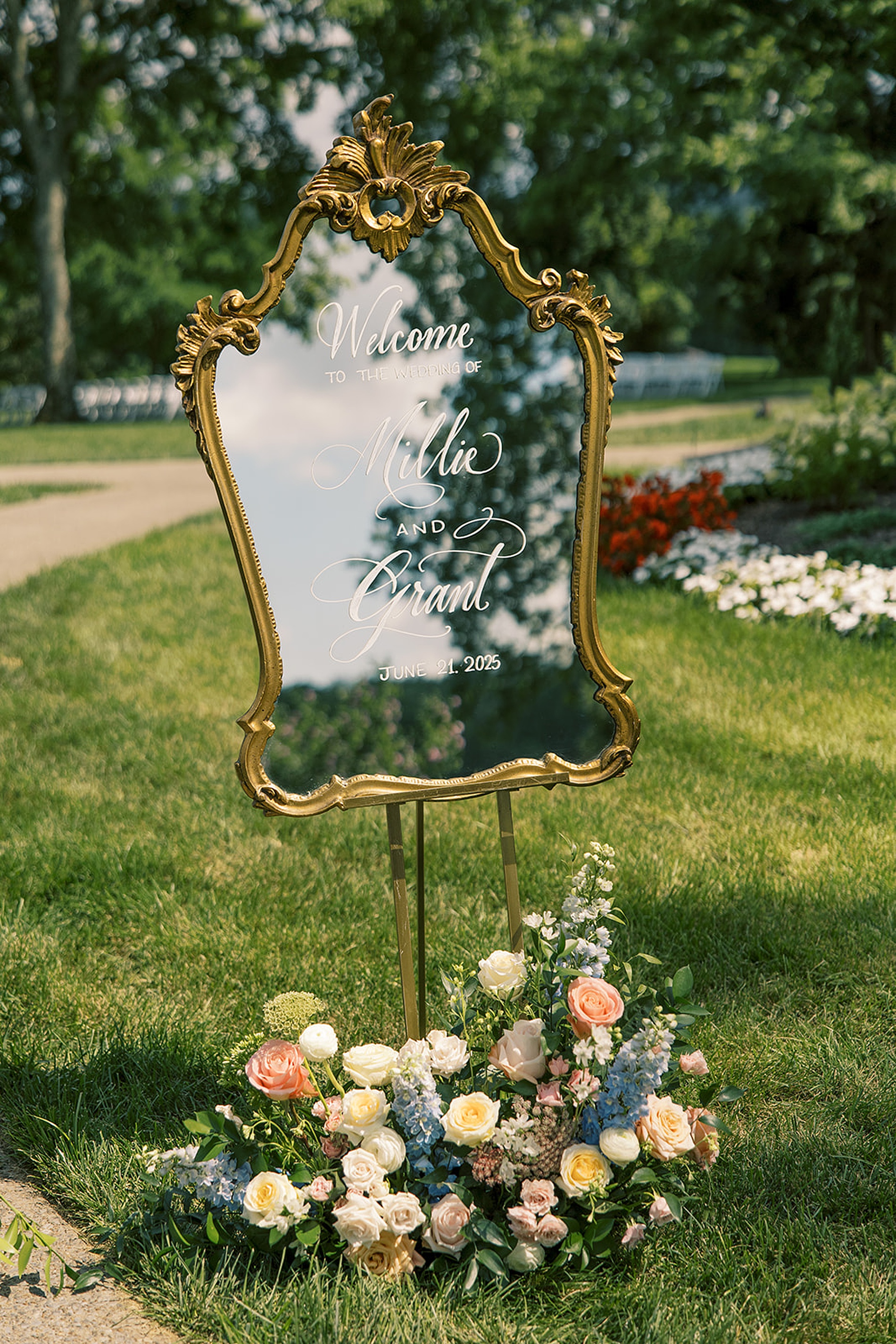
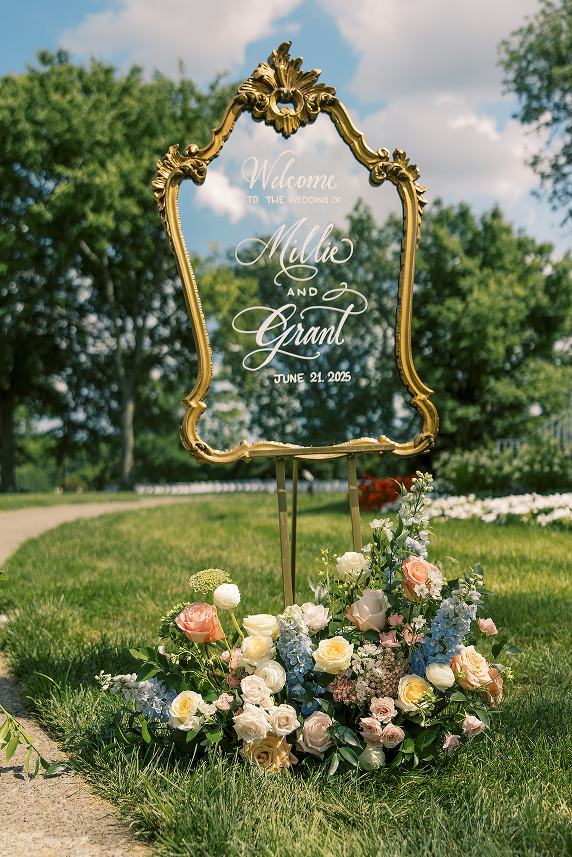
A gold-framed mirror welcome sign greeted guests as they arrived, setting the tone for the refined celebration ahead. The full-length mirror seating chart, also displayed in an ornate gold frame, guided guests gracefully to their seats.
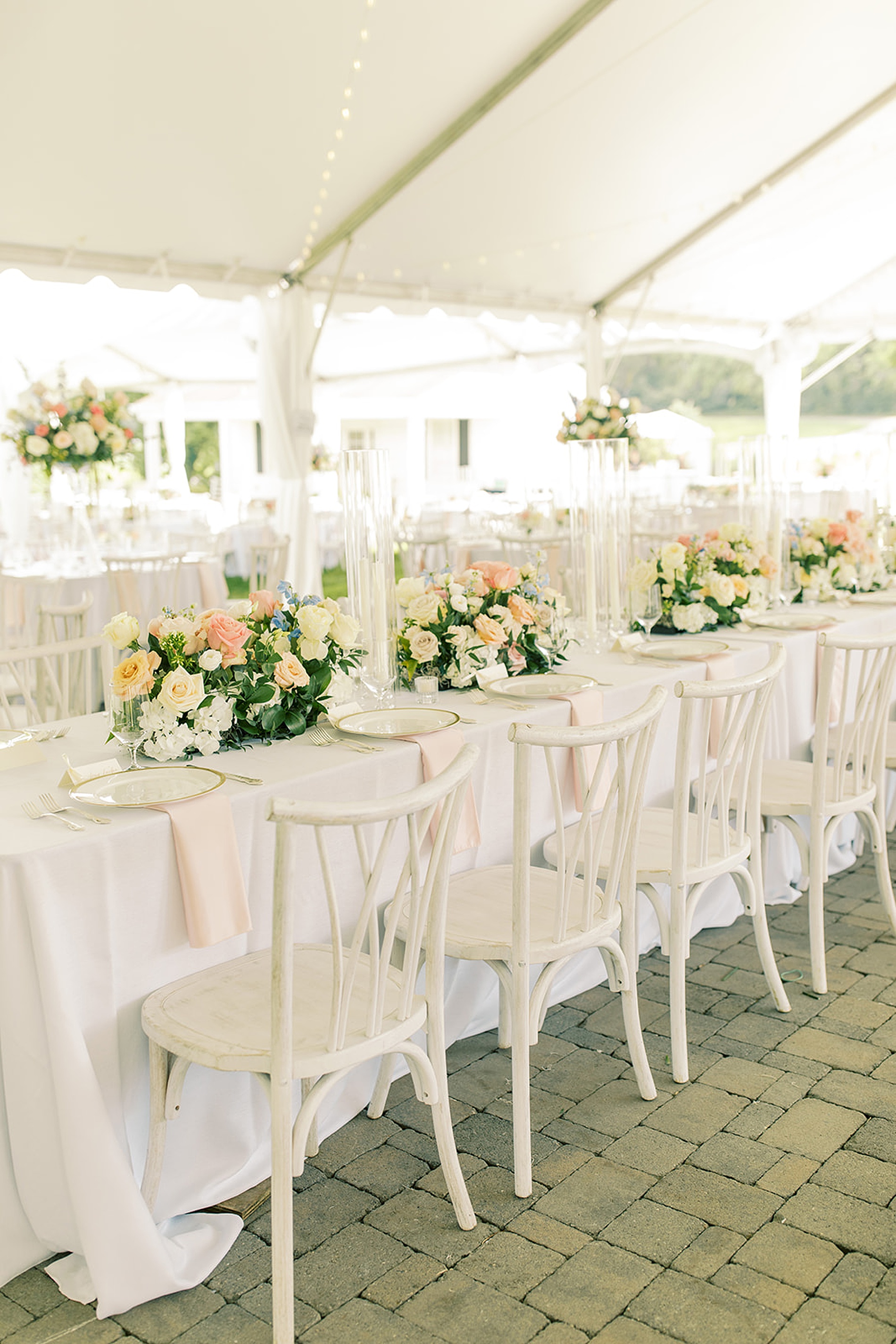
Throughout the reception, every detail was thoughtfully styled. Tables featured white table numbers with gold numerals, nestled among vibrant summer florals.
White place cards with gold calligraphy coordinated with the seating chart, guiding guests to their seats, while gold-framed signature drink signage and custom bar decals added personality to the bar area. The couple’s monogram even graced frost flex cups, tying everything together seamlessly across every touchpoint.
A Celebration to Remember
These two graduates of the University of Tennessee Knoxville had a gorgeous wedding day vision that balanced color with classic neutrals. It was a perfect blend of personality and timeless style. The amazing and incredibly talented planner, Dana McCollum, expertly planned the entire day to flow beautifully.
We loved seeing how gold became the thread that tied everything together, creating a memorable, joyful, and elevated wedding day. It’s a beautiful reminder that paper details aren’t just decorative! They shape the guest experience and make a wedding feel truly you.
Congratulations to the happy couple, and thank you for trusting White Ink Calligraphy + Co. to be a part of your unforgettable day at Ravenswood!
If you’re looking to add custom, thoughtful touches to your wedding or event, we would love to make your vision a reality. Reach out today to learn more about our full-service design offerings! We can’t wait to create something unforgettable for you!
If you enjoyed this post, you’ll love these other blogs!