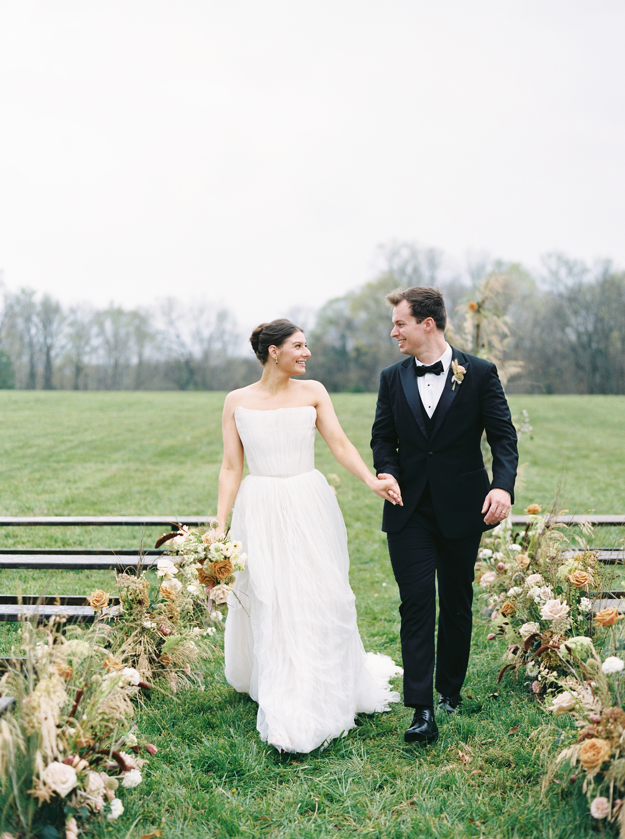
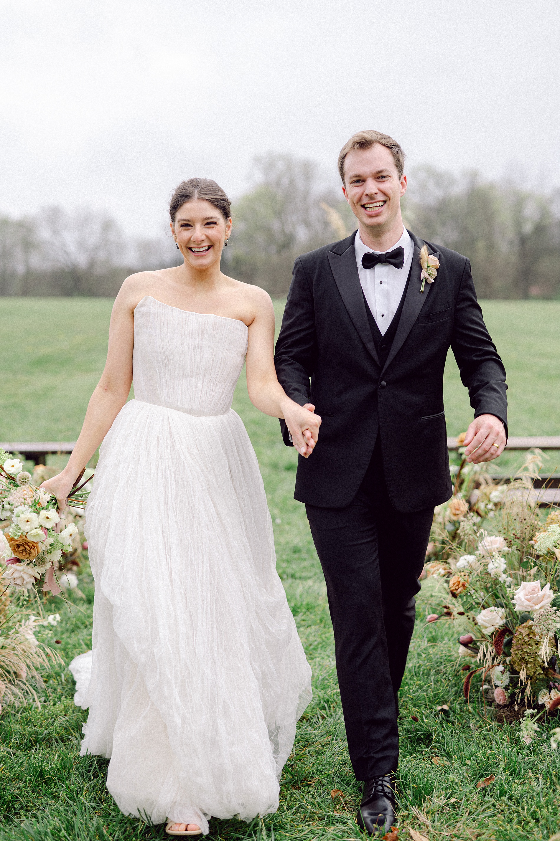
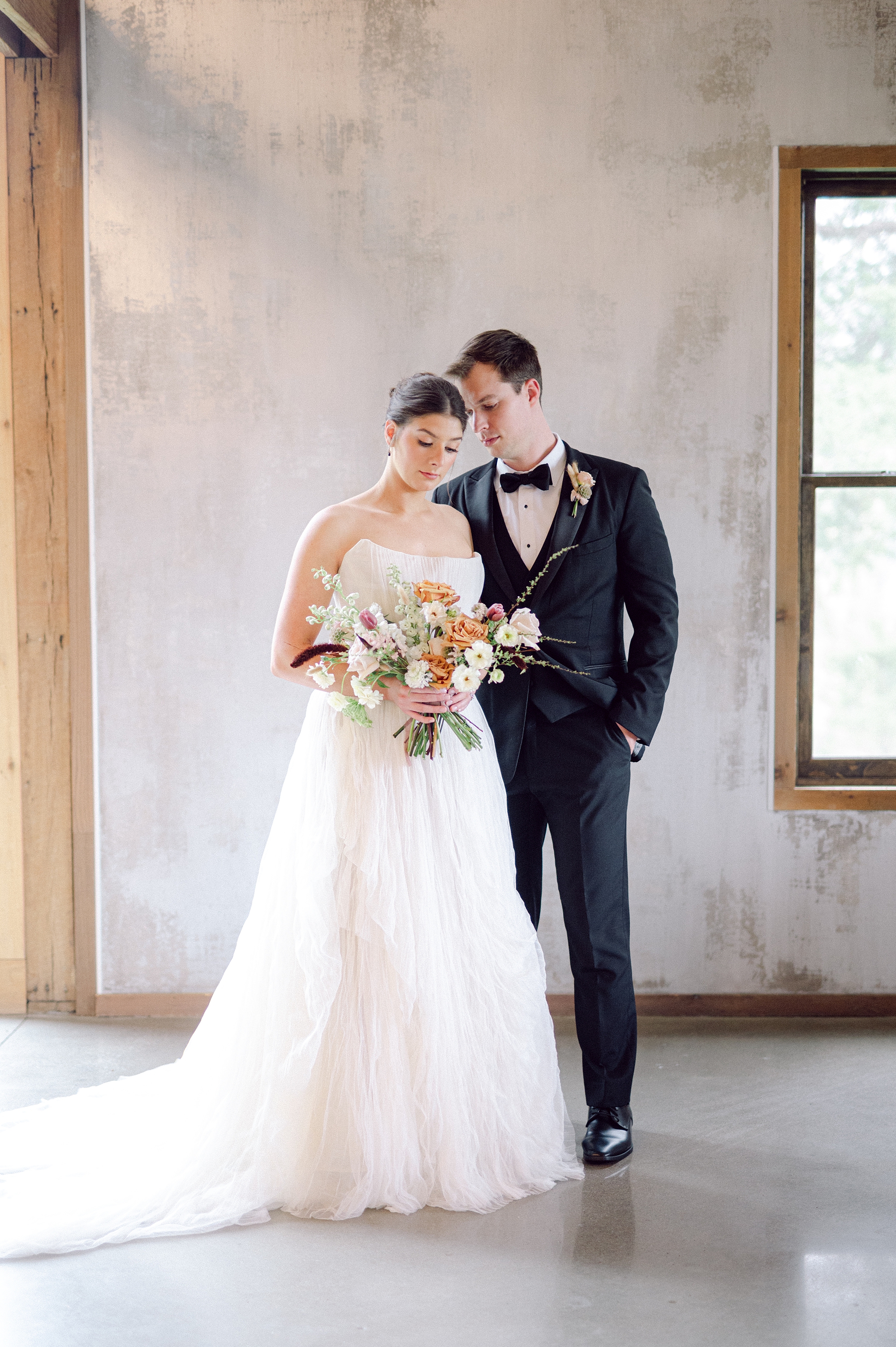
Recently featured in The Wren, this Cedarmont Farm wedding editorial was an absolute dream to create for. The entire design concept centered around texture, warmth, and timeless romance, and we wanted every detail of the paper goods and signage to reflect that. I am in love with the results from these Cedarmont Farm textured wedding details.
A Warm, Earthy Vision for This Cedarmont Farm Wedding
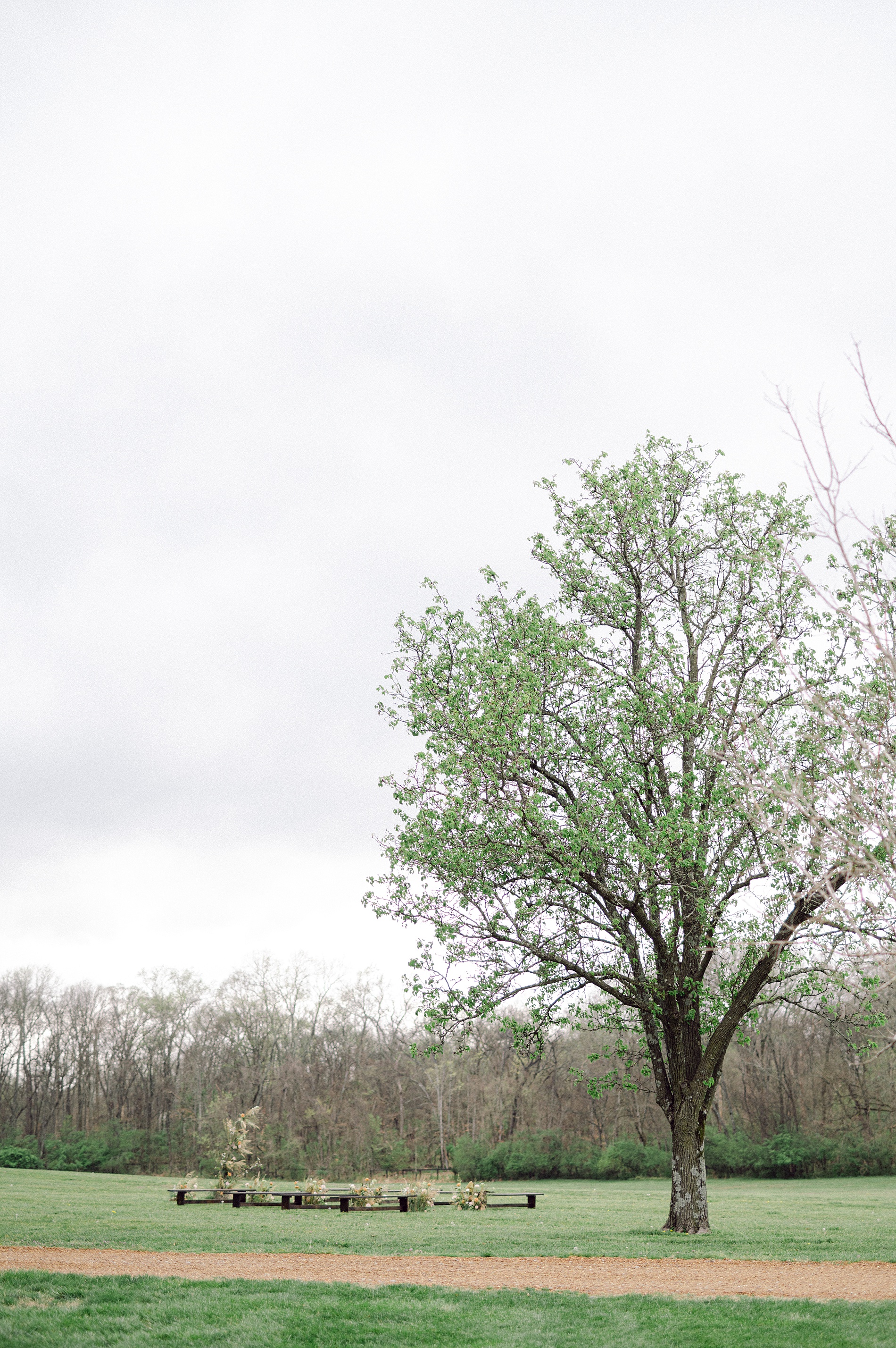
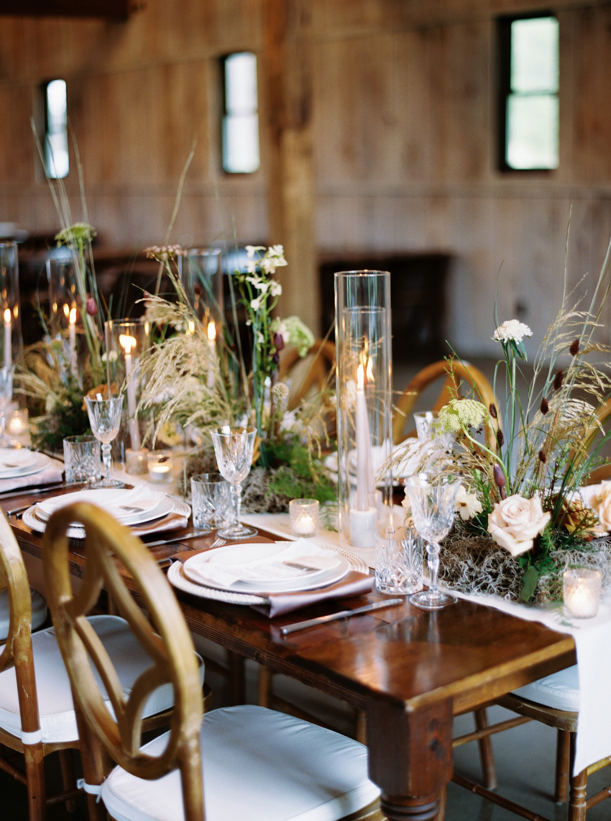
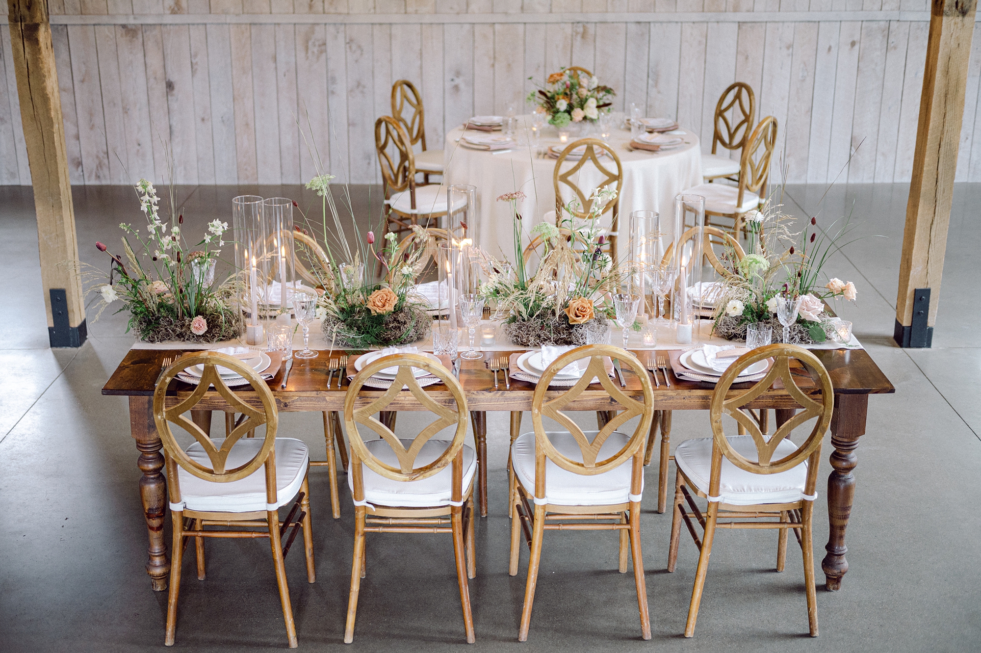
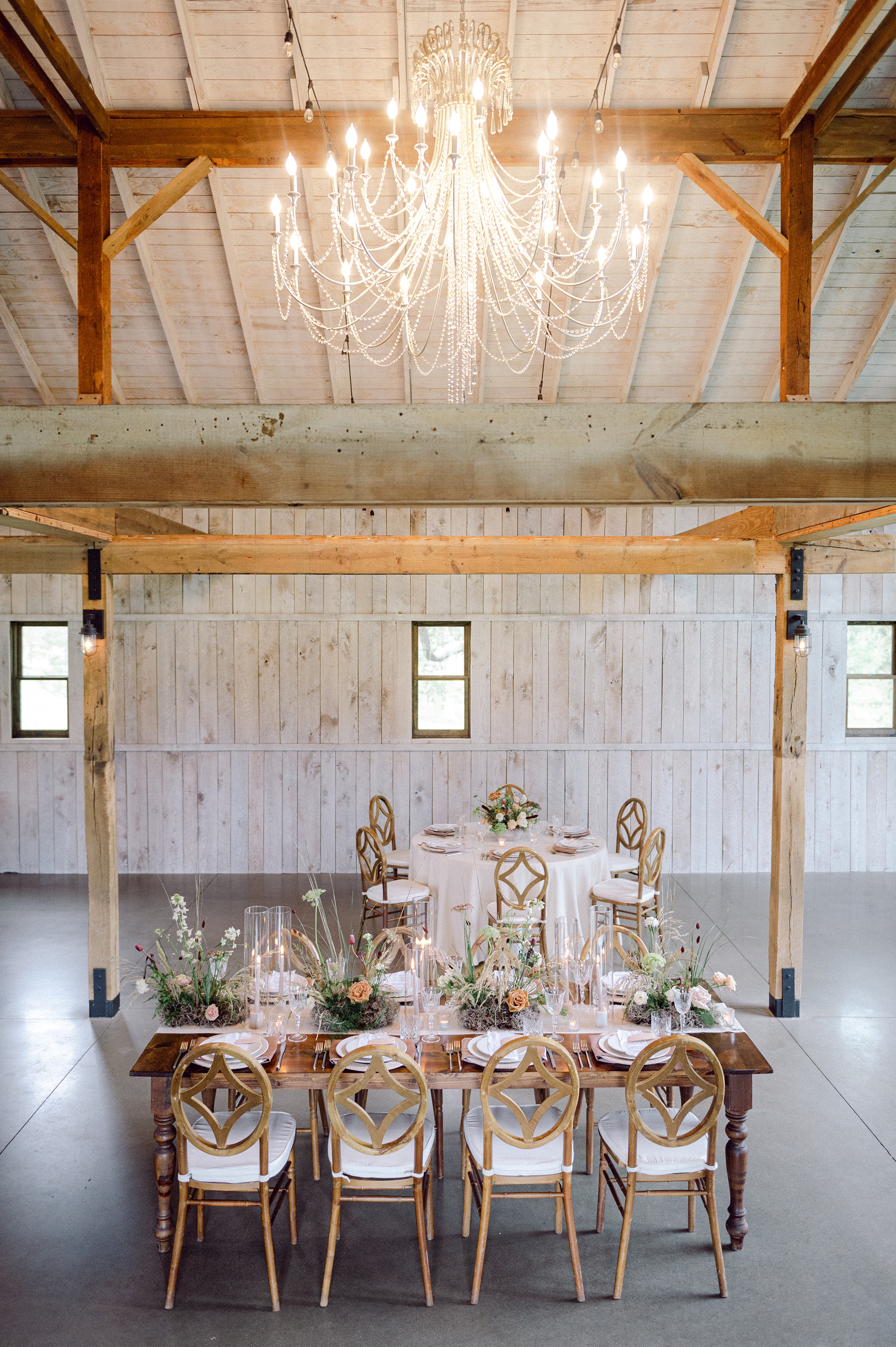
Set among the rolling hills of Franklin, Tennessee, Cedarmont Farm is a venue that beautifully blends historic charm with modern touches. Its elegant interiors made it the perfect backdrop for this editorial. Our goal was to pull as much texture as possible into each stationery and signage element.
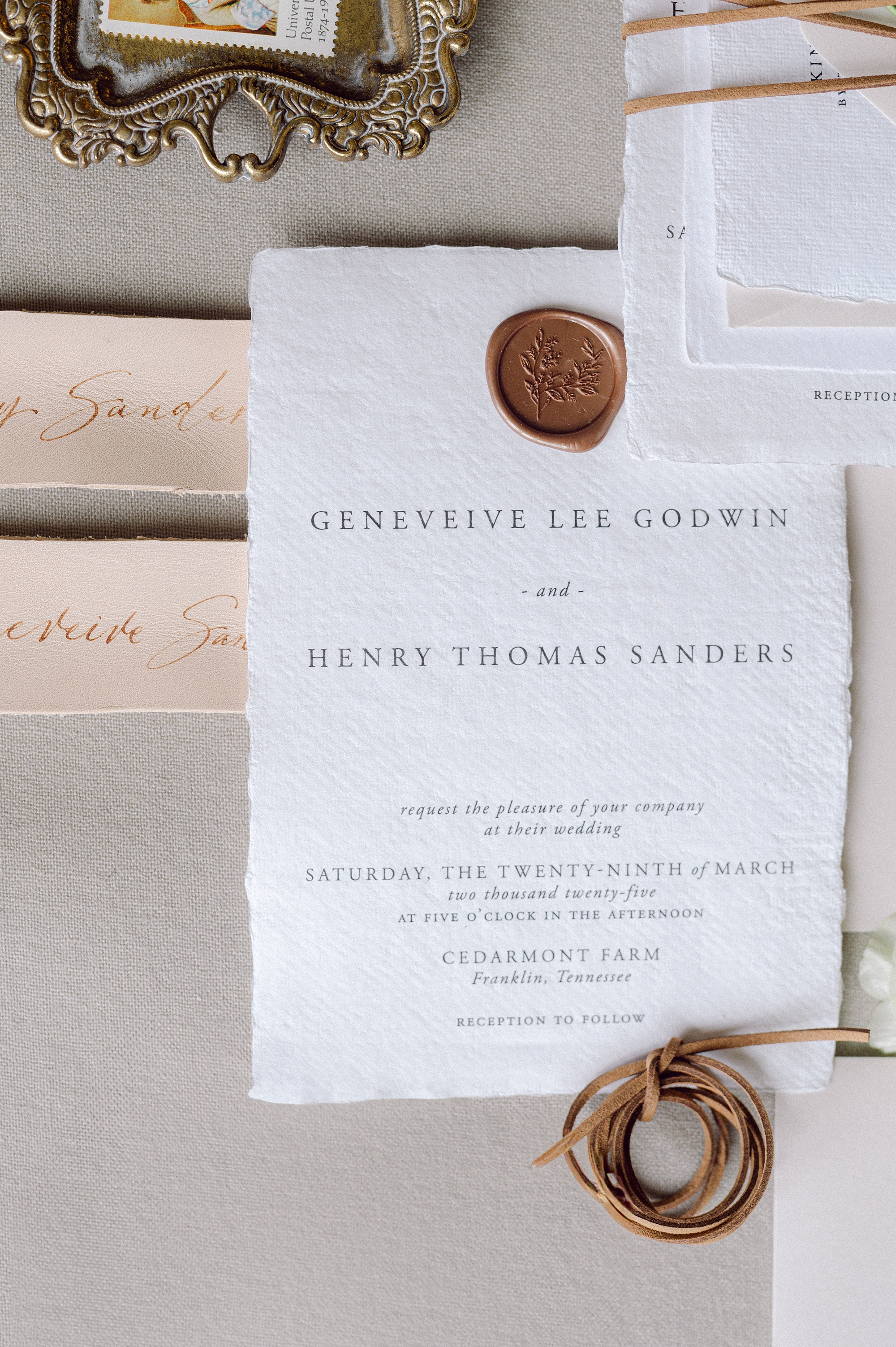
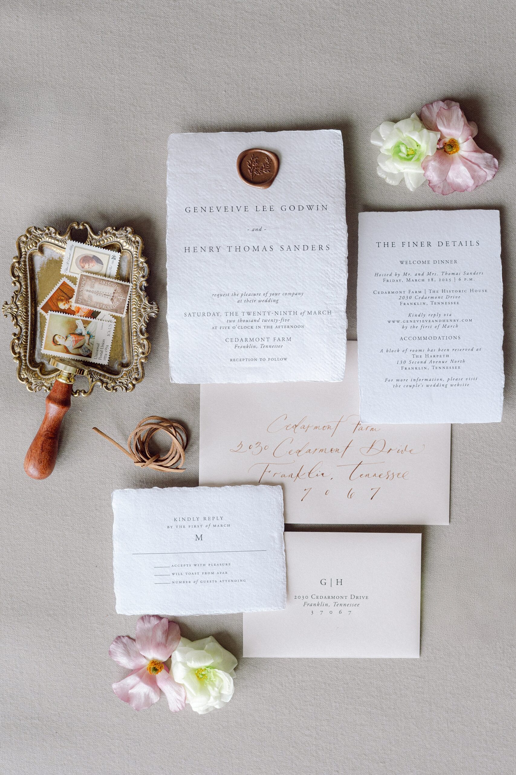
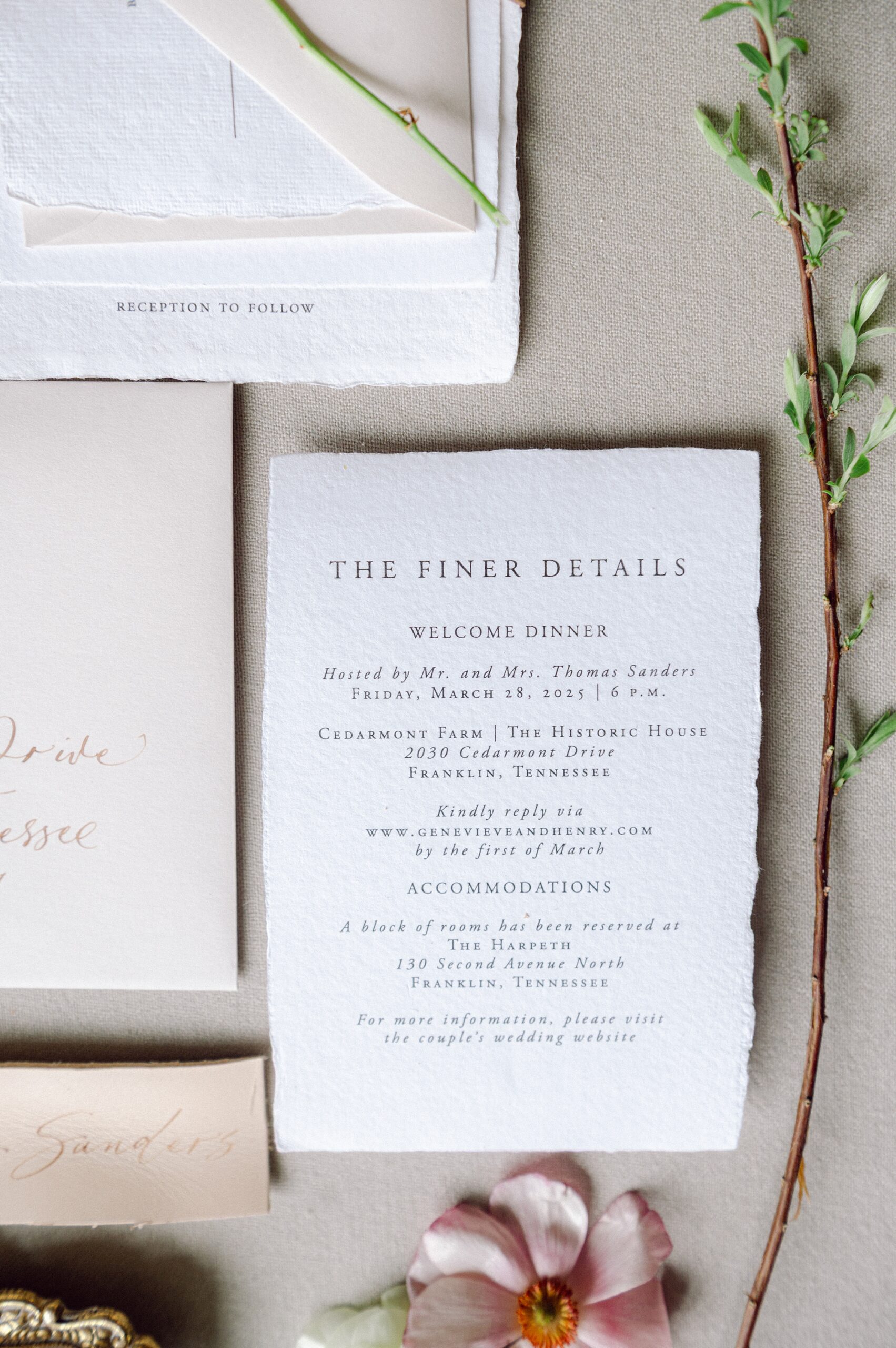
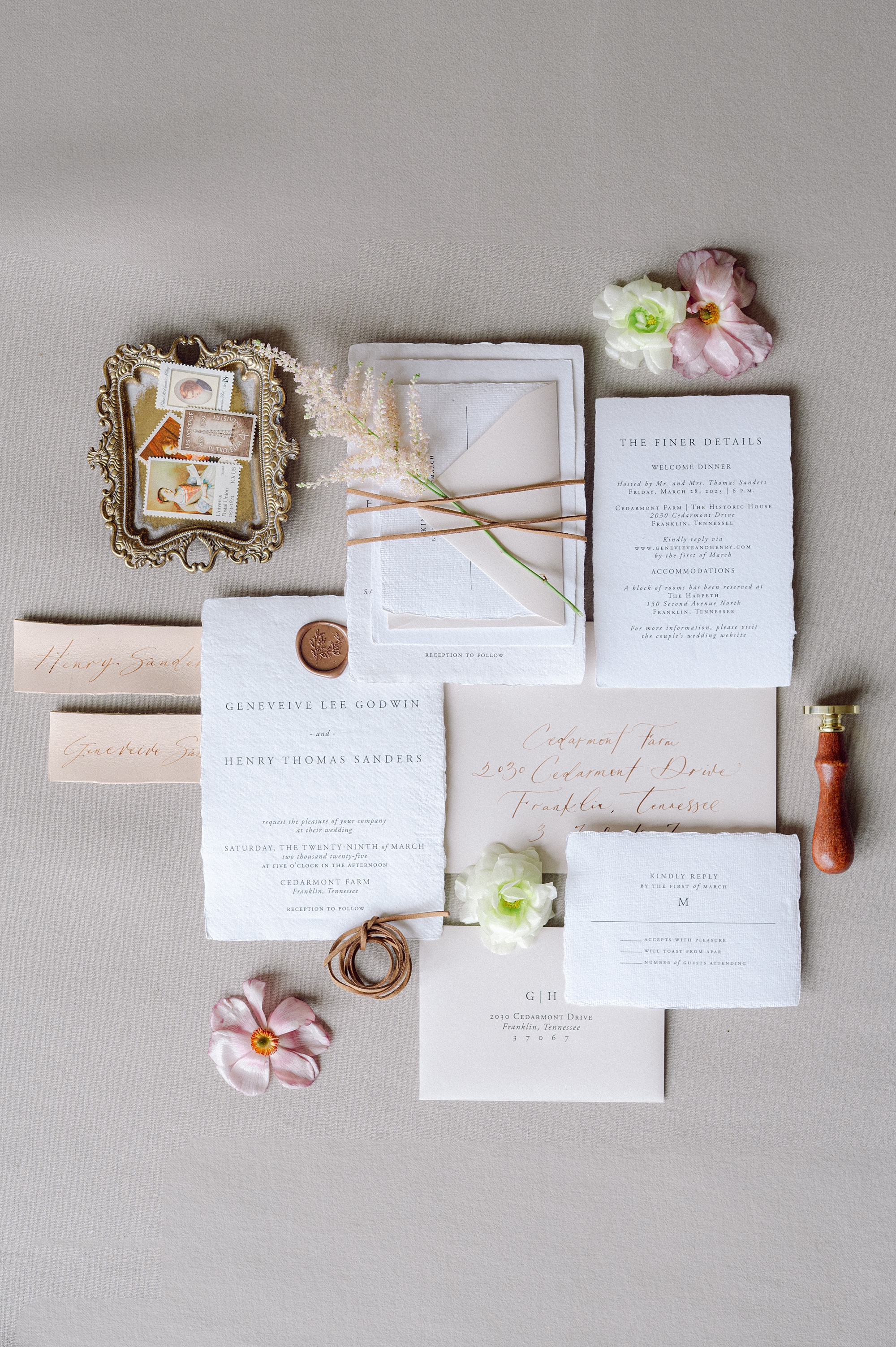
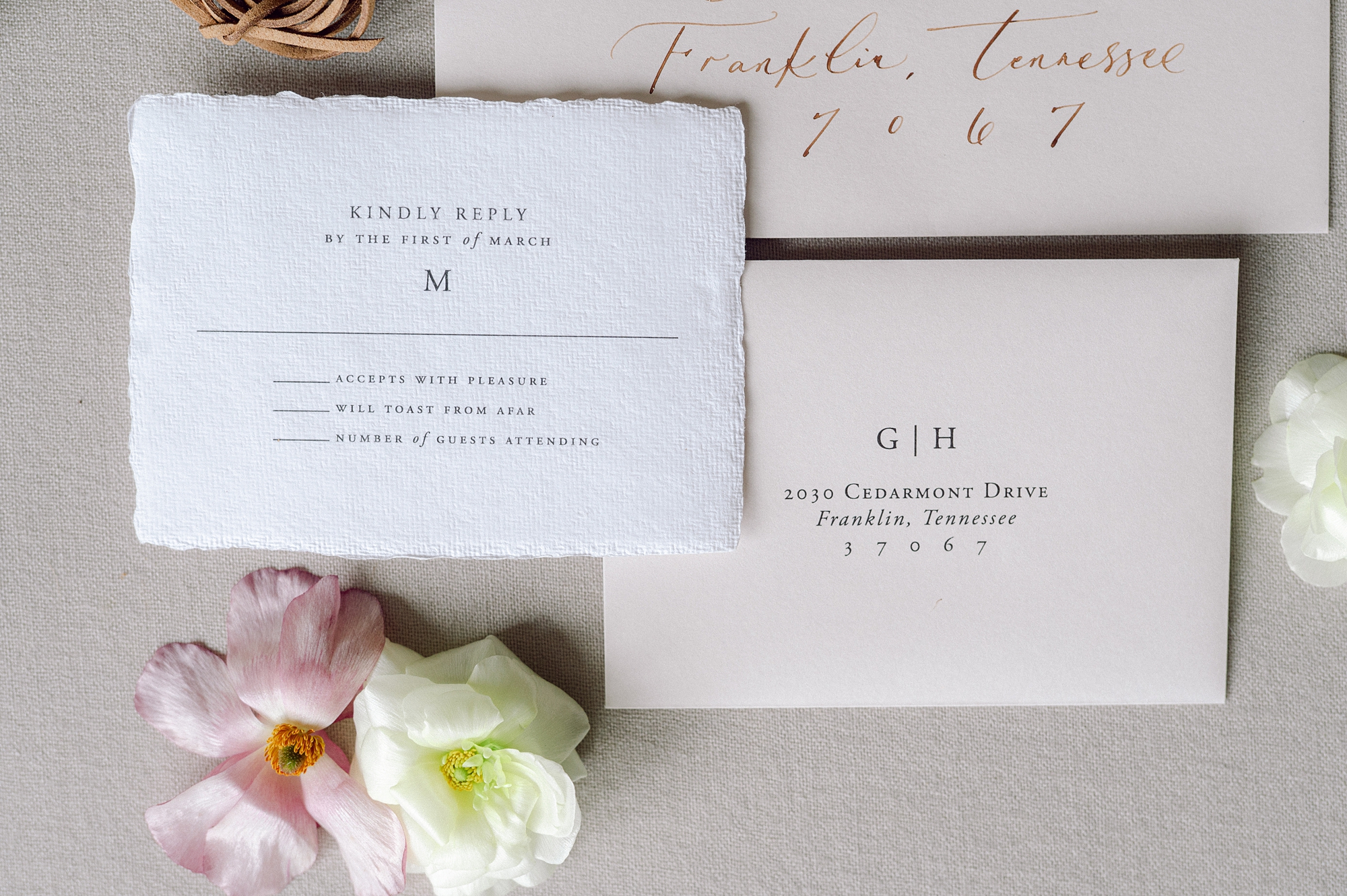
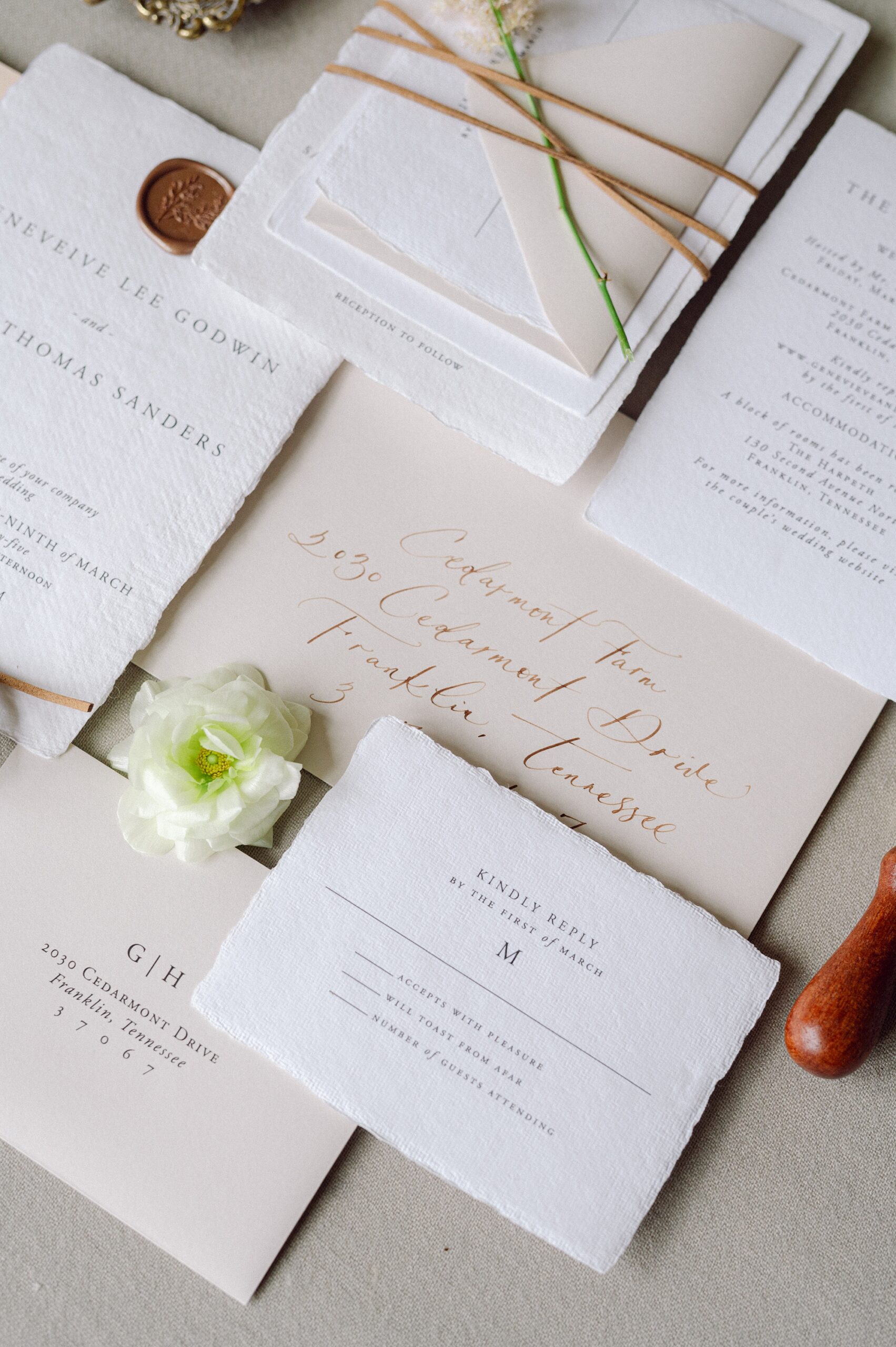
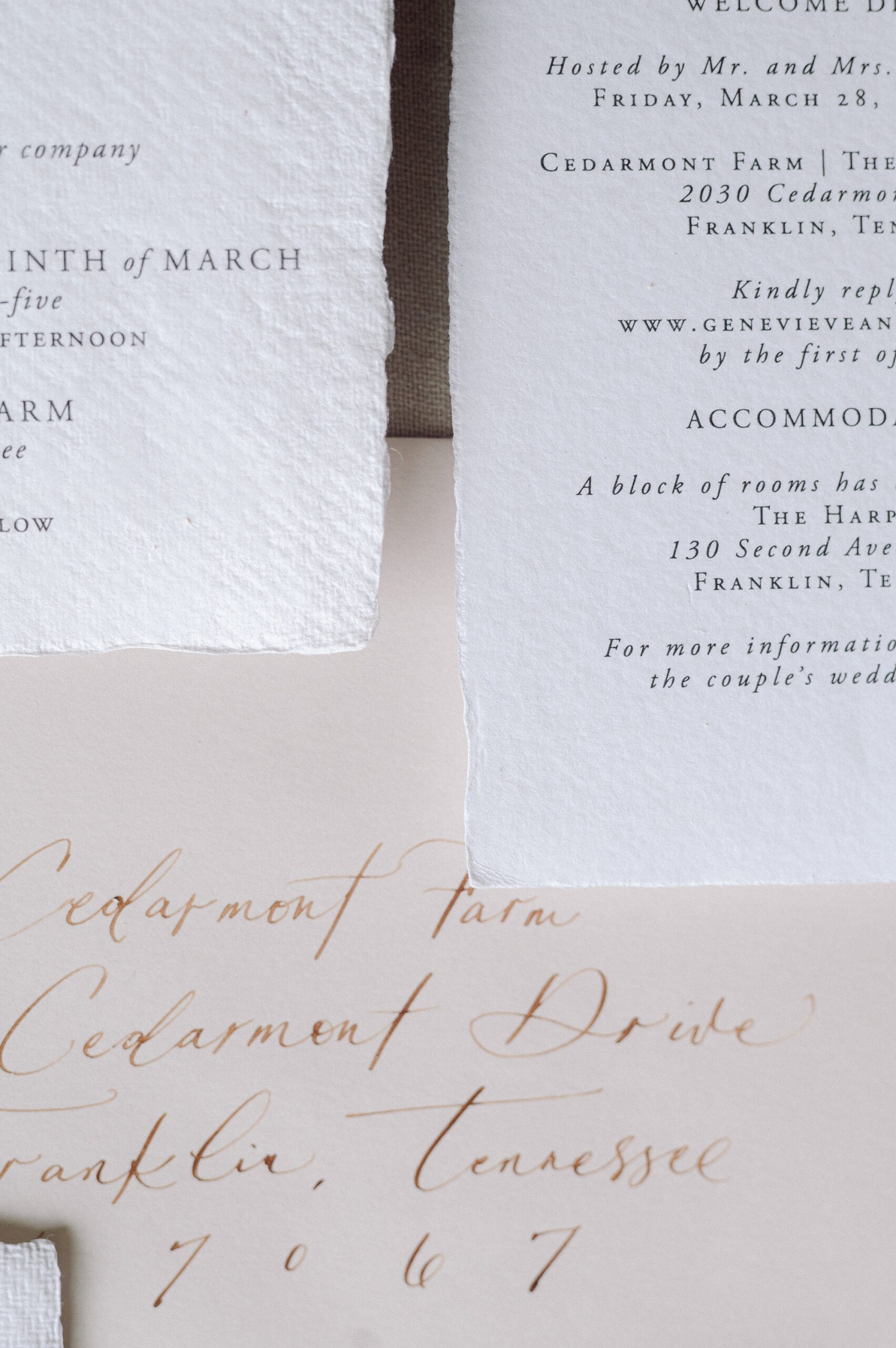
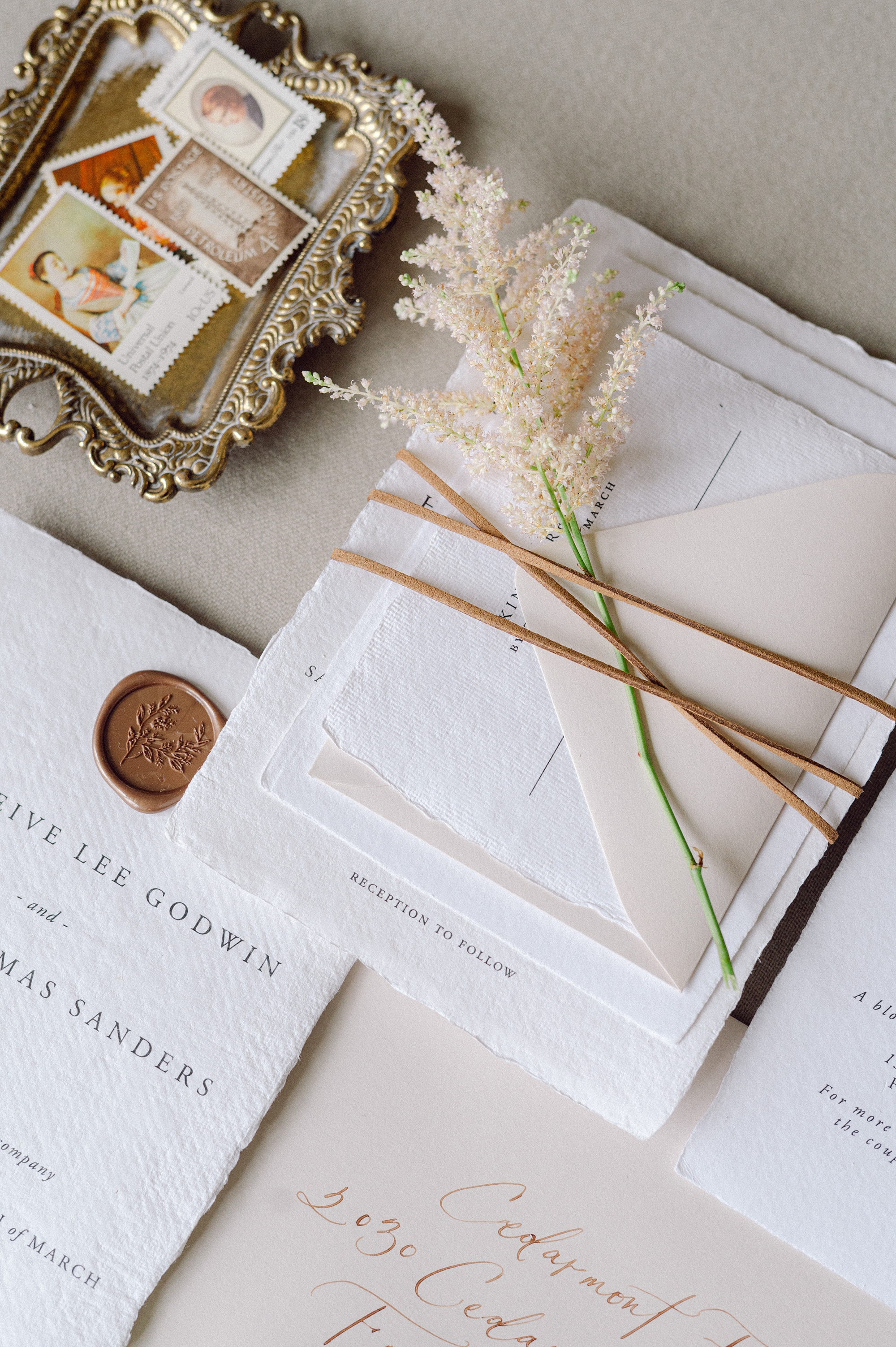
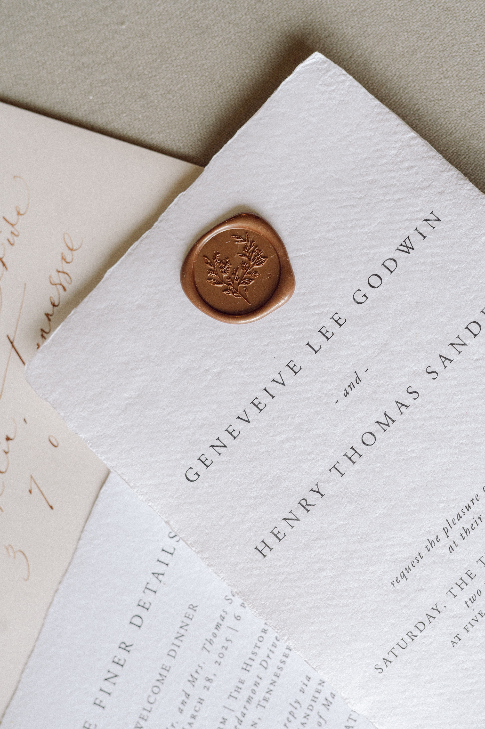
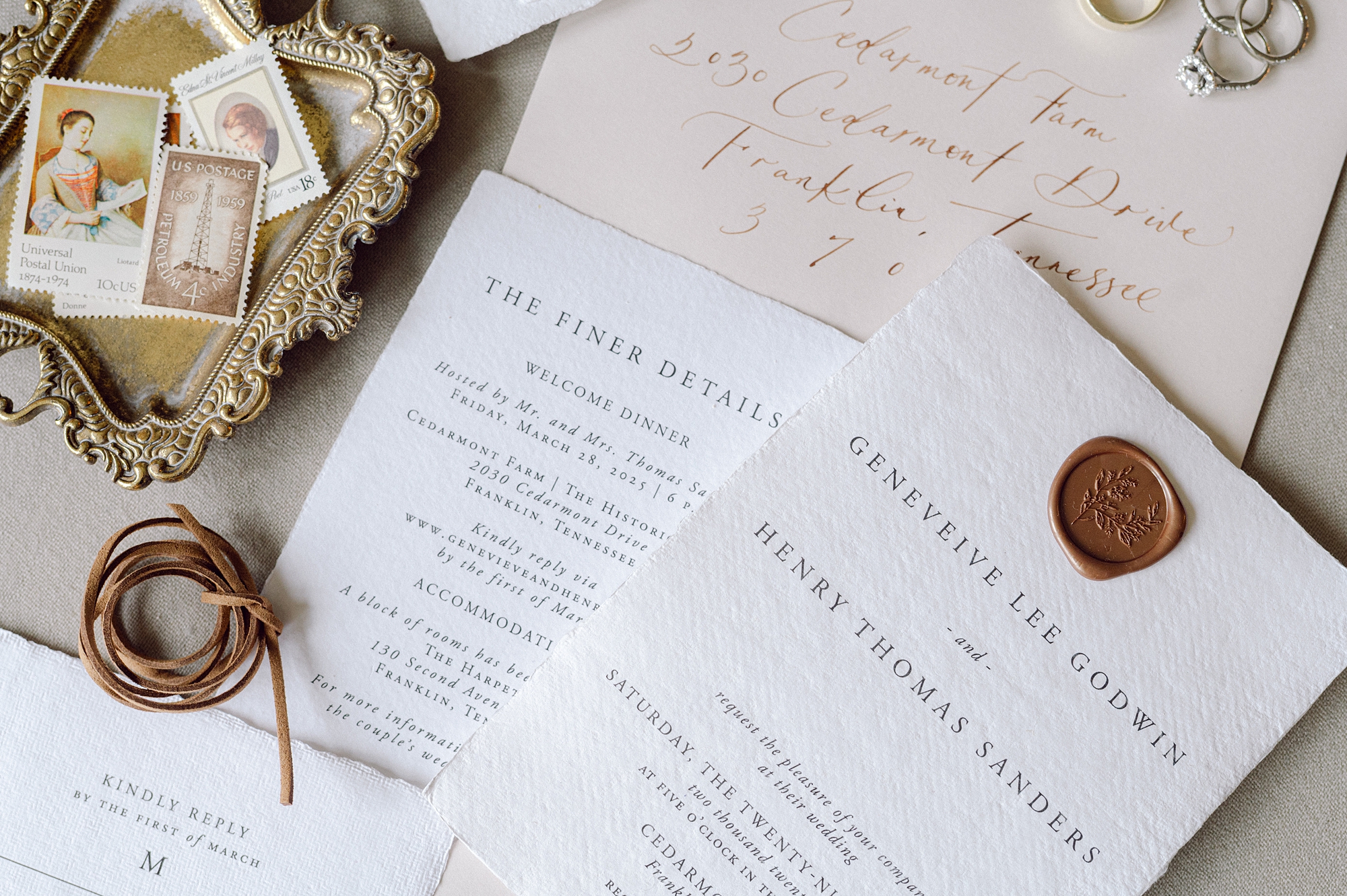
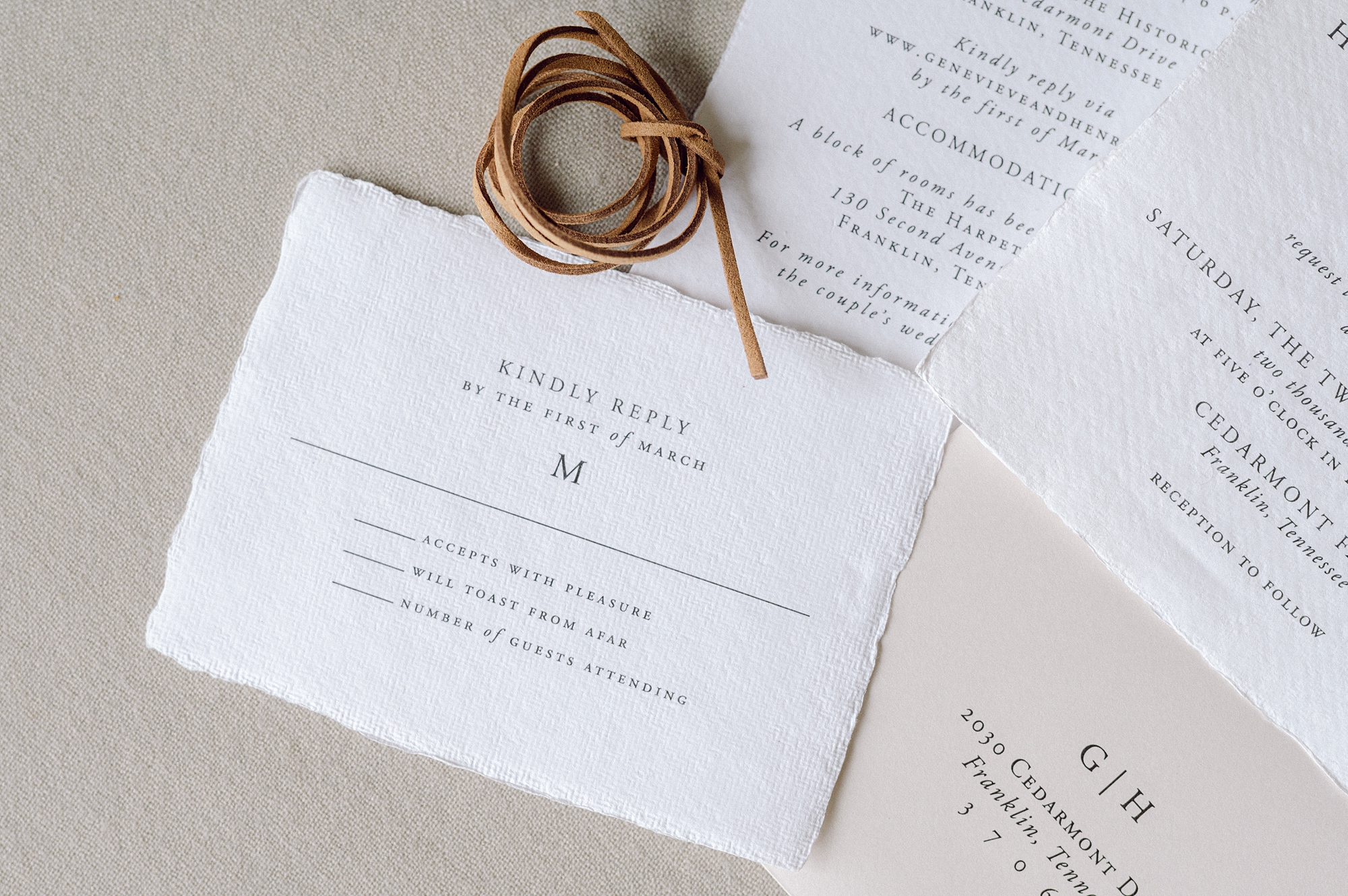
Elegant and Classic Textured Invitation Suite
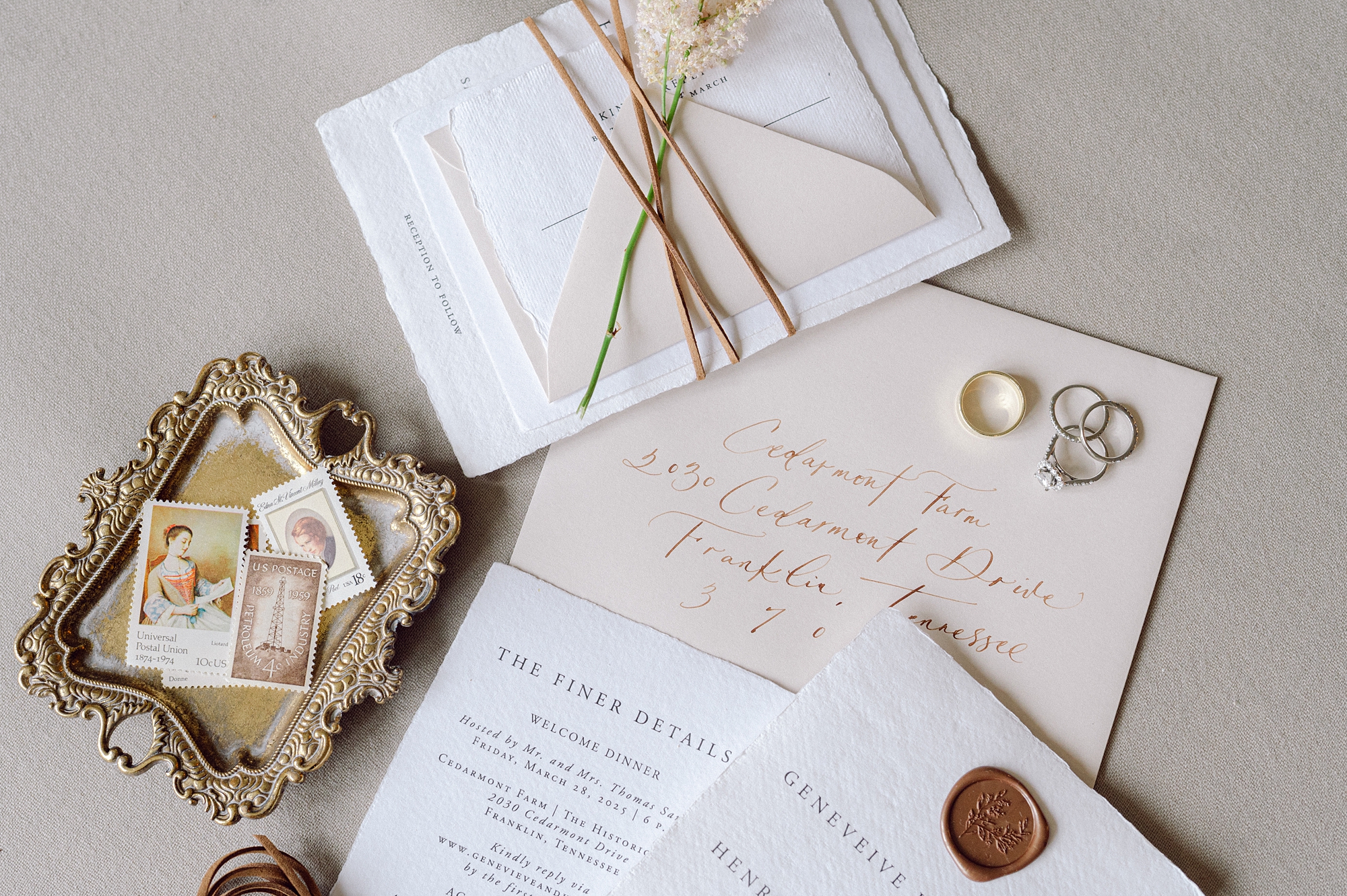
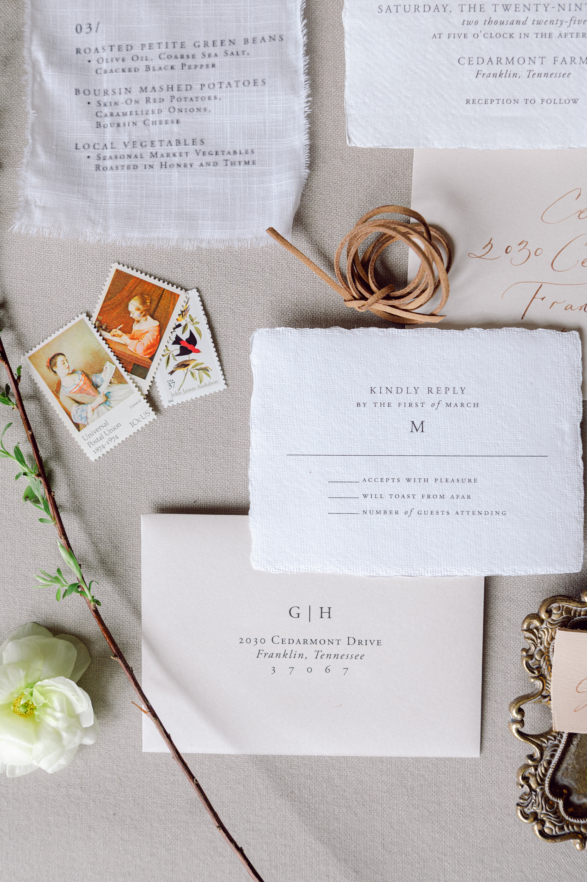
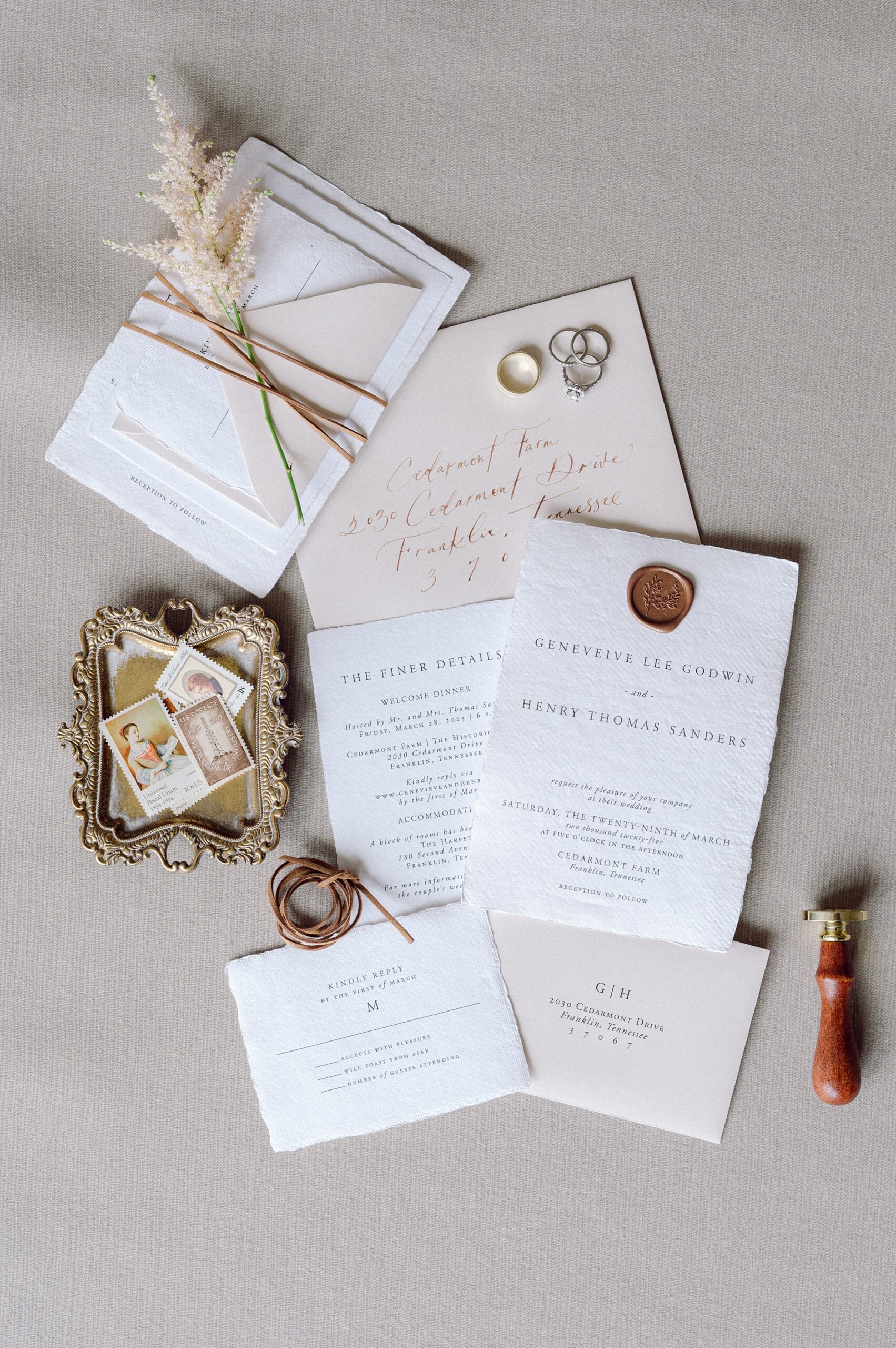
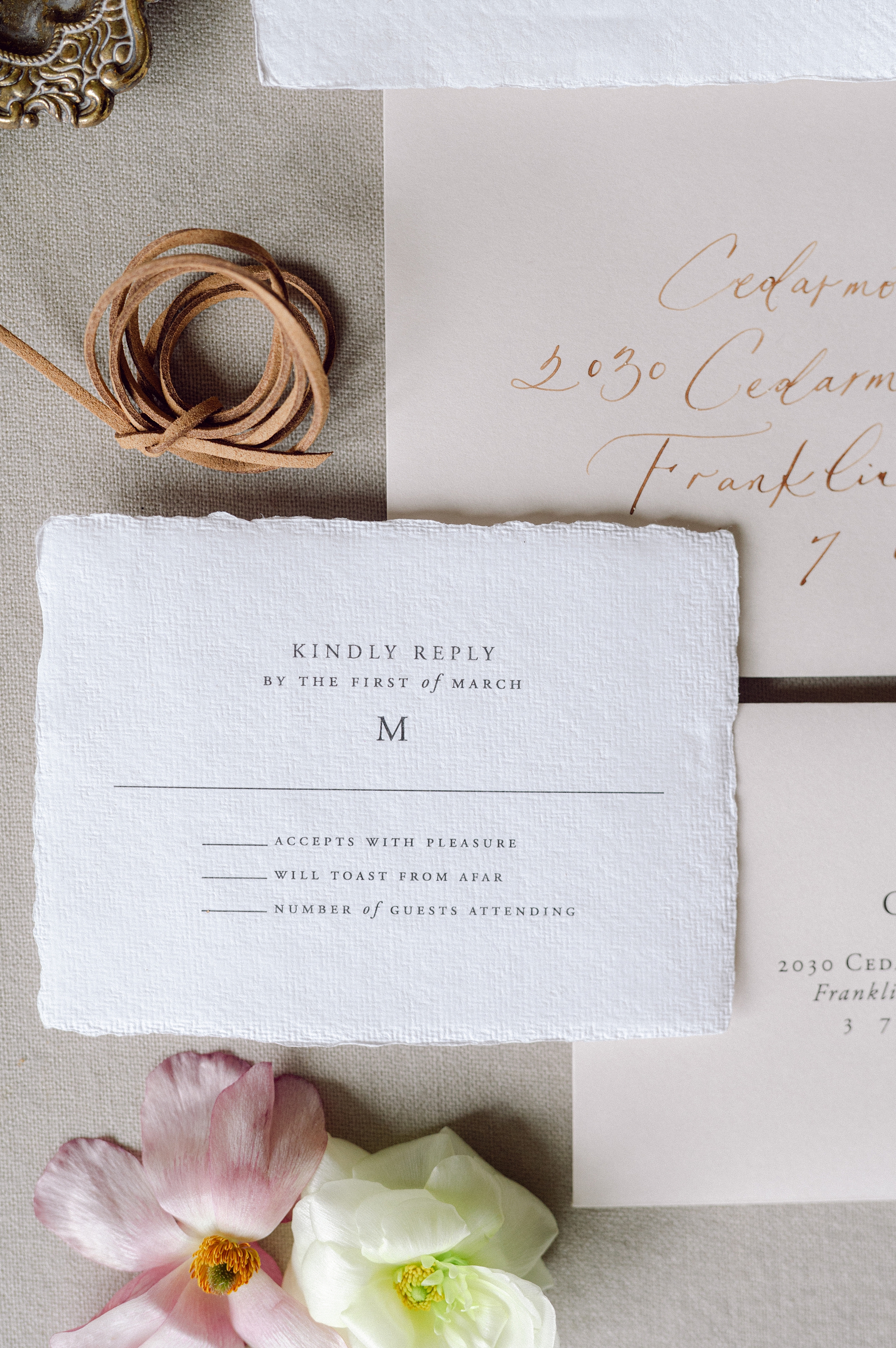
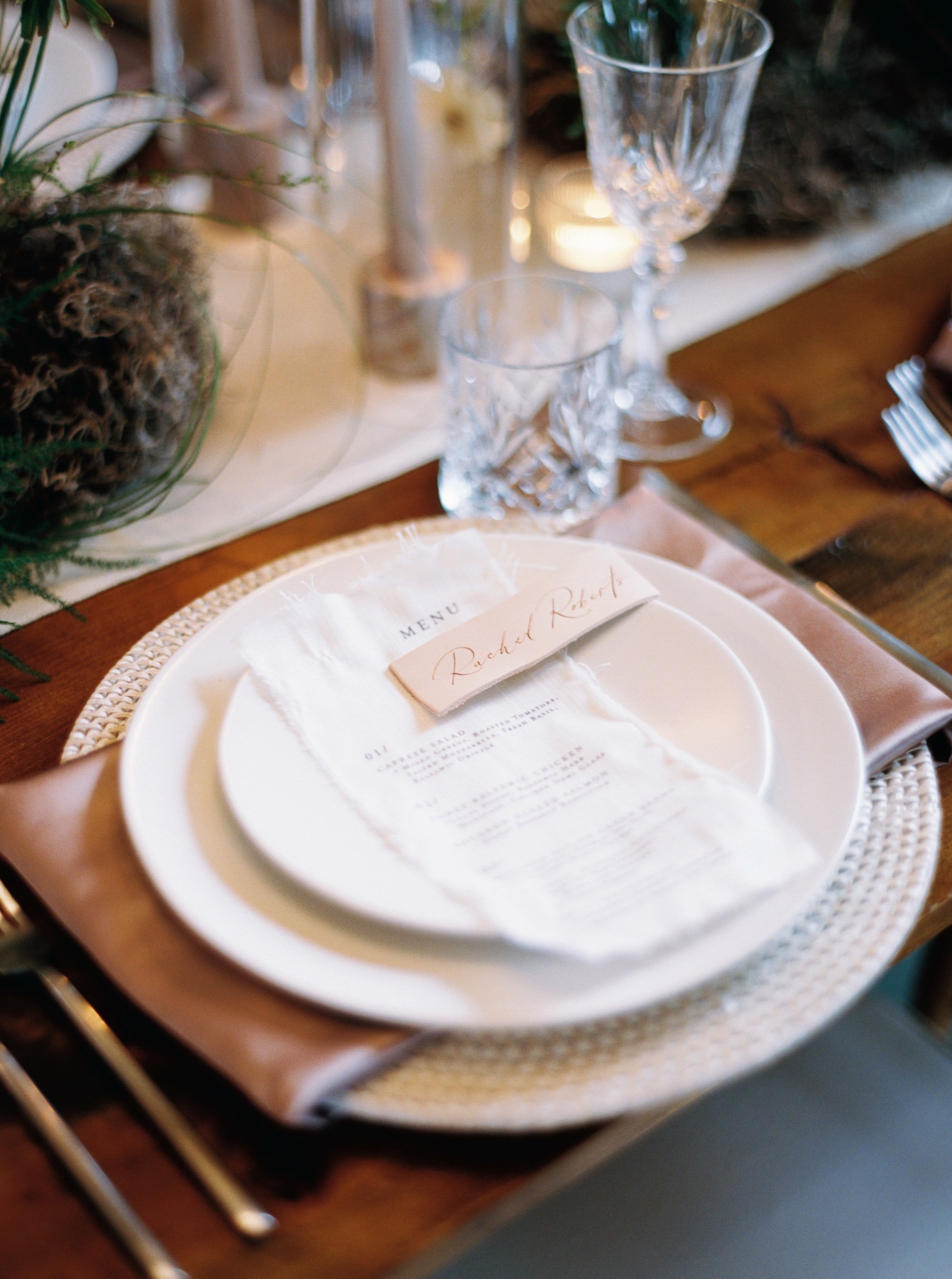
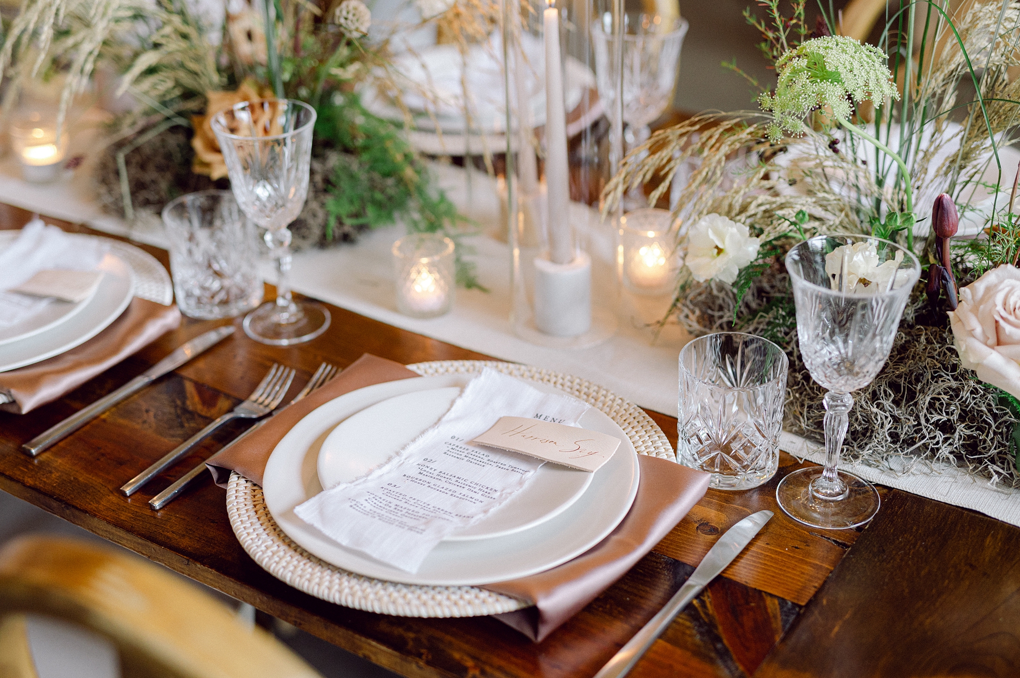
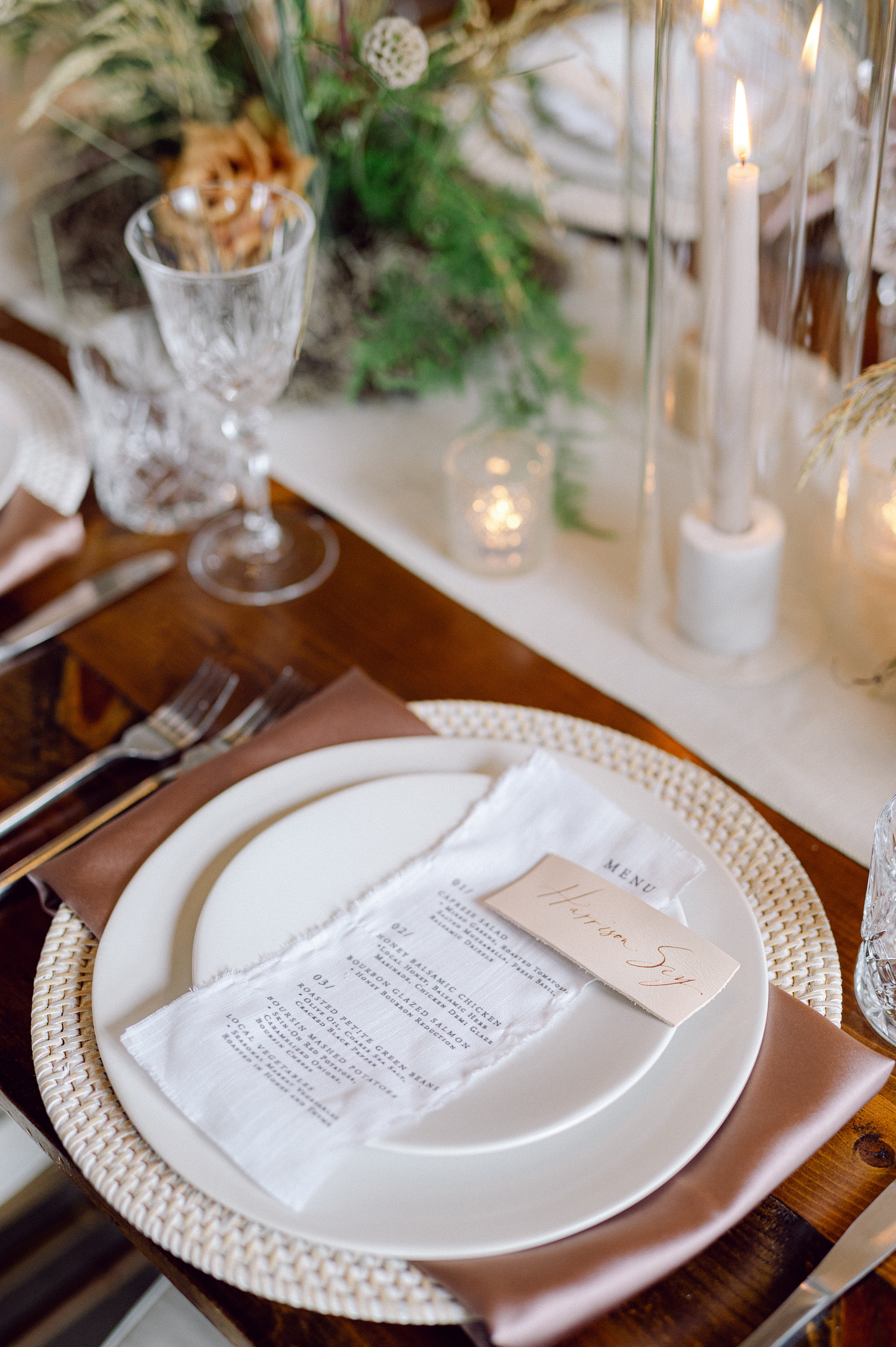
The invitation suite set the tone for the event with handmade, textured paper and a classic wax seal for an organic yet elevated look. We paired the suite with light tan envelopes. The combination of warm neutrals and refined materials perfectly echoed the editorial’s color palette inspired by Pantone’s Mocha Mousse.
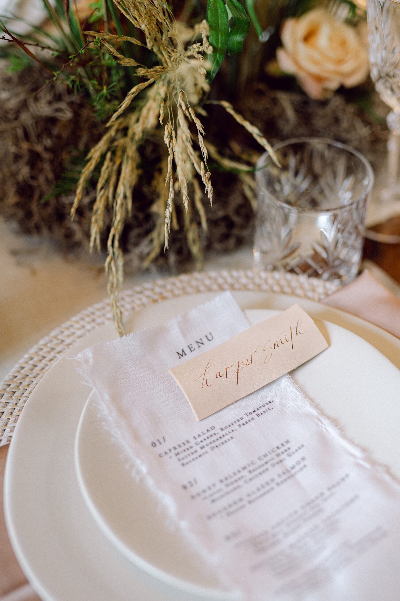
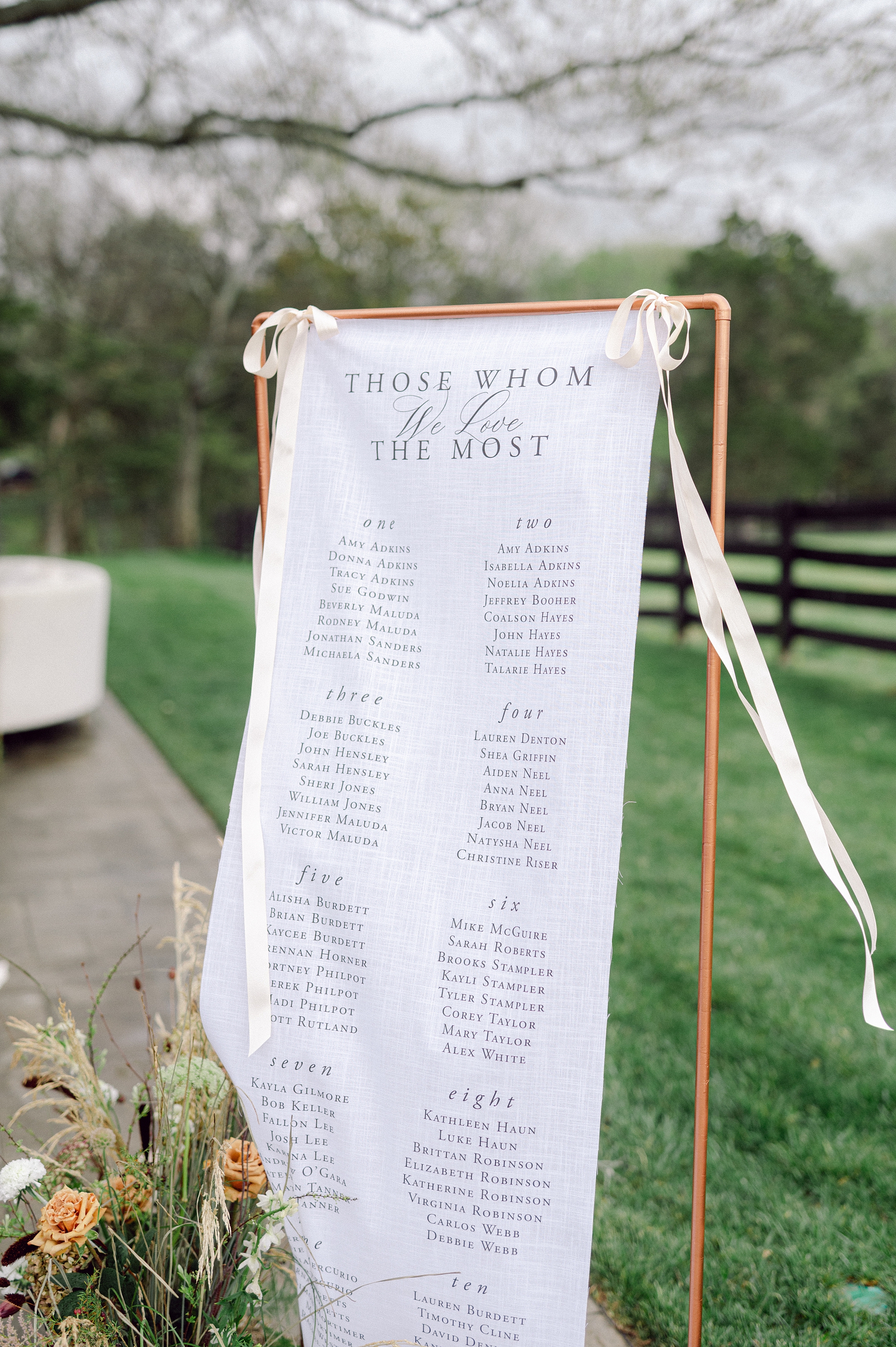
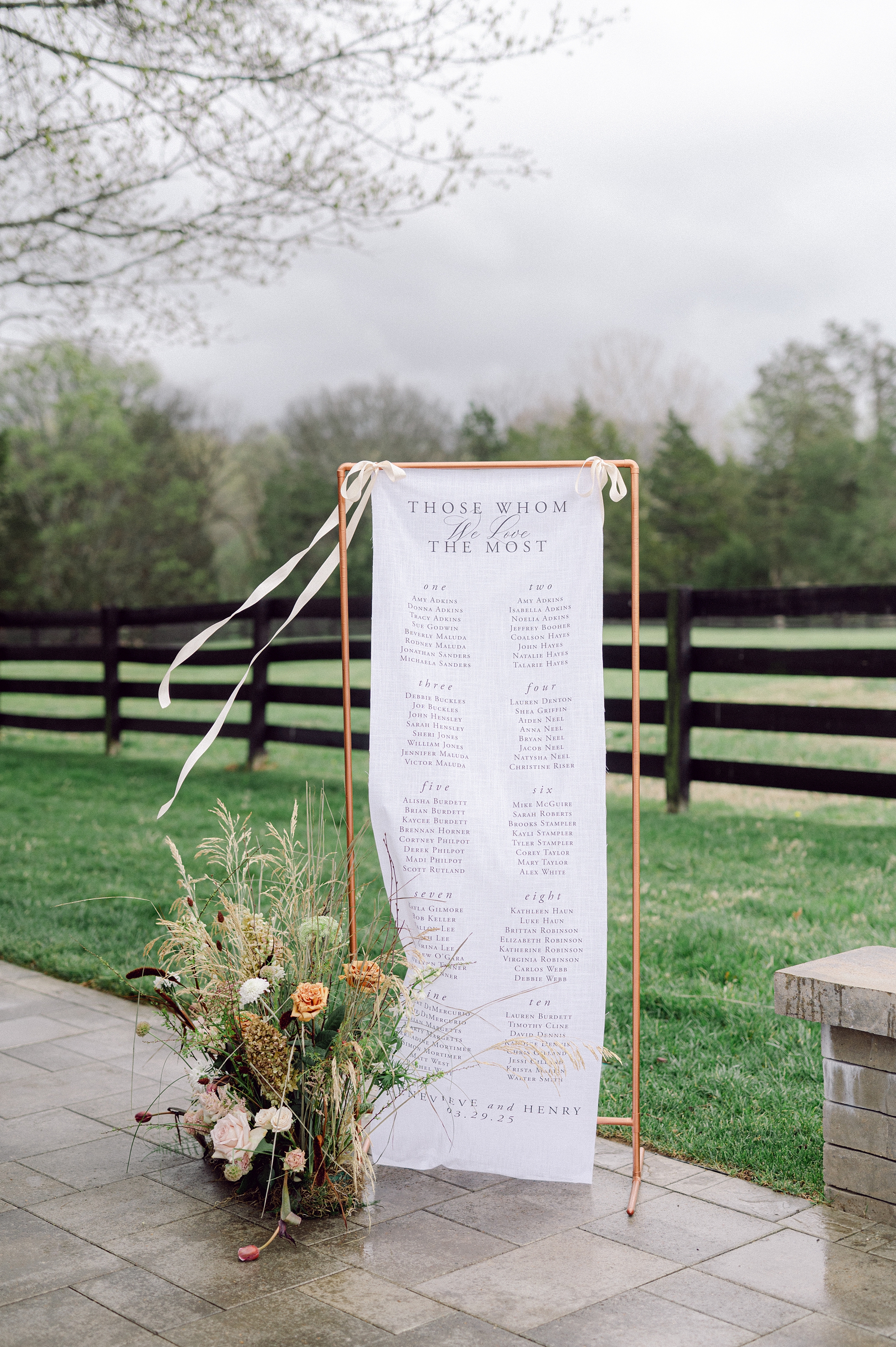
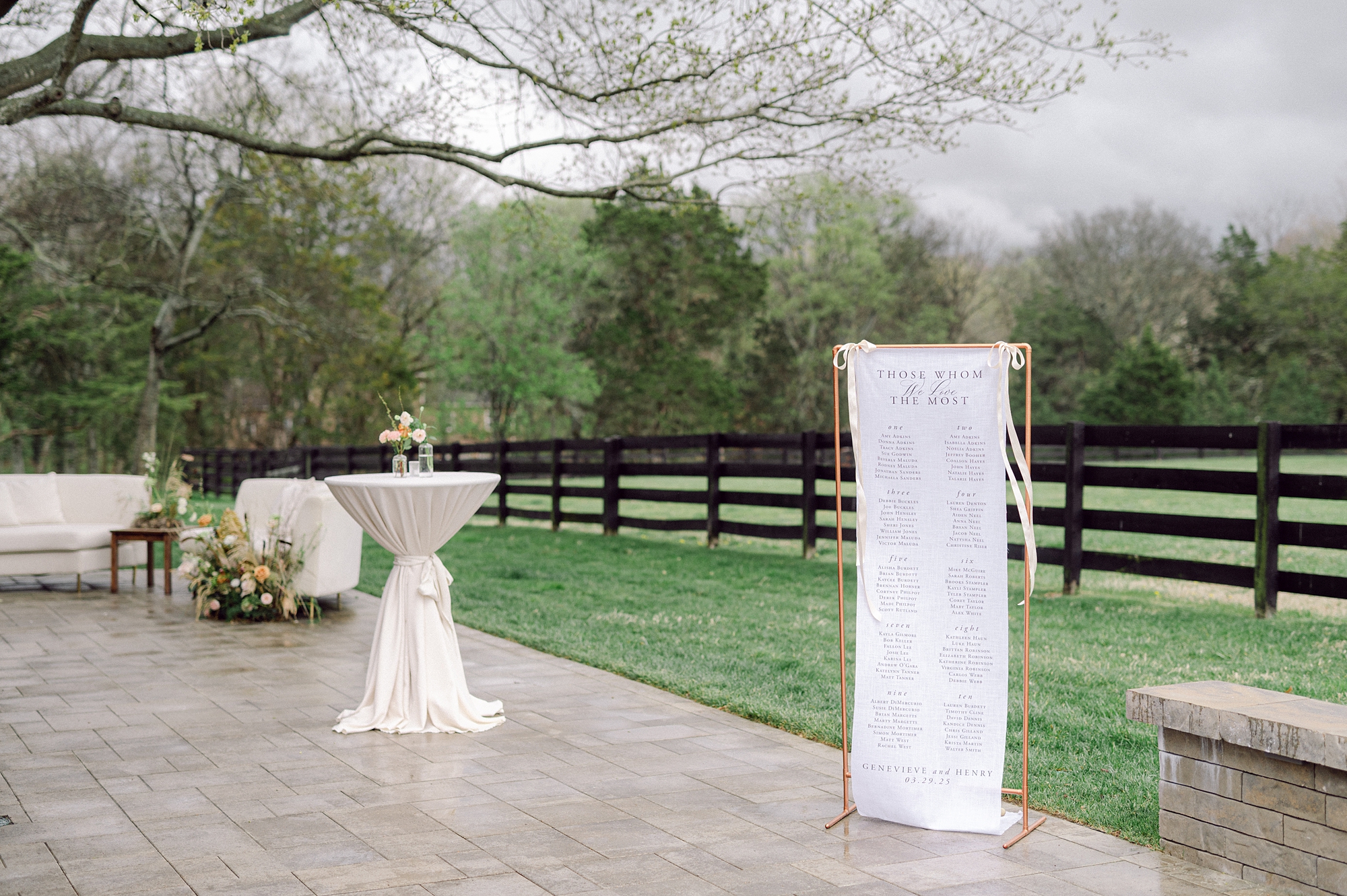
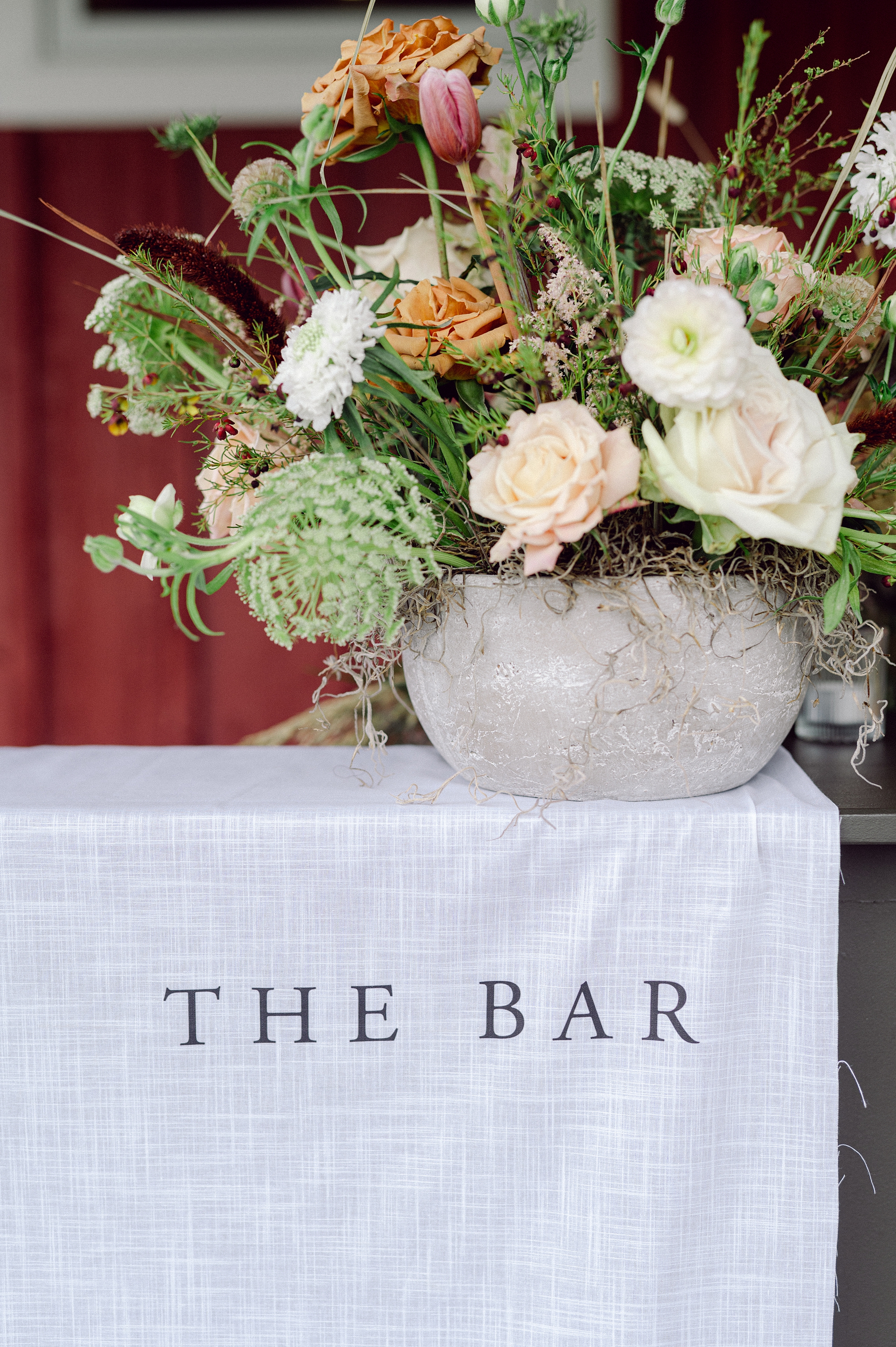
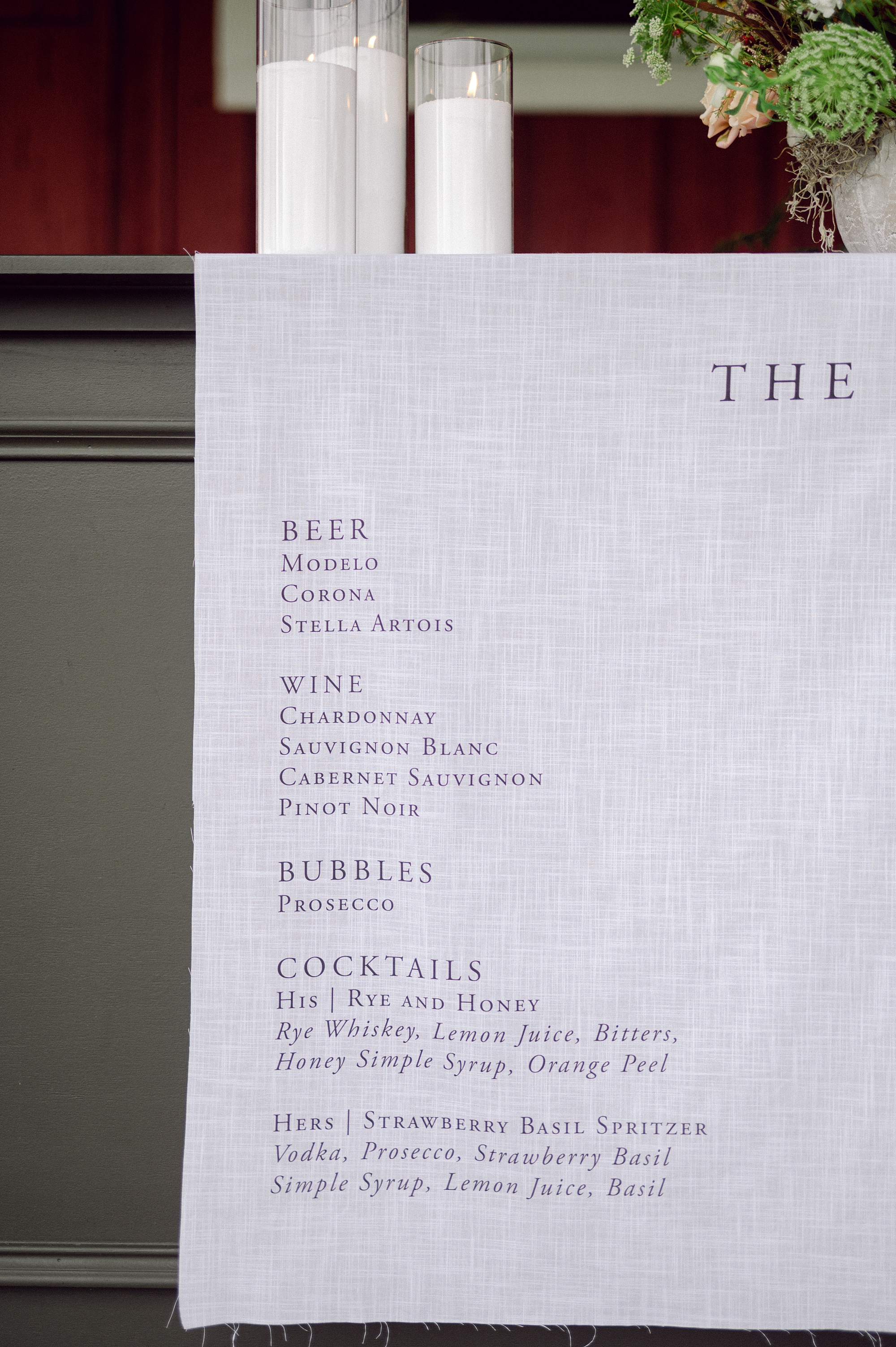
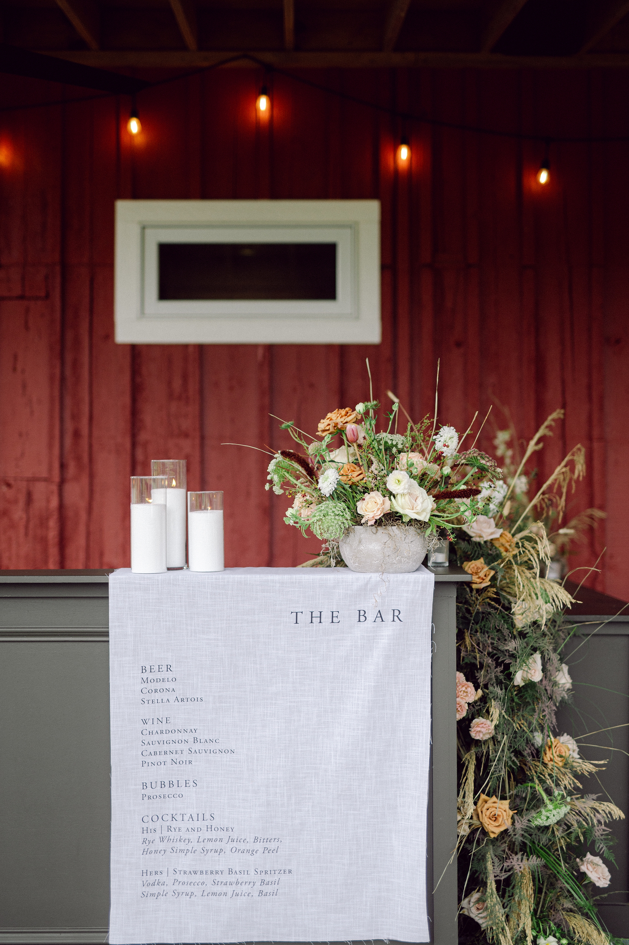
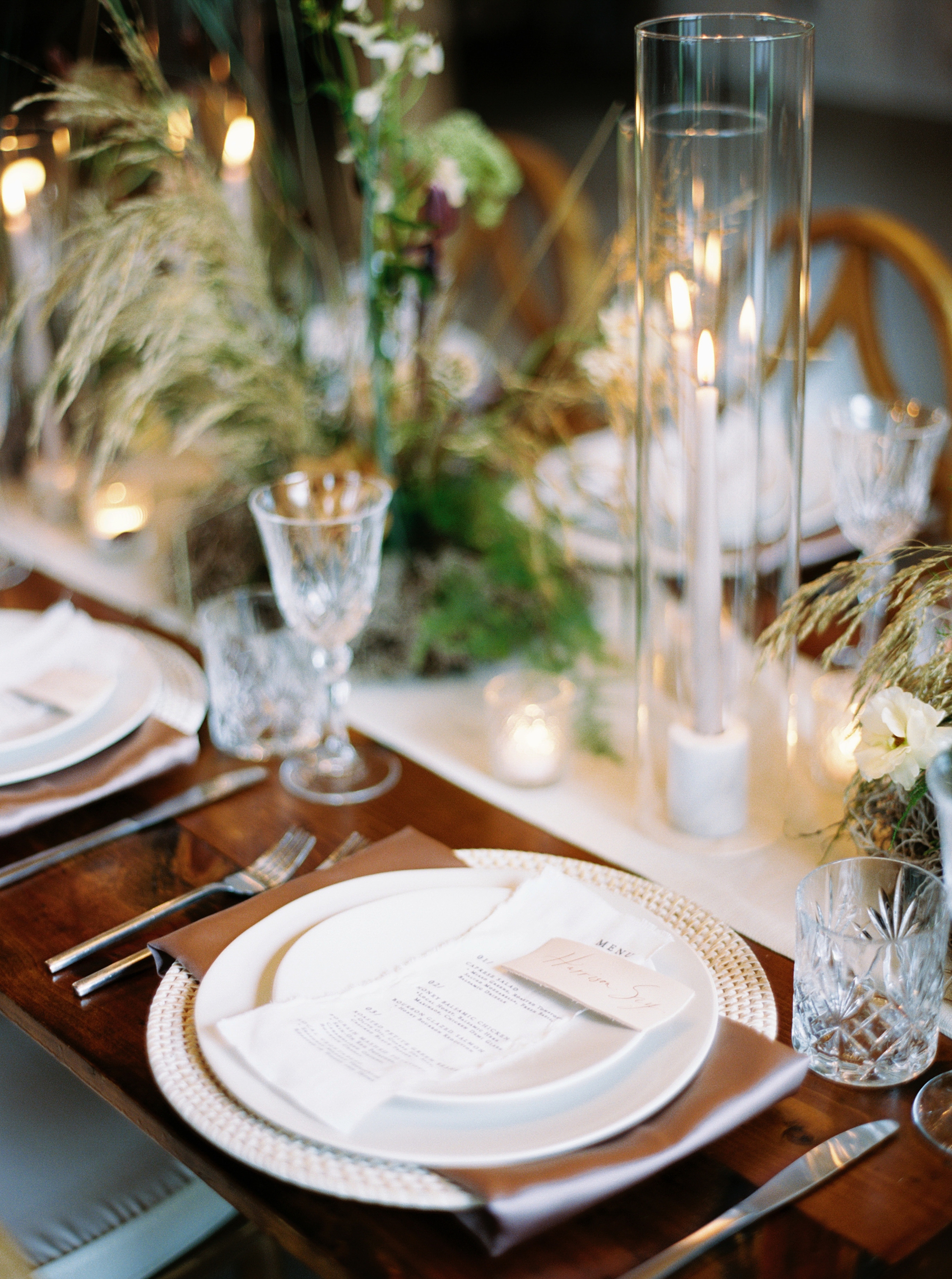
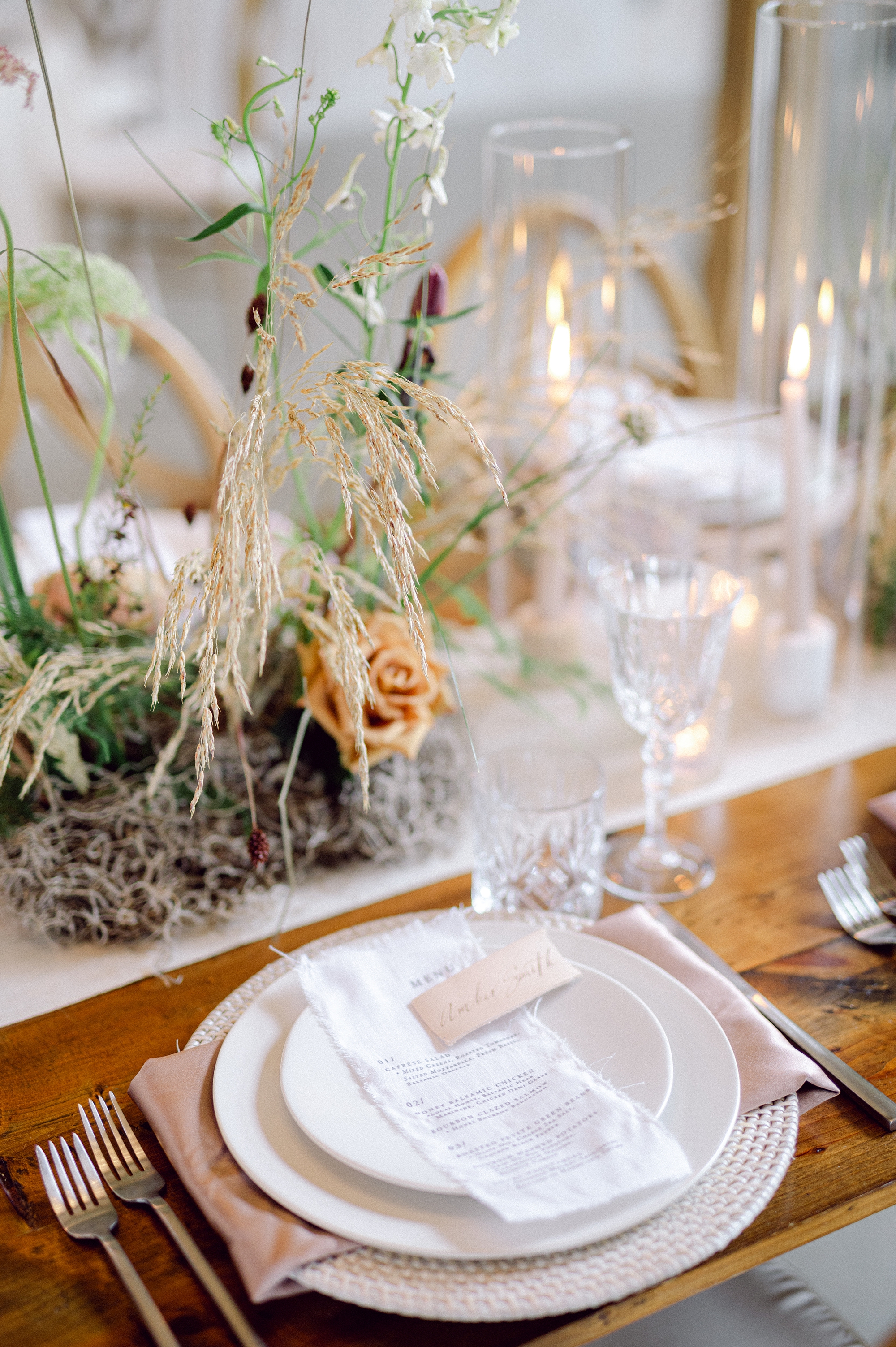
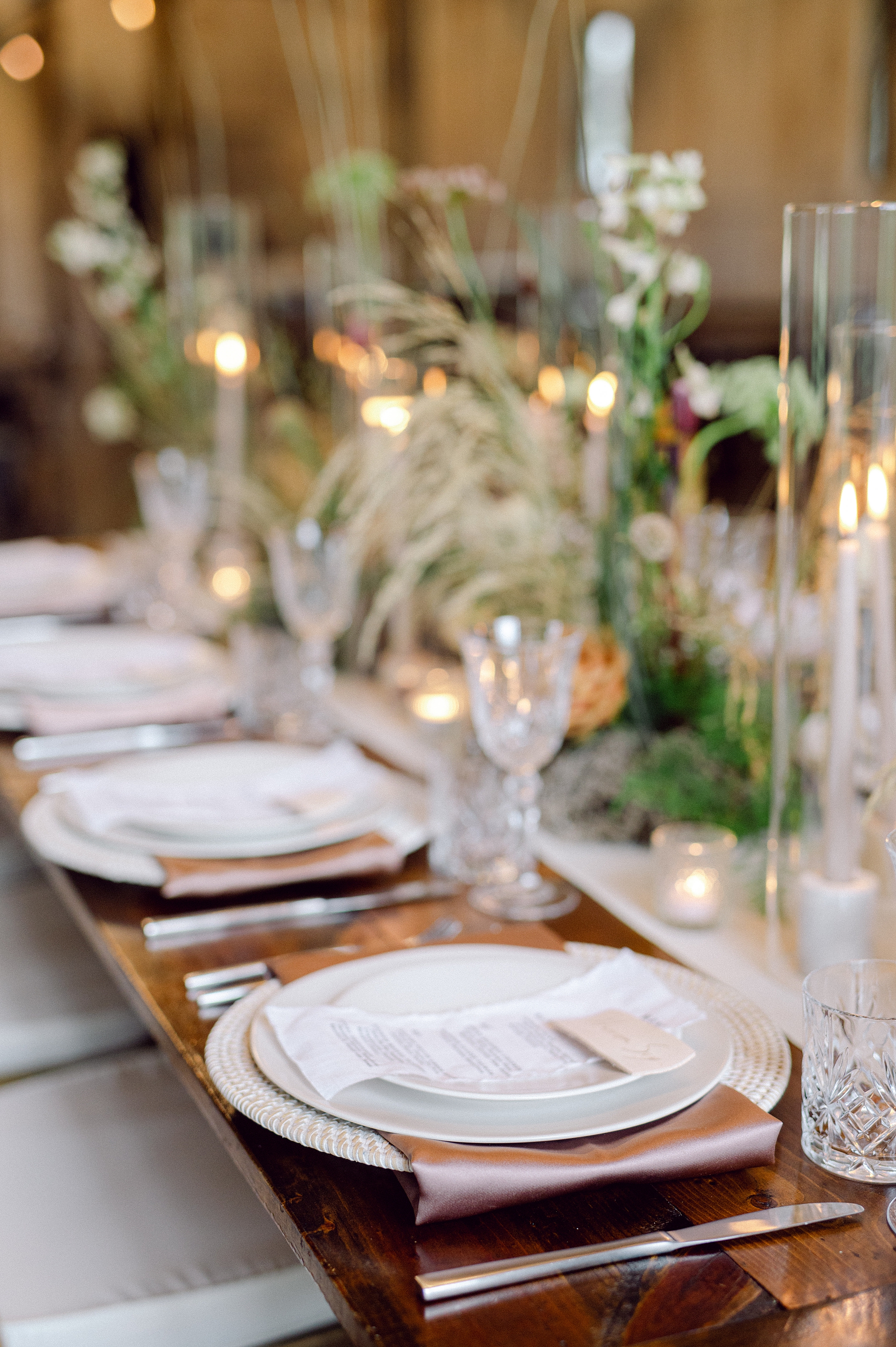
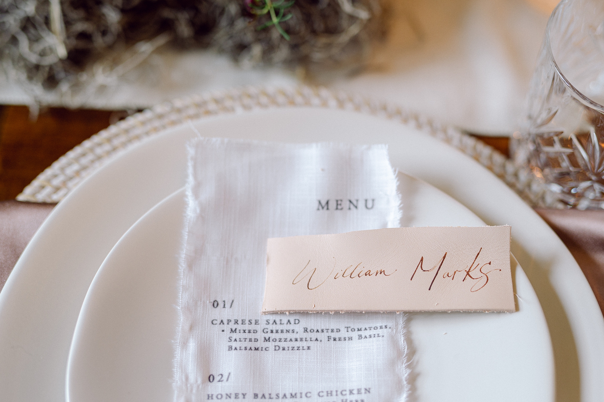
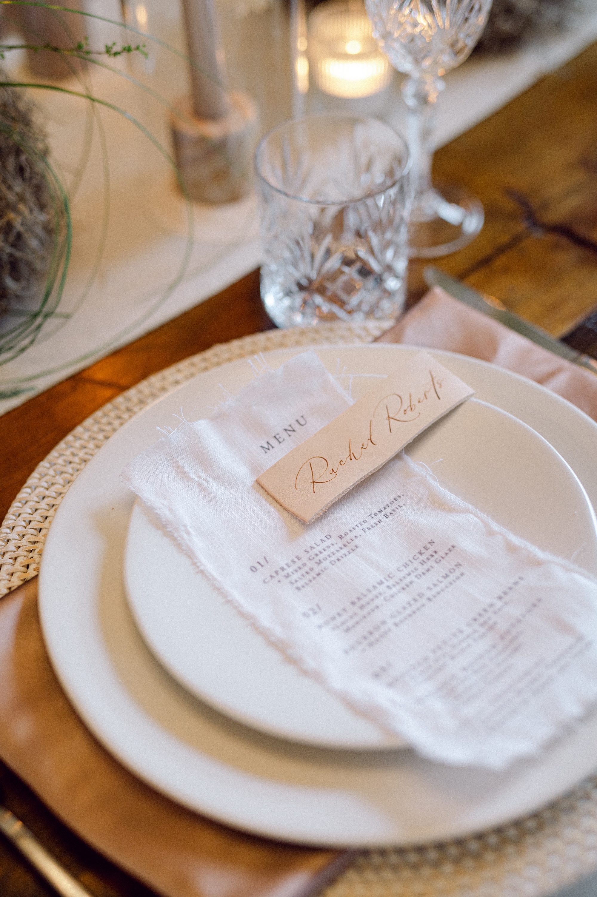
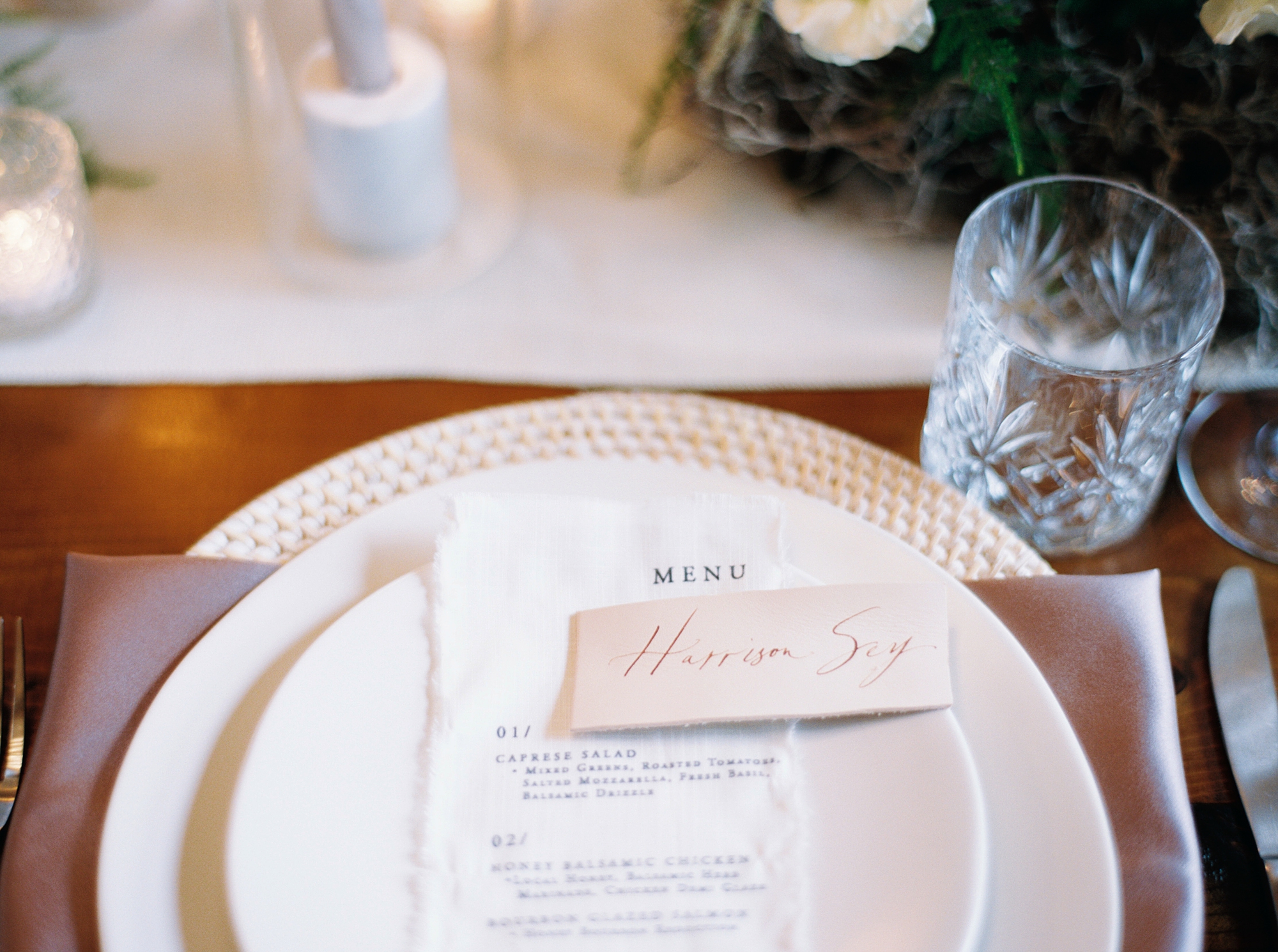
Day-of Details: Fabric Signage
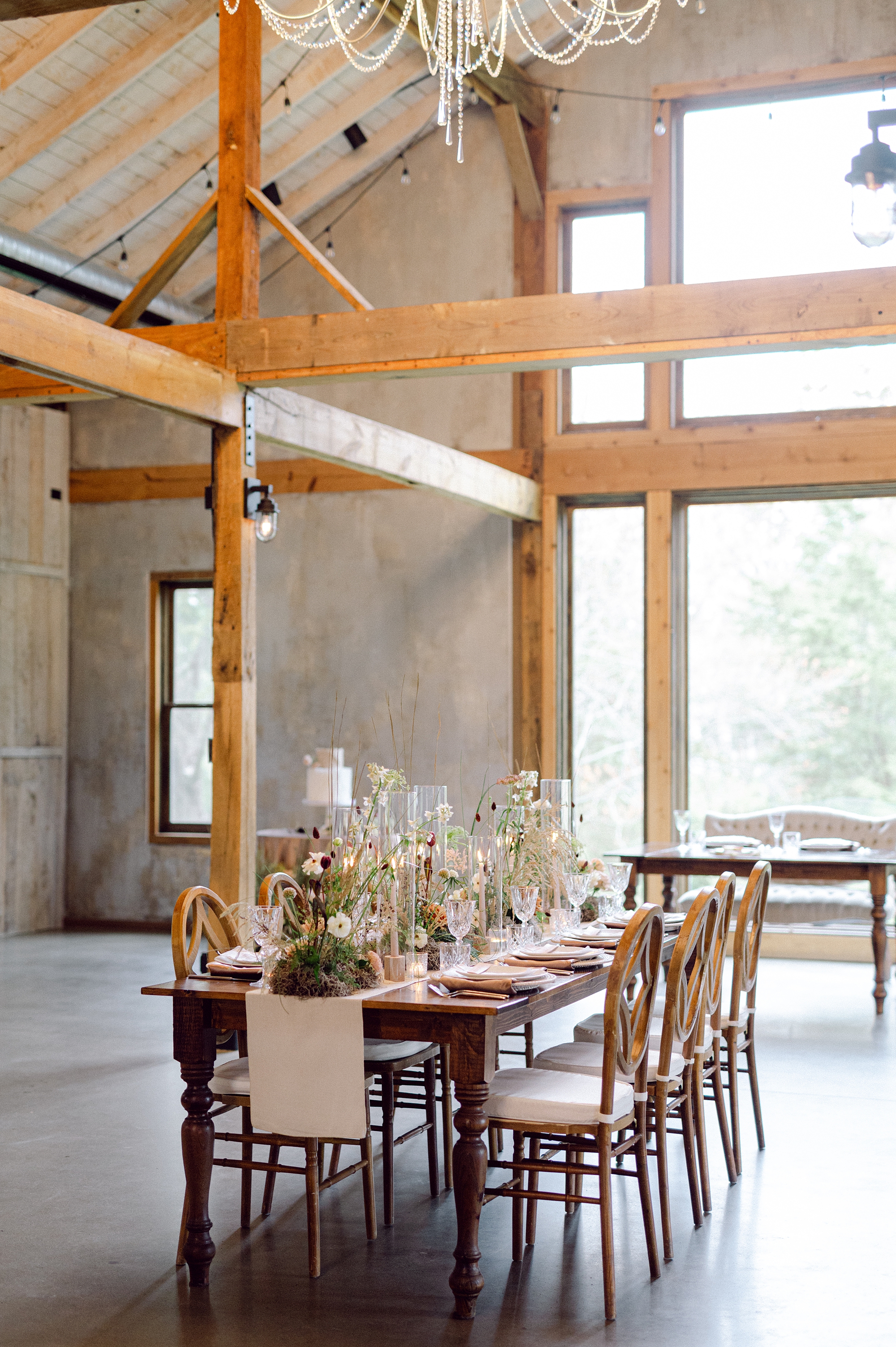
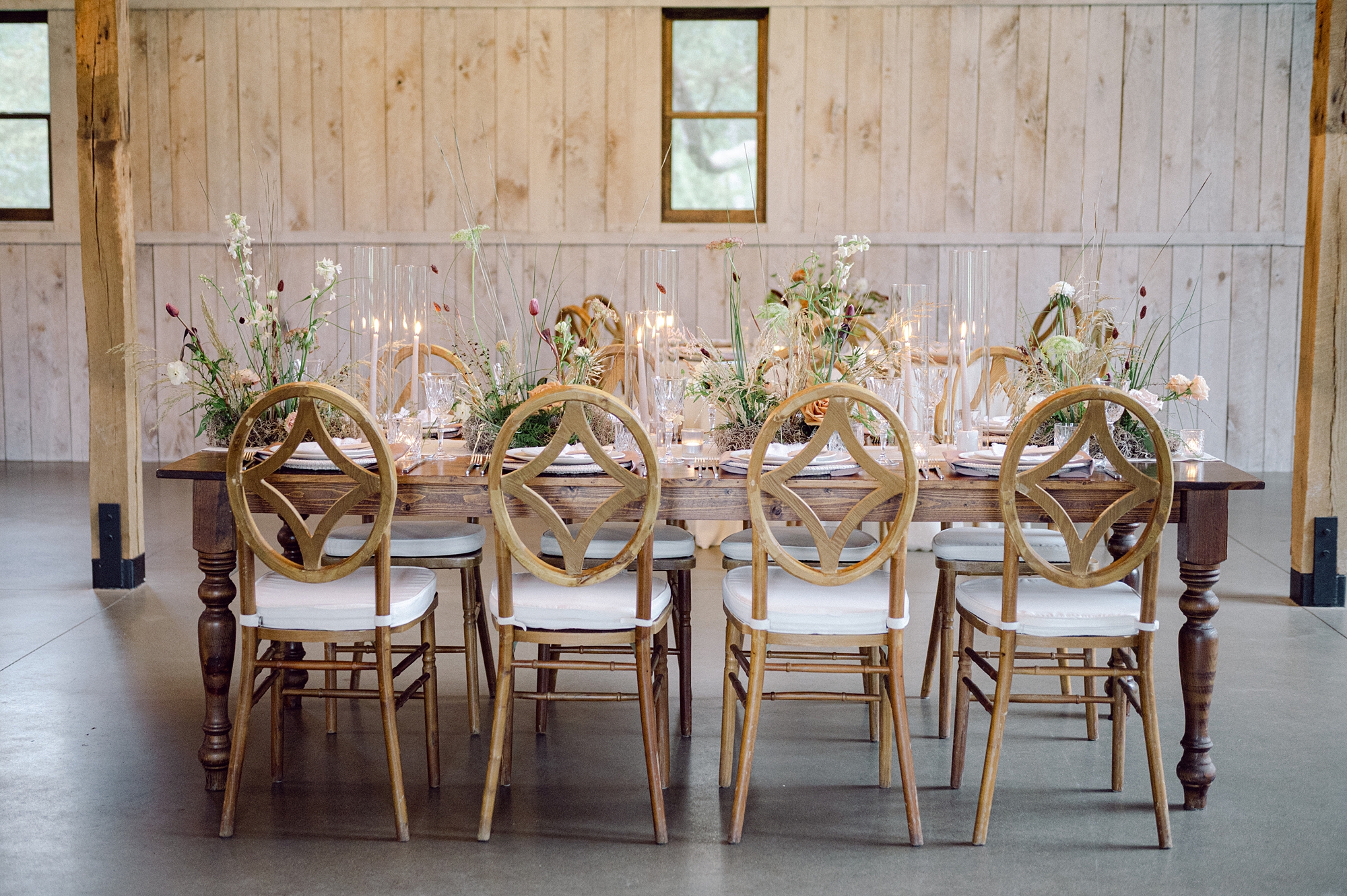
For the bar signage and seating chart, we continued the theme of texture and flow with custom fabric signage, which brought a sense of cohesion to the space. The seating chart flowed in the wind as was placed outside in the seating area. The bar sign was a statement piece as it draped over the front of the bar listing all the beverages available.
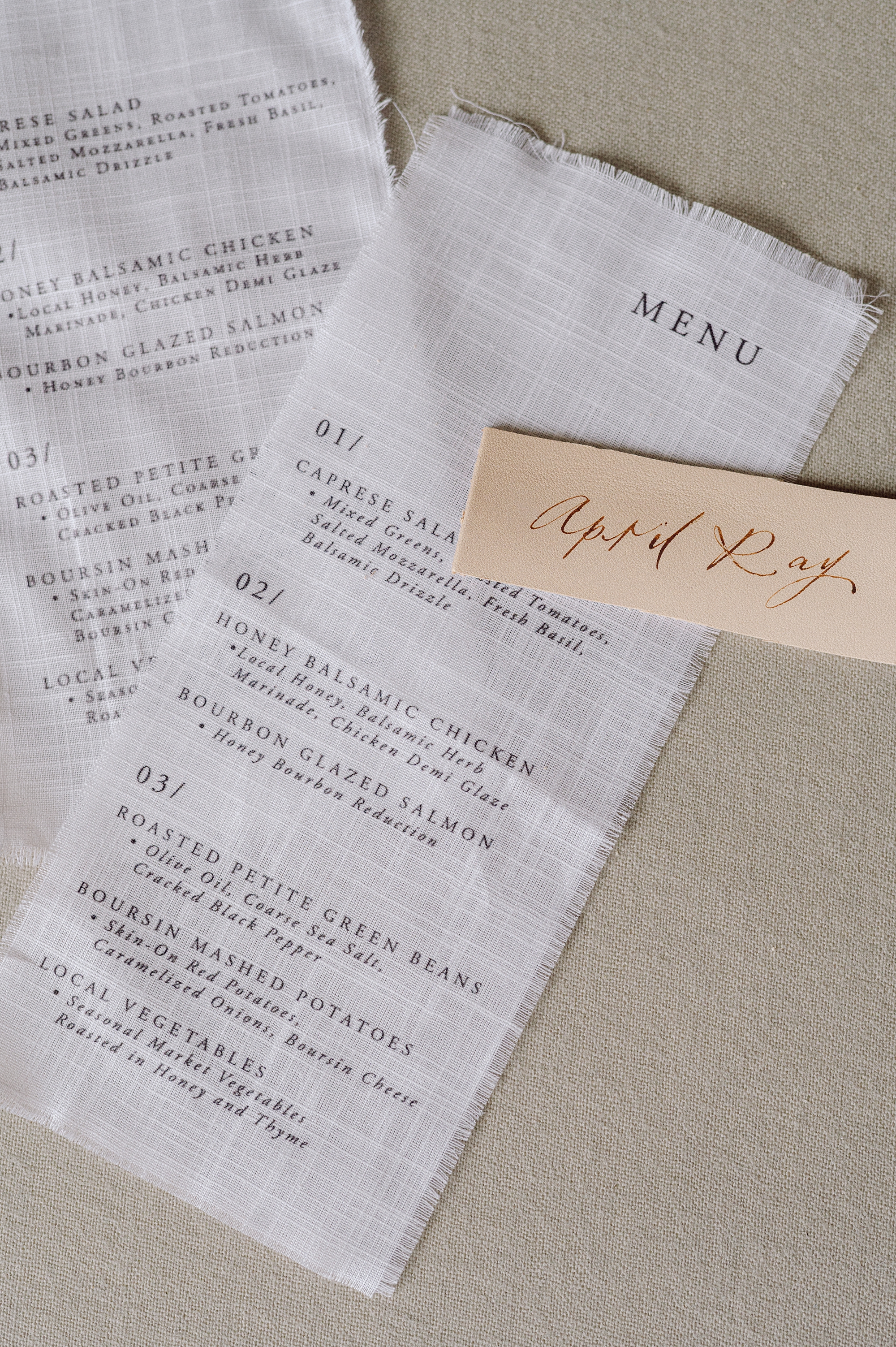
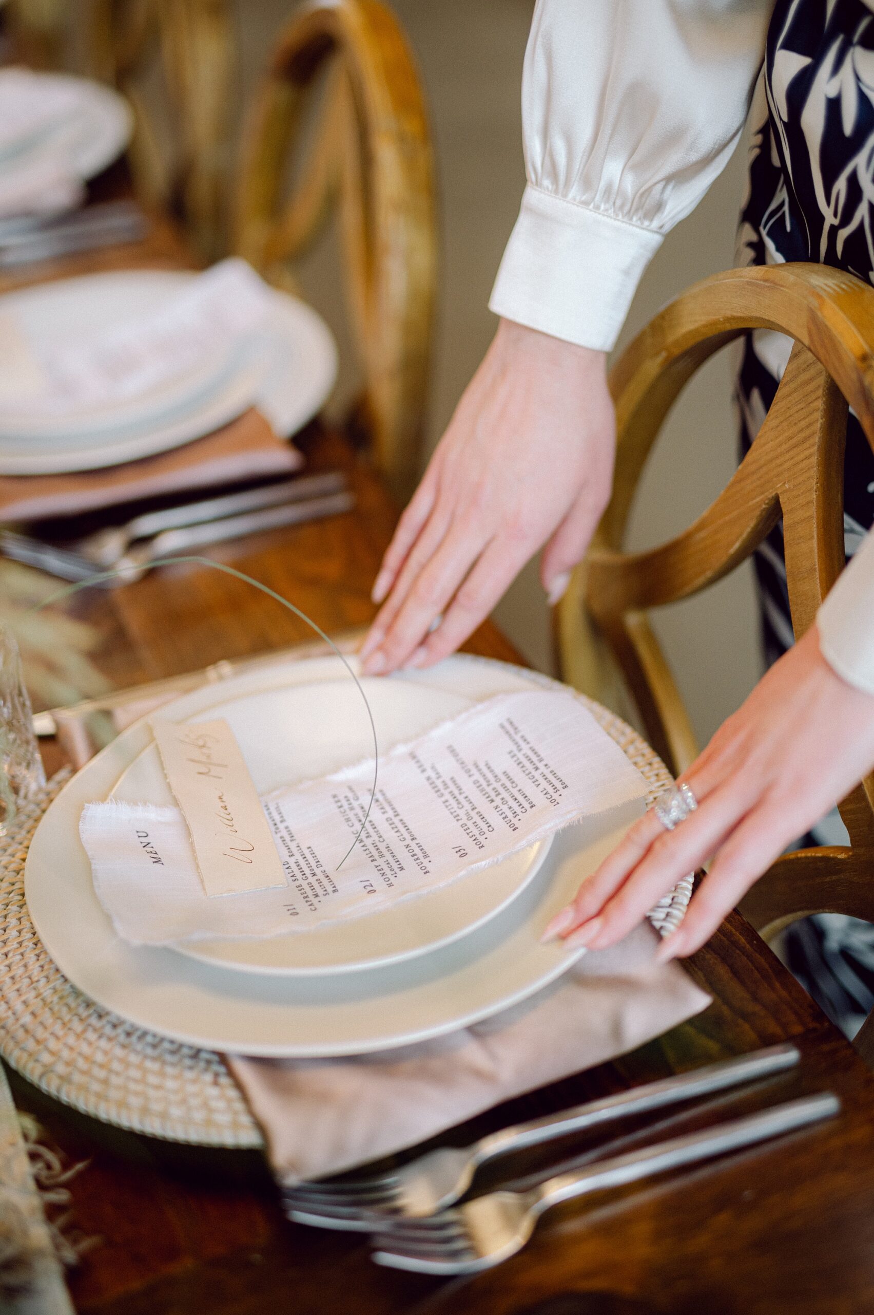
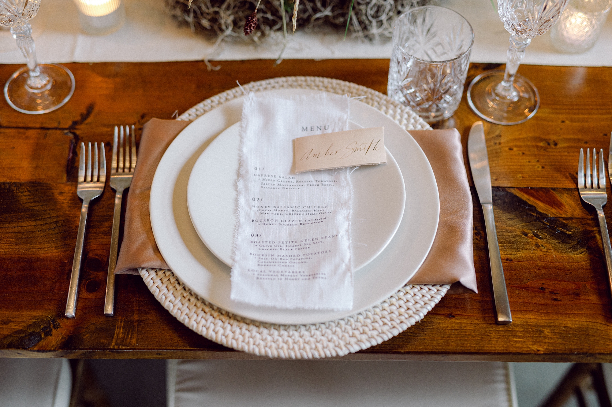
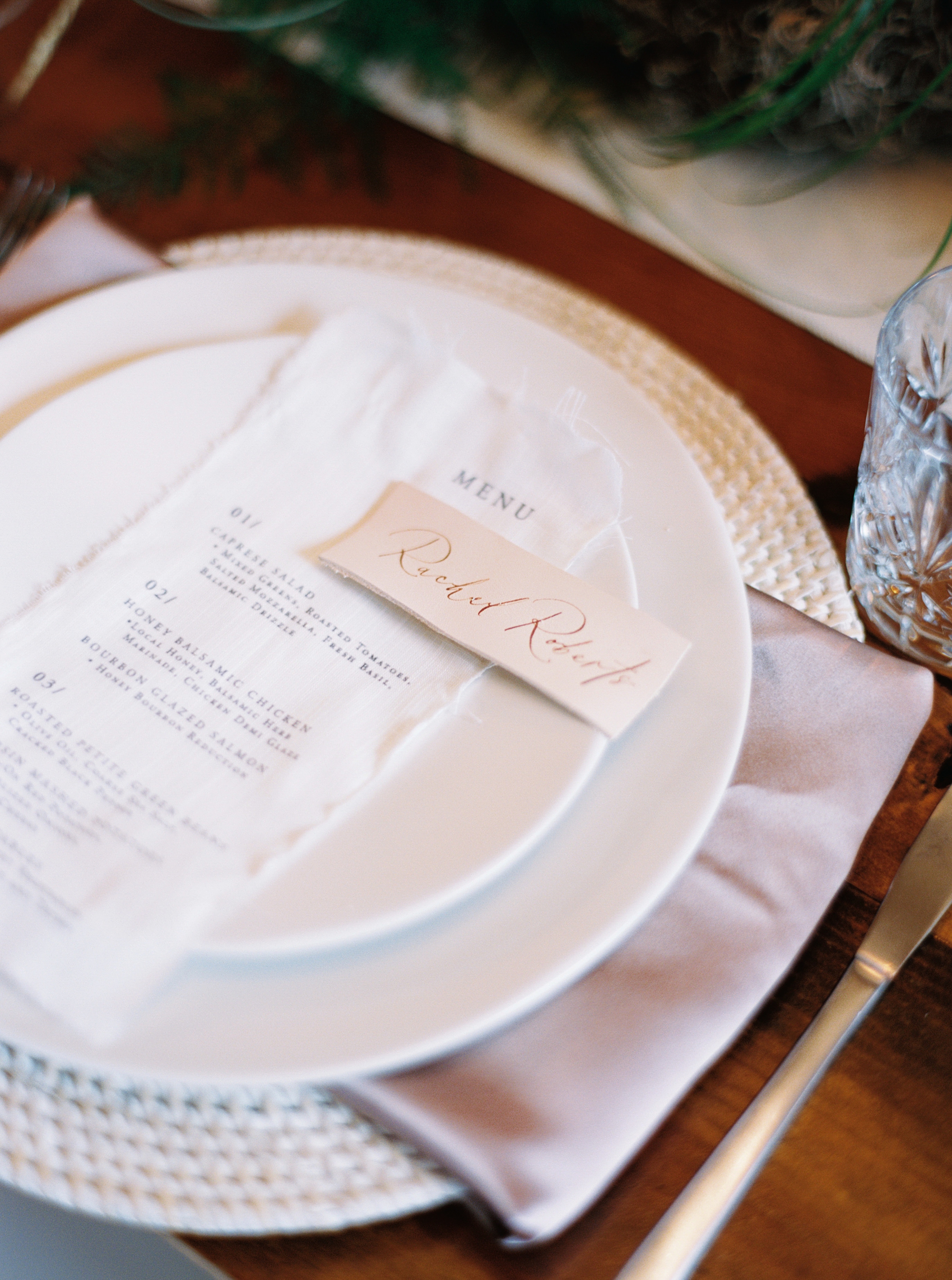
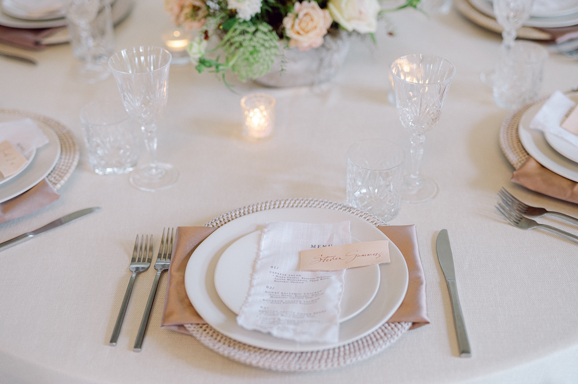
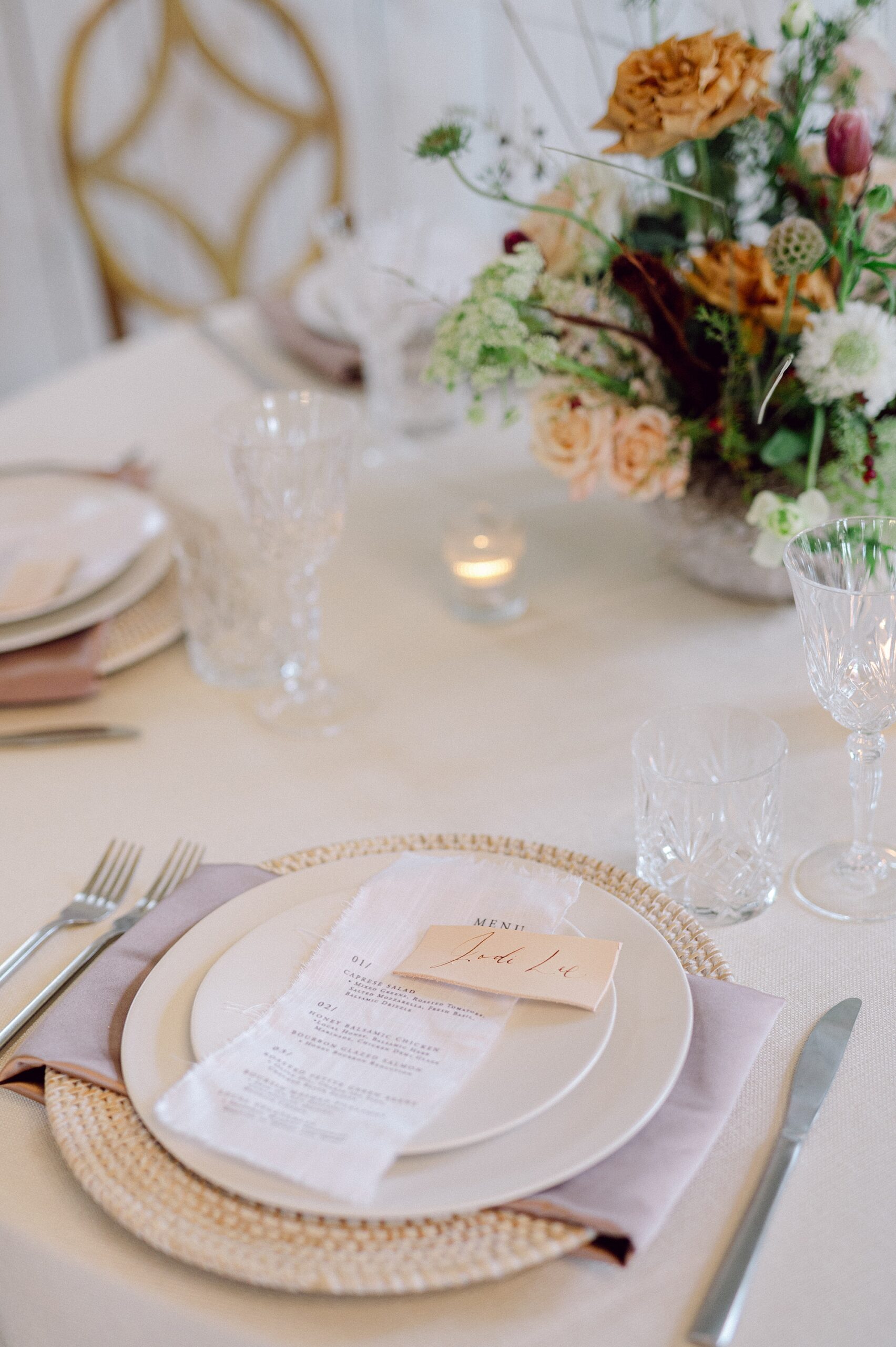
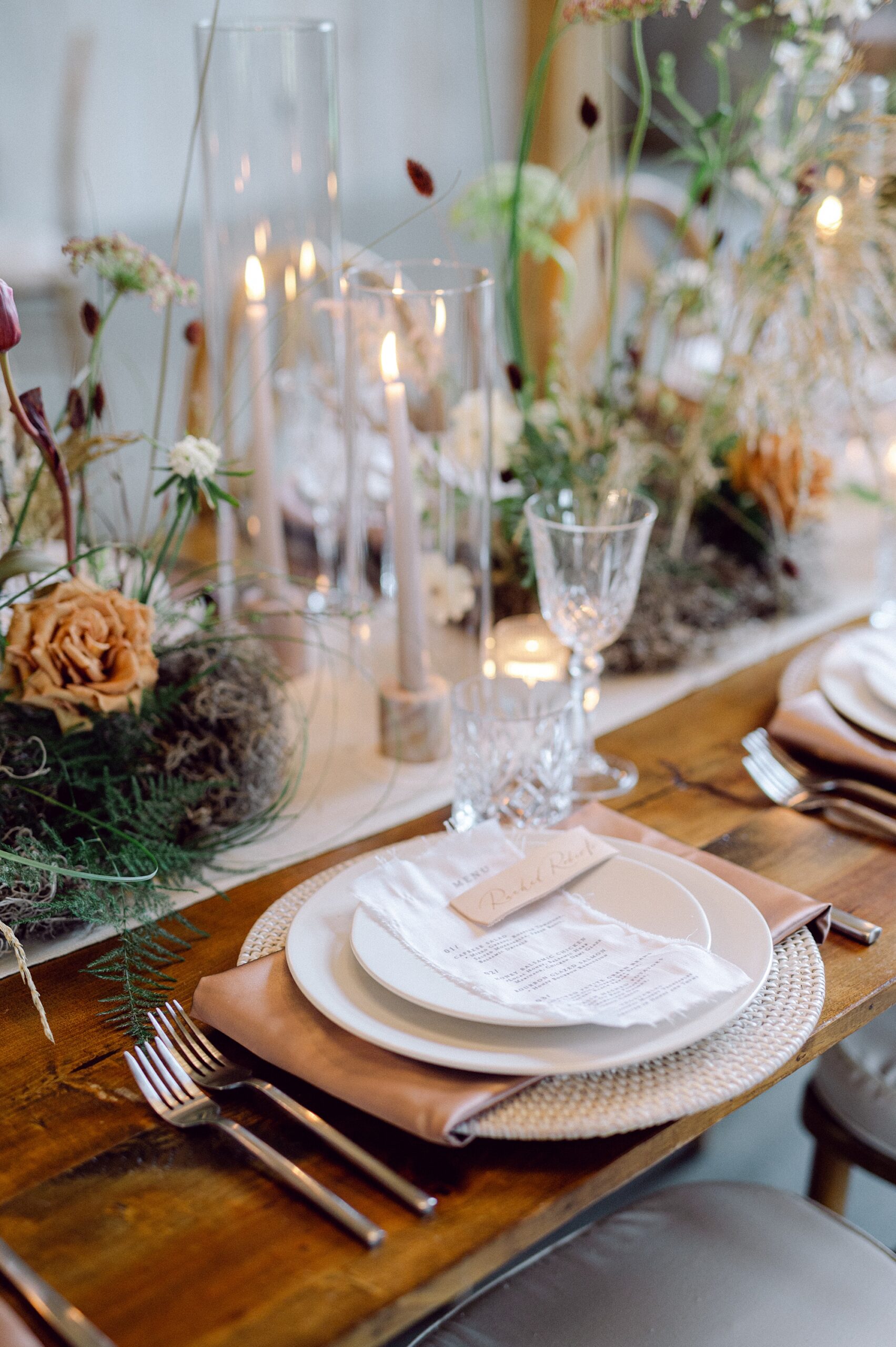
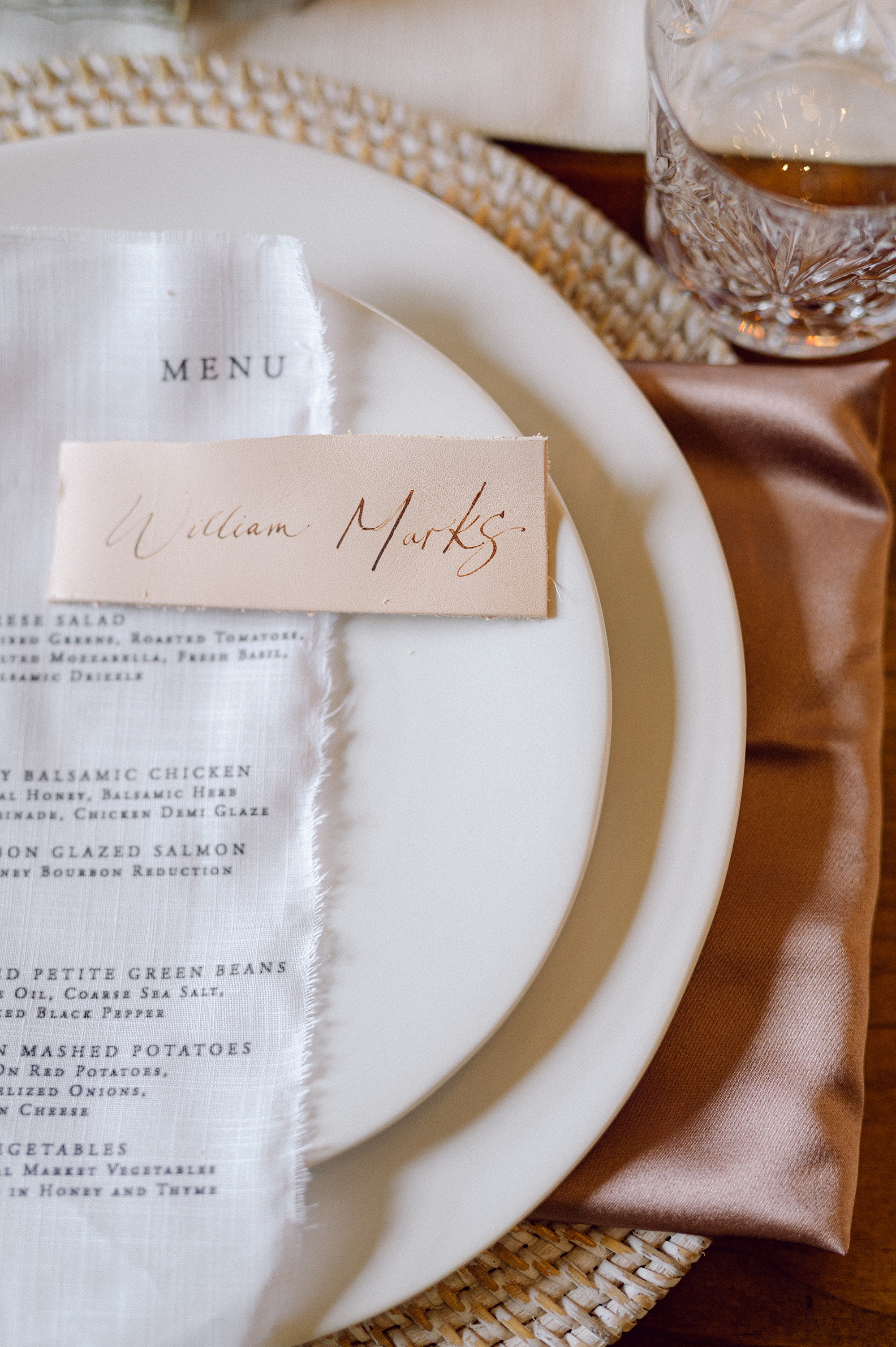
Fabric continued to take center stage as we created fabric menus that draped effortlessly across each place setting, adding softness and movement to the tablescape.
To complement the other design elements, we also incorporated leather place cards. Each detail worked together to create a cohesive visual narrative that invited you to see and feel the design. This vibe was enhanced by the muted floral tones and boho-inspired flower arrangements that decorated the space adding movement and beauty.
It was a dream to collaborate with such a talented team of wedding professionals and bring this vision to life.
If you’re planning a wedding in Nashville, or anywhere in the world, we’d love to help you create meaningful, personalized stationery and event details that tell your story. We work with couples worldwide to design details you and your guests will remember forever. Reach out today to learn more about our full-service wedding and event design offerings! We can’t wait to create something unforgettable for you!
If you enjoyed this post, you’ll love these other blogs!
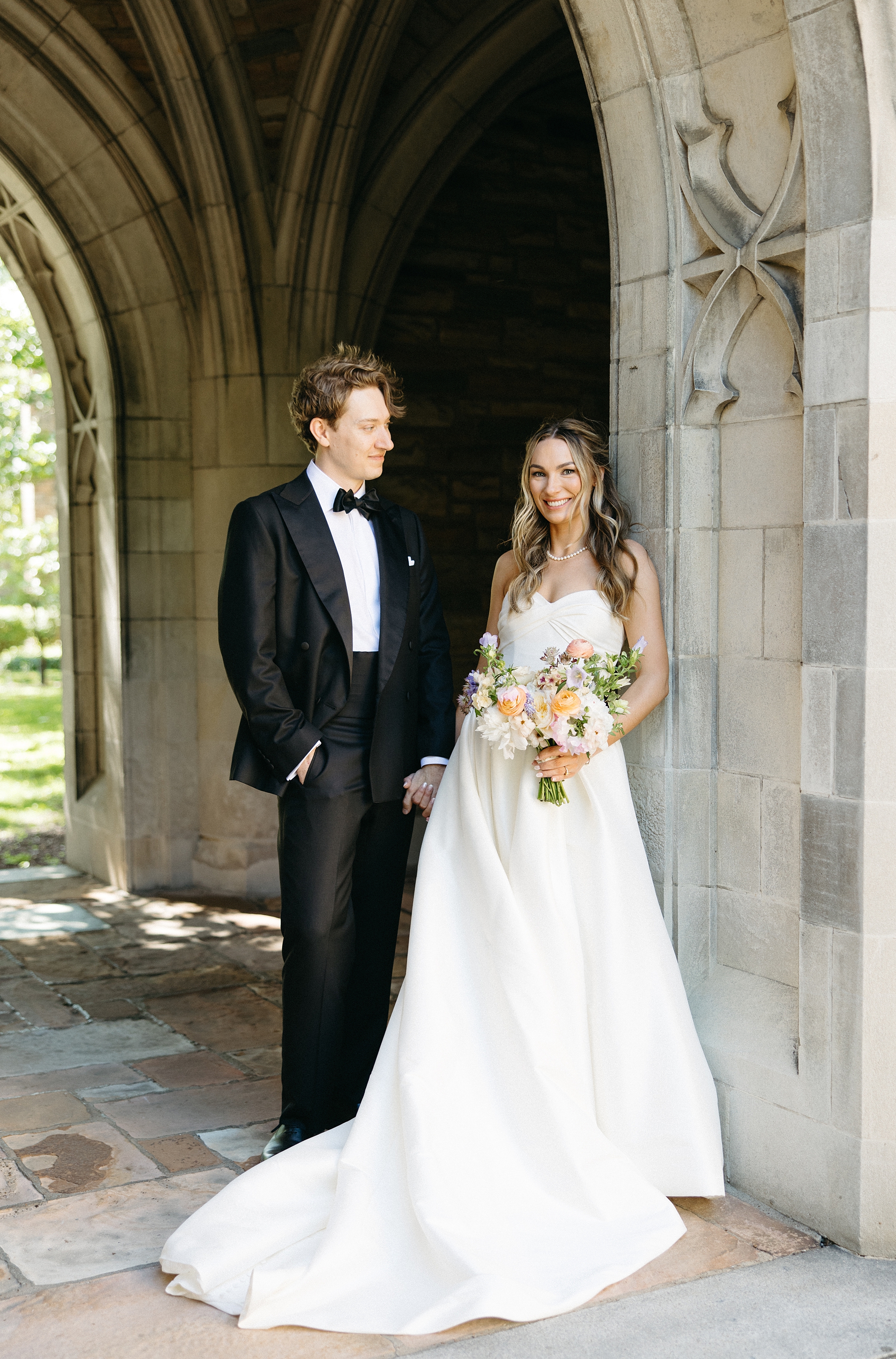
This gorgeous Clementine Hall wedding was a true reflection of creativity, elegance, and personal touches woven throughout the day. We had the joy of designing both their invitation suite and many of their day-of details, and every element wove the couple’s story and style into their big day.
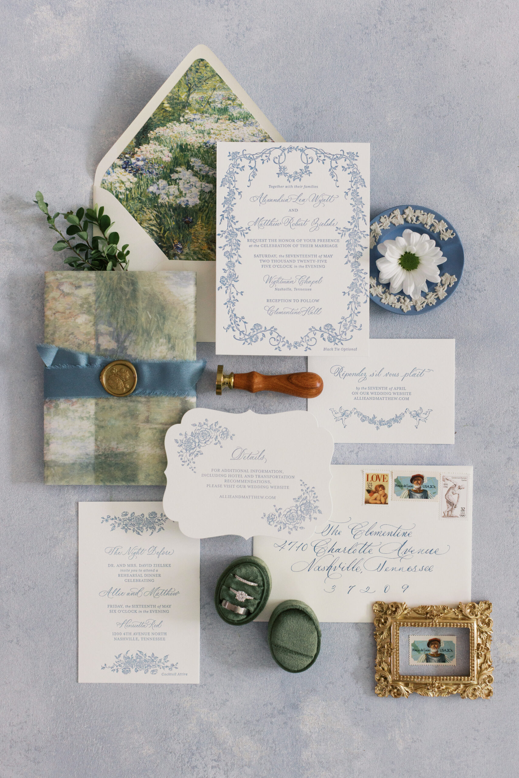
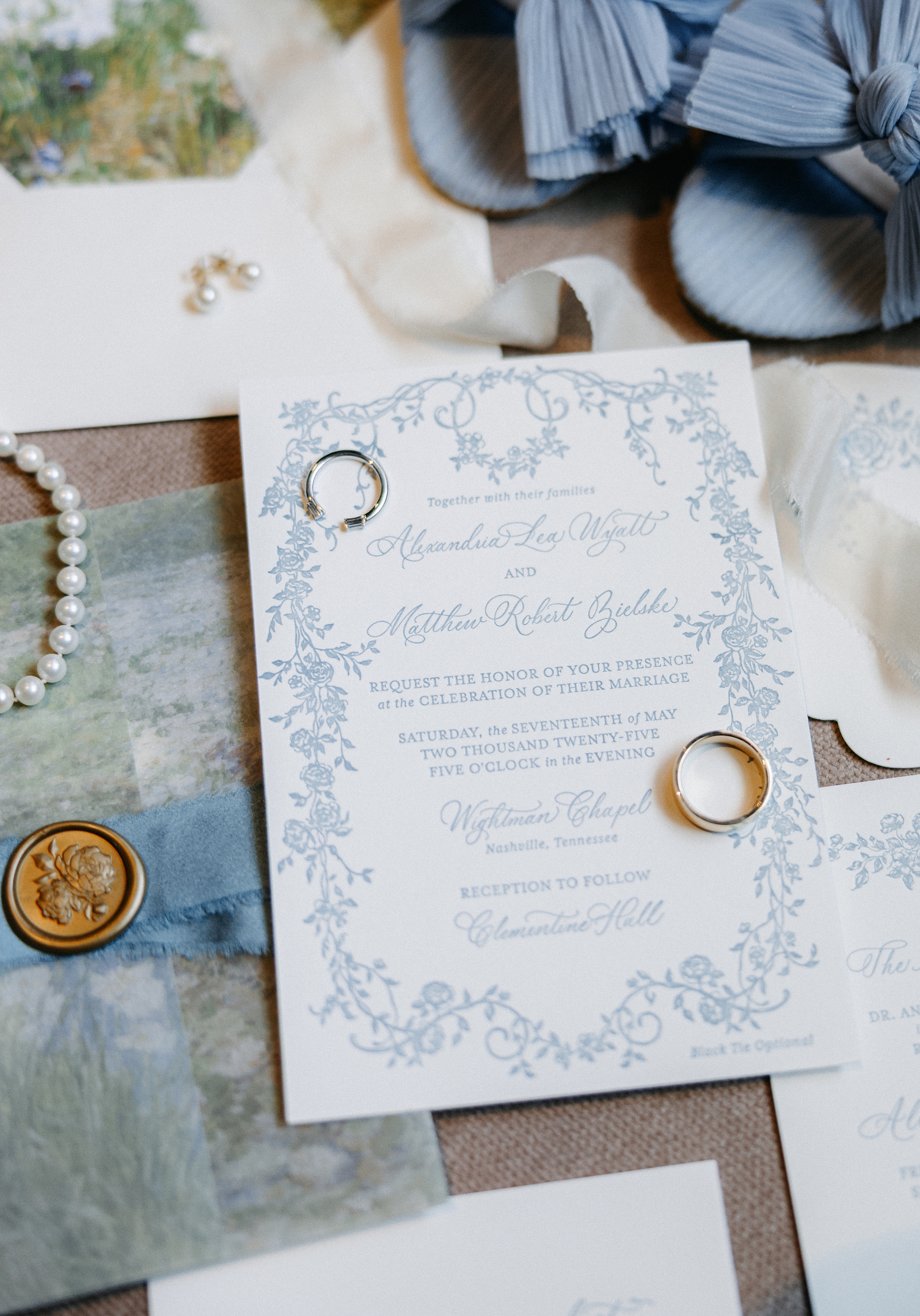
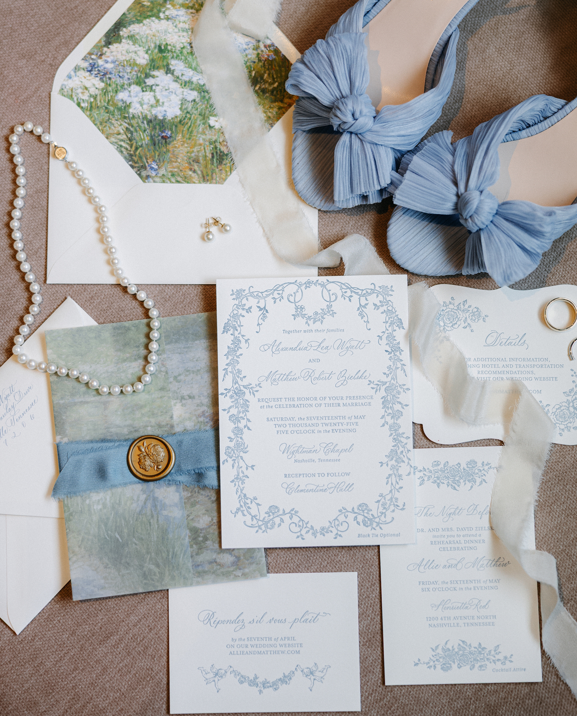
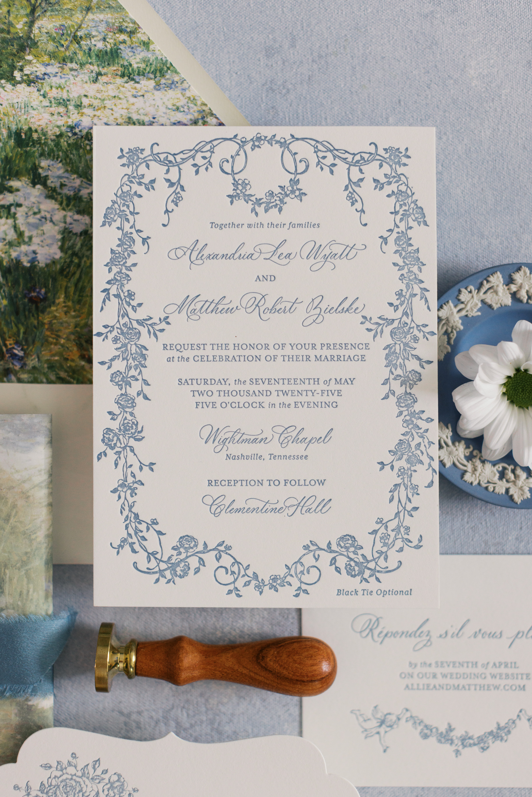
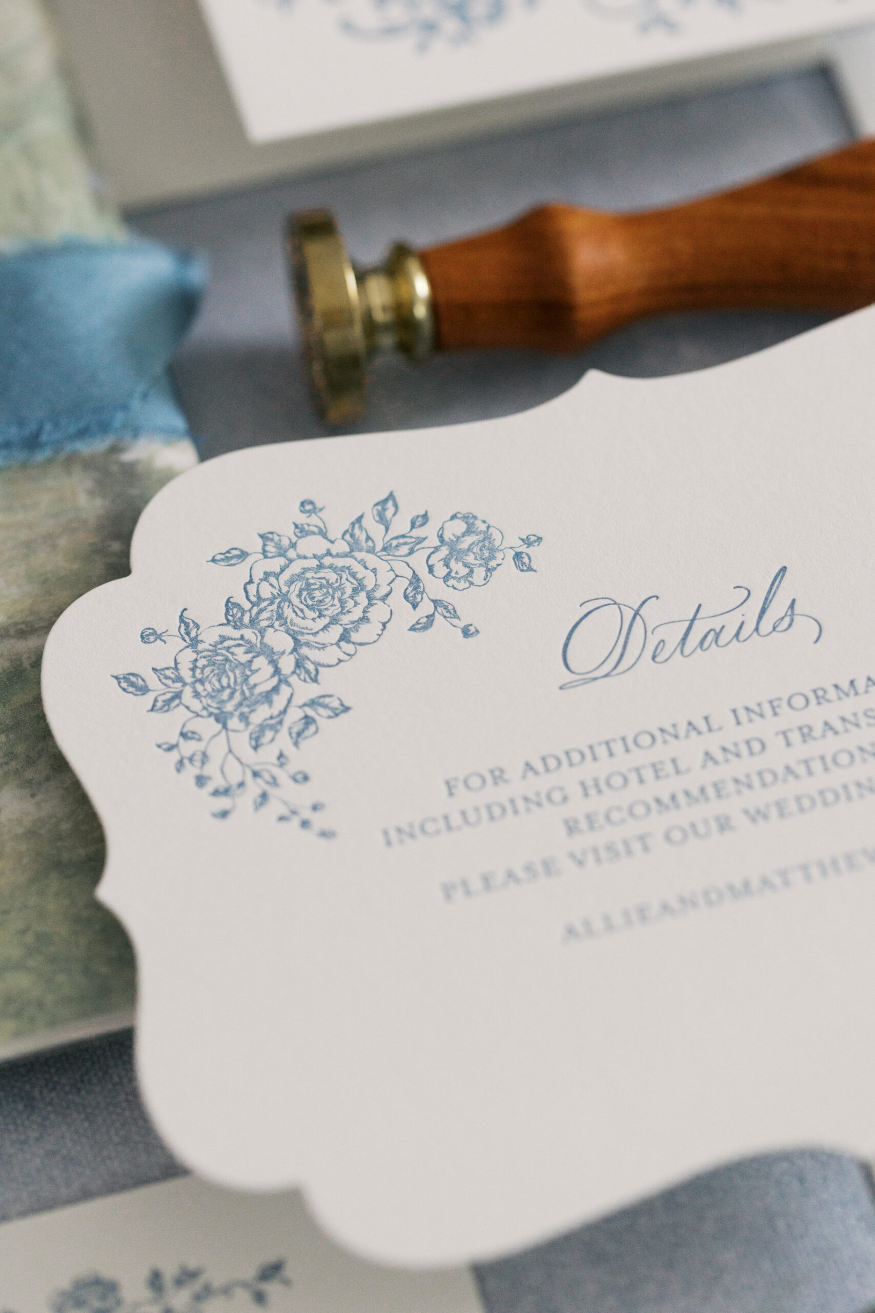
Elegant Letter-Pressed Invitations
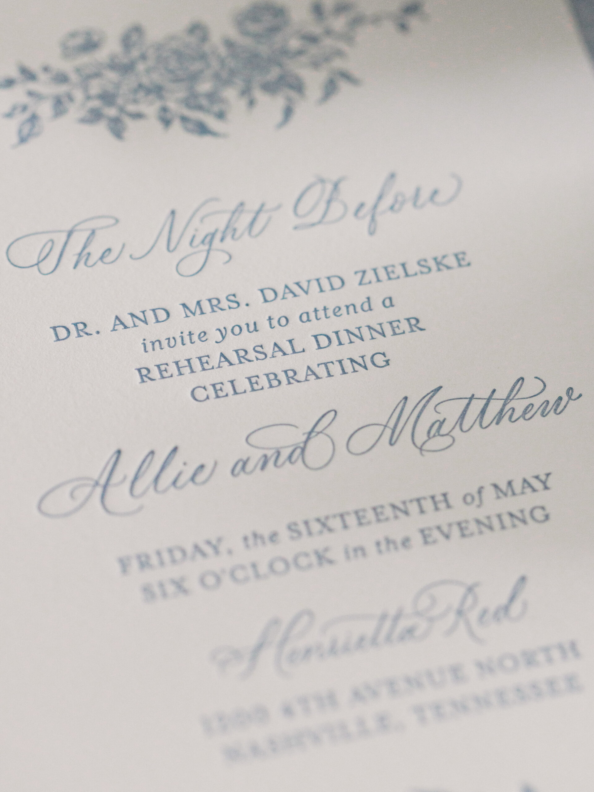
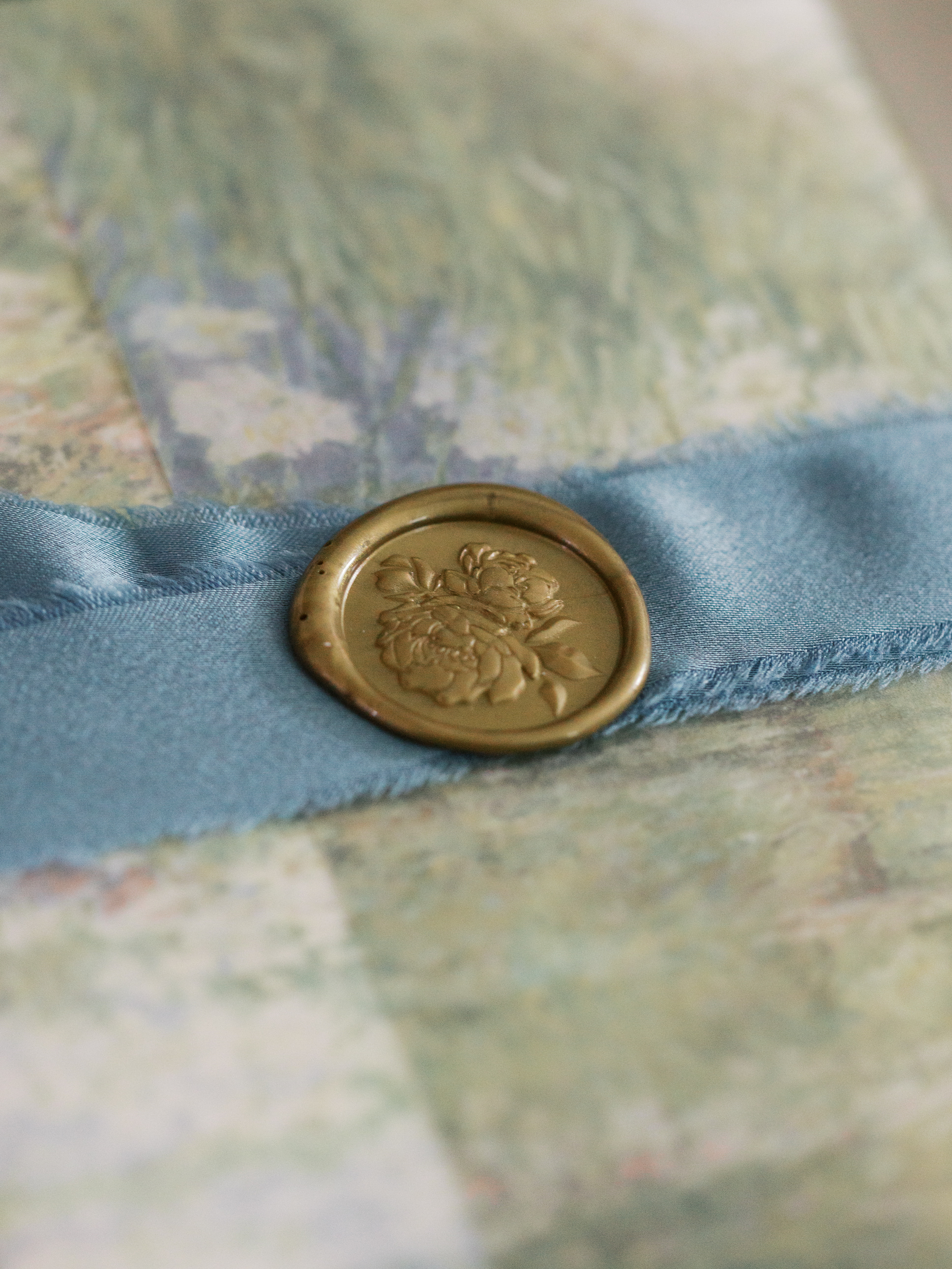
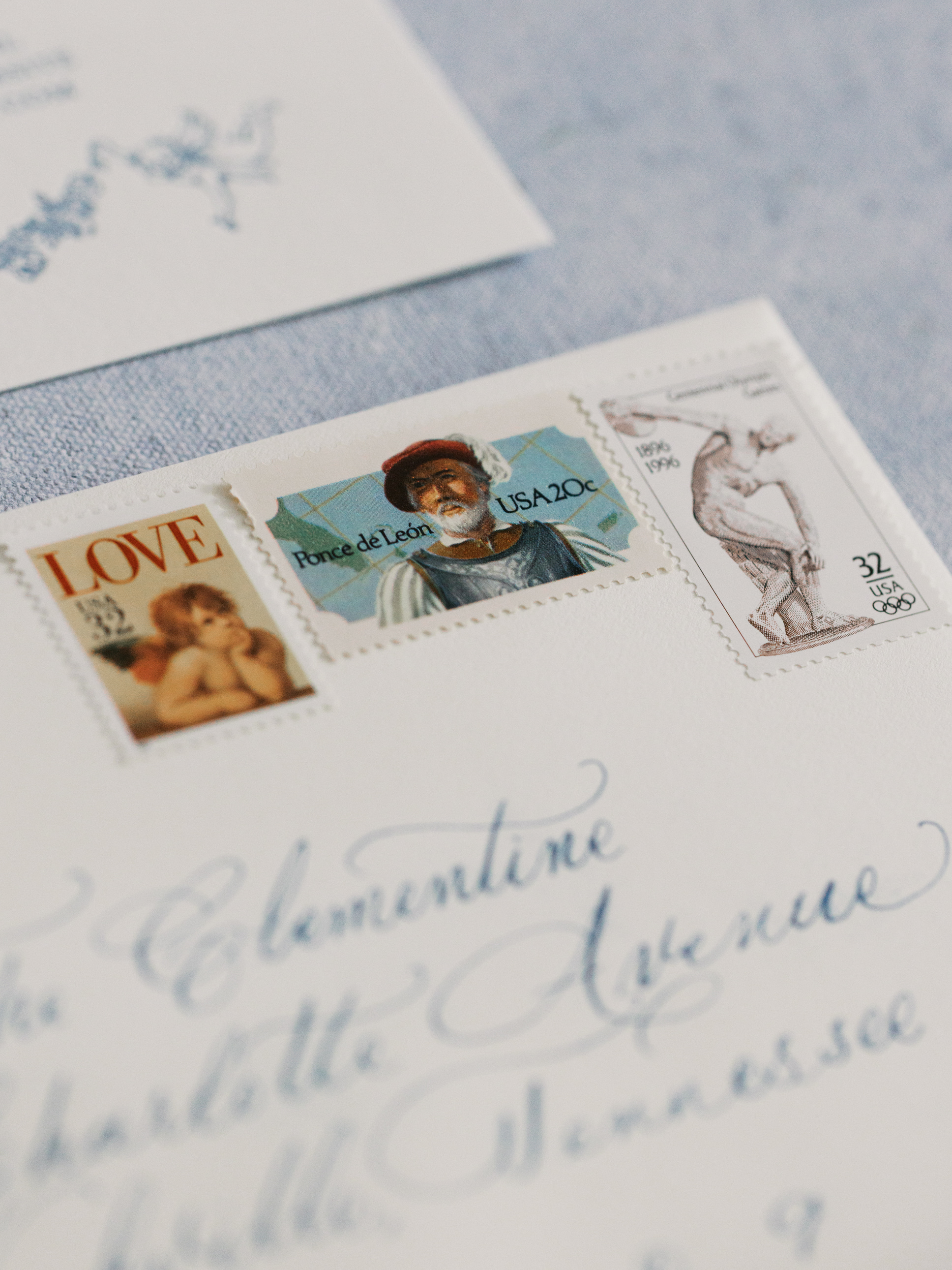
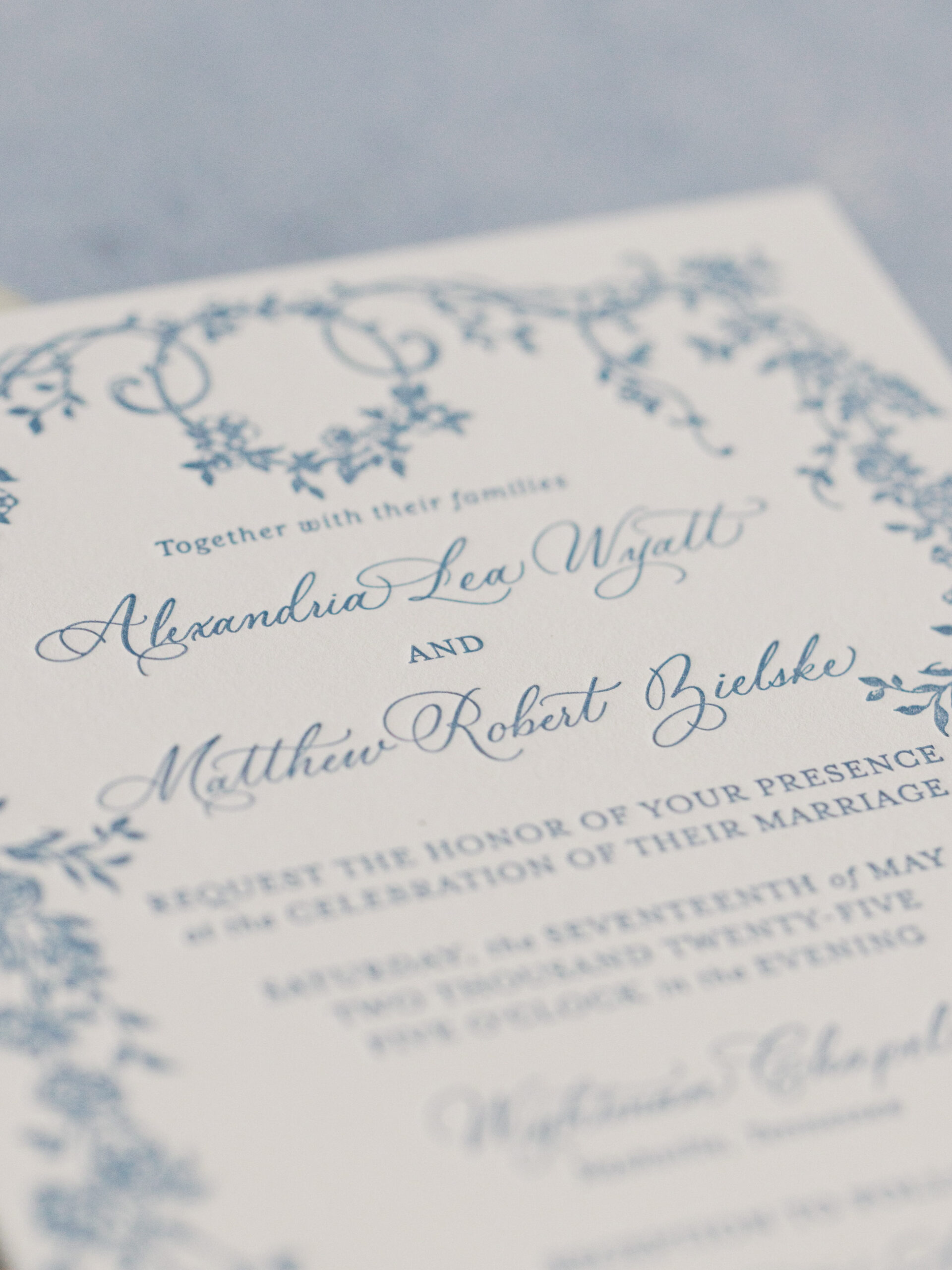
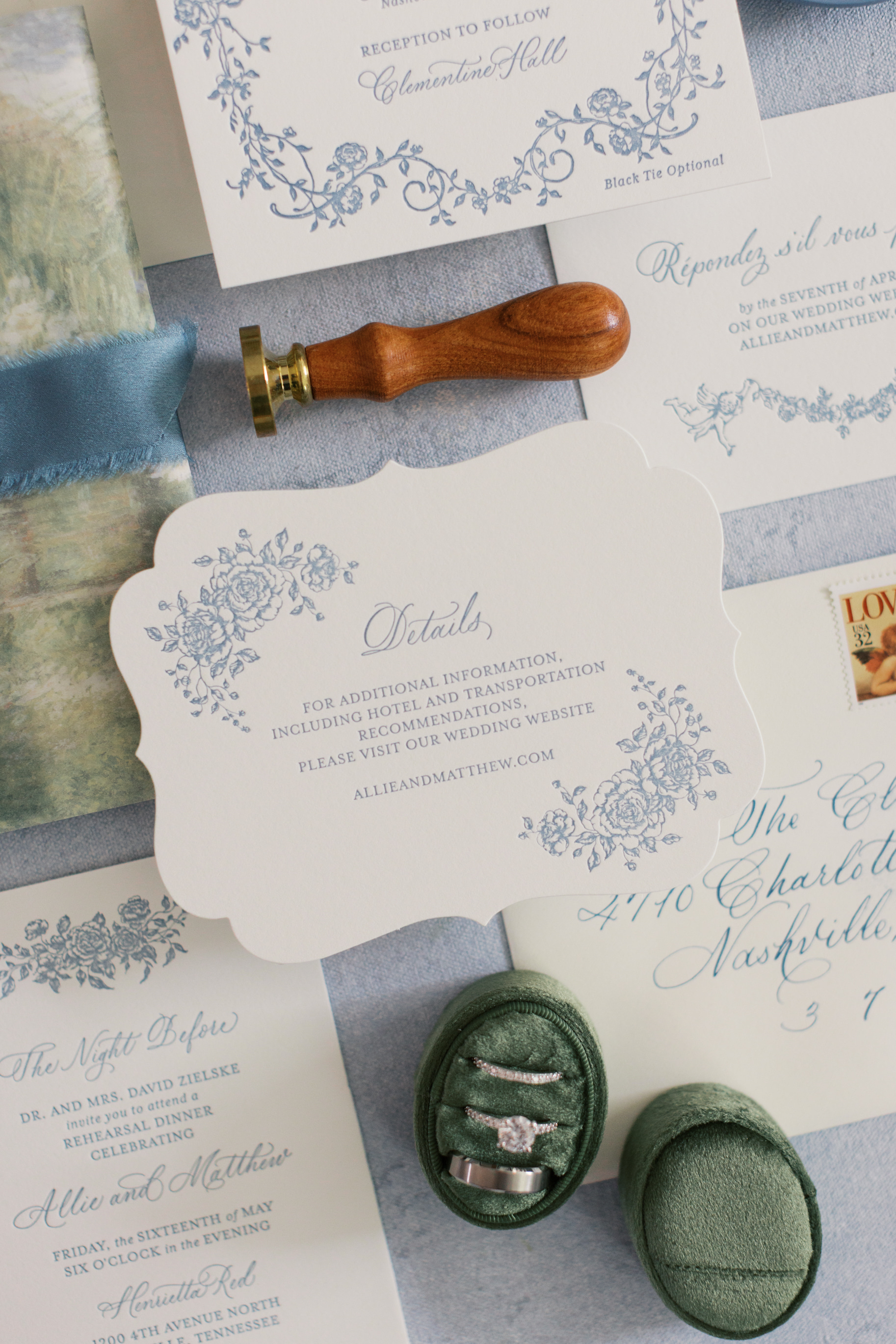
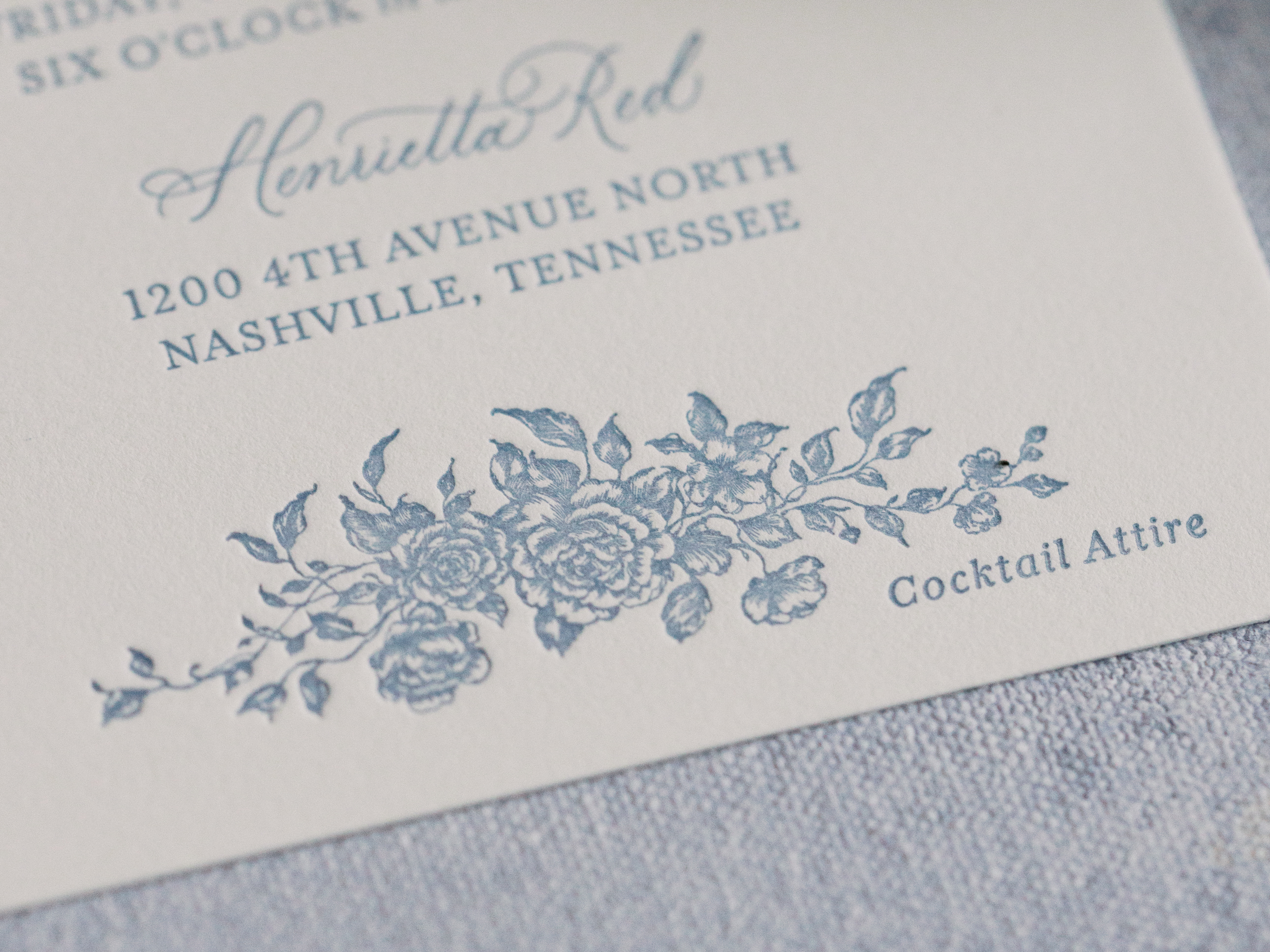
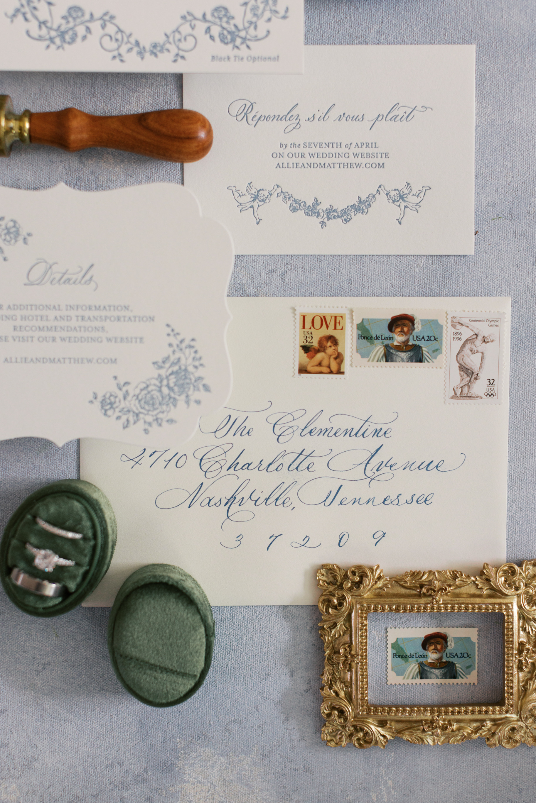
One of our favorite parts of this wedding was how involved the groom was in the design process and the overall aesthetic, which we love! Together, we created a letterpress invitation suite that set the tone for the celebration. A soft blue vine design bordered the invitation, while dreamy light blue lettering paired beautifully with an envelope liner resembling a watercolor field of flowers. The suite was layered with a vellum overlay, tied together with a thick, dusty blue ribbon, and finished with a gold wax seal. It was elevated, romantic, and timeless.
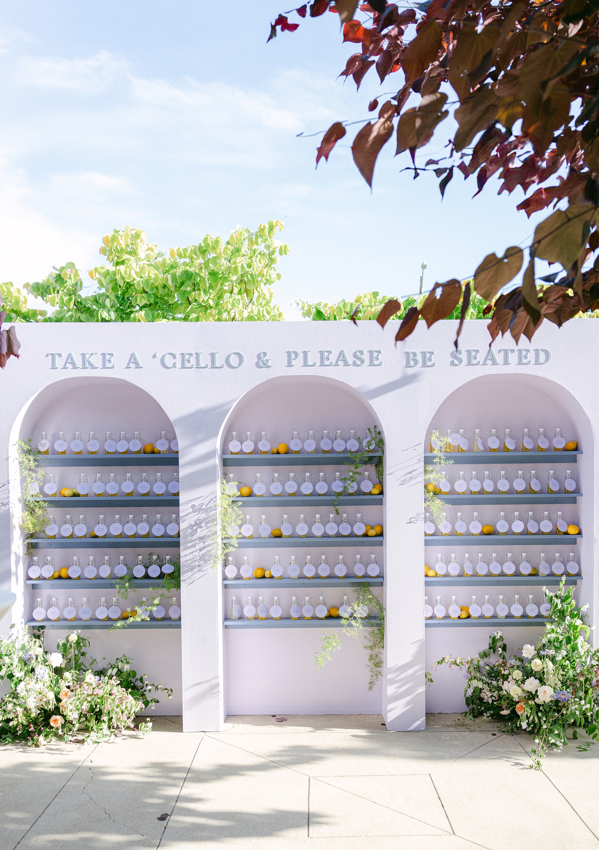
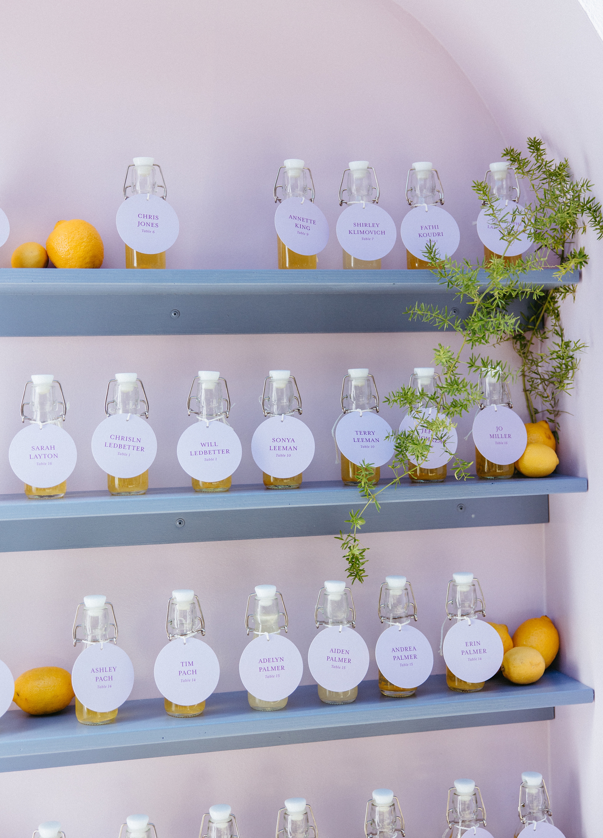
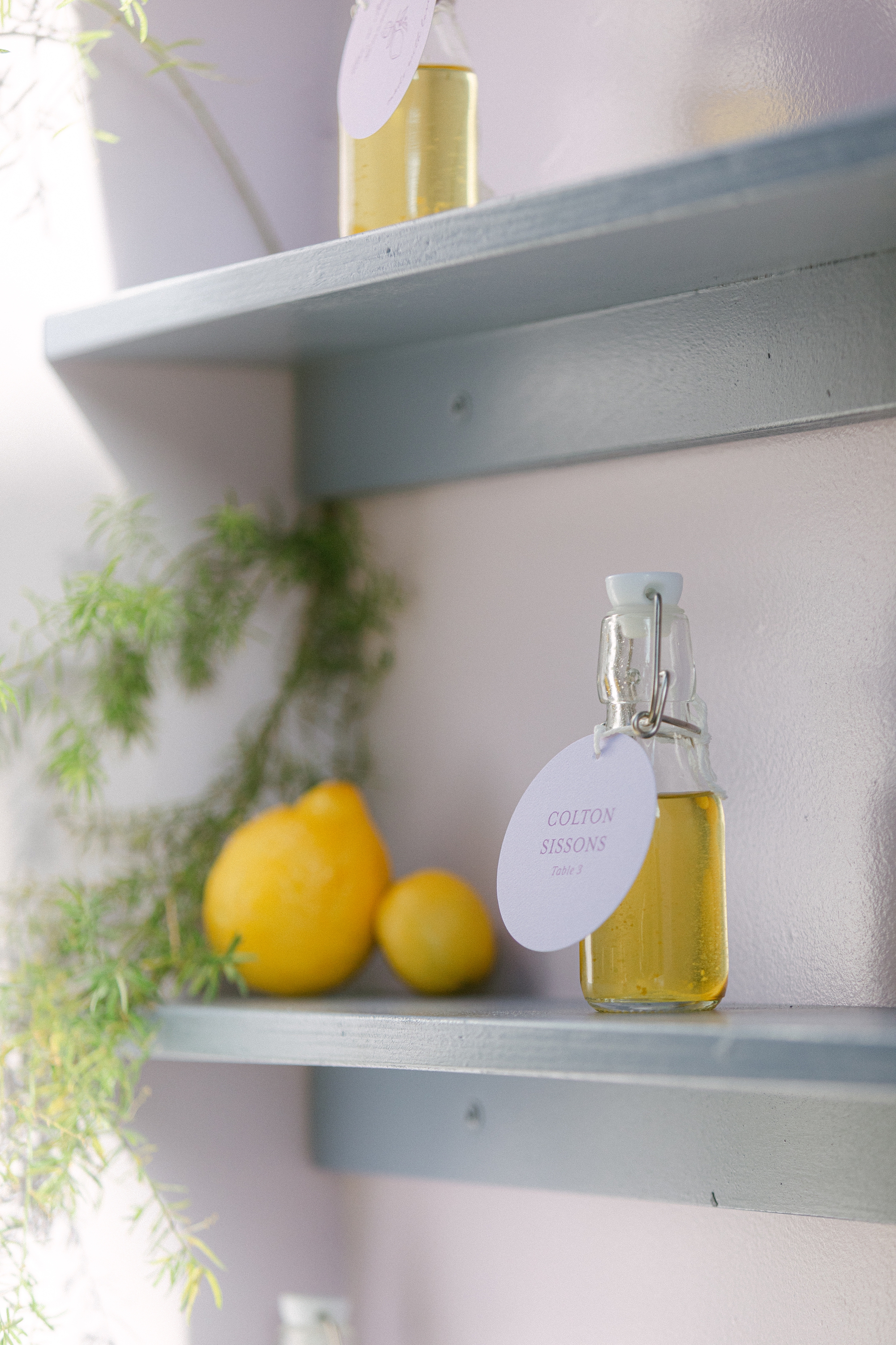
Limoncello Wall + Escort Tags
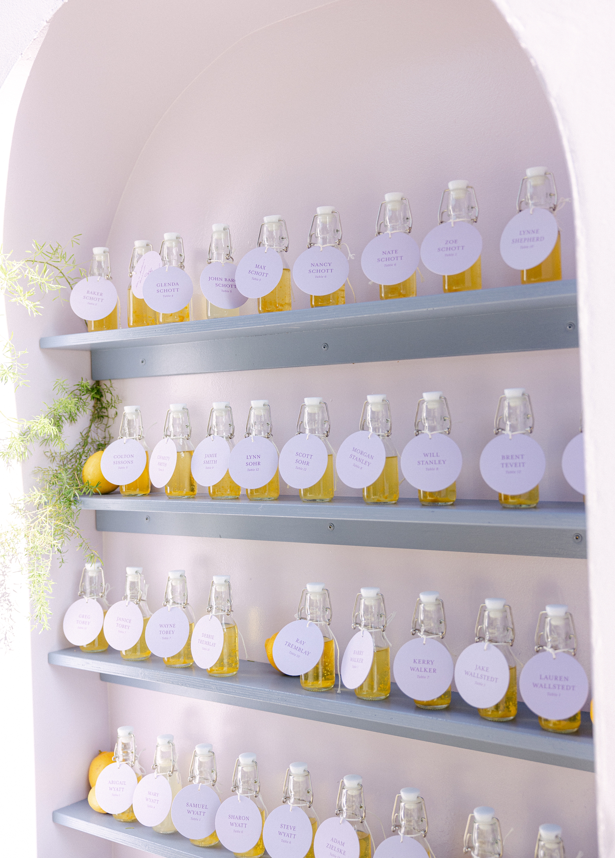
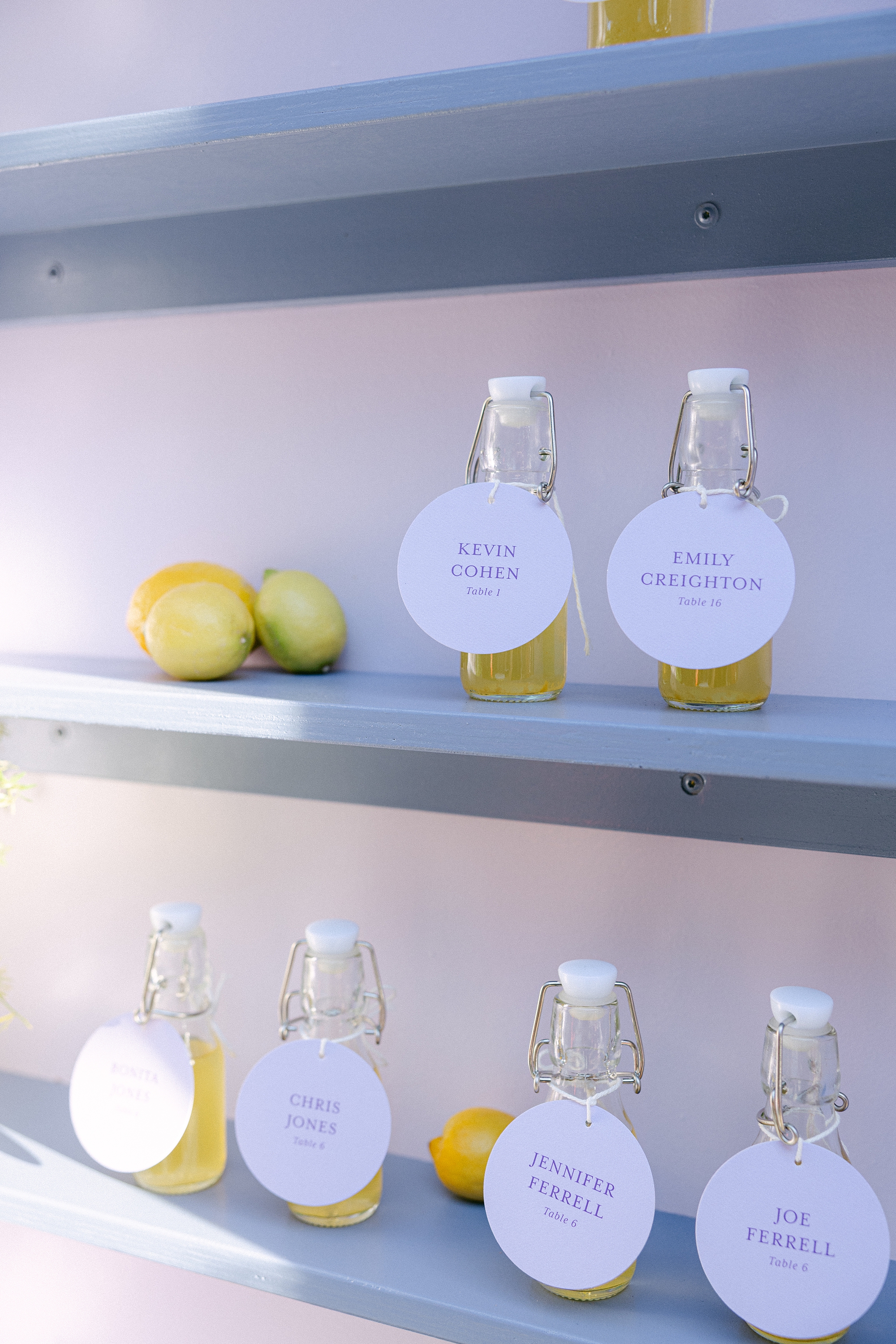
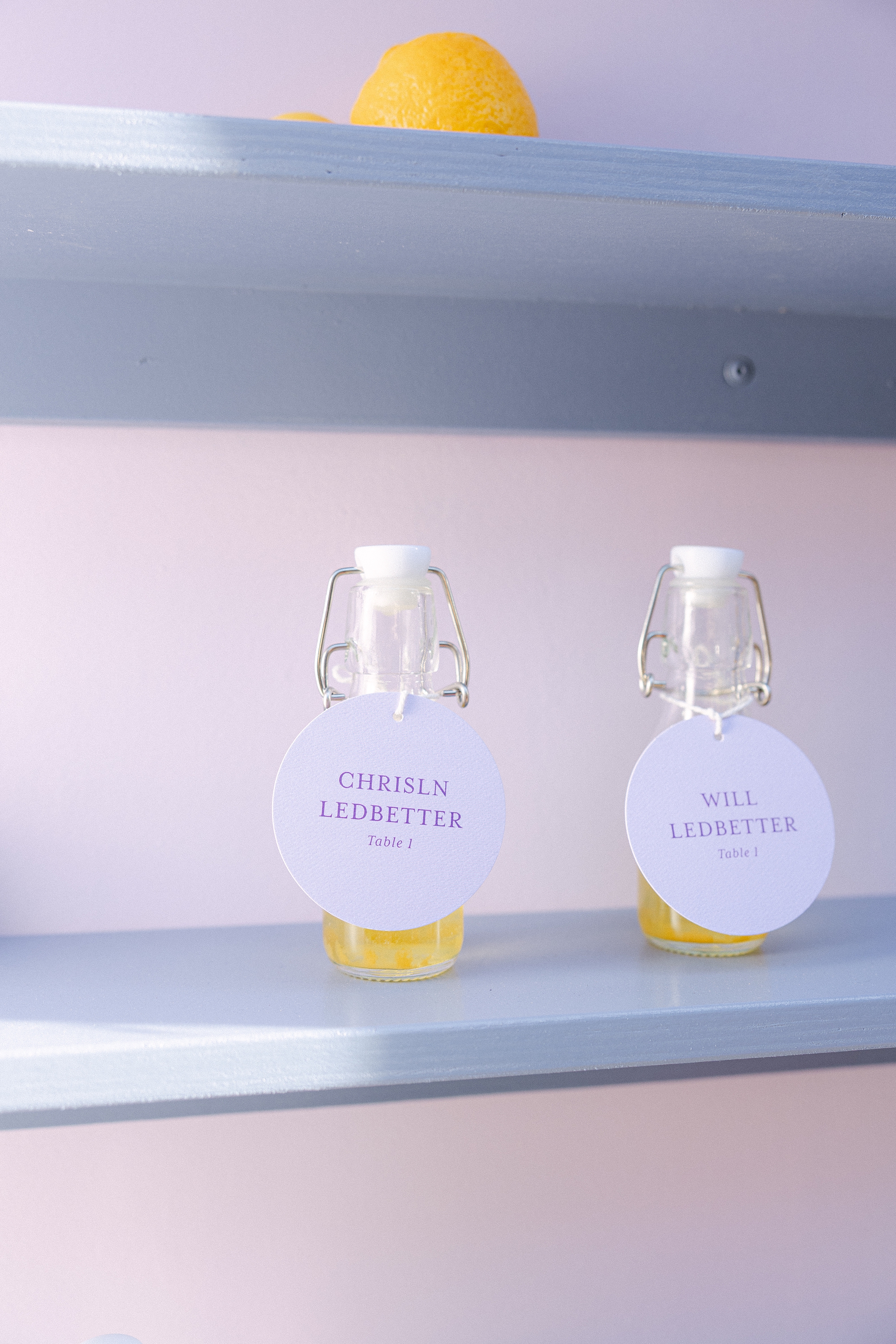
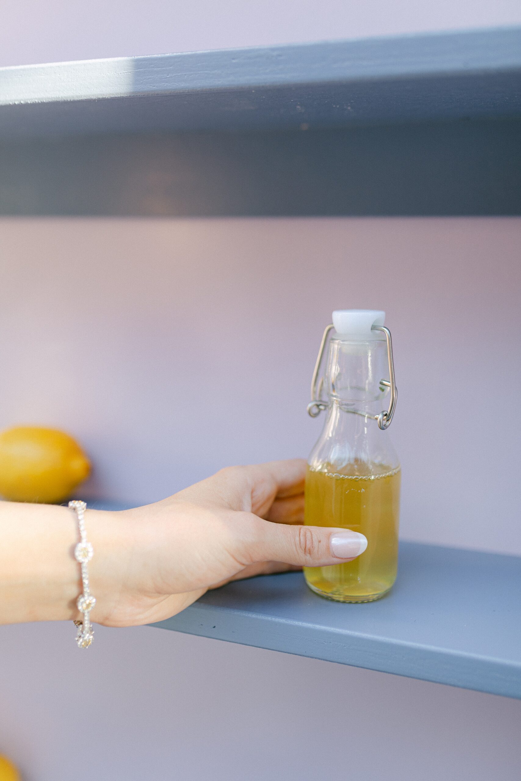
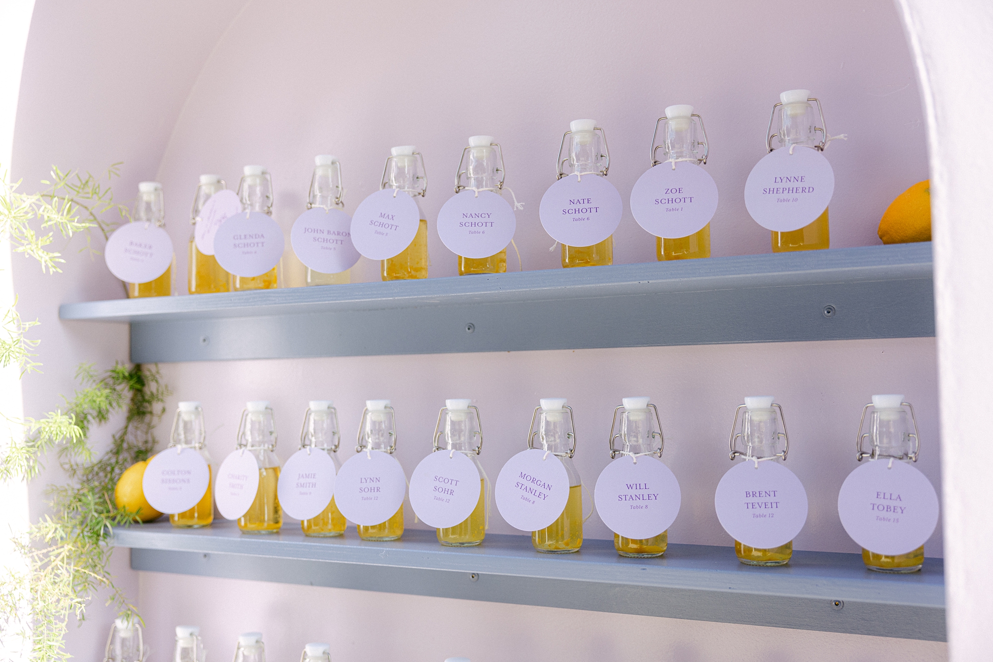
During our consultation, the couple mentioned that they LOVE limoncello. Naturally, we knew this had to play a starring role in their wedding design, so we designed a custom seating chart around limoncello, and it was better than we envisioned! Guests were welcomed with the seating chart wall display featuring three columns of shelving, each lined with bottles of homemade limoncello (or lemonade for those littles in attendance). Yes, you read that right, the couple made the limoncello themselves!! Talk about a personal touch!
Each bottle featured a circular escort tag with the guest’s name and table assignment. Across the top of the display, we added the playful phrase: “Take a ‘cello and Please Be Seated.” At the base of the installation, lush florals completed the look, making this display not just a seating chart, but a true statement piece and guest favorite.
Day-Of Details: Wedding Signage
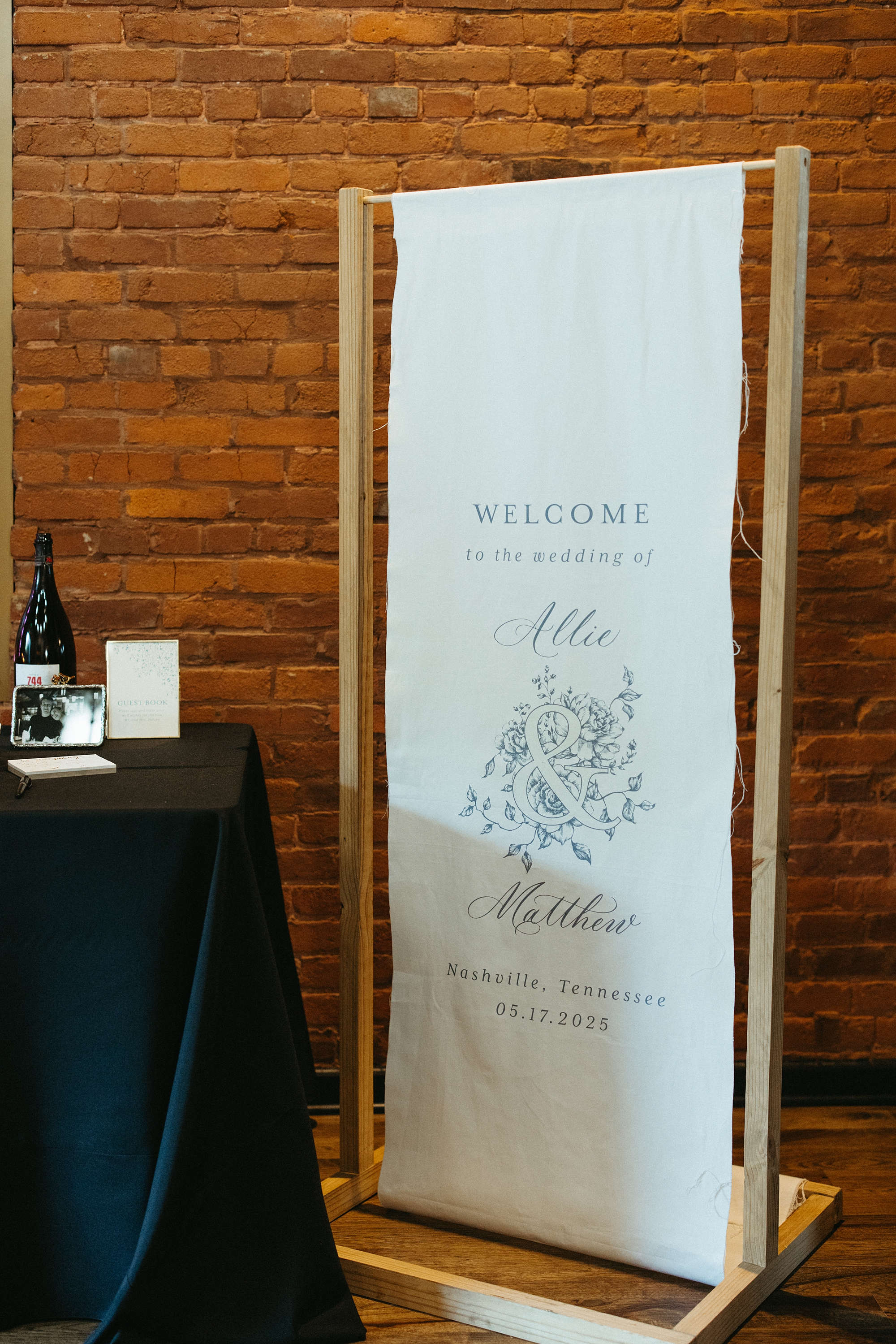
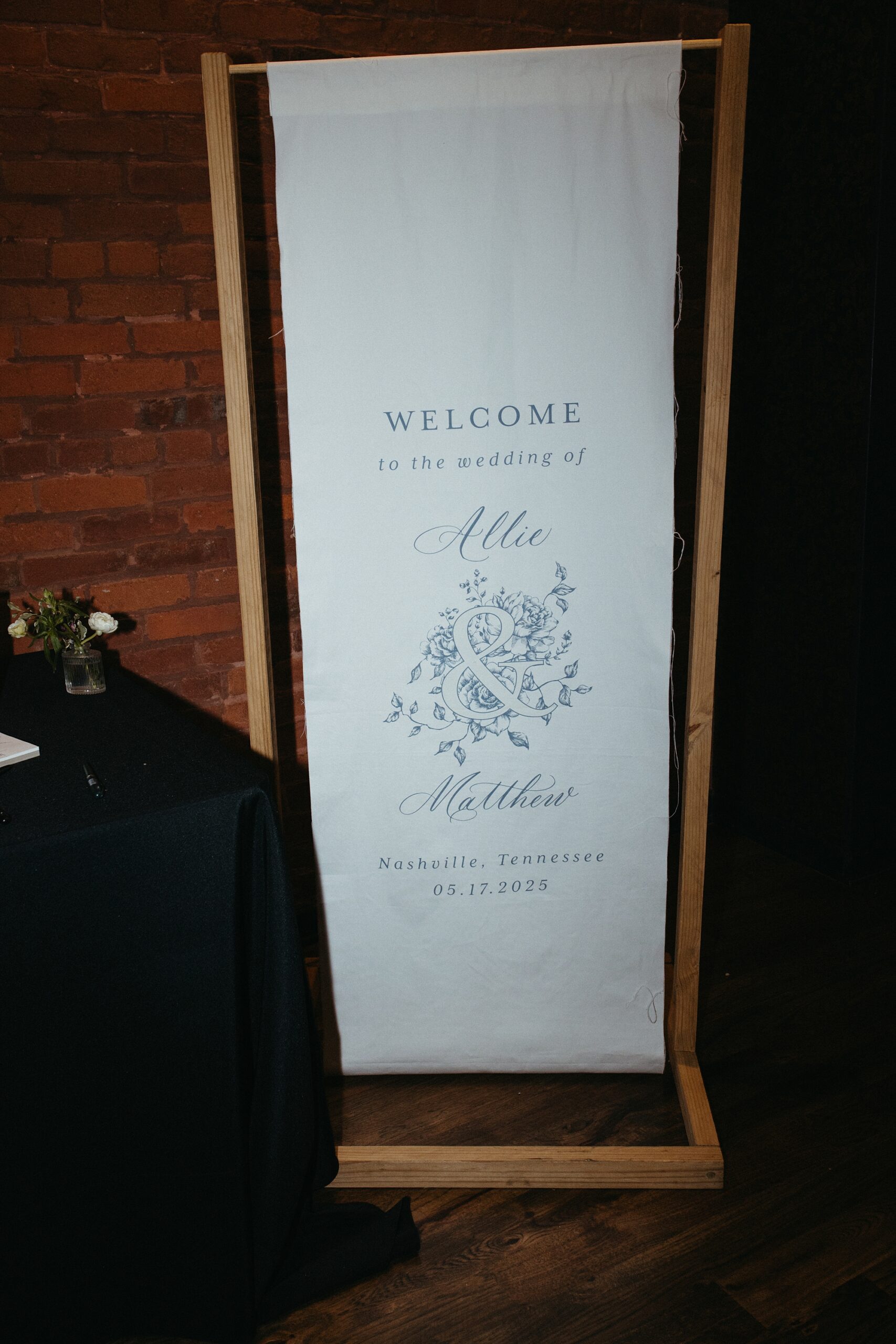
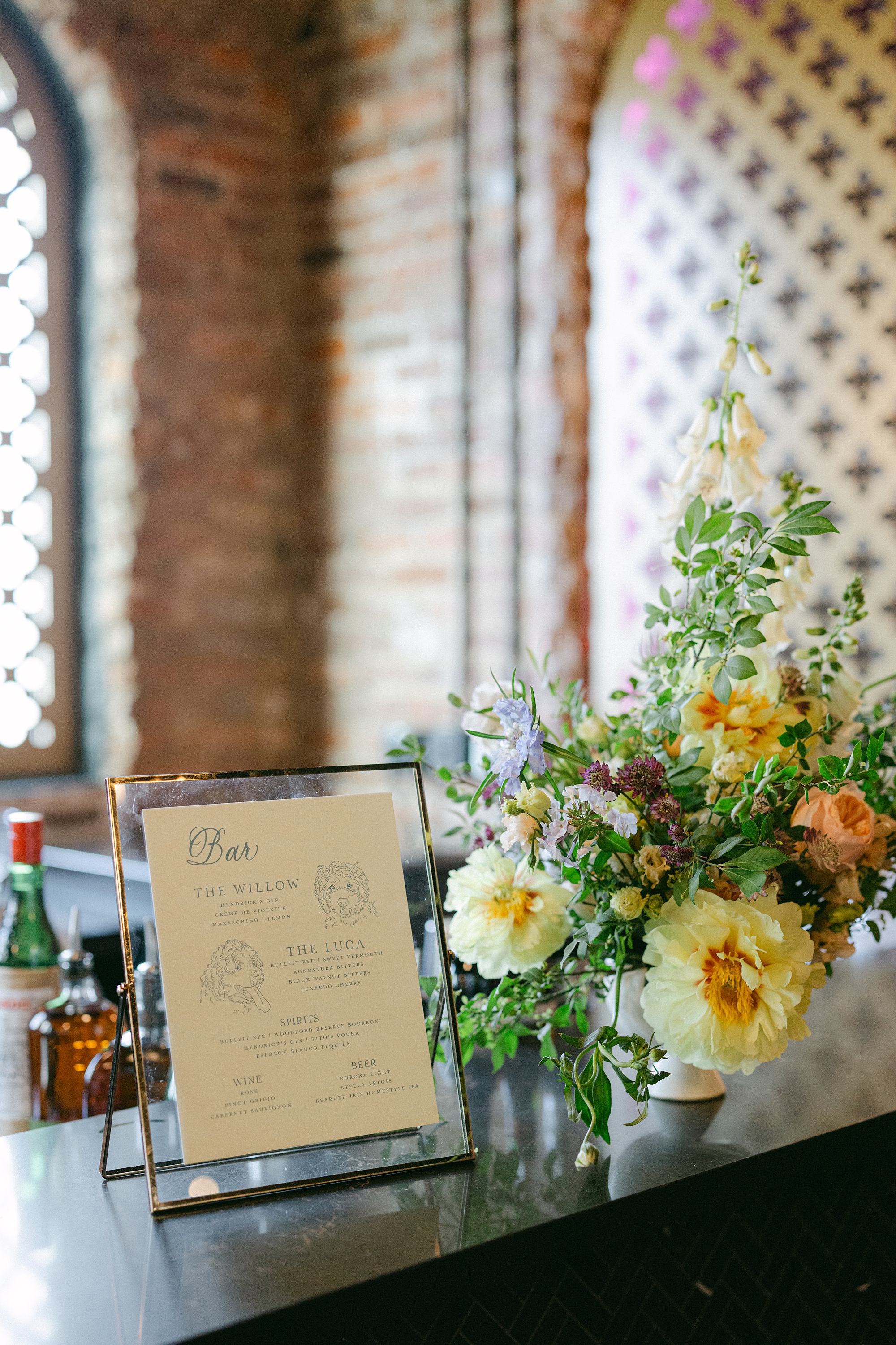
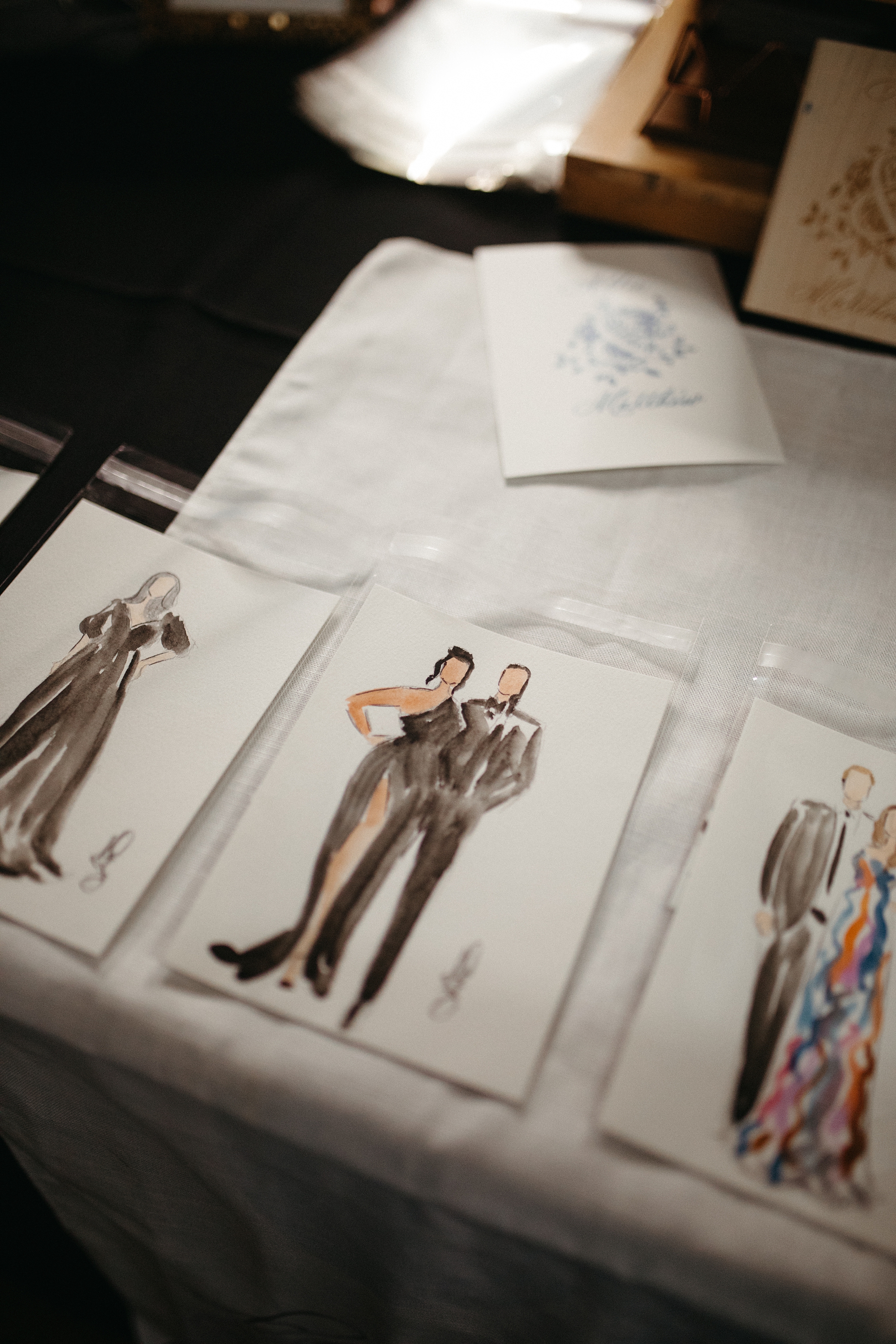
Beyond the invitations and seating chart, we created several custom paper goods and signage to carry the couple’s aesthetic throughout the celebration. A white fabric wedding welcome sign with soft blue lettering set the tone from the moment guests arrived. Bar signage featured signature cocktails inspired by the couple’s beloved dogs, Willow and Luca, complete with hand-sketched portraits. It was a personal detail that had everyone smiling.
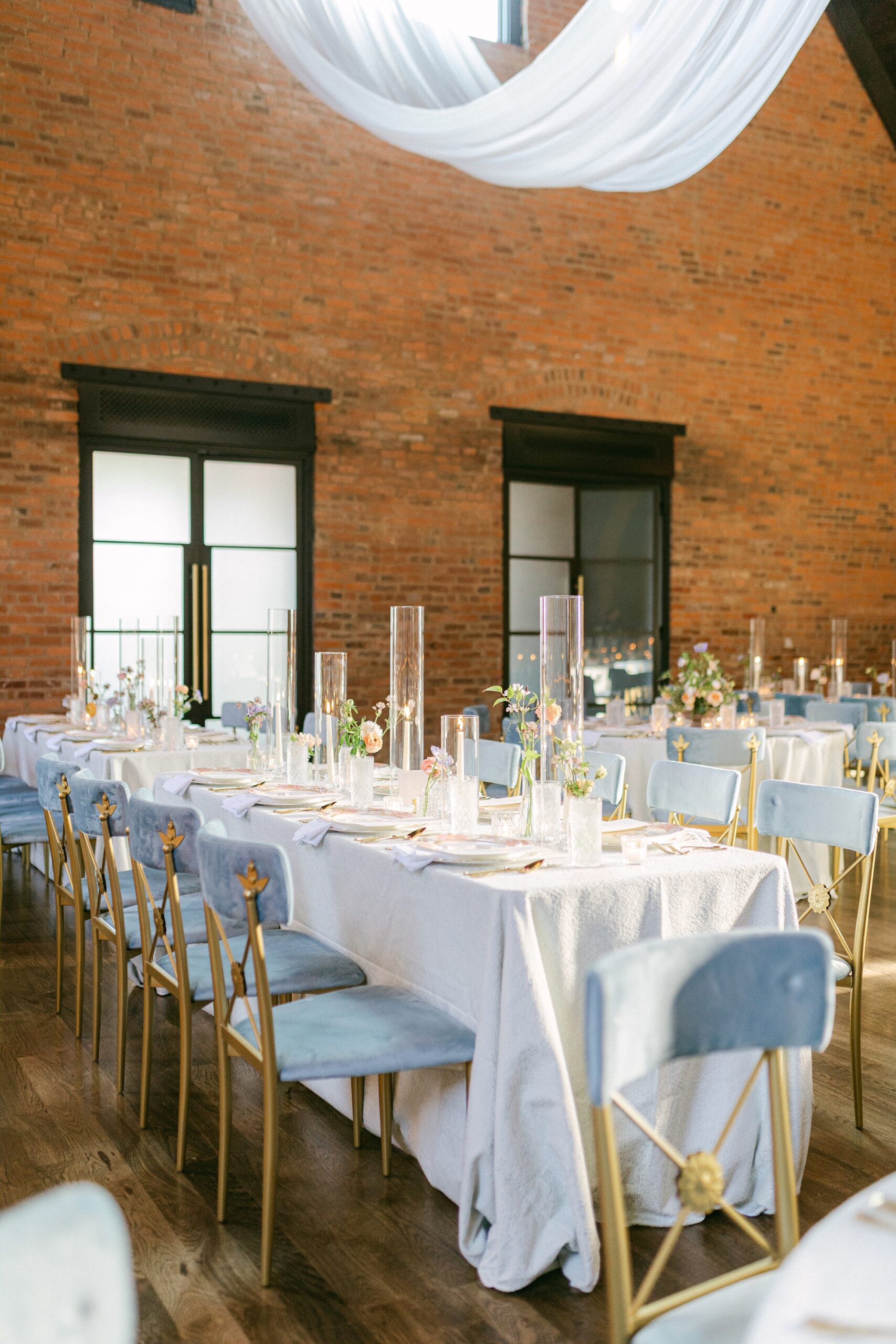
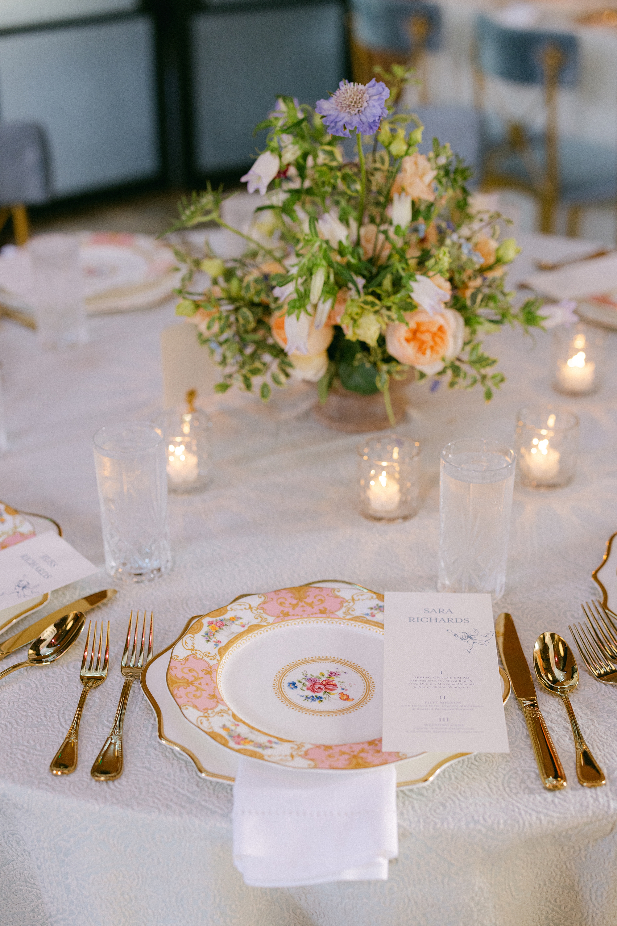
Menus and an Elegant Tablescape
Menus sat atop each place setting. The pink, floral patterned plates and gold cutlery added a pop of color to tables draped in textured white linens and surrounded by soft blue chairs. Candlelight and romantic floral centerpieces tied everything together for an atmosphere that was both inviting and elegant.
From the custom invitation suite to the unforgettable limoncello seating chart wall, every design choice reflected the couple’s personality and vision. This was so much fun to create and bring to life. Congratulations to the newlyweds!
If you’re planning a wedding in Nashville, or anywhere in the world, we’d love to help you create meaningful, personalized stationery and event details that tell your story. We work with couples worldwide to design details you and your guests will remember forever. Reach out today to learn more about our full-service wedding and event design offerings! We can’t wait to create something unforgettable for you!
If you enjoyed this post, you’ll love these other blogs!
There’s just something about blue. From deep navy to soft dusty blues, bold cobalt to calming slate, blue is one of those rare colors that truly shines in every shade. It’s timeless, versatile, and effortlessly elegant, which is why we nevertire of incorporating it into custom invitation suites and paper goods. Whether you’re planning a coastal celebration, a garden soirée, or a Southern wedding with a little personality, blue brings just the right amount of charm, calm, and wow. Here’s a look at a few of our favorite custom blue wedding invitations that make a statement and show just how much this hue can do.
Blue Wedding Invitations That Make a Statement
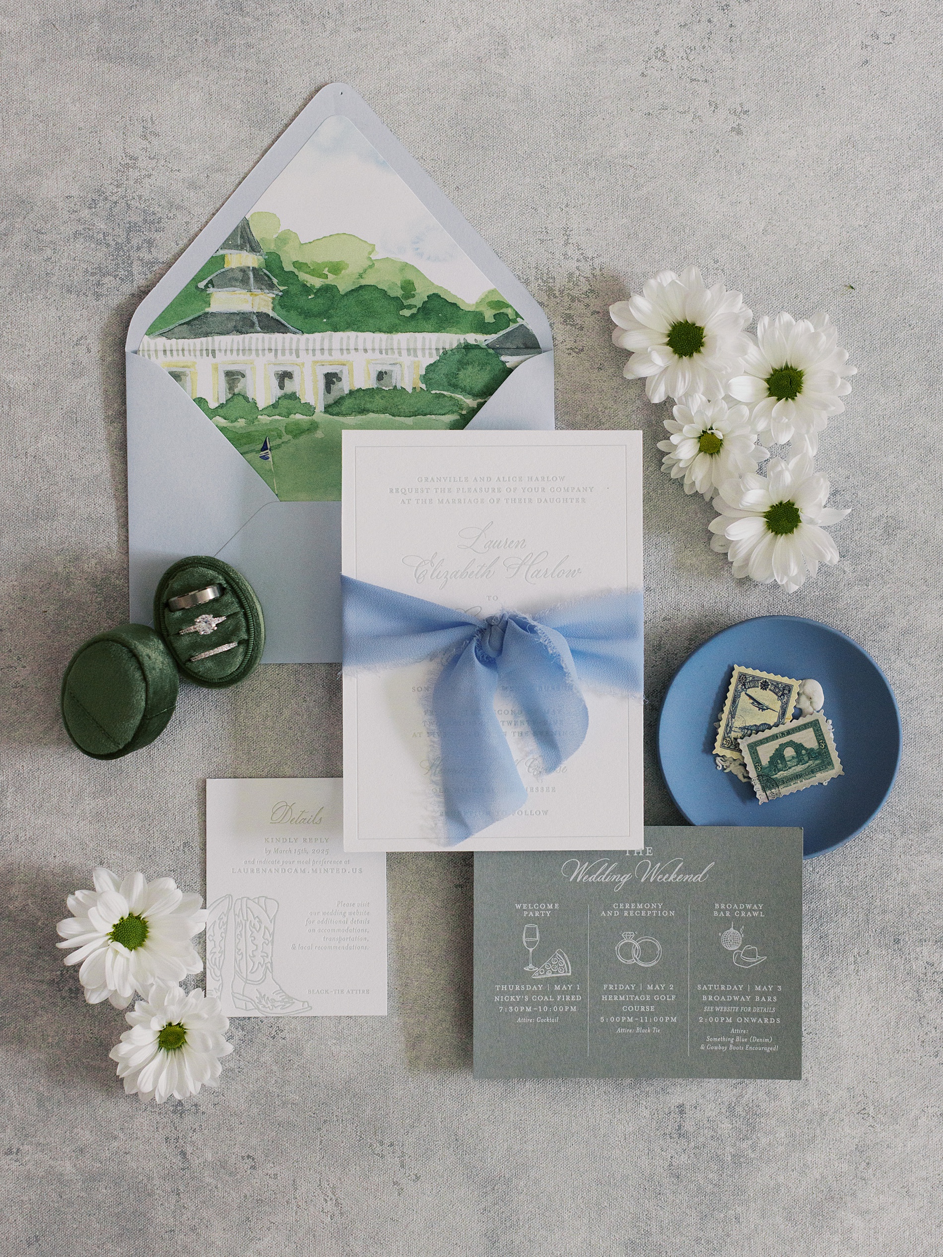
Southern Charm Meets Sophistication
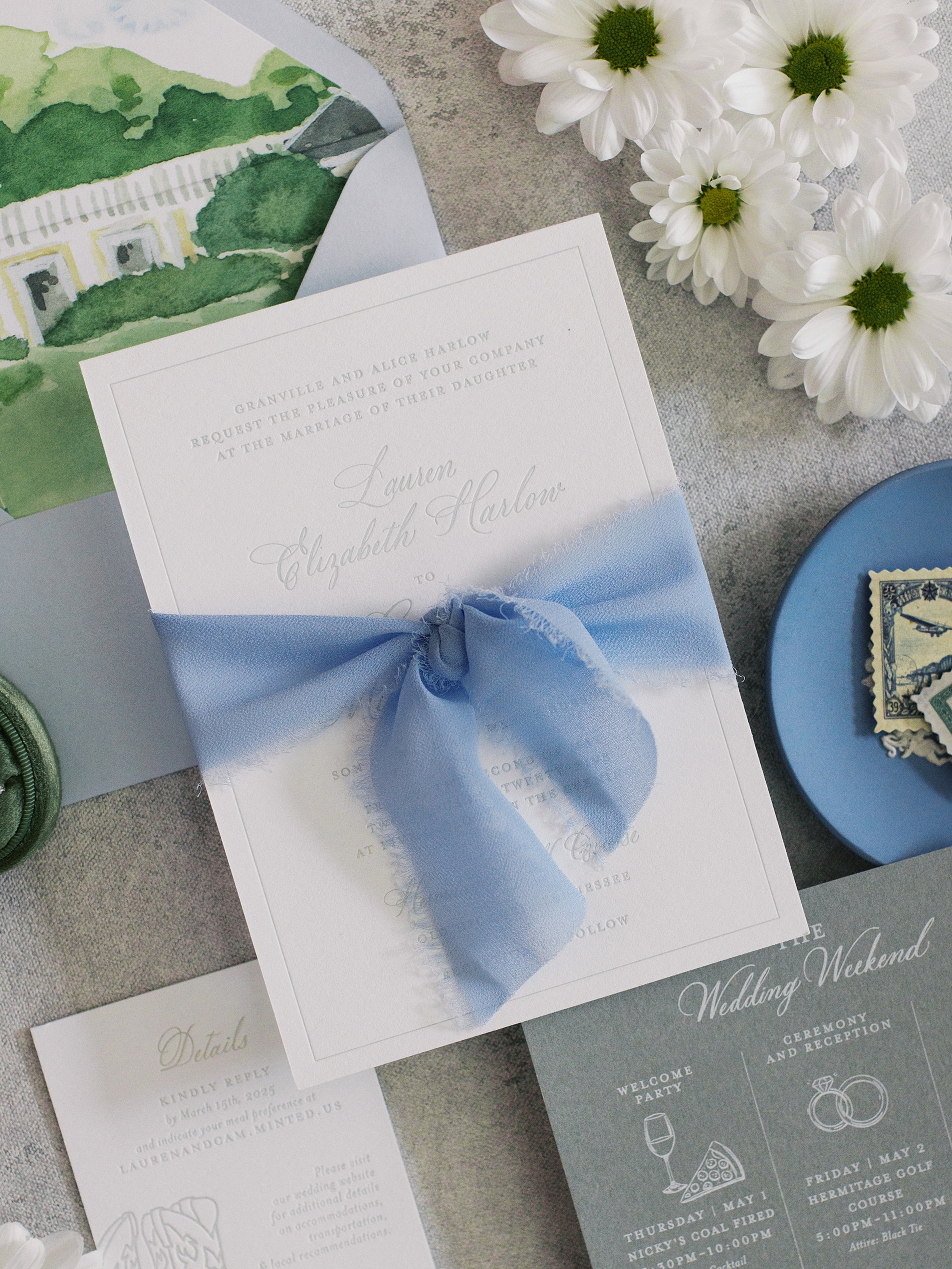
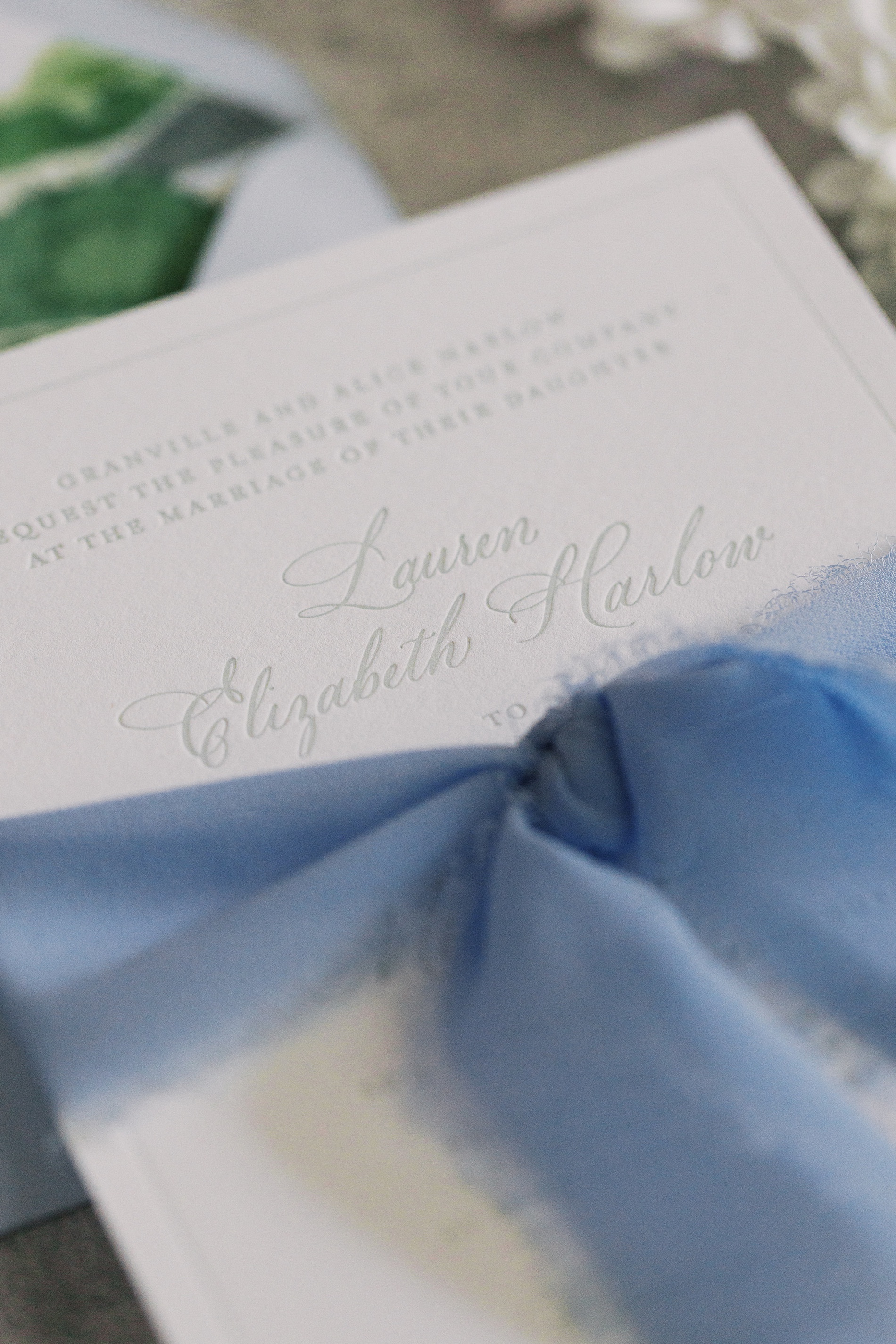
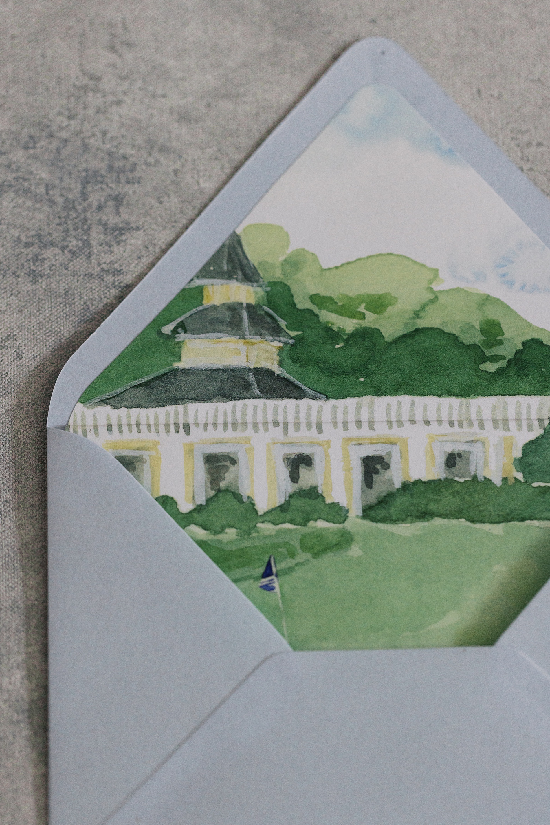
For Lauren’s wedding at the Hermitage Golf Course, we designed a timeless suite. A custom envelope liner, brought this light blue envelope to life. The artwork on the liner was a custom painting by Lauren O’Brien Art, featuring the Hermitage Golf Course. The artwork even included the golf flag hole, which, according to the bride, the guys LOVED!
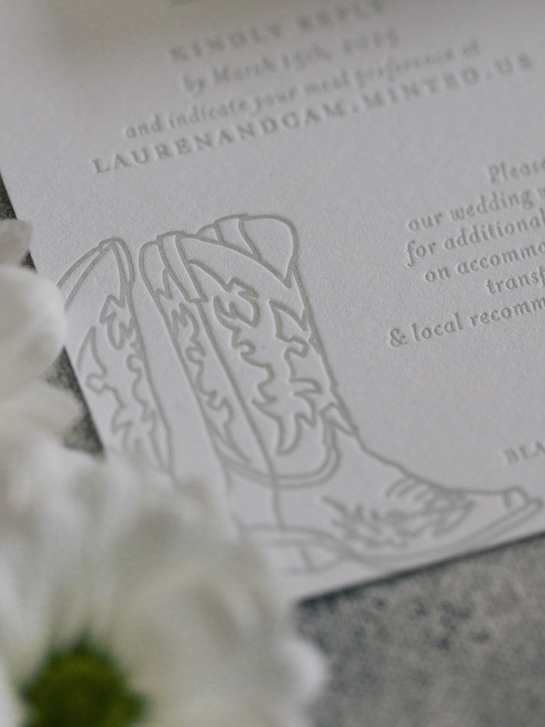
The main invitation was letterpressed for an elegant texture. Meanwhile, the RSVP card included a fun nod to Nashville with cowboy boots. The dark grey details card was printed in white ink, rounding out this soft, Southern-inspired suite.
Coastal Invite with a Splash of Personality
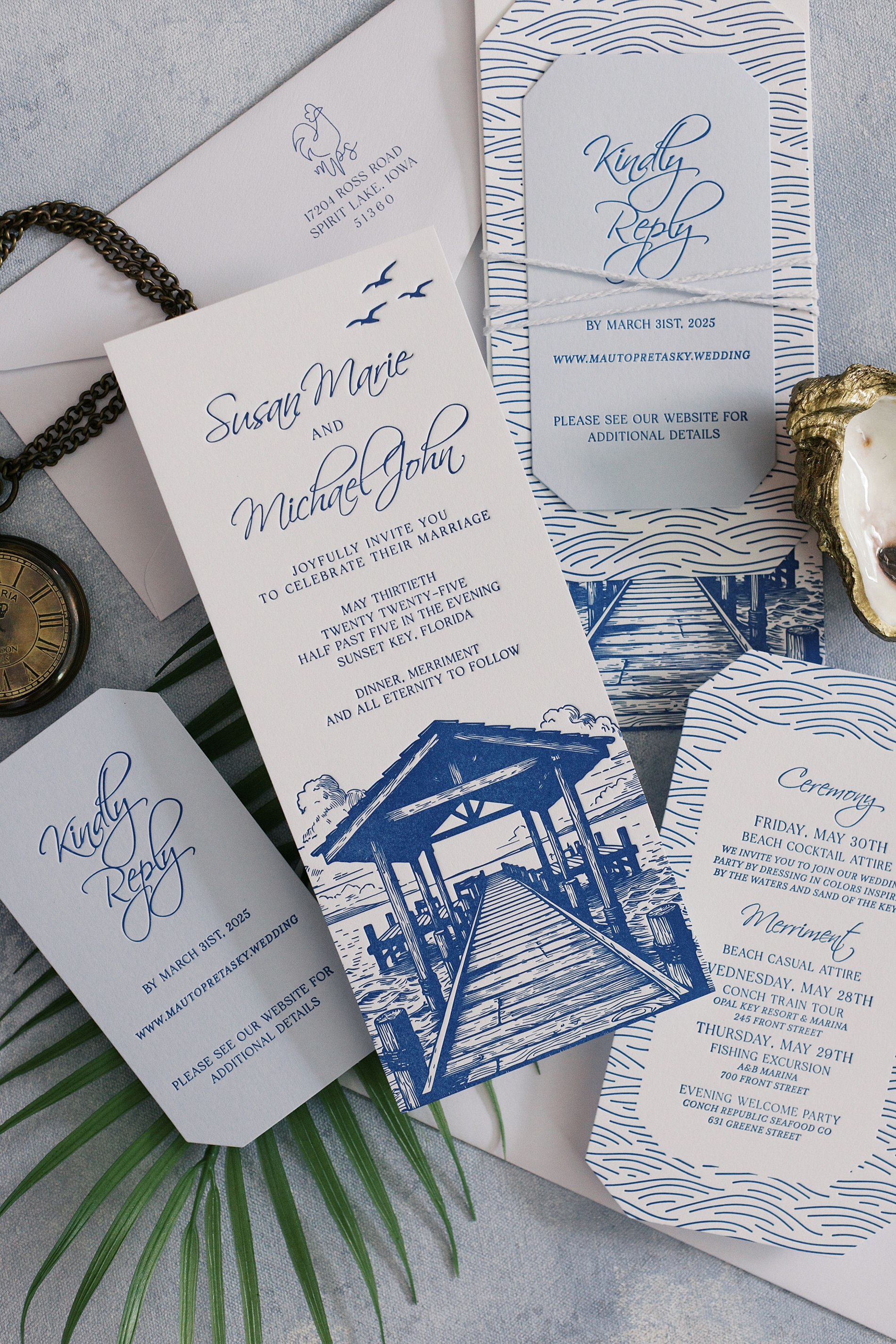
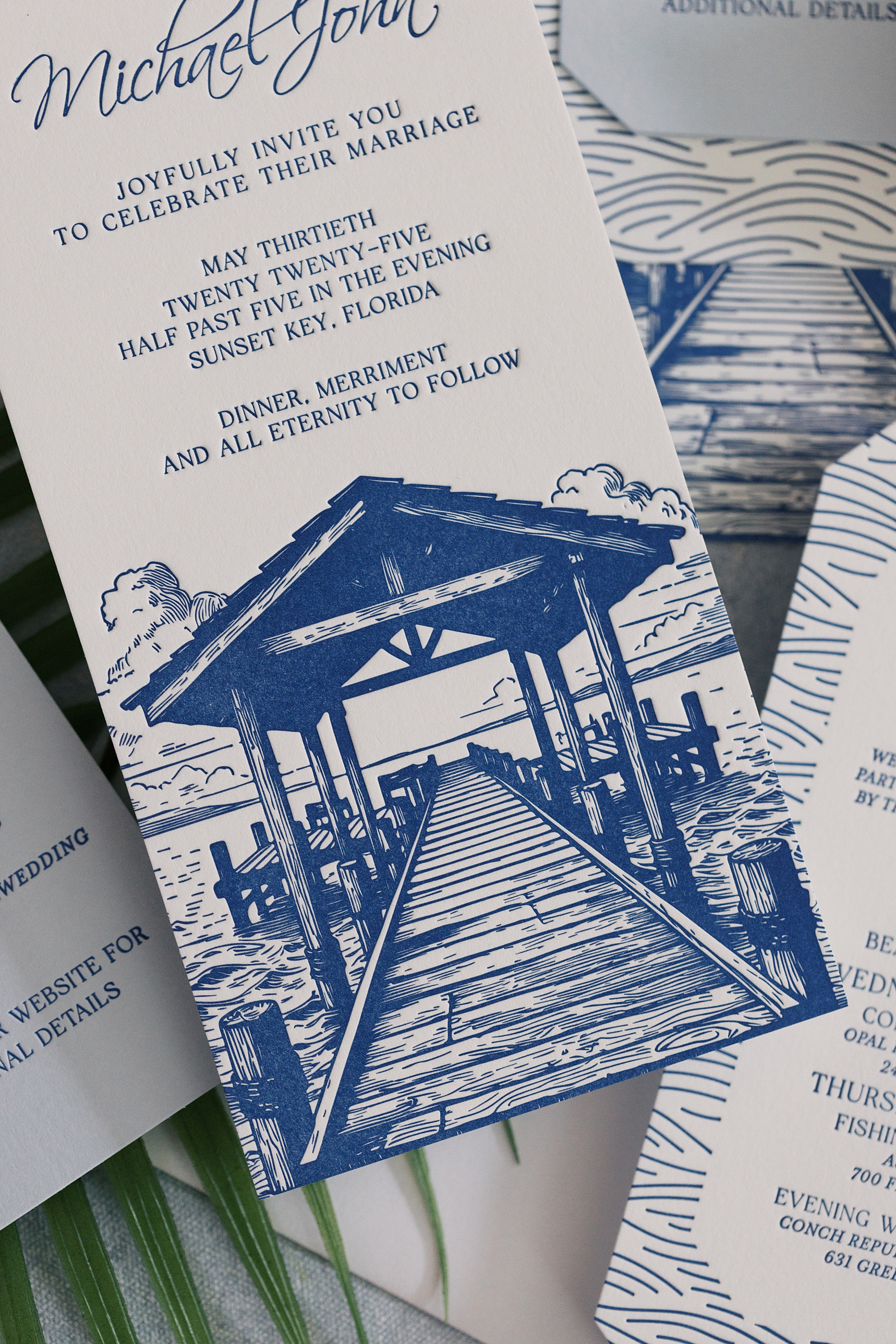
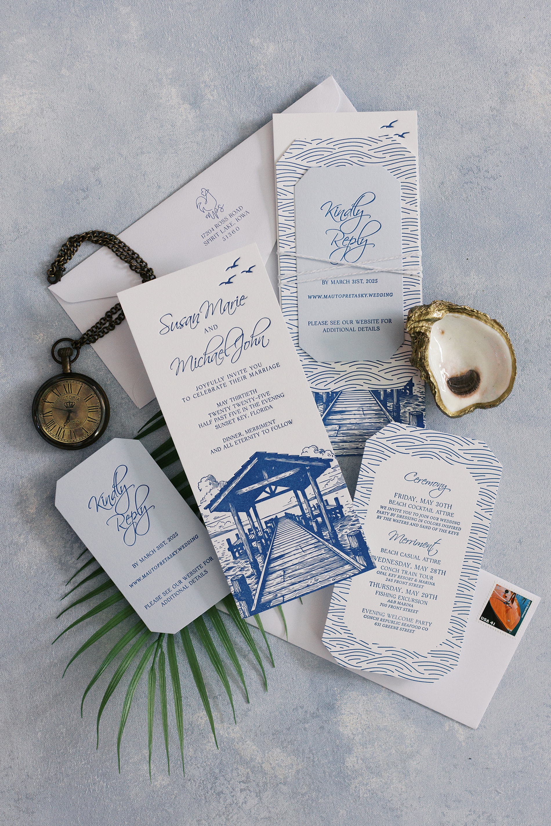
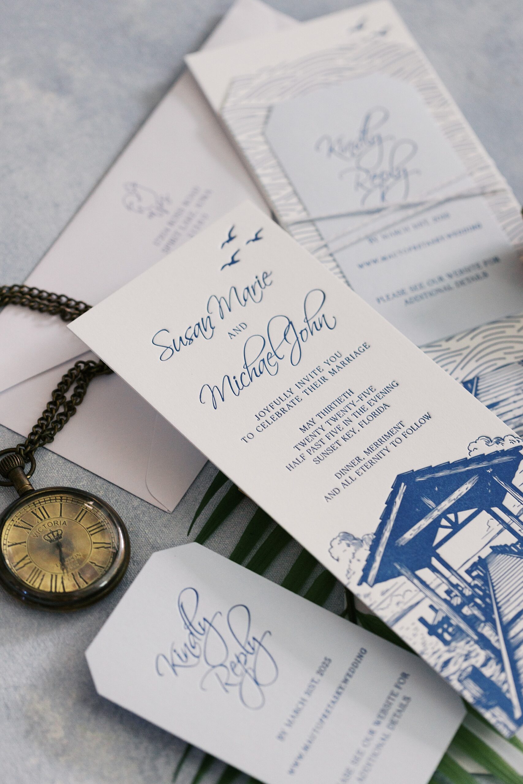
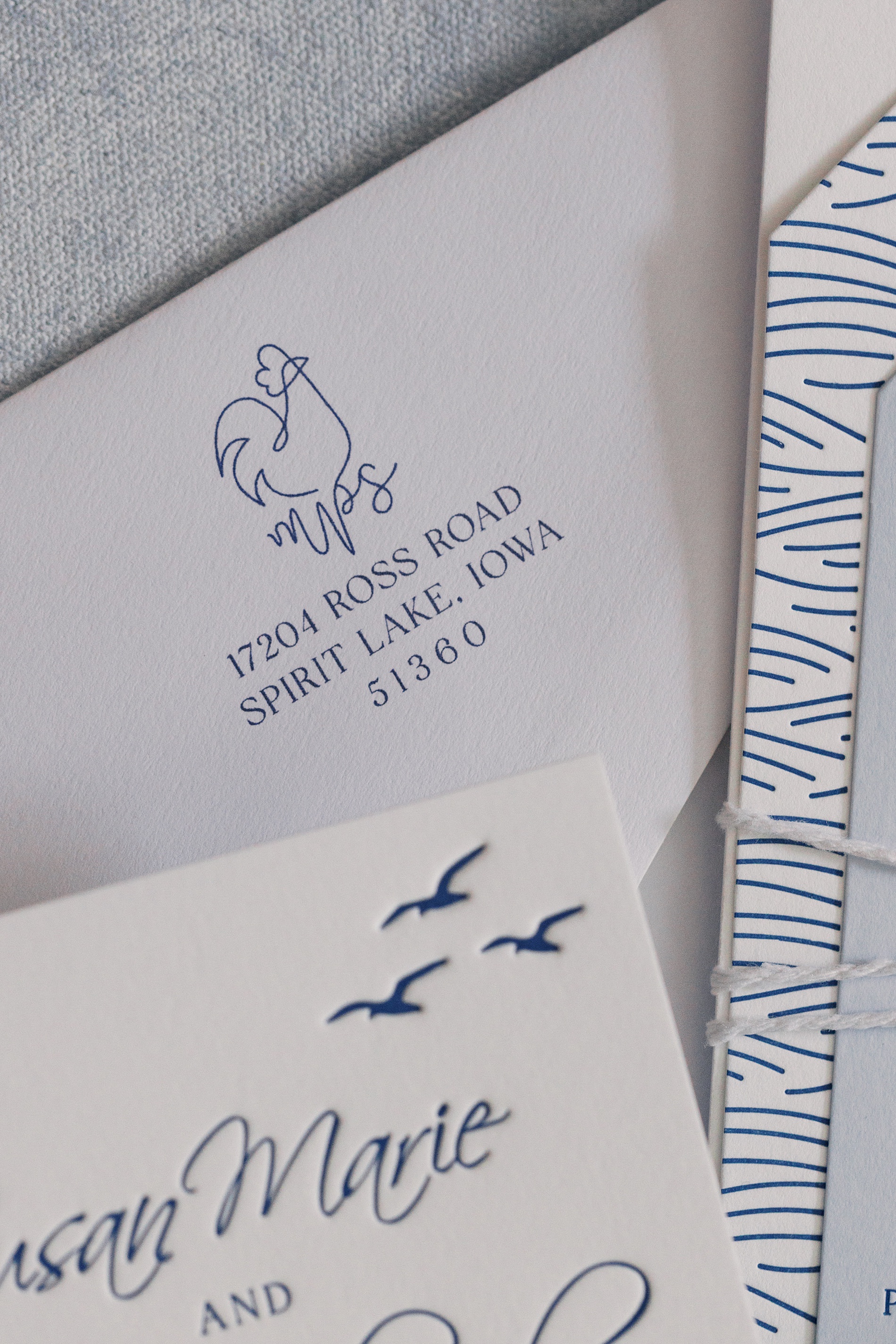
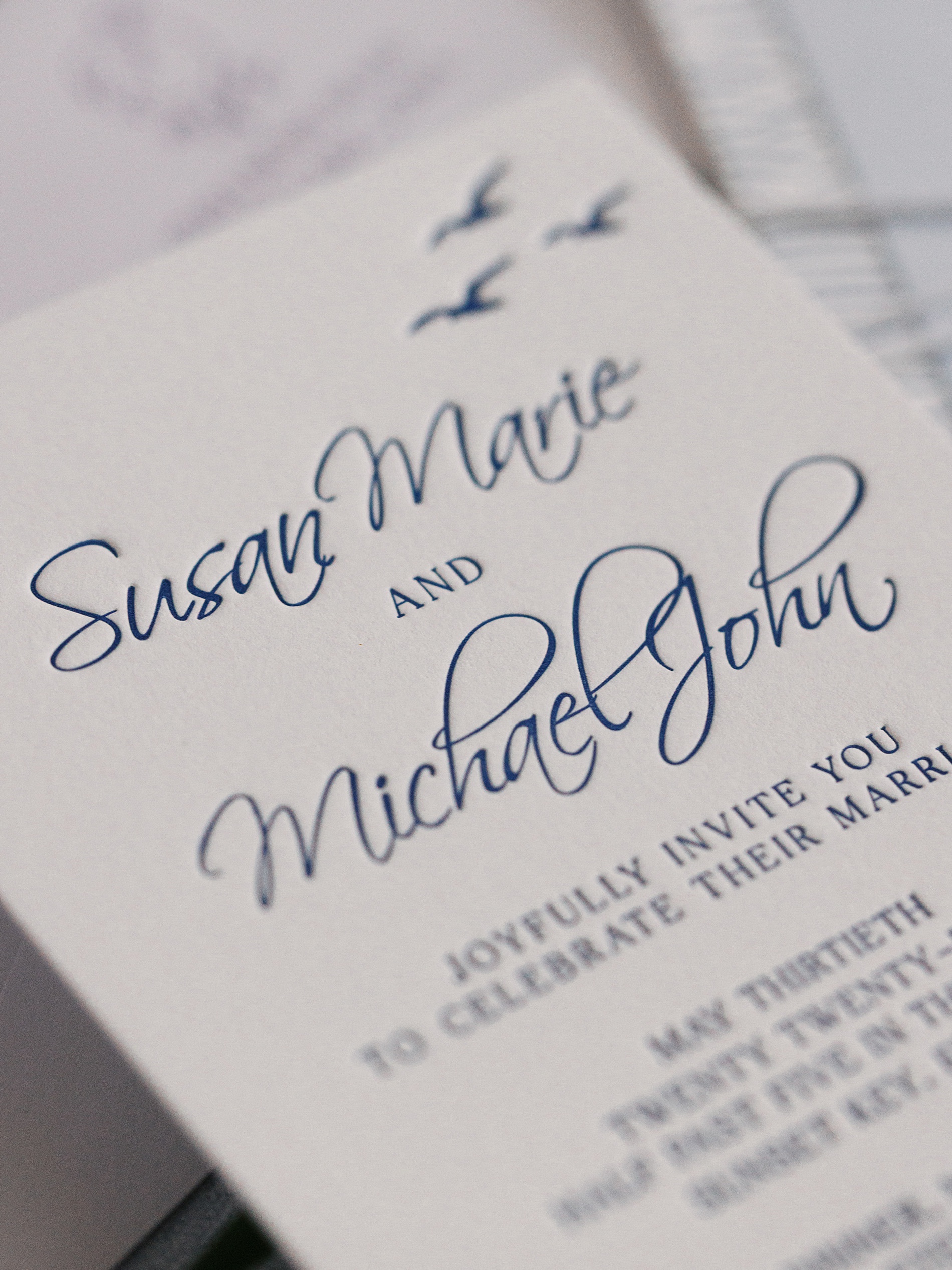
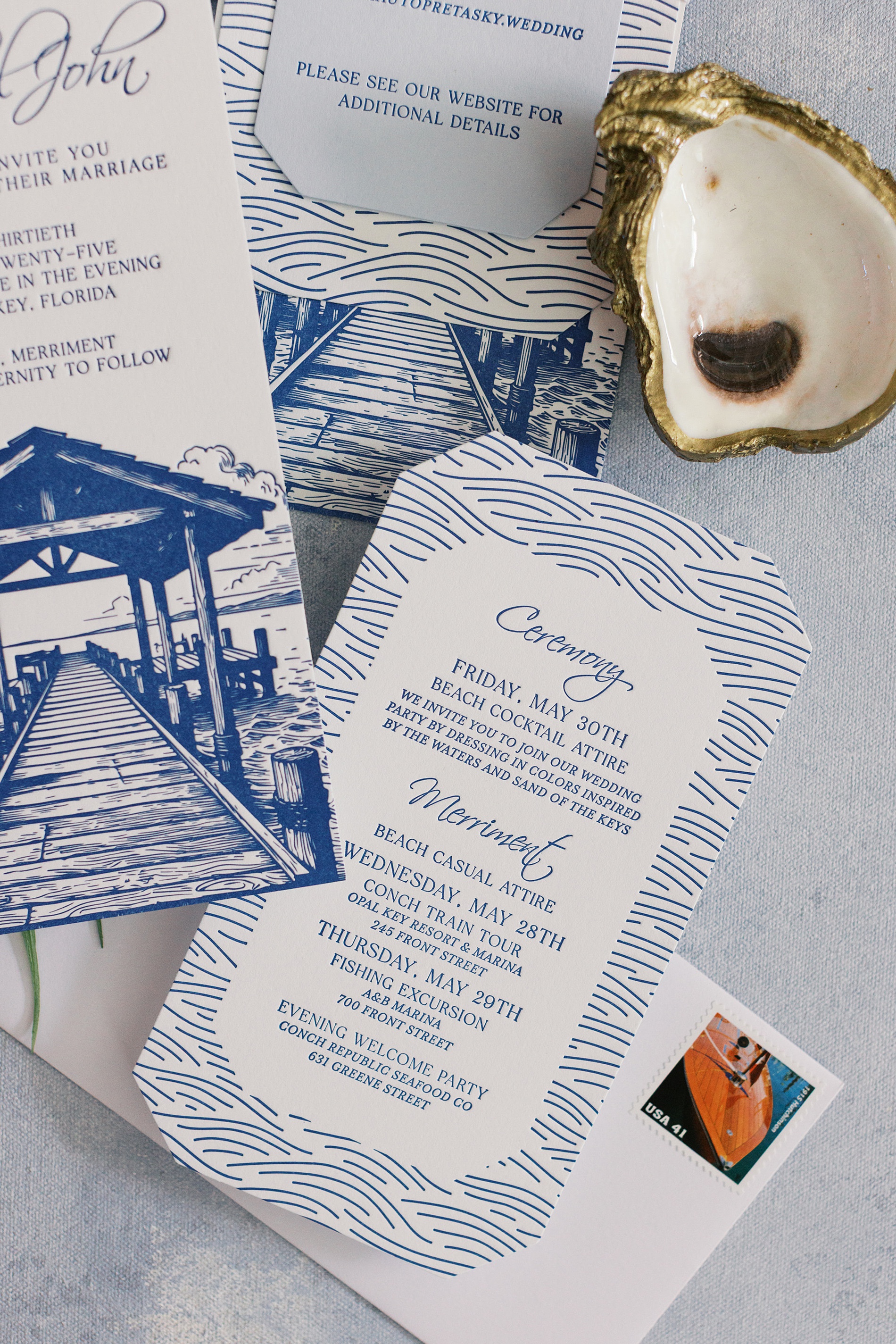
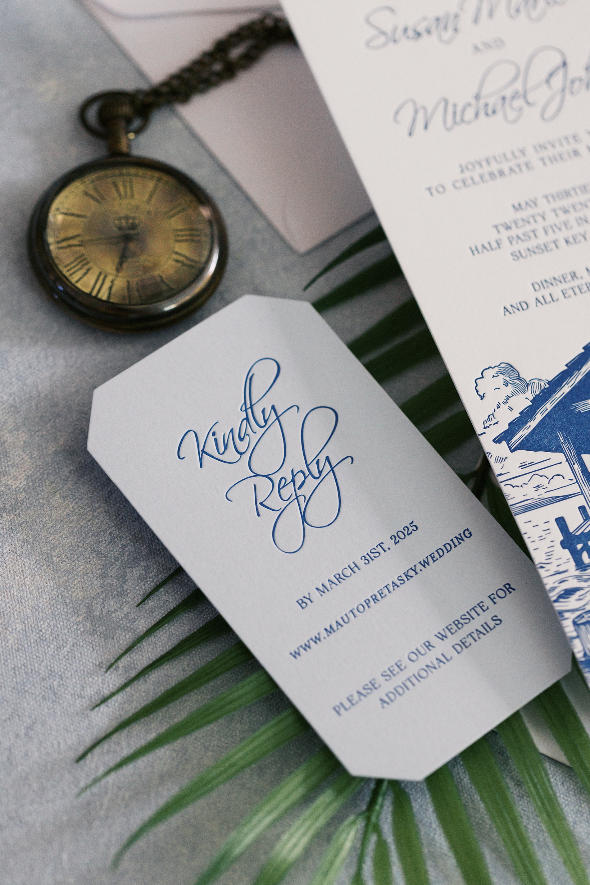
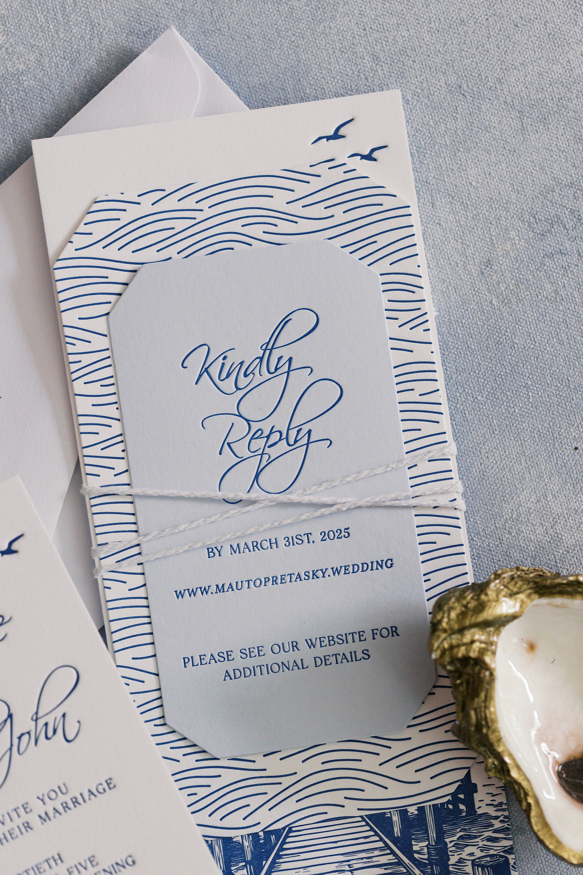
This Key West wedding invitation suite was all about setting the tone for this luxurious coastal wedding. All the different details that went into this suite made it such a blast to design. The bride, Susan, is a boat dealer, so we had to create a custom illustration of the boat dock at their wedding venue using a fun No. 10 long and skinny paper that showed off the design perfectly.
The custom chicken monogram was a fun and unforgettable detail as a nod to all the wild chickens all over Key West! Add in some vintage boat-themed postage, and this letterpressed blue and white suite became one of our favorite stacks we’ve ever created, with all the artwork lining up beautifully. The seagulls on the upper right corner of the invite, followed by the wedding week itinerary with a blue wave design on the border to give that ocean feel, the light blue rsvp card on top, and then the white twine to mimic boat rope tying it all together, instantly transported guests to the ocean upon opening up their wedding envelope and pulling out the invitation stack. We just love a good stack!
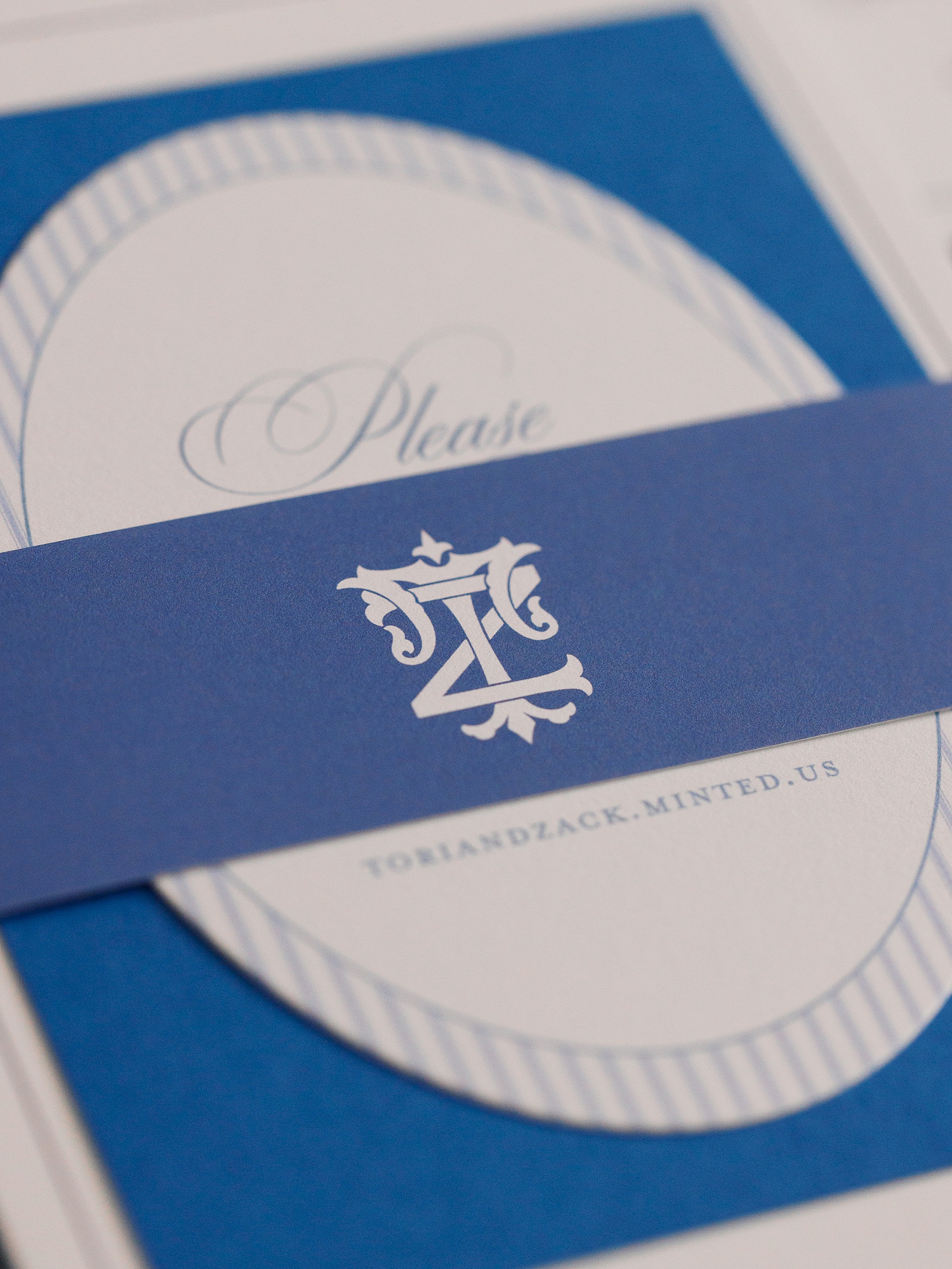
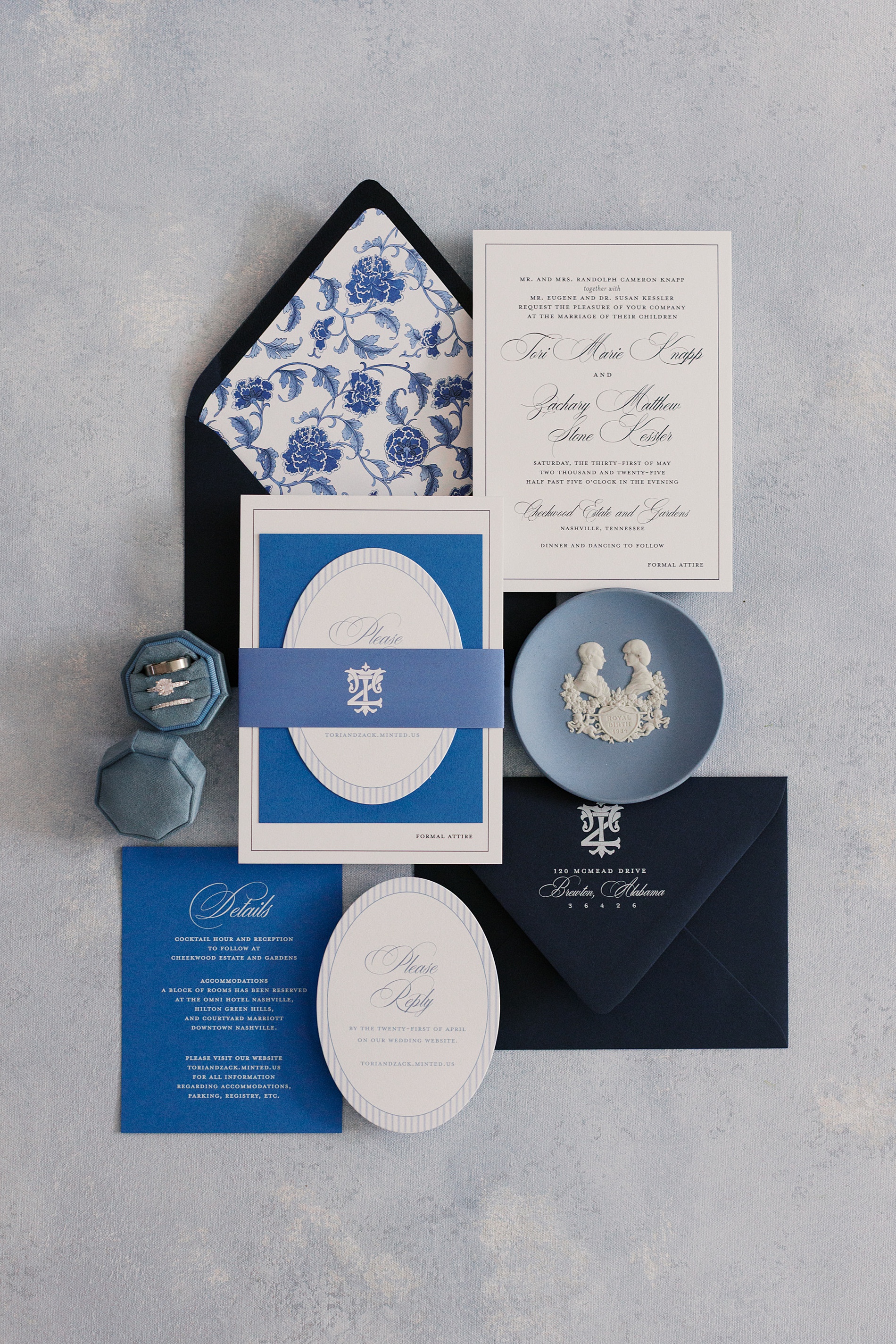
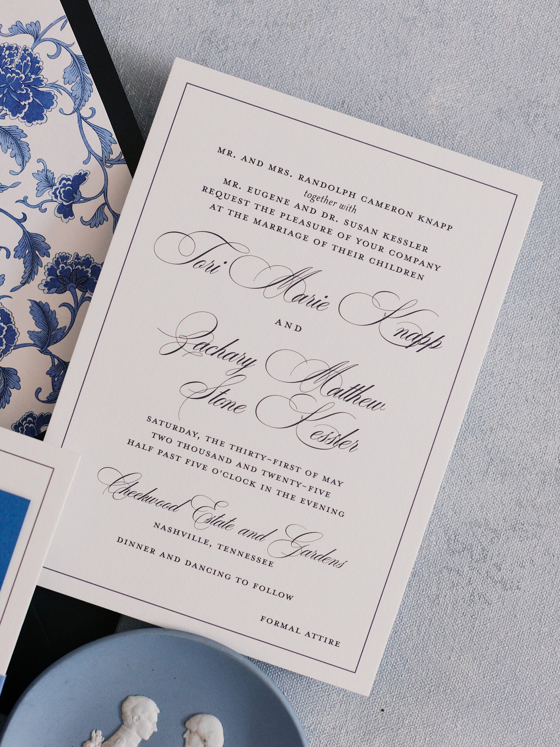
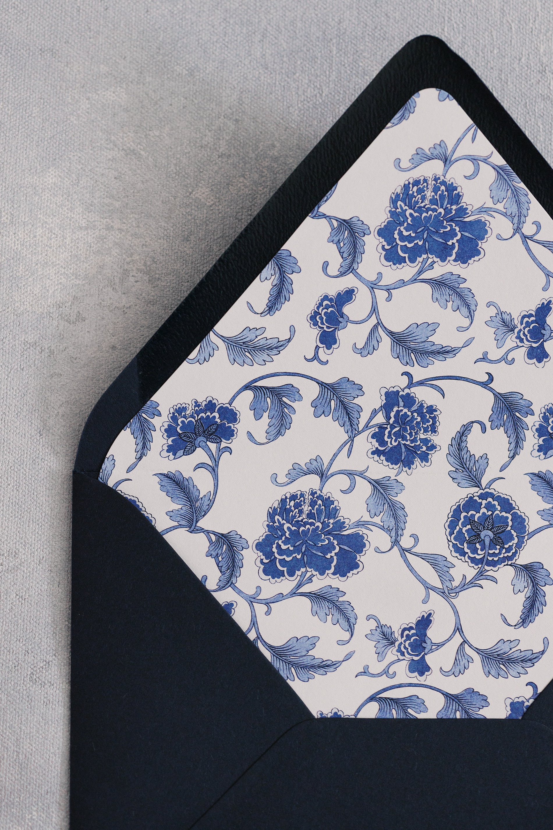
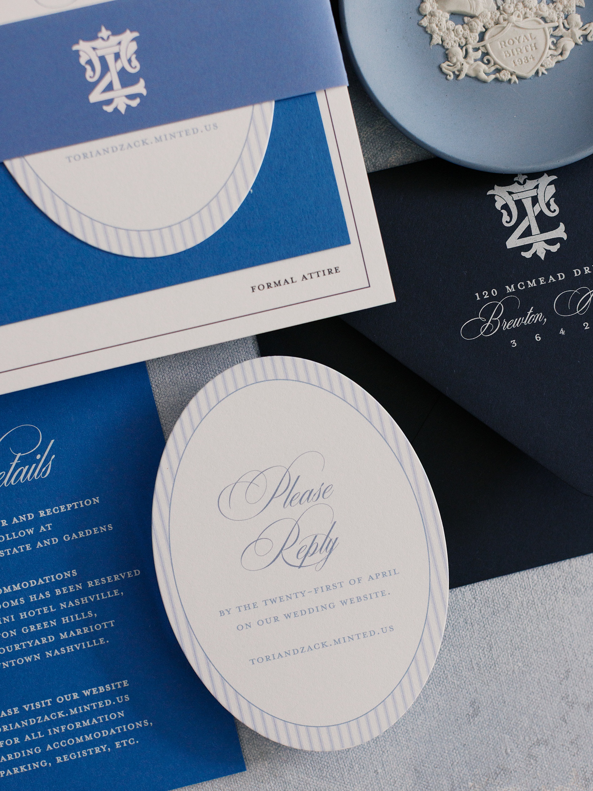
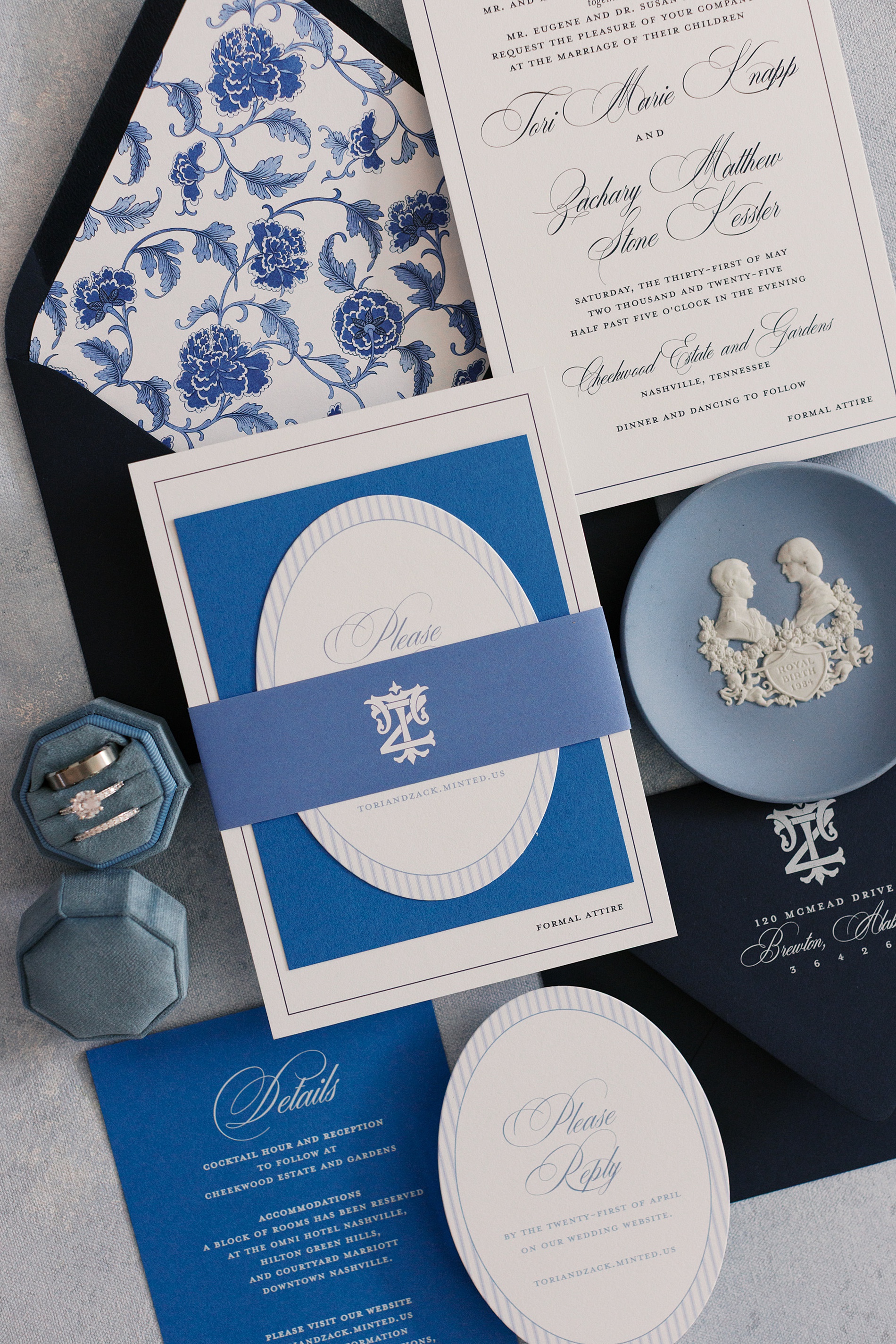
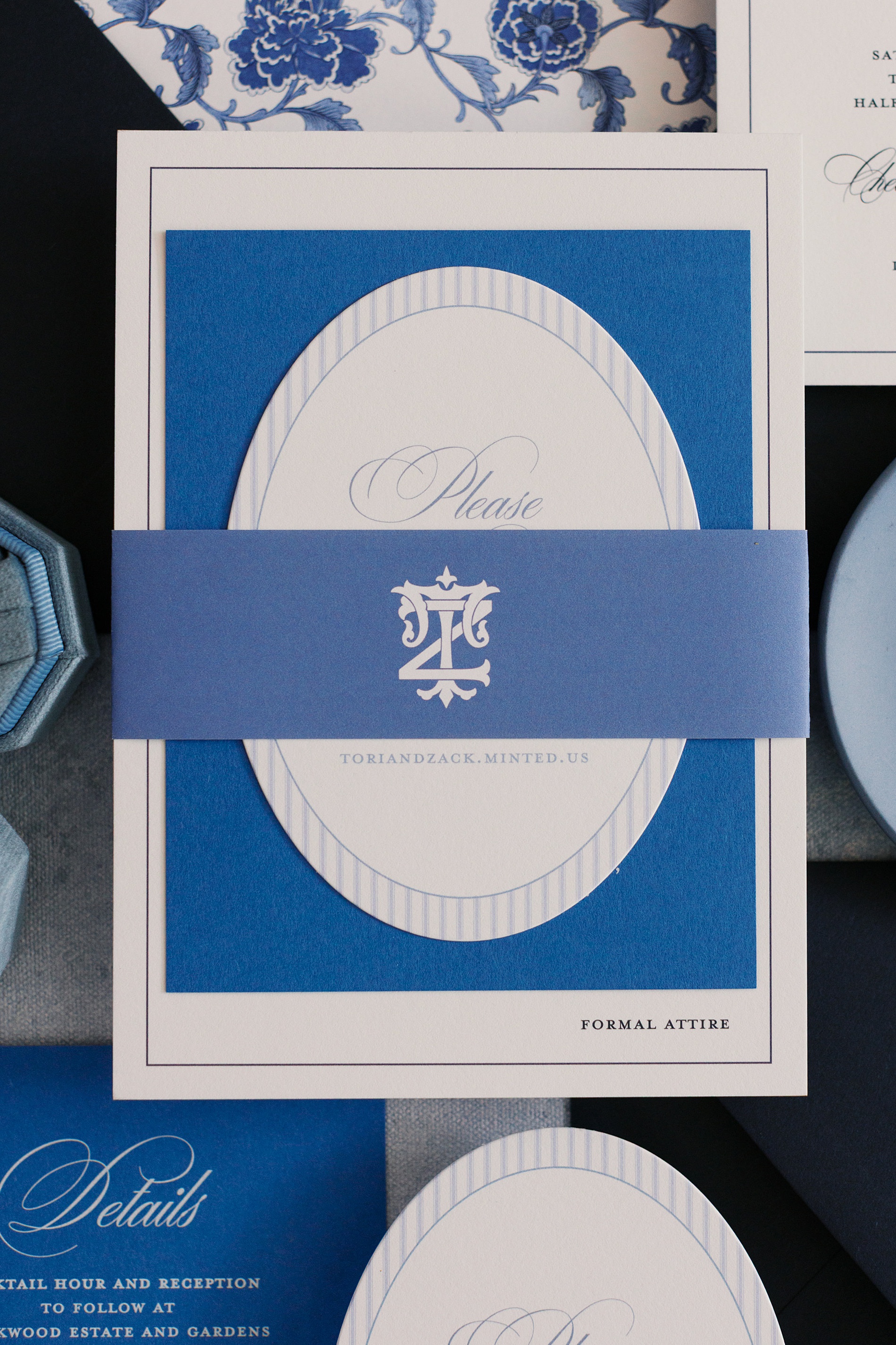
Chinoiserie-Inspired Elegance in Various Blues
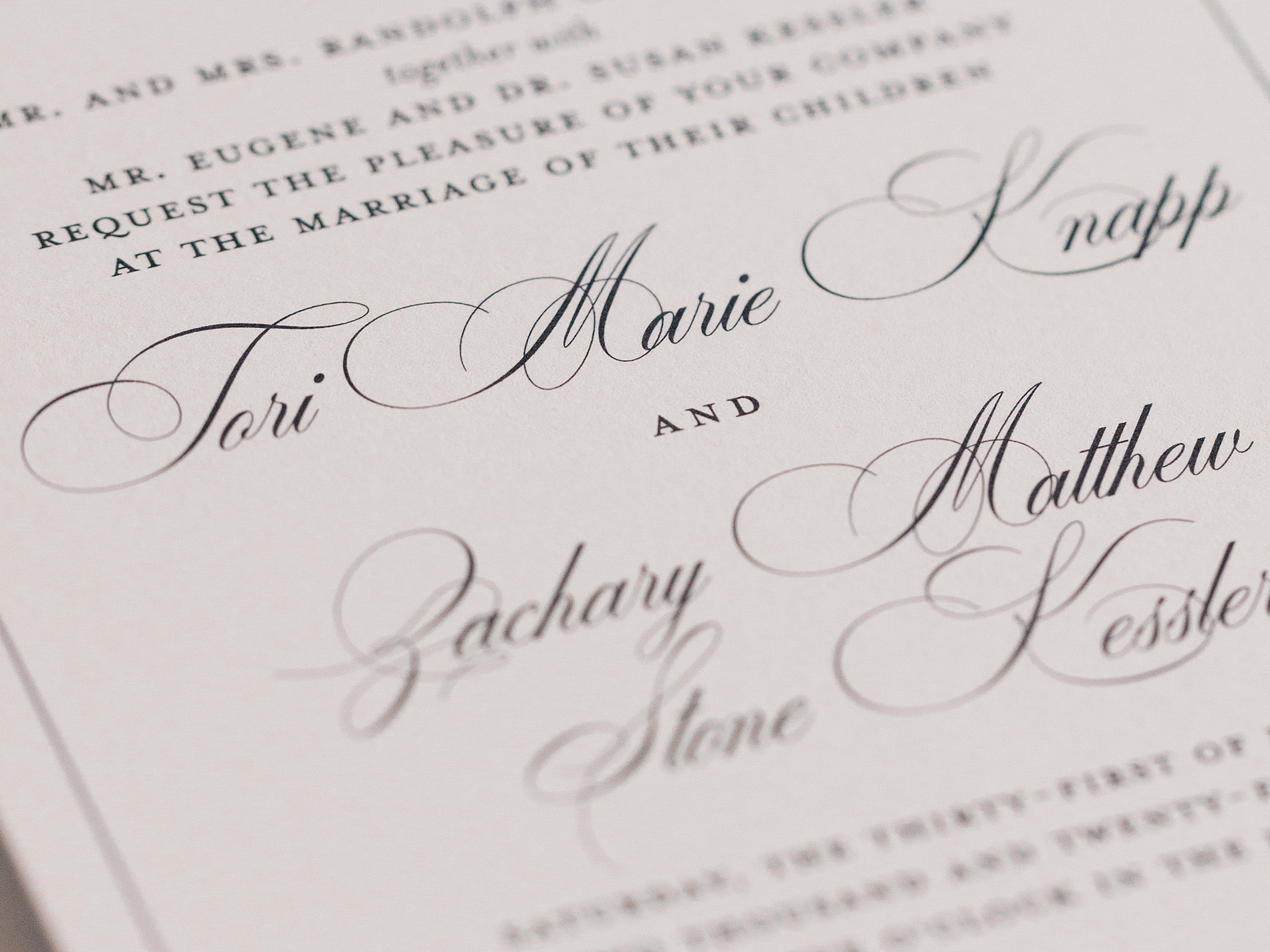
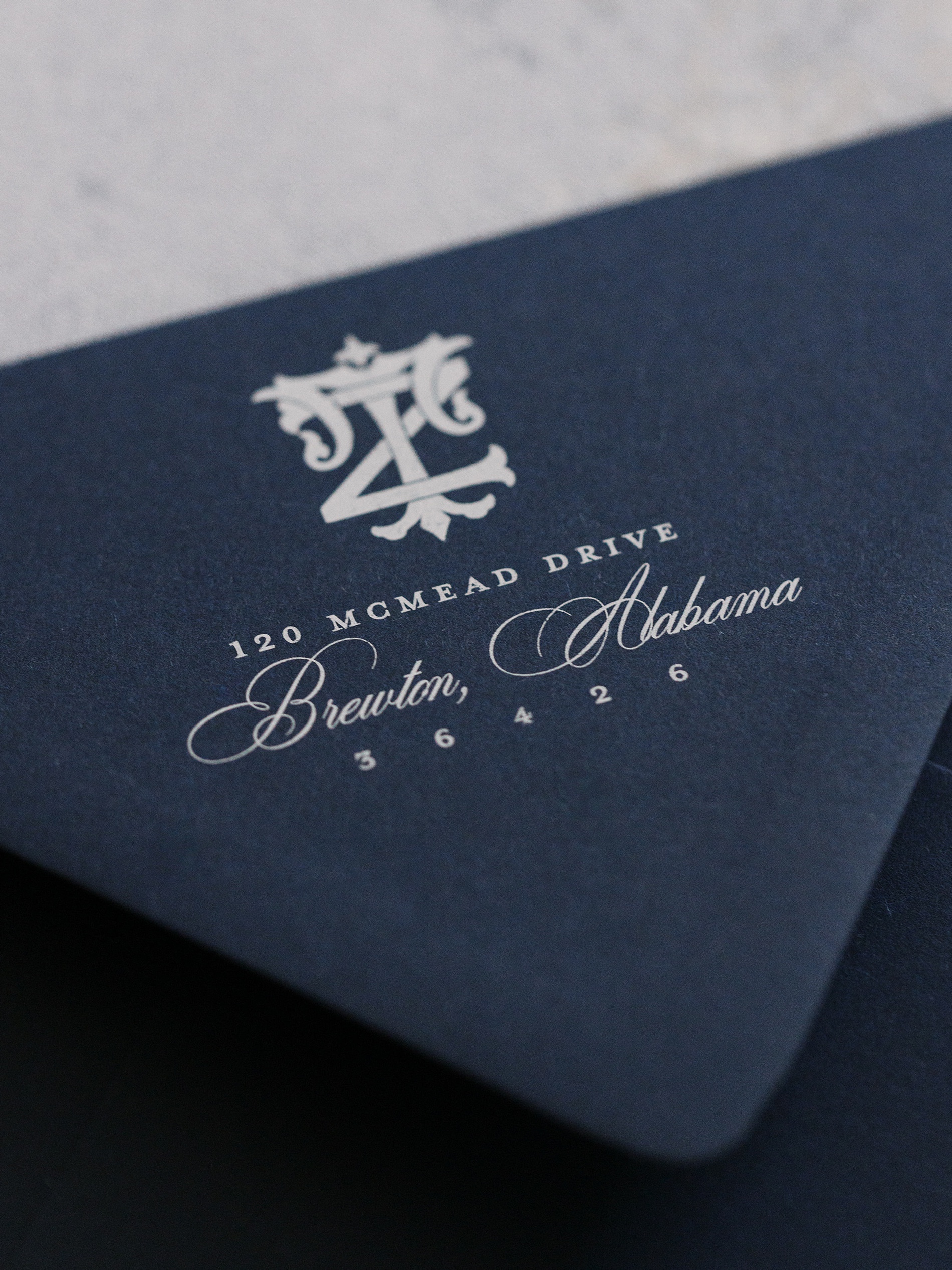
Tori’s suite brought traditional blue-and-white elegance to life. The envelope liner was inspired by the classic ginger jar motif. The color palette featured both bright blues and deeper tones for a layered, high-end look.
The suite was digitally printed and wrapped with a custom monogrammed belly band, which also appeared on the envelope. The result? A timeless design that felt curated, clean, and absolutely stunning from the moment it arrived in guests’ mailboxes.
Why Blue Works Every Time
Blue has a calming presence and an effortless grace that feels at home in almost any celebration. It complements florals, works across all seasons, and adds just the right amount of tradition or personality, depending on how you use it.
From dark navy and sky blues to watercolor washes and chinoiserie patterns, blue works well with nearly every wedding style. We love creating custom invites and paper goods tailored to your story, whether it’s through liners, monograms, illustrations, or custom elements that speak to you.
Because when it comes to wedding paper, the details matter.
If you’re looking to add custom, thoughtful touches to your wedding or event, we would love to make your vision a reality. Reach out today to learn more about our full-service design offerings! We can’t wait to create something unforgettable for you!
If you enjoyed this post, you’ll love these other blogs!
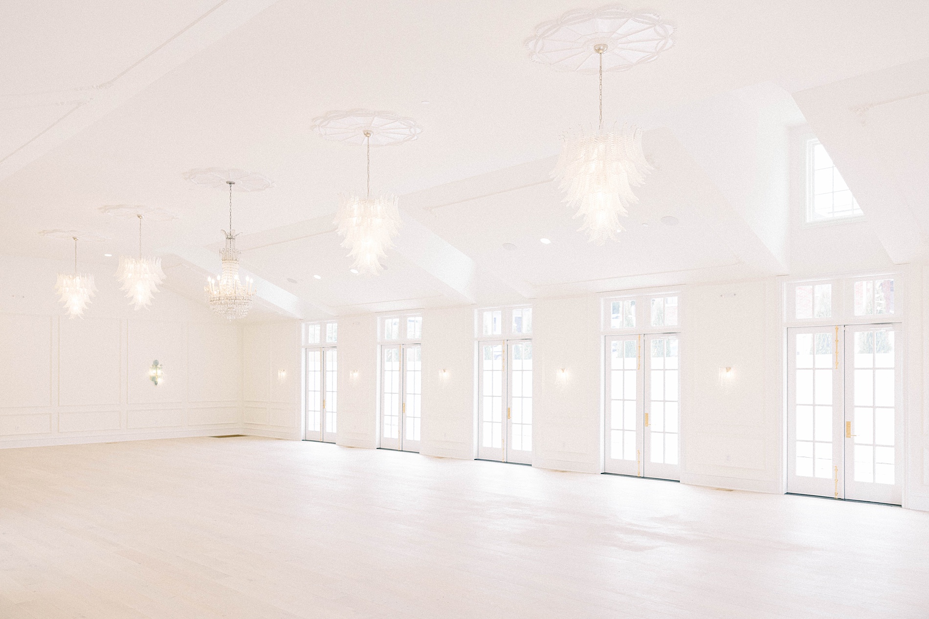
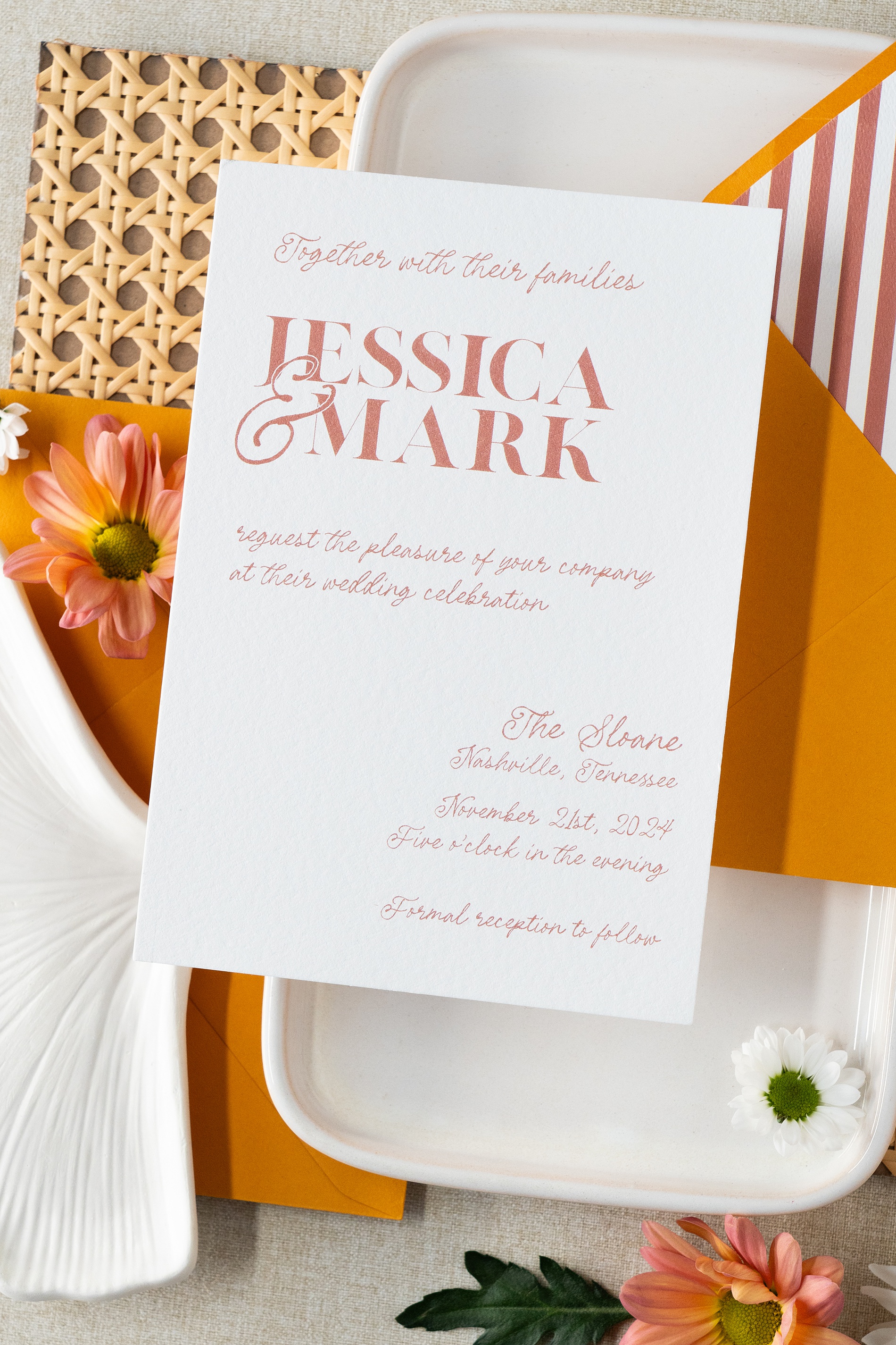
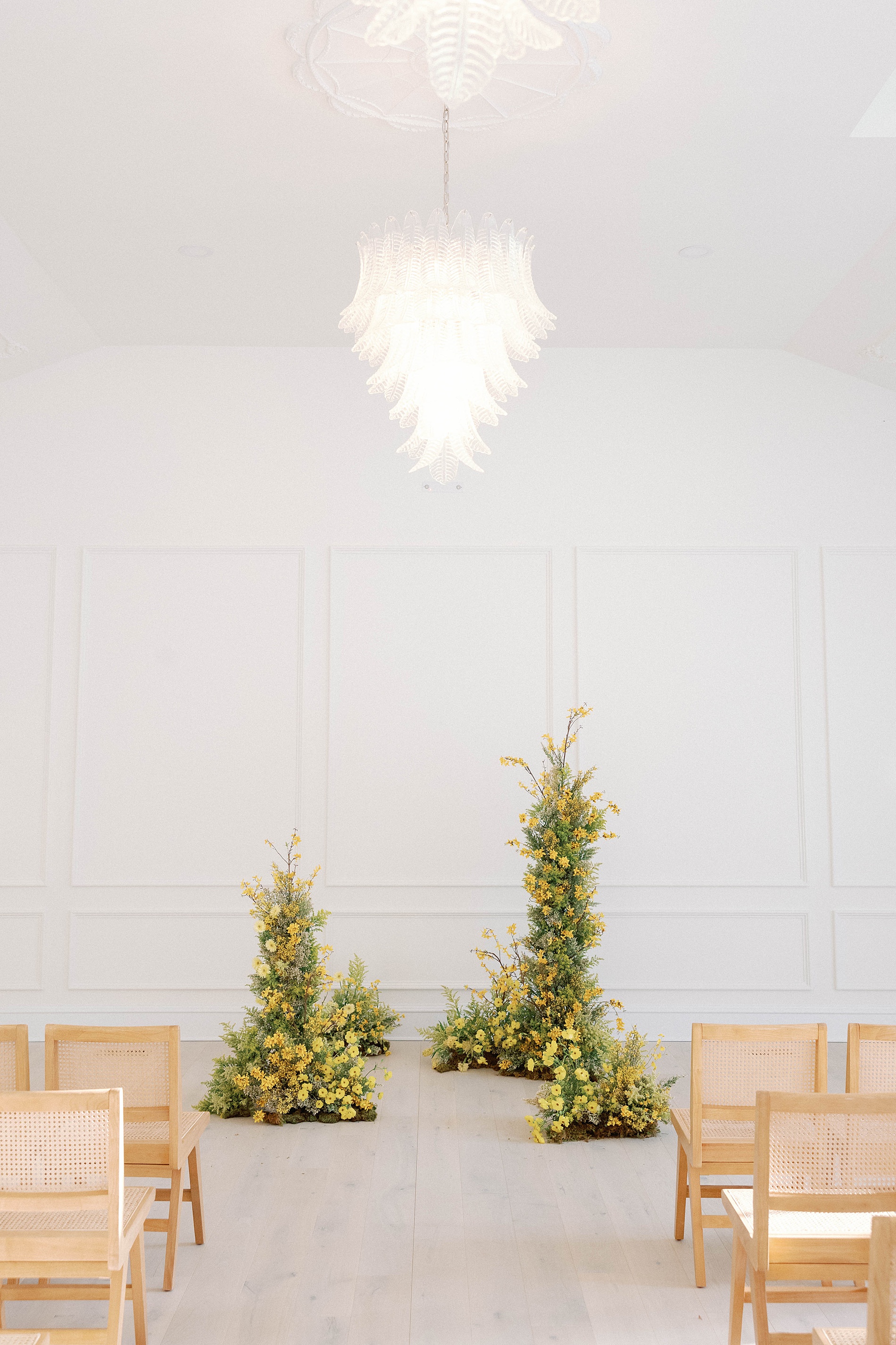
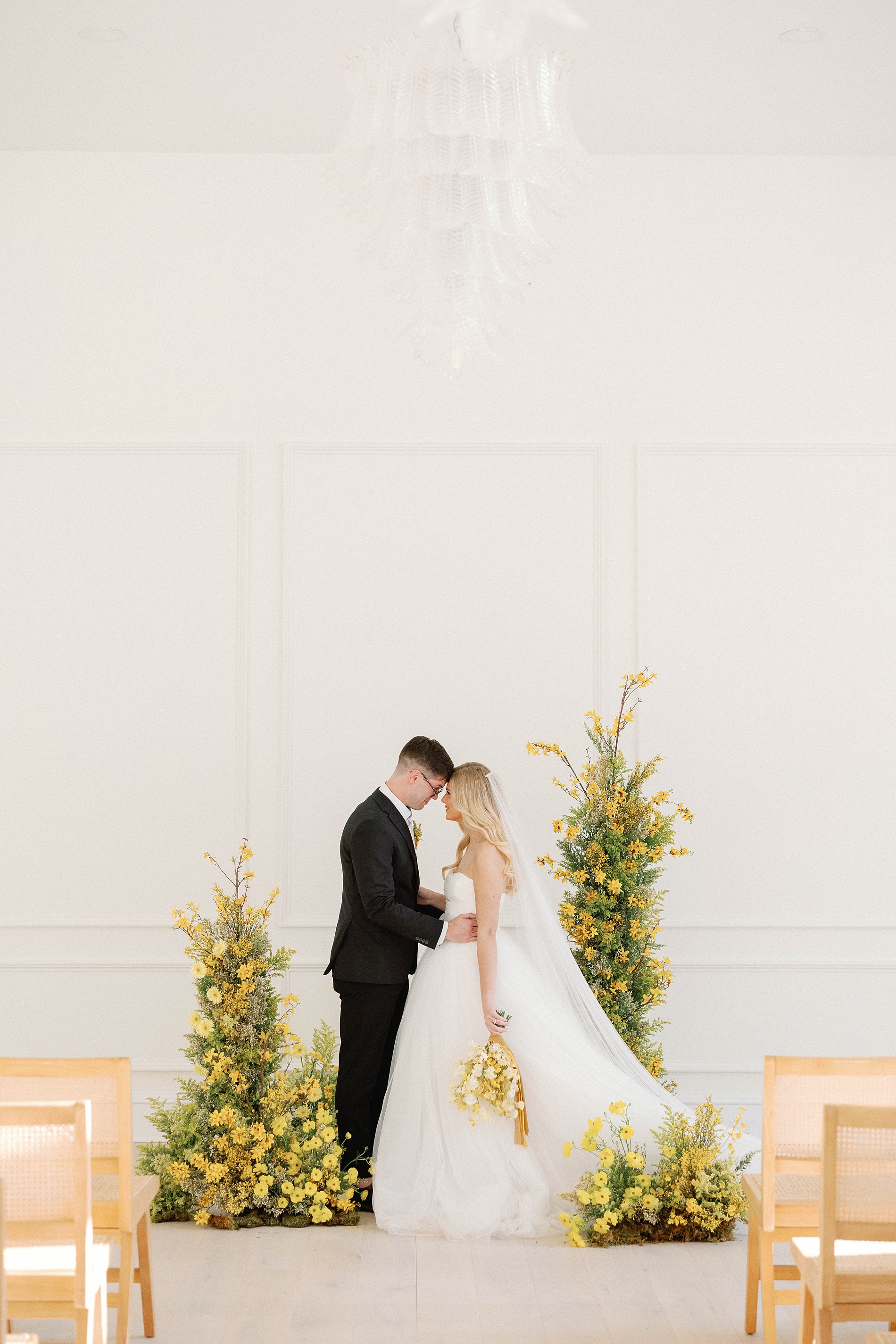
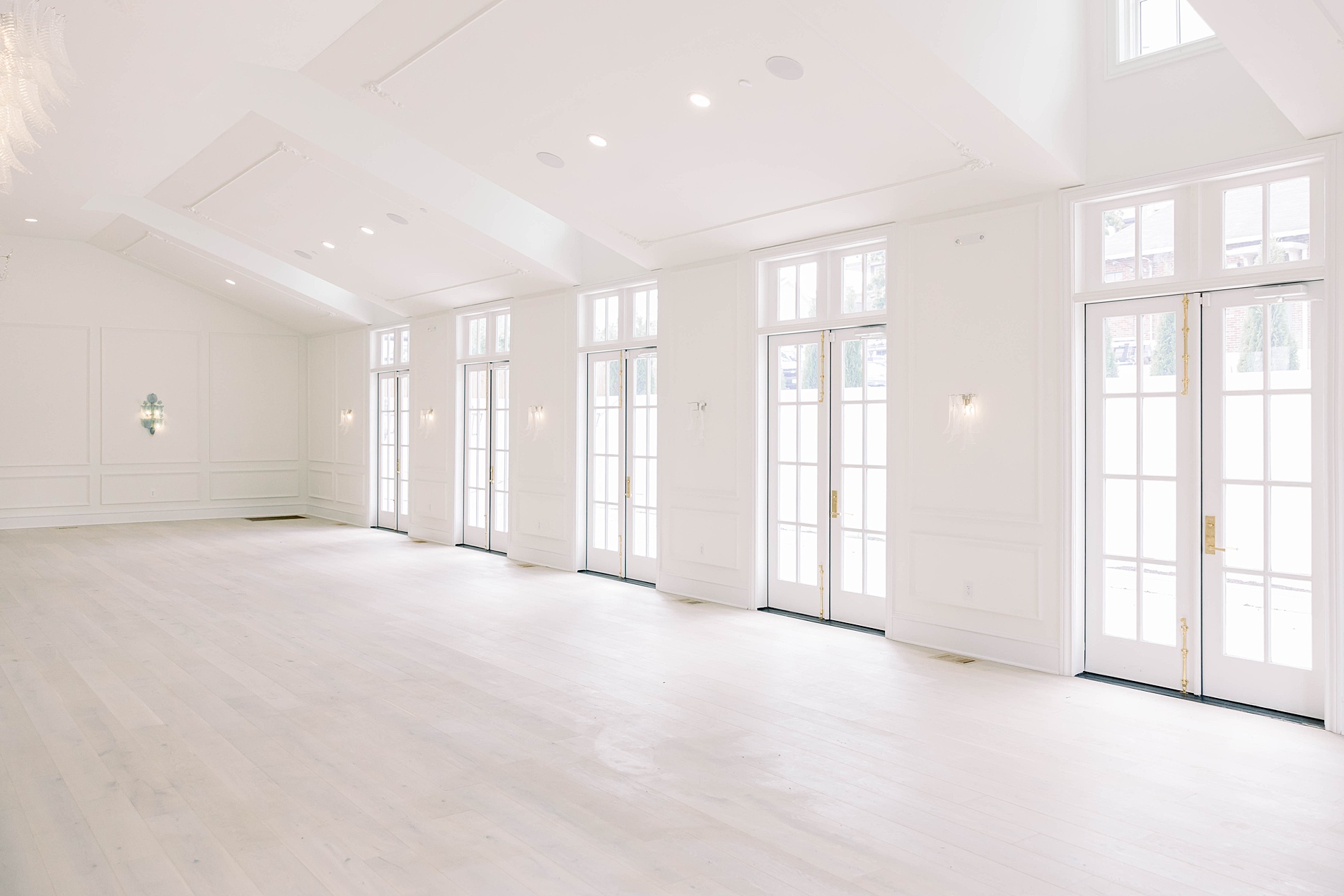
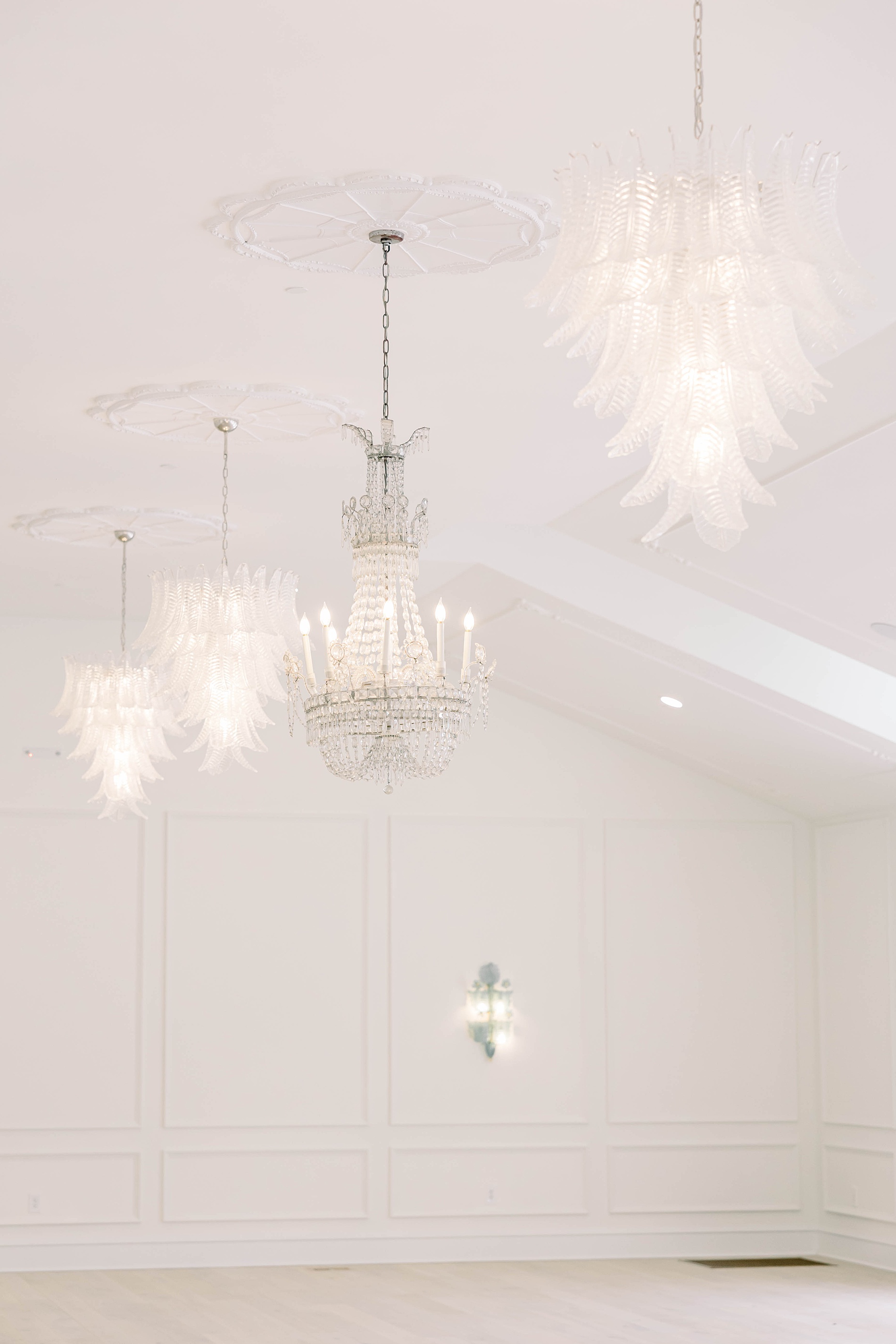
There’s something magical about being part of a venue’s very first event, and that’s exactly how we felt walking into The Sloane for the first time. This brand new wedding venue, nestled in the heart of historic Germantown just 5 minutes from Nashville, is bright and modern. With its tall vaulted ceilings and light-filled spaces, it provided the perfect blank canvas to bring this vibrant, colorful editorial to life. We were honored to be one of the first vendors inside this new venue for a photoshoot, and even more thrilled to create the wedding invitations and paper goods in collaboration with one of our longtime favorite planners, Kelsey Rae Designs, who brought the vision together in the most beautiful way.
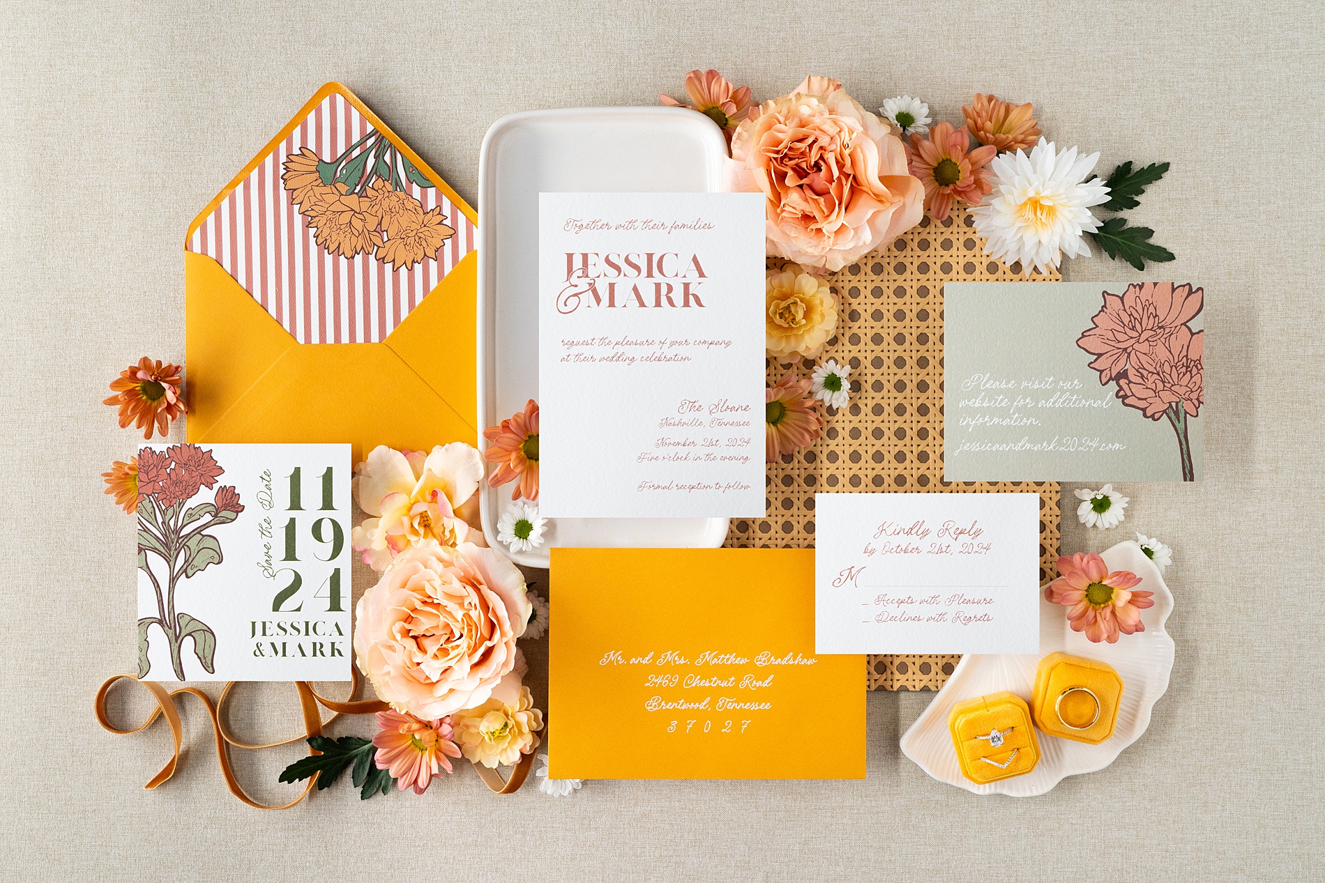
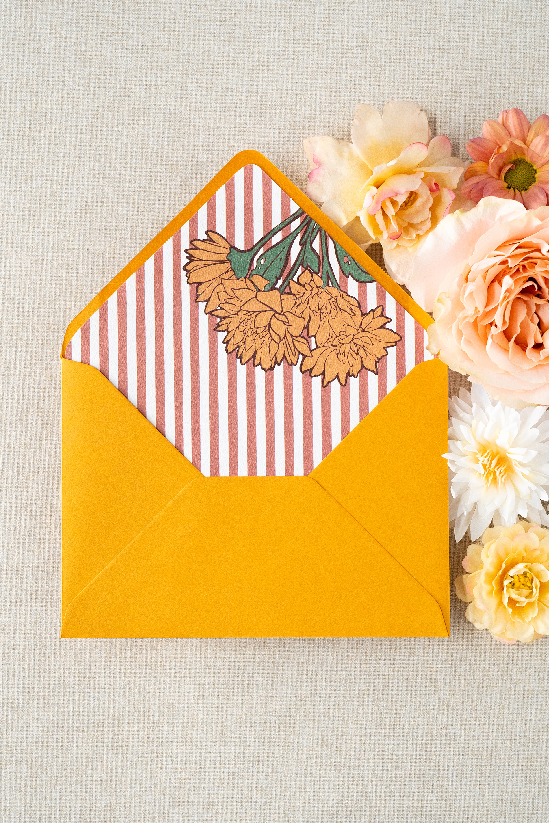
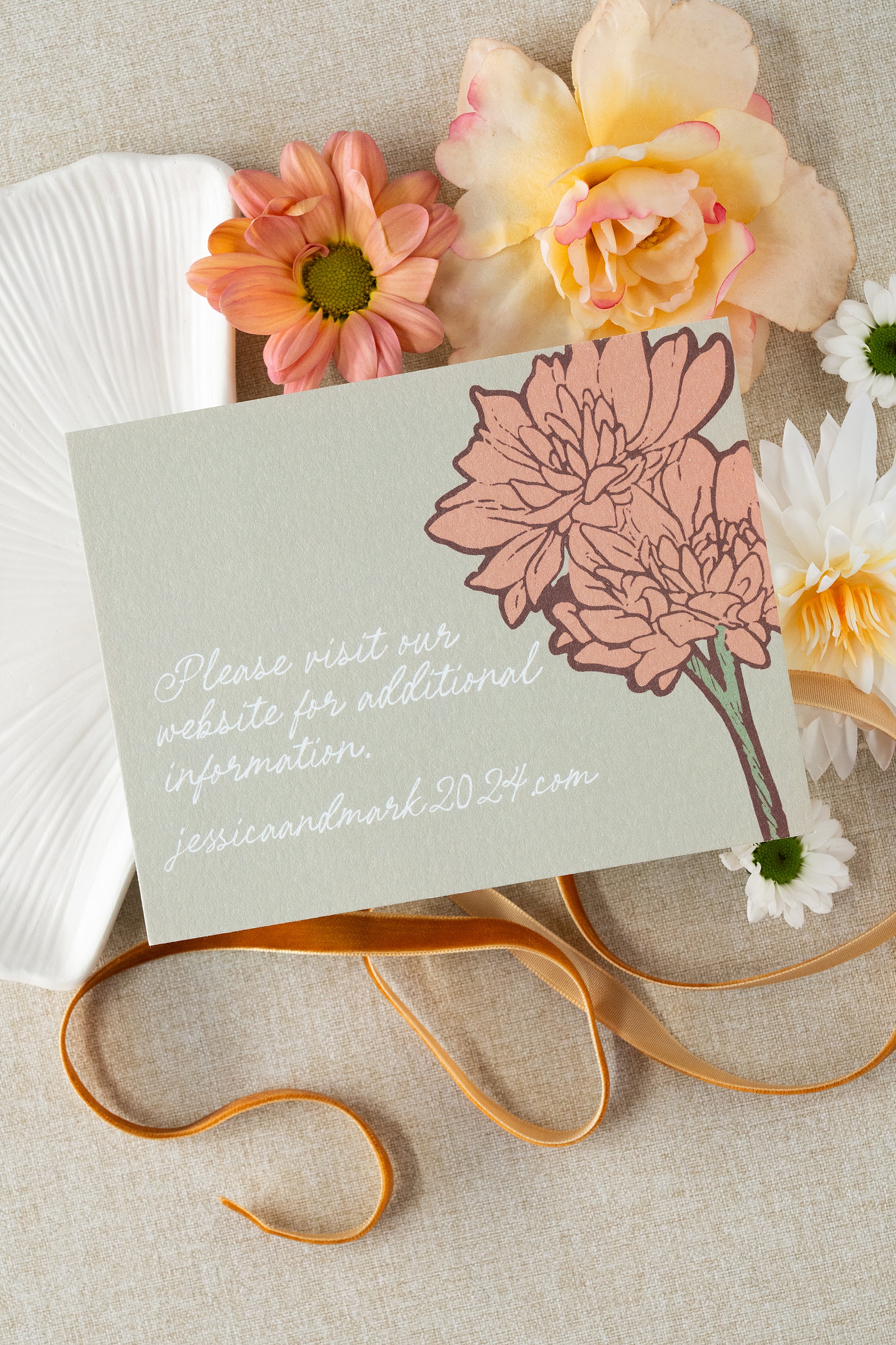
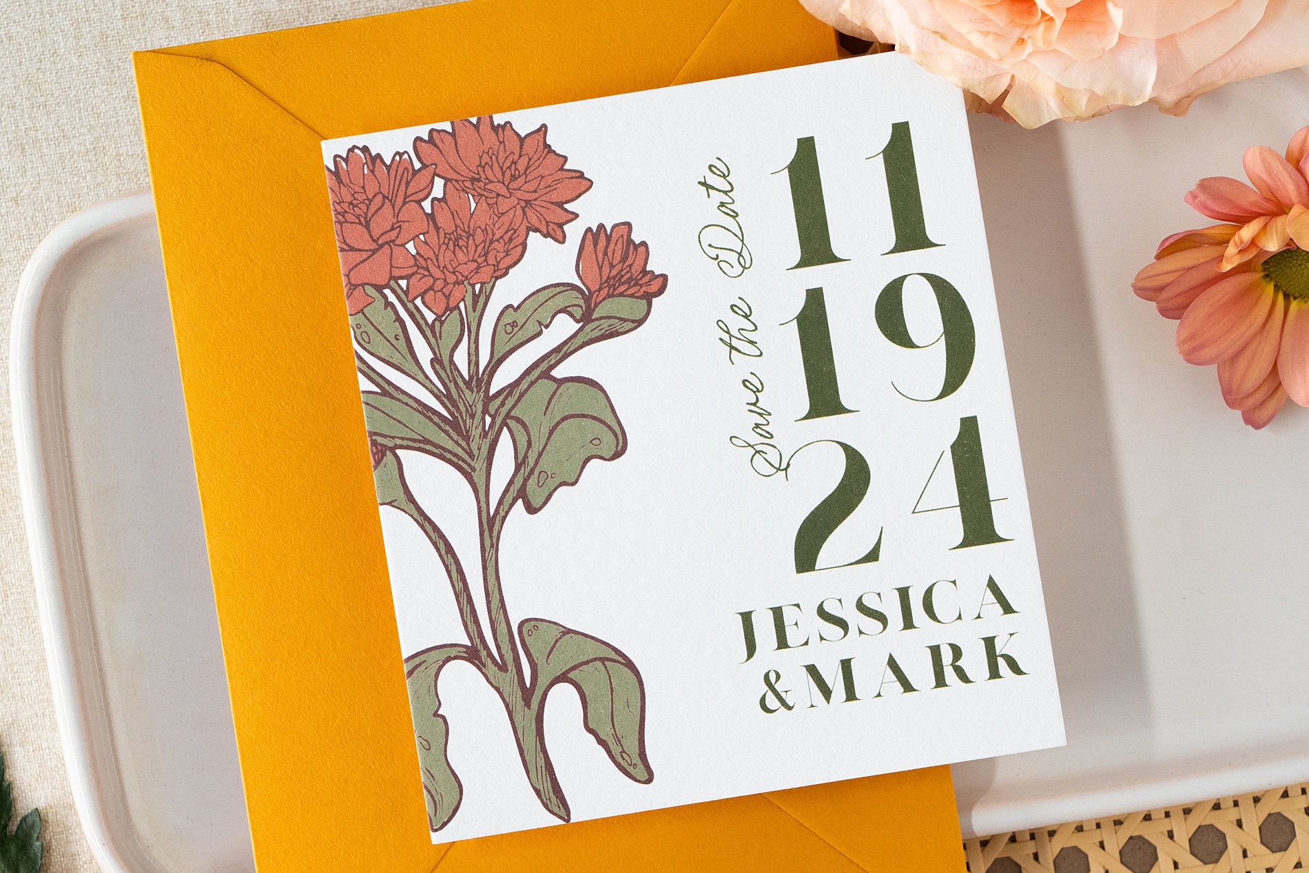
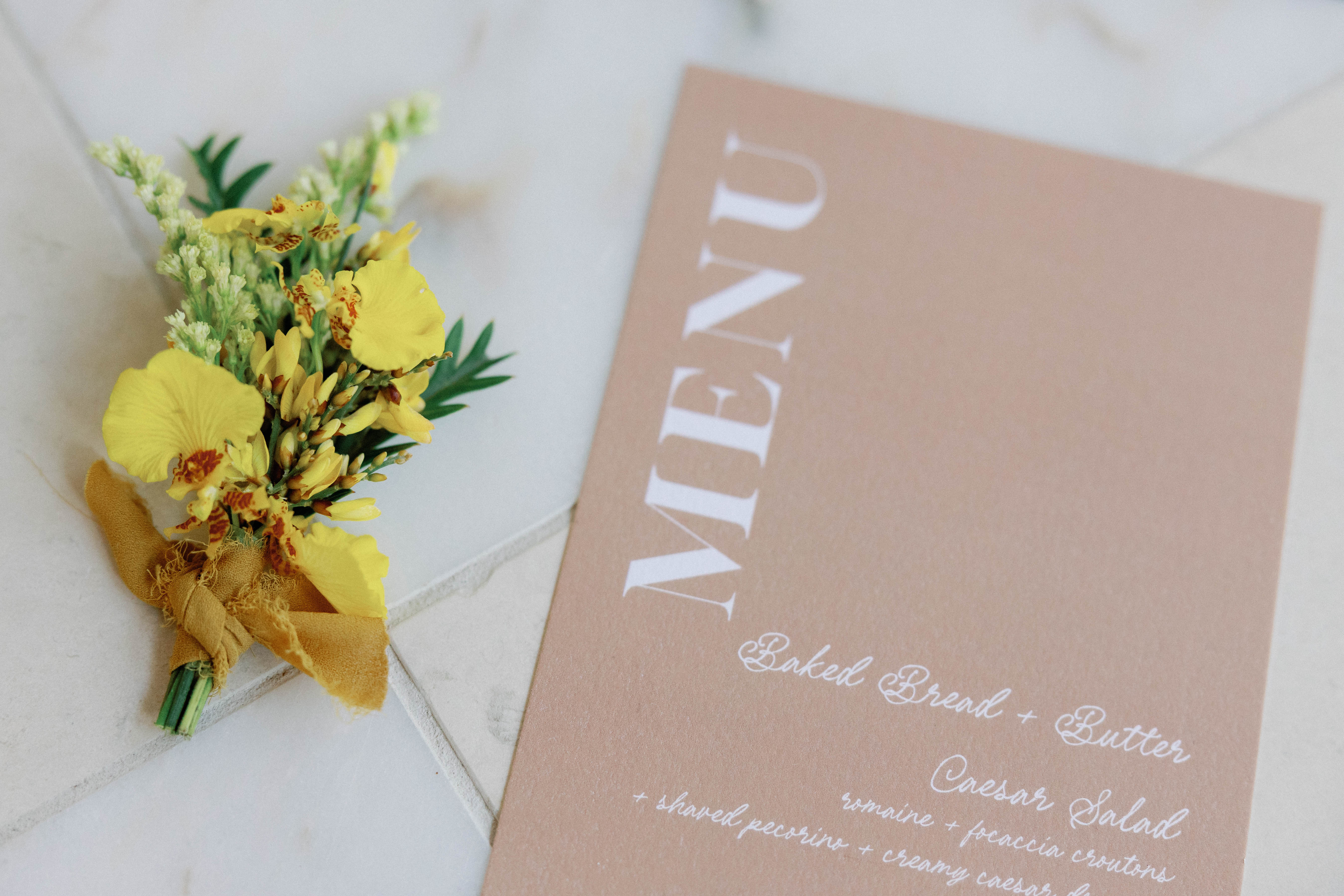
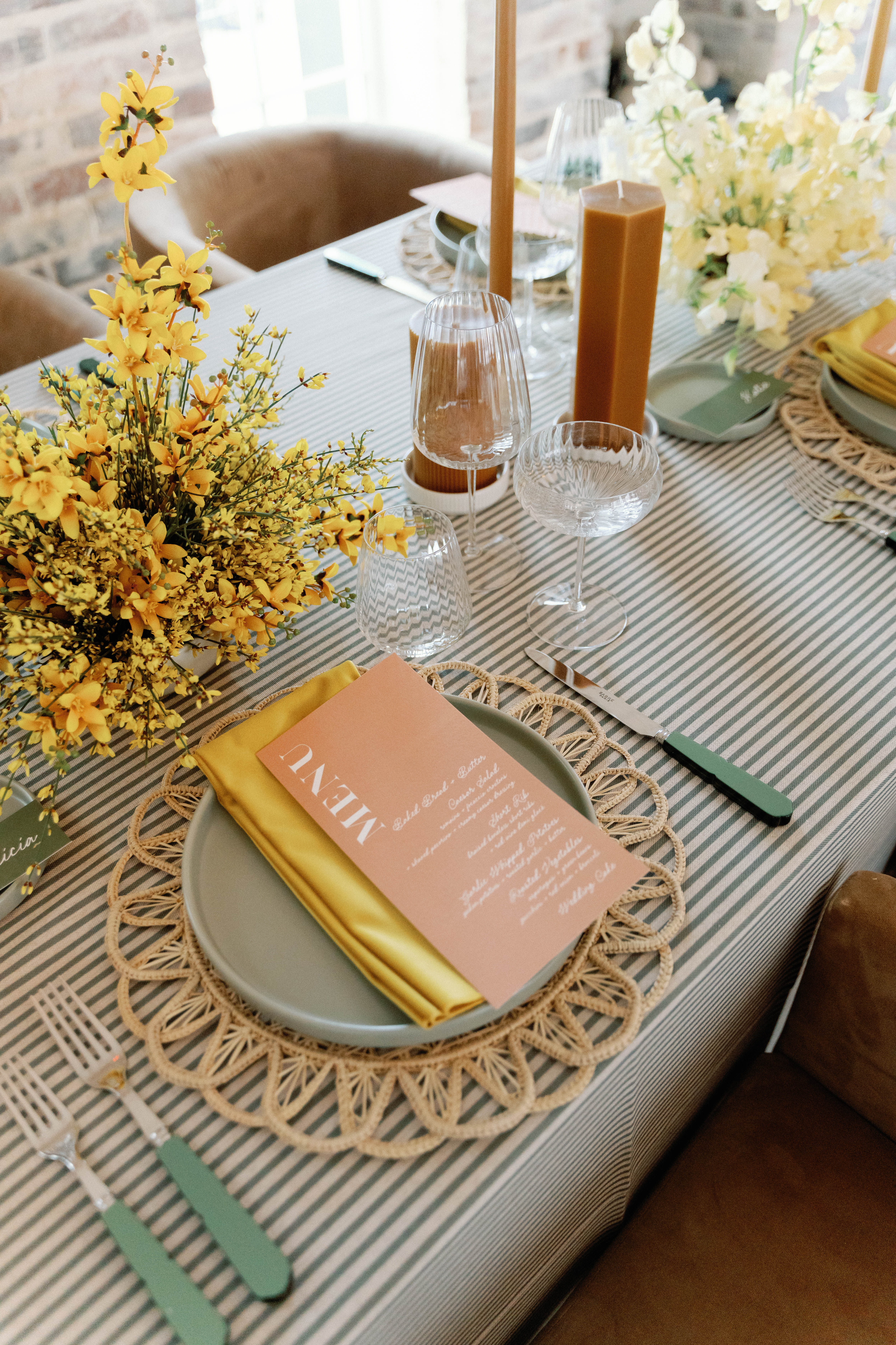
Marigold Wedding Invitations That Pop
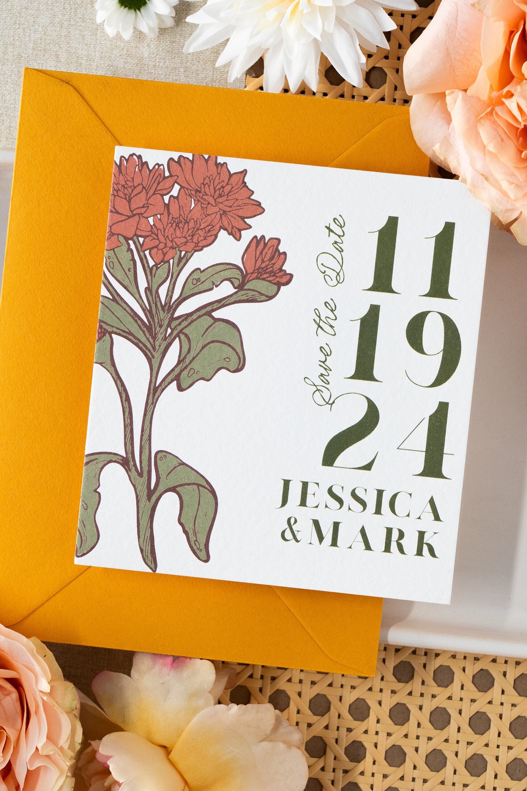
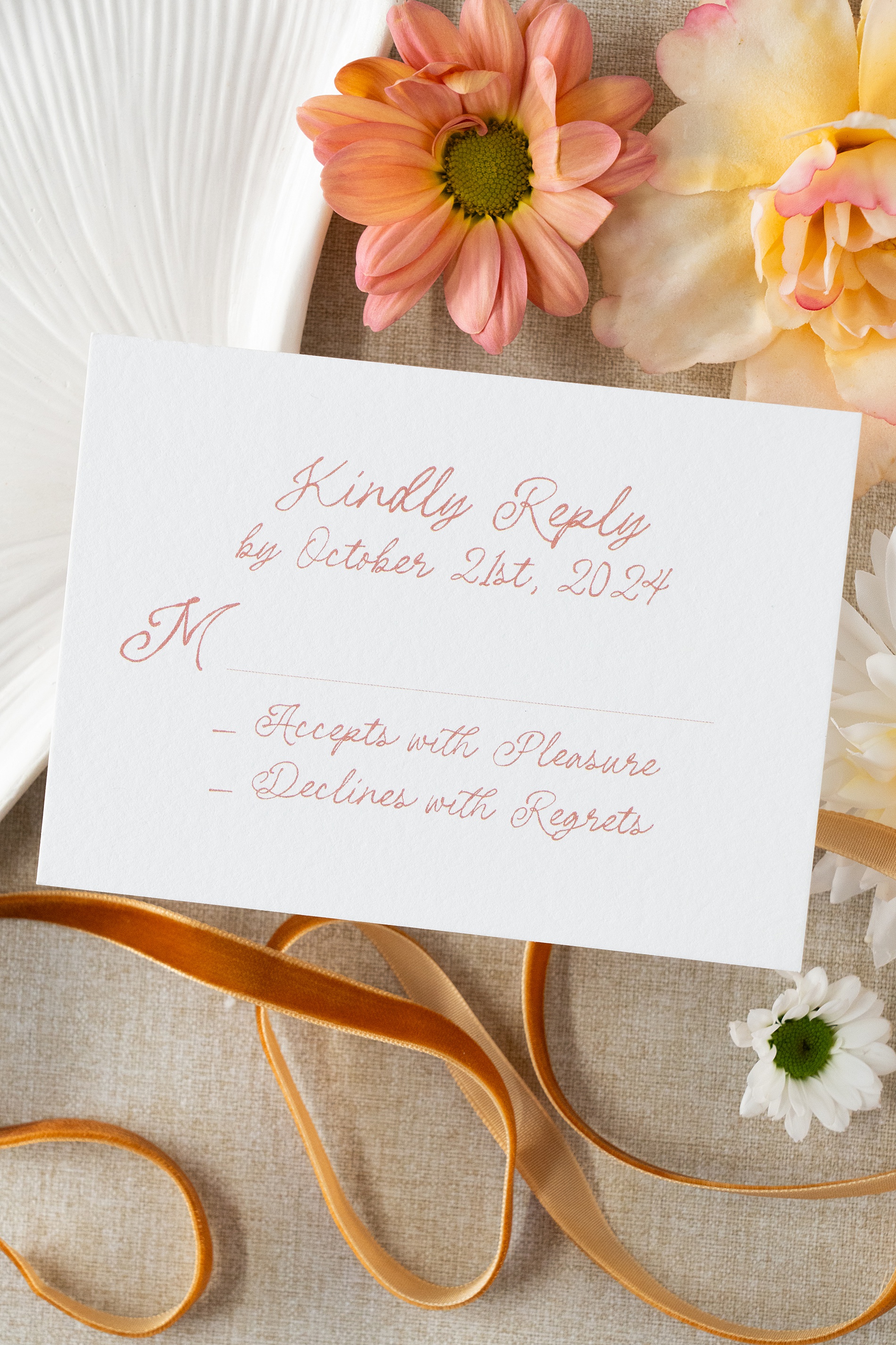
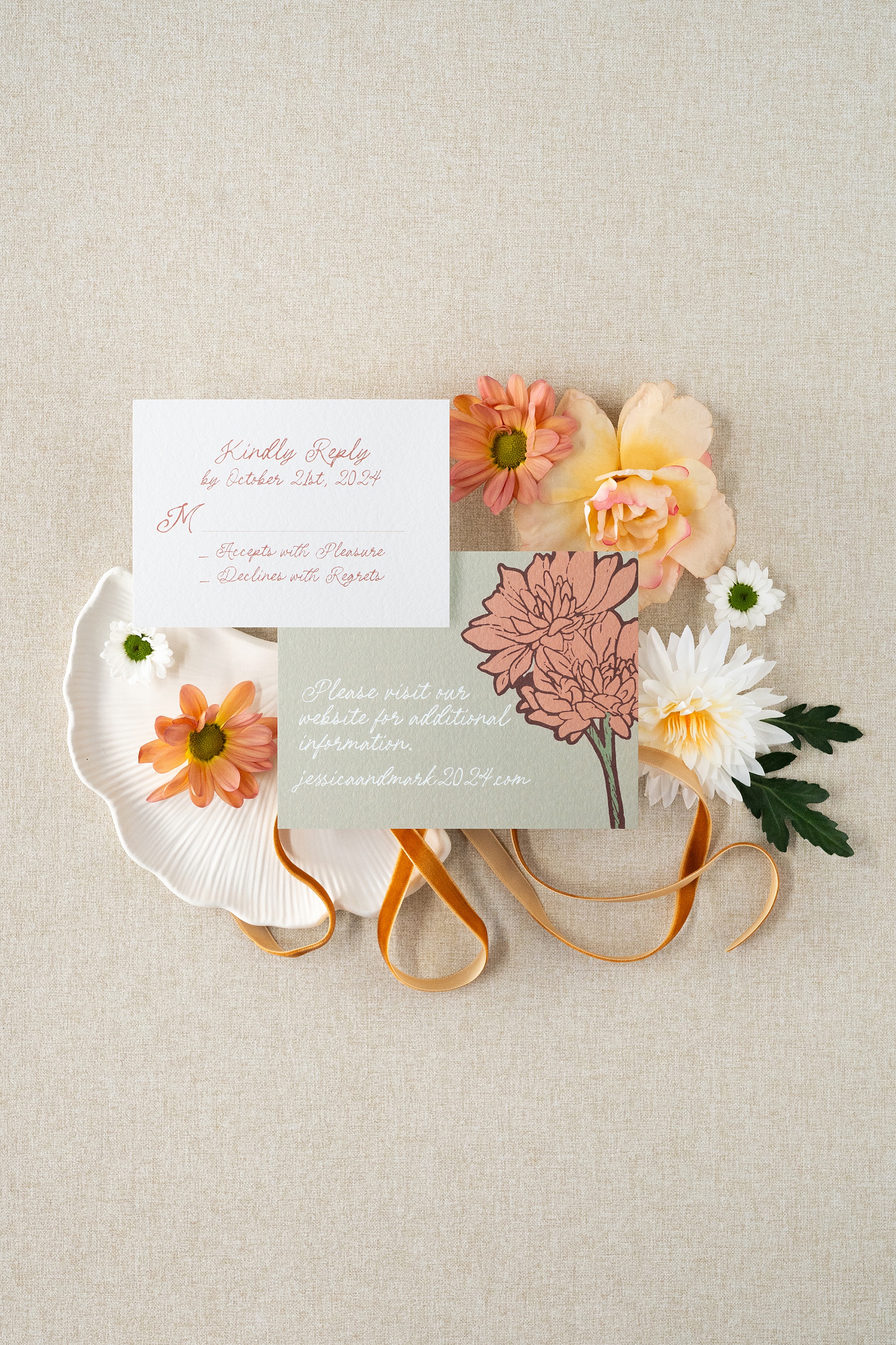
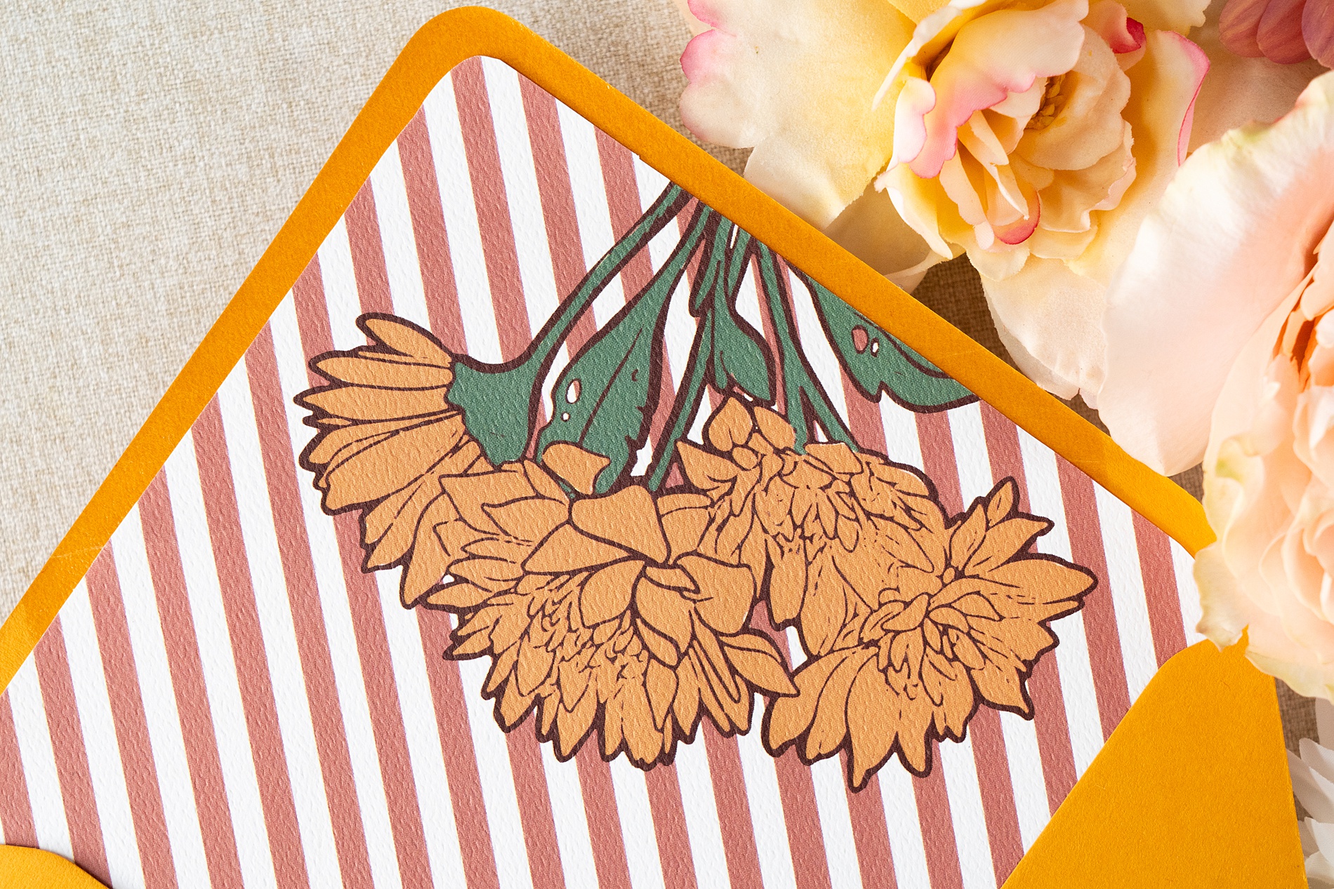
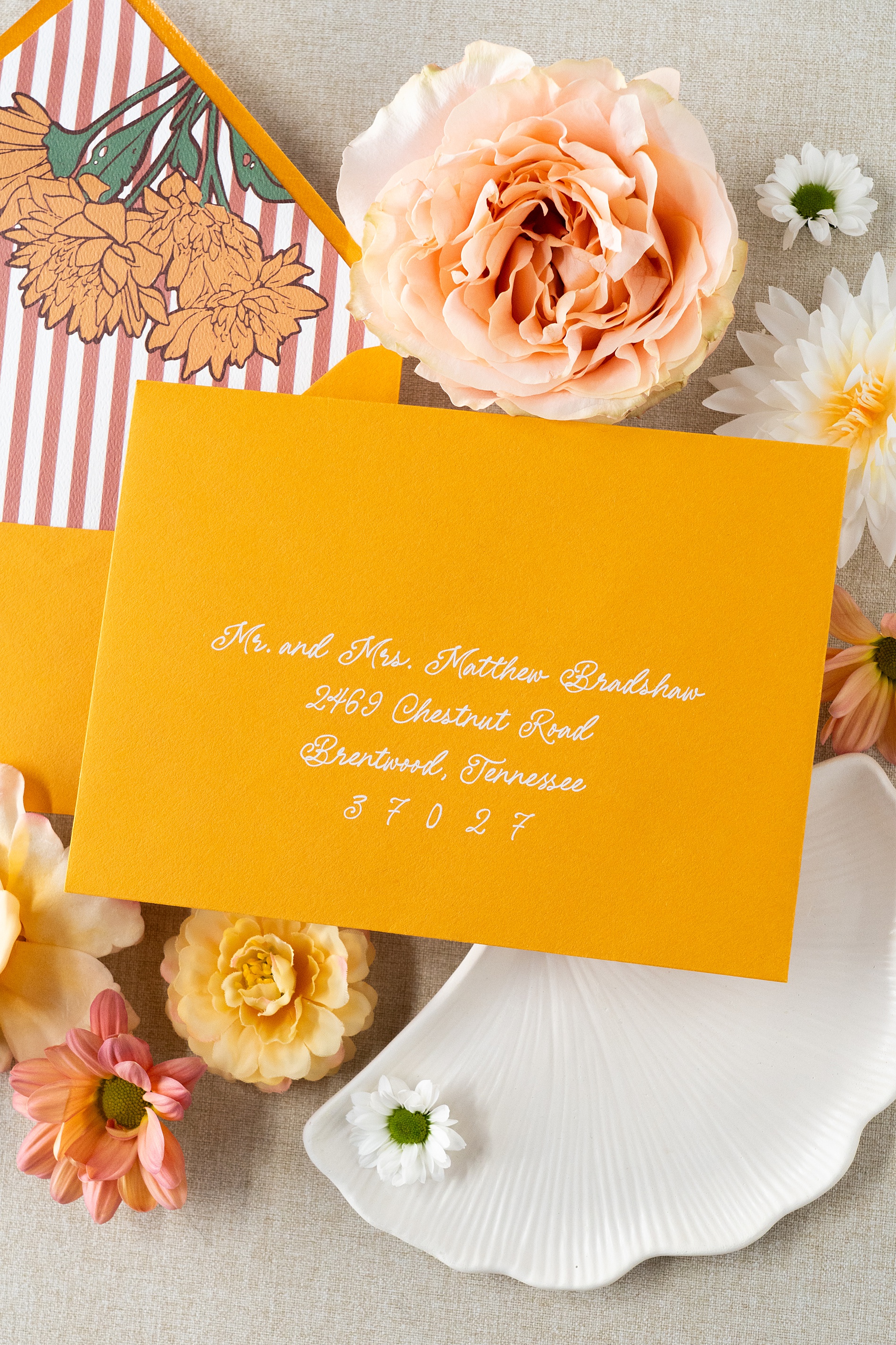
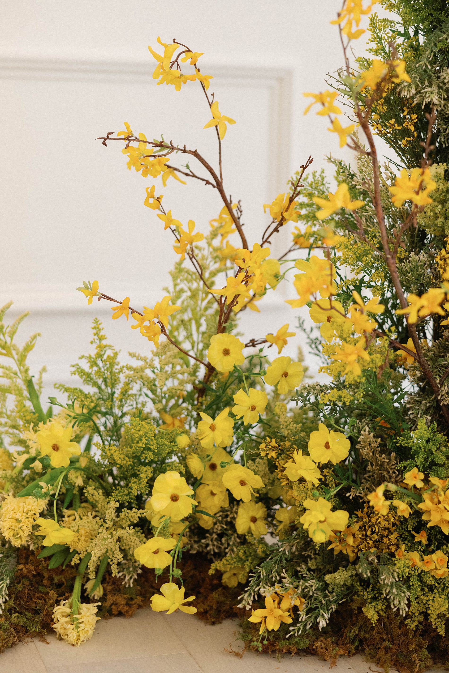
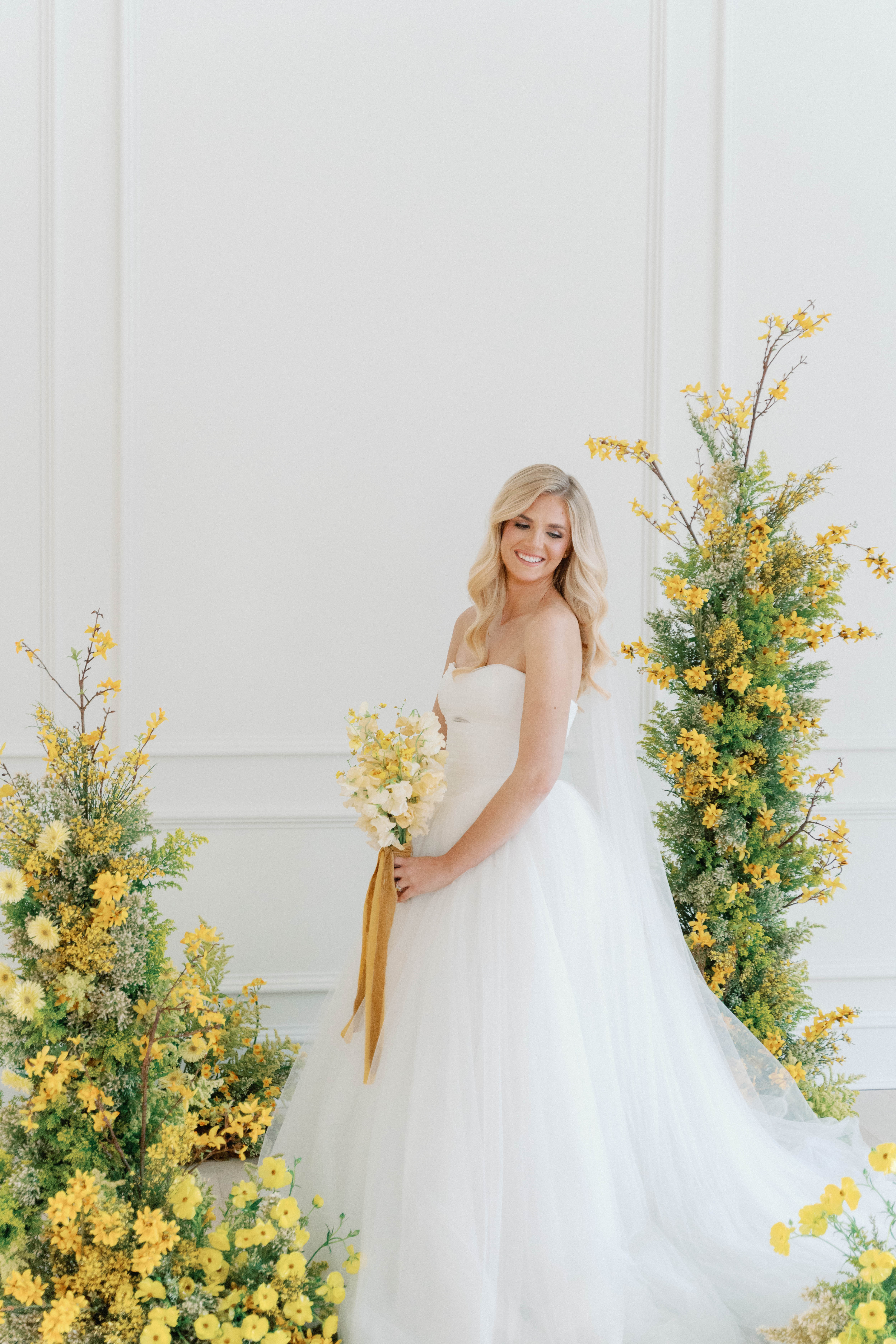
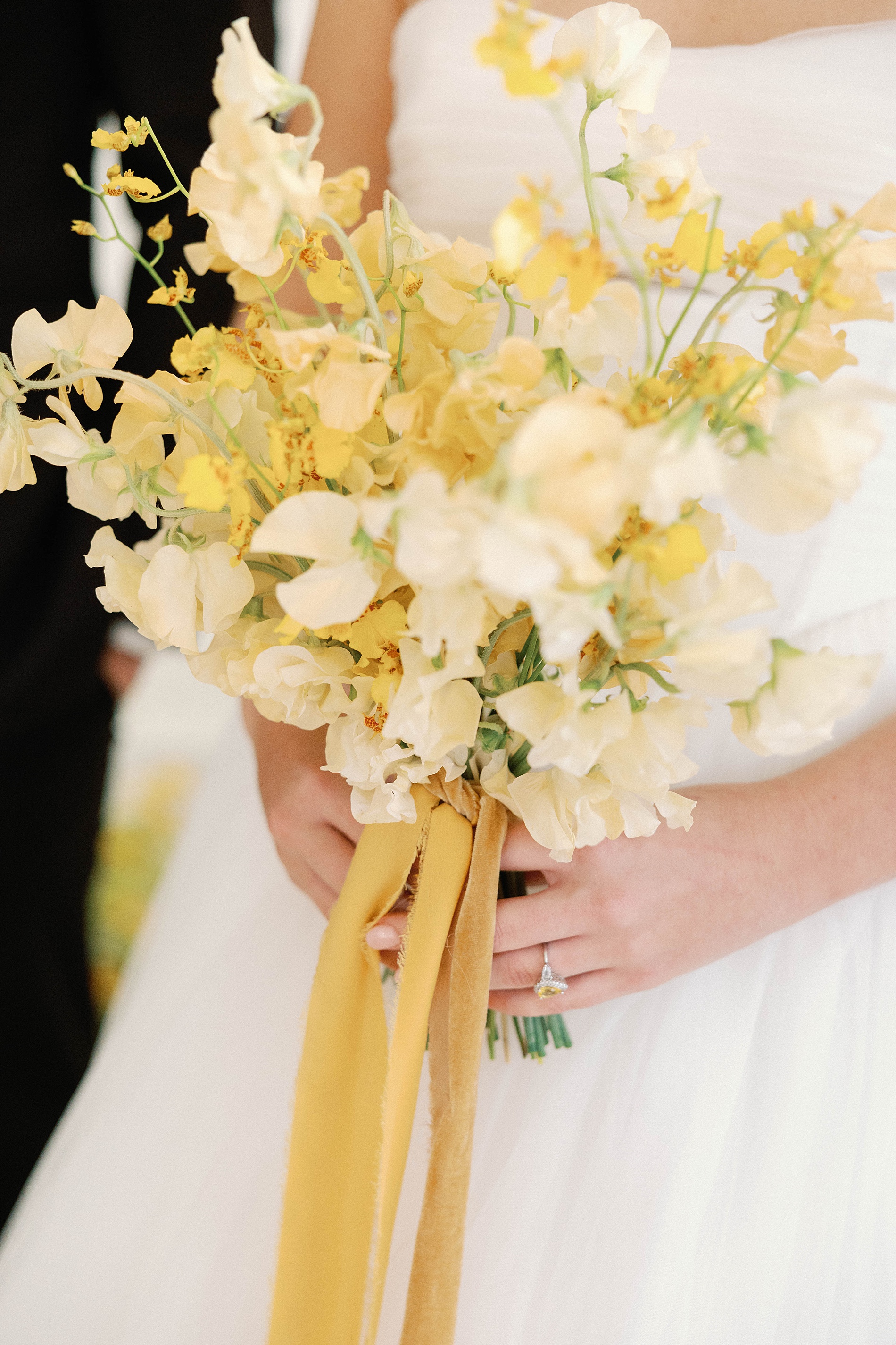
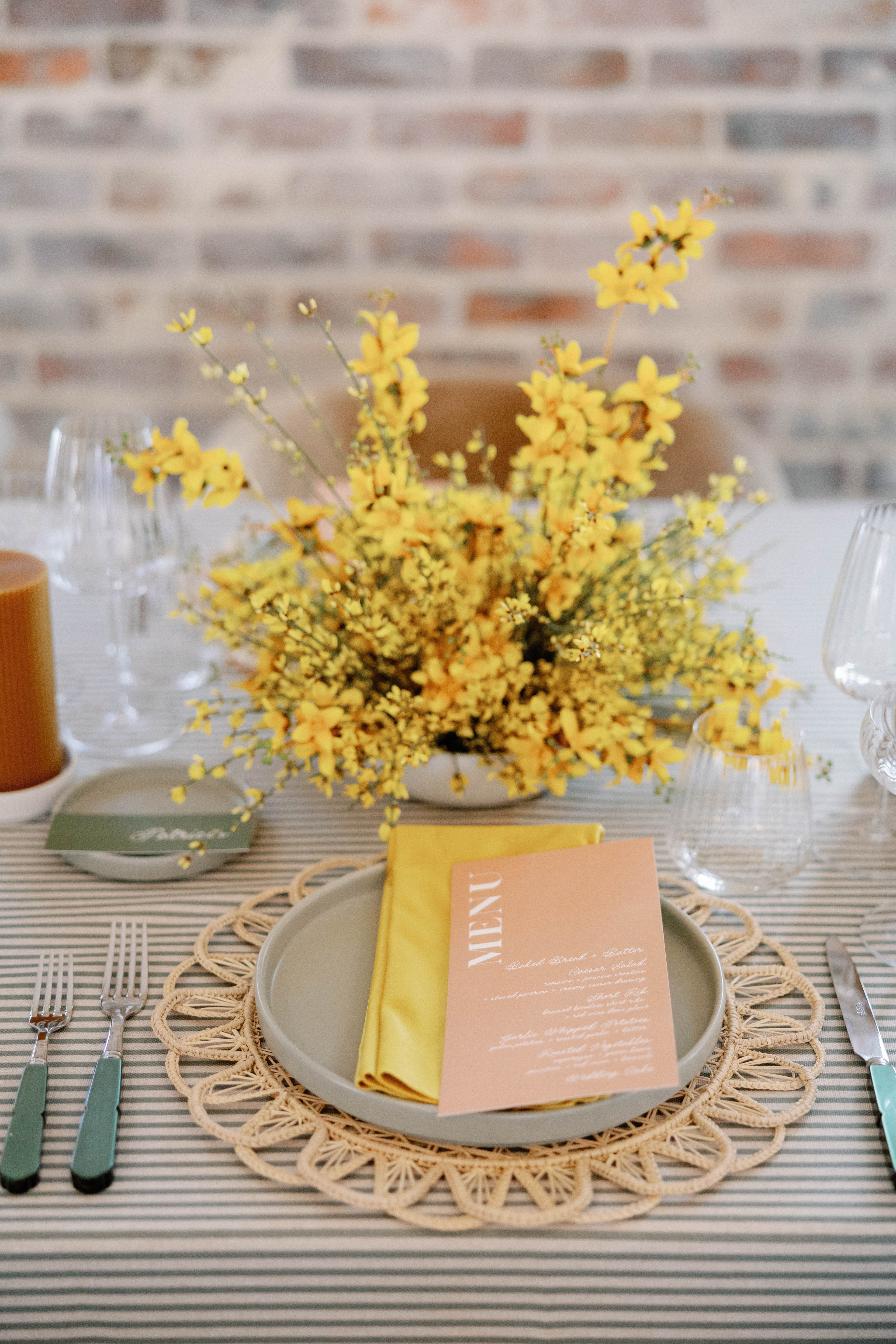
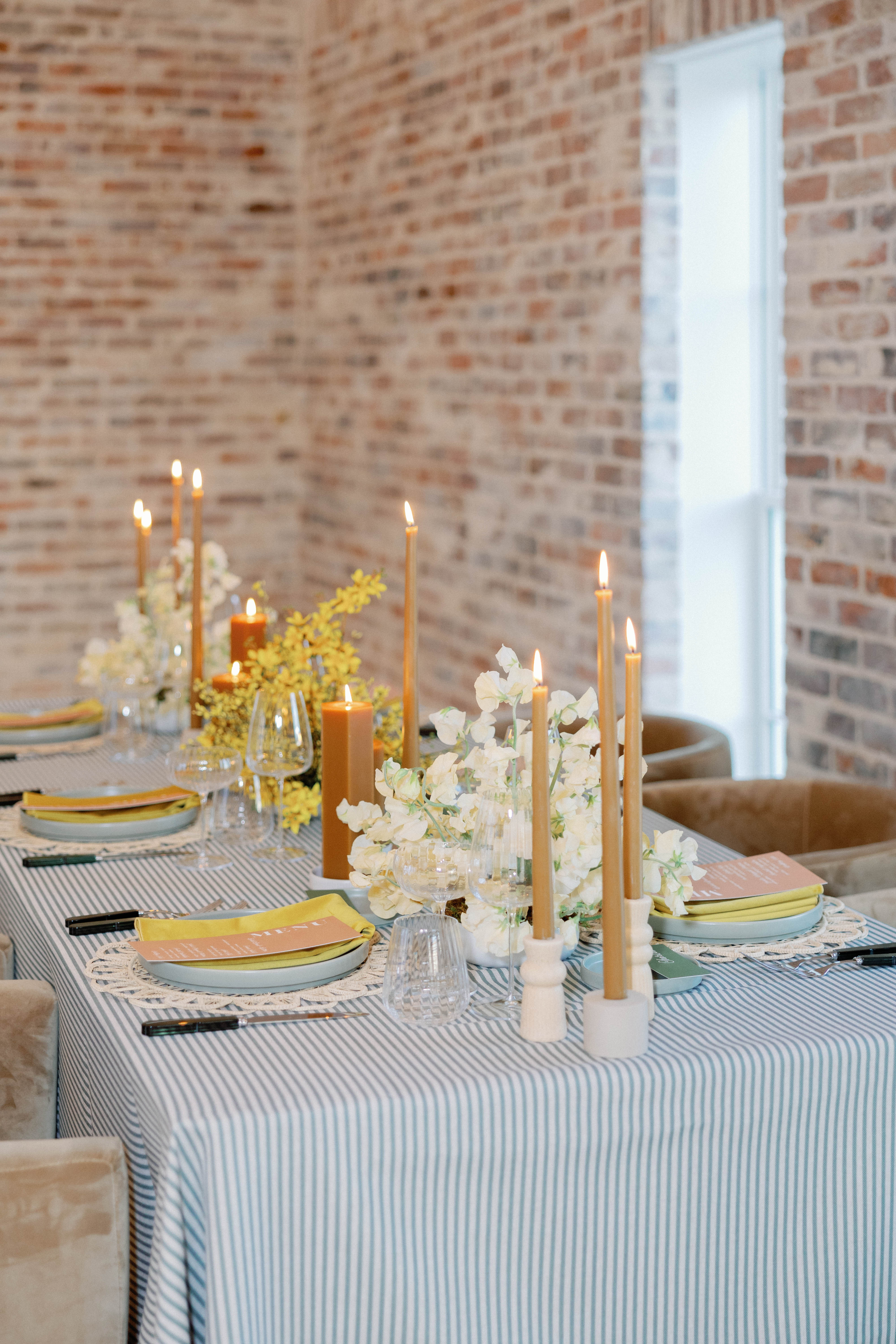
Let’s talk color! Because when a marigold envelope arrives in your mailbox, it’s not going unnoticed! Color is one of our favorite ways to elevate a paper suite, and for this shoot, a rich marigold hue was the star. We used a yellow envelope with a striped liner featuring a floral design of a marigold to set the tone. We then carried that motif to the save the dates and information cards. This bright and cheerful invitation suit is definitely one that guests will remember, perfectly setting the tone and vibe of the wedding day.
Layering Texture and Tone
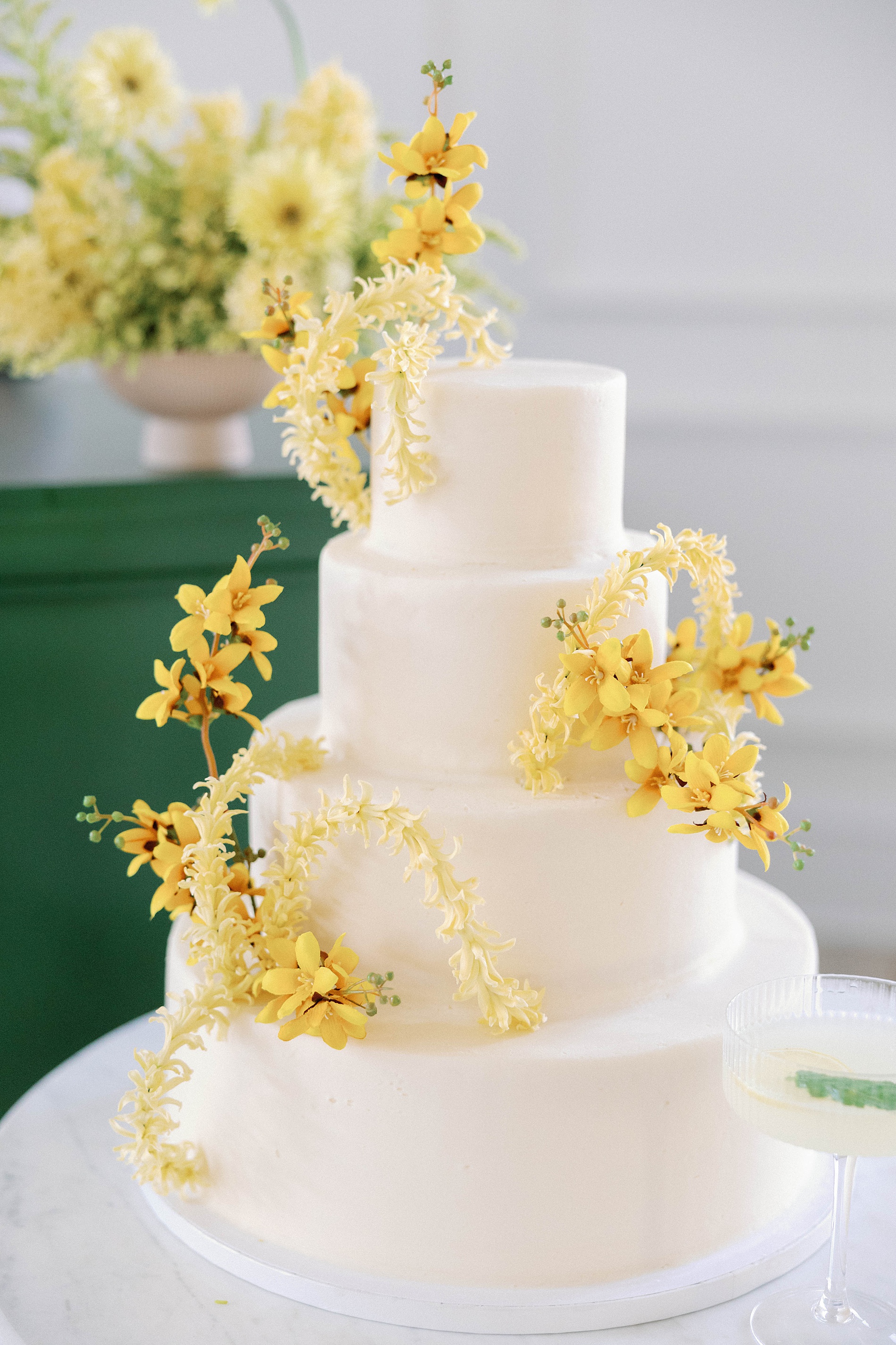
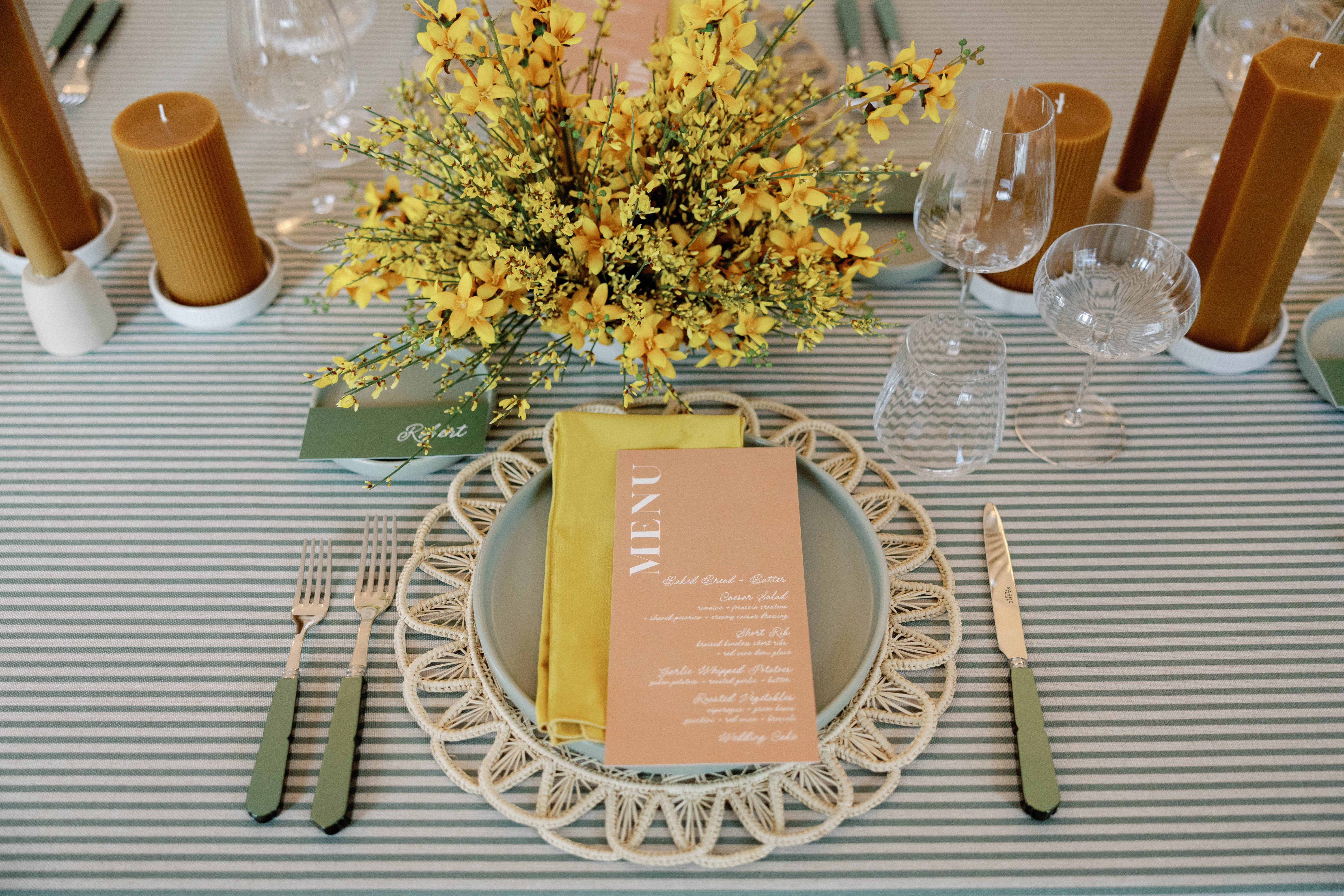
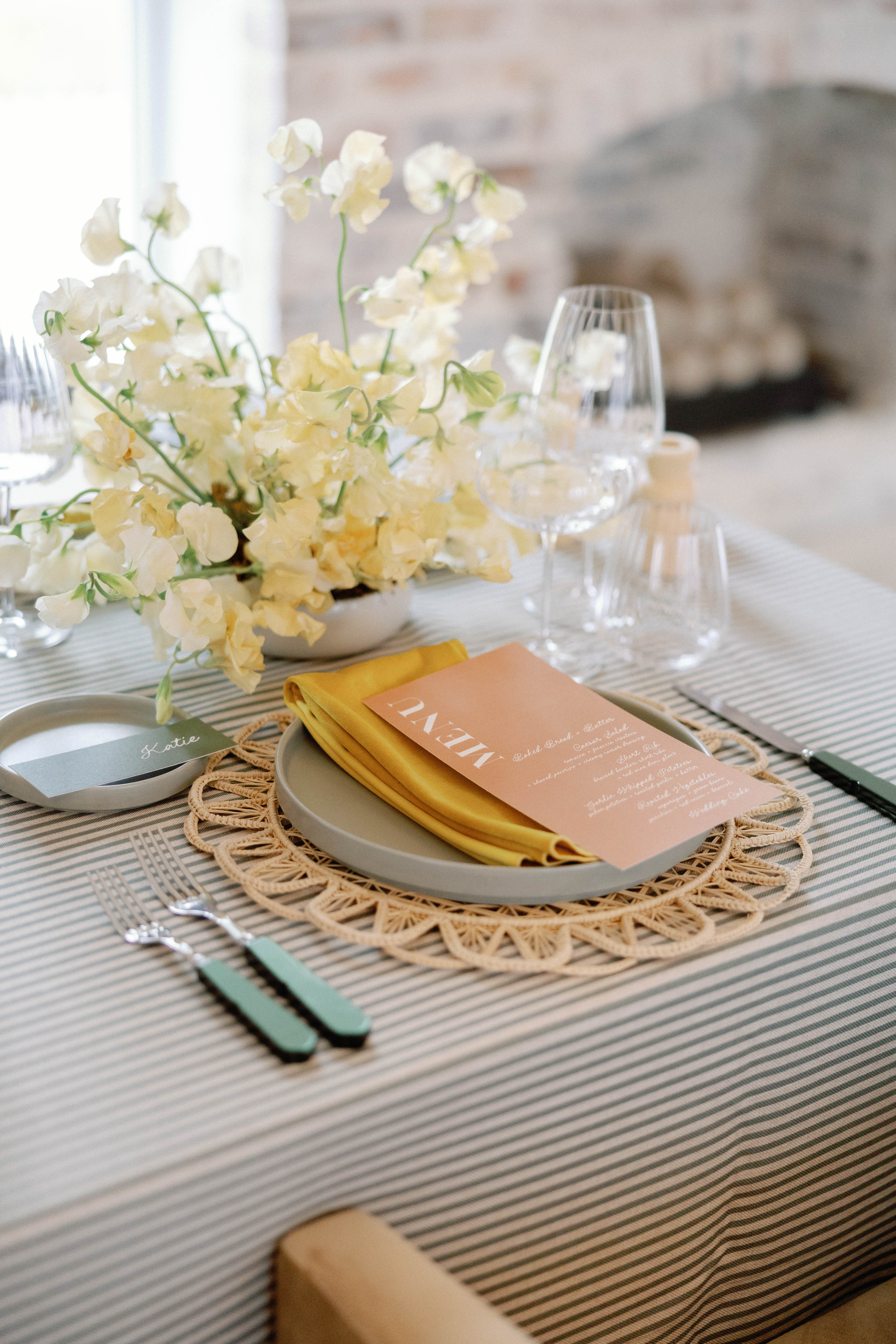
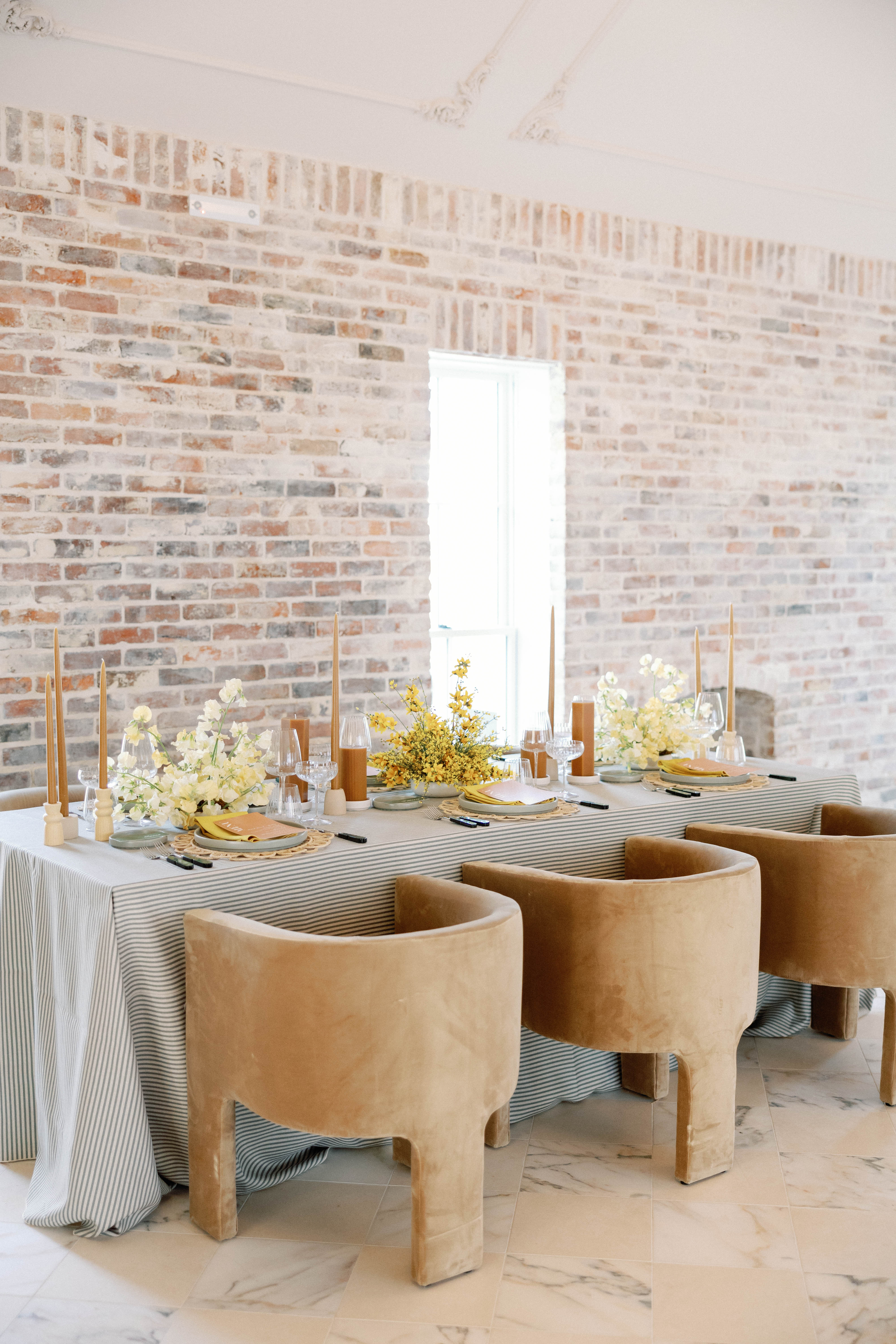
At the venue, stunning, yellow floral displays were set up in the ceremony space. The bride carried her own bouquet of light and darker yellow flowers. Then for the reception, white and yellow arrangements sat in low vases at the center of the table, bringing a cohesiveness that tied everything together.
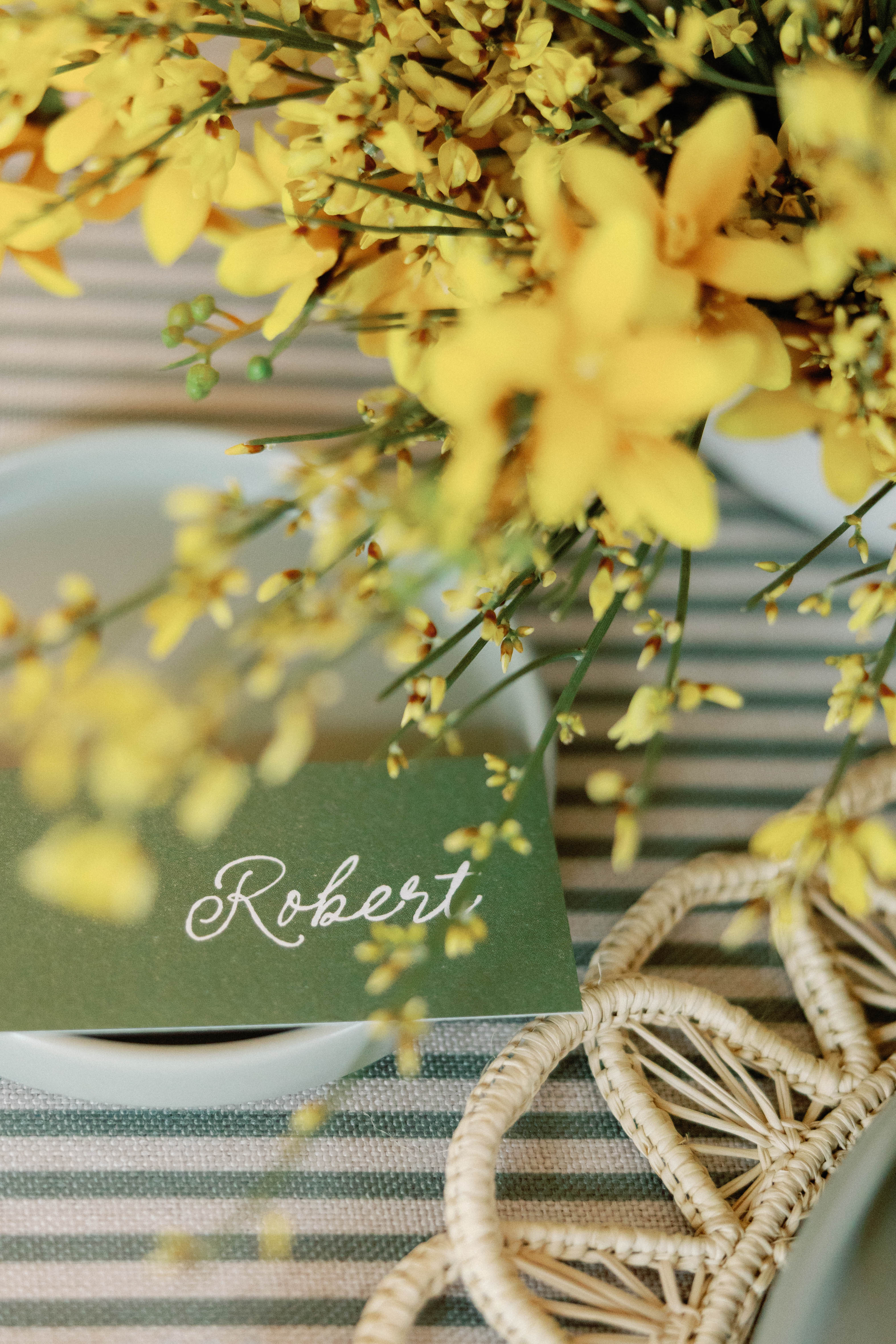
While the bold yellow made a statement, we also wanted to balance the palette with softer, grounded details. On the reception tables, peach-toned menus rested atop marigold napkins, adding warmth and elegance. Our dark green place cards featured crisp white calligraphy for contrast and depth. It was a small detail, but one that elevated each place setting and pulled the entire look together.
A Dreamy New Space in Nashville
If you’re a couple dreaming of a fresh, inviting, upscale venue, The Sloane is definitely one to have on your radar. Its clean architecture, gorgeous natural light, and flexible event spaces make it the perfect canvas for any wedding design. We loved seeing how the bright pops of yellow transformed the white ceremony backdrop and how every vendor worked together to bring this joyful concept to life. One thing is certain, creating wedding invitations that pop and set the tone for the wedding day ahead is not only our specialty, but our favorite thing to do!
If you’re looking to add custom, thoughtful touches to your wedding or event, we would love to help make your vision a reality. Reach out today to learn more about our full-service design offerings! We can’t wait to create something unforgettable for you!
If you enjoyed this post, you’ll love these other blogs!
When it comes to wedding invitations, green is a color we’ll never stop reaching for. Whether it’s soft sage, deep emerald, or a muted olive, green truly works like a neutral as it pairs beautifully with florals, practically every color on the spectrum, and even bold patterns. It’s elegant yet still allows for playful creativity. At White Ink Calligraphy + Co., we’ve had the joy of bringing several green invitation suites to life, and we’re sharing a few of our favorites today to show how this gorgeous hue can set the tone for an elevated and memorable celebration.
Green Invitation Suites for Every Wedding Style
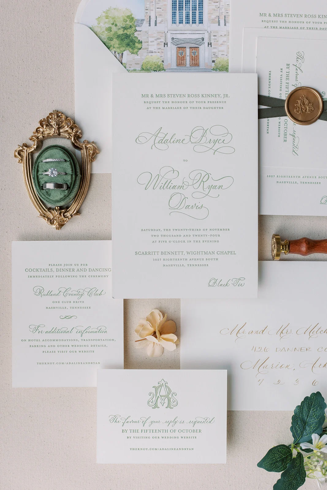
Refined Letterpress Suite
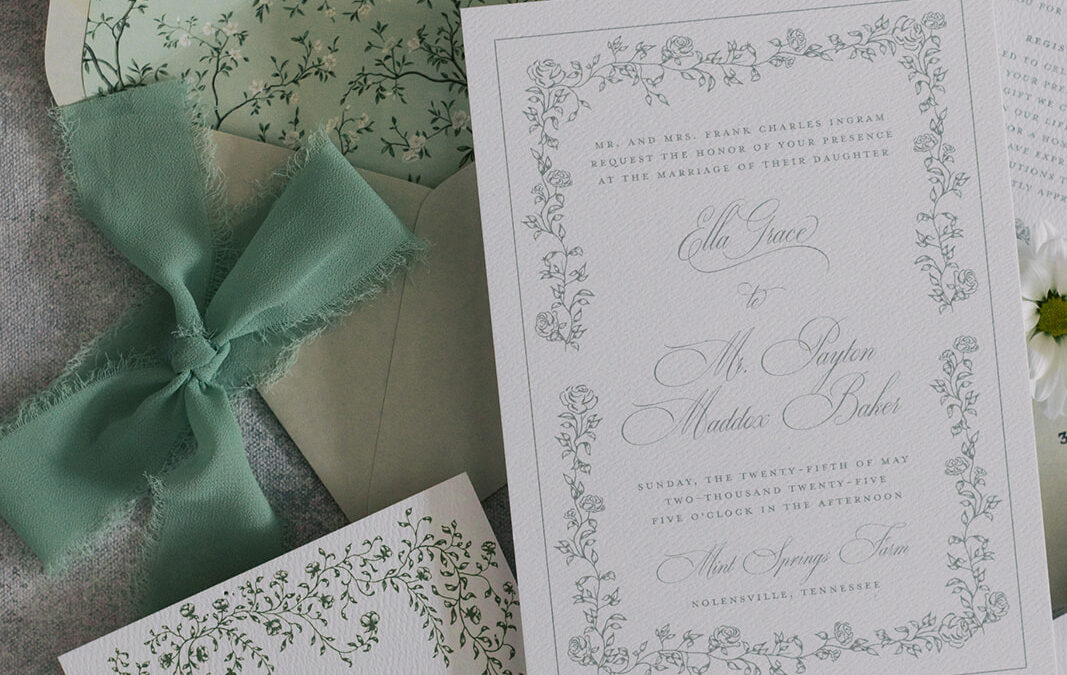
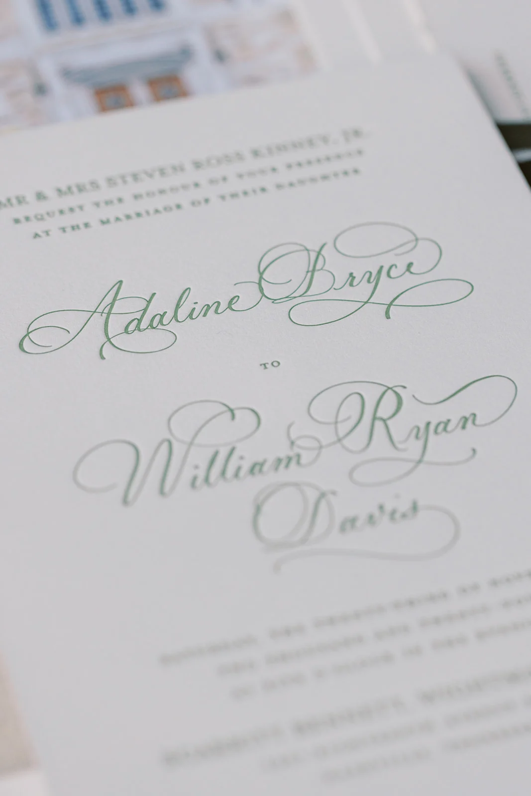
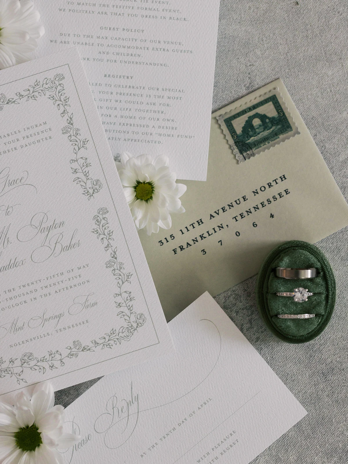
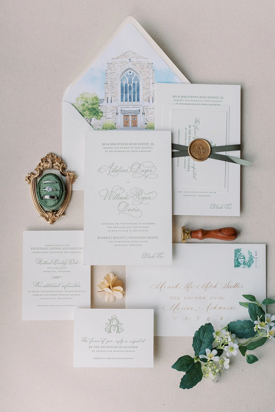
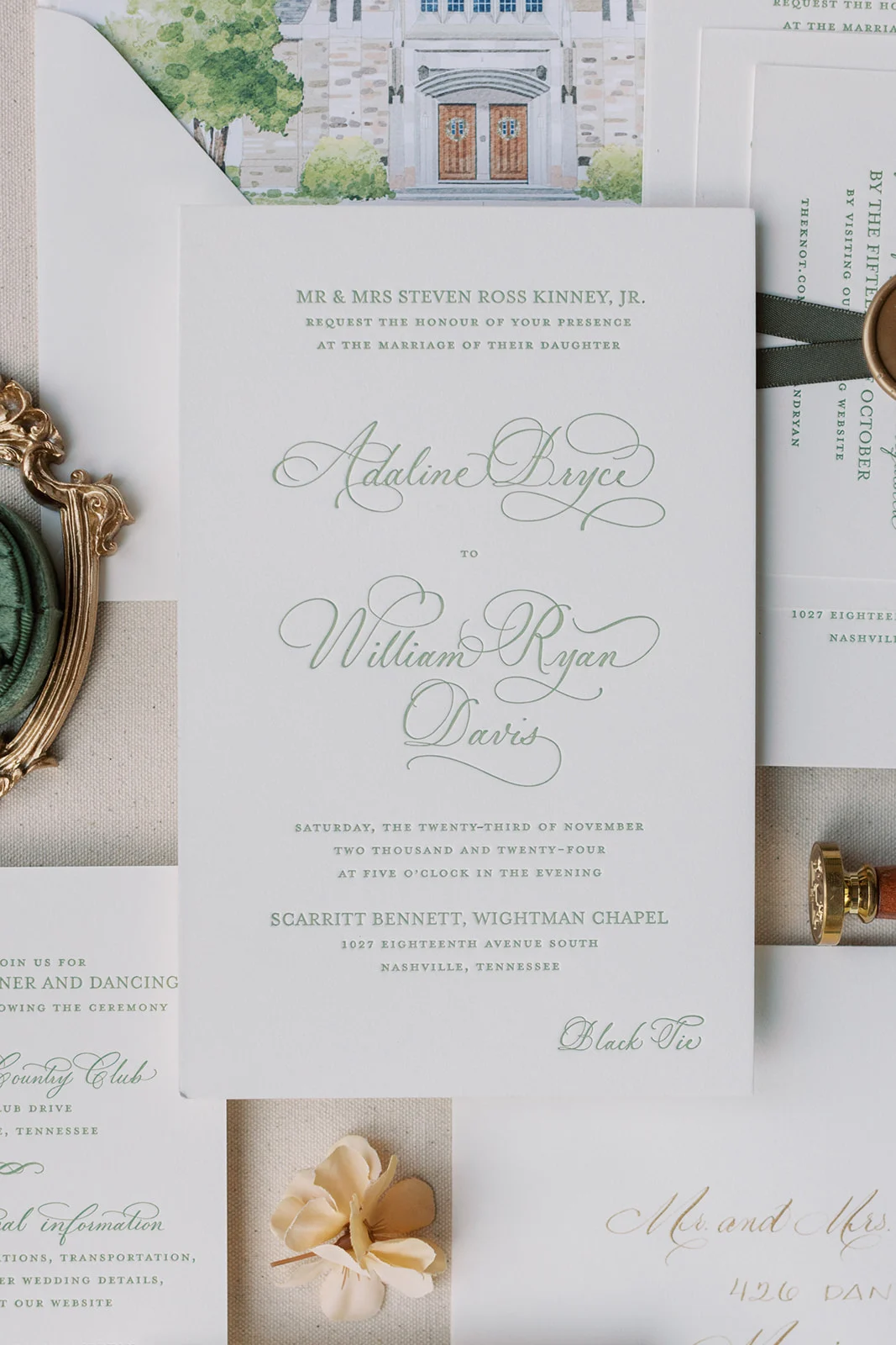
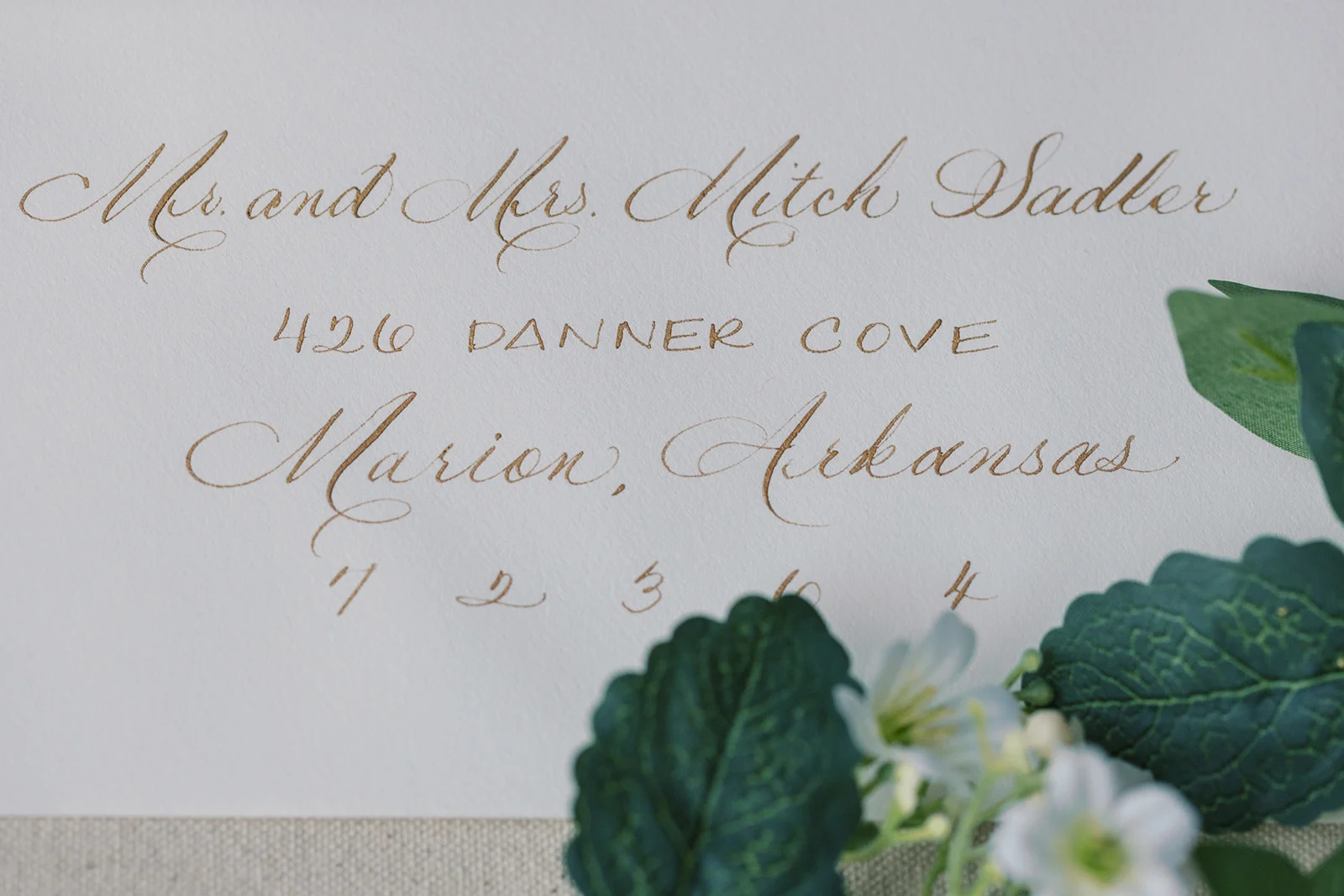
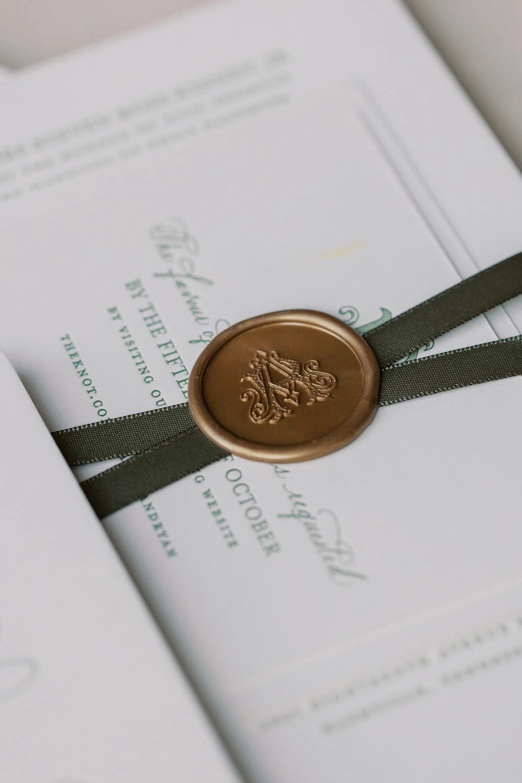
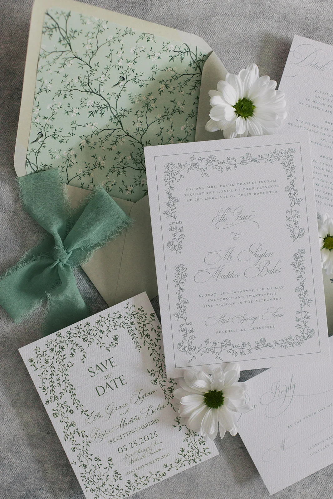
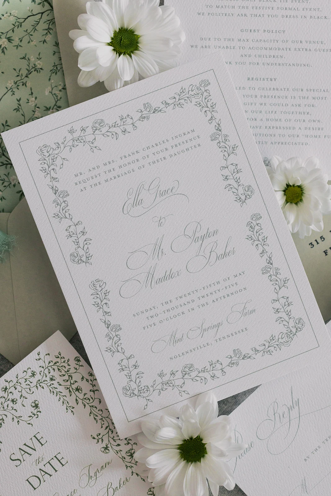
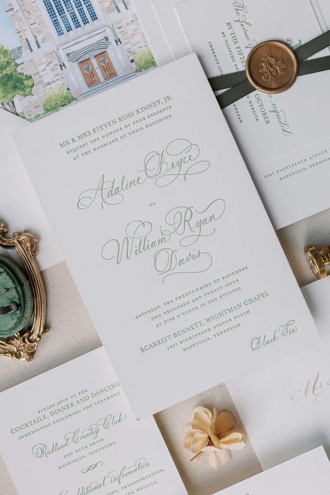
This suite is a perfect example of how green can bring together classic romance and elegance. Designed with luxurious letterpress printing and a custom monogram, Adaline’s suite felt like a work of art from the very first glance.
My favorite detail from this suite, besides the color, is the custom watercolor painting of the venue featured on the envelope liner, setting the tone before guests even opened the invitation. Pulling the invitation out from the beautiful envelopes, guests would find the suite tied together with a wax seal and soft ribbon, a finishing touch that felt as elevated as the day itself. We also added spot calligraphy to the main invitation card for a personal, hand-touched feel, along with matching calligraphed envelopes. Every detail reflected the couple’s vision for a refined and heartfelt celebration.
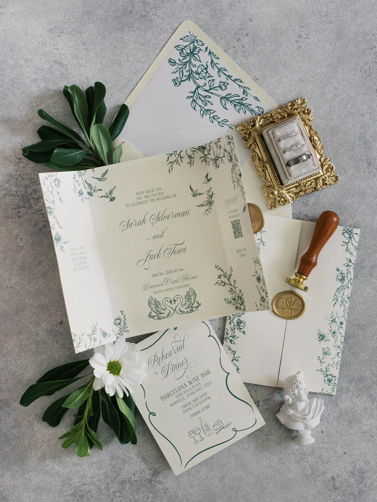
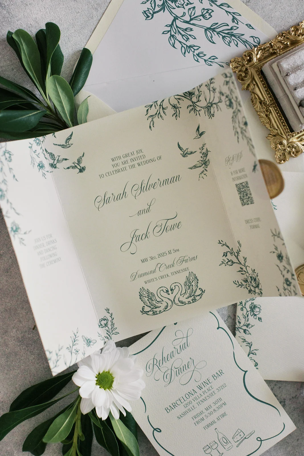
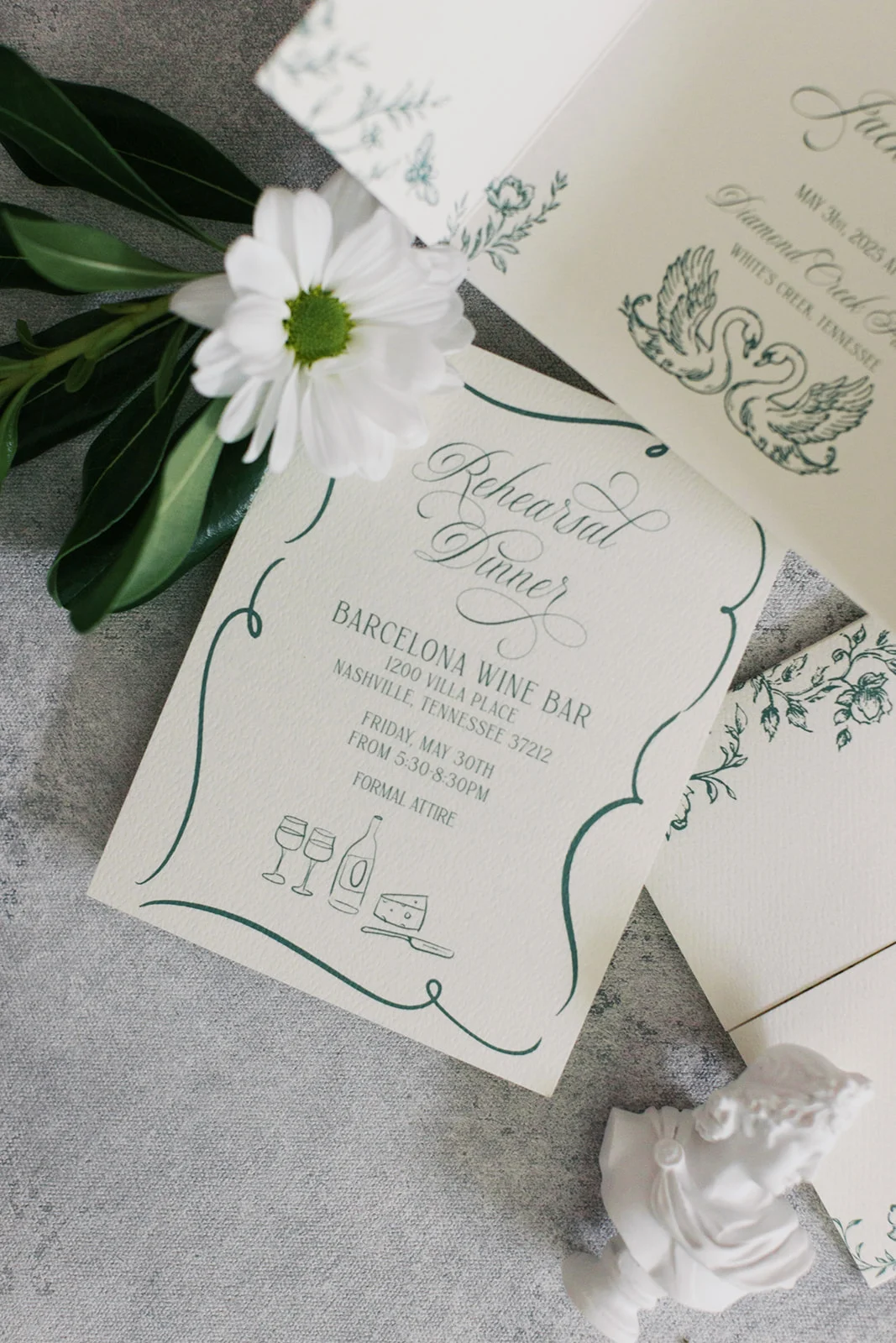
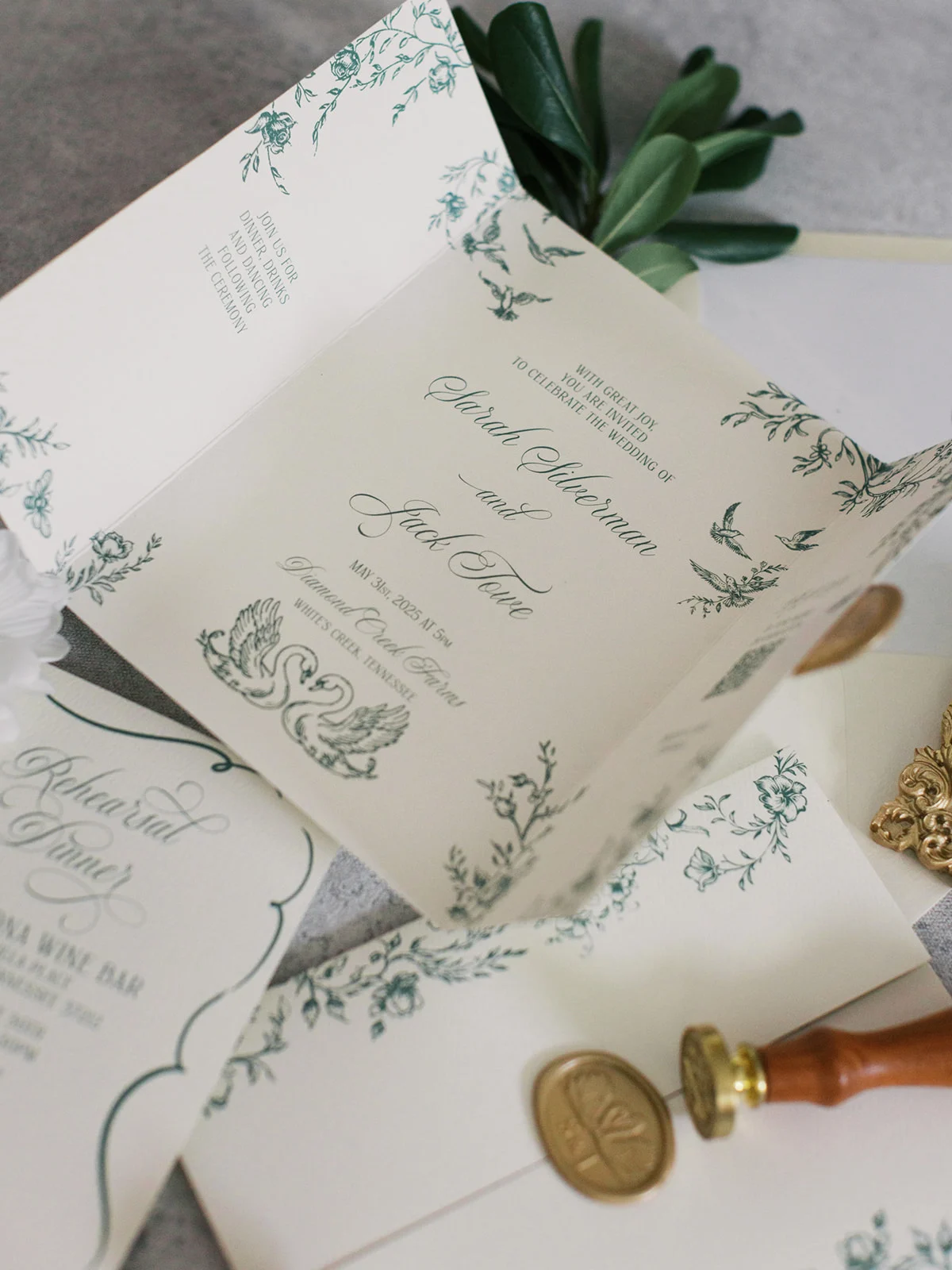
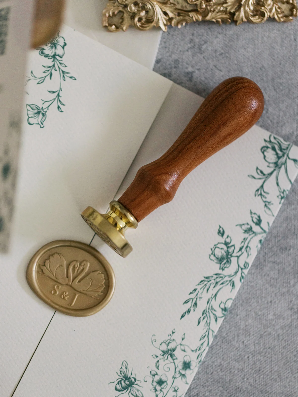
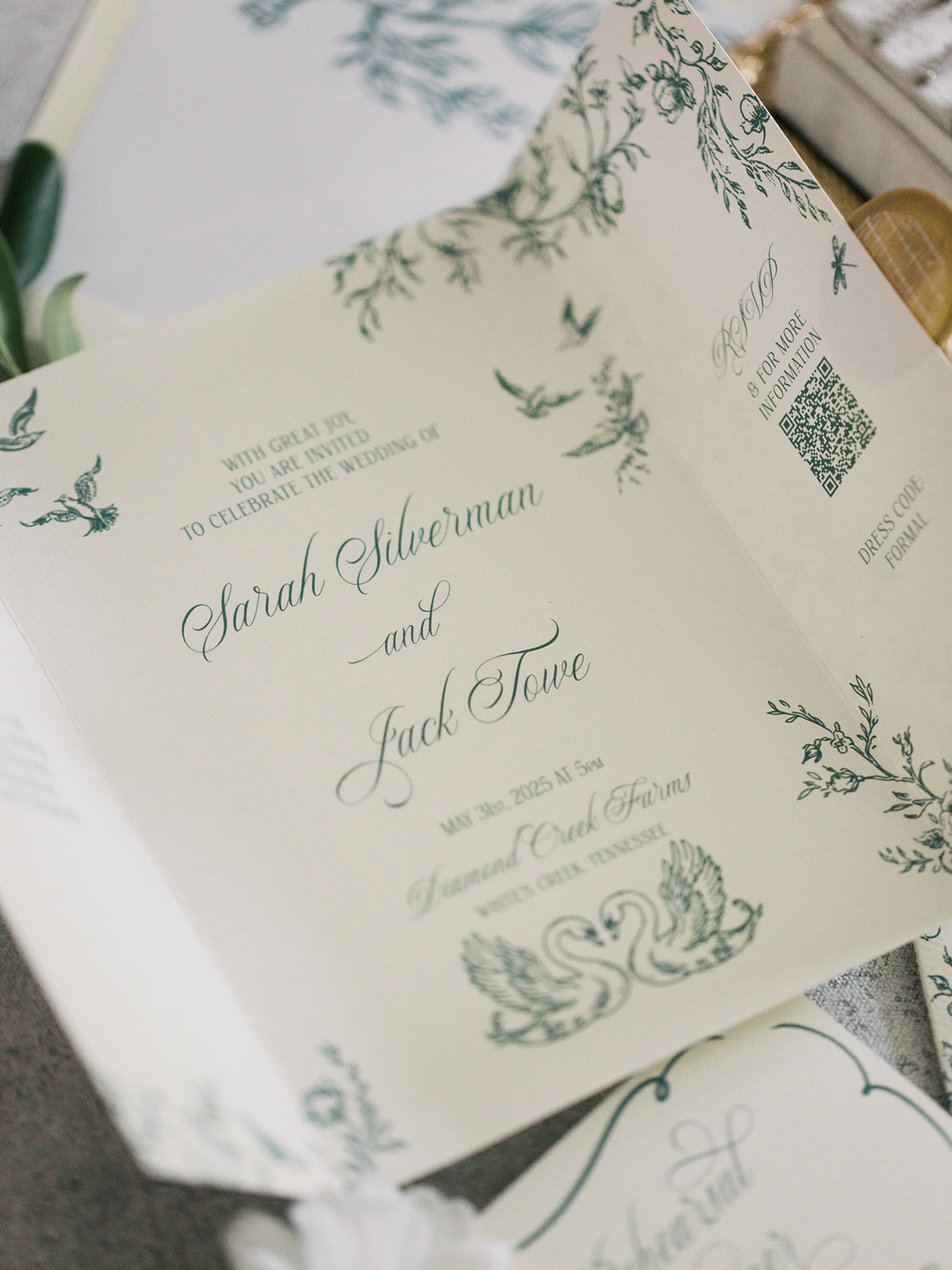
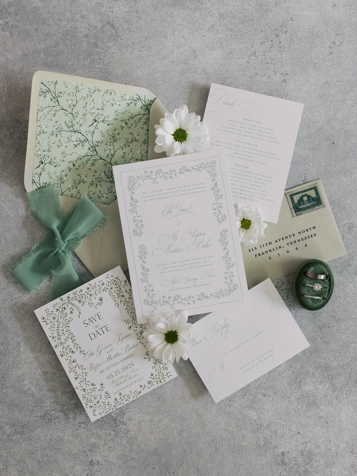
Gatefold Green Suite
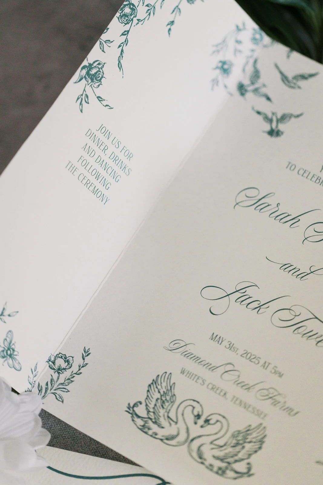
This next invitation suite took a modern yet timeless approach. The centerpiece was a single gatefold card printed digitally and sealed with a custom swan wax seal, a charming detail that made an appearance on the invitation as well. A green design of vines and flowers on the custom envelope liner was carried through the invitation design, decorating the cover and the inside of the gatefold invitation. We also designed a coordinating rehearsal dinner card that made the whole suite feel seamless and curated.
Whimsical Invitation Suite
For this whimsical invitation suite it was all about soft, romantic charm. Digitally printed and tied with a delicate chiffon ribbon, the pieces felt light and inviting. The real showstopper was the envelope liner, which featured an illustrated pattern of birds reminiscent of classic chinoiserie prints. It added the perfect touch of whimsy to this otherwise classic design.
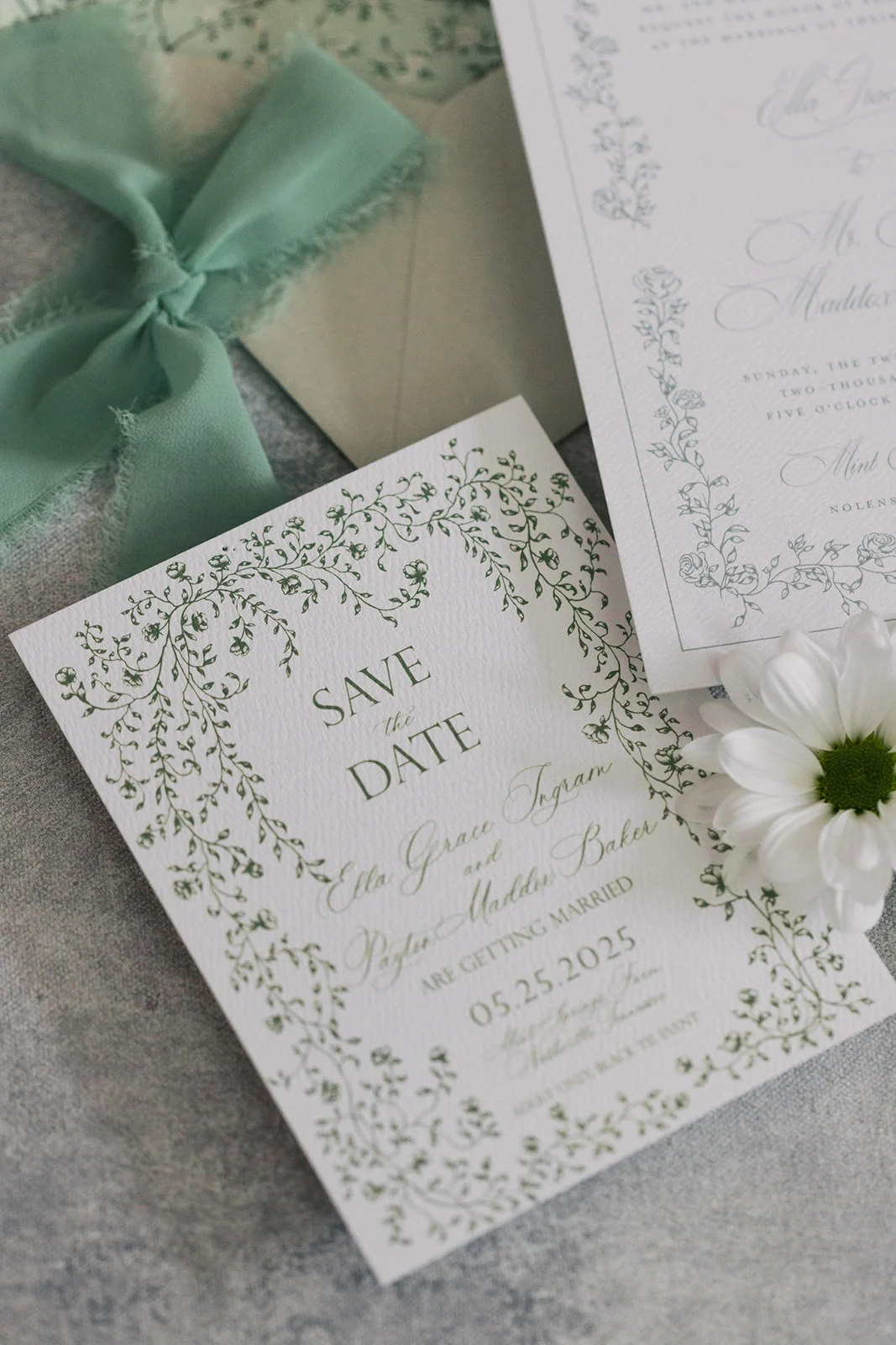
We also created matching save the dates that guests received prior to and hinted at the beauty to come. This suite is proof that green doesn’t have to feel overly formal. It can be playful and fun, while still displaying elegance.
Why Green Works for Every Wedding Style
Green’s versatility is what makes it shine. It plays well with every season and complements a wide range of colors and themes, from garden romance and historical venues to modern minimalism and fine art design. It adds a grounded, organic, and elevated feel to the suite, whether it’s worked into the paper, the printing, or the embellishments (hello, ribbon and wax seals!).
At White Ink, we treat green as a neutral not just because it pairs with everything, but because it feels natural, elegant, and rooted in timeless design.
If you’re looking to add custom, thoughtful touches to your wedding or event, we would love to help make your vision a reality. Reach out today to learn more about our full-service design offerings—we can’t wait to create something unforgettable for you!
If you enjoyed this post, you’ll love these other blogs!
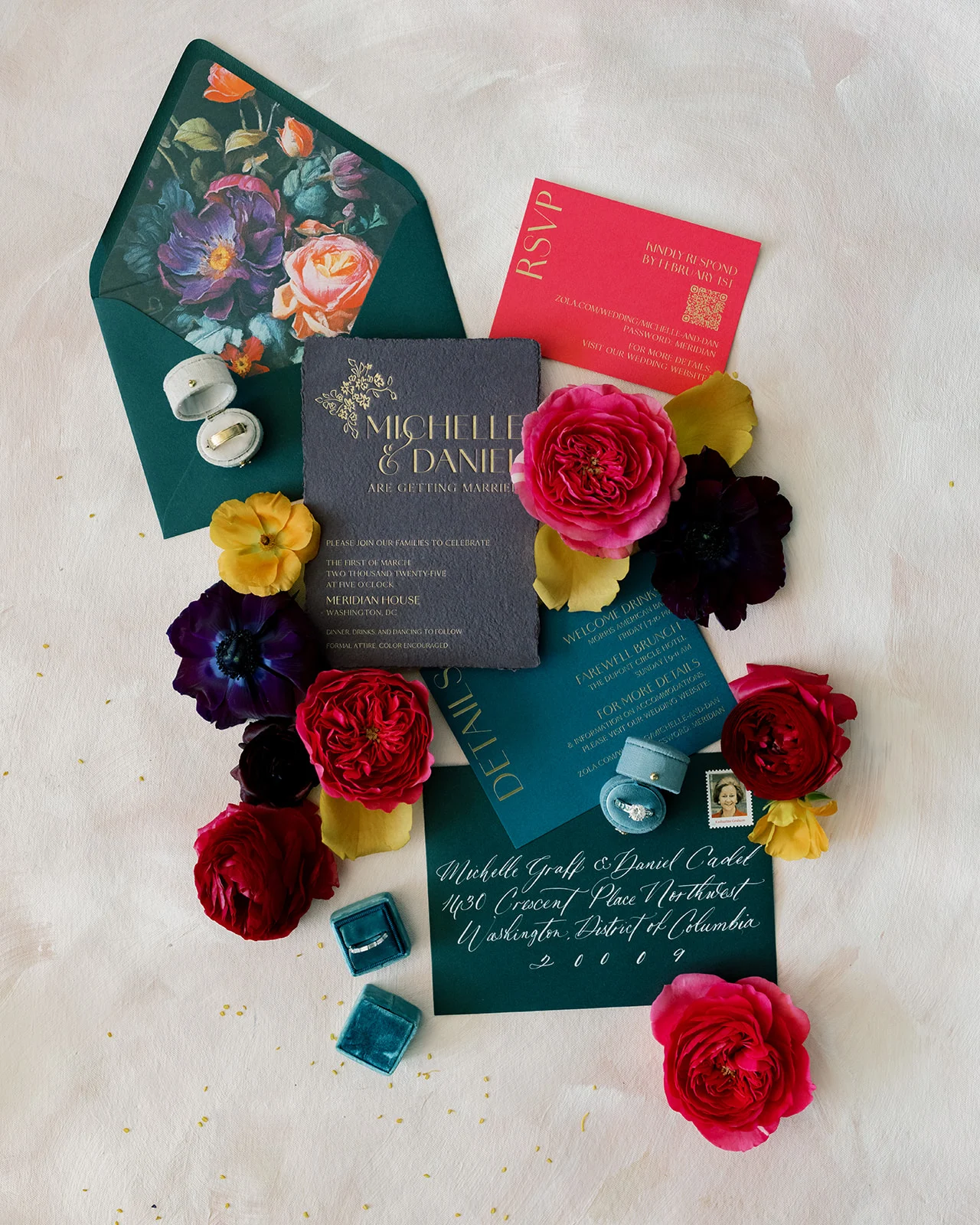
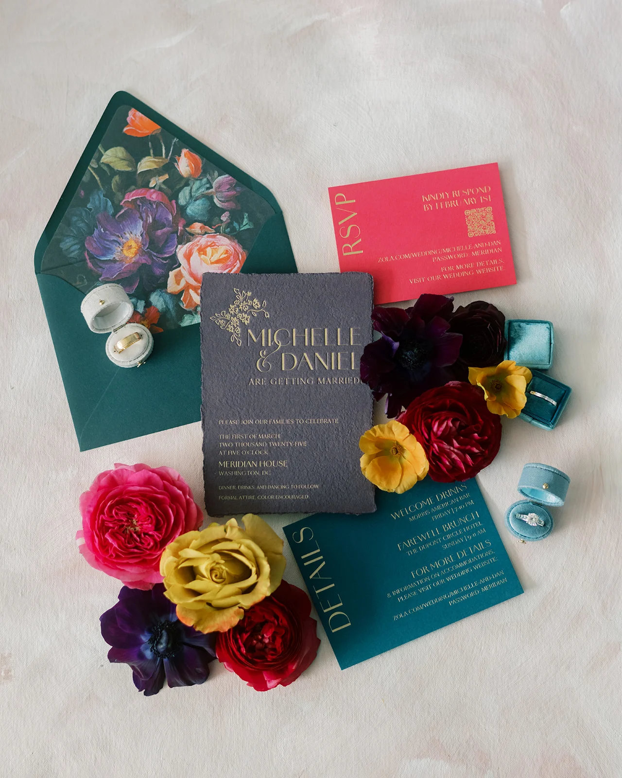
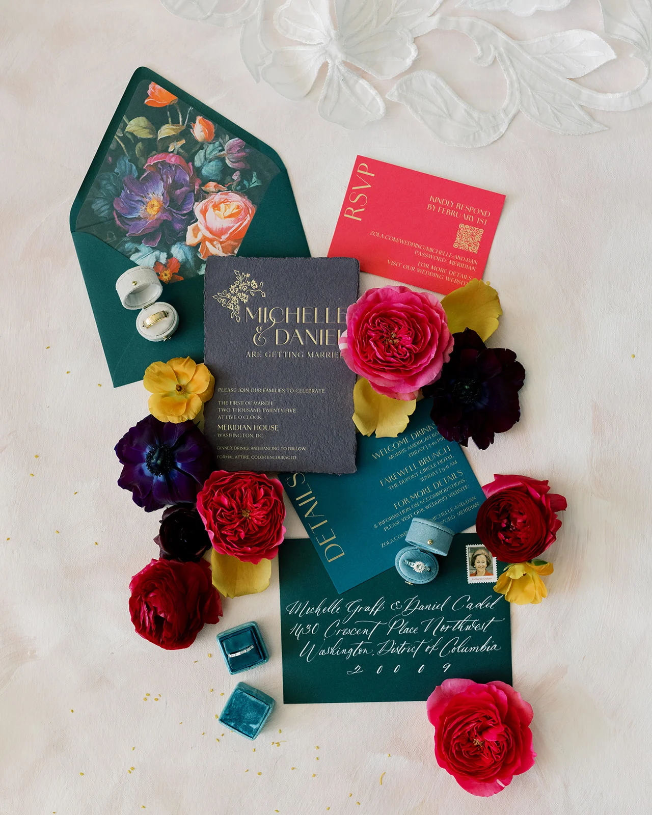
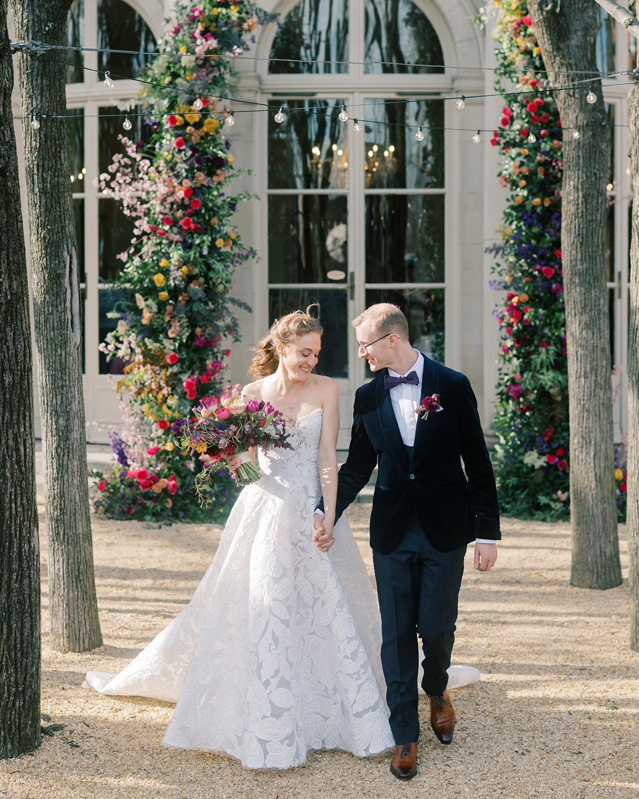
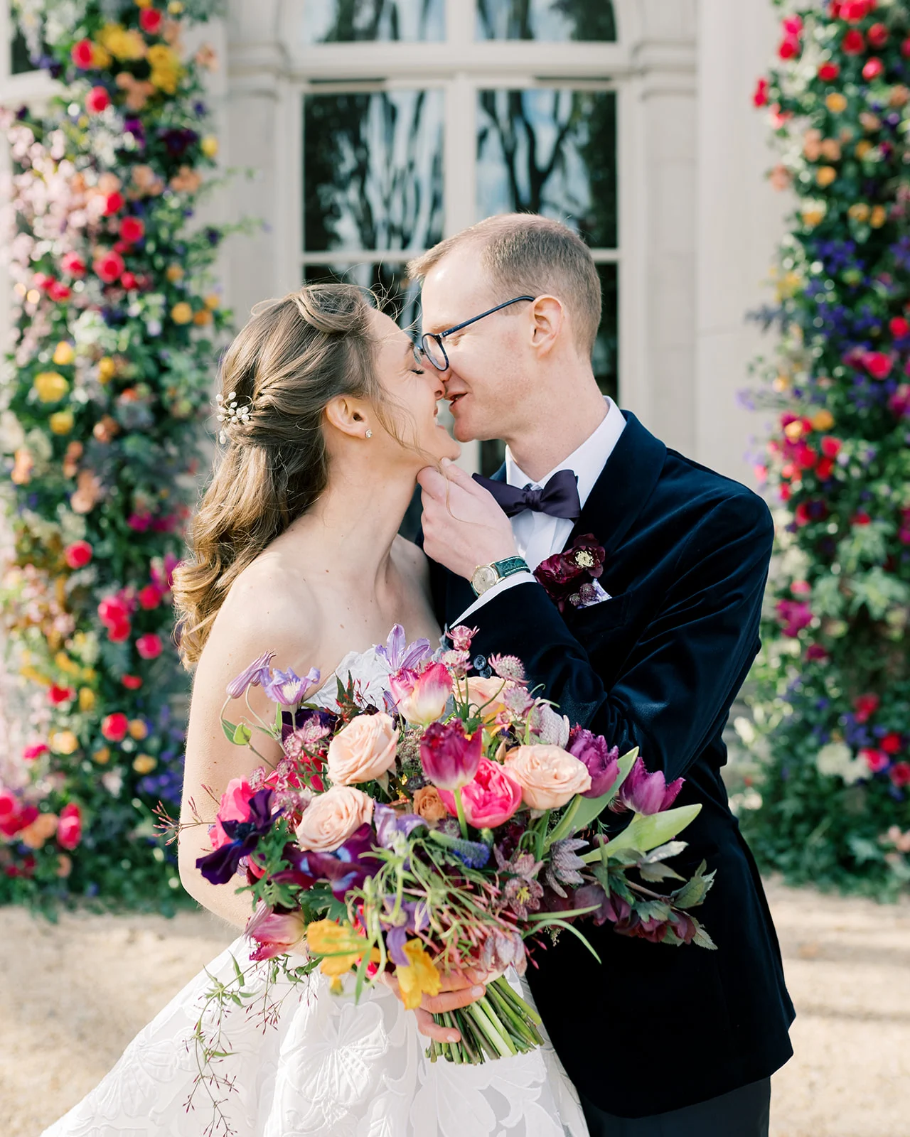
Michelle and Daniel’s colorful and bookish wedding in Washington, DC was an unforgettable celebration. Hosted at two of the city’s most beautiful and historic venues, The White Meyer House for the ceremony and The Meridian House for the reception, the day was a perfect blend of mid-century style and the era of the venue. With rich jewel tones and eco-conscious design choices, their vision was both vibrant and intentional. White Ink Calligraphy + Co, was honored to contribute to their celebration through a gorgeous invitation suite and day-of details that were full of intention and brought their story to life.
An Invitation Suite That Set the Stage
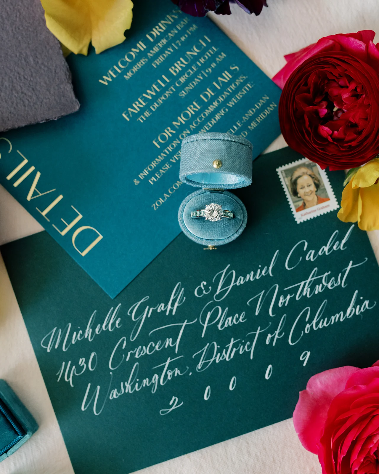
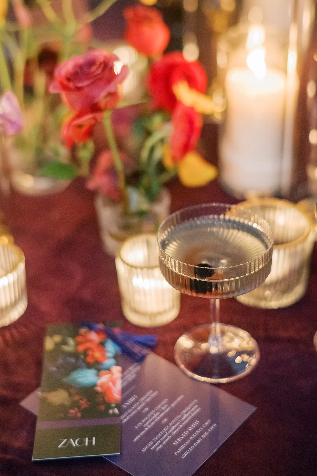
From the very first moment guests opened their invitations, it was clear this wedding would be anything but ordinary. The invitation suite featured handmade plum cardstock, pressed with luminous foil calligraphy. An epic floral envelope liner set the tone for their day and made a repeat appearance in other day of details! A bright magenta RSVP card offered a joyful contrast and an unexpected pop of color, while hand-calligraphed envelopes gave a nod to the couple’s love of personalized, elevated design.
The couple’s love of color and the stylish nod to the mid-century era of their venue came through in every detail, and we had so much fun weaving those themes throughout our work.
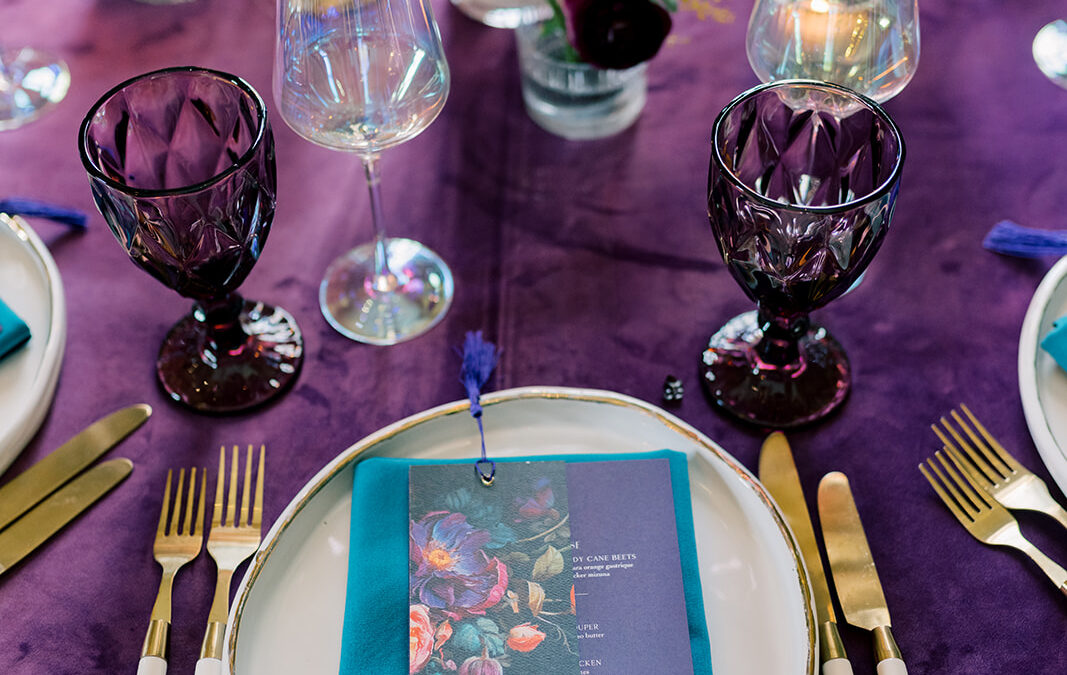
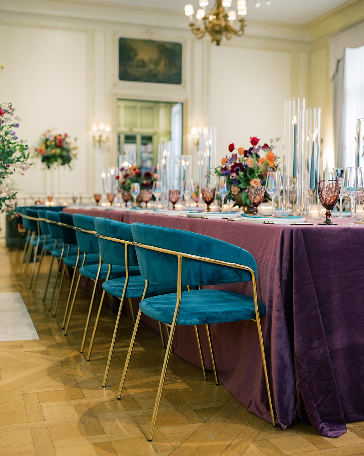
Colorful and Bookish Washington DC Wedding
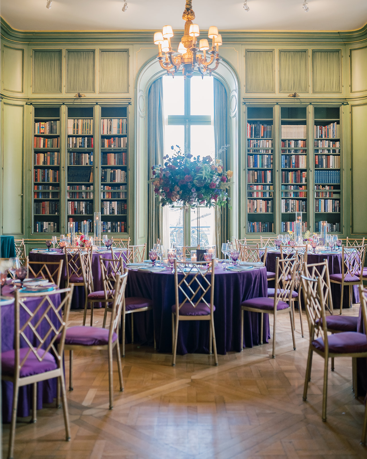
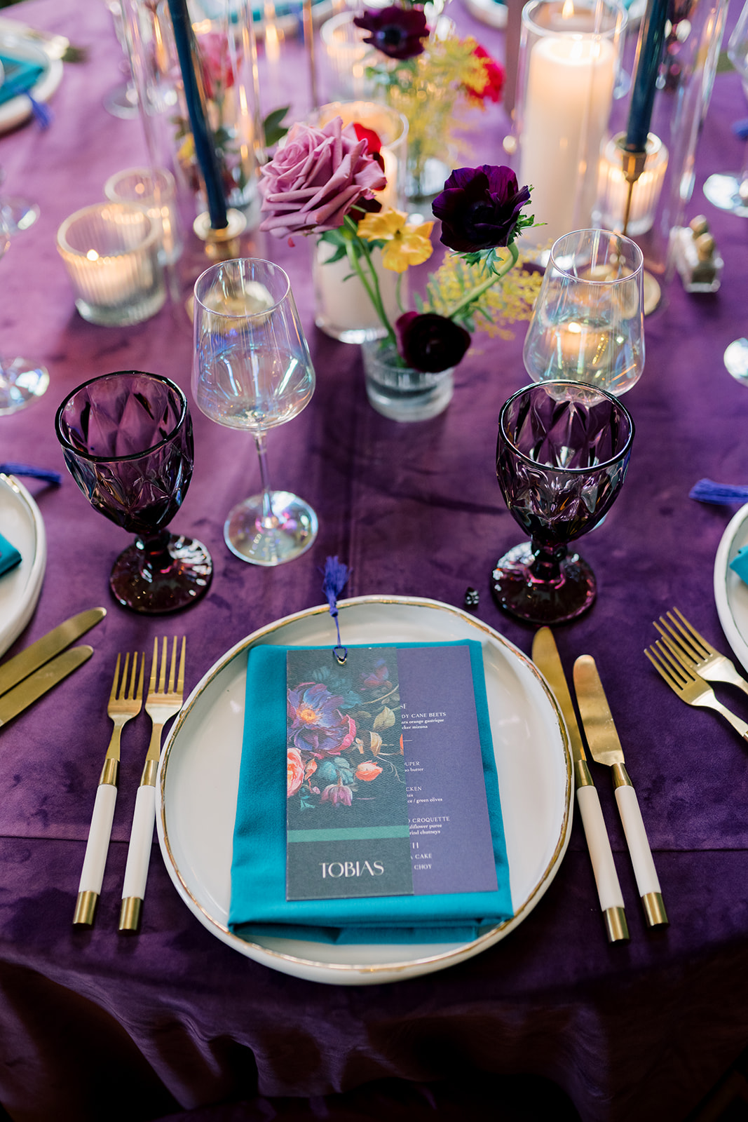
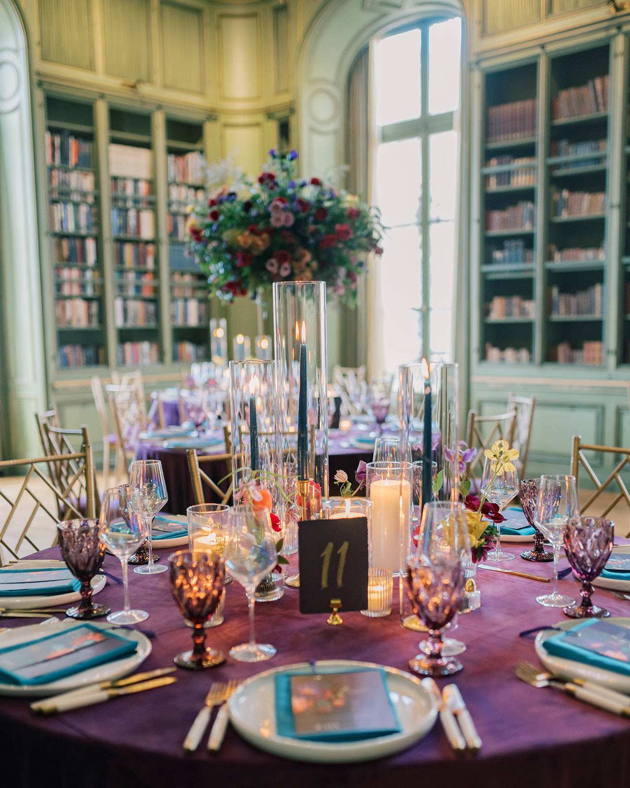
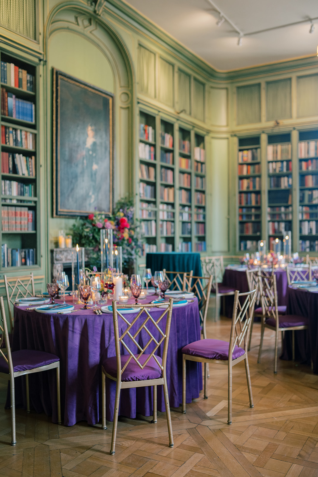
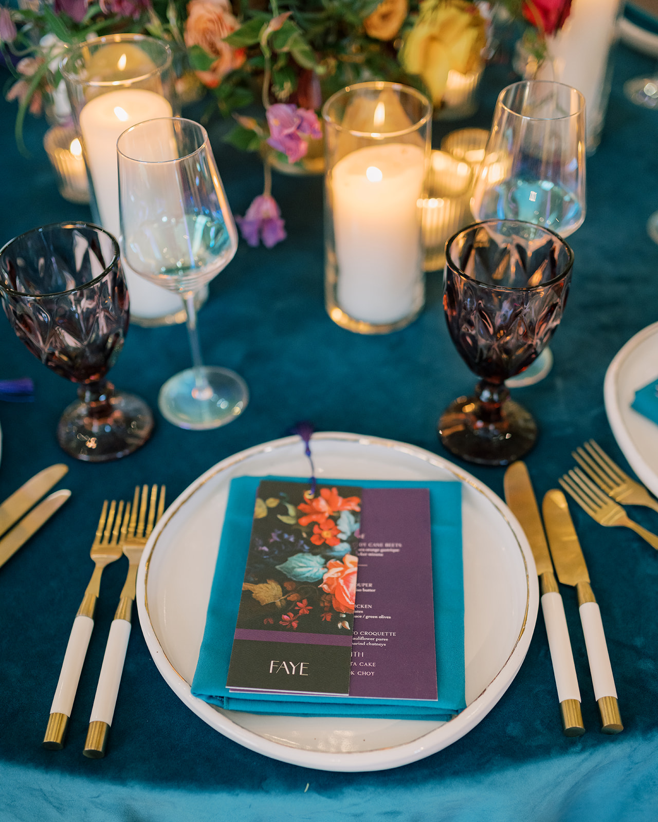
The invitation palette carried seamlessly into the reception at the iconic Meridian House. The mint green walls of the room created a striking contrast to the deep plum linens, purple glassware, and coordinating menus. Even the chairs featured plum and dark teal hues, adding to the rich colors that all worked together.
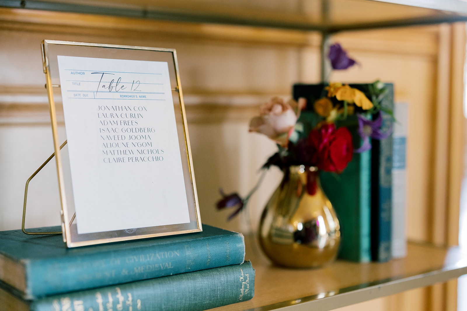
Each guest’s place card doubled as a keepsake, which was a beautifully printed bookmark that featured the same floral design from the invitation suite’s envelope liner. With bookshelves lining the reception space, the detail couldn’t have been more fitting. In fact, other bookish details were also woven into their wedding, like their vintage, library card inspired seating chart!
Vintage Library Card Seating Chart
One of the most creative and personal touches of the day was the seating chart. Vintage library cards printed with guest names and table number assignments were framed and displayed on a bookshelf alongside vintage books. This thoughtful design element was visually striking and a perfect match for the bookish charm and character of the venue.
Michelle and Daniel brought their personalities into every aspect of their day, and it was such a joy to help them tell their story through their invitations and details.
If you’re looking to add custom, thoughtful touches to your wedding or event, we would love to help make your vision a reality. Reach out today to learn more about our full-service design offerings—we can’t wait to create something unforgettable for you!
If you enjoyed this post, you’ll love these other blogs!