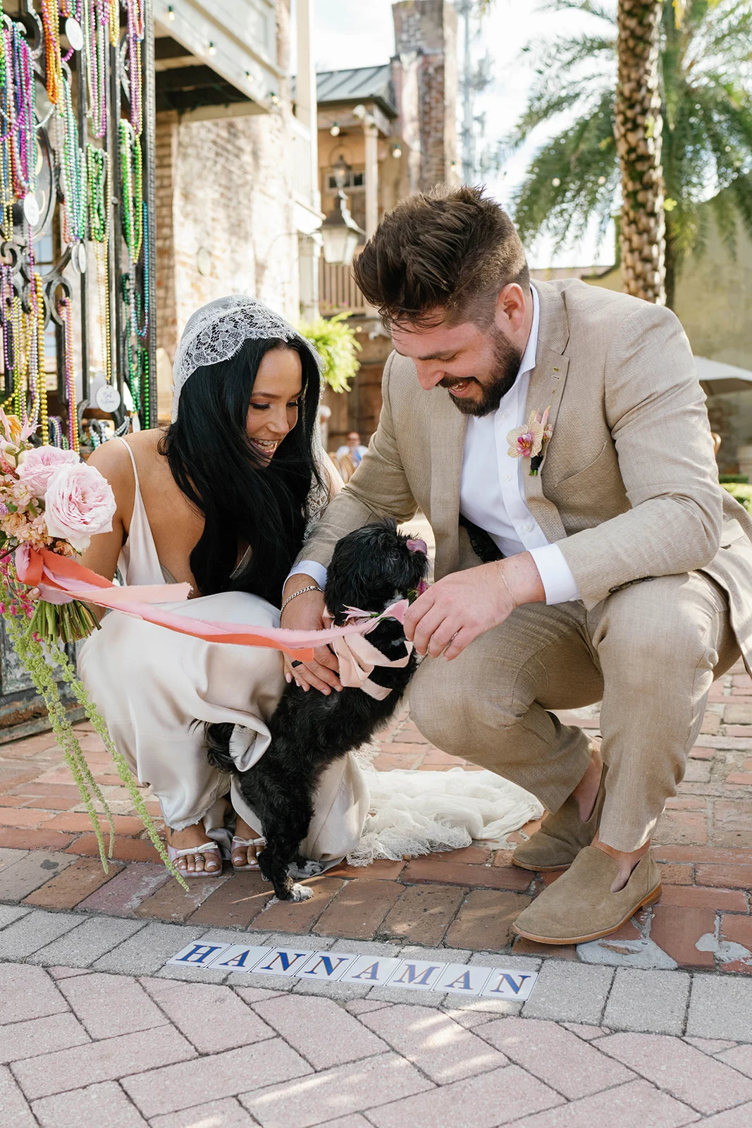
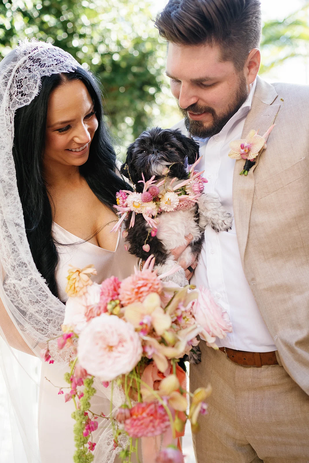
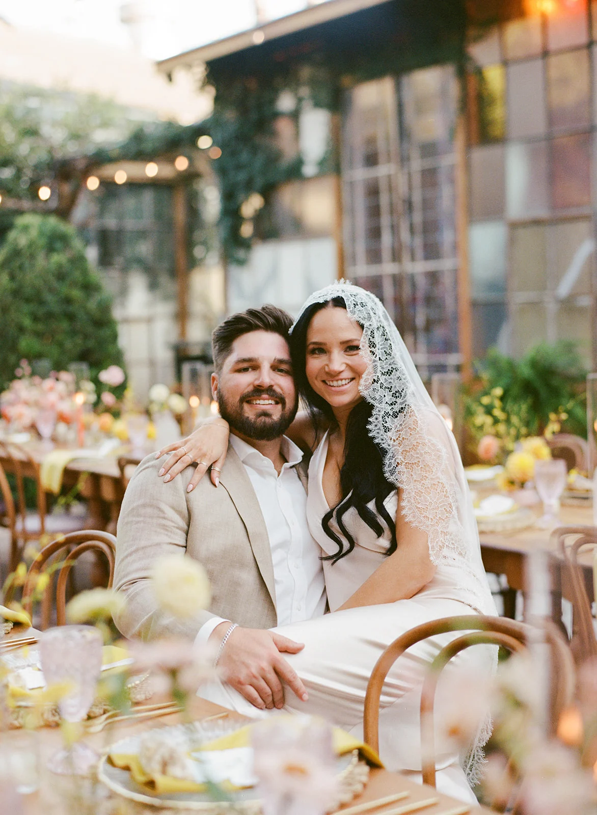
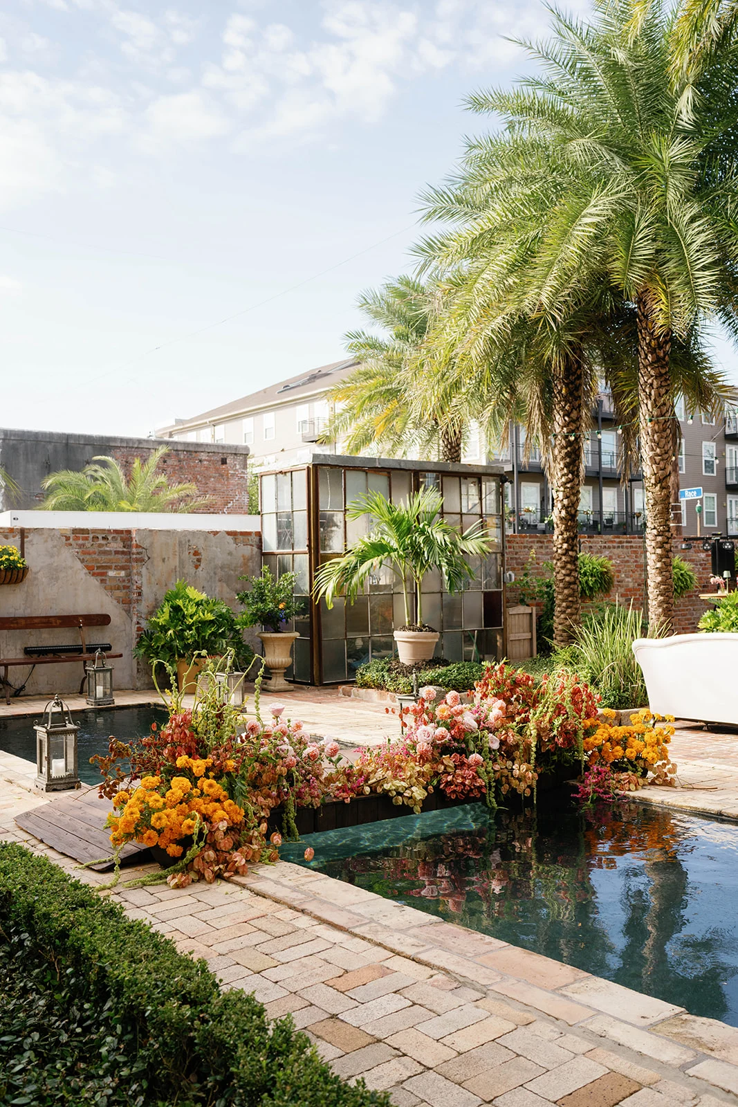
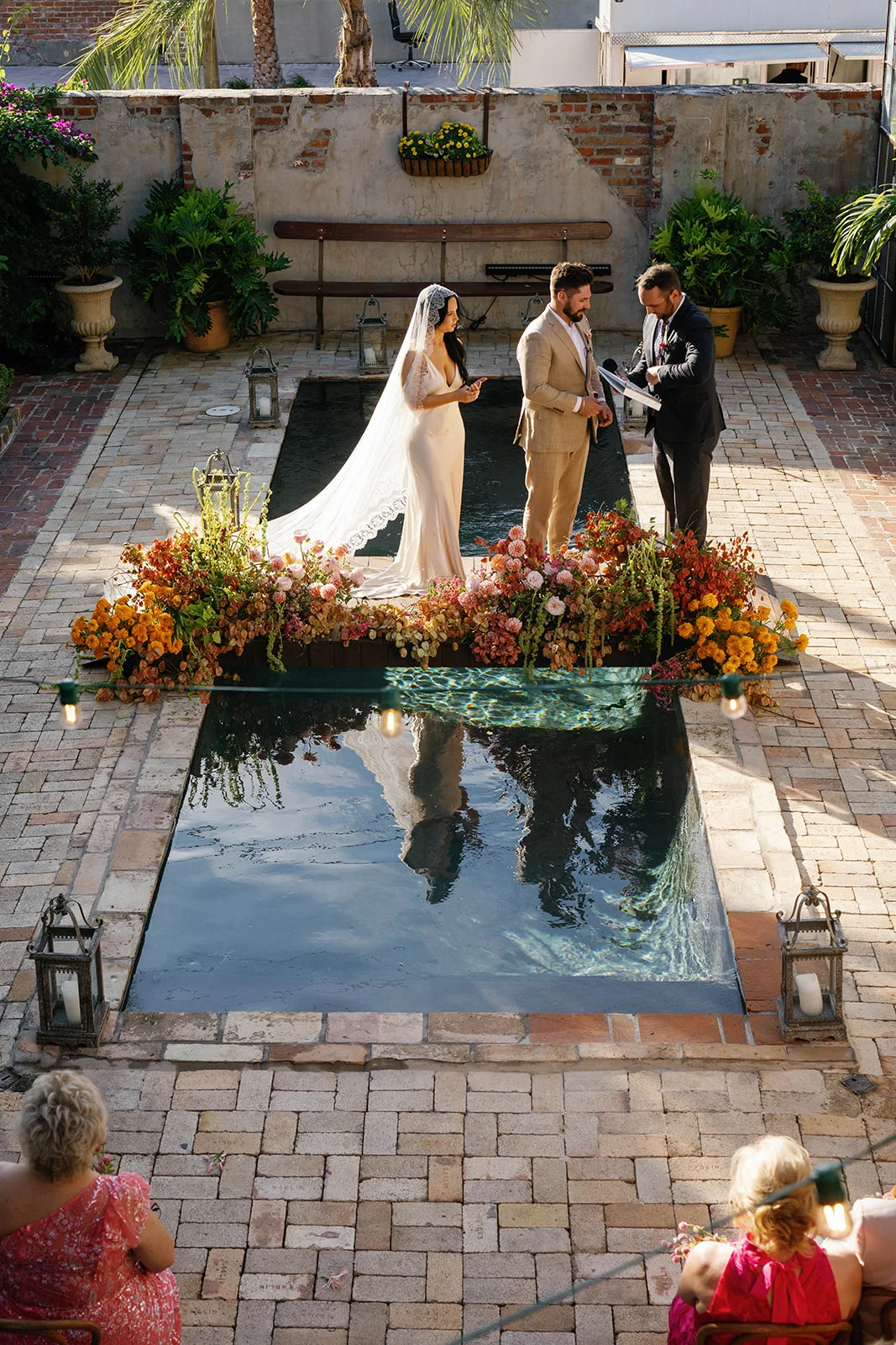
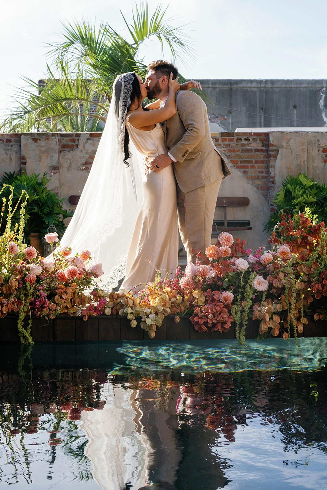
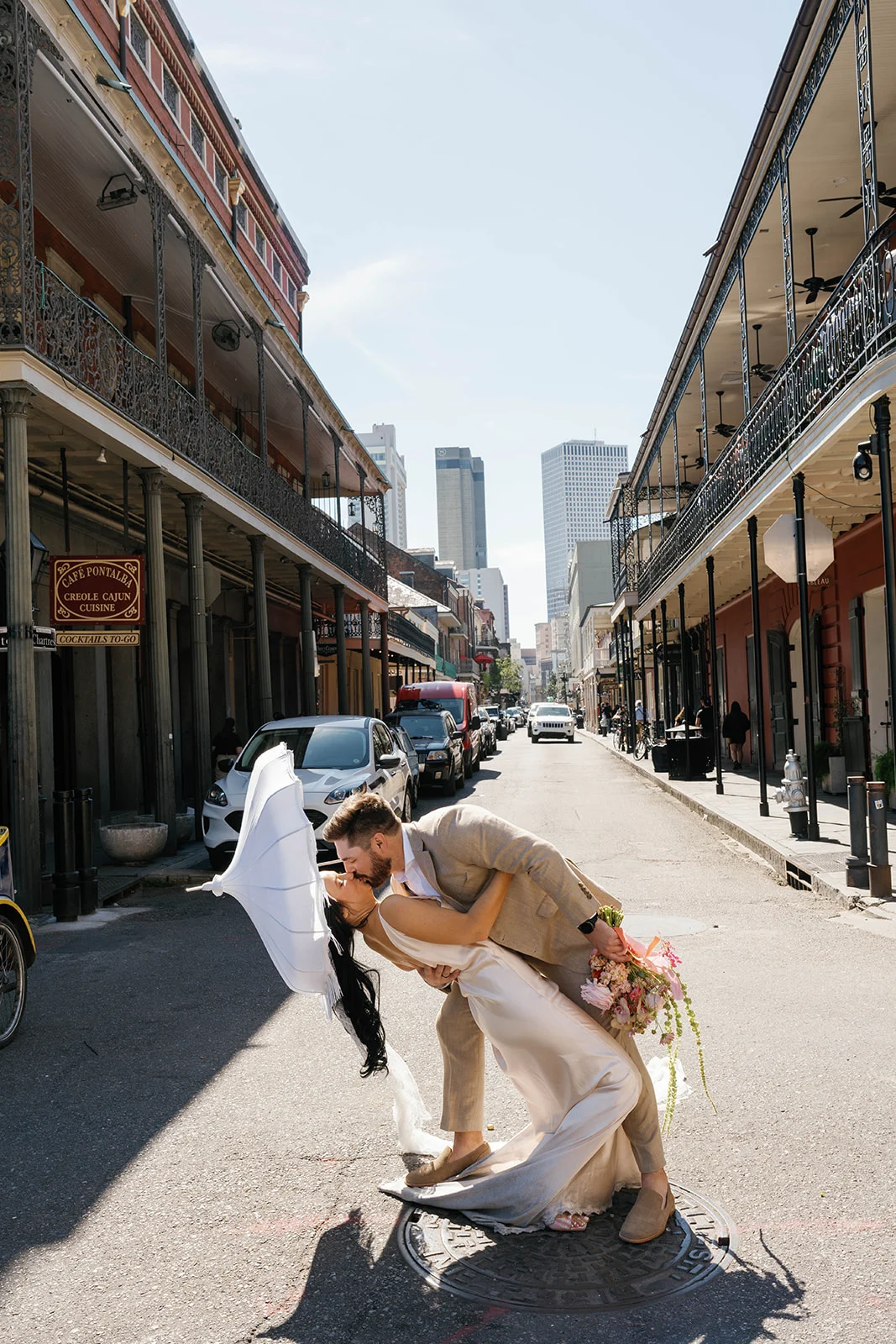
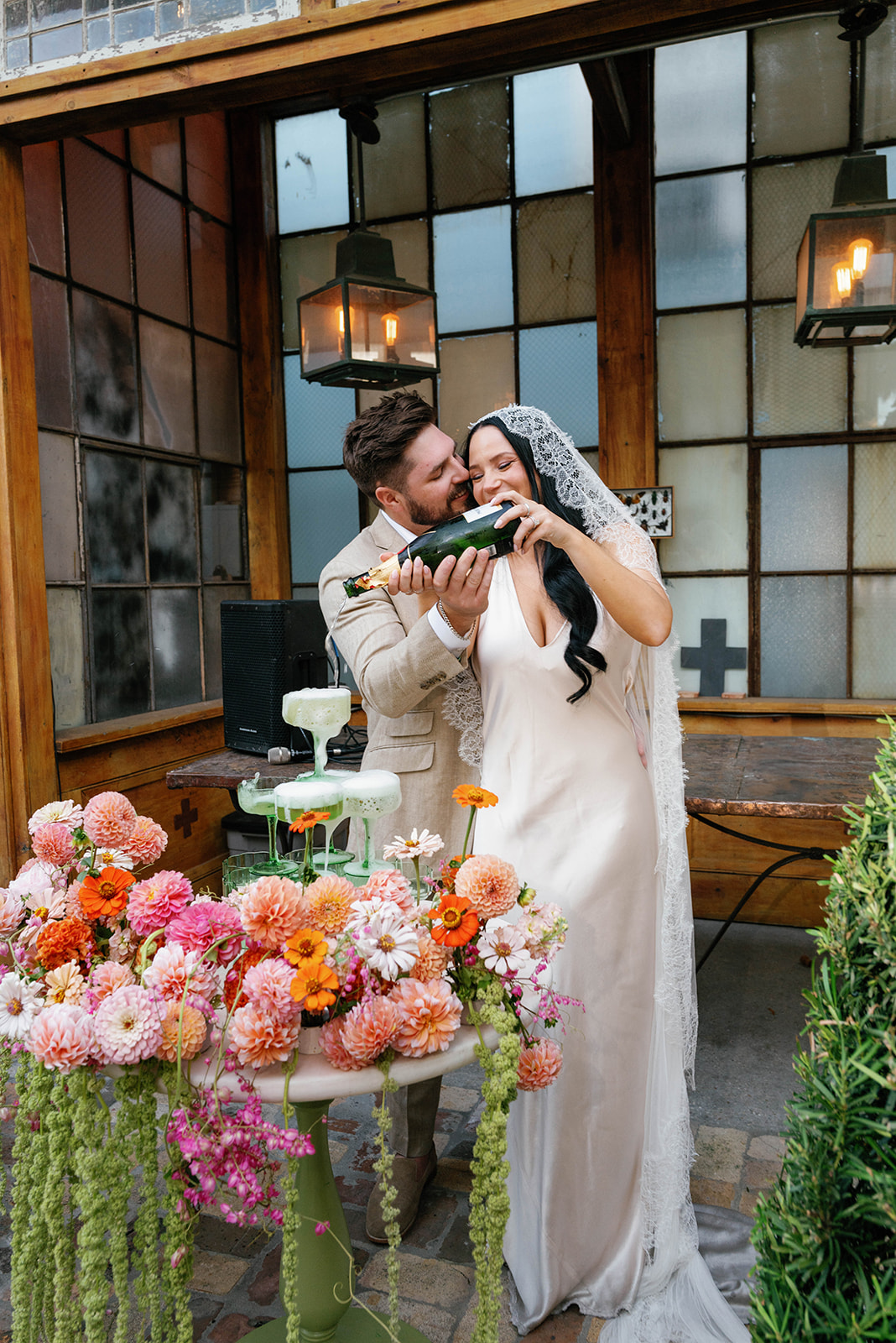
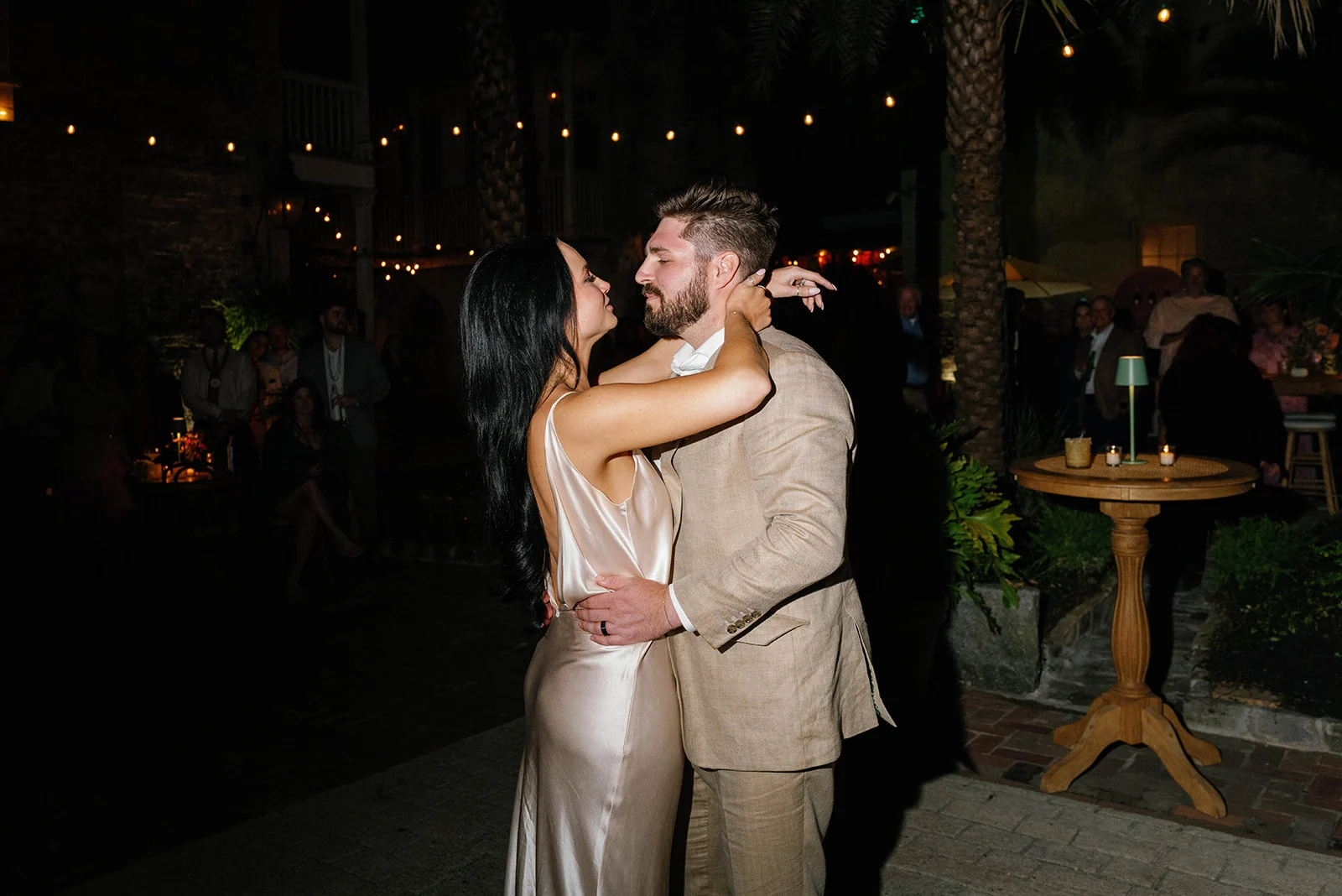
If we had to sum up this New Orleans wedding in three words, they’d be: elevated, eclectic, and unforgettable. Held at the iconic Race and Religious venue in New Orleans, Louisiana Katie and Derek’s wedding was one for the books. Everything from the fashion to the florals, and of course, the incredible wedding details we had the honor of creating for our couple was just out of this world amazing.
As a Nashville-based wedding photographer herself, the beautiful bride, Katie, knew what she wanted when it came to her wedding aesthetic. We were beyond flattered when she chose White Ink Calligraphy to design her custom invitation suite and day-of details. She brought such a fun, bold energy to the planning process, and her vibe translated beautifully into every design choice.
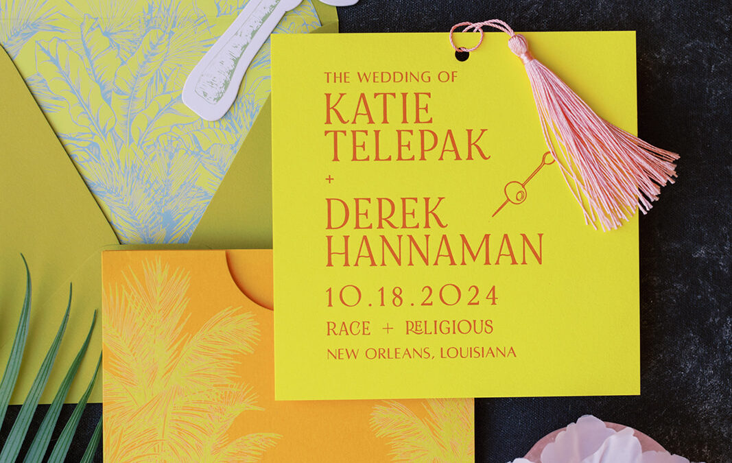
Bold and Fun Custom Wedding Invitation Suite
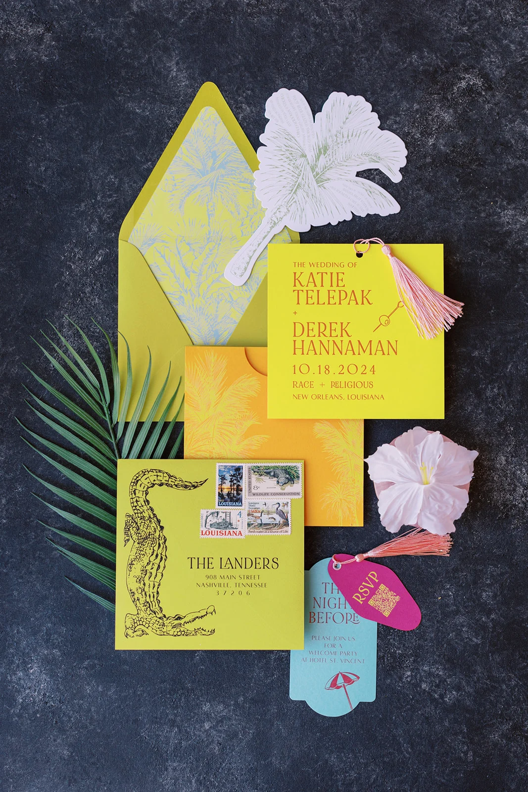
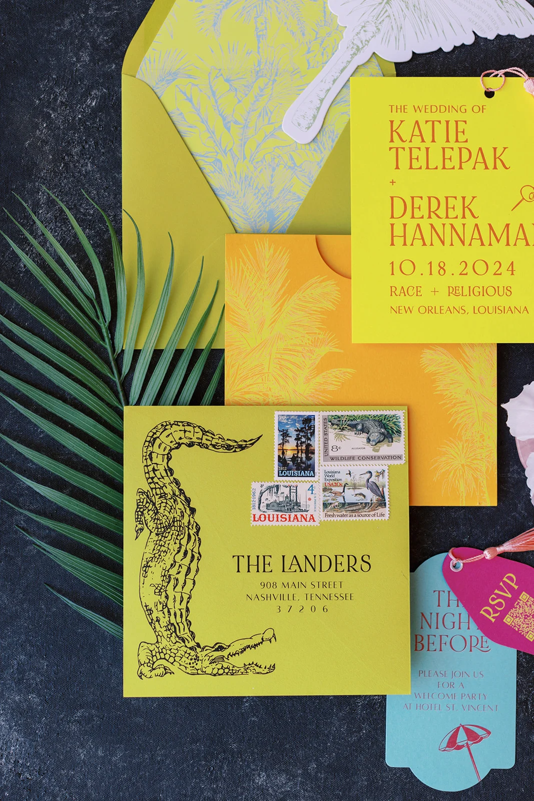
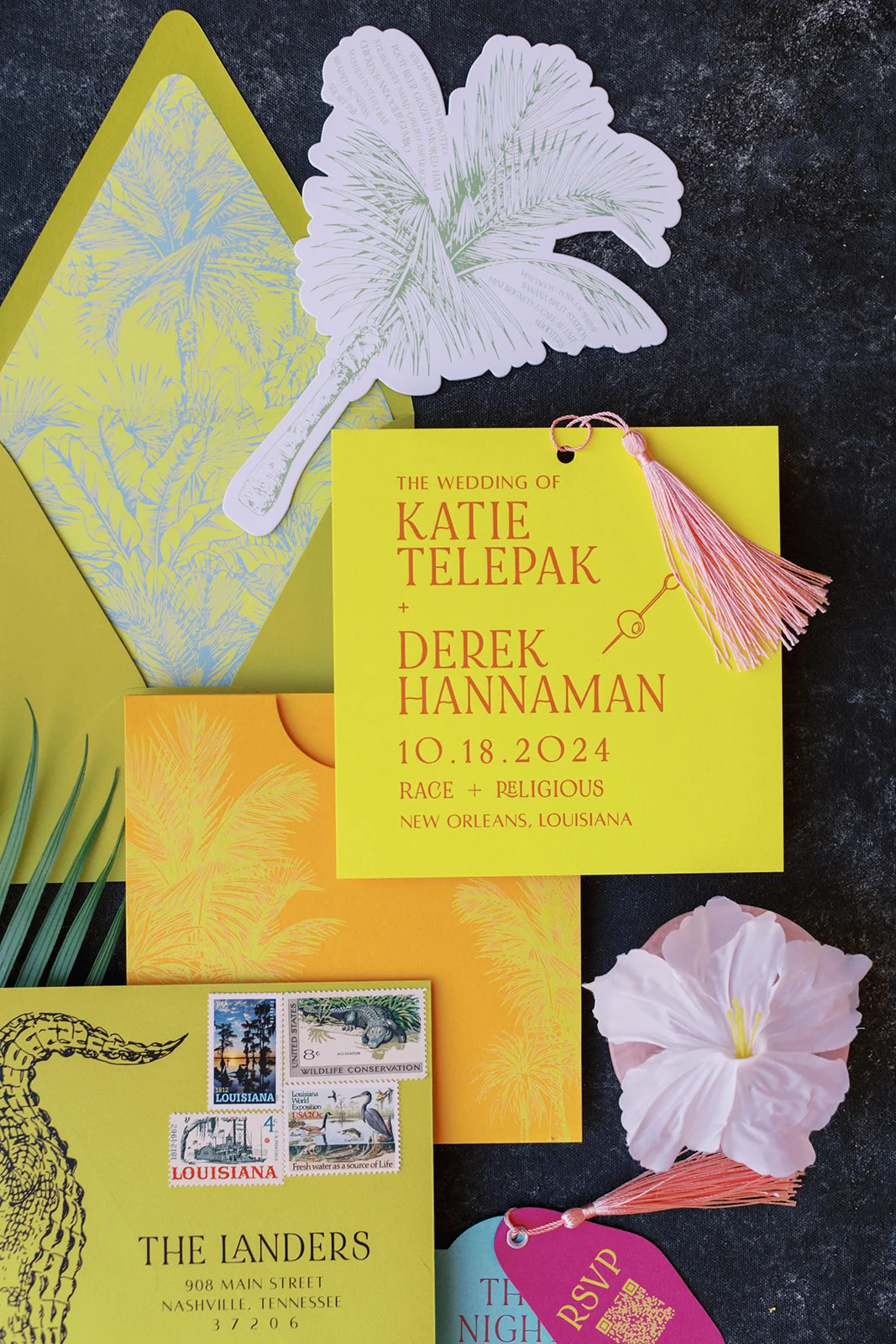
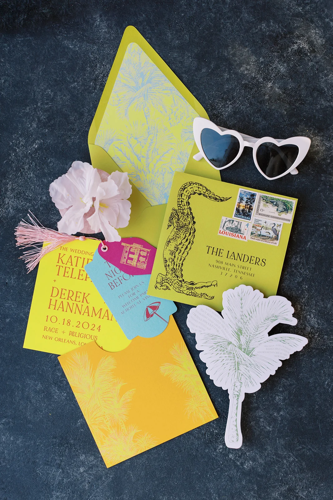
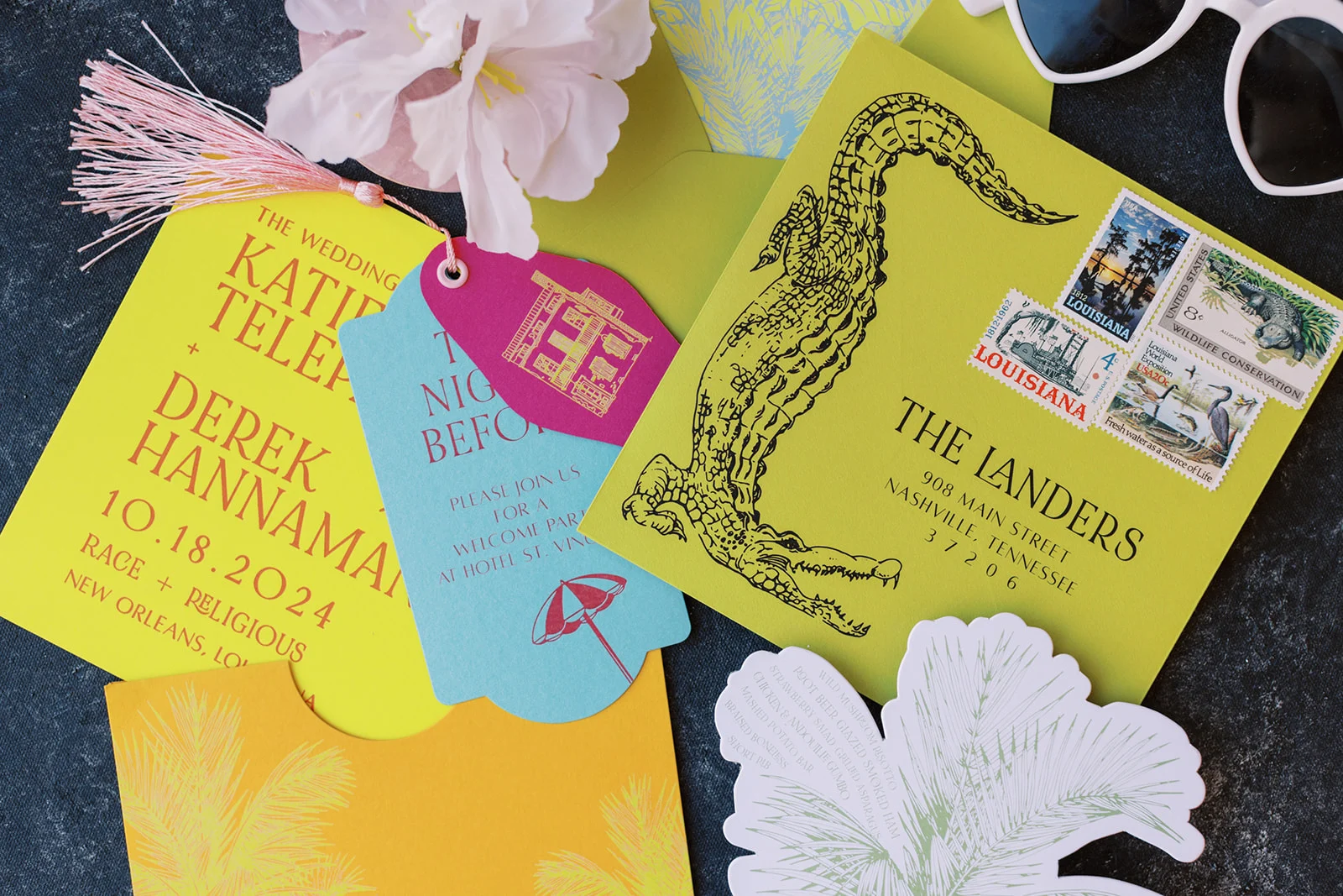
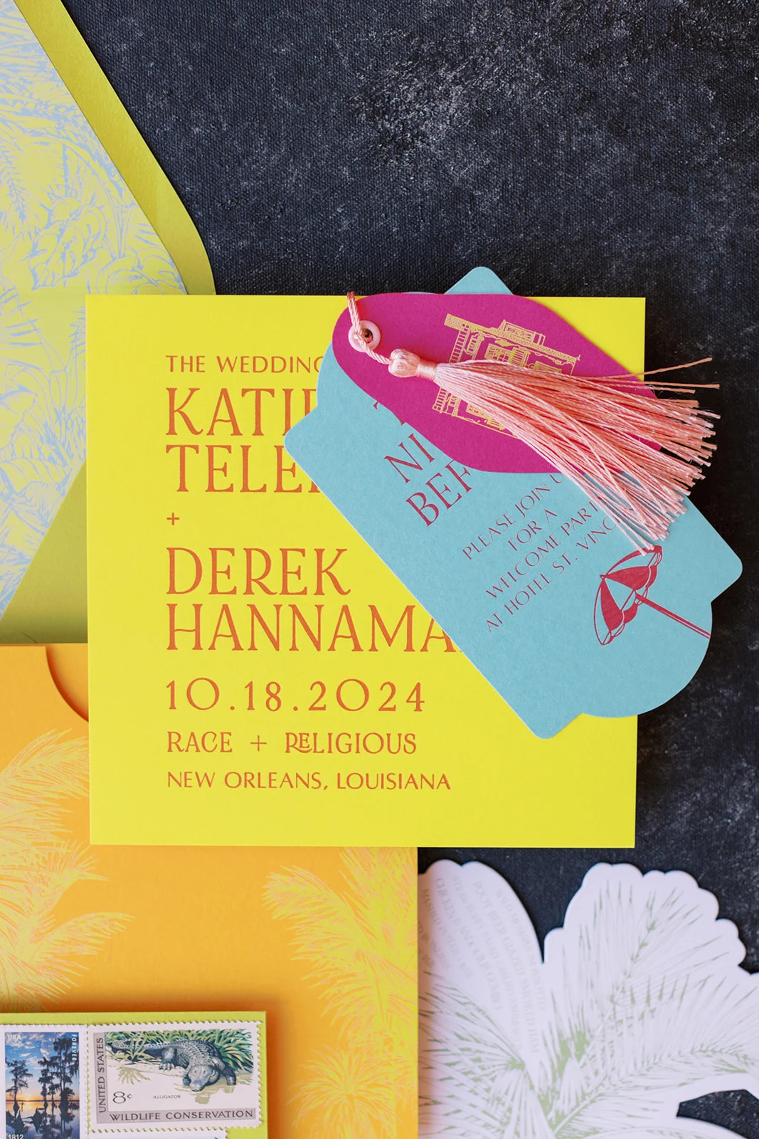
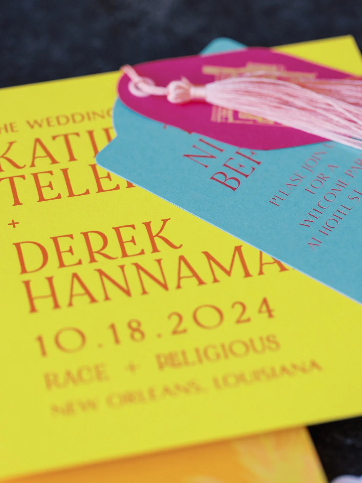
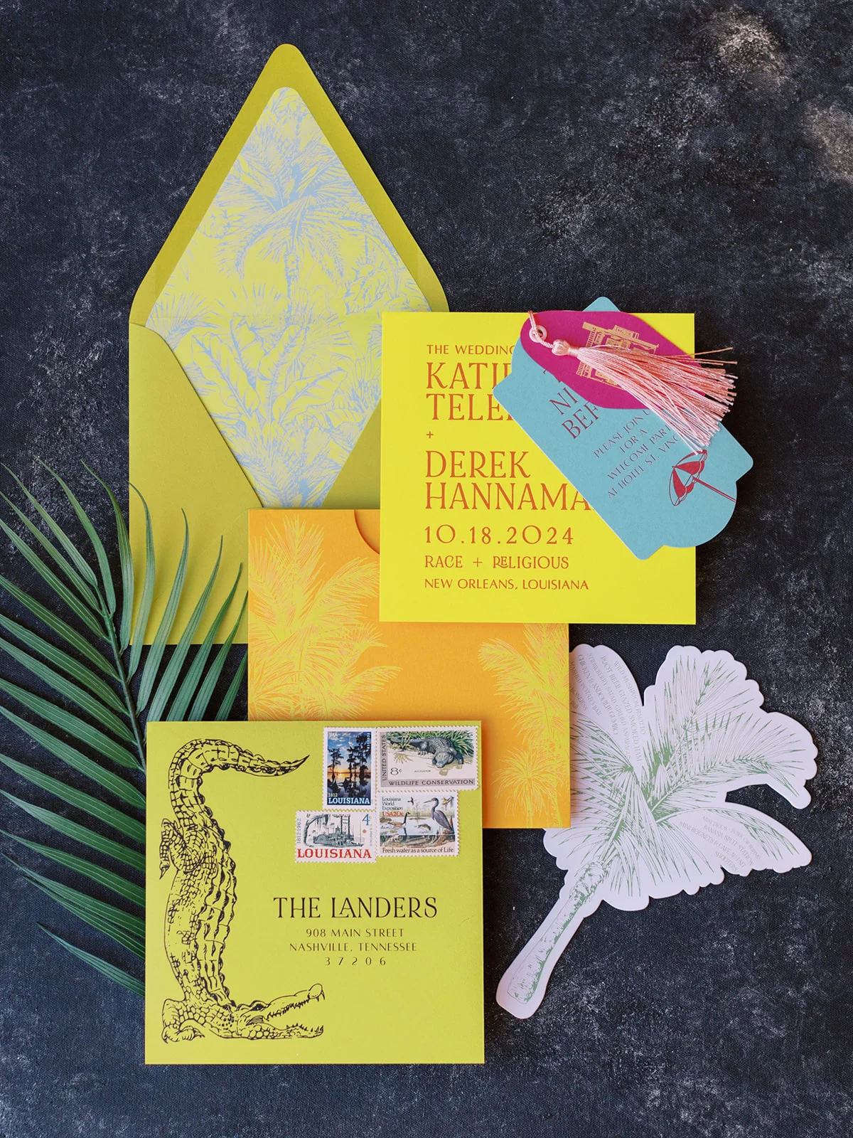
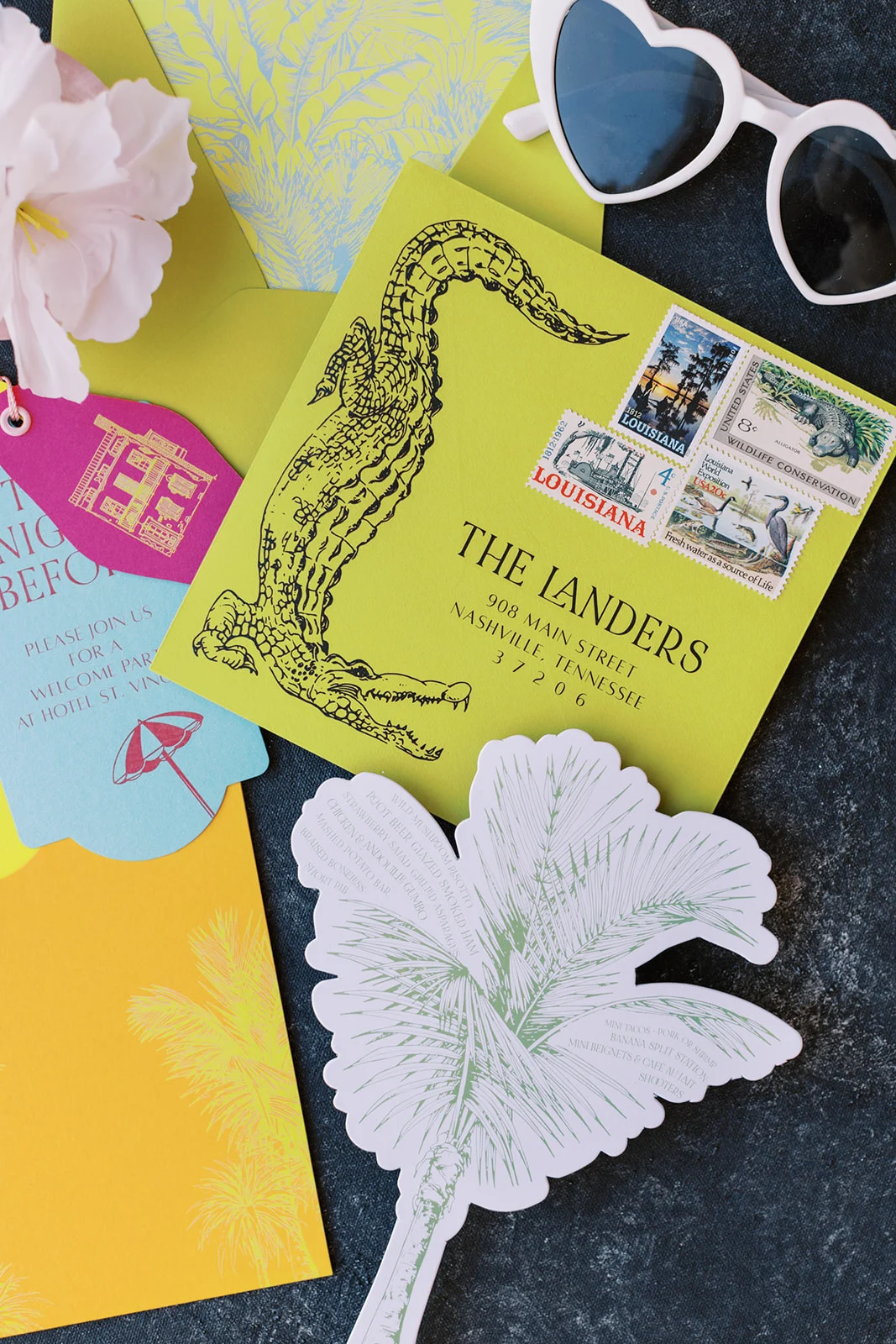
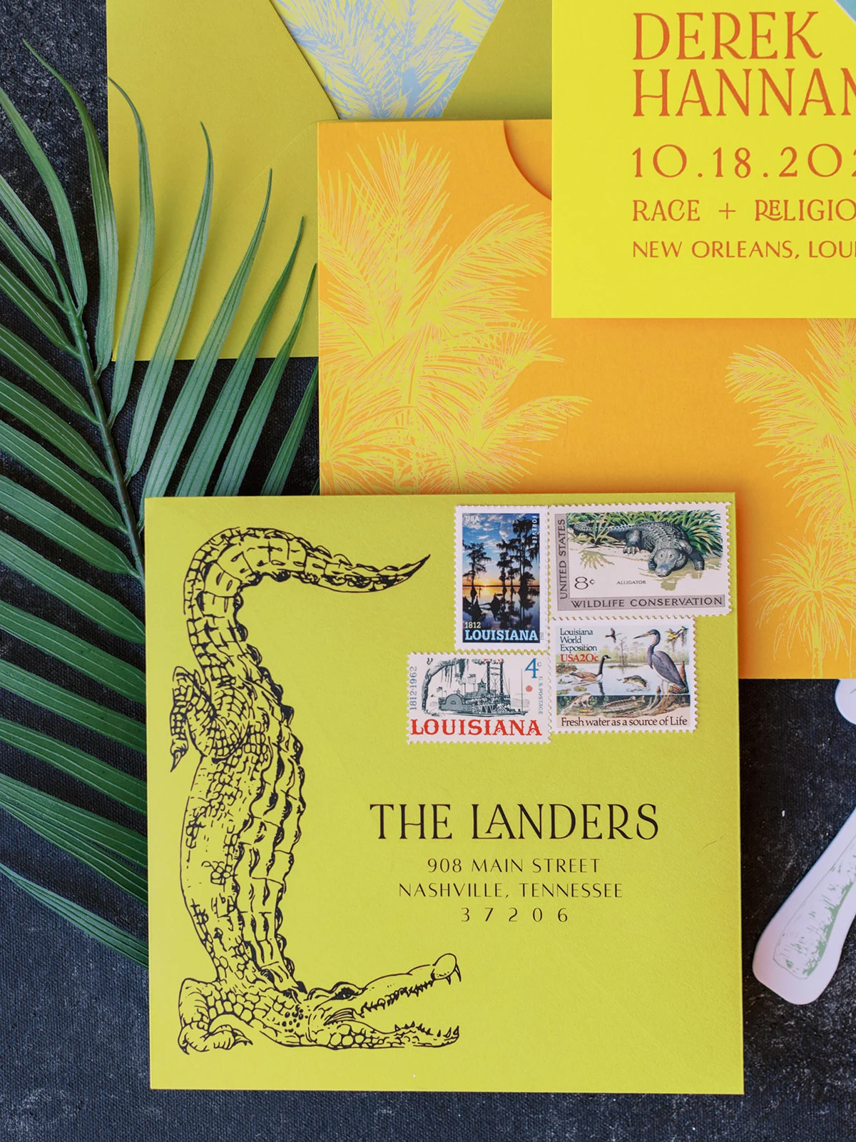
I’m just going to say it: this was our favorite invitation suite of the entire year! Every piece told a story, starting with the main invitation in bright, fun yellow that featured an illustration of an olive, which was an adorable nod to the bride’s sweet pup whose name is Olive. Personal touches like this are what take wedding paper goods to the next level, and this suite had plenty of them.
The RSVP card doubled as a vintage hotel key, complete with a sketch of the venue on one side and a QR code on the other for guests to easily reply. A blue card cut in the exact shape of the pool at Race and Religious was another favorite element of ours from this custom invitation suite. Each piece of the suite featured a different bright and bold color that had a tropical feel.
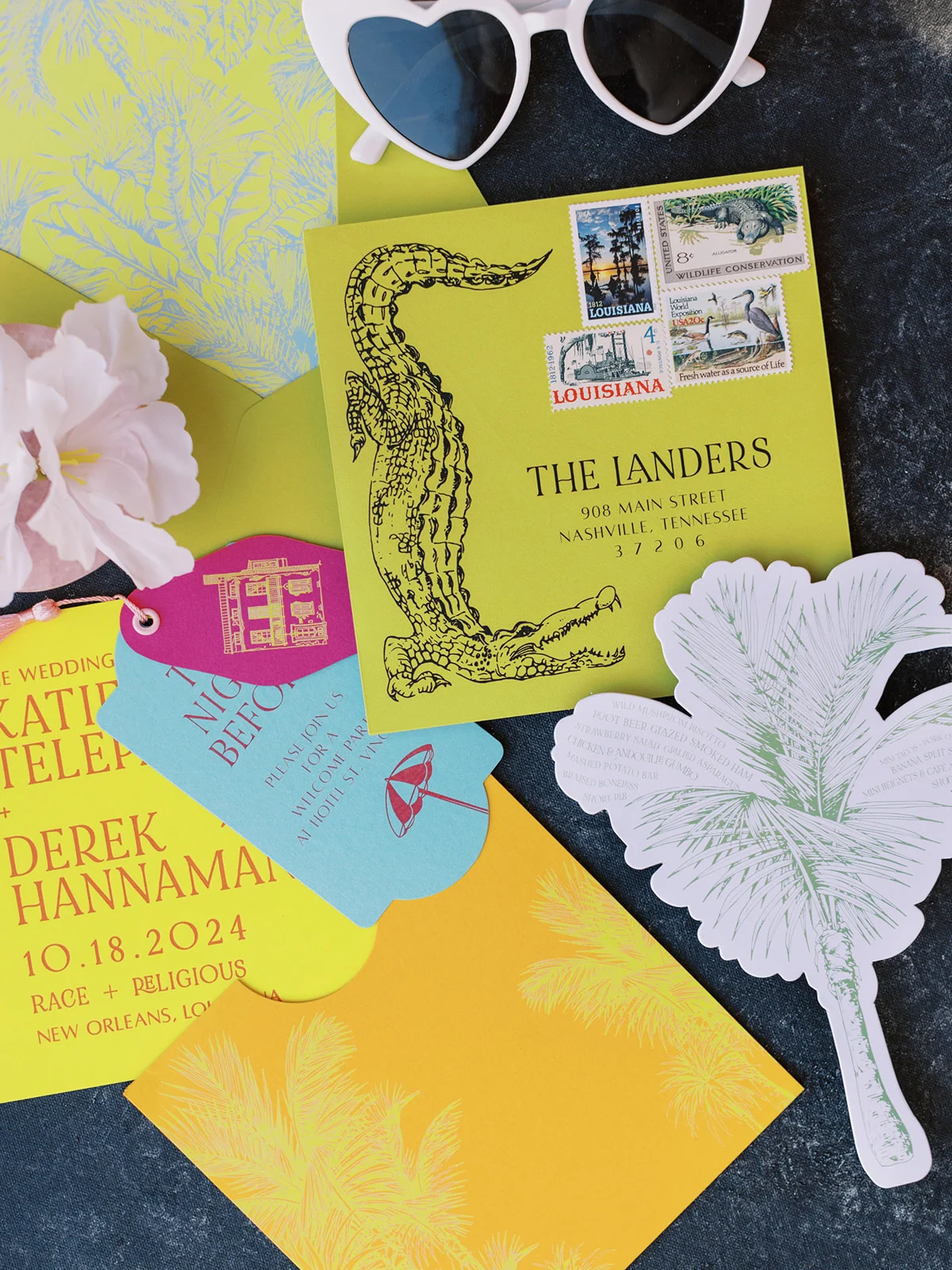
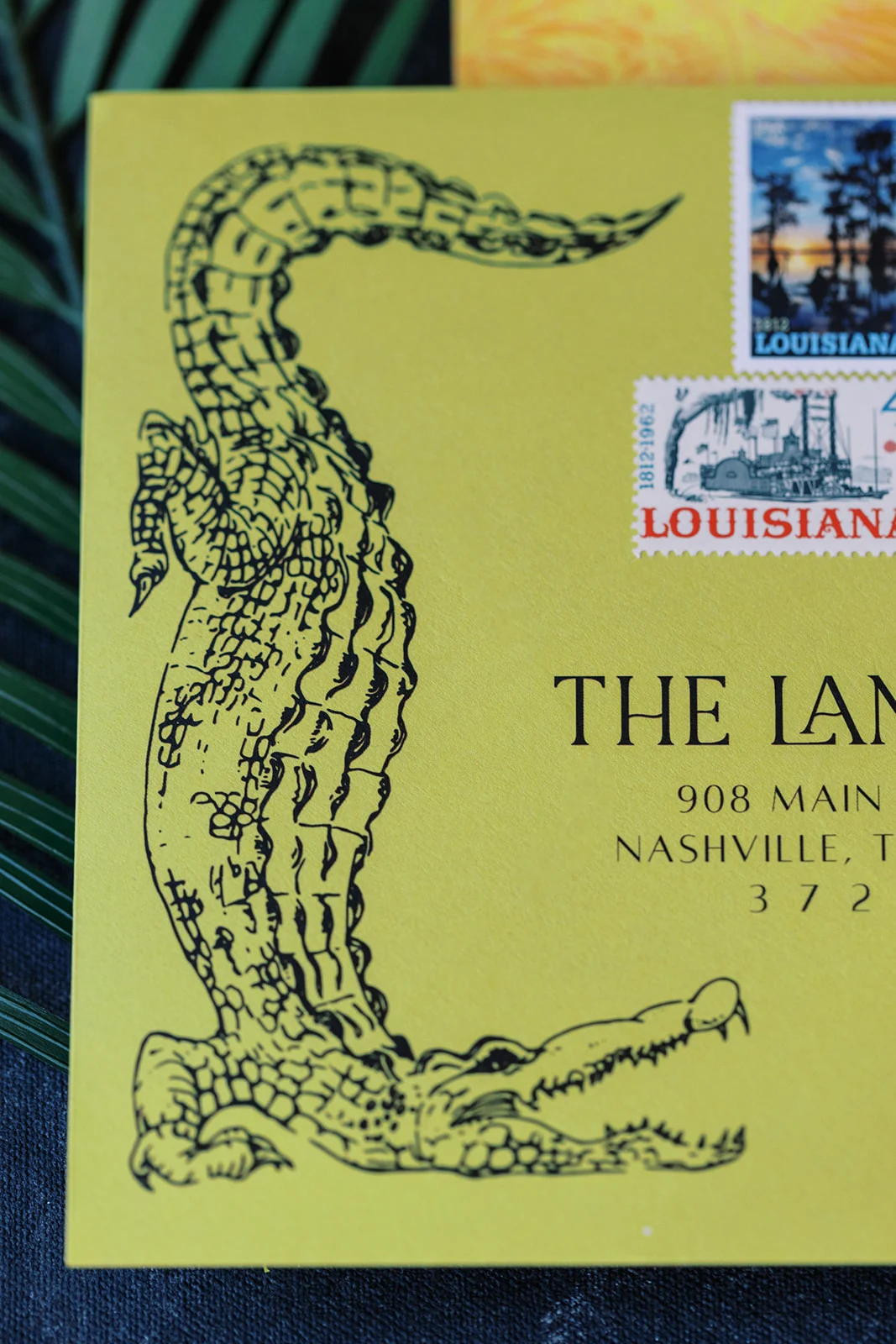
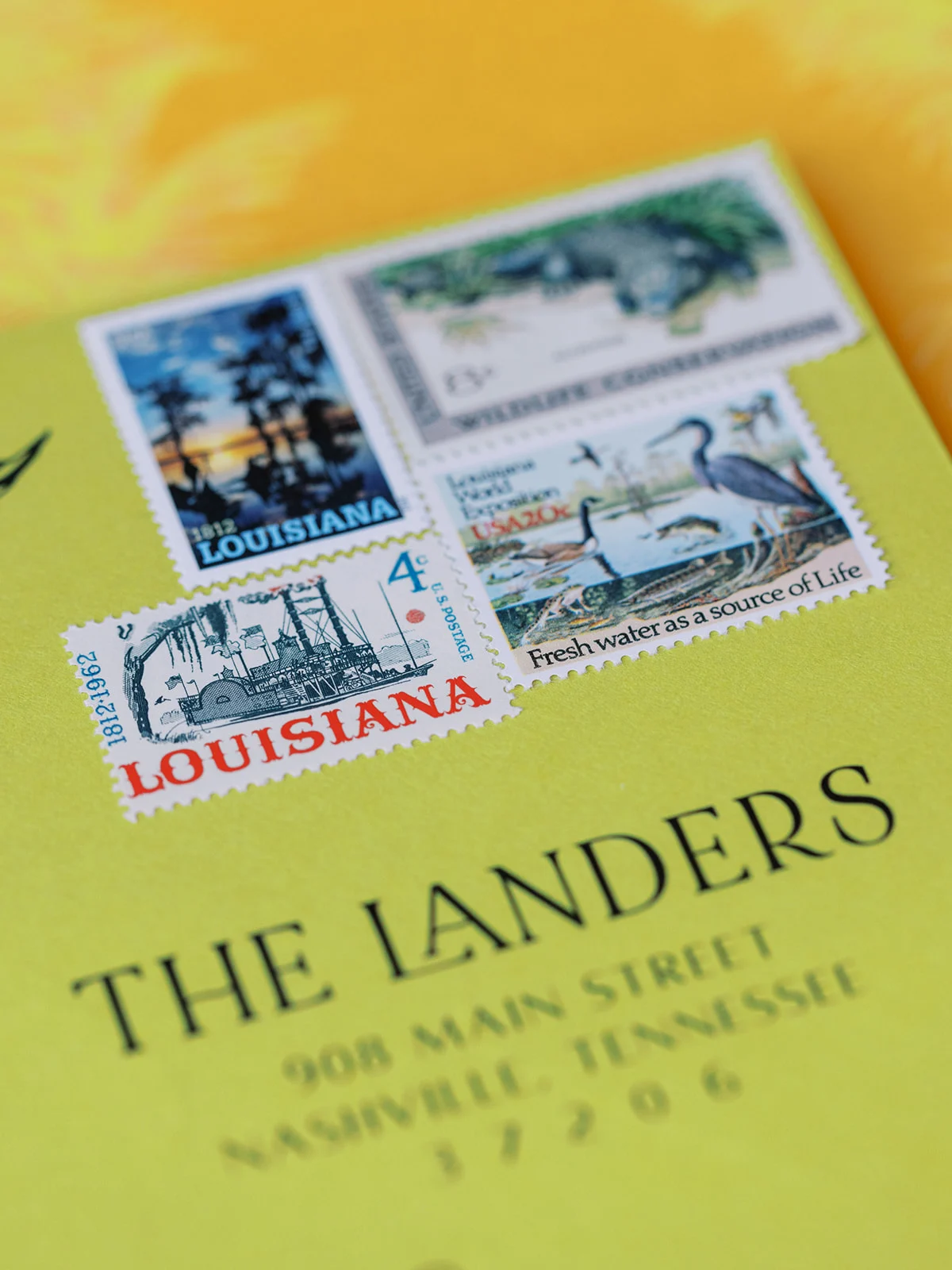
The final component was a green envelope with palm tree liner. Before ever opening the invitation, guests got a glimpse of what was to come with an illustration of alligator on the front, and stamps that provided subtle hints to the wedding’s Louisiana location. The entire suite was thoughtfully curated and unapologetically fun, just like the bride herself. It’s also such a wonderful example of setting the tone for a wedding and providing fun surprises for guests.
Bold Day-of Details with a New Orleans Twist
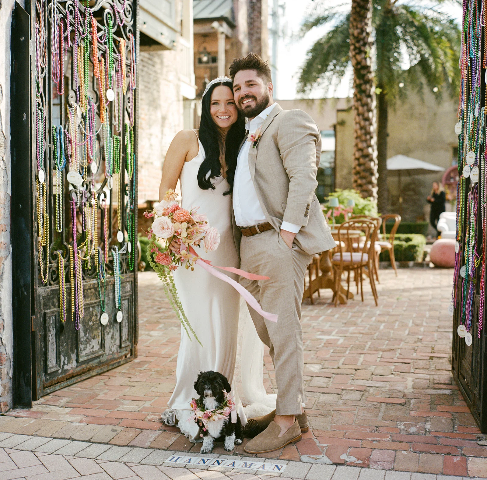
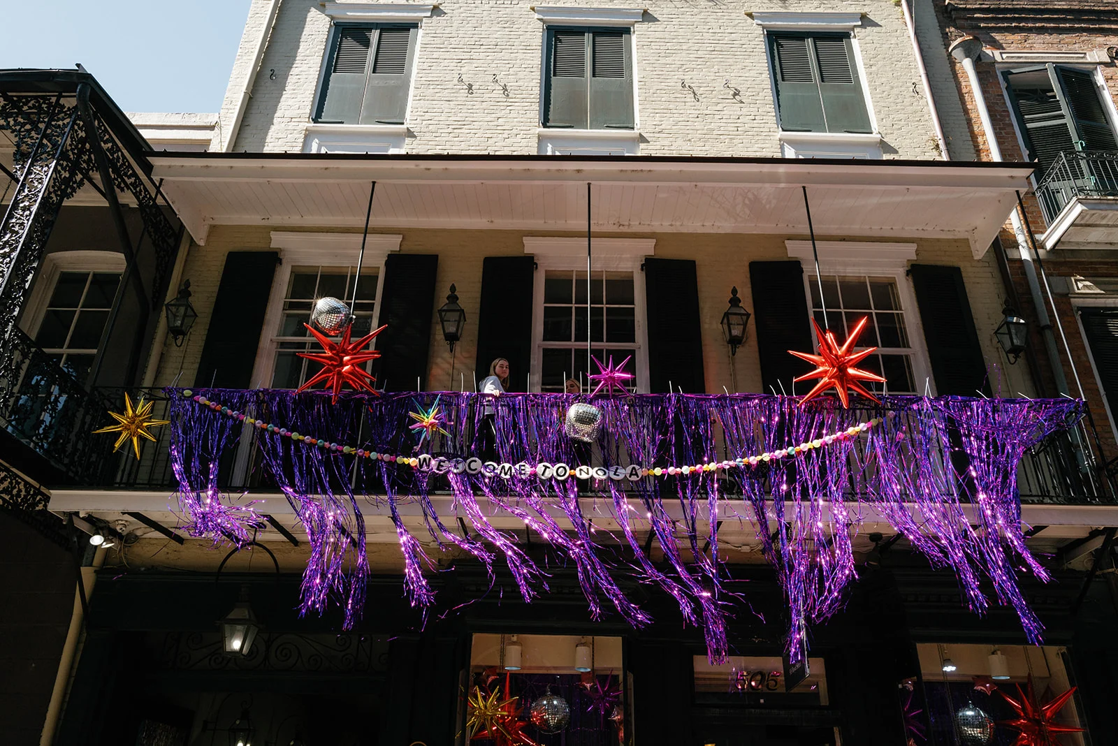
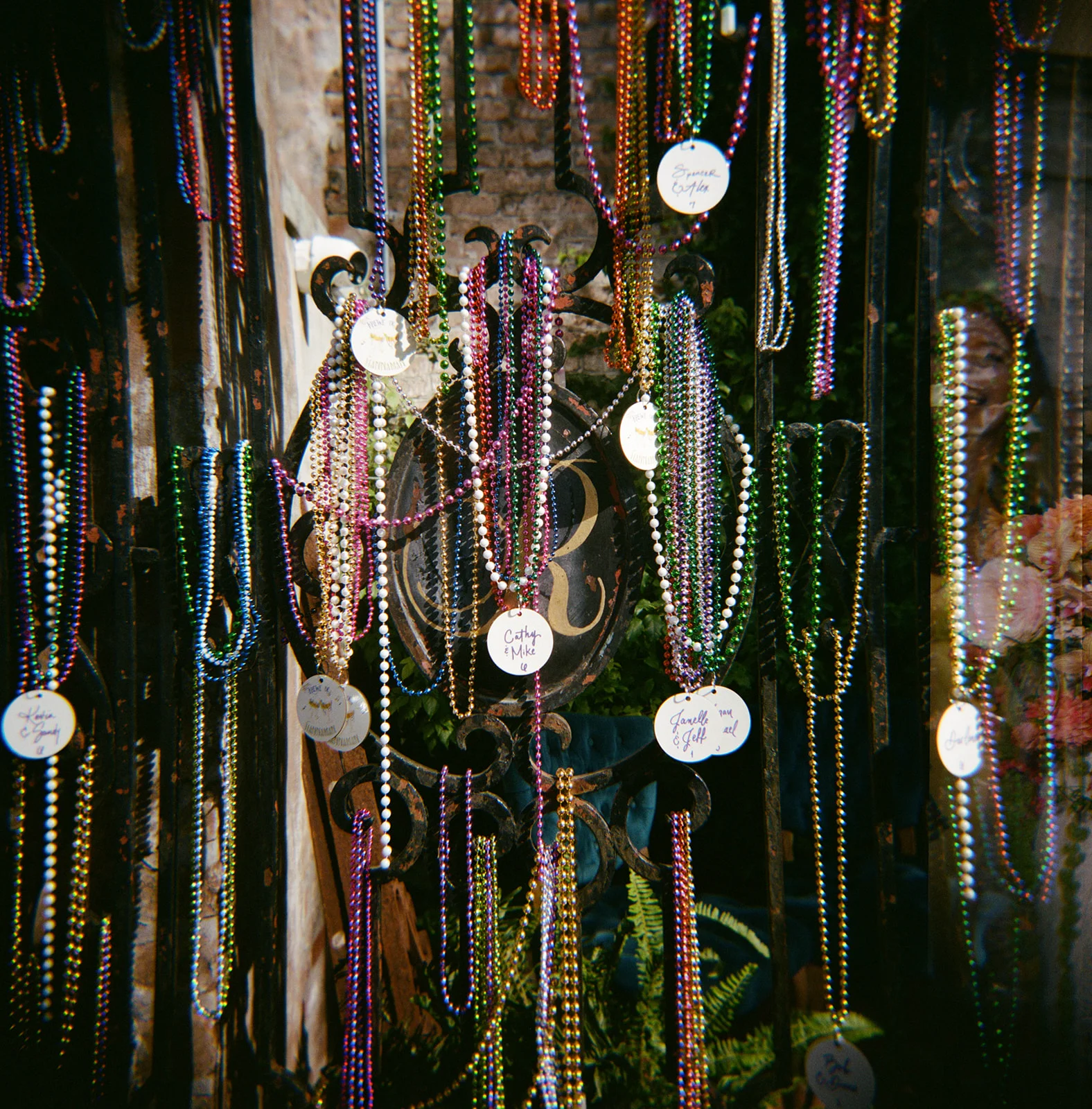
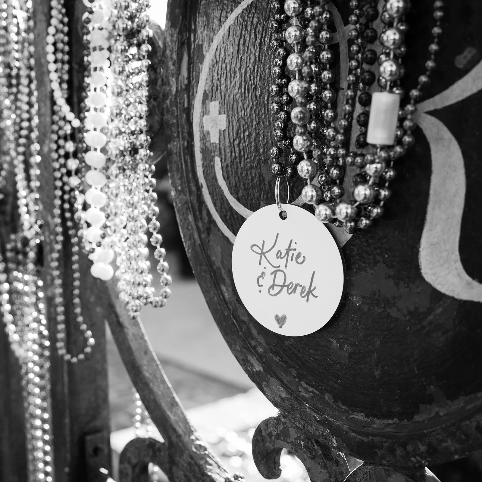
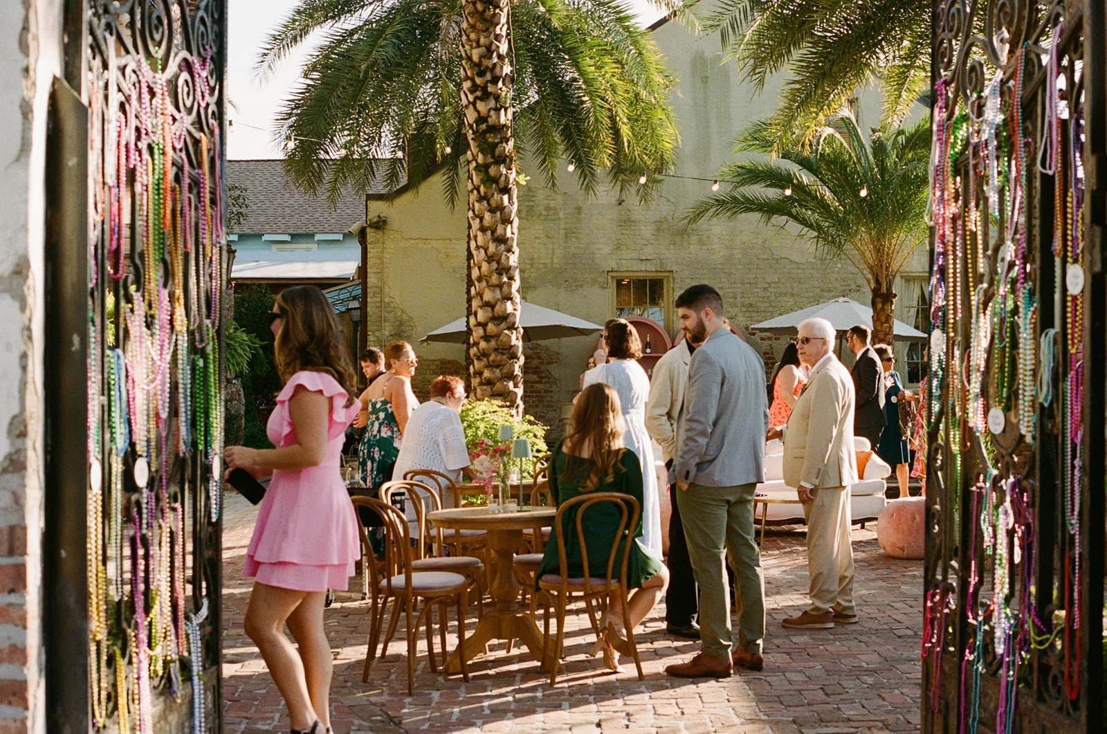
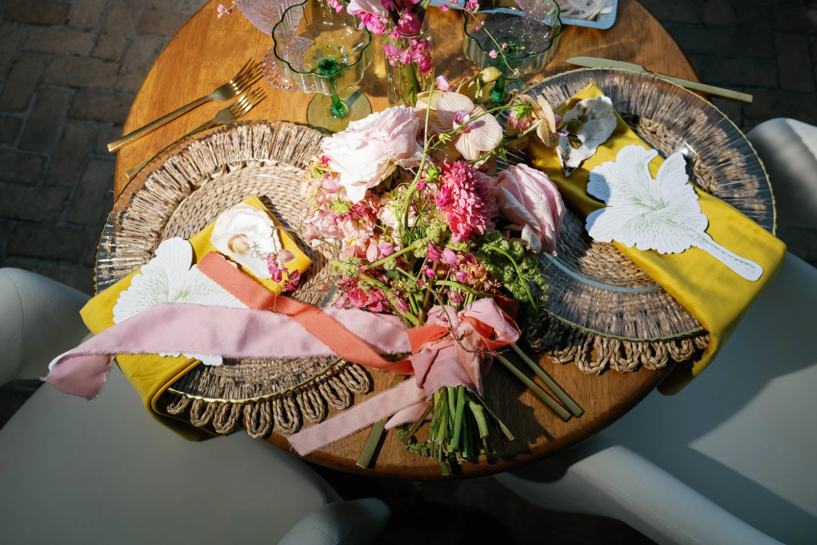
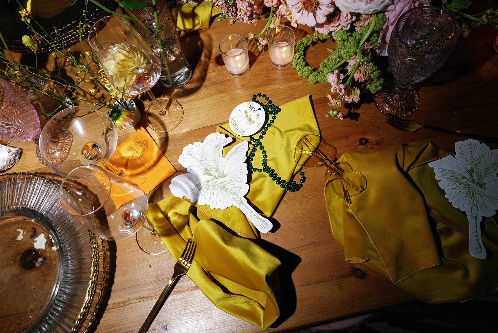
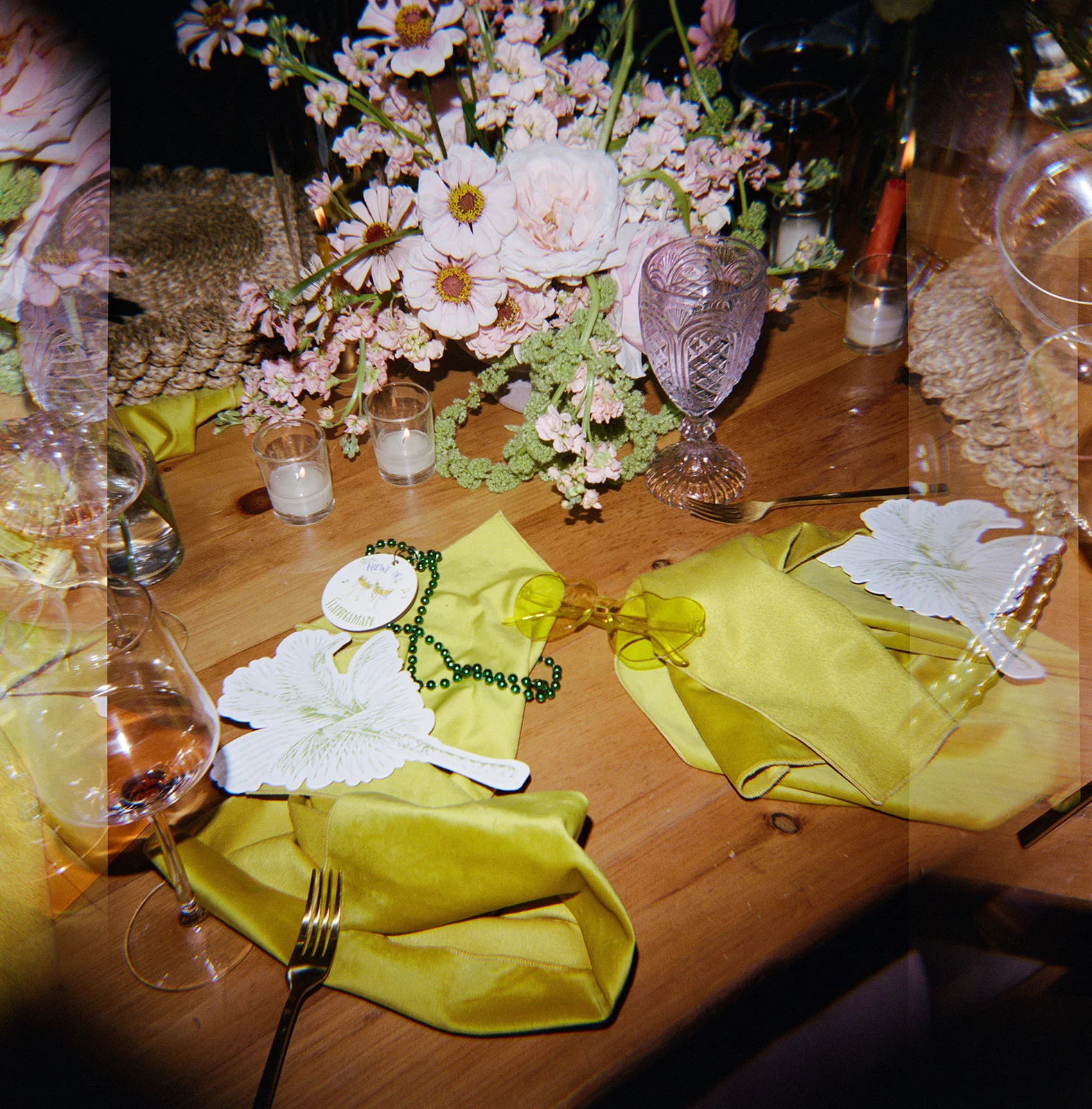
We kept the personality going strong with equally creative and unexpected day-of details. When you hear New Orleans, you think of Mardi Gras, and we wanted to lean into that a bit. To incorporate a little Mardi Gras flair, we used Mardi Gras beads for the seating chart. Guests found their tables by locating Mardi Gras beads hanging on the venue’s iron gate, with their name and table number attached to each strand. So NOLA. So FUN. This was such a hit and everyone wore their Mardi Gras beads all night!
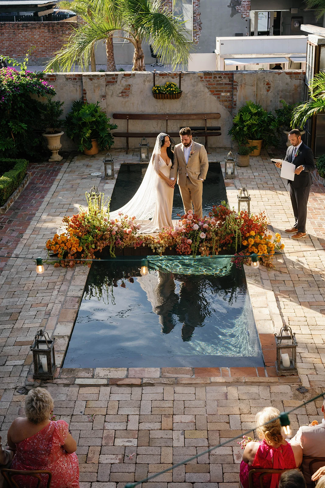
NOLA Wedding Ceremony and Reception
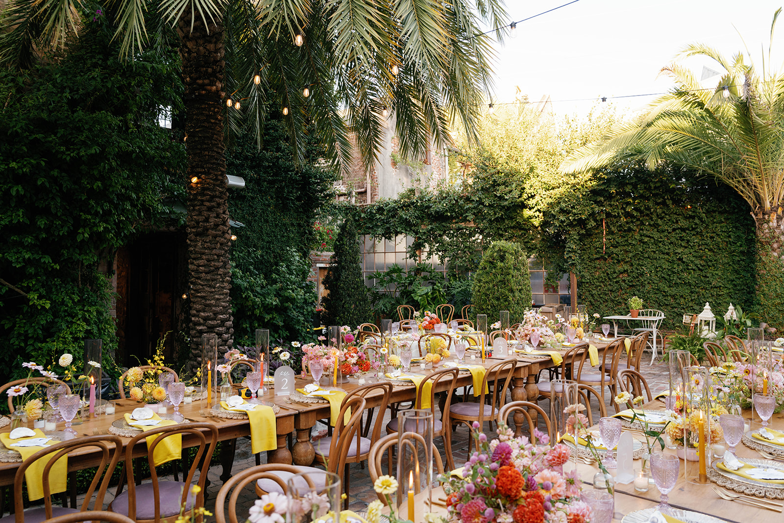
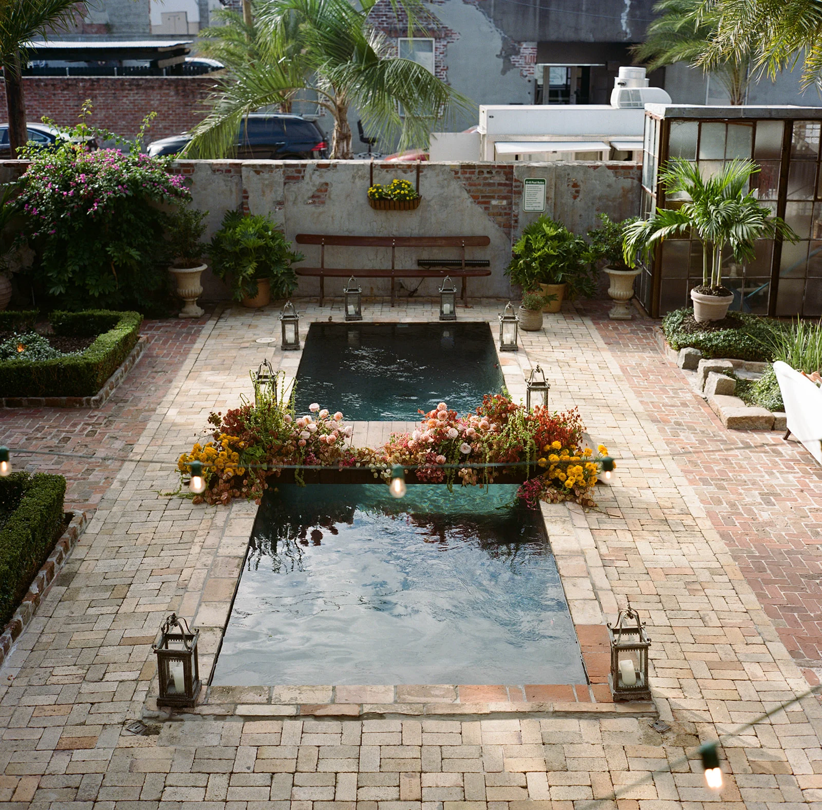
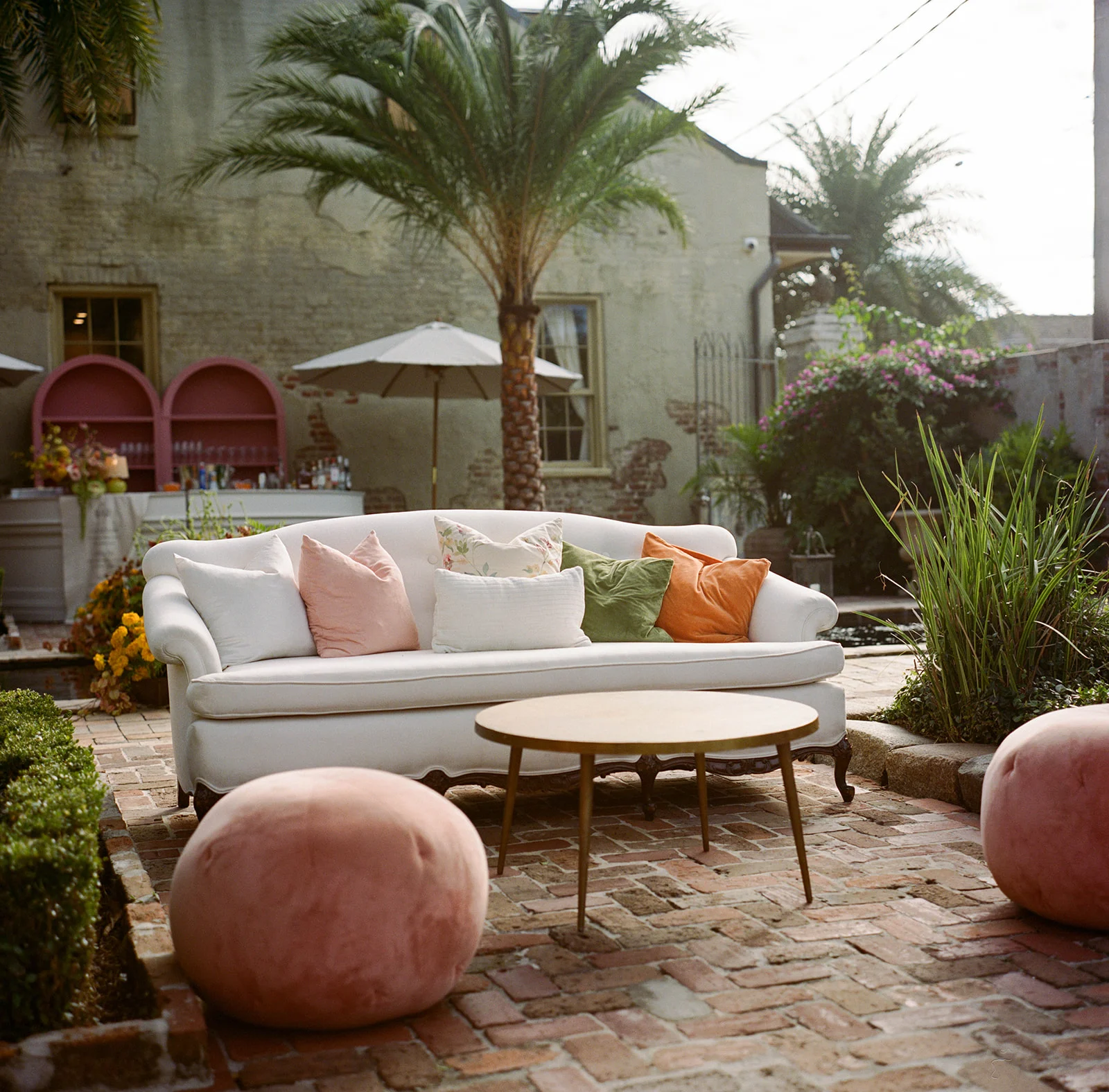
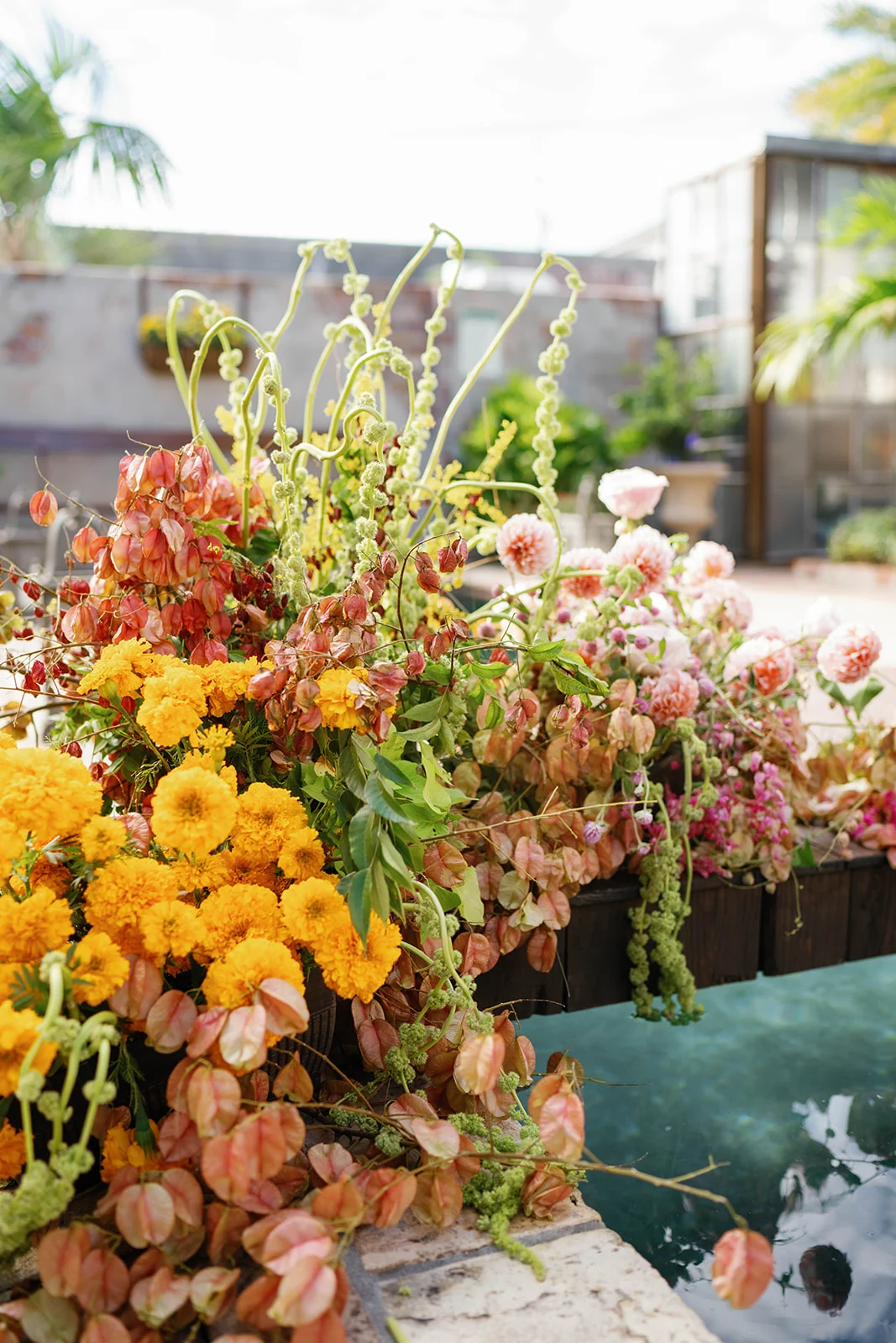
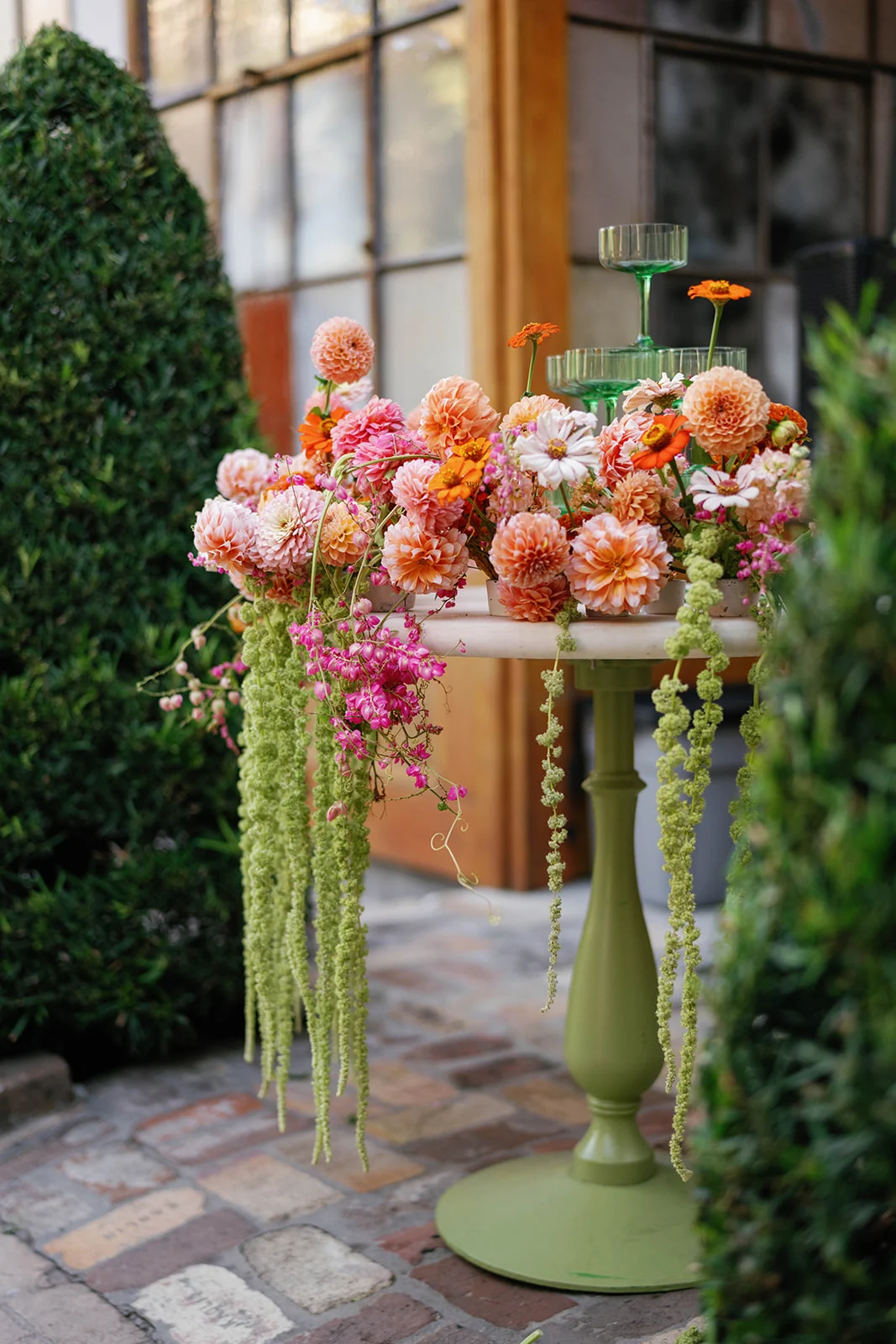
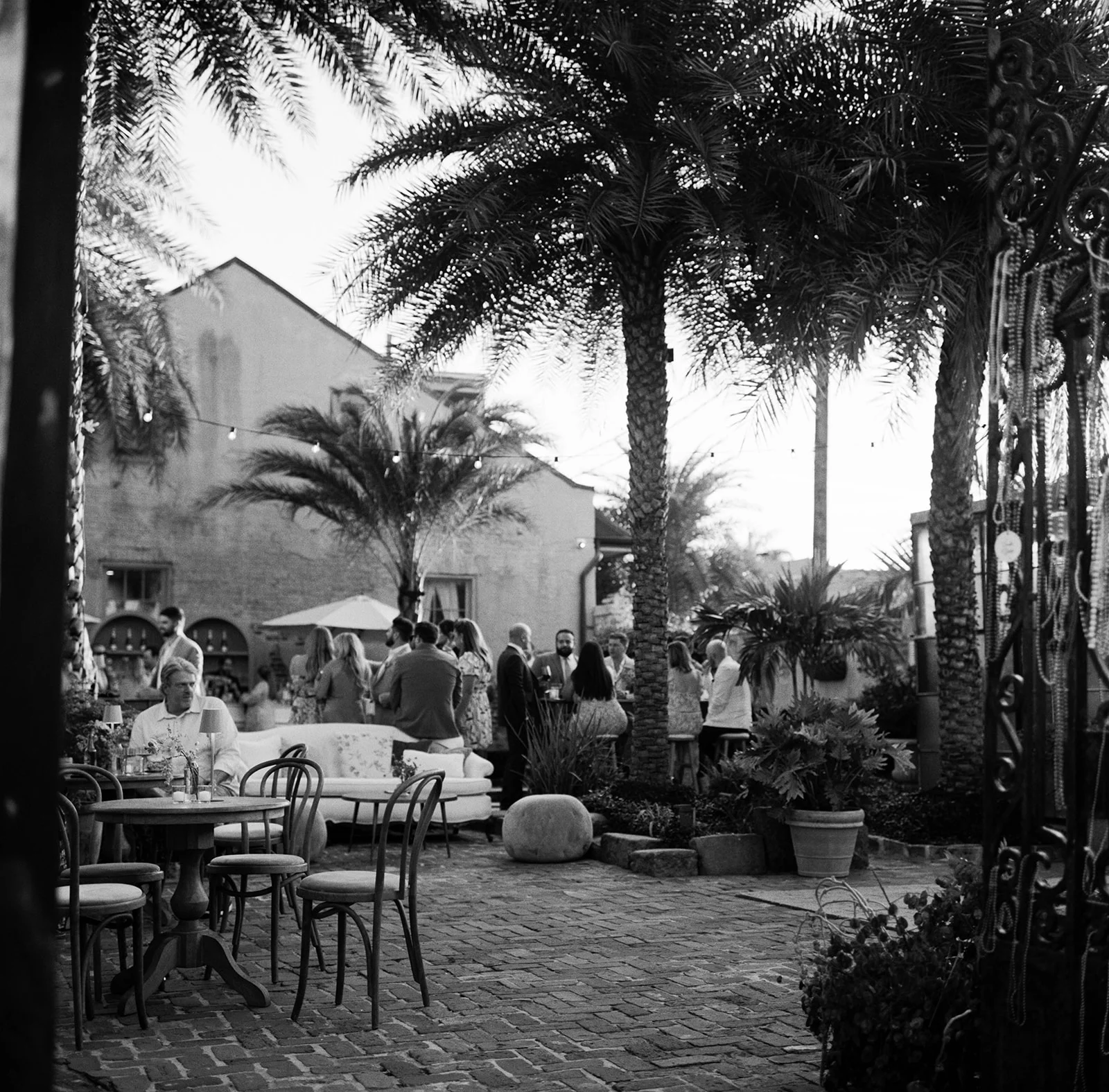
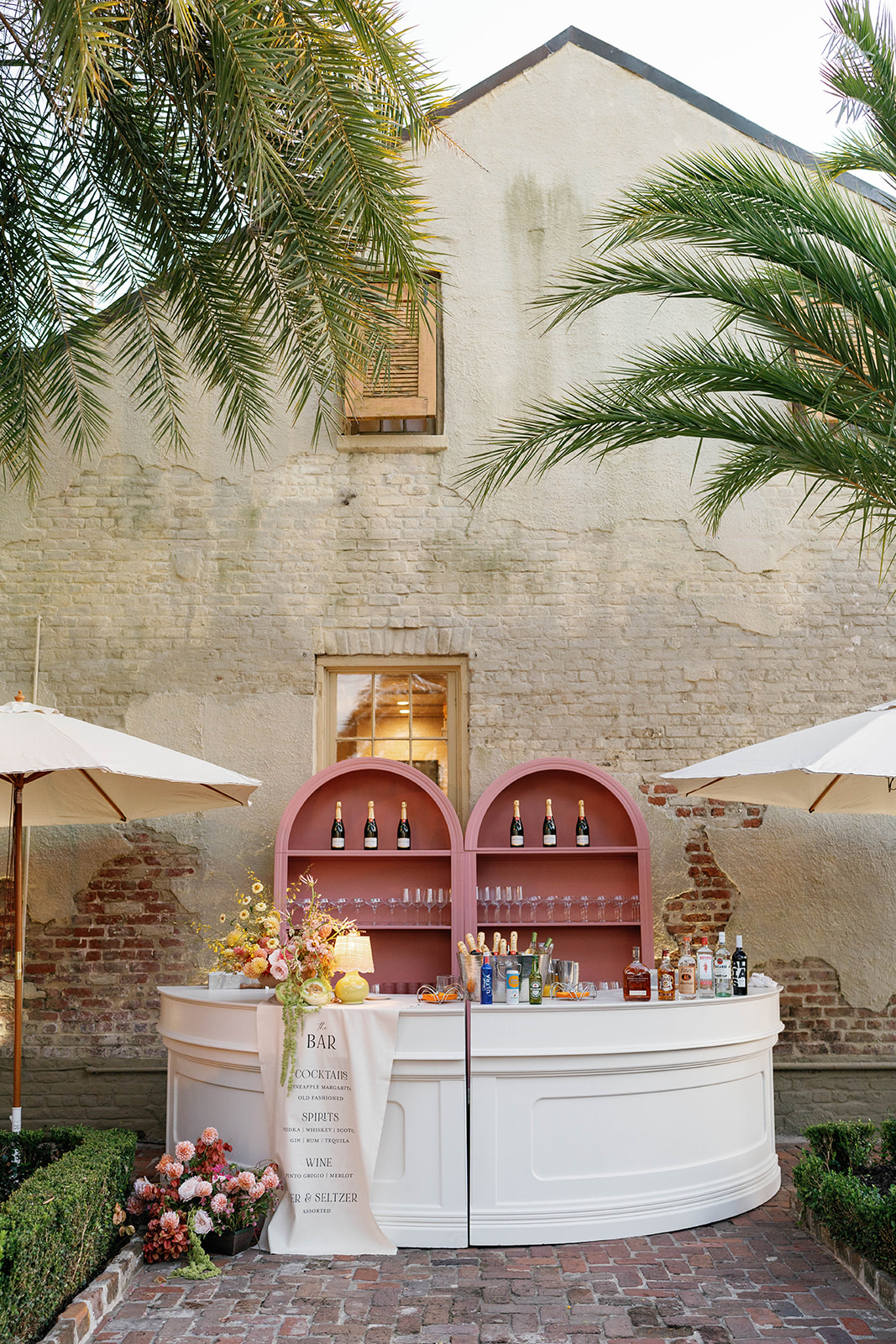
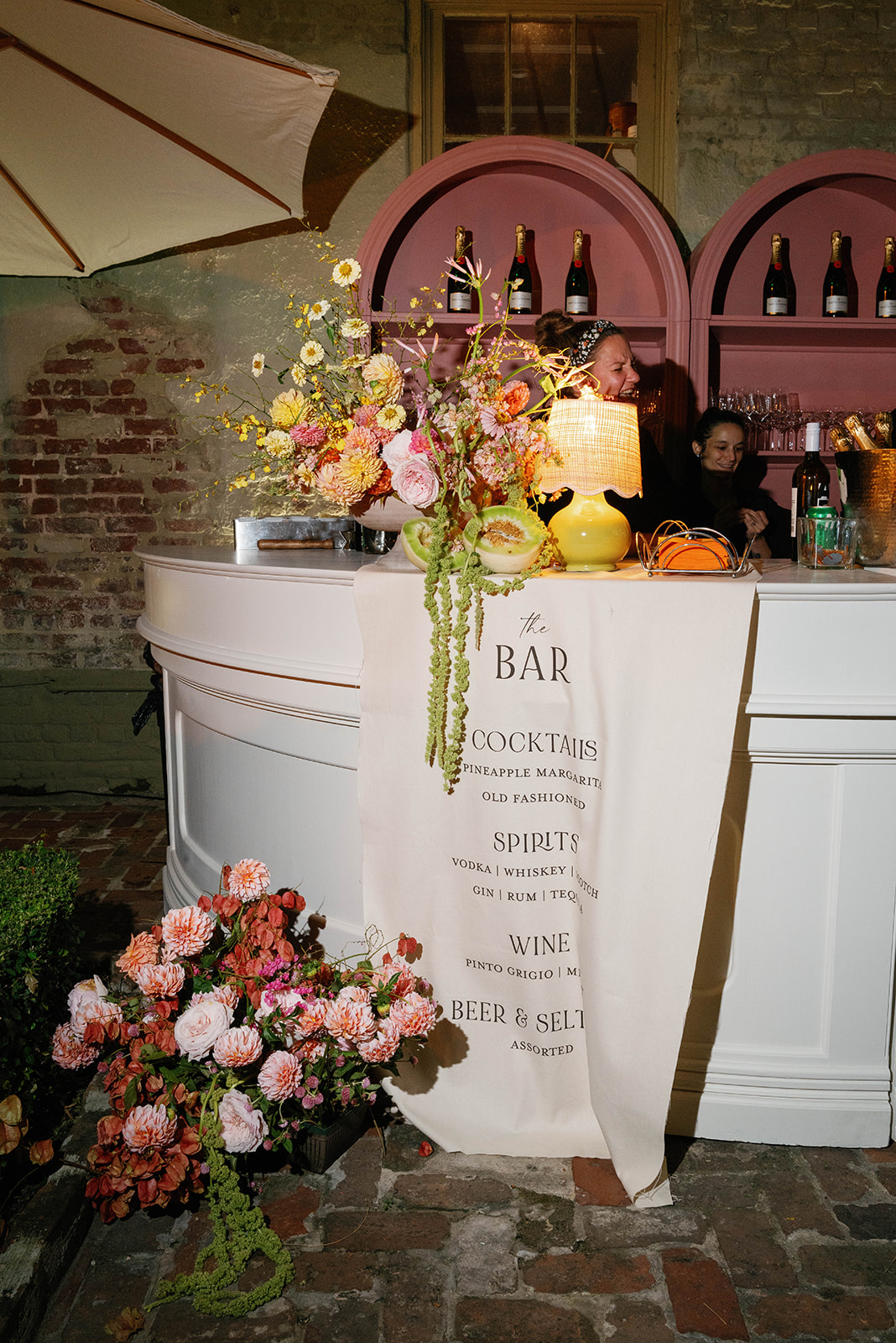
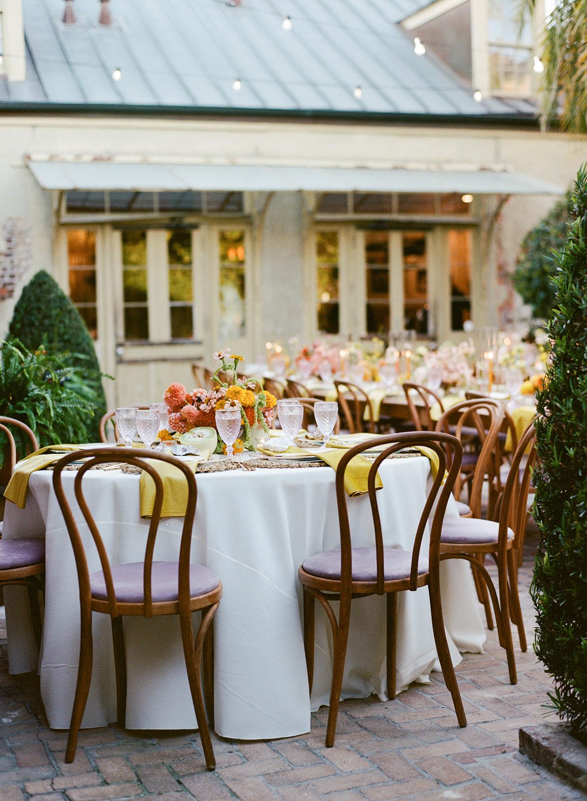
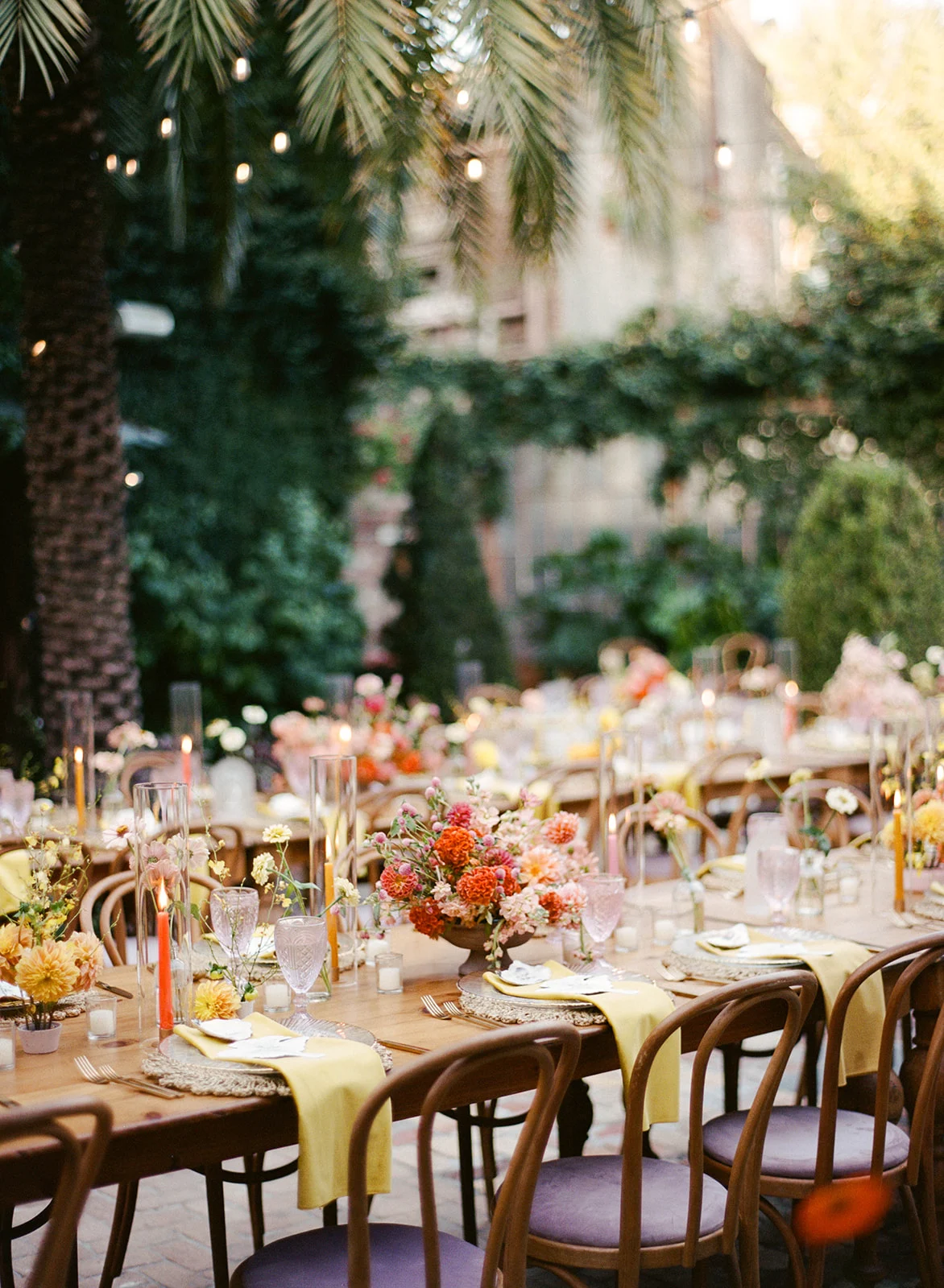
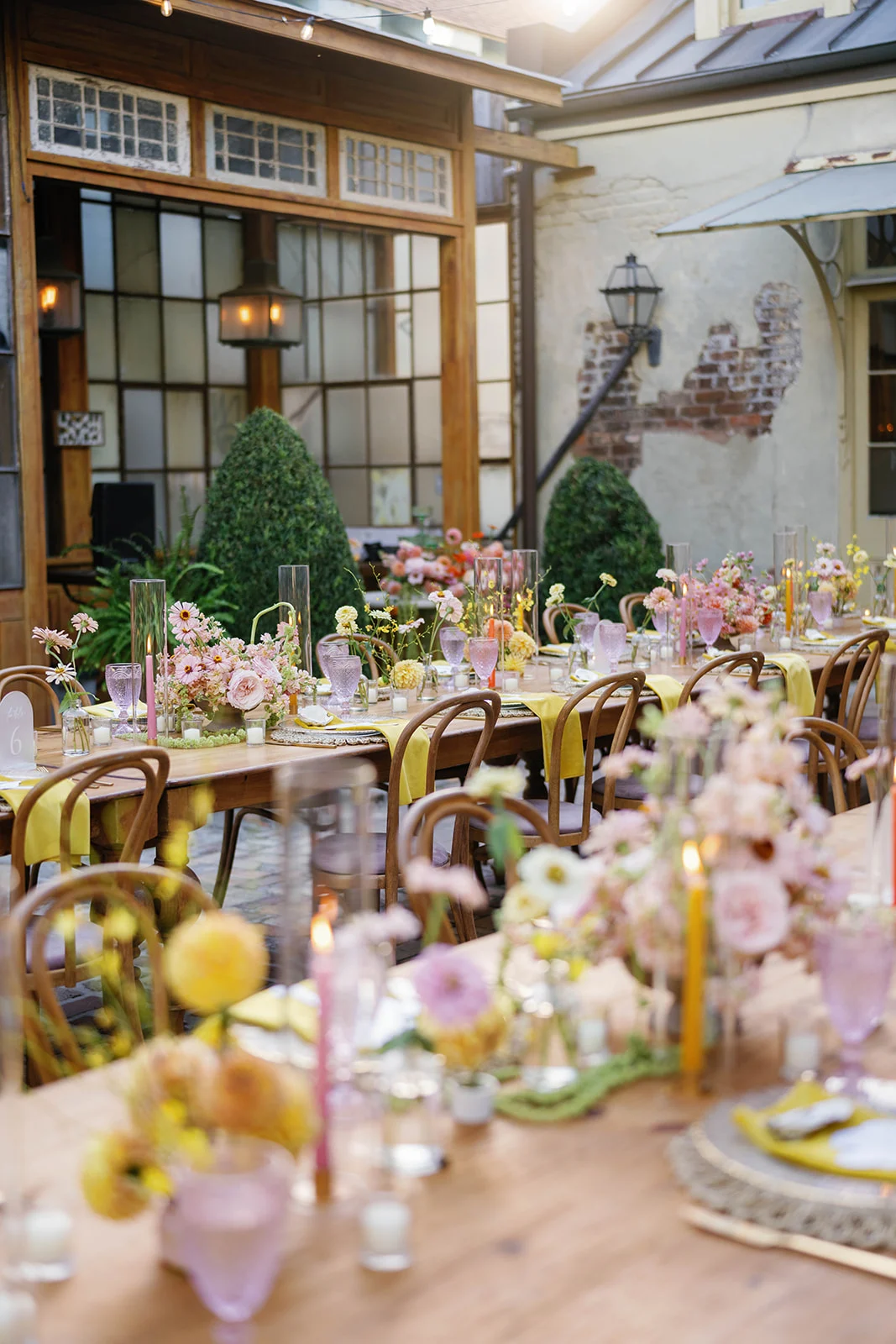
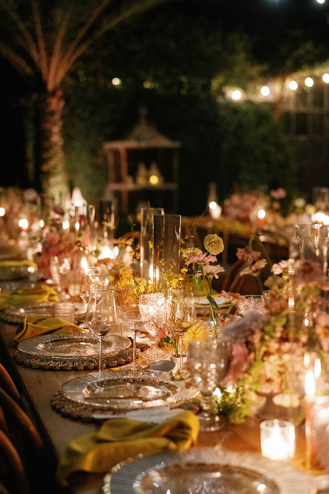
This wedding was a tropical dream! After a stunning ceremony by a pool surrounded in florals and palm trees, guests gathered on the patio for cocktails. A fabric bar sign listed the different drinks available adding texture and movement to the space, which we love! This one tied the whole cocktail setup together with gorgeous florals sitting on top of the bar framing the fabric sign.
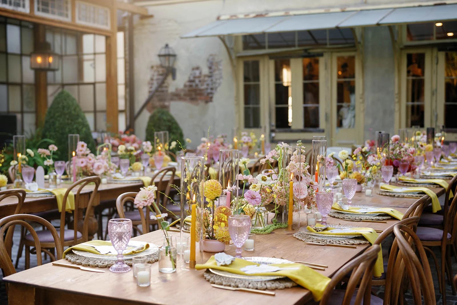
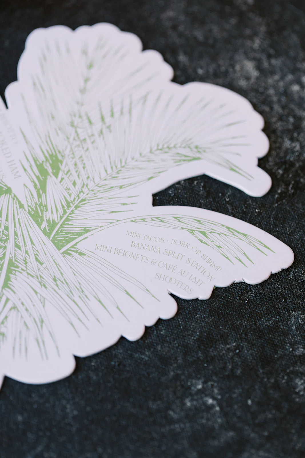
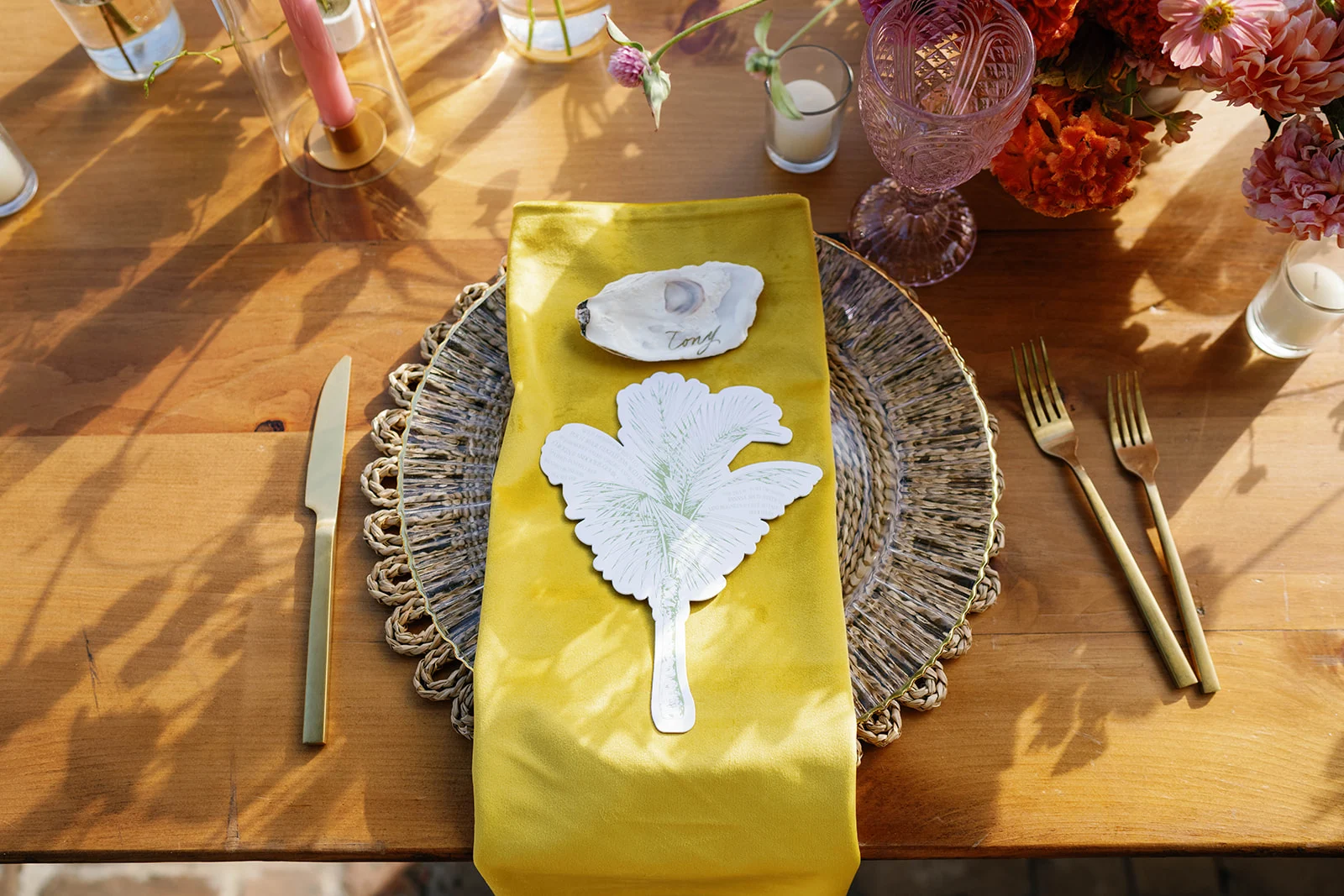
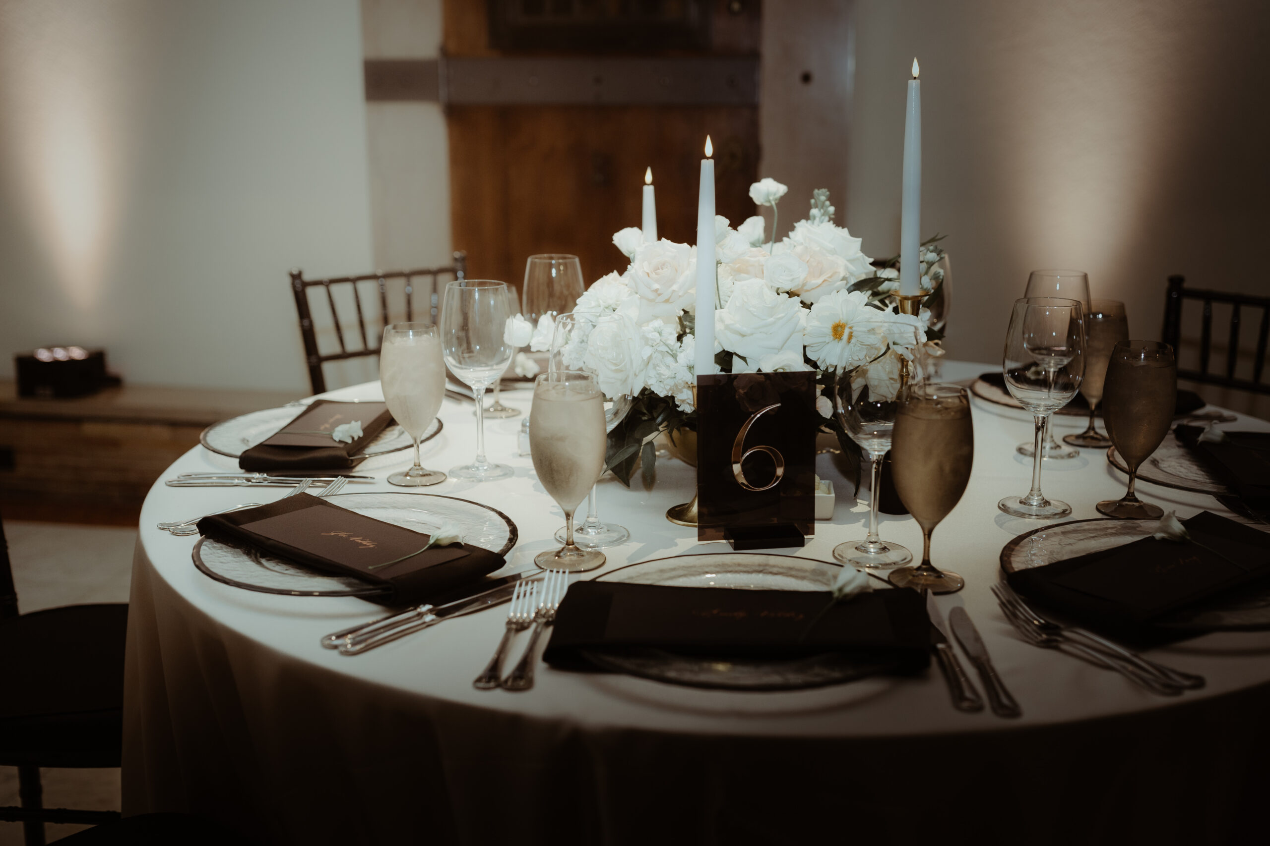
The tablescapes at the venue were just beautiful. The florals were stunning with pops of bright pink and orange. At each place setting were the playful menus we designed shaped like palm trees. Oyster Place Cards were also at each seat as a nod to local flavor and southern charm, adding an elegance to the setting.
From the smallest element to the biggest moments, every detail celebrated the vibrant spirit of New Orleans while staying true to the couple’s personal style.
At White Ink Calligraphy, we believe your wedding should reflect you. This wedding was a perfect example of what happens when a couple fully leans into their style and vision by choosing details that are both meaningful and fun. Bringing this wedding day to life in the vibrant city of New Orleans was such an honor and so much fun. We’re still not over it! Katie and Derek’s wedding is definitely one we will always remember!
If you’re looking to add custom, thoughtful touches to your wedding or event, we would love to help make your vision a reality. Reach out today to learn more about our full-service design offerings—we can’t wait to create something unforgettable for you!
If you enjoyed this post, you’ll love these other blogs!
Perhaps the most important element of a couple’s custom wedding invitation suite is the storytelling. In the same way a movie preview prepares viewers for a film, custom designed invites serve as a powerful glimpse into what the guests can expect from the bride and groom’s big day.
Custom Wedding Invitation Suite
After years of crafting and designing invitations for our White Ink couples, we’ve developed a keen awareness of this unique storytelling. Helping clients incorporate themes, colors, and a bit of their personalities into their invites is something we simply delight in.
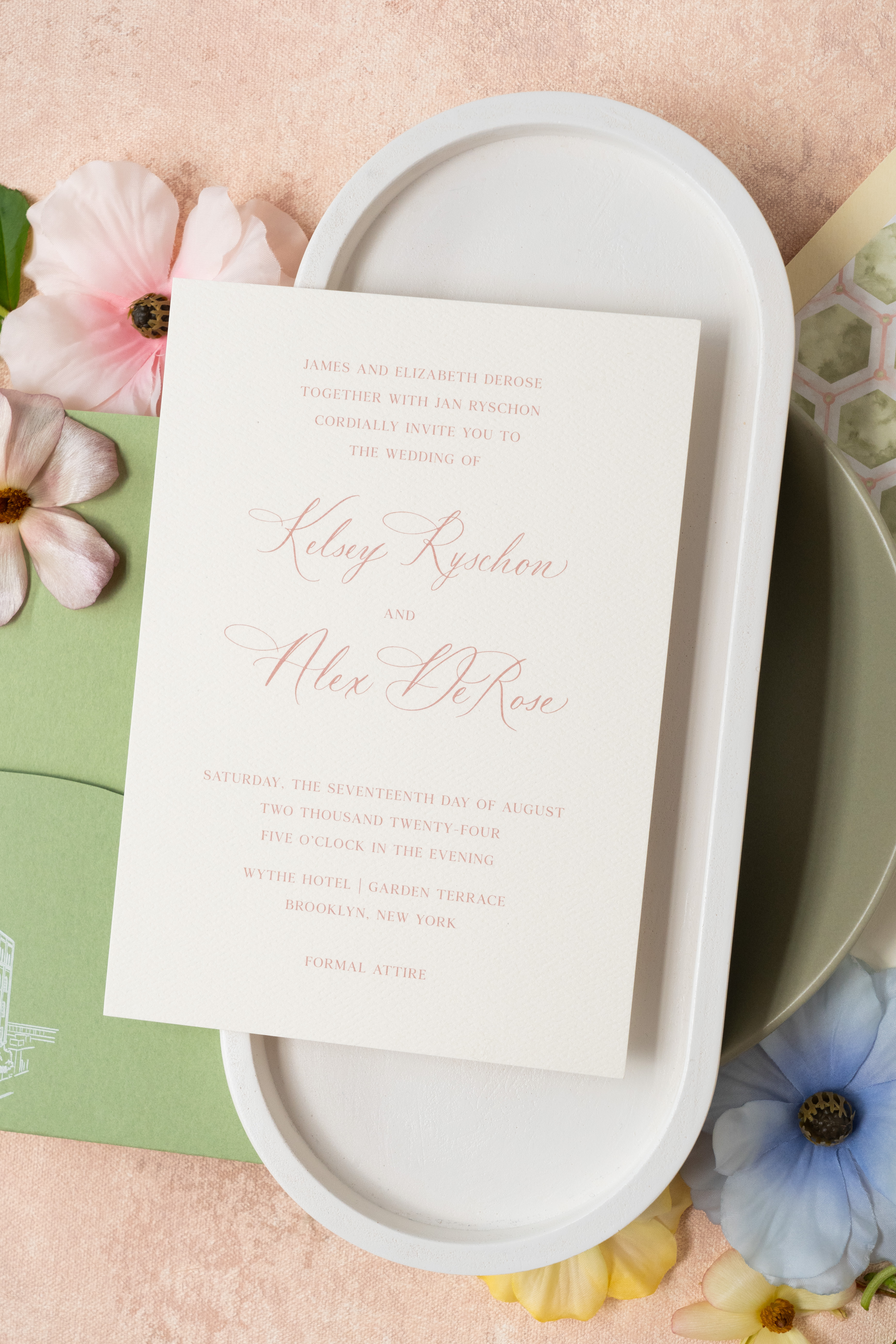
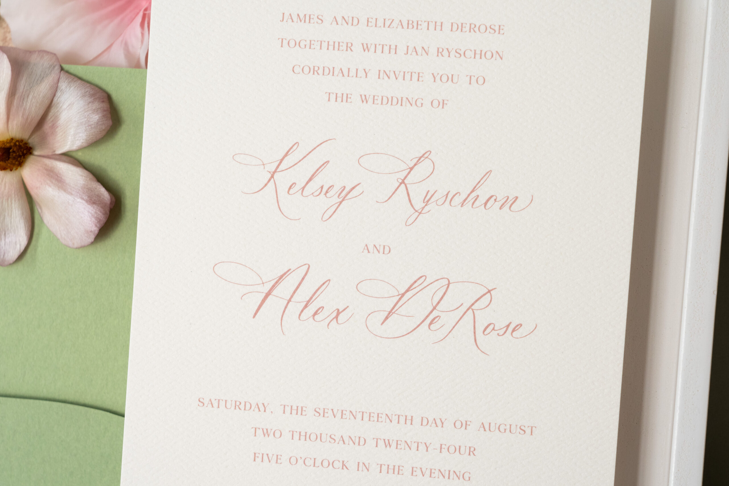
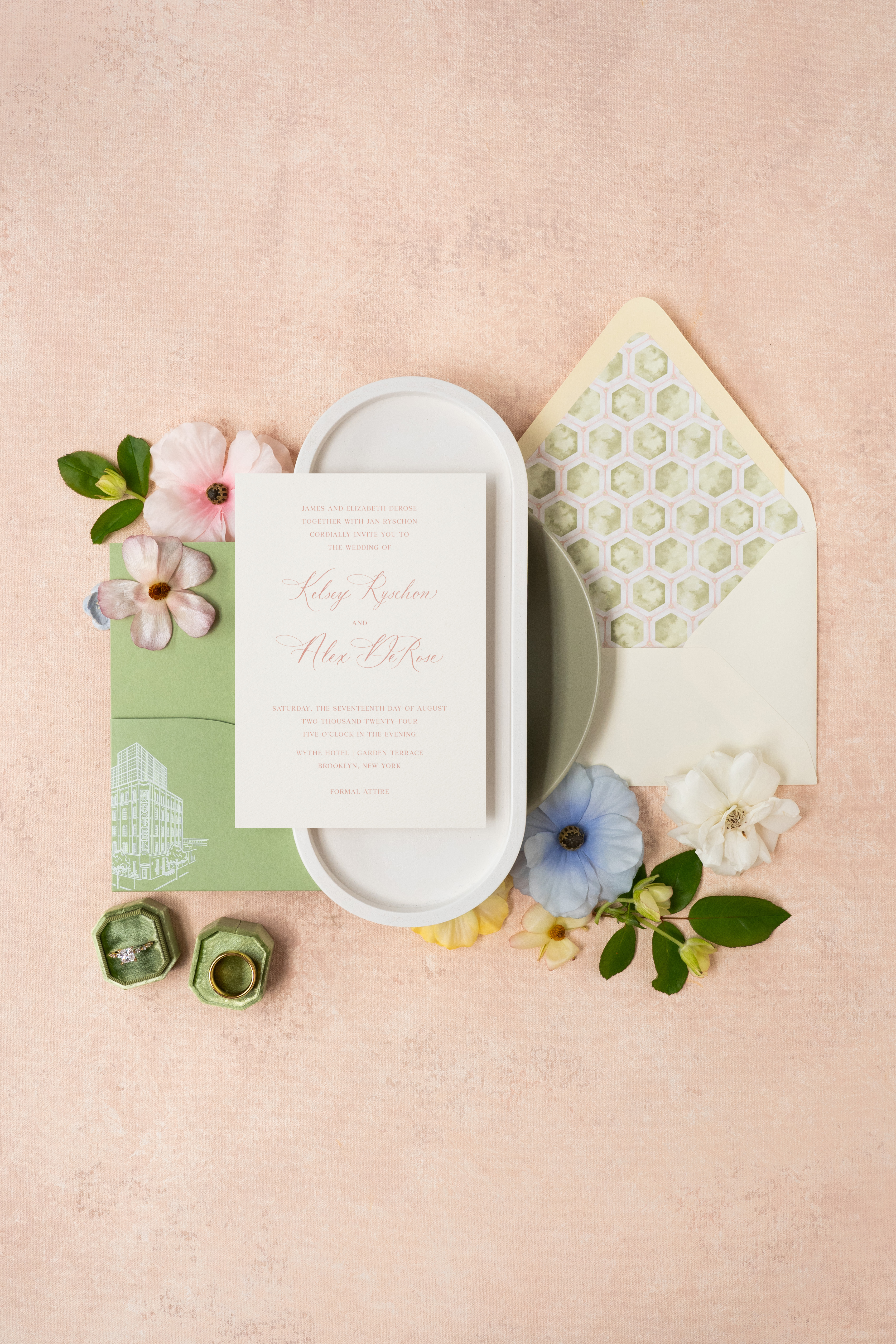
It was an honor having the opportunity to do just that for White Ink couple, Kelsey and Alex. Designing their custom wedding invitation suite was so fun! I’m beyond excited to finally share this amazing suite with all of you.
“Creating a strong perception of the beautiful and loving celebration we are throwing!”
– Kelsey and Alex
Urban Garden Party Theme
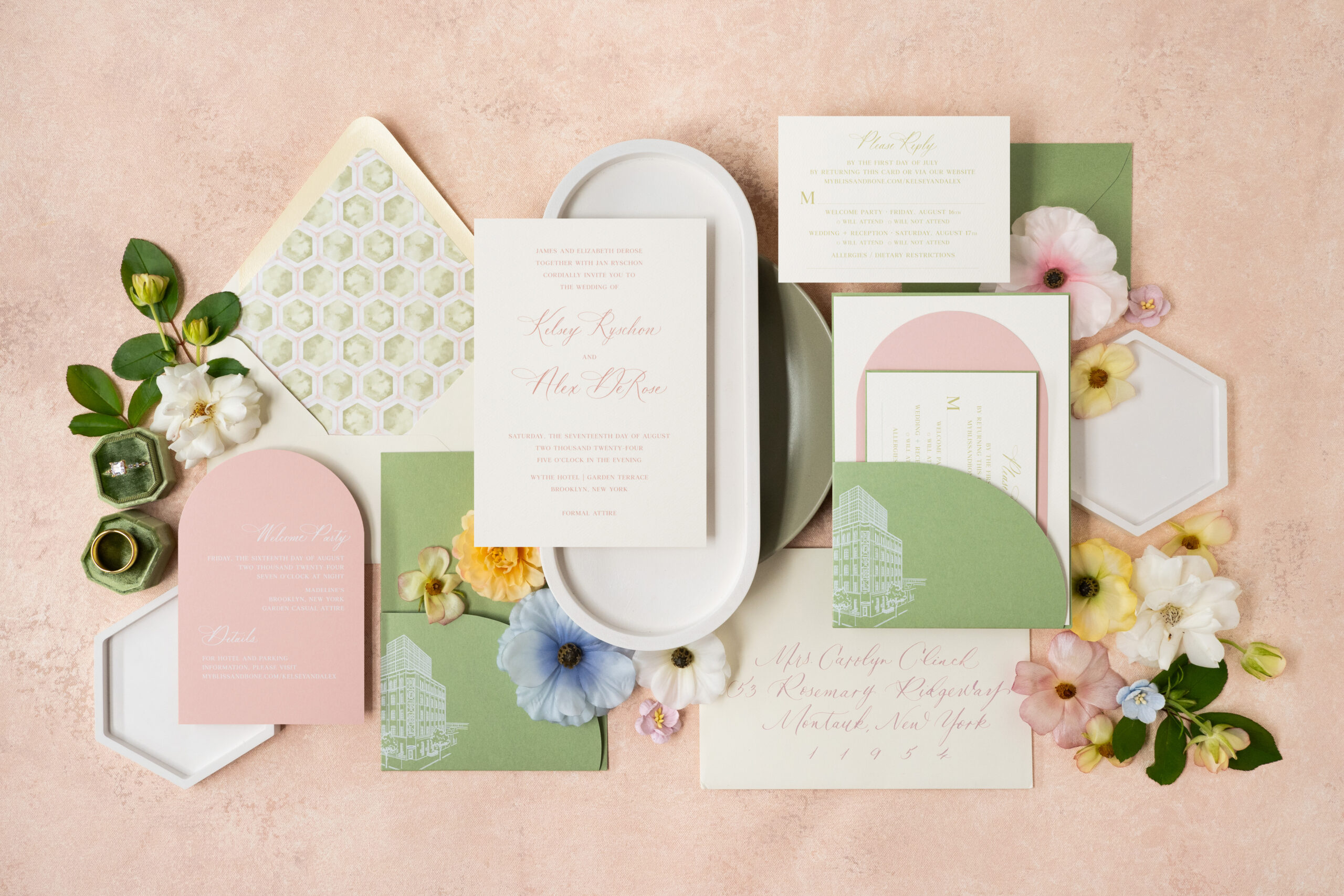
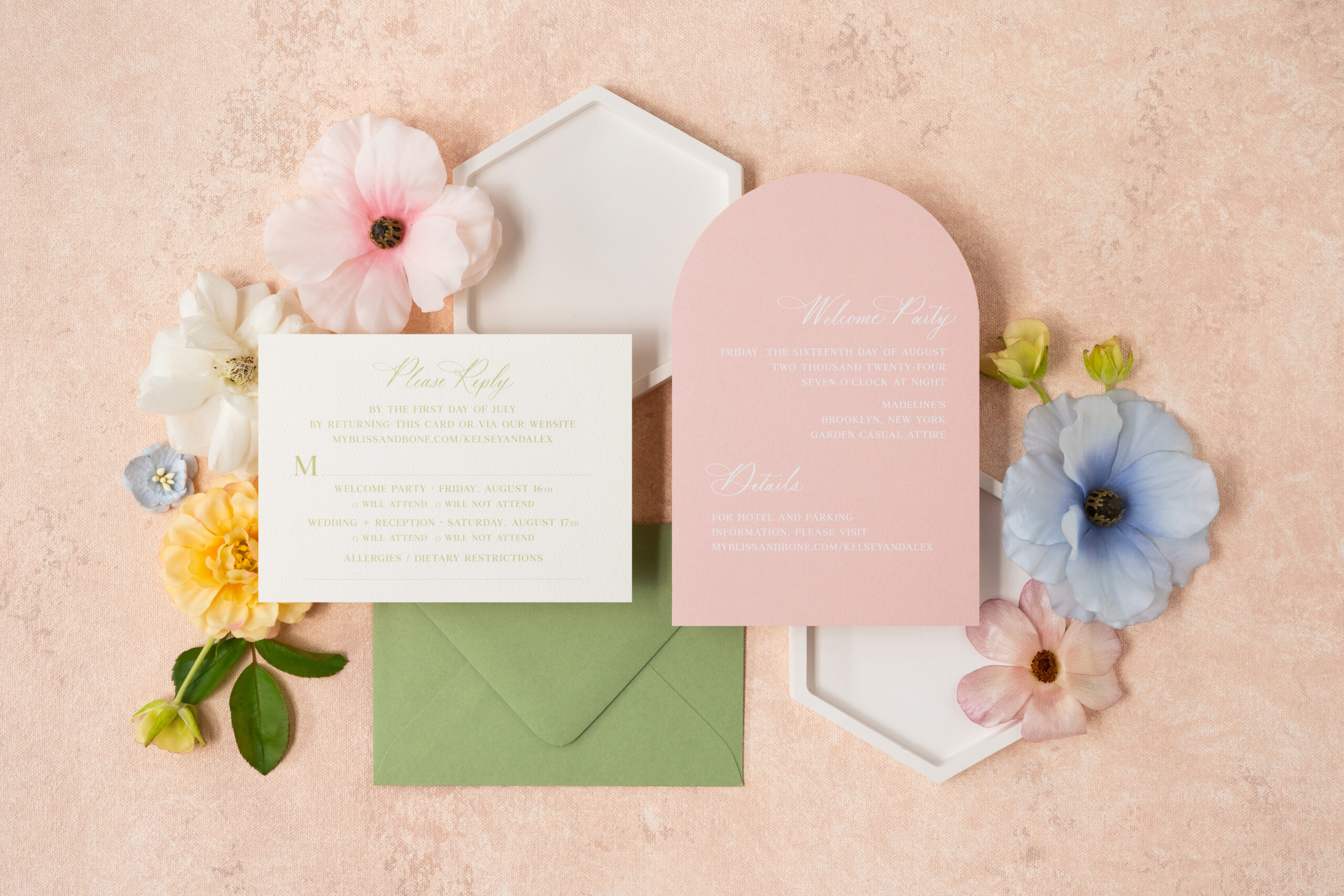
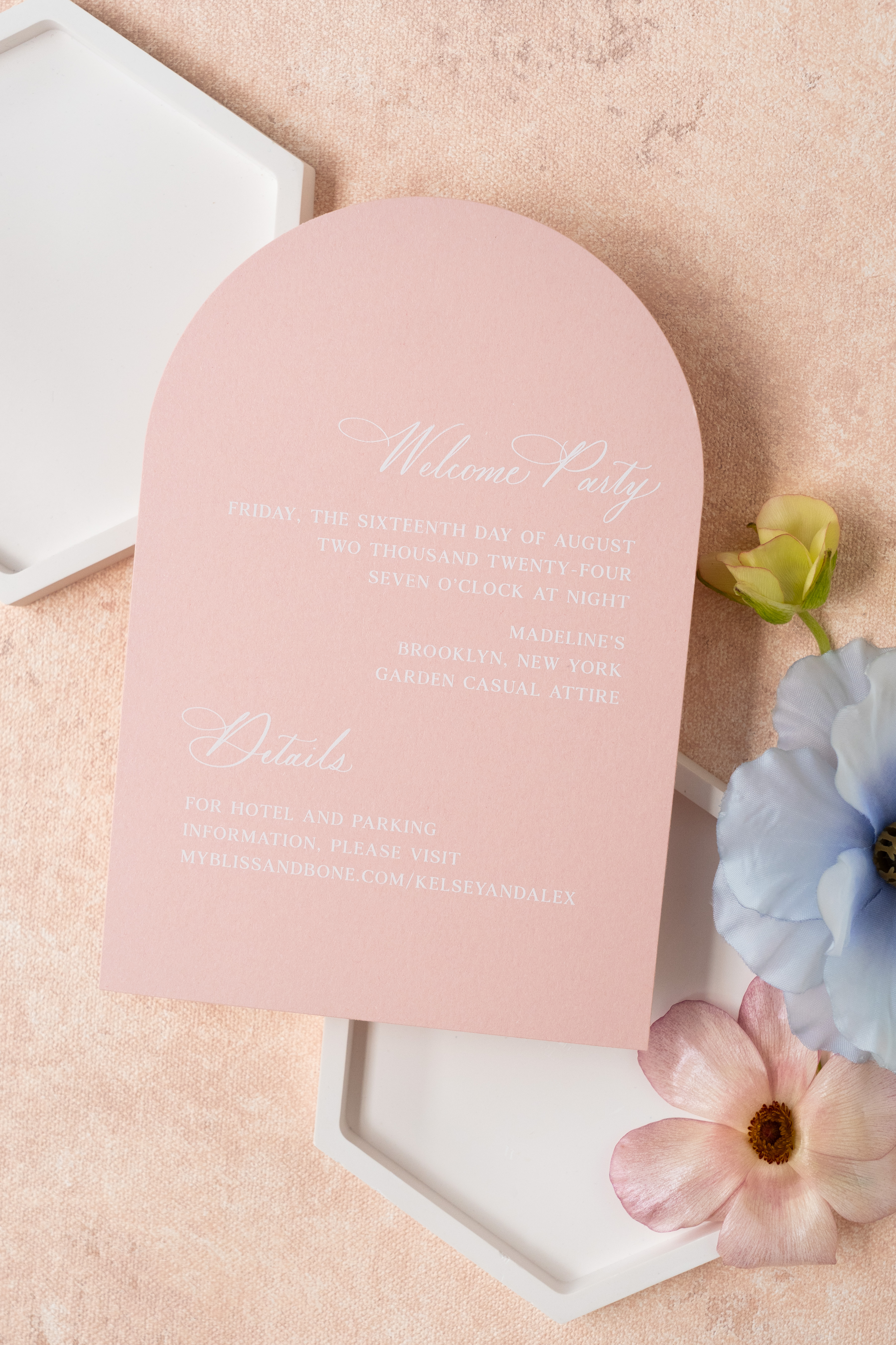
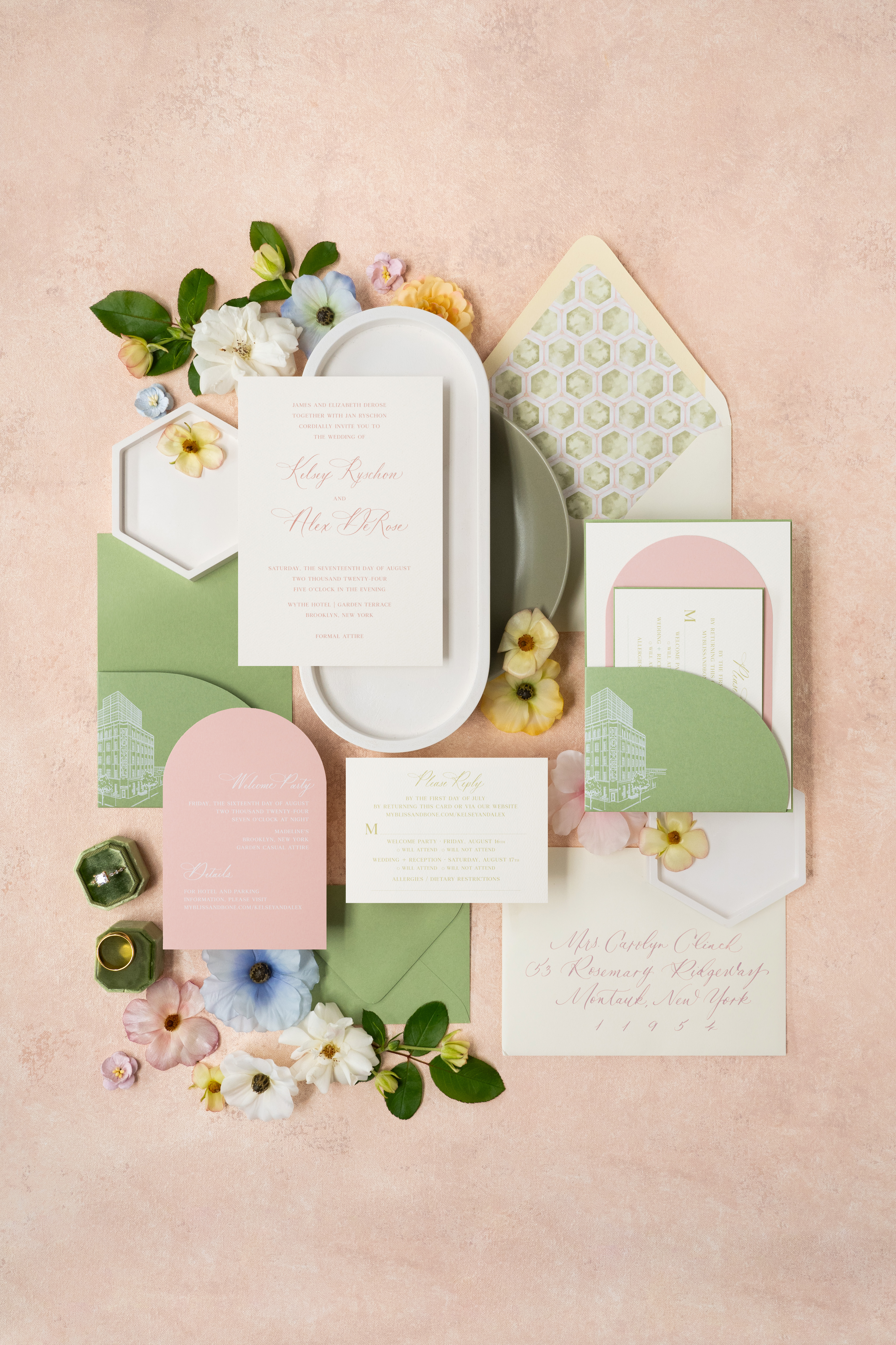
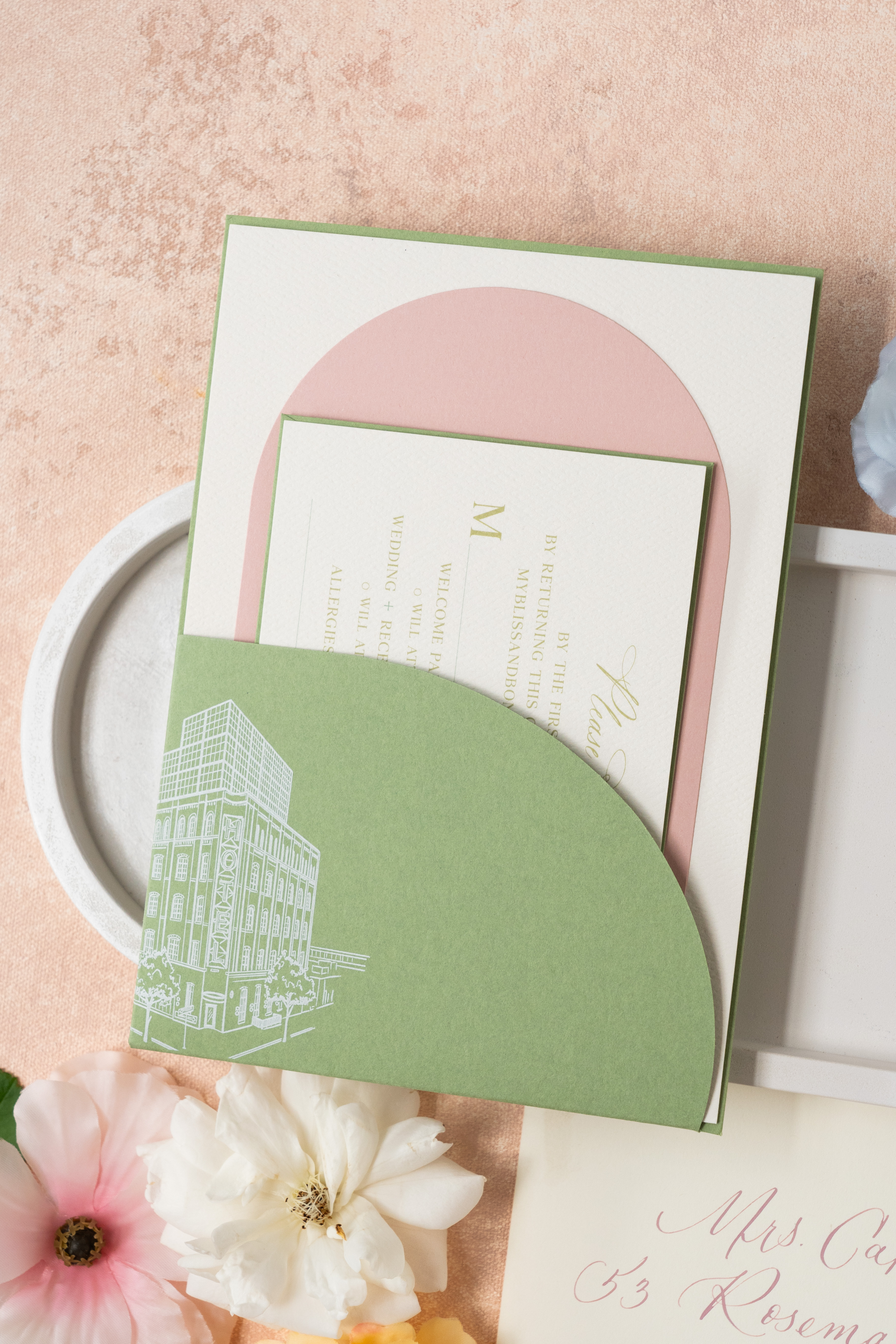
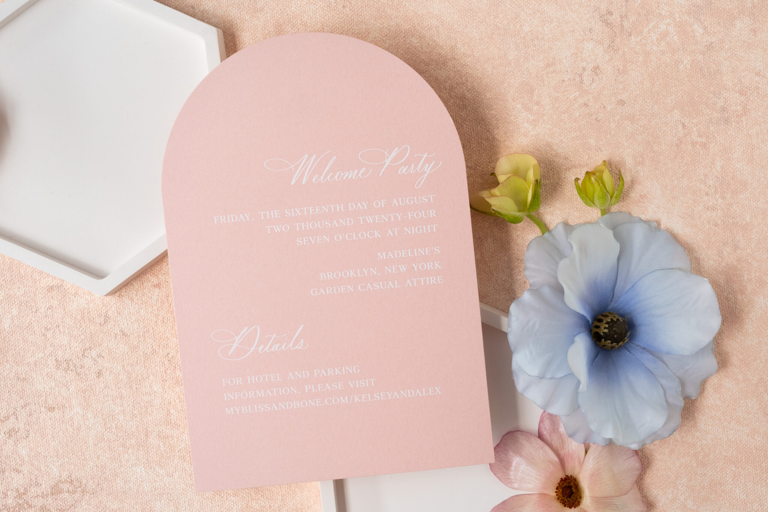
Undoubtedly, one of the best parts about working with Kelsey and Alex was how well they communicated to us exactly what they wanted their invites to reflect. The overall vision for their invitation suite was Urban Garden Party.
In order to make this vision a reality, we incorporated vibrant colors, like summer pinks and crisp greens, with modern elements like custom die-cut pockets. This allowed contemporary, industrial chic to meet seamlessly with the classic garden party theme. The result was gorgeous!
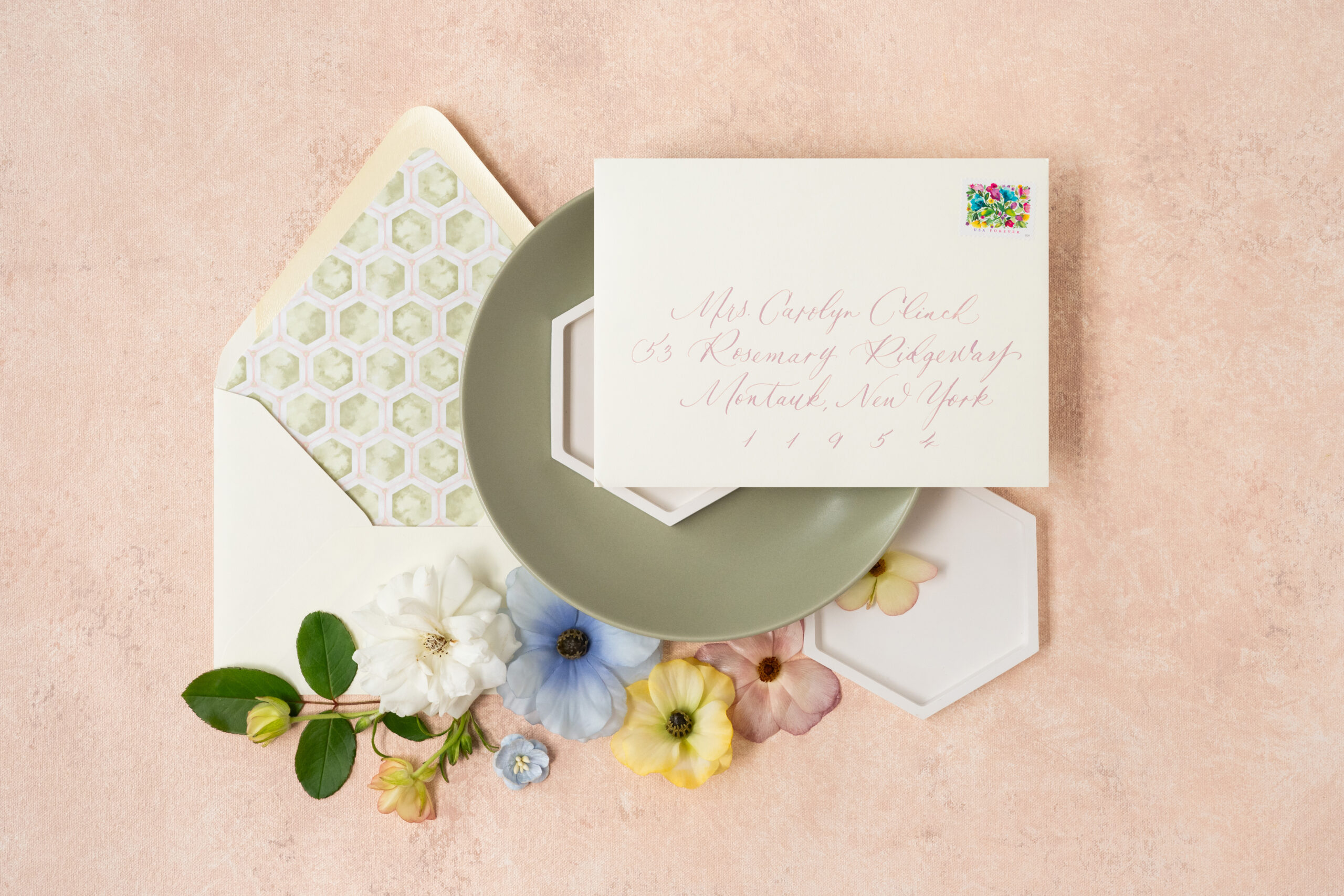
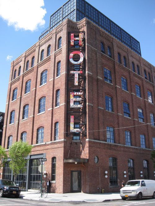
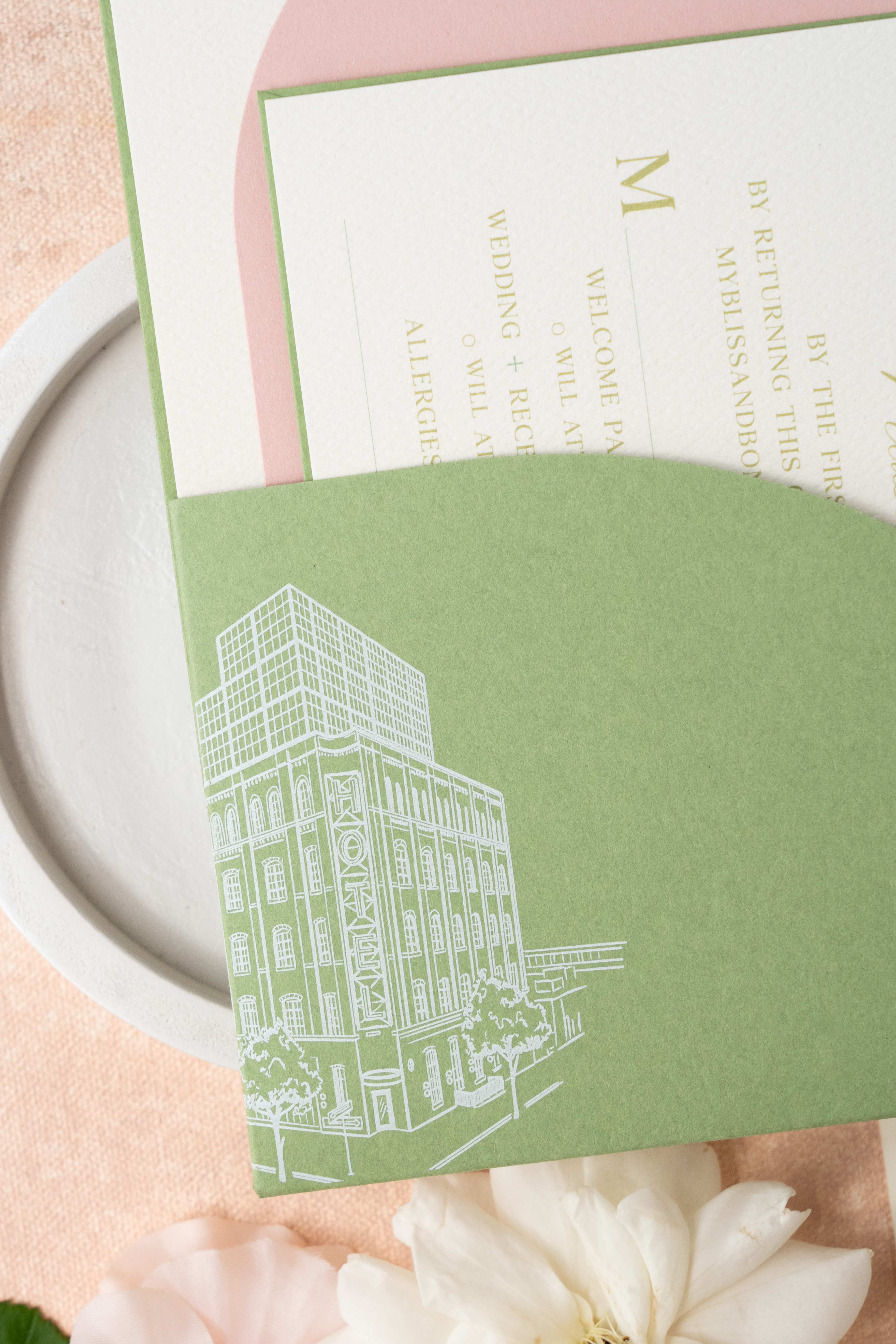
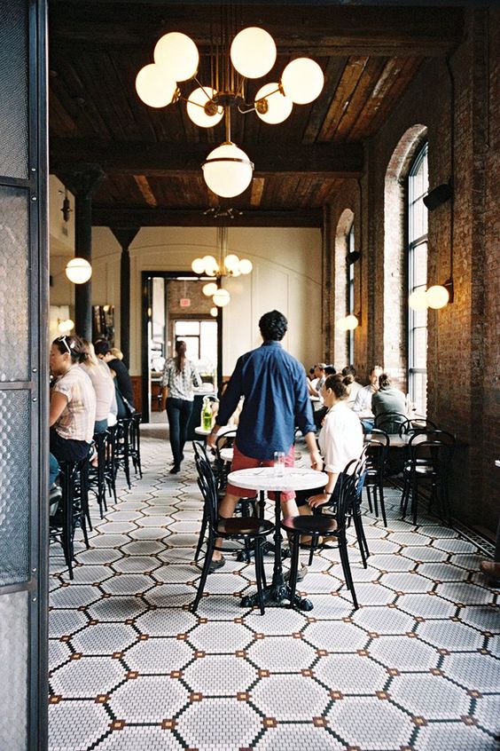
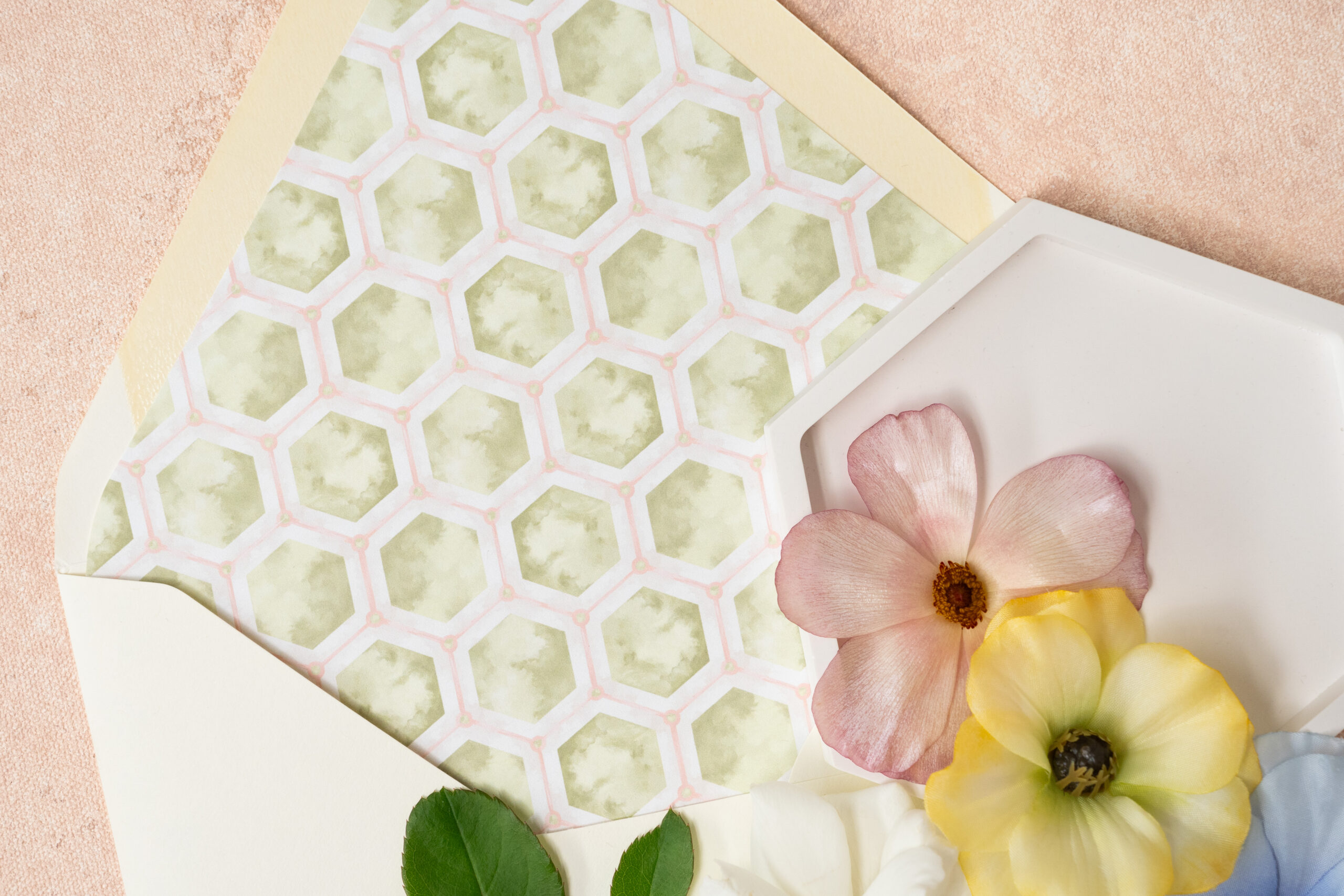
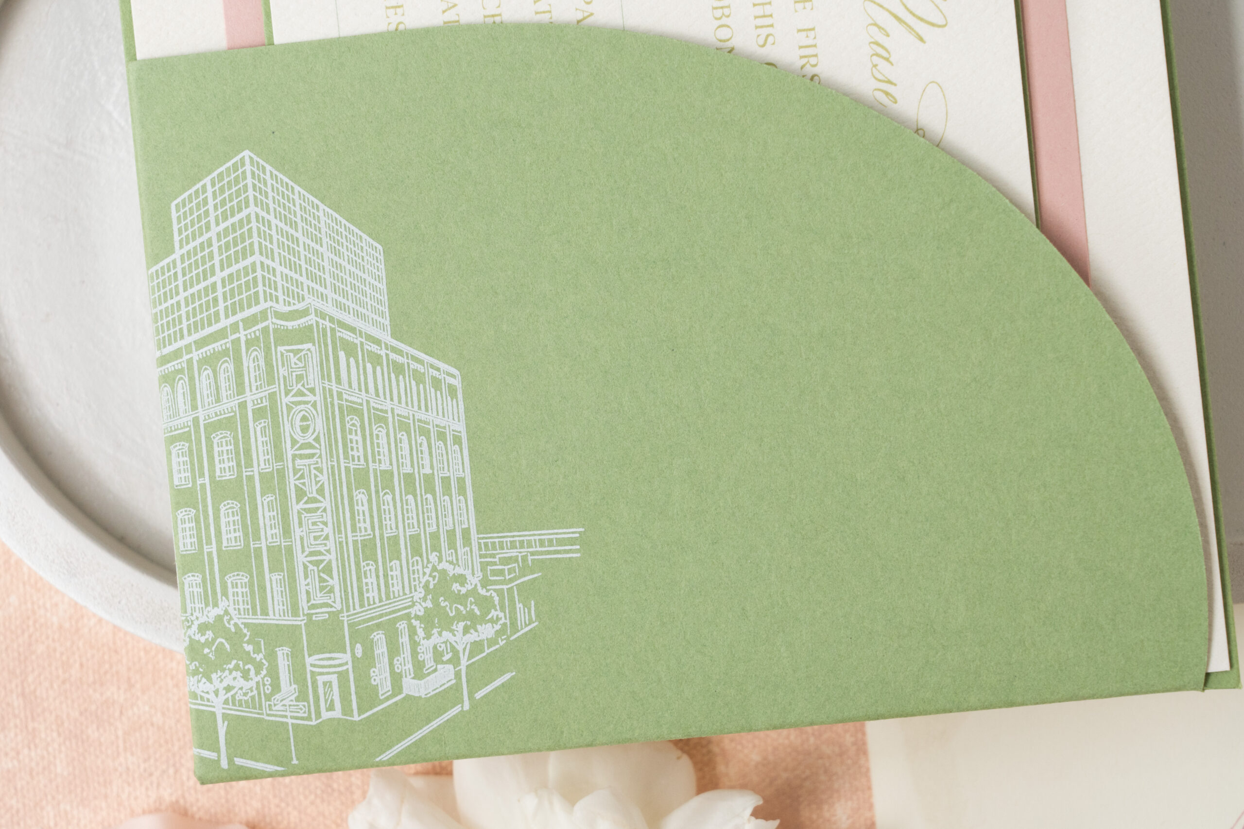
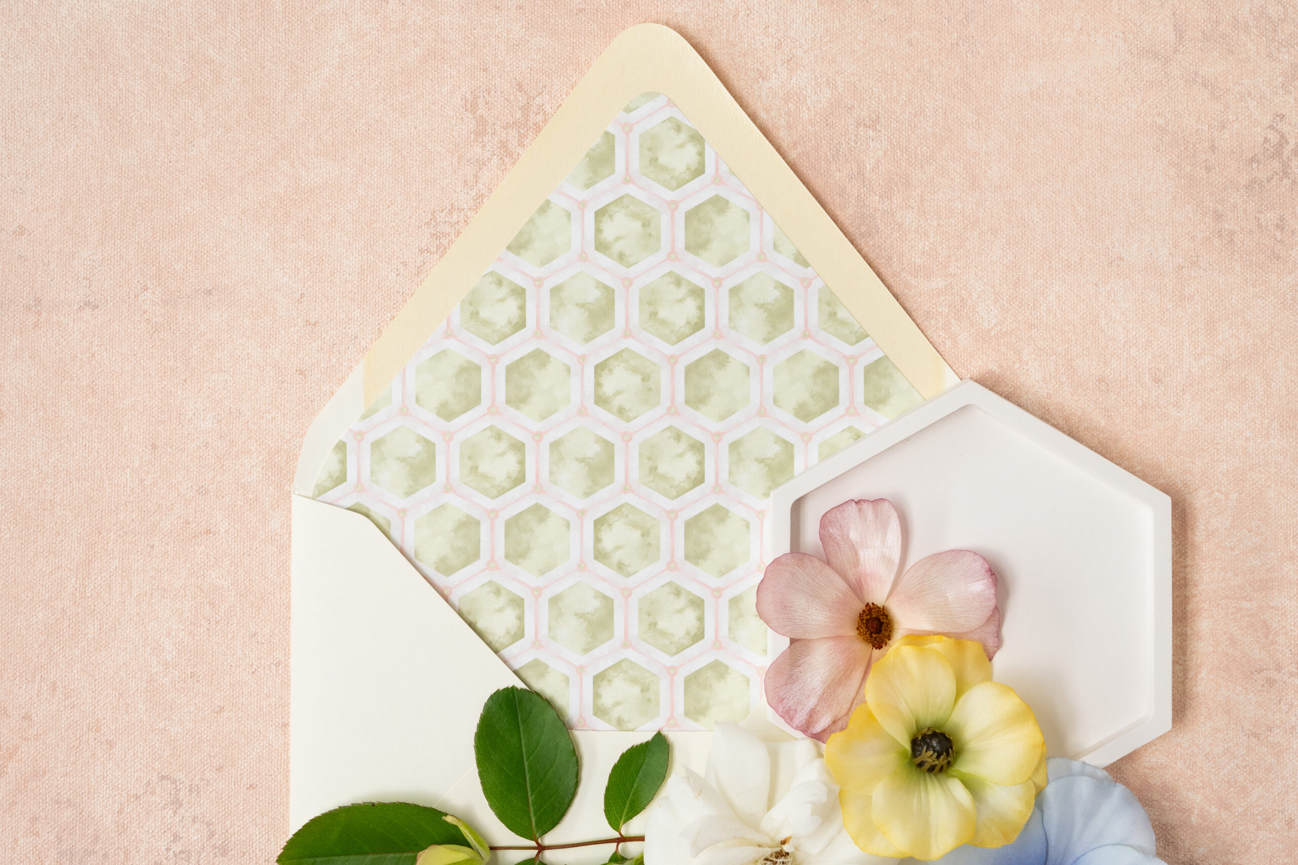
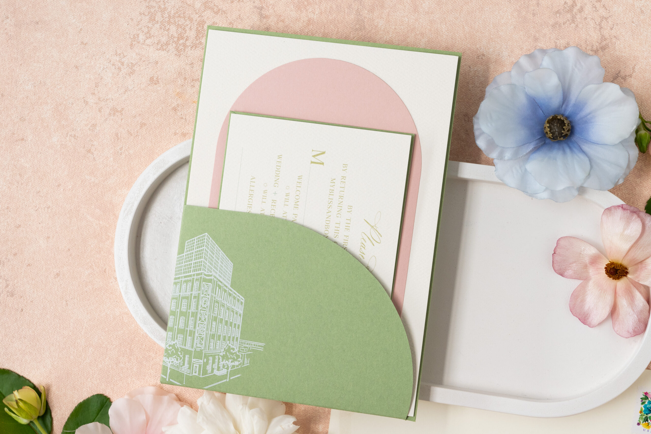
Talk about attention to detail! Kelsey and Alex took customizing their invites to the next level! They included a custom architectural sketch of their wedding venue, Brooklyn’s historic Wythe Hotel in New York, on the invitation. What’s even more amazing is that the very pattern used on the envelope liner is the same pattern from the tile on the floor of the Wythe Hotel! Can we say obsessed?! These are the little details that we love to incorporate into your invitations to tell your unique story.
While discussing their invitation vision with our team, Kelsey and Alex noted that the most important aspect of their wedding invites was, “Incorporating imagery of the venue and creating a strong perception of the beautiful and loving celebration we are throwing!”. I think it’s safe to say, they absolutely nailed it!
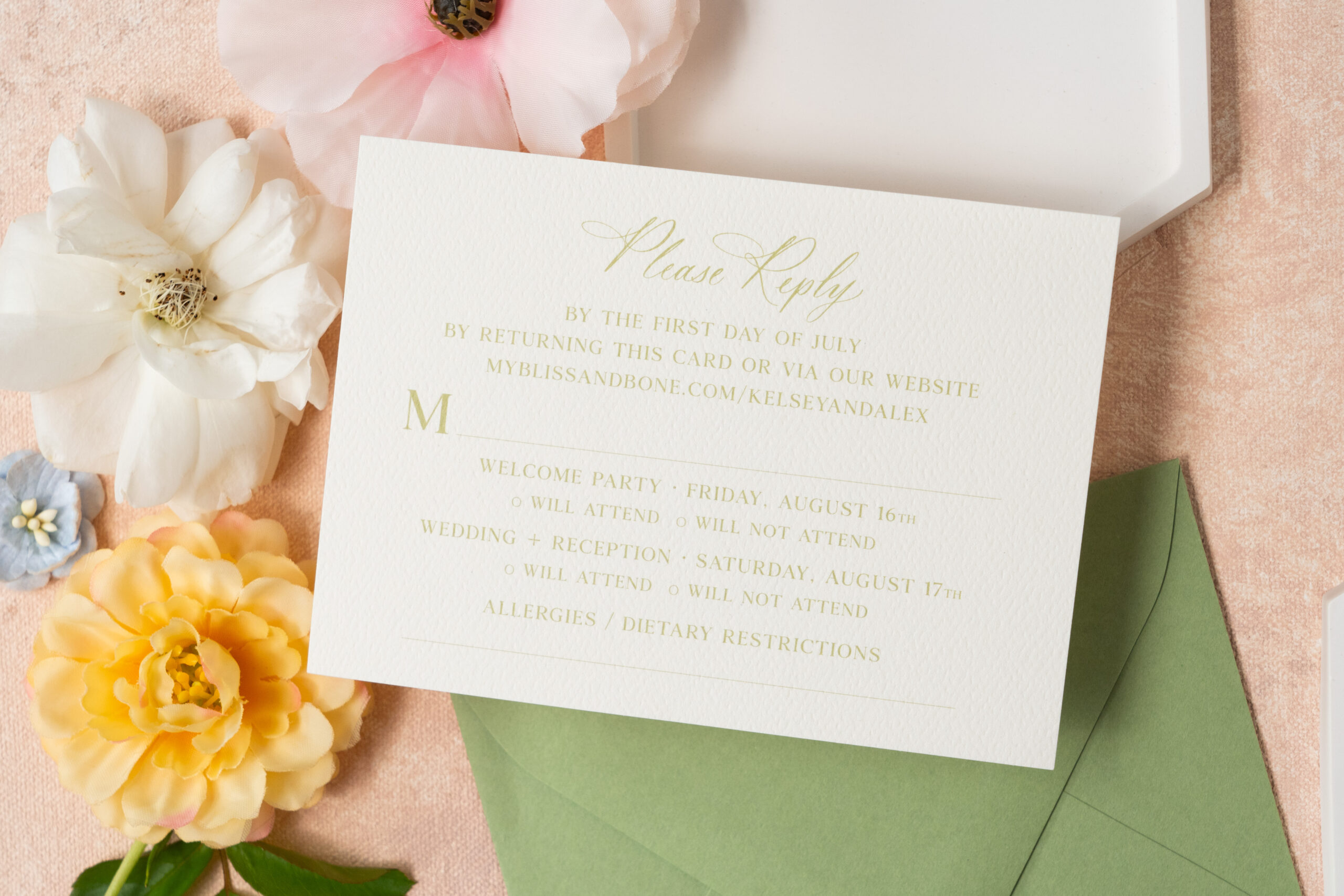
Let’s Talk about the Details.
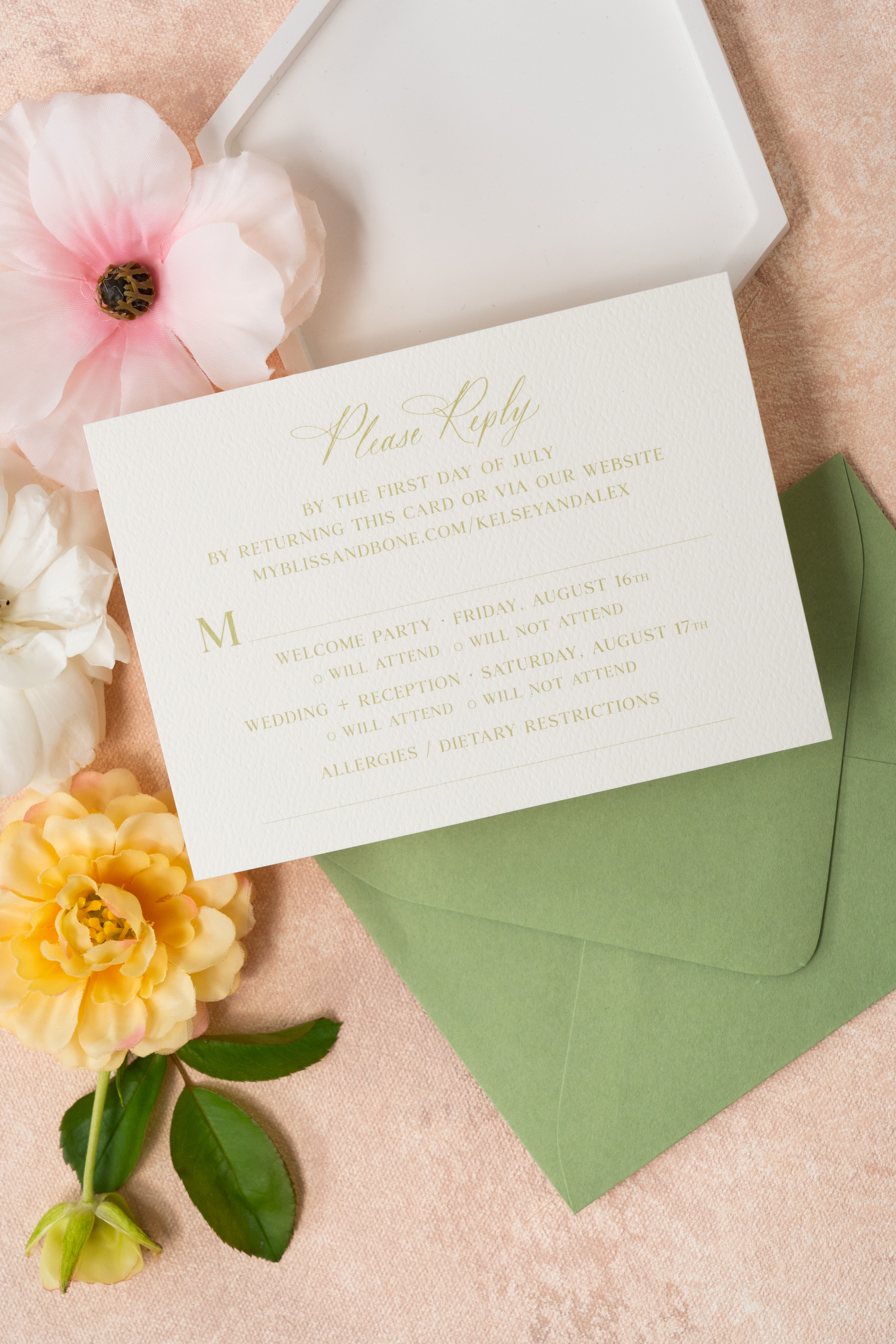
Here are some of our favorite details from Kelsey and Alex’s custom wedding invitation suite.
We used digital printing for this invitation suite. This helps to efficiently transfer custom tones, colors and fonts making each invite equally vibrant.
A custom shaped die-cut was used to create the pocket within the suite adding a notable tone of modern sophistication.
A custom architectural sketch of the wedding venue, the Wythe Hotel in Brooklyn, New York, peeked out from the corner of the invitation sleeve.
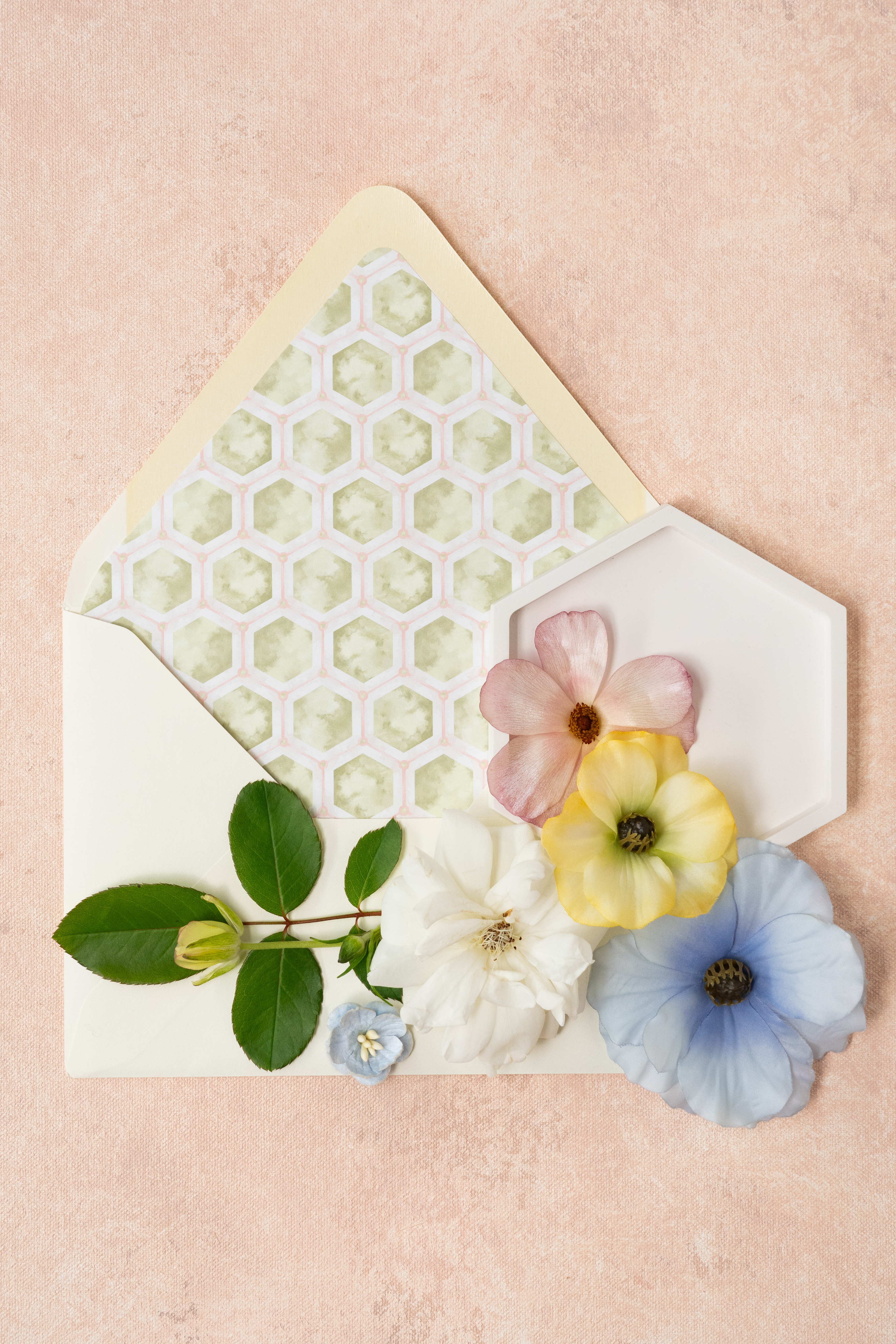
The pattern used for the envelope liner was specifically designed to mimic the pattern seen on the floor of the Wythe Hotel.
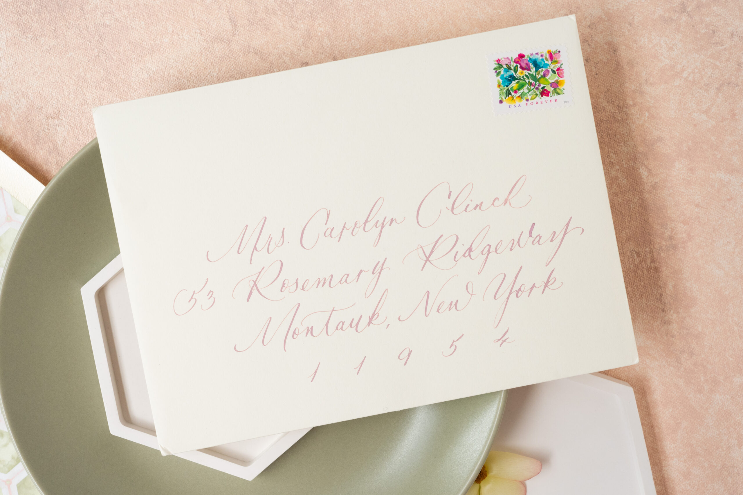
Custom envelope calligraphy was used for addresses. – always a guest favorite!
Vibrant, summer floral postage to pair with the theme of the invitation suite.
Giving our brides and grooms a space to bring in their creativity and personality is the most rewarding part of what we do. They are the storyteller giving their guests a sneak peek into what’s ahead by adding the delicate details of their favorite colors, favorite seasons, favorite places, and styles to a customized wedding invitation suite.
If you’re looking to add custom, thoughtful touches to your wedding or event, we would love to help make your vision a reality. Reach out today to learn more about our full-service design offerings—we can’t wait to create something unforgettable for you!
A custom wedding invitation is as unique to a couple as a fingerprint. It belongs to them and there is simply no other invite like it.
White Ink has been specializing in custom invites for several years, and each process is as exciting as the one before. Seeing our brides and grooms incorporate distinctive and meaningful details into their wedding invitations and make their visions come to life is easily the best part of our job.
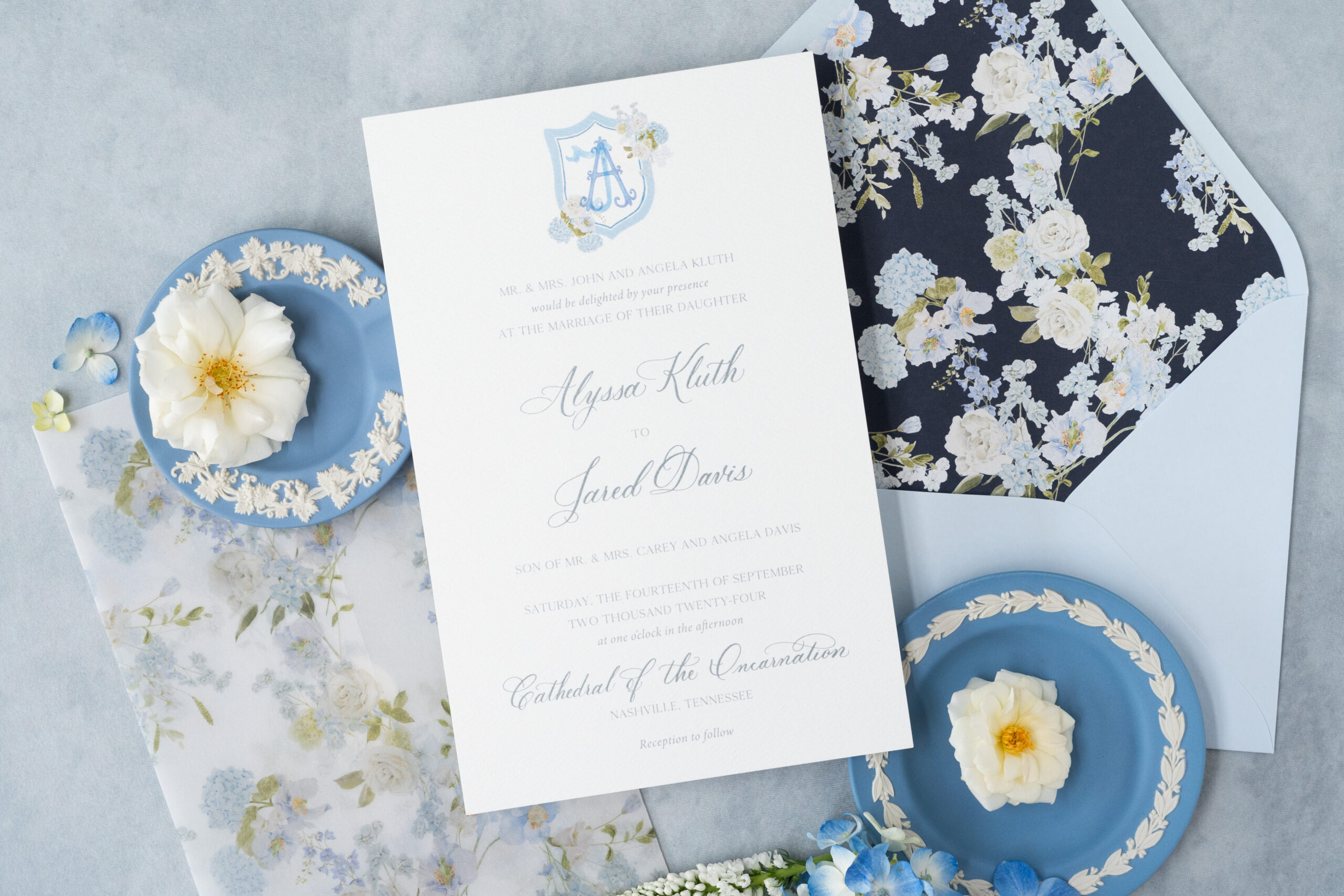
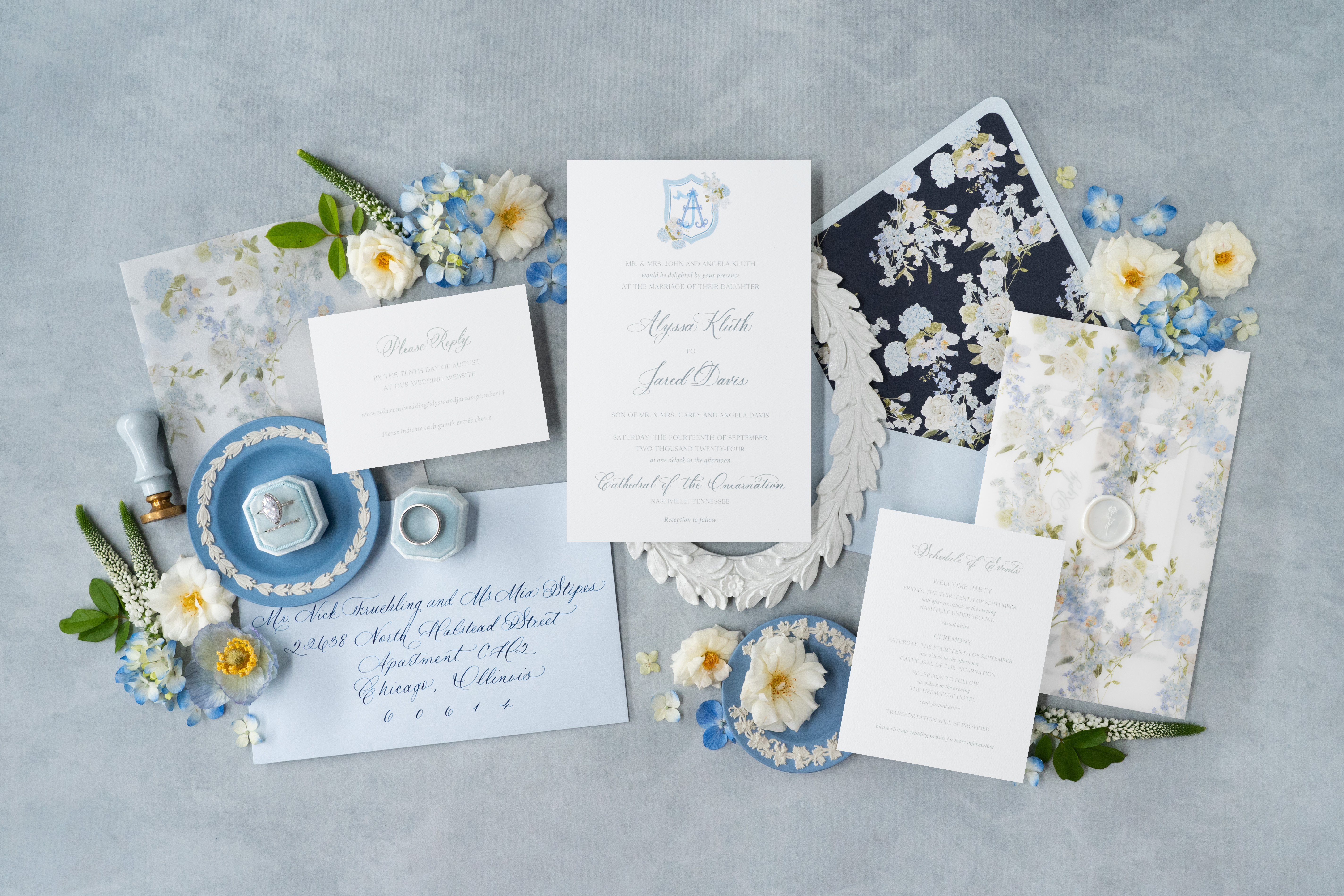
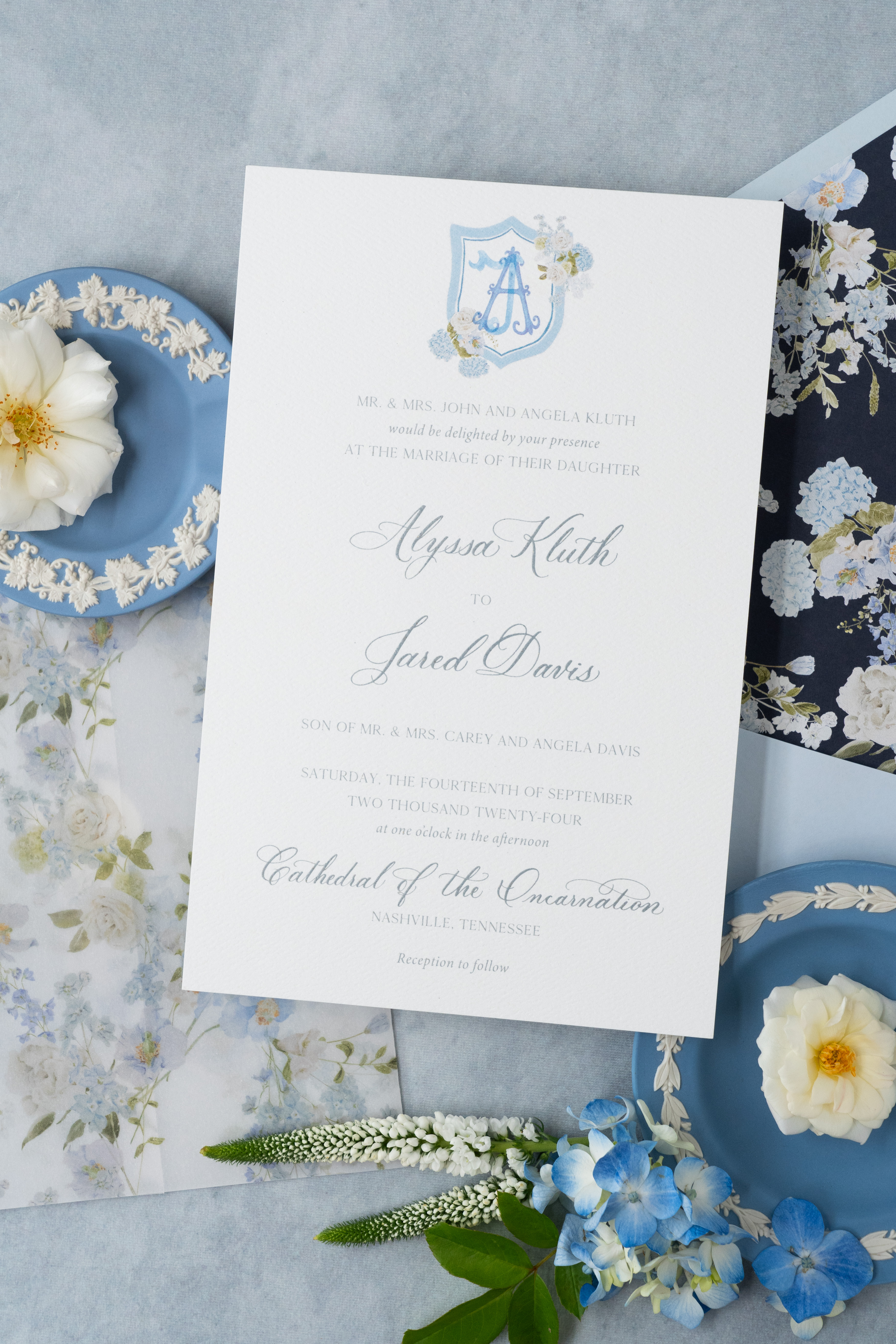
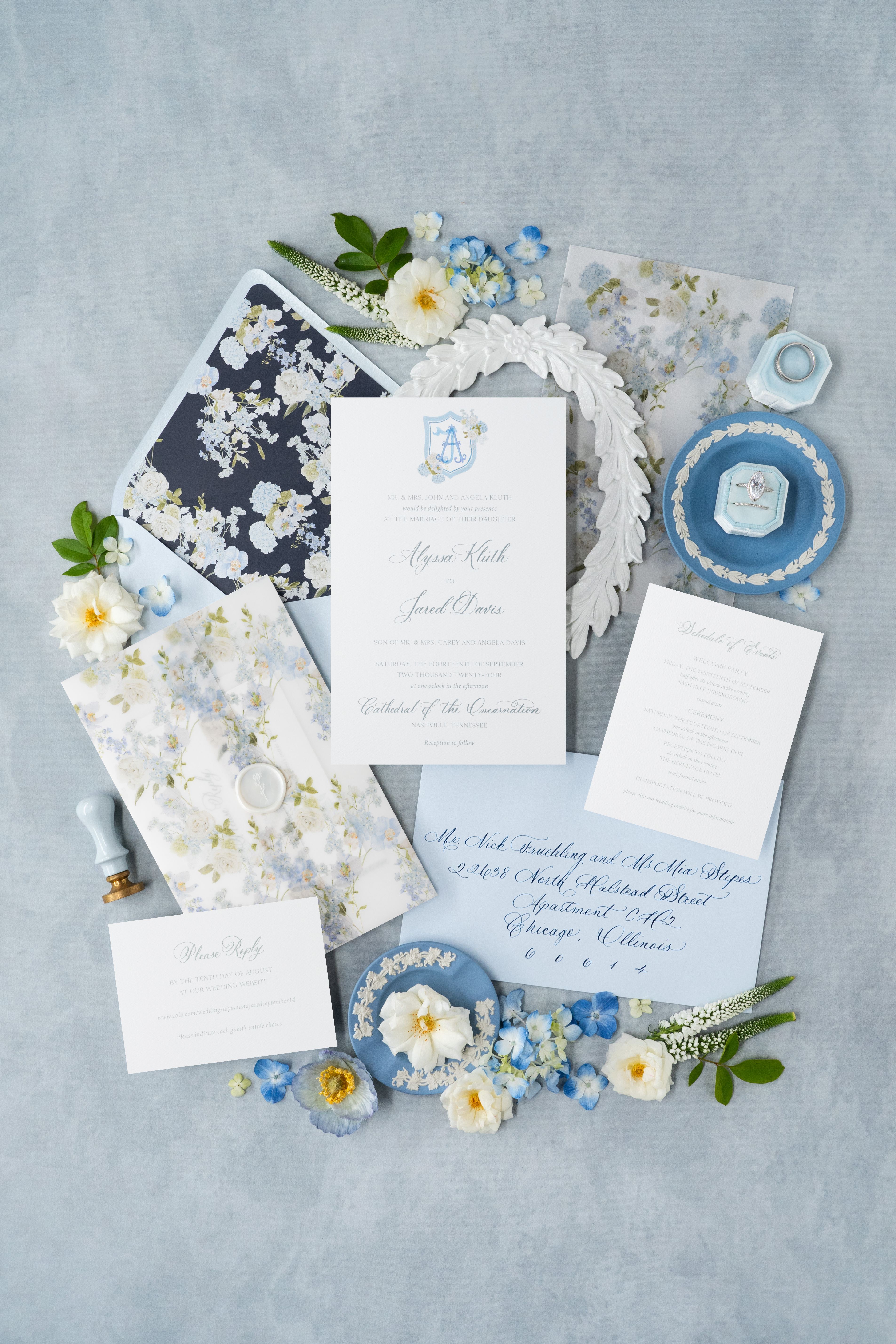
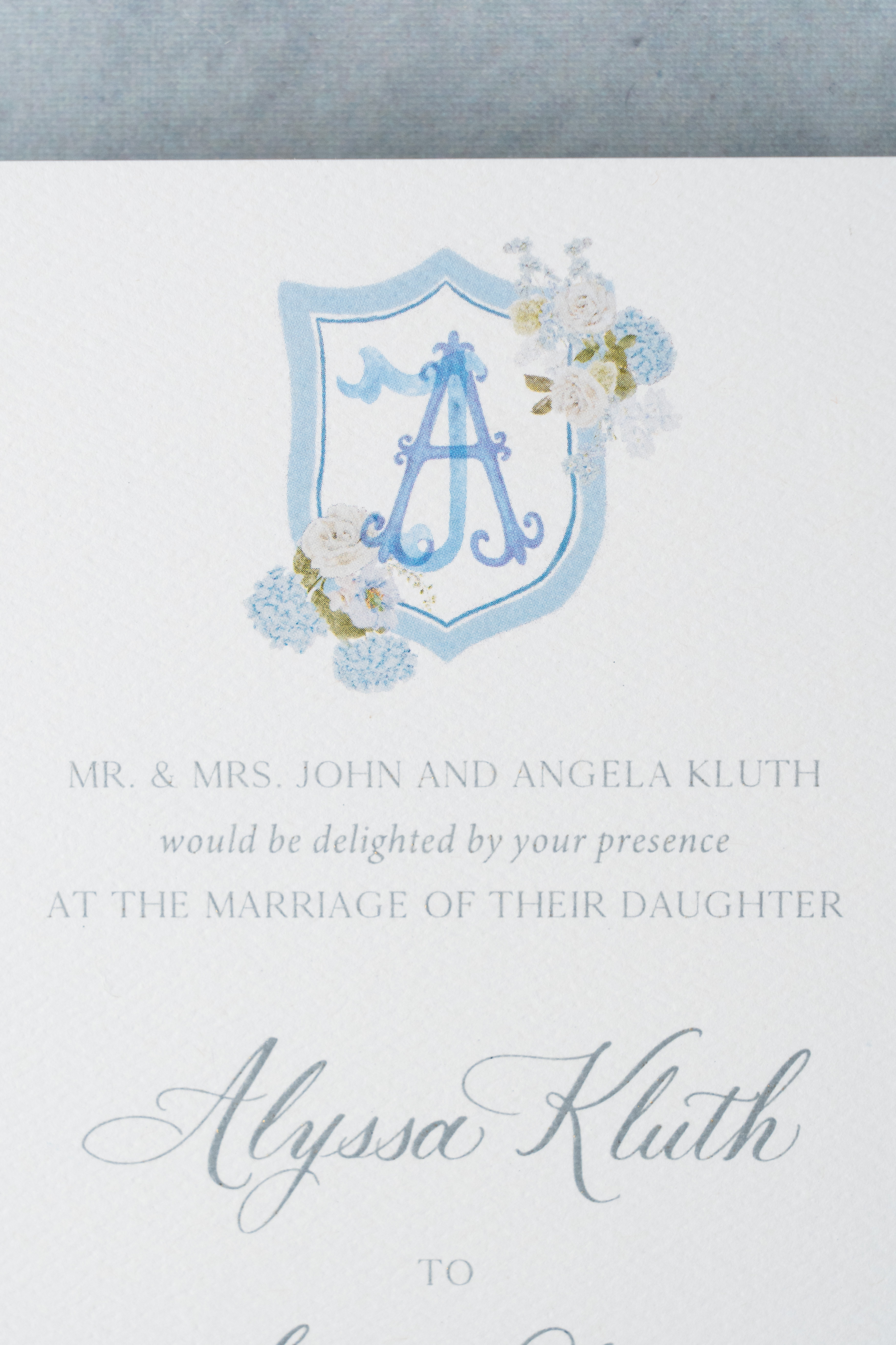
The custom invitation suite we created for White Ink couple, Alyssa and Jared, is a beautiful example of what it looks like when we pull together unique textures, tones, florals, and calligraphy that speak to the personality of a couple and what inspires them.
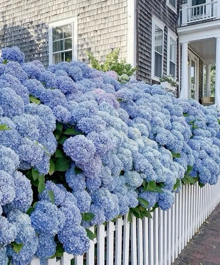
“Nothing says ‘timeless southern wedding’ more than blue and white hydrangeas.”
What Inspires a Custom Wedding Invitation Suite?
The inspiration behind the design of custom wedding invitations aims to reflect the theme of a client’s big day. For Alyssa and Jared, that meant choosing details that could blend perfectly into their end-of-summer, southern nuptials, which included a gorgeous summer wedding reception at the iconic Hermitage Hotel in Nashville. Nothing says “timeless southern wedding” more than blue and white hydrangeas!
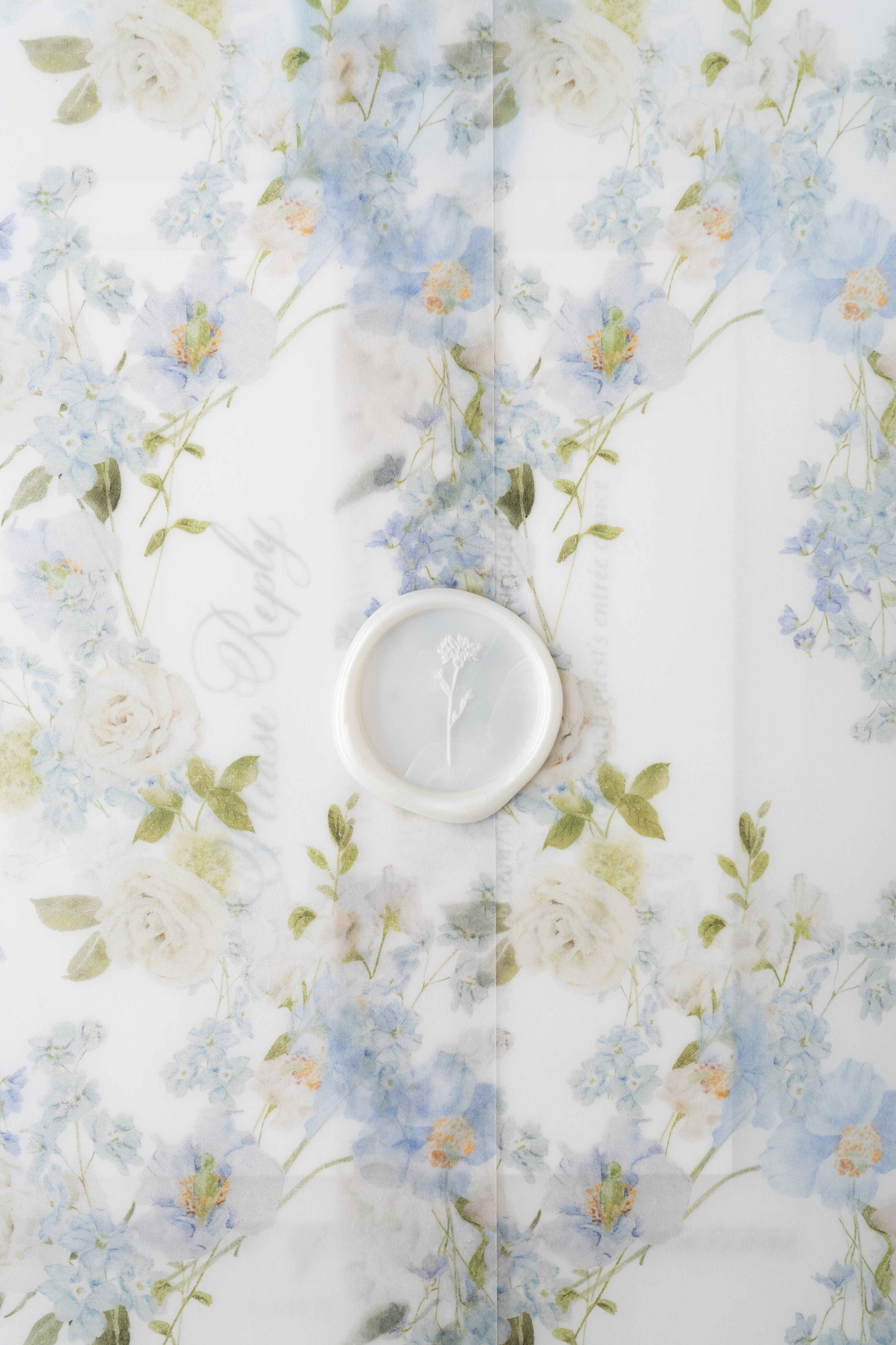
From top to bottom, the entire suite is giving southern living with a kiss of Nantucket floral vibes! Each layer is an absolute treat for the eyes with florals peeking from every corner.
If you’re familiar with the motif of a traditional southern wedding, you’ll know that more is always better- especially when it comes to florals! This invitation suite did not disappoint. From the envelope liner to the vellum gatefold, these invites are blooming with summery, southern florals.
By giving us an in-depth dive into the details and design of the grandmillennial aesthetic of their wedding, Alyssa and Jared were able to achieve the classic elements and charm they envisioned for their custom wedding invitations. We always work closely with our couples to make each project nothing short of special.
It’s all in the Details.
We are thrilled when it’s time to roll up our sleeves and begin the process of designing the custom wedding invitation of our clients dream. This is what we love to do and it’s why we’re here!
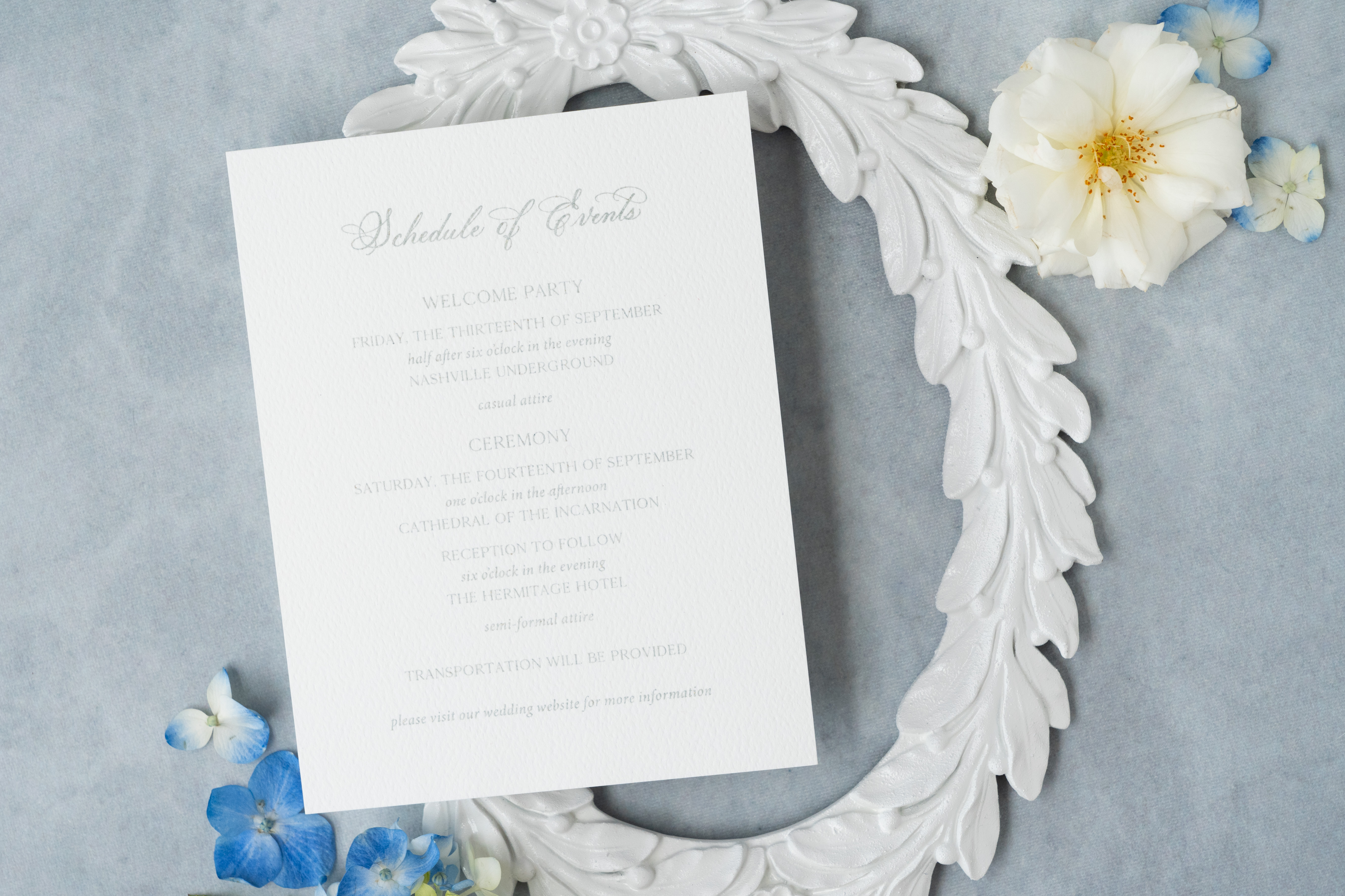
Let’s get into details that perfectly pulled Alyssa and Jared’s invitation suite together to pair with their classic southern, summer wedding day.
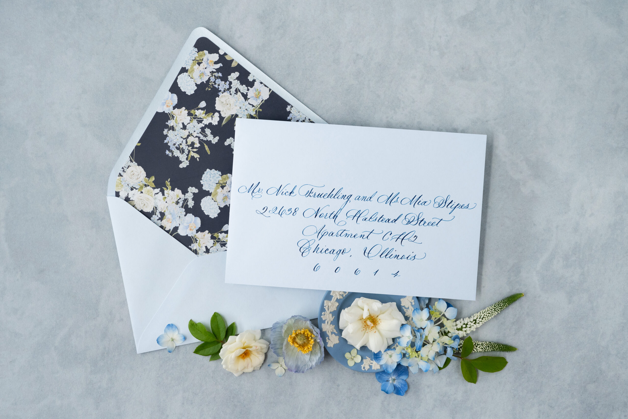
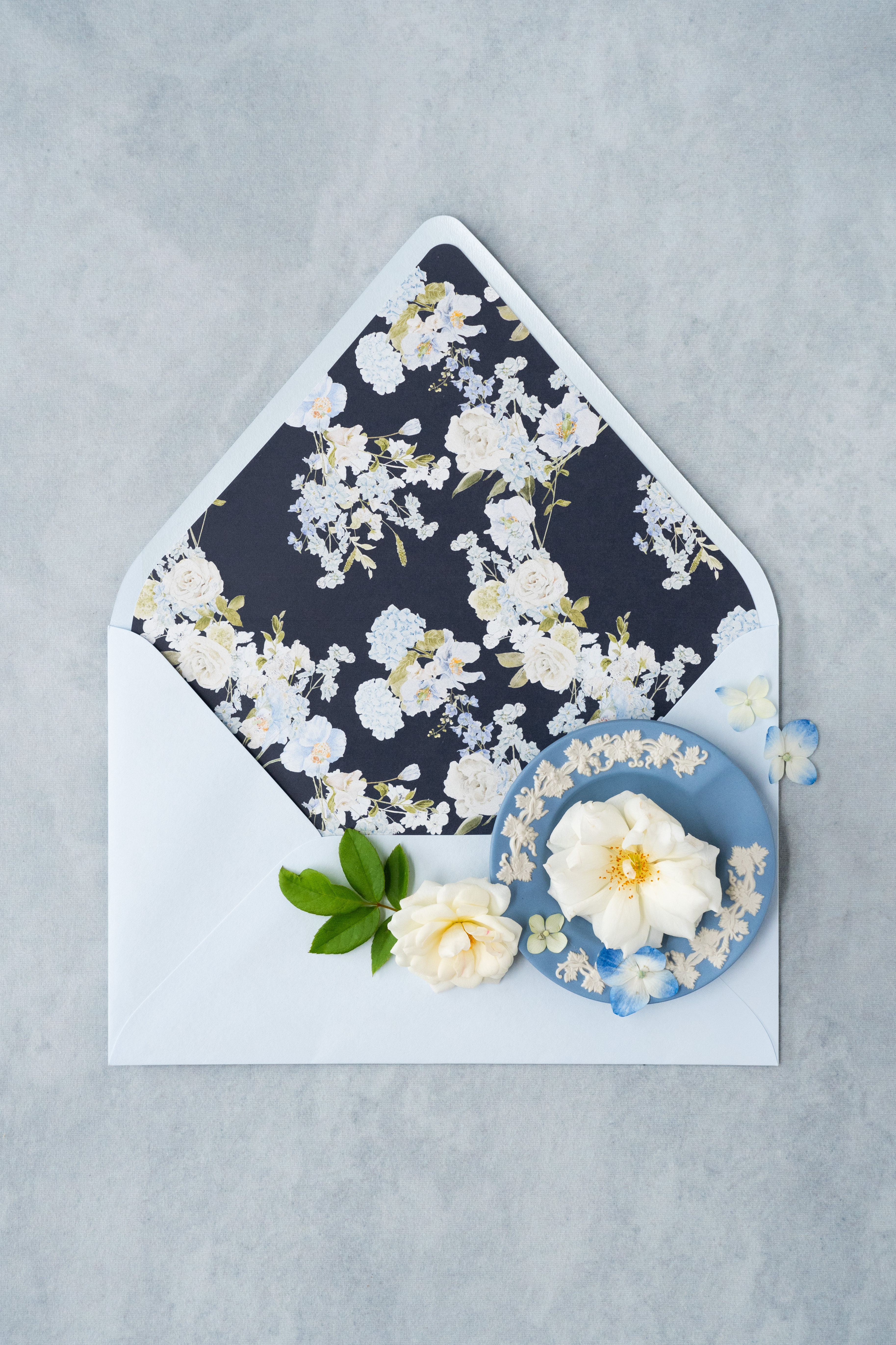
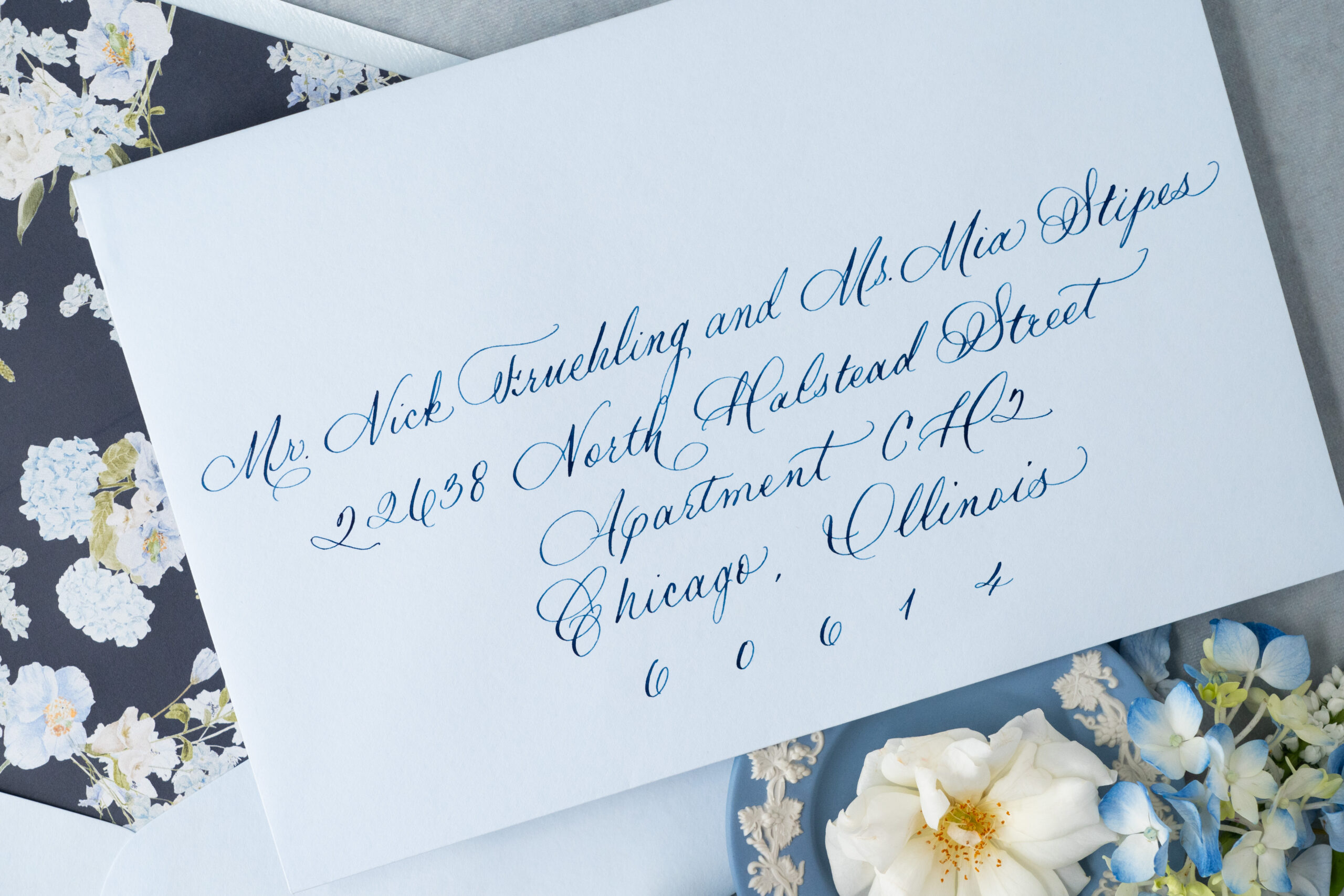
Spot calligraphy in dark blue ink addressed the dusty-blue toned envelopes.
We created the dark blue envelope liner that boasted baby blue and white summer florals. Envelope liners are always an eye-catching experience for guests!
A vellum gatefold is used to clutch the invitation suite. The soft transparent texture complete with southern florals easily elevates the elegance of the invites.
A custom wax seal added to the charm and texture of the vellum gatefold.
The custom monogram located atop the main invitation is digitally printed. Customized invitation artwork like this can pack a powerful punch in the uniqueness of an invitation suite.
The lettering throughout the invitation suite is done in a soft silver hue using thermography text- a process that is used to mimic the look of engraved lettering.
Thermography- Did you Know?
Thermographic printing is a printing technique that uses heat to slightly raise the lettering off of paper or cardstock adding to the texture and finish of an invite. It’s like adding an instant layer of luxury to your invitation suite!
When it comes to custom wedding invitations, White Ink has you covered. We have extensive experience in what it takes to create the exact invite our clients envision. Whether the theme is boho chic or traditionally southern, we know how to make an invitation suite that is uniquely you!
Reach out today to learn more about our full-service design offerings and tell us about your vision! What details and designs do you want to see on your wedding invites? We can’t wait to create something unforgettable for you!
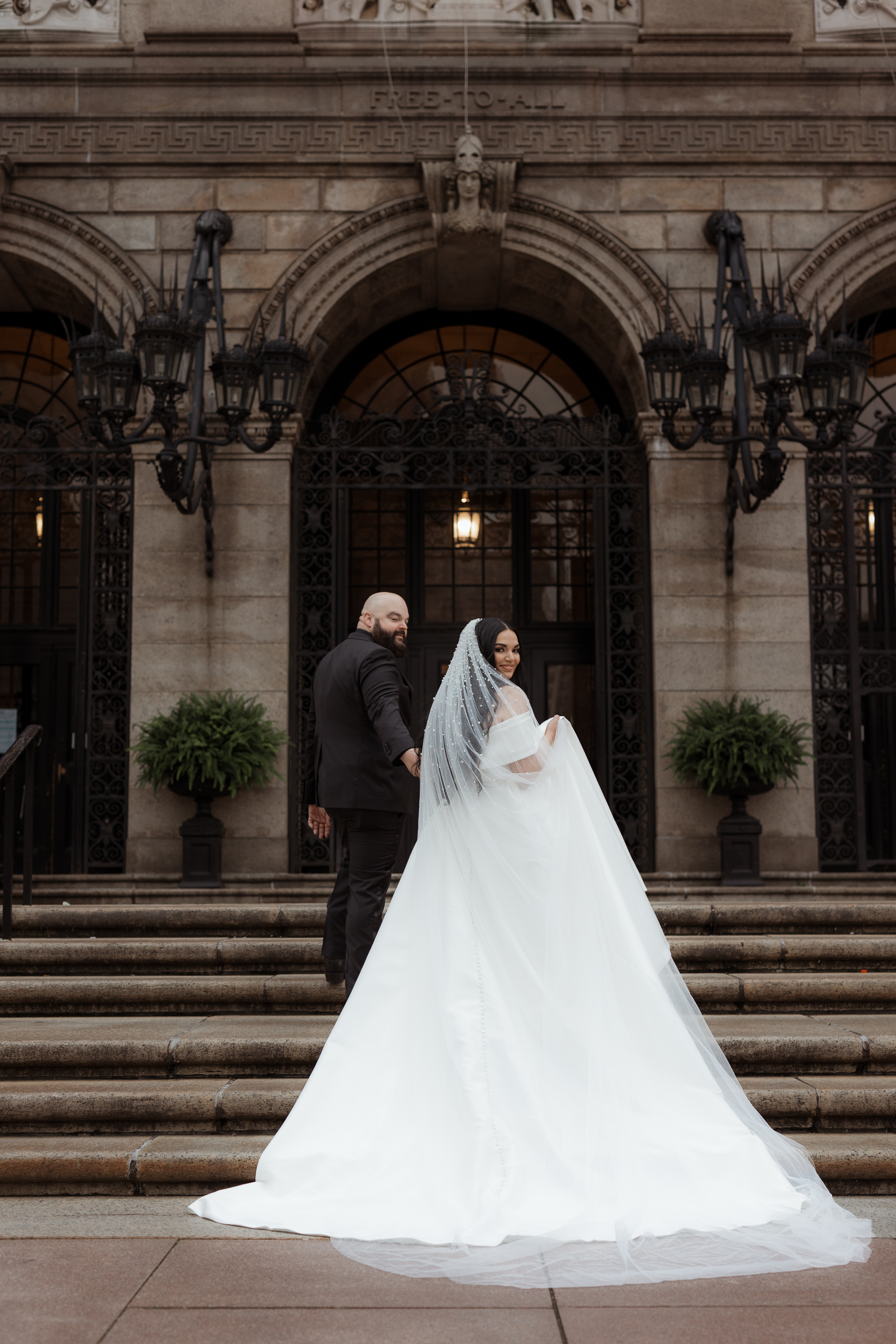
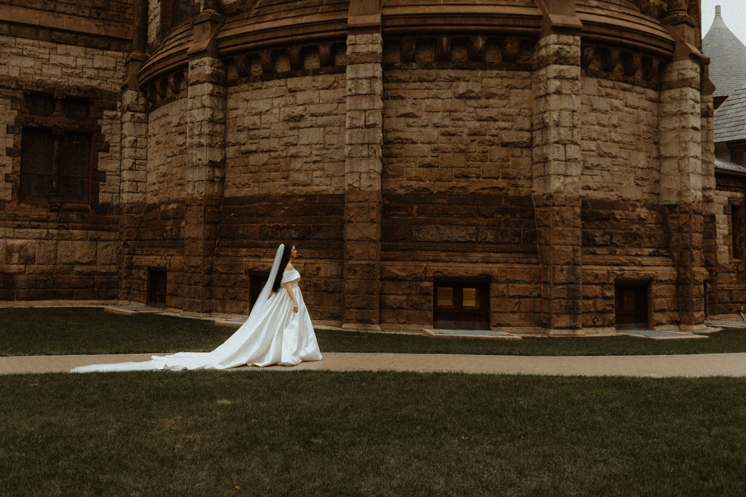
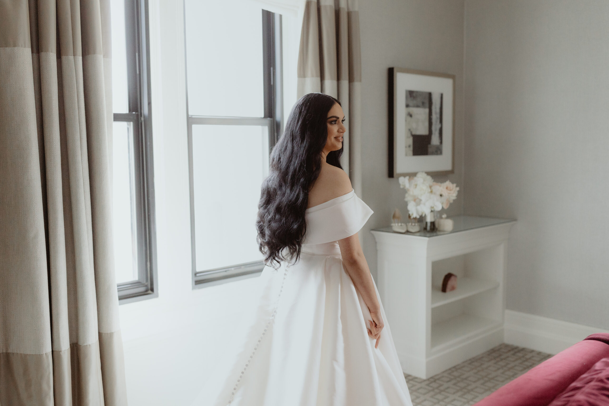
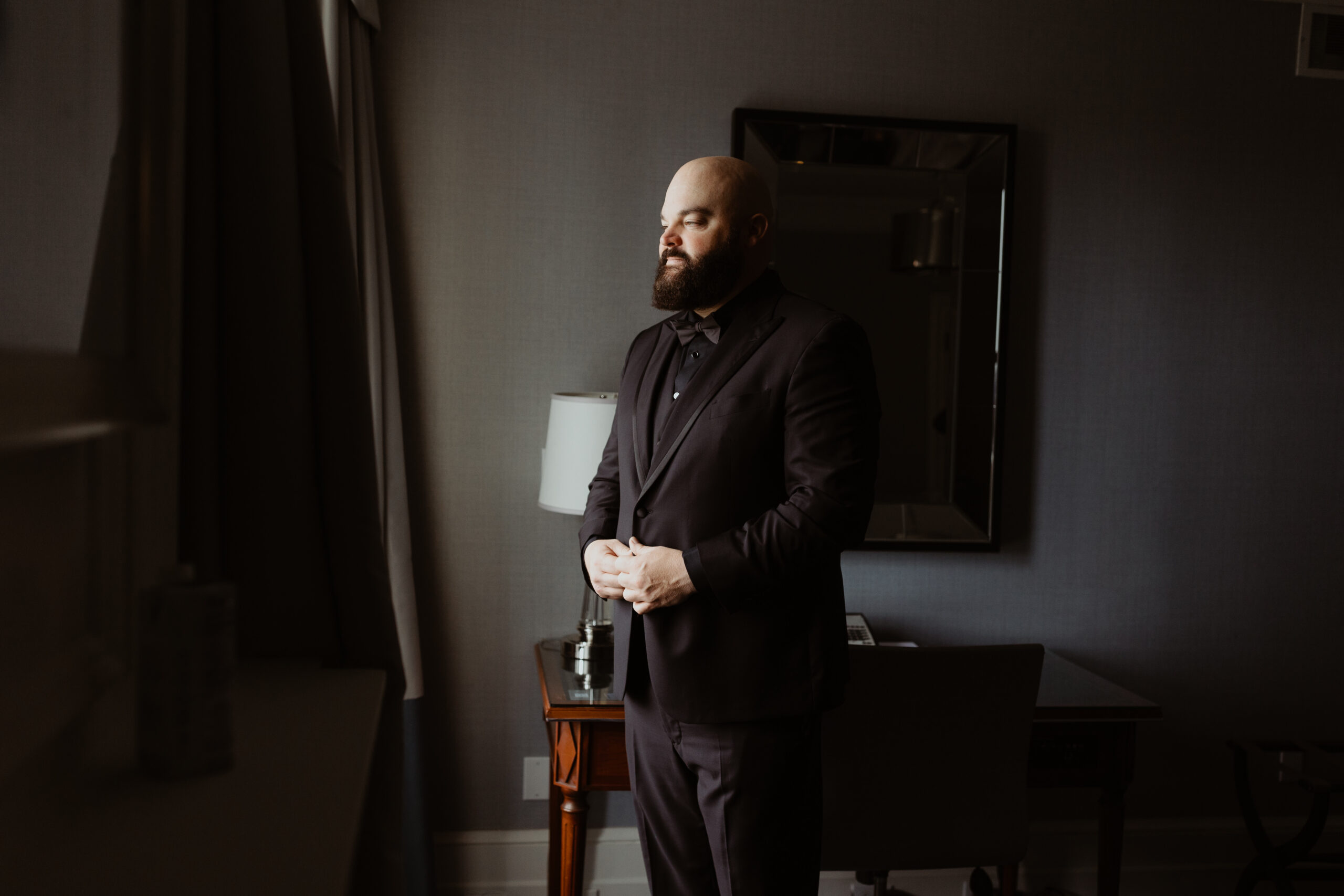
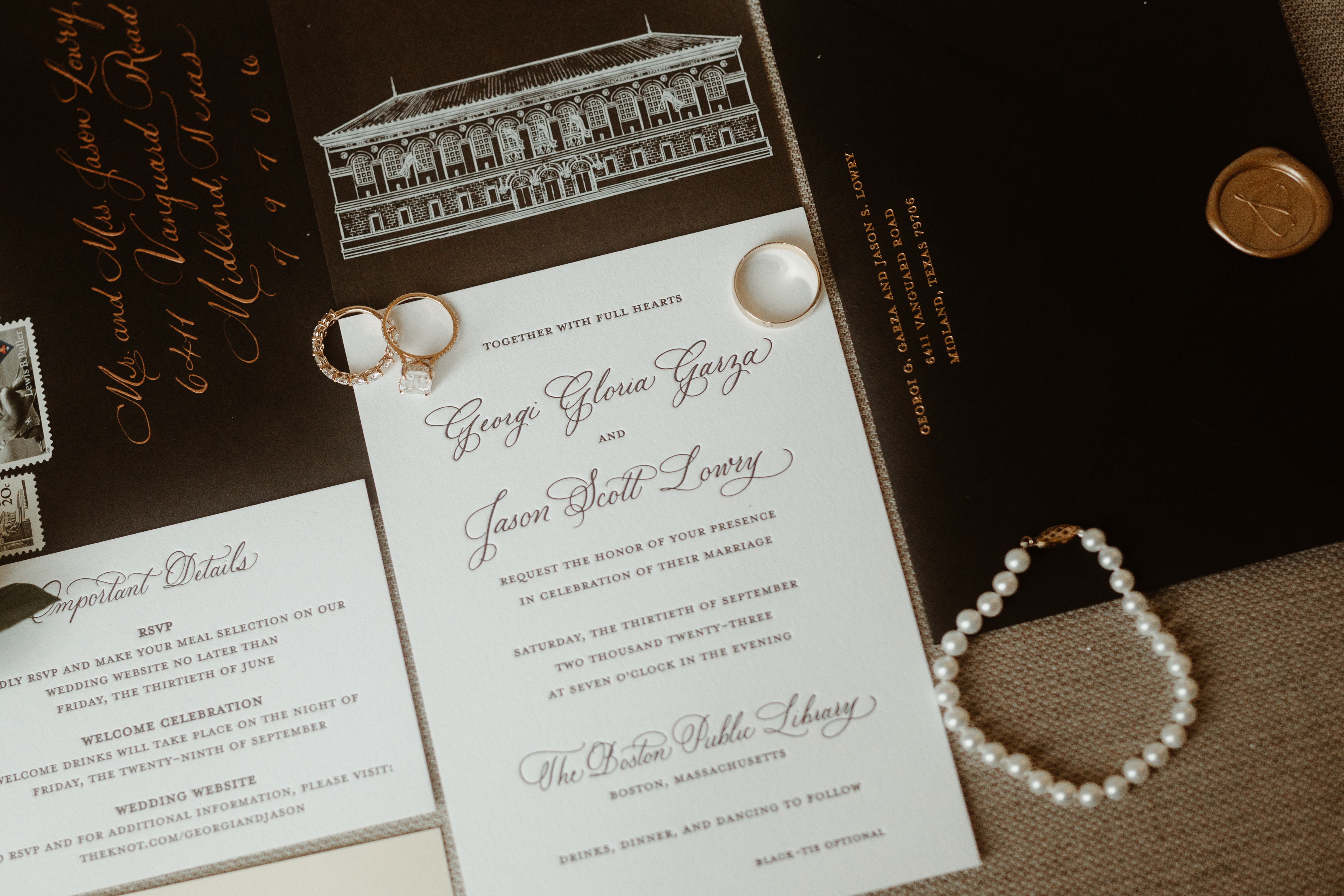
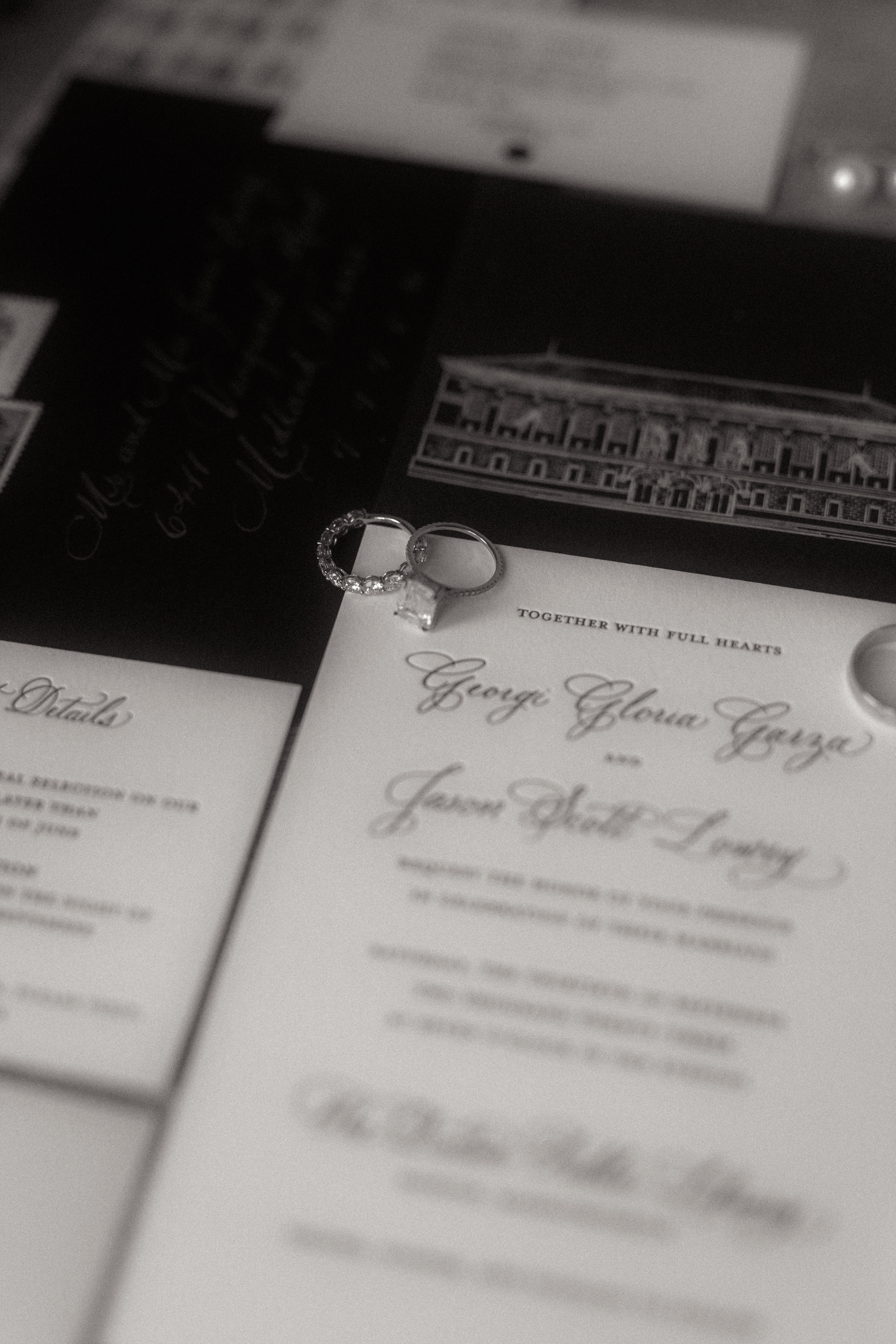
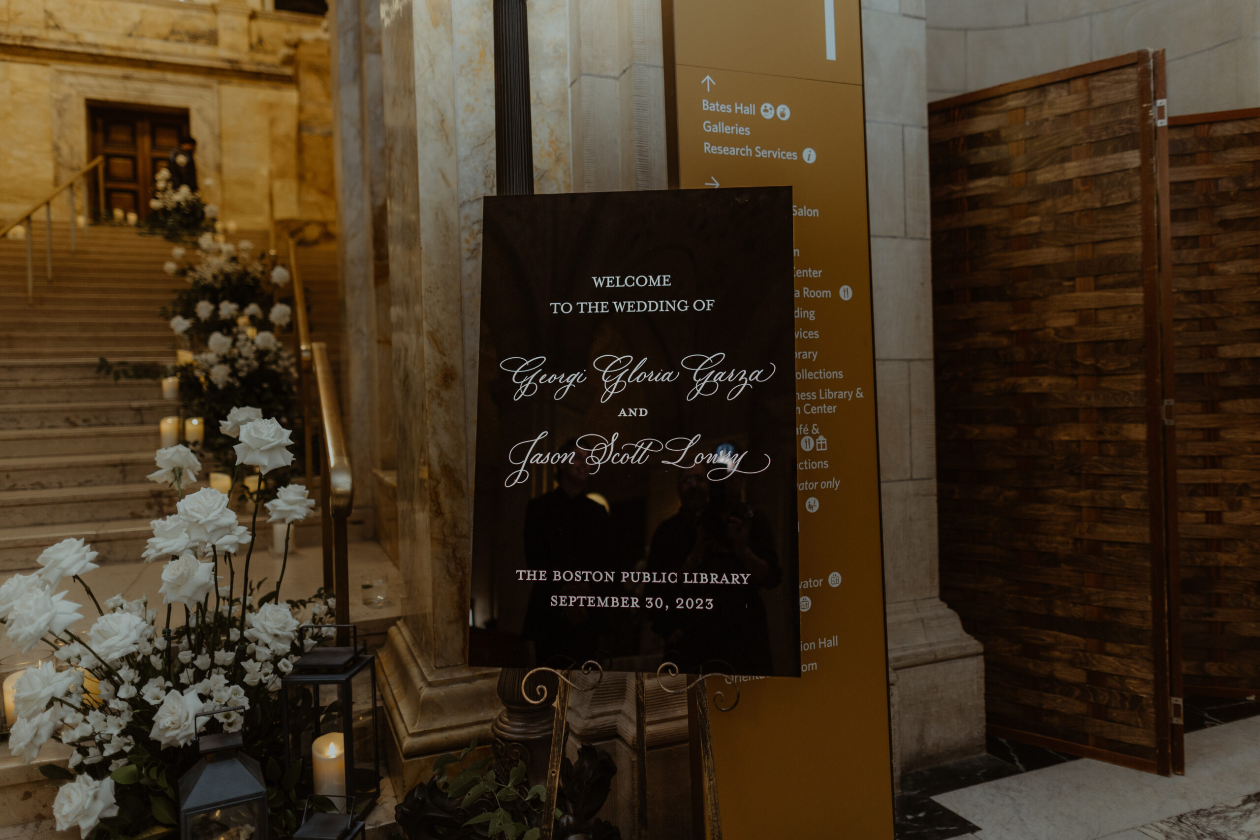
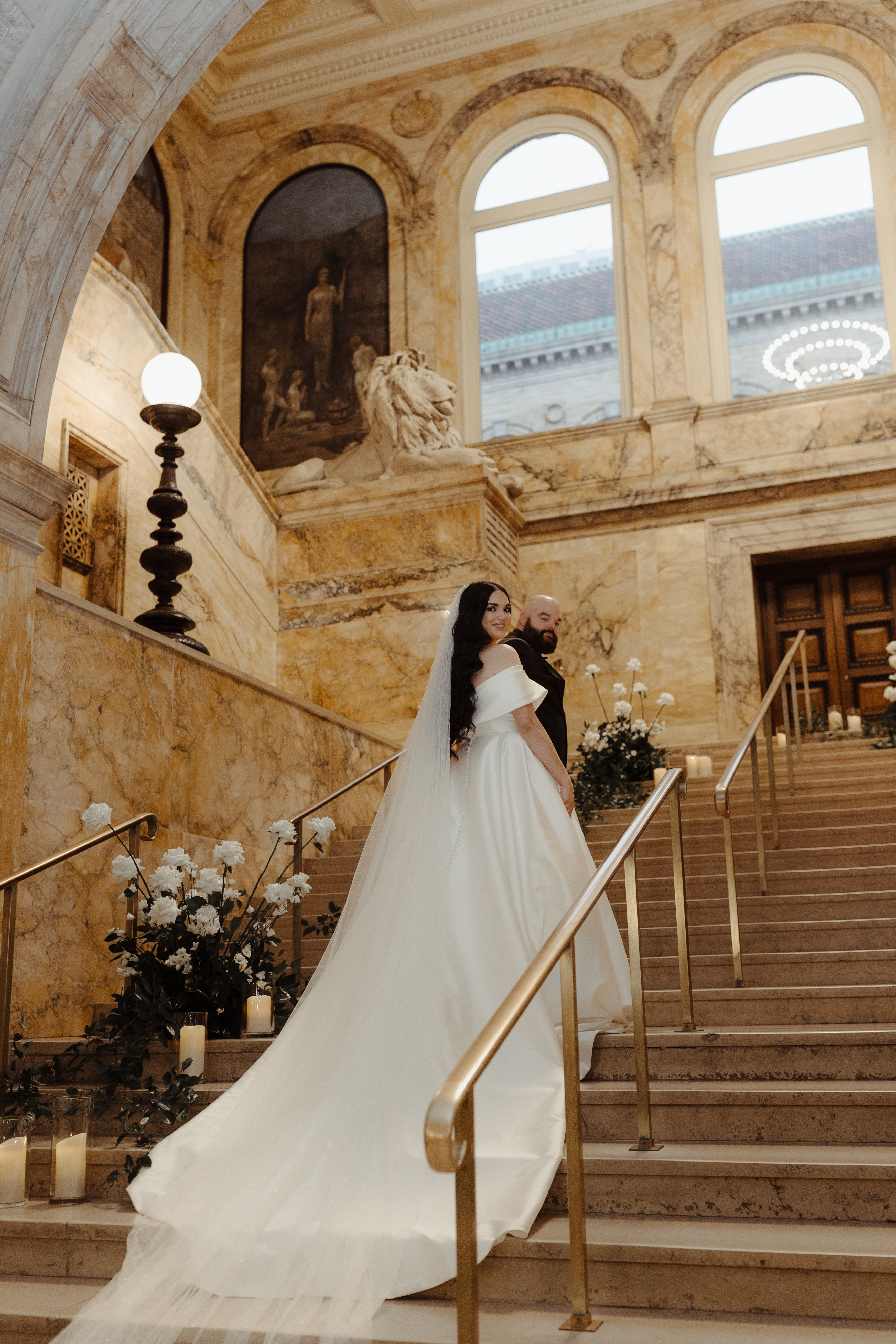
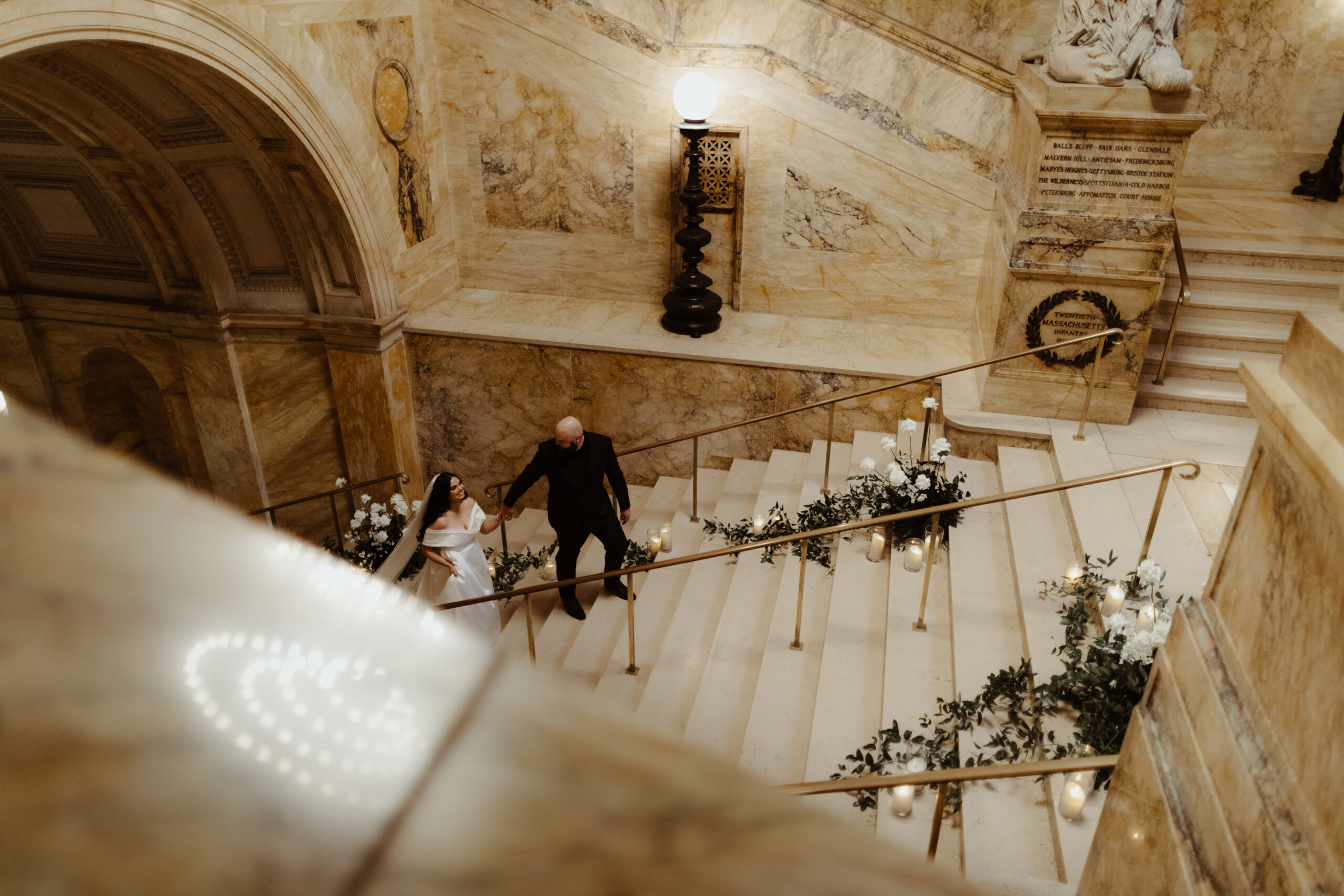
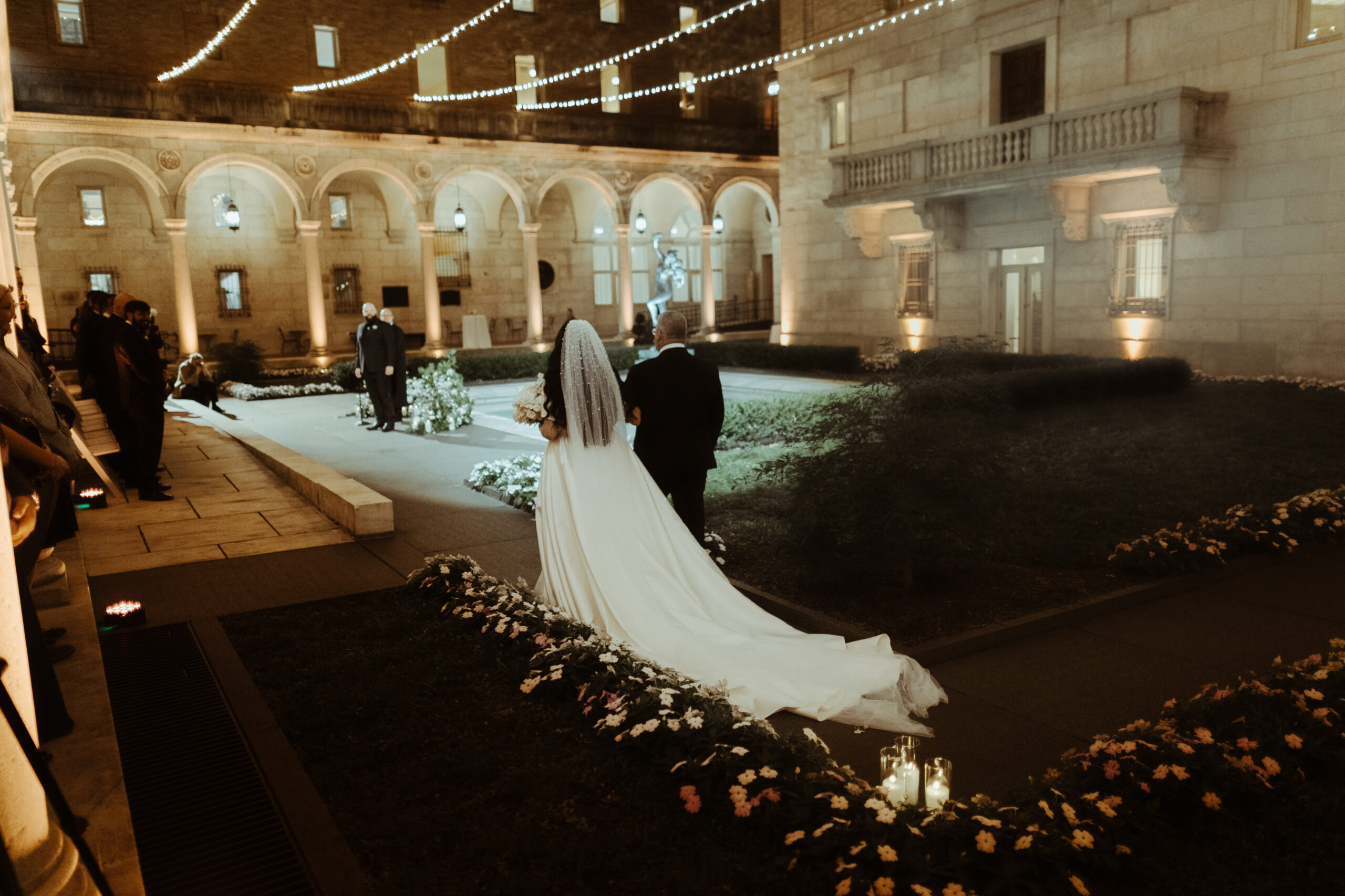
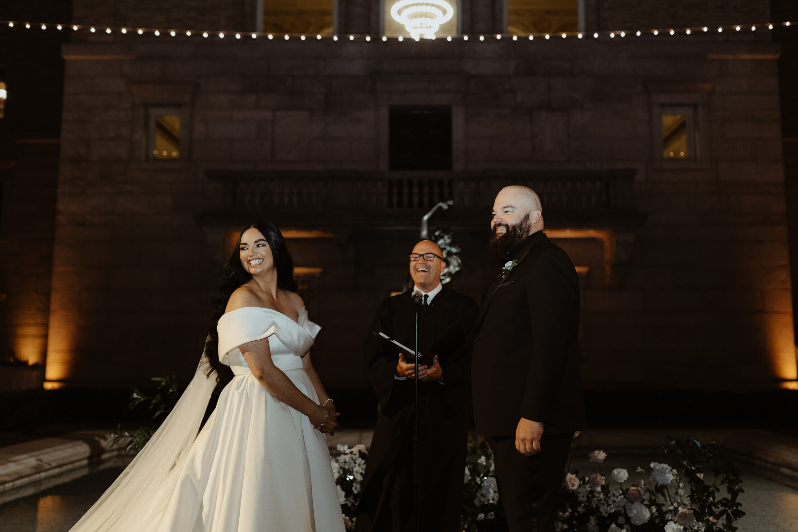
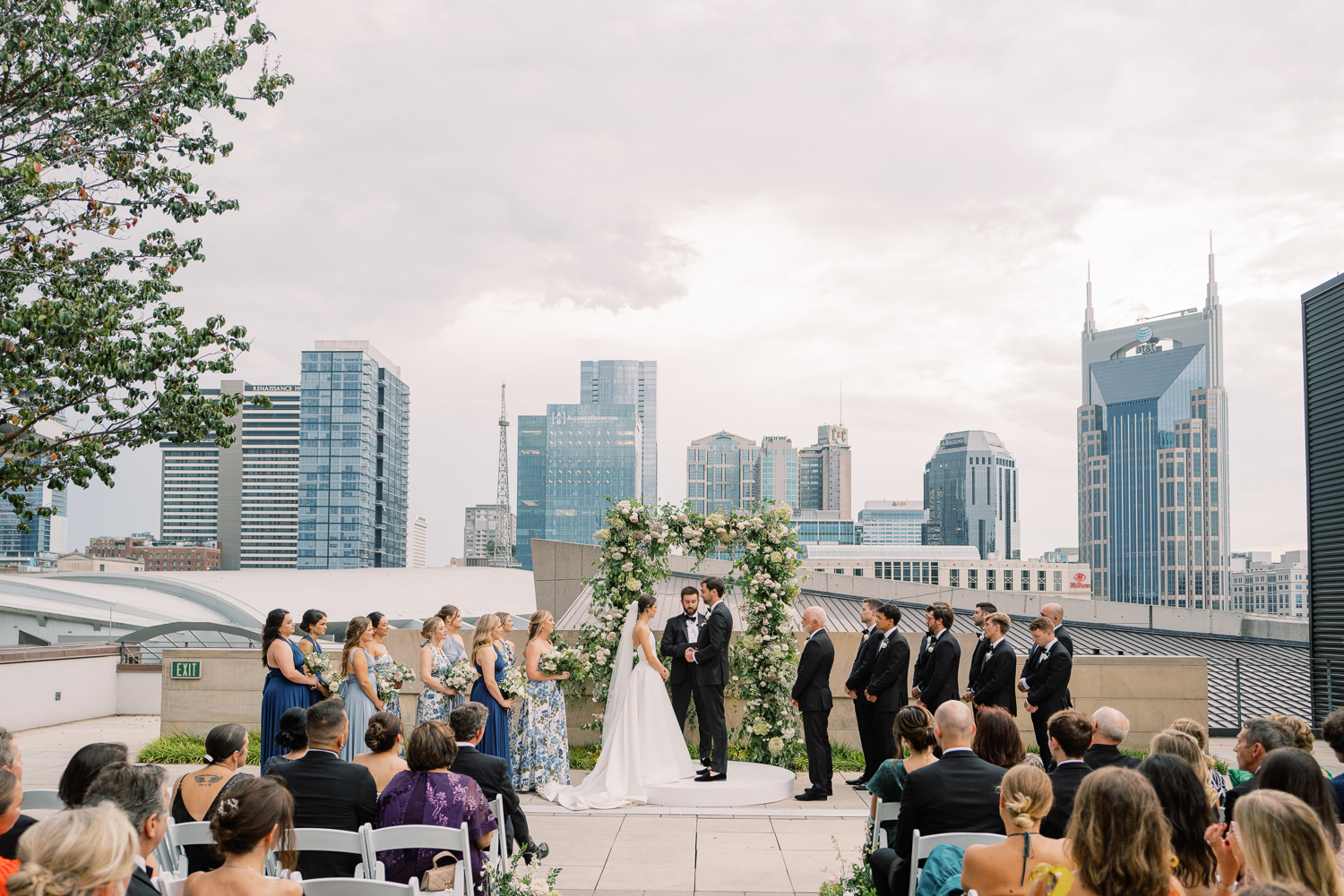
The September sky gave way to one of the most gorgeous and memorable weddings we’ve put our touch on, and it couldn’t have happened to a sweeter couple. Witnessing their Boston Public Library wedding day unfold was the cherry on top! Georgi and Jason put together an amazing wedding, and as thrilled as we were to be a part of it all, we hated to see the day come to an end. Couples like this, and weddings like this one, are something we keep close to our hearts.
The detail that I just can’t get over- the veil! Georgi’s veil alone was enough to stop us in our tracks. Draped gently behind her long dark hair, this stunning piece needed its own moment!
Boston Public Library Wedding Details
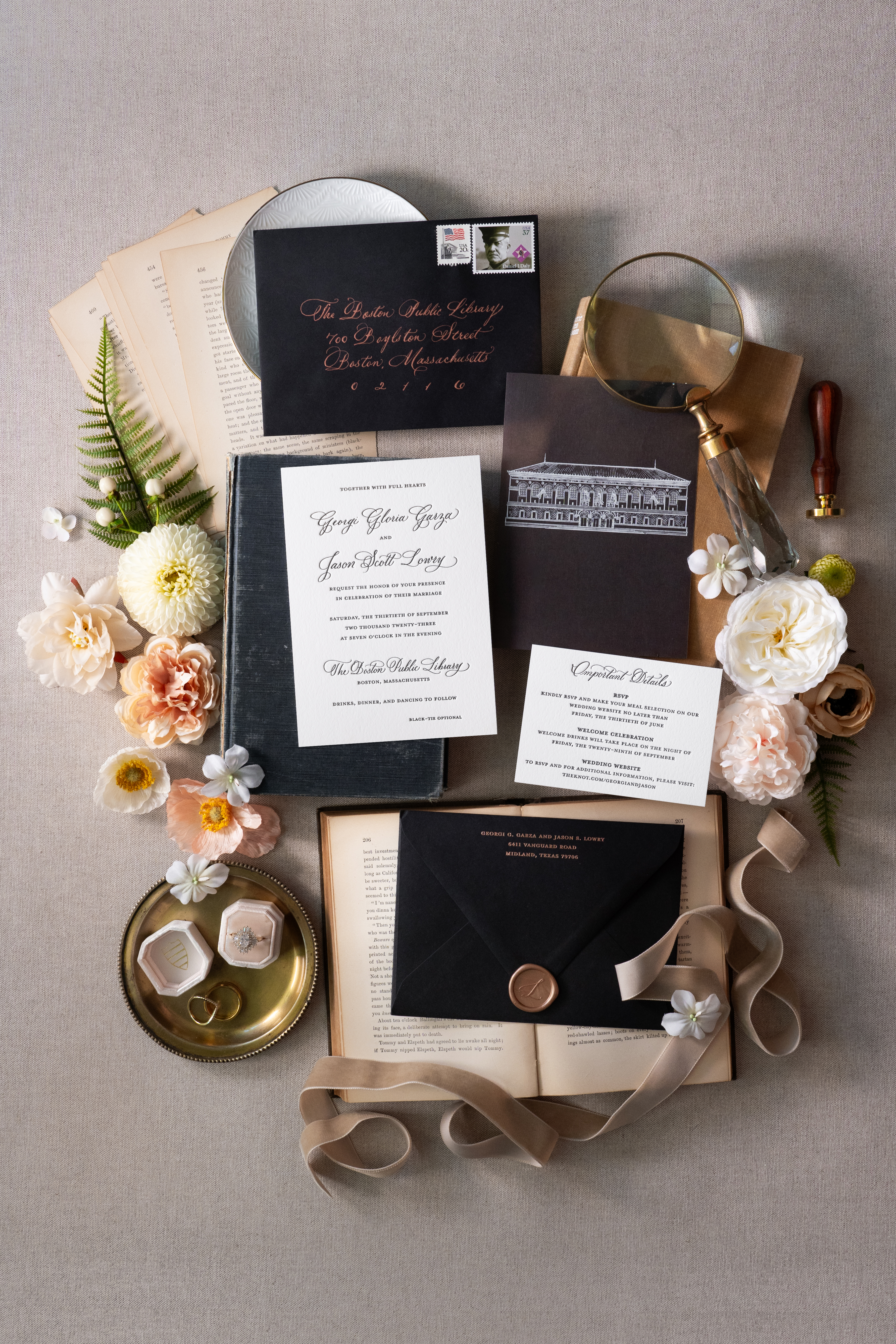
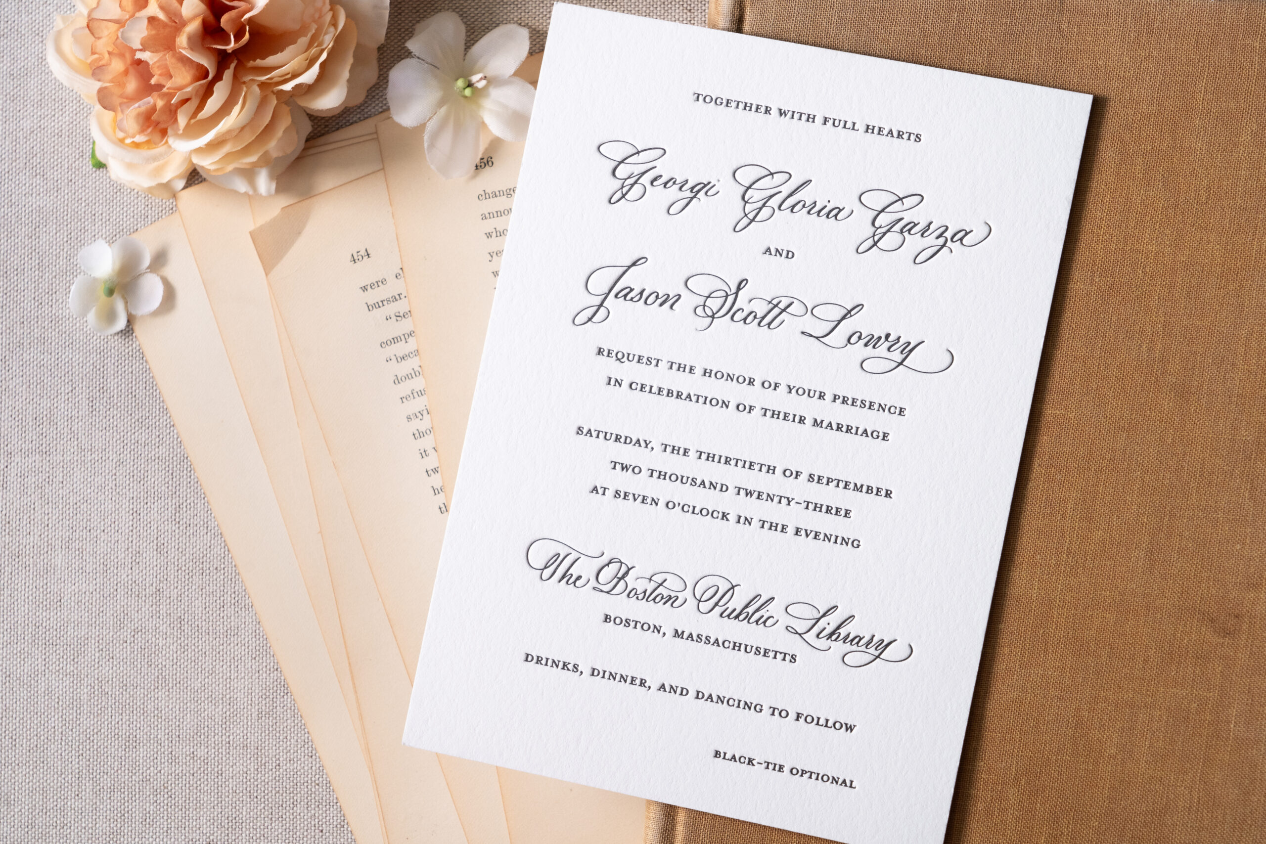
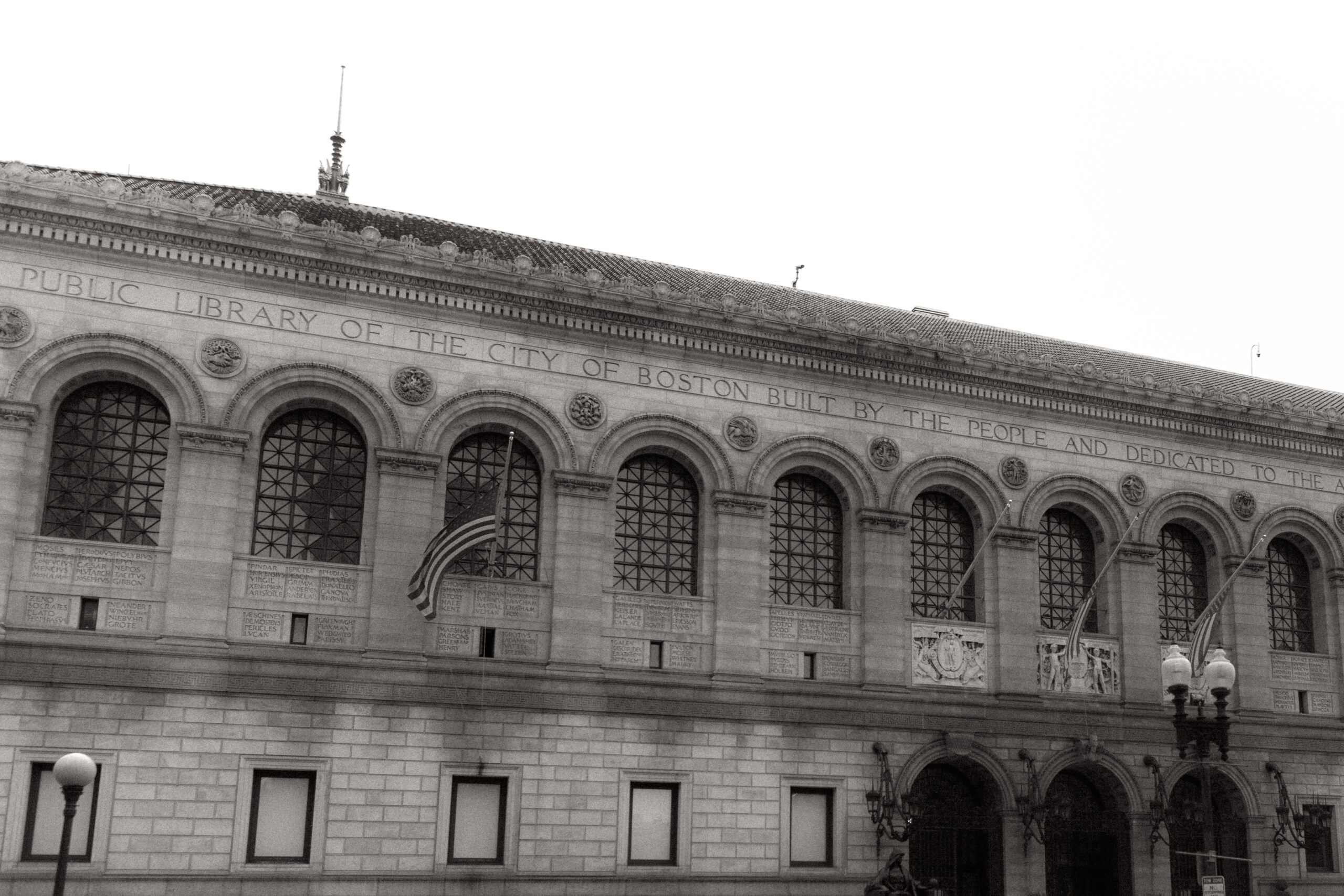
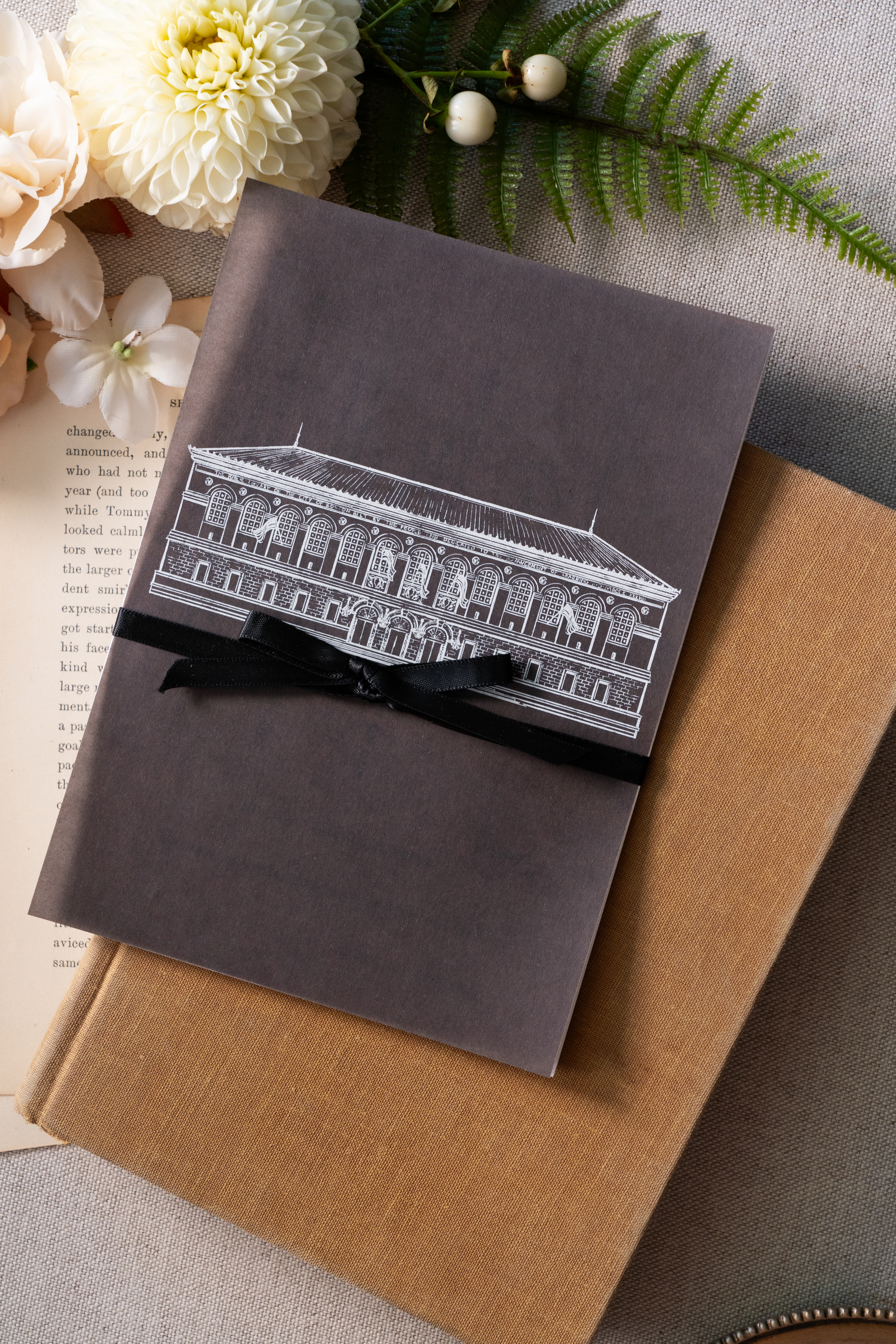
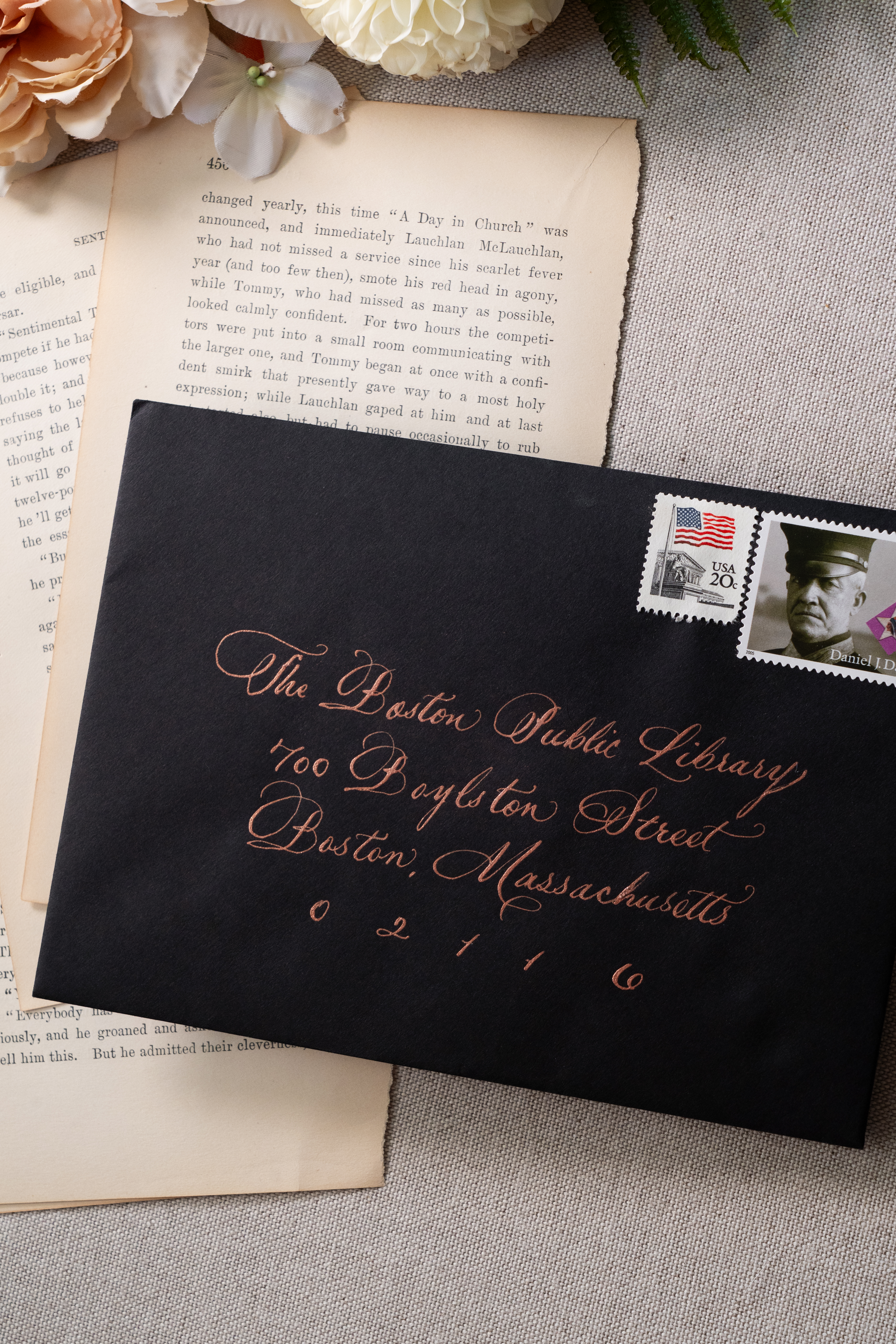
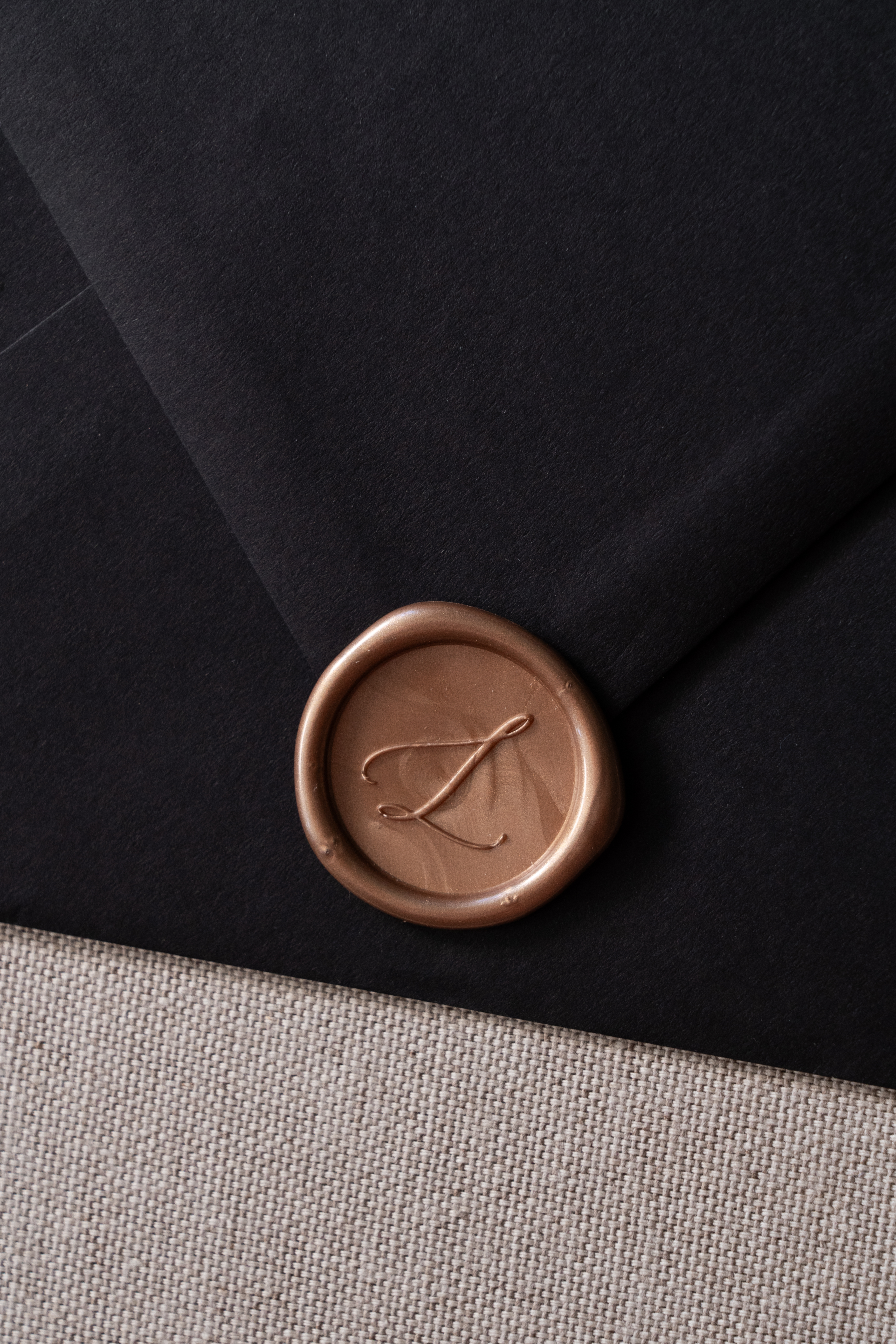
Georgi and Jason’s invitation suite boasted a seamless balance of delicate and bold features. Full calligraphy done in rose gold ink complimented the black envelopes beautifully. The invitation suite was letter-pressed with spot calligraphy on stock paper. A beautiful black, vellum overlay elevated the suite and included a custom sketch of the Boston Public Library! This was so much fun to create and one of my favorite details. Vintage postage and a custom rose gold wax seal completed this impeccable design.
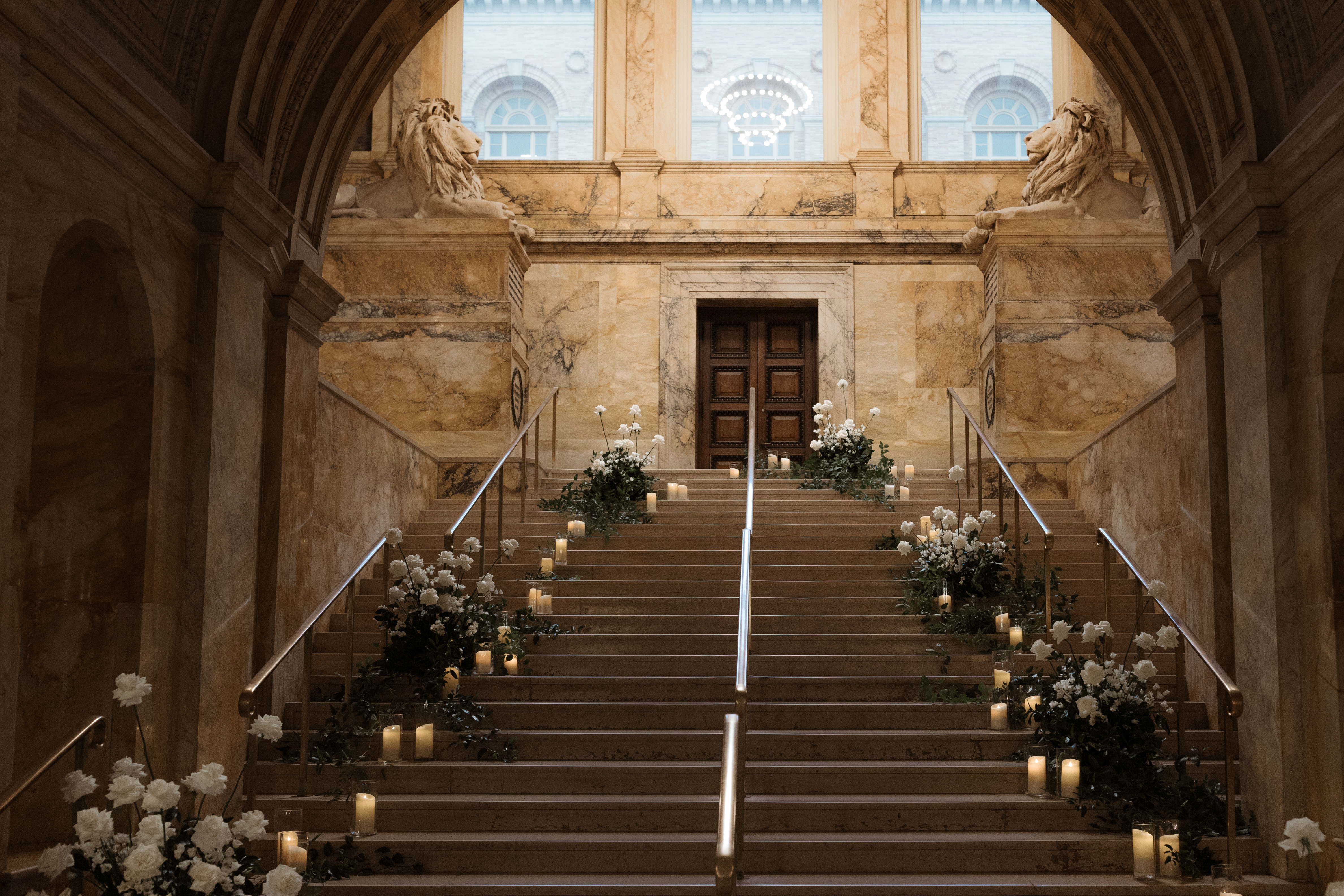
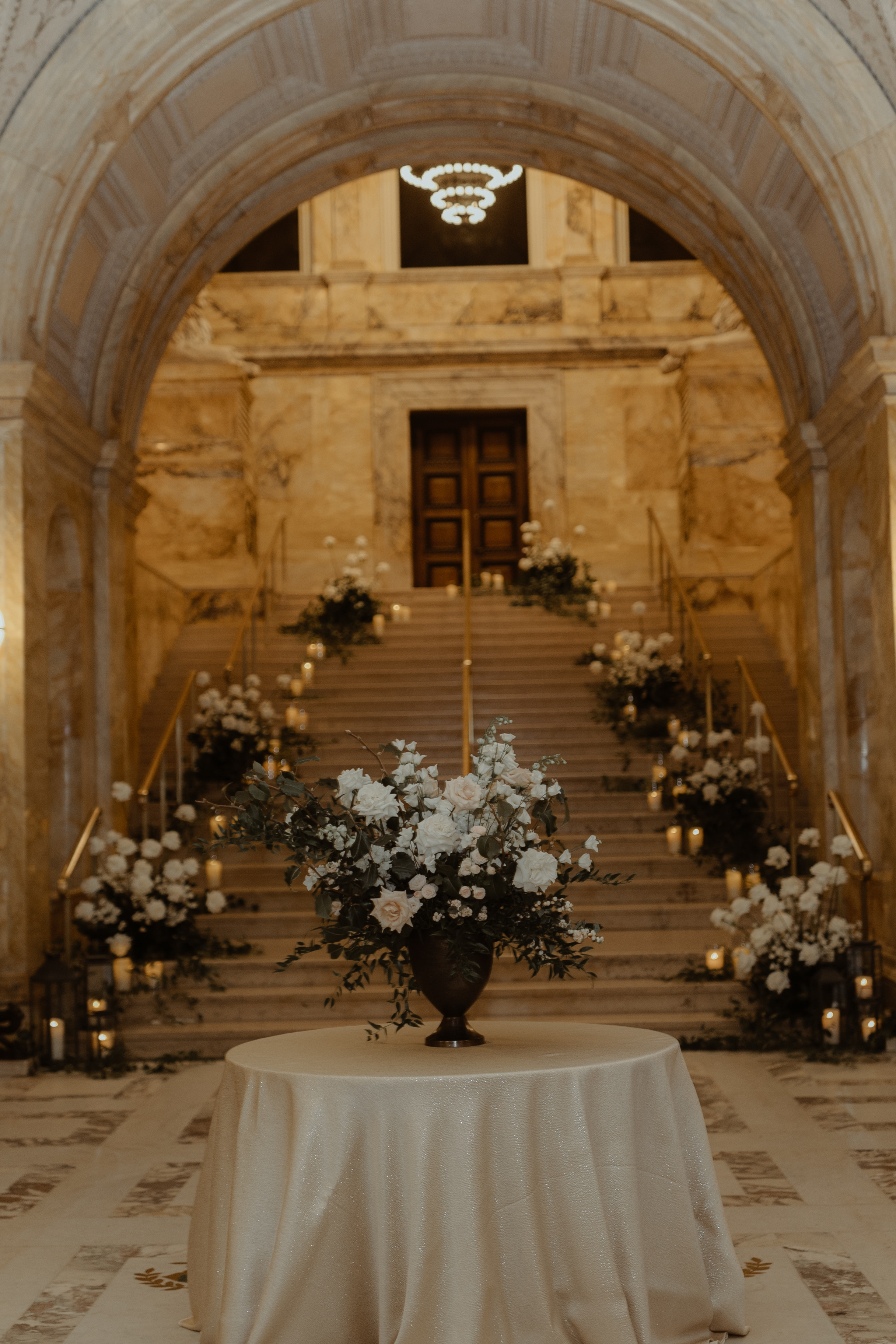
White Ink was honored to add to the breathtaking staircase entrance of this unforgettable venue. The sharp black wedding welcome sign topped with white lettering, stood out against an impressive array of florals and lit candles which demanded the attention of each guest as they passed by.
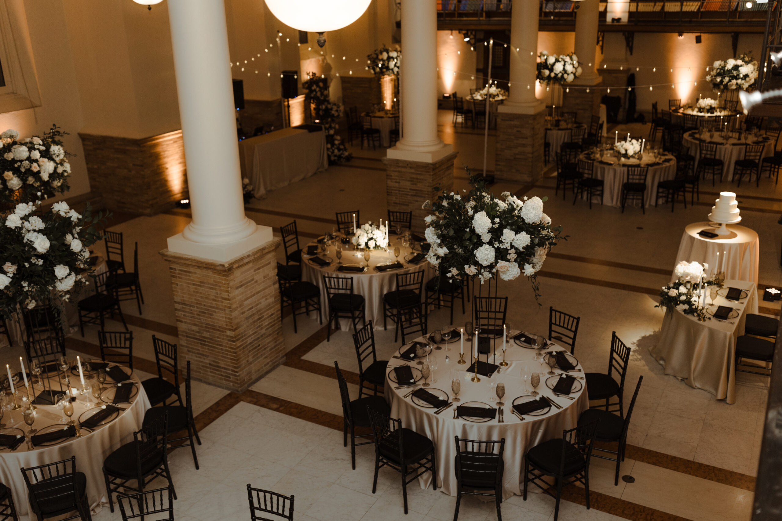
Elegant and Chic Reception Details
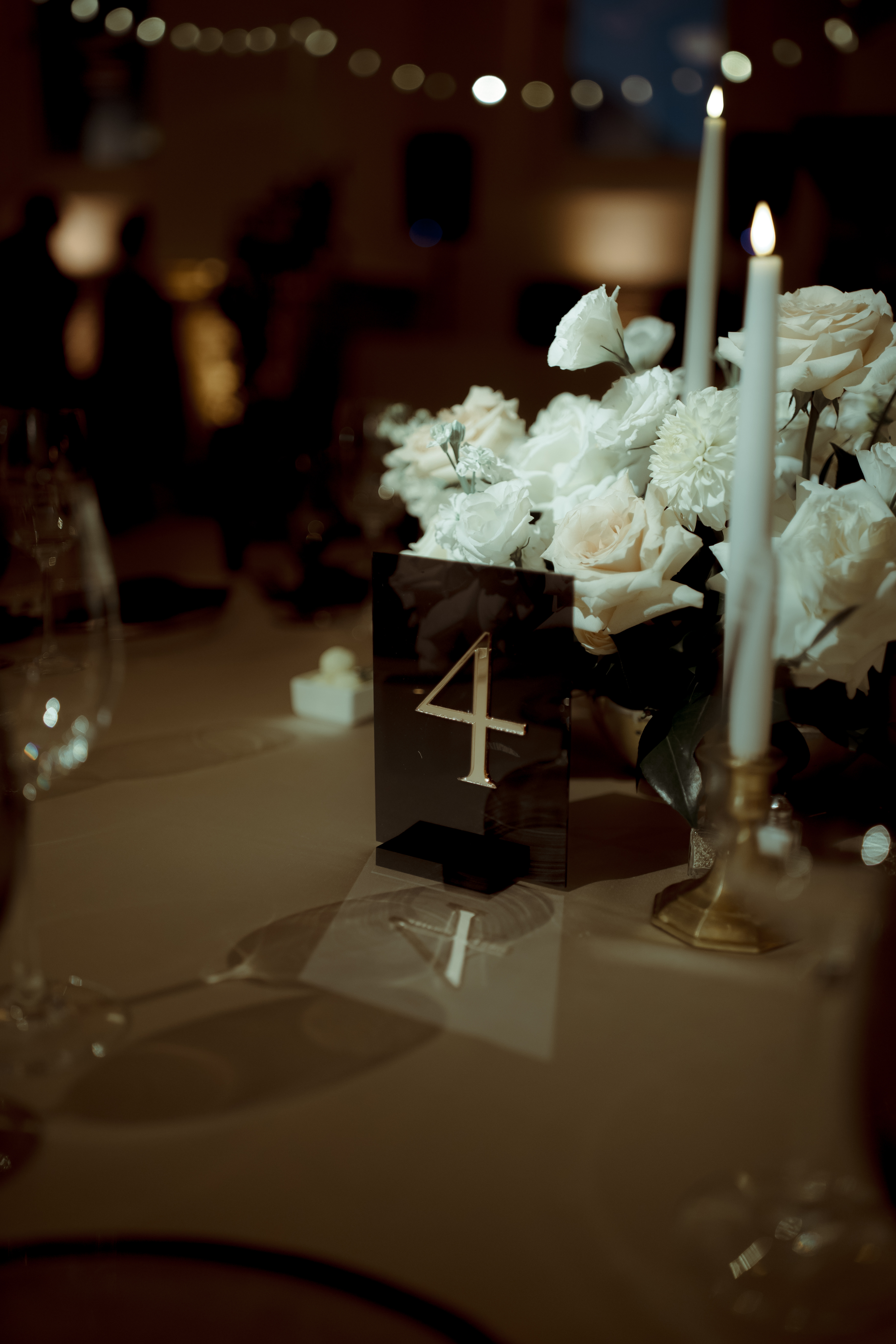
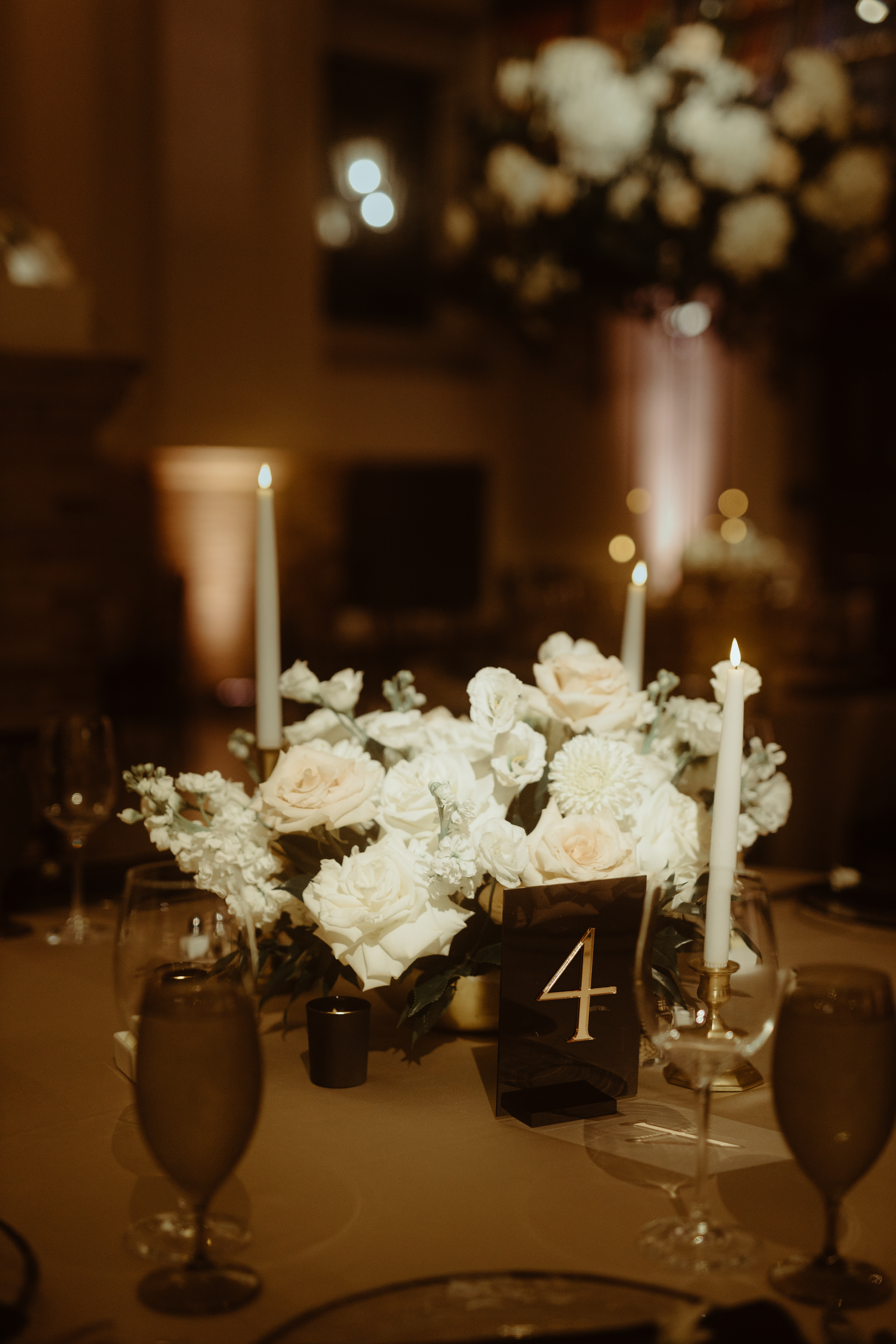
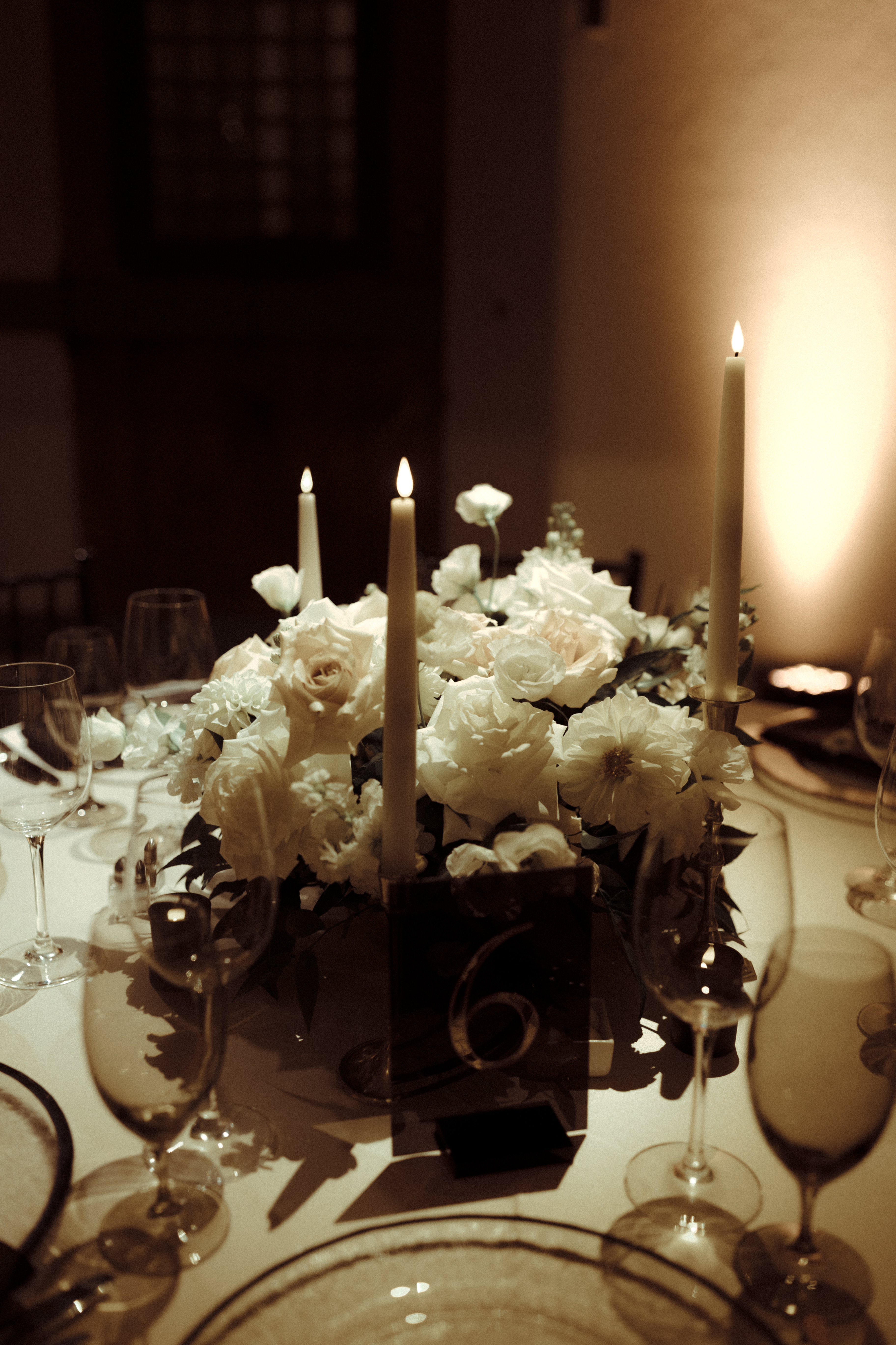
Just as Georgi and Jason’s invitation suite and wedding welcome sign harnessed a delicate boldness, so did the table numbers which sat perfectly within the elevated tablescape for their reception. There are times when table signage takes an unassuming role among the tablescape, but then there are moments when table signs play an important part in grabbing the guest’s attention. These sharp lines and block signage with gold numbers set against the soft florals and candles and white linen offered a uniquely formal taste and modern, chic appearance to the 170-year-old venue. A detail which was beautifully and purposefully done.
We love our Nashville couples, that’s no secret. However, the opportunity to meet our couples where they are is something we cherish. Finding ourselves at the Boston Public Library in the presence of Georgi and Jason along with their closest family and friends was an incredible moment. It was such an honor to have been a part of this incredible journey with the perfect couple. To Georgi and Jason, thanks for the memories that will last forever. Cheers!
If you’re looking to add custom, thoughtful touches to your wedding or event, we would love to help make your vision a reality. Reach out today to learn more about our full-service design offerings—we can’t wait to create something unforgettable for you!
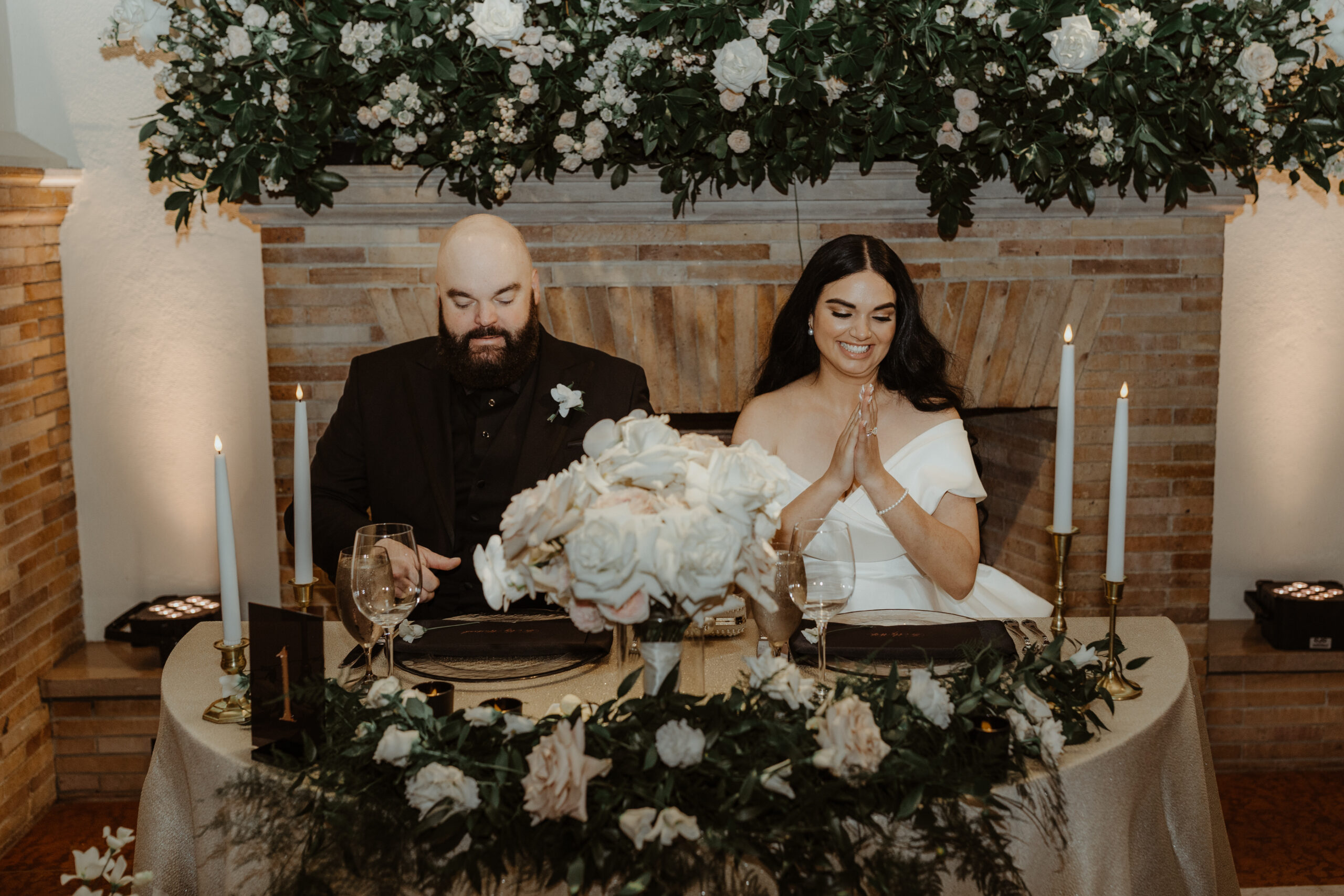
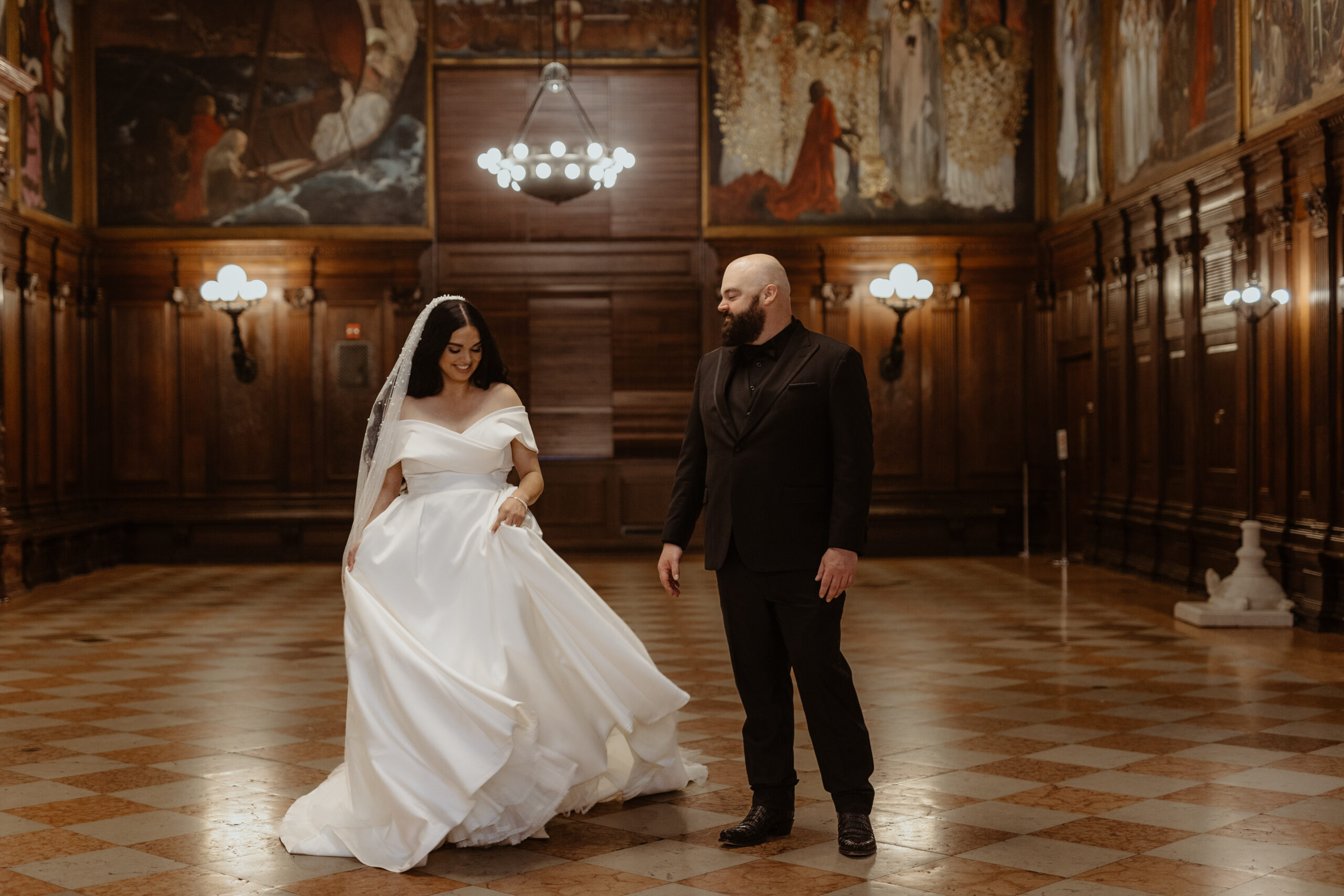
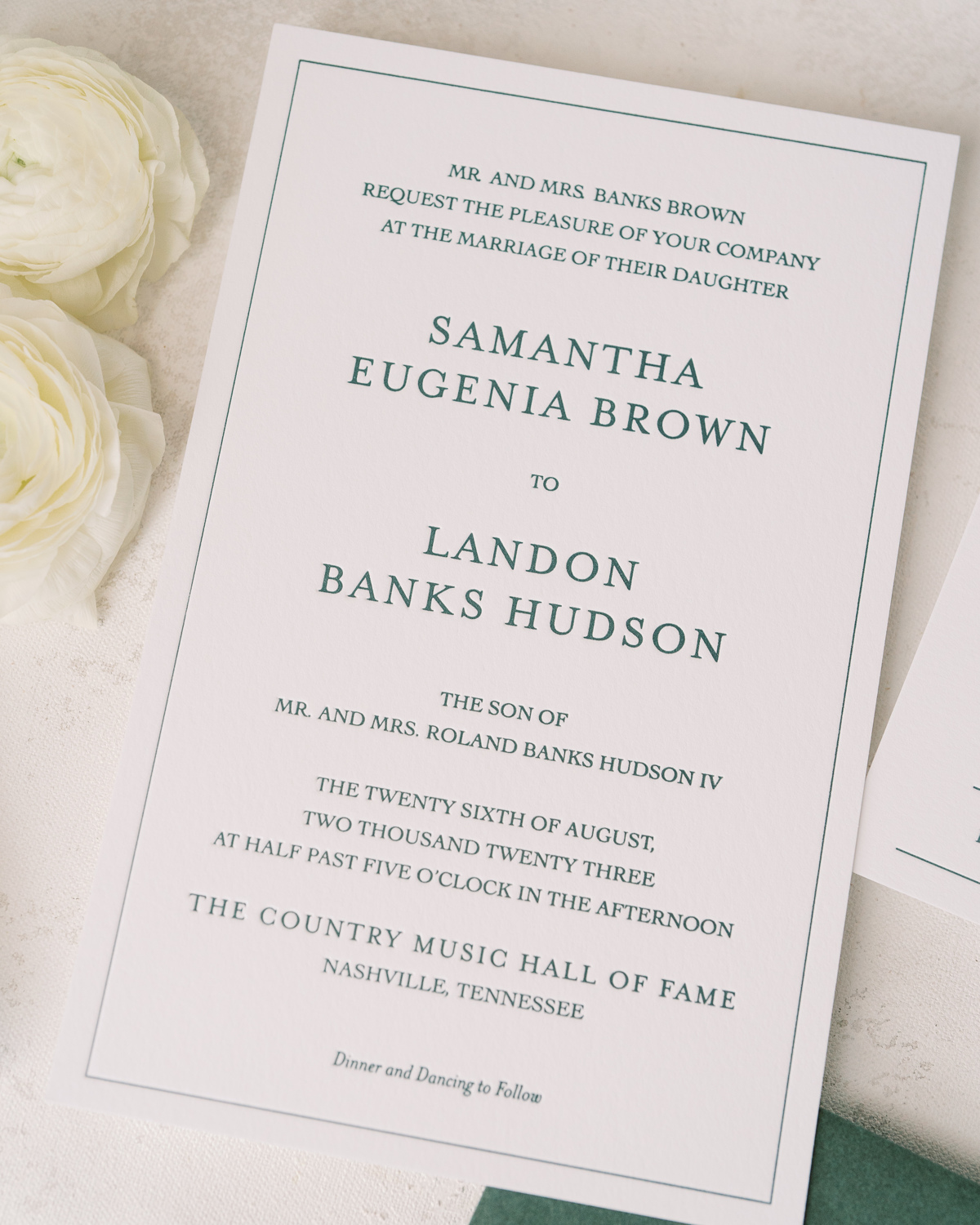
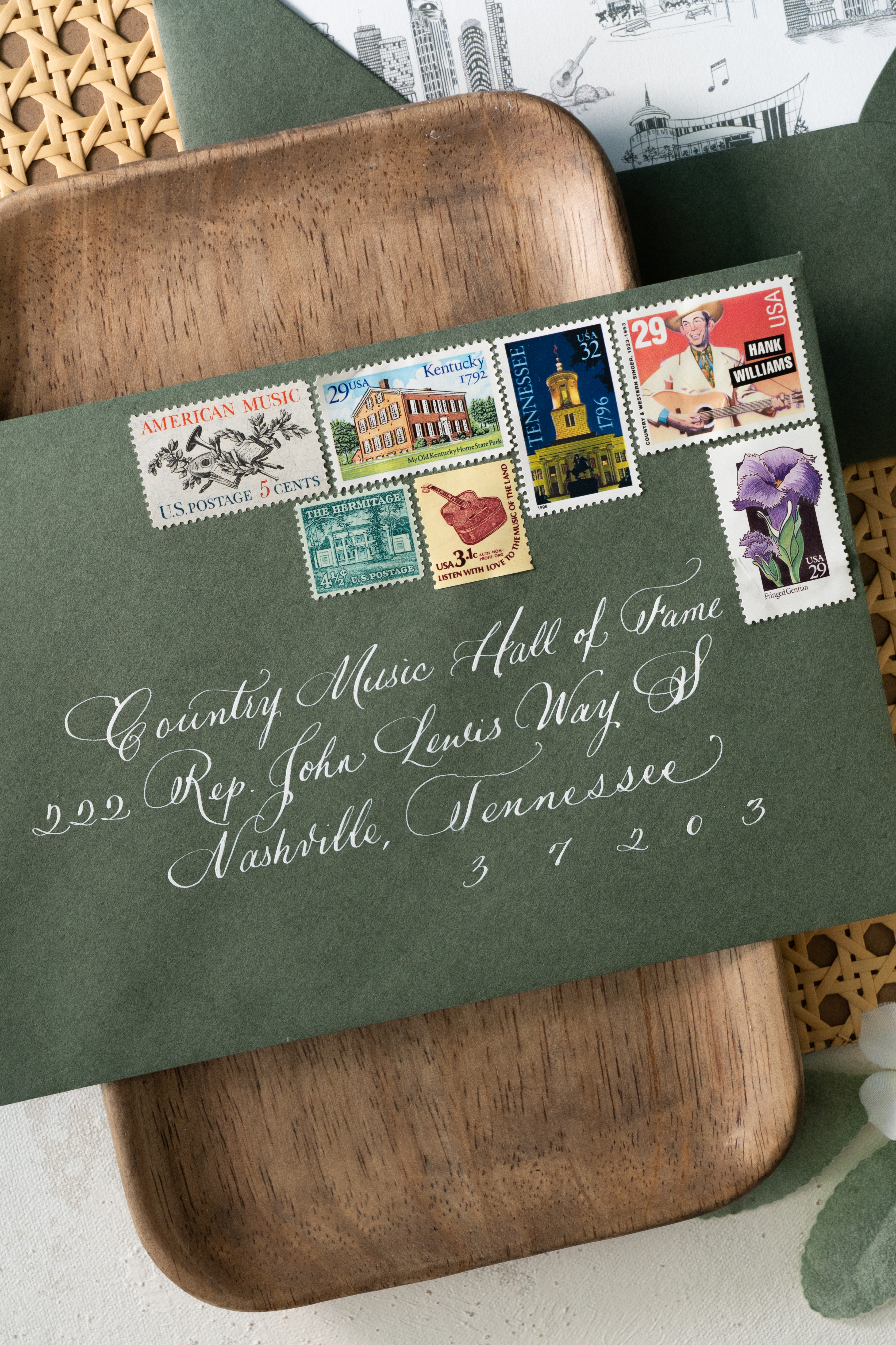
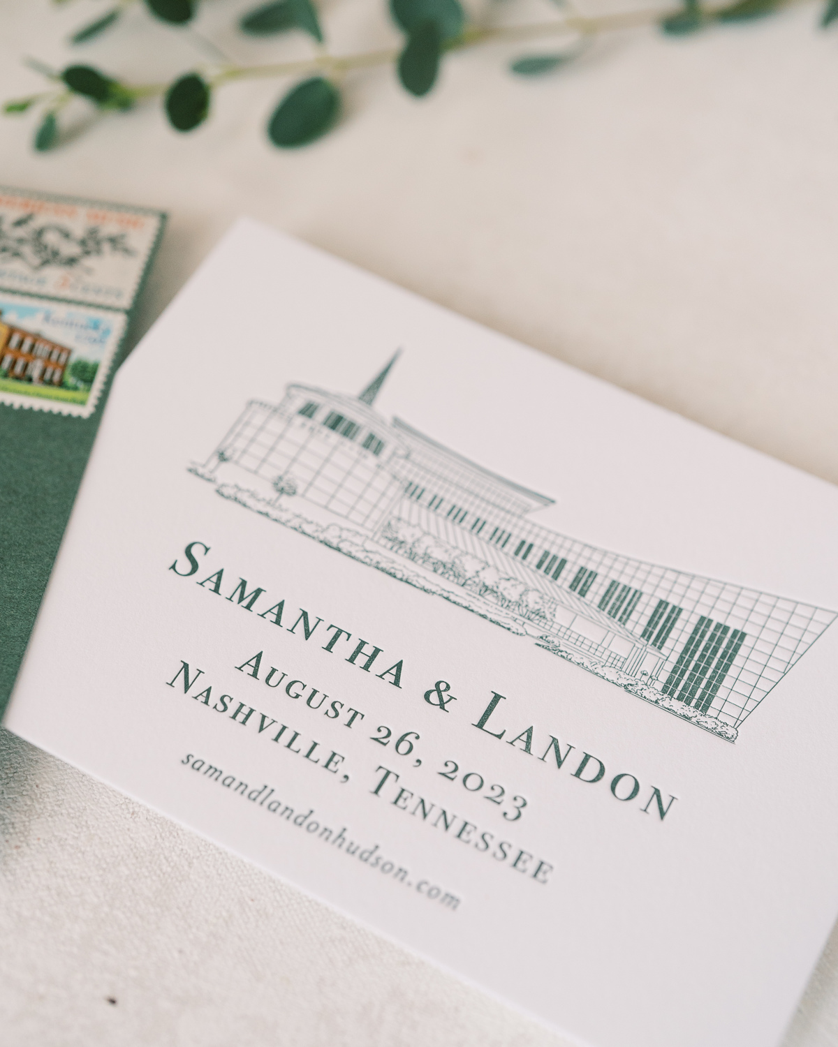
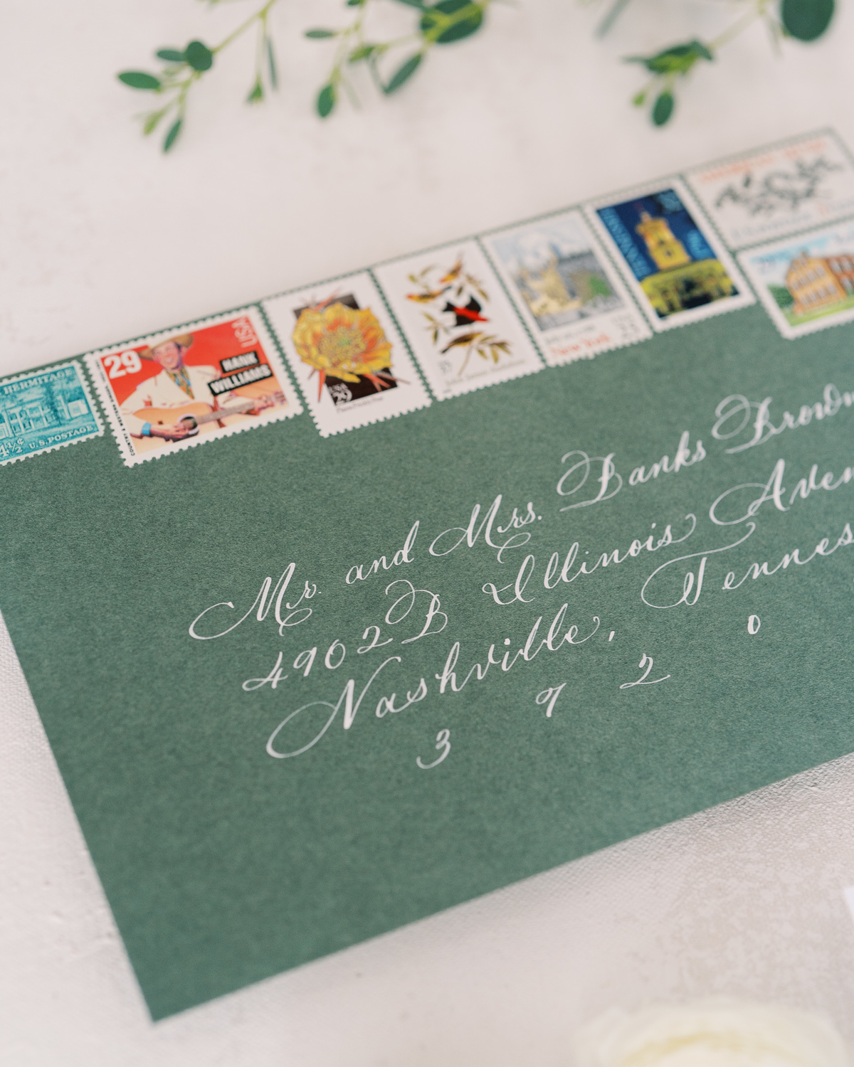
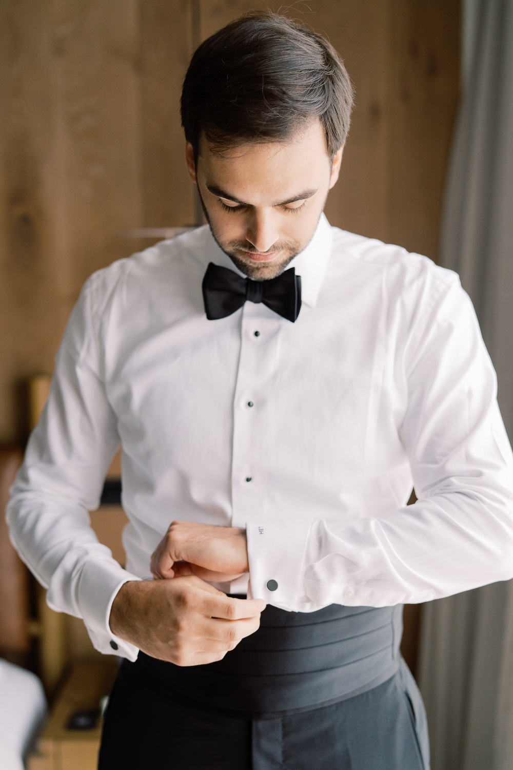
Sometimes, a client’s dream wedding turns into our dream wedding! The moment our sweet couple, Sam and Landon, asked White Ink to take part in elevating their Country Music Hall of Fame wedding details, I realized that this wedding was going to be incredibly memorable for our team. And indeed, it was! We had the honor of helping to showcase Sam and Landon’s style with purpose and authenticity by creating their custom Nashville wedding details.
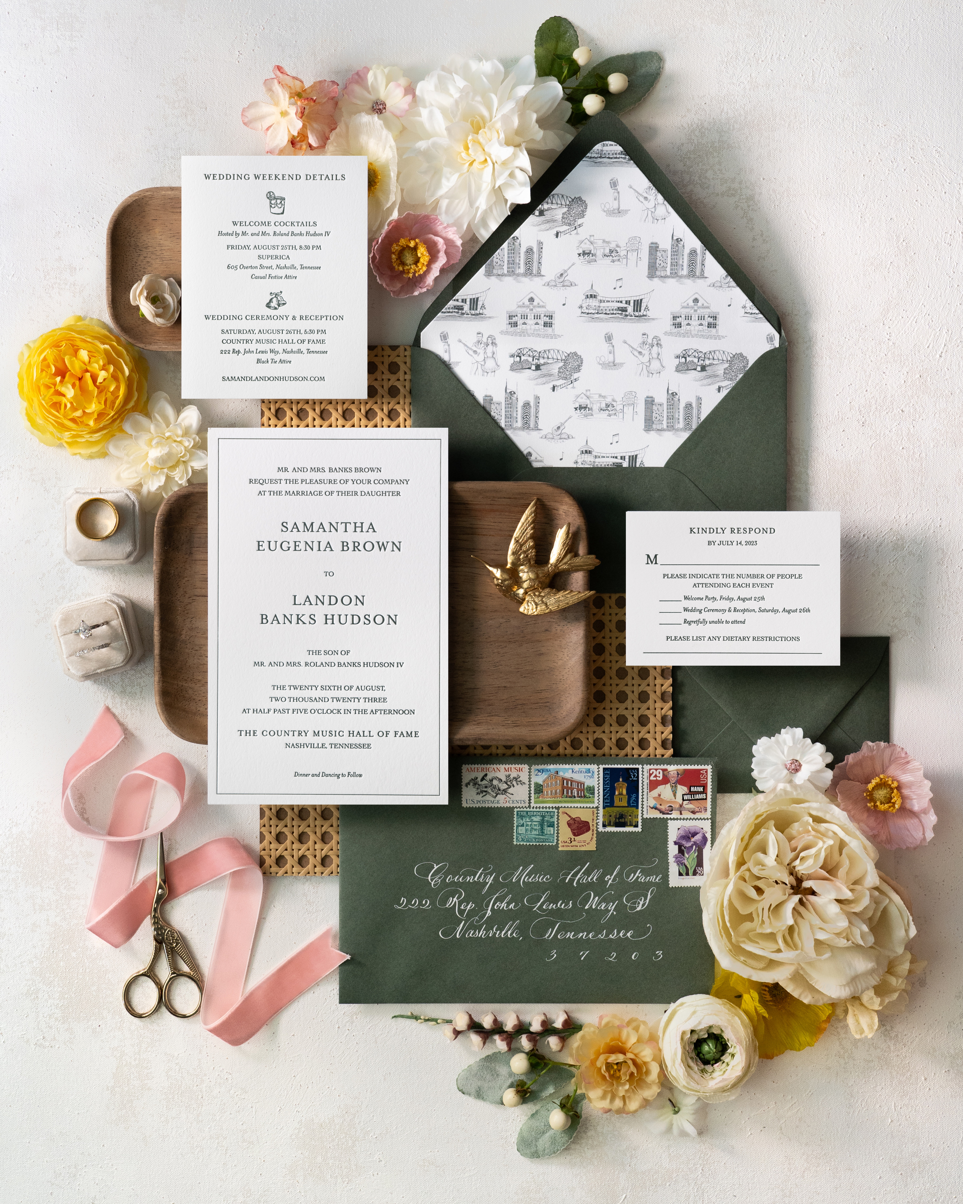
For starters, our couple’s wedding suite embraced a style that was bold and uniquely “Nashville.” I love the sharpness of the invite, complete with a heavy stock, wedding paper and letter pressed font.
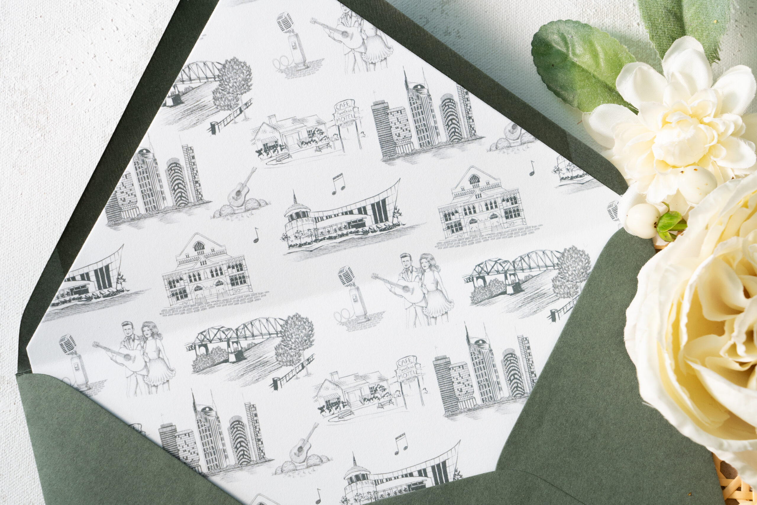
Take a moment to soak in the amazing work of the talented Katie Kime! She provided the custom artwork on the envelope liners which depict iconic Nashville favorites like Jonny and June, The Loveless Cafe, The Country Music Hall of Fame, and even the “Batman Building.” Details like this truly set the tone for your wedding guests and create a memorable experience. I just love this details!
Sam and Landon’s save-the-date boasted the same polished look as the invitation suite including the letter pressed font and print of the Country Music Hall of Fame. (Side note: I can never get enough of how beautiful the vintage postage is!)
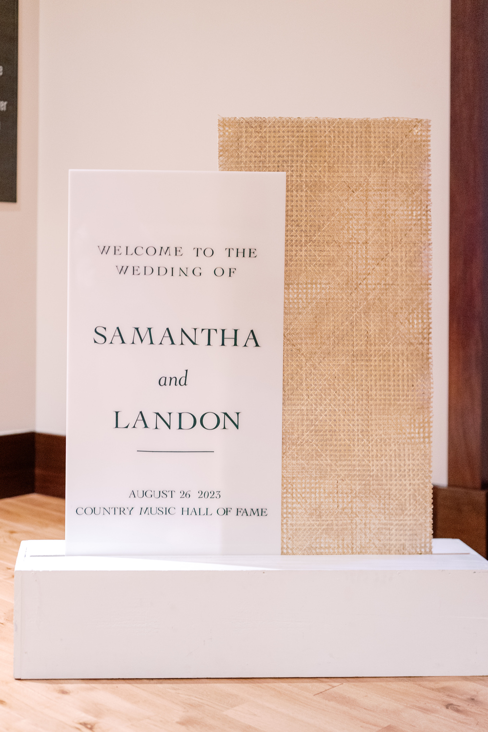
Wedding Welcome Sign and Program Details
This wedding welcome sign spoke volumes and was a complete showstopper. From the texture to the font to the overall framing of the display, this piece was impressive to say the least.
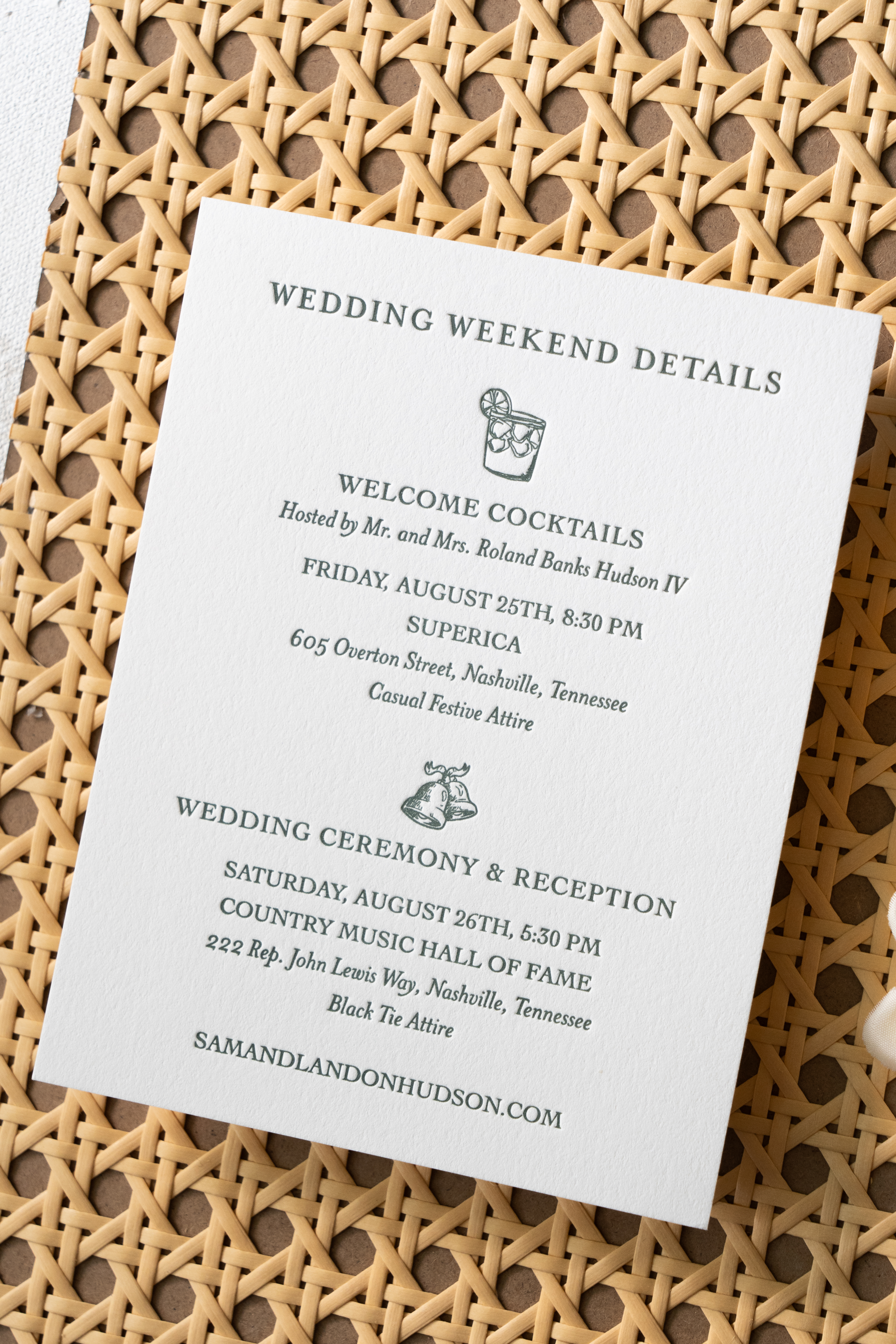
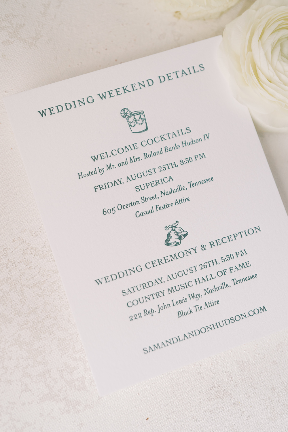
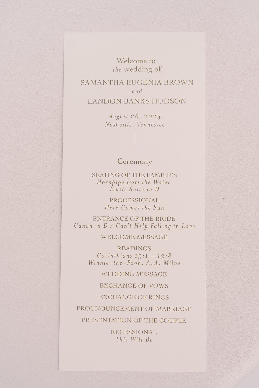
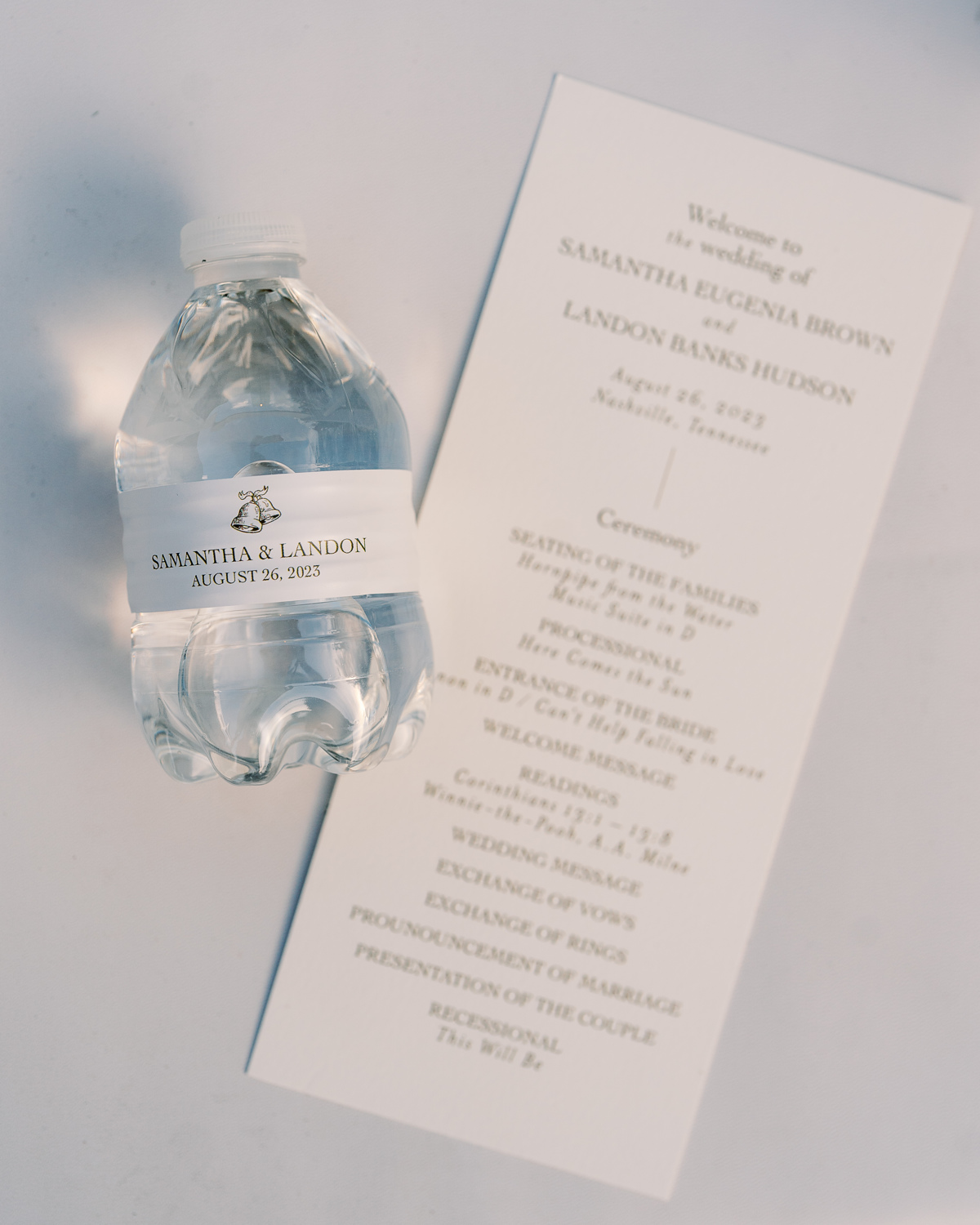
Simplicity goes a long way with these program details. A gentle font and color against a soft white paper was perfectly inviting for Sam and Landon’s guests. I love getting a peep of little details that are laced throughout the day like the cute little wedding bells on this custom water bottle. The same wedding bell print that we used for the wedding details card in the invitation suite.
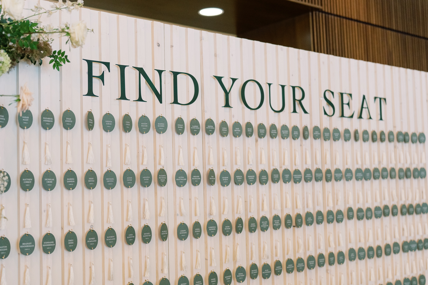
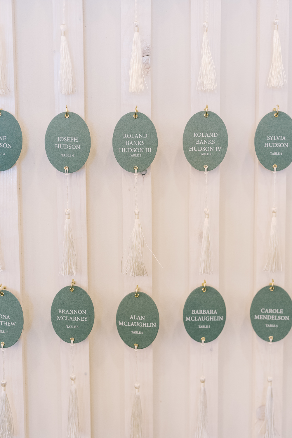
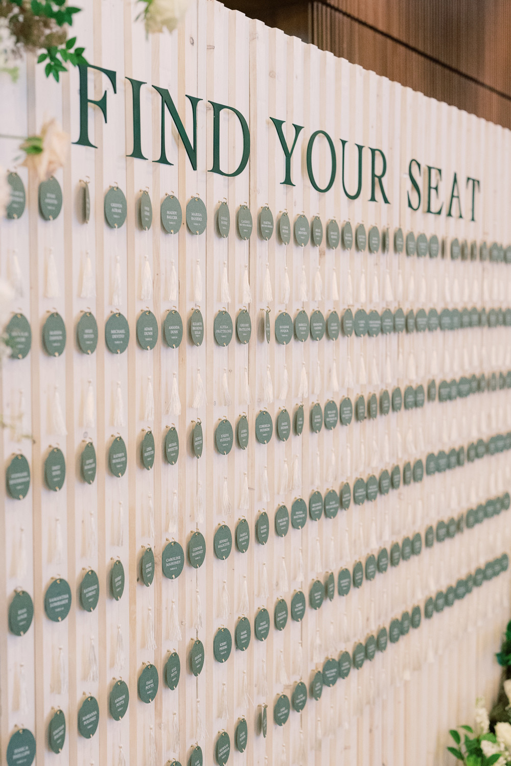
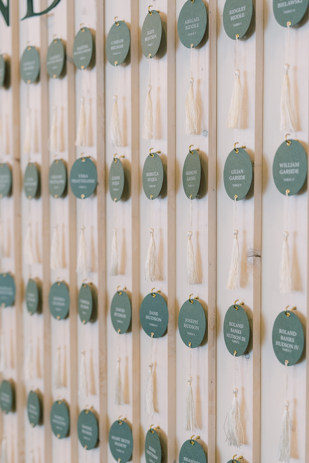
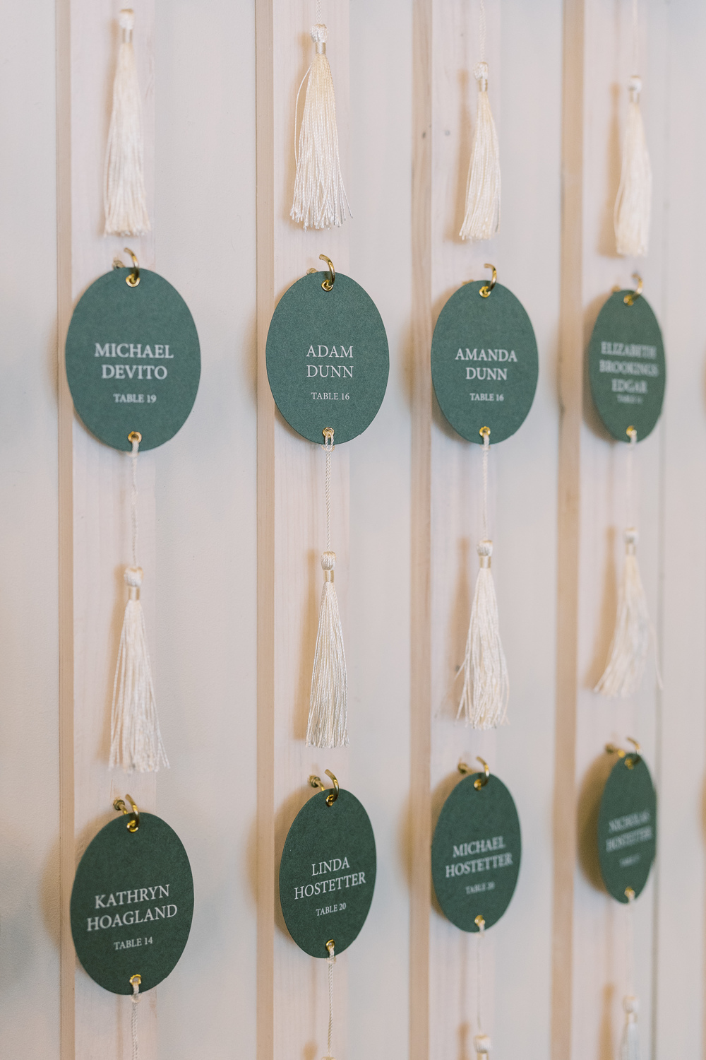
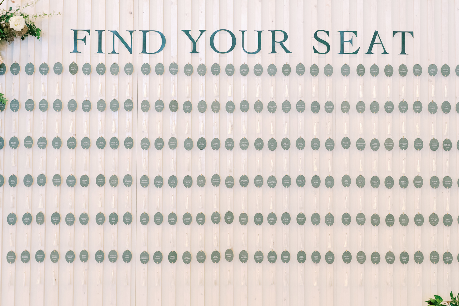
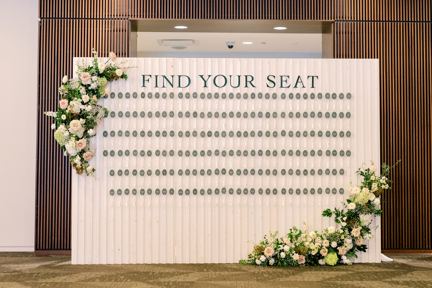
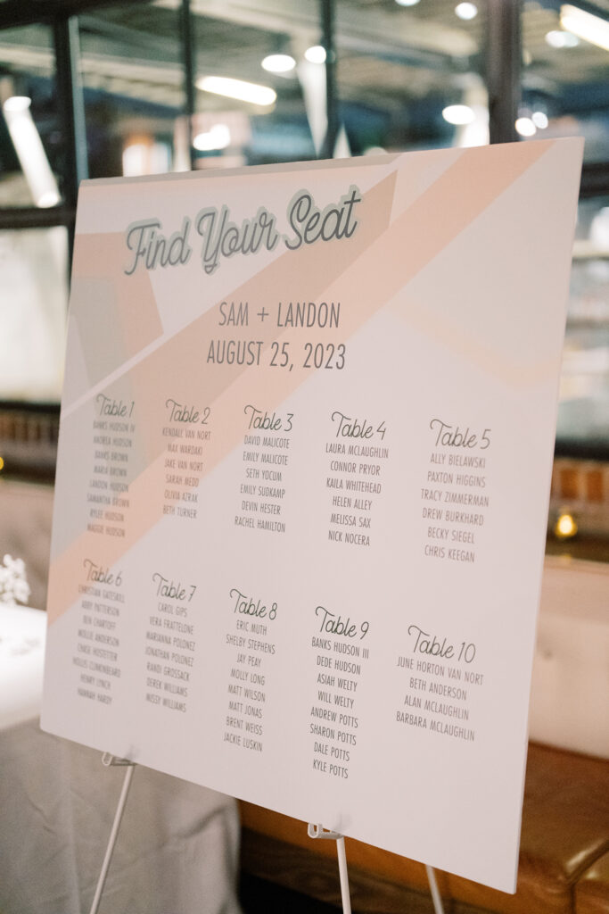
Elegant Seating Chart Display
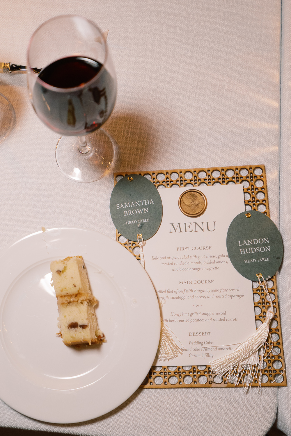
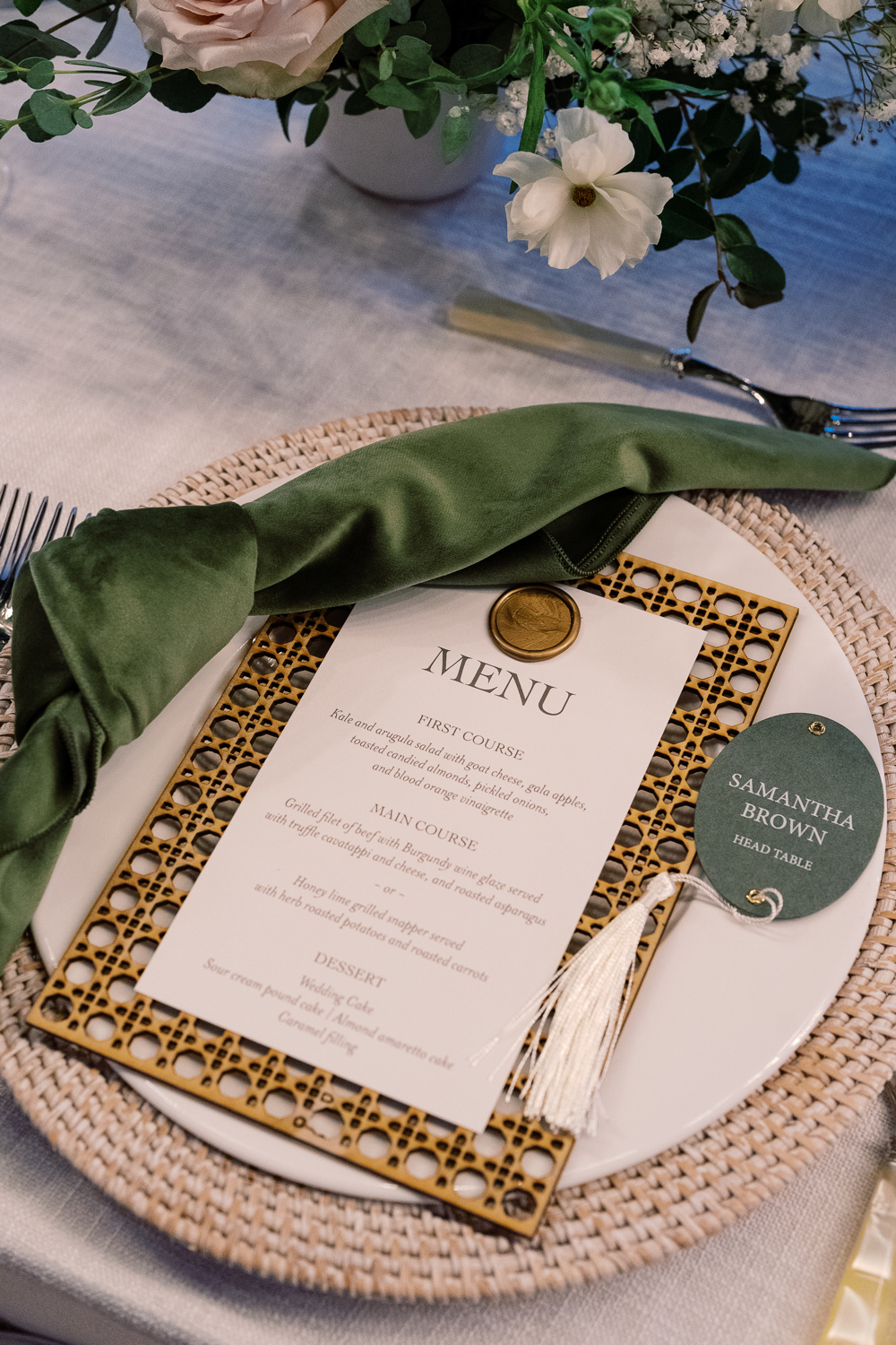
I am so happy to show off what my team created for Sam and Landon’s seating chart! Putting this seating chart wall together on site was an accomplishment. One that I adore! The sleek oval escort cards with hanging tassels were just so beautiful to see. This display wowed the guests and was yet another reflection of Sam and Landon’s elegant style.
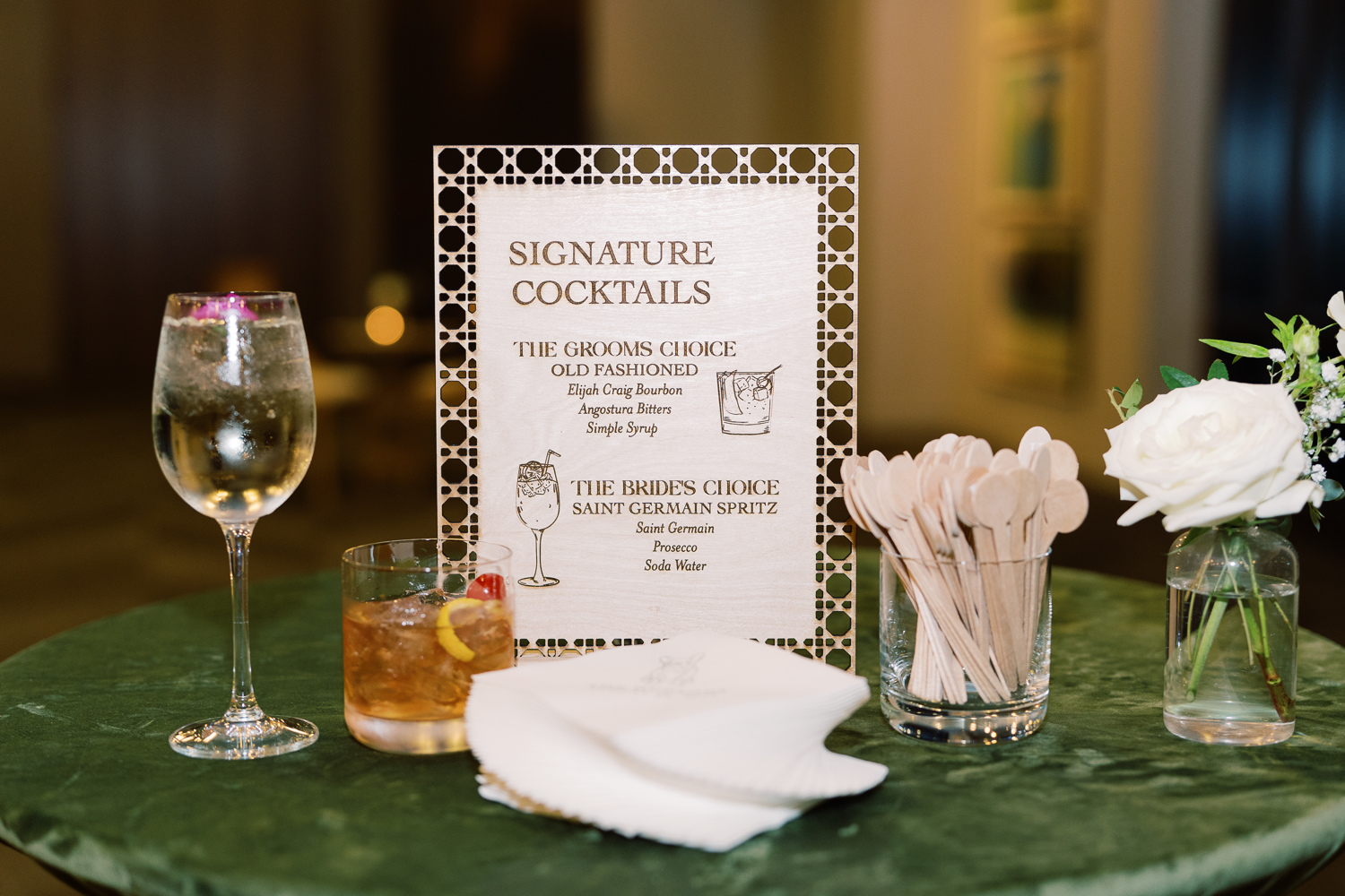
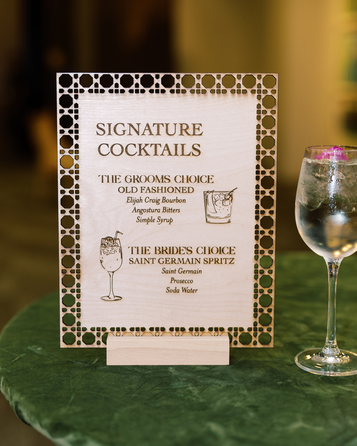
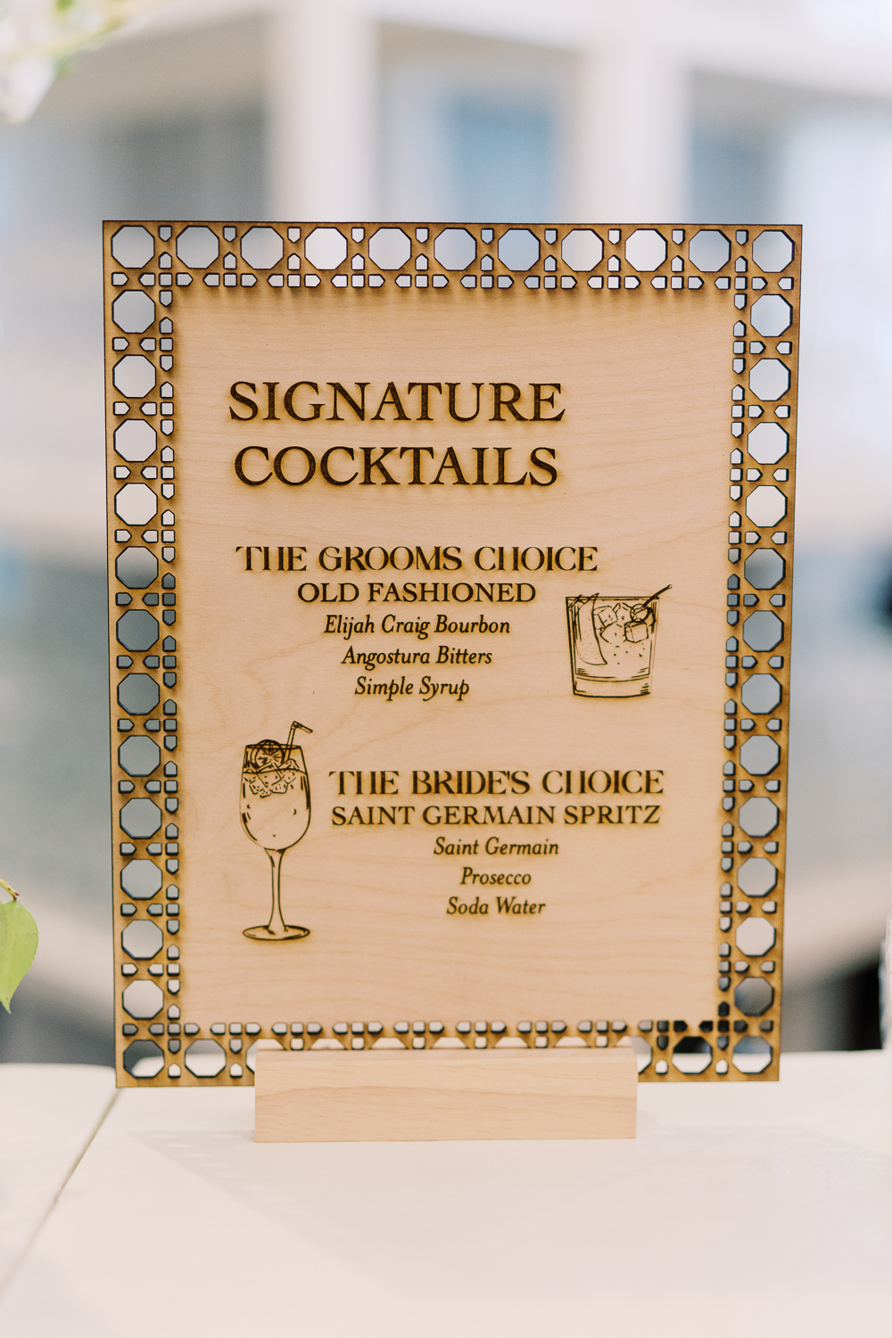
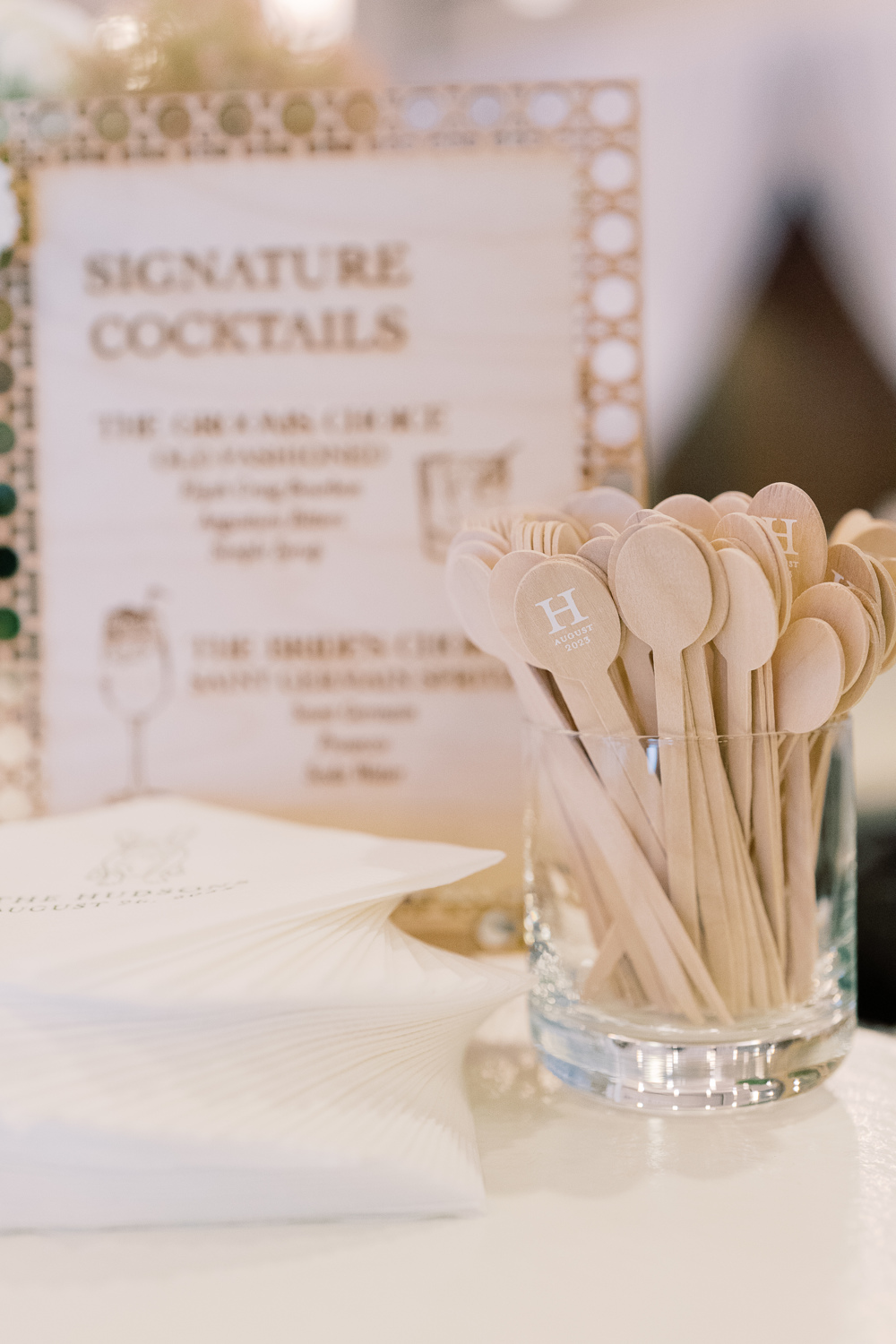
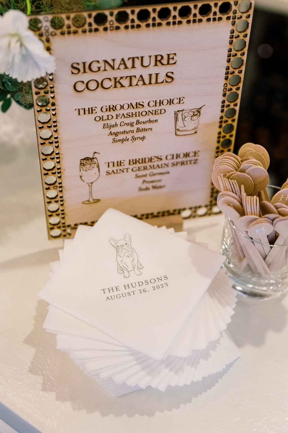
Custom Laser-Cut Signature Cocktail Signs
For cocktail hour, we rolled up our sleeves to do one of our favorite things: custom laser-cuts! We designed several table signs to add to the uniqueness of our couple’s unforgettable day. I love how this turned out and how well it fit into the style of the entire event.
However, it’s the custom cocktail stirrers for me! These little guys were so fun to make. The “H” initial stands out so perfectly along with the date. This is a great example of a small detail that packs a huge punch. It’s things like this that your guests never forget!
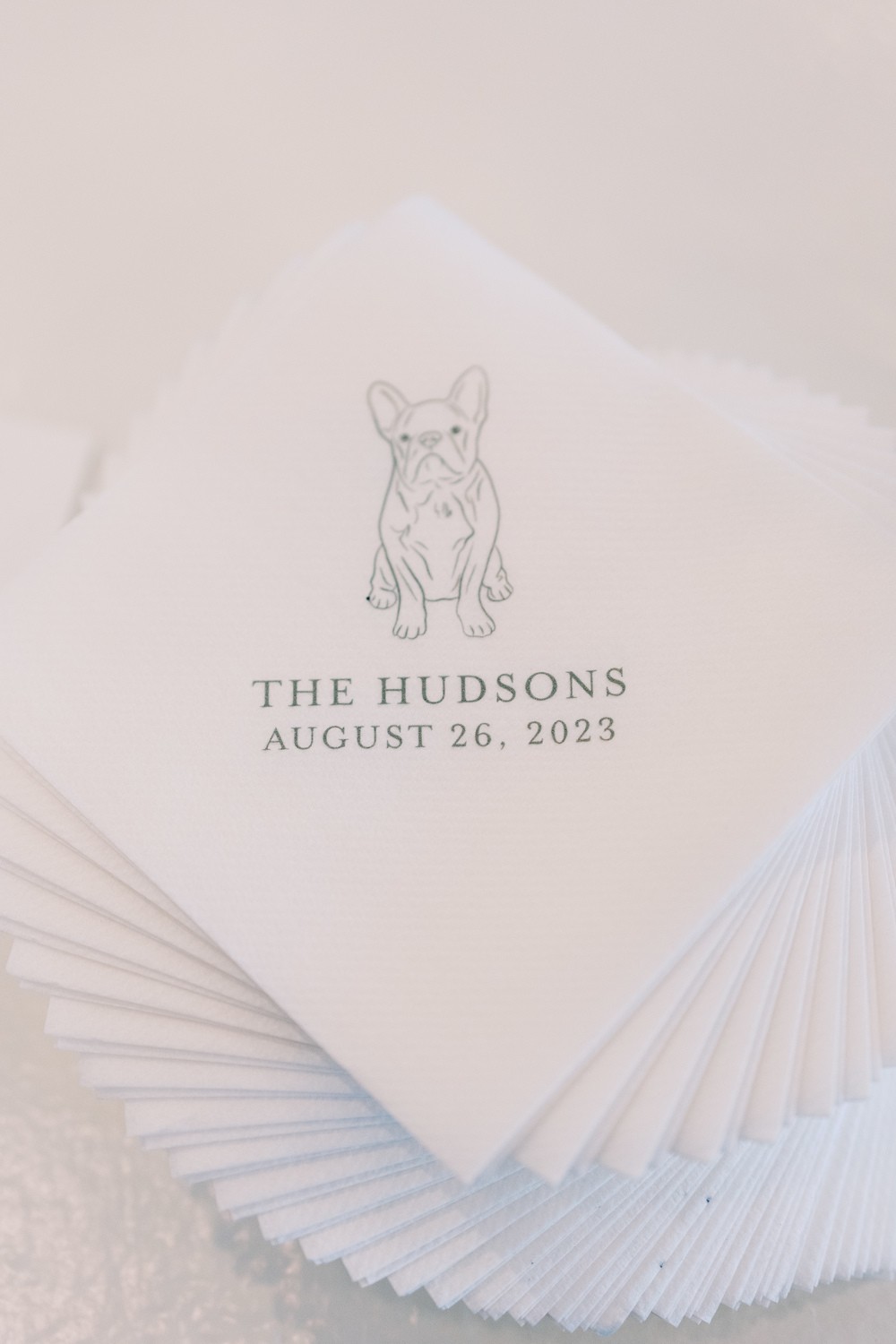
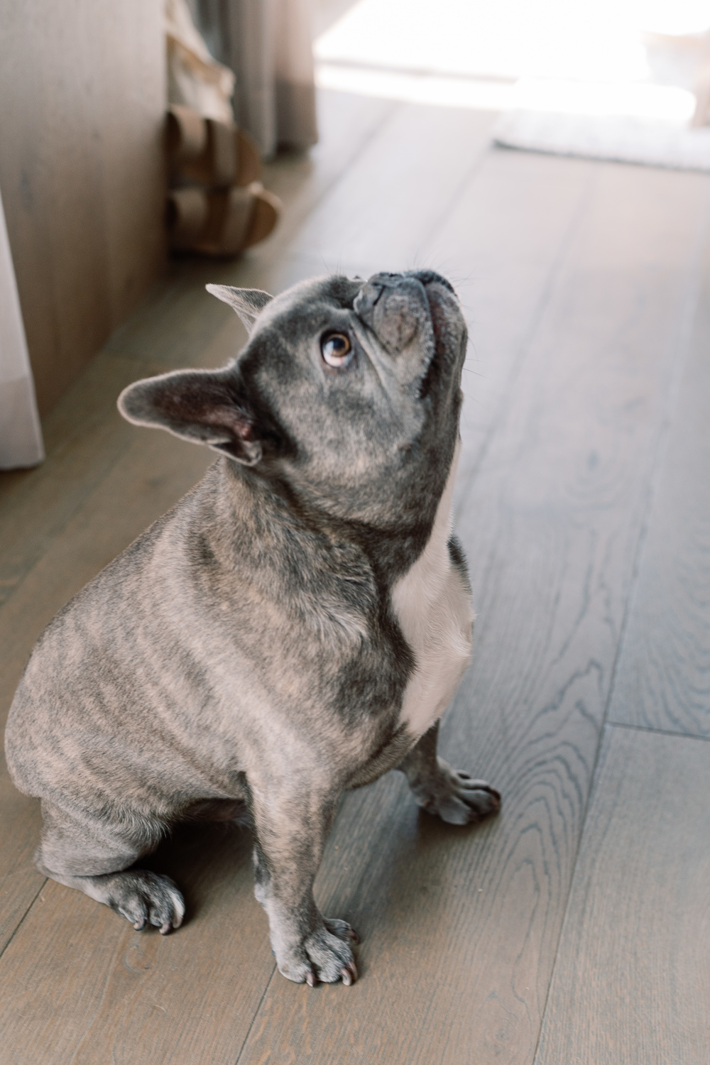
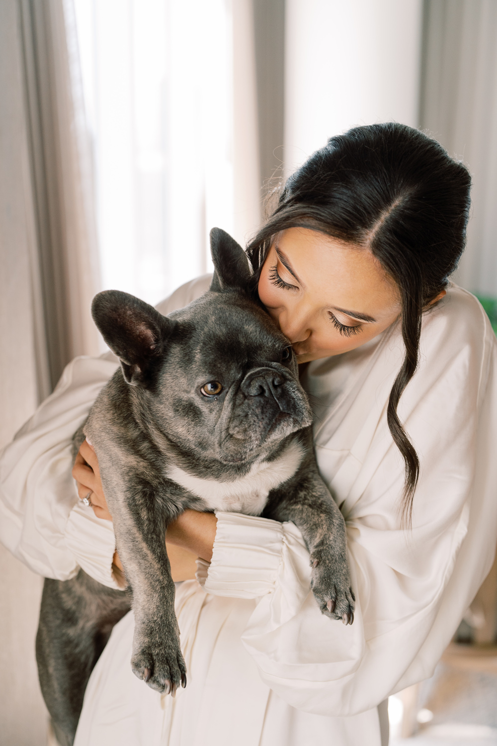
Can we all take a moment to appreciate how adorable Sam and Landon’s pup looks printed on these custom cocktail napkins? Cocktail hour is a great opportunity to pull in really special details of our lives- like pets! I could look at this face all day!
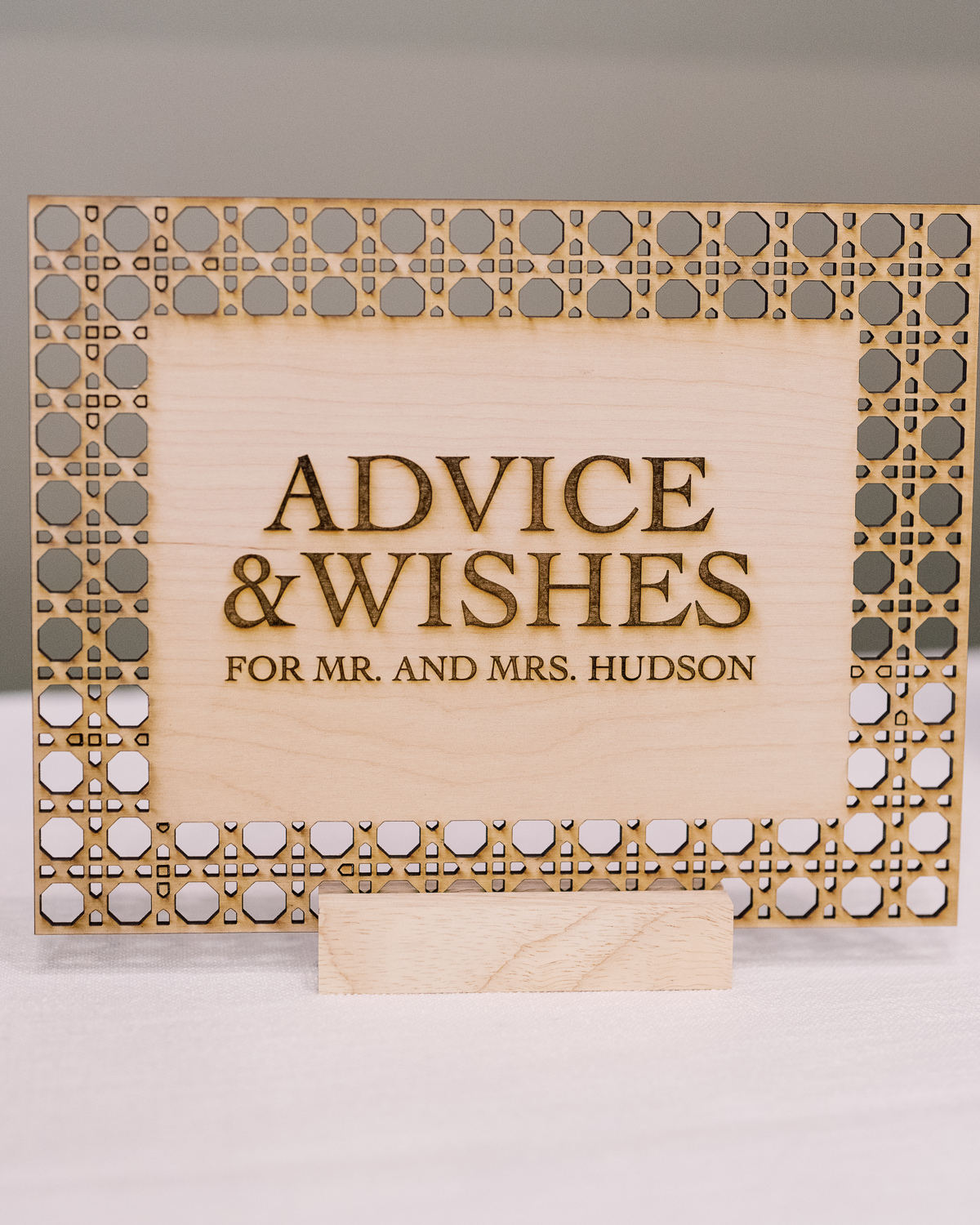
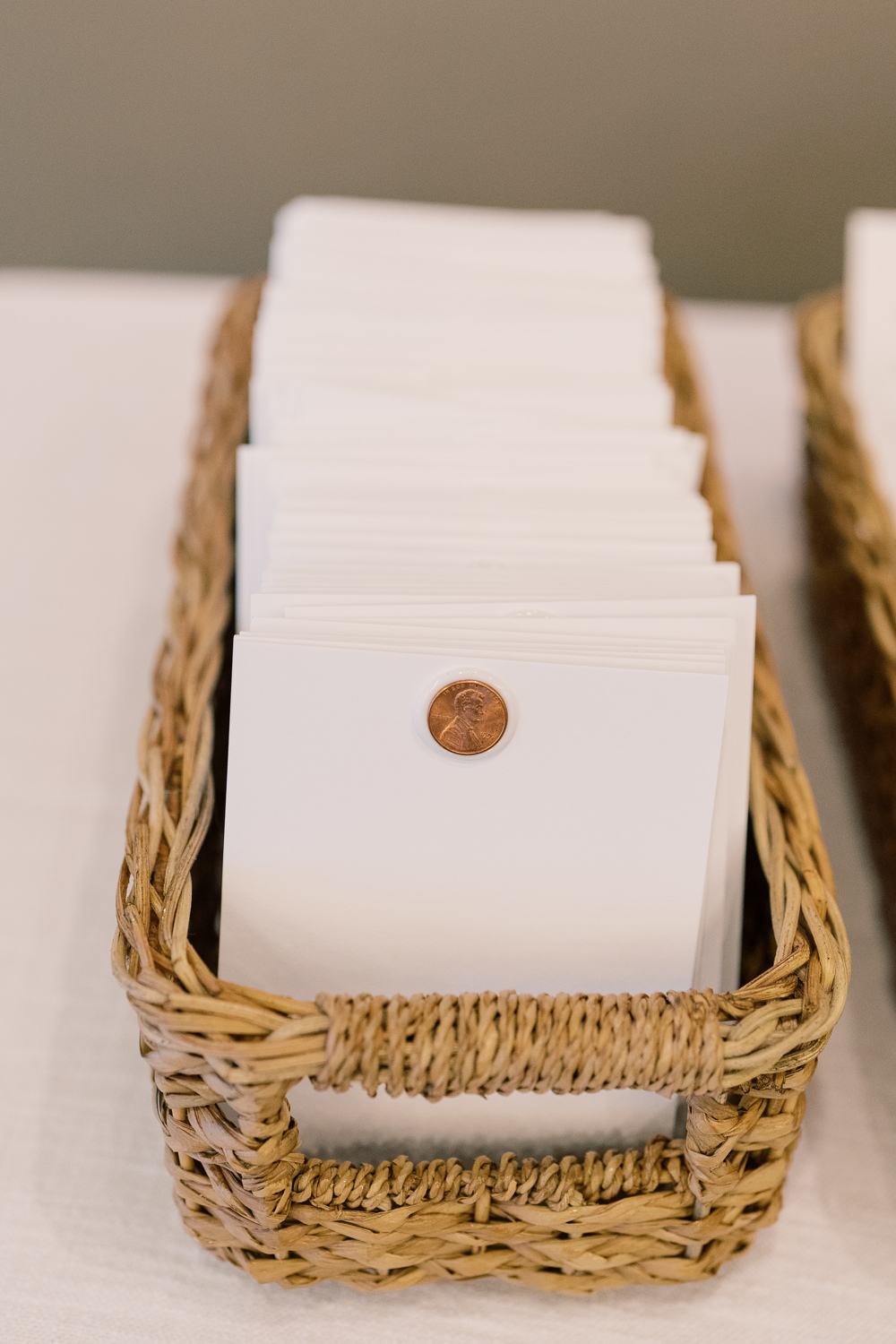
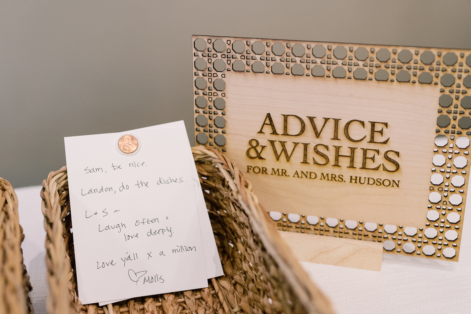
A Penny For Your Thoughts
Guests took the time to share their best advice on marriage and give well wishes as Sam and Landon created a space for “A penny for your thoughts.” This was a fun and clever way to include each guest as well as receive some welcomed advice from their closest friends and family! We were happy to be included by creating yet another one-of-a-kind laser-cut custom table sign.
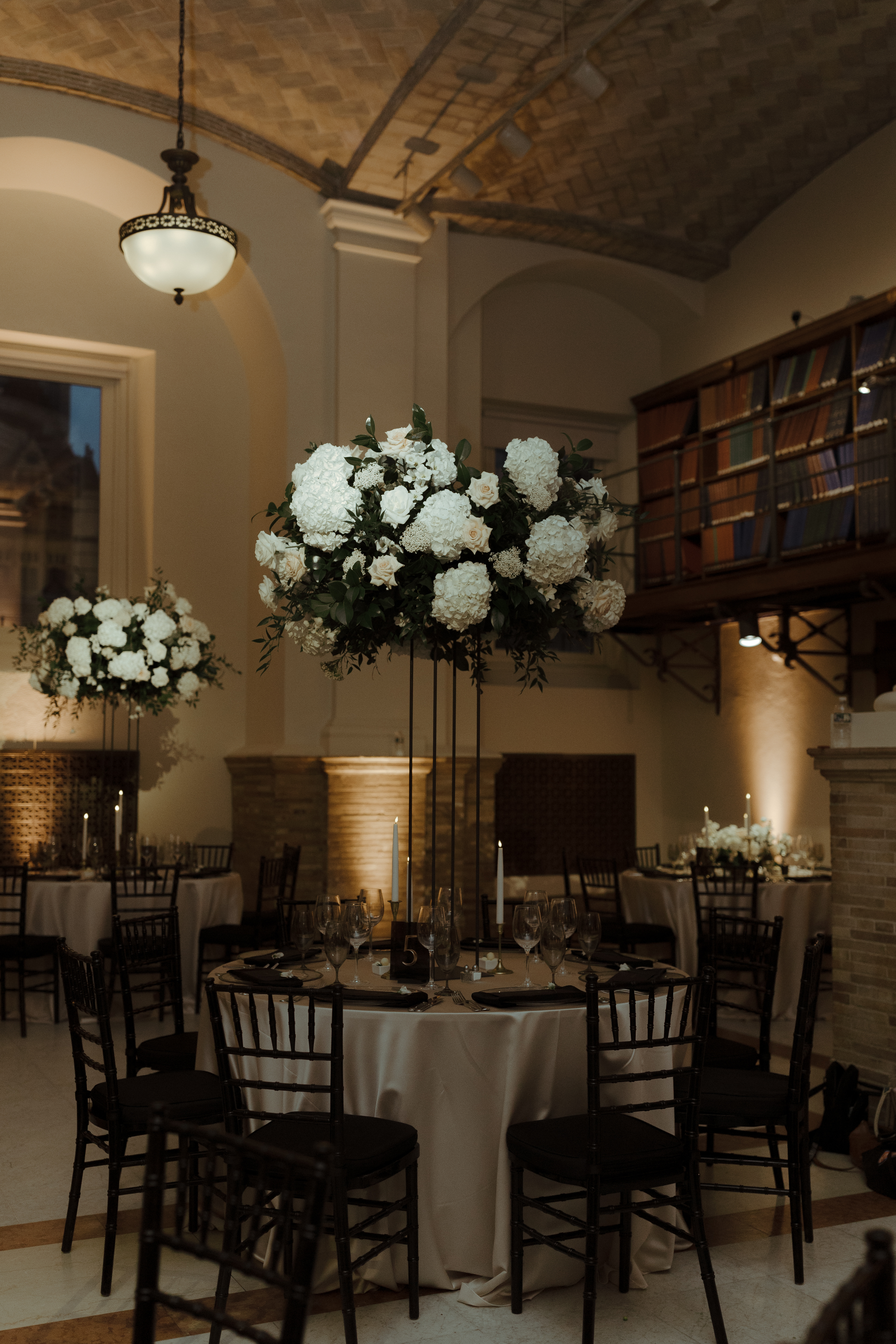
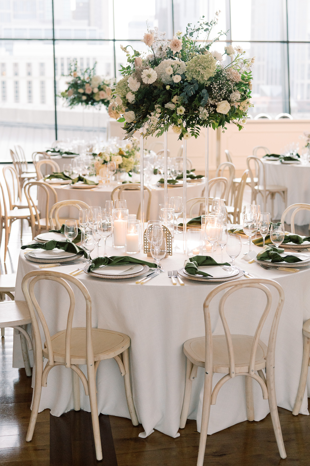
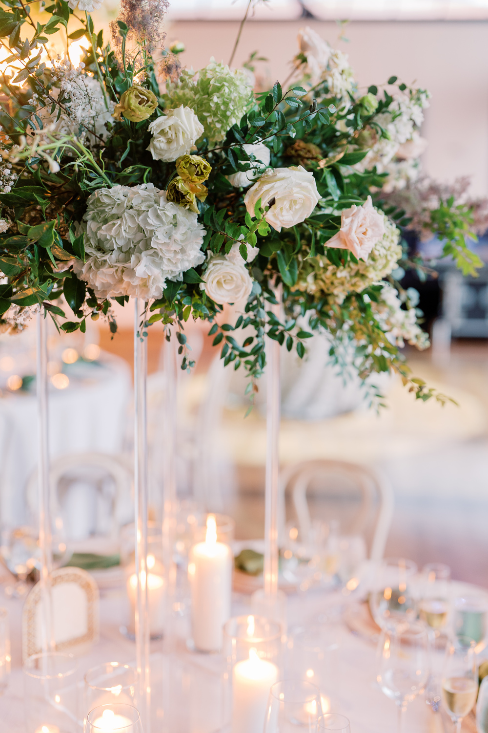
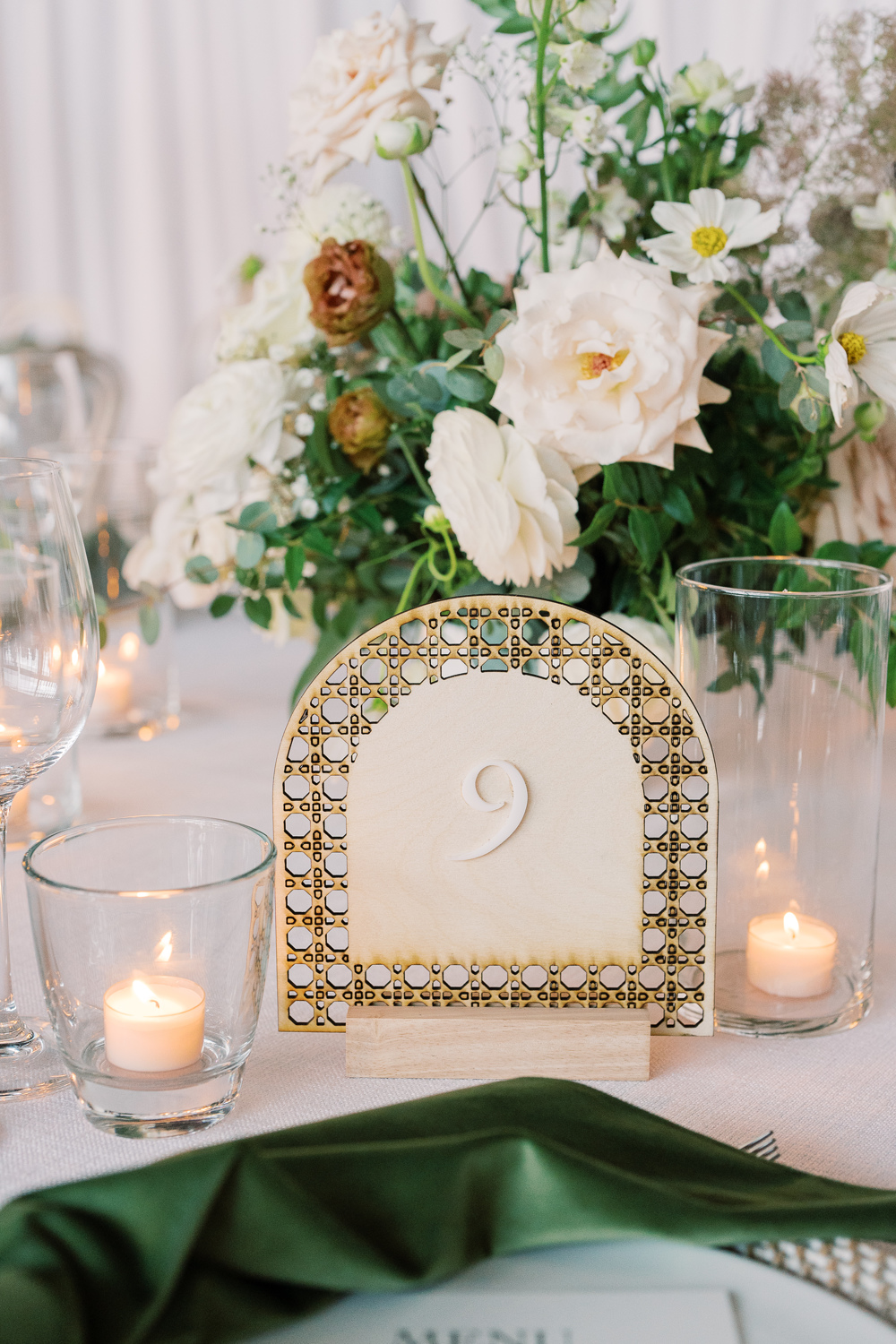
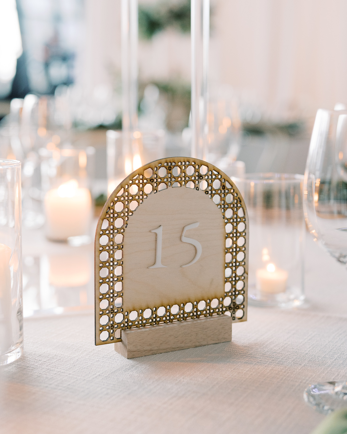
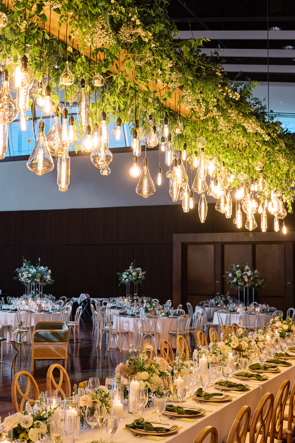
The custom signage was carried throughout the reception. Doing this can truly elevate the theme and help carry the tone of a room. The arched table numbers worked perfectly with the delicate tablescapes, and their texture offered a wonderful balance to the vibrant florals all around. Such an incredibly impressive look!
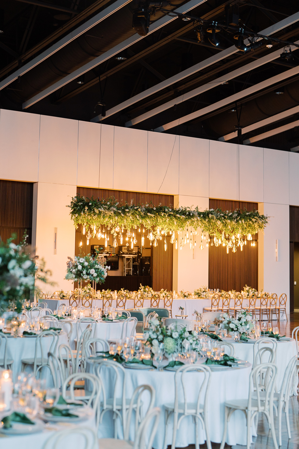
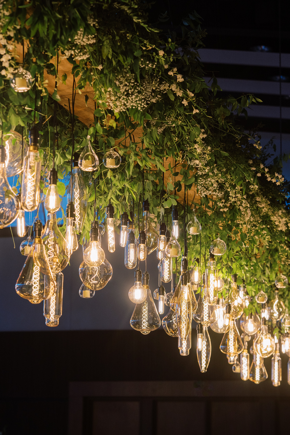
Sidenote: I still think about this floral chandelier more often than I care to admit. I mean, wow! This was such a stunning wedding in so many ways and this chandelier was a showstopper!
Custom Nashville Wedding Details
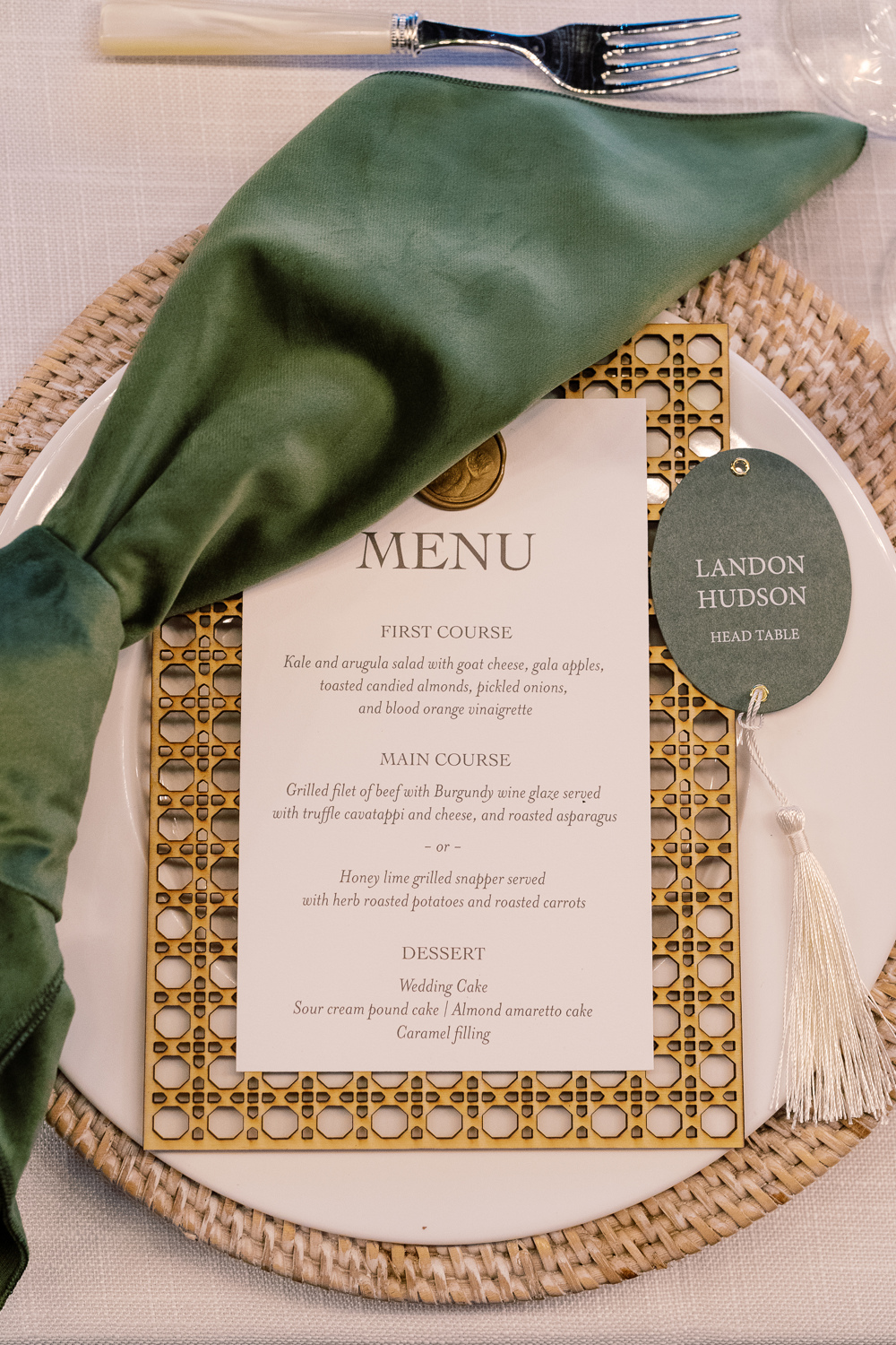
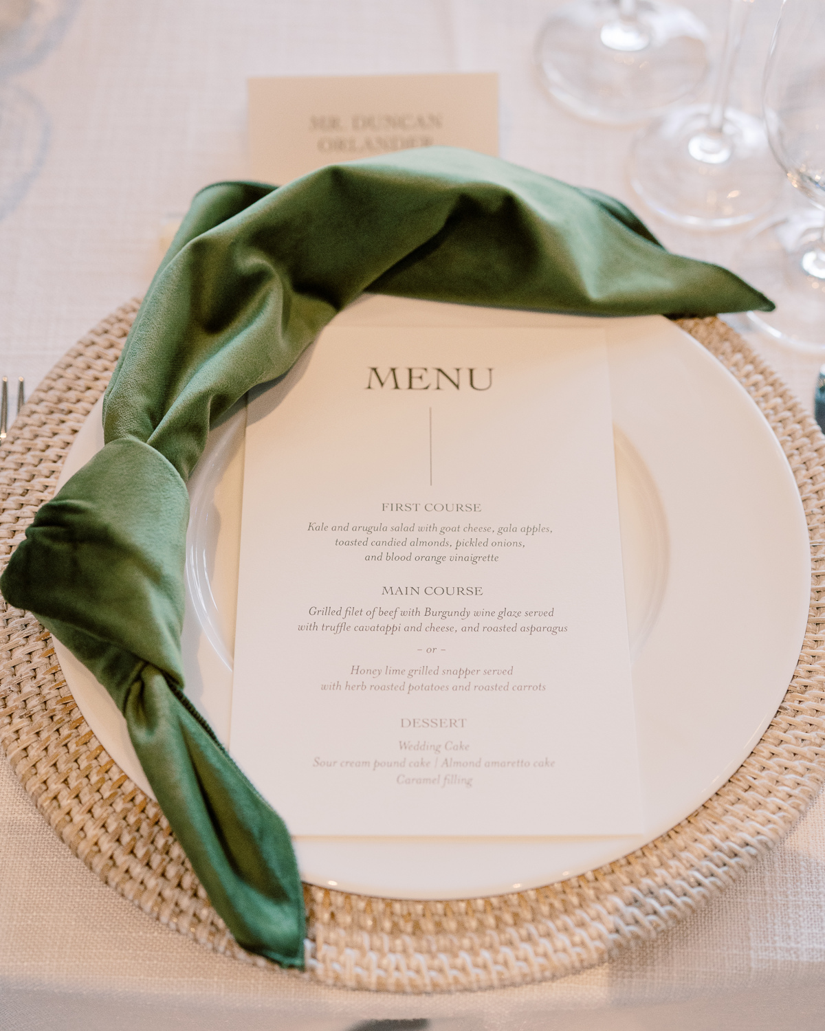
White Ink designed Sam and Landon’s reception menus that fit perfectly on top of the custom laser-cut settings we created as well! The gold wax seal to top the menu pulled this entire place setting together with the added bonus of the matching table numbers and table signage throughout. When it comes to lacing details throughout an event, THIS is how it’s done.
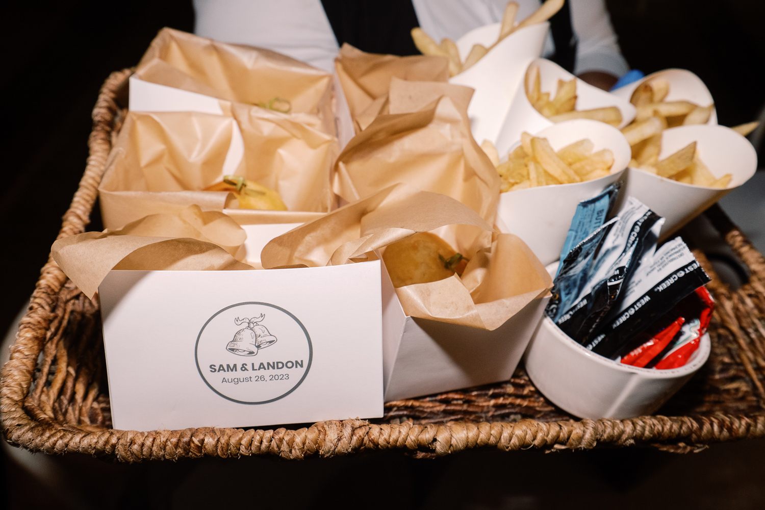
Peep the cute wedding bell prints making another appearance! This time, at the end of the night when guests were offered a yummy snack of burgers and fries. From invitation suite to burger box, this wedding bell print fit right in!
Wedding Welcome Party Details
I don’t want to wrap up without showing you guys a couple of the day-before details that White Ink did for Sam and Landon’s Wedding Welcome Party. Wedding parties and wedding rehearsal dinners are the perfect time to have fun with details and create a more intimate tone.
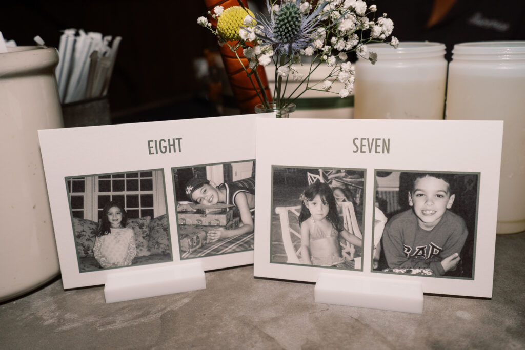
Sam and Landon wanted us to create table numbers for the welcome party that included pictures of them being the same age as the number on the sign. As you can see above, here are Sam and Landon at ages 7 and 8. Is this not the sweetest thing ever? It meant a lot to be able to provide these special table numbers for them!
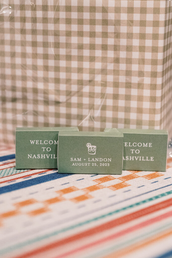
We also created a few more day-before details for Sam and Landon’s wedding welcome party. It was an honor to create items like their seating chart and the most adorable little matchboxes for the guests to take along with them. Putting in the extra effort in these more intimate settings really shows those closest to you, that they are appreciated and that you were thinking of them, which is really special!
To the happy couple, we hope you enjoy lots of love and adventure, and continue soaking in all the finer details around you! Cheers to you both!
If you’re looking to add custom, thoughtful touches to your wedding or event, we would love to help make your vision a reality. Reach out today to learn more about our full-service design offerings—we can’t wait to create something unforgettable for you!
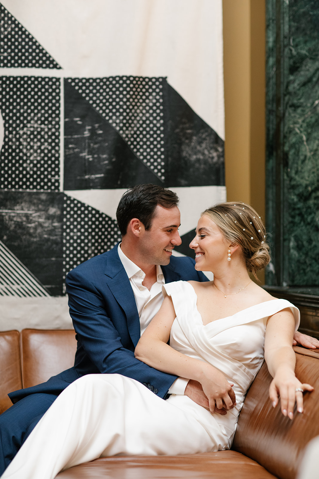
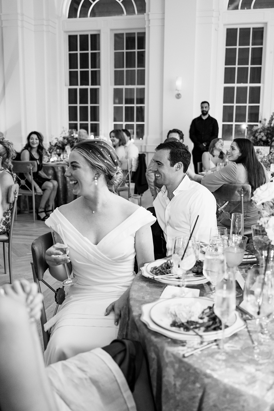
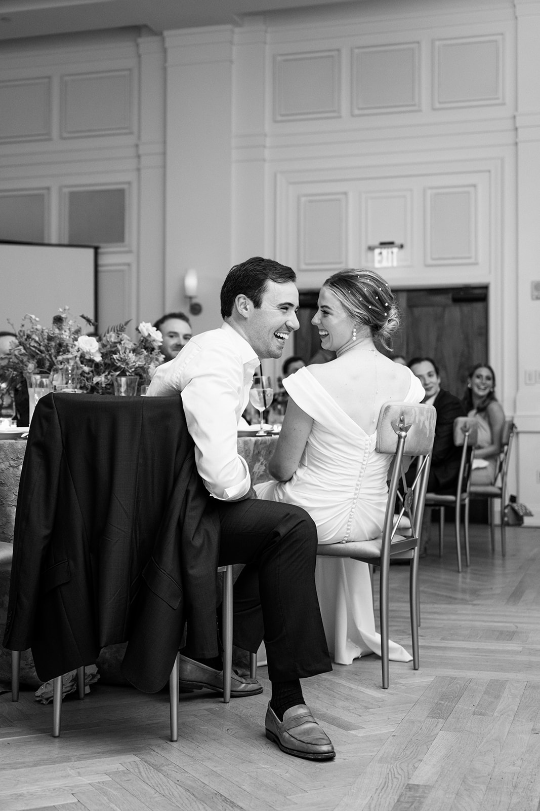
A bride and groom’s time to shine isn’t narrowed down to just one day. Sometimes, the most meaningful moments happen in the days surrounding a wedding day. One of the biggest roles of a rehearsal dinner is to allow the bride and group an opportunity to properly welcome family and the wedding party. Cason and Eddie set the bar for what a rehearsal dinner should look like and feel like! White Ink was honored to take part in delivering this rehearsal dinner to remember!
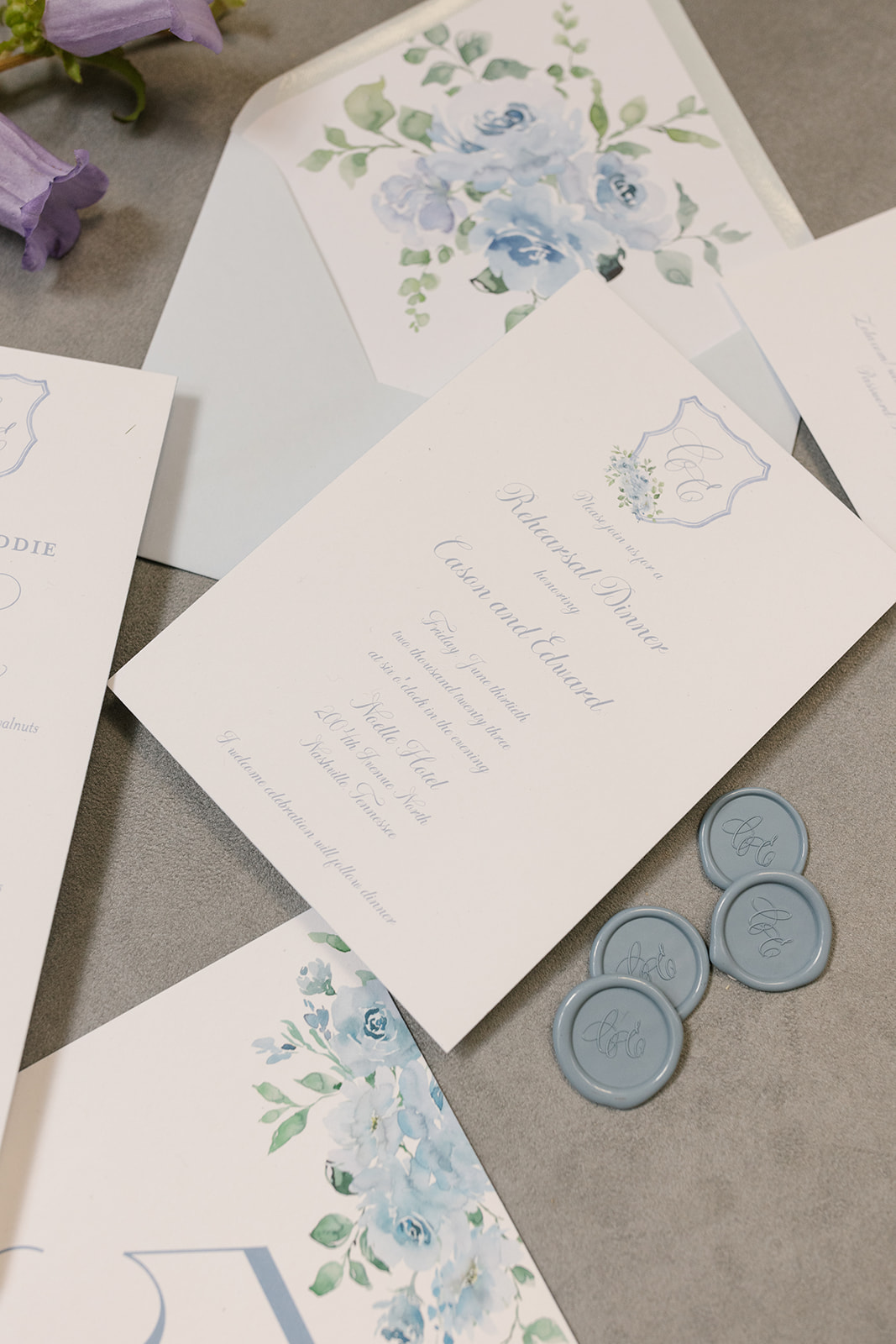
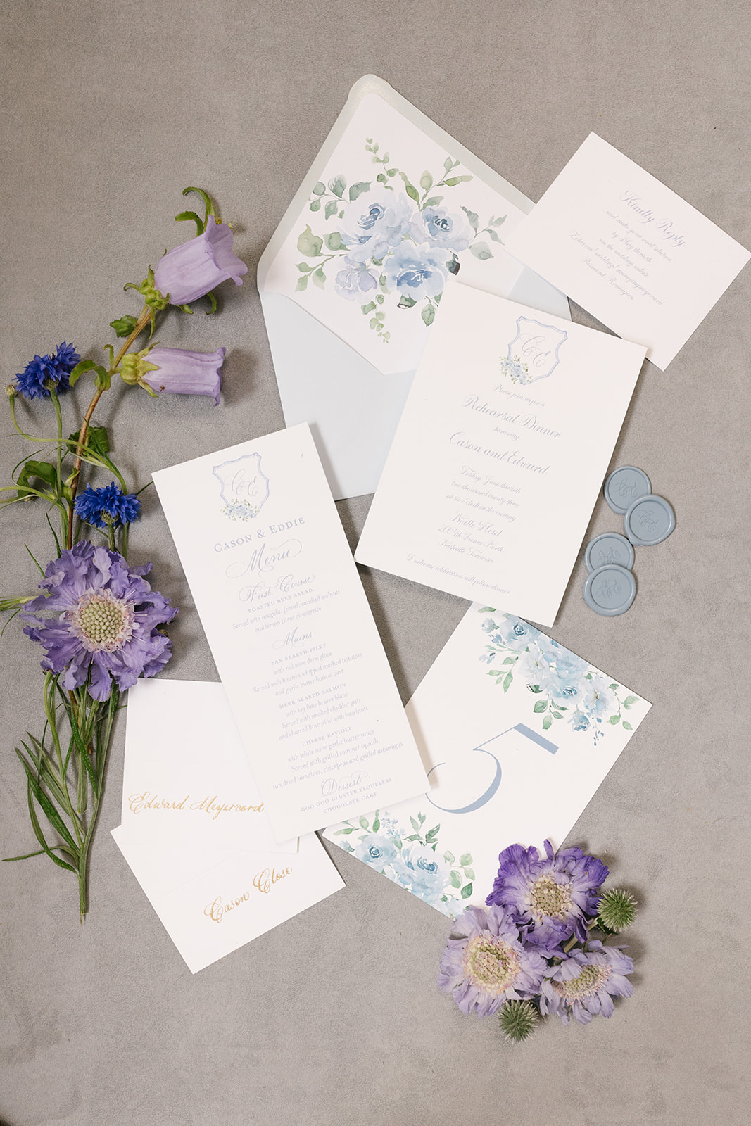
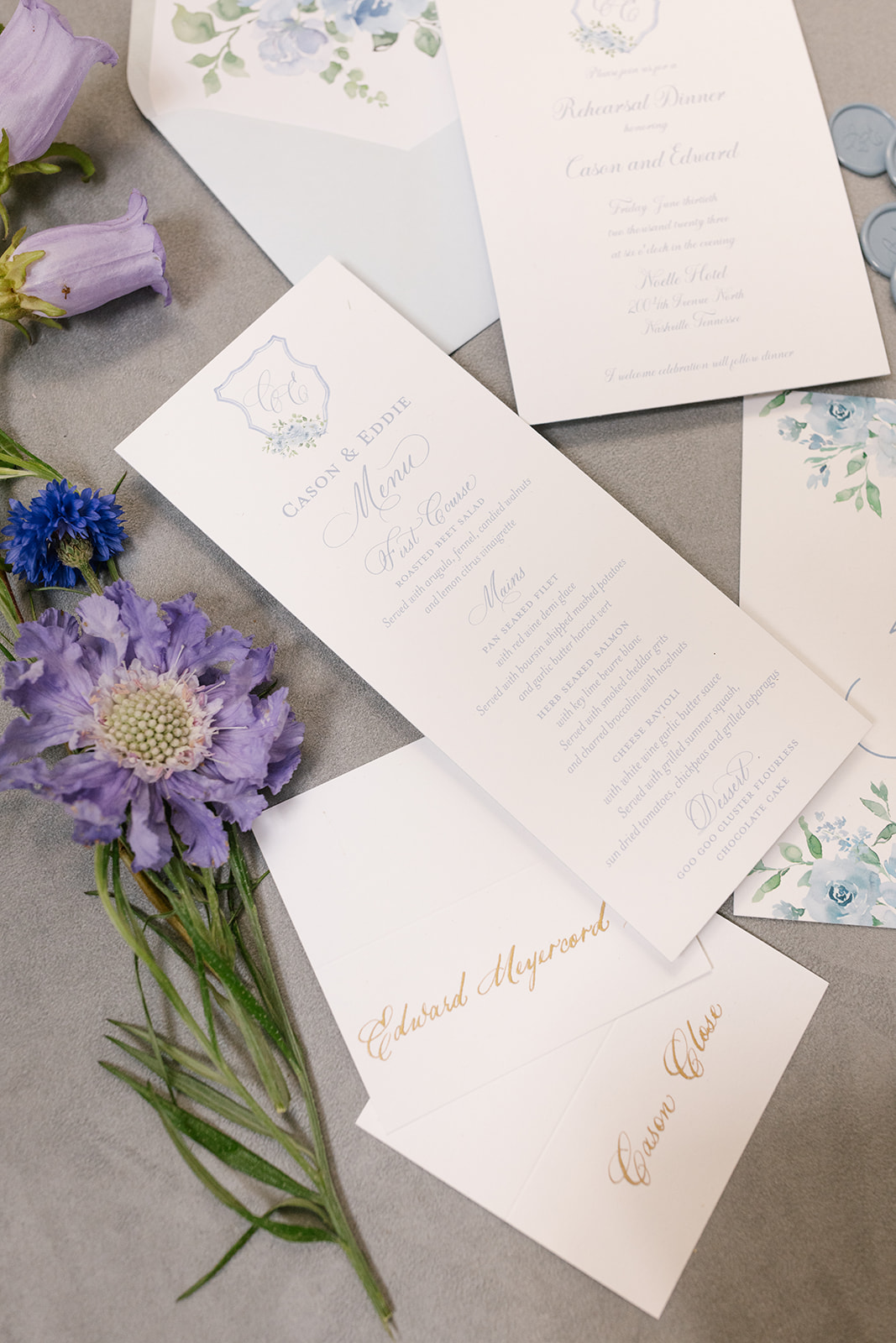
Rehearsal Dinner Invite + Paper Goods
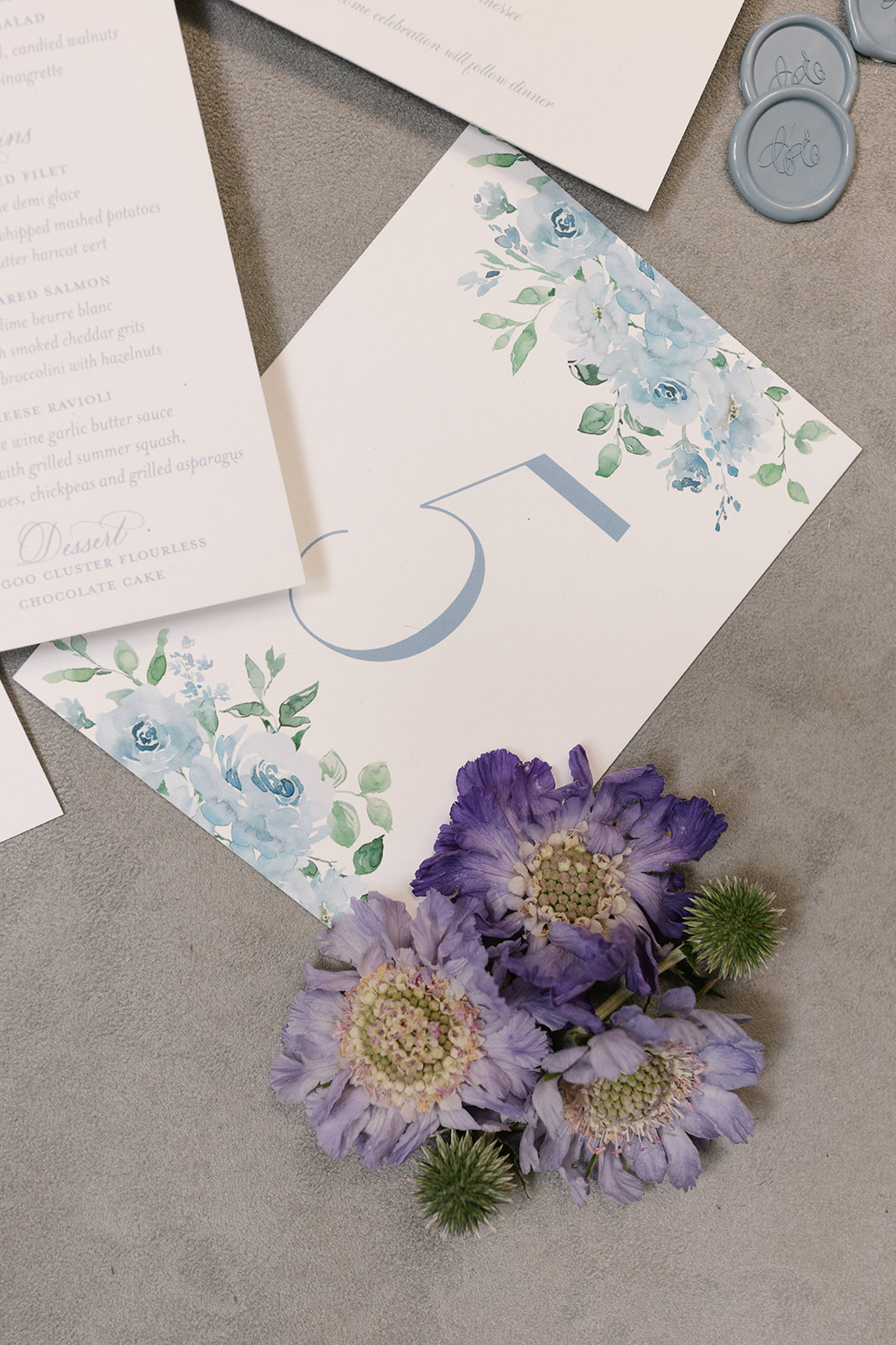
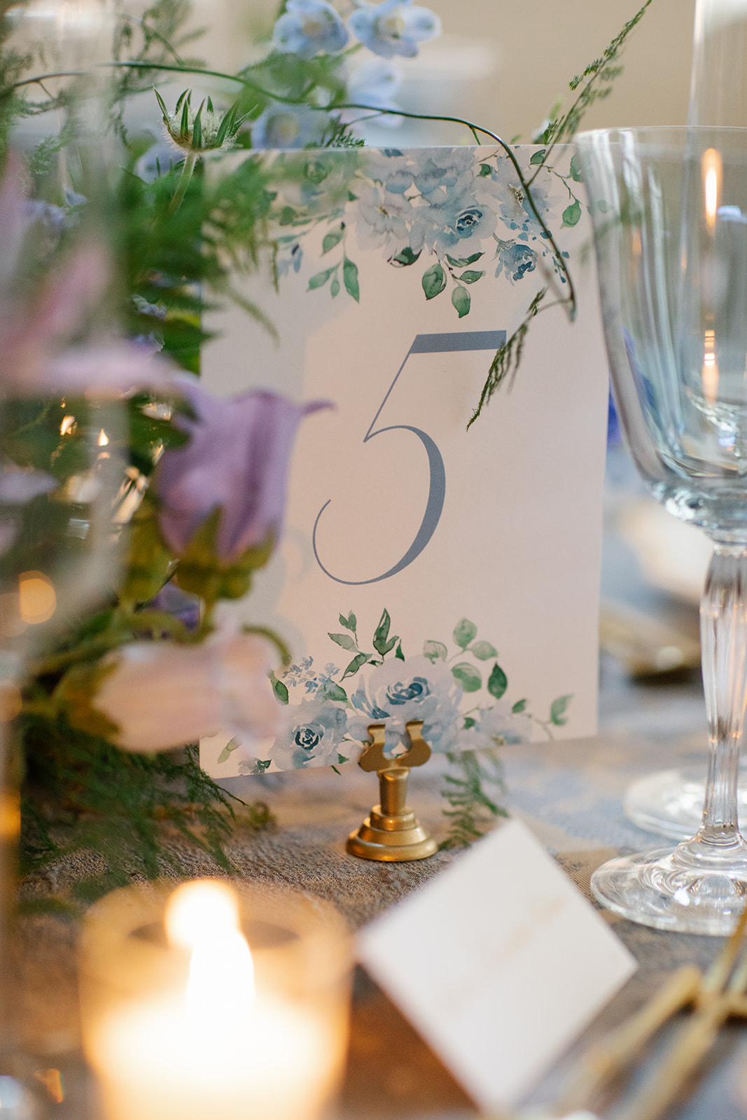
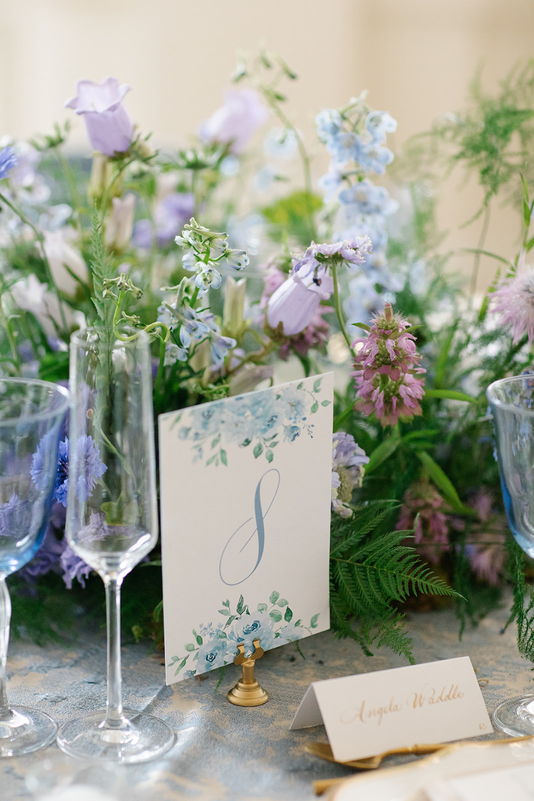
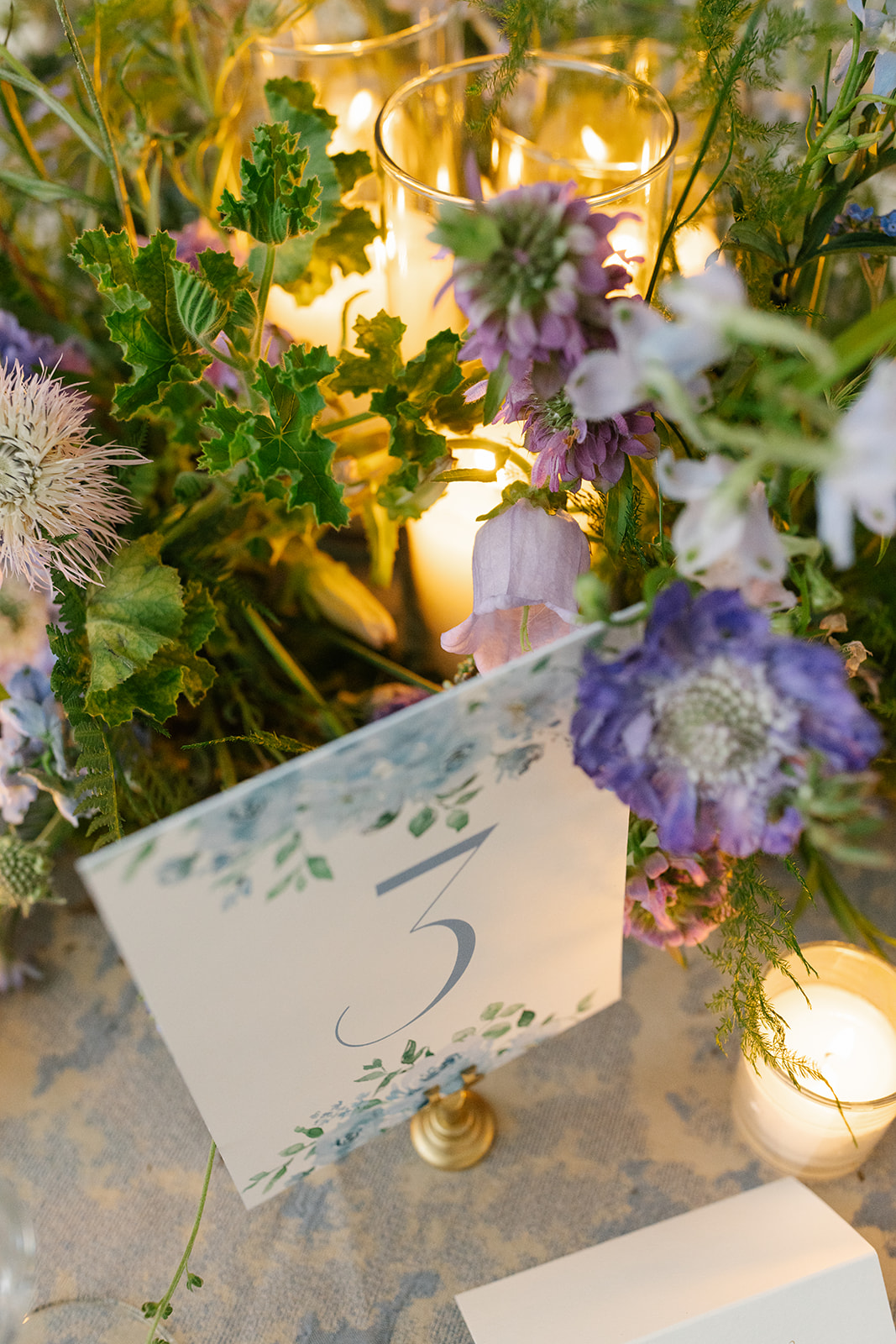
White Ink knows how to deliver the goods…. paper goods! Cason and Eddie’s June nuptials offered the perfect chance for them to use the beauty of summer floral prints. The rehearsal invite liner featured a beautiful floral print also found on the custom table number signs at the reception.
I always love to see that gorgeous dusty blue hue. Our couple incorporated this color throughout the entire evening, and I simply couldn’t get enough of it.
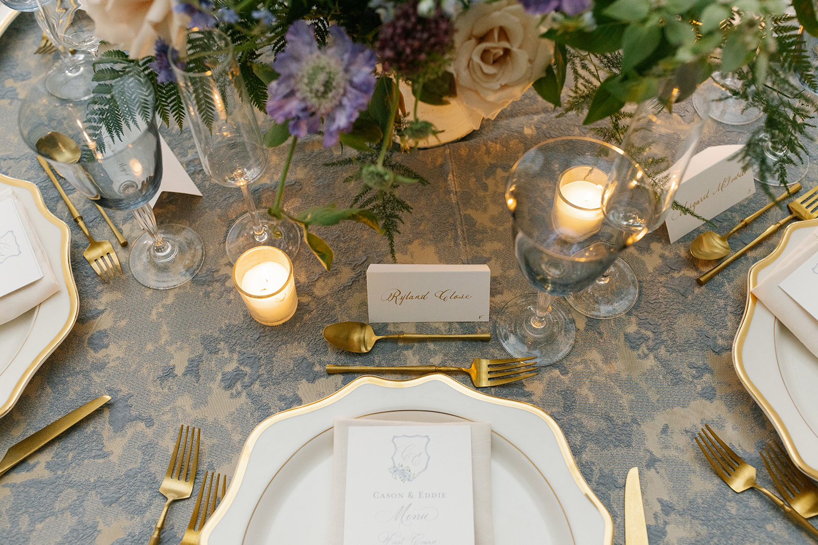
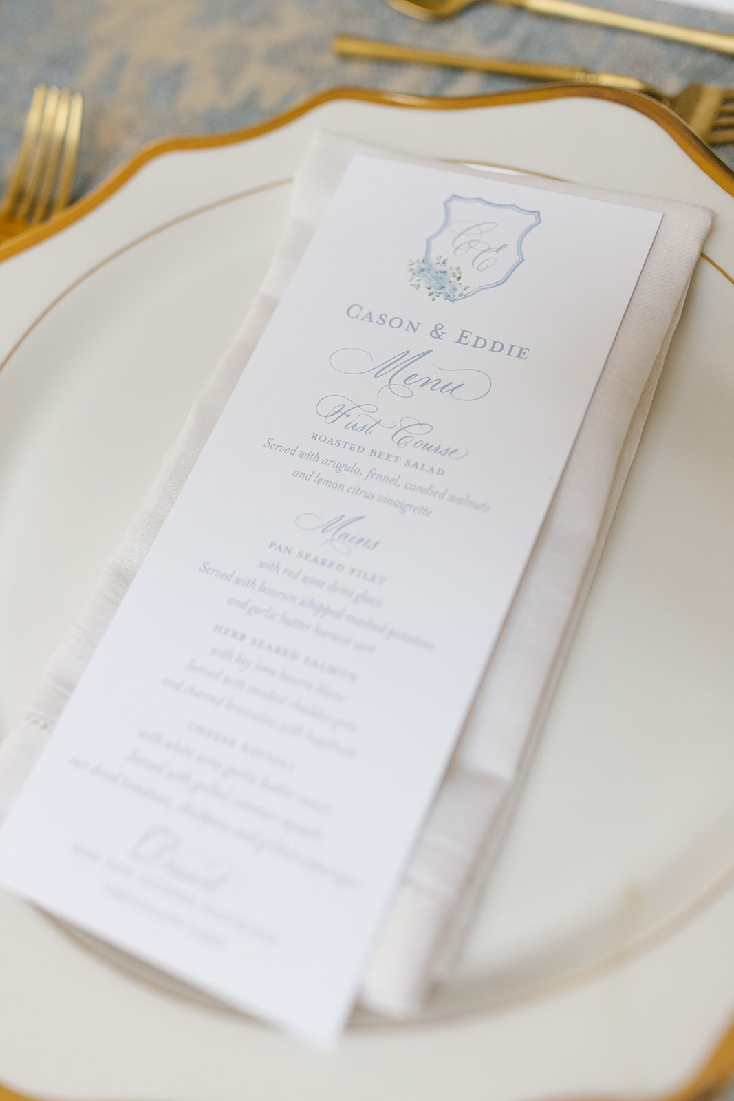
Notice the “C.E.” monogram sporting more gorgeous blue summer floral prints on both the custom Rehearsal Dinner menu and invite.
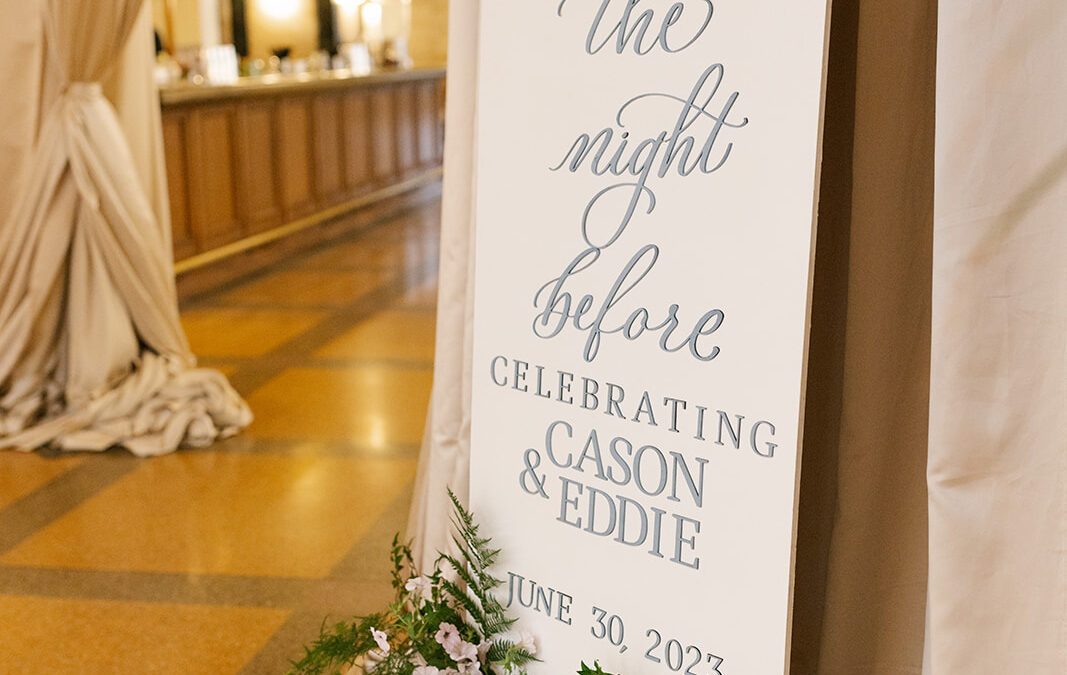
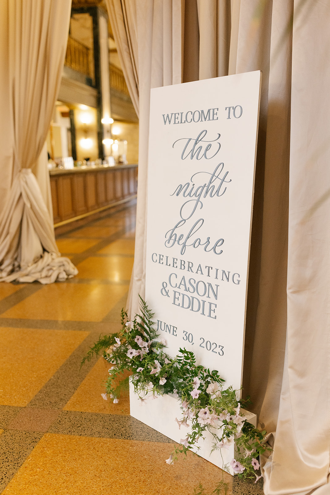
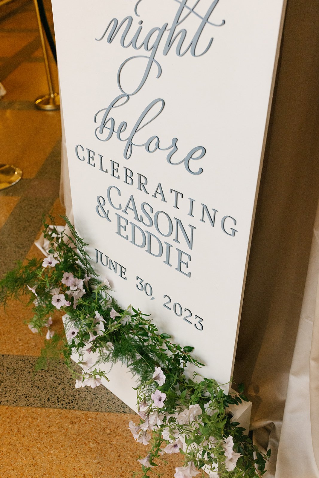
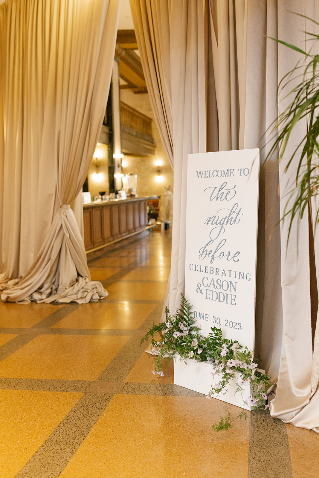
The Night Before Welcome Sign
Cason and Eddie chose the ever-stunning Noelle in Nashville to welcome their close friends and family to their wedding celebrations. We collaborated with Hill Event Rentals to put together this amazing welcome sign that was tucked perfectly against a draped entryway. The florals that lined the bottom of the sign was the cherry on top that made this welcome sign the delicate focal point that it was. Teamwork!
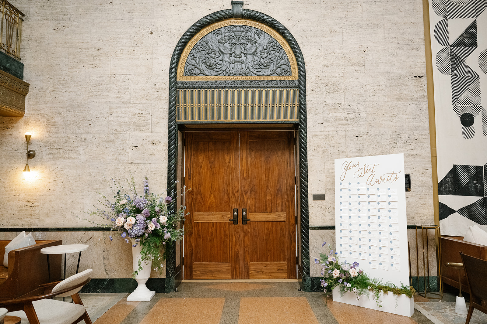
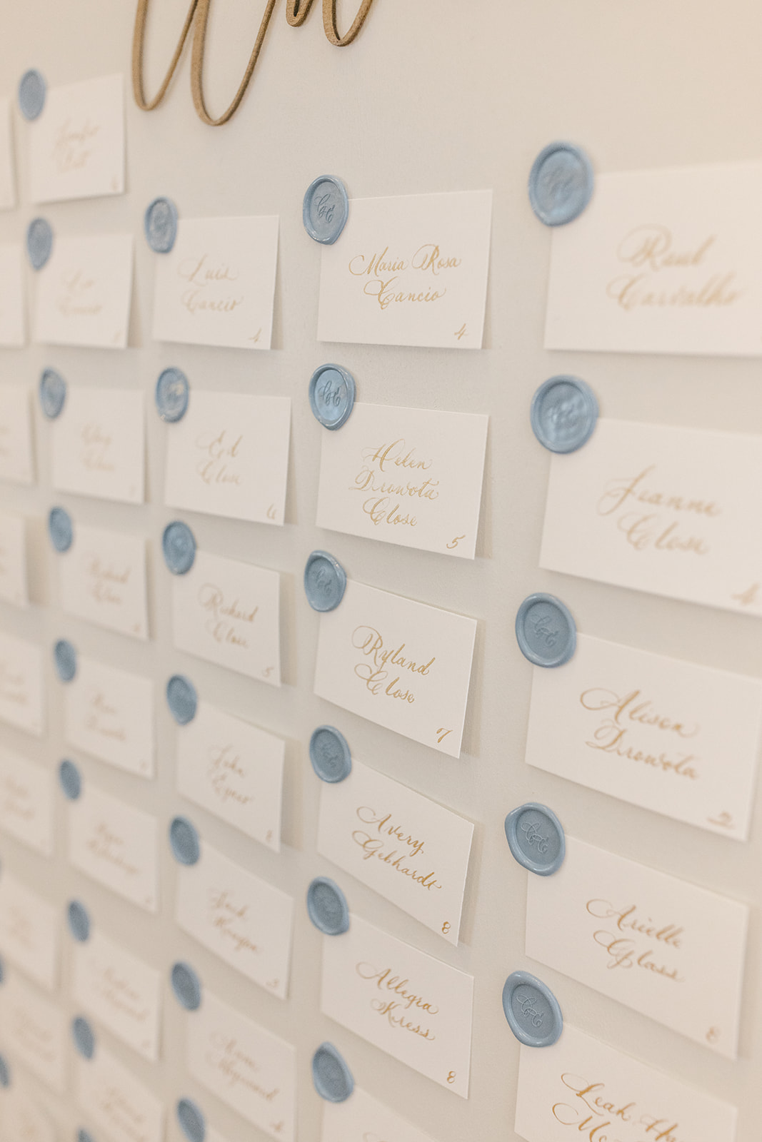
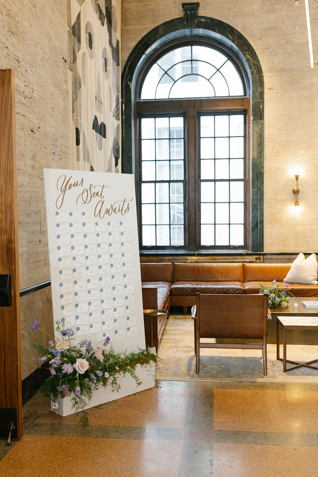
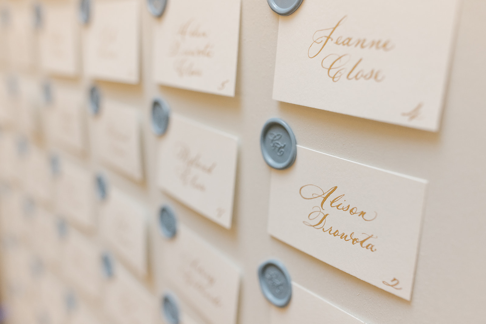
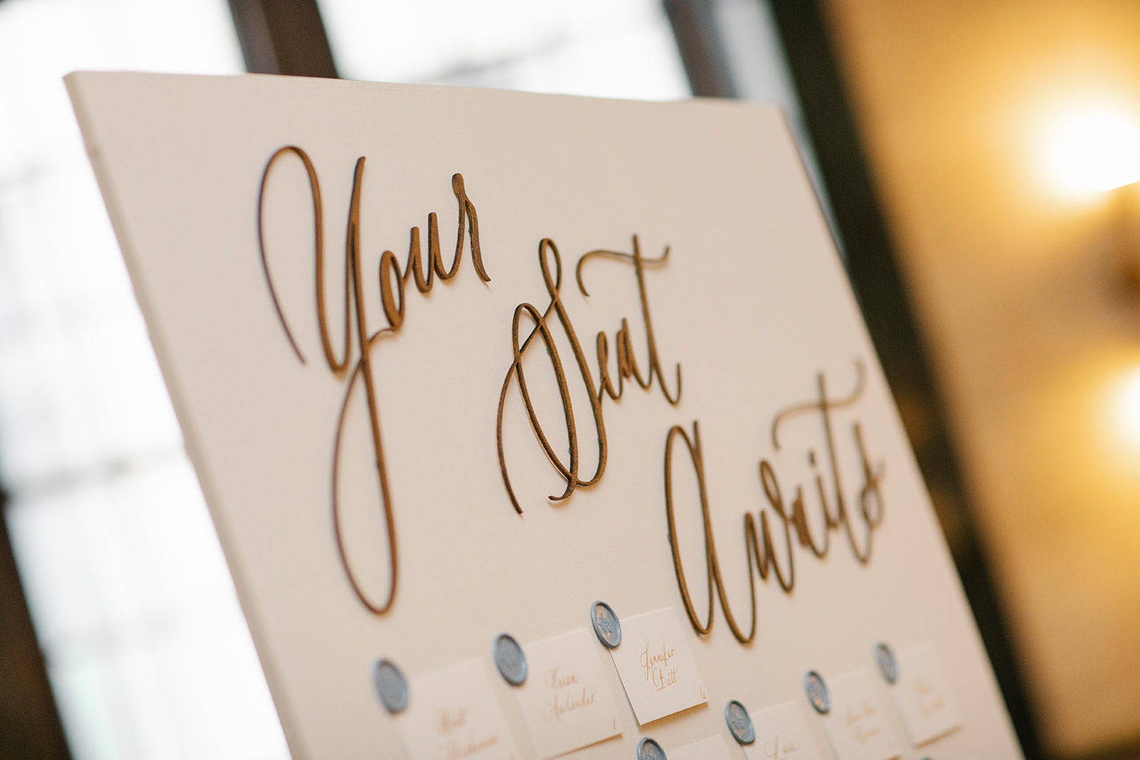
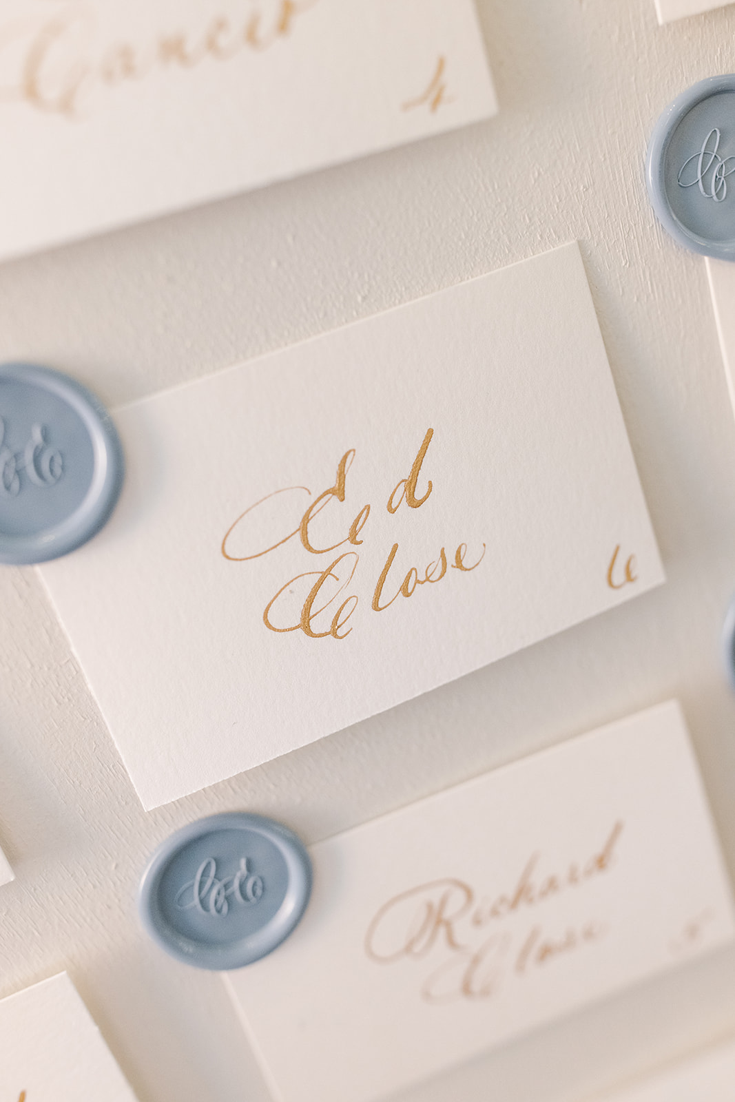
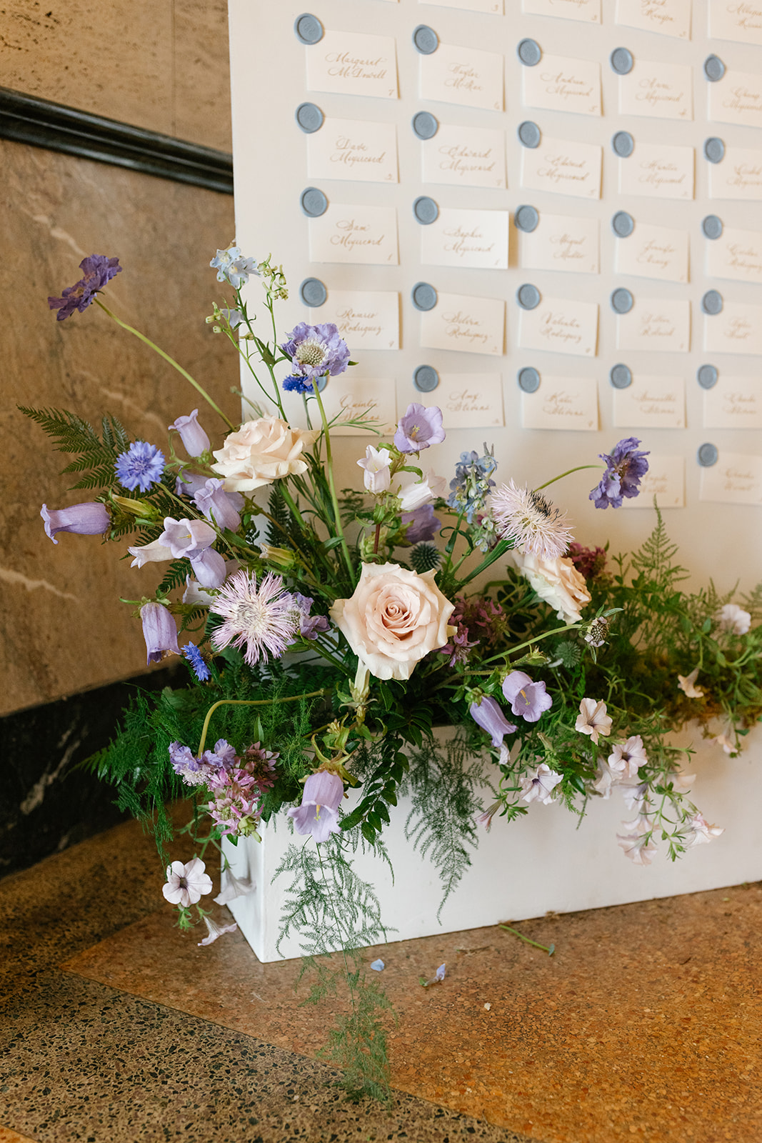
“Your Seat Awaits”
“Your Seat Awaits,” topped the escort card display. Hill Event Rentals once again showcased some of their best work with building this display to match the Welcome Sign display. White Ink did what we do best and added the laser-cut text along with individually calligraphed place cards, complete with a custom monogram wax seal.
Remember, event signage doesn’t have to be cold or bossy. Direct your guests in a warm and beautiful way! Feel free to make it unique and even playful! We love helping our clients with these ideas.
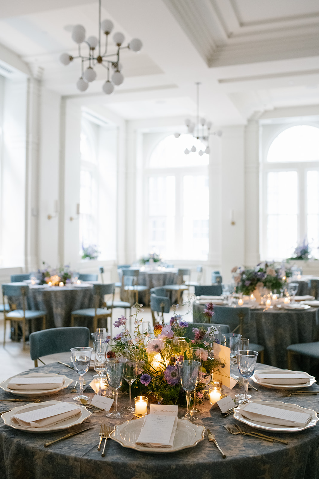
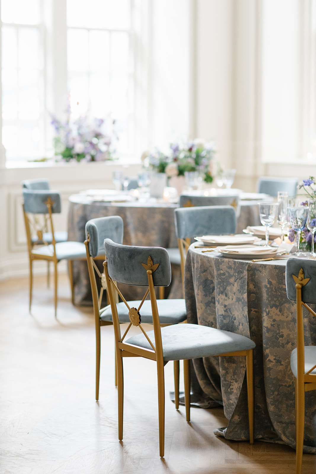
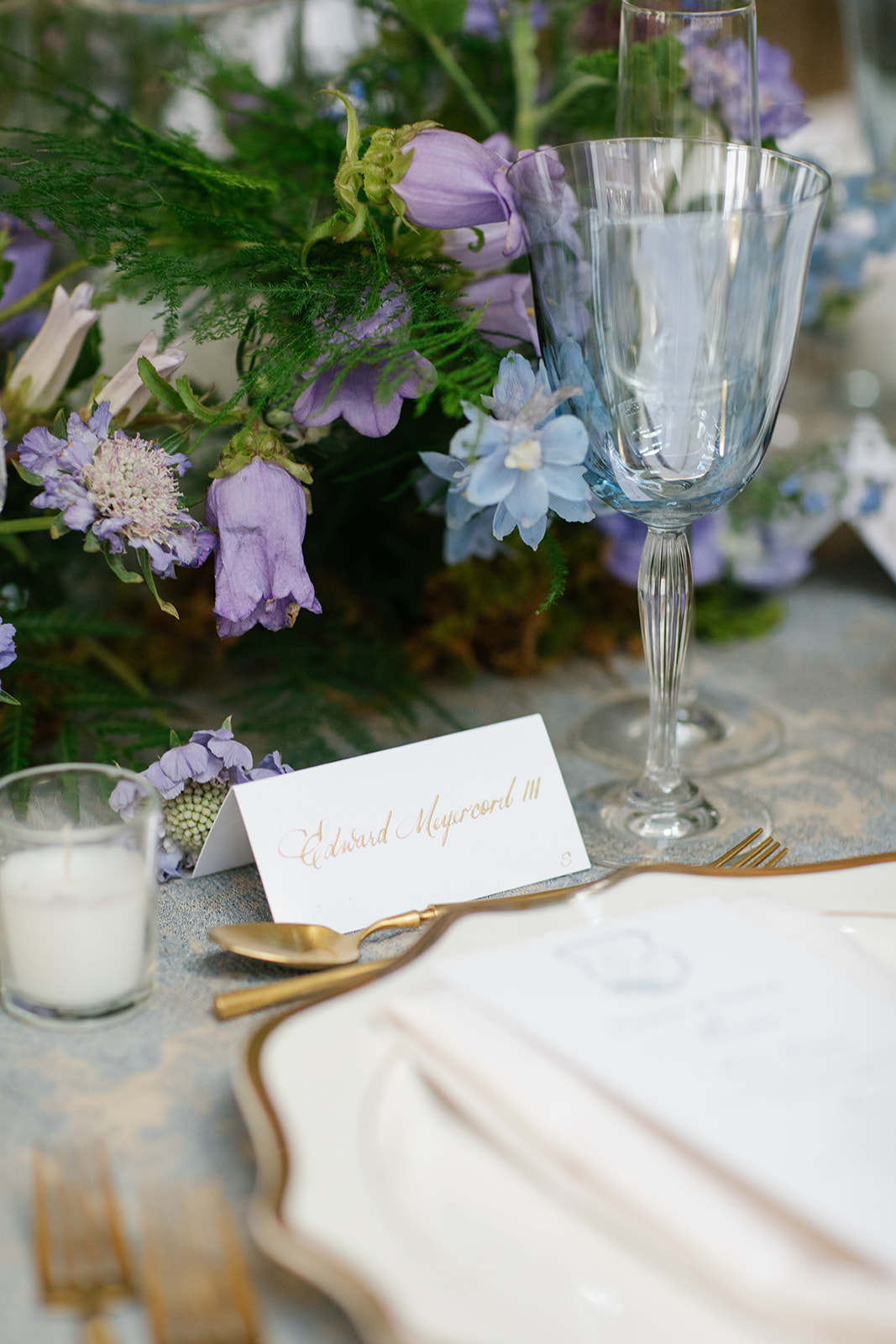
The table numbers fit perfectly into the stunning formal tablescapes in the Noelle’s Sadiee Gallery Grand Ballroom. They simple belonged in this room!
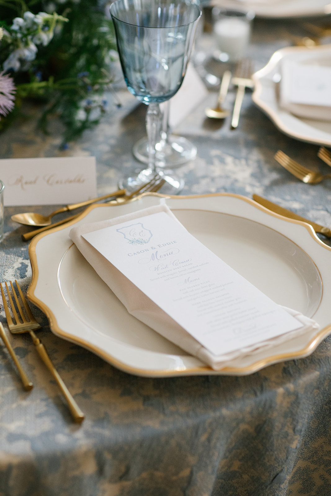
The place cards elevated the show-stopping tablescape and fit effortlessly alongside the goldware at each place setting. This is a perfect example of how one seemingly small detail can really pack a big decor punch!
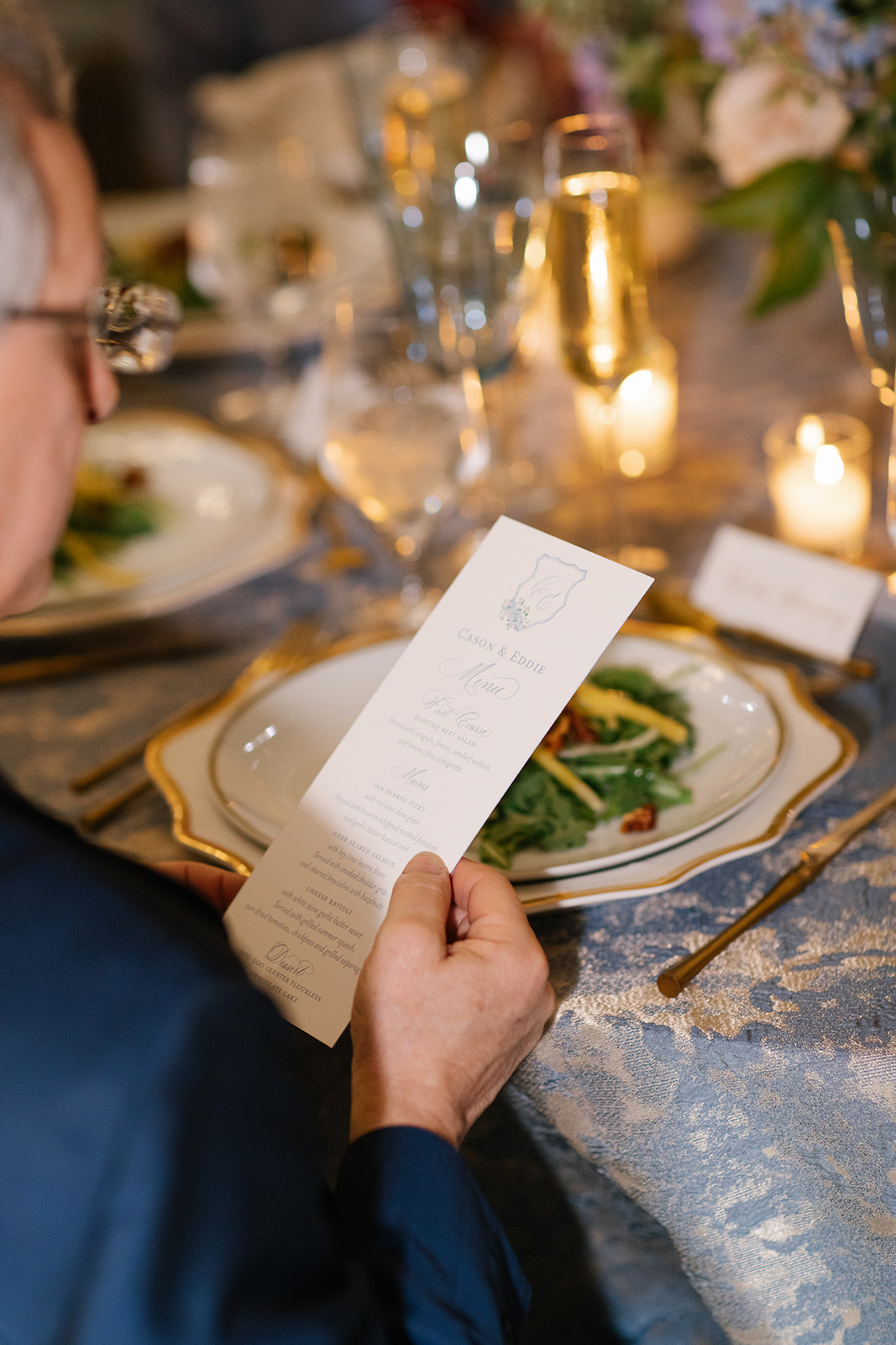
Custom Event Menus
We designed a classic, custom menu for Cason and Eddie. Carrying details like color and prints throughout the whole of an event sends a message of intention and thoughtfulness and can show guests that their enjoyment is a really big part of the planning process!
Cason and Eddie made sure that their family and wedding party received a proper welcome. It meant so much to be a part of this rehearsal dinner to remember! We cannot wait to share more details about their wedding day too! For now, we will hold onto memories that were made “The Night Before.”
If you’re looking to add custom, thoughtful touches to your wedding or event, we would love to help make your vision a reality. Reach out today to learn more about our full-service design offerings—we can’t wait to create something unforgettable for you!