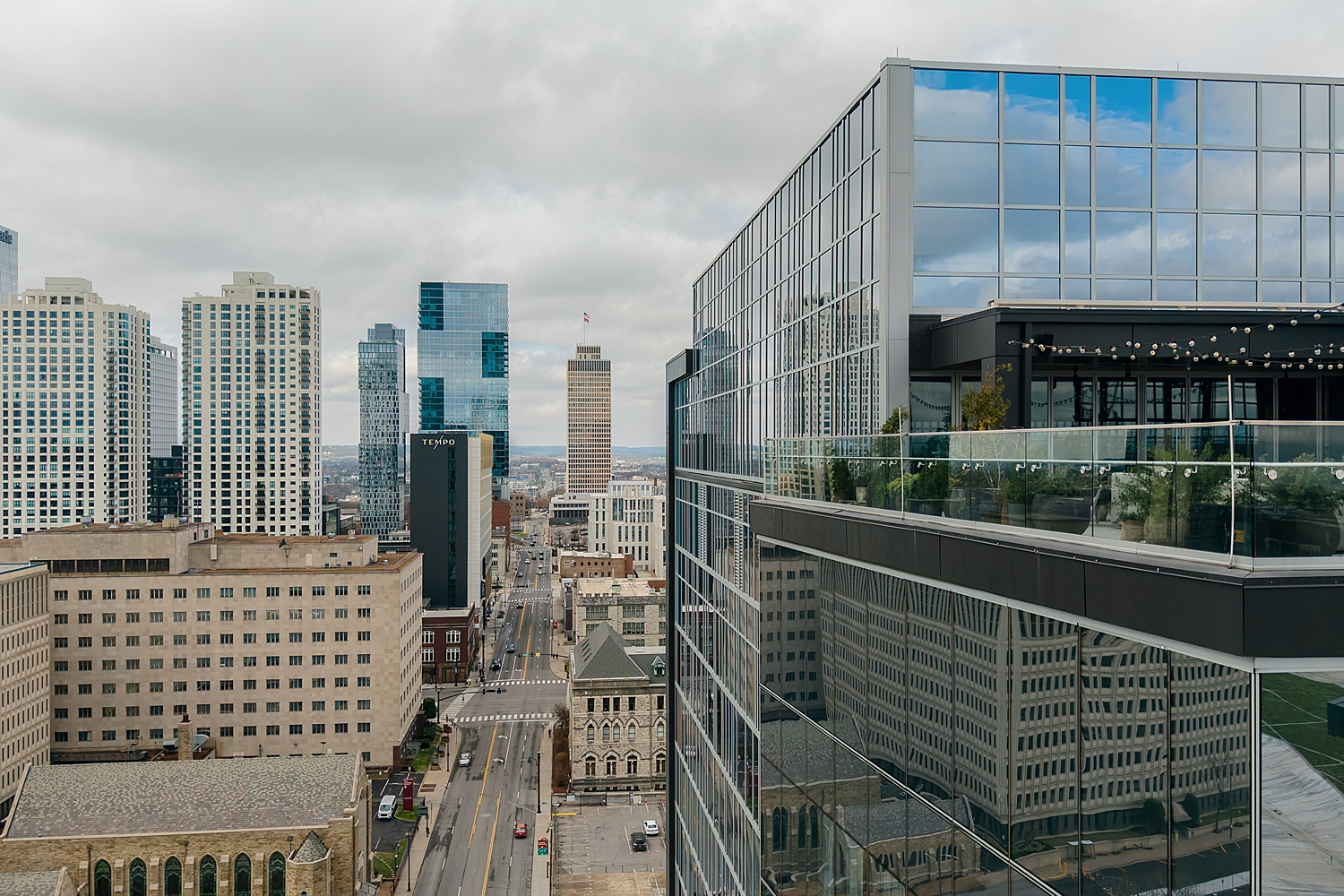
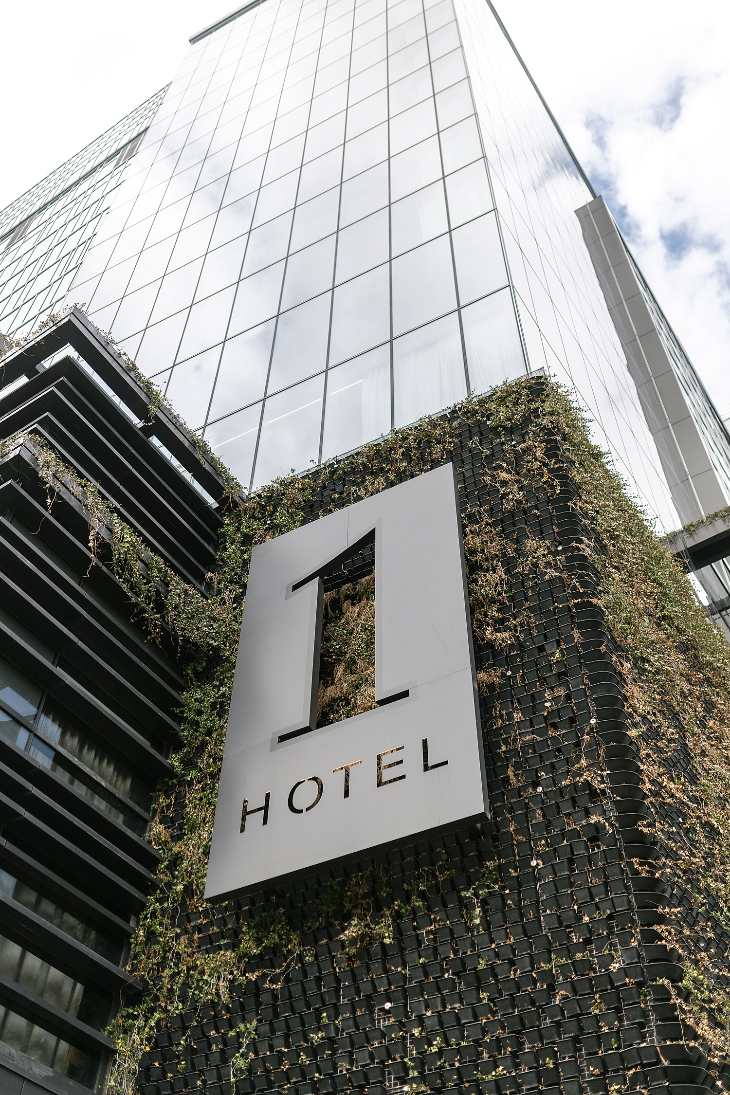
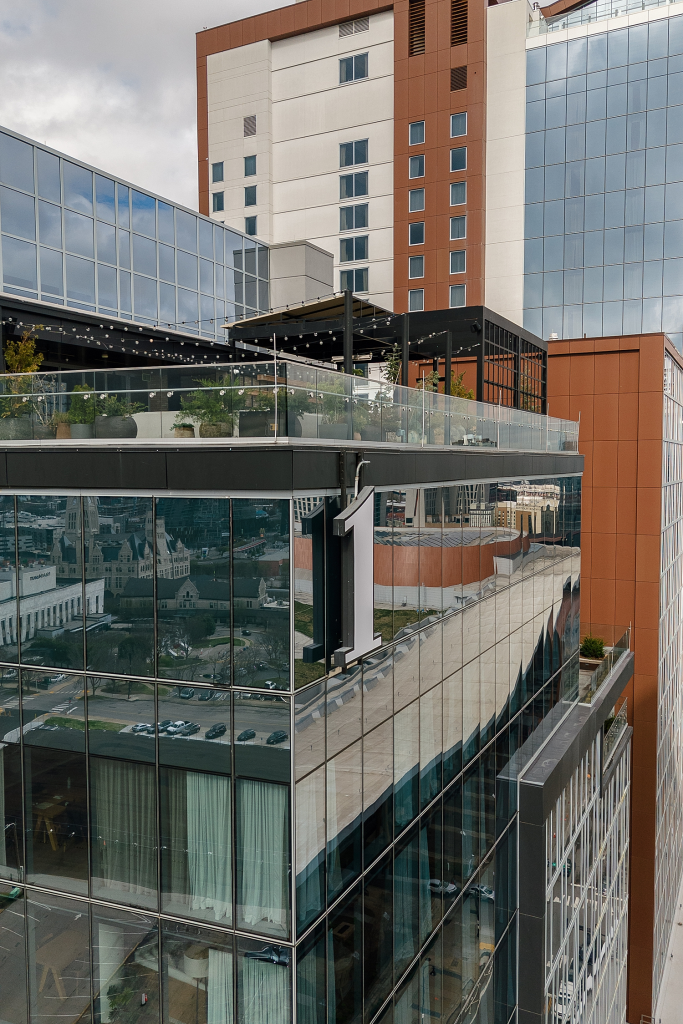
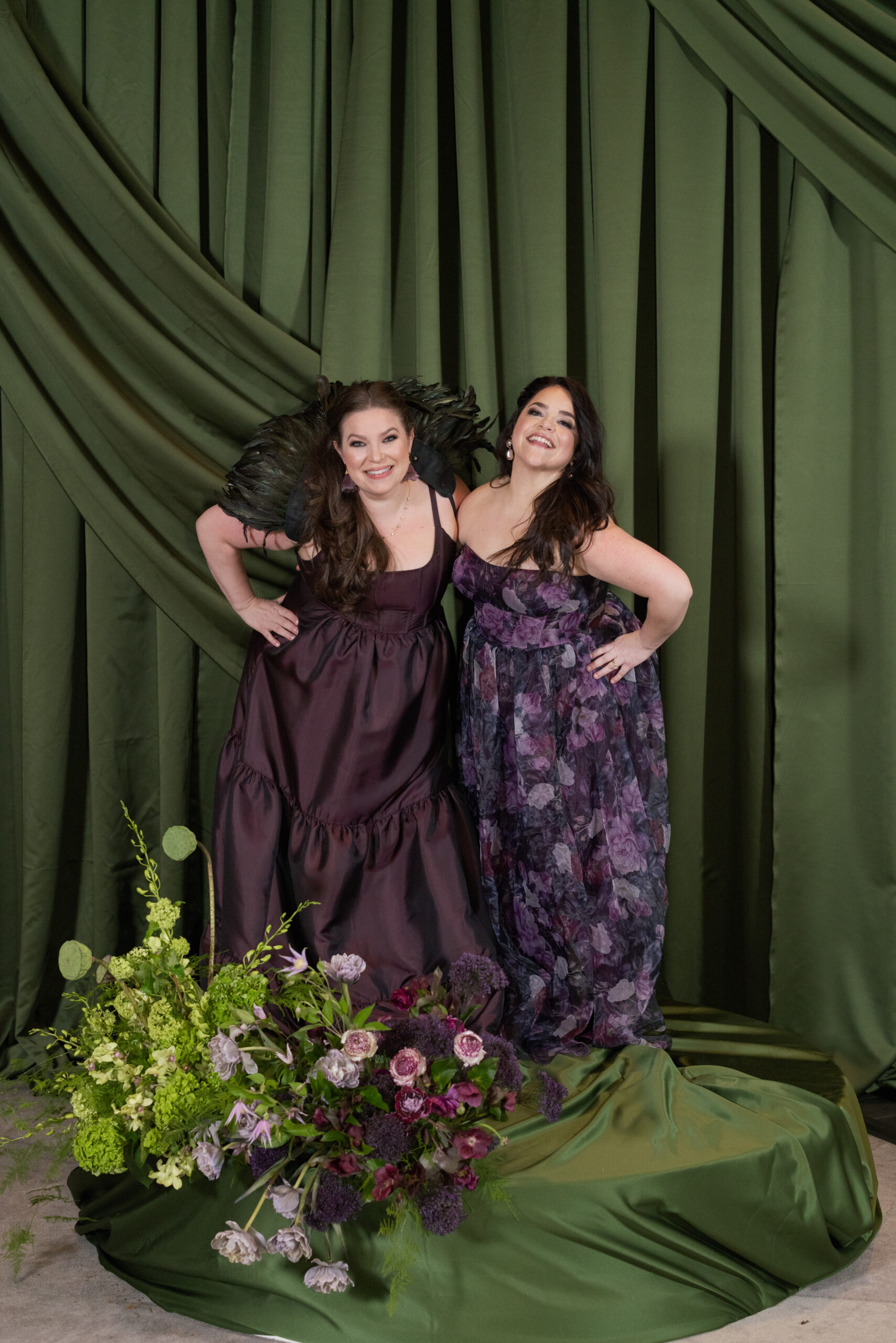
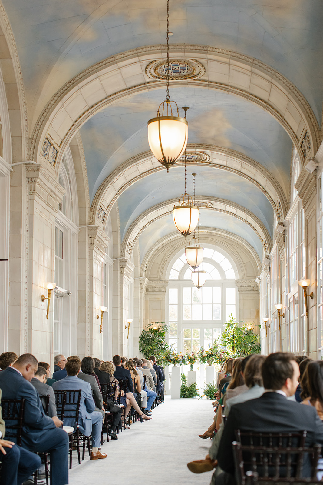
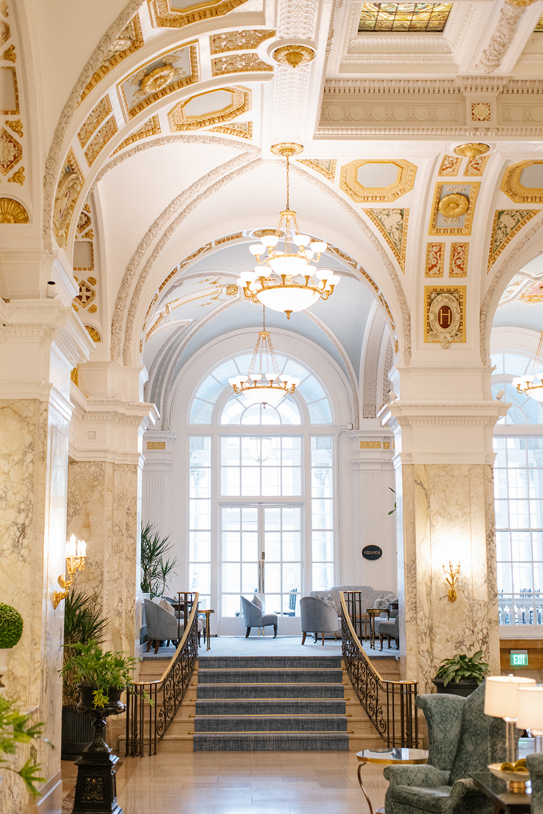
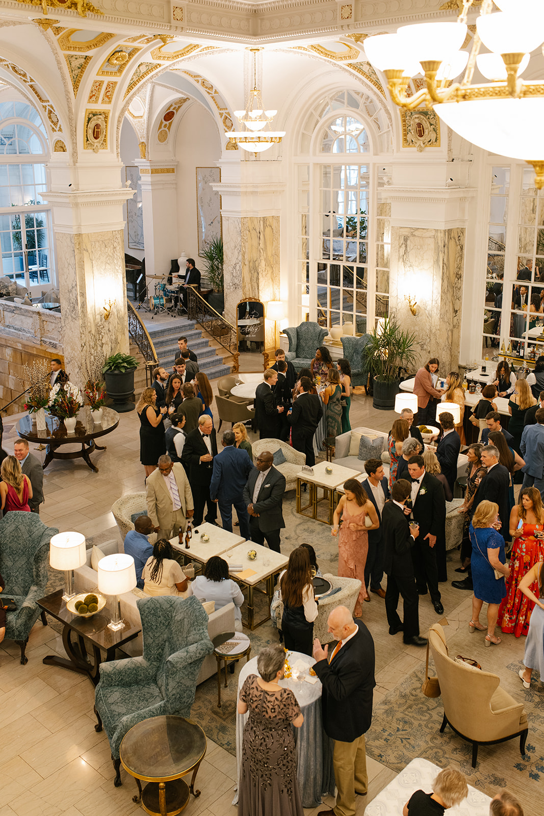
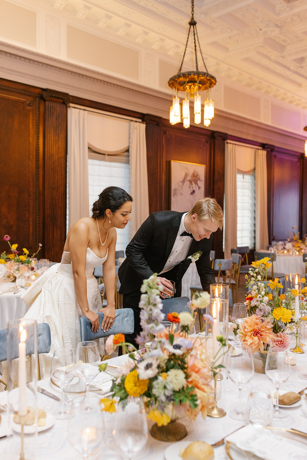
When it comes to designing for industry events, there’s an added layer of intention. Every detail matters, every texture is noticed, and every moment is an opportunity to inspire. At its heart, the evening was about inspiring creativity and making space for vendors to connect, collaborate, and celebrate one another. Needless to say, it was a true honor to plan and design elevated event details for the 2nd Annual Wipa Nashville Gala at 1 Hotel Nashville.
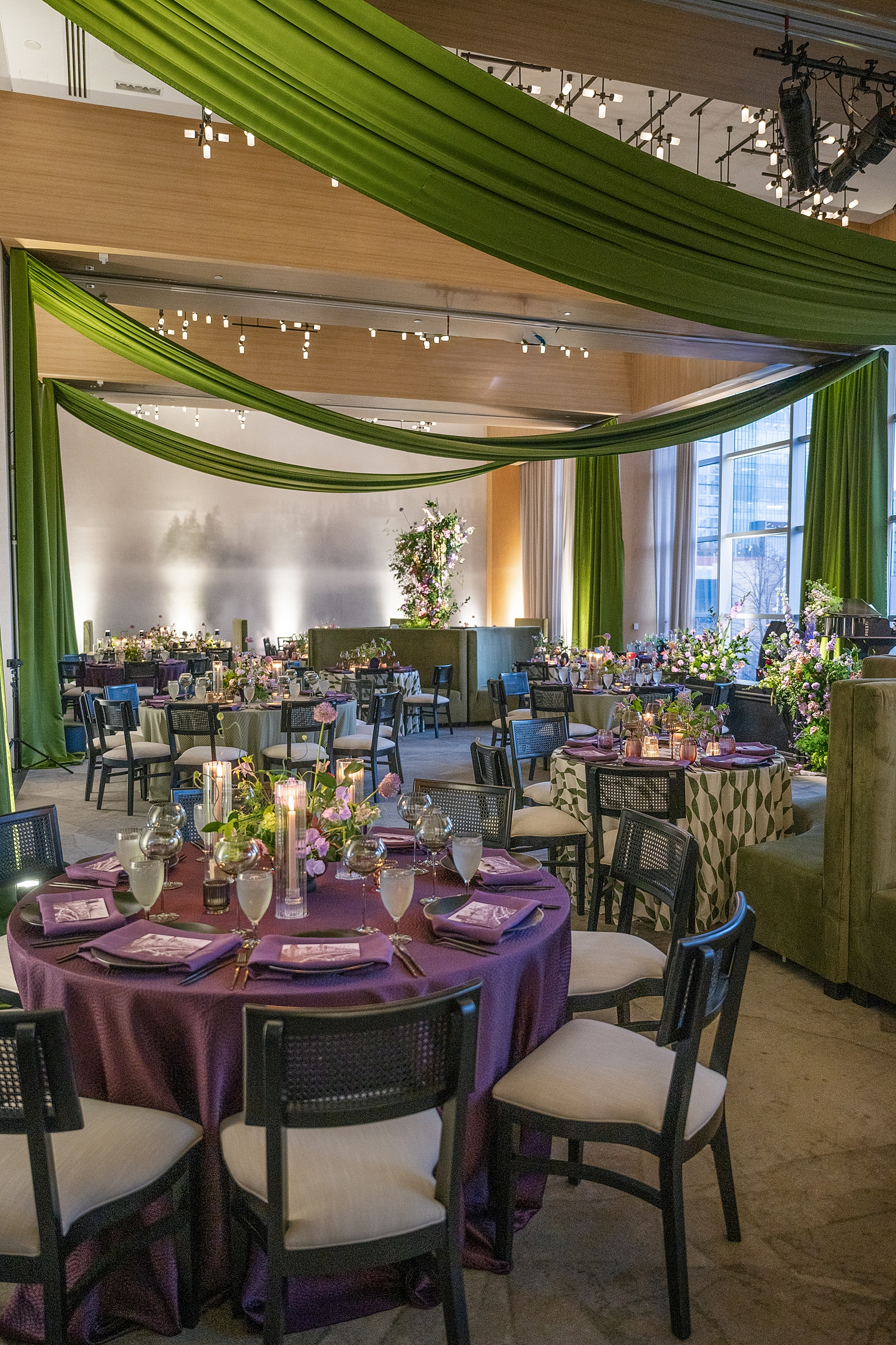
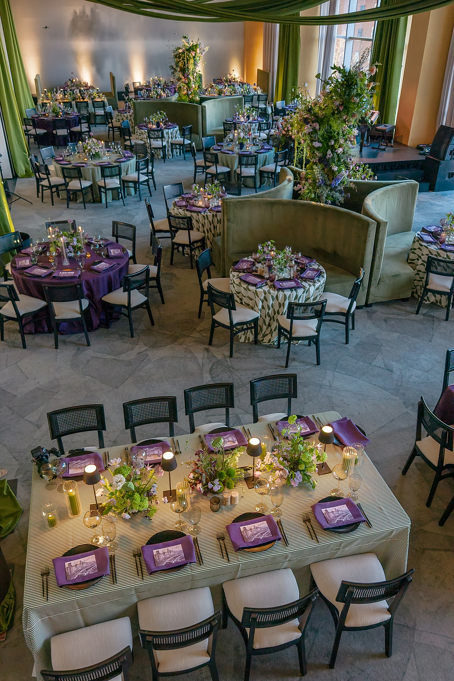
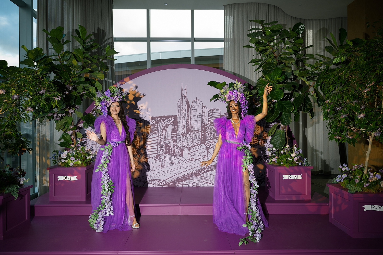
This luxury hotel was the perfect location to hold this epic event. The design brought bold color into the organic environment the hotel is known for, creating an atmosphere that felt both vibrant and welcoming. The theme, Lush Hues and Lavish Views, set the tone for a vibrant, layered, and immersive design experience. At White Ink Calligraphy + Co, we had the honor of bringing that vision to life through the details we created.
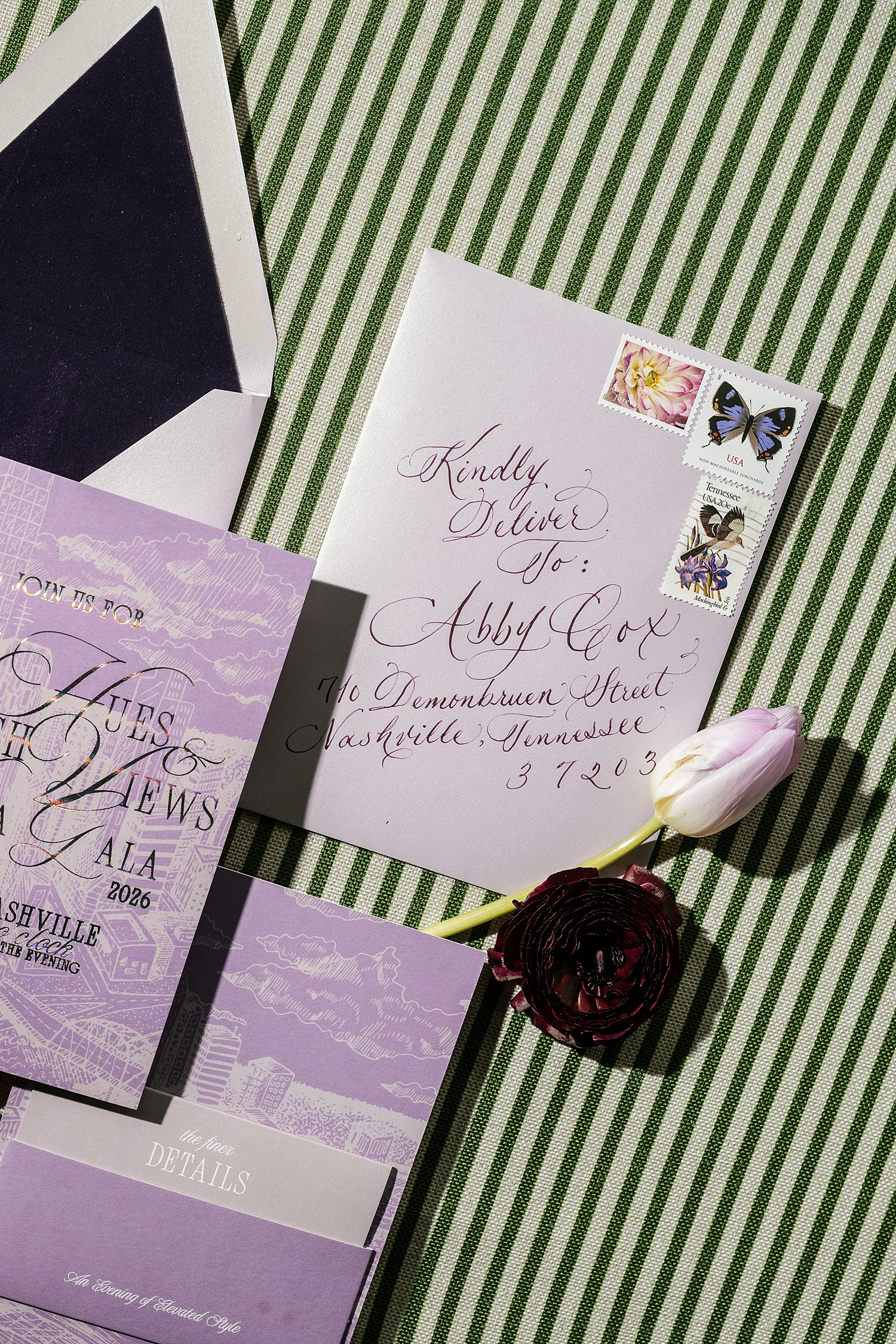
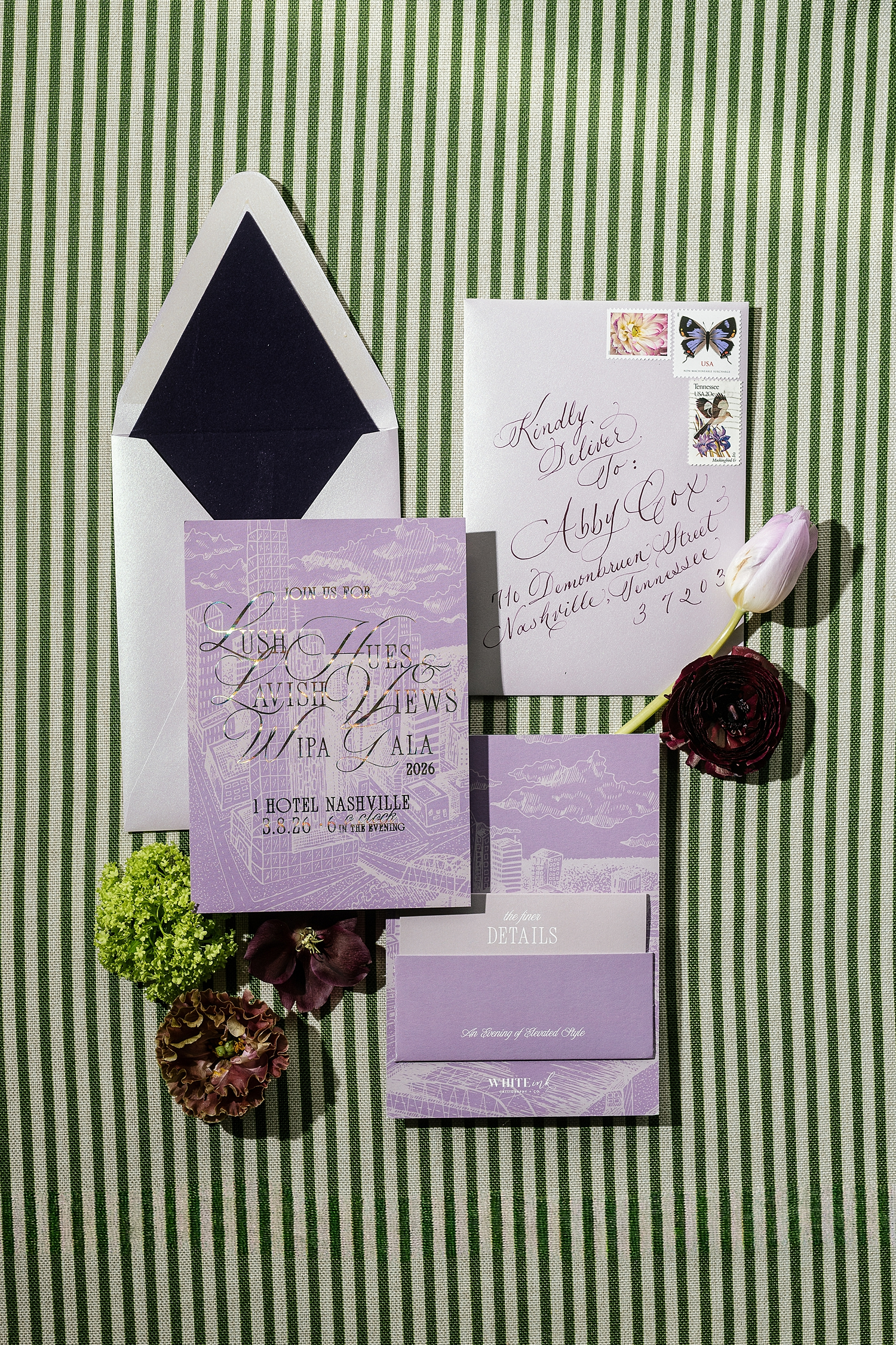
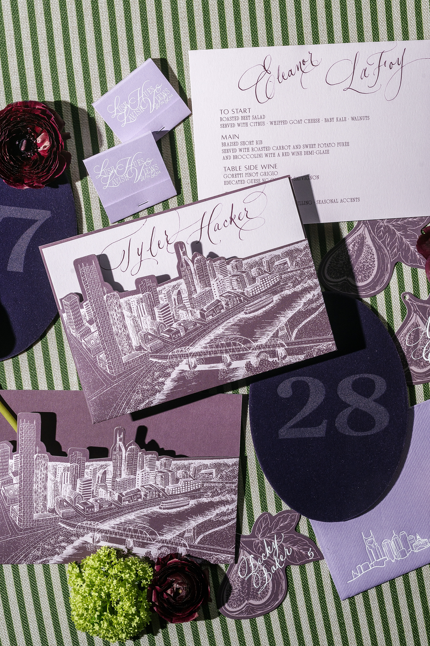
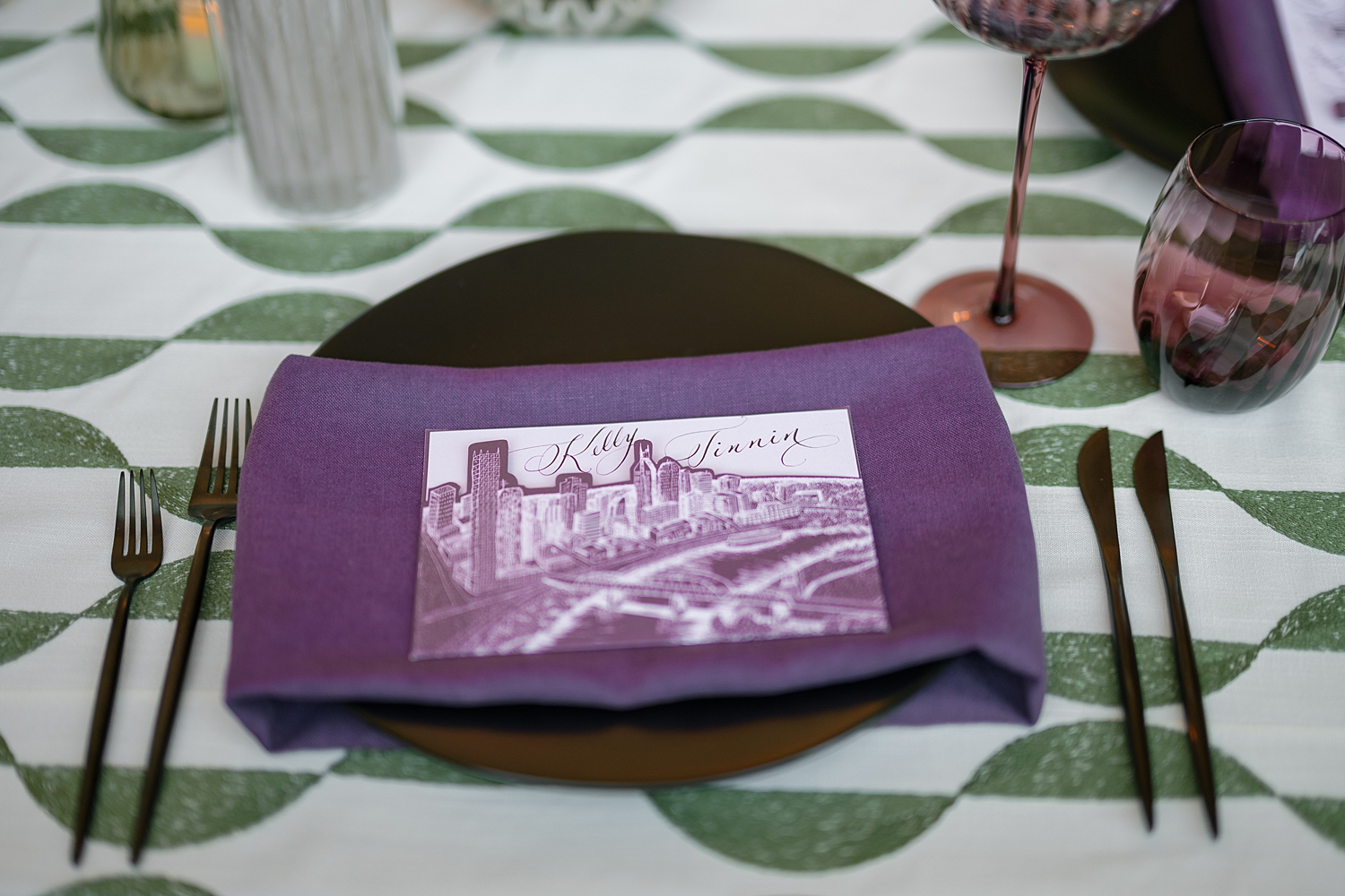
Invitations with a City View
The invitation suite introduced guests to the evening before they ever stepped foot inside the space. This is always our goal when creating custom paper invitations for weddings. In fact one of my favorite parts of my job is hearing our clients tell us all the amazing feedback they got from their guests after receiving an unexpected invitation that WOWS. We wanted our industry friends to experience that same dopamine hit wedding guests get when receiving beautiful invitations in the mail.
Let me just say: Goal accomplished! This is why paper is so important. This is why the invitation sets the tone for the event day. Sometimes, you just have to experience it, to get it.
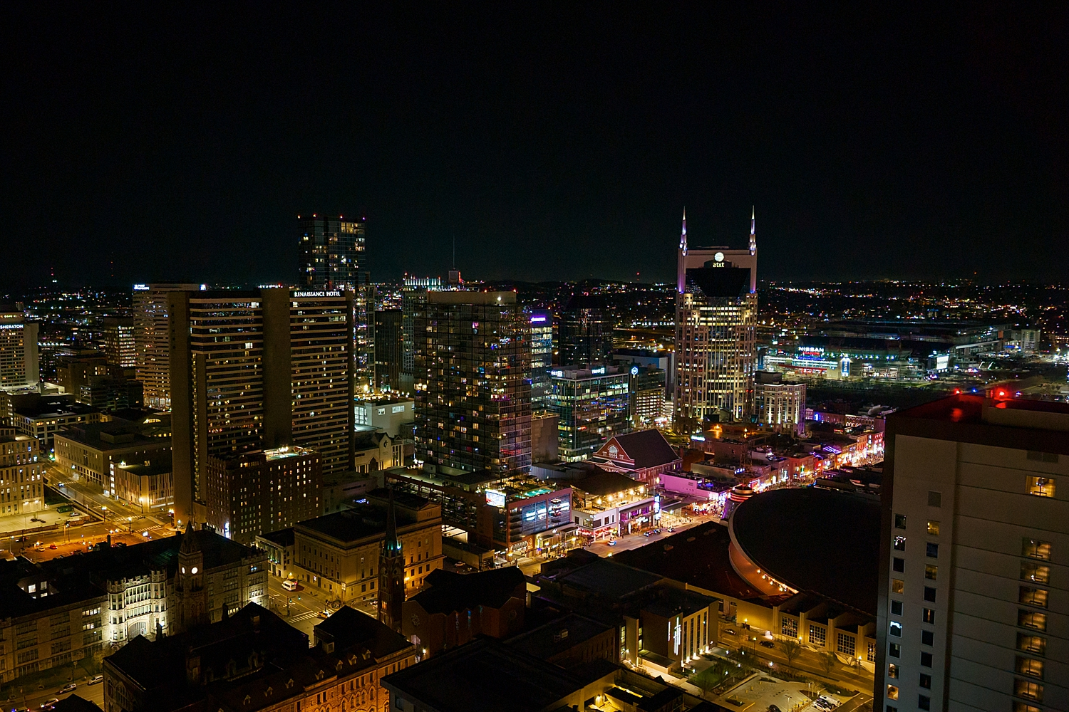
For this event invite, a rich purple backdrop with a delicate white sketch of the Nashville skyline added a refined, architectural element. The event title, Lush Hues and Lavish Views, was written in shimmering silver calligraphy, catching the light in a way that felt both celebratory and elevated. It was the perfect balance of color and fine detail, a preview of what was to come.
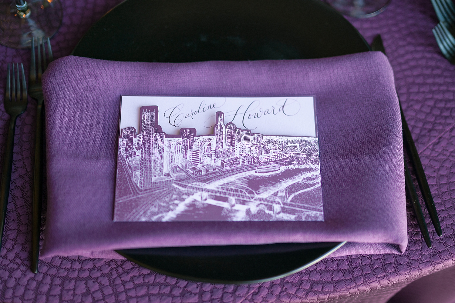
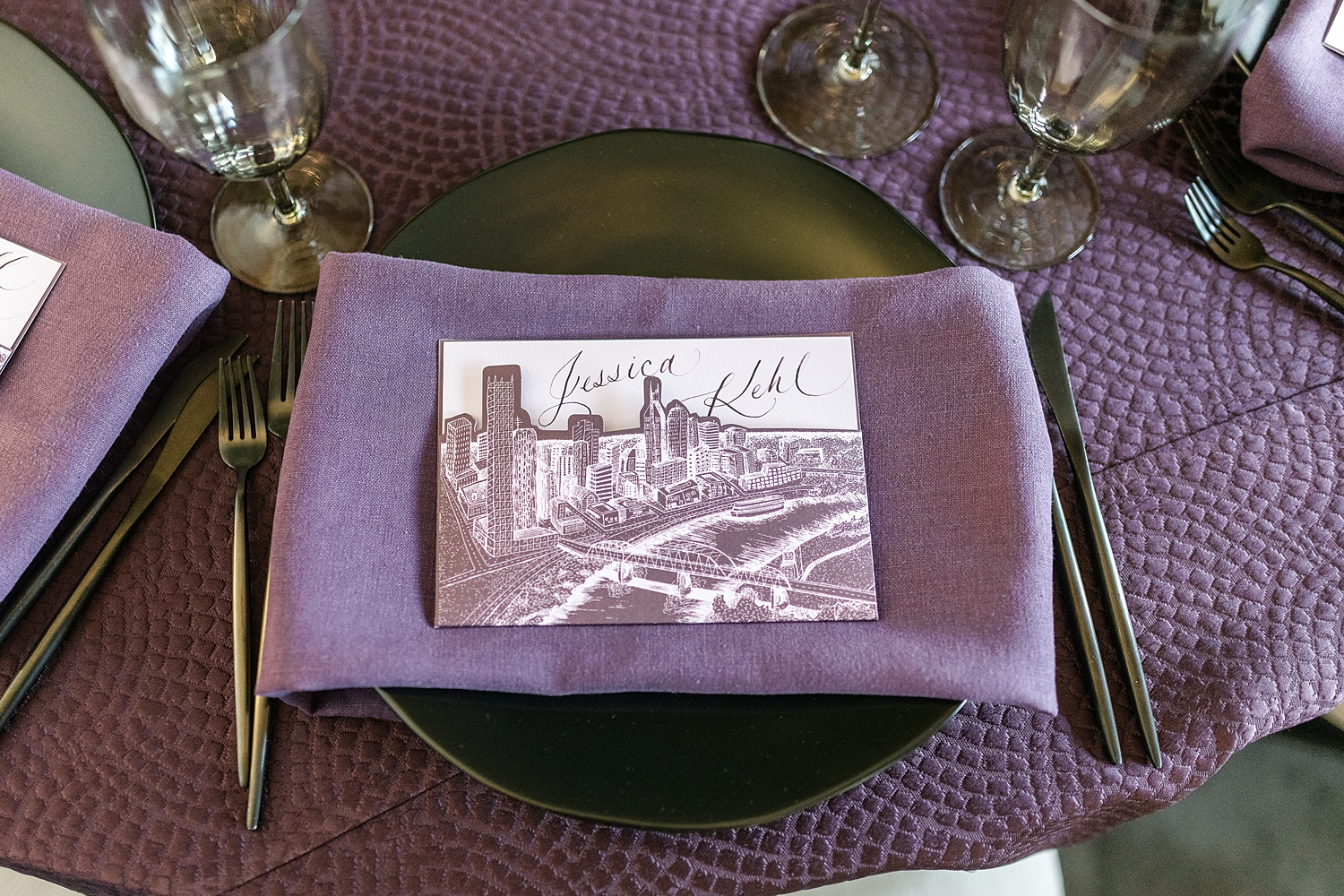
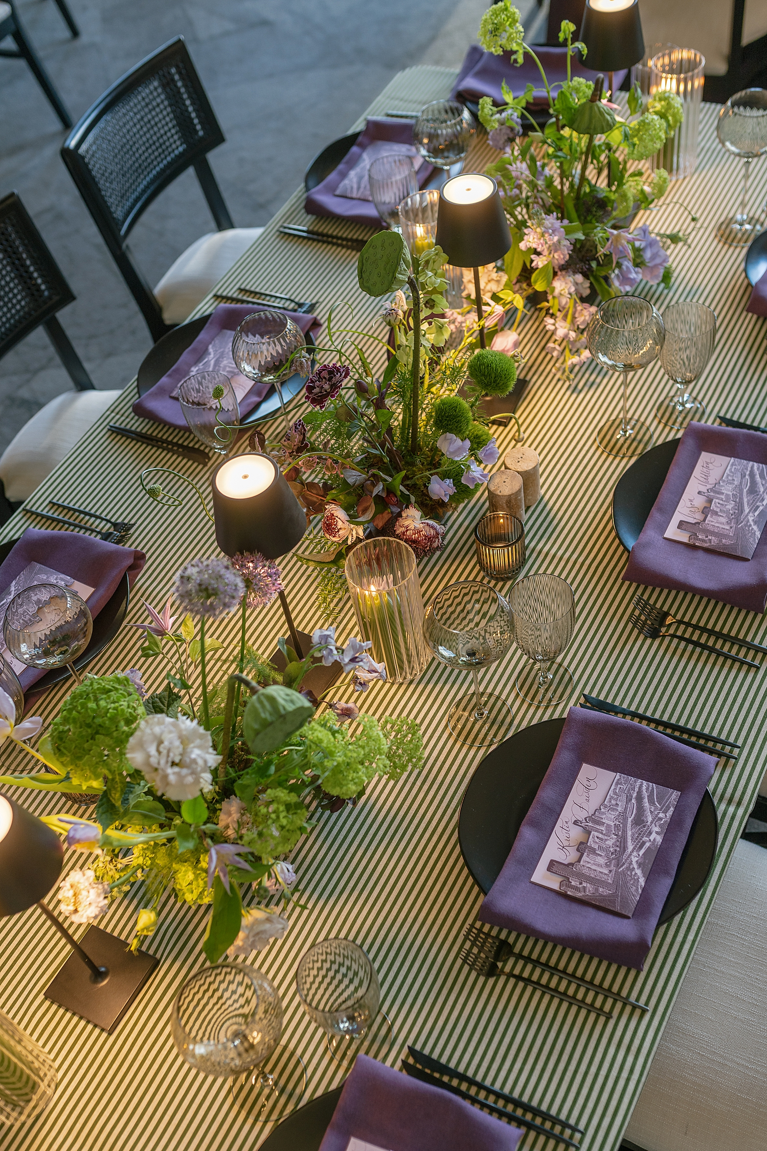
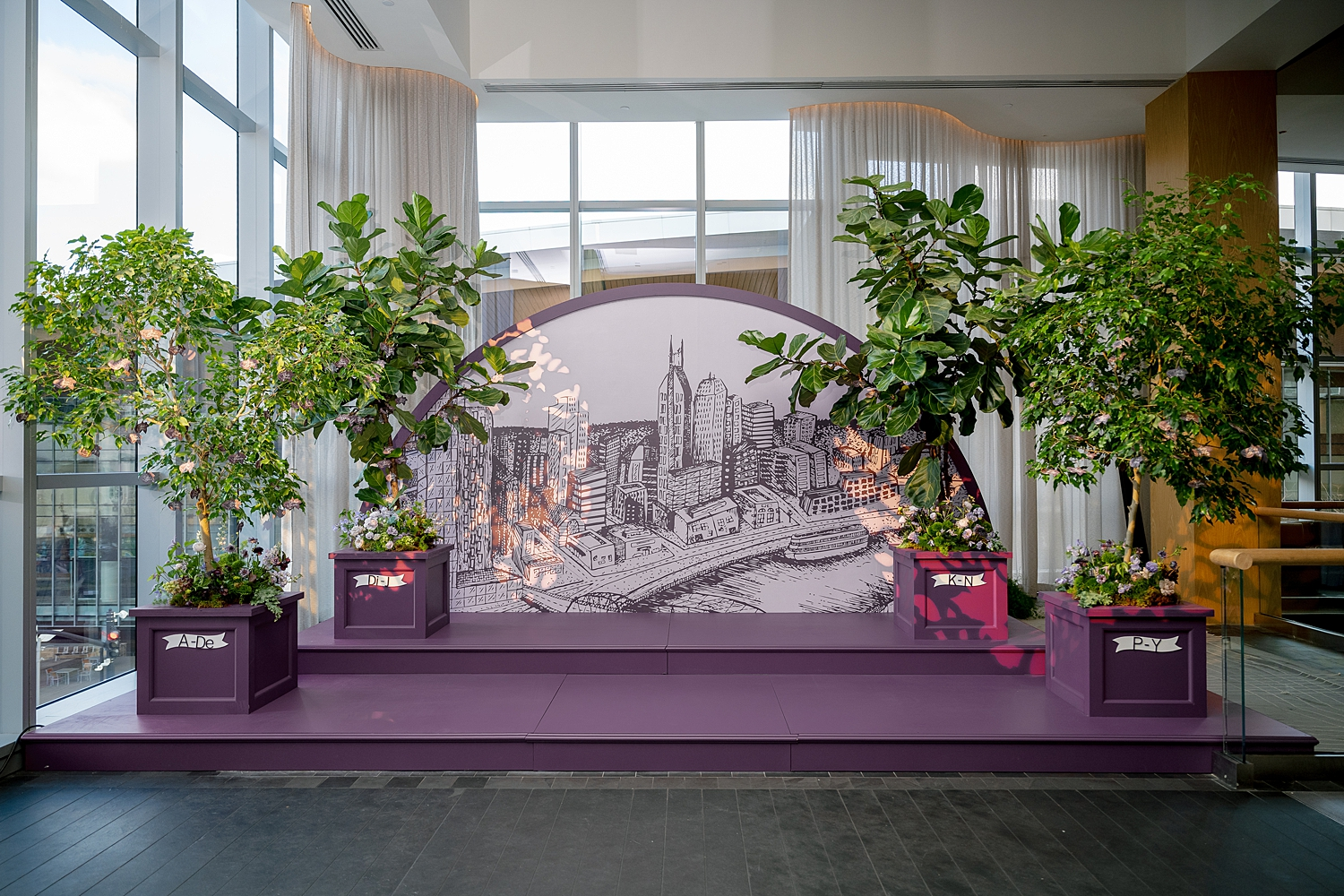
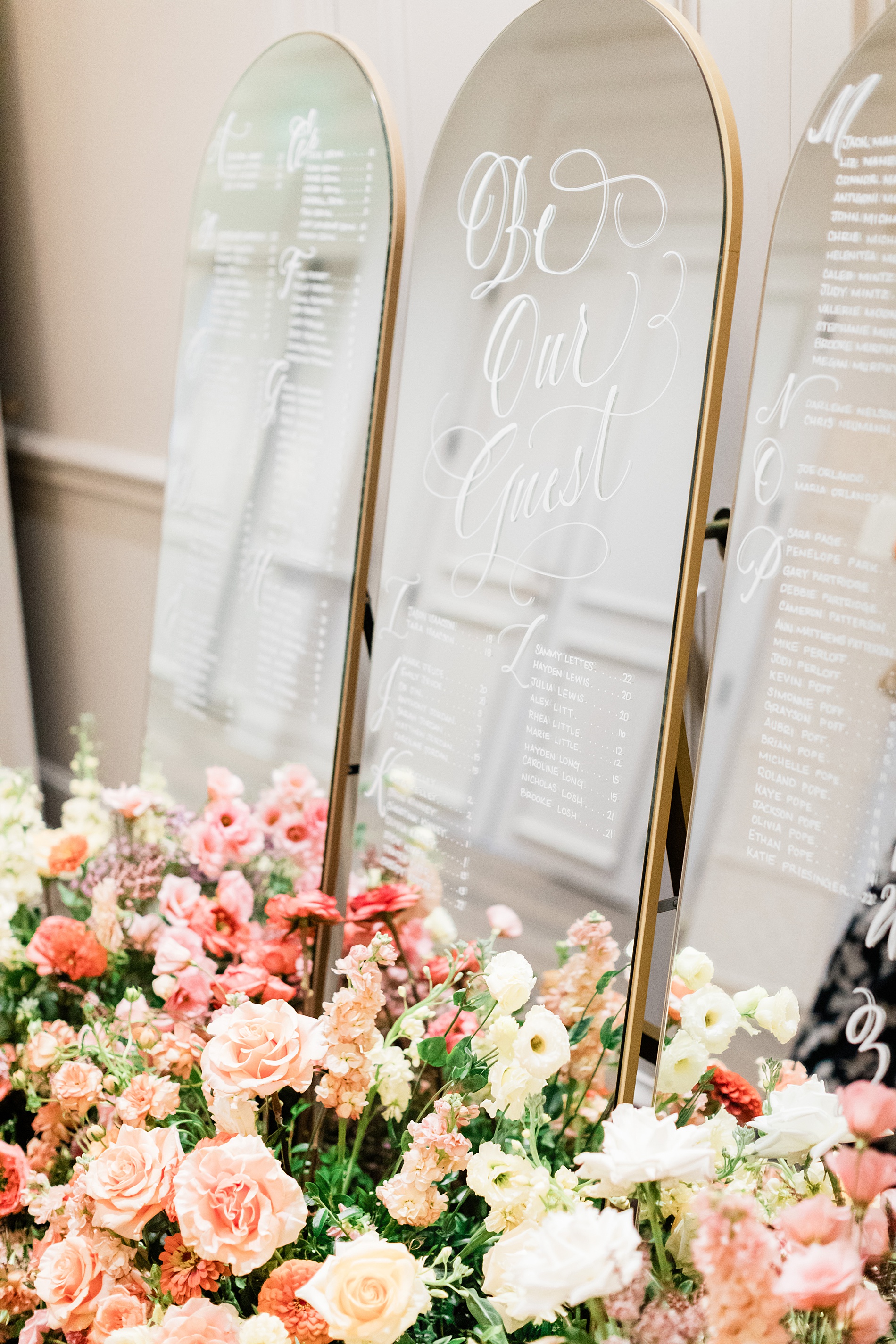
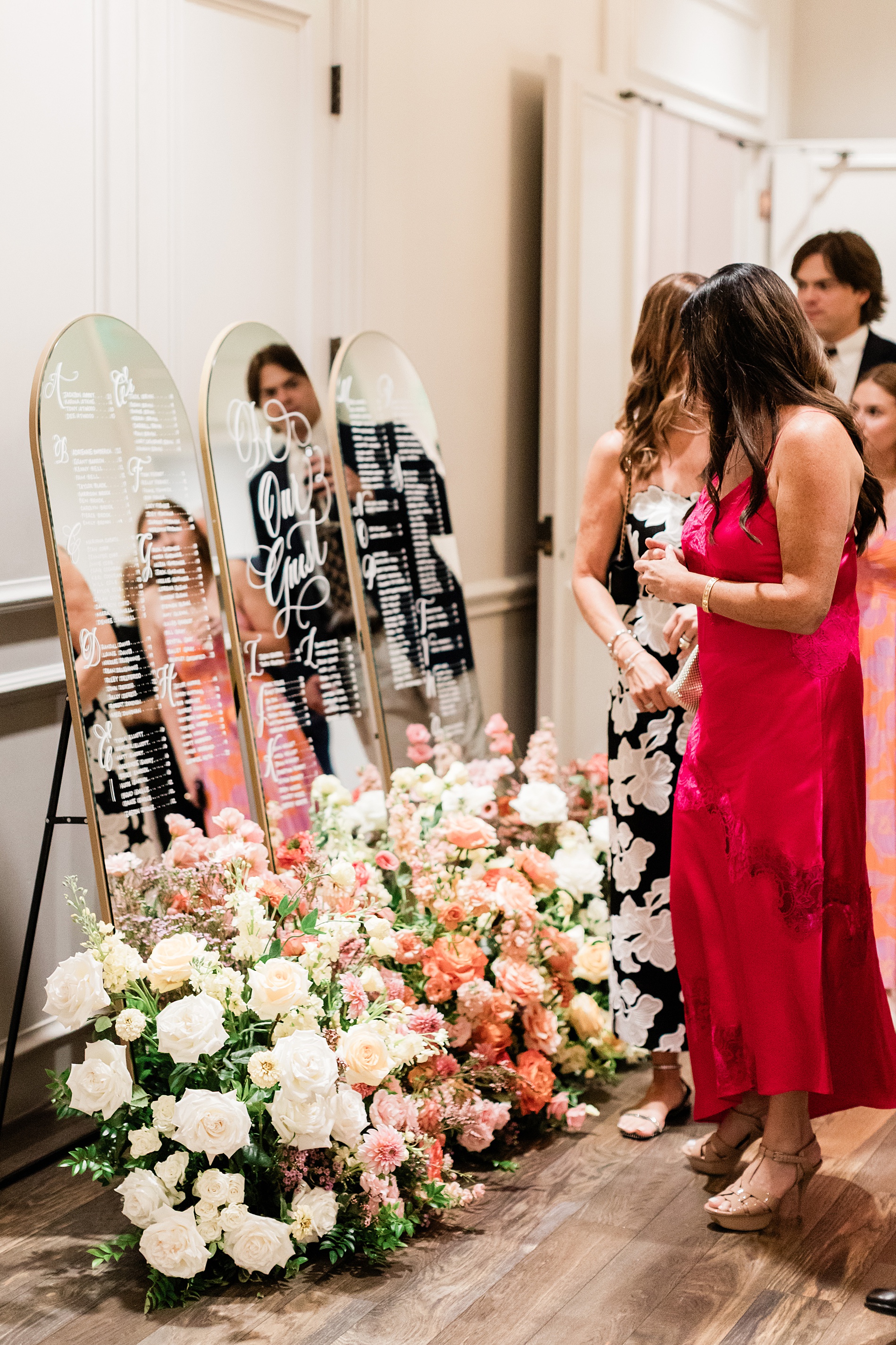
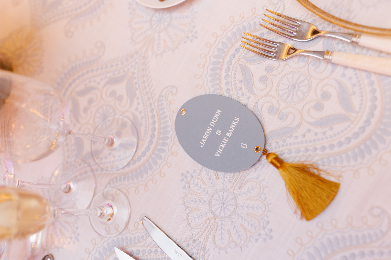
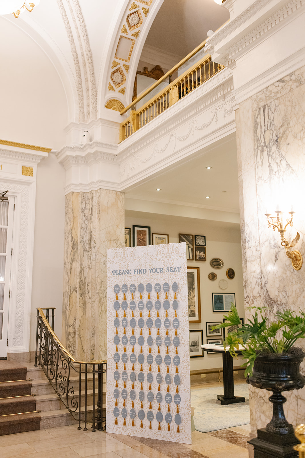
The custom cityscape of the Nashville skyline that was central to the event design was included on the invitation, the seating chart installation, and the die cut pocket on the menus. As always, all the artwork was done by hand – not shortcuts here. It was such an honor to bring this theme to life and carry it throughout this event celebrating fellow Nashville wedding professionals.
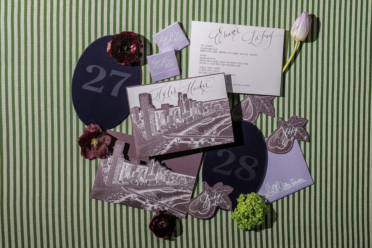
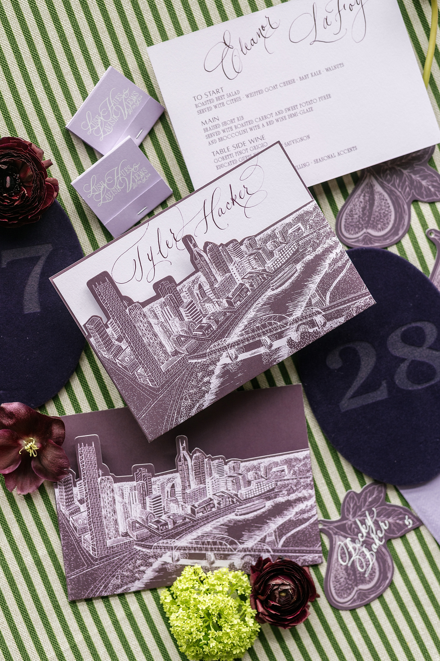
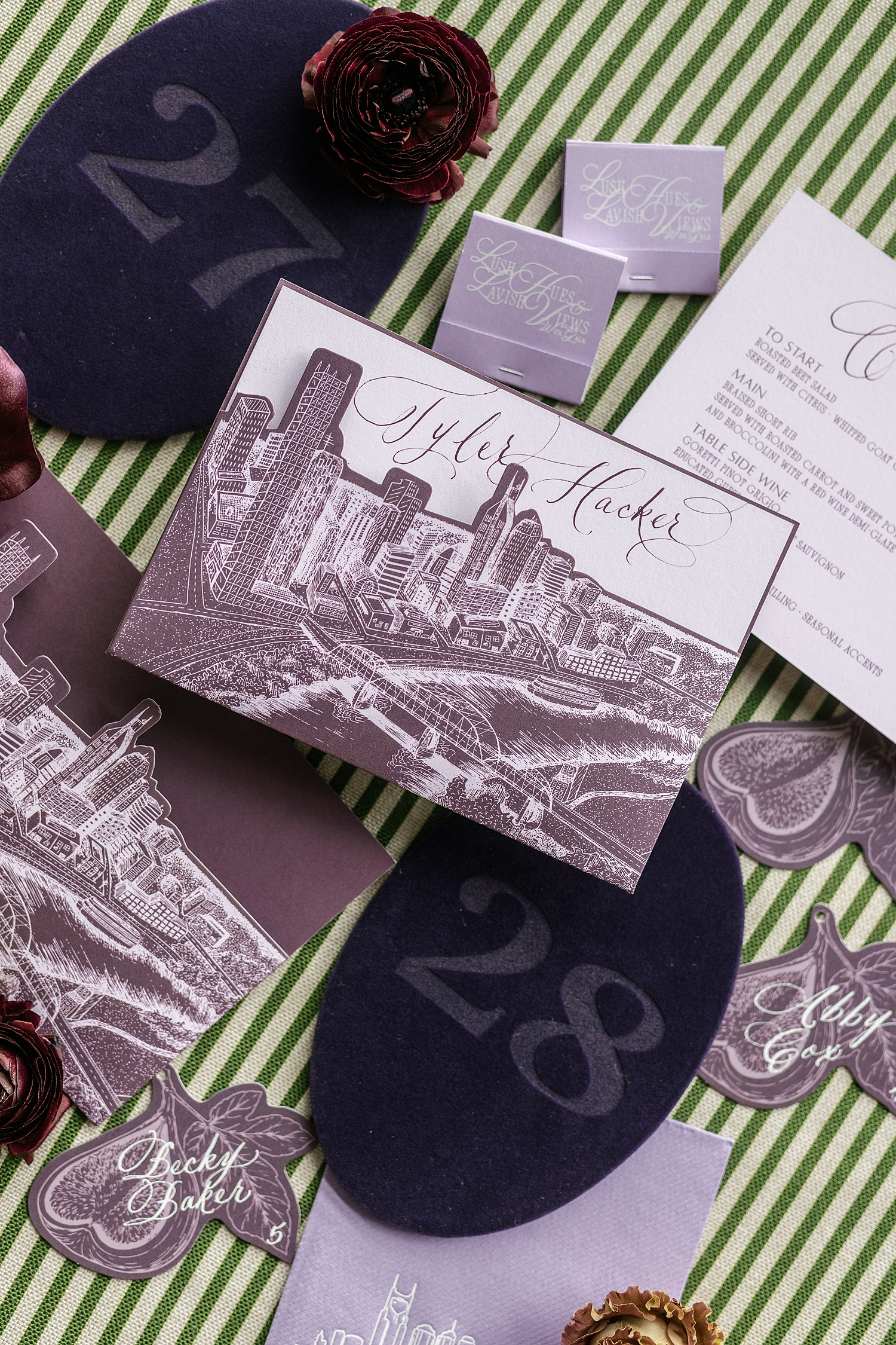
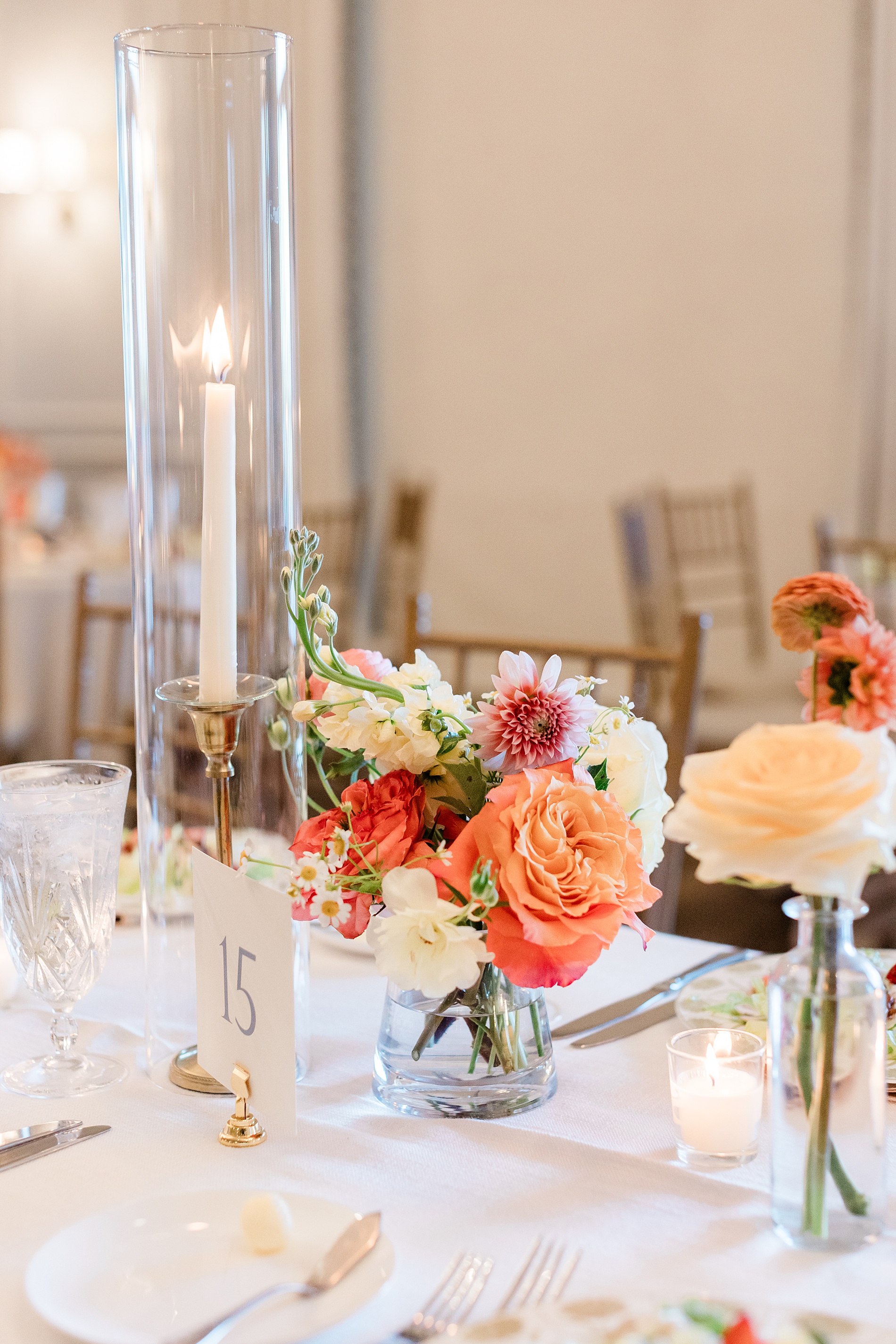
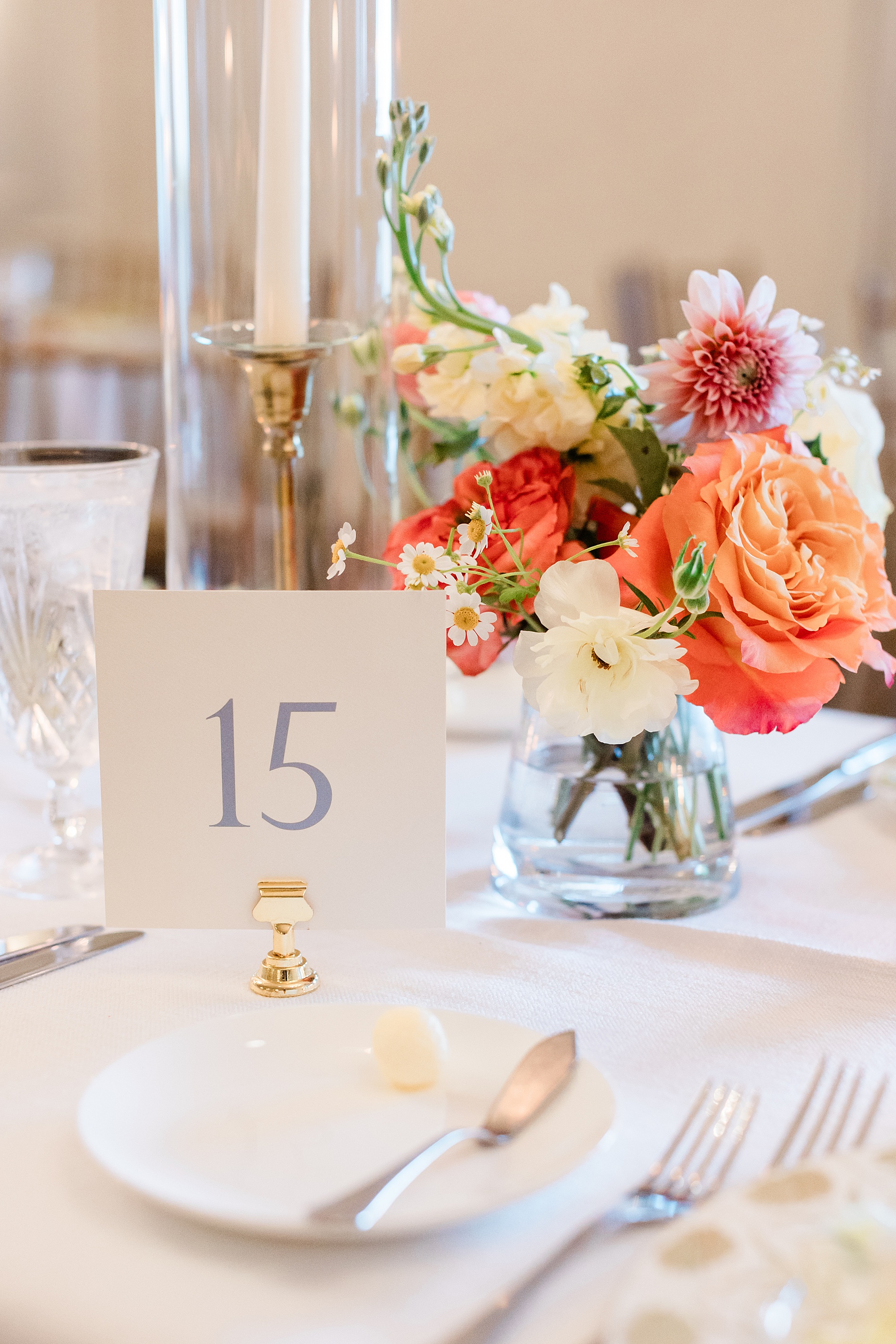
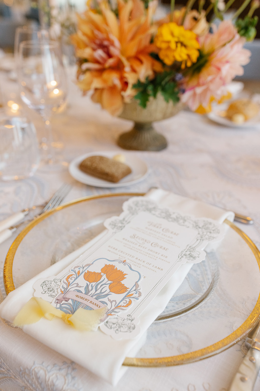
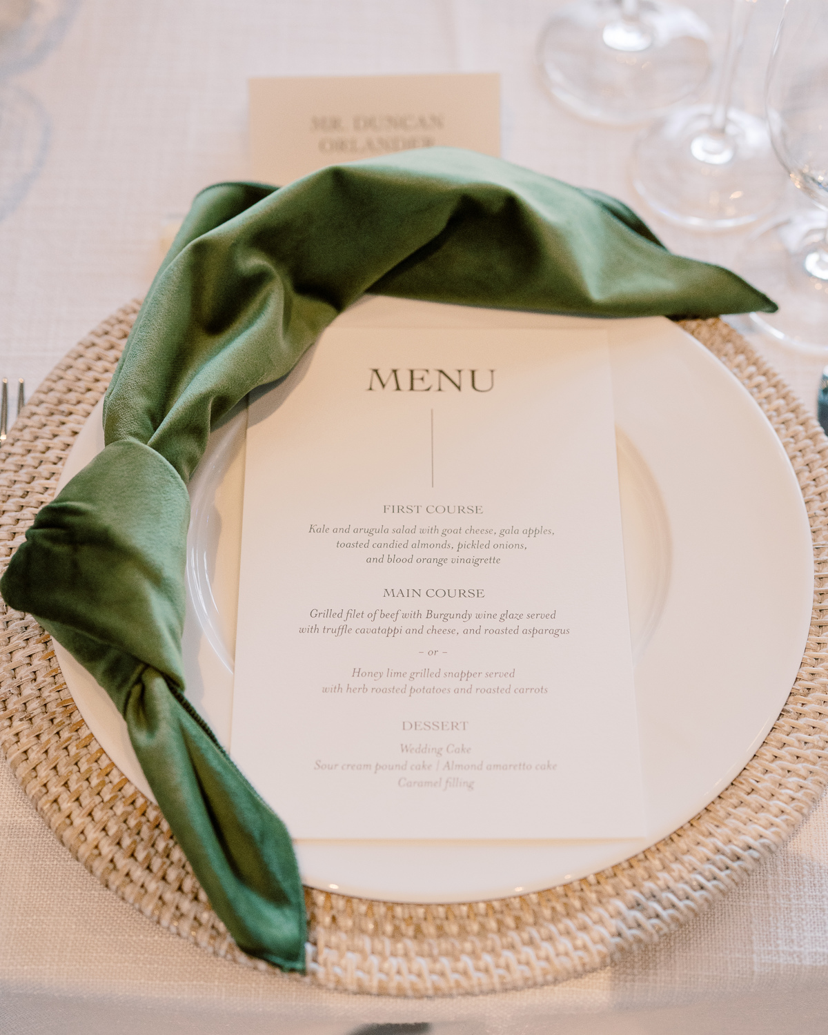
Menus with a Personalized Touch
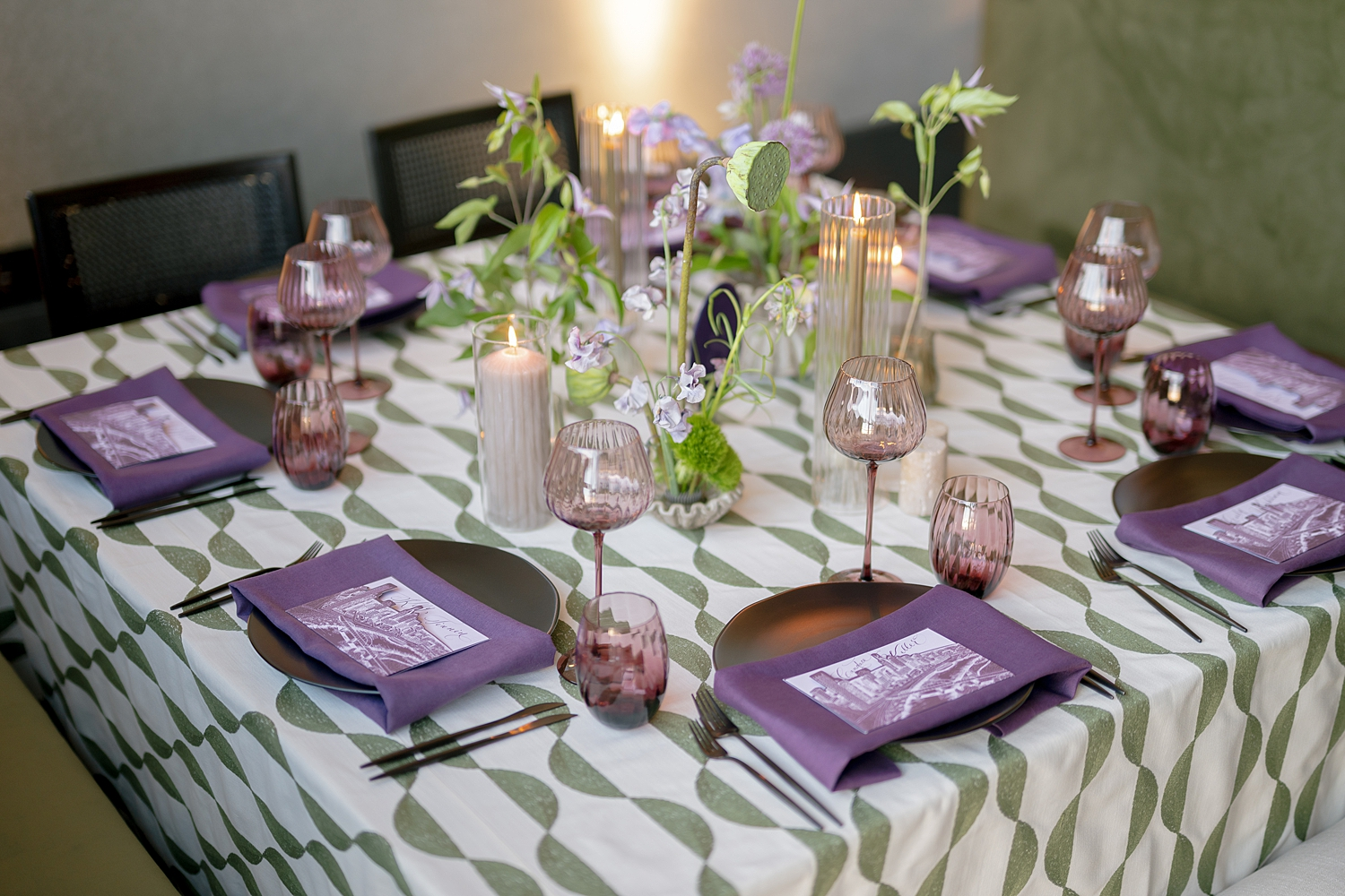
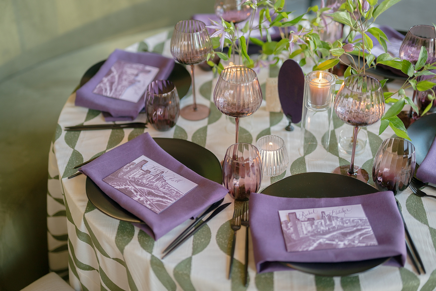
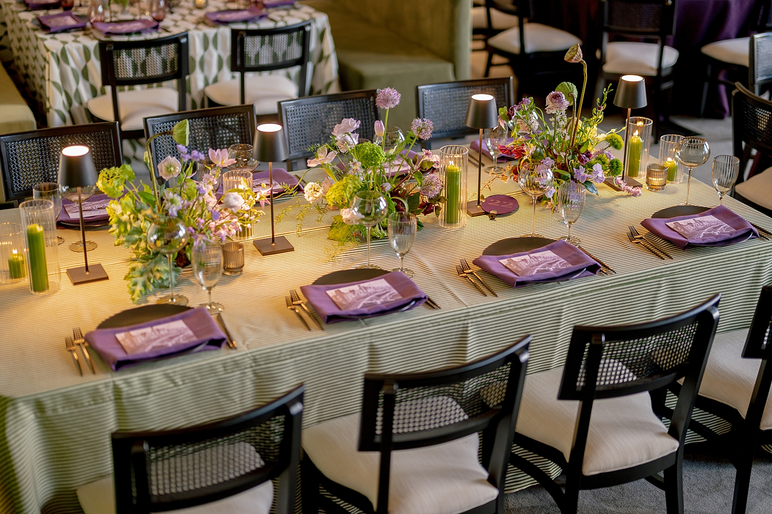
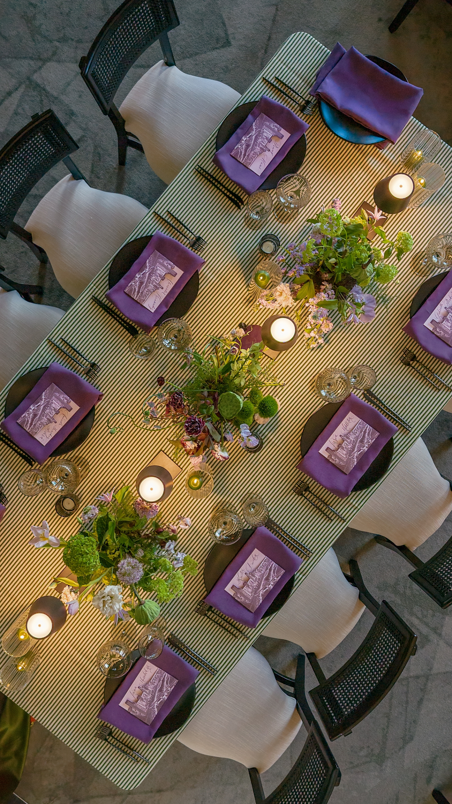
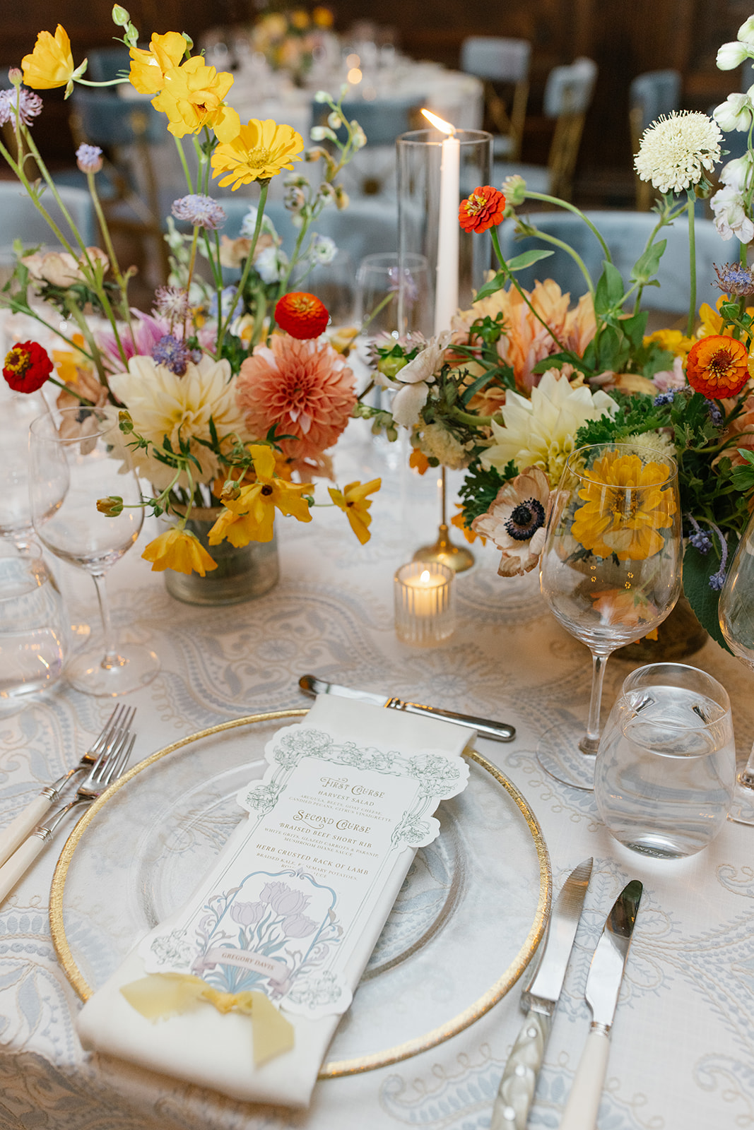
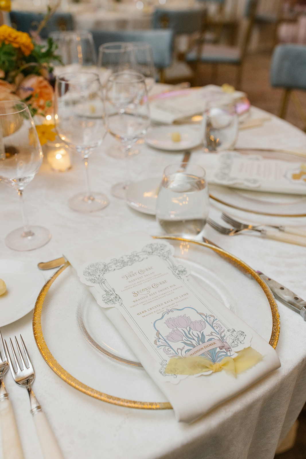
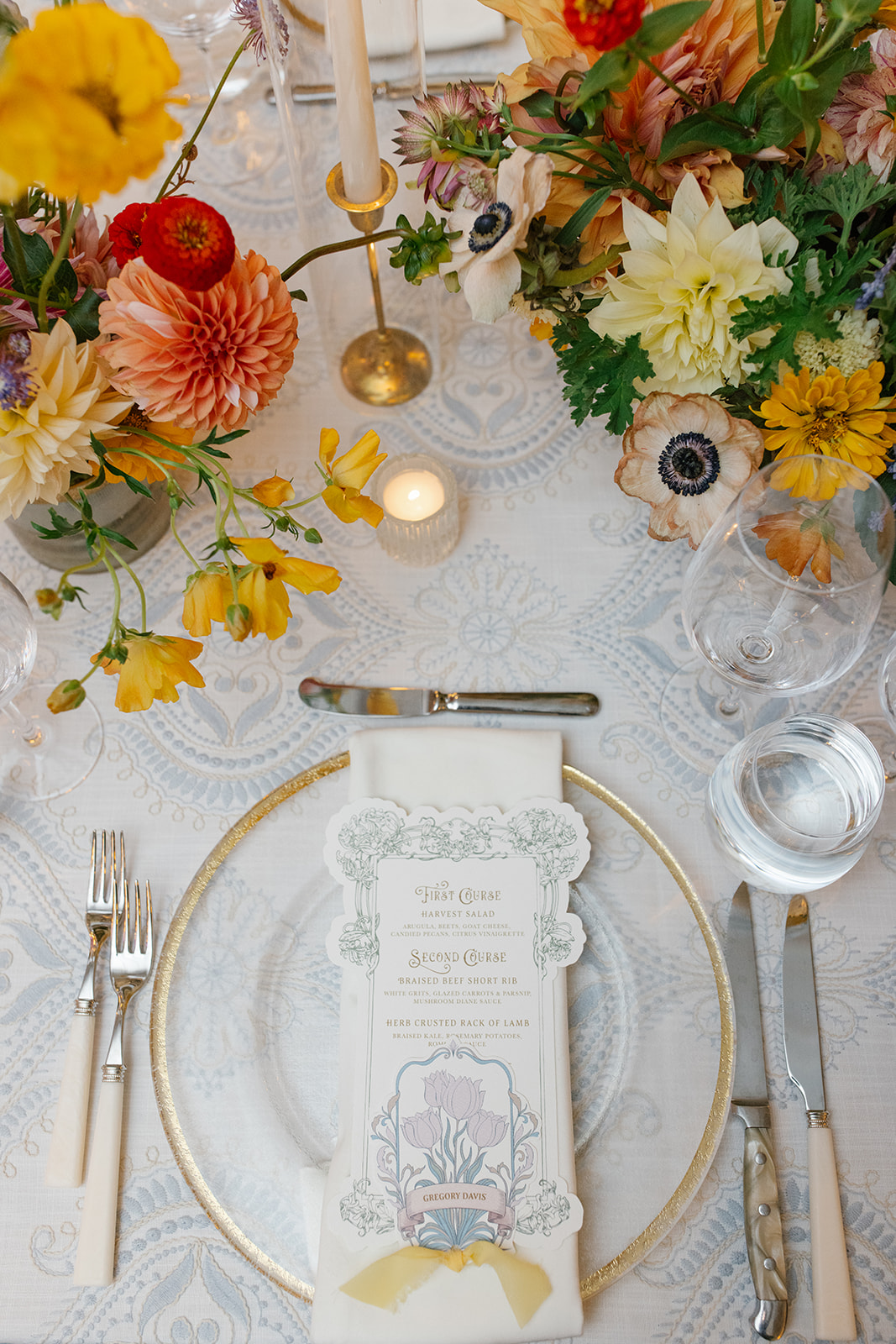
At each place setting, guests found menus that doubled as place cards, featuring their names handwritten in calligraphy at the top and tucked into a custom die-cut pocket featuring a sketch of the cityscape of Nashville. These kinds of details invite guests to slow down, look closer, and truly experience the design. These purple menus looked amazing at each place setting.
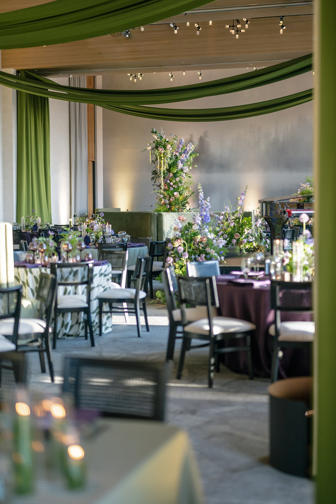
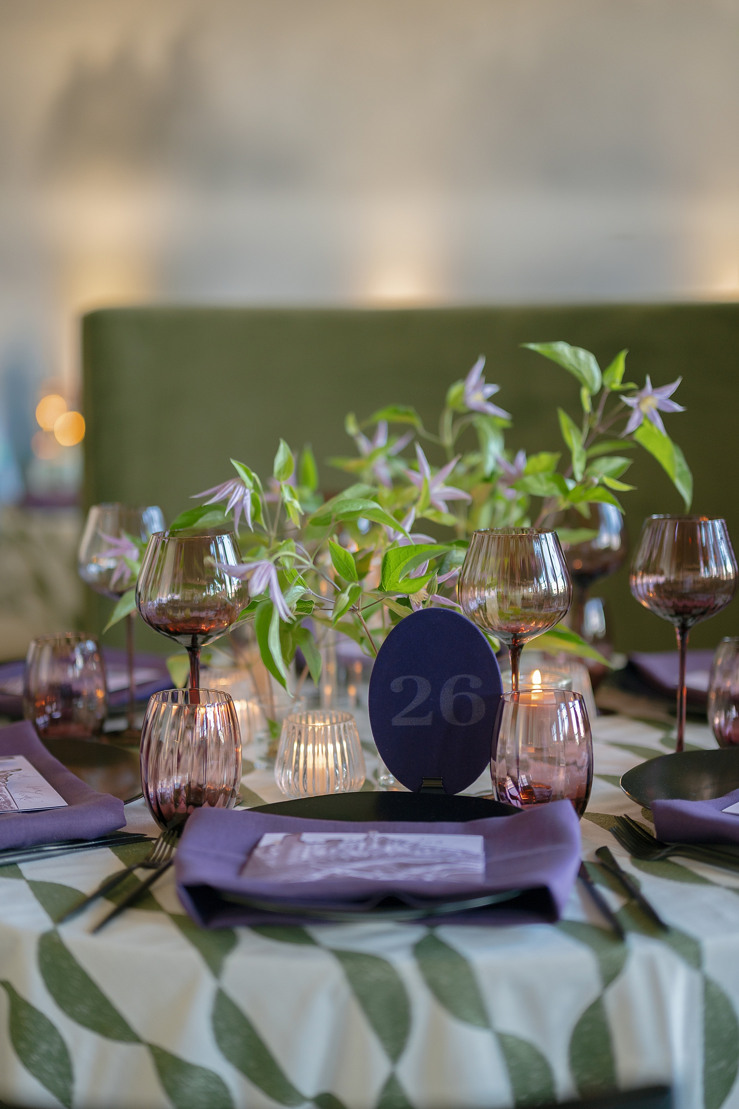
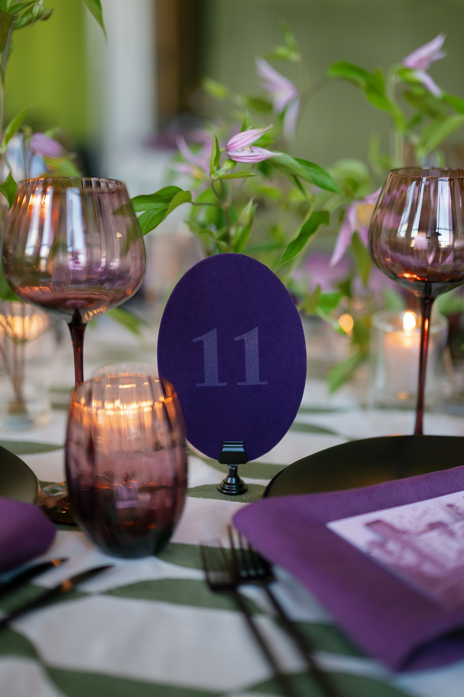
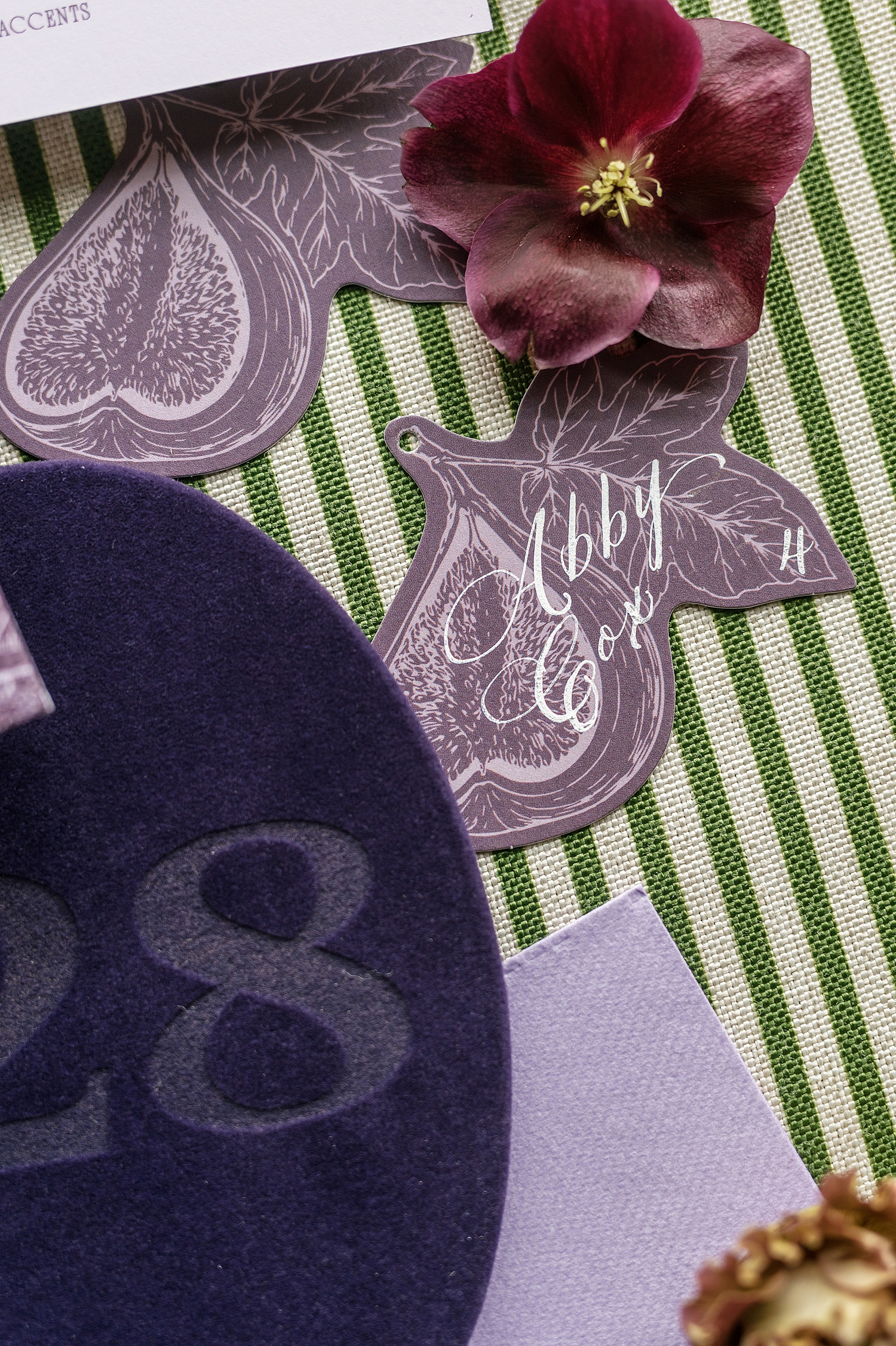
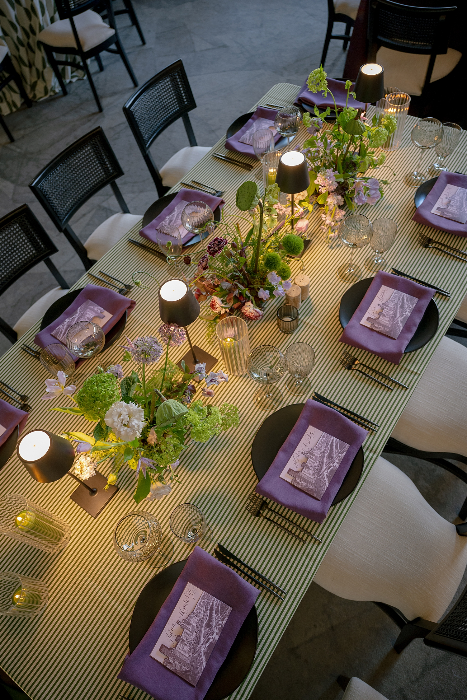
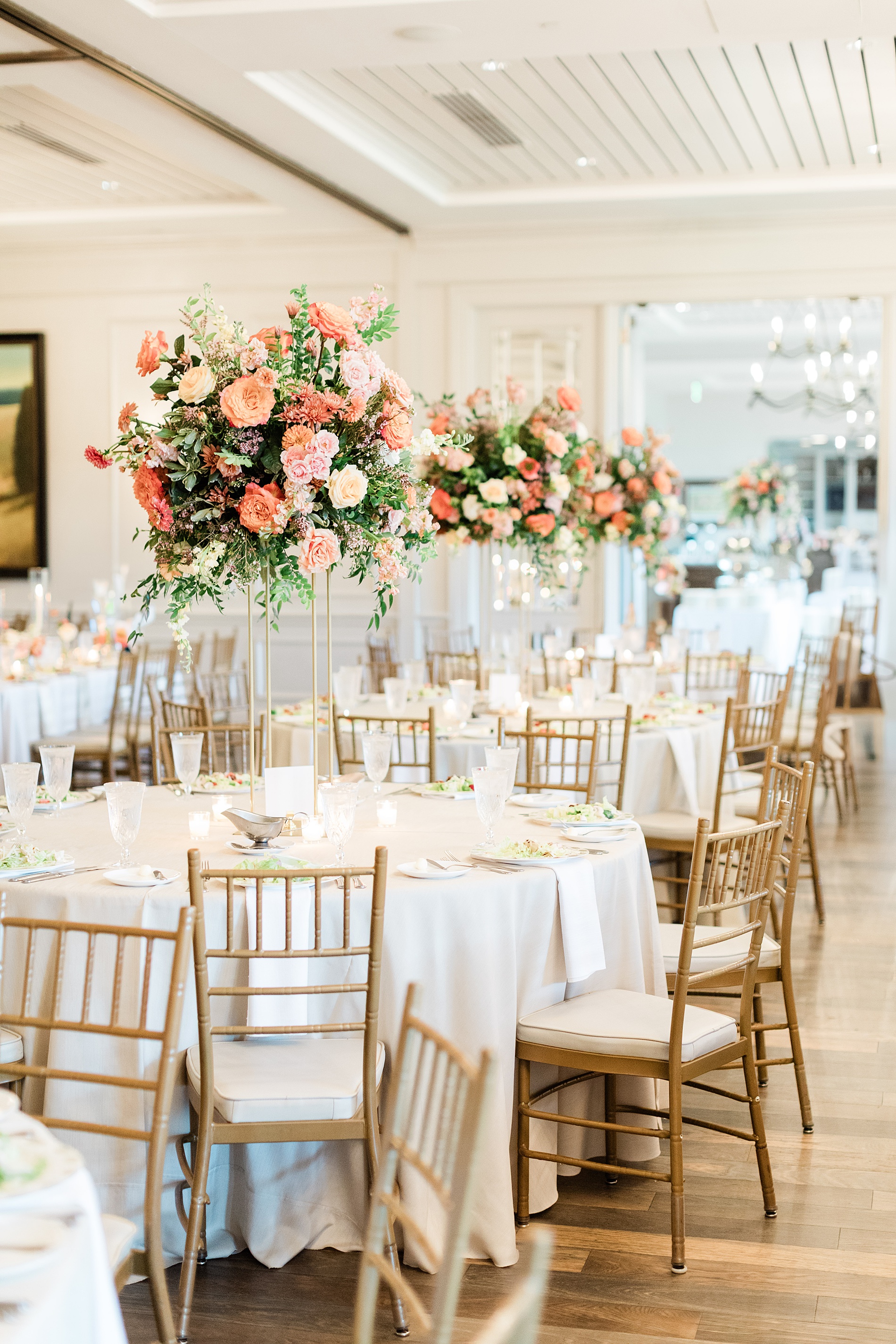
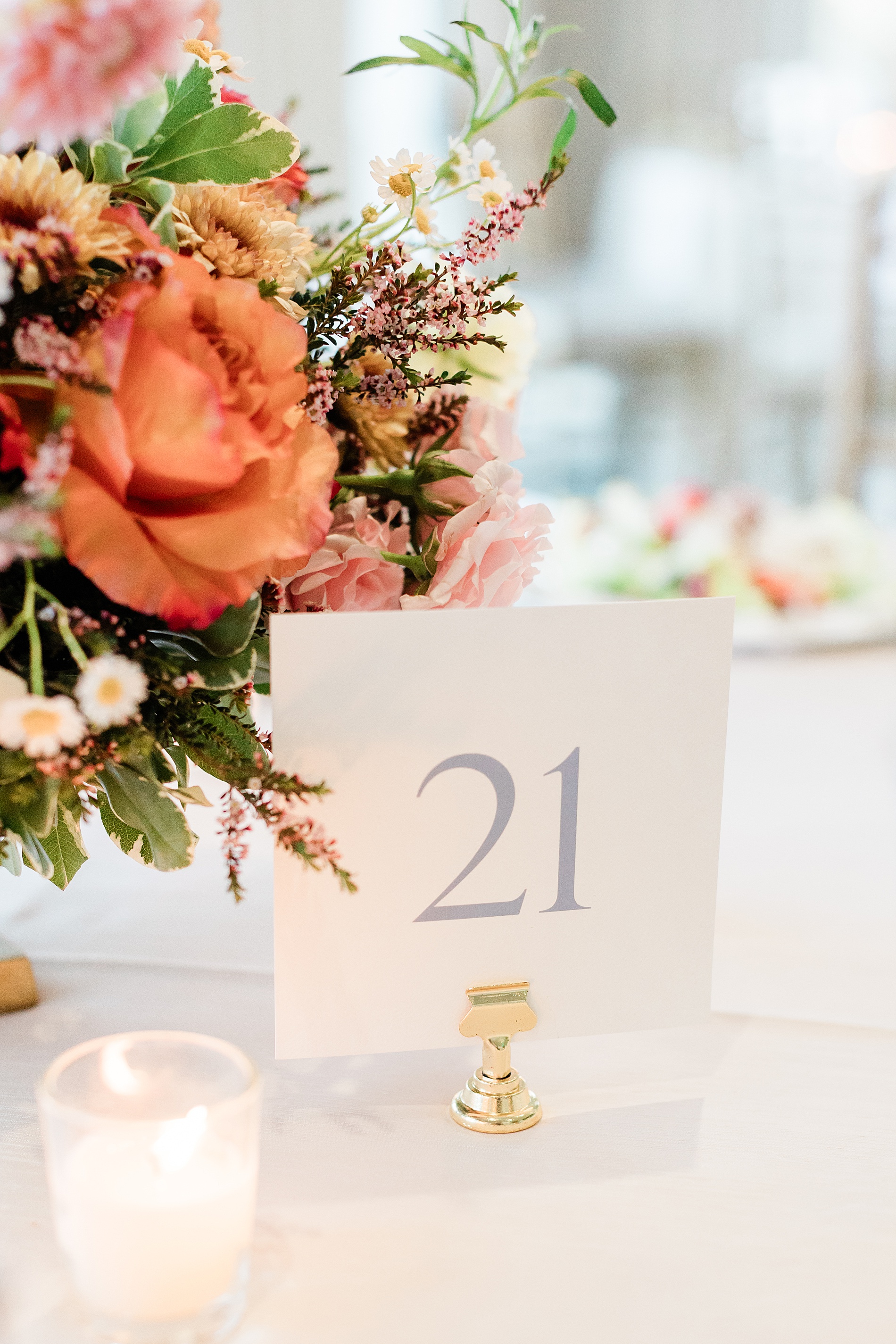
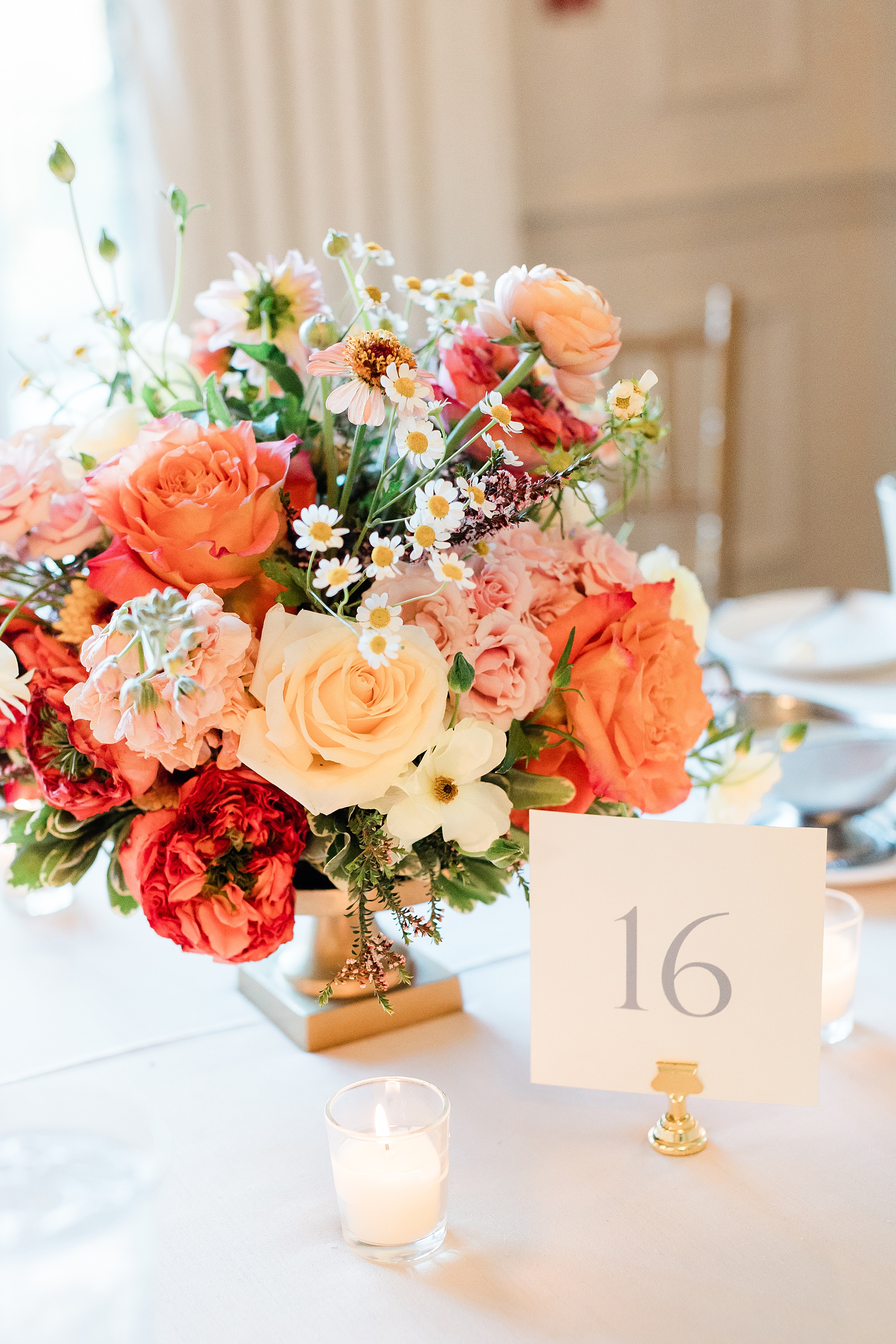
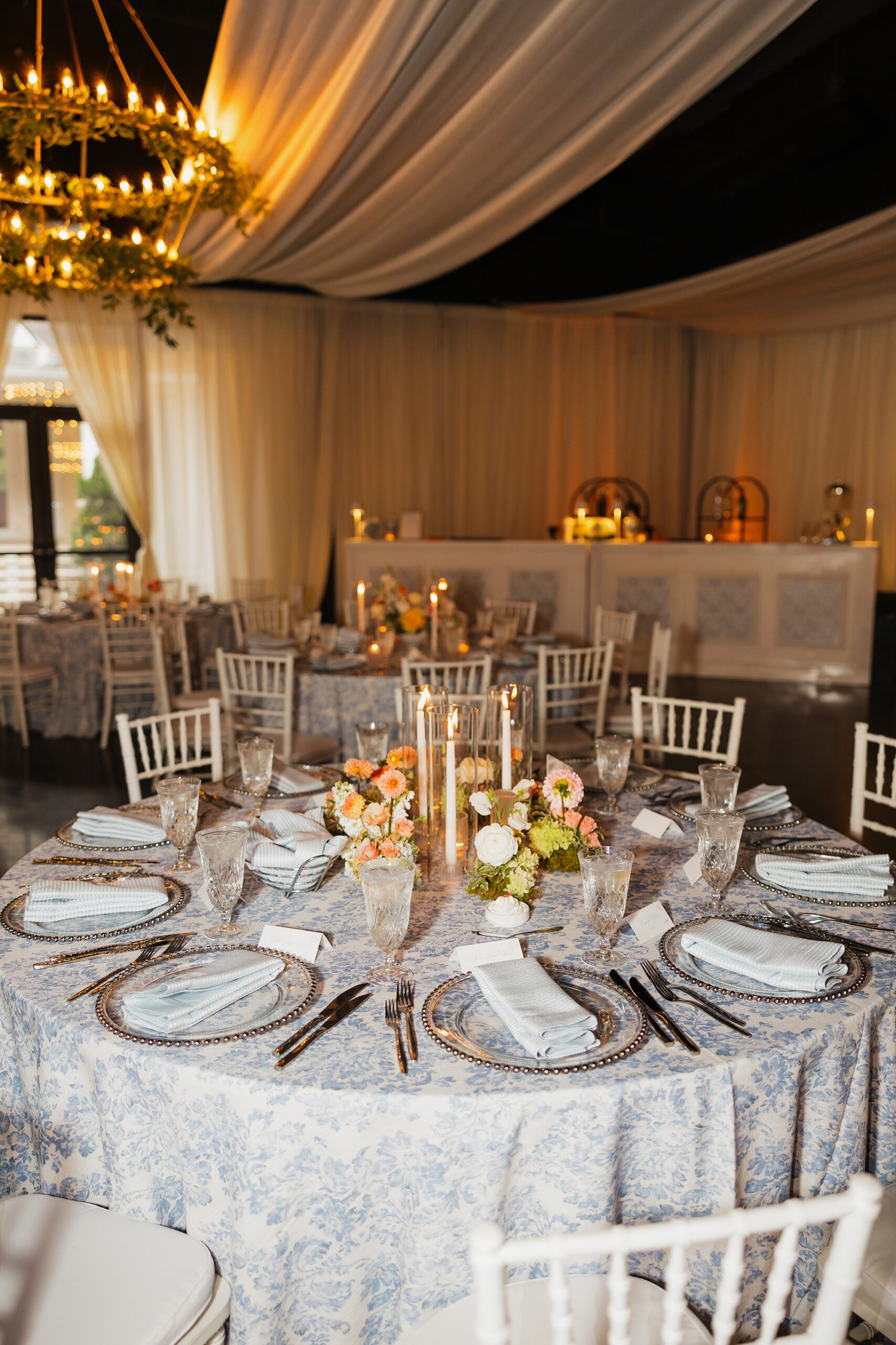
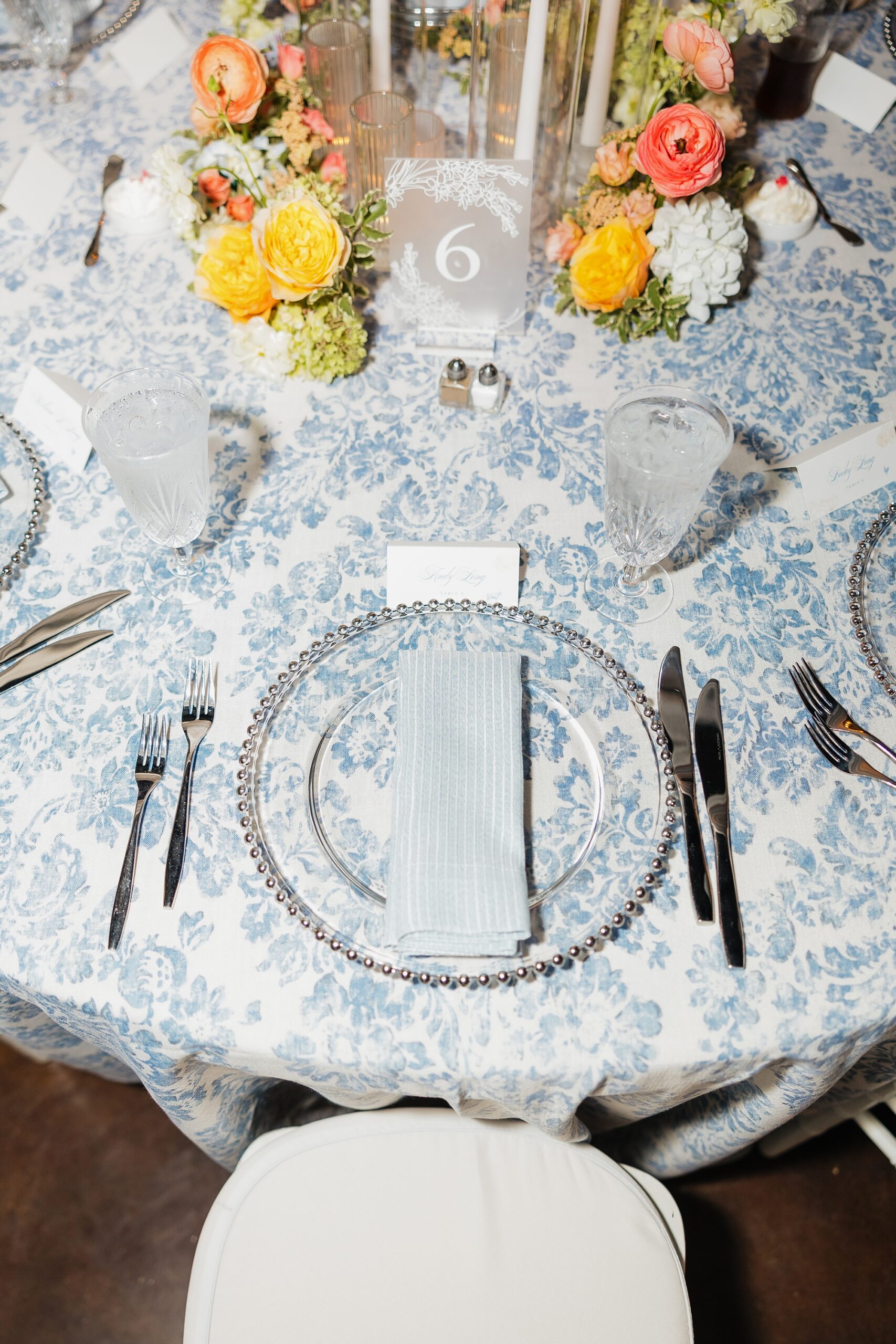
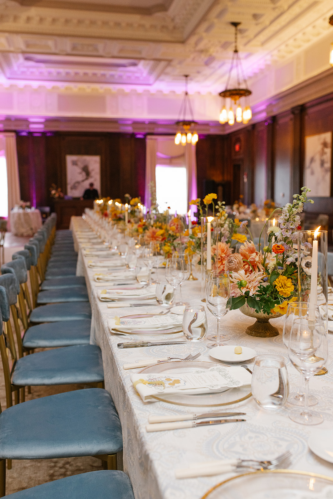
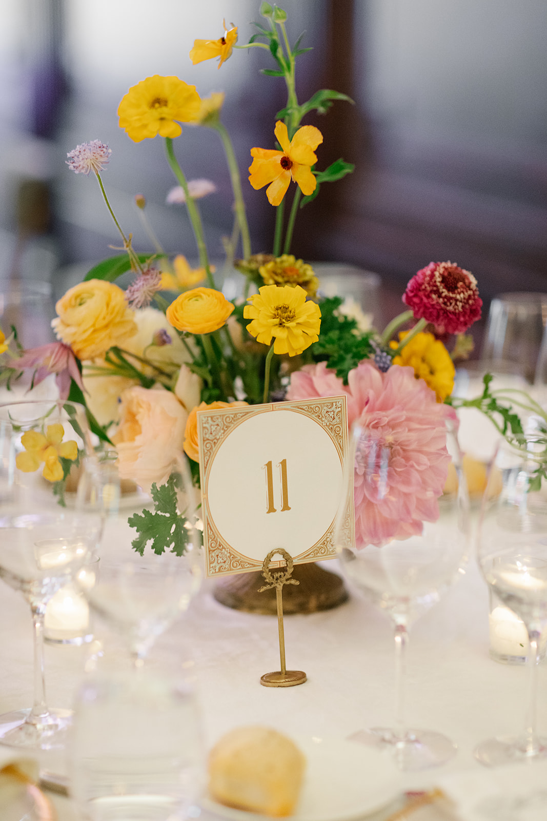
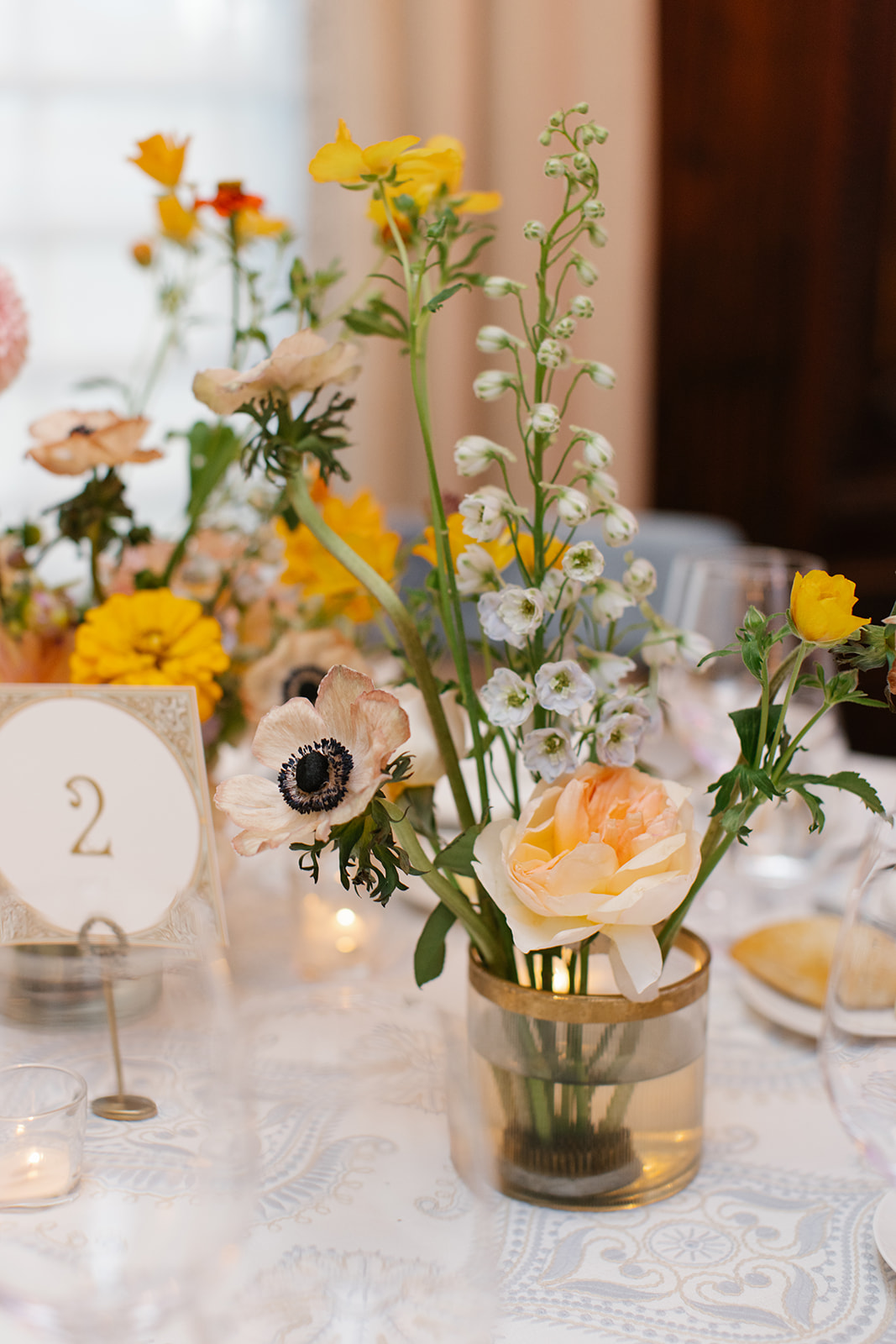
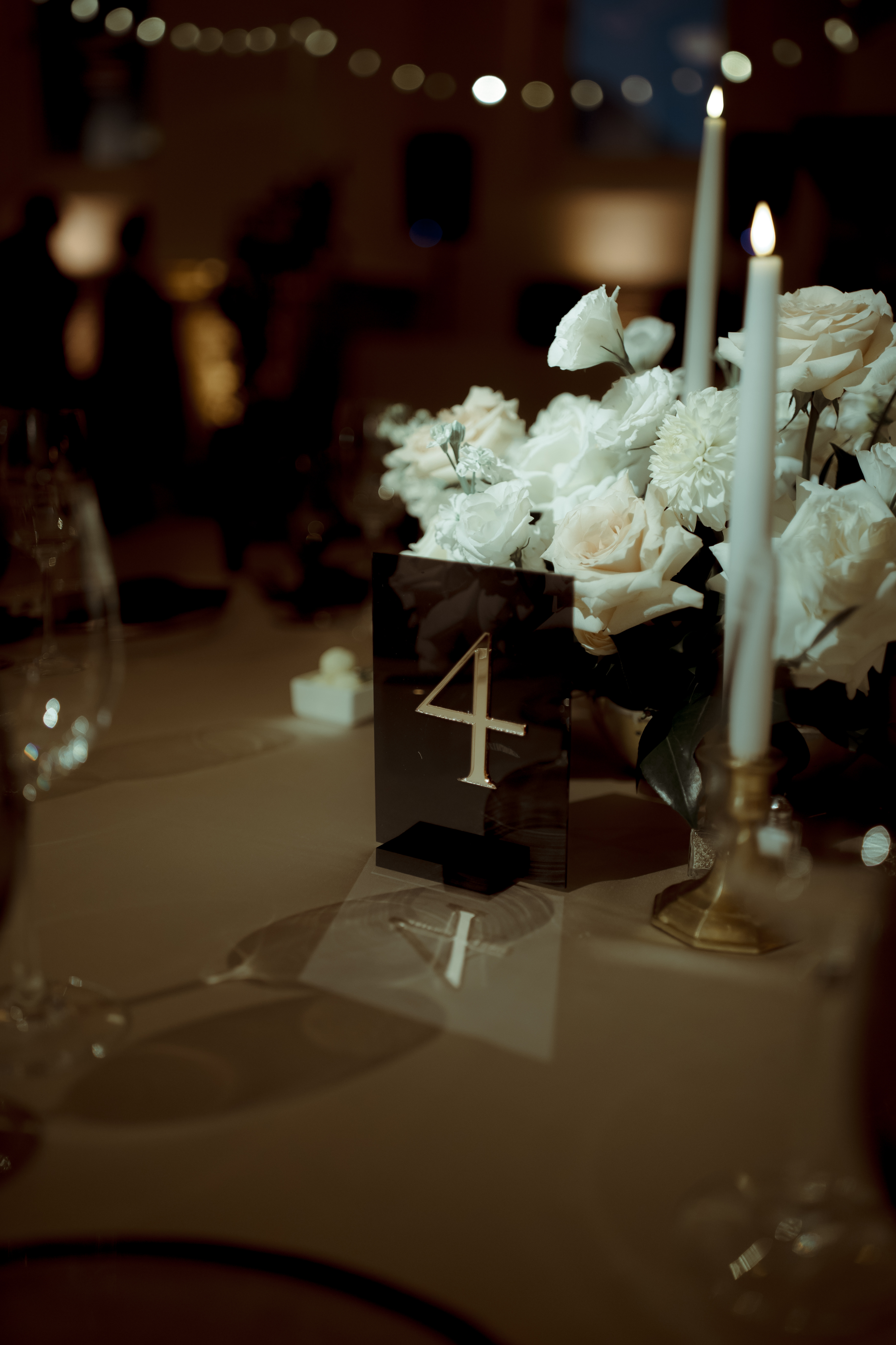
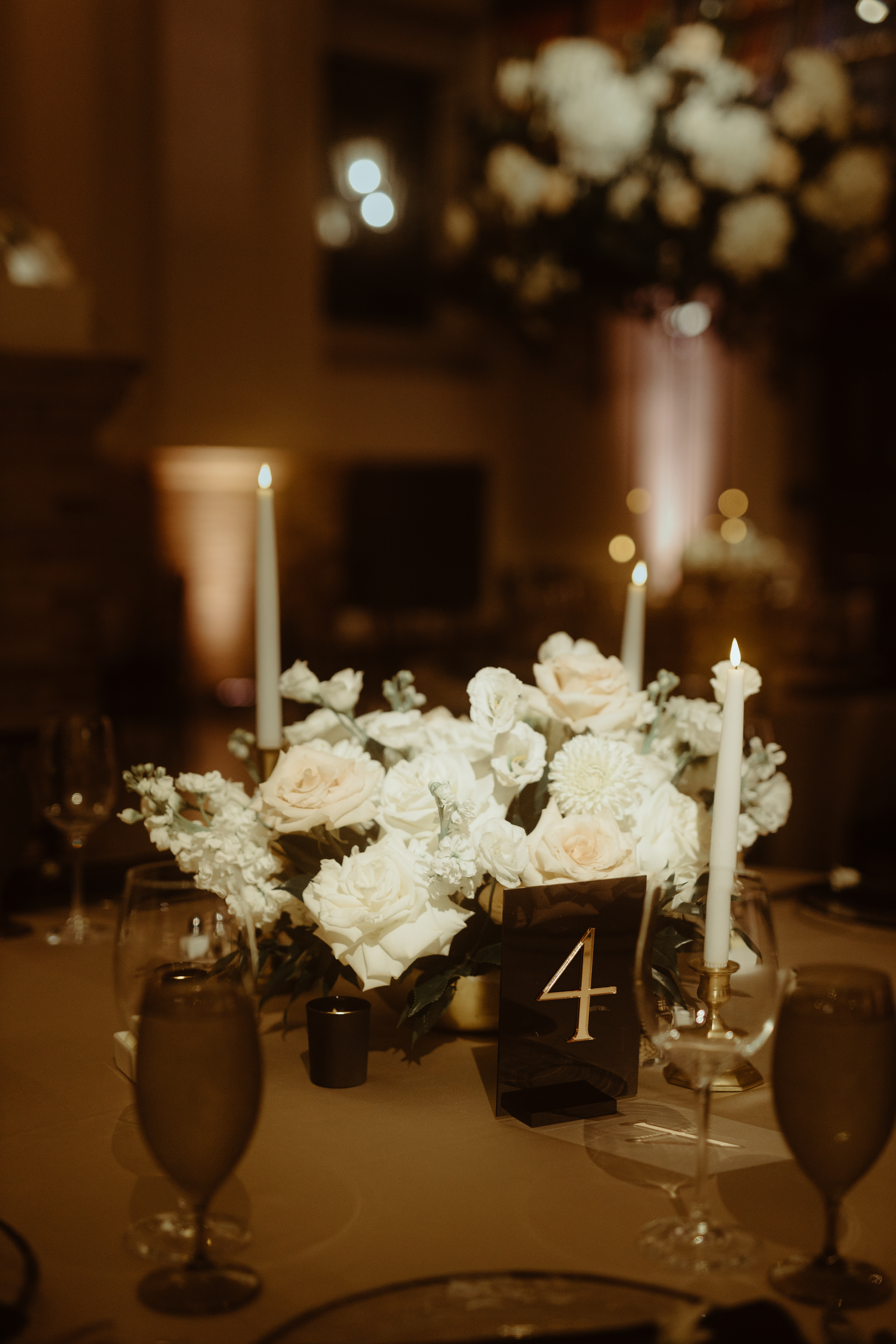
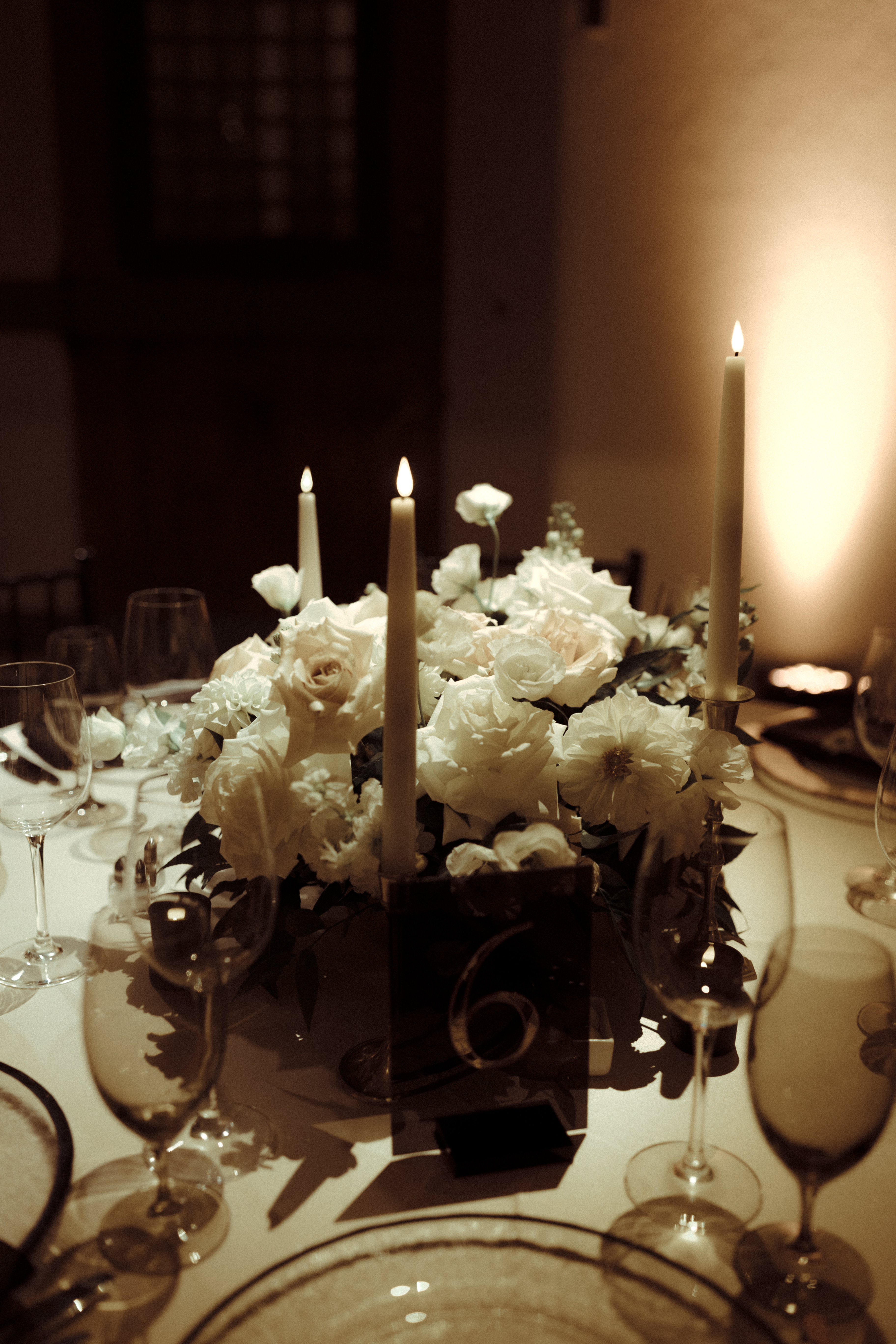
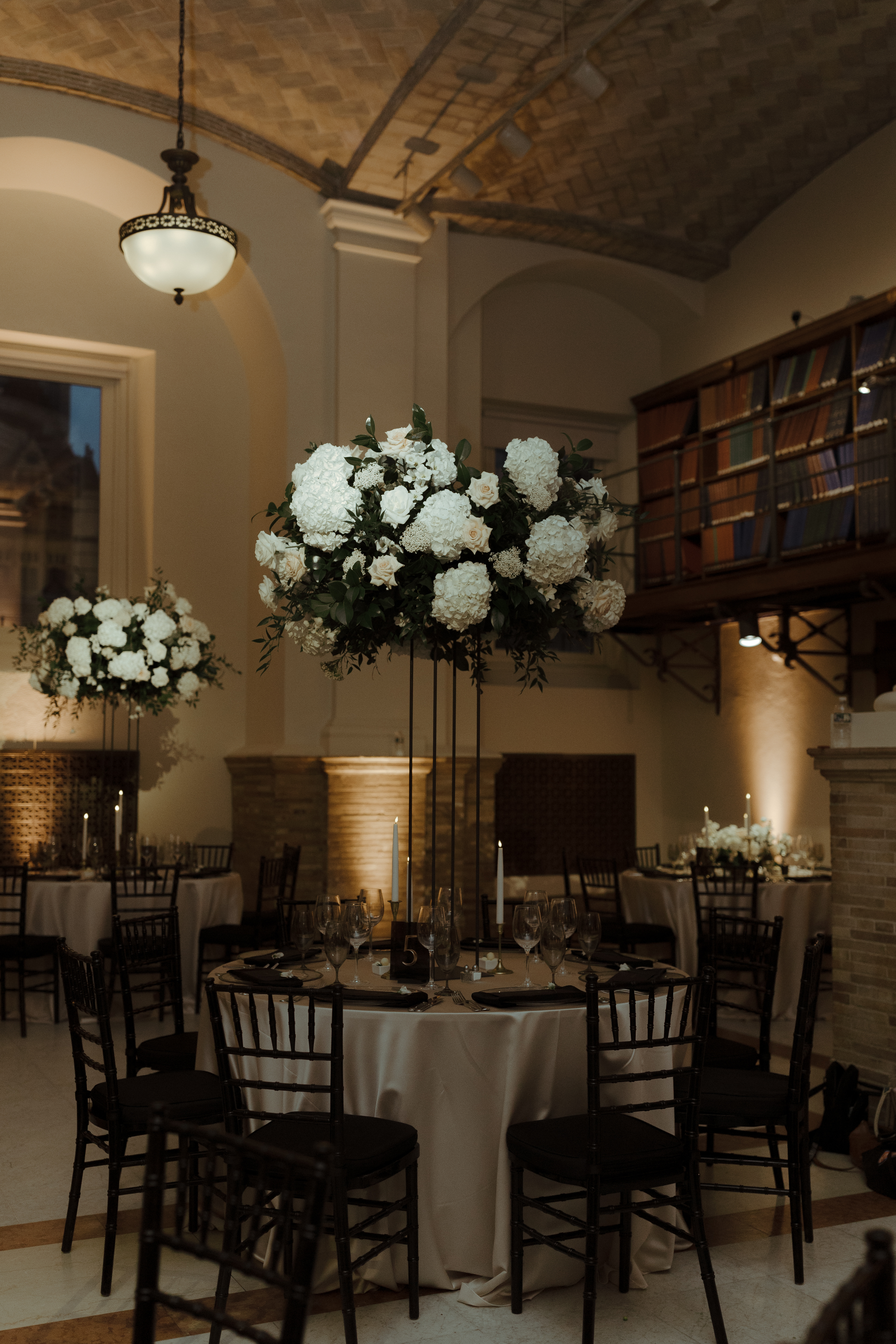
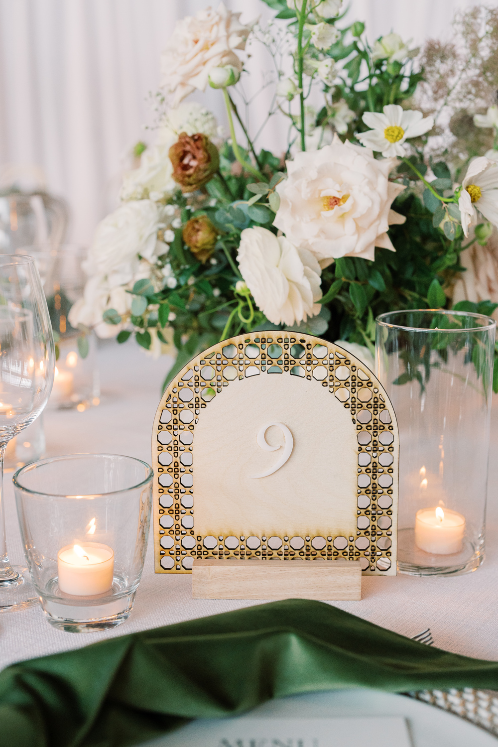
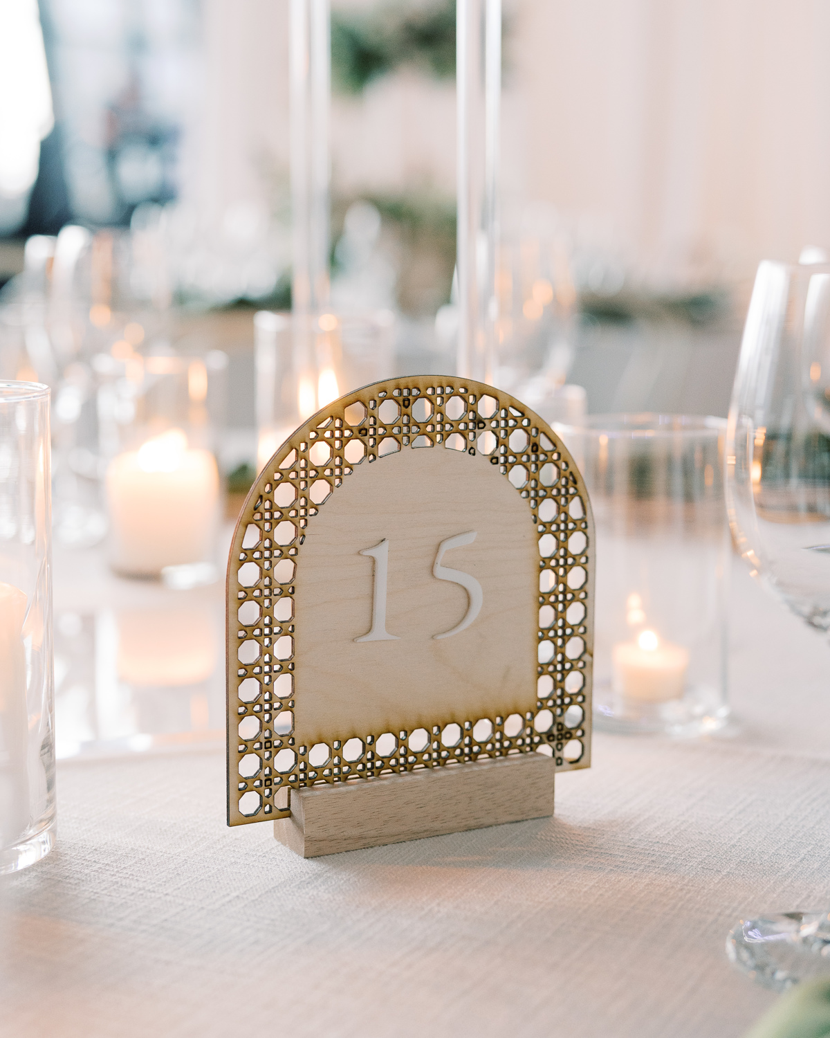
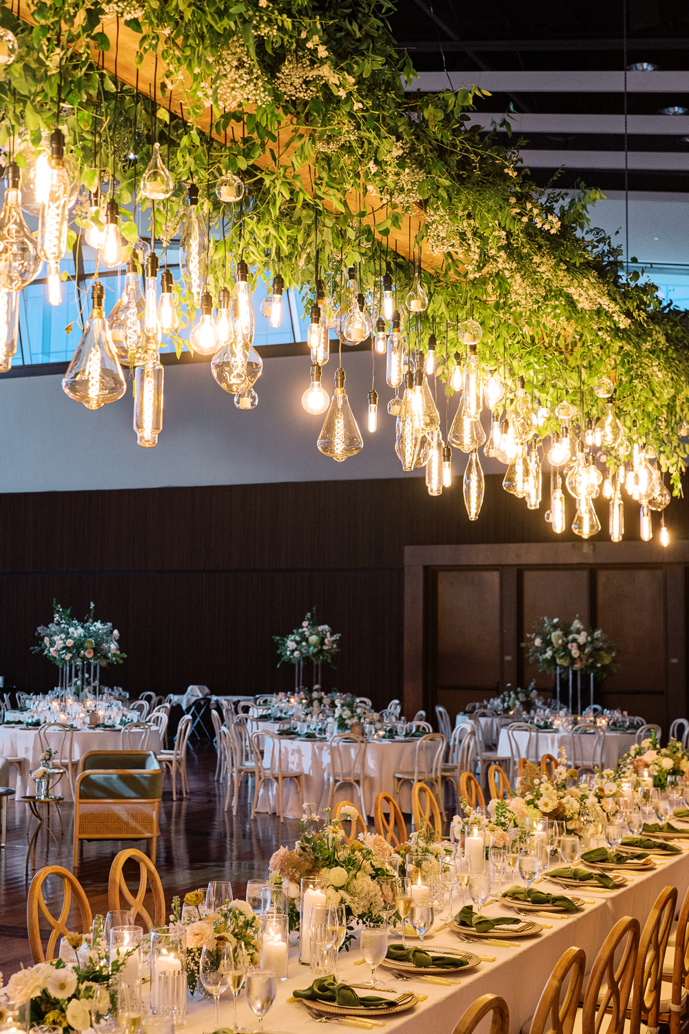
The tablescapes were a work of art. With stunning floral arrangements, intentional linens, purple glassware, and the royal purple table numbers we created in a fun material, it was a sight to behold.
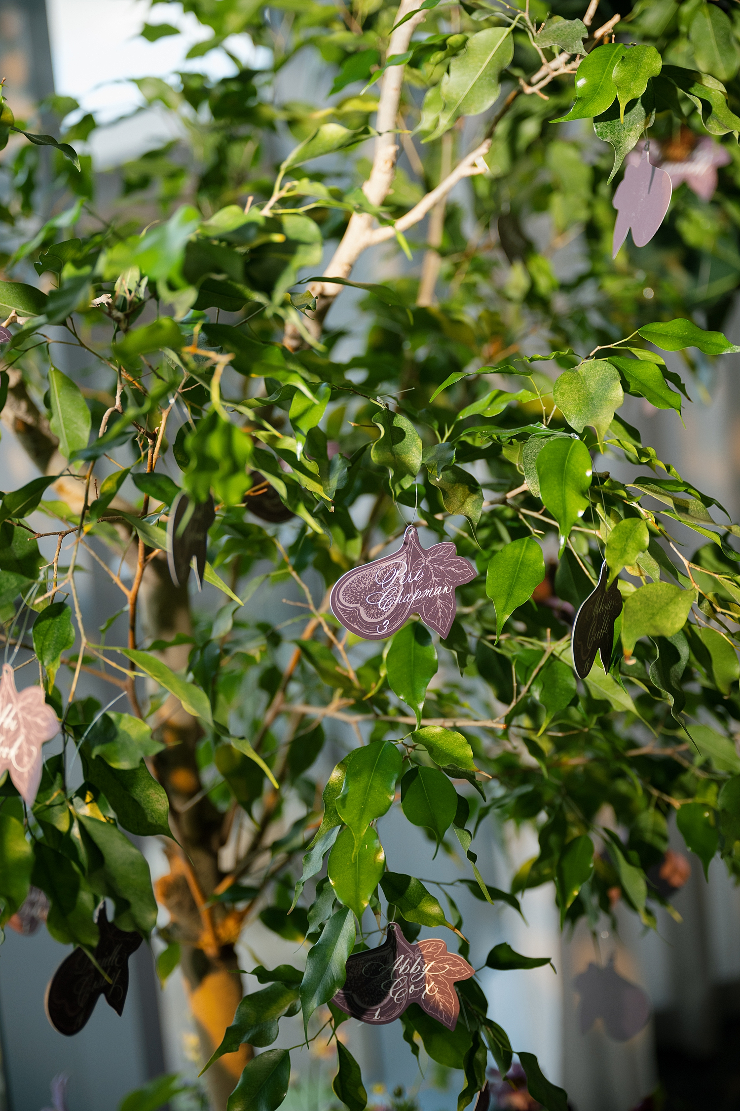
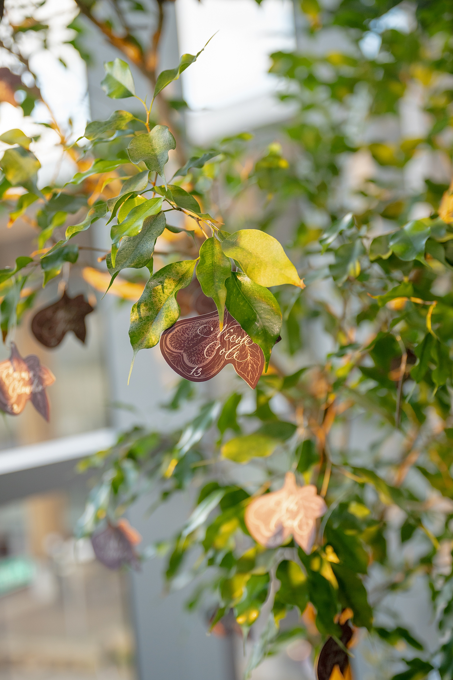
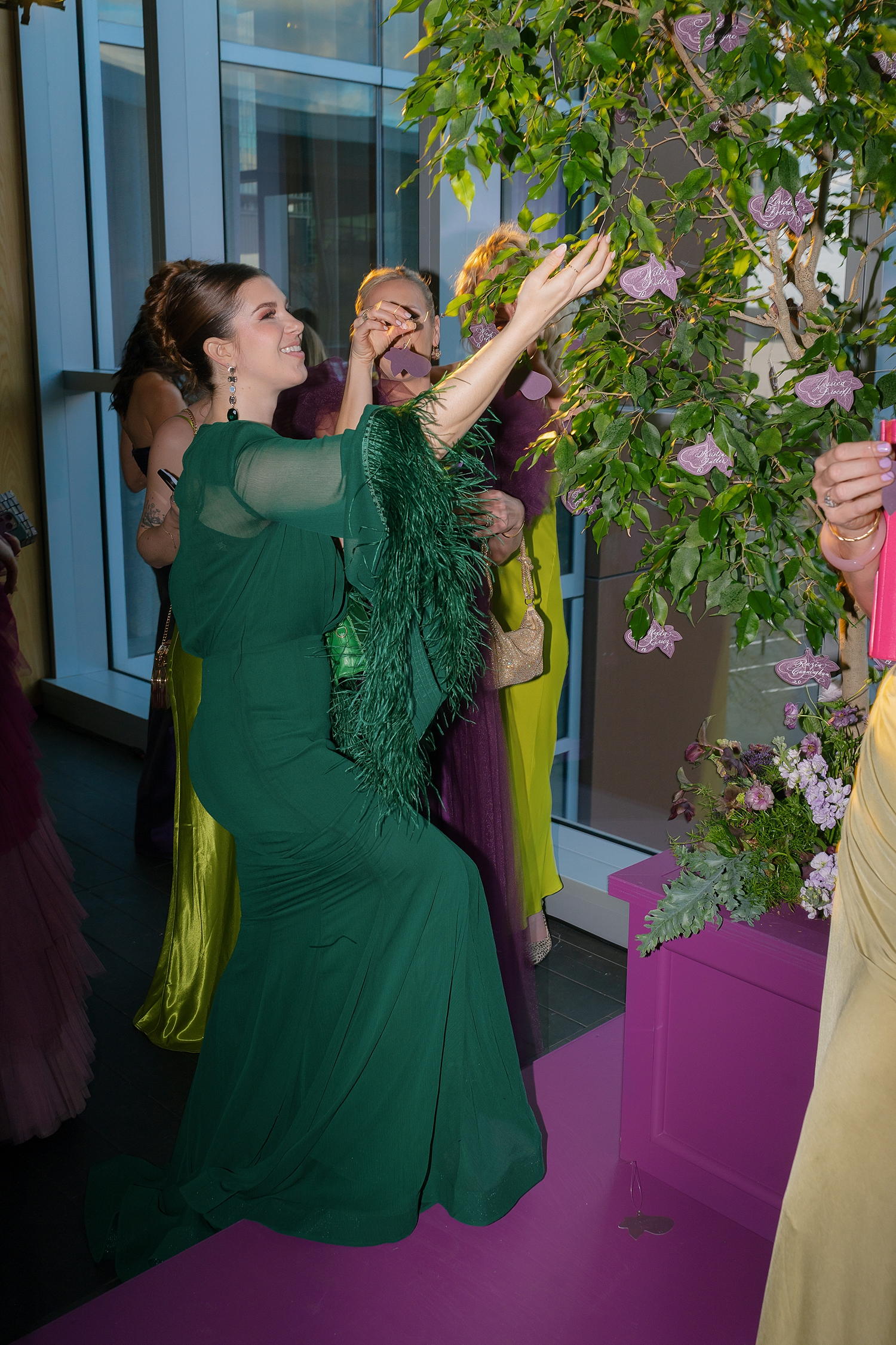
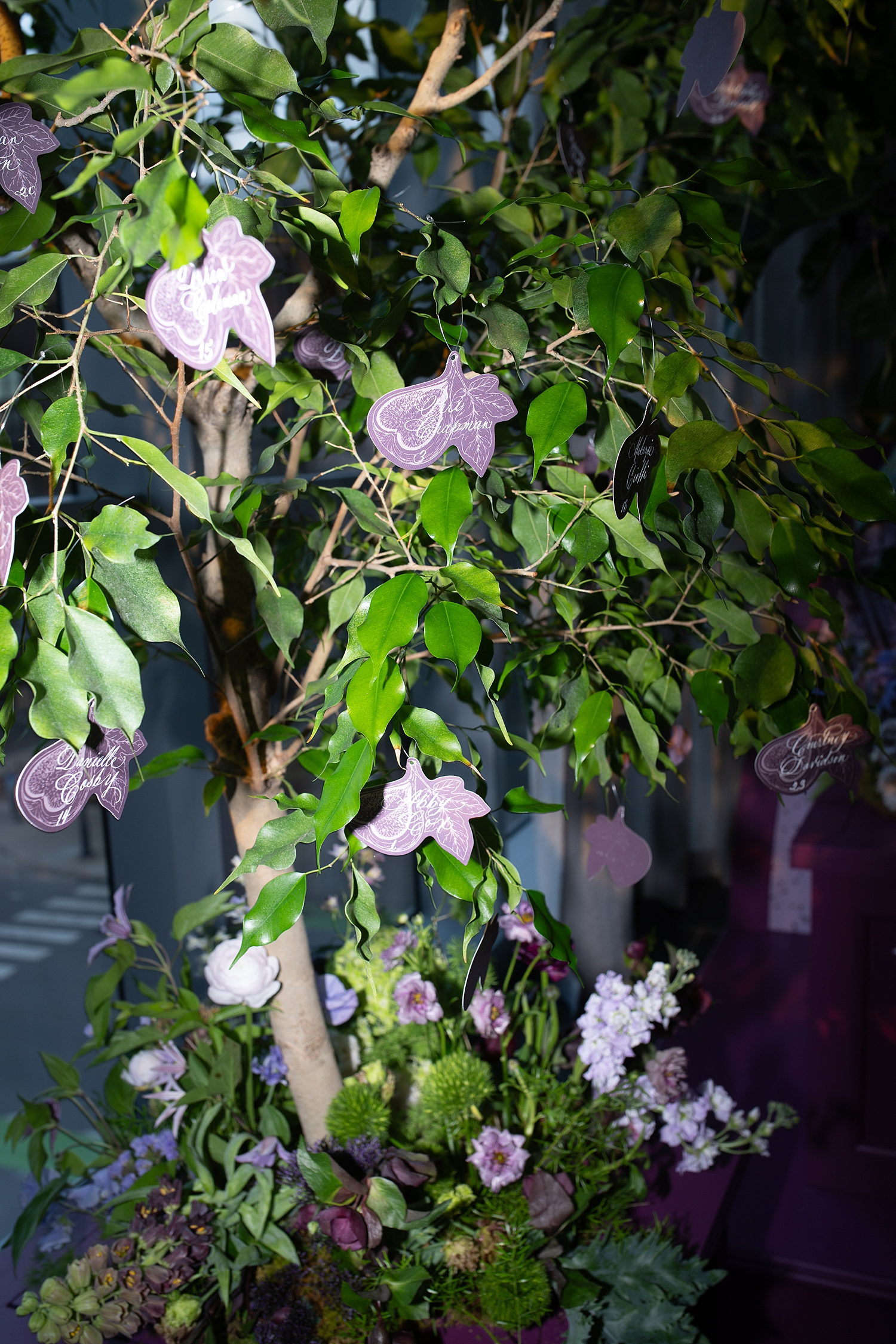
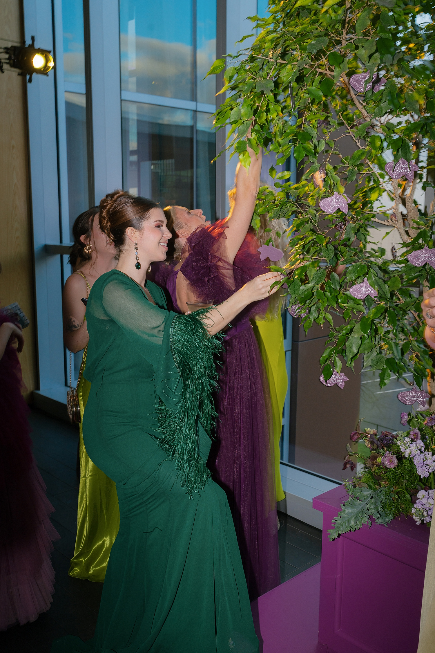
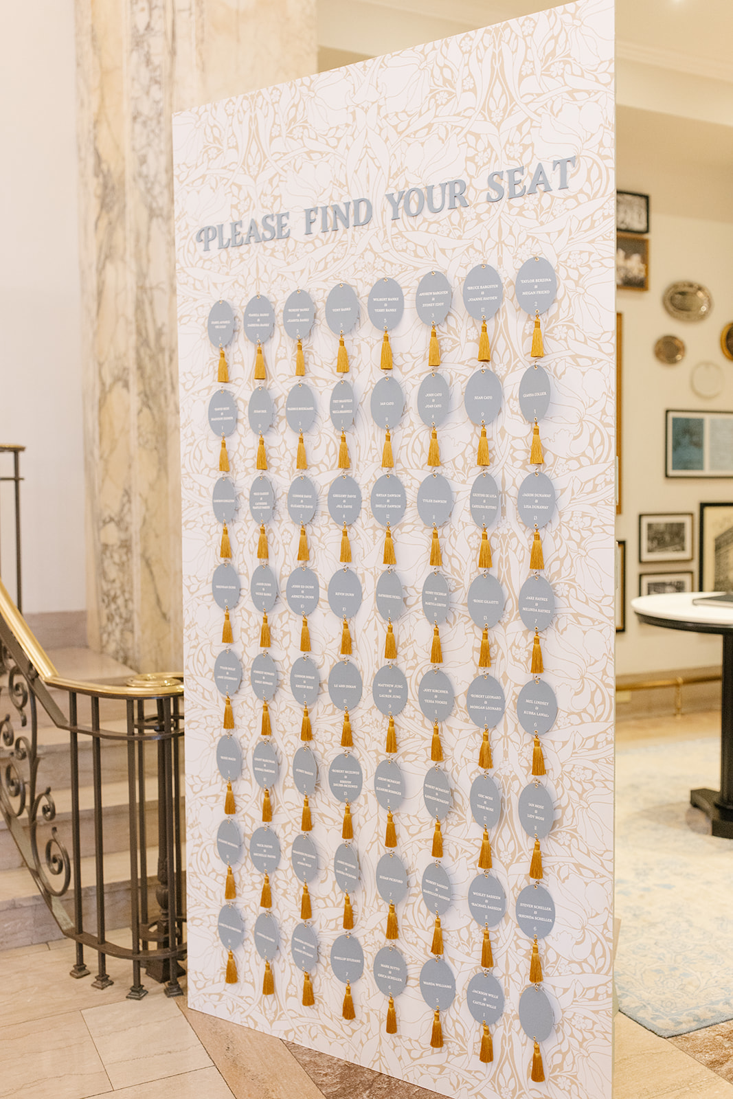
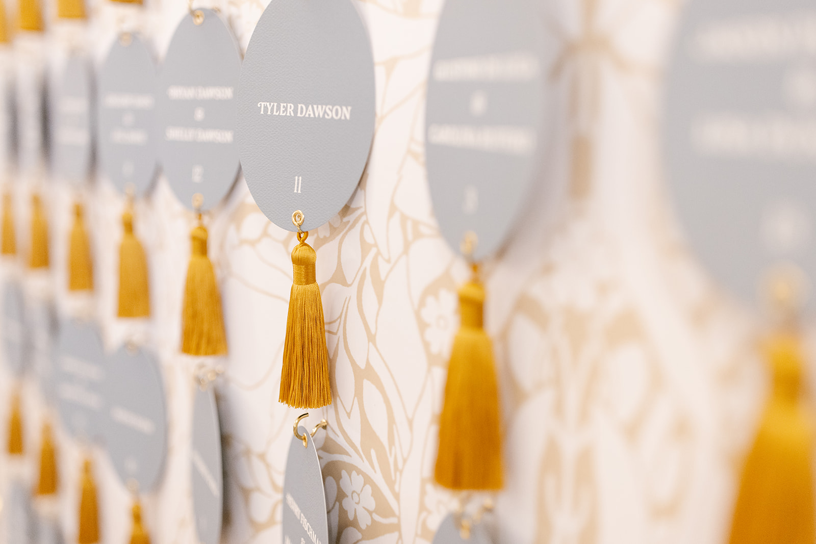
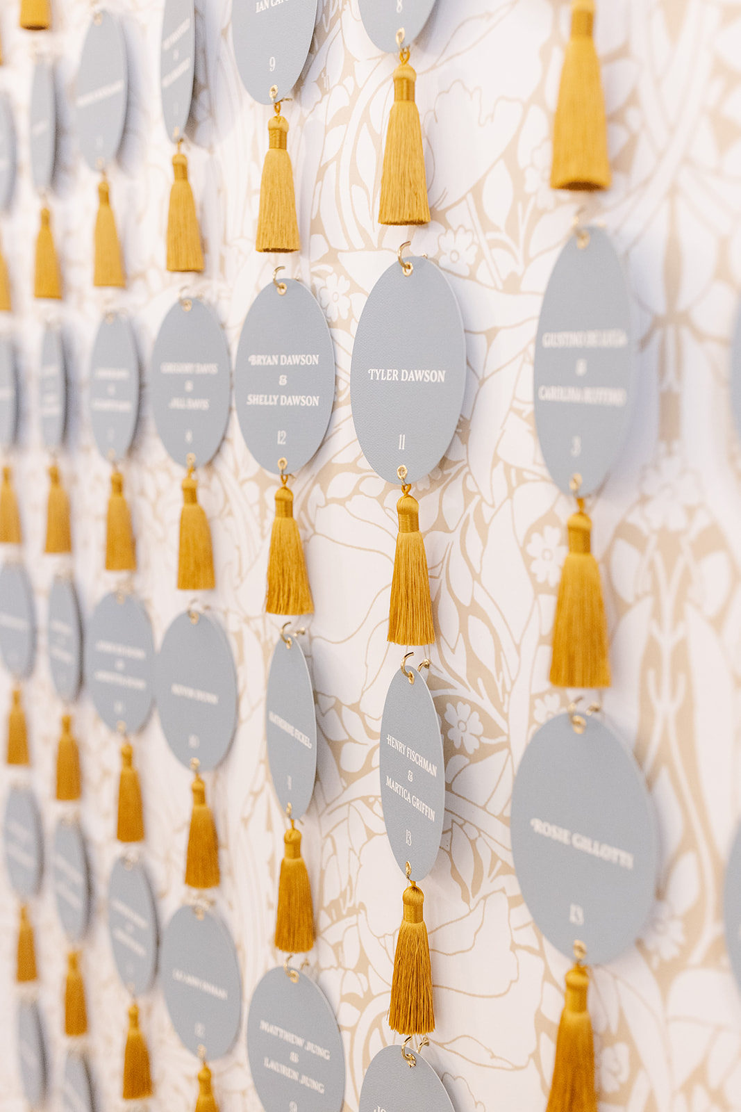
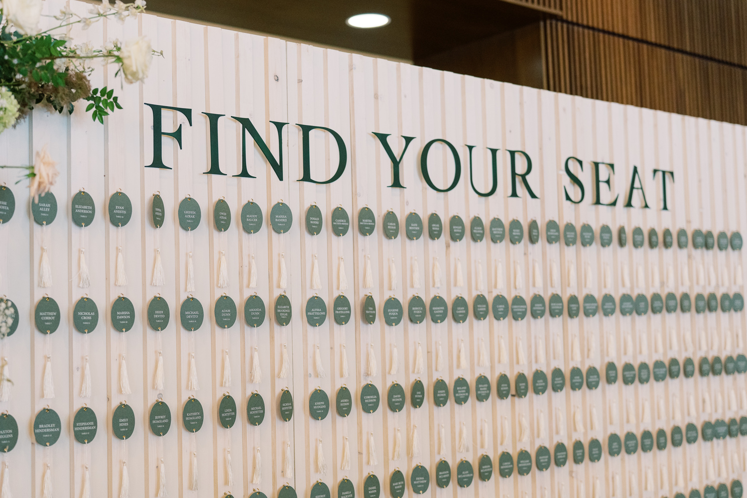
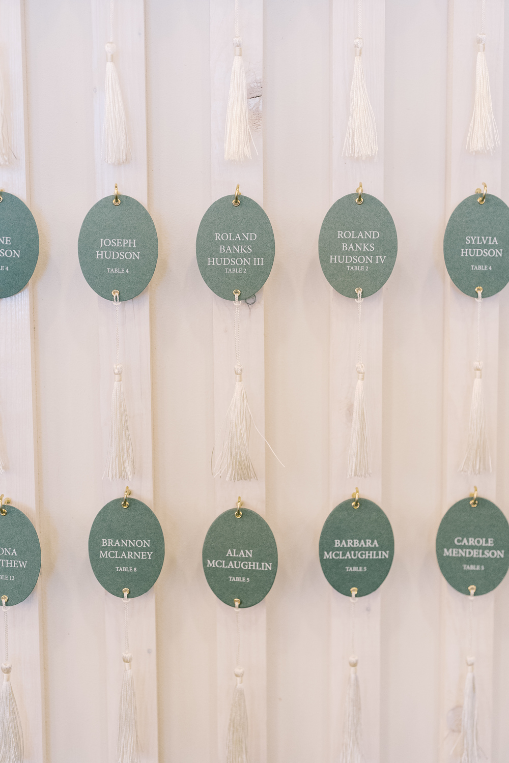
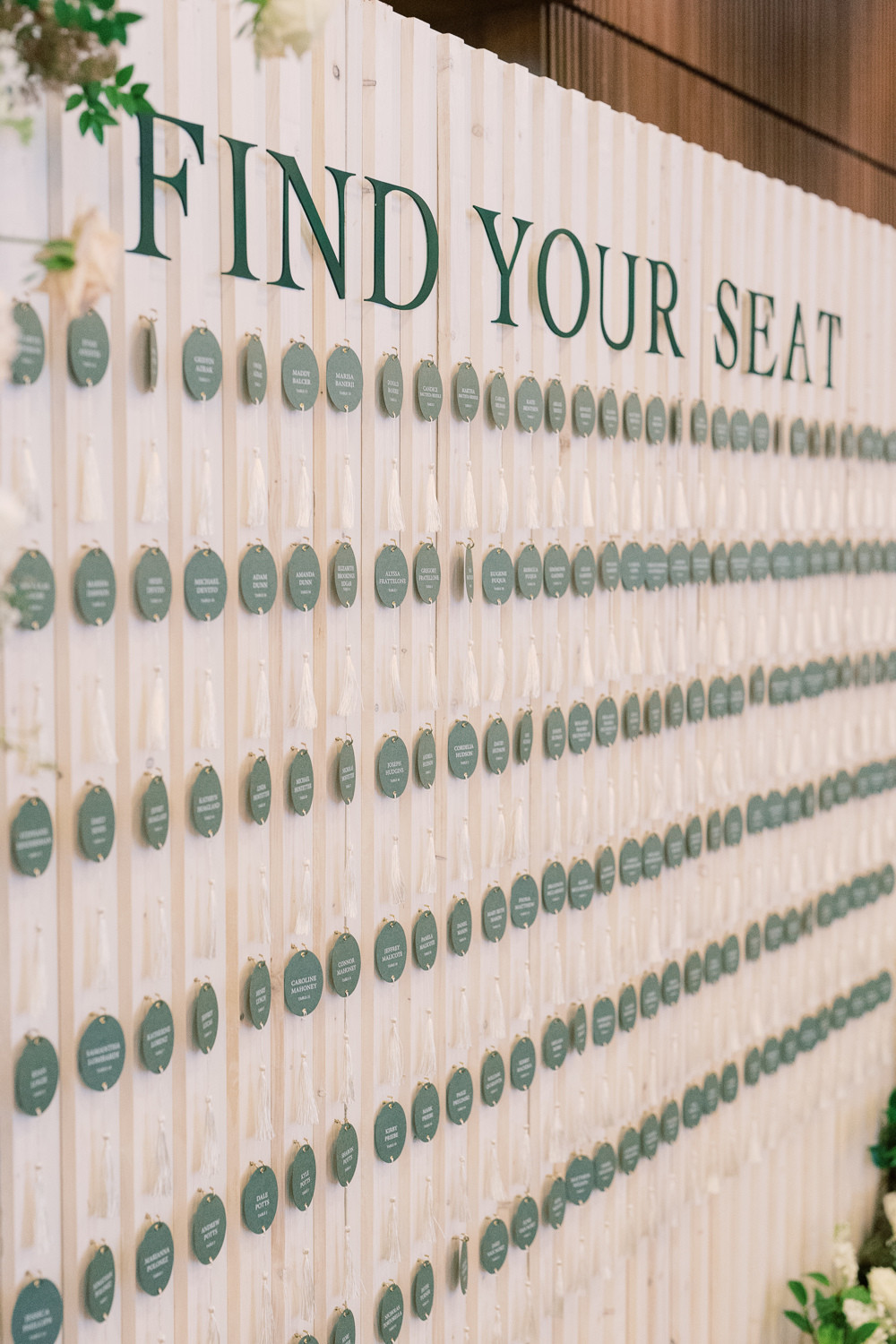
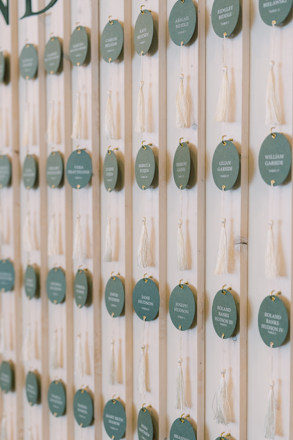
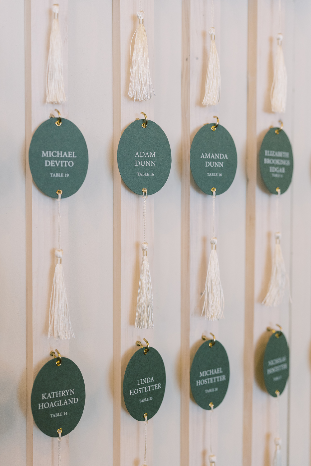
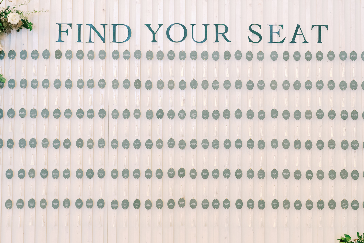
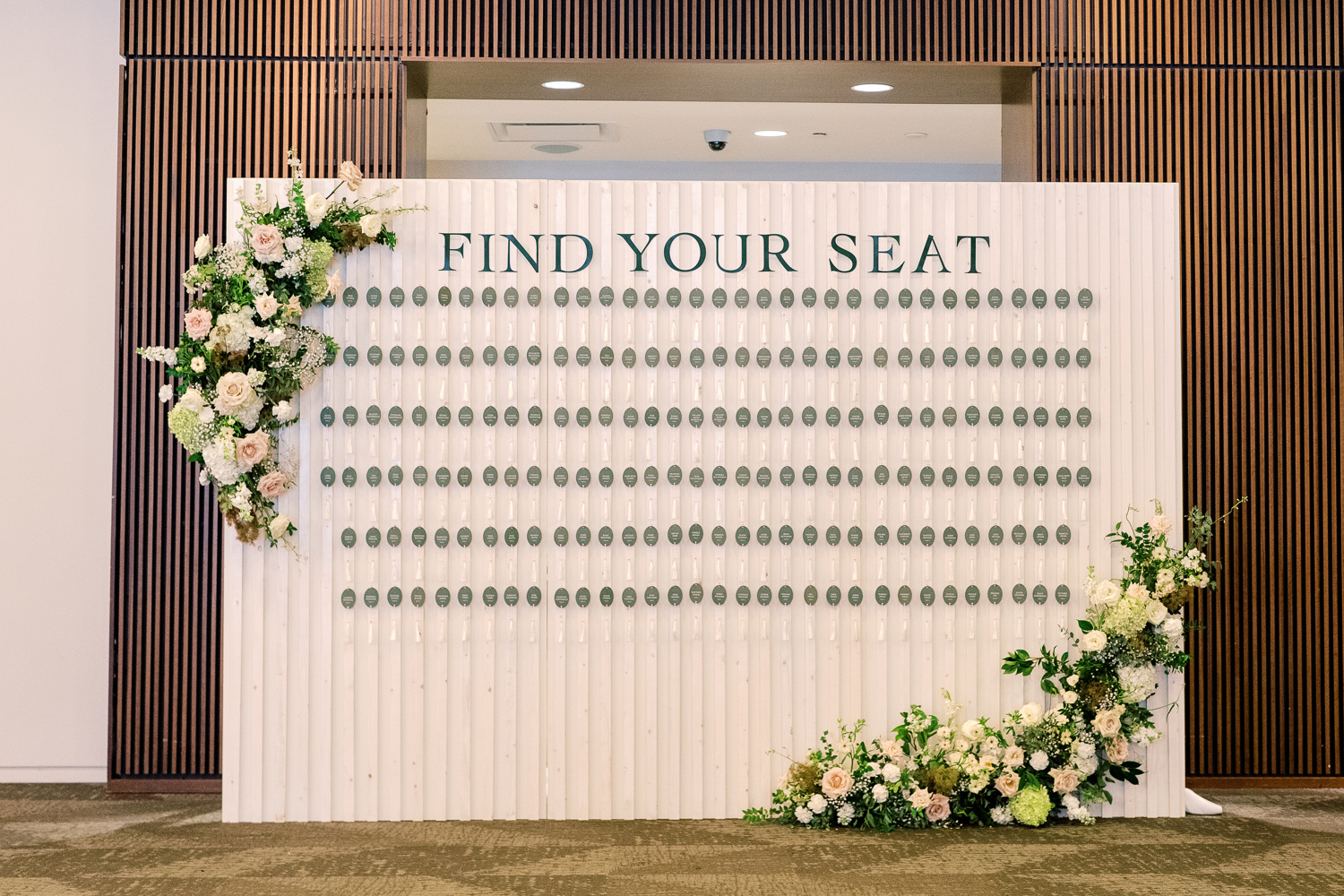
Fig Shaped Escort Cards and Interactive Seating Chart
One of the most playful and visually striking installations of the evening was the escort card display. Each guest experienced the seating chart installation, walking up the steps to find their escort card amongst the trees. Each escort card was die cut in the shape of a fig, with the guest name and table number in calligraphy. The organic movement of the cards, paired with their unexpected shape, created a moment that felt immersive and artful. The trees framed a large arch display of the Nashville Skyline, which mimicked the design of the bar signage we also created.
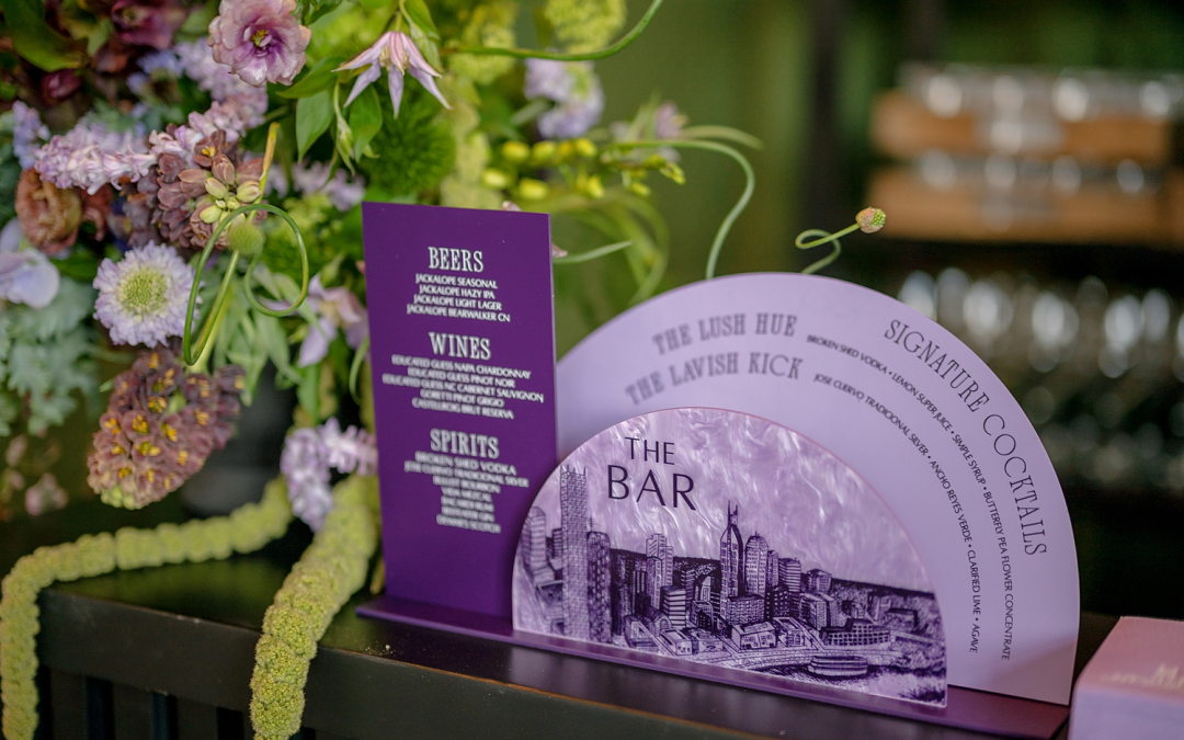
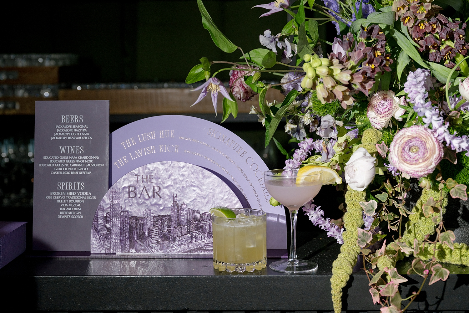
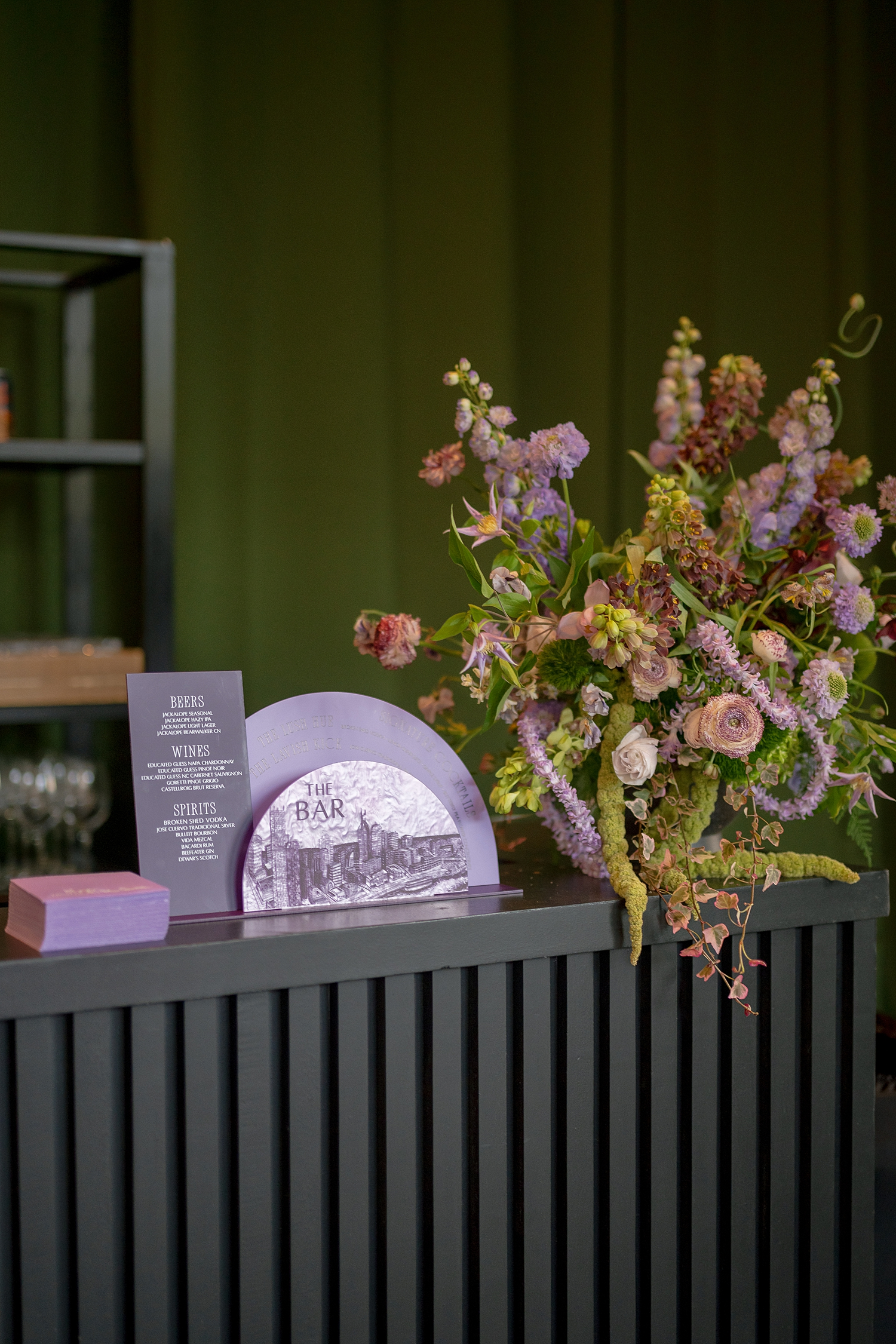
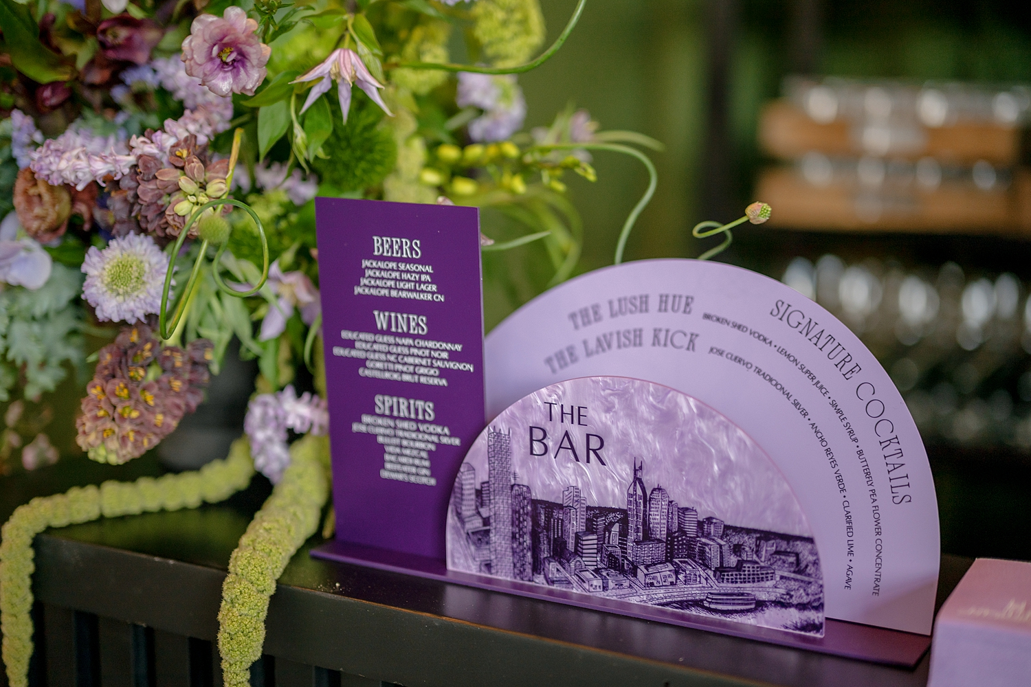
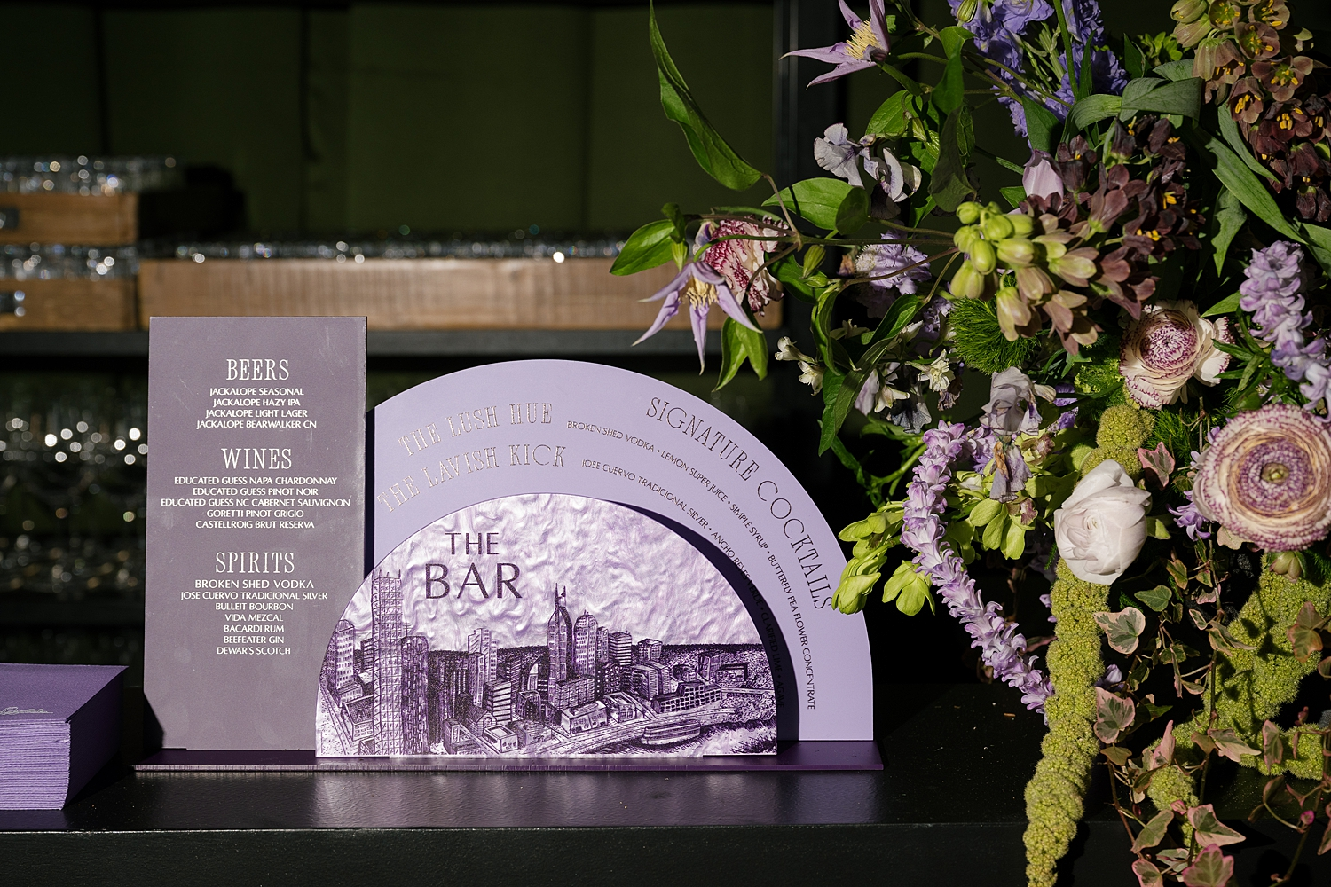
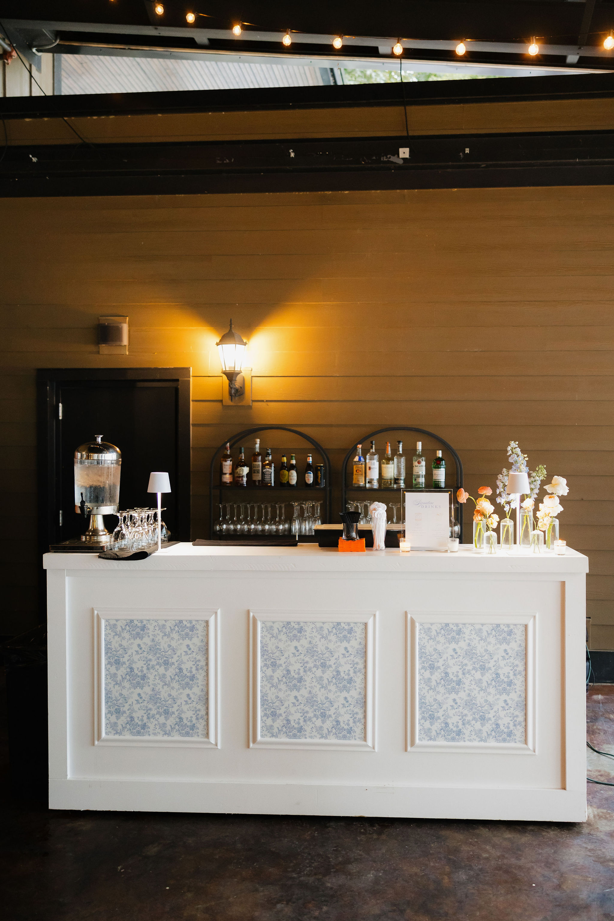
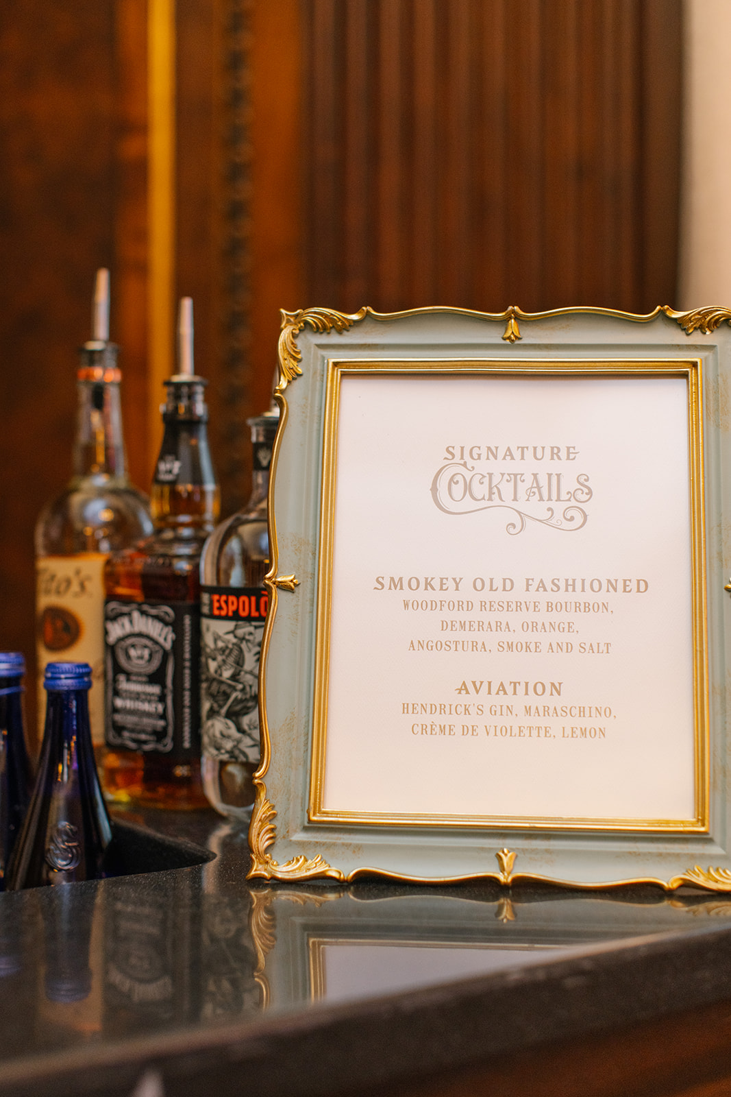
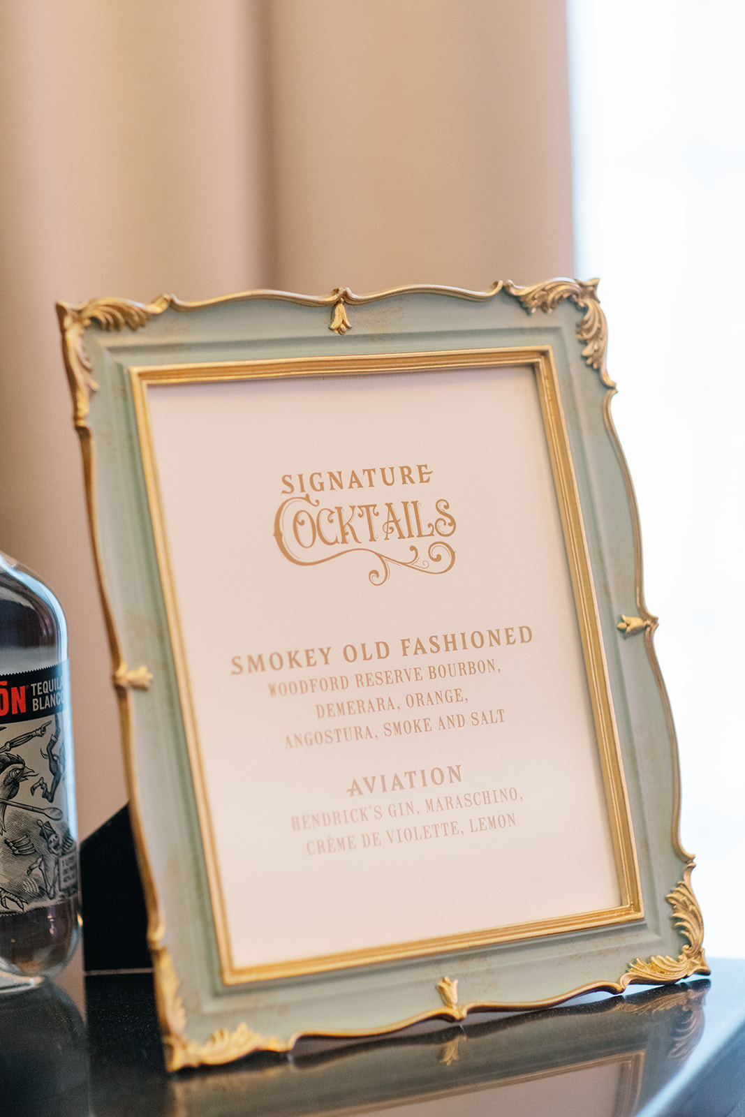
Statement Bar Signage
The bar signage featured semi-circle acrylic designs in custom colors that tied seamlessly into the event palette. Each piece incorporated a stylized Nashville cityscape, reinforcing the visual story throughout the space. The curved shapes softened the overall look while still feeling modern and bold, a perfect complement to the venue’s aesthetic.
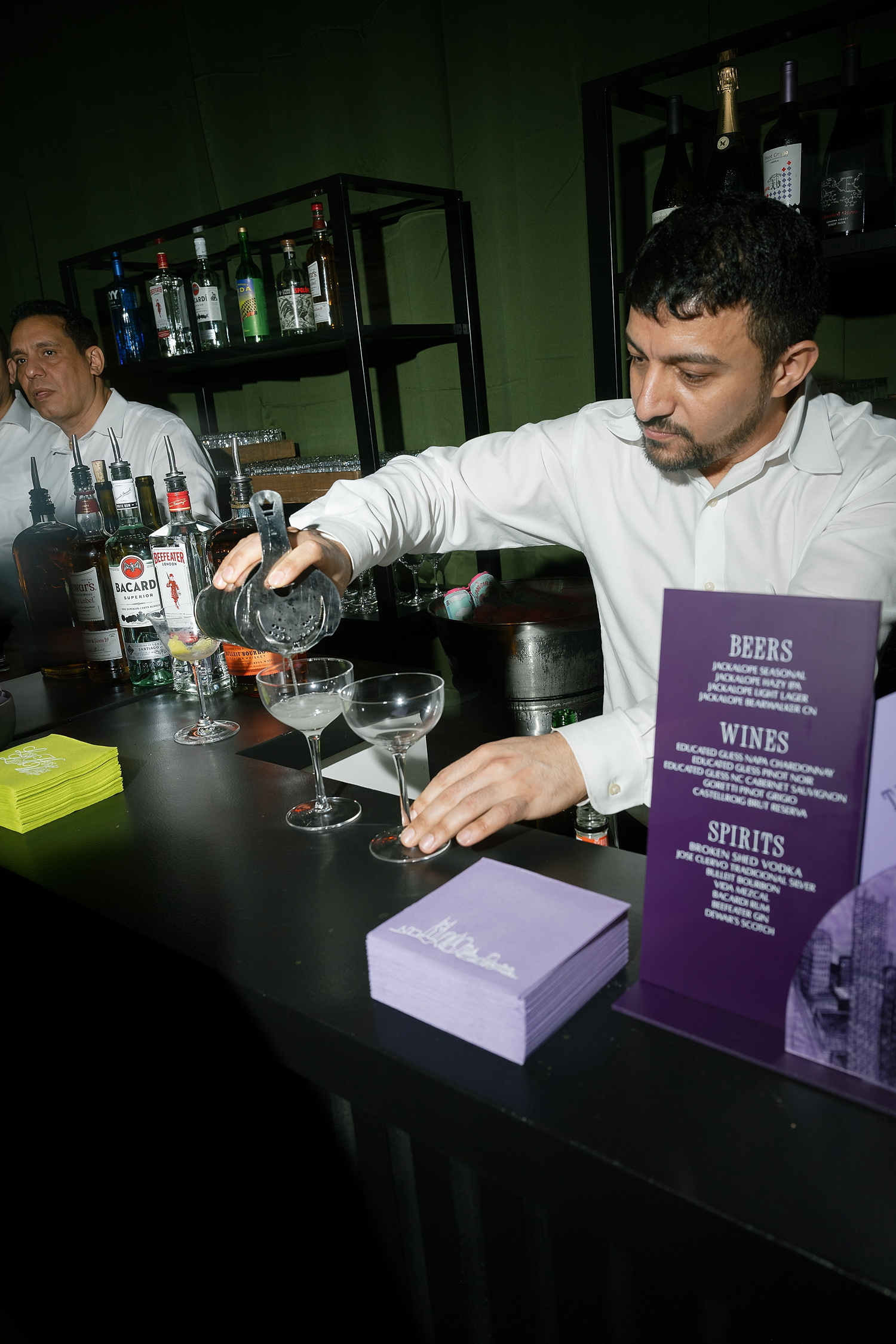
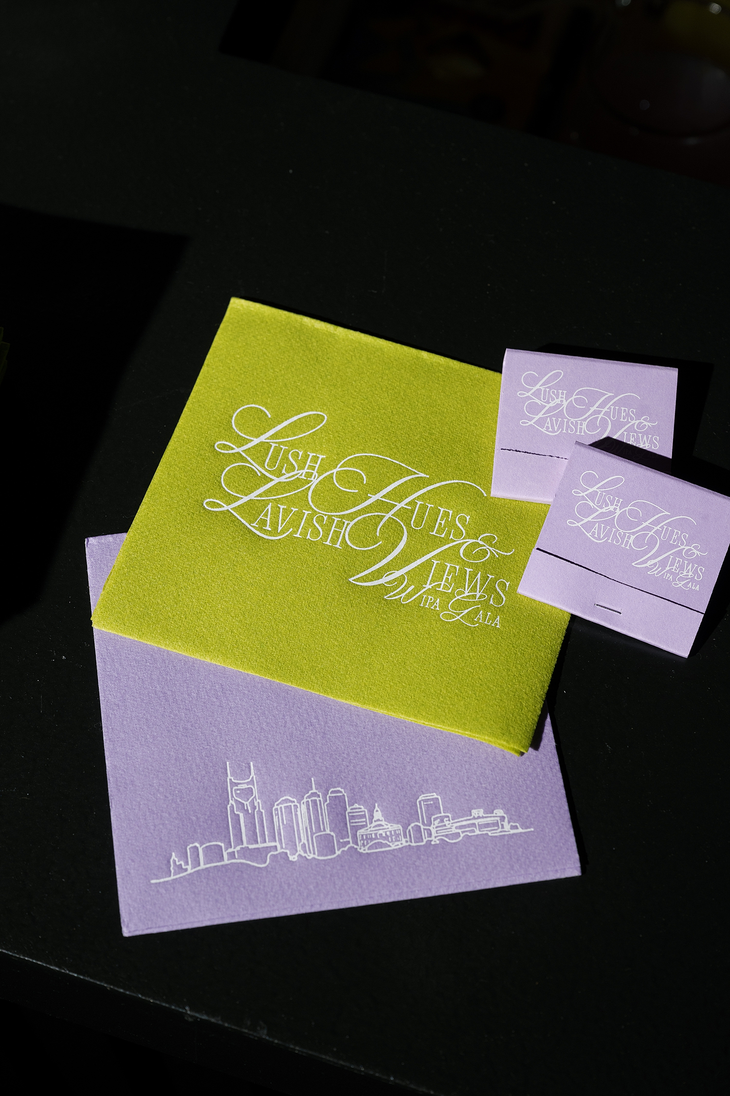
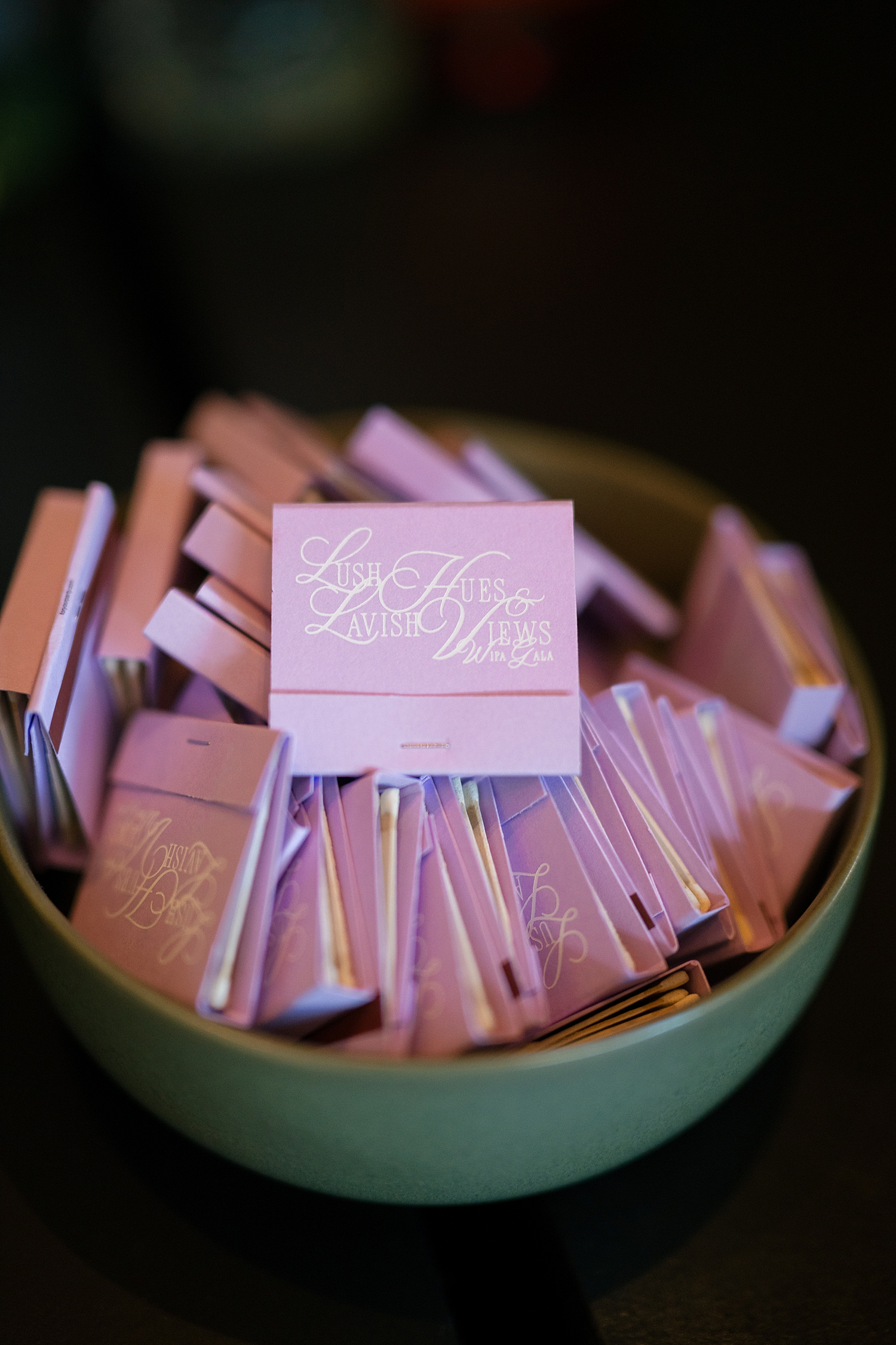
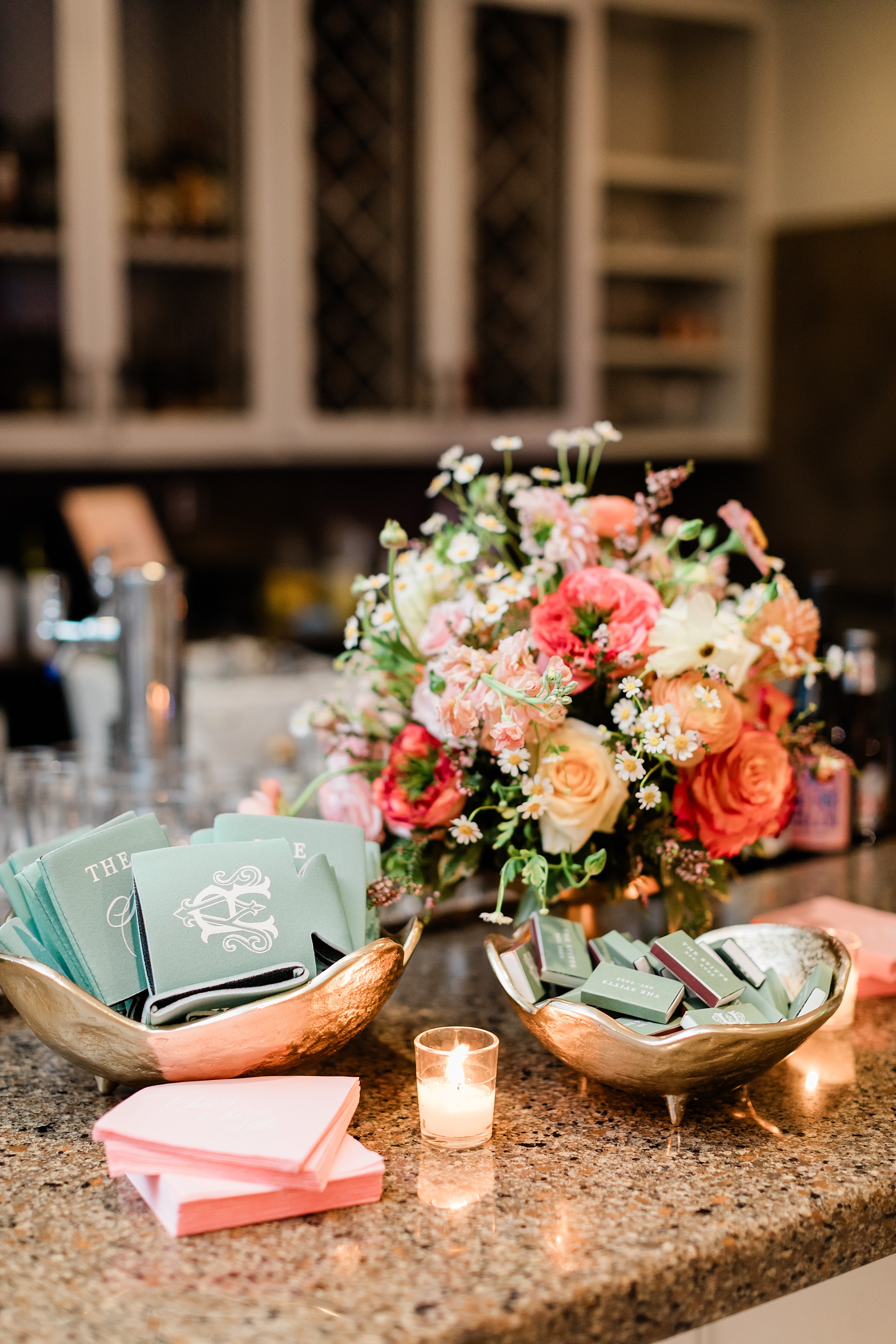
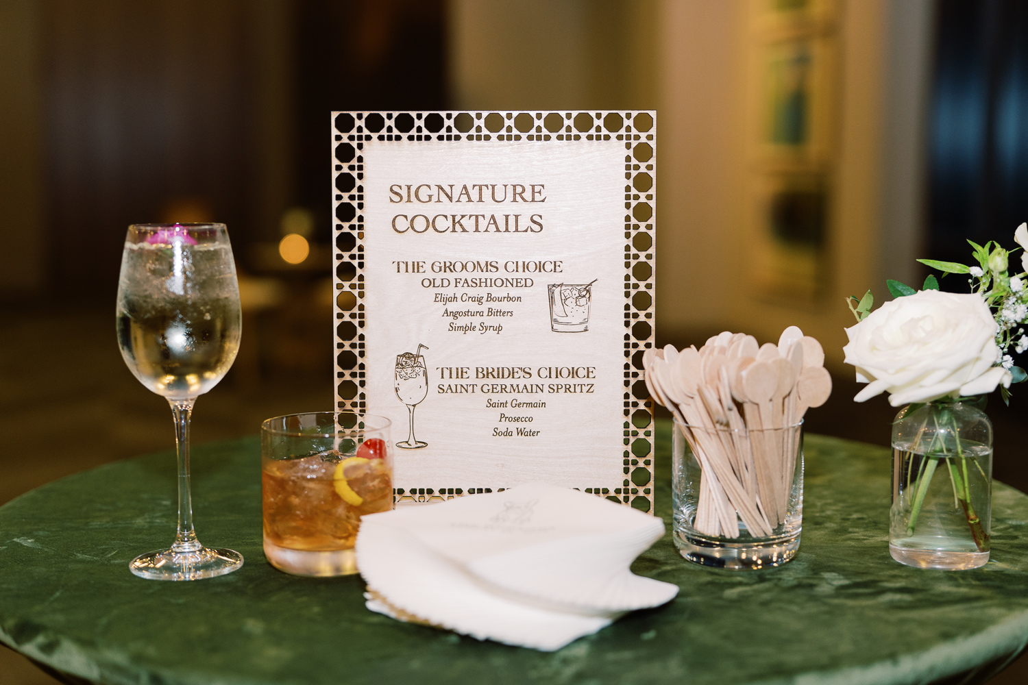
While guests grabbed a drink at the bar, they could also grab one of the cocktail napkins or matchbooks we designed. For the cocktail napkins, we had two designs. One in a bright green hue that featured the event theme, Lush Hues and Lavish Views, on it, adding a vibrant pop of color. The second napkin design was a soft lavender color that showcased a delicate line sketch of the Nashville skyline, tying back to the invitation suite.
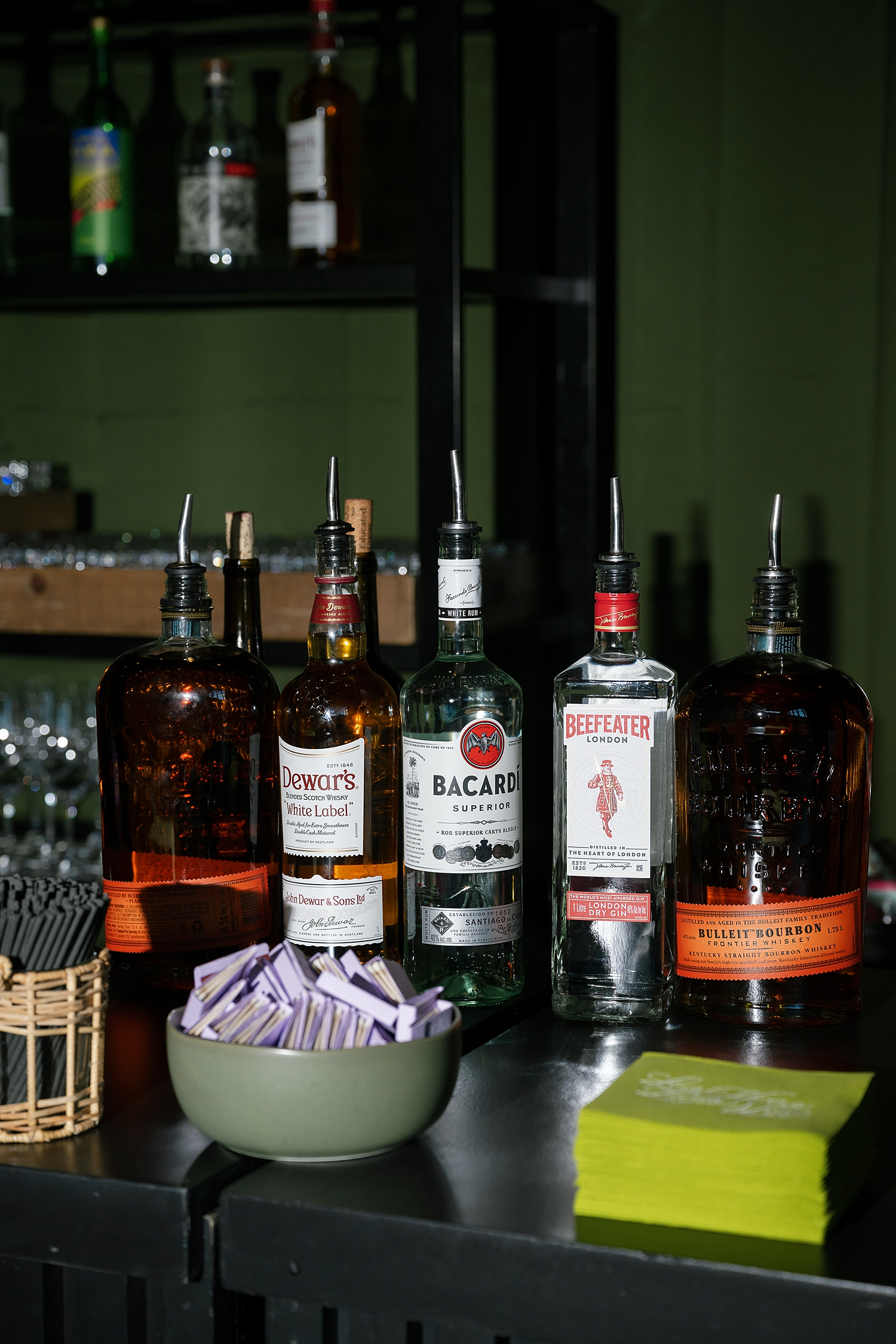
Next to the napkins in a bowl, were the light purple matchbooks that carried the event branding, offering guests a stylish and functional keepsake from the evening. Each element worked together to create a layered, cohesive design story that felt intentional from start to finish.
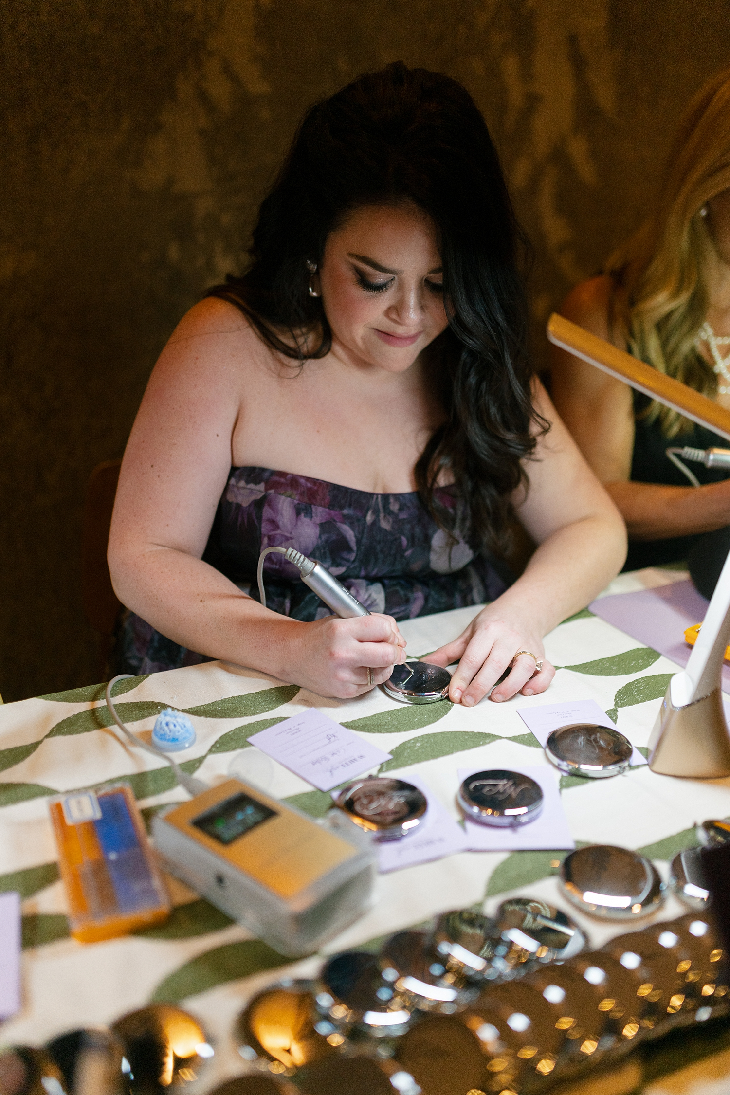
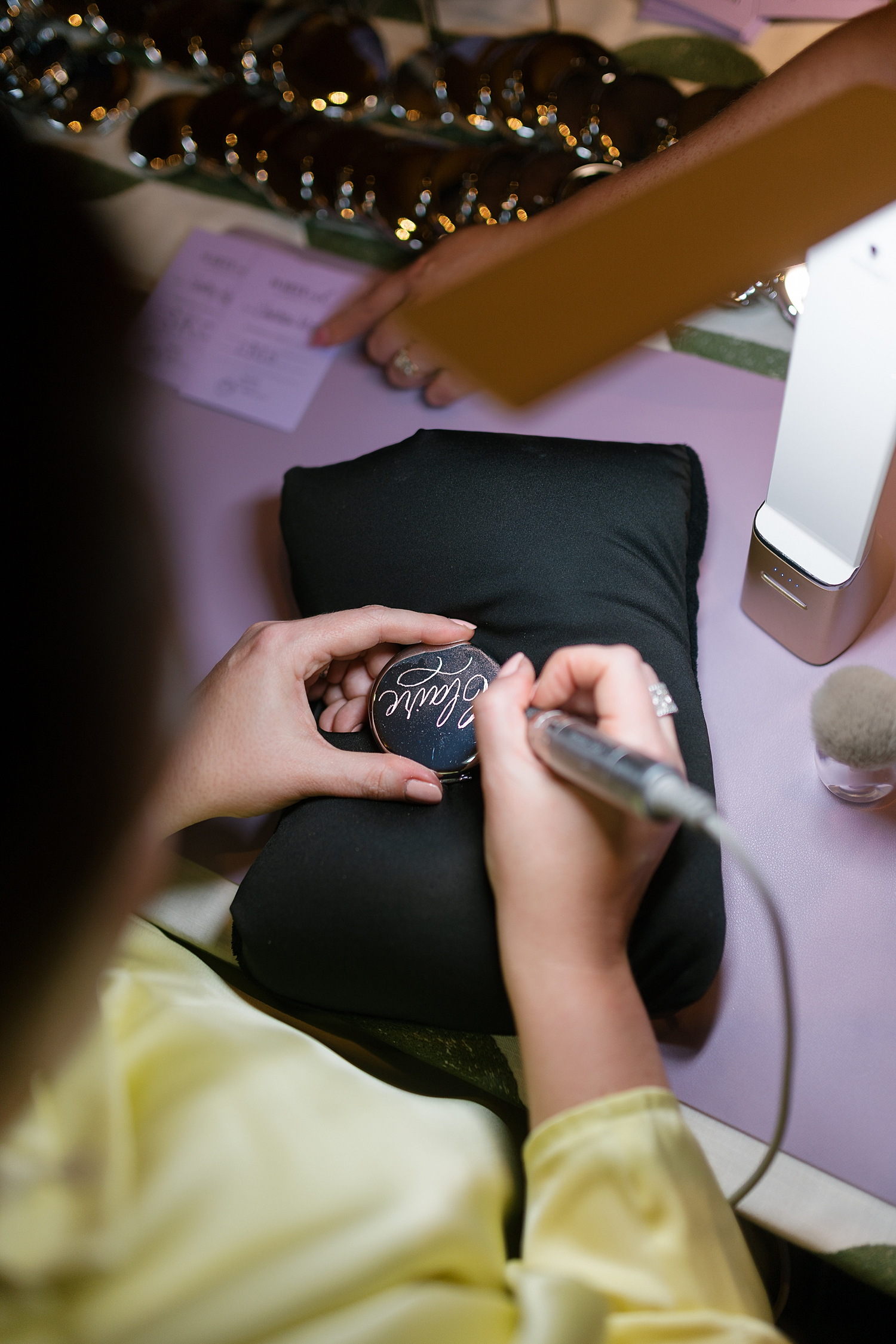
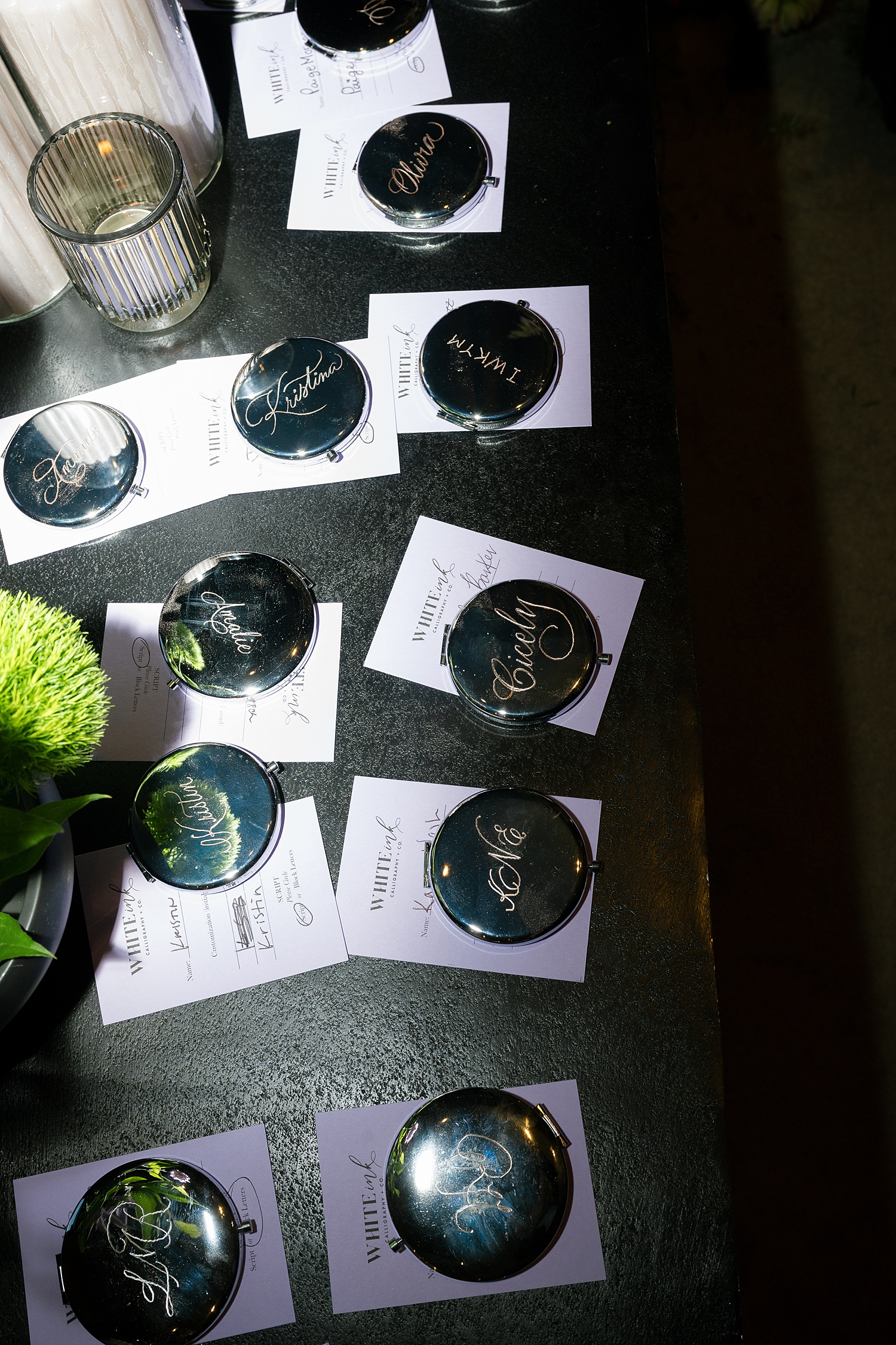
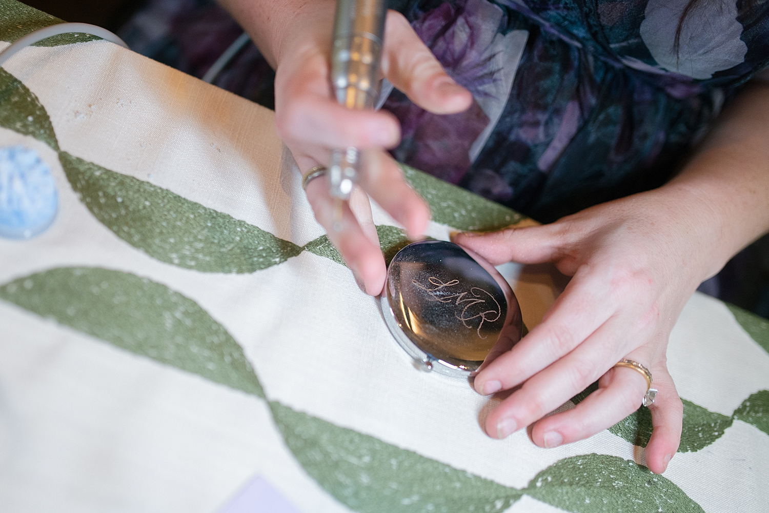
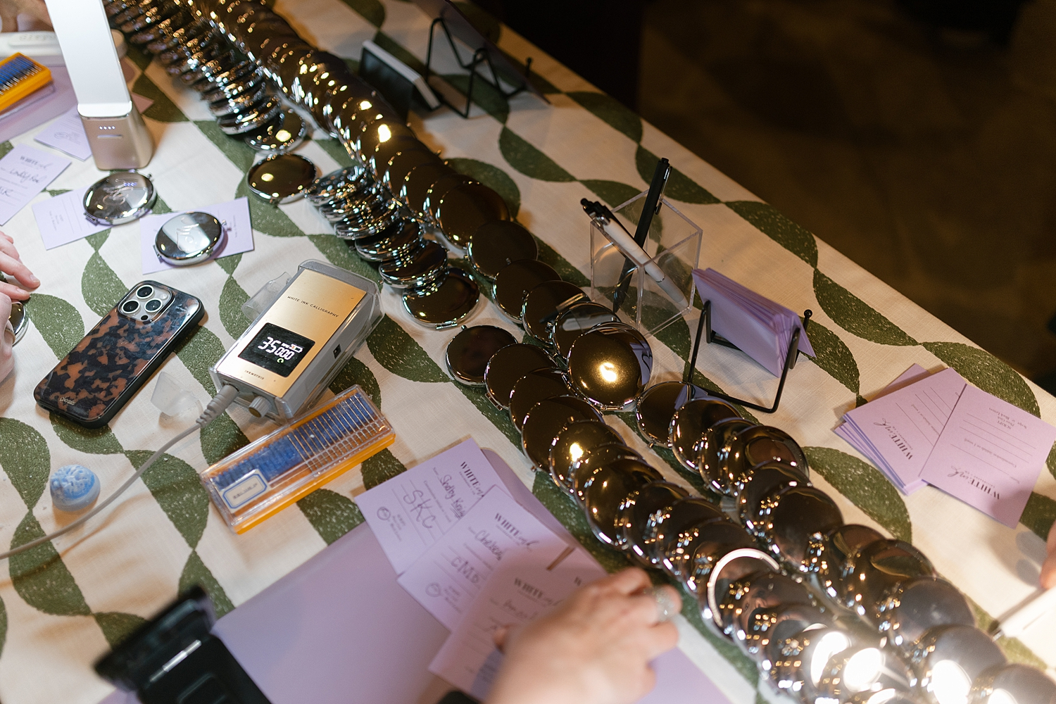
Custom Onsite Engraving Experience
To make the evening even more memorable, we brought in a live engraving station, which is one of our favorite ways to elevate a guest experience.
Attendees received compact mirrors engraved on-site, creating a personalized keepsake they could take home. Watching the engraving process unfold added an interactive element to the event, while the finished pieces felt thoughtful, elevated, and truly one-of-a-kind.
Immersive Design Experience
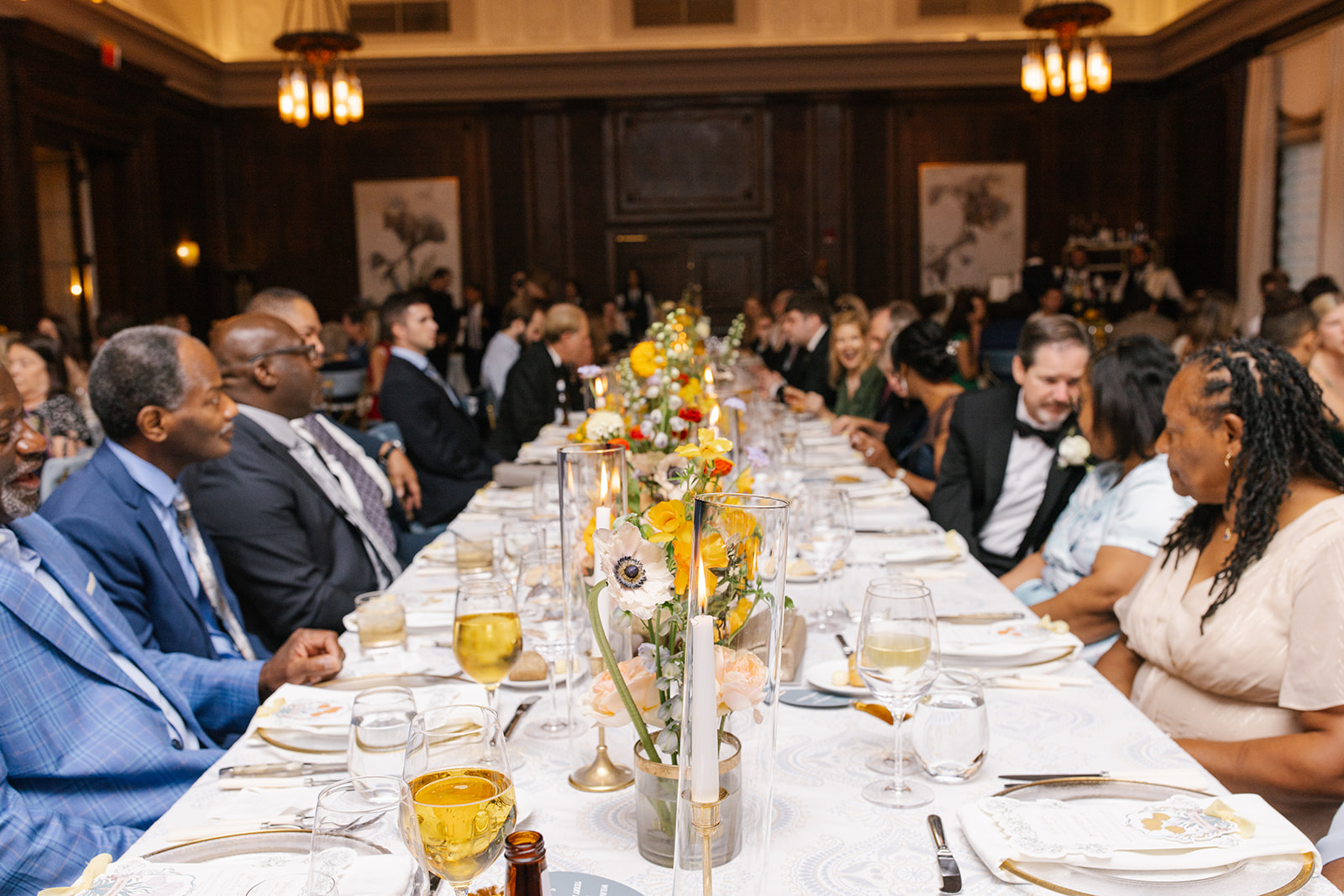
The WIPA Nashville Gala at 1 Hotel was a celebration of creativity, community, and elevated design. The Lush Hues & Lavish Views brought in creative design elements that were thoughtfully woven through the day creating an immersive experience for all in attendance. Seeing the joy on everyone’s face as they witnessed the various day-of event details was a highlight. It was truly an honor to be a part of such an amazing event for such a wonderful group of professionals. The wedding industry in the Southeast is filled with incredibly talented people, and I’m so grateful to be part of a community that continues to inspire me every day.
If you’re planning a wedding or event in Nashville, or anywhere in the world, we’d love to help you create meaningful, personalized stationery and event details that tell your story.
Reach out today to learn more about our full-service wedding and event design offerings! We can’t wait to create something unforgettable for you!
If you enjoyed this post, you’ll love these other blogs!
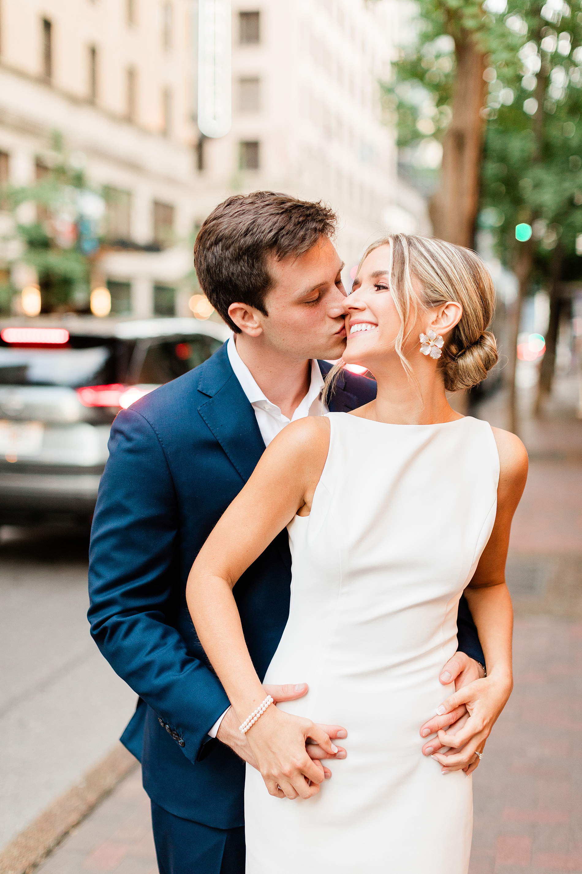
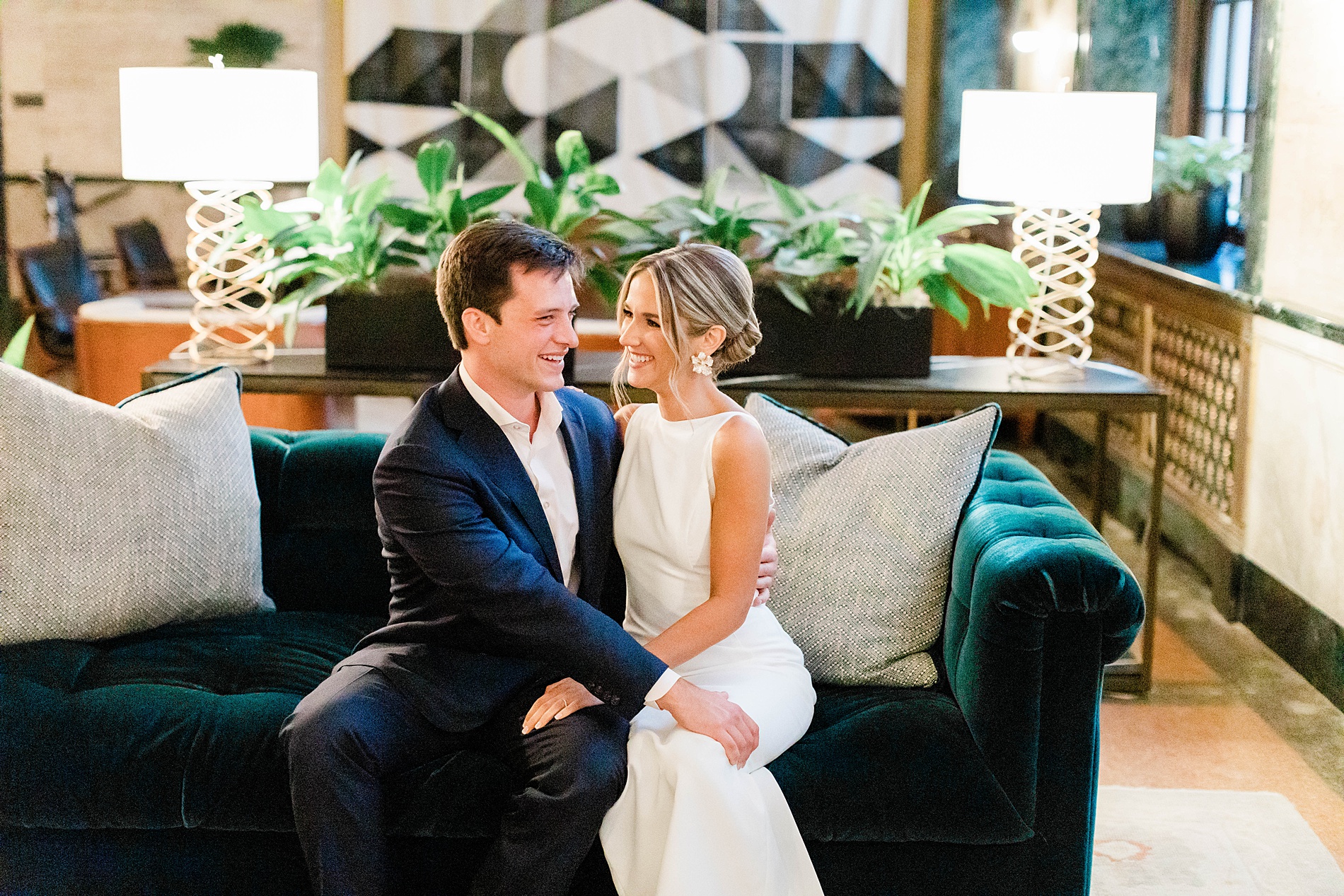
Every wedding we work on is such a different experience and always such a treat to see everything come together. For Anna and Ross’s wedding we had the joy of not only creating their wedding day paper goods and day of details, but also had a hand in designing items for their rehearsal dinner too! I love when we have the opportunity to design items for an entire wedding weekend as it really allows for an immersive experience as details are intentionally woven throughout the events.
Rehearsal Dinner Details
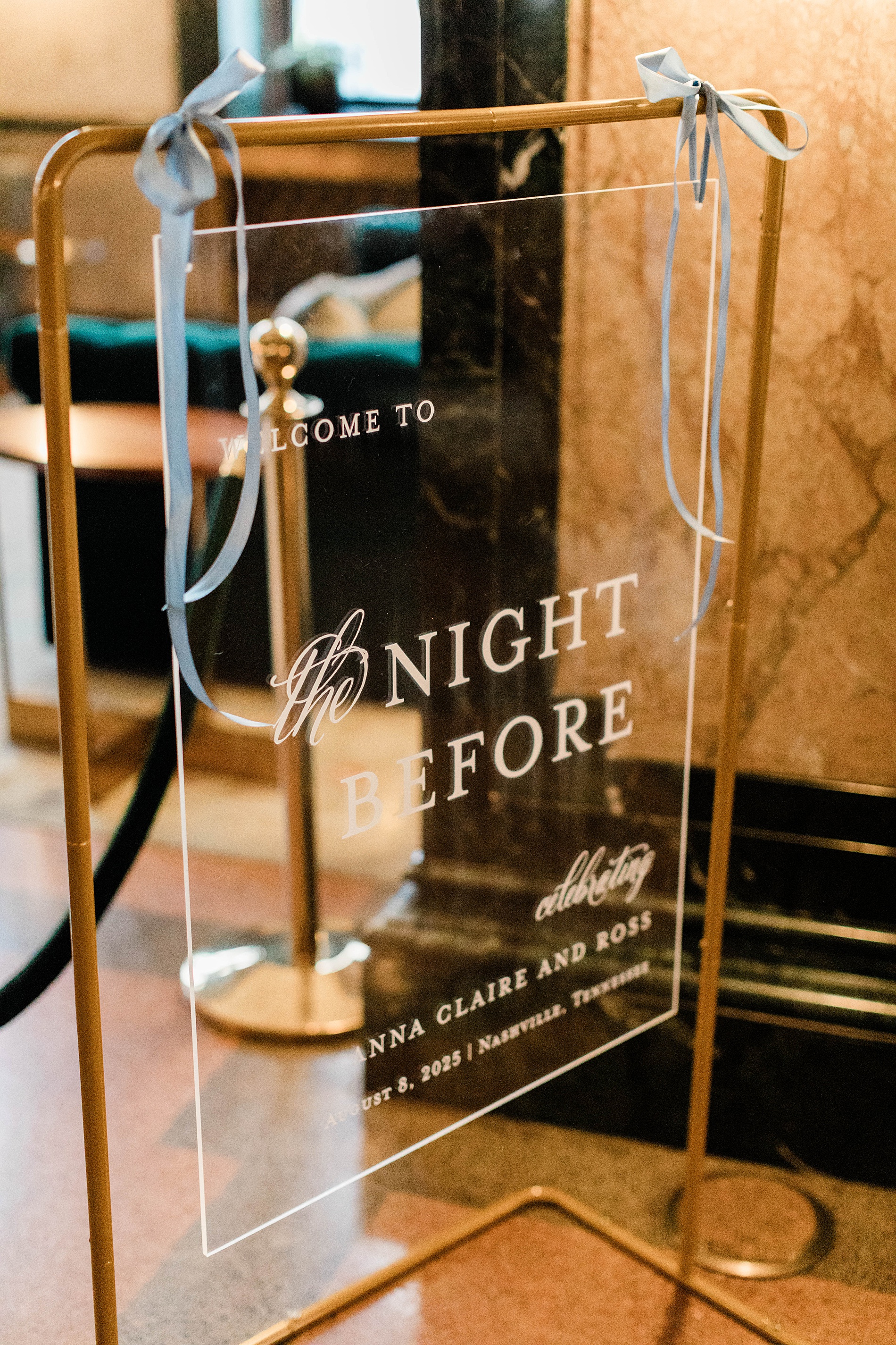
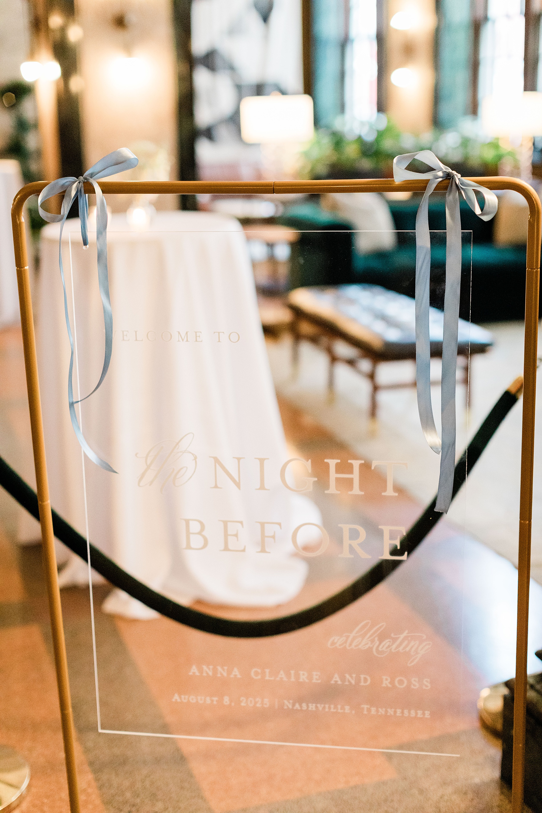
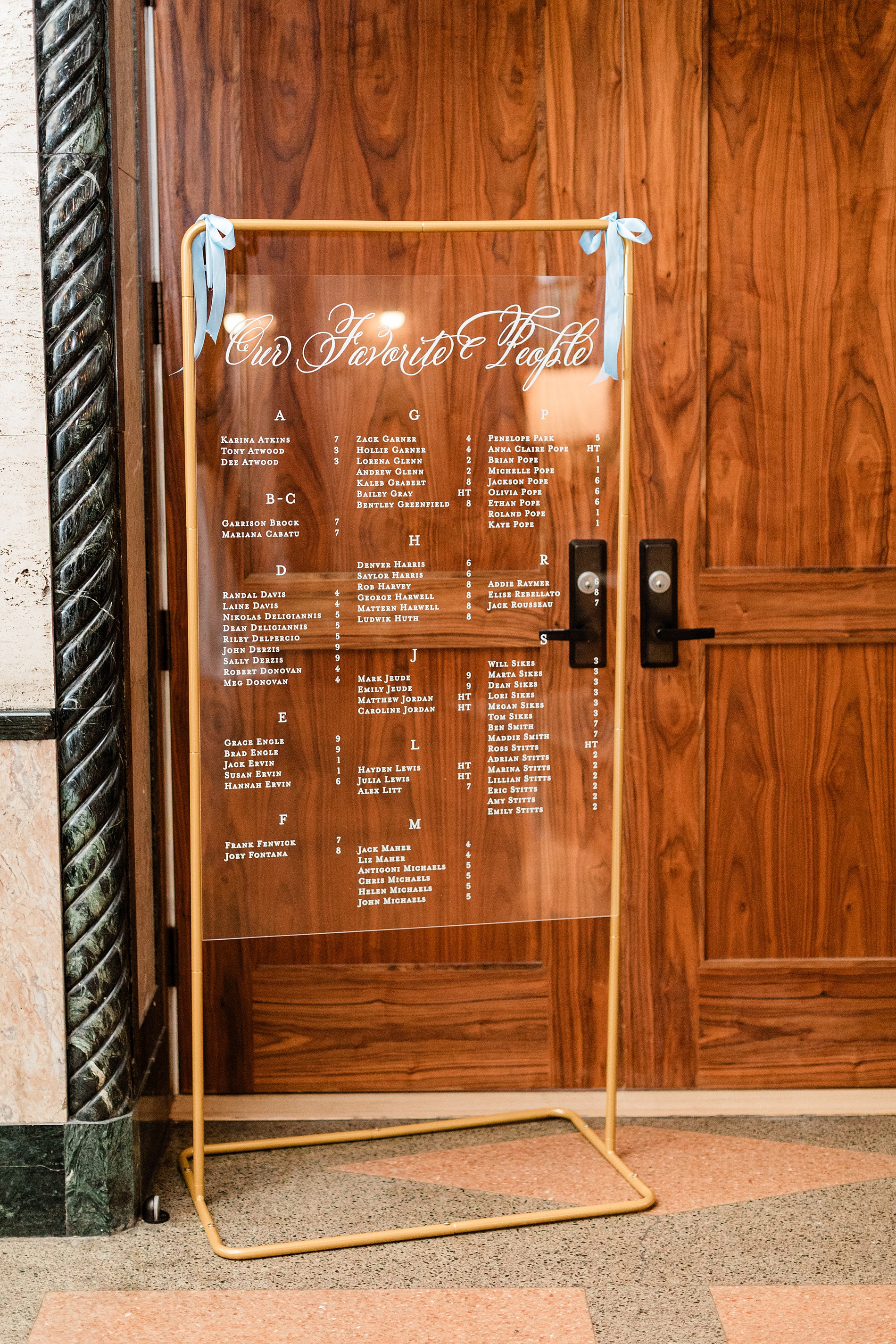
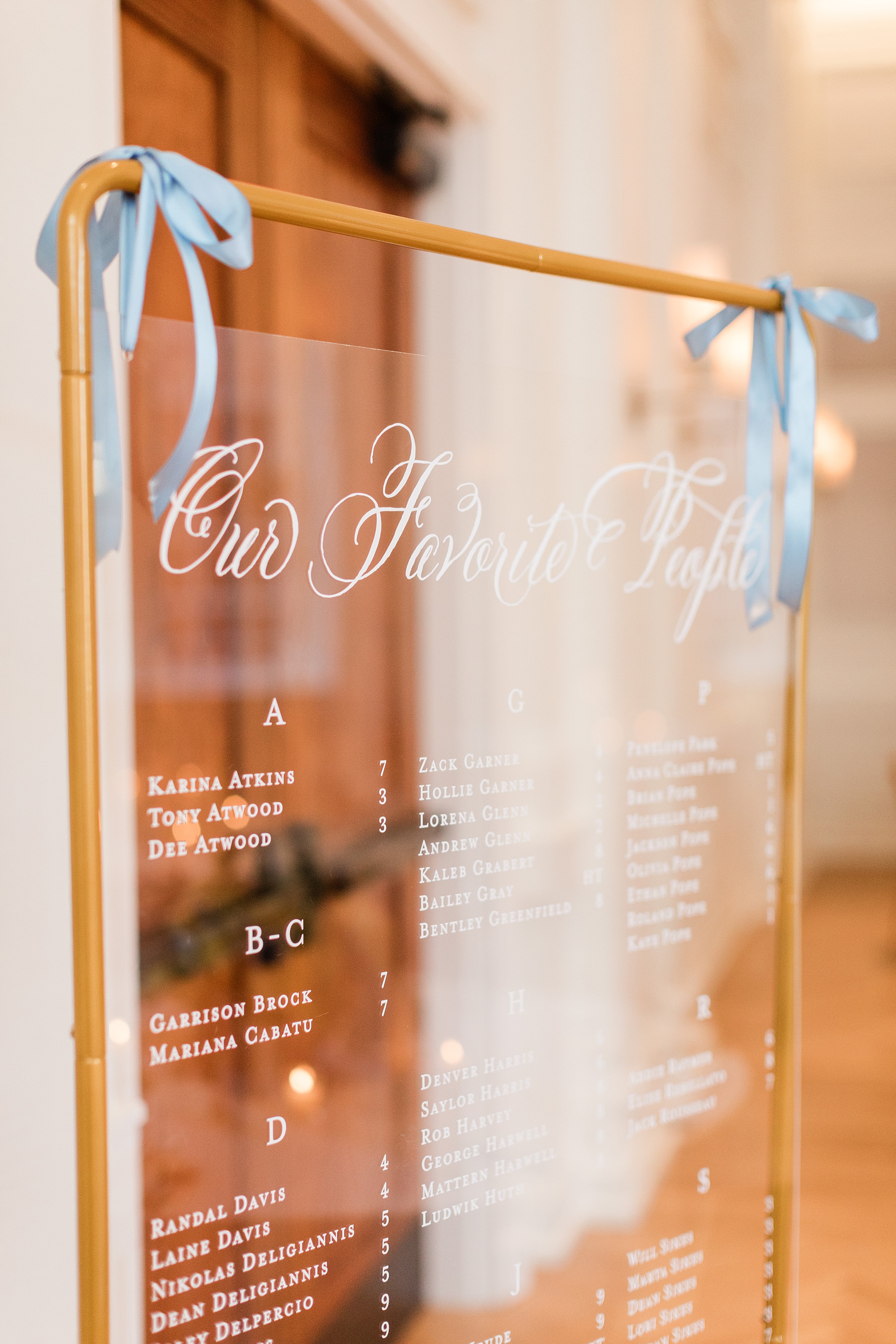
The rehearsal dinner took place at Noelle Hotel Nashville, which is a gorgeous boutique hotel in downtown. A clear welcome sign with a gold frame greeted guests that read “Welcome to the Night Before”. Light blue ribbons tied at the top corners of the sign gave a subtle hint to the colors that would be seen throughout the evening. We also created the seating chart that mimicked the clear welcome sign with a gold frame and blue ribbons. This was a lovely touch and a foreshadowing of the details to come on their wedding day.
As guests sat down to the rehearsal dinner, the tables were decorated with fresh flowers, greenery, and flickering candle light, which made the light blue and white table numbers and place cards we created stand out beautifully. The entire evening unfolded seamlessly and was a perfect prelude to the wedding day ahead.
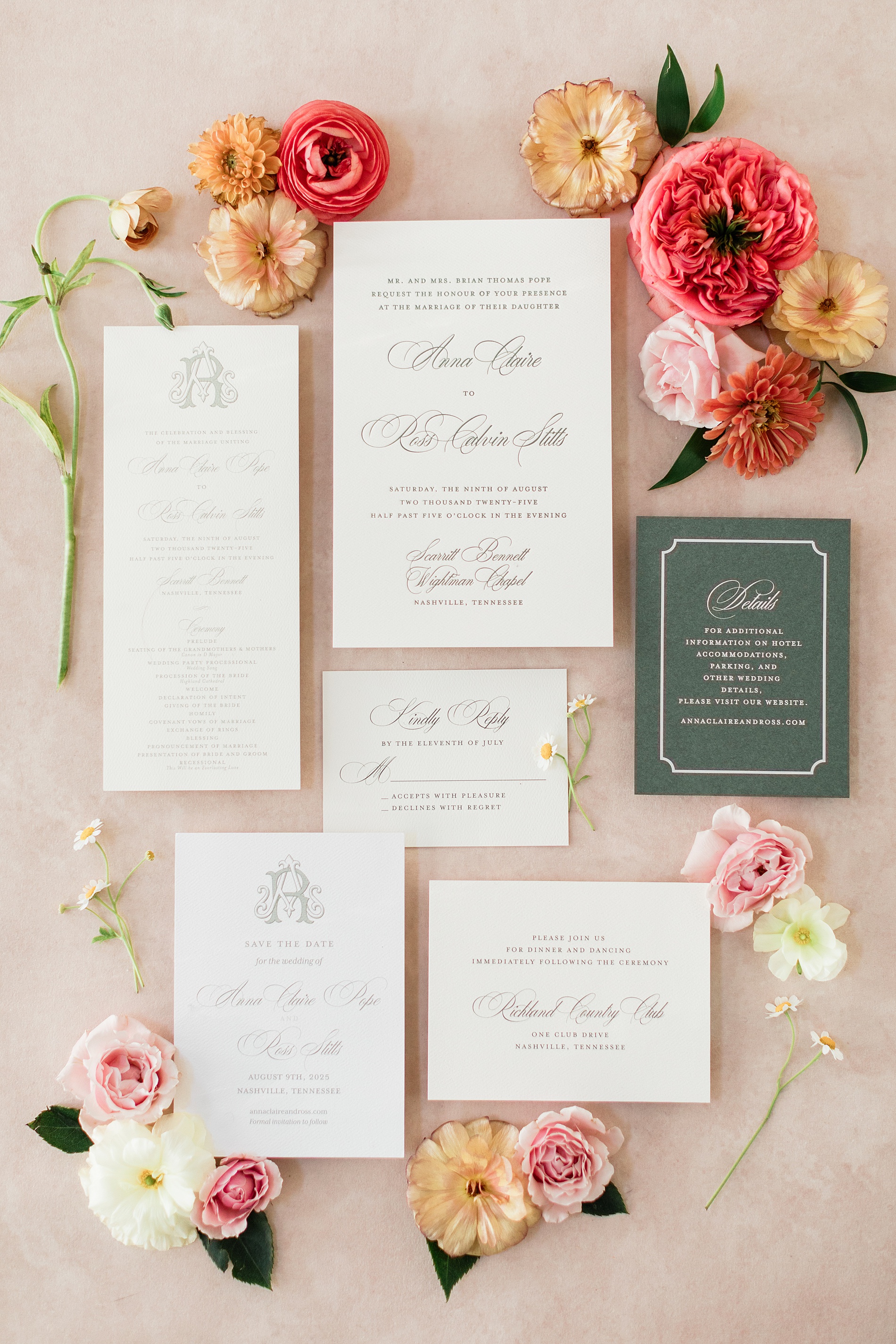
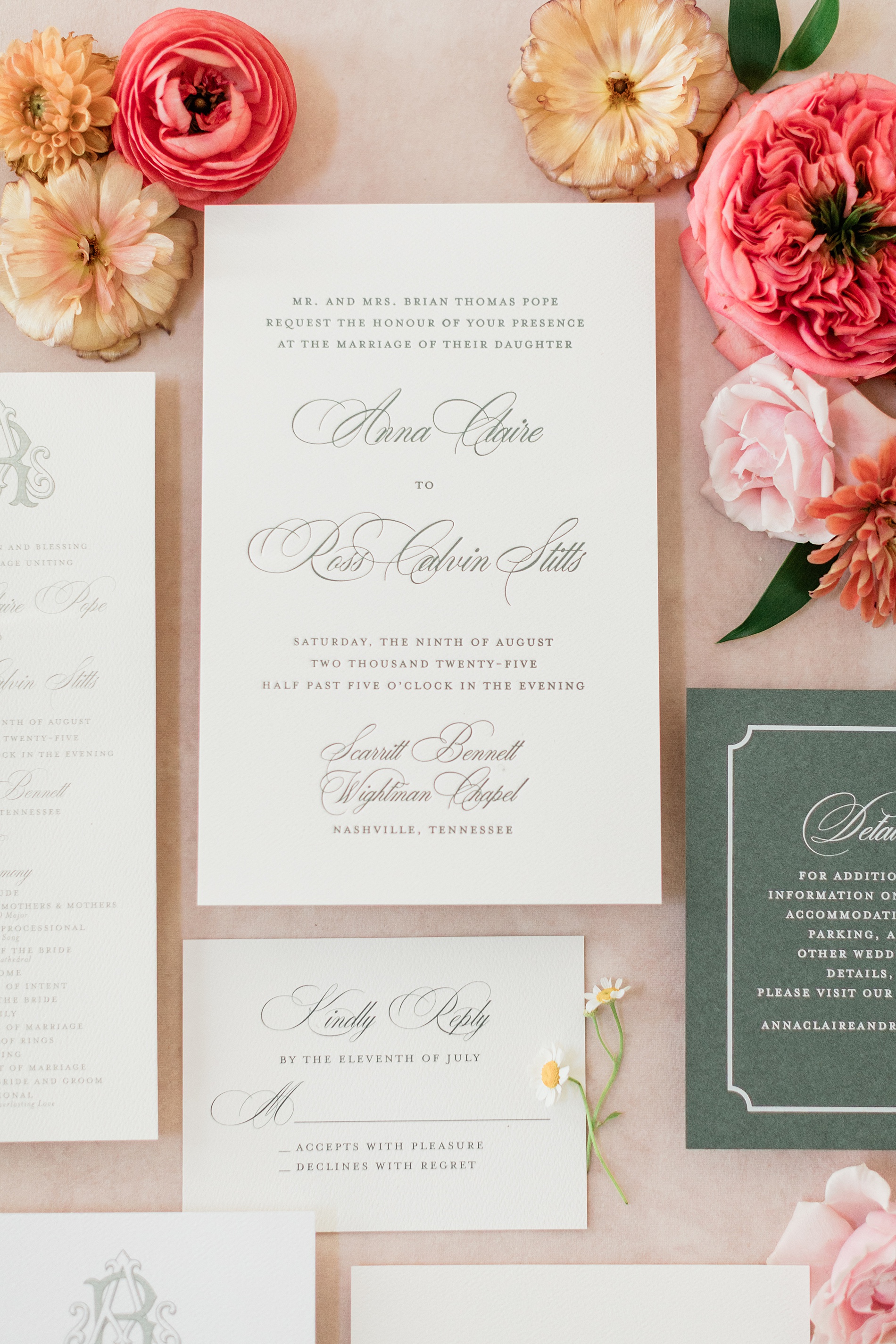
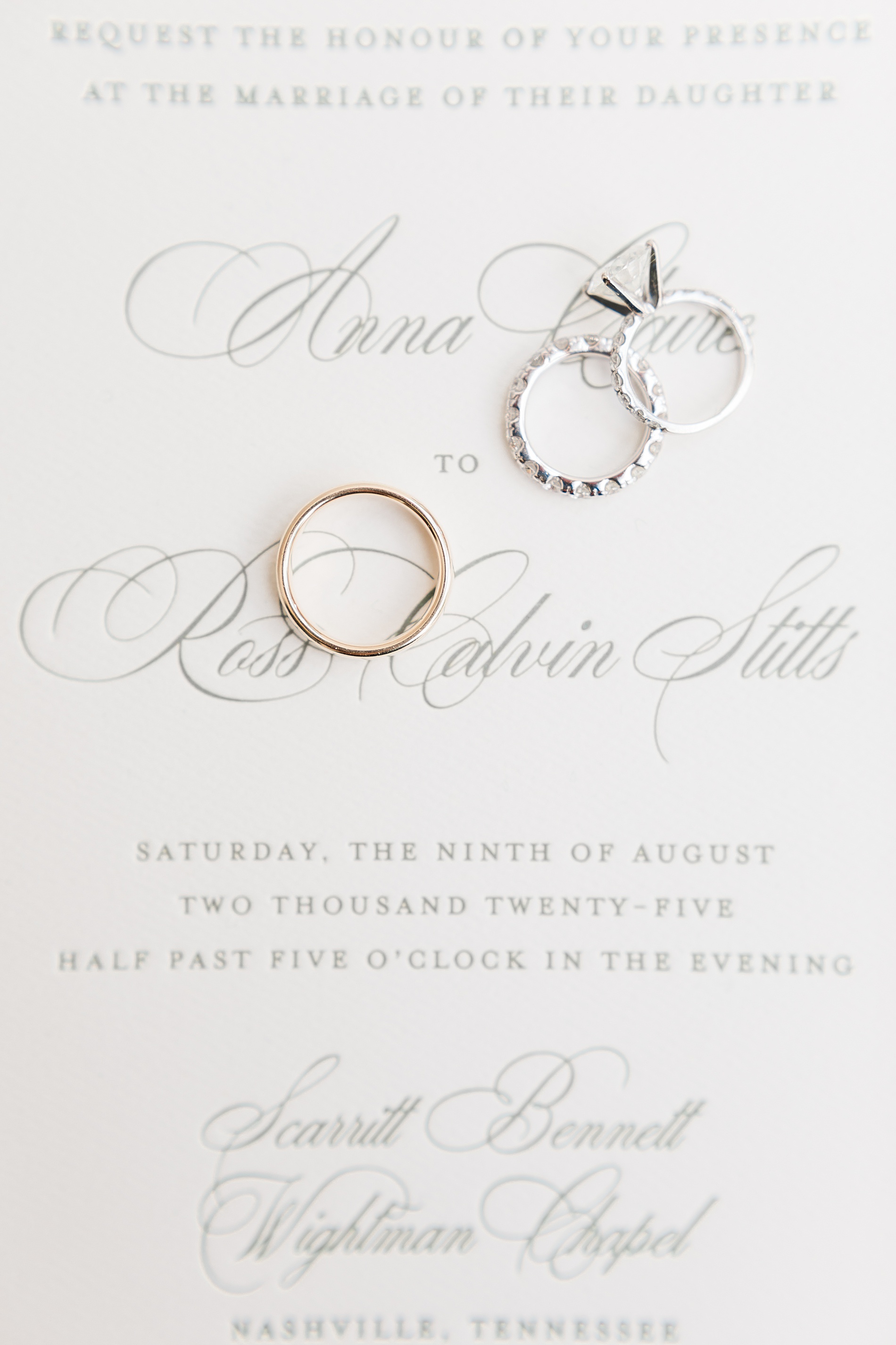
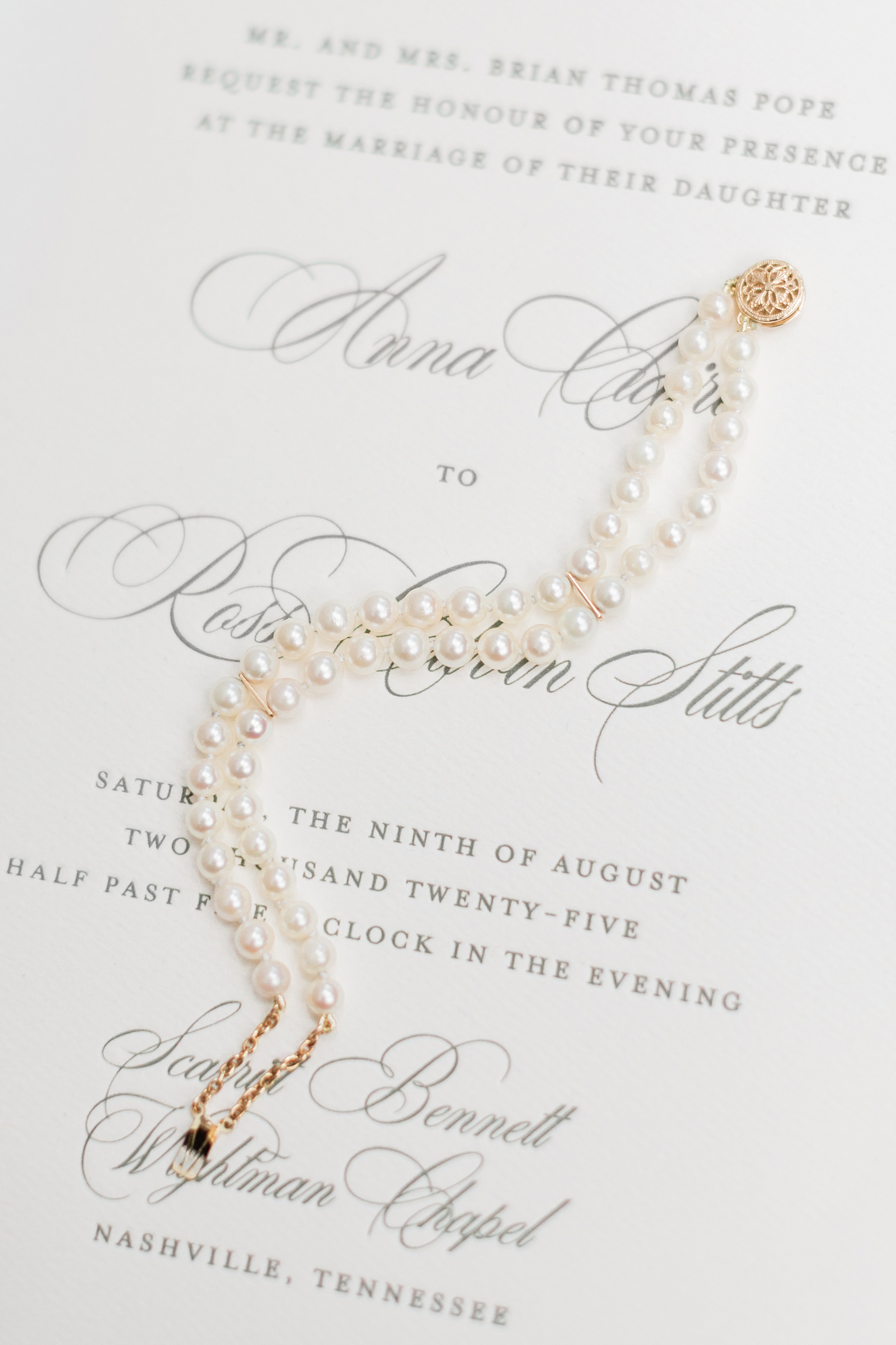
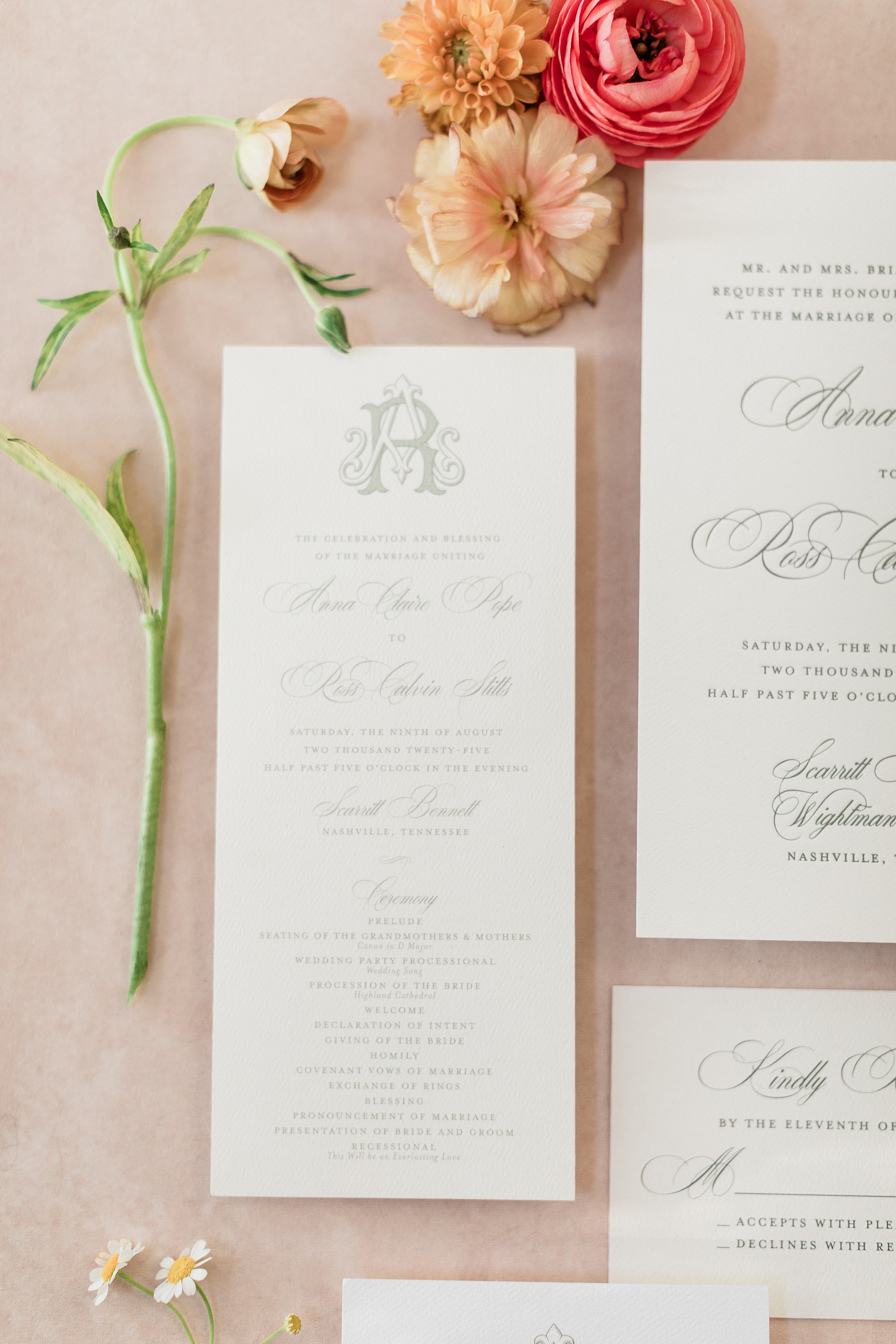
Elegant Letter-Pressed Wedding Invitations
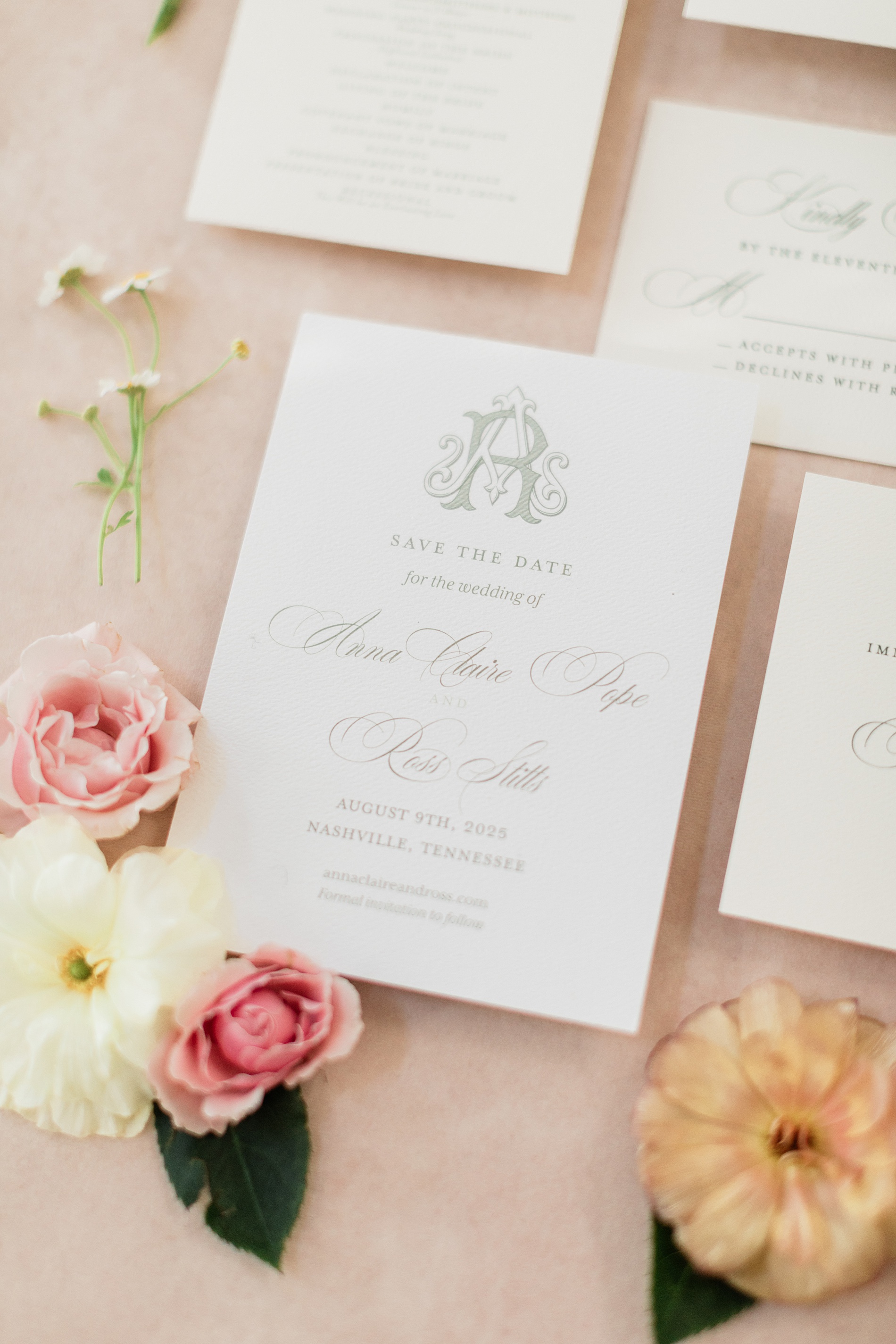
Their classic, letter-pressed wedding invitations set the tone for an elegant evening. The custom monogram on their Save The Dates and Wedding Programs would also make an appearance on other wedding details we created, creating a cohesive design that we just love!
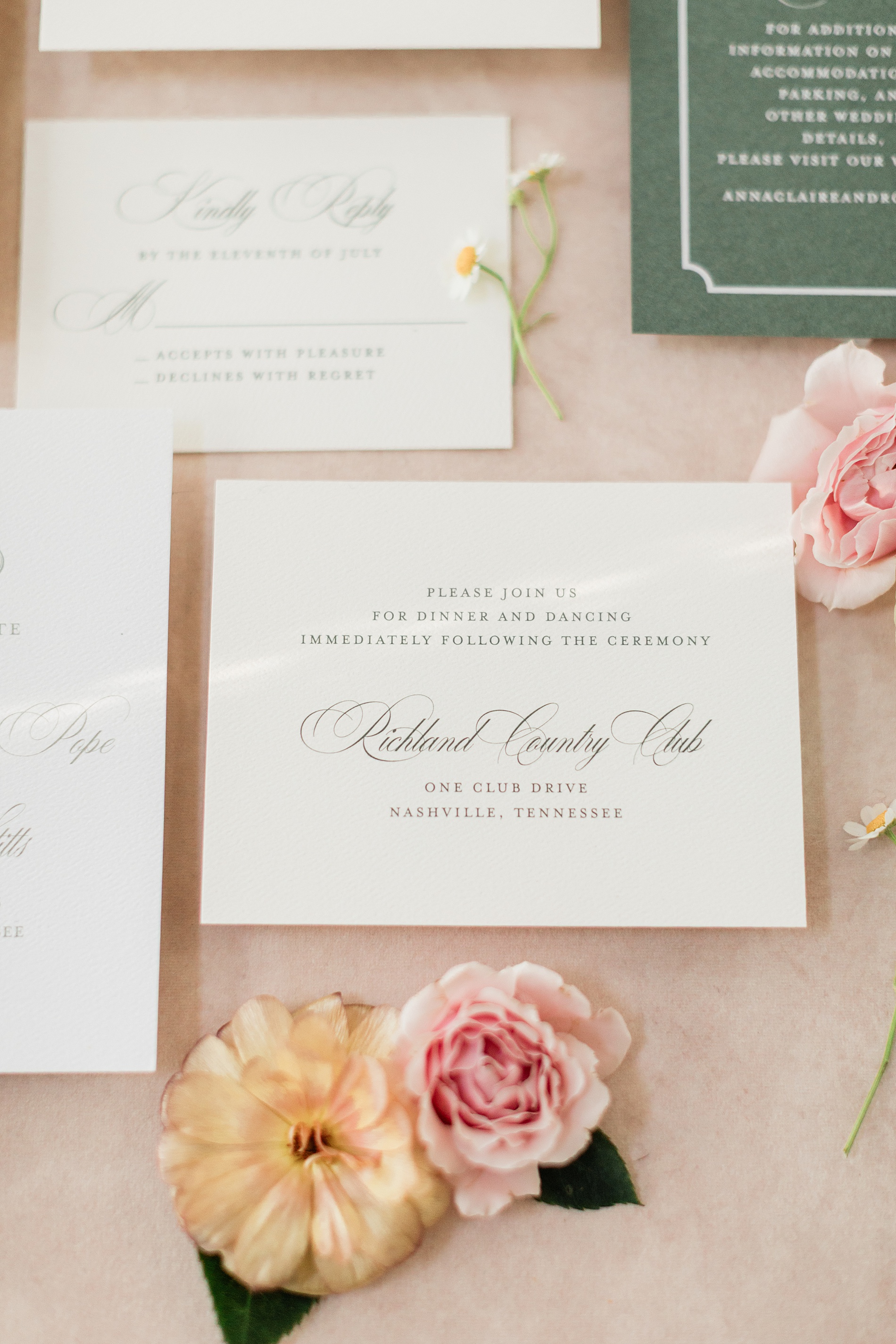
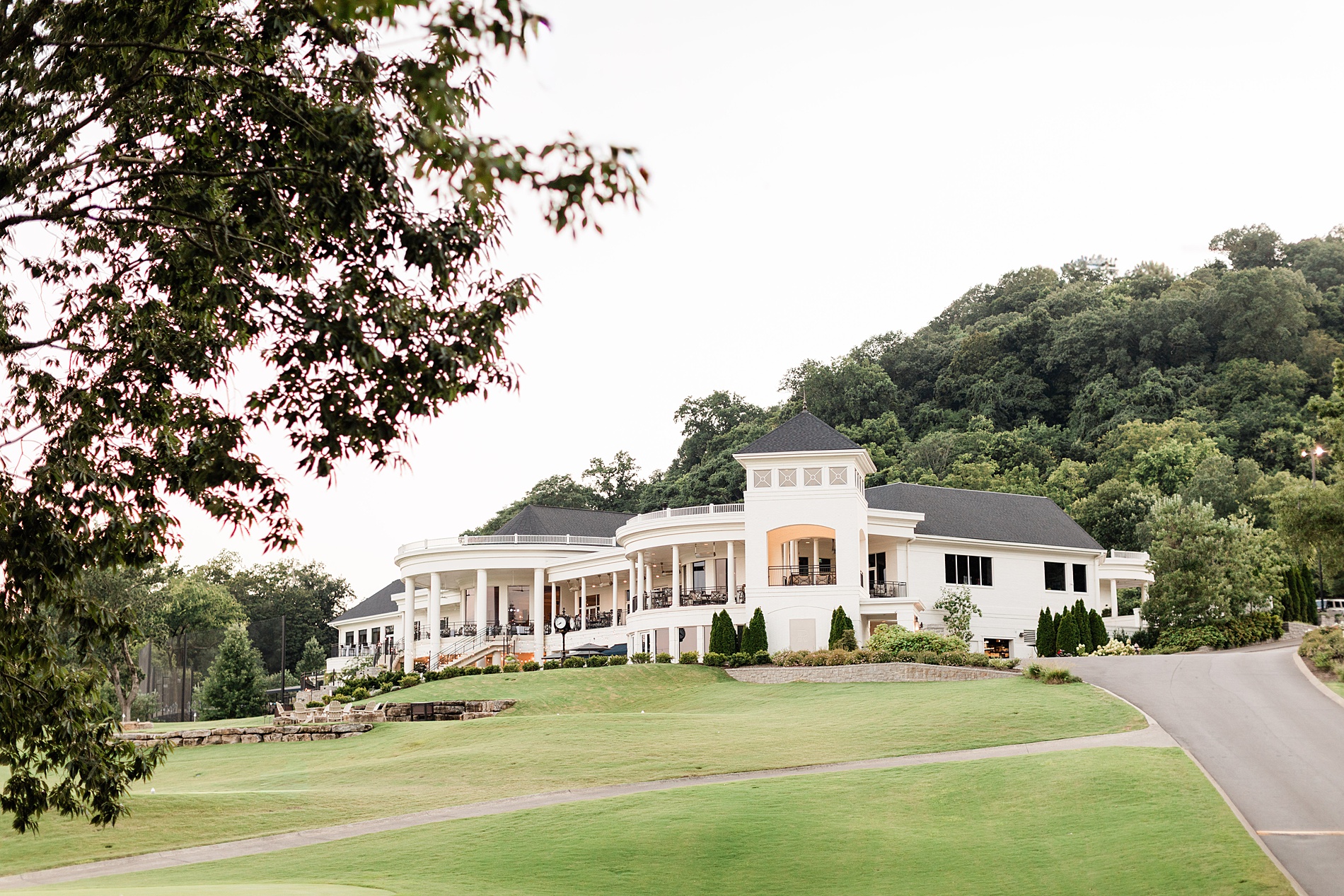
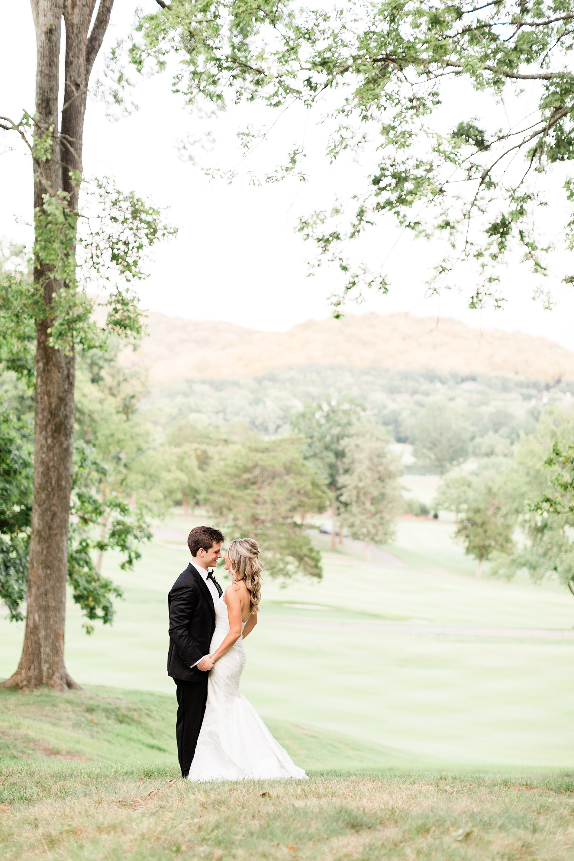
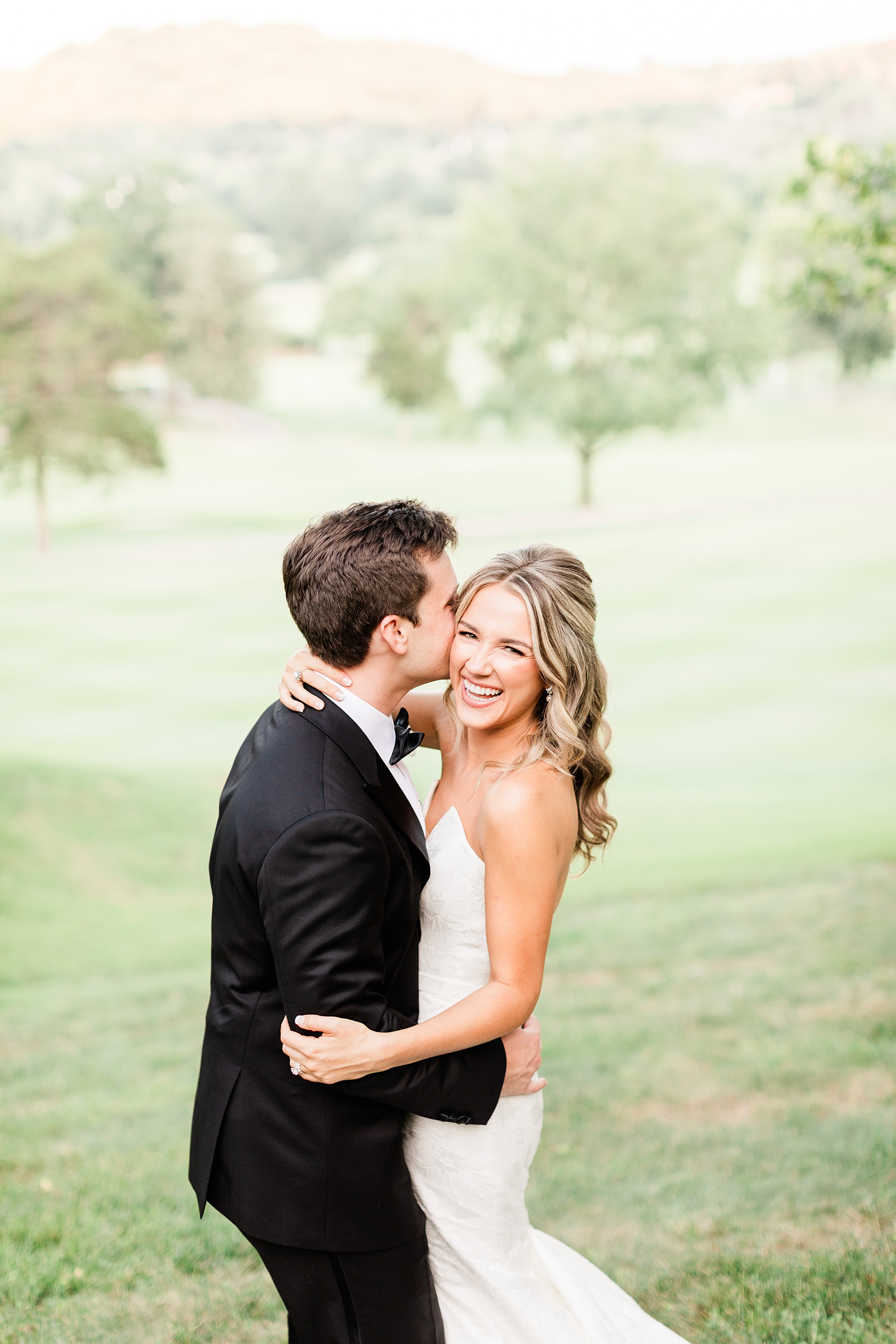
Their wedding took place at the stunning Richland Country Club in Nashville, TN, which is a beautiful venue with a breathtaking property.
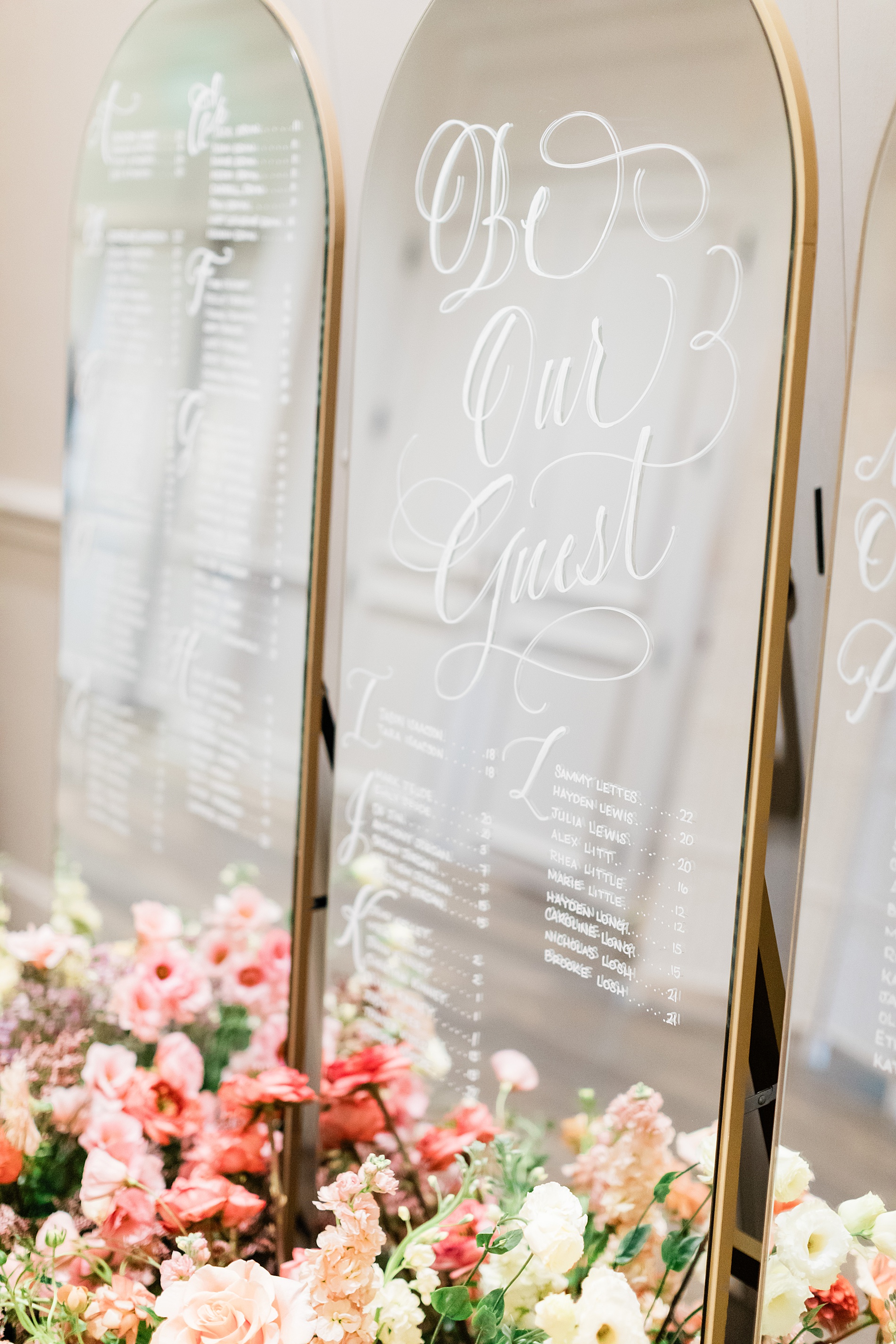
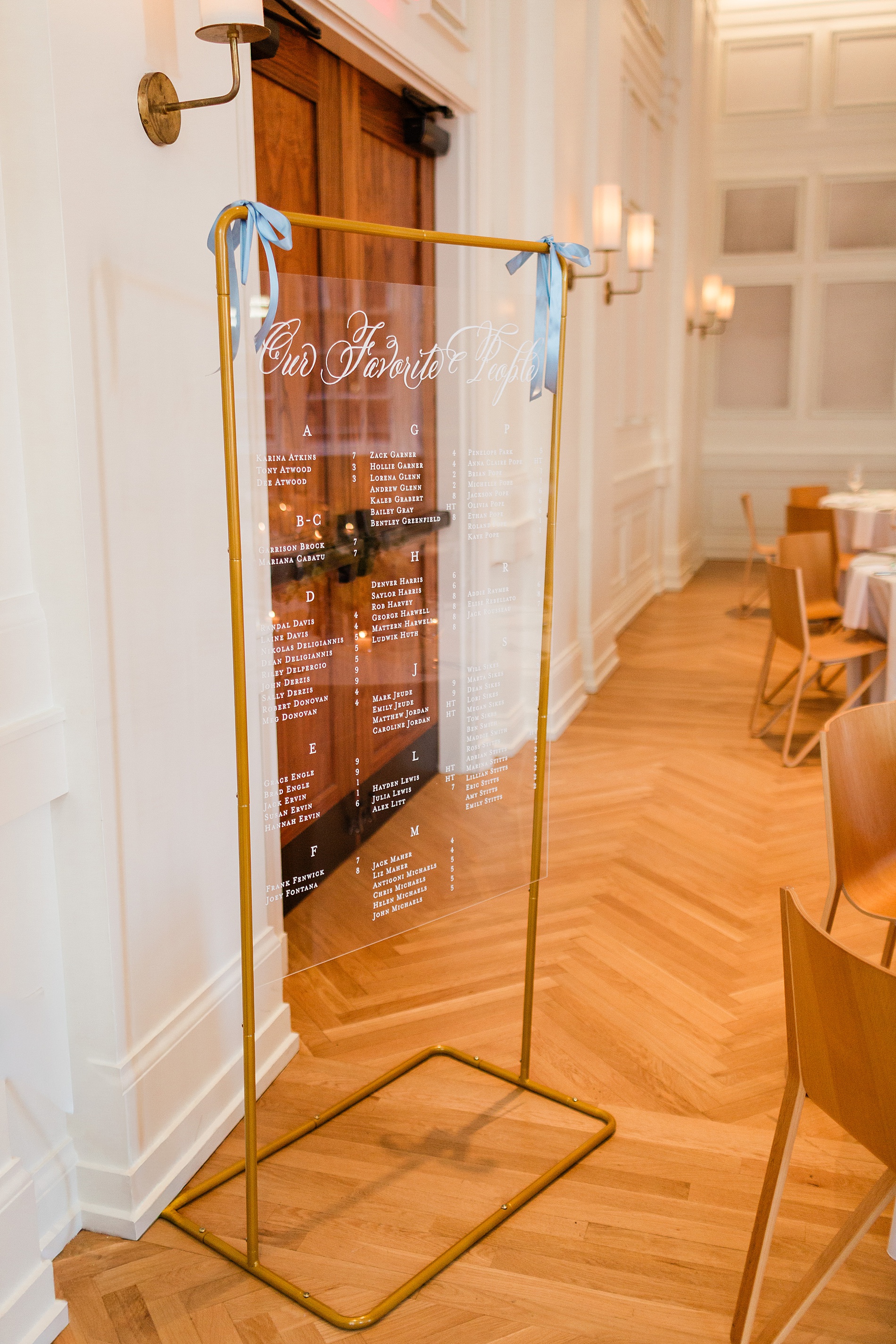
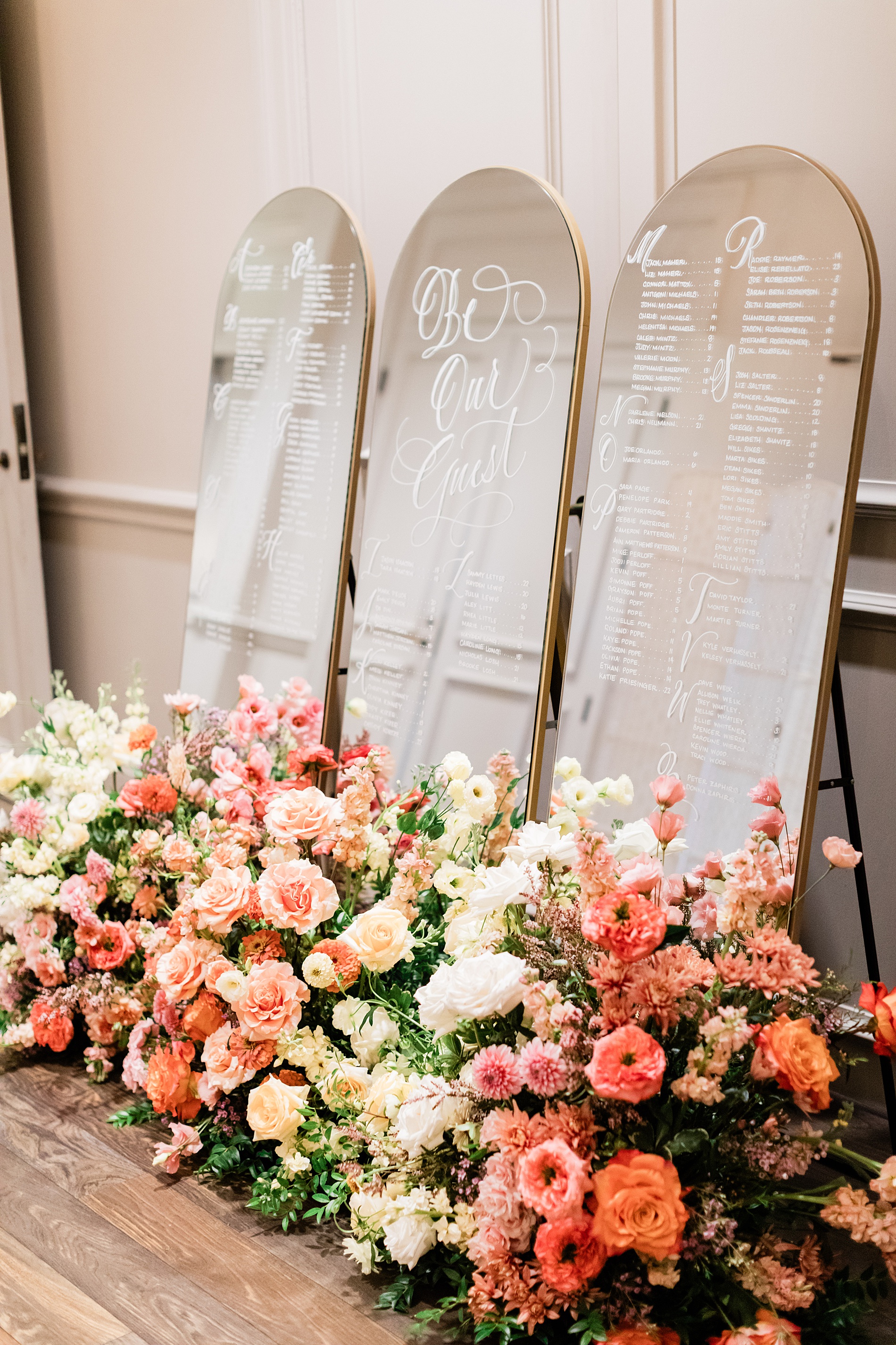
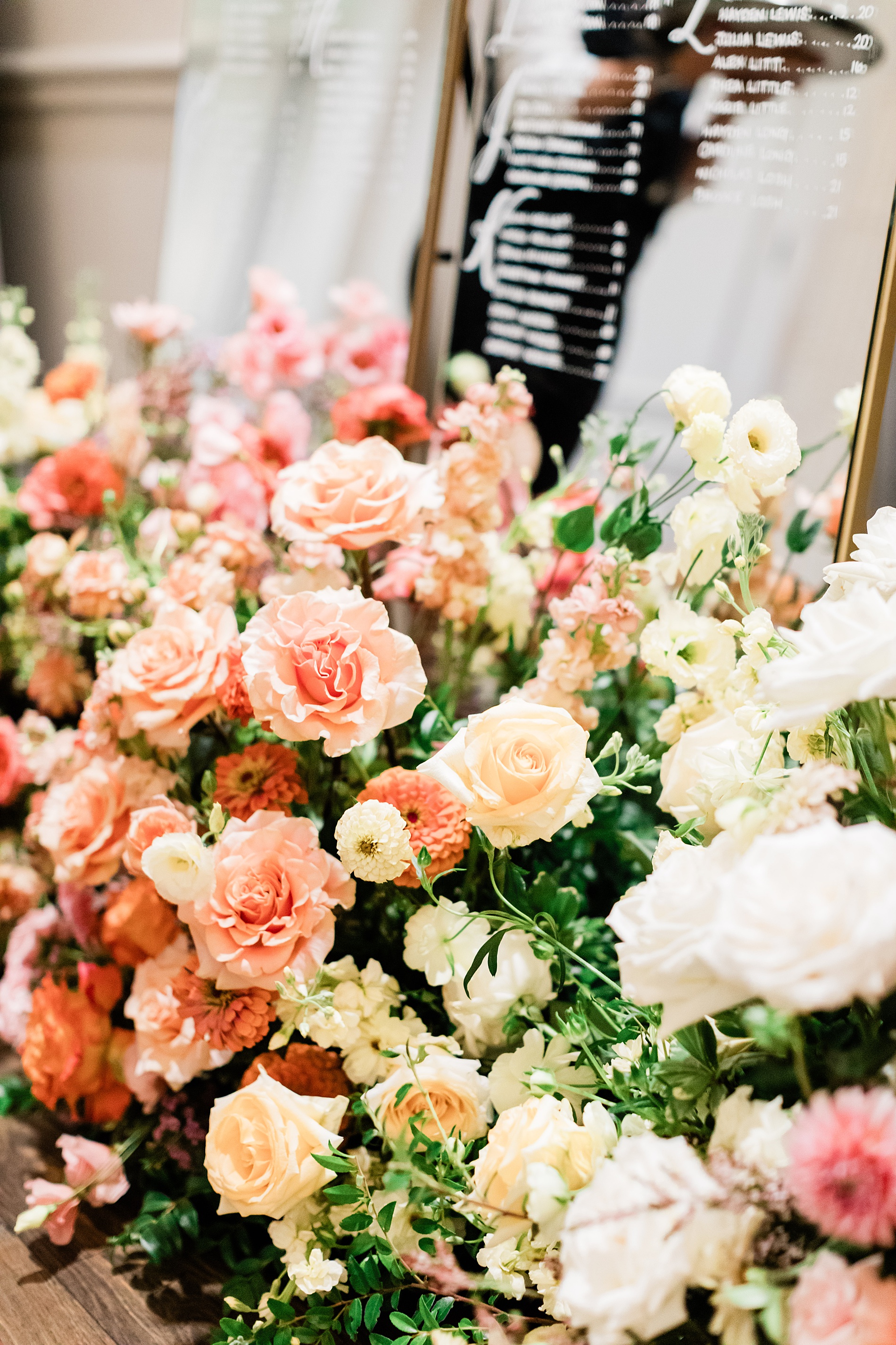
Mirrored Wedding Seating Chart
Their wedding reception featured a three-piece mirrored seating chart. The arched mirrors with gold frames were lettered by hand. A fresh flower display of white, cream, and various pink flowers sat at the base of the seating chart making it an eye-catching display.
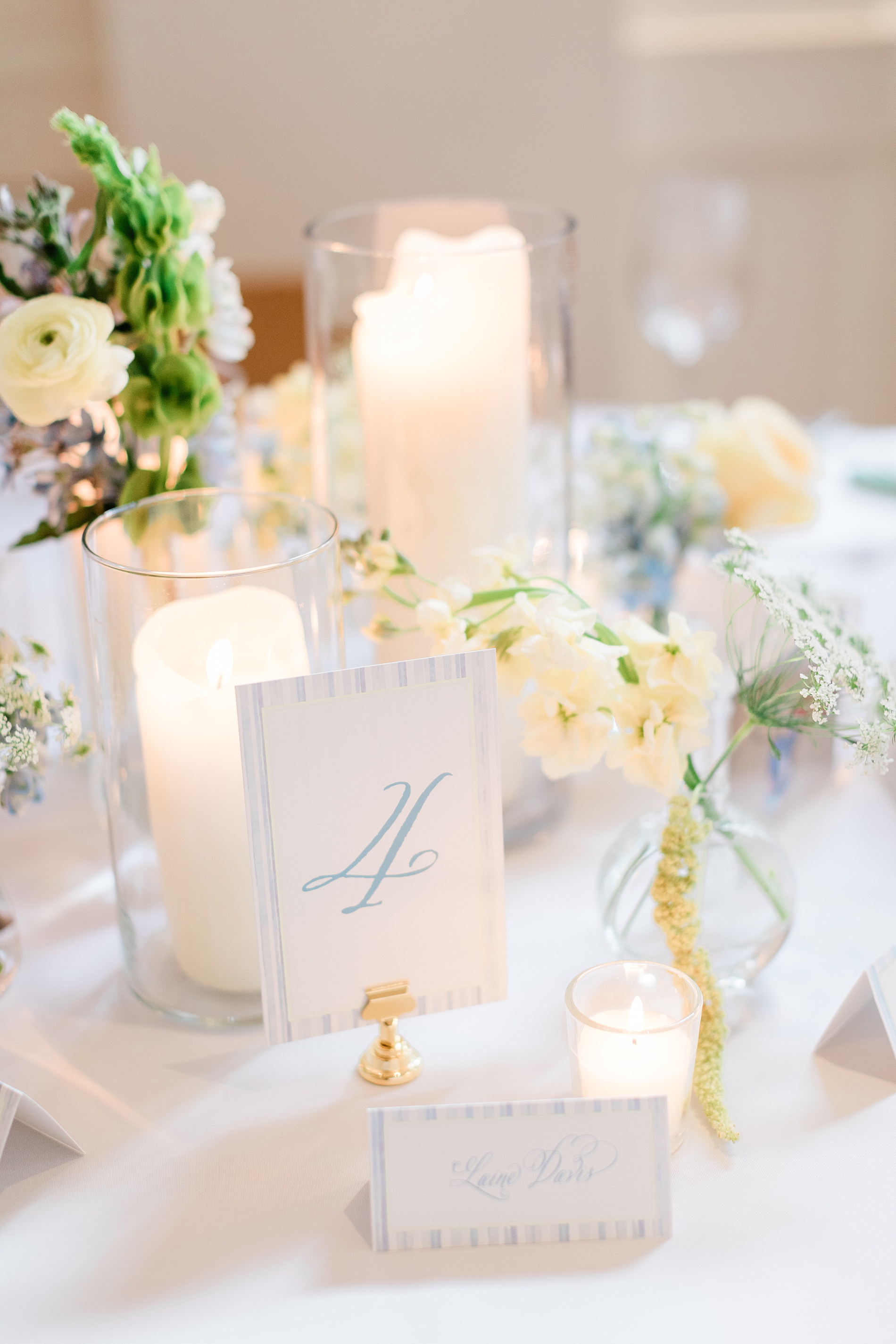
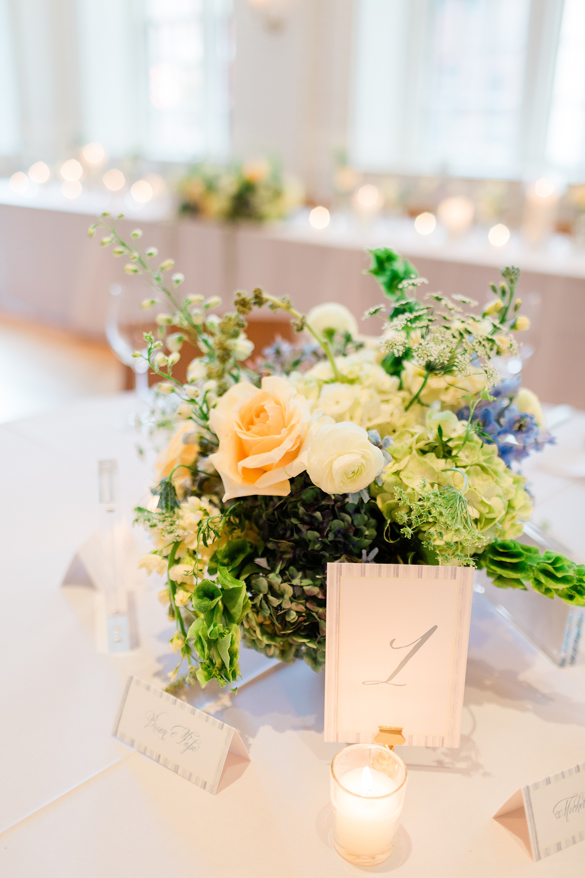
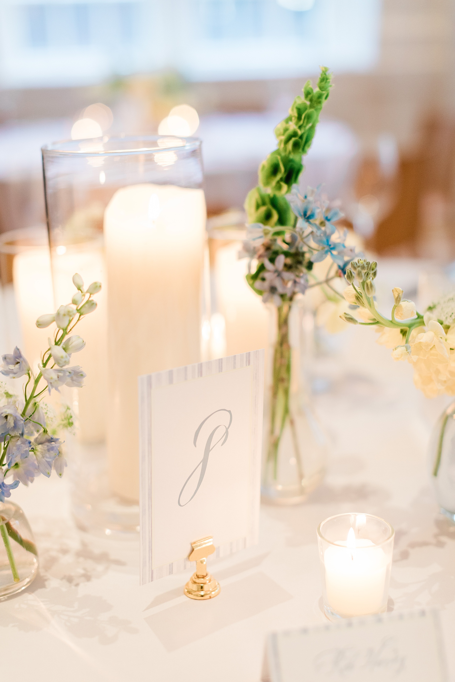
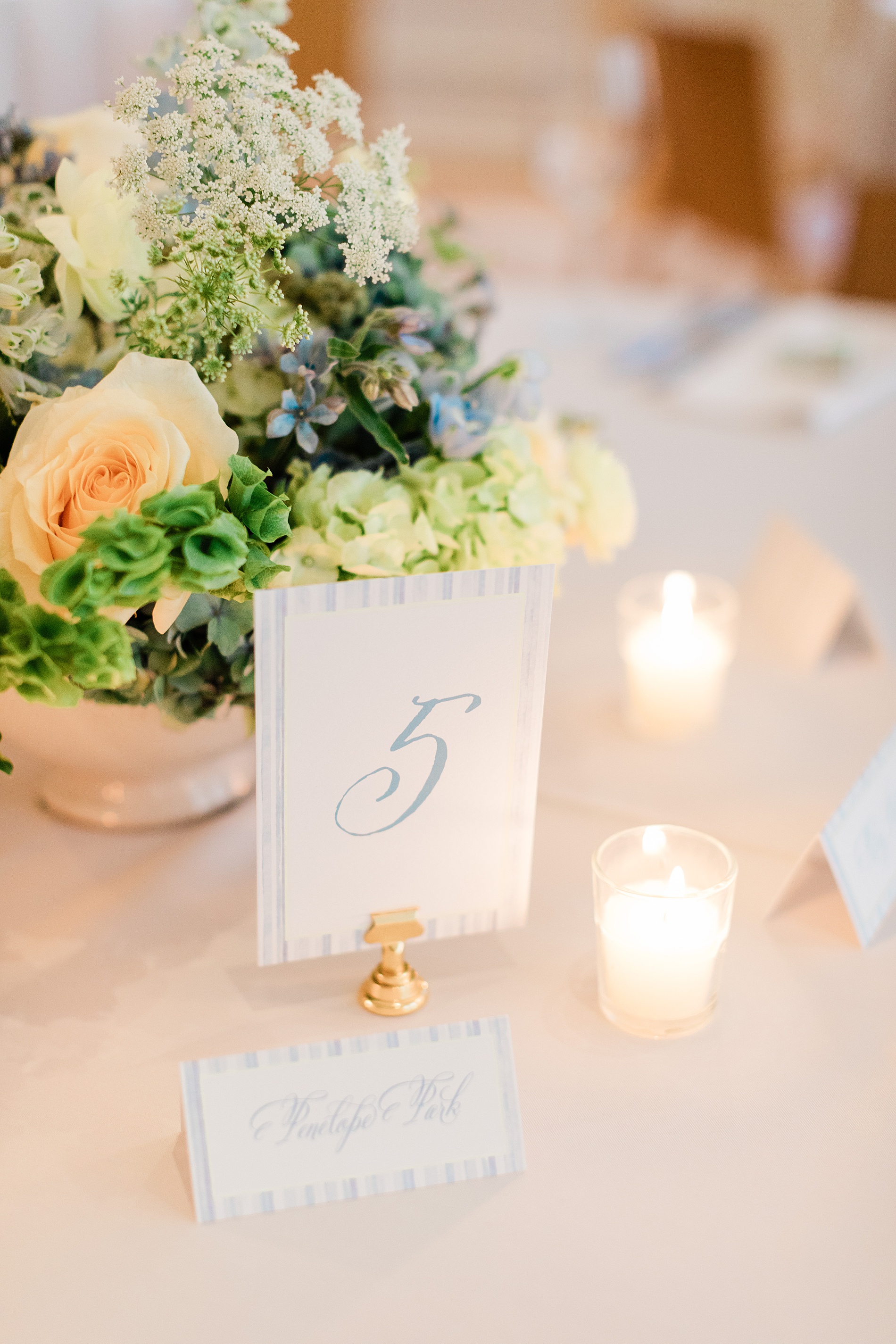
Table Numbers
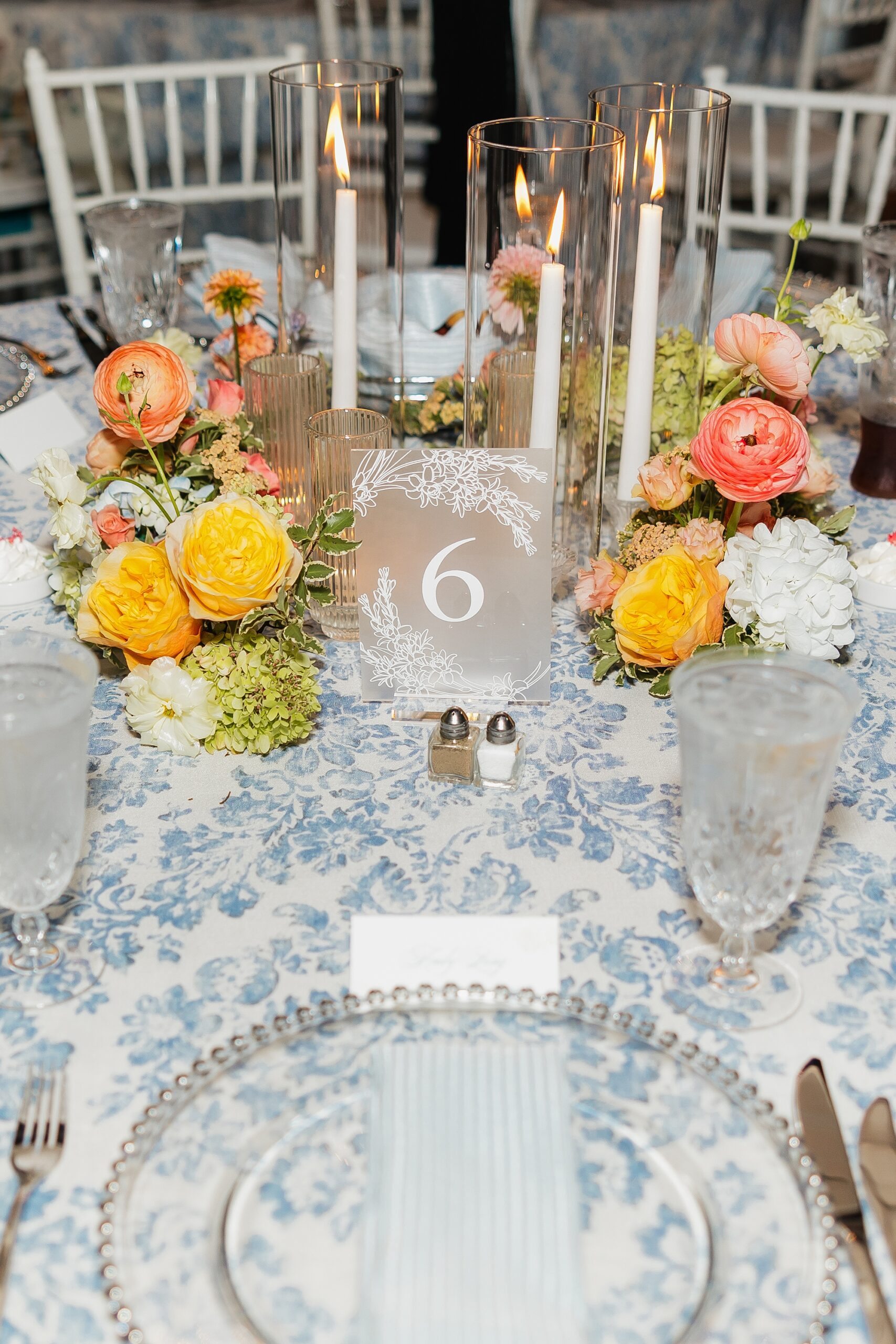
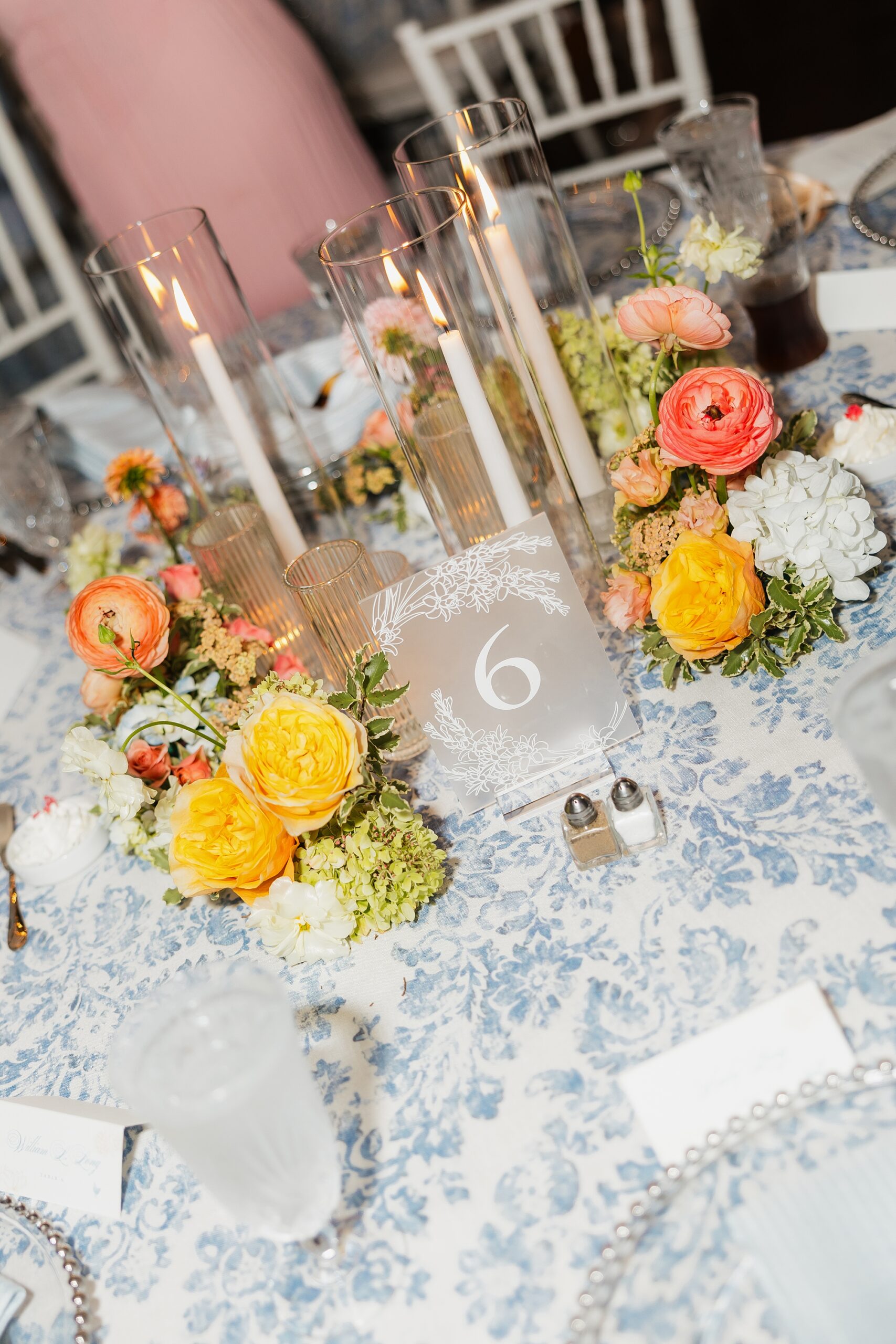
Colorful flower centerpieces decorated the center of each table. The table numbers we designed elegantly completed the tablescape. The white cards with numbers in a dusty blue color were displayed in gold holders tying the look together.
Custom Wedding Favors
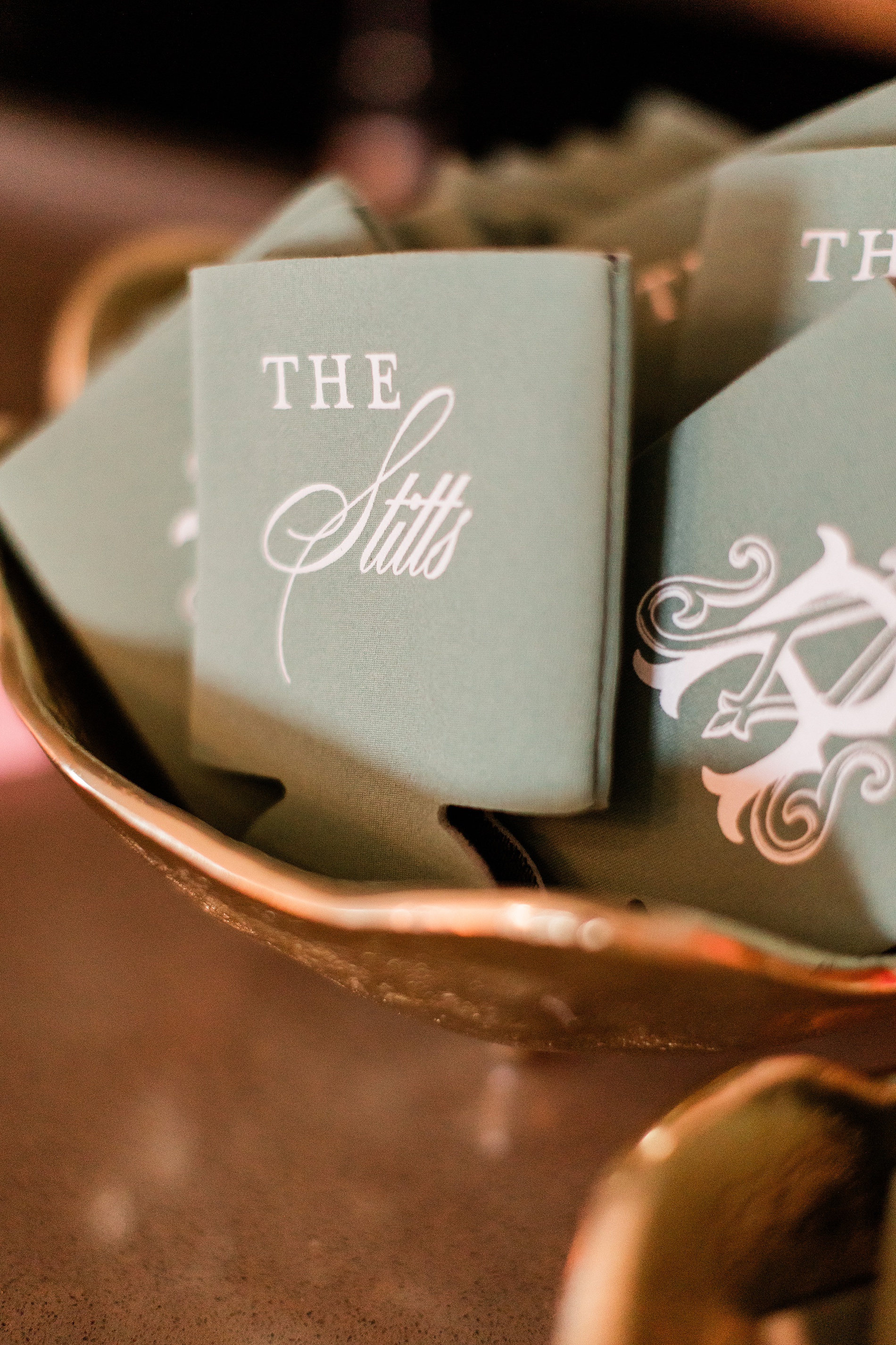
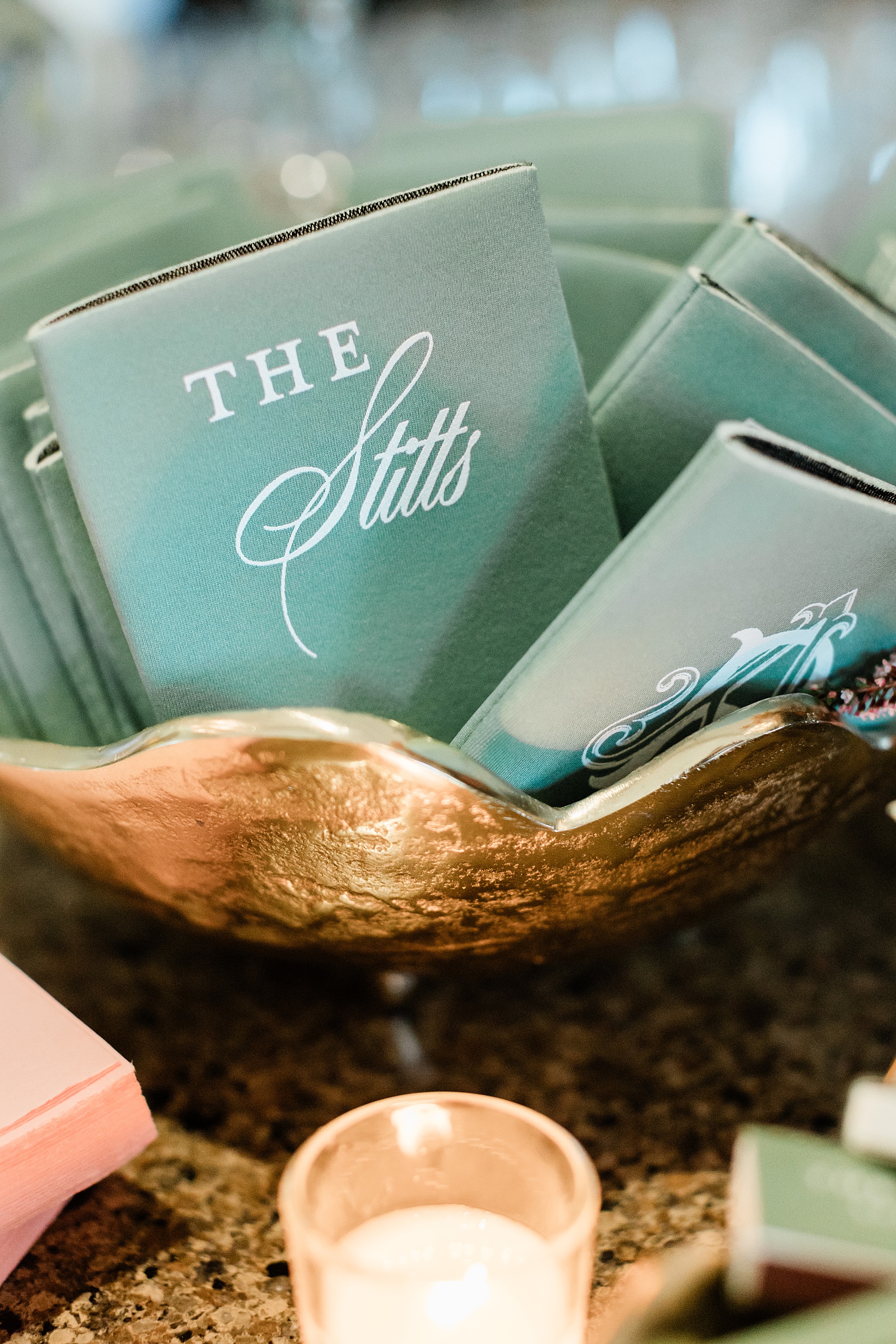
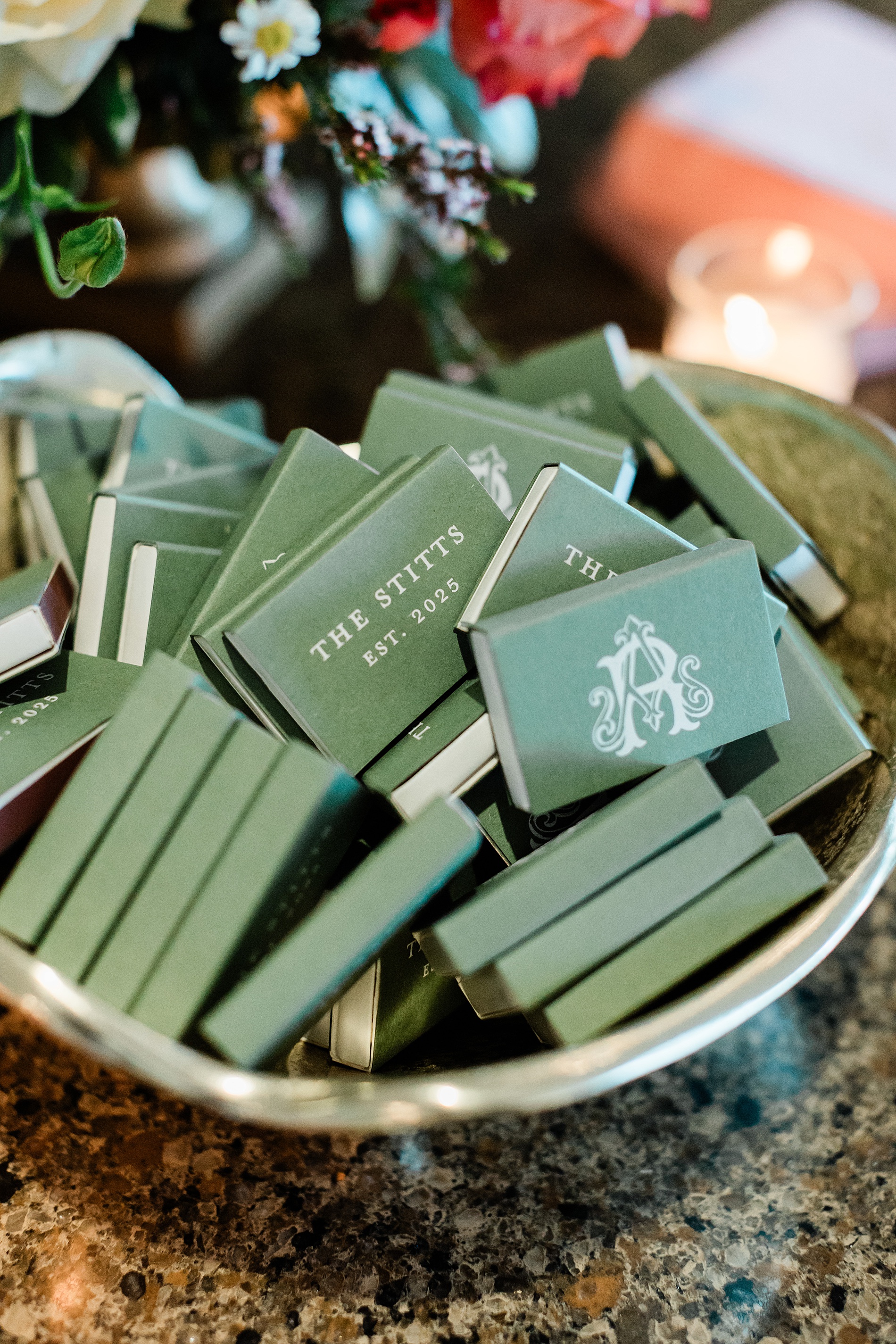
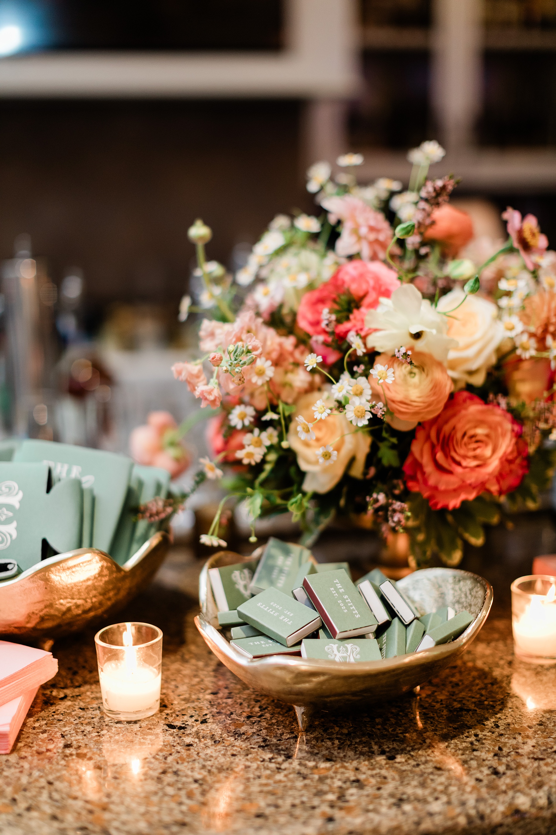
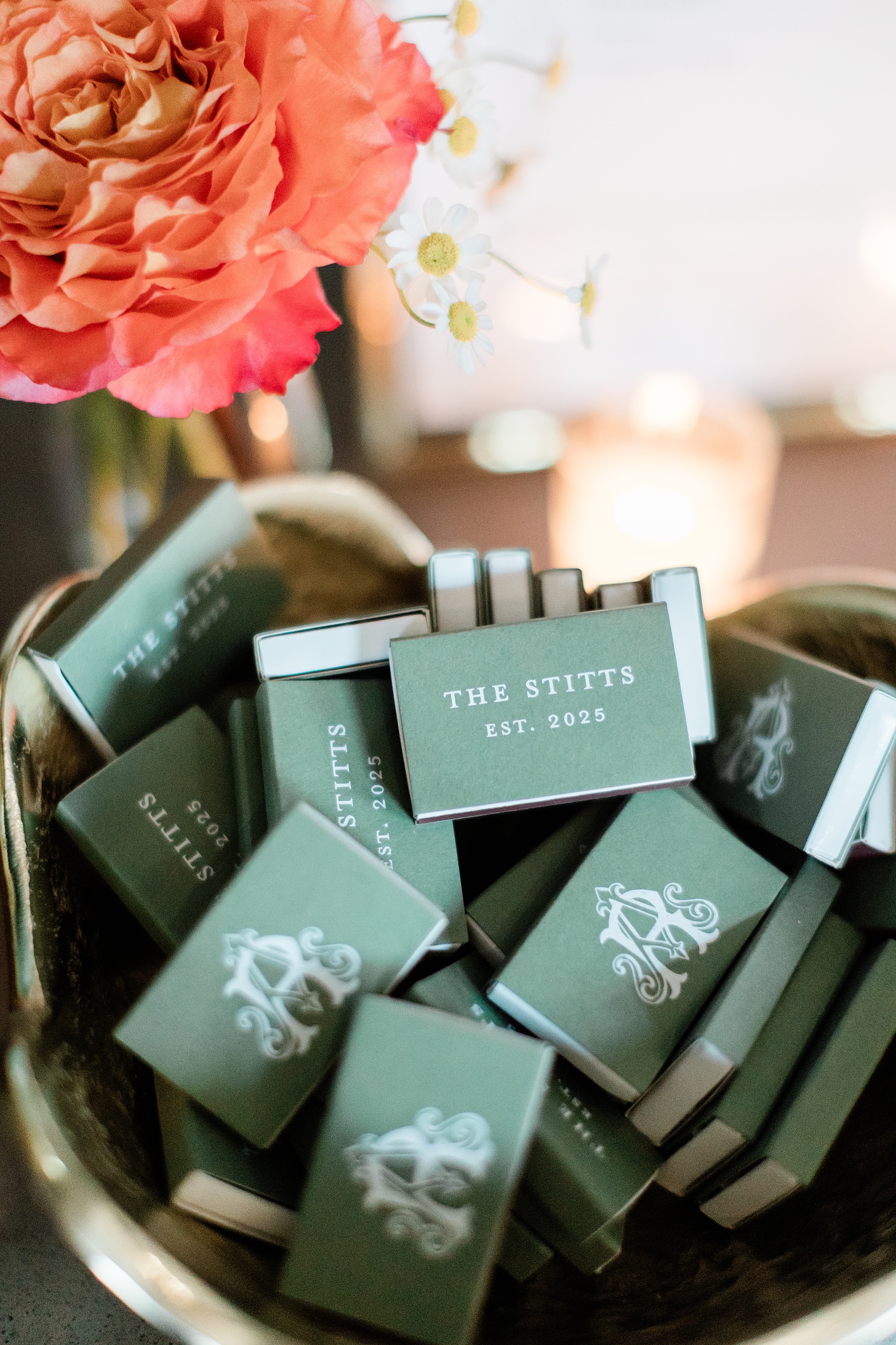
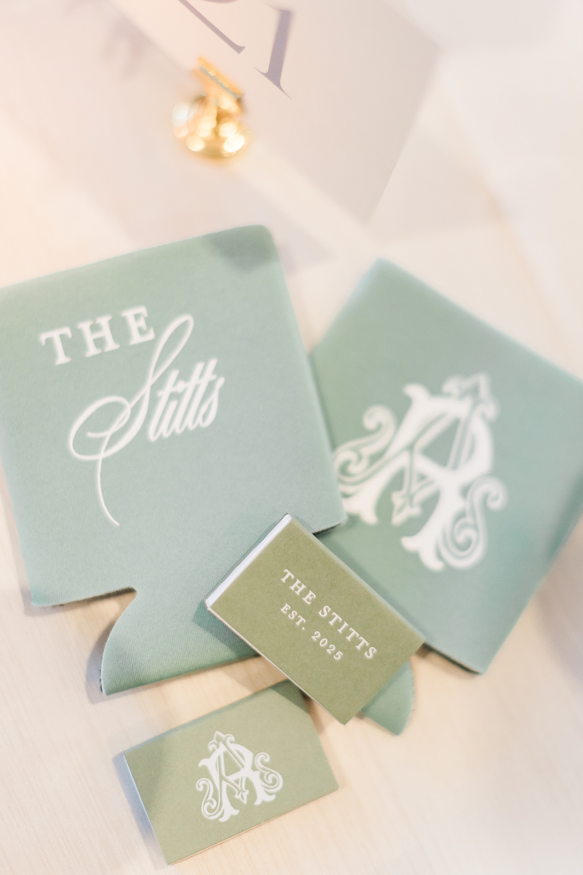
Anna and Ross decided on custom drink koozies and matches for their wedding favors. To make them stand out, we put their custom monogram as seen on the invitations and programs on one side of the koozie and match box, and the other side featured their new shared name, The Stitts.
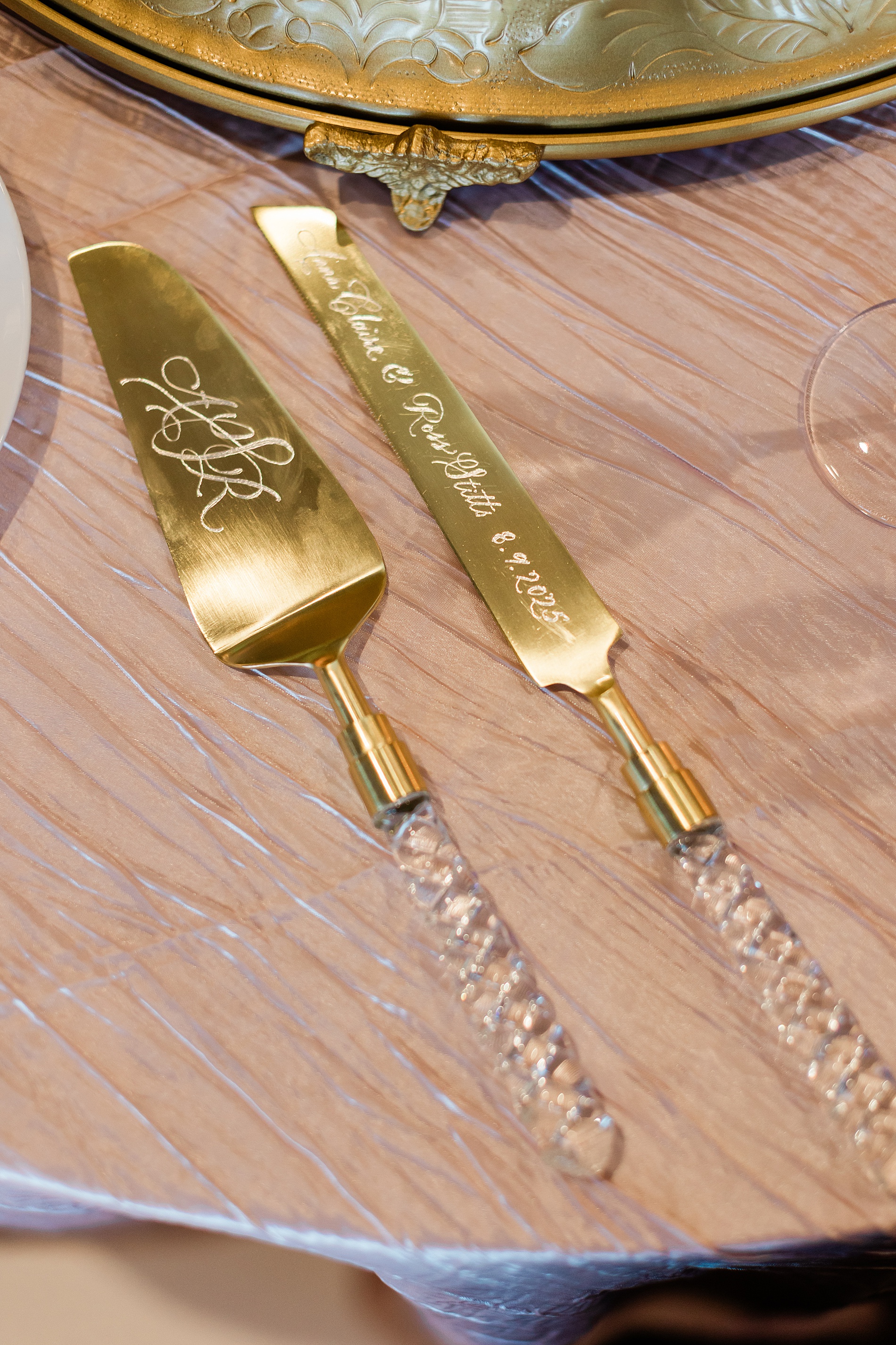
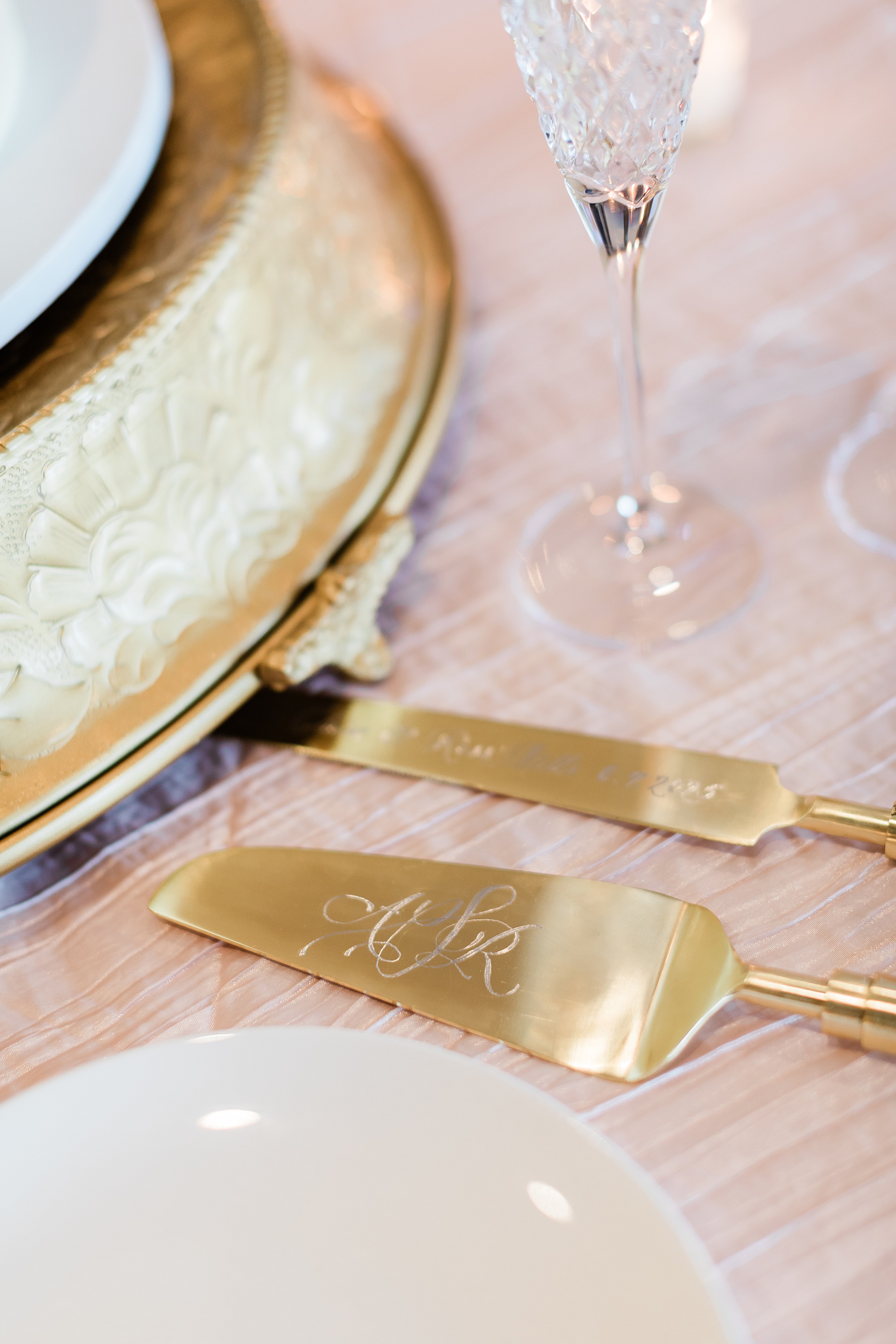
Engraved Cake Serving Set
One of my favorite items from this wedding was the hand-engraved cake serving set, which was a gift from the Mother of the Bride to the couple. The knife was engraved with their names and wedding date, while the cake server was hand engraved with a custom monogram.
Tying all the details together for this wedding weekend was so fun. At White Ink Calligraphy, we love creating experiences for our couples and their guests by artfully weaving threads of the design throughout the weddding day to create a cohesive look.
Congratulations, Anna and Ross, and thank you for trusting us with your wedding invitations and day of details for both your wedding day and the night before!
If you’re planning a wedding in Nashville, or anywhere in the world, we’d love to help you create meaningful, personalized stationery and event details that tell your story. We work with couples worldwide to design details you and your guests will remember forever.
Reach out today to learn more about our full-service wedding and event design offerings! We can’t wait to create something unforgettable for you!
If you enjoyed this post, you’ll love these other blogs!
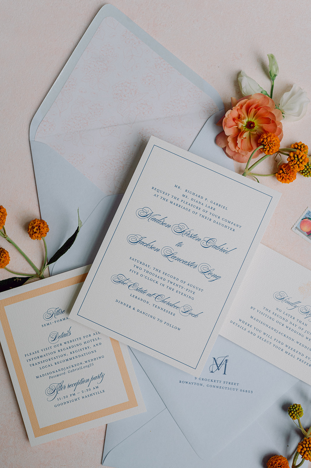
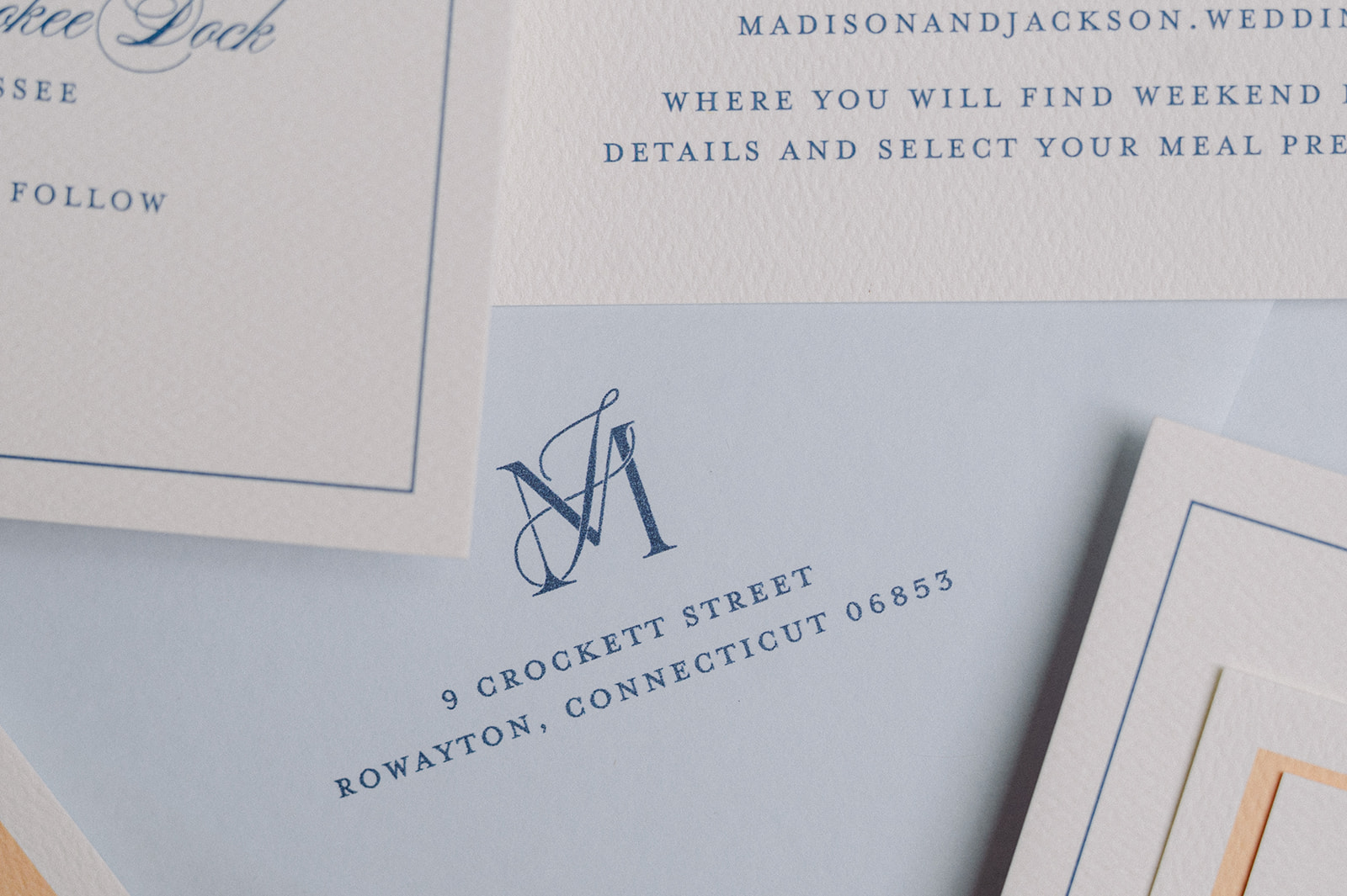
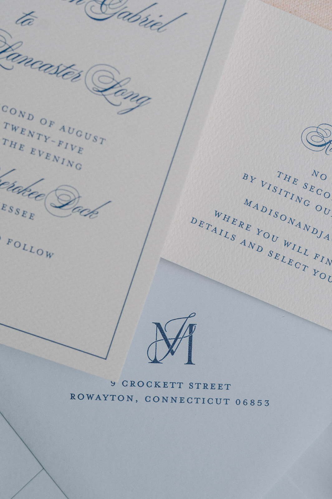
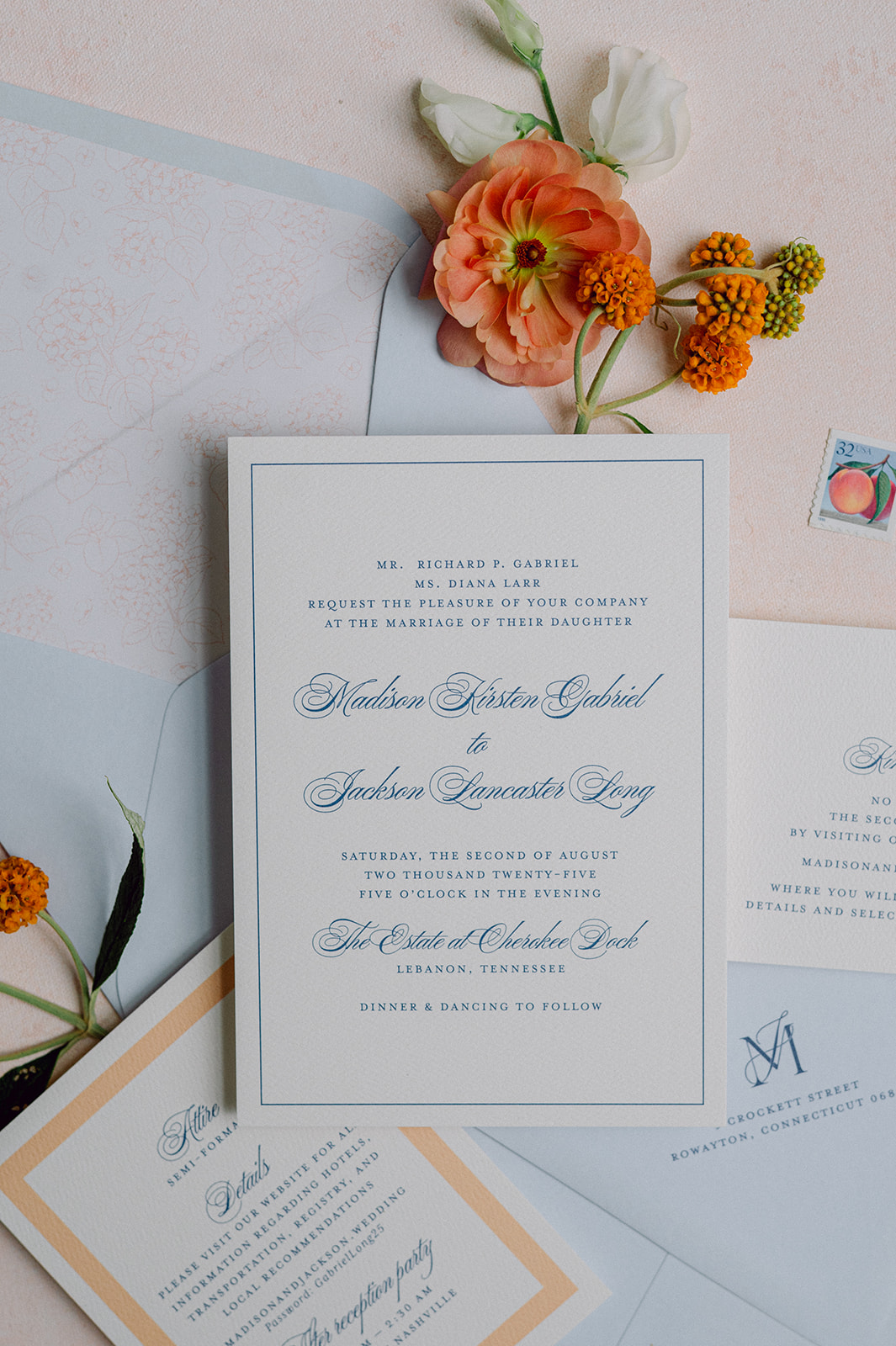
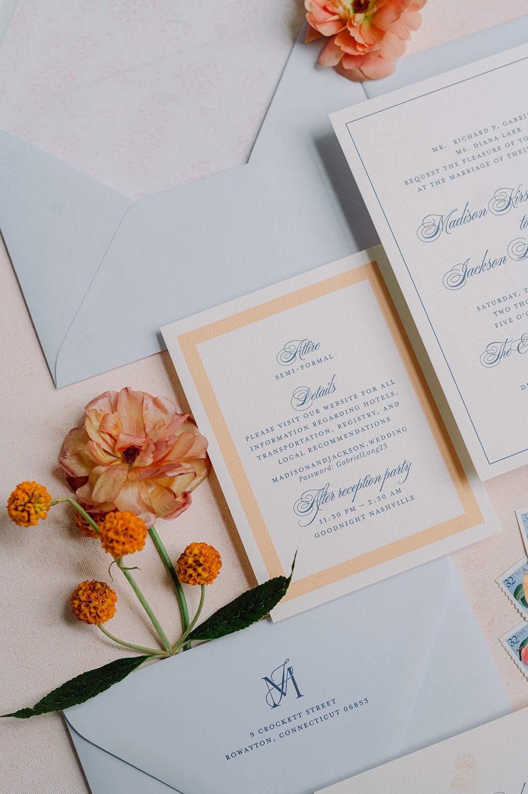
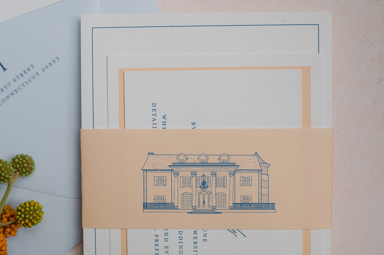
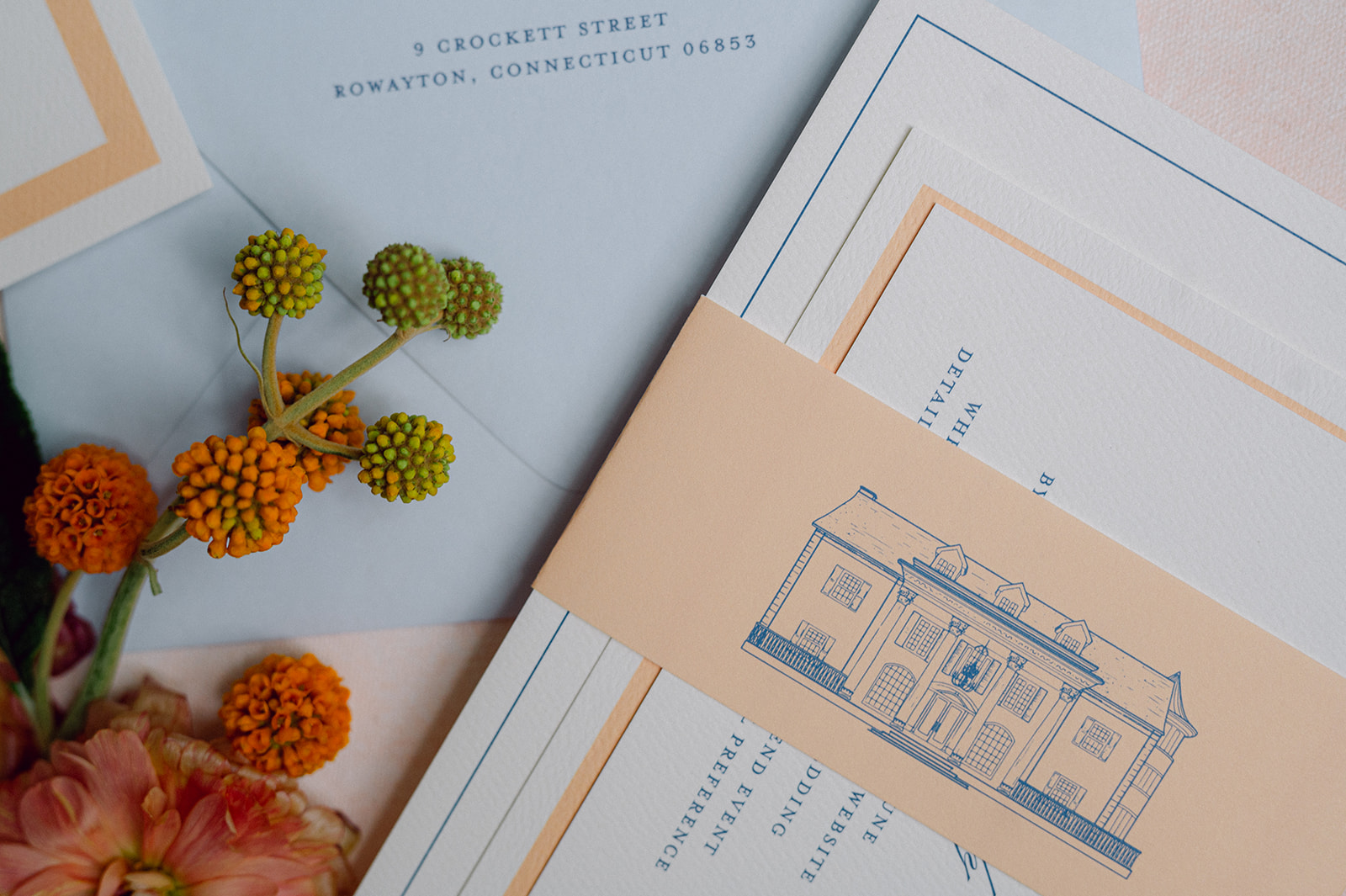
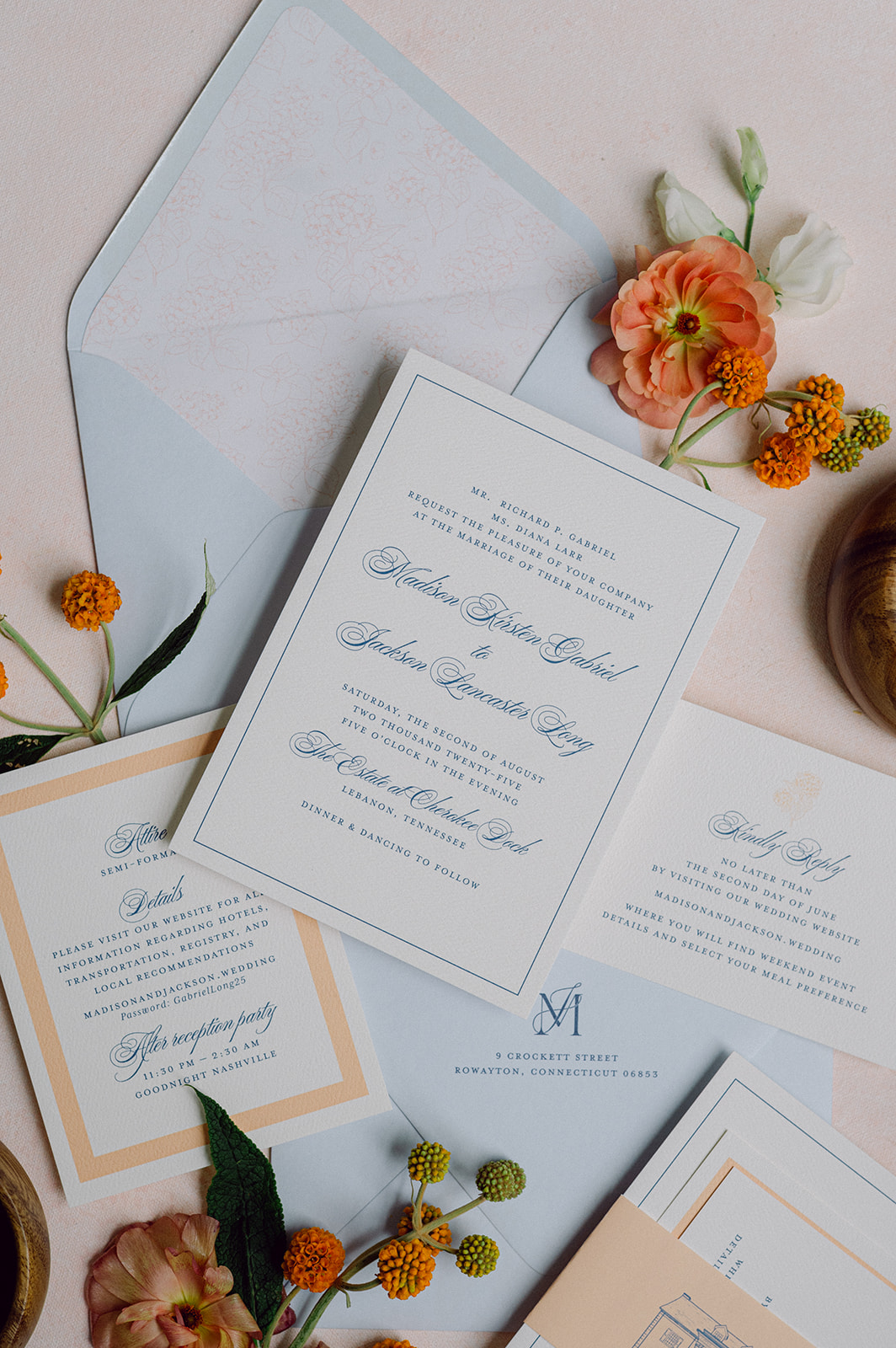
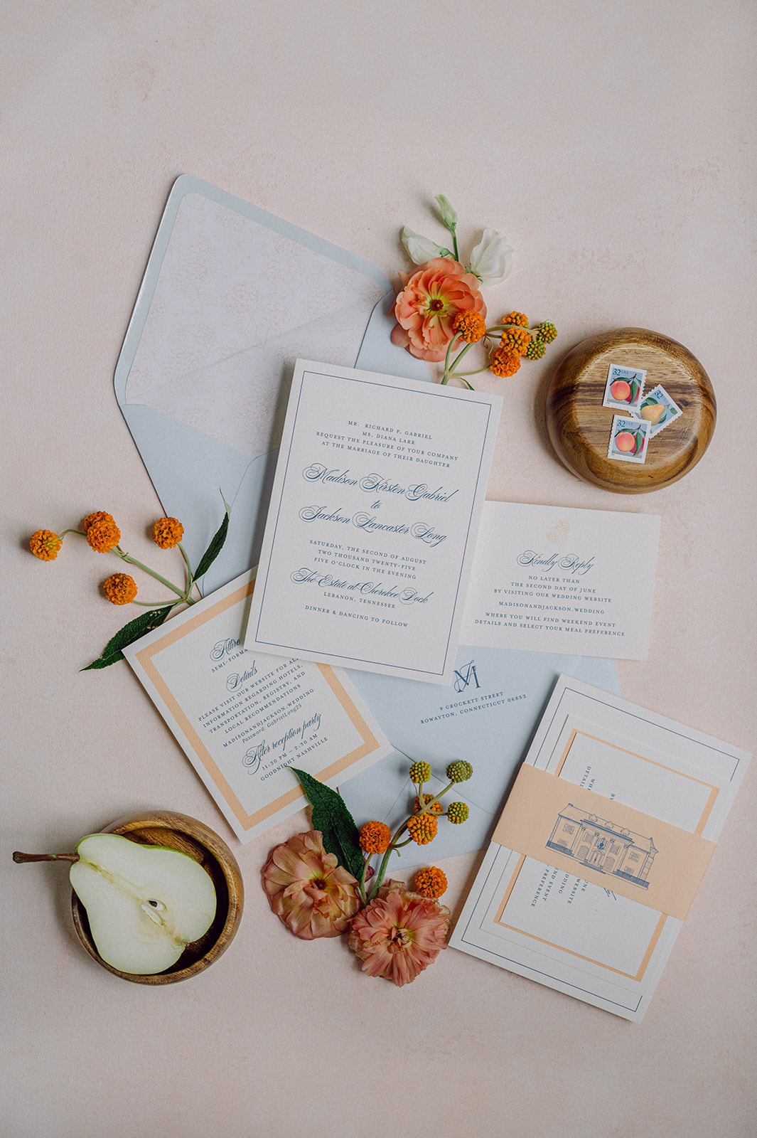
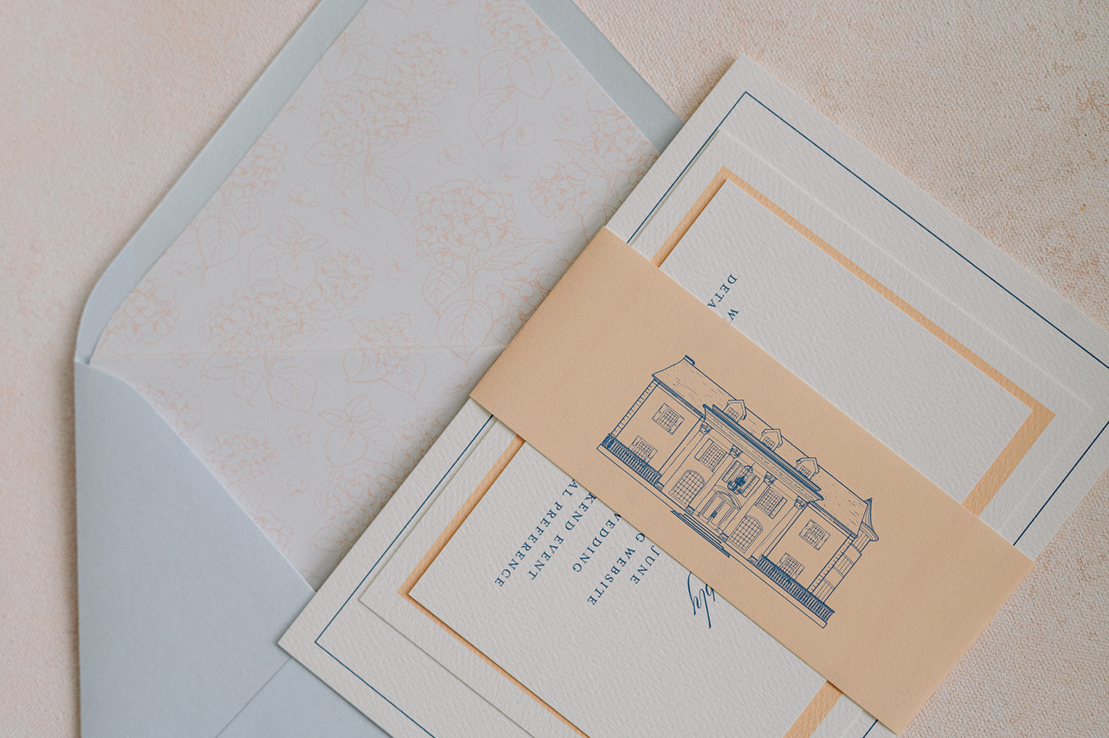
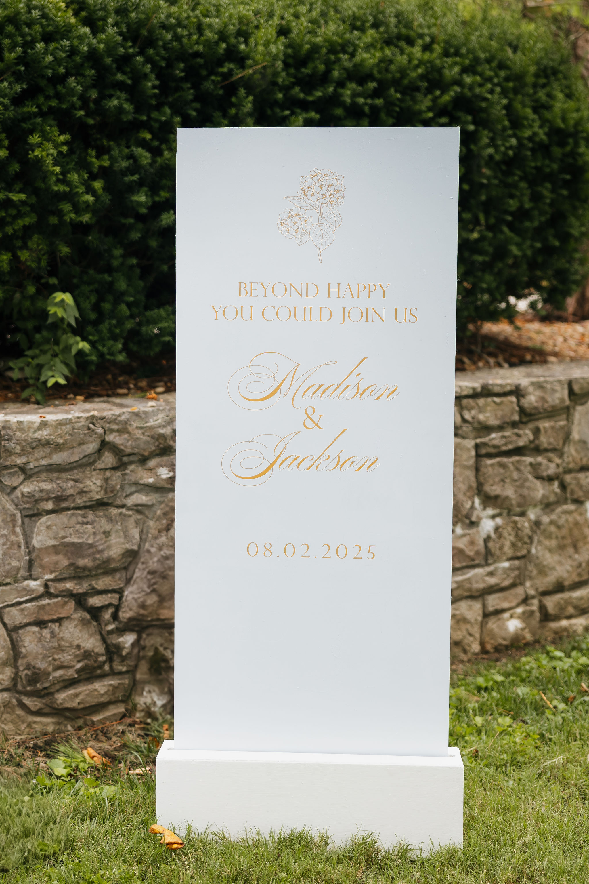
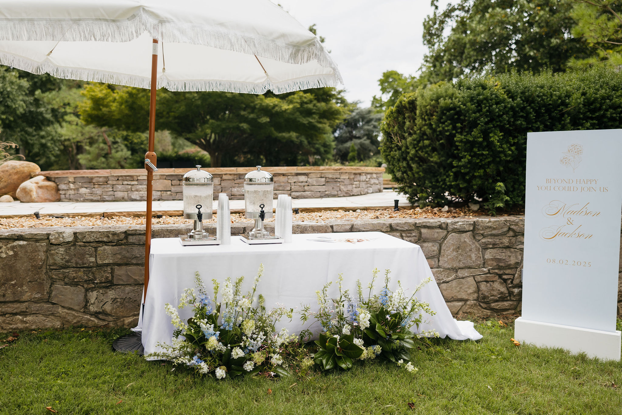
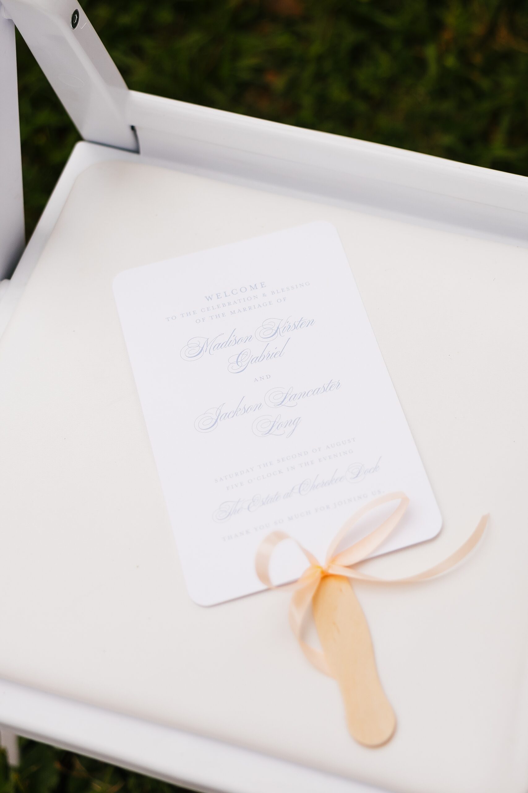
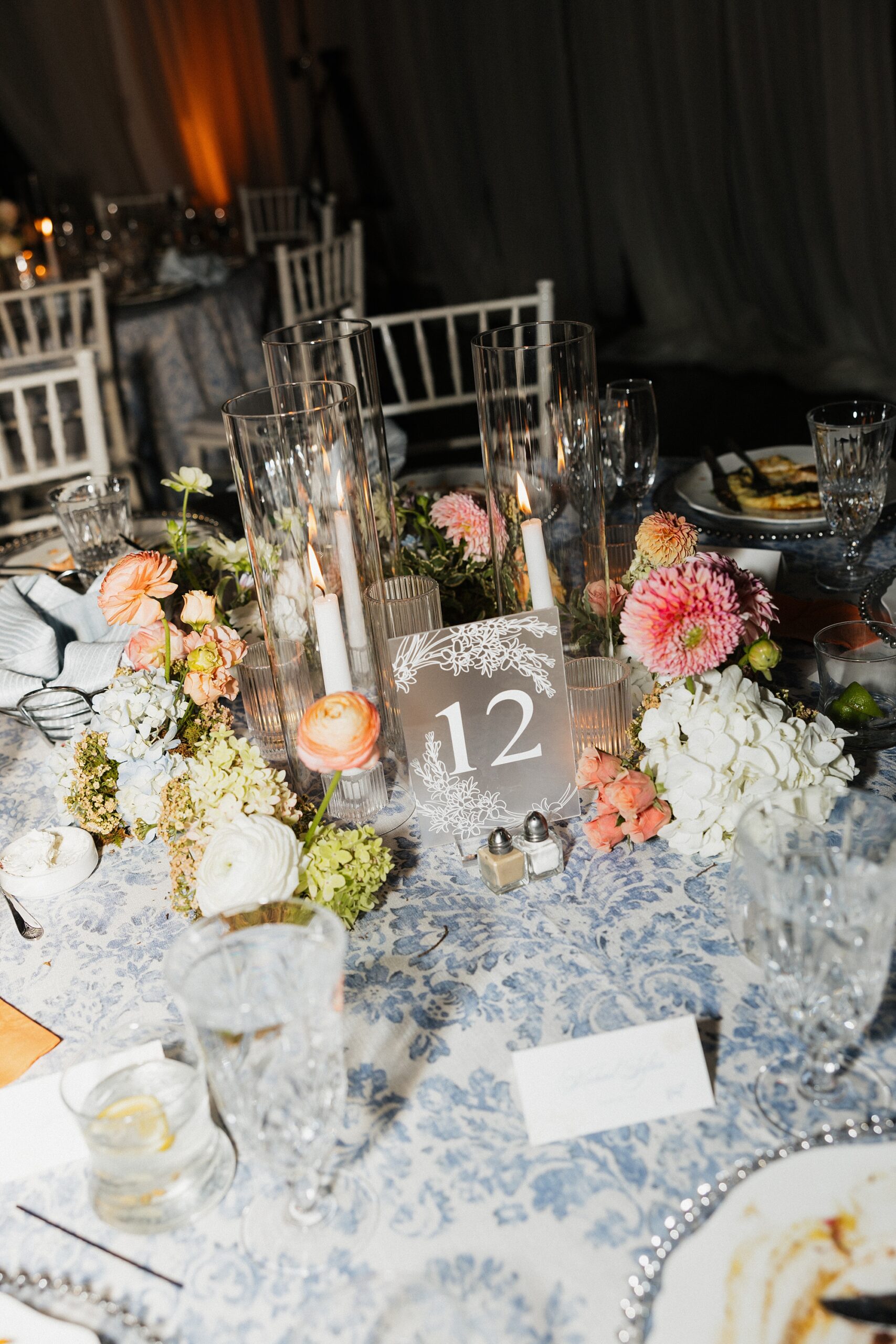
When designing paper goods and day-of details for weddings, we always strive to bring cohesion to the design. We did just that for this Cherokee Dock Nashville wedding. The couple, Madison and Jackson, dreamed of a celebration filled with soft spring colors, thoughtful touches, and a hint of fun. We took their ideas and wove their vision and colors into every element we created, bringing their vision to life. From the invitation suite to the late-night snack boxes, this wedding was full of creativity, color, and personality.
A Soft, Spring-Inspired Invitation Suite
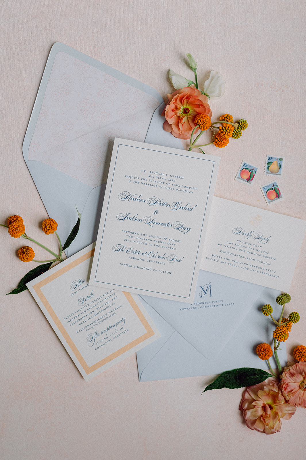
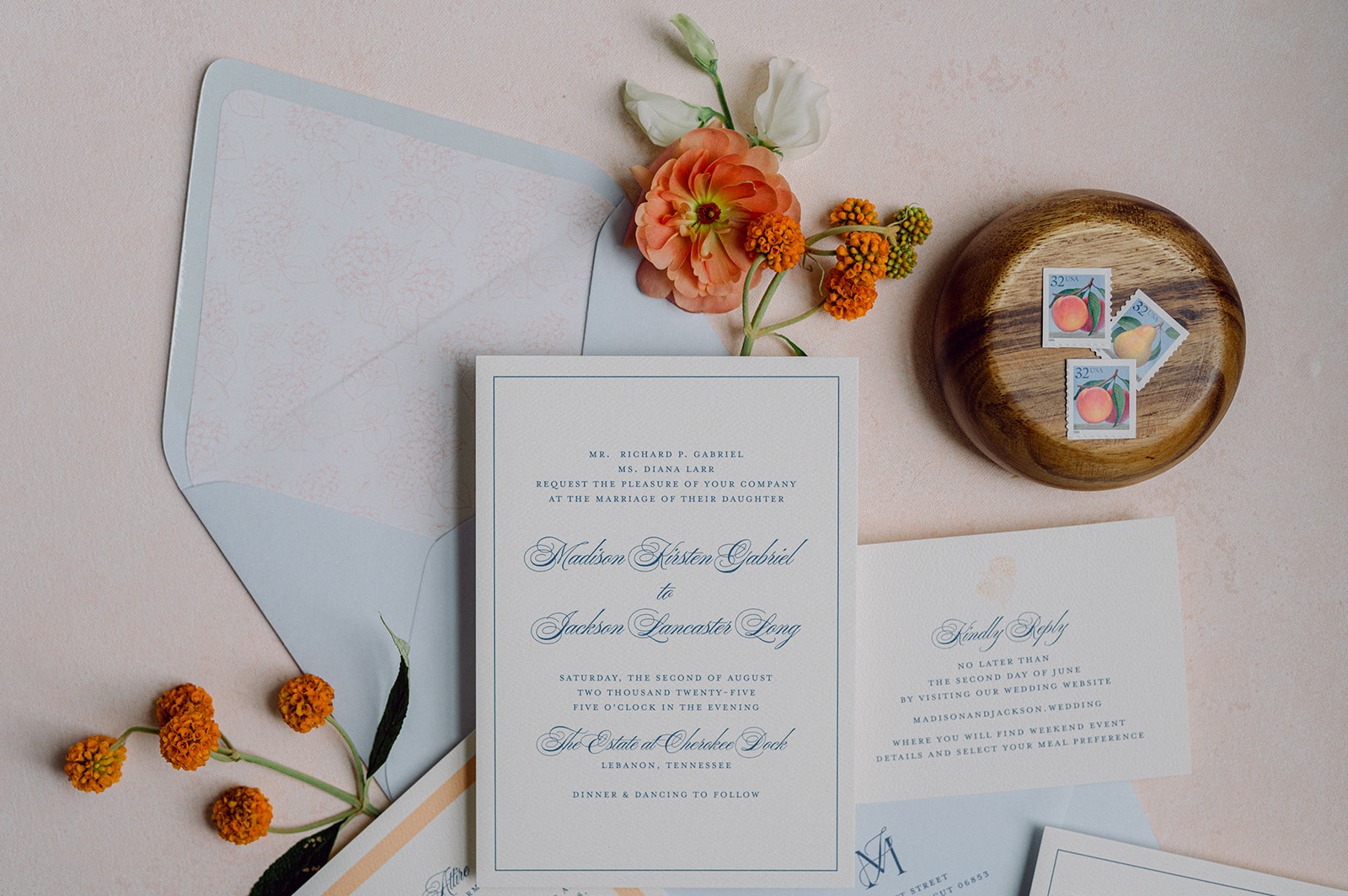
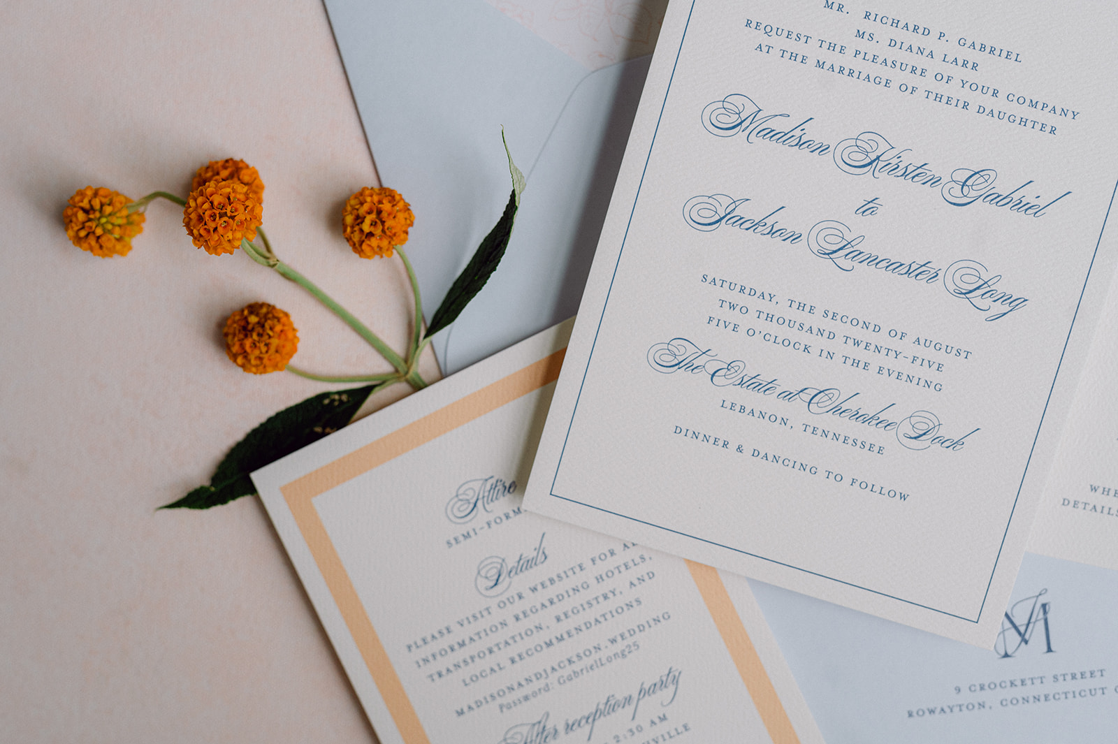
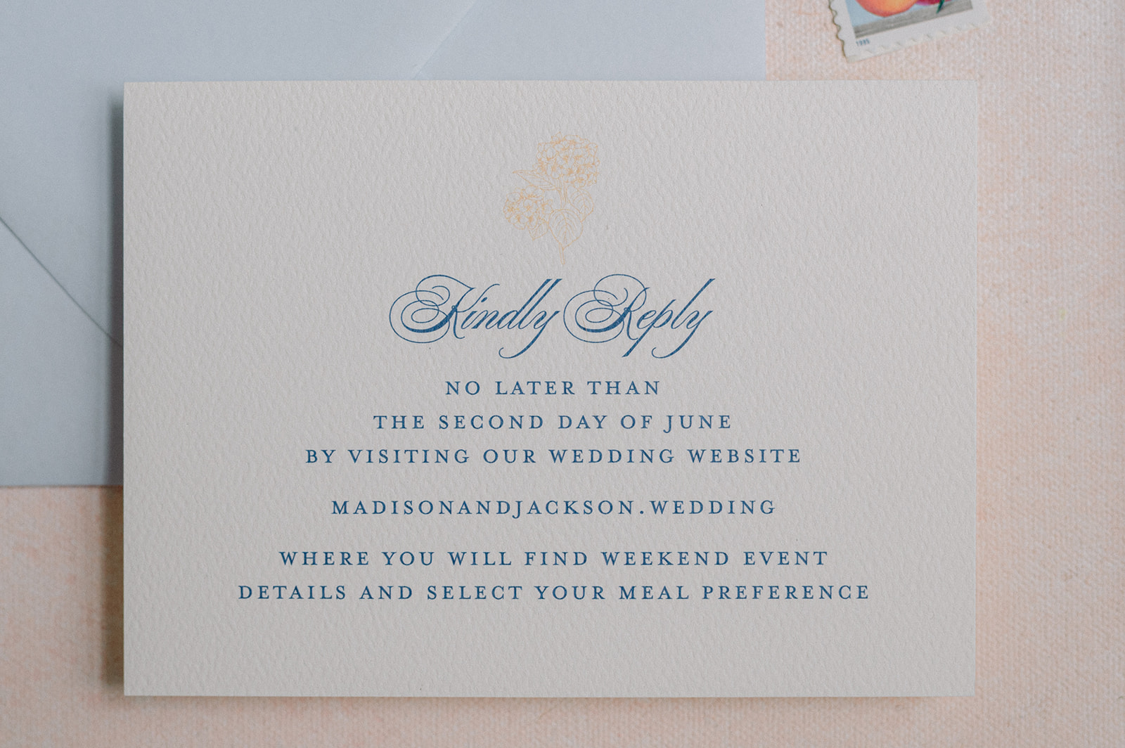
We started with an invitation suite inspired by airy spring hues. The palette centered around light blue, white, and a soft sherbet orange, which instantly set a fresh and joyful tone for the day.
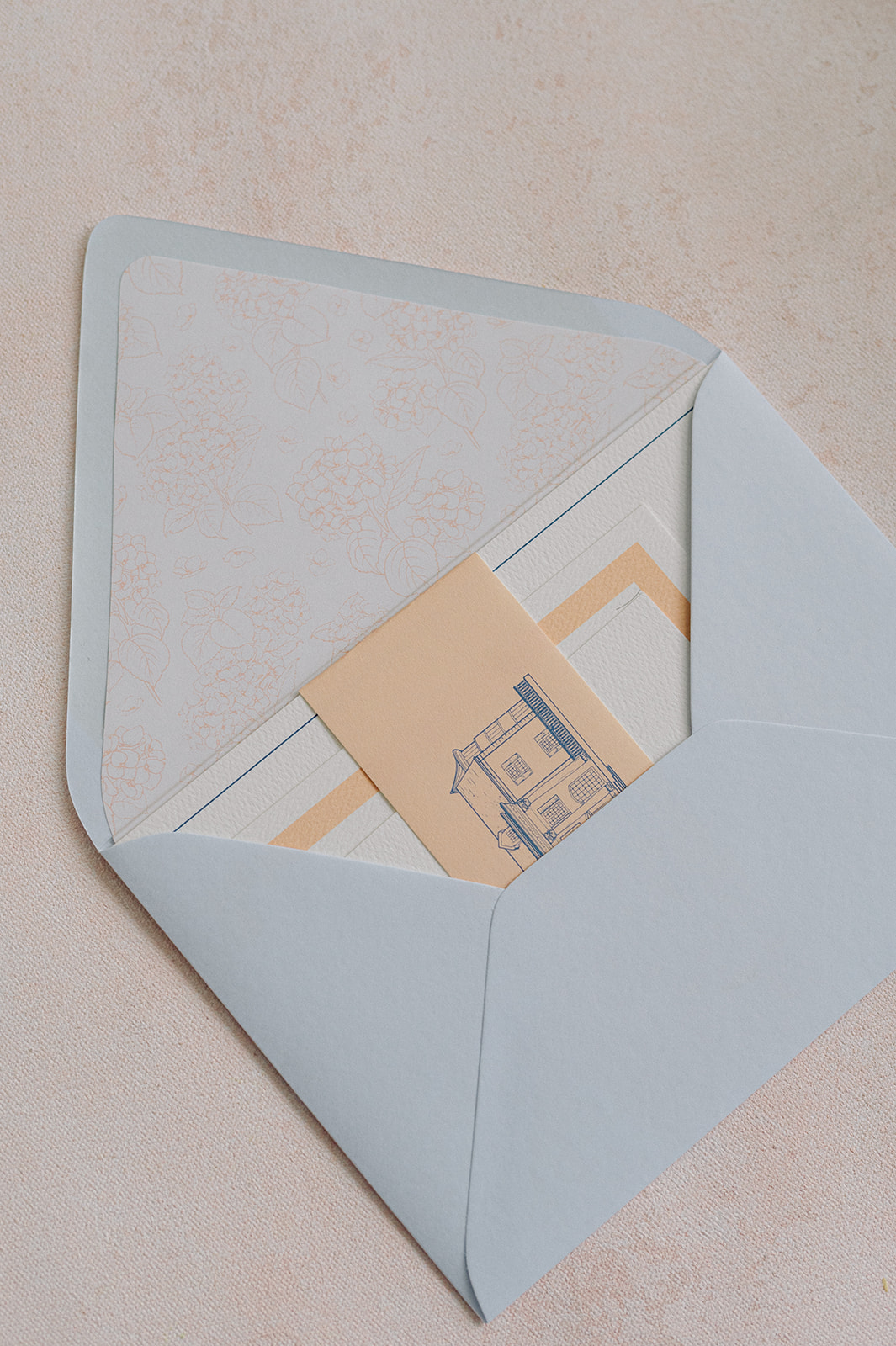
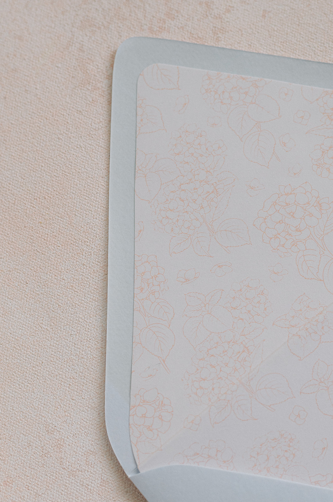
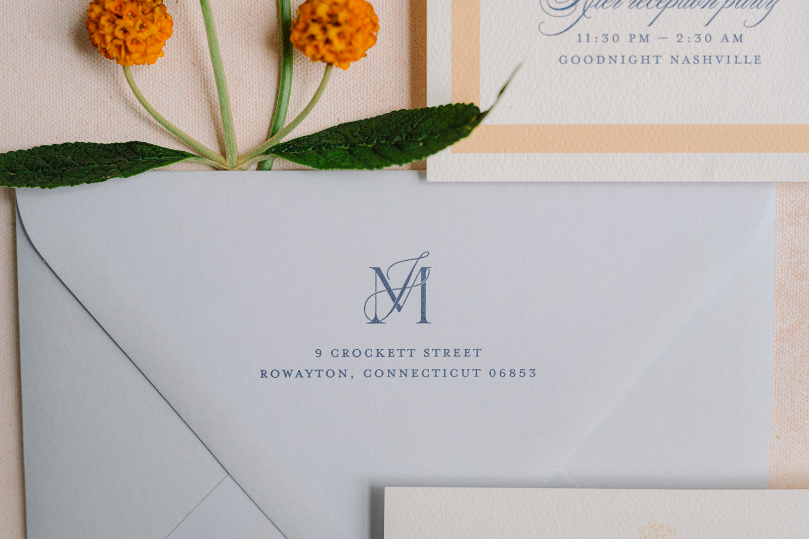
For the envelopes, we used a dusty blue color that was the foundation of the wedding day design. The envelopes featured the couple’s monogram and a custom floral-patterned envelope liner created with the wedding’s signature orange hue accent color.
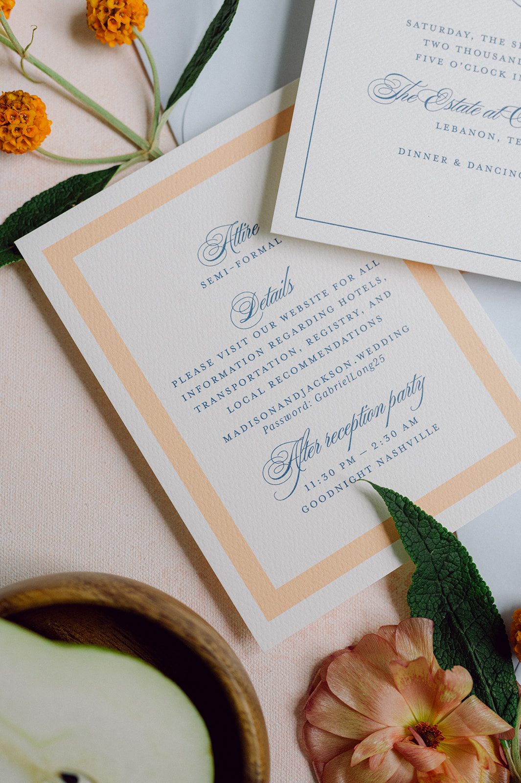
The main invitation was white with light blue calligraphy. The details card was similar but stood out with a thick sherbet-orange border. The entire suite was then wrapped in a vellum band in the same light orange color showcasing a custom sketch of Cherokee Dock in a deep blue.
The suite felt polished yet playful and gave guests an early glimpse into the wedding day ahead.
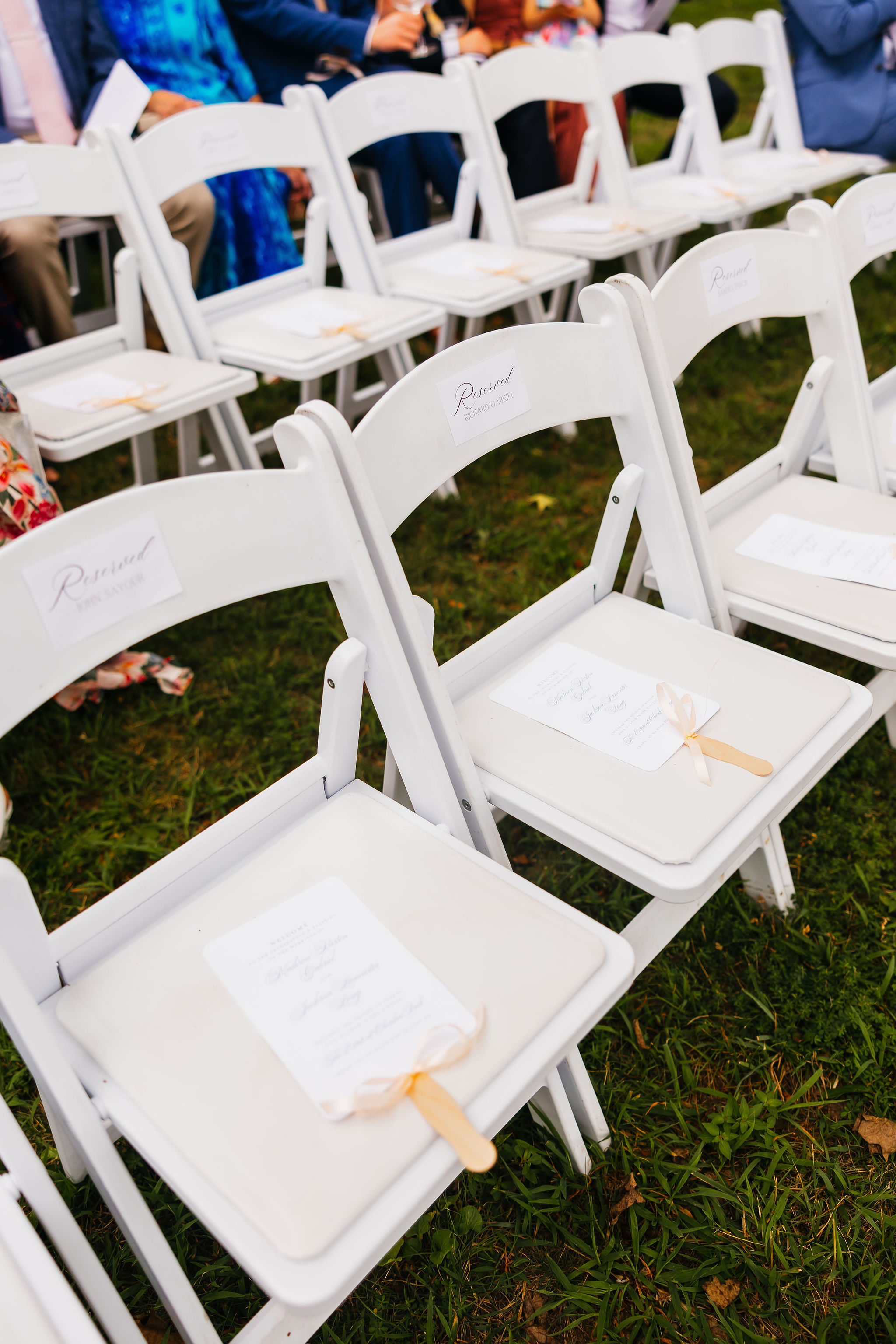
Wedding Day-of Details
For the ceremony, we designed a white welcome sign featuring sherbet orange lettering, keeping everything soft, clean, and cohesive.
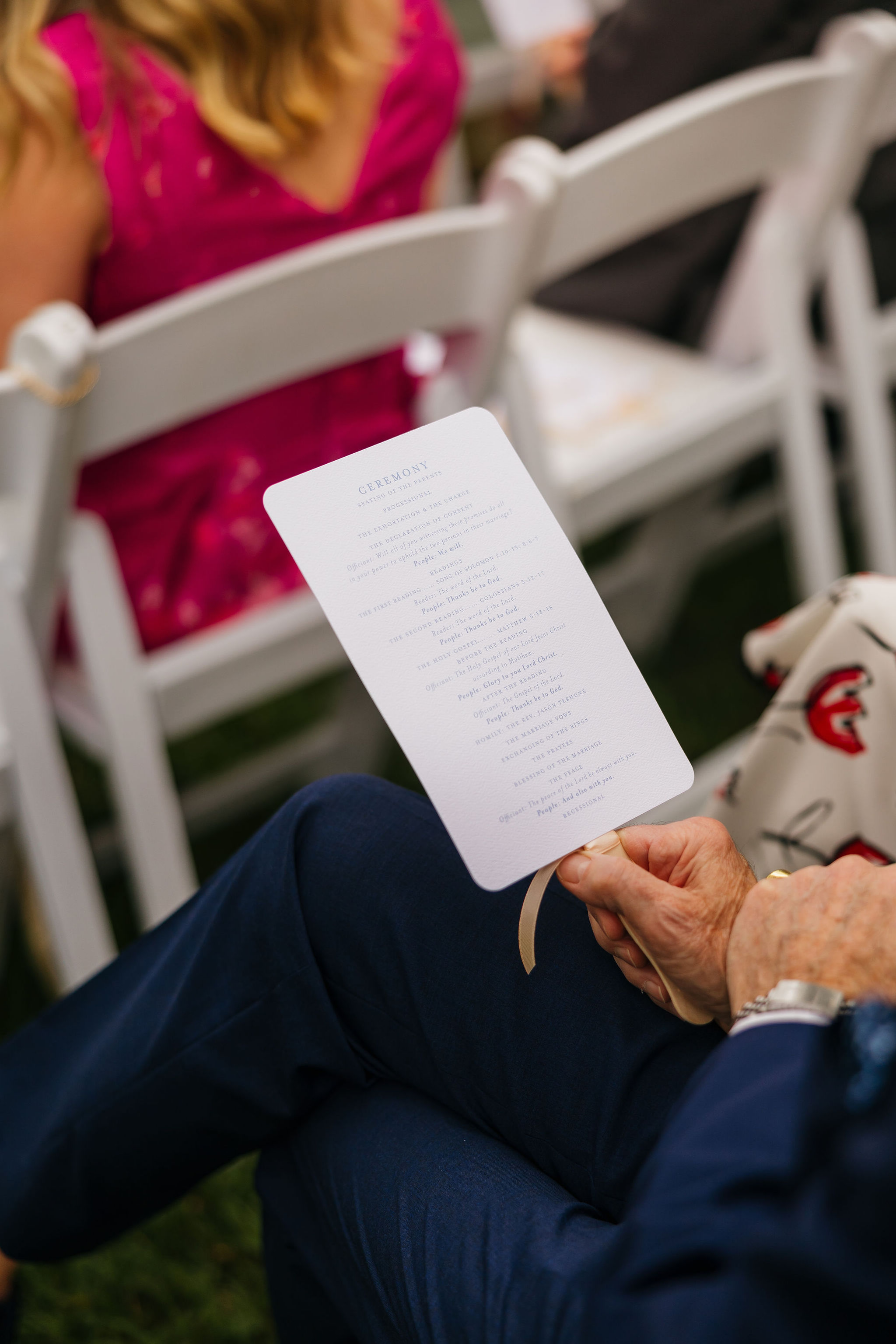
Guests also received program fans, which served a dual purpose of sharing the ceremony details while offering much-needed relief from the Tennessee heat. Practical and beautiful—our favorite combination.
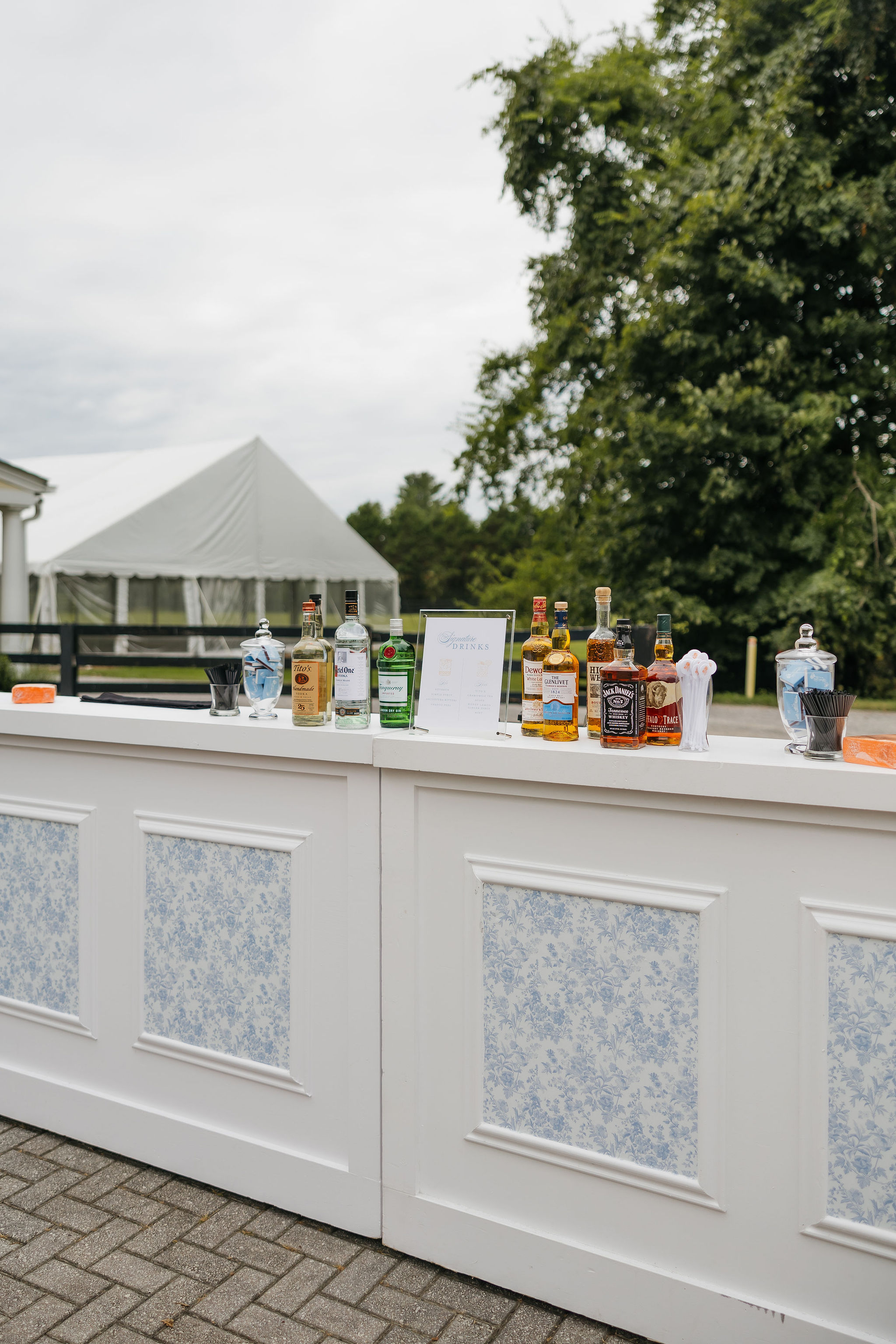
Fun, Colorful Details at the Bar
We created bar inserts showcasing the signature light blue color pattern. This same pattern could later be found on the table linens created seamless design that carried through the wedding day. On top of the bar, guests found custom orange napkins and white stir sticks with an orange flower sketch, bringing an extra pop of color. It’s always the small touches that make the biggest impact.
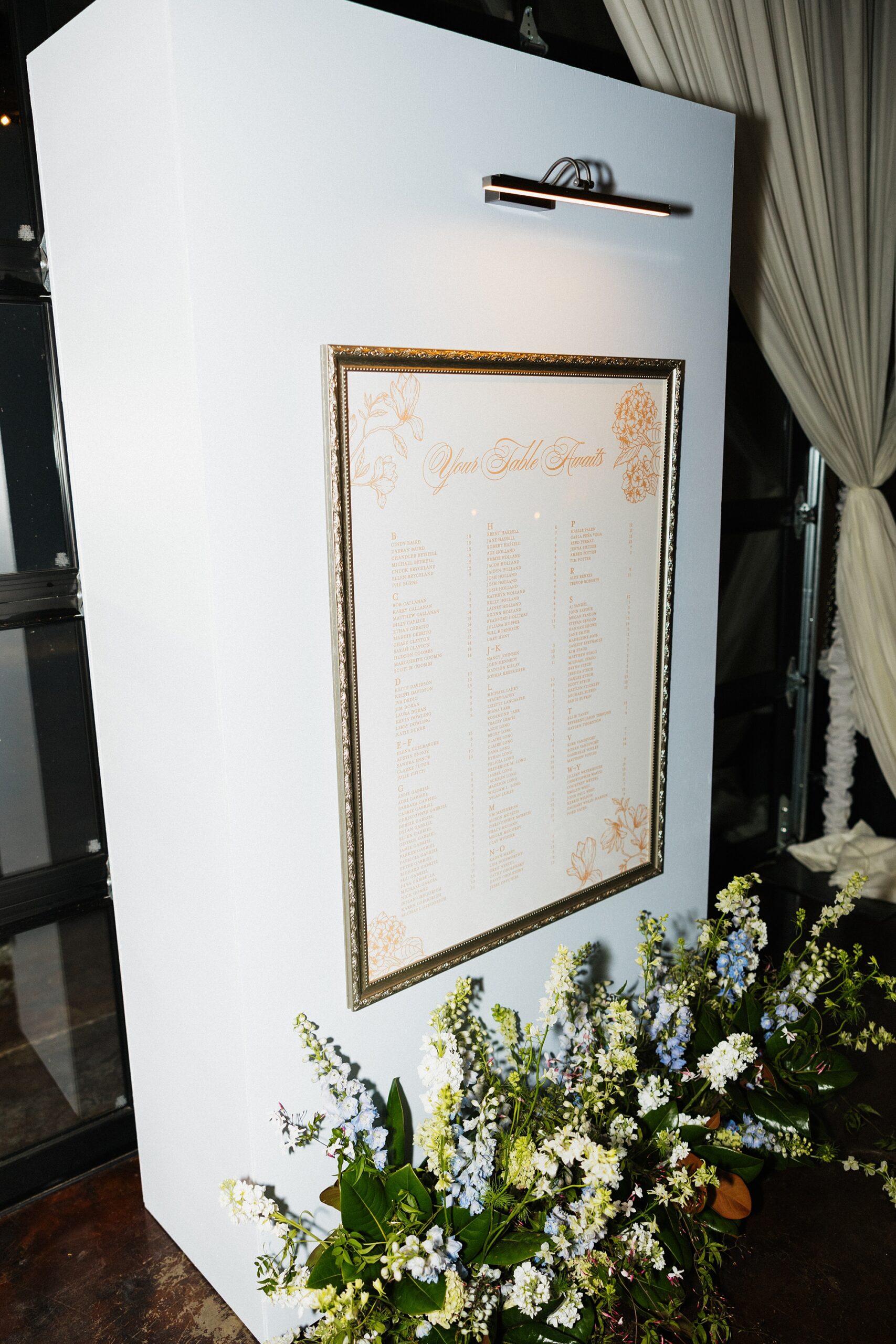
Seating Chart Display
We created a framed seating chart wall with a gallery light, giving it the look of a curated art installation. The clean, structured design brought an elevated feel to the reception entrance.
Reception Details That Tied Everything Together
As guests entered the reception, they located their seats using the frosted acrylic table numbers and white place cards we designed. Notice anything familiar? Here are the table linens I mentioned earlier featuring the same light blue pattern from the bar fronts! The repeating pattern created a seamless, intentional design, which is our speciality.
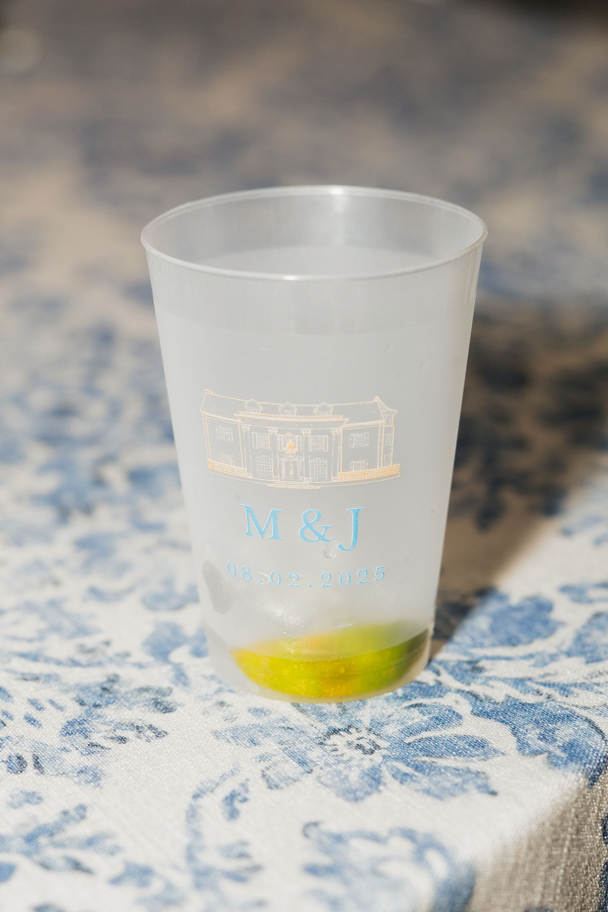
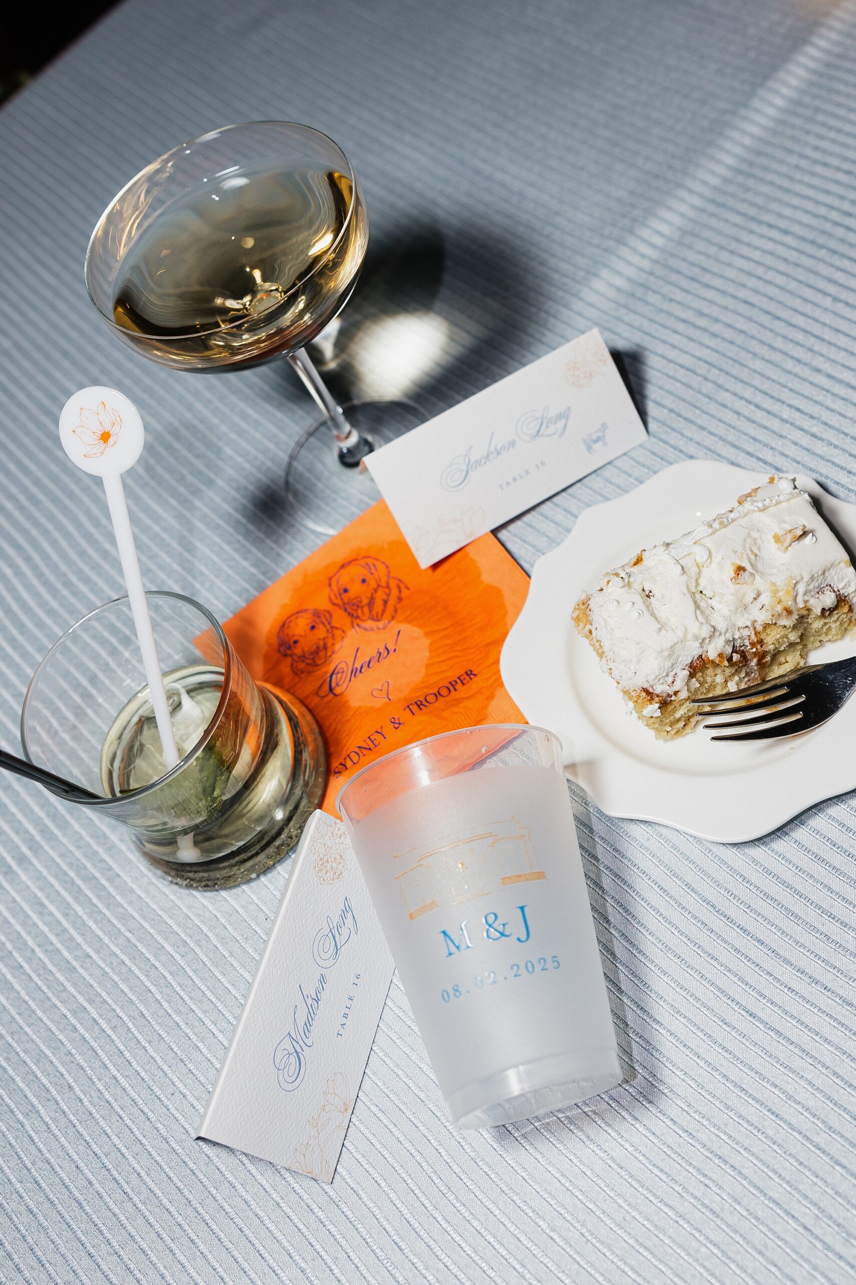
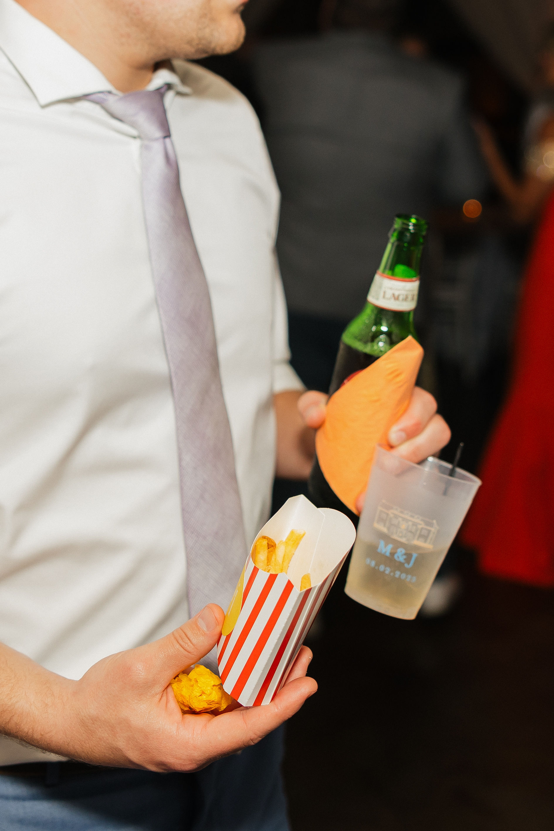
We also designed the frosted cups used throughout the evening, which doubled as wedding favors. Each cup featured the Cherokee Dock sketch from the vellum band, this time printed in light orange, paired with the couple’s initials and wedding date in soft blue. It was the perfect blend of chic and fun.
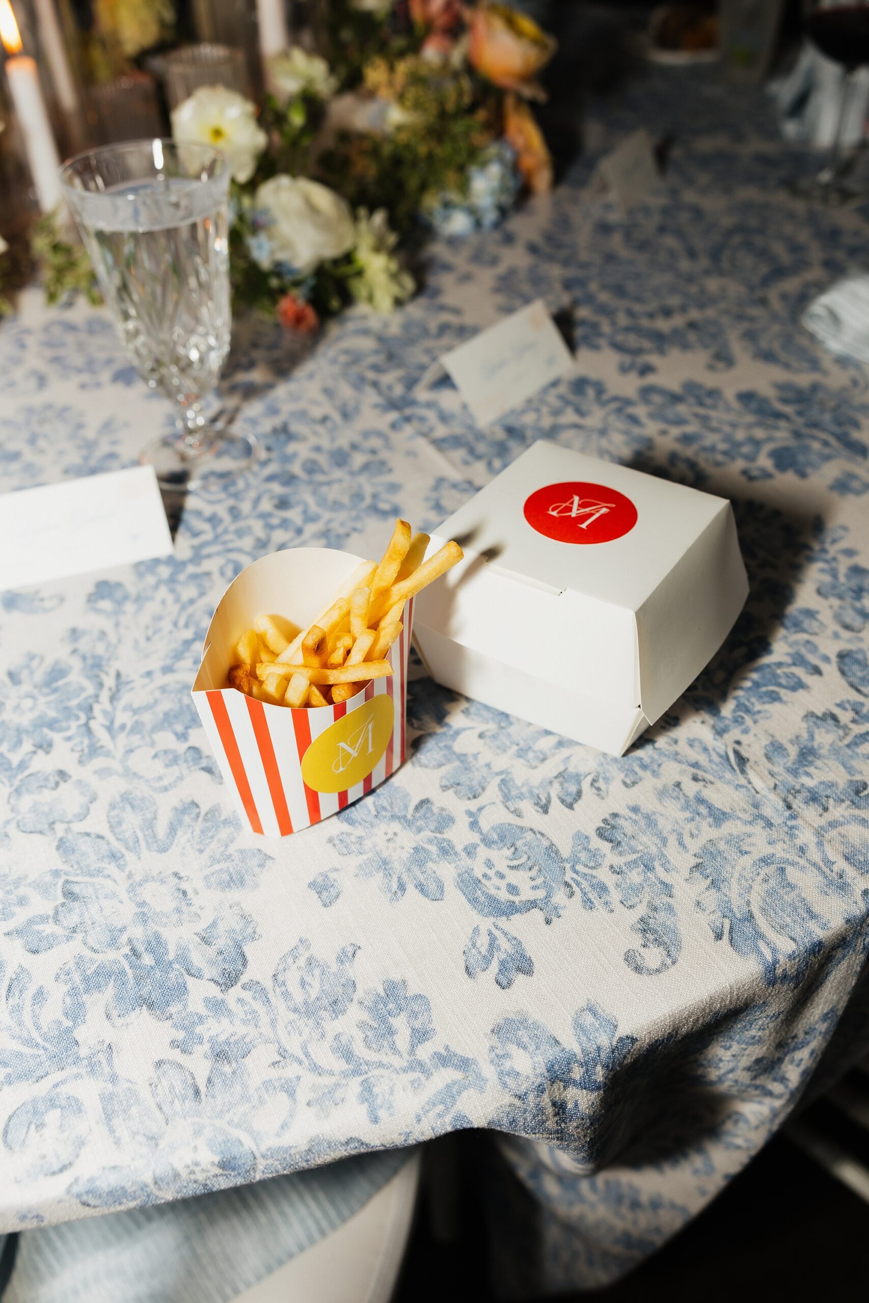
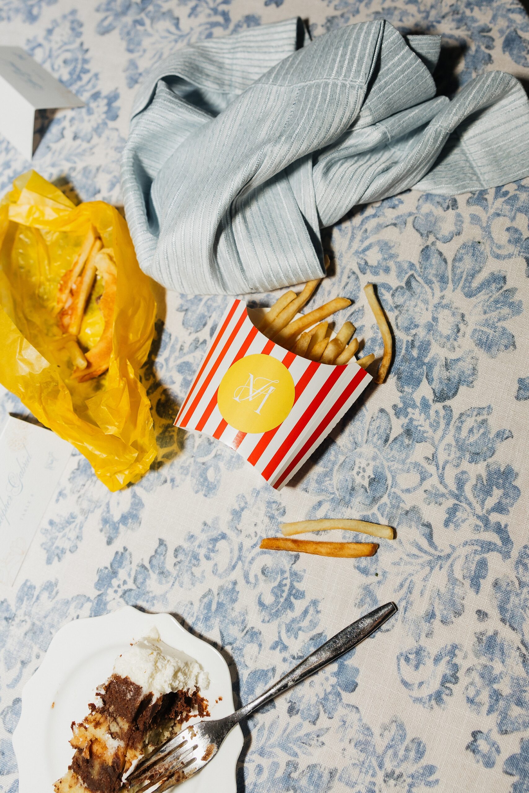
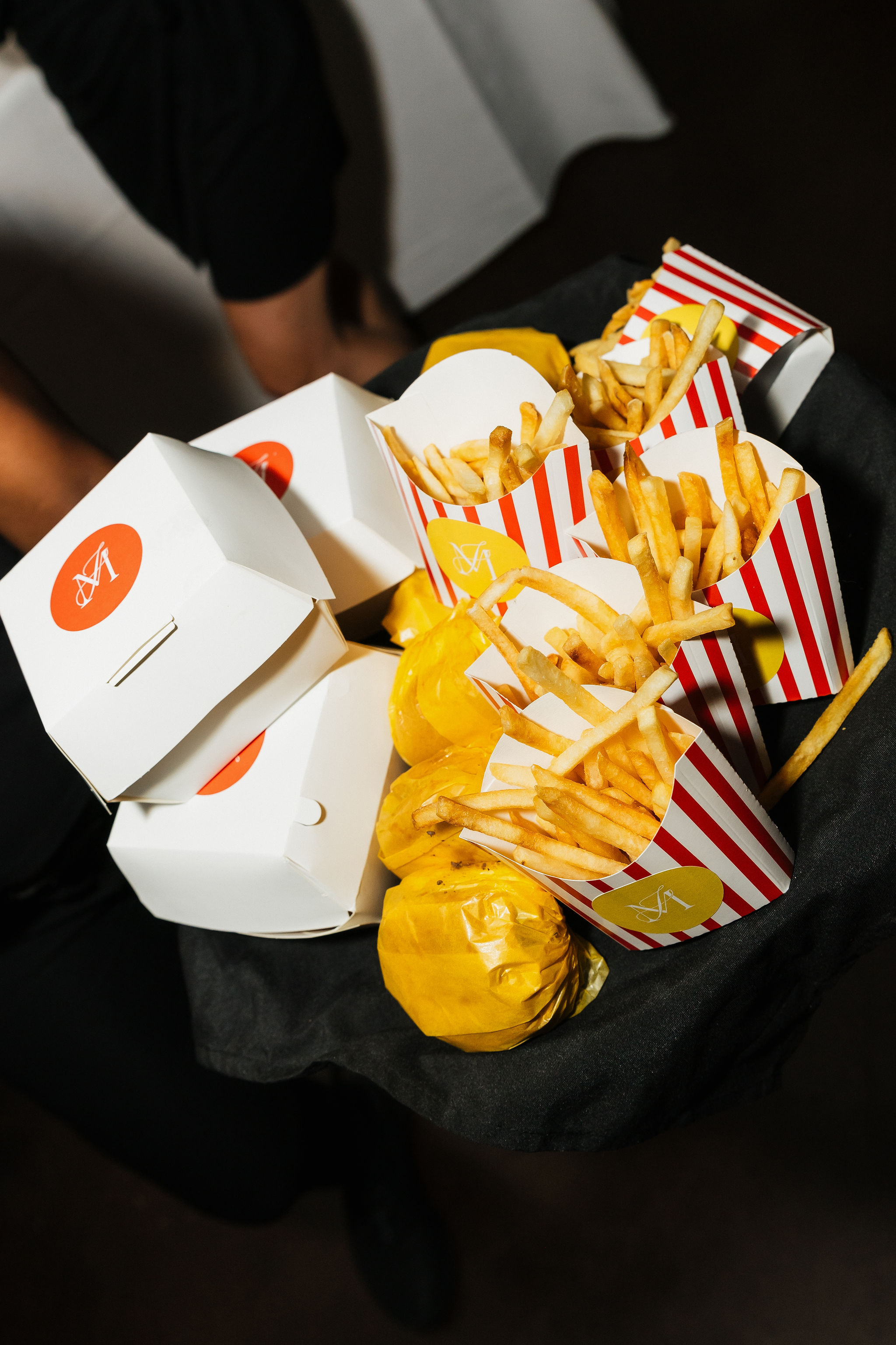
A Playful Late-Night Snack Moment
The wedding ended with a little late night snack of burgers and fries that were served in custom burger and fry boxes we designed! The white burger boxes featured a bold orange circle centered on the lid with the couple’s monogram in white. The fry boxes leaned retro with white-and-red stripes and a yellow circle holding the same monogram.
This final detail brought so much personality and nostalgia. It was impossible not to smile when you saw them. Not only that, but they were truly so much fun to create.
A Spring Wedding Filled With Creativity and Color
This Cherokee Dock celebration was the perfect mix of polished design, soft springtime color, and playful, personalized details. Every piece from the invitations to food packaging was created with intention and cohesive design in mind. It was an honor to bring Madison and Jackson’s wedding vision to life.
If you’re planning a wedding in Nashville, or anywhere in the world, we’d love to help you create meaningful, personalized stationery and event details that tell your story. We work with couples worldwide to design details you and your guests will remember forever.
Reach out today to learn more about our full-service wedding and event design offerings! We can’t wait to create something unforgettable for you!
If you enjoyed this post, you’ll love these other blogs!
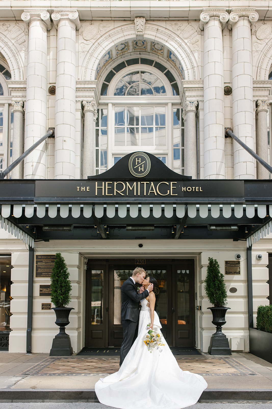
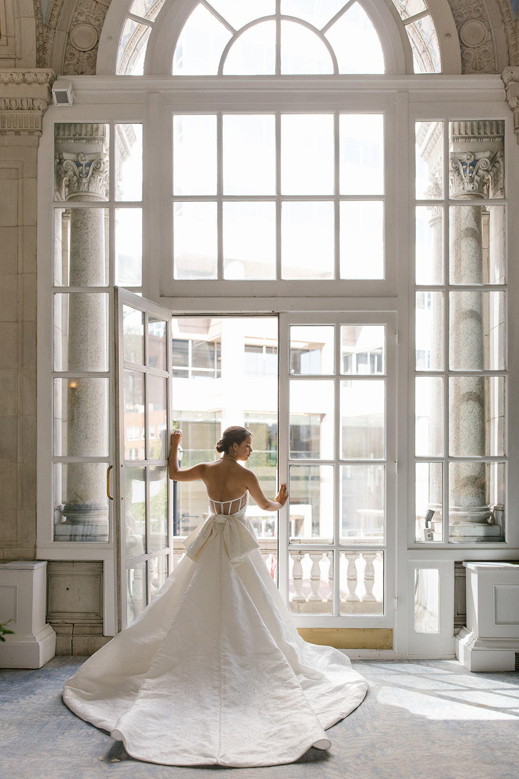
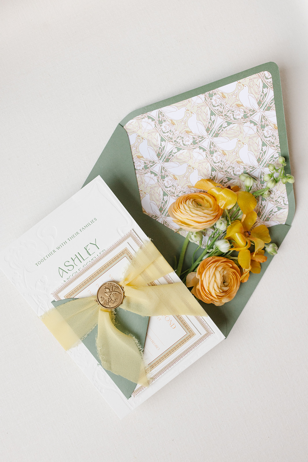
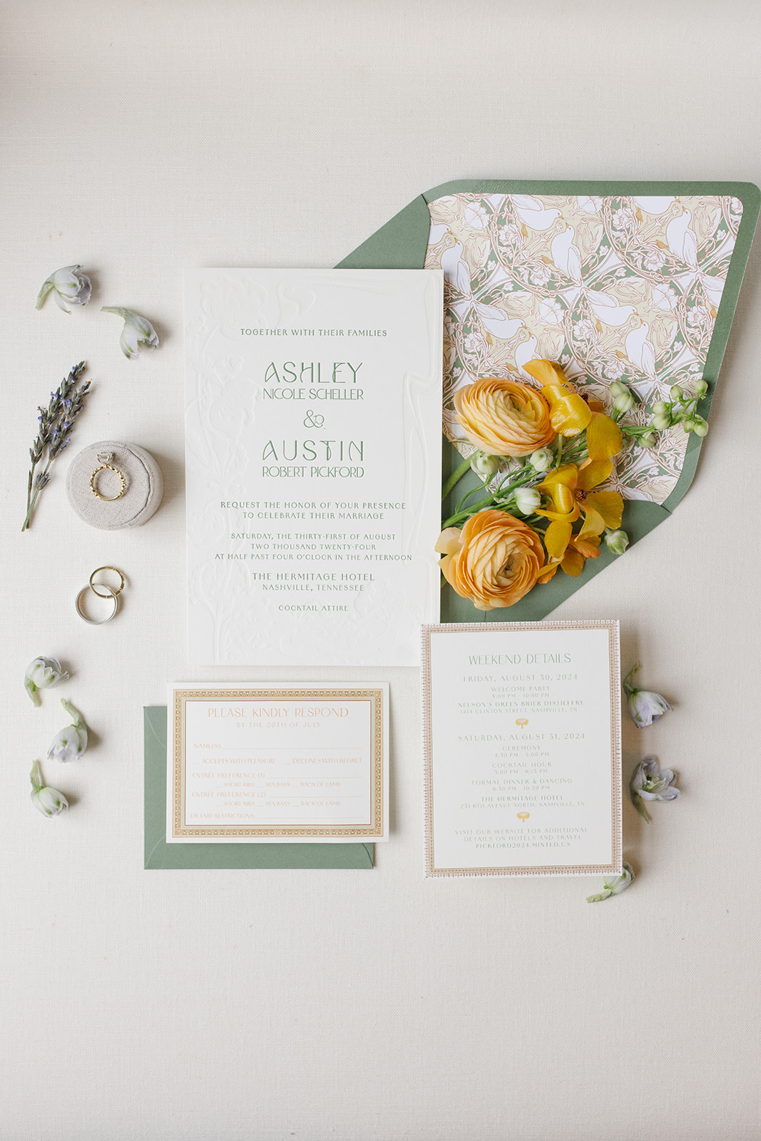
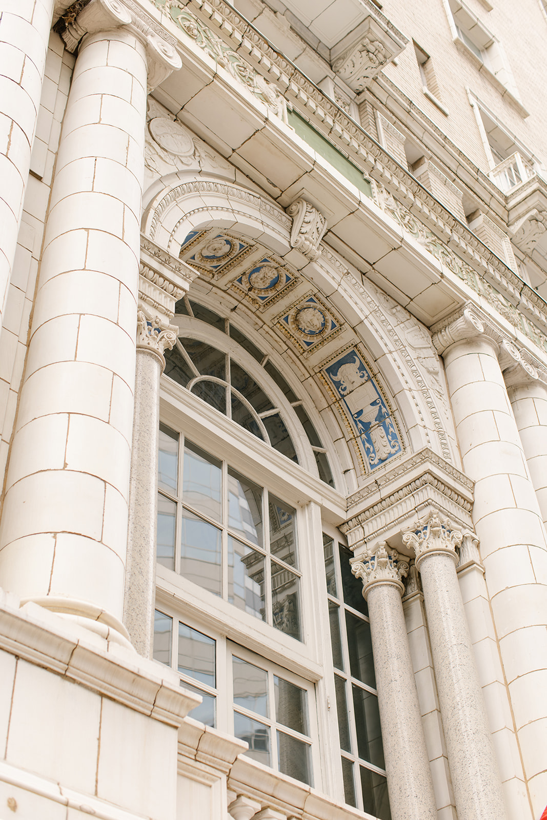
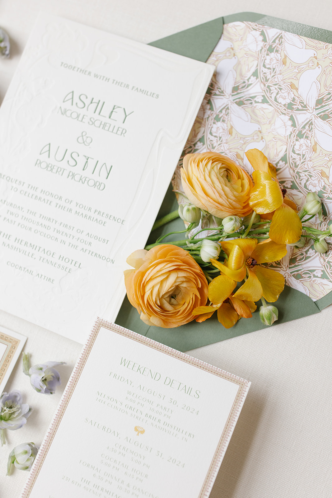
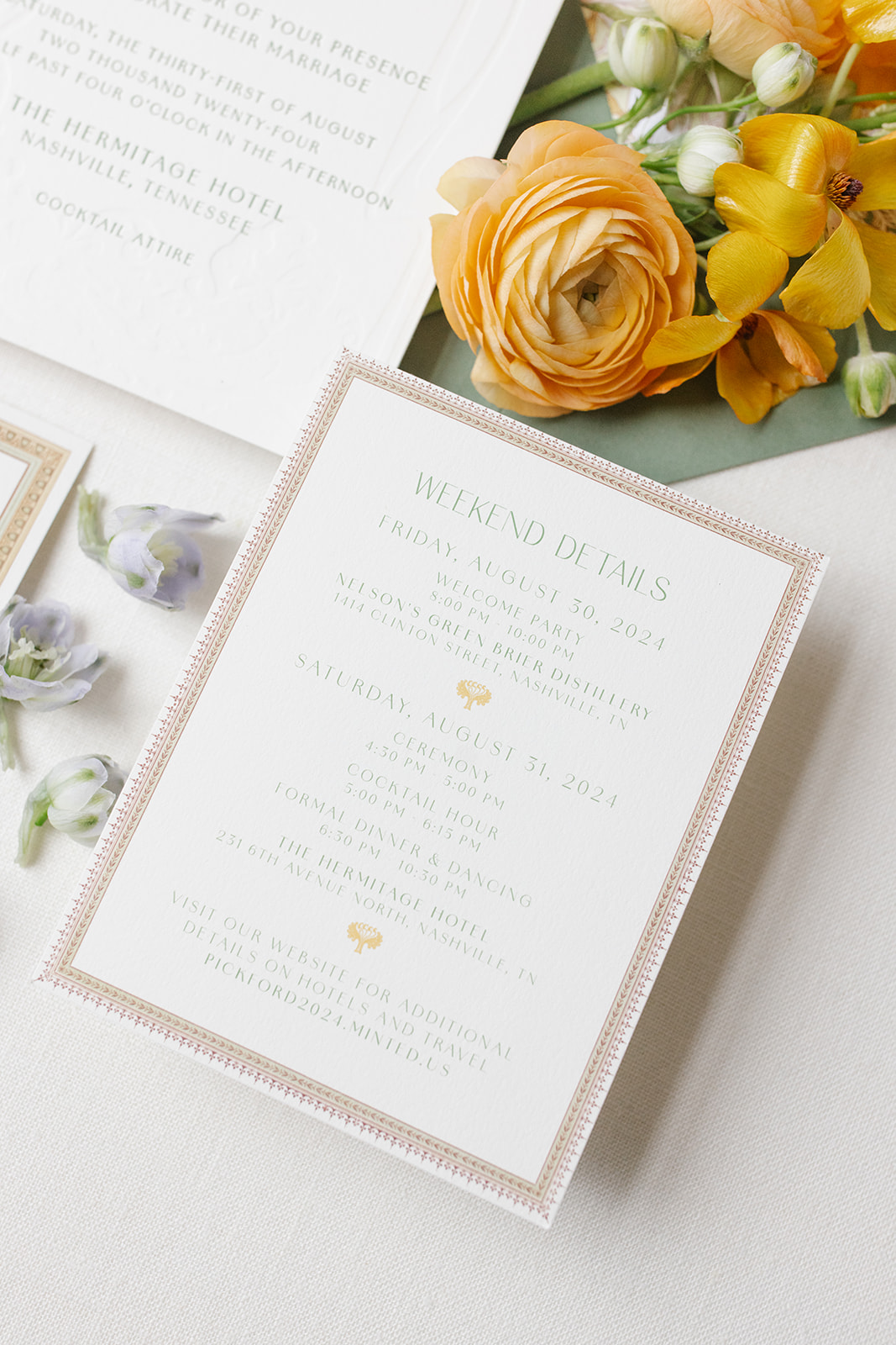
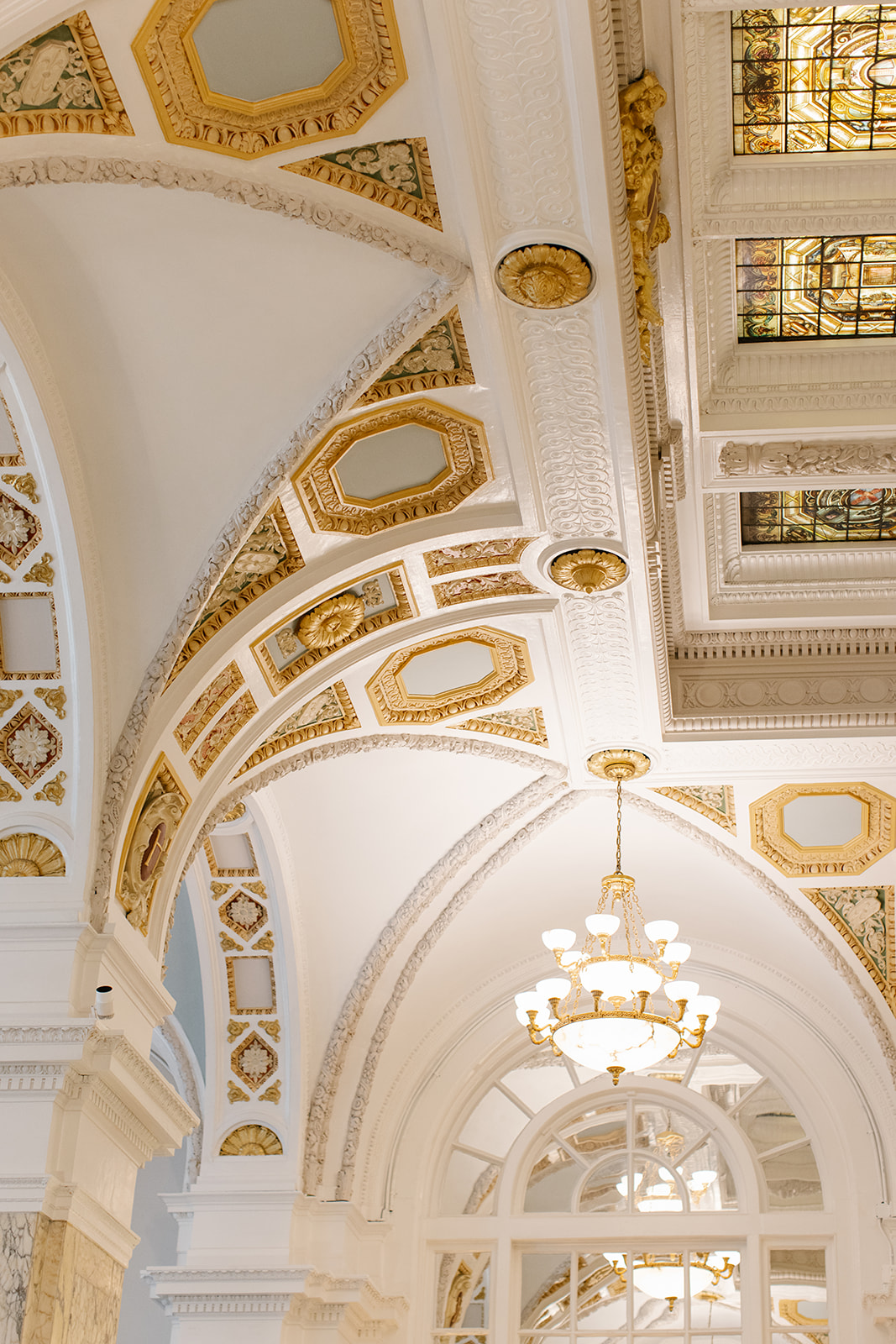
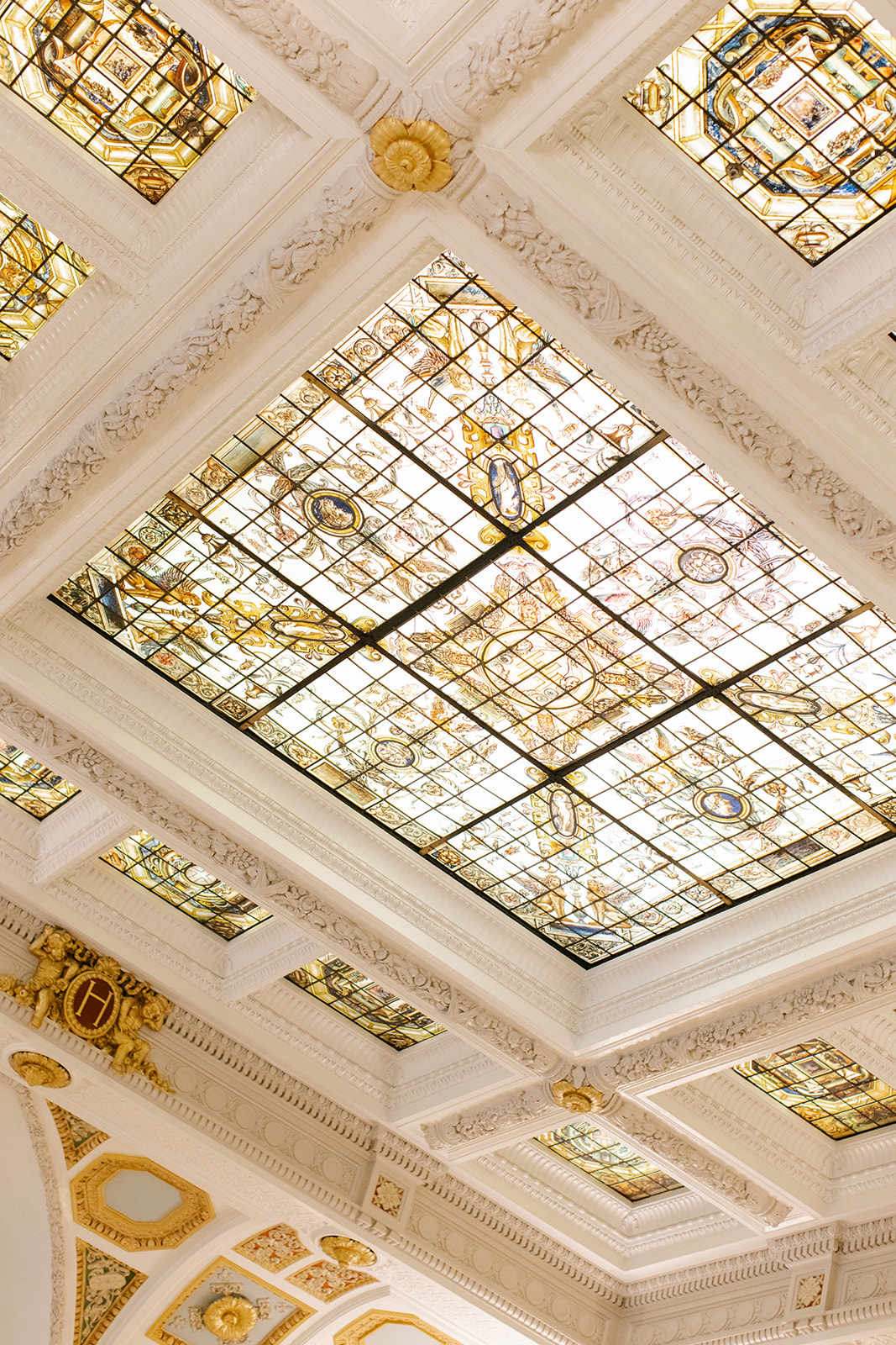
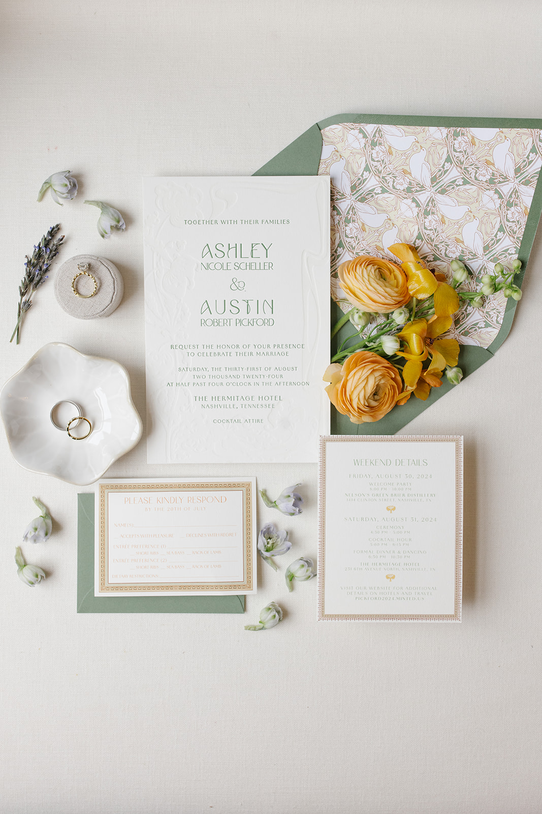
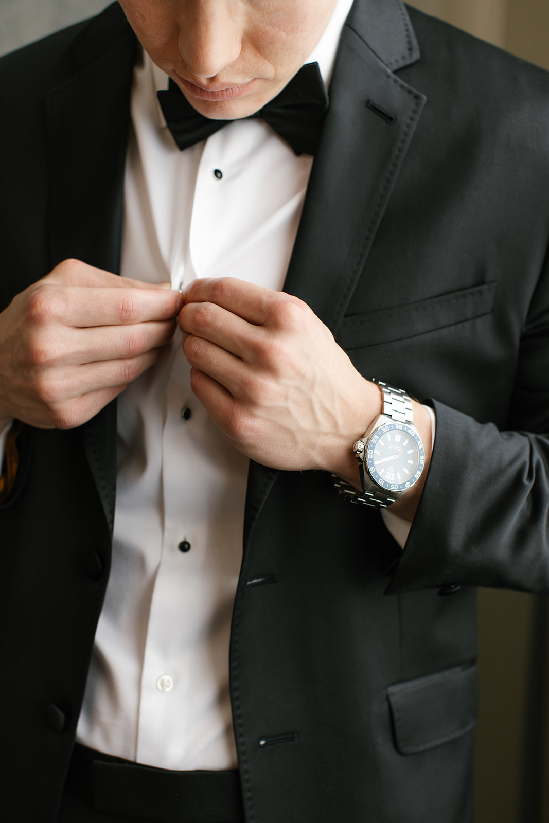
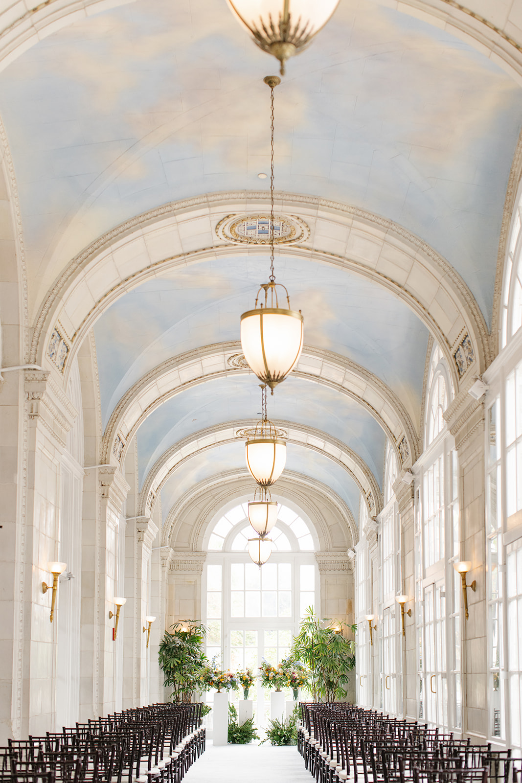
This year we started off a busy fall wedding season with White Ink Couple, Ashley and Austin, at the iconic Hermitage Hotel in downtown Nashville. This unforgettable, art nouveau-inspired wedding did not hold back when utilizing details, pulling in colors, and interlacing style and texture throughout the entire event. White Ink was there for ALL of it!
We rolled up our creative sleeves and worked to help bring Ashley and Austin’s elegant vision into focus. We wove together poignant characteristics from The Hermitage Hotel’s architecture along with the flowing geometric styles and muted colors of the booming art nouveau movement were incorporated into all the important details of the day.
This was an unforgettable experience for the our team and we are delighted to finally get to share this day with you!
Art Nouveau- Did you know?
Art Nouveau or “new art” was a movement that gained popularity from the late 1800’s to the early 1900’s. According to the The Art Story’s website, “Art Nouveau was aimed at modernizing design, seeking to escape the eclectic historical styles that had previously been popular. Artists drew inspiration from both organic and geometric forms, evolving elegant designs that united flowing, natural forms resembling the stems and blossoms of plants. The emphasis on linear contours took precedence over color, which was usually represented with hues such as muted greens, browns, yellows, and blues.” www.theartstory.org
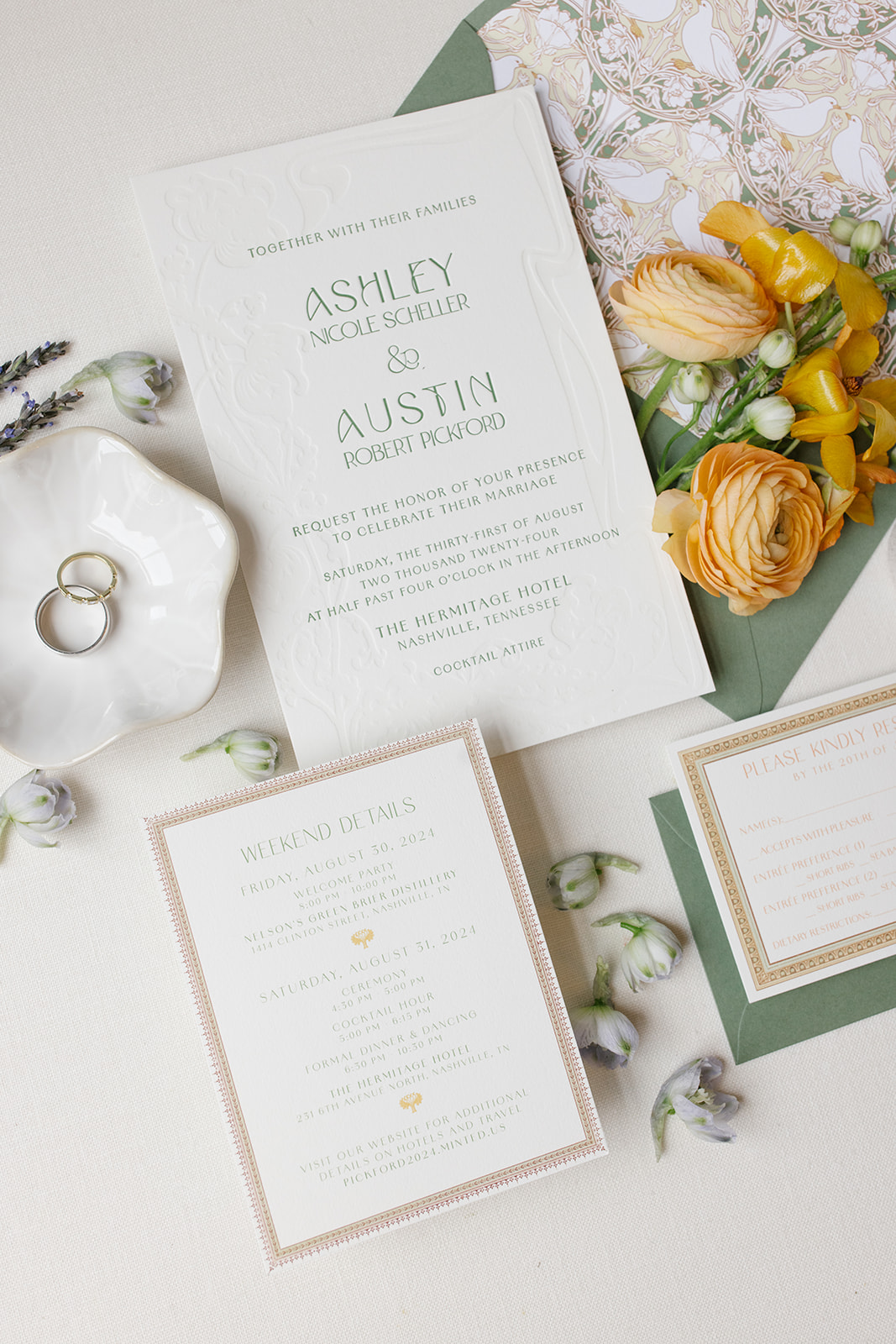
This invitation suite was designed to reflect the timeless details of the wedding venue. We custom-designed the envelope liner to include that classic, art nouveau look. Muted greens and yellows rested perfectly together with a focus on the natural beauty of white birds and the liners’ harmonious shapes and lines.
One notable detail within The Hermitage Hotel is a hand-painted bird theme throughout the guestrooms and suites. The idea to include birds in the custom envelope liner was a purposeful and beautiful way to connect the invites to the venue.
The ornament framing around the rsvp and details cards was meant to mimic the ornate frames and trim work throughout the hotel. This invitation suite was truly the ultimate ‘sneak peek’ for Ashley and Austin’s guests of what was to come!
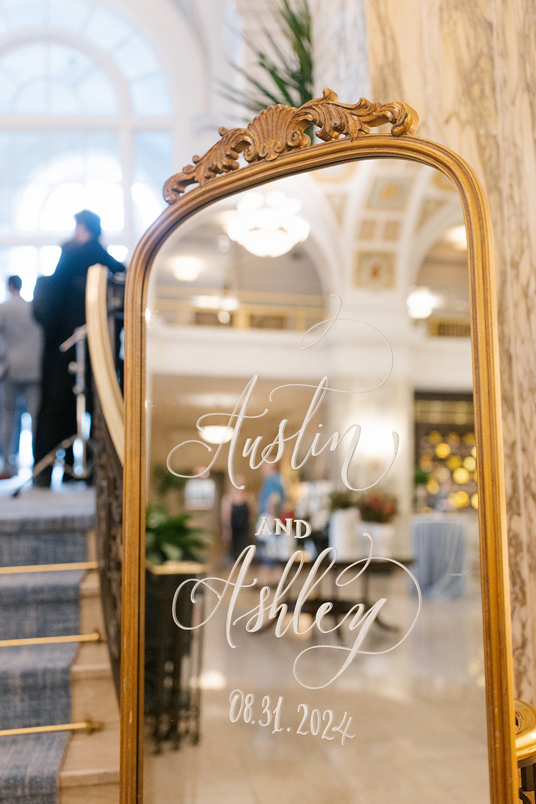
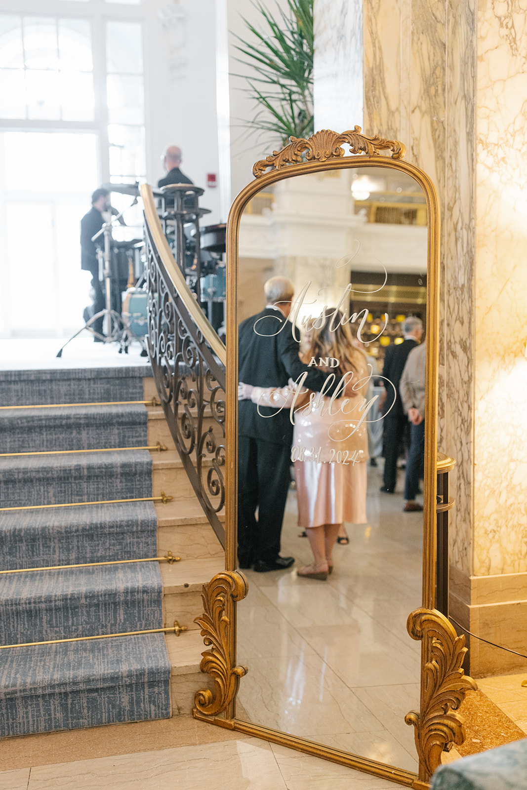
A wedding welcome sign is multifunctional, especially if it is mirrored. Event signage, in general, is a seamless way to provide guidance for your guests as they enter the venue space. It adds to the tone of the space without stealing the show. It’s also a fantastic way to showcase the theme of your big day.
Ashley and Austin chose to use our floor-length, Bourdeaux, gold-framed mirror with minimal ornamentation. It was the perfect sign to bring just enough attention. Even in a vintage, art nouveau-themed wedding, small details can go a long way. Giving guests a quick opportunity to check their reflection is a welcomed added bonus!
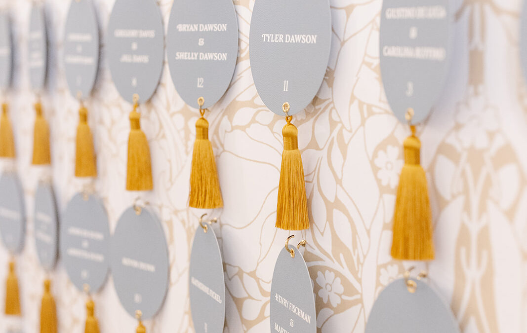
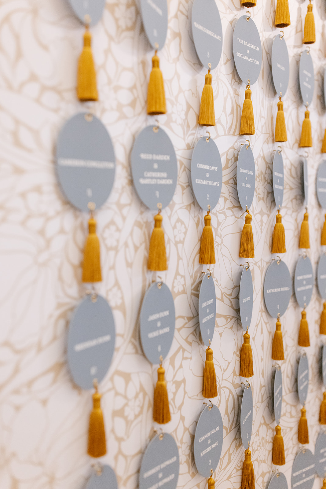
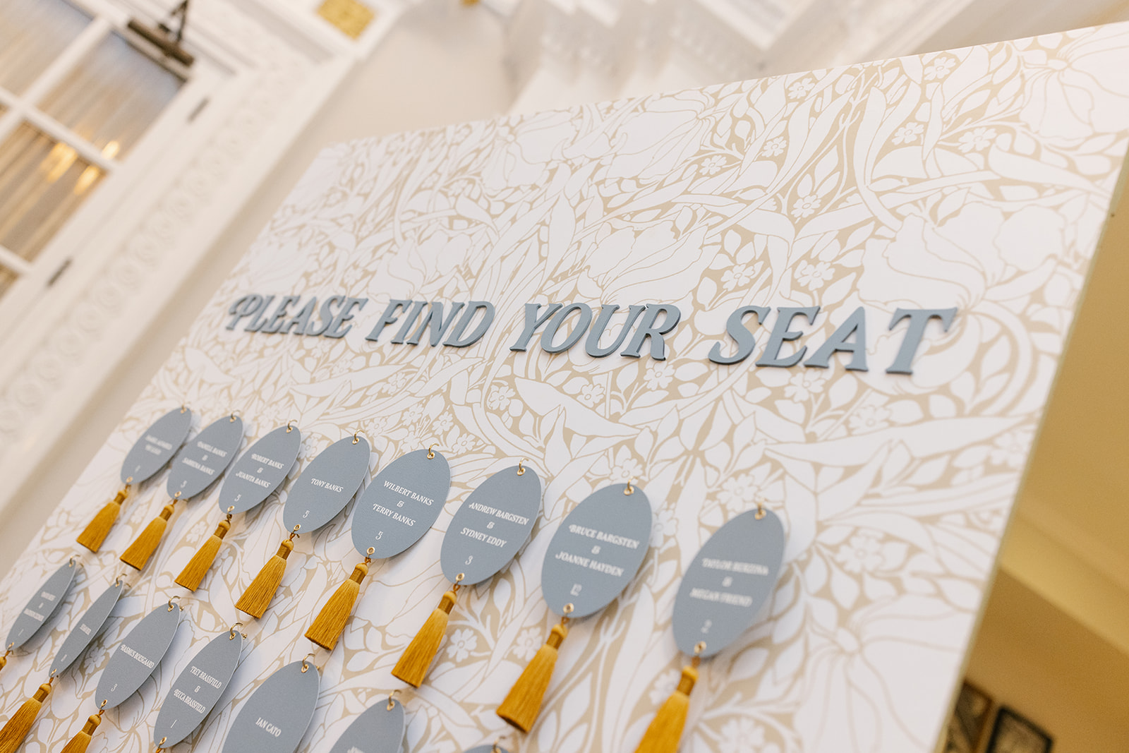
Our couples often use seating charts and escort wall displays as an opportunity to showcase their wedding day theme in a big way, and I am HERE for it!
Ashley and Austin trusted White Ink to create a custom wallpaper to serve as the backdrop for this one-of-a-kind escort wall display. We kept with the art nouveau theme by focusing on natural elements, like leaves and flowers with a soft brown and white. The oval escort cards were individually hooked to the display and boasted a thick yellow tassel to replicate a vintage hotel key. How cute are these?
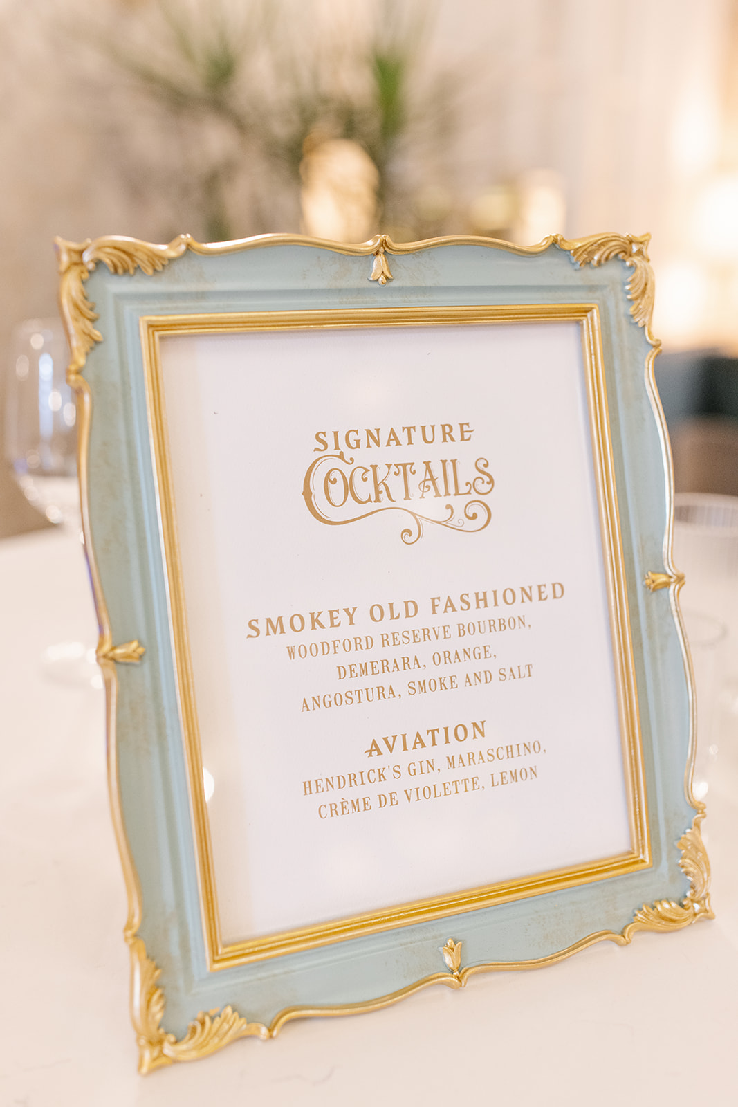
This stunning muted blue frame with gold ornamented trim was the perfect addition to our custom bar sign. It fit in with theme so seamlessly. The cocktail hour bar sign was a beautifully subtle addition to help carry the art nouveau theme by pulling in those soft hues and bold fonts.
Details like these are so much more than signs and menus, they provide a pivotal role in a carefully designed event. These little details leave a lasting impression and are something guests appreciate.
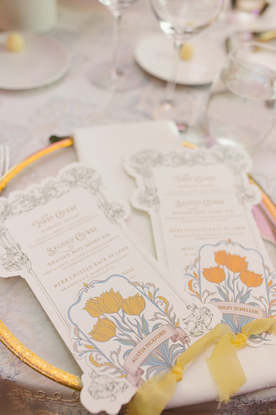
I could stare at these custom die-cut menus and place cards for hours. Guests enjoyed many day-of details that these little guys boasted. Much of the day’s style, colors, florals, and designs can be found right here in the artfully designed paper details.
A place card sat atop each menu, connected together with a soft, vintage, yellow chiffon ribbon. The same yellow ribbon could also be found on their invitation suite. I especially appreciated the functionality of the color-coded blooms on the place cards, which served as the meal indicator. Absolute perfection.
White Ink carried the vintage frame design from the invitation suite, rsvp, and detail cards to create Ashley and Austin’s table numbers. Table numbers don’t have to steal the spotlight in order to be a memorable part of a stunning tablescape.
The best way to tie in wedding theme details throughout the day is by pulling in designs just like this. Our couple also decided to use the vintage, wreath table number base from our extensive wedding rental collection. As you can see, it was the perfect choice!
Ashley and Austin came to White Ink with an elegant, vintage, art nouveau-inspired wedding vision. It was an honor to take on the task of bringing their vision to life. Taking in the approving whispers and smiles of the bridal party and guests is an unforgettable feeling. It is at the heart of why we do what we do. We love seeing the faces of our couples and their loved ones light up when they see their wedding dreams become a reality. We can’t wait to do it for you!
If you’re looking to add custom, thoughtful touches to your wedding or event, we would love to help make your vision a reality. Reach out today to learn more about our full-service design offerings—we can’t wait to create something unforgettable for you!
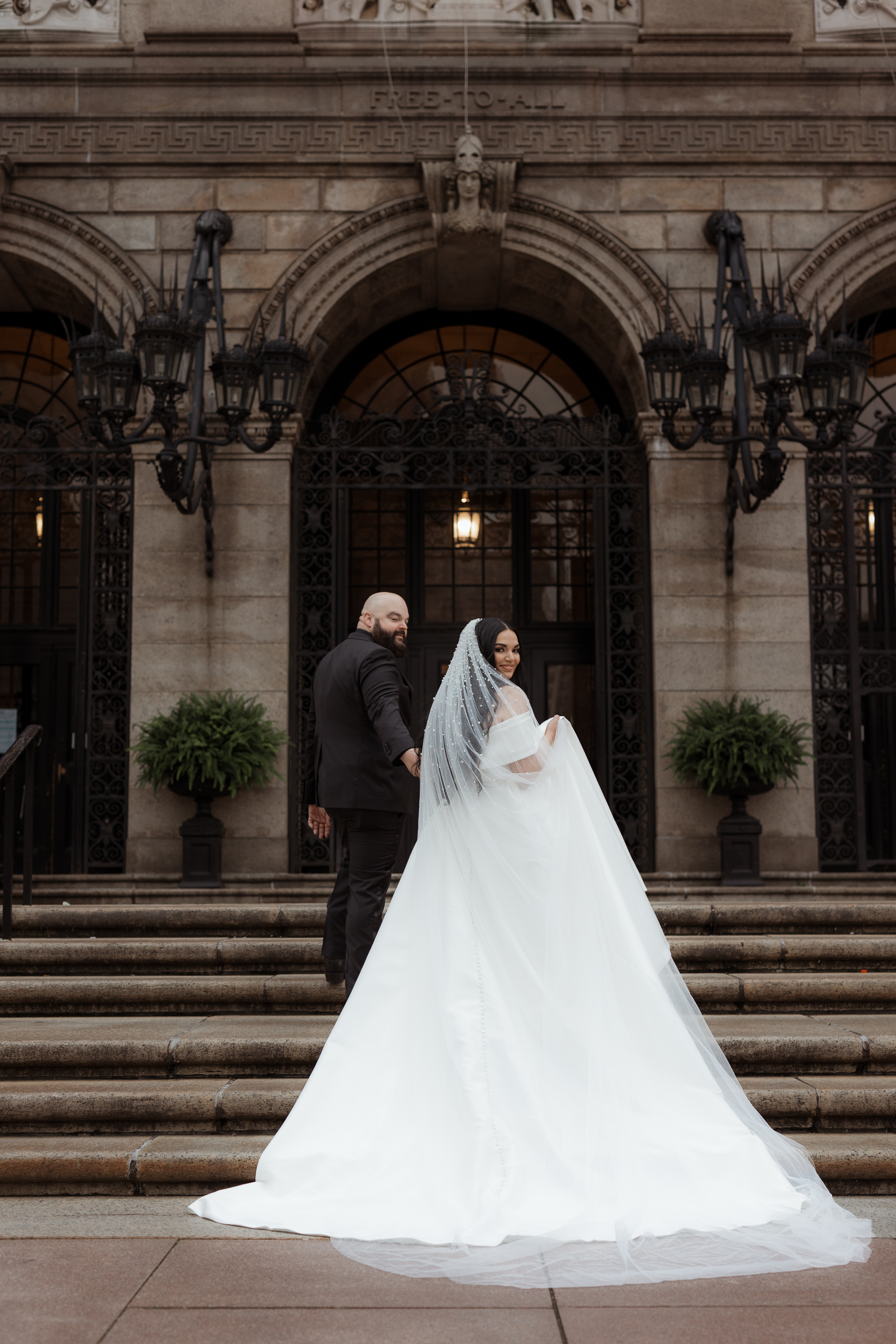
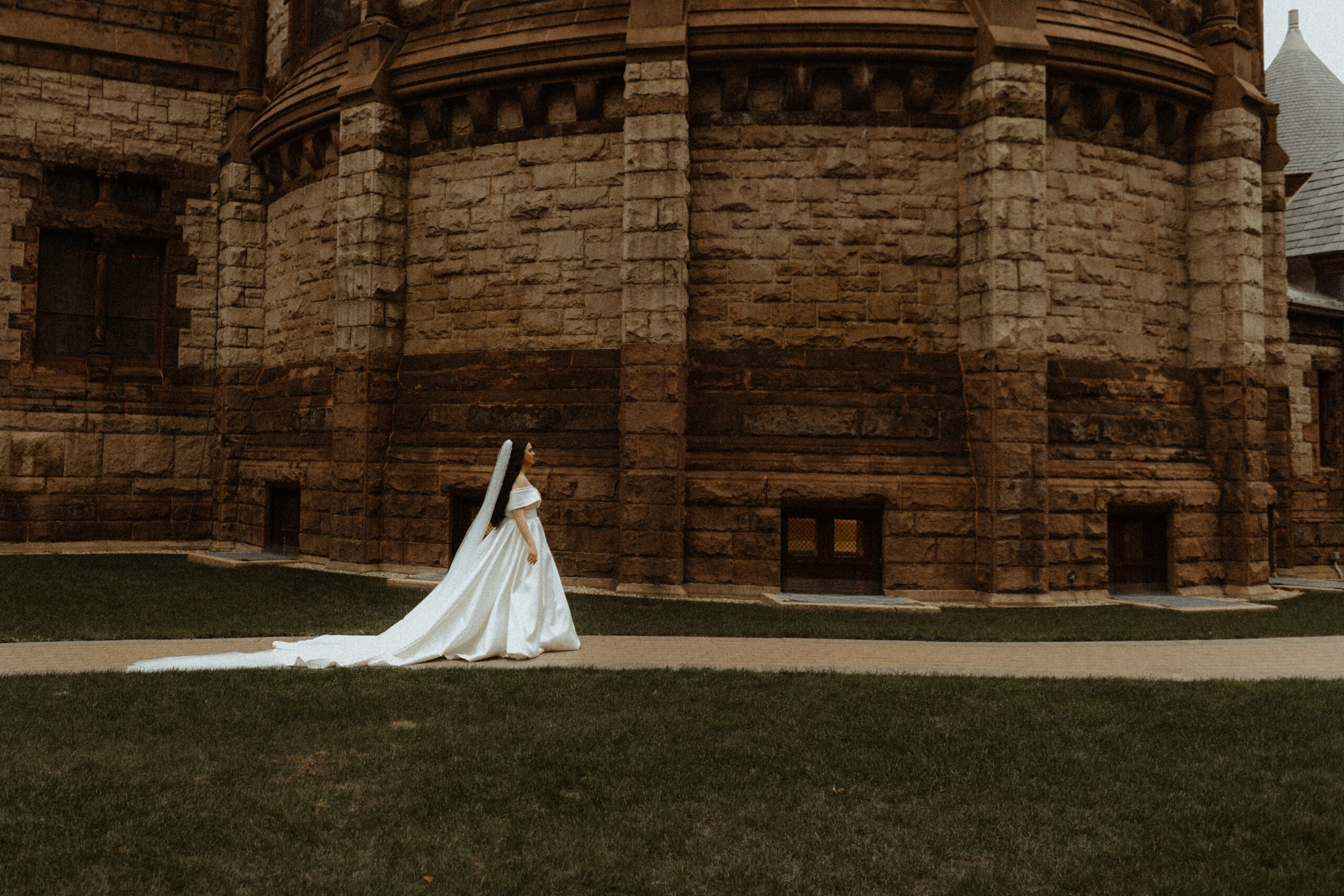
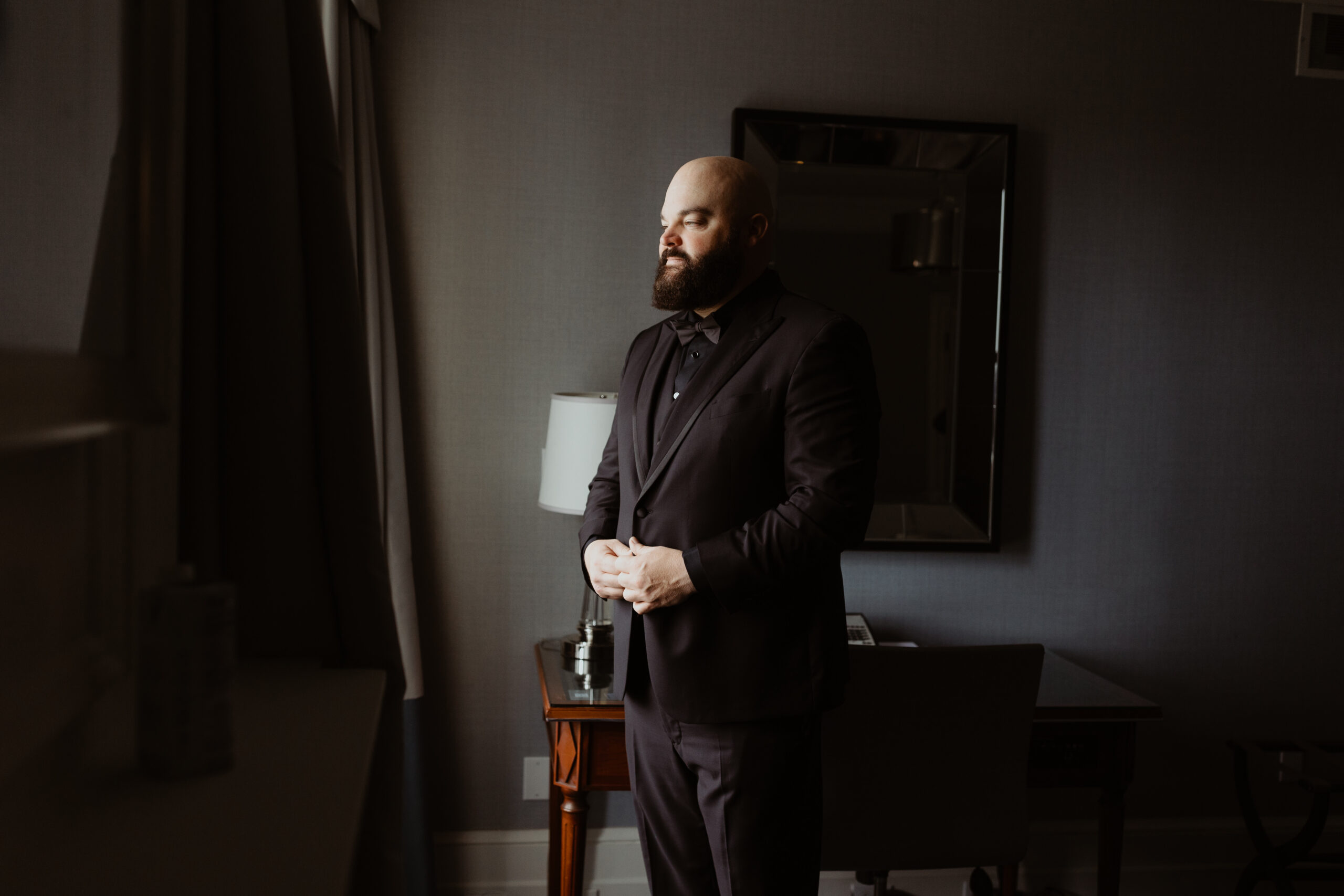
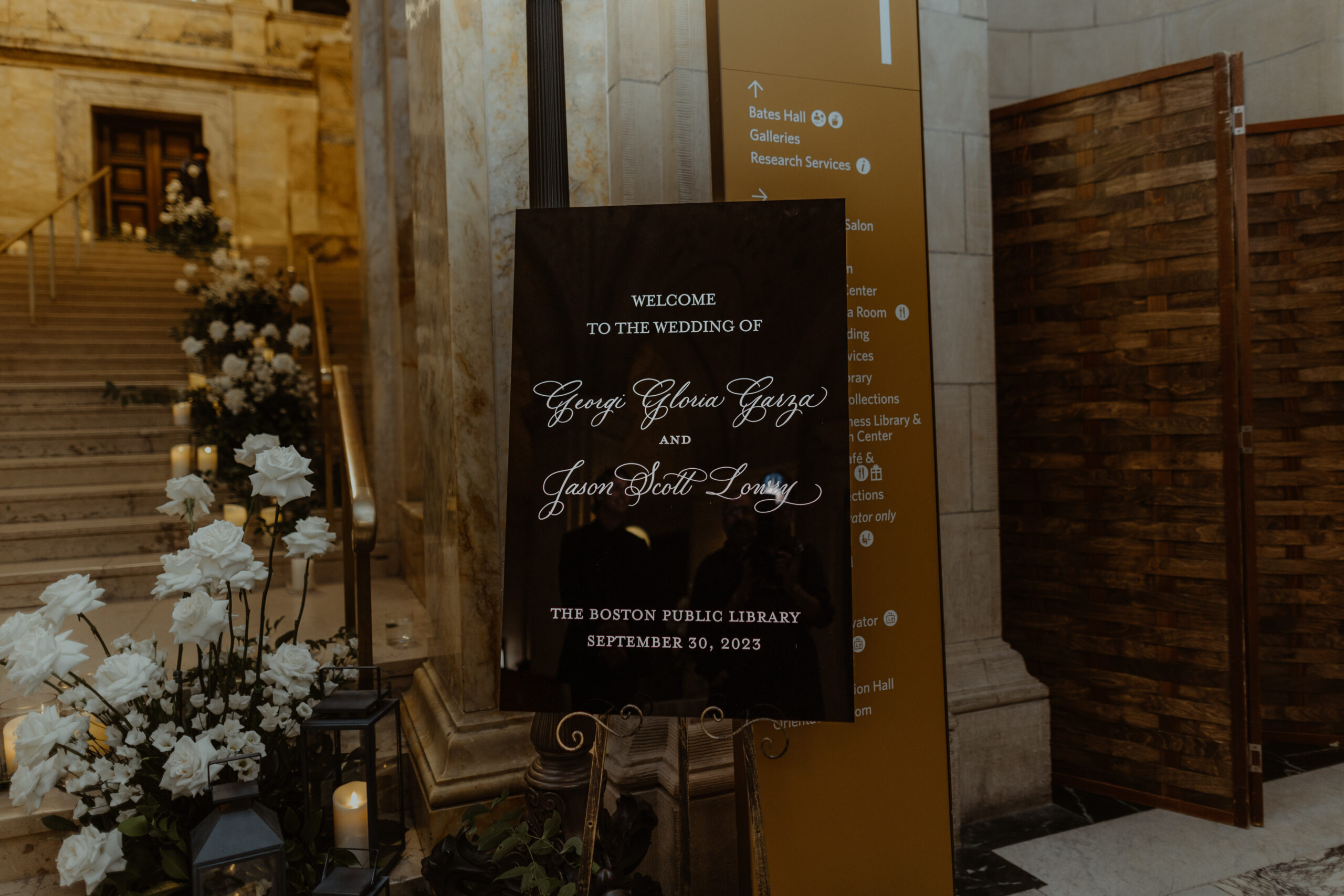
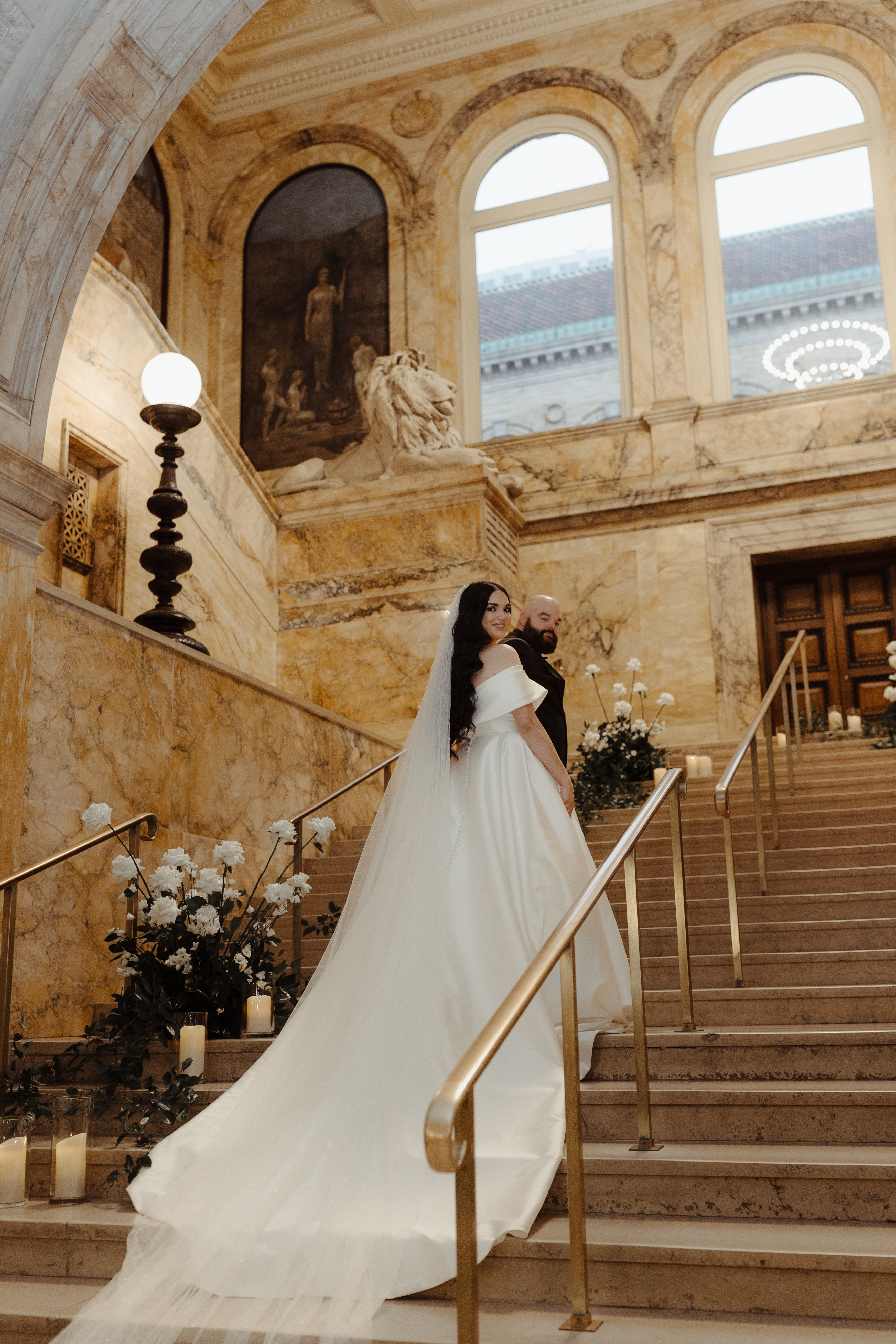
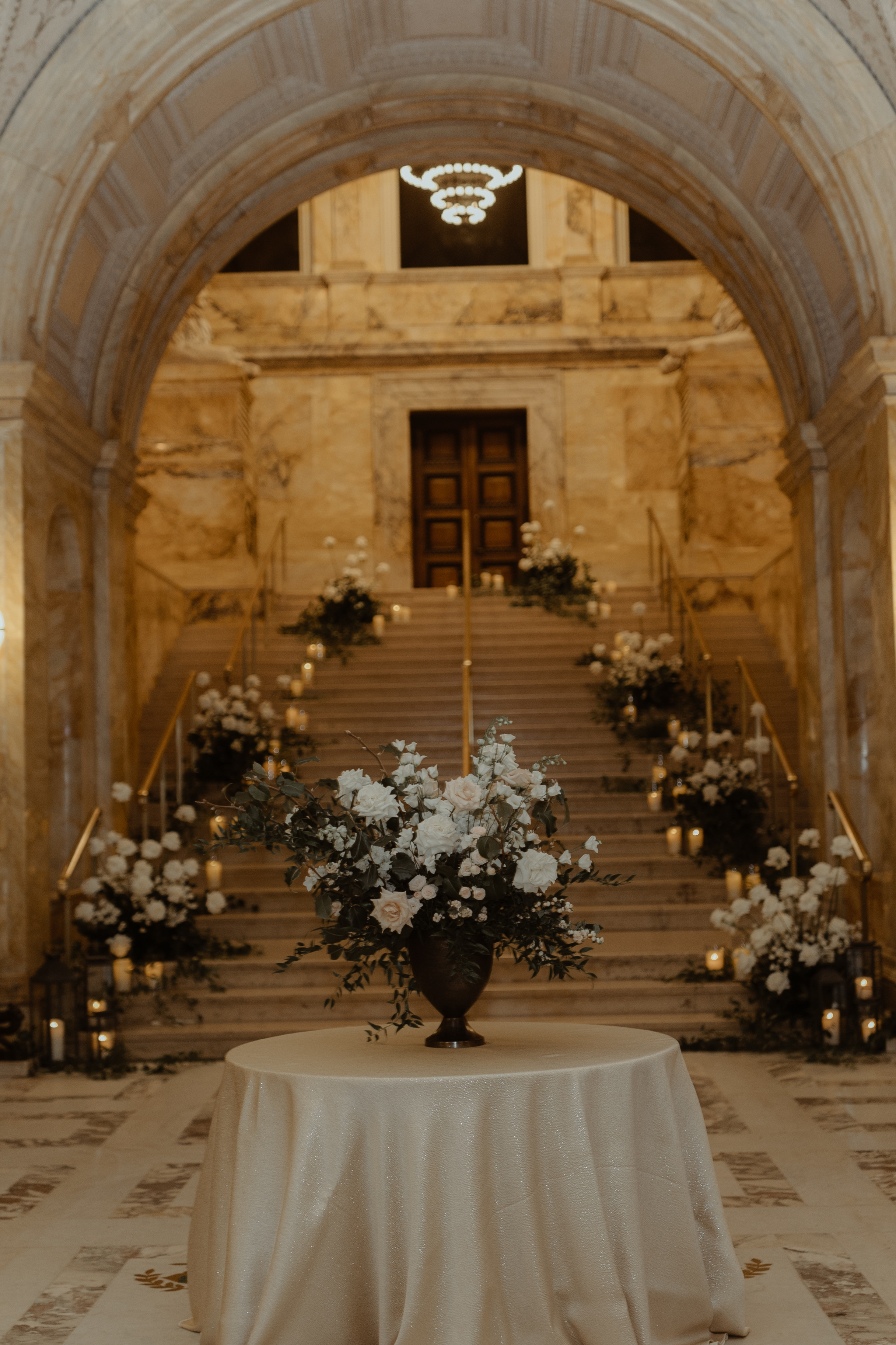
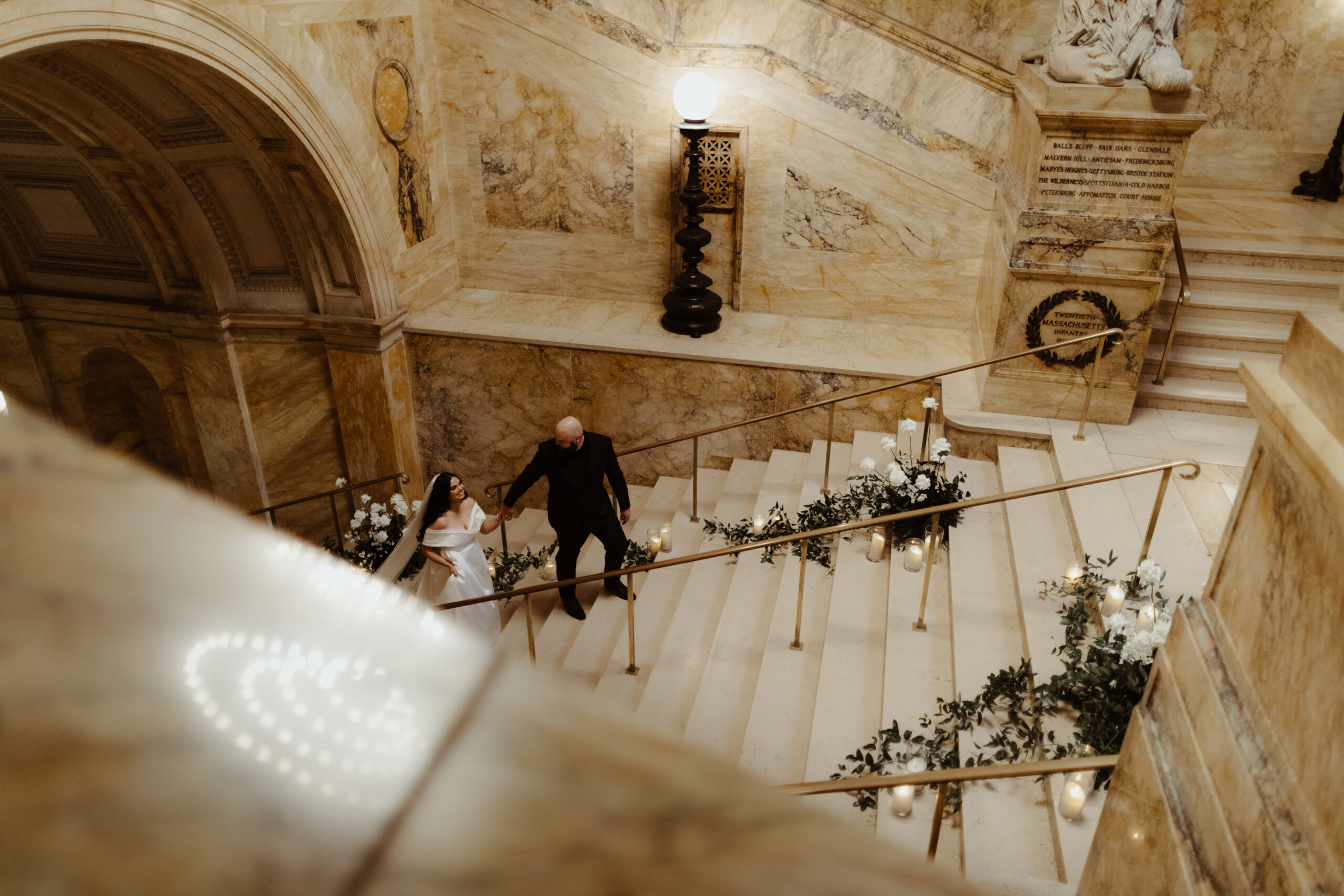
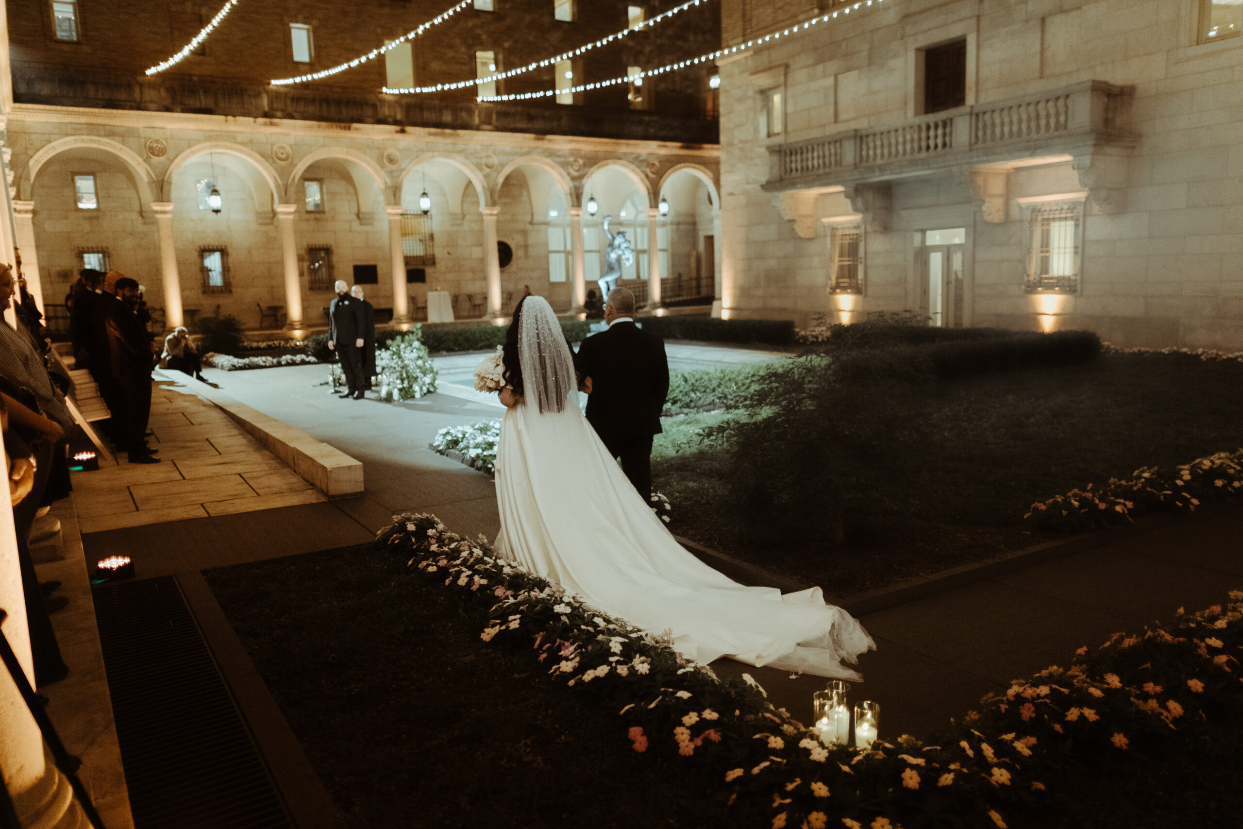
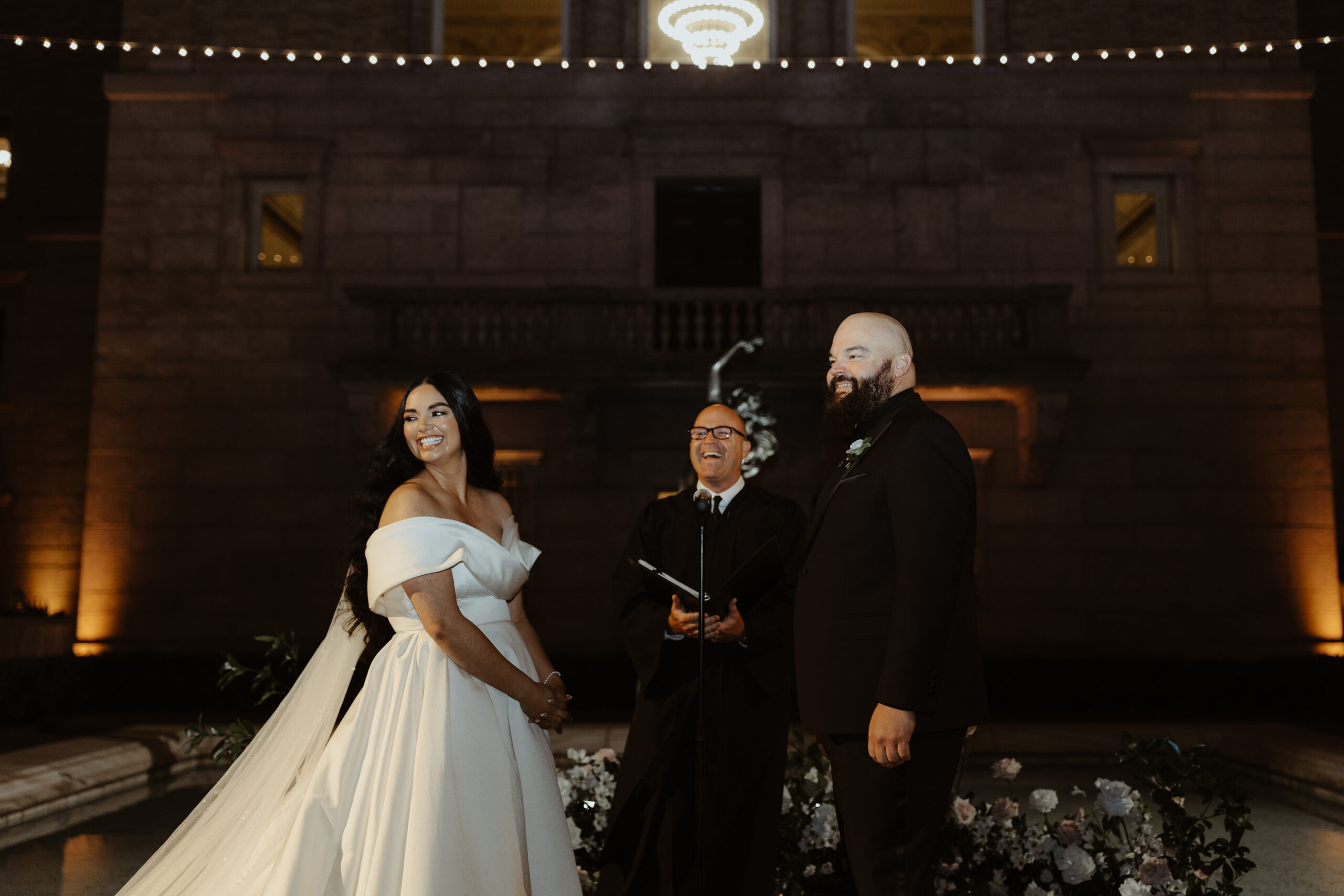
The September sky gave way to one of the most gorgeous and memorable weddings we’ve put our touch on, and it couldn’t have happened to a sweeter couple. Witnessing their Boston Public Library wedding day unfold was the cherry on top! Georgi and Jason put together an amazing wedding, and as thrilled as we were to be a part of it all, we hated to see the day come to an end. Couples like this, and weddings like this one, are something we keep close to our hearts.
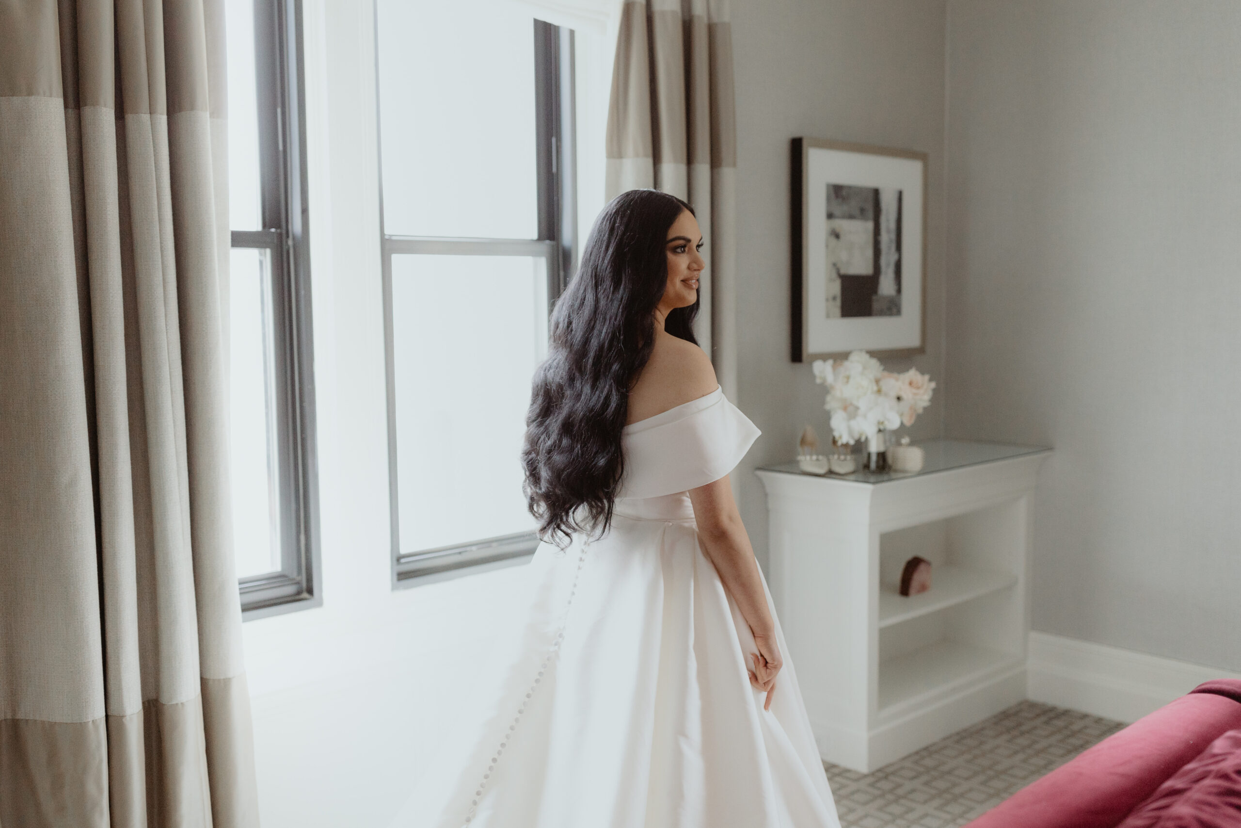
The detail that I just can’t get over- the veil! Georgi’s veil alone was enough to stop us in our tracks. Draped gently behind her long dark hair, this stunning piece needed its own moment!
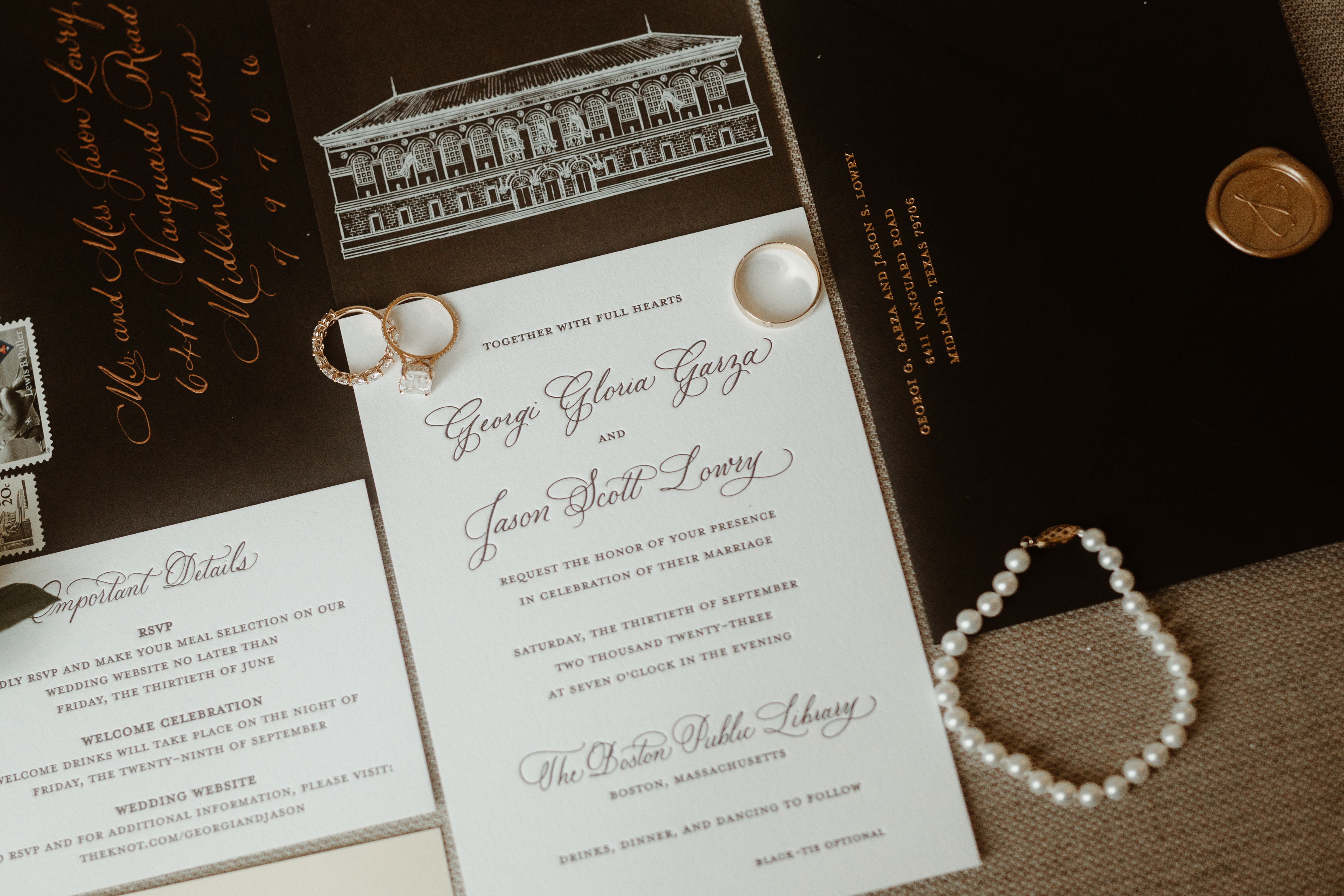
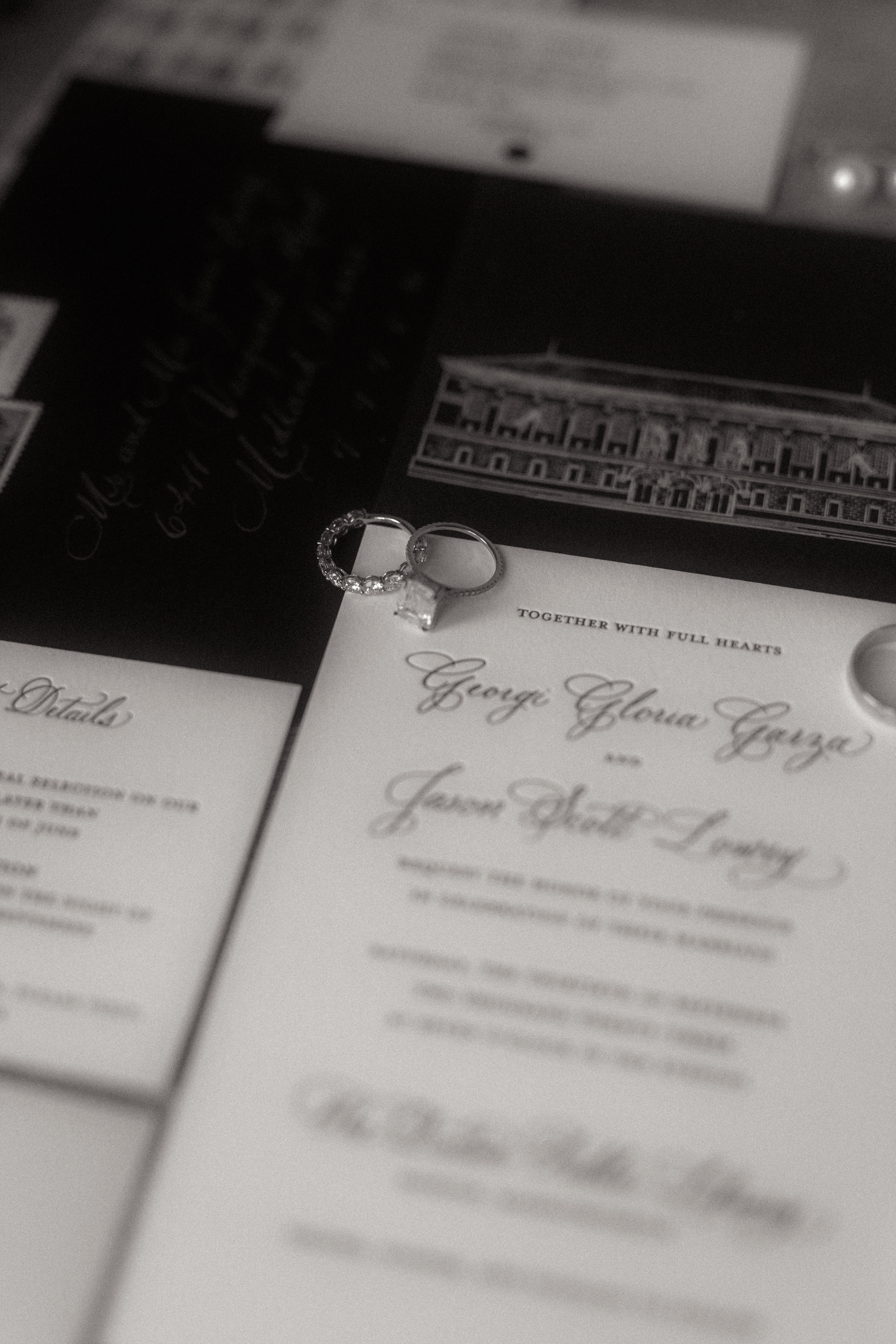
Boston Public Library Wedding Details
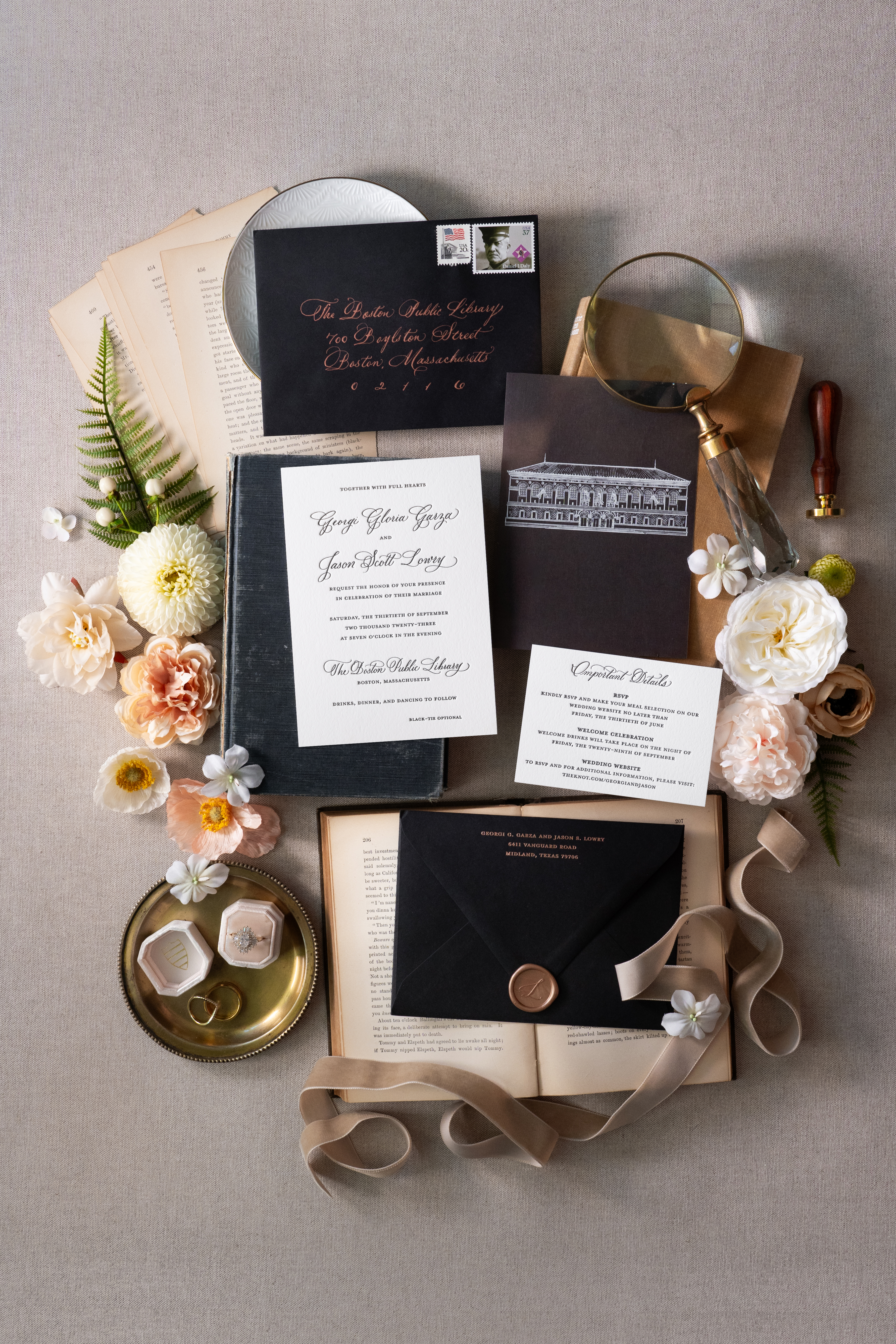
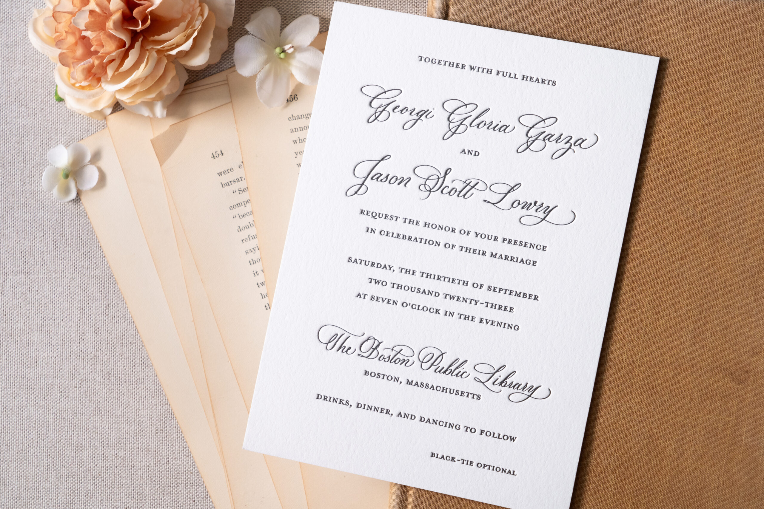
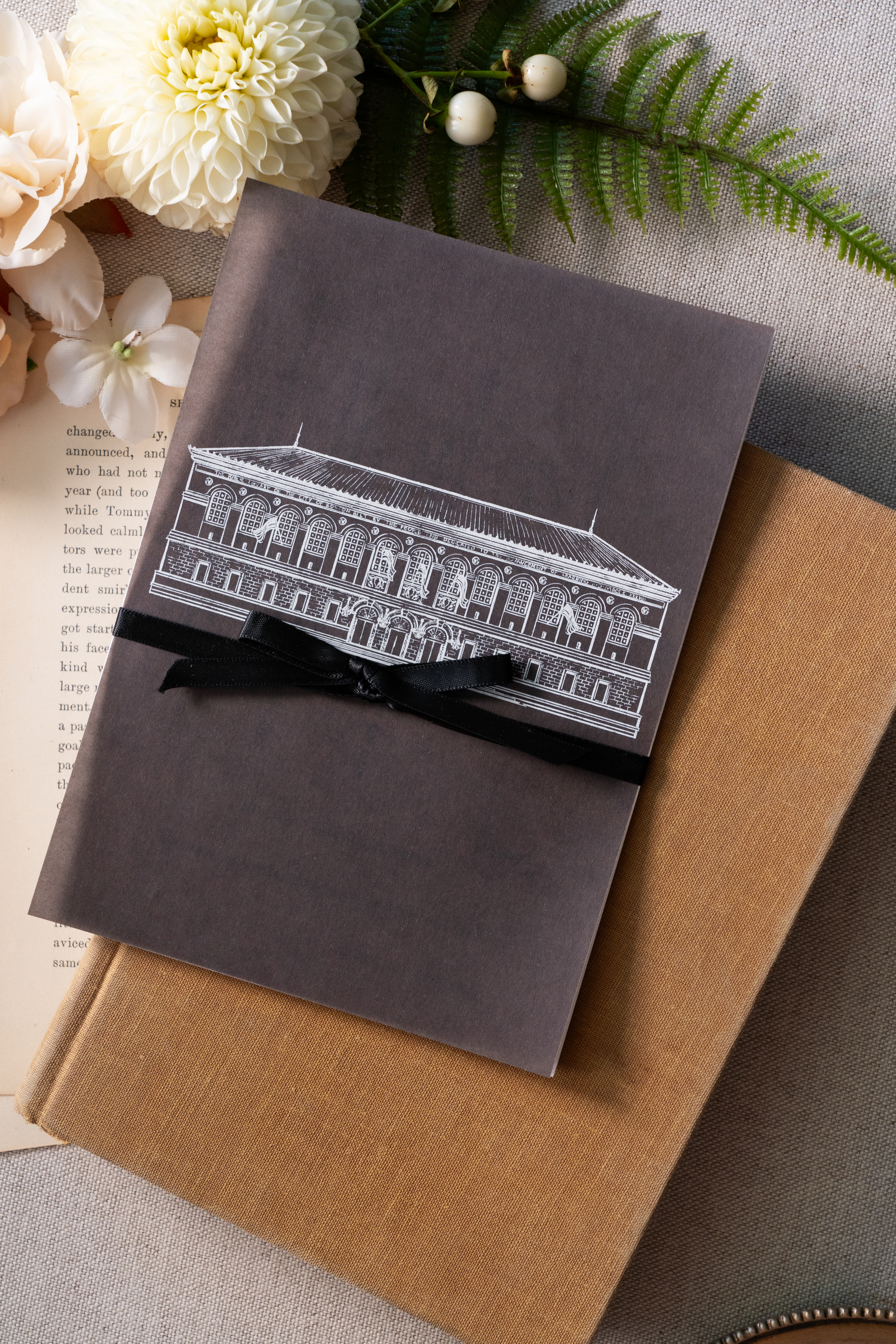
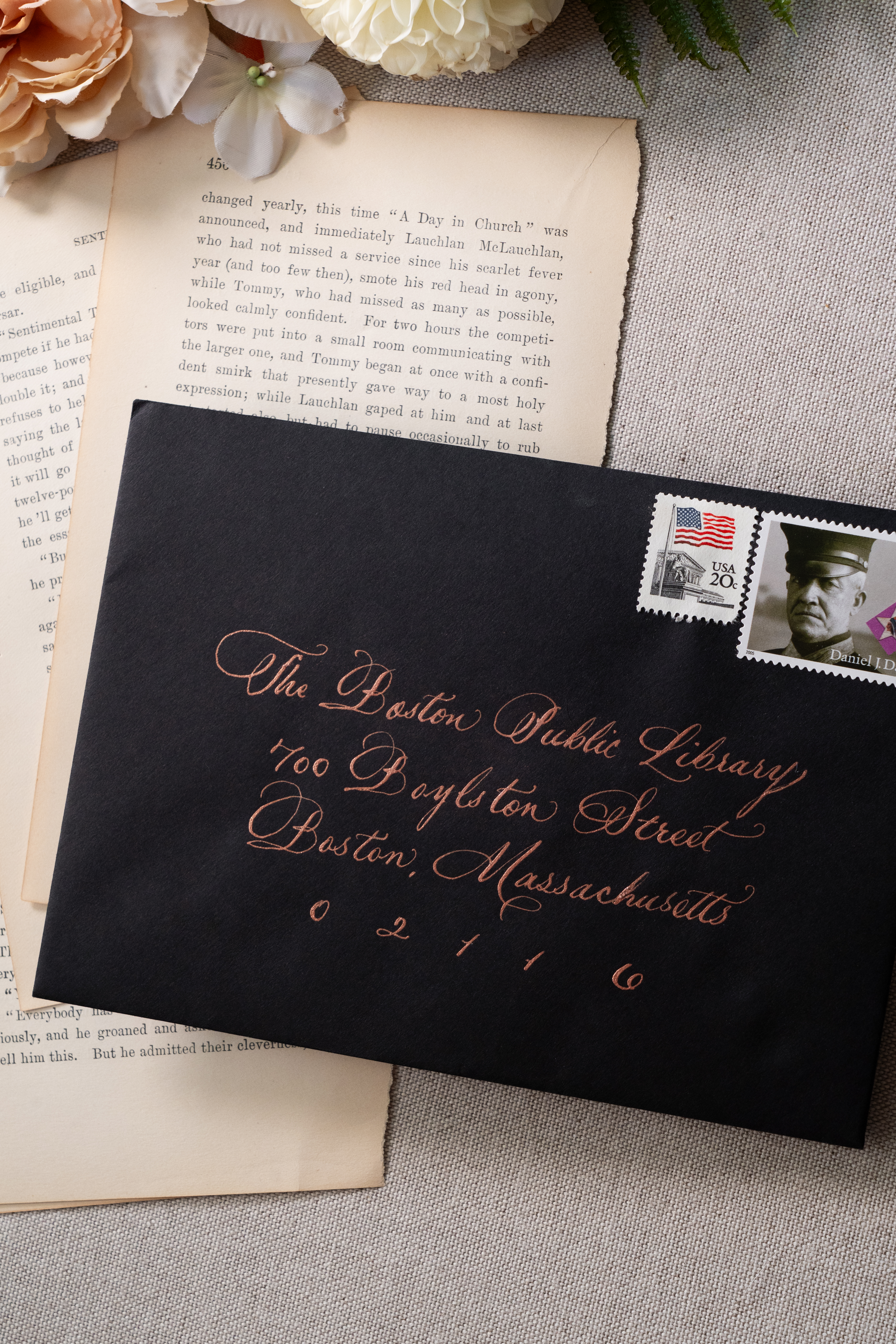
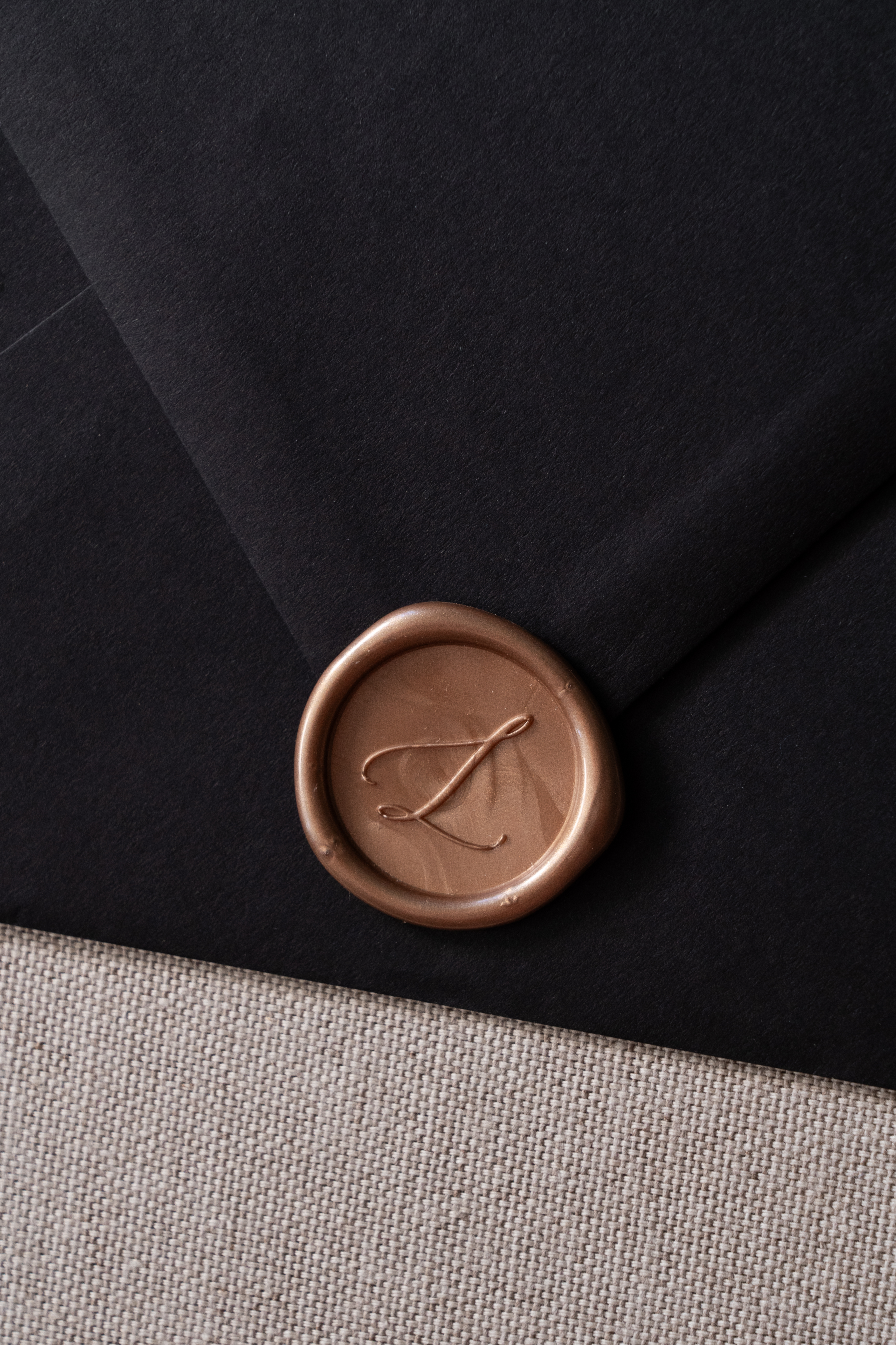
Georgi and Jason’s invitation suite boasted a seamless balance of delicate and bold features. Full calligraphy done in rose gold ink complimented the black envelopes beautifully. The invitation suite was letter-pressed with spot calligraphy on stock paper. A beautiful black, vellum overlay elevated the suite and included a custom sketch of the Boston Public Library! This was so much fun to create and one of my favorite details. Vintage postage and a custom rose gold wax seal completed this impeccable design.
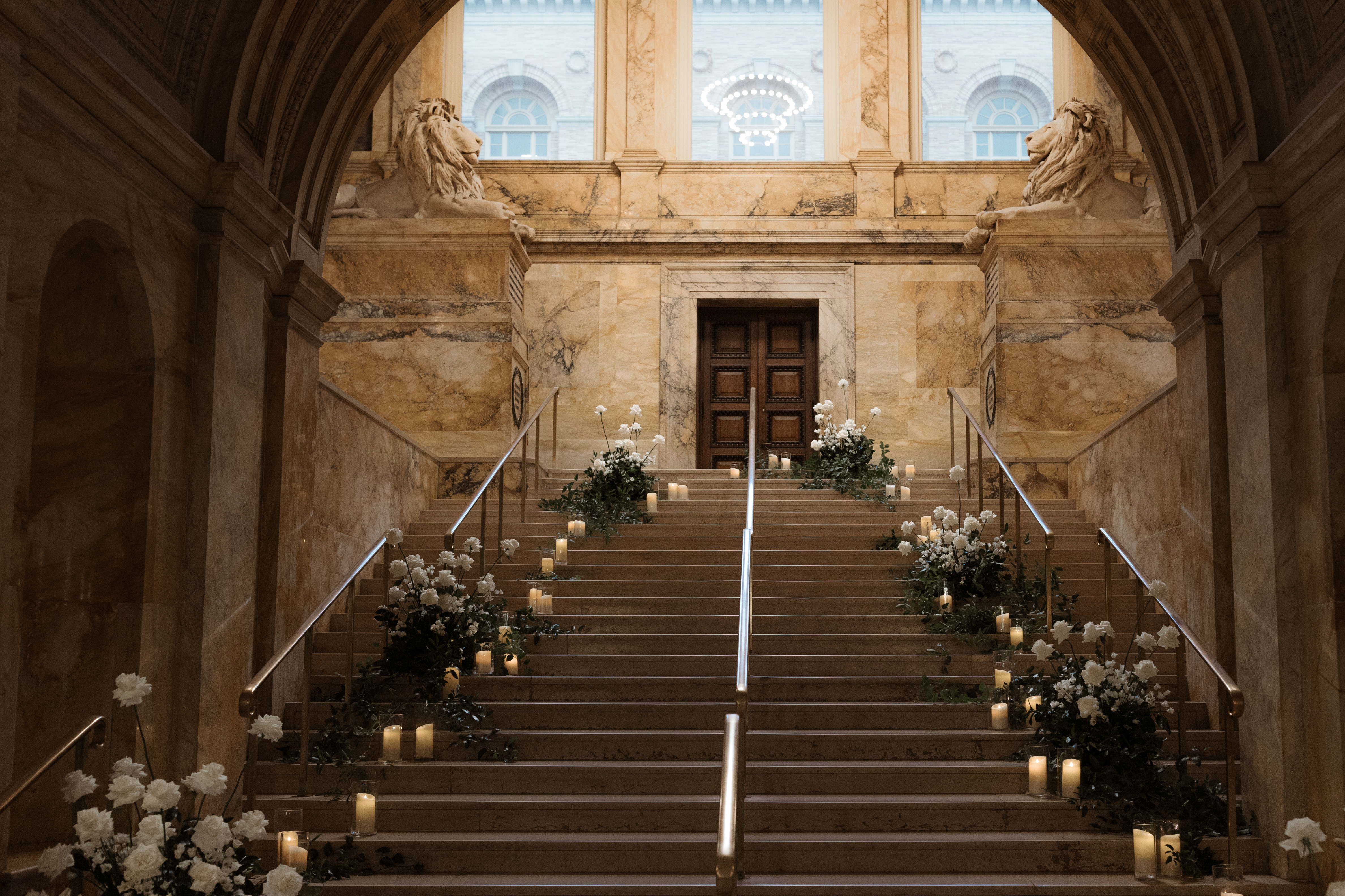
White Ink was honored to add to the breathtaking staircase entrance of this unforgettable venue. The sharp black wedding welcome sign topped with white lettering, stood out against an impressive array of florals and lit candles which demanded the attention of each guest as they passed by.
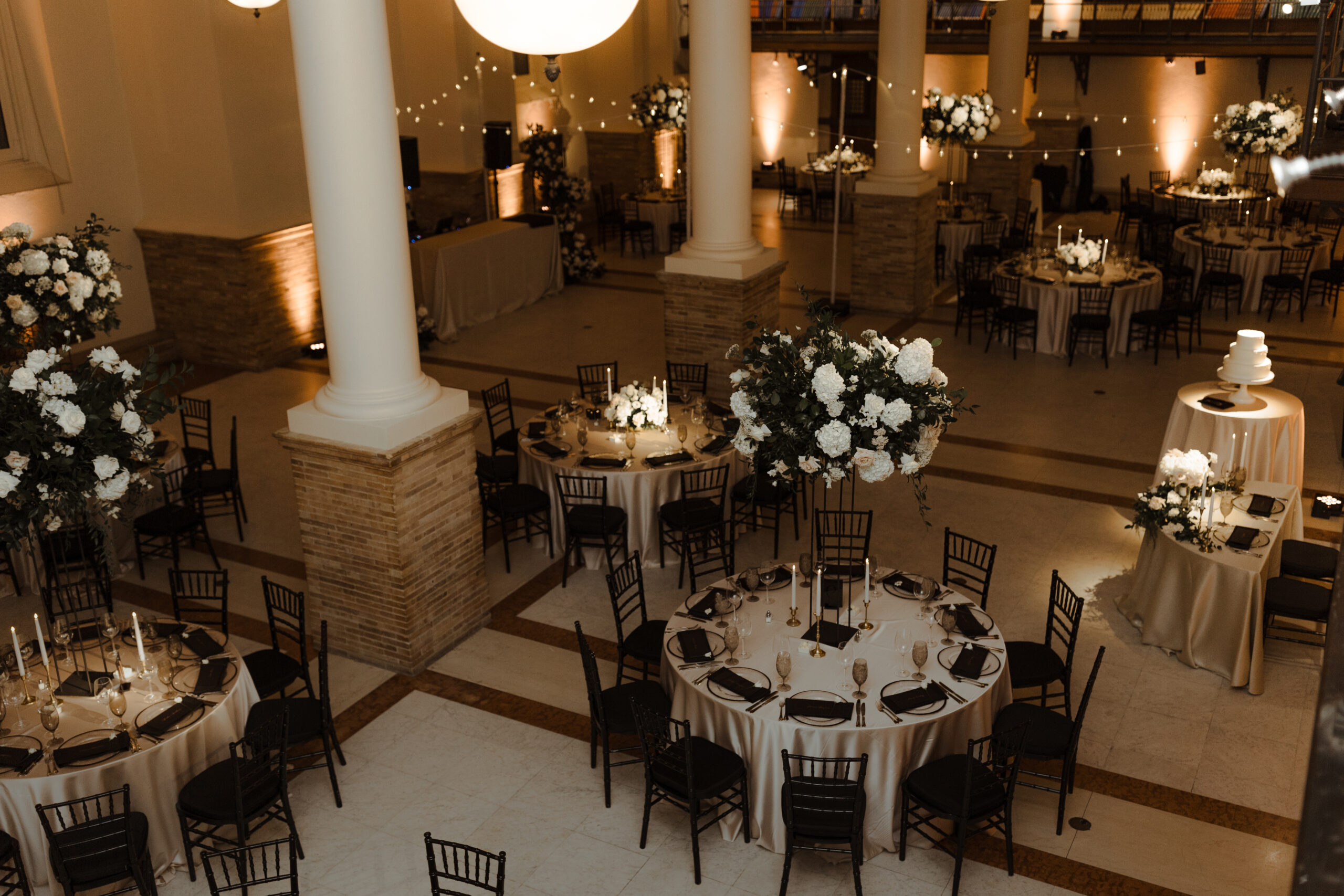
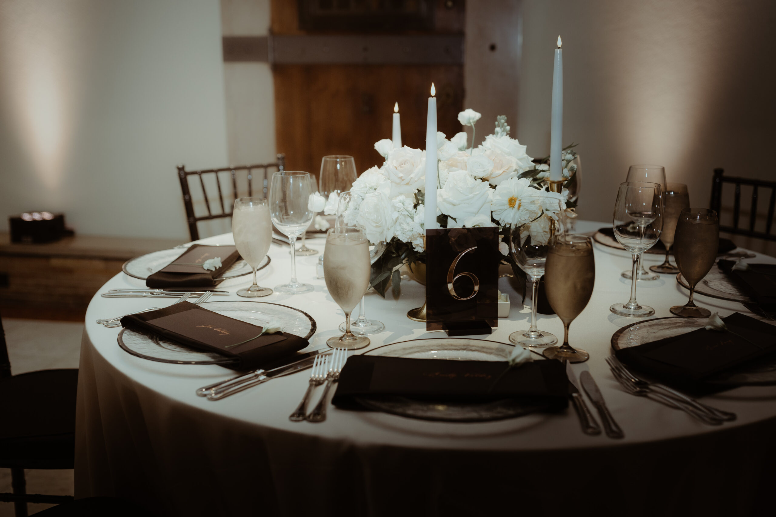
Elegant and Chic Reception Details
Just as Georgi and Jason’s invitation suite and wedding welcome sign harnessed a delicate boldness, so did the table numbers which sat perfectly within the elevated tablescape for their reception. There are times when table signage takes an unassuming role among the tablescape, but then there are moments when table signs play an important part in grabbing the guest’s attention. These sharp lines and block signage with gold numbers set against the soft florals and candles and white linen offered a uniquely formal taste and modern, chic appearance to the 170-year-old venue. A detail which was beautifully and purposefully done.
We love our Nashville couples, that’s no secret. However, the opportunity to meet our couples where they are is something we cherish. Finding ourselves at the Boston Public Library in the presence of Georgi and Jason along with their closest family and friends was an incredible moment. It was such an honor to have been a part of this incredible journey with the perfect couple. To Georgi and Jason, thanks for the memories that will last forever. Cheers!
If you’re looking to add custom, thoughtful touches to your wedding or event, we would love to help make your vision a reality. Reach out today to learn more about our full-service design offerings—we can’t wait to create something unforgettable for you!
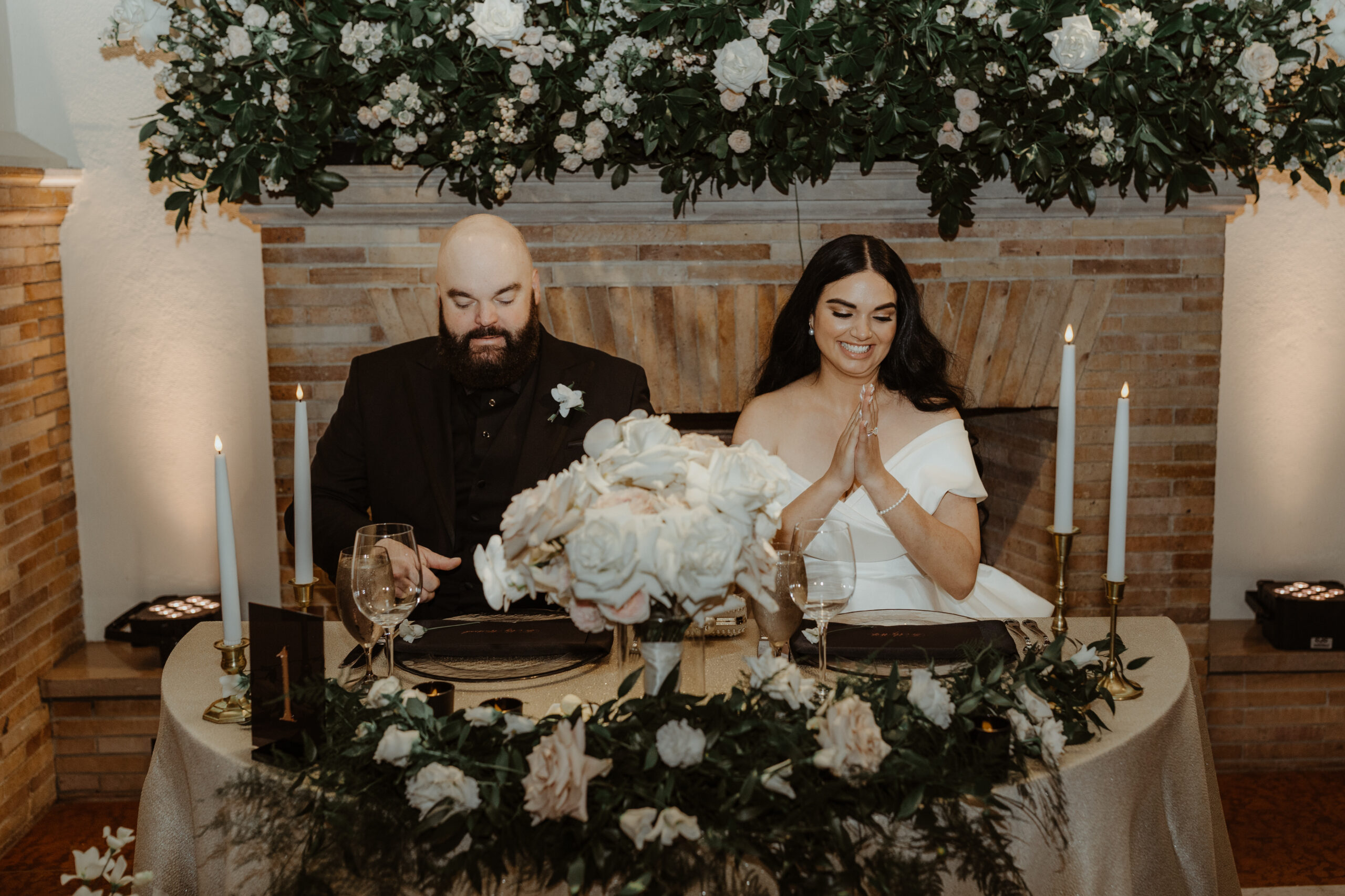
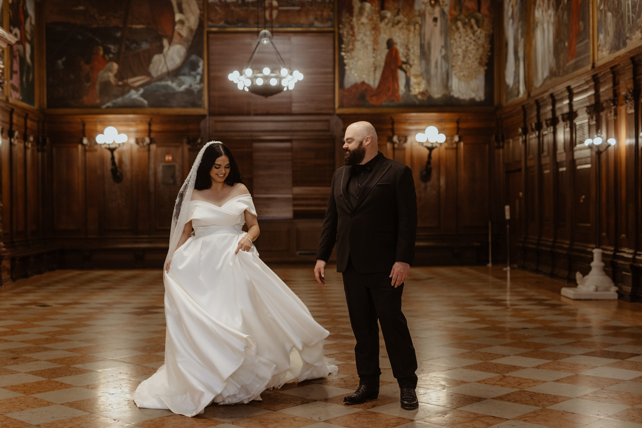
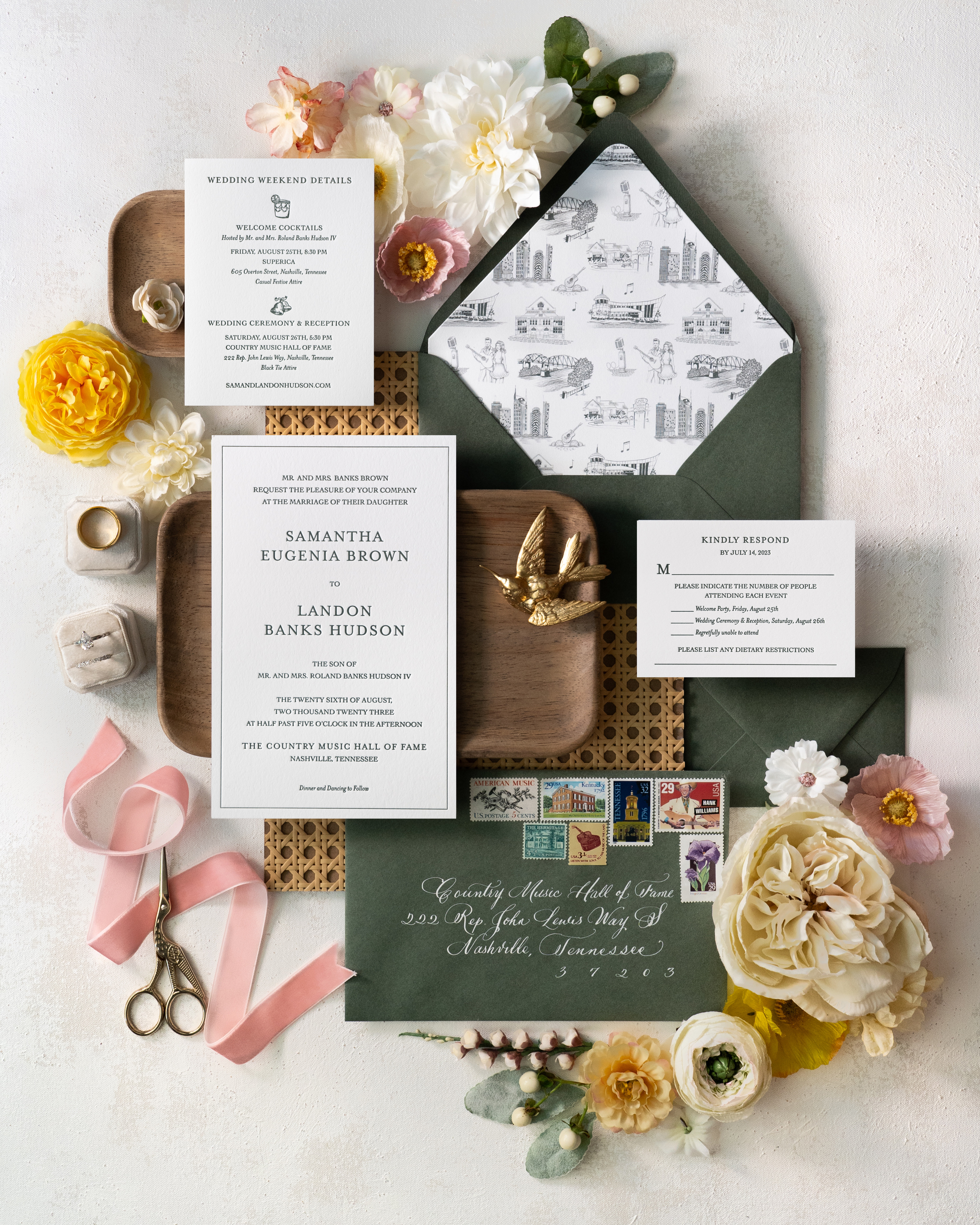
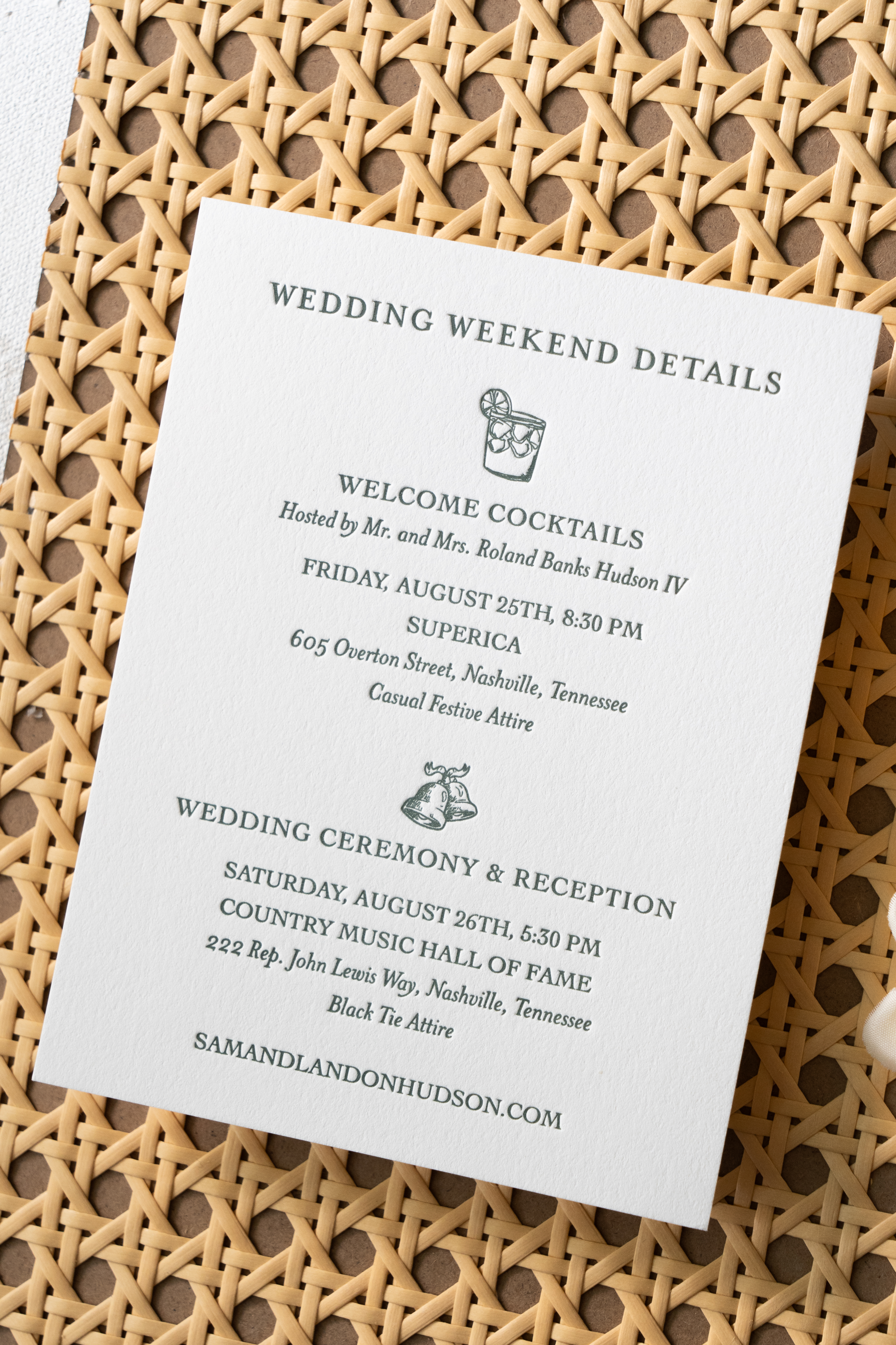
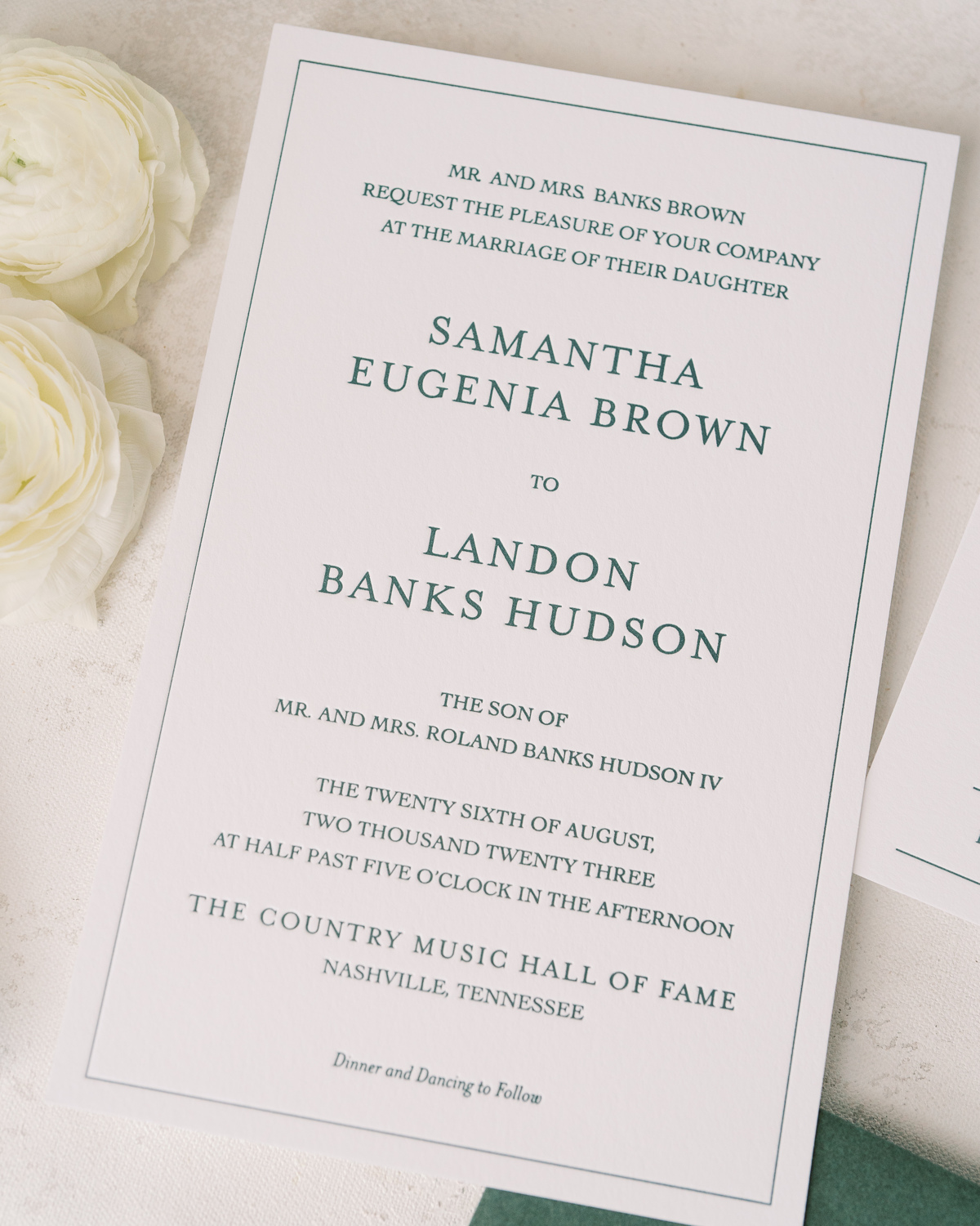
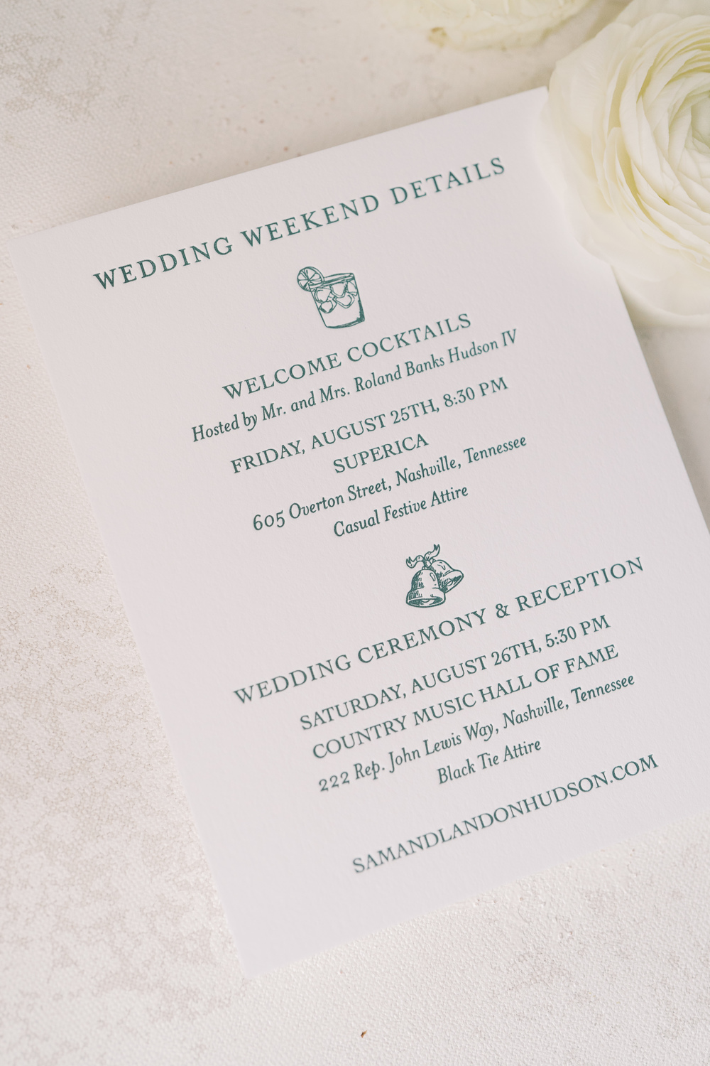
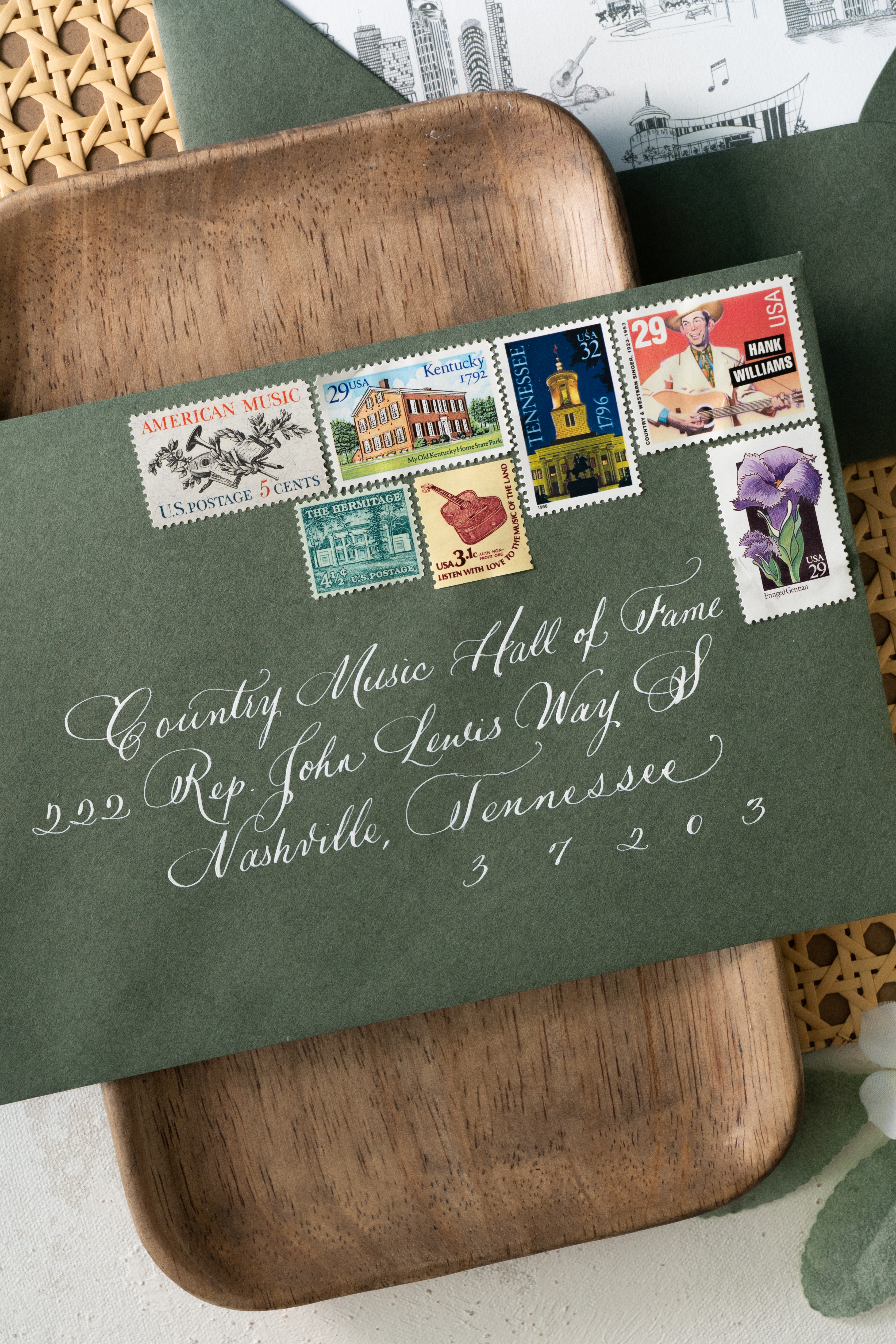
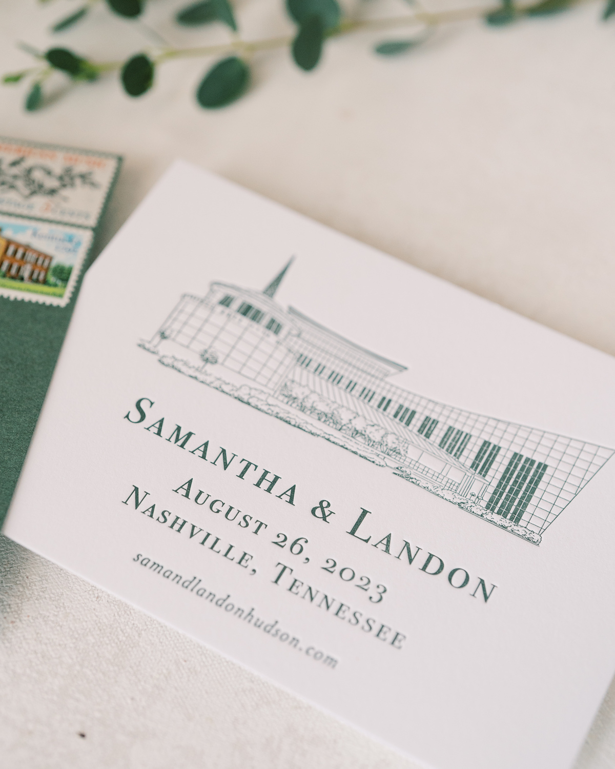
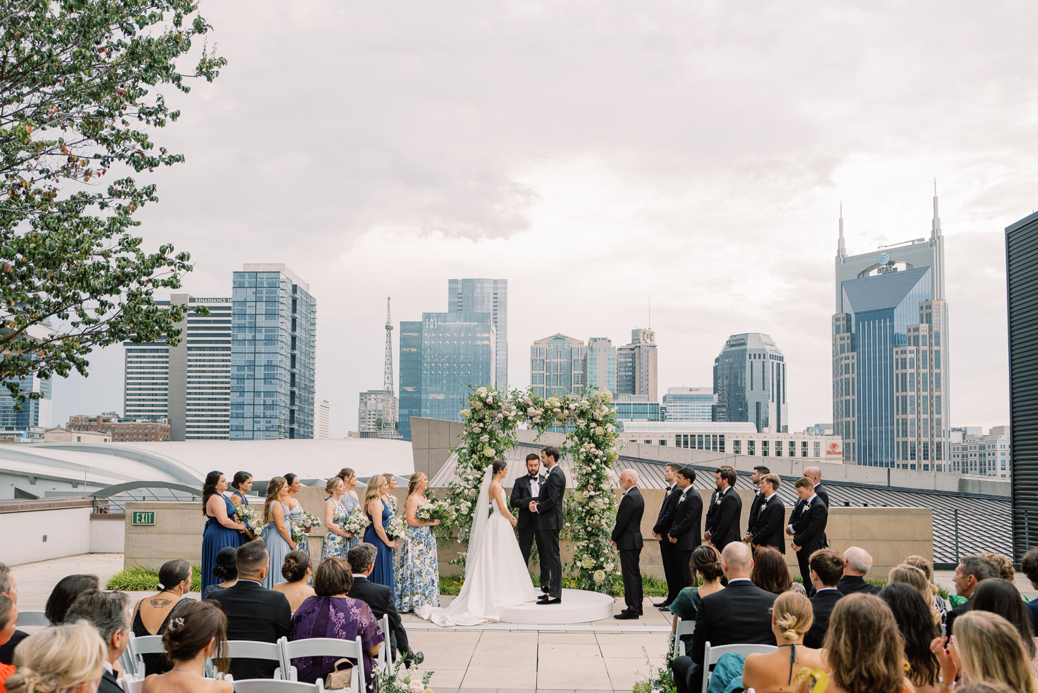
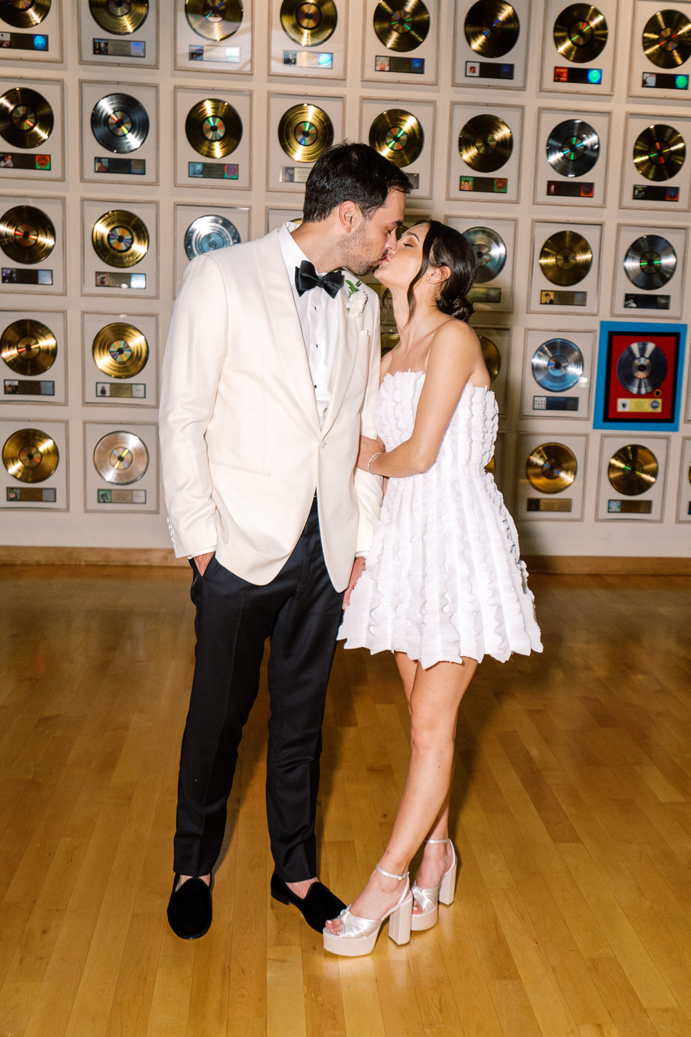
Sometimes, a client’s dream wedding turns into our dream wedding! The moment our sweet couple, Sam and Landon, asked White Ink to take part in elevating their Country Music Hall of Fame wedding details, I realized that this wedding was going to be incredibly memorable for our team. And indeed, it was! We had the honor of helping to showcase Sam and Landon’s style with purpose and authenticity by creating their custom Nashville wedding details.
For starters, our couple’s wedding suite embraced a style that was bold and uniquely “Nashville.” I love the sharpness of the invite, complete with a heavy stock, wedding paper and letter pressed font.
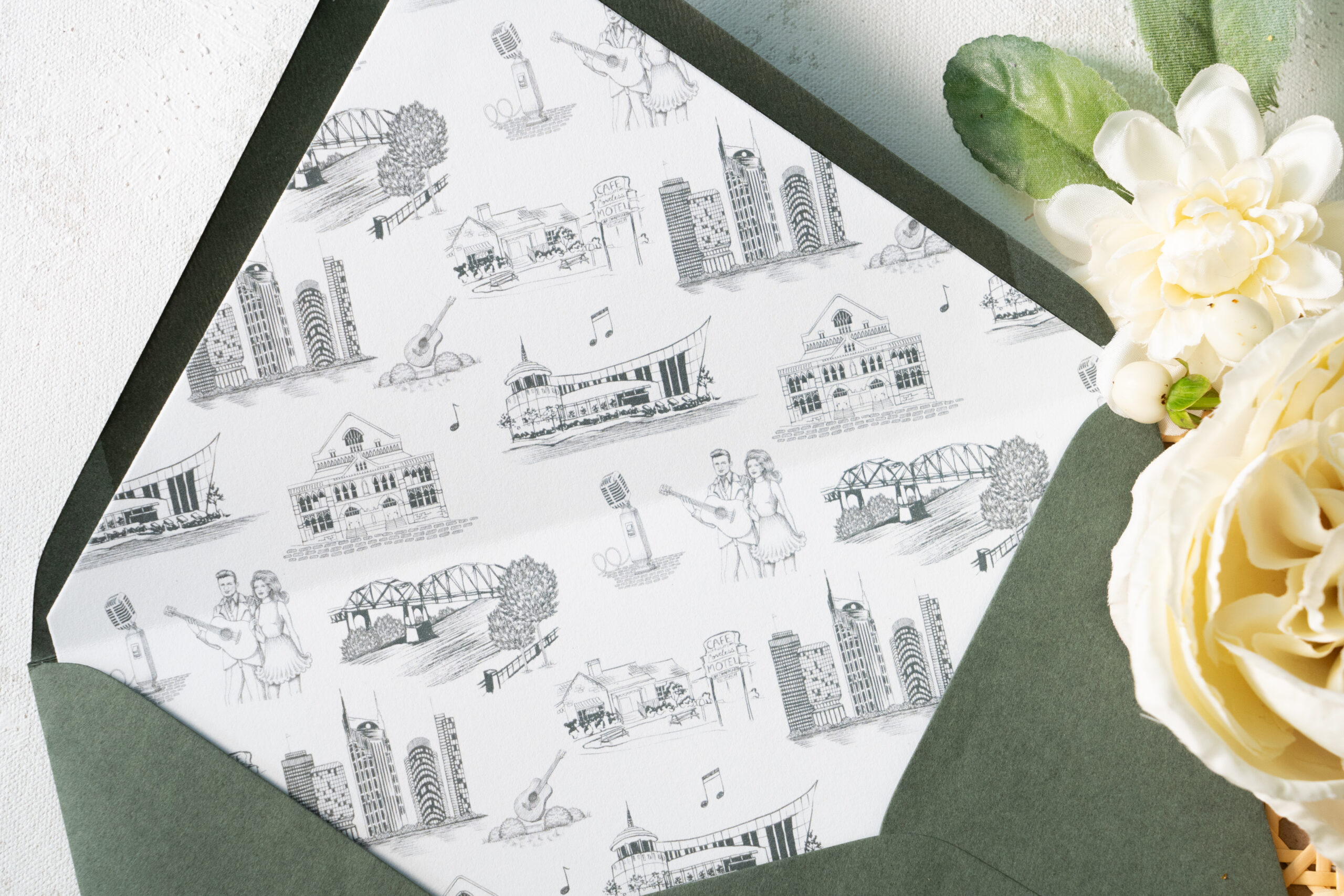
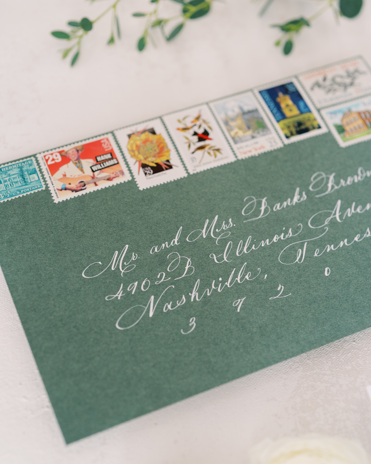
Take a moment to soak in the amazing work of the talented Katie Kime! She provided the custom artwork on the envelope liners which depict iconic Nashville favorites like Jonny and June, The Loveless Cafe, The Country Music Hall of Fame, and even the “Batman Building.” Details like this truly set the tone for your wedding guests and create a memorable experience. I just love this details!
Sam and Landon’s save-the-date boasted the same polished look as the invitation suite including the letter pressed font and print of the Country Music Hall of Fame. (Side note: I can never get enough of how beautiful the vintage postage is!)
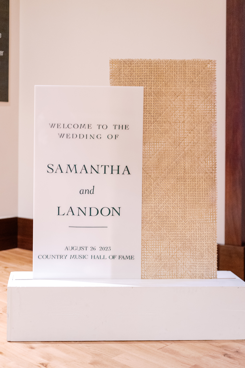
Wedding Welcome Sign and Program Details
This wedding welcome sign spoke volumes and was a complete showstopper. From the texture to the font to the overall framing of the display, this piece was impressive to say the least.
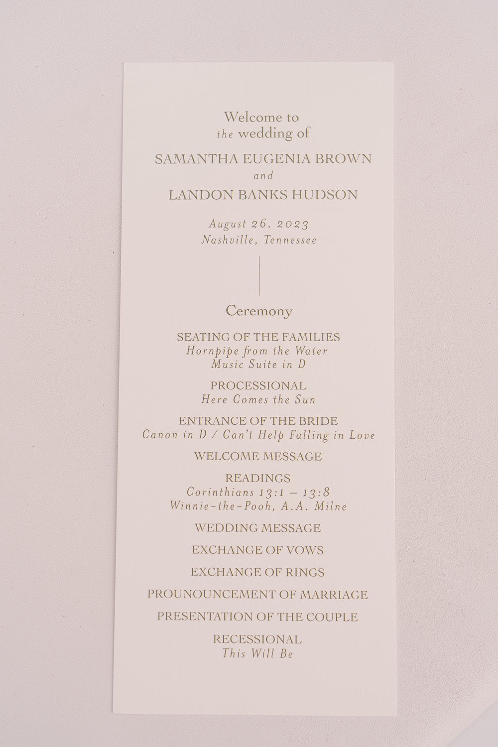
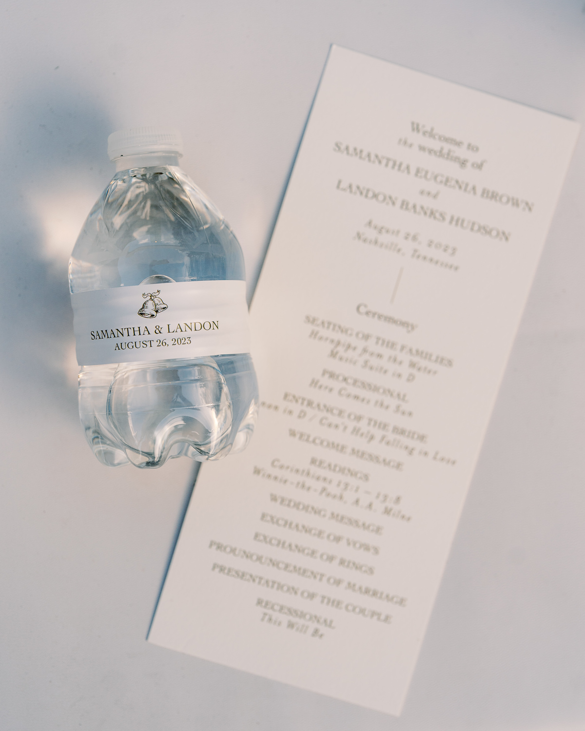
Simplicity goes a long way with these program details. A gentle font and color against a soft white paper was perfectly inviting for Sam and Landon’s guests. I love getting a peep of little details that are laced throughout the day like the cute little wedding bells on this custom water bottle. The same wedding bell print that we used for the wedding details card in the invitation suite.
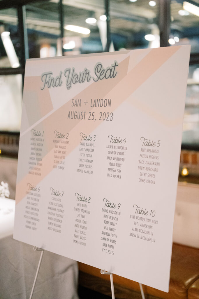
Elegant Seating Chart Display
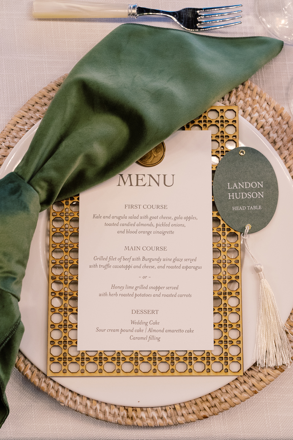
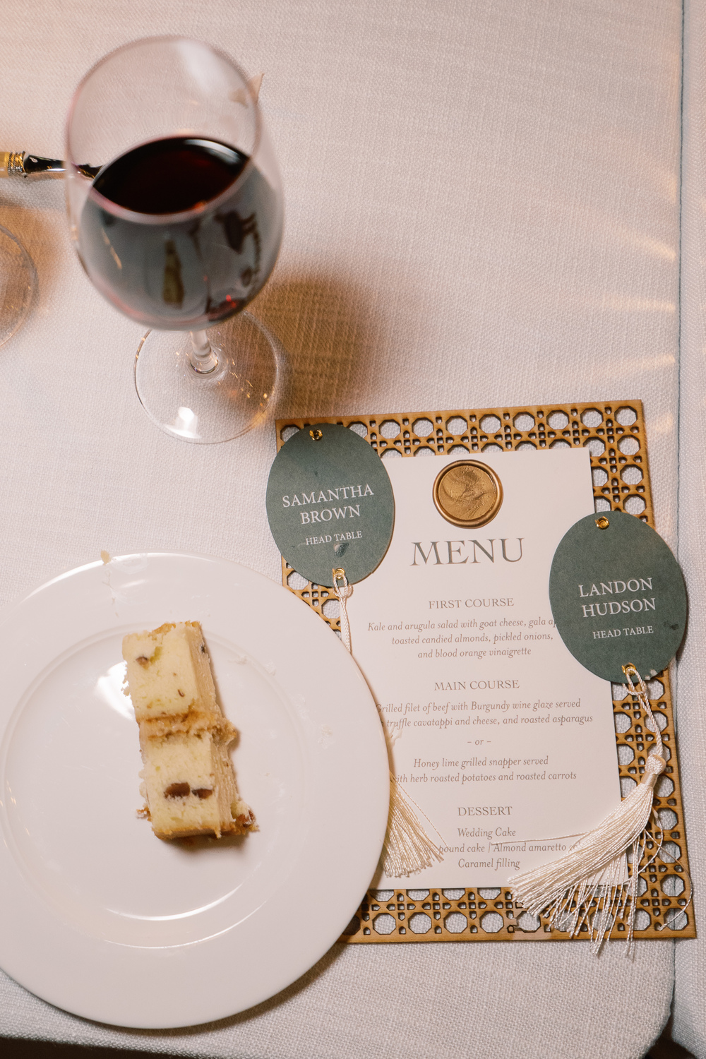
I am so happy to show off what my team created for Sam and Landon’s seating chart! Putting this seating chart wall together on site was an accomplishment. One that I adore! The sleek oval escort cards with hanging tassels were just so beautiful to see. This display wowed the guests and was yet another reflection of Sam and Landon’s elegant style.
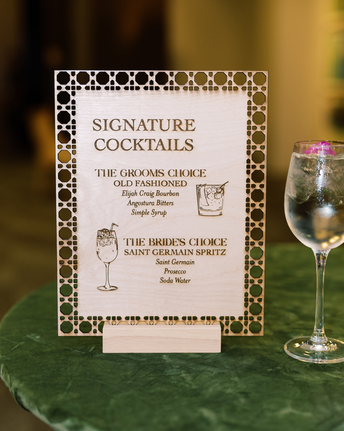
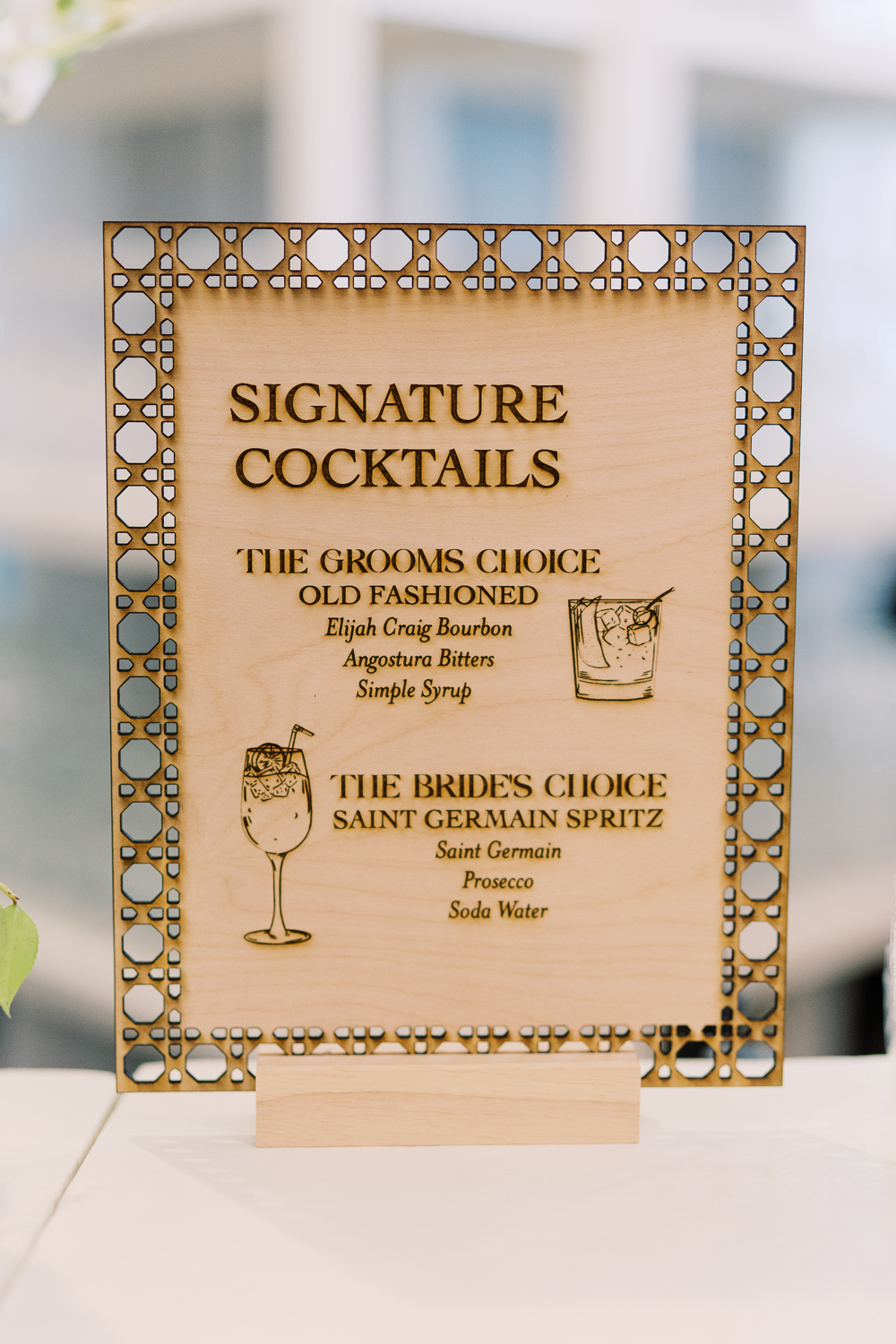
Custom Laser-Cut Signature Cocktail Signs
For cocktail hour, we rolled up our sleeves to do one of our favorite things: custom laser-cuts! We designed several table signs to add to the uniqueness of our couple’s unforgettable day. I love how this turned out and how well it fit into the style of the entire event.
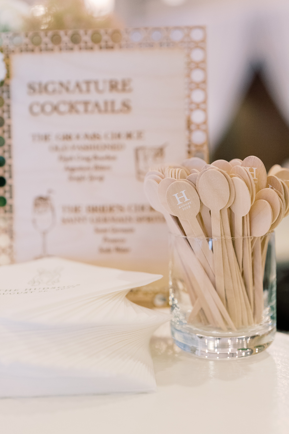
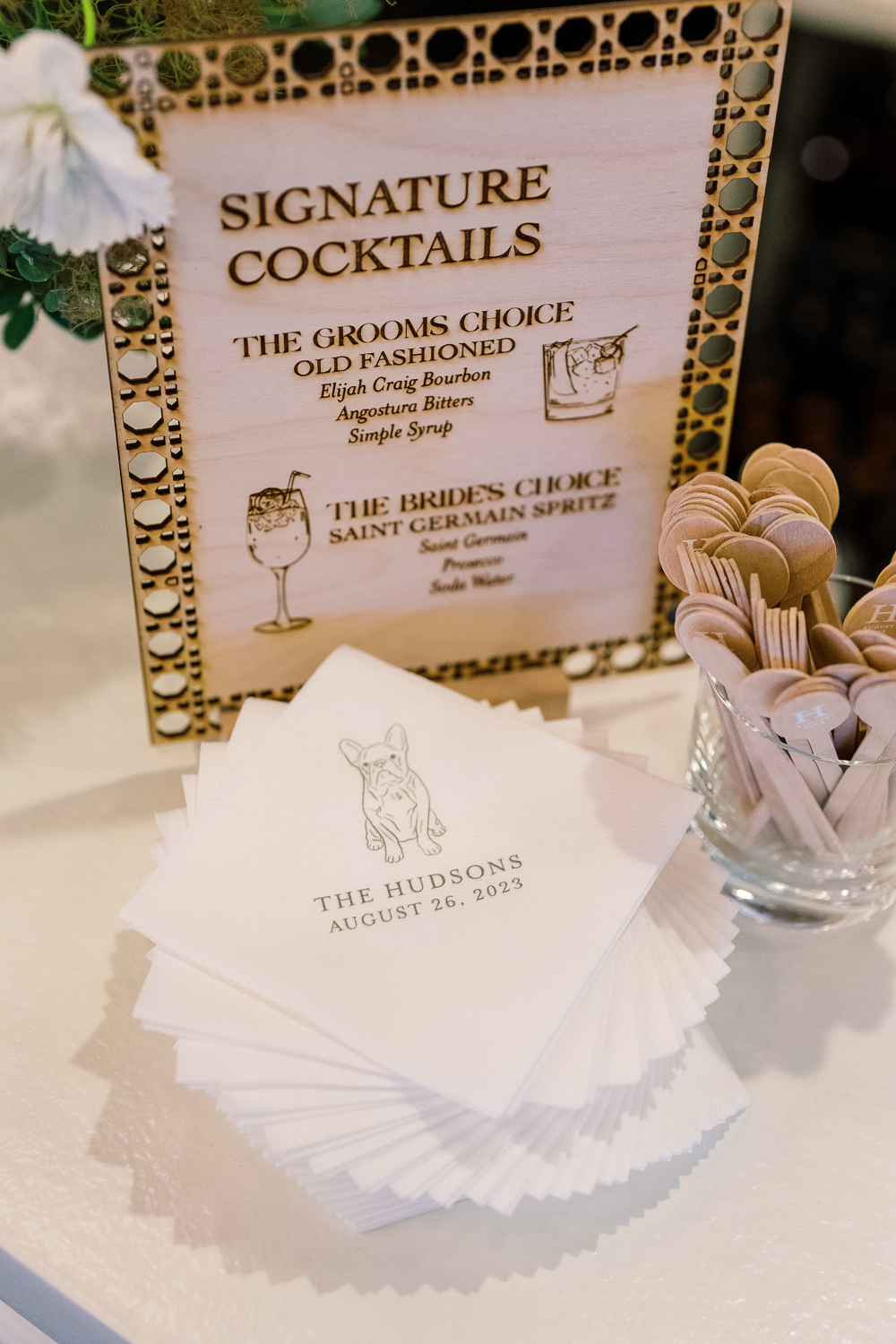
However, it’s the custom cocktail stirrers for me! These little guys were so fun to make. The “H” initial stands out so perfectly along with the date. This is a great example of a small detail that packs a huge punch. It’s things like this that your guests never forget!
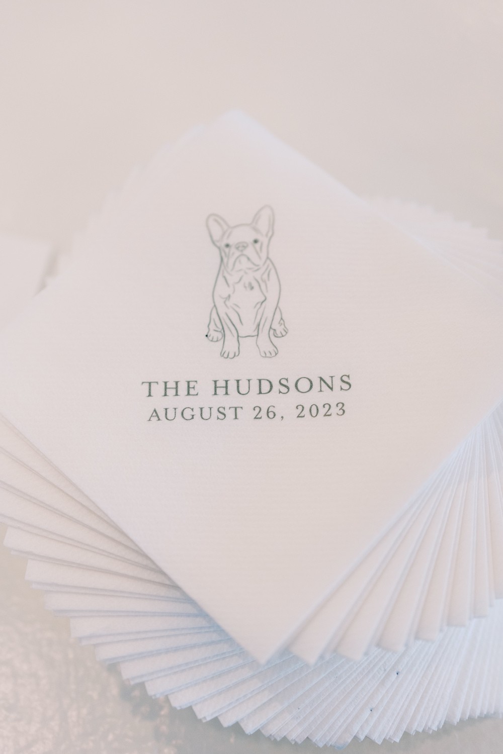
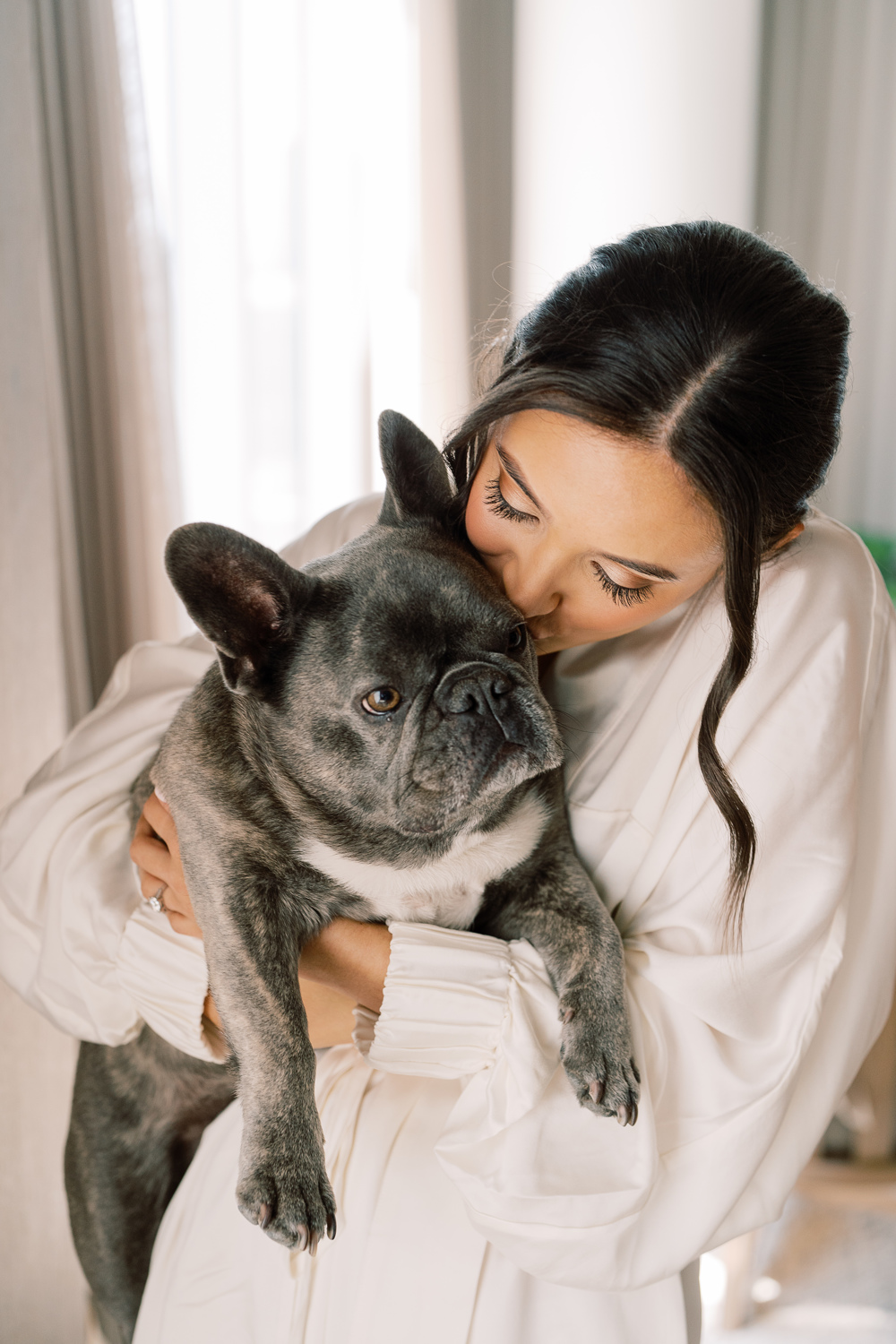
Can we all take a moment to appreciate how adorable Sam and Landon’s pup looks printed on these custom cocktail napkins? Cocktail hour is a great opportunity to pull in really special details of our lives- like pets! I could look at this face all day!
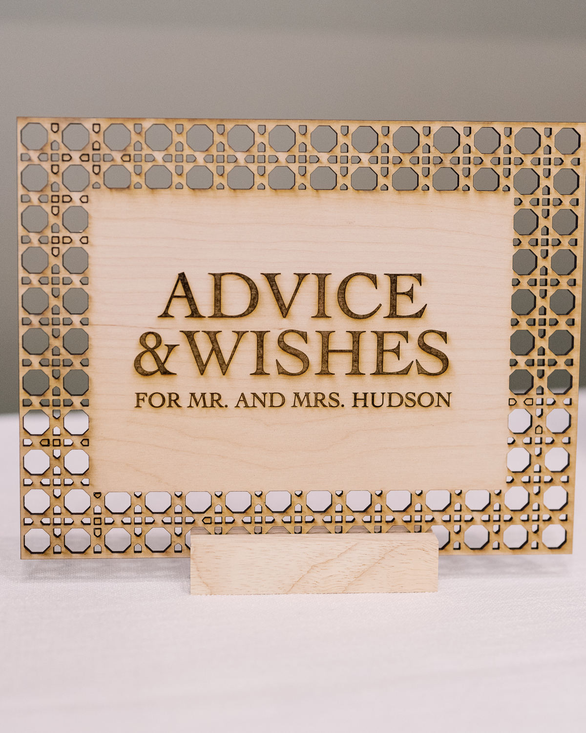
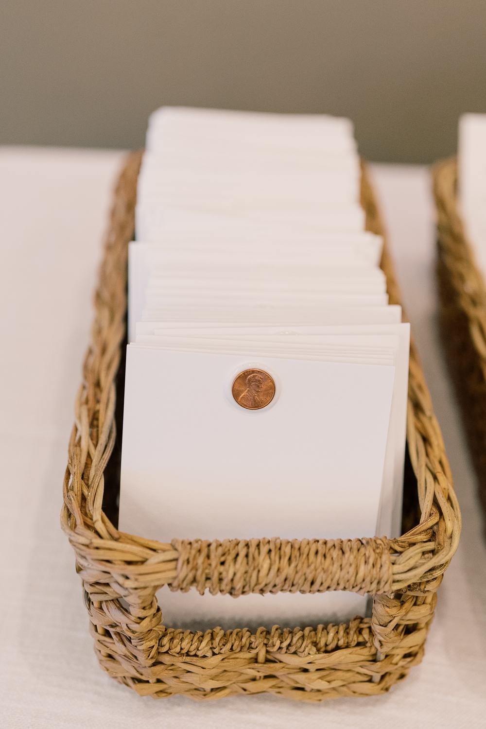
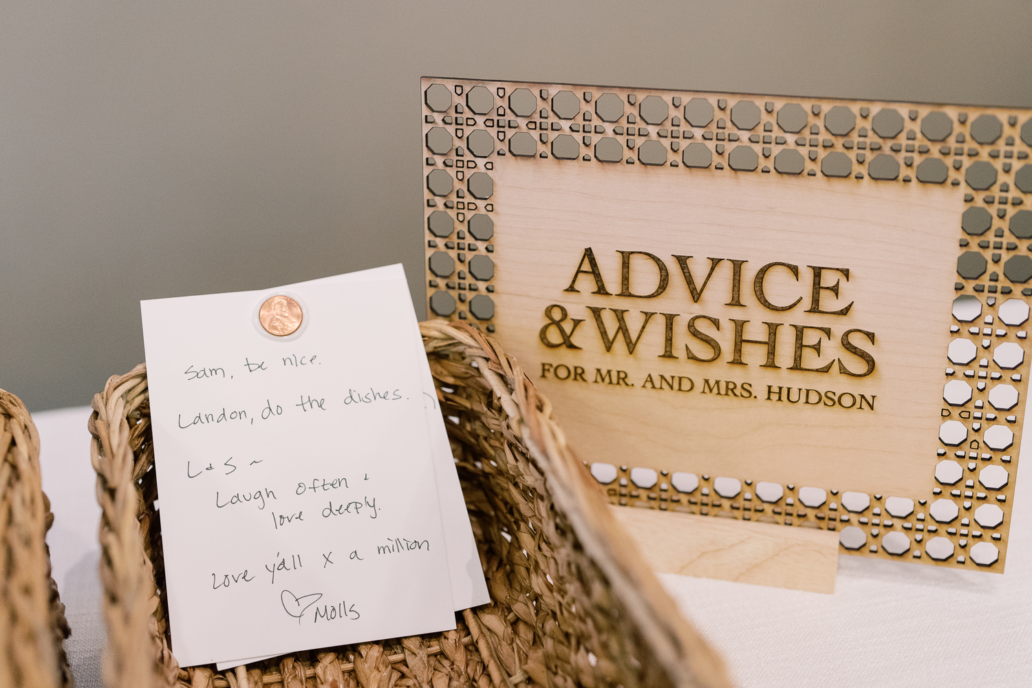
A Penny For Your Thoughts
Guests took the time to share their best advice on marriage and give well wishes as Sam and Landon created a space for “A penny for your thoughts.” This was a fun and clever way to include each guest as well as receive some welcomed advice from their closest friends and family! We were happy to be included by creating yet another one-of-a-kind laser-cut custom table sign.
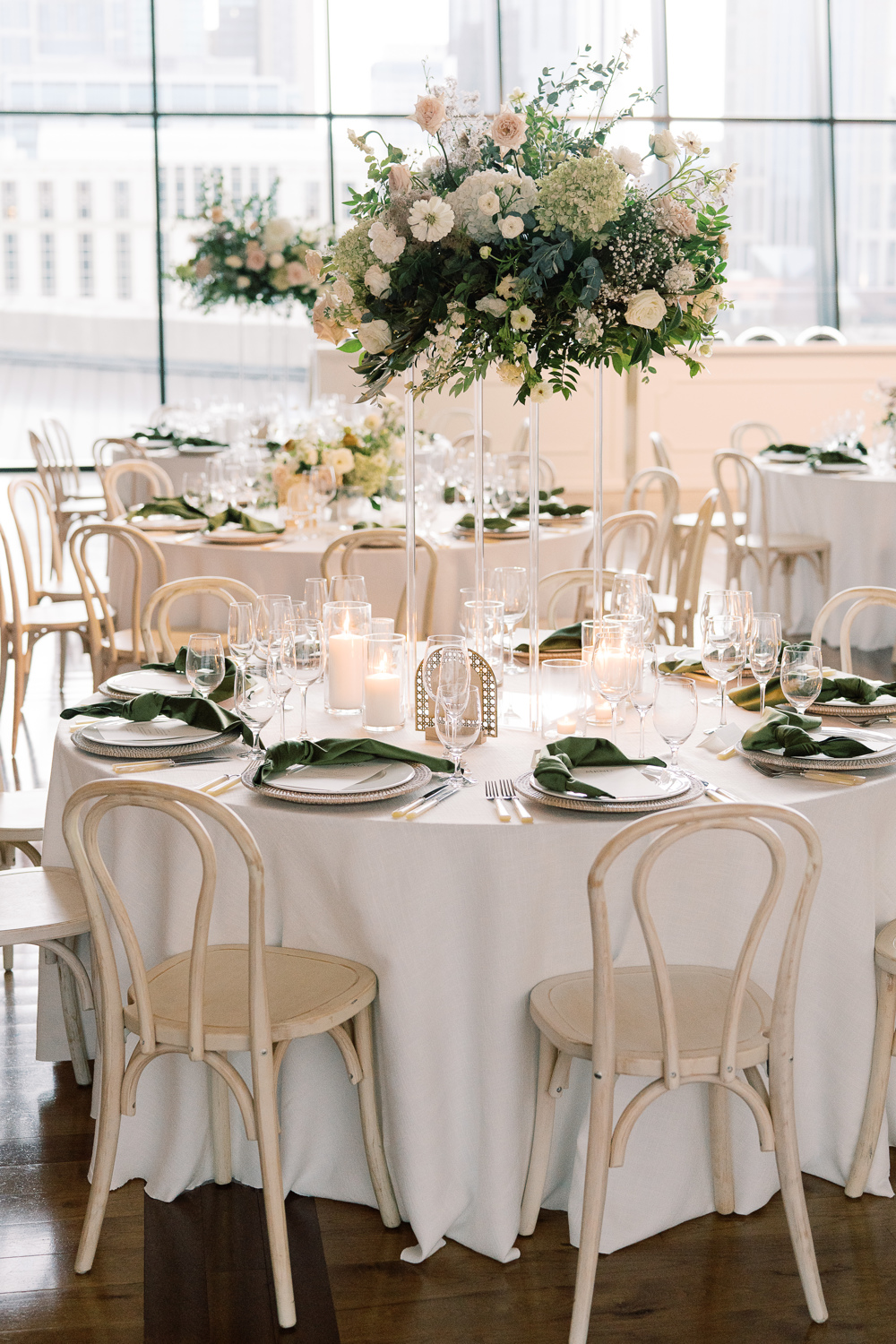
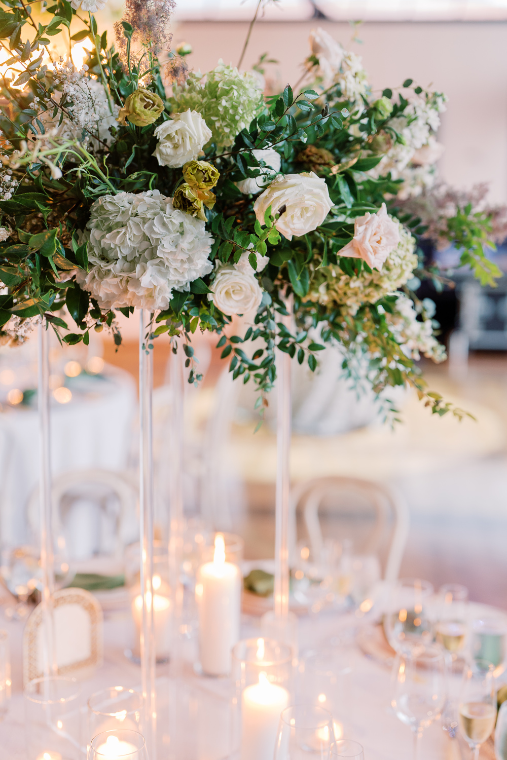
The custom signage was carried throughout the reception. Doing this can truly elevate the theme and help carry the tone of a room. The arched table numbers worked perfectly with the delicate tablescapes, and their texture offered a wonderful balance to the vibrant florals all around. Such an incredibly impressive look!
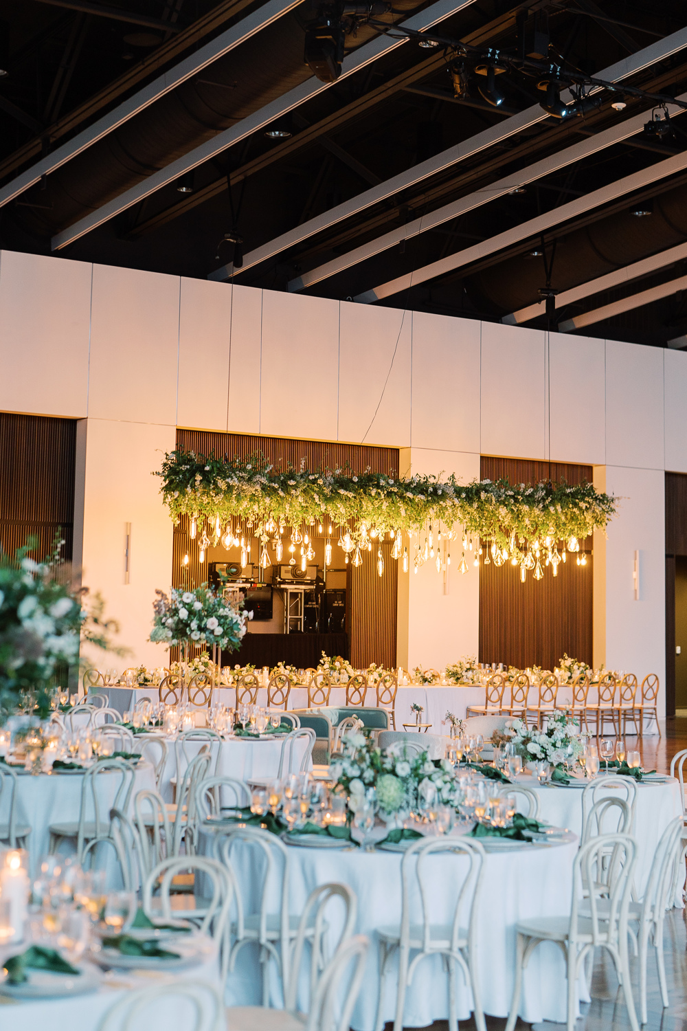
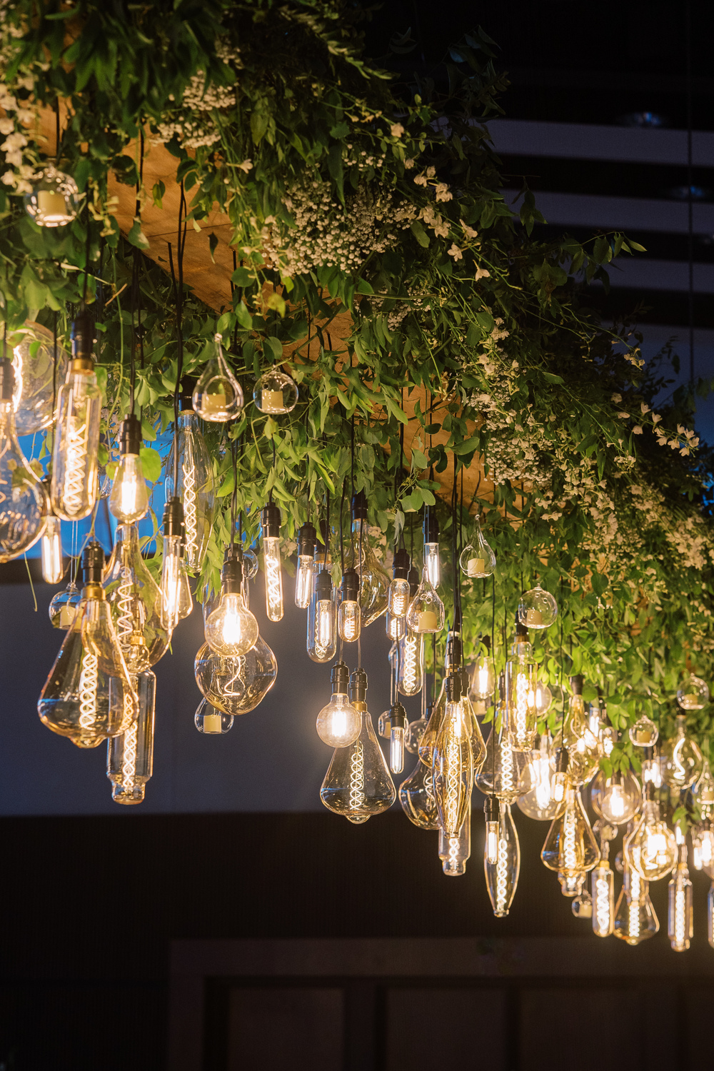
Sidenote: I still think about this floral chandelier more often than I care to admit. I mean, wow! This was such a stunning wedding in so many ways and this chandelier was a showstopper!
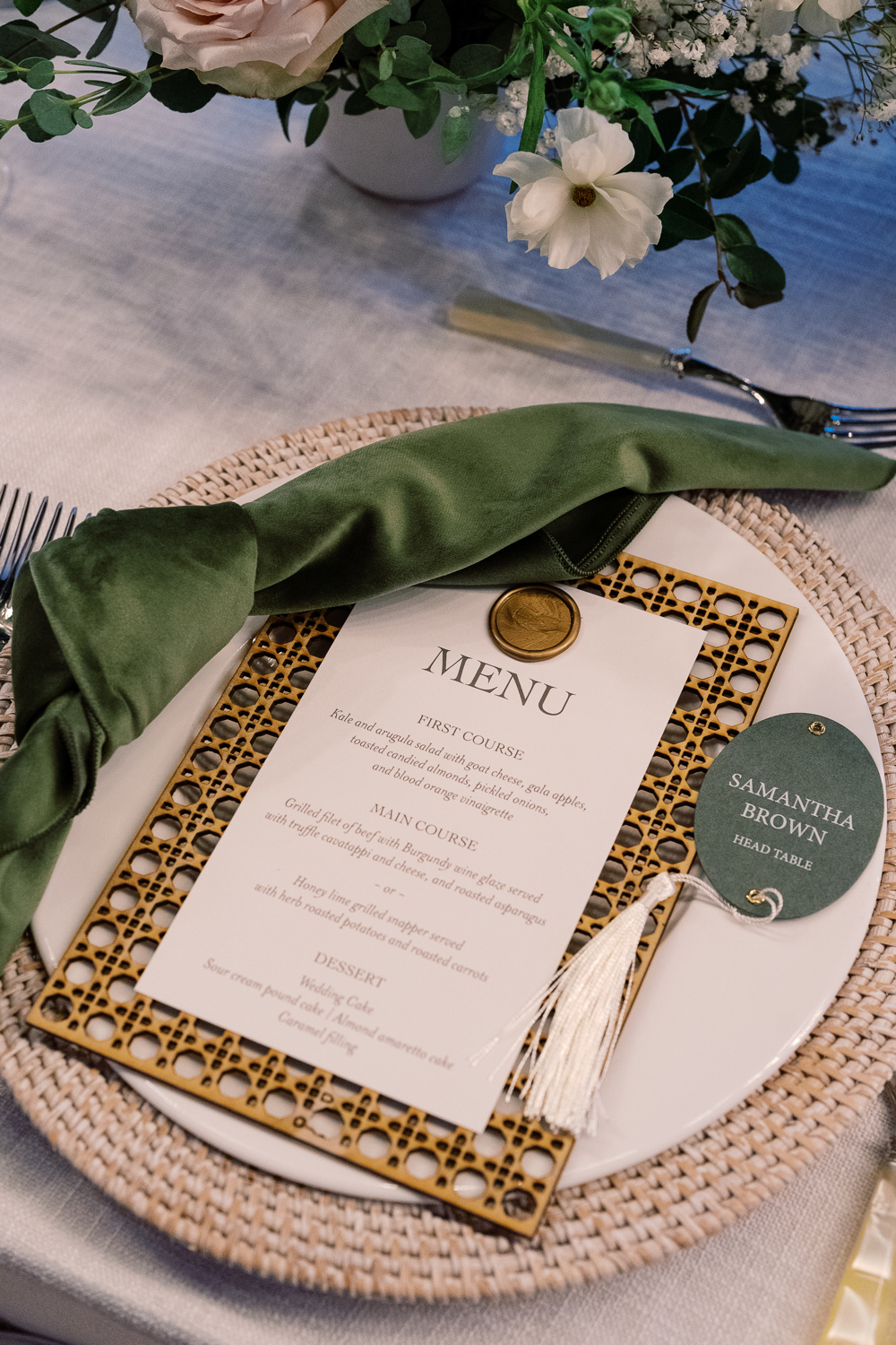
Custom Nashville Wedding Details
White Ink designed Sam and Landon’s reception menus that fit perfectly on top of the custom laser-cut settings we created as well! The gold wax seal to top the menu pulled this entire place setting together with the added bonus of the matching table numbers and table signage throughout. When it comes to lacing details throughout an event, THIS is how it’s done.
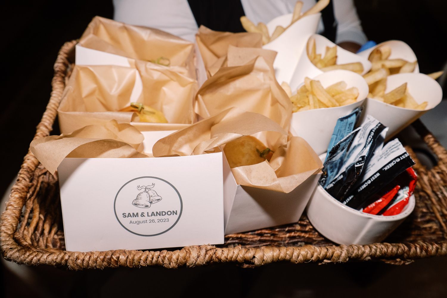
Peep the cute wedding bell prints making another appearance! This time, at the end of the night when guests were offered a yummy snack of burgers and fries. From invitation suite to burger box, this wedding bell print fit right in!
Wedding Welcome Party Details
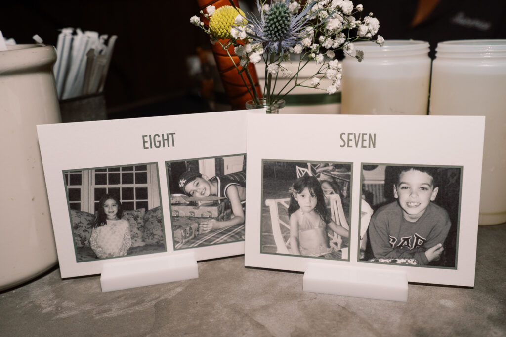
I don’t want to wrap up without showing you guys a couple of the day-before details that White Ink did for Sam and Landon’s Wedding Welcome Party. Wedding parties and wedding rehearsal dinners are the perfect time to have fun with details and create a more intimate tone.
Sam and Landon wanted us to create table numbers for the welcome party that included pictures of them being the same age as the number on the sign. As you can see above, here are Sam and Landon at ages 7 and 8. Is this not the sweetest thing ever? It meant a lot to be able to provide these special table numbers for them!
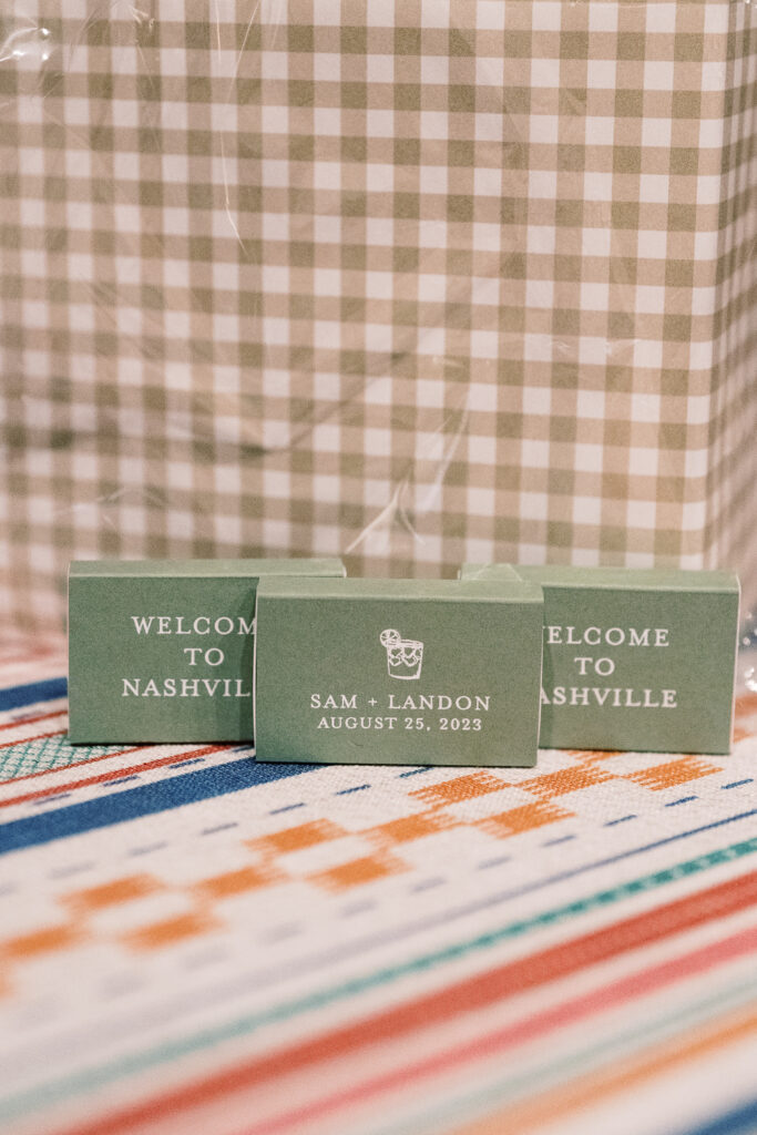
We also created a few more day-before details for Sam and Landon’s wedding welcome party. It was an honor to create items like their seating chart and the most adorable little matchboxes for the guests to take along with them. Putting in the extra effort in these more intimate settings really shows those closest to you, that they are appreciated and that you were thinking of them, which is really special!
To the happy couple, we hope you enjoy lots of love and adventure, and continue soaking in all the finer details around you! Cheers to you both!
If you’re looking to add custom, thoughtful touches to your wedding or event, we would love to help make your vision a reality. Reach out today to learn more about our full-service design offerings—we can’t wait to create something unforgettable for you!