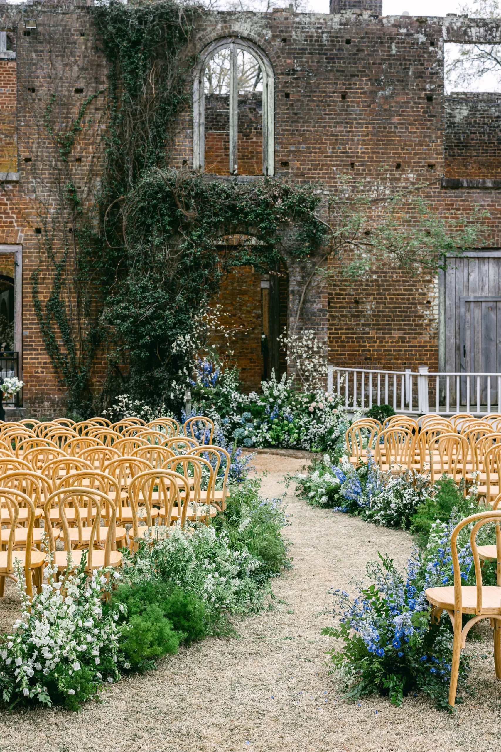
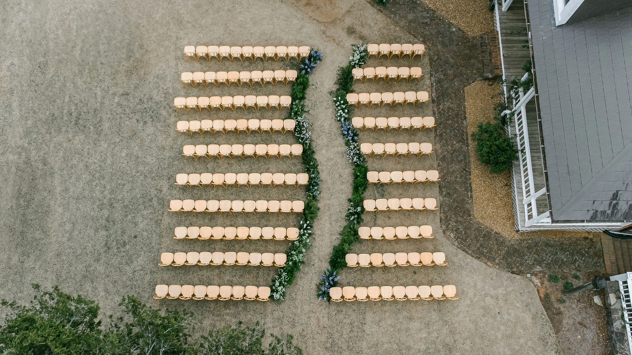
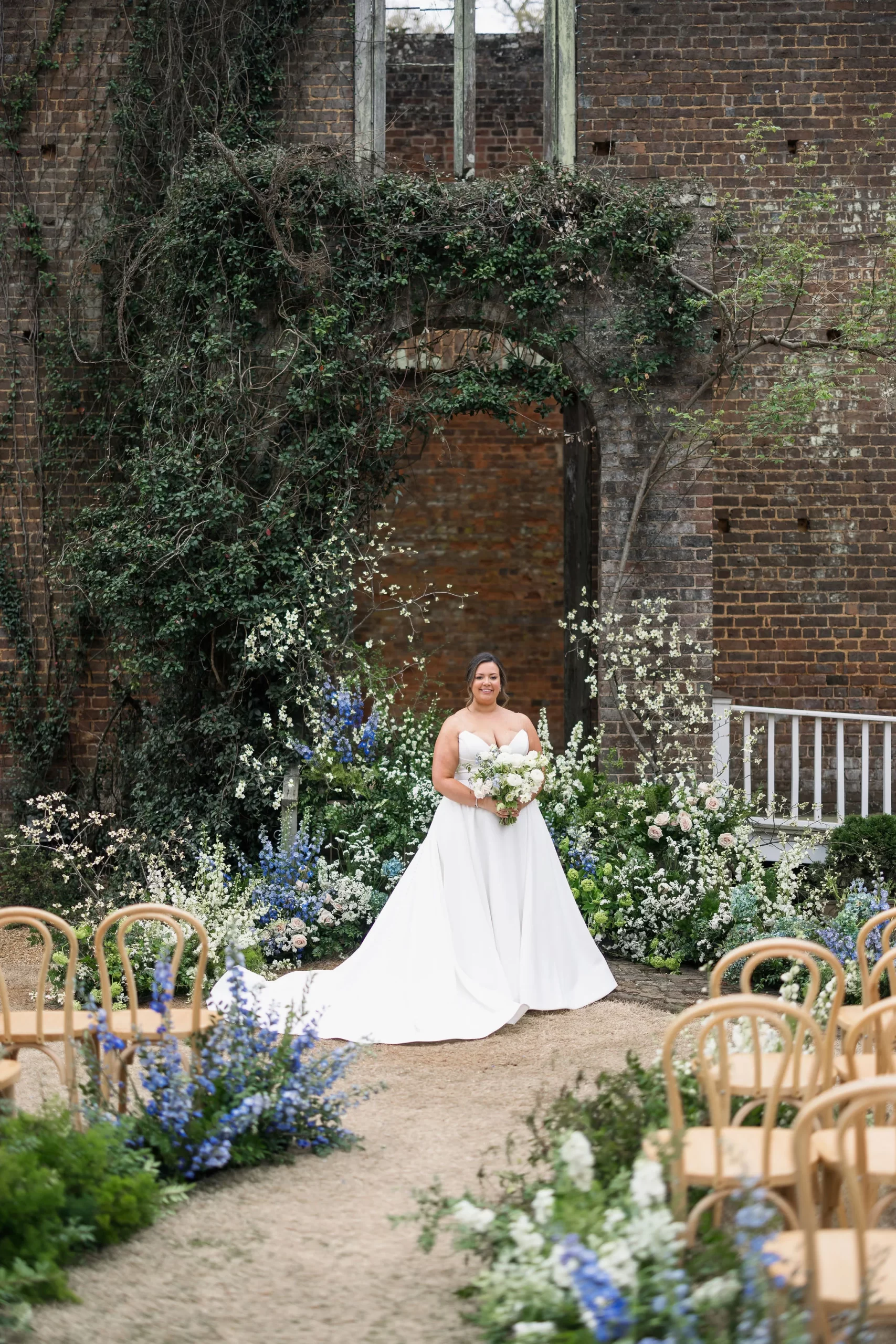
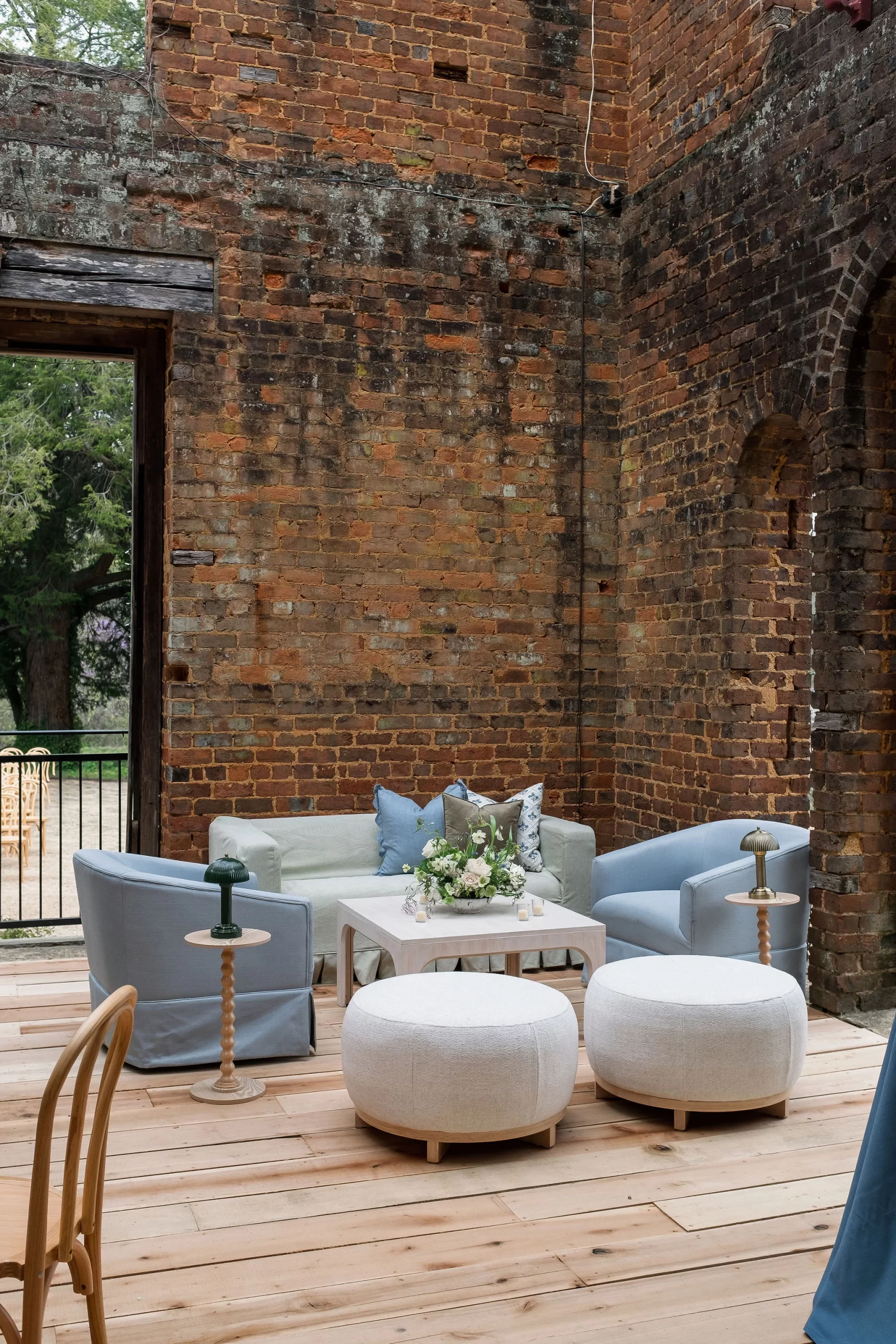
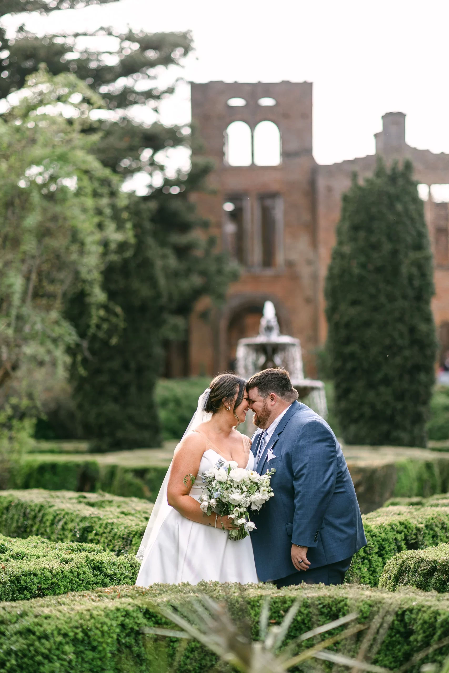
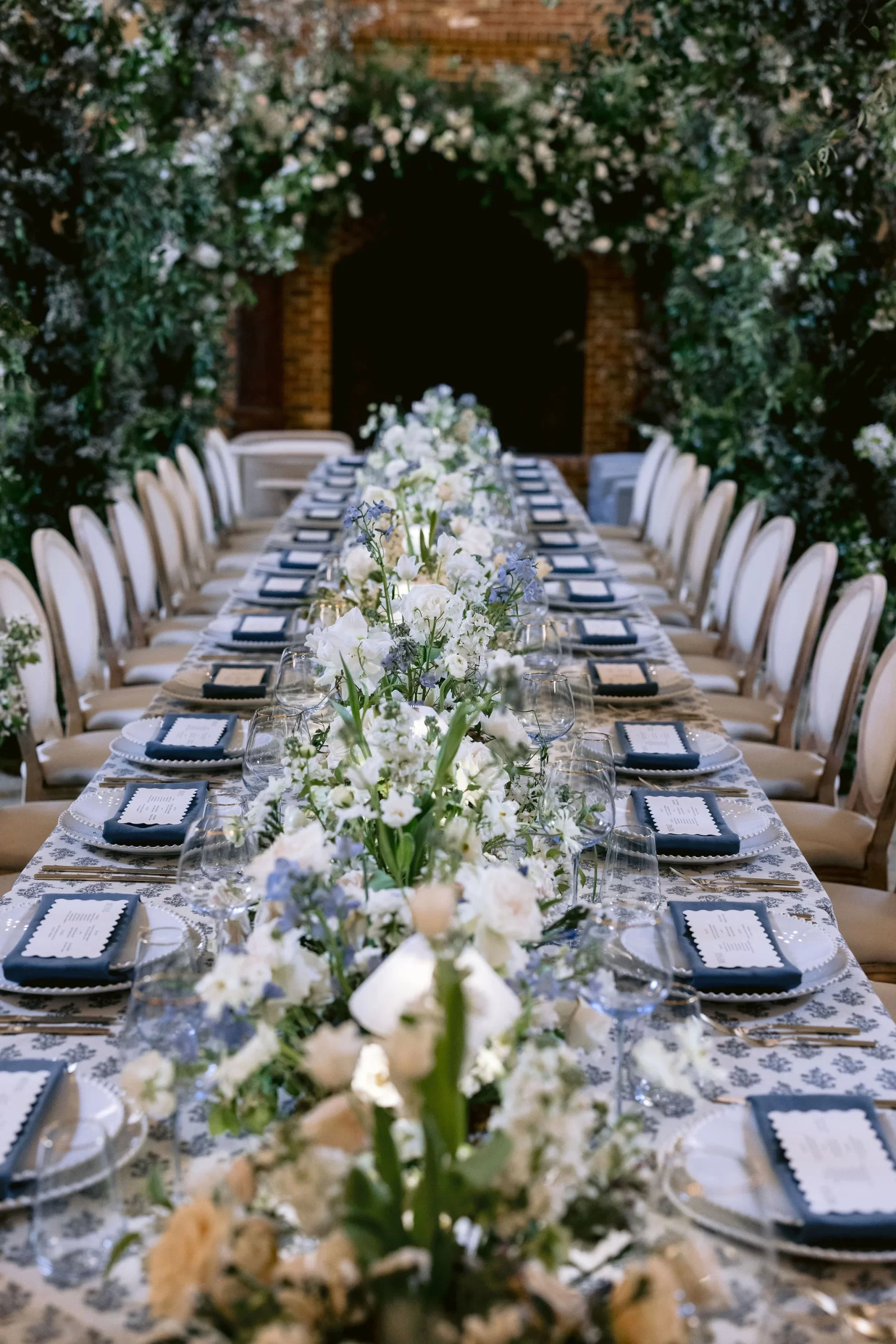
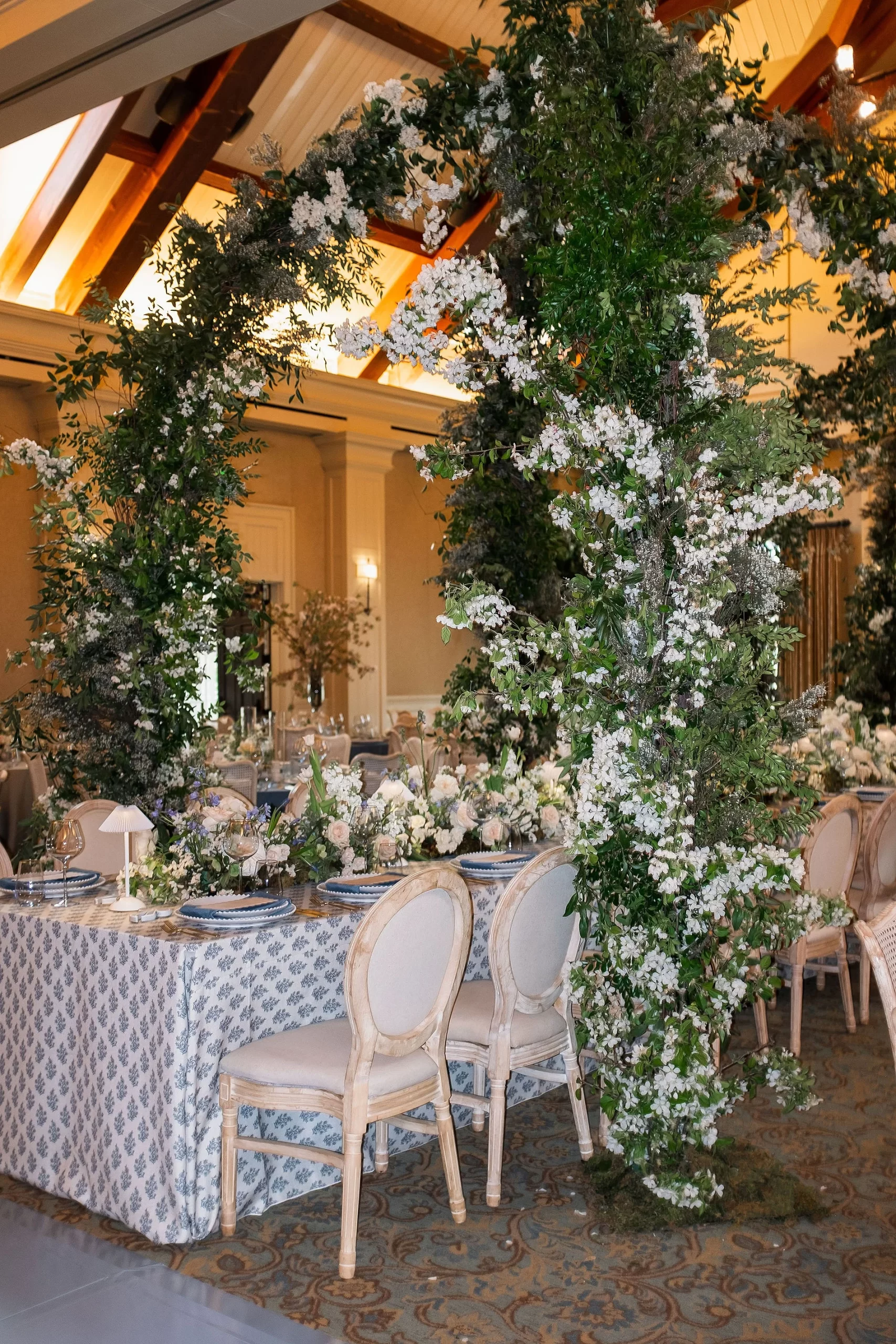
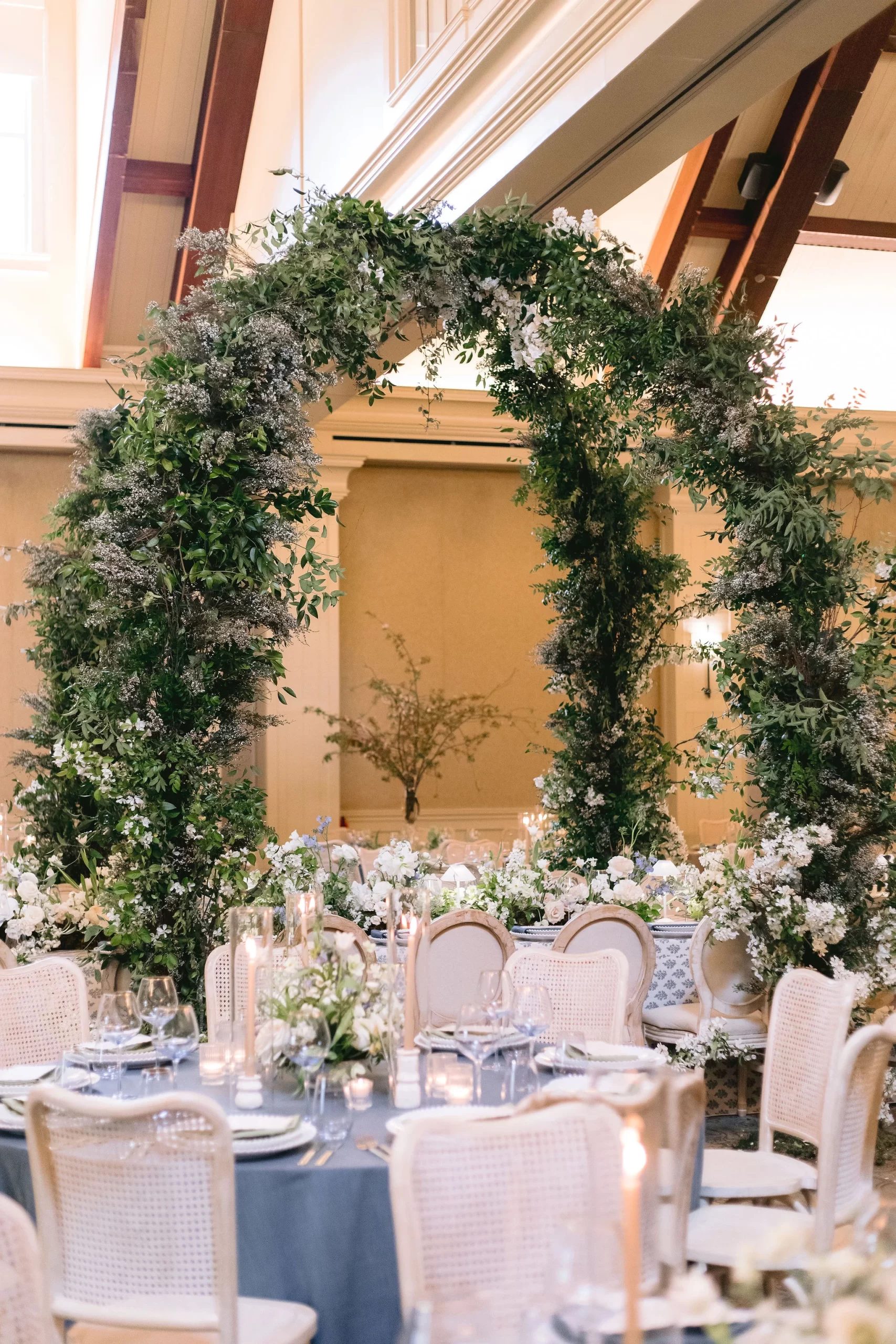
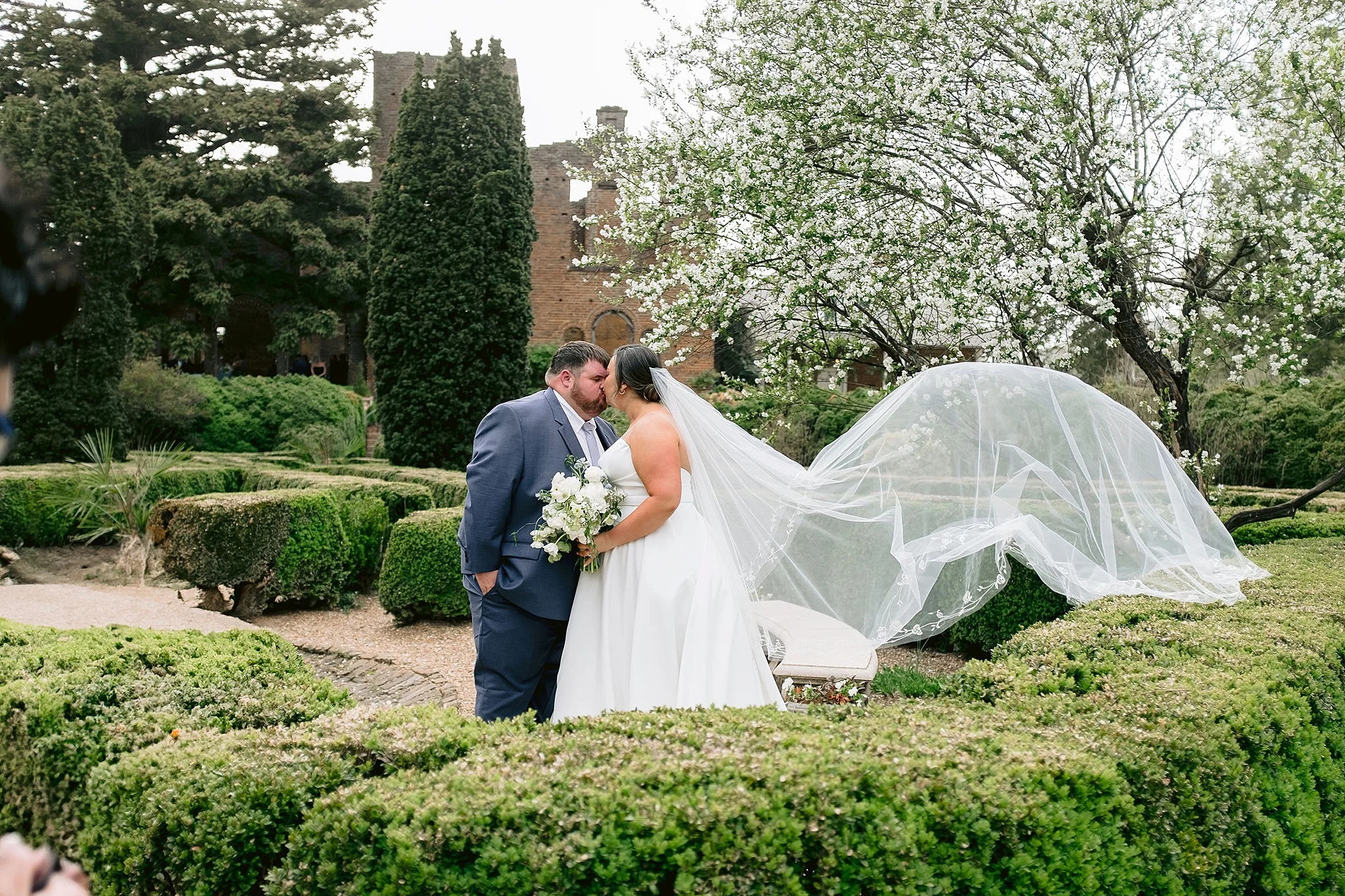
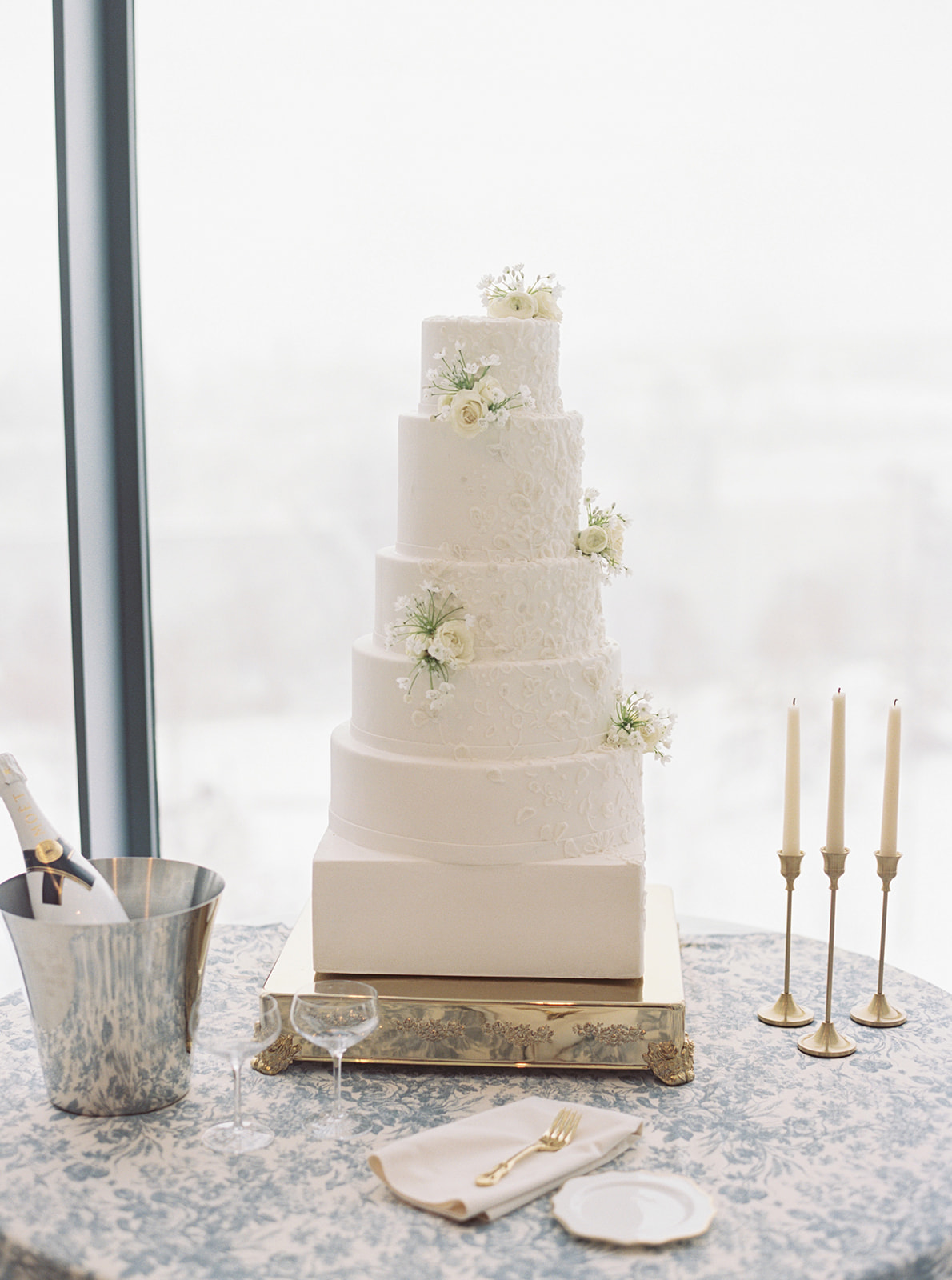
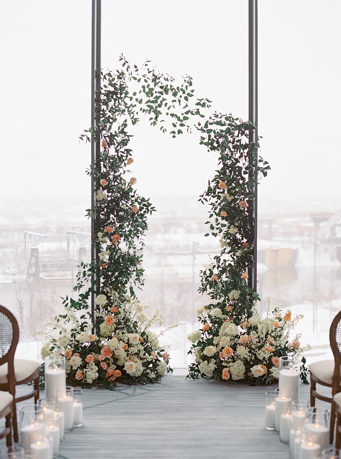
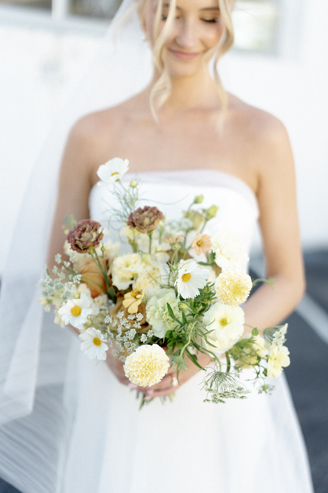
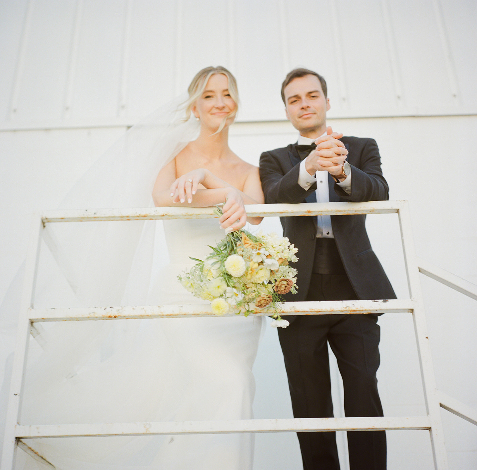
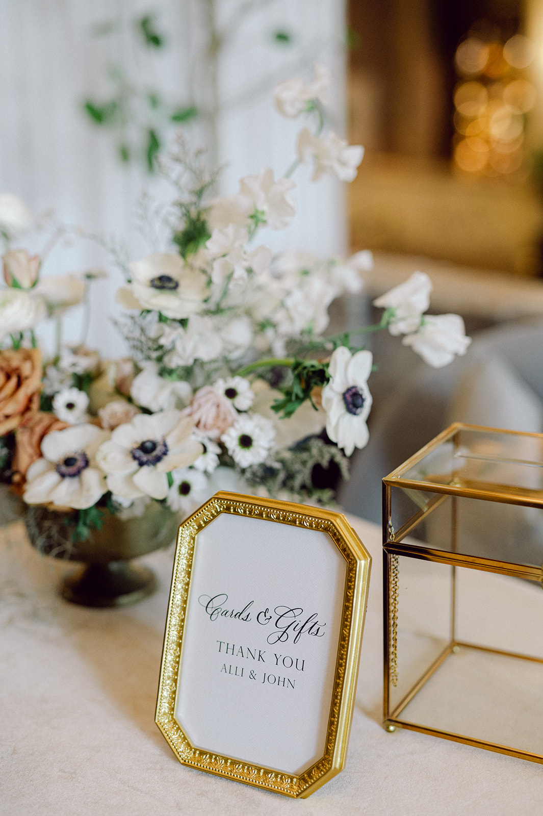
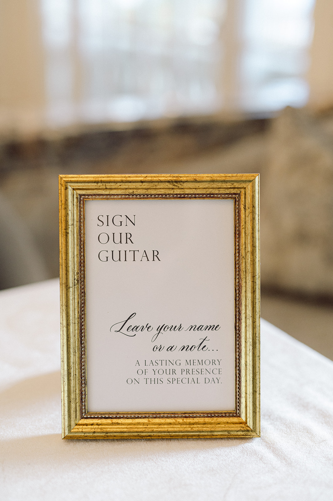
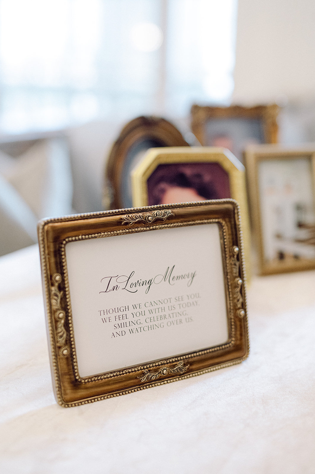
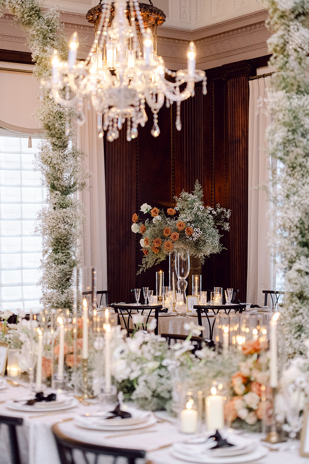
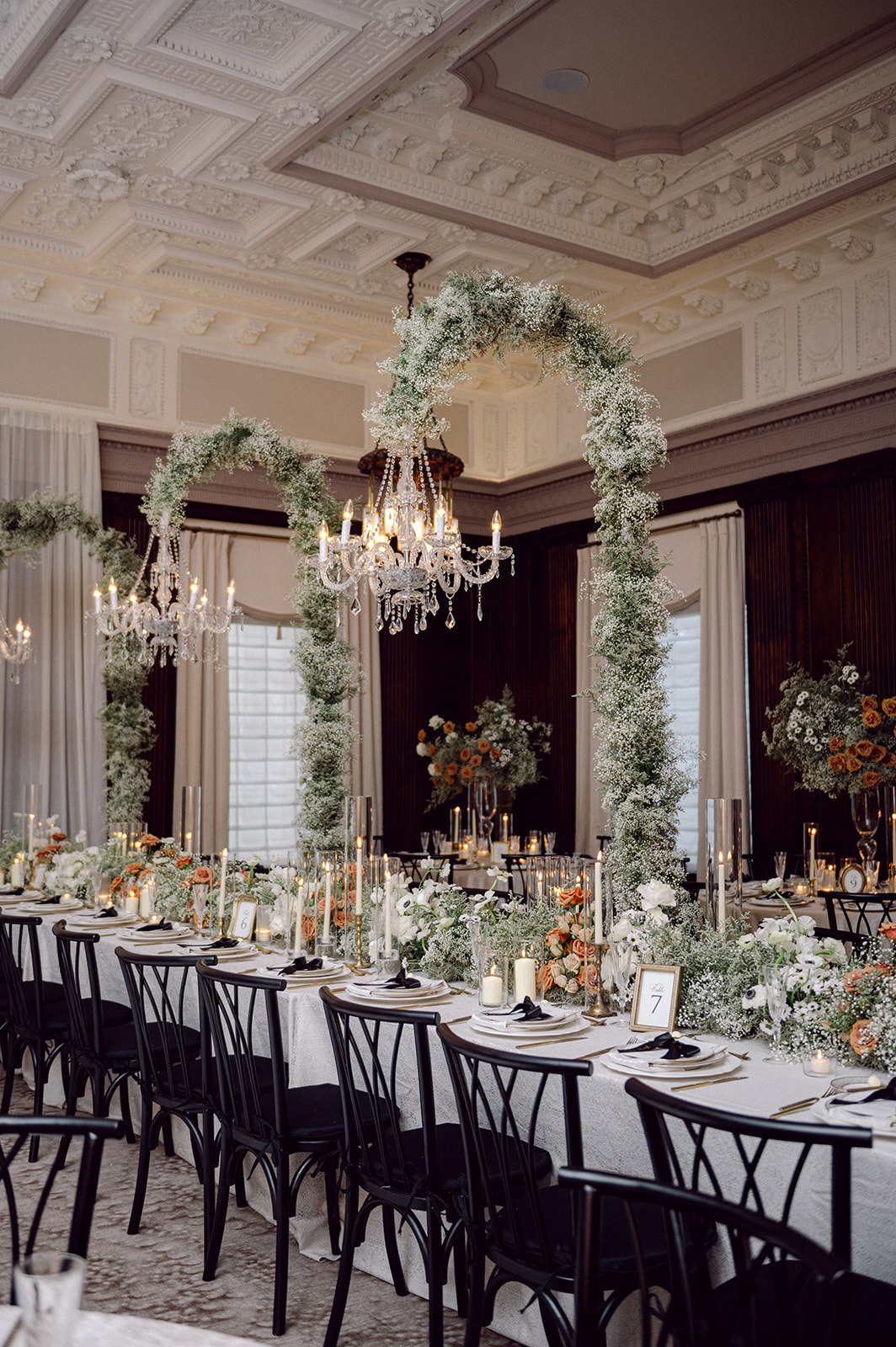
Some weddings are so full of thoughtful details and genuine heart, they stay with you long after it has ended. Blaise and Michael’s romantic Barnsley Resort wedding is absolutely one of those. Their March wedding at the historic Georgia venue was the perfect blend of classic elegance and unique personal touches. Barnsley Resort was the ideal setting for Blaise and Michael’s big day. Nestled in the Georgia countryside, the venue offers the best of both indoor elegance and outdoor romance. Floral arches brimming with greenery and white blooms created a storybook setting for both the ceremony and reception. The lush, vine-covered installations brought a sense of natural whimsy to the space, complementing the aesthetic and details perfectly.
We had the joy of working with Sofia Ocampo Events for the first time on this wedding. She is a talented planner based in Atlanta who we’ve become great friends with through networking events. Getting to collaborate with someone local (and so lovely!) was just the cherry on top of an already meaningful project. Then, there was the beautiful bride, Blaise, who was a dream client! As her elevated vision took shape, I grew more excited to work on each detail of this wedding. I just knew it was going to be spectacular. She fully trusted us to bring her style to life and we had so much fun designing a wide range of paper goods and day of details for this celebration!
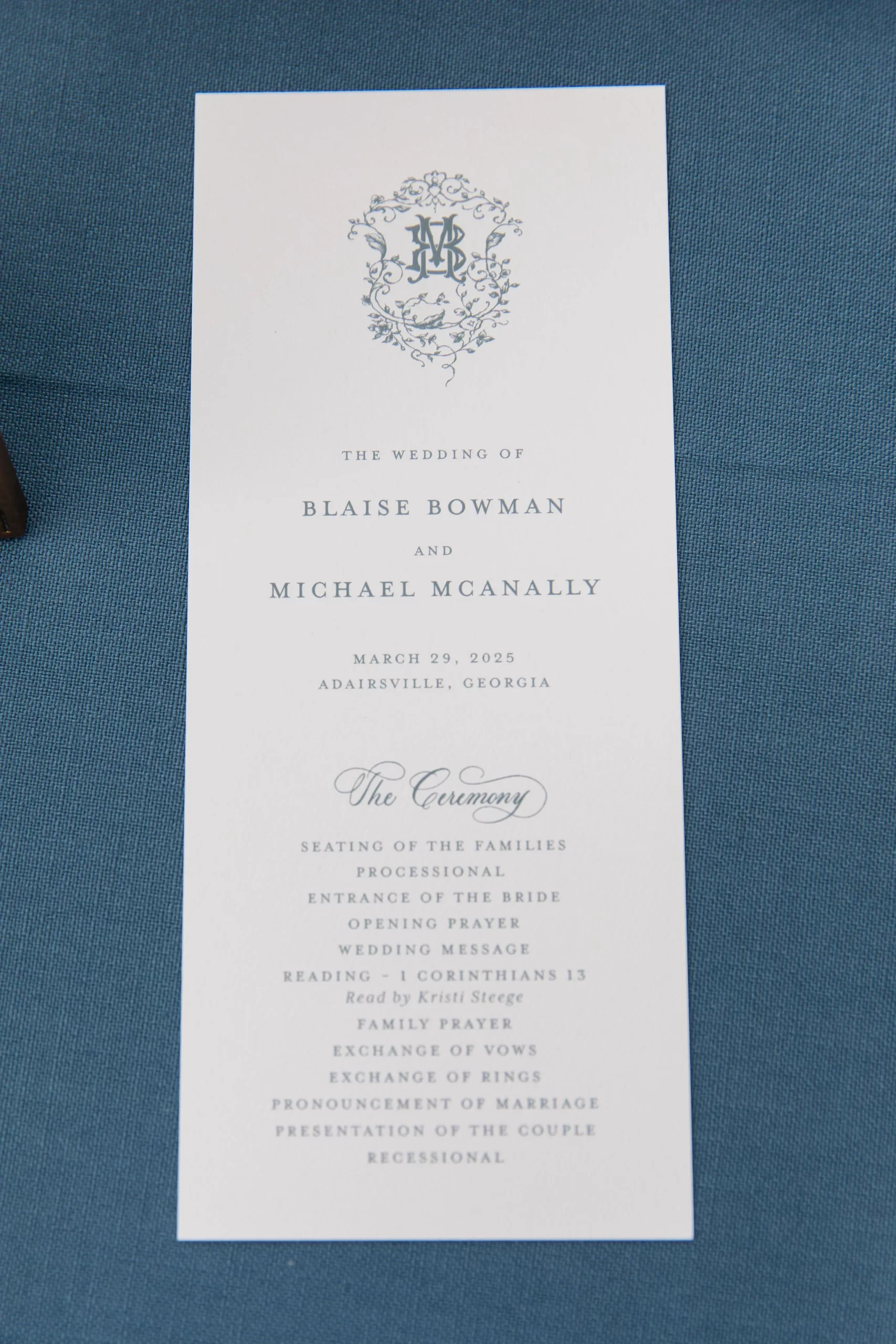
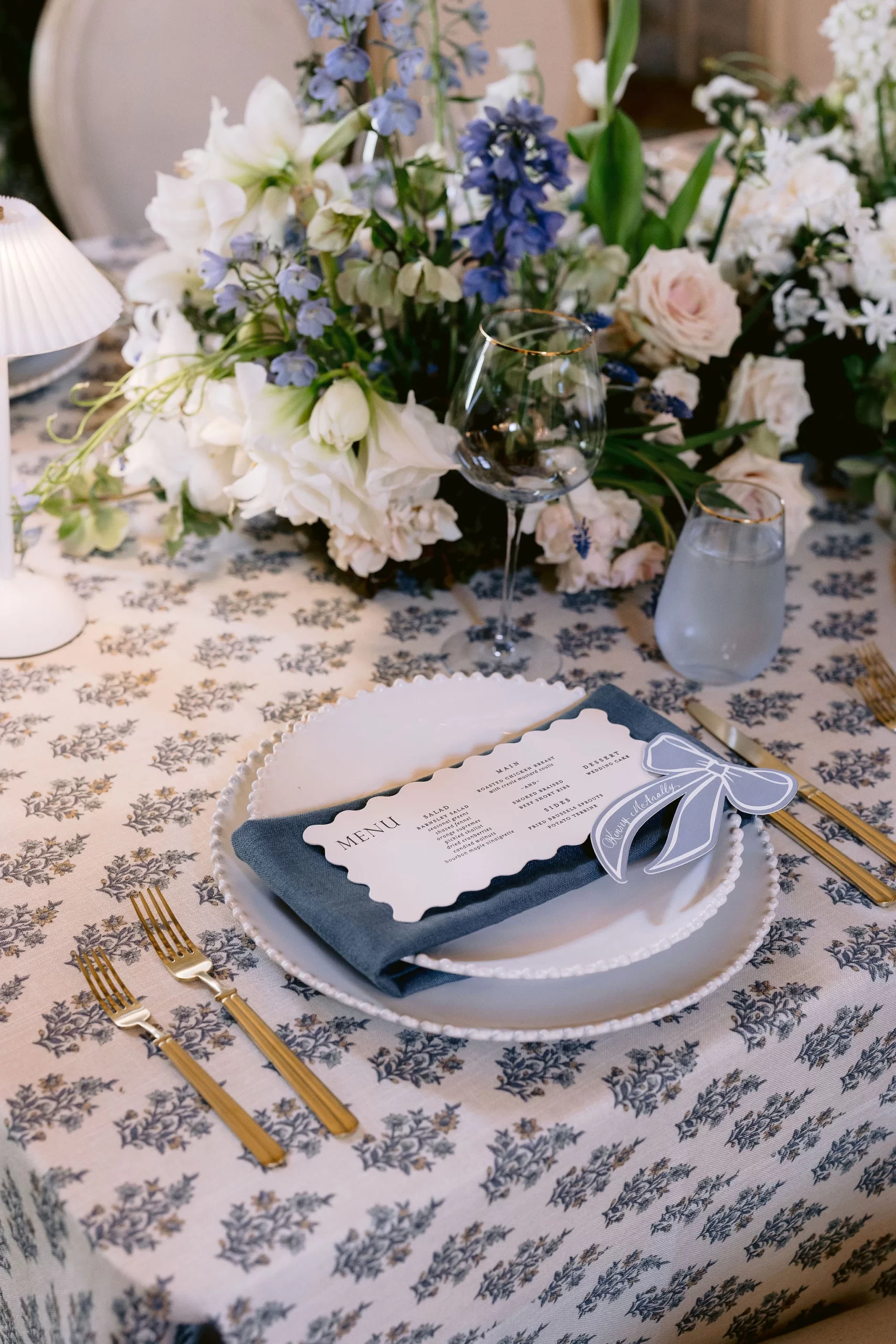
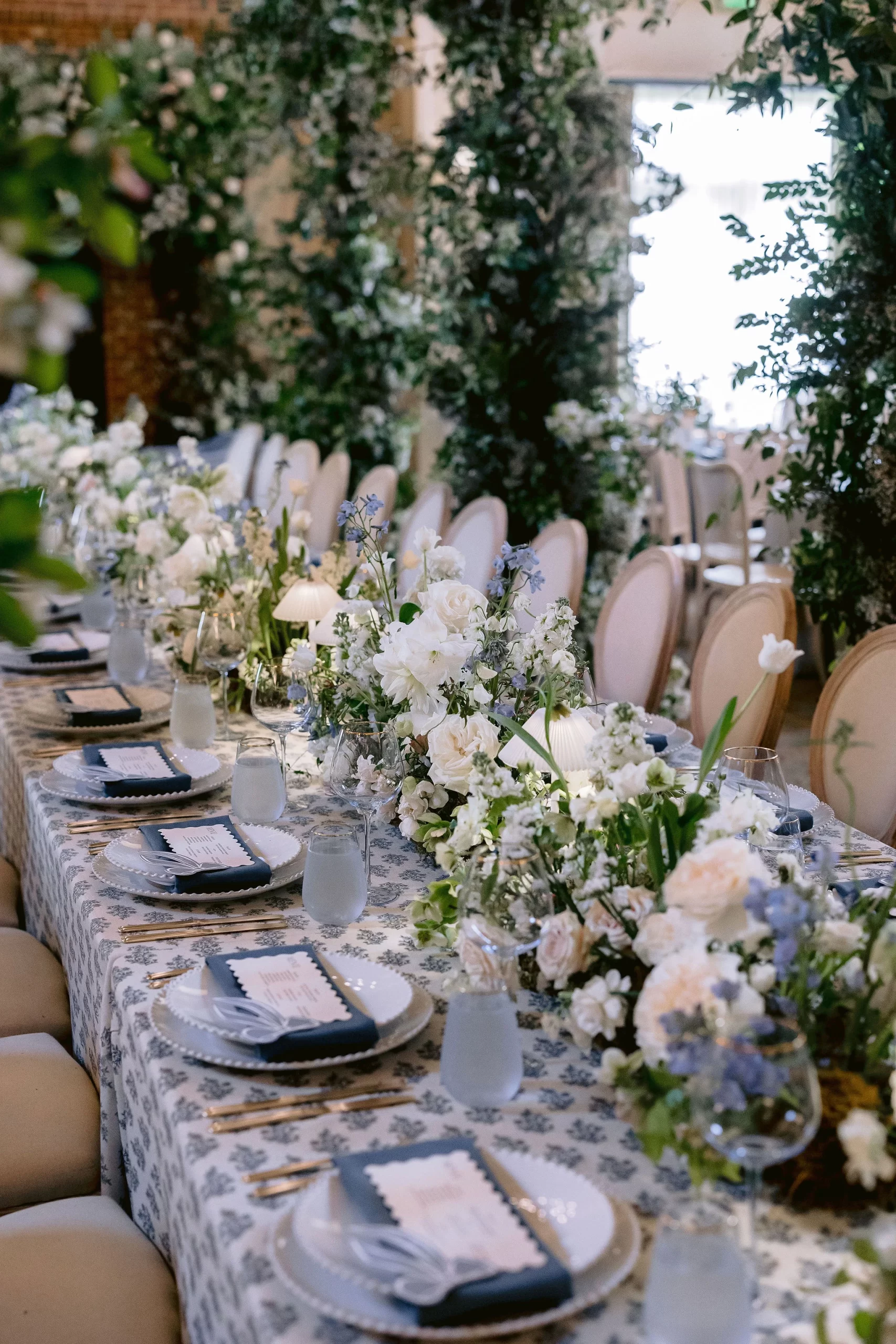
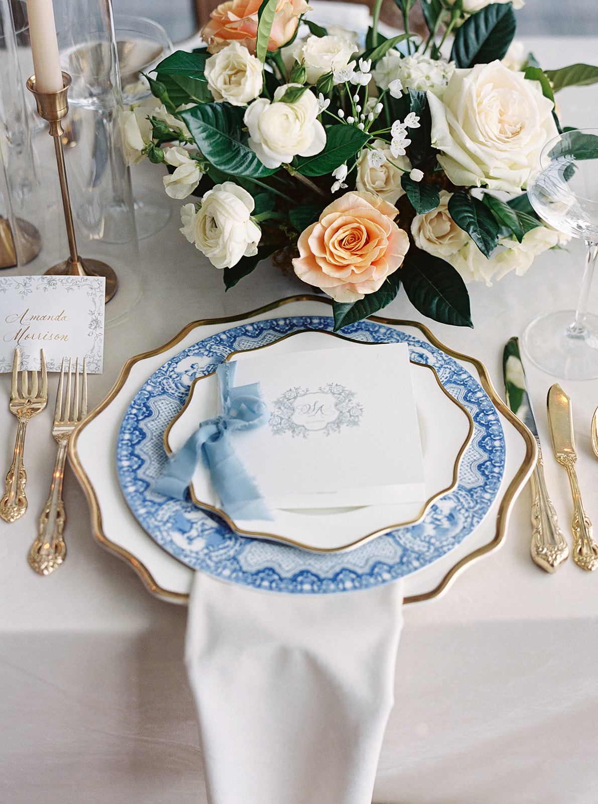
A Soft, Elegant Palette
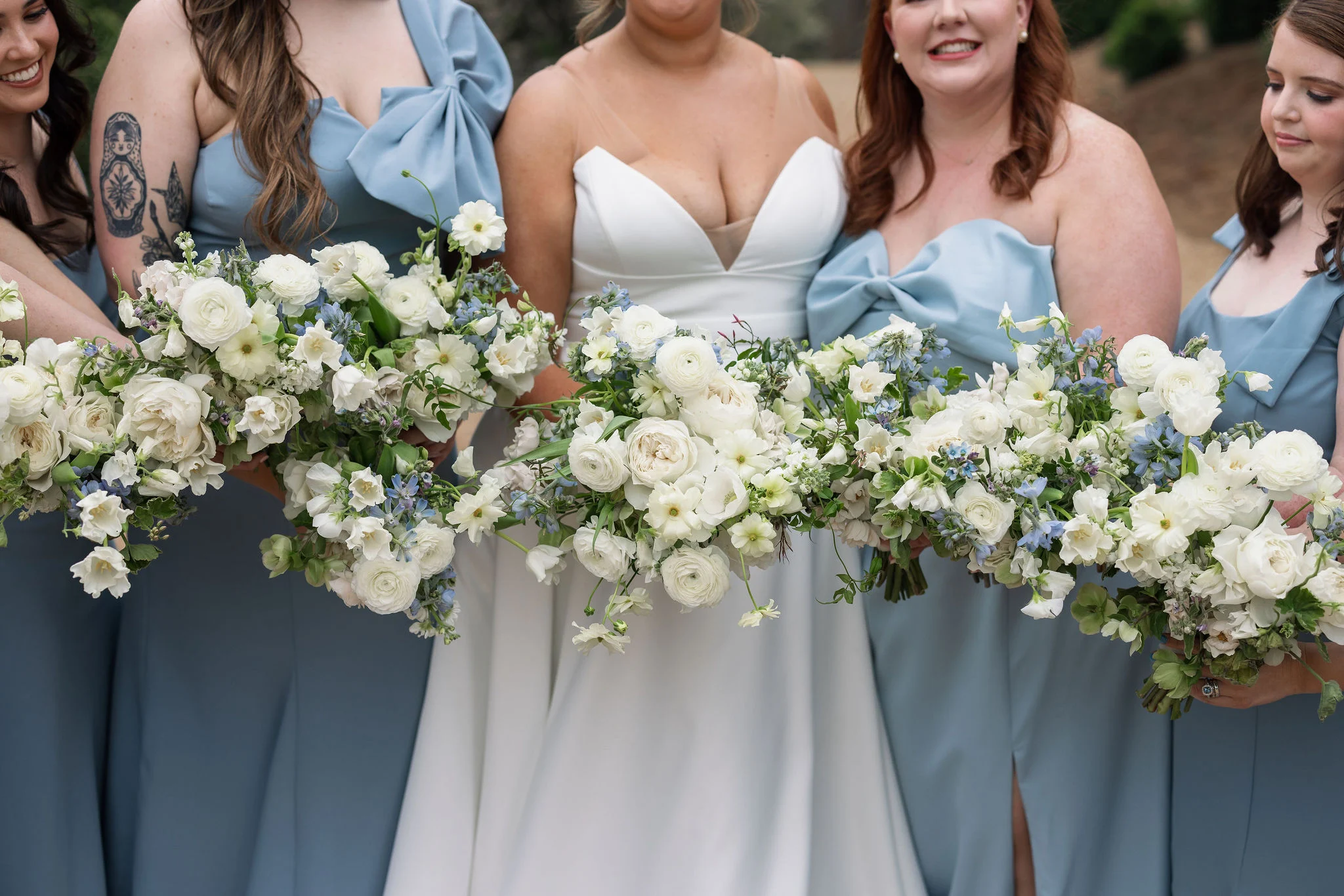
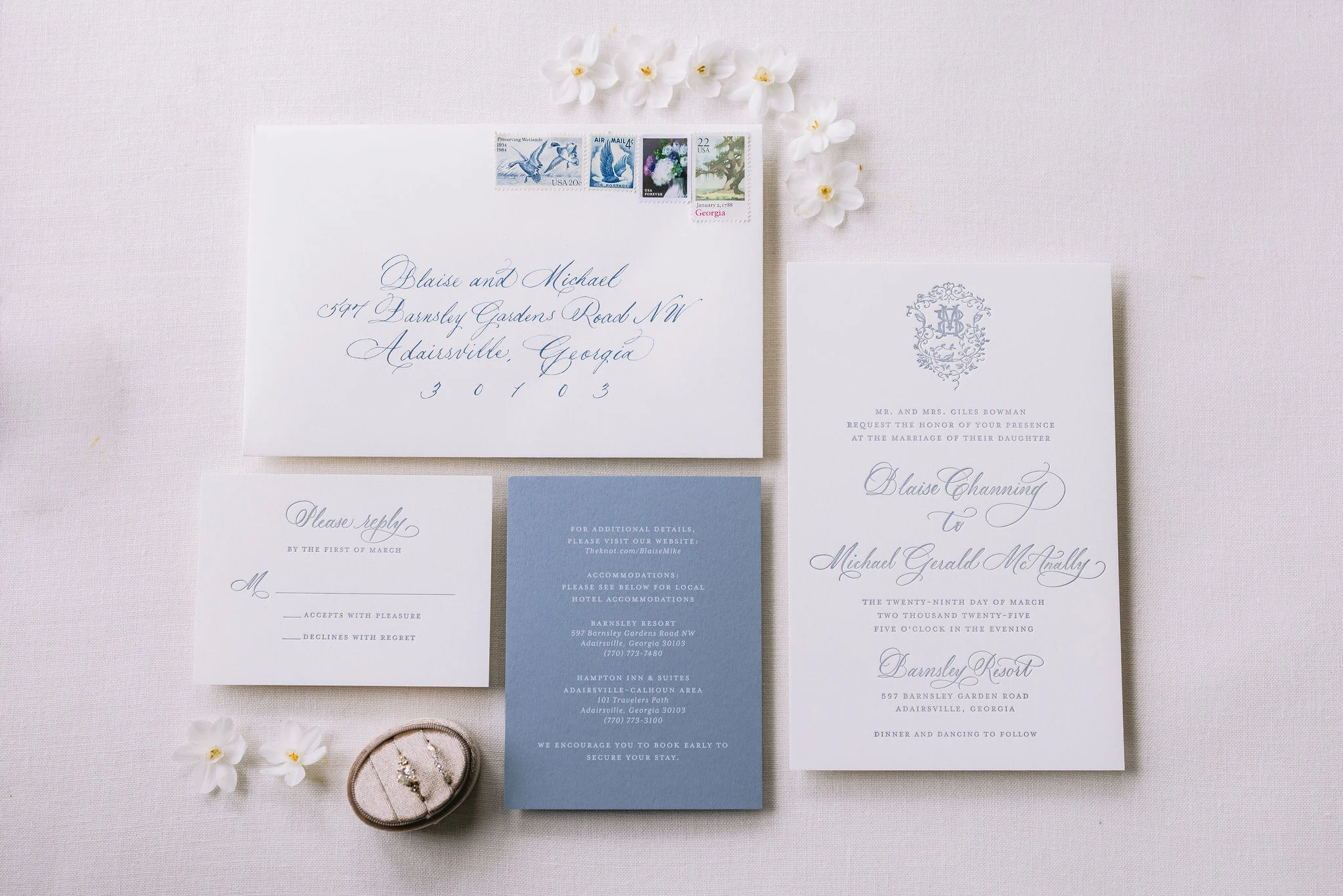
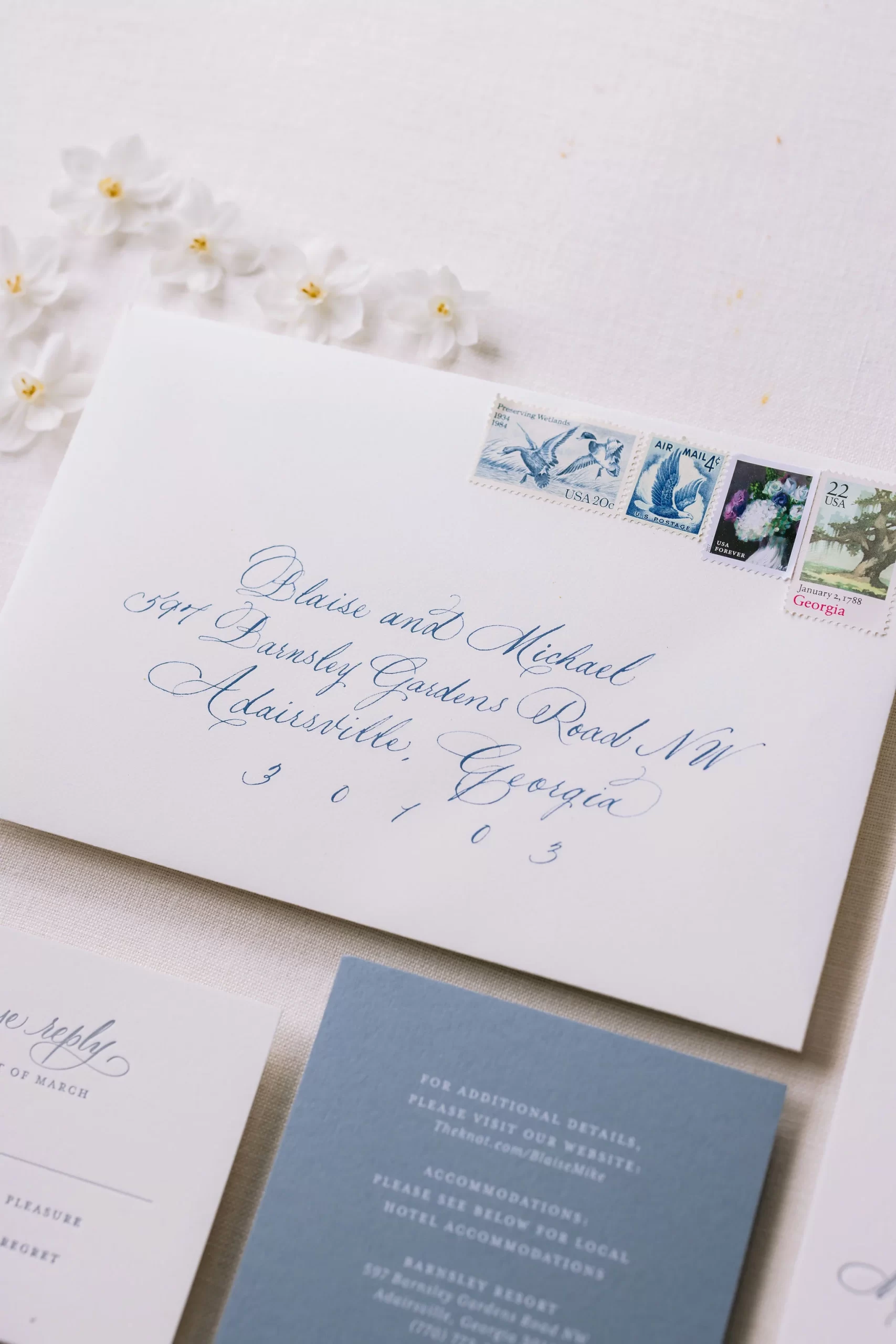
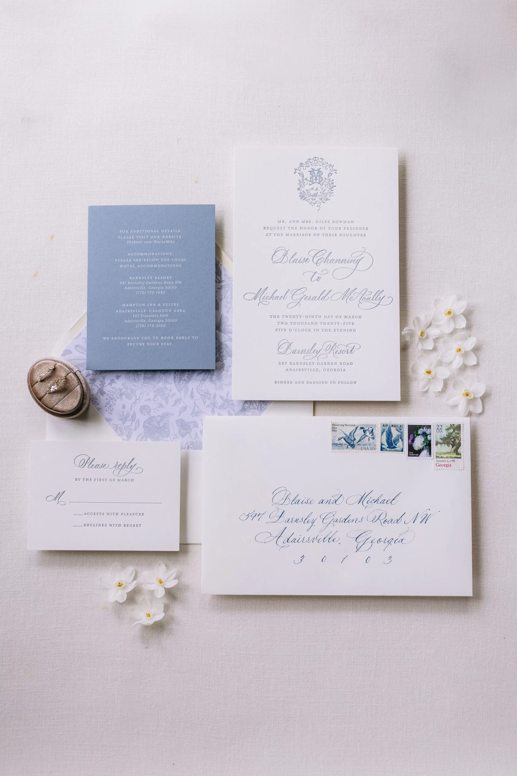
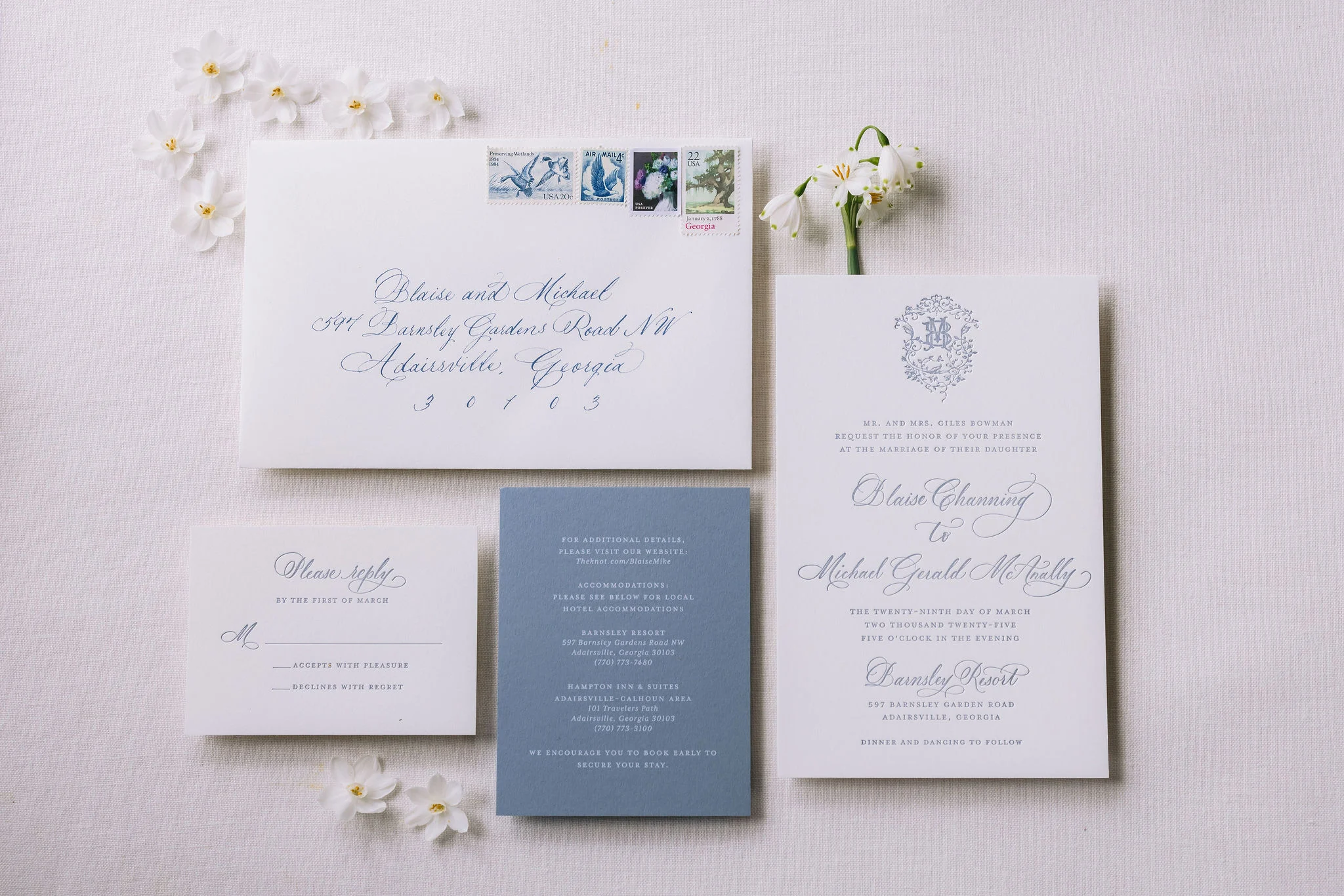
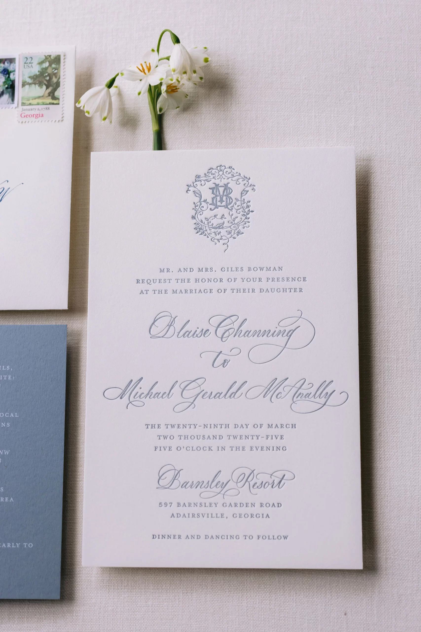
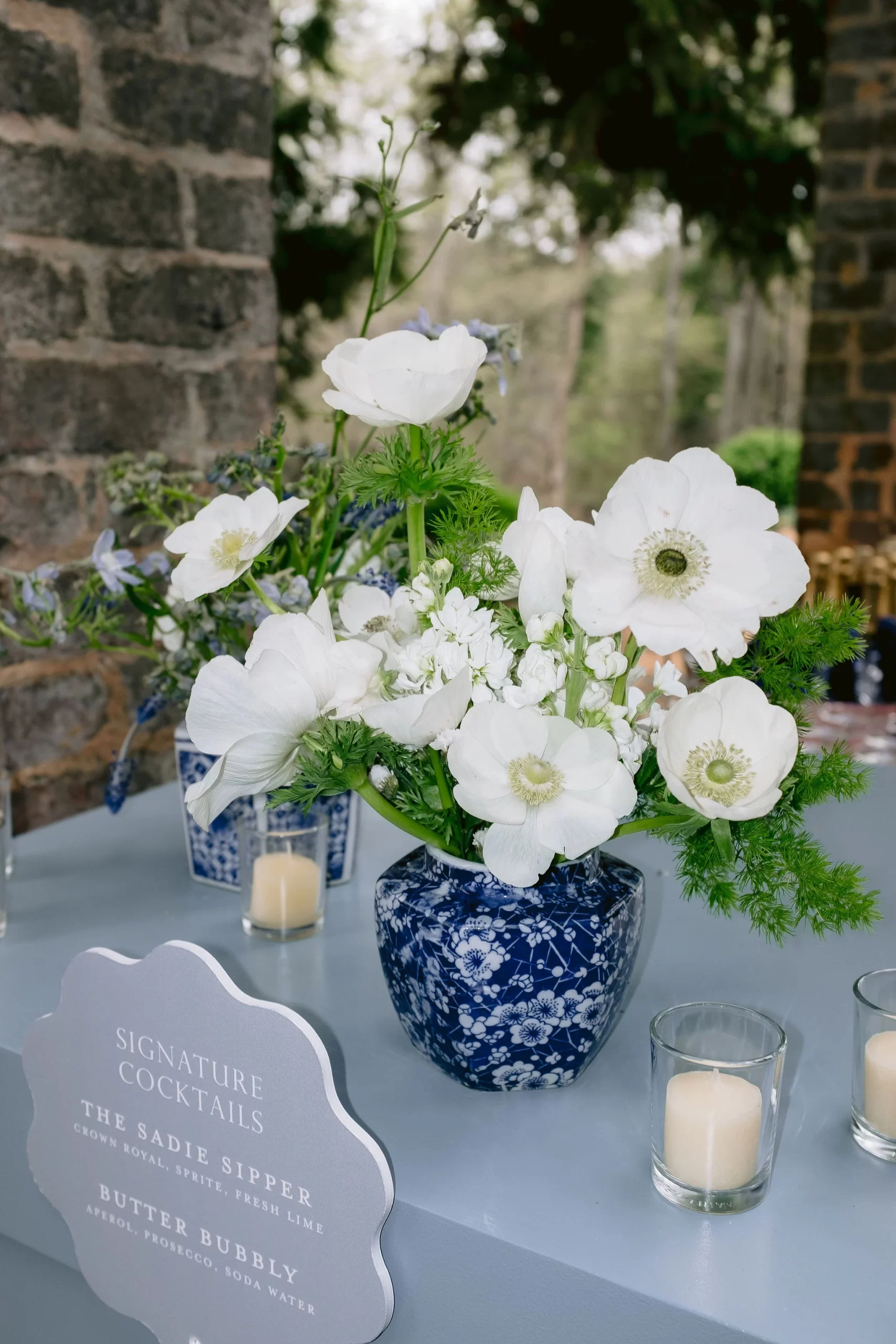
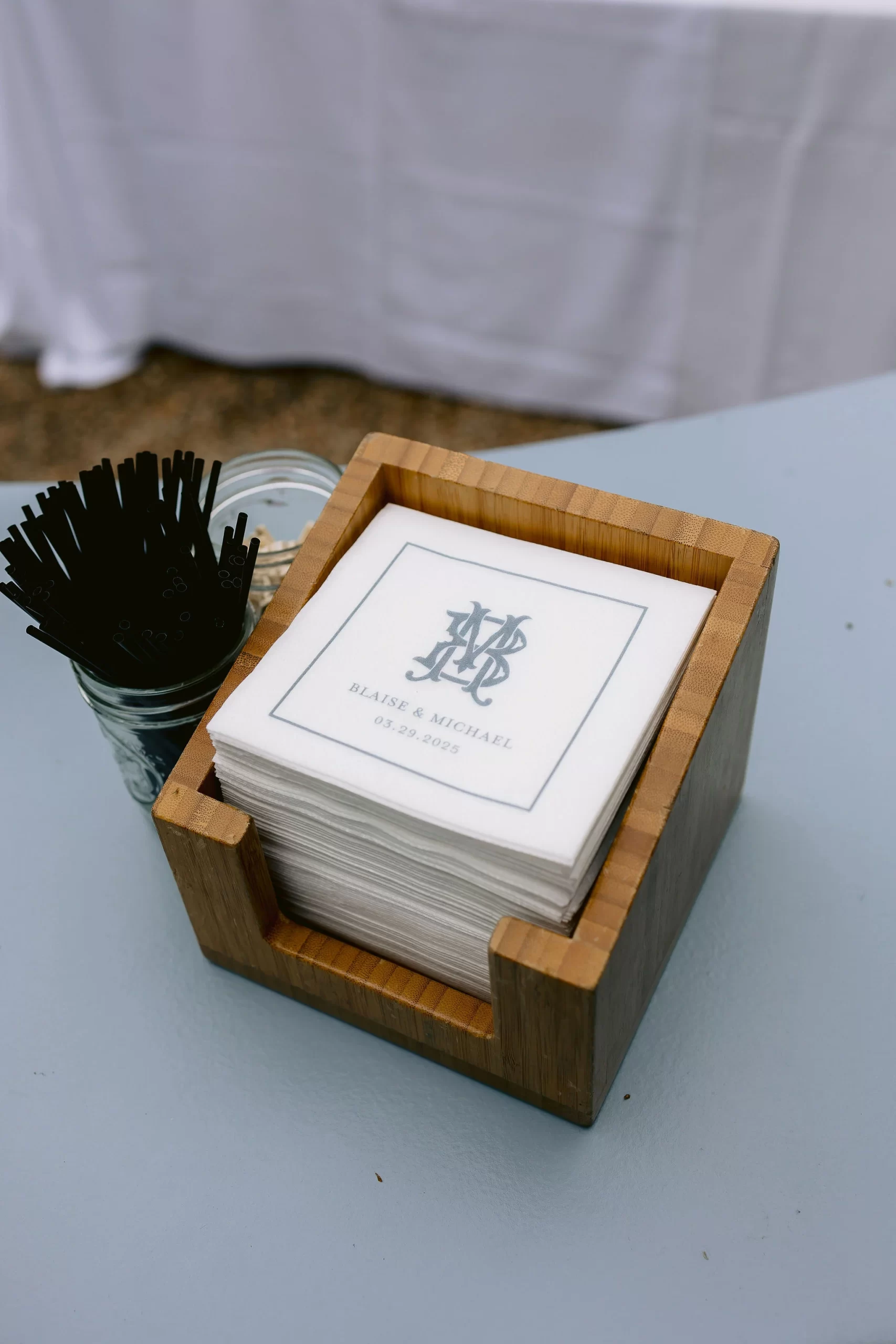
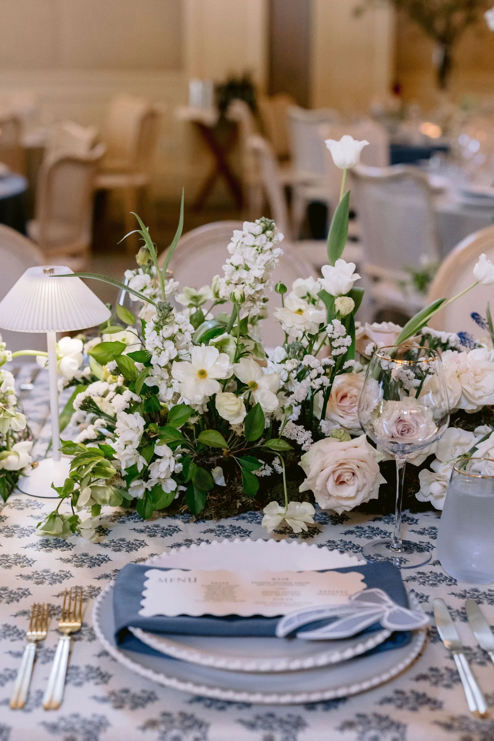
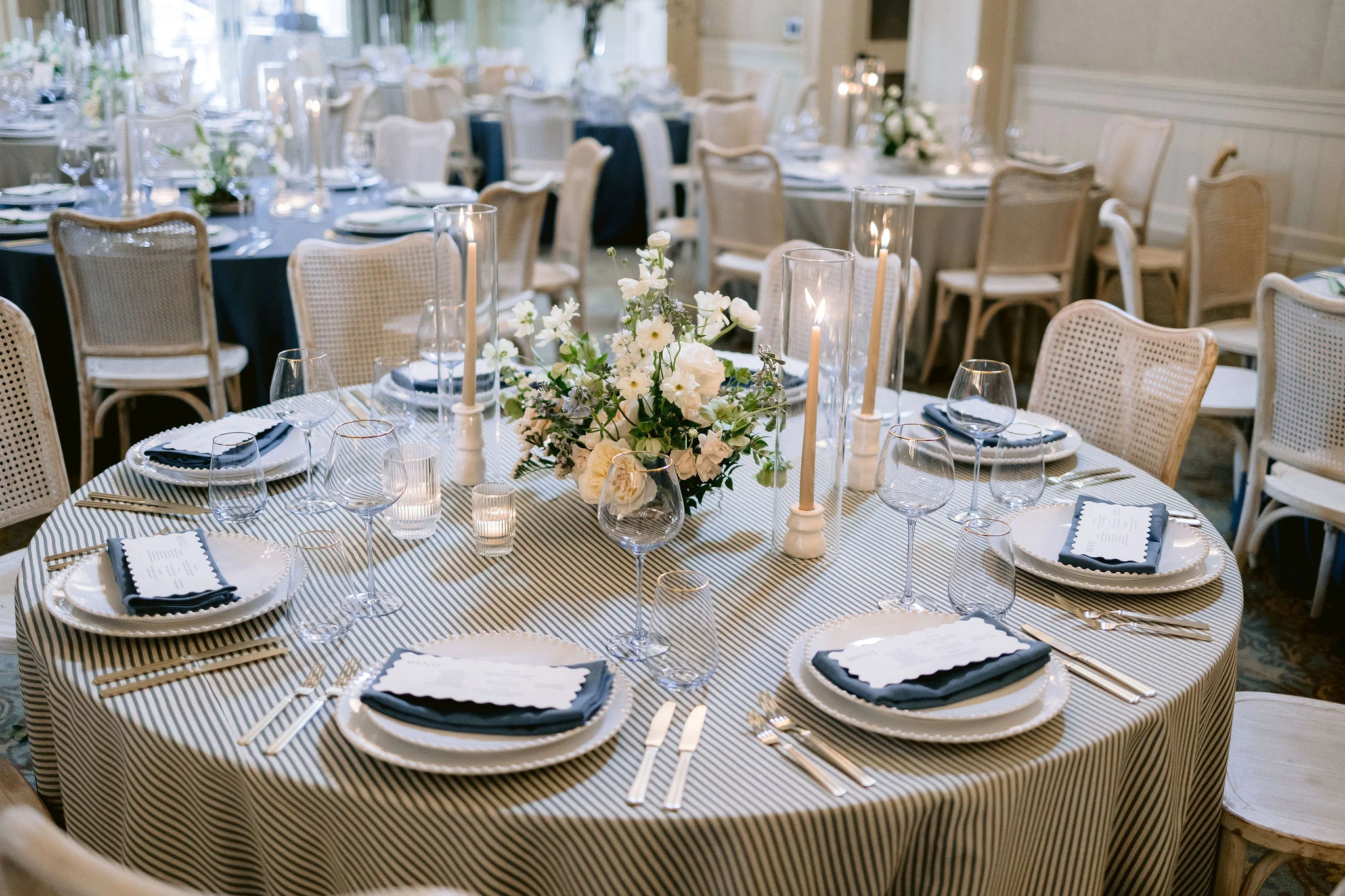
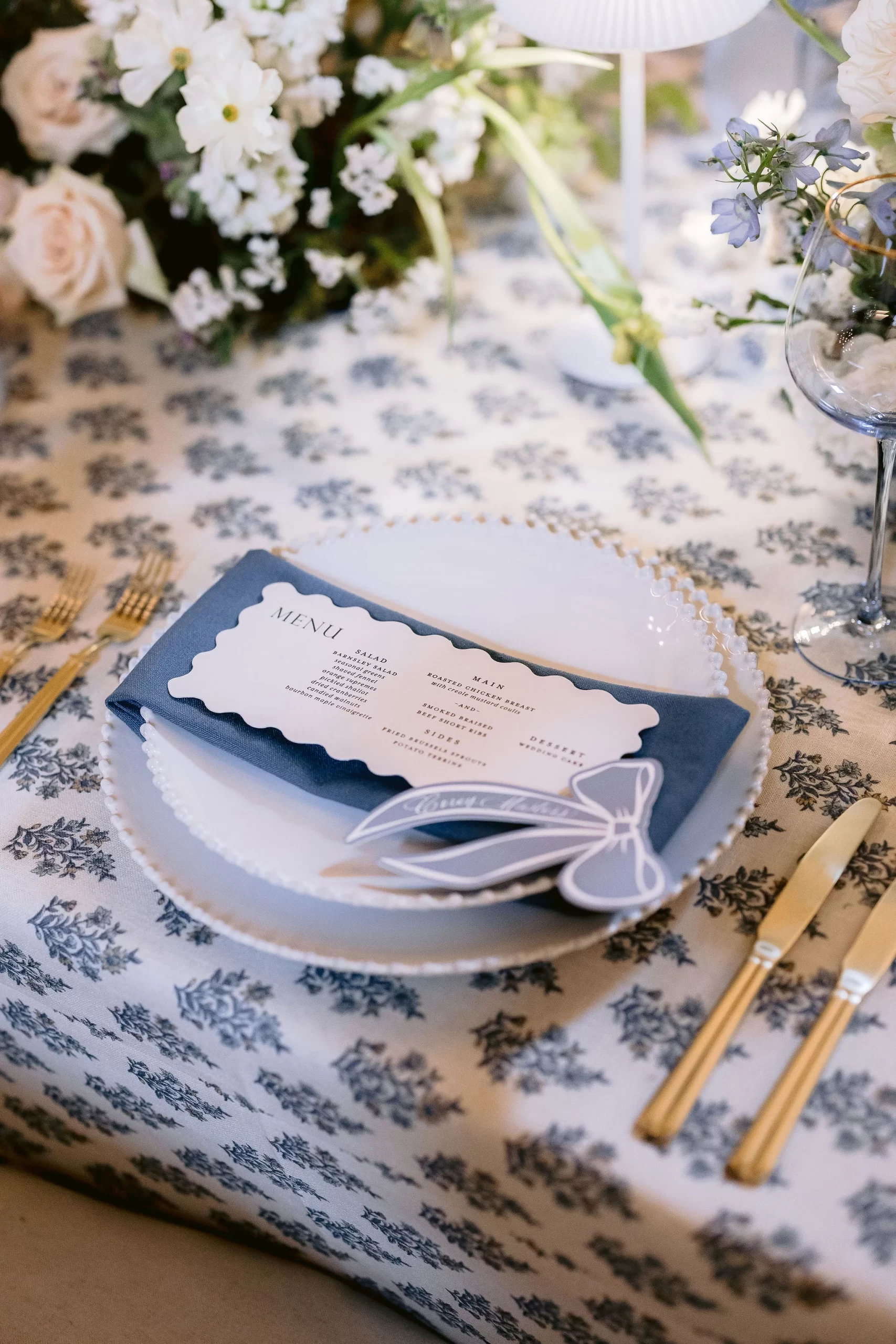
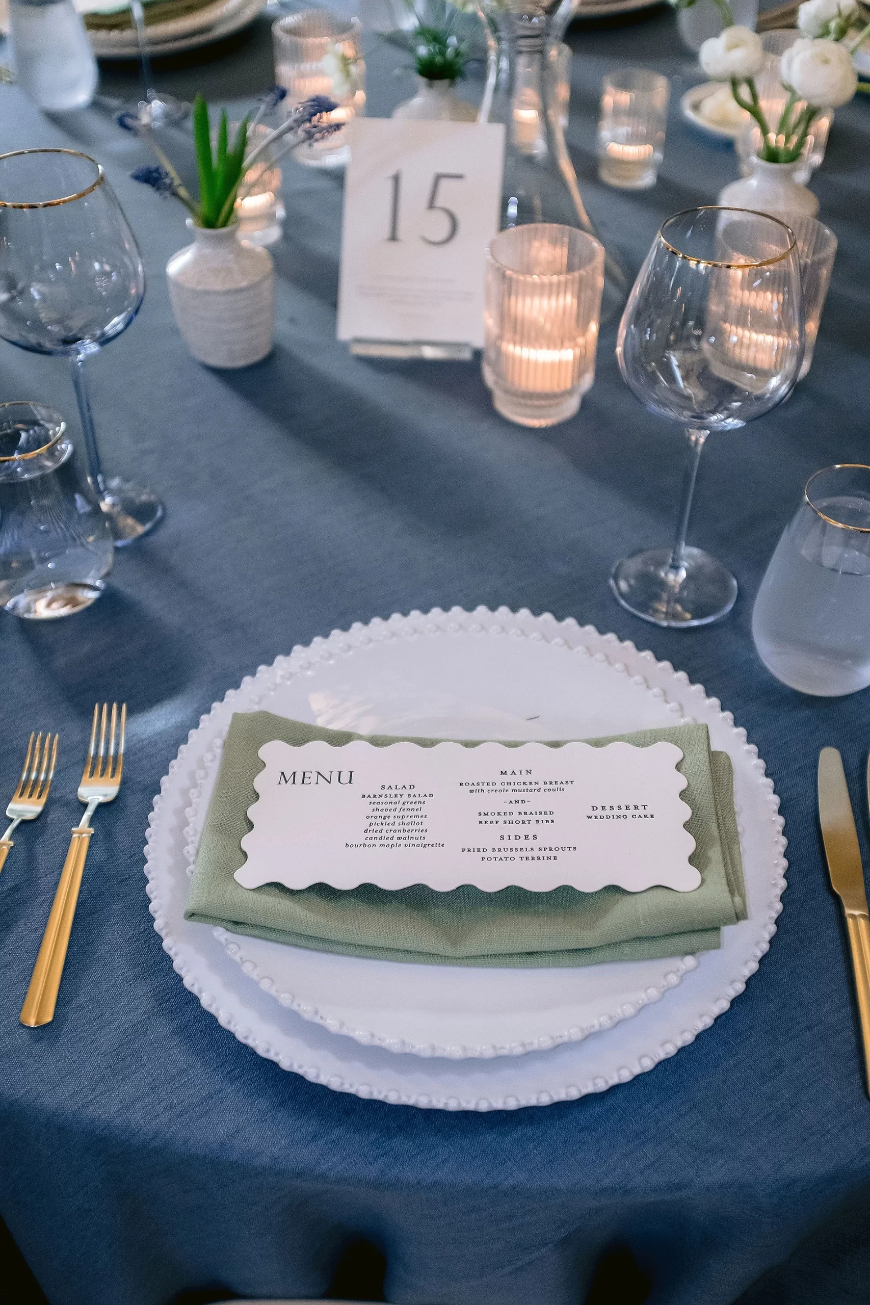
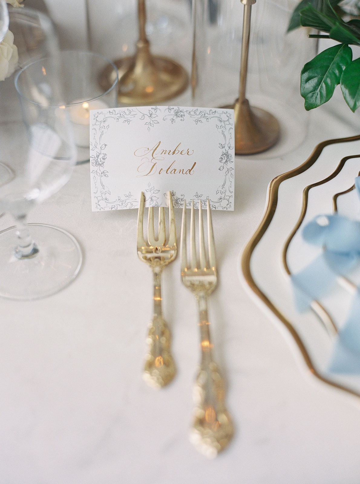
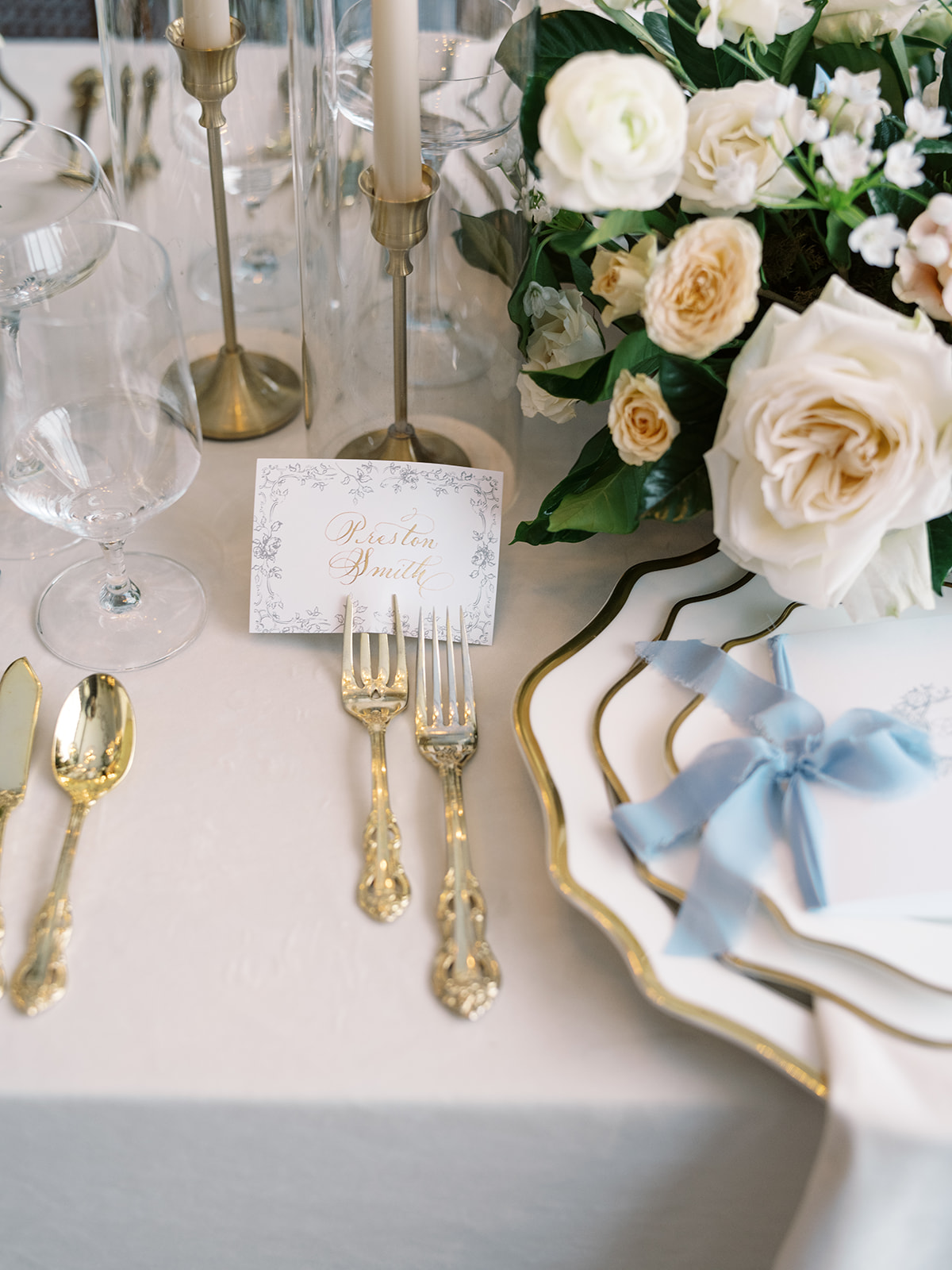
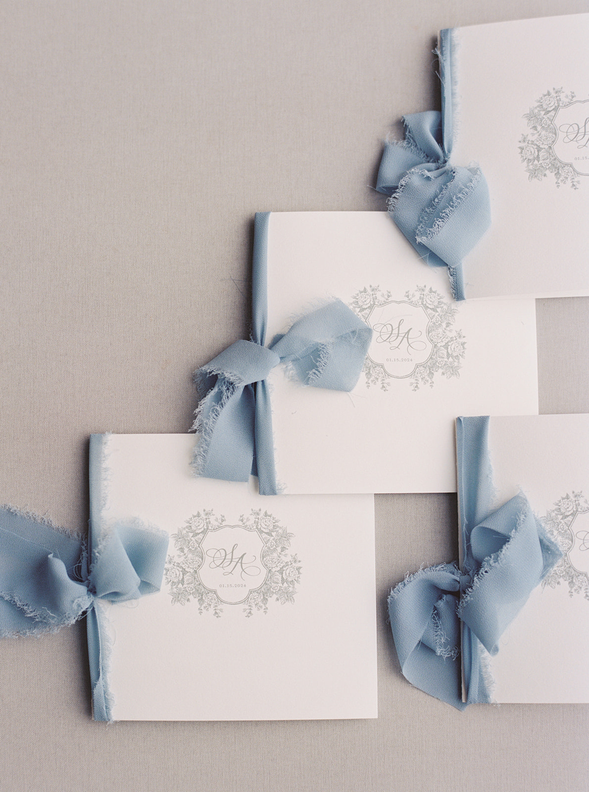
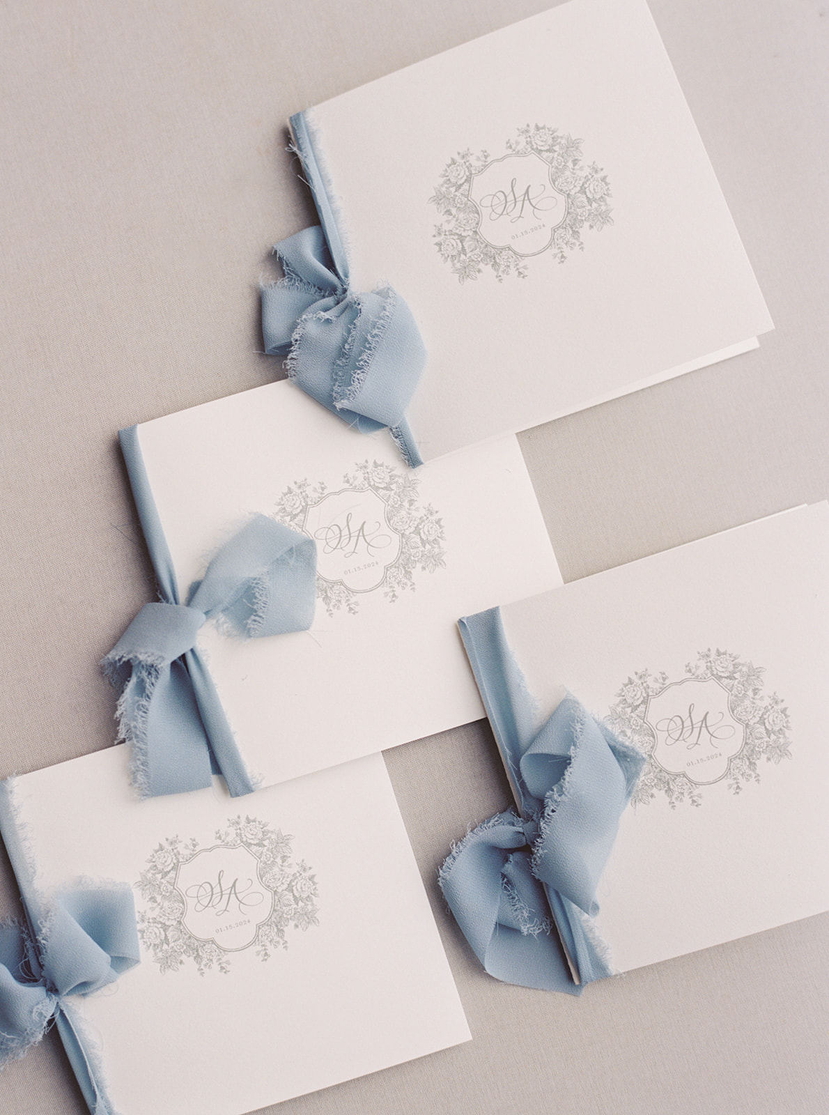
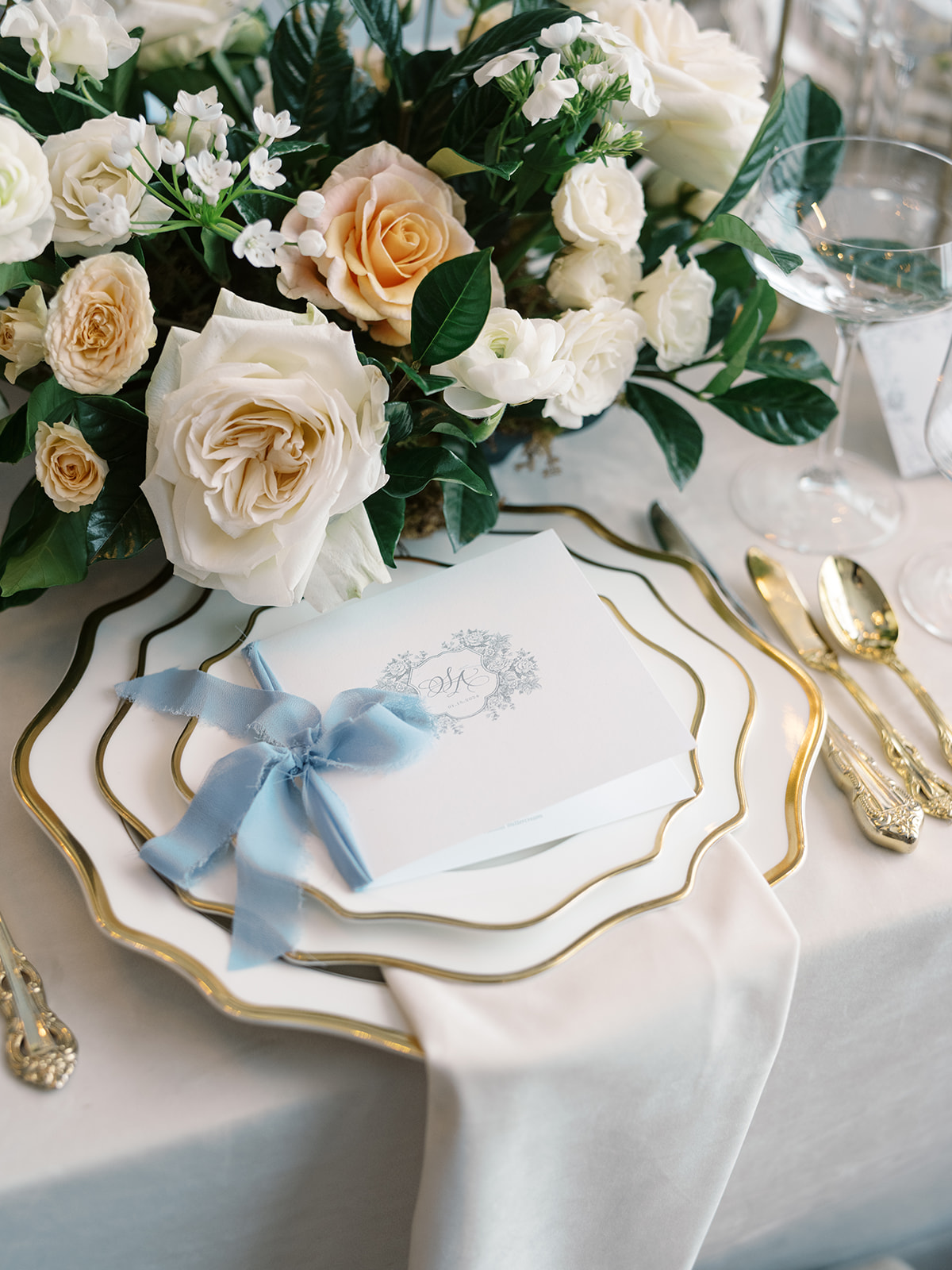
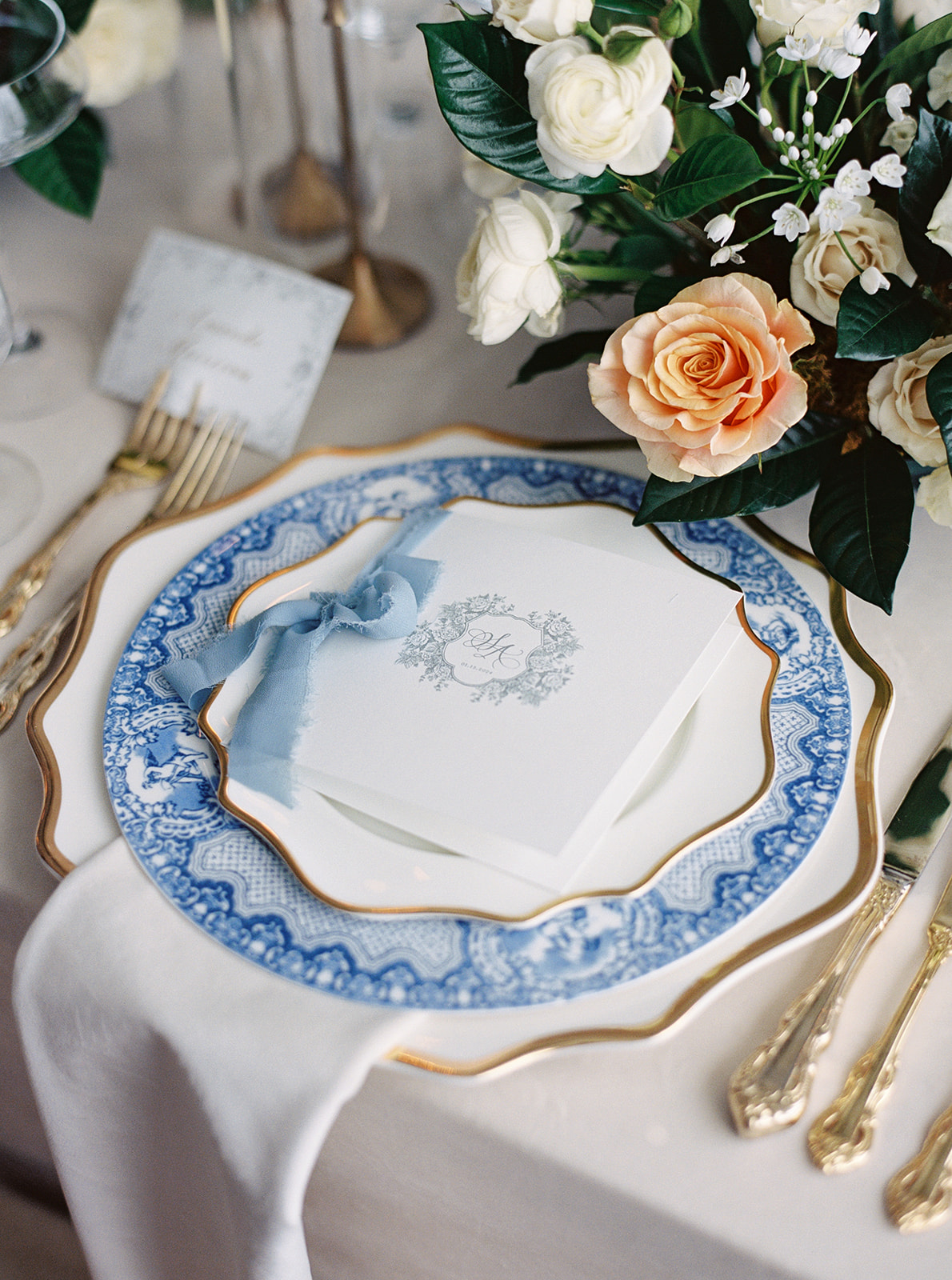
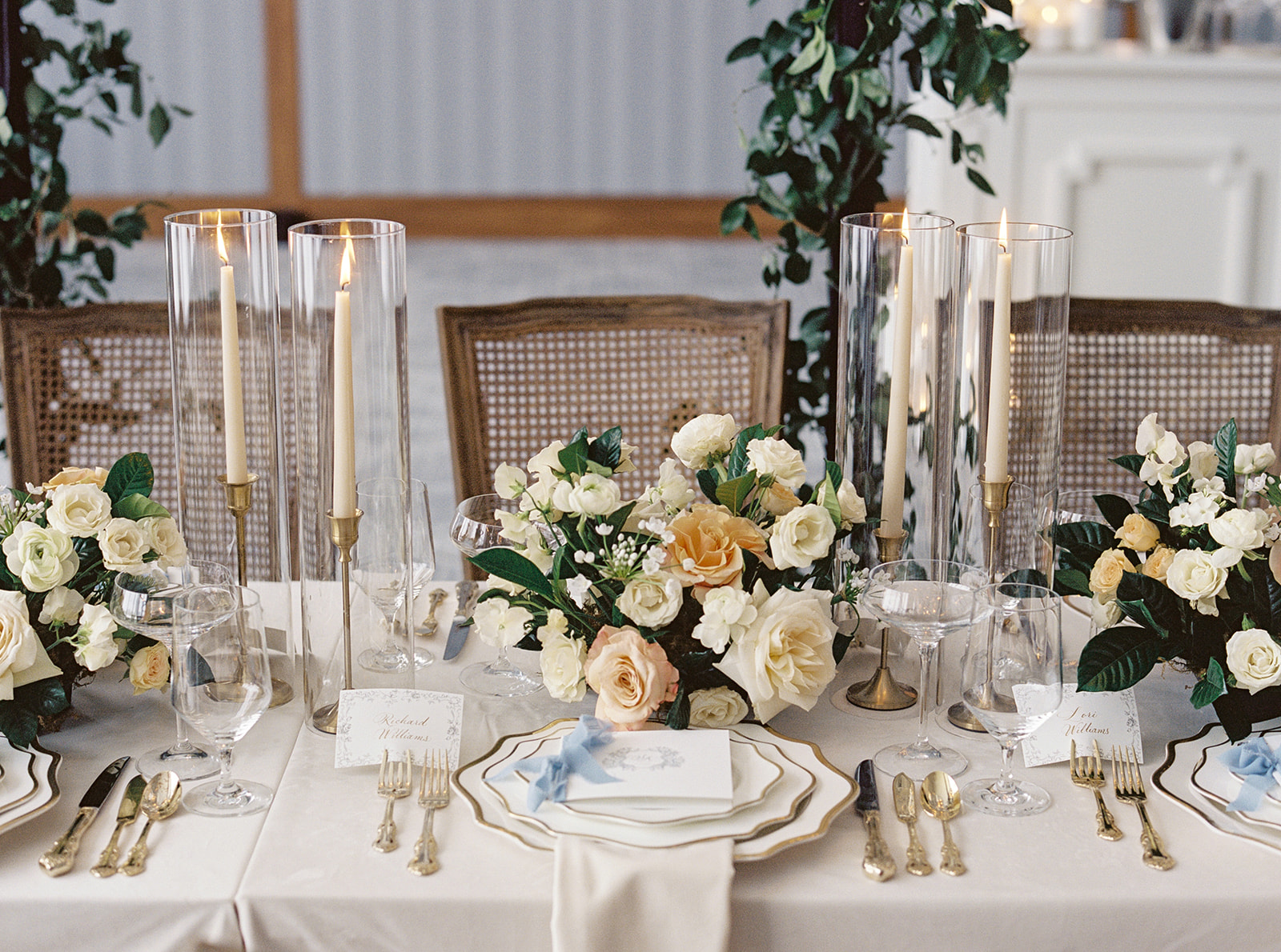
Blaise’s chosen colors of white and steel blue set a calming and sophisticated tone for the day. From the very beginning, we wove these hues into all the details, starting with the letter-pressed invitation suite on soft white and blue cardstock. A custom monogram graced the top of the invitation and made repeat appearances on other details throughout the wedding we created, including the programs and cocktail napkins. When couples are this intentional about design, the whole day feels effortlessly cohesive.
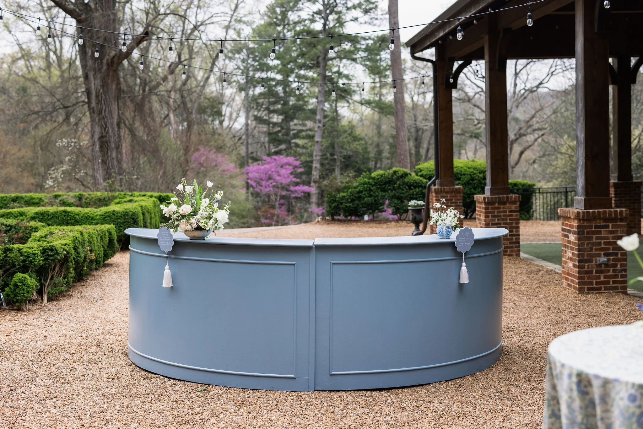
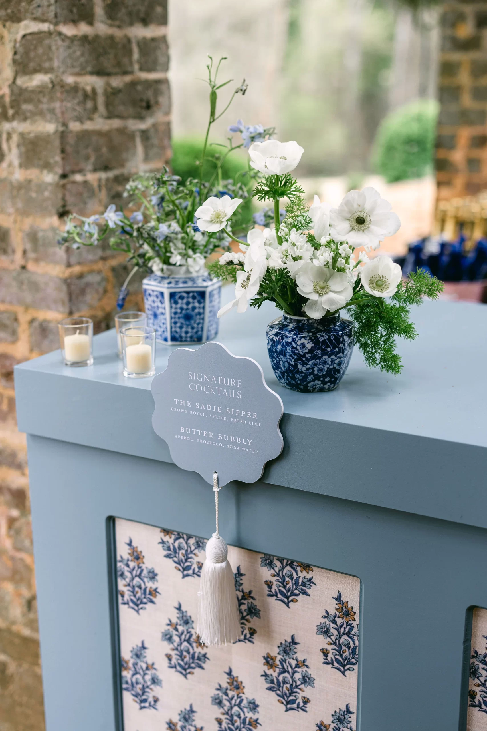
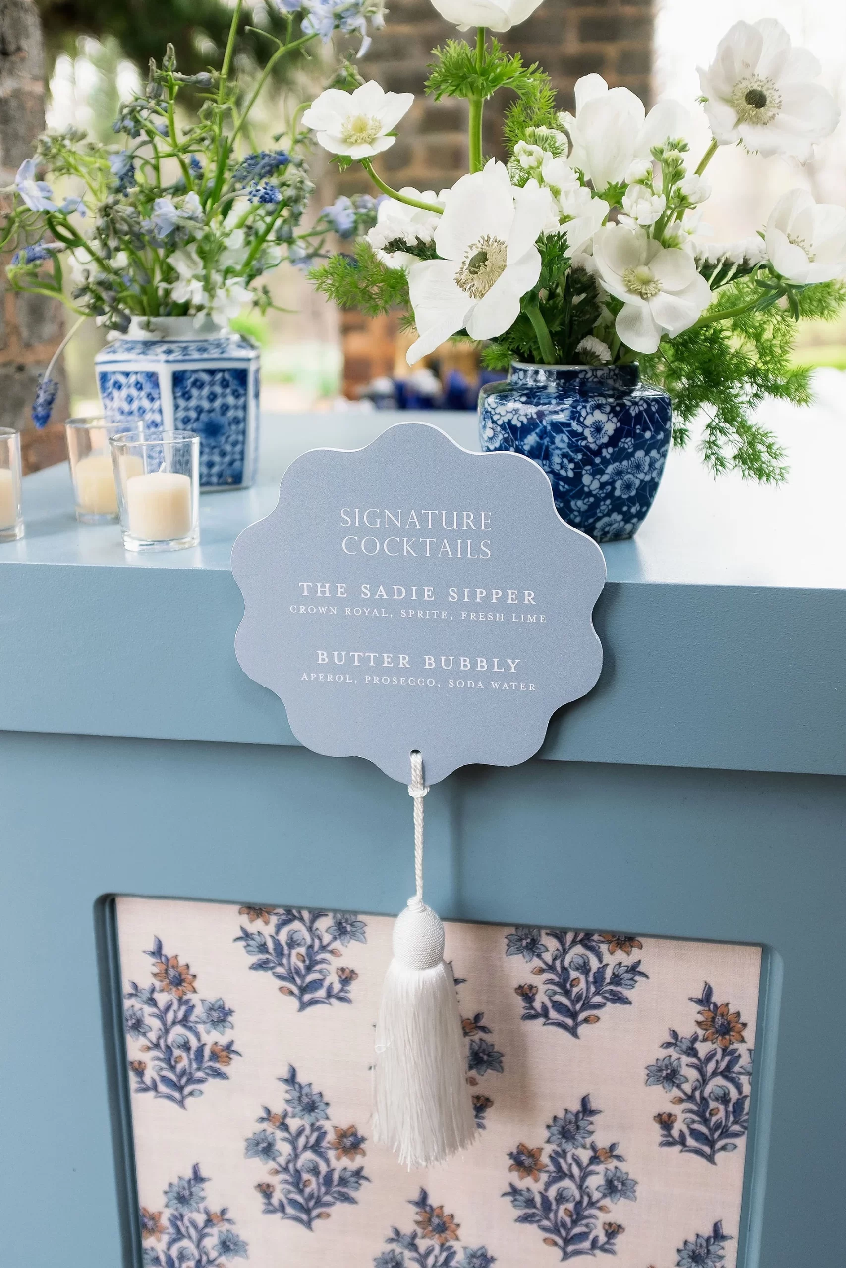
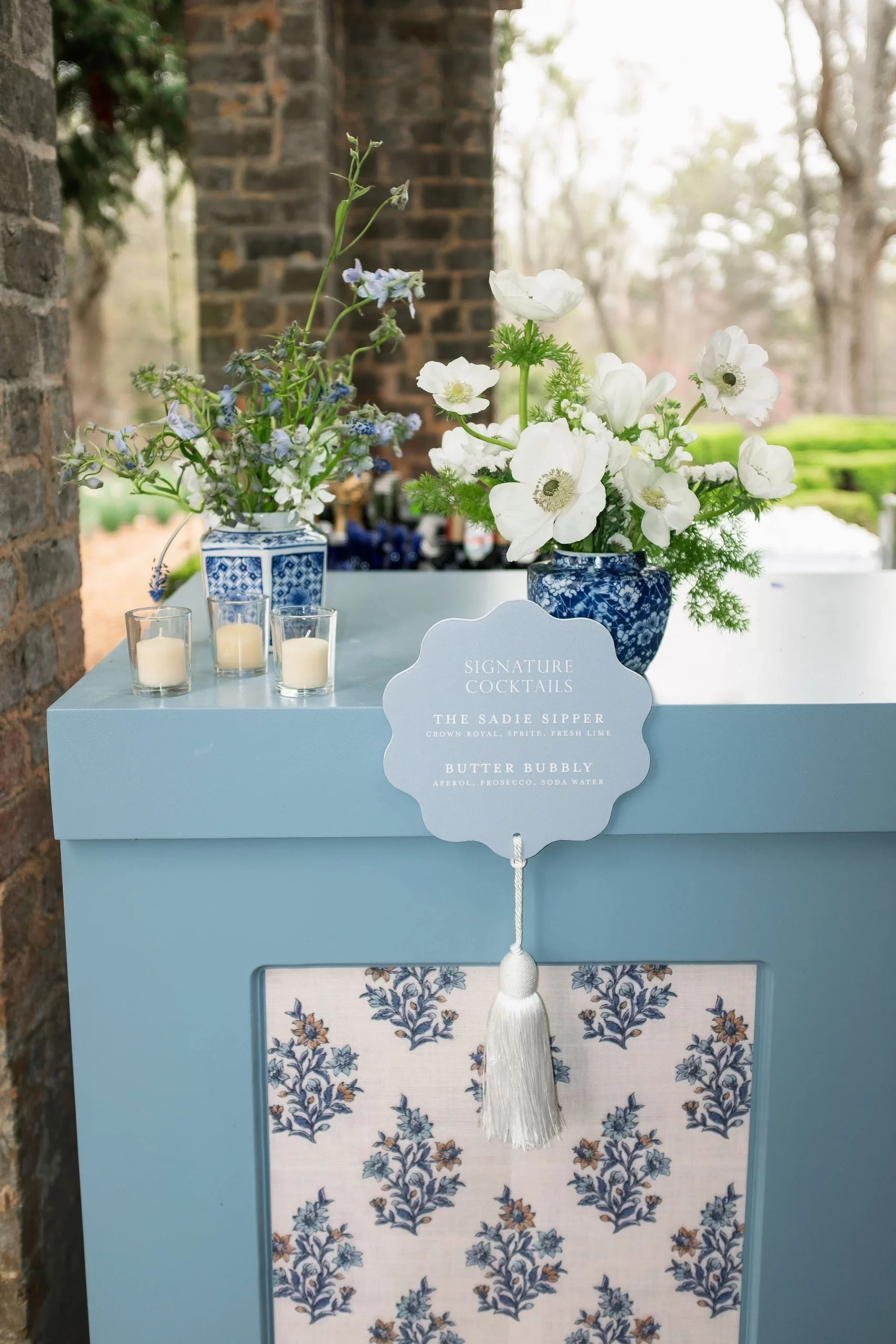
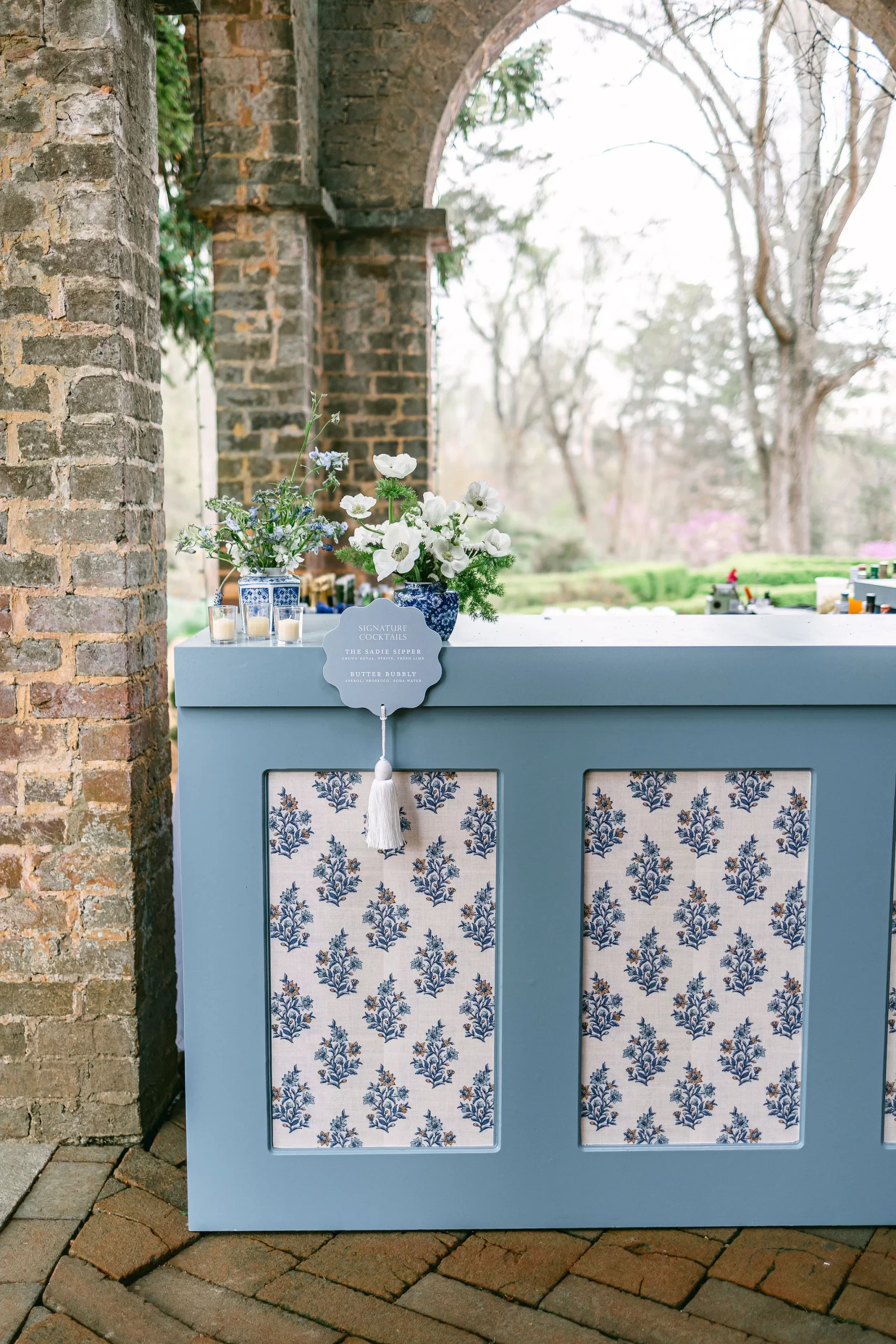
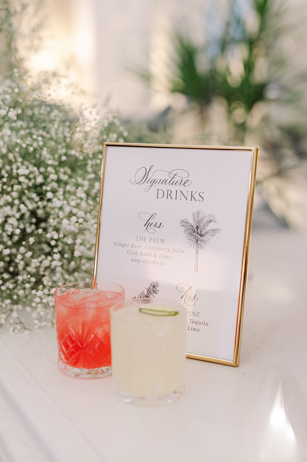
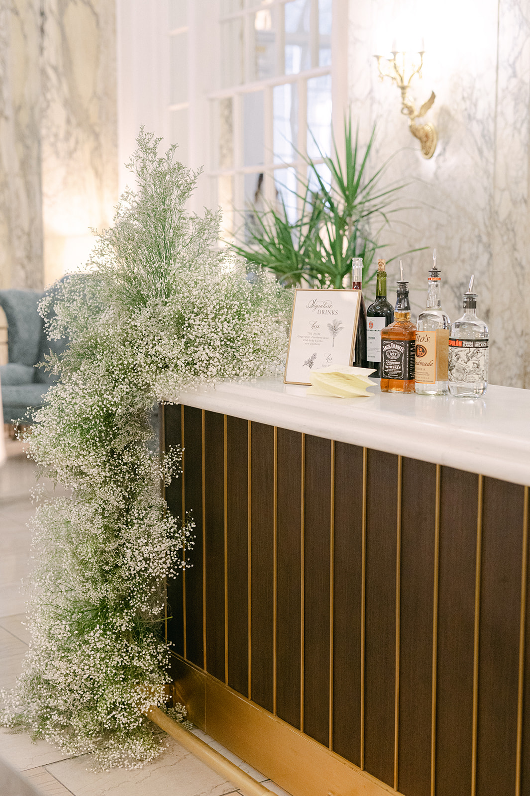
The couple married outside near the gorgeous gardens at the venue. After saying “I do”, guests mingled on the property enjoying cocktails. The signature cocktail bar sign was another one of my favorite details. The steel blue sign with white wording, was made complete with a fun, white tassel. Along with the custom bar signs, we also designed the monogrammed cocktail napkins.
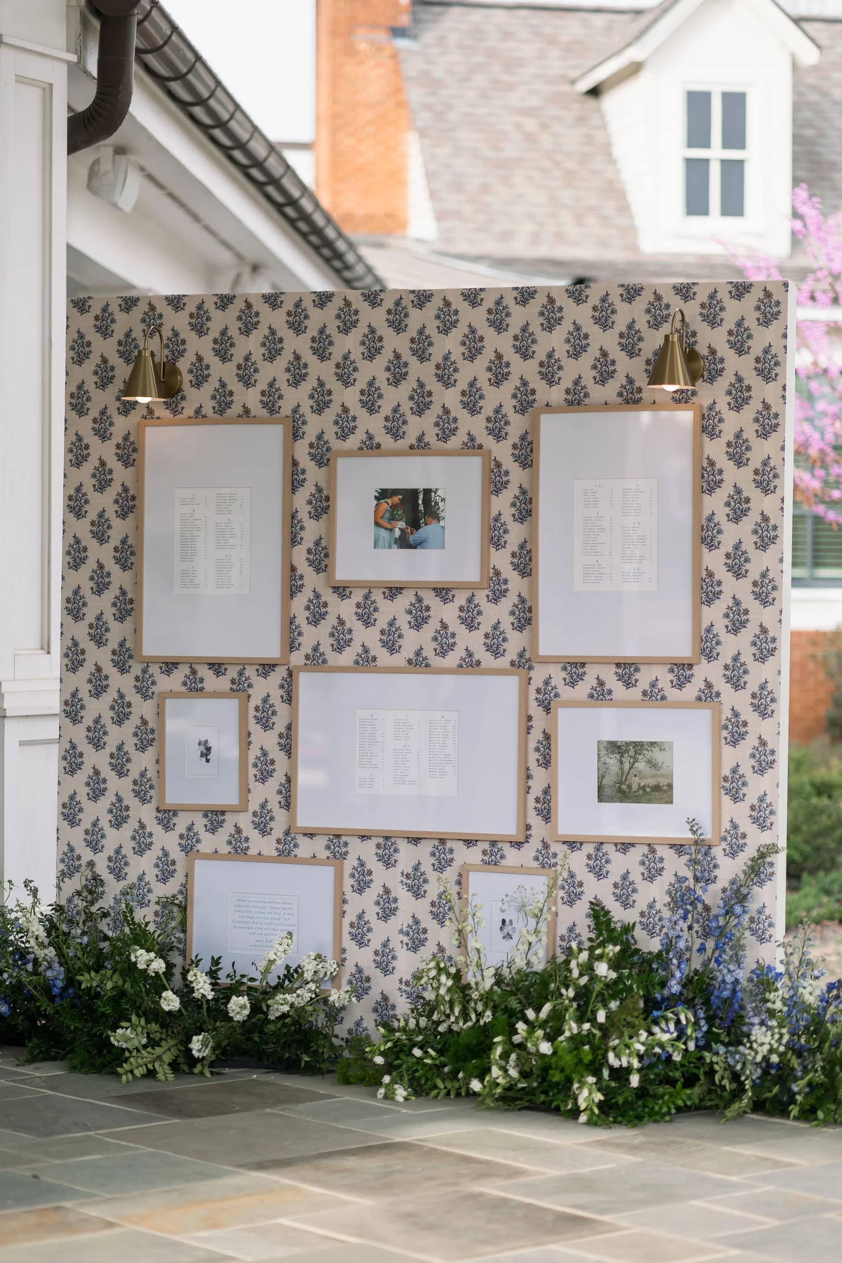
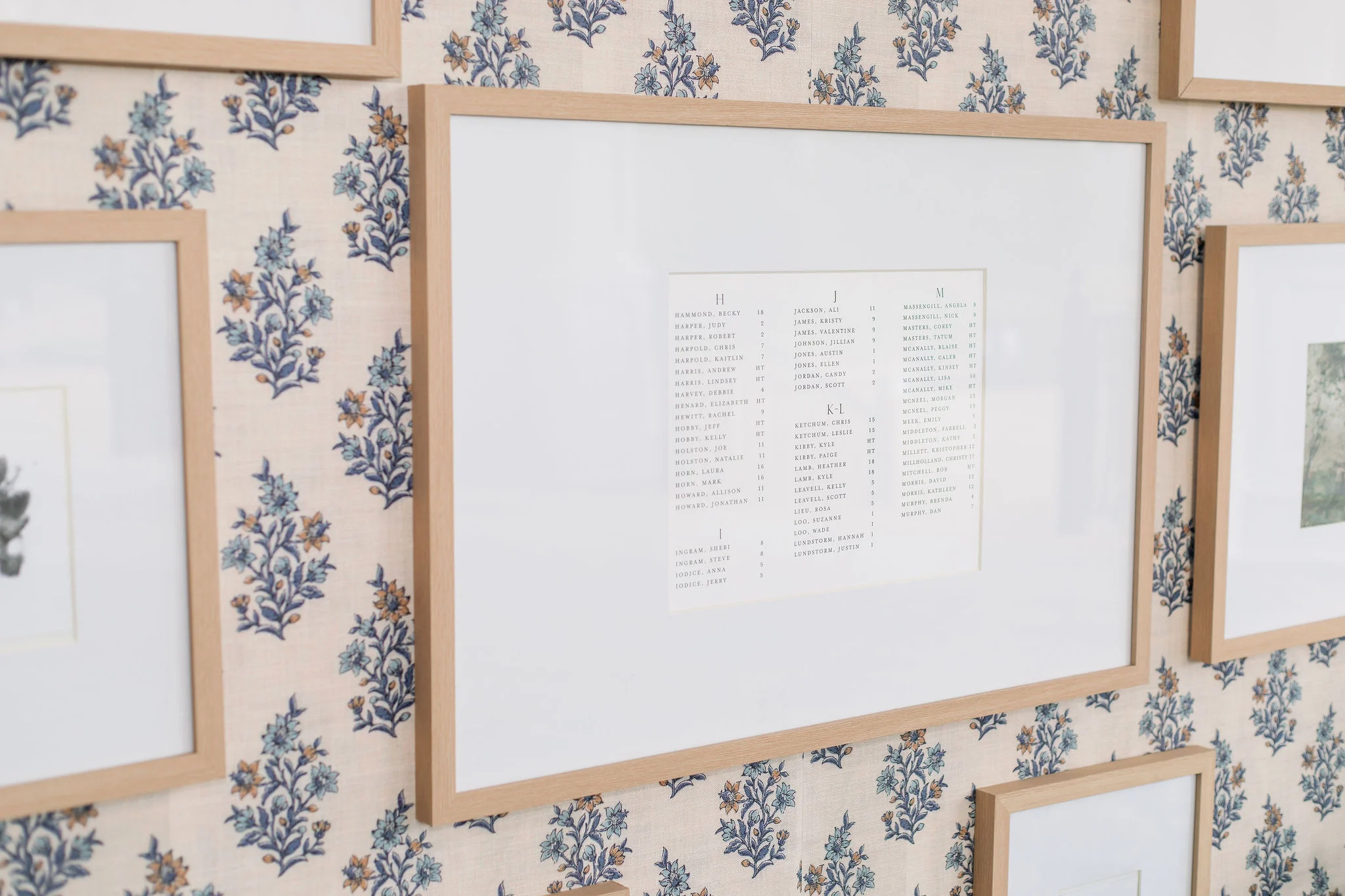
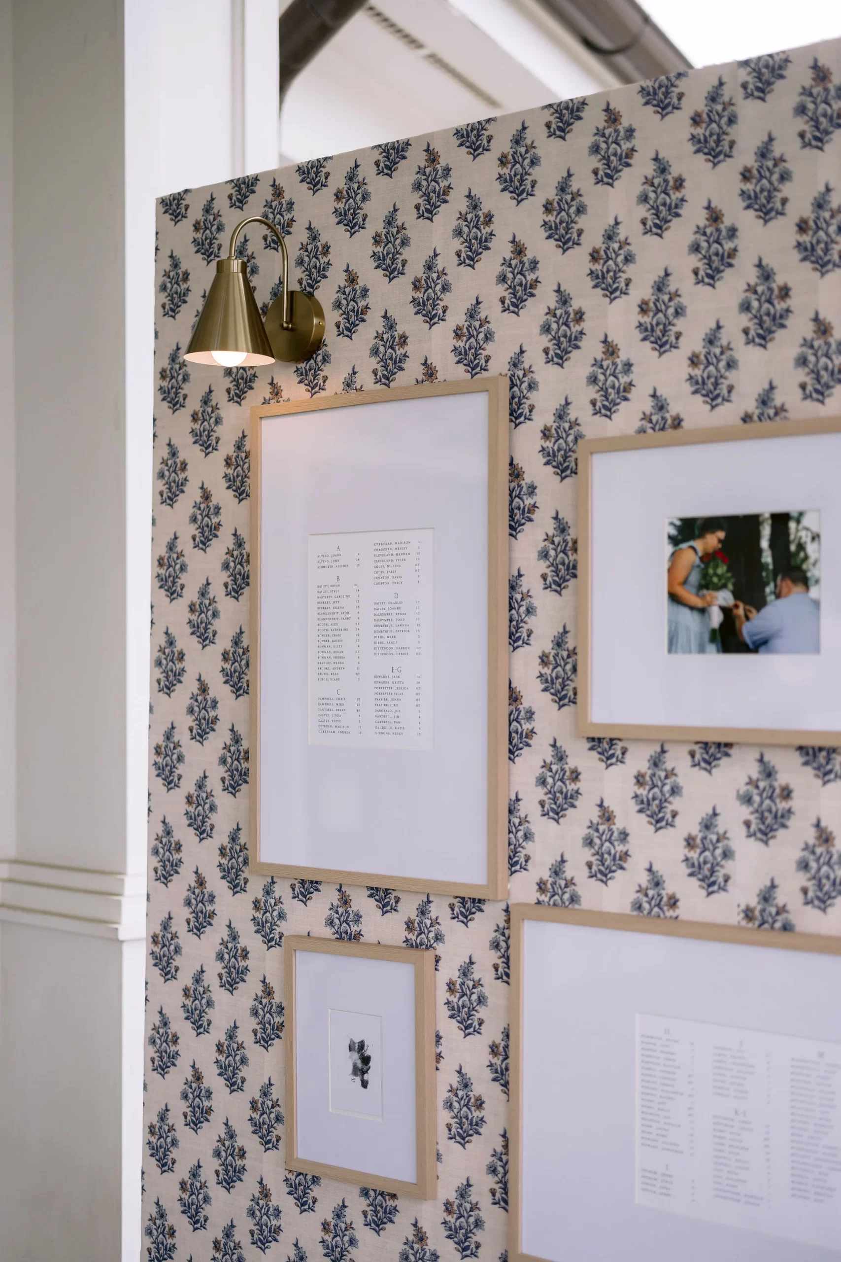
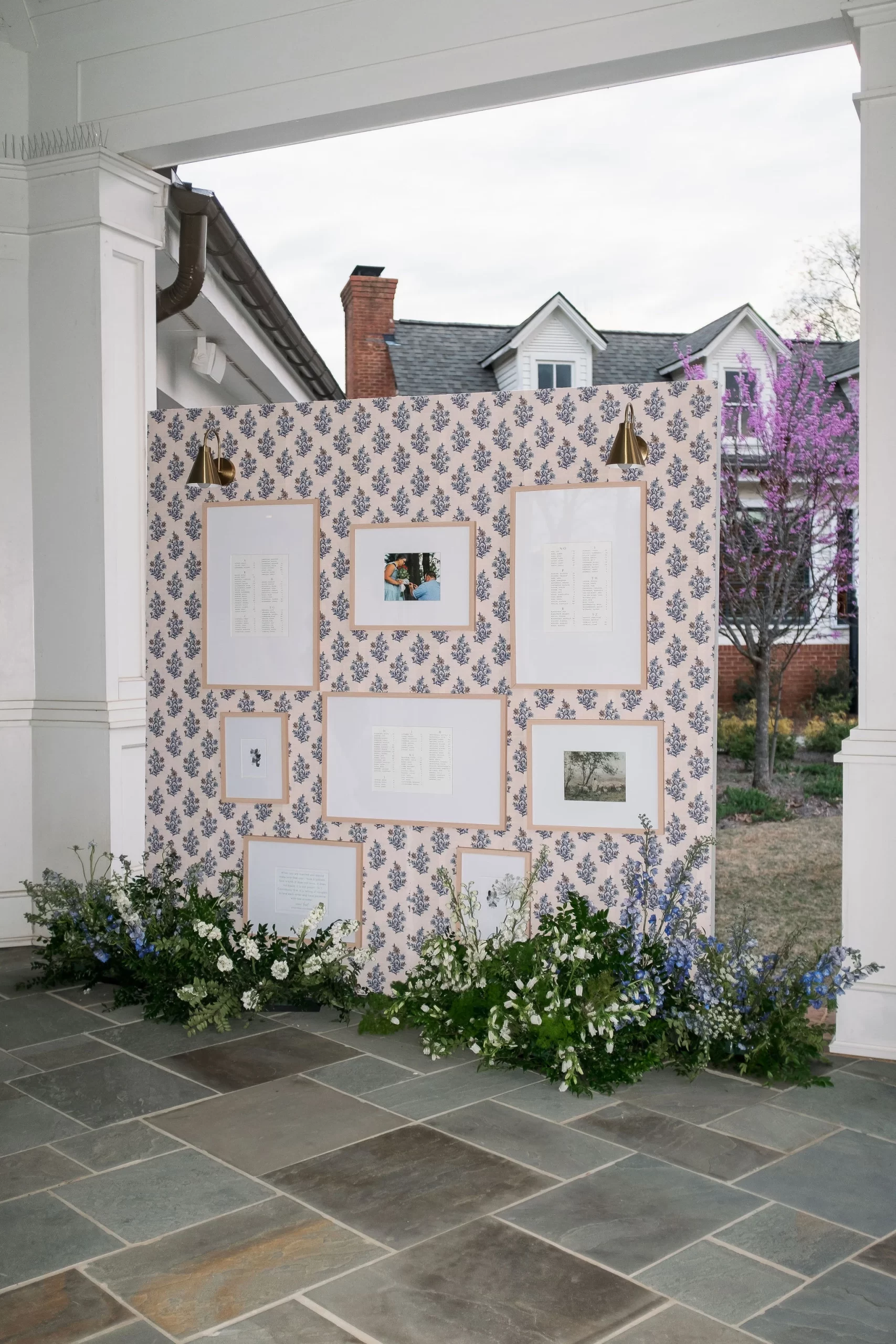
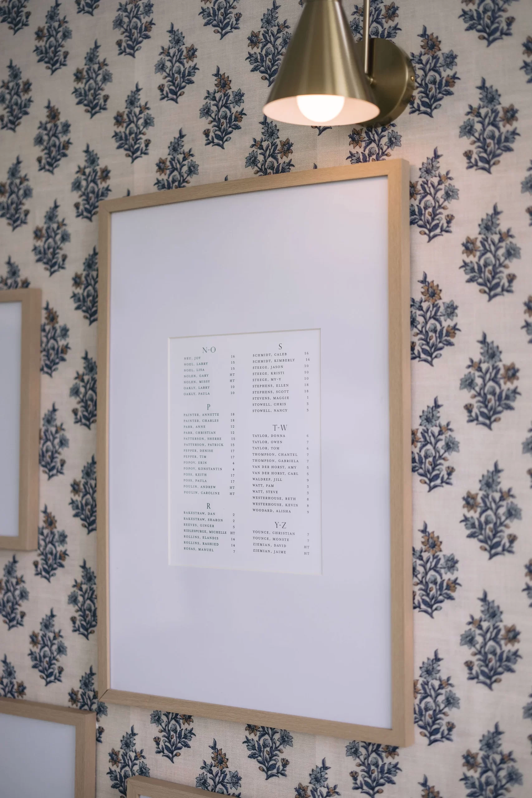
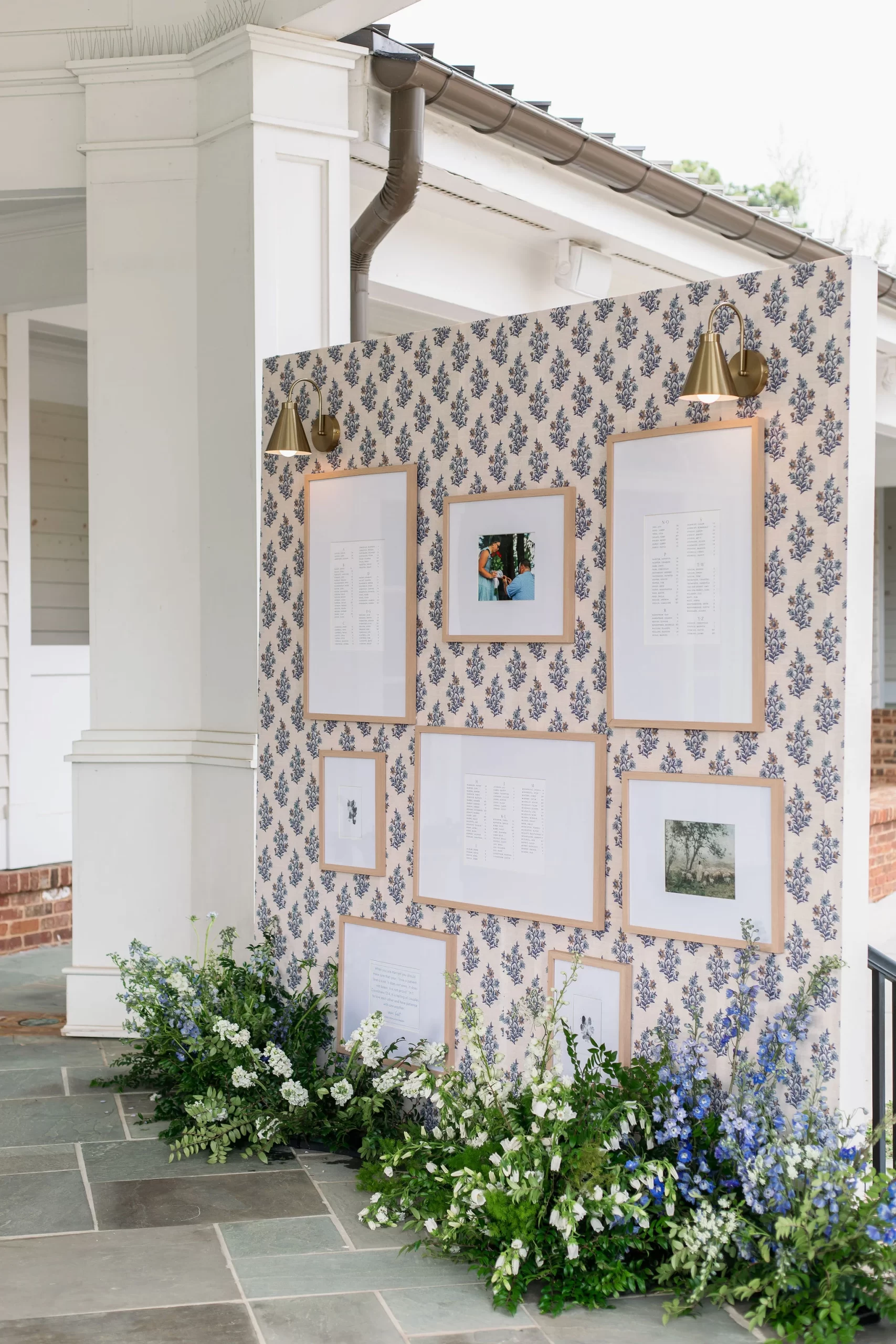
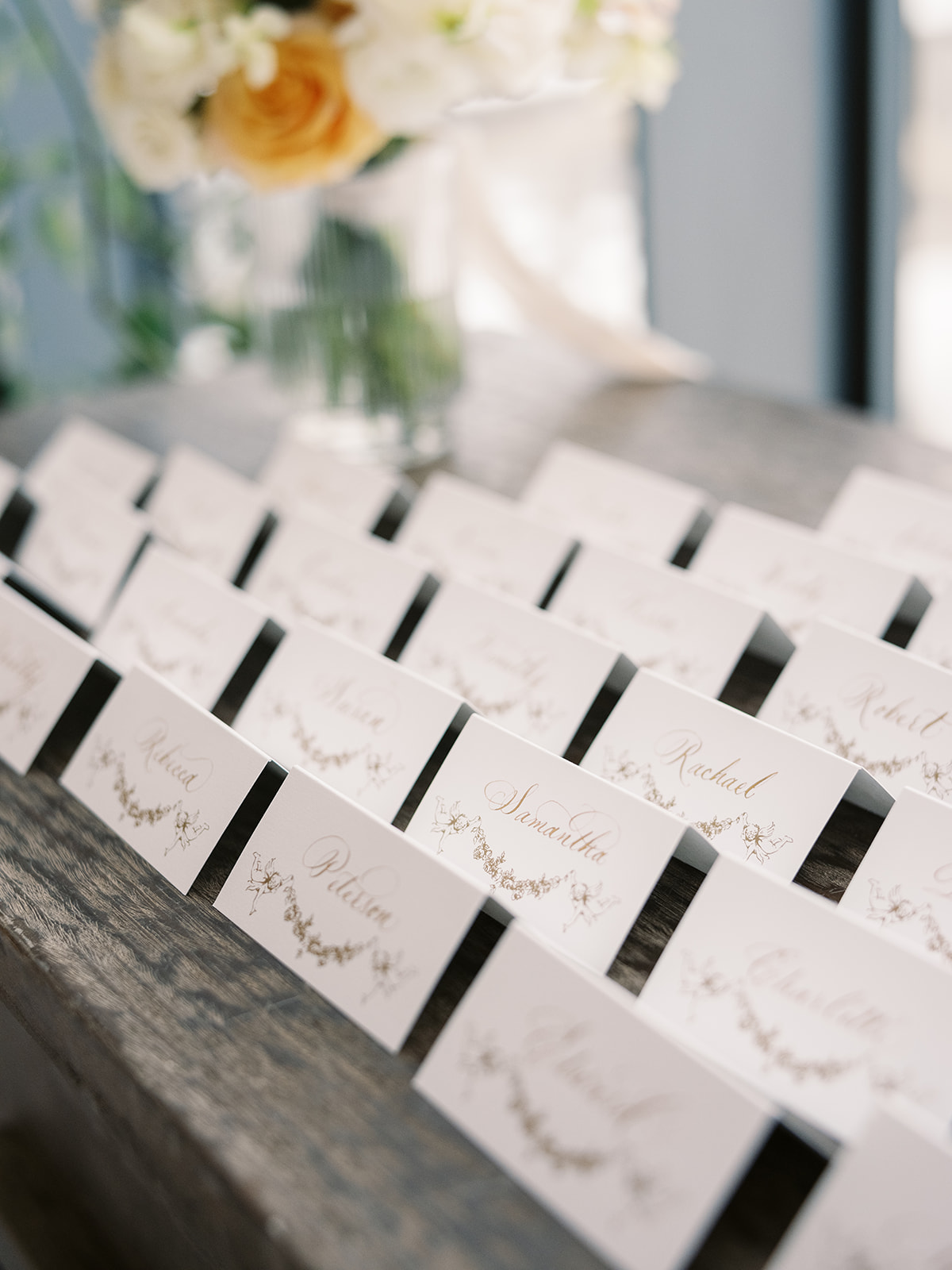
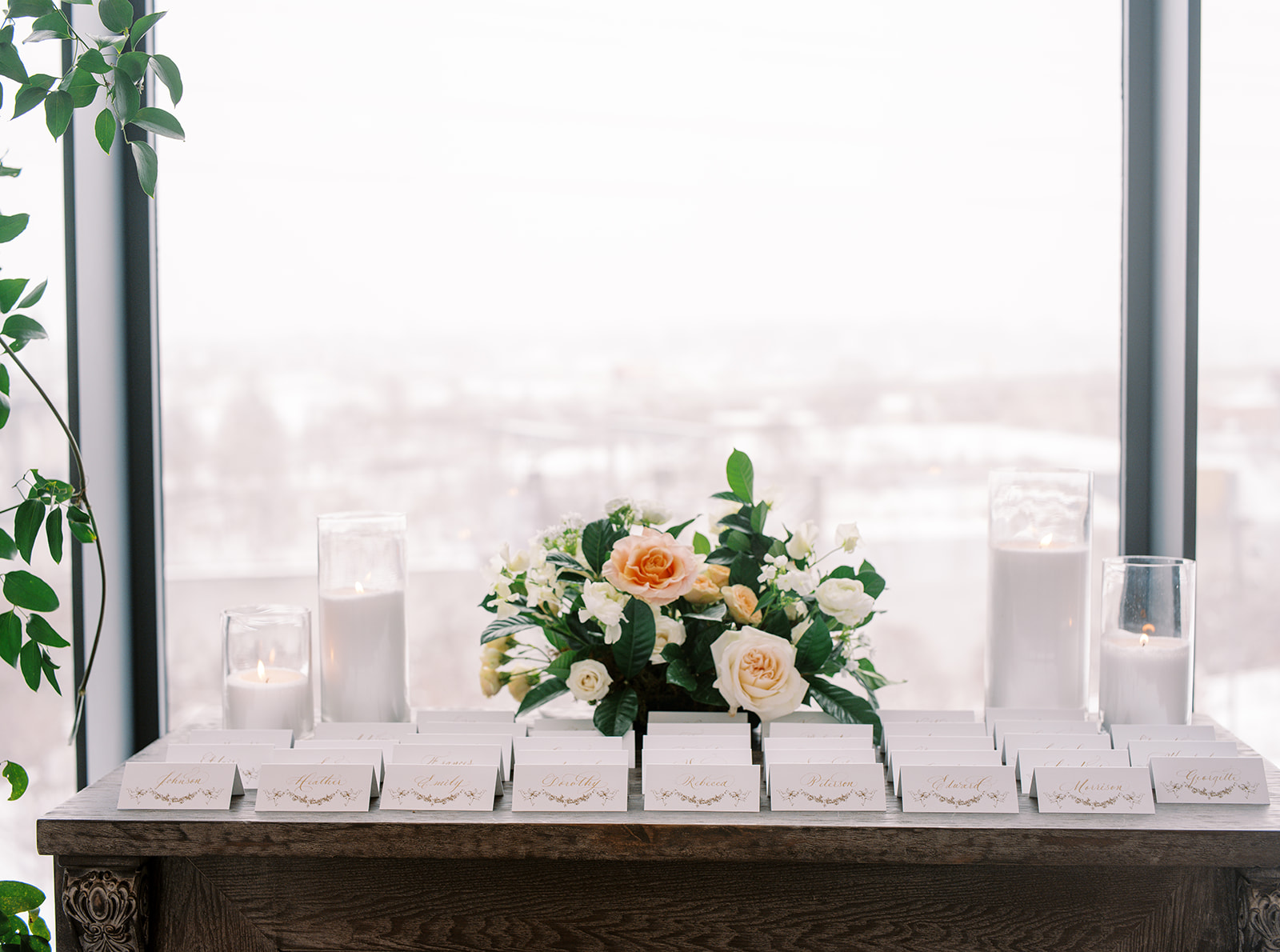
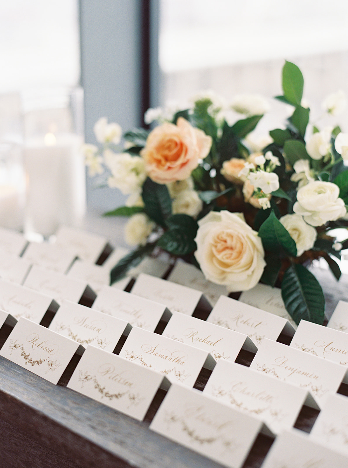
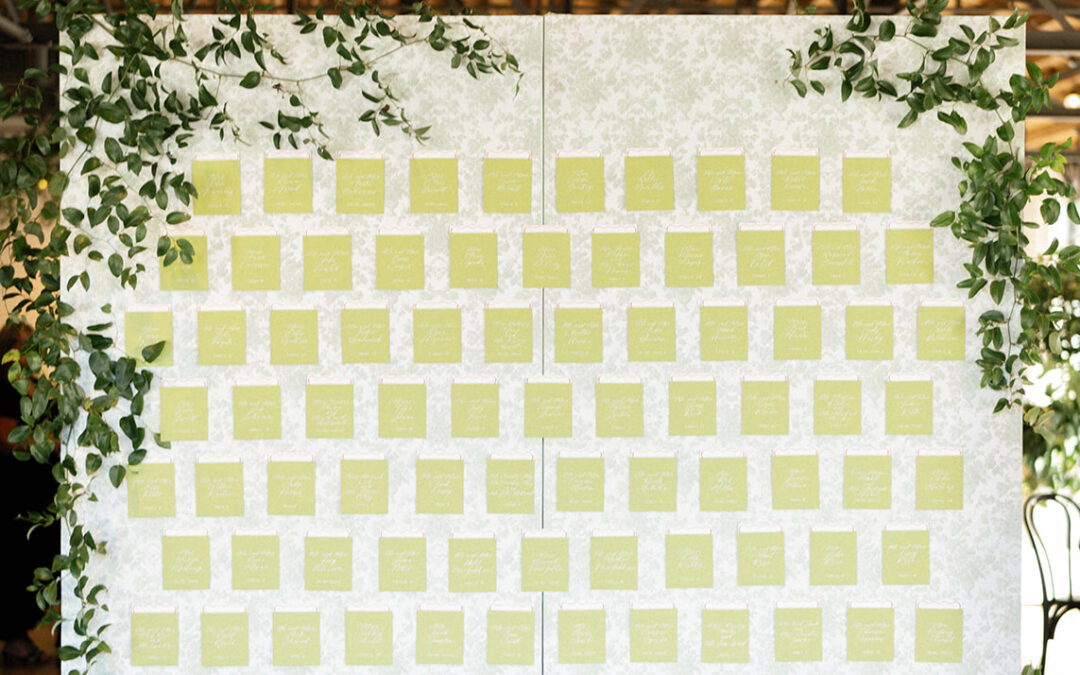
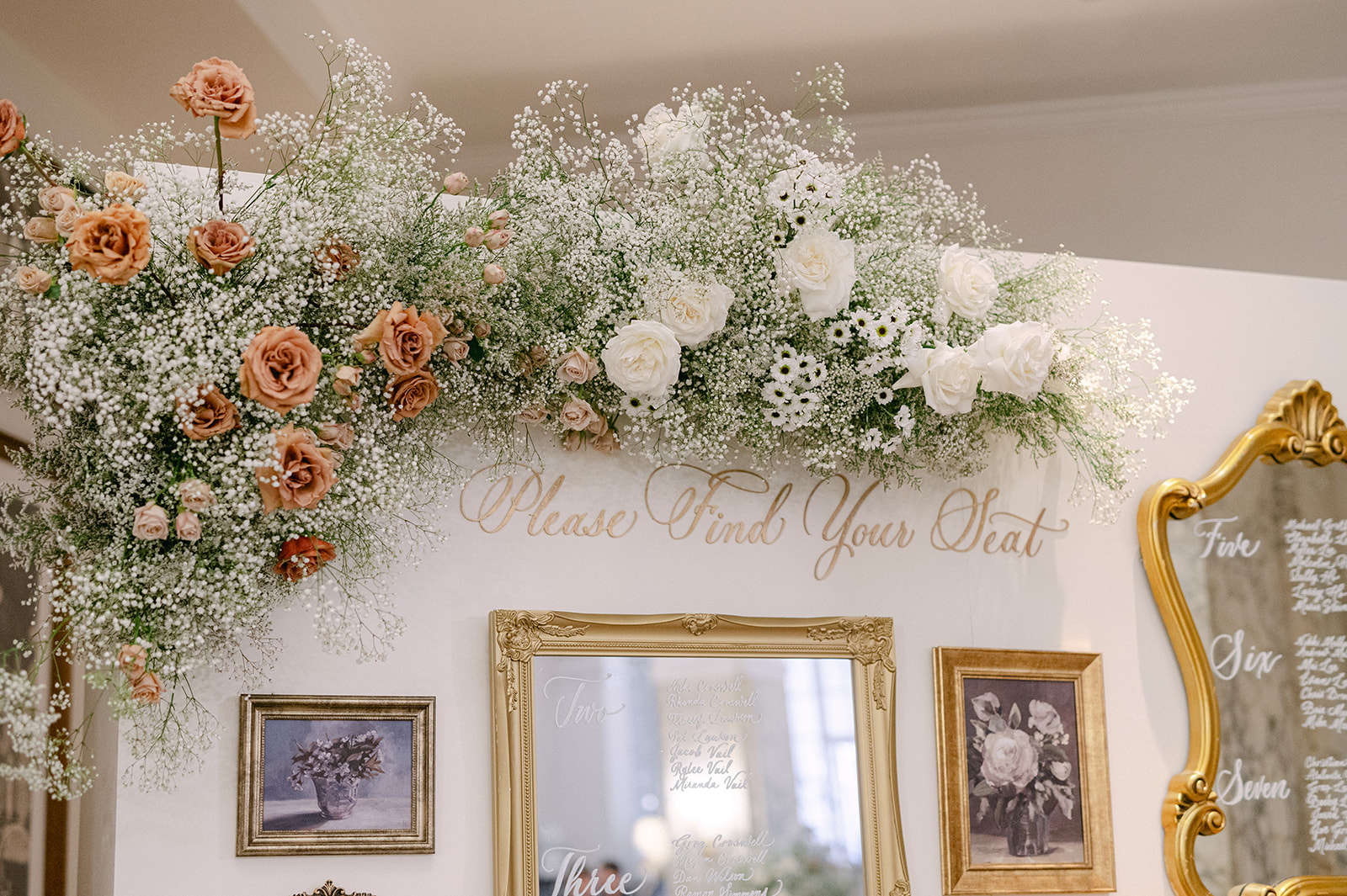
Seating Chart Display
As guests made their way inside for the reception, they were greeted by a wallpapered seating chart display with framed cards listing the table assignments. It was a beautifully curated focal point. I also love that the pattern on the wallpaper made an appearance on several other details, including the inlay of the bars, tablecloths at the reception, and surrounding the monogram detail on the invitations and programs. Absolute perfection!
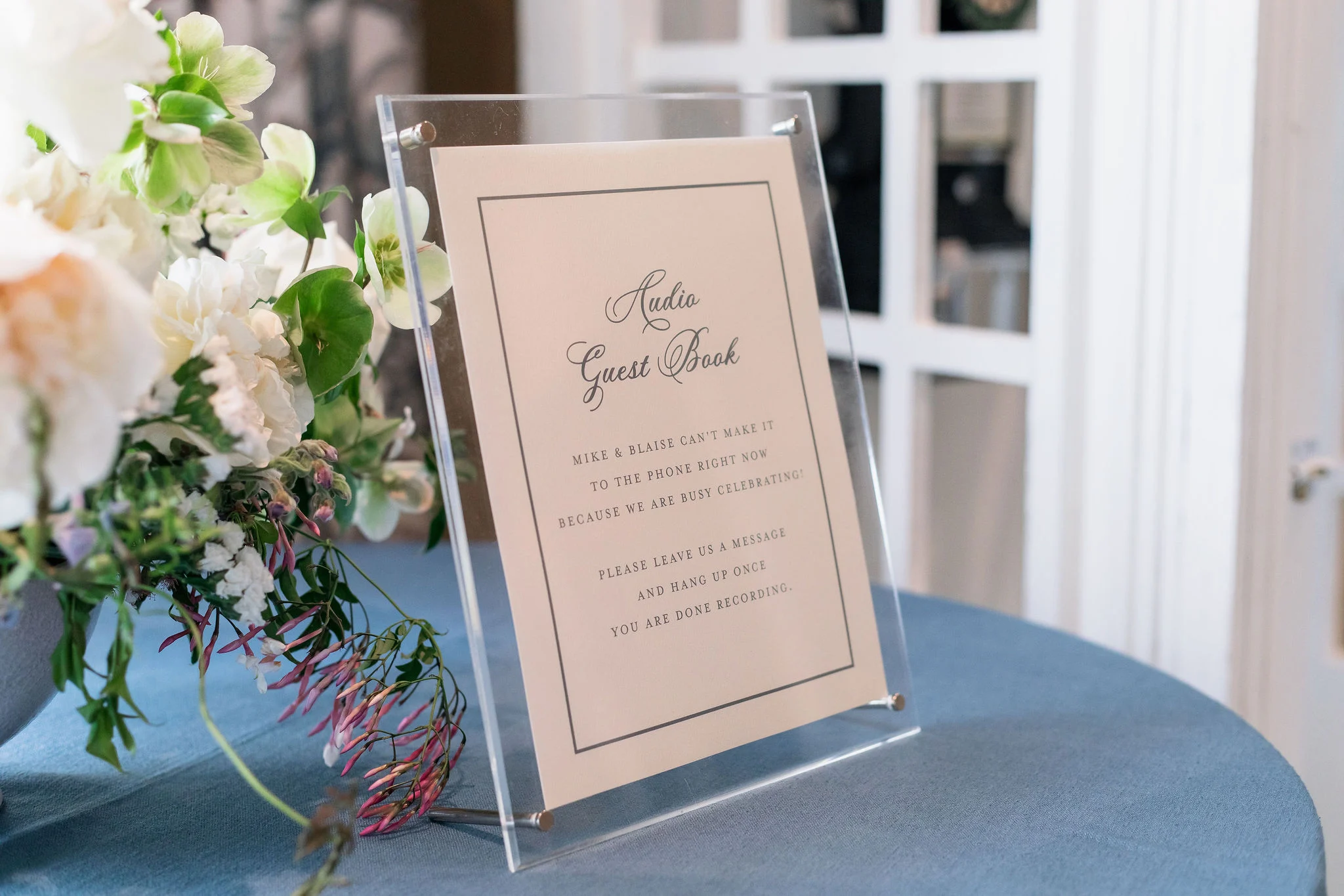
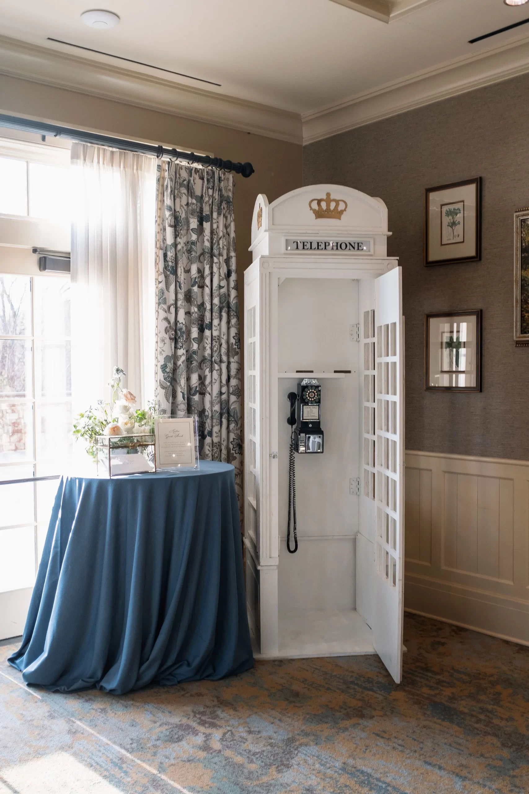
There was also an audio guestbook sign we created that was on display next to an old school telephone booth where guests could leave their messages and well wishes. This was another unique and fun detail that guests loved and really made their wedding stand out.
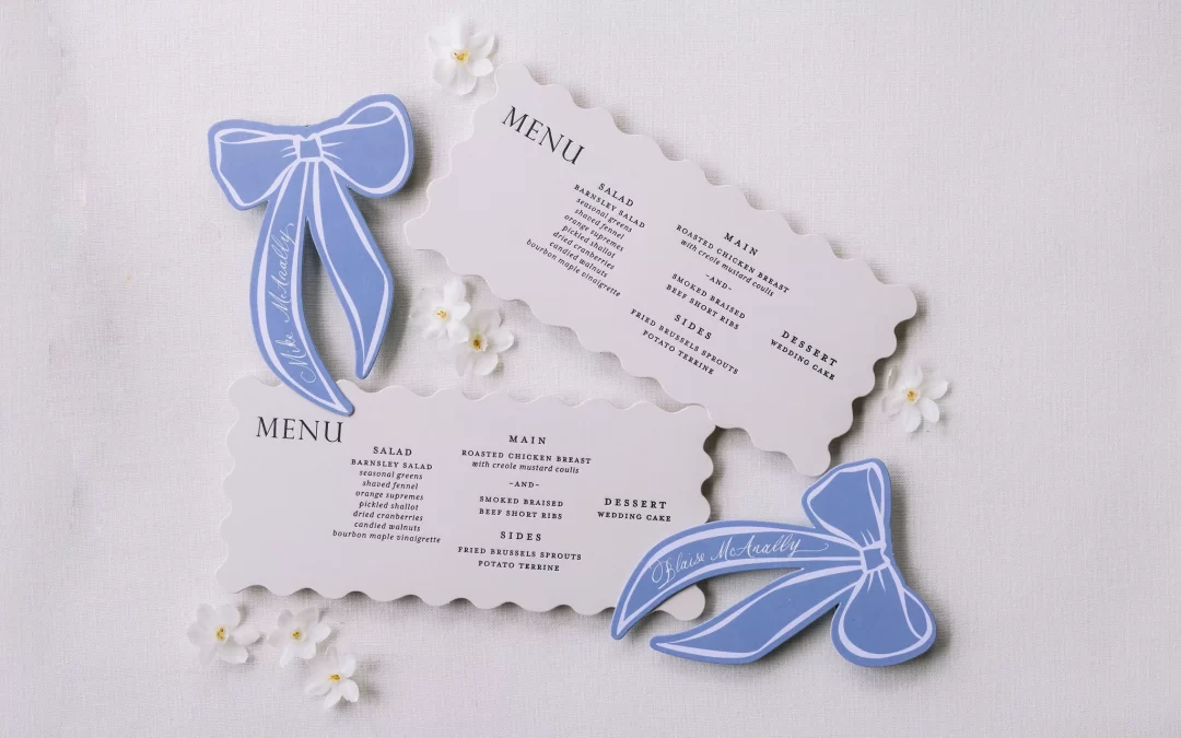
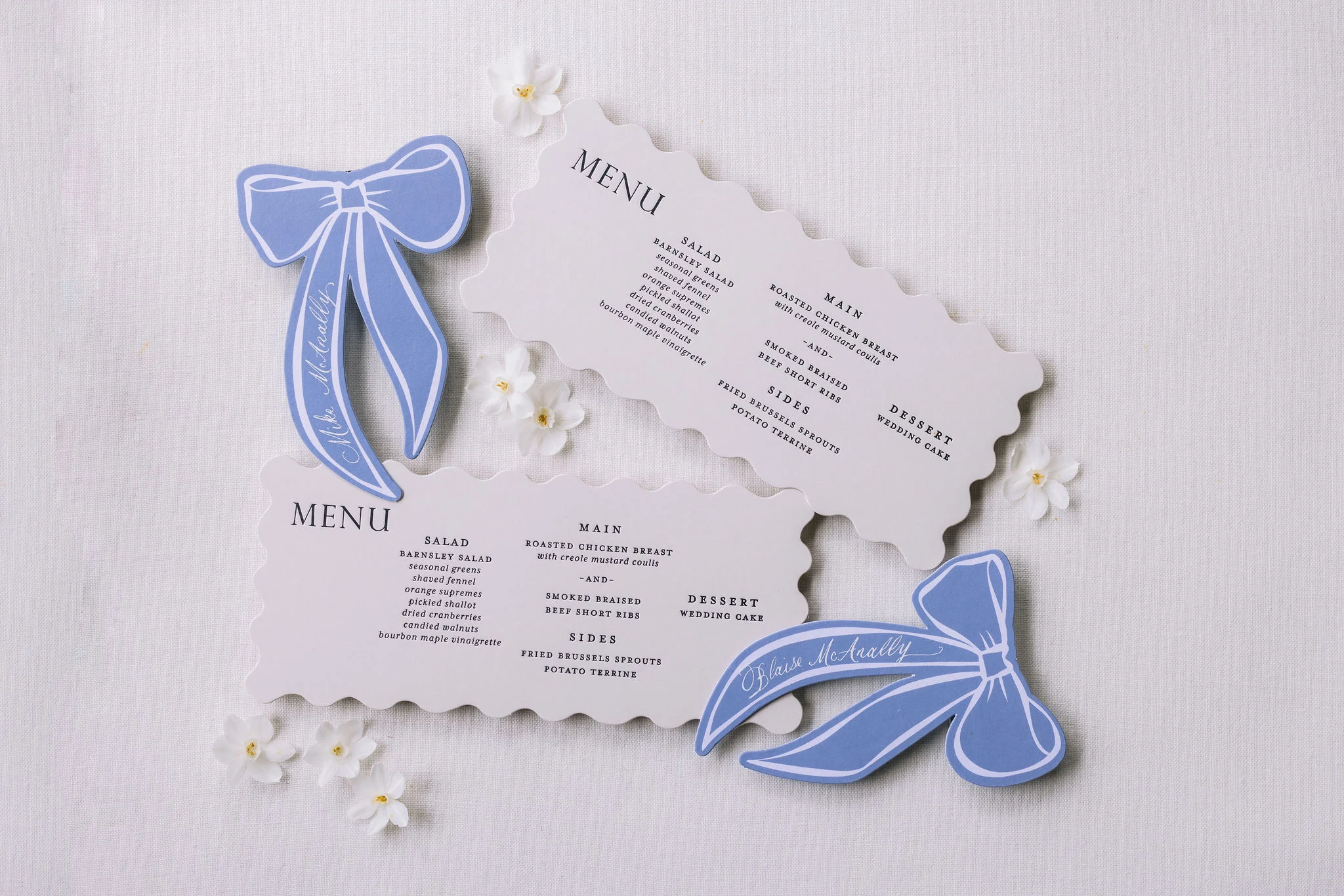
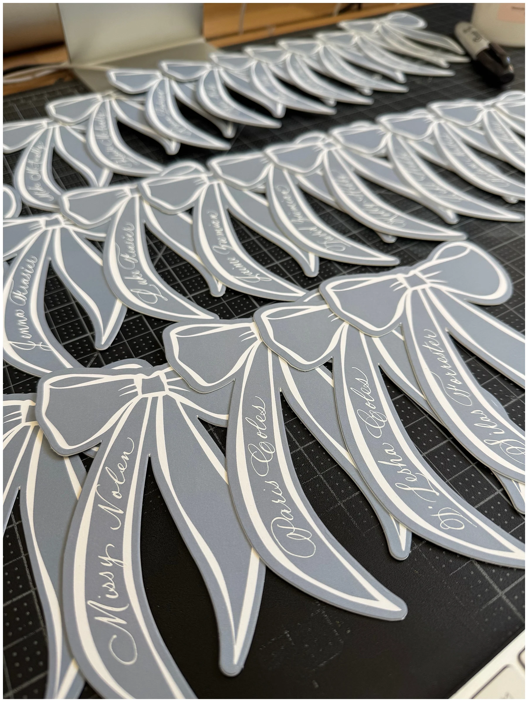
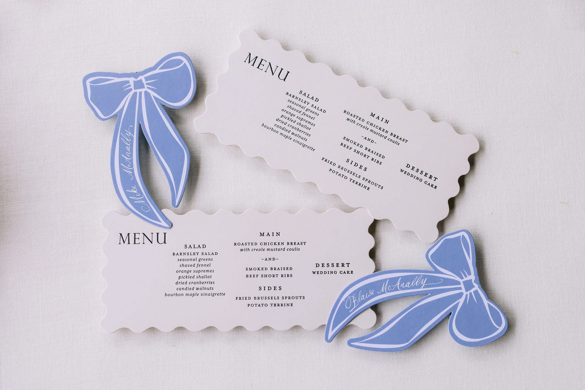
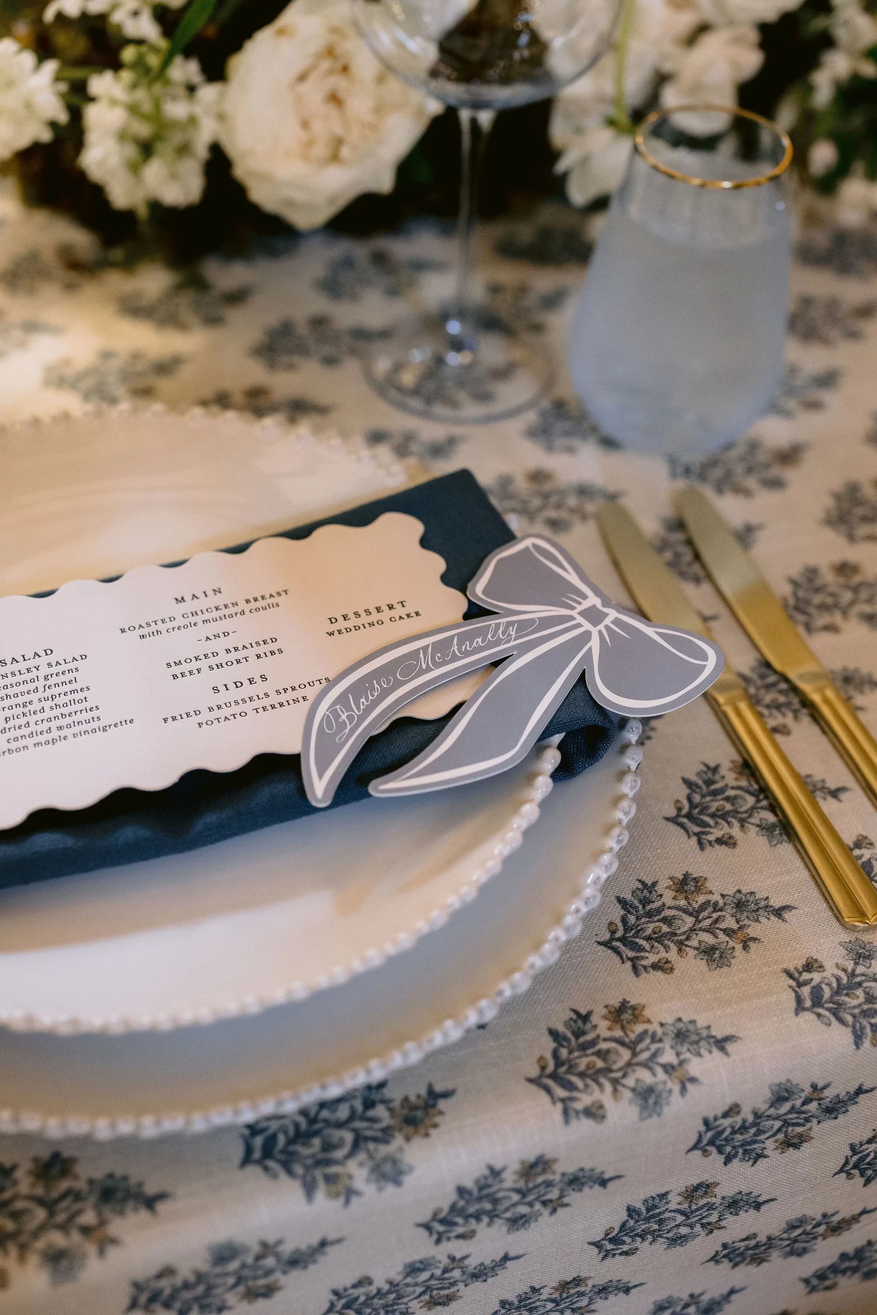
Unique + Custom Ribbon Place Cards
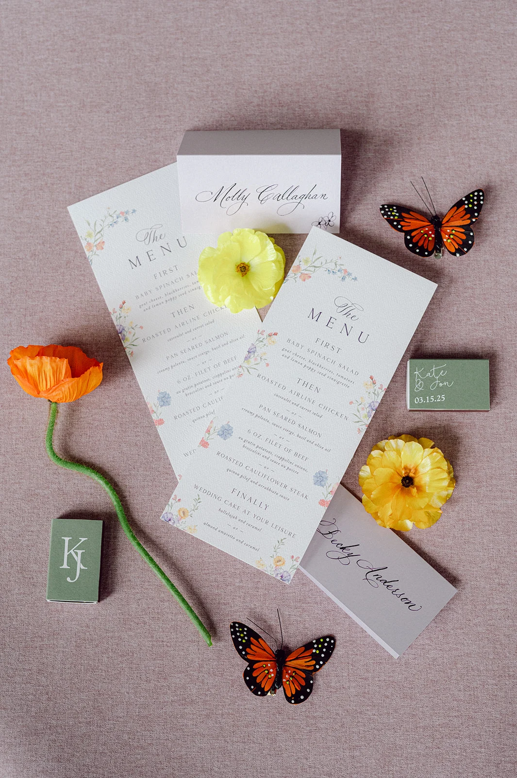
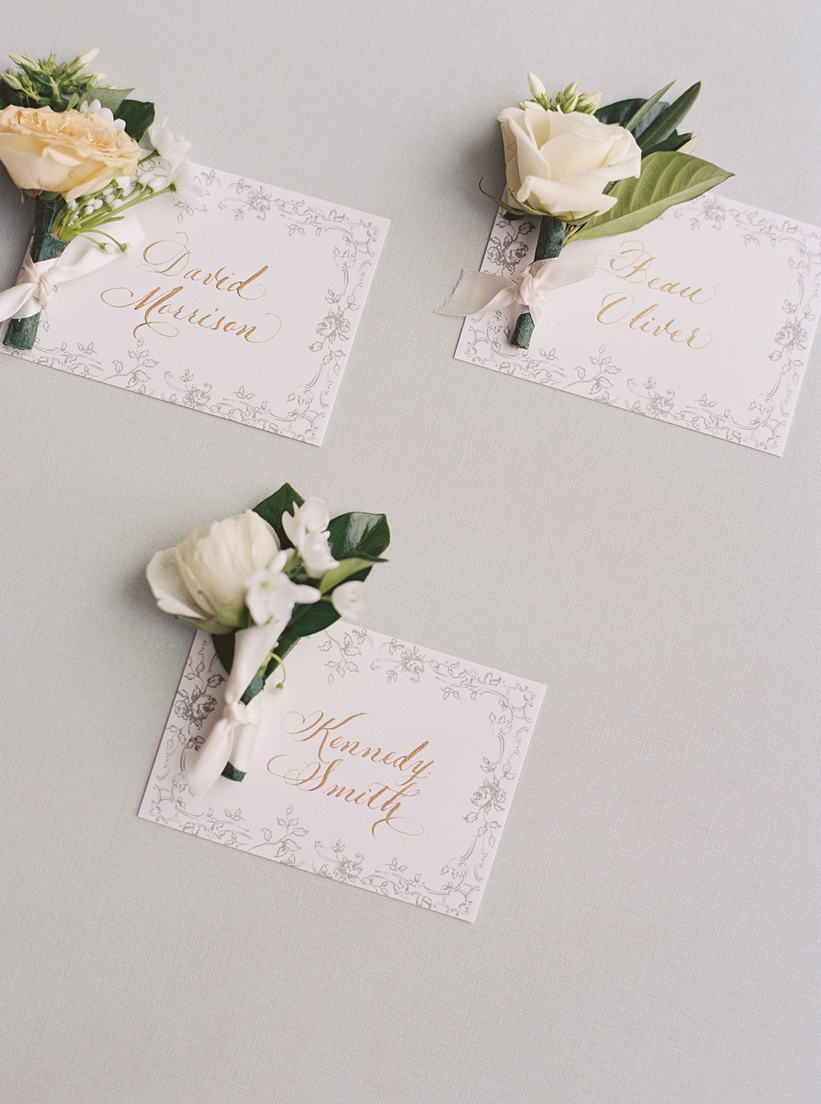
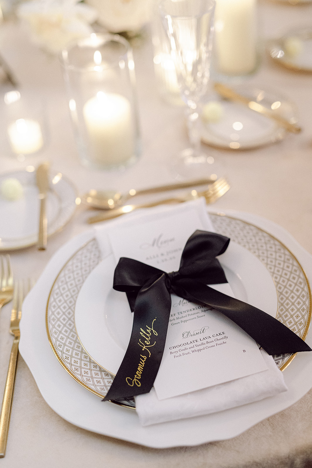
The place cards definitely need their own spotlight because they were just that good! Die-cut ribbon place cards in a light blue color, were each hand-calligraphed with guests’ names. One of my favorite moments was catching a photo of a guest snapping a picture of her place card on her phone, which made my calligrapher heart so happy! These place cards were just so fun and different from the usual, and definitely left an impression on guests!
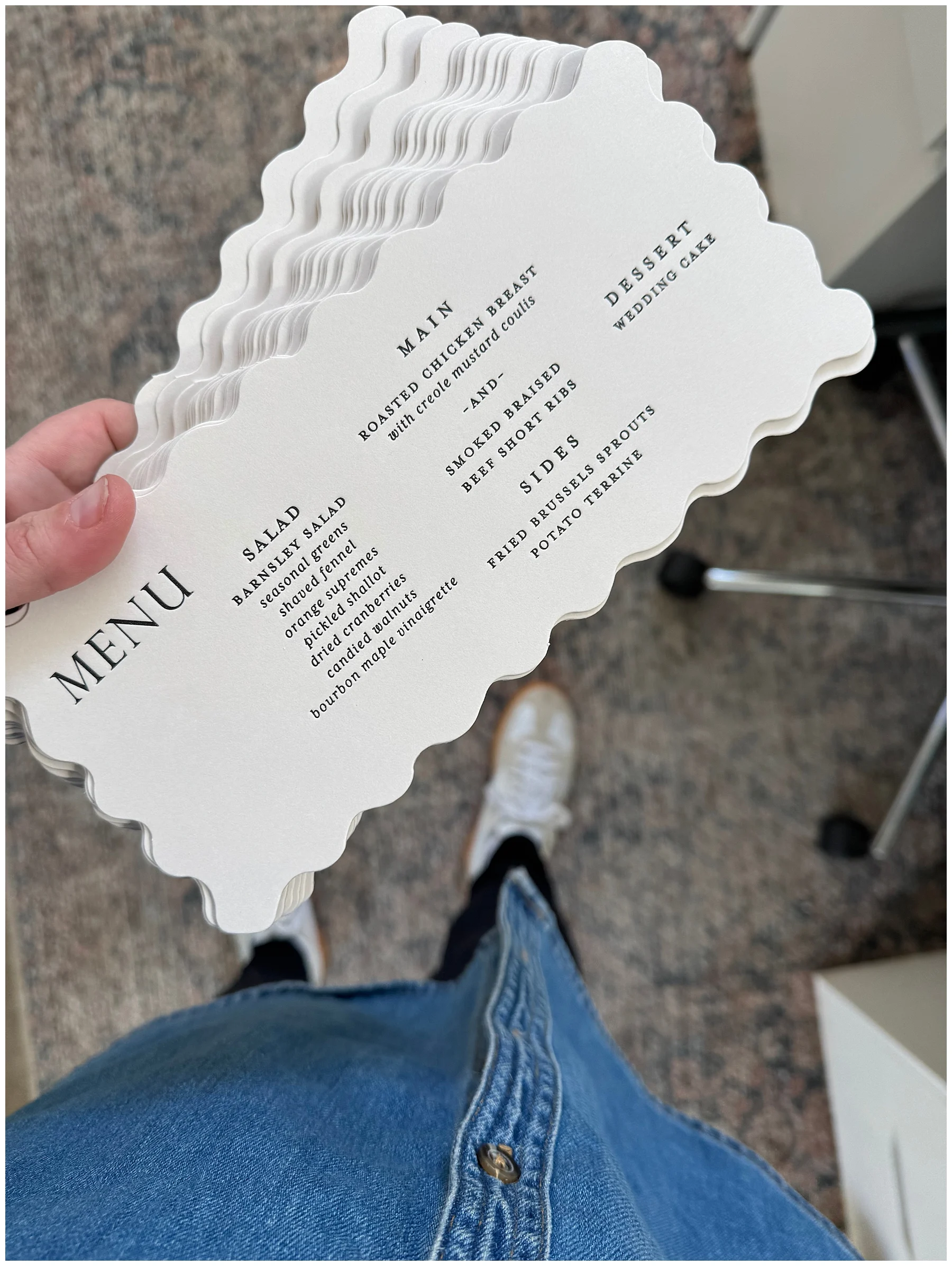
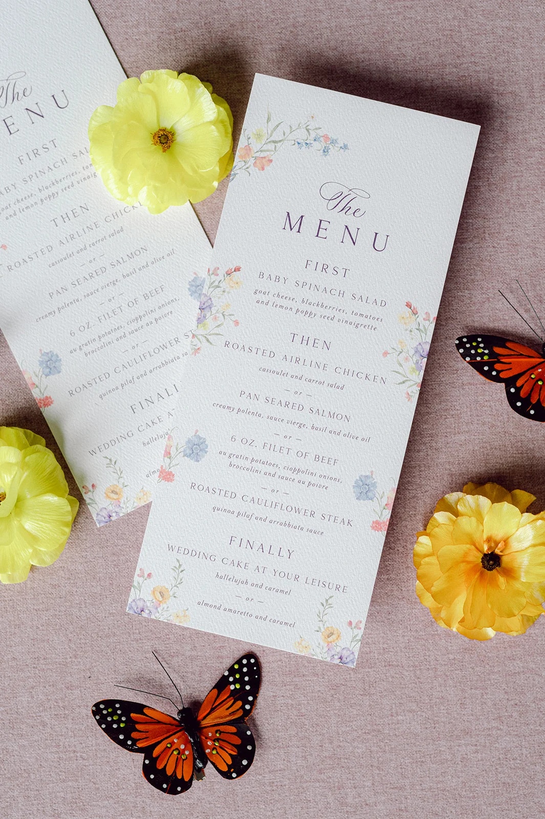
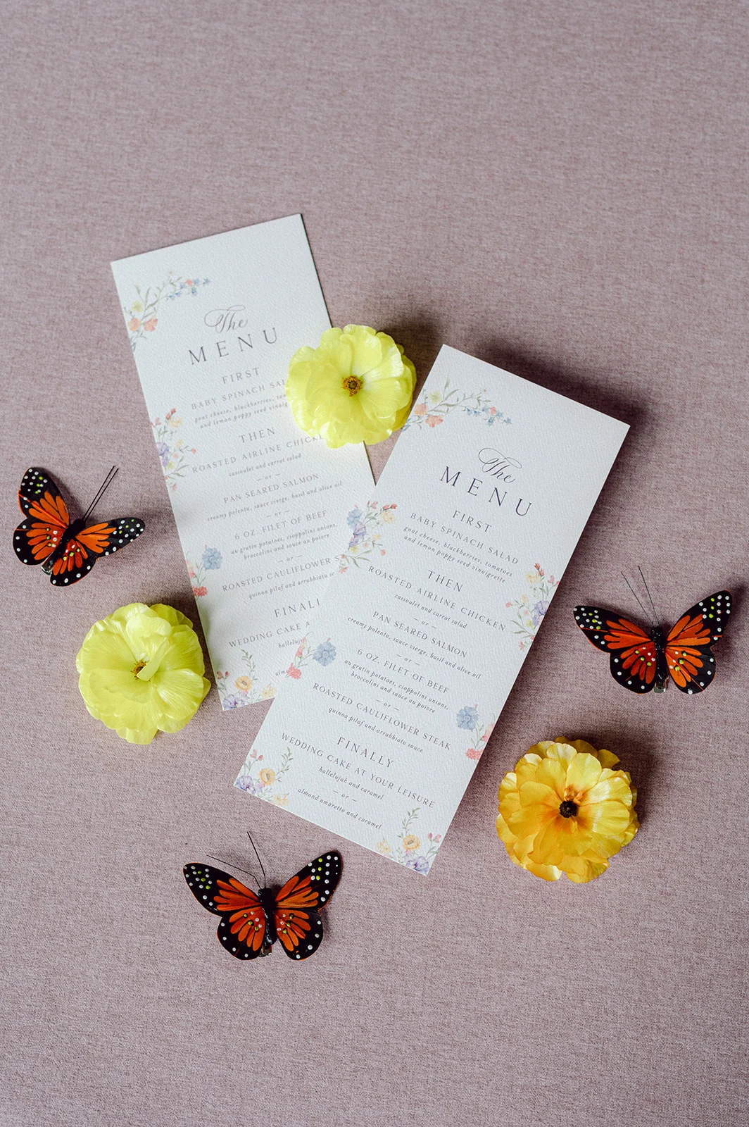
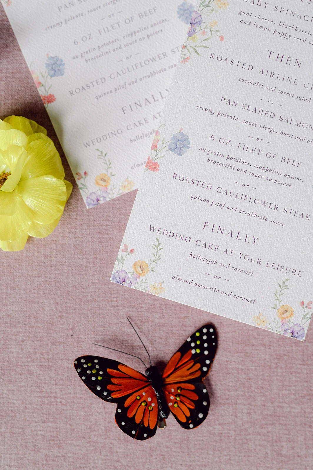
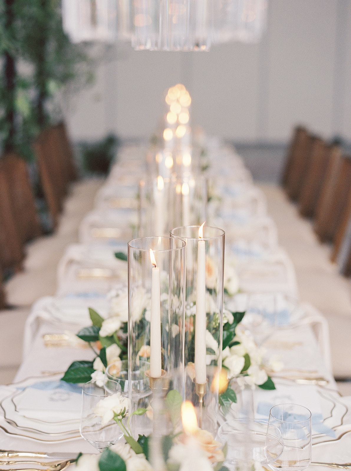
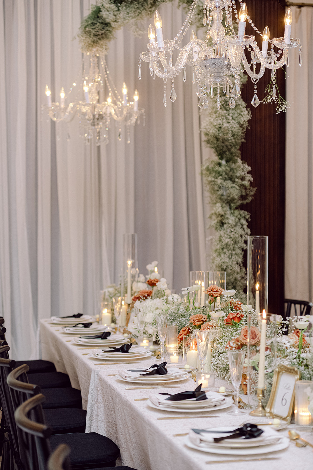
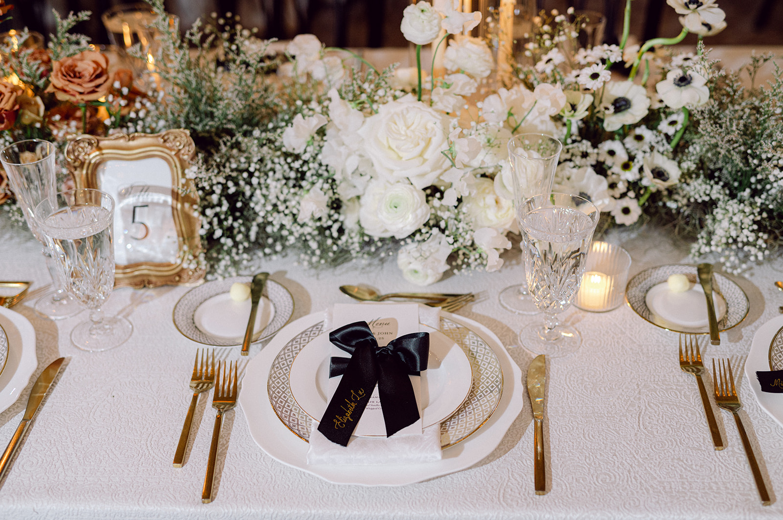
Accompanying the custom place cards, were the die-cut menus that sat atop each napkin at the table, adding a modern spin to the timeless tablescape. These tablescapes were a total highlight, featuring simple white florals with pops of blue and abundant greenery, paired with the paper details that tied everything together.
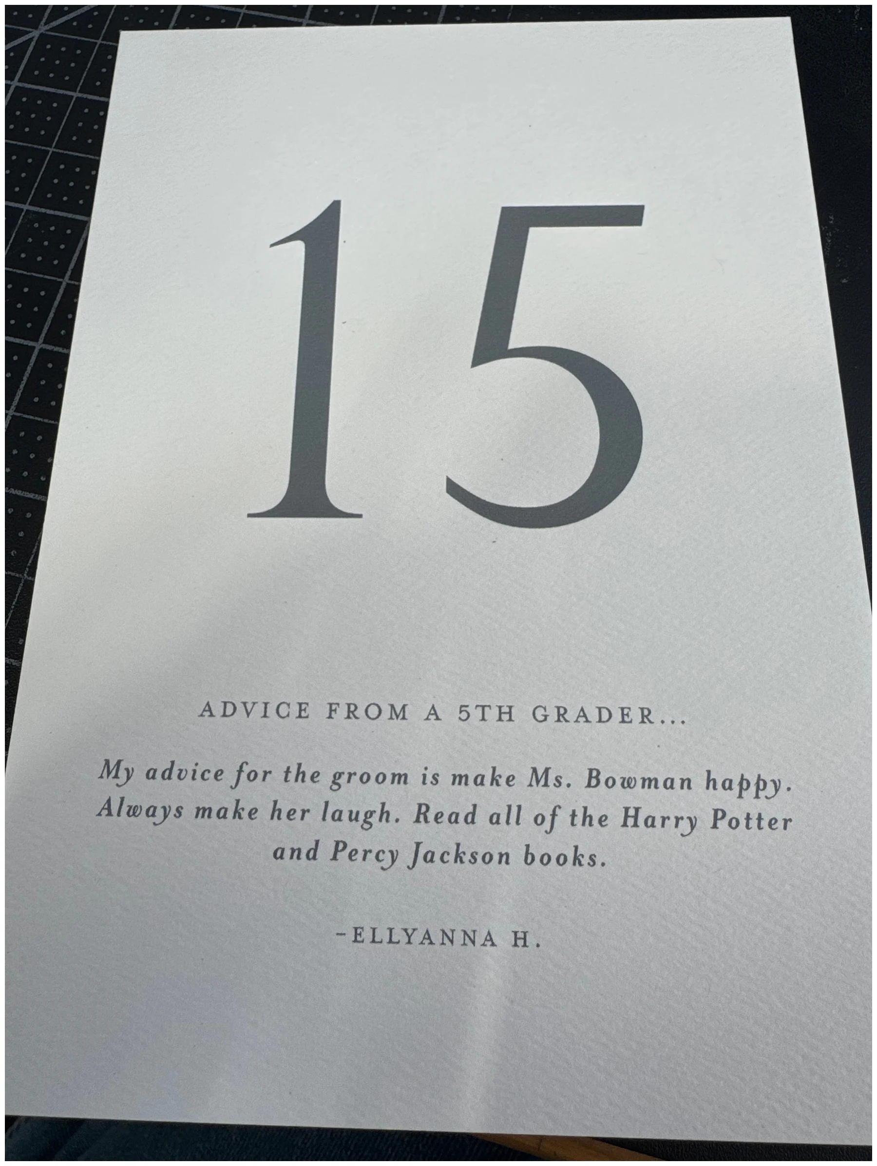
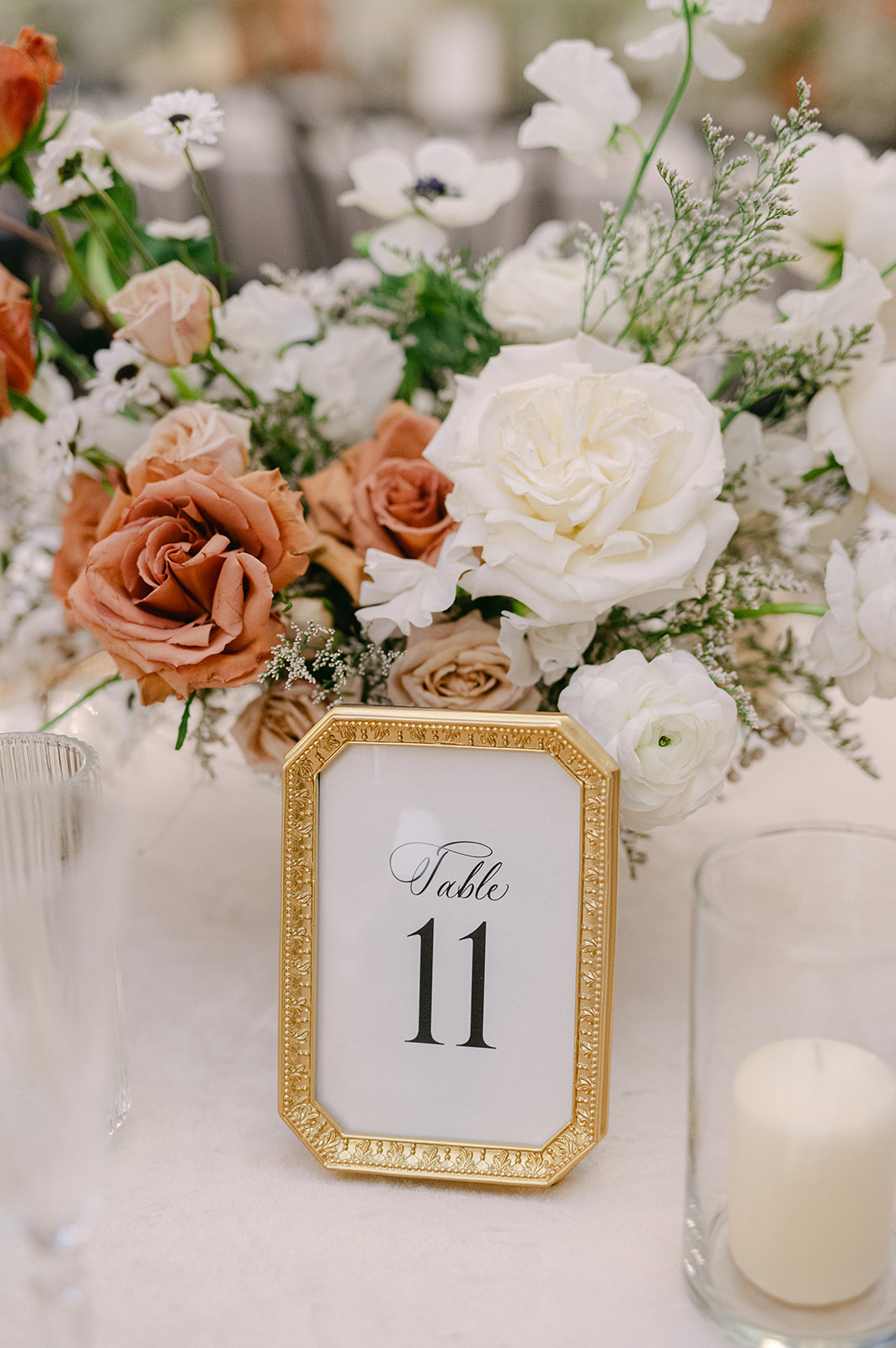
Memorable Custom Table Numbers
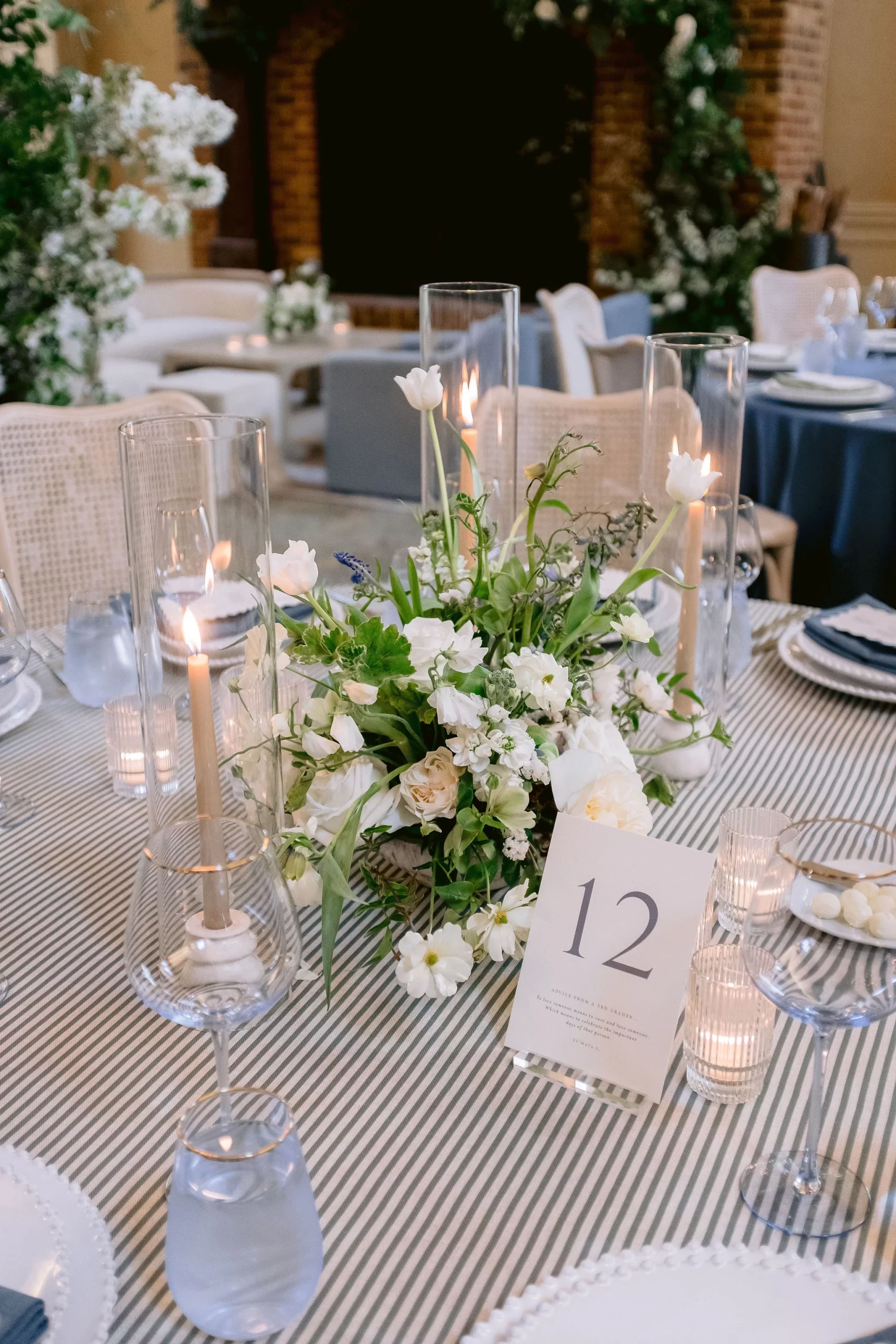
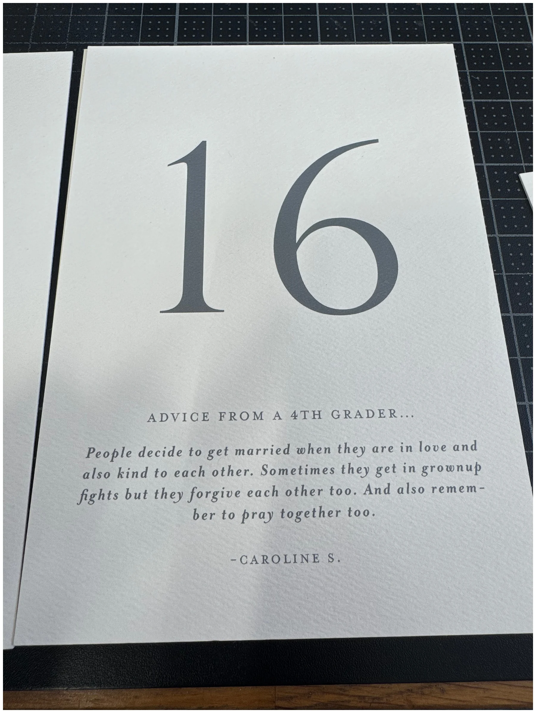
One of the most charming and memorable elements was a nod to Blaise’s career as a teacher. Instead of traditional table numbers, she had her third-grade students write “advice” for the couple. Each table featured a different note from her students, and they were as hilarious as they were heartfelt. One of our favorites:
“If you have a fight you should solve it out, hug it out, talk about your point of view and let him talk about his. And ask your dog if you shall forgive him.” – Zareya W.
That is solid advice from a third grader! These custom table numbers added so much personality to the reception. It’s these thoughtful, personal touches that truly make a wedding day unforgettable. I also love that Blaise wanted to include her students in her big day. It says so much about her love and dedication to her students!
From the Invitations to the place cards and everything in between, every element was intentional and cohesive, speaking to the couples’ dreamy wedding day vision. Blaise and Michael’s wedding was one to remember and it was an honor to be a part of it!
If you’re looking to add custom, thoughtful touches to your wedding or event, we would love to help make your vision a reality. Reach out today to learn more about our full-service design offerings—we can’t wait to create something unforgettable for you!
If you enjoyed this post, you’ll love these other blogs!
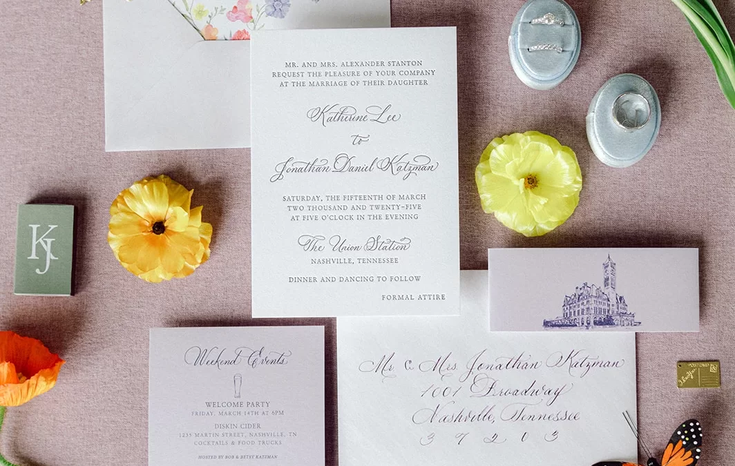
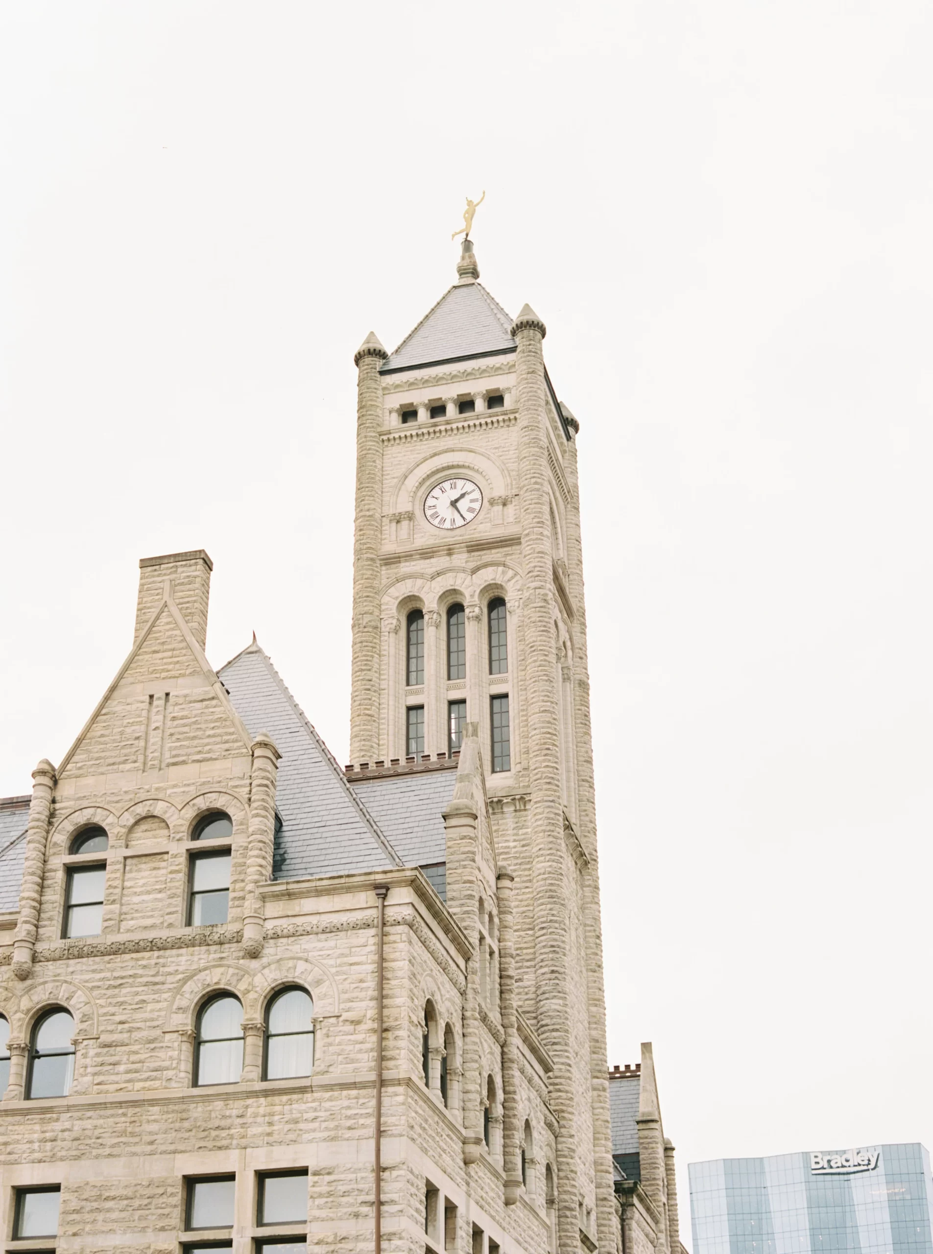
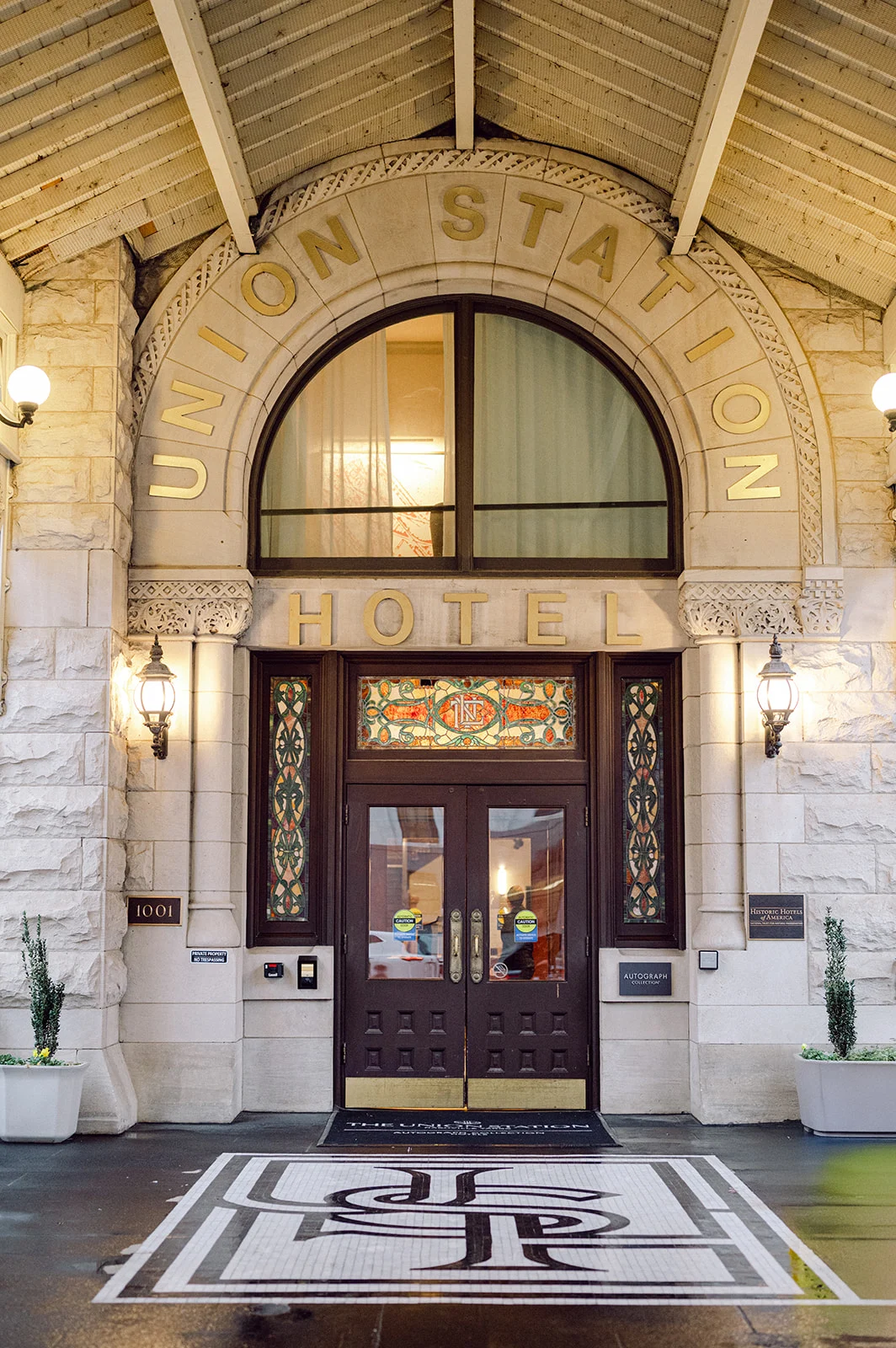
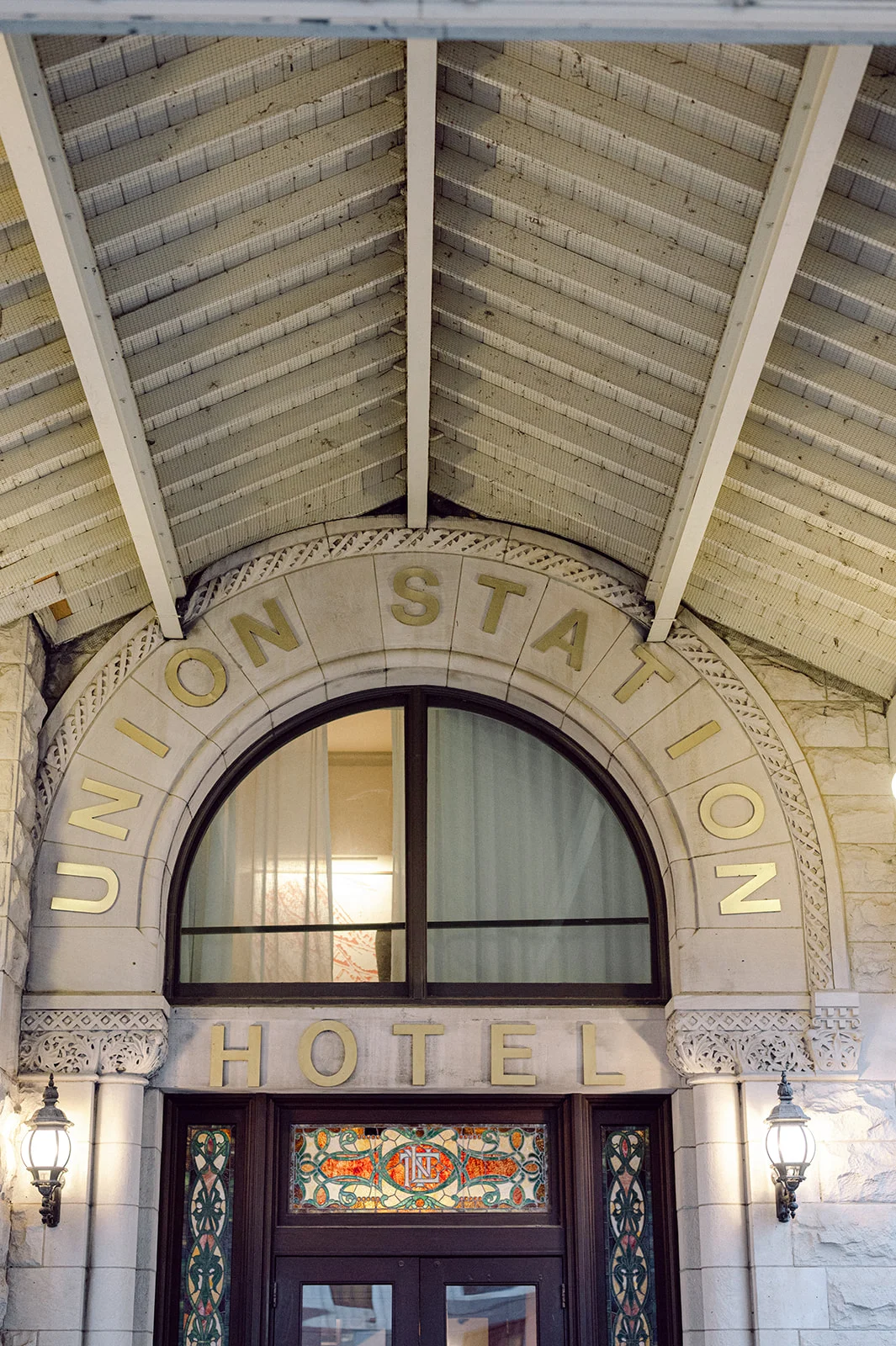
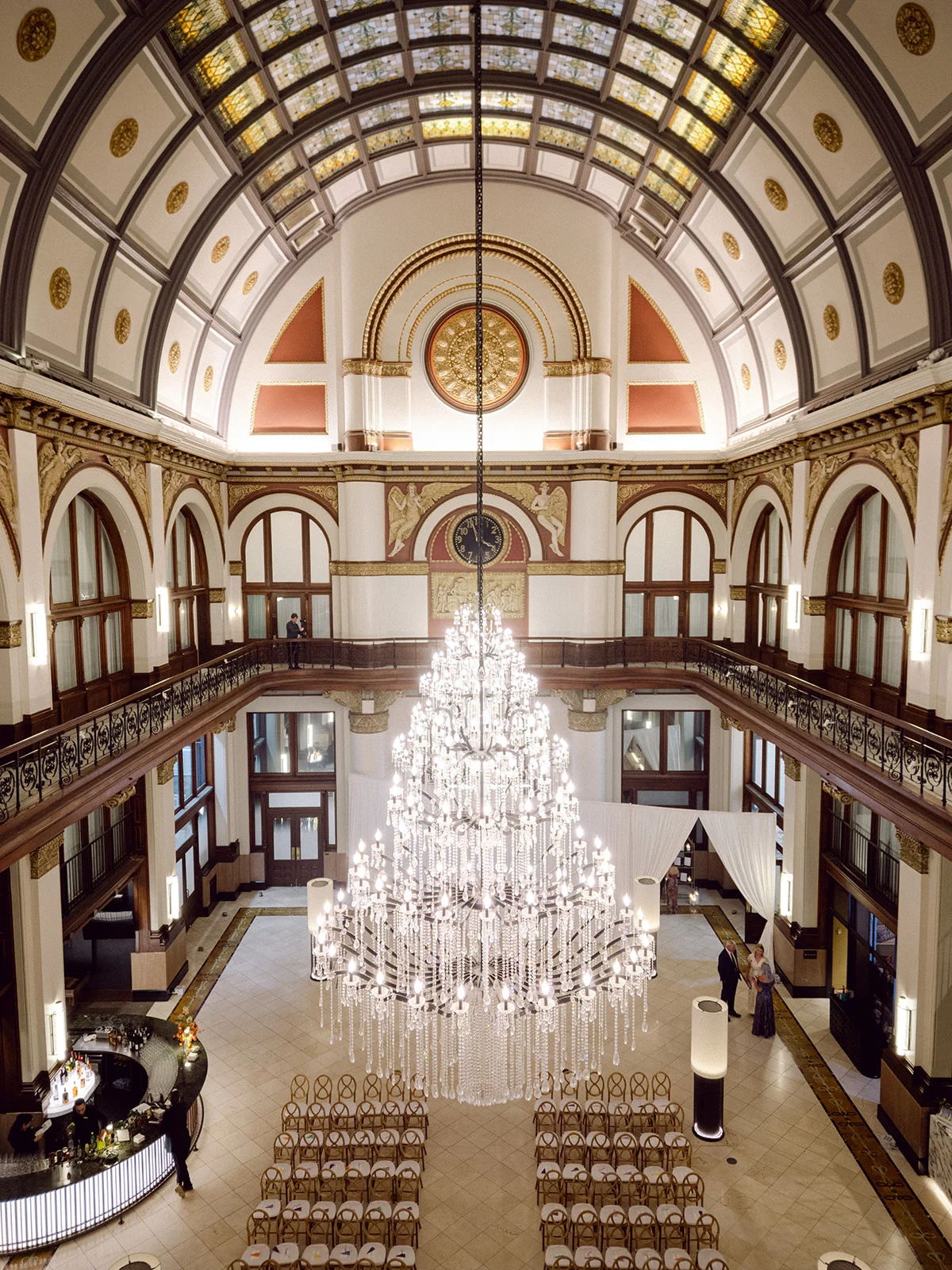
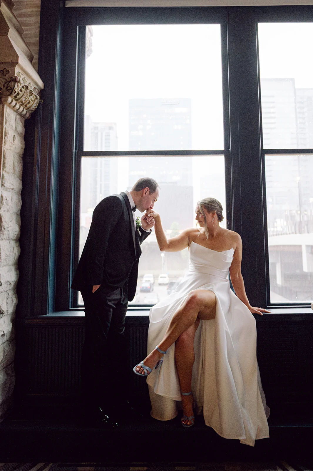
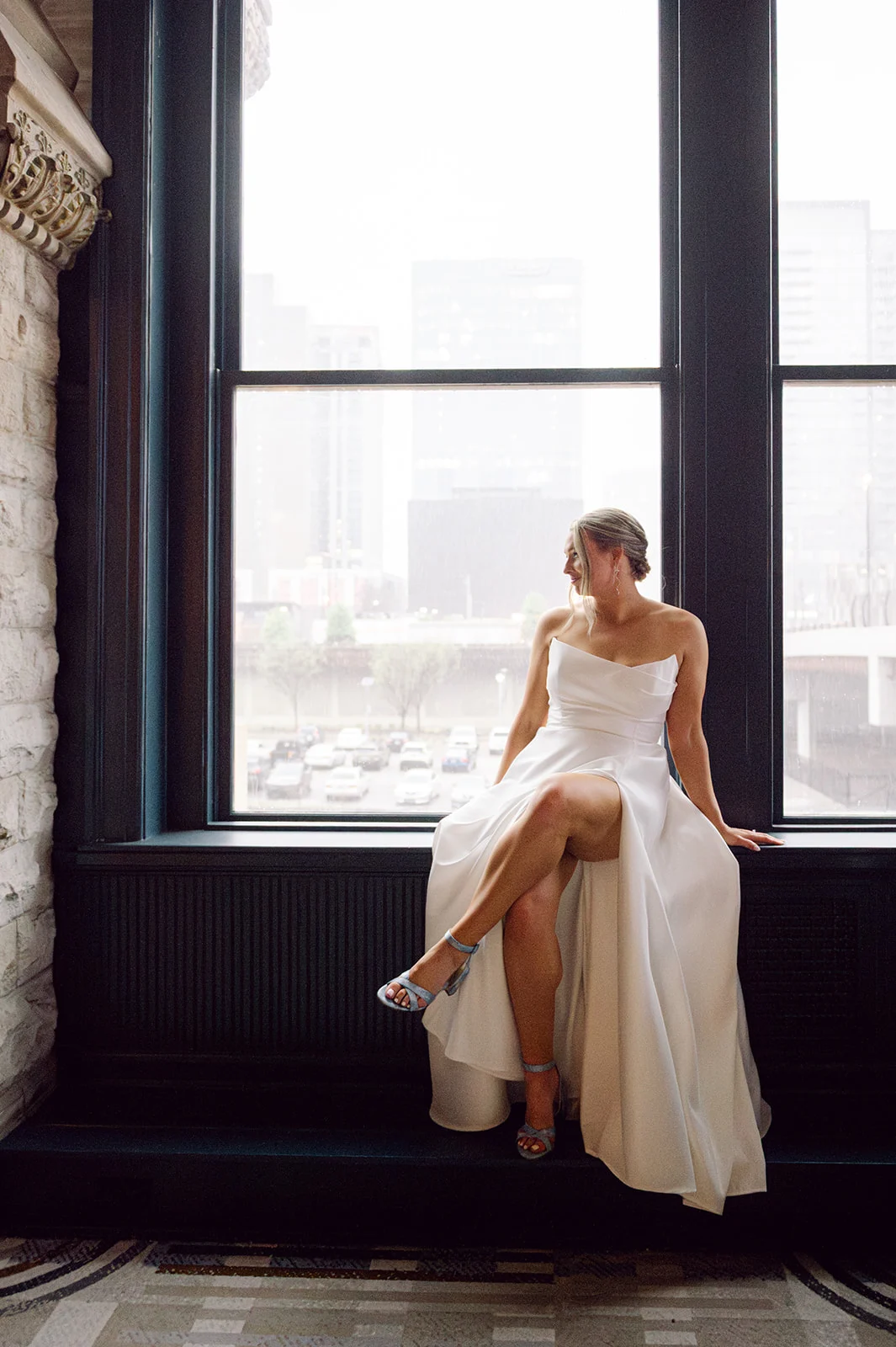
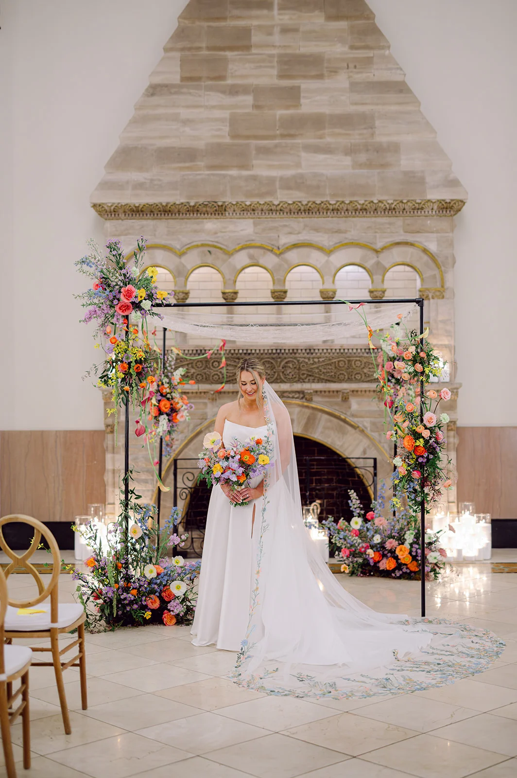
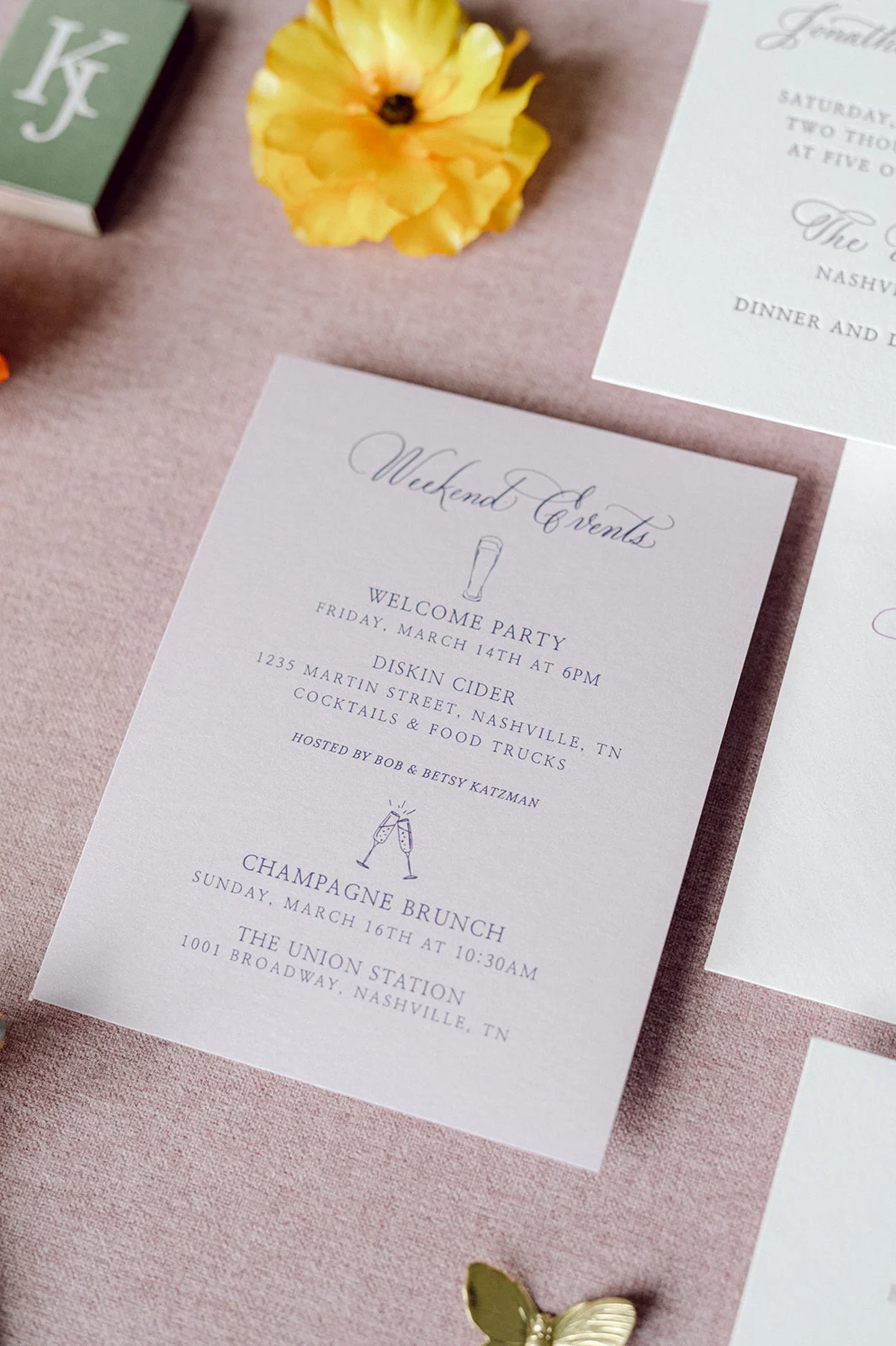
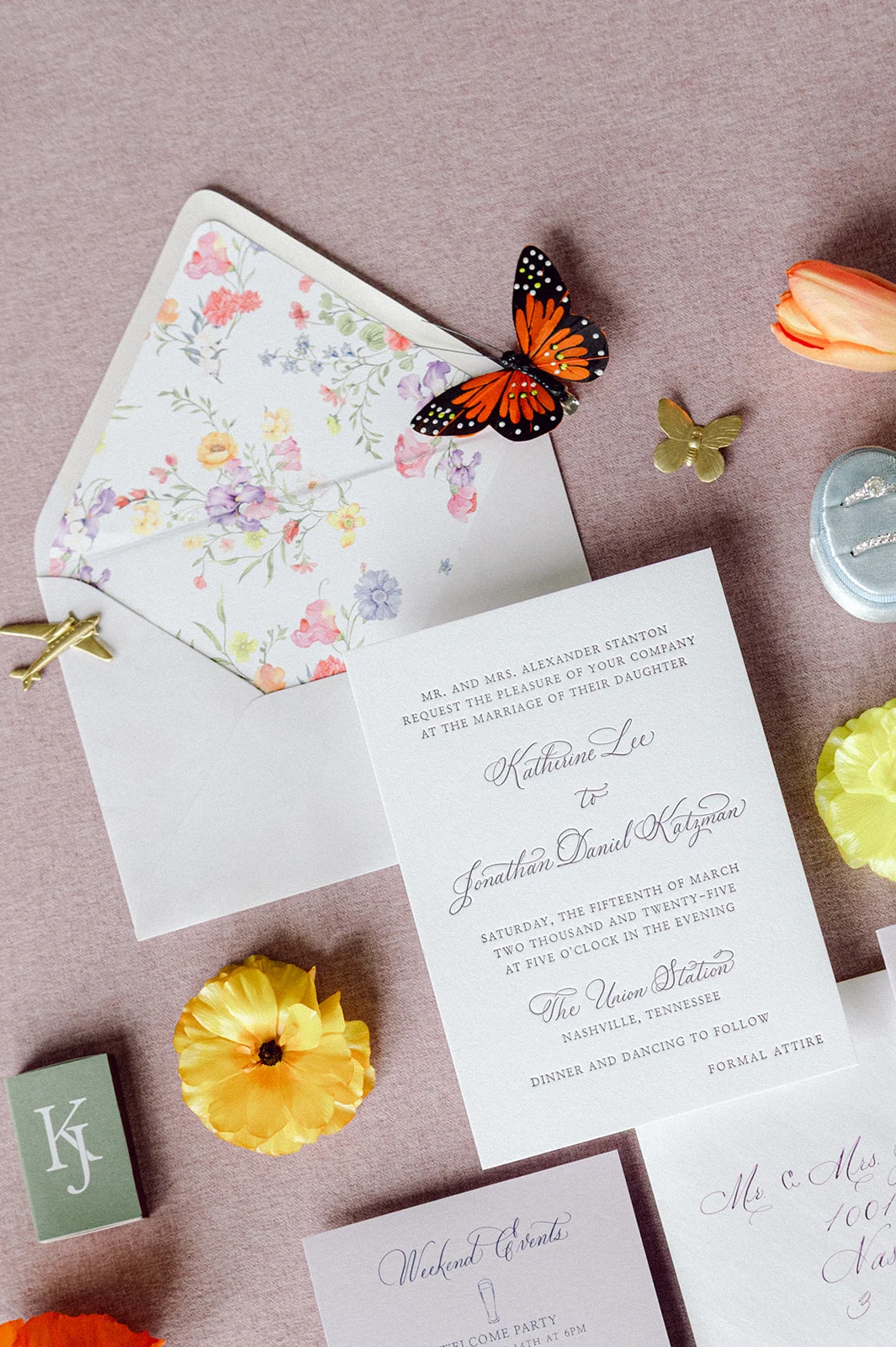
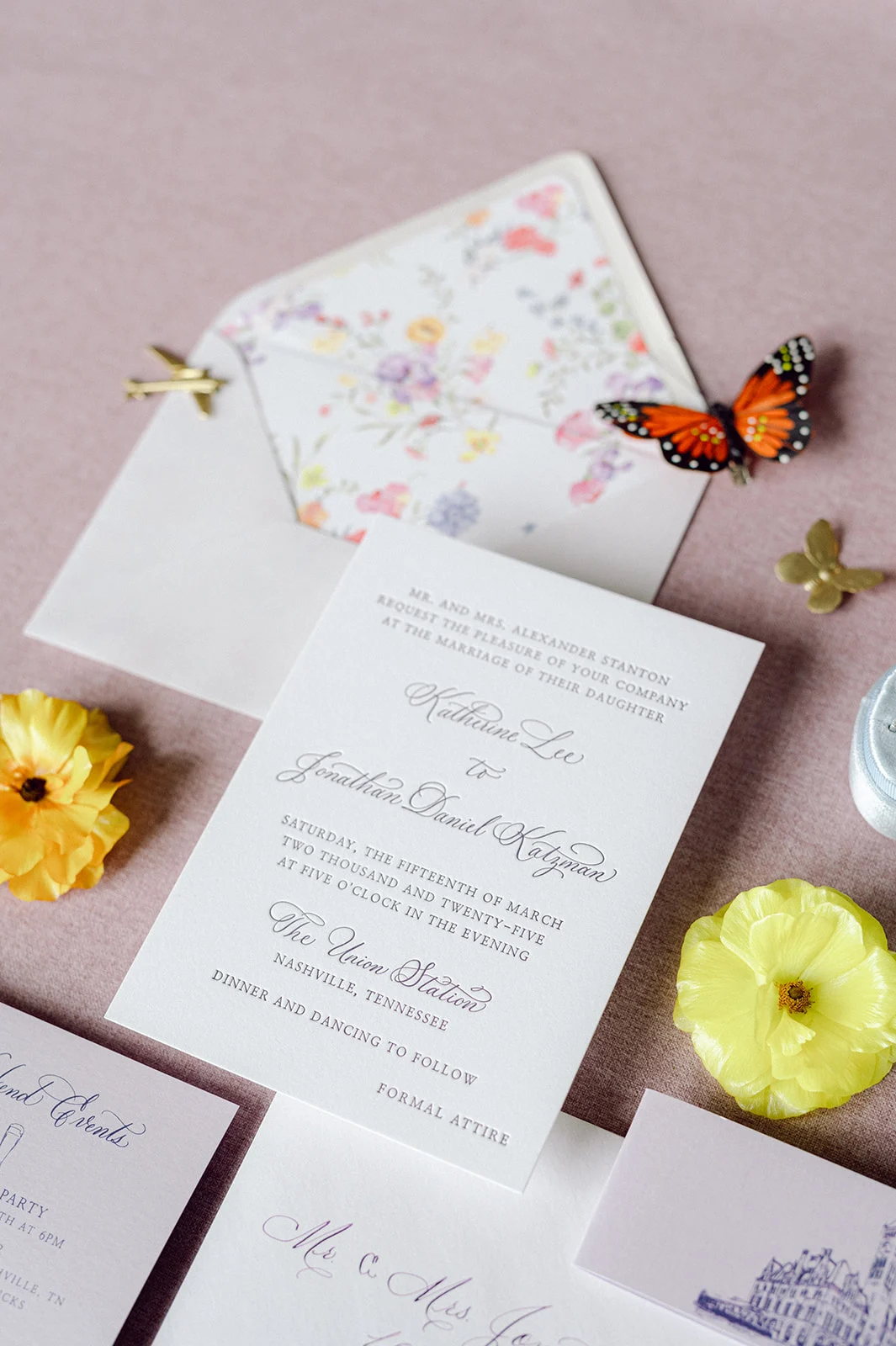
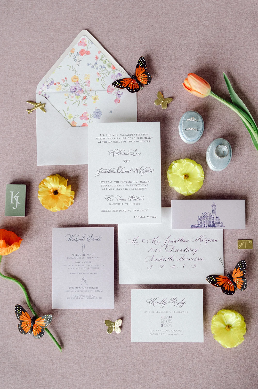
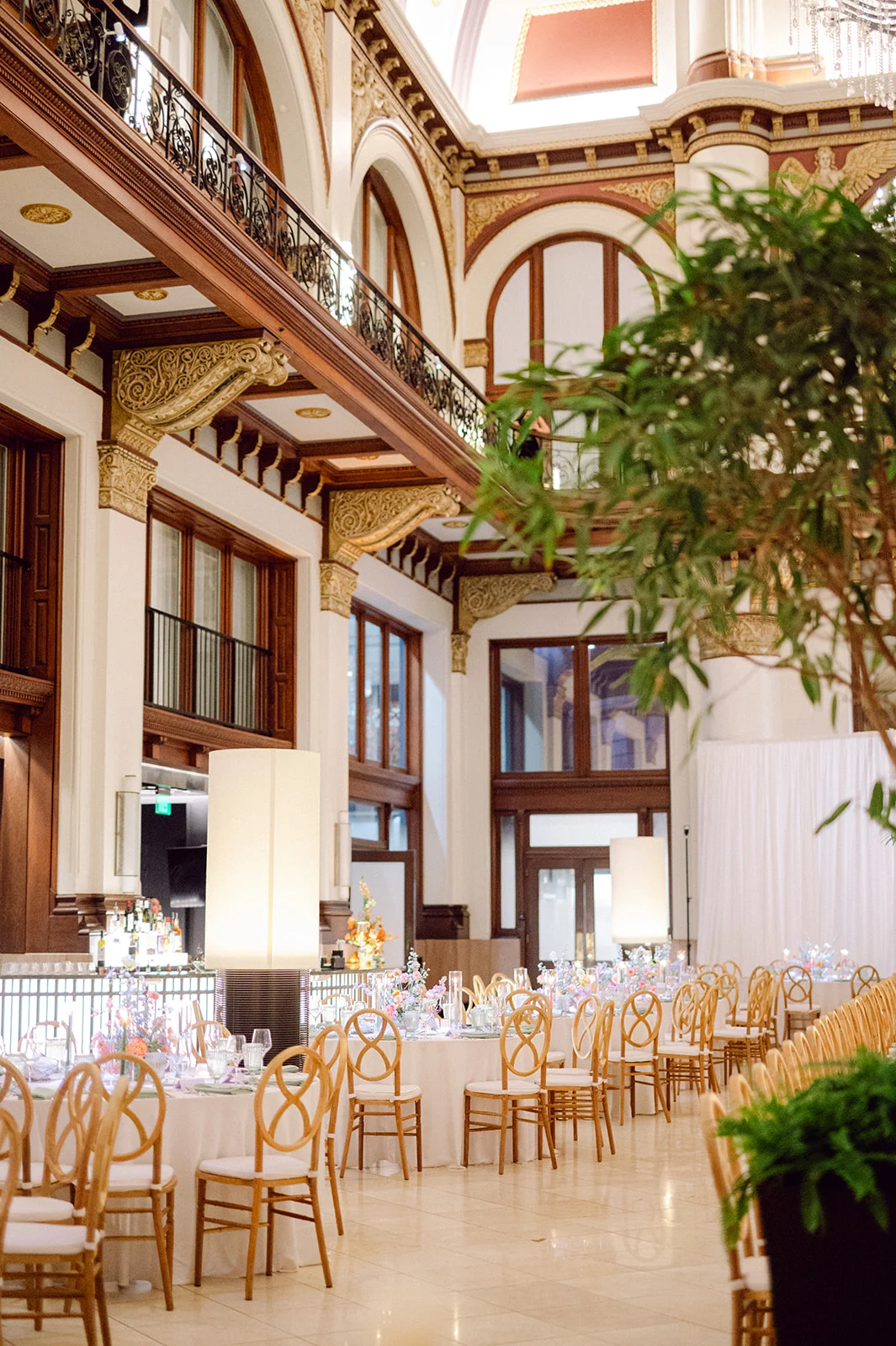
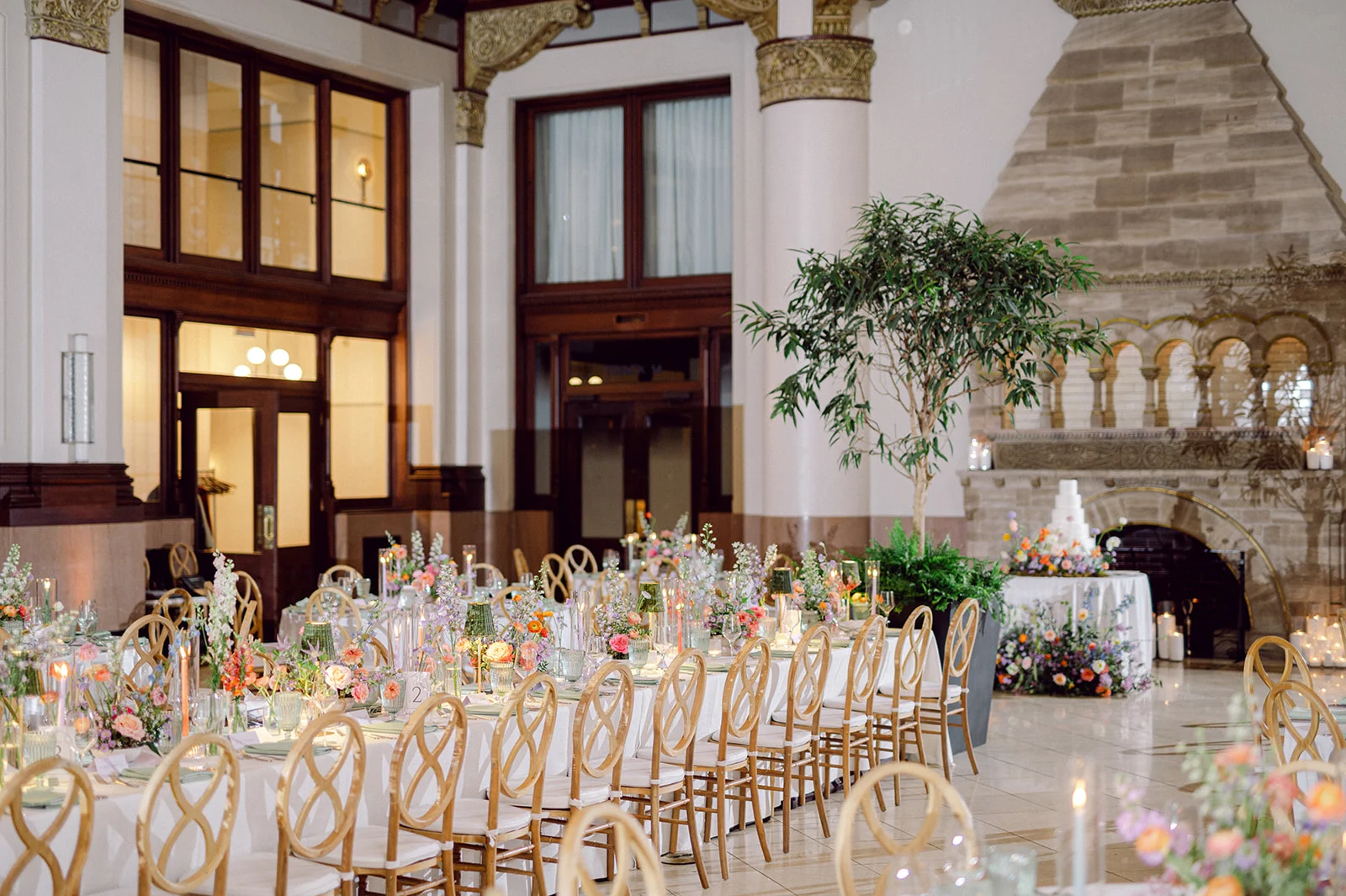
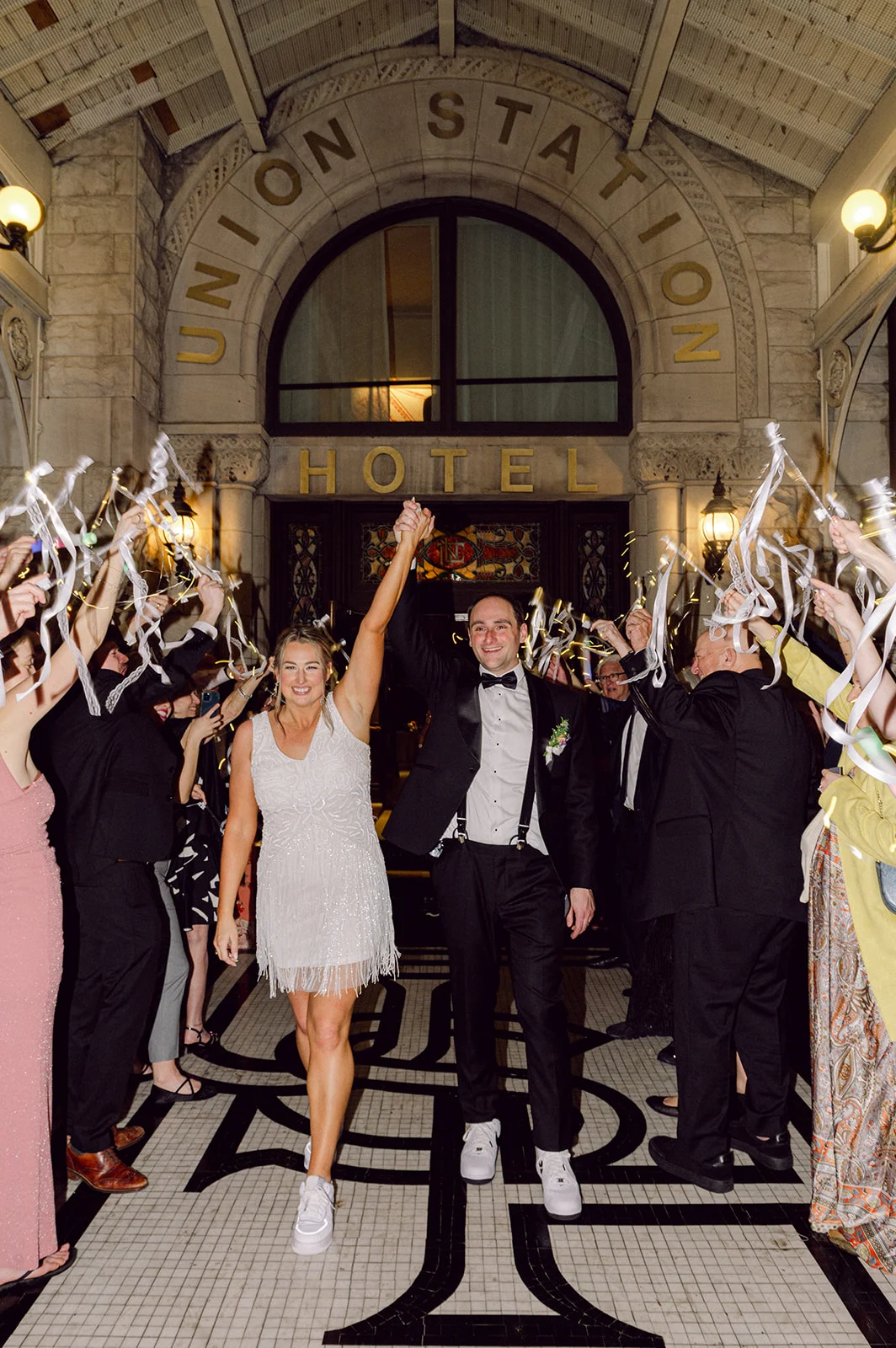
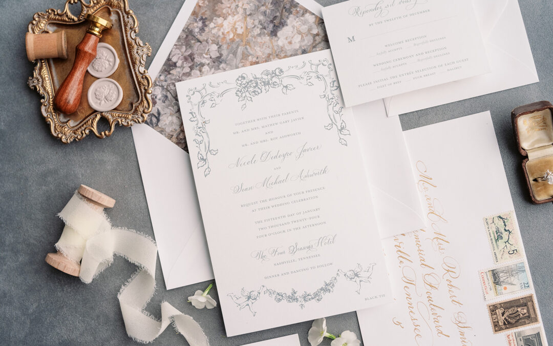
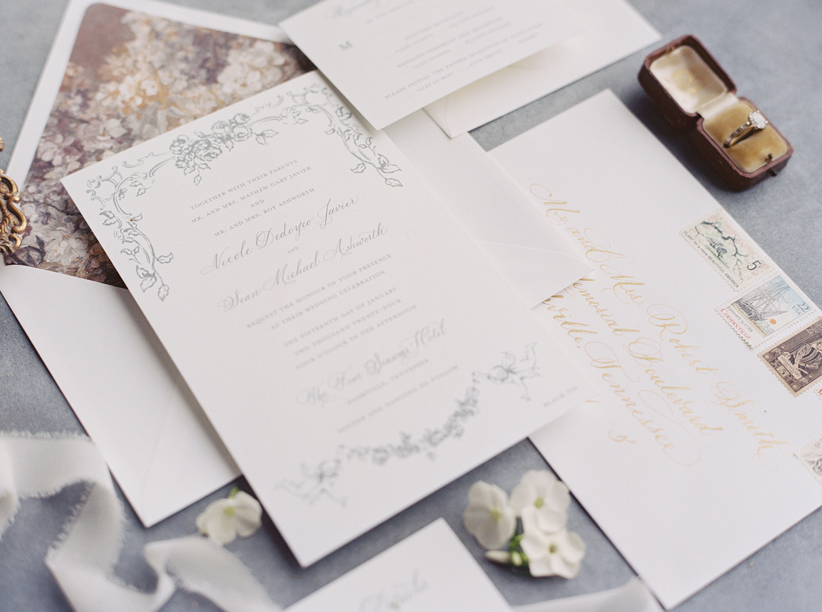
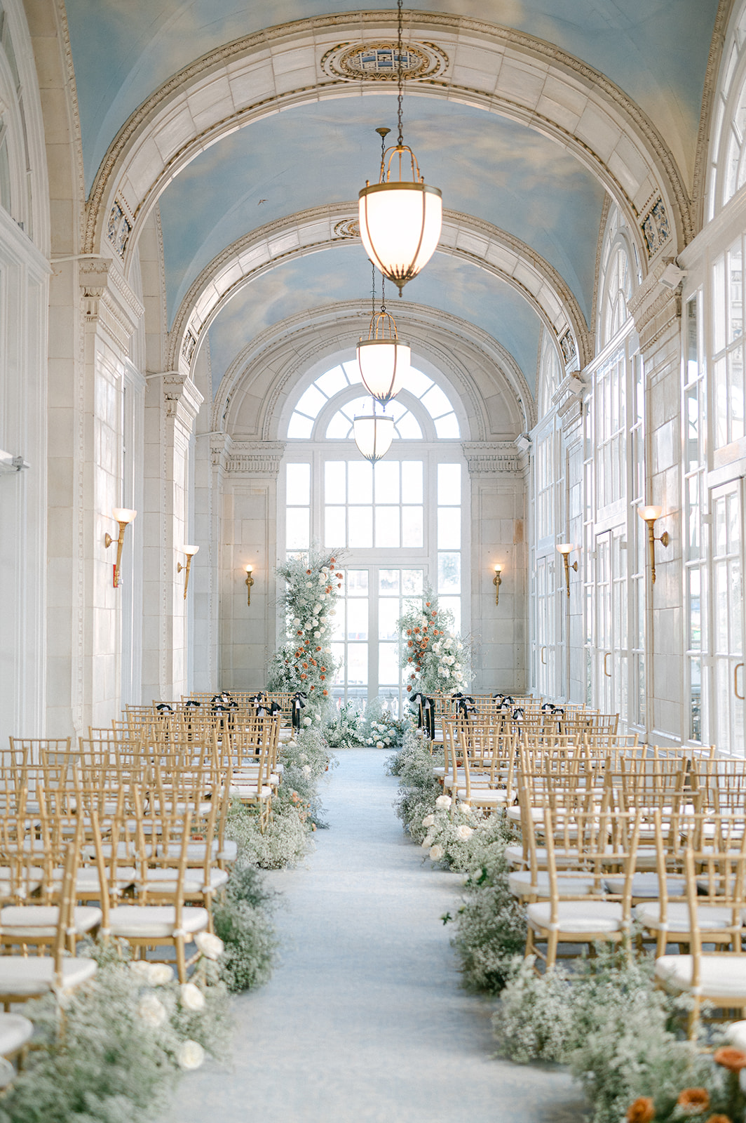
When a wedding takes place in one of the most iconic hotels in Nashville you know it’s going to be a good one! Once a bustling railroad terminal, Union Station Hotel is now a stunning luxury hotel, still brimming with its original architecture, that includes arches, stained-glass windows, and endless historical charm. The gothic exterior design is one that demands attention. It’s a venue where history and elegance collide, setting the perfect tone for a celebration as beautiful and meaningful as Kate and Andrew’s dreamy wedding.
To play a part in their big day by creating their custom invitation suite, menus, and place cards was such an honor. The sweet bride, Kate, found us on Instagram, which is always so flattering! She was a dream to work with, as we couldn’t have asked for a more gracious, fun, and lovely client. Her dreamy wedding day vision paired beautifully with the character and charm of the hotel.
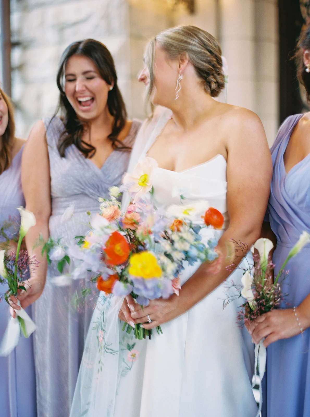
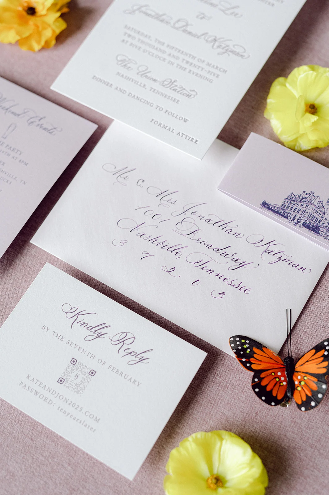
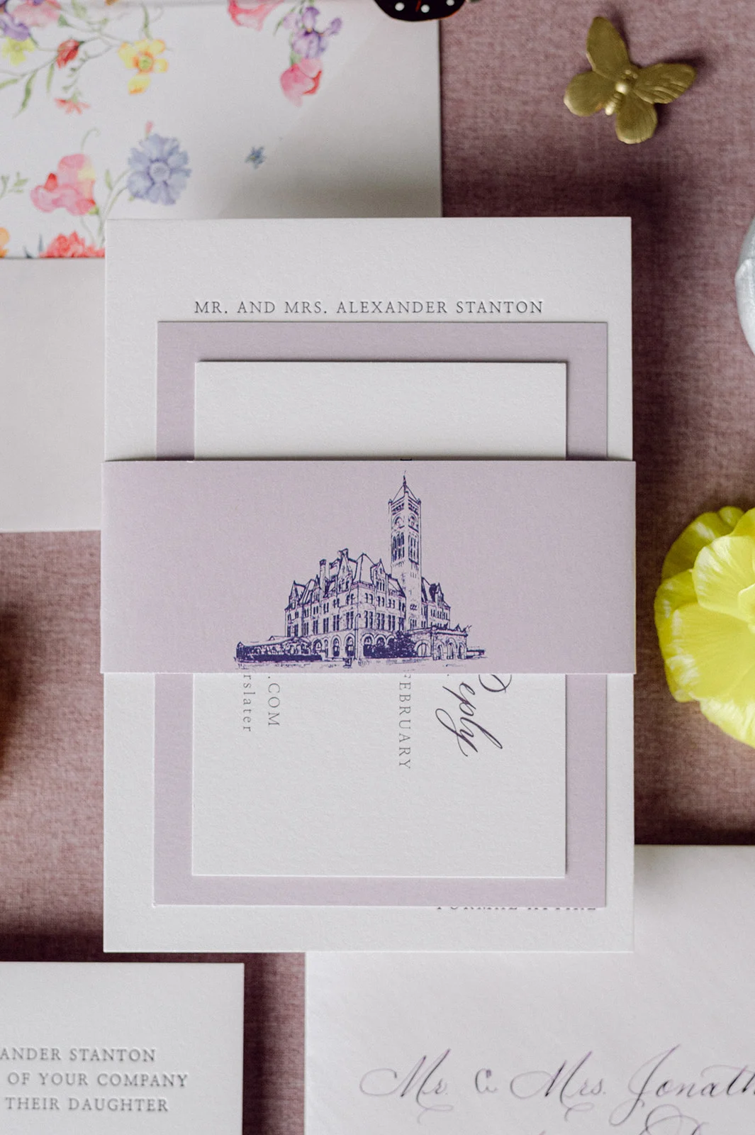
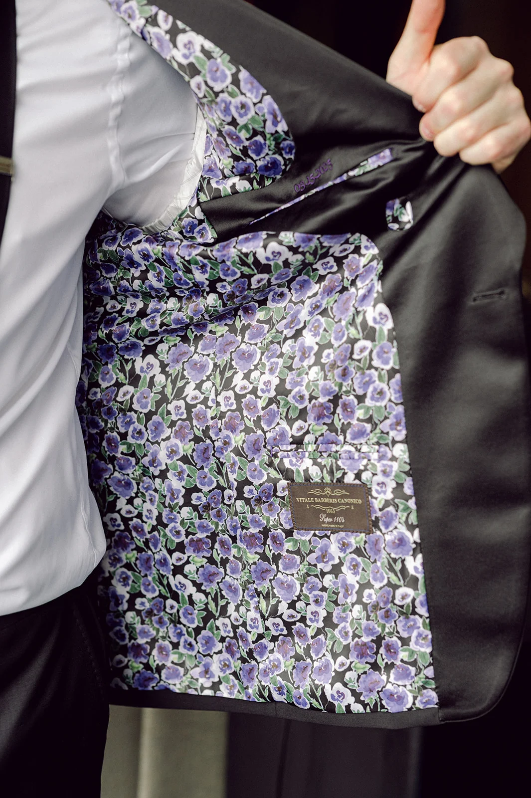
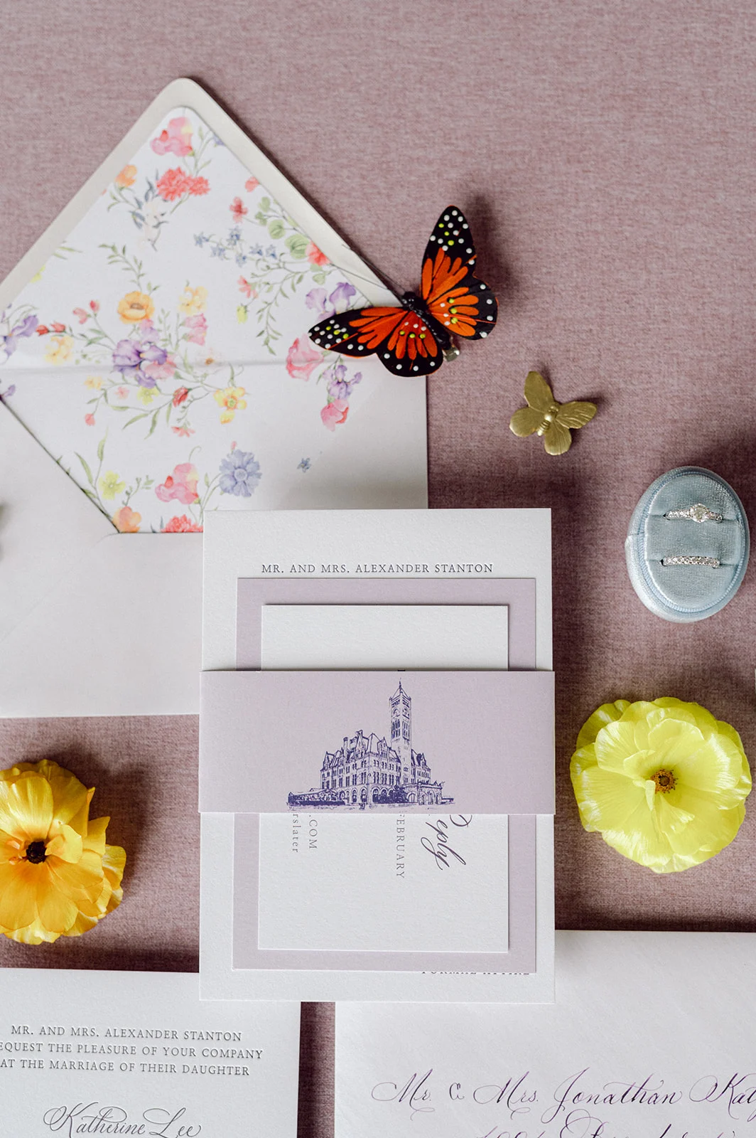
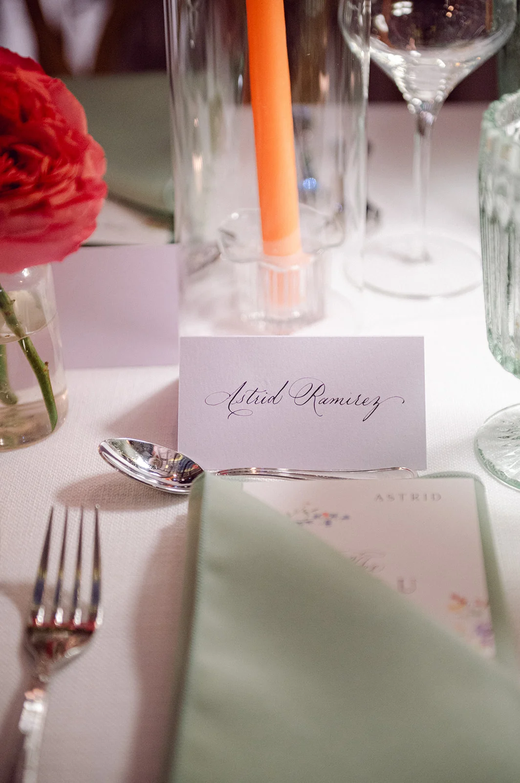
Lavender Wedding Invitations and Details
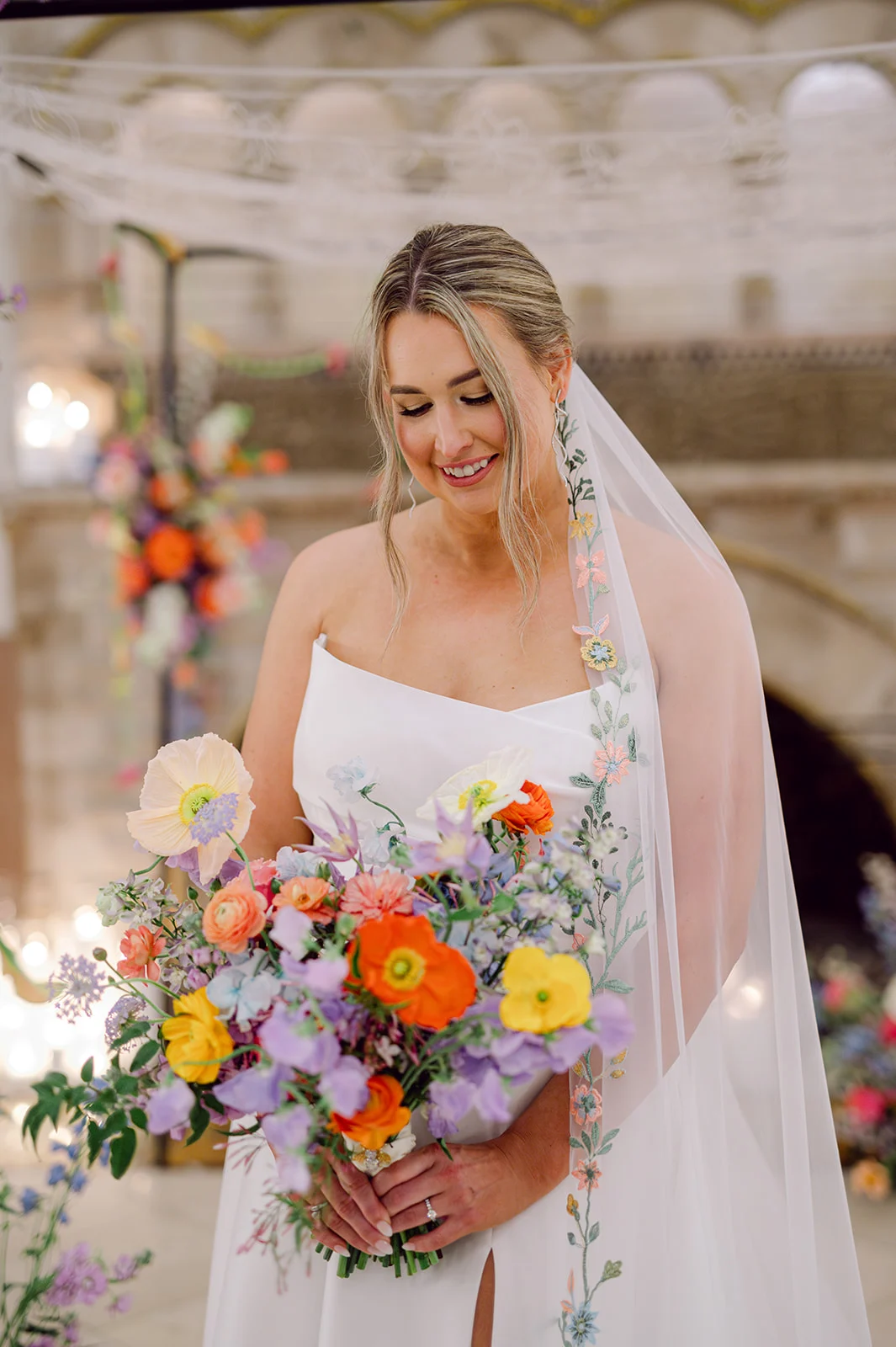
One detail we absolutely adored about this wedding was the color palette. Lavender isn’t a color we get to work with often in invitations. It brought such a fresh, romantic feel to each element. It also beautifully tied into the wedding day itself, where shades of purple were thoughtfully woven throughout the florals, the groom’s custom jacket liner, bridesmaids’ dresses, and even the bride’s veil, which featured the most gorgeous floral embroidery. Seriously, the veil was a work of art!
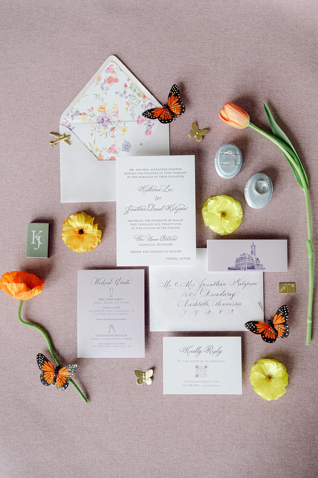
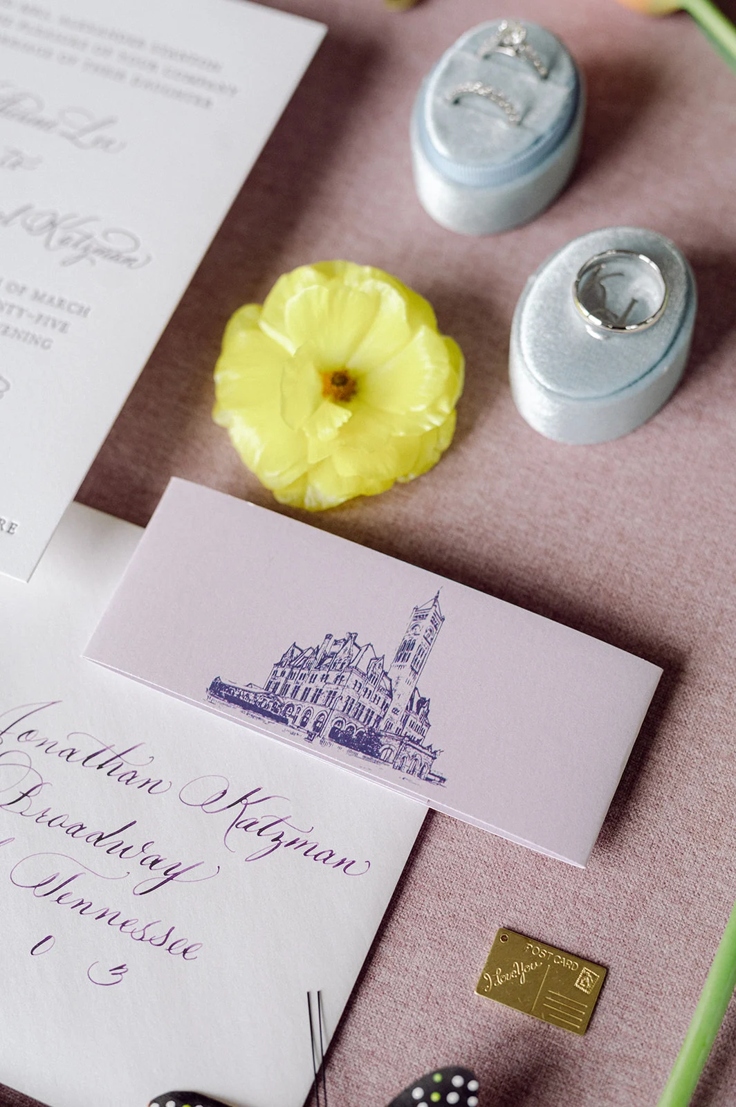
The custom invitation suite featured elegant white and lavender card stock, with delicate calligraphy bringing everything to life. The suite was wrapped with a custom-designed purple band showcasing an illustration of the historic Union Station as a nod to the incredible venue that would set the scene for their day.
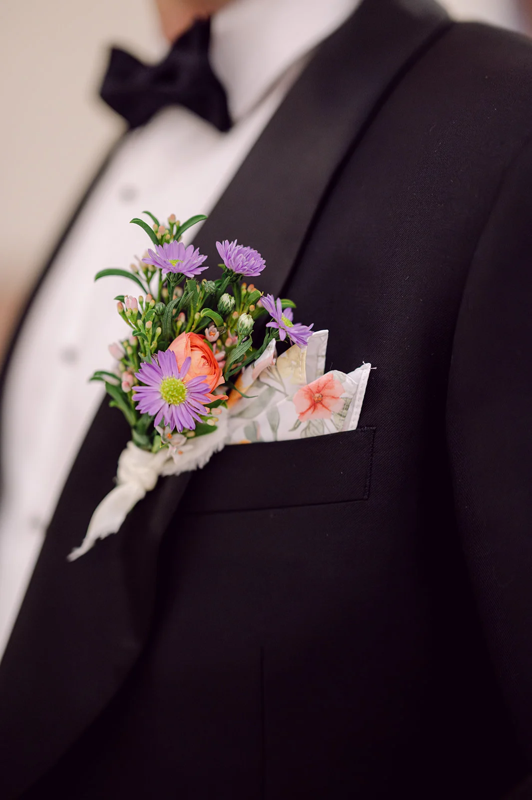
Inside, the envelope liner greeted guests with a burst of colorful florals. This offered a playful hint to all the vibrant flower details that would later decorate their ceremony and reception spaces. As a special gesture because we loved working with Kate so much, we shared with her the floral artwork we used for the invitation suite, and she used that to create the groom’s pocket square. It was a small but meaningful detail that spoke volumes about the couple’s thoughtful approach to design.
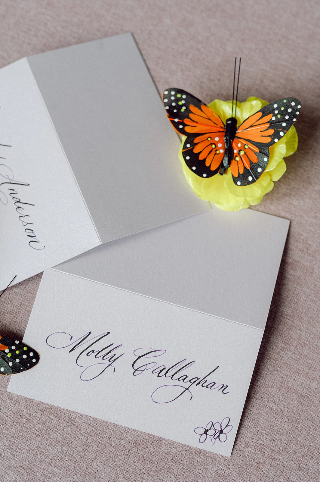
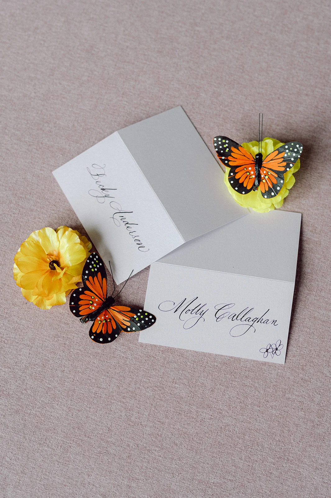
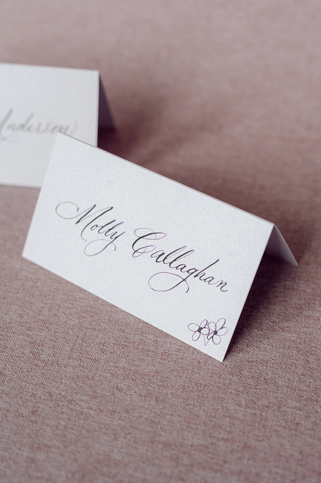
Elegant Day-of Touches
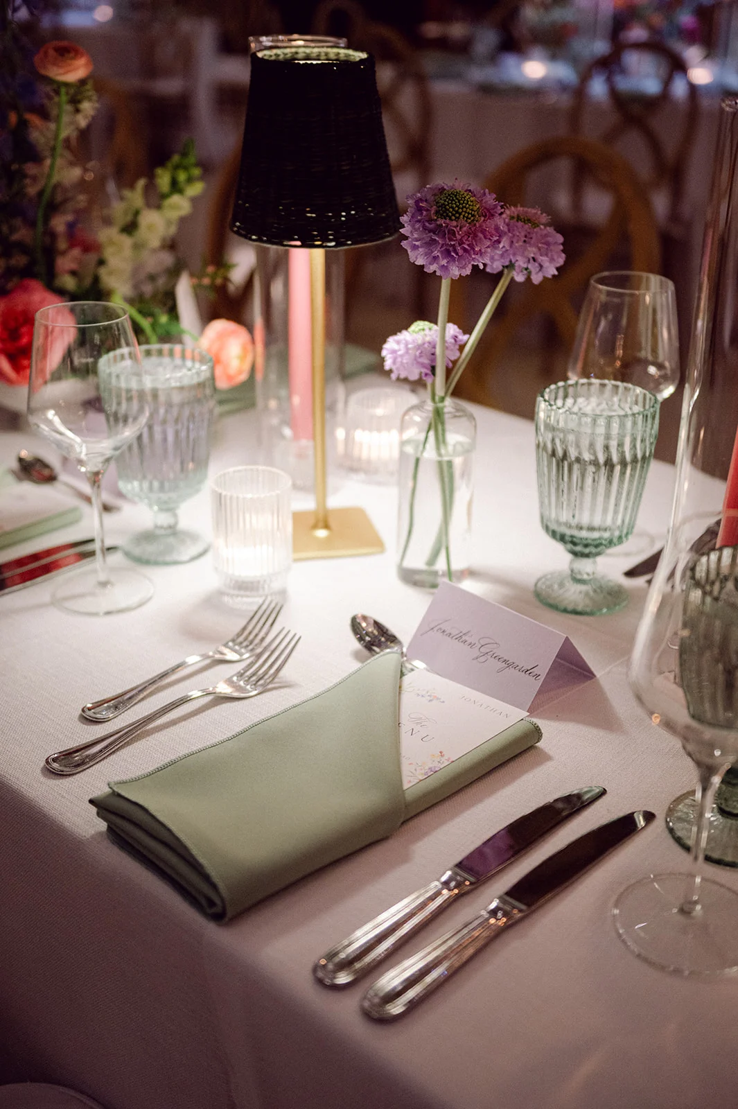
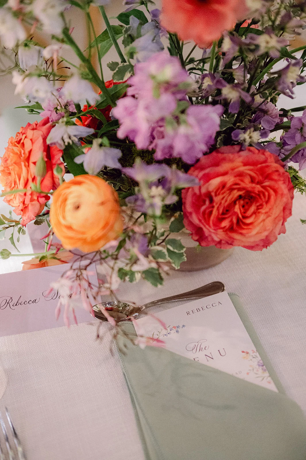
Alongside the invitation suite, we also created the folded place cards, which featured the same elegant calligraphy as the invitations, adding a cohesive and sophisticated touch to the guest tables.
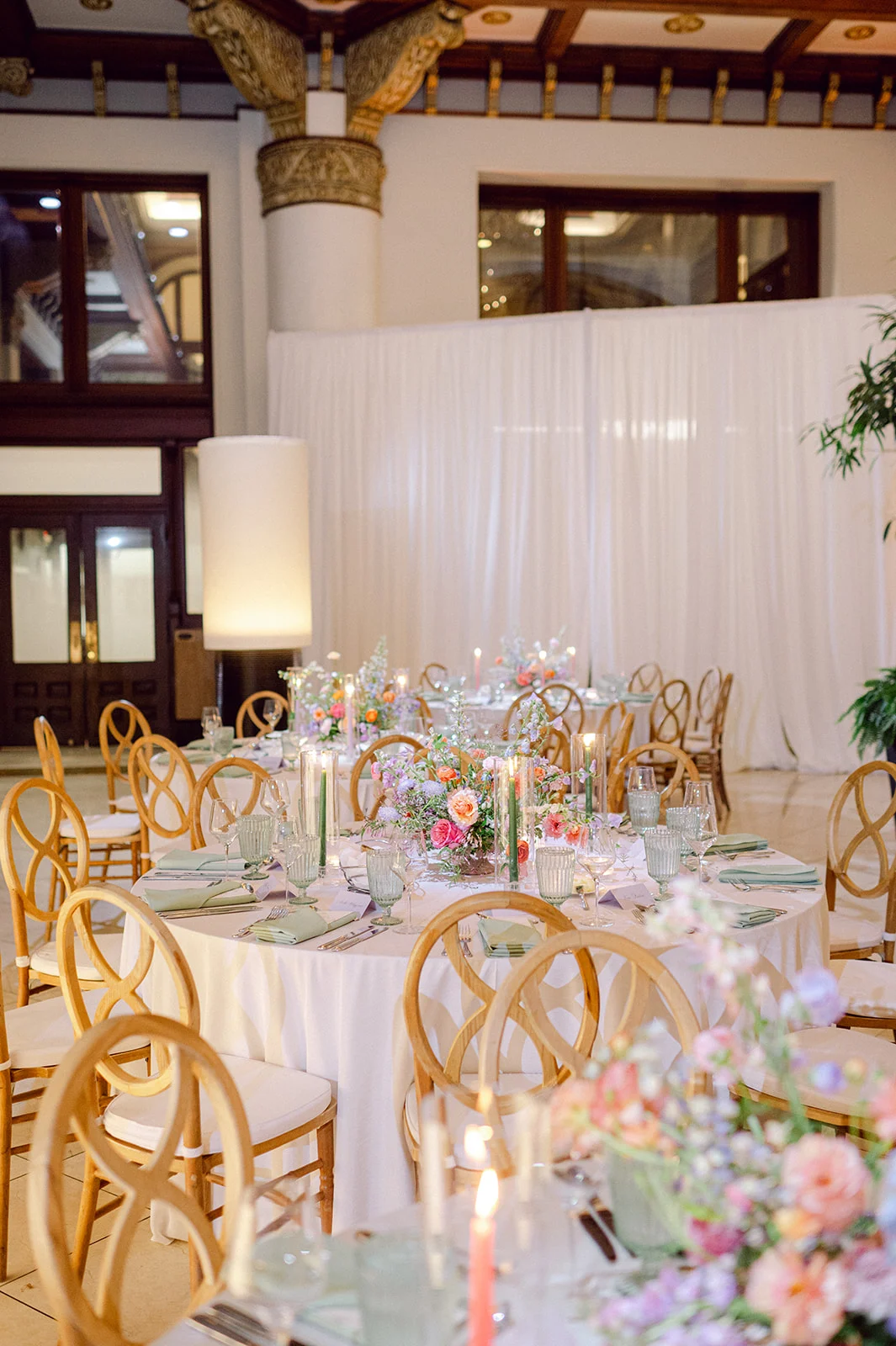
To tie the pieces together, the custom menus we created featured the same colorful floral design that was seen on the envelope liner. At the reception, these menus were tucked into the sage green napkins next to the place cards, creating a beautiful place setting for guests.
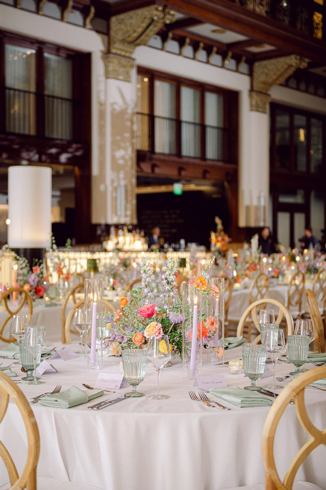
The tablescapes were stunning! Along with the paper goods, stunning floral arrangements decorated the center of the tables, and flickering candlelight added to the romantic setting. EBJ & Company did an amazing job planning and coordinating, as everything came together beautifully.
Kate and Andrew’s Union Station wedding blended old-world charm with fresh, personal style in the most perfect way. Being able to contribute to their day was such an honor for our team at White Ink Calligraphy.
If you’re looking to add custom, thoughtful touches to your wedding or event, we would love to help make your vision a reality. Reach out today to learn more about our full-service design offerings—we can’t wait to create something unforgettable for you!
If you enjoyed this post, you’ll love these other blogs!
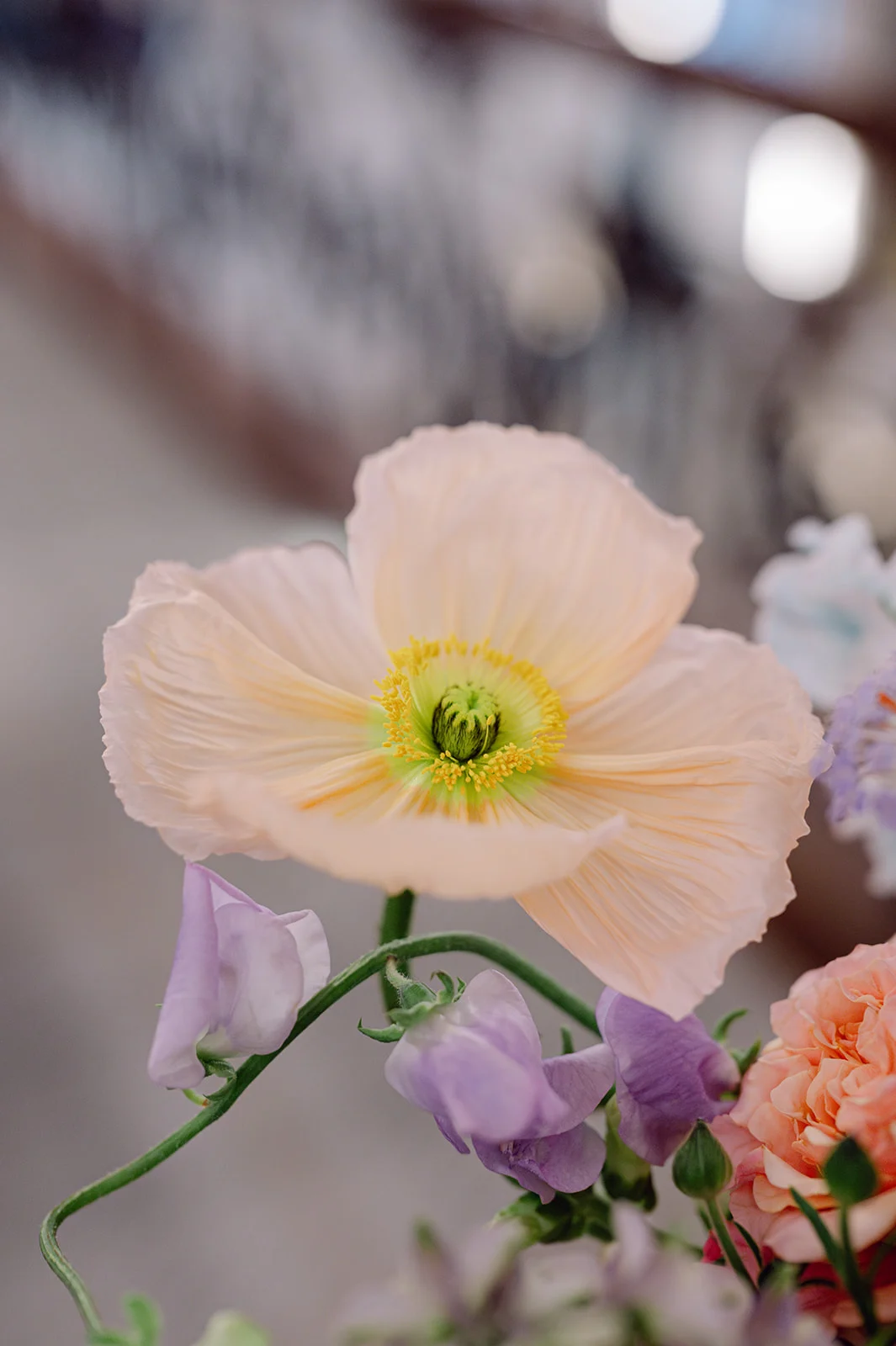
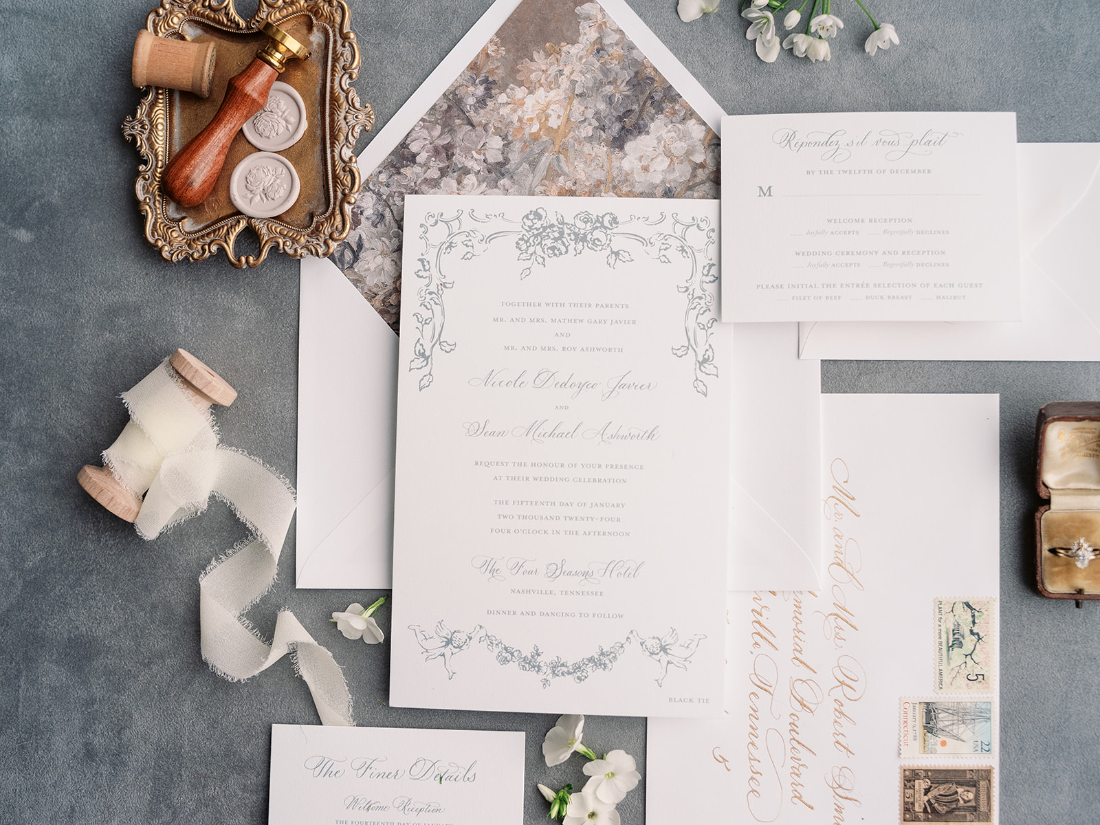
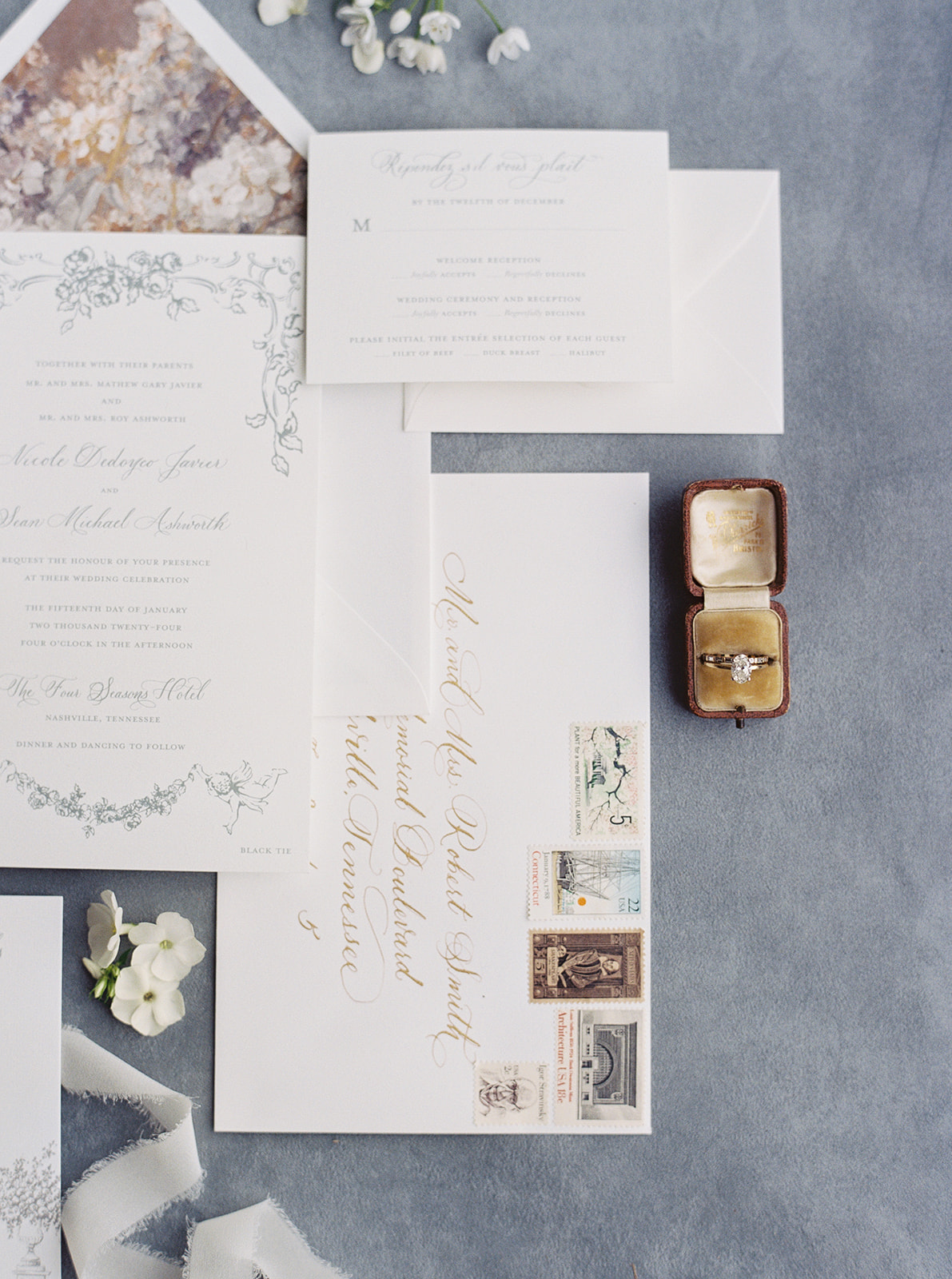
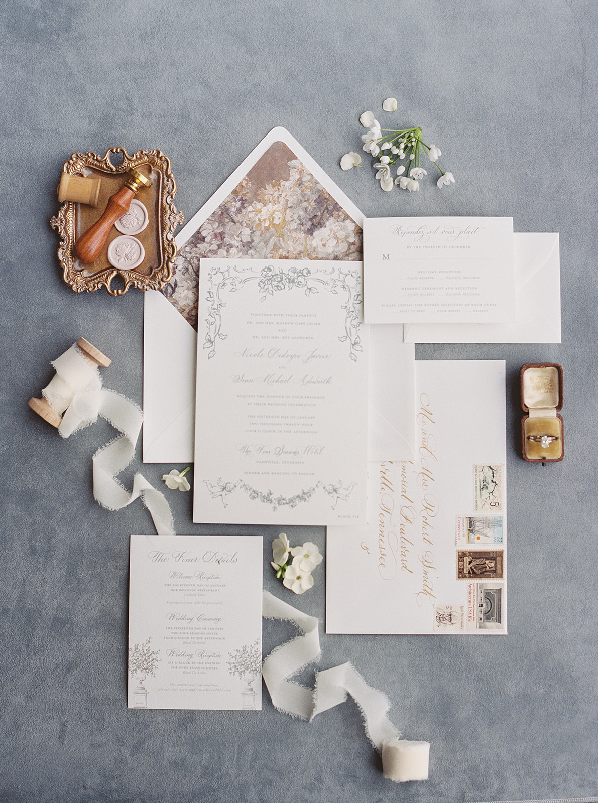
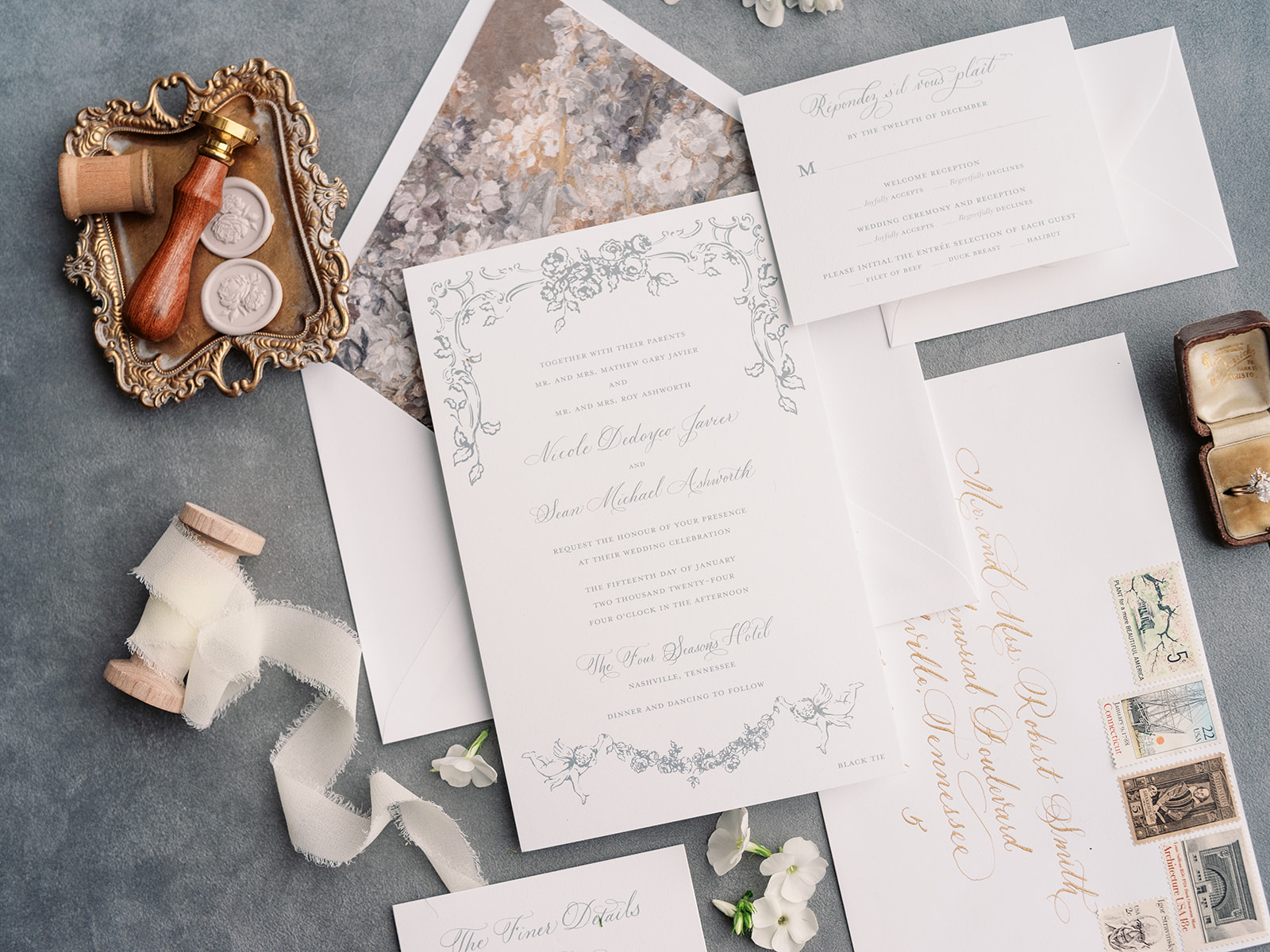
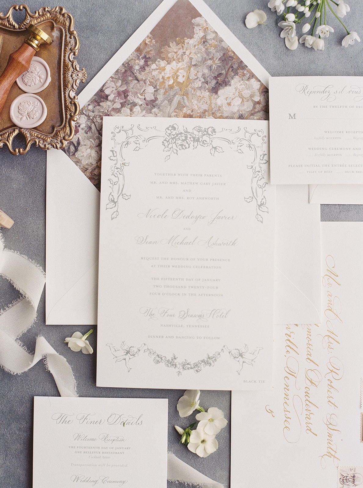
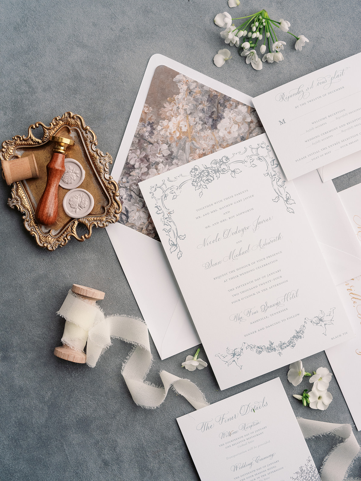
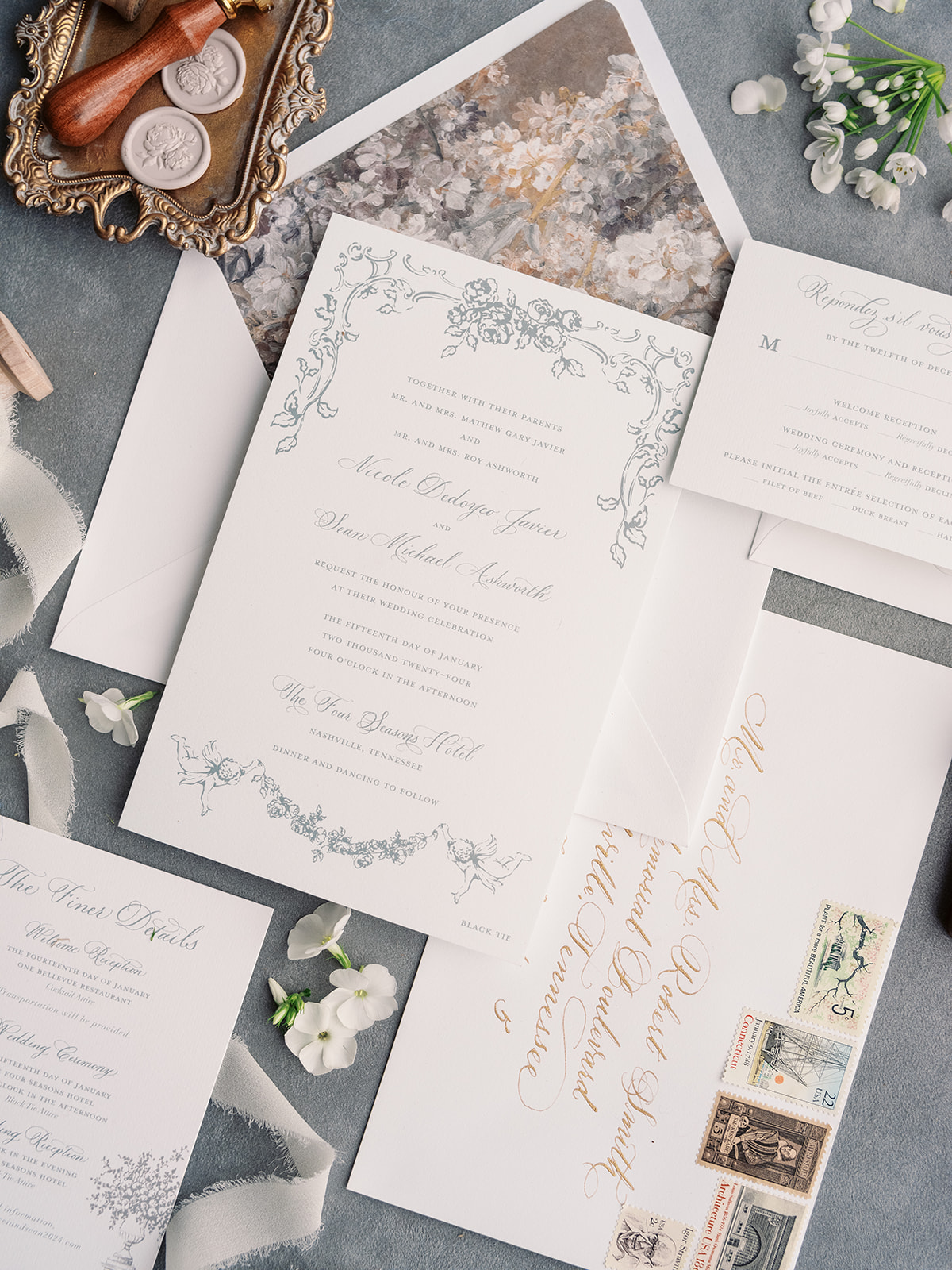
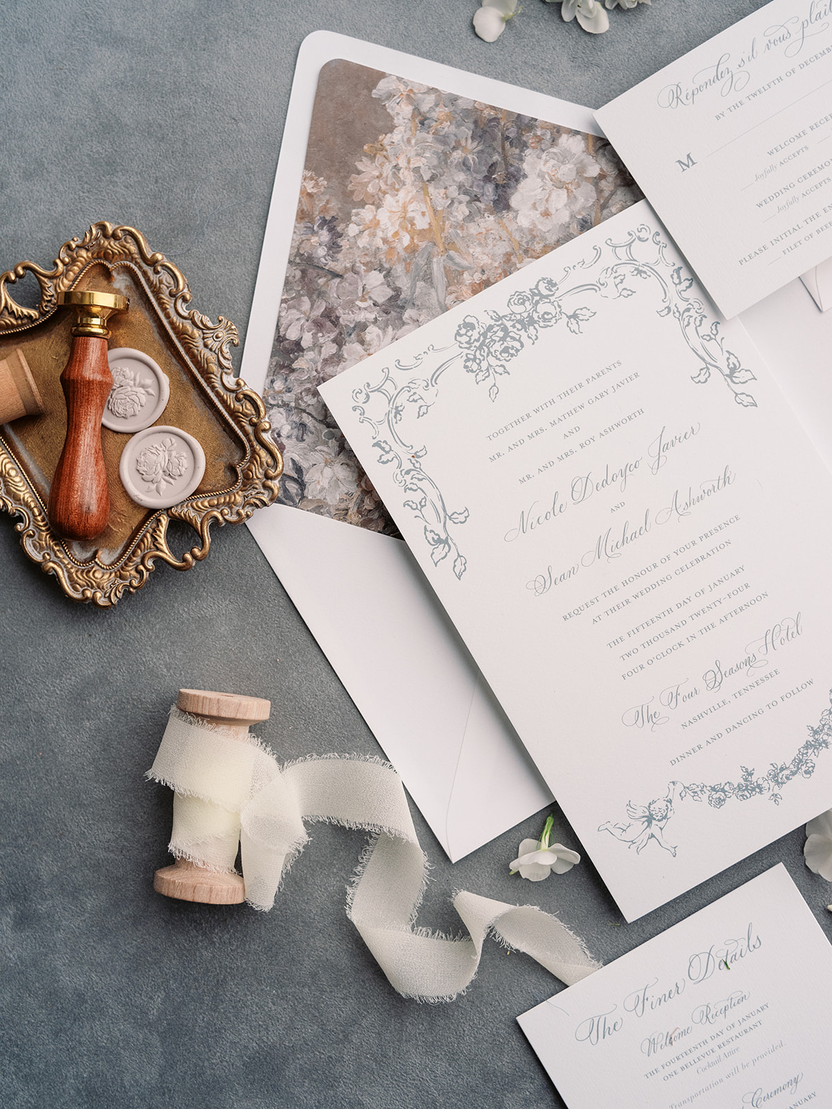
This stunning styled wedding shoot at the Four Seasons Nashville was all about timeless charm with a fresh, elevated twist. As part of a special competition for Southern Bride Magazine, this luxurious Southern inspired wedding shoot brought together some of the most talented creatives in the industry, including planner Amanda Marie and Co.. who is known for designing warm, upscale, and unforgettable events. This event was no exception! With 18 photographers present capturing every moment, we were honored to contribute custom wedding details that brought the vision to life.
An Invitation Suite Rooted in Romance
The foundation of any wedding aesthetic starts with the invitation suite, and this one was nothing short of refined elegance. Featuring delicate light gray calligraphy on crisp white cardstock, the suite exuded sophistication. A romantic floral border framed the invitation, while a soft floral print on the envelope liner added a subtle touch of Southern charm. To complete the look, we sealed each envelope with a rose wax seal, the perfect final detail to elevate the experience.
Luxurious Southern-Inspired Wedding Details
Bringing a cohesive vision to life is all about consistency in the details, and we were excited to incorporate subtle nods to the invitation suite throughout the wedding.
The personalized folded name cards for the seating chart and corresponding place cards at the table included an extra thoughtful touch by framing each guest’s name with the same border details found on the invitation suite. This delicate print not only enhanced the overall design but also created a seamless visual experience from the first invitation to the wedding day details. Even the bride’s wedding dress and piping on the wedding cake featured a similar pattern. Pulling similar details throughout a wedding day is something we love to do, as it really creates a cohesive style and vision and elevates the guest experience.
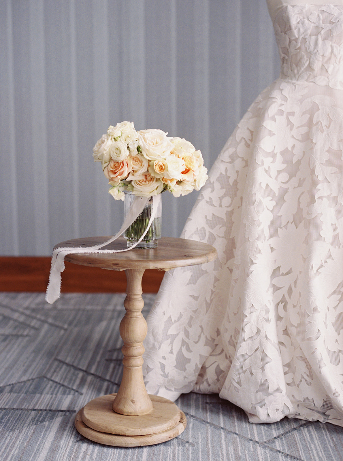
Then there were the unique dinner menus, which were a favorite of mine. Instead of a traditional flat menu, we designed booklet-style menus, that were tied with a dusty blue ribbon, and featured the couple’s initials on the cover. They perfectly complemented the tablescape, where gold cutlery and gold-rimmed plates tied everything together in effortless elegance. The romantic ambiance was furthered by the soft florals and flickering candles that decorated the center of the tables.
This entire shoot was a masterclass in Southern luxury, and we loved every moment of bringing these wedding details to life. Styled shoots like these are such an inspiring way to collaborate with other creatives and push the boundaries of design. Seeing all the details come together at the Four Seasons Nashville was a dream, and we can’t wait to create even more unforgettable designs in the future!
If you’re looking to add custom, thoughtful touches to your wedding or event, we would love to help make your vision a reality. Reach out today to learn more about our full-service design offerings—we can’t wait to create something unforgettable for you!
If you enjoyed this post, you’ll love these other blogs!
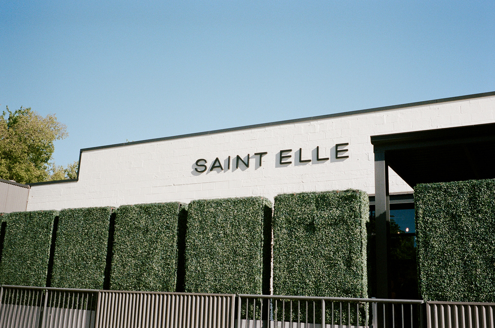
At White Ink Calligraphy, we love when couples and planners trust us to have fun with design! This Saint Elle wedding in Nashville was no exception! The incredible Sarah Oakland worked her magic, and gave us the creative freedom to incorporate fun, bold colors. In addition to the bright colors, the personal touches and mix of trendy and traditional wedding details made this wedding truly one-of-a-kind.
As we were setting up in the morning, we overheard the father of the bride introduce himself to a vendor by saying, “I’m the father of the bride—last name Swift, like Taylor Swift, but not related.” It was such a cute and memorable moment that perfectly captured the joy and excitement of the day. The bride and groom were brimming with happiness, as were all the guests who shared this special day with them.
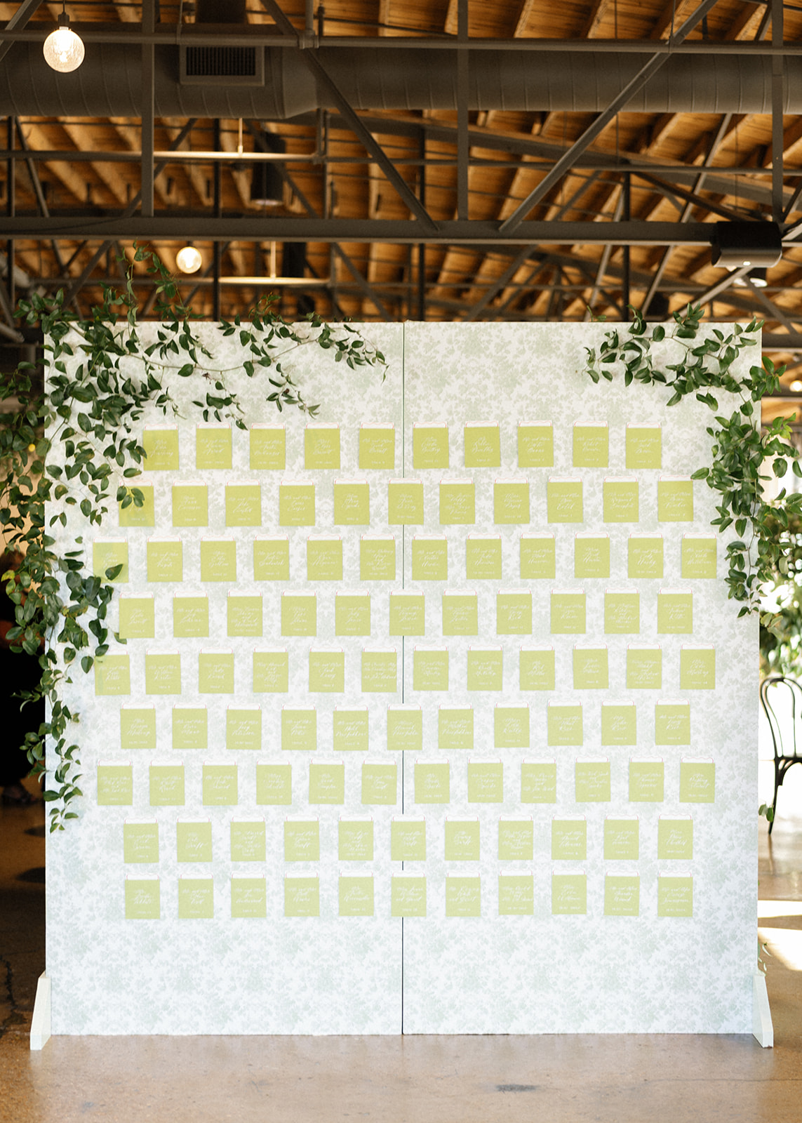
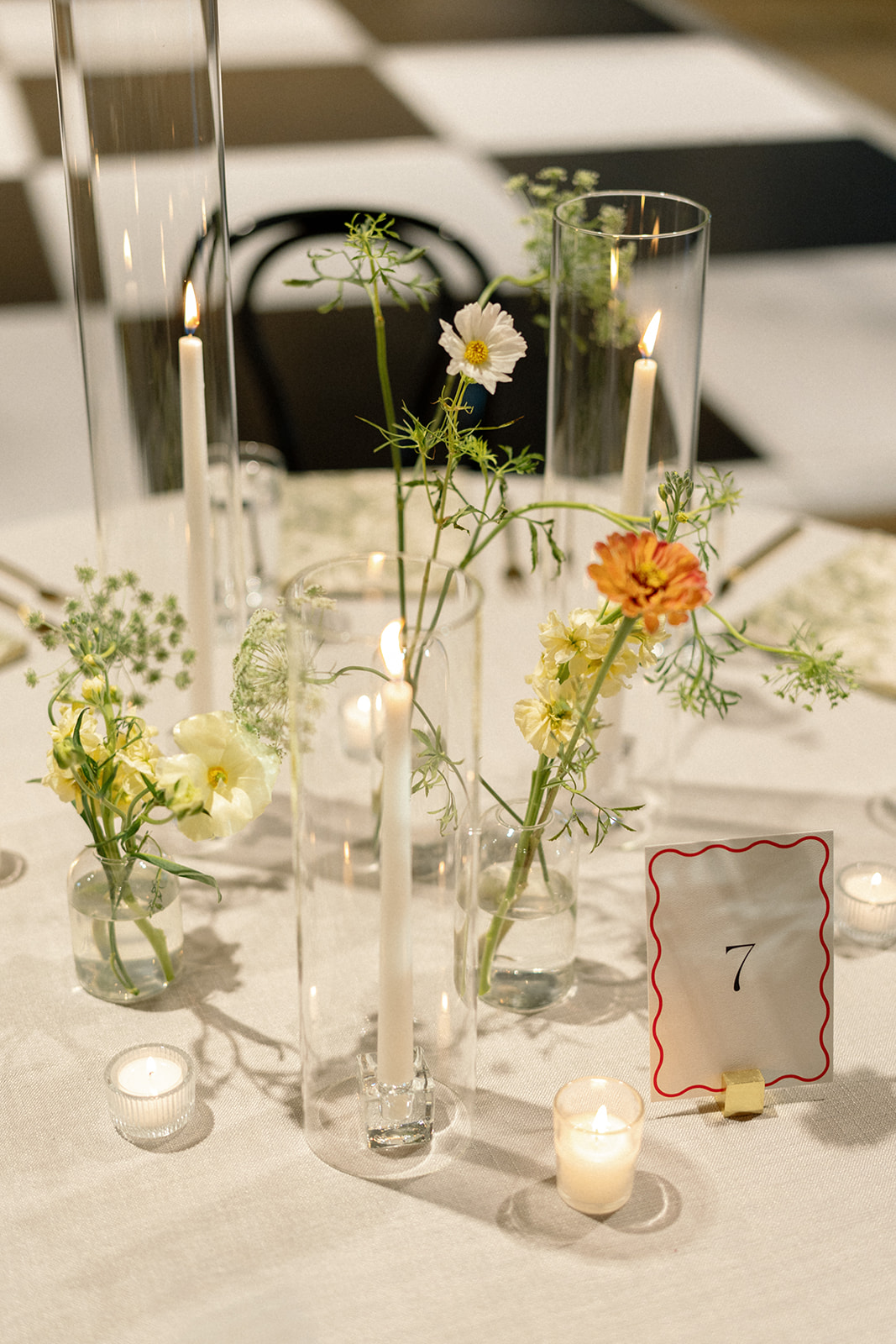
A Vibrant Seating Chart with a Personal Touch
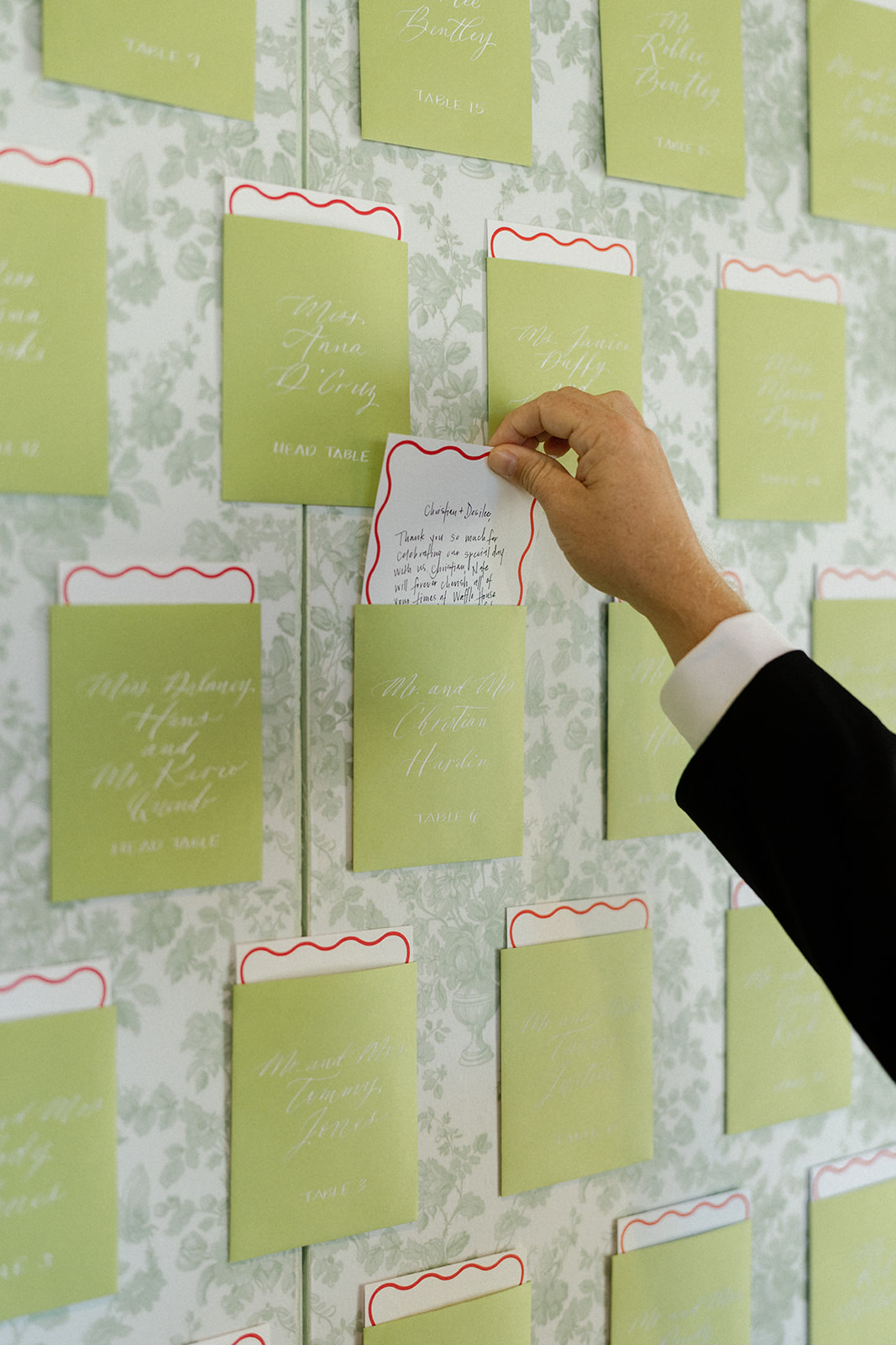
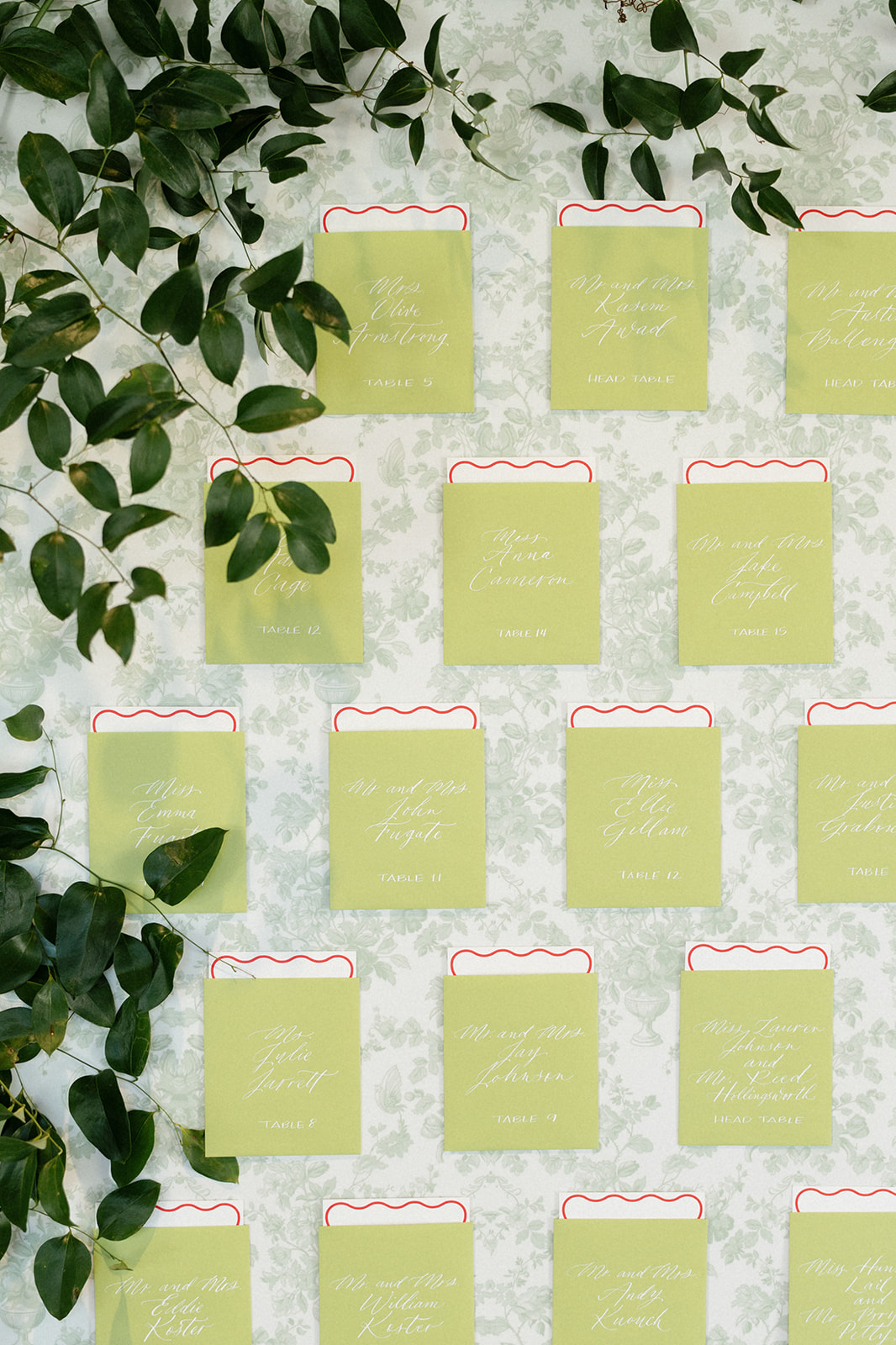
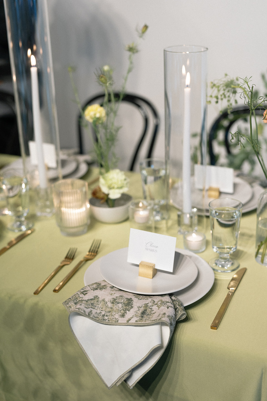
One of our favorite elements of this wedding was the seating chart wall, which featured envelopes in a striking “Sour Apple” green shade. The bright pop of color added energy to the event and drew people in as they walked by. It was also the perfect complement to the varying shades of green woven throughout the wedding design.
However, there was one personal touch that made this seating chart extra special. Inside each green envelope, where guests could find their table number, there was also a handwritten note from the bride and groom. This incredibly thoughtful detail left a lasting impression and made every attendee feel extra appreciated. These are the details that make a huge impact on your day, and when they are seamlessly incorporated with your overall design like this, it is pure perfection.
Mixing Modern Trends with Timeless Elegance
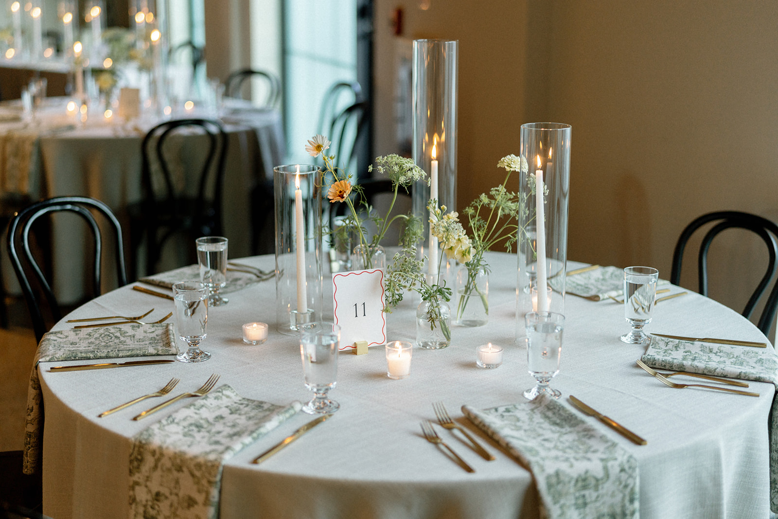
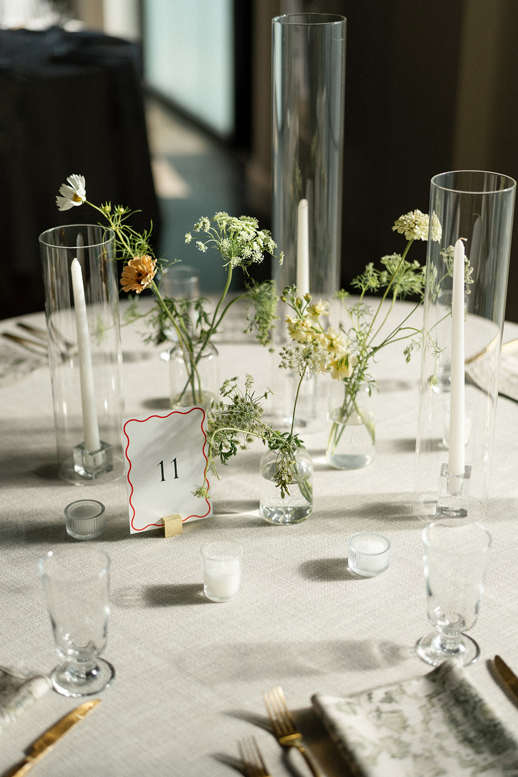
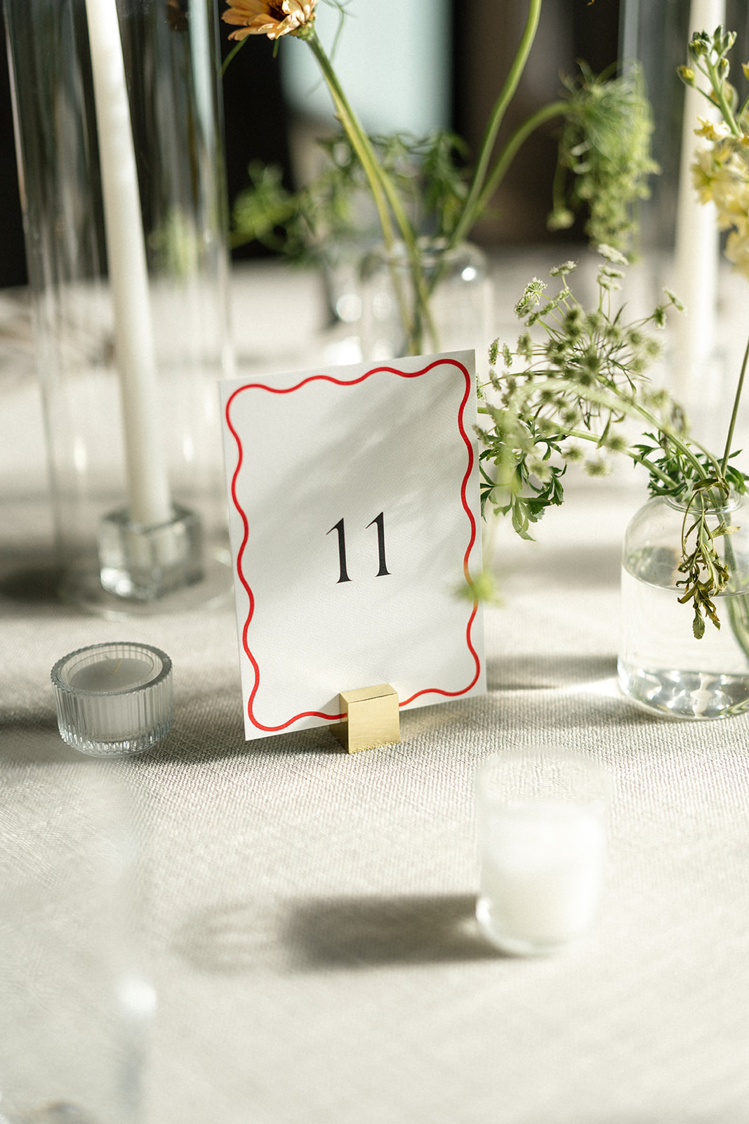
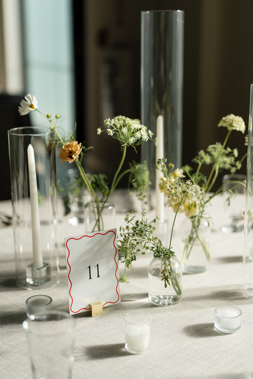
We always love finding ways to balance current trends with classic design, and this wedding was the perfect opportunity to do just that. The seating chart wall featured a sophisticated custom wallpaper, bringing in a timeless element, while the guest cards and table numbers had a modern, red squiggle border design that felt fresh and playful. The contrast of these styles created a look that was both elegant and fun.
Wedding Signage and Details
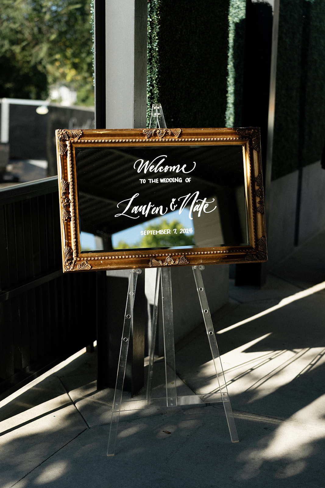
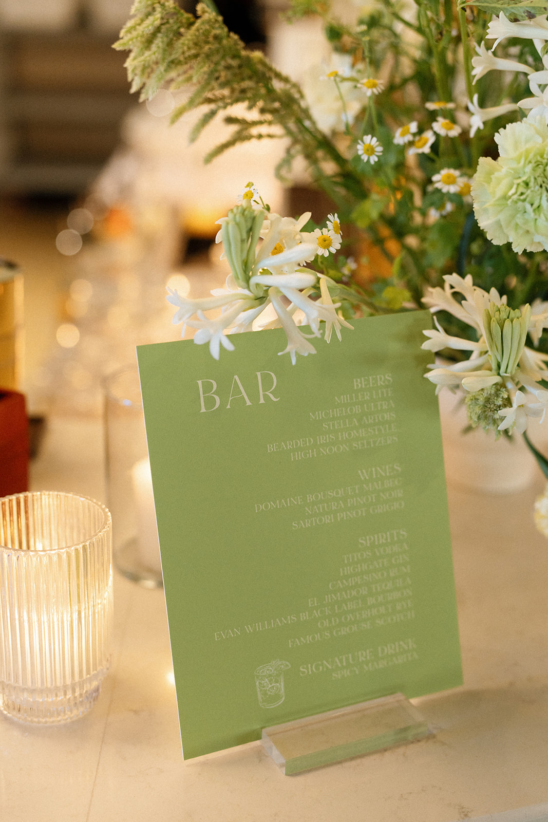
As guests arrived at Saint Elle, they were greeted by a beautiful mirror welcome sign with white calligraphy, setting the tone for the celebration to come. White Ink Calligraphy also created the green bar sign with white lettering, similar to that of the envelopes on the seating chart. The soft, muted florals found in the wedding party bouquets and arrangements at the reception balanced the brighter green wedding details and the pop of red on the table numbers and guest cards.
We were honored to be a part of this gorgeous Saint Elle wedding. From the vibrant green seating chart to the personal touches and stylish design elements, this wedding was a great example of how to mix modern and classic elements to create a beautifully designed event.
If you’re looking to add custom, thoughtful touches to your wedding or event, we would love to help make your vision a reality. Reach out today to learn more about our full-service design offerings—we can’t wait to create something unforgettable for you!
If you enjoyed this post, you’ll love these other blogs!
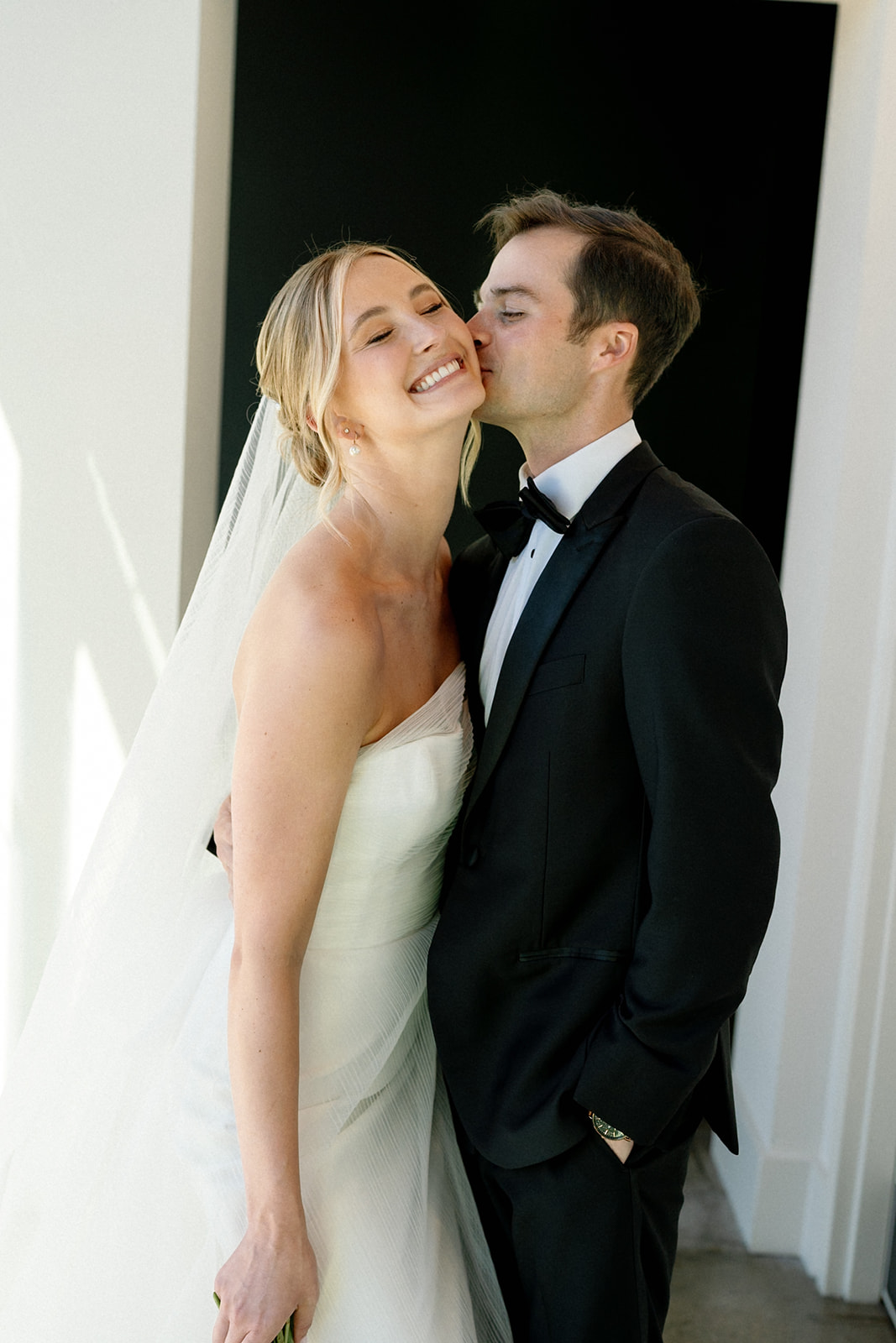
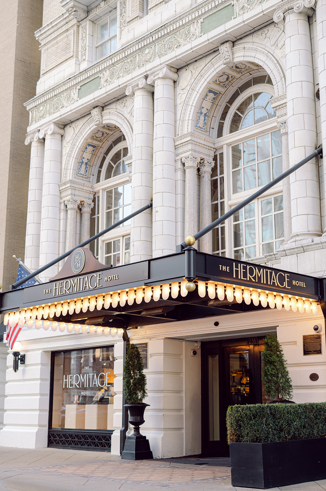
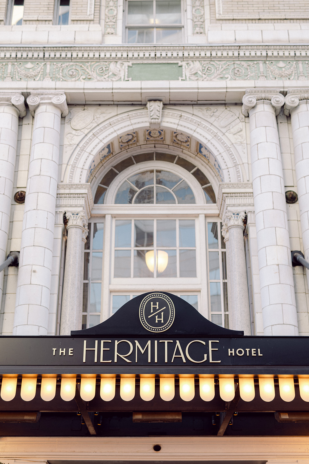
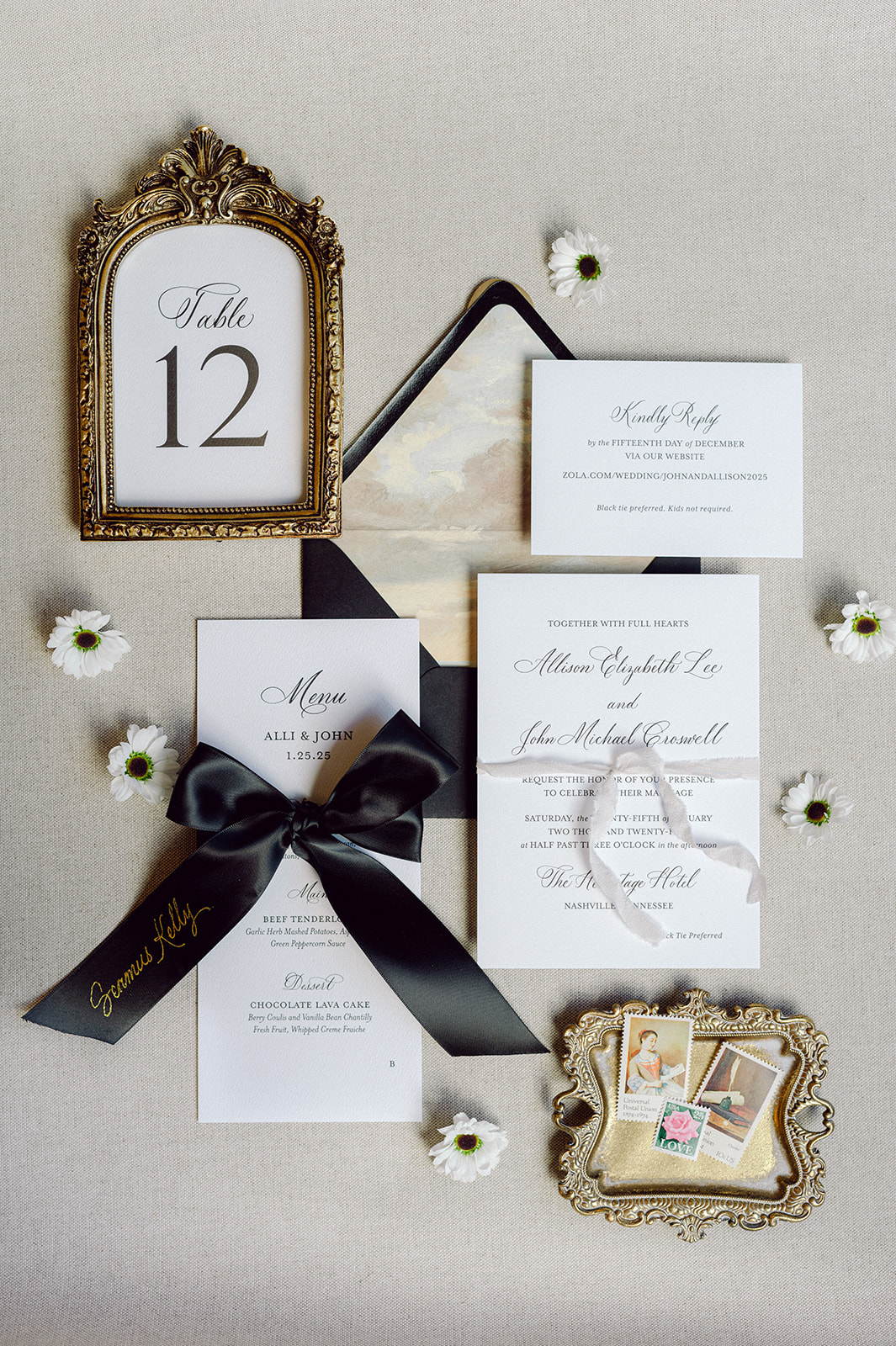
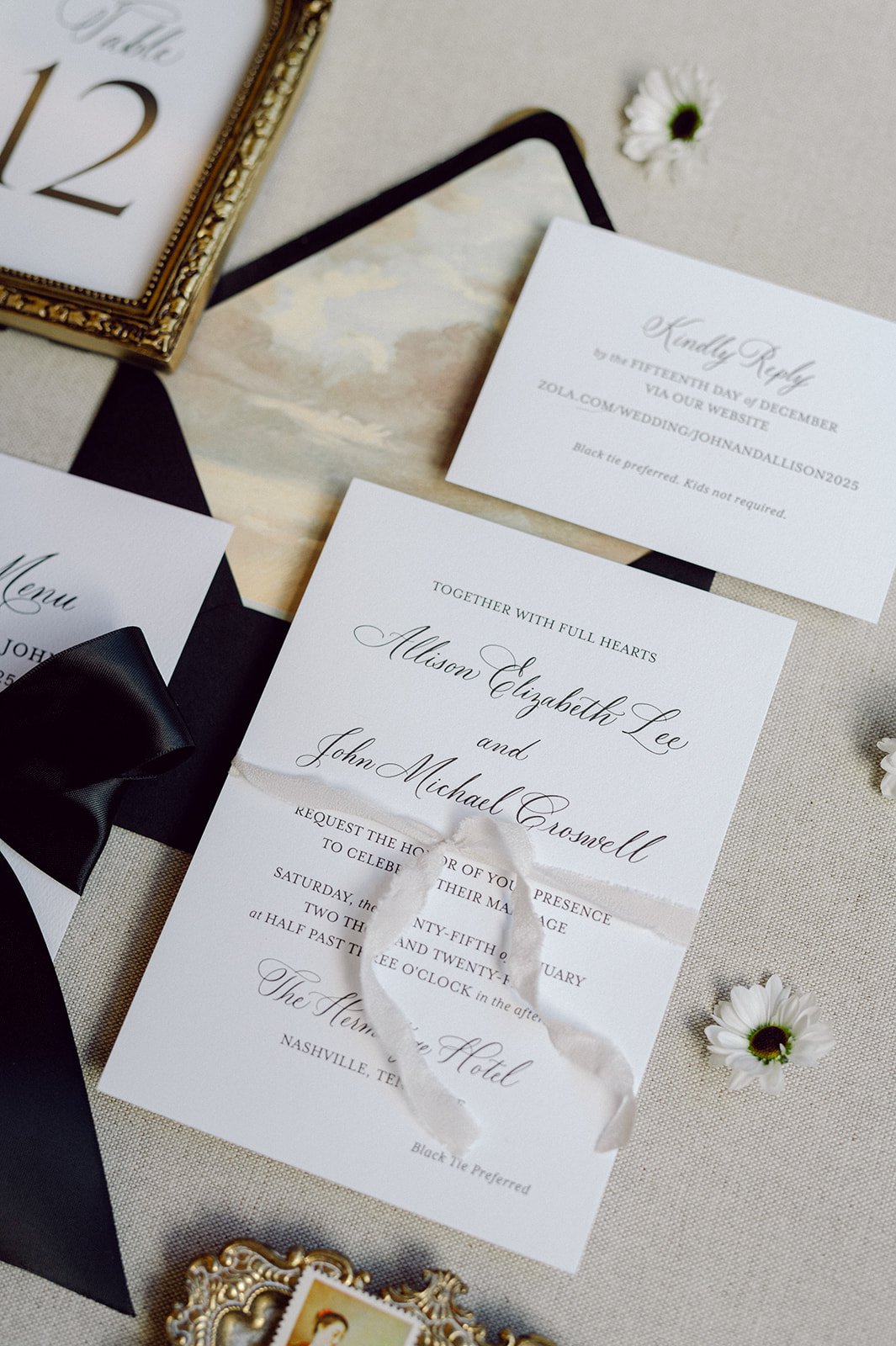
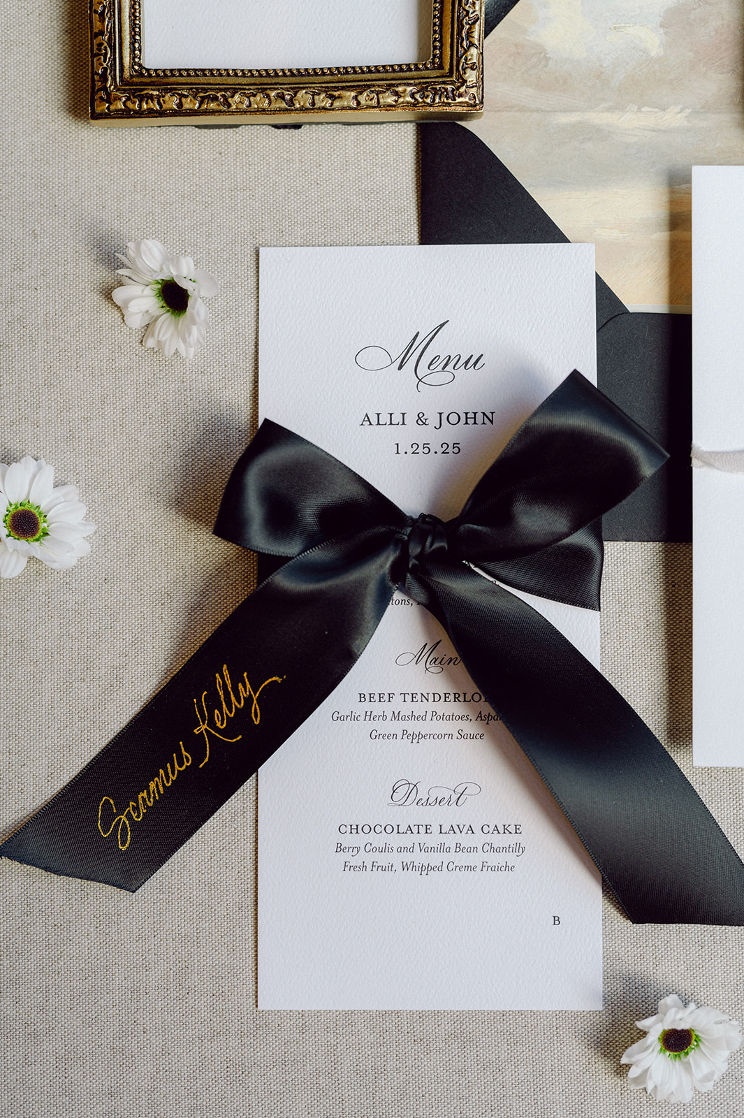
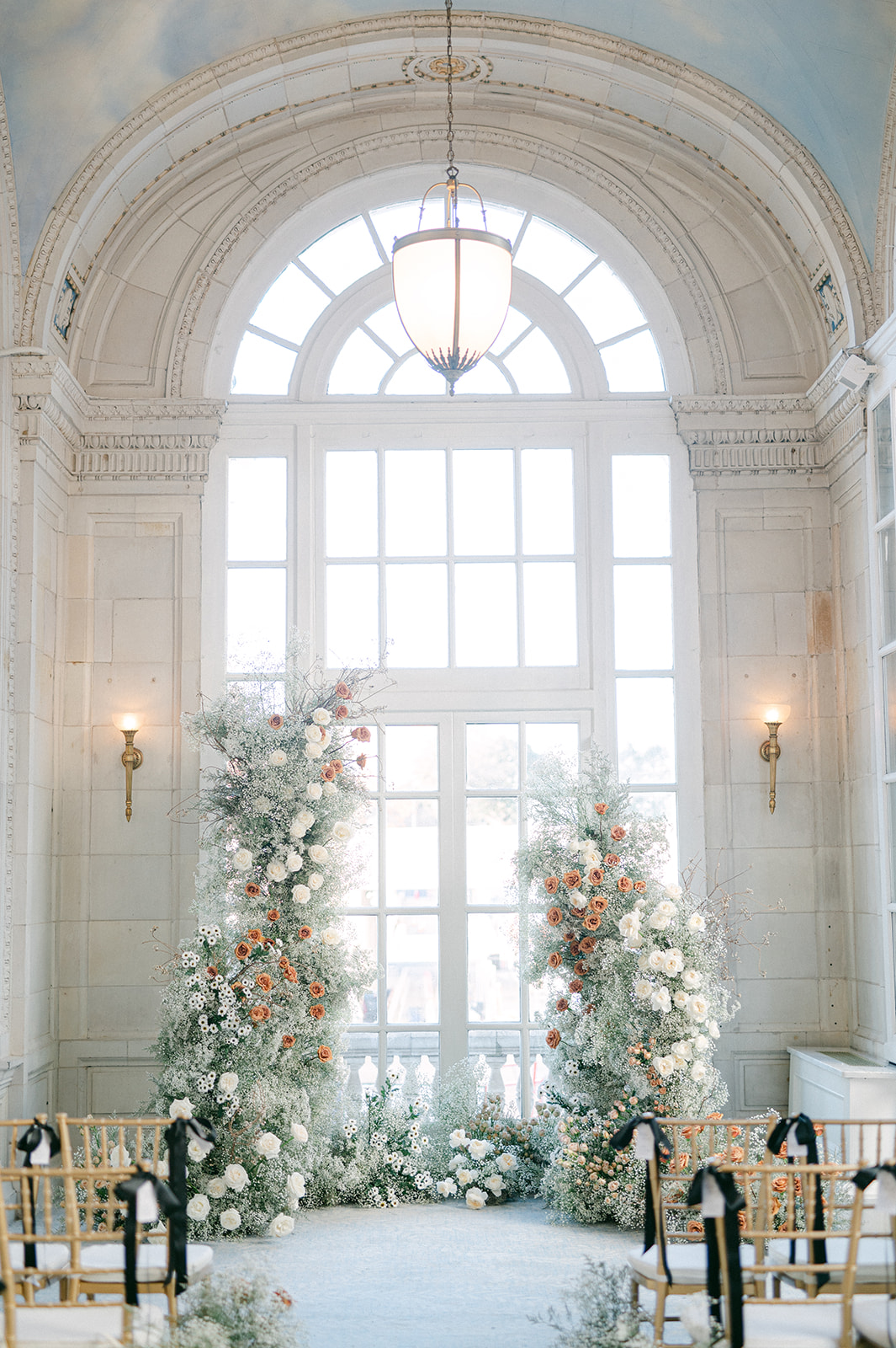
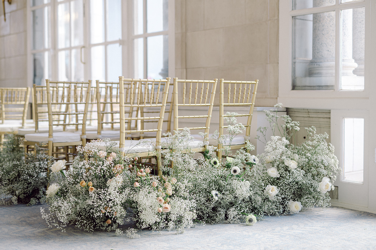
This stunning, elegant Hermitage Hotel wedding was our first wedding to kickstart 2025, and this was definitely one for the books. What a great way to start our year off. Every detail was elegant, classic, and just overall perfection, especially when paired with the amazing venue and the florals of the day. The fabulous vendor team we had the privilege of working with also elevated this entire wedding experience. The talented Joanna Lewis of Siena & Co. planned this beautiful wedding, executing everything to perfection. Kéra Photography did the honor of capturing all our detail shots. They are stunning and I’m so excited to showcase all the different details that went into this wedding!
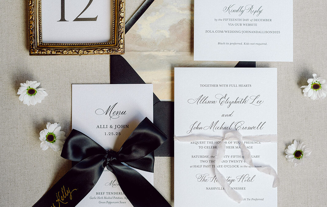
Elegant Wedding Details: The Invitation Suite
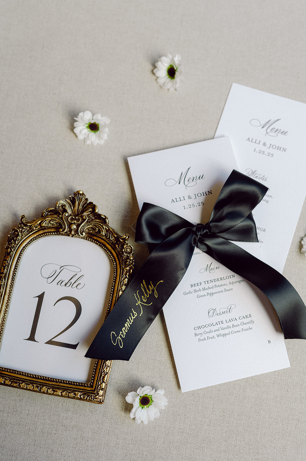
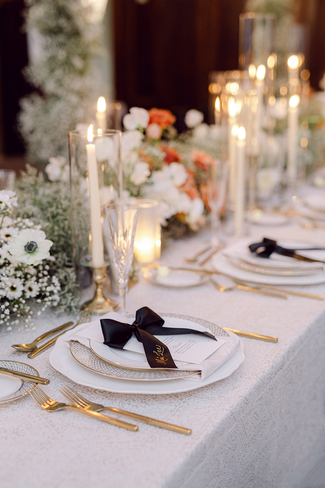
We produced all of the stationer items for this day-everything from wedding invitations to the day of details. The wedding invitation suite was a masterclass in effortless elegance. We kept it classic and in line with the vision of the wedding using black letterpress calligraphy. The custom envelope liner included a nod to The Hermitage Hotel’s stunning ceiling, which was such a fun and unique detail that tied everything together. The bold black envelope added just the right amount of drama and was a preview to the timeless black accents that were to come. Of course, we made a beautiful, thread-it-all-together moment when the spot calligraphy carried through to the wedding day signage.
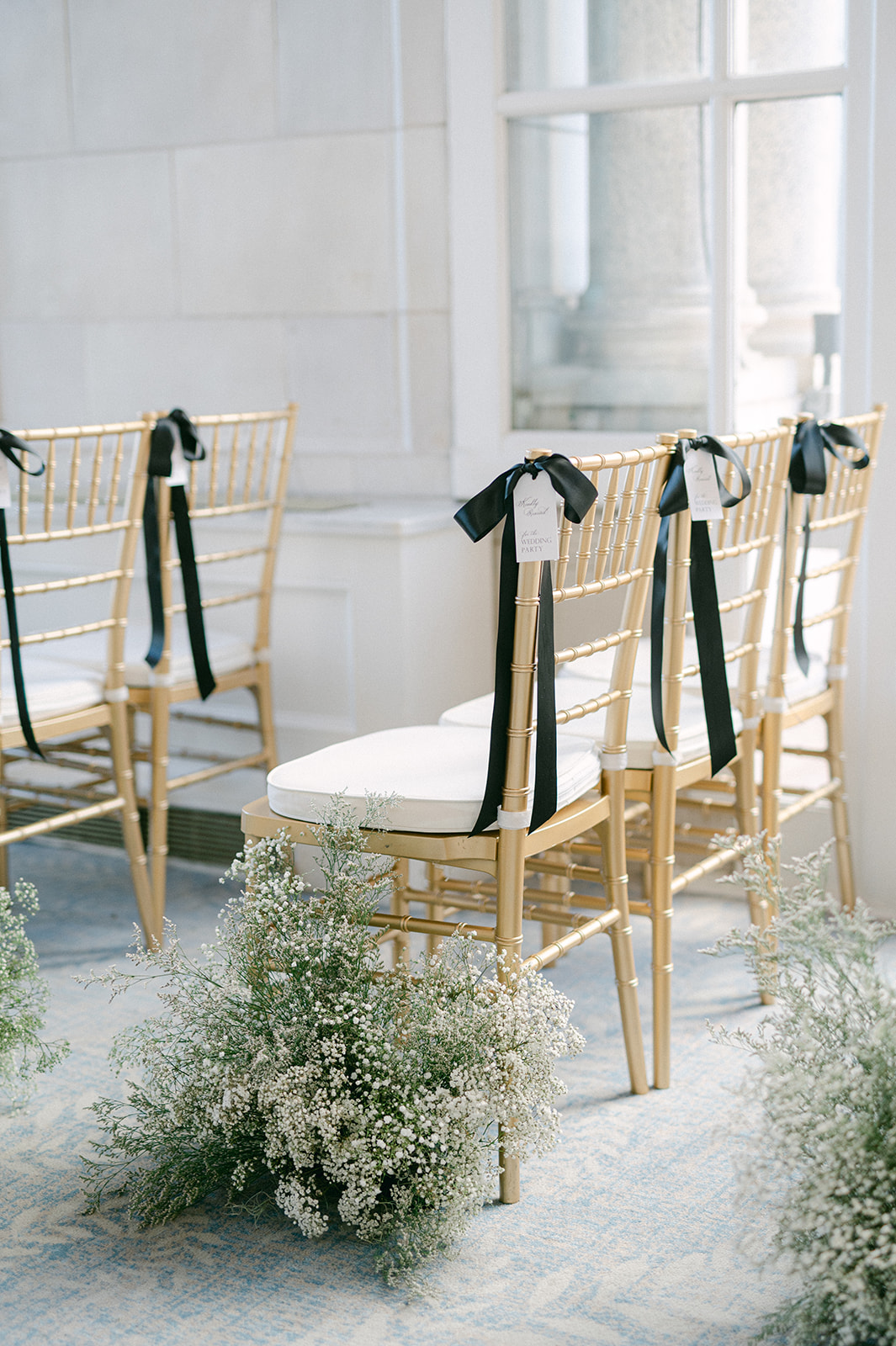
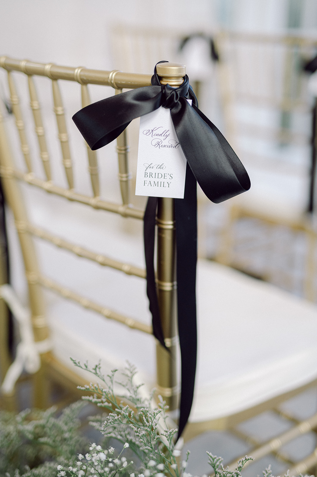
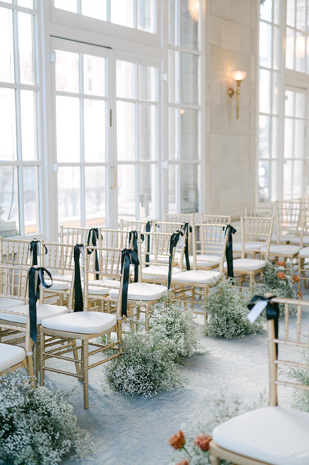
Bold, Black Ribbon Details
I was onsite working this wedding from the start of the day until ceremony start time. I wanted to ensure the seating chart was flawless and the bows on each table place setting were perfect. The black ribbon bows were incorporated into various moments throughout the day. At the ceremony under the beautiful ceiling that served as inspiration for the envelope liners, reserved chairs for the bride and groom’s family and bridal party were identified by black ribbons with a white tag that had each guest name in calligraphy.
More classic, black ribbons were used as place cards and tied to the custom menus at each place setting. Hand lettered hot foiled calligraphy in gold stood out on each bow with each guests’ name, which coordinated with the custom seating chart. I absolutely love the end result! Let’s make this a trend for 2025!
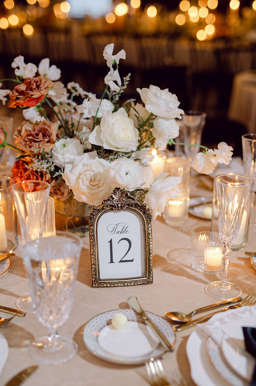
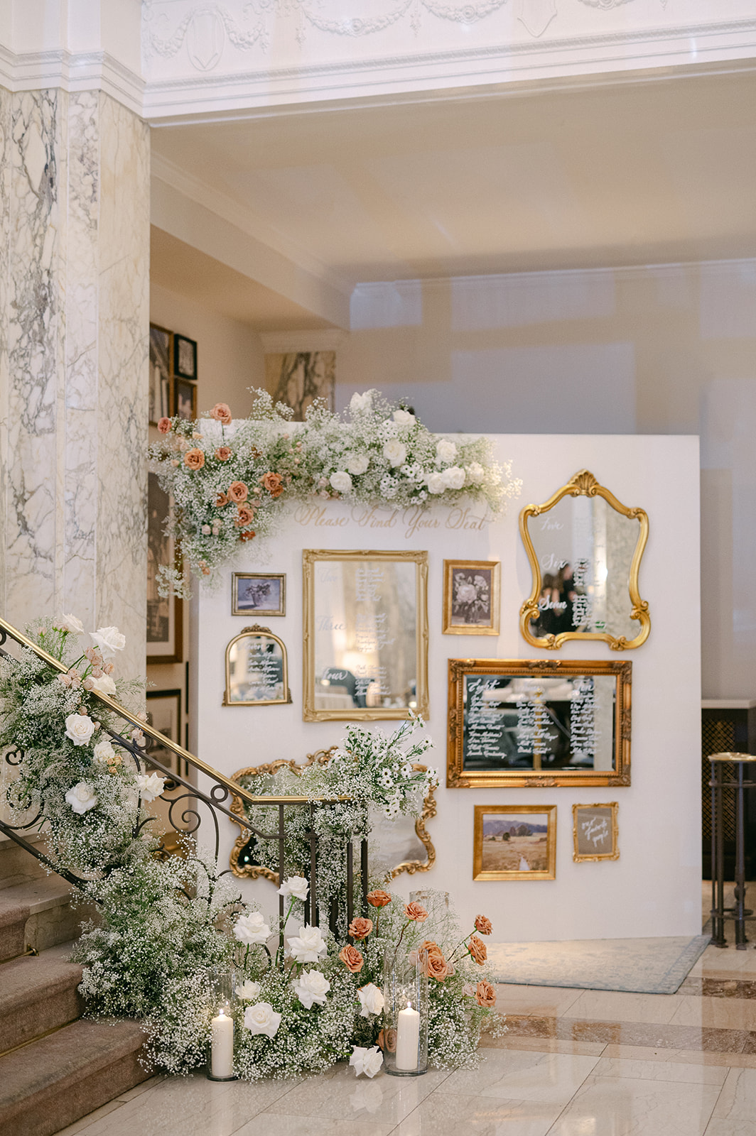
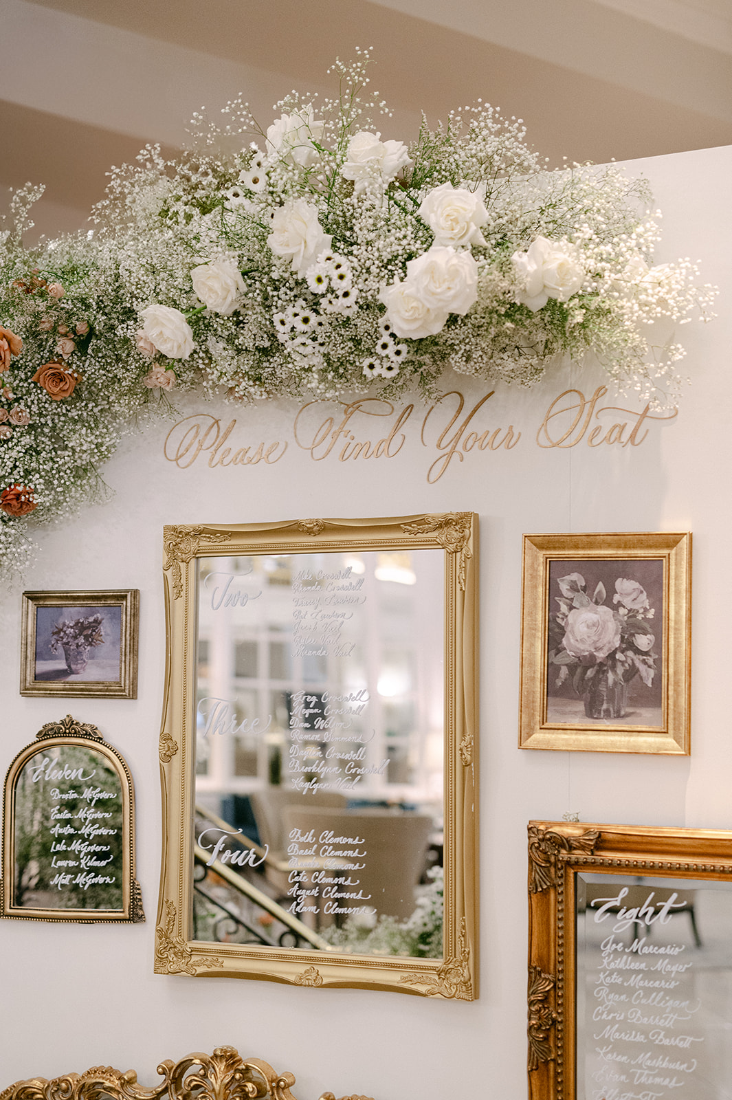
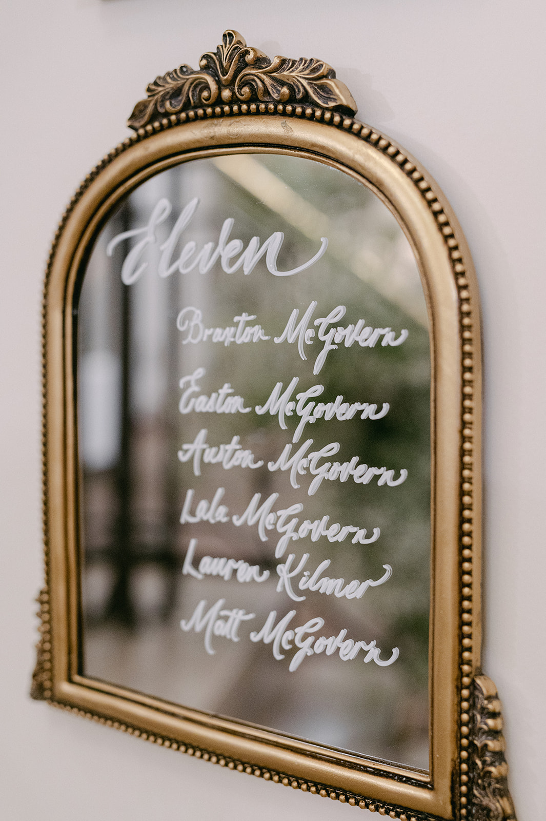
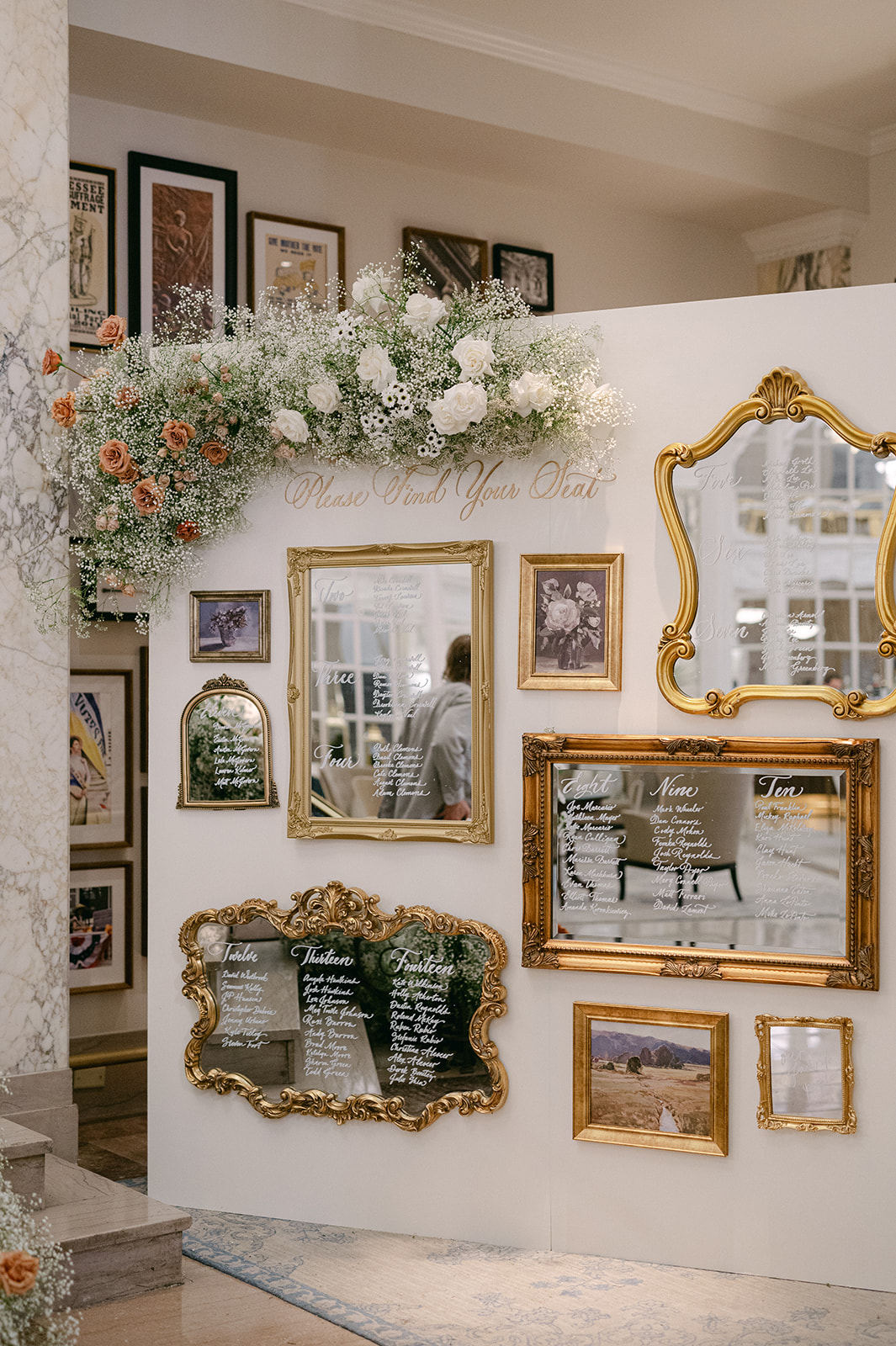
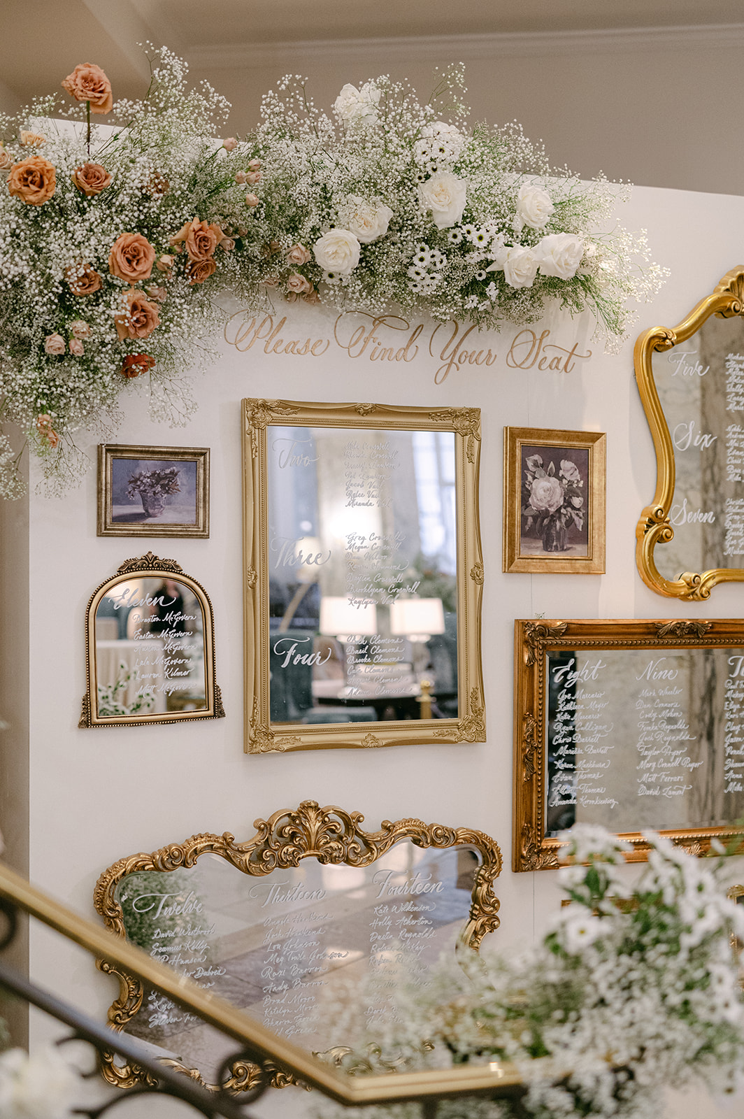
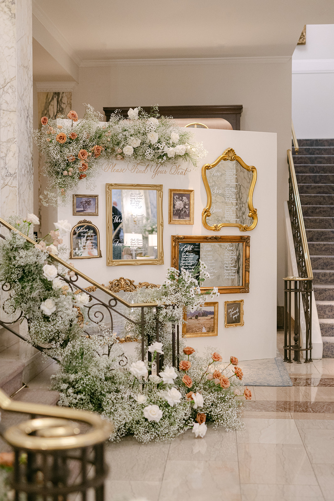
An Elegant Seating Chart
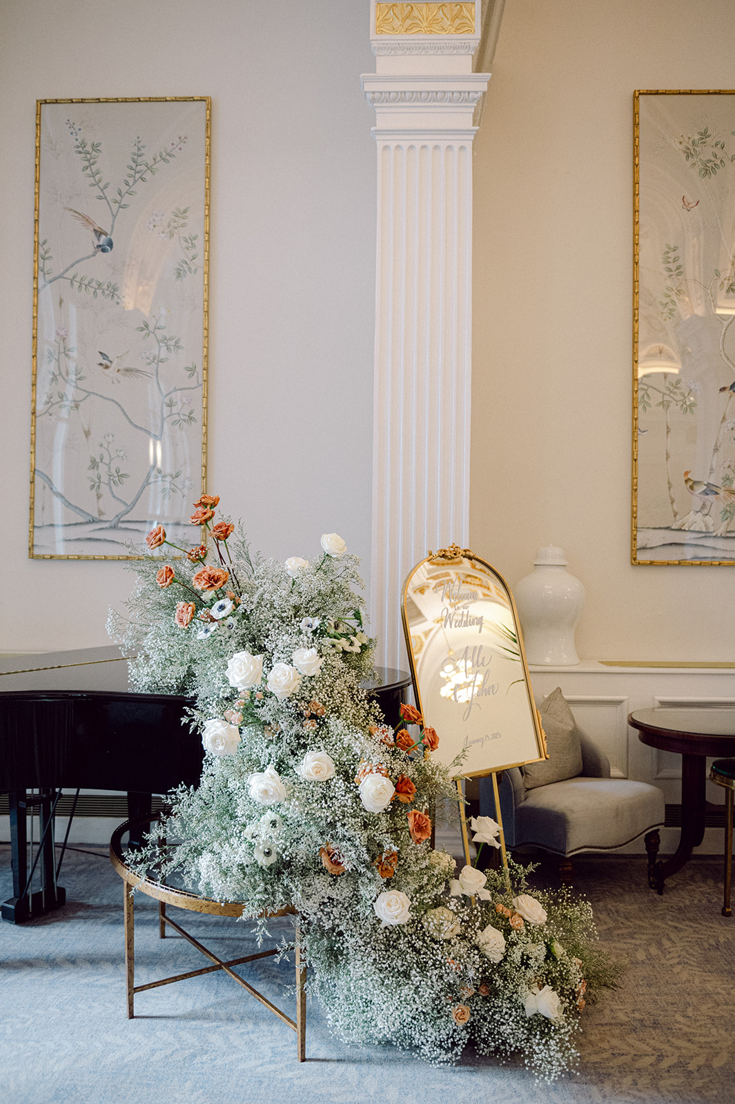
The seating chart was a masterpiece! The gold vintage framed mirrors in different styles and sizes hung on a display wall. This served as a functional focal point for guests to locate their table number and seat. Each guest’s name was written on the mirrors in white calligraphy and the entire display was accented with gorgeous florals that carried on throughout the reception.
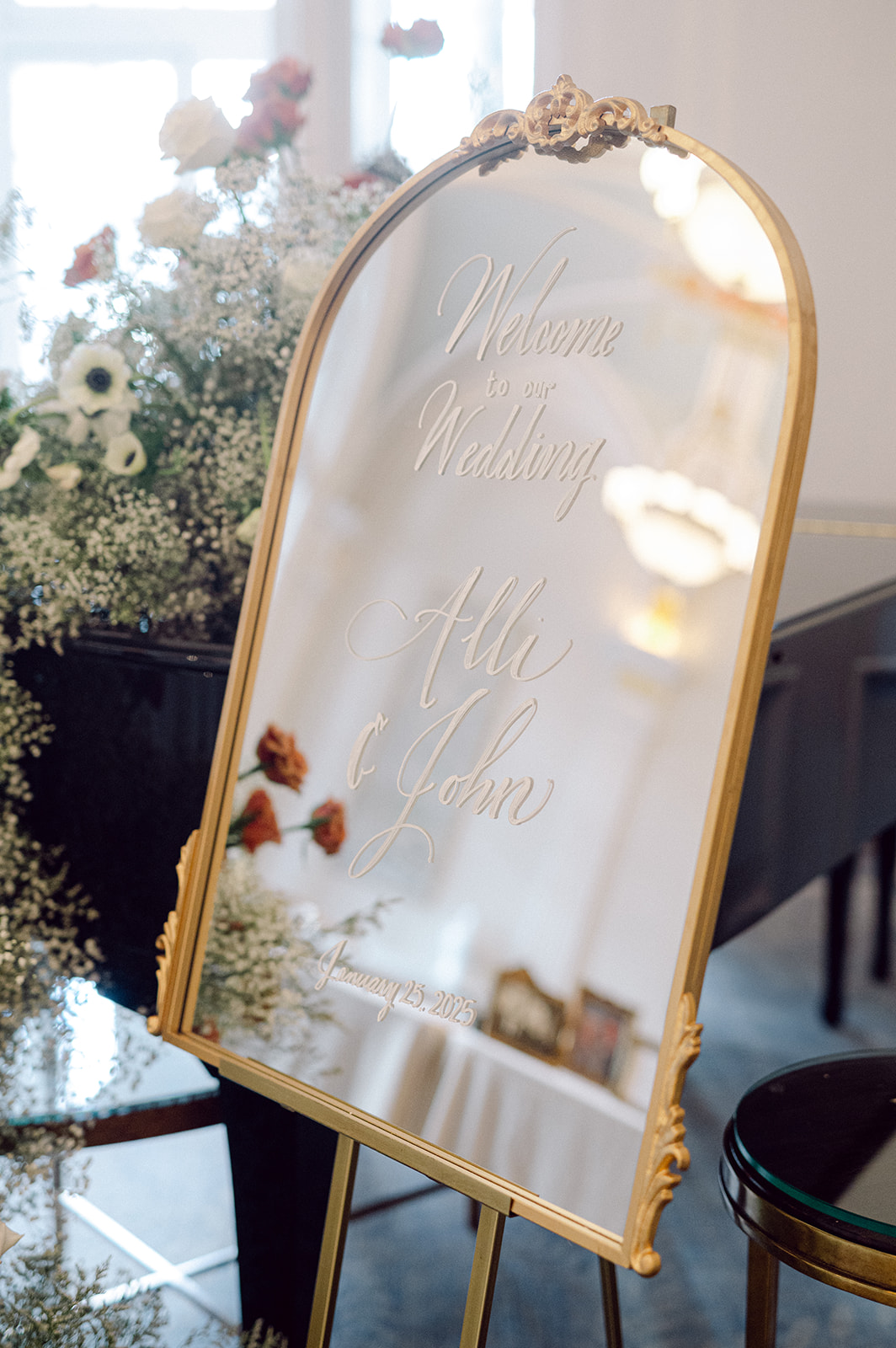
From the custom bar sign, a welcome sign that cohesively tied in the seating chart, custom napkins, table number signs and all the stationery in between, this wedding was so much fun to work on. I love the classic, elegant aesthetic of this wedding, as well as the talented Nashville vendors I had the joy of working alongside! If this is how 2025 started, I can’t wait to see what is to come!
If you’re looking to add custom, thoughtful touches to your wedding or event, we would love to help make your vision a reality. Reach out today to learn more about our full-service design offerings—we can’t wait to create something unforgettable for you!
If you enjoyed this post, you’ll love these other blogs!
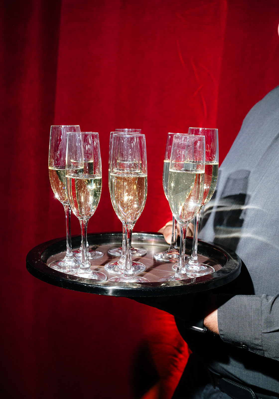
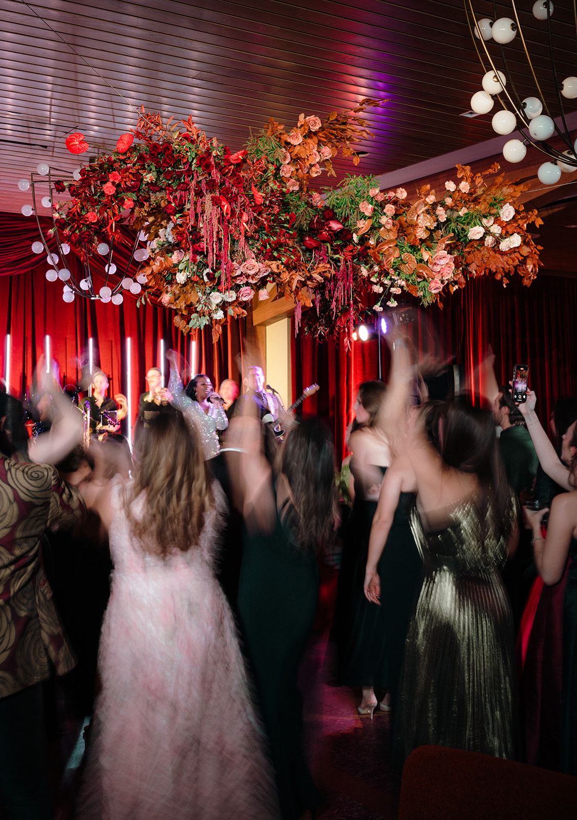
To close out an incredible year, White Ink Calligraphy + Co. attended the Wedding International Professionals Association (WIPA) Gala in Nashville. This exciting annual event brings together local wedding professionals to celebrate, connect, and reflect on another successful season. WIPA hosts events throughout the year that encourage learning, networking, and growth. However, the gala is all about celebrating—and we were thrilled to be part of it!
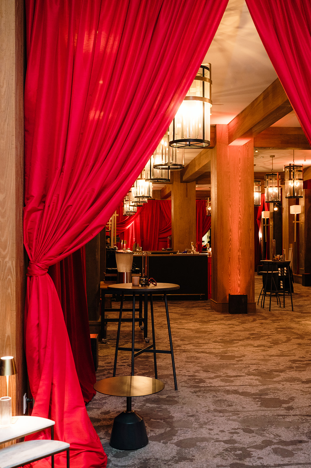
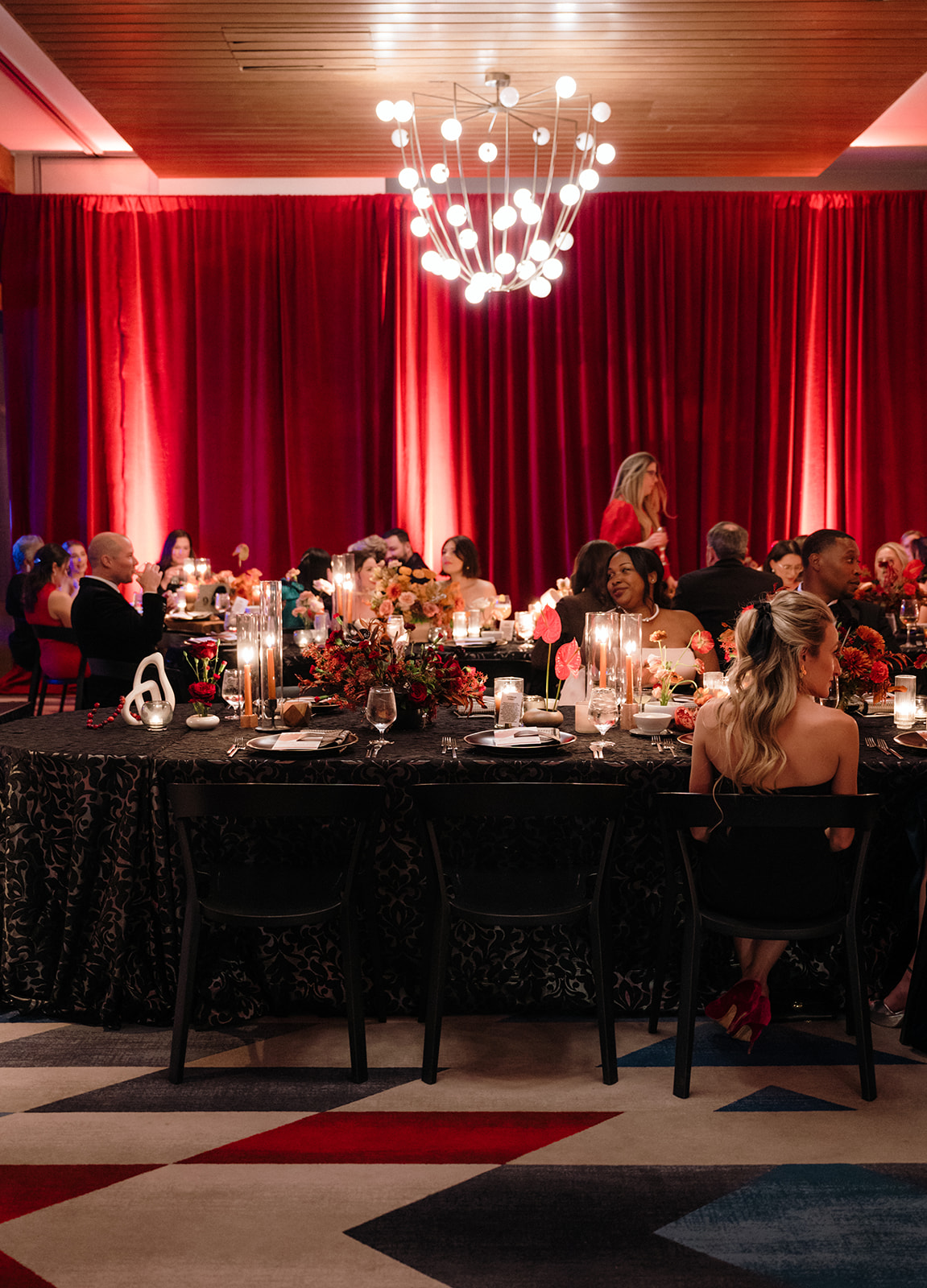
Nashville WIPA Gala: A Night to Remember
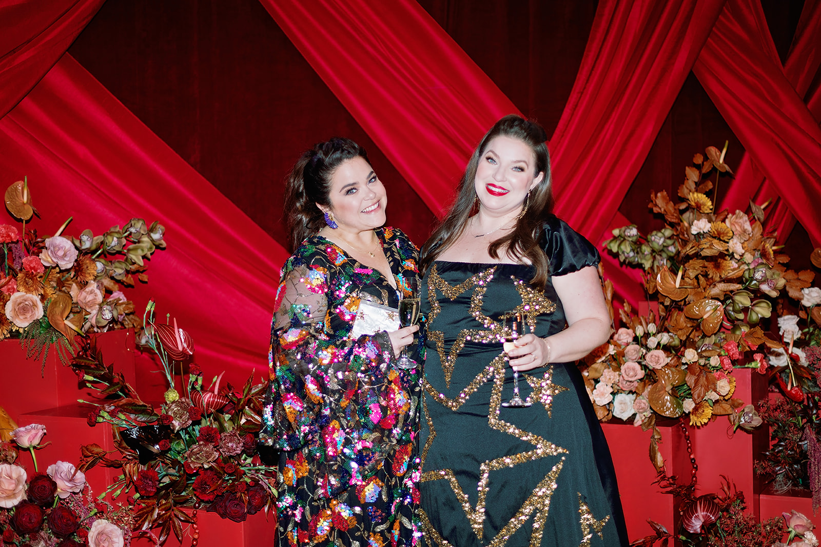
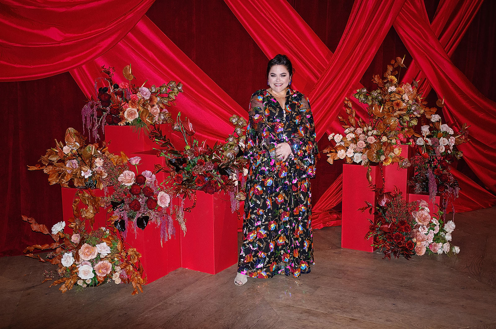
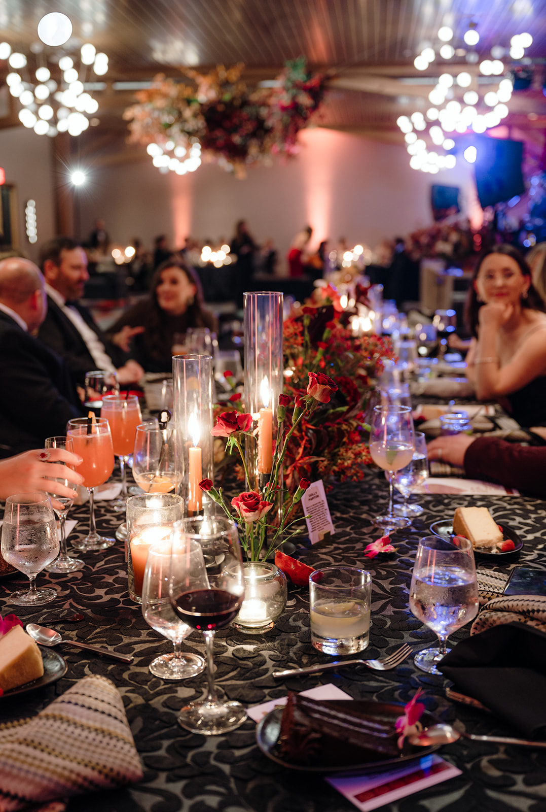
The gala took place at the stunning Virgin Hotel Nashville on December 8th, right after our last event for the year, which meant we were excited to celebrate the end of the year! As active members of WIPA, it was an honor for my team and I to attend the gala as guests but also to contribute to the event’s details. Townley, White Ink’s stationer, and I enjoyed a well-deserved night out, surrounded by familiar faces and fellow wedding industry creatives.
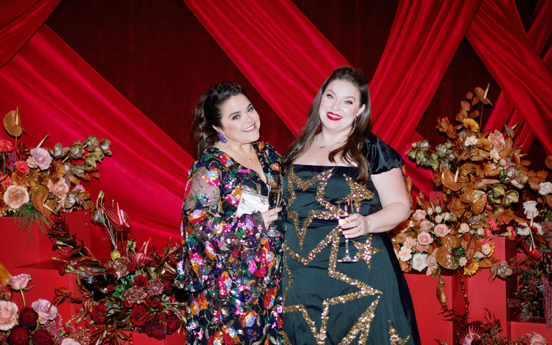
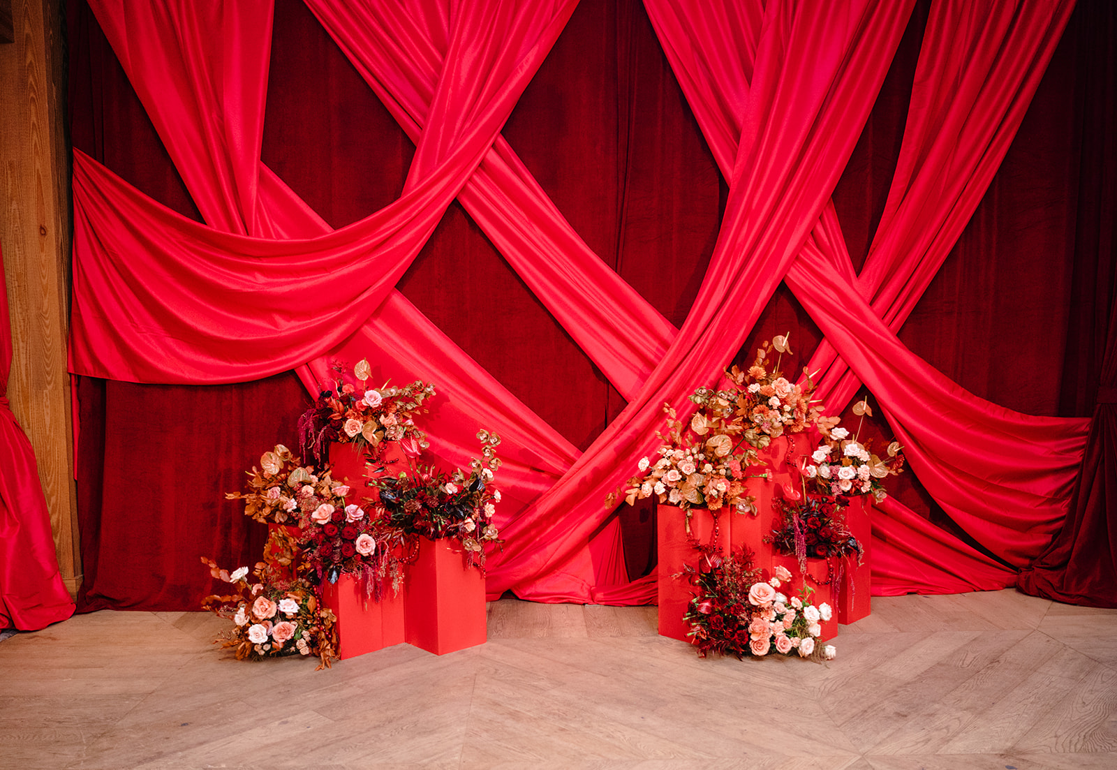
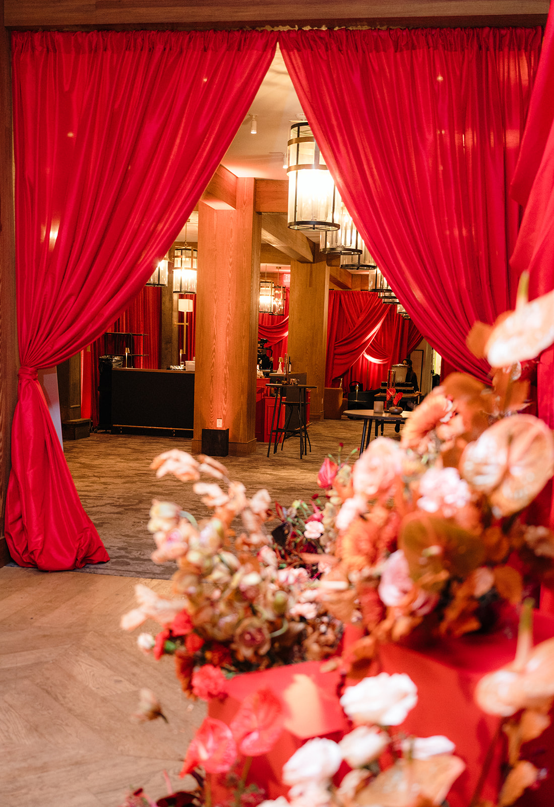
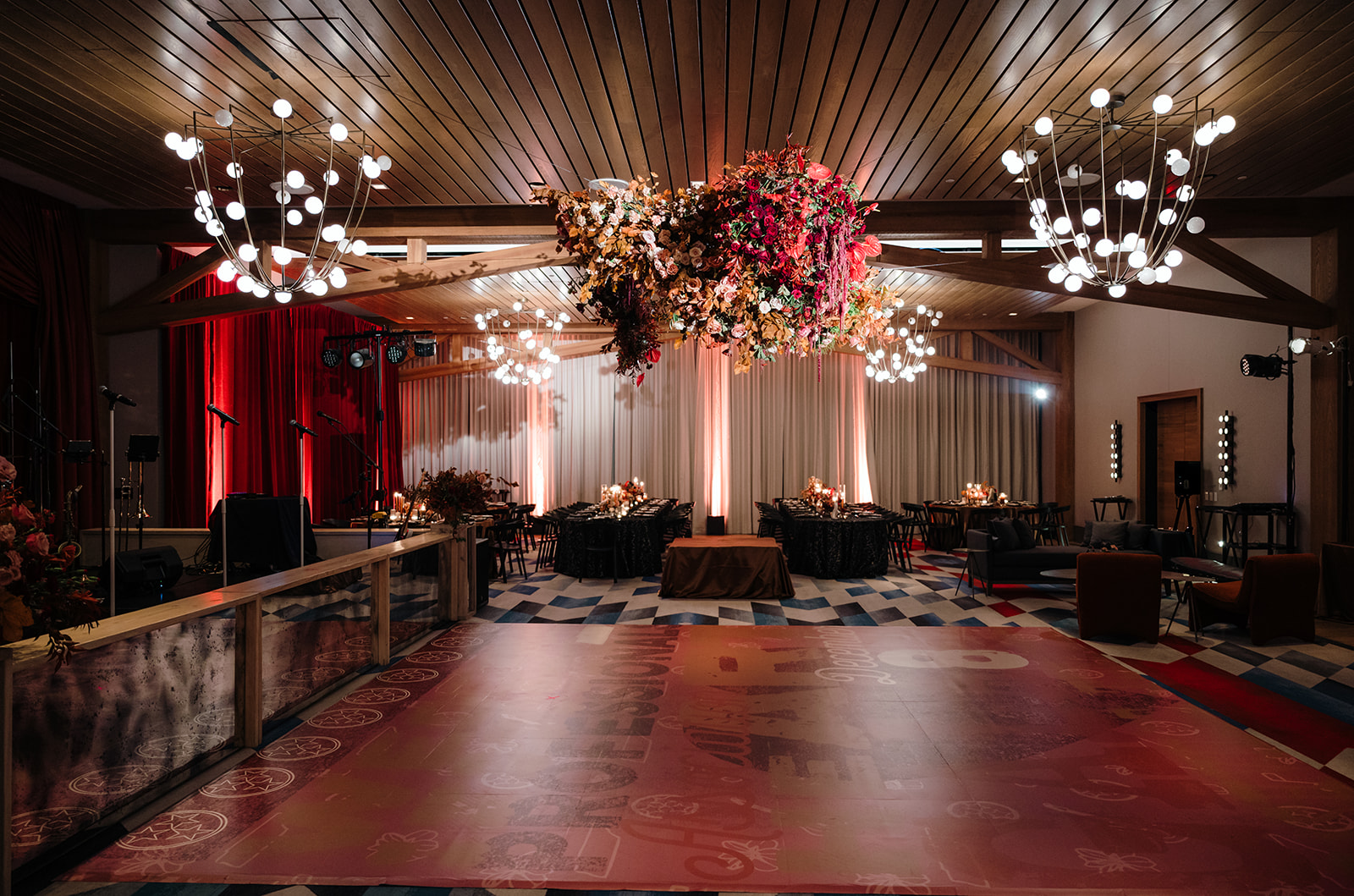
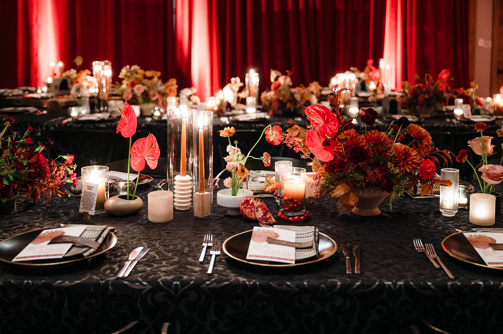
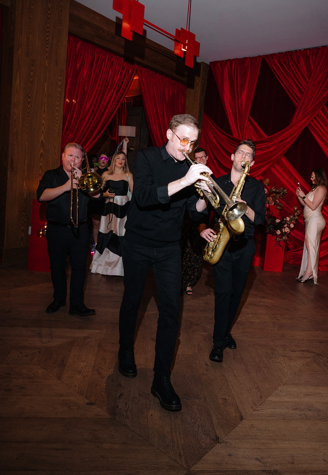
Everyone arrived dressed to impress, and the red carpet entrance set the tone for a glamorous evening. Photographers captured guests as they arrived, framed by a striking red draping and exquisite florals designed by the incredibly talented Rosemary & Finch—a perfect backdrop for portraits.
Our Red Carpet Looks
Townley and I made sure to embrace the occasion with stylish outfits from The Showroom Nashville, owned by one of our past brides, Kristen Geyser. Townley’s dress, adorned with golden stars, was a nod to the Tennessee flag, while I chose a sparkling ensemble. We even treated ourselves to hair and makeup by the amazing Katie-Laine Thornton, making the night feel extra special!
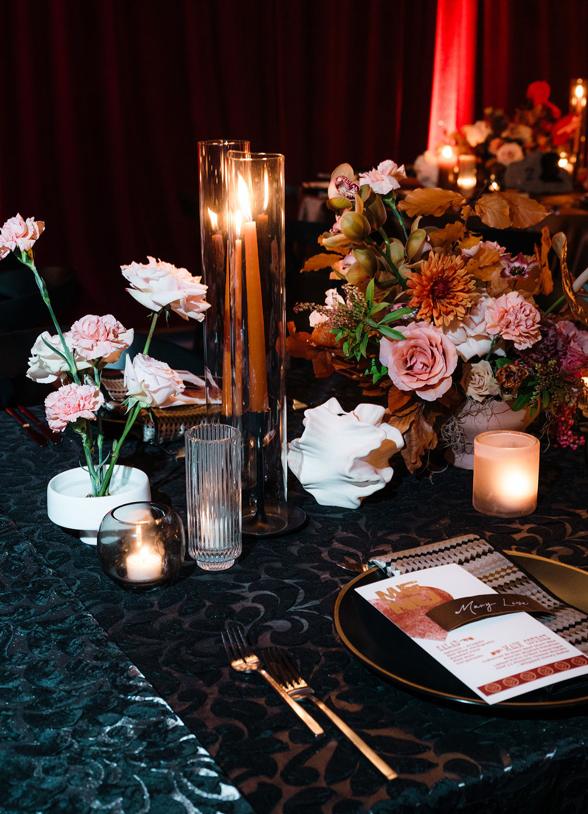
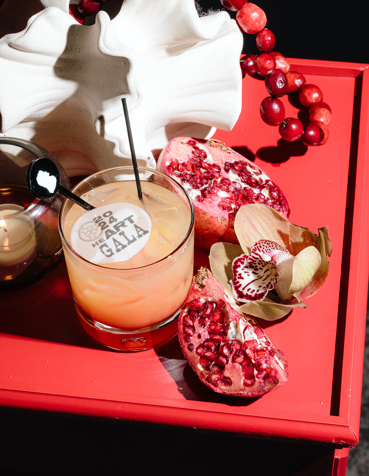
The heART of Nashville: A Celebration of Artistry
The theme of this year’s gala, “The heART of Nashville,” with an emphasis on Nashville ART, to celebrate the city’s rich artistic culture. We had the honor of crafting custom stationery pieces that reflected this theme in a creative and meaningful way.
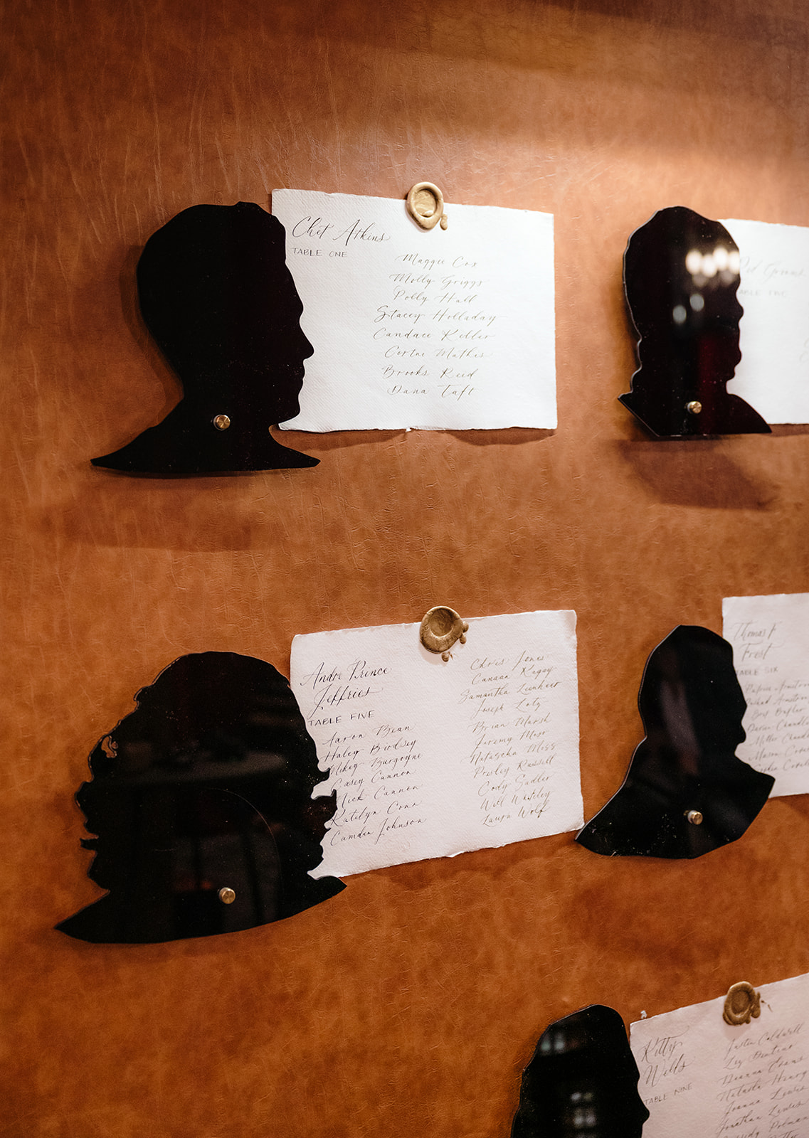
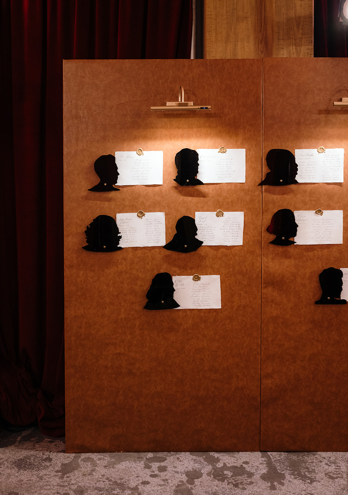
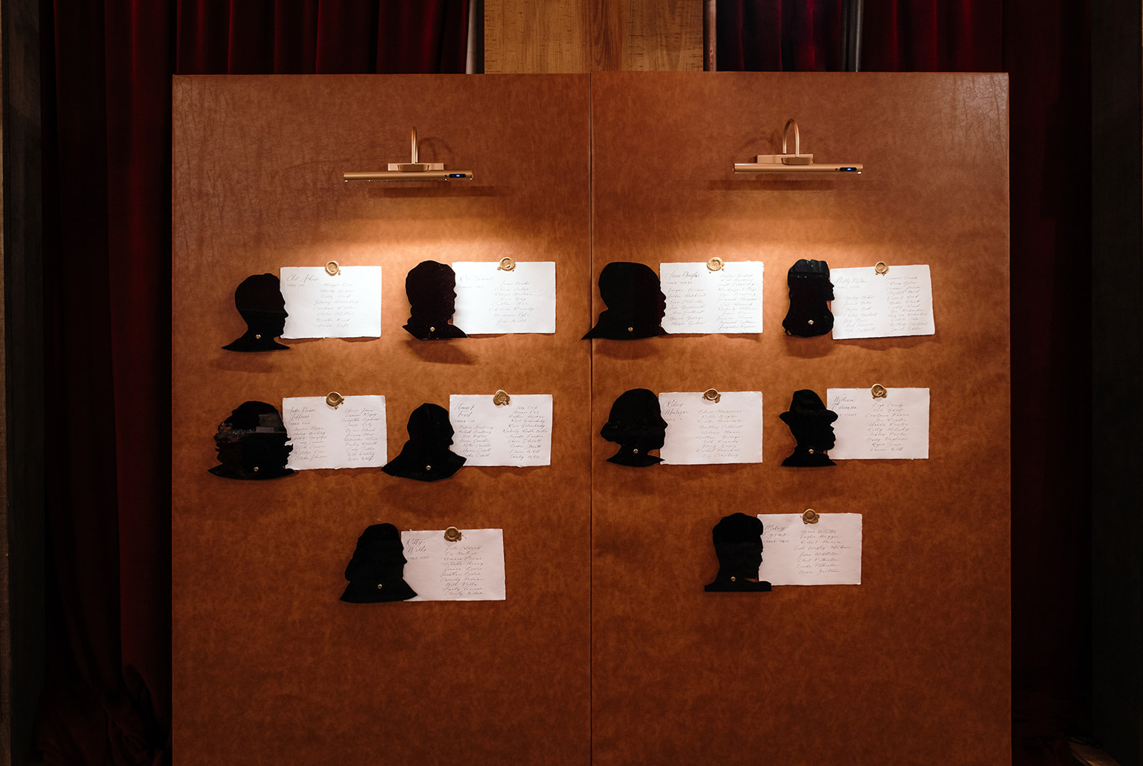
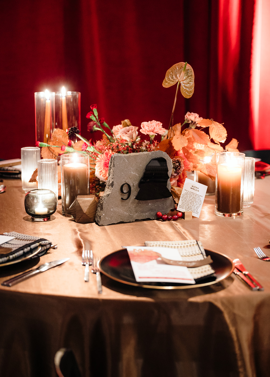
The Seating Chart
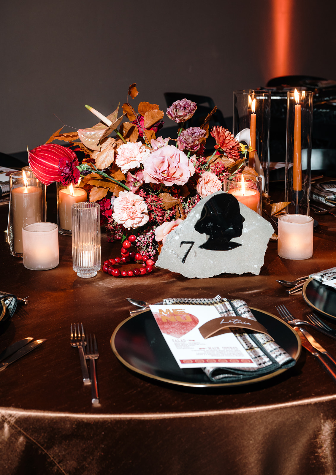
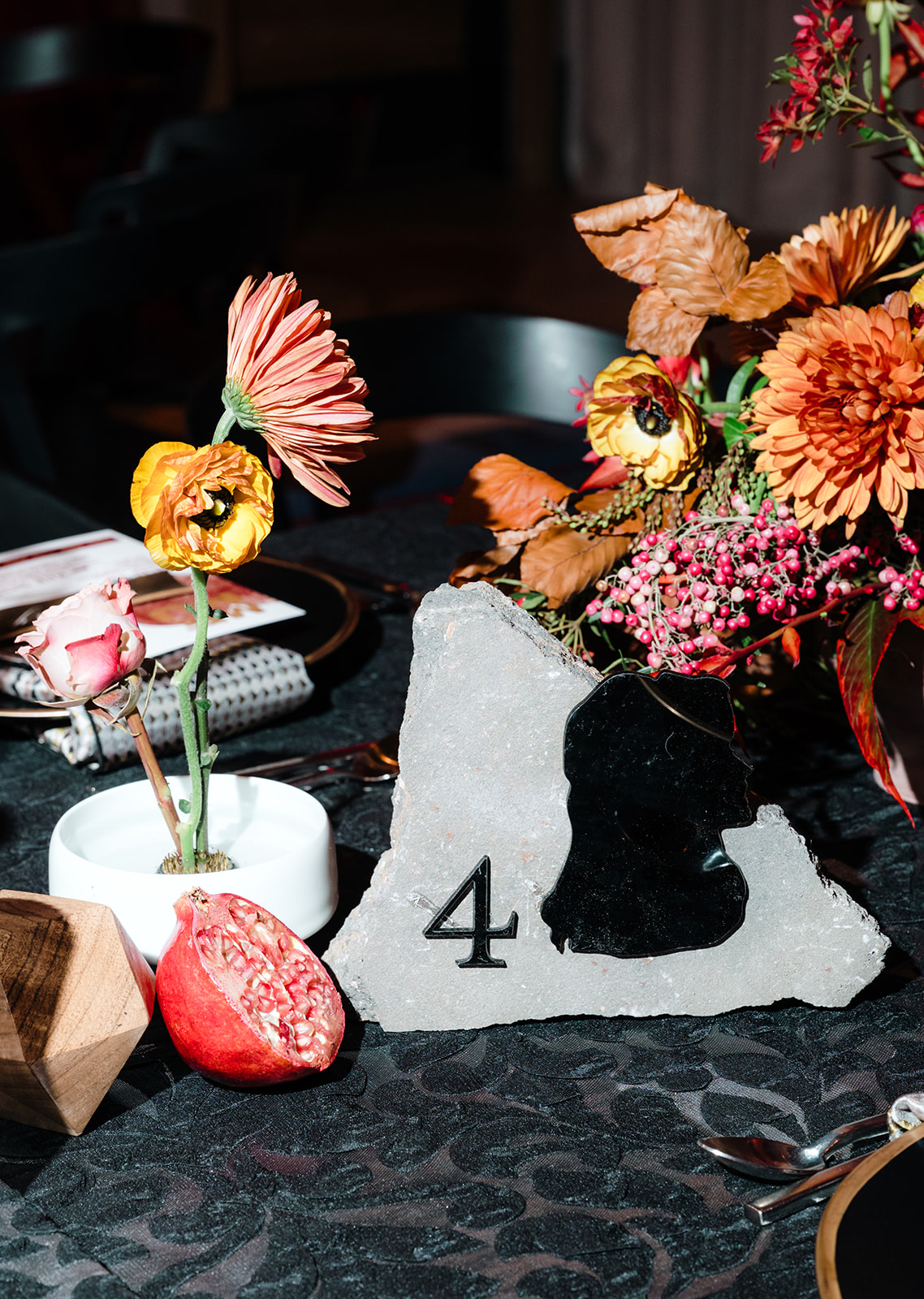
We elevated the seating chart design by incorporating handmade paper for calligraphed guest names, all mounted on a backdrop lined with leather, creating a sophisticated and tactile experience. Next to each piece of paper were Silhouettes of different Nashville artists that served as another table identifier.
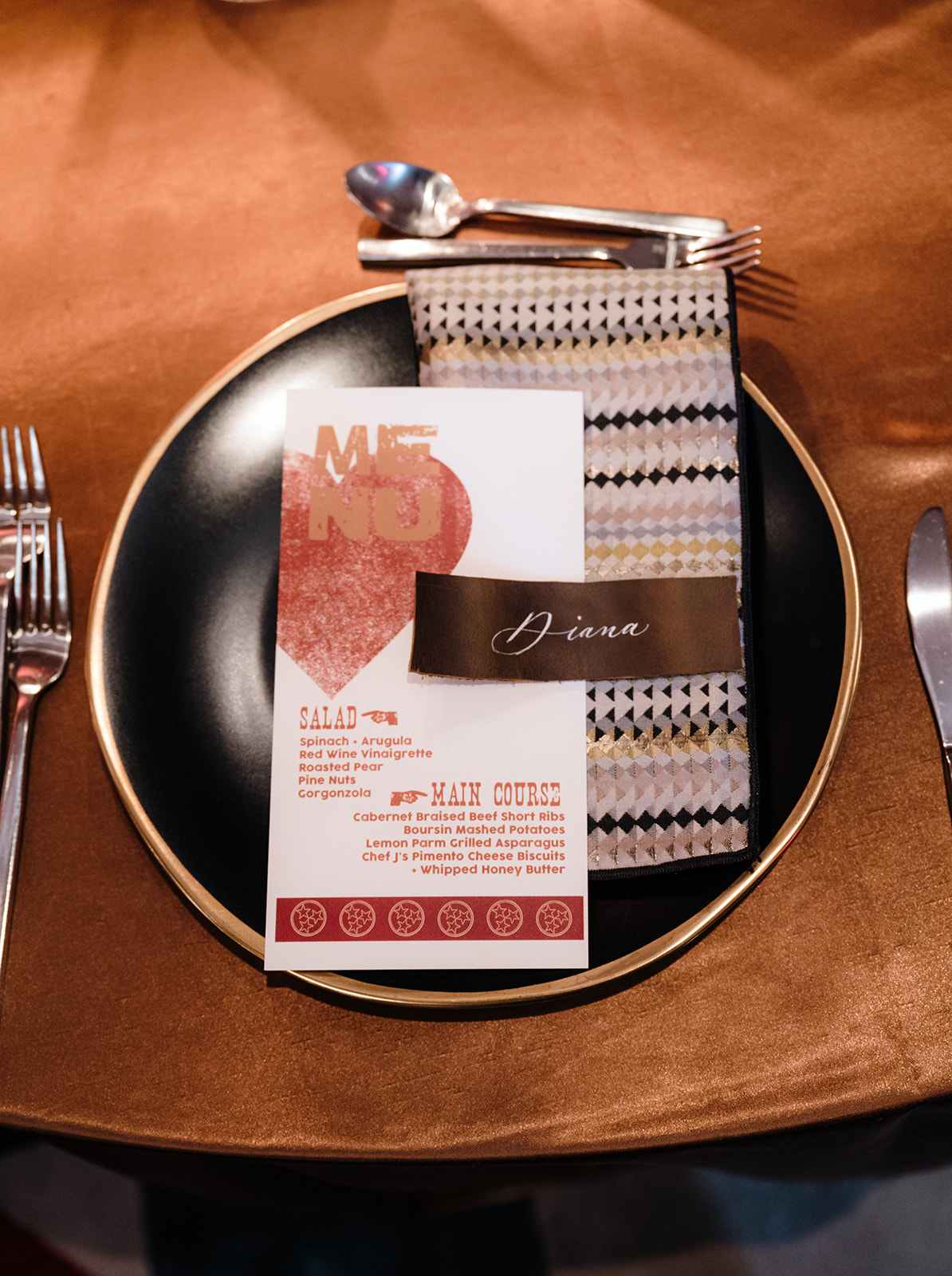
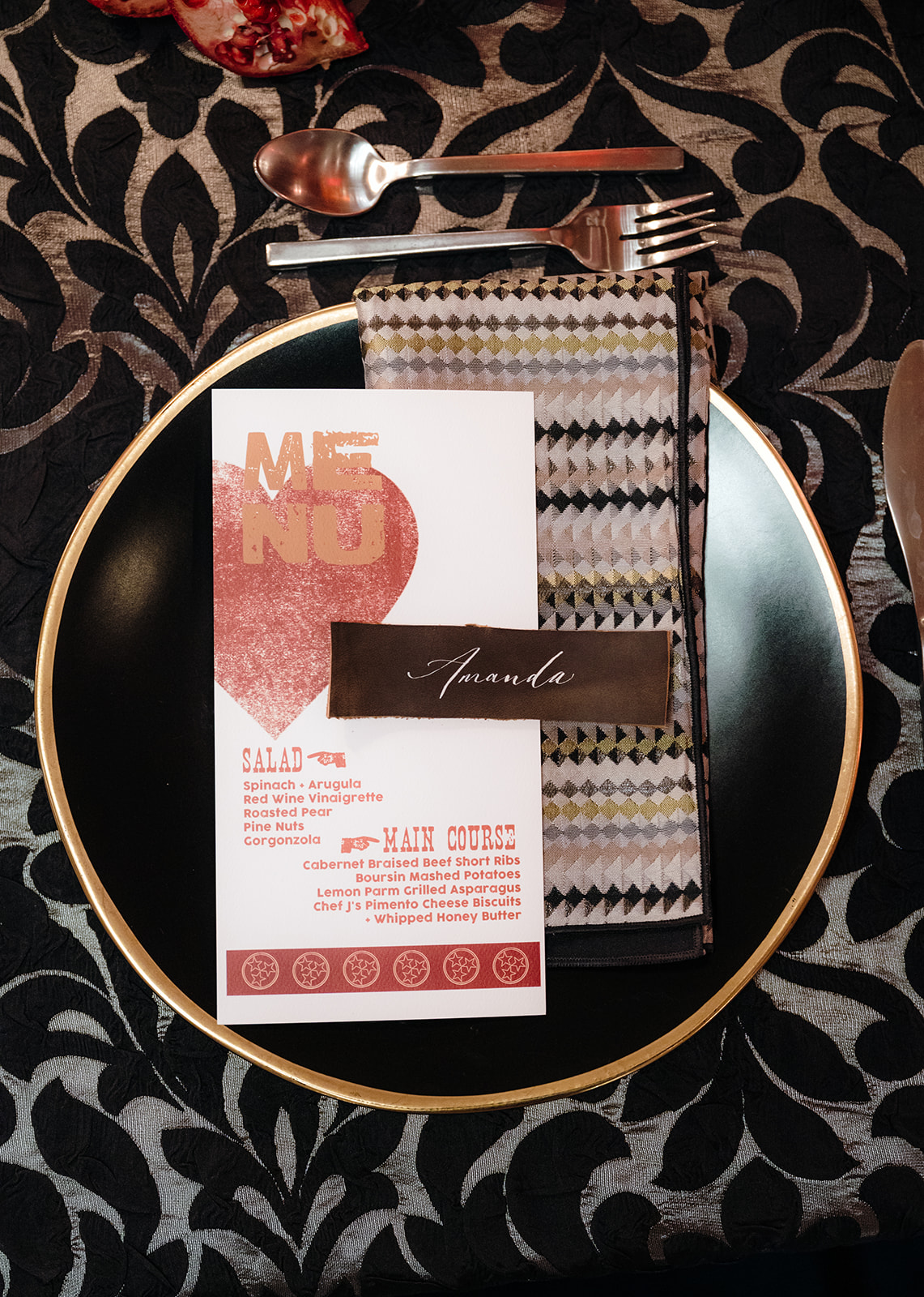
Place Cards + Menus
Leather was also used for the place cards. Our signature white ink calligraphy was elegantly displayed on leather place cards resting atop each menu. Inspired by the classic Hatch Print style, our menus added a touch of vintage Nashville charm to each place setting.
Unique Table Numbers
Lastly, the table numbers came from Tennessee limestone and featured silhouettes of Nashville artists, tying in beautifully with the seating chart design, where coordinating silhouettes were placed next to the handmade paper list.
A Perfect End to 2024
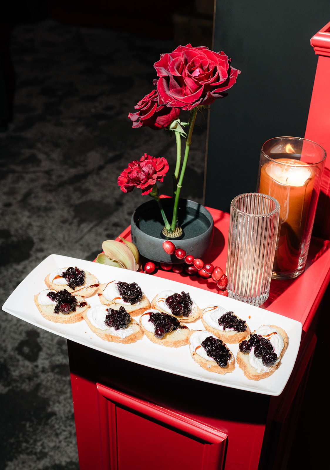
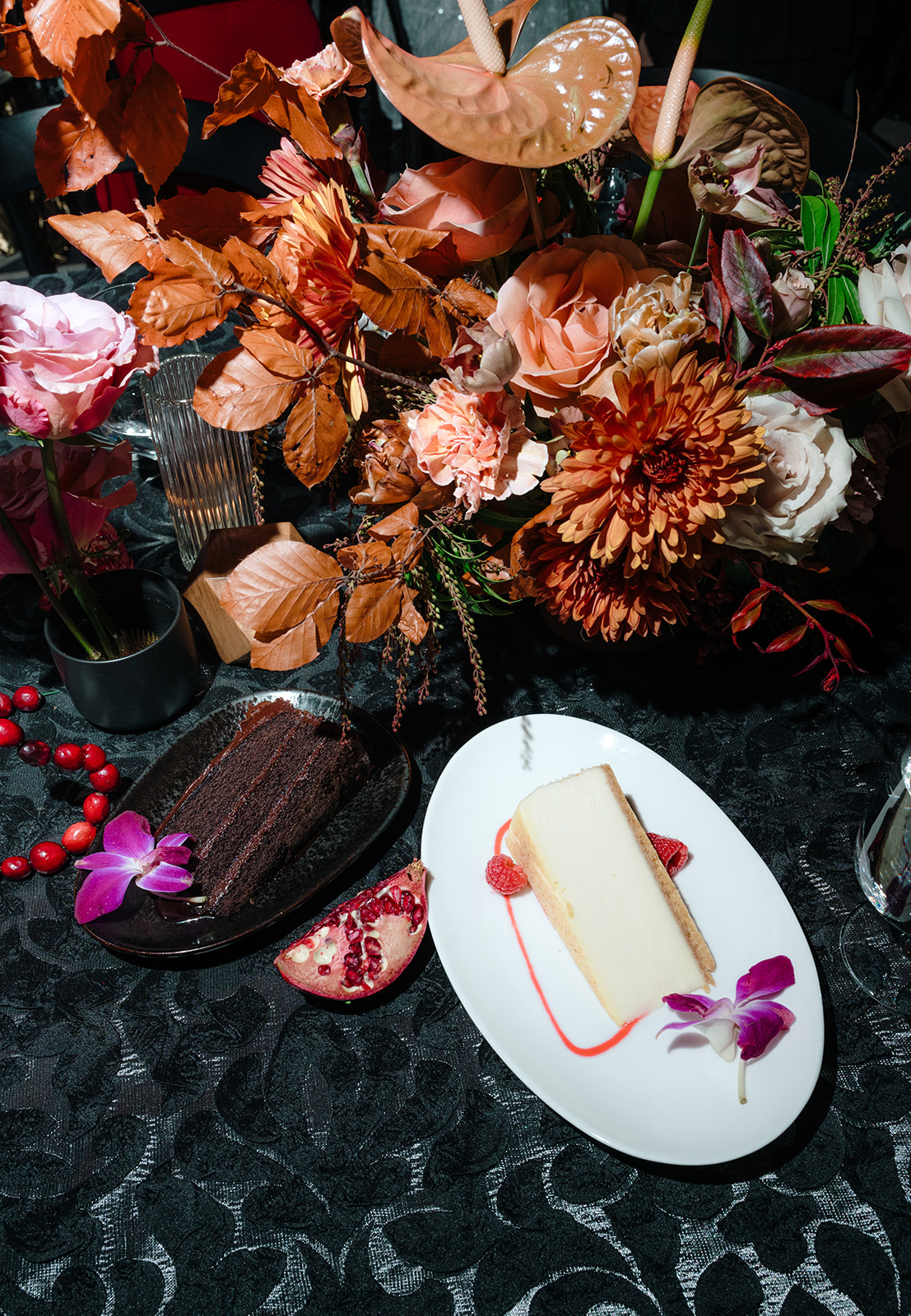
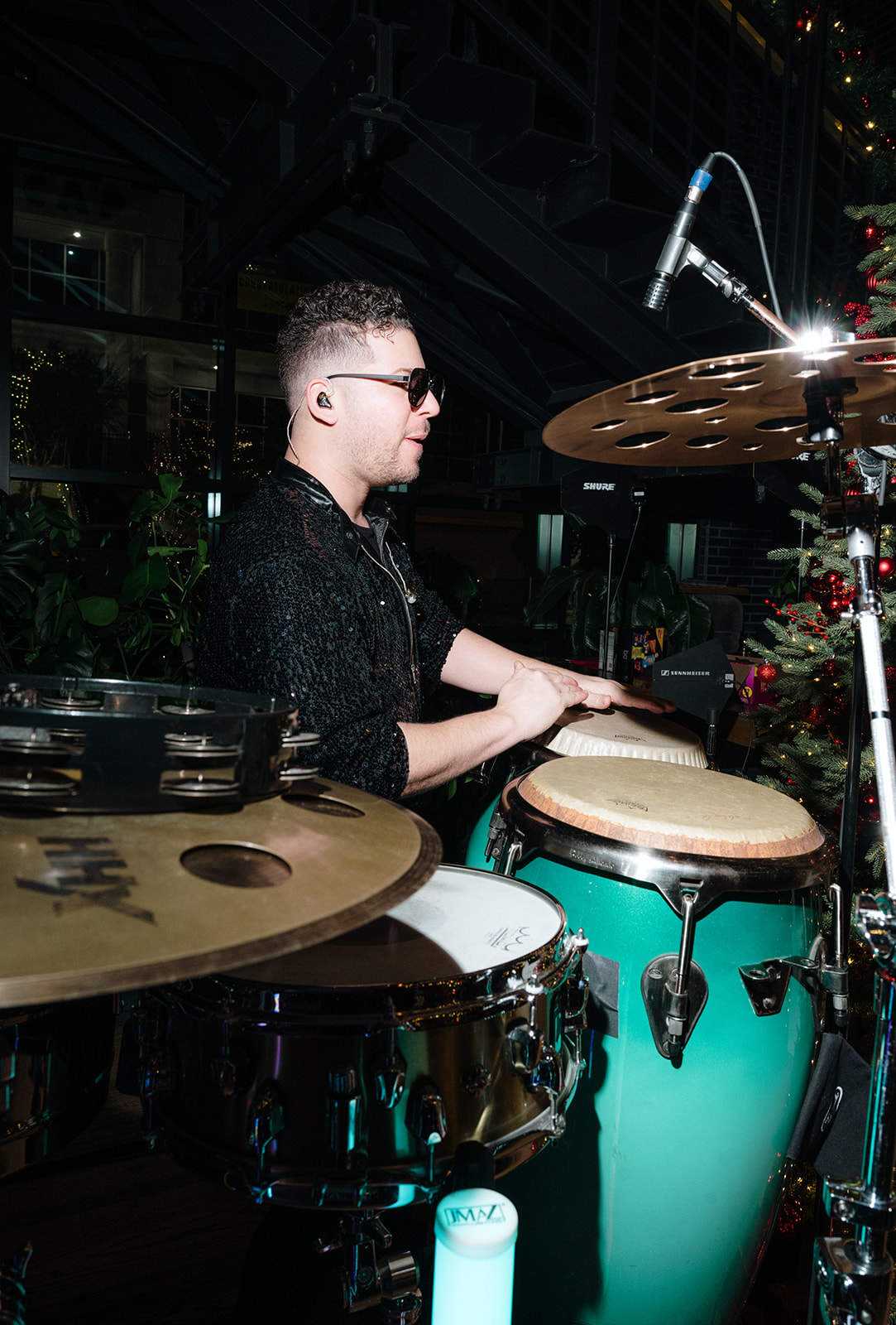
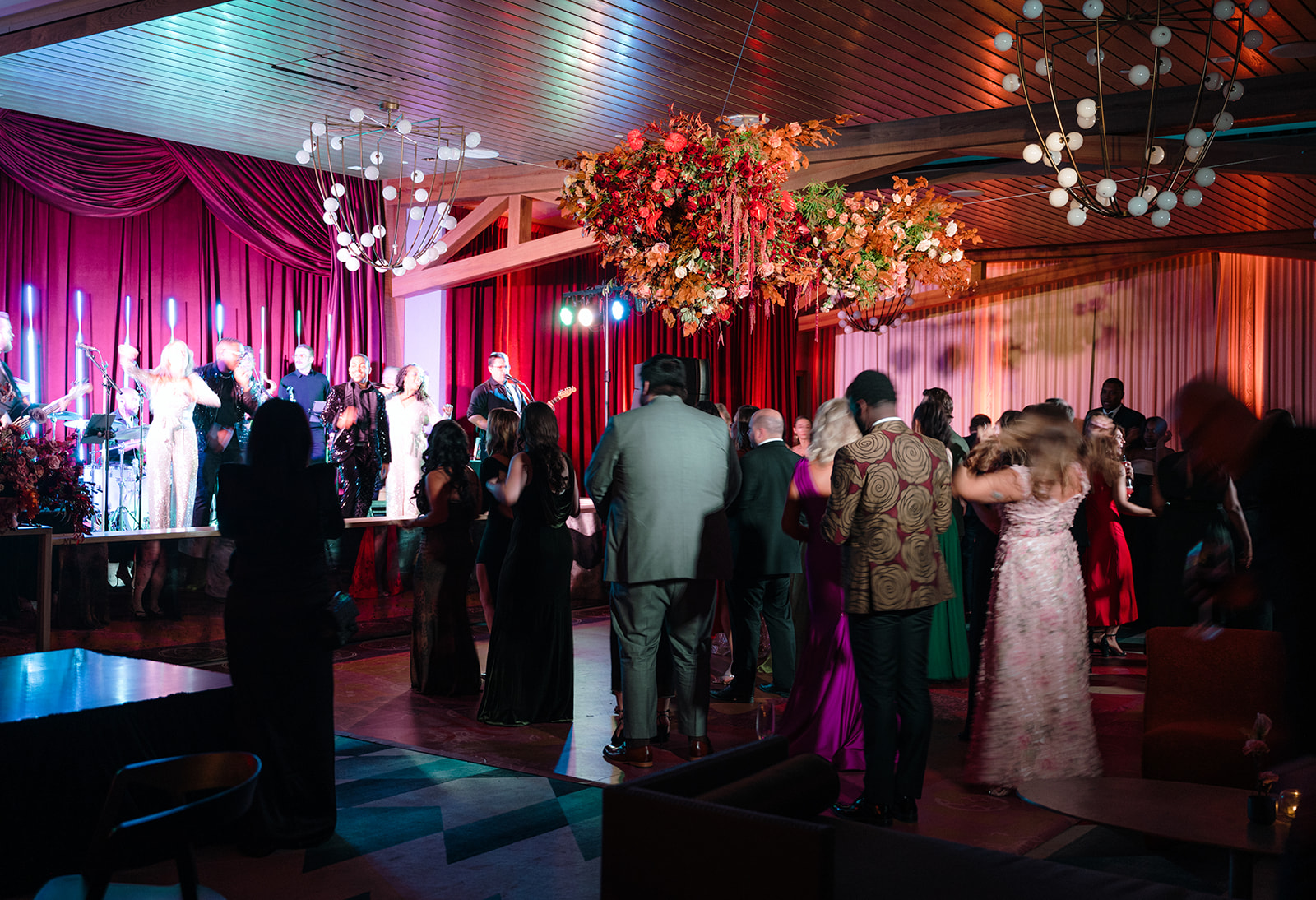
From the delicious food and cocktails to the lively dancing and wonderful company, the WIPA Gala was truly a night to remember. It was the perfect way to reflect on another successful year. We are so grateful for the wedding community in Nashville and beyond, and we can’t wait to see what the rest of 2025 brings!
If you’re looking for custom, one-of-a-kind stationery and calligraphy details for your wedding or special event, we’d love to bring your vision to life. Reach out today to learn more about our full-service design offerings—we can’t wait to create something unforgettable for you!