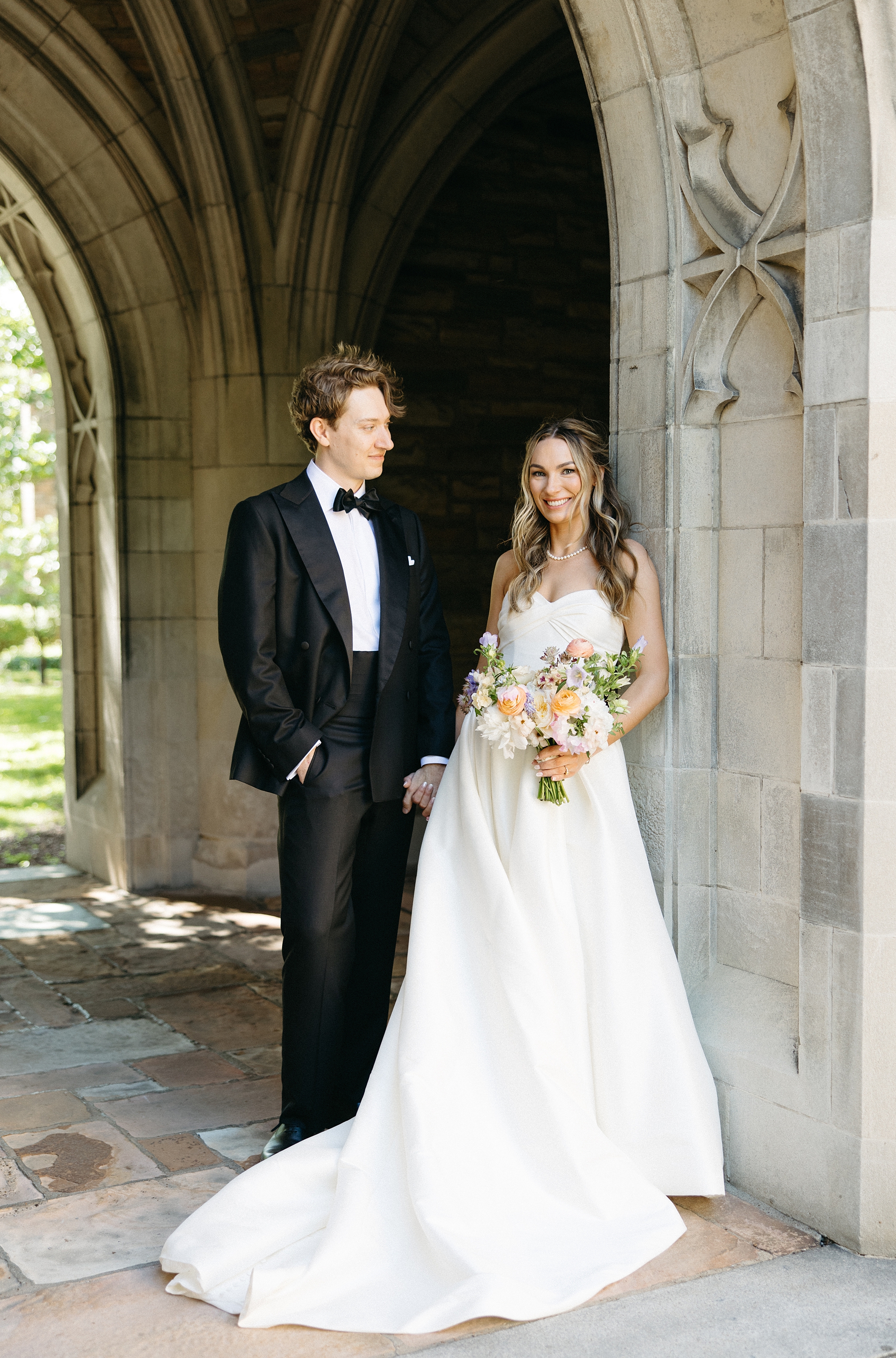
This gorgeous Clementine Hall wedding was a true reflection of creativity, elegance, and personal touches woven throughout the day. We had the joy of designing both their invitation suite and many of their day-of details, and every element wove the couple’s story and style into their big day.
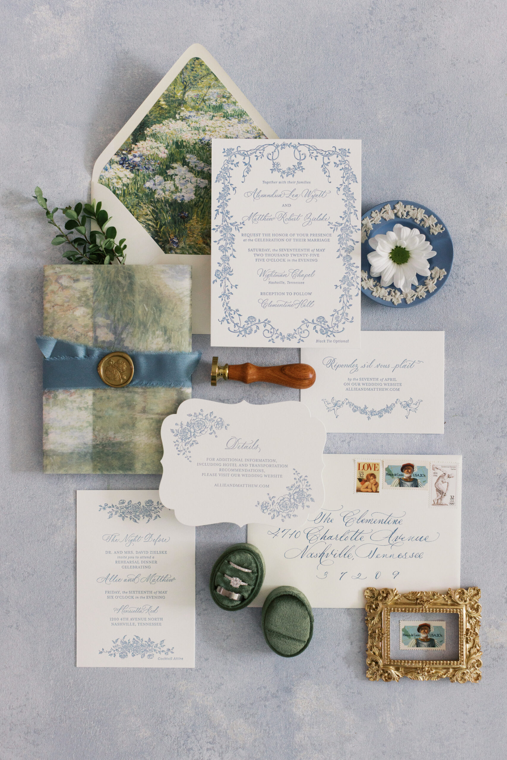
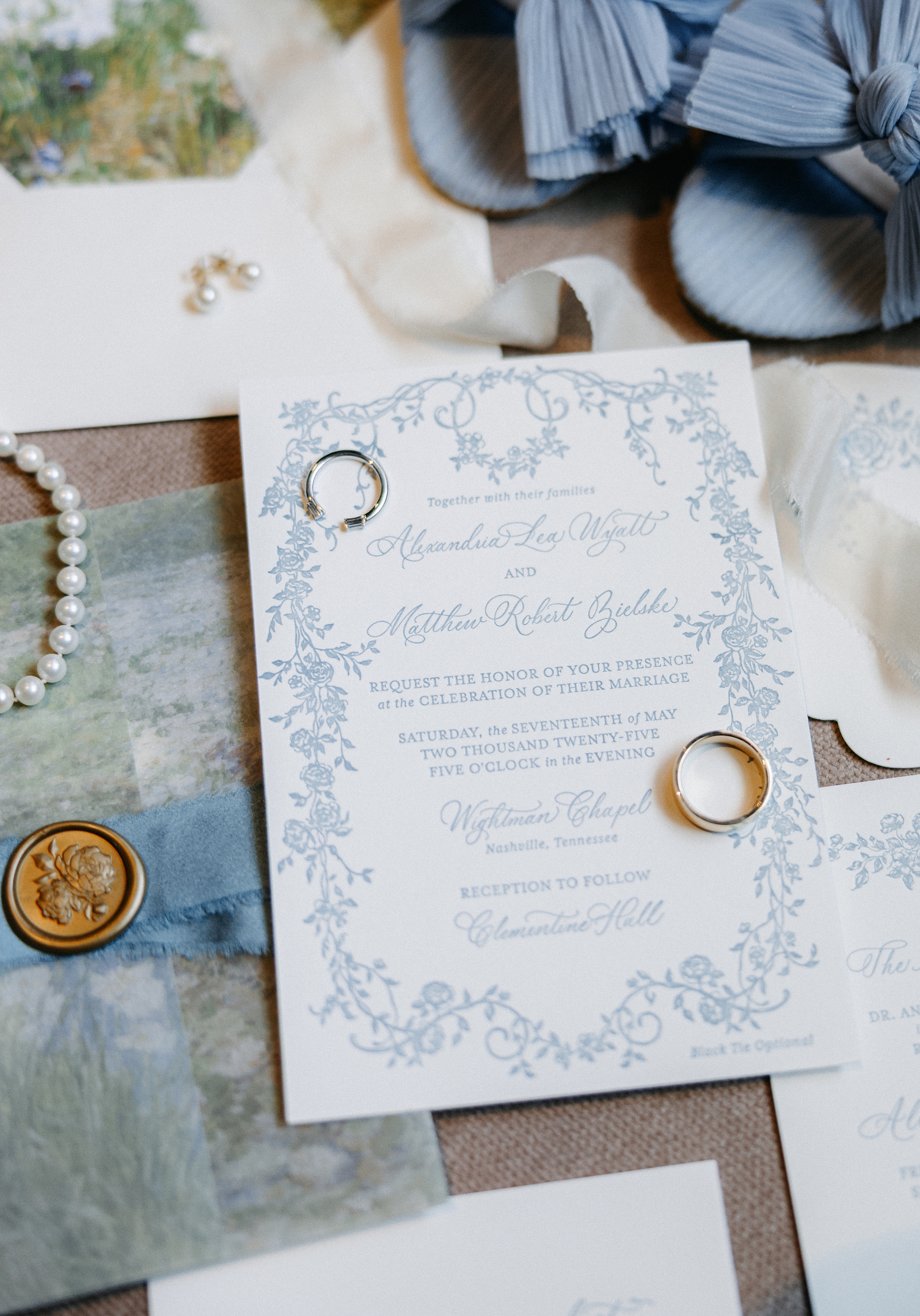
Elegant Letter-Pressed Invitations
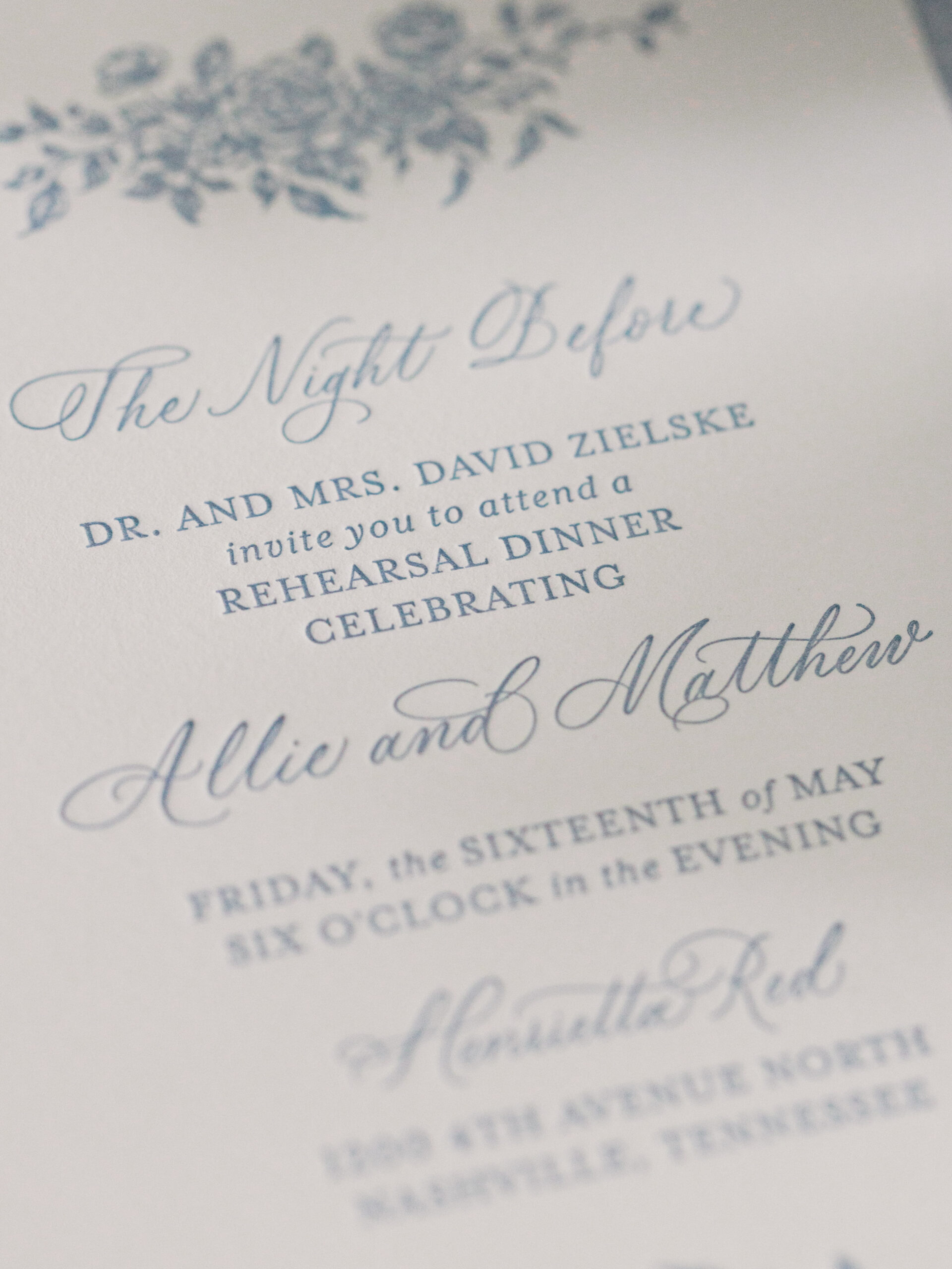
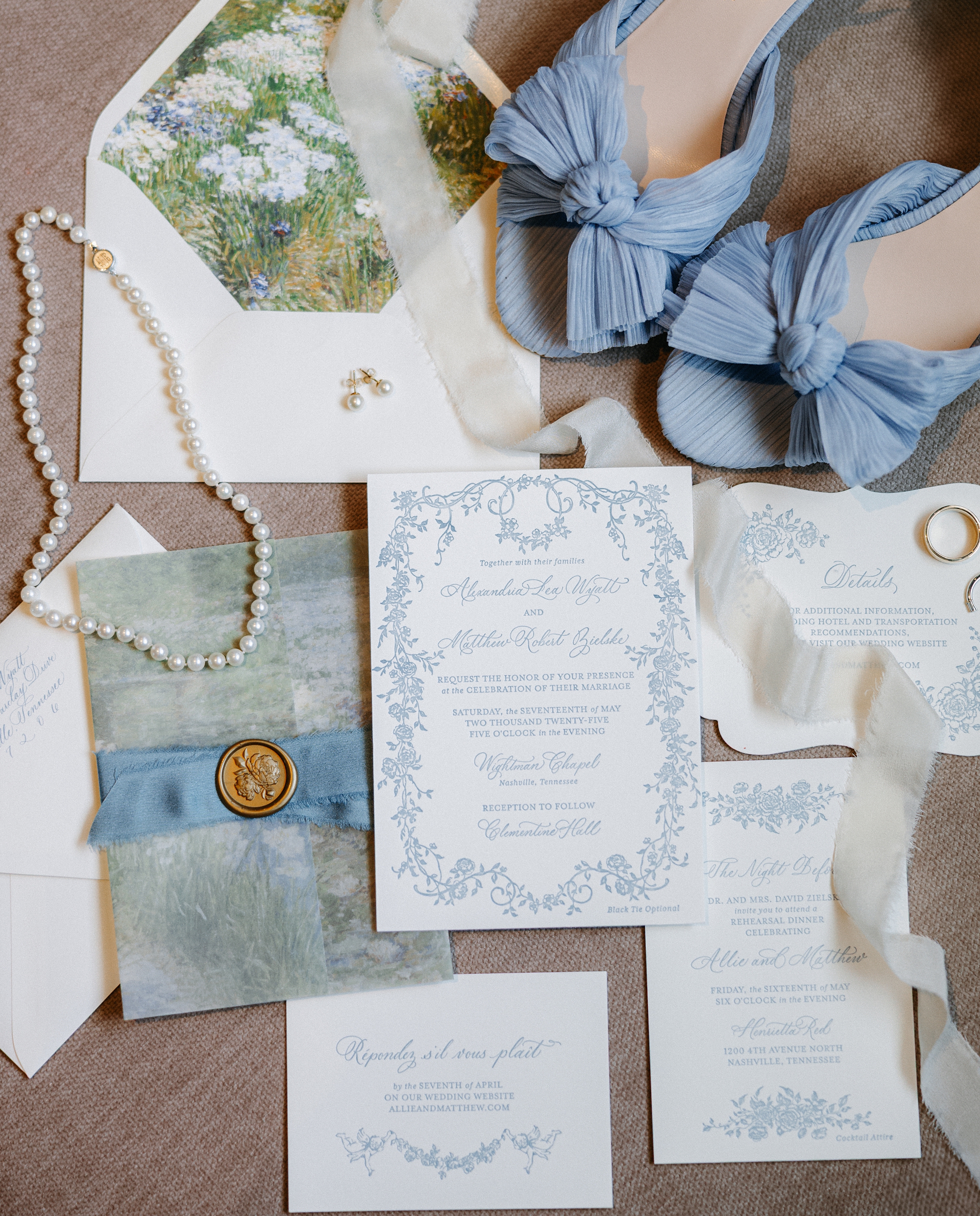
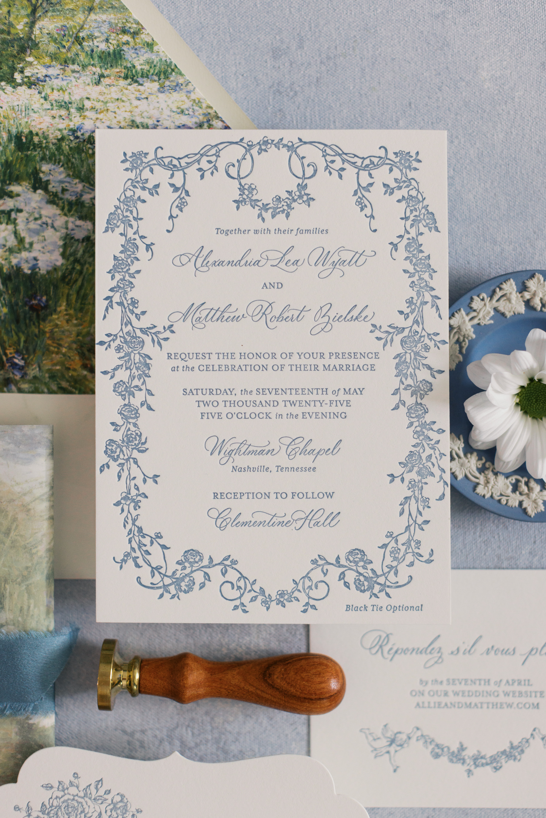
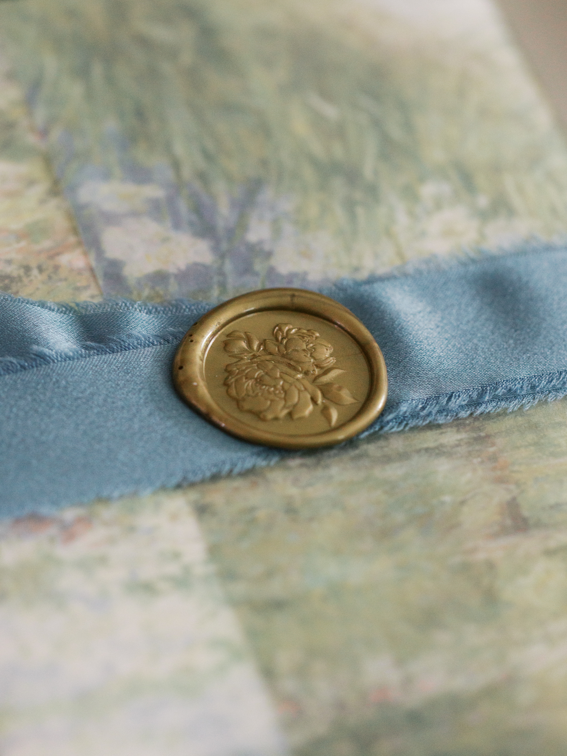
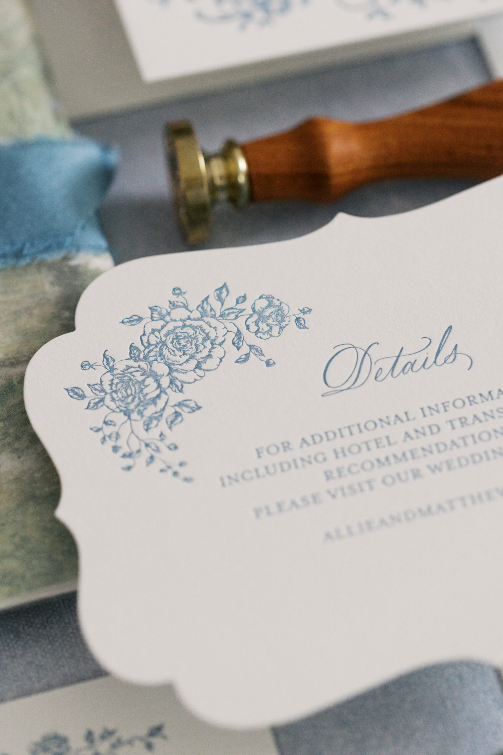
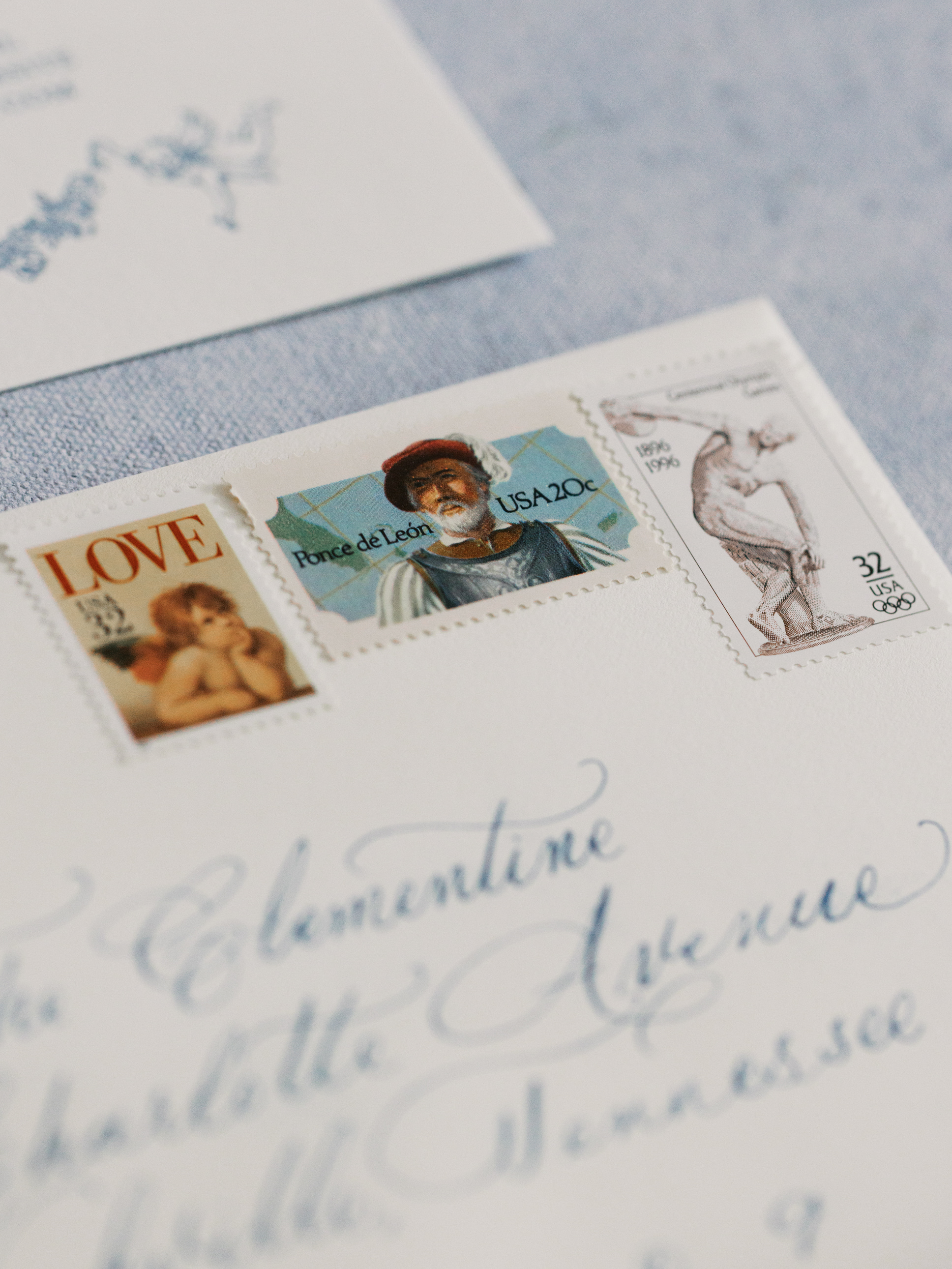
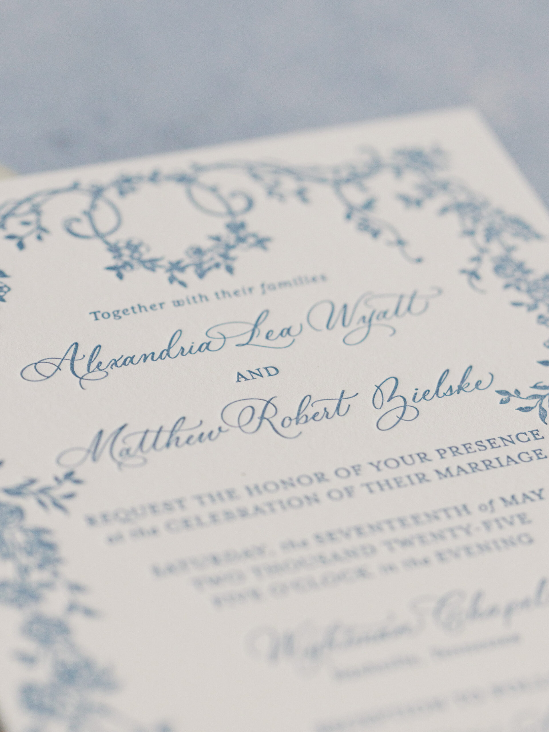
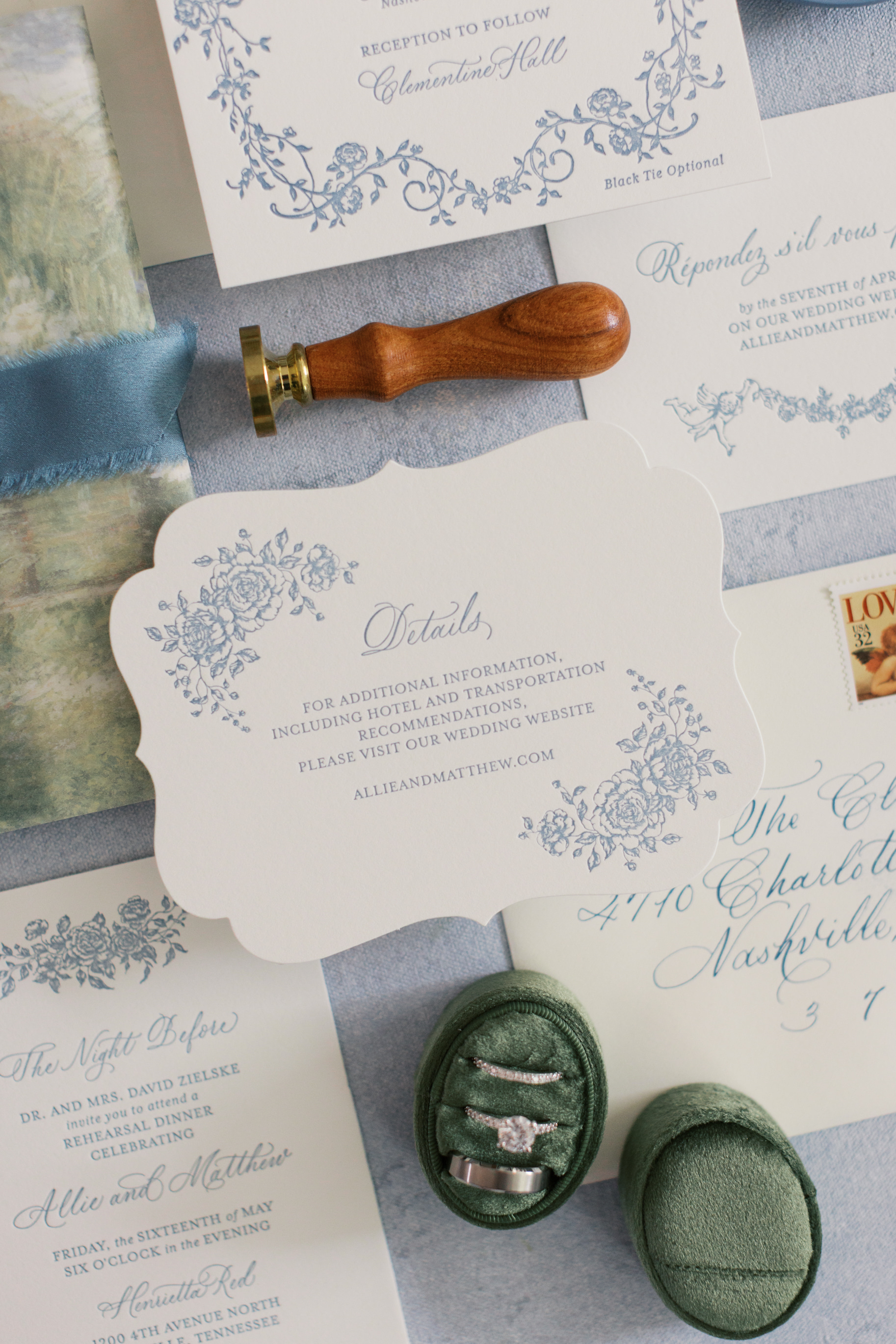
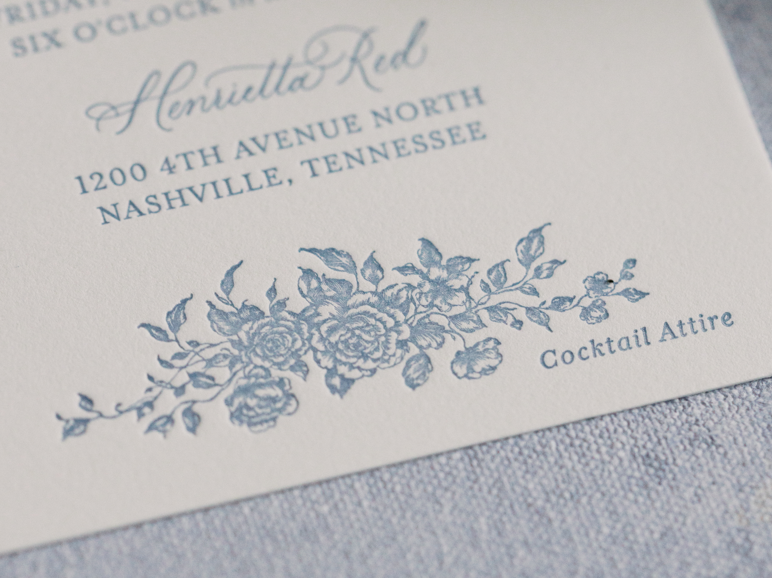
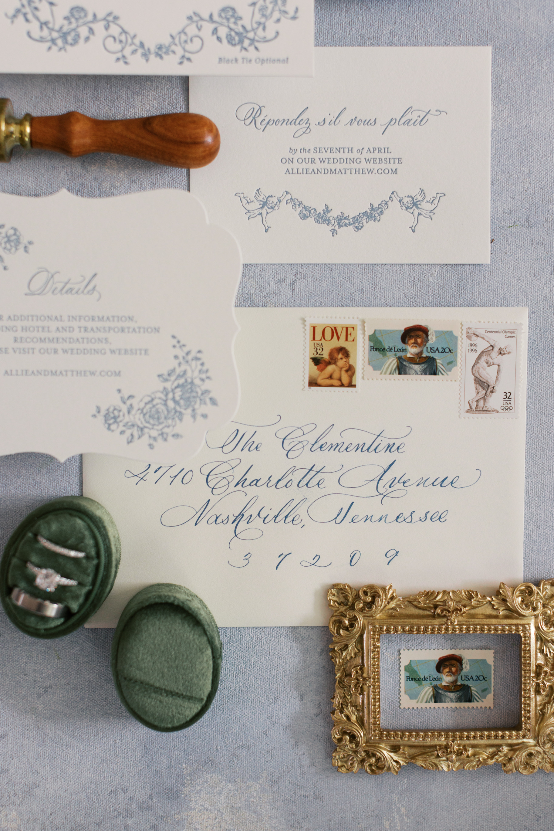
One of our favorite parts of this wedding was how involved the groom was in the design process and the overall aesthetic, which we love! Together, we created a letterpress invitation suite that set the tone for the celebration. A soft blue vine design bordered the invitation, while dreamy light blue lettering paired beautifully with an envelope liner resembling a watercolor field of flowers. The suite was layered with a vellum overlay, tied together with a thick, dusty blue ribbon, and finished with a gold wax seal. It was elevated, romantic, and timeless.
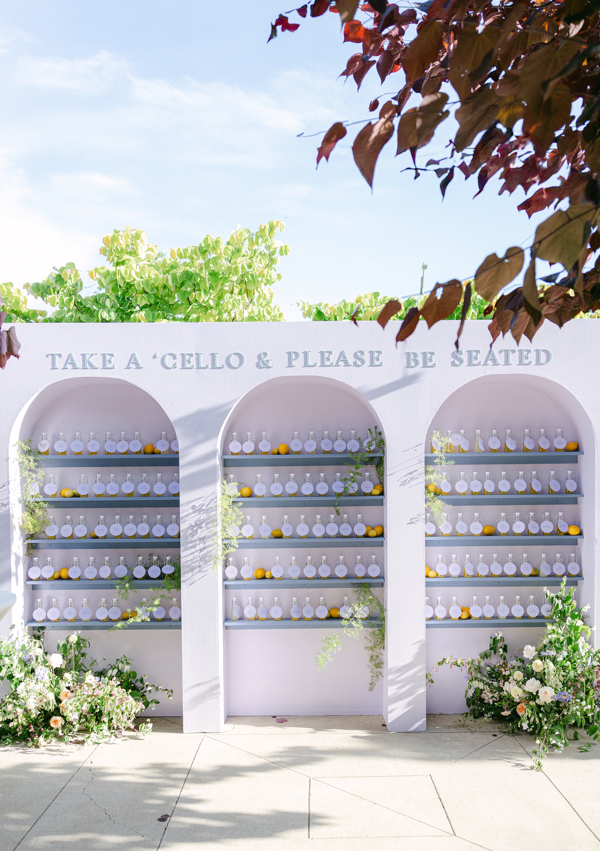
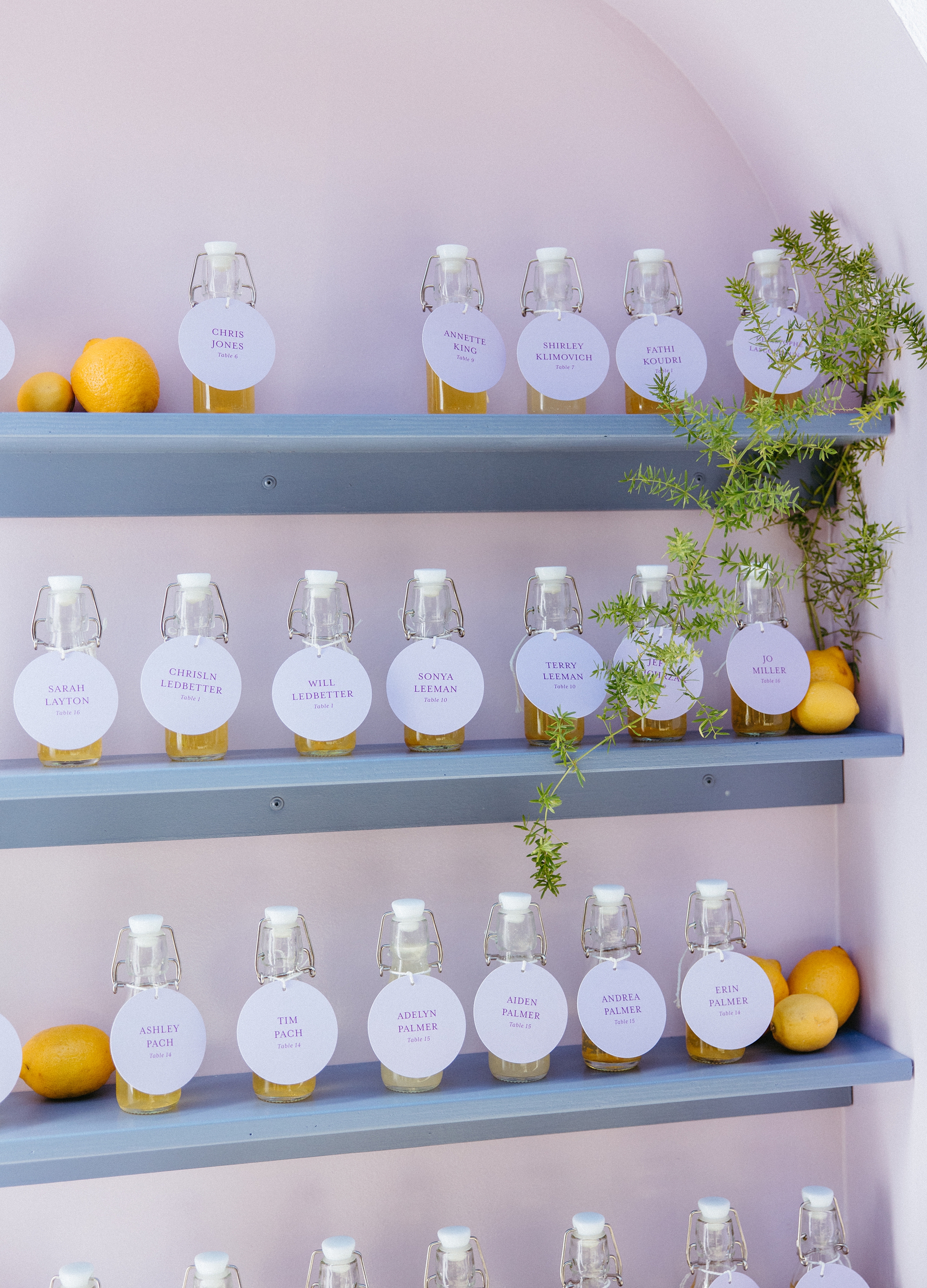
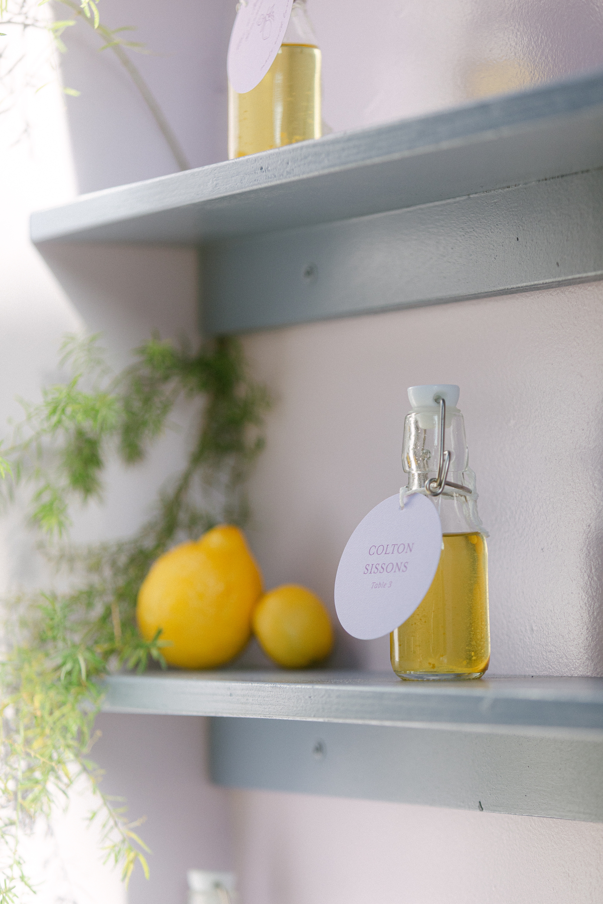
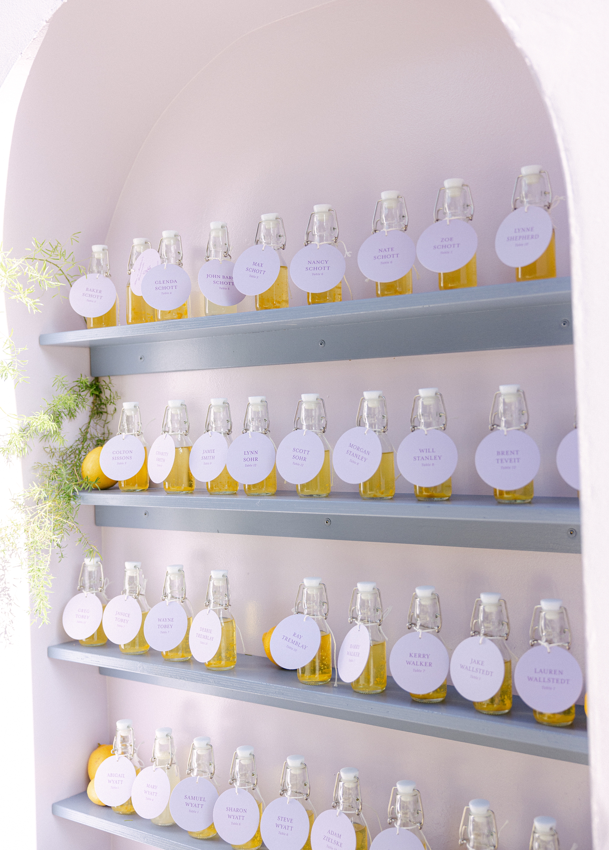
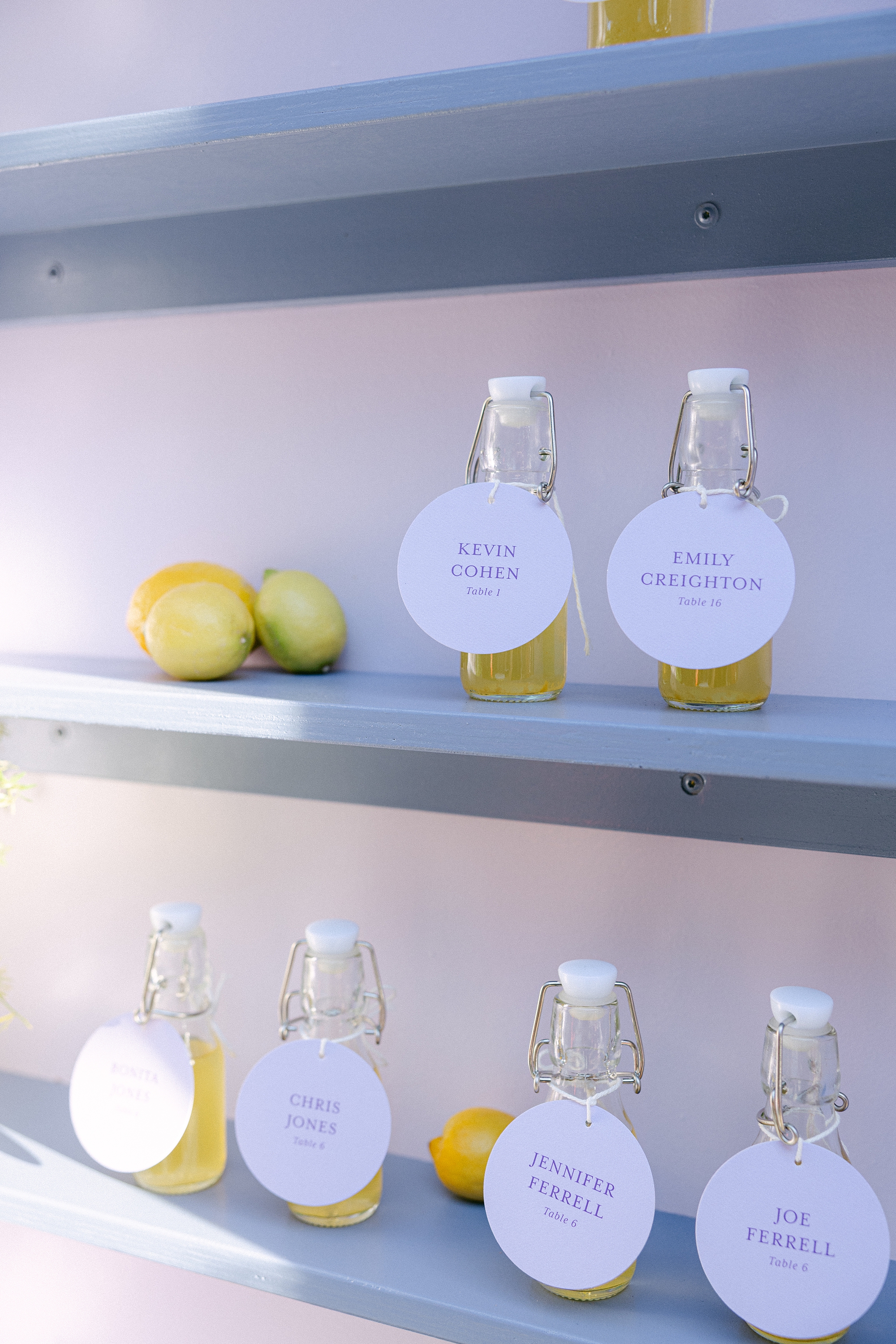
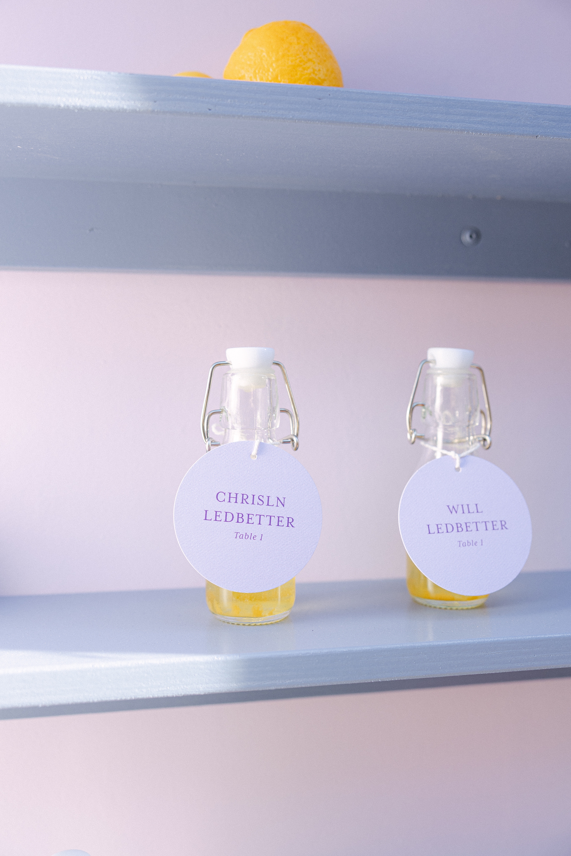
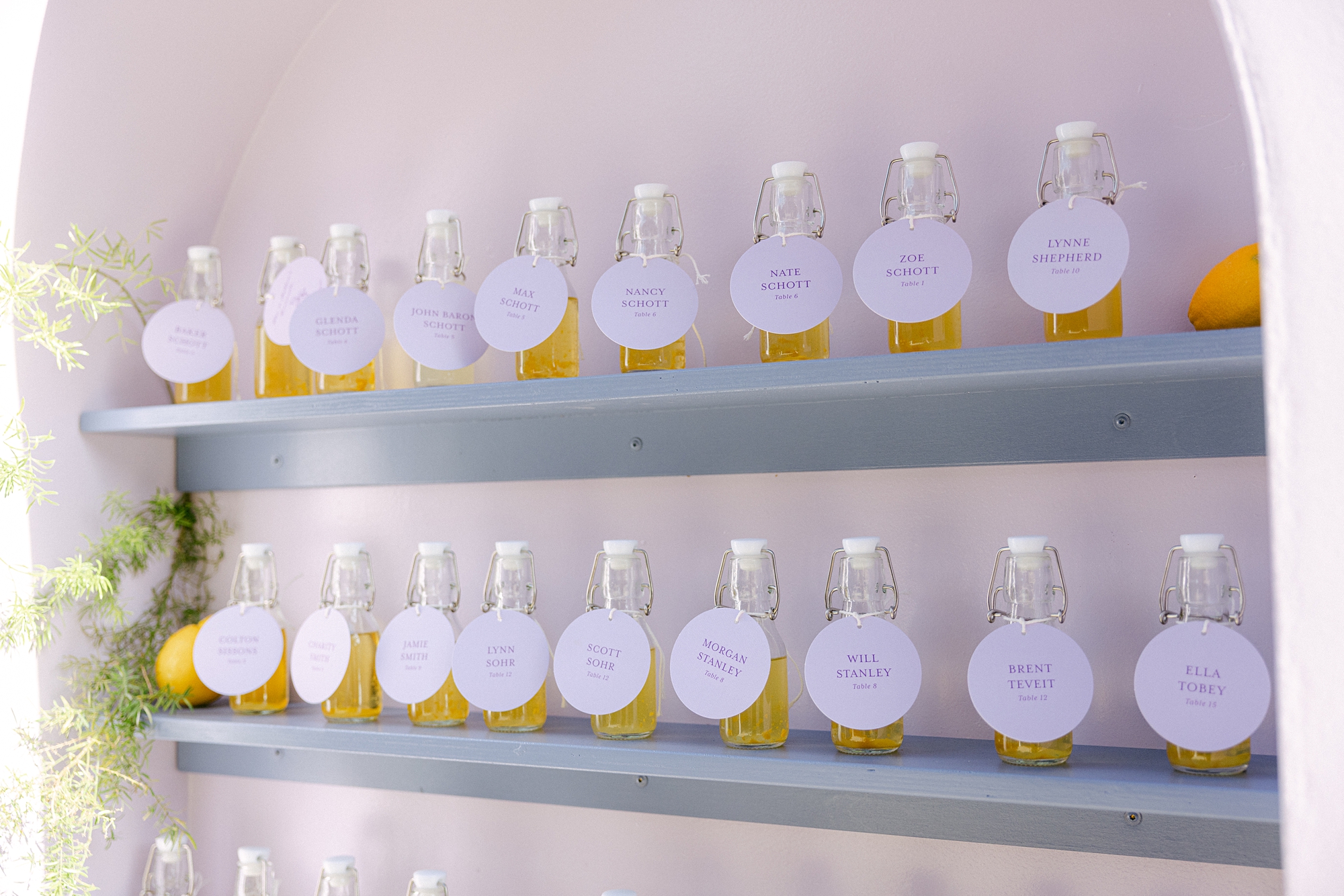
Limoncello Wall + Escort Tags
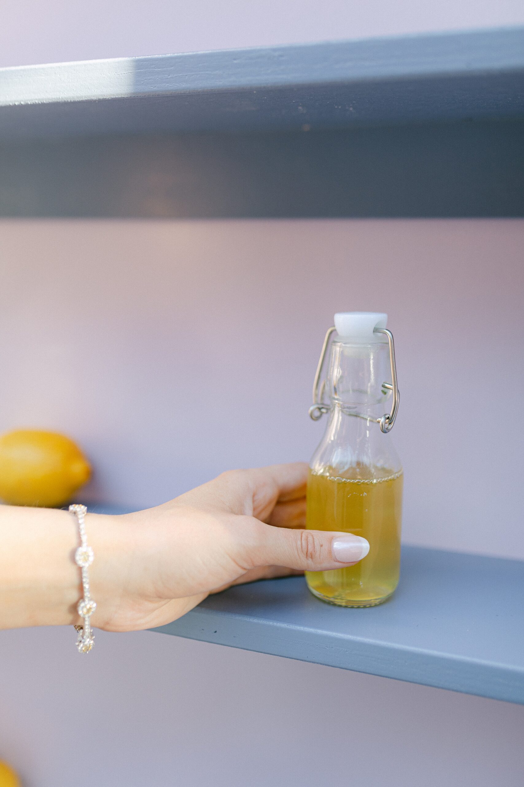
During our consultation, the couple mentioned that they LOVE limoncello. Naturally, we knew this had to play a starring role in their wedding design, so we designed a custom seating chart around limoncello, and it was better than we envisioned! Guests were welcomed with the seating chart wall display featuring three columns of shelving, each lined with bottles of homemade limoncello (or lemonade for those littles in attendance). Yes, you read that right, the couple made the limoncello themselves!! Talk about a personal touch!
Each bottle featured a circular escort tag with the guest’s name and table assignment. Across the top of the display, we added the playful phrase: “Take a ‘cello and Please Be Seated.” At the base of the installation, lush florals completed the look, making this display not just a seating chart, but a true statement piece and guest favorite.
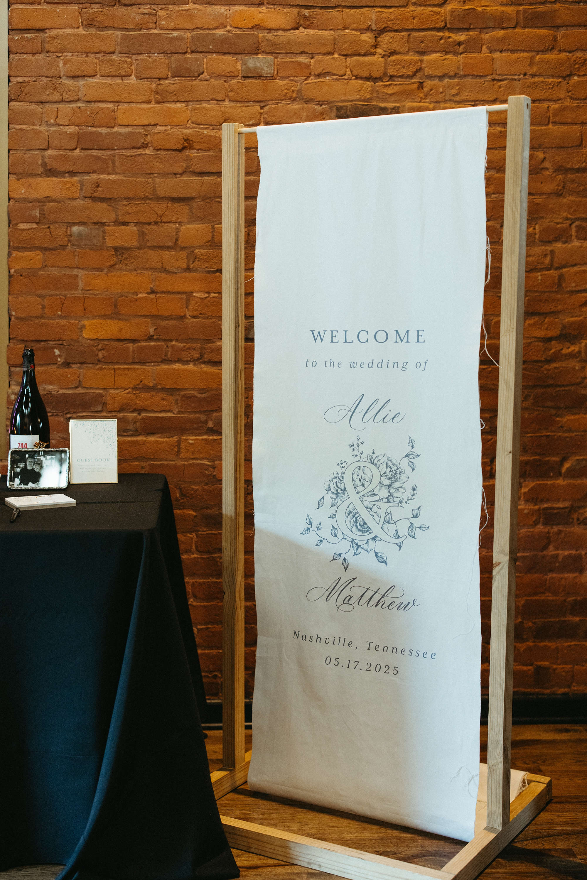
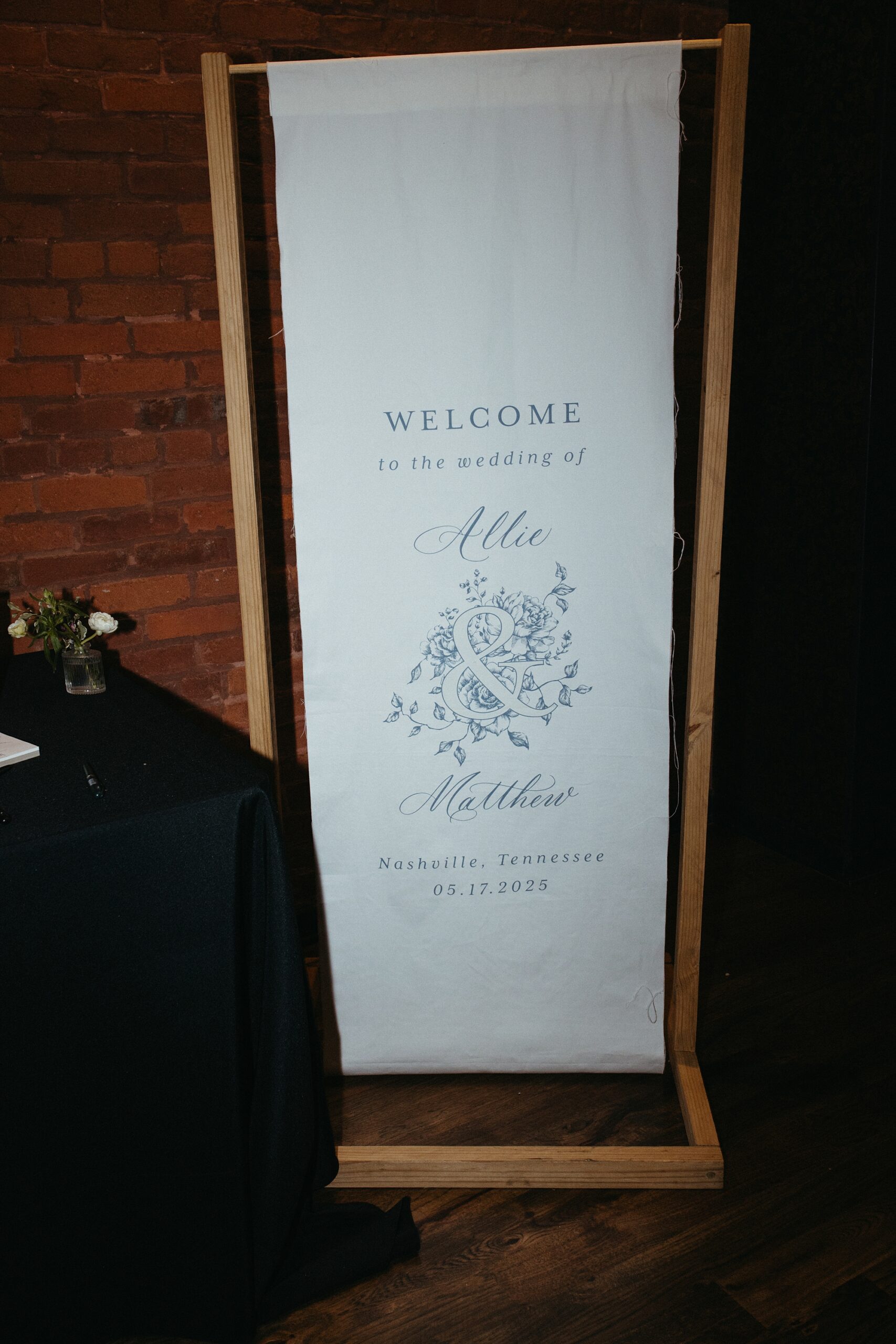
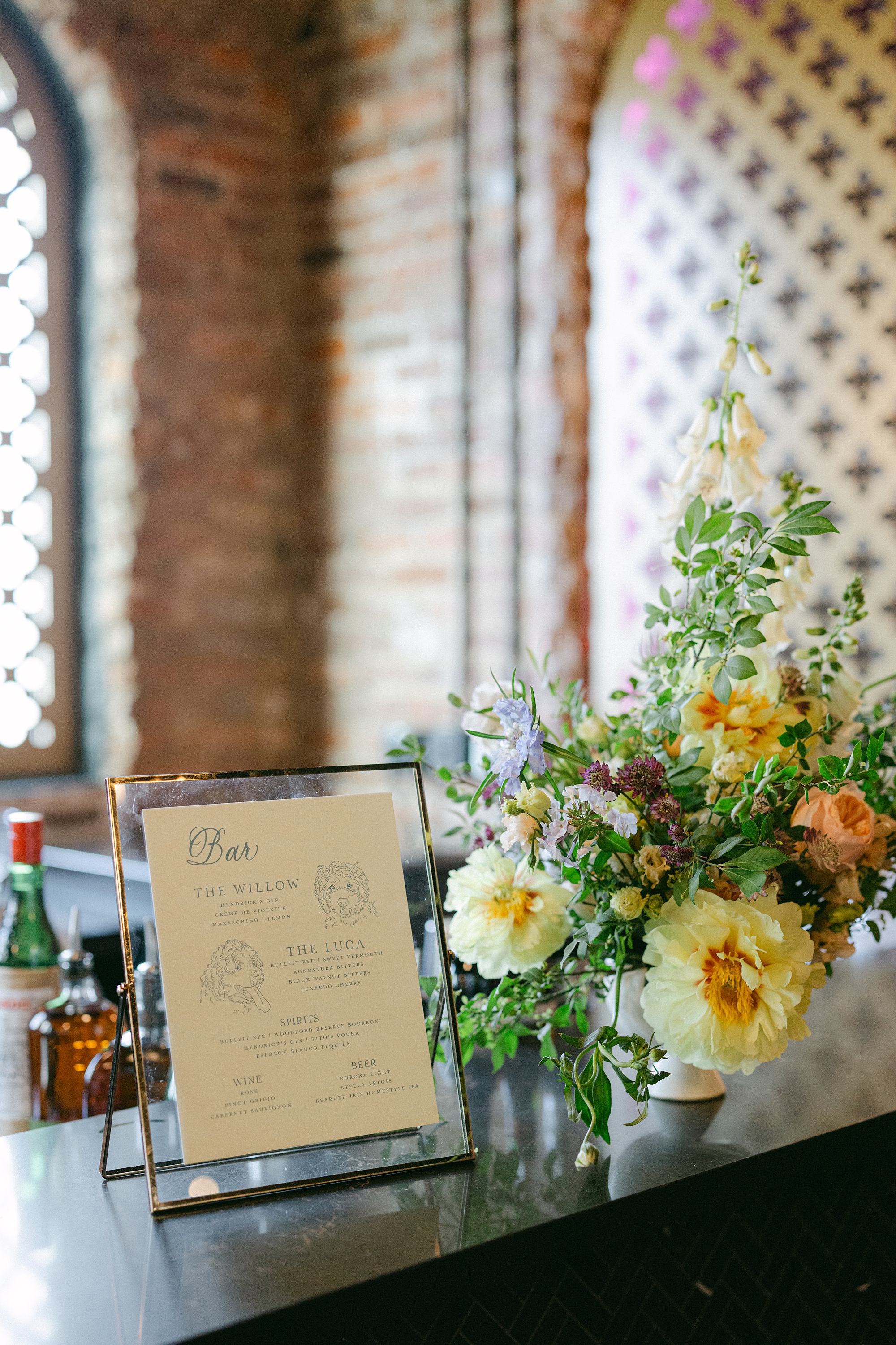
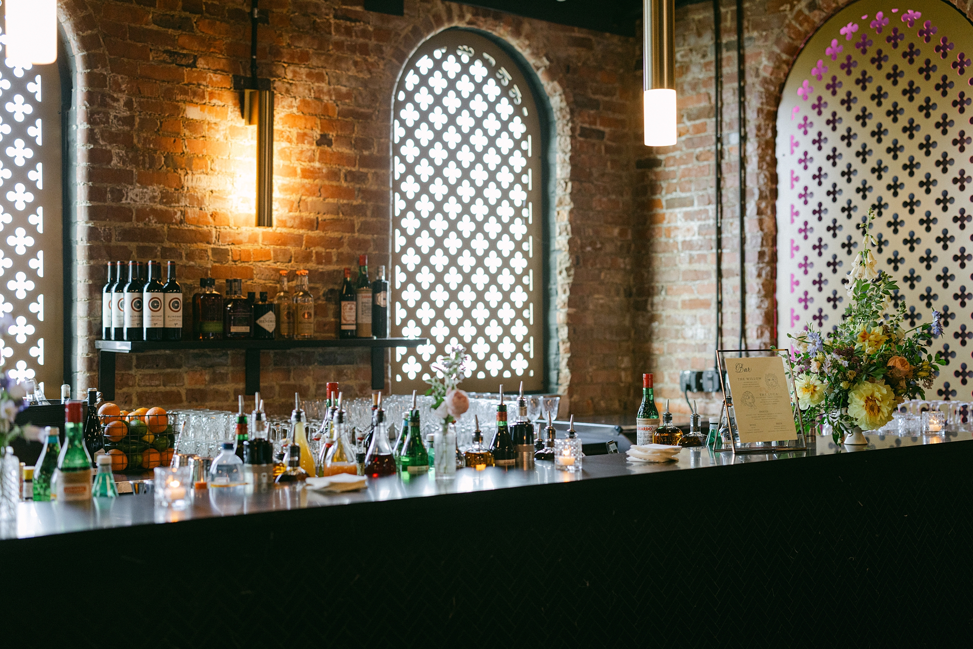
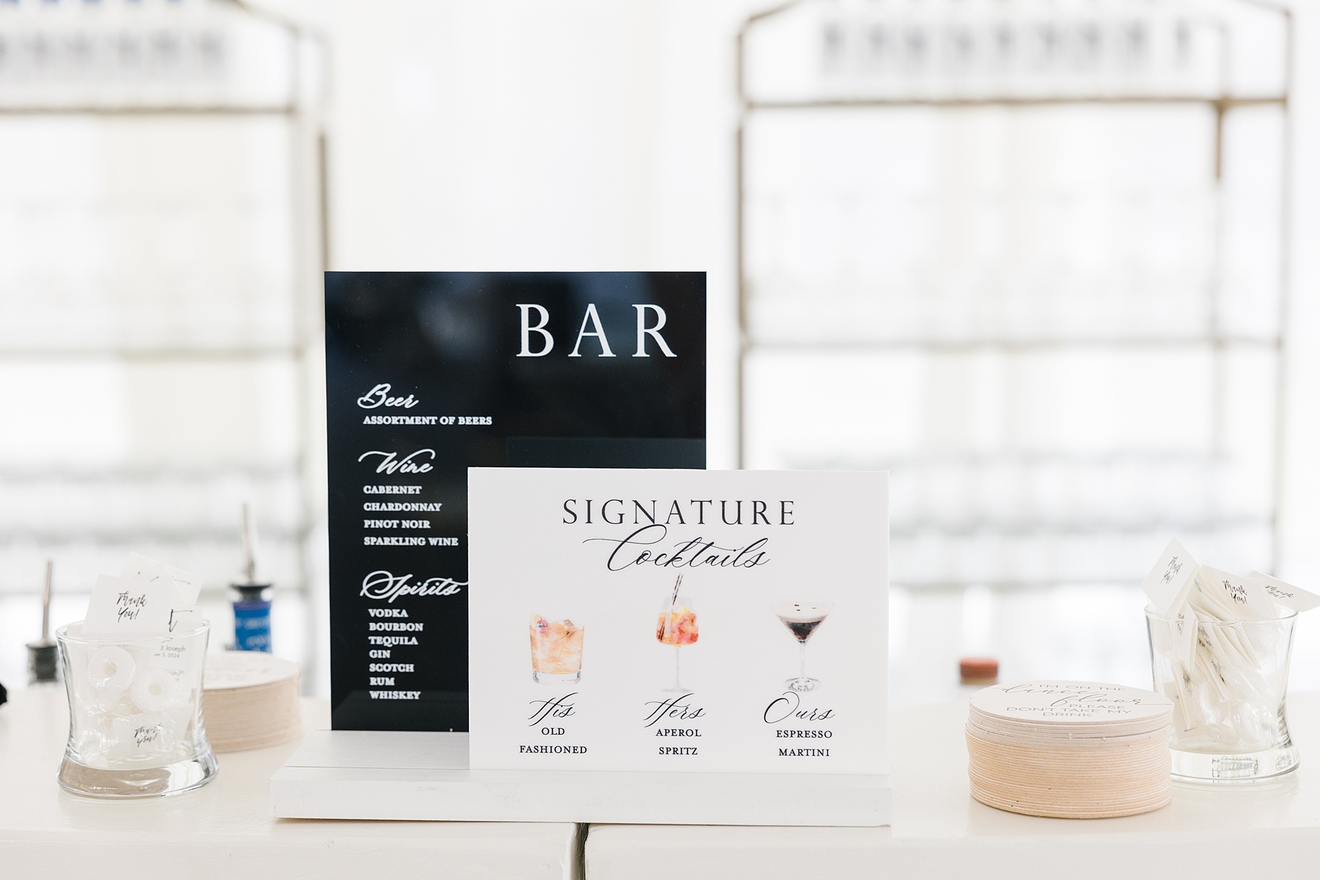
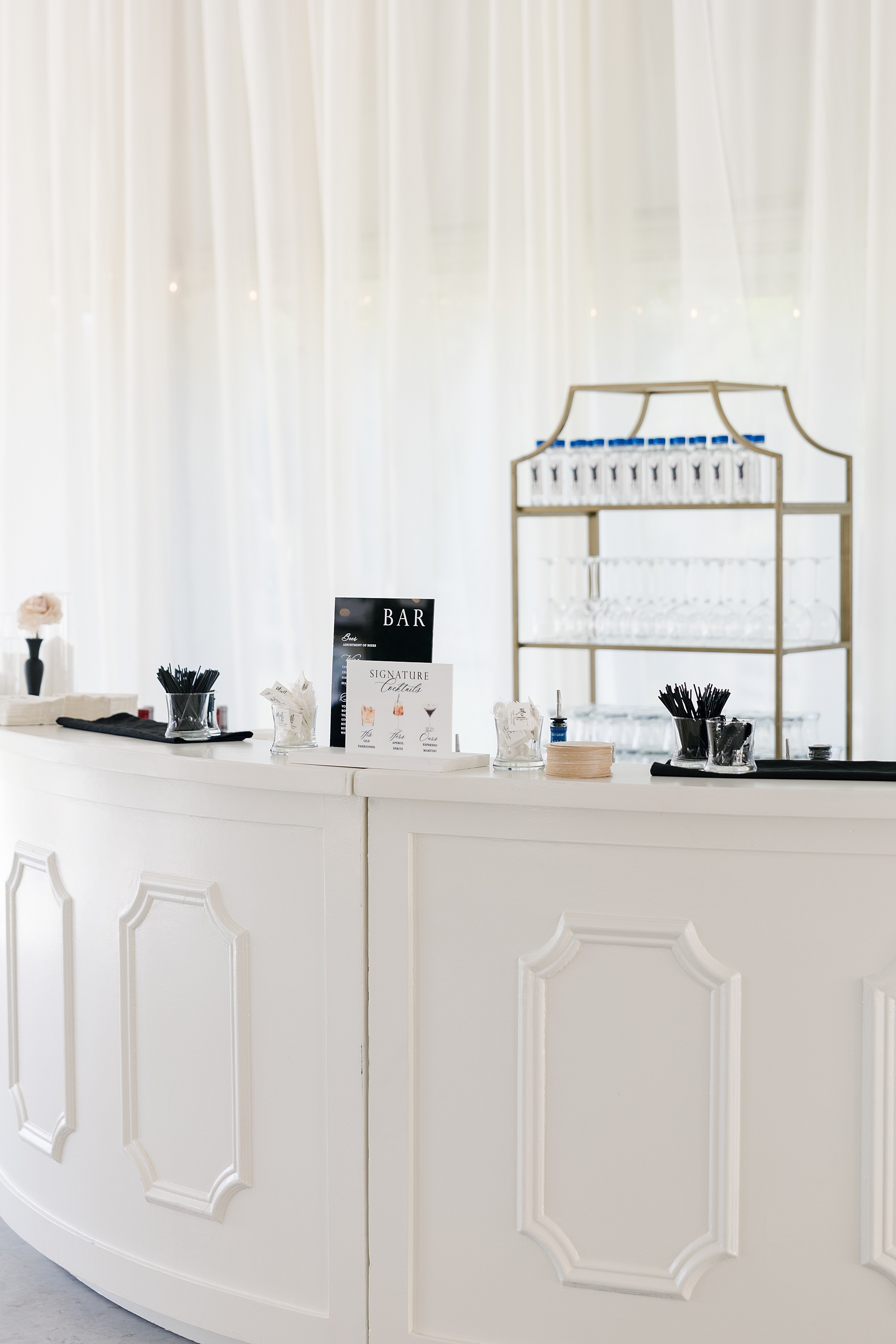
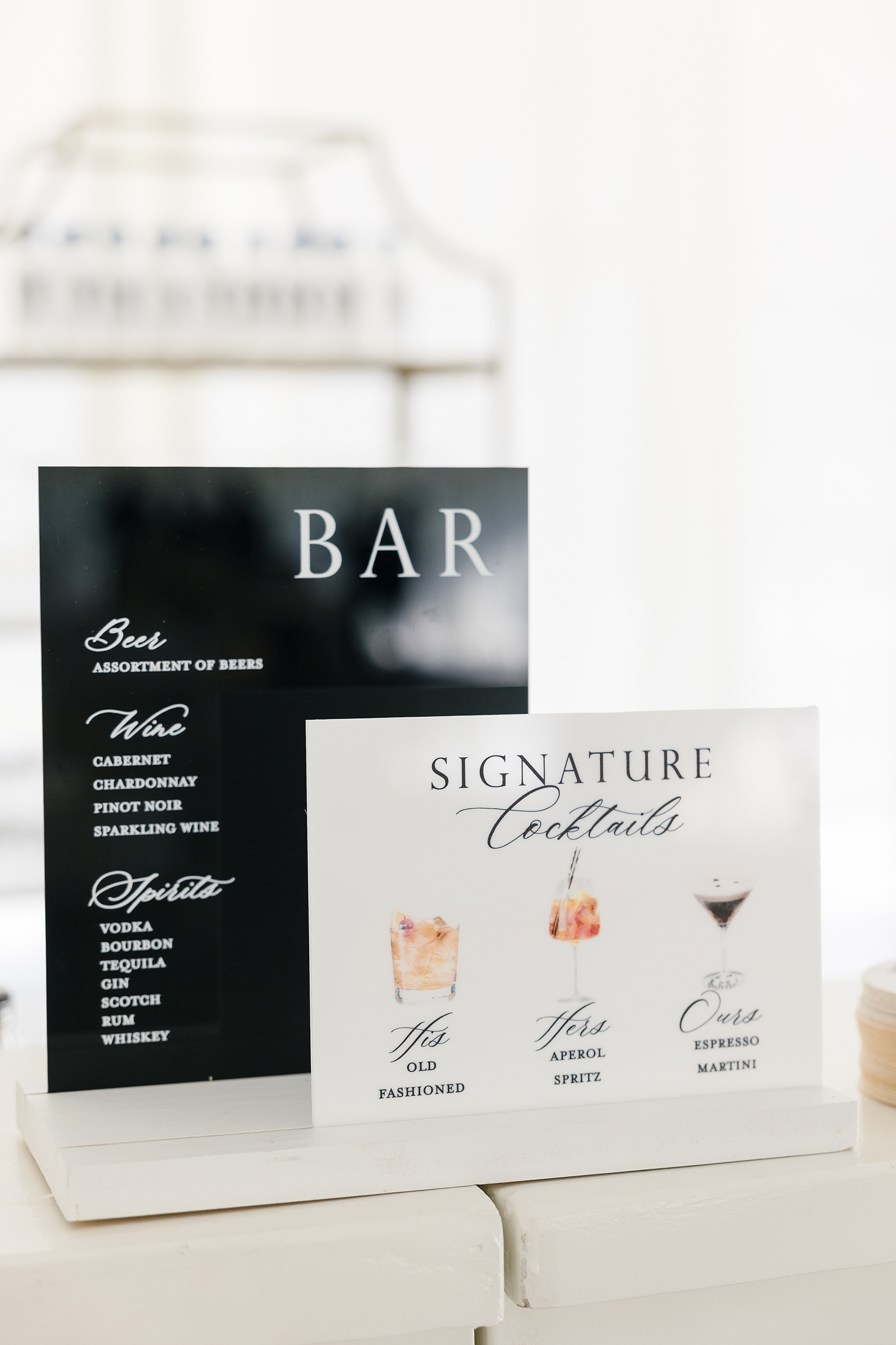
Day-Of Details: Wedding Signage
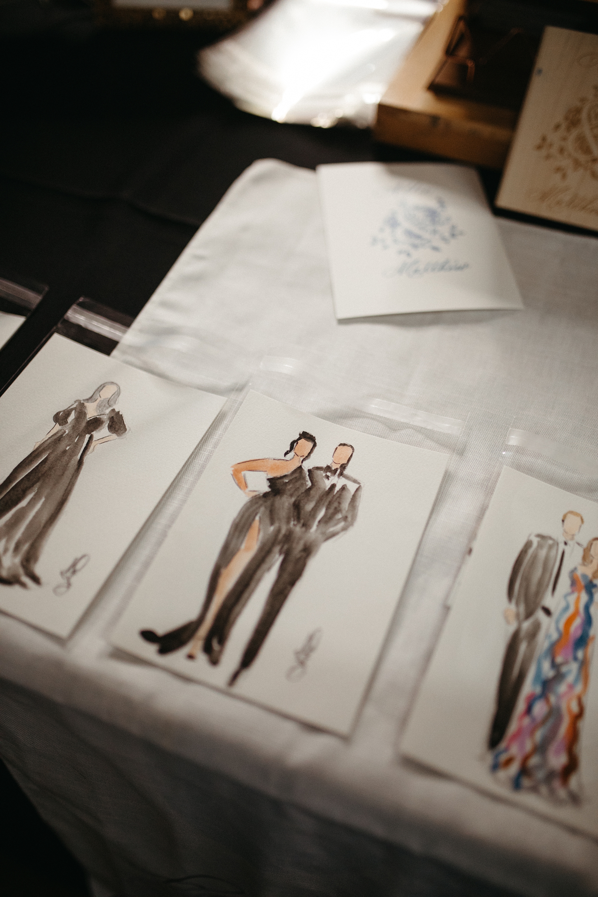
Beyond the invitations and seating chart, we created several custom paper goods and signage to carry the couple’s aesthetic throughout the celebration. A white fabric wedding welcome sign with soft blue lettering set the tone from the moment guests arrived. Bar signage featured signature cocktails inspired by the couple’s beloved dogs, Willow and Luca, complete with hand-sketched portraits. It was a personal detail that had everyone smiling.
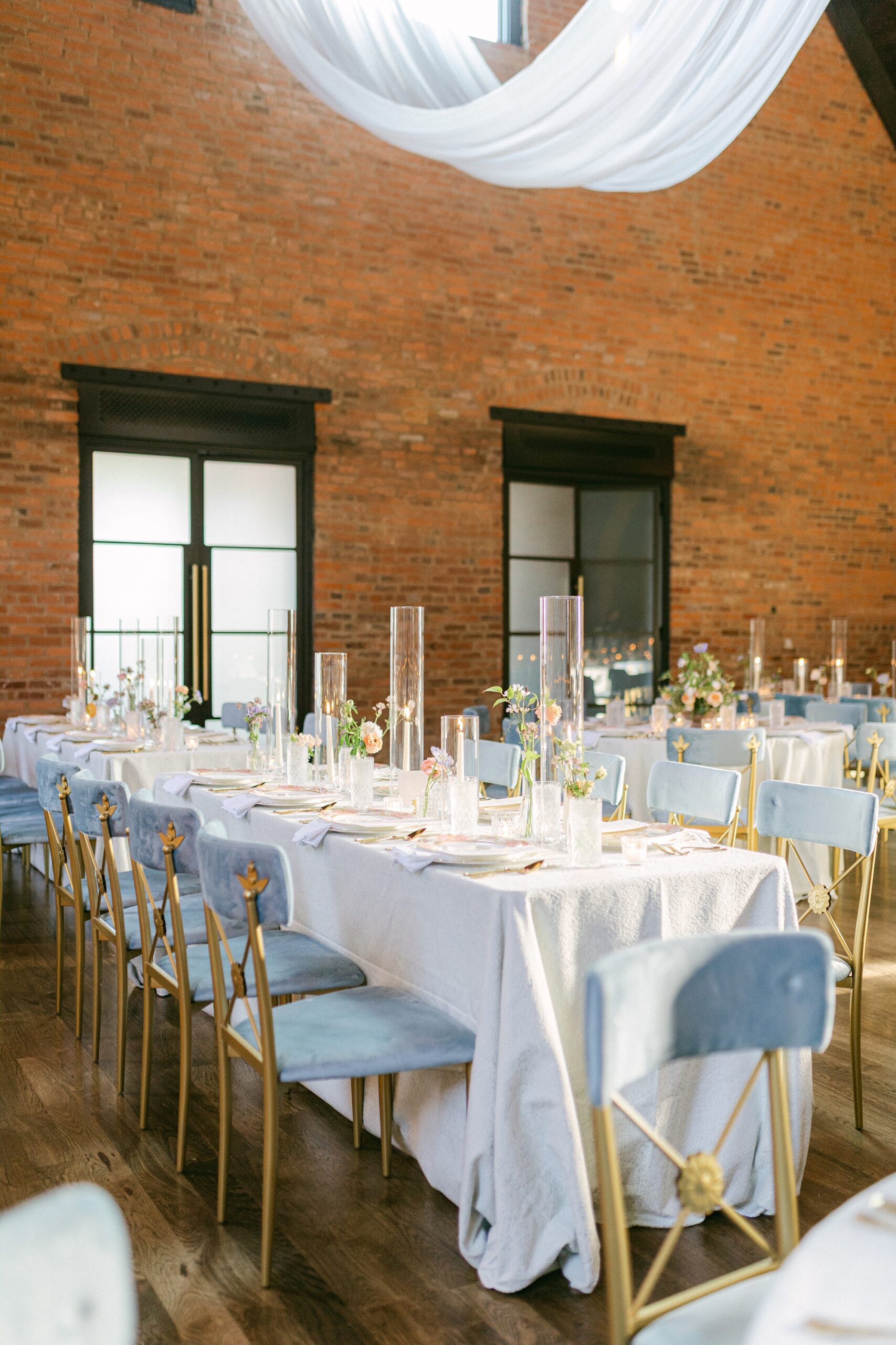
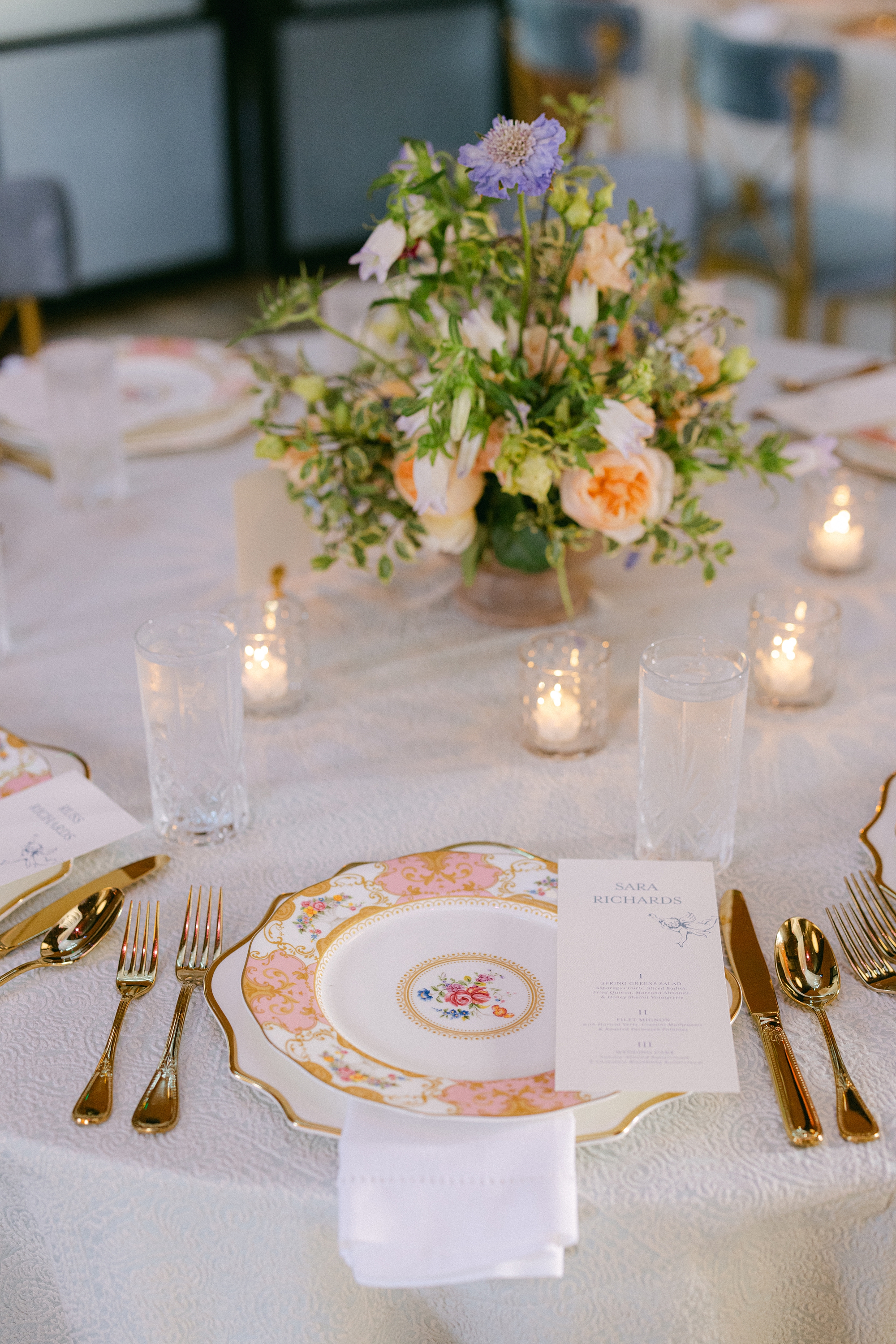
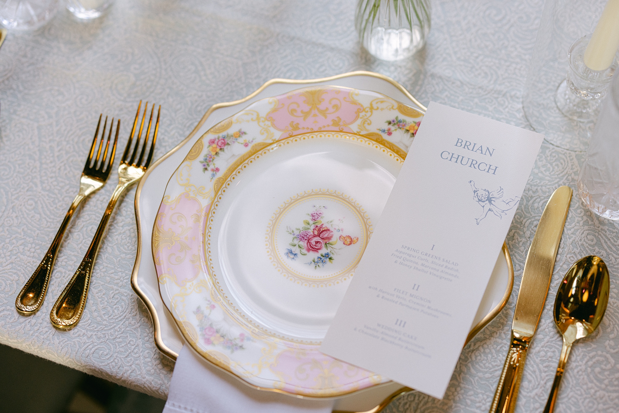
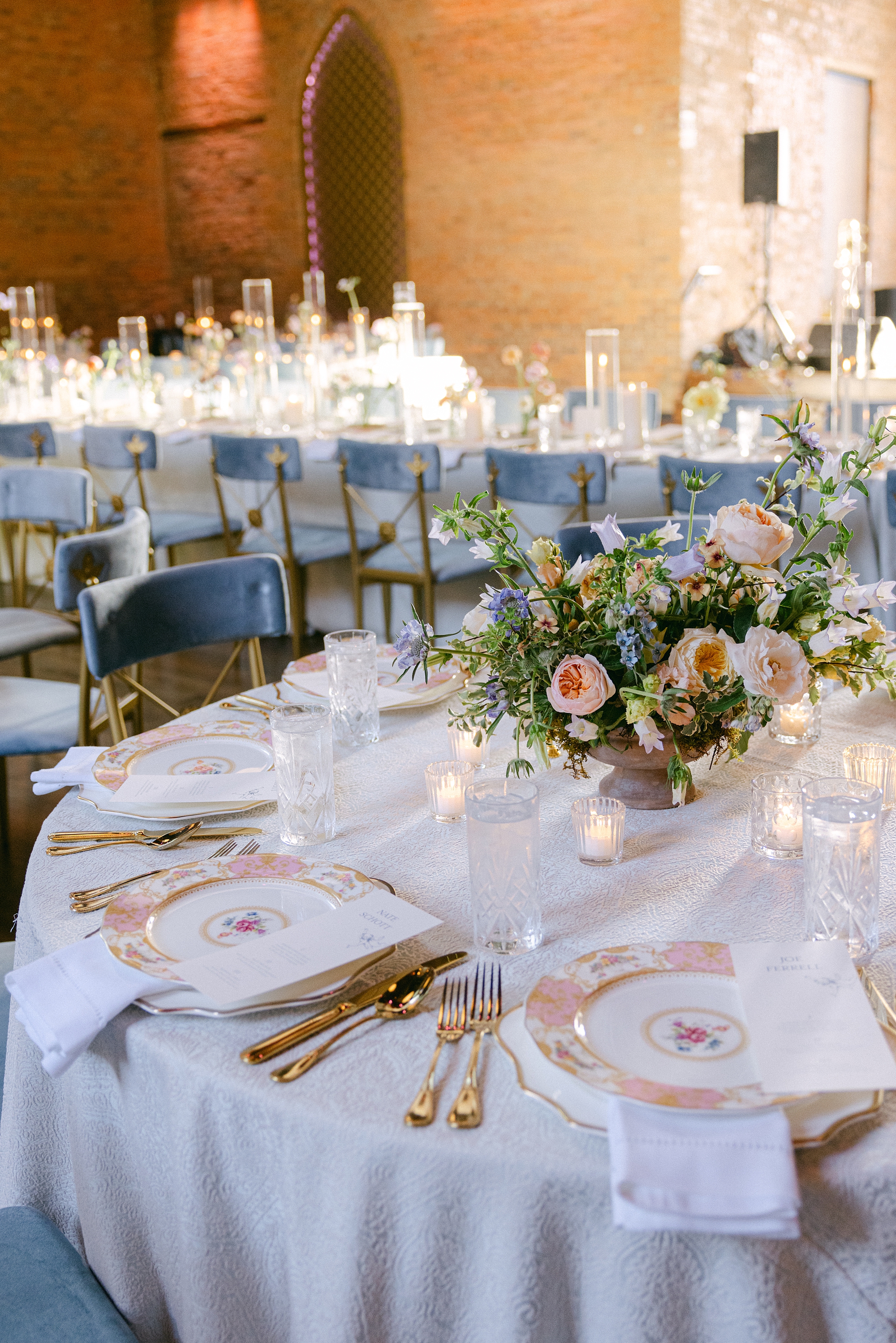
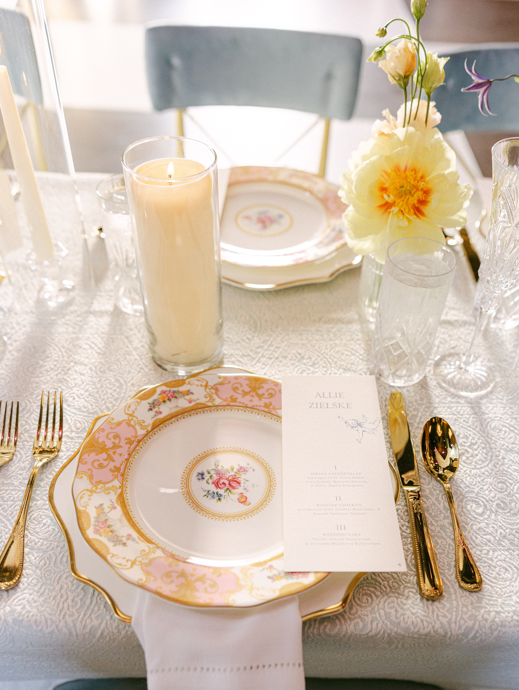
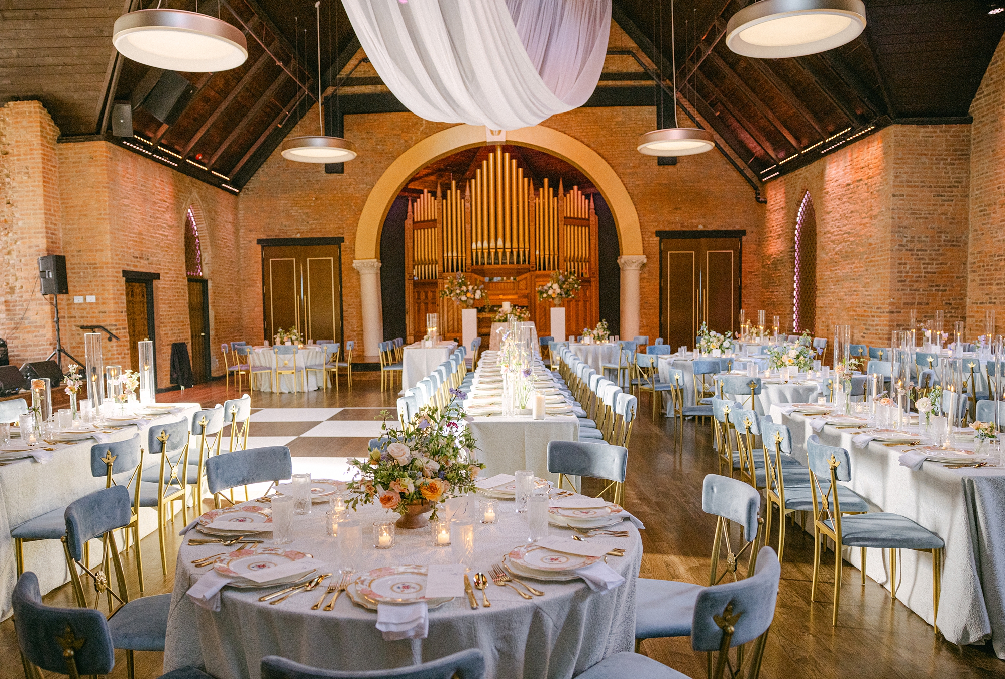
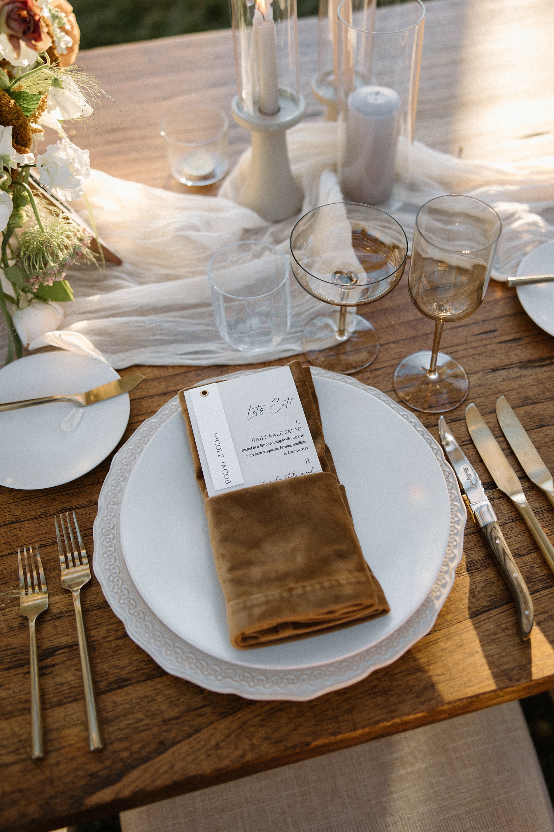
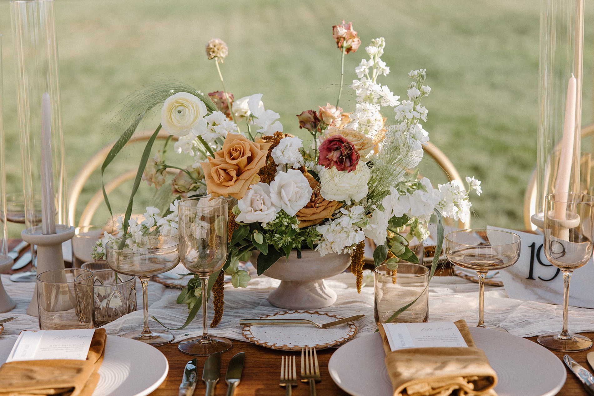
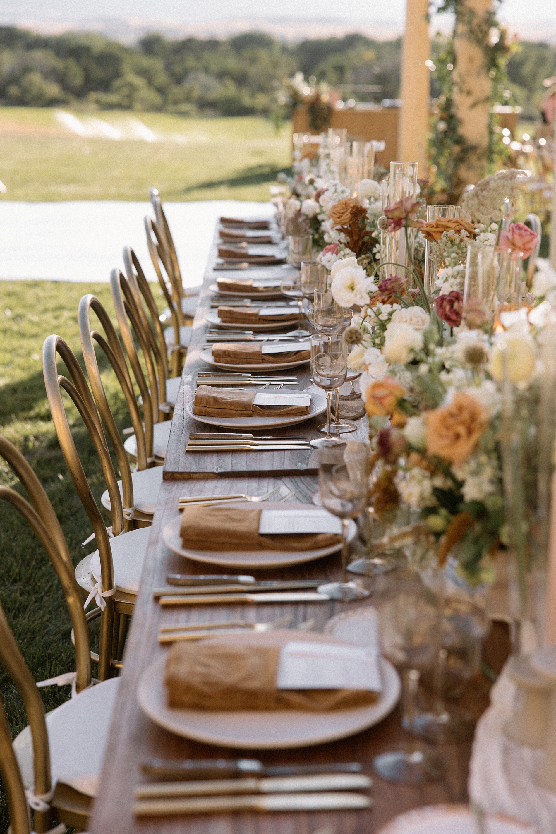
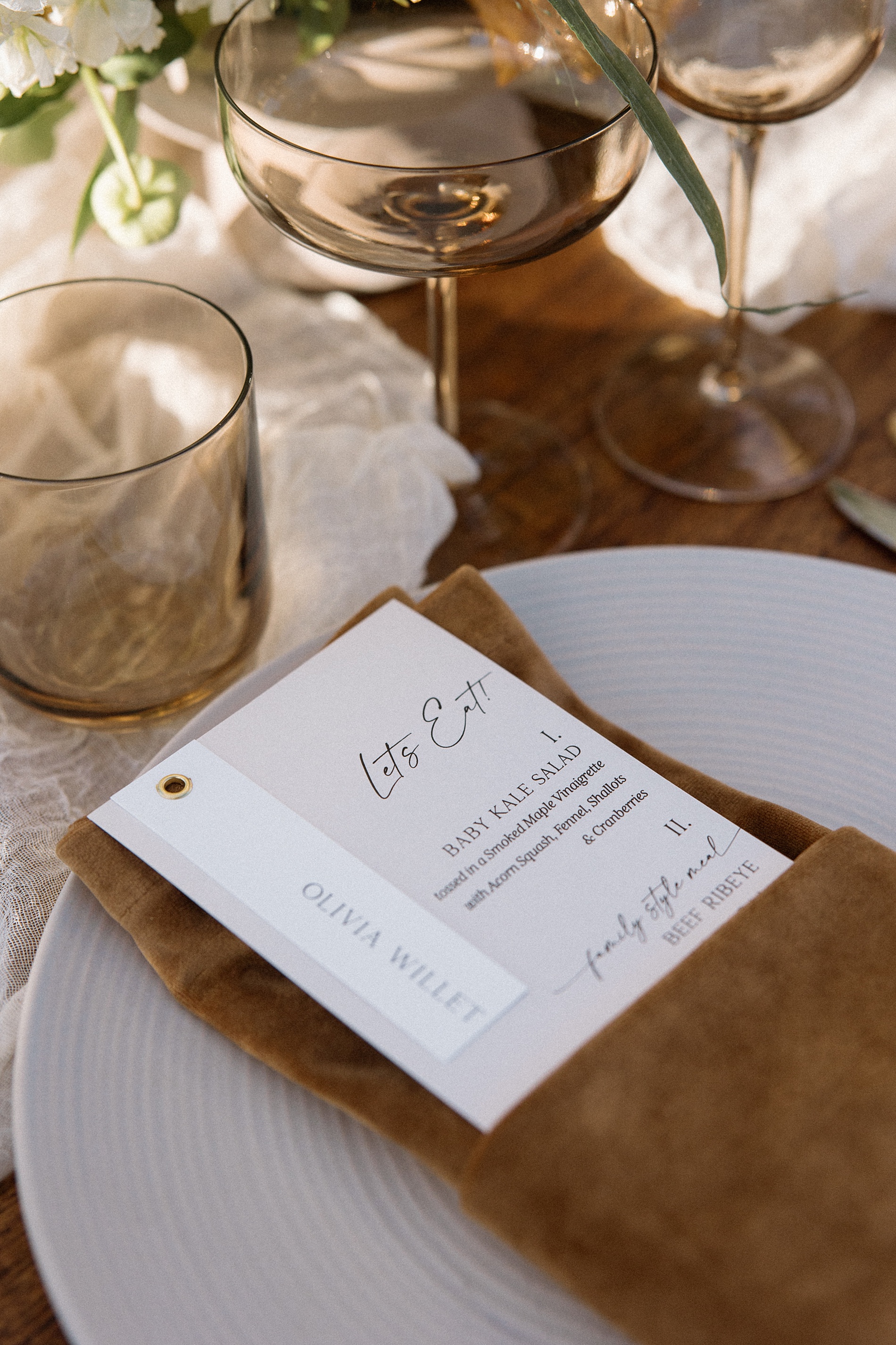
Menus and an Elegant Tablescape
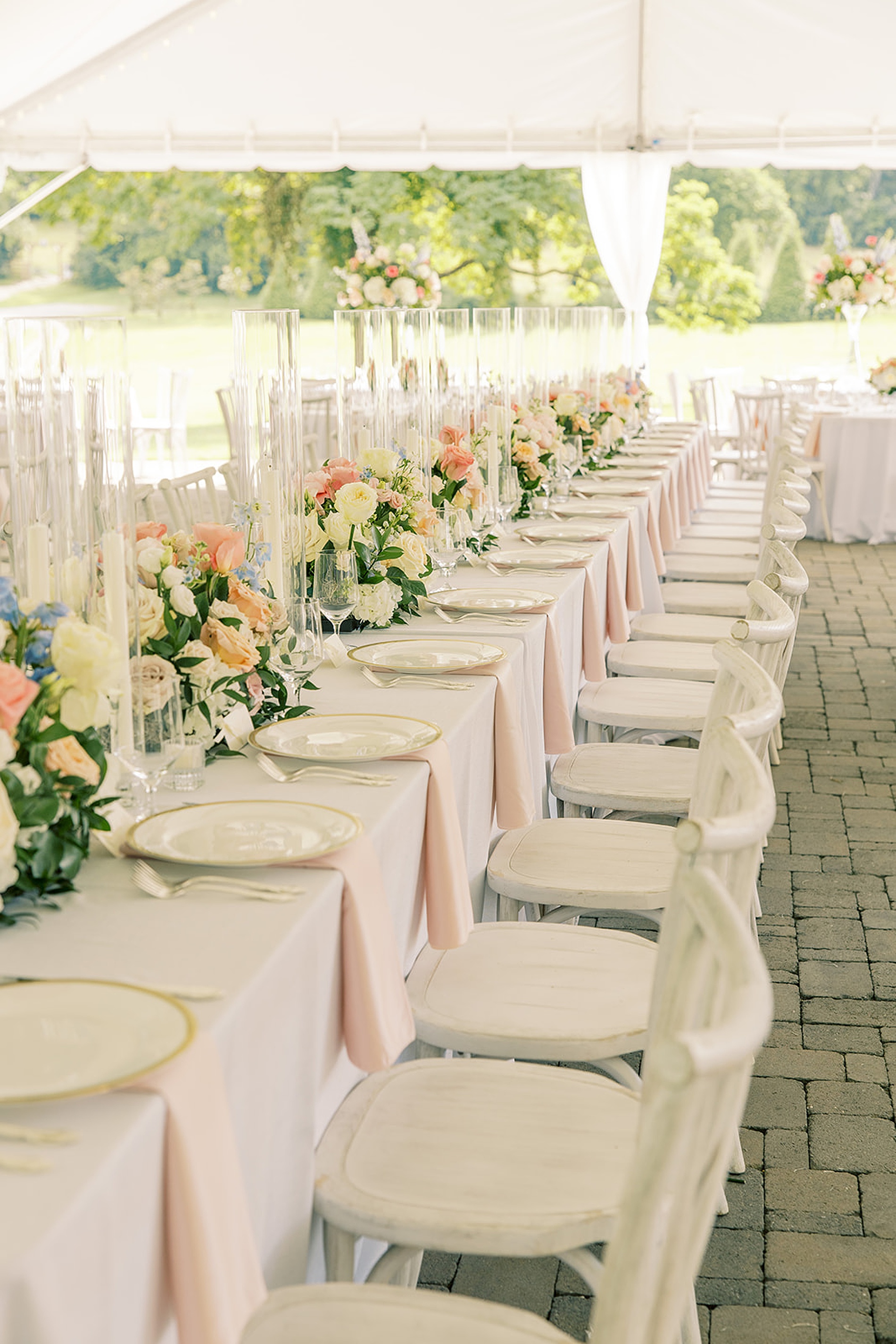
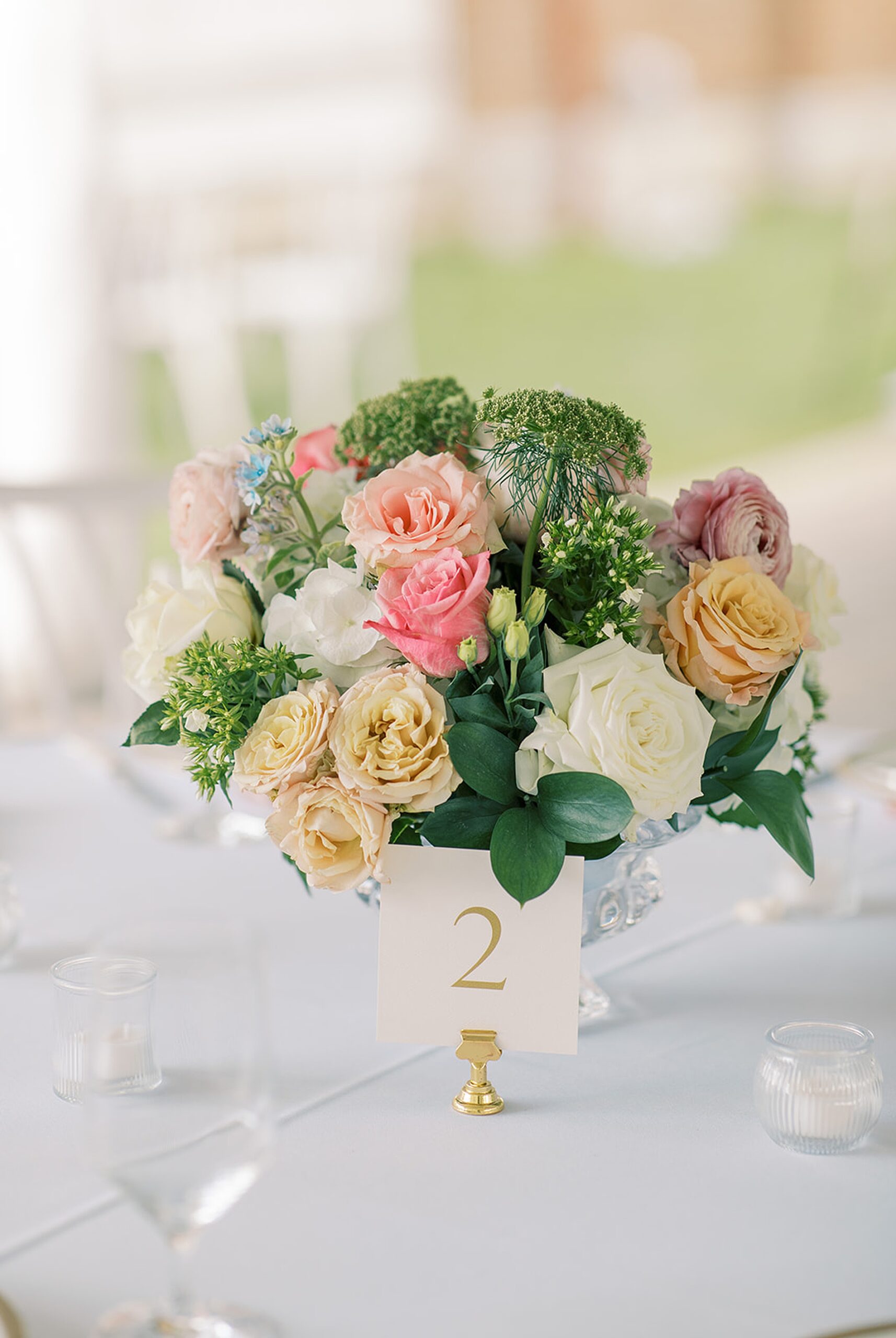
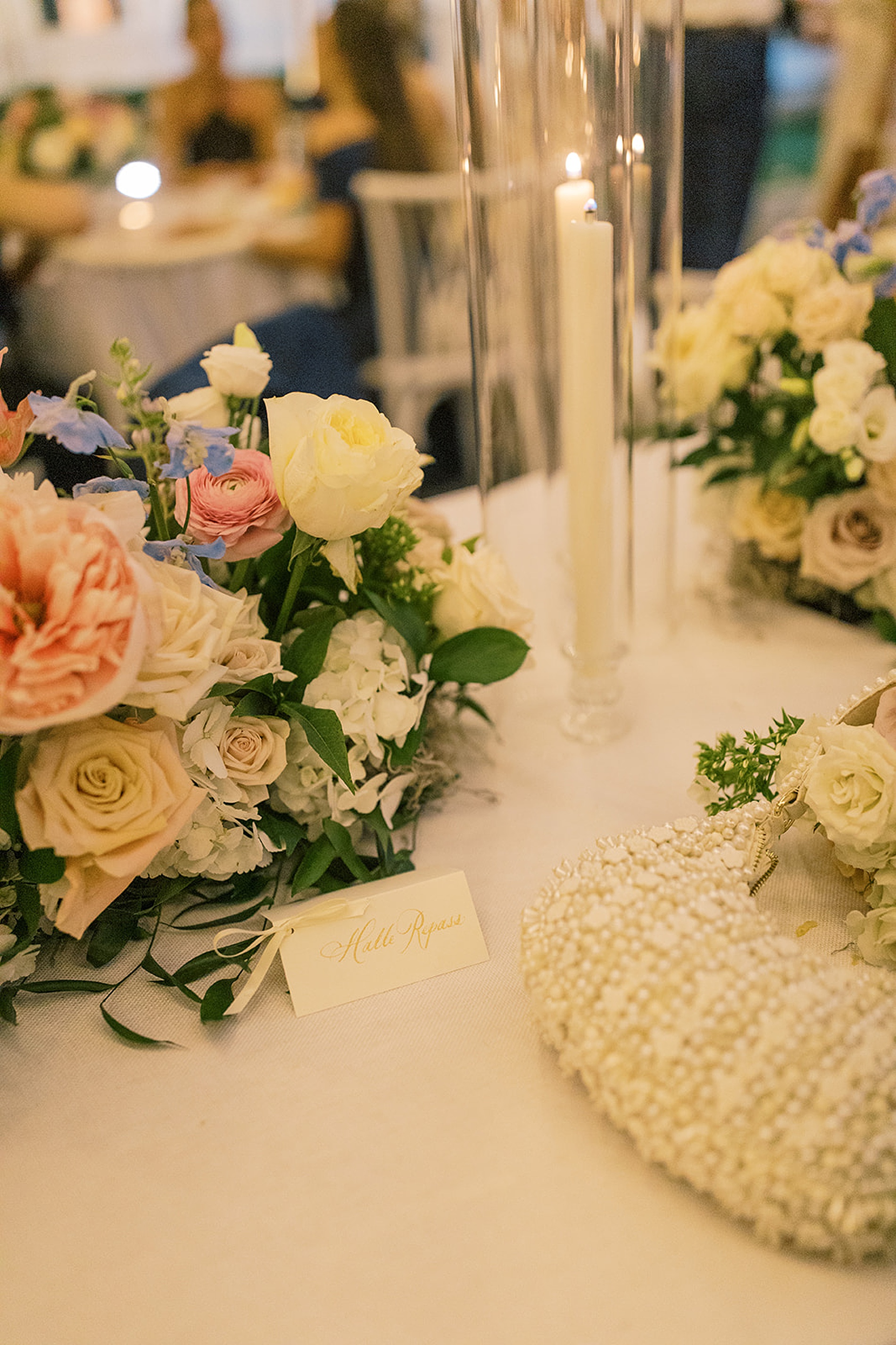
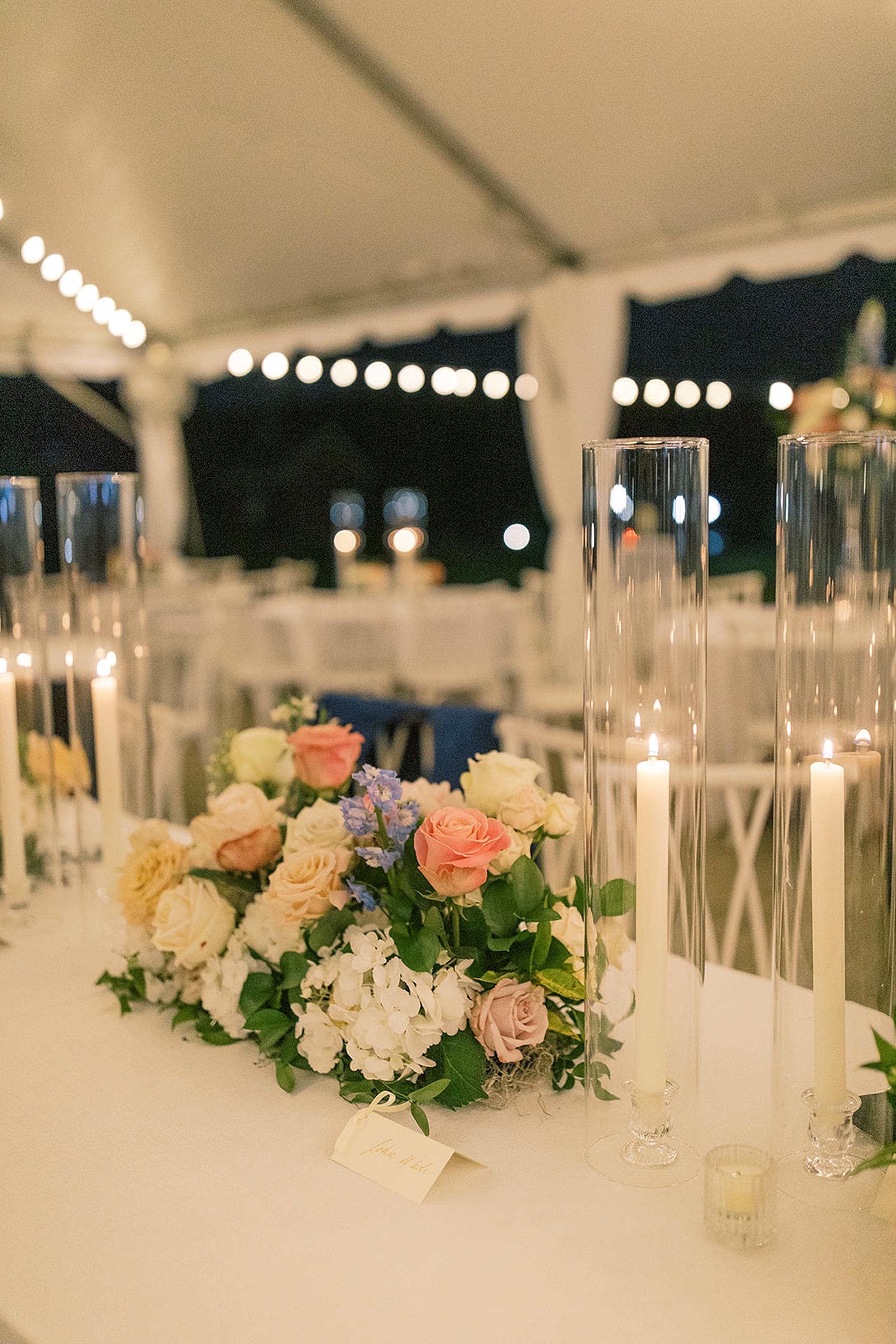
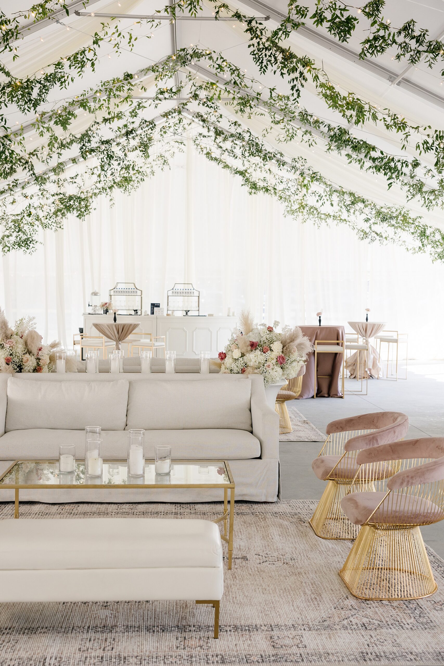
Menus sat atop each place setting. The pink, floral patterned plates and gold cutlery added a pop of color to tables draped in textured white linens and surrounded by soft blue chairs. Candlelight and romantic floral centerpieces tied everything together for an atmosphere that was both inviting and elegant.
From the custom invitation suite to the unforgettable limoncello seating chart wall, every design choice reflected the couple’s personality and vision. This was so much fun to create and bring to life. Congratulations to the newlyweds!
If you’re planning a wedding in Nashville, or anywhere in the world, we’d love to help you create meaningful, personalized stationery and event details that tell your story. We work with couples worldwide to design details you and your guests will remember forever. Reach out today to learn more about our full-service wedding and event design offerings! We can’t wait to create something unforgettable for you!
If you enjoyed this post, you’ll love these other blogs!
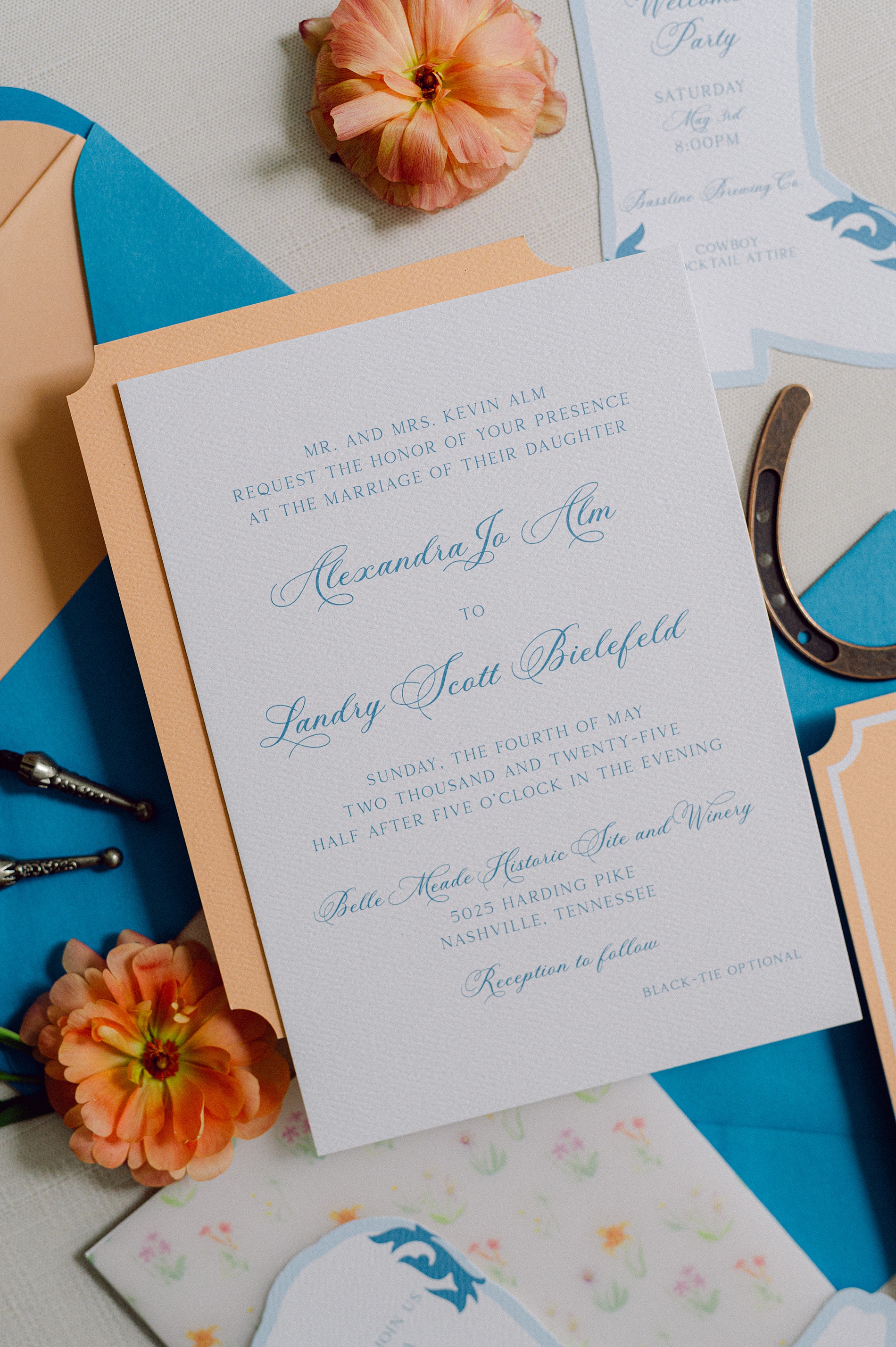
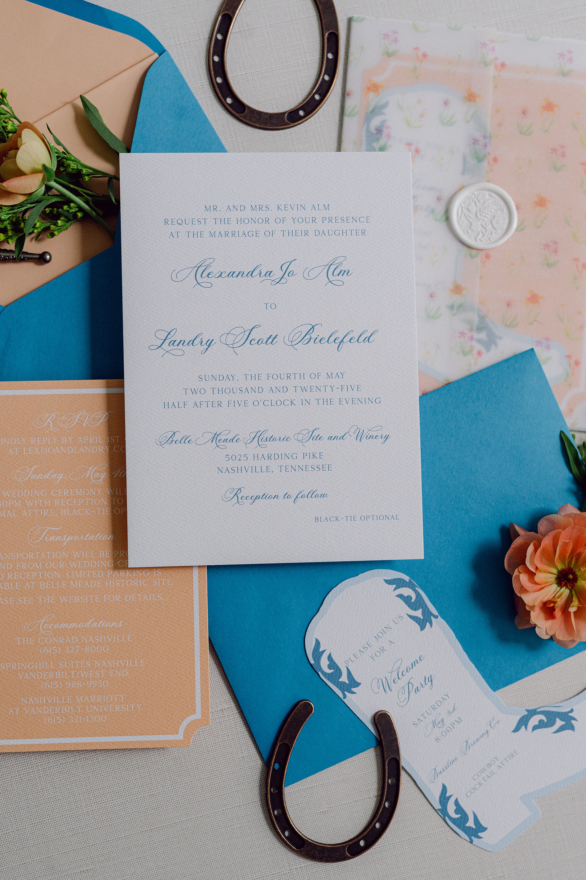
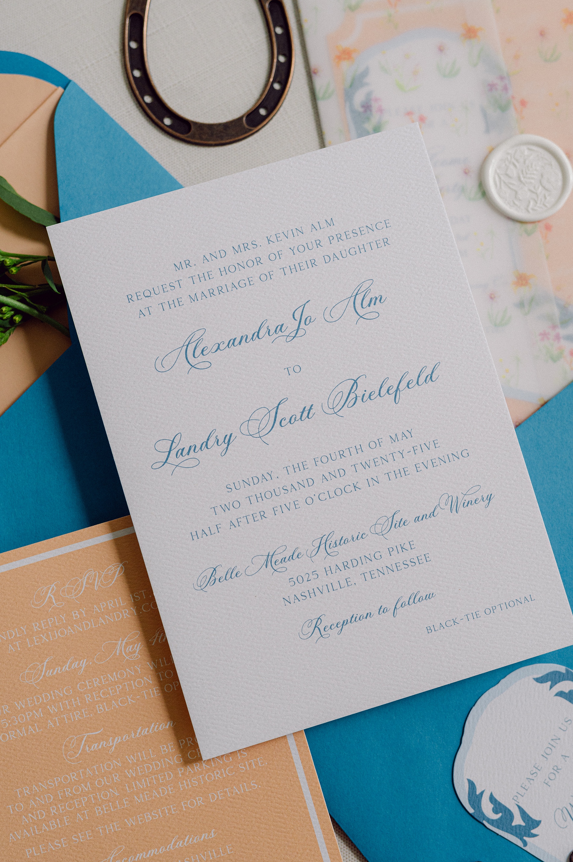
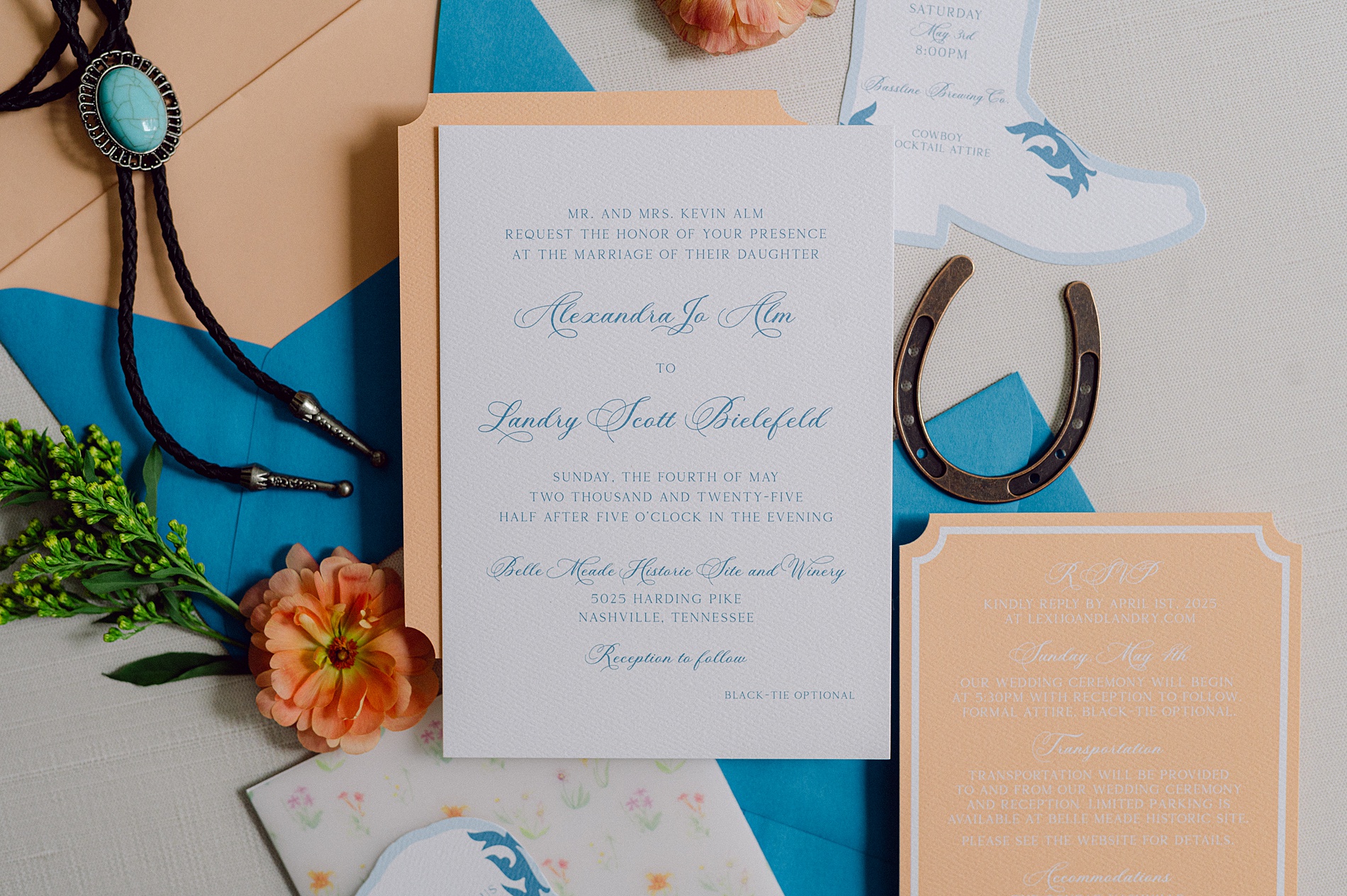
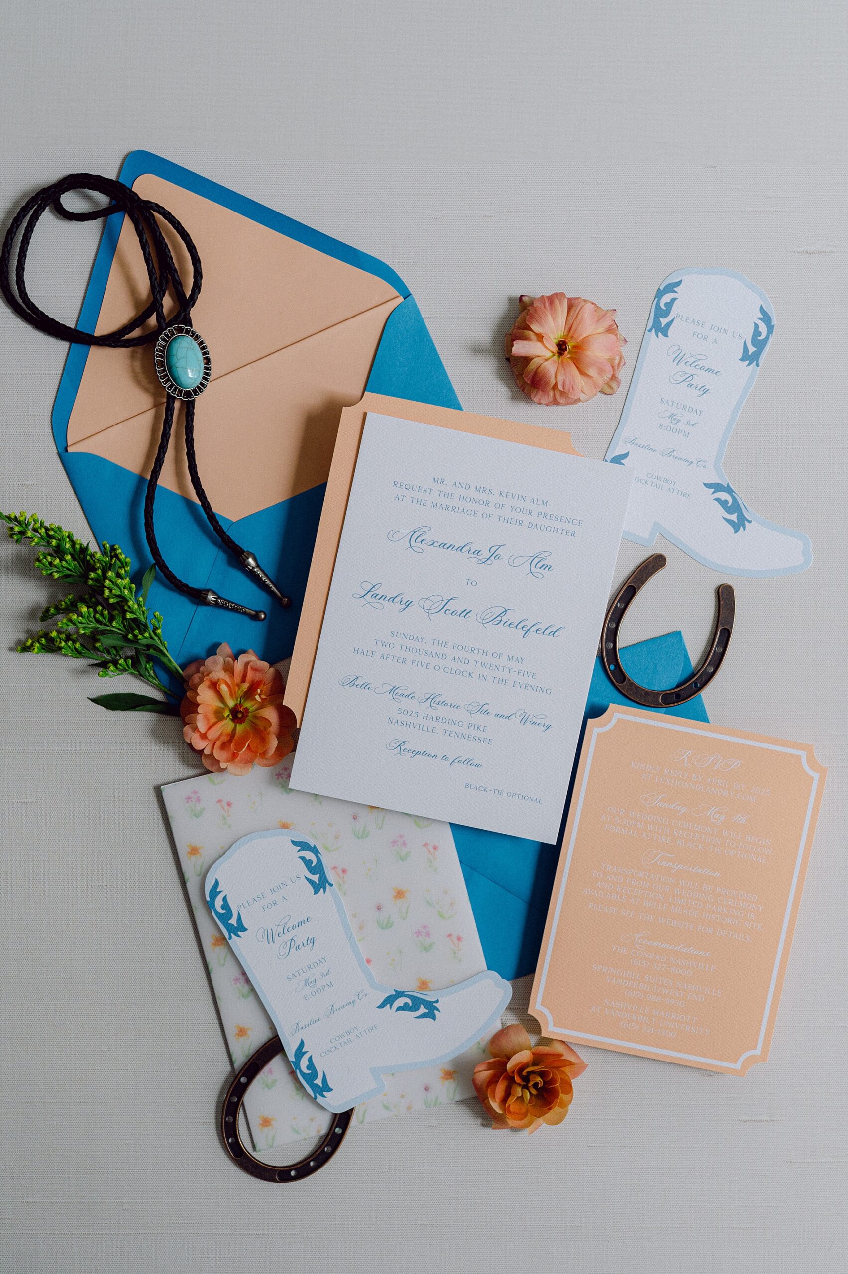
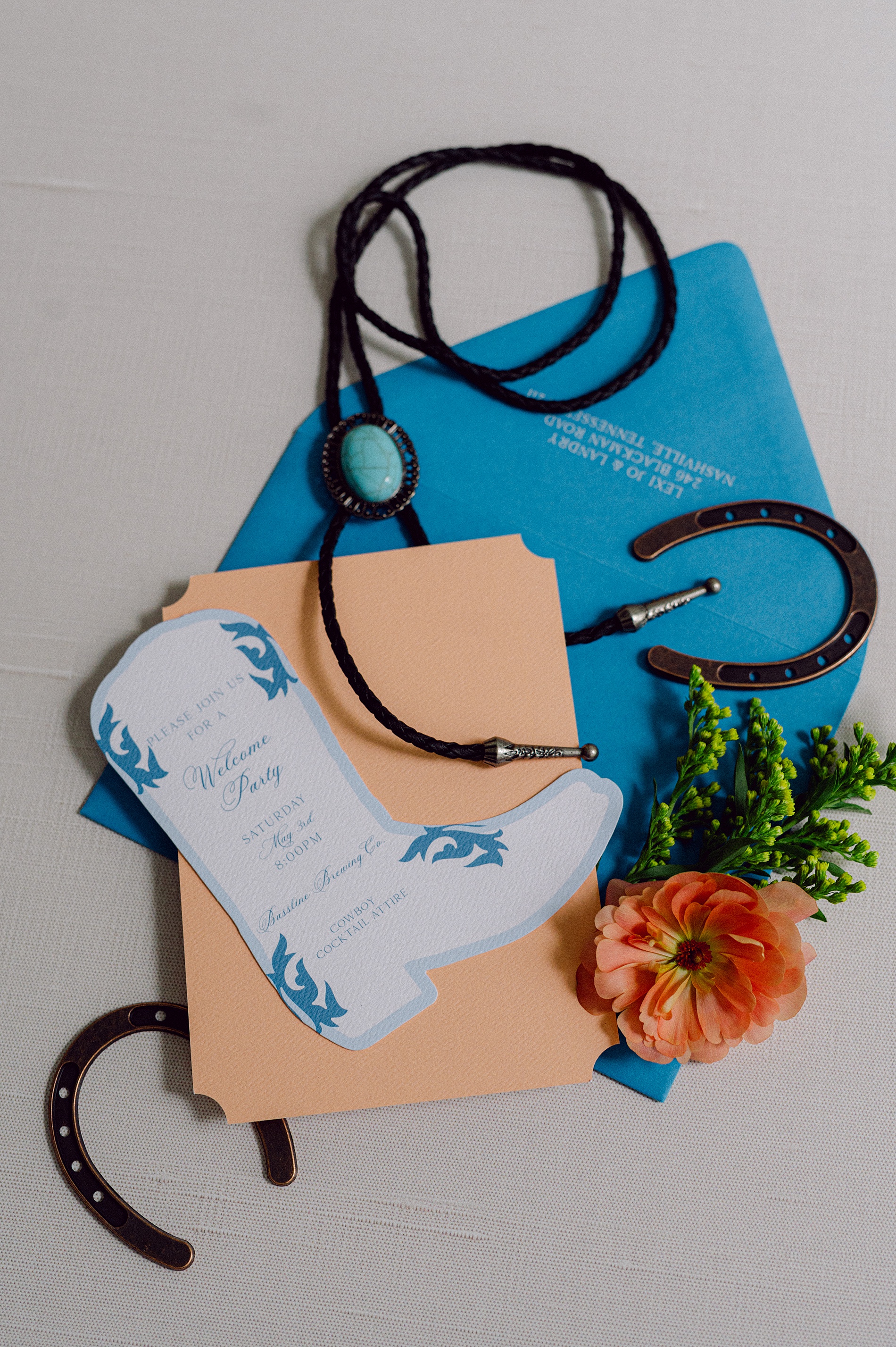
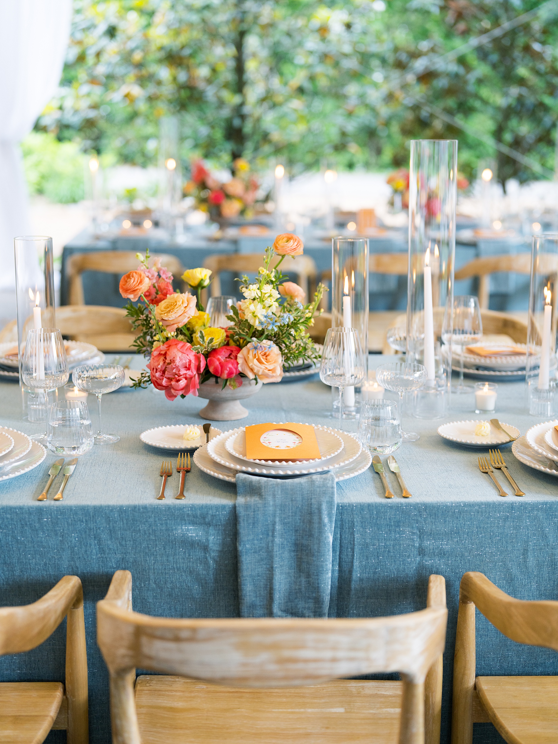
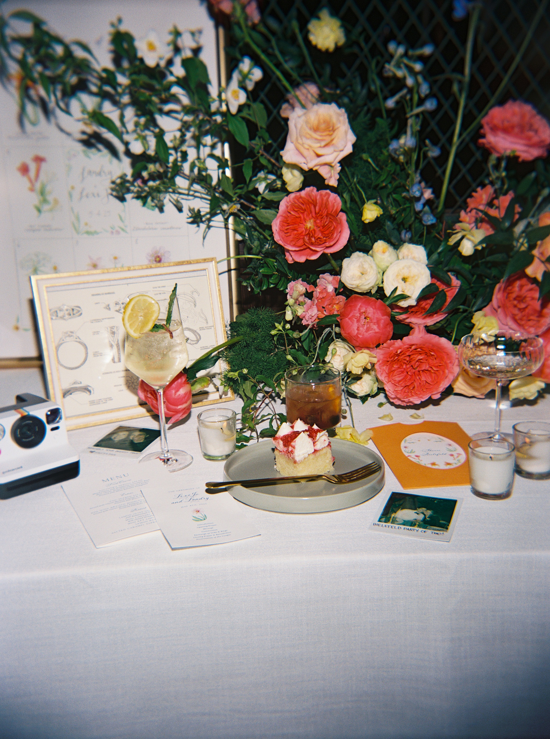
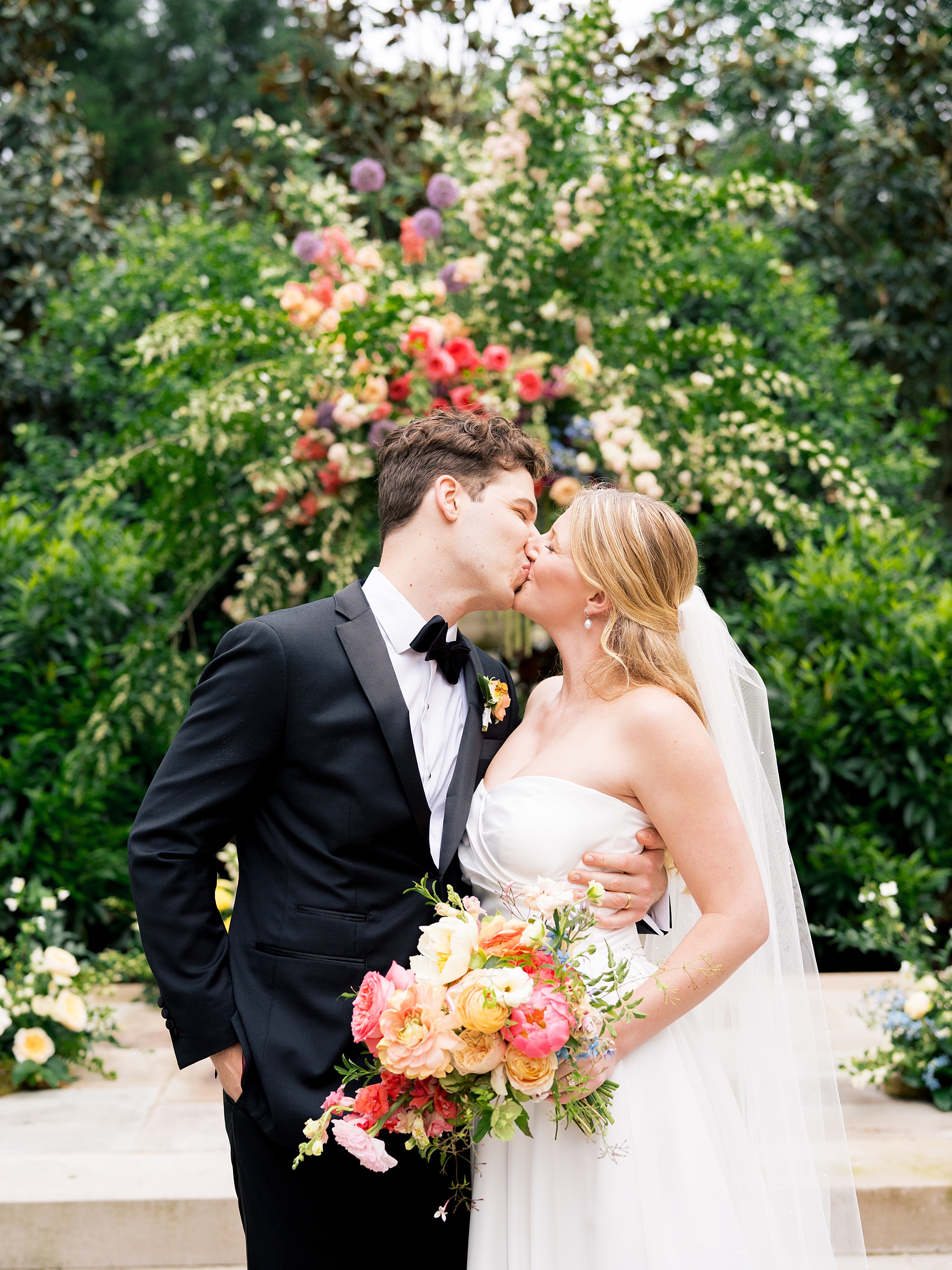
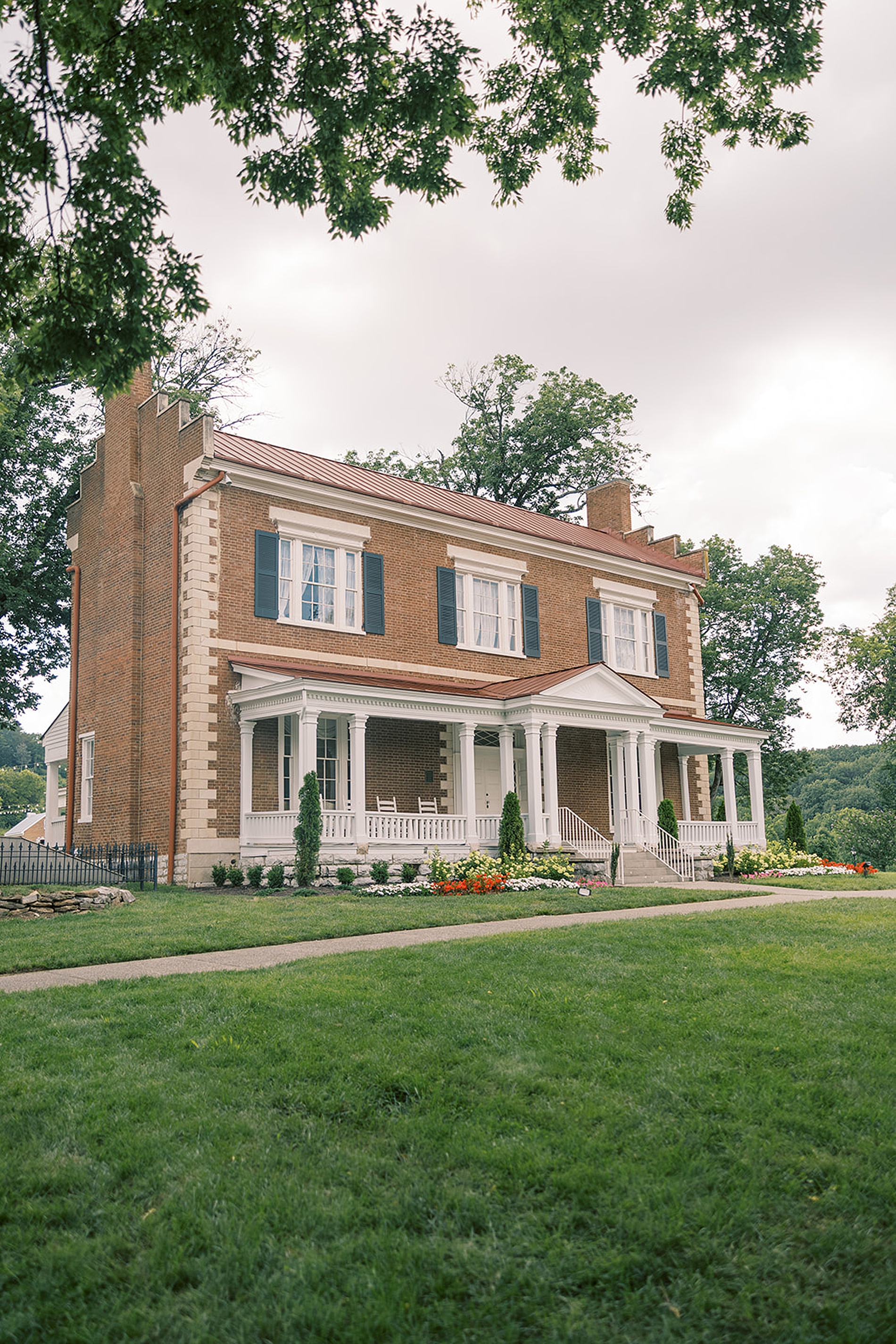
As a full-service wedding design house in Nashville, we love working with couples and planners to create wedding details that reflect each couples’ unique vision. It is such a treat to create custom pieces that tell your story, and are thoughtfully woven into your day. Lexi Jo and Landry’s artistic and colorful wedding at Belle Meade Historic Site in Nashville, Tennessee, was the perfect example of how vibrant colors and meaningful design can come together to create something truly beautiful and unforgettable.
Sherbet Hues and Hand-Painted Details
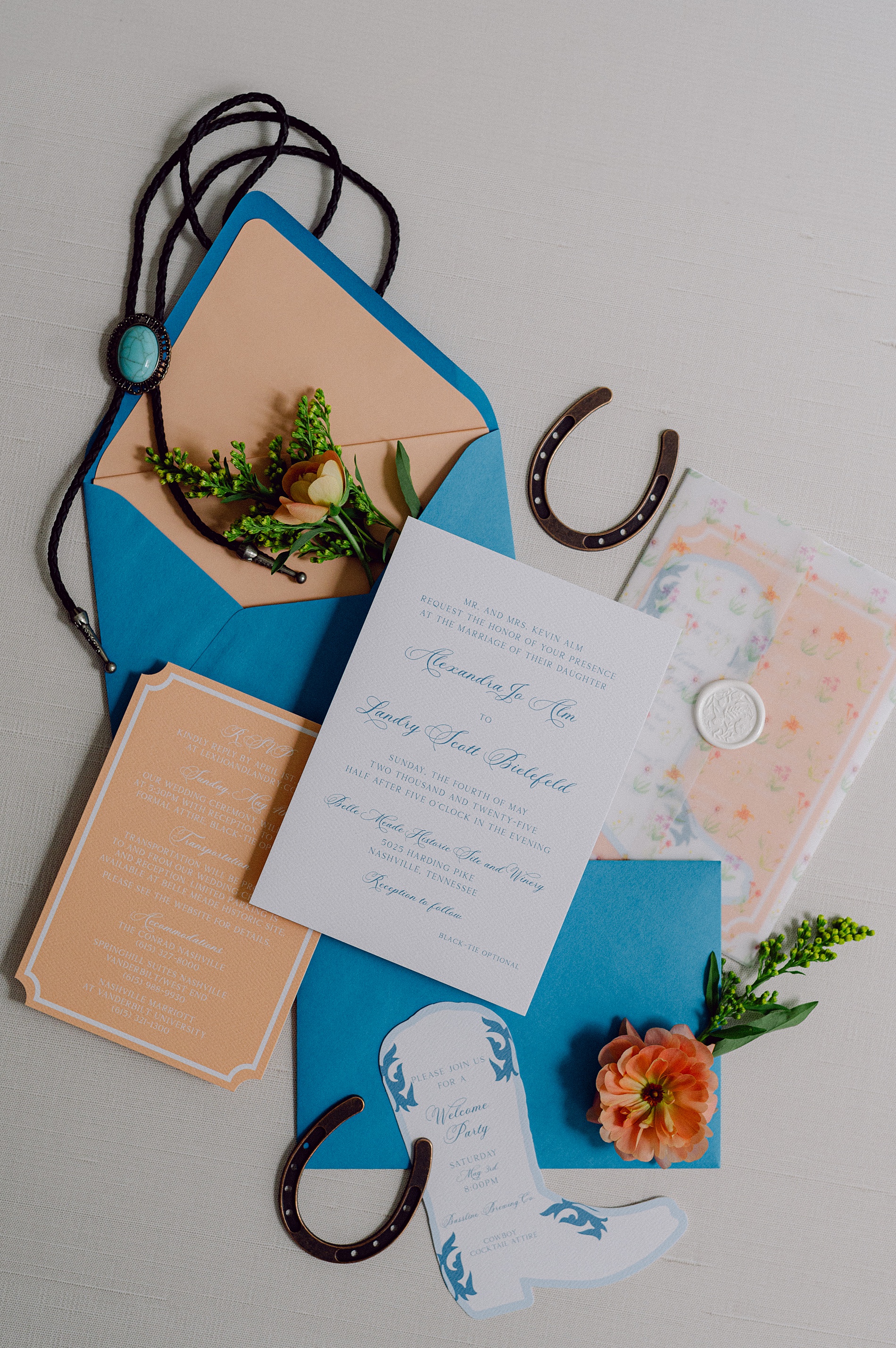
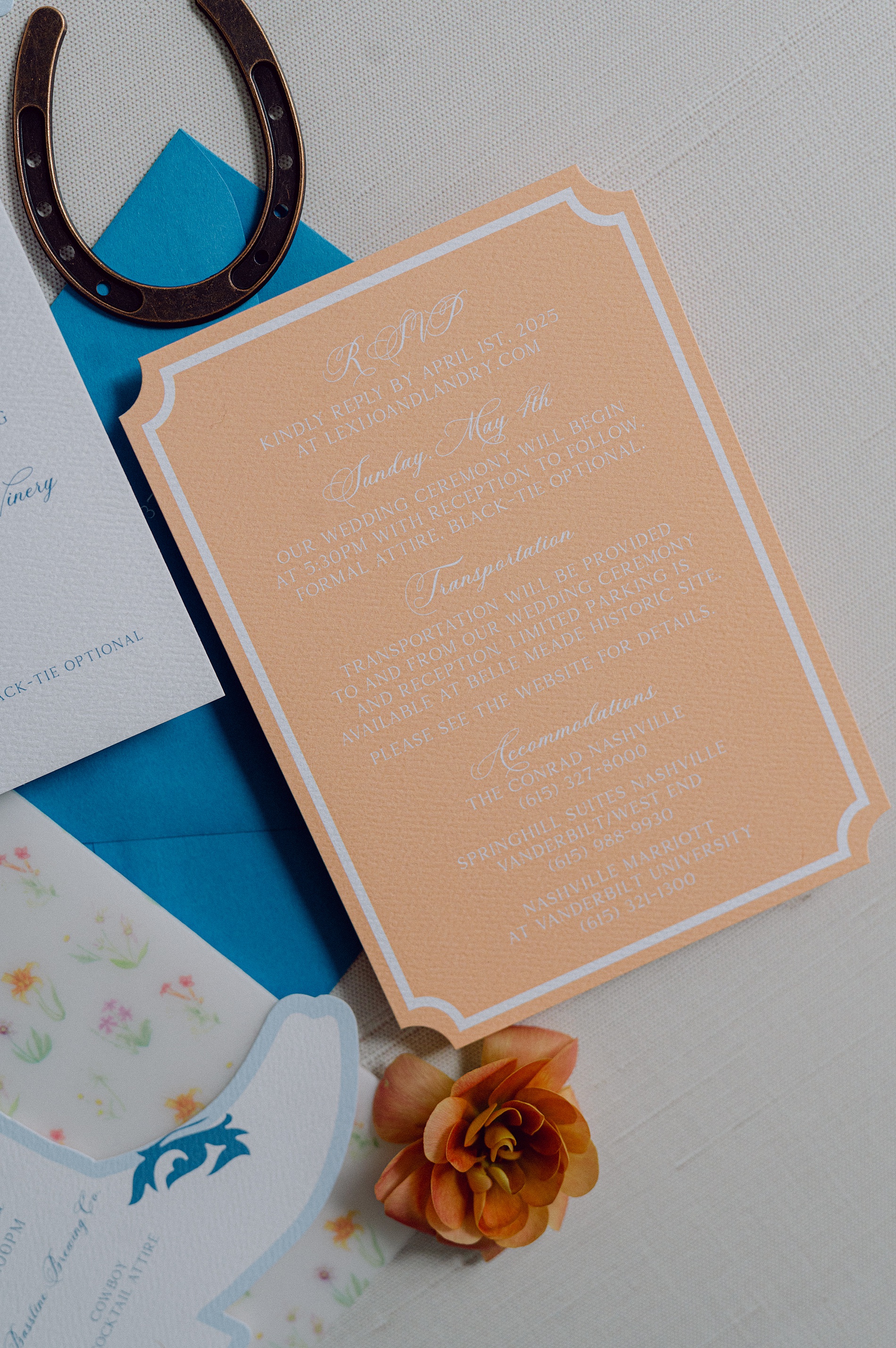
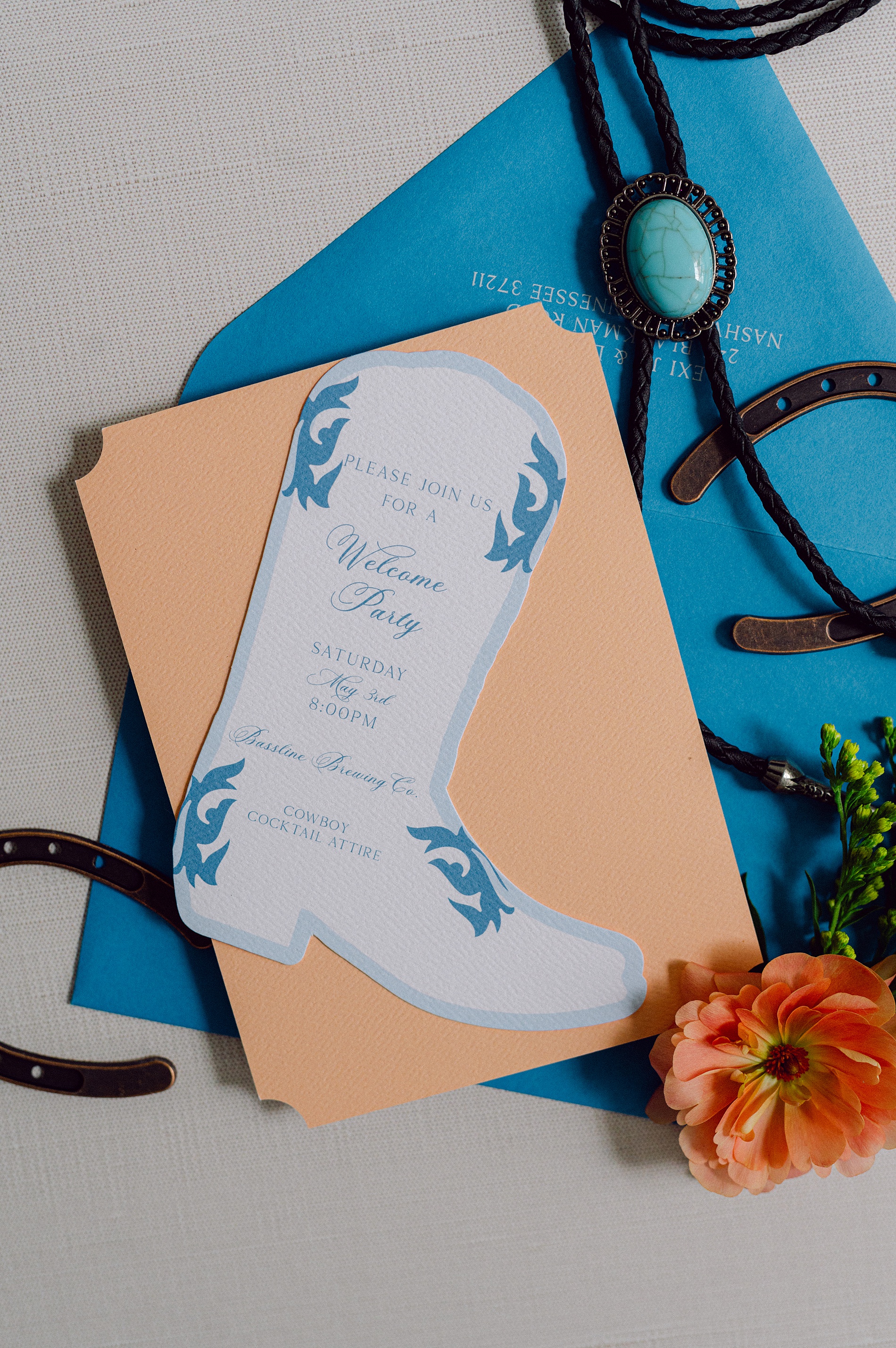
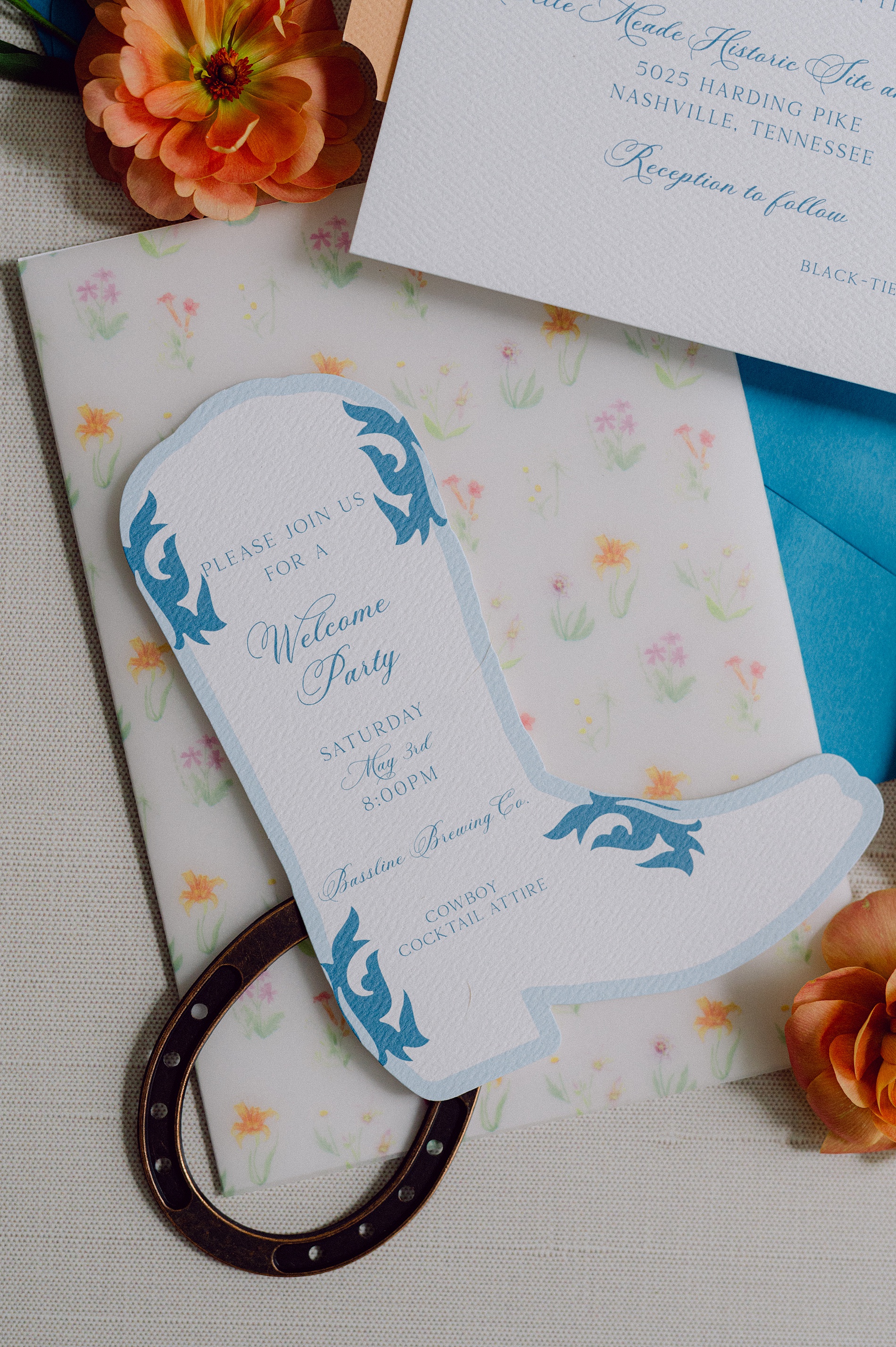
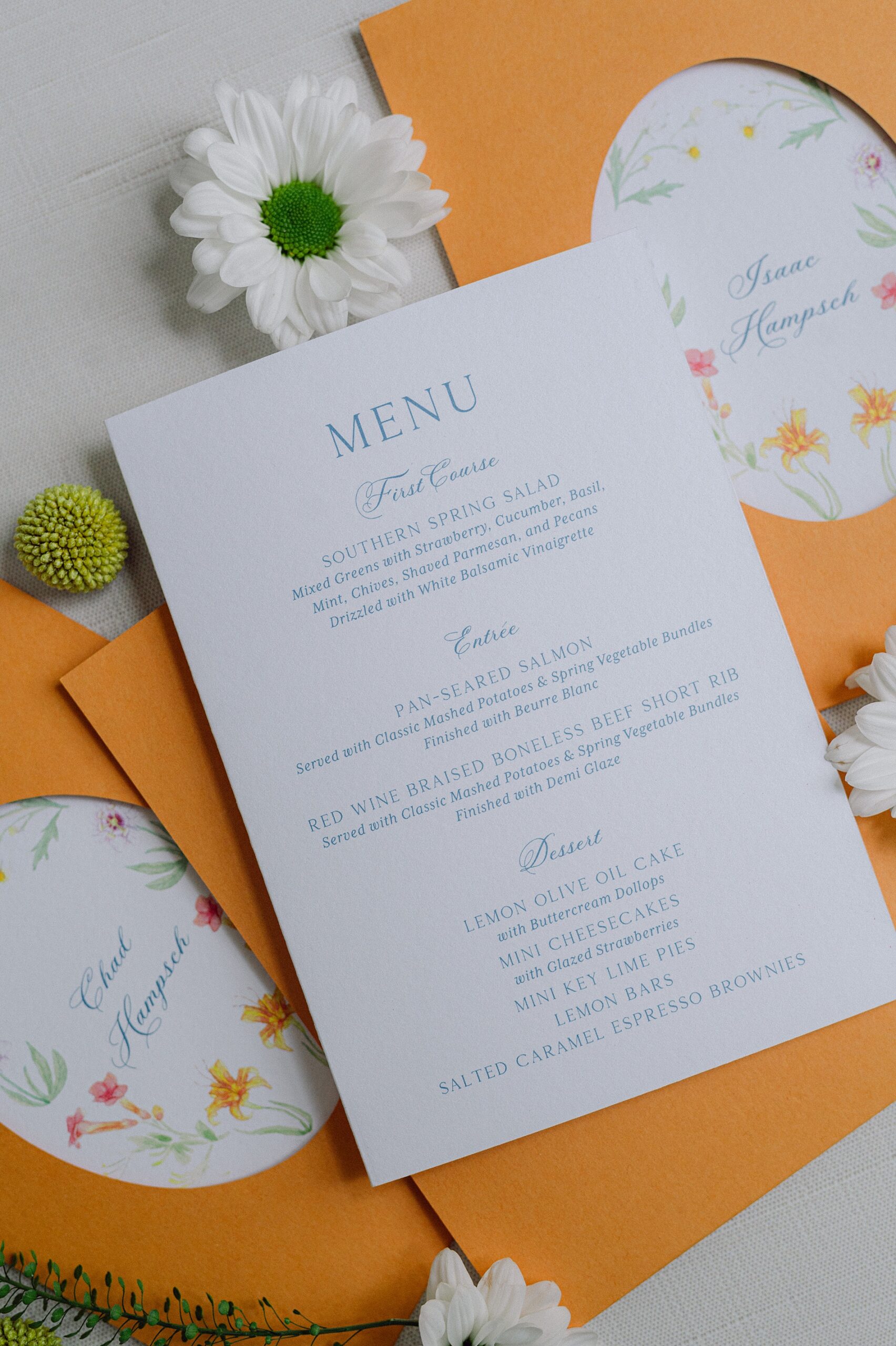
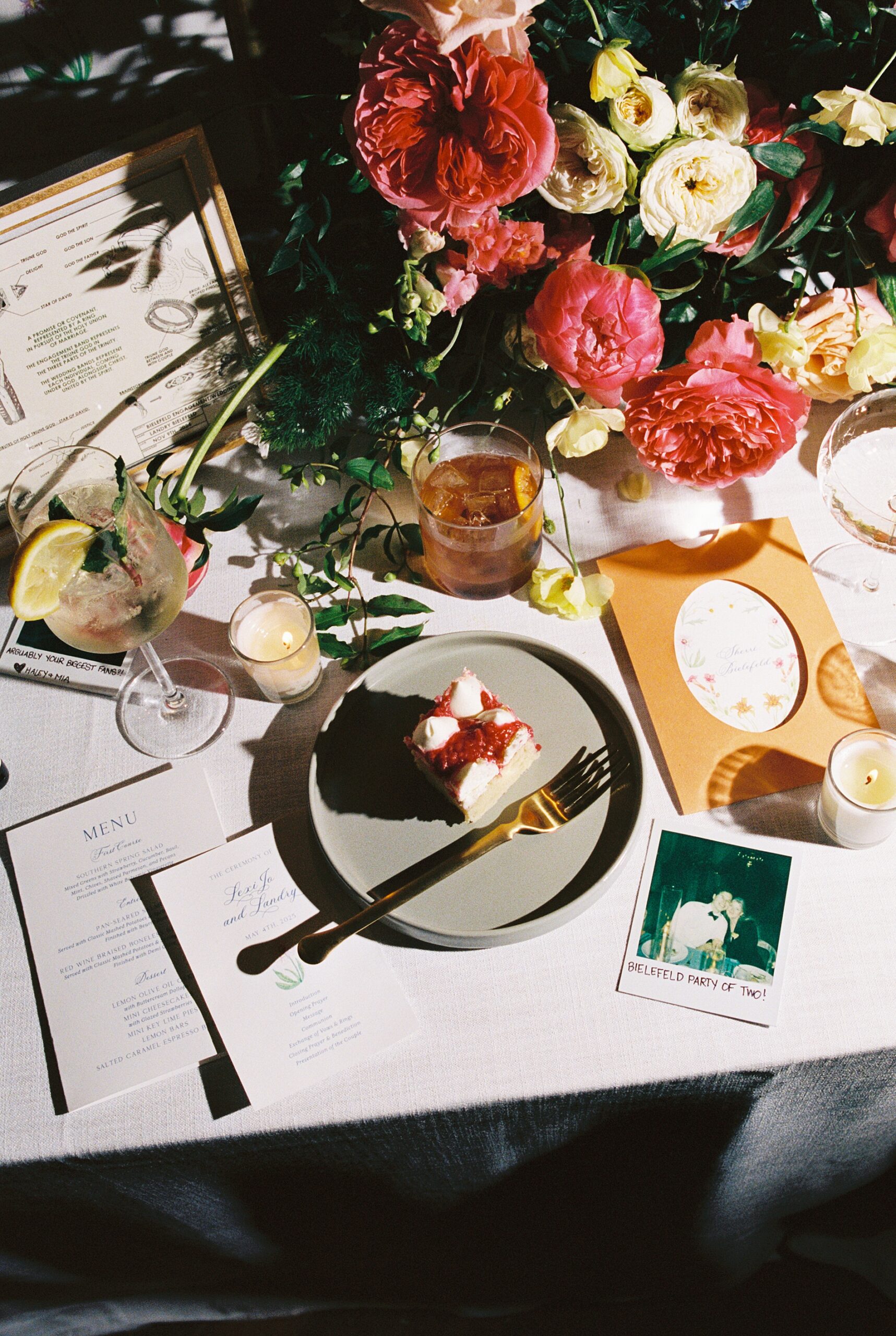
Their wedding invitations were one-of-a-kind. The main invite was both elegant and southern in style with white card stock and blue calligraphy. Then there was the cowboy boot-shaped welcome party piece, which hinted at the fun cowboy cocktail dress code. It was playful, memorable, and full of personality just like the couple! This was the perfect base for the pop of sherbet orange on the rsvp and wedding details card. The combination of white and blue, and the creamy orange hue were carried throughout the day.
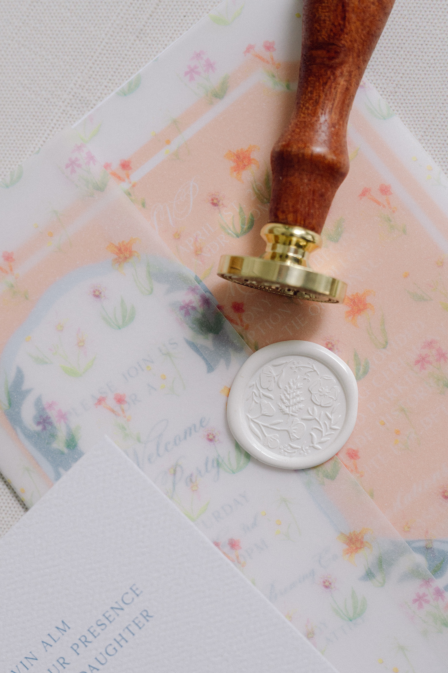
However, our favorite moment of this suite was the groom’s hand-painted floral artwork that was included on the vellum overlay (as well as many other wedding details) that held all the paper pieces together with a wax seal.
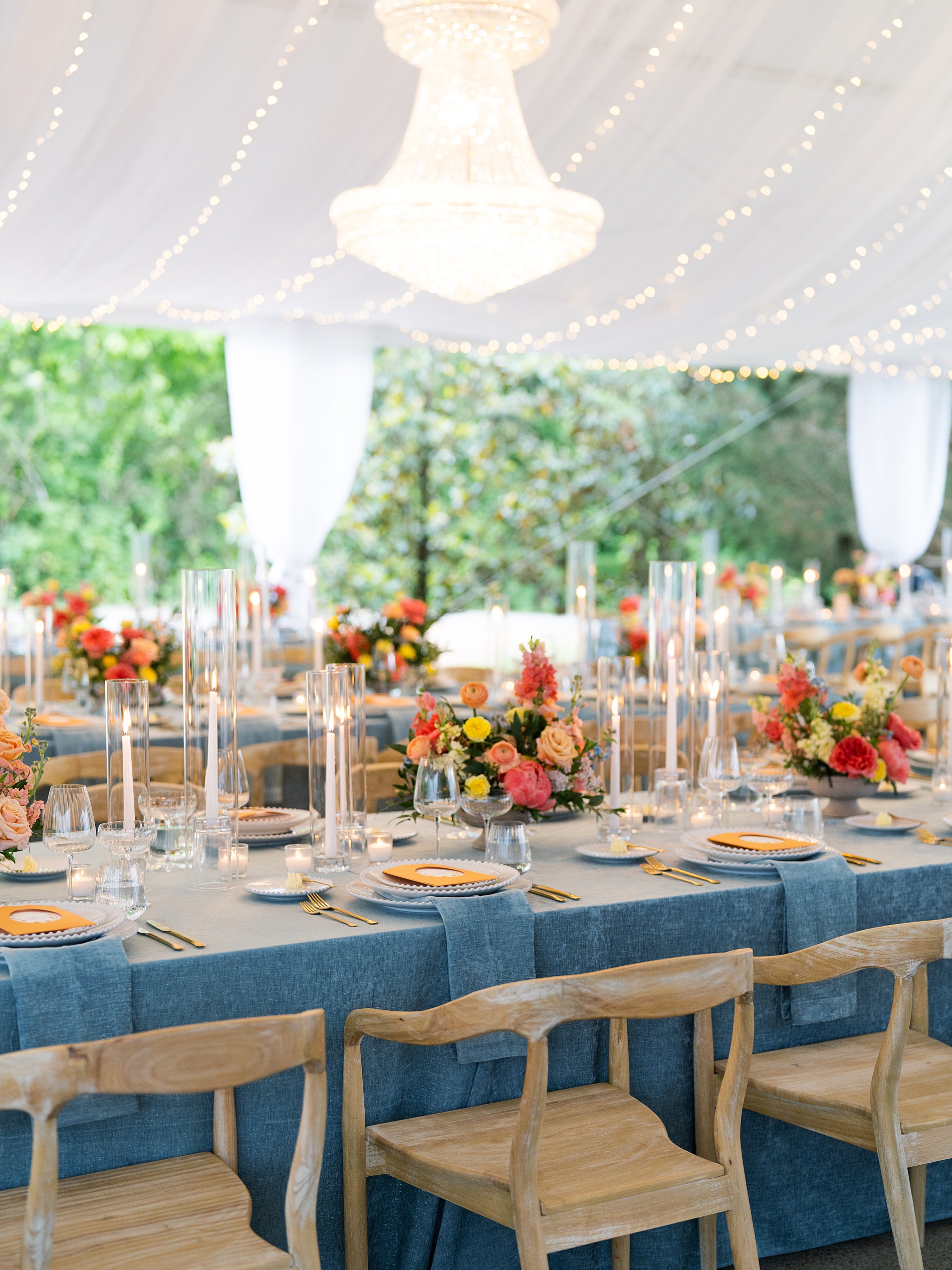
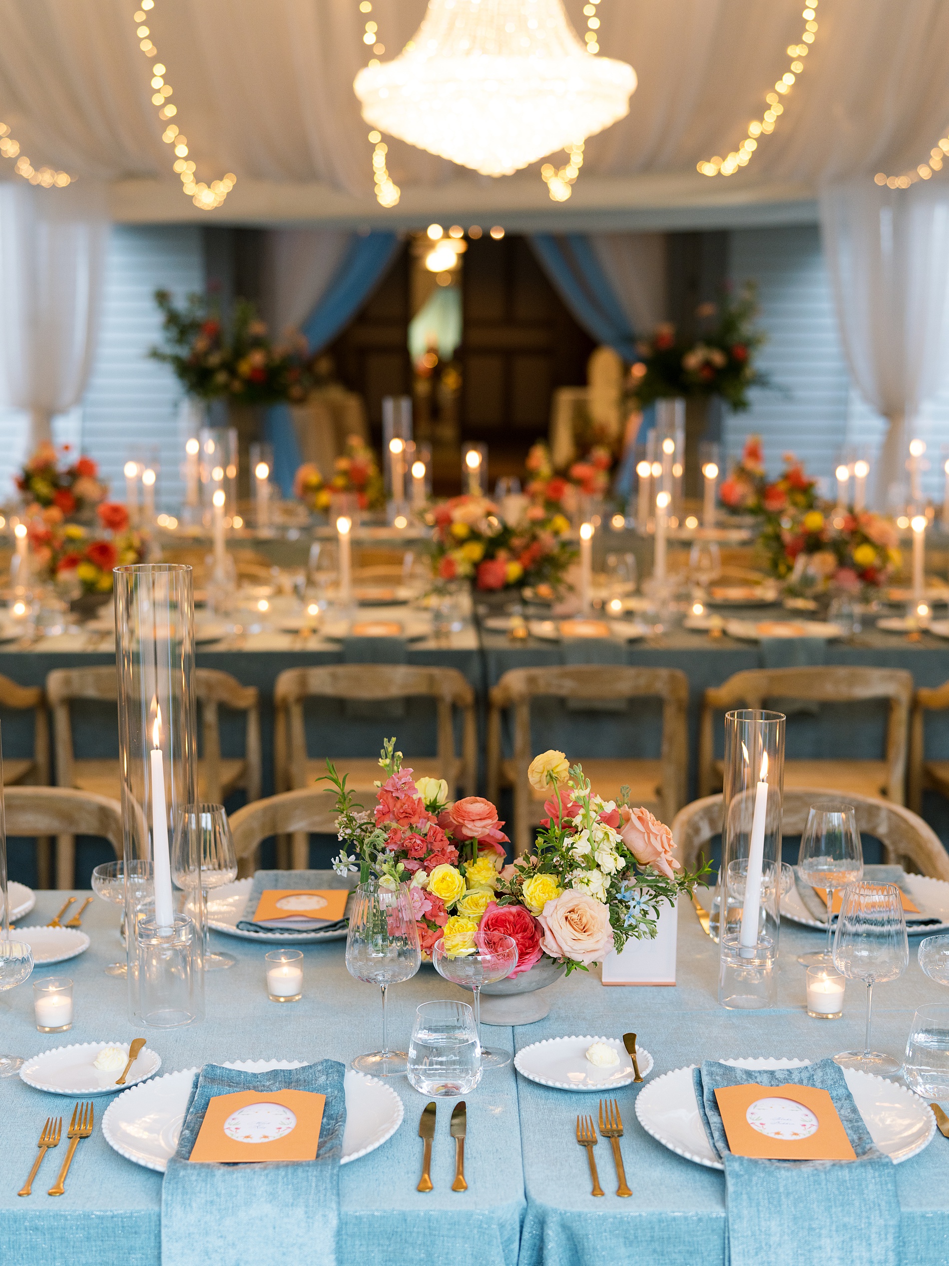
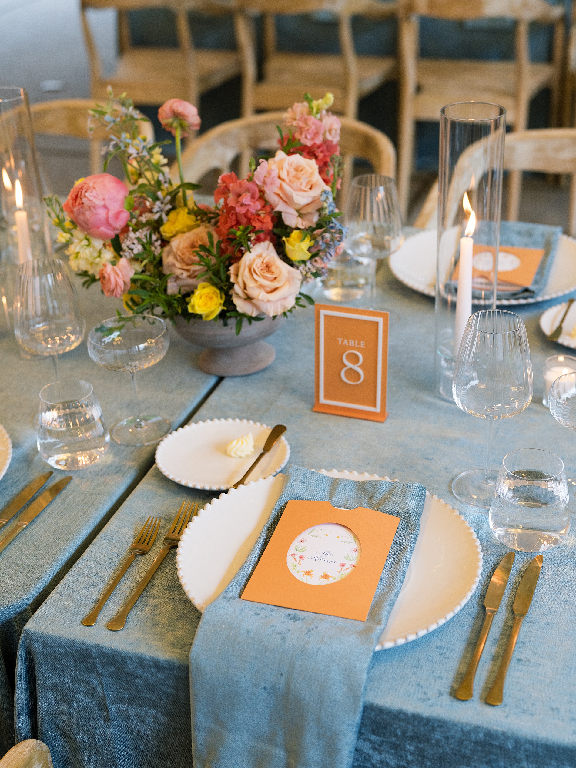
Day-of Details That Brought the Color Palette to Life
The celebration continued with colorful, cohesive paper goods that carried their sherbet-toned color palette and floral focused design into every space.
Wedding Welcome Sign
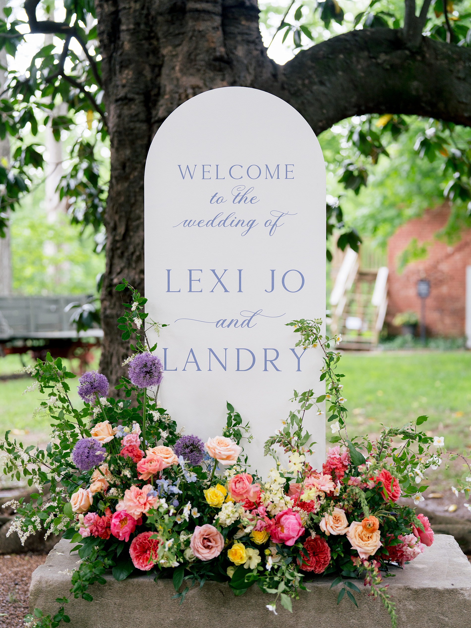
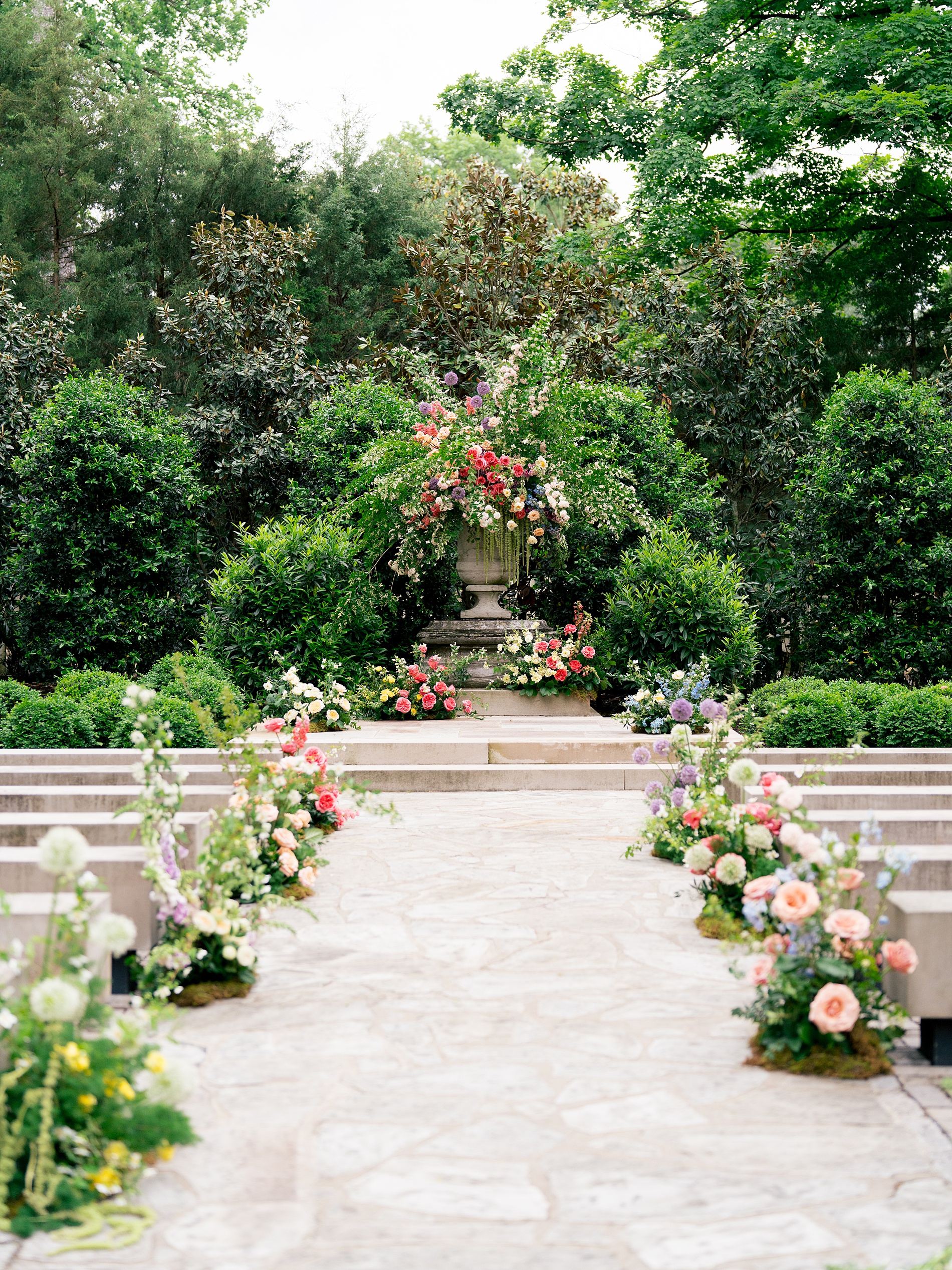
A white, rounded welcome sign featuring Southern-inspired blue calligraphy greeted guests, framed by a stunning floral arrangement bursting with vibrant pinks, purples, and oranges. As guests entered the outdoor ceremony site covered in gorgeous florals they could pick up a wedding program. We designed the programs on classic white paper with blue calligraphy and a floral element from the suite brought a cohesive and elegant finishing touch to the ceremony space.
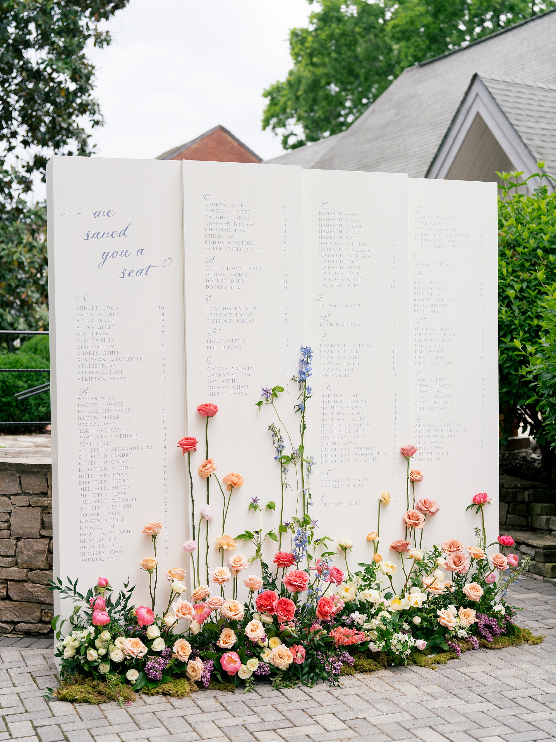
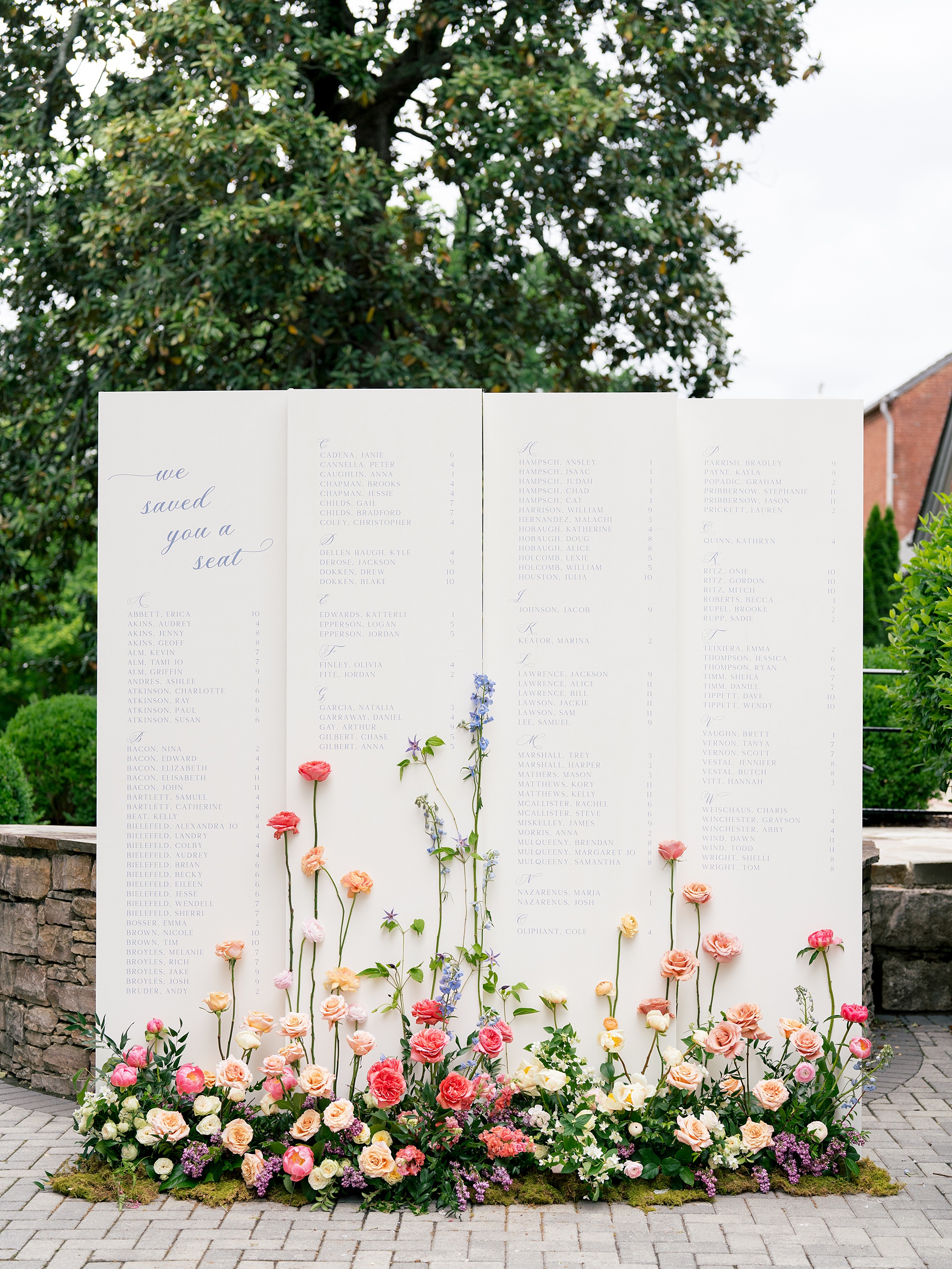
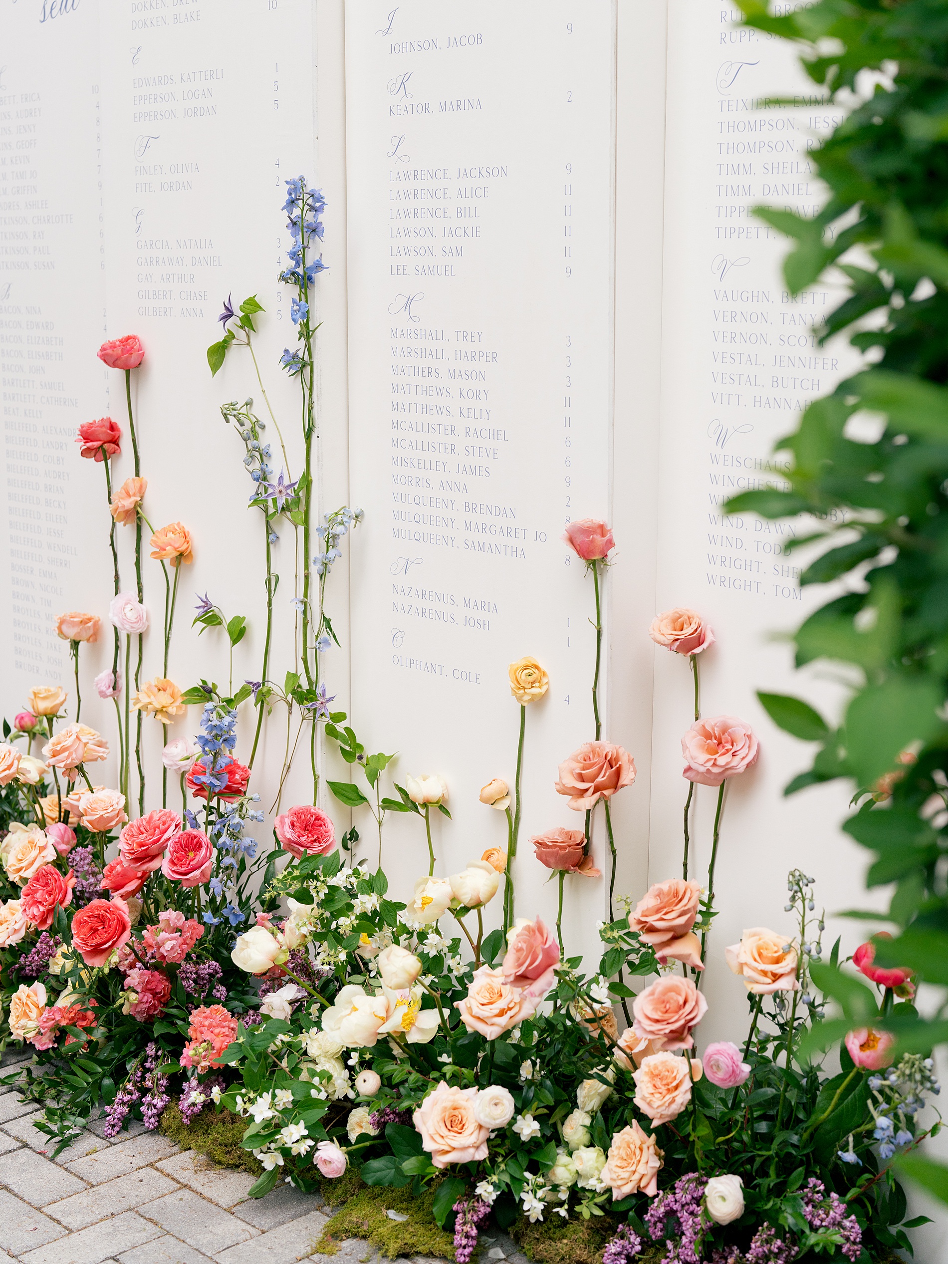
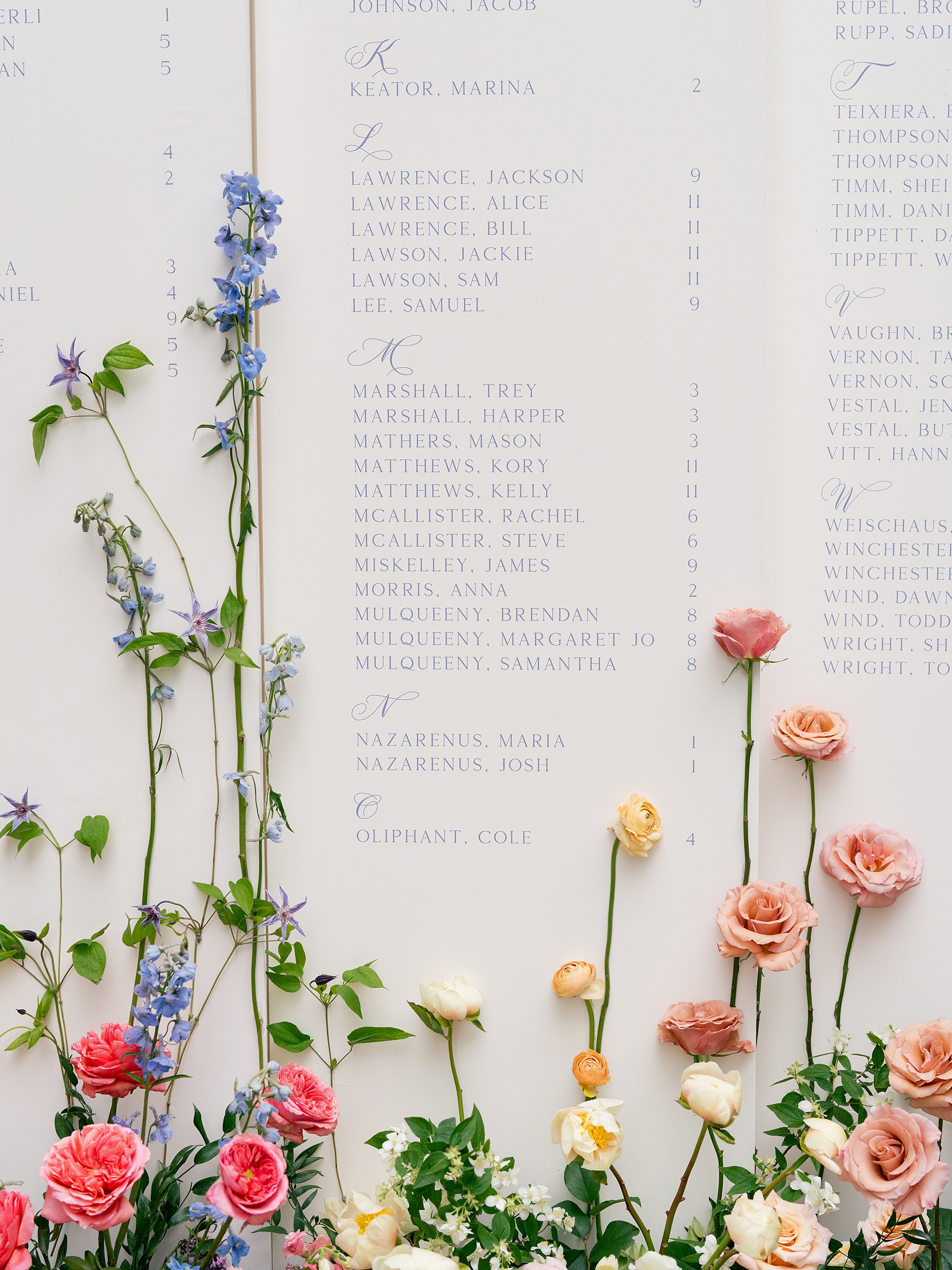
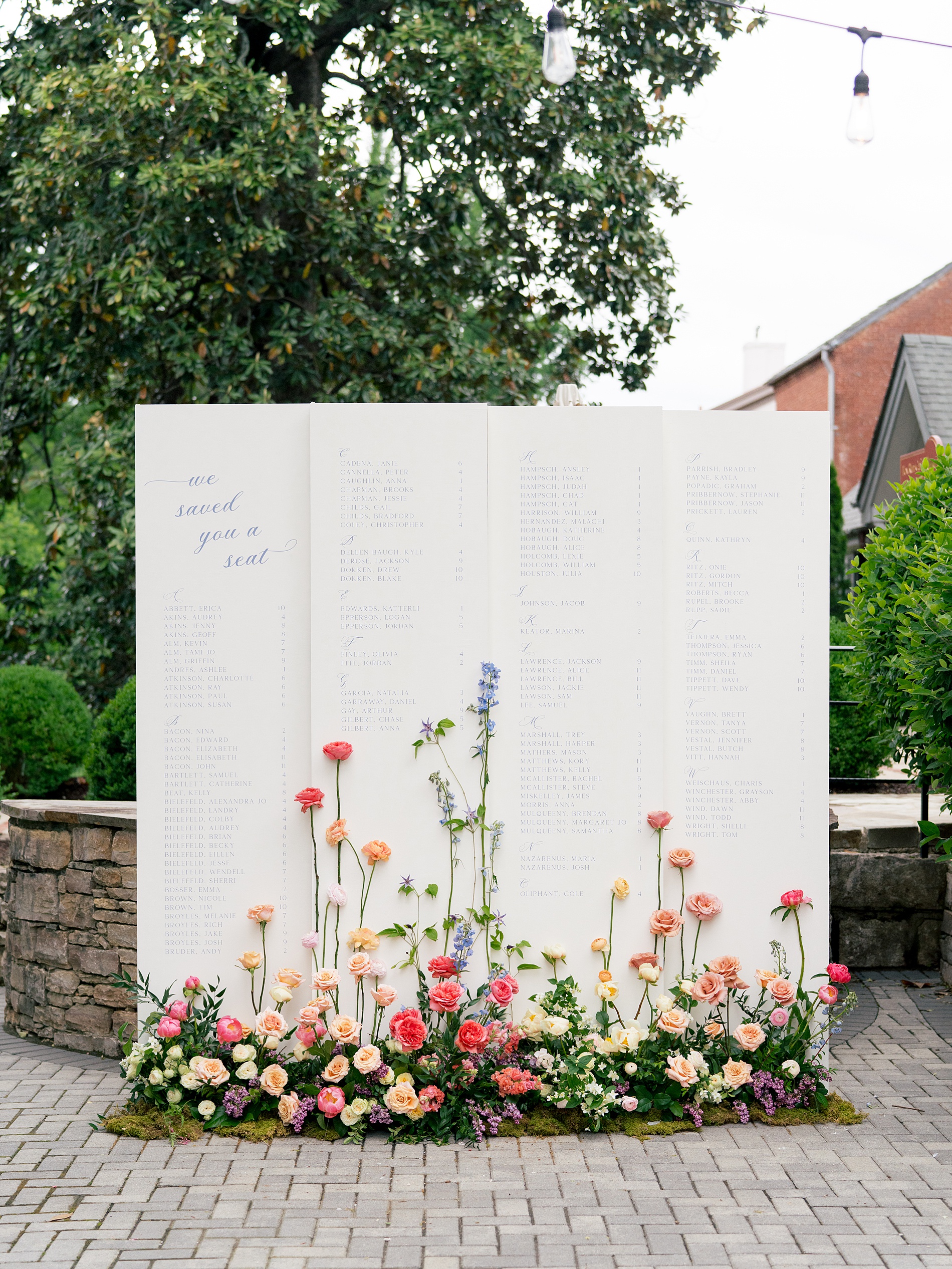
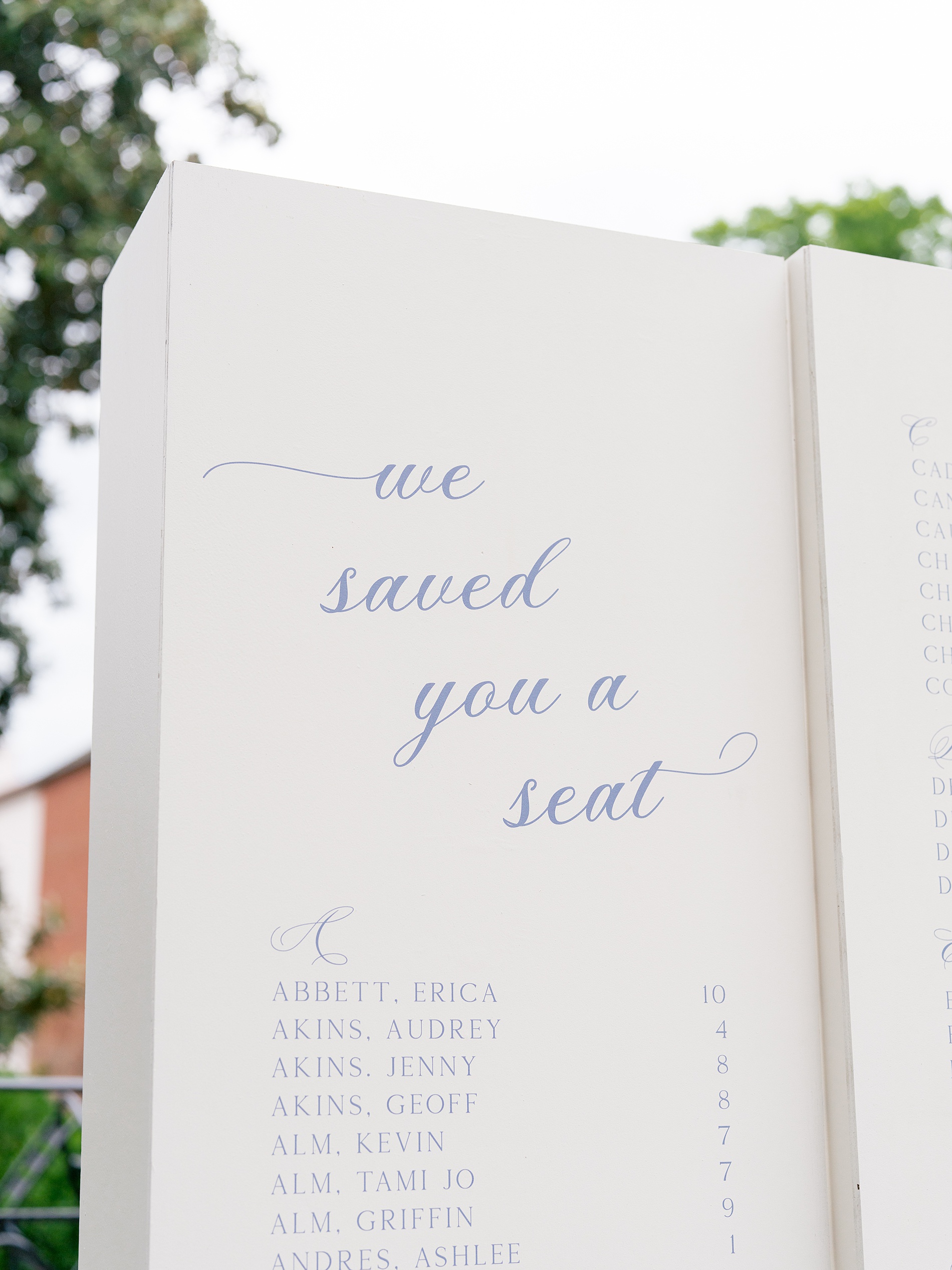
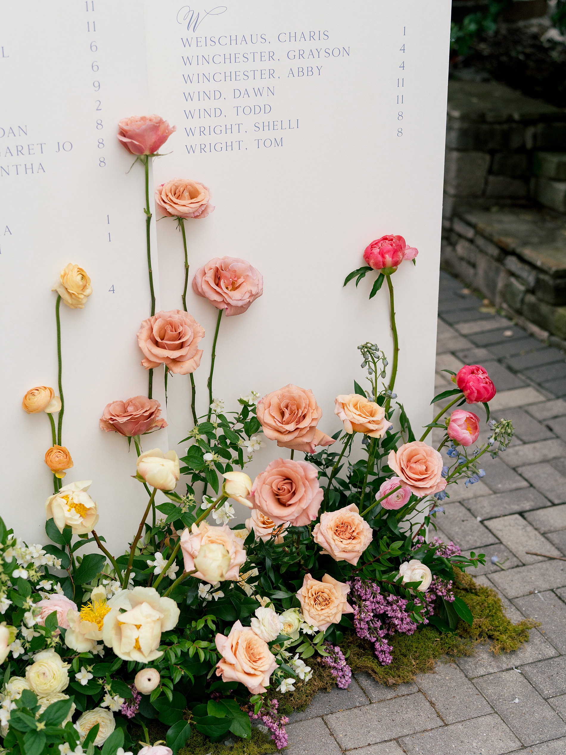
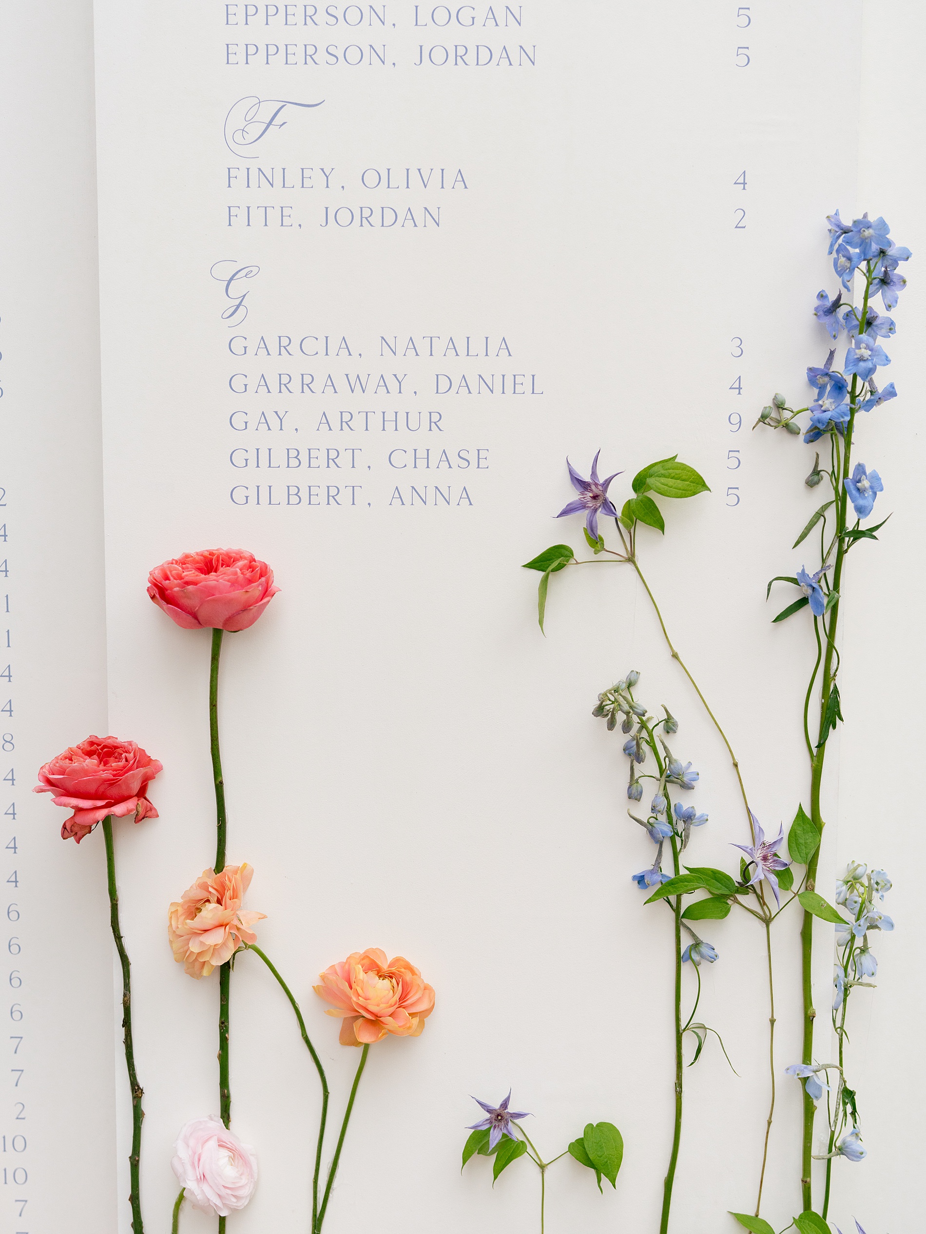
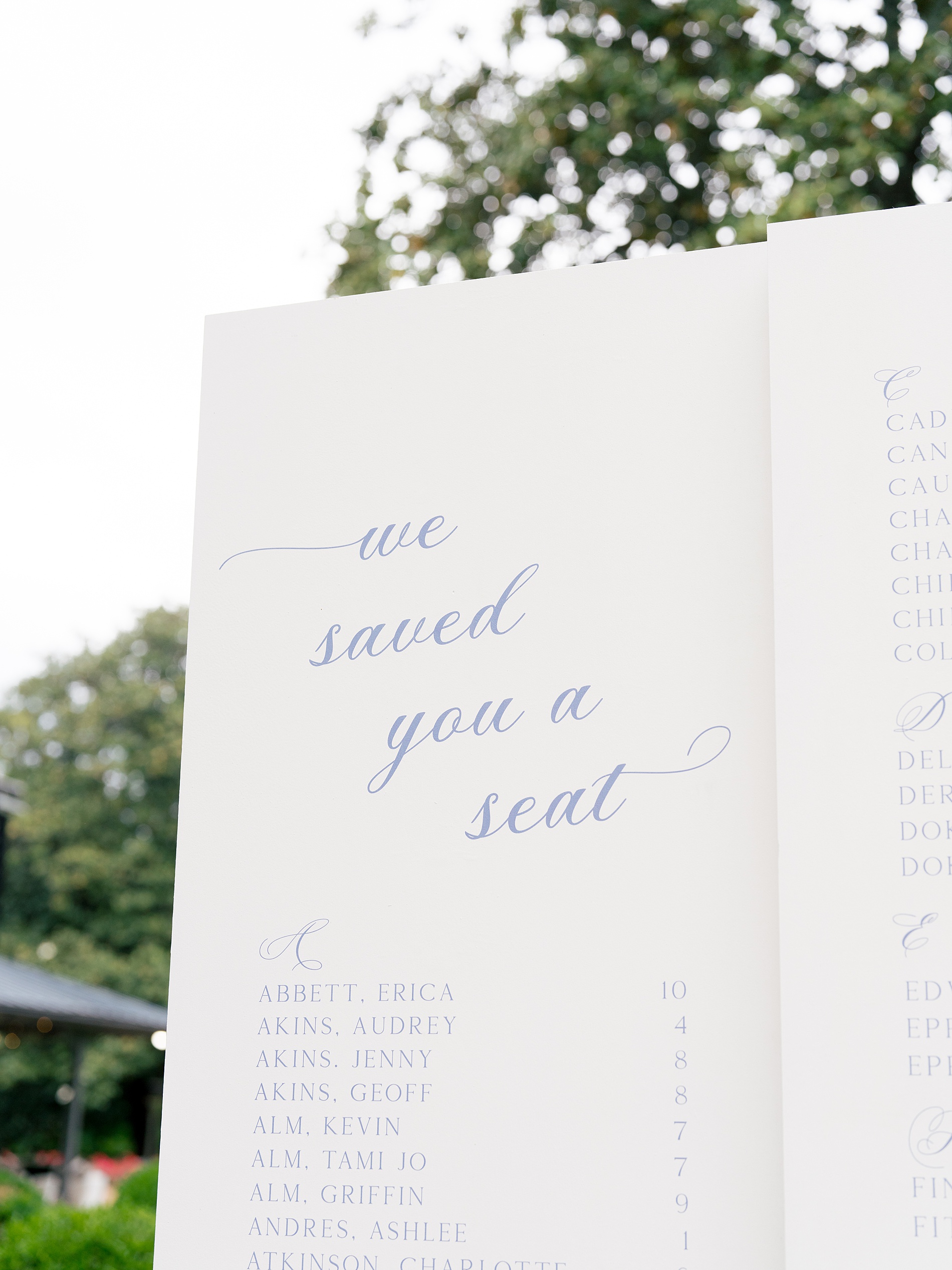
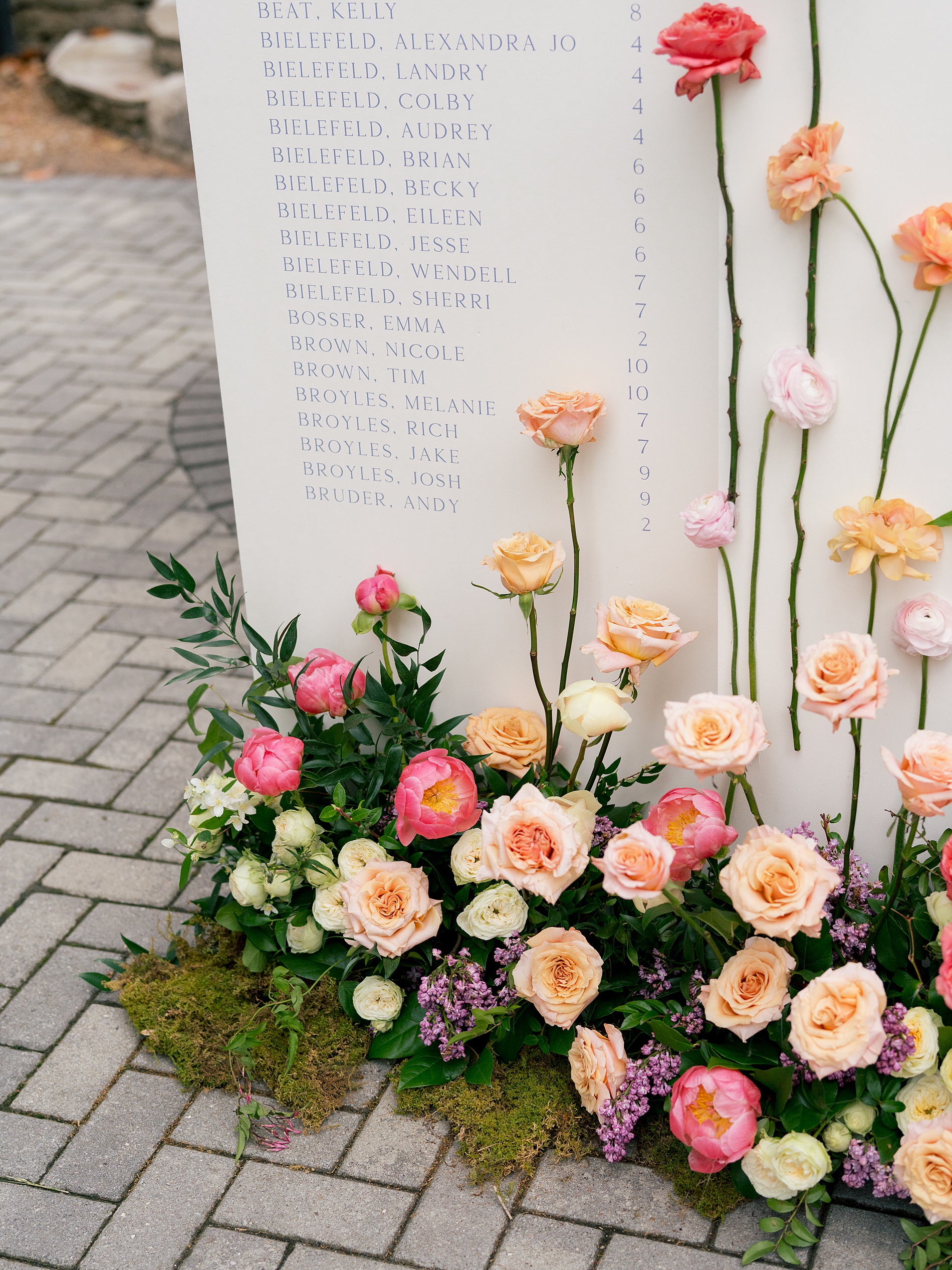
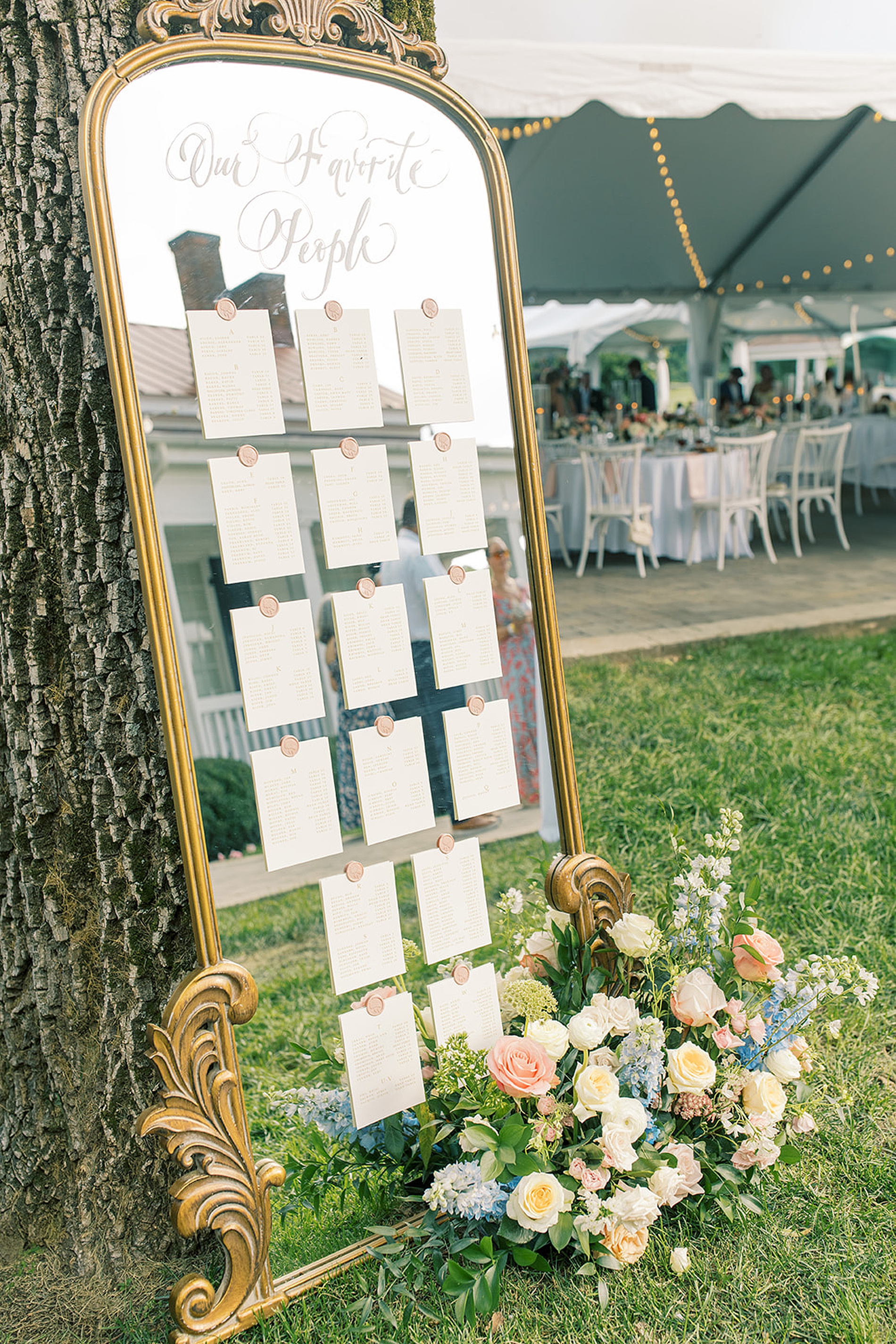
Elegant Seating Chart
The seating chart was a show-stopping display and one of my favorite details. The display featured soft blue lettering on a white background that had a 3D effect with stunning florals arranged at the base. The mix of low florals and tall stemmed blooms created a romantic, layered look that perfectly complemented the venue’s charm.
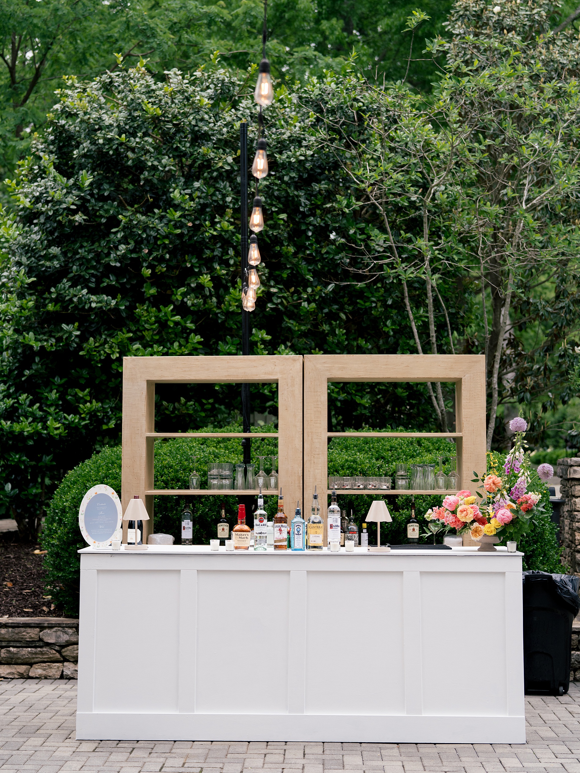
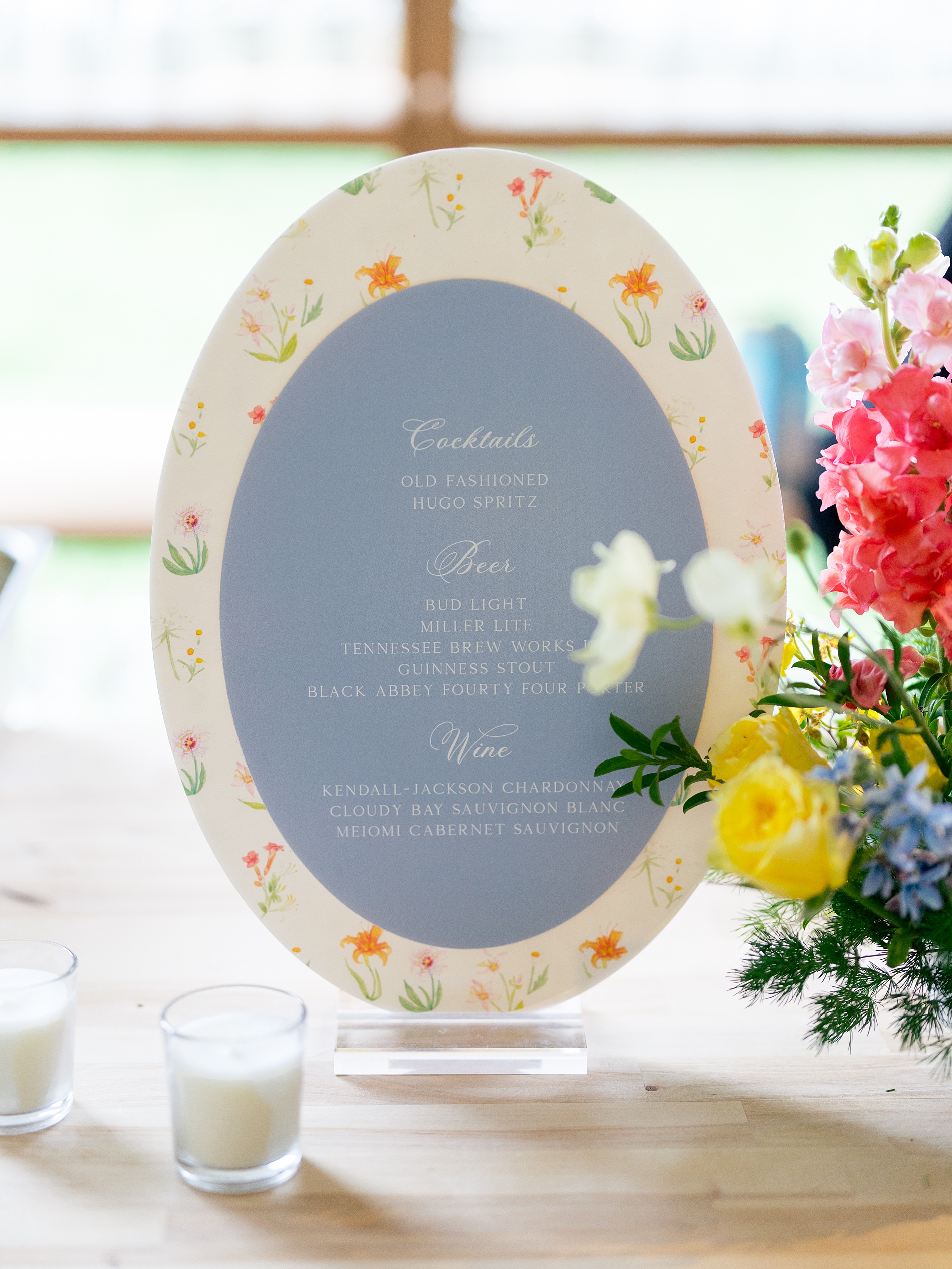
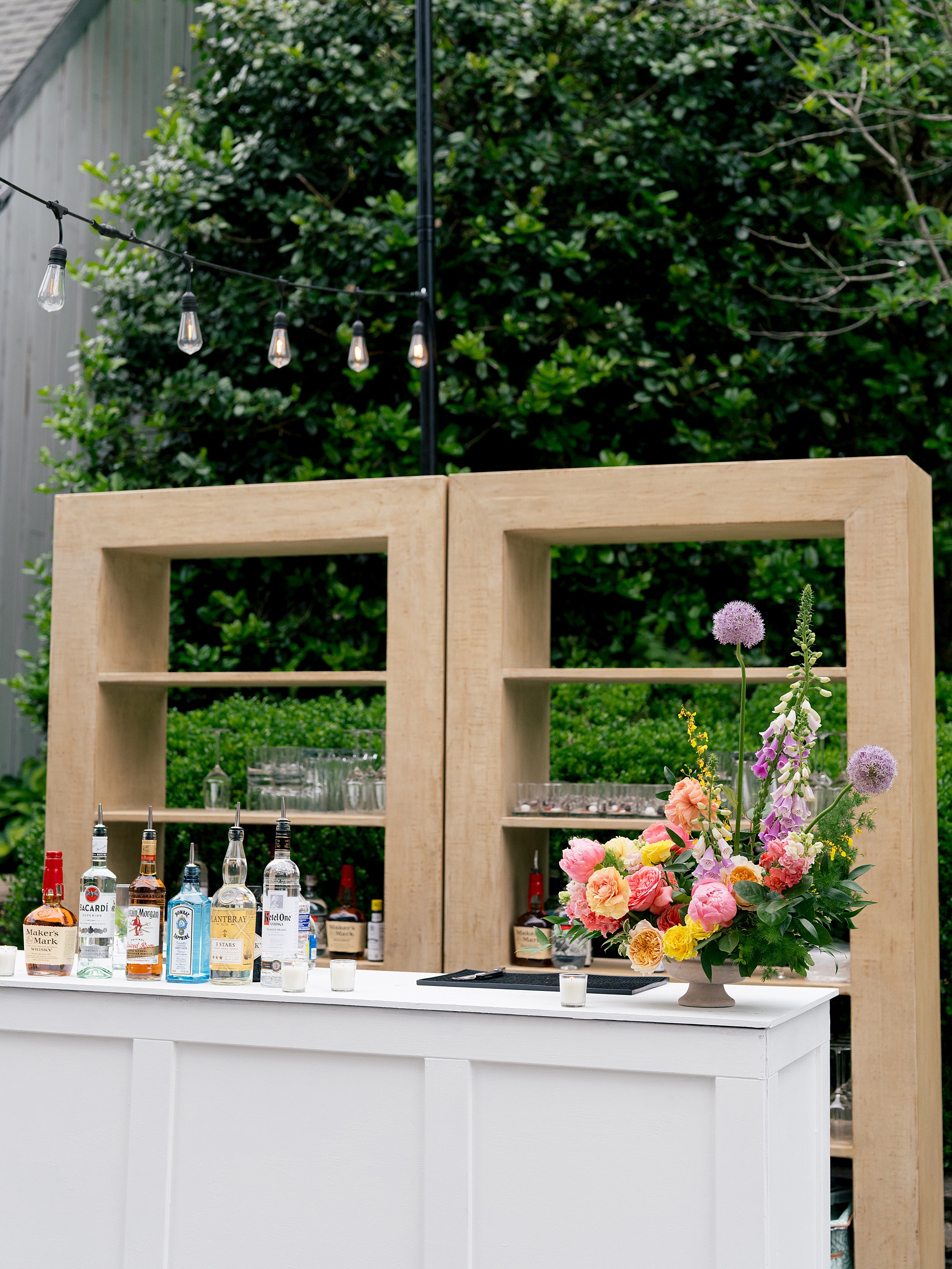
Bar Sign
We created an oval bar sign in steel blue, with white calligraphy framed by the same floral border from the invitation art. This visual tie-in made the entire event feel thoughtfully styled.
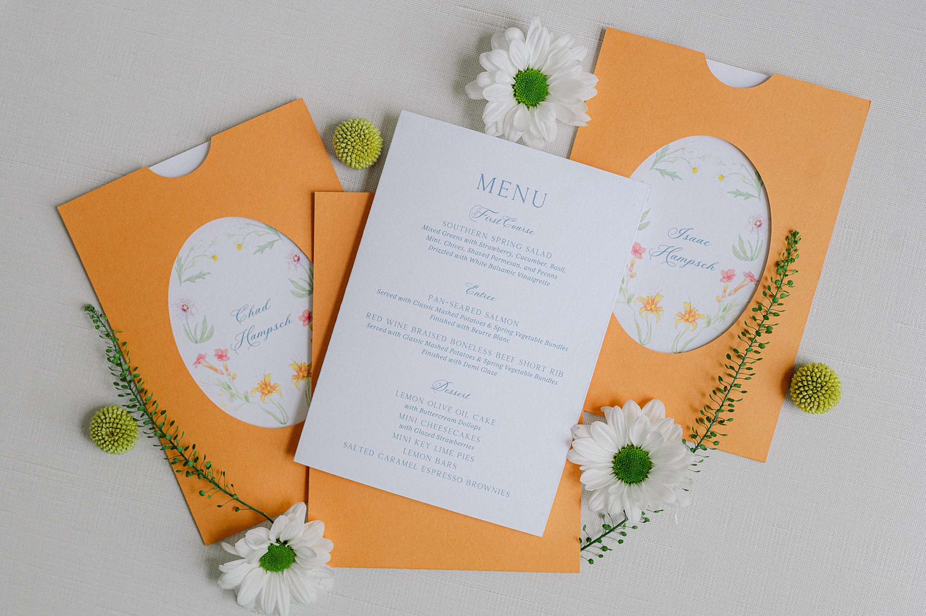
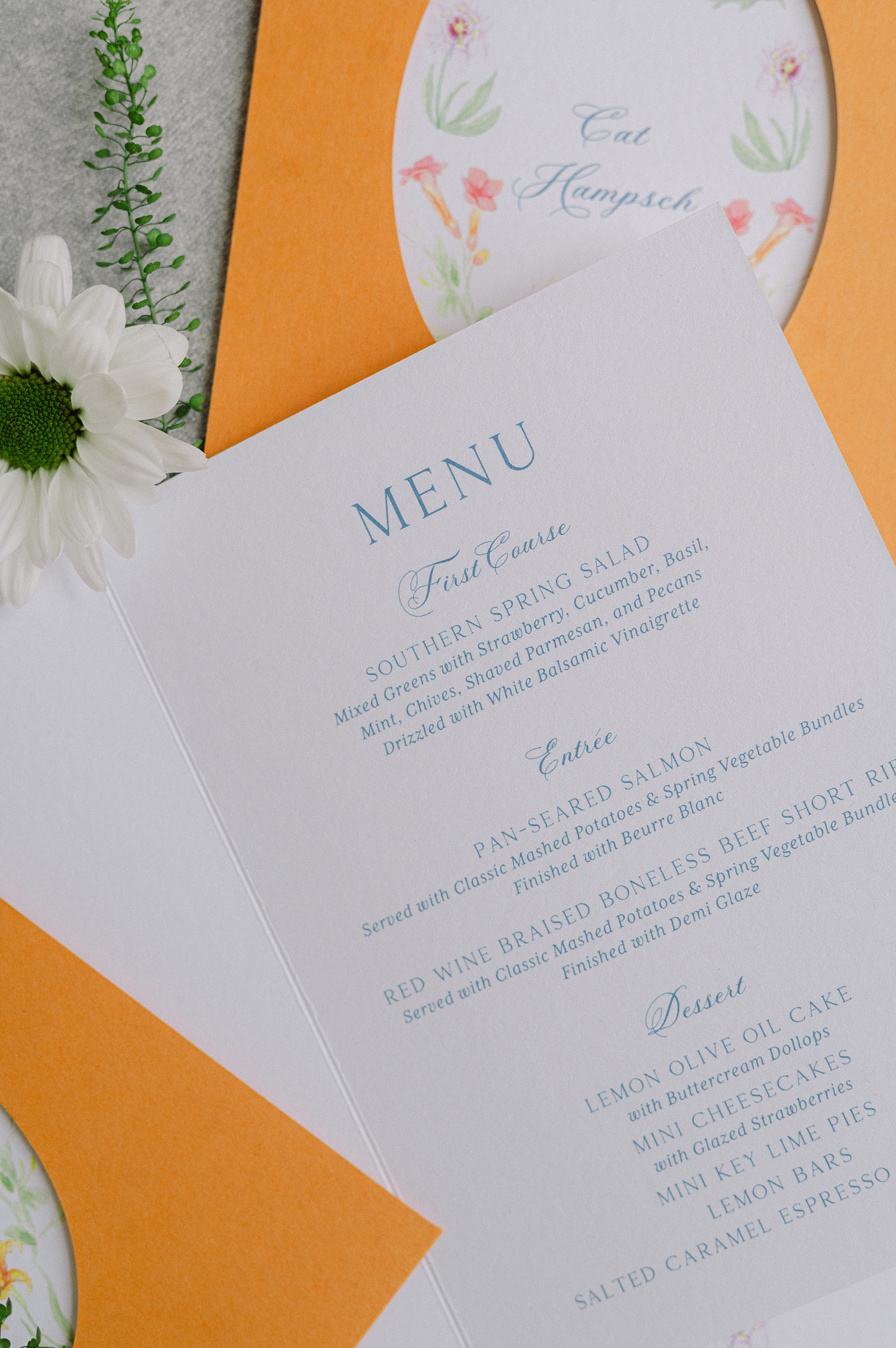
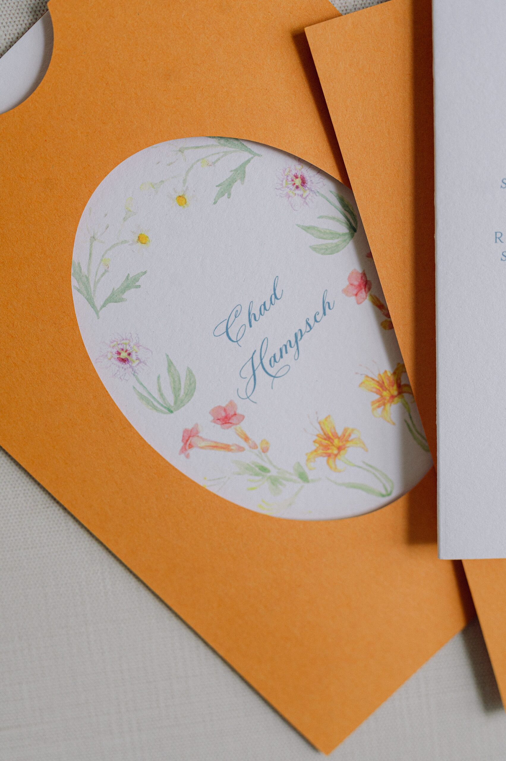
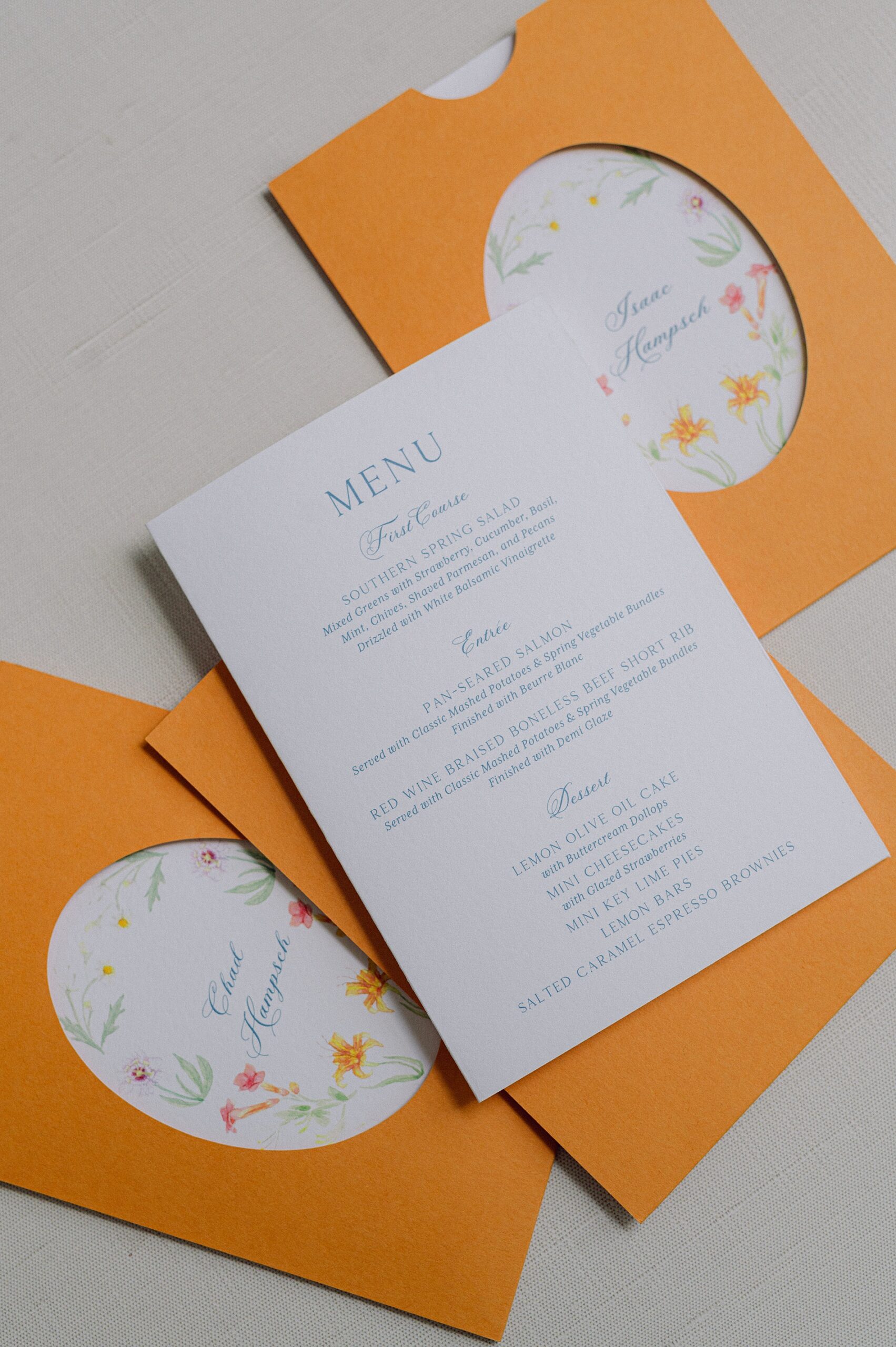
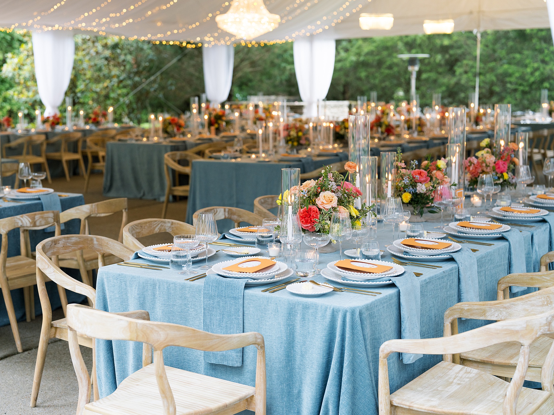
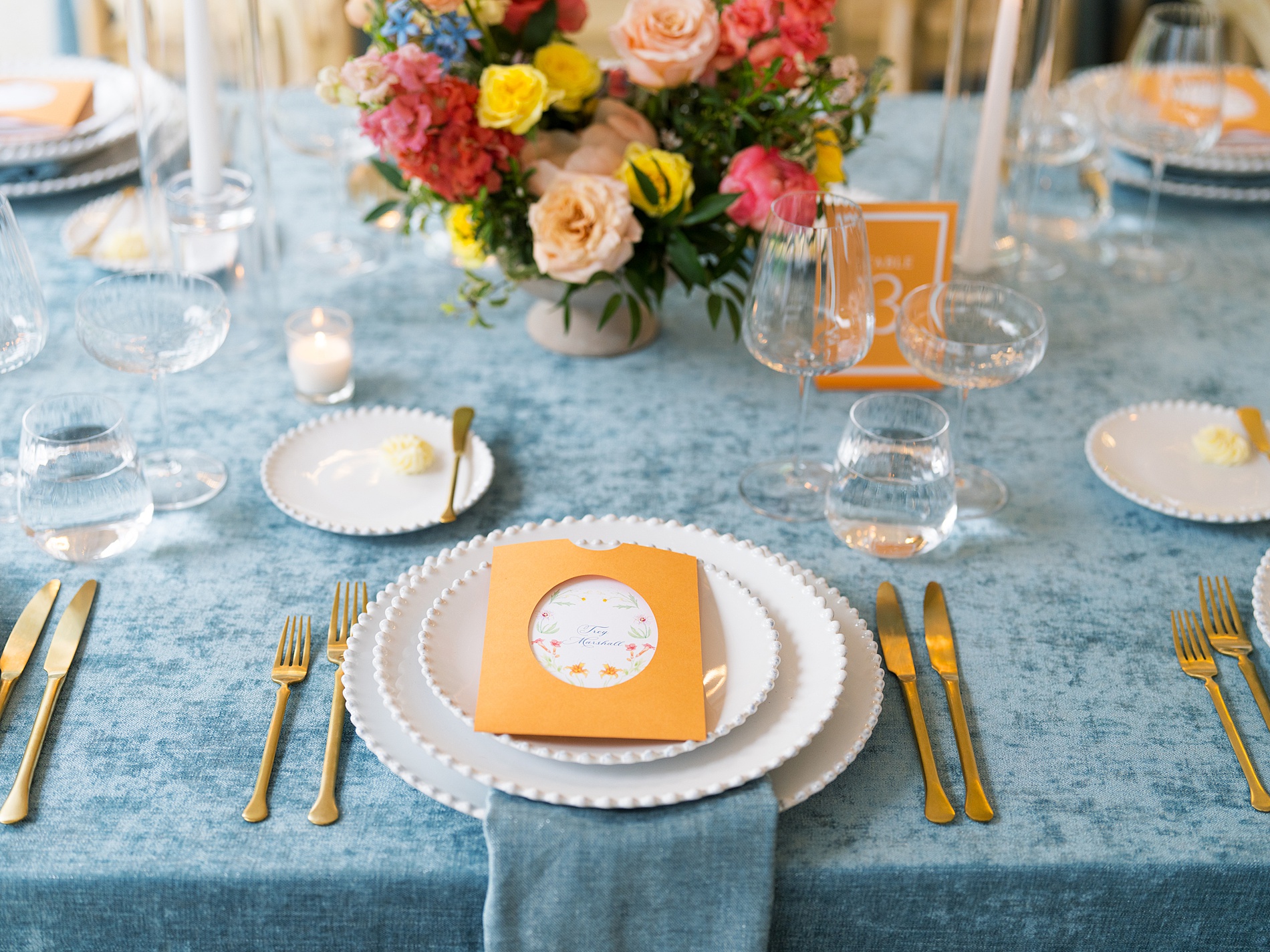
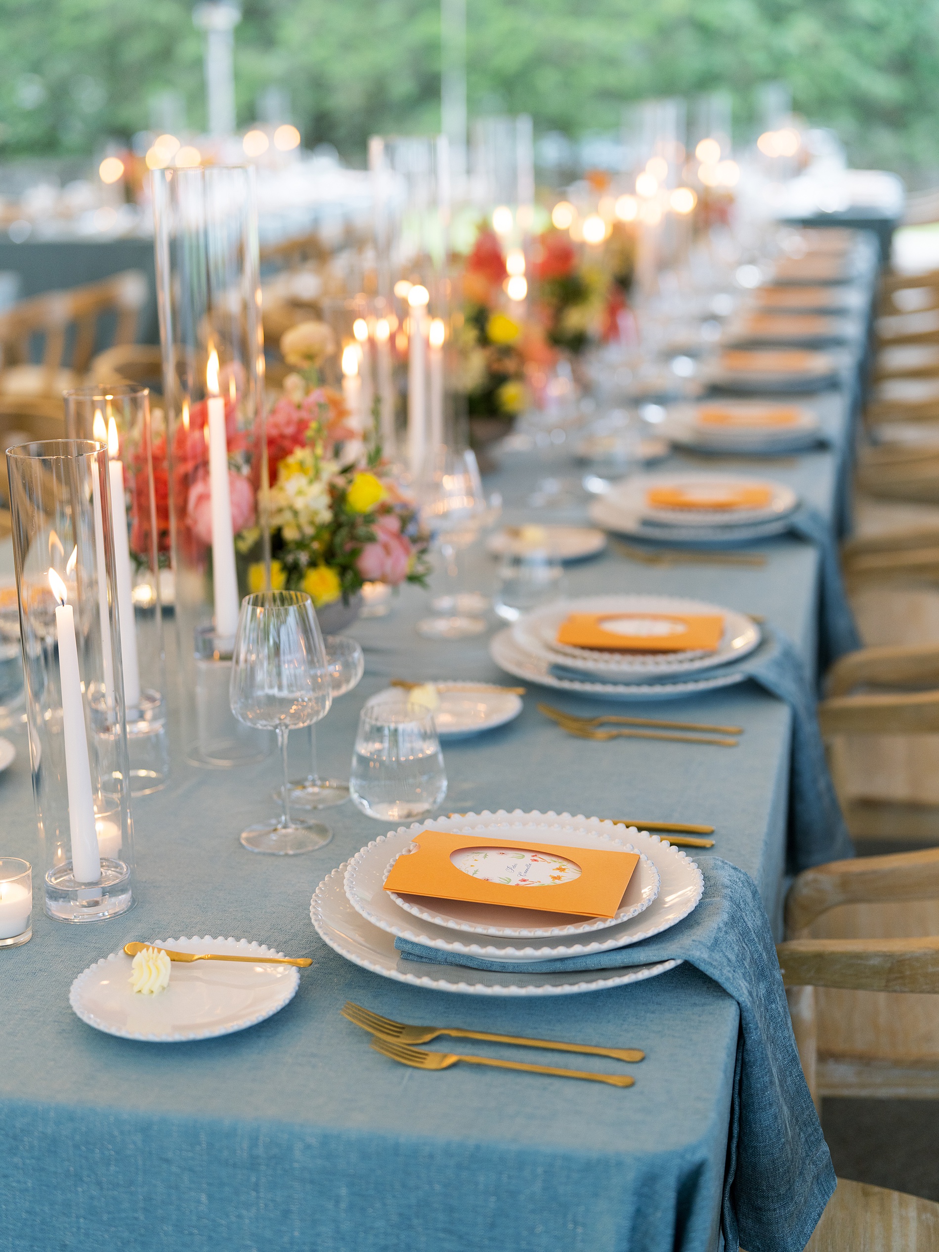
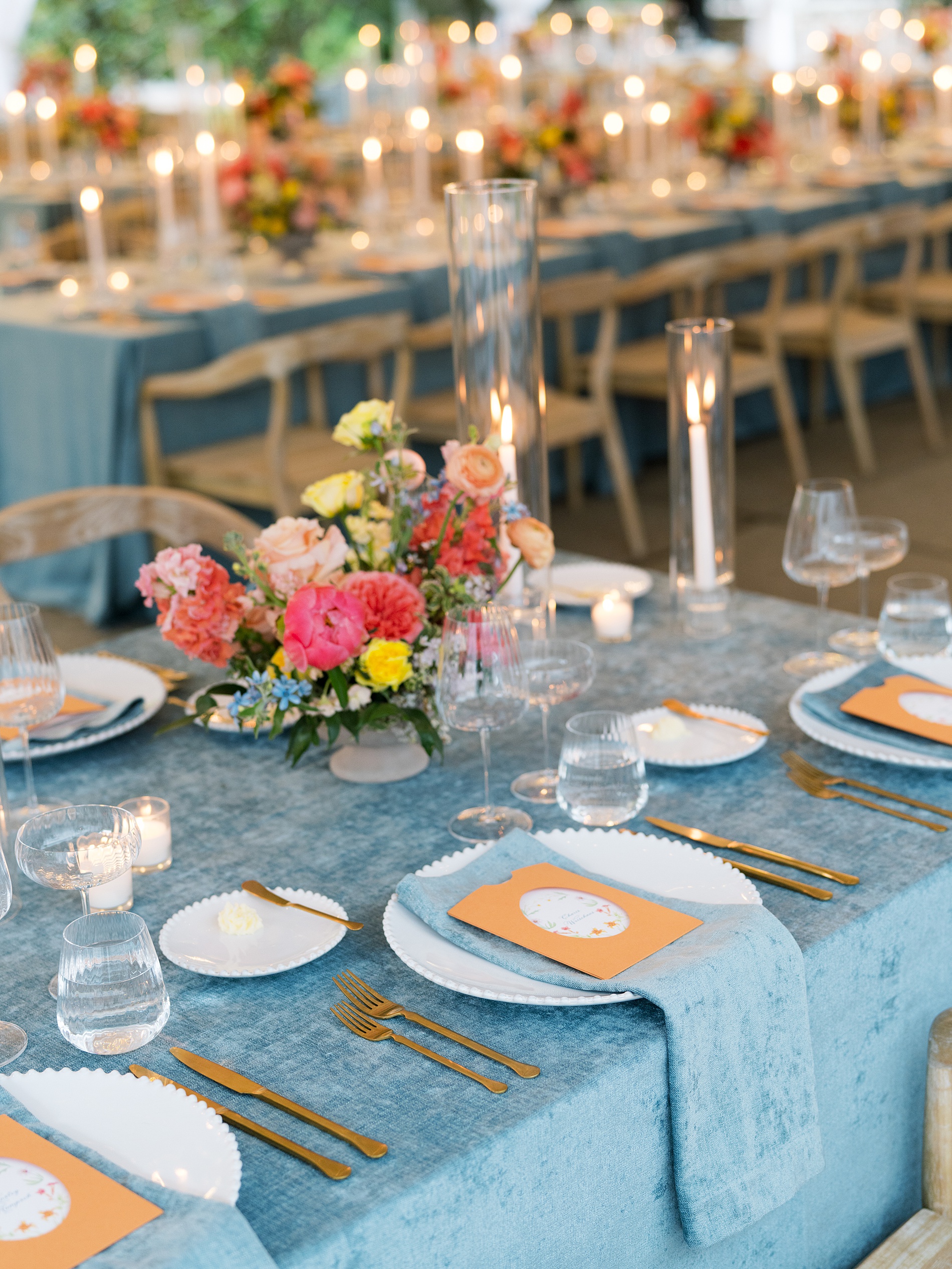
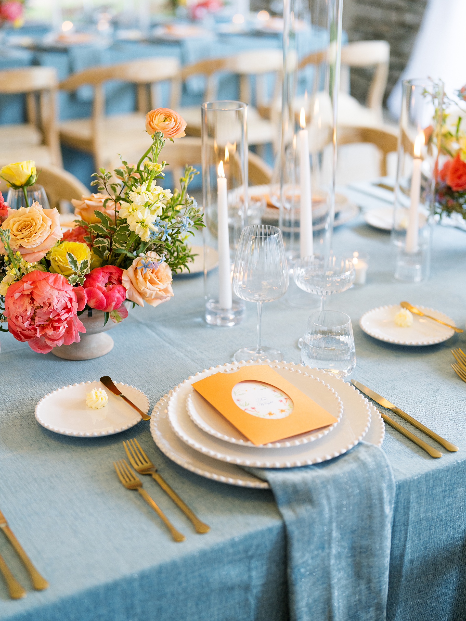
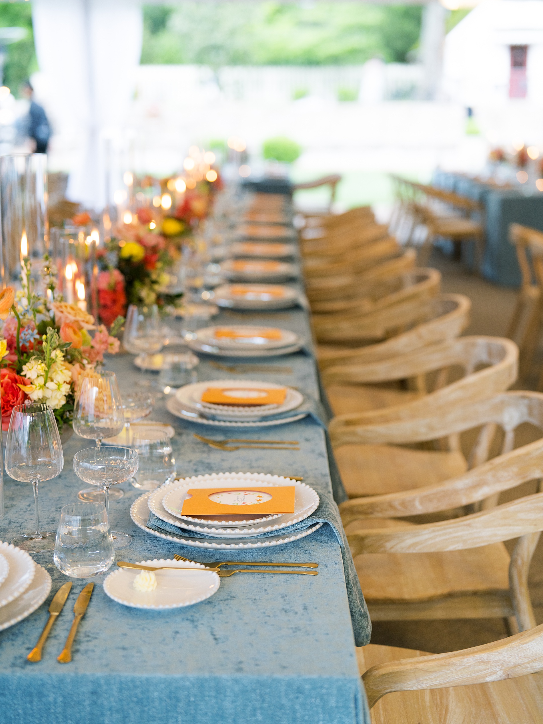
Reception Tablescape and Details
As guests moved inside for the reception they found their menus tucked into a custom die-cut orange pocket, again featuring Landry’s floral artwork. The menus and orange acrylic table numbers popped against the blue linens and tied into the colorful spring floral centerpieces.
Lexi Jo and Landry’s wedding was full of color, romance, and intention. It was a joy to work them, and lean in to their love of color and design, as well as the rest of the amazing vendor team who brought this wedding dream to life!
If you’re looking to add custom, thoughtful touches to your wedding or event, we would love to help make your vision a reality. Reach out today to learn more about our full-service wedding and event design offerings! We can’t wait to create something unforgettable for you!
If you enjoyed this post, you’ll love these other blogs!
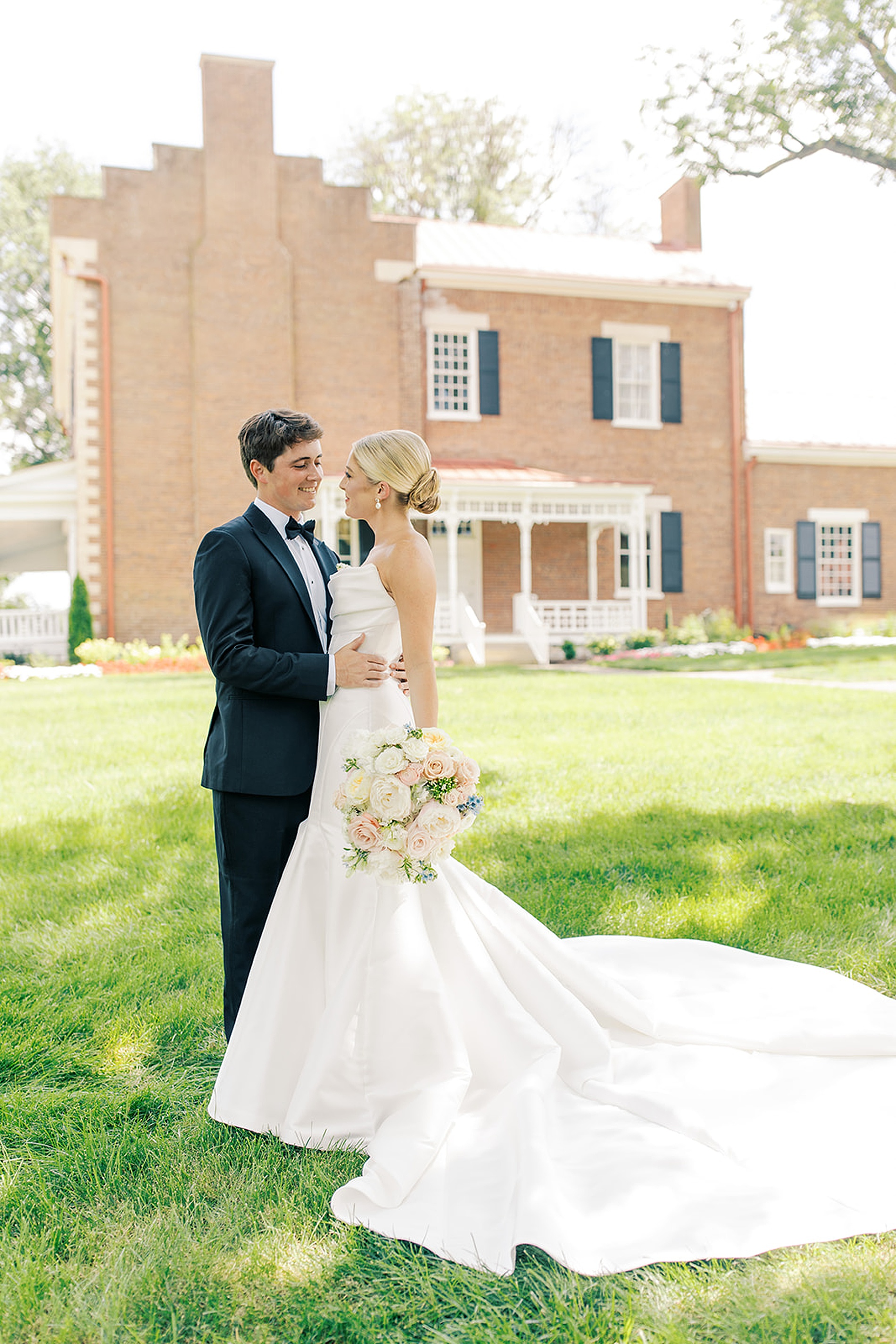
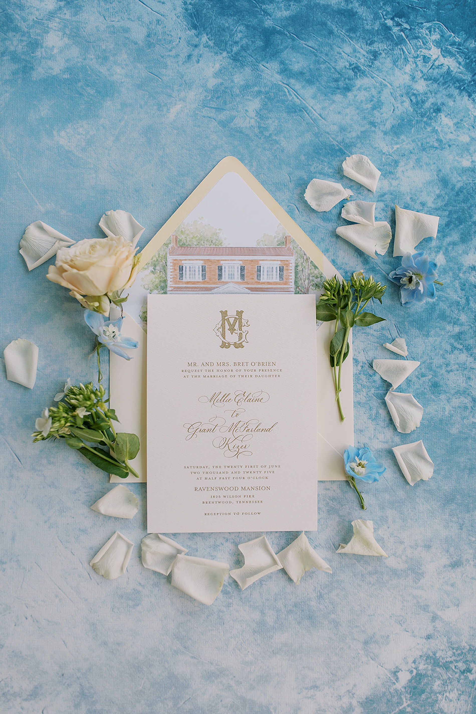
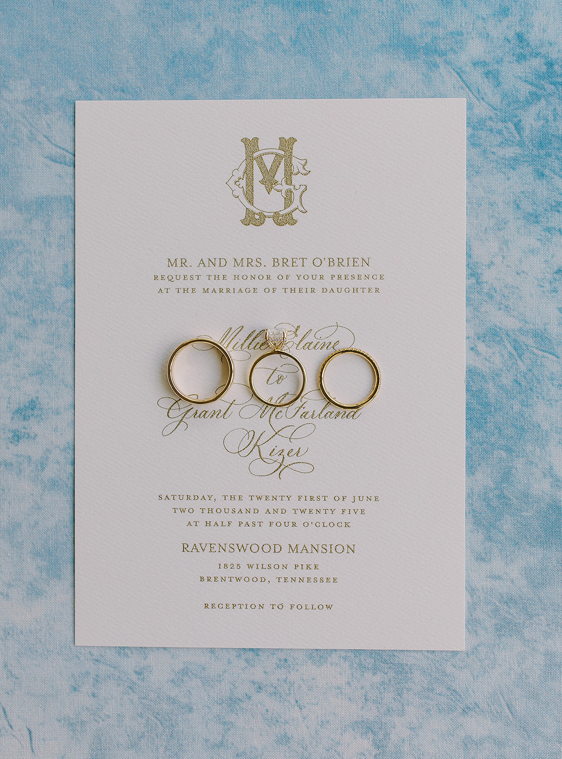
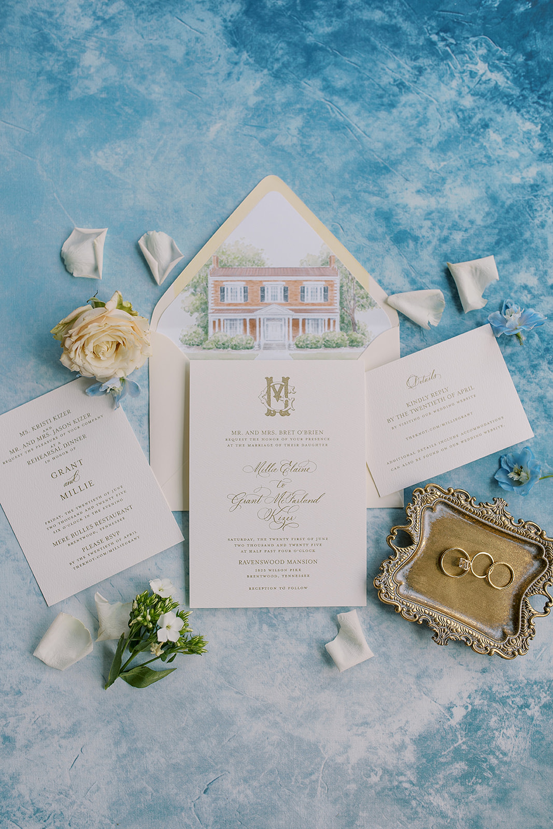
Set against the stately backdrop of Ravenswood Mansion in Brentwood, TN, this colorful garden wedding was a breathtaking blend of timeless design and heartfelt celebration. We had the joy of designing a variety of paper goods and signage for this stunning wedding day. Gold took center stage in all the designs and was thoughtfully woven into a variety of elements. Classic gold wedding details and accents played a part in bringing this stunning, garden-inspired wedding to life.
A Gold-Kissed Invitation Suite
The invitation suite truly set the tone for the day with an elegant mix of gold calligraphy and classic styling. One of our favorite moments from this invite was the custom sketch of Ravenswood Mansion that lined each envelope! It was an inviting nod to the historic beauty of the venue. The couple’s custom monogram added a layer of sophistication, making its debut on the invitation and reappearing throughout the wedding day for a cohesive, elevated look.
Day-of Details
That same monogram reappeared on the couple’s wedding programs, which echoed the gold-ink design of the invitation but with a soft floral border that added a romantic, garden-inspired flair.
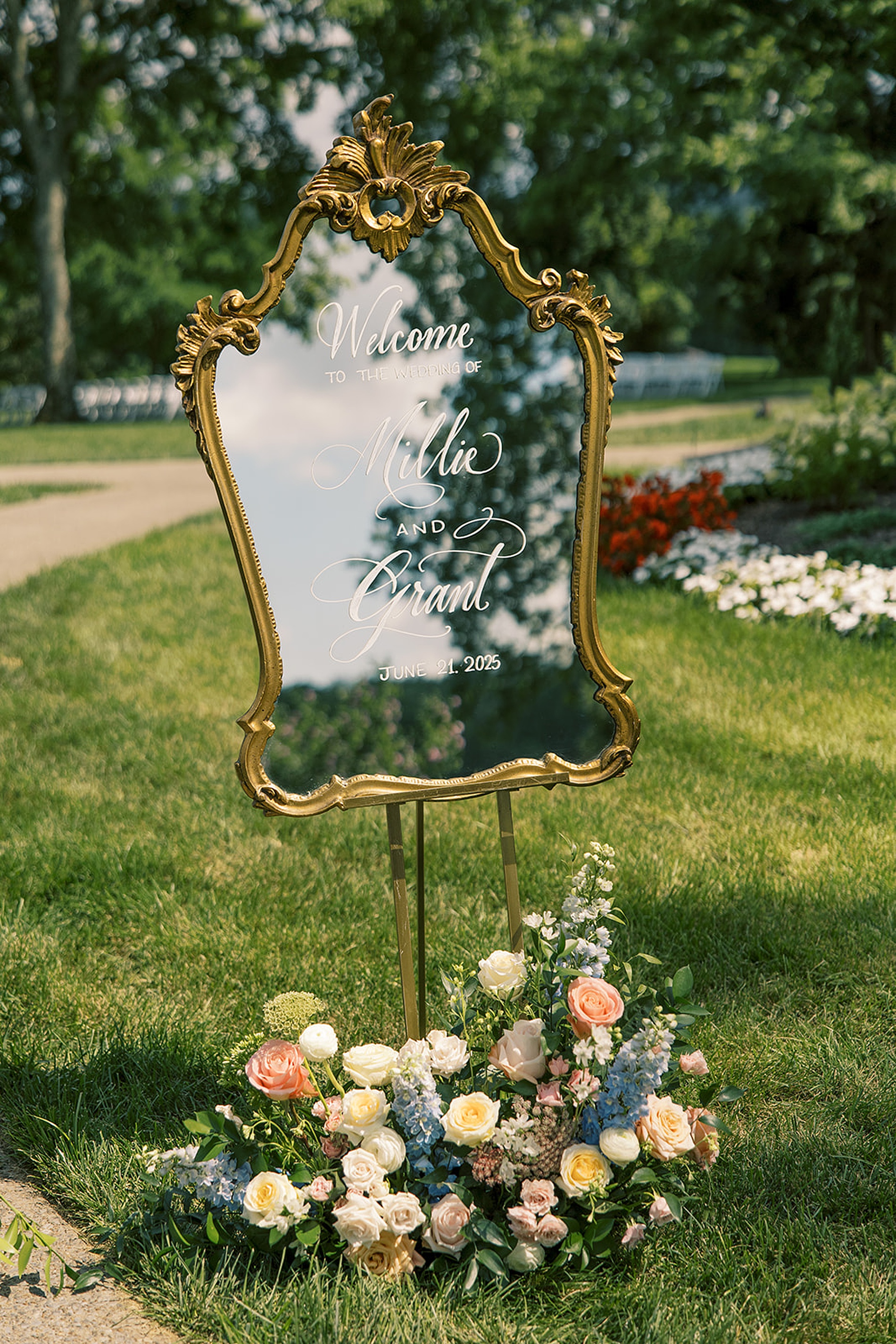
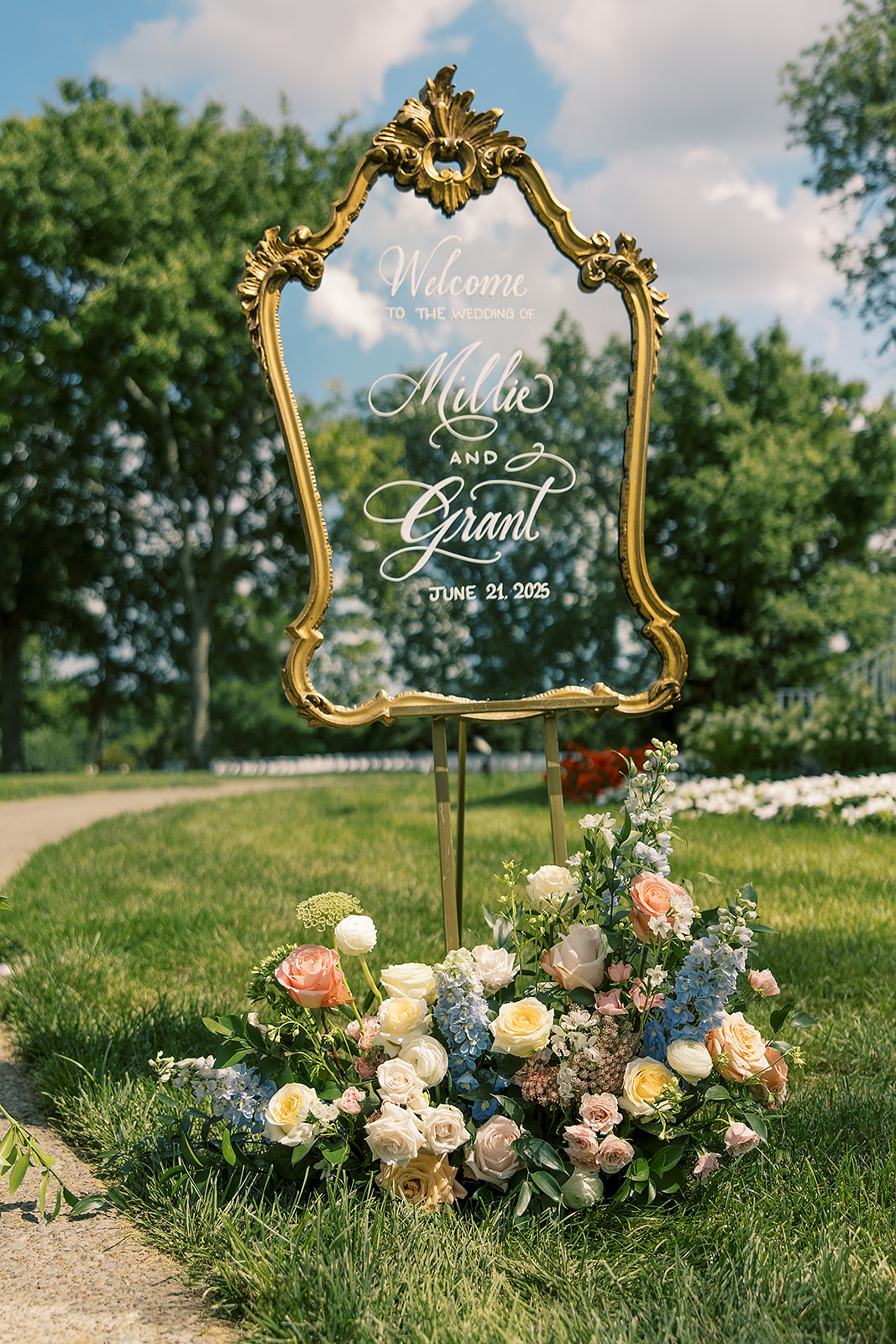
A gold-framed mirror welcome sign greeted guests as they arrived, setting the tone for the refined celebration ahead. The full-length mirror seating chart, also displayed in an ornate gold frame, guided guests gracefully to their seats.
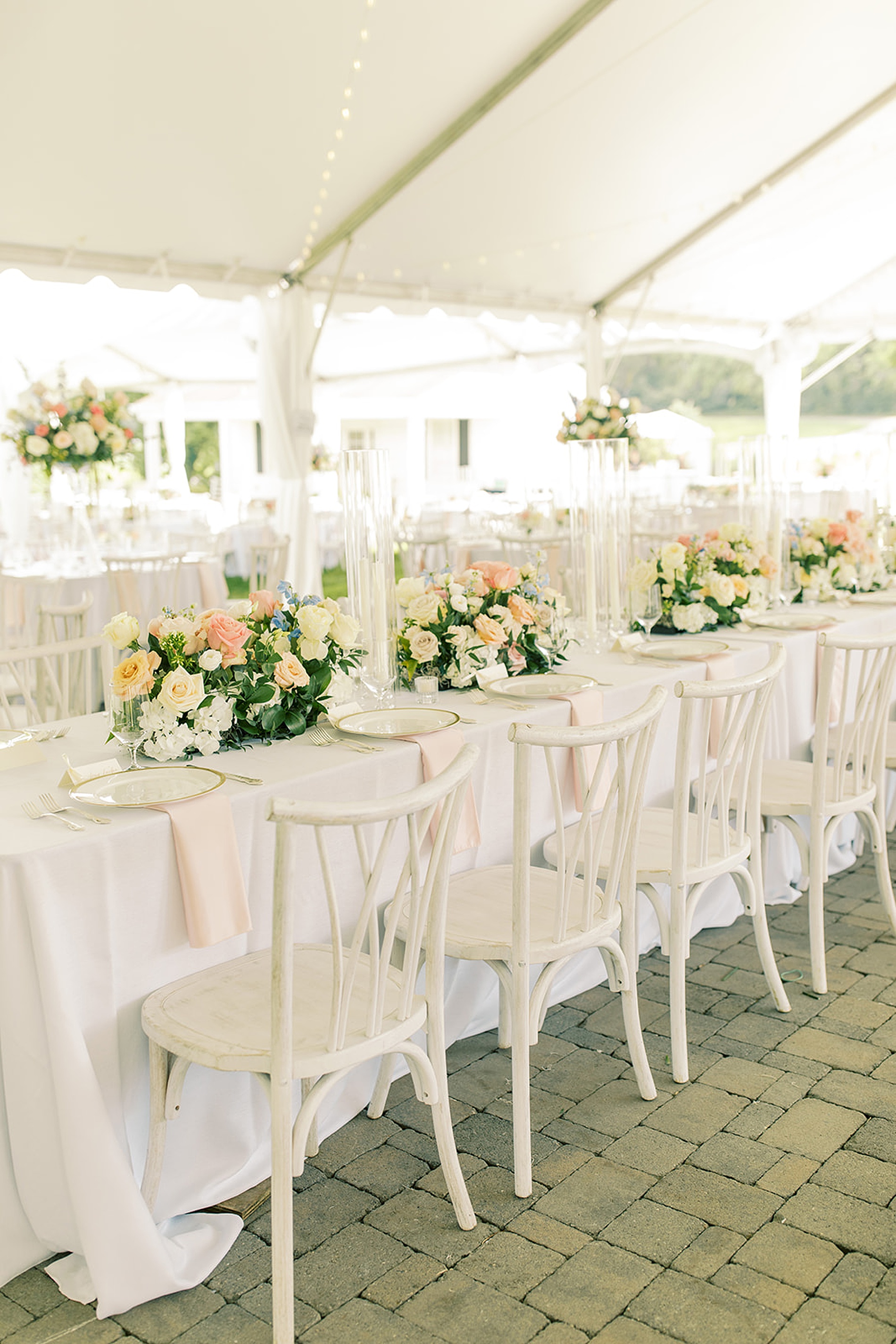
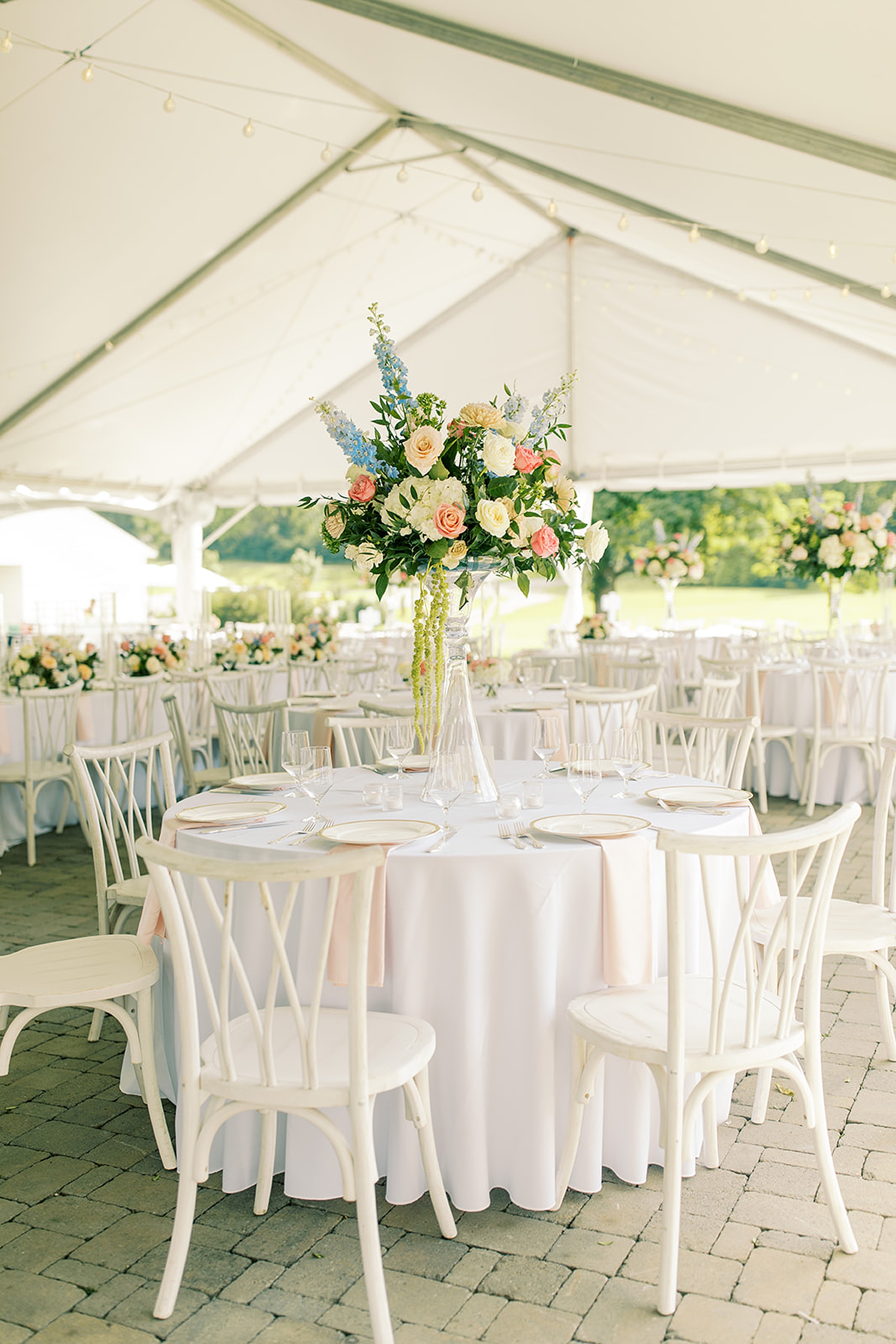
Throughout the reception, every detail was thoughtfully styled. Tables featured white table numbers with gold numerals, nestled among vibrant summer florals.
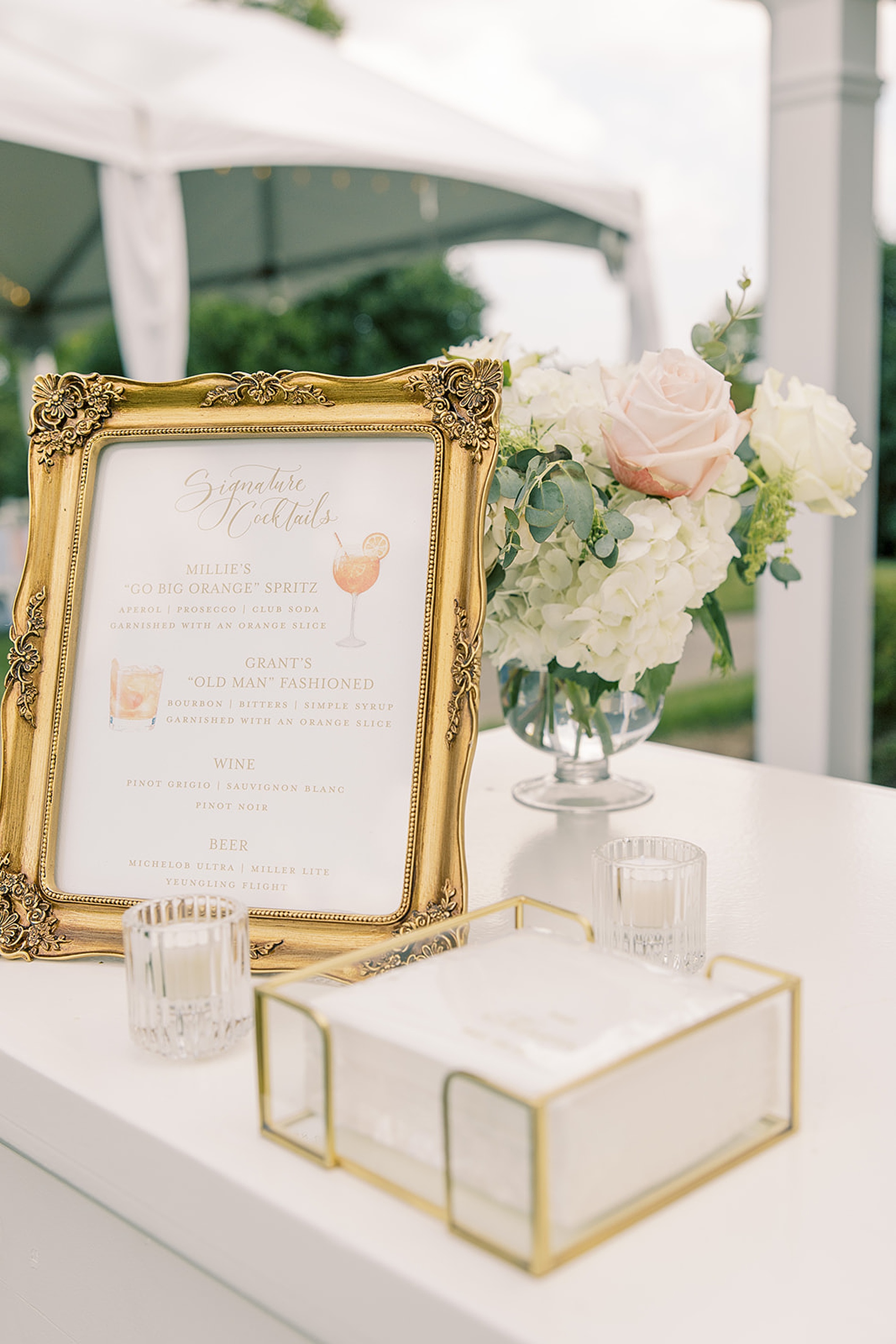
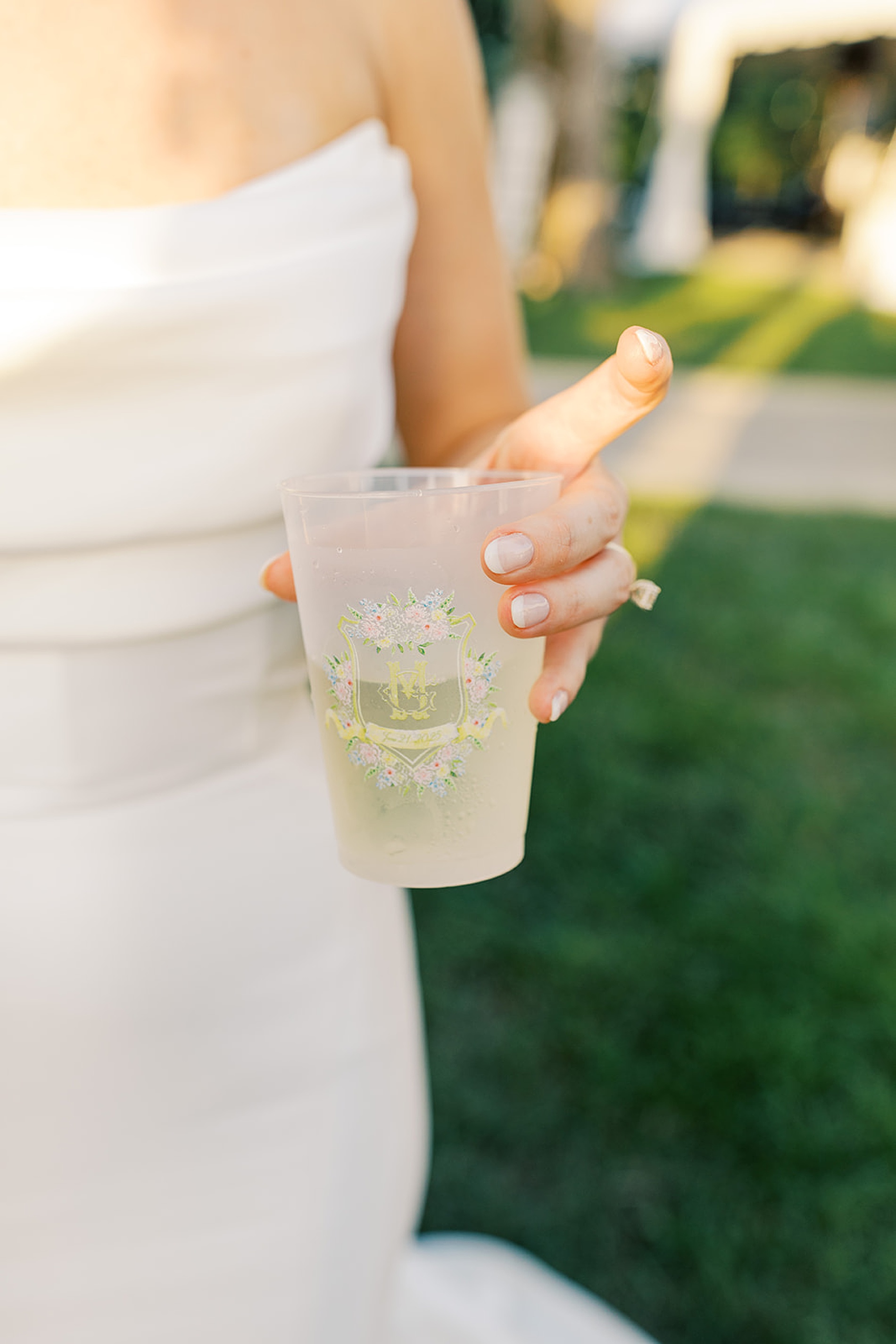
White place cards with gold calligraphy coordinated with the seating chart, guiding guests to their seats, while gold-framed signature drink signage and custom bar decals added personality to the bar area. The couple’s monogram even graced frost flex cups, tying everything together seamlessly across every touchpoint.
A Celebration to Remember
These two graduates of the University of Tennessee Knoxville had a gorgeous wedding day vision that balanced color with classic neutrals. It was a perfect blend of personality and timeless style. The amazing and incredibly talented planner, Dana McCollum, expertly planned the entire day to flow beautifully.
We loved seeing how gold became the thread that tied everything together, creating a memorable, joyful, and elevated wedding day. It’s a beautiful reminder that paper details aren’t just decorative! They shape the guest experience and make a wedding feel truly you.
Congratulations to the happy couple, and thank you for trusting White Ink Calligraphy + Co. to be a part of your unforgettable day at Ravenswood!
If you’re looking to add custom, thoughtful touches to your wedding or event, we would love to make your vision a reality. Reach out today to learn more about our full-service design offerings! We can’t wait to create something unforgettable for you!
If you enjoyed this post, you’ll love these other blogs!
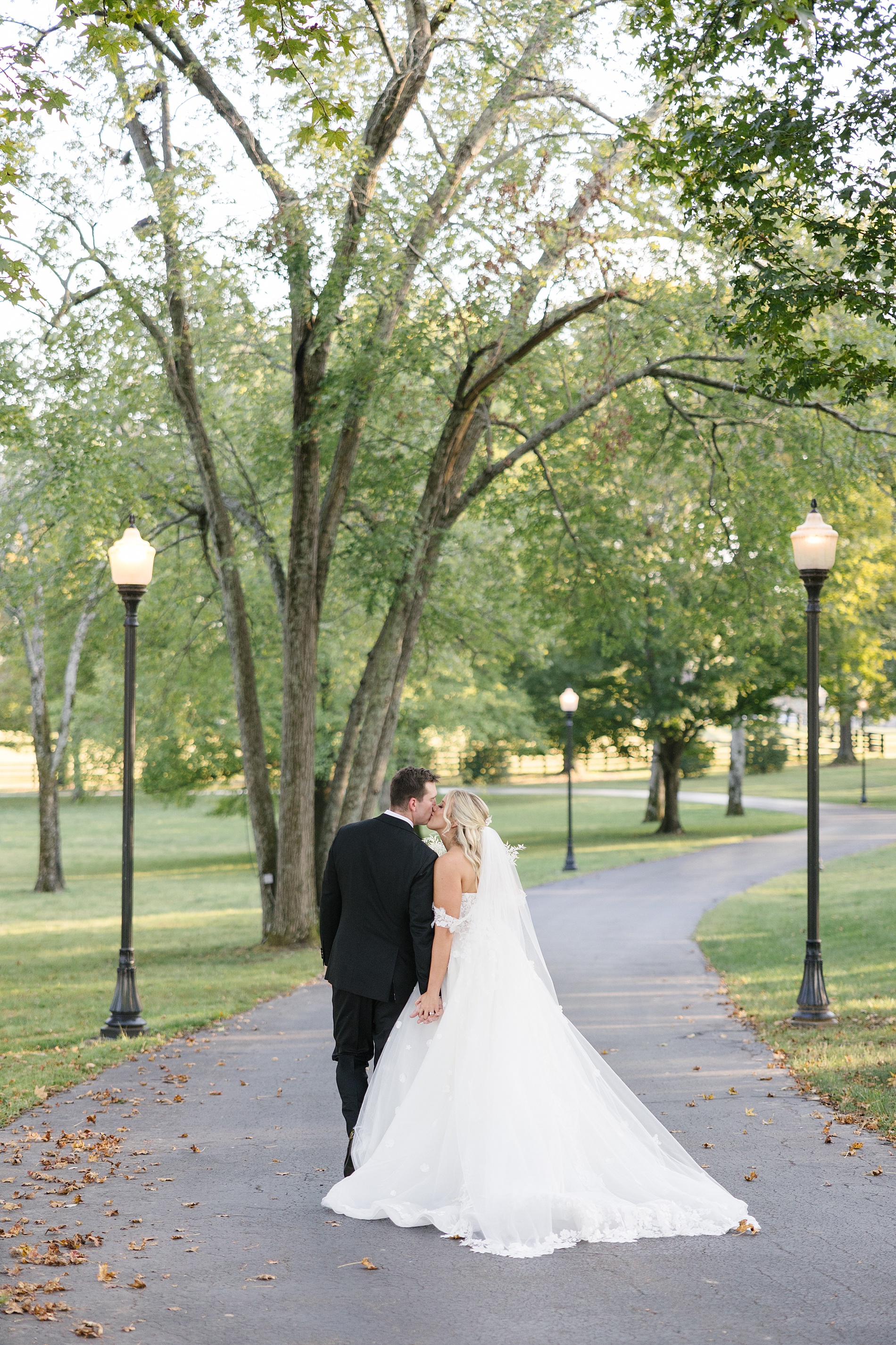
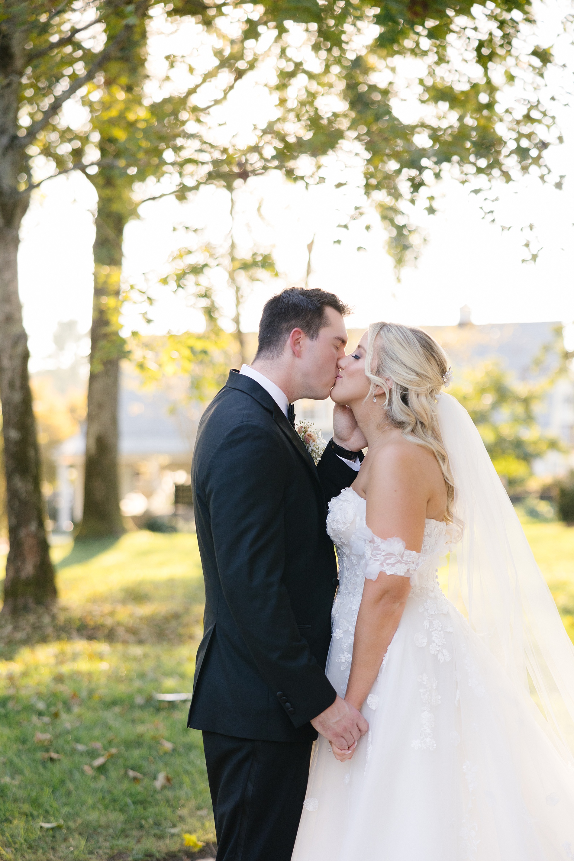
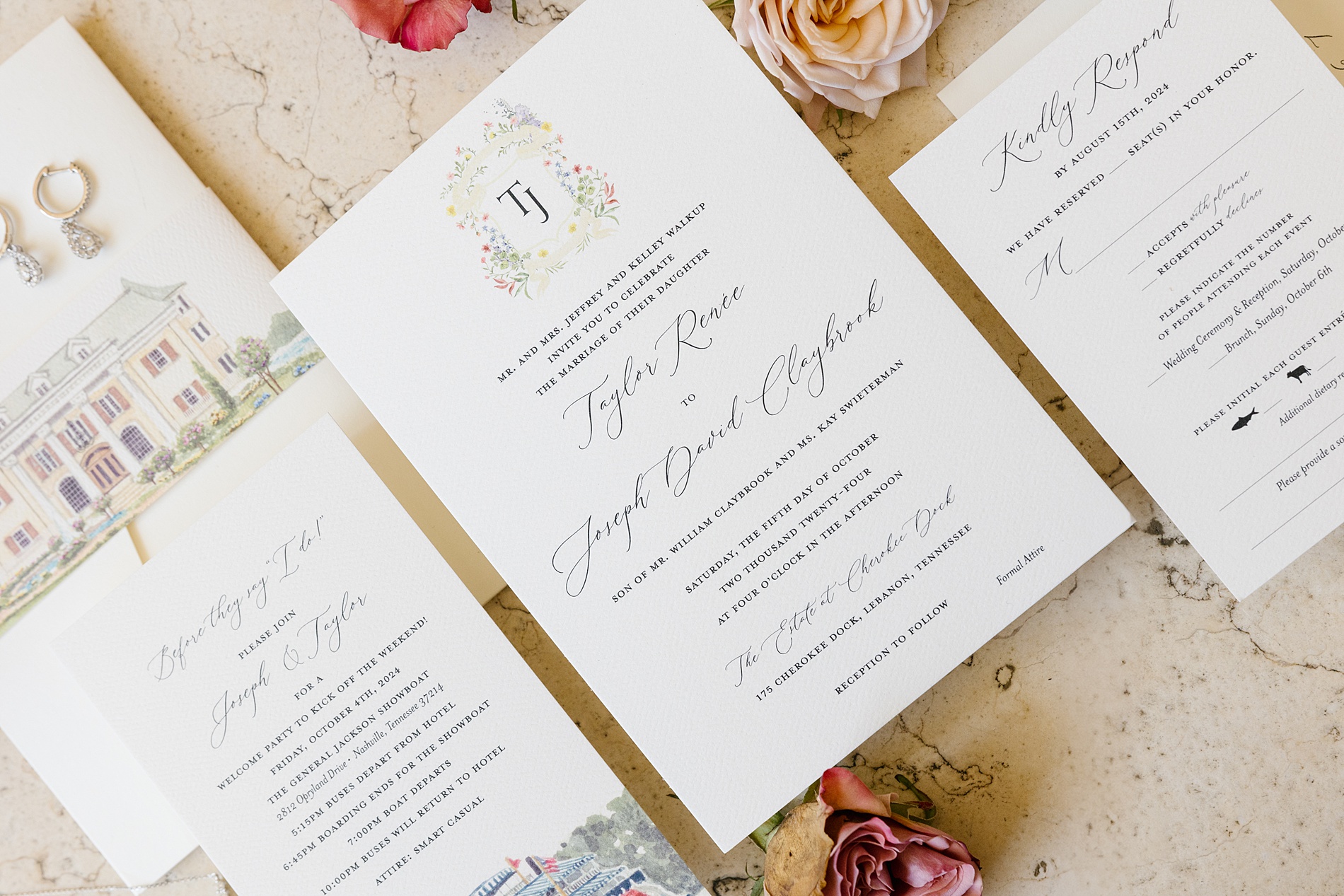
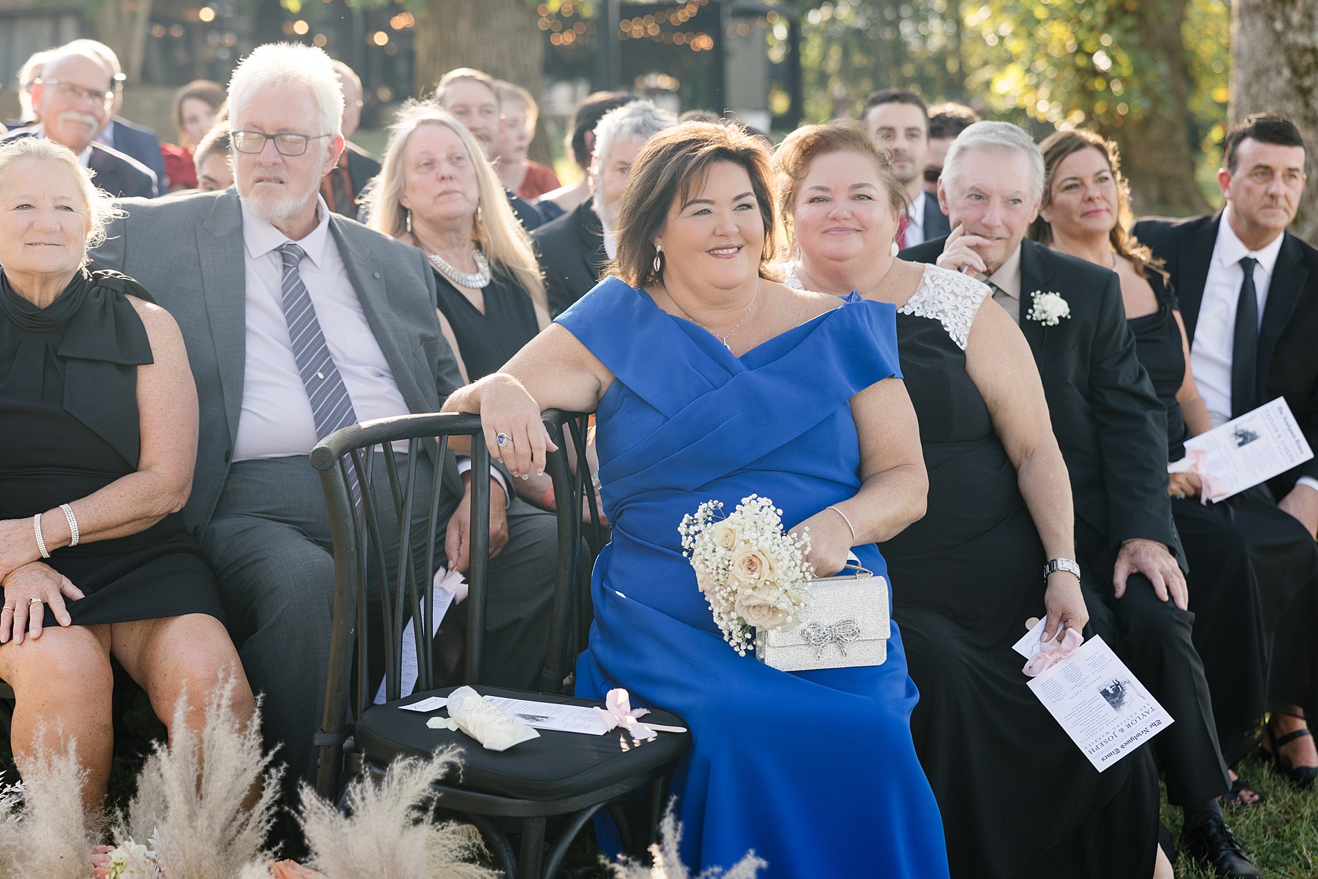
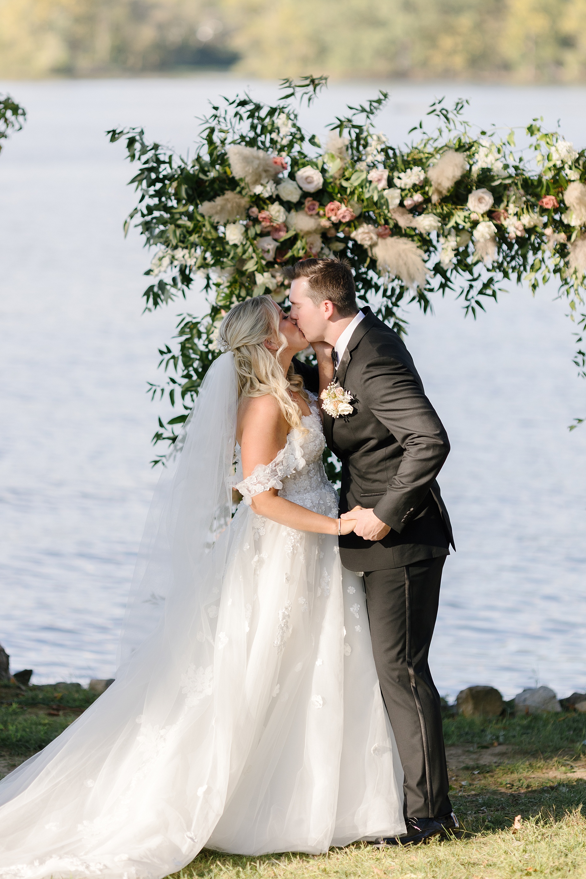
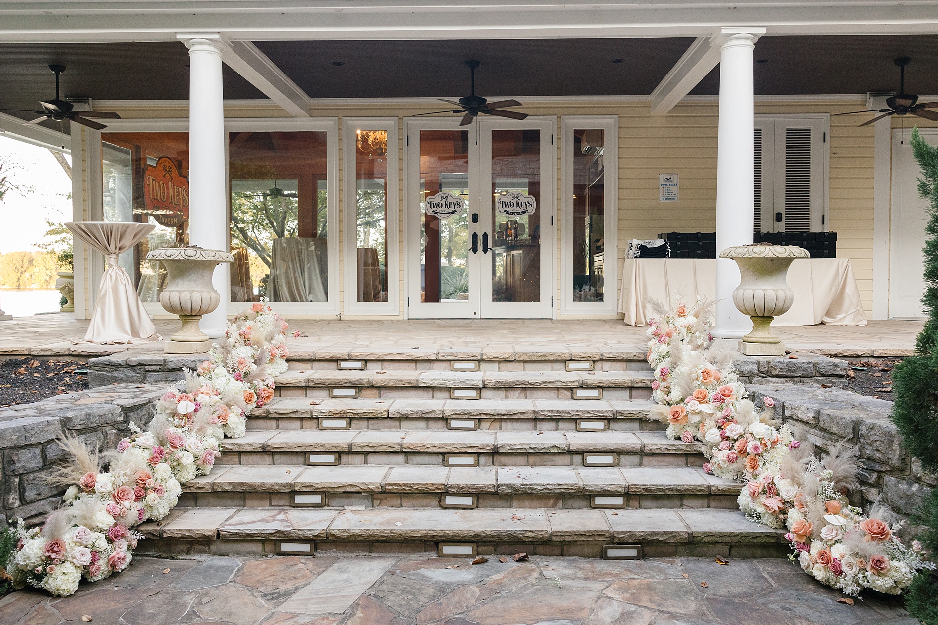
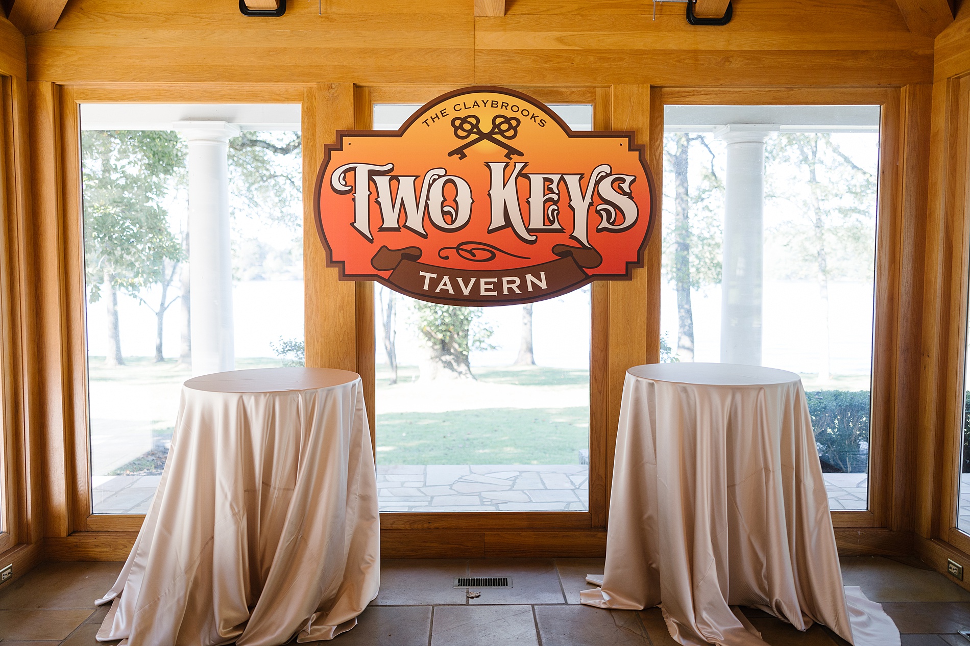
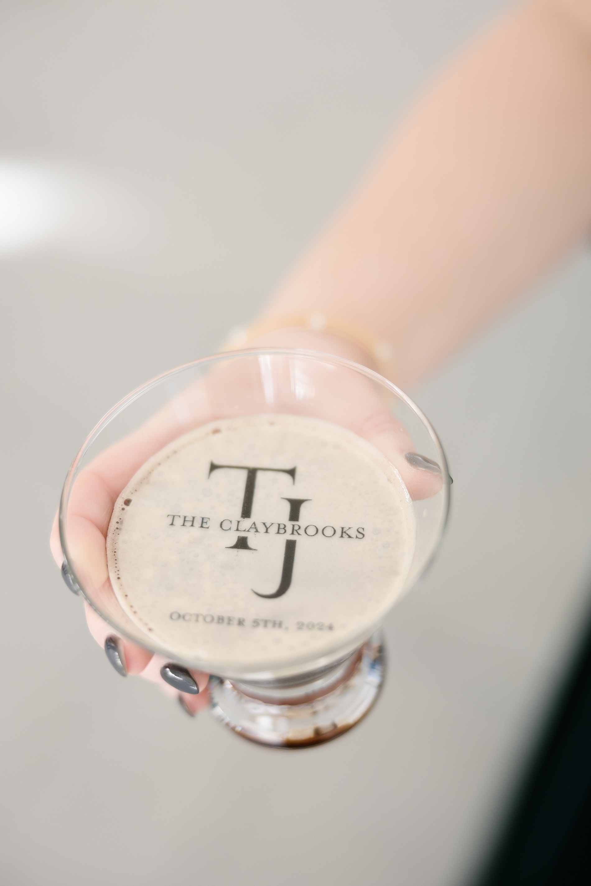
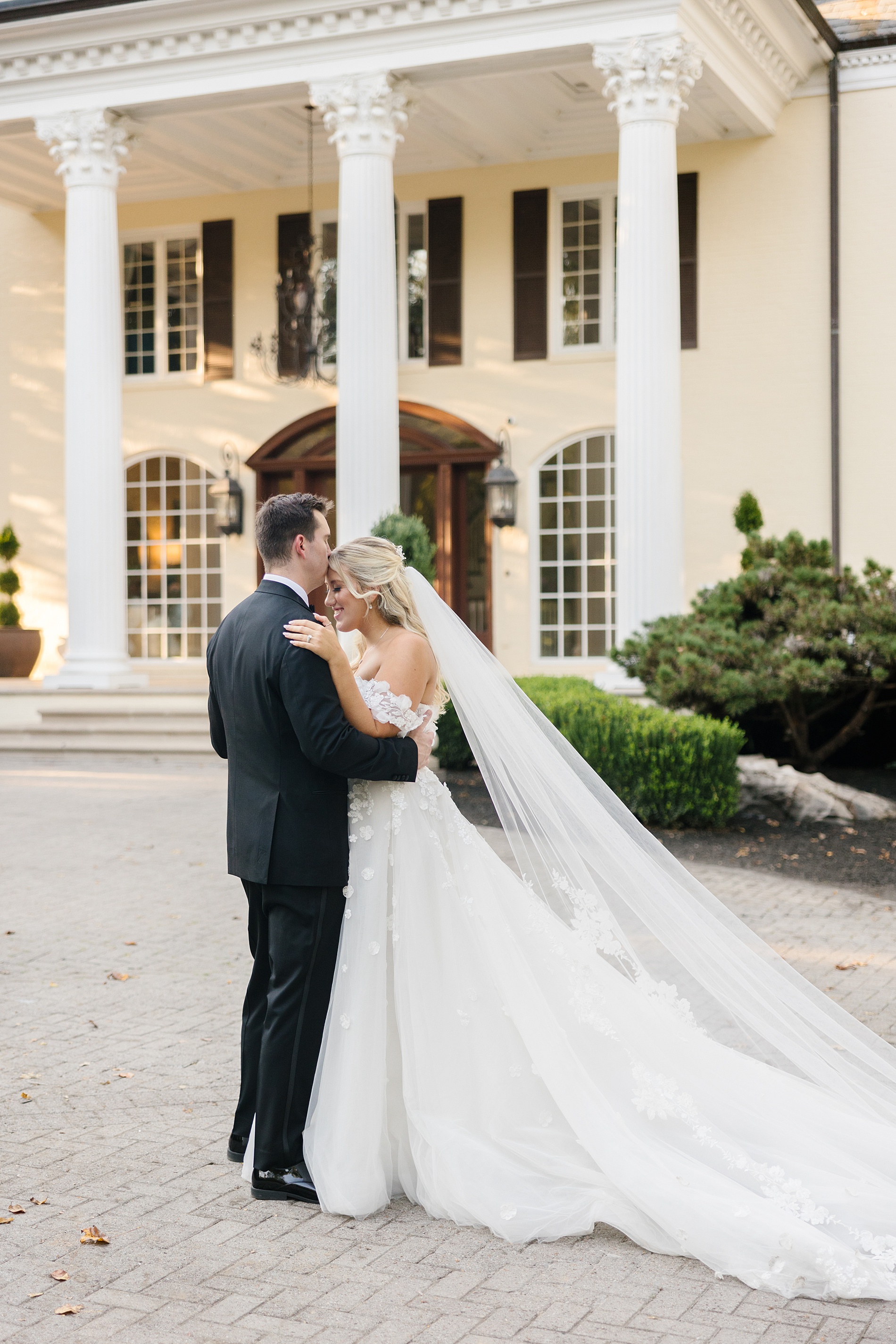
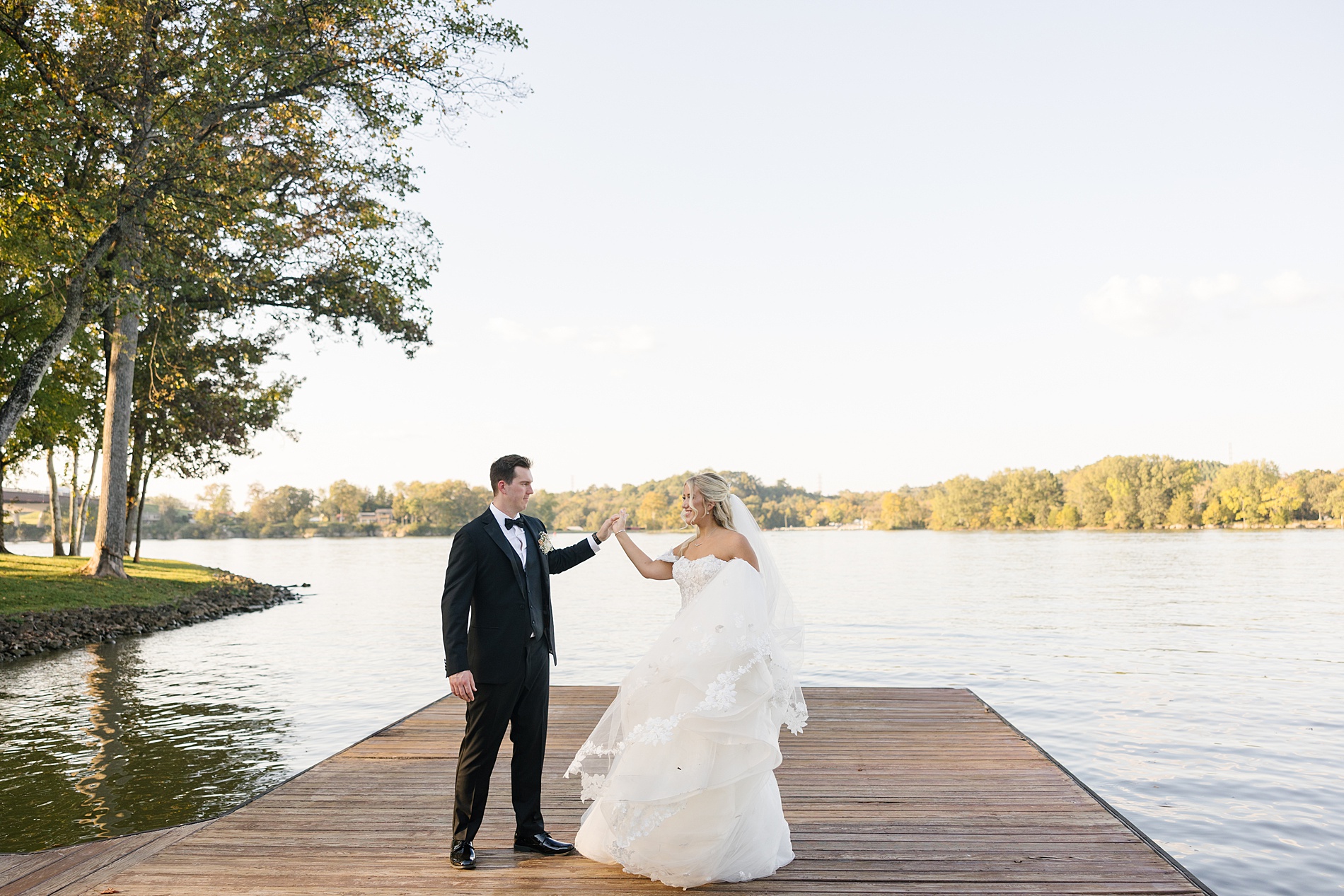
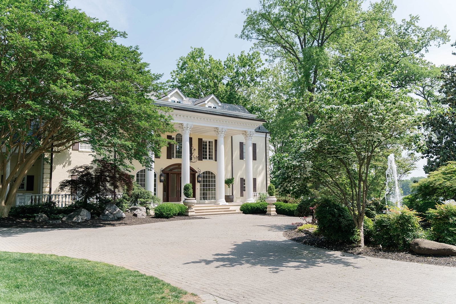
Nashville is home to many amazing wedding venues, but this luxury lakeside venue sitting on 15 beautiful acres is one of my top favorites. The Claybrooks’ luxurious fall wedding at Cherokee Docks combined romantic elegance with interactive fun. Personalized touches and breathtaking details filled the entire weekend, and we were honored to play a part in it all.
We worked closely with the fabulous mother of the bride, Kelly, who planned every last detail of her daughter’s big day with care and intention. Kelly truly had a vision, and bringing that to life through elegant invitations and paper goods, custom signage, and unforgettable installations was such a joy for our team!
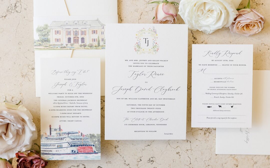
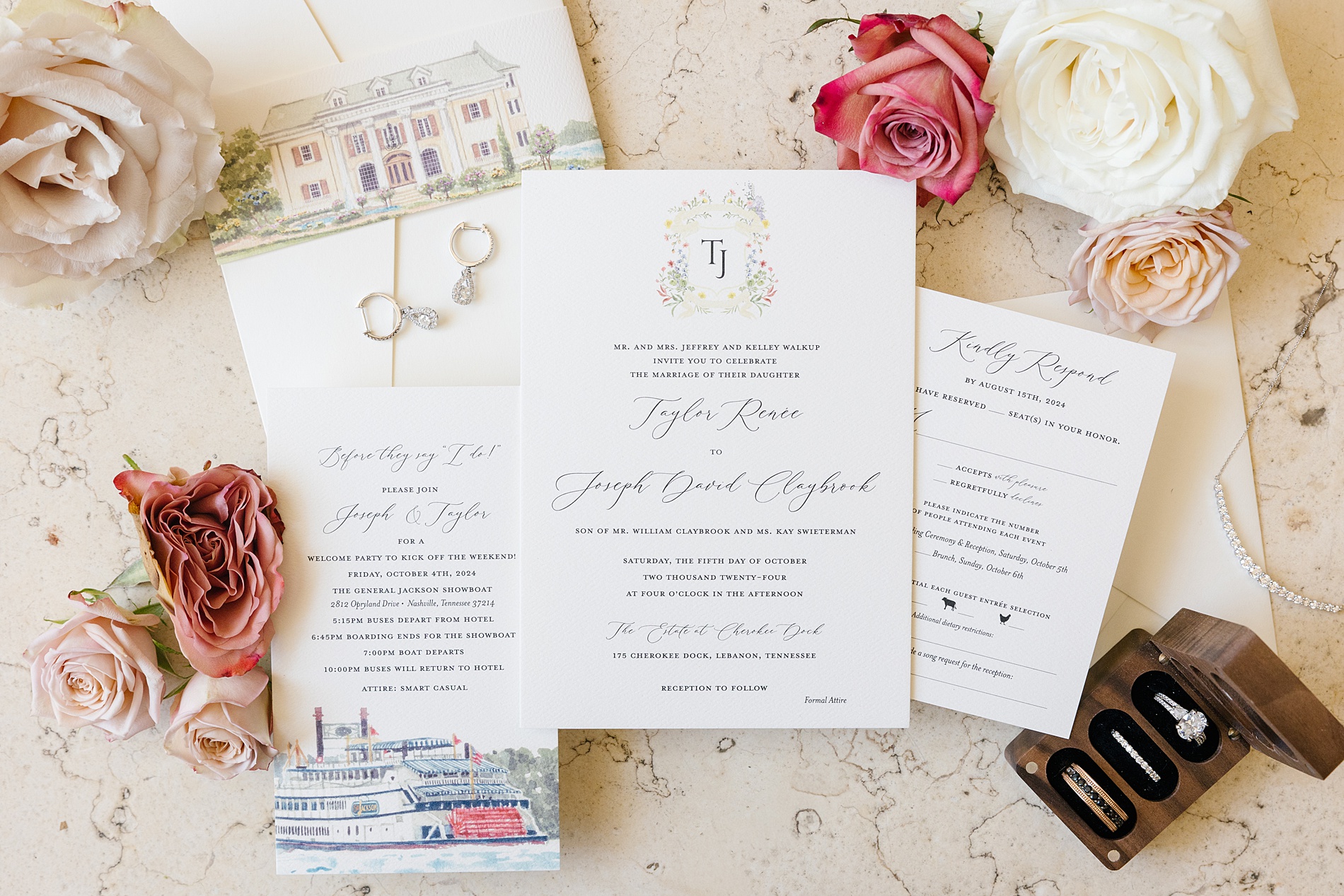
Custom Sketches for an Elegant Invitation Suite
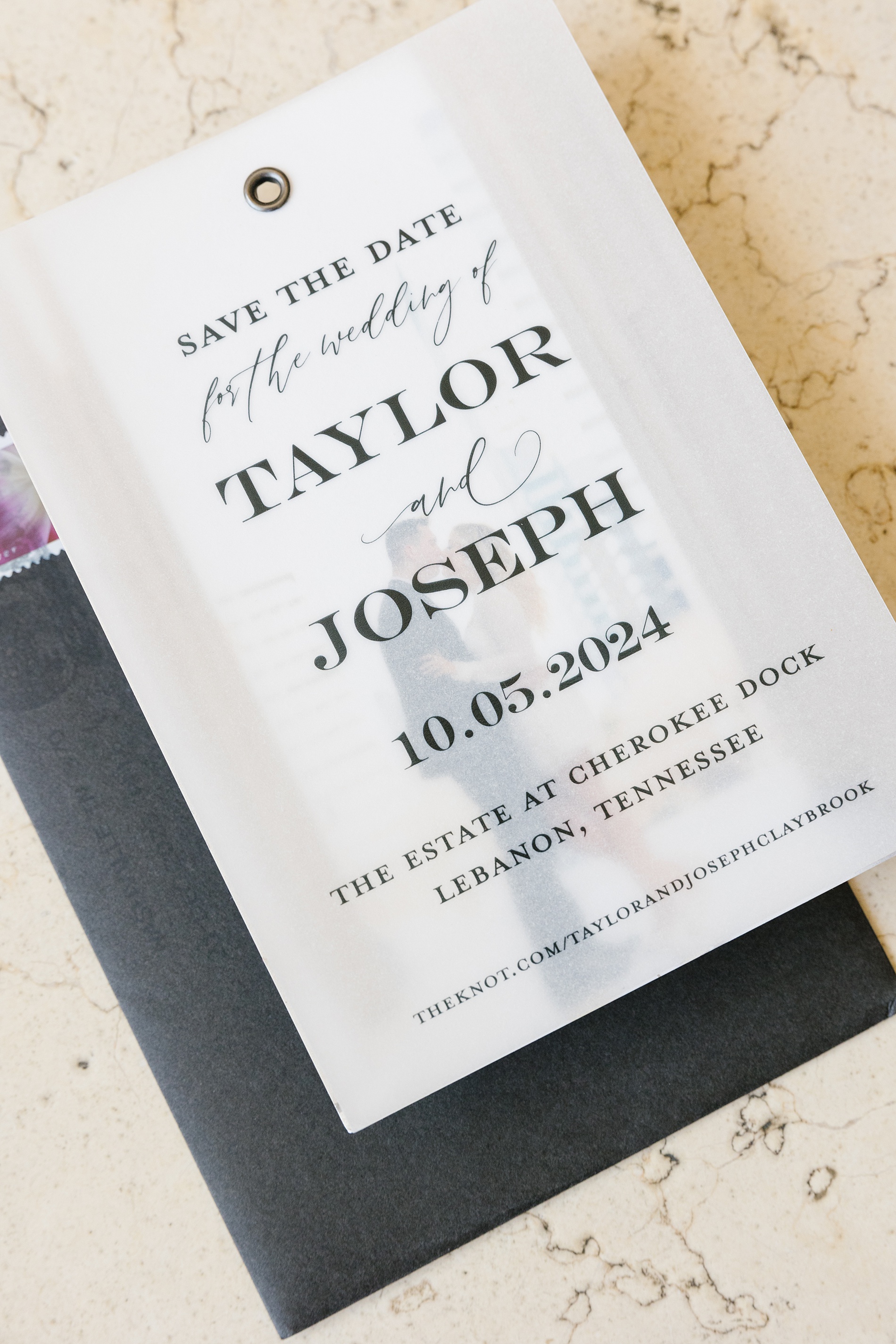
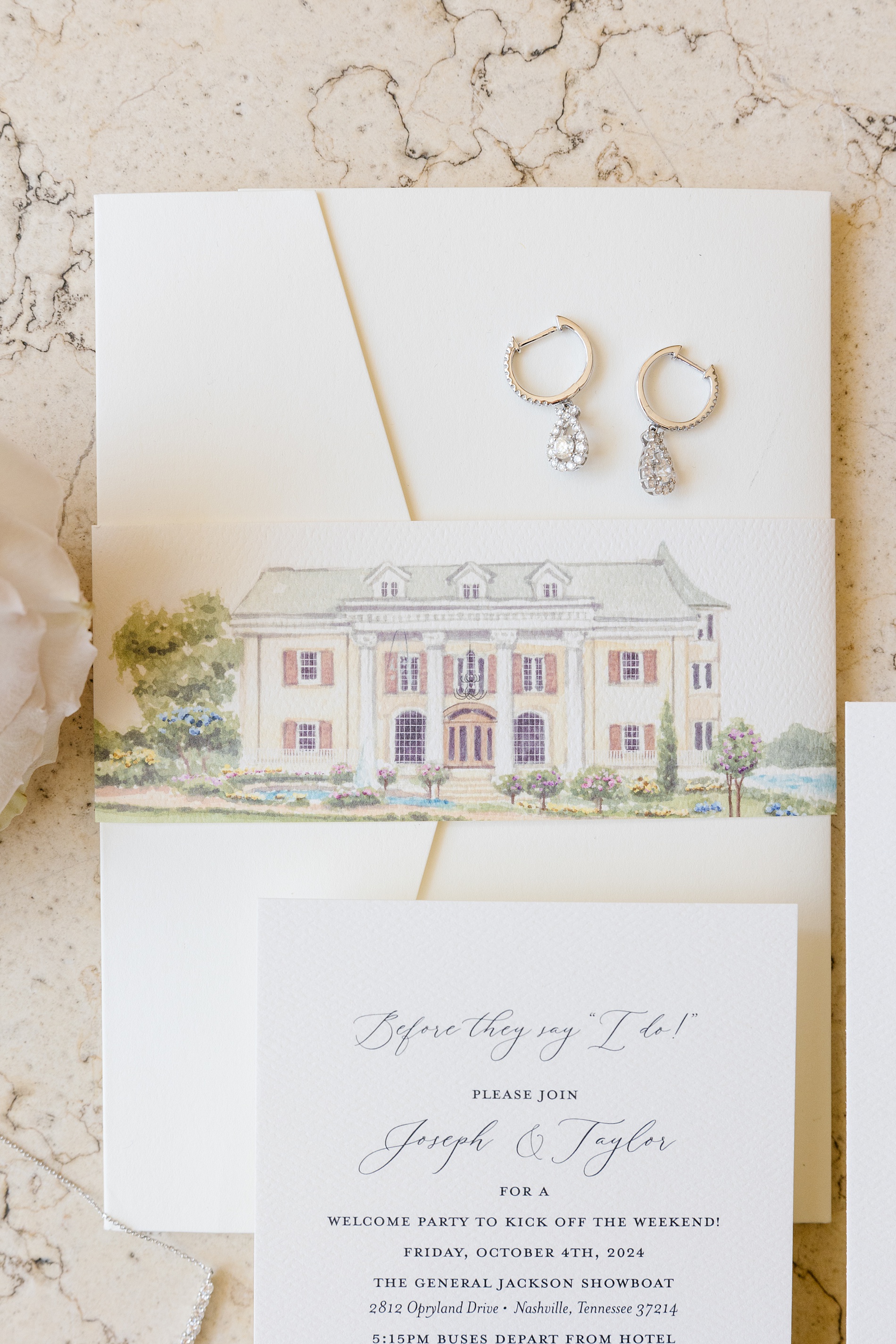
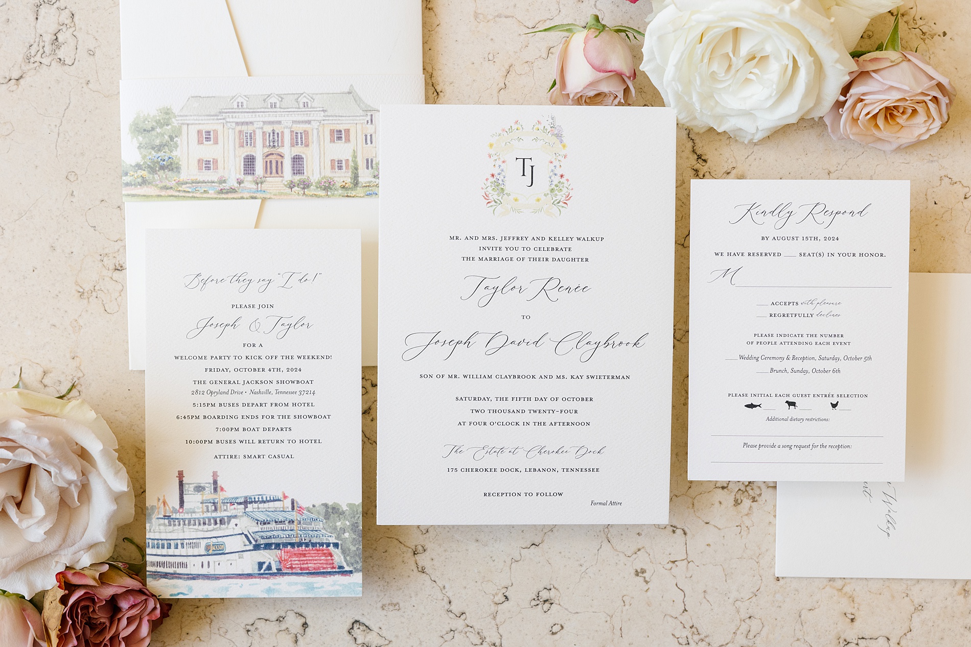
Guests were first introduced to the weekend with a custom save the date featuring an engagement photo underneath a vellum overlay with the event details printed on top. Held together with a gold grommet, this piece was an interactive and modern way to include a photo while keeping the aesthetic cohesive and timeless. Read more about this and other fun and unique Save the Dates here!
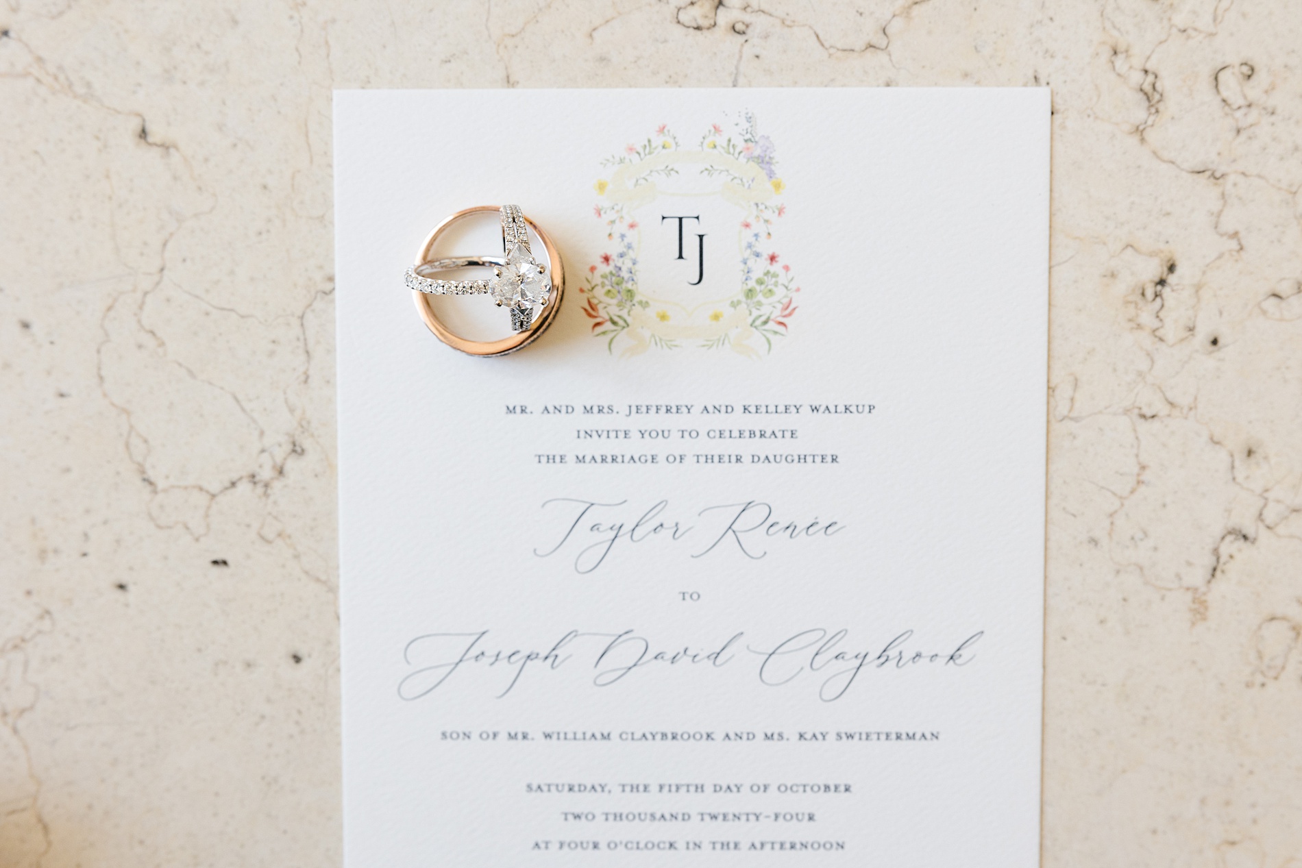
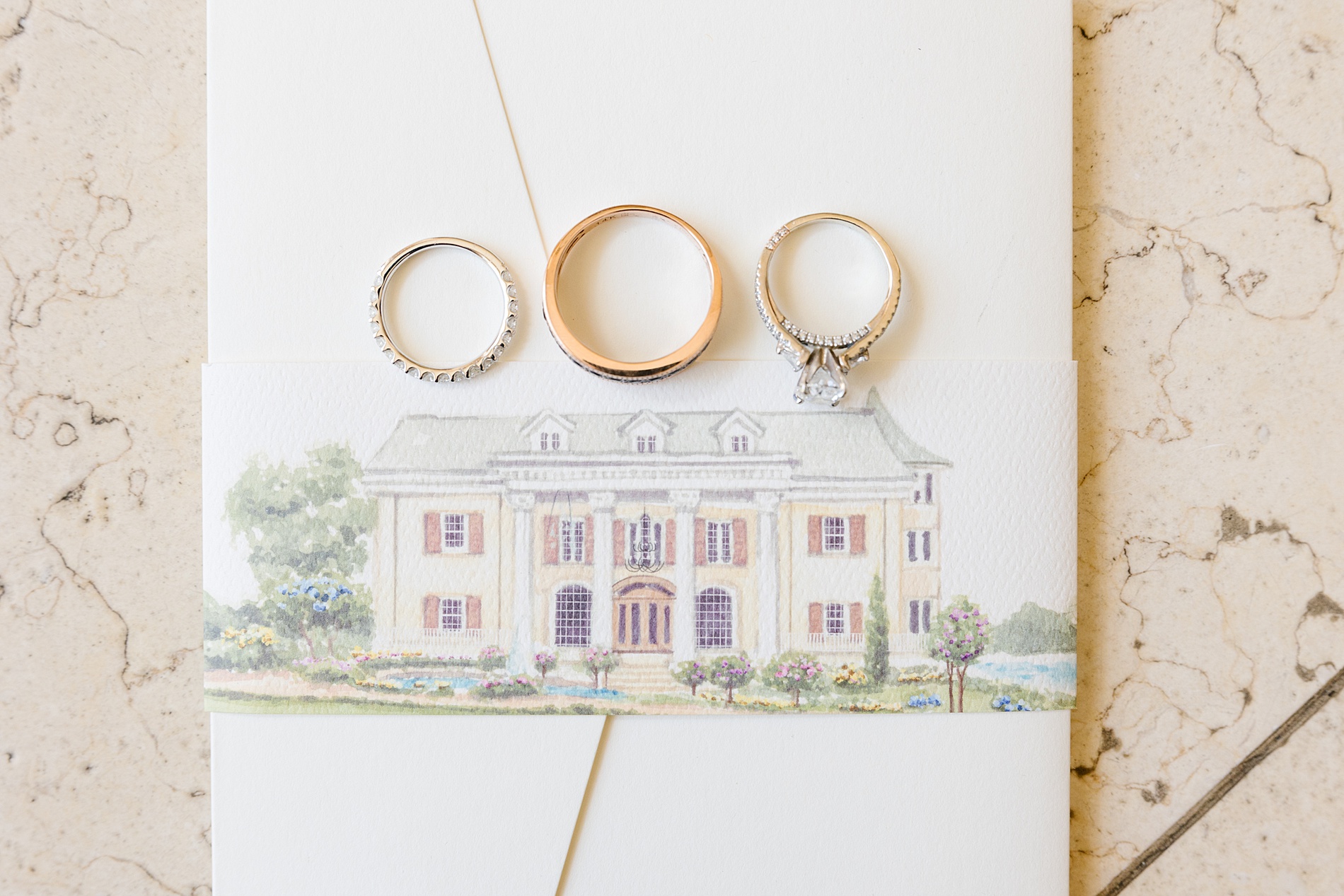
The couple’s invitation suite was a perfect reflection of their classic style. We created a soft, romantic white invitation that featured delicate florals surrounding the couple’s monogram. A custom sketch of the Cherokee Dock venue on the wrap that held the invitation suite pieces together was my favorite detail. It completely elevated the suite! I just love slipping in little details and hints about the wedding day to guests.
To kick off the weekend, we also designed a welcome party invitation featuring a sketch of the General Jackson Showboat, giving guests a peek at the fun to come. From beginning to end, each paper piece was designed to build anticipation and set the tone for the weekend.
Ceremony Details
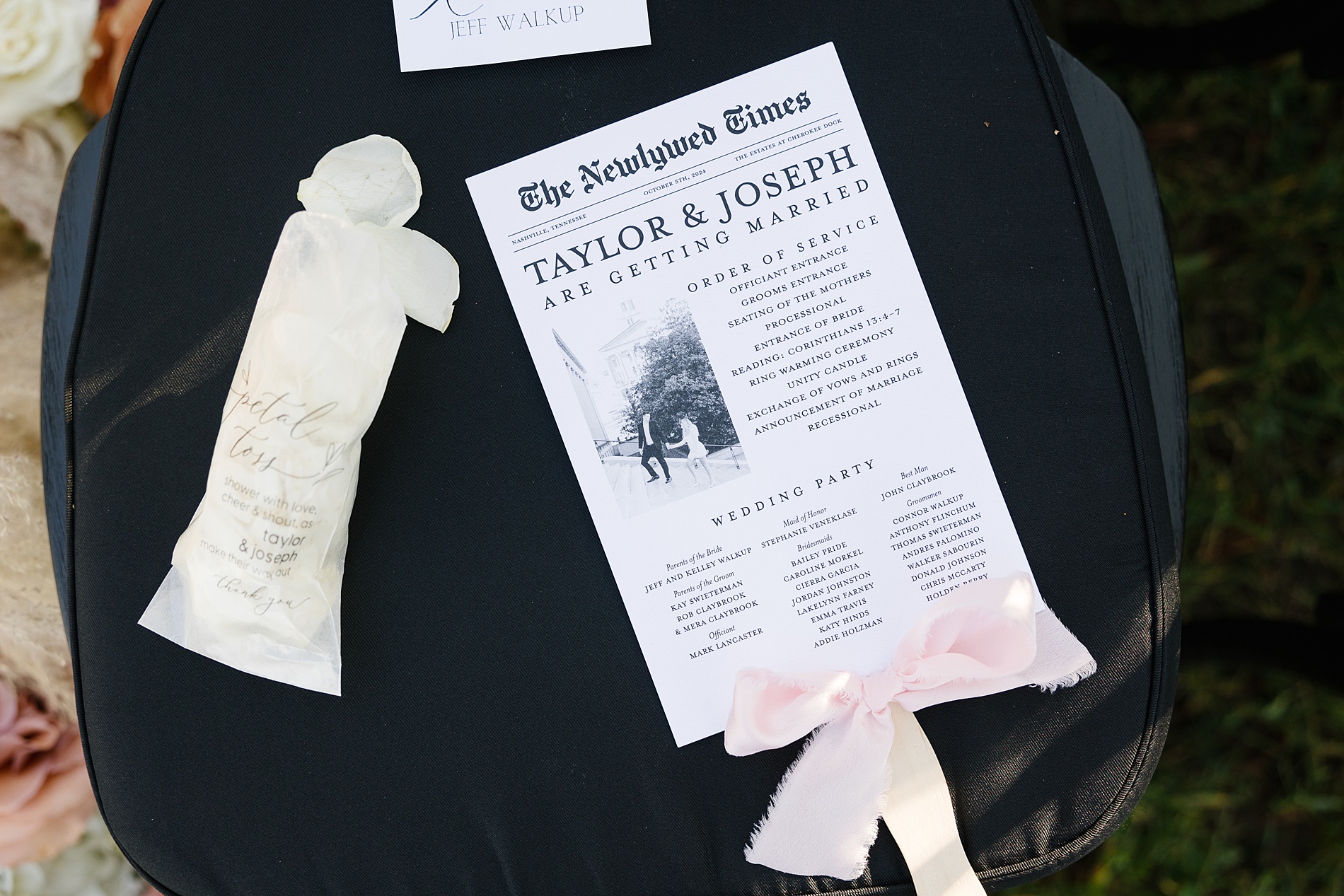
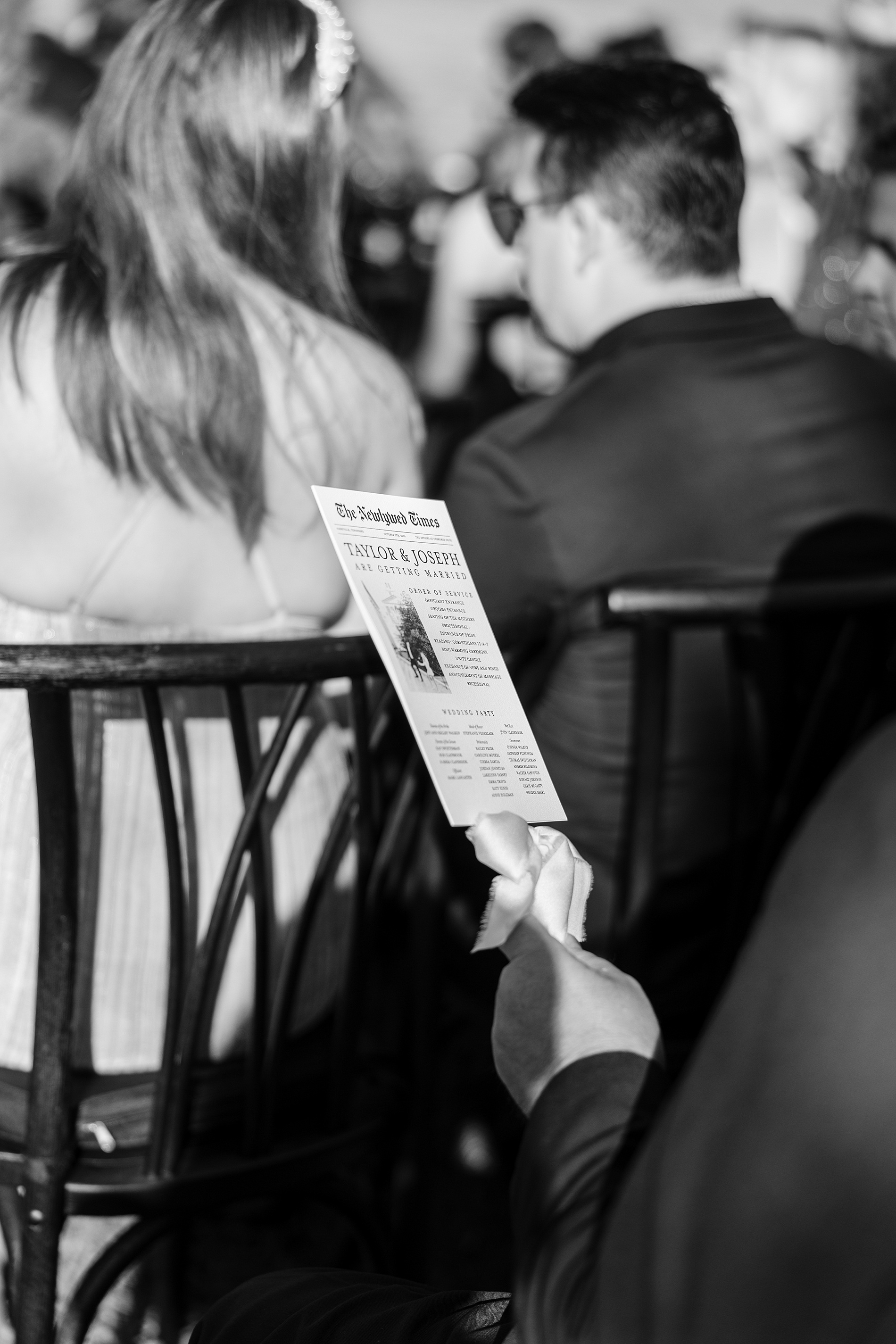
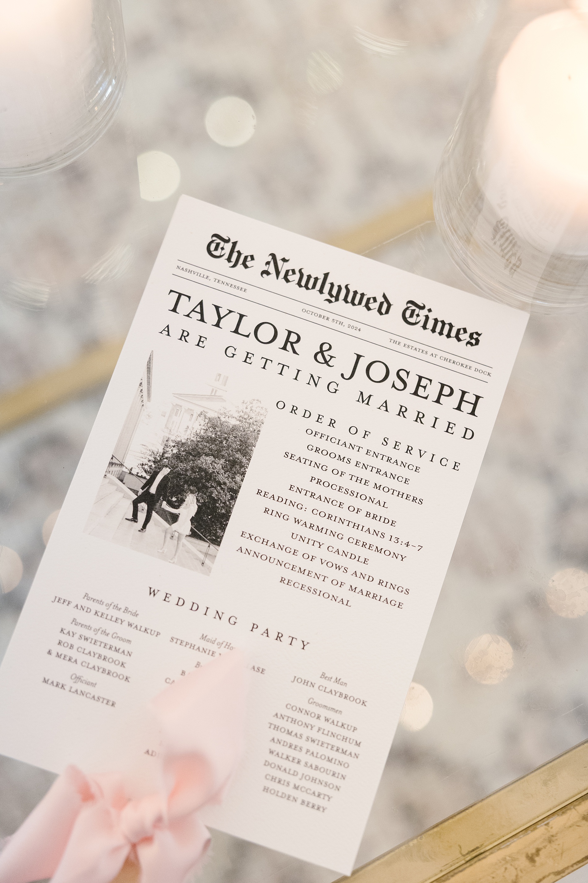
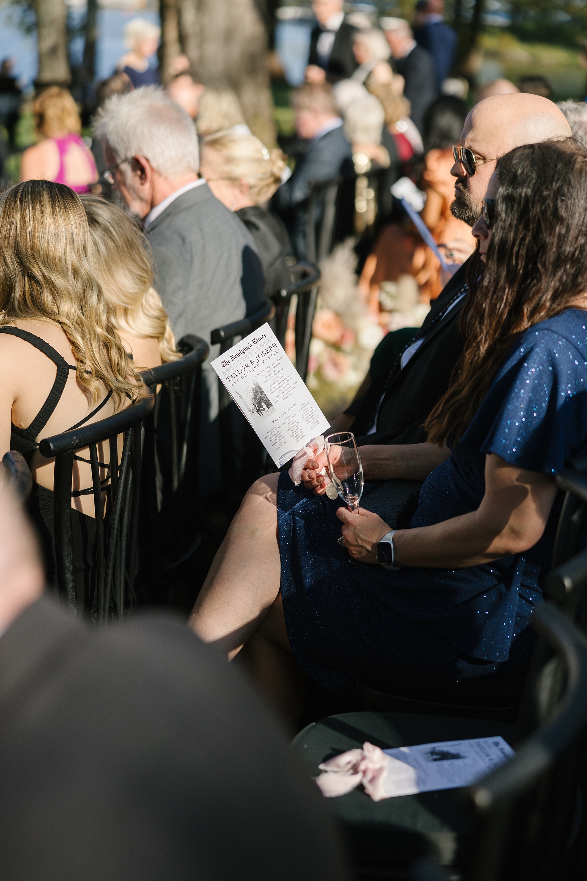
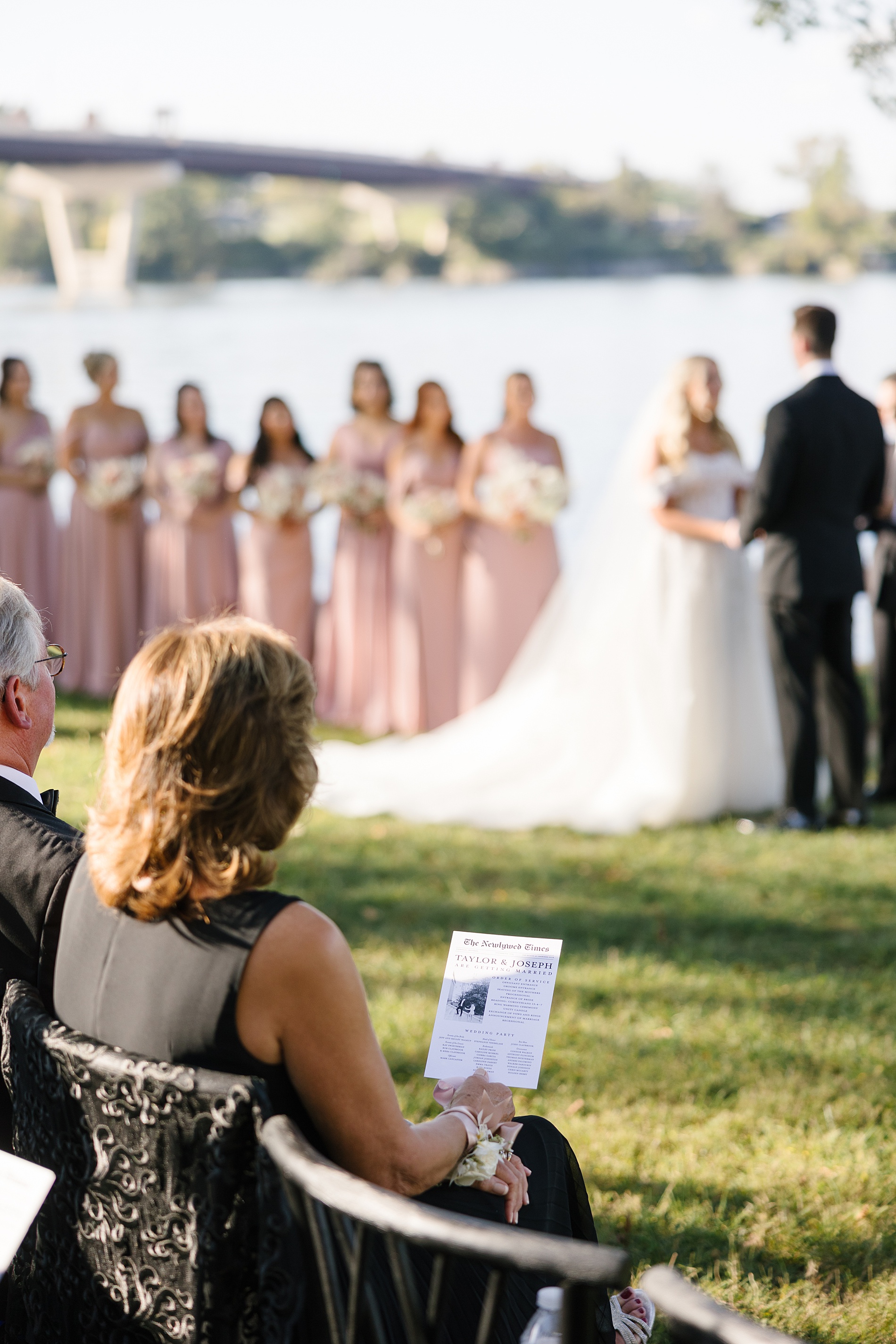
The ceremony wasn’t without its own beautiful paper moments. Guests received newspaper-style fan programs, which doubled as a ceremony timeline and a creative way to showcase an engagement photo. These charming, multi-purpose programs were a total win on a warm fall day.
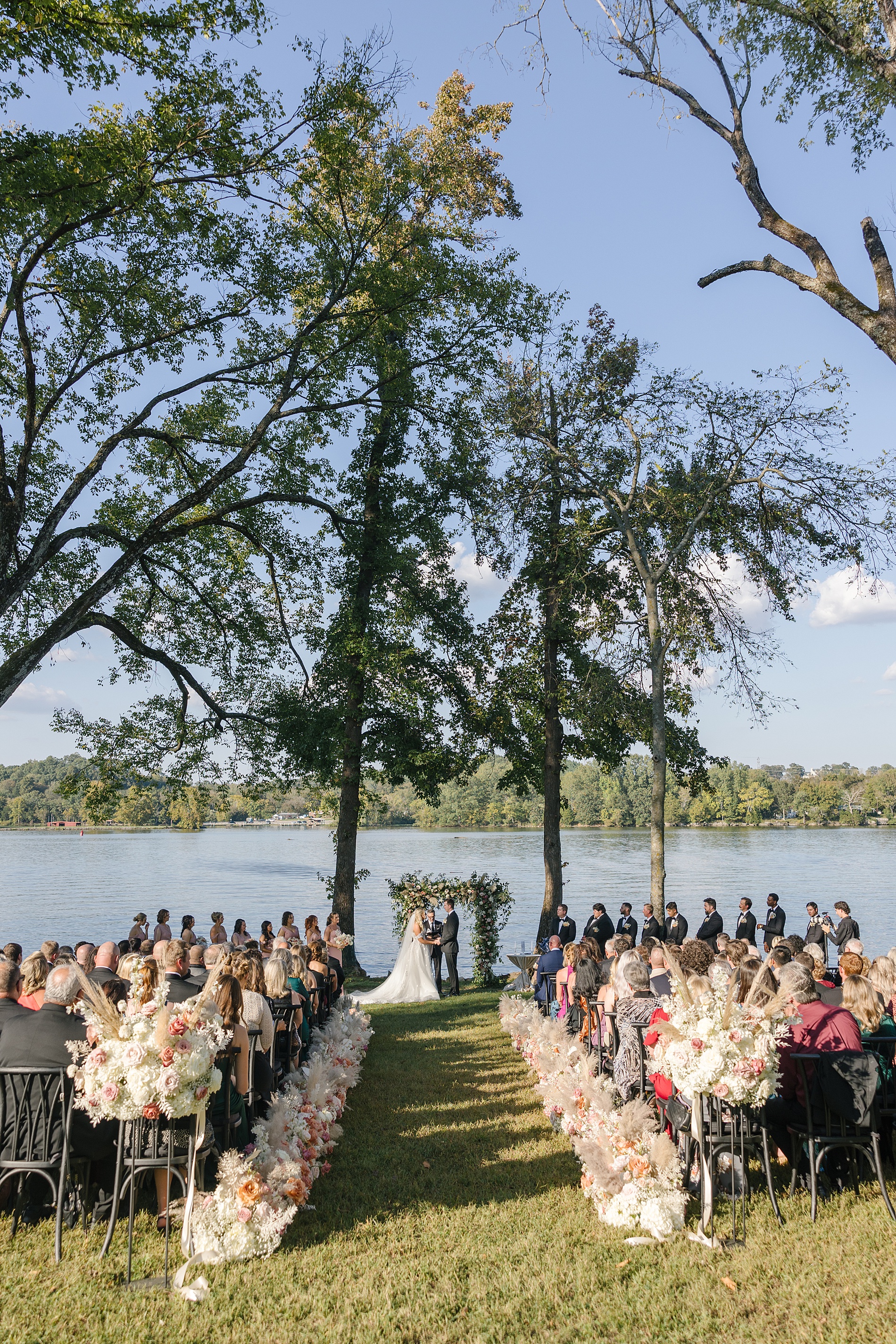
Then there was the ceremony itself which took place outside by the water. Between the leaves changing colors, the sunlight hitting the water, and the beautiful couple so excited to be married, there was so much to love about this wedding,
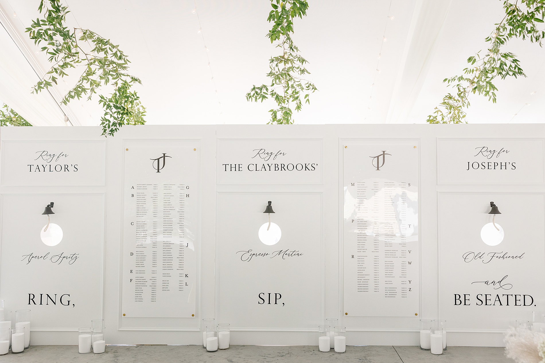
Interactive Details Guests Will Never Forget
This wedding was full of beautiful, classic moments, but it also had some fun surprises! We loved bringing a little playfulness to the design while still keeping things elevated.
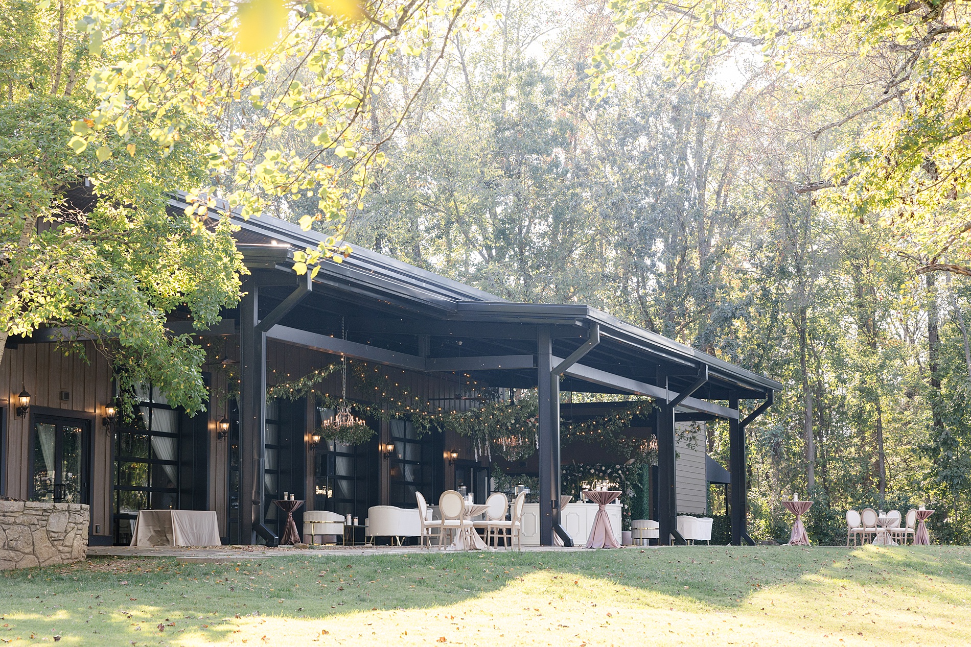
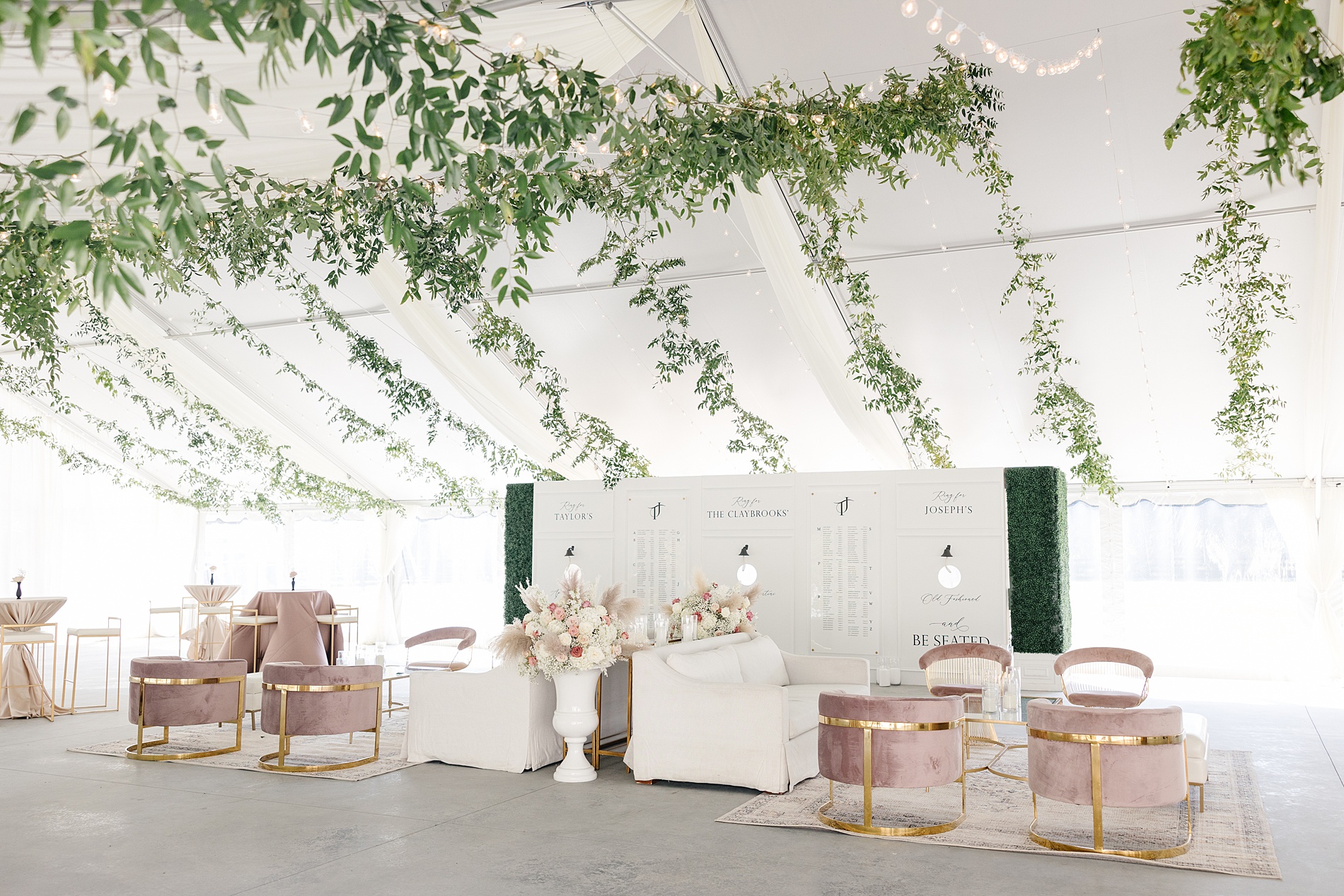
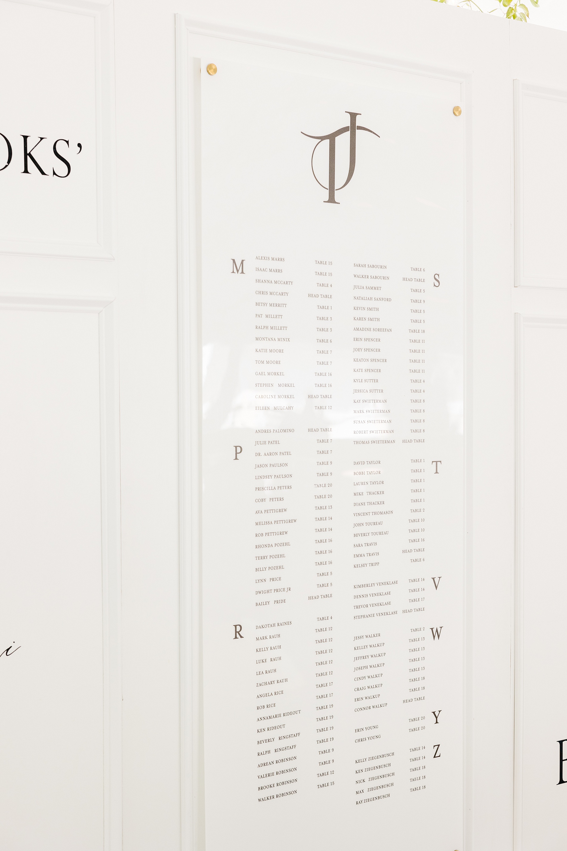
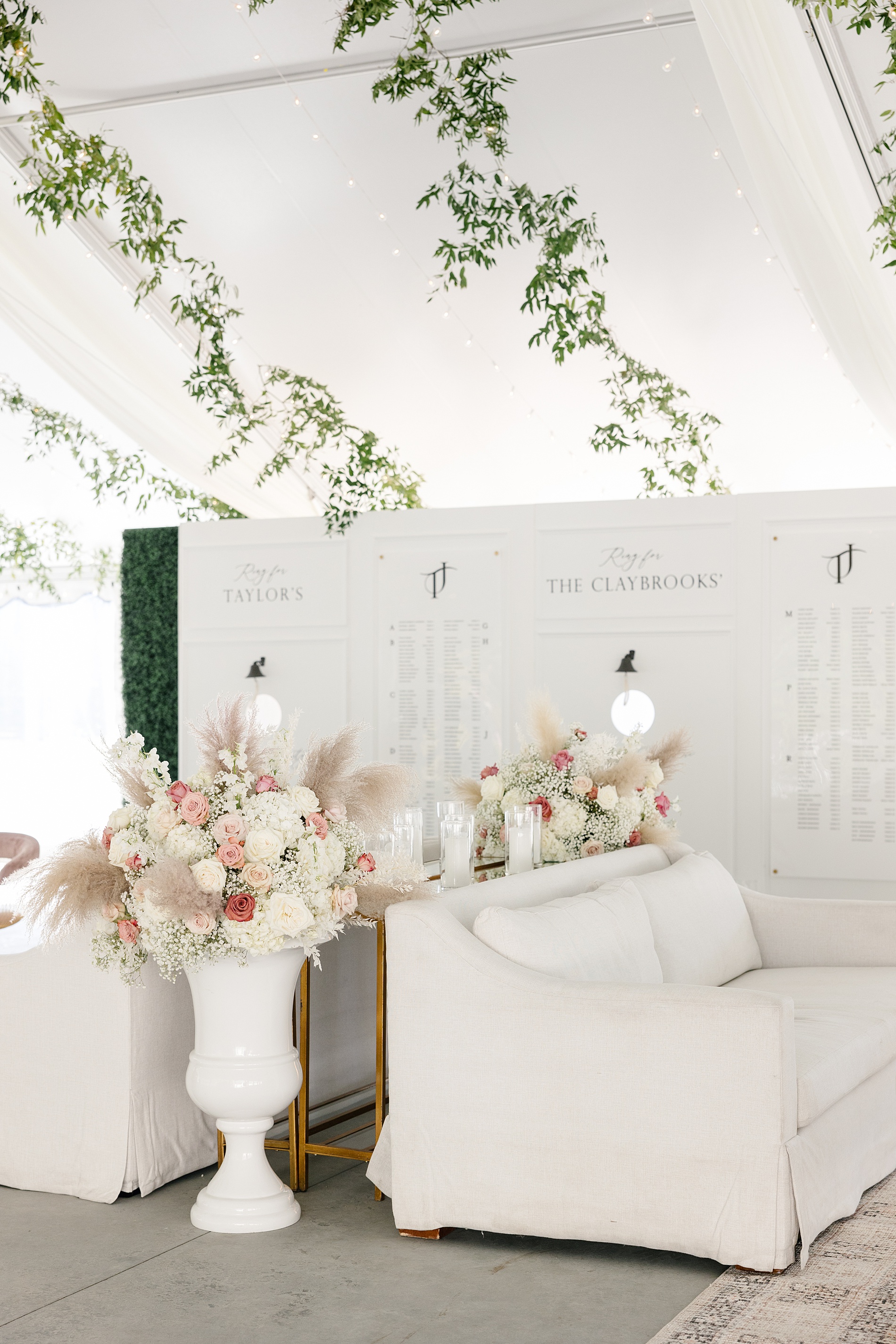
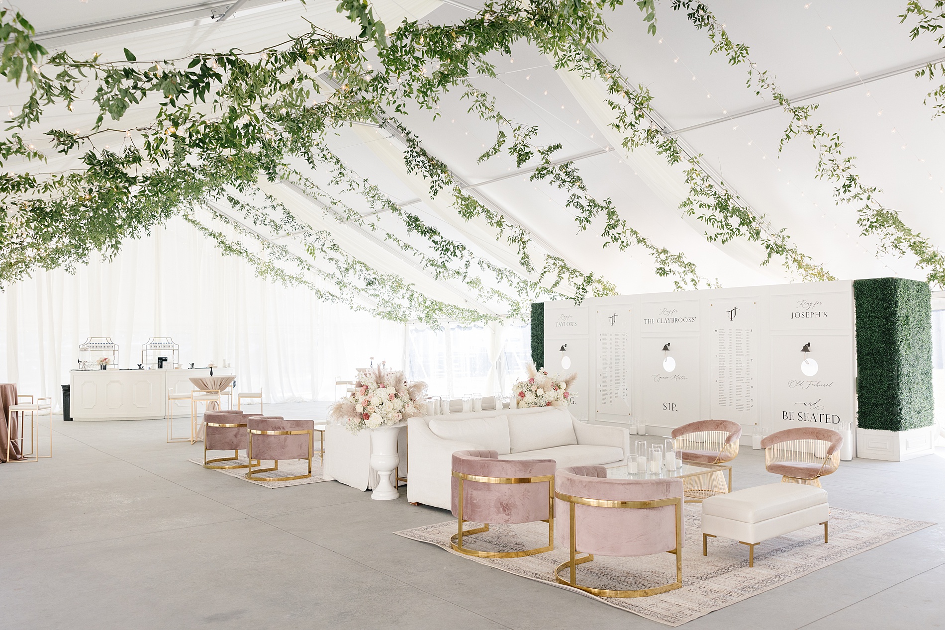
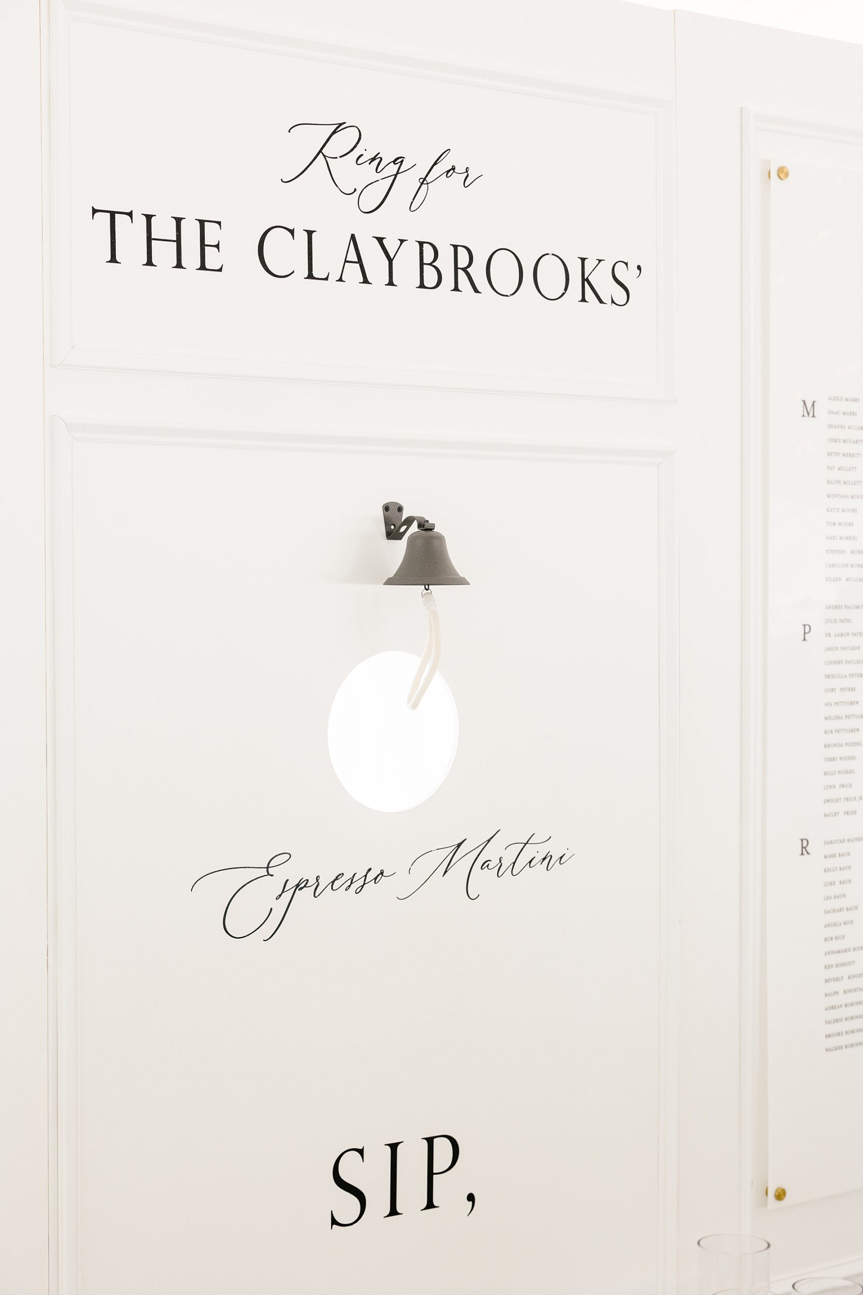
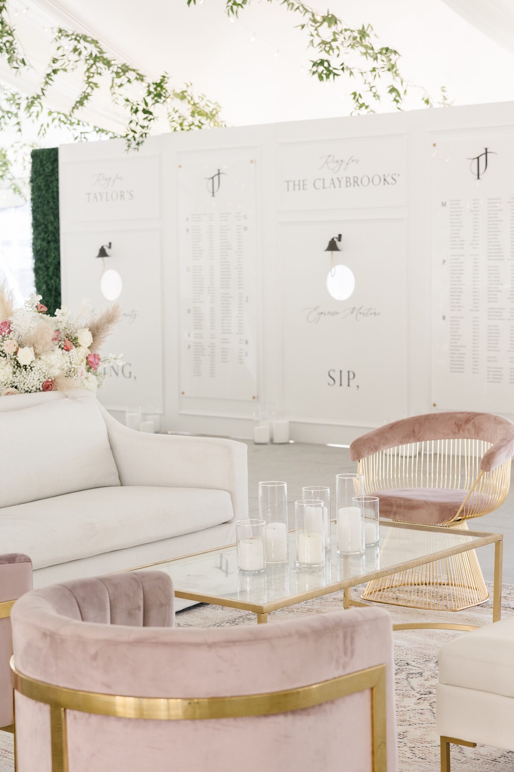
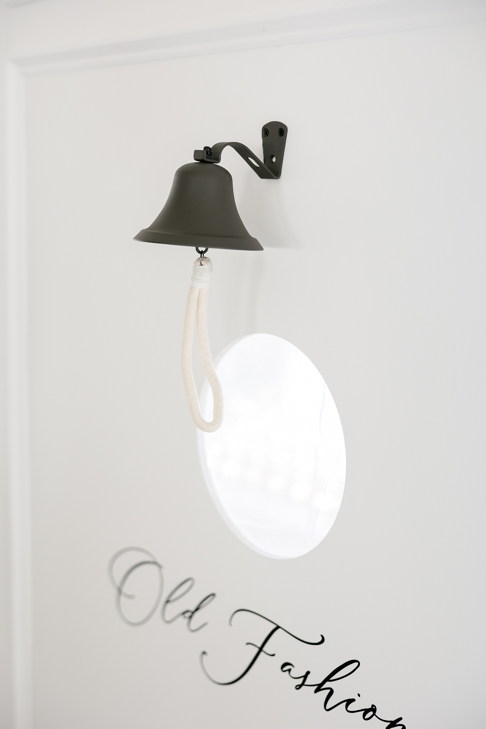
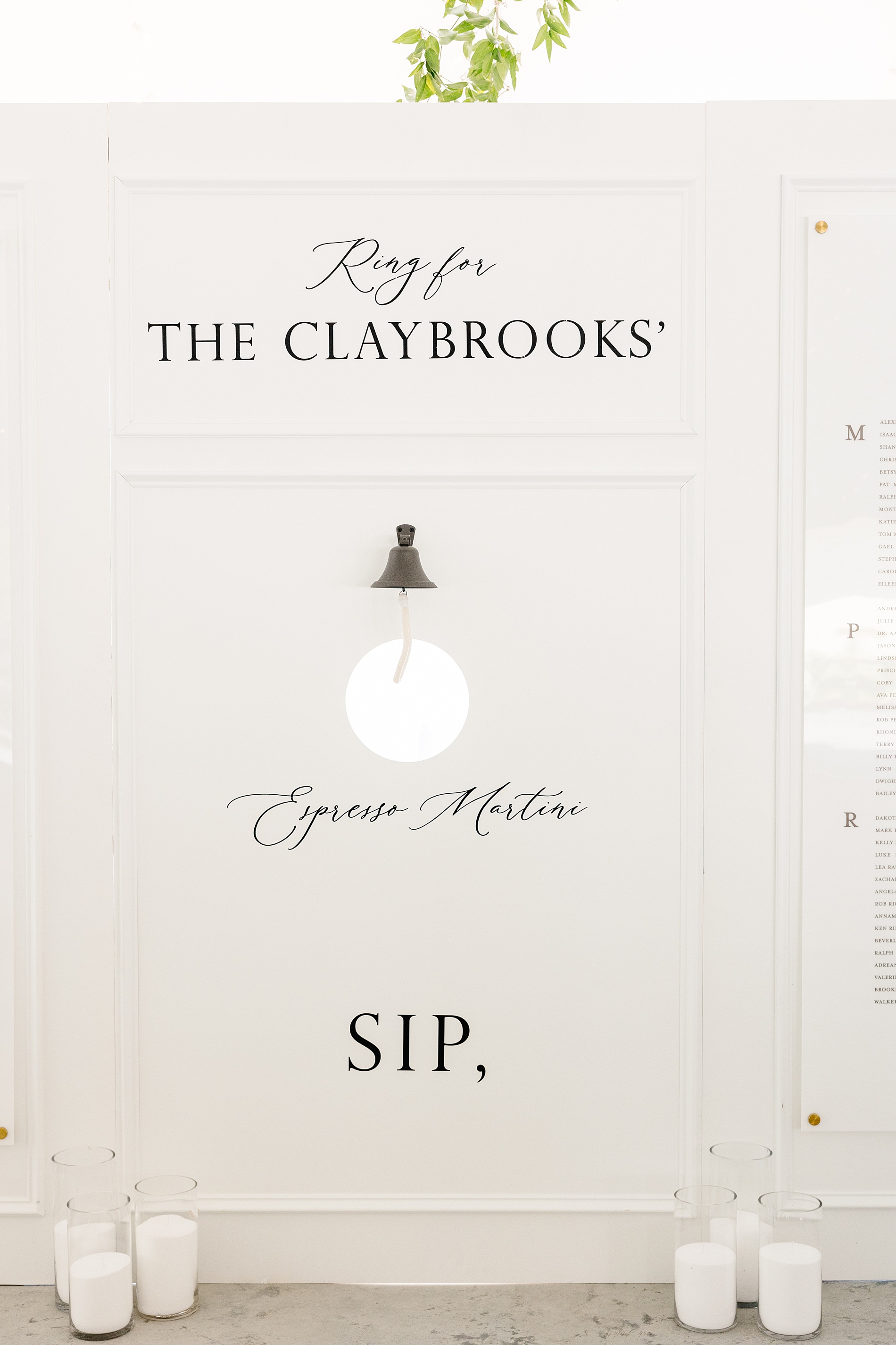
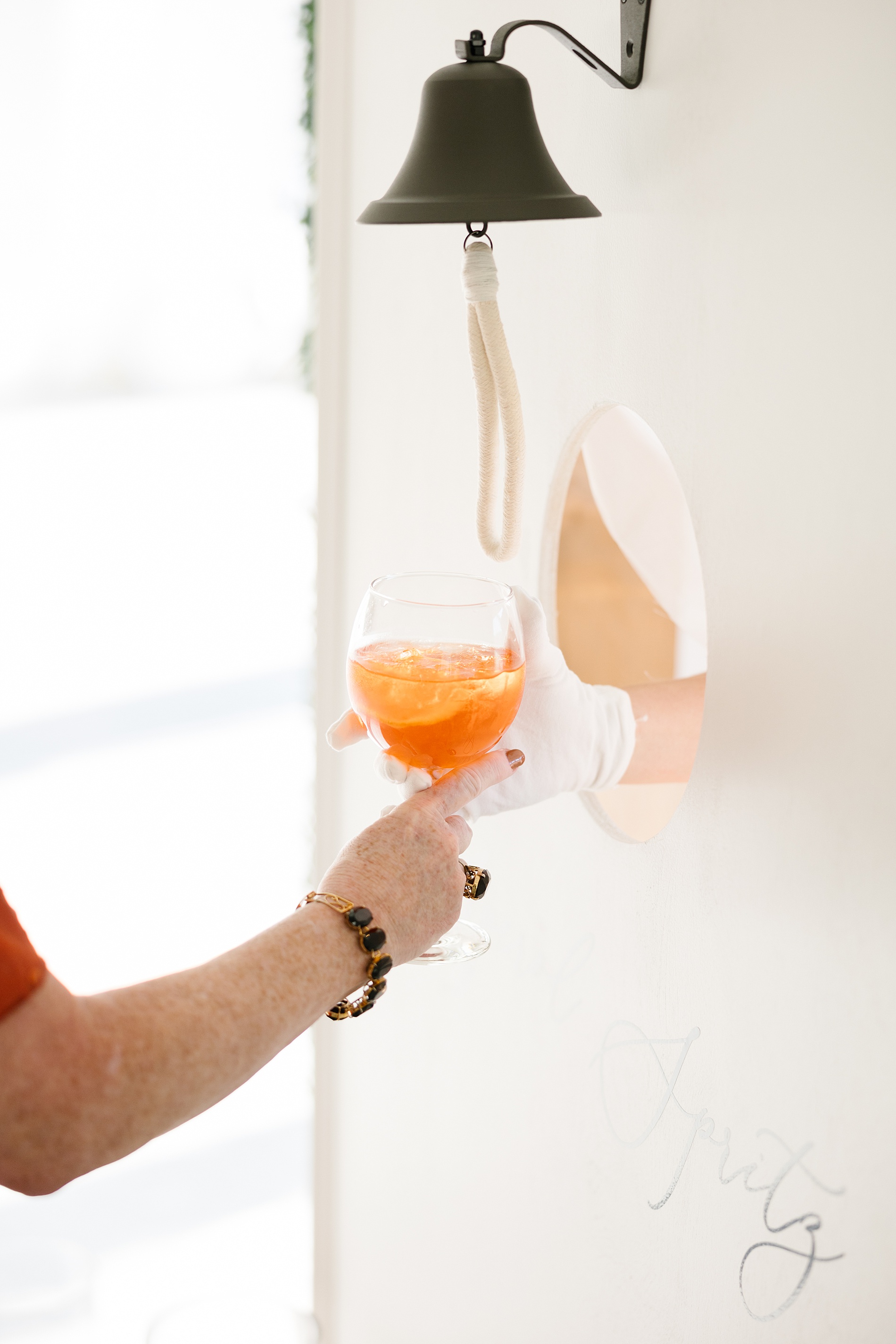
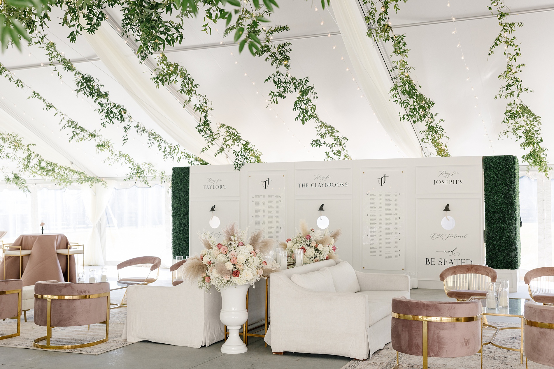
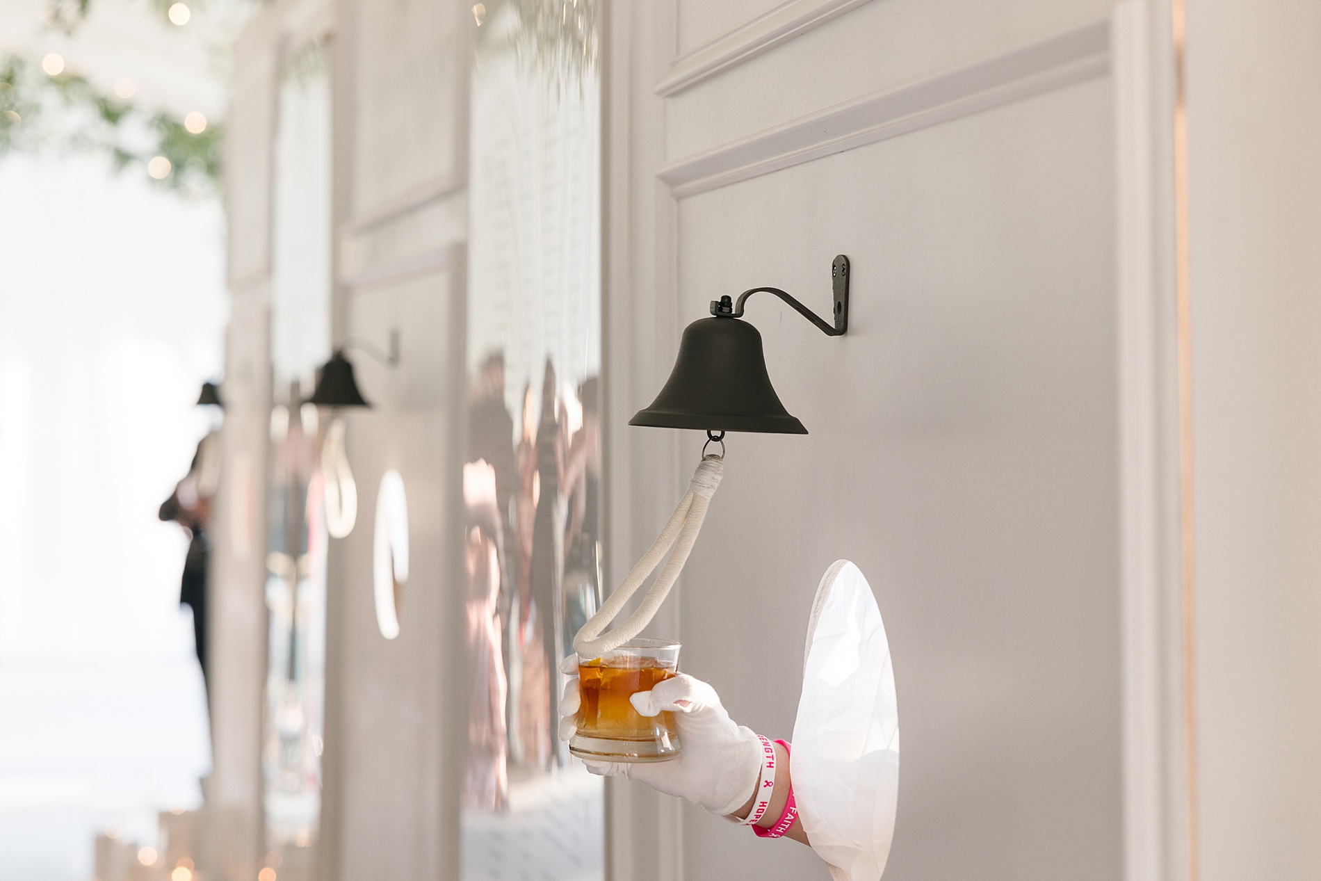
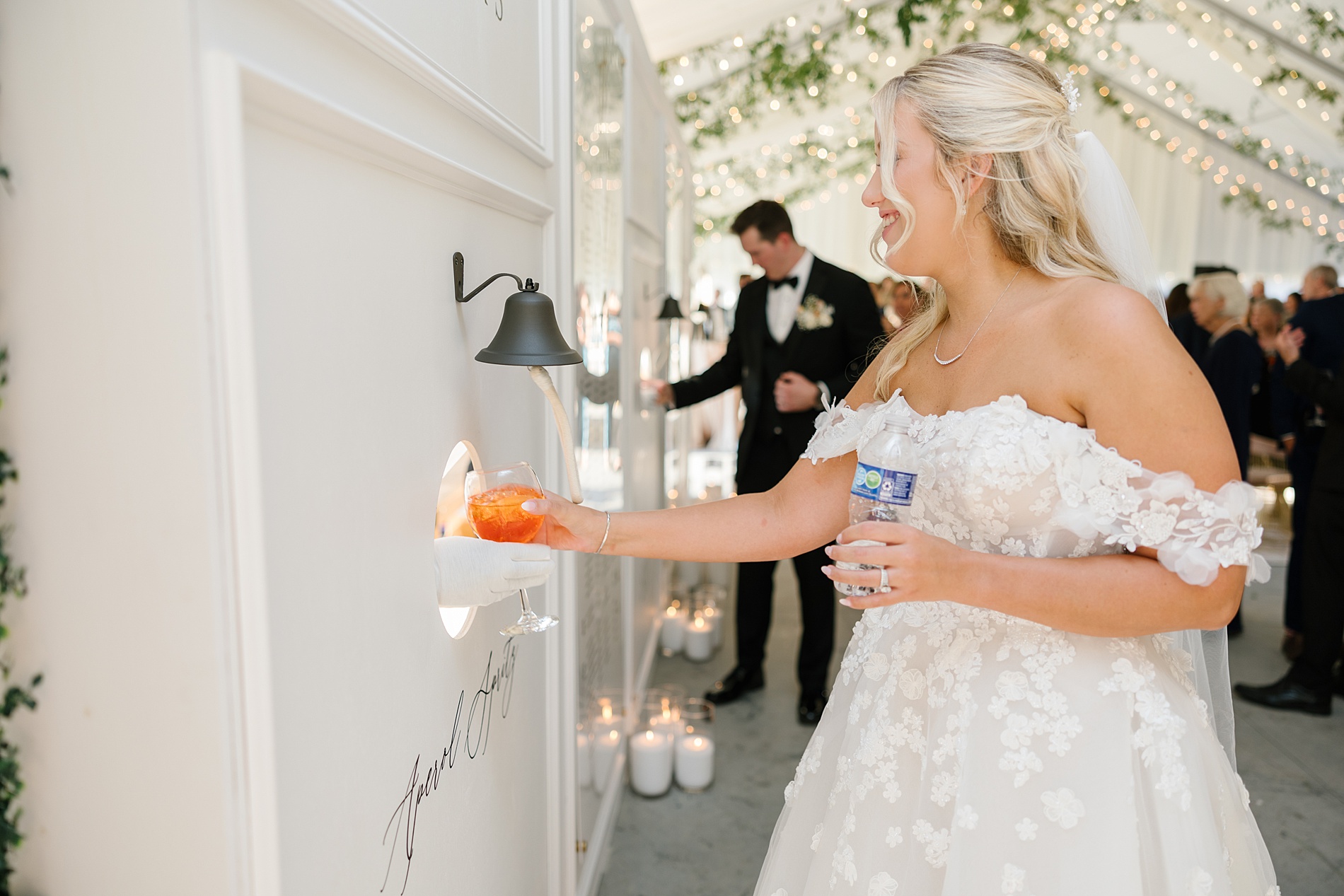
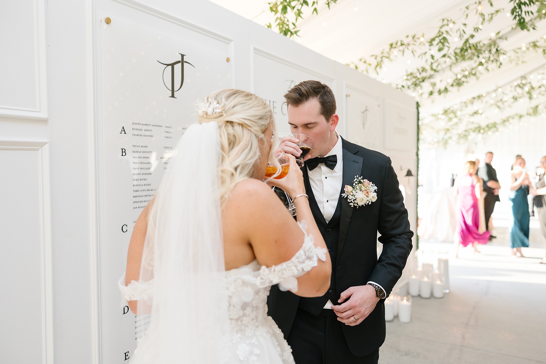
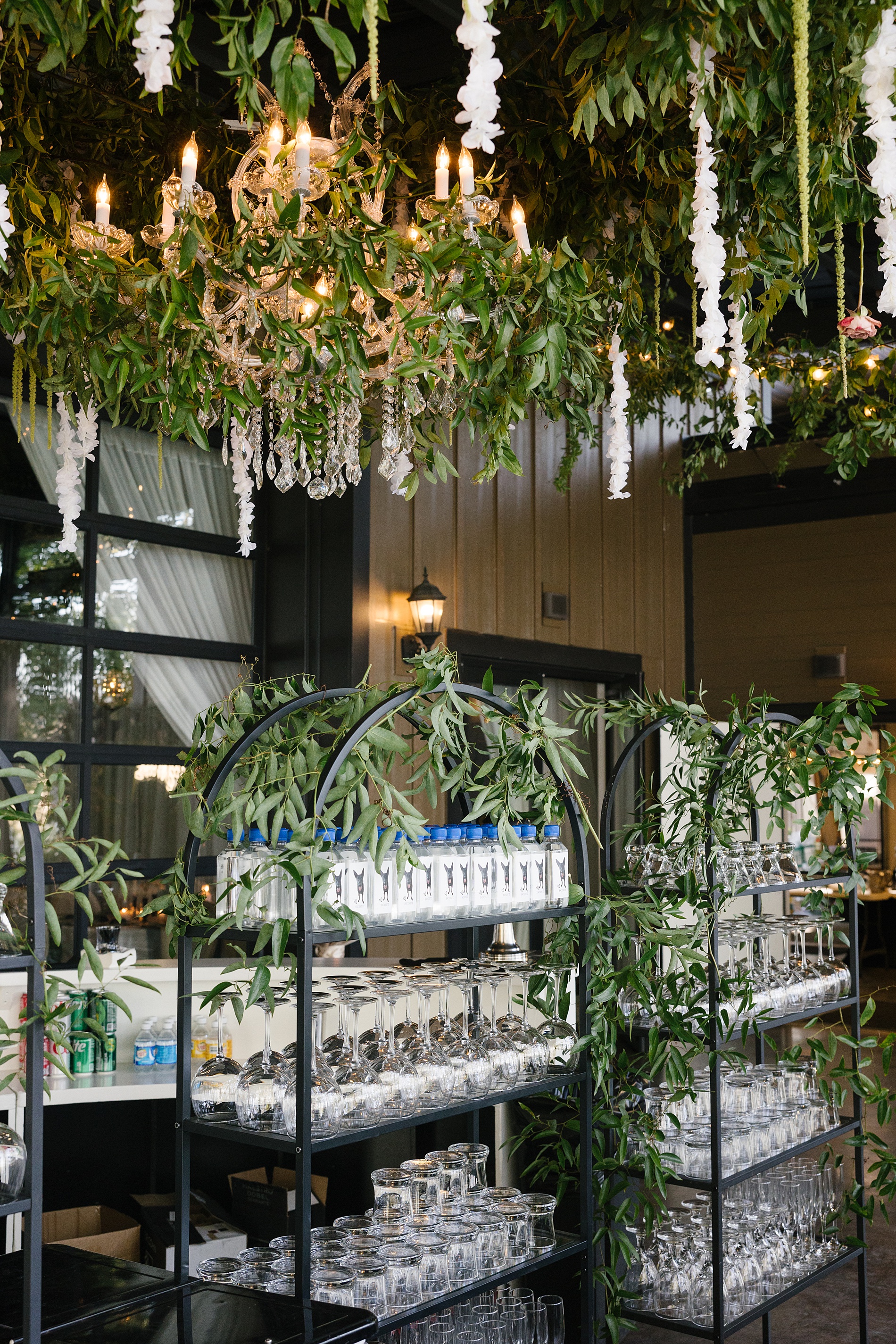
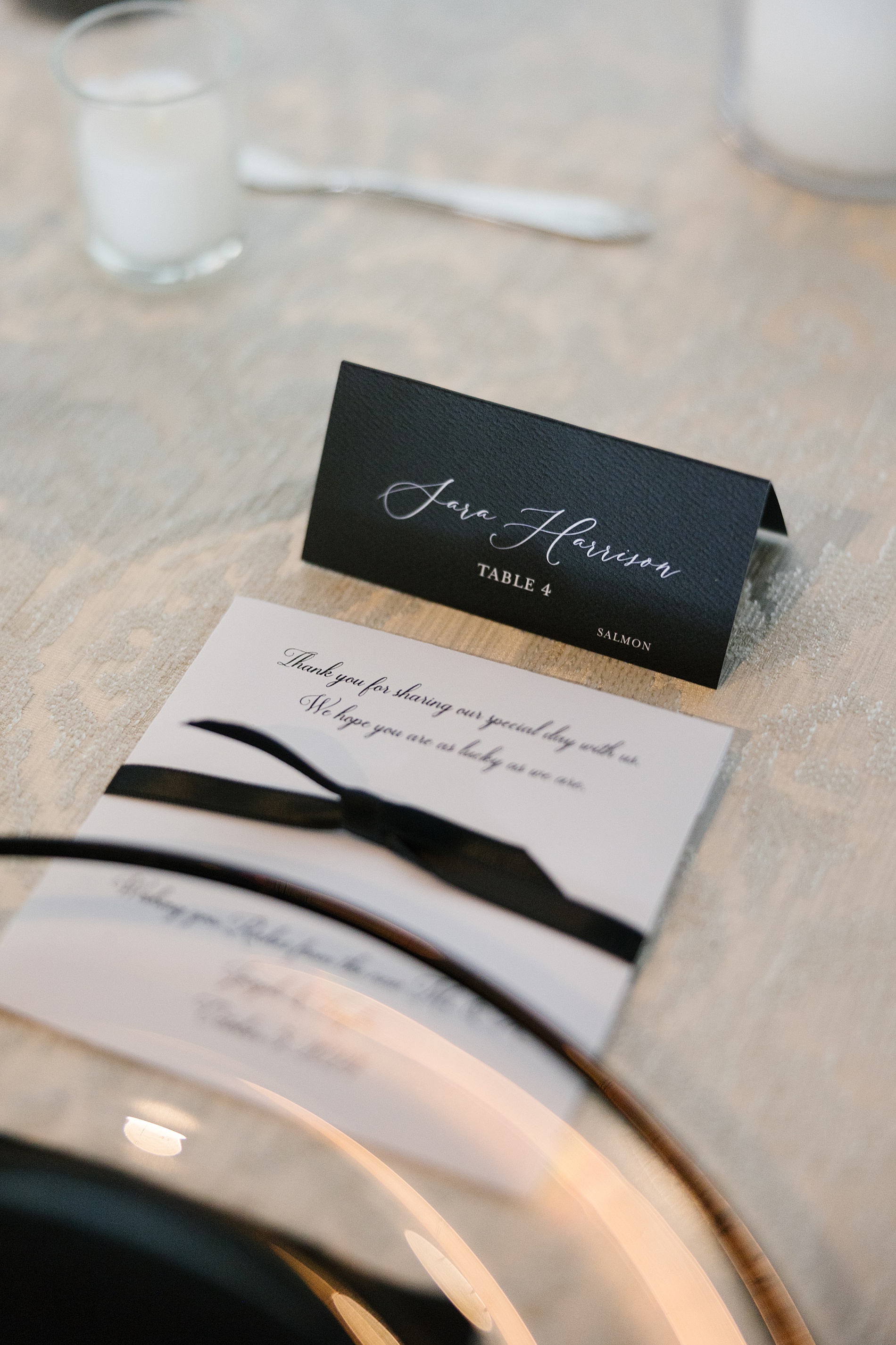
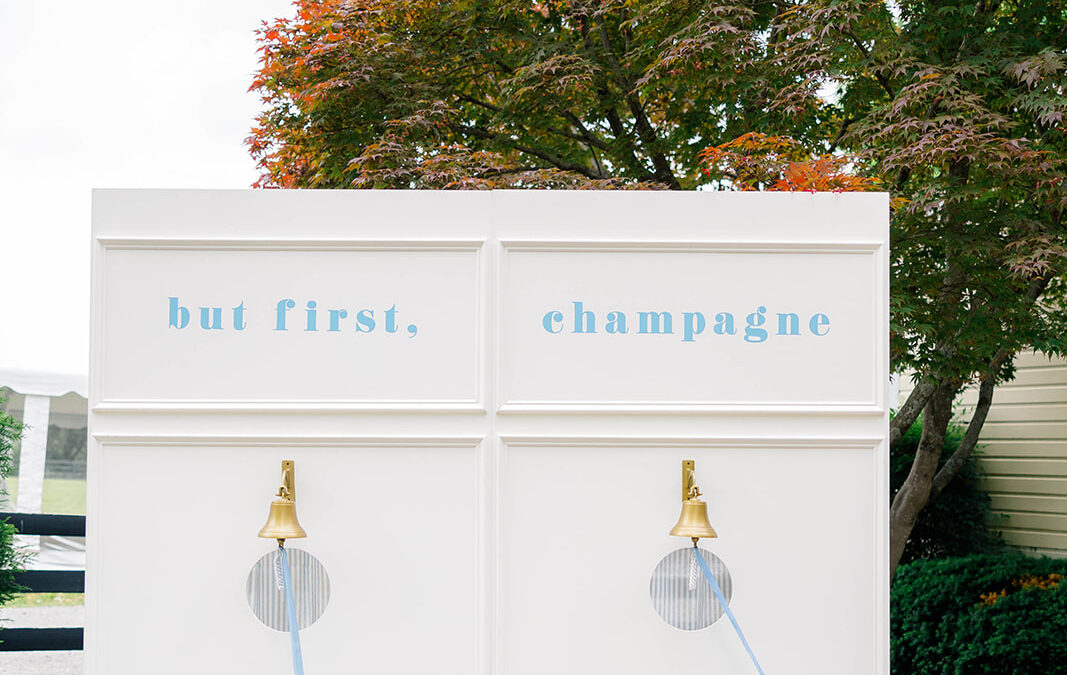
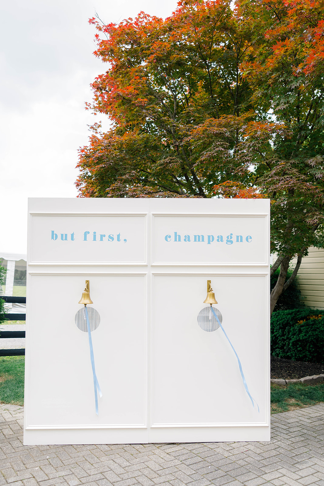
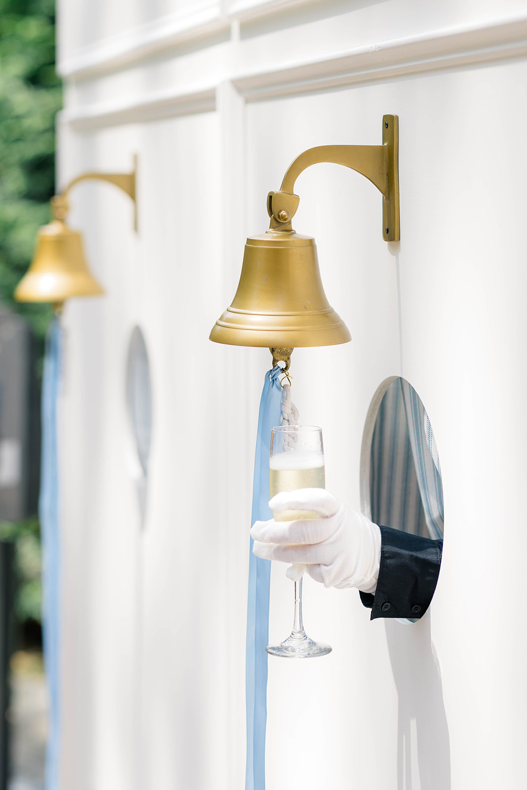
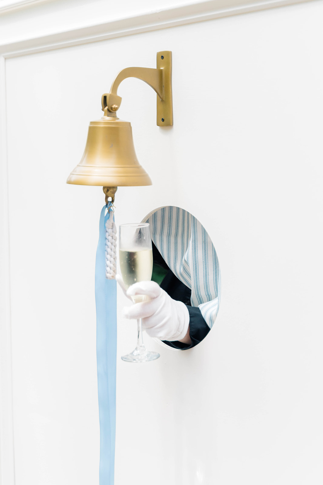
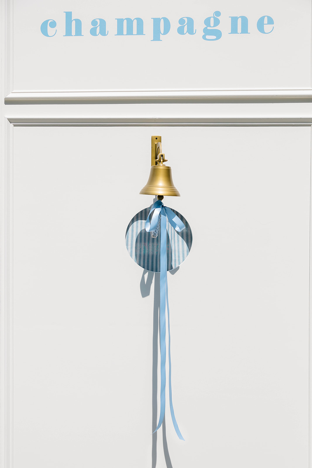
Our favorite feature of the day? A 20-foot cocktail pass-through wall, which is our largest installation to date! This statement piece displayed the seating chart alongside three signature cocktail options. Guests would ring a bell, and a white-gloved bartender on the other side would pass their drink through the wall. It was interactive, elegant, and such a highlight of the evening (a little birdie, aka the MOB, told us it was a MAJOR guest favorite!)
Day of Details
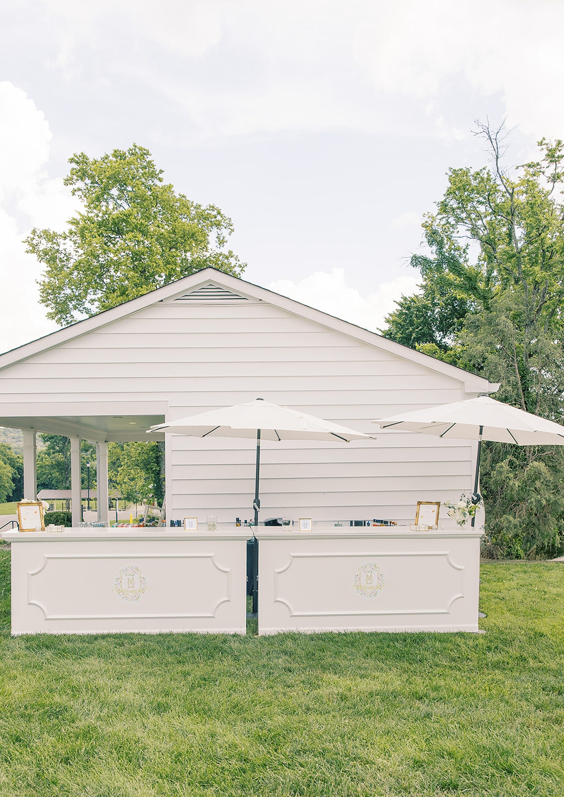
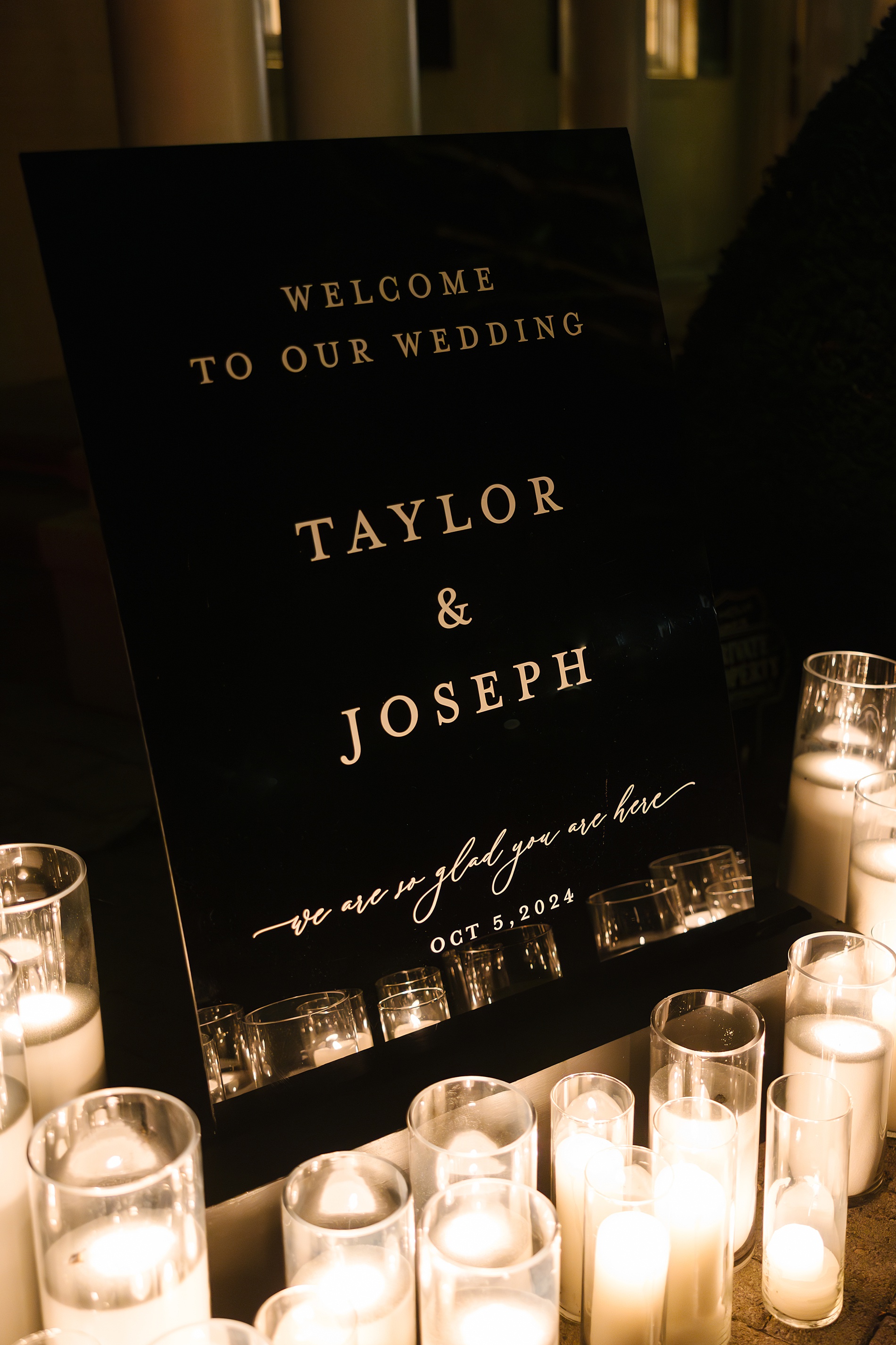
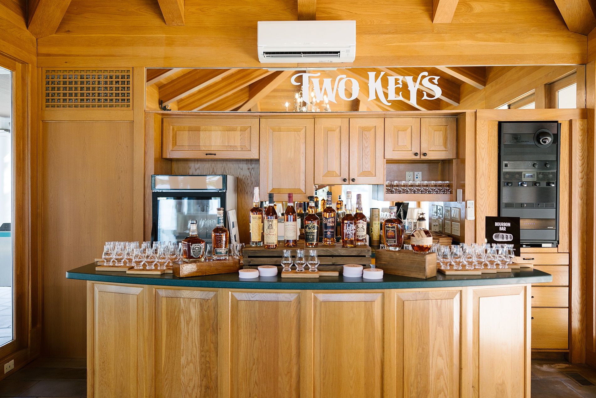
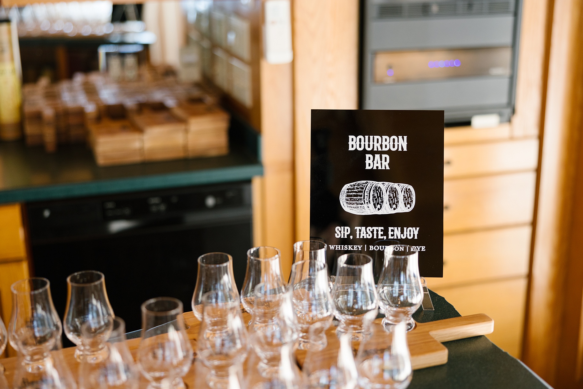
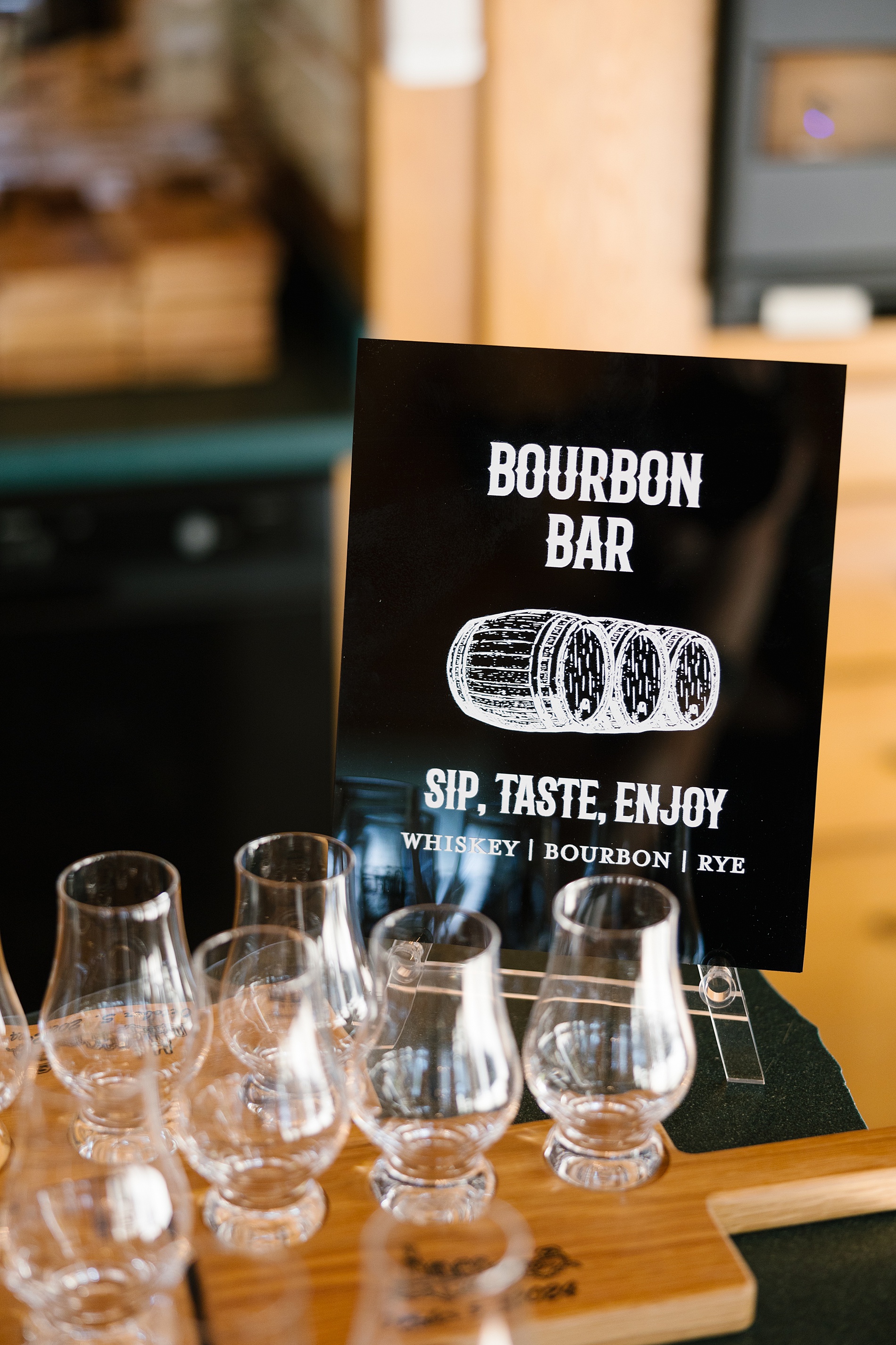
We also had the honor of creating many other day of details that fit flawlessly into their wedding day vision. Guests were greeted by a sleek, black acrylic welcome sign with white calligraphy. It looked so good surrounded by candle light reflecting off the glass. The bar signage and the black acrylic bourbon bar sign were two other reception details we had our hand in creating!
The details didn’t stop there though! Custom foam drink toppers for the espresso martinis (yes, the details even made it to the cocktails!) included their monogram with their last name and wedding date!
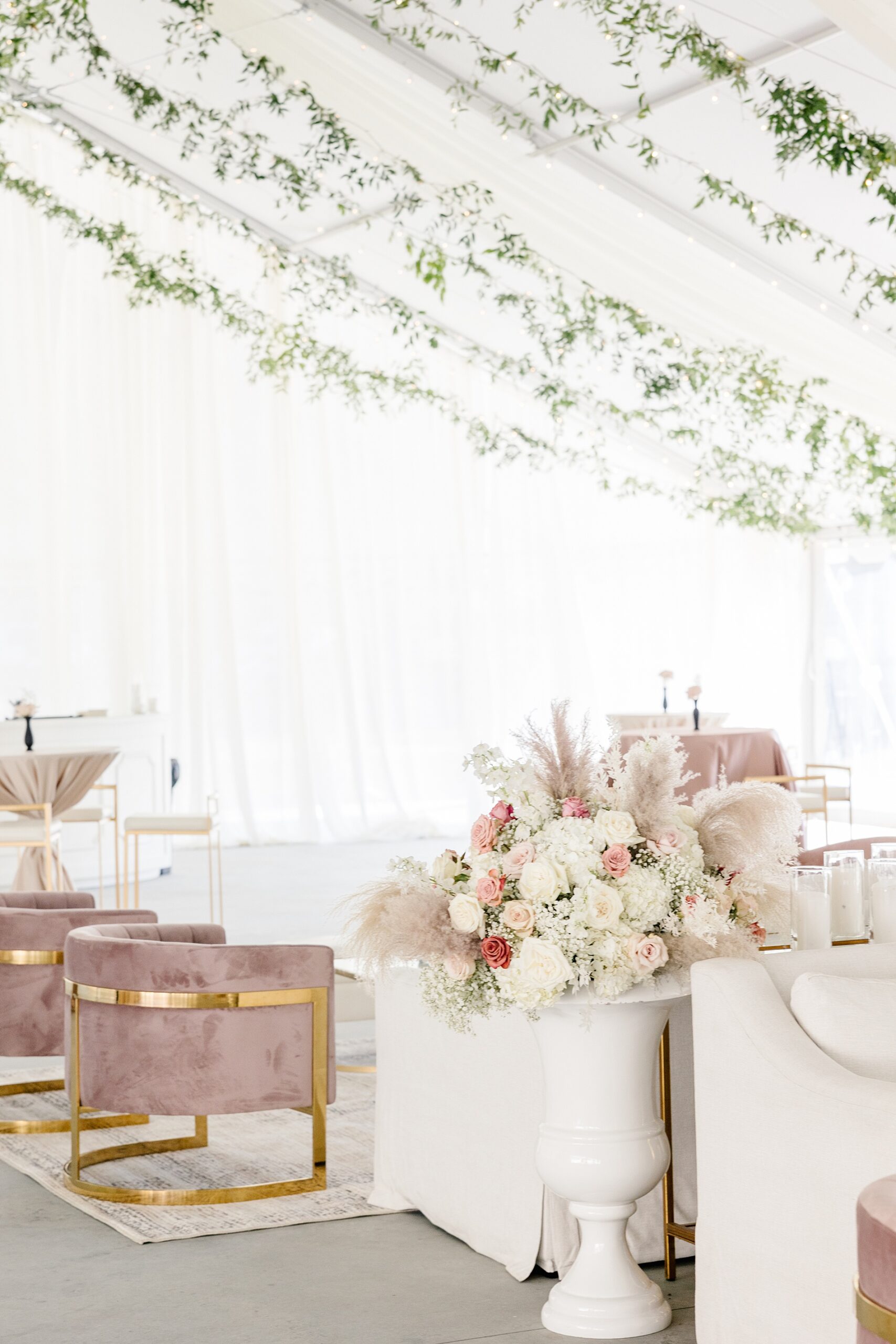
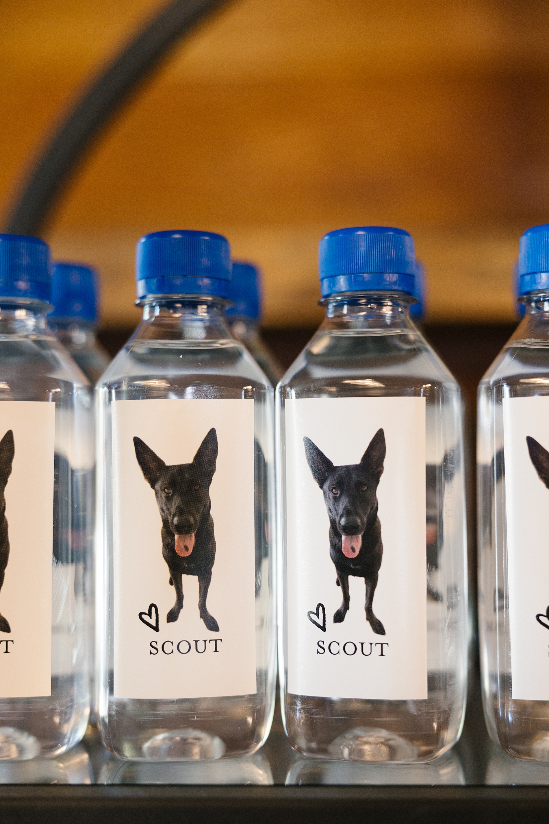
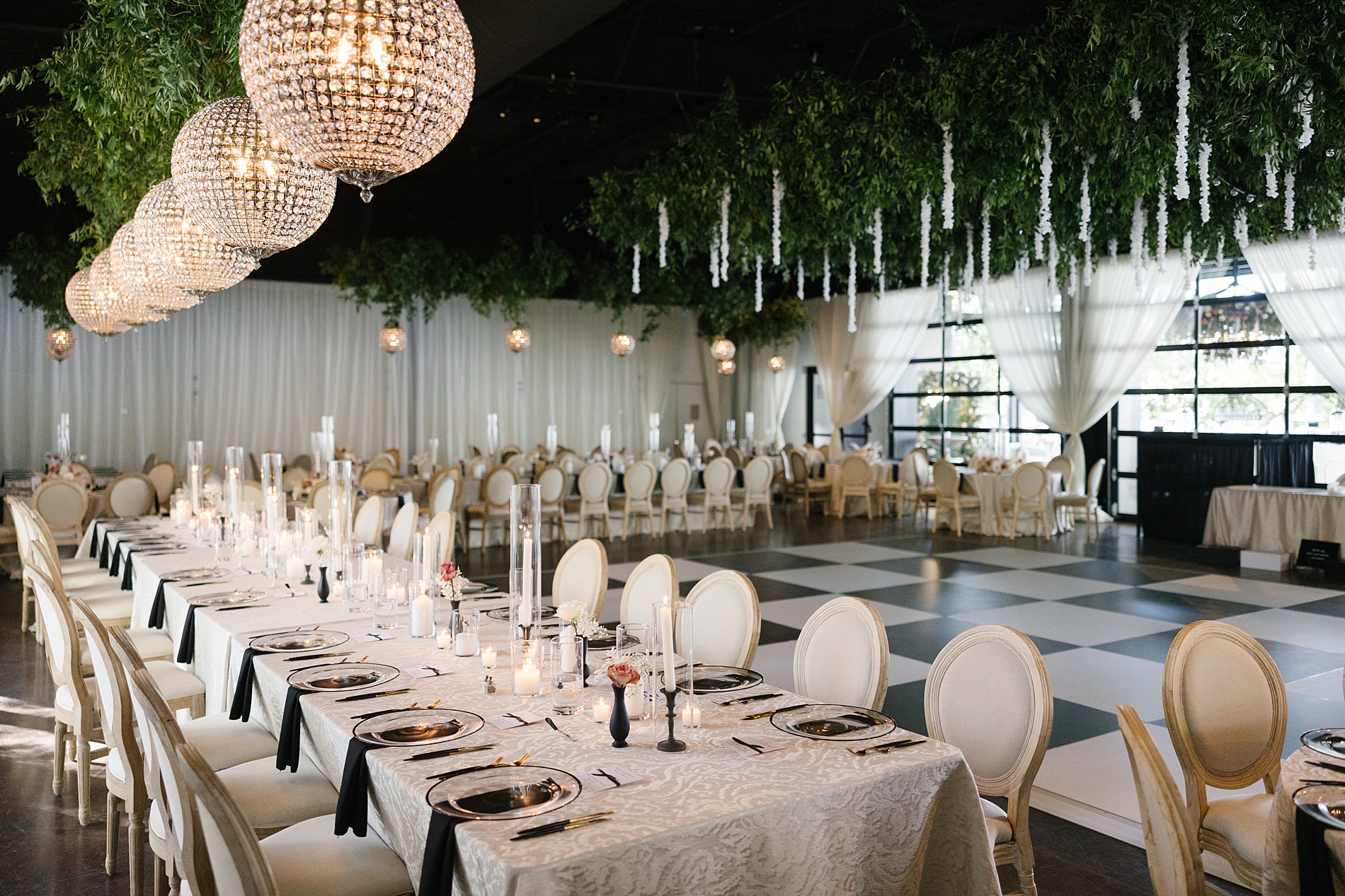
Guests could also grab a refreshing bottle of Fiji water that featured a custom sketch of their beloved dog, Scout, on the label. I love weaving fun and personal details into a wedding day in unique ways. The reception space was stunning with spherical chandeliers and greenery draped from the ceiling. At each table setting there were classic, black place cards in white calligraphy that corresponded with the grand seating chart.
Every single touchpoint of The Claybrooks’ wedding weekend, from the save the dates to the cocktail wall and seating chart, was designed with intention. We were thrilled to help Kelly and her family bring it to life. It’s weddings like this that remind us why we love what we do.
If you’re looking to add custom, thoughtful touches to your wedding or event, we would love to help make your vision a reality. Reach out today to learn more about our full-service design offerings! We can’t wait to create something unforgettable for you!
If you enjoyed this post, you’ll love these other blogs!
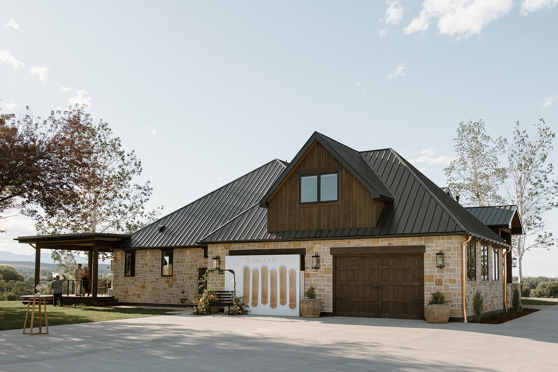
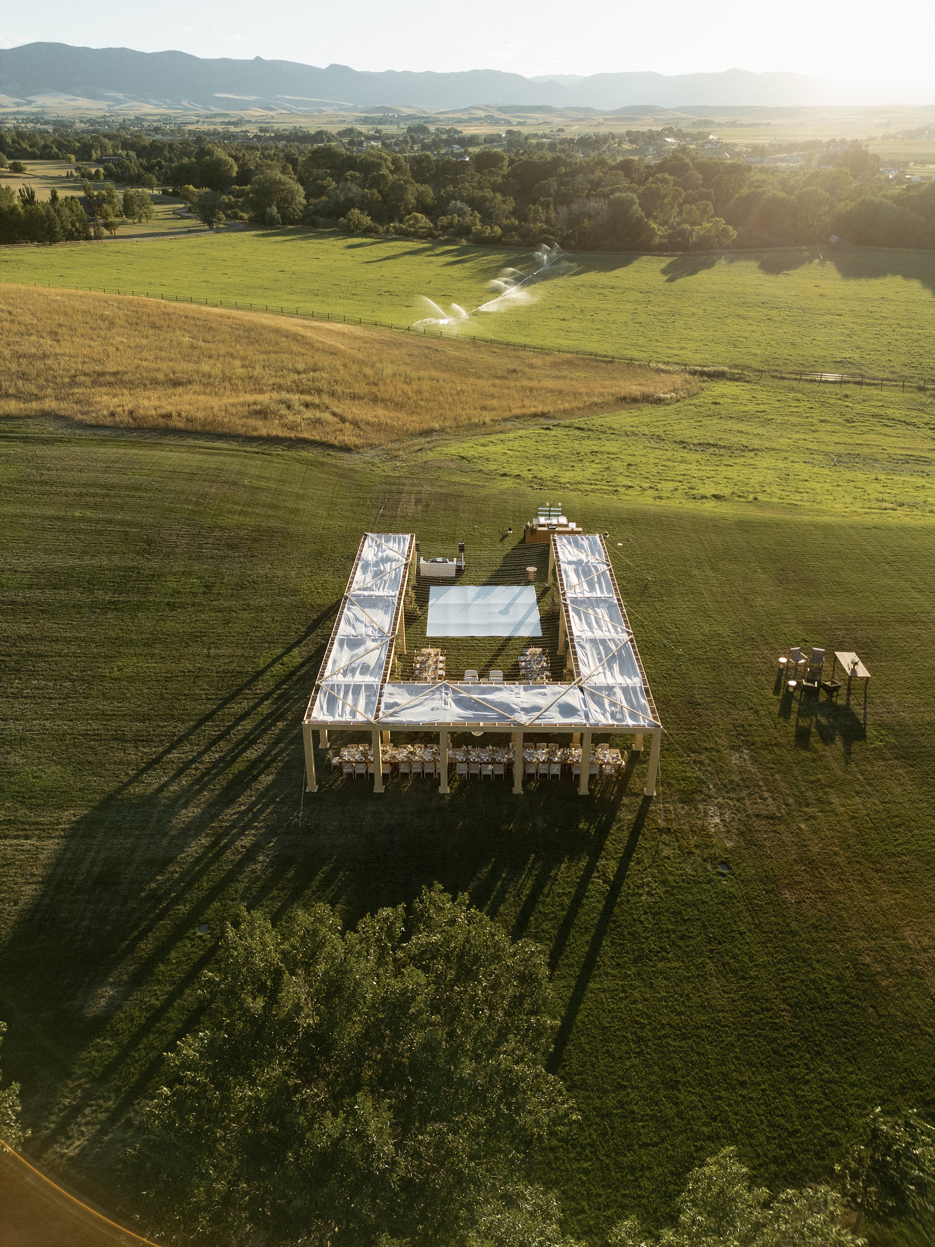
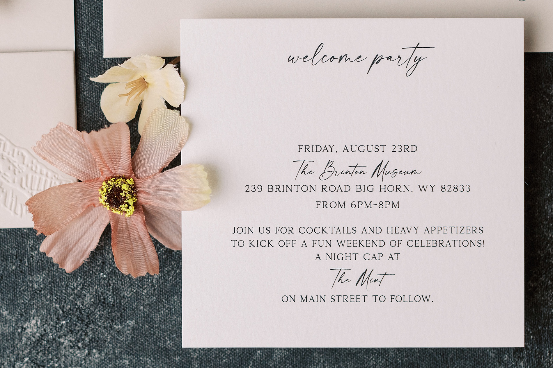
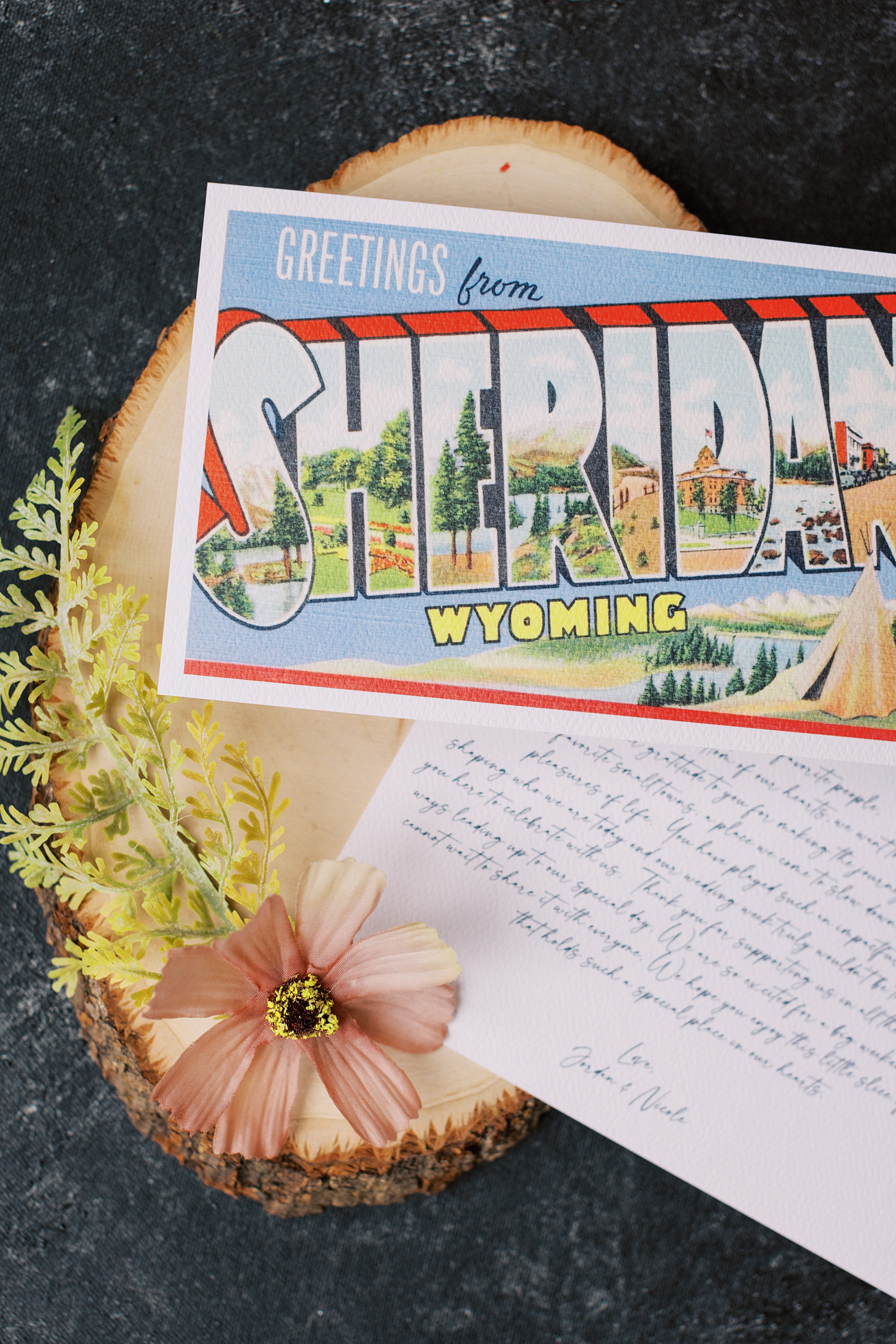
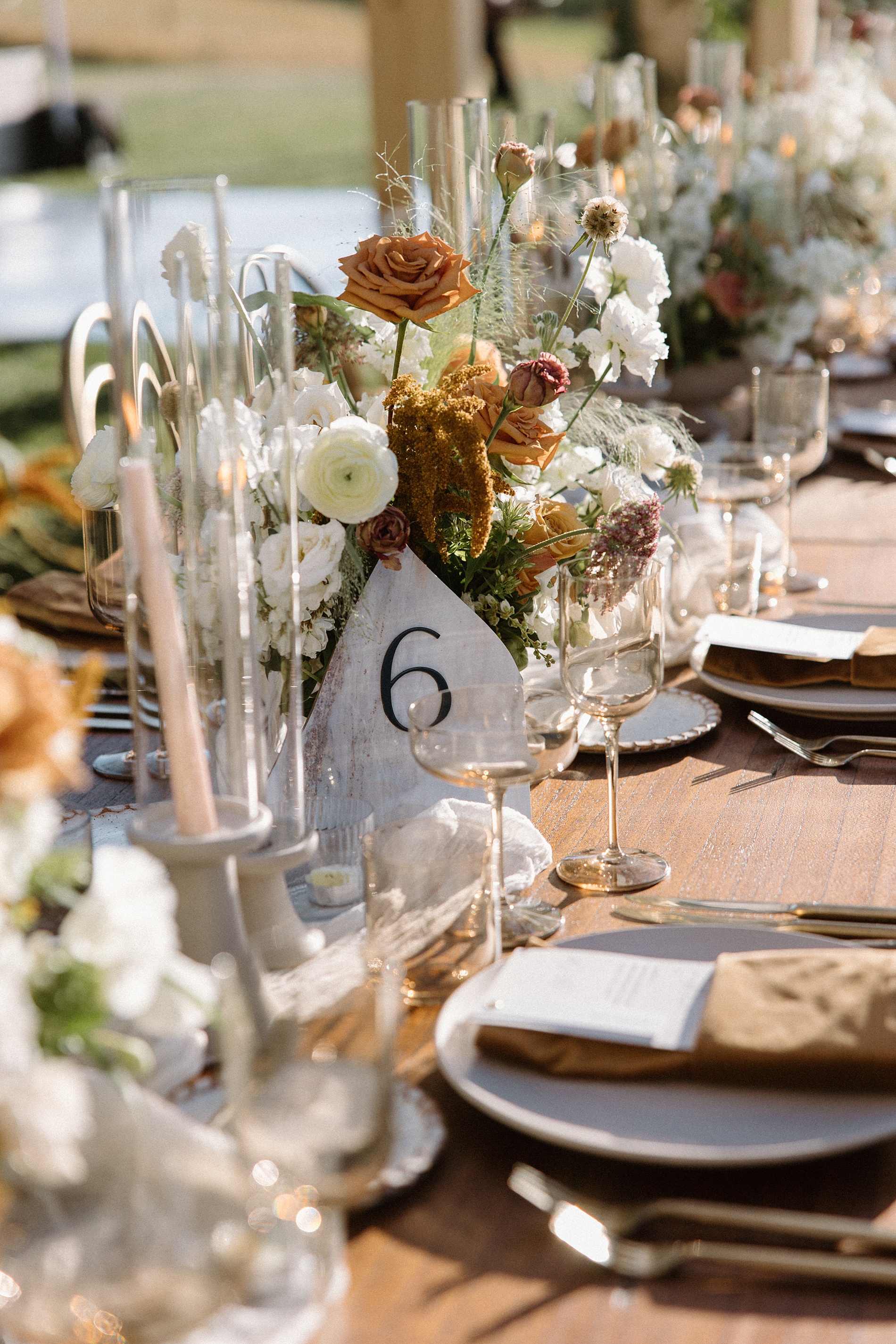
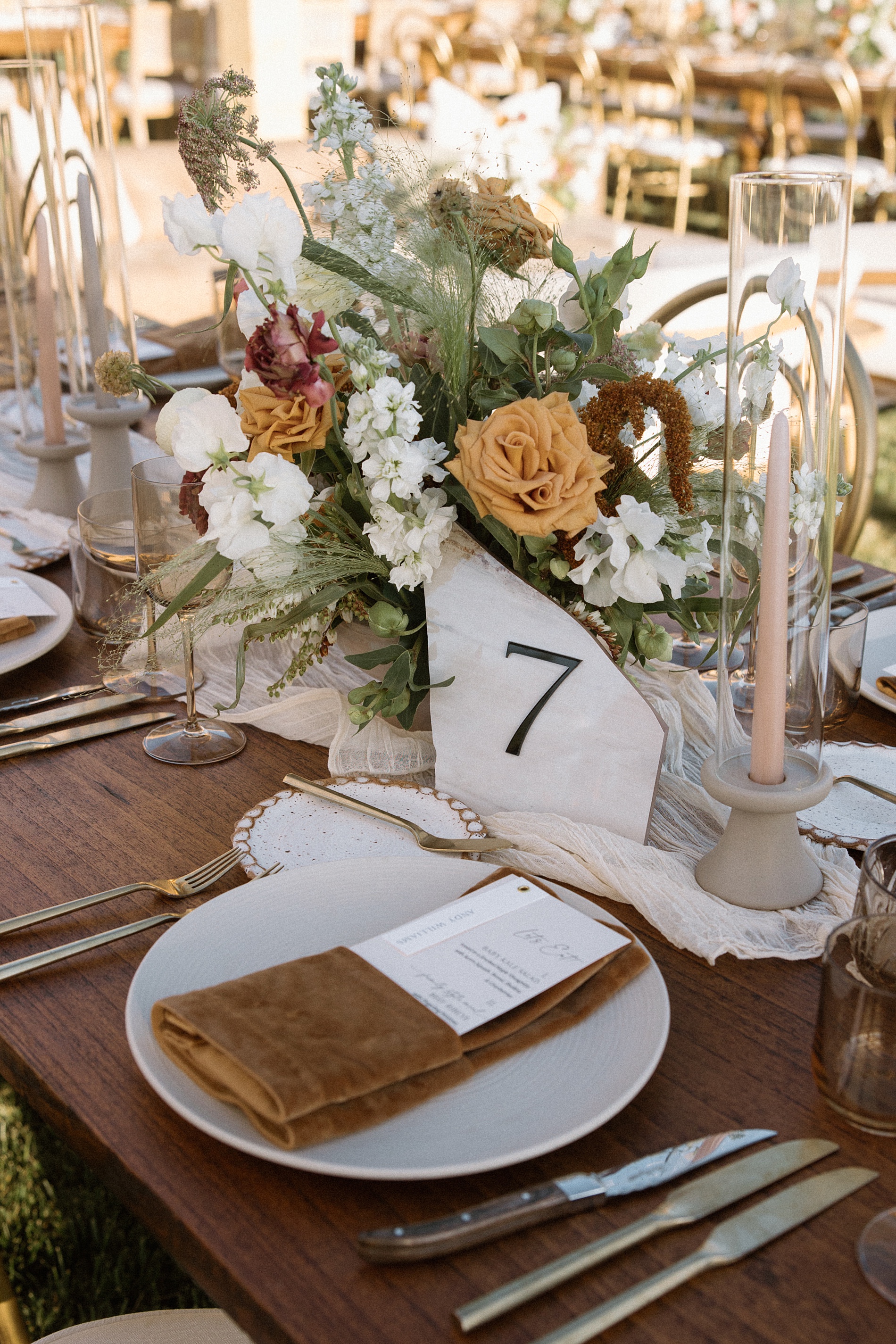
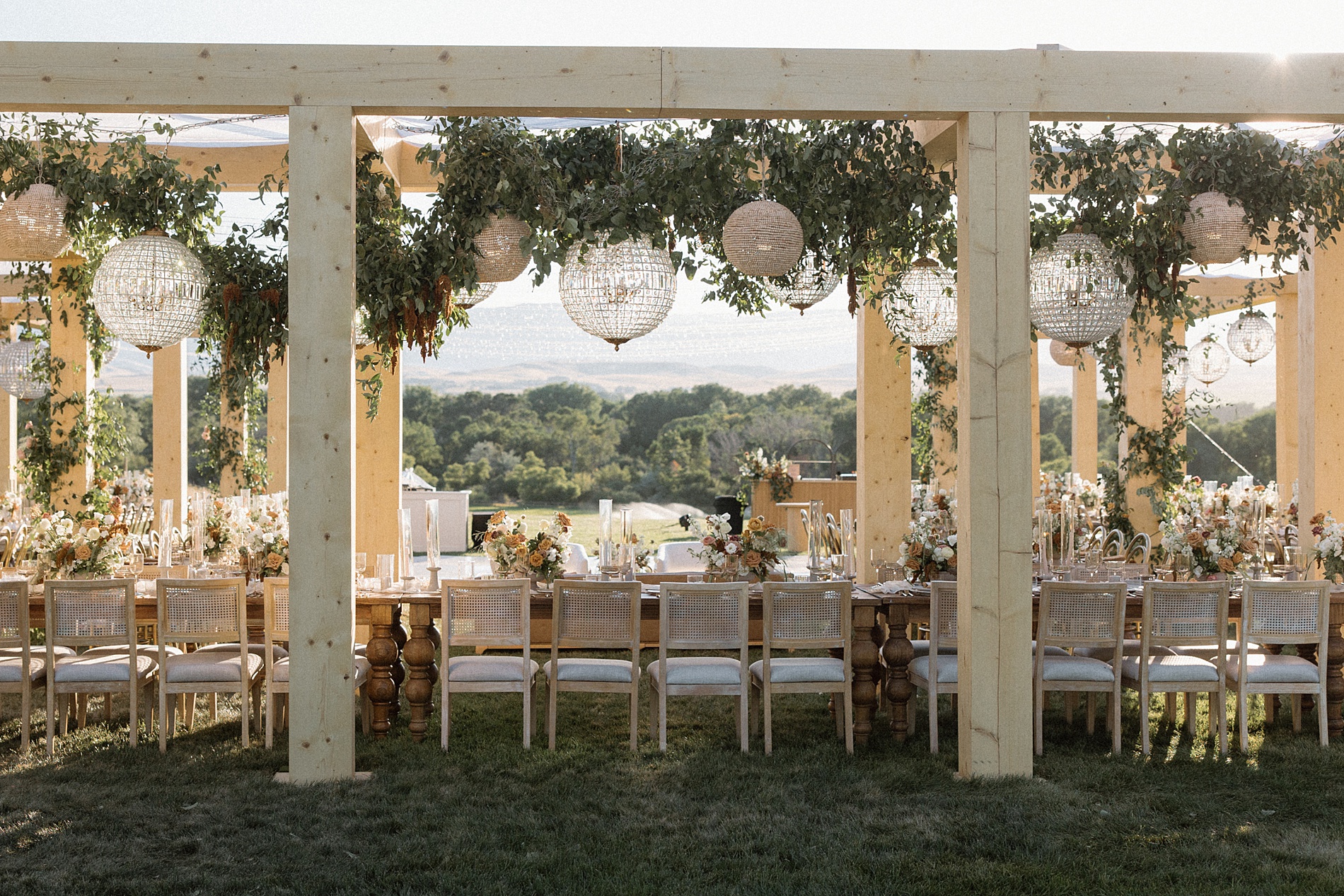
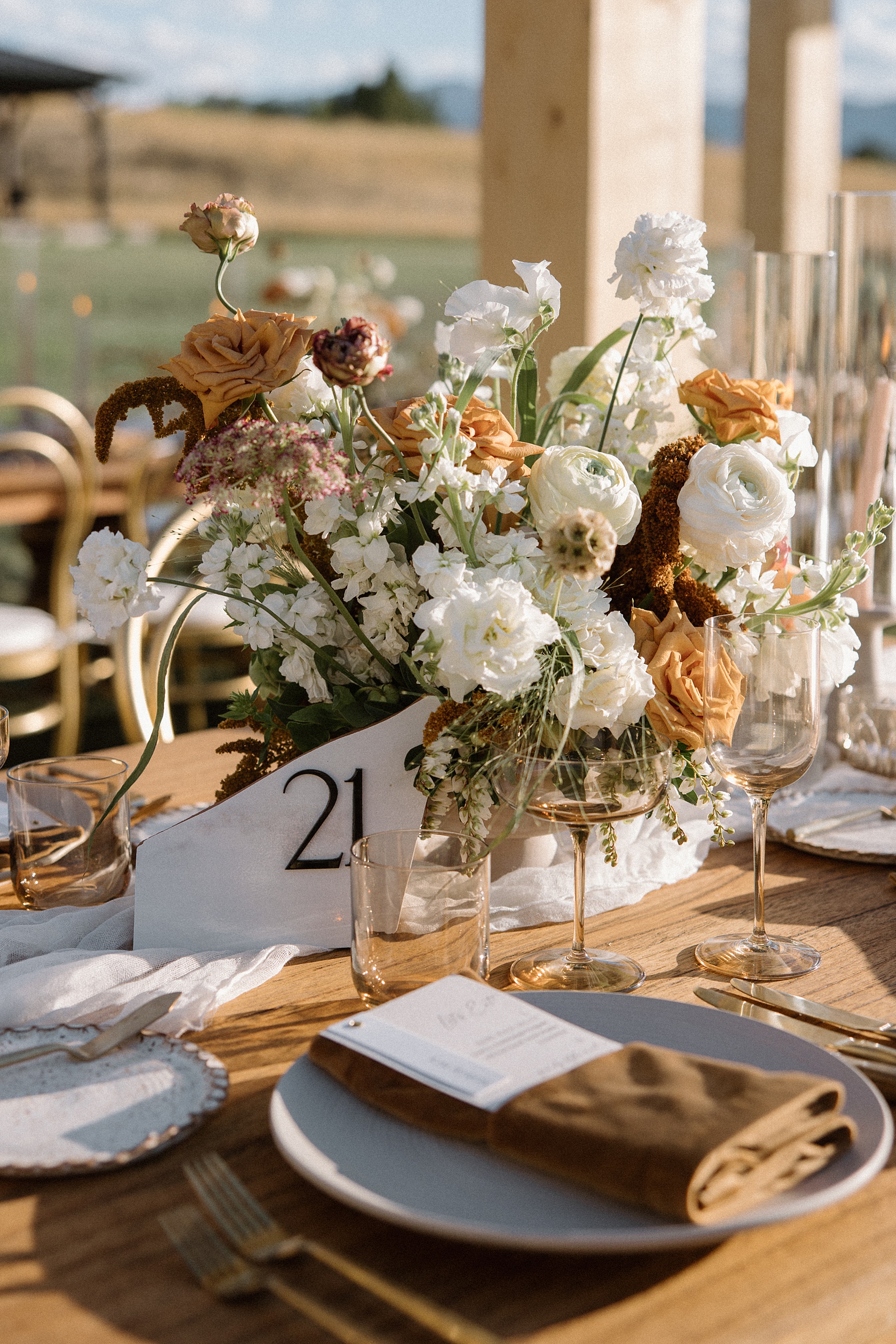
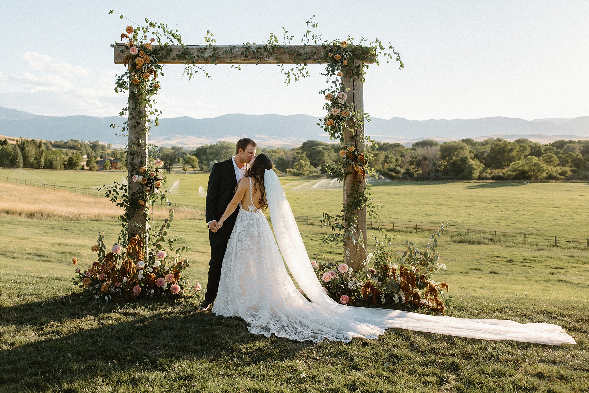
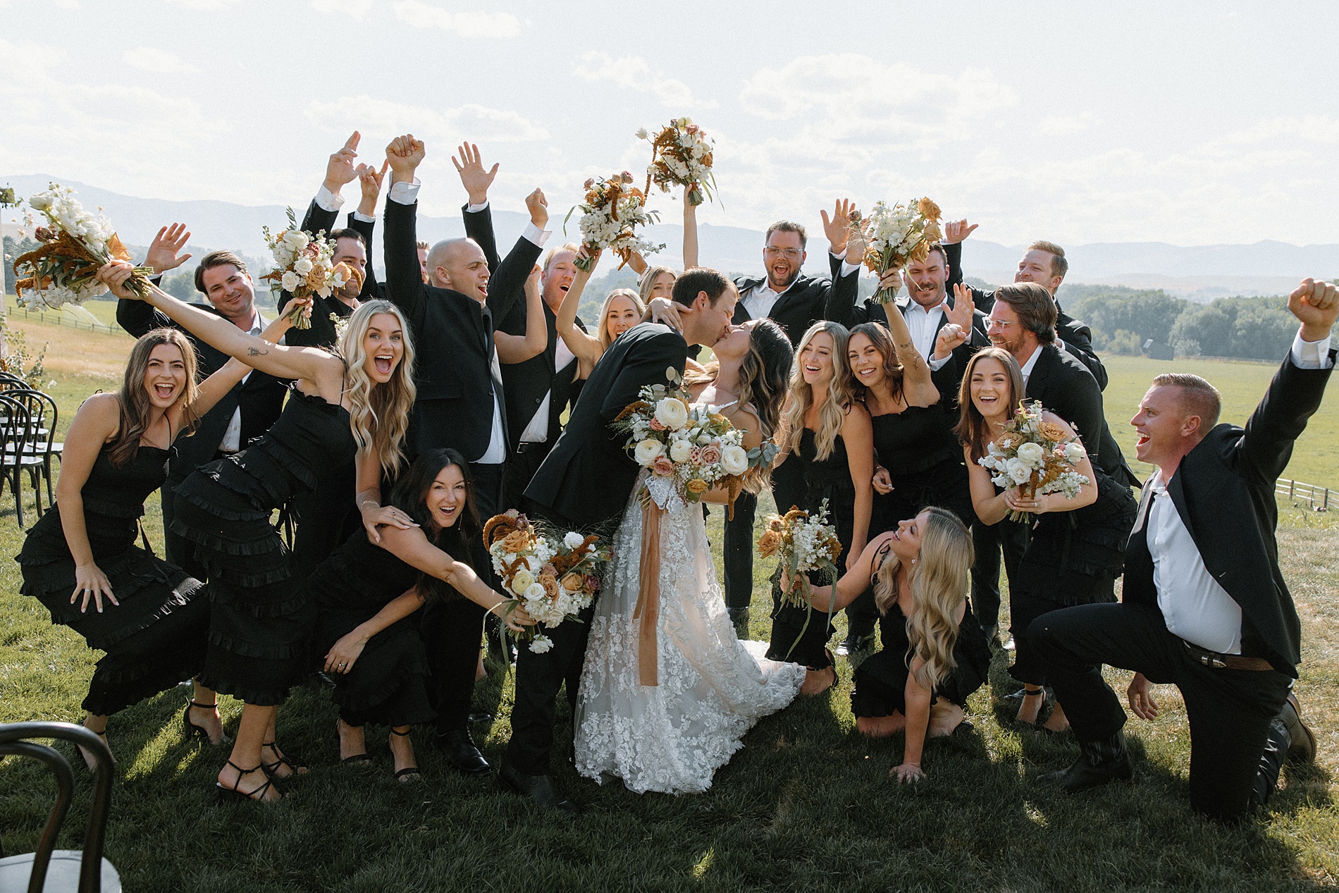
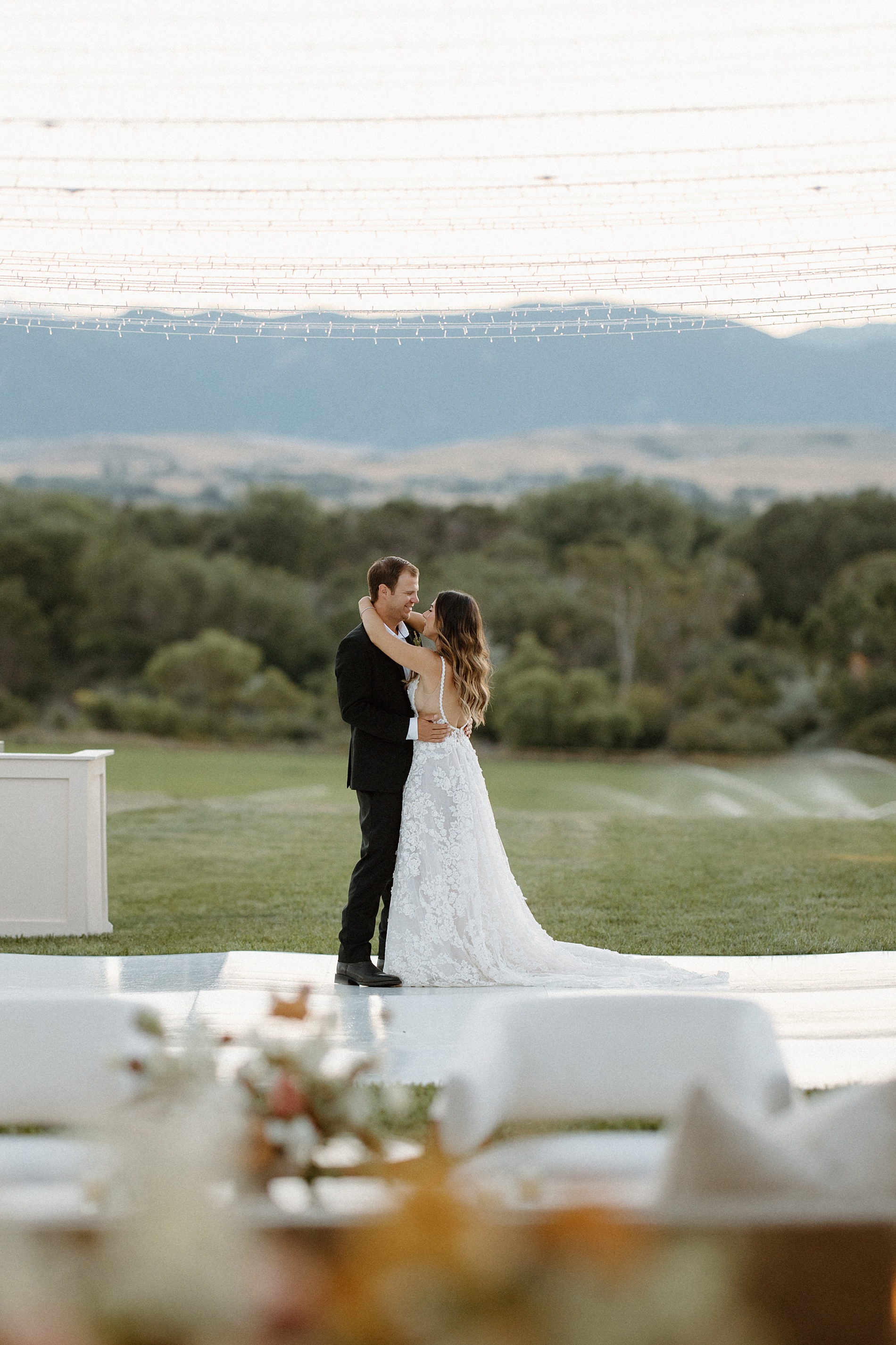
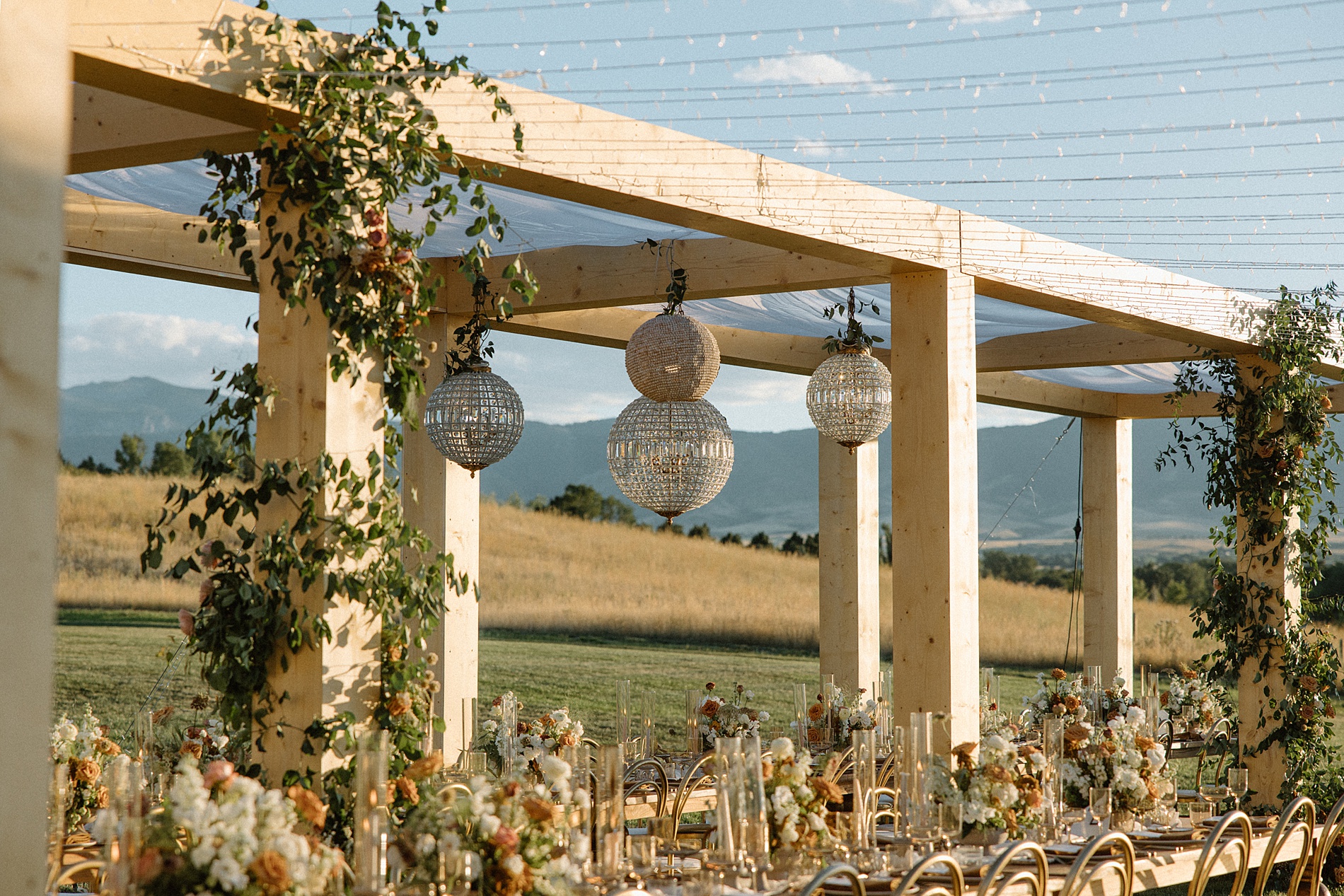
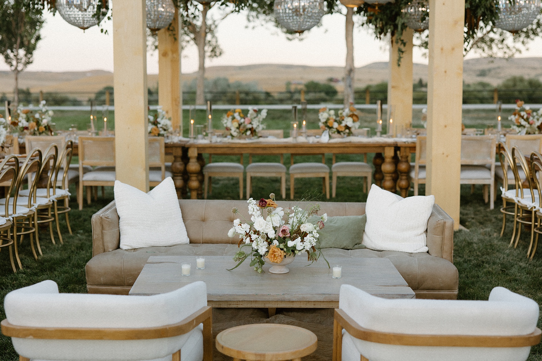
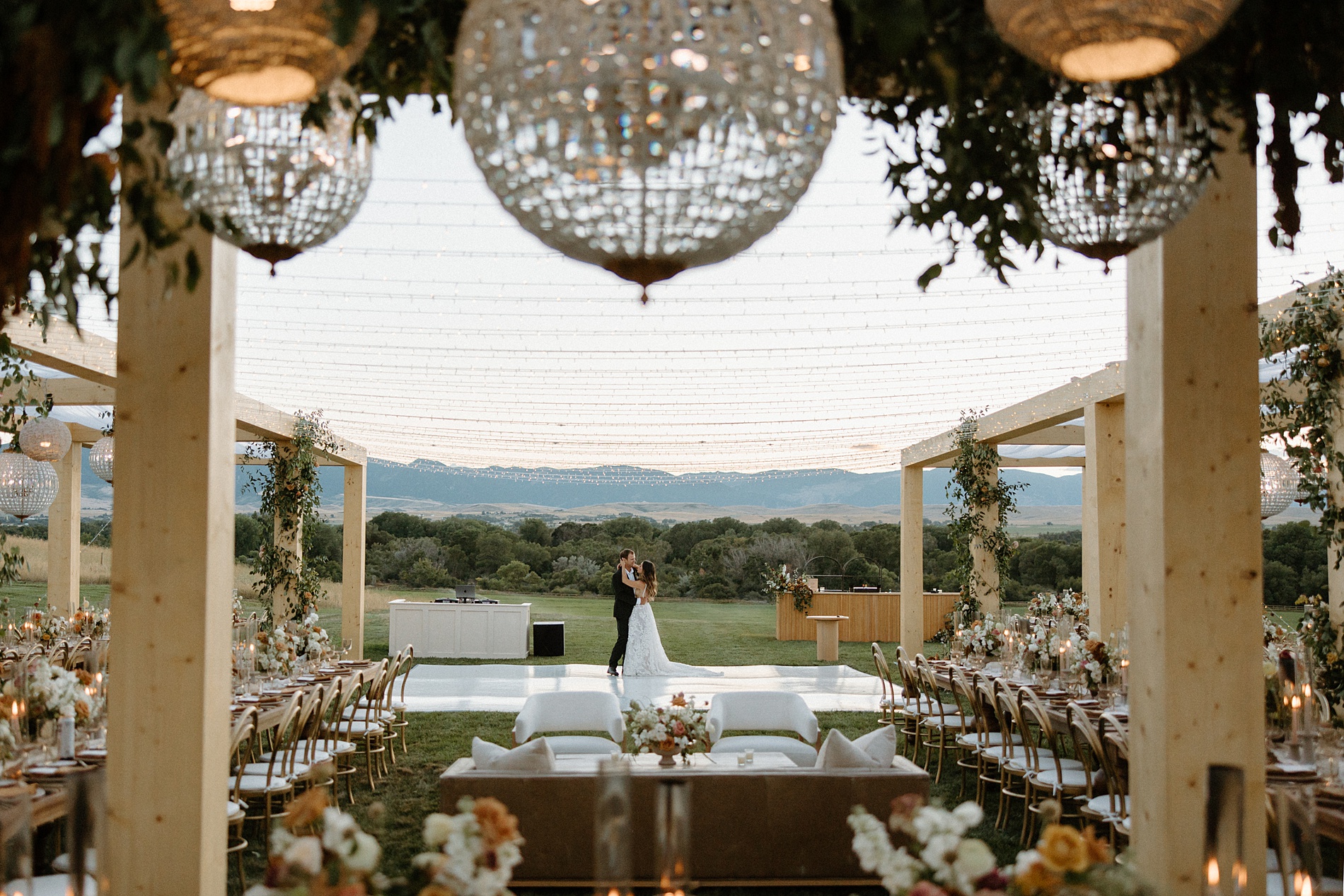
There’s something so special about a wedding hosted on family land, and this one was no exception. Held at the bride’s family ranch in Sheridan, Wyoming, this Western-inspired Wyoming ranch wedding was the perfect blend of elevated rustic charm, muted tones, and intentional, meaningful design. Contributing to this heartfelt day was an honor. We made sure the custom invitation suite and day-of details reflected both the stunning location as well as the couple’s story and vision.
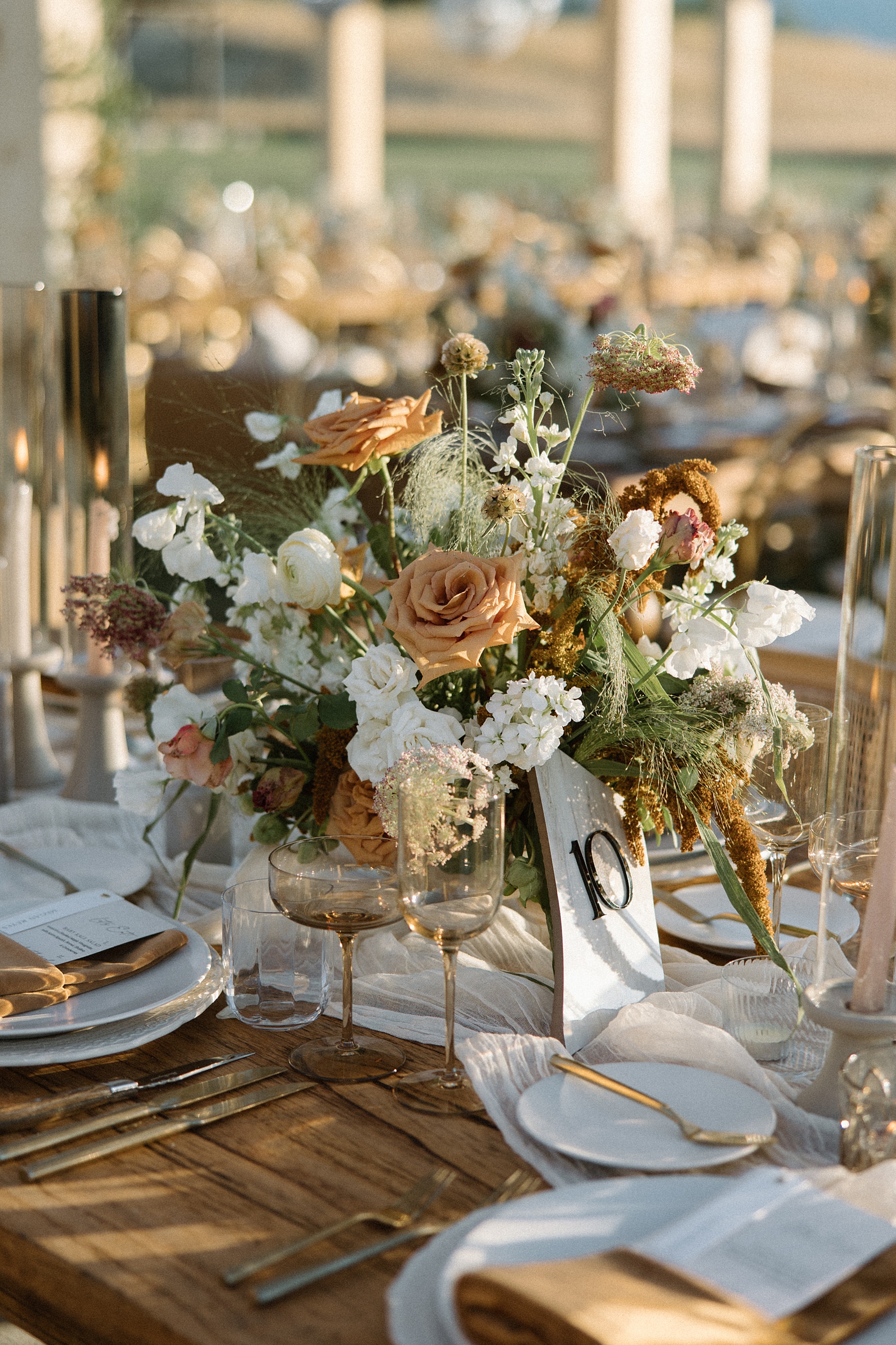
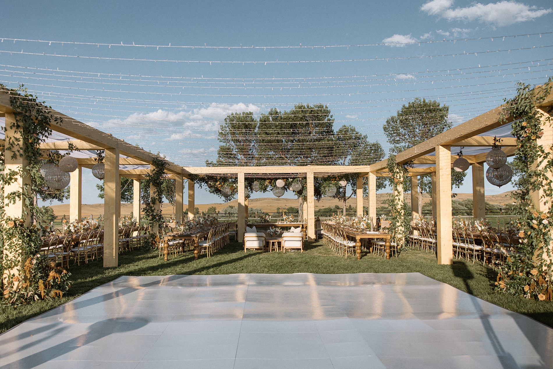
Both the ceremony and reception took place outside under the vast Wyoming sky. A gorgeous reception area was created on the property. Wood framing constructed a U-shape design with a fabric ceiling where tables sat underneath, allowing guests to sit outside gathered around beautifully decorated tables while taking in the breathtaking mountain views.
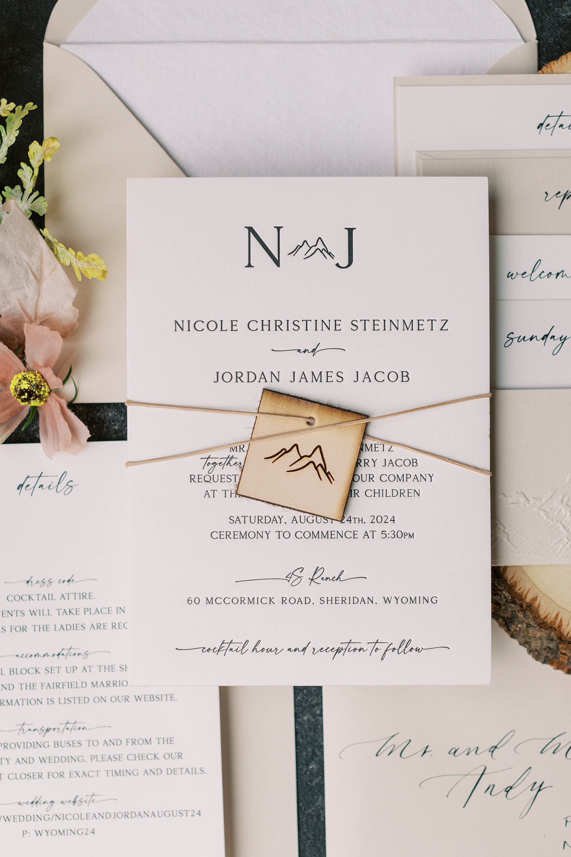
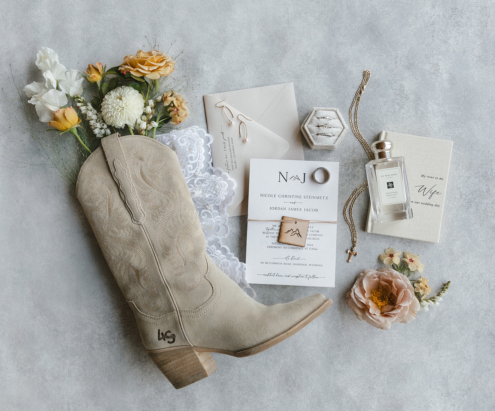
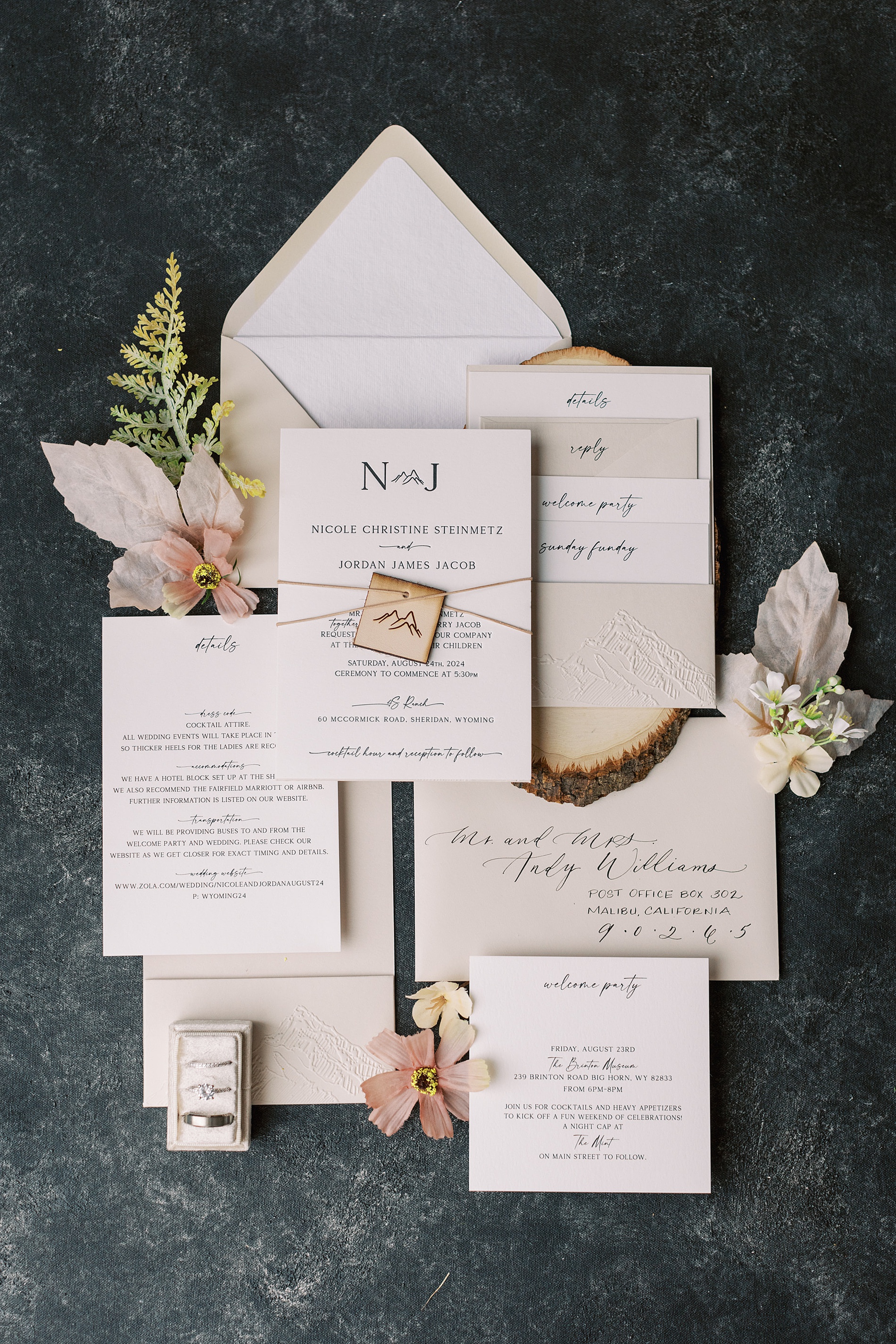
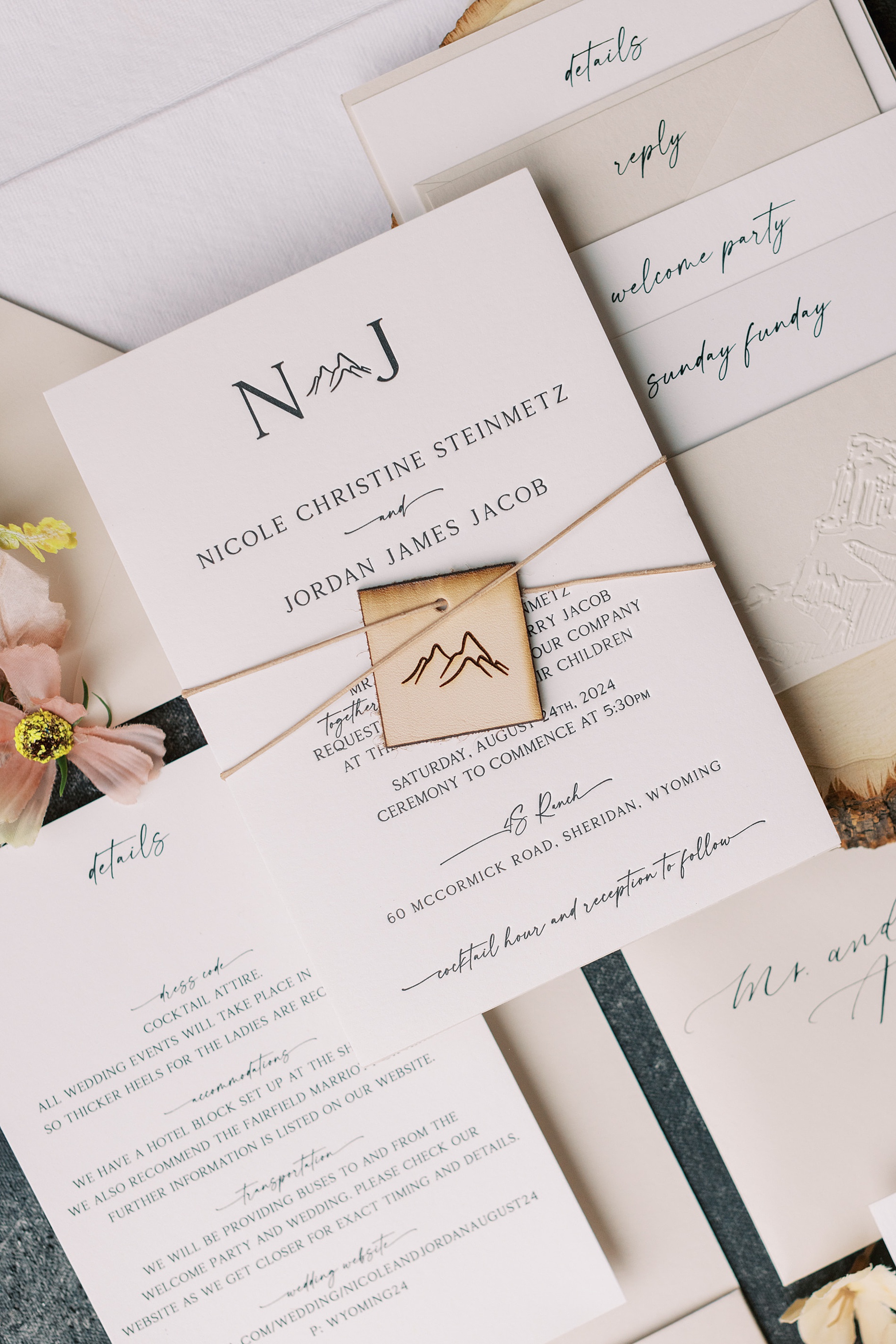
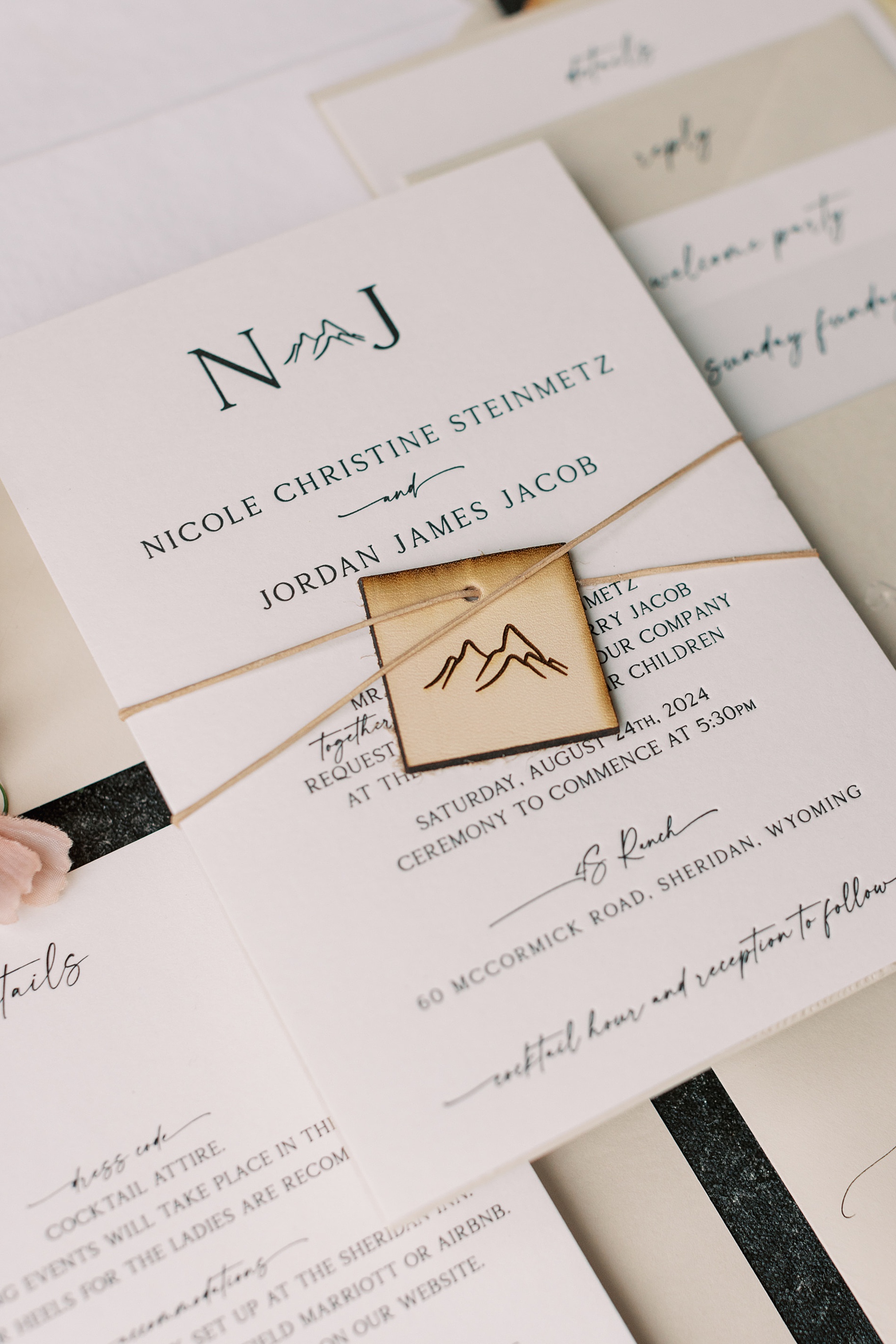
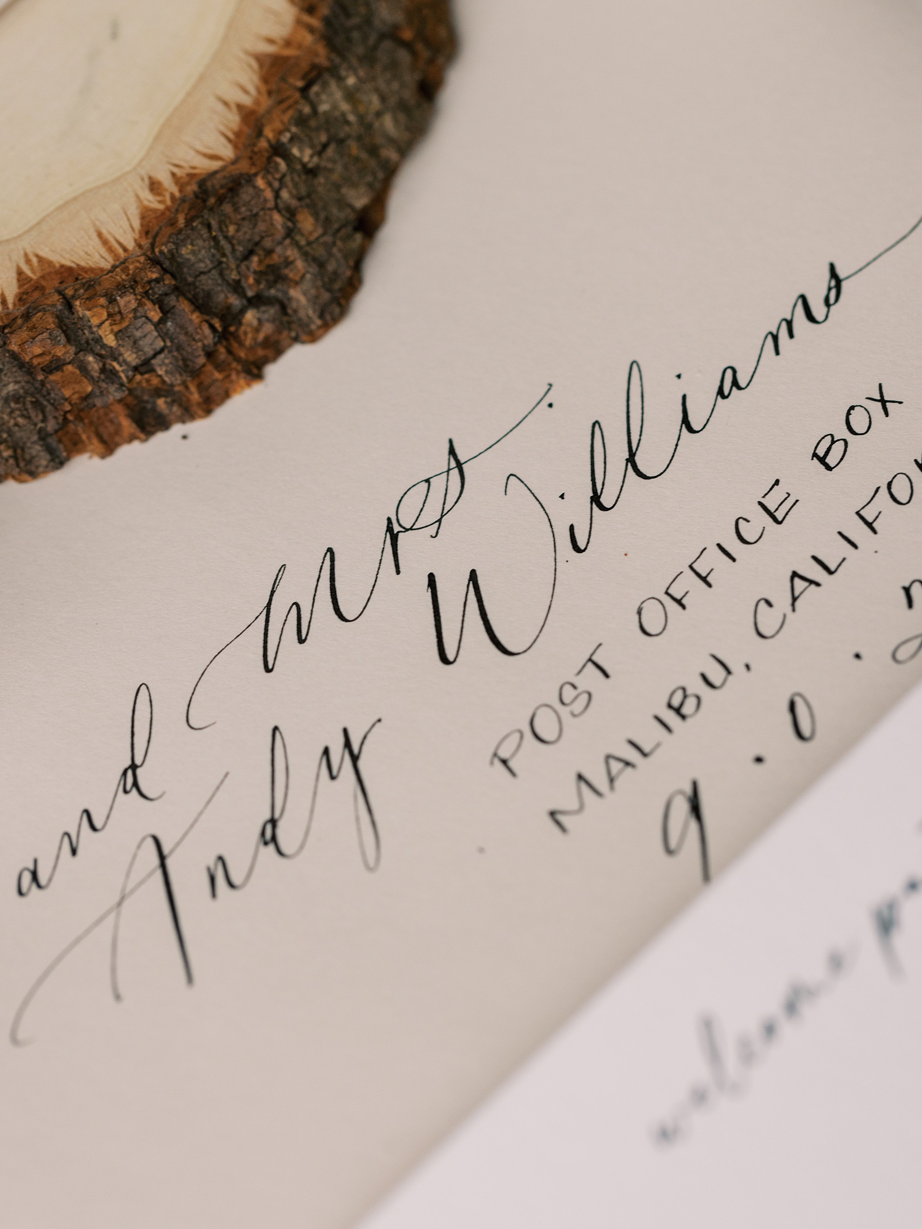
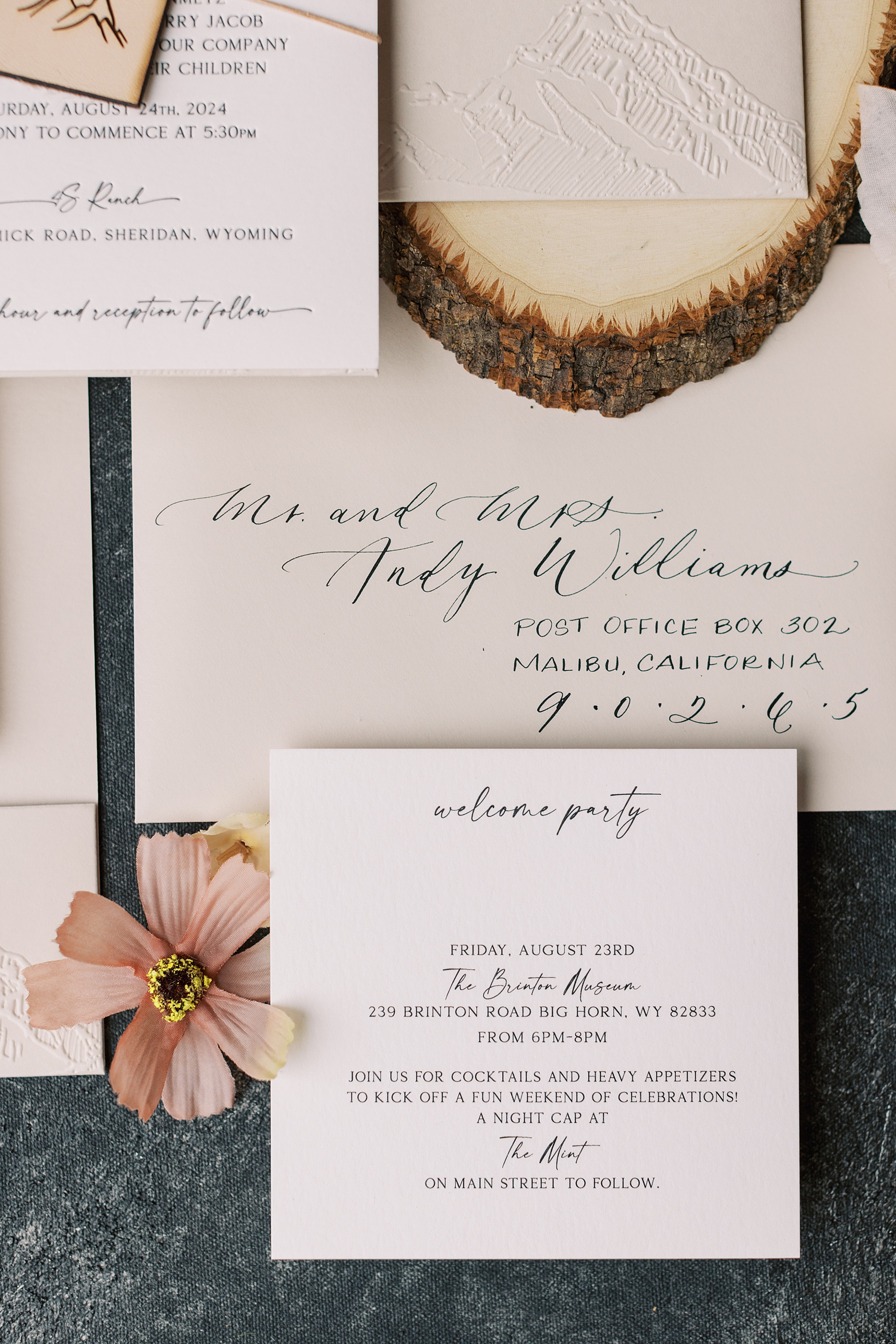
Custom Wedding Invitations
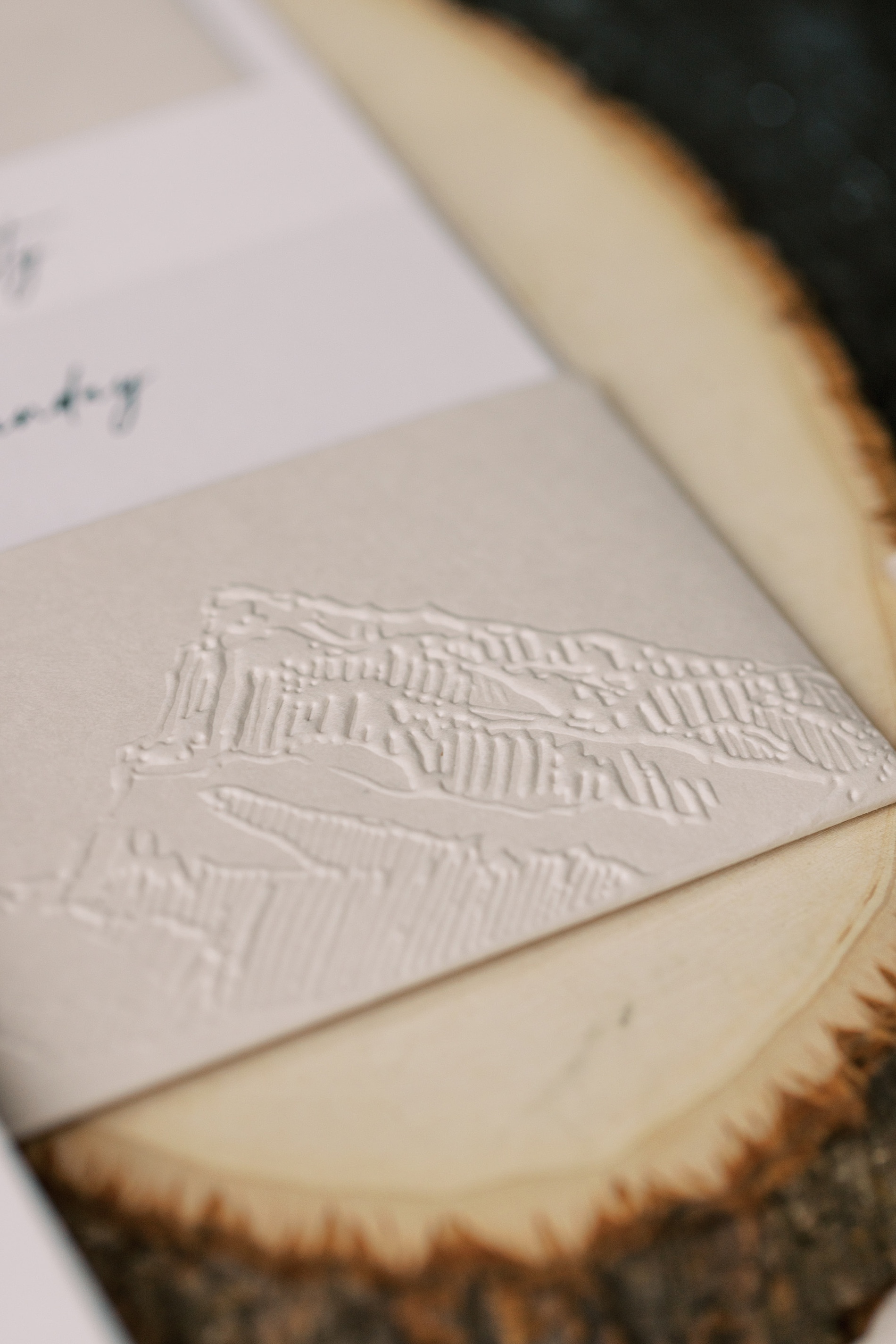
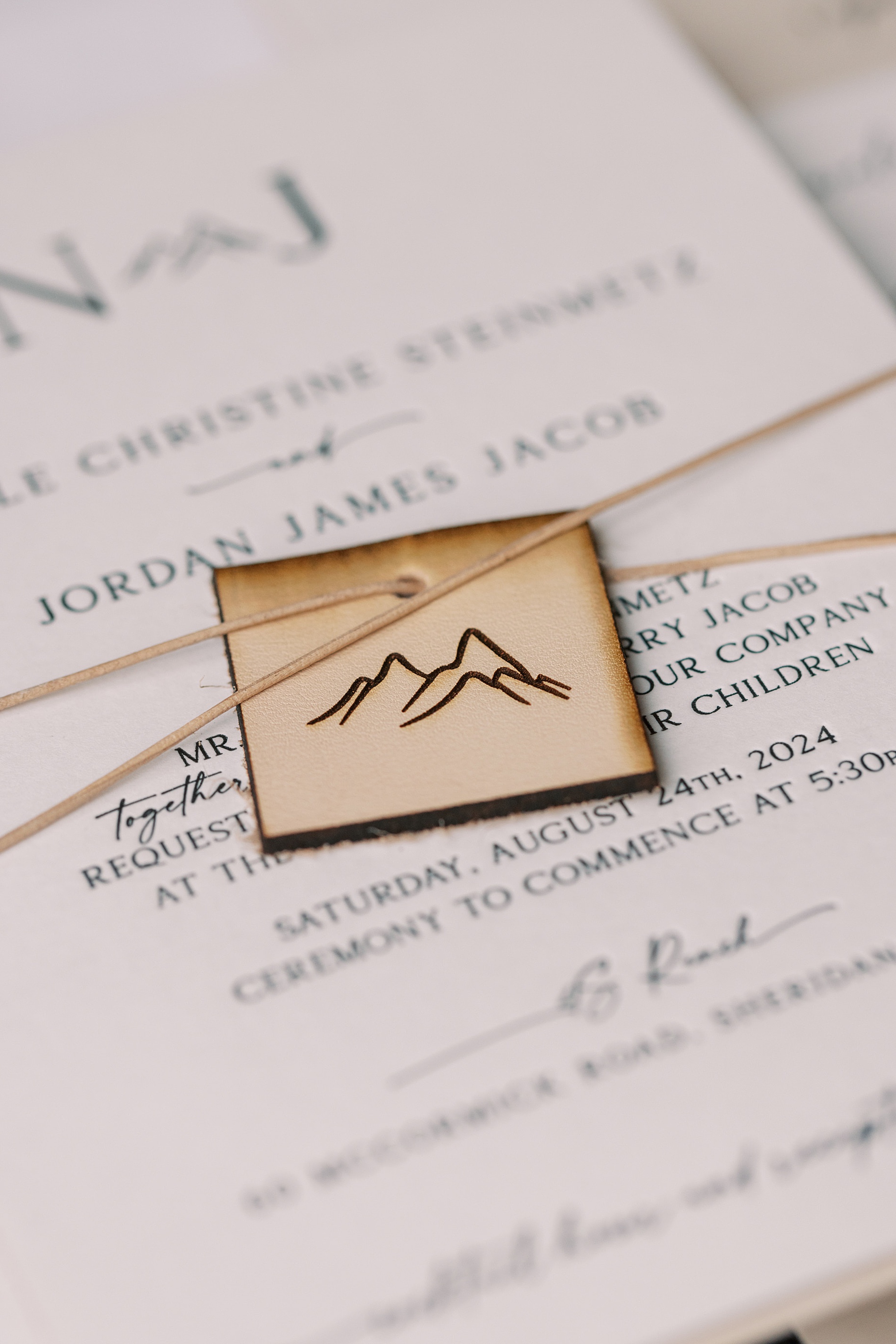
We knew from the start that this invitation suite needed to reflect the feel of the ranch location: rustic yet refined, full of character and thoughtful craftsmanship. We started with black ink letterpress and included a custom embossed raised mountain-scape on the invitation pocket to pay homage to the epic mountains at the venue. The views were really something to behold and these little invitation details helped guests know what to expect from the very first look. First impressions really are everything!
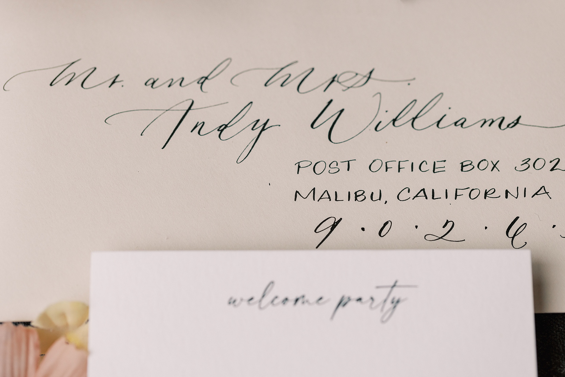
To hold the suite and perfectly stacked insert cards together, we created a custom branded leather tag with a mountain design that wrapped around the invitation with a leather cord as a nod to the family’s ranch lifestyle. The same mountain design on the leather tag was also used in the monogram on the invite. Envelope calligraphy added a layer of elegance, and vintage postage gave the suite that classic-inspired finish we love. Oh, and did we mention the handmade paper envelope liners? Because texture was the main character here. The entire suite was a tactile dream.
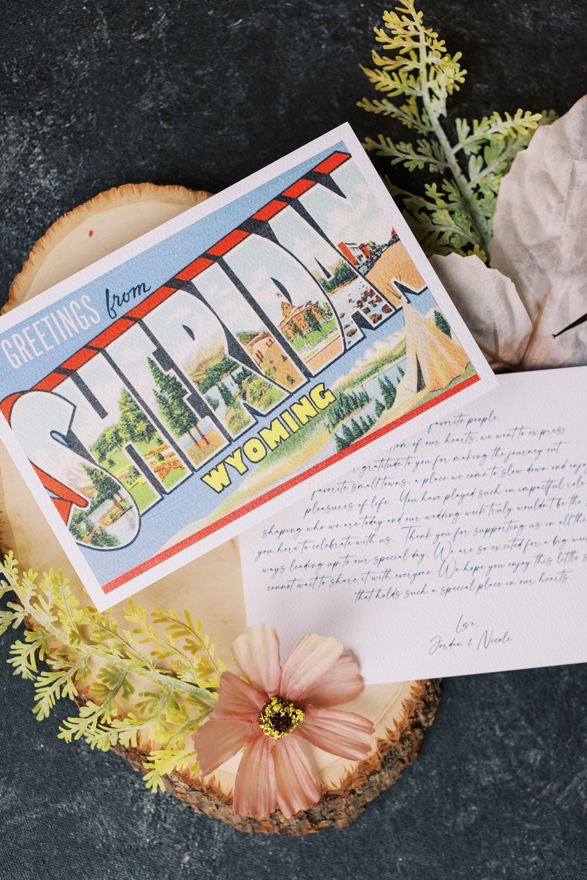
We also included vintage Sheridan, Wyoming postcards for the couple’s welcome bags to guests. A small but thoughtful touch that celebrated their hometown and welcomed guests right away.
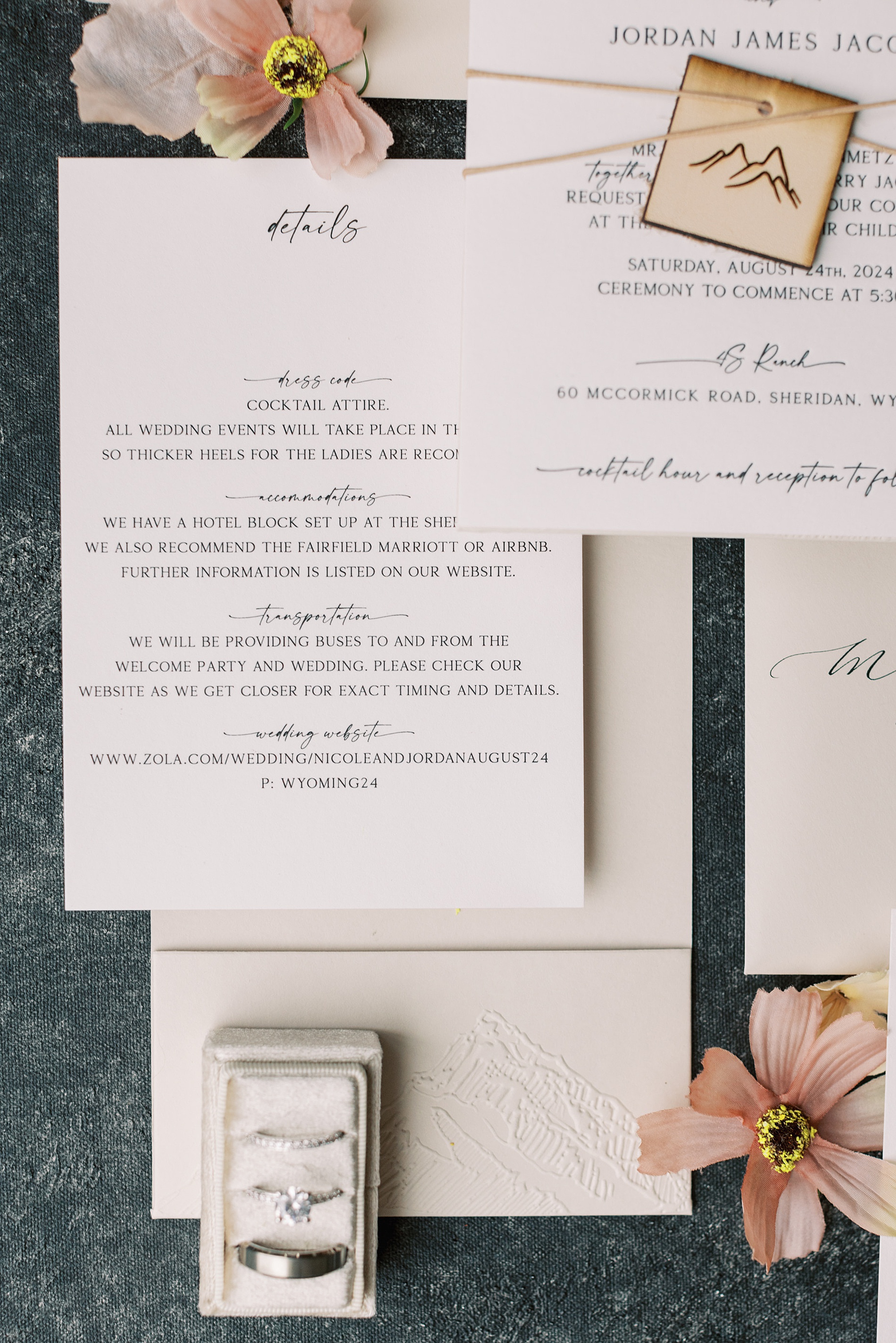
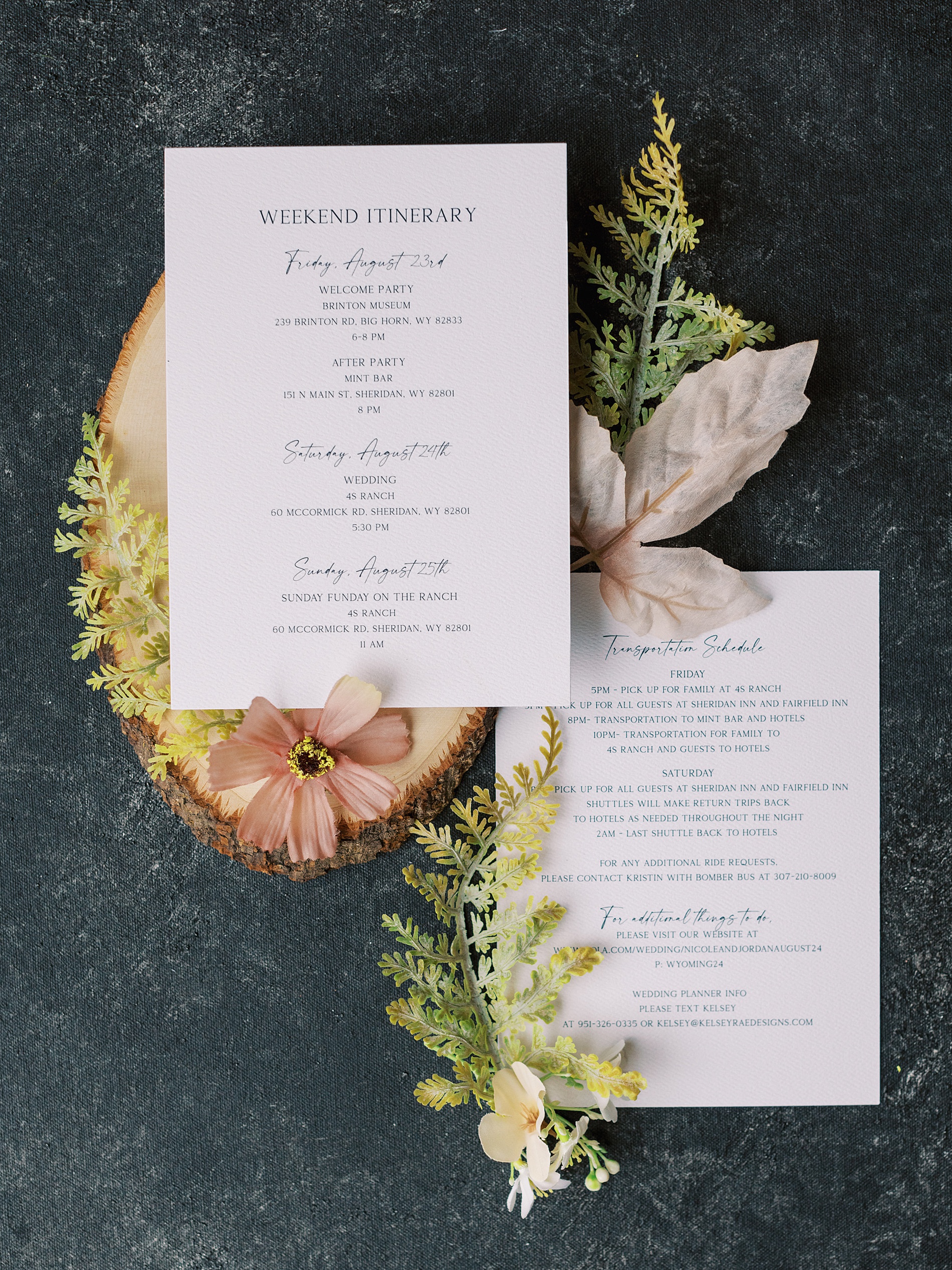
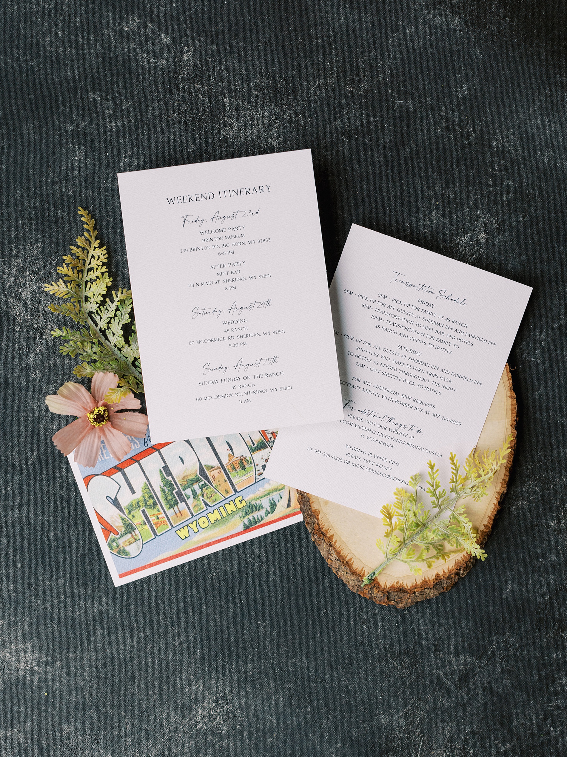
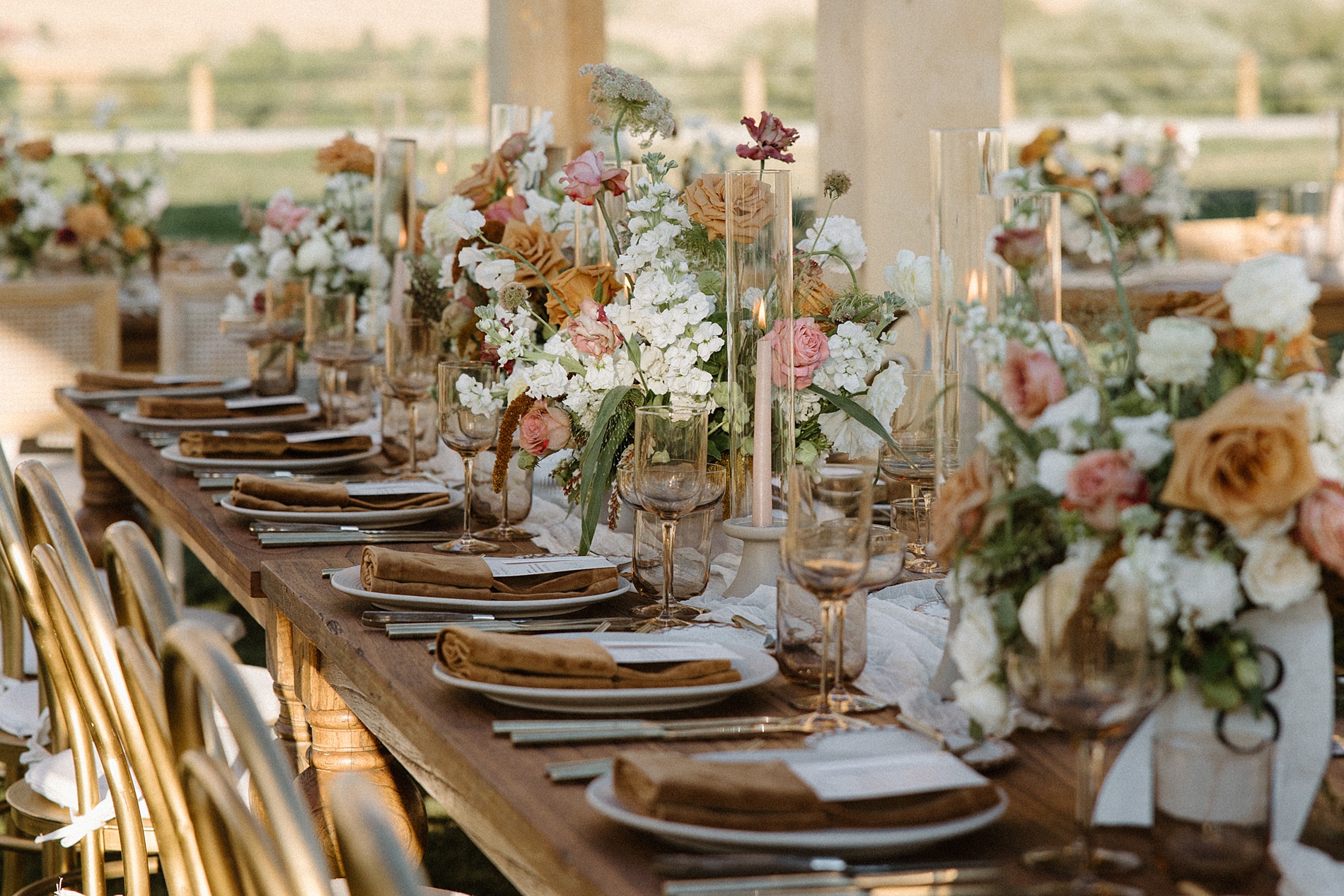
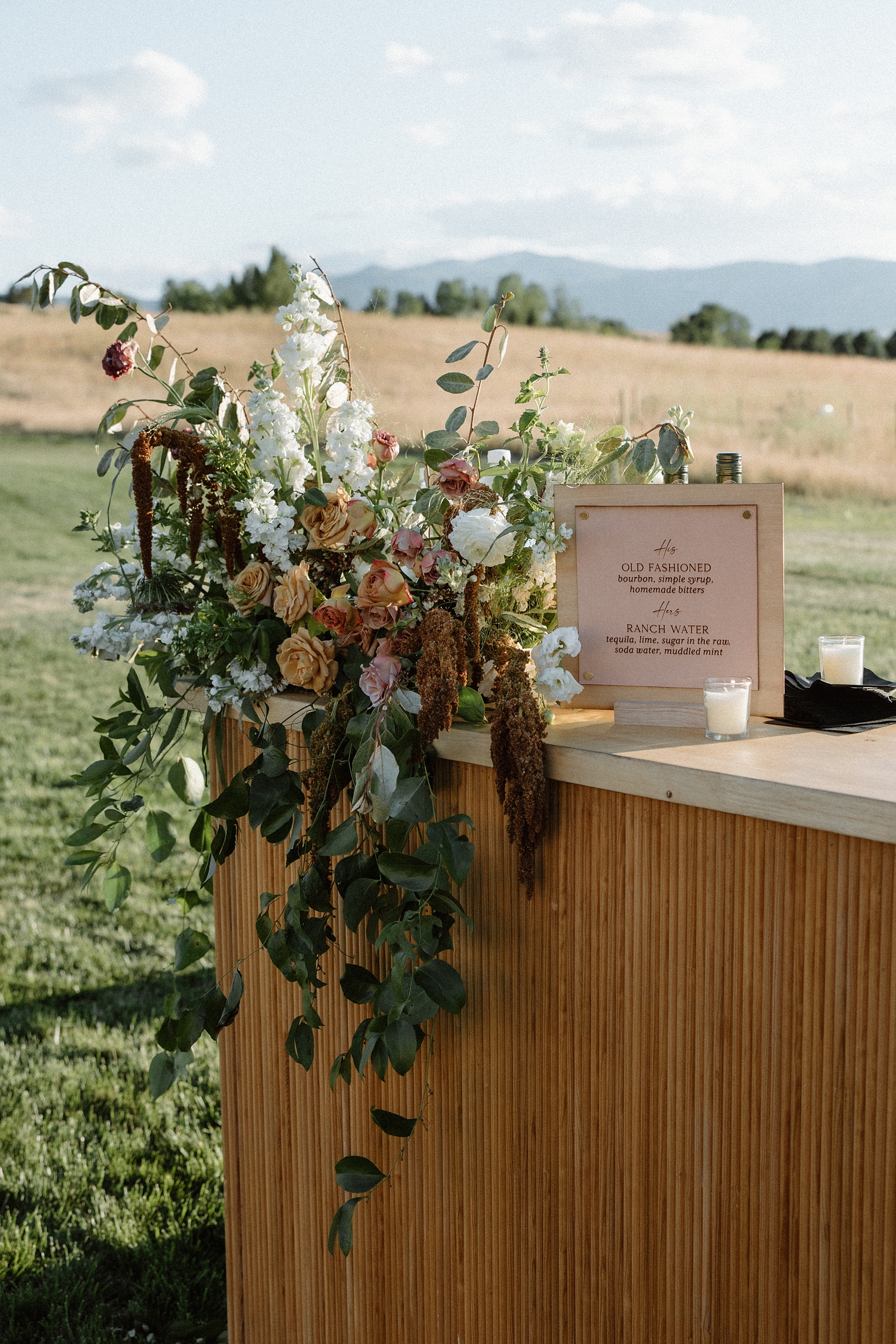
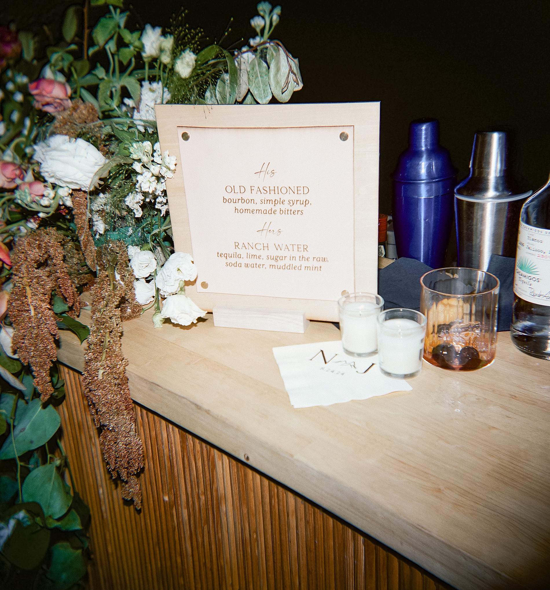
Day-Of Wedding Details
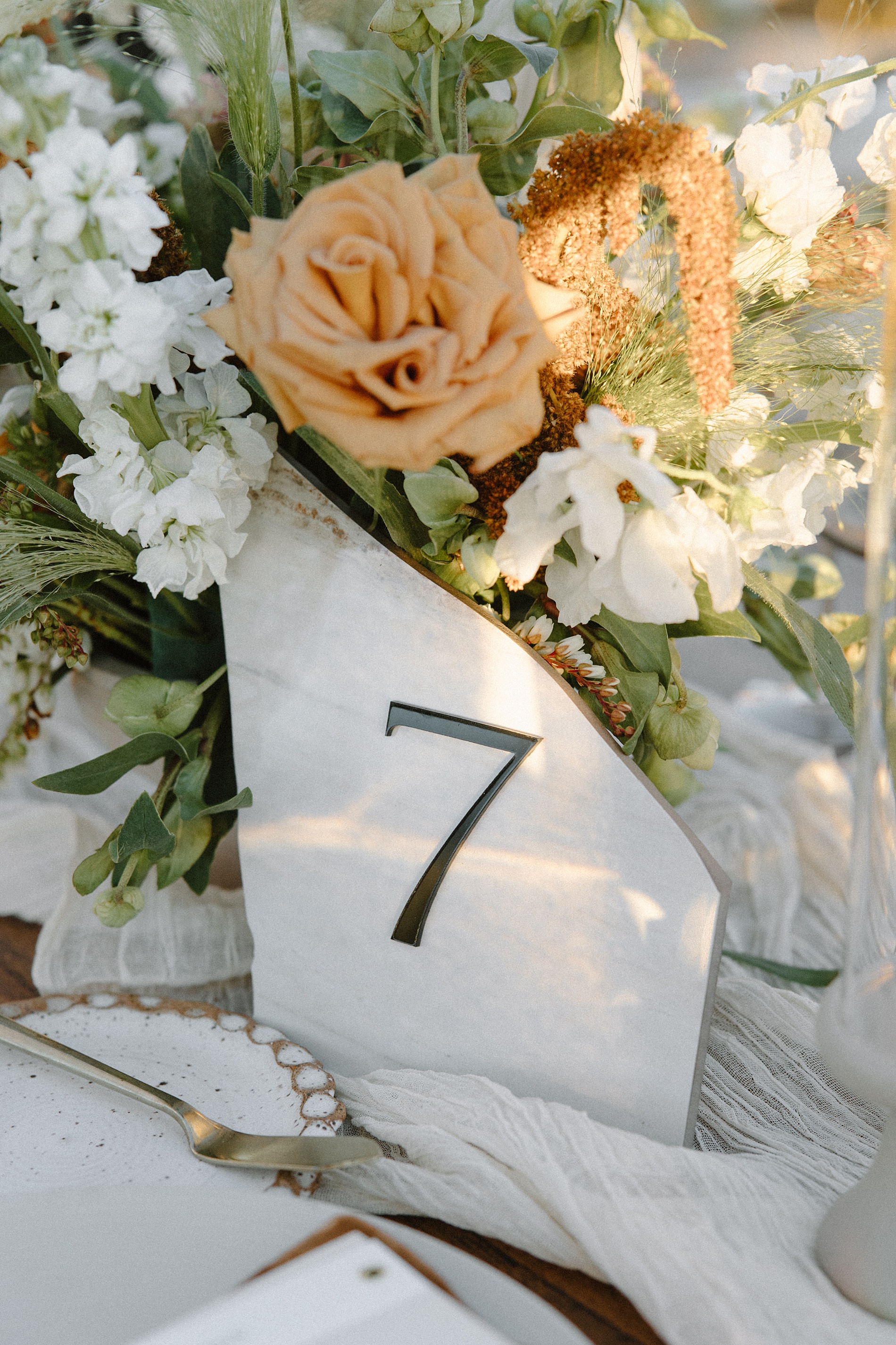
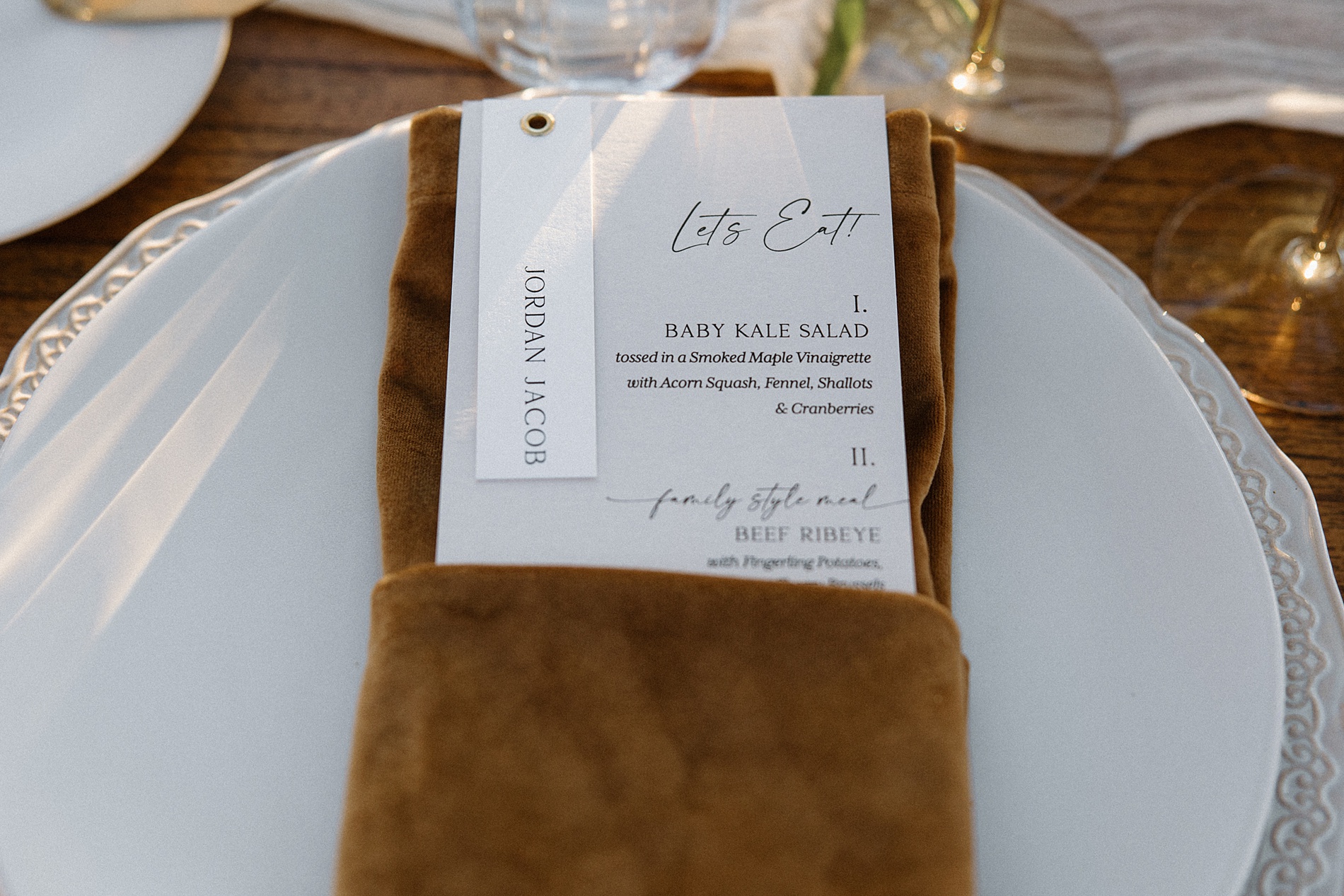
The design didn’t stop at the paper goods. We carried the Western elegance through to the wedding day, beginning with stone table numbers that blended seamlessly with the natural surroundings. The white menus we made were tucked into a soft, suede leather napkin, keeping things layered with texture while tying into the theme.
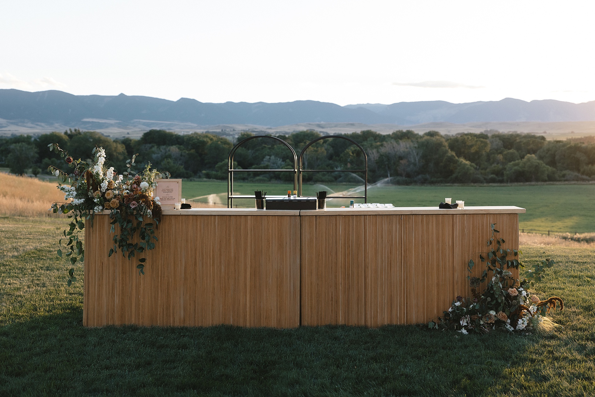
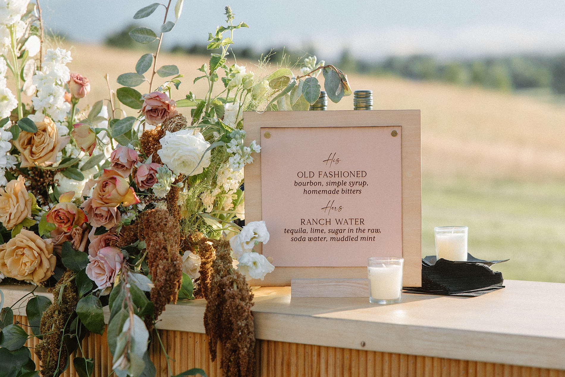
The bar signage was another amazing detail, featuring wood and leather that carried the elevated Western aesthetic through cocktail hour and beyond.
We also had the honor of creating a custom bar sign with pressed florals for the night-before celebration, bringing in a soft, romantic element to the evening.
This family ranch was the perfect venue for the couples’ elevated western-inspired wedding. From start to finish, this wedding honored the location, their family, and the couple’s elegant, yet rustic and natural wedding vision. It was an incredible honor to create invitation suites and day of details to bring their wedding dreams to life.
If you’re looking to add custom, thoughtful touches to your wedding or event, we would love to help make your vision a reality. Reach out today to learn more about our full-service design offerings! We can’t wait to create something unforgettable for you!
If you enjoyed this post, you’ll love these other blogs!
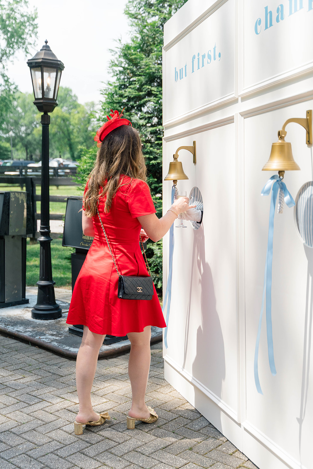
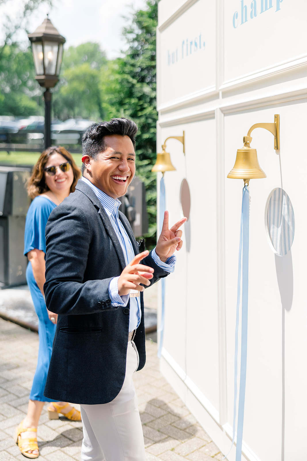
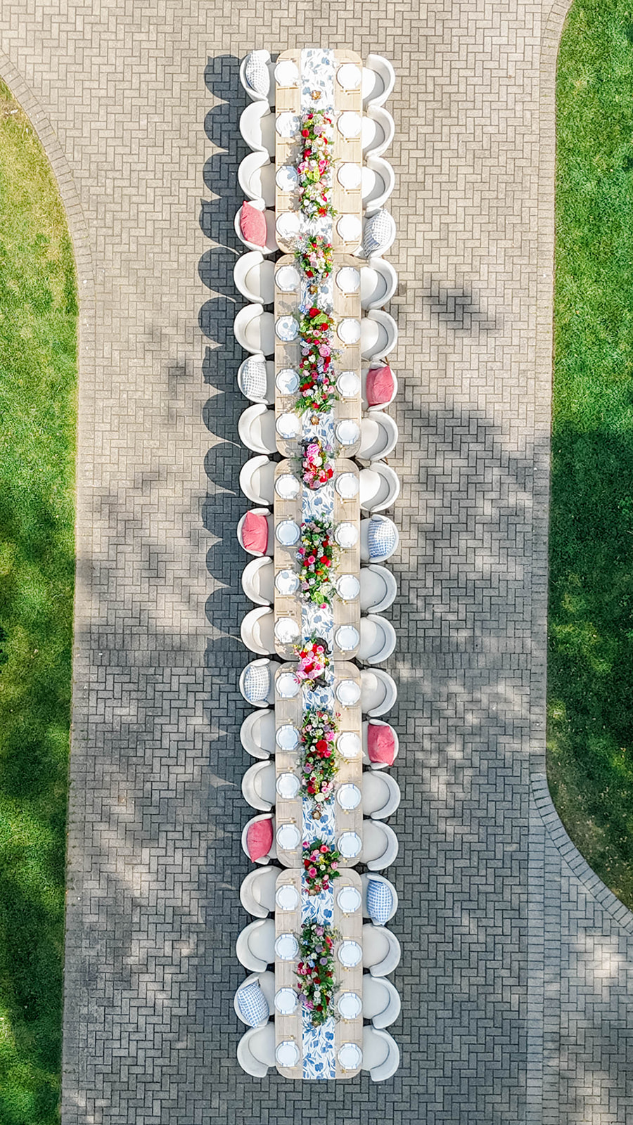
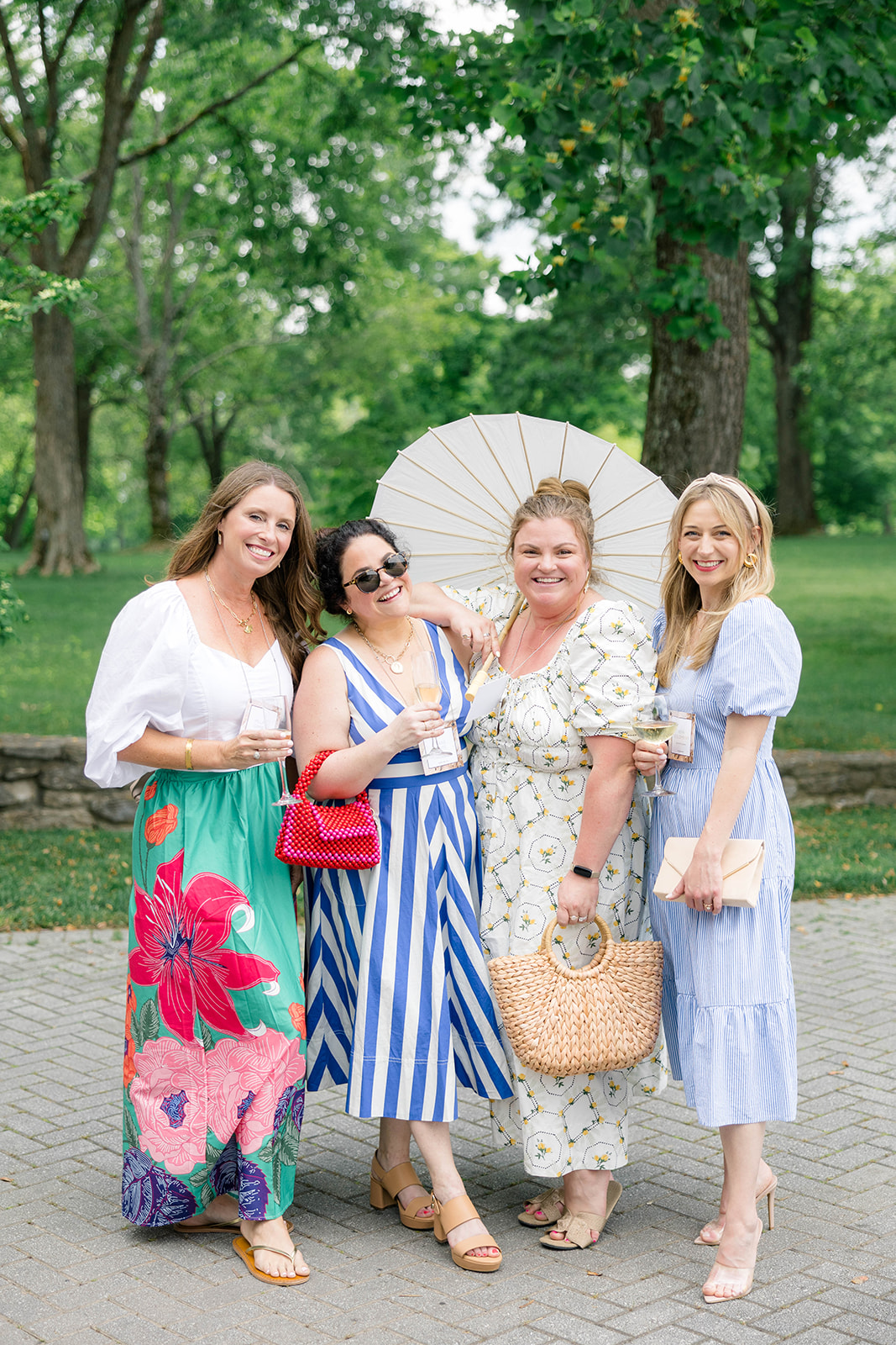
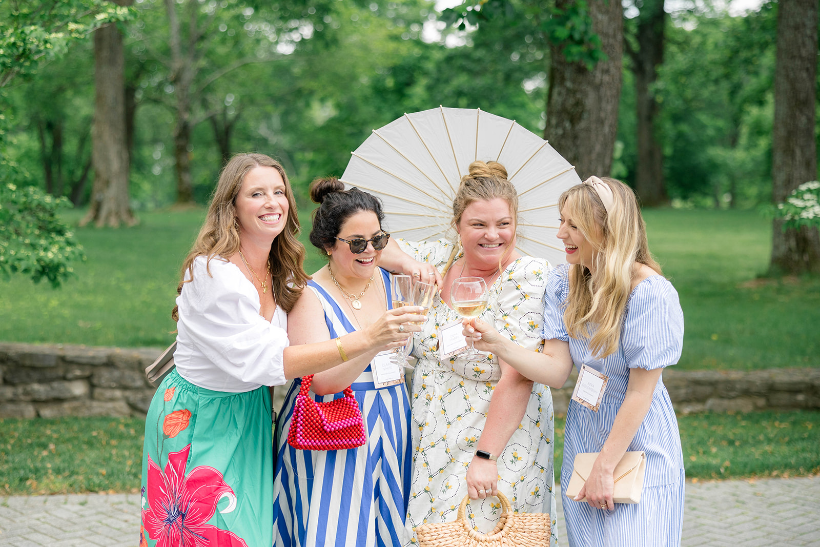
This past spring, WIPA Nashville, short for Wedding Industry Professionals Association, hosted an amazing event for WIPA members. These quarterly events allow us fellow wedding professionals to celebrate each other, learn more about boosting our businesses, and make lasting connections. This spring networking event took place at the beautiful Cherokee Dock, bringing together some of the most talented wedding and event pros in the region! The theme was a Kentucky Derby-inspired event, and let me tell you, it did not disappoint! WIPA Nashville’s Derby at the Dock was one for the books! I was honored to attend alongside my incredible team, Townley and Emily, and even more thrilled to contribute some fun, standout details to help bring this event and the Derby theme to life.
Welcoming Guests in Style
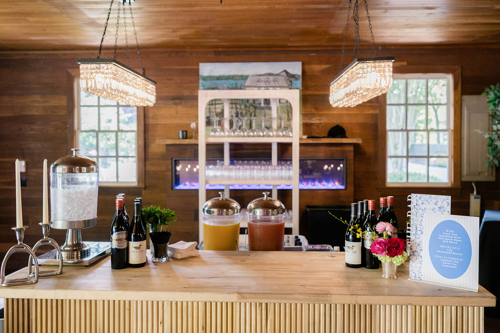
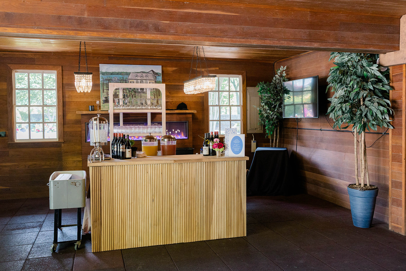
We wanted our fellow vendors to experience the fun interactions that our clients are loving right now, so we kicked things off with a cocktail pass-through wall. As guests arrived, they were greeted with a refreshing welcome drink handed through the wall, which is such a fun way to start an event! Everyone enjoyed this interactive installation and understands why they are so popular. I I have no doubt we will continue to see these at our future events!
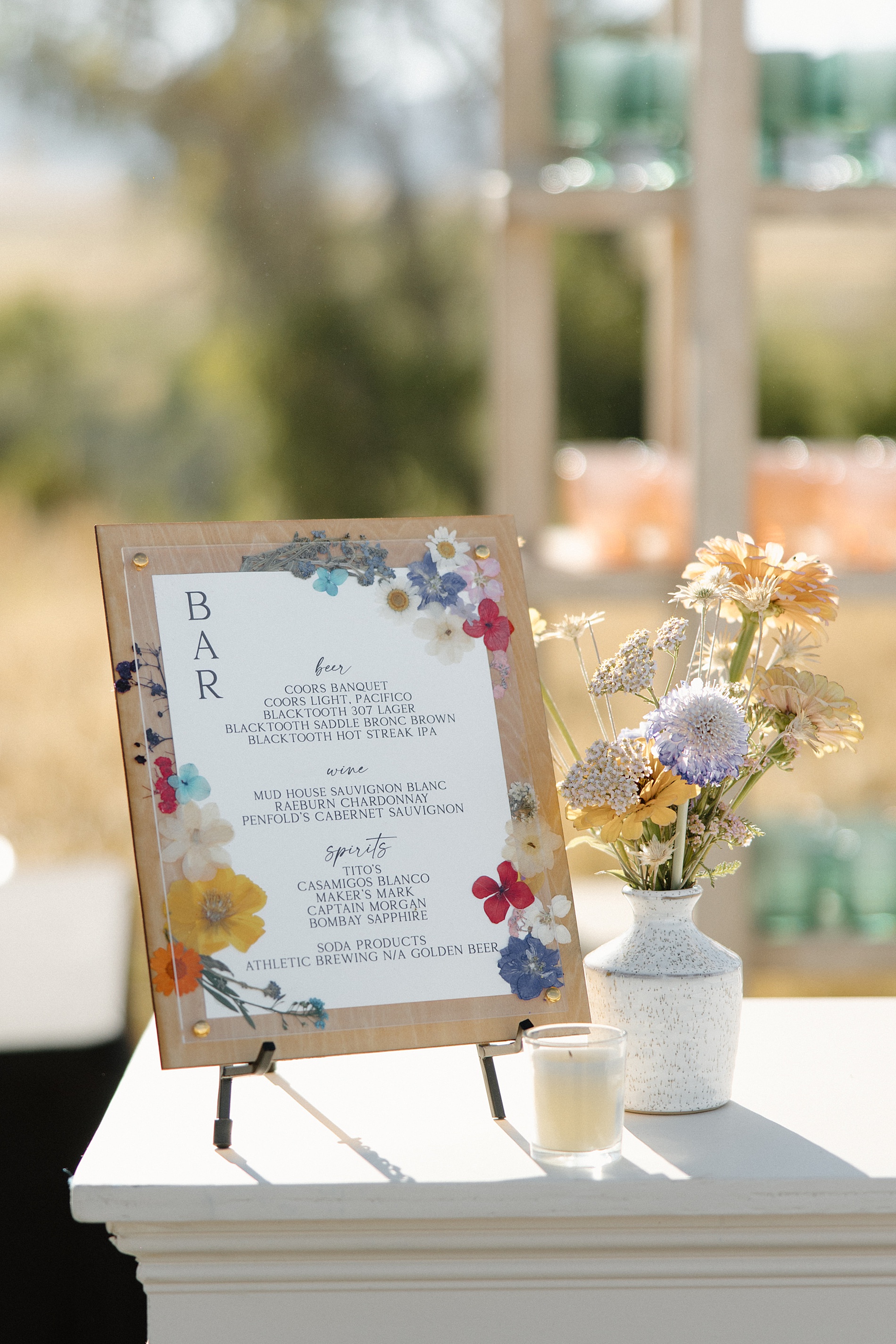
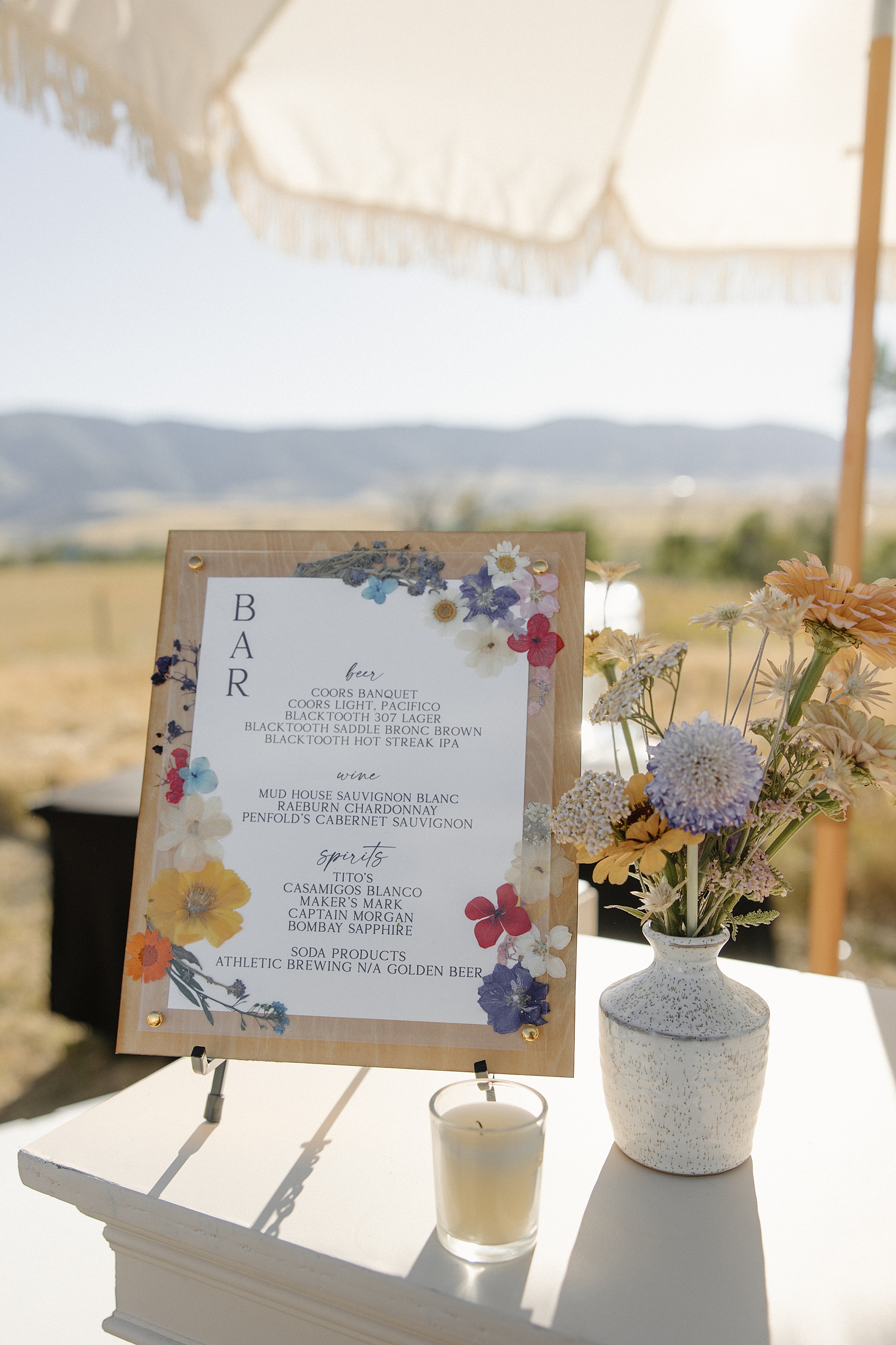
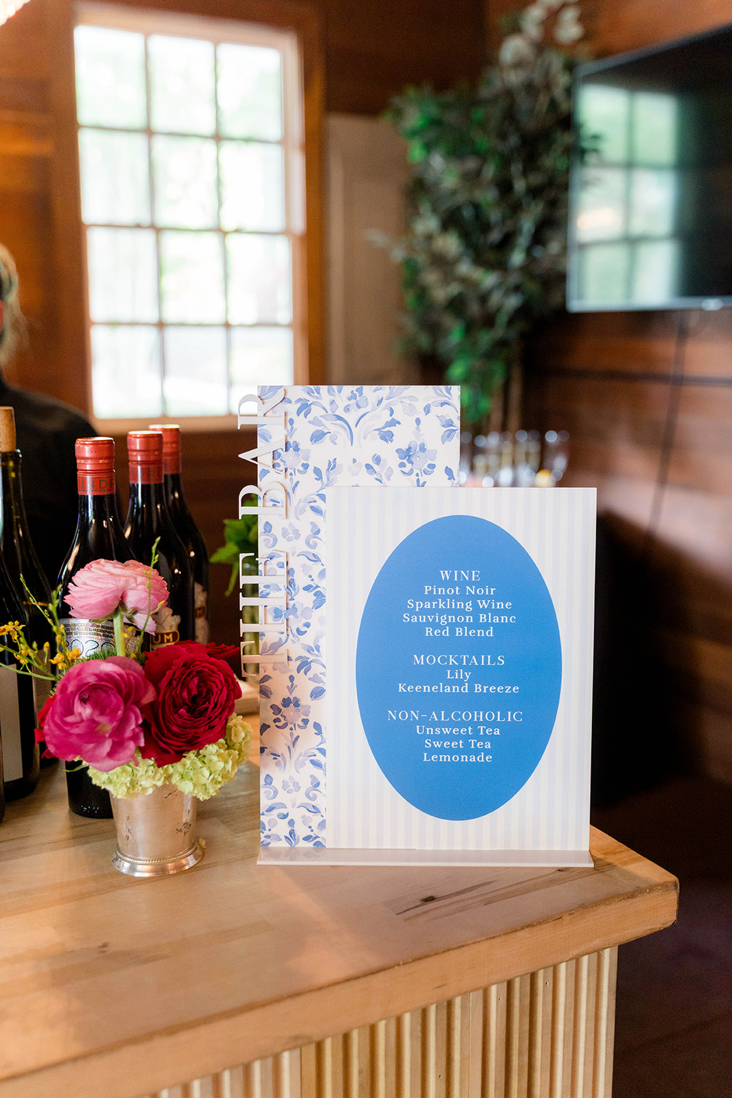
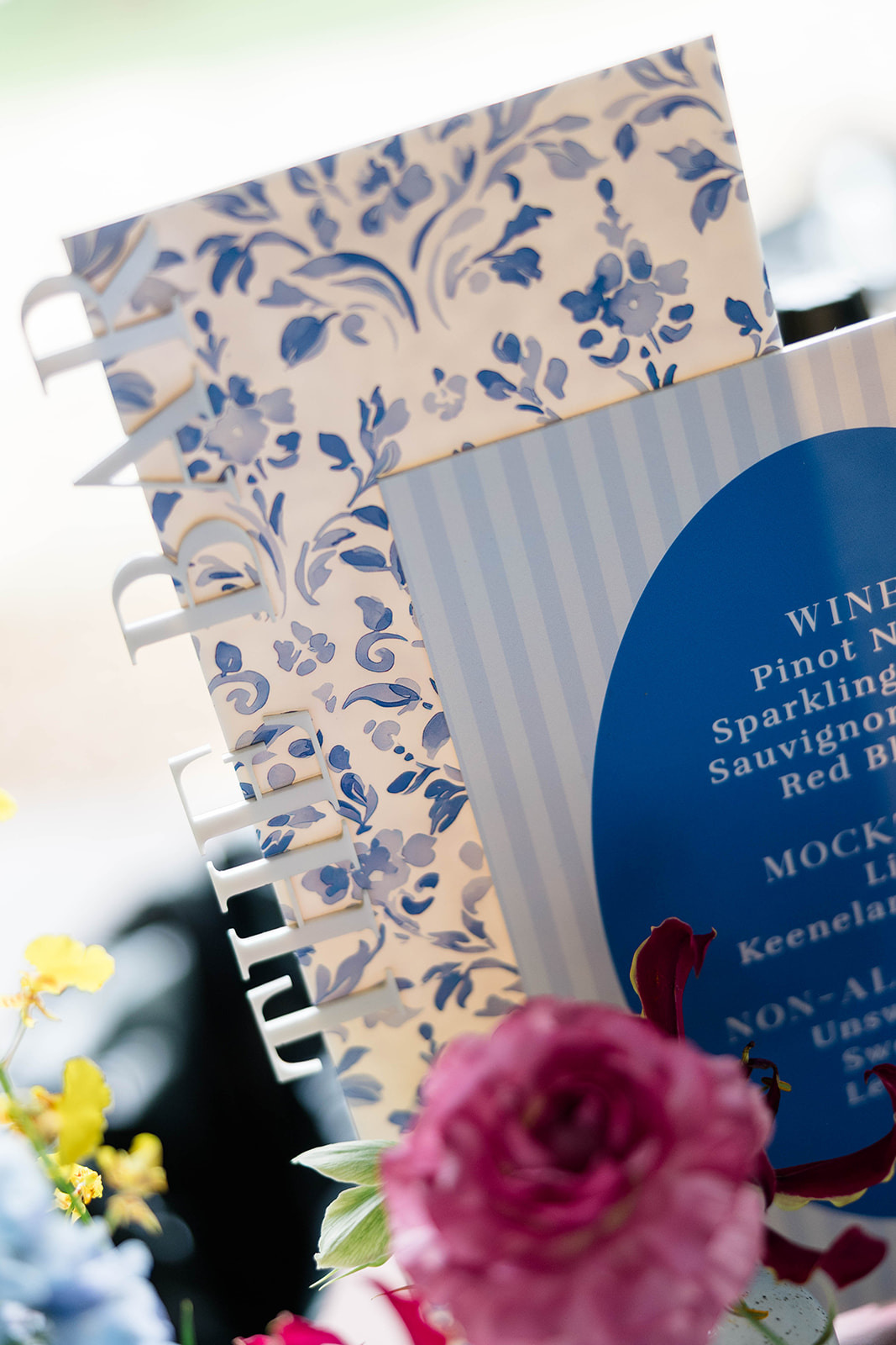
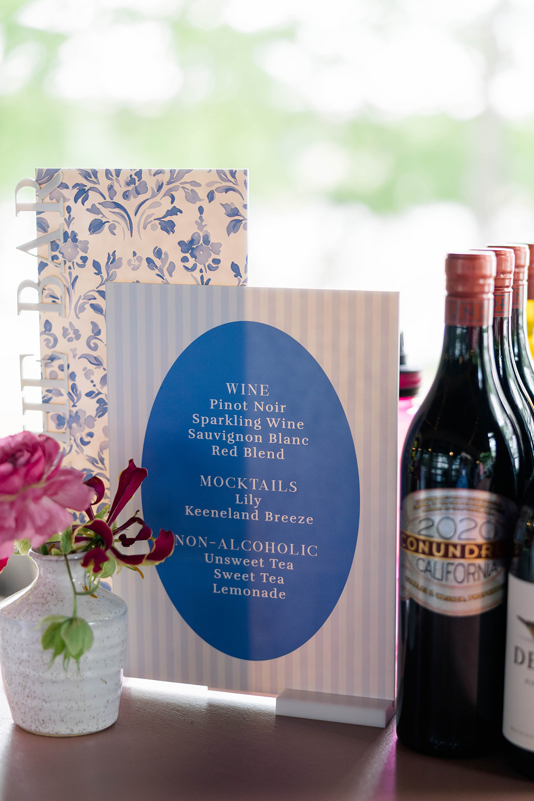
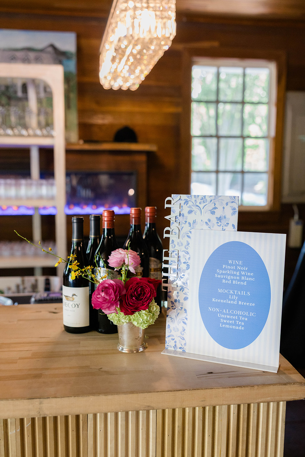
The Bar Signage
We contributed the custom bar signage, created with a mix of layered dark and light blue paper mounted on a soft blue, Southern-inspired floral pattern. My favorite detail was the bold 3D lettering that spelled out “THE BAR” running up the side. This fun, yet elegant detail is exactly the kind of thing we love dreaming up for weddings and events!
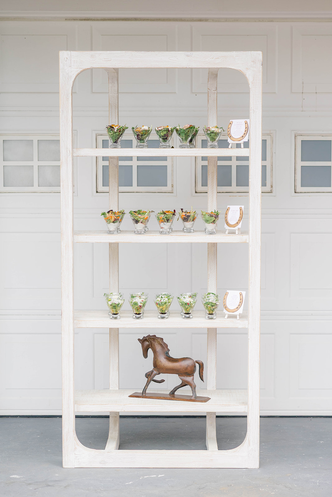
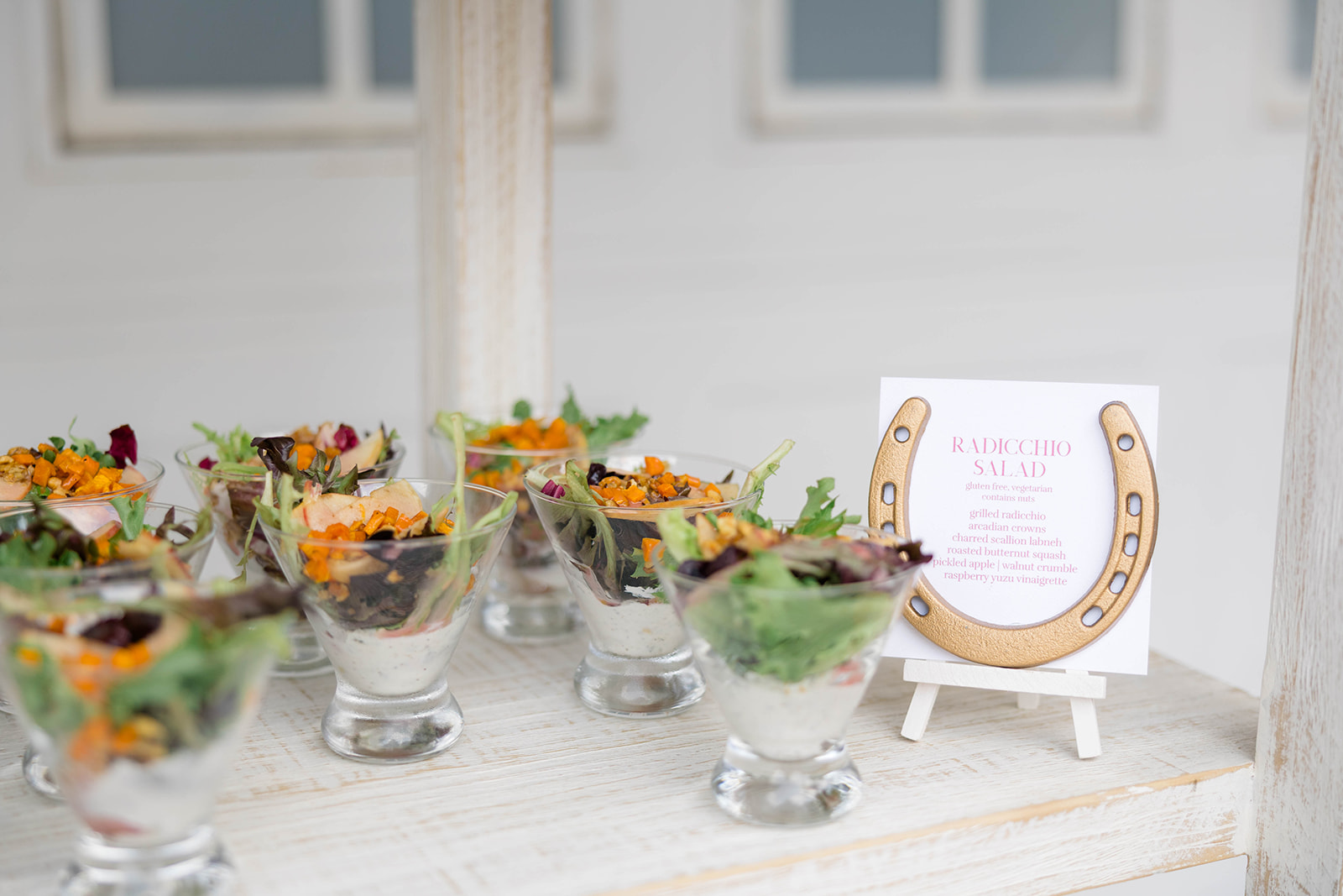
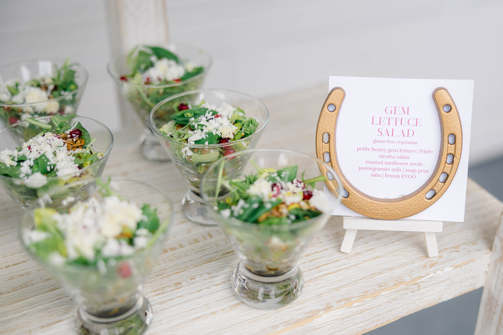
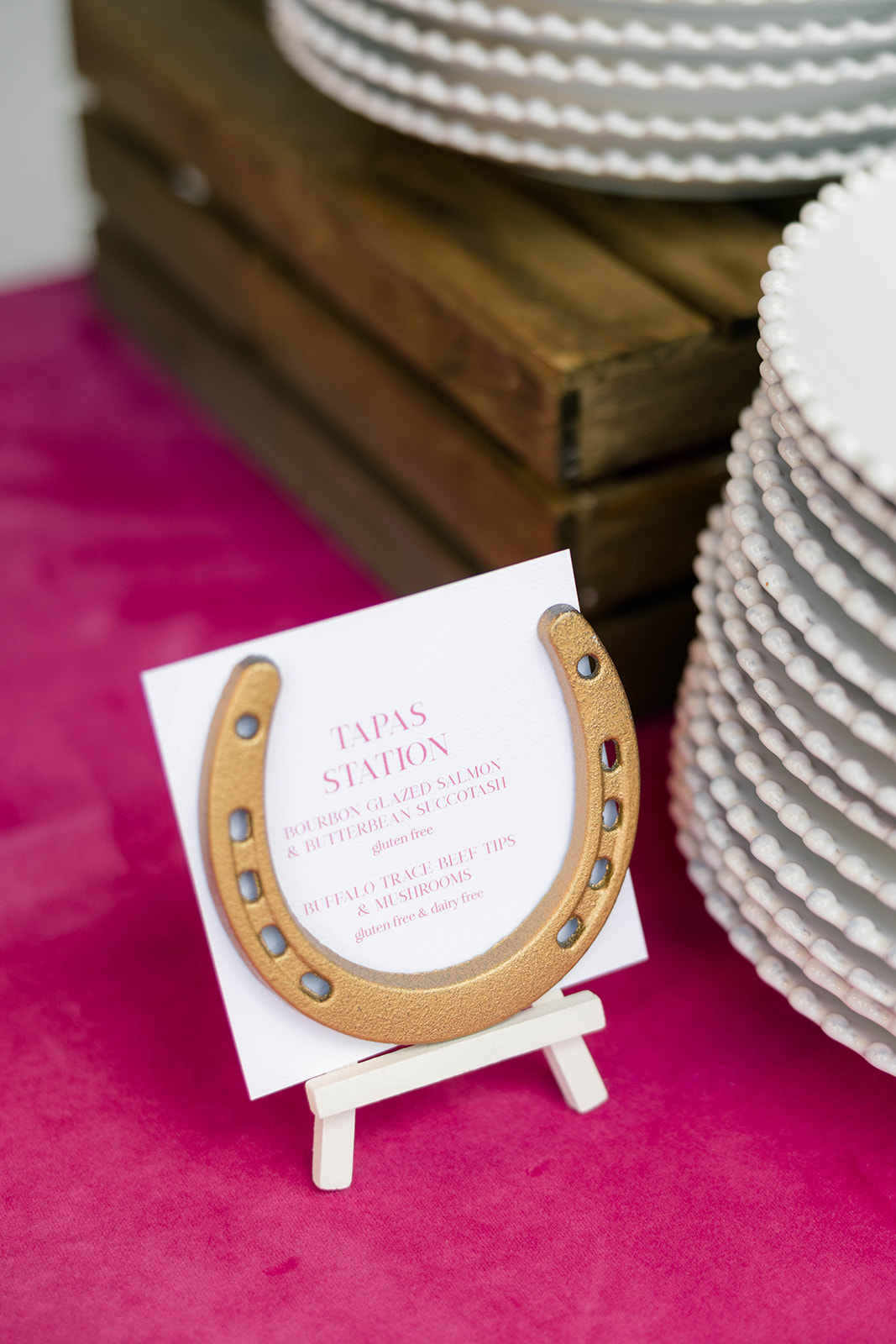
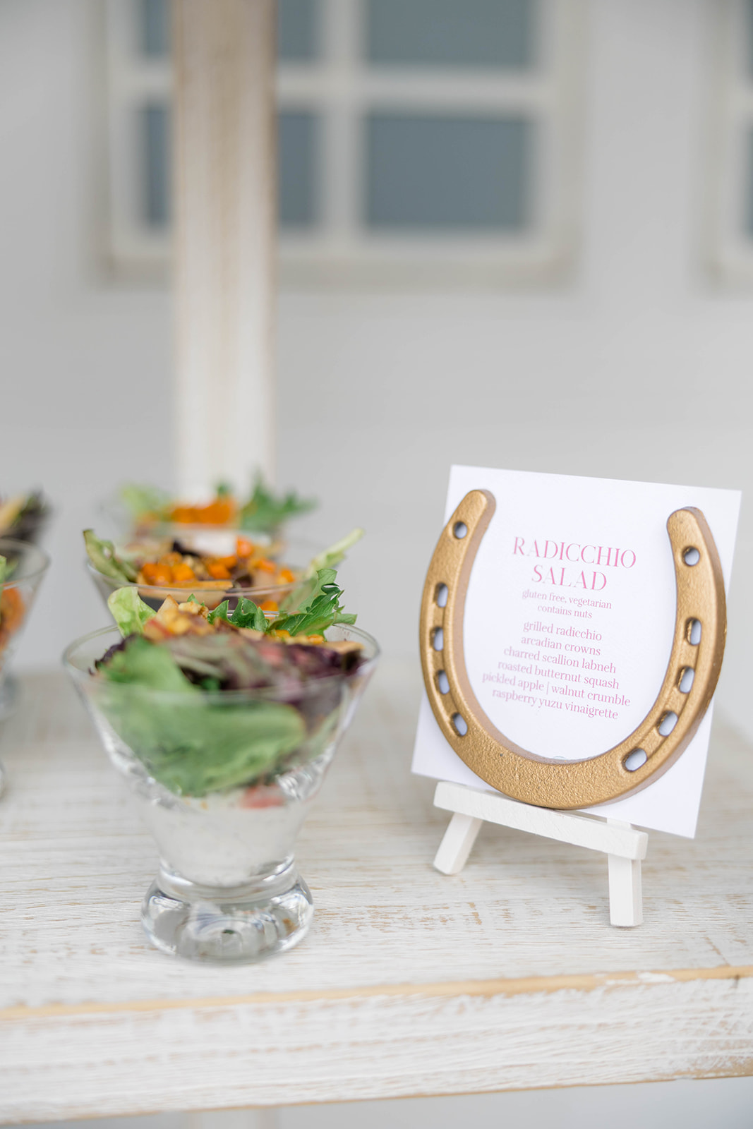
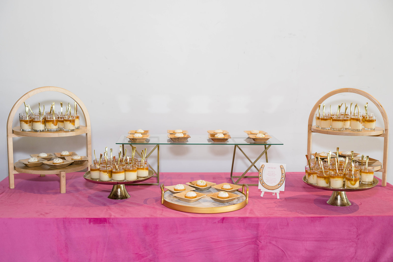
Horseshoes & Hospitality
We kept the Derby theme going strong with horseshoe food signage that highlighted the event’s delicious menu in a unique and thematic way. These signs served a functional purpose while also adding a nod to that classic Derby vibe at each food station.
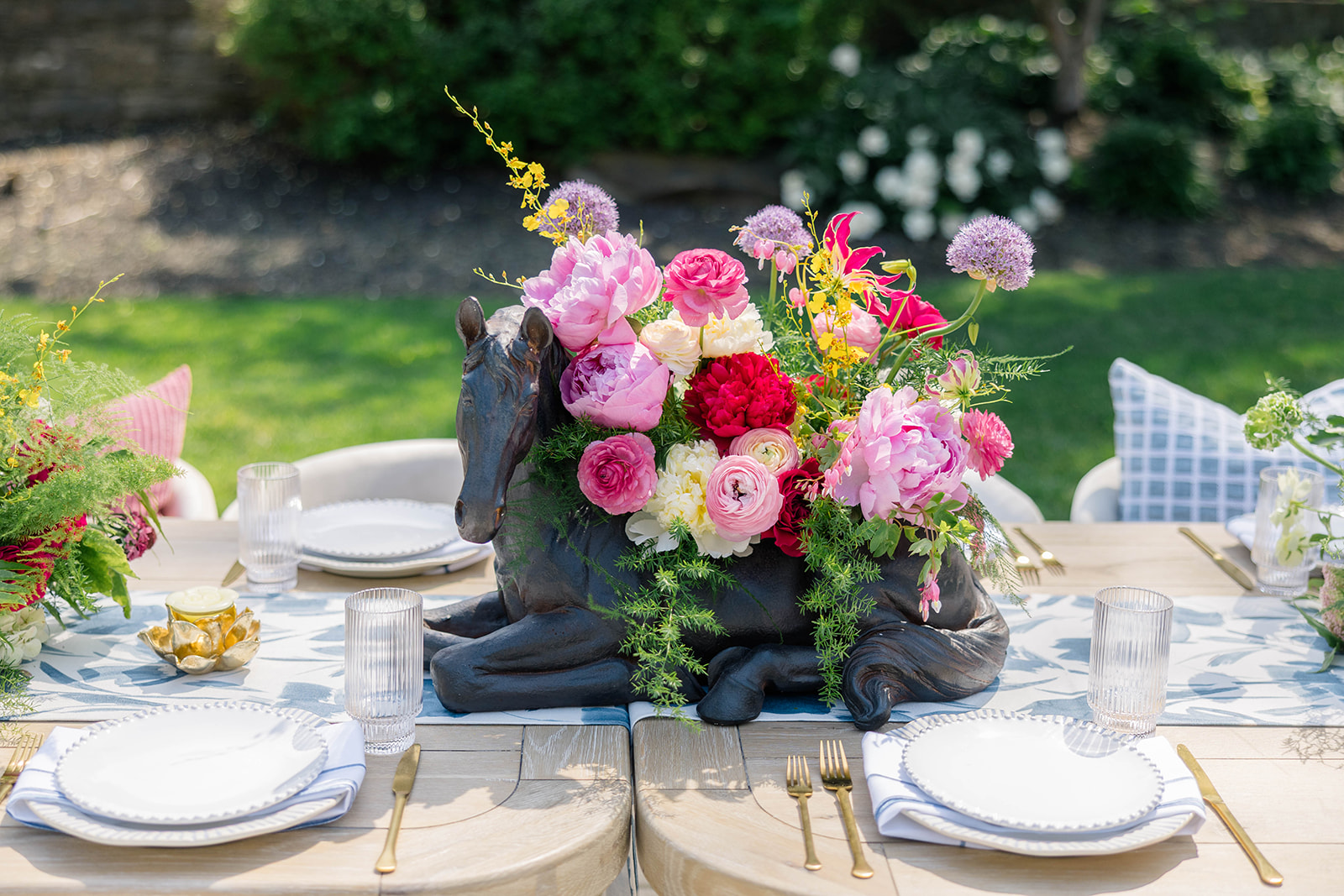
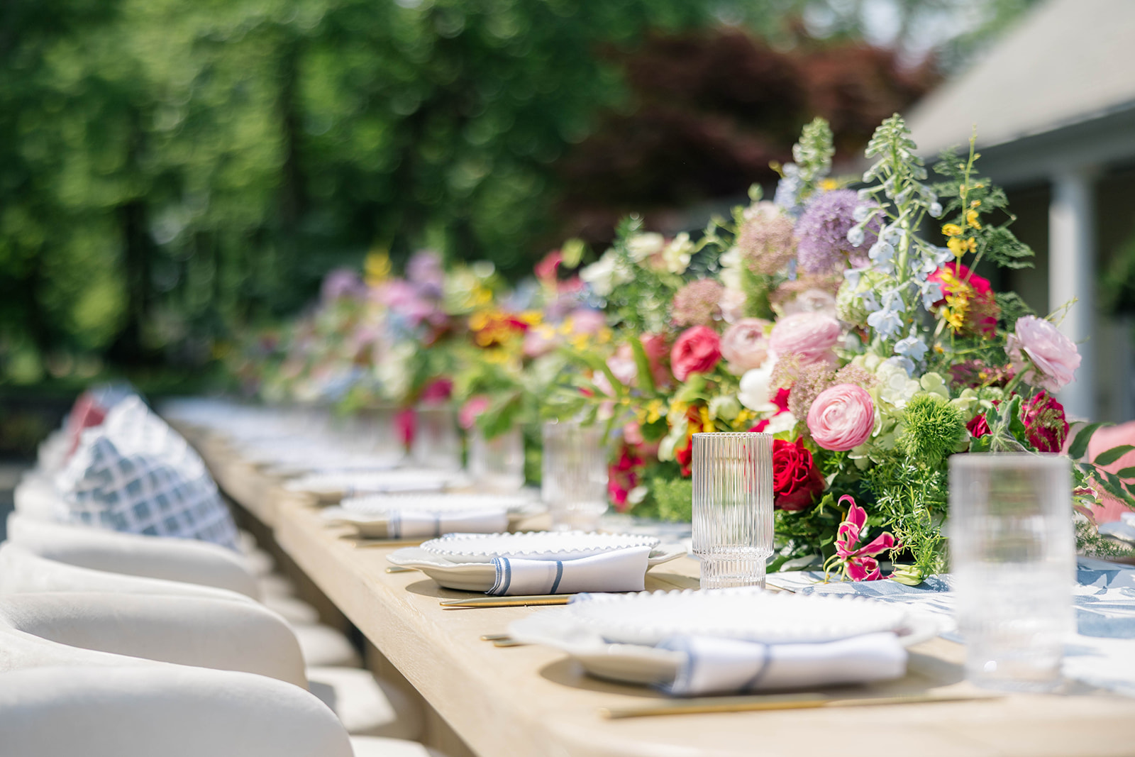
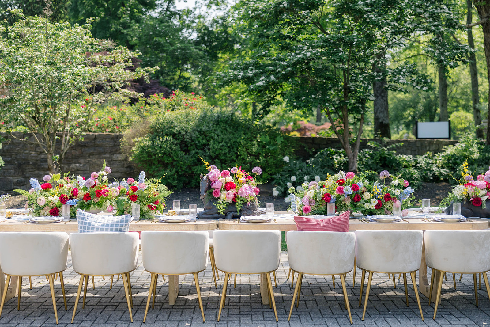
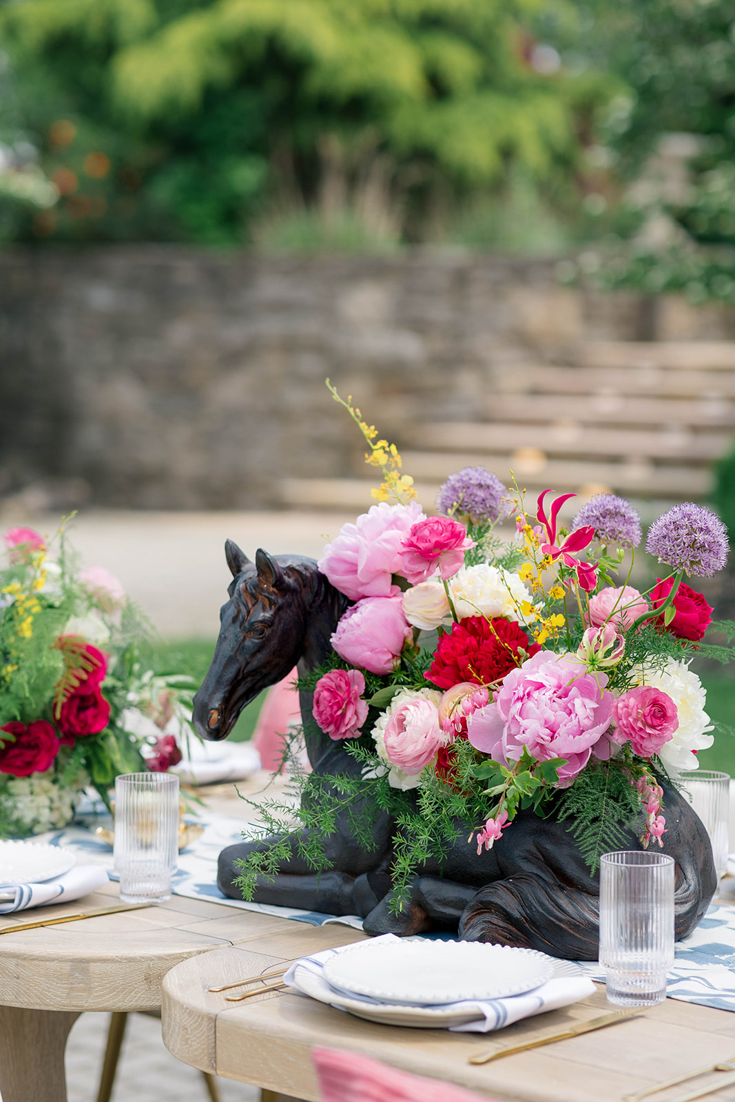
There were so many other details that made this event standout, from the horse vase centerpieces holding beautiful spring blooms, to the elevated Southern fashion worn by attendees, the entire event was so thoughtfully designed. It was a joy to create a few of the special touches that helped weave the story together and spark inspiration for our fellow creatives and planners.
Events like this don’t come together without a powerhouse team of vendors, and it was truly an honor to work alongside some of Nashville’s finest. Not to mention all the connections made throughout the evening. A big thank you to Let’s Do This Events for the incredible planning and design, and to WIPA Nashville for putting together such a meaningful gathering for our community. I am so proud to be a part of such an amazing and inviting group of professionals that are really more like family.
If you’re looking to add custom, thoughtful touches to your wedding or event, we would love to help make your vision a reality. Reach out today to learn more about our full-service design offerings! We can’t wait to create something unforgettable for you!
If you enjoyed this post, you’ll love these other blogs!