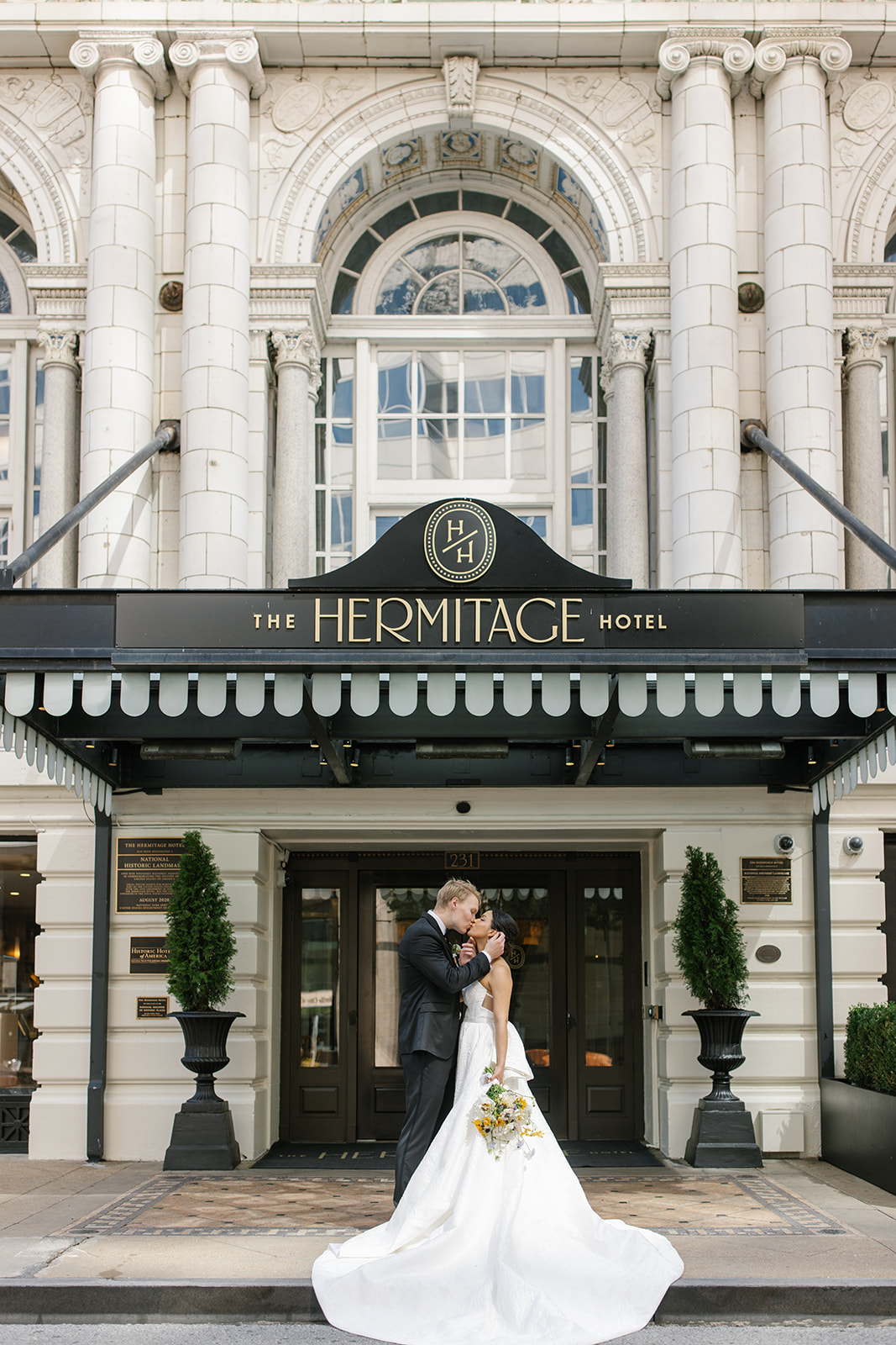
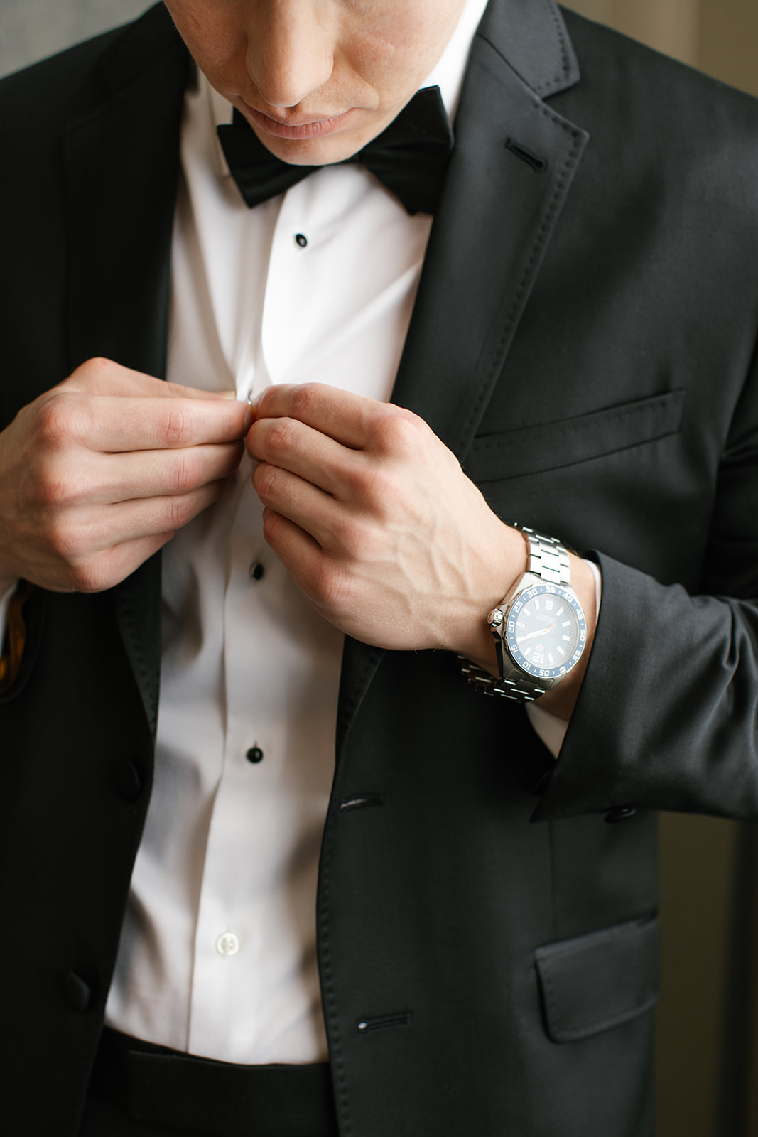
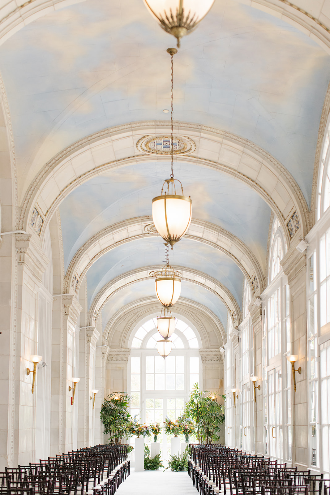
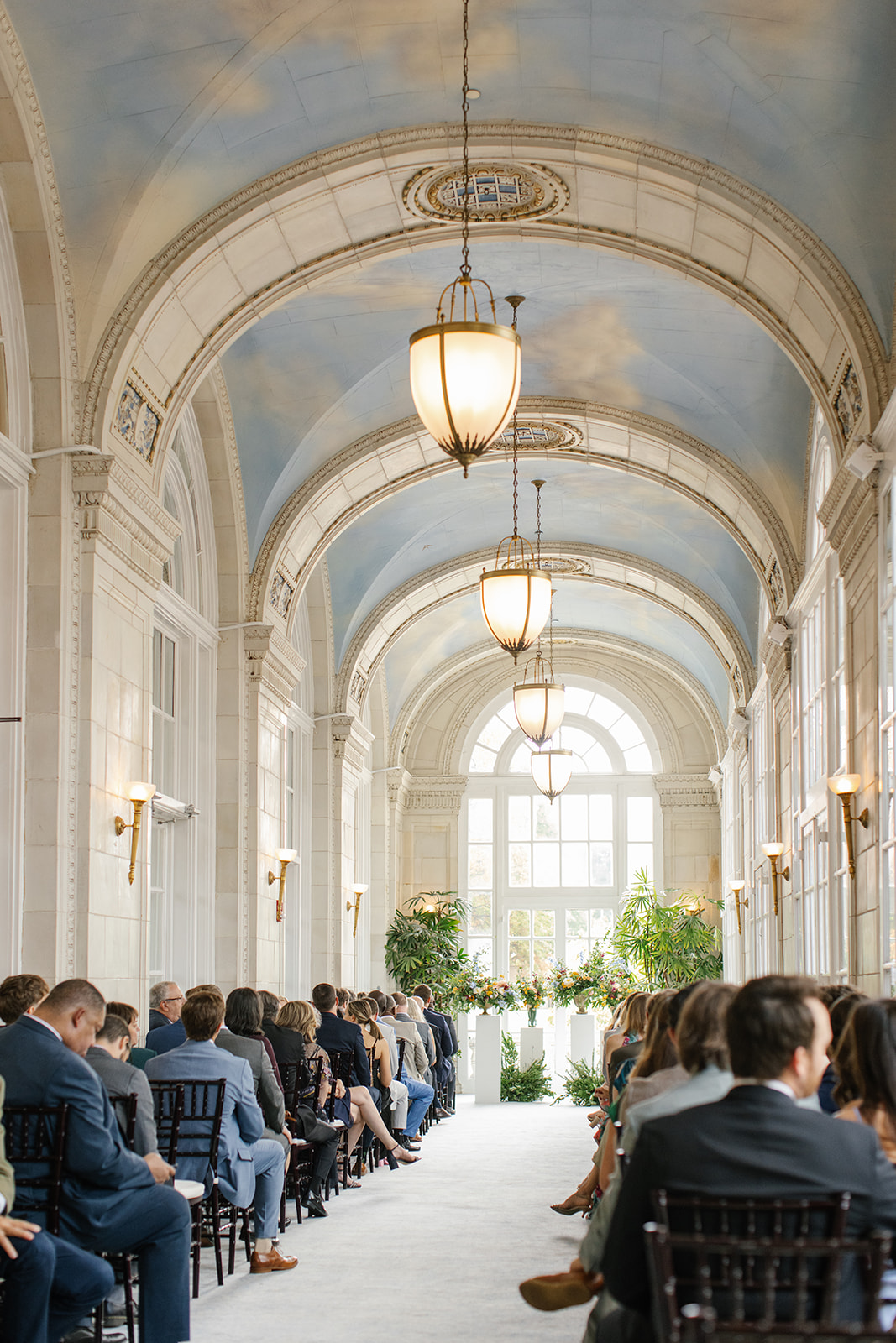
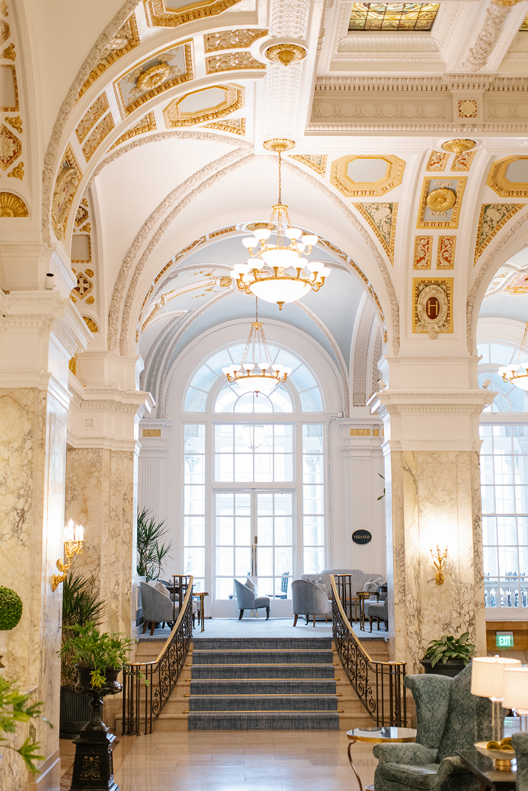
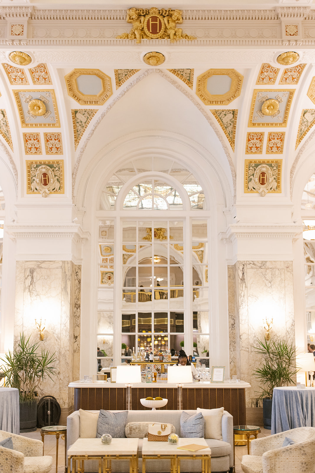
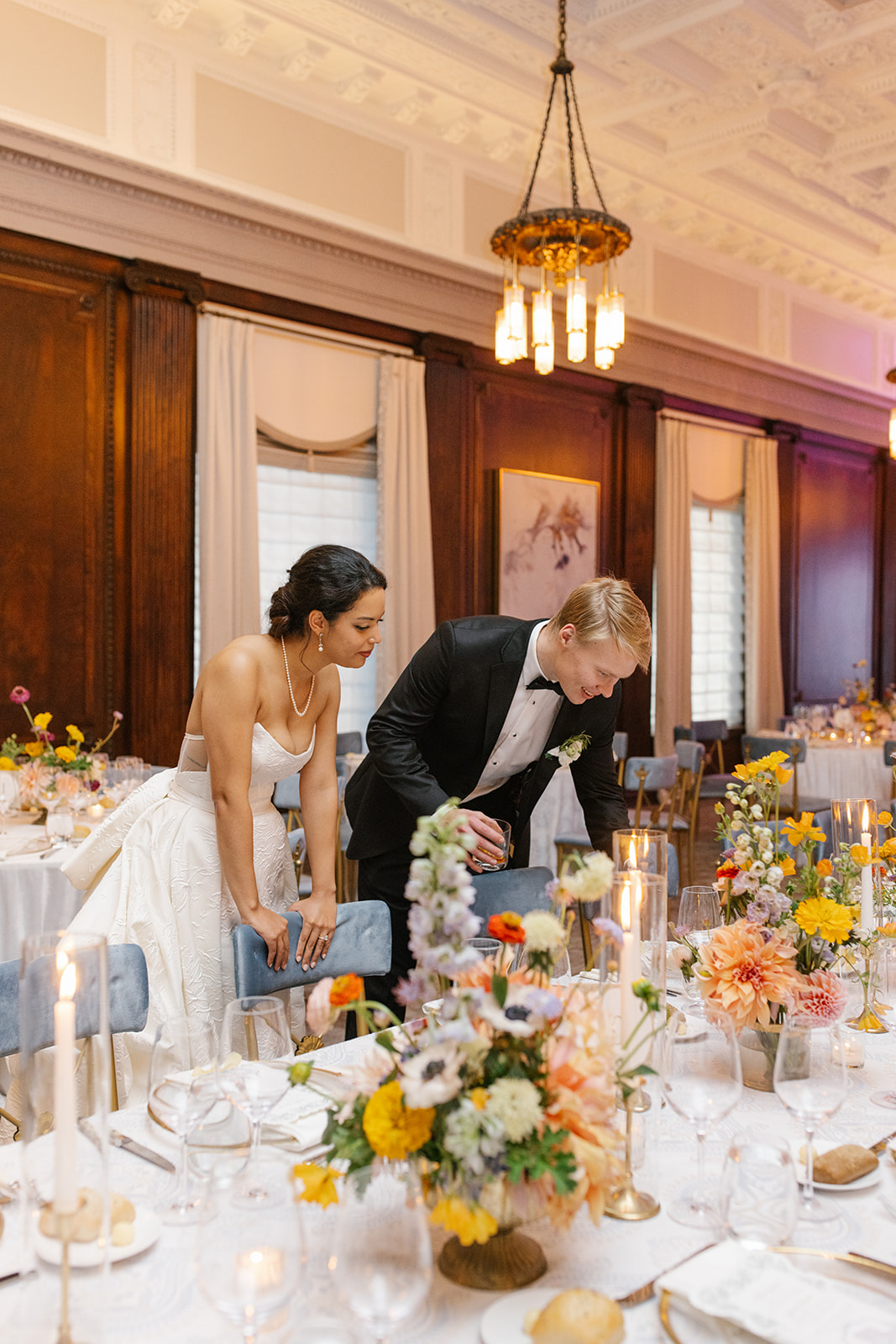
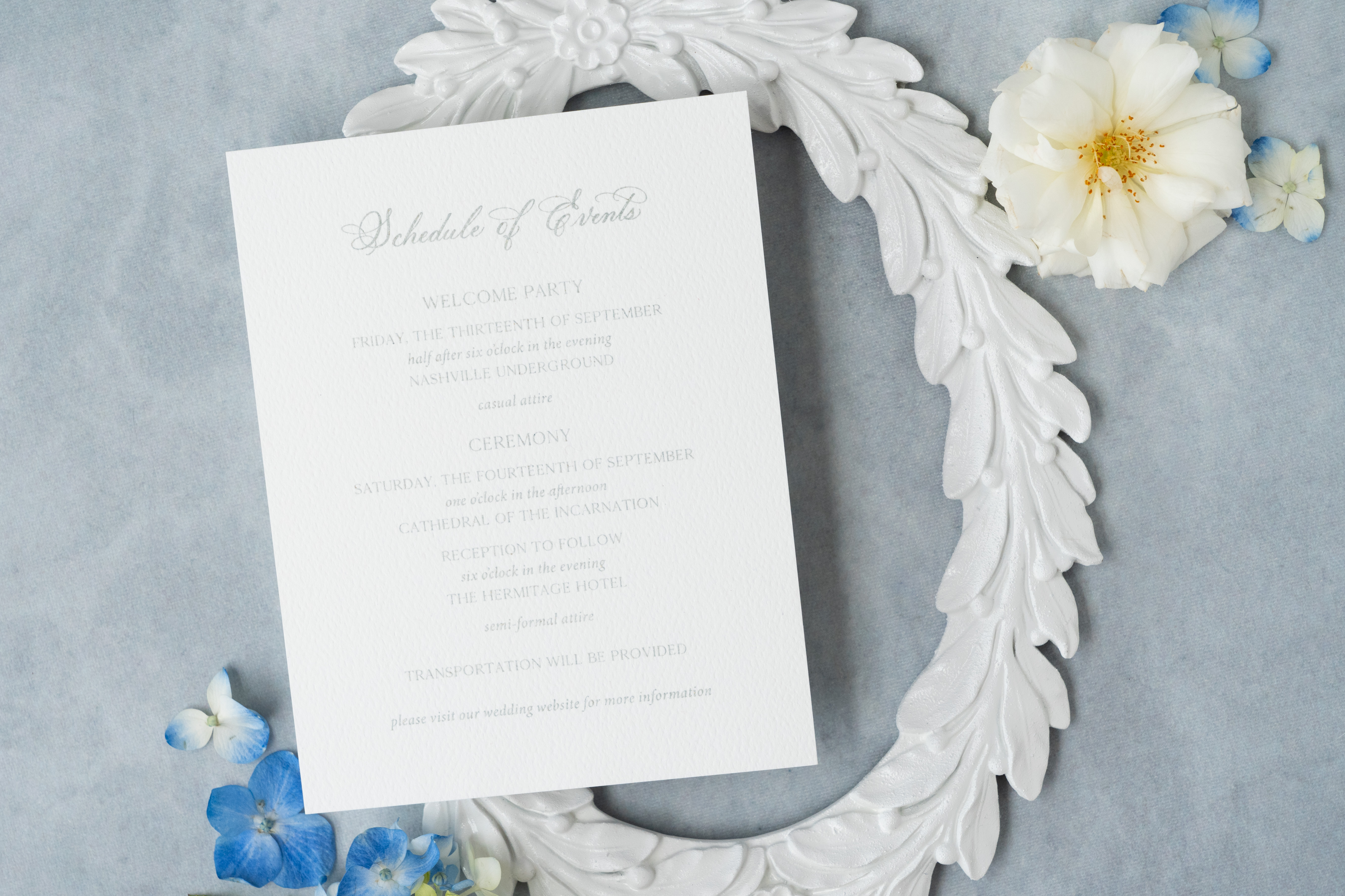
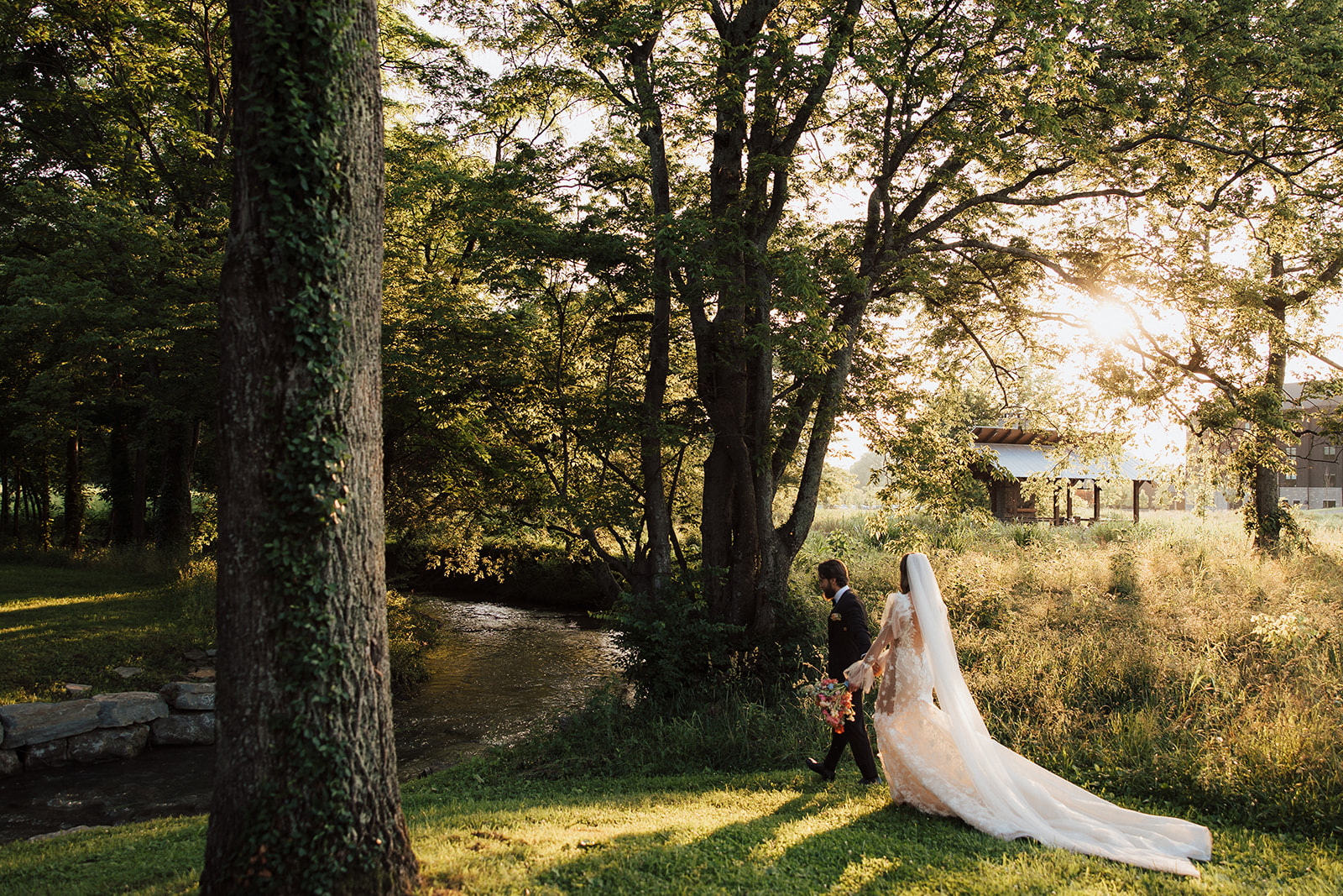
This year we started off a busy fall wedding season with White Ink Couple, Ashley and Austin, at the iconic Hermitage Hotel in downtown Nashville. This unforgettable, art nouveau-inspired wedding did not hold back when utilizing details, pulling in colors, and interlacing style and texture throughout the entire event. White Ink was there for ALL of it!
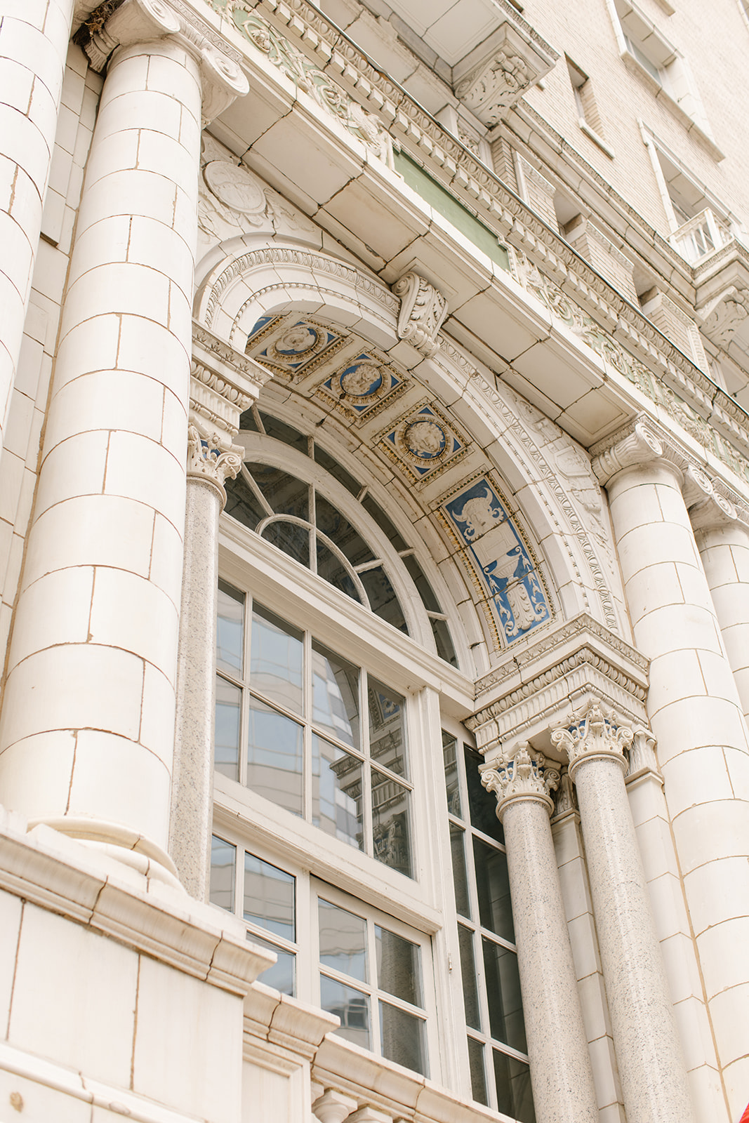
We rolled up our creative sleeves and worked to help bring Ashley and Austin’s elegant vision into focus. We wove together poignant characteristics from The Hermitage Hotel’s architecture along with the flowing geometric styles and muted colors of the booming art nouveau movement were incorporated into all the important details of the day.
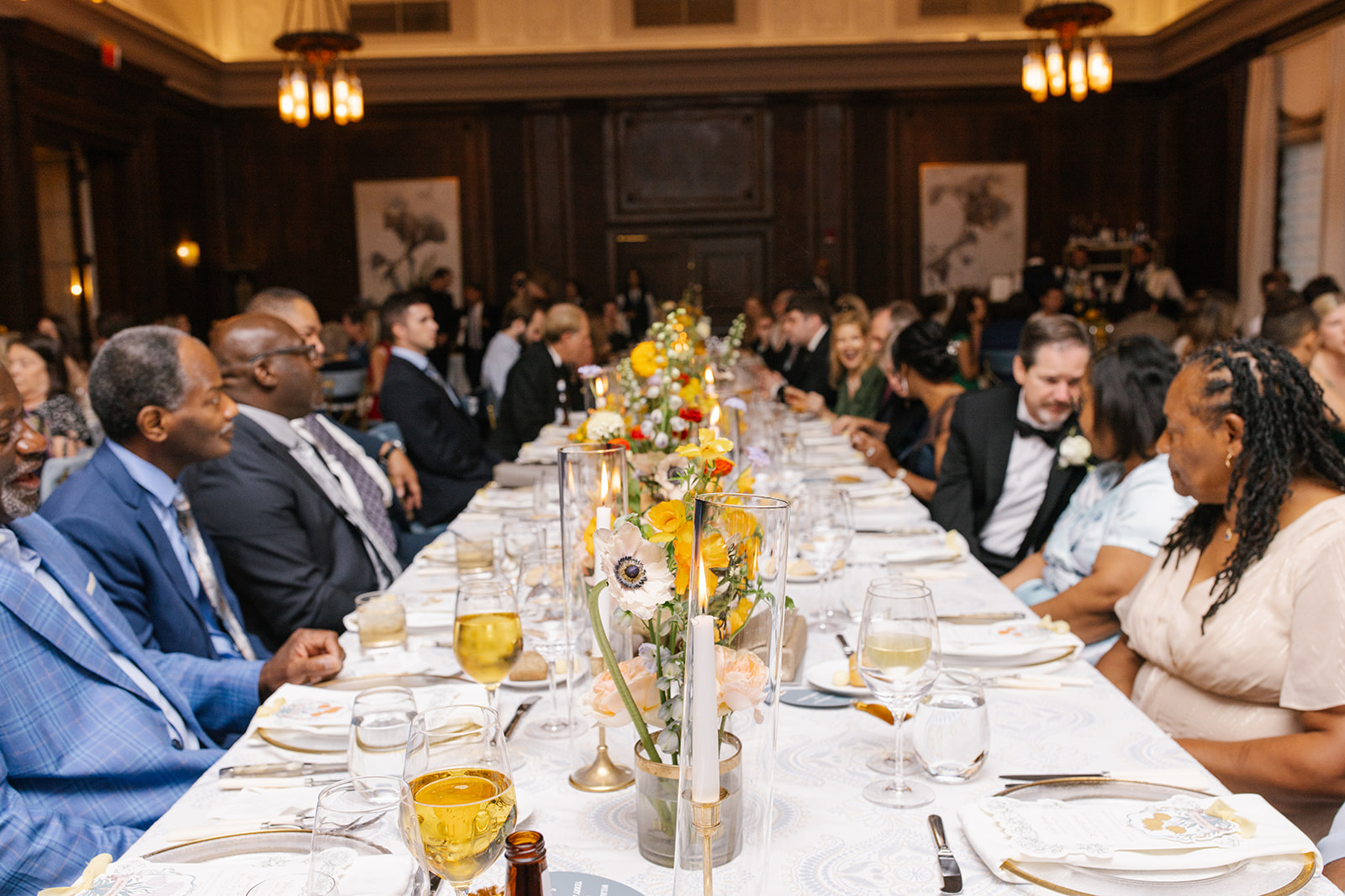
This was an unforgettable experience for the our team and we are delighted to finally get to share this day with you!
Art Nouveau- Did you know?
Art Nouveau or “new art” was a movement that gained popularity from the late 1800’s to the early 1900’s. According to the The Art Story’s website, “Art Nouveau was aimed at modernizing design, seeking to escape the eclectic historical styles that had previously been popular. Artists drew inspiration from both organic and geometric forms, evolving elegant designs that united flowing, natural forms resembling the stems and blossoms of plants. The emphasis on linear contours took precedence over color, which was usually represented with hues such as muted greens, browns, yellows, and blues.” www.theartstory.org
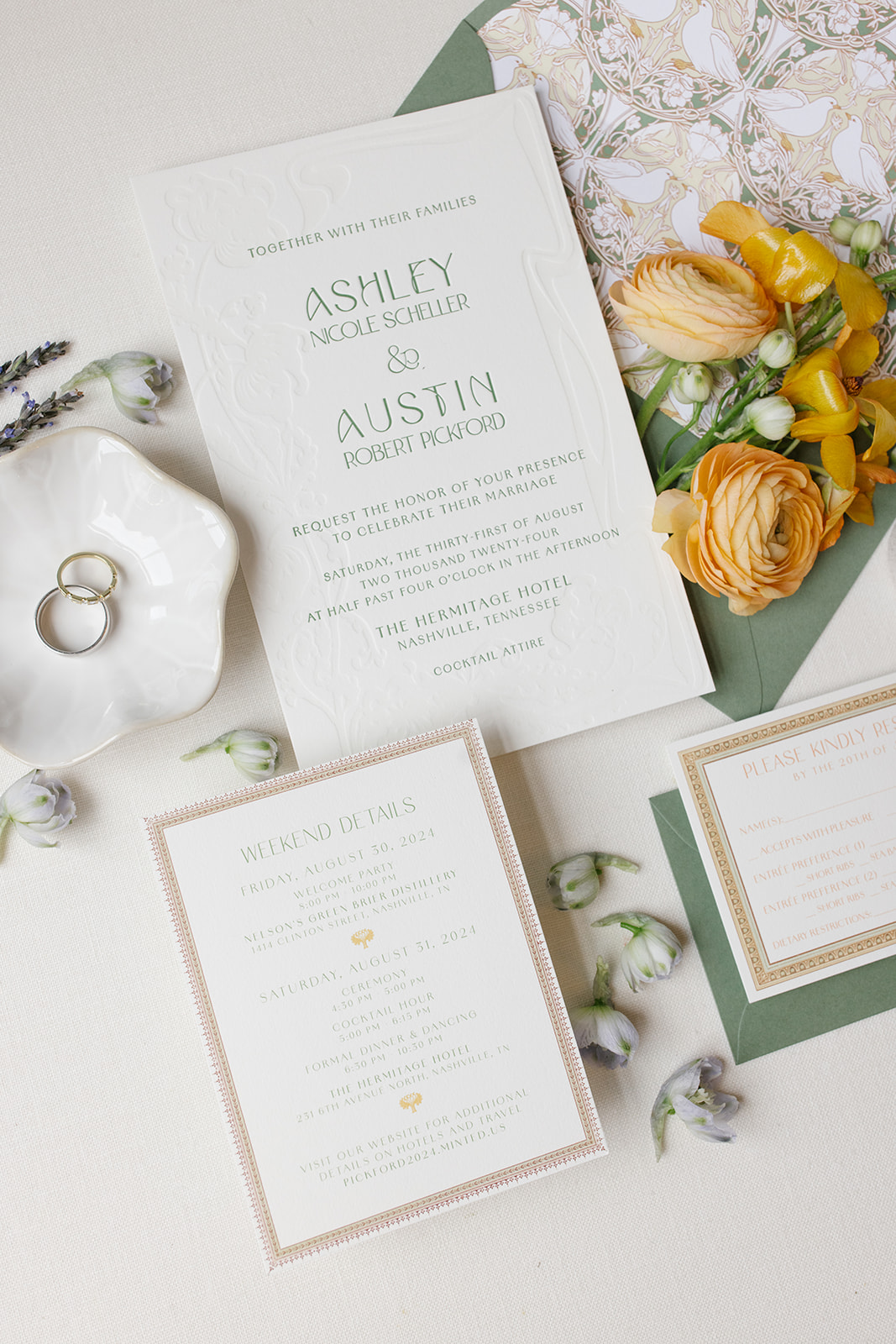
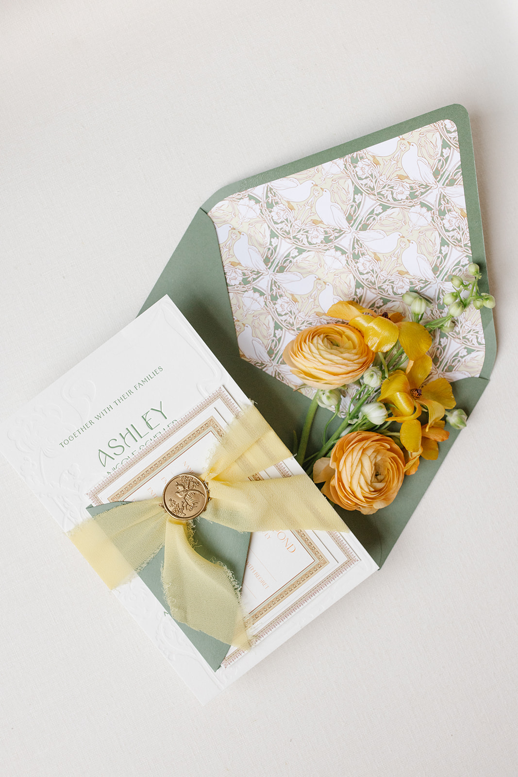
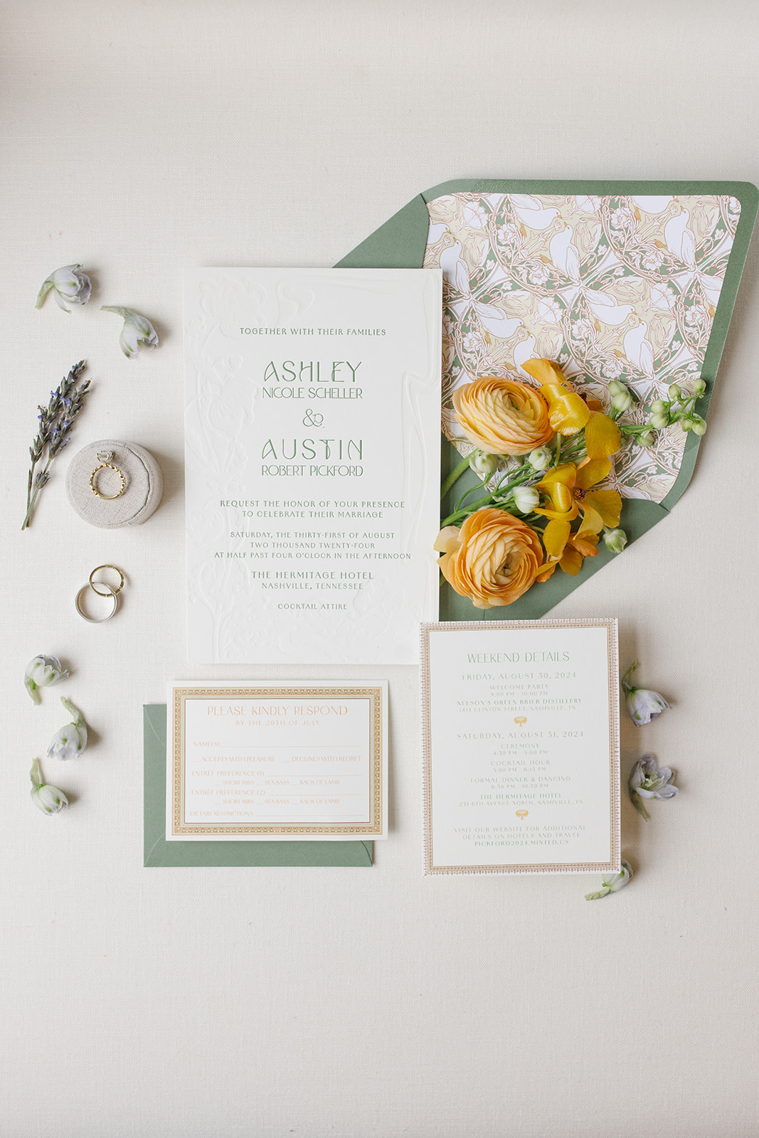
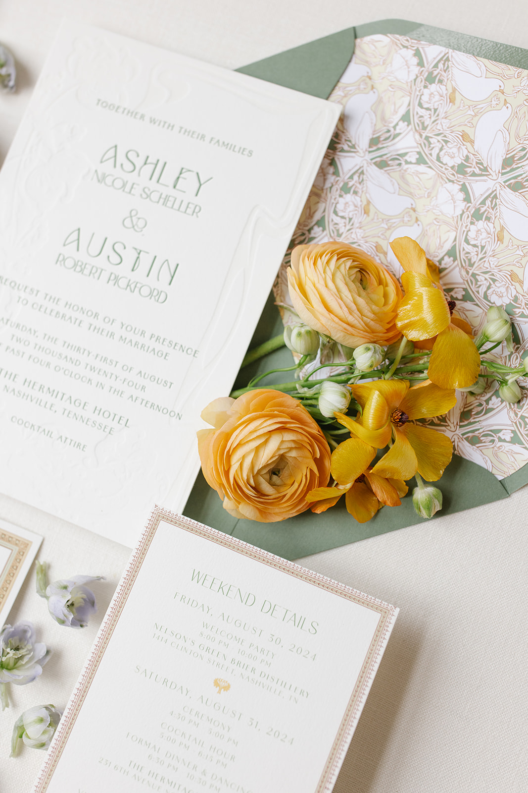
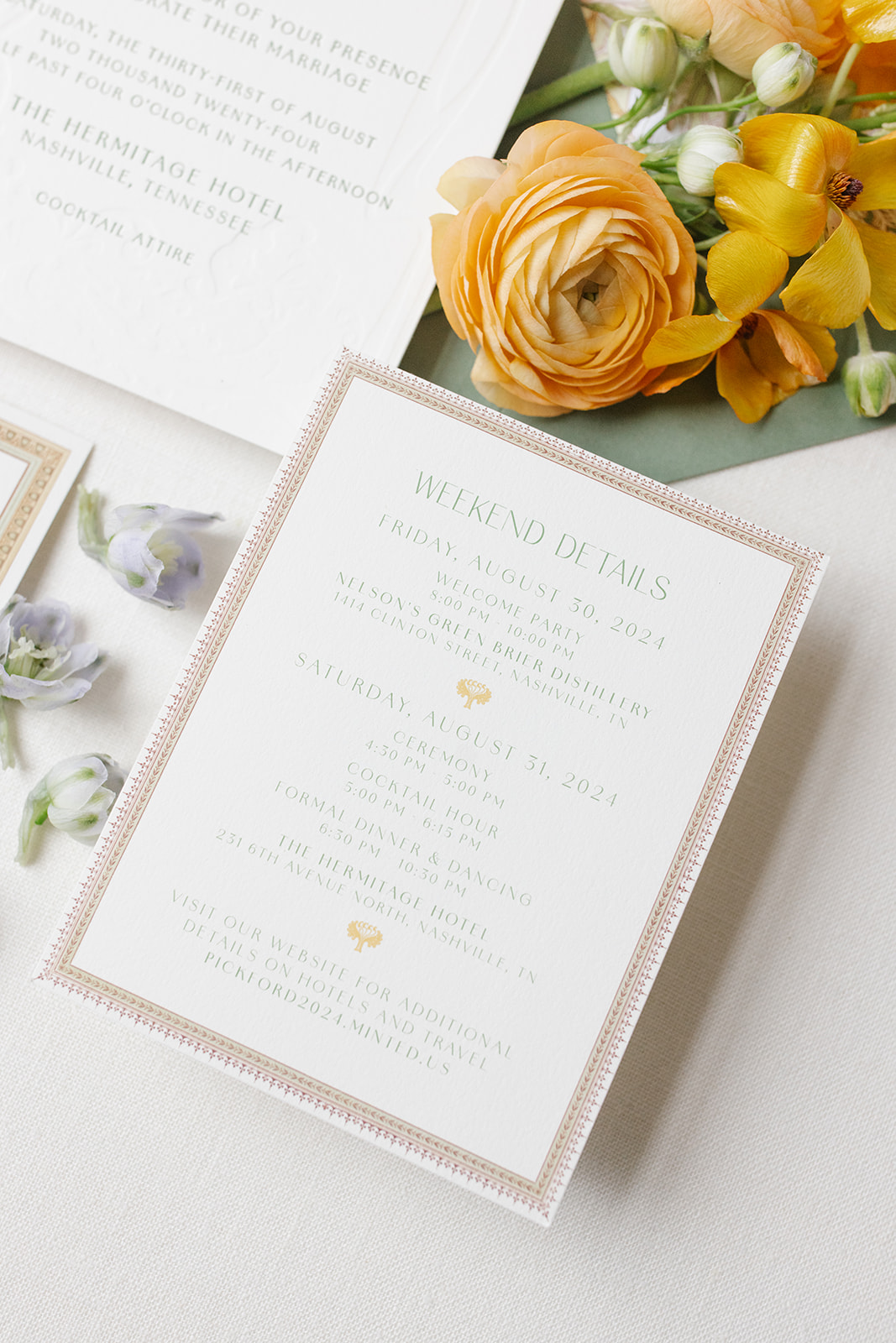
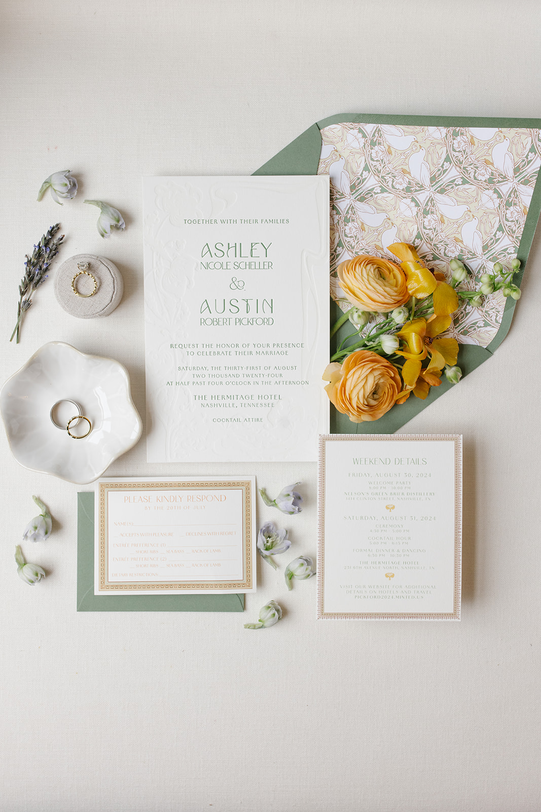
This invitation suite was designed to reflect the timeless details of the wedding venue. We custom-designed the envelope liner to include that classic, art nouveau look. Muted greens and yellows rested perfectly together with a focus on the natural beauty of white birds and the liners’ harmonious shapes and lines.
One notable detail within The Hermitage Hotel is a hand-painted bird theme throughout the guestrooms and suites. The idea to include birds in the custom envelope liner was a purposeful and beautiful way to connect the invites to the venue.
The ornament framing around the rsvp and details cards was meant to mimic the ornate frames and trim work throughout the hotel. This invitation suite was truly the ultimate ‘sneak peek’ for Ashley and Austin’s guests of what was to come!
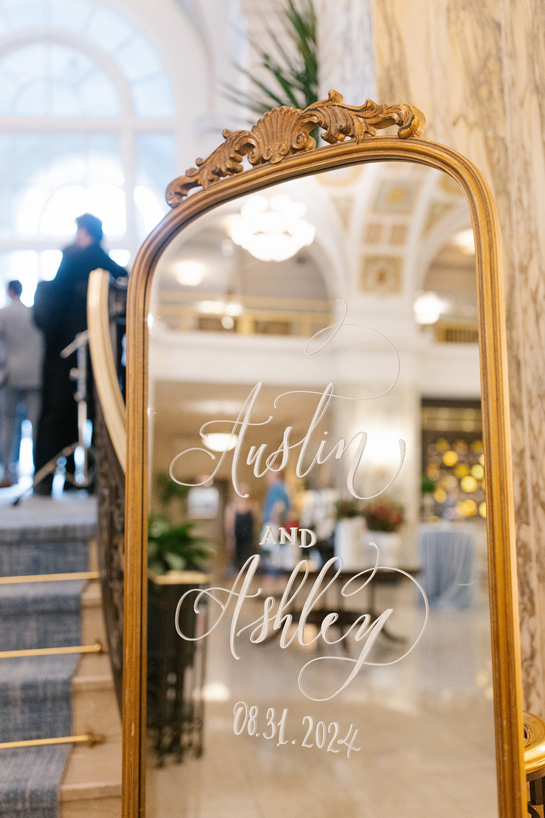
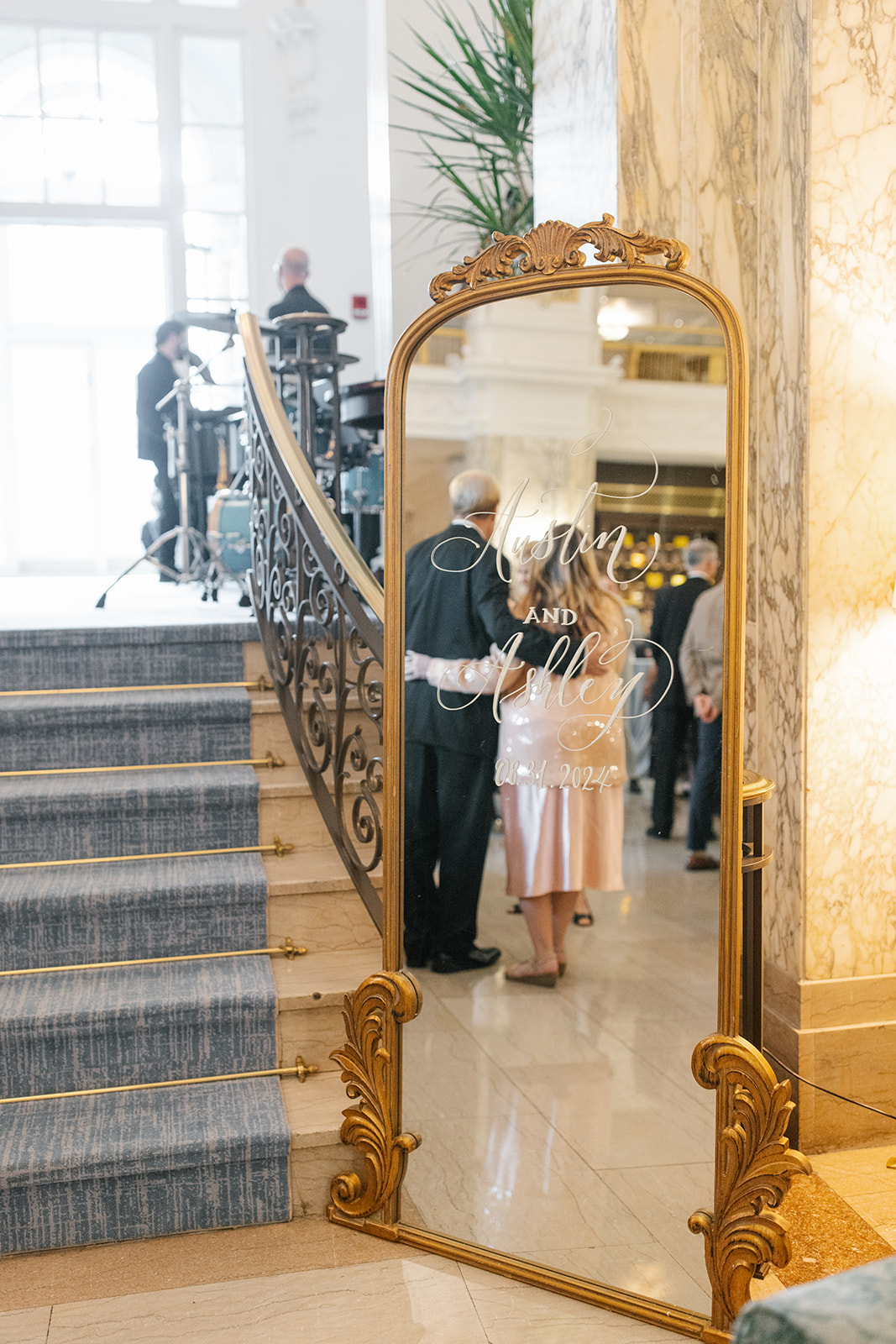
A wedding welcome sign is multifunctional, especially if it is mirrored. Event signage, in general, is a seamless way to provide guidance for your guests as they enter the venue space. It adds to the tone of the space without stealing the show. It’s also a fantastic way to showcase the theme of your big day.
Ashley and Austin chose to use our floor-length, Bourdeaux, gold-framed mirror with minimal ornamentation. It was the perfect sign to bring just enough attention. Even in a vintage, art nouveau-themed wedding, small details can go a long way. Giving guests a quick opportunity to check their reflection is a welcomed added bonus!
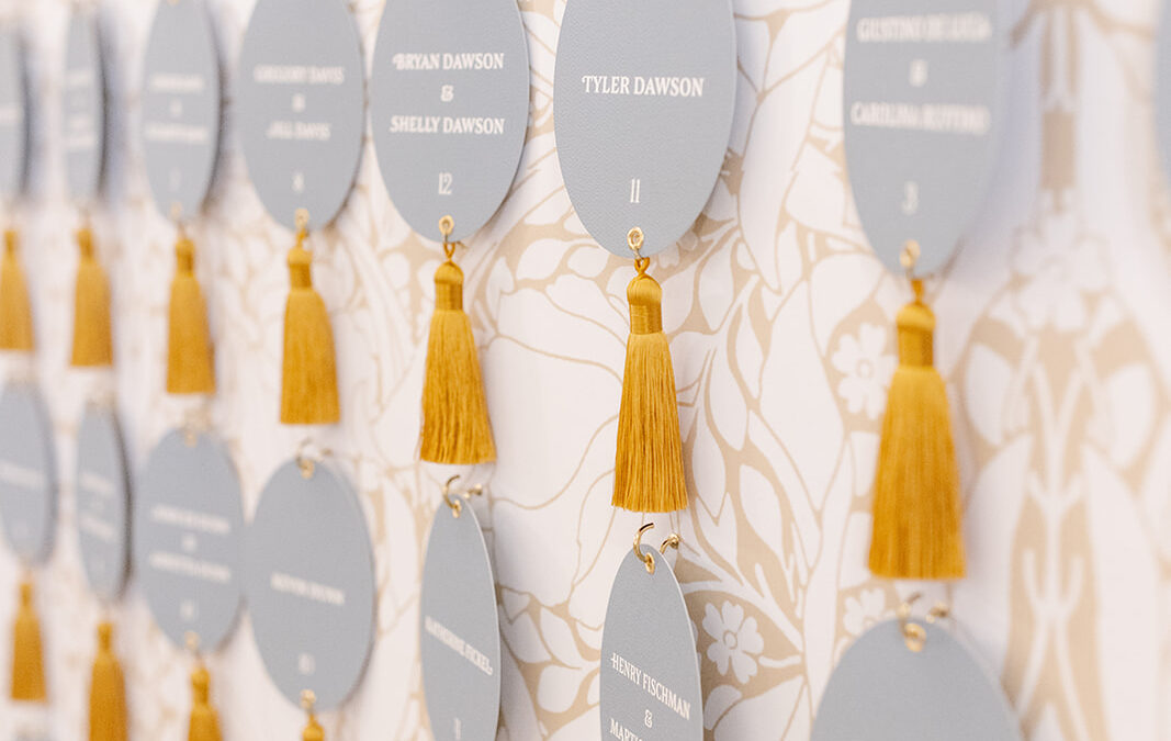
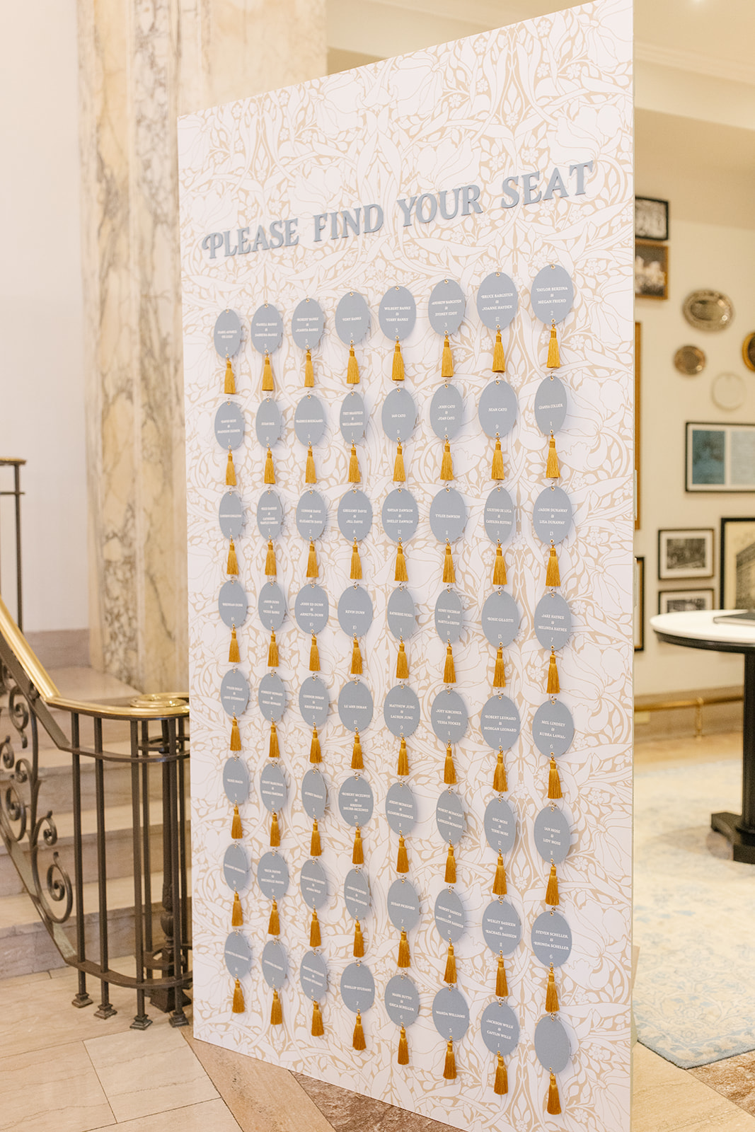
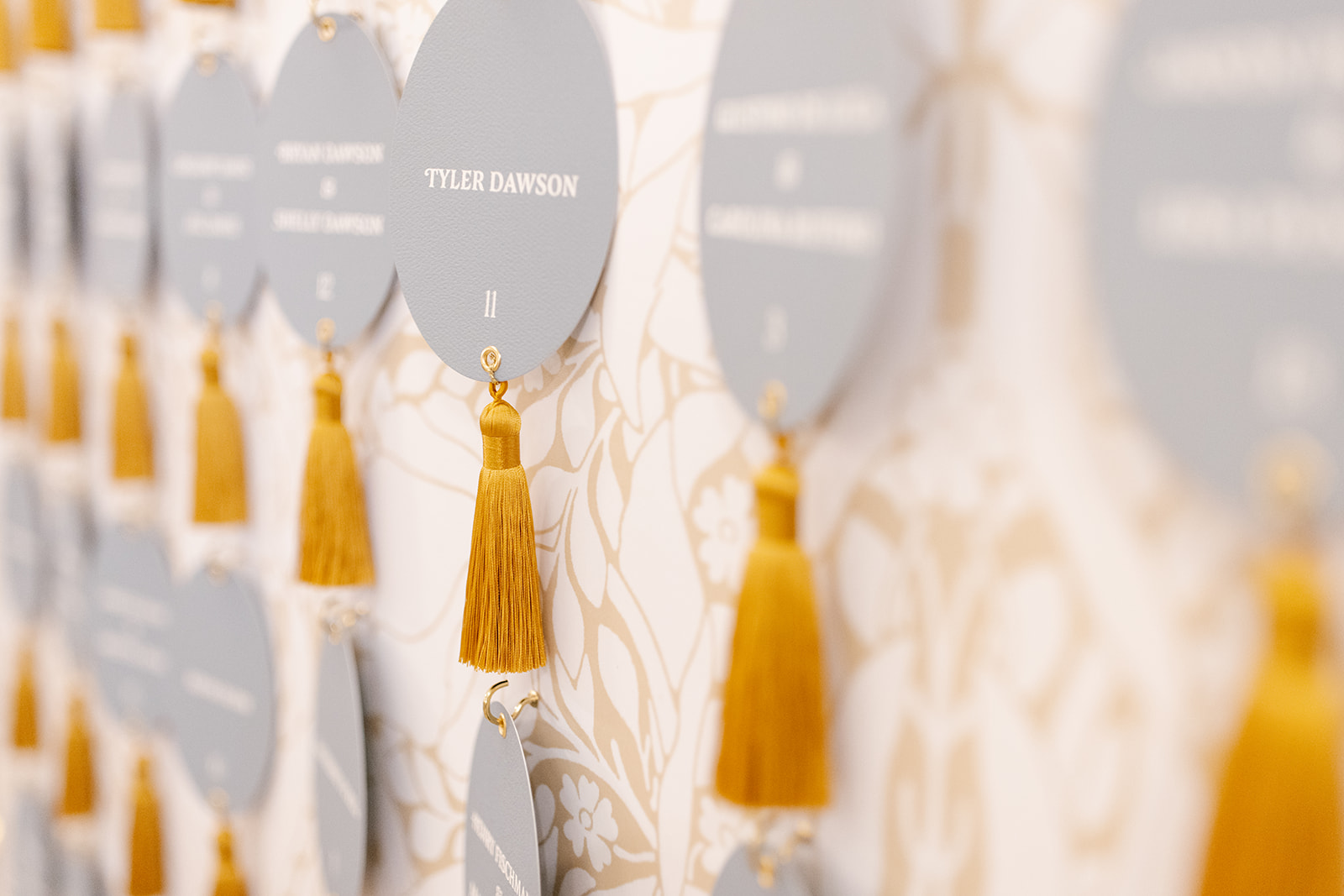
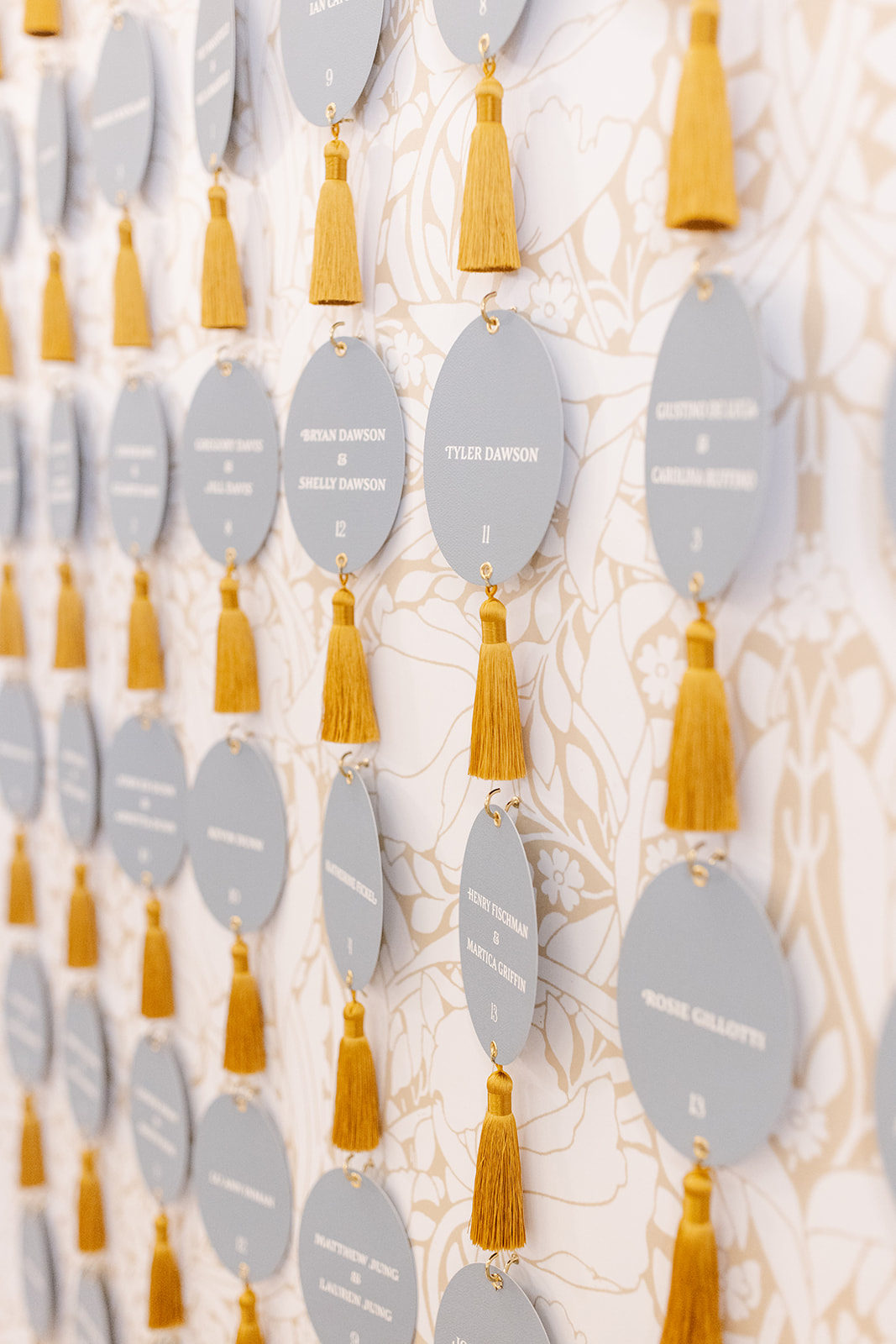
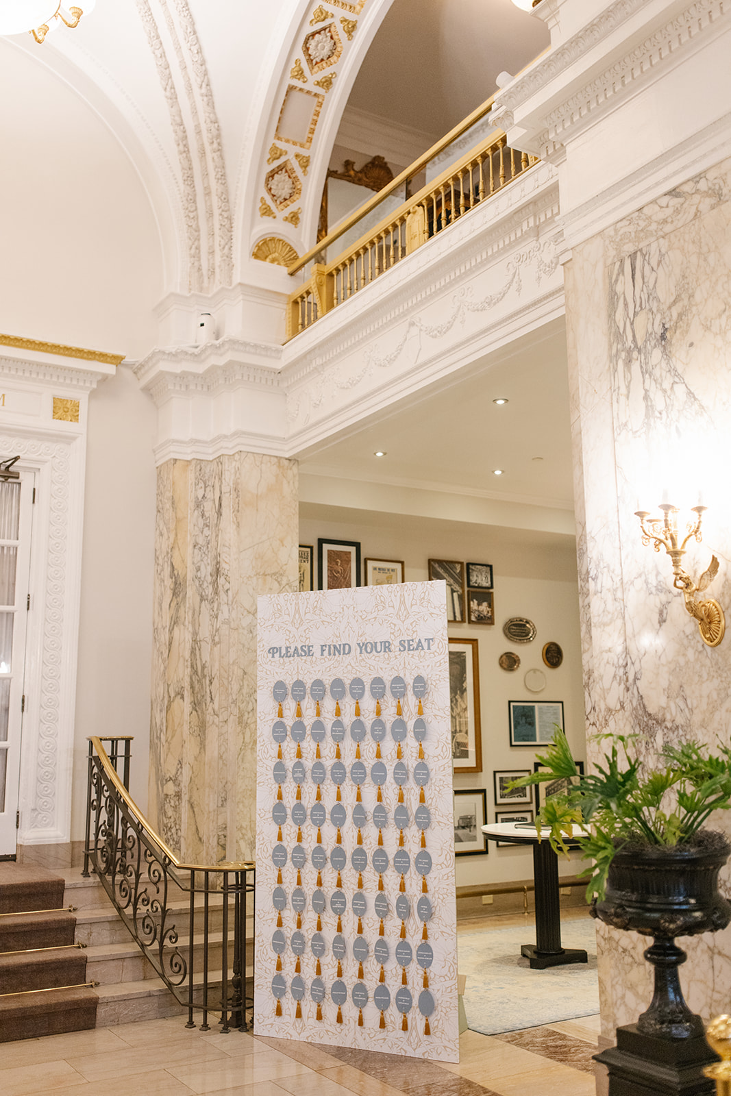
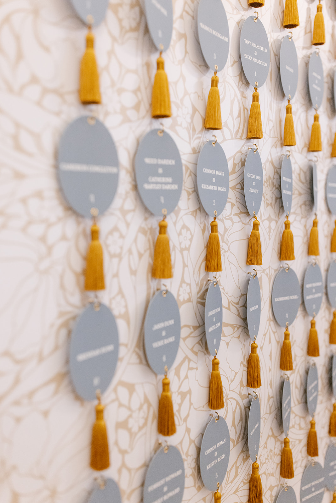
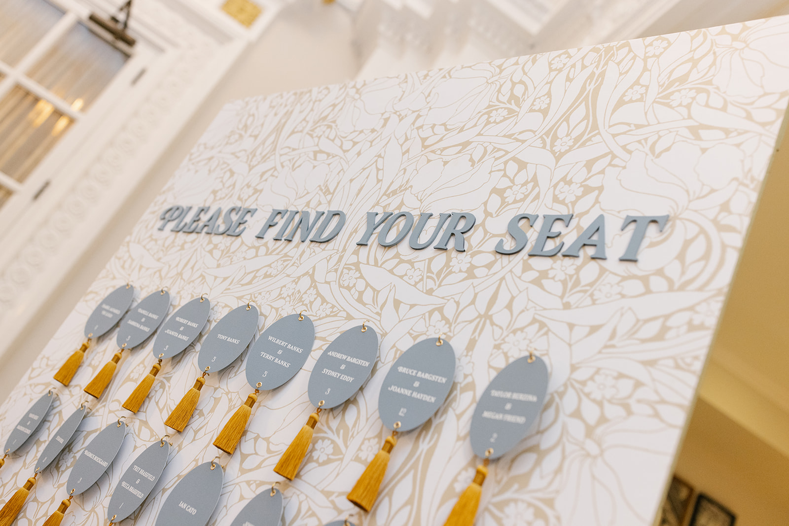
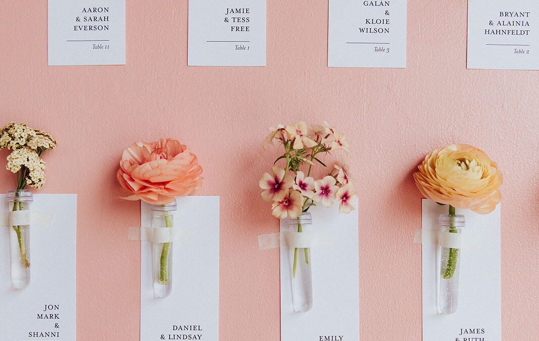
Our couples often use seating charts and escort wall displays as an opportunity to showcase their wedding day theme in a big way, and I am HERE for it!
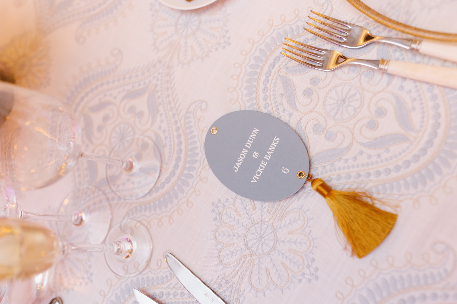
Ashley and Austin trusted White Ink to create a custom wallpaper to serve as the backdrop for this one-of-a-kind escort wall display. We kept with the art nouveau theme by focusing on natural elements, like leaves and flowers with a soft brown and white. The oval escort cards were individually hooked to the display and boasted a thick yellow tassel to replicate a vintage hotel key. How cute are these?
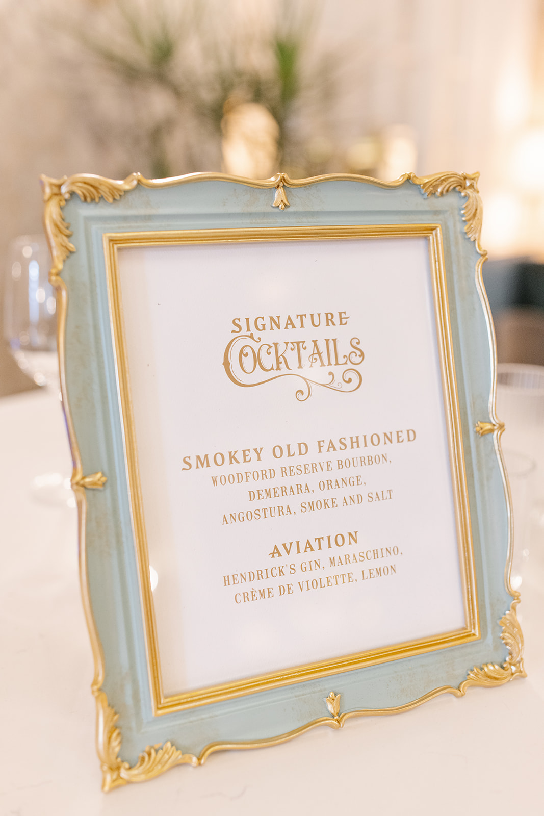
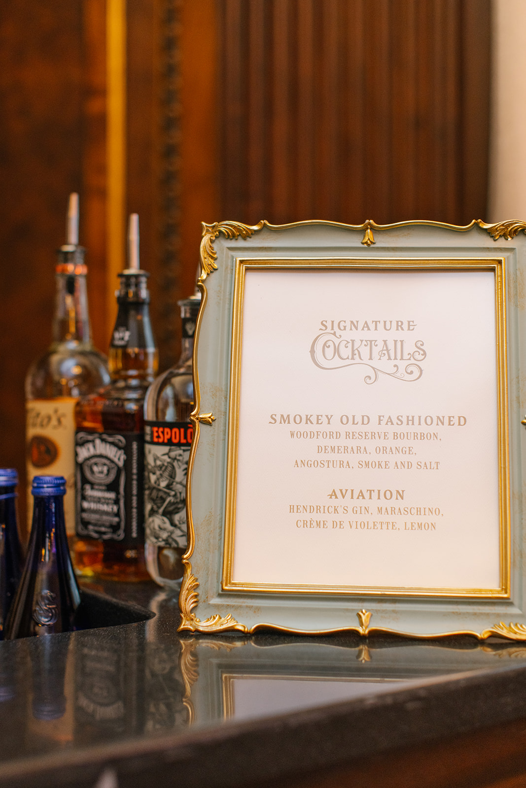
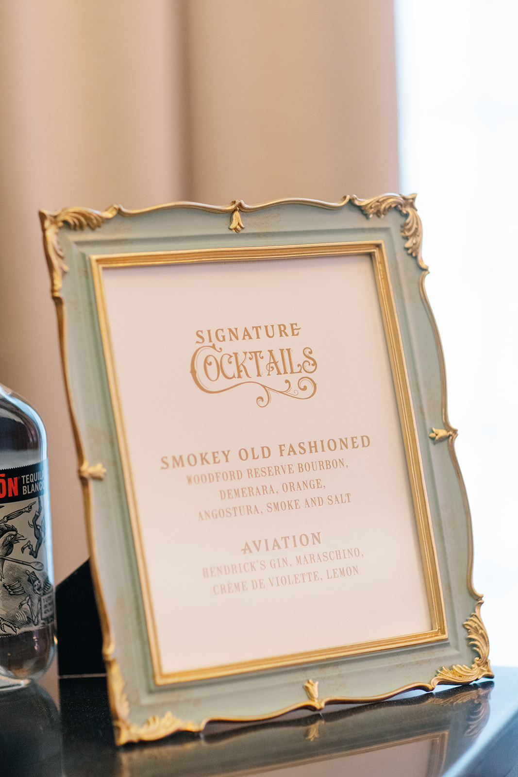
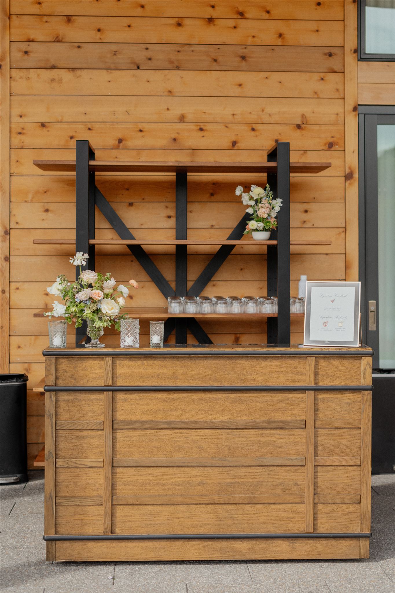
This stunning muted blue frame with gold ornamented trim was the perfect addition to our custom bar sign. It fit in with theme so seamlessly. The cocktail hour bar sign was a beautifully subtle addition to help carry the art nouveau theme by pulling in those soft hues and bold fonts.
Details like these are so much more than signs and menus, they provide a pivotal role in a carefully designed event. These little details leave a lasting impression and are something guests appreciate.
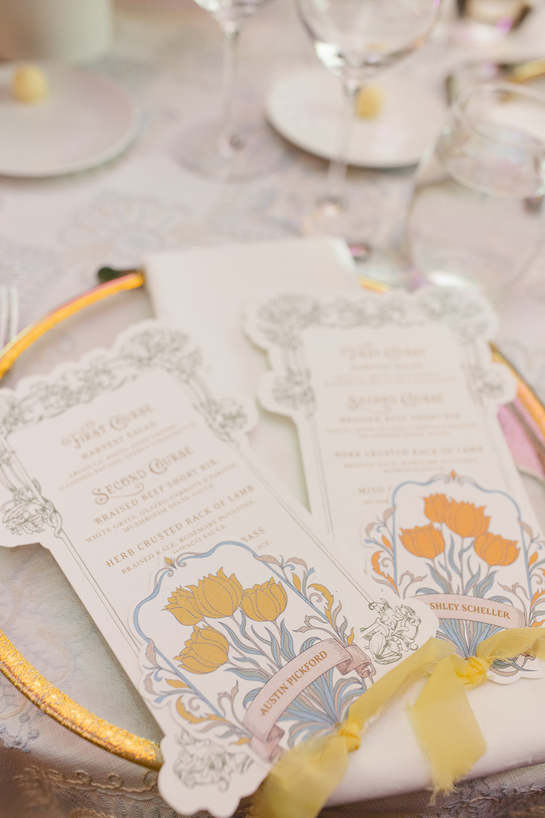
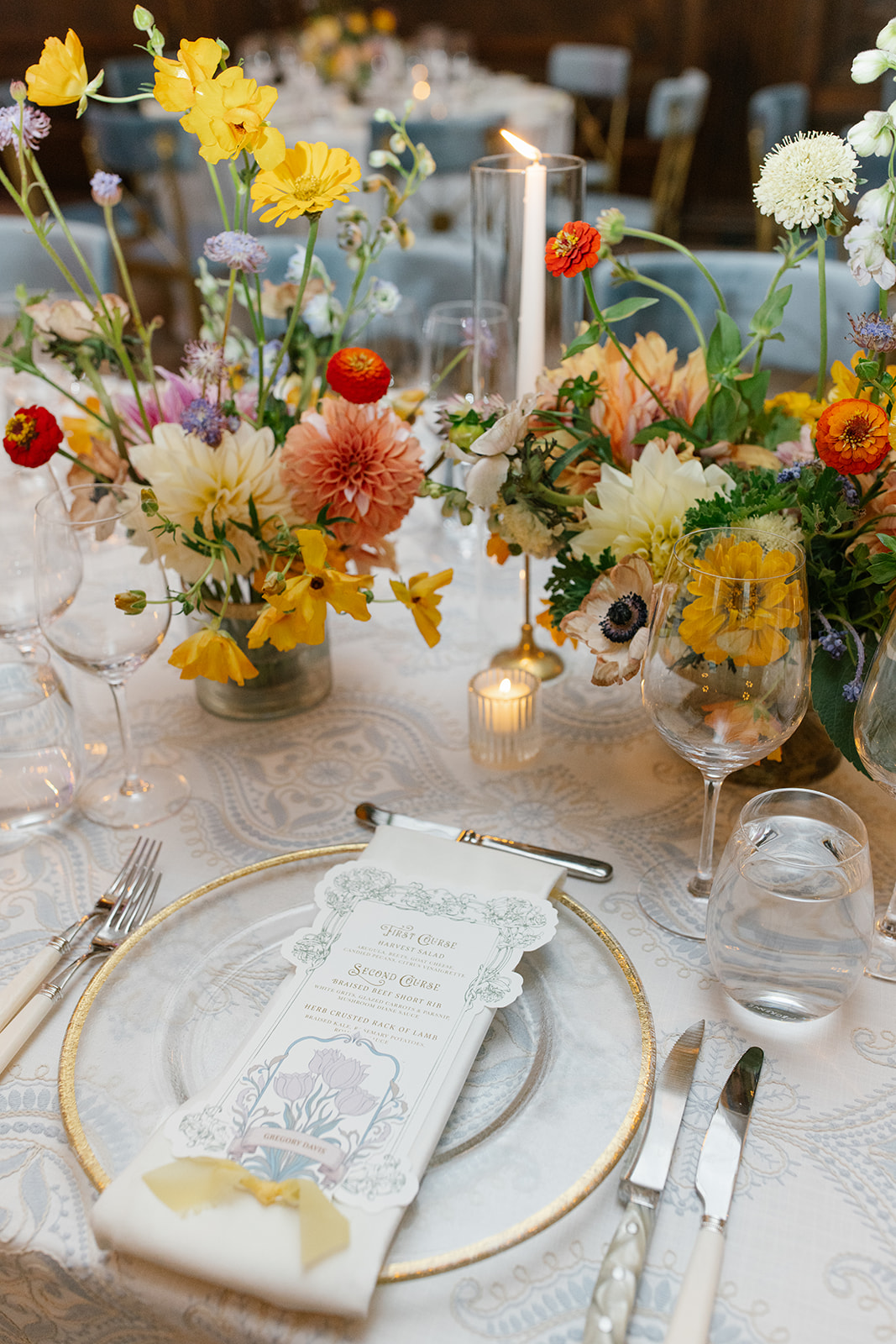
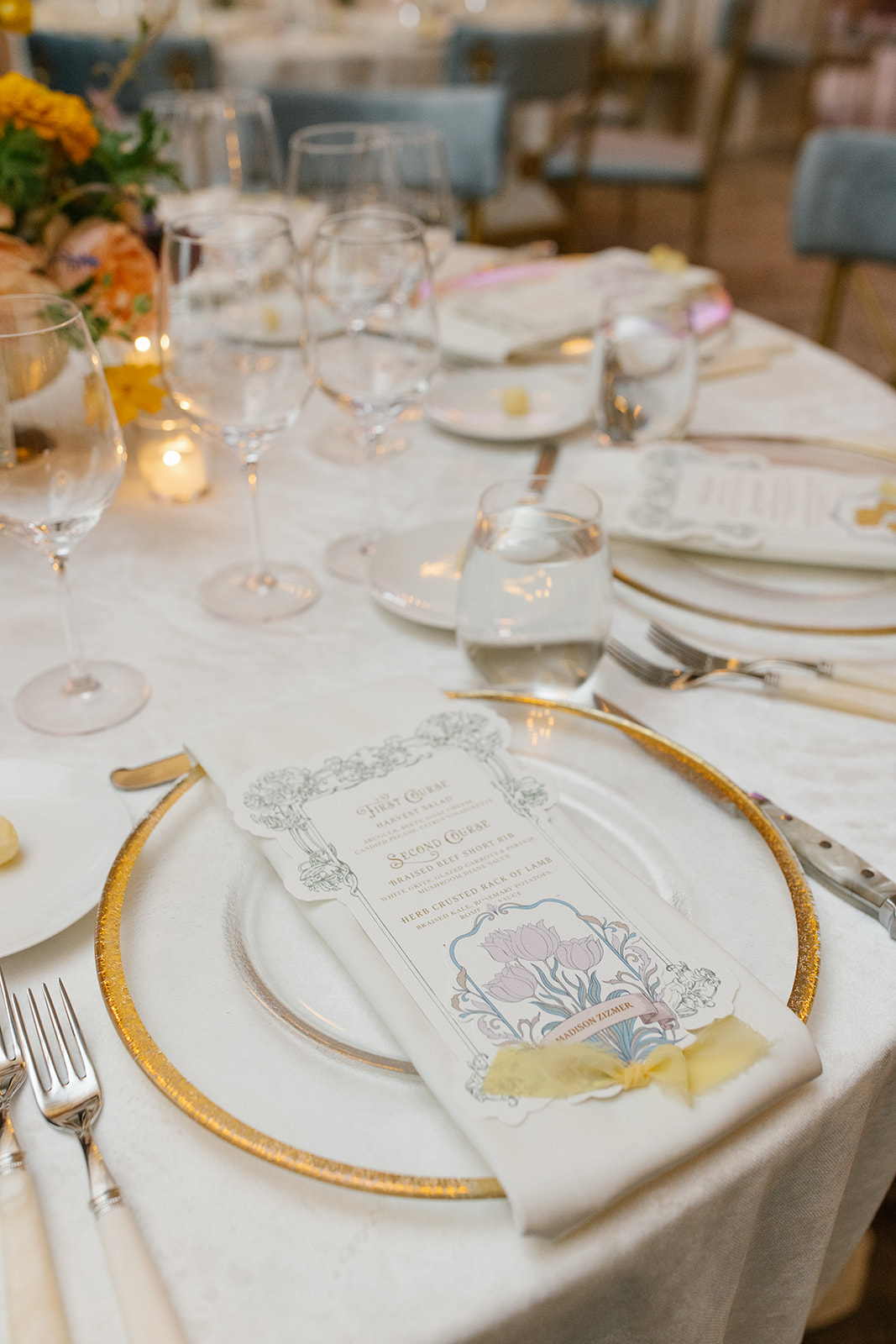
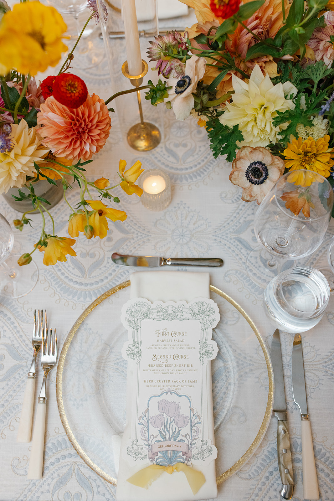
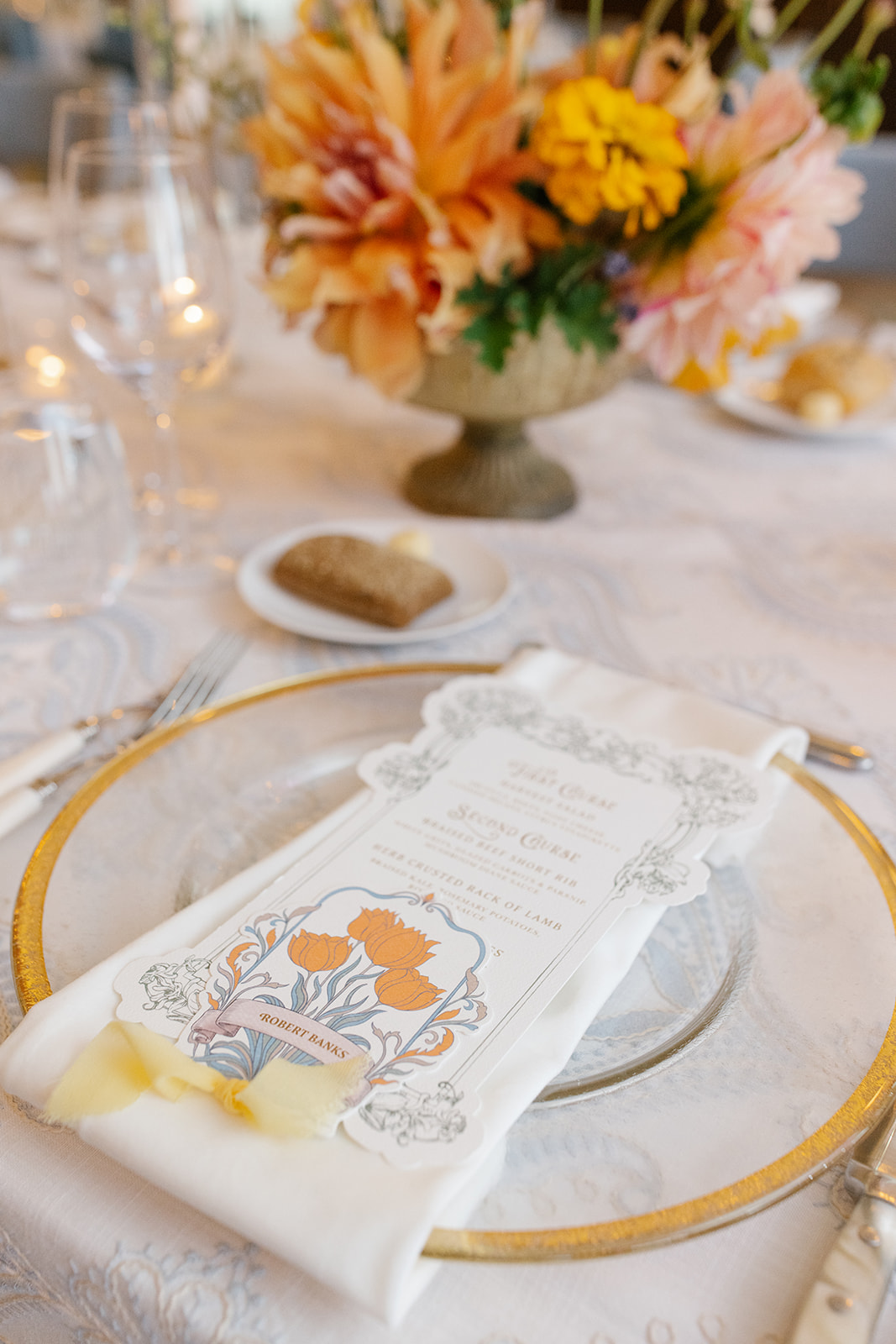
I could stare at these custom die-cut menus and place cards for hours. Guests enjoyed many day-of details that these little guys boasted. Much of the day’s style, colors, florals, and designs can be found right here in the artfully designed paper details.
A place card sat atop each menu, connected together with a soft, vintage, yellow chiffon ribbon. The same yellow ribbon could also be found on their invitation suite. I especially appreciated the functionality of the color-coded blooms on the place cards, which served as the meal indicator. Absolute perfection.
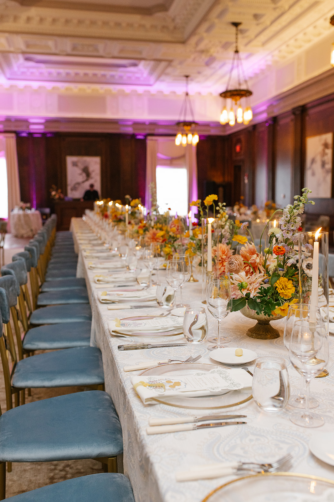
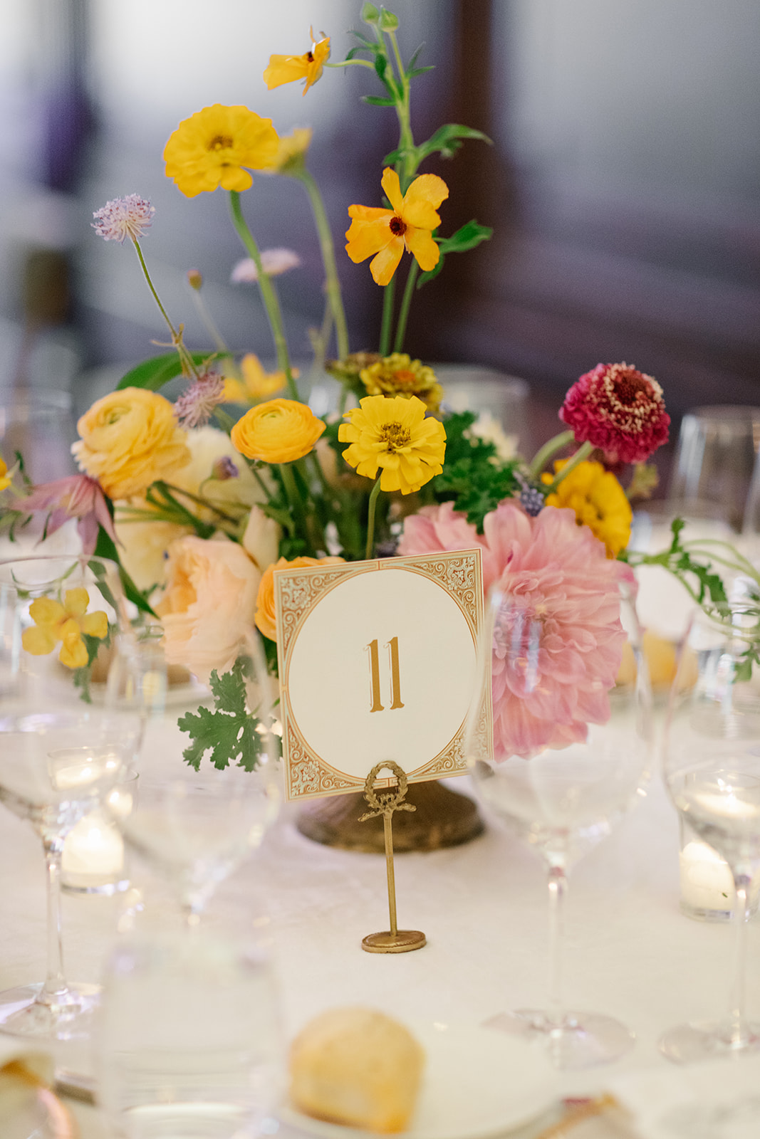
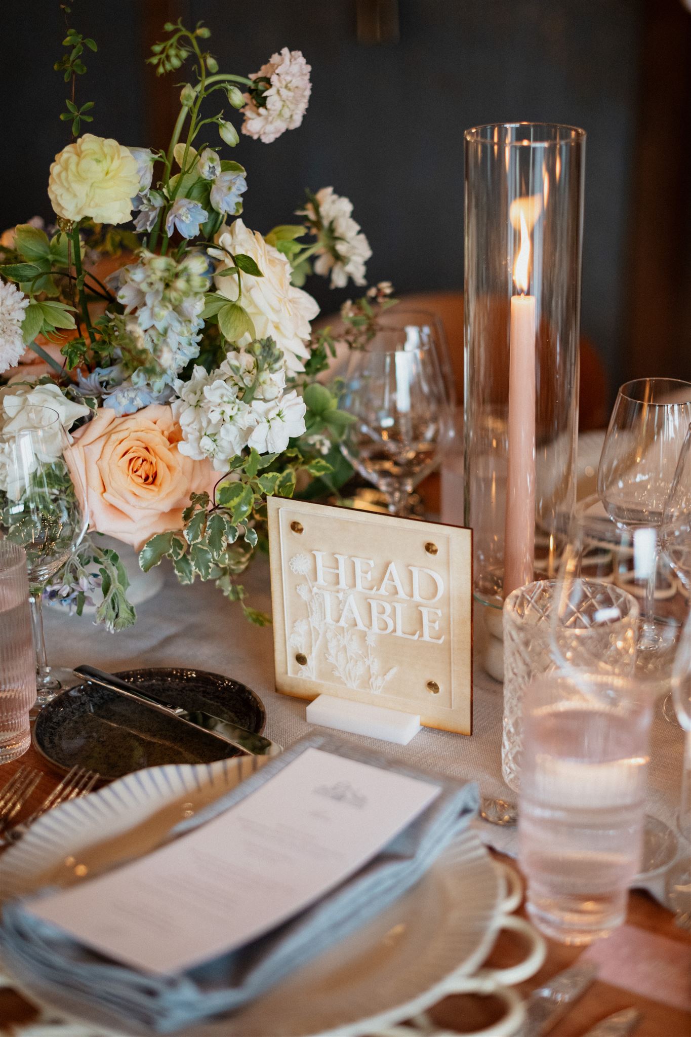
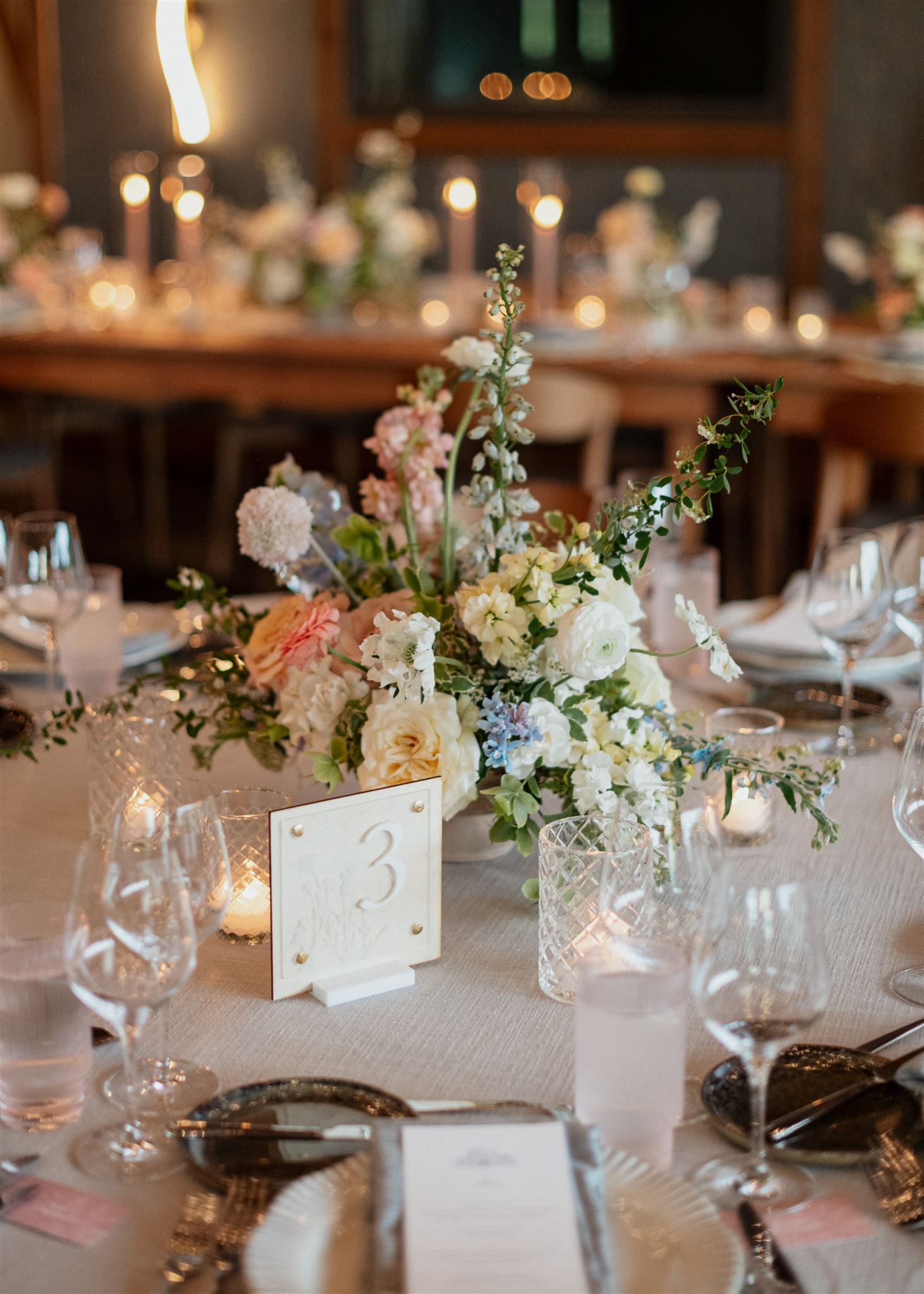
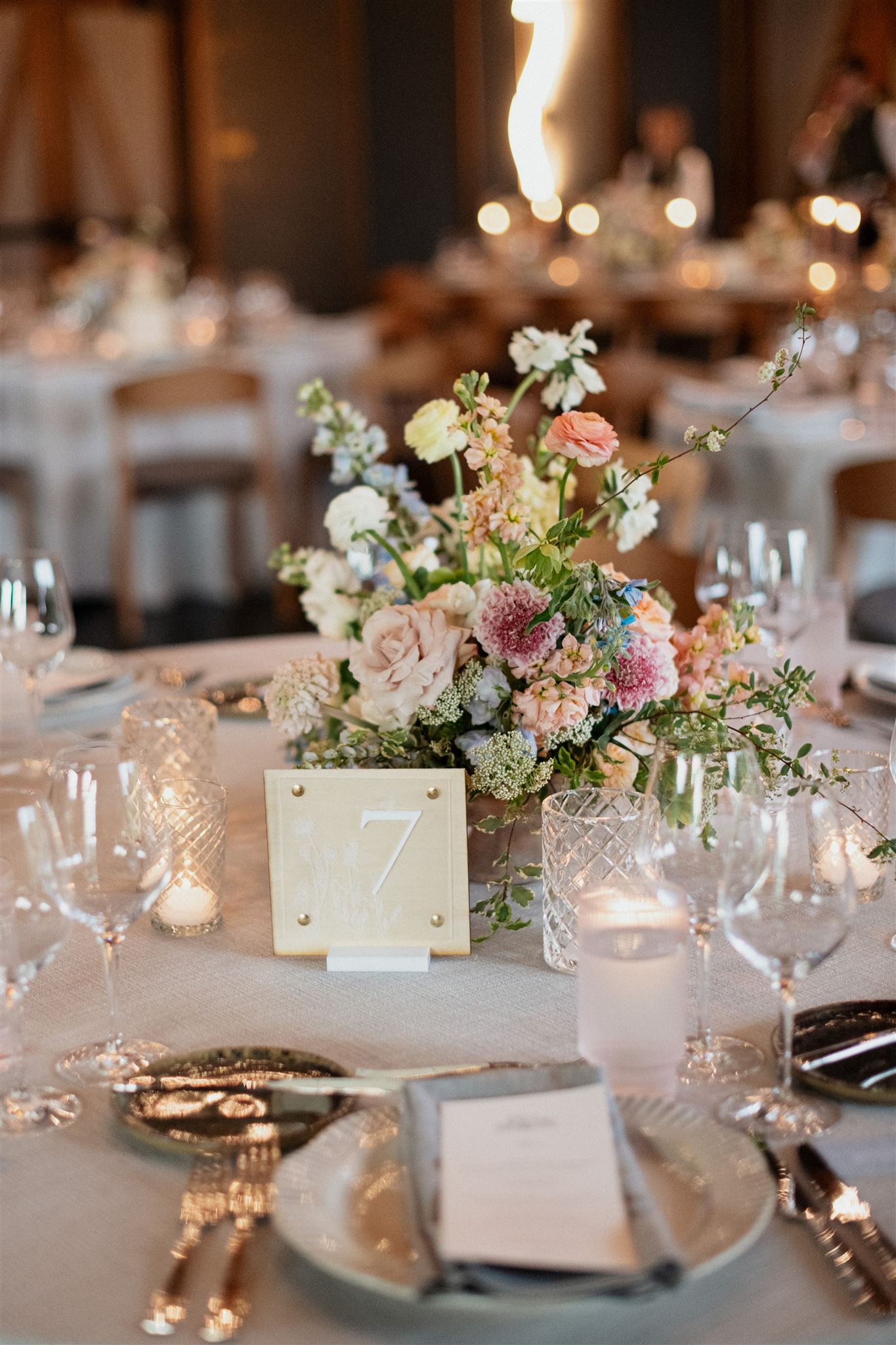
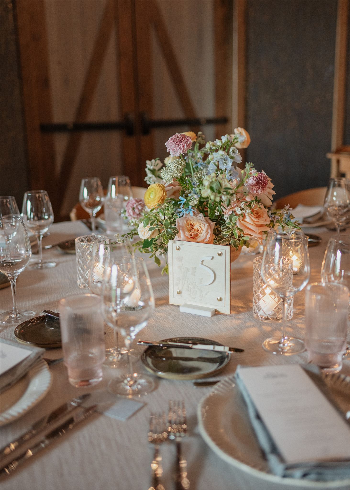
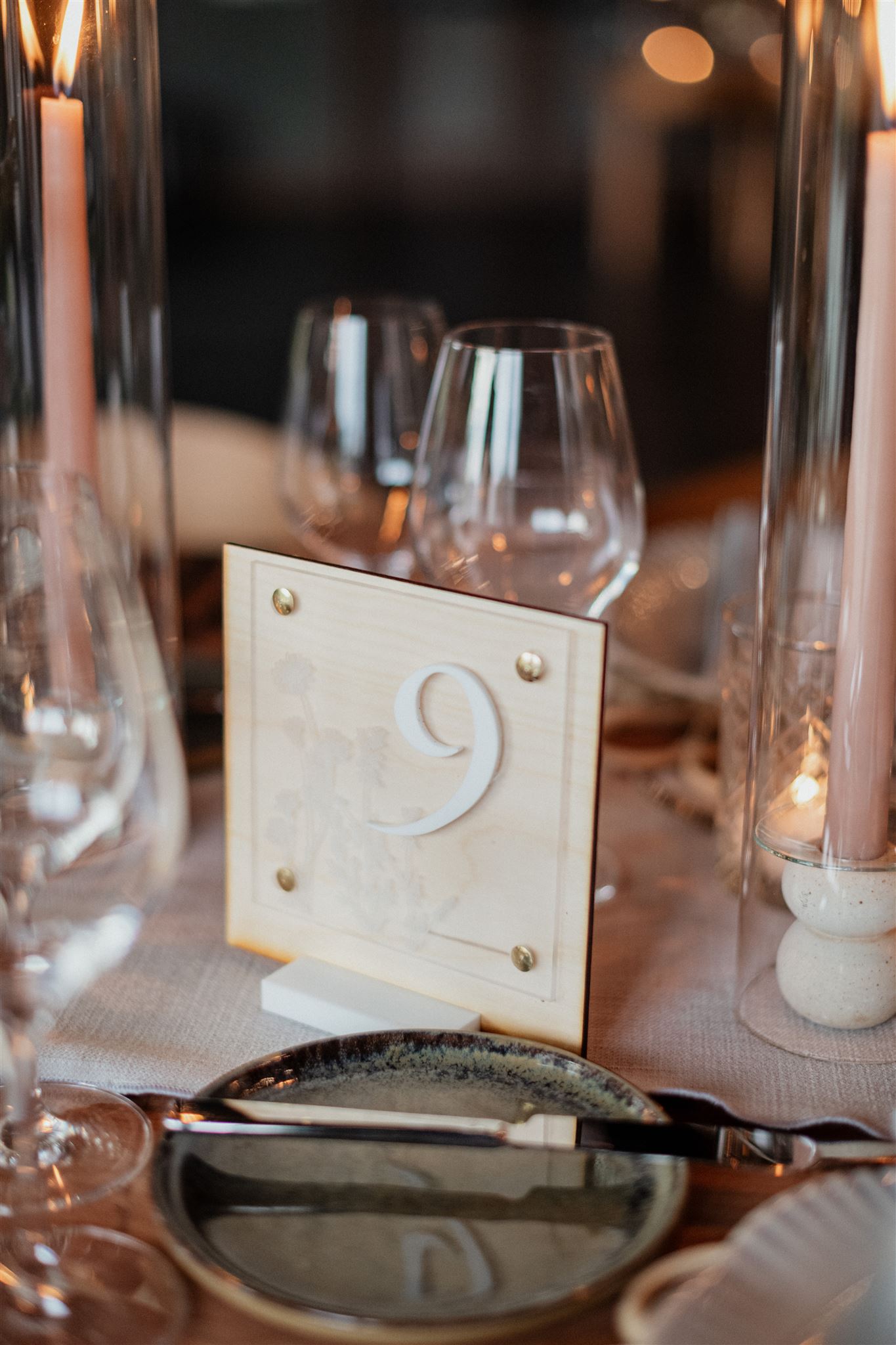
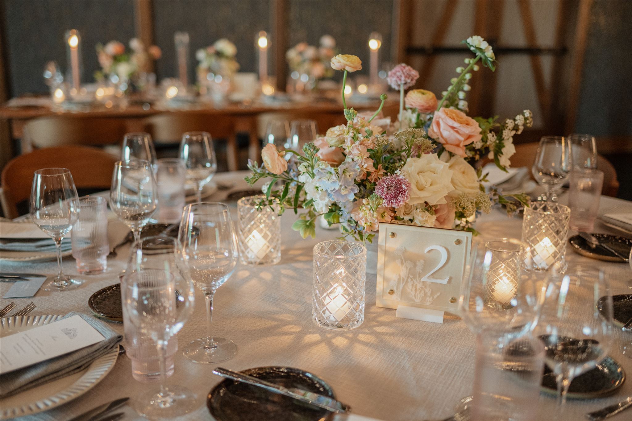
White Ink carried the vintage frame design from the invitation suite, rsvp, and detail cards to create Ashley and Austin’s table numbers. Table numbers don’t have to steal the spotlight in order to be a memorable part of a stunning tablescape.
The best way to tie in wedding theme details throughout the day is by pulling in designs just like this. Our couple also decided to use the vintage, wreath table number base from our extensive wedding rental collection. As you can see, it was the perfect choice!
Ashley and Austin came to White Ink with an elegant, vintage, art nouveau-inspired wedding vision. It was an honor to take on the task of bringing their vision to life. Taking in the approving whispers and smiles of the bridal party and guests is an unforgettable feeling. It is at the heart of why we do what we do. We love seeing the faces of our couples and their loved ones light up when they see their wedding dreams become a reality. We can’t wait to do it for you!
If you’re looking to add custom, thoughtful touches to your wedding or event, we would love to help make your vision a reality. Reach out today to learn more about our full-service design offerings—we can’t wait to create something unforgettable for you!
A custom wedding invitation is as unique to a couple as a fingerprint. It belongs to them and there is simply no other invite like it.
White Ink has been specializing in custom invites for several years, and each process is as exciting as the one before. Seeing our brides and grooms incorporate distinctive and meaningful details into their wedding invitations and make their visions come to life is easily the best part of our job.
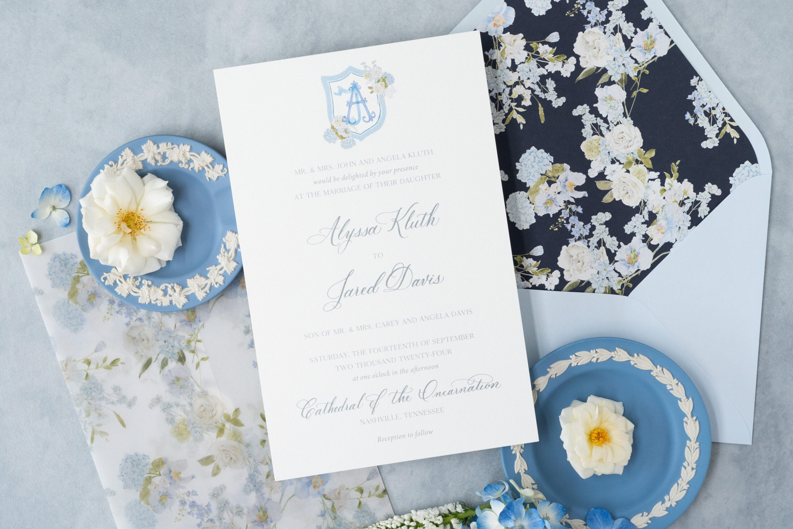
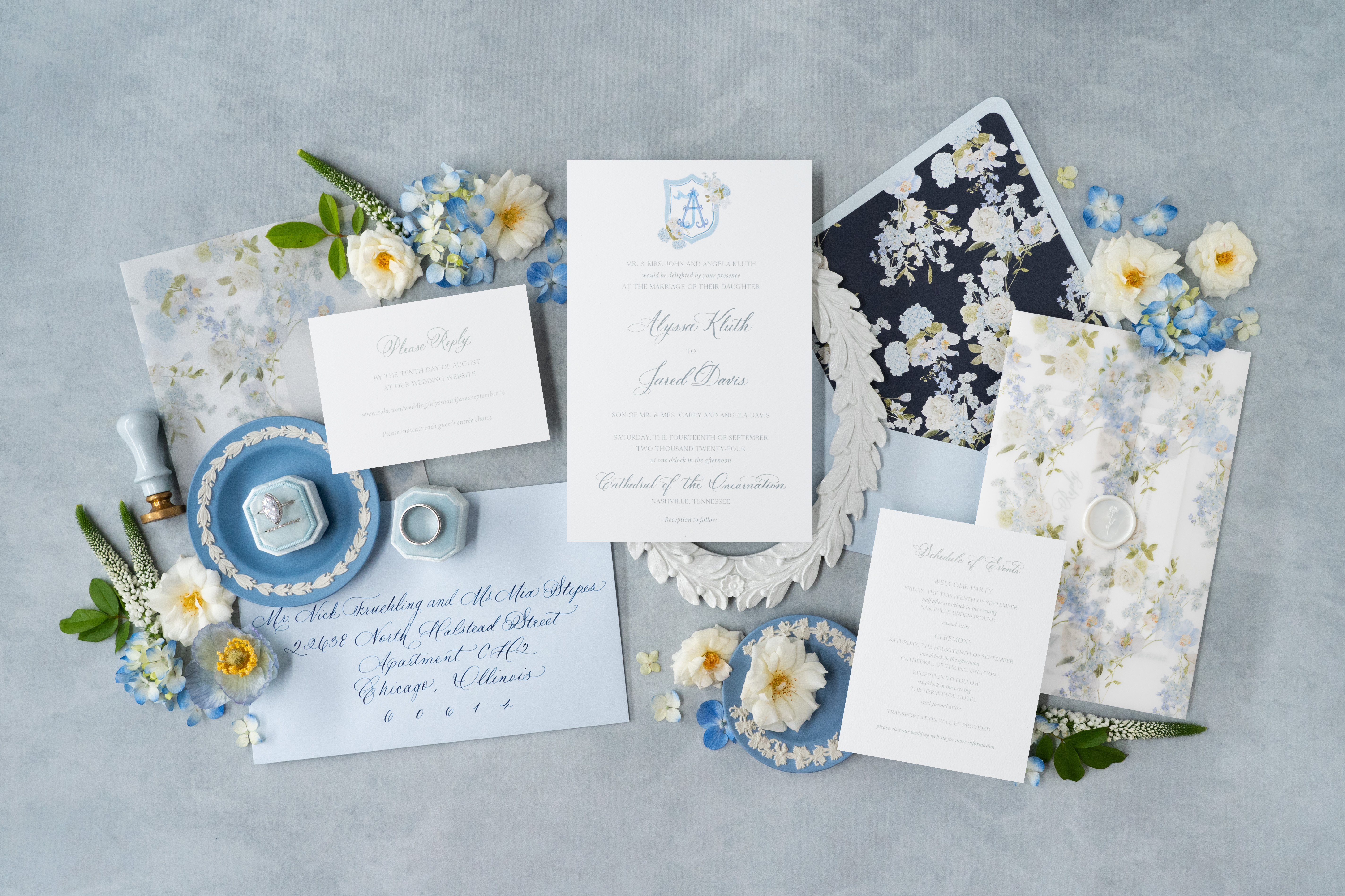
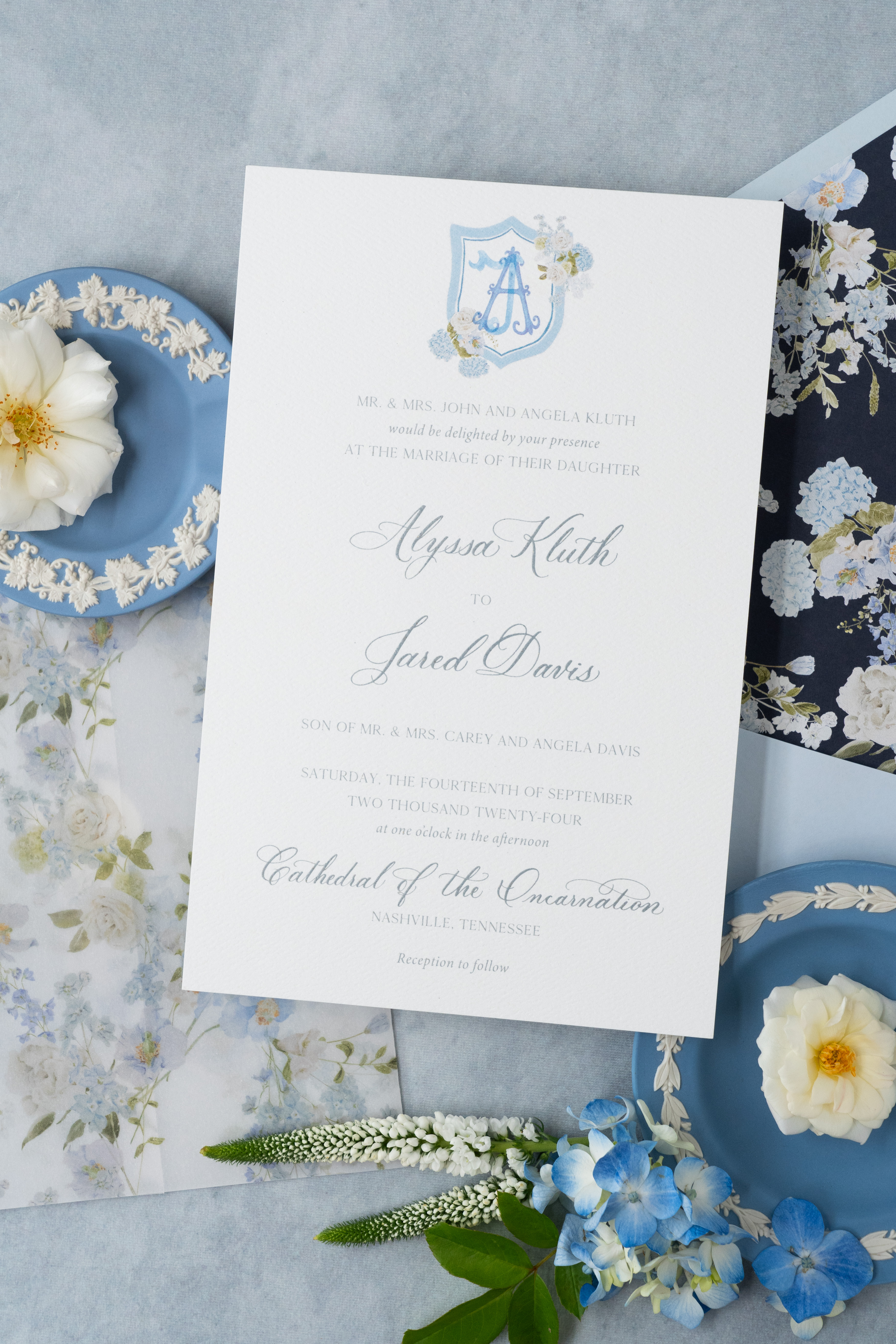
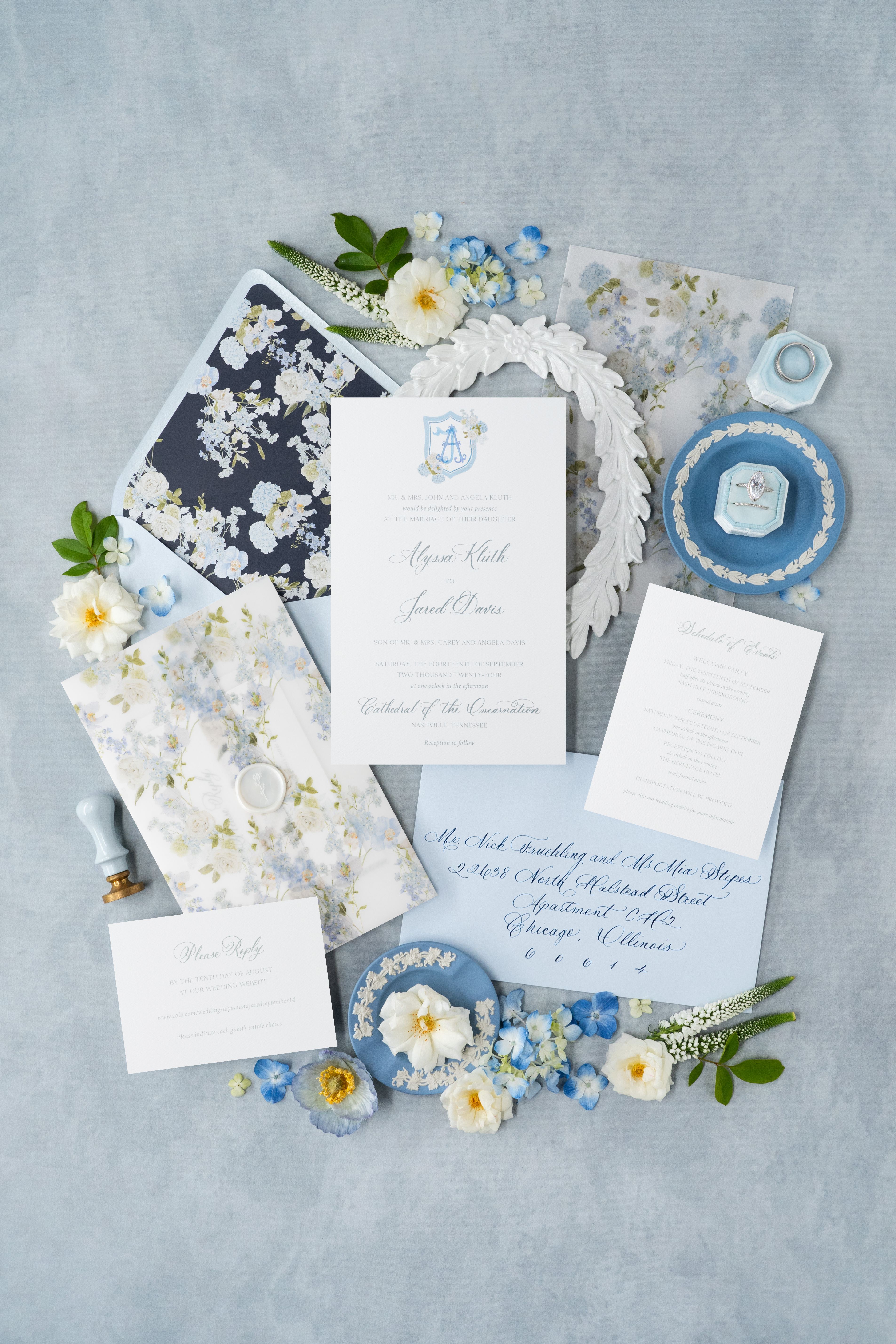
The custom invitation suite we created for White Ink couple, Alyssa and Jared, is a beautiful example of what it looks like when we pull together unique textures, tones, florals, and calligraphy that speak to the personality of a couple and what inspires them.
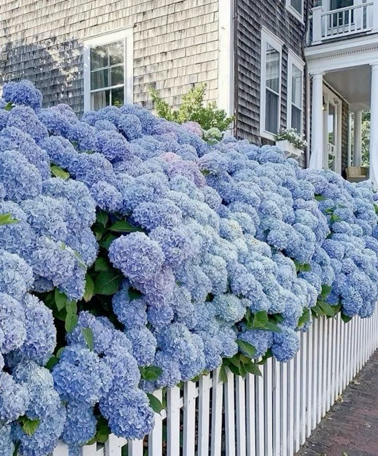
“Nothing says ‘timeless southern wedding’ more than blue and white hydrangeas.”
What Inspires a Custom Wedding Invitation Suite?
The inspiration behind the design of custom wedding invitations aims to reflect the theme of a client’s big day. For Alyssa and Jared, that meant choosing details that could blend perfectly into their end-of-summer, southern nuptials, which included a gorgeous summer wedding reception at the iconic Hermitage Hotel in Nashville. Nothing says “timeless southern wedding” more than blue and white hydrangeas!
From top to bottom, the entire suite is giving southern living with a kiss of Nantucket floral vibes! Each layer is an absolute treat for the eyes with florals peeking from every corner.
If you’re familiar with the motif of a traditional southern wedding, you’ll know that more is always better- especially when it comes to florals! This invitation suite did not disappoint. From the envelope liner to the vellum gatefold, these invites are blooming with summery, southern florals.
By giving us an in-depth dive into the details and design of the grandmillennial aesthetic of their wedding, Alyssa and Jared were able to achieve the classic elements and charm they envisioned for their custom wedding invitations. We always work closely with our couples to make each project nothing short of special.
It’s all in the Details.
We are thrilled when it’s time to roll up our sleeves and begin the process of designing the custom wedding invitation of our clients dream. This is what we love to do and it’s why we’re here!
Let’s get into details that perfectly pulled Alyssa and Jared’s invitation suite together to pair with their classic southern, summer wedding day.
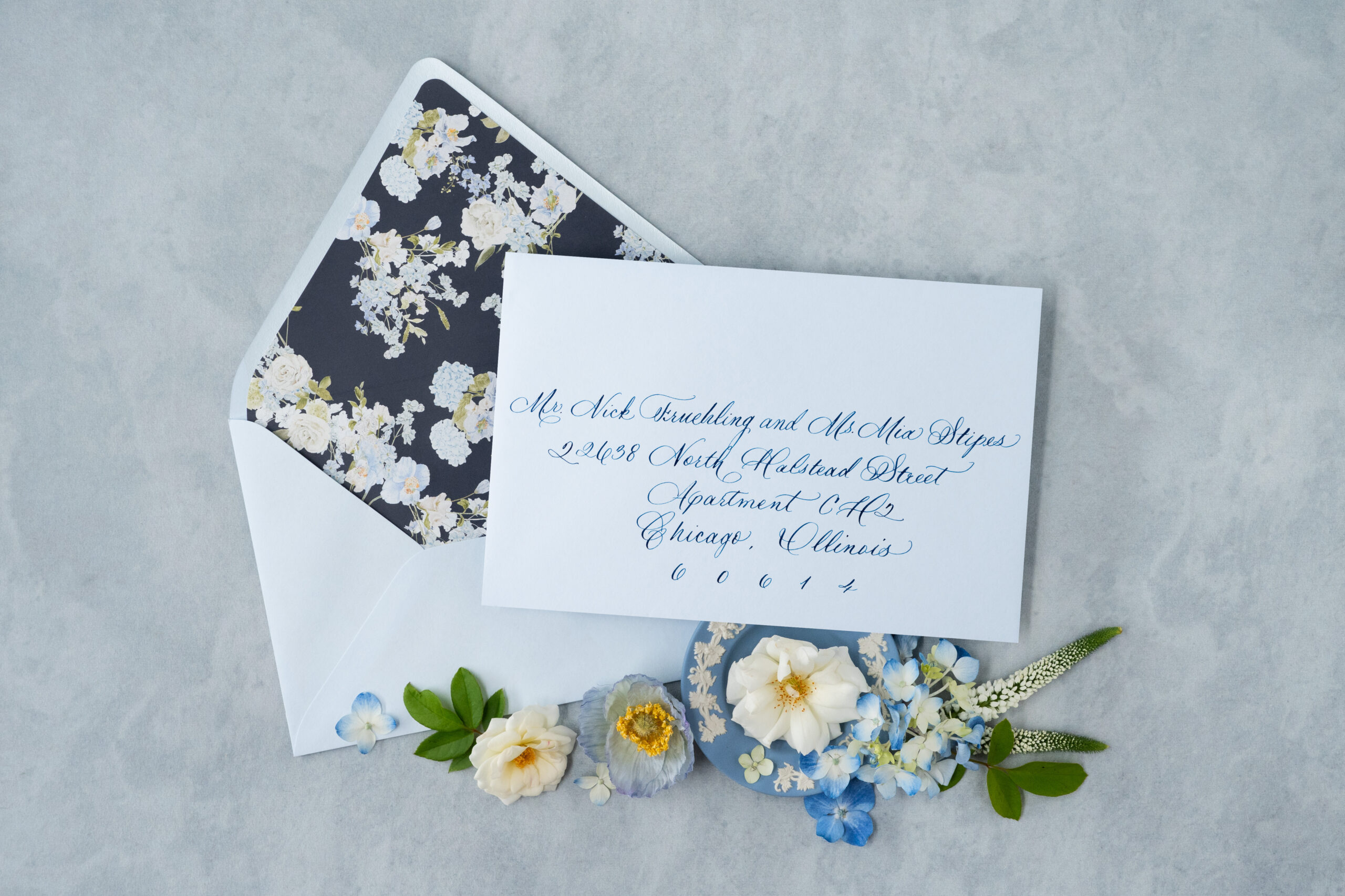
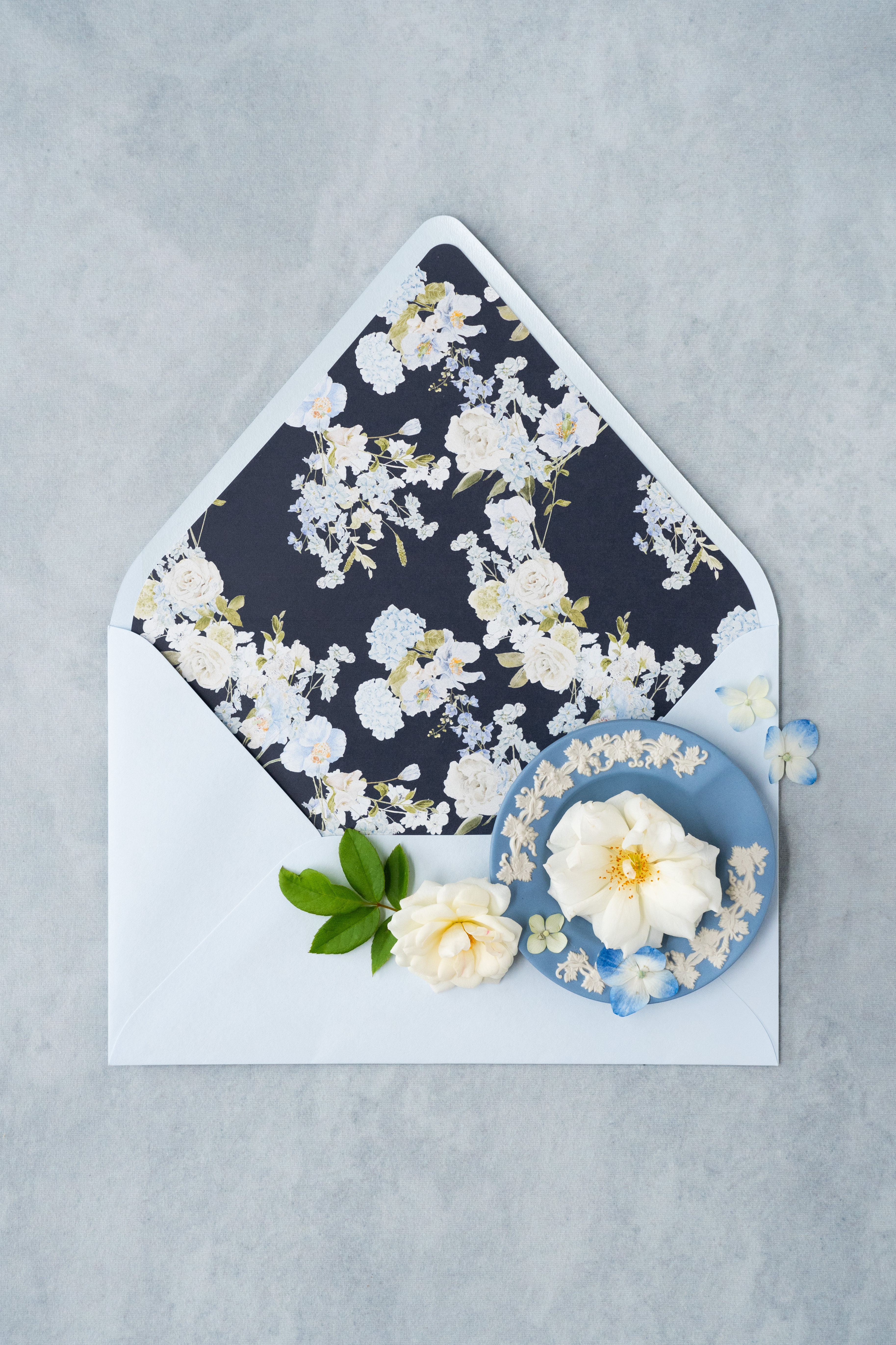
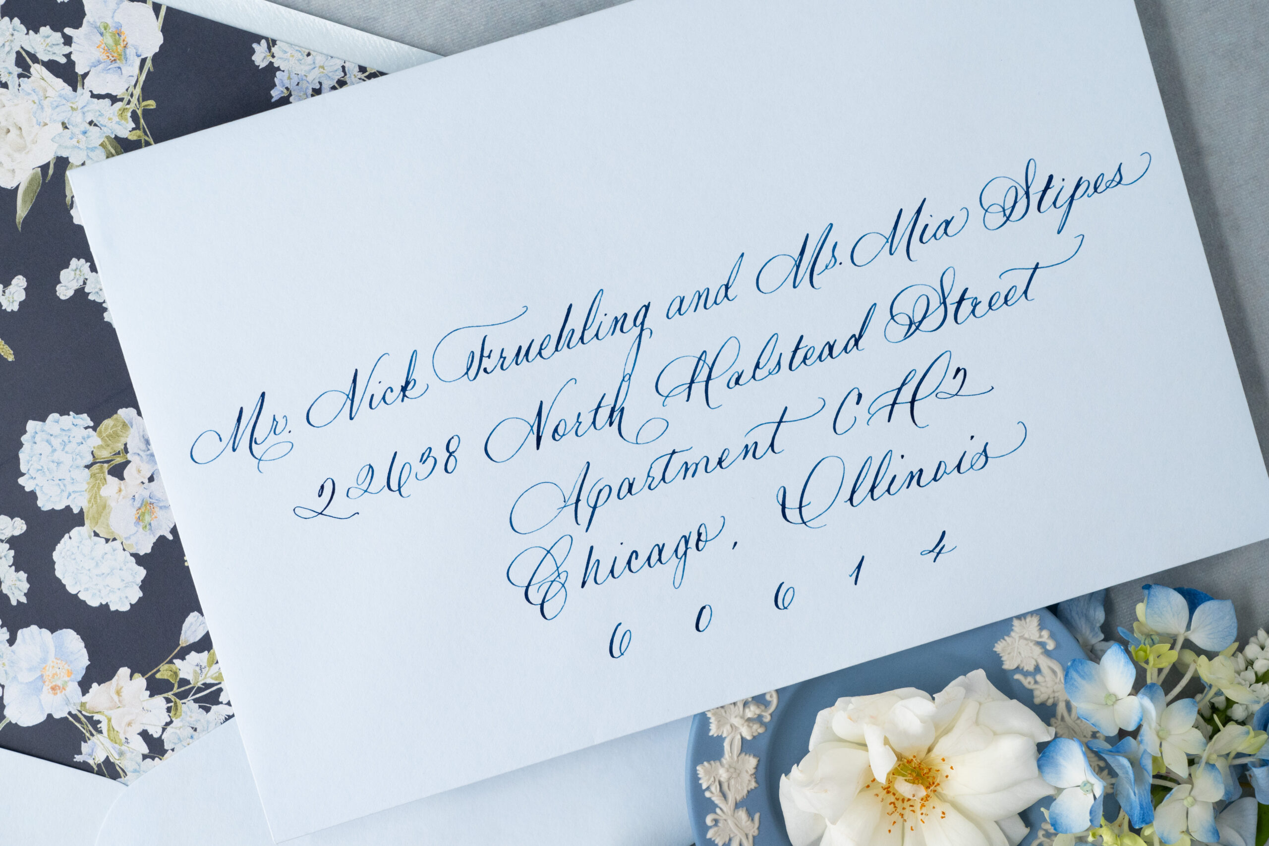
Spot calligraphy in dark blue ink addressed the dusty-blue toned envelopes.
We created the dark blue envelope liner that boasted baby blue and white summer florals. Envelope liners are always an eye-catching experience for guests!
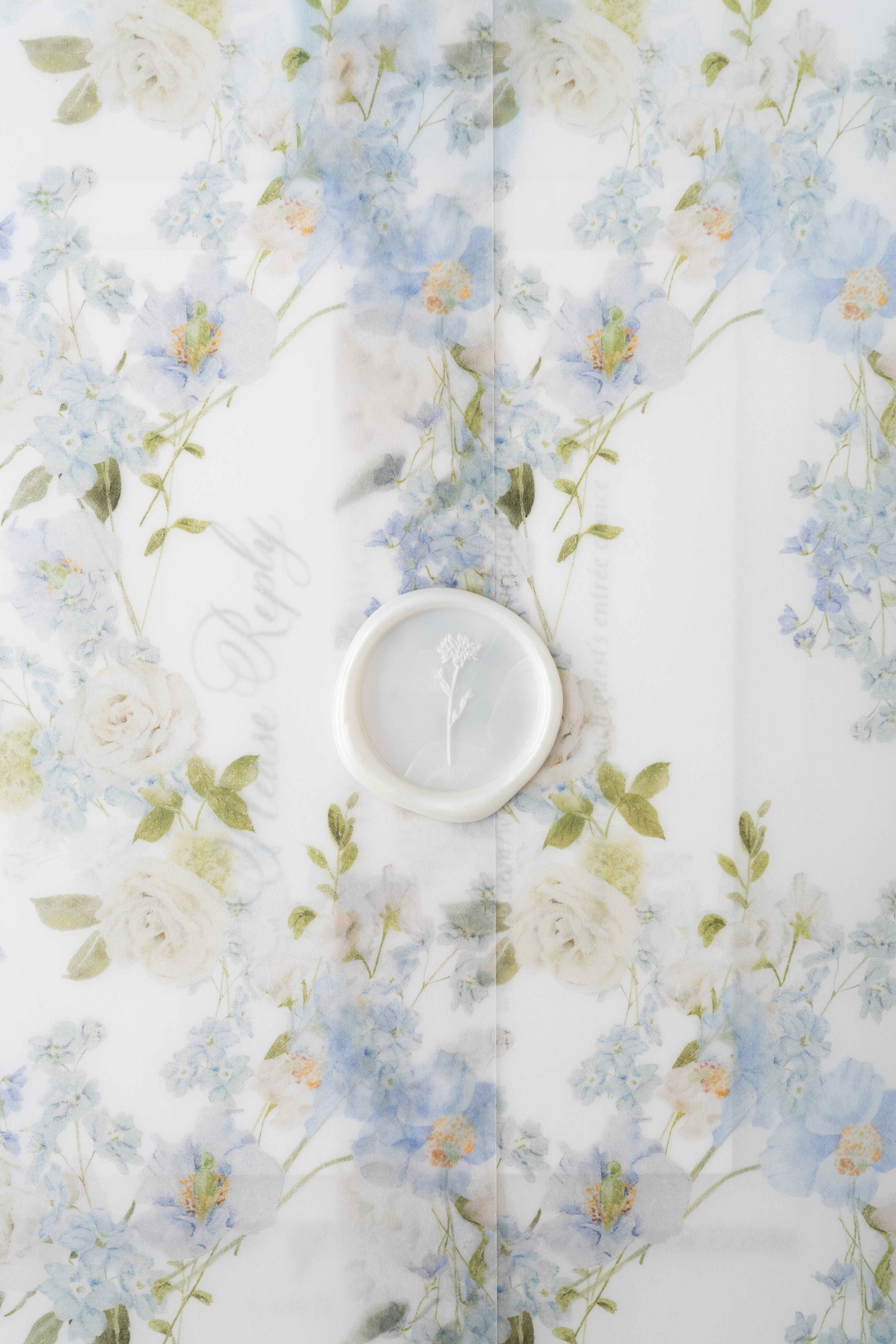
A vellum gatefold is used to clutch the invitation suite. The soft transparent texture complete with southern florals easily elevates the elegance of the invites.
A custom wax seal added to the charm and texture of the vellum gatefold.
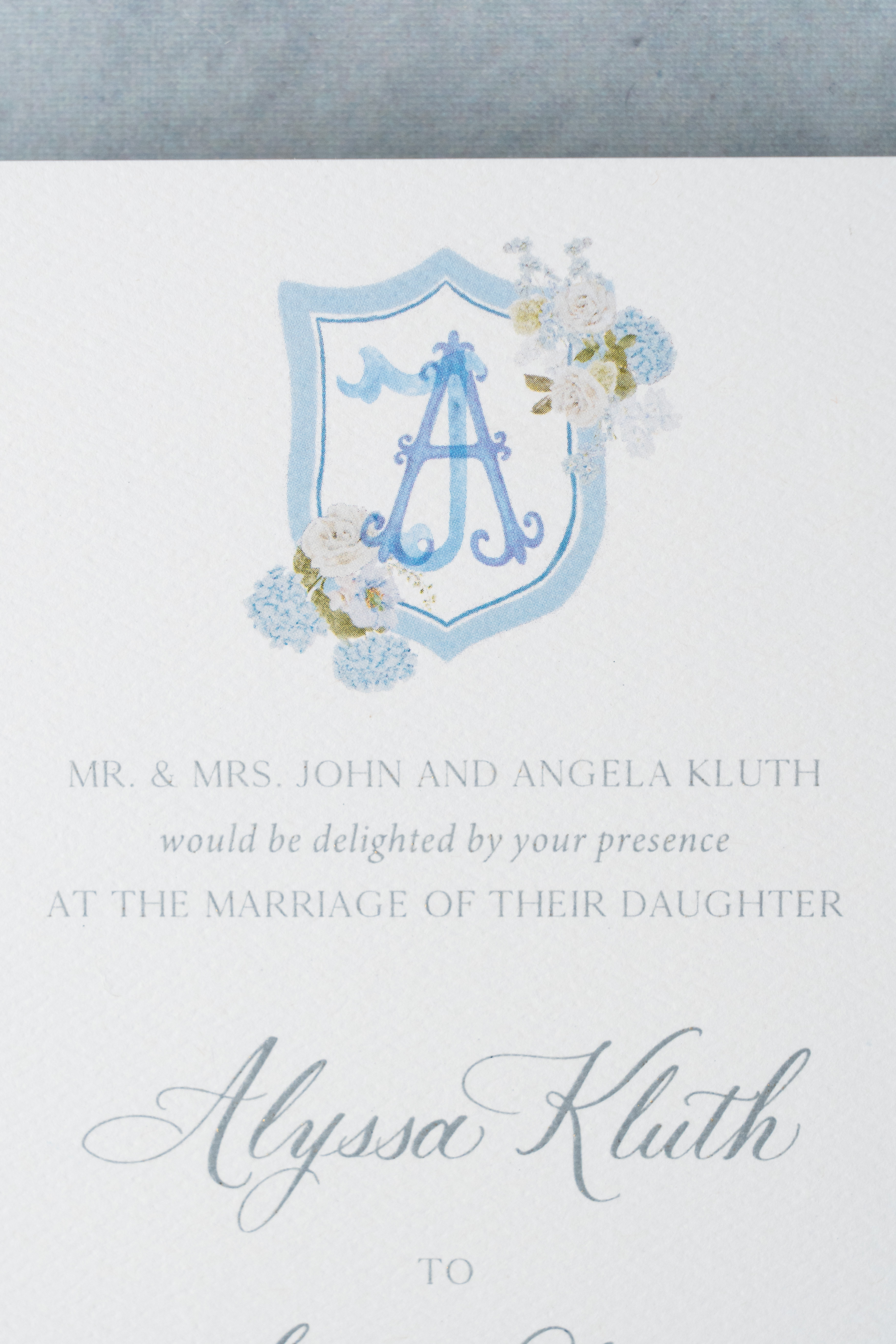
The custom monogram located atop the main invitation is digitally printed. Customized invitation artwork like this can pack a powerful punch in the uniqueness of an invitation suite.
The lettering throughout the invitation suite is done in a soft silver hue using thermography text- a process that is used to mimic the look of engraved lettering.
Thermography- Did you Know?
Thermographic printing is a printing technique that uses heat to slightly raise the lettering off of paper or cardstock adding to the texture and finish of an invite. It’s like adding an instant layer of luxury to your invitation suite!
When it comes to custom wedding invitations, White Ink has you covered. We have extensive experience in what it takes to create the exact invite our clients envision. Whether the theme is boho chic or traditionally southern, we know how to make an invitation suite that is uniquely you!
Reach out today to learn more about our full-service design offerings and tell us about your vision! What details and designs do you want to see on your wedding invites? We can’t wait to create something unforgettable for you!
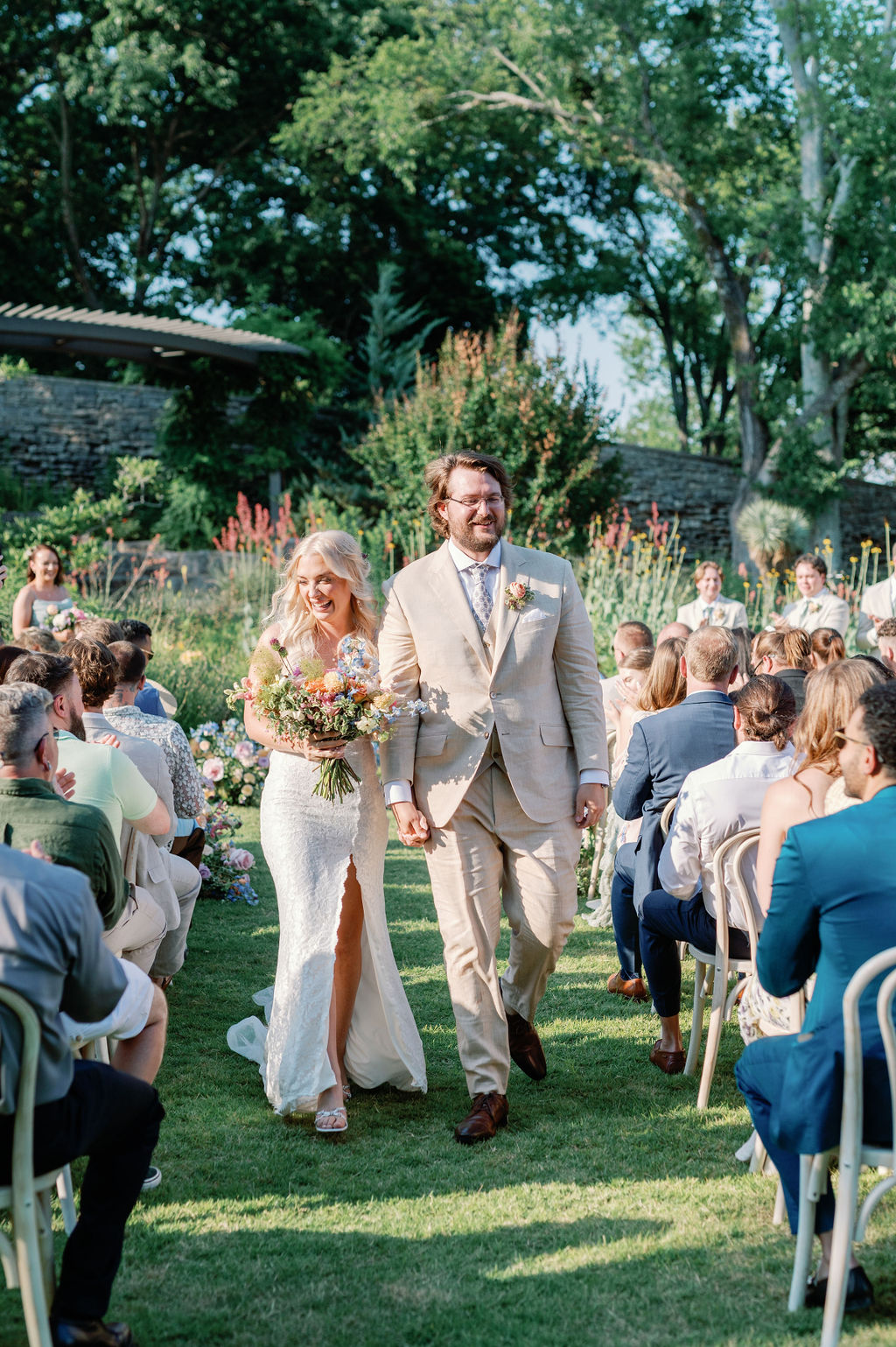
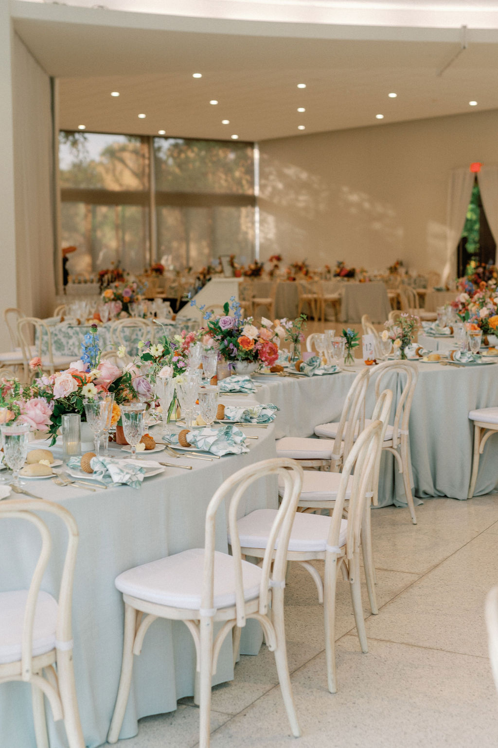
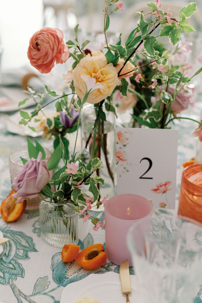
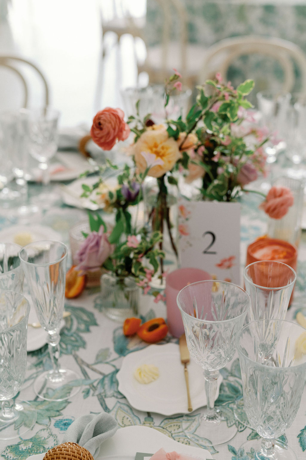
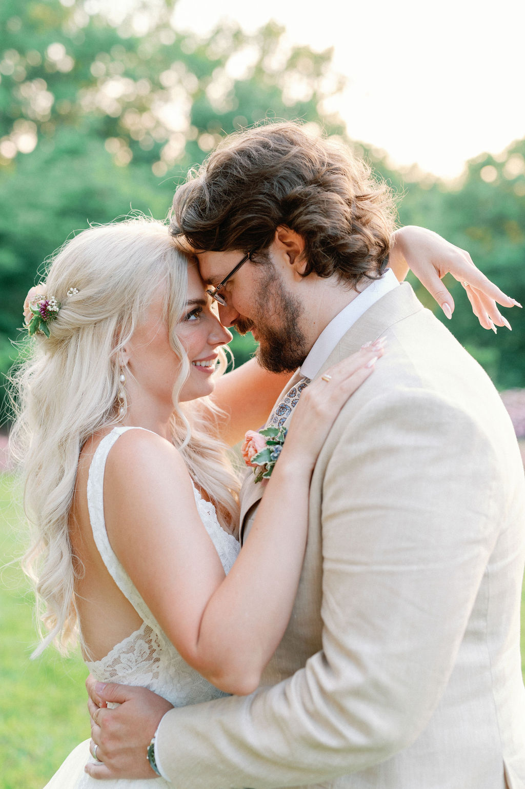
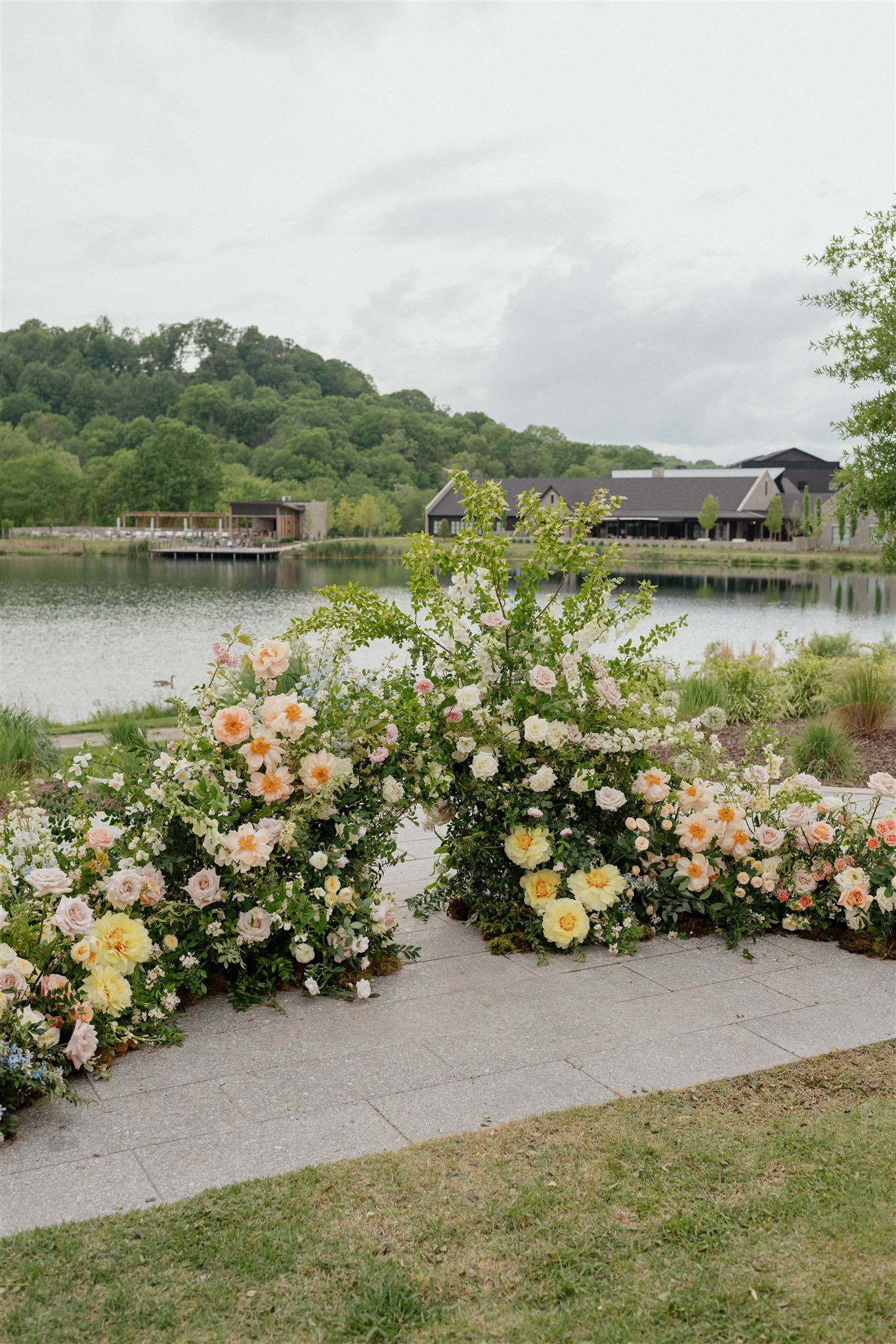
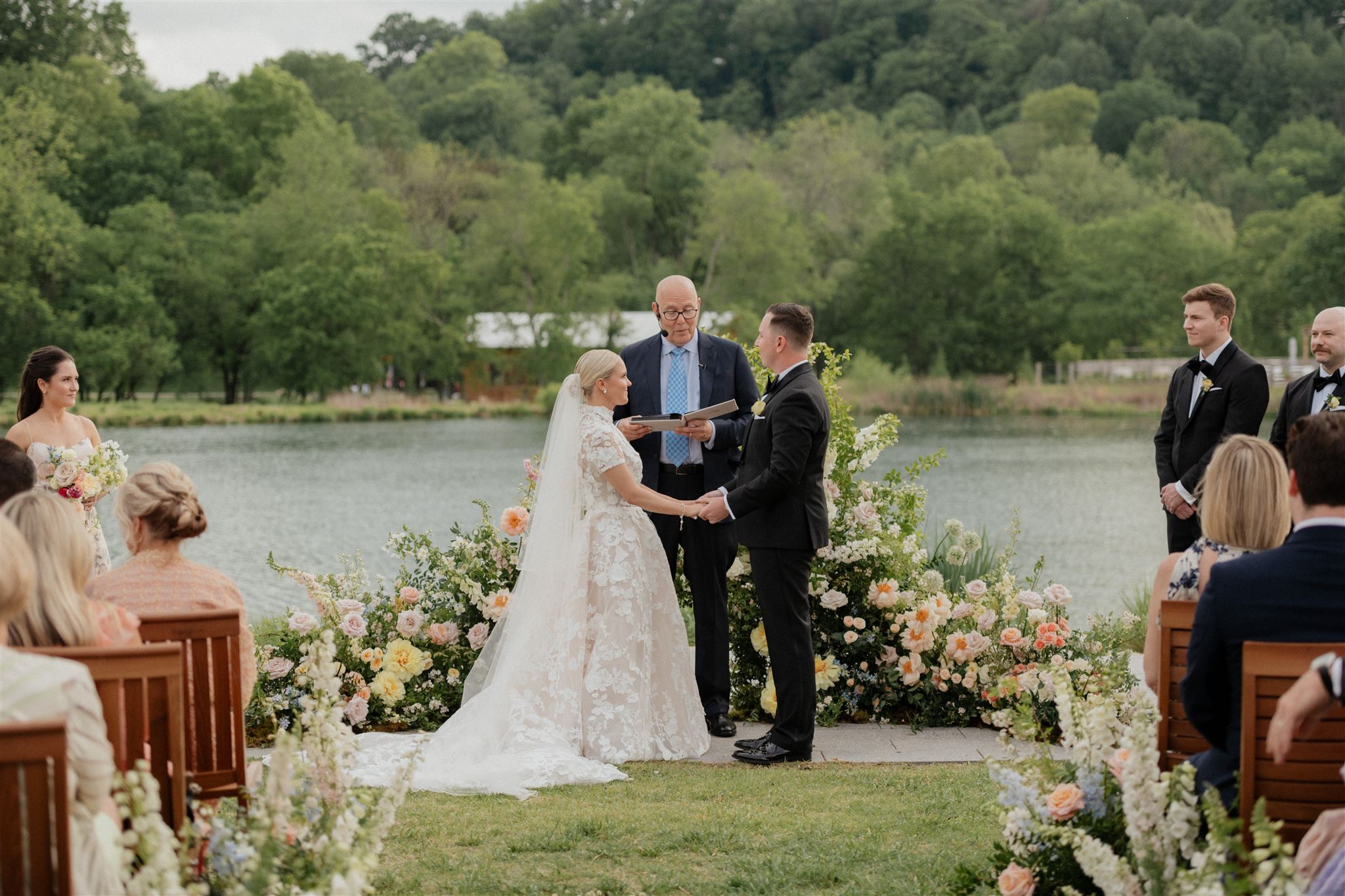
We have been looking forward to taking you guys behind the scenes of this incredibly whimsical floral-centered wedding located at none other than the iconic Cheekwood Estate & Gardens in Nashville! White Ink couple, Kelly and Tyler, invited us along to customize and create some of the most darling details we have made yet!
Whimsical Floral-Centered Wedding
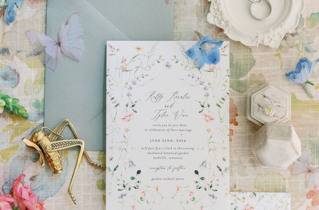
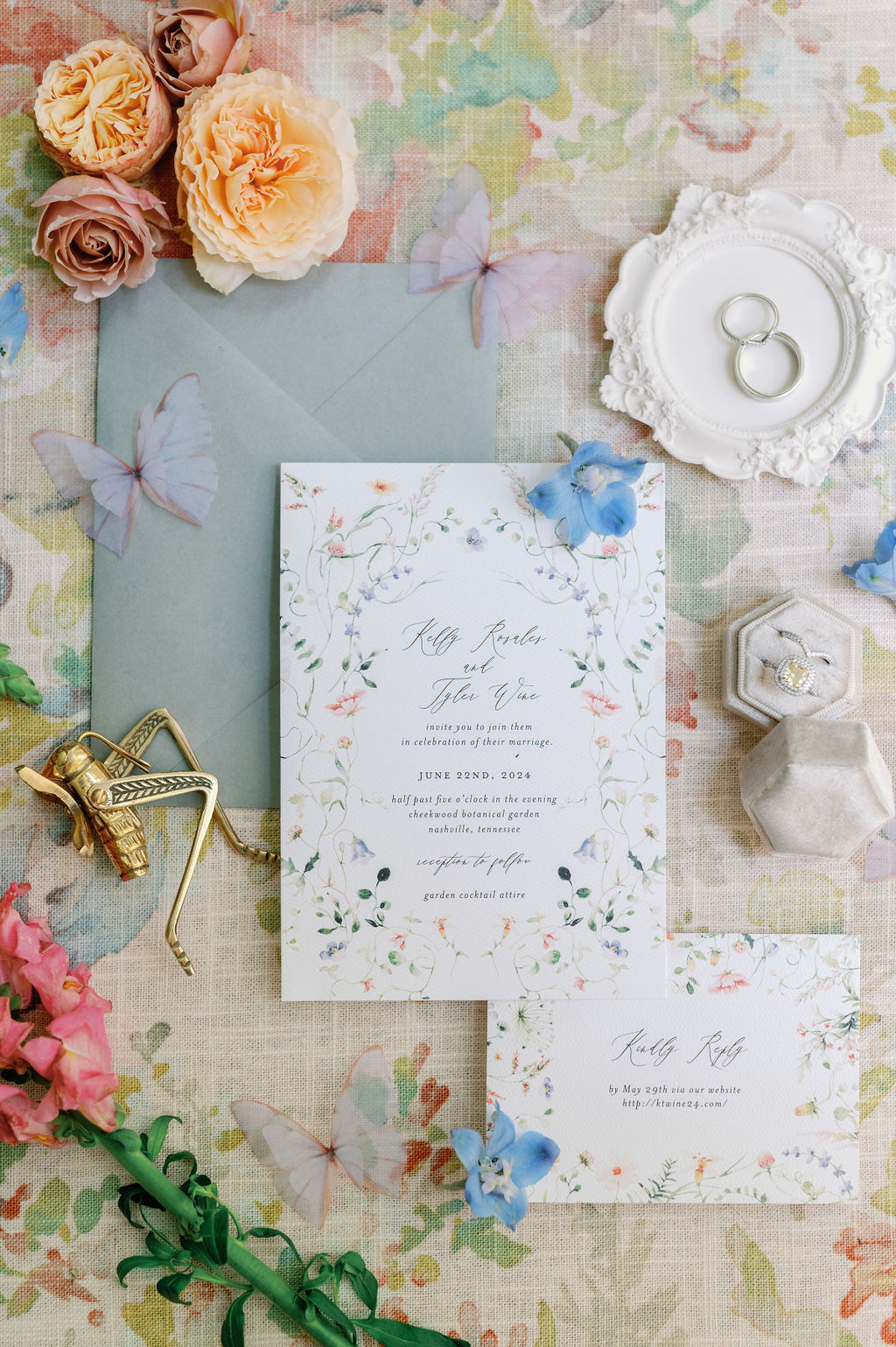
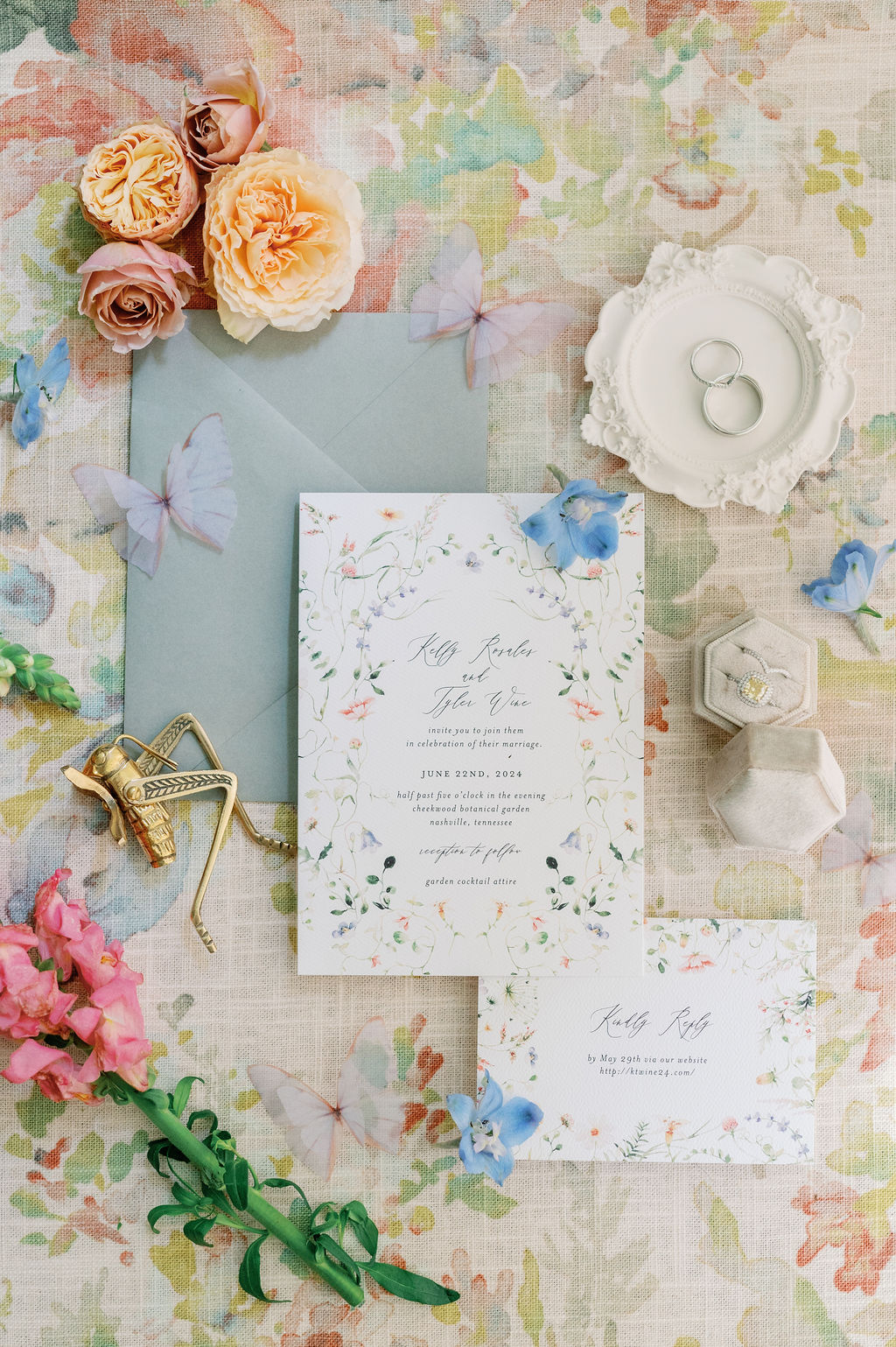
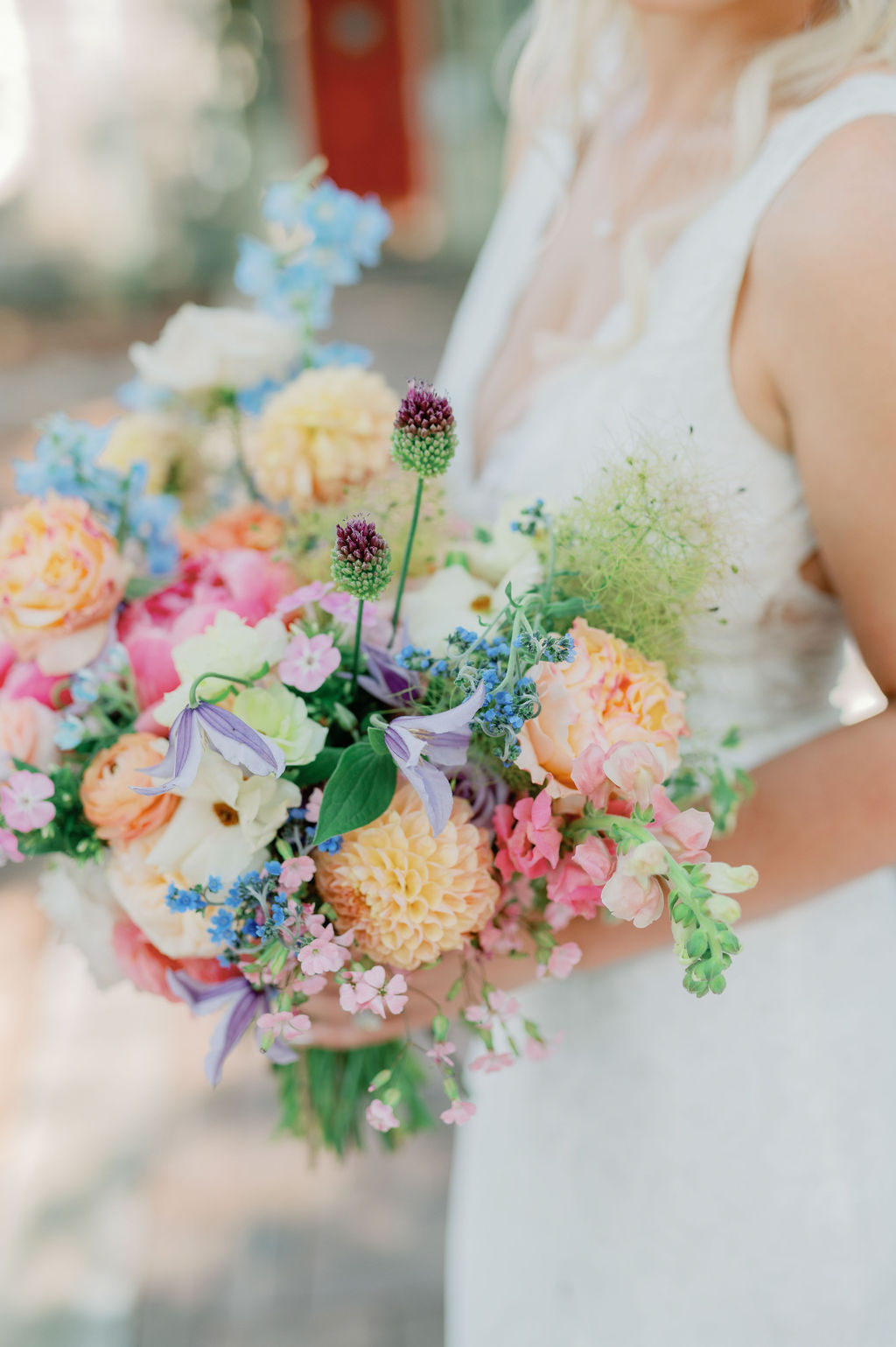
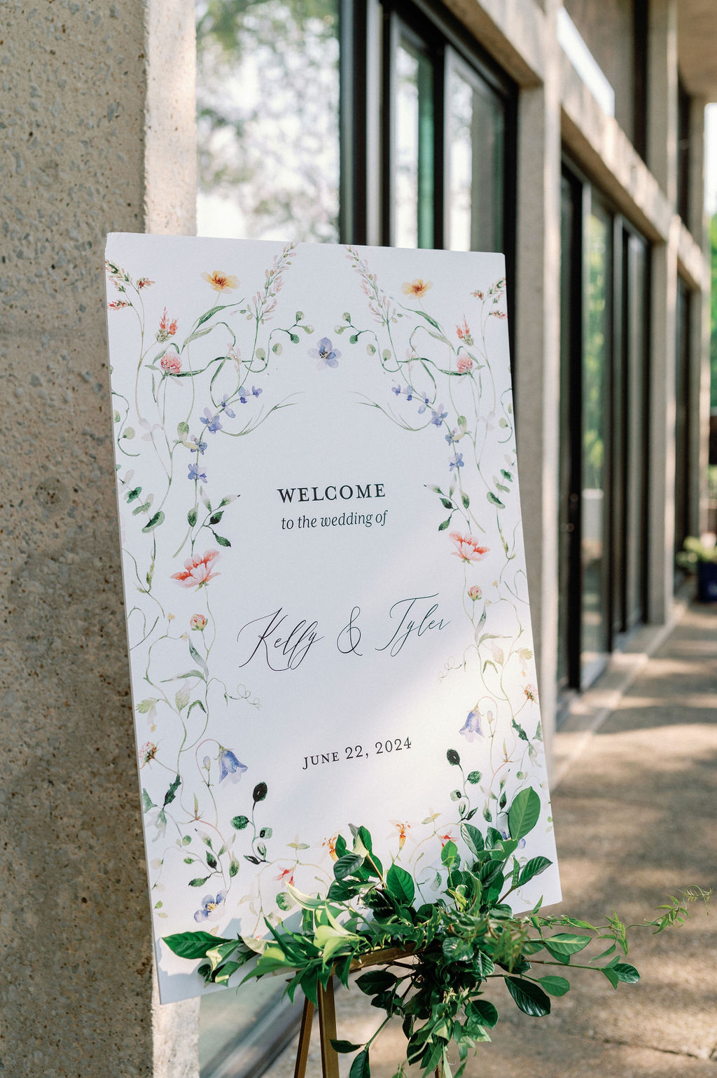
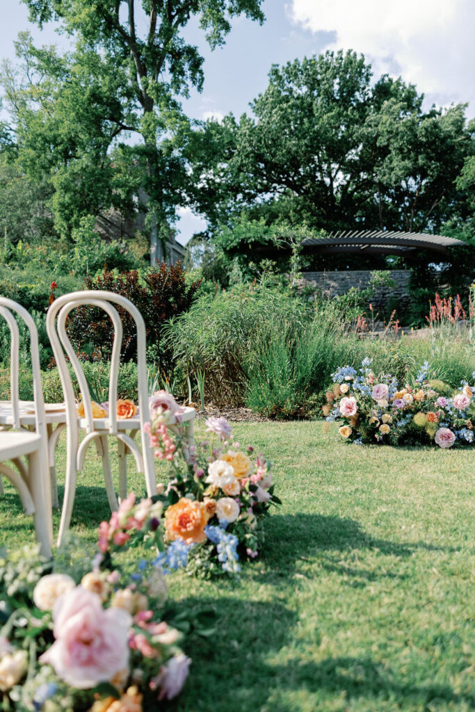
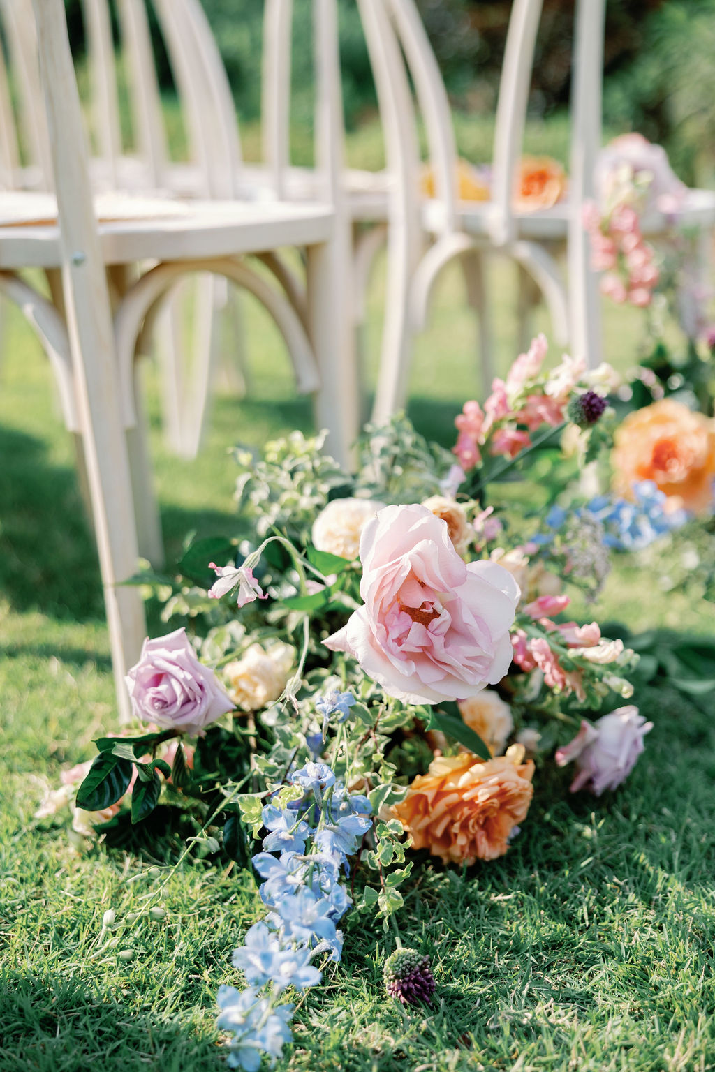
An early summer wedding offers the warmth of summer and all the beauty of the passing spring. It’s still the perfect time to embrace the gentleness of the air and the unmatched florals that haven’t yet been challenged by the summer heat. Kelly and Tyler wisely let nature take the stage as they chose florals for the focal point in most of the details throughout their big day. To begin, White Ink Calligraphy + Co. designed an invitation suite that would really reflect the botanical-inspired nuptials. A simple two-piece invitation suite with a dusty blue envelope perfectly embraced the delicate florals that draped around the paper. These particular floral prints on the invites would remain a familiar detail for Kelly and Tyler’s guests as the design was pulled throughout the entire wedding day. (I just LOVE it when that happens!)
Notice anything familiar? Our floral print came full circle from the invitation suite to the wedding welcome sign. I’ve said it many times before, carrying details throughout an event has the unbeatable power to elevate it. It shows attention to detail and your guests DO notice it.
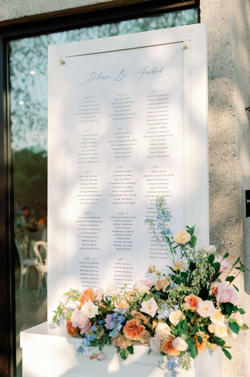
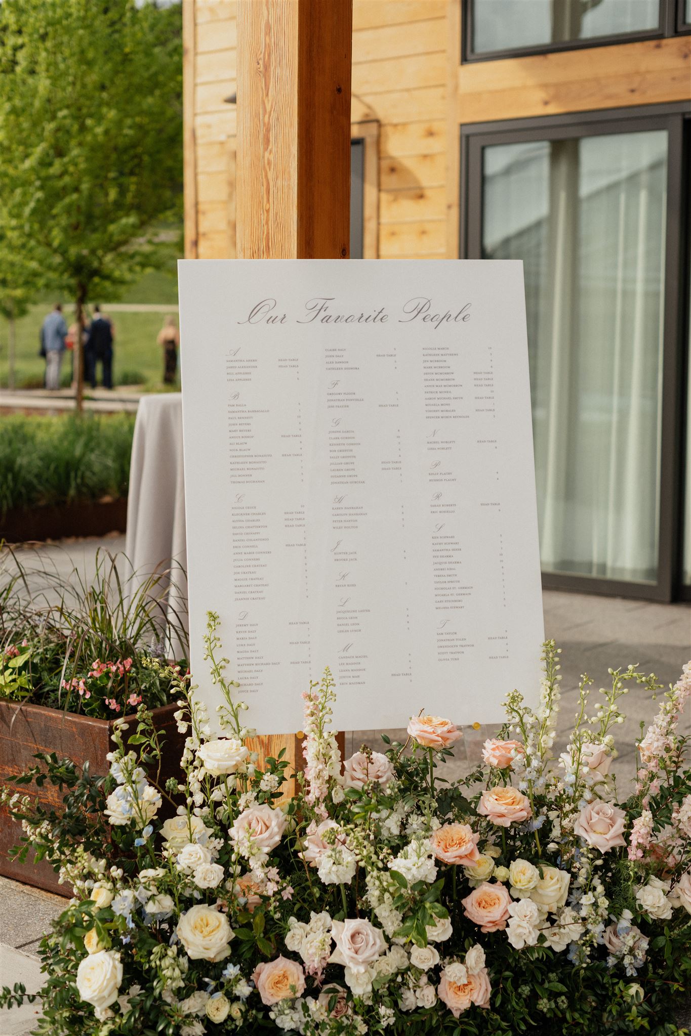
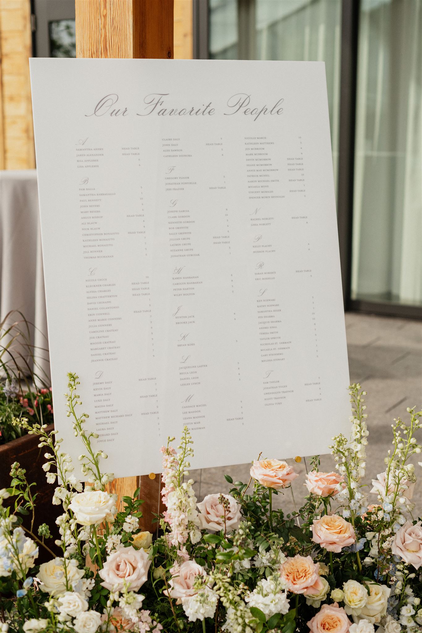
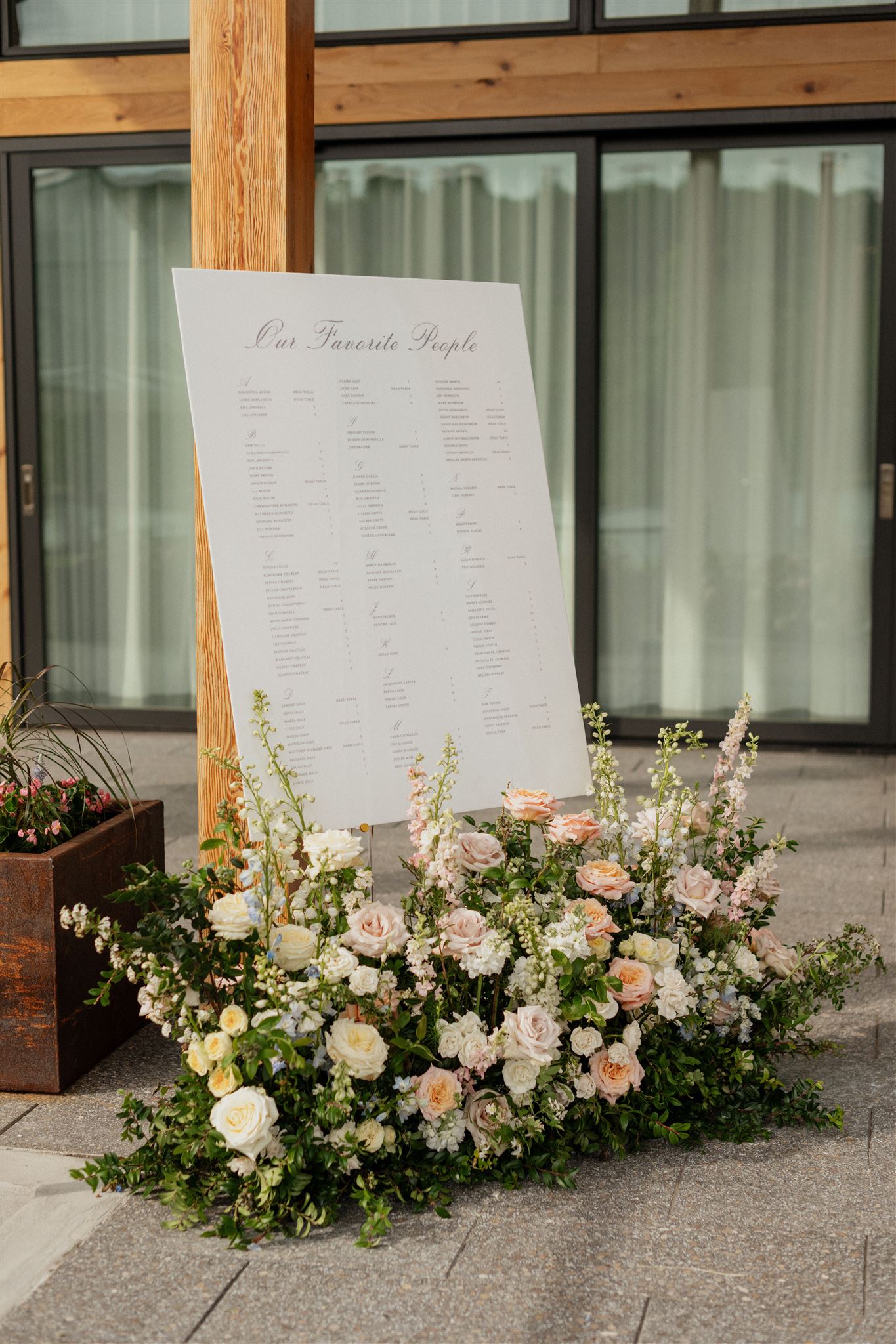
The Seating Chart
Kelly and Tyler wanted a custom seating chart that suited the light and floral-filled motif of the day. The simplicity of the color and design of this chart spoke to its elegant style while lending itself as the perfect canvas for displaying the gorgeous floral arrangement sitting at its base, proving that simplicity also makes a statement!
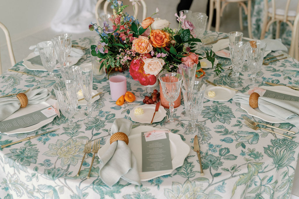
Reception Details by White Ink Calligraphy + Co.
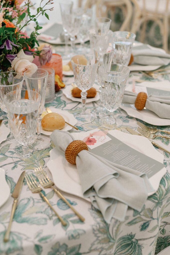
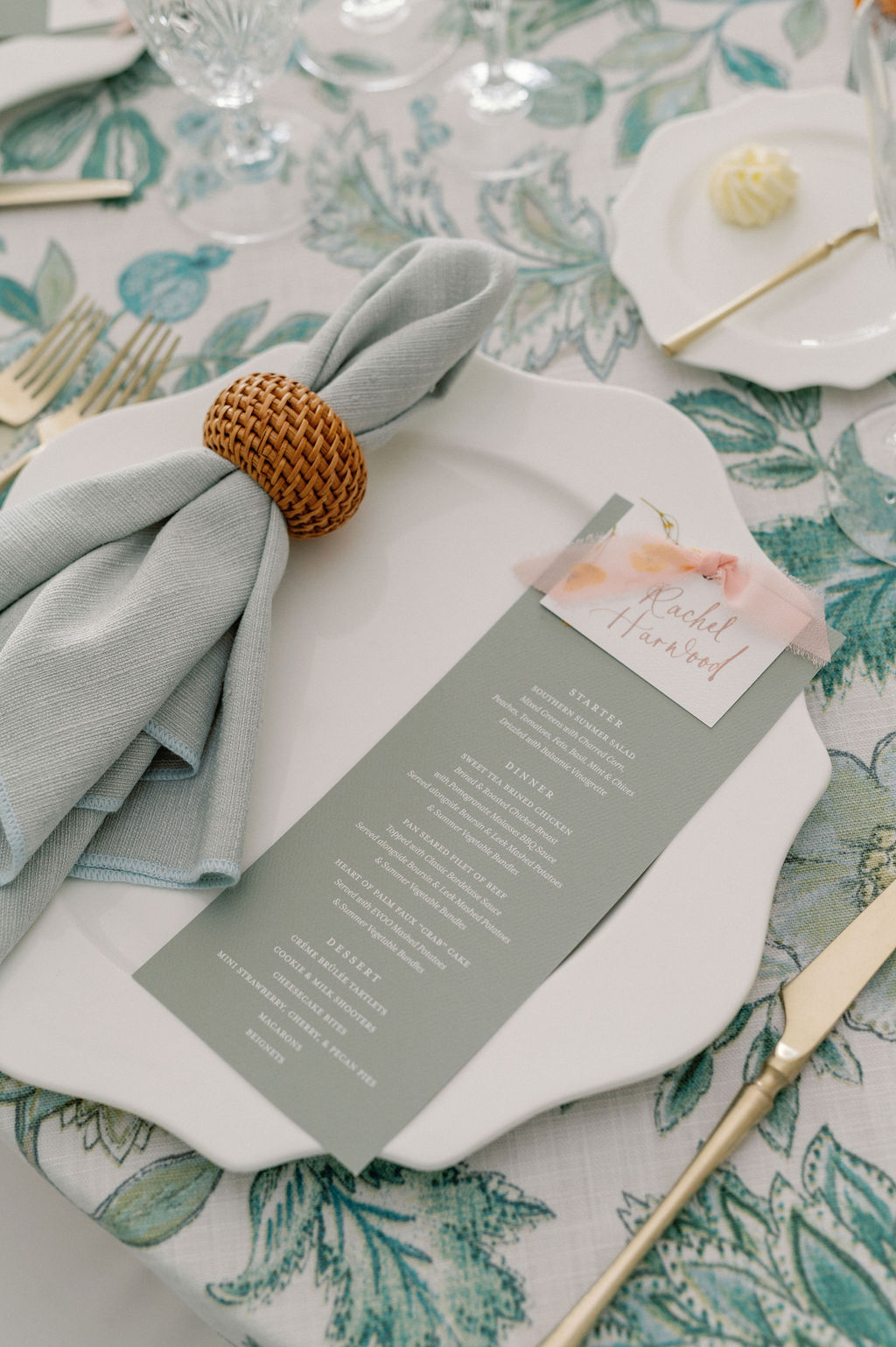
How sweet are these custom gray menus? Gray is a color that seamlessly fits into nearly any style or design pattern. I especially love how the white font pops right off the paper while not stealing the show from the arrangement of the stunning, garden party-inspired tablescapes.
Don’t forget that even the most delicate of details can be functional! What may seem like a simple pressed flower atop each place card, actually served as the meal indicator for the guests! The place cards were gently fastened to their menus using baby pink ribbons.
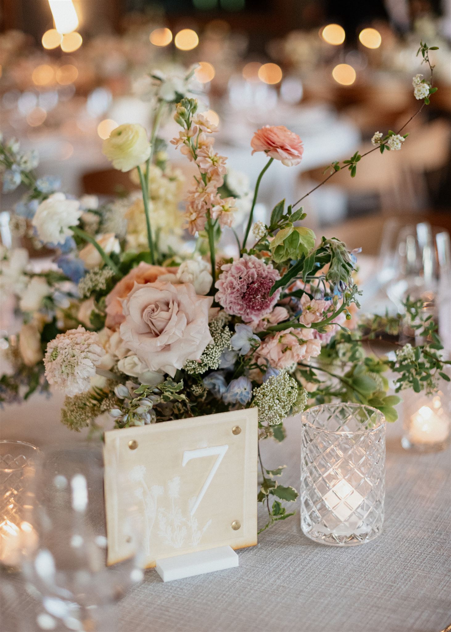
The table numbers we created for Kelly and Tyler’s reception are truly some of my favorites. The crisp, bright white paired with the boldness of the number catches the eye in the most inviting way. The blooming floral print on either corner is just the cherry on top.
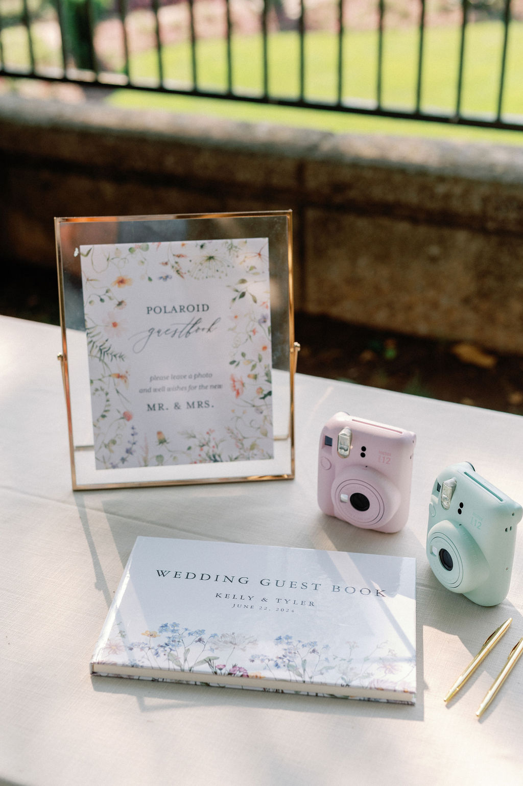
We were happy to be a part of this adorable “polaroid guestbook” table. I love traditional ideas with a modern twist. White Ink provided the table signage which boasted the familiar floral print from the invitation suite as well as the wedding welcome sign.
Nothing is more moving than the beauty of nature and the power of love. Audrey Hepburn once said, “To plant a garden is to believe in tomorrow.” Kelly and Tyler’s unforgettable floral-centered wedding day was a beautiful reflection of that hope and intention for their future together. Here’s to the happy couple as they walk through the garden of love. Cheers!
If you’re looking to add custom, thoughtful touches to your wedding or event, we would love to help make your vision a reality. Reach out today to learn more about our full-service design offerings—we can’t wait to create something unforgettable for you!
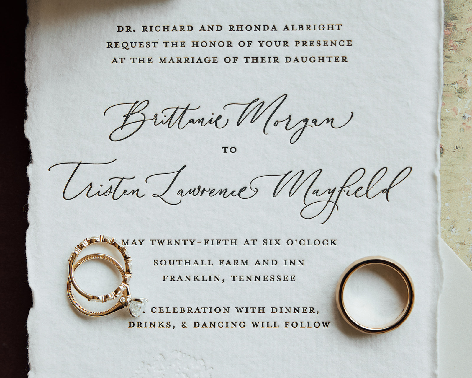
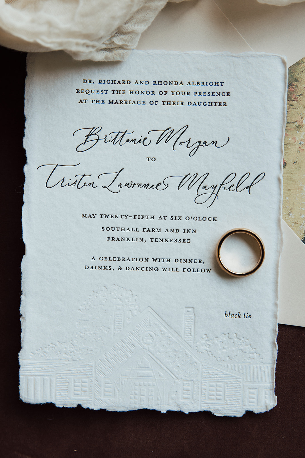
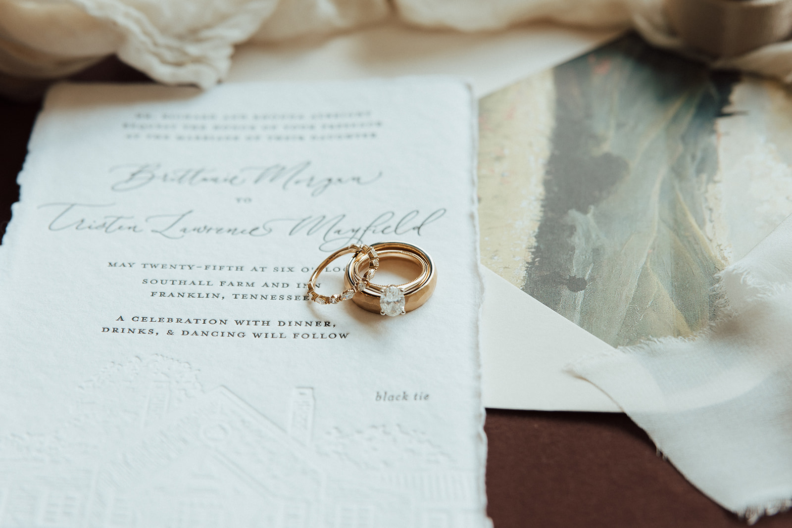
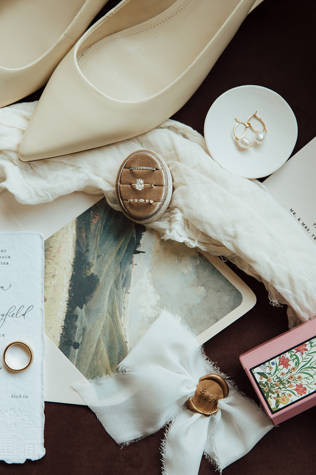
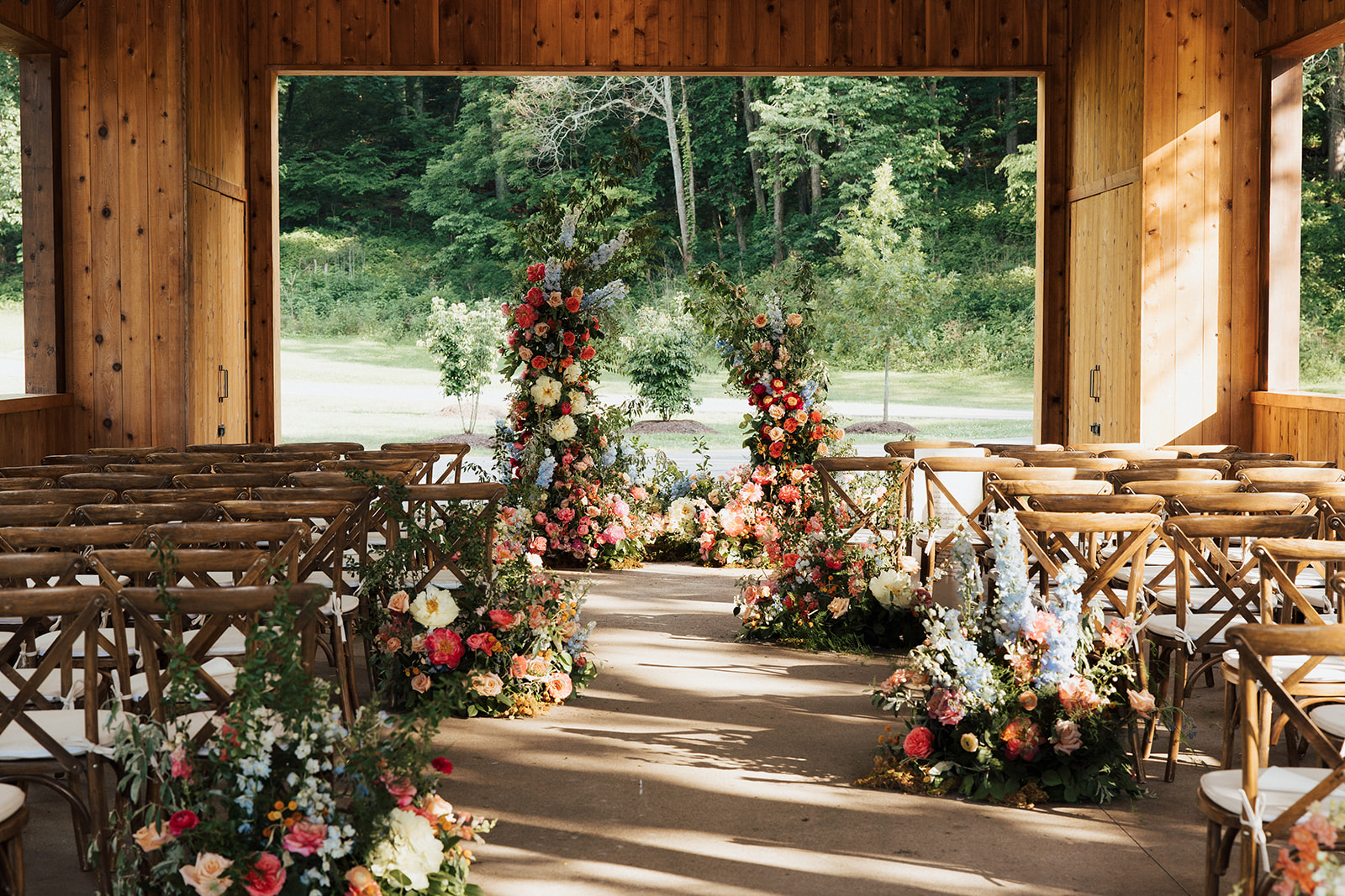
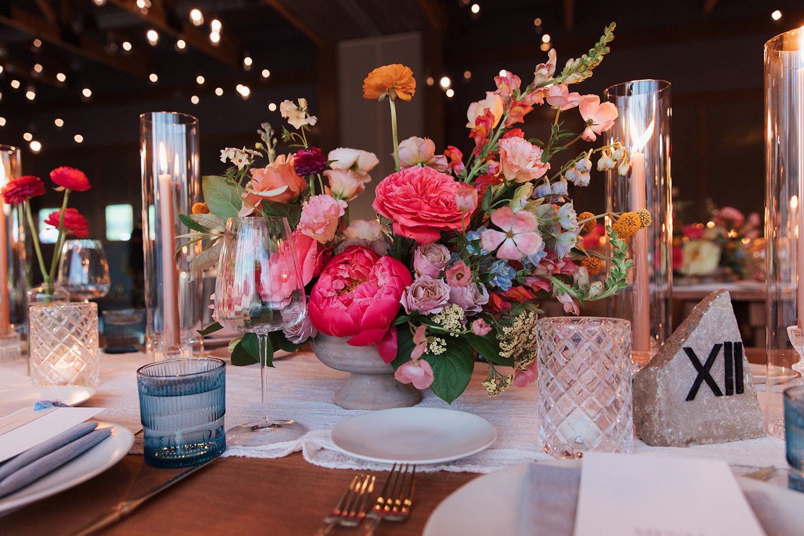
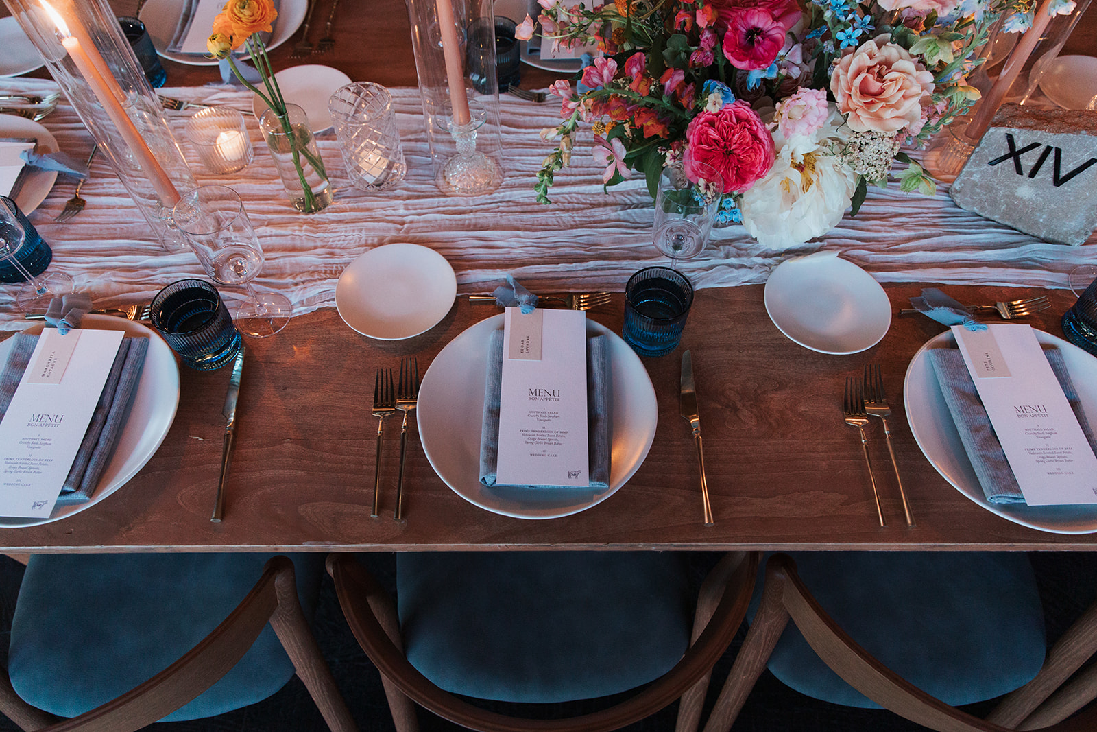
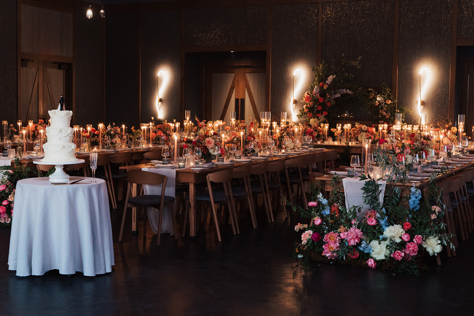
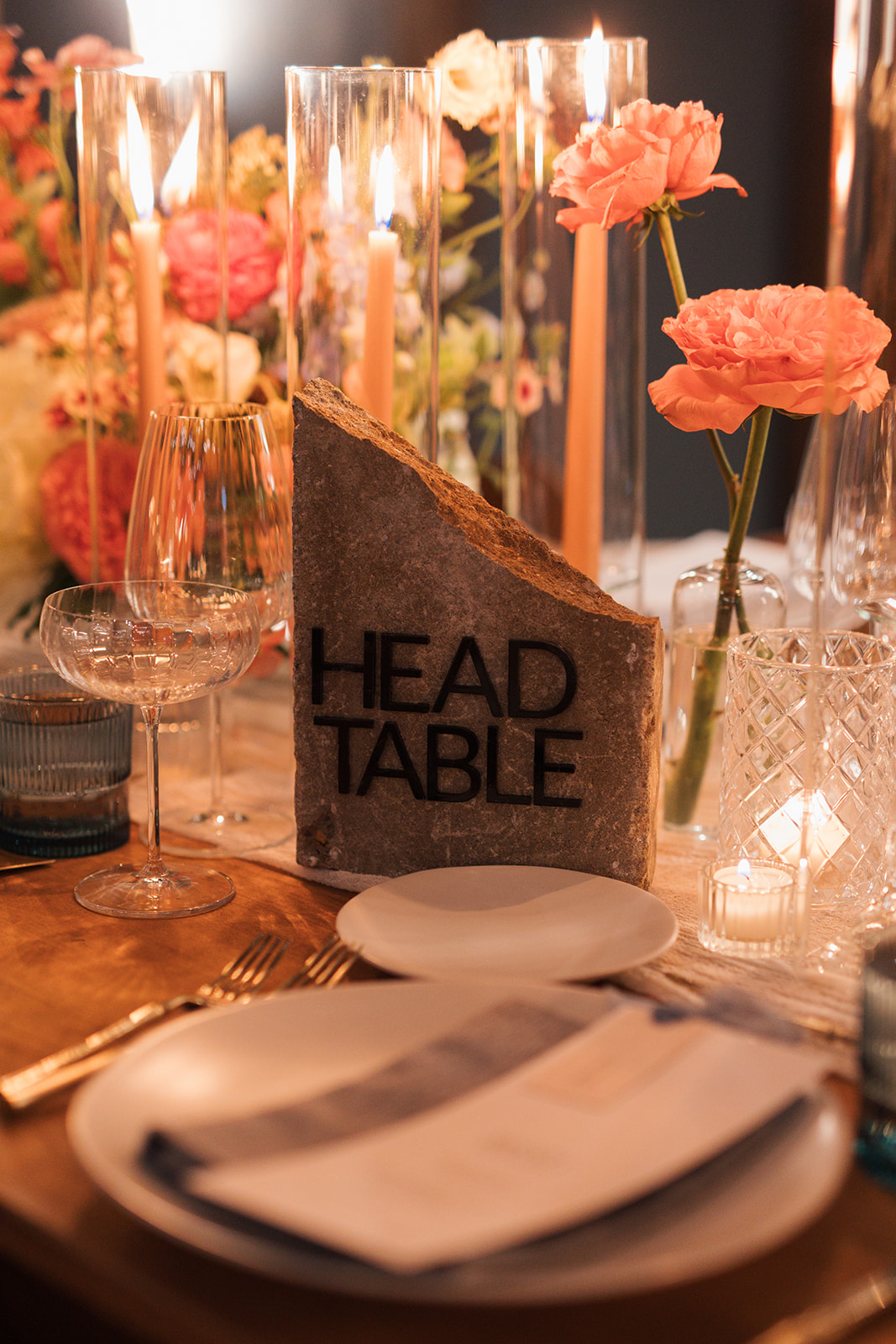
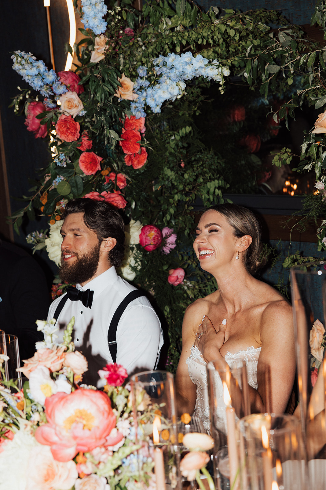
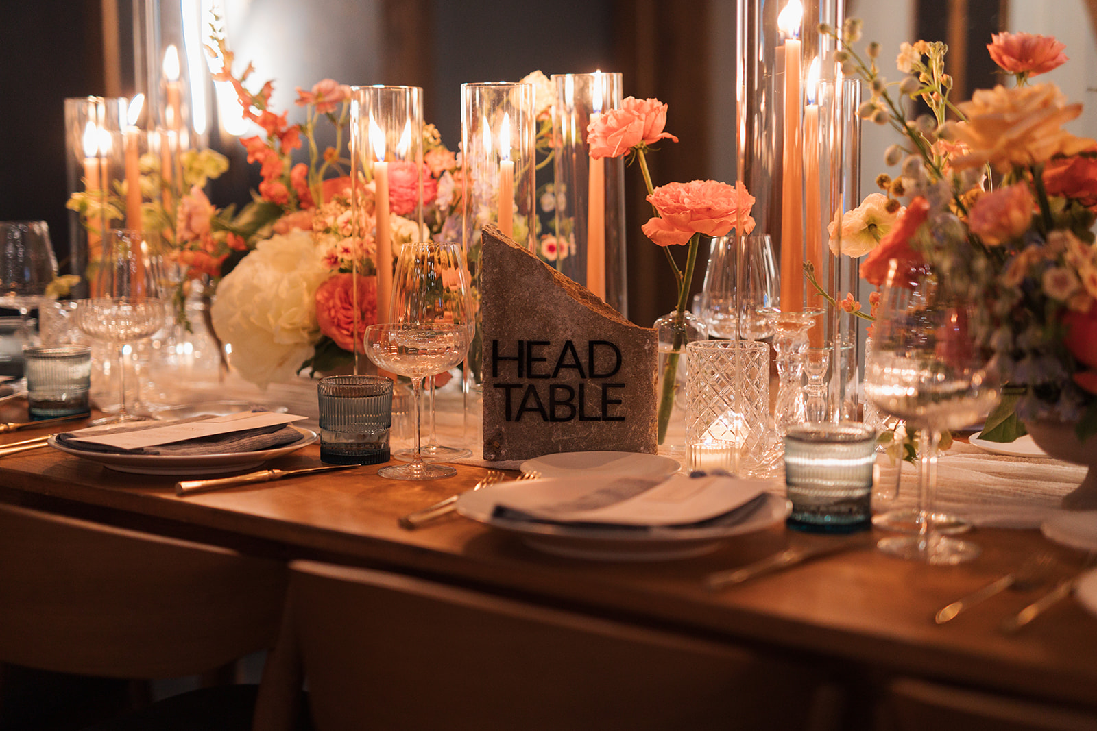
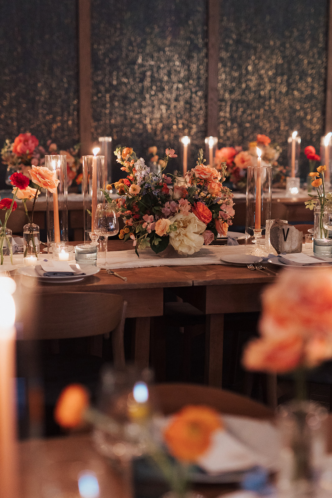
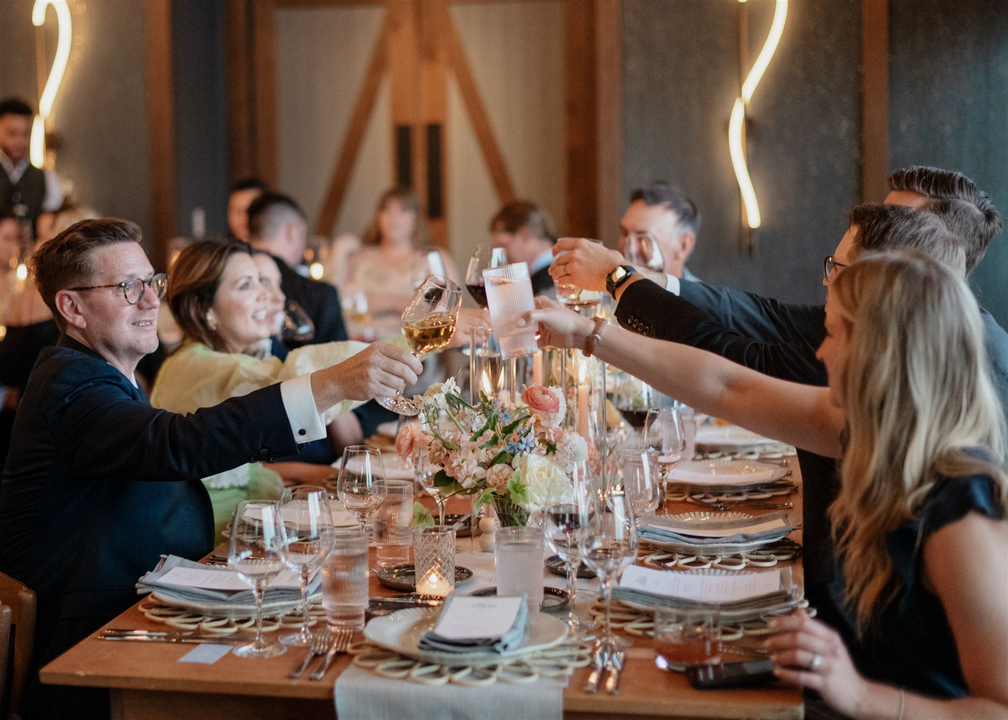
We are back at the enchanting Southall Farm and Inn as we take part in elevating the gorgeous wedding of White Ink couple, Brittanie and Tristen. This wedding touches all the senses, as textures and colors burst throughout the Franklin, TN venue.For this elegant, black tie wedding, we created several fun and unique textured details. From fabric signs to stone table numbers, we loved putting all our creative energy to use to make their vision come alive.
Elegant Wedding Invitation Suite
Brittanie and Tristen’s invitation complete with letterpress on hand-torn stock card created an incredibly elegant feel and look for their big day. Wedding invites have the power to truly set the tone for the entire event. I love when our couples understand how important it is to not skip the delicate details that give their guests the very first impression of what’s to come.
Note the pressed image of the Southall venue gently placed over the invite. It’s a small yet mighty detail that makes this invite one-of-a-kind.
Another detail that we must highlight in this suite is the beautiful envelope liner. In my opinion, envelope liners are simply a must, especially when finding ways to customize your wedding invitation suite. I like to think of it as the lining of a fancy jacket; it’s a place to pull in color and even have some fun and make it yours!
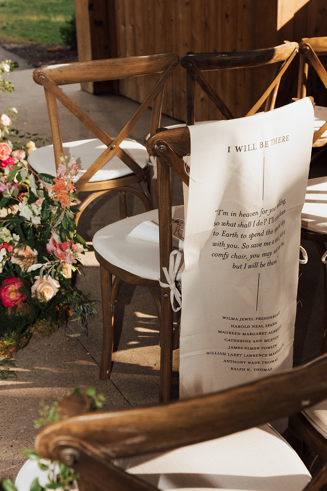
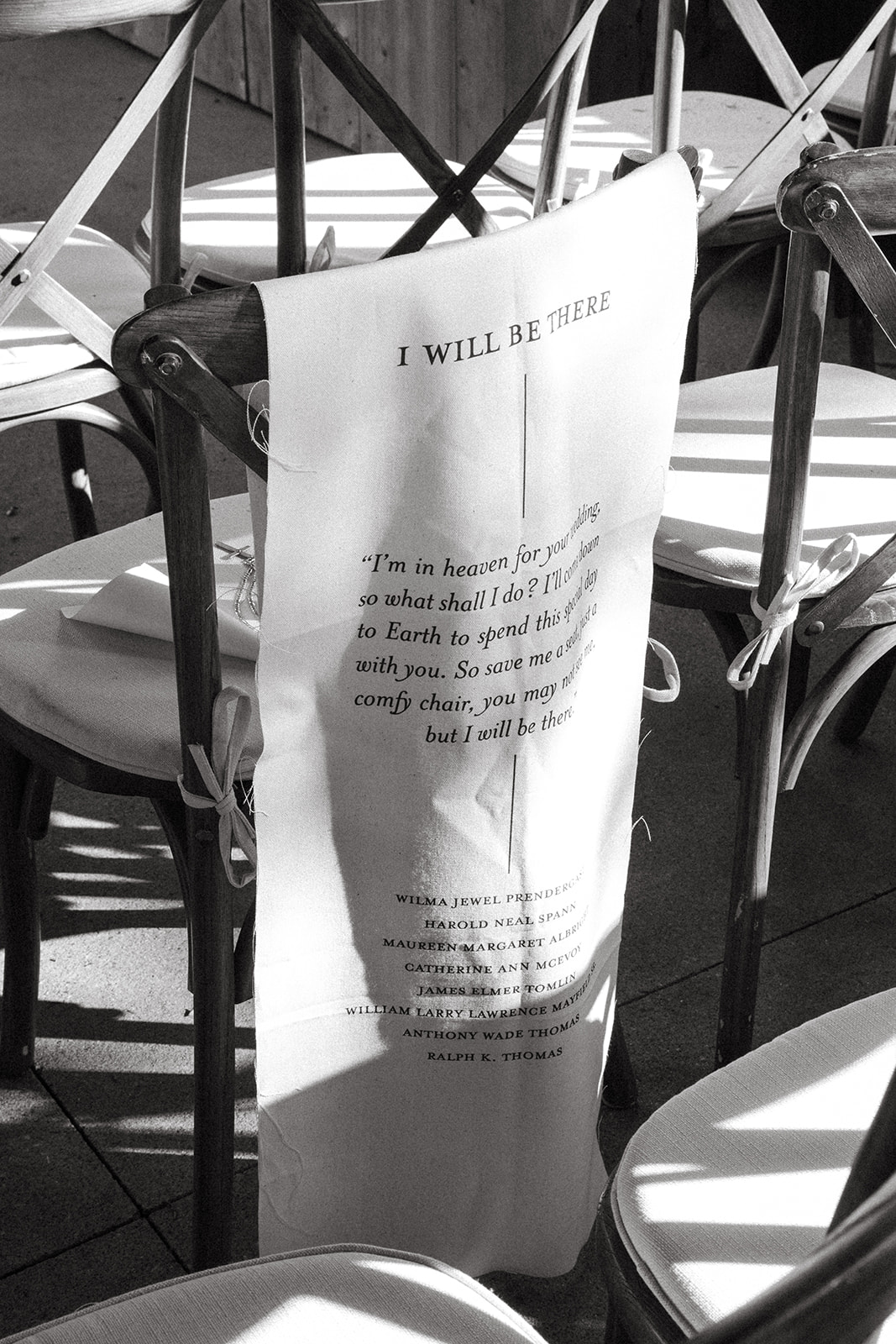
“I’m in heaven for your wedding, so what shall I do? I’ll come back to earth to spend it with you. So save me a seat, just a comfy chair, you may not see me, but I will be there.” This touching poem was placed on a fabric banner along with the names of those from Brittanie and Tristen’s life who have passed on. It was an honor for us at White Ink to be involved in such a sentimental part of the ceremony and create this loving gesture for our couple.
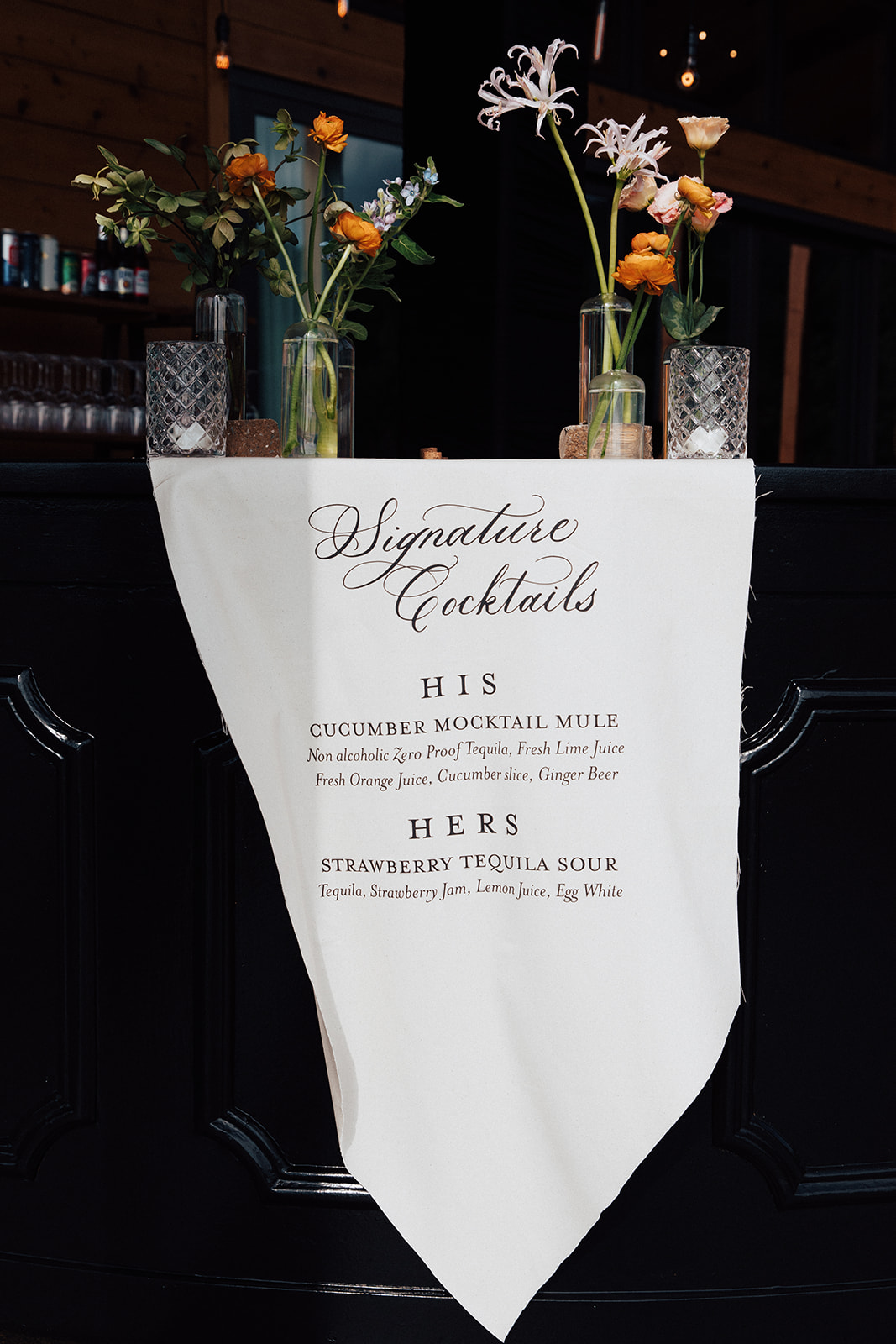
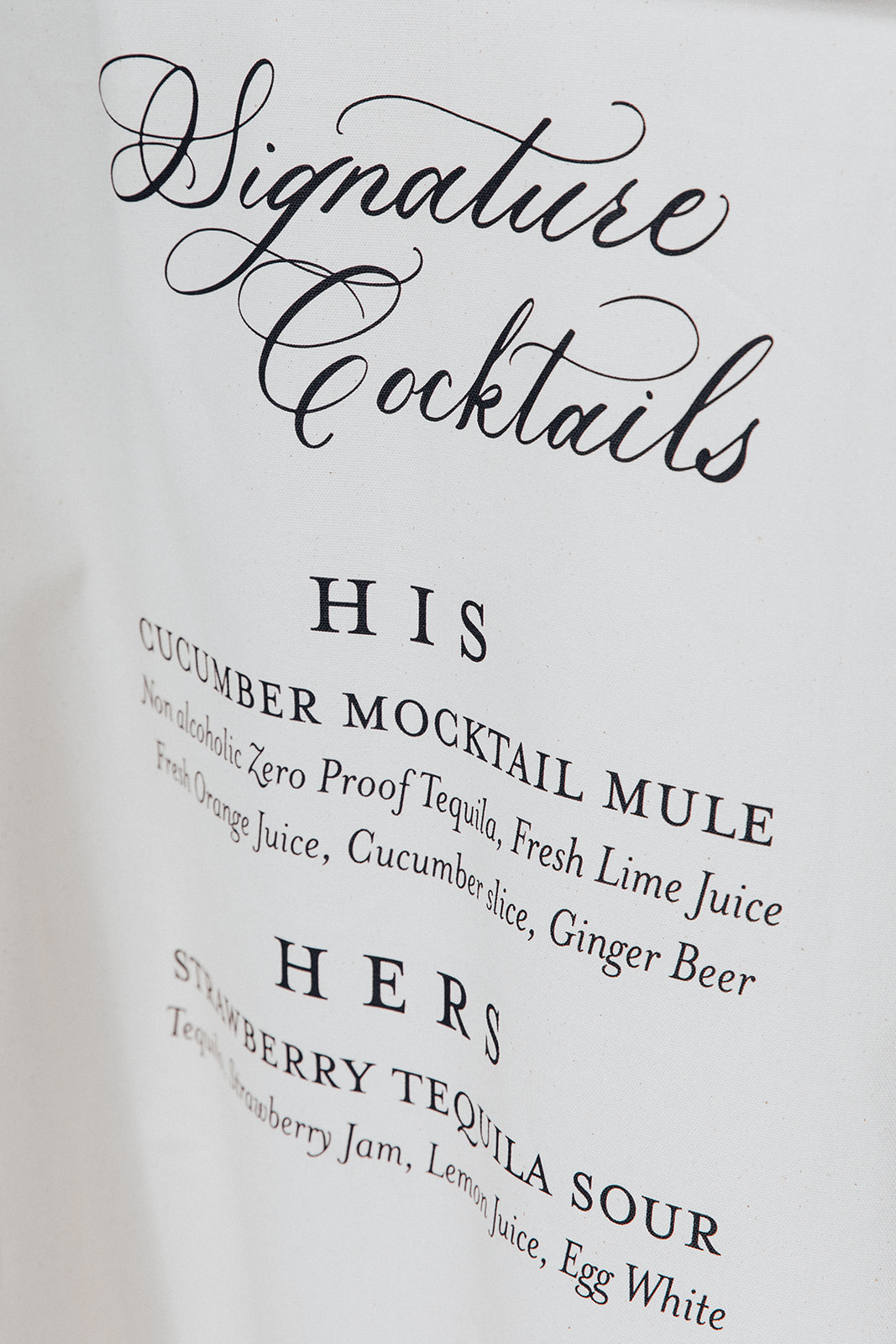
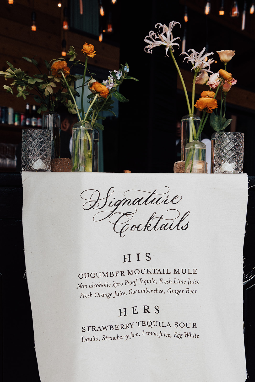
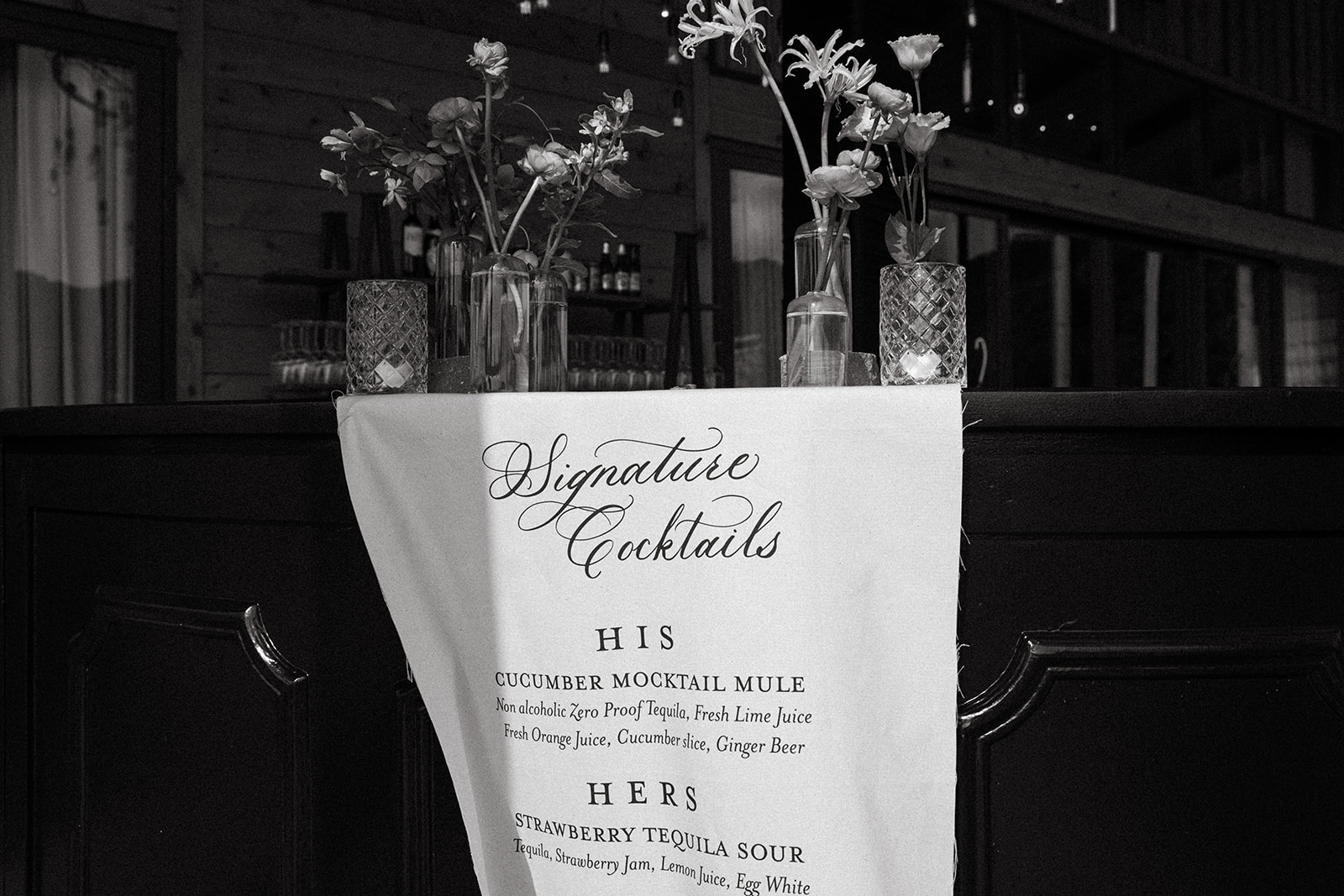
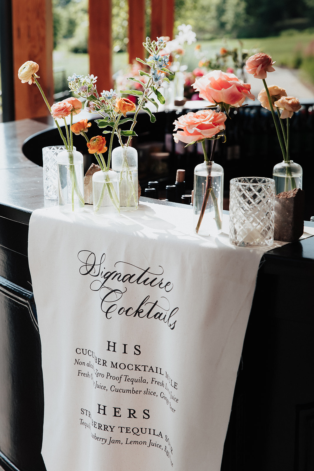
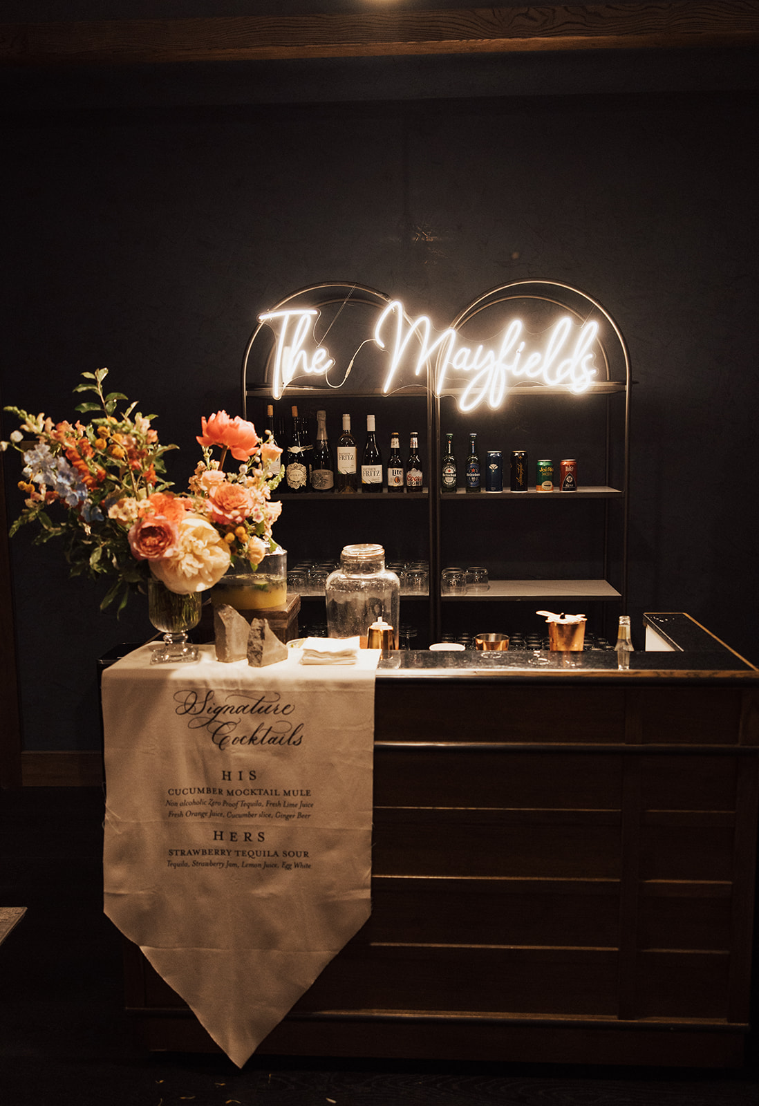
Custom Fabric Bar Sign
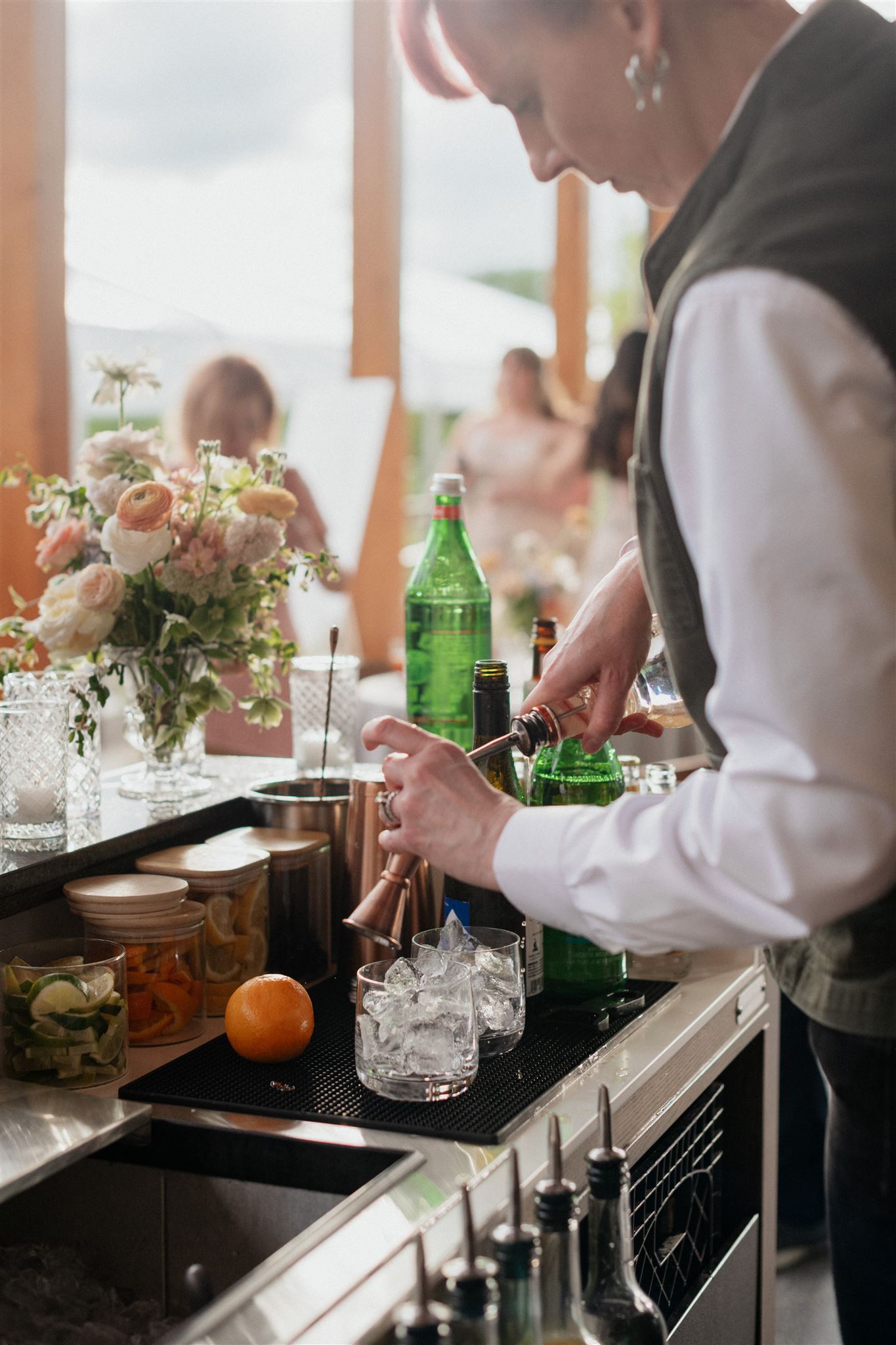
For cocktail hour, Brittanie and Tristen chose to utilize fabric for the custom bar sign. I like getting the chance to showcase our work as we step off the paper and onto other textures! The look of the fabric bar sign, on the thick wooden bar decorated with soft florals is perfectly inviting as guests make the transition from ceremony to reception. Also, I can guarantee guests will not forget a sign like this!
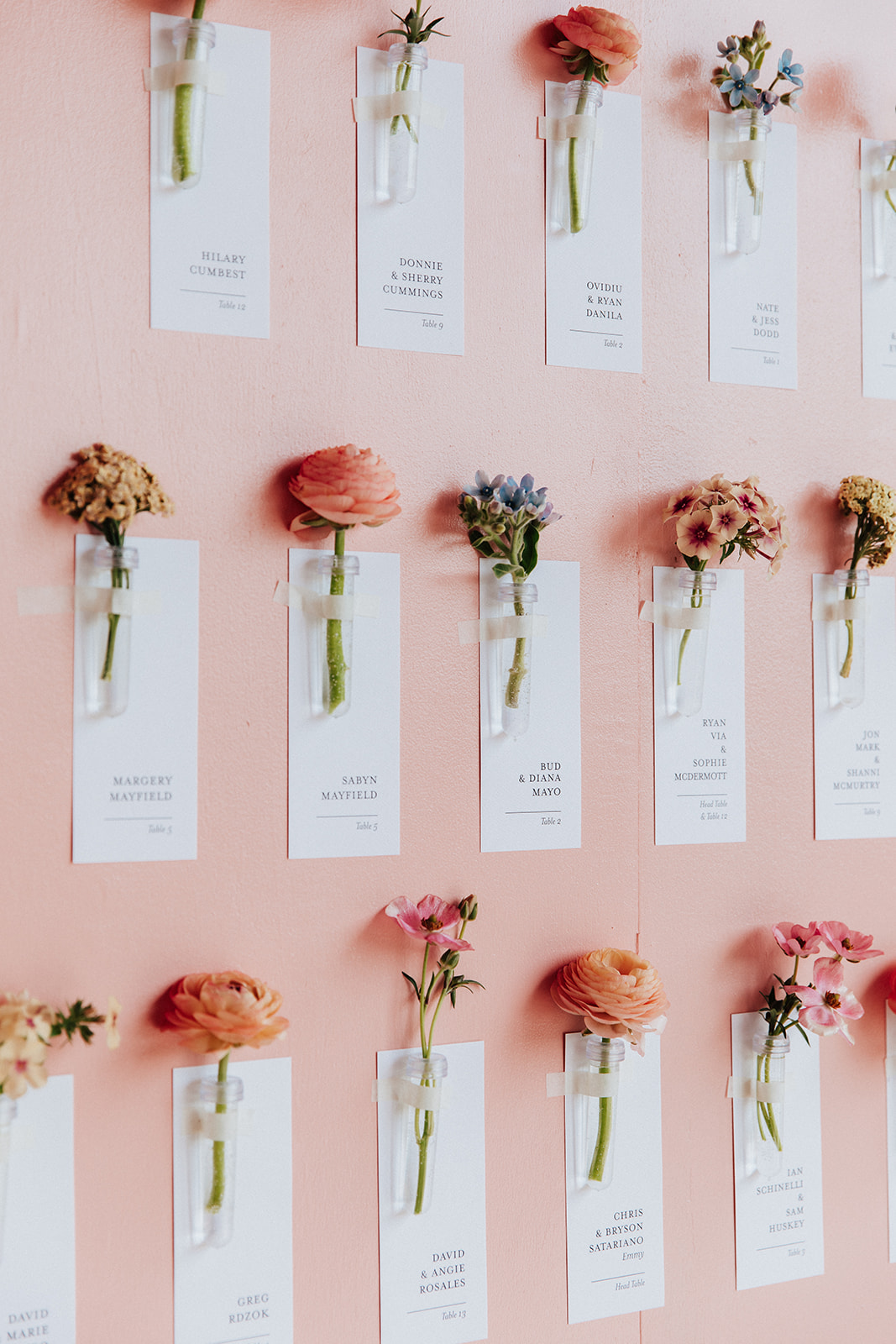
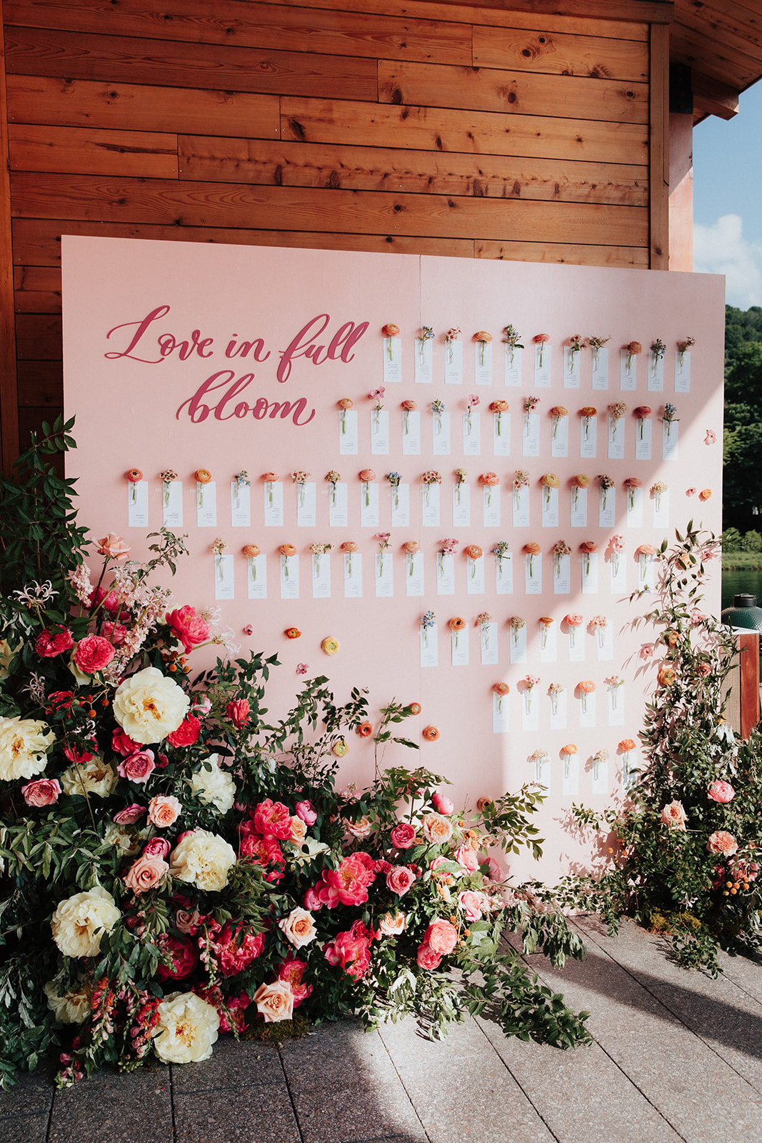
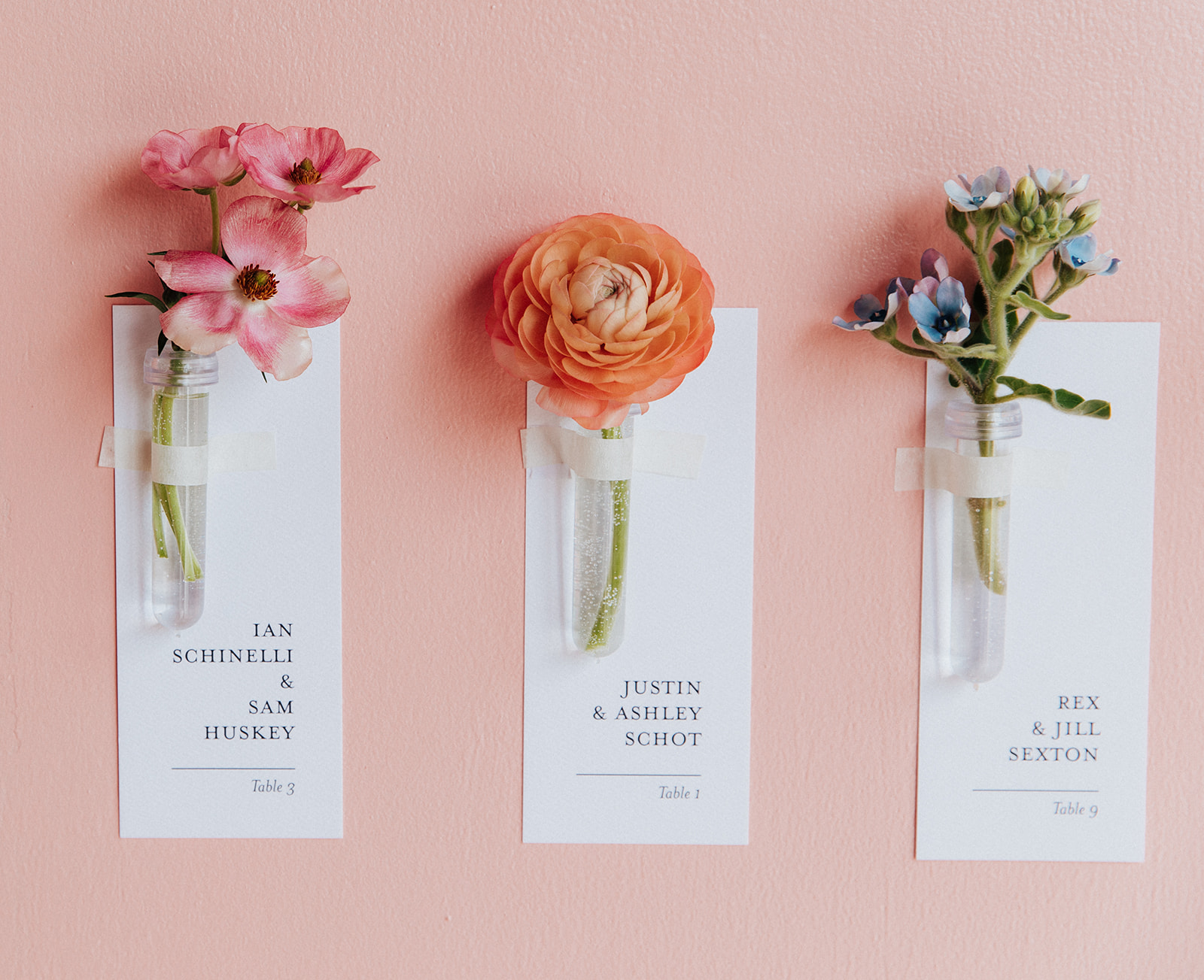
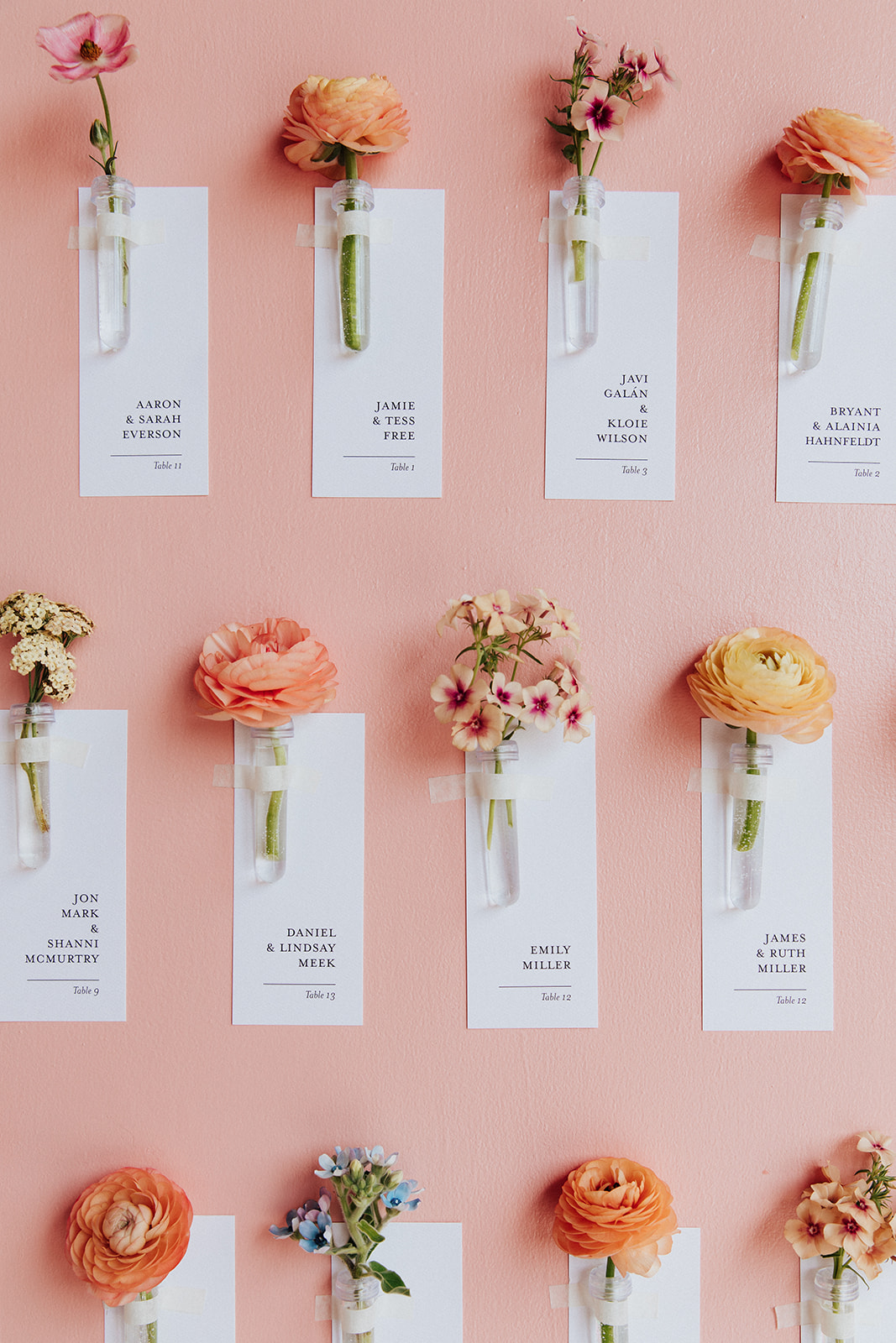
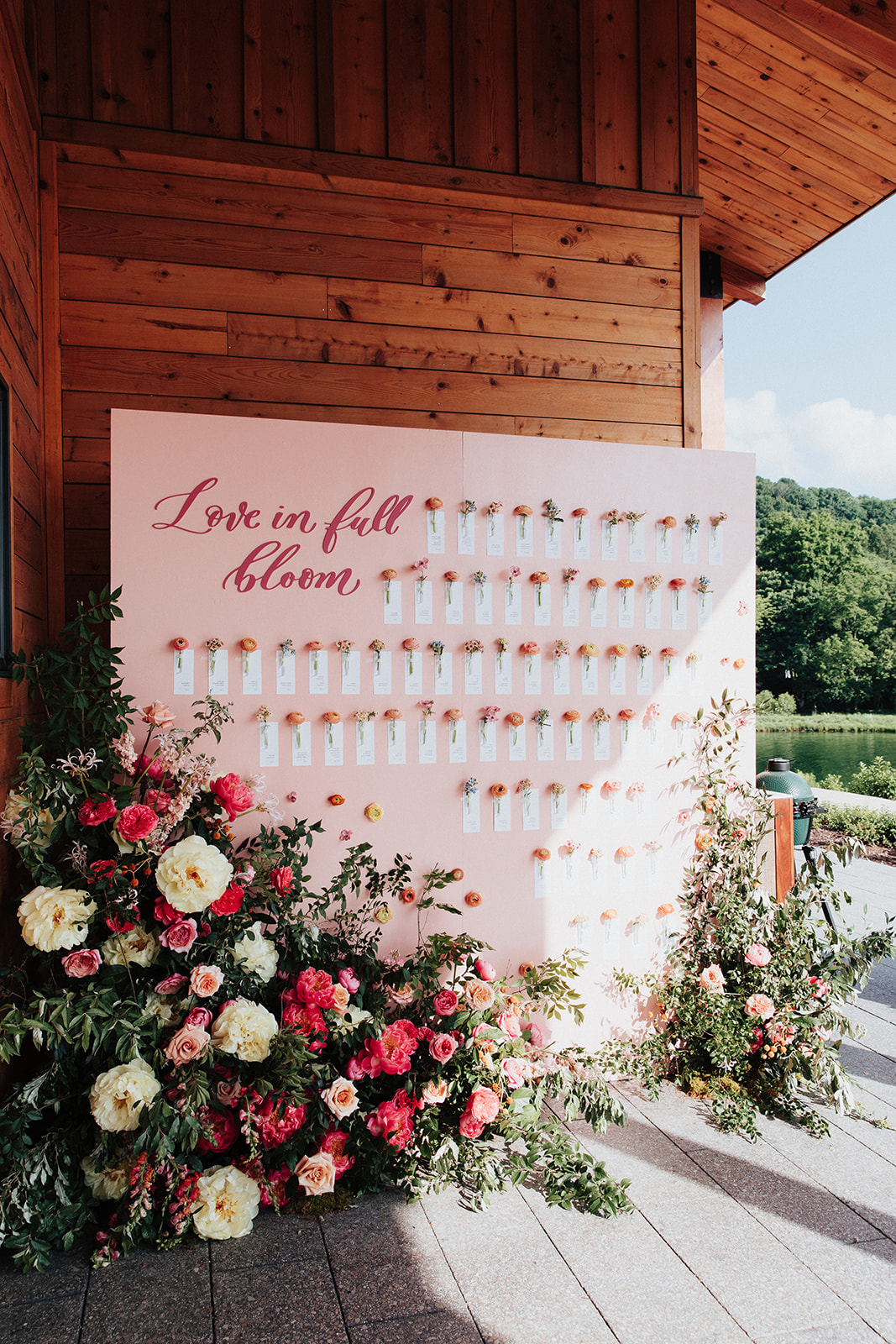
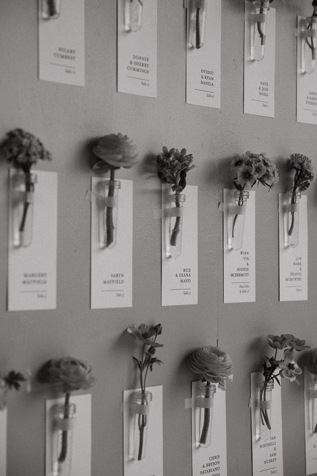
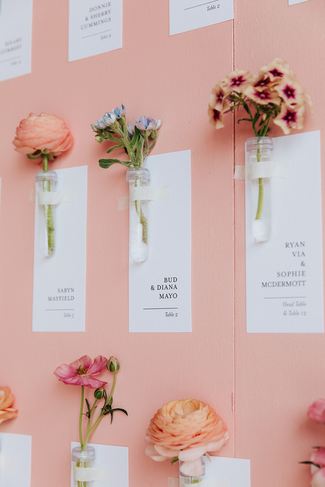
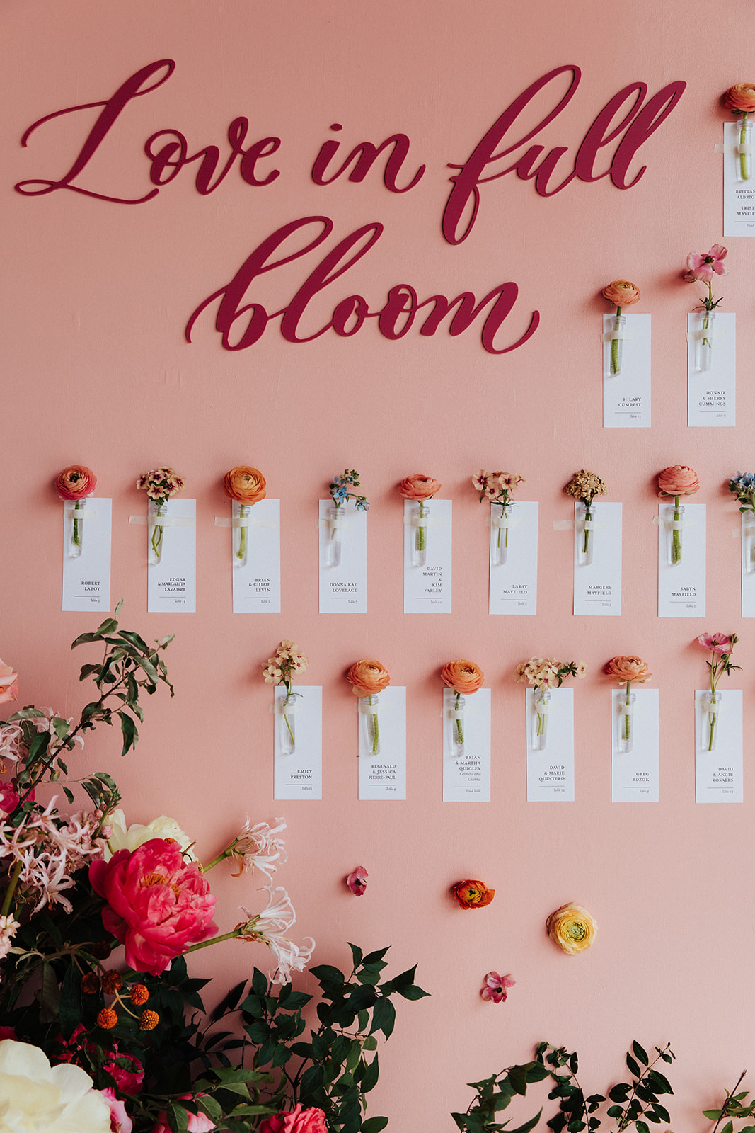
The title of this custom escort wall says it all: “Love in Full Bloom”. Brittanie and Tristen’s seating chart was so much fun to help create. As if the cascading florals all around aren’t enough to brighten this display, we kept it coming with custom escort cards attached to individual flowers. I like to think of them as small tokens to carry on the mood and energy of this fantastic day.
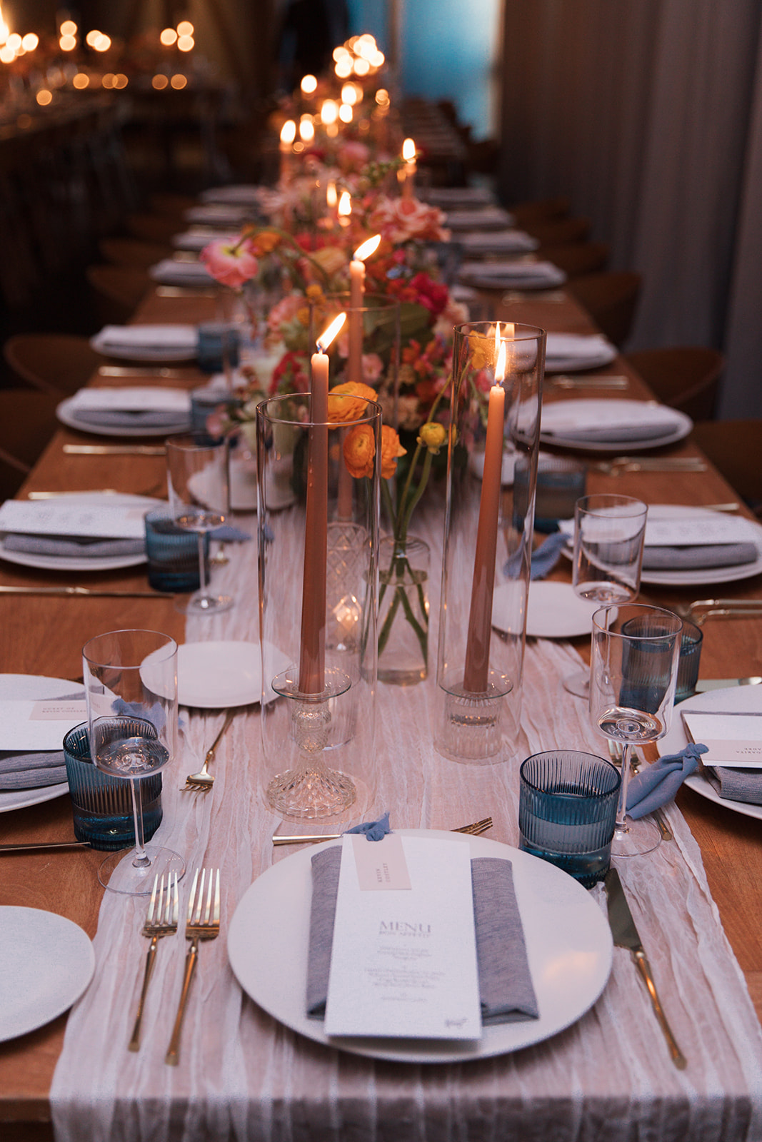
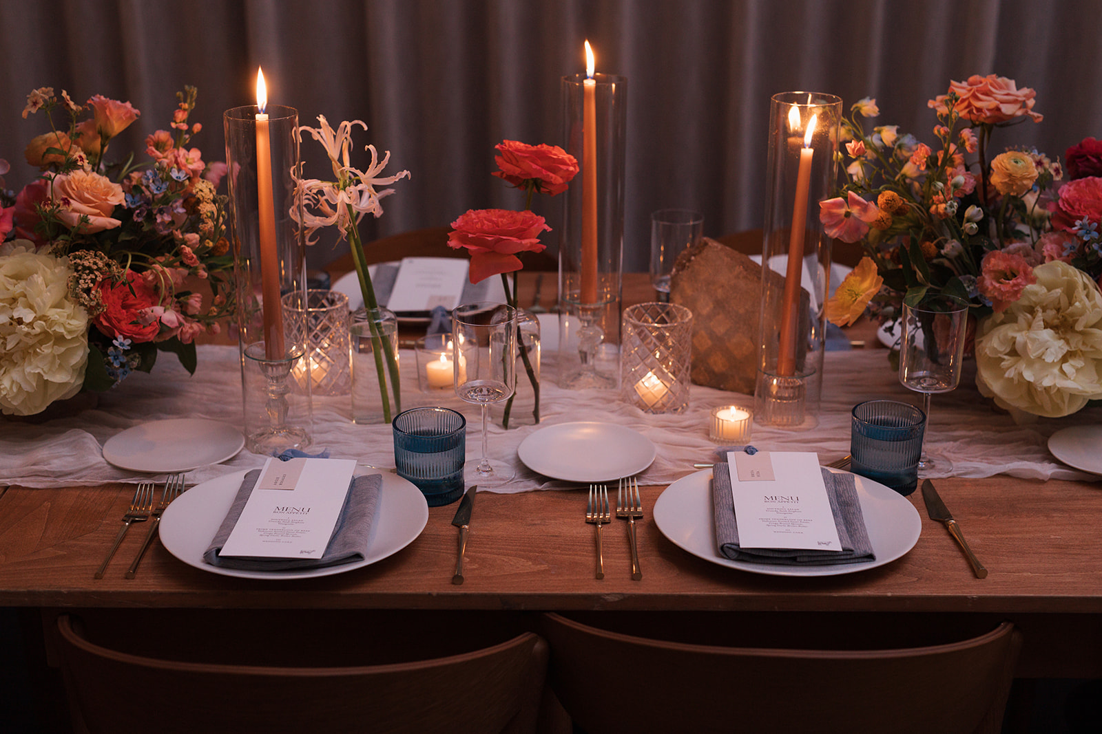
Textured Reception Details
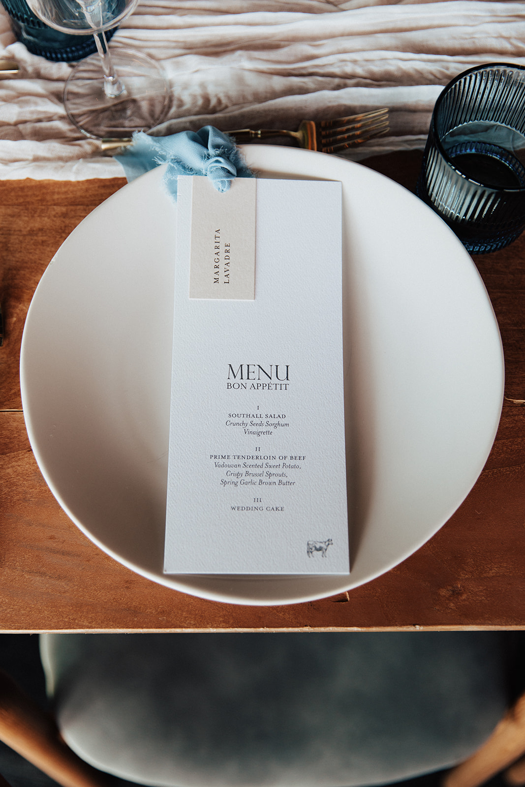
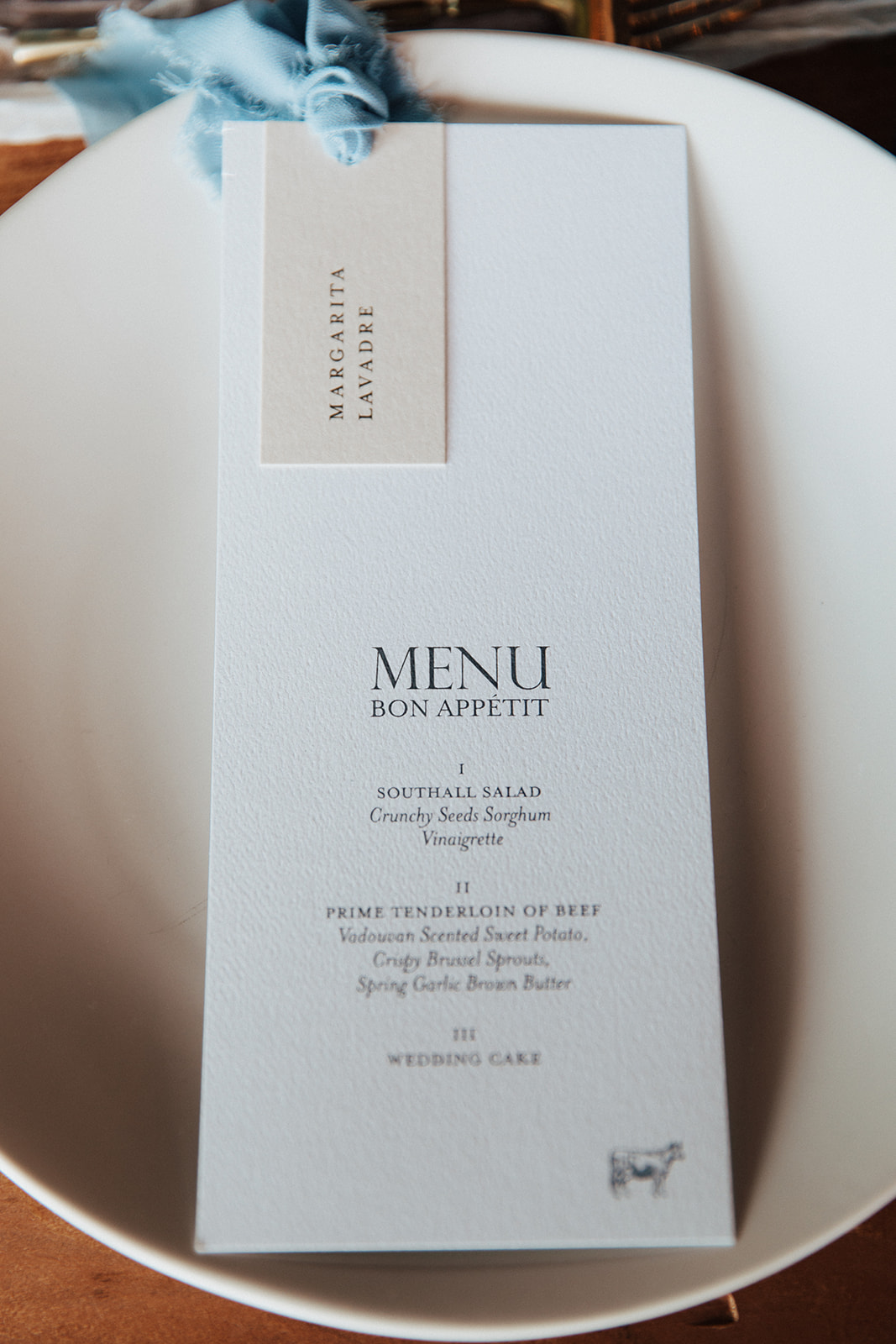
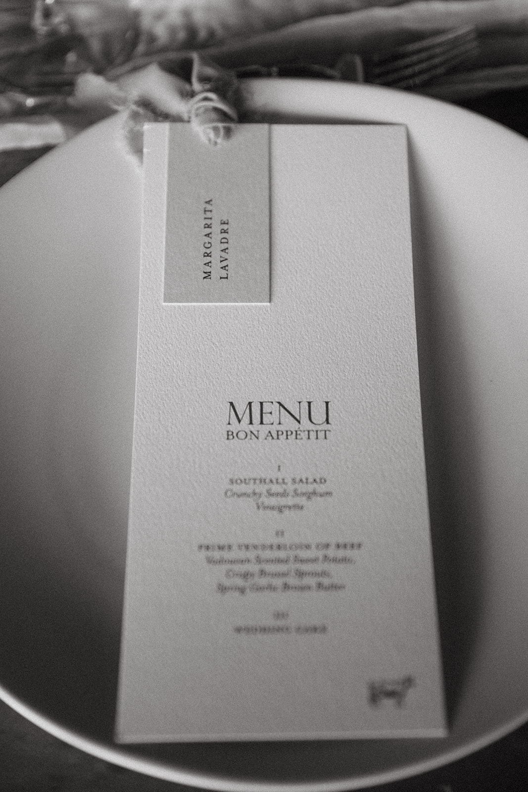
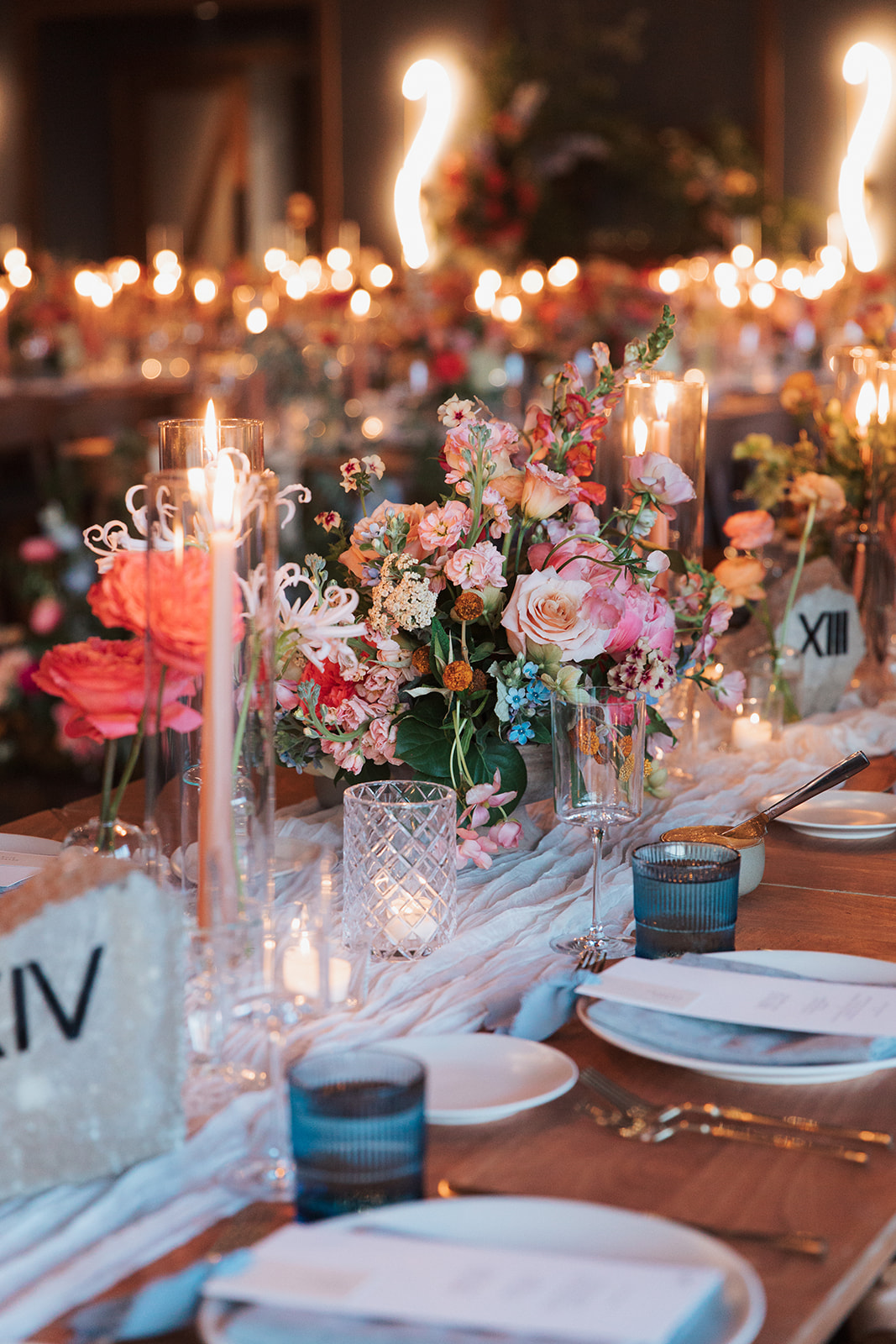
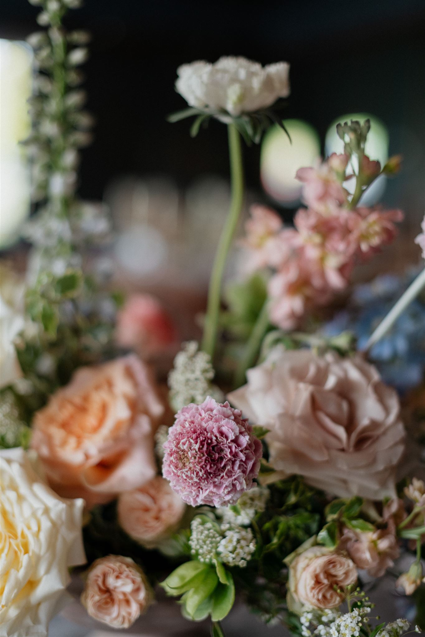
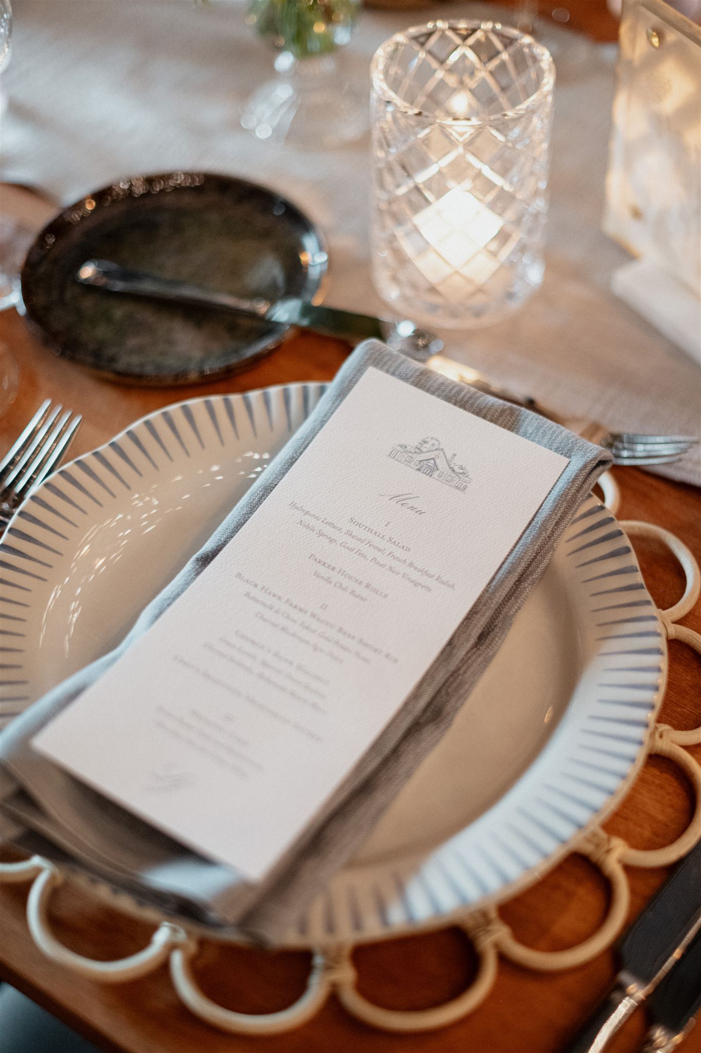
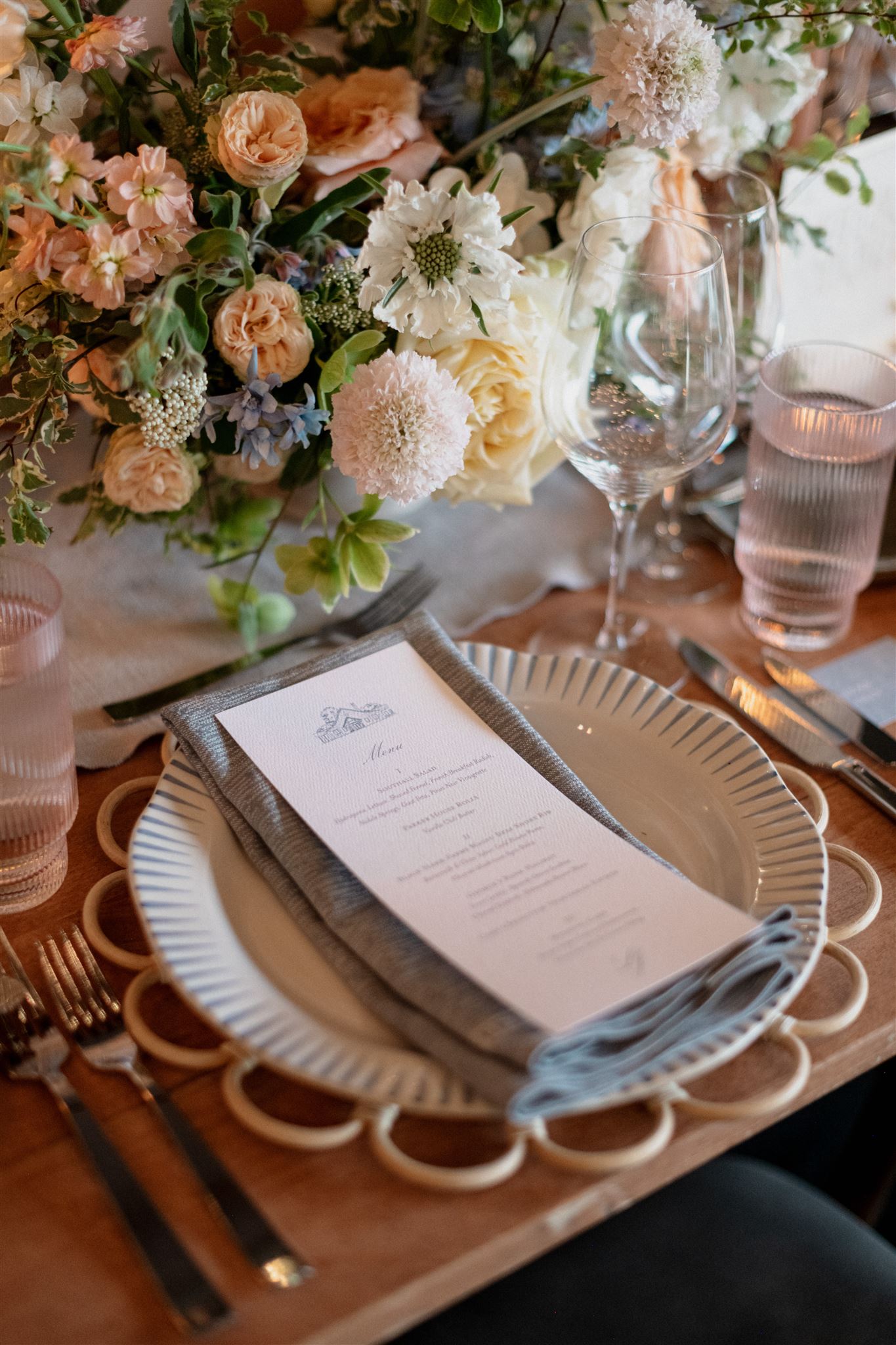
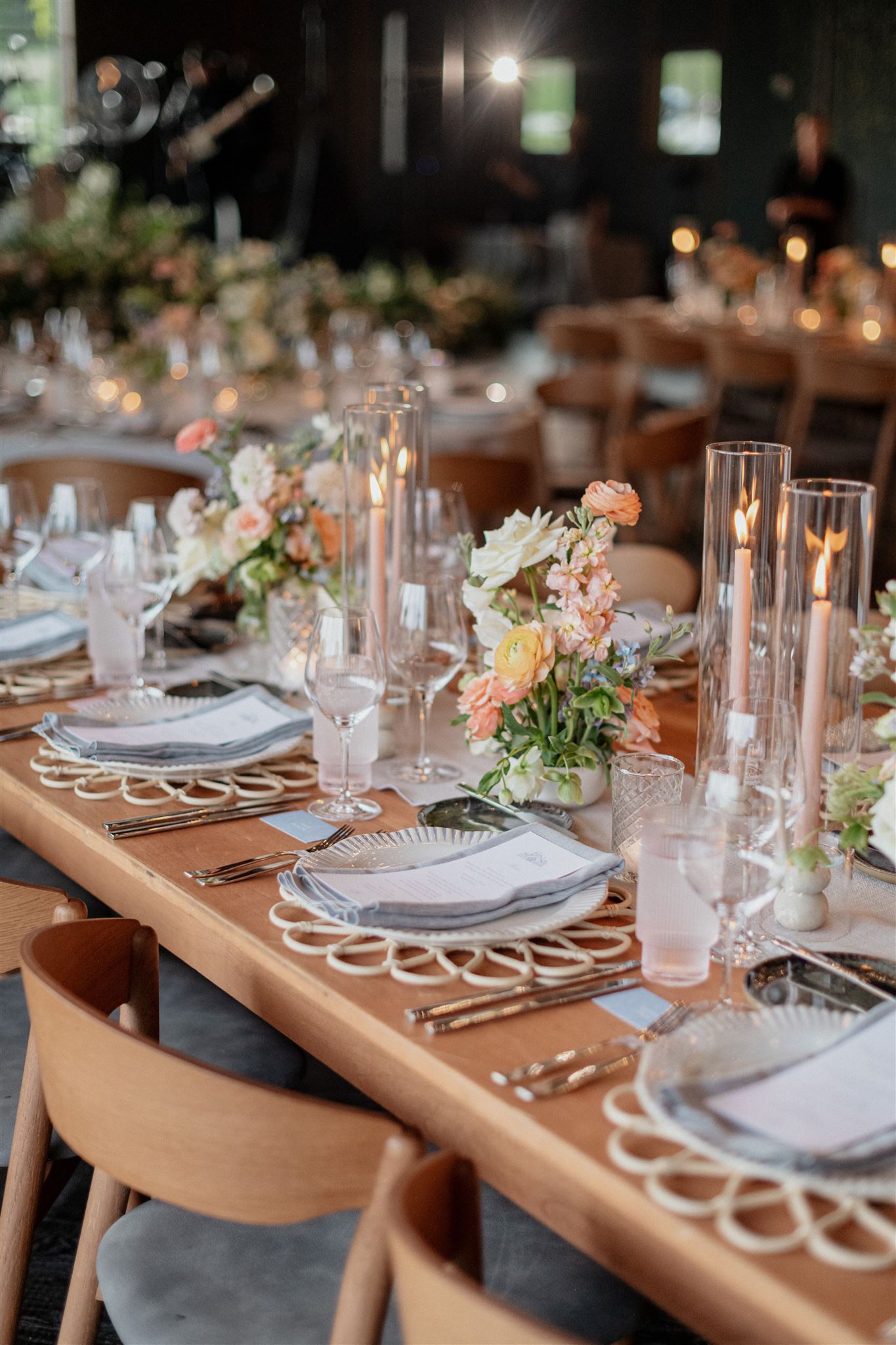
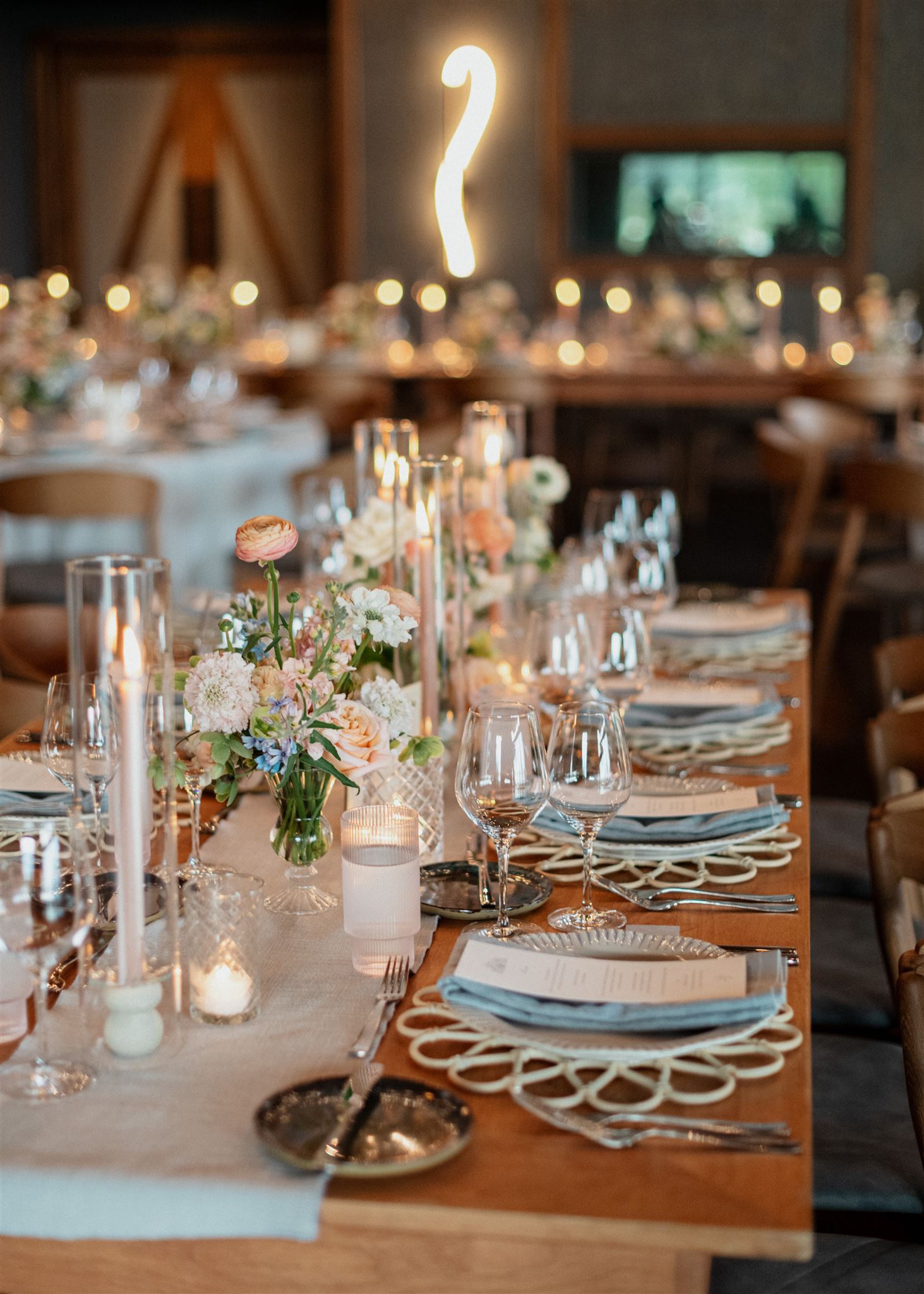
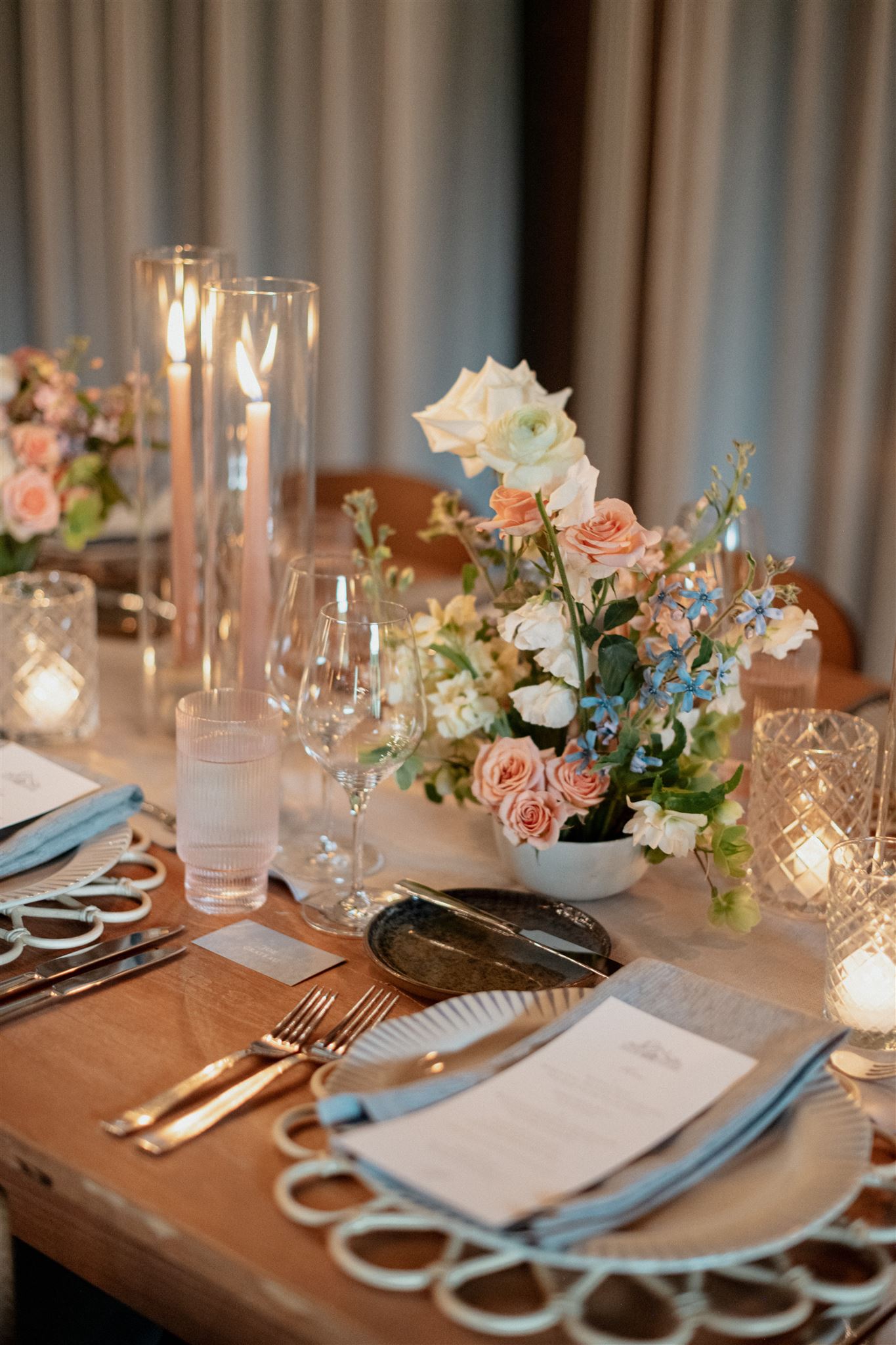
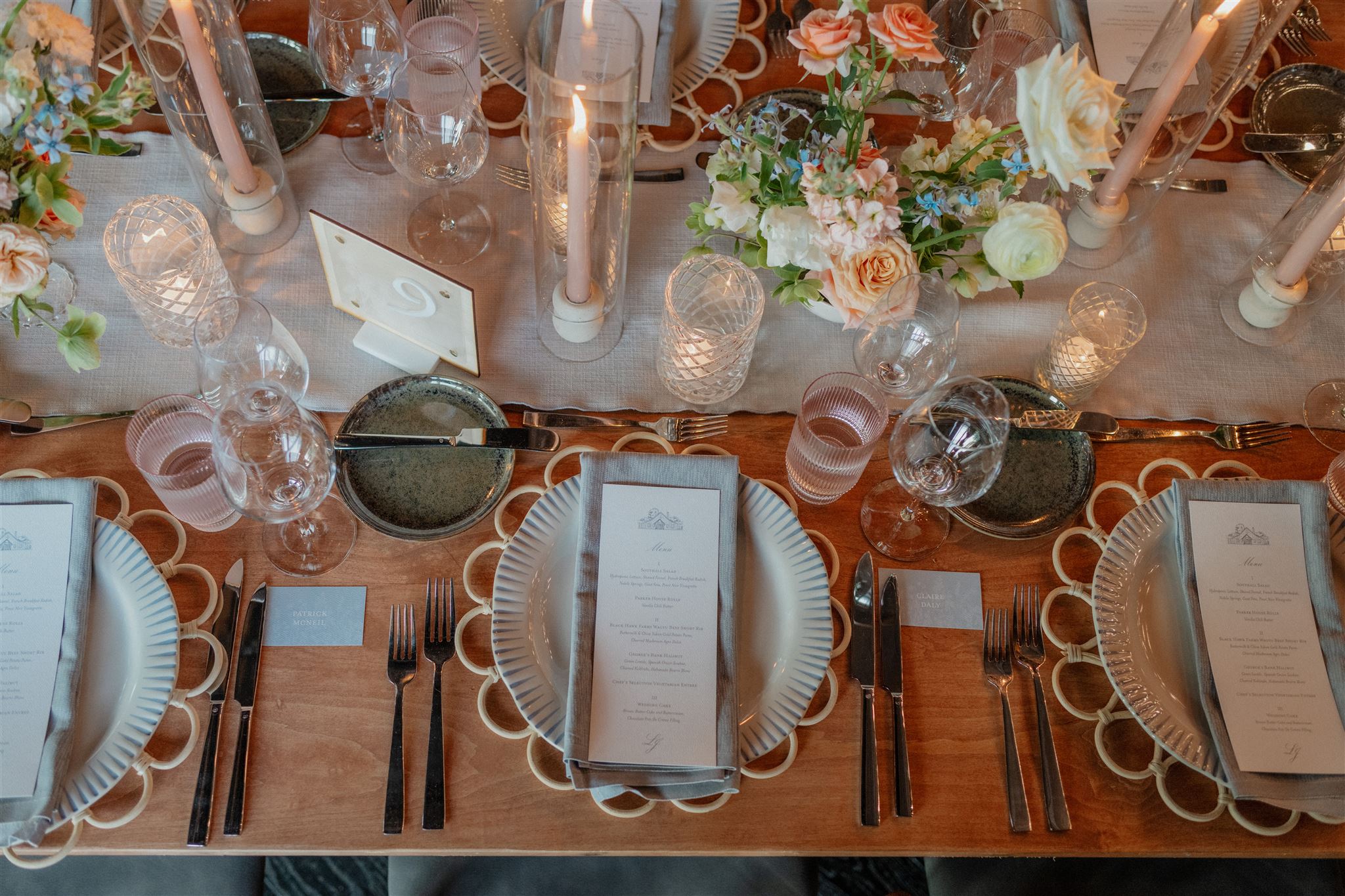
The delicious menu selection was printed on a beautiful stock card and placed underneath a delicate place card with baby blue ribbons. I think it’s important to point out the spectacular usage of texture from Brittanie and Tristen’s reception. Guests soaked in the beauty of soft linens, traditional and modern glassware, abundant florals, and warm candlelight. THIS is how you create the mood and keep the guests engaged in every sense. I could have stayed here forever.
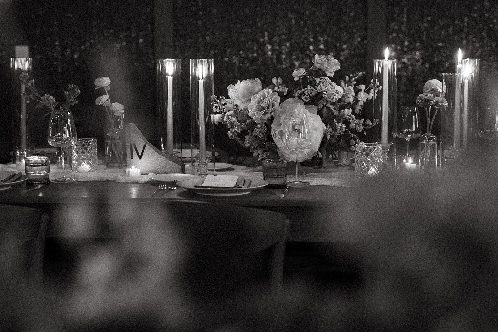
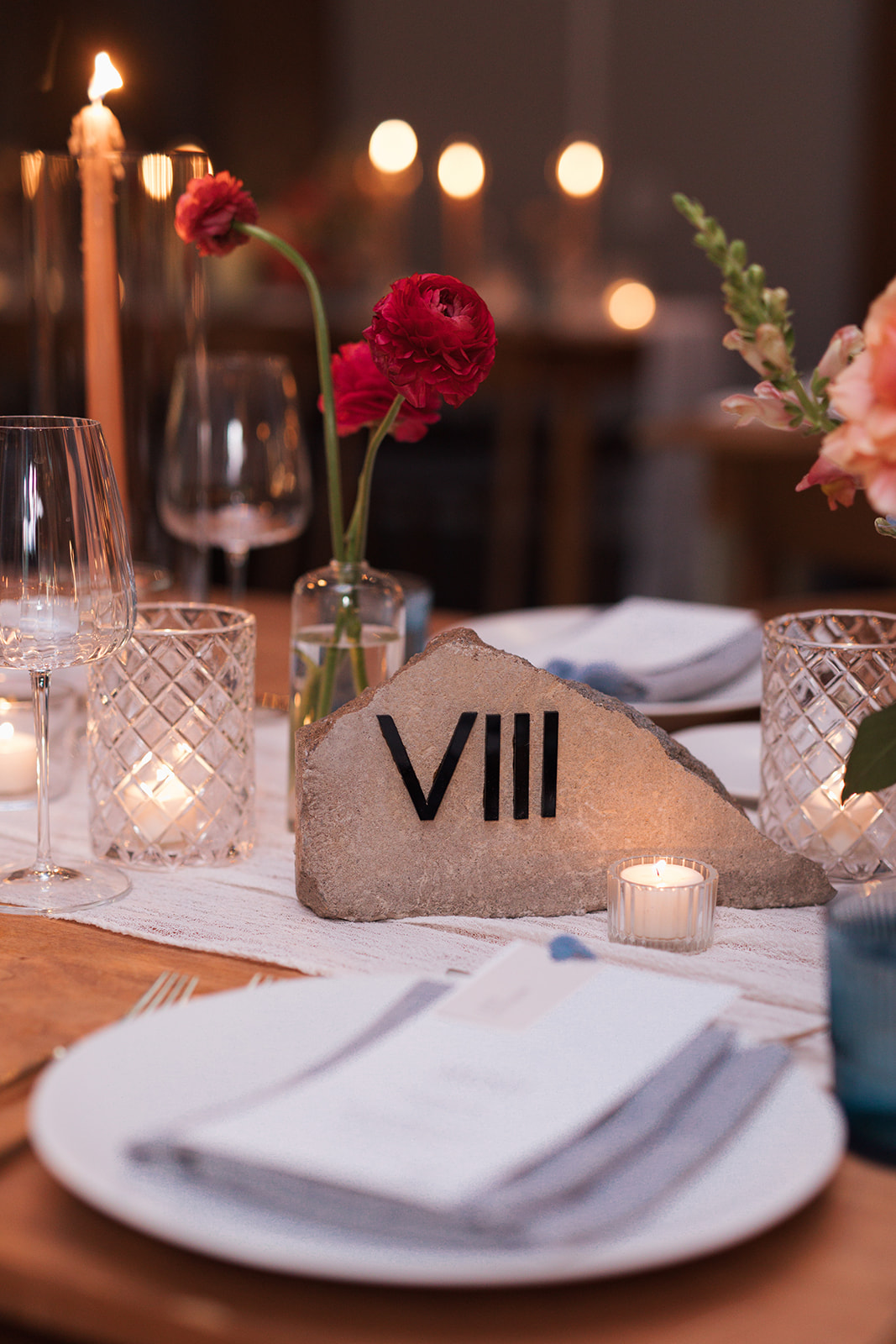
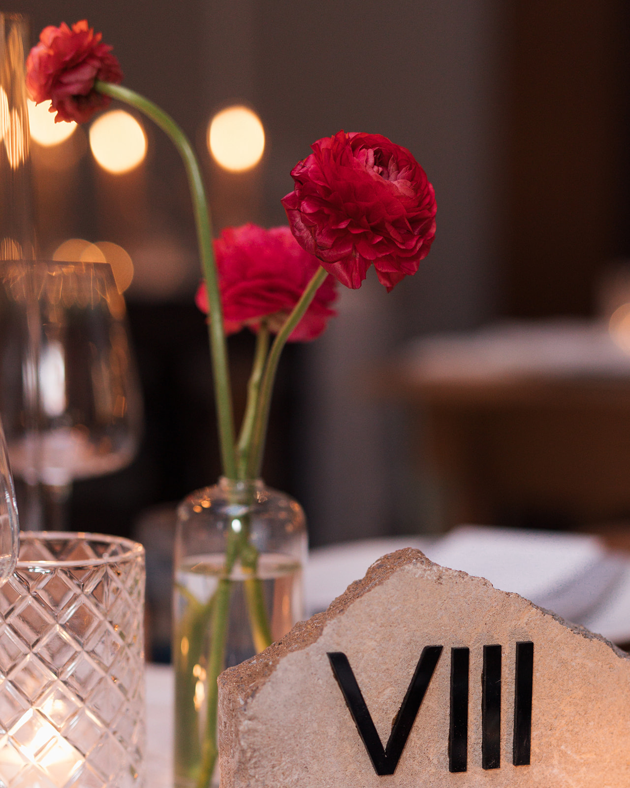
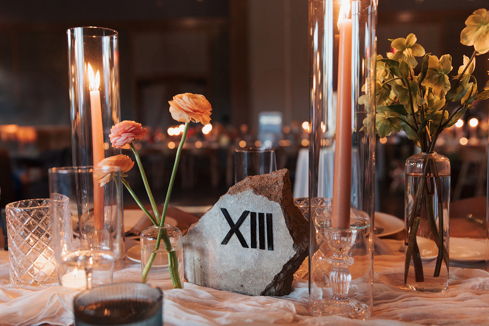
I have been so excited to showcase these table numbers! Talk about texture! These custom stone table numbers from our extensive rental collection are a favorite of ours at White Ink. We were thrilled to provide these at the reception for Brittanie and Tristen. They created the perfect balance of the texture-filled tablescapes and were undoubtedly a main conversation piece. Reception decor is a wonderful time to show your style and personality just as Brittanie and Tristen did. The Roman numerals were an excellent touch.
Here’s to Brittanie and Tristen. For trusting White Ink with the finer details of this fine day. The love, the people, the creativity is something that will stay with us for many years to come. Cheers!
If you’re looking to add custom, thoughtful touches to your wedding or event, we would love to help make your vision a reality. Reach out today to learn more about our full-service design offerings—we can’t wait to create something unforgettable for you!
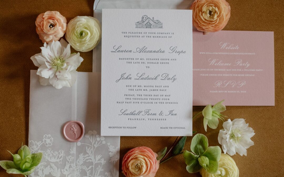
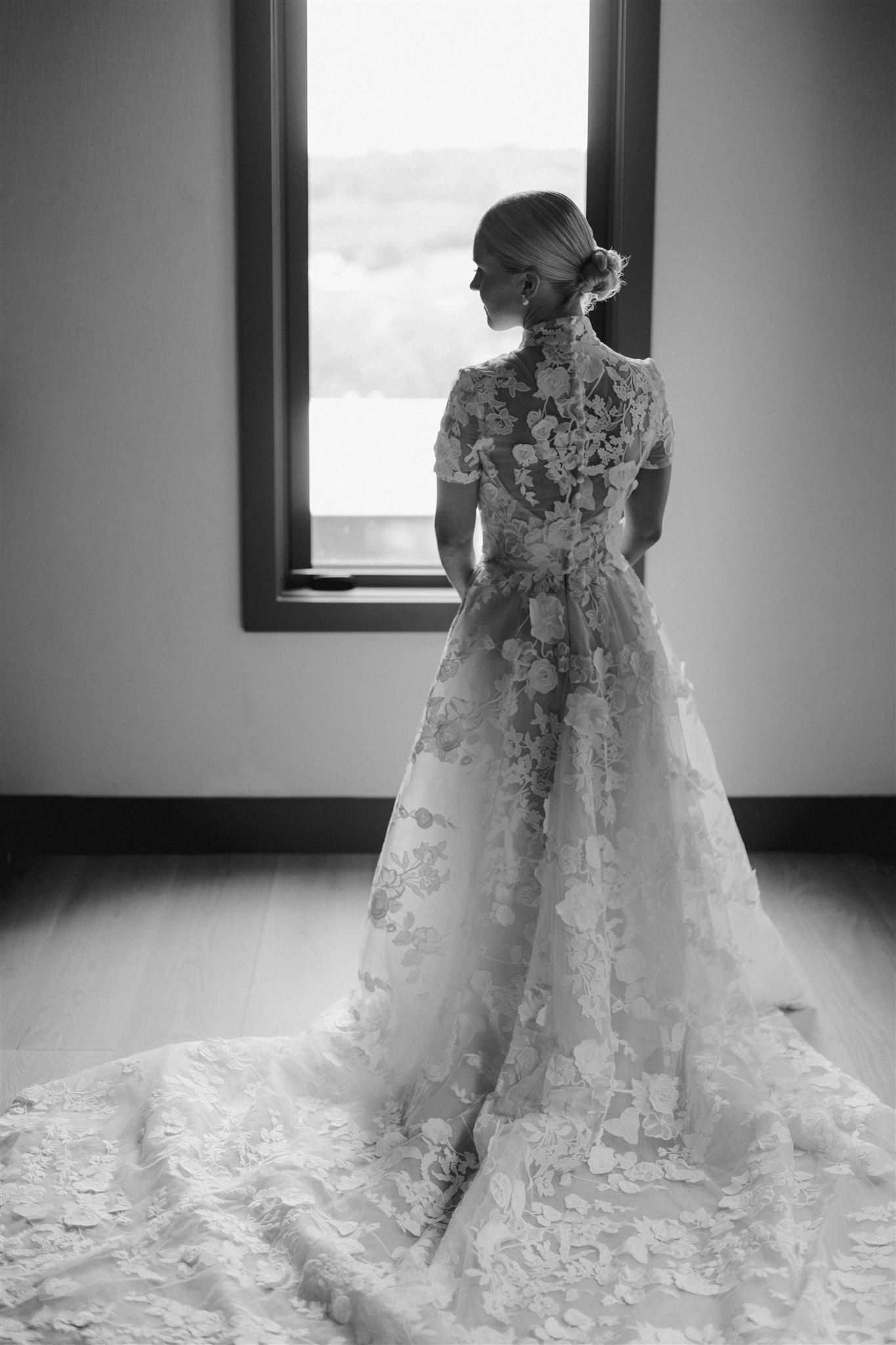
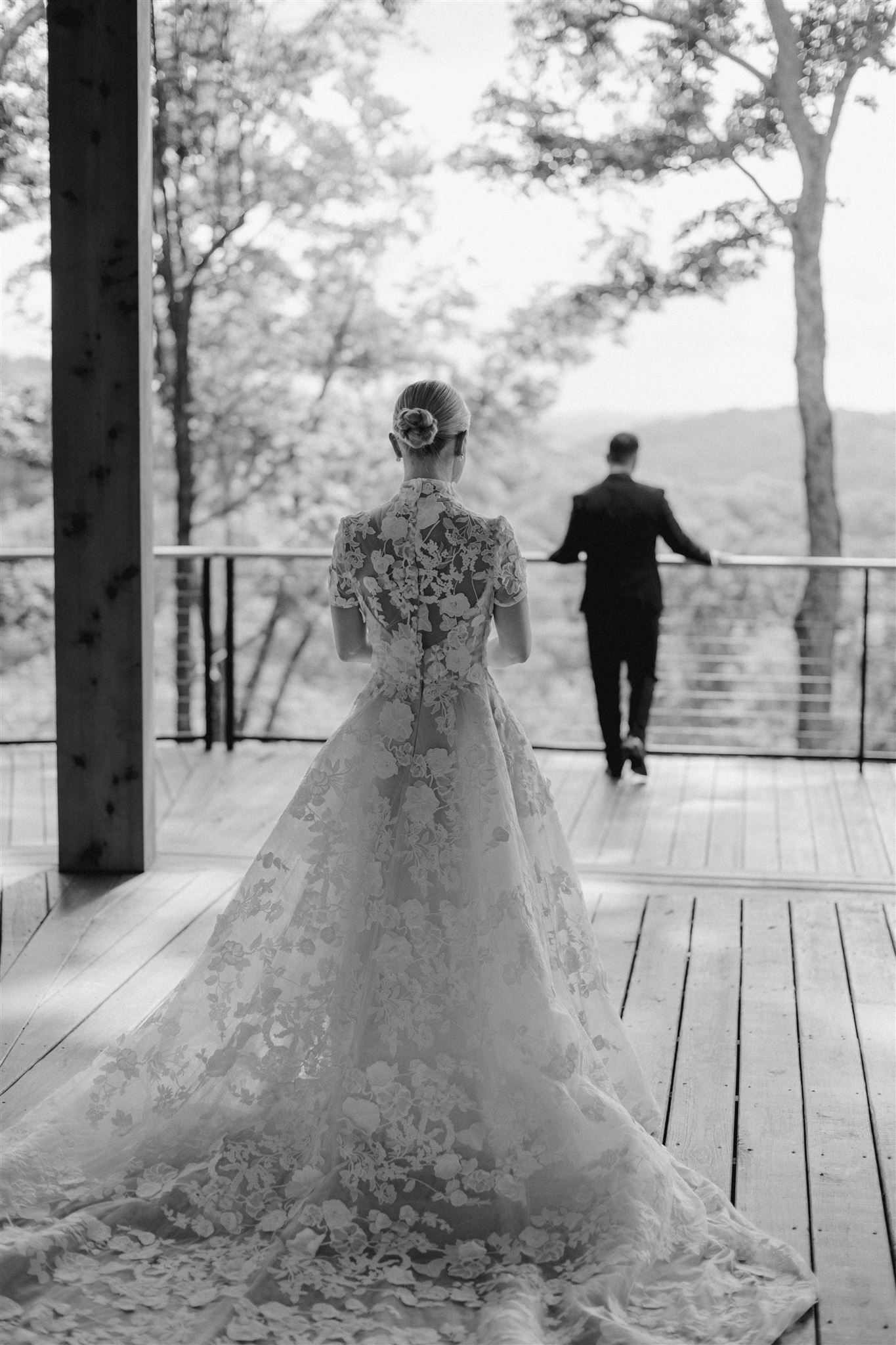
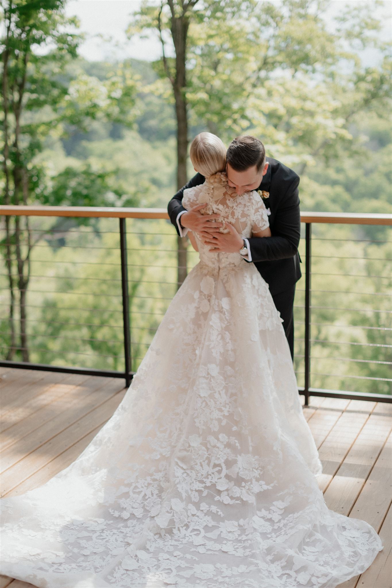
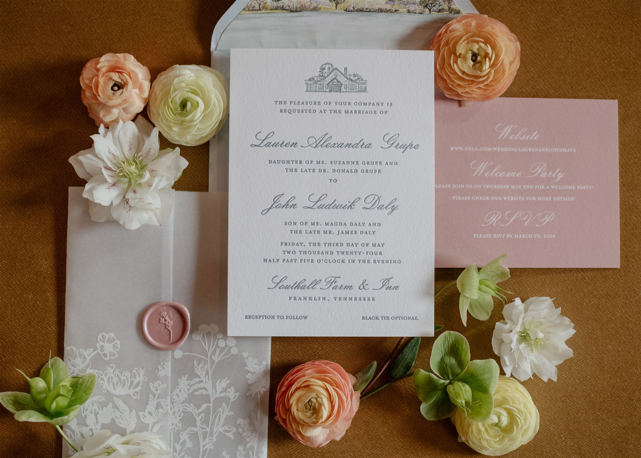
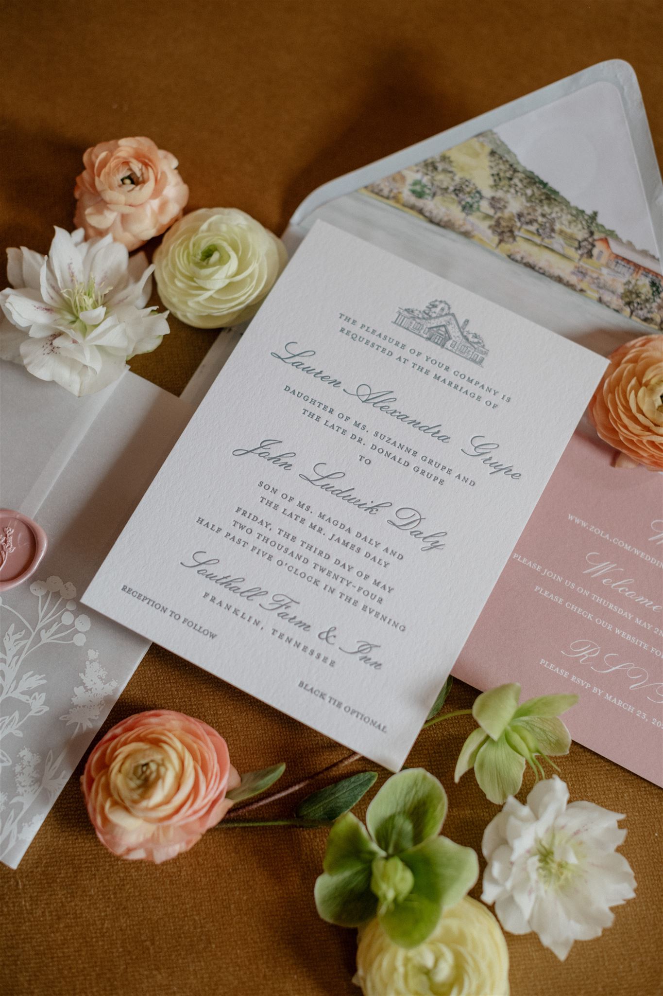
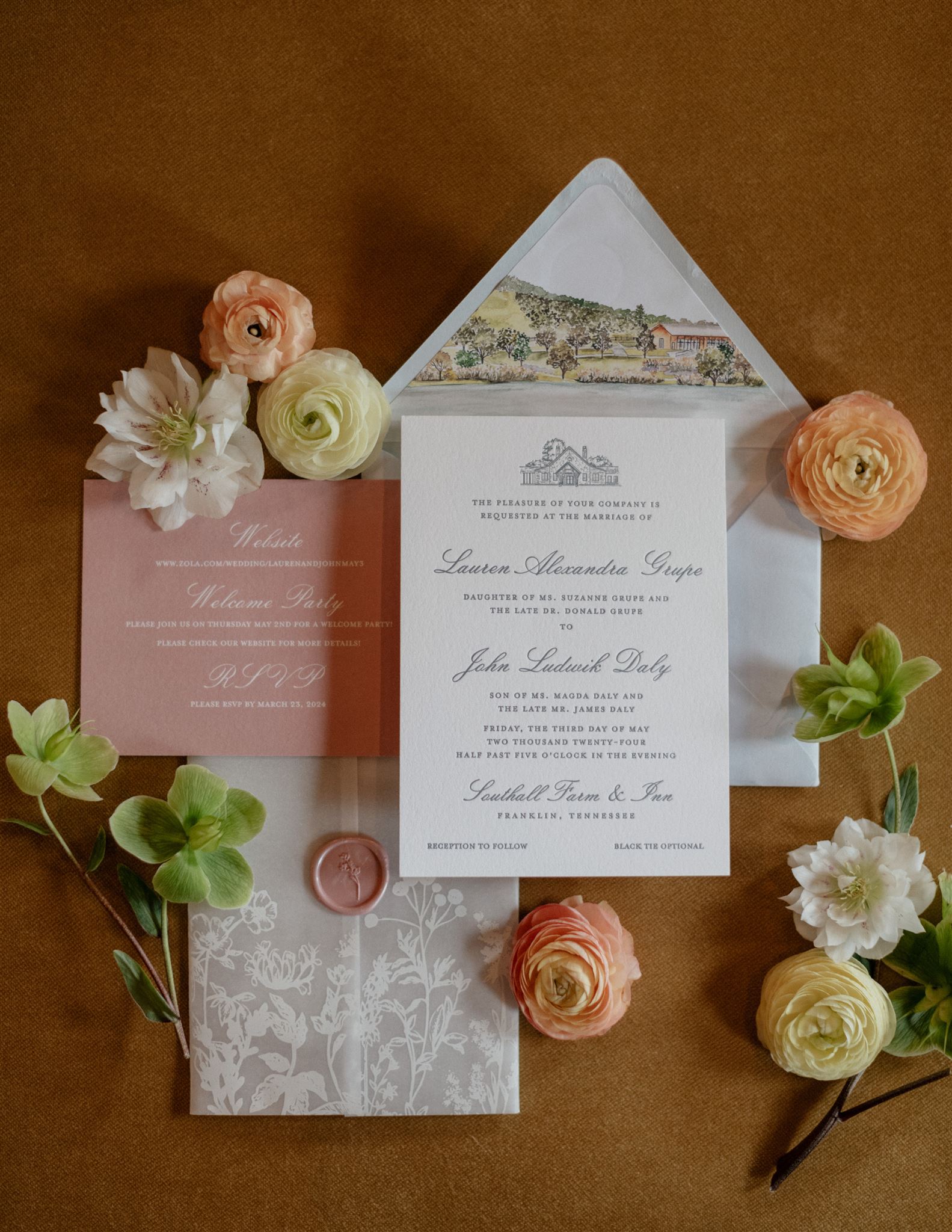
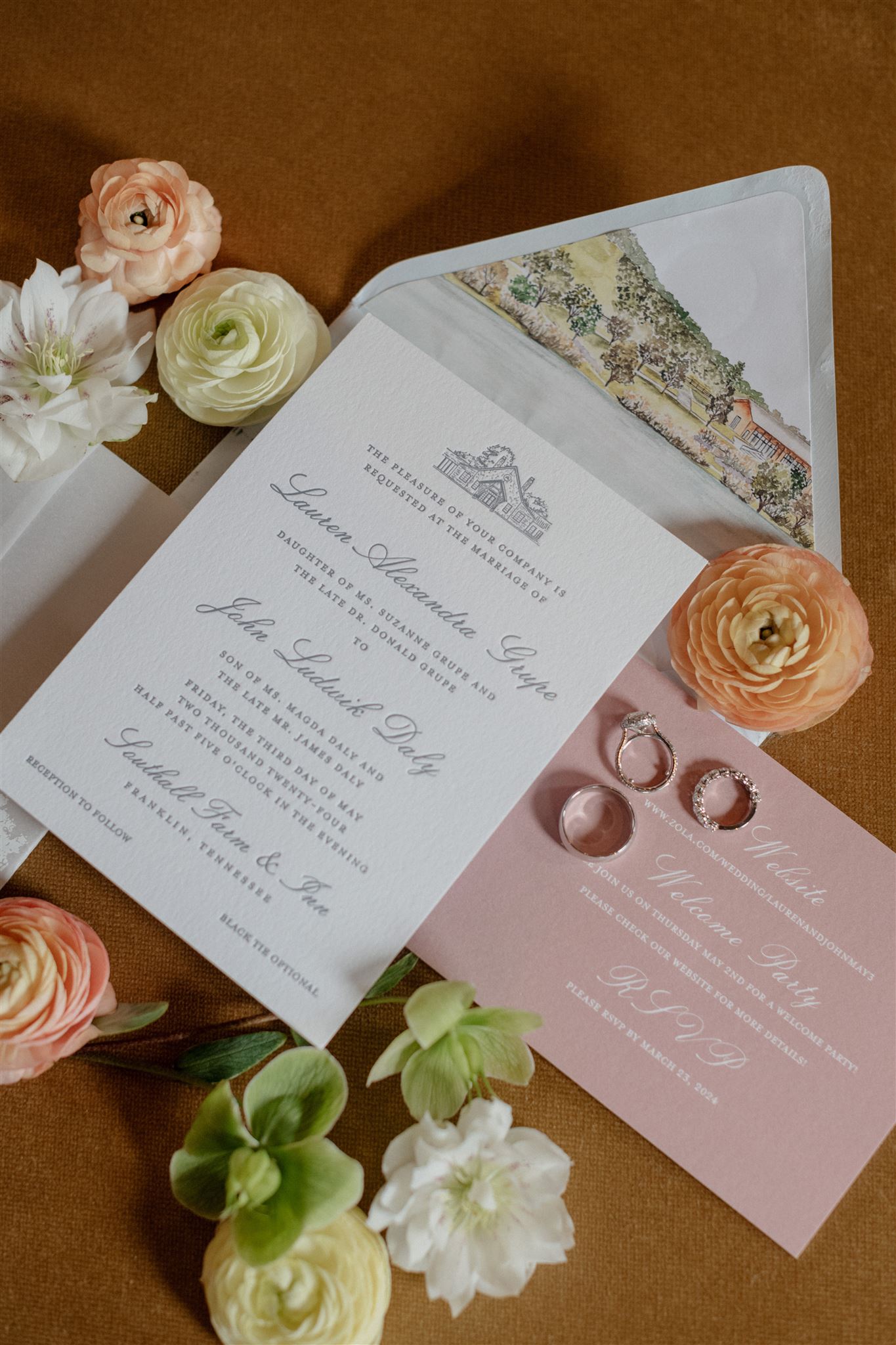
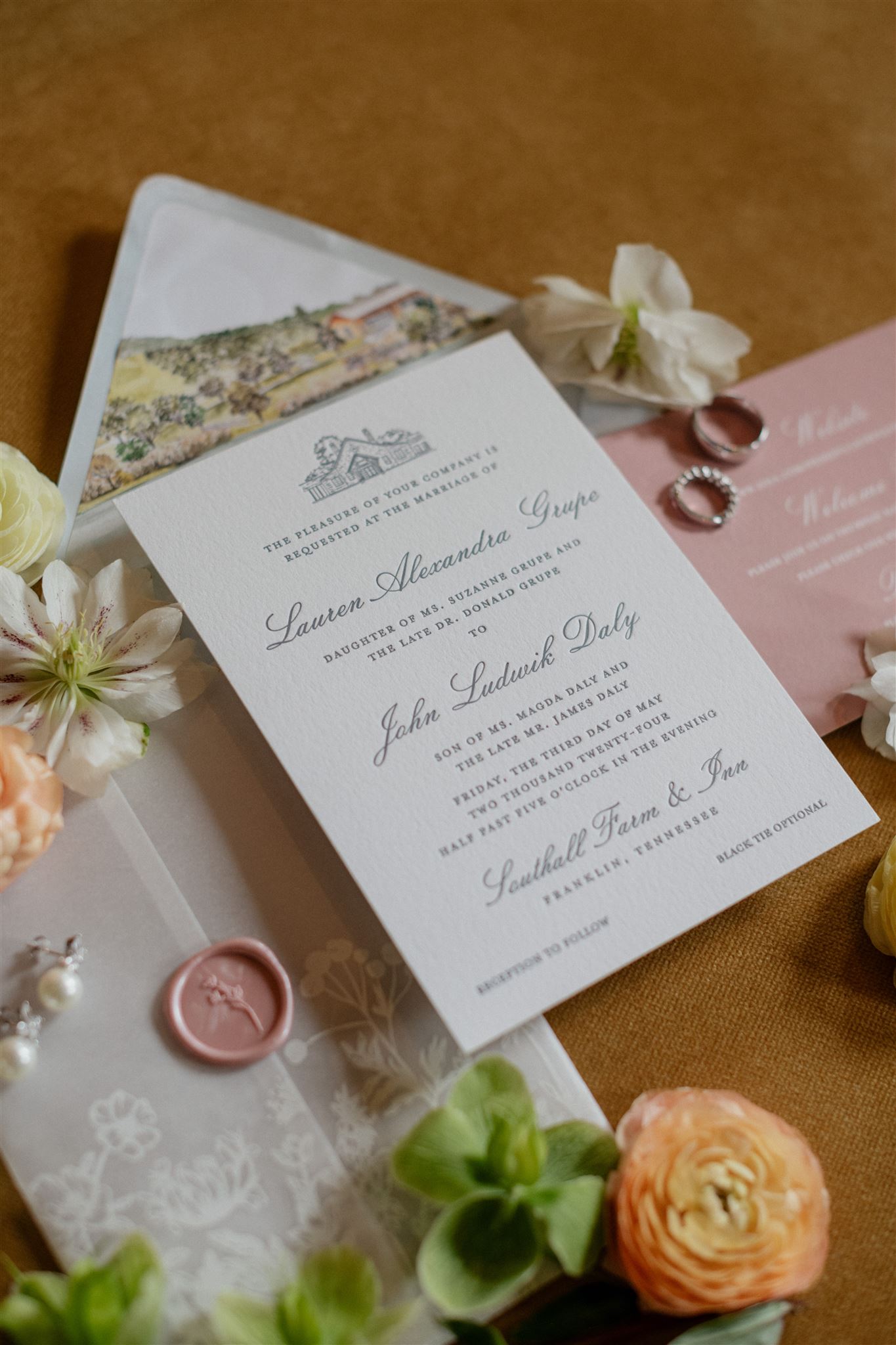
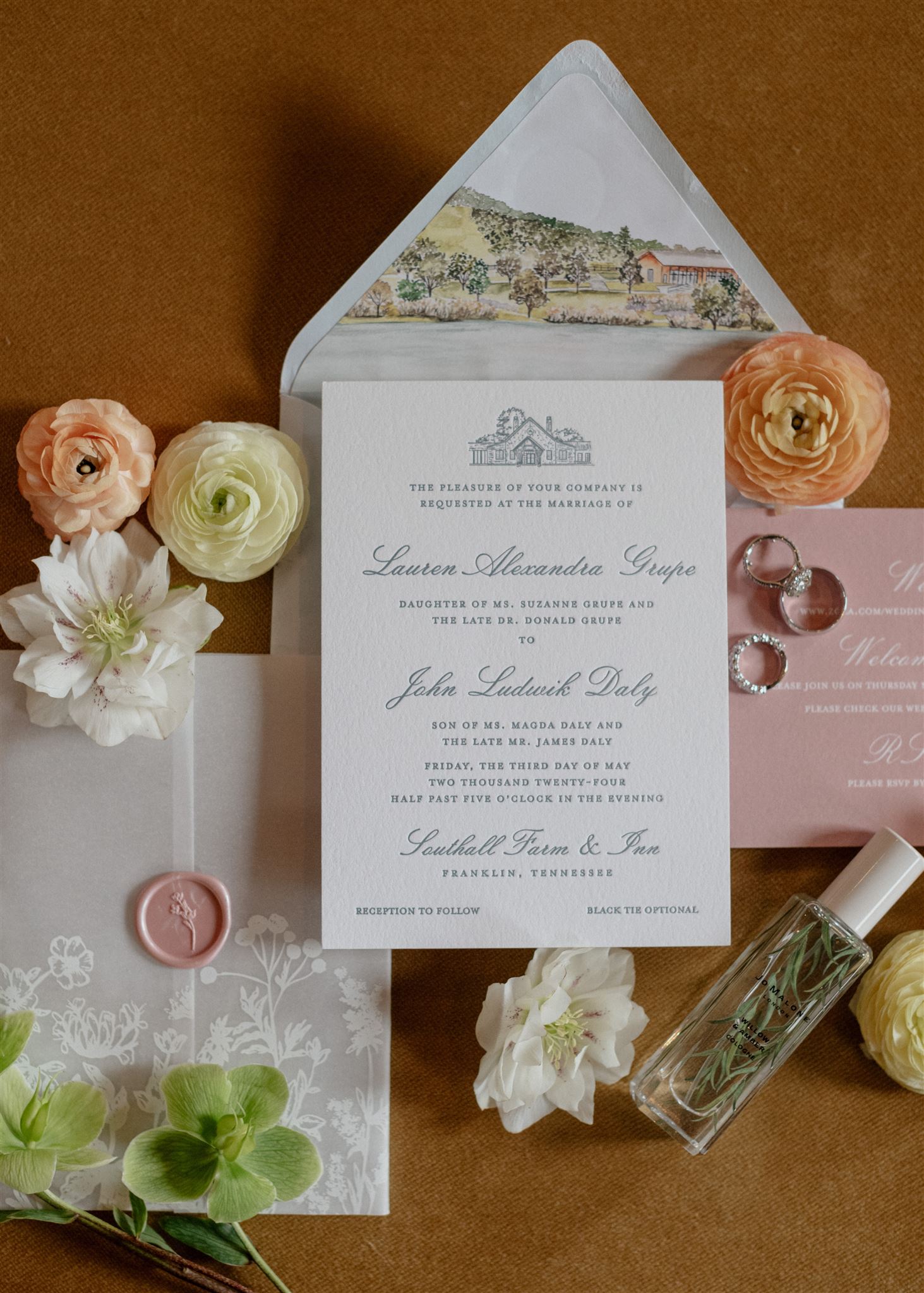
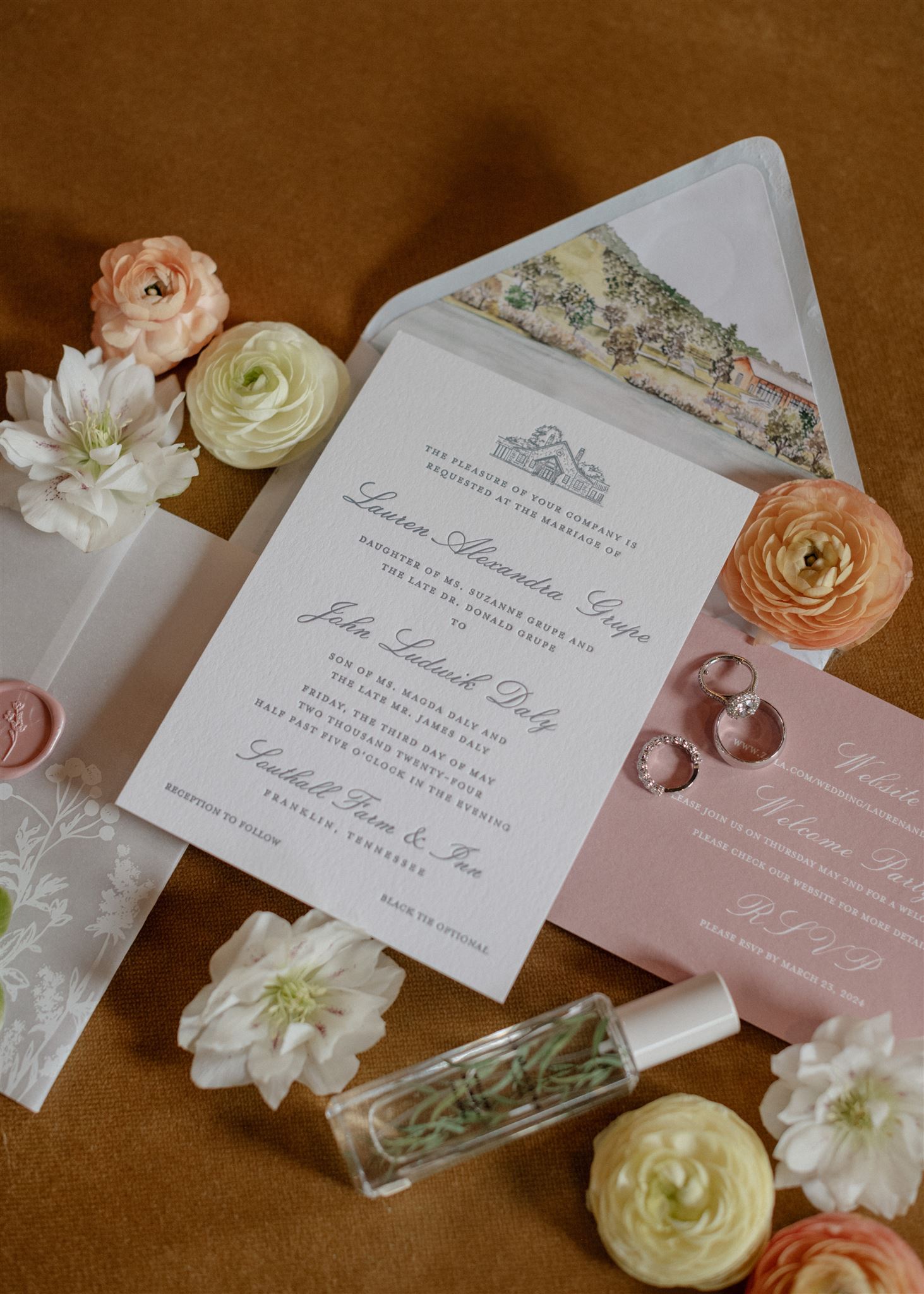
Fixed among the serene beauty of rural Franklin, TN, Southall Farm & Inn lent itself to one of the most gently breathtaking weddings we’ve been a part of. White Ink couple, Lauren and John, allowed us to create custom spring wedding details for their incredible wedding day and we were honored to do it.
Classic Invitation Suite
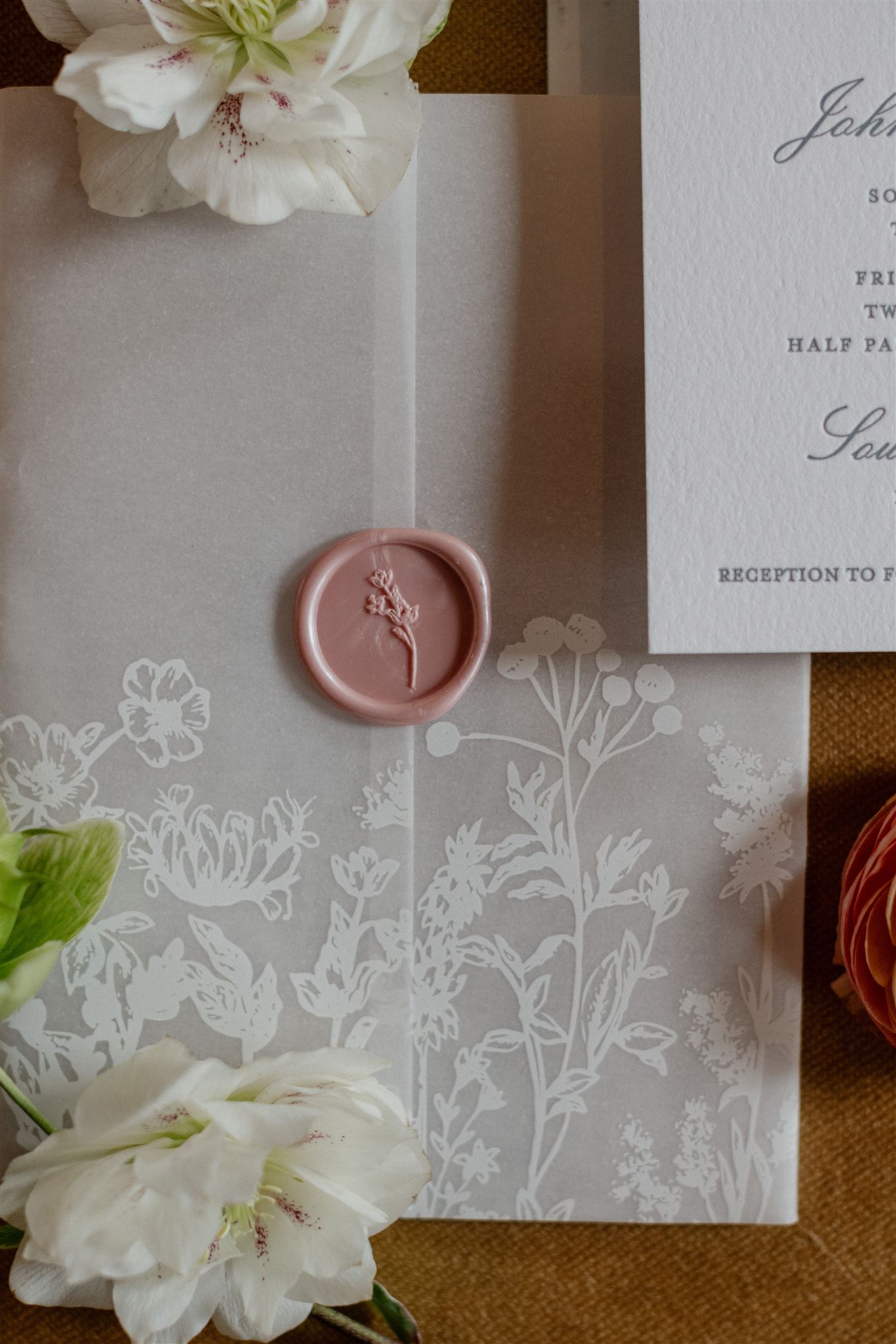
Coming in on the heels of spring, just before the summer wedding season, this special day proved to be perfect in so many ways. We began with designing Lauren and John’s impressive and quintessentially classic invitation suite. There is a notable balance of boldness and delicacy as the envelope liner with a print of the gorgeous foothills of the Southall venue jumps right off the paper while the vellum sleeve softly wraps around the classic letterpressed invitation. A perfectly placed, dusty-rose, wax seal to close the vellum wrap added an extra charm that effortlessly tied the suite together. It really was the perfect invite.
Notice that the custom wax seal not only matched the dusty rose color of the RSVP card, but it also boasts florals to match the ones found on the vellum wrap. There is nothing that elevates a wedding like tying together details throughout!
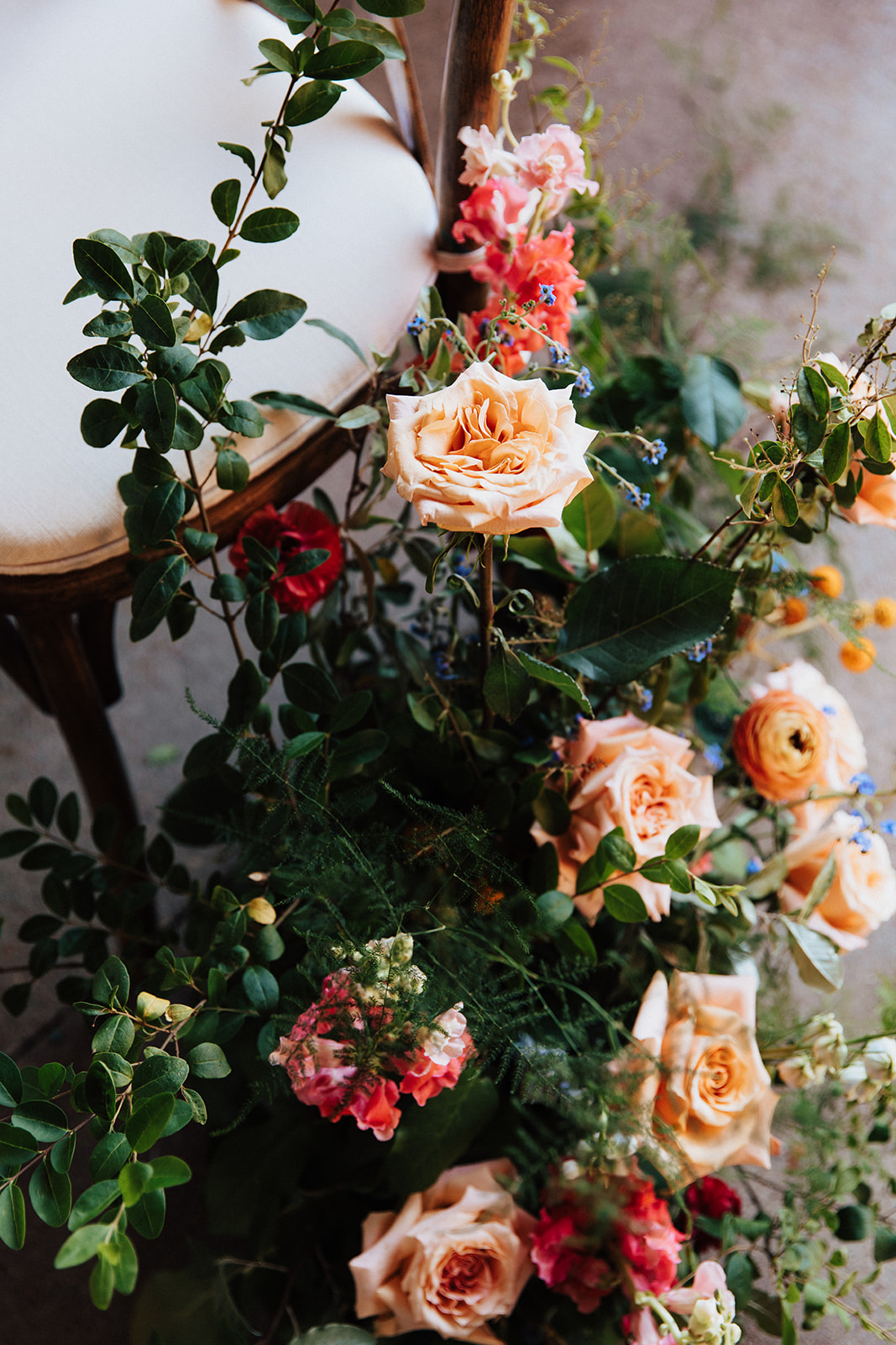
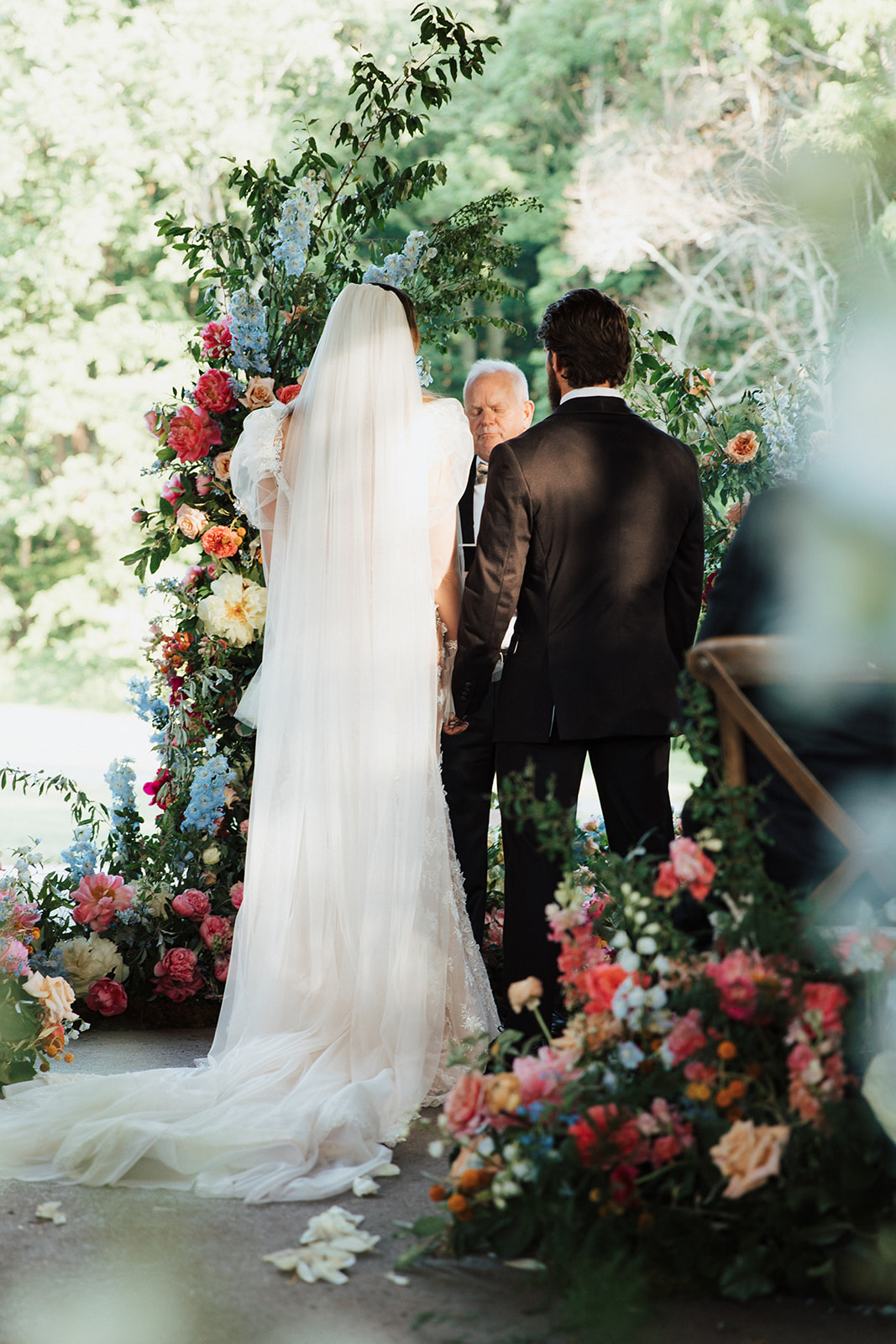
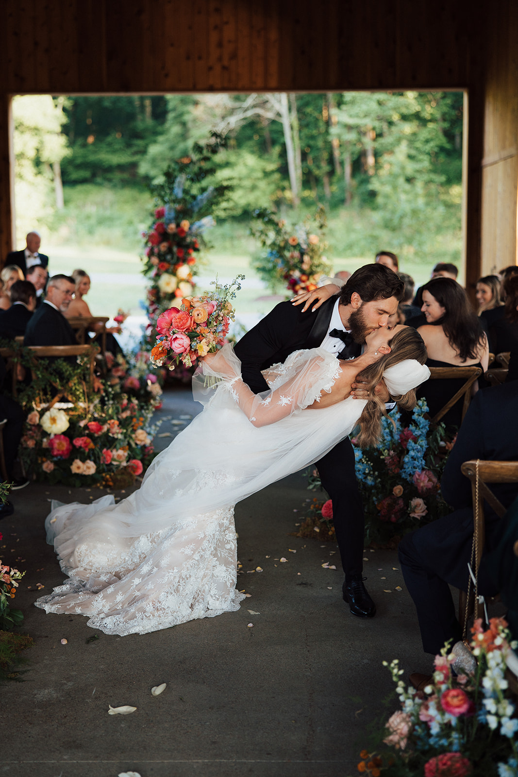
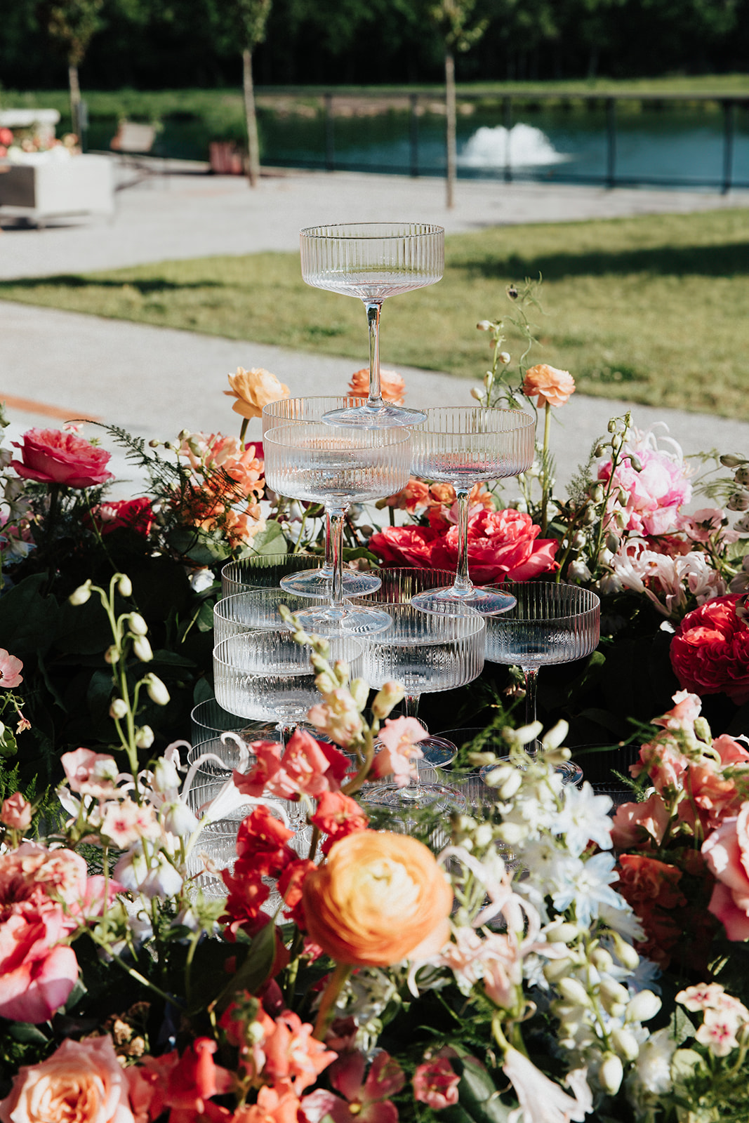
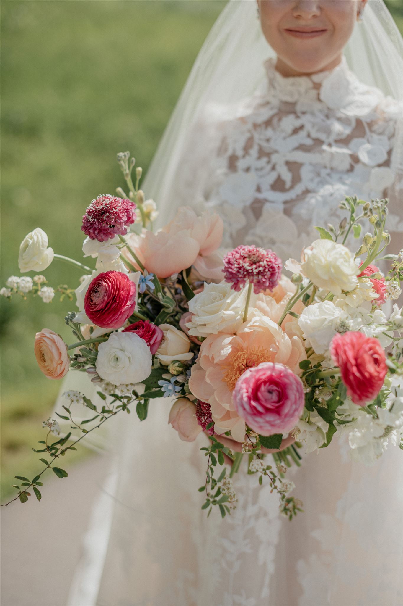
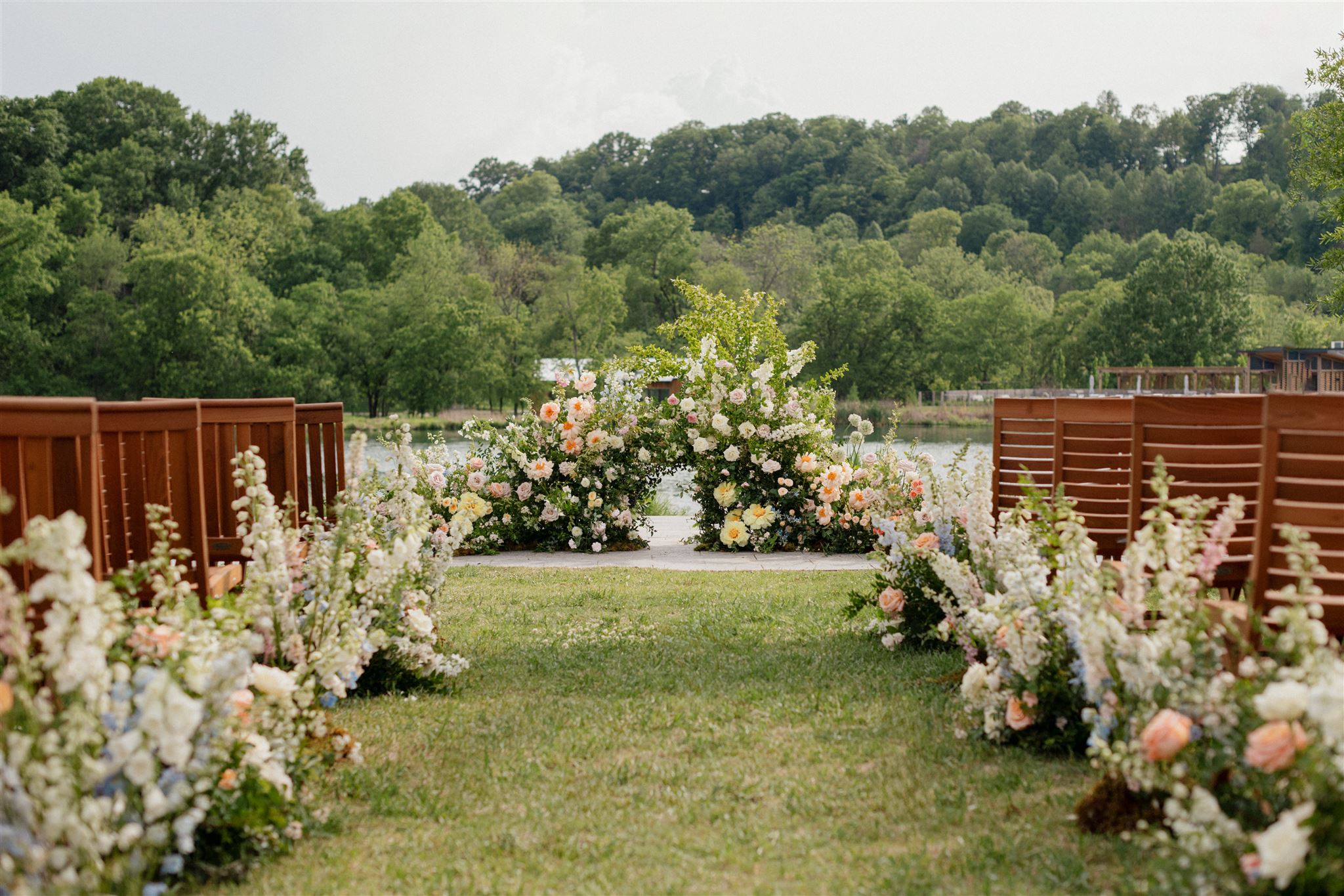
From the bride’s bouquet to a cascade of florals used for the arbor, we couldn’t get enough of the gorgeous flowers bursting through each part of this spring wedding!
Chic, sleek, and simple – the bar menu that we prepared for Lauren and John fit perfectly into the bar’s clean look and layered textures. Guests definitely enjoyed the inviting vibe of this delicious cocktail hour. How could you not?
We helped guests to their seats with a tastefully designed seating chart. I adore the soft gray lettering against the white signage as flower arrangements kissed the bottom of the chart. Florals and signage just go together, there’s just nothing else like it!
Custom Spring Wedding Details
One of the most exciting things for us at White Ink is when our couples request the “designer’s choice” for some of their details and signage. Sometimes, brides and grooms know exactly what they’re looking for with these types of details and decor. However, there are others who just aren’t sure what would look best. We LIVE for these moments! Not only is this what we do, but more than that, it means that our couples completely trust us and our experience.
Customized Wedding Reception Details
For Lauren and John, we were happy to flex our creative muscles to come up with these stunning table numbers for their reception. We surprised them with a frosted acrylic to match the vellum wrap we made for the invitations, as well as etched florals from the vellum wrap. We then mounted it against a laser-cut number in white acrylic to natural wood. Designer’s choice and a chef’s kiss.
Menus are another great opportunity for brides and grooms tie in special details. Lauren and John chose the same letter press wording and hue of that of their wedding invites.
These menus were simply made for this tablescape as they tucked effortlessly against the napkins and place settings. Never stealing the show, only elevating it.
Lauren and John were a delight to work with from start to finish! It was an honor to be a part of their big day. The couple ensured that every guest felt special, and that every detail mattered. This is a wedding that will certainly be hard to forget. A toast to the happy couple- a toast to forever. Cheers!
If you’re looking to add custom, thoughtful touches to your wedding or event, we would love to help make your vision a reality. Reach out today to learn more about our full-service design offerings—we can’t wait to create something unforgettable for you!
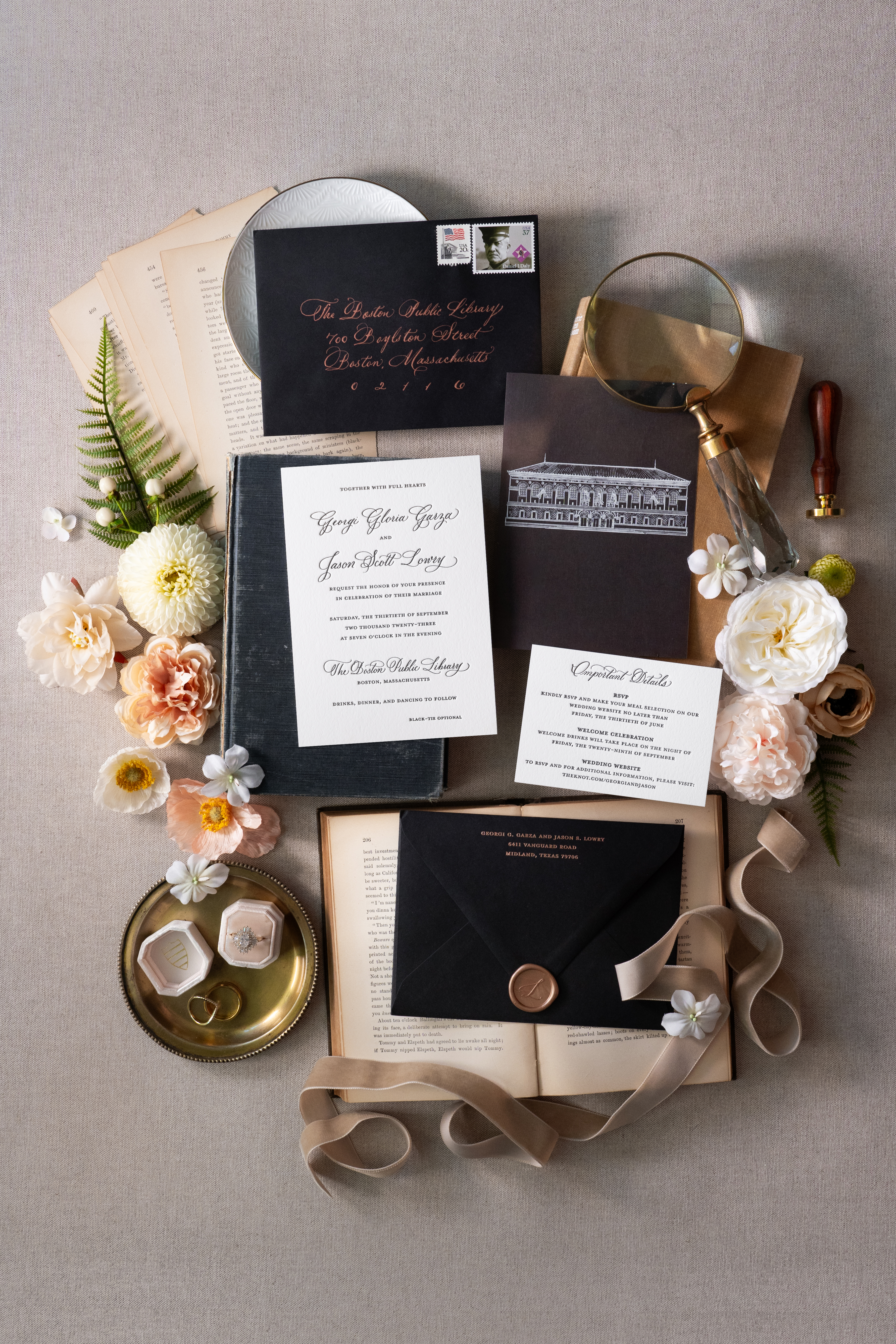
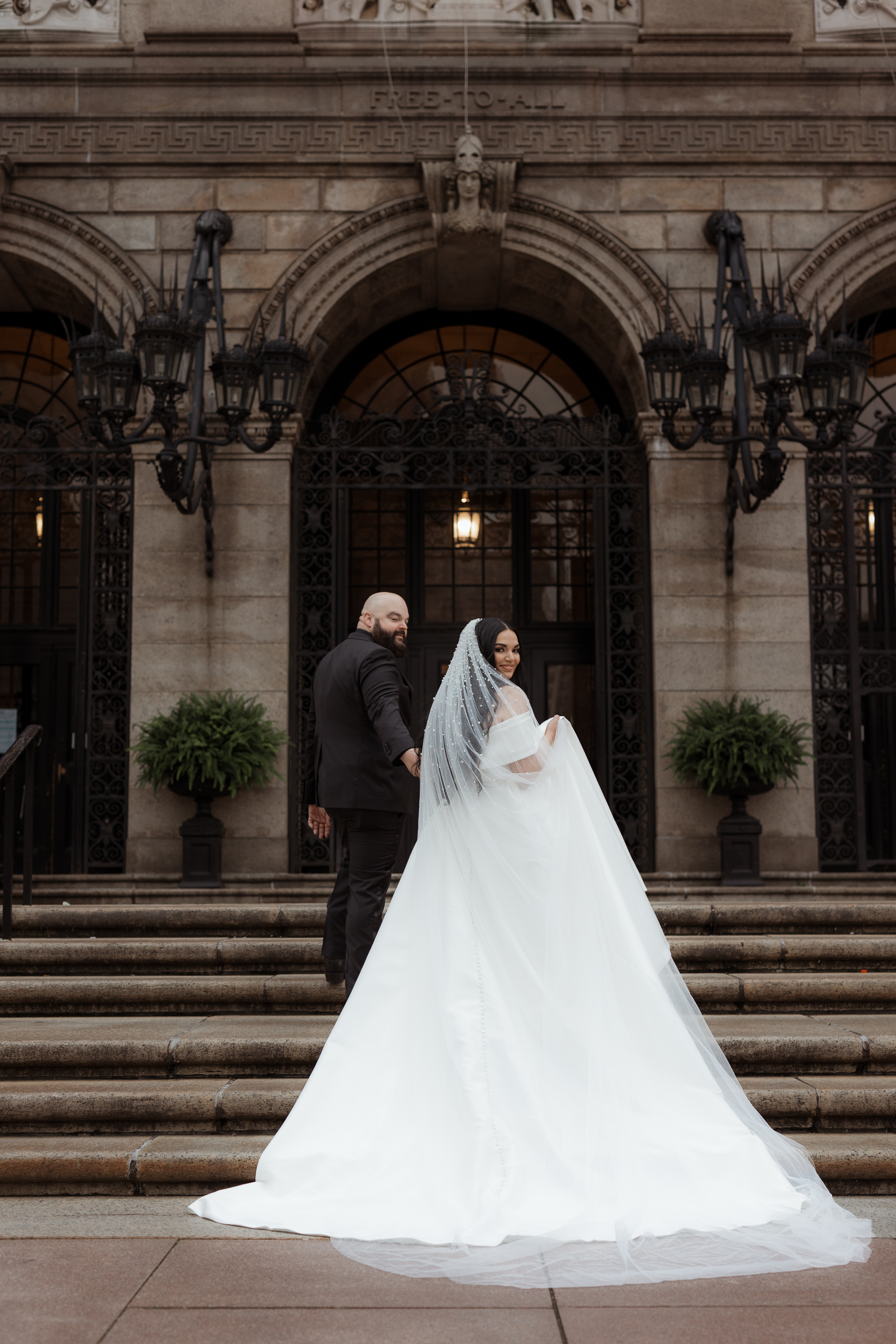
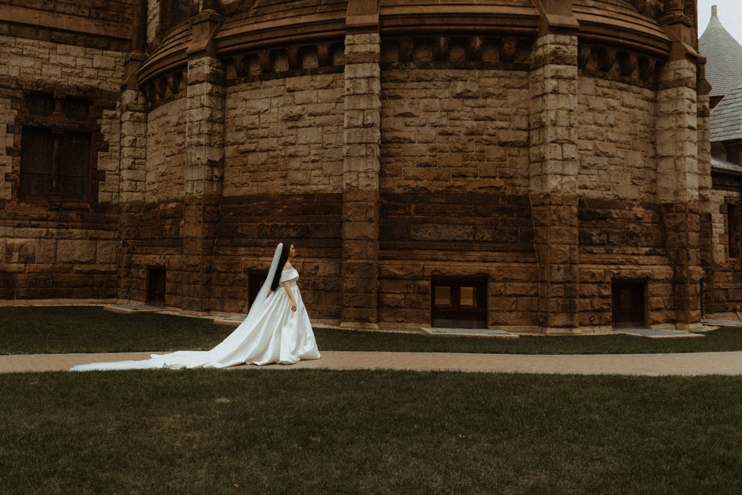
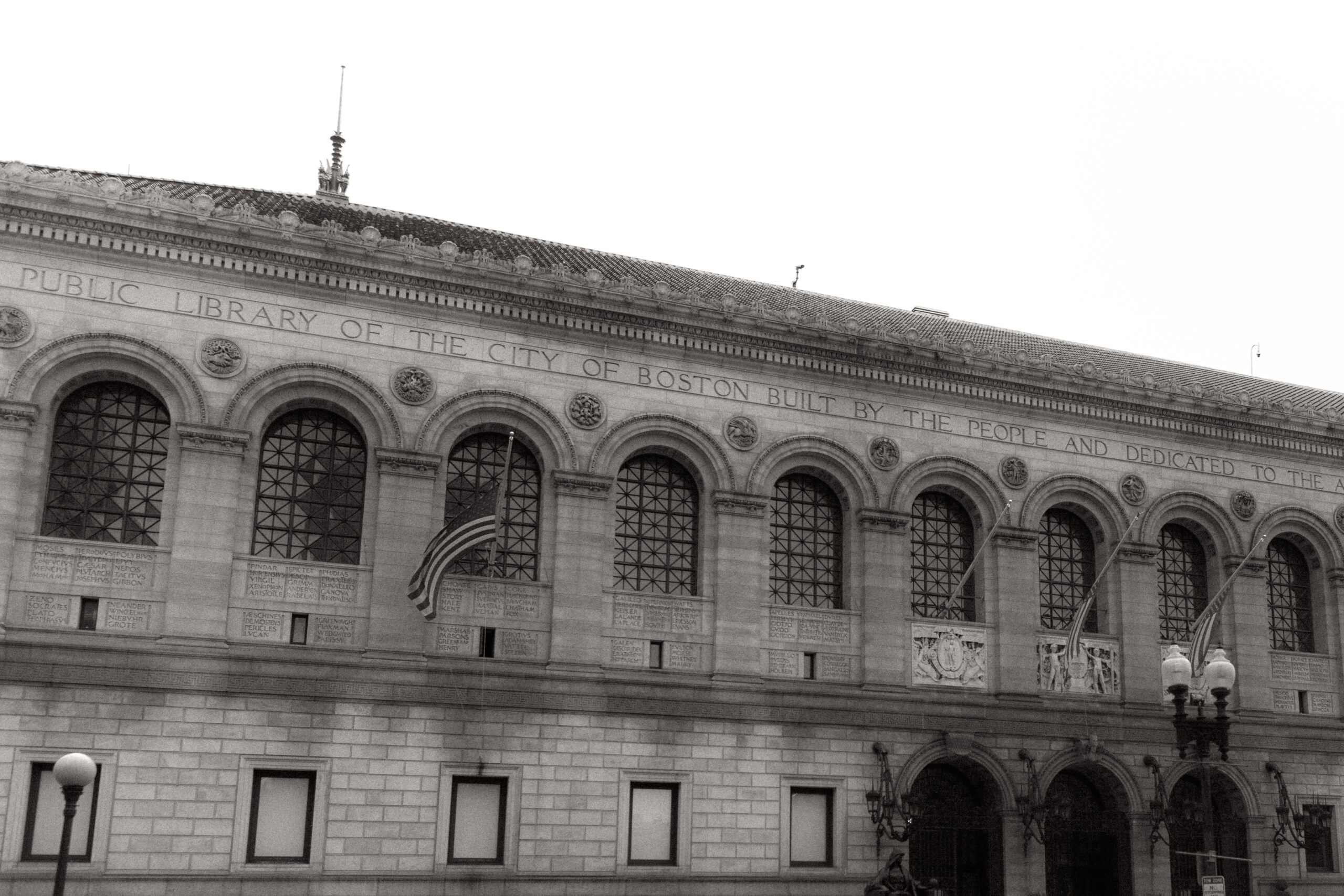
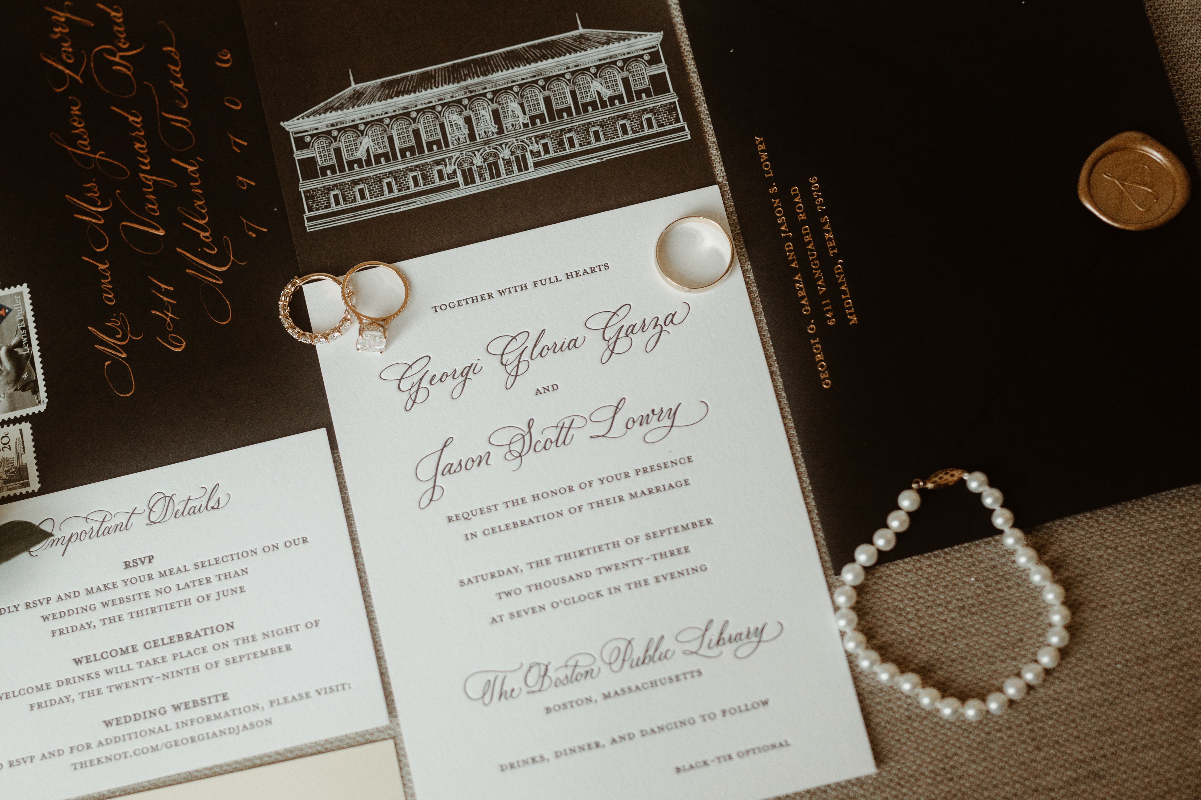
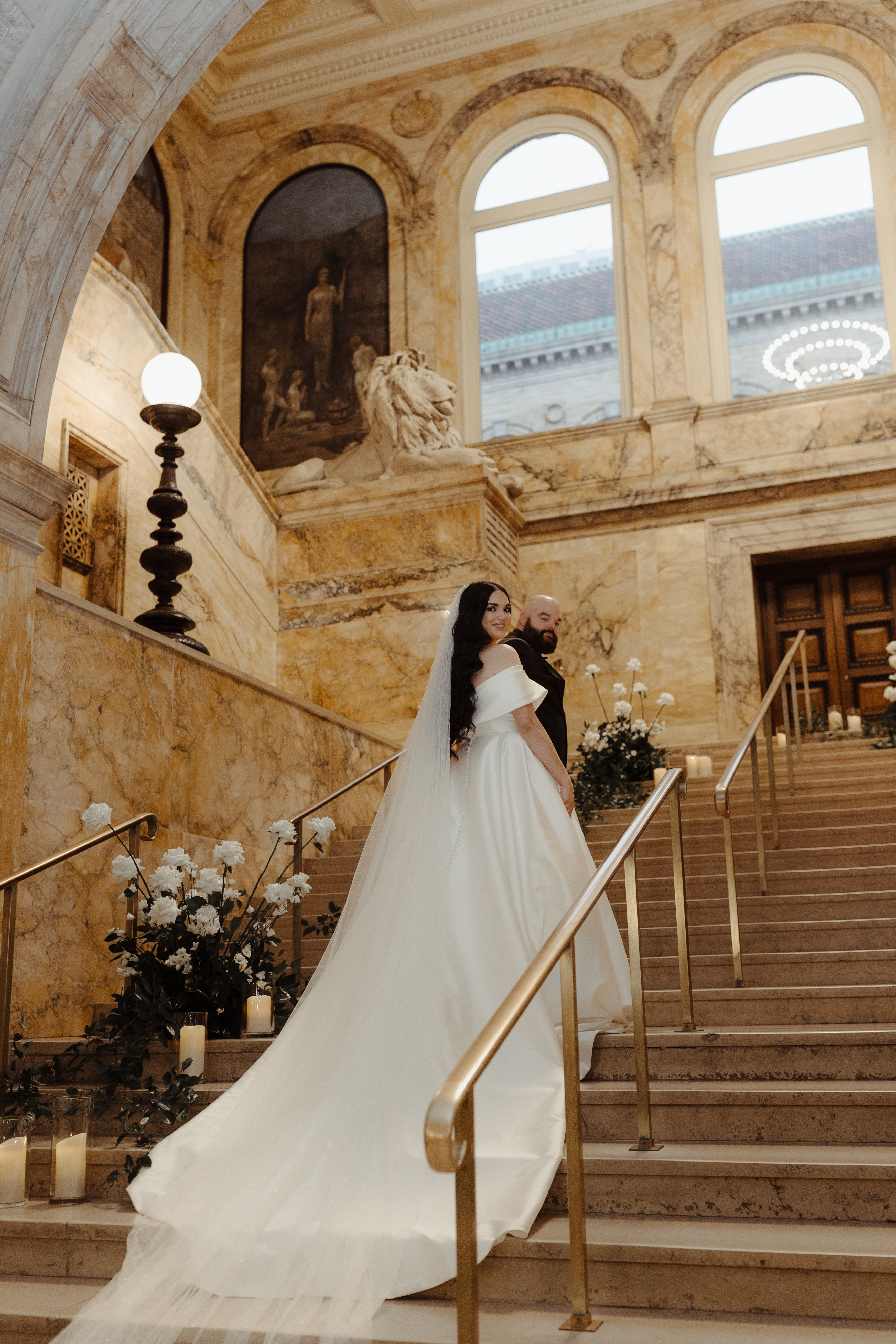
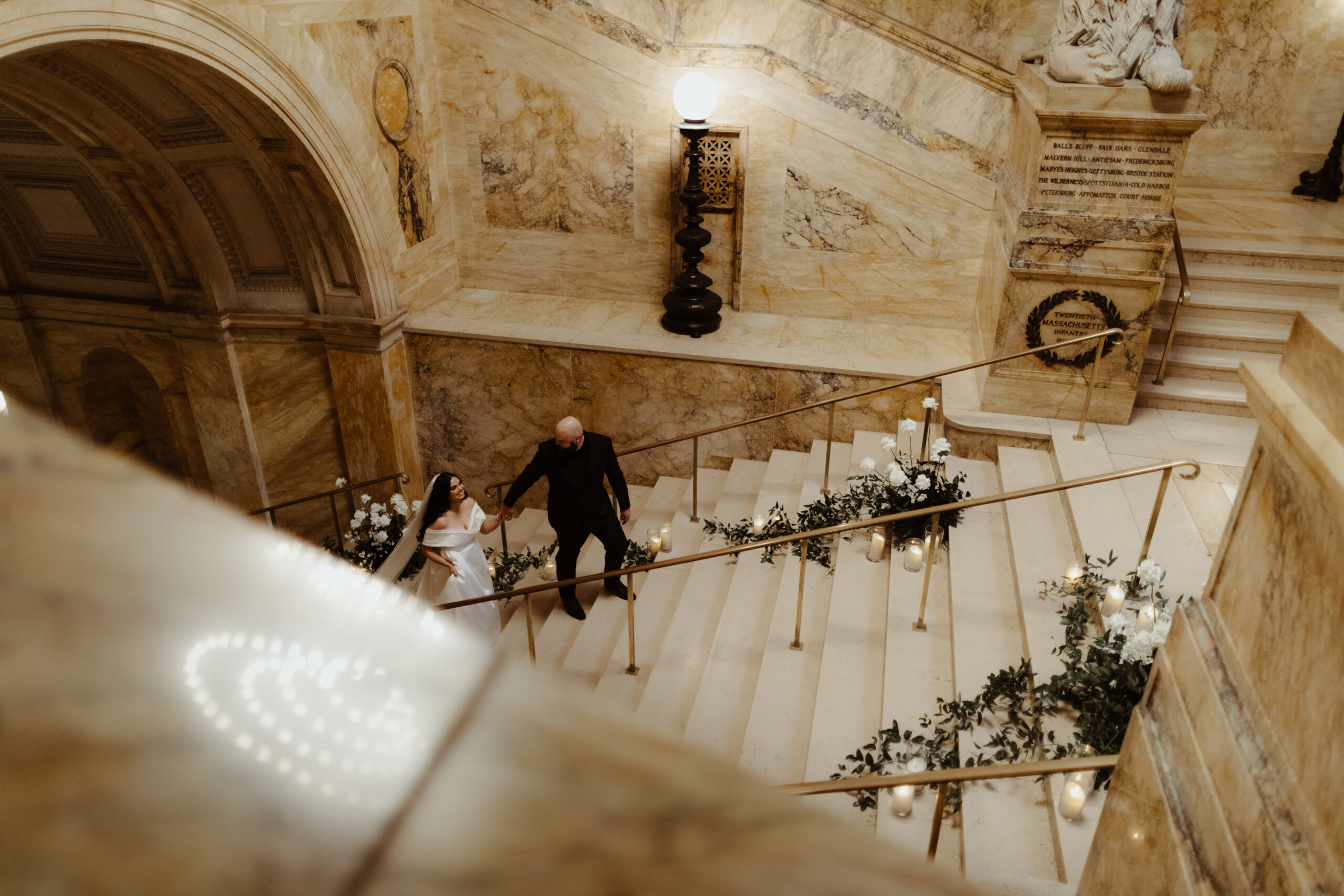
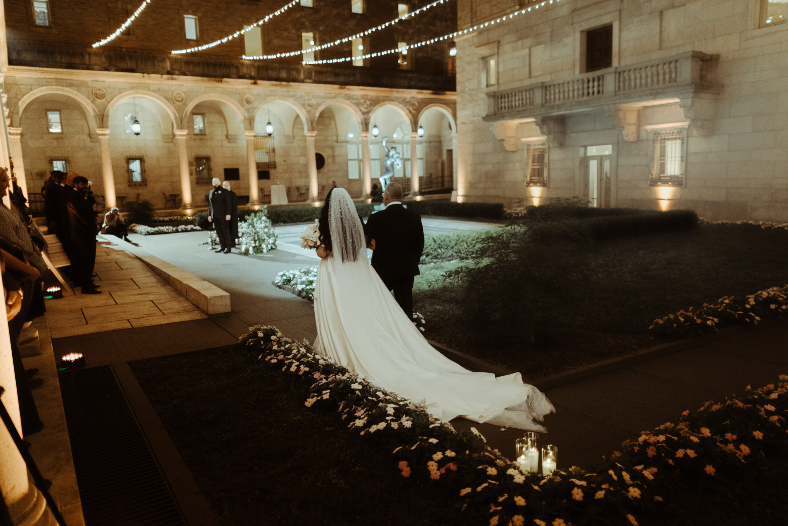
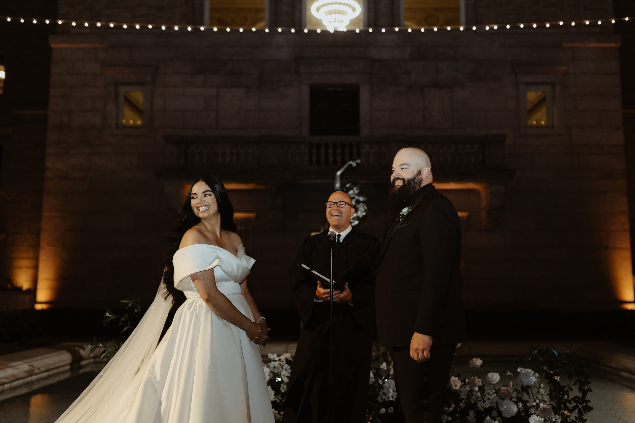
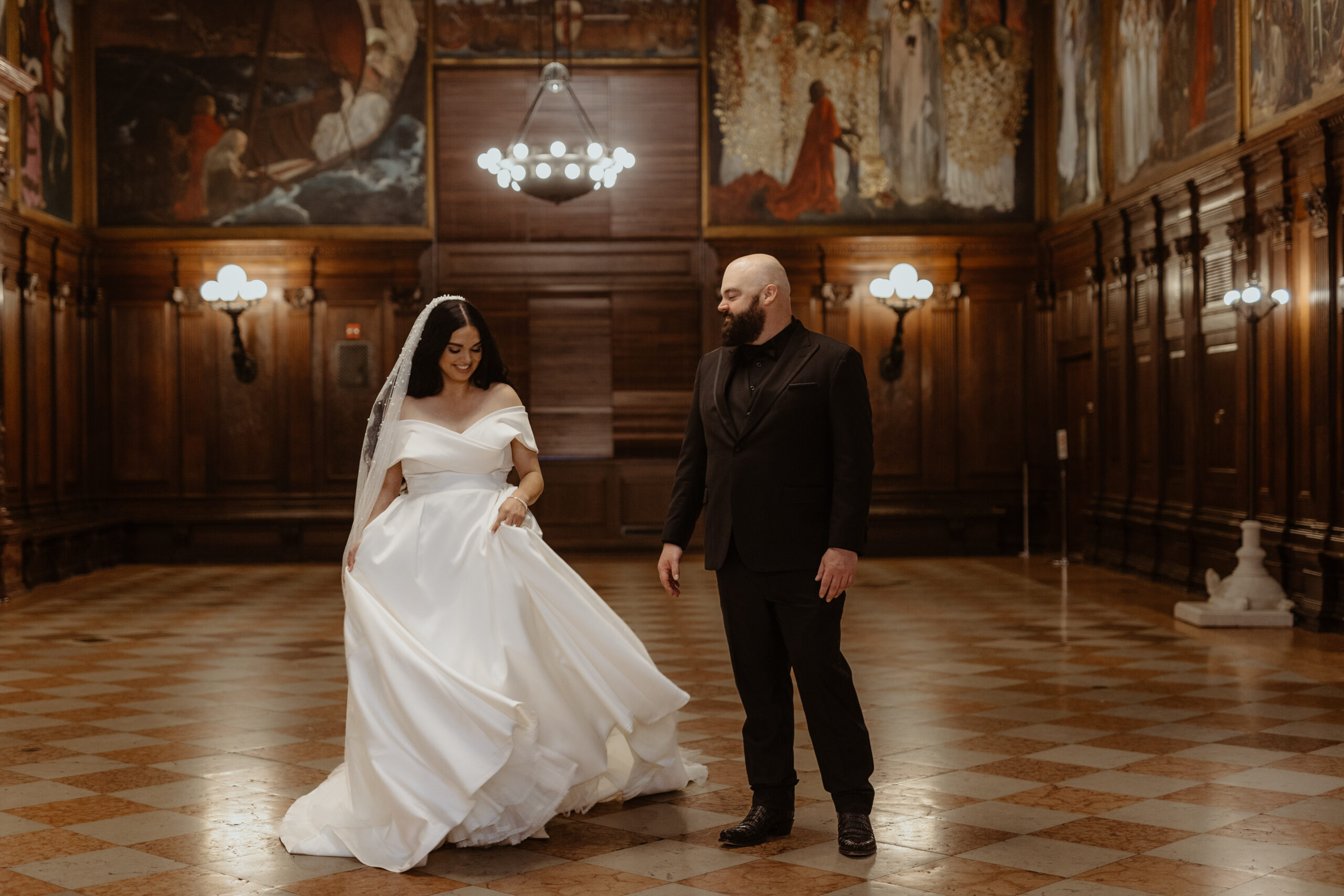
The September sky gave way to one of the most gorgeous and memorable weddings we’ve put our touch on, and it couldn’t have happened to a sweeter couple. Witnessing their Boston Public Library wedding day unfold was the cherry on top! Georgi and Jason put together an amazing wedding, and as thrilled as we were to be a part of it all, we hated to see the day come to an end. Couples like this, and weddings like this one, are something we keep close to our hearts.
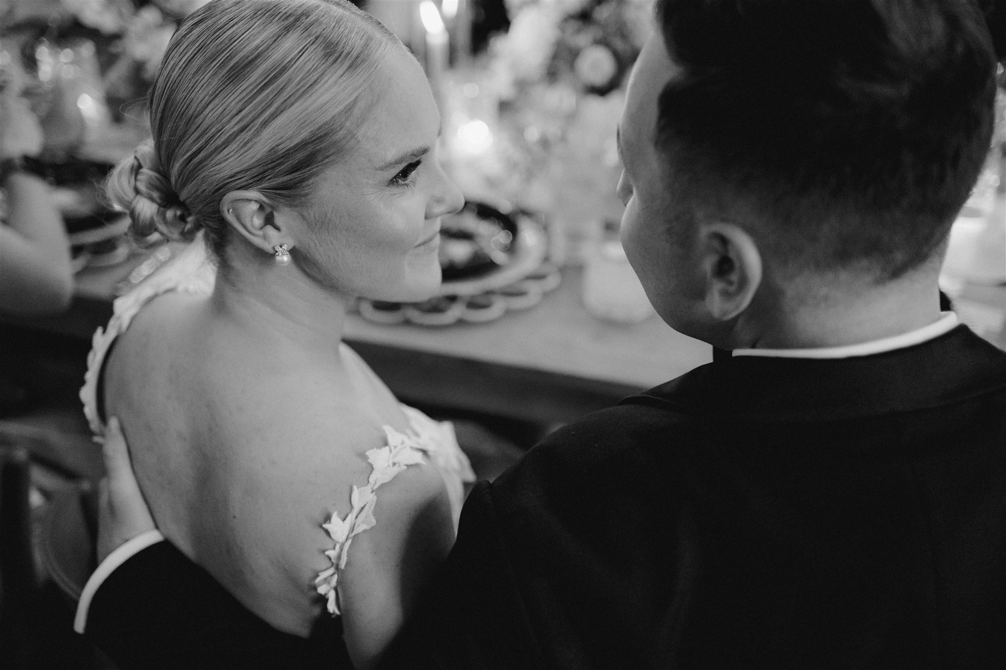
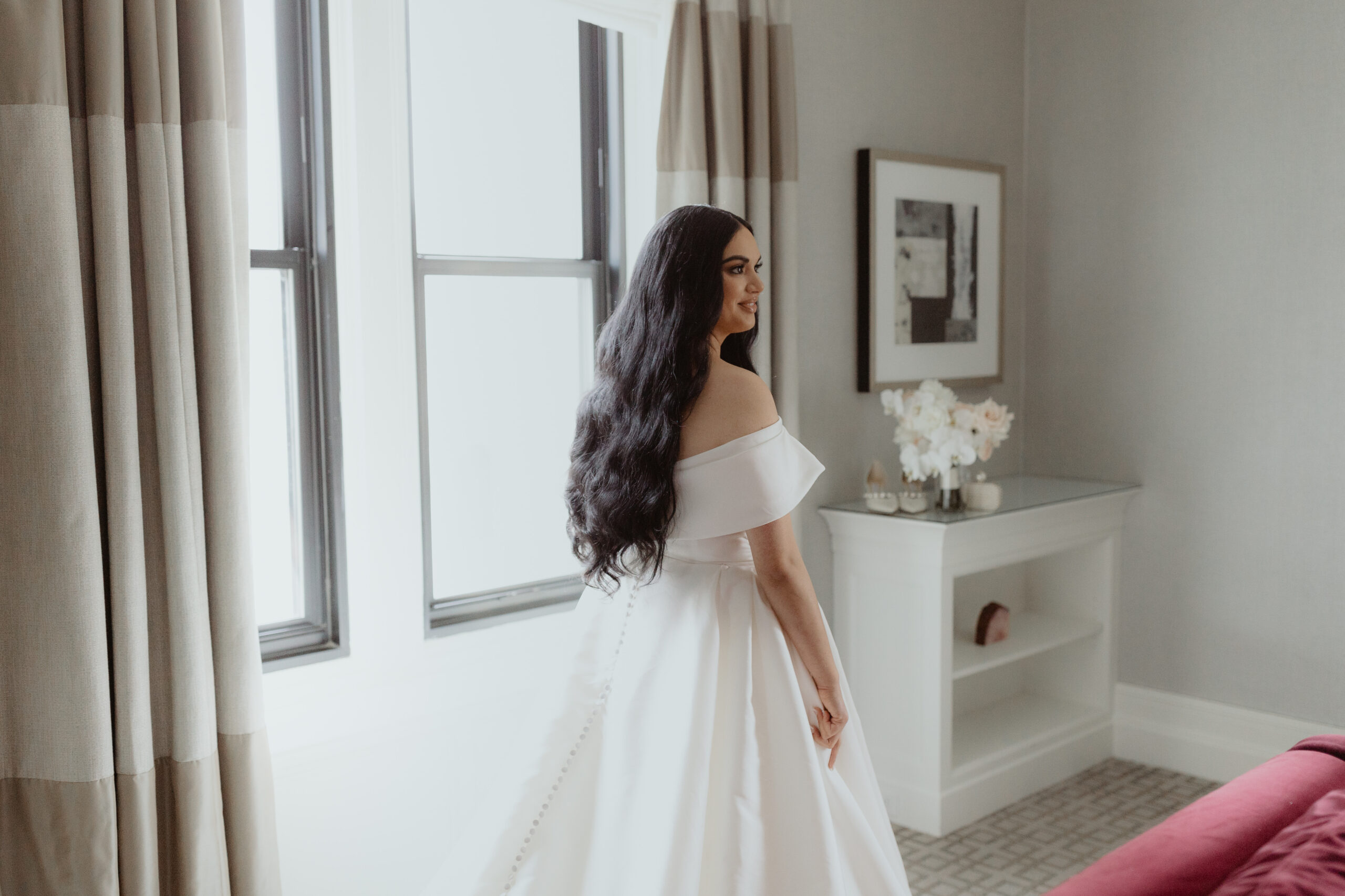
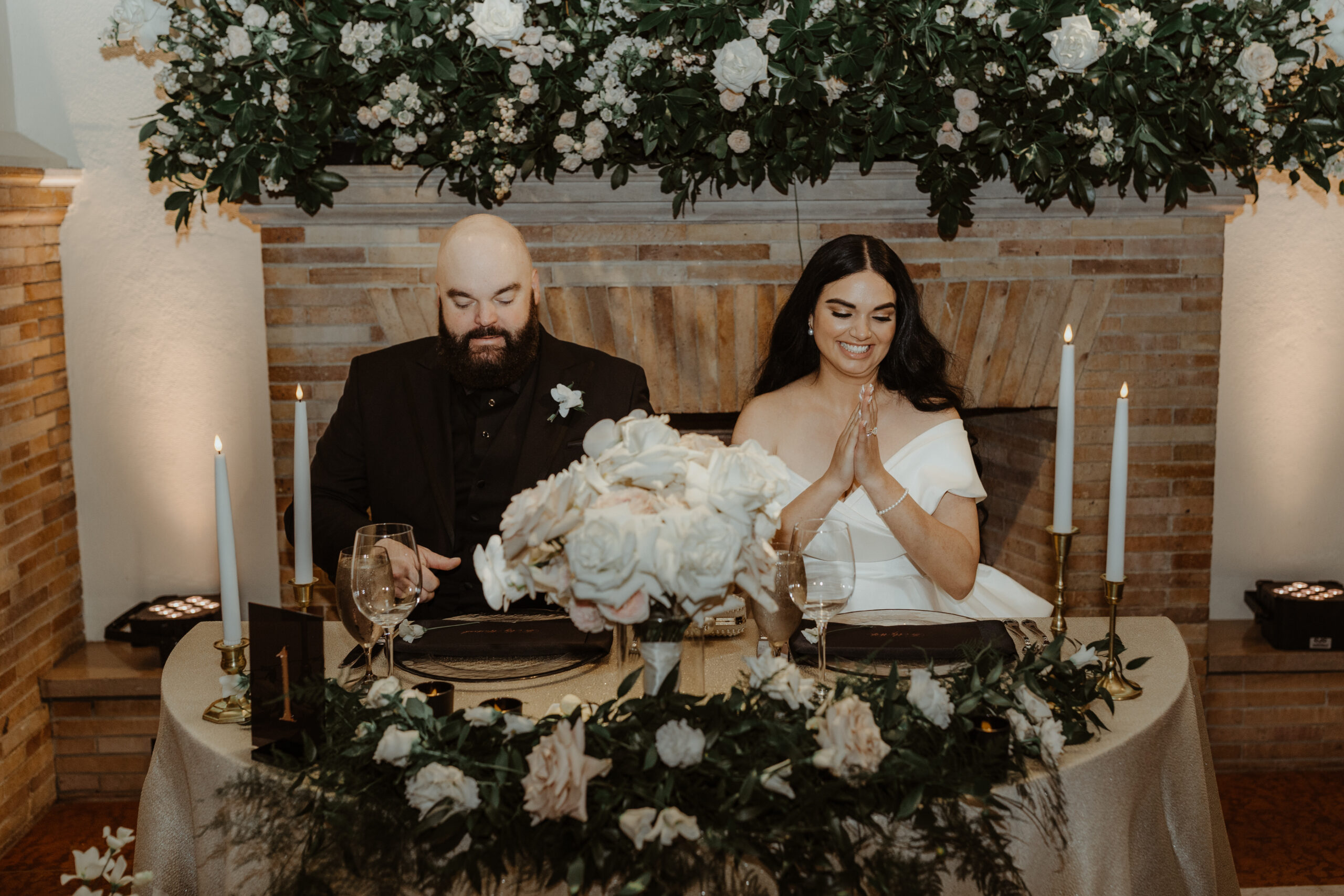
The detail that I just can’t get over- the veil! Georgi’s veil alone was enough to stop us in our tracks. Draped gently behind her long dark hair, this stunning piece needed its own moment!
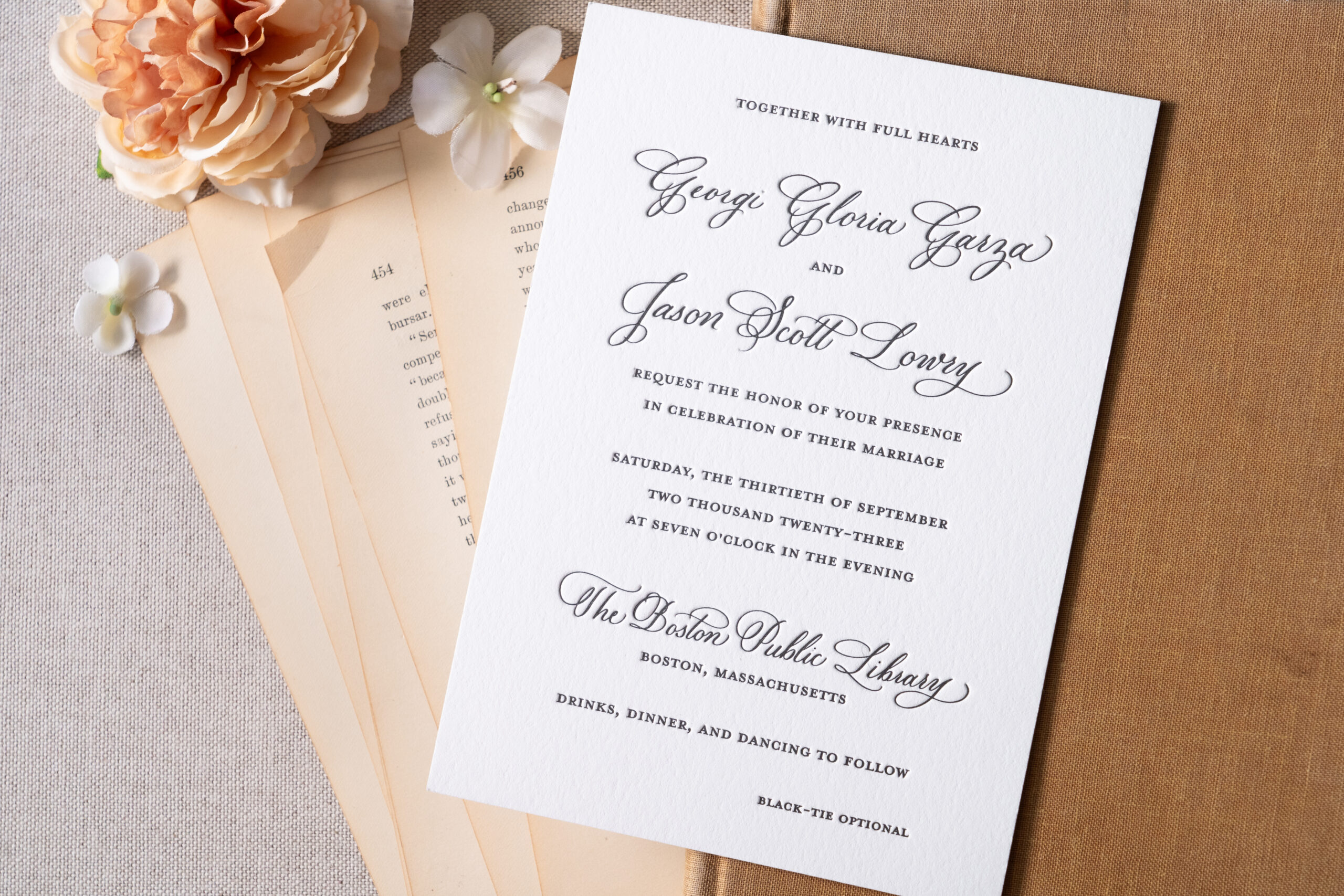
Boston Public Library Wedding Details
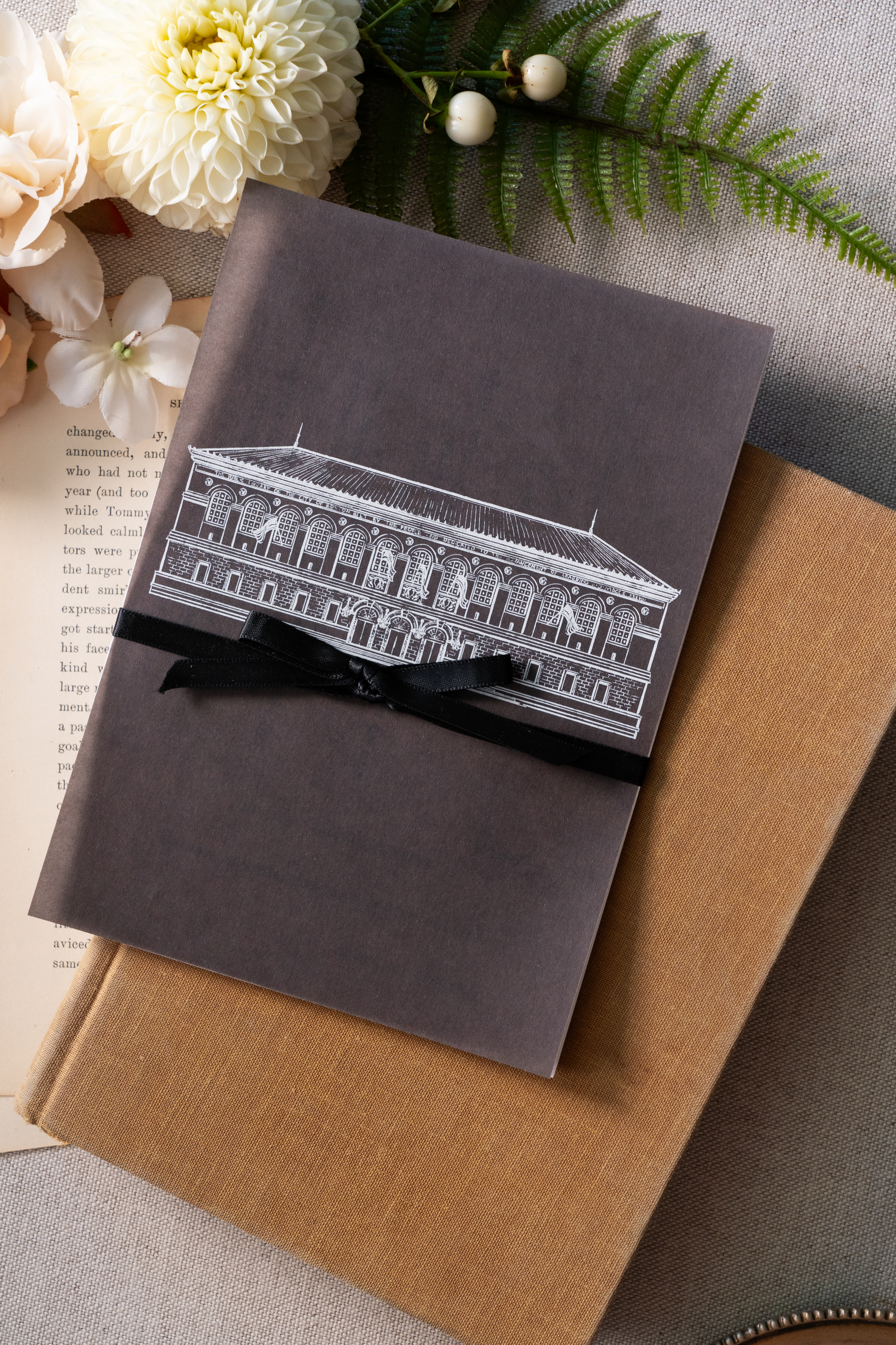
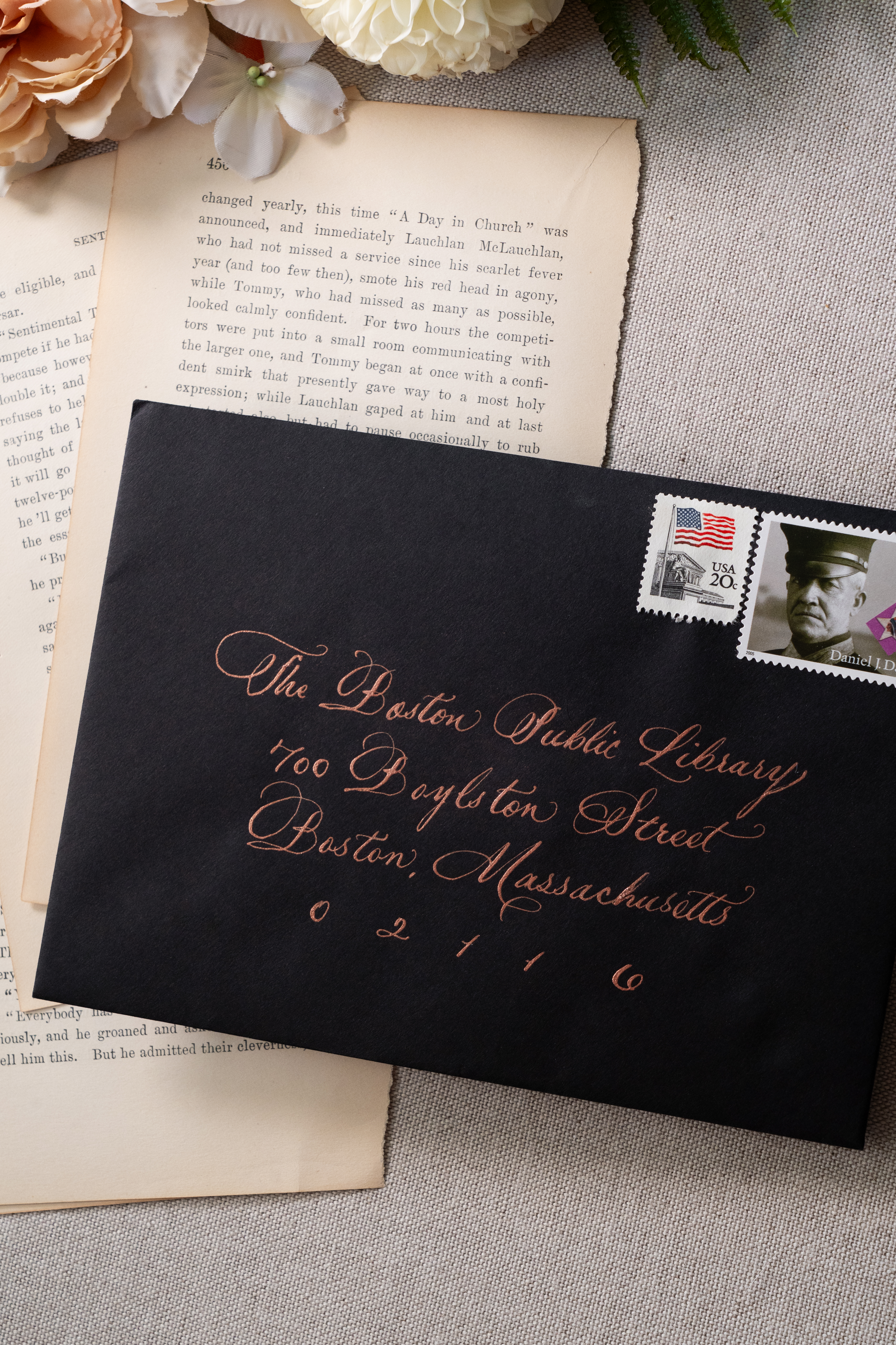
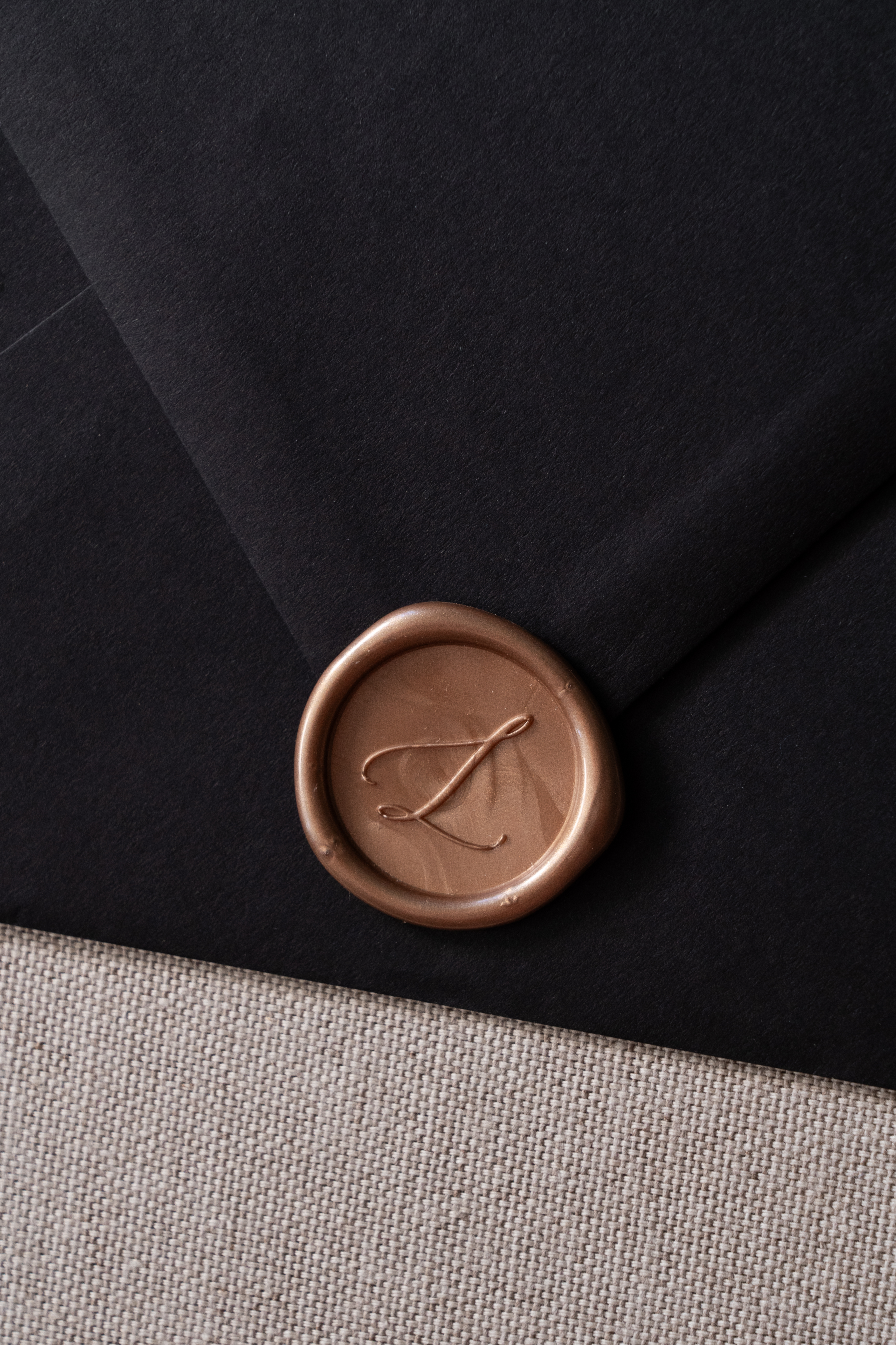
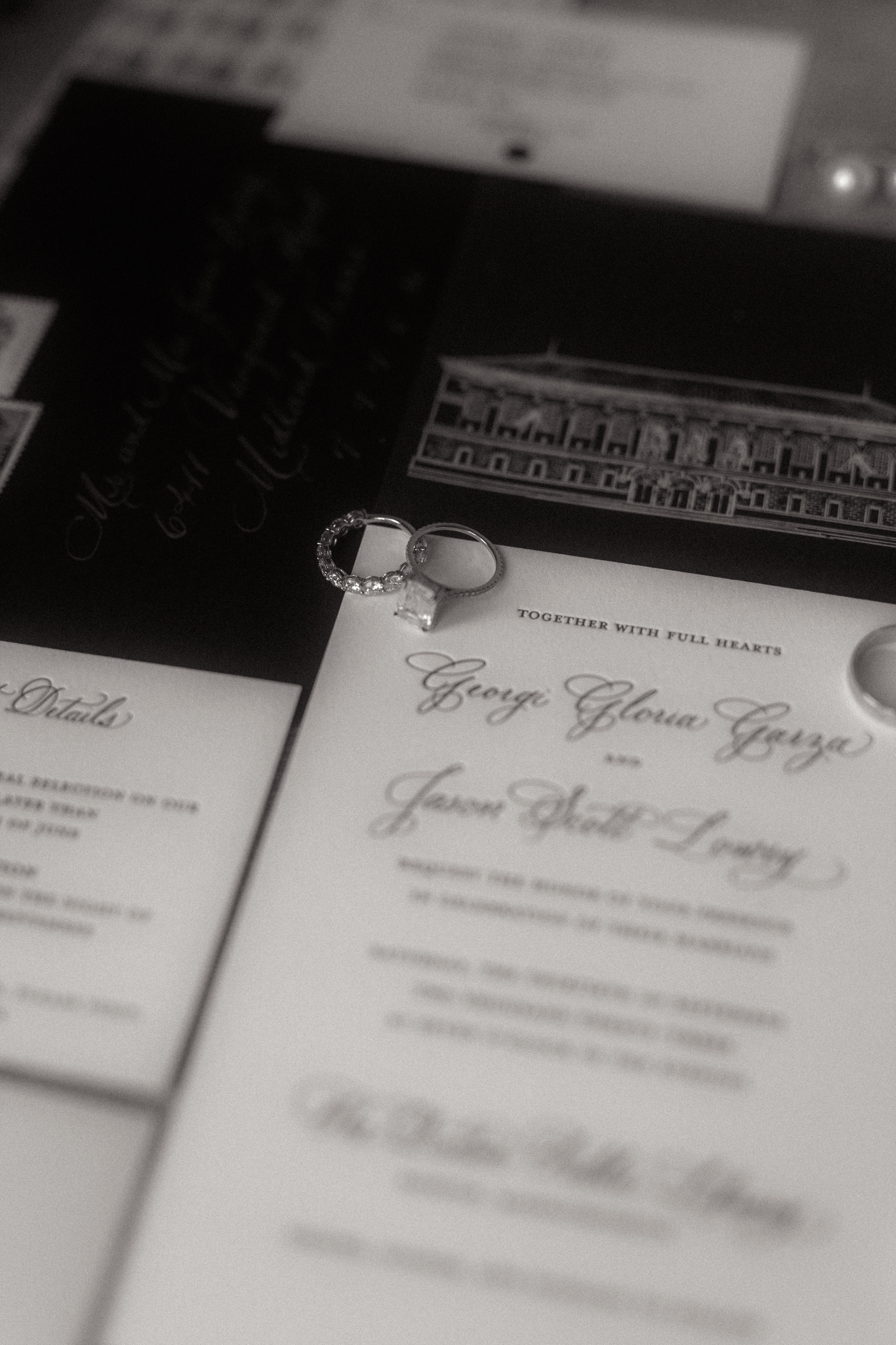
Georgi and Jason’s invitation suite boasted a seamless balance of delicate and bold features. Full calligraphy done in rose gold ink complimented the black envelopes beautifully. The invitation suite was letter-pressed with spot calligraphy on stock paper. A beautiful black, vellum overlay elevated the suite and included a custom sketch of the Boston Public Library! This was so much fun to create and one of my favorite details. Vintage postage and a custom rose gold wax seal completed this impeccable design.
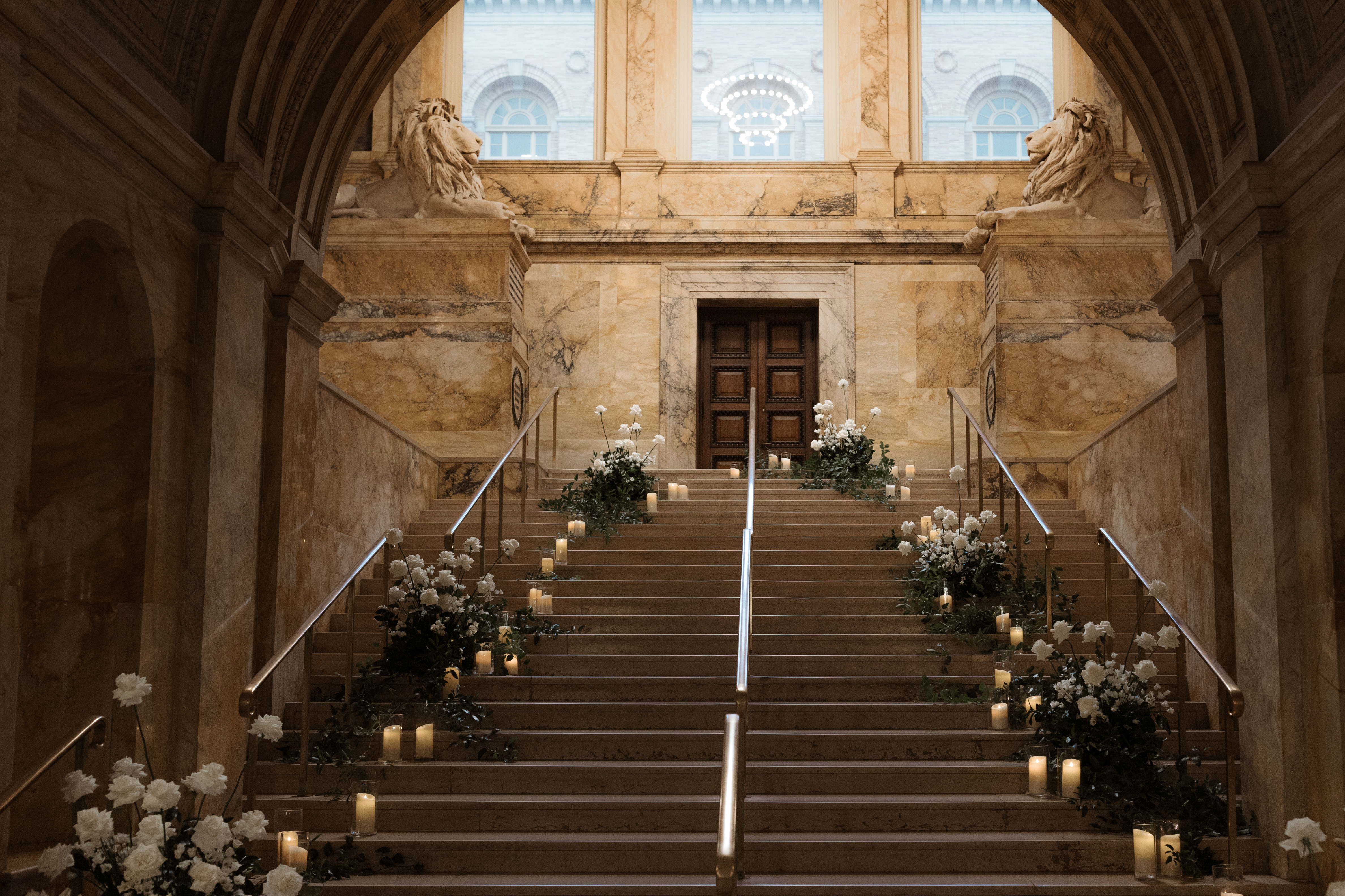
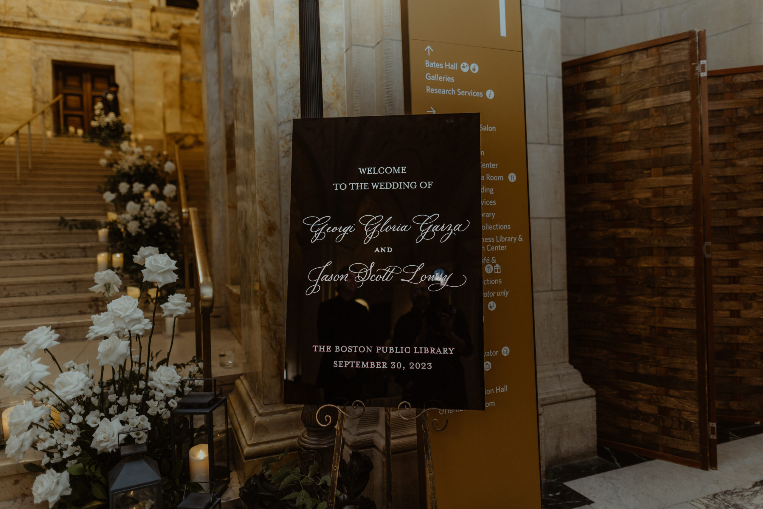
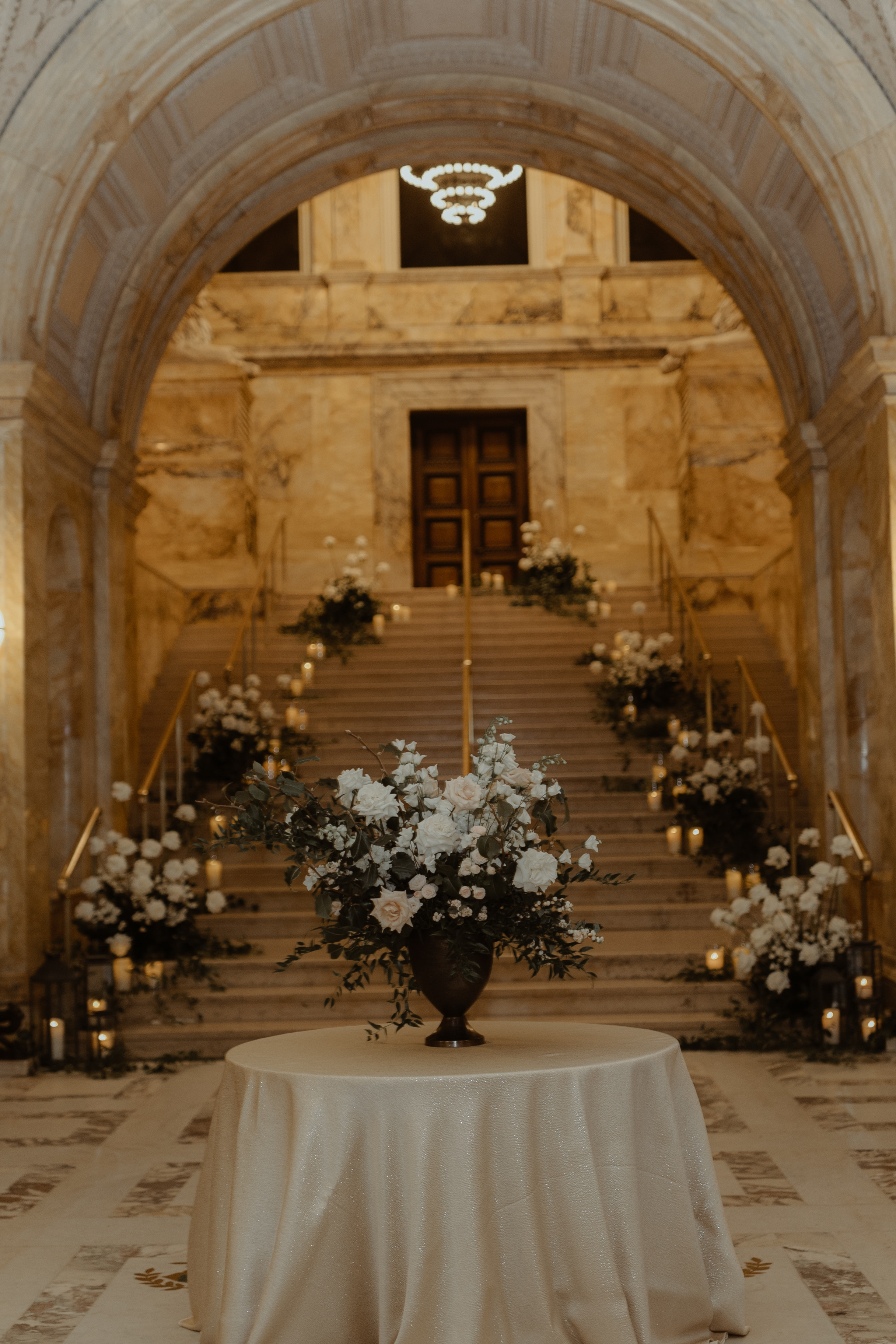
White Ink was honored to add to the breathtaking staircase entrance of this unforgettable venue. The sharp black wedding welcome sign topped with white lettering, stood out against an impressive array of florals and lit candles which demanded the attention of each guest as they passed by.
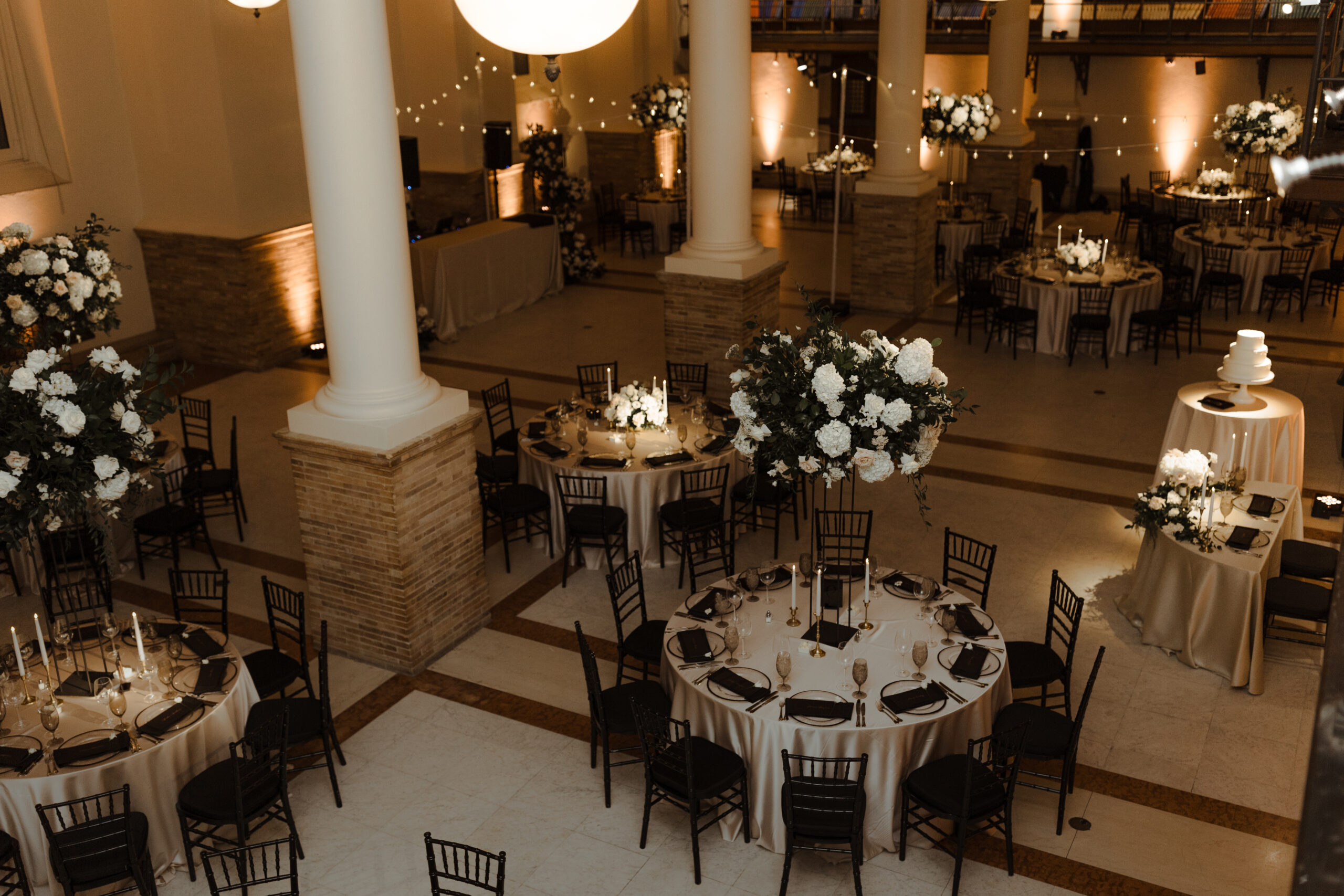
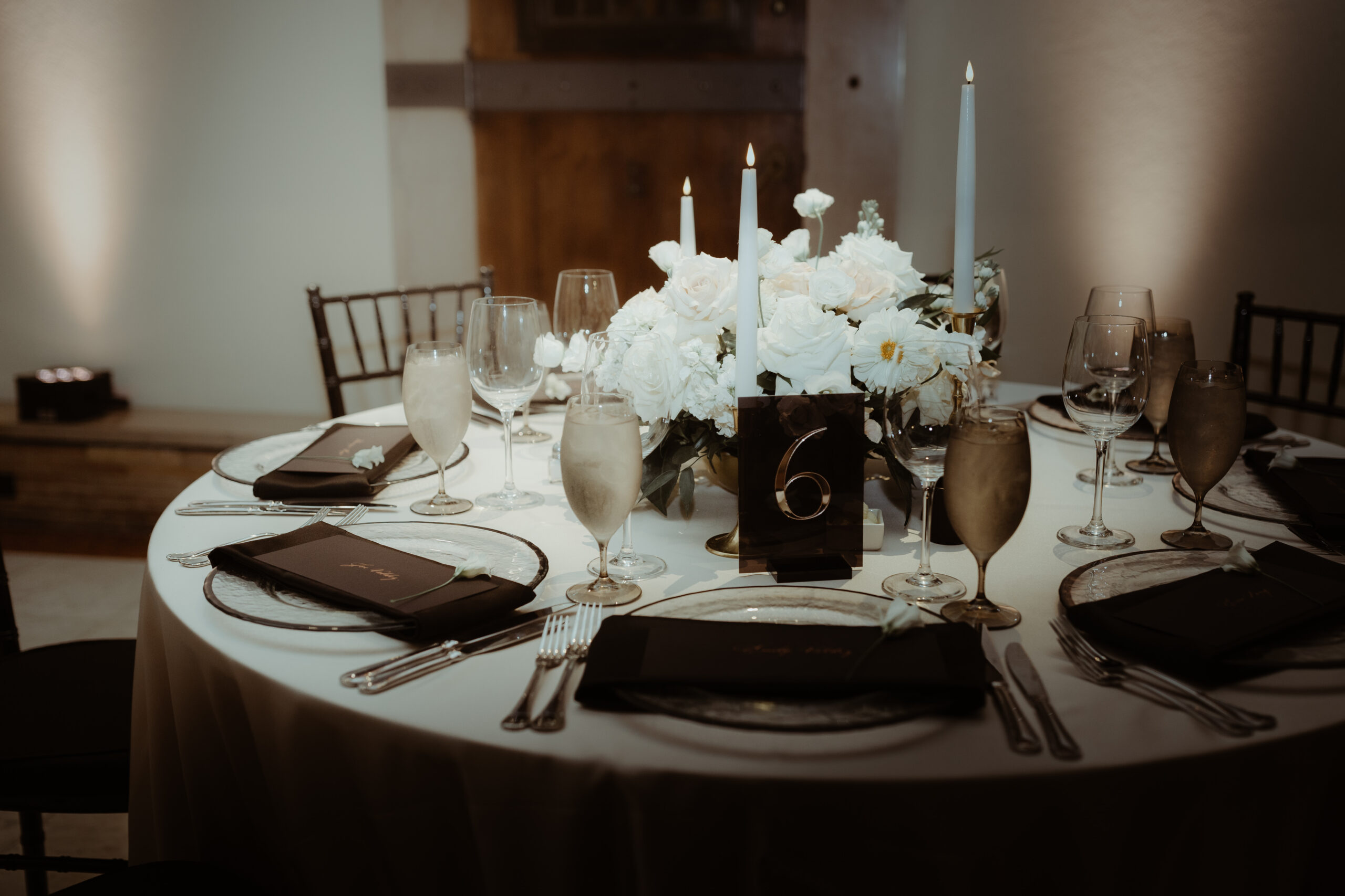
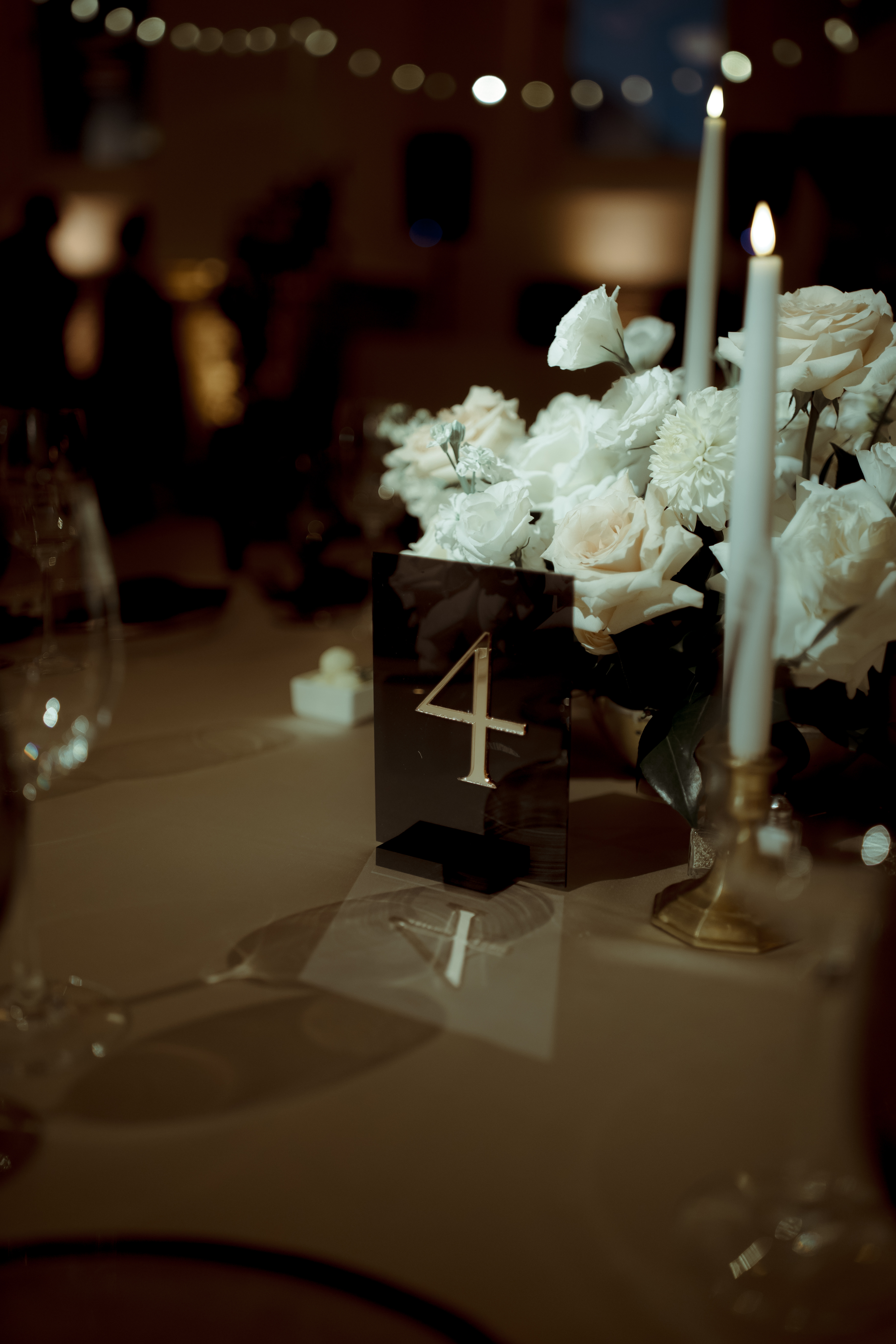
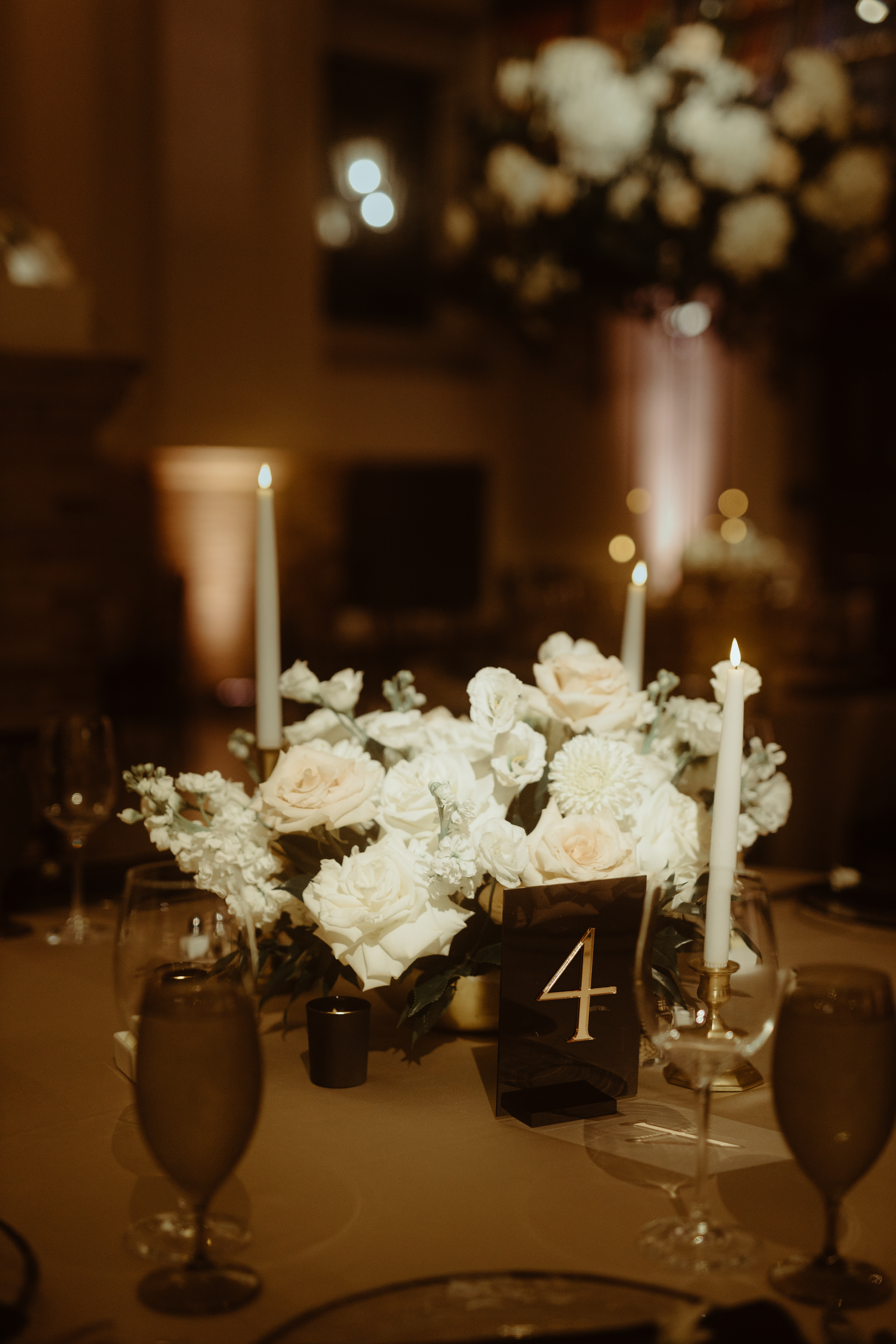
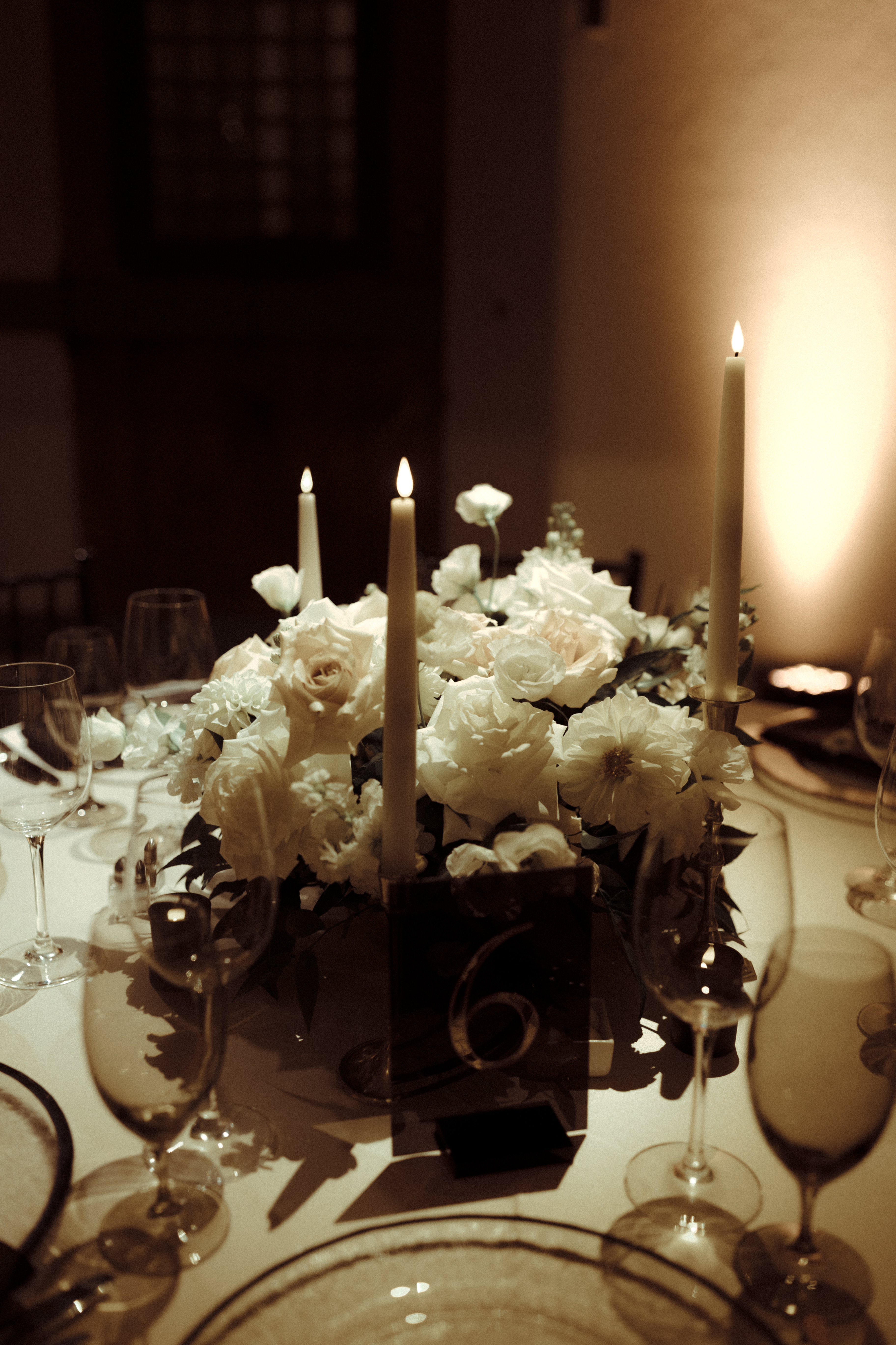
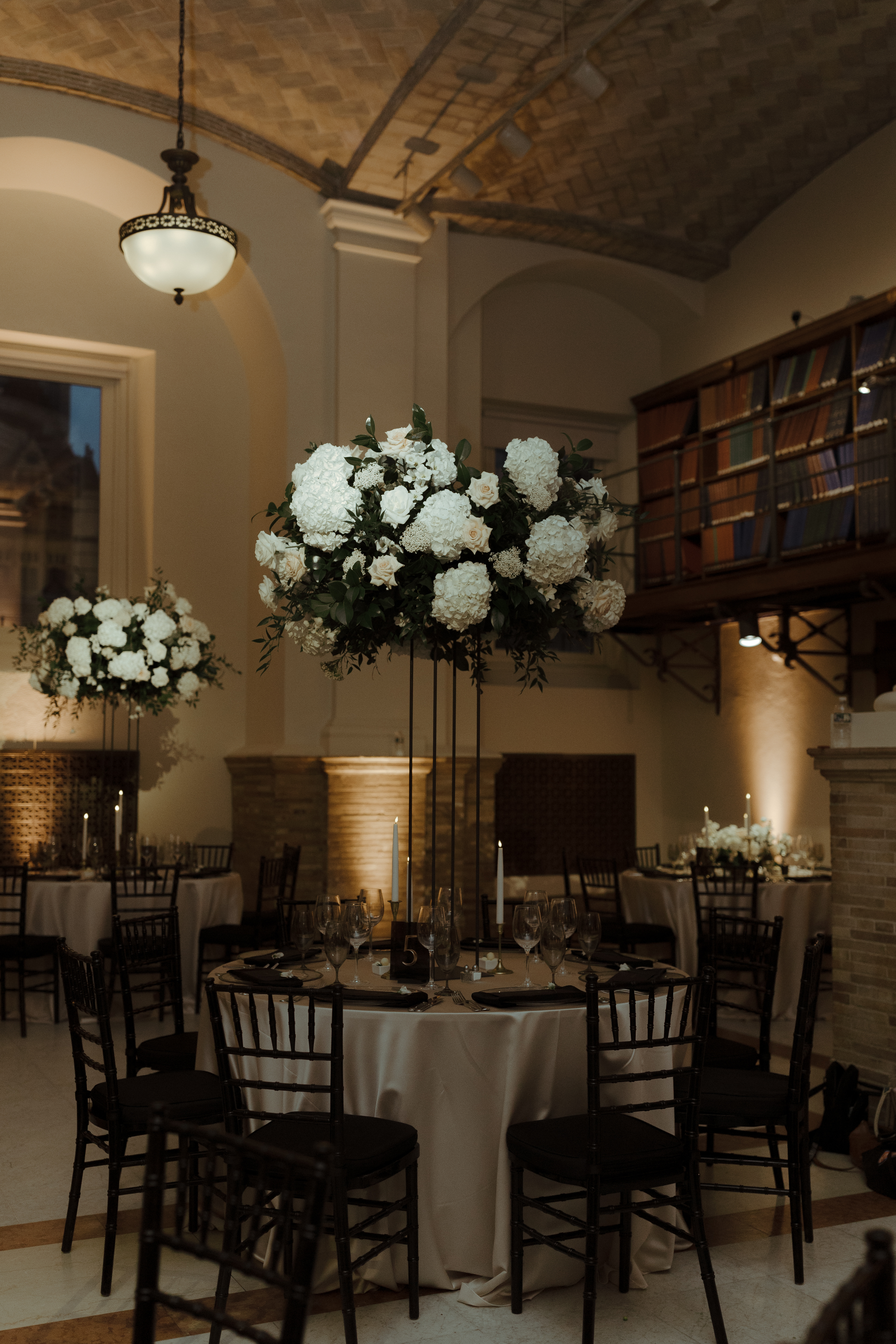
Elegant and Chic Reception Details
Just as Georgi and Jason’s invitation suite and wedding welcome sign harnessed a delicate boldness, so did the table numbers which sat perfectly within the elevated tablescape for their reception. There are times when table signage takes an unassuming role among the tablescape, but then there are moments when table signs play an important part in grabbing the guest’s attention. These sharp lines and block signage with gold numbers set against the soft florals and candles and white linen offered a uniquely formal taste and modern, chic appearance to the 170-year-old venue. A detail which was beautifully and purposefully done.
We love our Nashville couples, that’s no secret. However, the opportunity to meet our couples where they are is something we cherish. Finding ourselves at the Boston Public Library in the presence of Georgi and Jason along with their closest family and friends was an incredible moment. It was such an honor to have been a part of this incredible journey with the perfect couple. To Georgi and Jason, thanks for the memories that will last forever. Cheers!
If you’re looking to add custom, thoughtful touches to your wedding or event, we would love to help make your vision a reality. Reach out today to learn more about our full-service design offerings—we can’t wait to create something unforgettable for you!