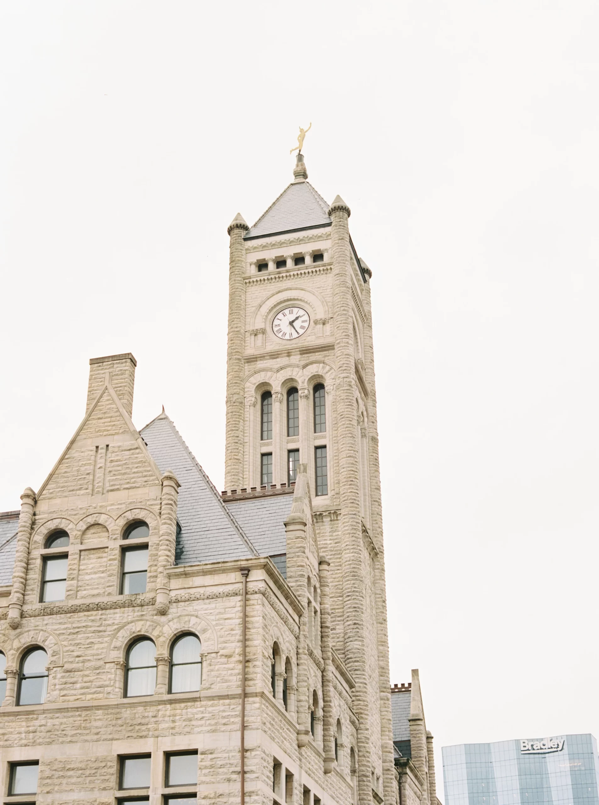
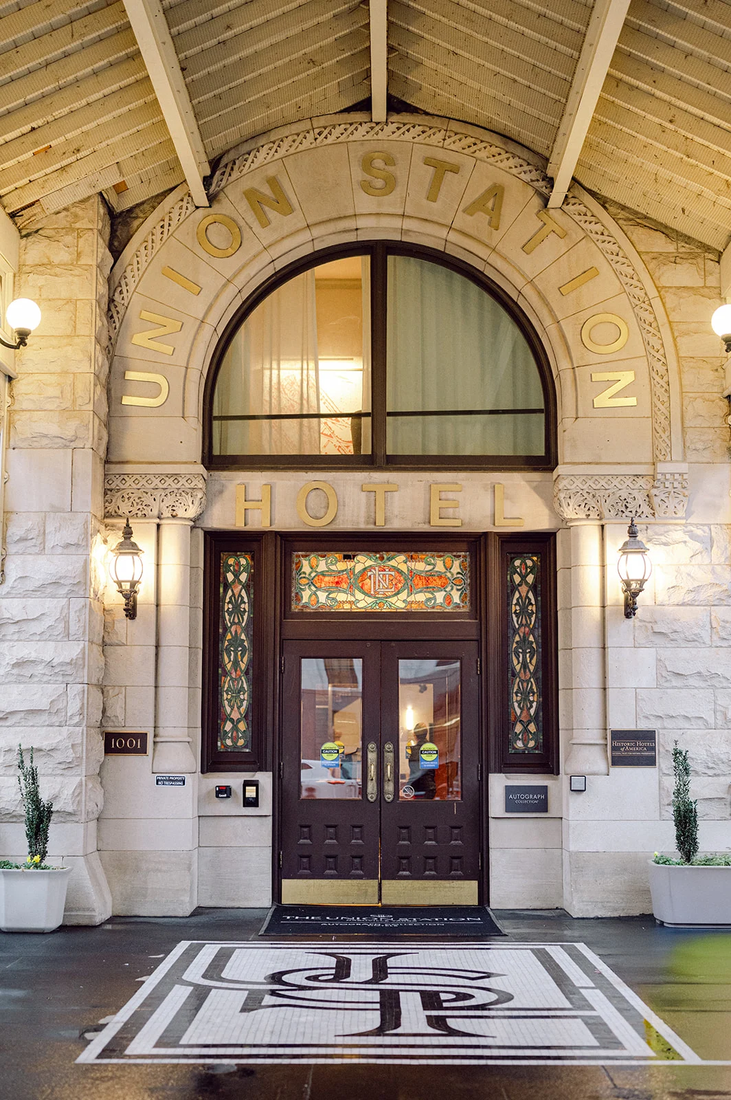
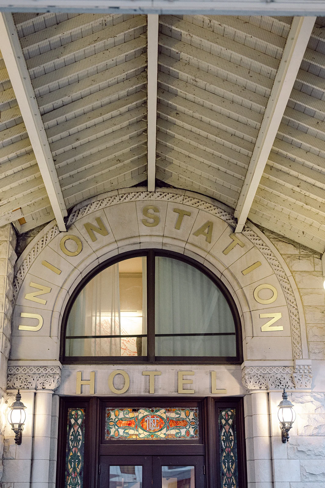
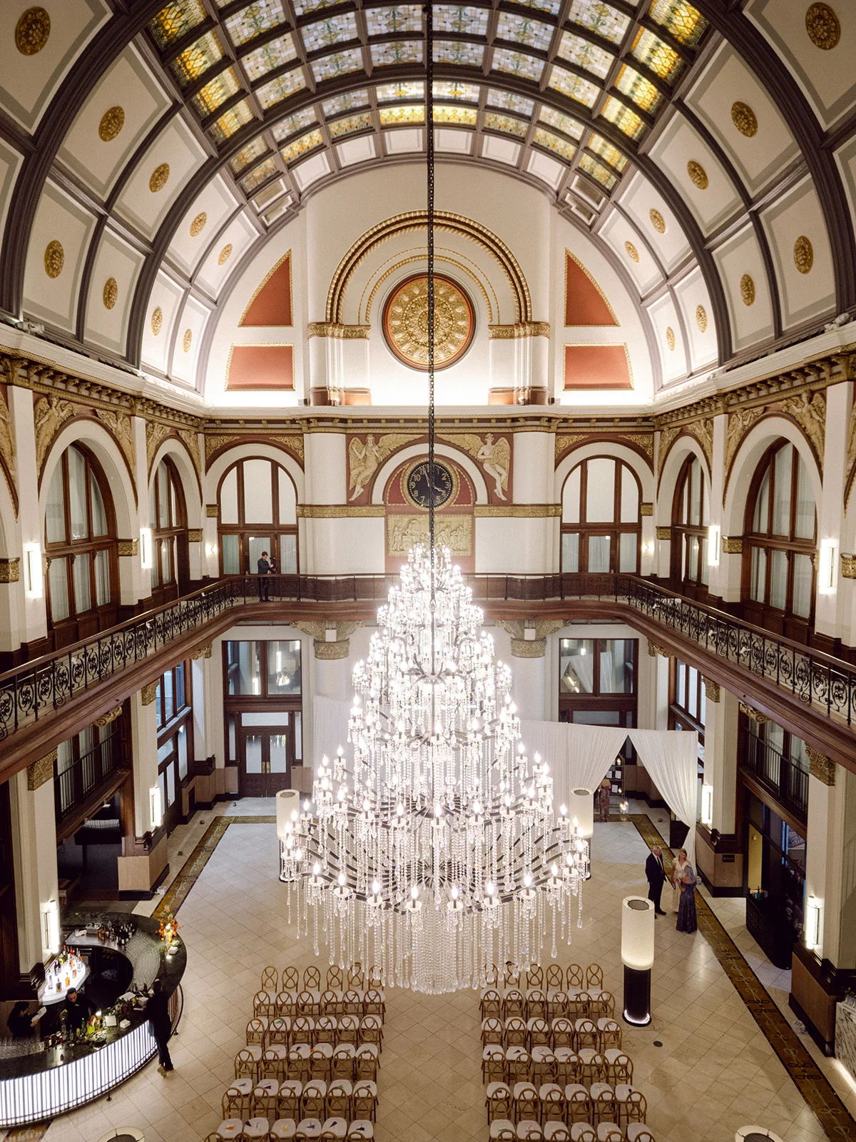
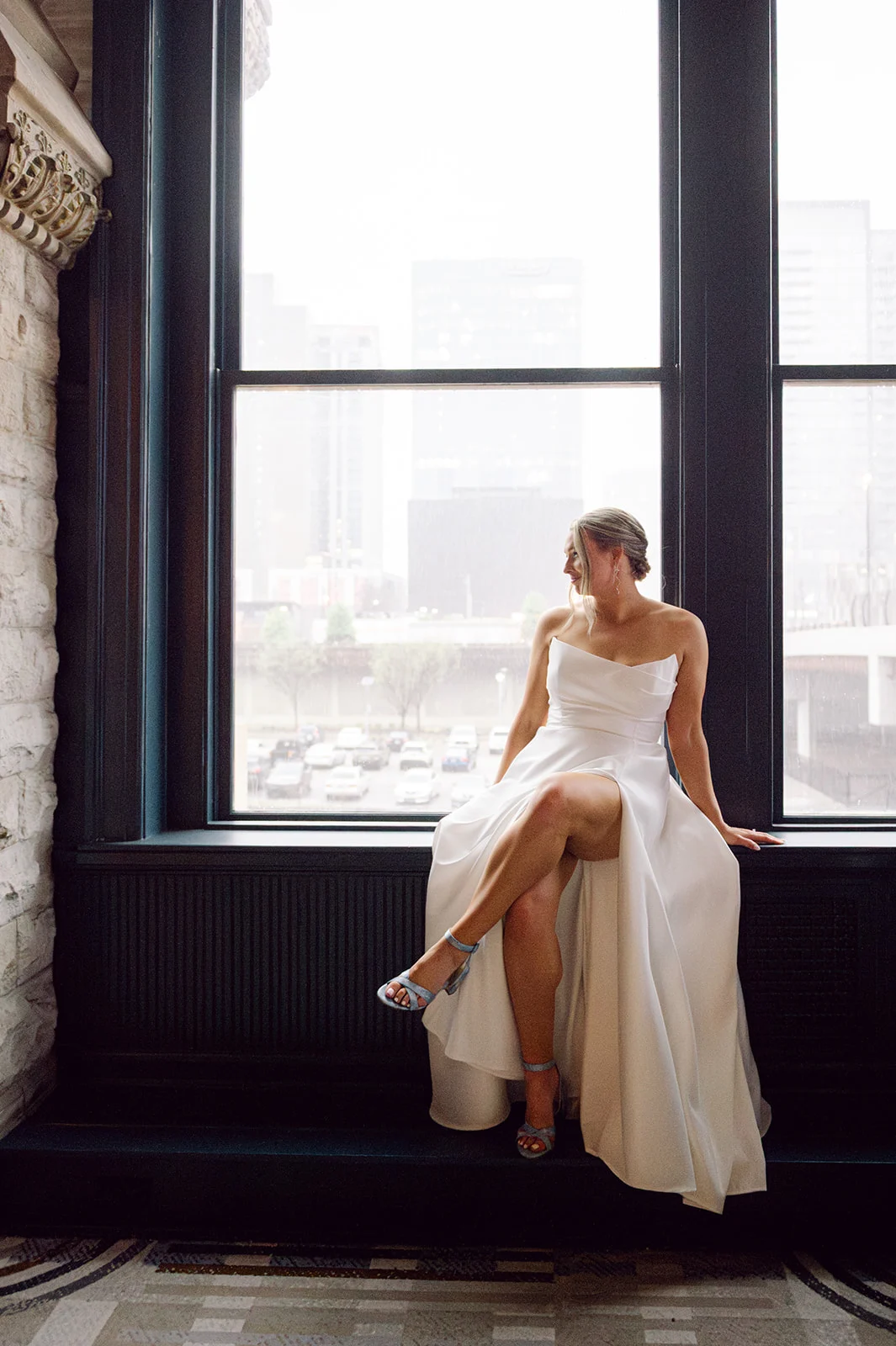
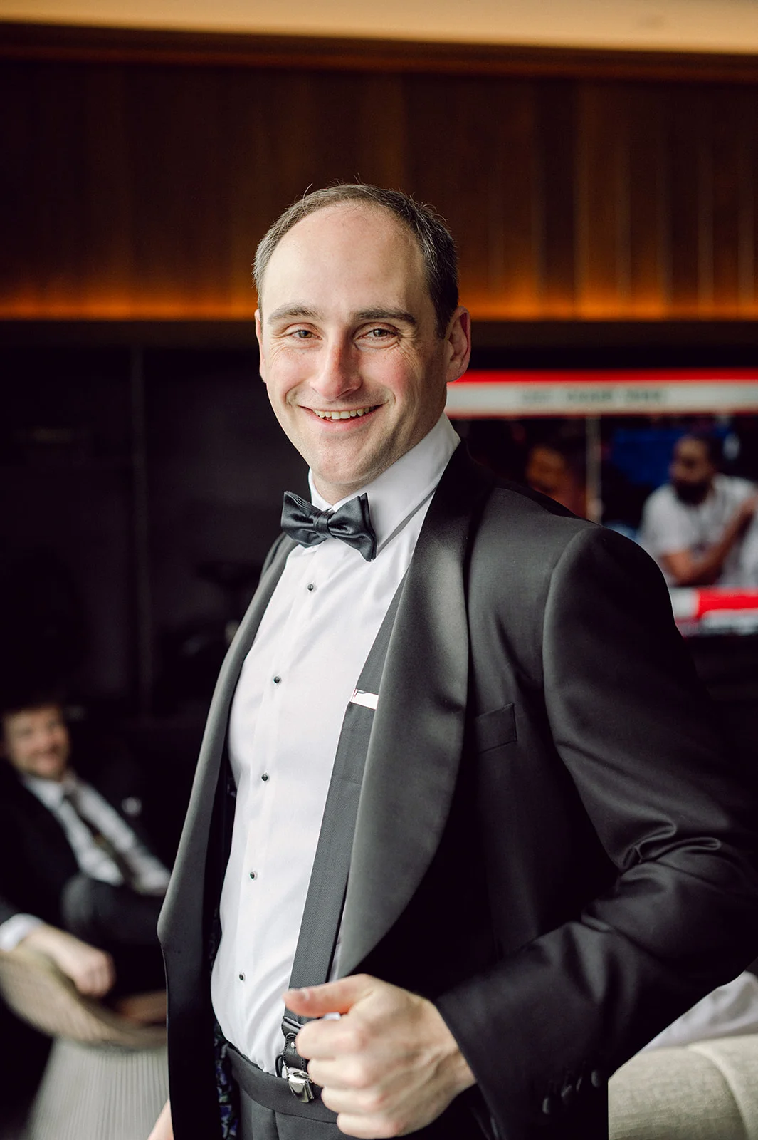
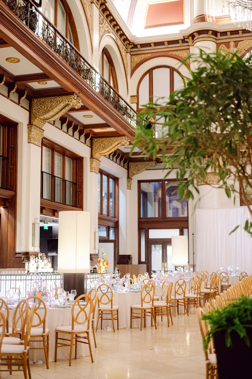
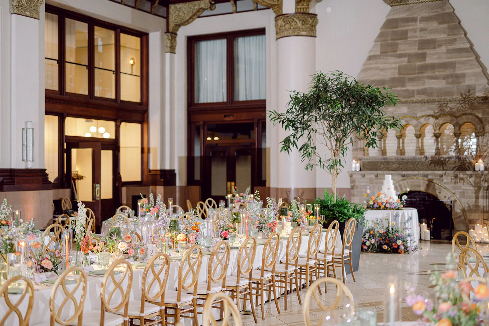
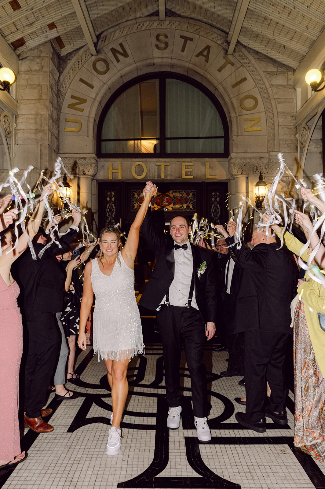
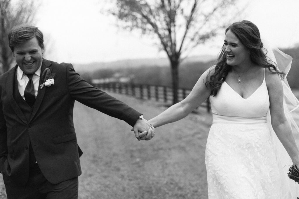
When a wedding takes place in one of the most iconic hotels in Nashville you know it’s going to be a good one! Once a bustling railroad terminal, Union Station Hotel is now a stunning luxury hotel, still brimming with its original architecture, that includes arches, stained-glass windows, and endless historical charm. The gothic exterior design is one that demands attention. It’s a venue where history and elegance collide, setting the perfect tone for a celebration as beautiful and meaningful as Kate and Andrew’s dreamy wedding.
To play a part in their big day by creating their custom invitation suite, menus, and place cards was such an honor. The sweet bride, Kate, found us on Instagram, which is always so flattering! She was a dream to work with, as we couldn’t have asked for a more gracious, fun, and lovely client. Her dreamy wedding day vision paired beautifully with the character and charm of the hotel.
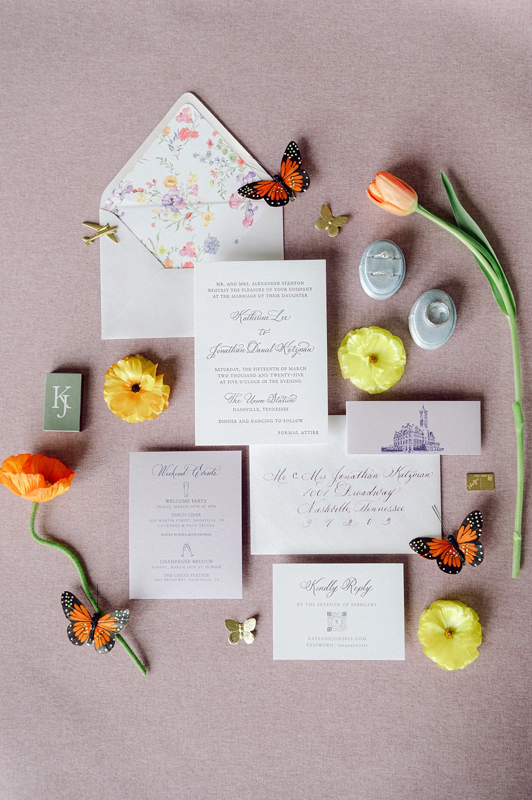
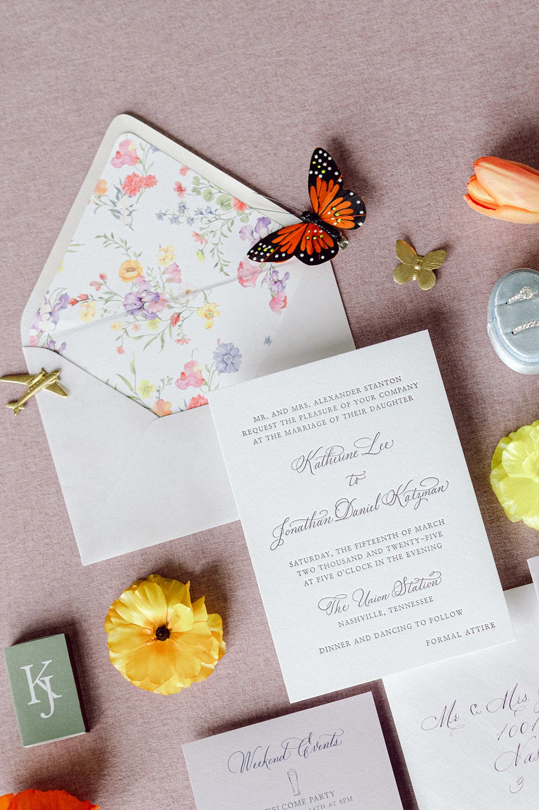
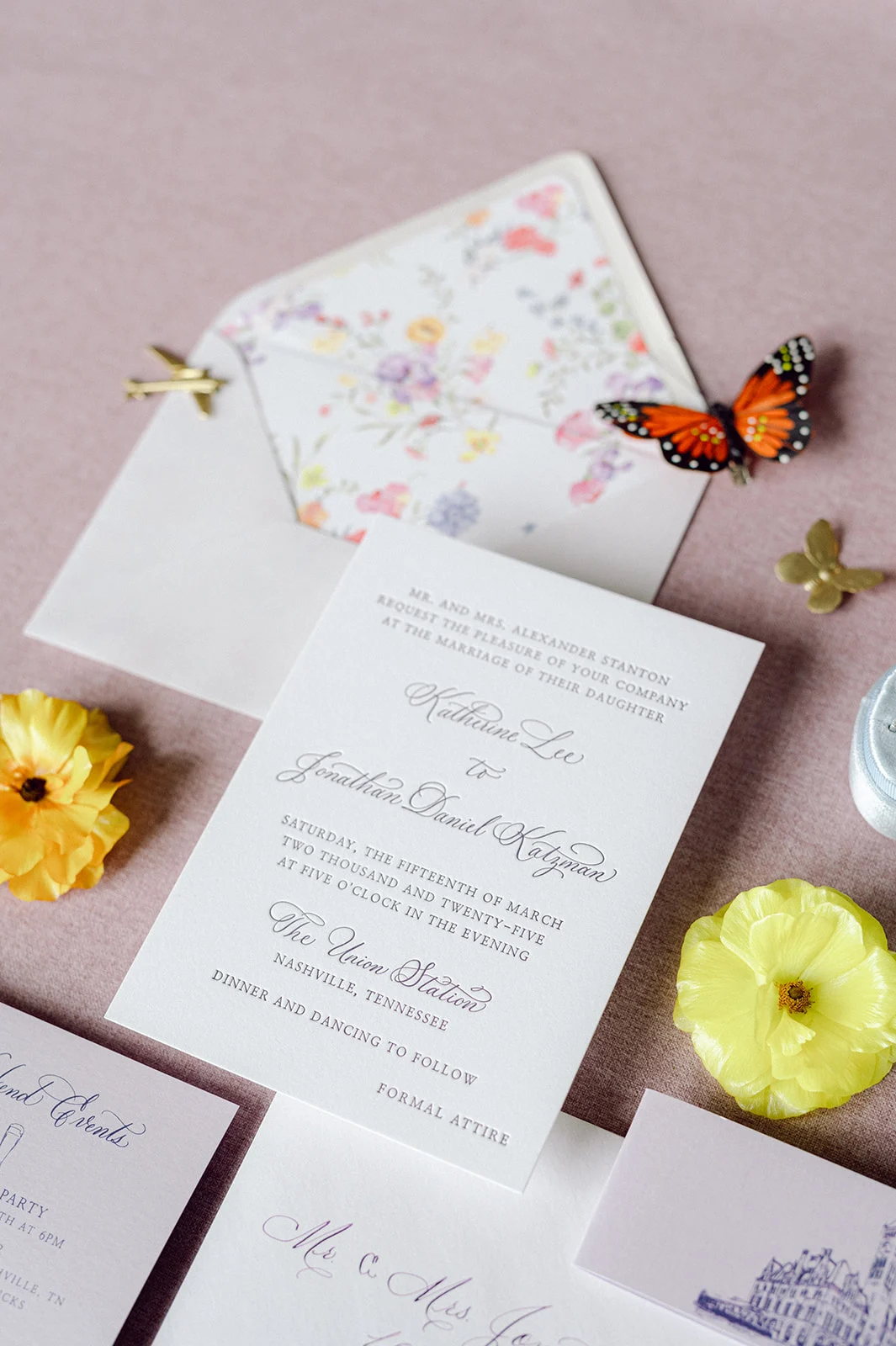
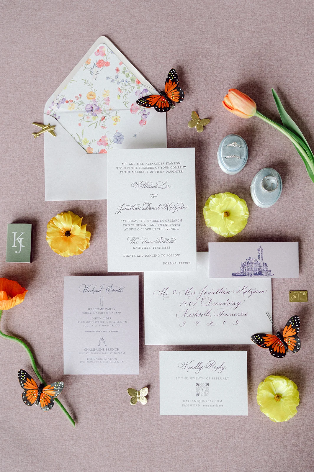
Lavender Wedding Invitations and Details
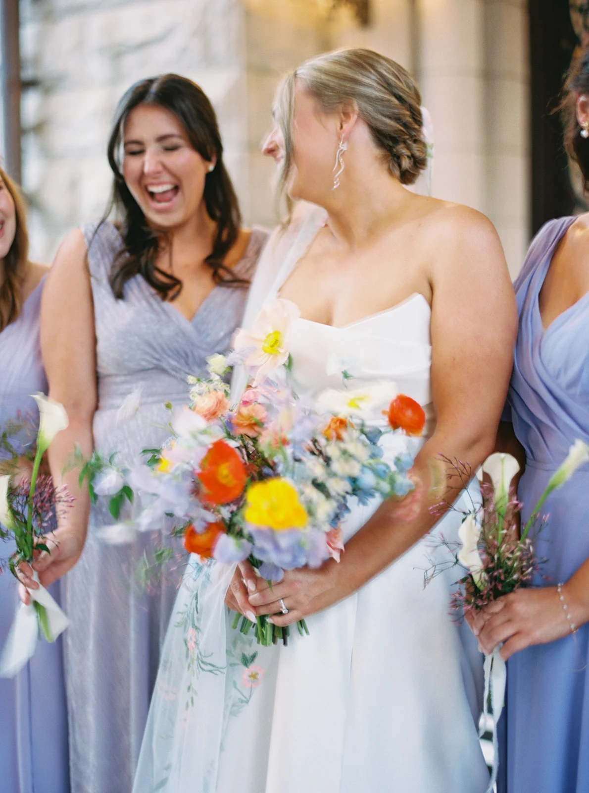
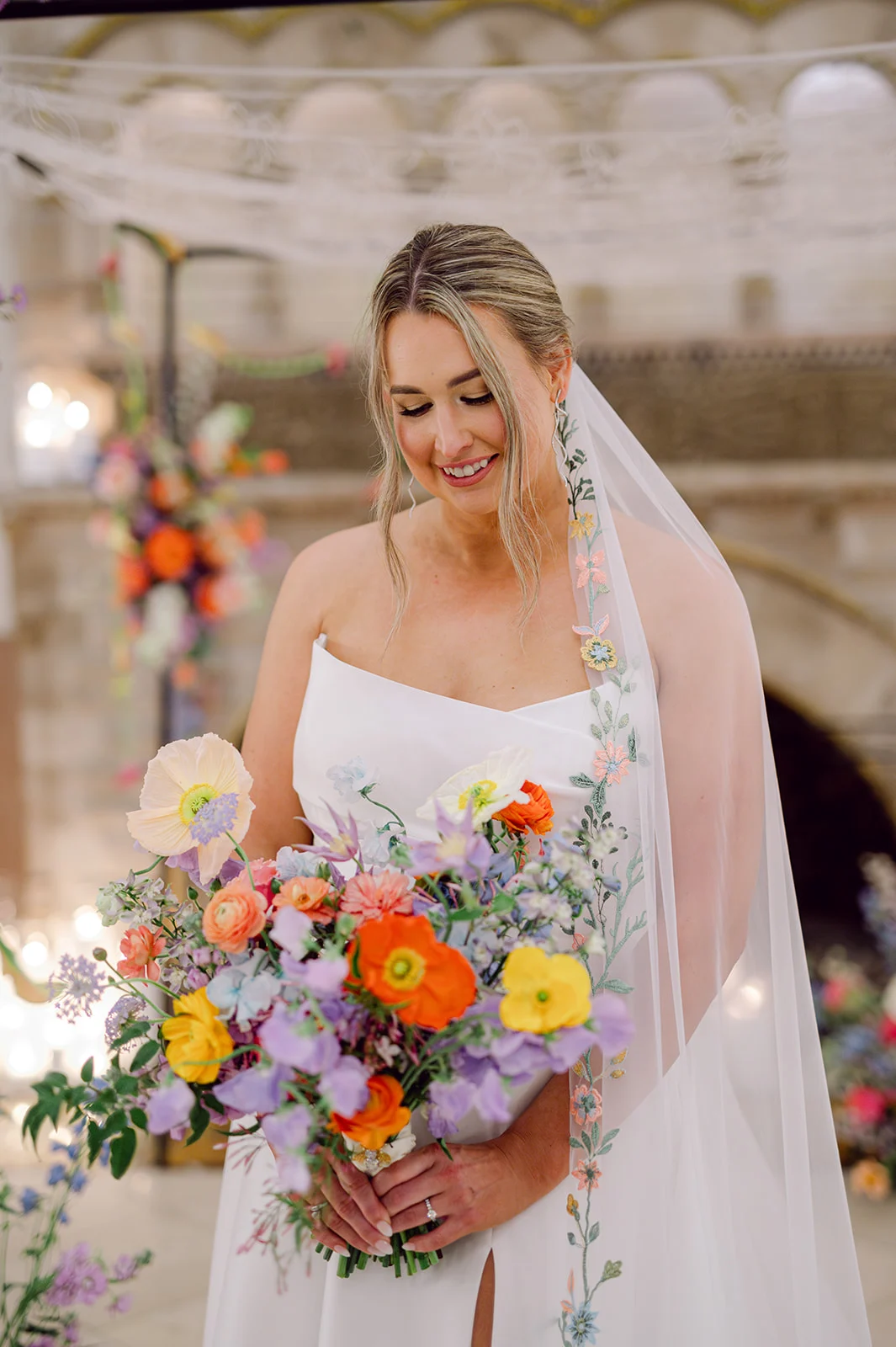
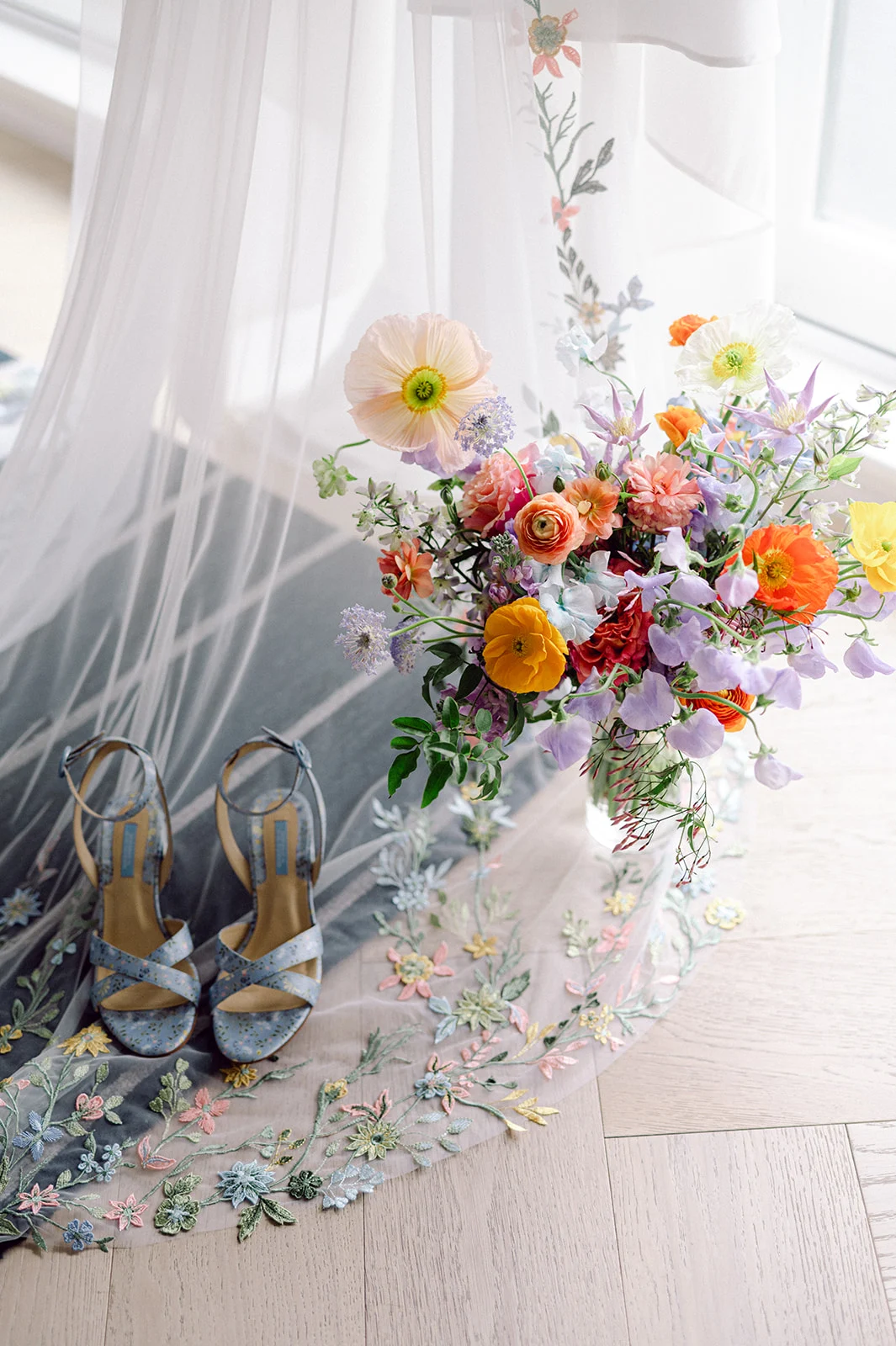
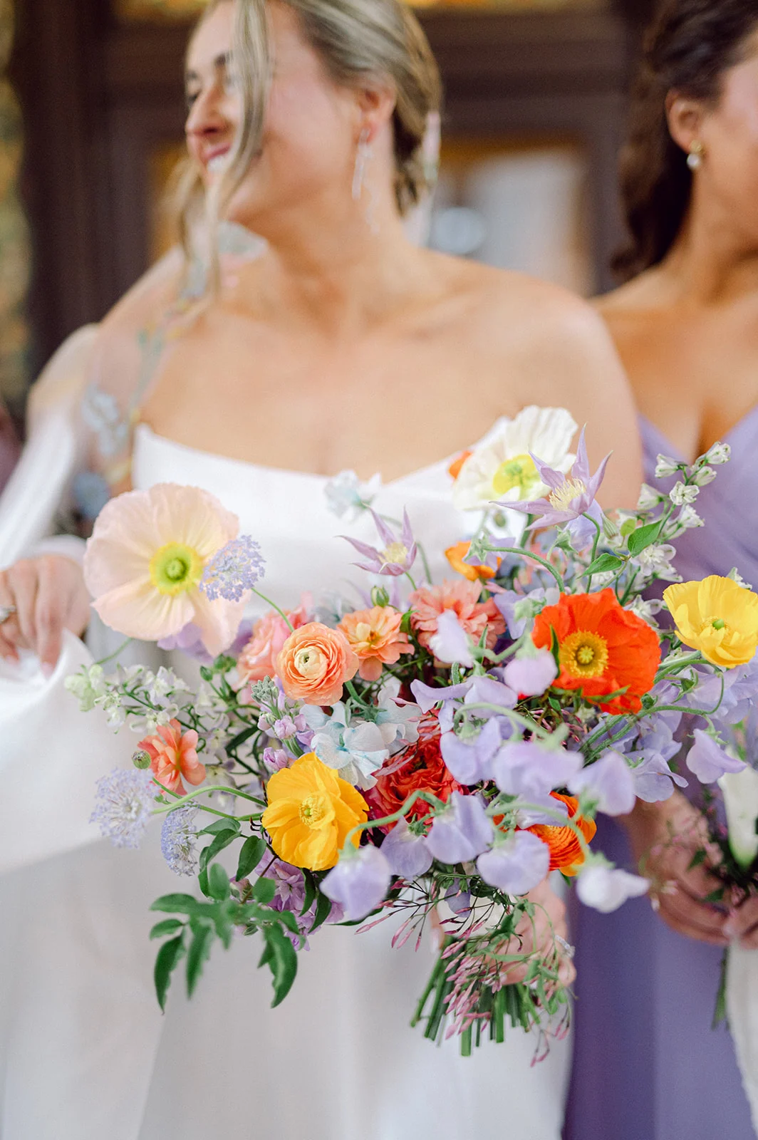
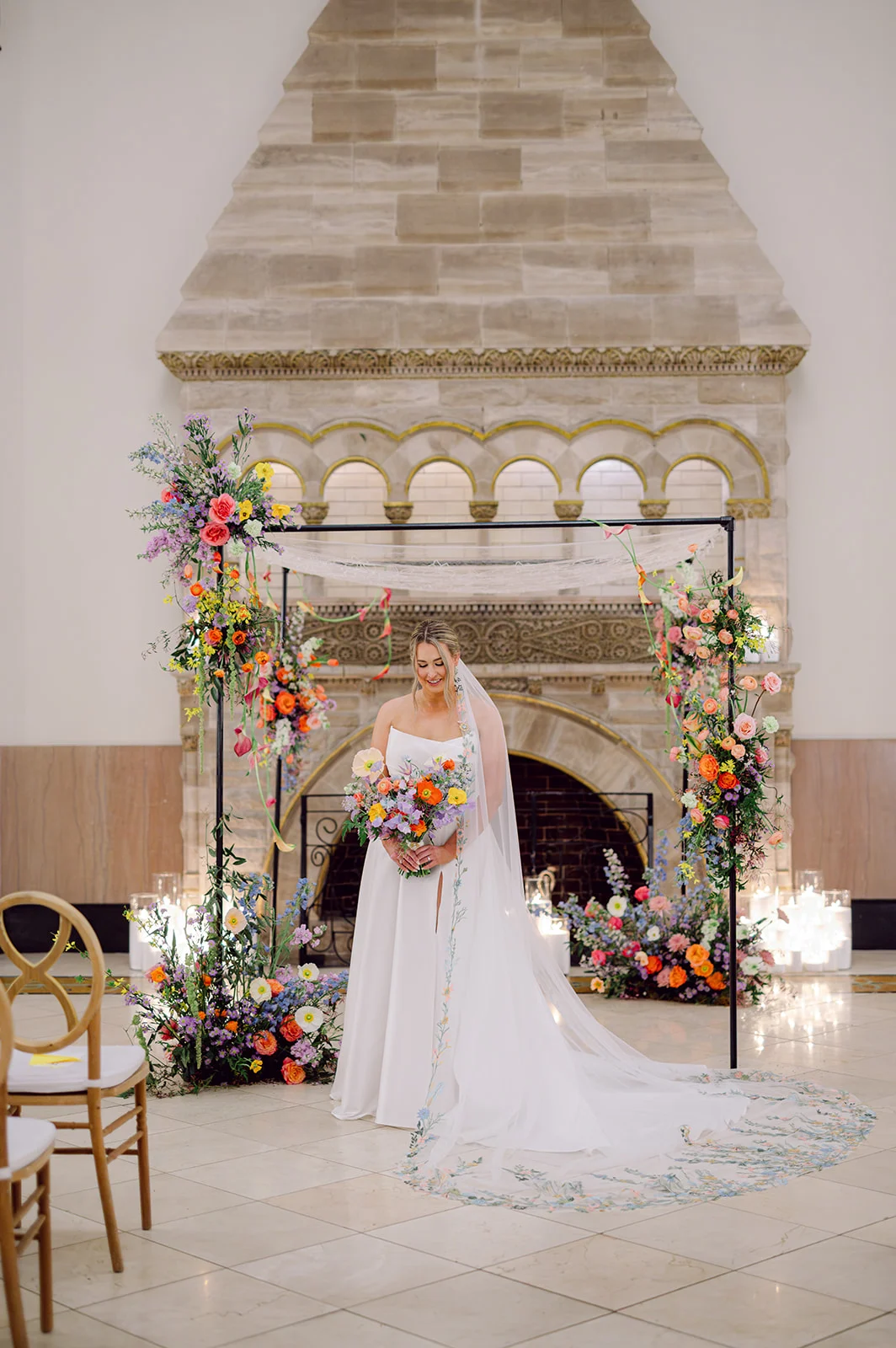
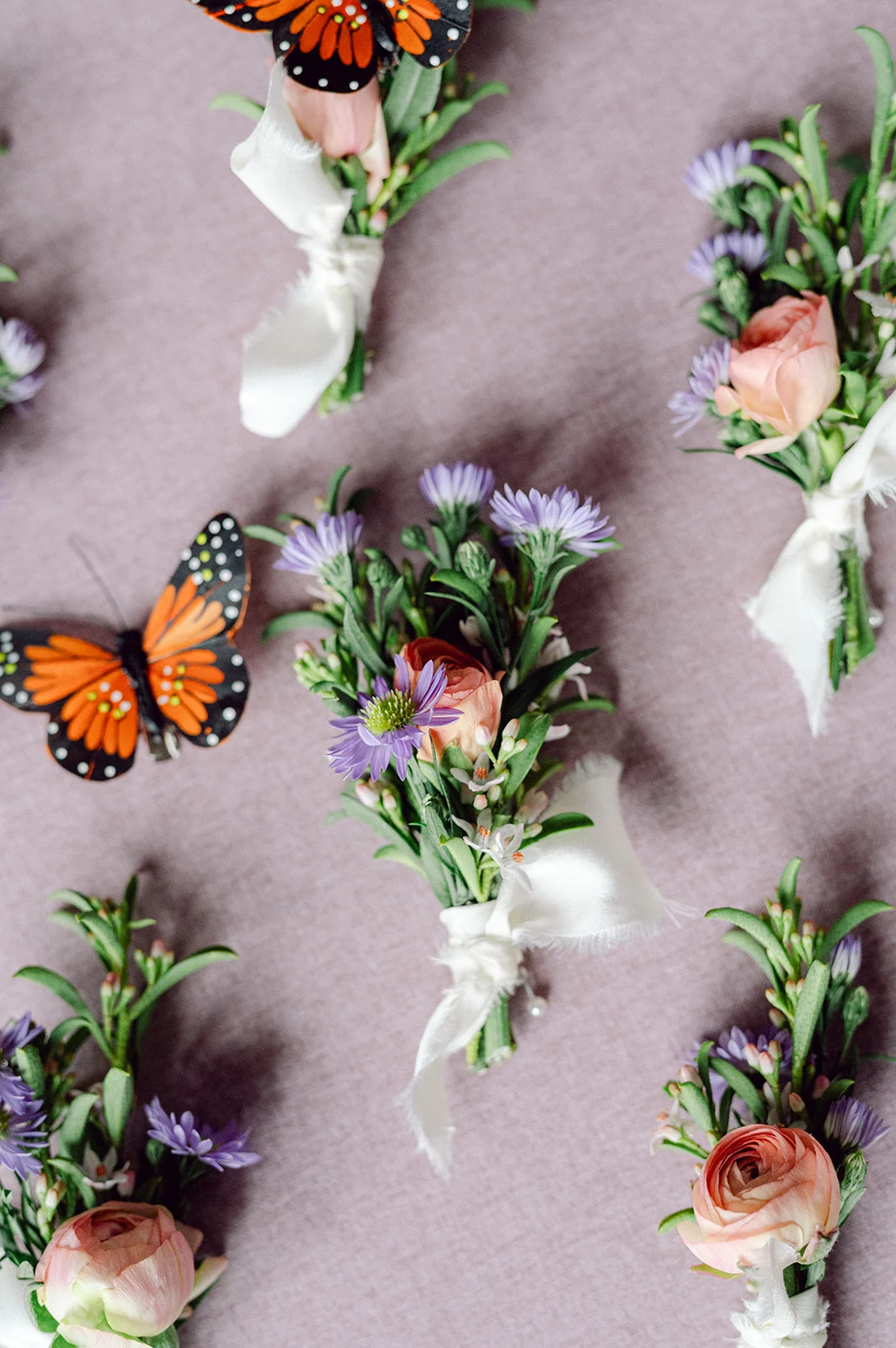
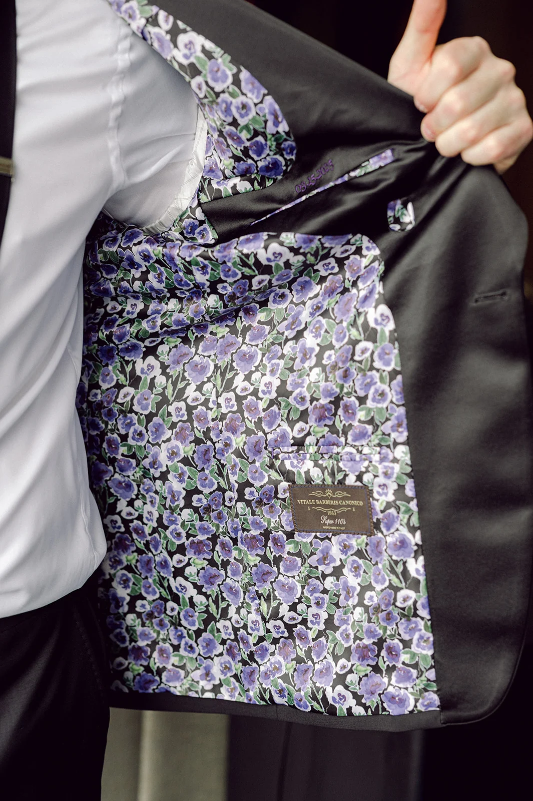
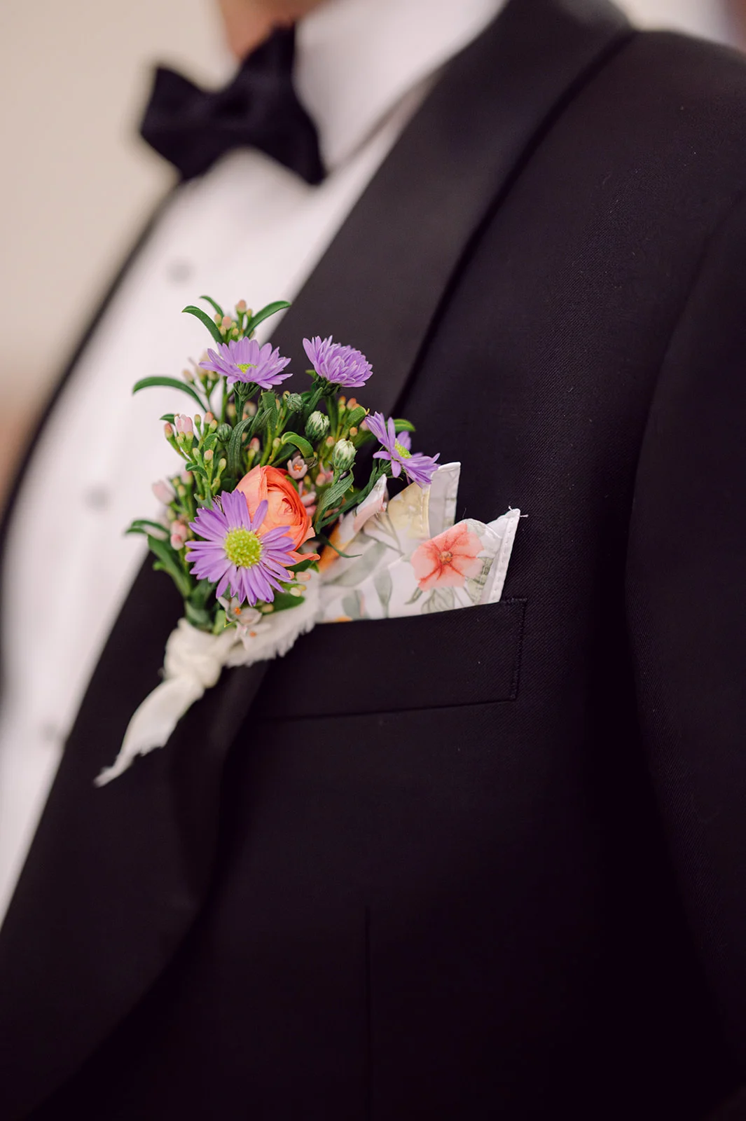
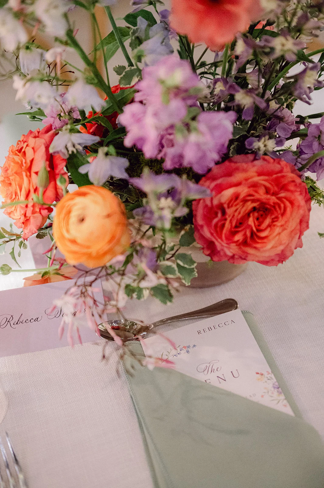
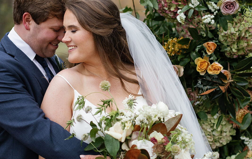
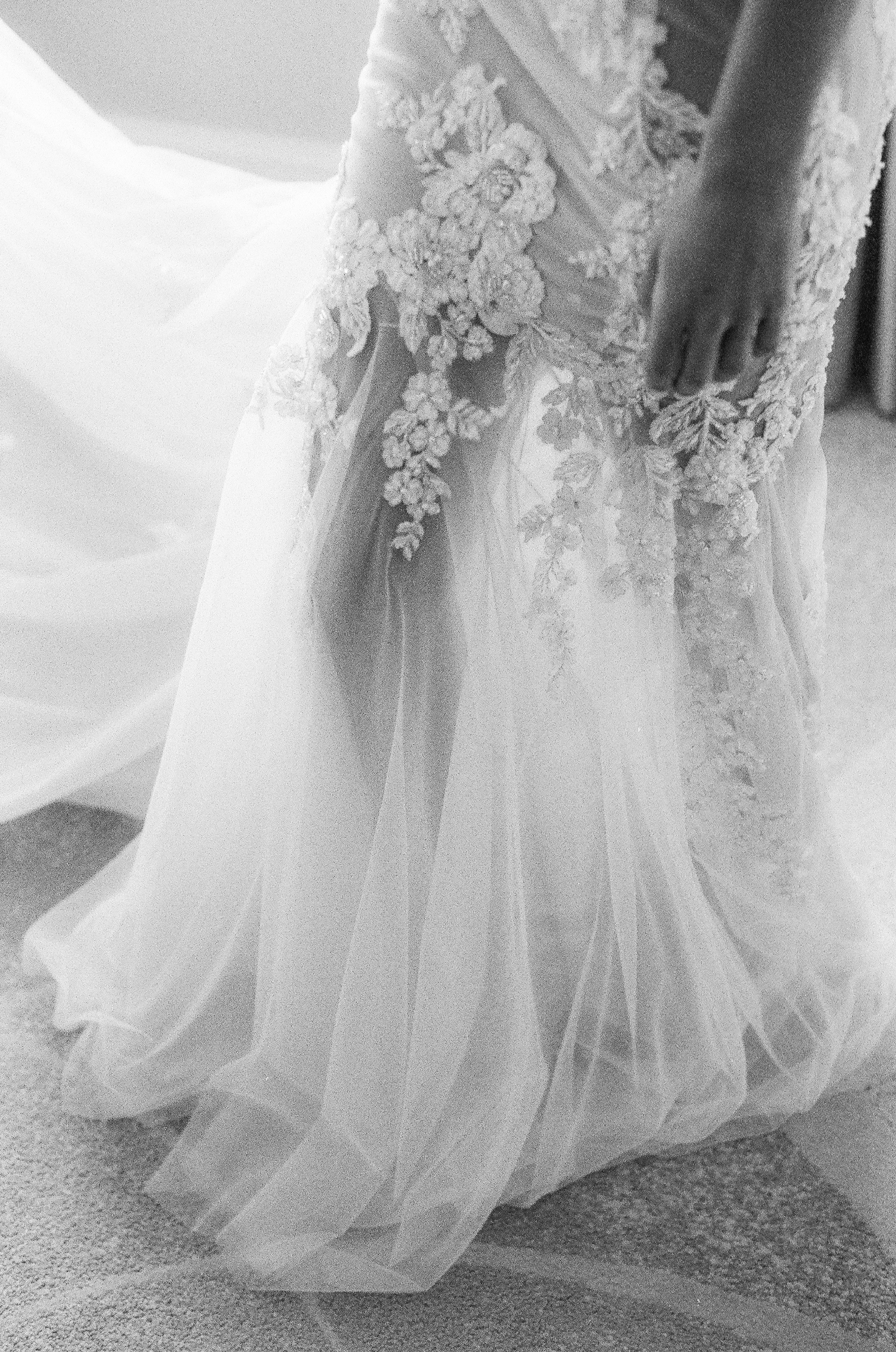
One detail we absolutely adored about this wedding was the color palette. Lavender isn’t a color we get to work with often in invitations. It brought such a fresh, romantic feel to each element. It also beautifully tied into the wedding day itself, where shades of purple were thoughtfully woven throughout the florals, the groom’s custom jacket liner, bridesmaids’ dresses, and even the bride’s veil, which featured the most gorgeous floral embroidery. Seriously, the veil was a work of art!
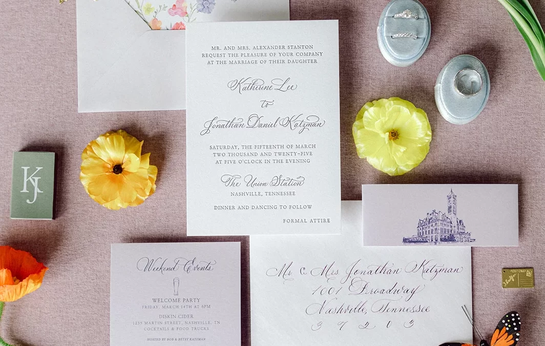
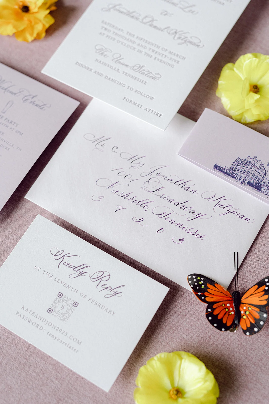
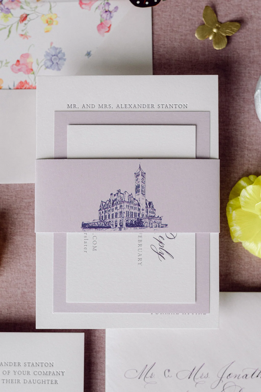
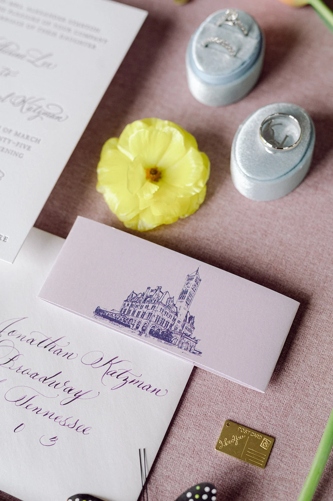
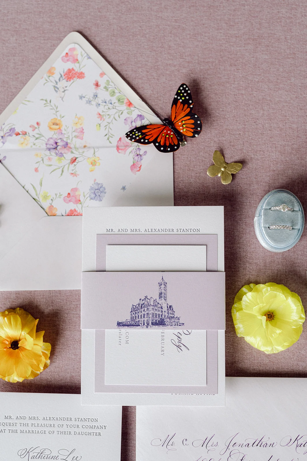
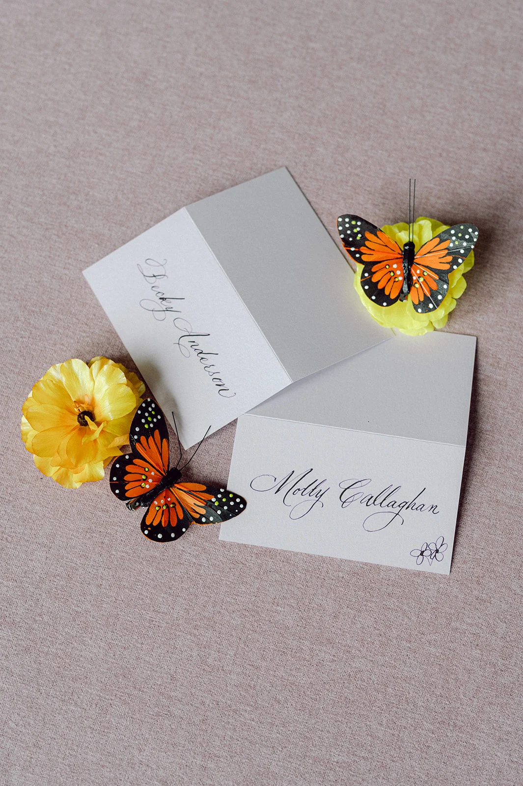
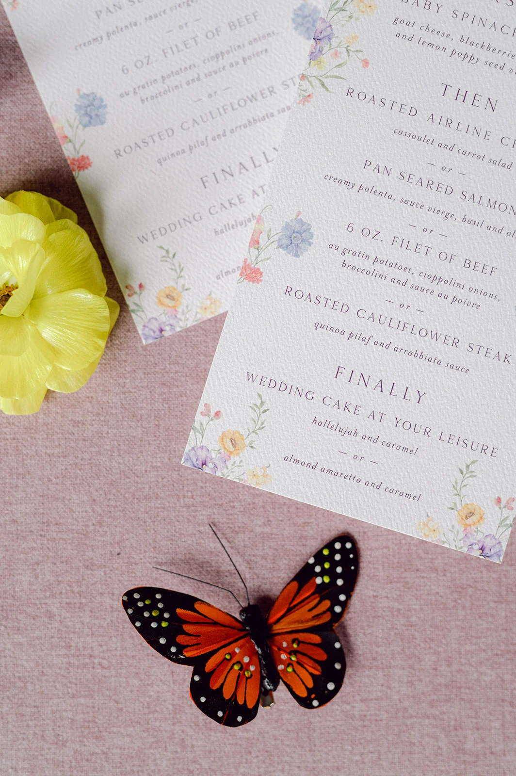
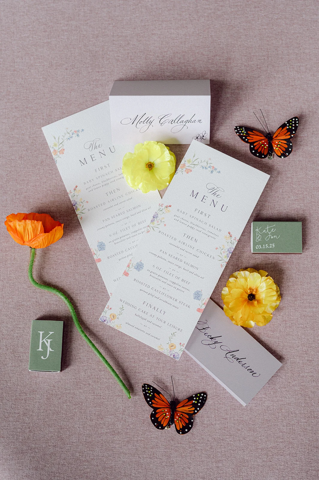
The custom invitation suite featured elegant white and lavender card stock, with delicate calligraphy bringing everything to life. The suite was wrapped with a custom-designed purple band showcasing an illustration of the historic Union Station as a nod to the incredible venue that would set the scene for their day.
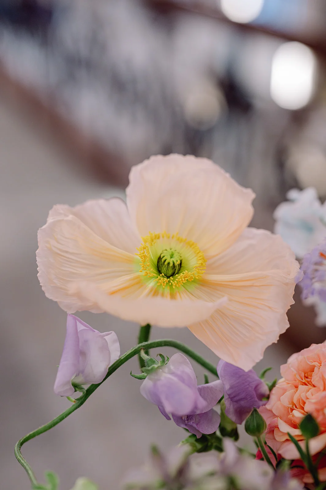
Inside, the envelope liner greeted guests with a burst of colorful florals. This offered a playful hint to all the vibrant flower details that would later decorate their ceremony and reception spaces. As a special gesture because we loved working with Kate so much, we shared with her the floral artwork we used for the invitation suite, and she used that to create the groom’s pocket square. It was a small but meaningful detail that spoke volumes about the couple’s thoughtful approach to design.
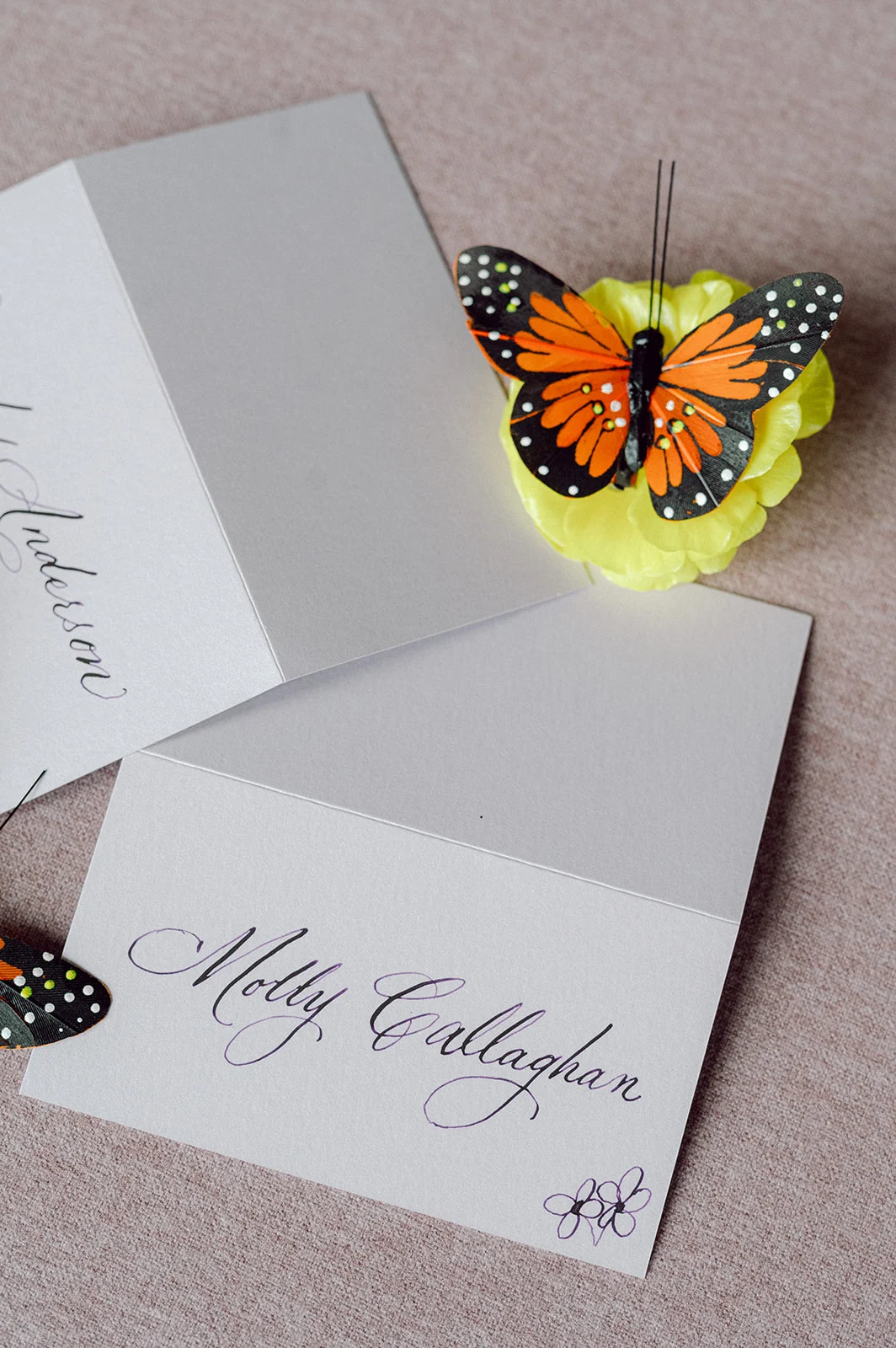
Elegant Day-of Touches
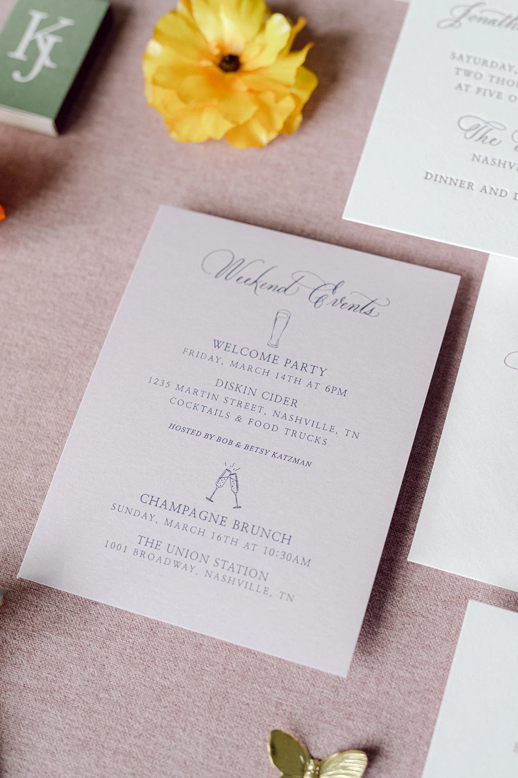
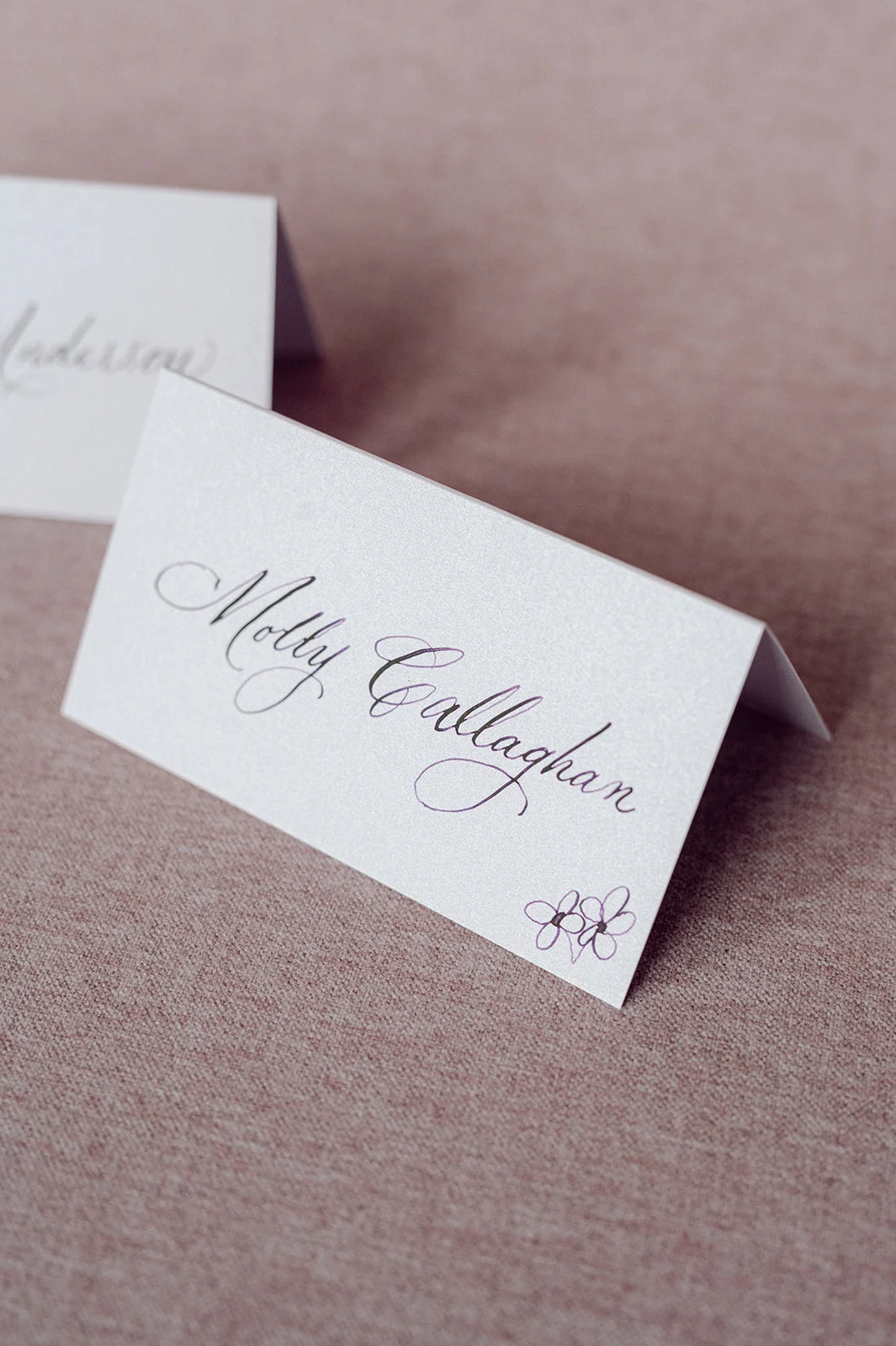
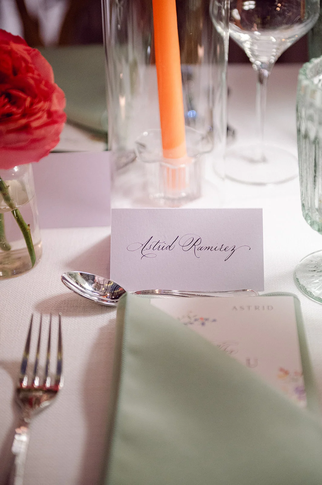
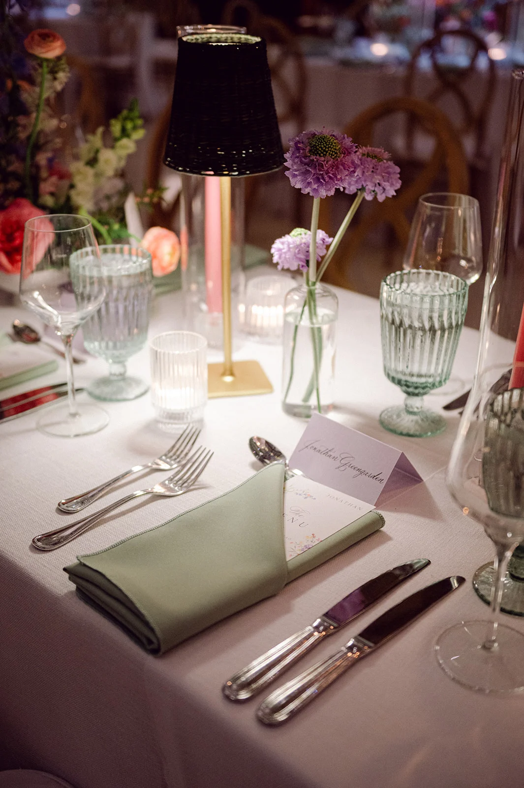
Alongside the invitation suite, we also created the folded place cards, which featured the same elegant calligraphy as the invitations, adding a cohesive and sophisticated touch to the guest tables.
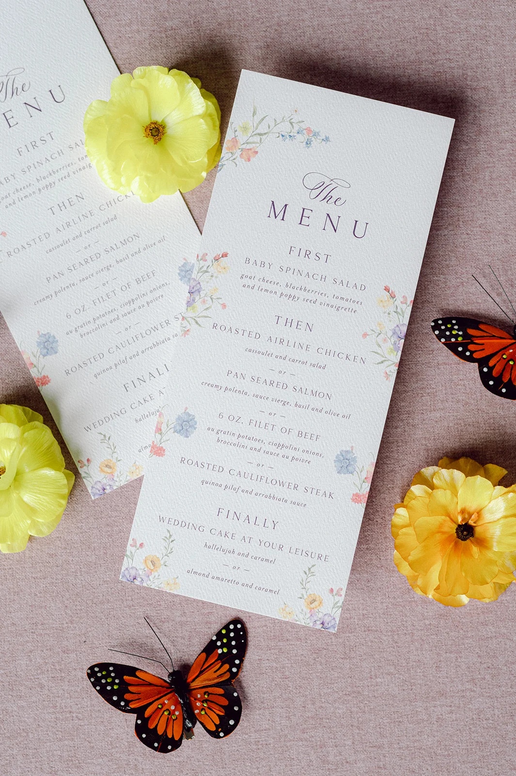
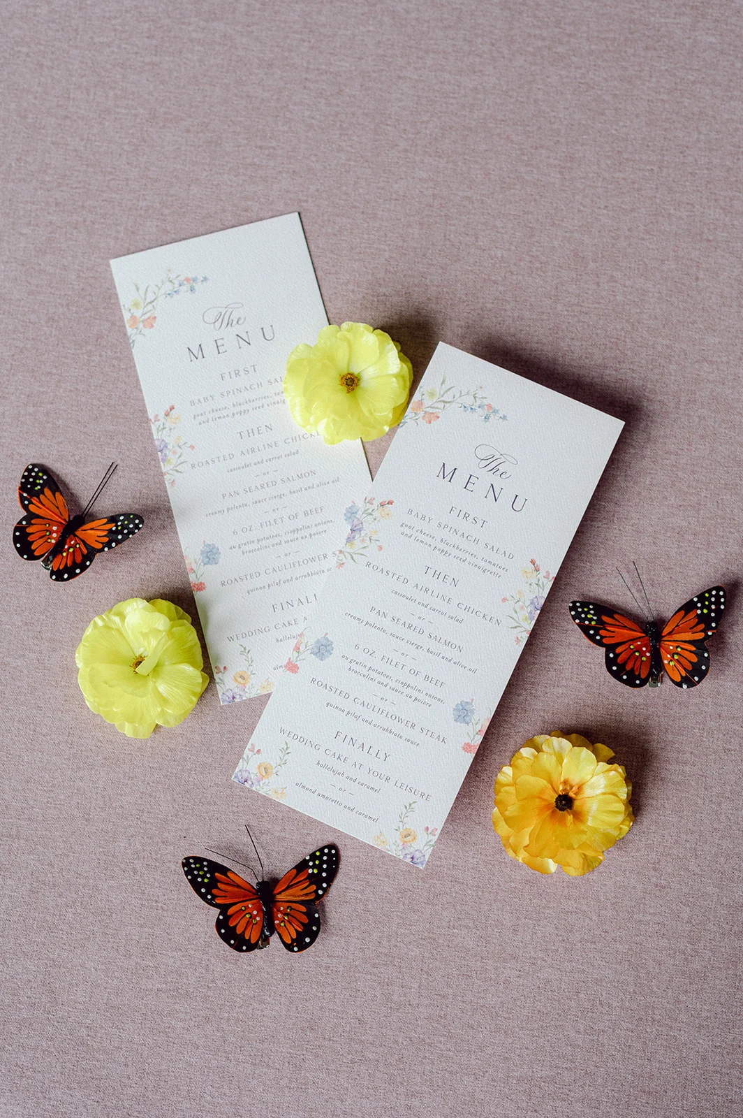
To tie the pieces together, the custom menus we created featured the same colorful floral design that was seen on the envelope liner. At the reception, these menus were tucked into the sage green napkins next to the place cards, creating a beautiful place setting for guests.
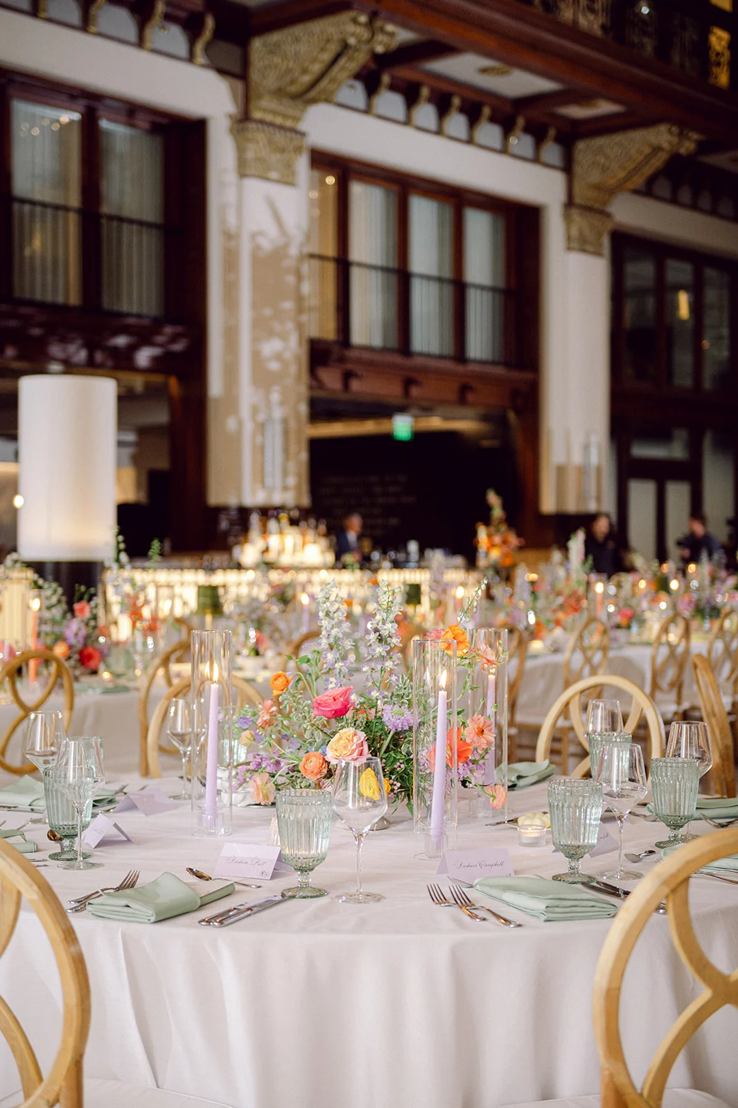
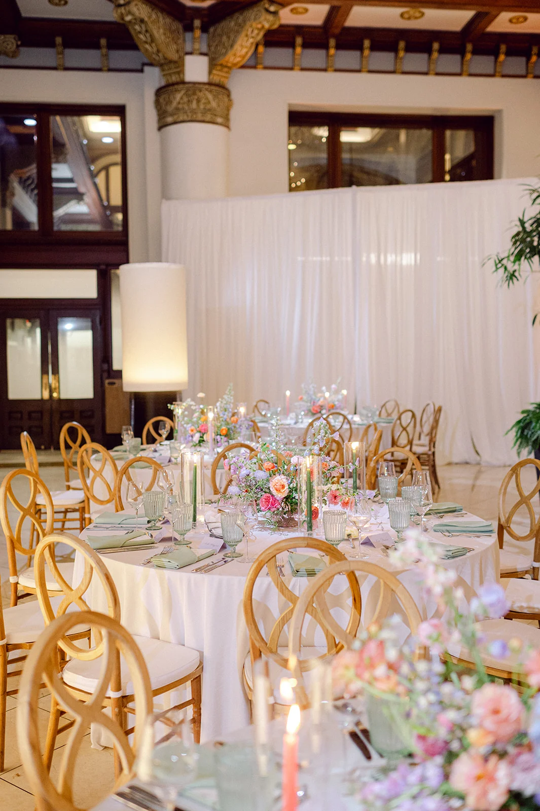
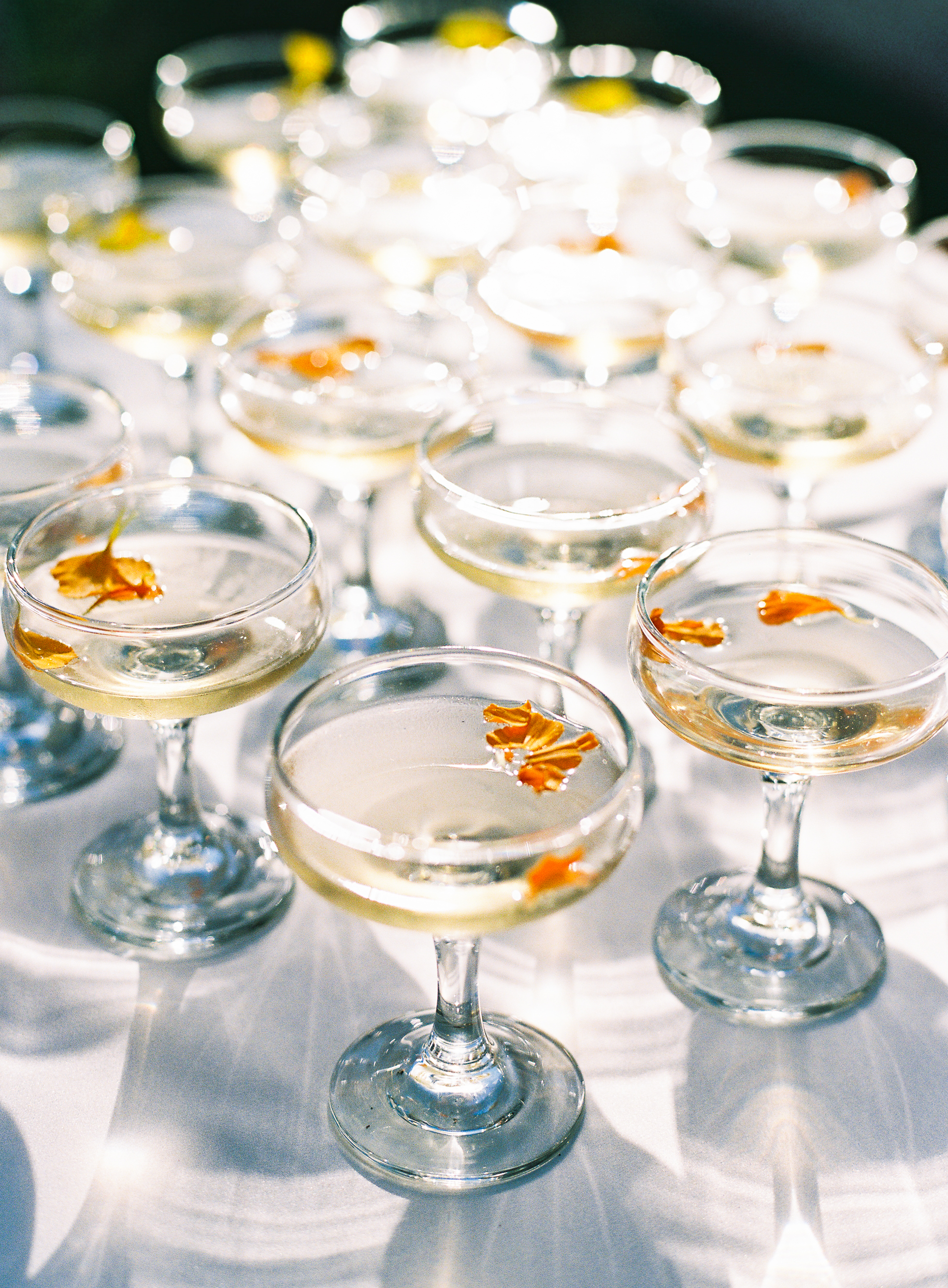
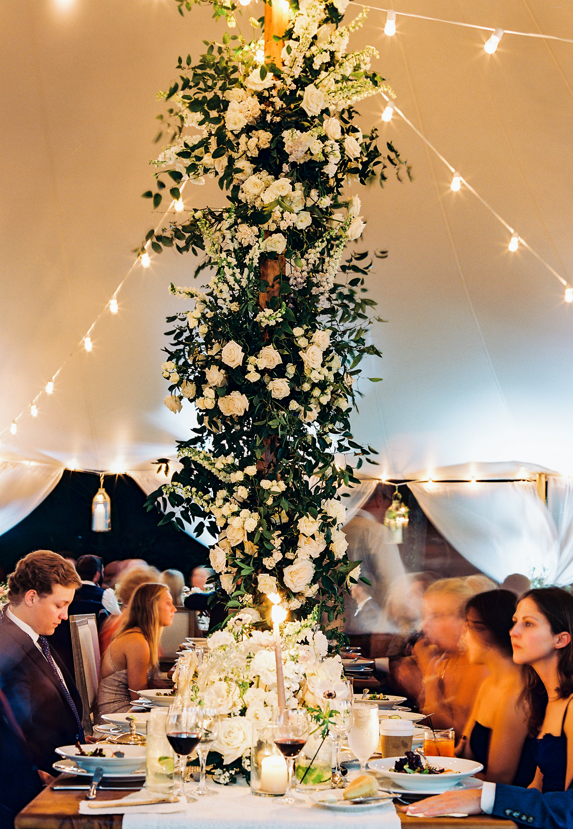
The tablescapes were stunning! Along with the paper goods, stunning floral arrangements decorated the center of the tables, and flickering candlelight added to the romantic setting. EBJ & Company did an amazing job planning and coordinating, as everything came together beautifully.
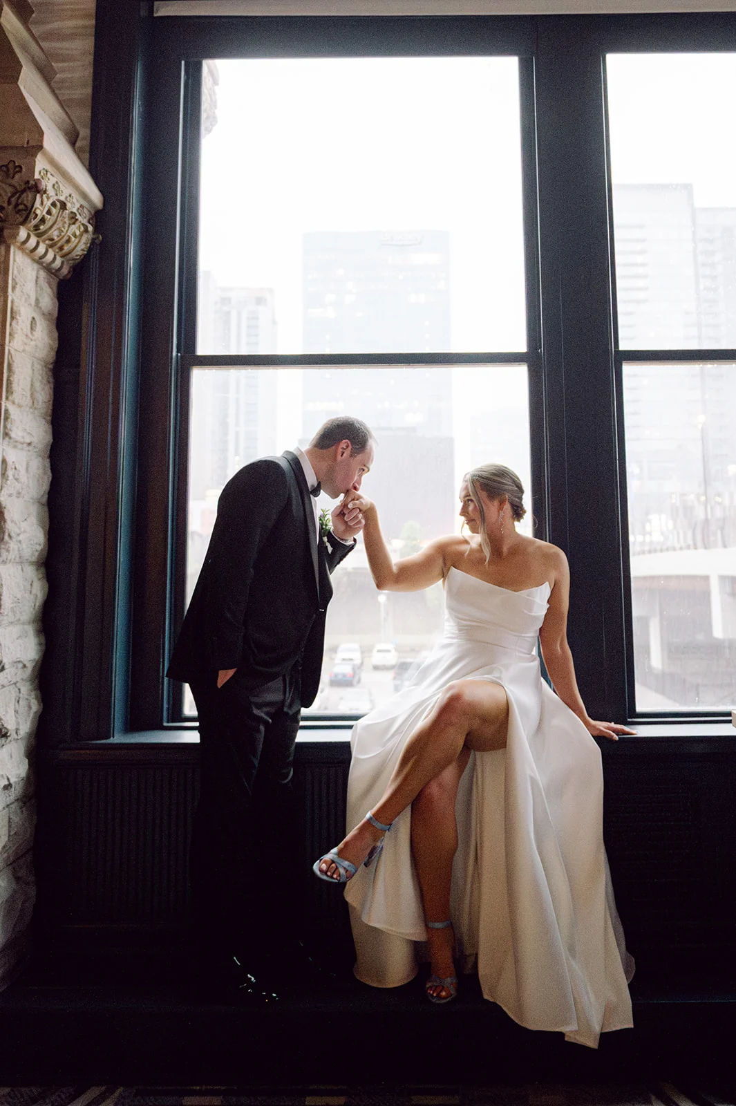
Kate and Andrew’s Union Station wedding blended old-world charm with fresh, personal style in the most perfect way. Being able to contribute to their day was such an honor for our team at White Ink Calligraphy.
If you’re looking to add custom, thoughtful touches to your wedding or event, we would love to help make your vision a reality. Reach out today to learn more about our full-service design offerings—we can’t wait to create something unforgettable for you!
If you enjoyed this post, you’ll love these other blogs!
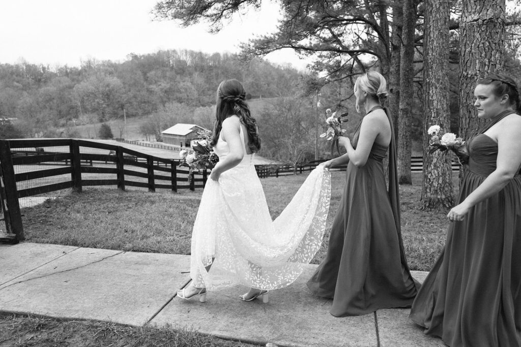
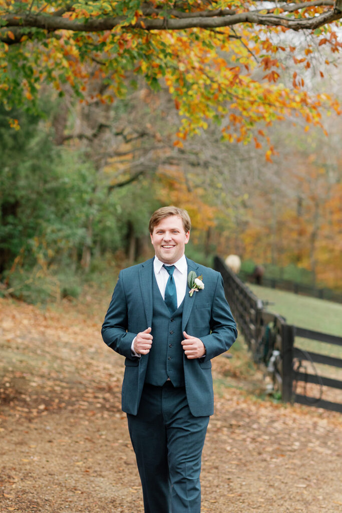
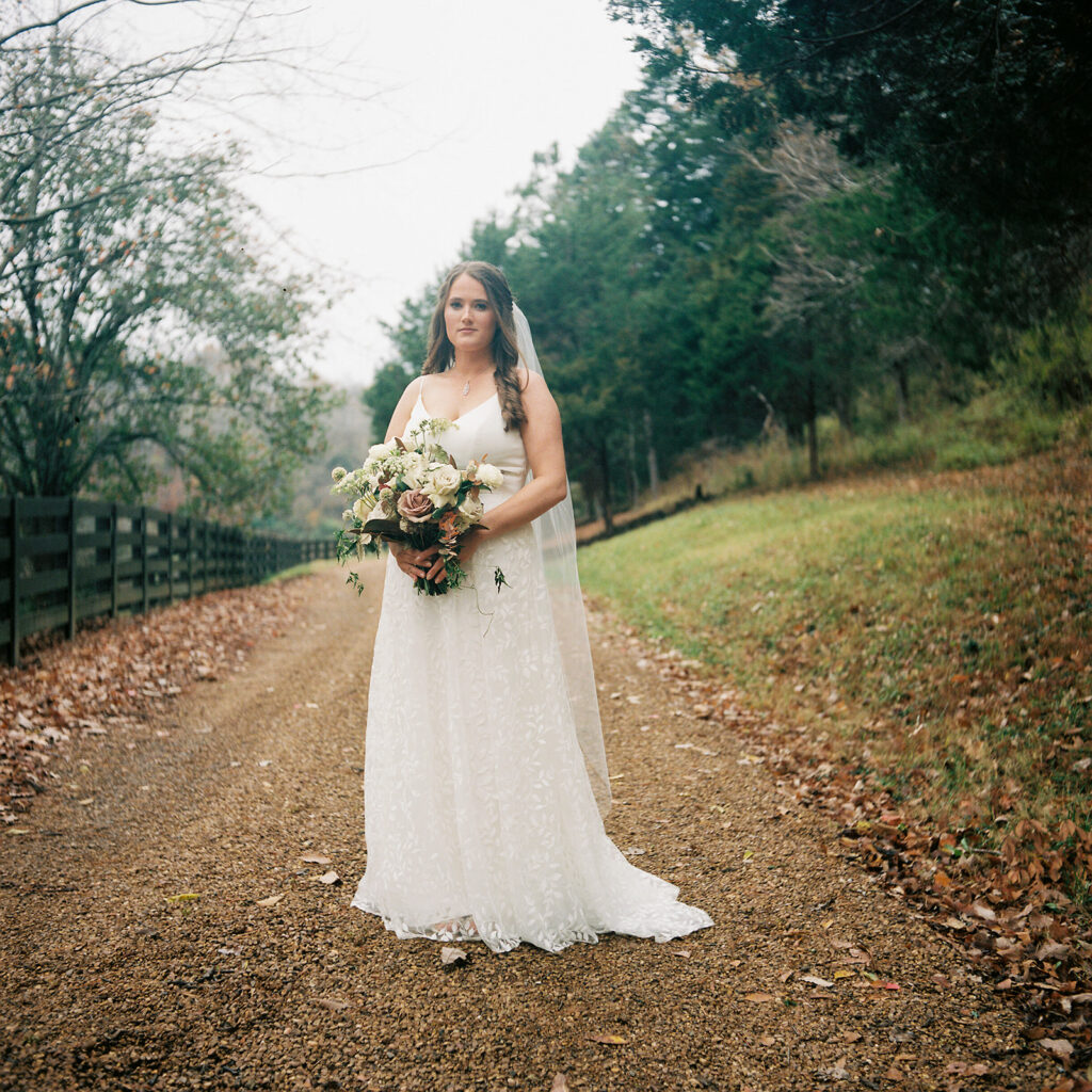
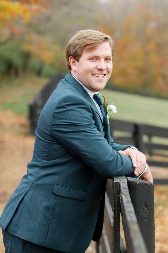
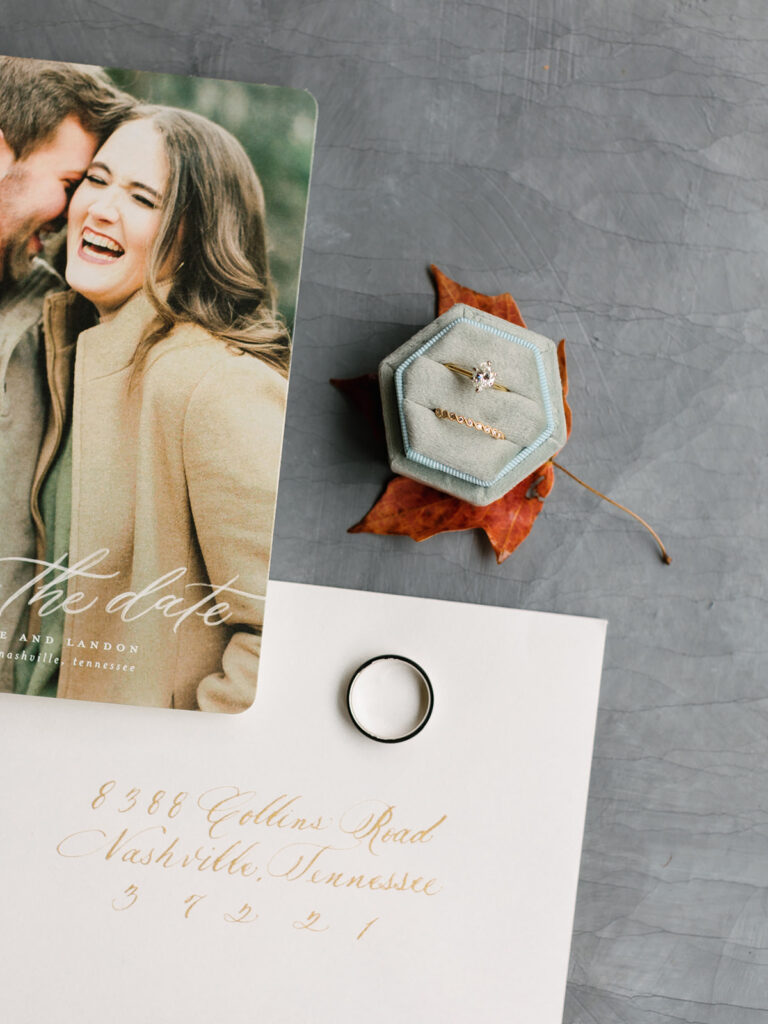
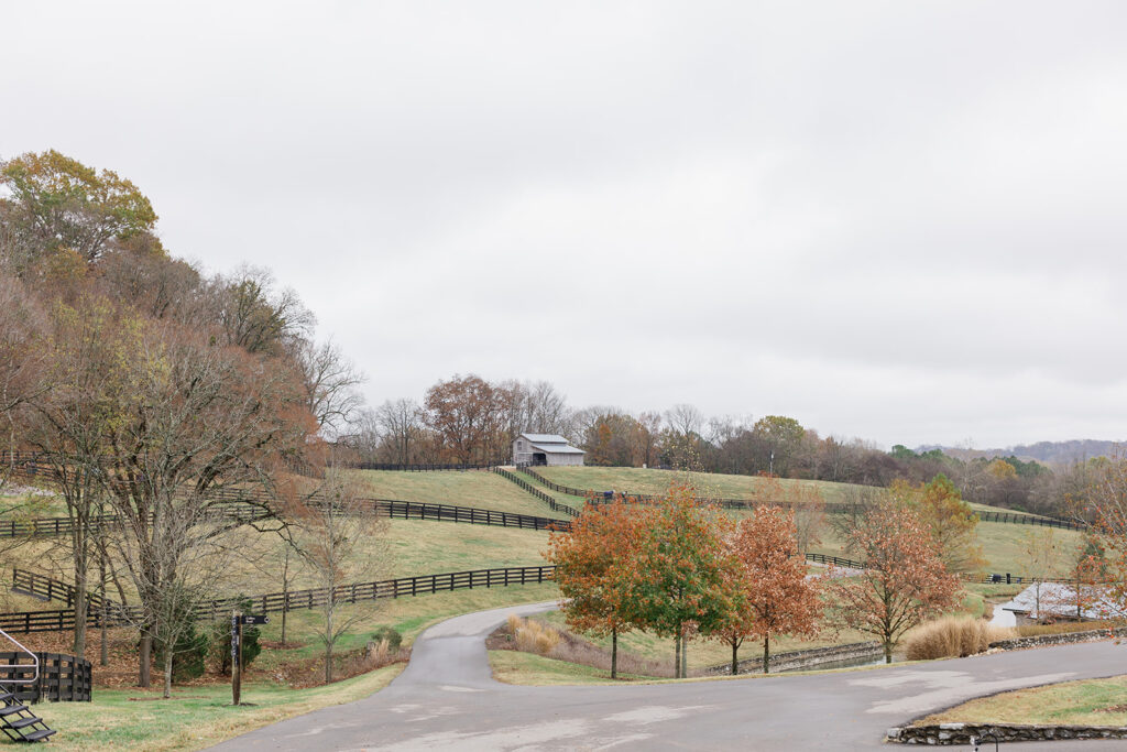
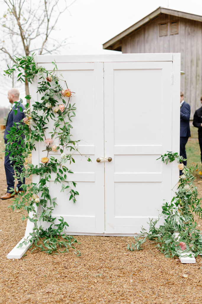
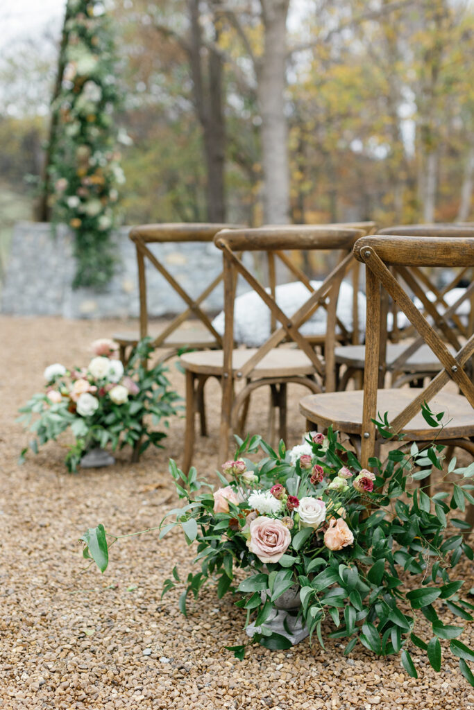
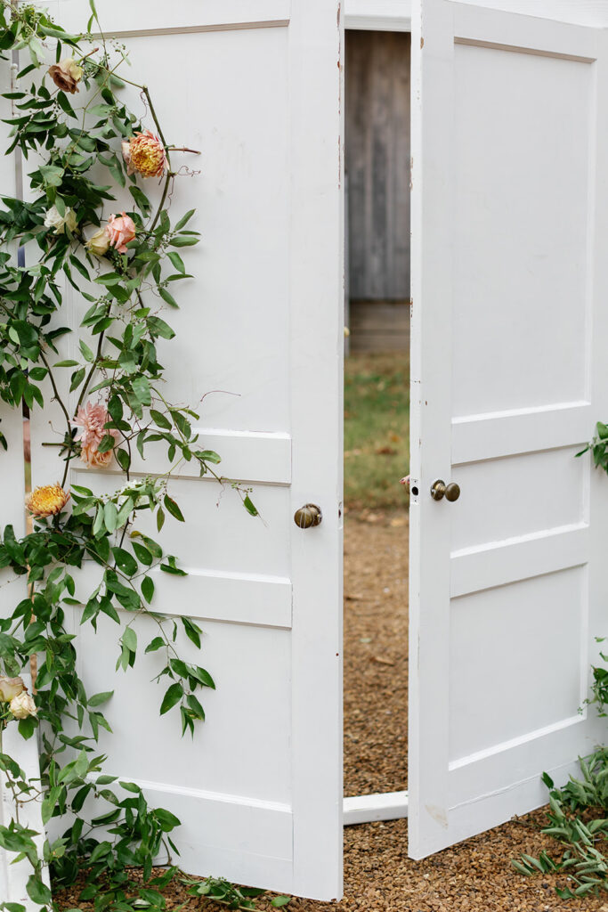
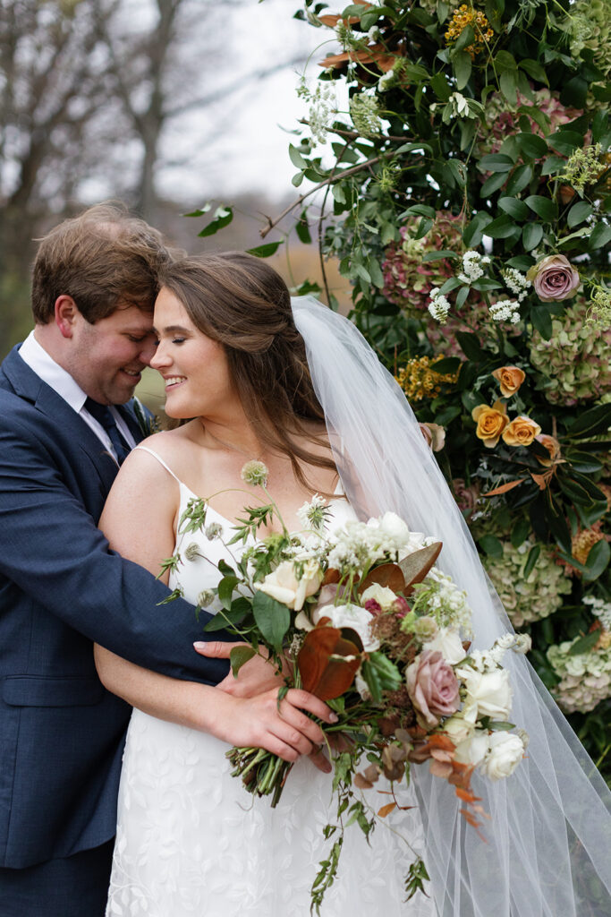
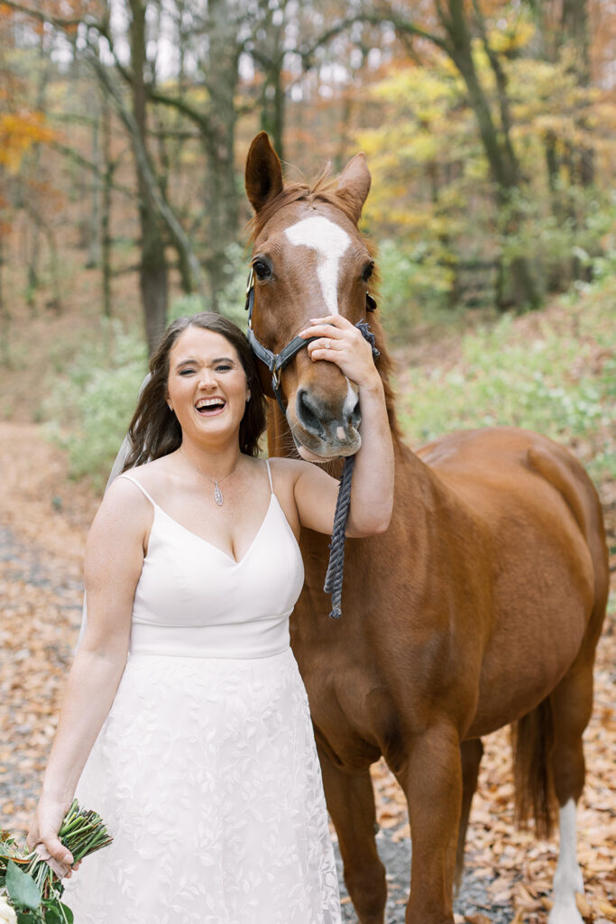
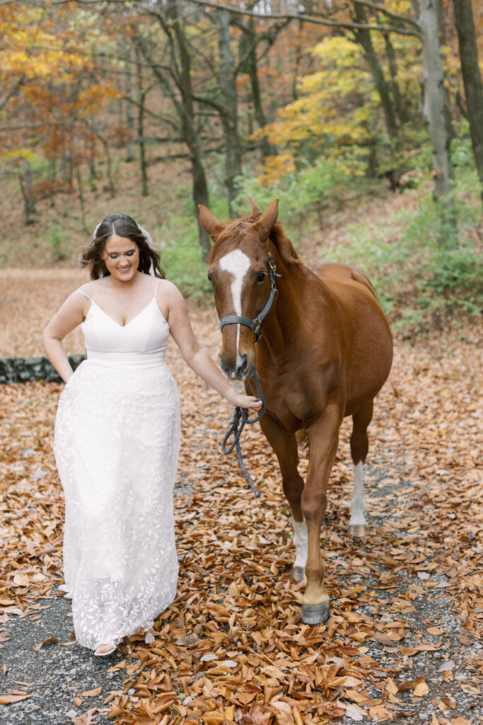
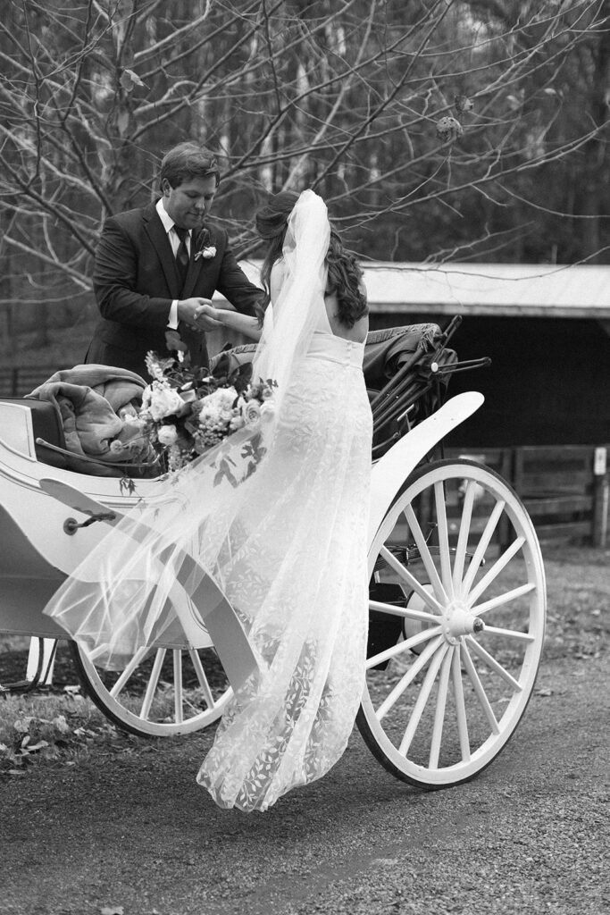
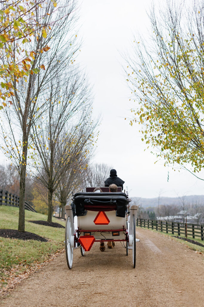
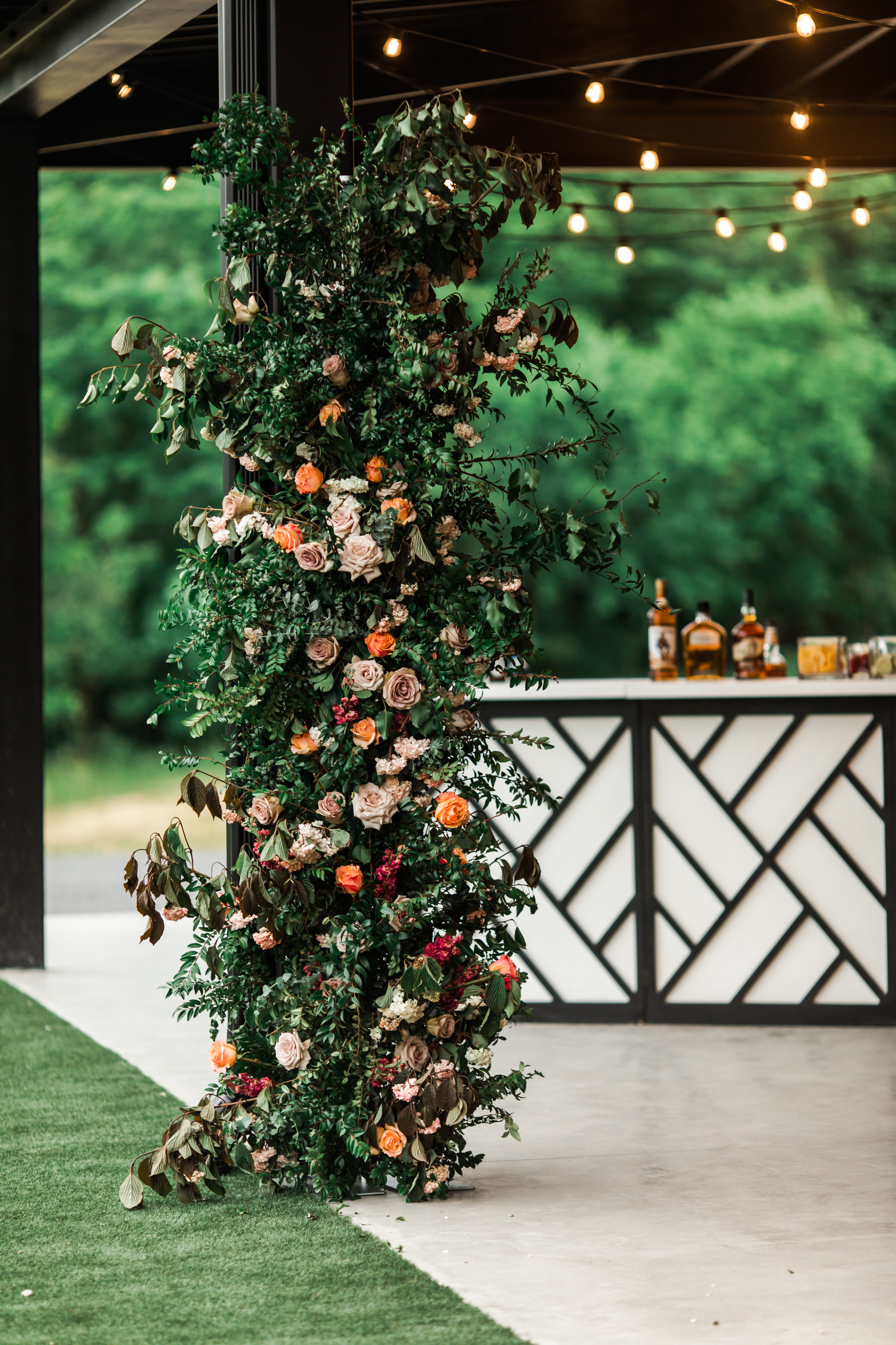
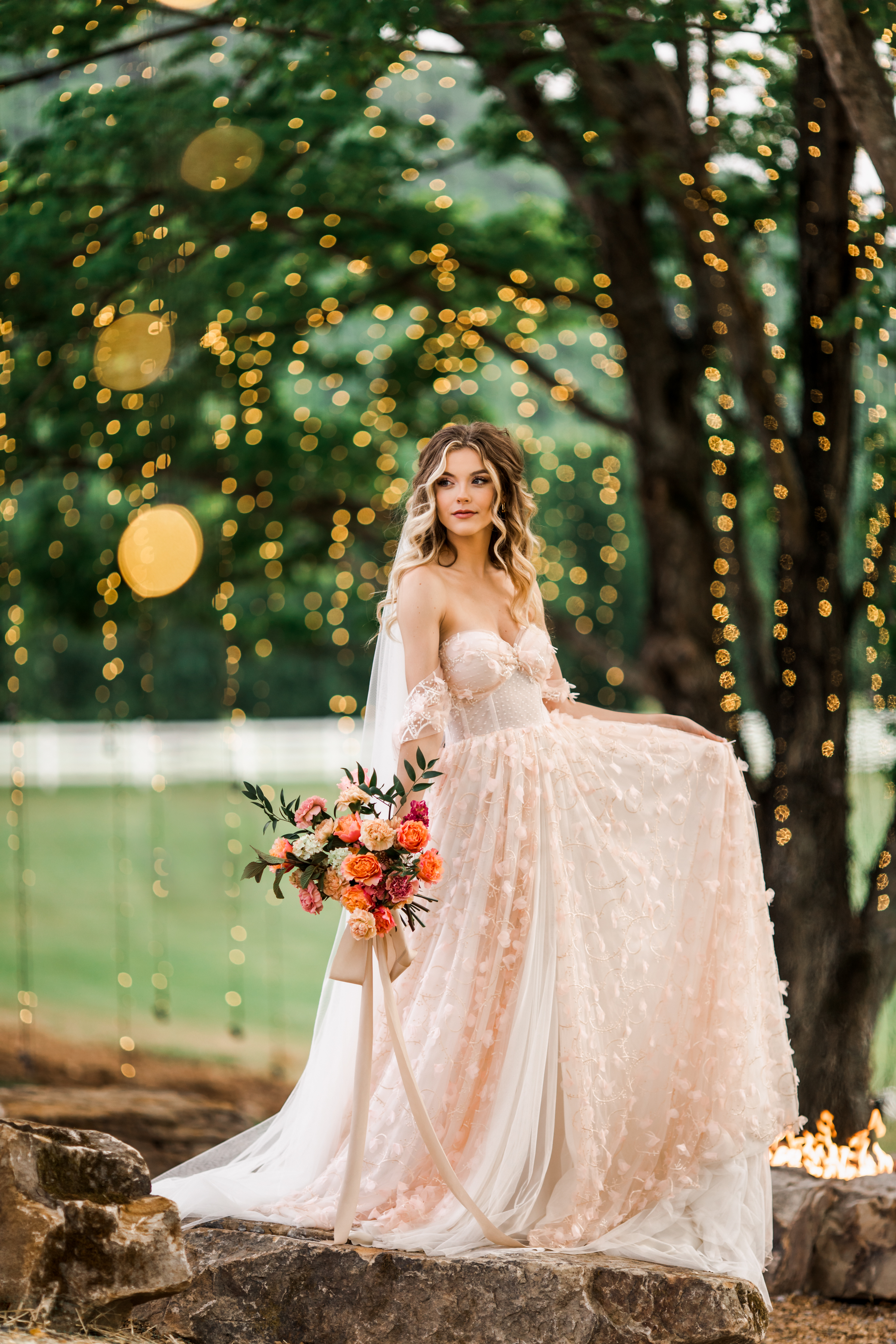
There is no shortage of awe-inspiring, crowd-pleasing, showstopping wedding venues in Nashville. But sometimes, home is exactly where you want to be and simply nothing else will do. Because, as we all know, there’s no place like home. Last fall, Caroline and Landon invited their guests to the family farm where they created an incredibly memorable wedding day and White Ink had the pleasure of elevating this beautiful day with some uniquely exciting details.
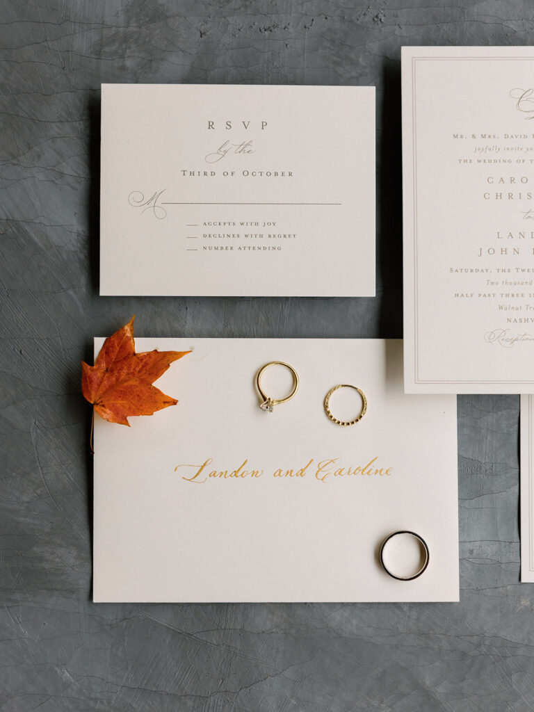
White Ink made an elegantly simple envelope using spot calligraphy in gold which the couple paired with their invites. I love this look because it is crisp and clean and the perfect example of “less is more”. Timeless and always appropriate.
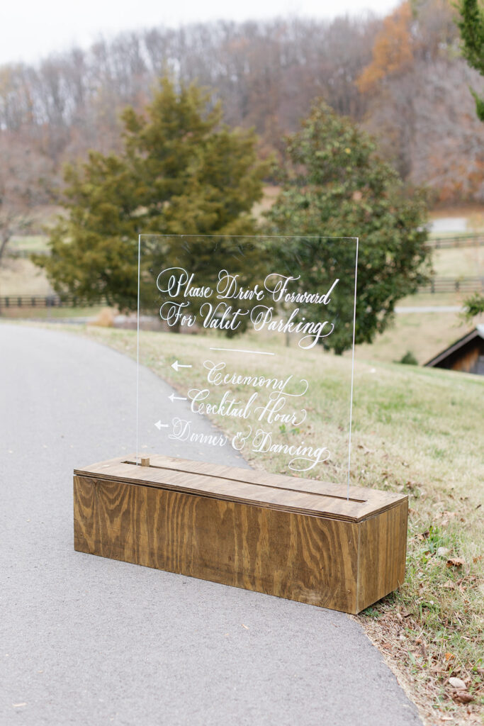
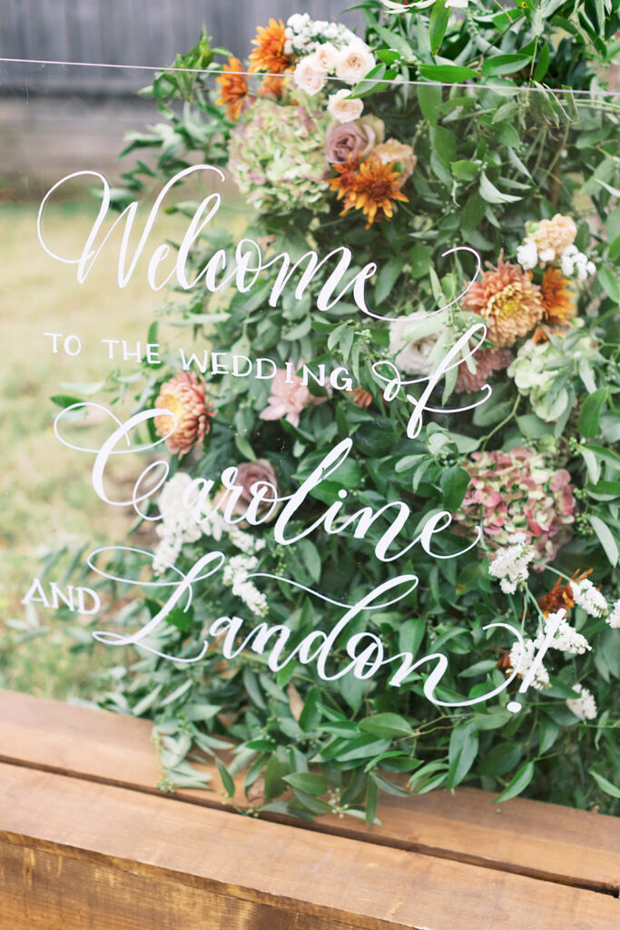
The vast family farm offered the most breathtaking views and open spaces. Caroline and Landon thoughtfully provided a directional sign for their guests so that they could easily get around the farm. White Ink put together this rustic, chic sign. I especially love the look of the acrylic with the wooden case. The custom white calligraphy was the cherry on top!
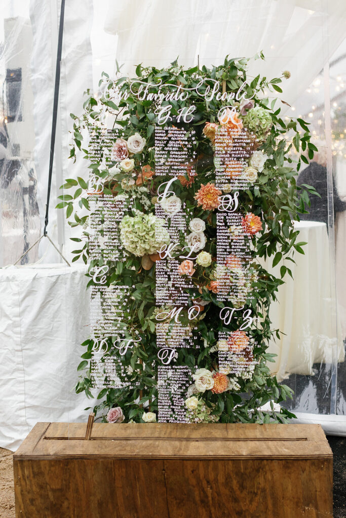
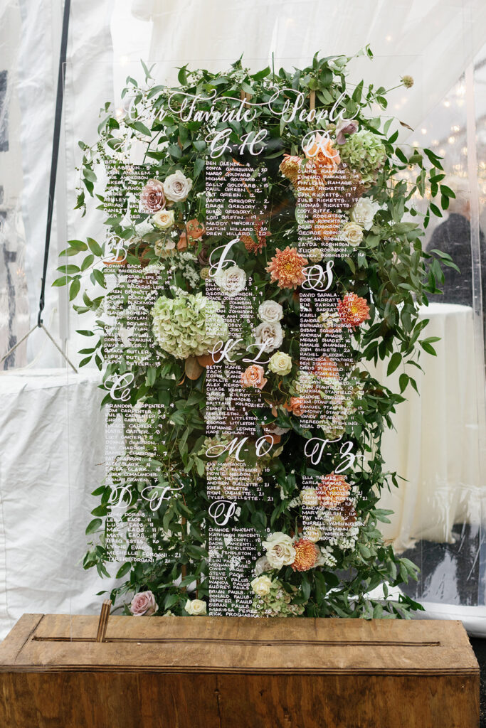
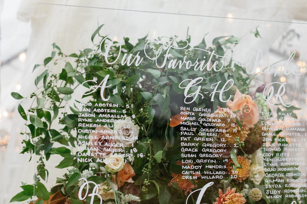
We took the same style as the directional sign to create both the wedding welcome sign and the seating chart. It effortlessly tied these important details together. The only major difference was the POP of florals beautifully peeking through the acrylic welcome sign and seating chart. Mixing florals and calligraphy will forever be my favorite!
“Our Favorite People,” is the cutest way to title a seating chart. It’s an instant smile-maker!
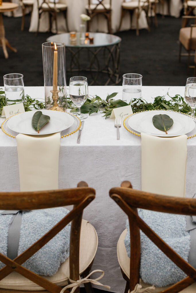
We loved getting to add the sweet bride and groom place cards for the head table. Yes, this is a detail that is subtle, but it holds a lot of meaning- this is Caroline and Landon’s first meal as husband and wife! Our couples are always glad they chose not to overlook the small, customizable details. They’re more important than you might think!
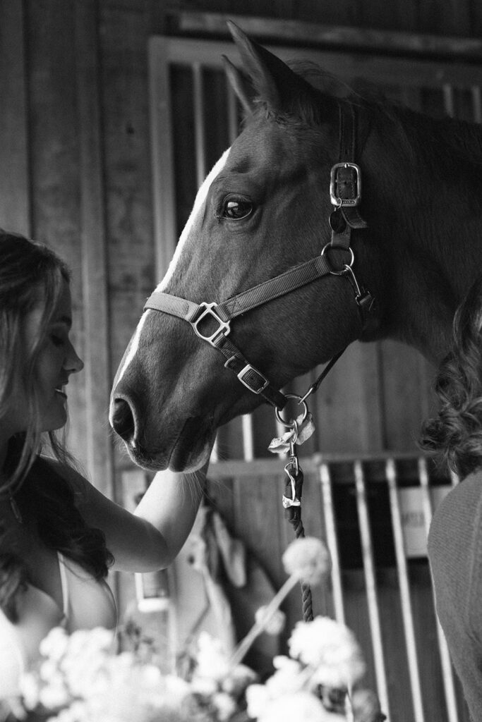
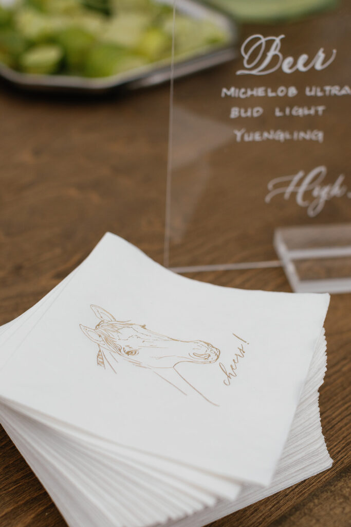
One of my favorite things White Ink did for Caroline and Landon’s reception was create a cocktail napkin where we incorporated the profile of Caroline’s beloved horse! Where are my horse lovers at? Is this not the most adorable way to include your favorite animal in the festivities? These cocktail napkins definitely fit into the scene of the evening.
Home weddings are on the rise. And White Ink is here for it! We are honored each time we are invited into someone’s space, to a place they call their own- a place called home. In some way, the memories are a little bit sweeter. Maybe it’s because home is where the heart is. Congratulations Caroline and Landon!
I absolutely love getting a chance to show you guys projects that White Ink does that are completely outside of the wedding scene. It’s a great opportunity for us to remind folks that calligraphy belongs in any event!
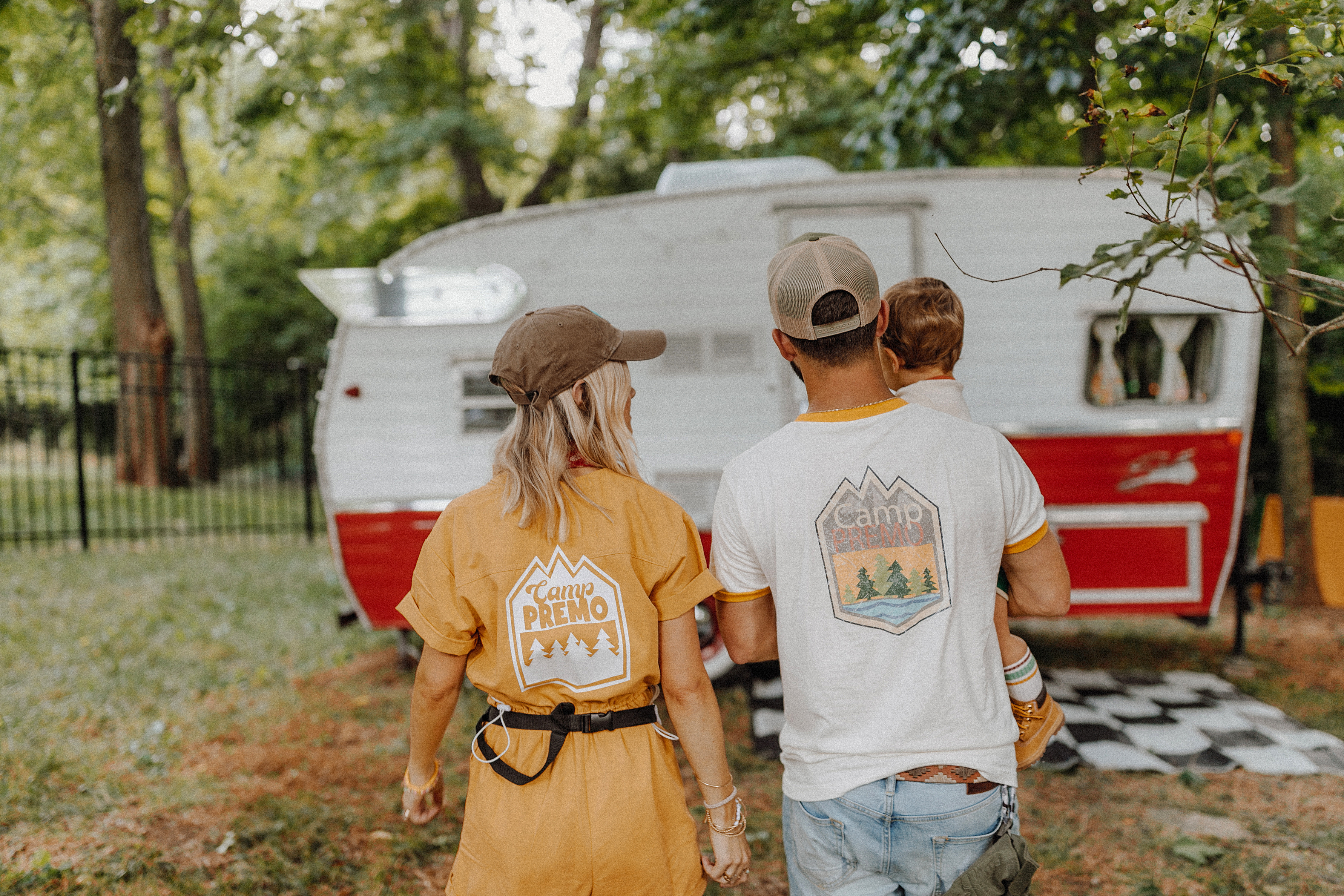
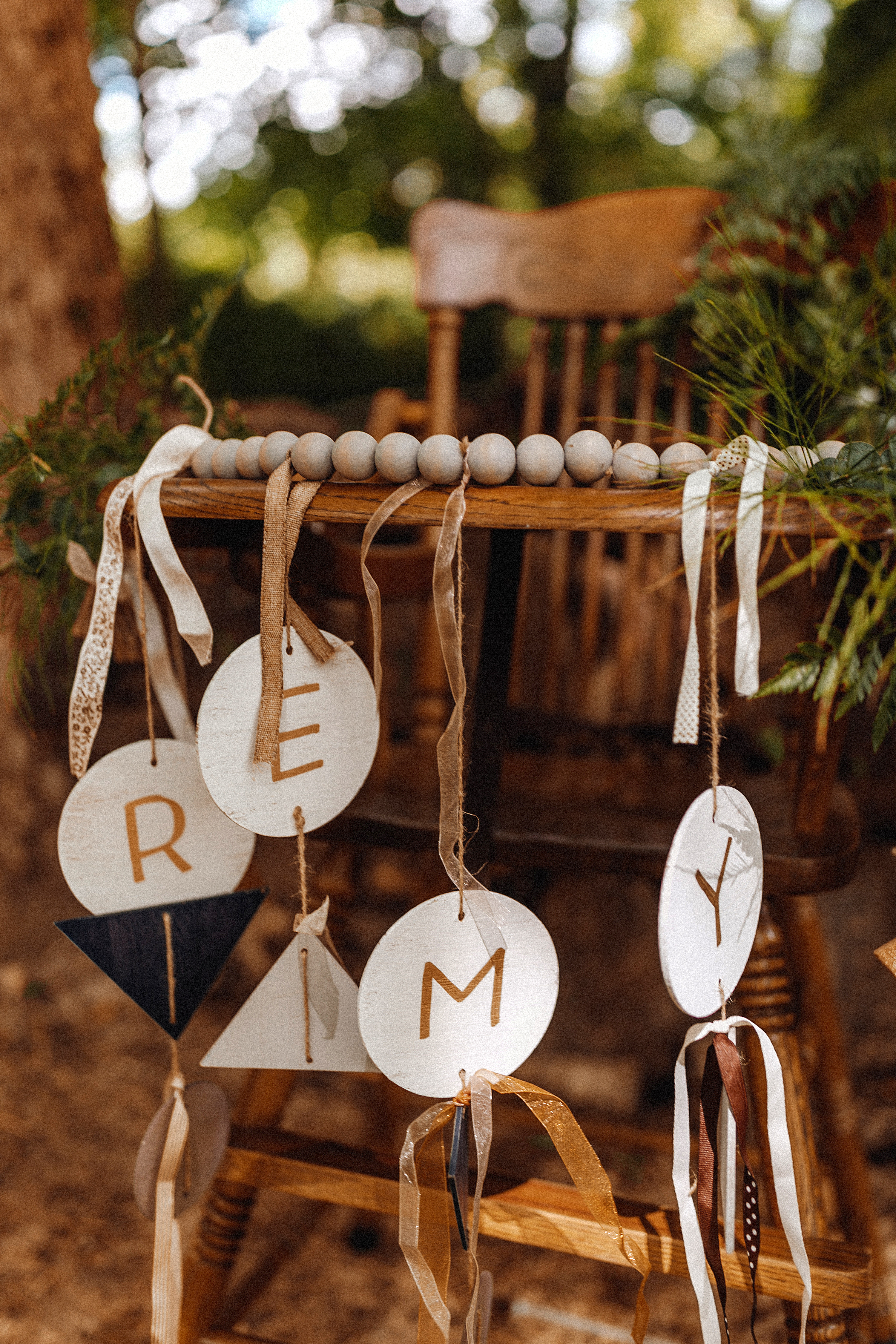
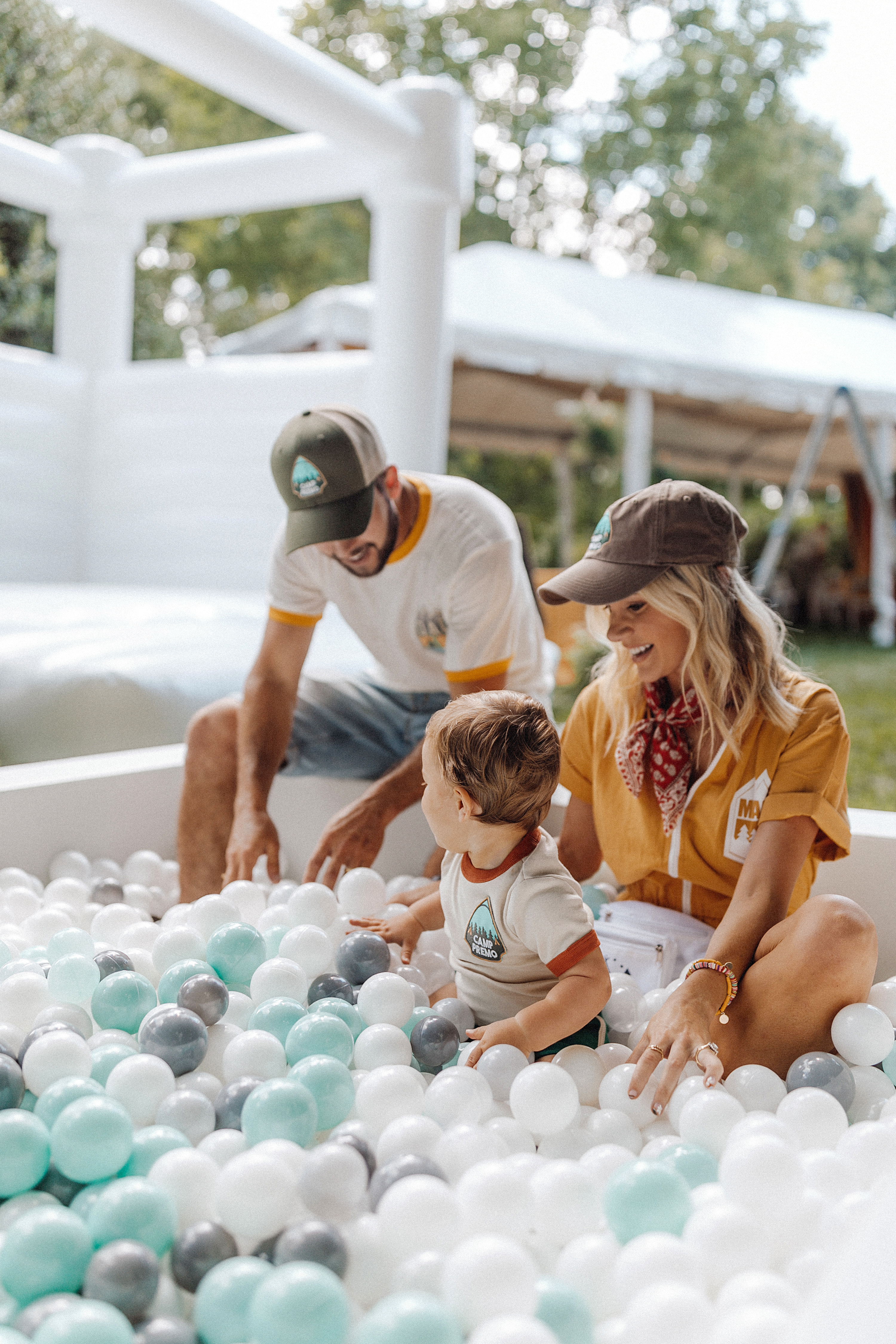
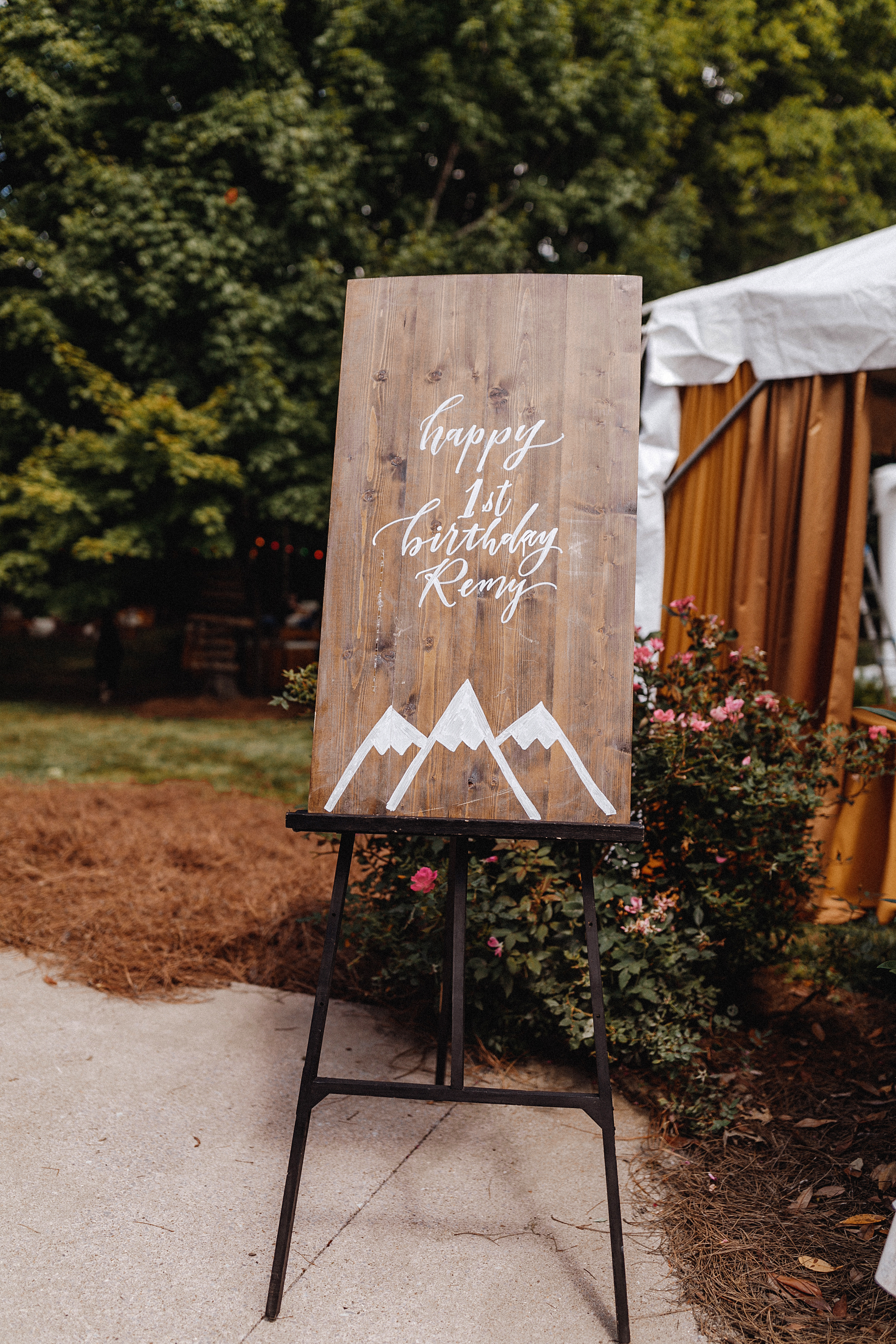
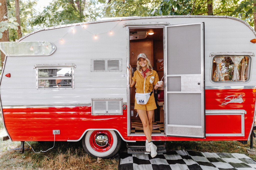
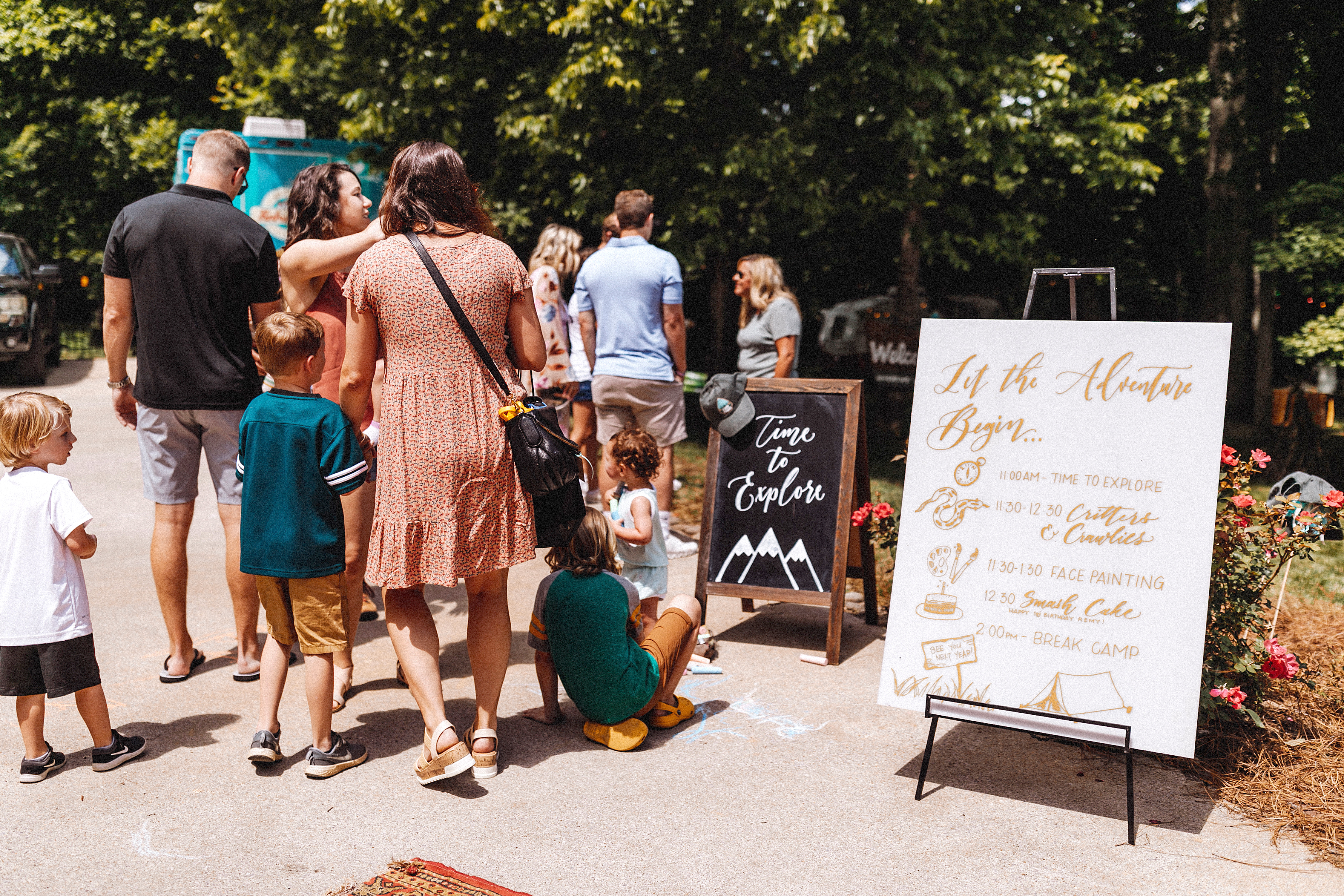
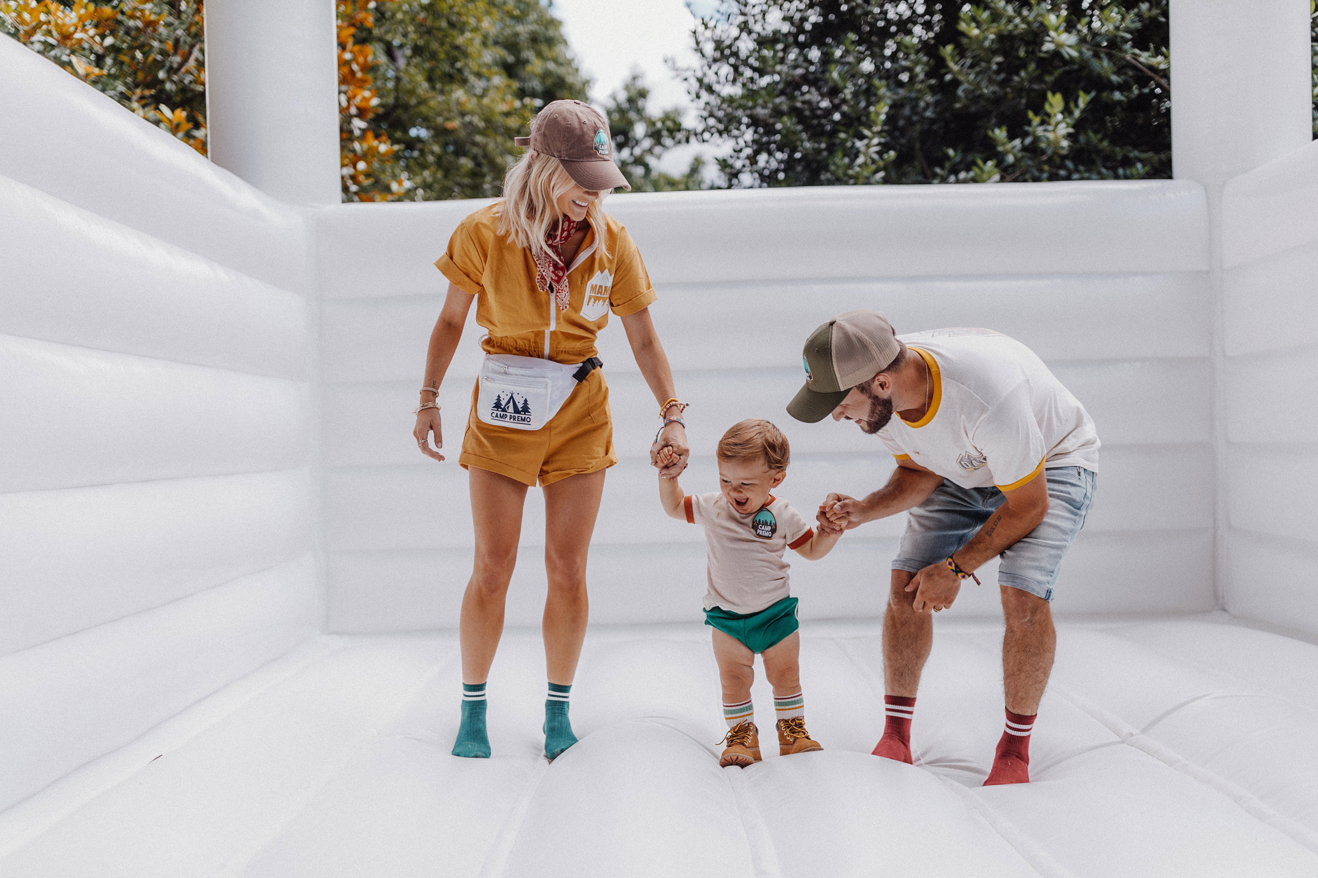
One of Nashville’s top lifestyle-influencers and bloggers, Hunter Premo, reached out to White Ink for help in personalizing the coolest first birthday party we’ve ever seen! This day was all about Remy, the birthday boy. His first birthday seriously blew us away. And our team had a ton fun creating some unique pieces that are sure to bring a bit of birthday inspo to you.
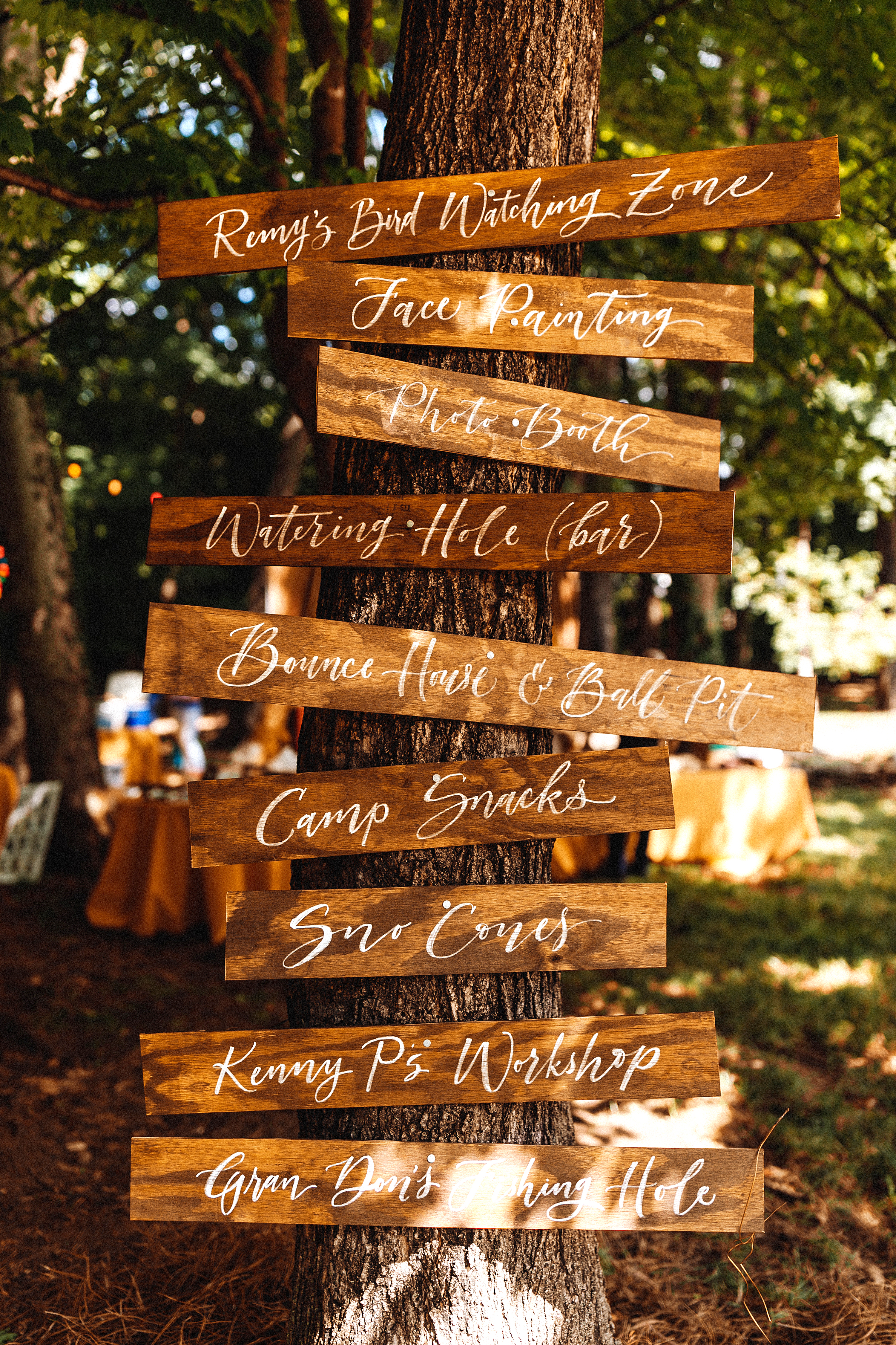
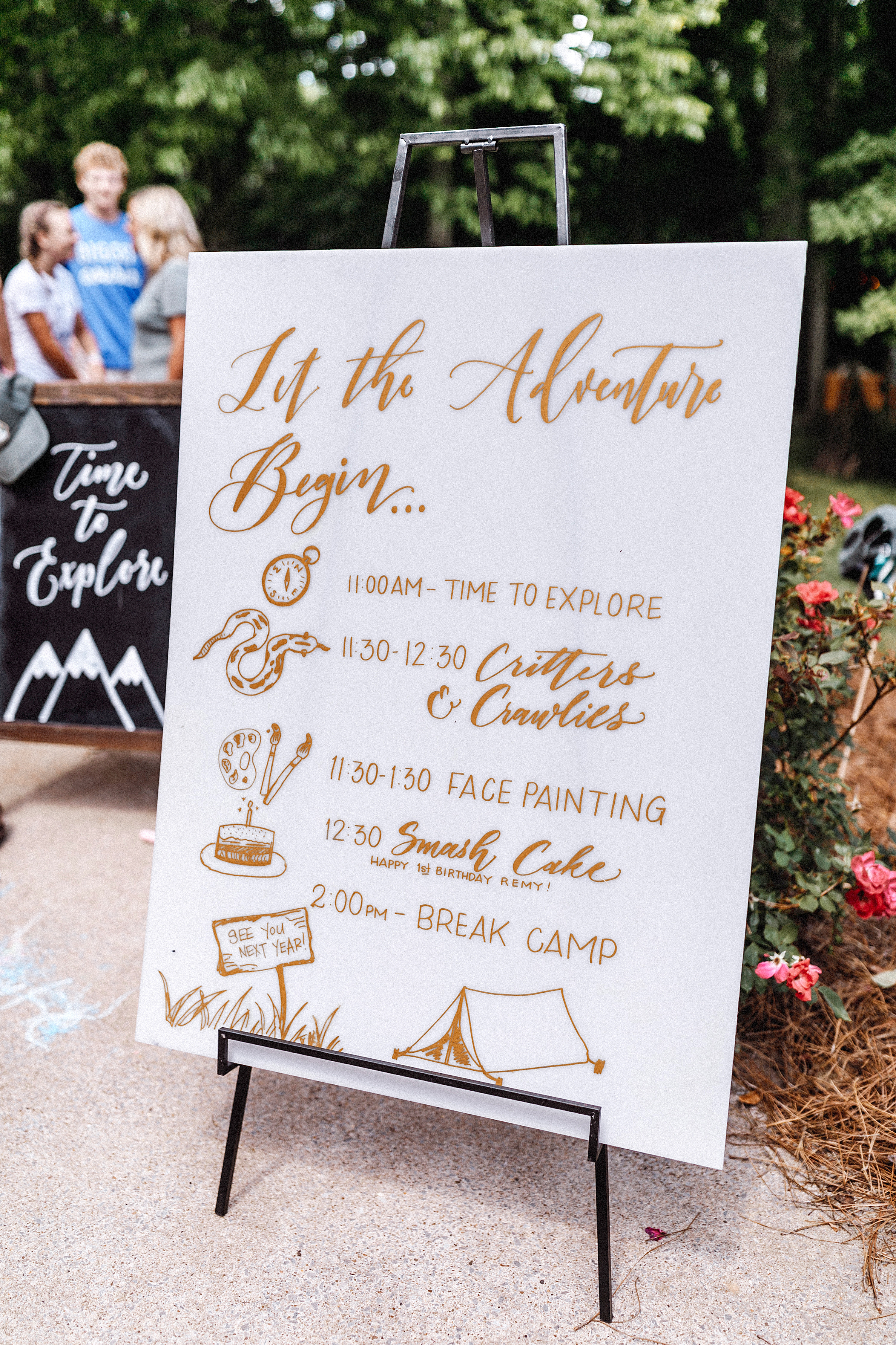
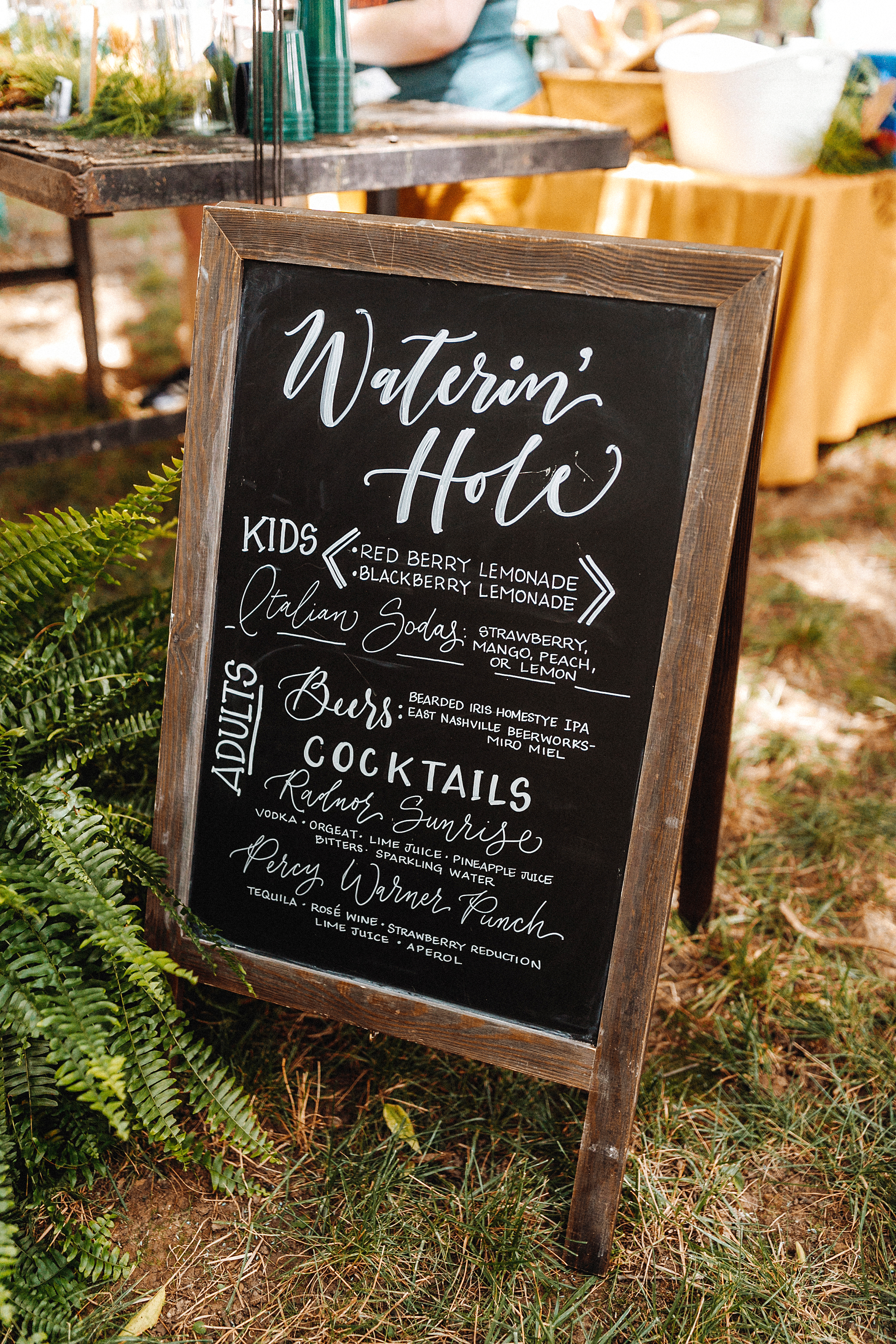
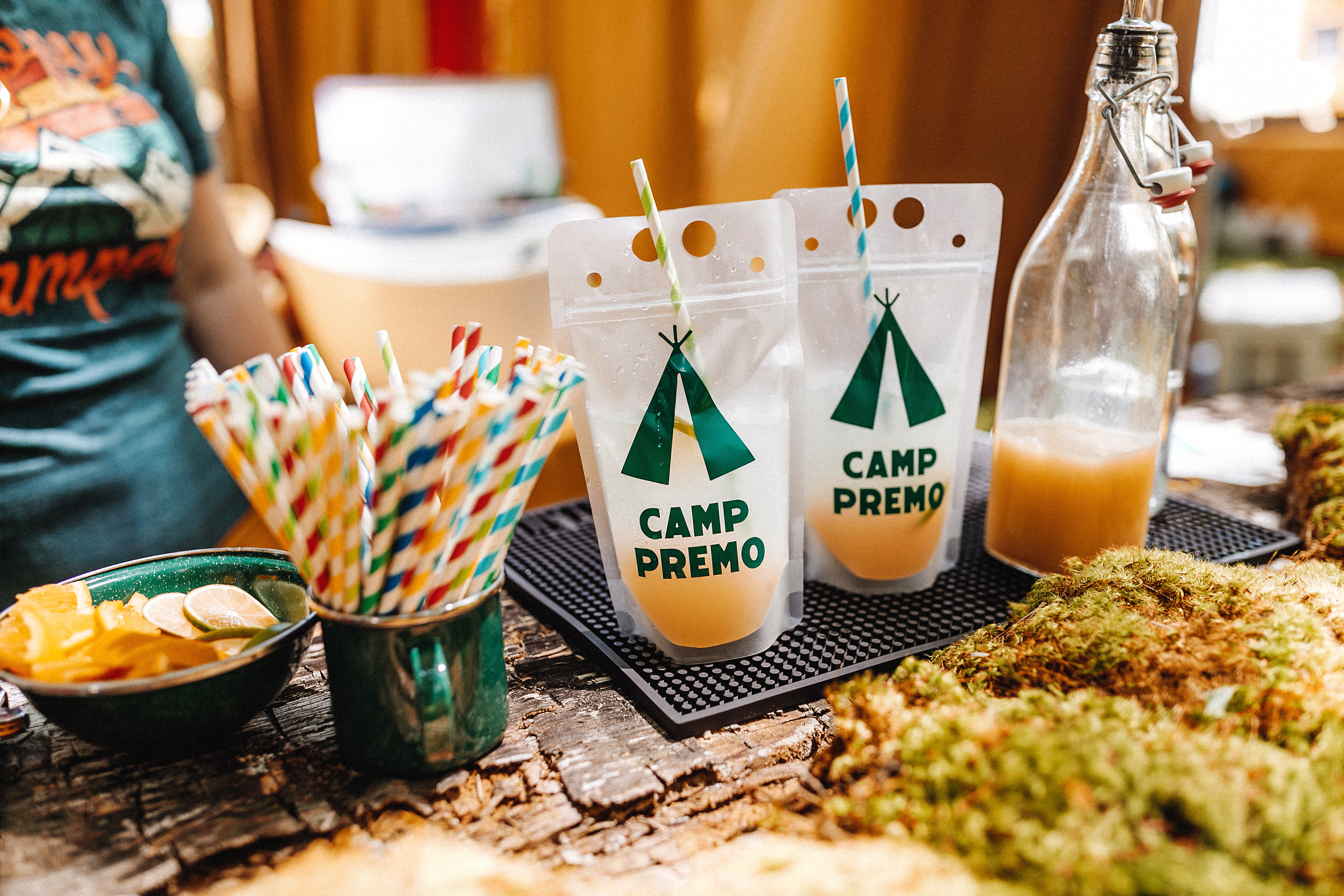
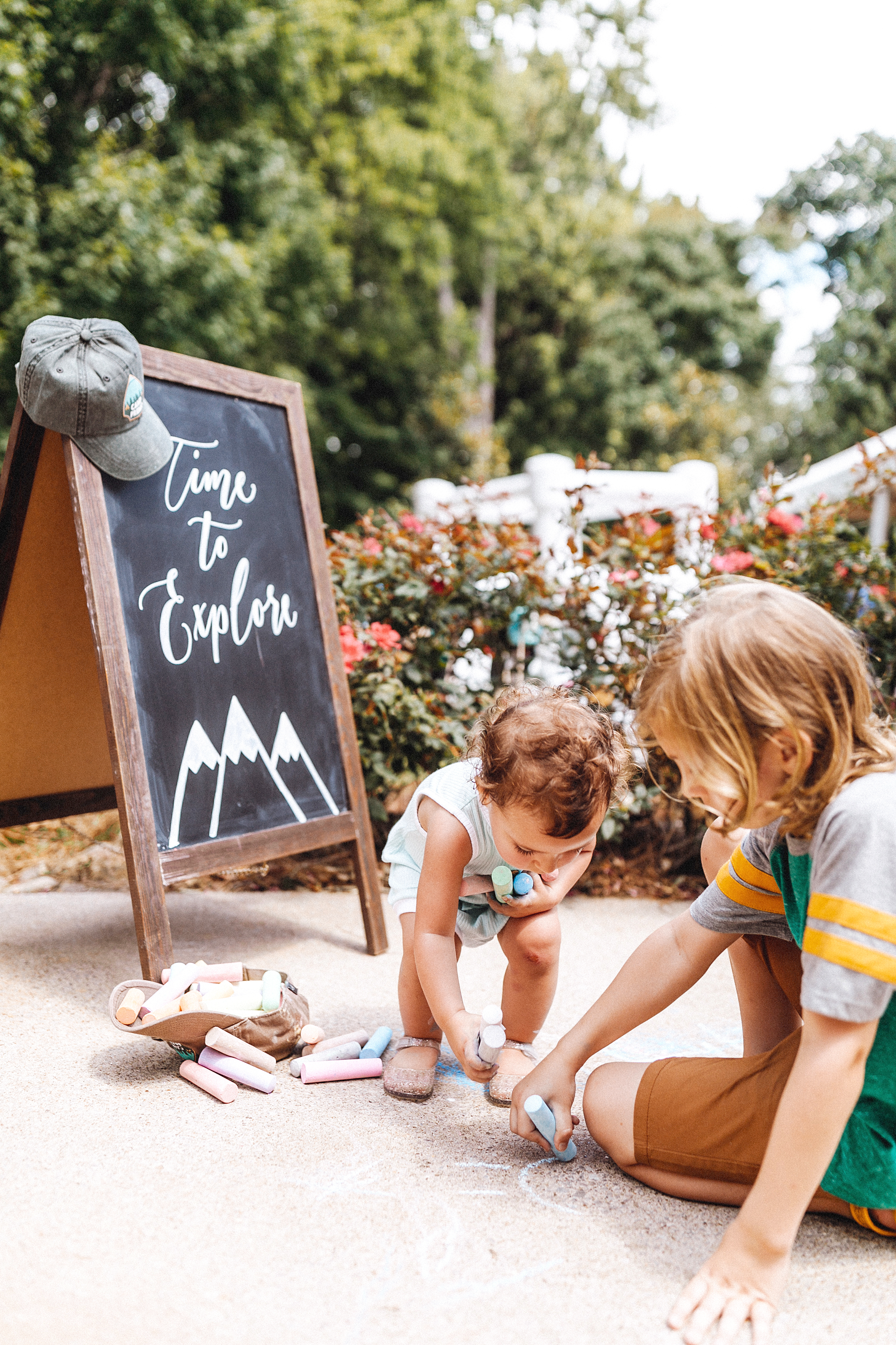
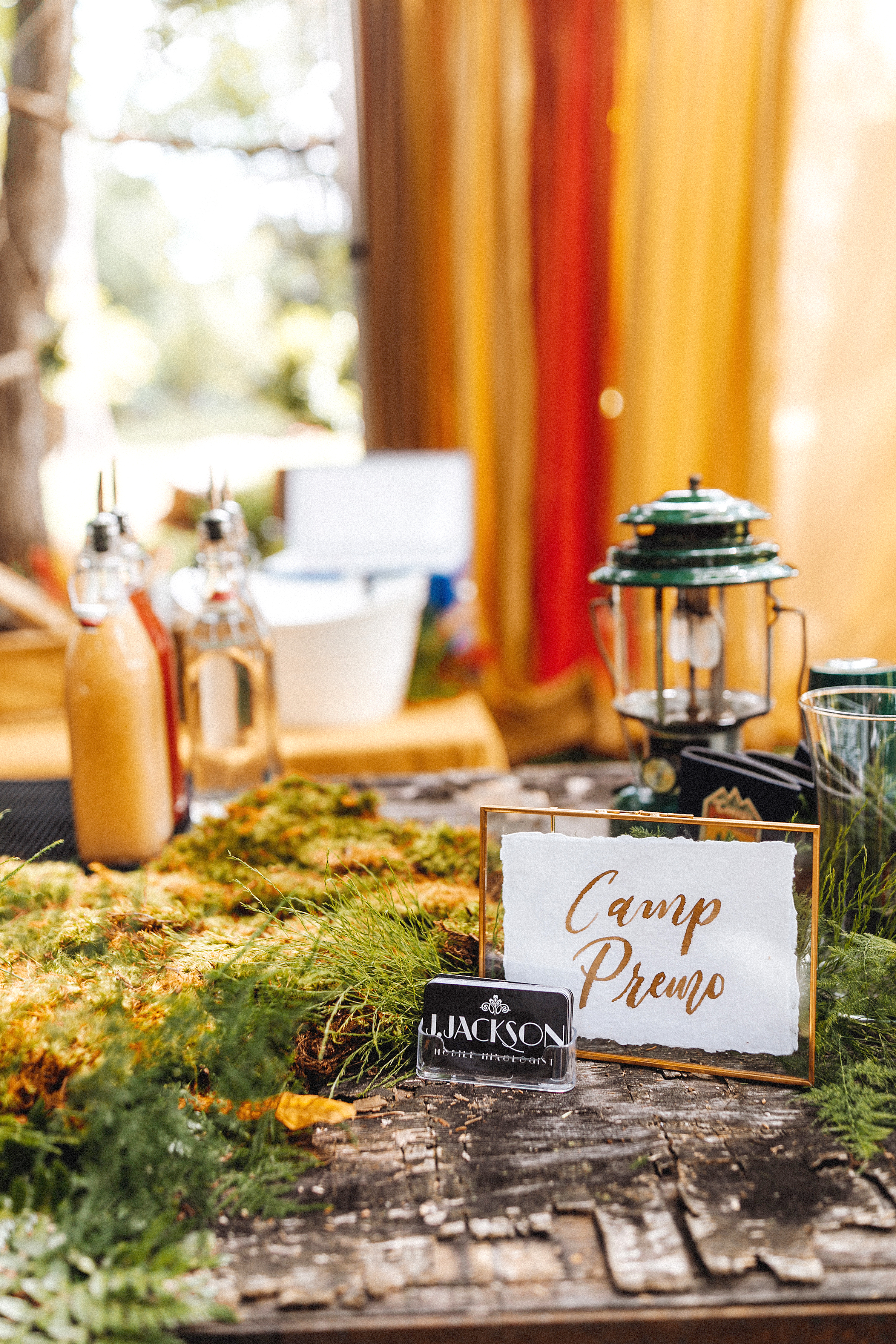
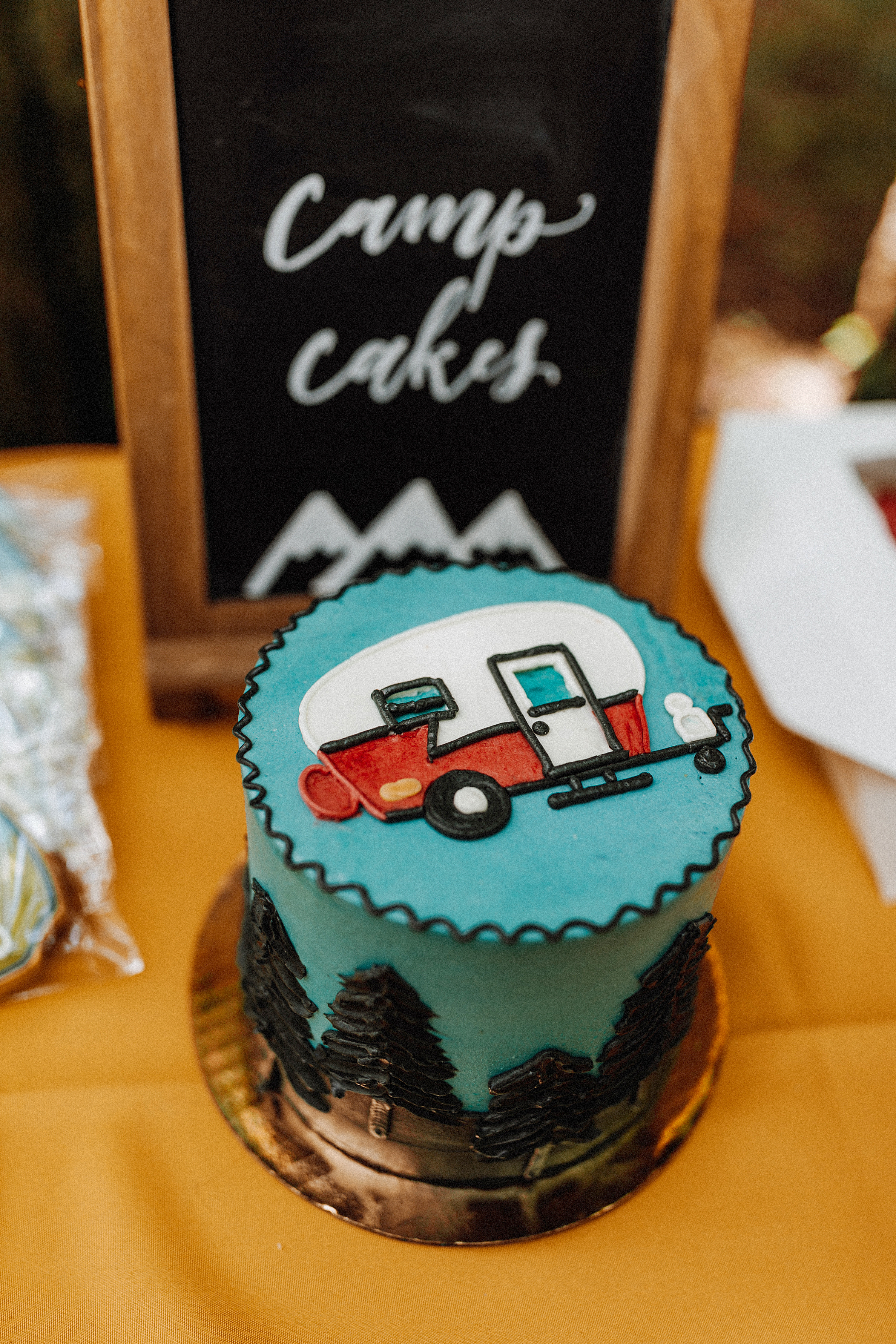
Let’s go to summer camp! This camp-themed birthday was filled with all the nostalgia any summer camp lover could ask for with activities like archery, fishing, workshop, bounce house, watering hole (bar), even a reptile petting station! White Ink got to create the wooden activity signs that were perfectly situated against one of the trees on the property. This definitely made for a great conversation piece. (The owners liked them so much they actually kept them up long after the party was over.)
White Ink’s touch could be spotted throughout “camp” as we created special signage at many of the stations. The adventure sign broke down all of the scheduled activities for the day, which turns out to be a really helpful source when there is such a young audience to entertain. Campers of all ages could enjoy refreshments with lemonades for the little campers and cocktails for the more mature campers! We loved getting to make this sign, so cute!
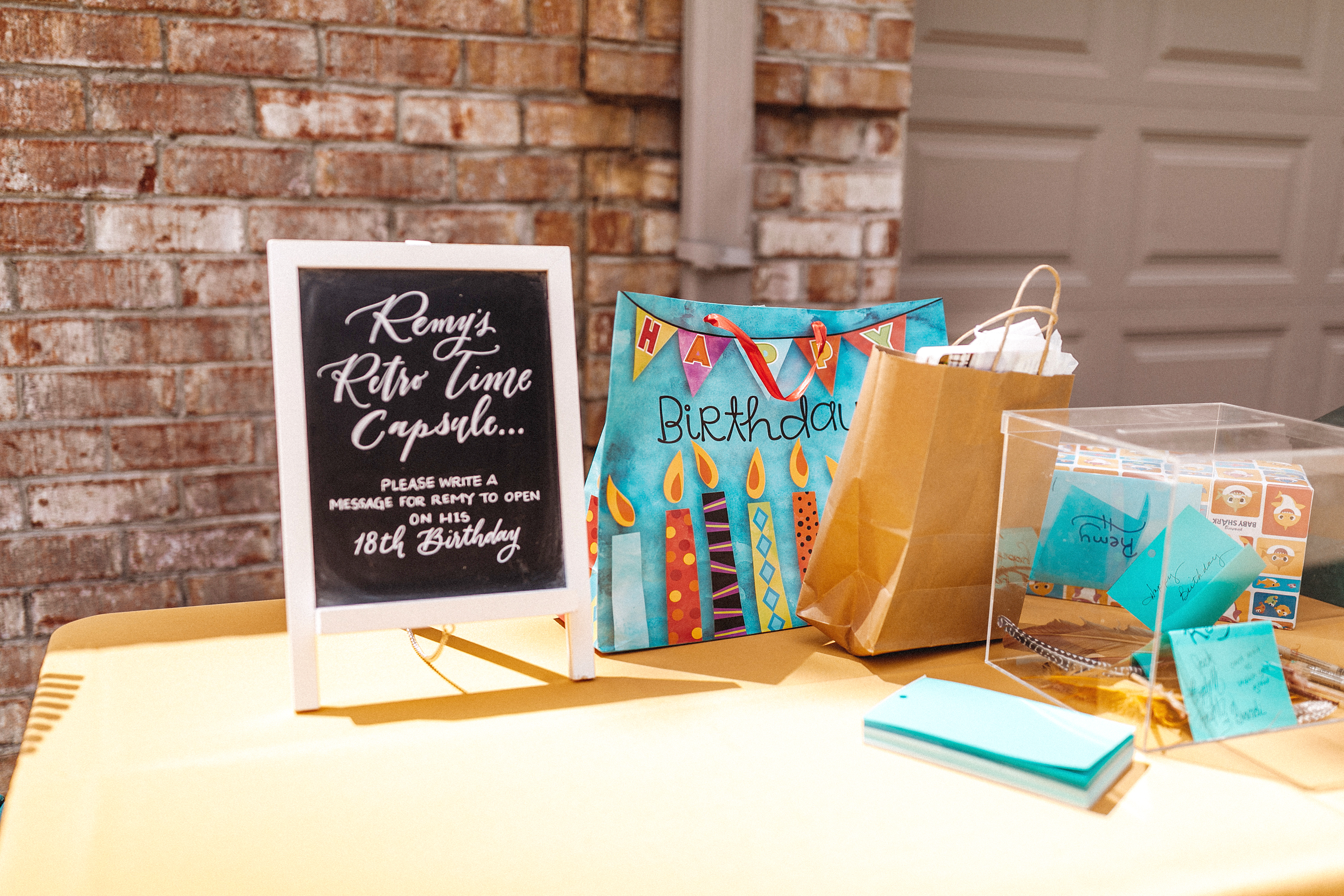
My personal favorite was the table for Remy’s “time capsule”. We did the sign for this station asking folks to write down a message for Remy to open on his 18th birthday. How awesome is that! I wonder what words of wisdom he’ll smile at when he reads them.
White Ink Calligraphy has the best clients in the world! We love it when we get to keep celebrating some of the biggest moments throughout their lives. Remy, we hope your day was filled with all of the love and wonder you deserve. We were so happy just to be a part of it!
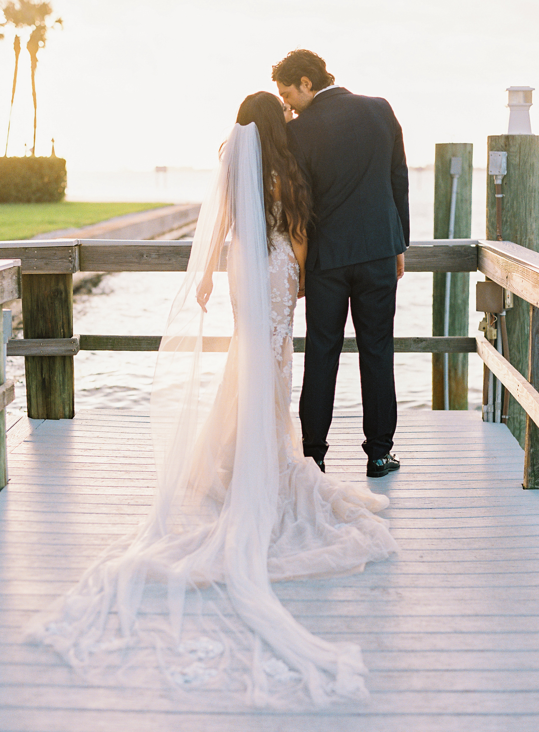
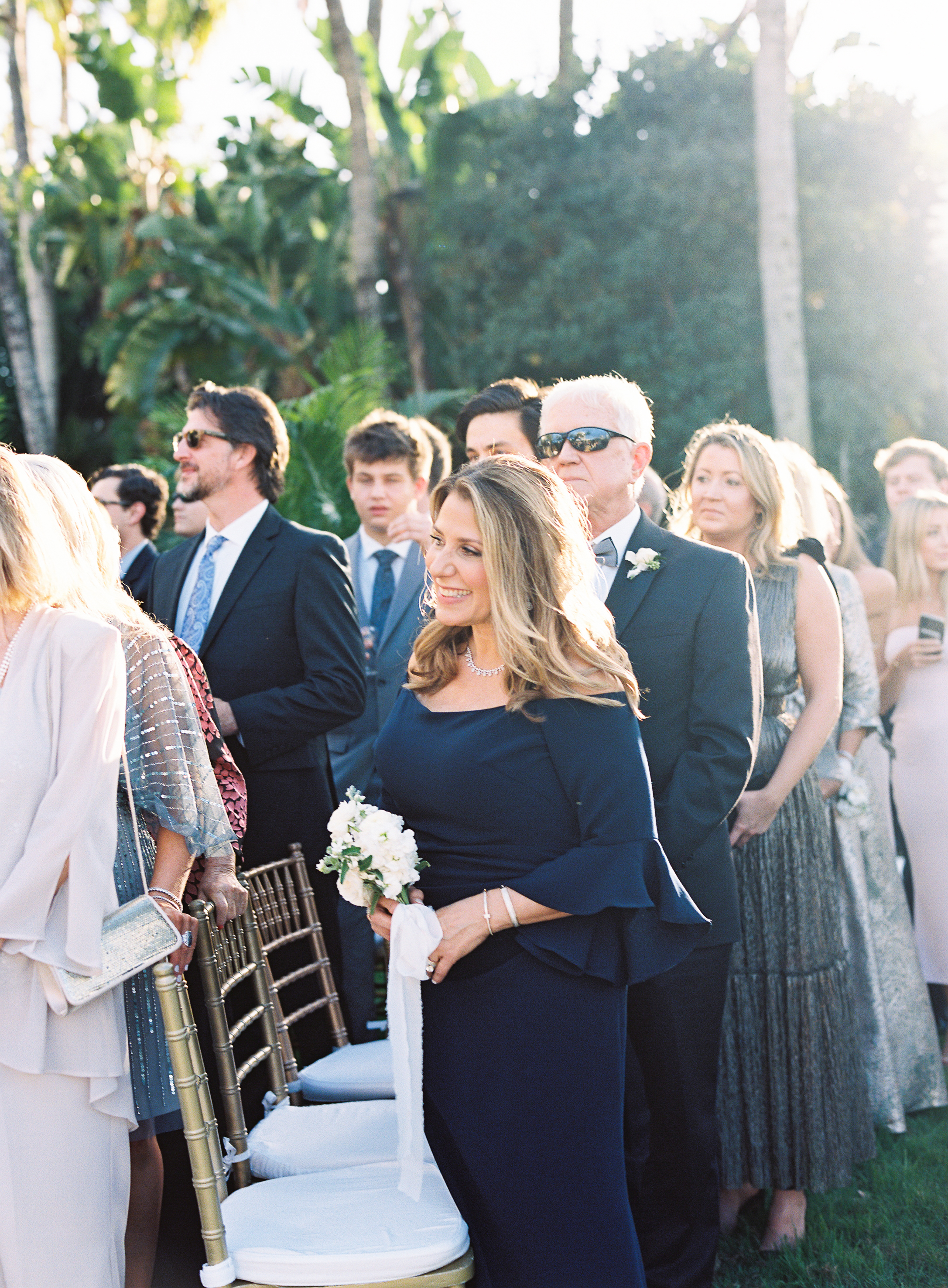
Have you ever been to a wedding or an event and felt, “Why didn’t I think of that?” One of the reasons why we LOVE doing what we do at White Ink Calligraphy is because we get to have front row seats to some of the cutest, boldest ideas in town. And we want to share them with you! This time, White Ink goes to Sarasota, Florida to take part in a wedding where love was all in the detail.
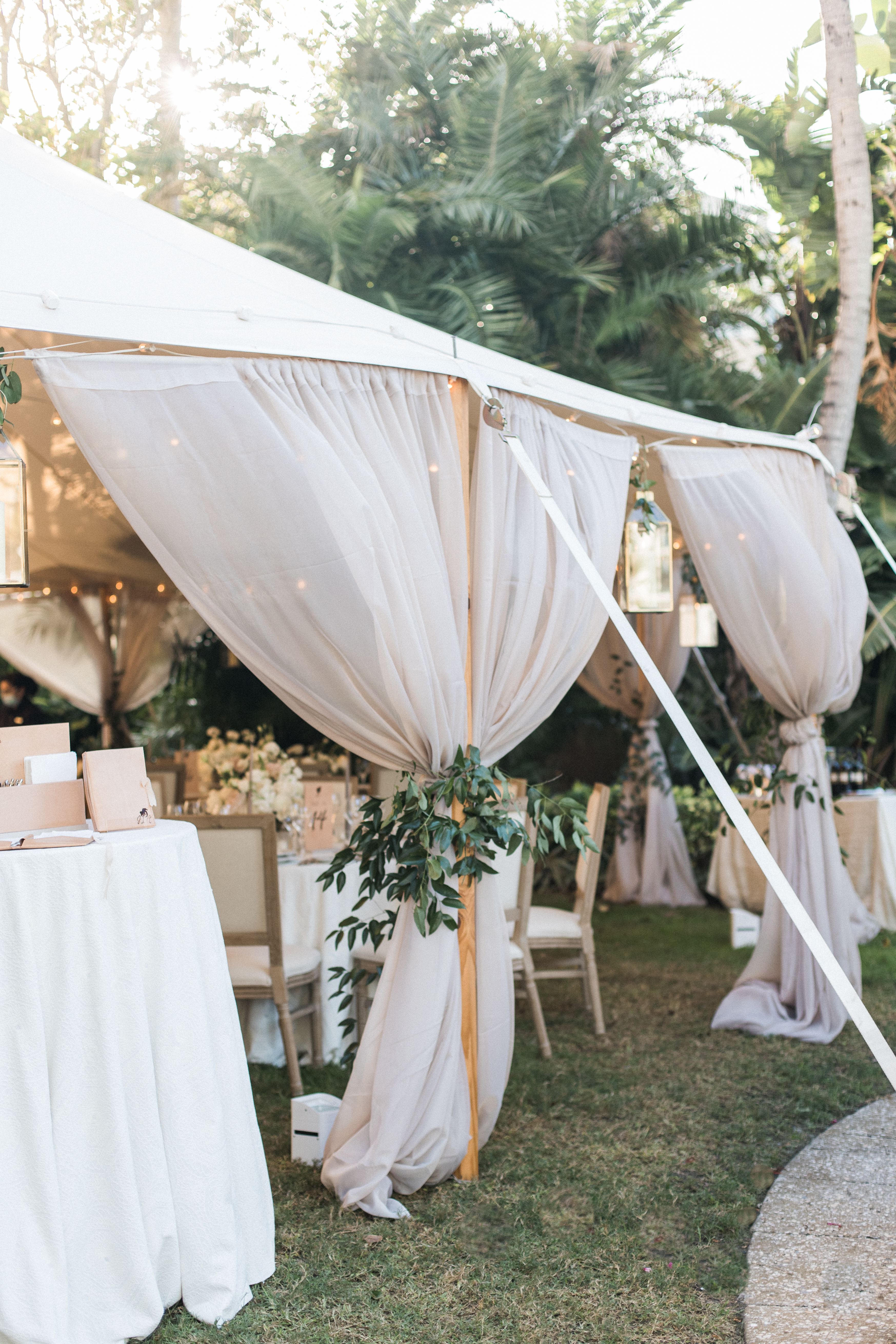
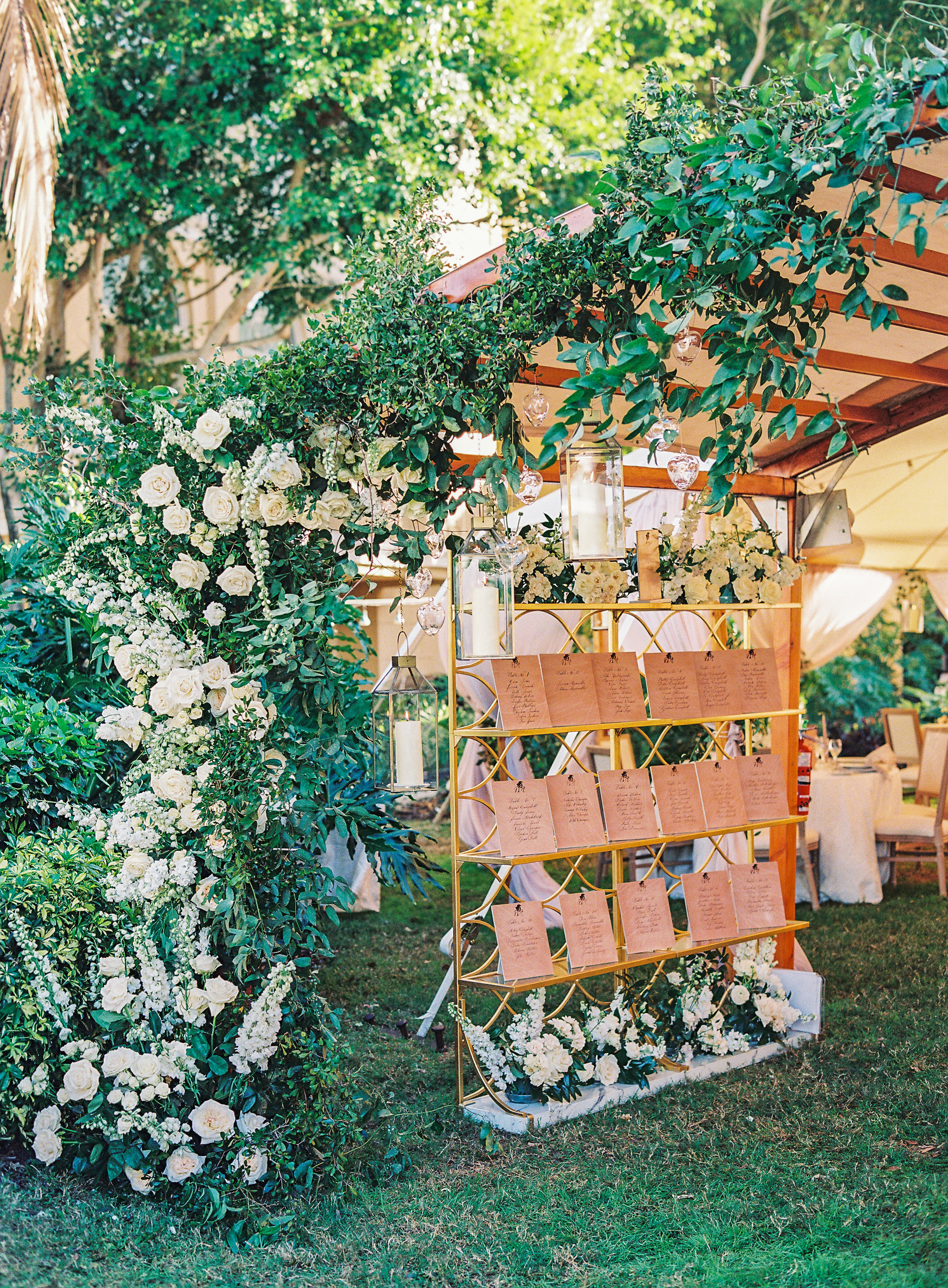
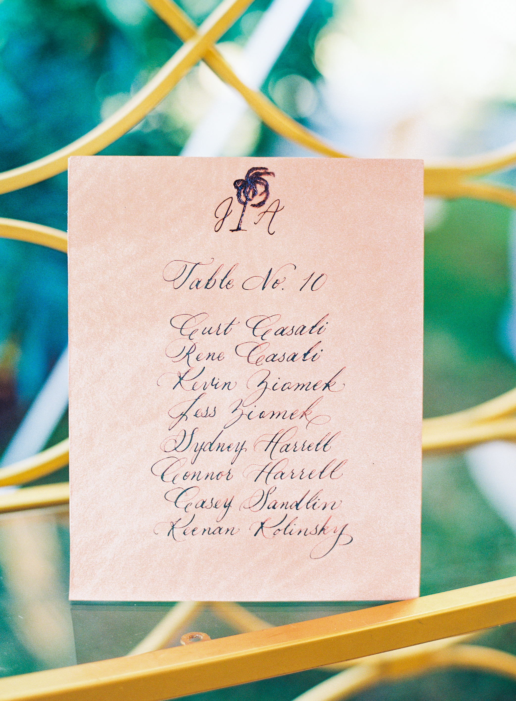
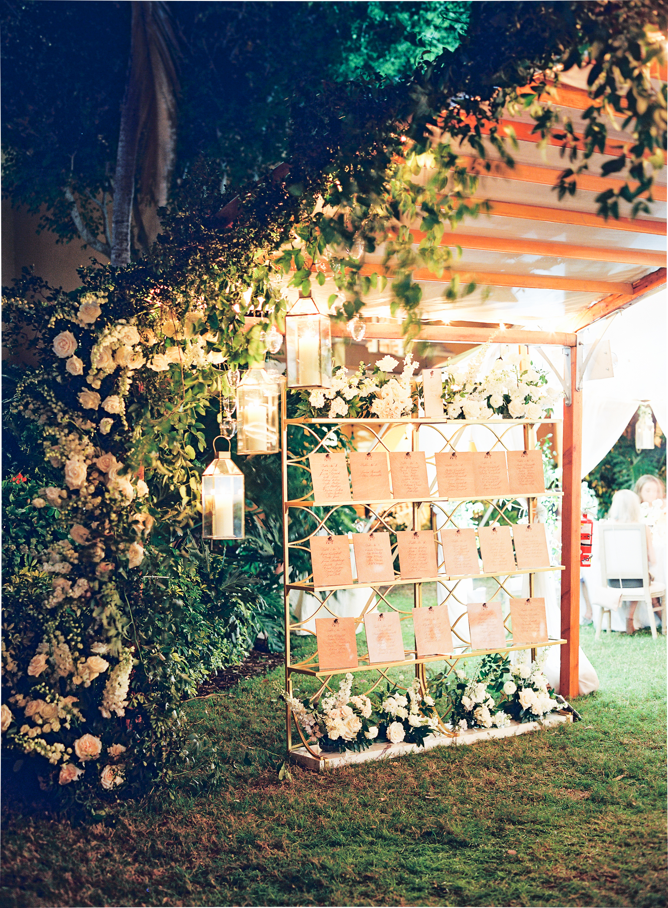
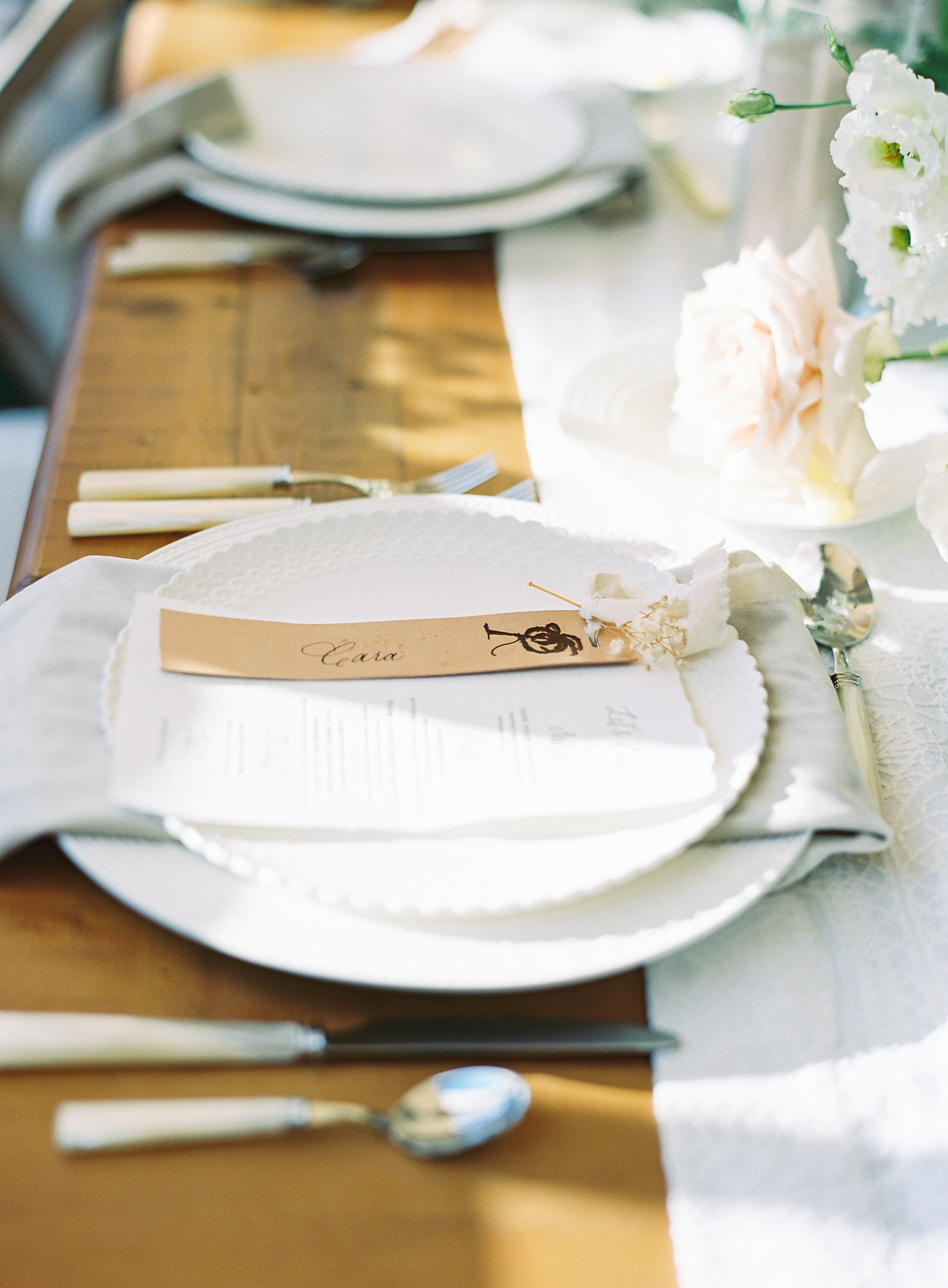
White Ink couple, Jessica and Adam, recently tied the knot and we had a lot of fun with some of the long-lasting details of their wedding. Take your time to check out how gorgeous this calligraphy looks on these leather pieces for the seating signage (this is your reminder that we do SO much more than paper!). These beauties were charmingly tucked beneath a cascading array of flowers for every guest to gush over as they walked by. This seating chart is the epitome of balance between gentle and bold. More of this please!
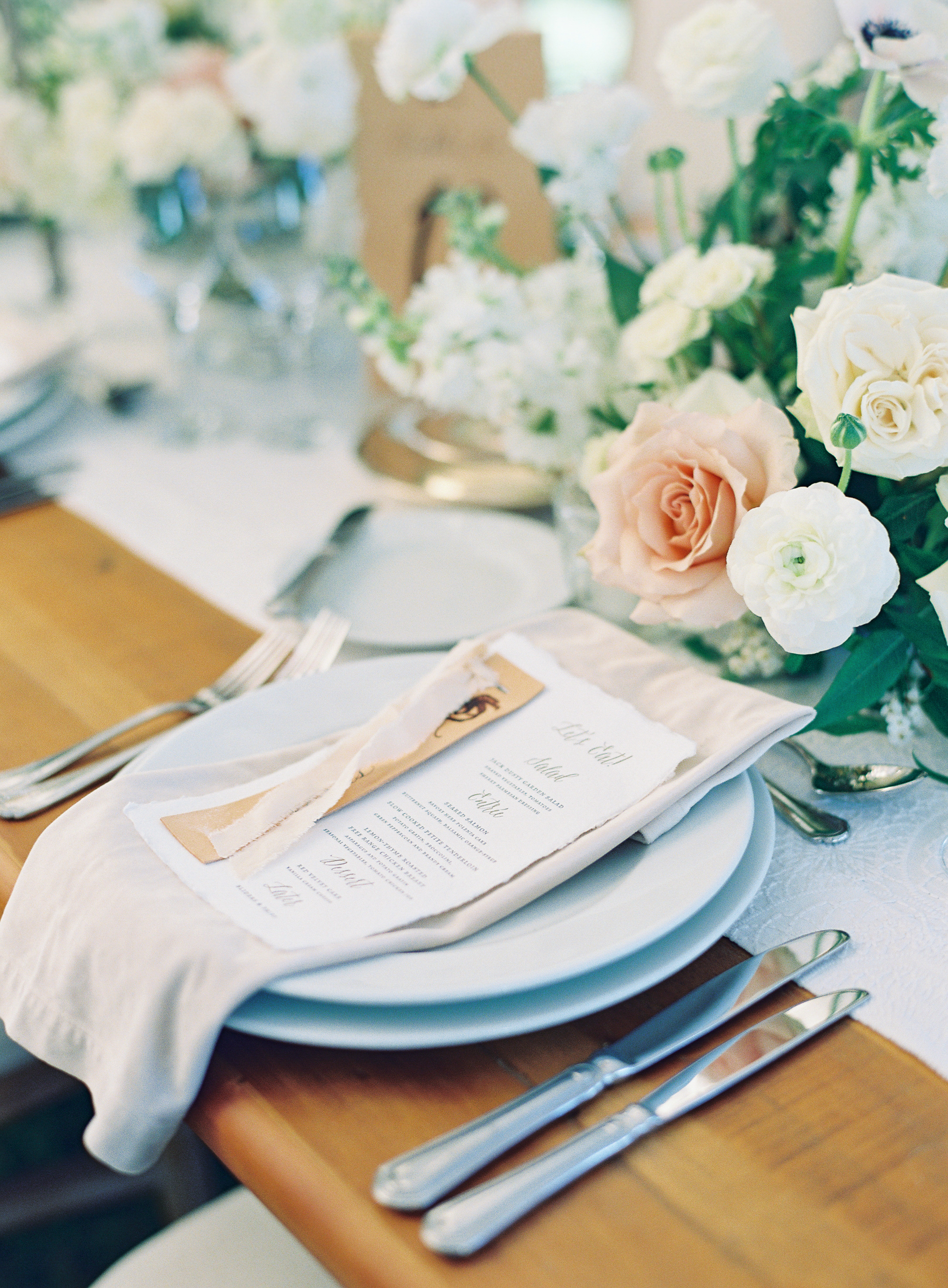
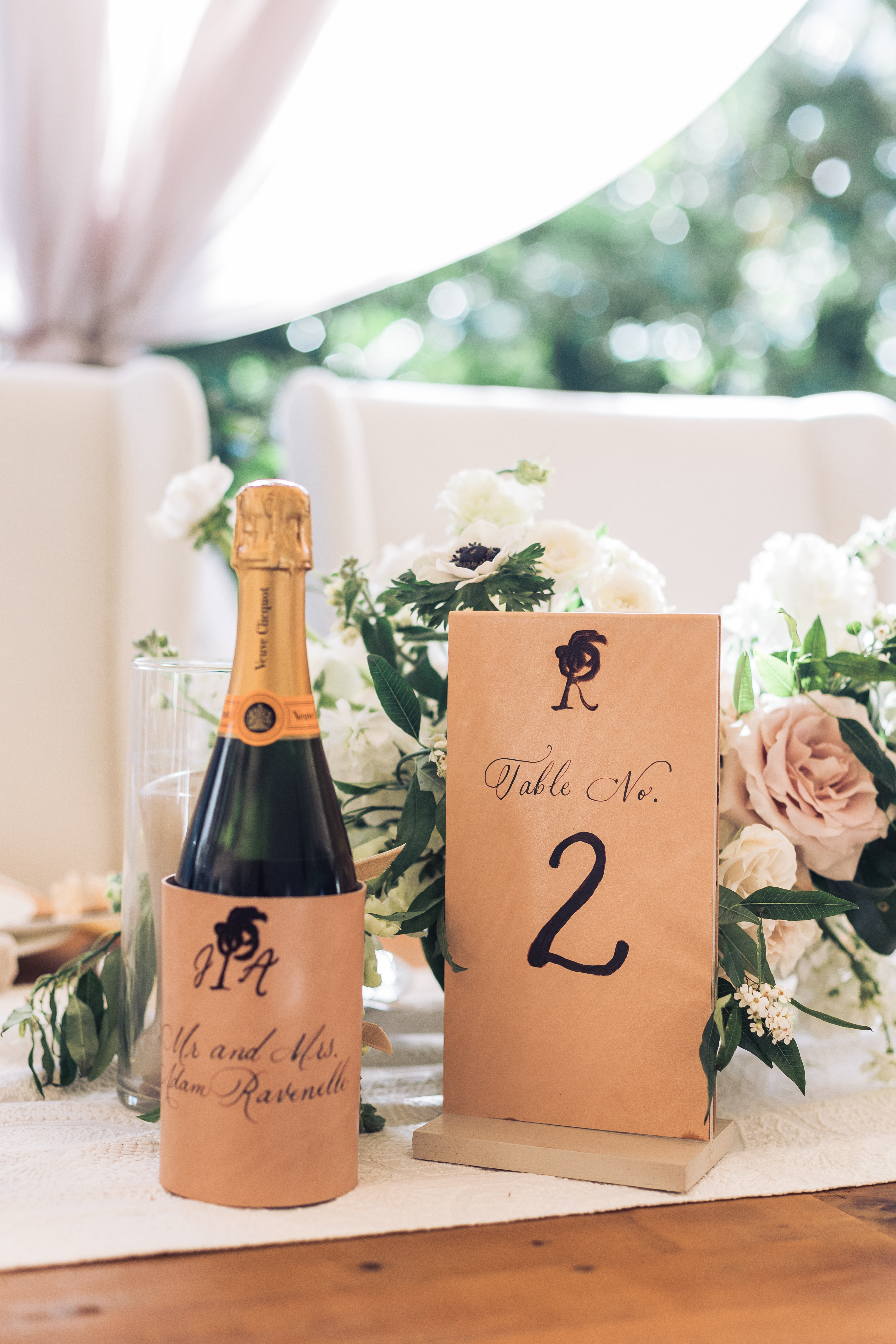
In addition, White Ink was excited to personalize the stunning leather favorites that gently laid atop the reception menus for the guests. Even Jessica and Adam’s champagne bottle was draped in the delicately customized leather.
Did you notice that Jessica and Adam had each leather piece branded with their wedding logo? Talk about a conversation piece! We’re thinking leather is kind of the best texture ever to elevate your next event.
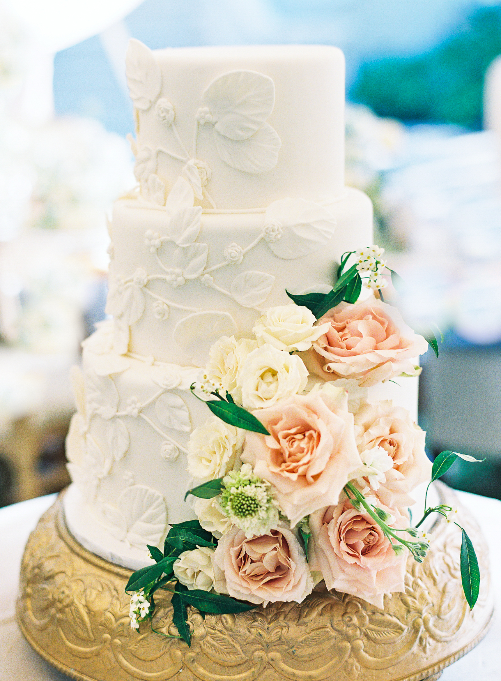
This couple left no stone unturned. The lasting memories that guests walked away with were all in the detail. From the majestic display of florals to the precise construction of their wedding cake and cocktails, it’s hard not to be enraptured by the beauty of a wedding like this.
We can’t wait to do something like this for you too!
So, what’s the deal with a styled shoot? What makes wedding and event vendors put in the time and effort to throw something together that isn’t an actual event? Well, it’s pretty simple… we want to show you what we’ve got! Putting together a top-notch event is an art form, and we are the creatives behind the scenes. Nashville is one of those places where you don’t have to look very far to find a vendor or creative that is the absolute best at what they do.
For obvious reasons, most of what event vendors create come directly from whatever inspires the client: theme, colors, style, texture, all of it. So, when we are afforded a moment to let our creative juices flow and boast our skills, we will jump at the chance.
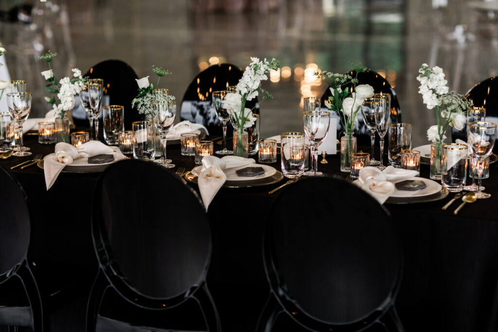
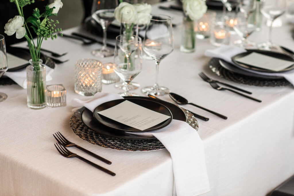
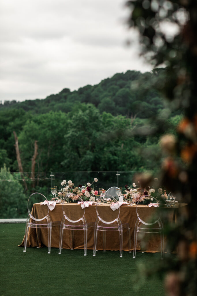
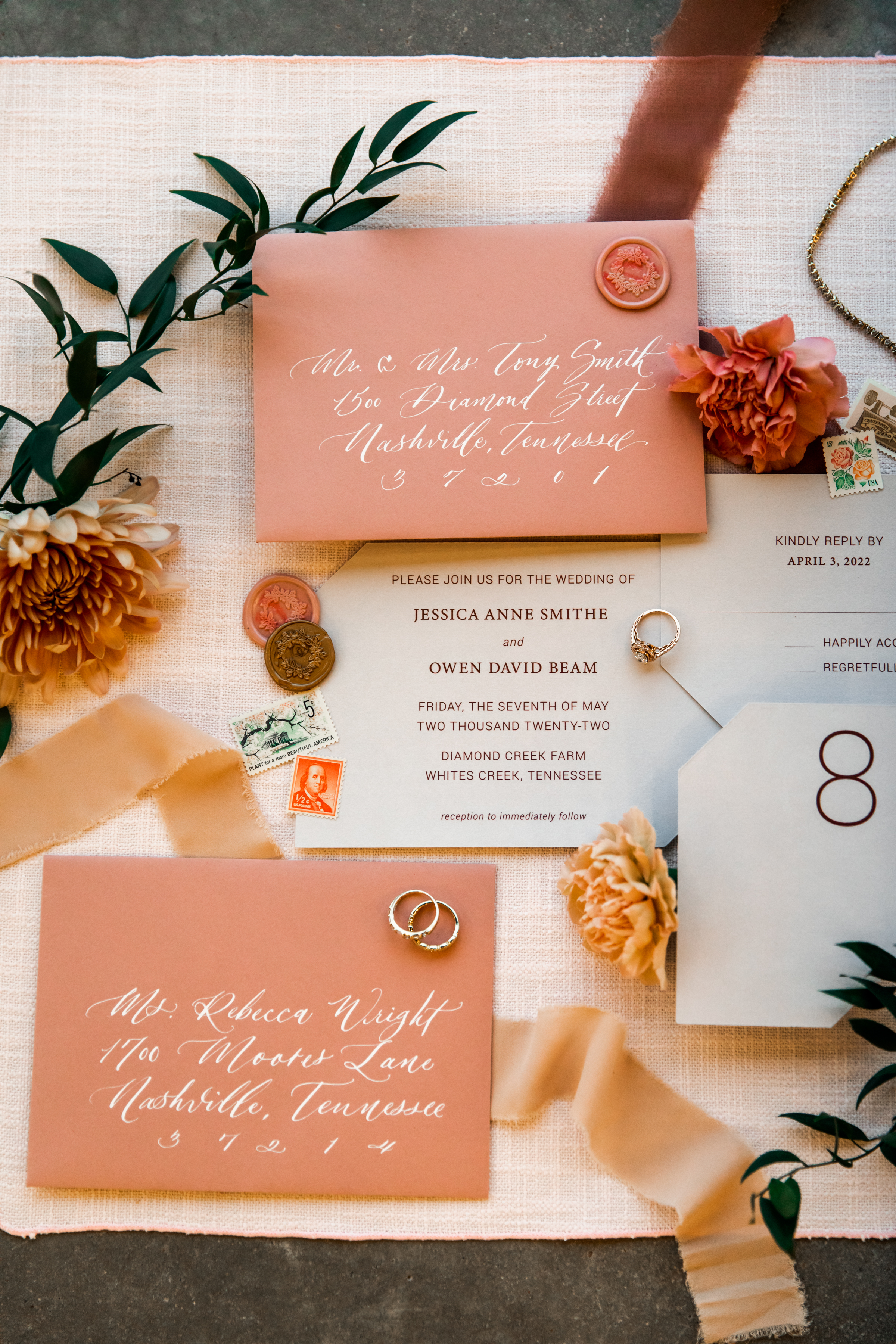
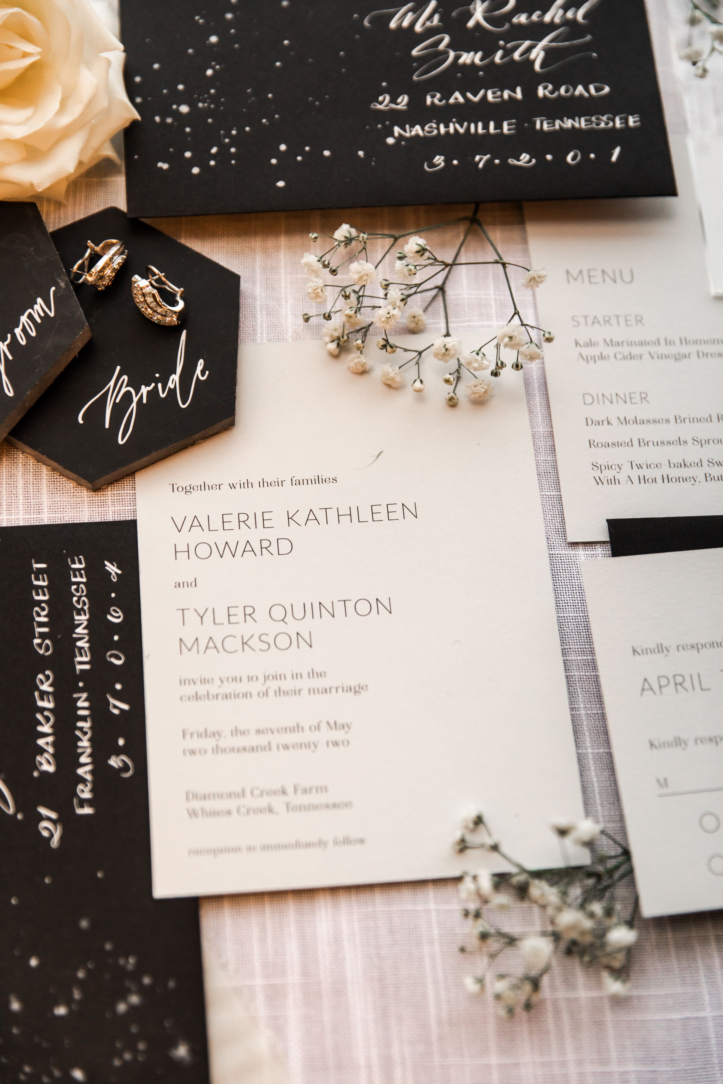
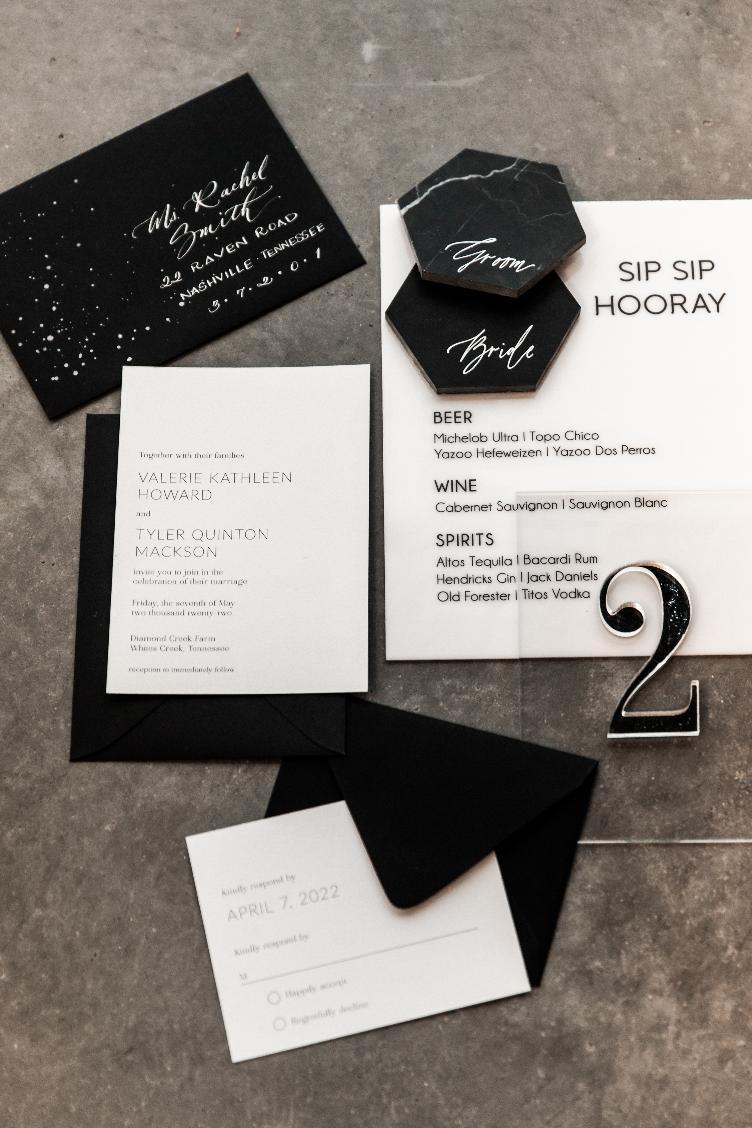
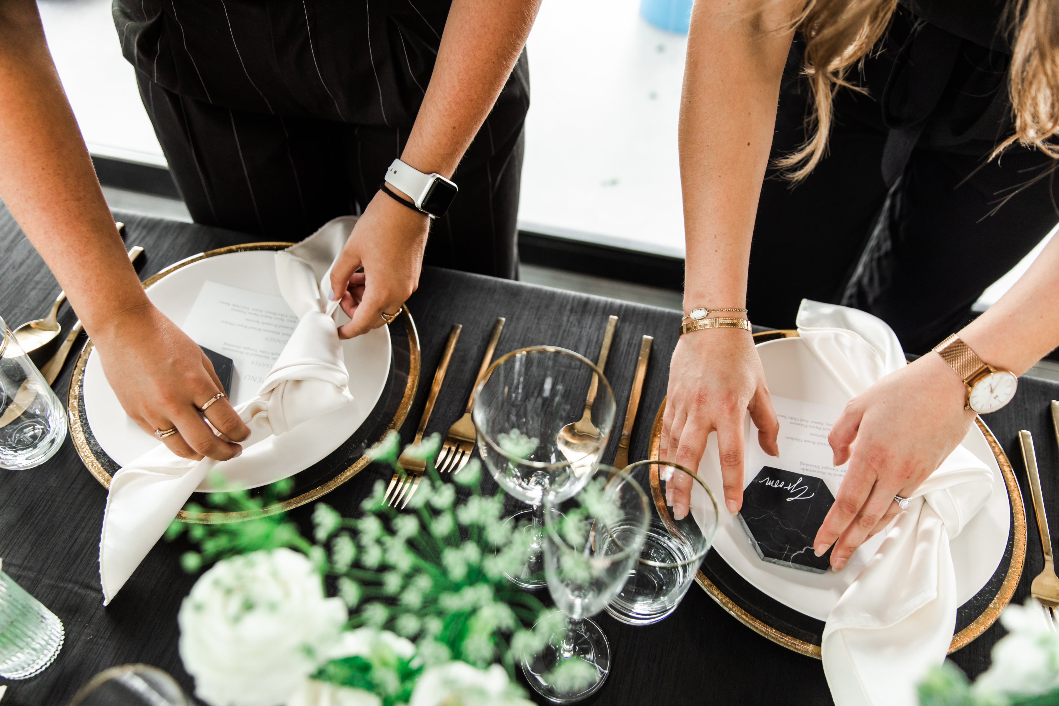
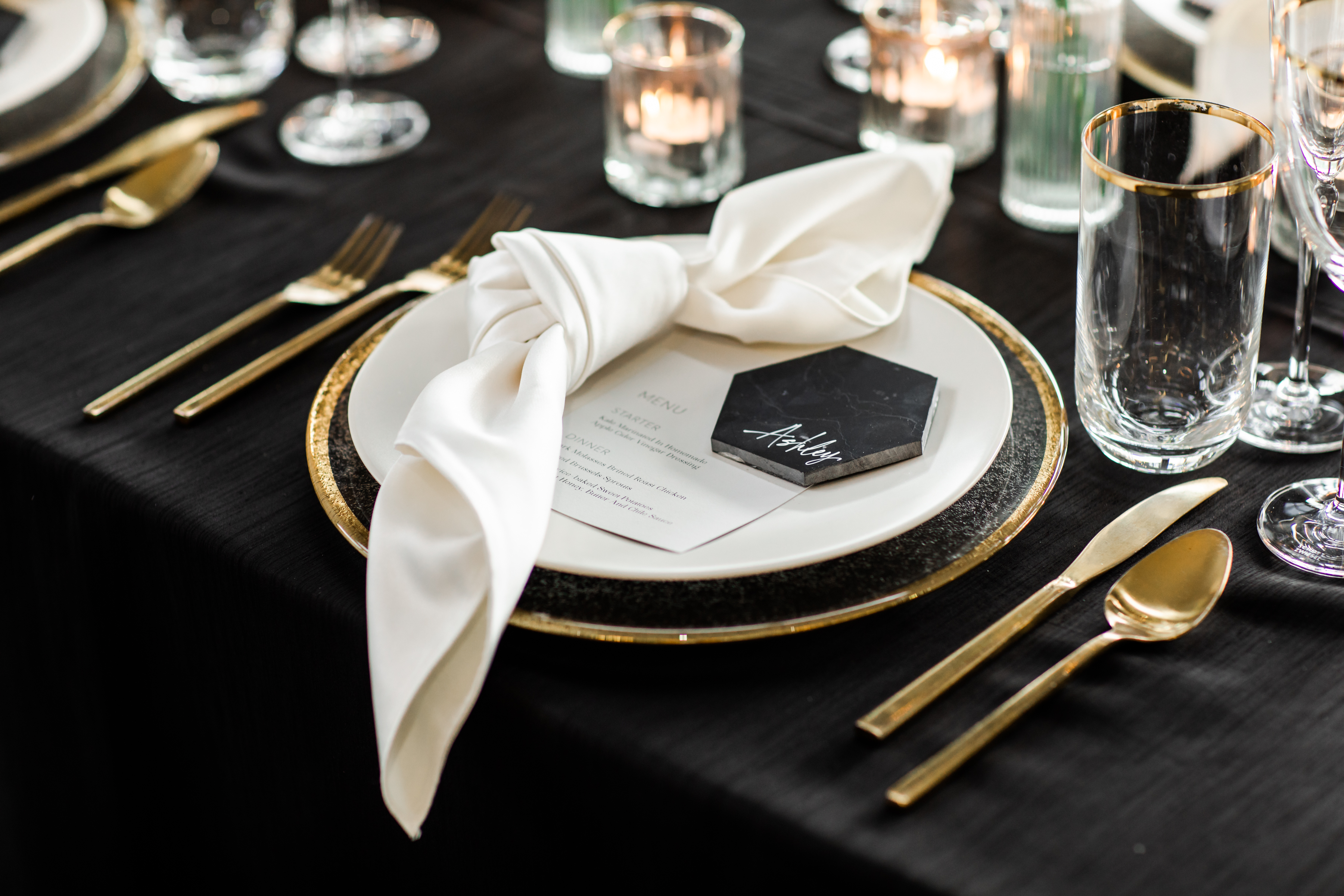
A few of Nashville’s best creatives put our minds together for what turned out to be an amazing display of talent. I hope that you can use our styled shoot at Diamond Creek Farms to pull some inspiration for your next event or wedding. This was a multi-part shoot designed to demonstrate the contrast between gold and black, blush and gold, and black and white styles! I think you’ll agree that what we put together for you is simply stunning. Check it out!
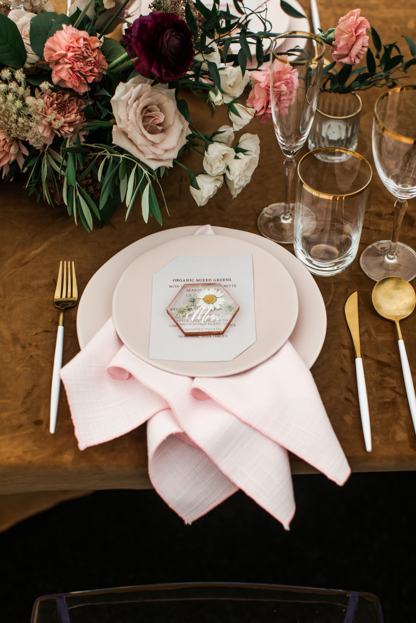
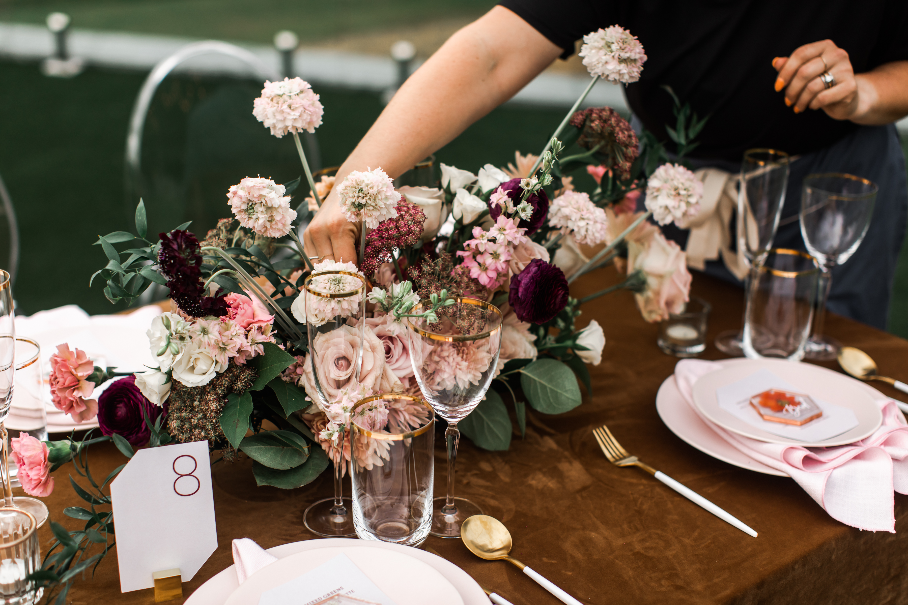
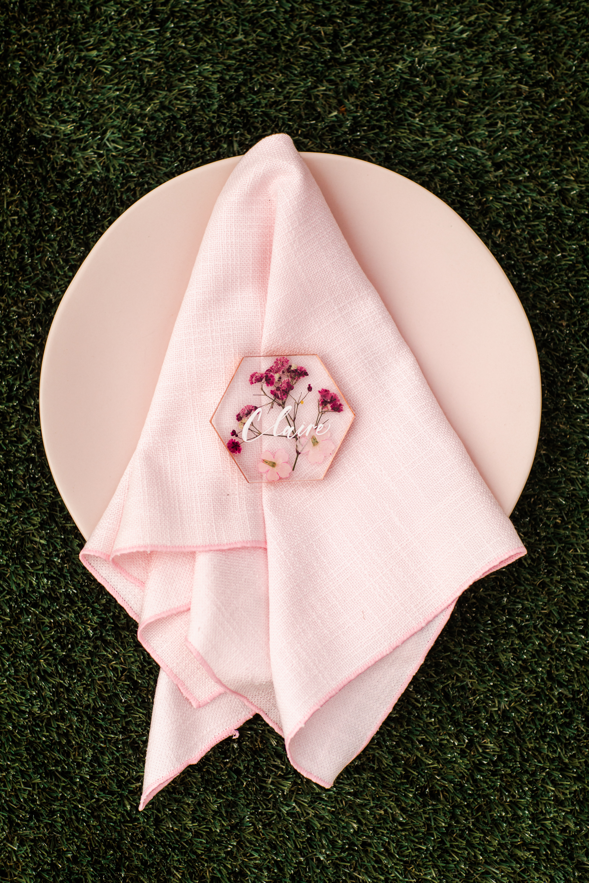
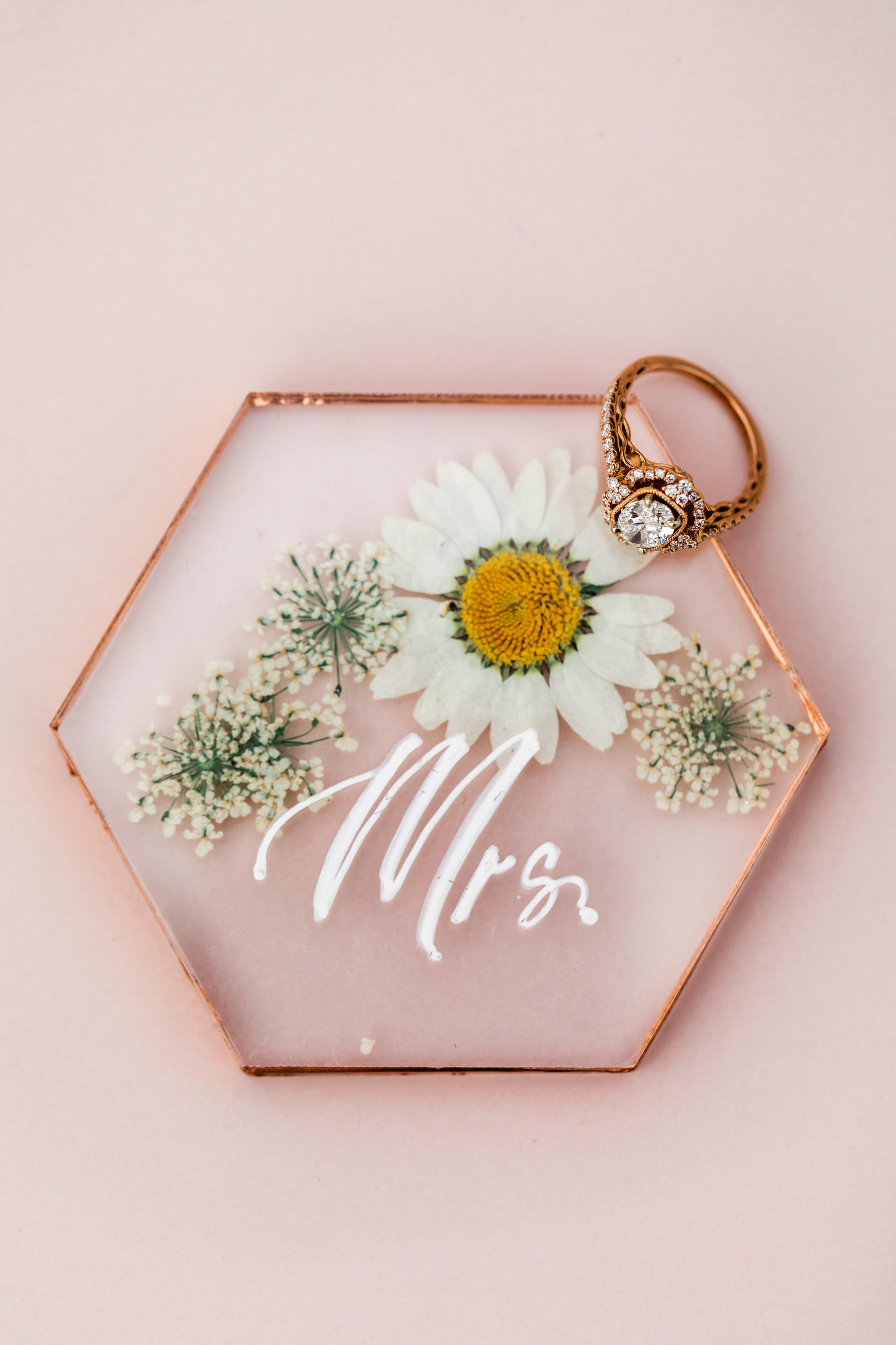
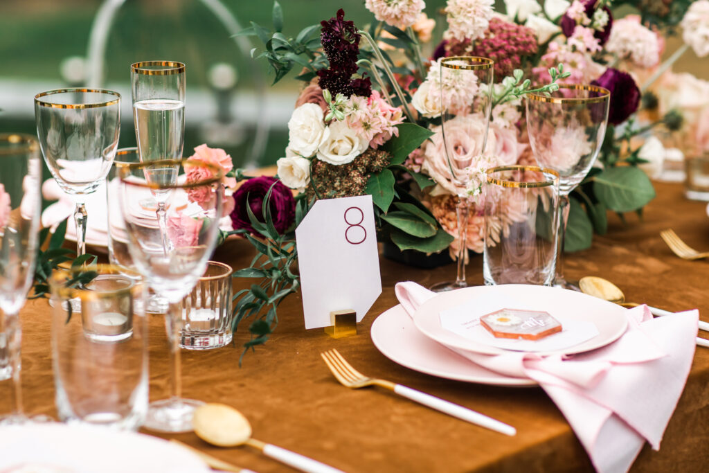
The blush and gold themed invitation suite focused on a balance of gentle and modern. The rosy envelopes with custom calligraphy and wax seals leaned perfectly into the edge-cut papers and print invites. To elevate this combination, White Ink created the most attractive little place cards I think I’ve ever done. We used pressed florals inside acrylic, lined it in gold and used custom spot calligraphy; all resting gorgeously on top of the menu place setting. I’m in love with the idea of using this for an outdoor spring wedding!
For the black and gold, and black and white portion of the shoot, White Ink really got to have fun and play with some amazing details. For the invitation suite we “pushed the envelope”, if you will, and designed off-centered custom envelope calligraphy while using the added space to make a modern splash. Our stationary team came through with a custom modern font for the invites, making this a truly impressive suite for clients to draw some inspiration from.
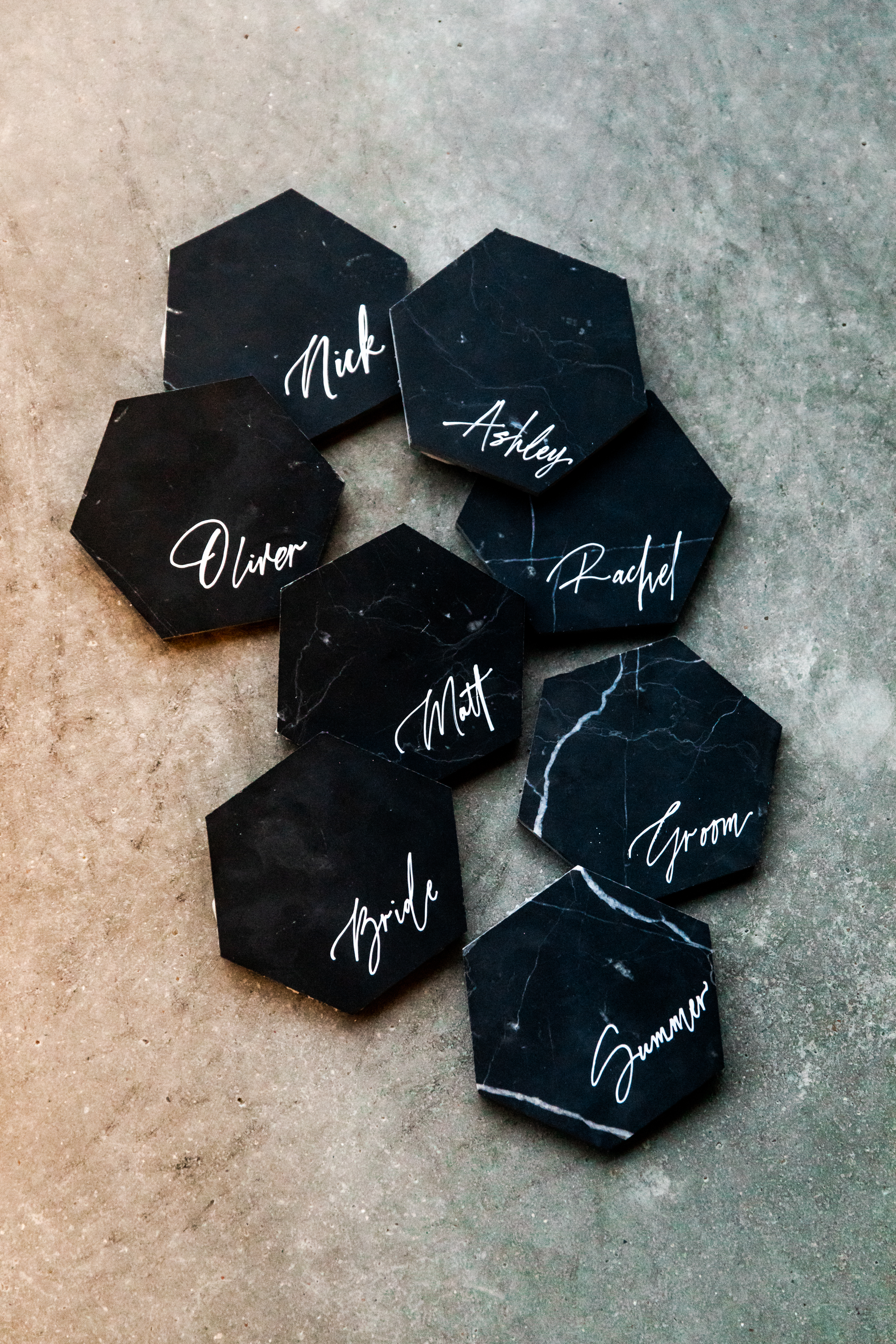
It’s time to talk about these black marble, stand-alone tiles! Details like these babies have an amazing way of keeping your guests chatting about your event for a long time to come. The contrast between the muted black and bright white custom calligraphy is an aesthetic gem. (Sigh). I love using tile place cards as a way to add texture to a reception. And for those outdoor receptions, they can double as paperweights for your menus. Brilliant!
There you have it! Vendors want to help make your wedding and events everything you hoped for. We might even have a few great ideas up our sleeves! We hope you enjoy.