So, what’s the deal with a styled shoot? What makes wedding and event vendors put in the time and effort to throw something together that isn’t an actual event? Well, it’s pretty simple… we want to show you what we’ve got! Putting together a top-notch event is an art form, and we are the creatives behind the scenes. Nashville is one of those places where you don’t have to look very far to find a vendor or creative that is the absolute best at what they do.
For obvious reasons, most of what event vendors create come directly from whatever inspires the client: theme, colors, style, texture, all of it. So, when we are afforded a moment to let our creative juices flow and boast our skills, we will jump at the chance.
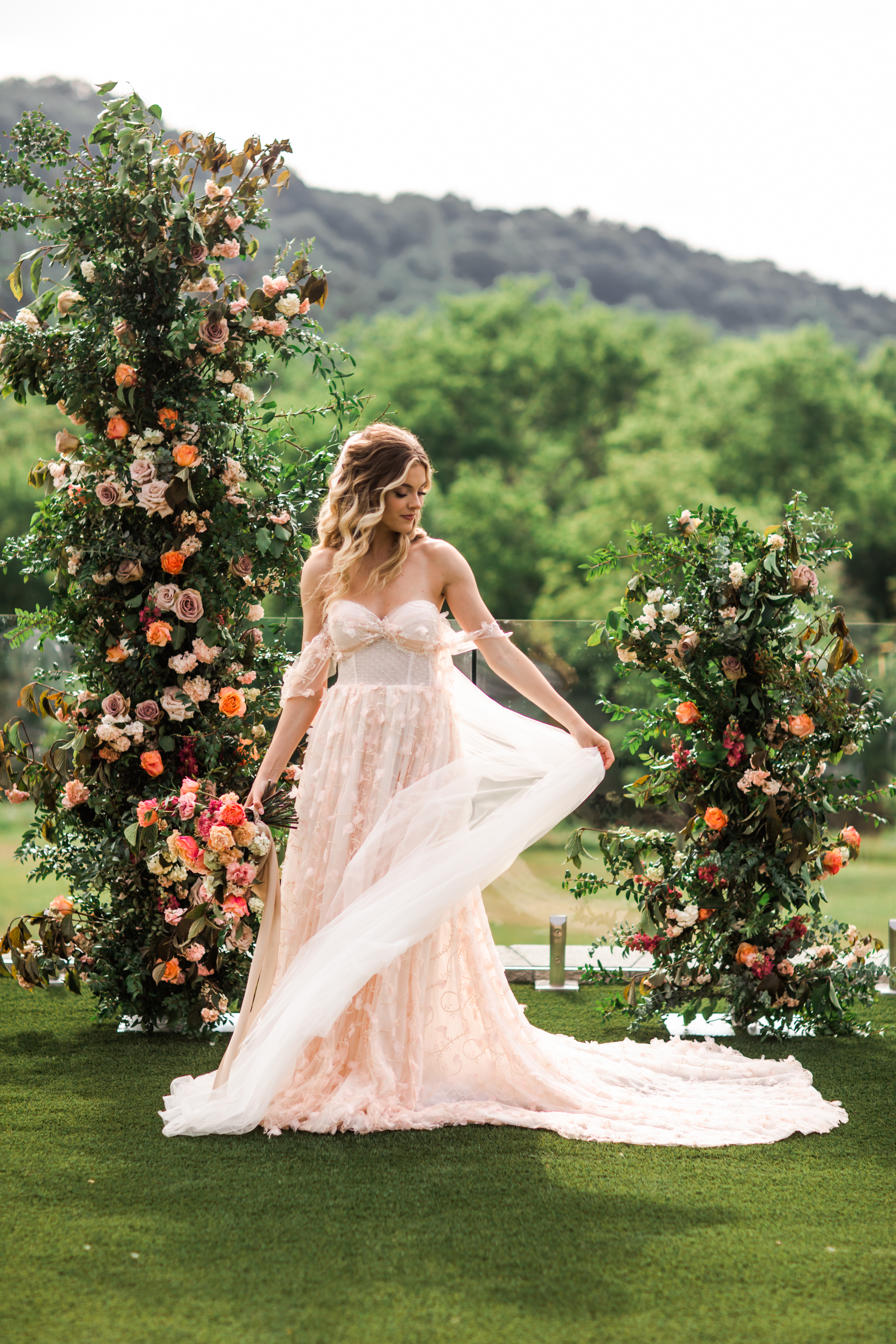
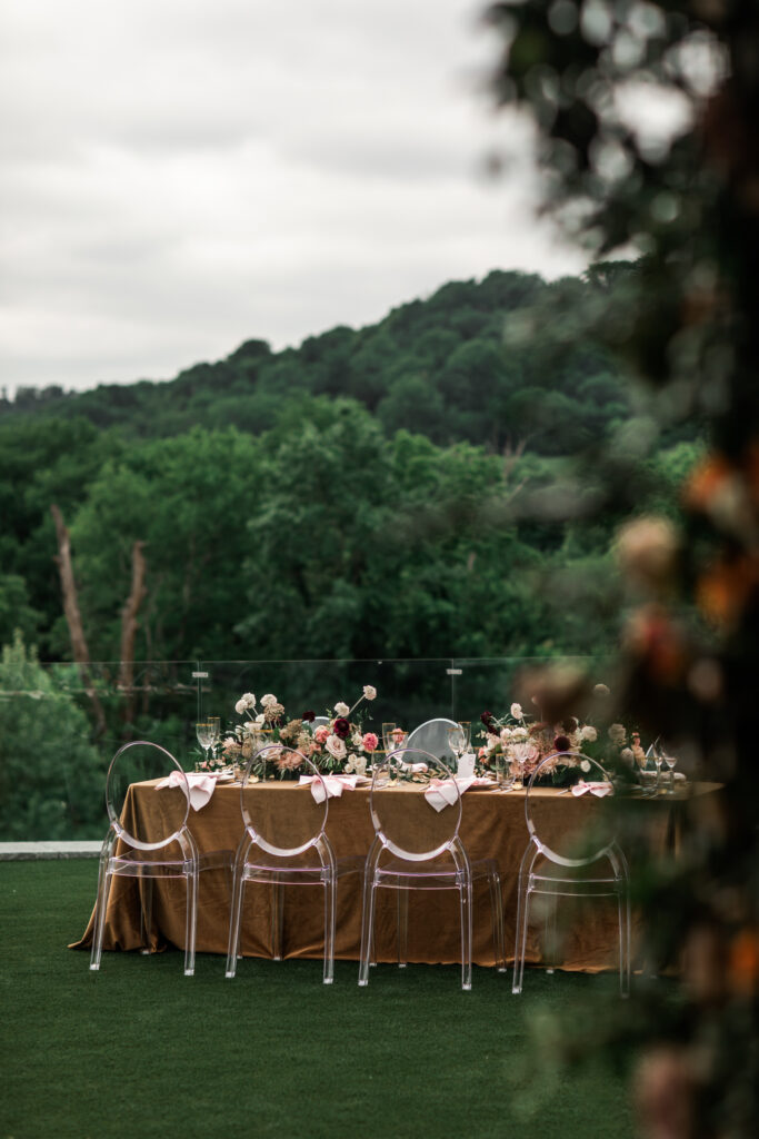
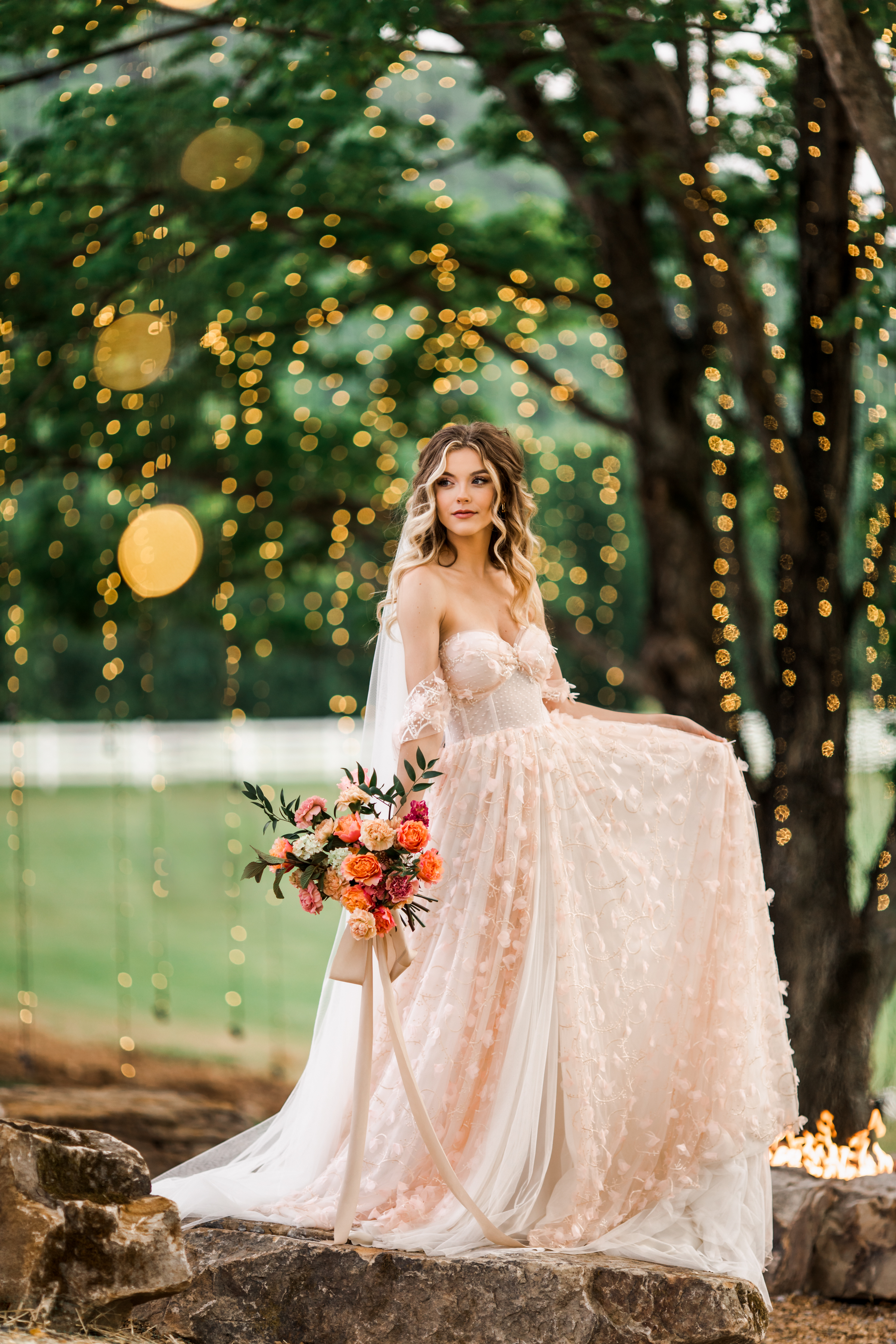
A few of Nashville’s best creatives put our minds together for what turned out to be an amazing display of talent. I hope that you can use our styled shoot at Diamond Creek Farms to pull some inspiration for your next event or wedding. This was a multi-part shoot designed to demonstrate the contrast between gold and black, blush and gold, and black and white styles! I think you’ll agree that what we put together for you is simply stunning. Check it out!
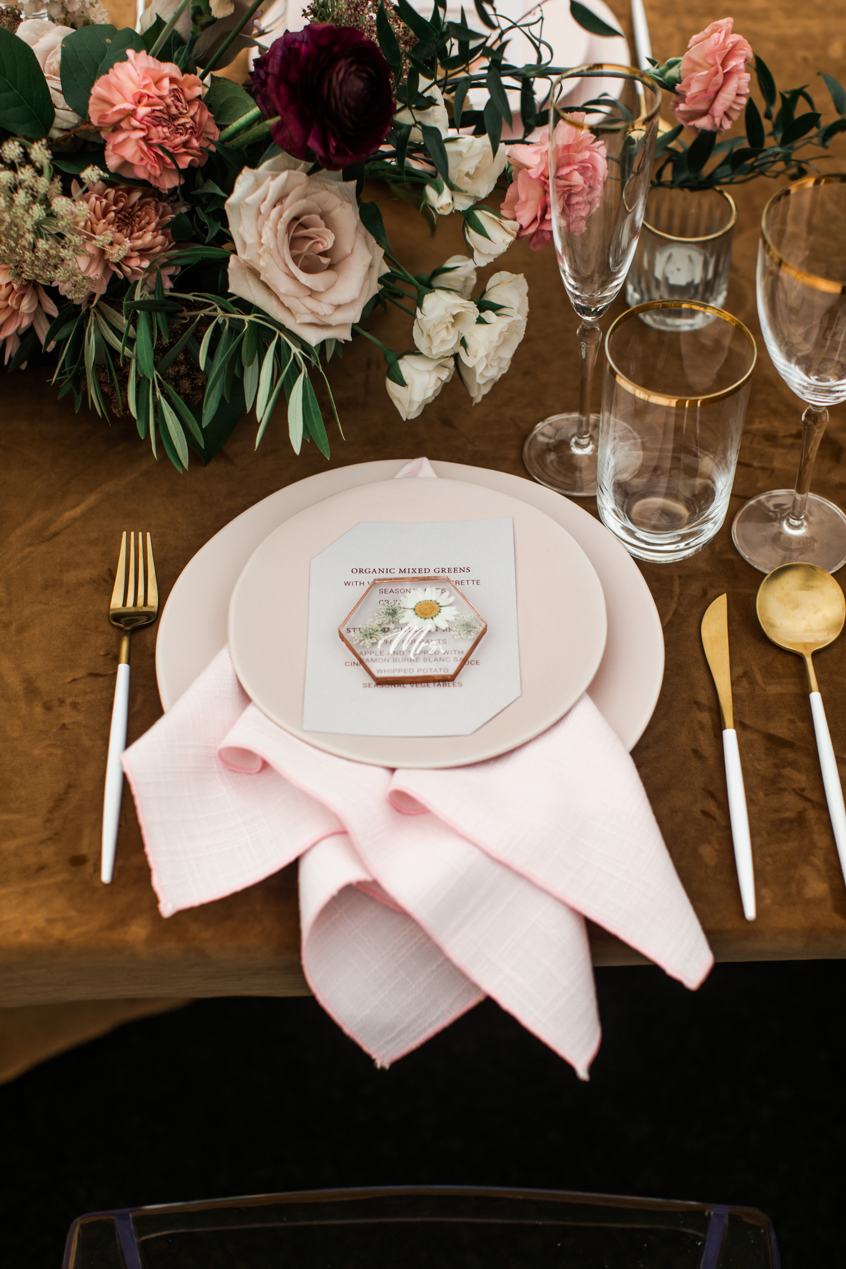
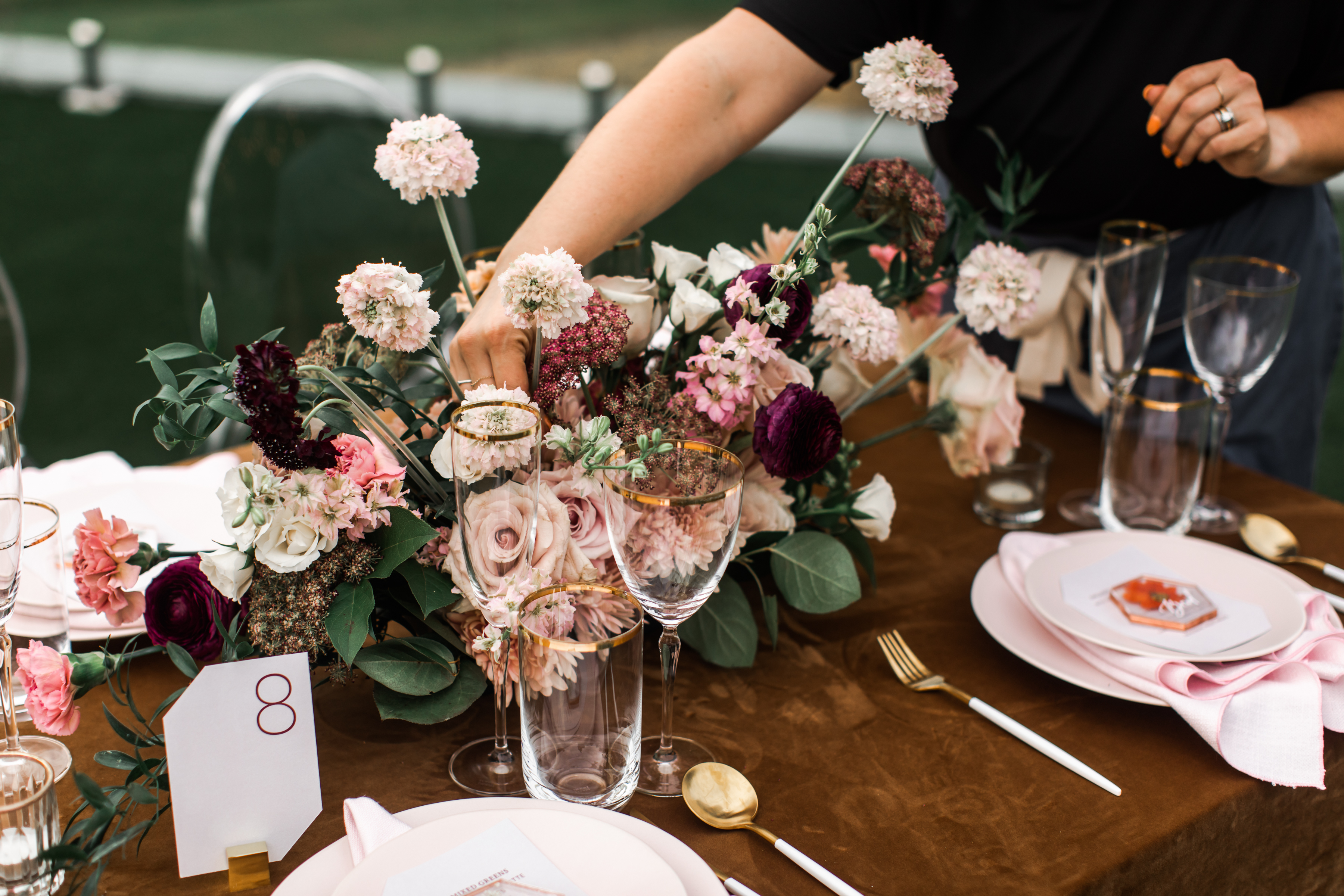
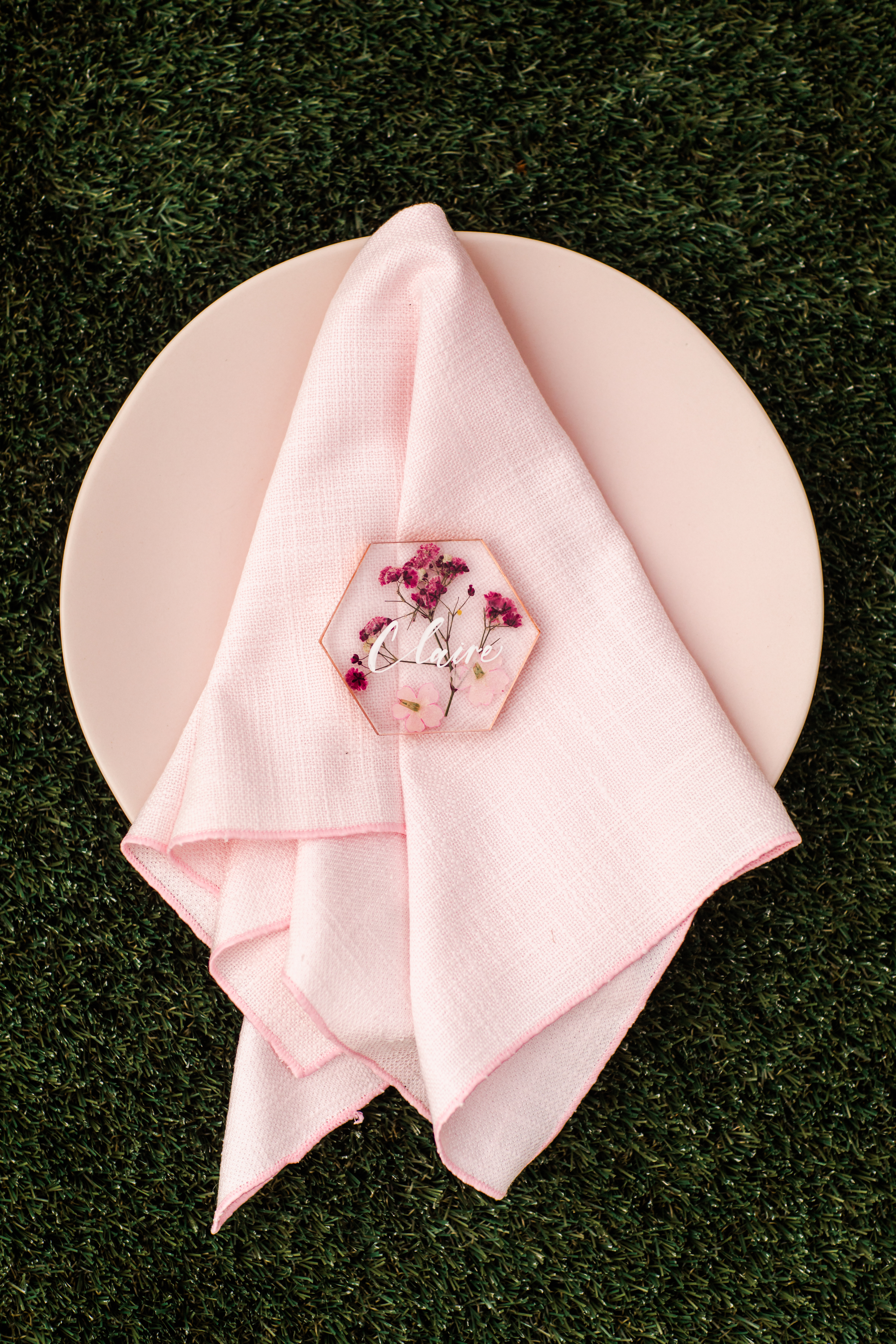
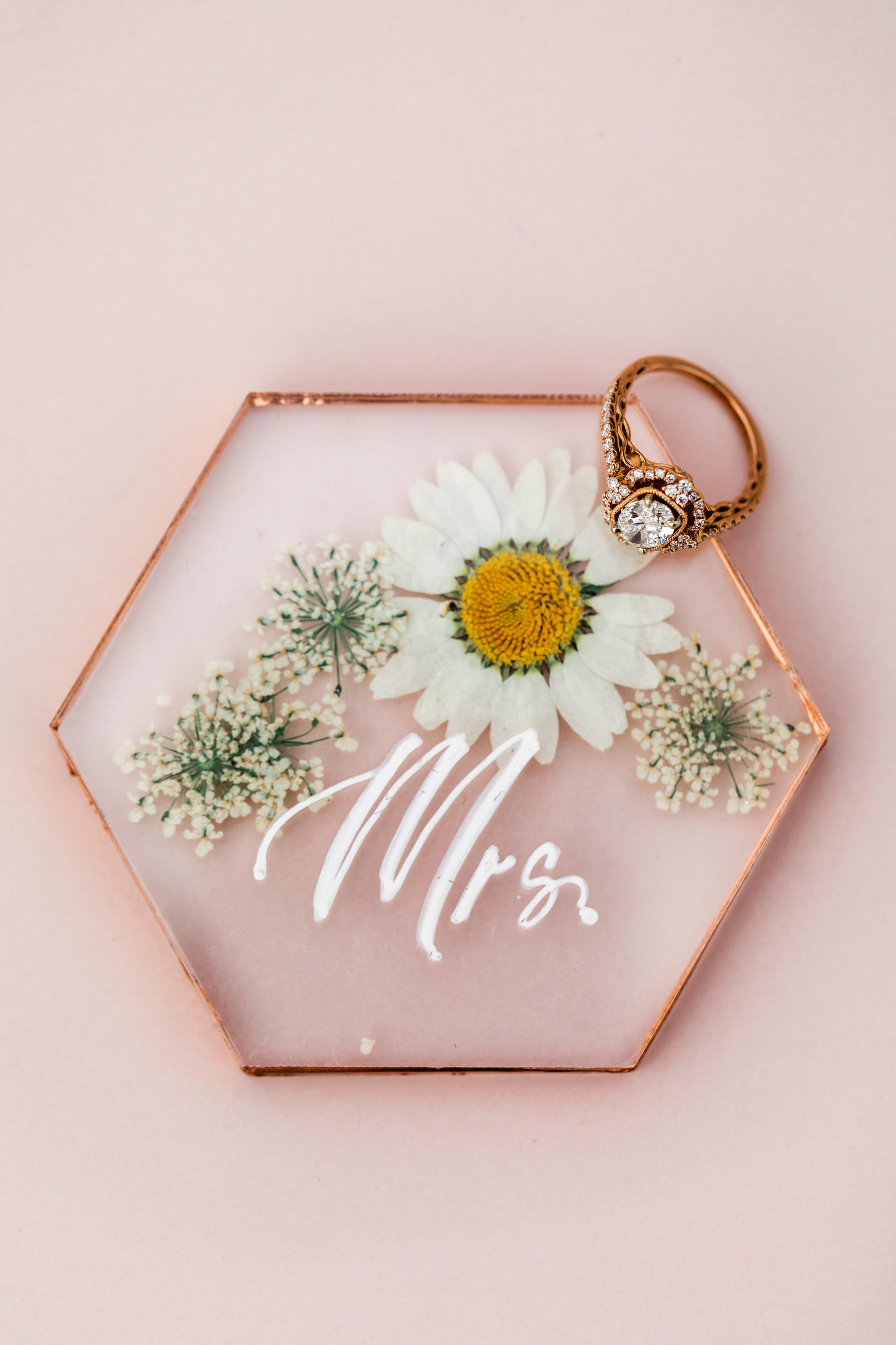
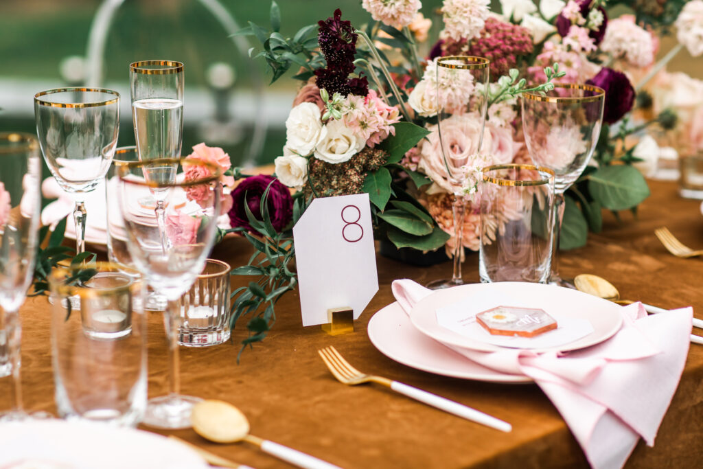
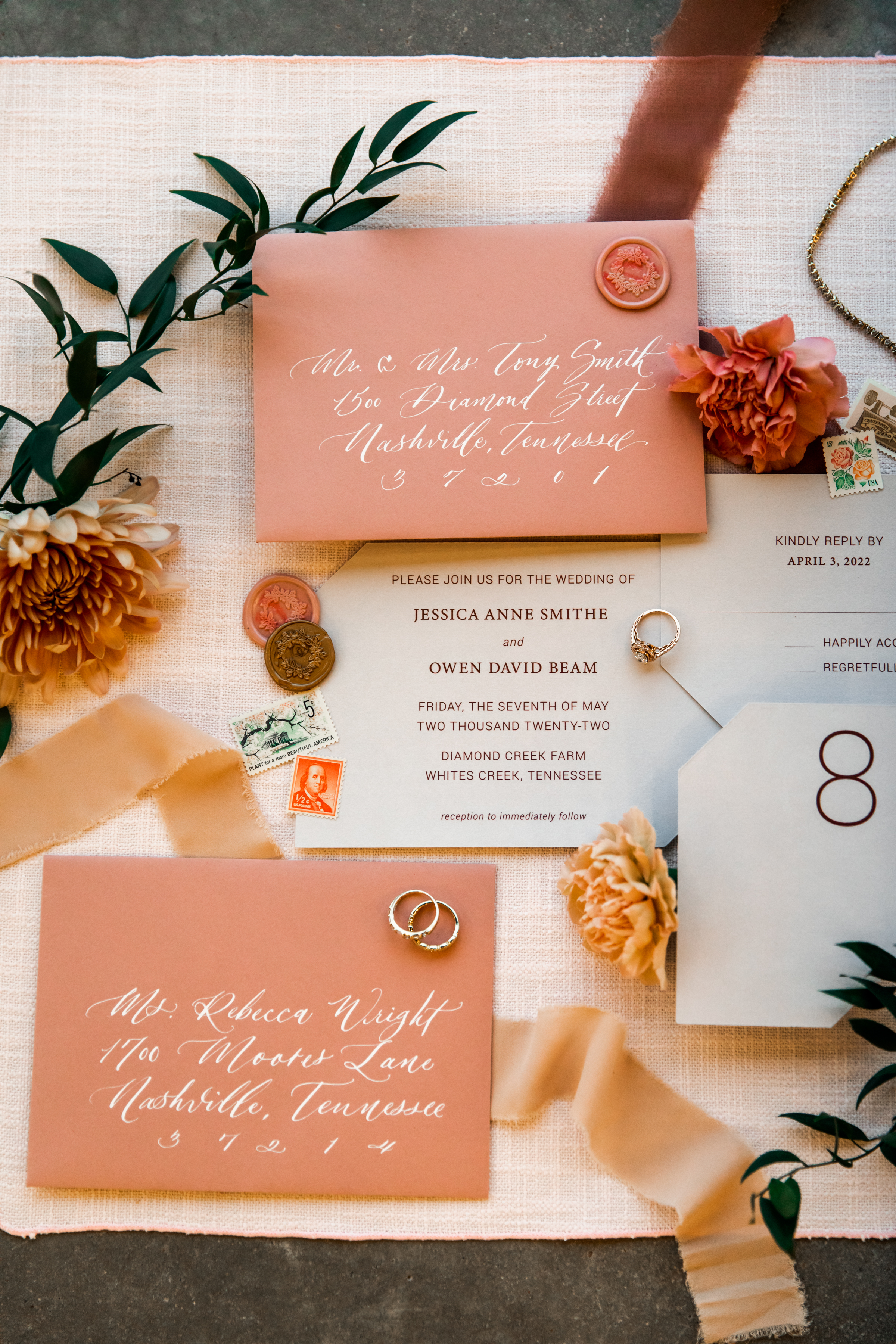
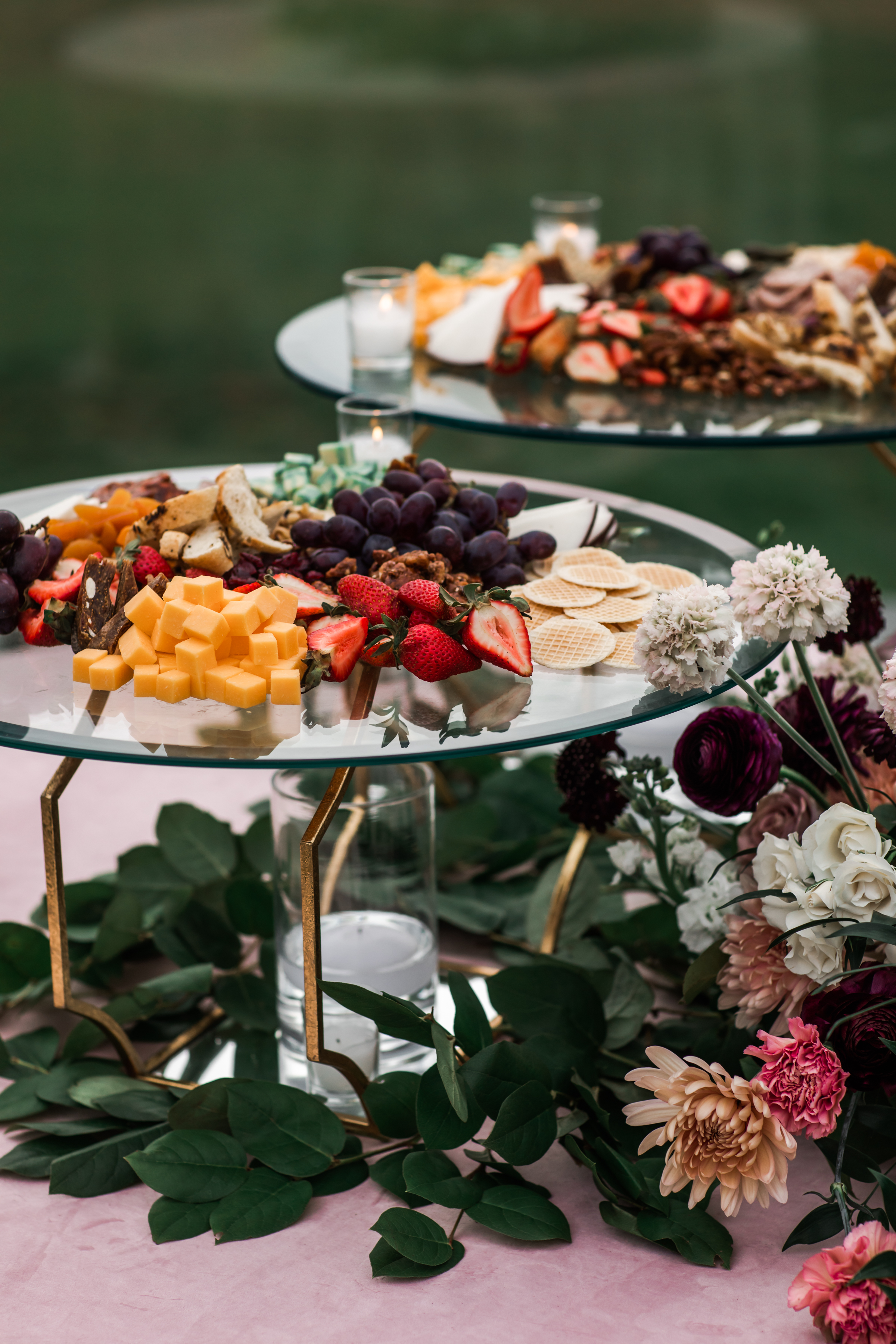
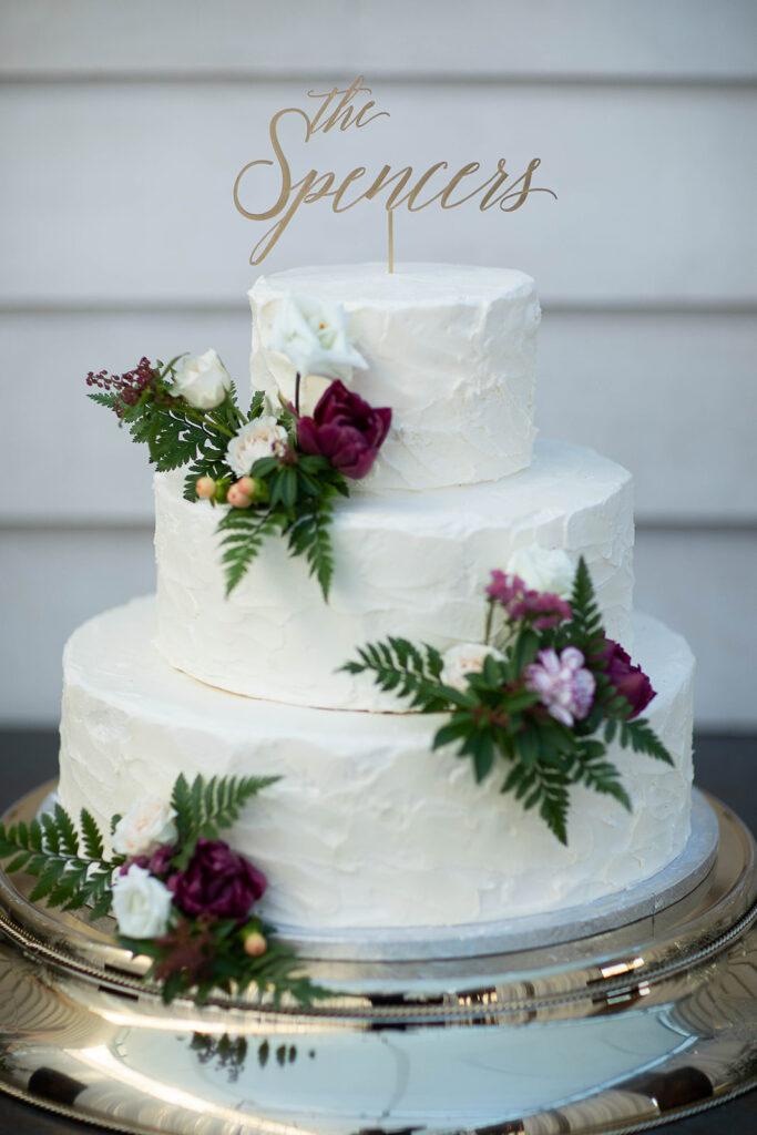
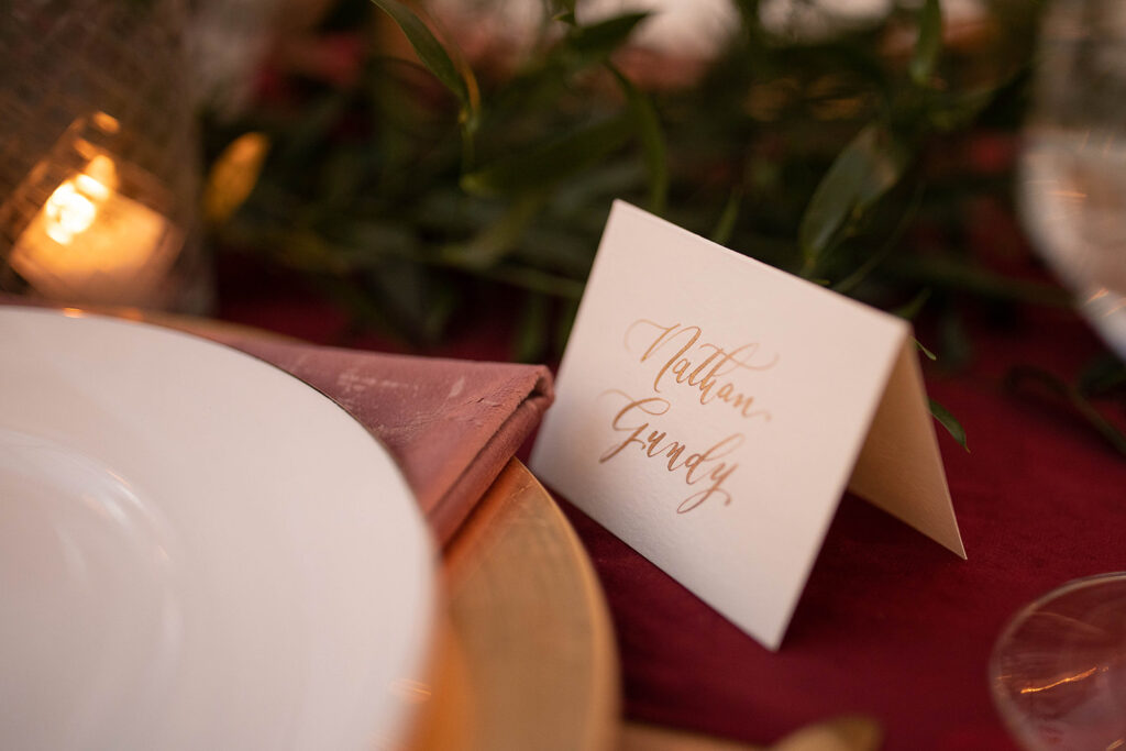
The blush and gold themed invitation suite focused on a balance of gentle and modern. The rosy envelopes with custom calligraphy and wax seals leaned perfectly into the edge-cut papers and print invites. To elevate this combination, White Ink created the most attractive little place cards I think I’ve ever done. We used pressed florals inside acrylic, lined it in gold and used custom spot calligraphy; all resting gorgeously on top of the menu place setting. I’m in love with the idea of using this for an outdoor spring wedding!
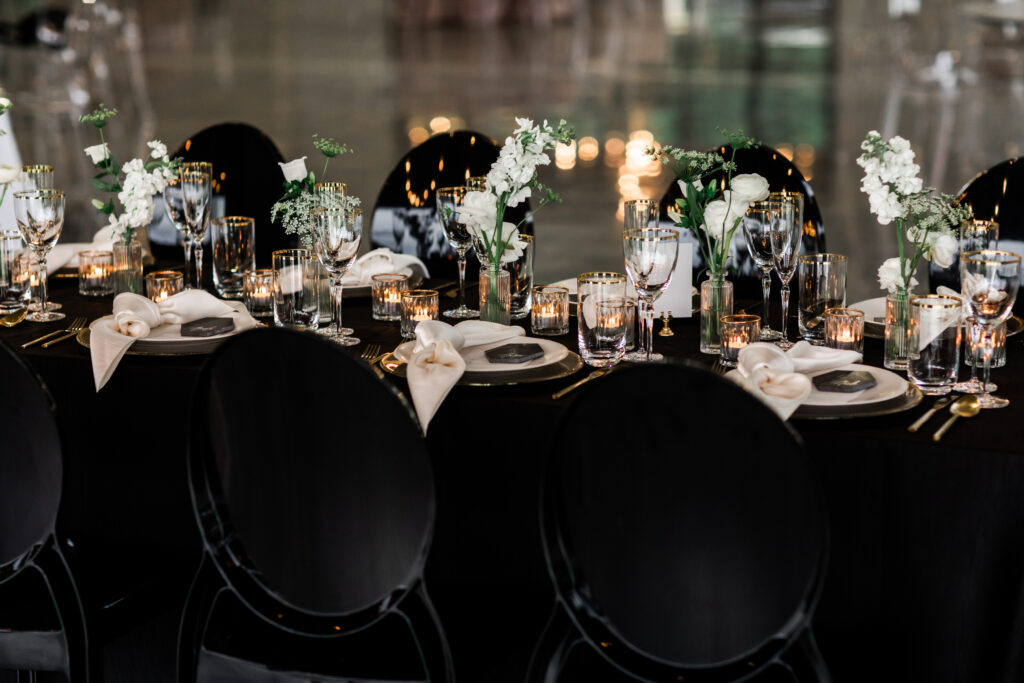
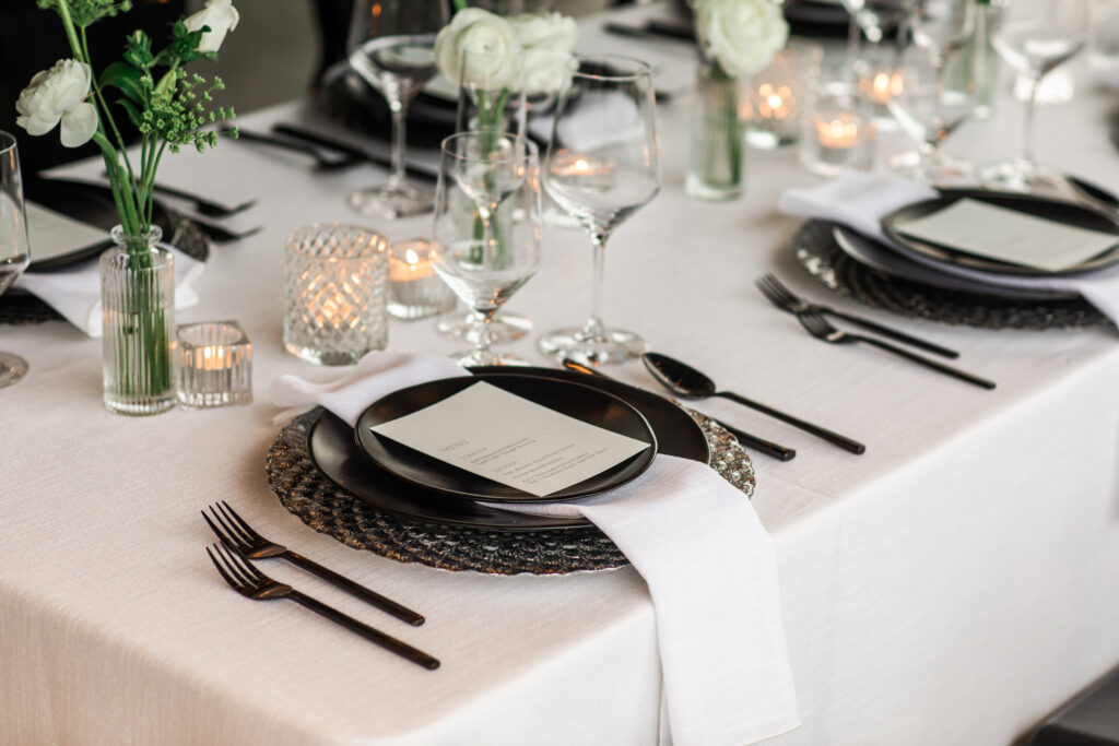
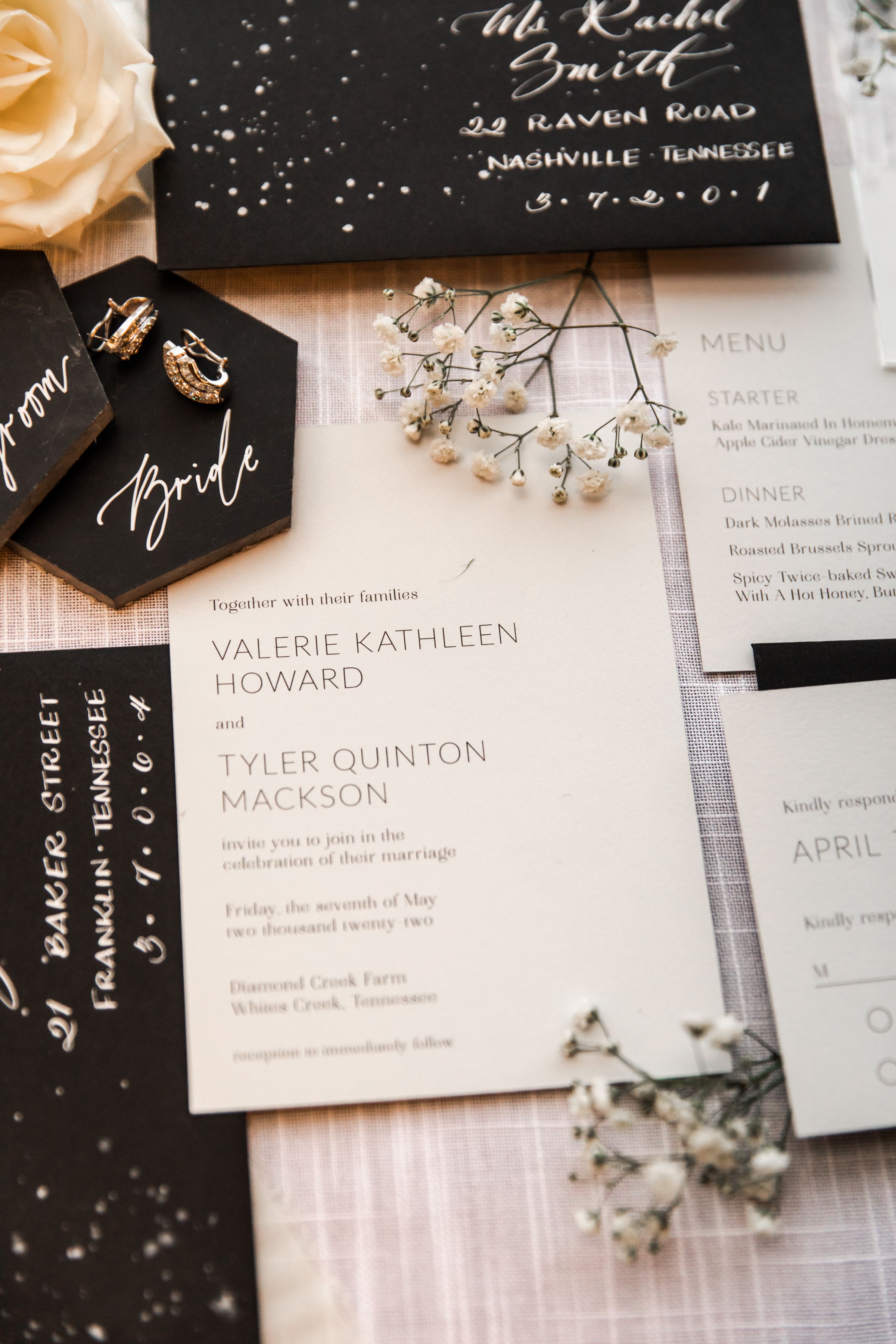
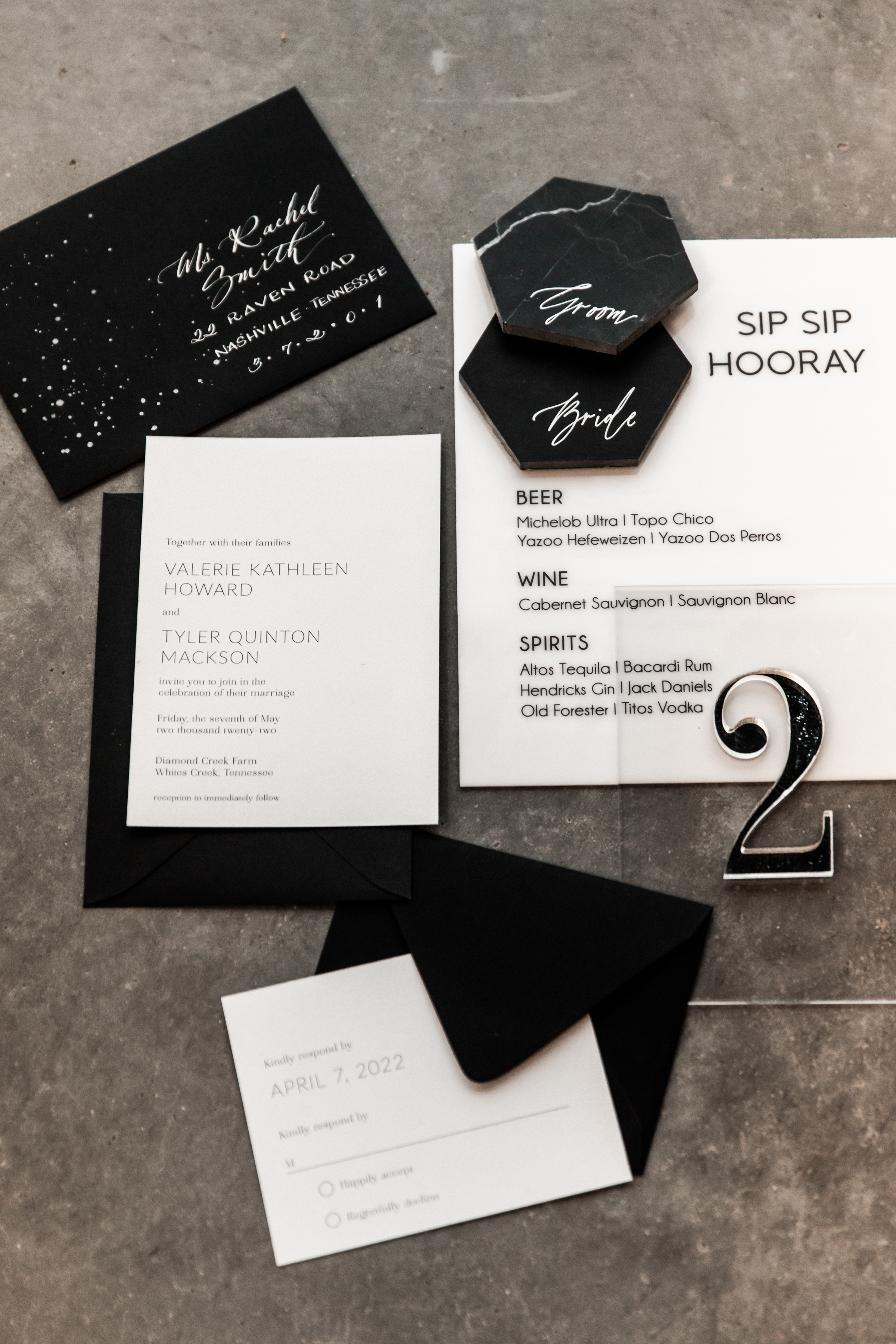
For the black and gold, and black and white portion of the shoot, White Ink really got to have fun and play with some amazing details. For the invitation suite we “pushed the envelope”, if you will, and designed off-centered custom envelope calligraphy while using the added space to make a modern splash. Our stationary team came through with a custom modern font for the invites, making this a truly impressive suite for clients to draw some inspiration from.
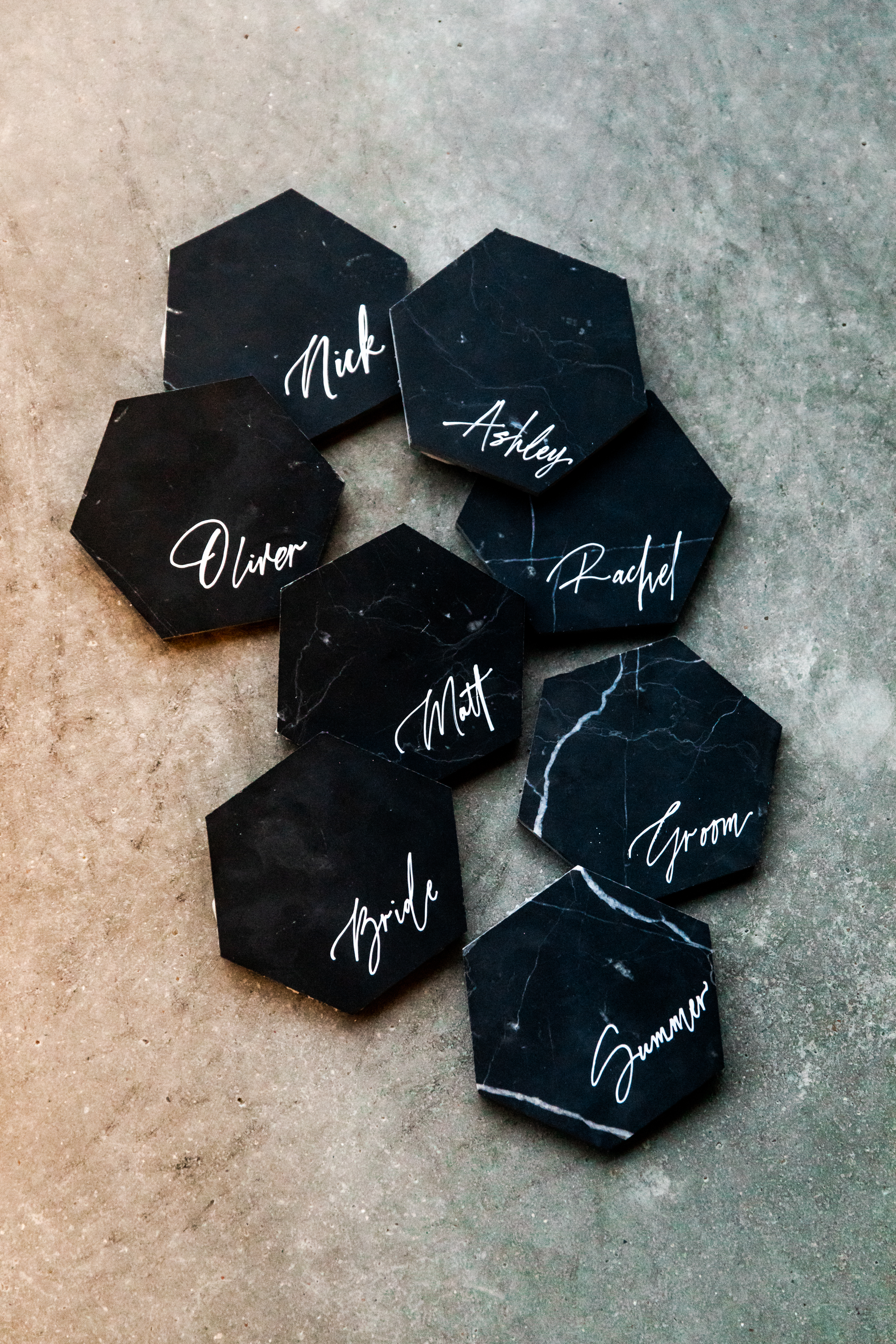
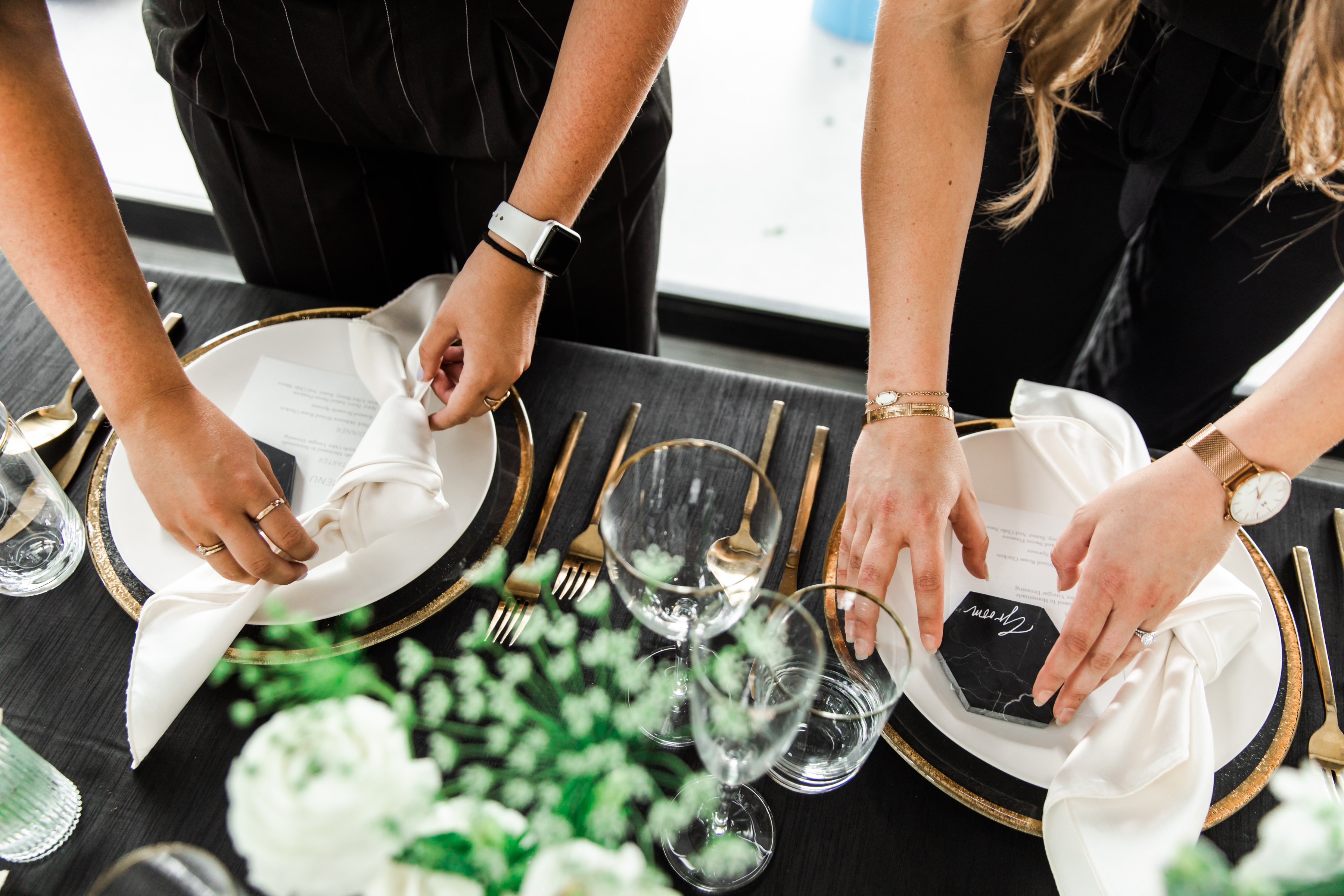
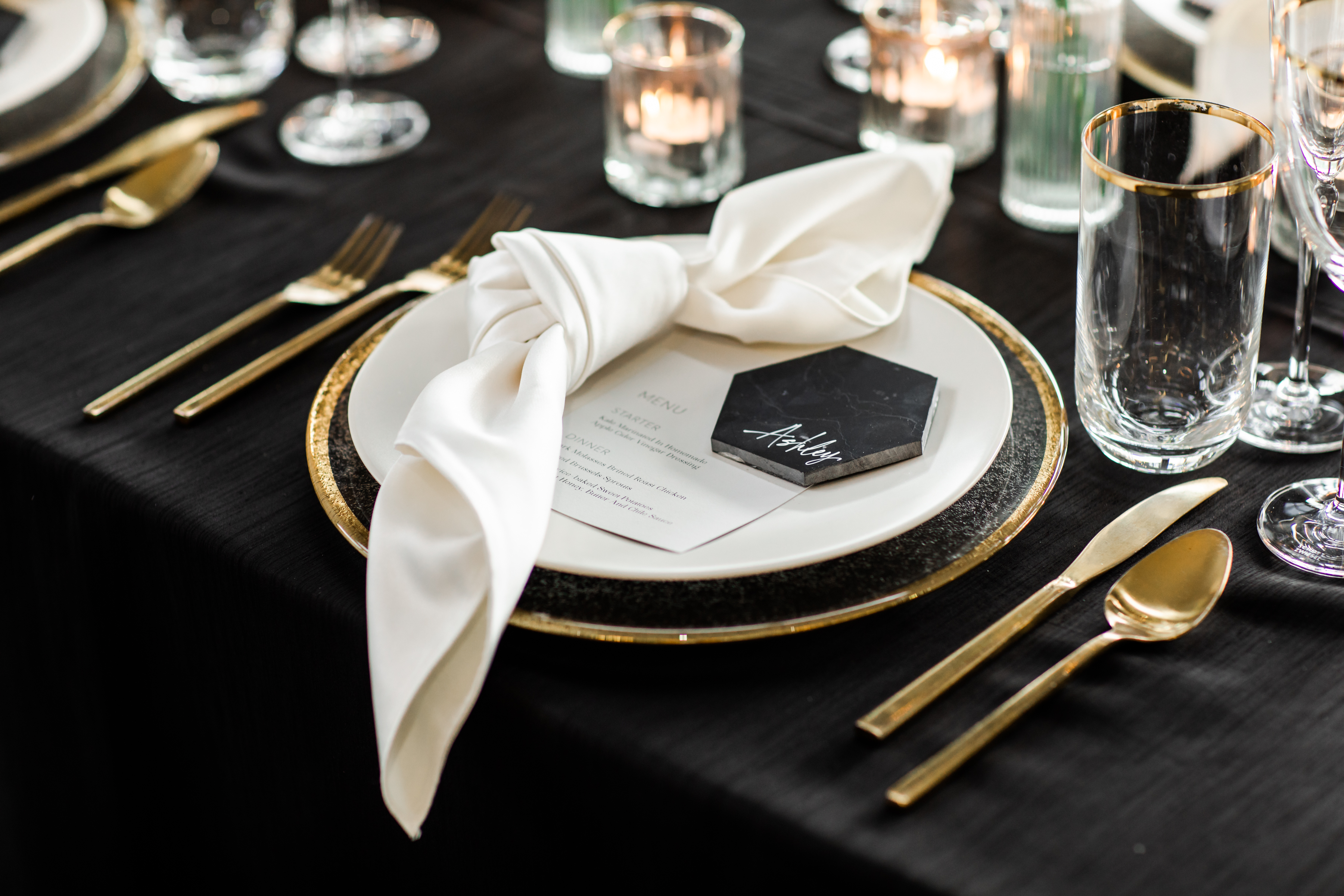
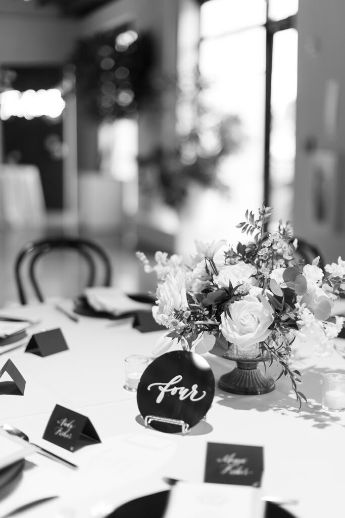
It’s time to talk about these black marble, stand-alone tiles! Details like these babies have an amazing way of keeping your guests chatting about your event for a long time to come. The contrast between the muted black and bright white custom calligraphy is an aesthetic gem. (Sigh). I love using tile place cards as a way to add texture to a reception. And for those outdoor receptions, they can double as paperweights for your menus. Brilliant!
There you have it! Vendors want to help make your wedding and events everything you hoped for. We might even have a few great ideas up our sleeves! We hope you enjoy.
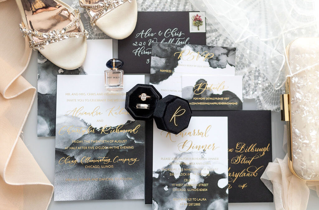
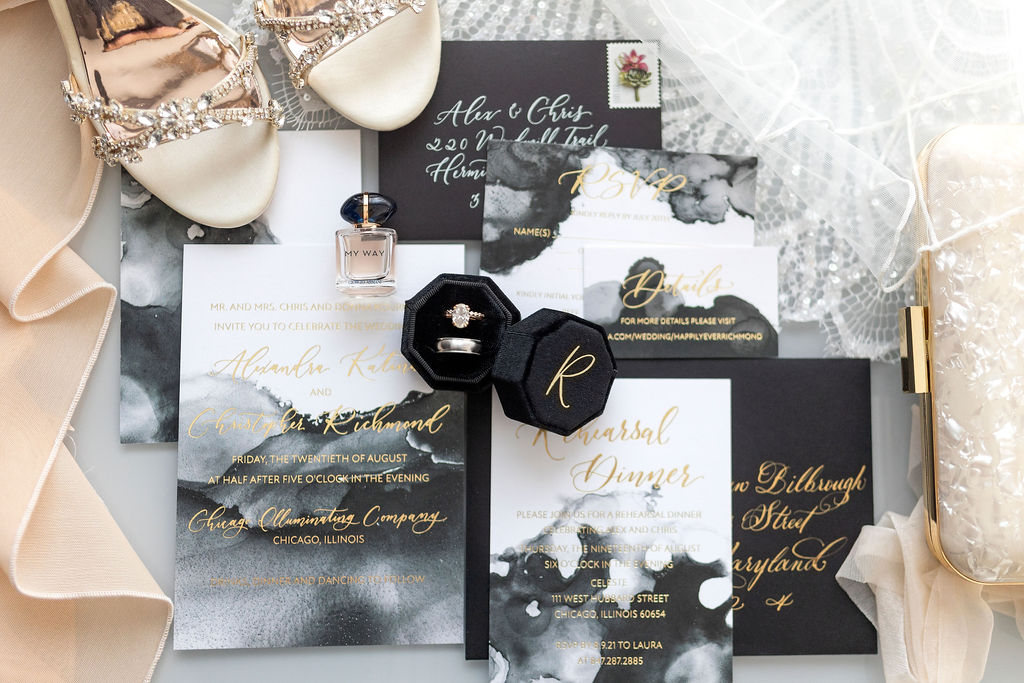
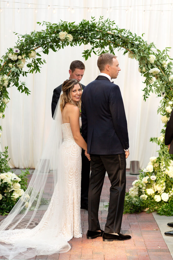
White Ink is in the business of detail. You could say we’re the experts! Our team understands the impact that even the smallest of details can have on any event, invitation or gift. We know the difference between an invite that gets the point across and an invite gives an experience. We work really hard to make sure we achieve exactly what our clients have envisioned for their weddings and other occasions. For Alex and Christopher, White Ink understood the assignment!
Let’s talk about the details of this stunning invitation suite. We really had fun with this one! The boldness of the white, black and gray watercolor background is enough to make any recipient stop what they’re doing and think “WOW!” It’s definitely a small detail that packs a big punch.
We love envelope calligraphy, but we love gold ink calligraphy on black envelopes better than anything. It’s always so satisfying to create with these colors! And the gold continued with the spot calligraphy on the invitations. Just perfect! Taking the time to choose details, like the ones Alex and Christopher used here, gives a lasting impression that your guests will remember for a long time. It also sets the tone for the rest of your event and gives them something they’ll look forward to.
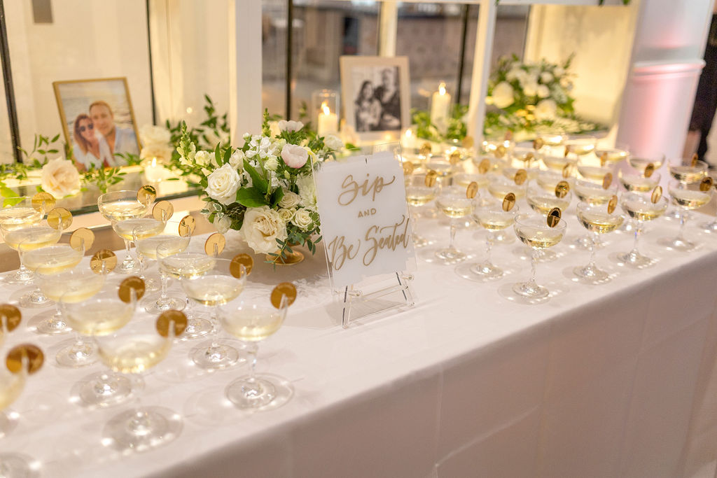
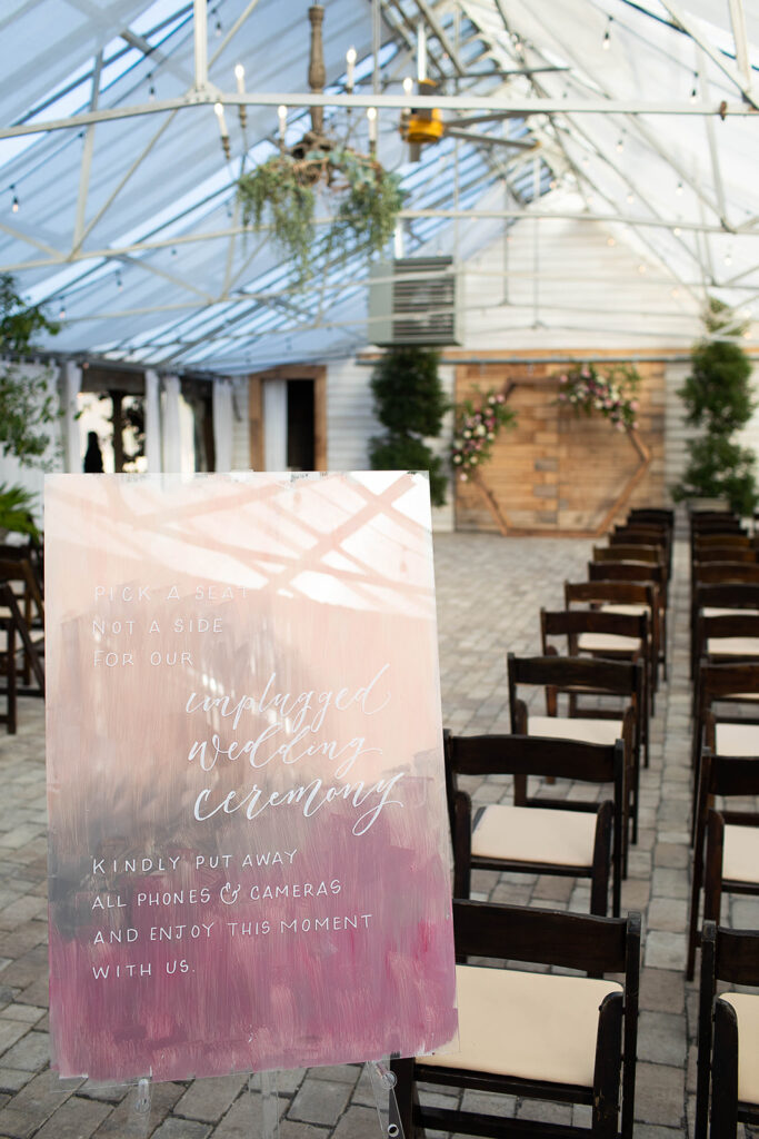
When people talk about wedding signage, they usually mention the welcome signs, or the big amazing seating charts; and those are always fun and memorable, but the small signage that is peppered throughout the ceremony and reception actually have a big job to do. They act like a sort of footnote to your event. For instance, our hand-painted acrylic “Sip and be Seated” sign is the perfect way to subtlety move guests along during cocktail hour. Reminding guests to enjoy the present moment with a sign like, “Welcome. Eyes up, phones down, hearts open,” is not only thoughtful, but it’s a perfect way to keep your guests engaged in the day you’ve worked so hard to put together. It’s all in the detail!
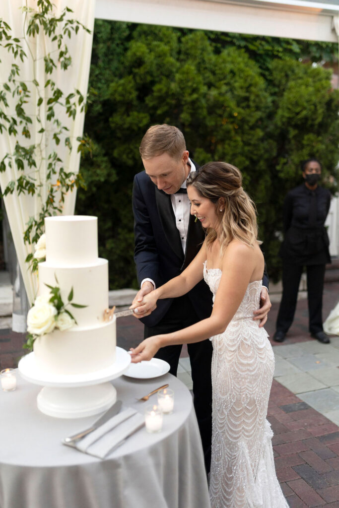
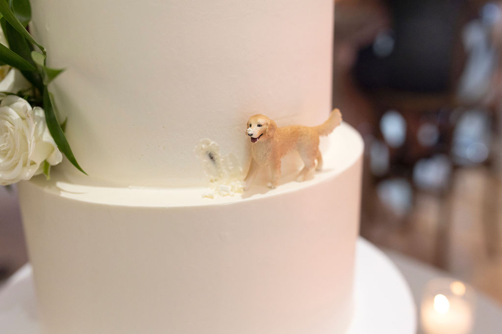
Still, as a fellow golden retriever lover, my favorite detail of Alex and Christopher’s wedding by far is the adorable golden retriever figure on their cake! I CAN’T! They even made it look like he took a bite! So, so adorable. What a fantastic way to use a small detail to make a big impression. White Ink was honored to help Alex and Christopher make their big day a day that left a lasting impression on all who attended. We love to help our clients with each creative detail we can offer, big or small, because they all serve a great purpose. Congrats to our happy couple!
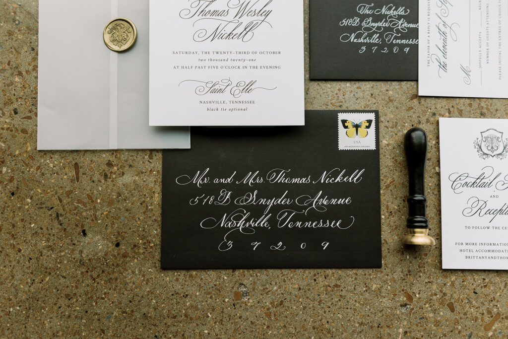
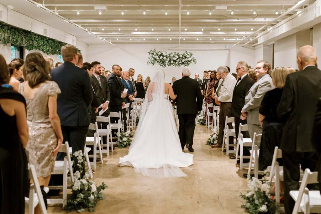
Ya’ll, we love a traditional Nashville style wedding, but there is something so satisfying about watching a wedding with a more modern form come together. Brittany and Thomas did not let us down. Everything they chose, from the invitation suites to place cards, was dripping in the perfect mixture of elegance and boldness. It made my calligrapher heart so happy that the White Ink team had the opportunity to work with this fantastic couple and help make their wedding dream become a reality.
wedding invitation suite
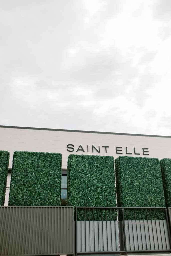
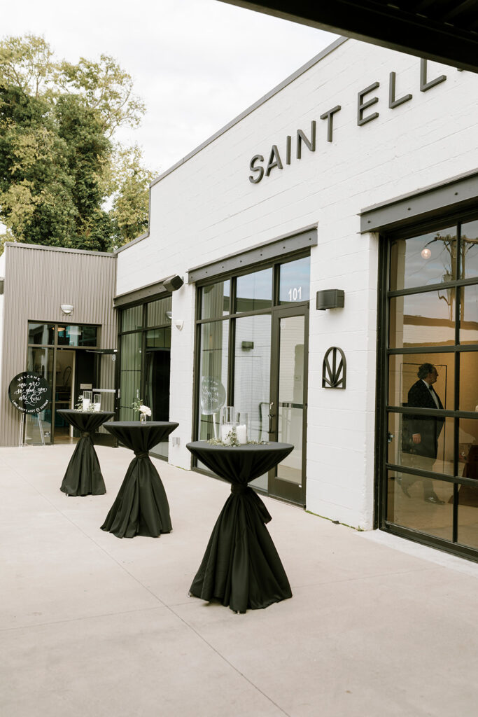
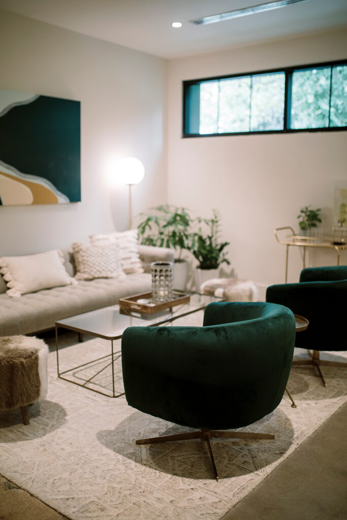
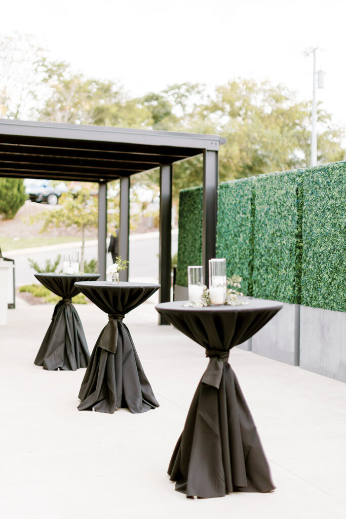
For starters, Brittany and Thomas chose Saint Elle in downtown Nashville as their wedding venue. It’s impossible to go wrong with that location! The furniture, the clean lines, the open spaces, and the abundance of greenery will certainly compliment your modern wedding goals. I love that we got create some really sleek custom calligraphy that flowed with the top-notch décor.
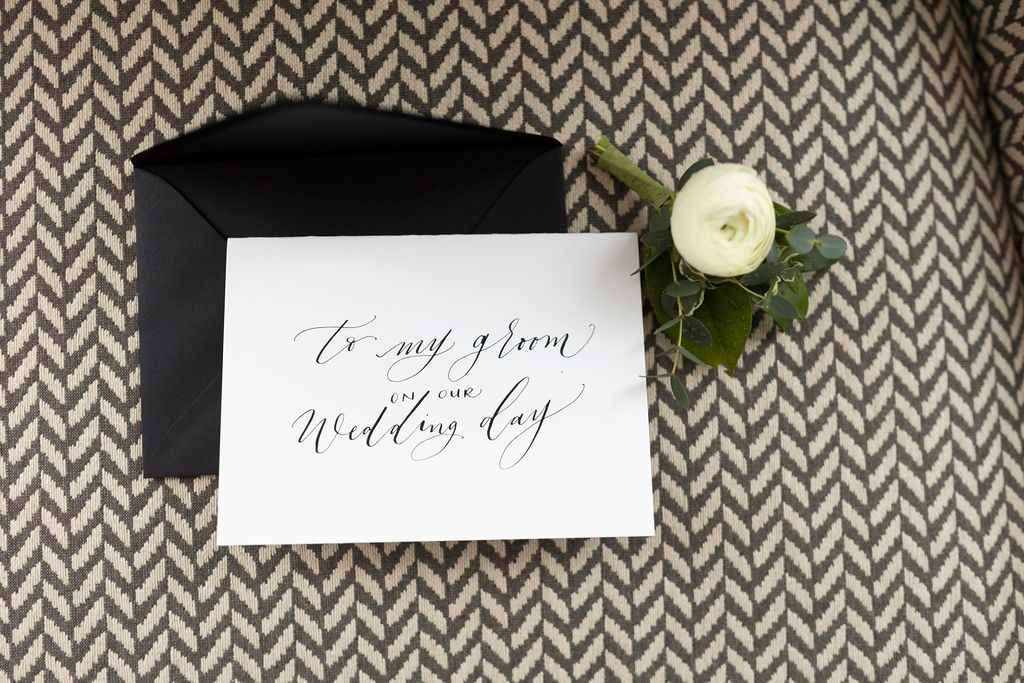
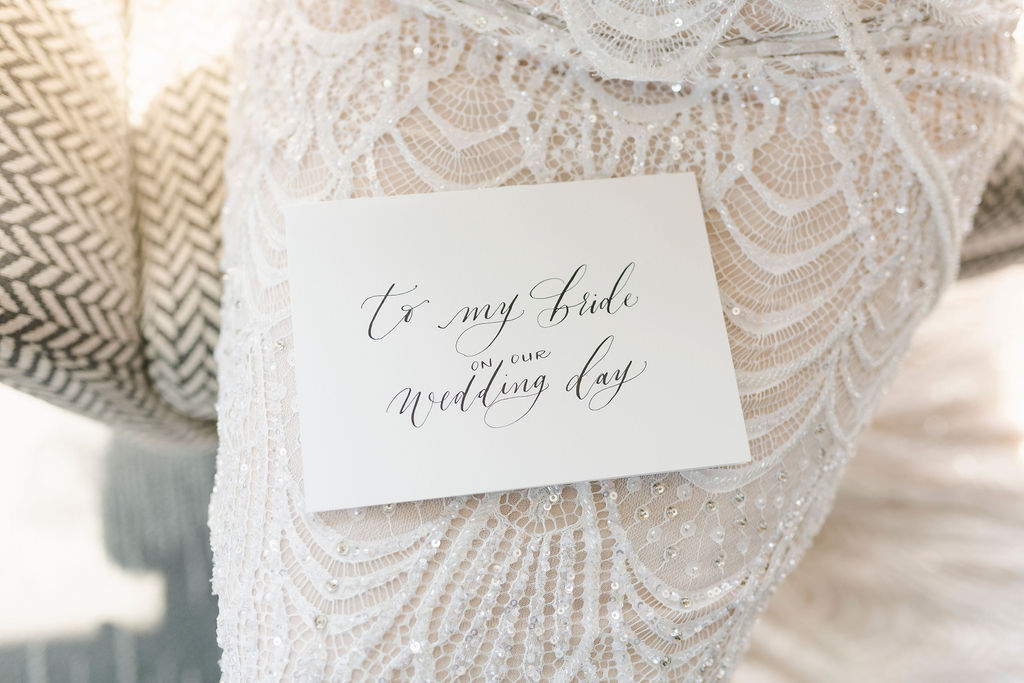
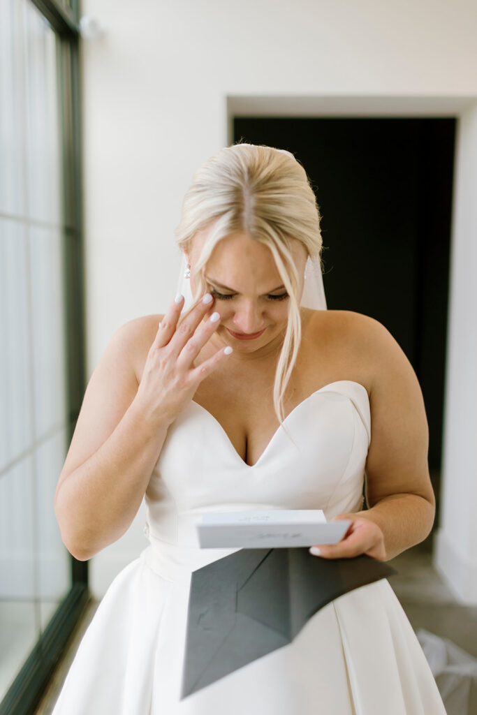
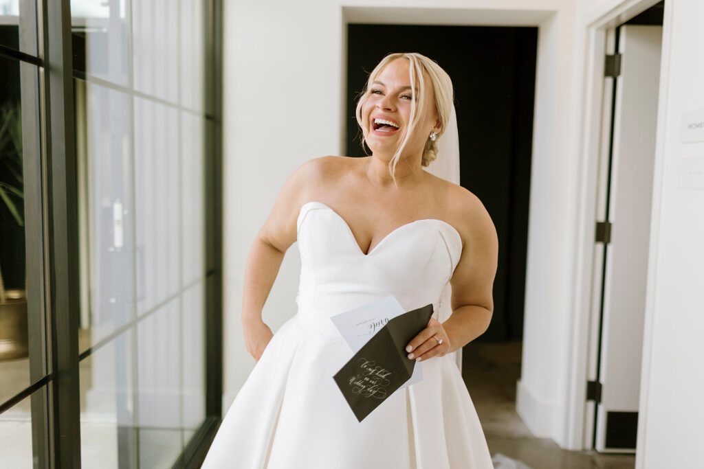
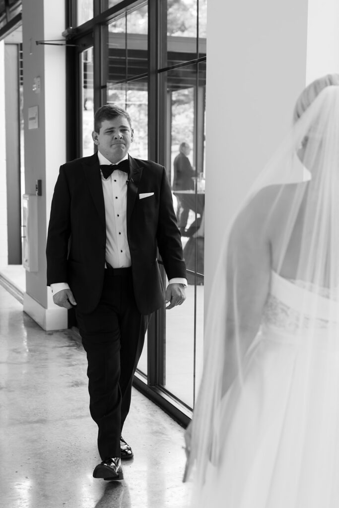
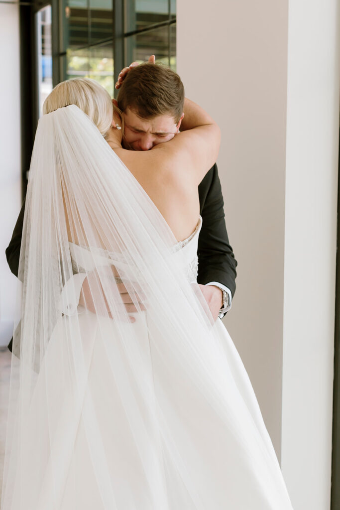
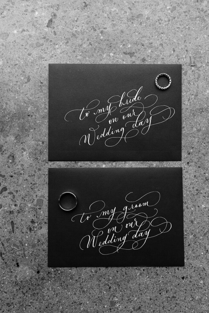
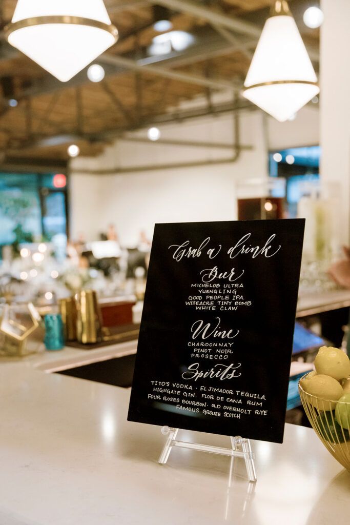
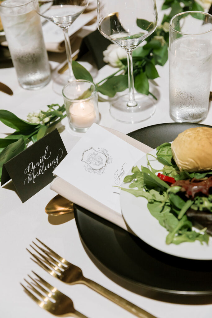
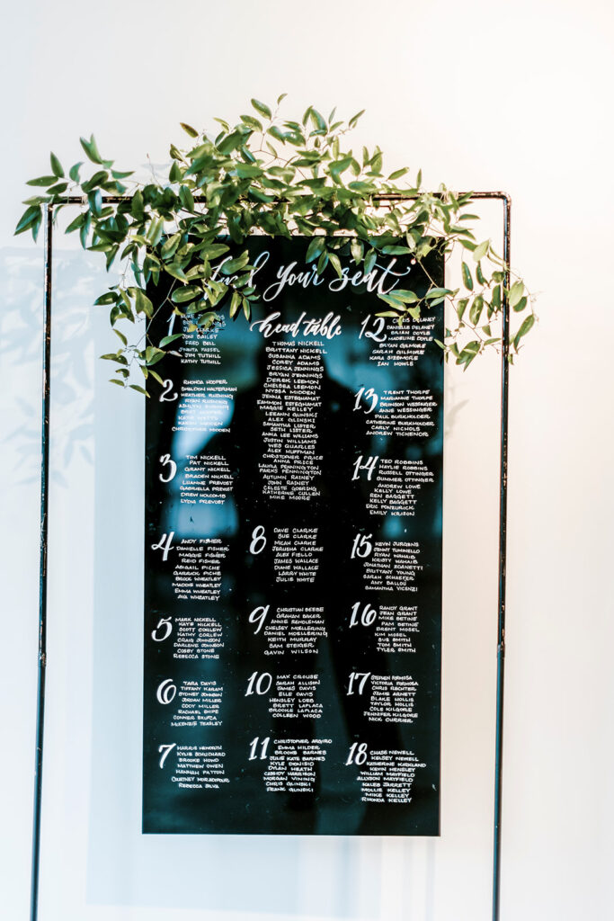
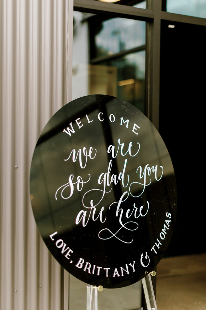
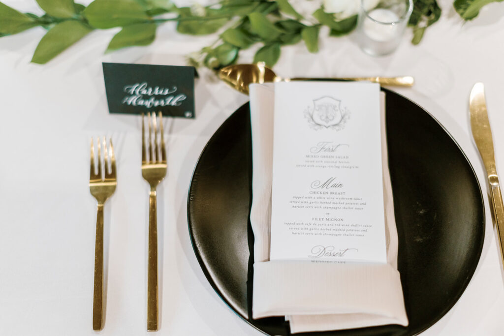
White Ink kept it coming while we put our mark on the super chic welcome sign, seating chart, bar signage, and place cards. I don’t know, but putting white custom calligraphy on top of black just kept blowing my mind. And I want more! We definitely had a lot of favorites at this wedding but getting to customize the envelopes that read, “To my Bride/Groom on our wedding day,” warmed our hearts! Seeing their reaction to such a sweet and delicate moment on the biggest day of their lives really made me appreciate that White Ink had a little part in that.
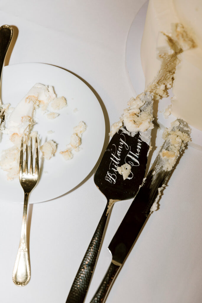
Don’t forget, White Ink can ENGRAVE custom calligraphy on many different surfaces. You have to take a look at Brittany and Thomas’ stunning cake-knife and server set! You don’t have to be a bride or groom to inquire about something like these. This would be a fantastic gift for anyone to give to a special couple on their big day.
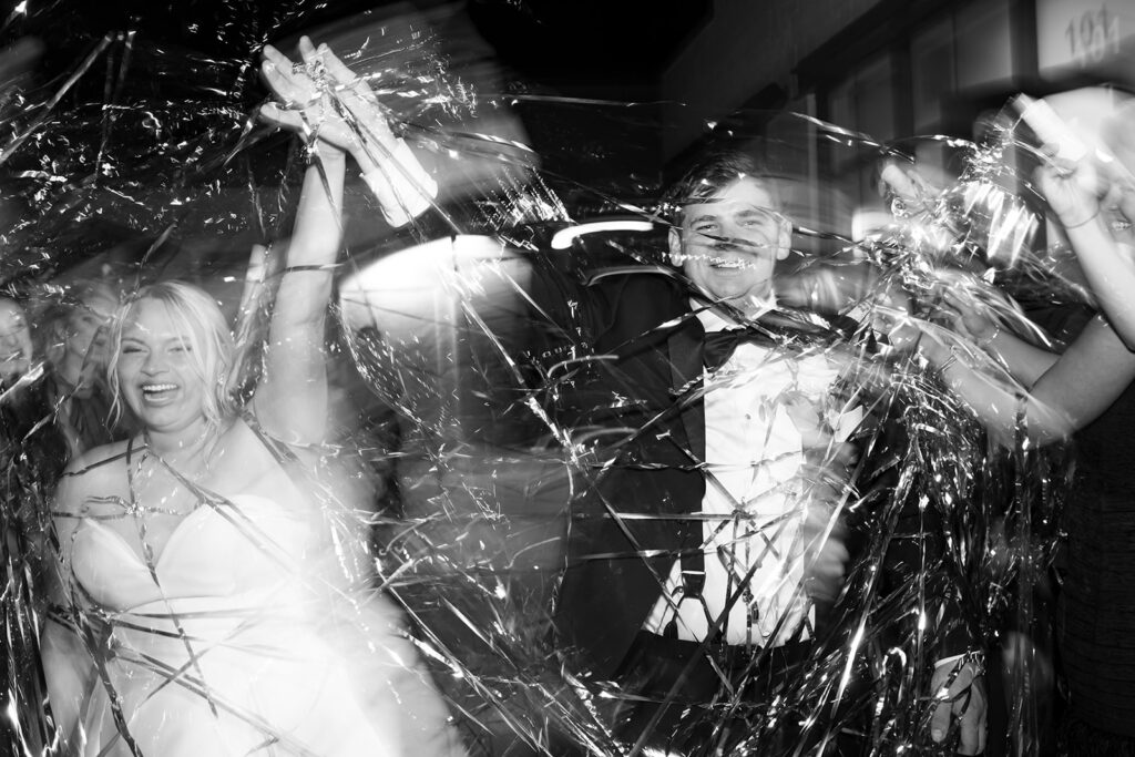
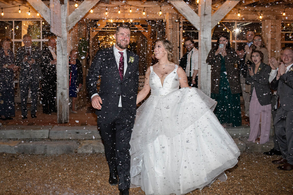
Anytime I think about designing for this wedding it puts a smile on my face. We cannot wait for the next opportunity to design with a modern style in mind because, just like those confetti streamers at our couples exit, this wedding POPPED!
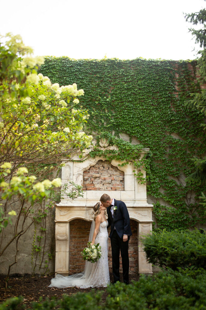
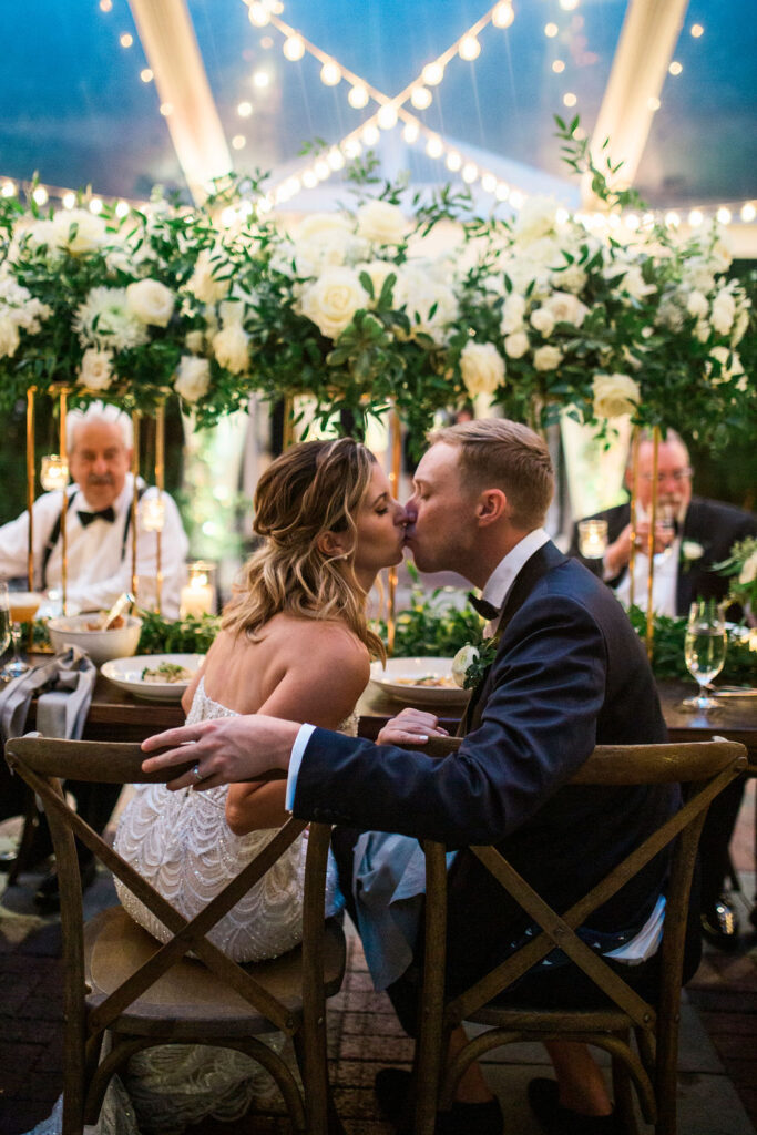
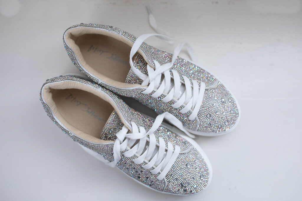
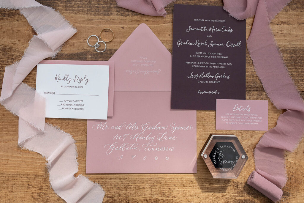
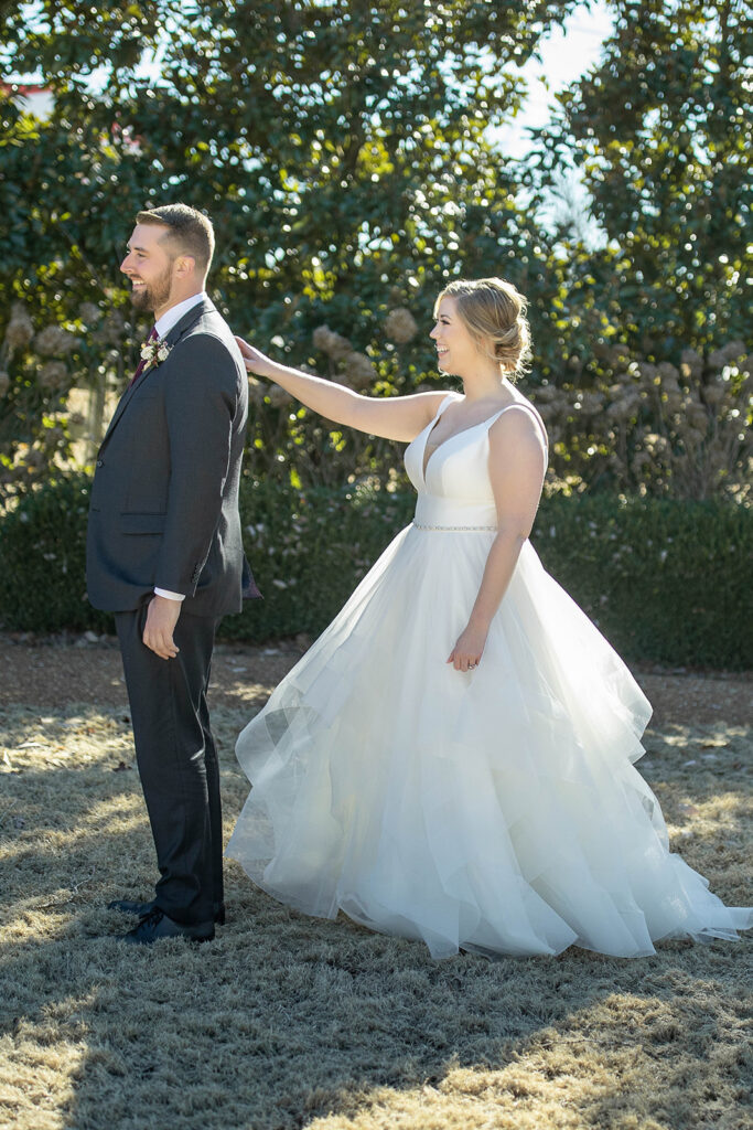
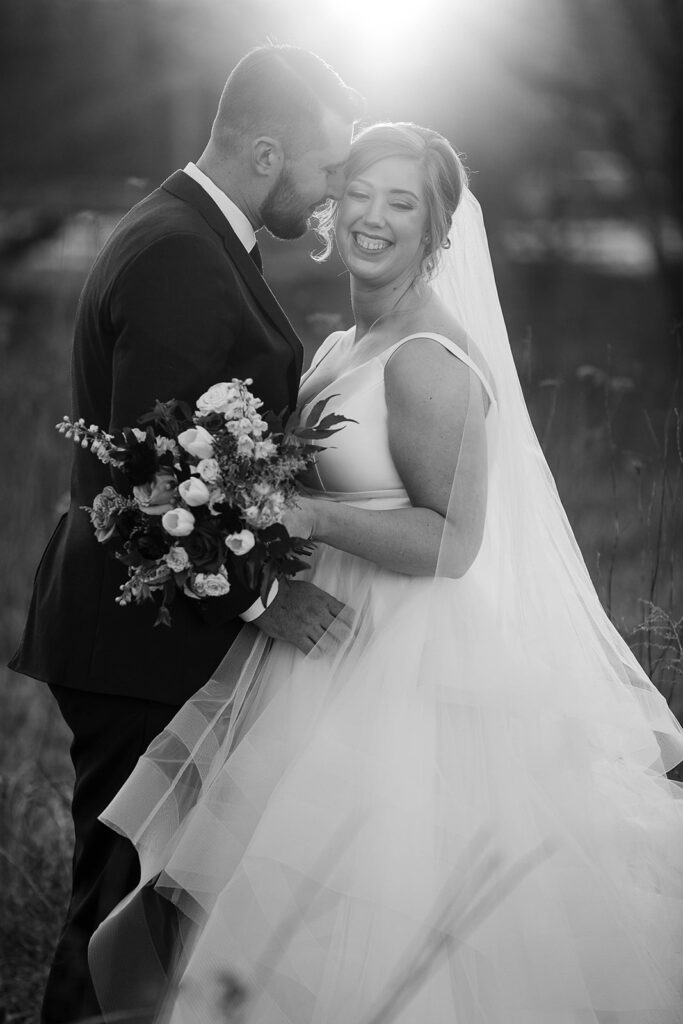
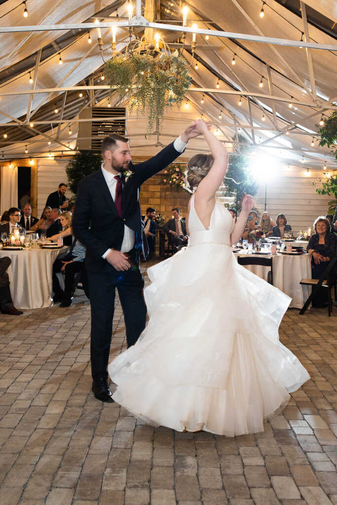
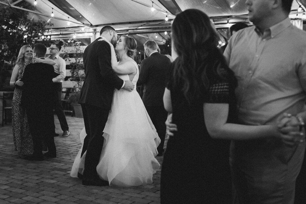
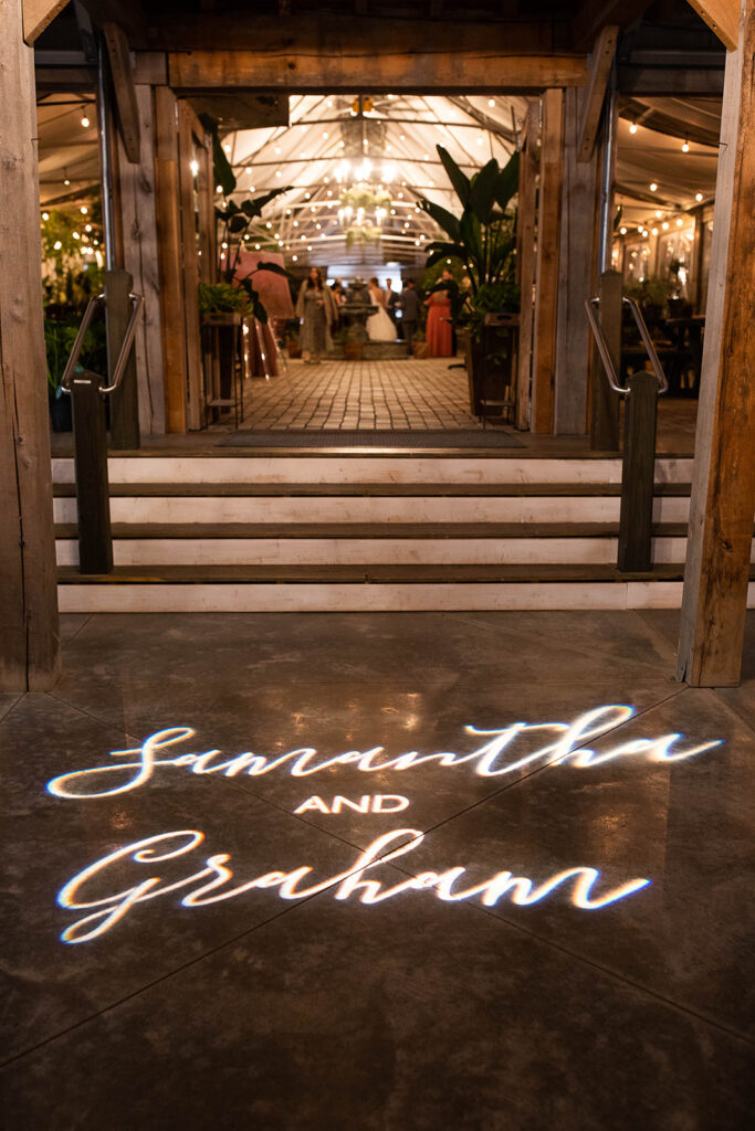
Like the pop of a champagne cork, White Ink has burst into yet another wedding season. And we are ready for it! This is, hands down, our favorite time to really showcase what we love to do for our couples. Samantha and Graham were easily the sweetest bride and groom we’ve had the pleasure to work with. In fact, I took particular pride in getting to be a part of their big day because Samantha was a wedding planner once upon a time. She is a creative herself, so trusting White Ink with the finer details of her wedding was a great honor.
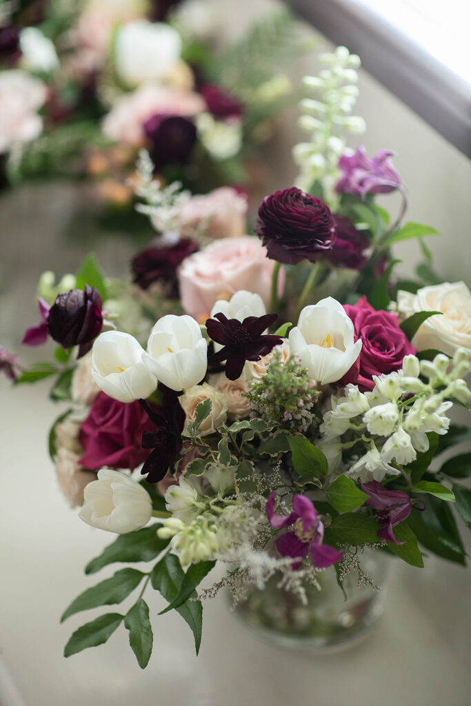
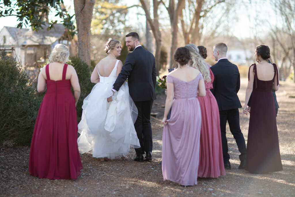
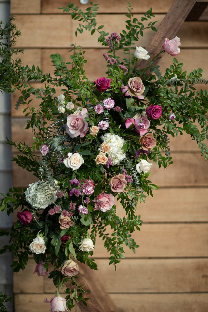
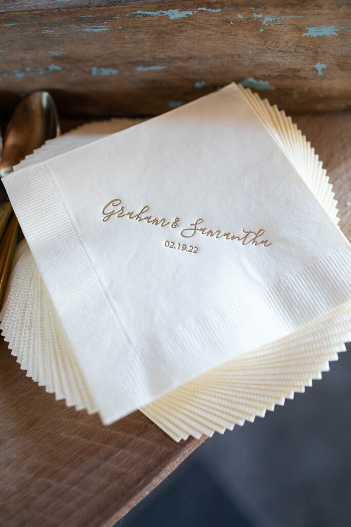
Today, Samantha and Graham are both teachers. They exude a perfect balance of love, humor, and comfort. That balance shone through during the entire process of creating the wedding details that were just right for them. We swoon for the blushing hues of these invitations! These colors poured beautifully into their wedding.
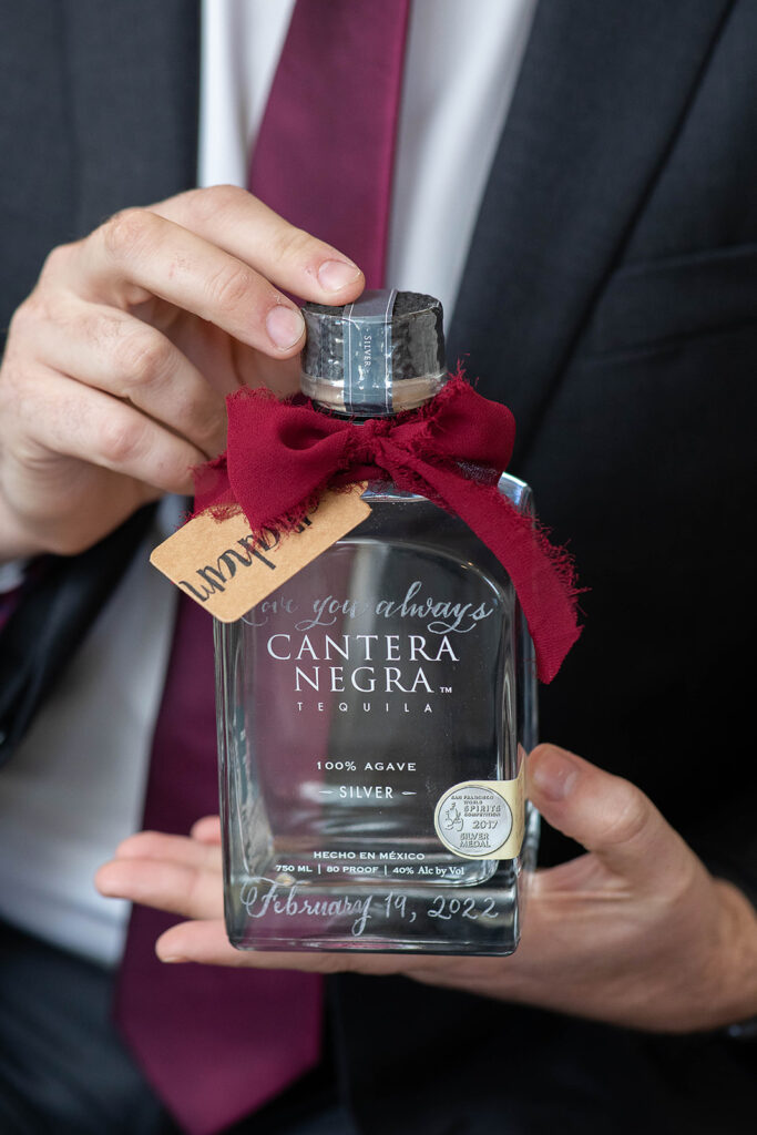
Can we all just take a moment to appreciate the beauty of gifting an engraved bottle to our grooms? A gift as bold as the sting of its contents but as delicate as the glass that holds it.
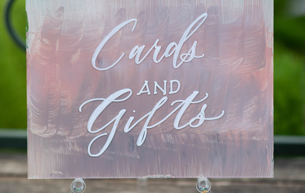
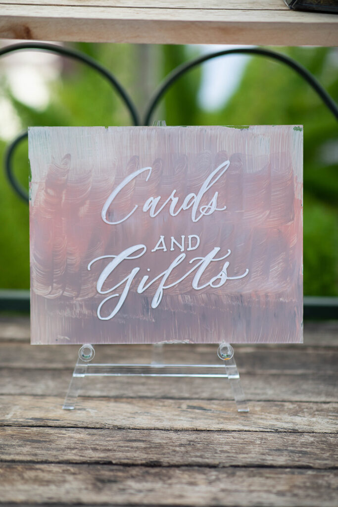
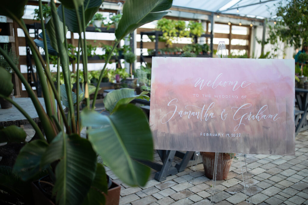
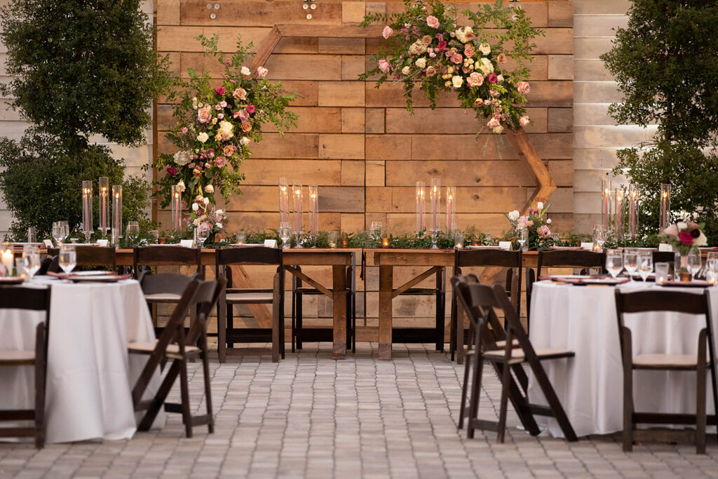
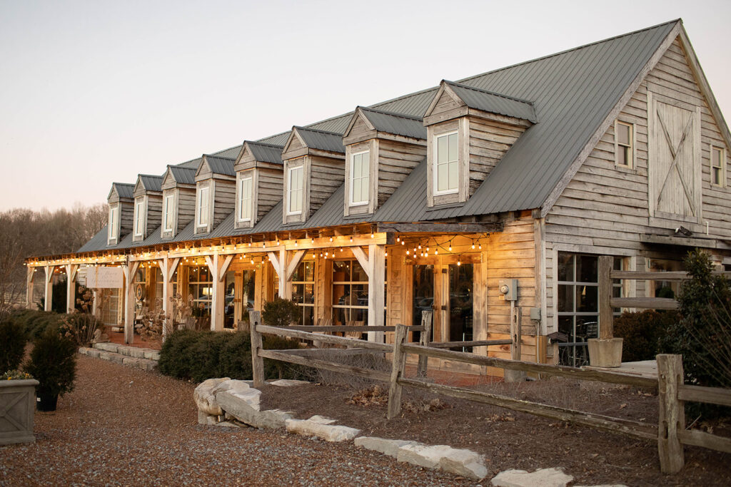
The event signage for the ceremony met the guests with subtle displays of rosy ombre tints. We love the gentleness that the signage added to the already gorgeous ambiance of chandeliers and cobble stone in Long Hollow Gardens’ Greenhouse venue.
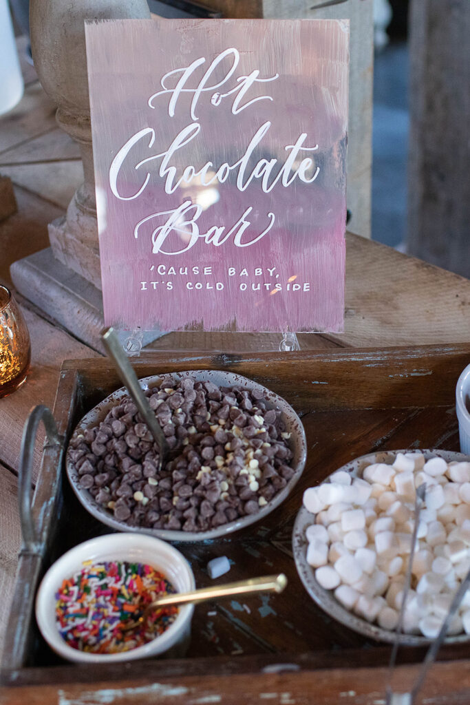
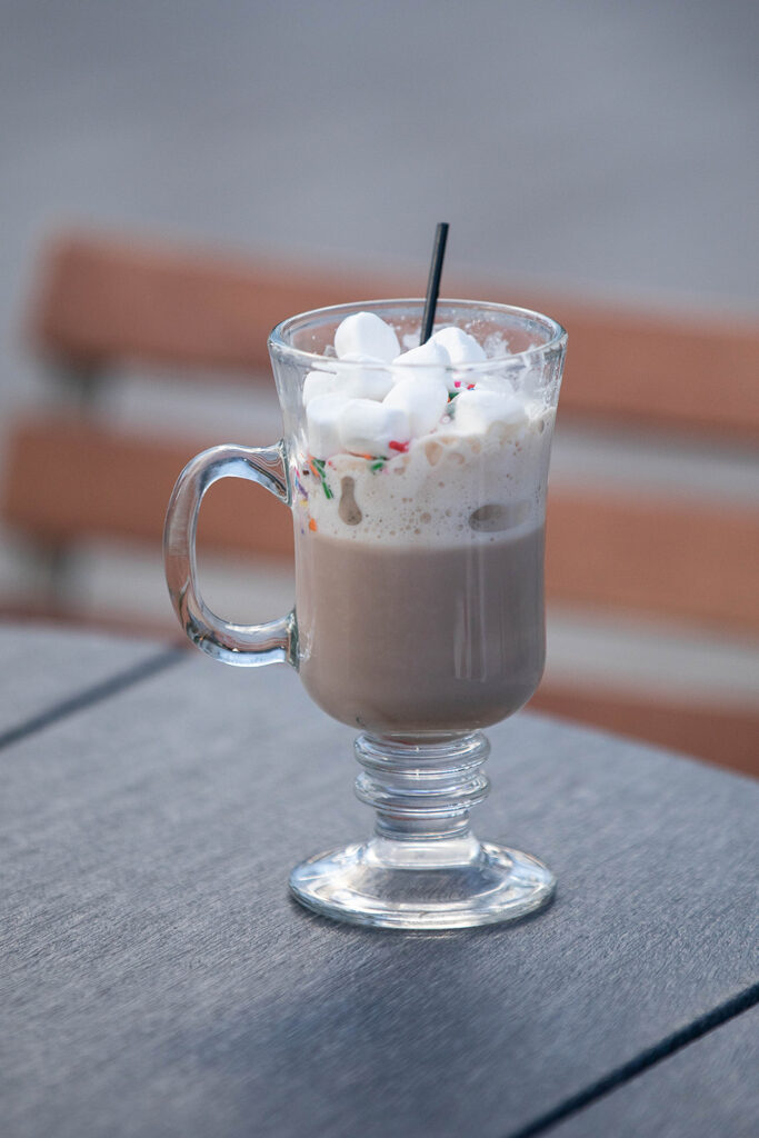
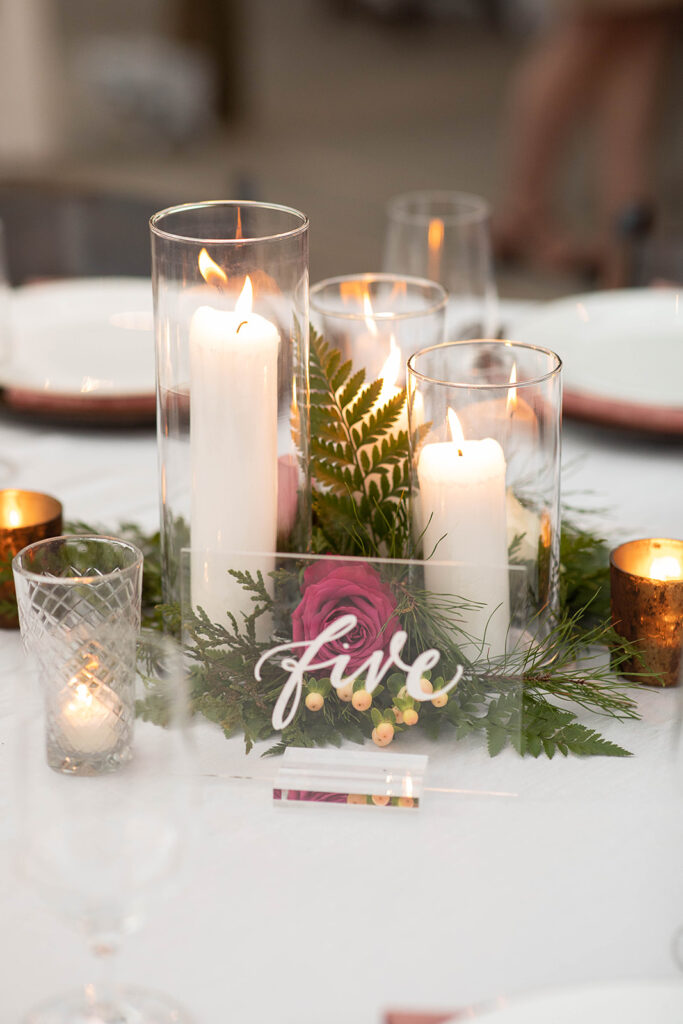
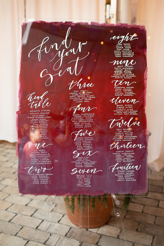
Naturally, these dreamy colors jumped into the reception with these fun acrylic tabletop signs for Samantha and Graham’s seating chart, drink bar, and decadent chocolate bar! Now it’s a party!
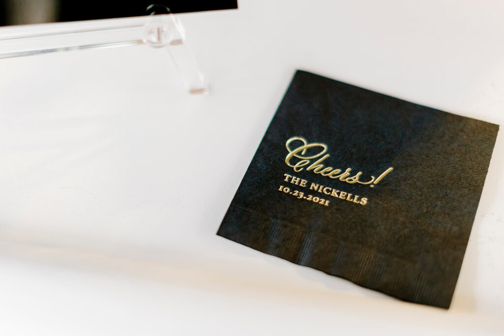
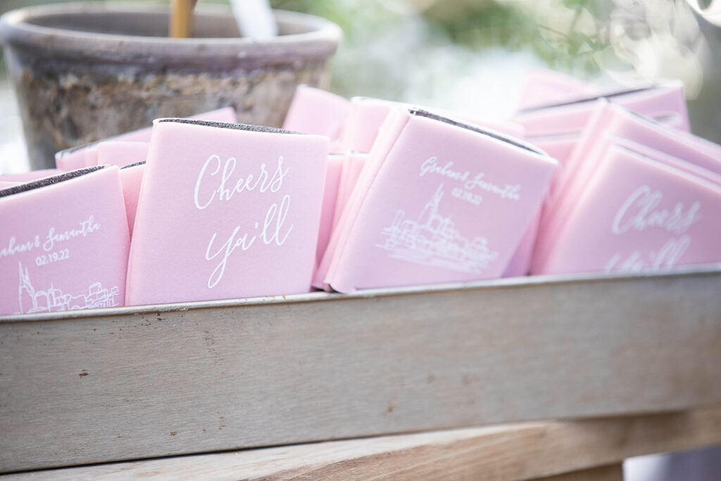
After our couple and their guests danced the night away, everyone was free to take home a little piece of the evening with these adorable koozies! And to the happy couple, we couldn’t have said it better, “Cheers Ya’ll!”