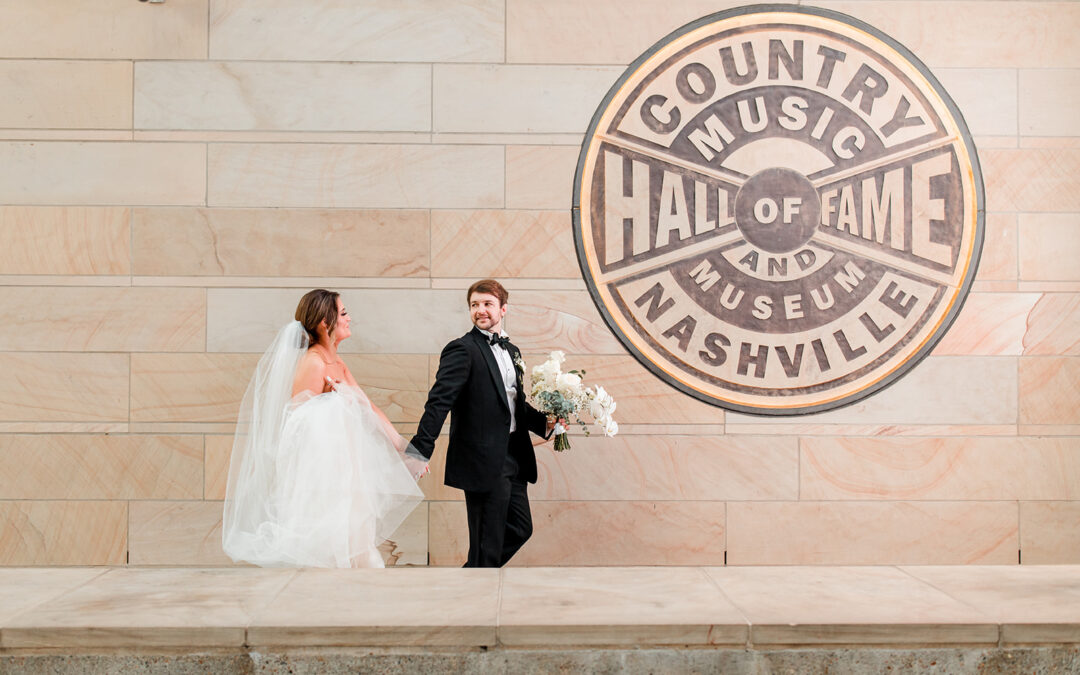
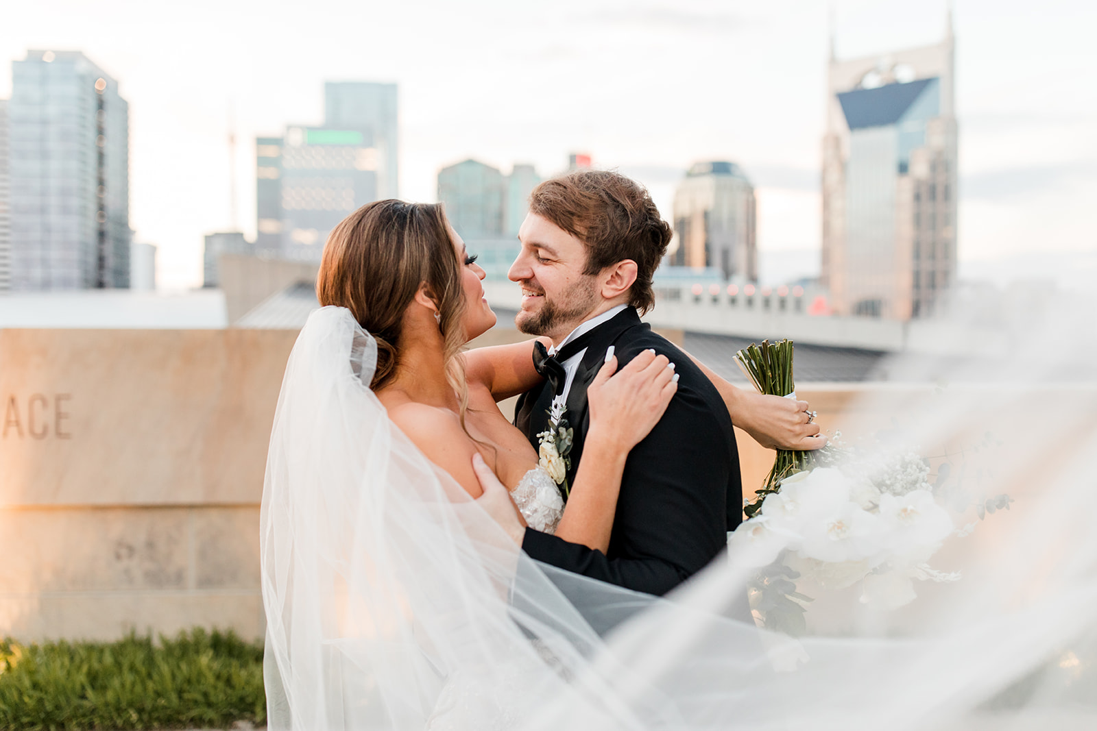
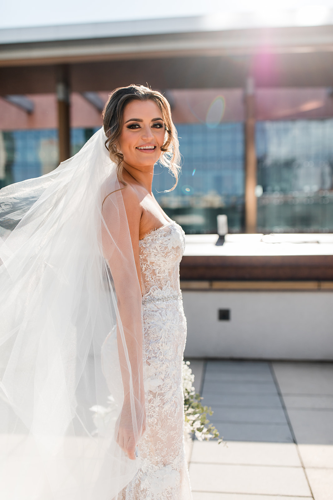
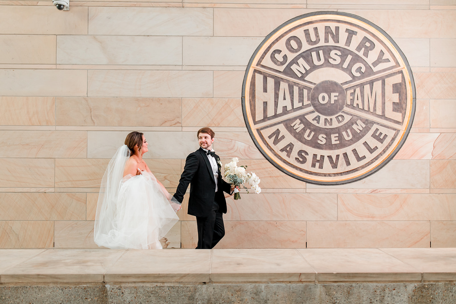
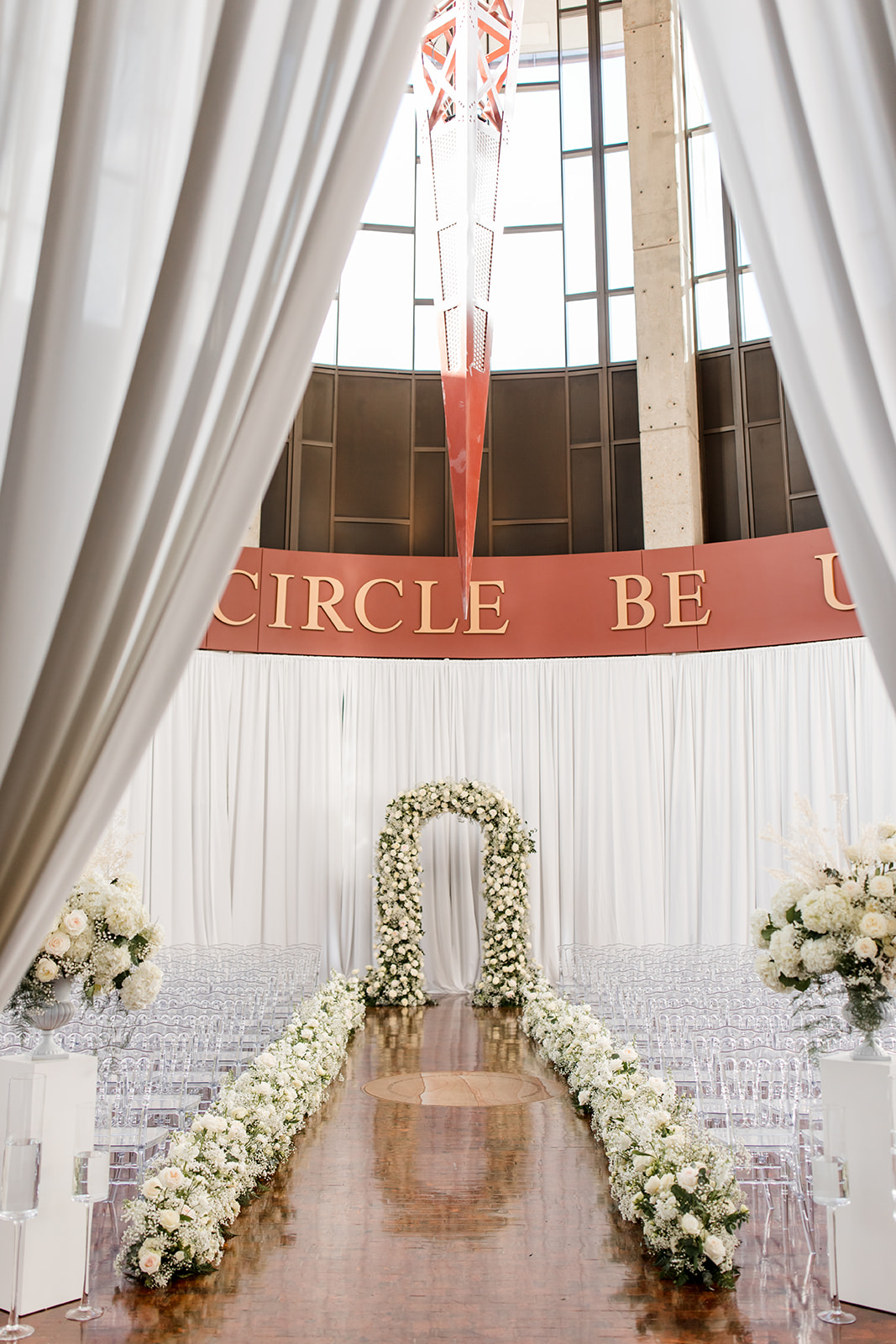
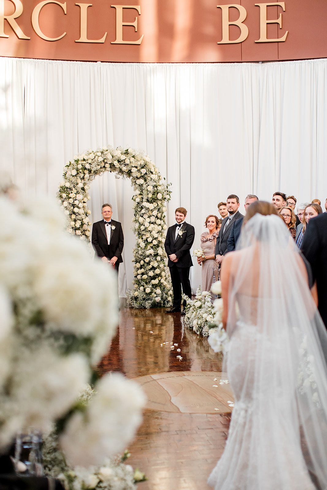
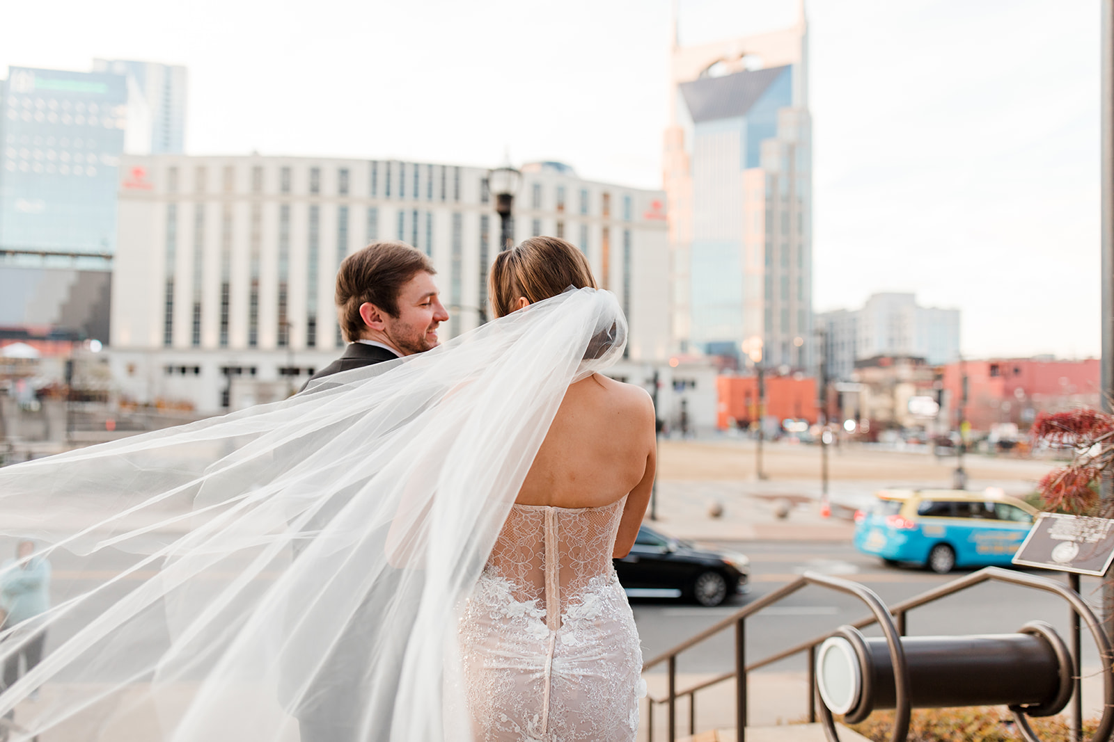
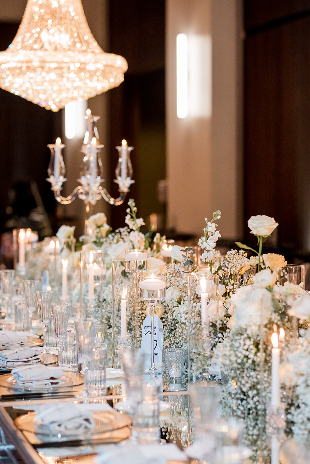
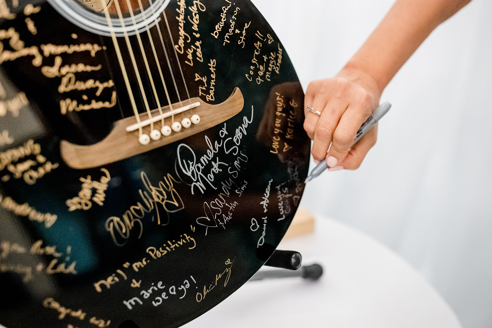
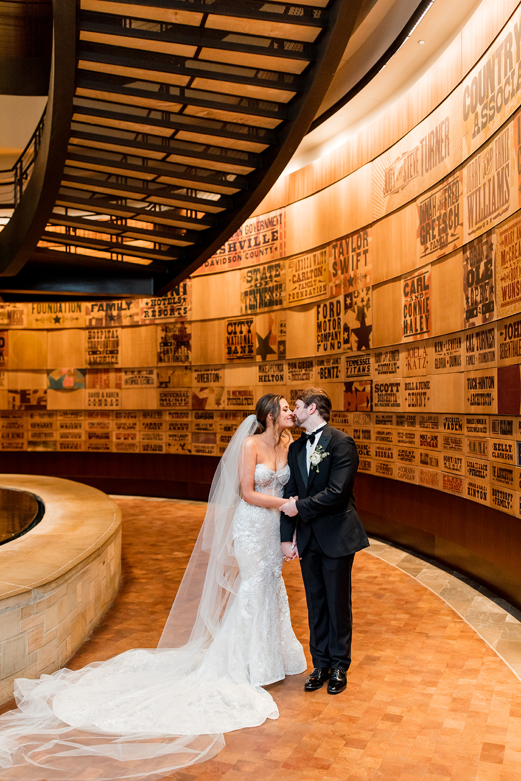
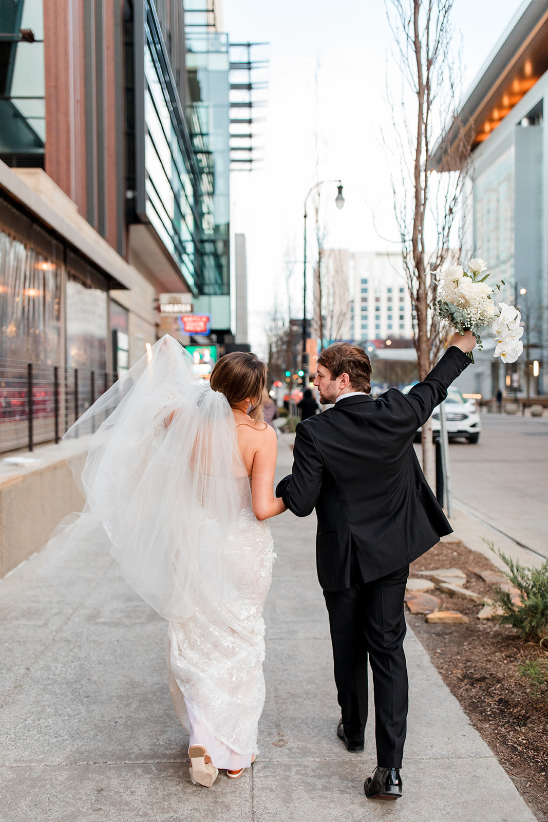
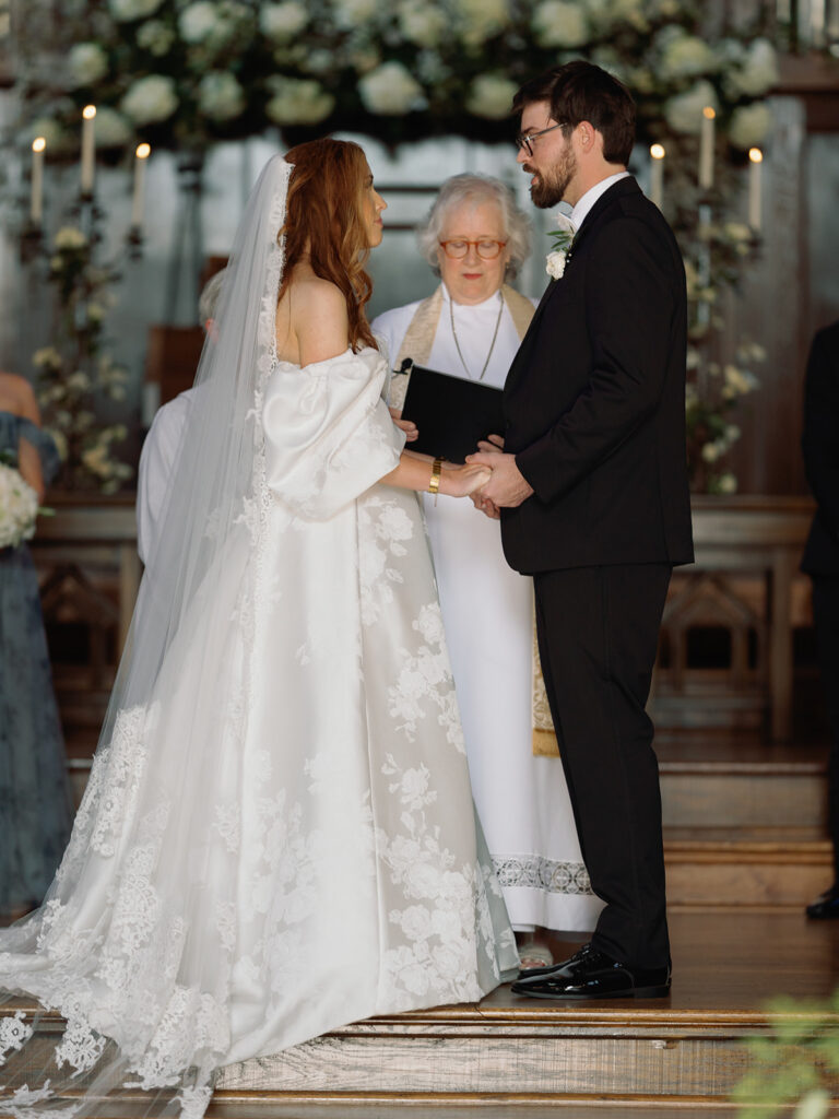
Nashville is widely celebrated as the birthplace of country music. When you’re here, you don’t have to go very far before you start to hear sounds of strumming and people bearing their hearts and souls through the words and the meanings of this thing they call country. If this is your jam, we are excited to bring you downtown with us to see how White Ink couple, Lindsey and Carson, created their downtown Nashville dream wedding surrounded by the iconic collections that live inside of Nashville’s very own Country Music Hall of Fame and Museum. Check out how we played a part in creating details that helped tie this beautiful Nashville wedding together.
It’s easy to tell when a couple takes time and care in selecting the finer details of their wedding. Lindsey and Carson are an exceptional team and were so fun to work with because they took care in choosing what they wanted for their big day.
Downtown Nashville Dream Wedding
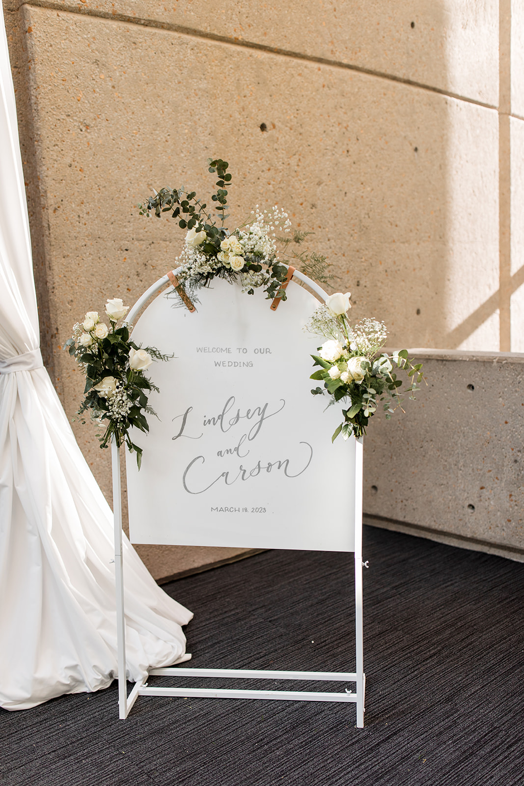
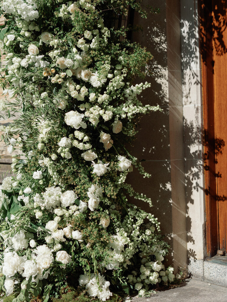
This arched wedding welcome sign is definitely one of my favorites from our collection. I love the all-white look; it fits into nearly any style and makes the perfect canvas for displaying florals or really any other designing element that you would want to tie together throughout the day.
The beautiful floral designs that Lindsey and Carson chose were laced throughout the ceremony and reception, including the wedding welcome sign.
Reception Details
It’s fun when we get to focus our attention on the reception too! I can’t begin to tell you guys how cool it is to be a part of so many amazing seating chart designs and ideas.
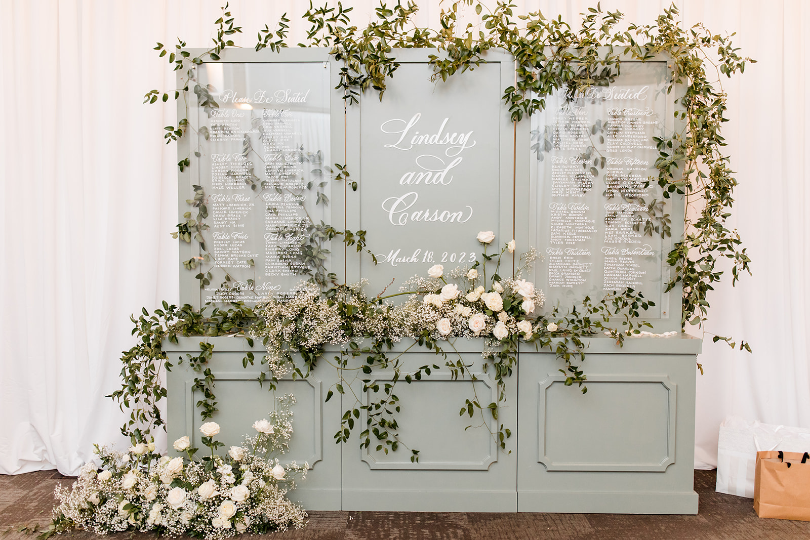
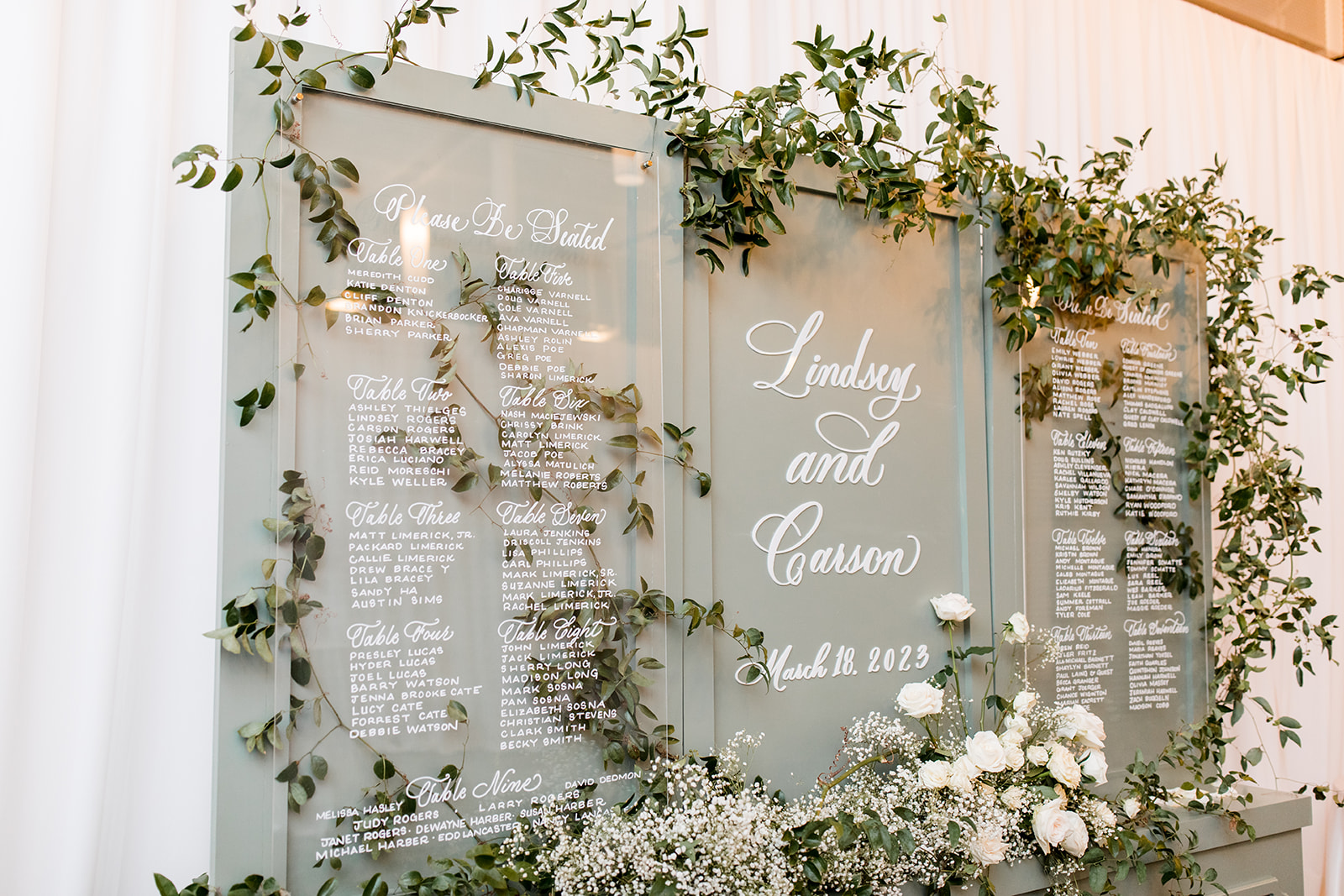
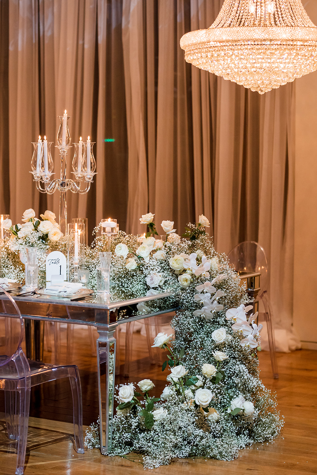
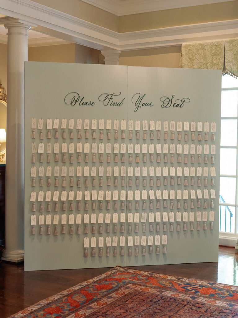
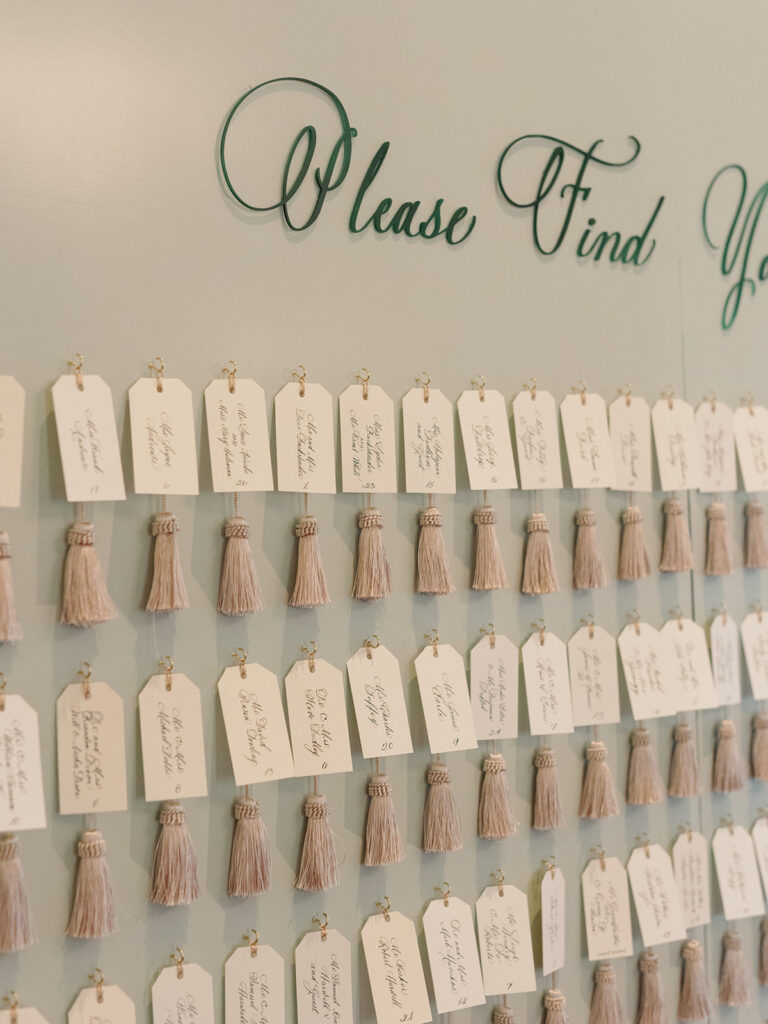
This seating chart just makes me smile – I don’t know how else to put it. I mean, the muted, soft gray with florals cascading all around. I really love how delicate the white ink looks against this color and how the greenery pops from behind the acrylic of the seating signage. Perfectly magical.
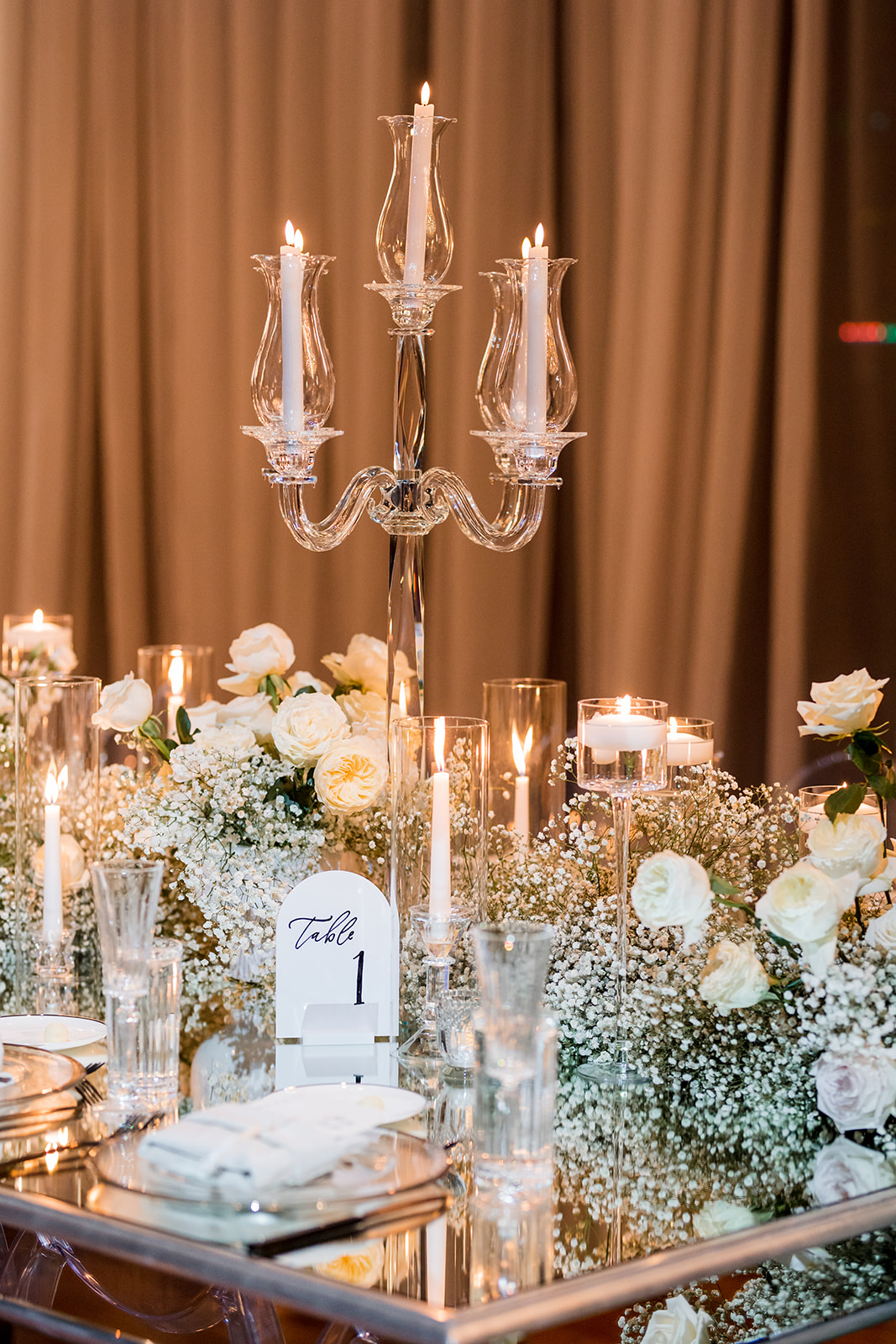
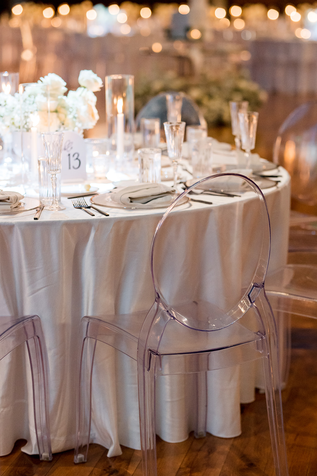
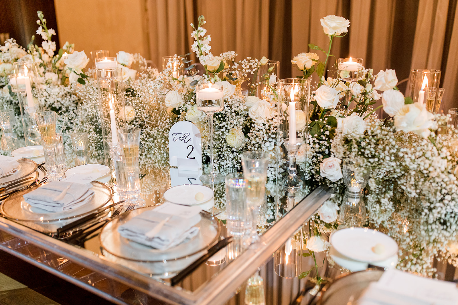
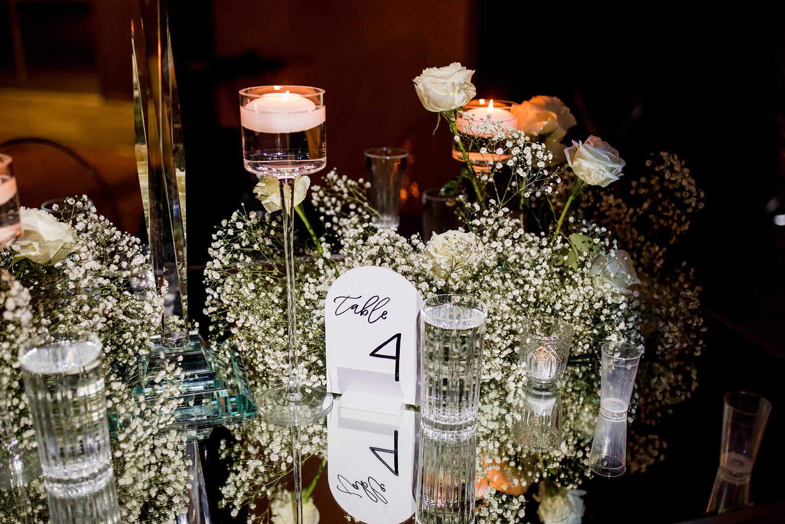
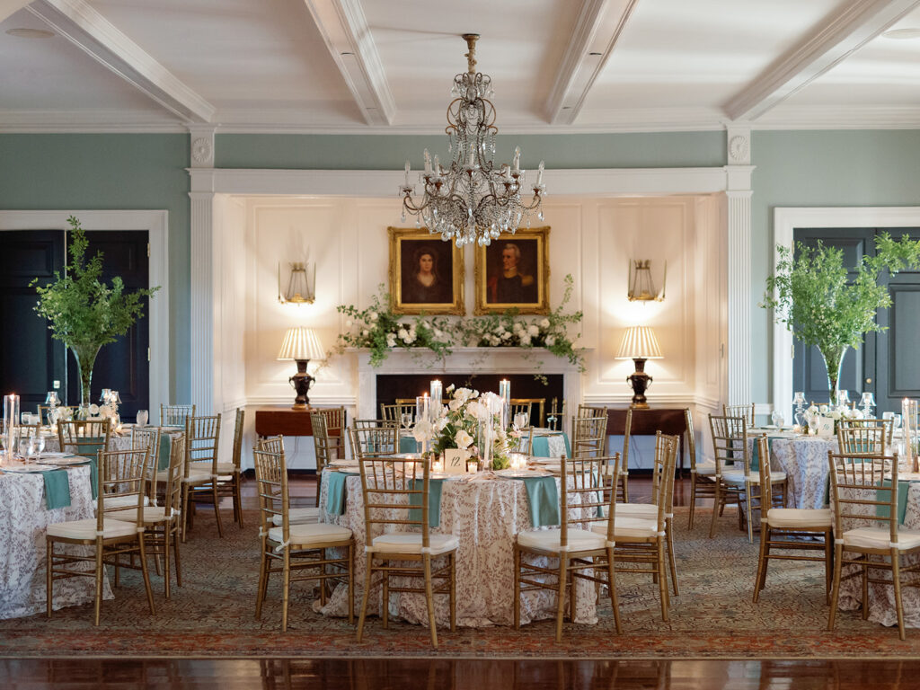
Our couple chose our white arched table number signs in black ink. Not only did these little beauties match the shape and color of the arched wedding welcome sign, but they also blended perfectly into the stunning tablescapes!
Custom Menu + Place Cards
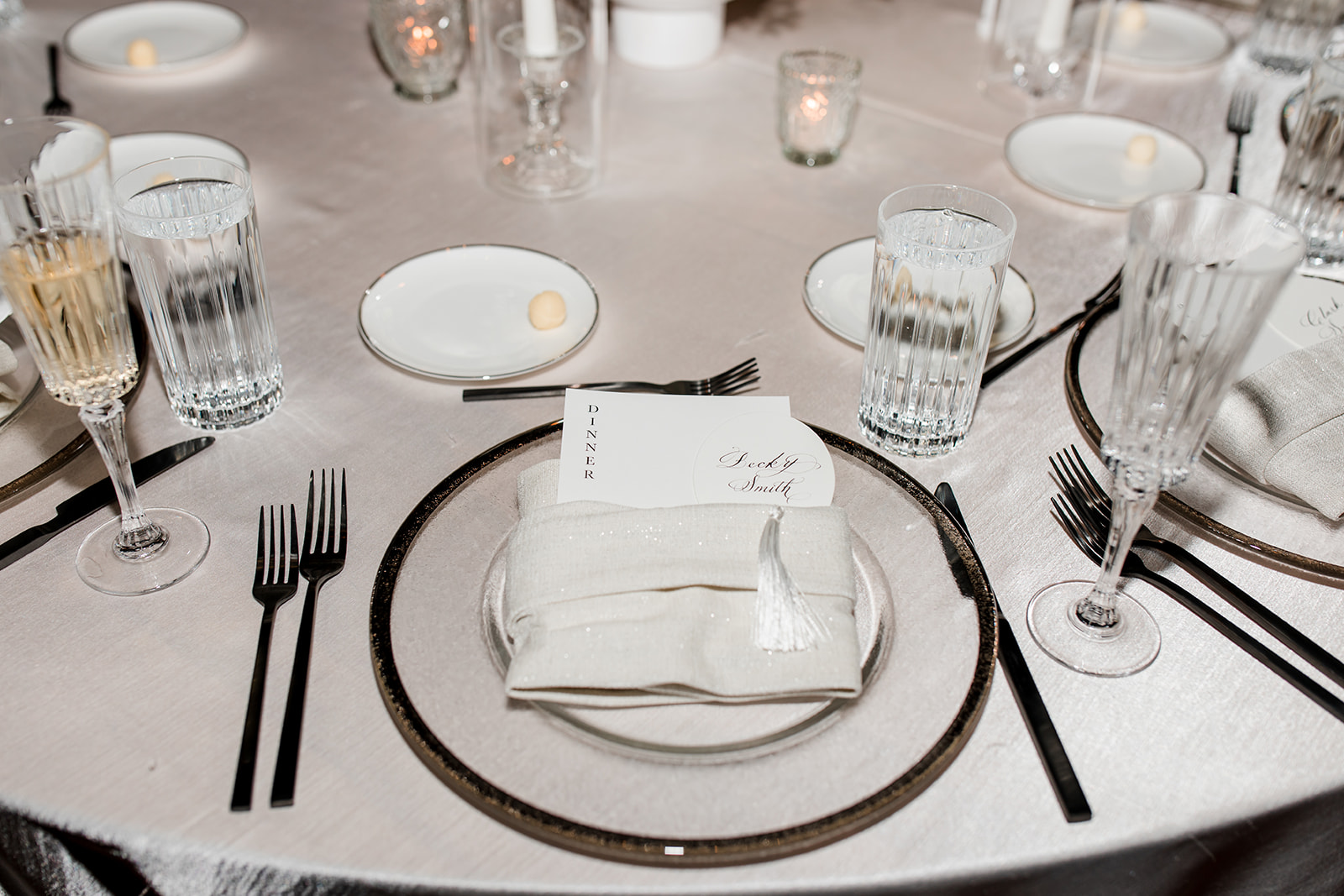
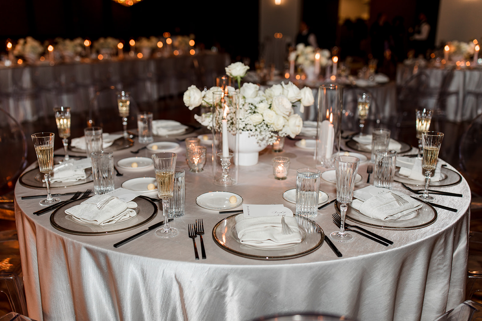
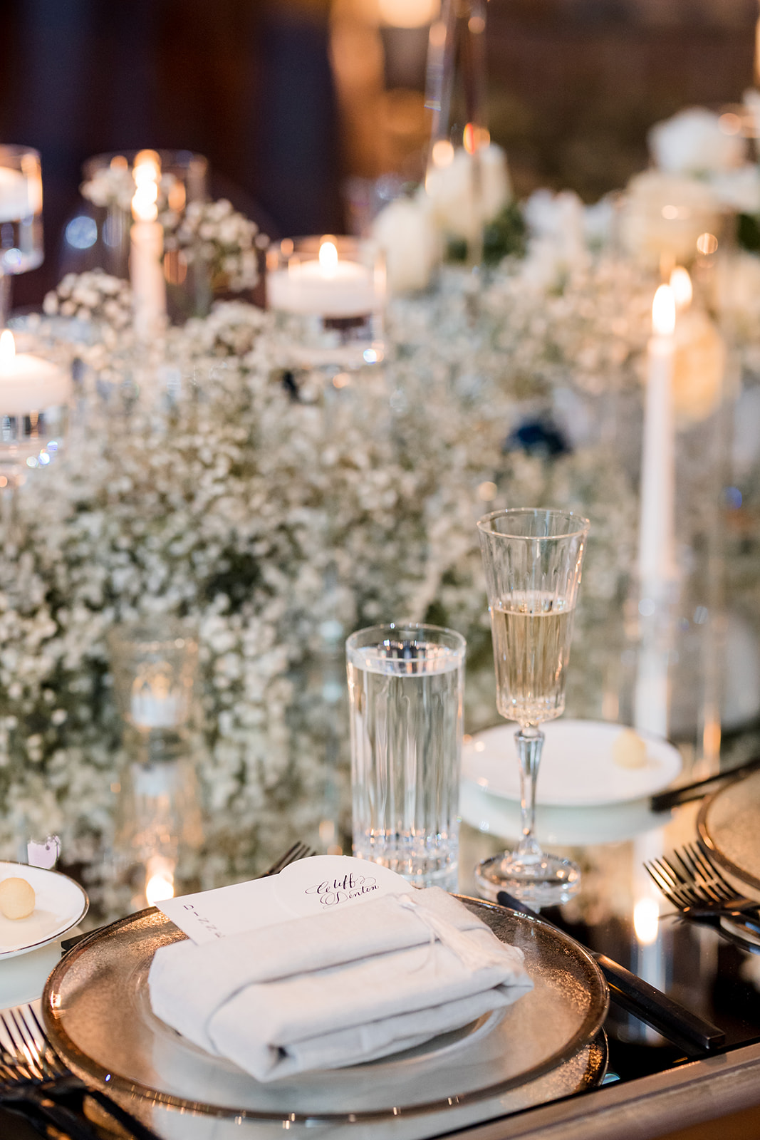
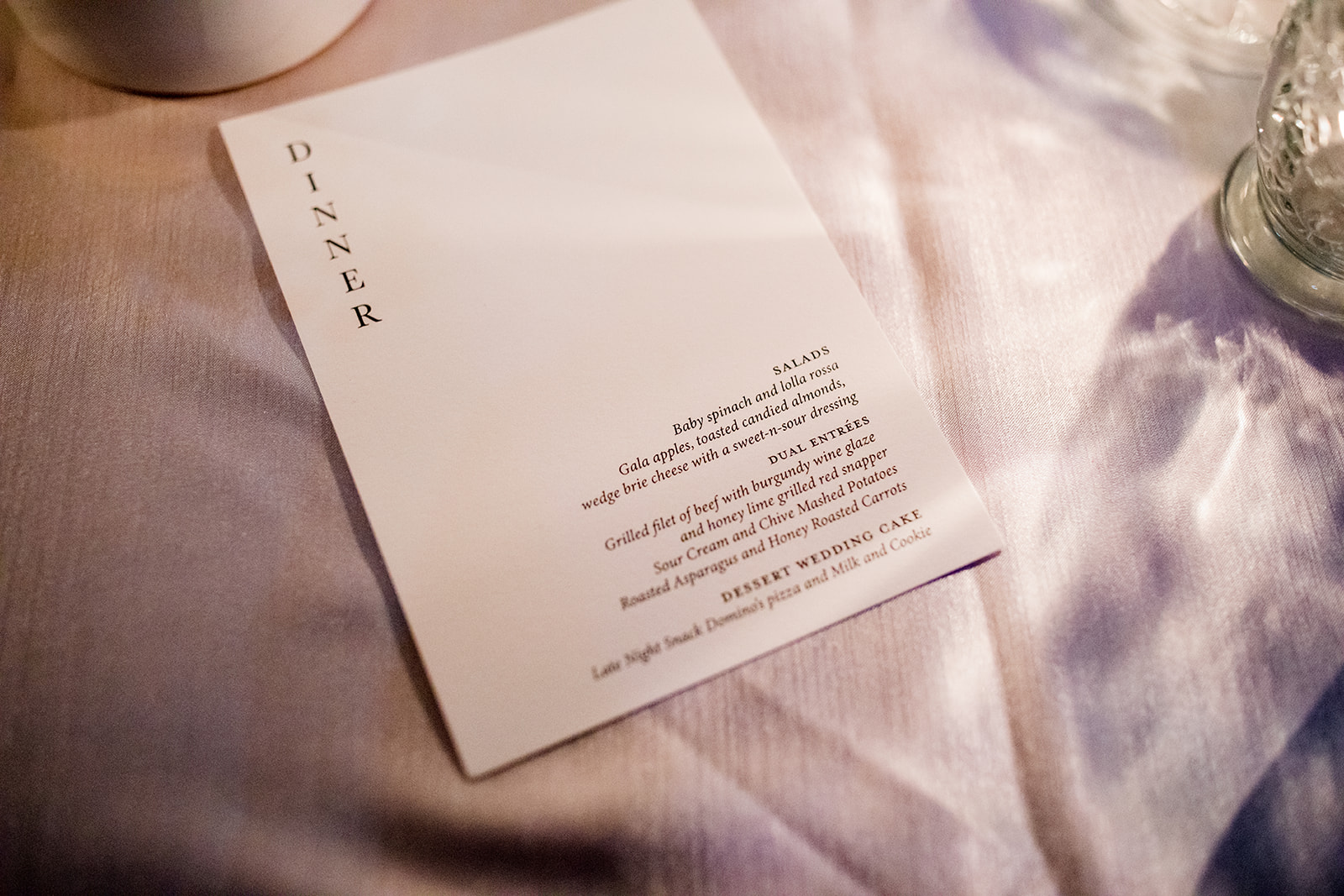
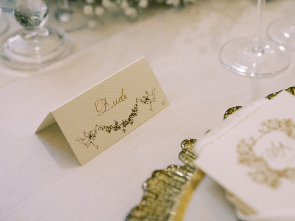
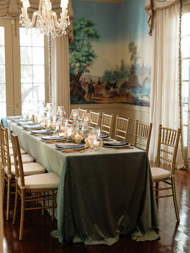
White Ink also designed Lindsey and Carson’s custom menus for the reception that were perfectly tucked into the napkins at the formal place settings. We also created the most adorable little oval place cards with tassels that went alongside the custom menus. I love when details are both adorable and functional!
The word “Dinner” peeks out from the napkin leaving this custom menu sleek and inviting.
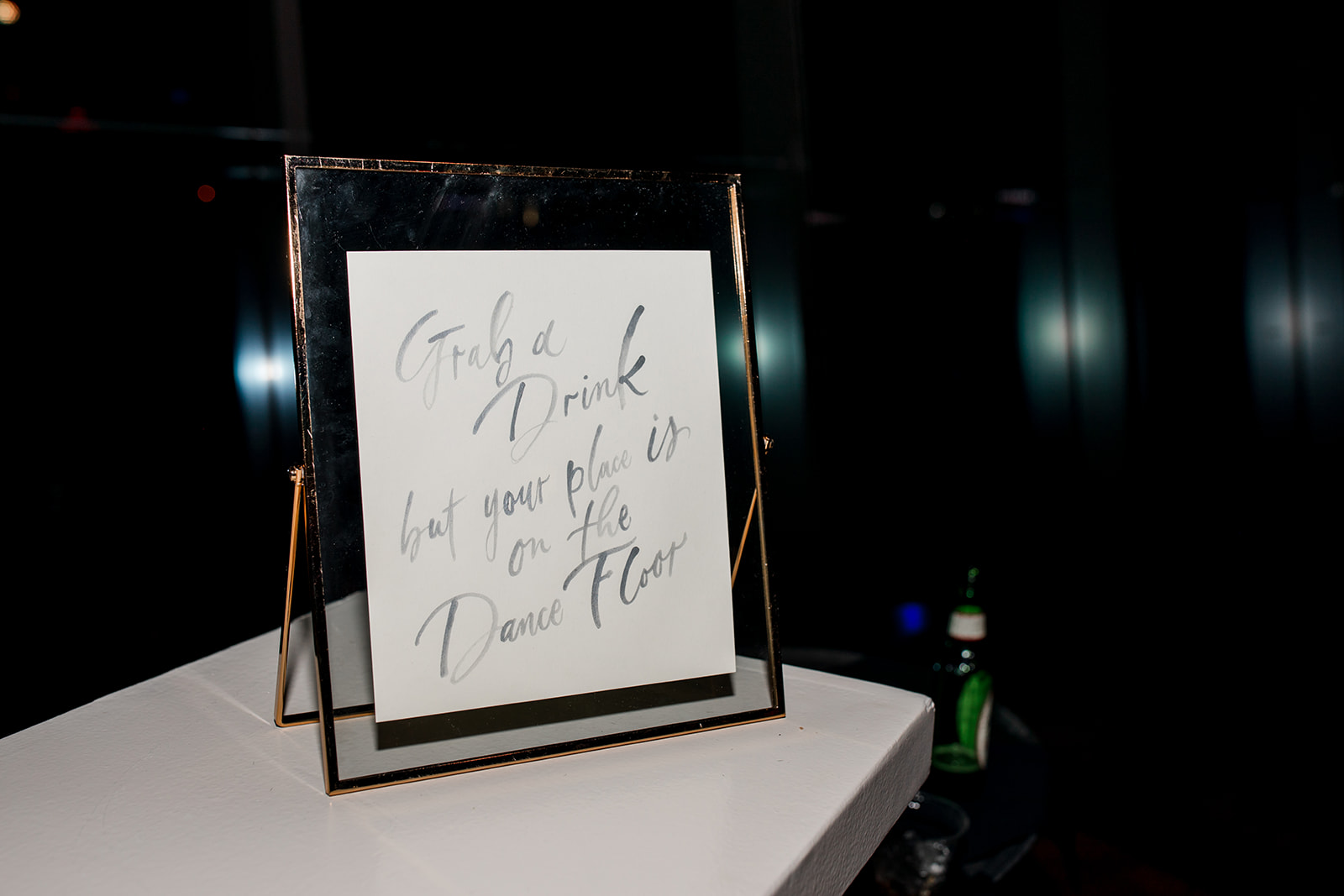
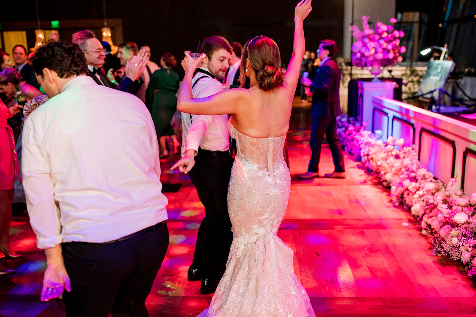
“Grab a Drink but your place is on the Dance Floor,” is the kind of guidance I need to encourage me to let my hair down and hit the dance floor. I love added humor into signage like this, very fun and highly appropriate.
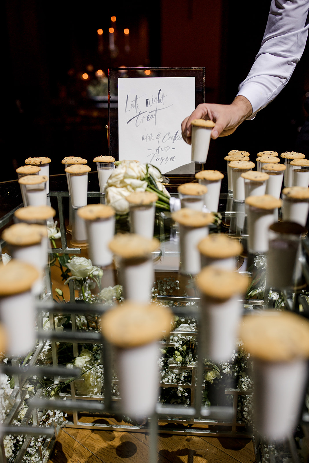
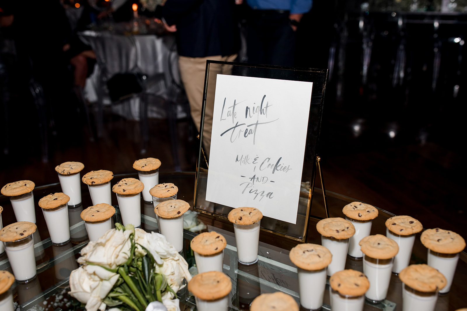
Let’s be honest, late night snacks are the real MVPs of wedding receptions and we all know it! I’m so happy we were able to make a sign for these little lifesavers.
When it comes to Nashville, you may be here for the country, or you may be here for a good time. Lindsey and Carson made sure to have both and that’s what keeps us always coming back for more. To this amazing couple, may there be more just like you with nights just like this. Cheers, ya’ll!
If you’re looking to add custom, thoughtful touches to your wedding or event, we would love to help make your vision a reality. Reach out today to learn more about our full-service design offerings—we can’t wait to create something unforgettable for you!
For those that may not know, I serve on the board of directors as the Director of Community Service for the Nashville chapter of the Wedding International Professionals Association also known as, WIPA. WIPA first began in 2008 in South Carolina. Their goal was to create an association that could genuinely represent this unique community of professionals and offer opportunities to connect with each other, effectively setting the standard for wedding vendors and professionals. Today, WIPA is a global community and I’m so proud of what our Nashville chapter has been able to accomplish!
This past May, WIPA Nashville hosted an amazing event for WIPA members to come and celebrate each other, learn more about boosting our businesses, and make lasting connections throughout the wedding industry. I want to show you a peek inside this fun-filled event at the new Four Seasons Hotel Nashville that left us all eager to sign up for next gathering!
Of course, you know White Ink had to show up to the party! We supplied the event with paper goods and signage that included my laser debut! I sharpened my laser cutting skills with this super chic and fun wooden bar sign design.
After enjoying cocktails with a view (can’t go wrong with a rooftop pool and that Nashville skyline), folks were invited to find their tables with these adorable escort cards we personalized for each guest. An eye-catching hedge wall made these guys stand out so well. Love it!
I had so much fun with the menu design. Yes, more laser cutting! I especially loved getting to match the menu design with the bar sign. So proud of how these turned out!
White Ink provided the table numbers and place cards. The decor and tablescapes for this event look absolutely stunning in the Four Seasons grand ballroom!
There were so many connections made throughout the evening. Many people took time to speak and tell their stories and open up about business in Nashville’s booming wedding industry. Guest speaker, Jullianne Smith with The Garter Girl gave a wonderful presentation on how to effectively use Pinterest to boost your business! People coming together in this capacity is what WIPA is all about.
This event wasn’t just about connection. As the Director of Community Service, I had the honor of selecting a non-profit partnership that would benefit from our WIPA Nashville evening. We were able to raise over $1,000.00 for Shower the People, a nonprofit organization that offers shower and laundry services for people in Nashville experiencing homelessness. We were happy to not only raise money for this invaluable organization, but also raise awareness to this growing need in our local communities.
Thank you to everyone who showed up and showed support! I am proud to be a part of such a warm and inviting group of professionals that are really more like family. Staying connected is how we stick together. Until next time!
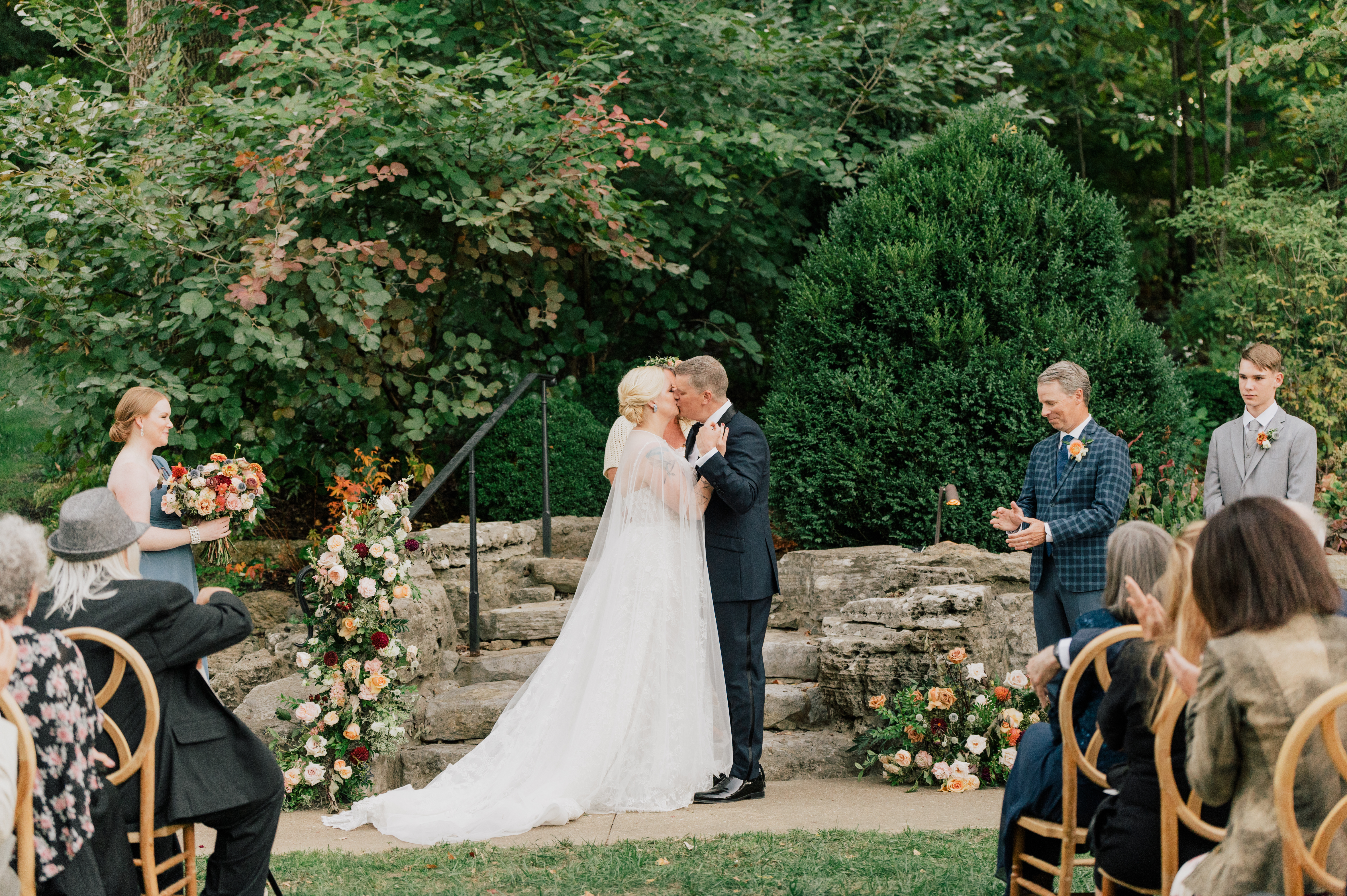
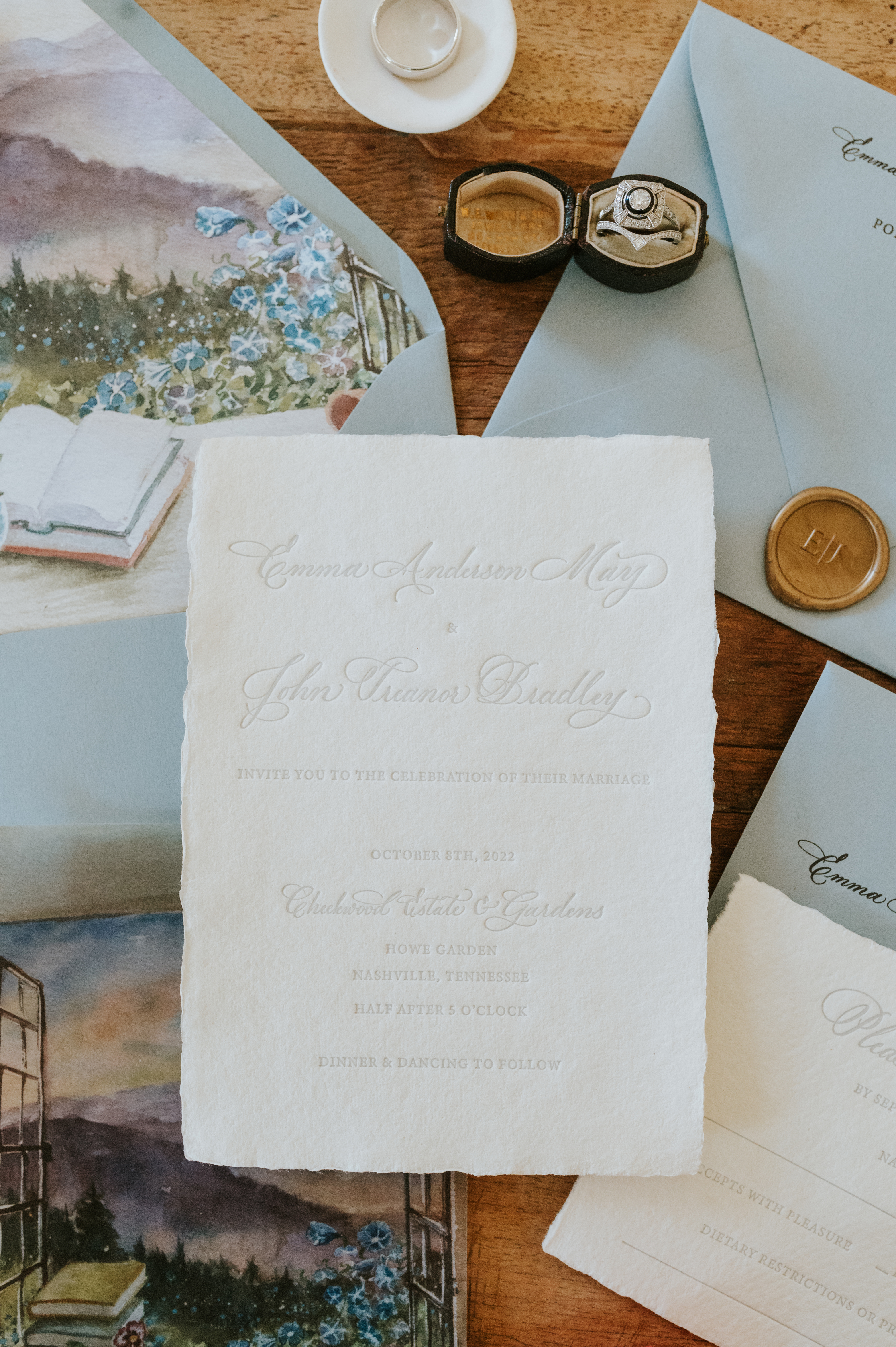
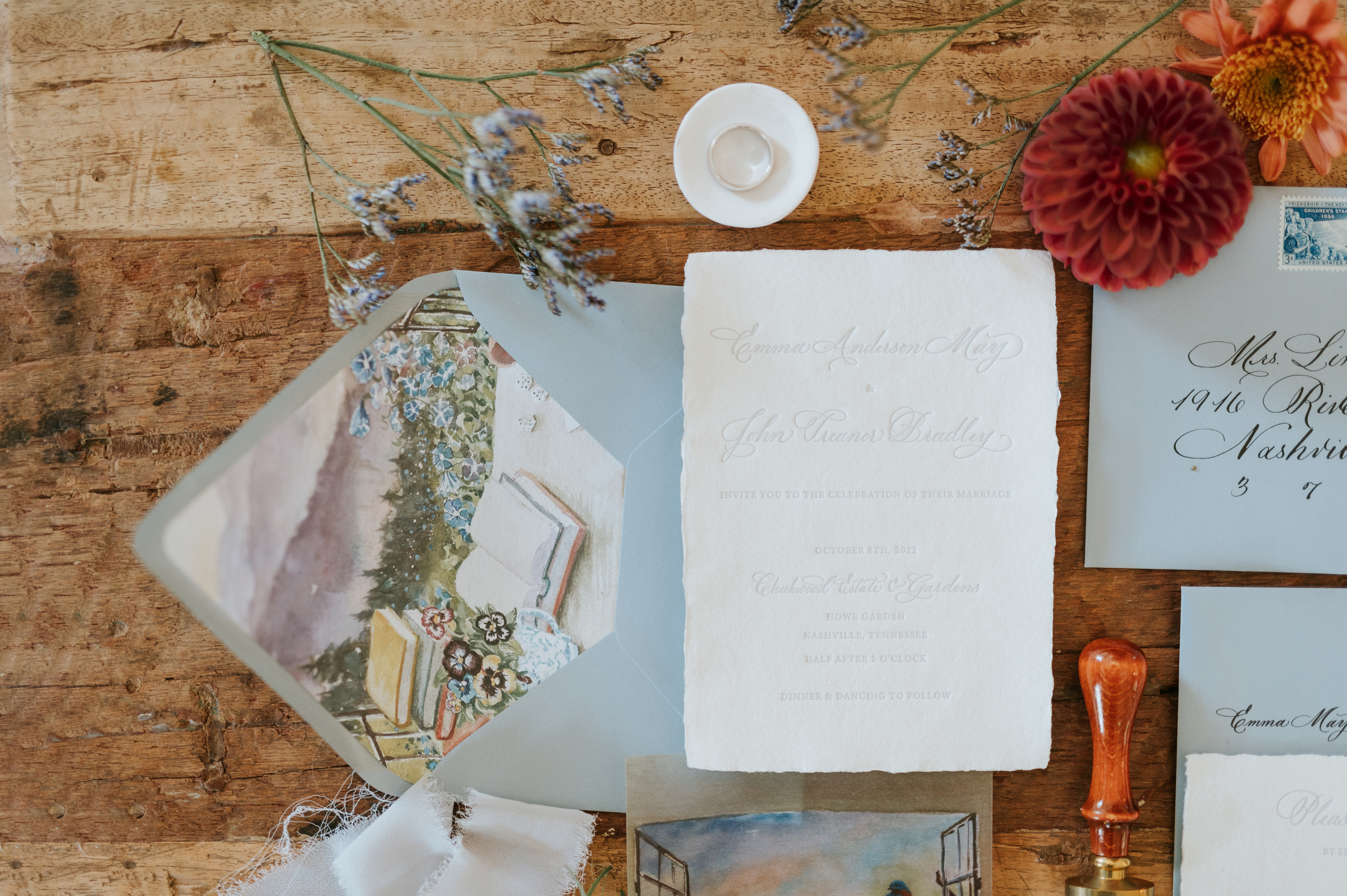
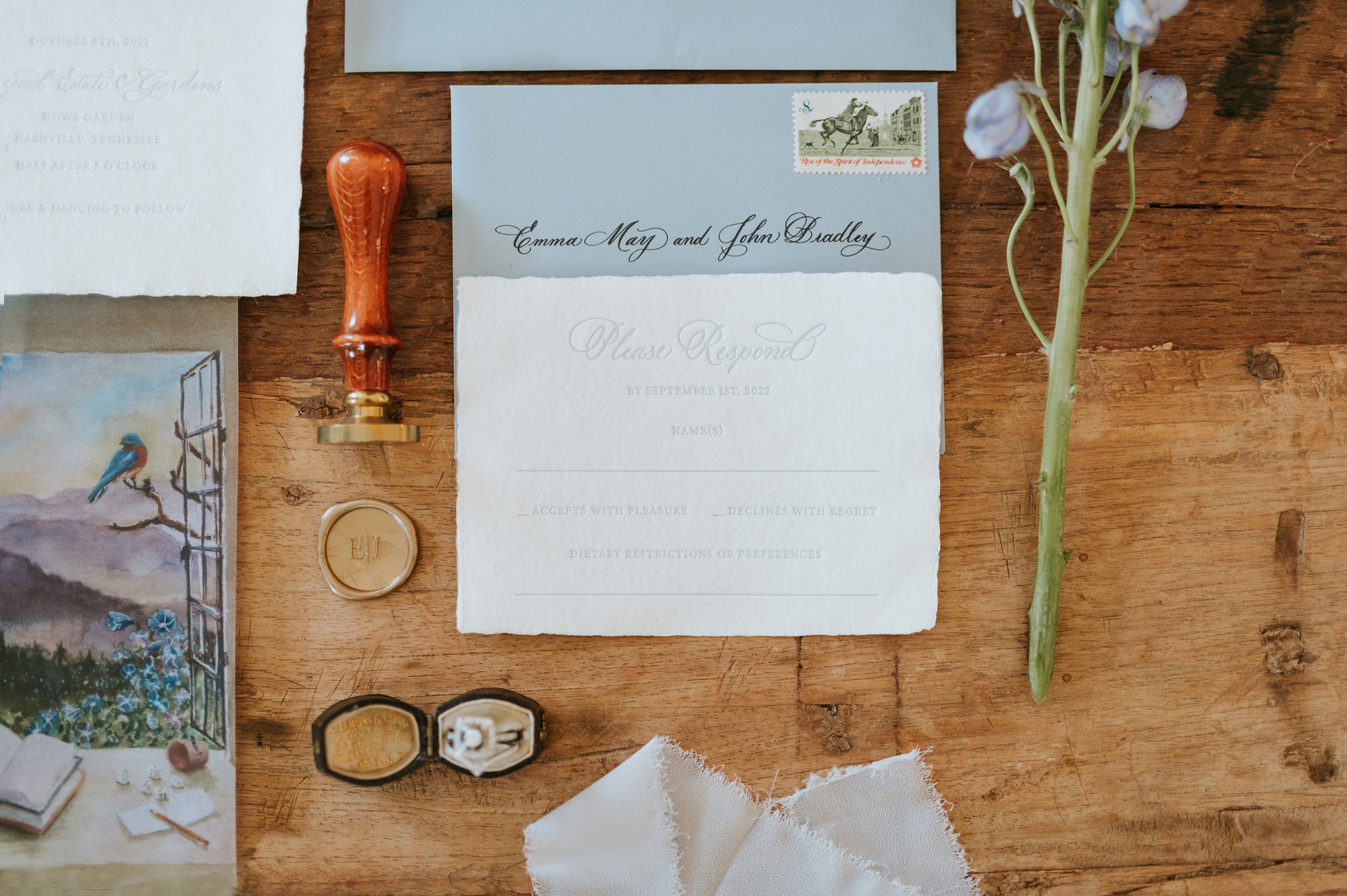
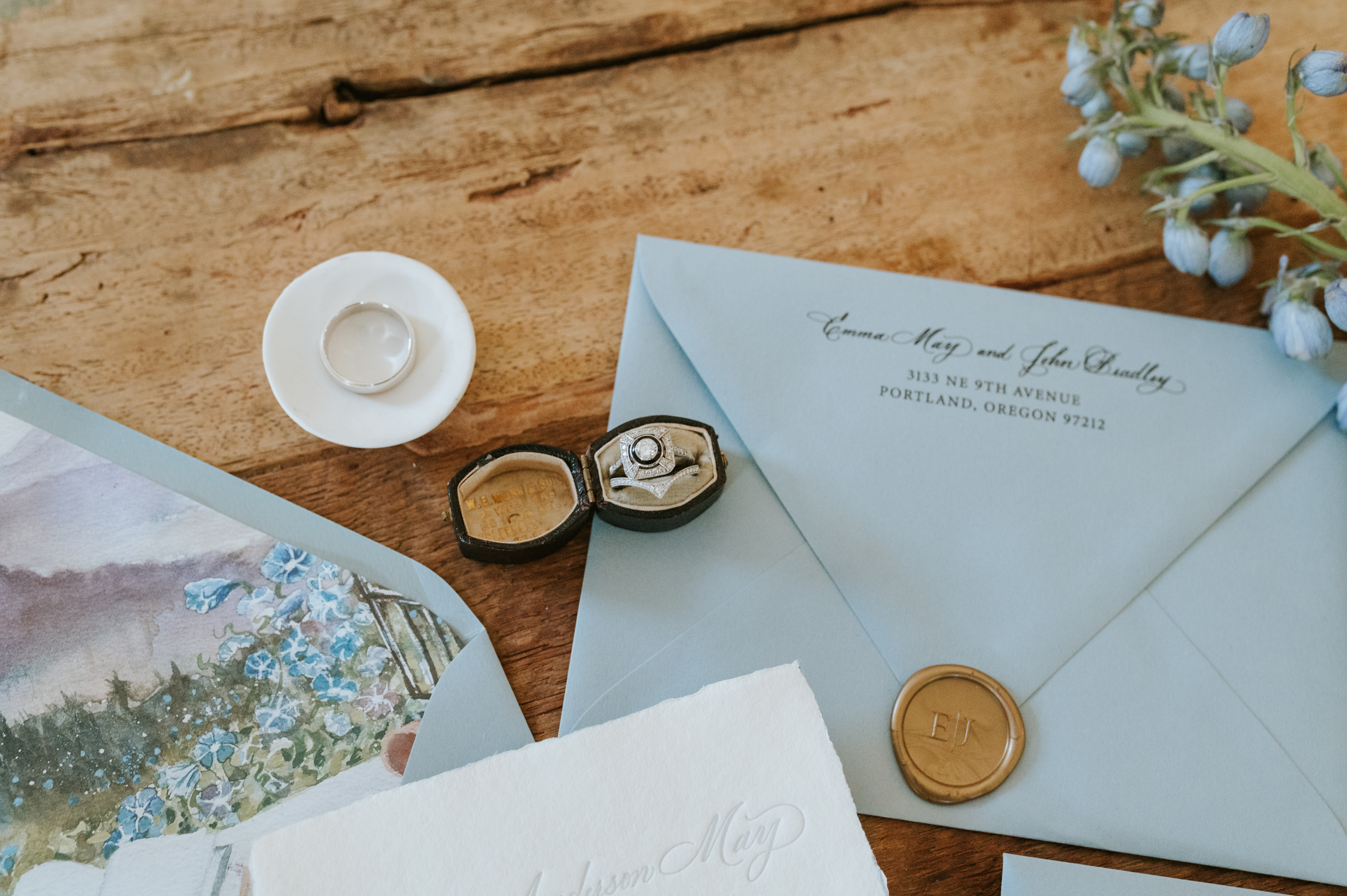
I am honored beyond words that I get to work alongside so many amazing vendors for weddings and other major events. It is a community that I never knew I needed. We all may have different jobs, but in the end, we are working towards one goal- giving our clients the wedding/event of their dreams! Taking part in the beautiful nuptials of our couple, Emma and John, last October gave us a front-row seat to one of the dreamiest weddings we had the pleasure of being a part of. I’ve been excited to show you all of the personalized details that made this wedding exceptional. In truth, there is a lot of hard work that goes into a wedding day, but the effects of that dedication last far longer than just a single day; we help create the details that are put into memories that last forever.
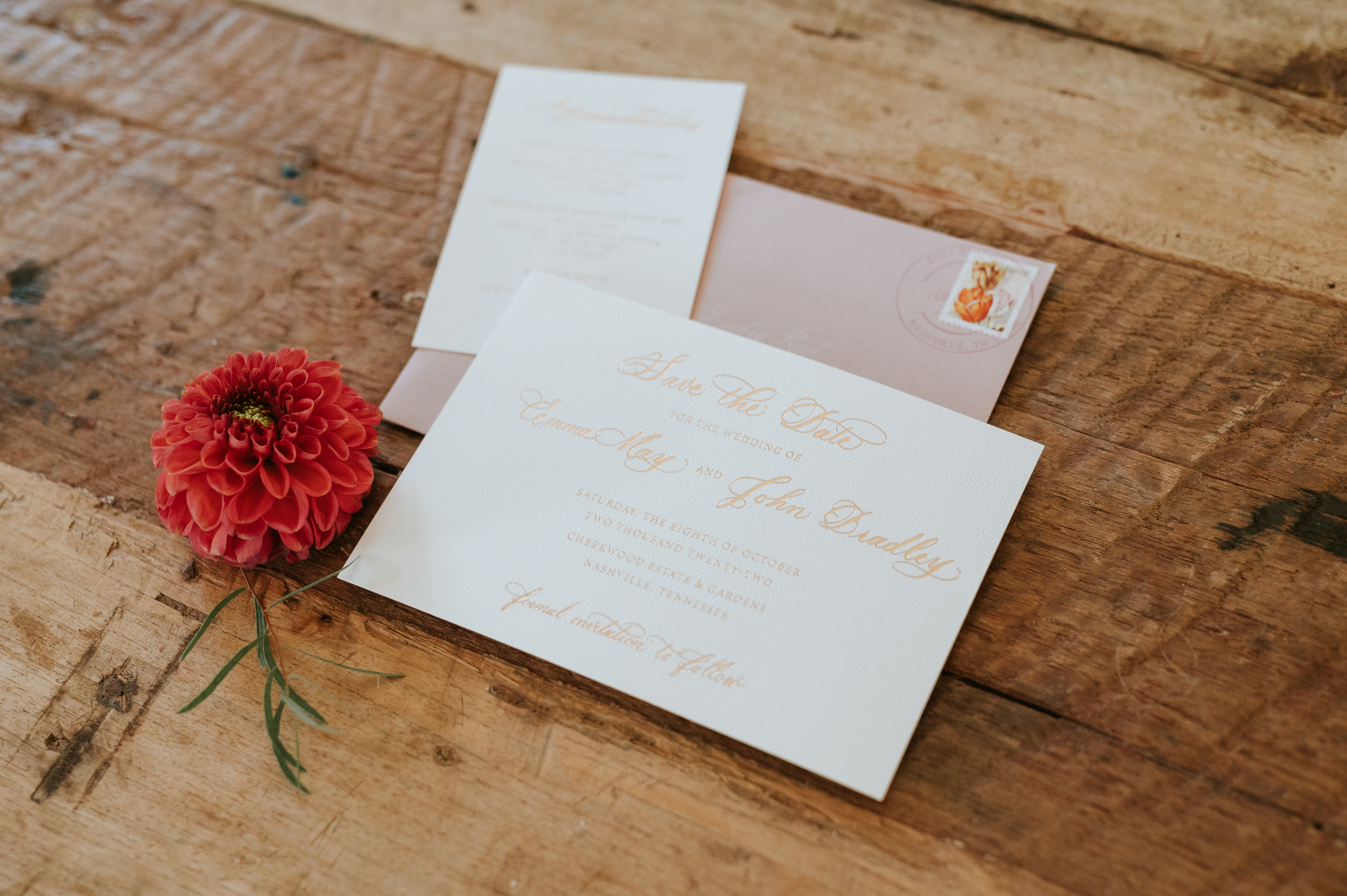
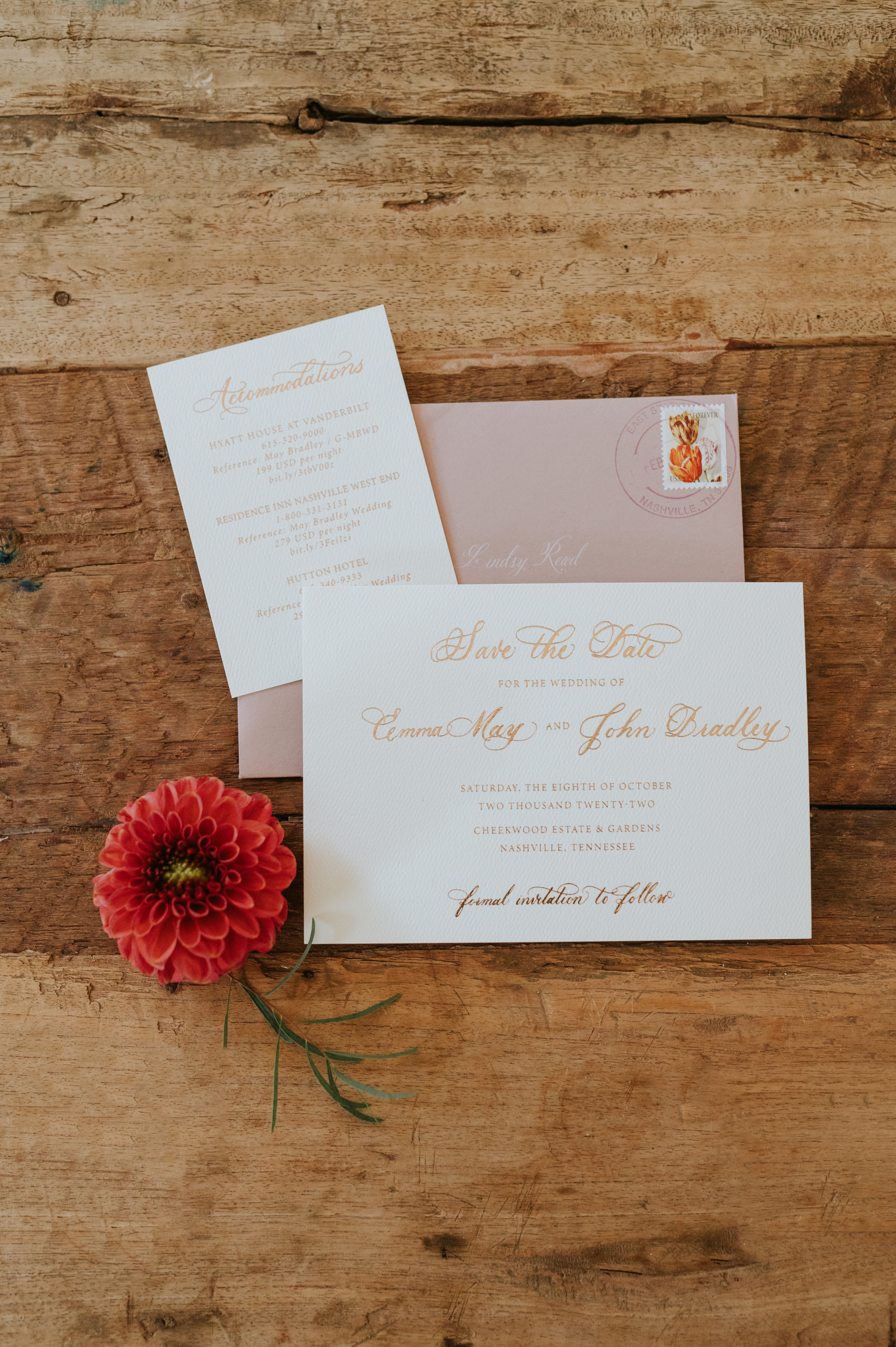
Emma and John’s save-the-date was done using card stock topped with gold calligraphy and tucked into a warm, dusty rose envelope giving it a most delicate and inviting feel. I like to imagine the smiles people give when opening up these happy color combos.
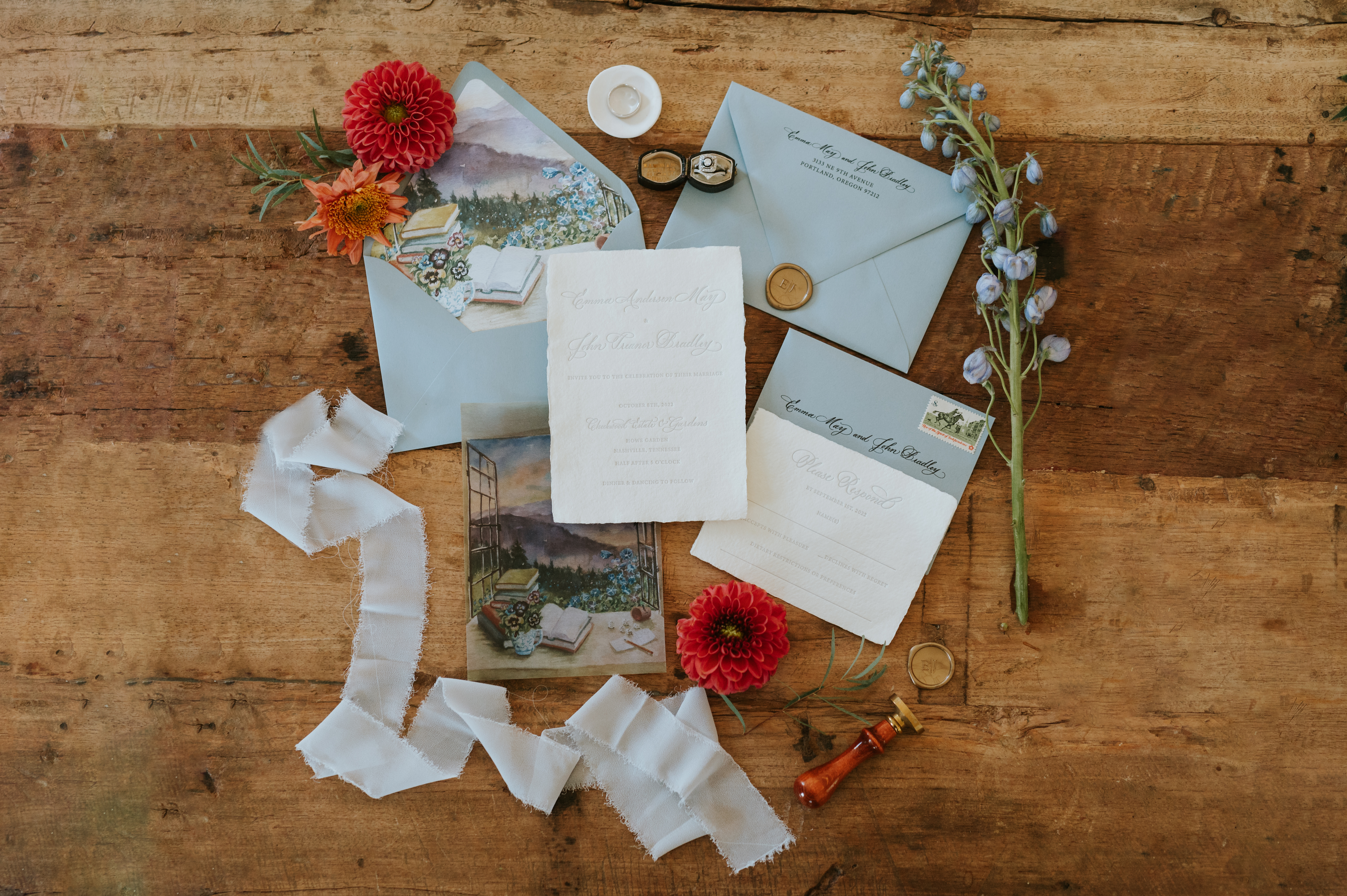
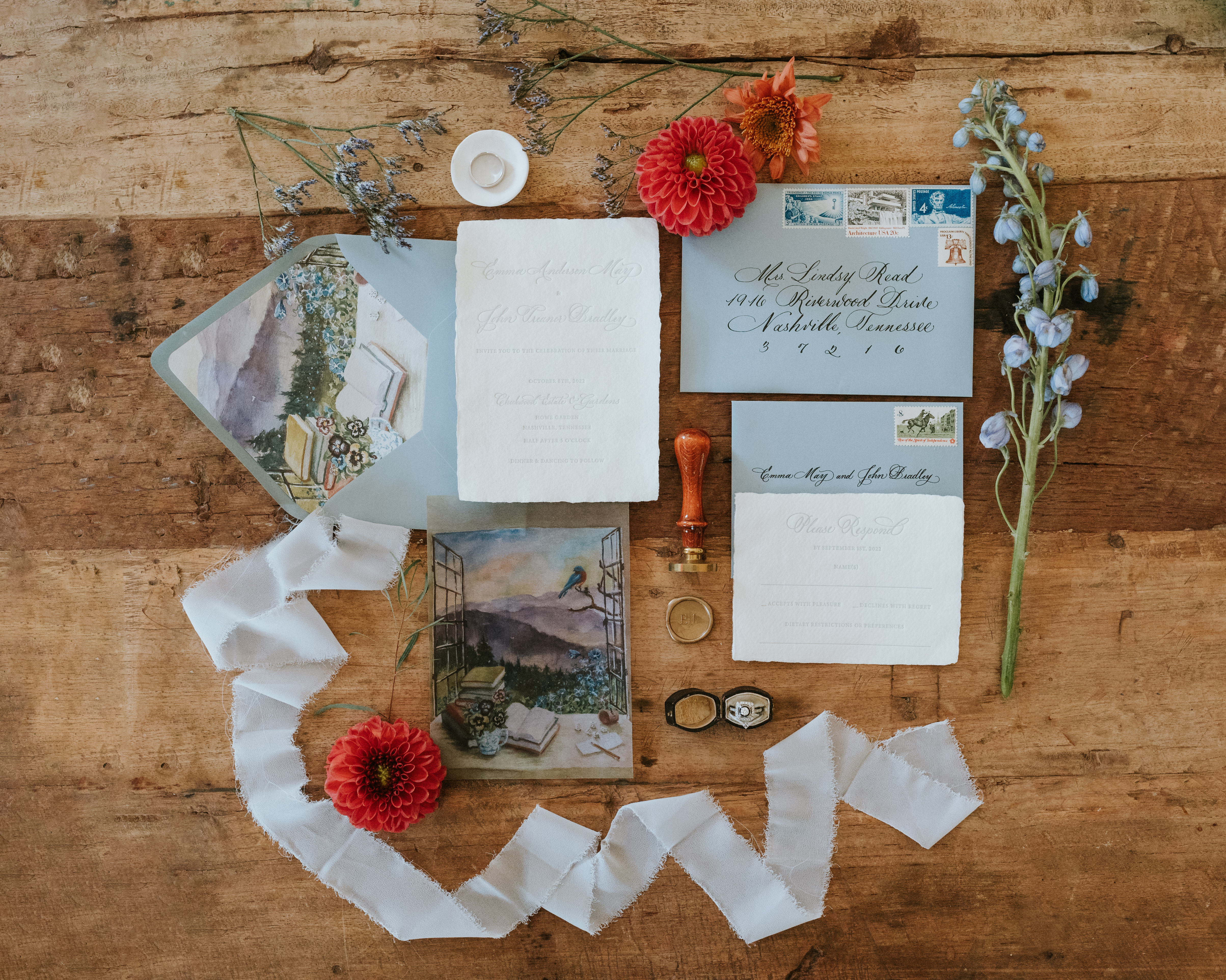
This invitation suite steals the show. For me, this is about as good as it gets. The invitation was done in letterpress on handmade paper (yes, handmade paper). I especially love how Emma and John went from a dusty rose save-the-date envelope to dusty blue invitation suite envelopes. The envelopes were closed with a gold, custom, monogrammed wax seal. (Icing on the cake!)
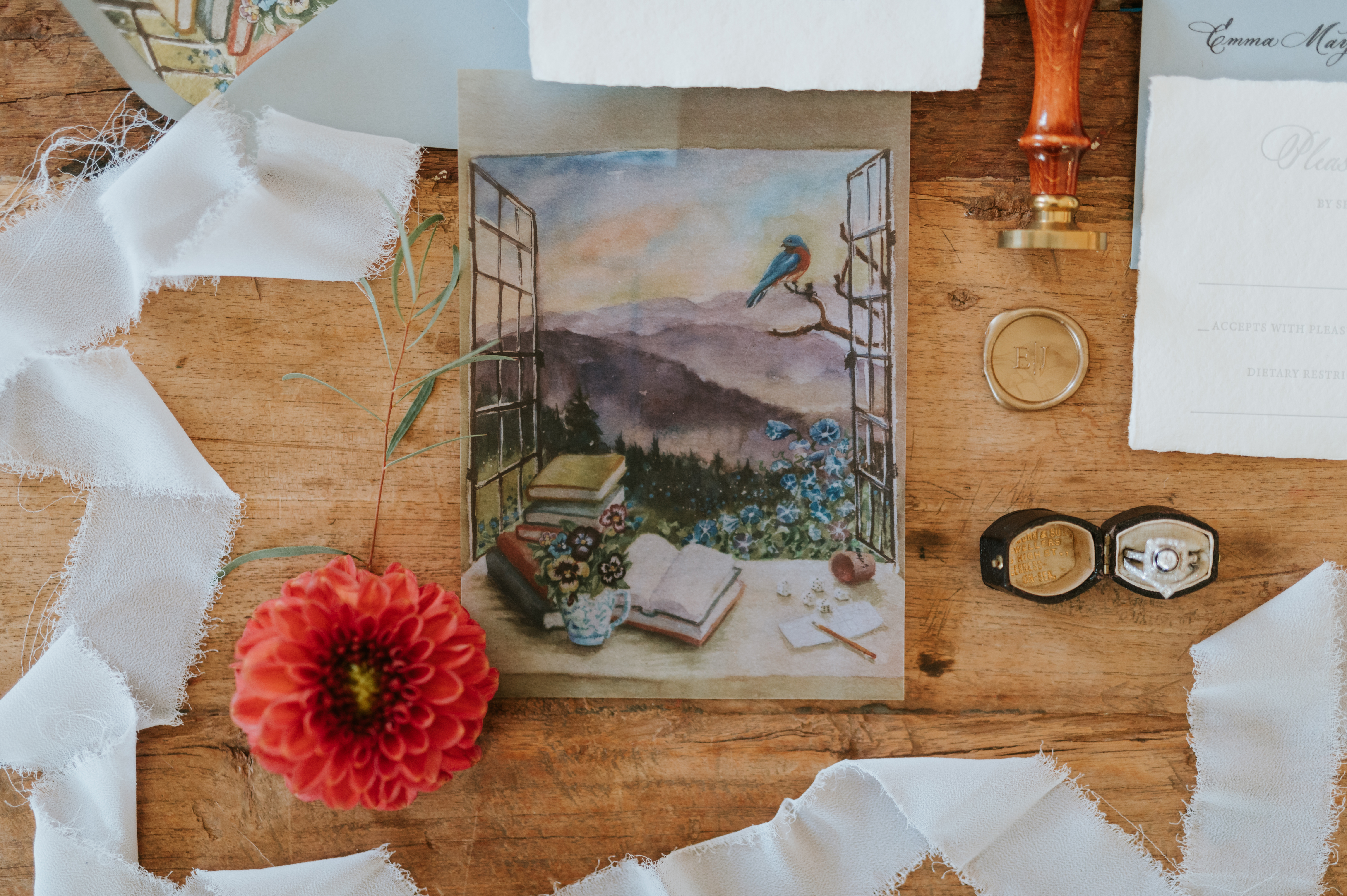
Emma and John personalized their invitation suite to include a liner that had a print which was actually hand-painted by John’s mother. The same print was also used on the suite’s vellum overlay. THIS is what I mean when I say we help create memories that last forever. How special is this gorgeous detail?
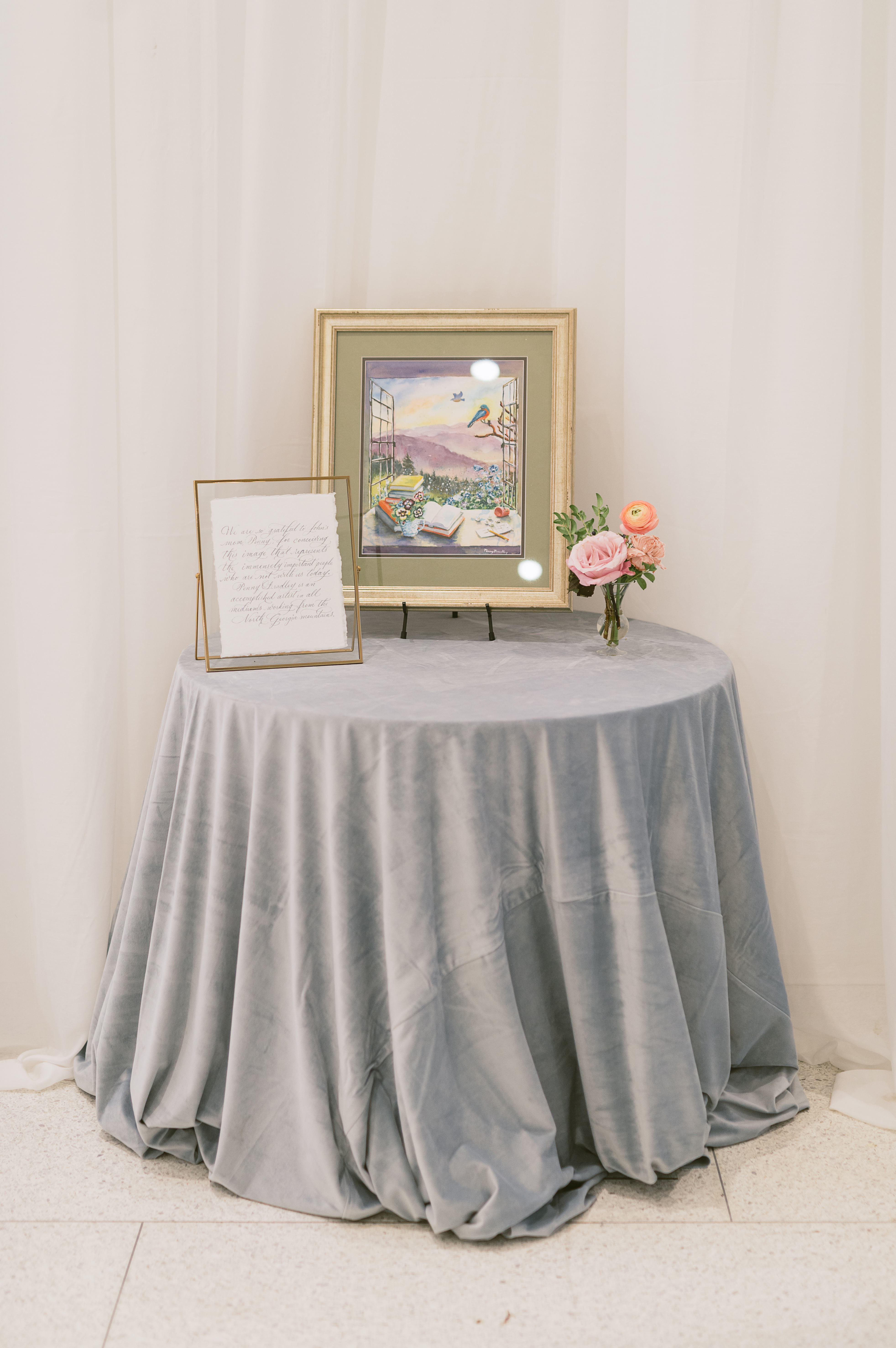
John’s mother, Penny, is an artist who took on the role of creating this piece for her son and daughter-in-law as a way to include those who were with them in spirit. She used very special and specific details in this image to represent those loved ones. We were honored to pen the letter that went along with the beautiful picture display.
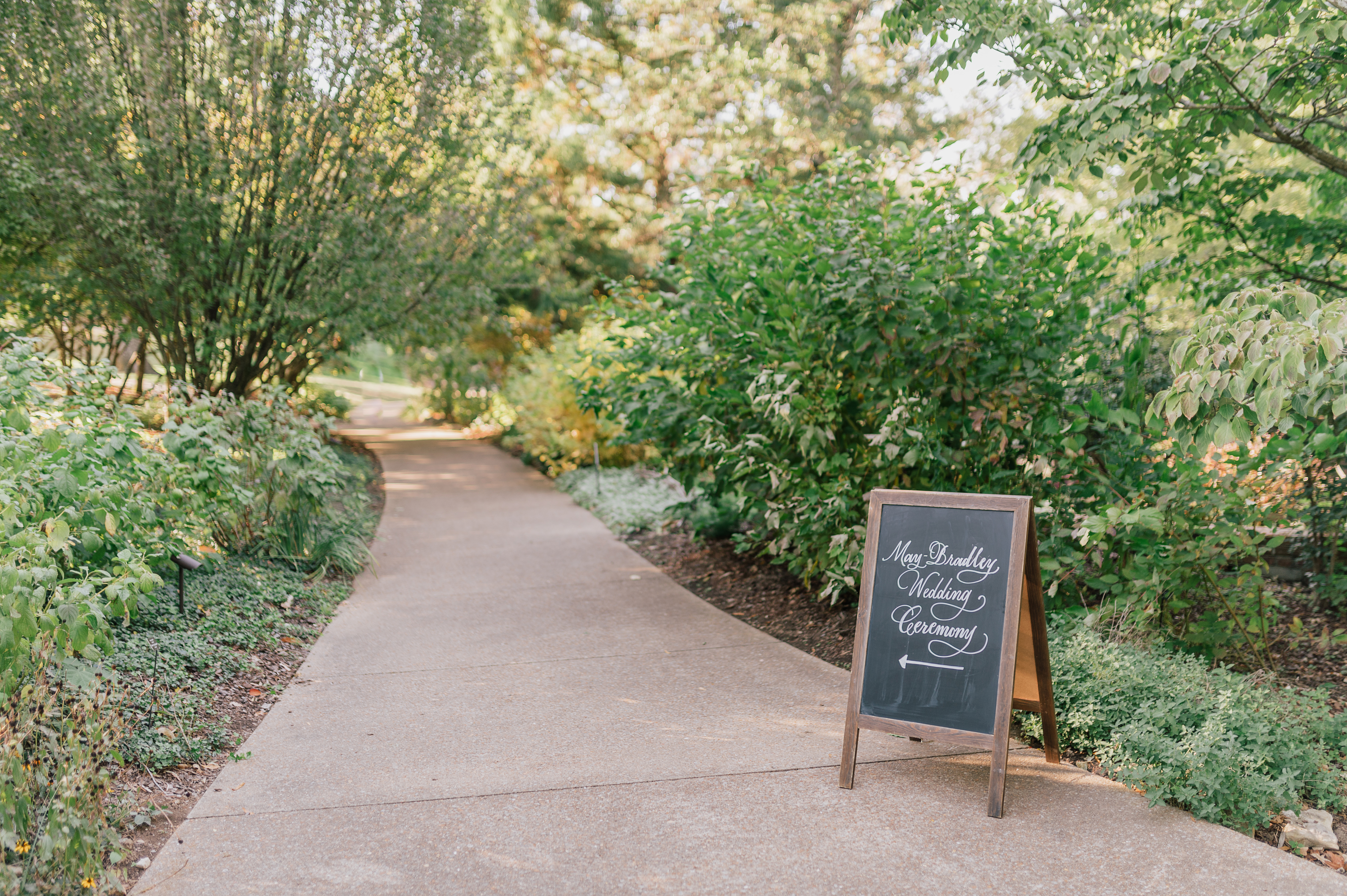
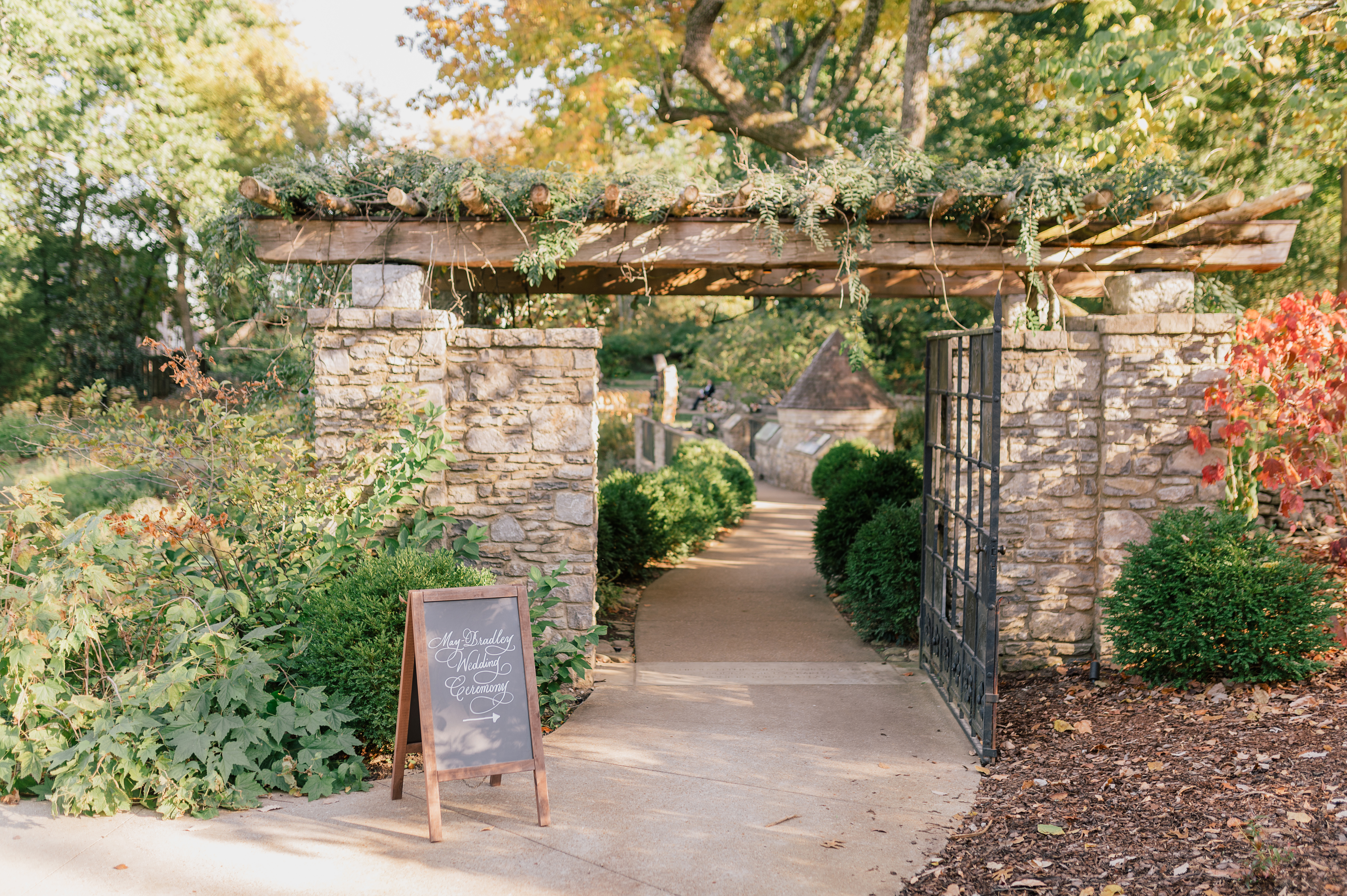
The chalkboard directional signs fit perfectly within the woodsy scenery of this Cheekwood venue. They stand out just enough to guide guests to their seats.
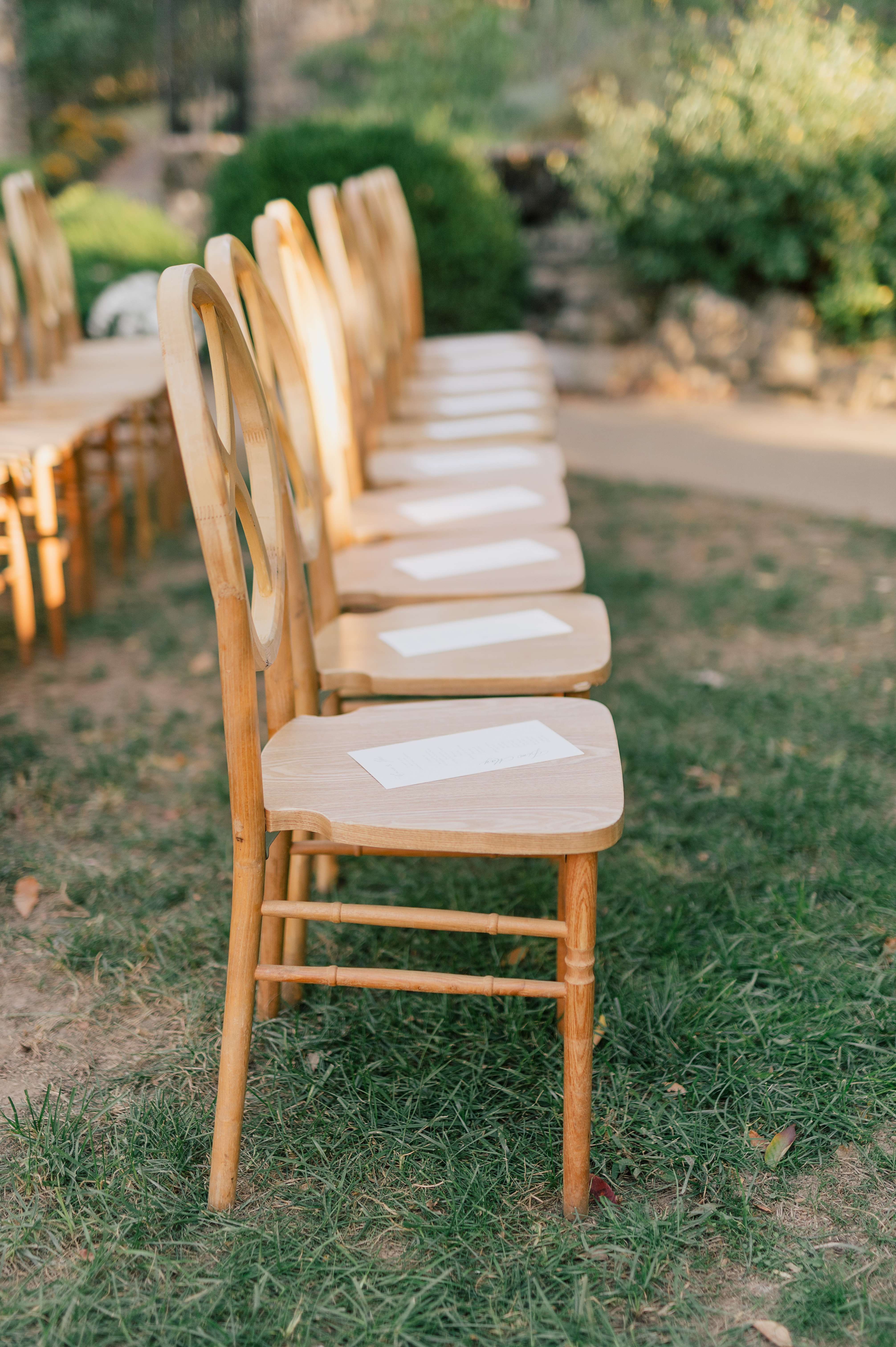
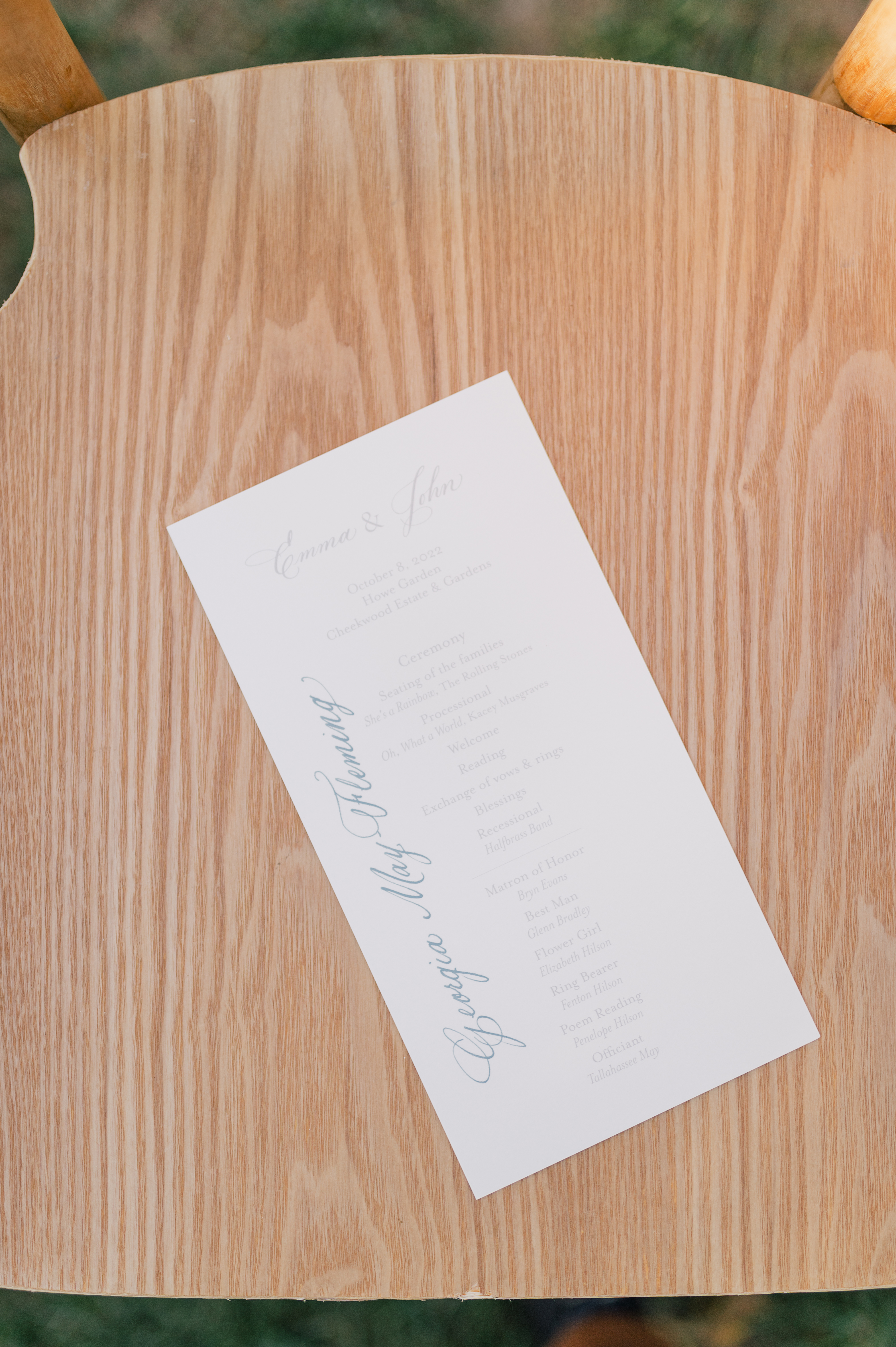
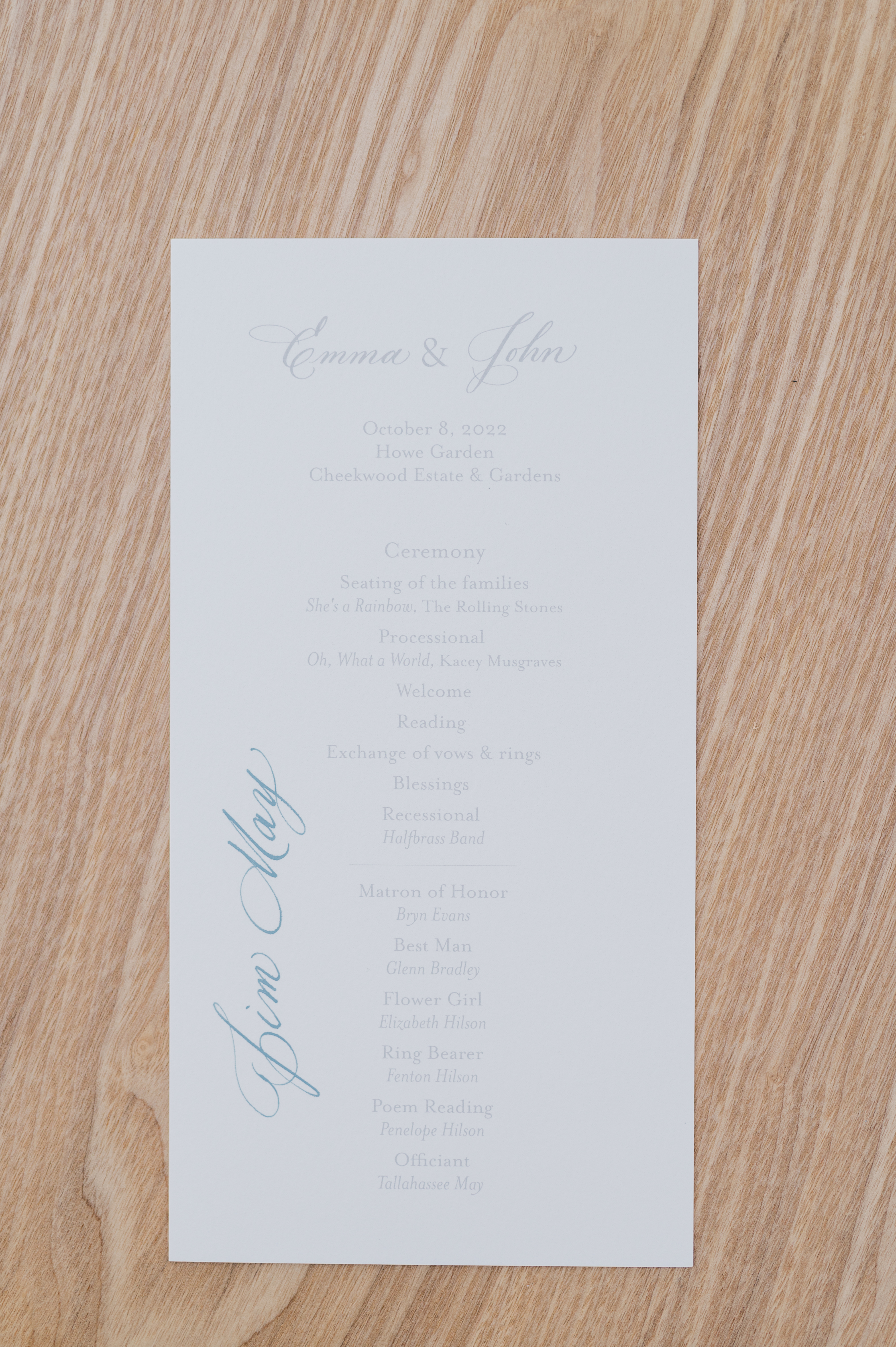
Here is a refreshing new detail that we don’t see very often. The couple wanted to have special seating for the ceremony portion of the wedding. We did that by taking the printed programs and writing the names of each guest so they knew where to find their seat. This was a beautiful example of how much thought went into each moment of Emma and John’s big day.
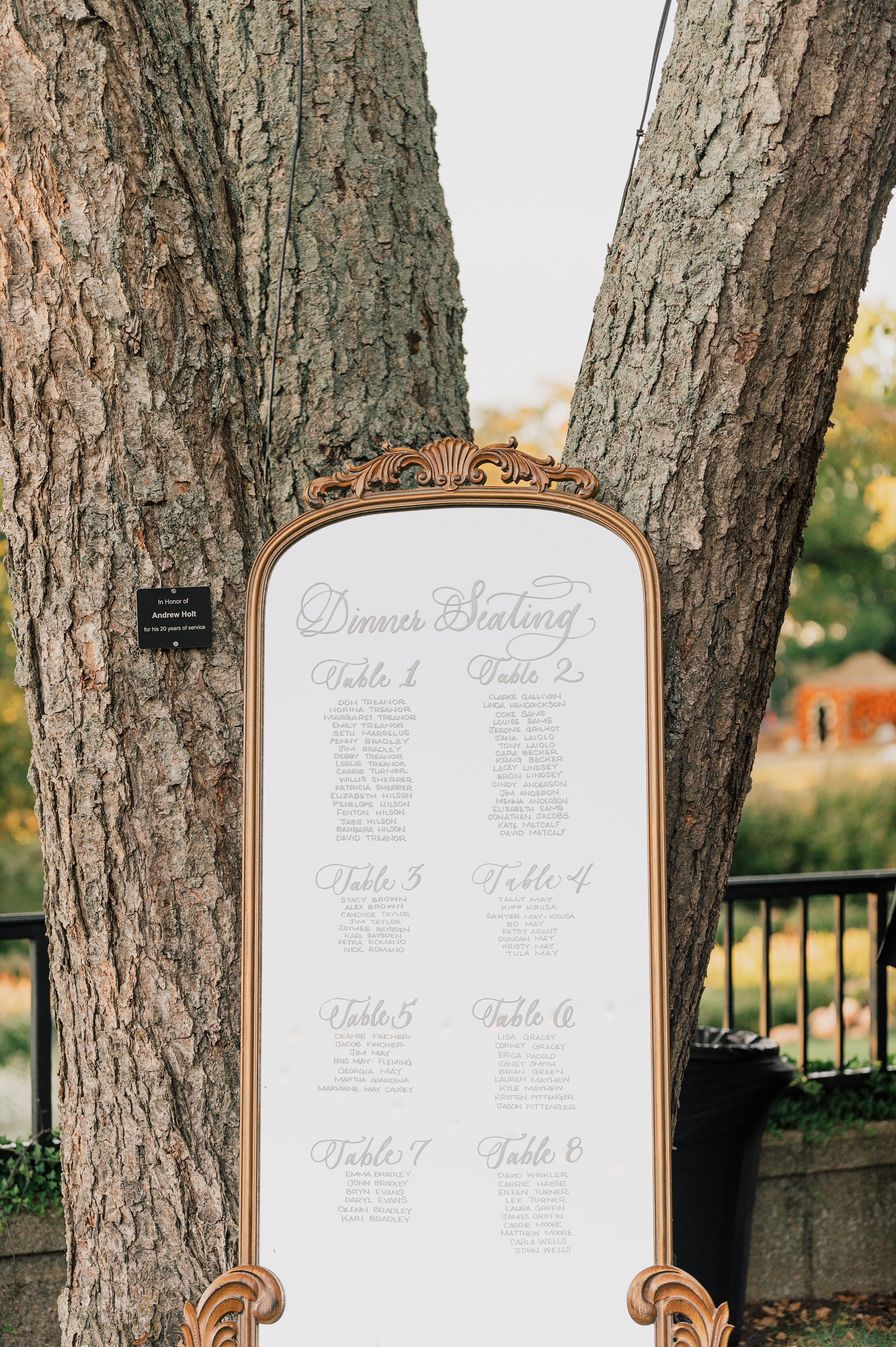
You can never go wrong with a classically beautiful, mirrored seating chart. Although this is a very popular seating chart display, there was something especially whimsical about seeing the textural differences of the glass mirror against the beautiful trees in the garden.
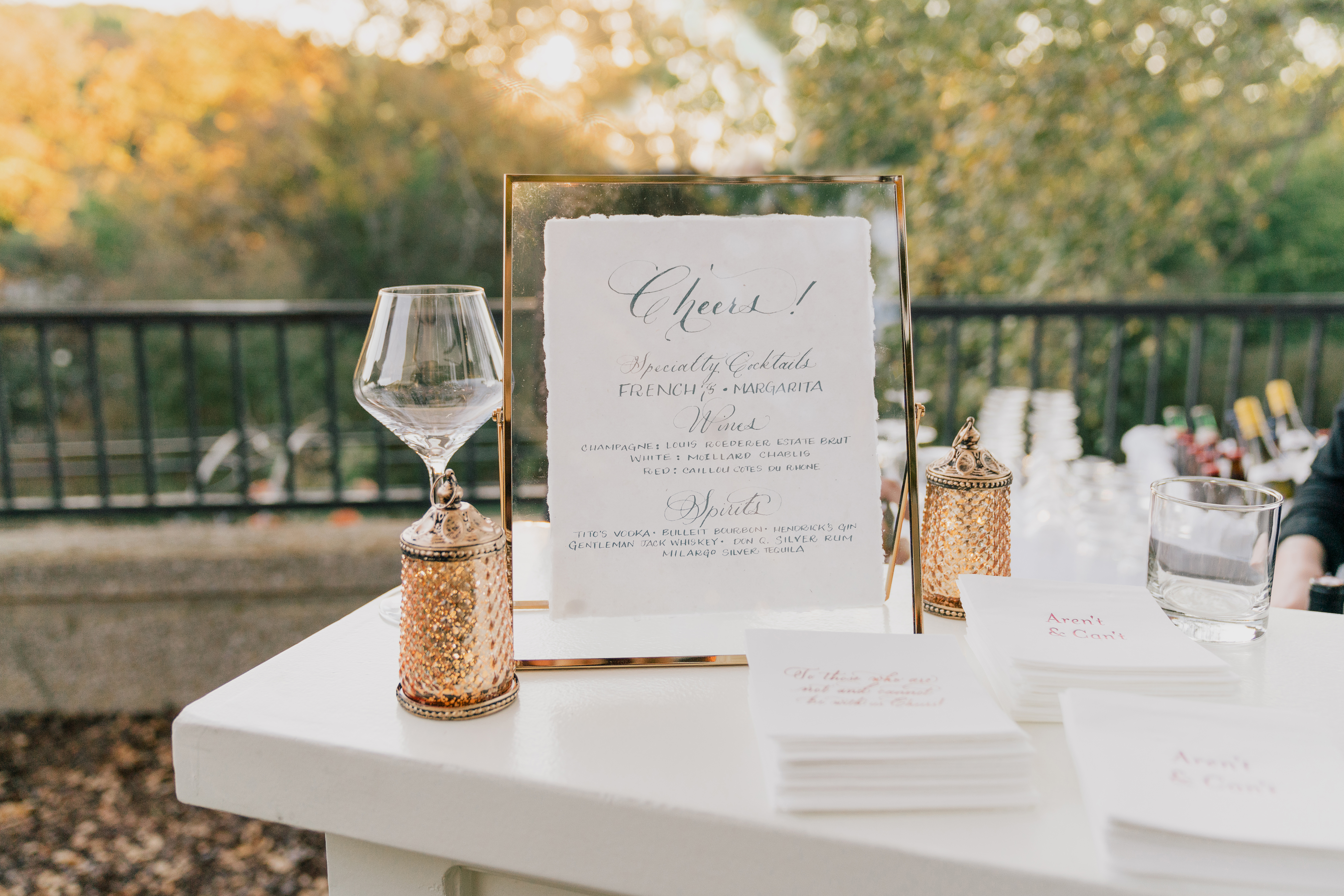
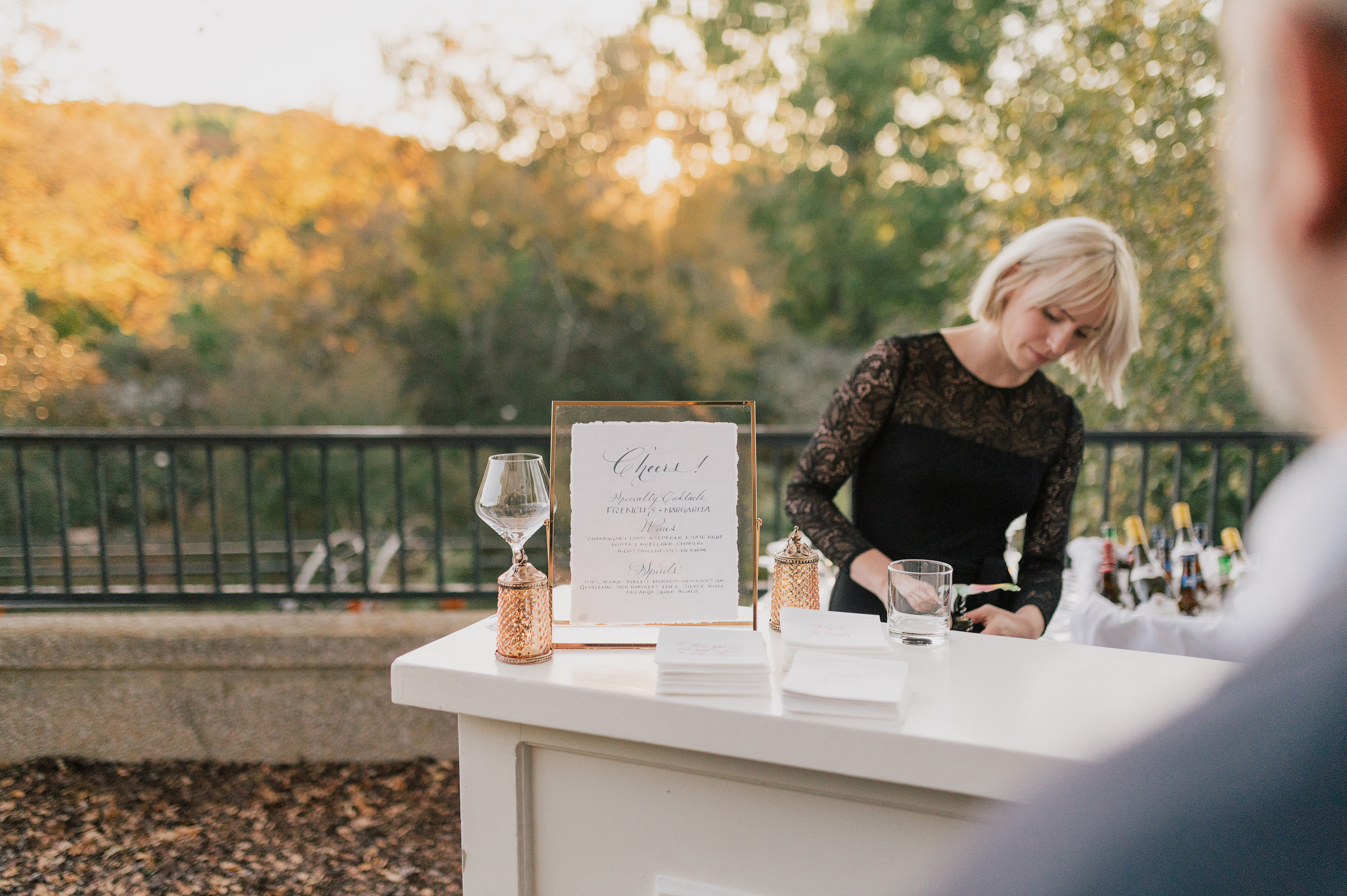
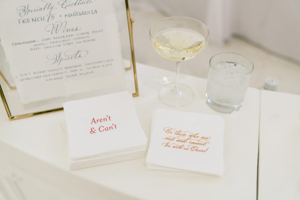
White Ink is always happy to put our touch on table signage like we did for Emma and John’s bar sign. But what we loved most was getting to make the super awesome cocktail napkins that displayed several of the couple’s favorite sayings. Taking it to the next level and making it your own, is what’s it’s all about. I hope you enjoy these!
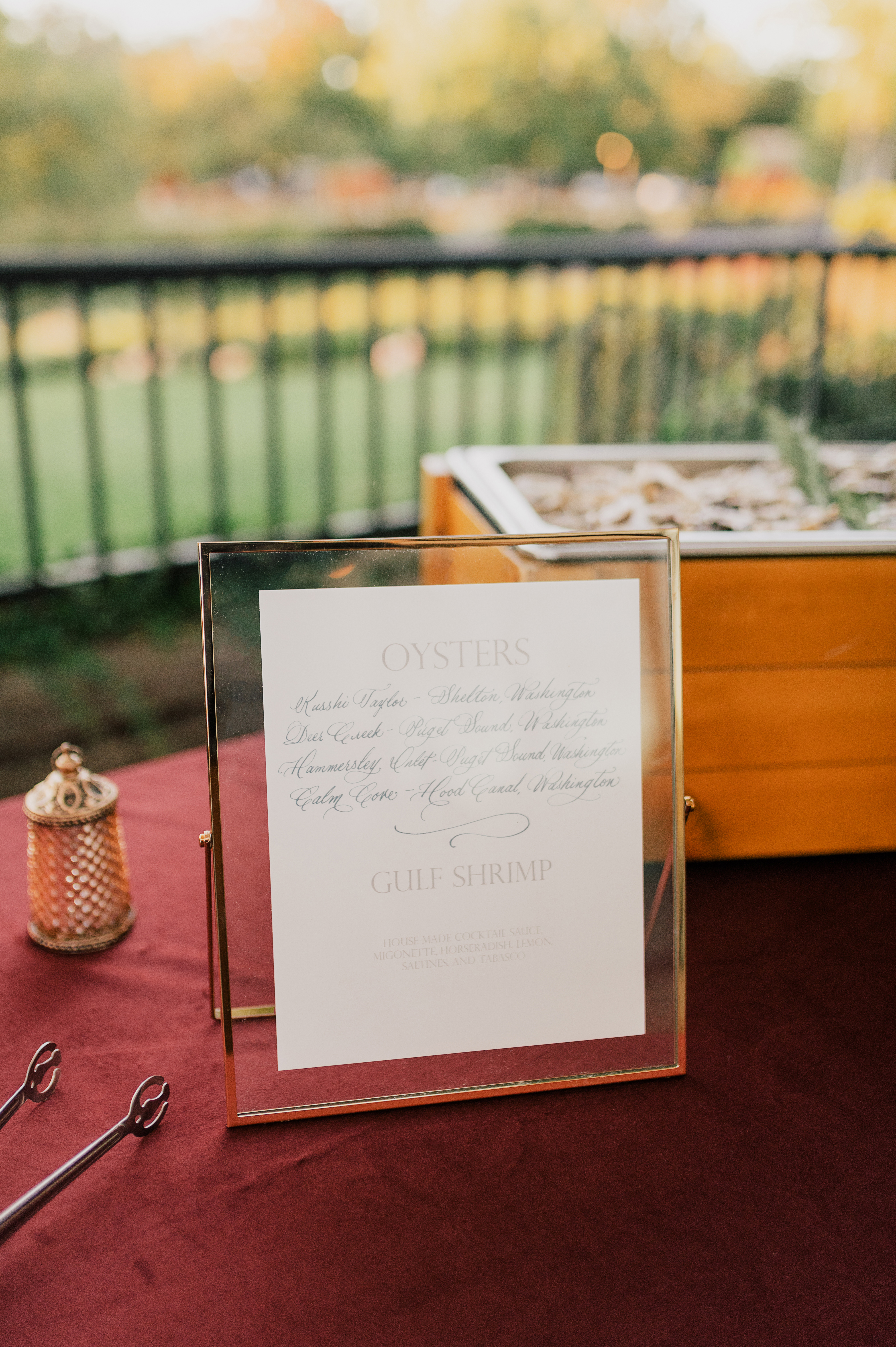
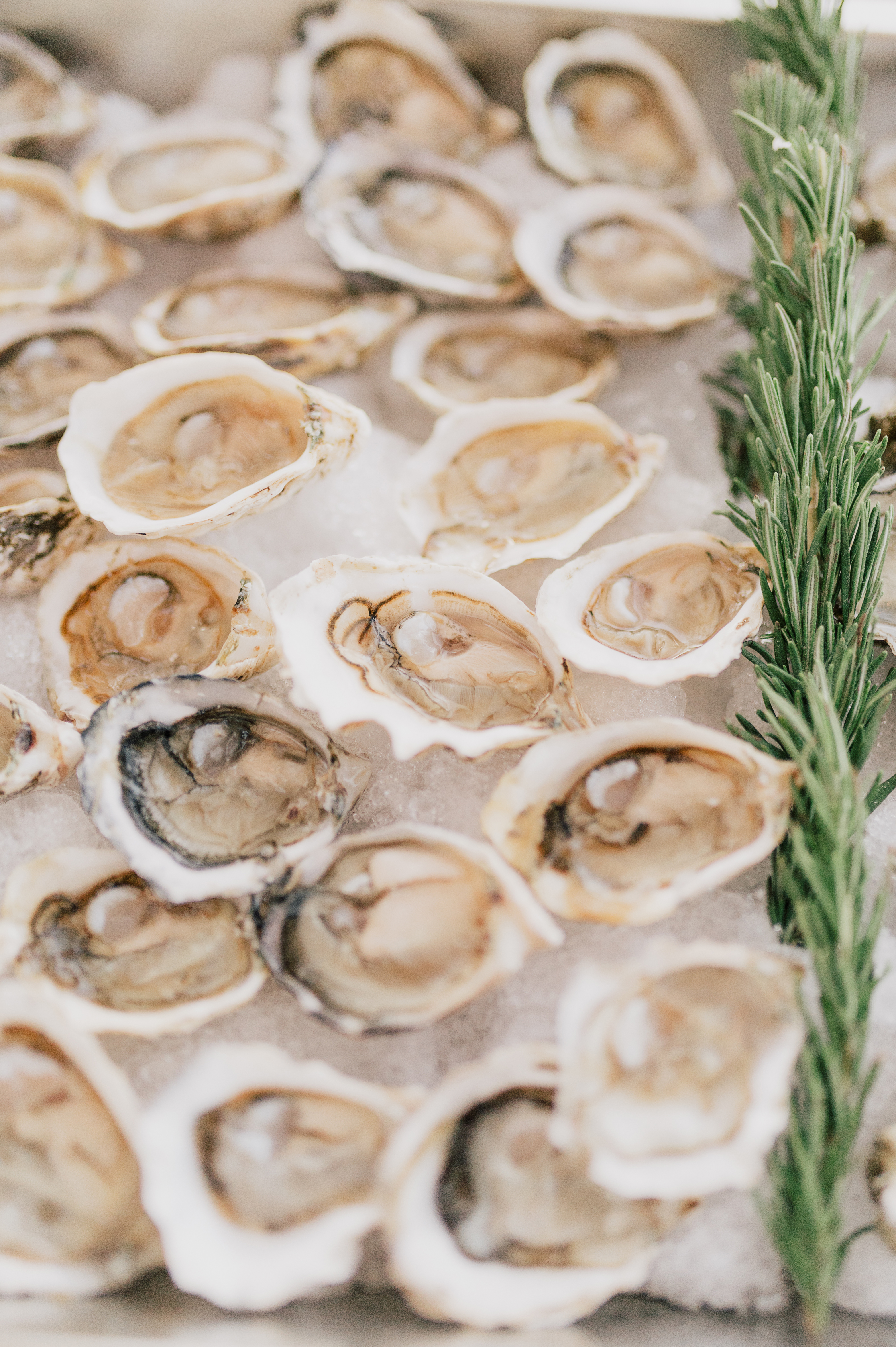
Another table-top sign was for the deliciously showstopping oyster and shrimp bar! Yum!
Every single wedding White Ink gets to be a part of is always so special to us. We loved the deeply personal touches that Emma and John made room for on their big day. A gem of a wedding, indeed! Cheers to the happy couple! Check out some of the amazing vendors who took part in this event.
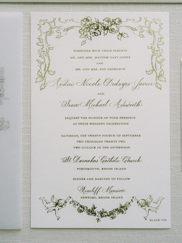
Take a look at White Ink’s journey to Rhode Island as our creativity made its way up the coast! Everything about Andrei and Sean’s wedding was top notch and we are in LOVE with how well the details turned out for this spectacular event.
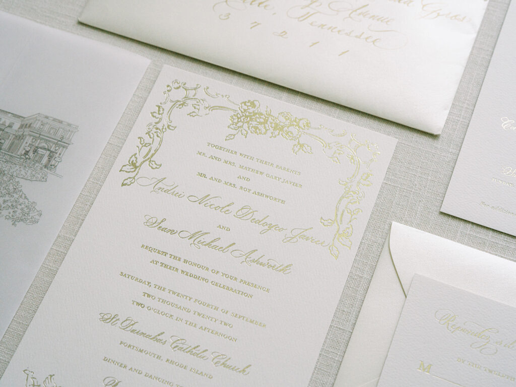
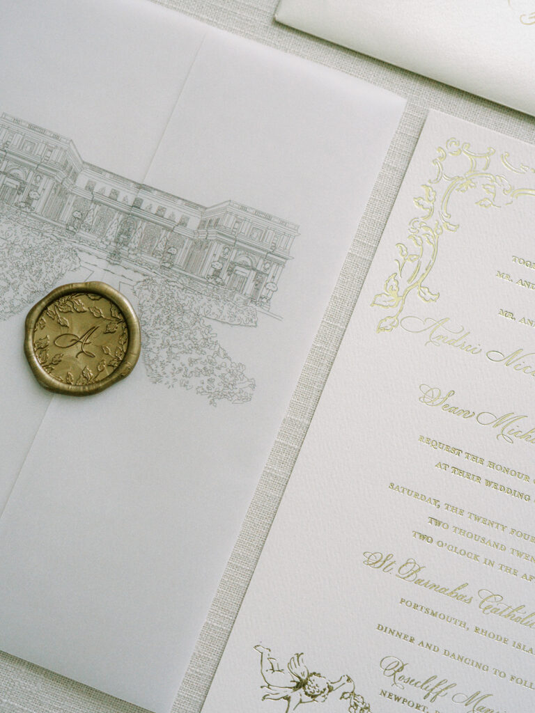
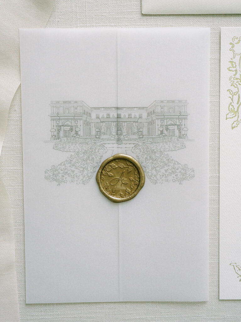
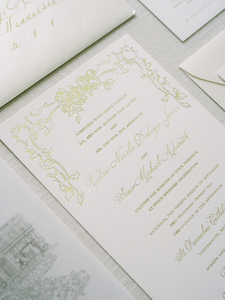
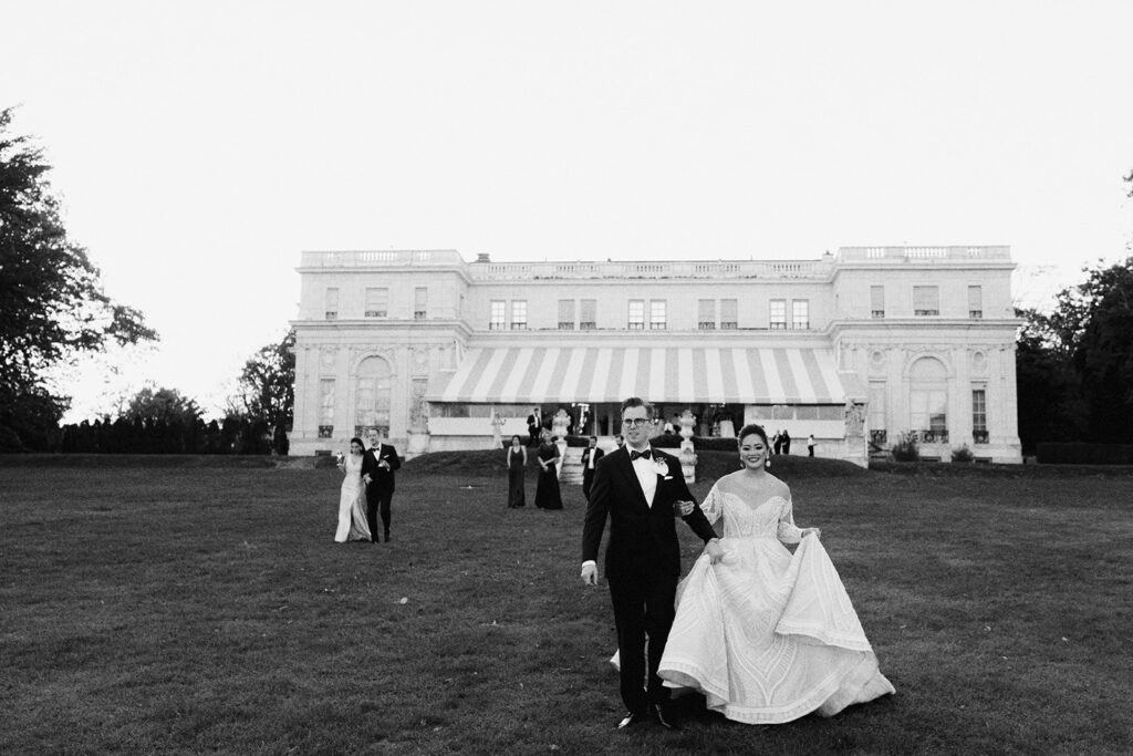
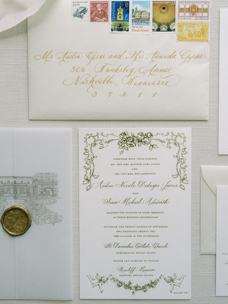
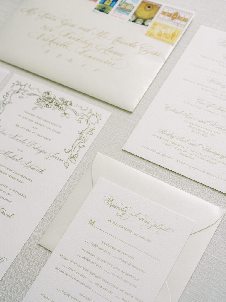
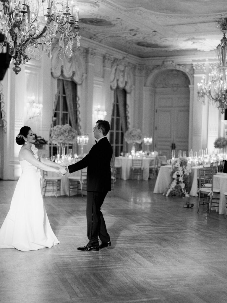
As far as invitation suites go, there was no stone unturned. Andrei and Sean selected the most beautiful gold ink pressed into white cardstock. The suite was wrapped together by a stunning vellum jacket complete with a gold, custom monogramed wax seal. On the vellum jacket you will notice a print of the historic Rosecliff Mansion in Newport, Rhode Island which would be the location of our couple’s reception. Fun Fact: Rosecliff Mansion was featured in the 1974 film, The Great Gatsby.
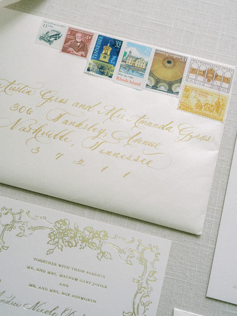
If you want your invitation suites to embody elegance, we cannot recommend envelope calligraphy enough! The gold calligraphy on these white envelopes shines like the treasure they are.
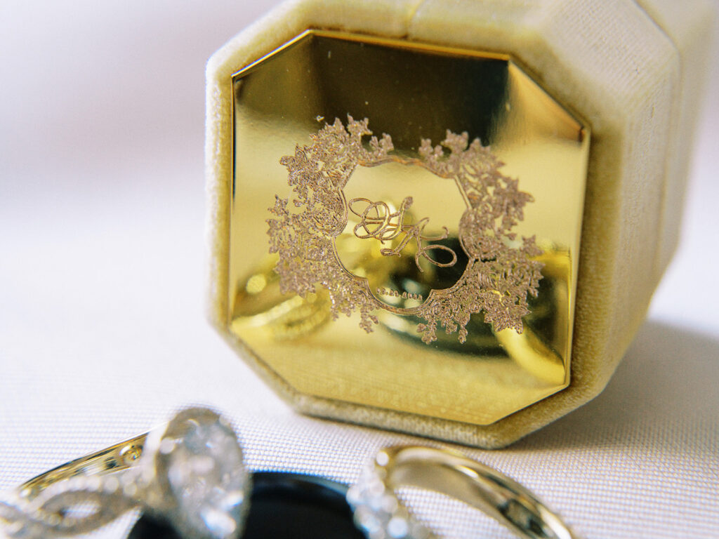
How stunning is this engraved, custom monogramed ring box?!
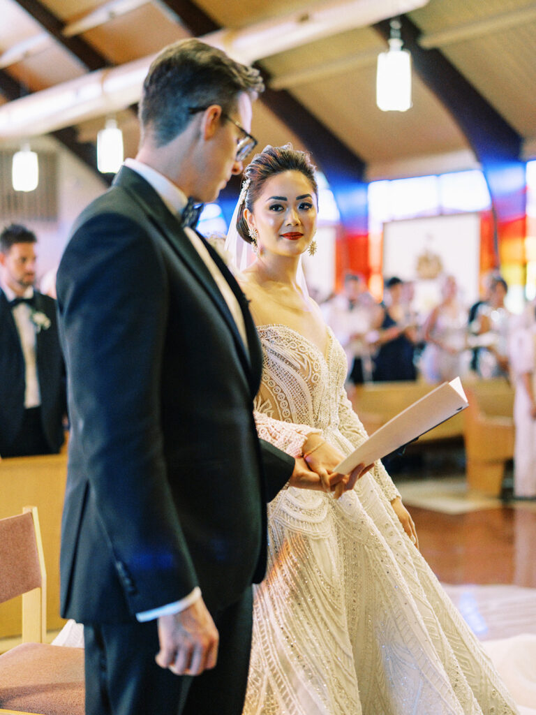
White Ink also designed the wedding programs for Andrei and Sean. The ceremony took place at the gorgeous St. Barnabas Catholic Church located in Portsmouth, Rhode Island.
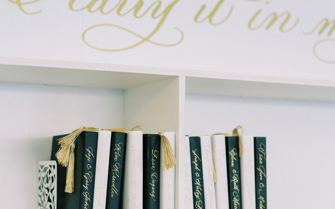
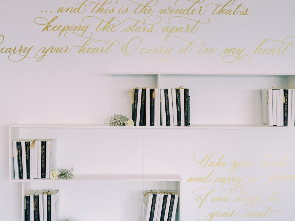
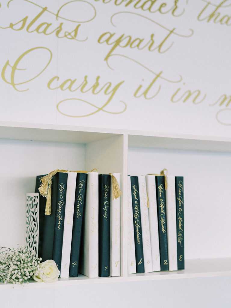
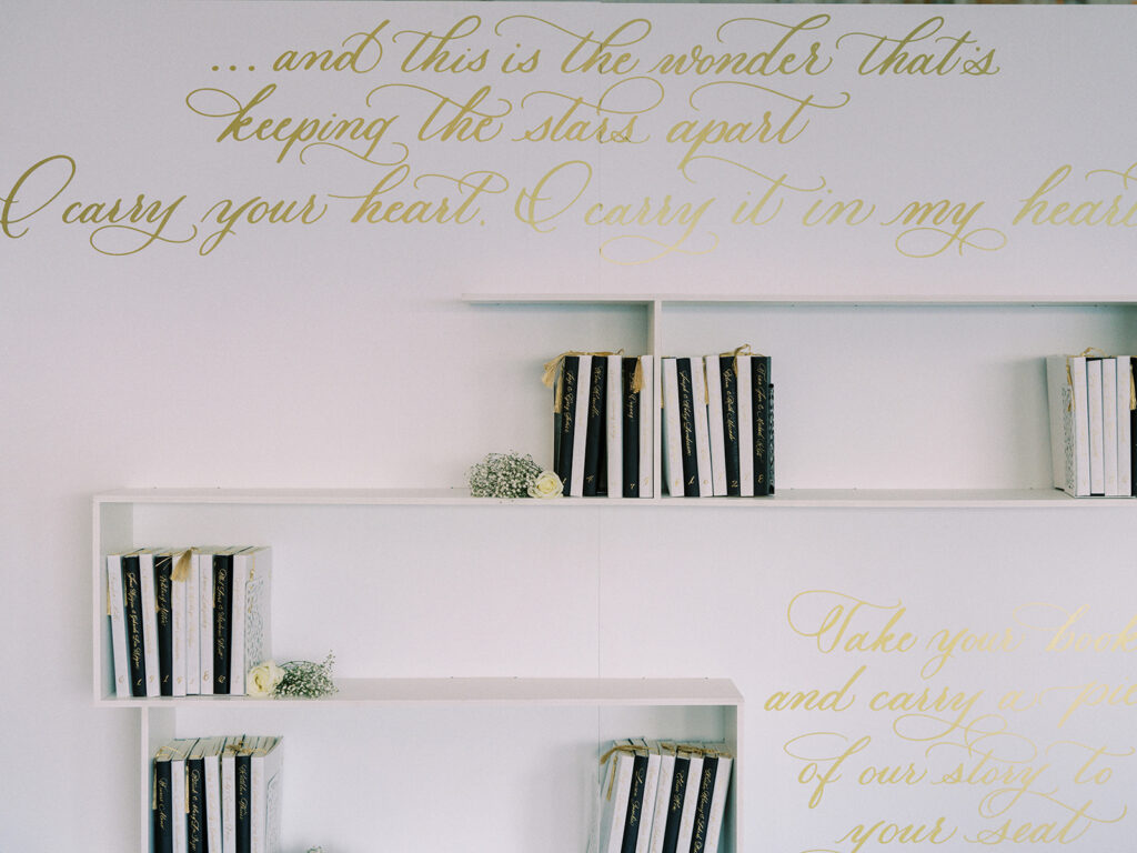
I have been SO excited to show you guys what we did for Andrei and Sean’s seating chart for their reception! I know we have shown you some unique seating chart pieces, but this one is definitely one I will always remember.
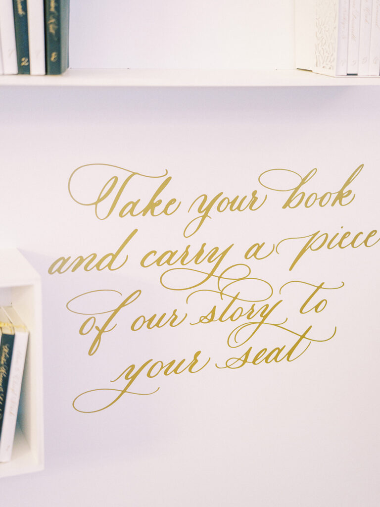
Each guest was gifted a book of poems where they could find their names followed by their table number written in custom gold calligraphy down the spine of their individual book. (I mean… I have no words). Inside the books, White Ink designed custom bookmarks that marked the page where Andrei and Sean’s favorite love poem was written. You could also enjoy excerpts of the famous E.E. Cummings poem, I Carry Your Heart with Me, written on the wall of the shelves. Honestly, it’s enough to turn you into a puddle!
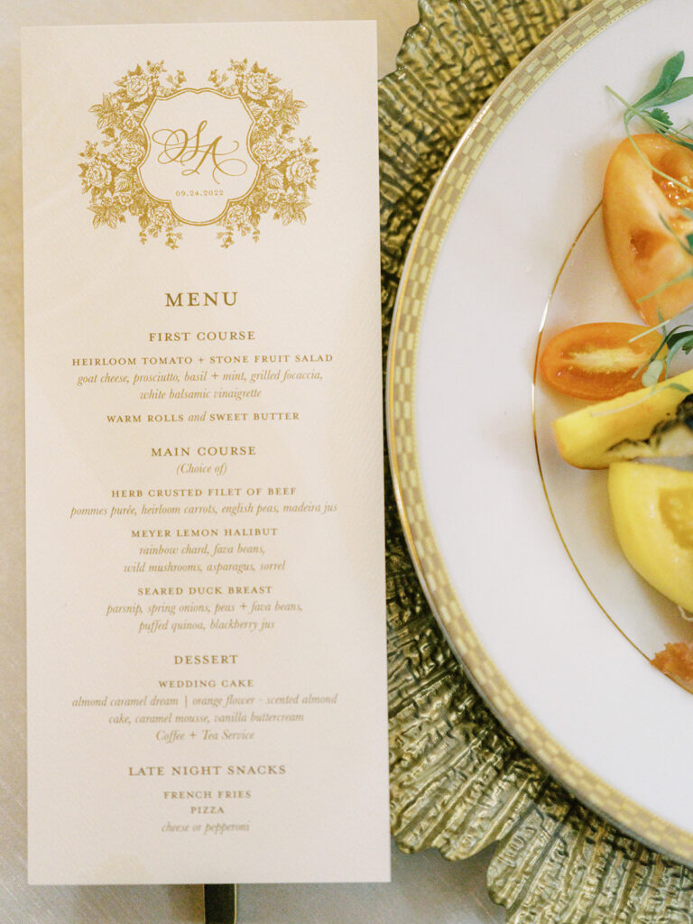
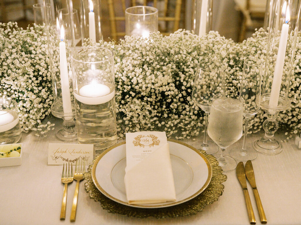
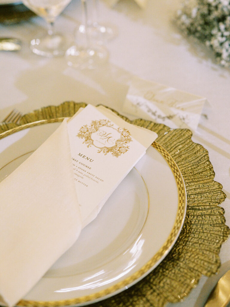
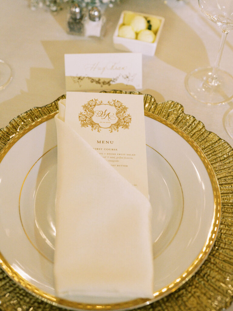
Andrei and Sean asked White Ink to help create the menus for the reception which carried the same delicate combination of gold and white just as their wedding invitation suites did. I say it every time, connecting even the smallest details together can really be the thing that separates your wedding apart.
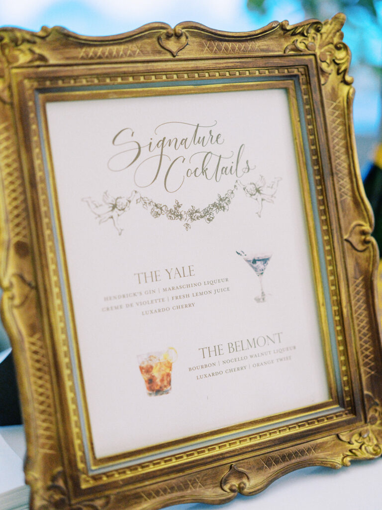
Ellegant or not, you know White Ink is going to show up at the bar! We love the look of this bar menu inside the distressed gold frame.
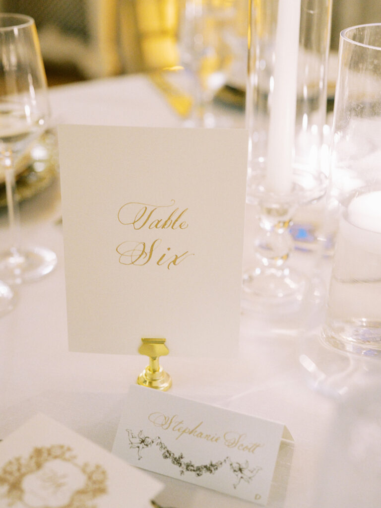
The perfect little place cards we did for Andrei and Sean blended effortlessly into the stunning tablescapes.
I especially love when White Ink gets to leave a mark in destinations beyond Nashville. It’s always a beautiful journey and a fantastic opportunity to represent our little corner of the wedding world. Couples like Andrei and Sean remind us of why we love what we do. This couple put so much effort and thought into every single part of their wedding day. We were honored to connect with them in such a memorable way. You could say, we will carry them in our hearts. Cheers!
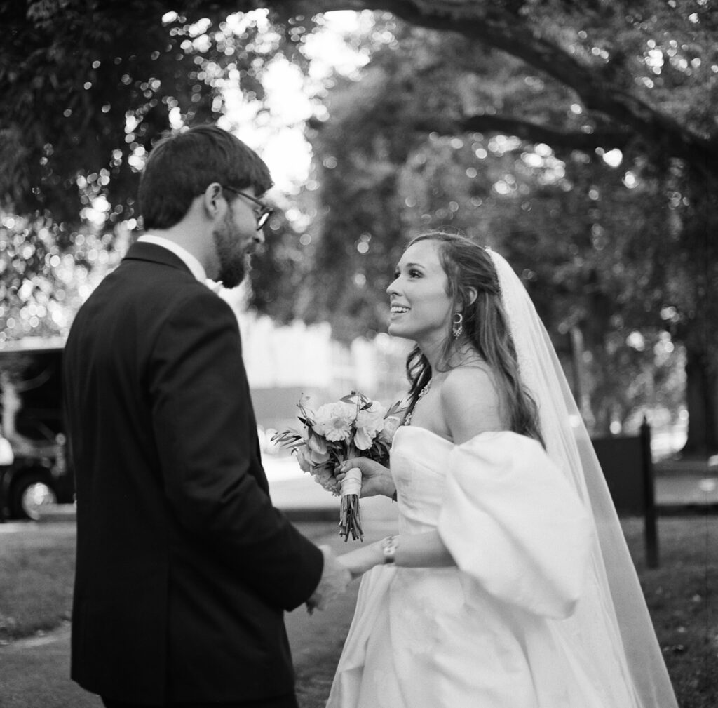
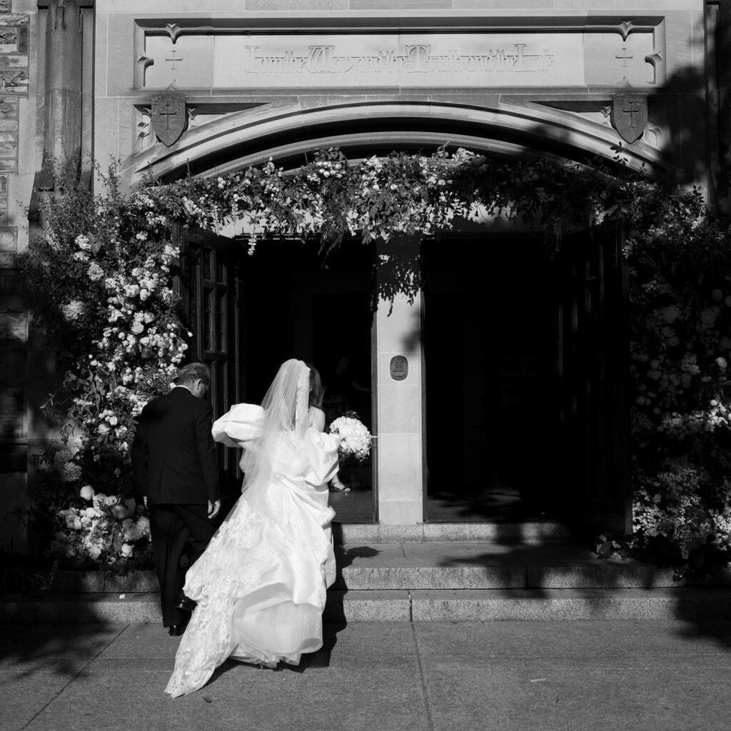
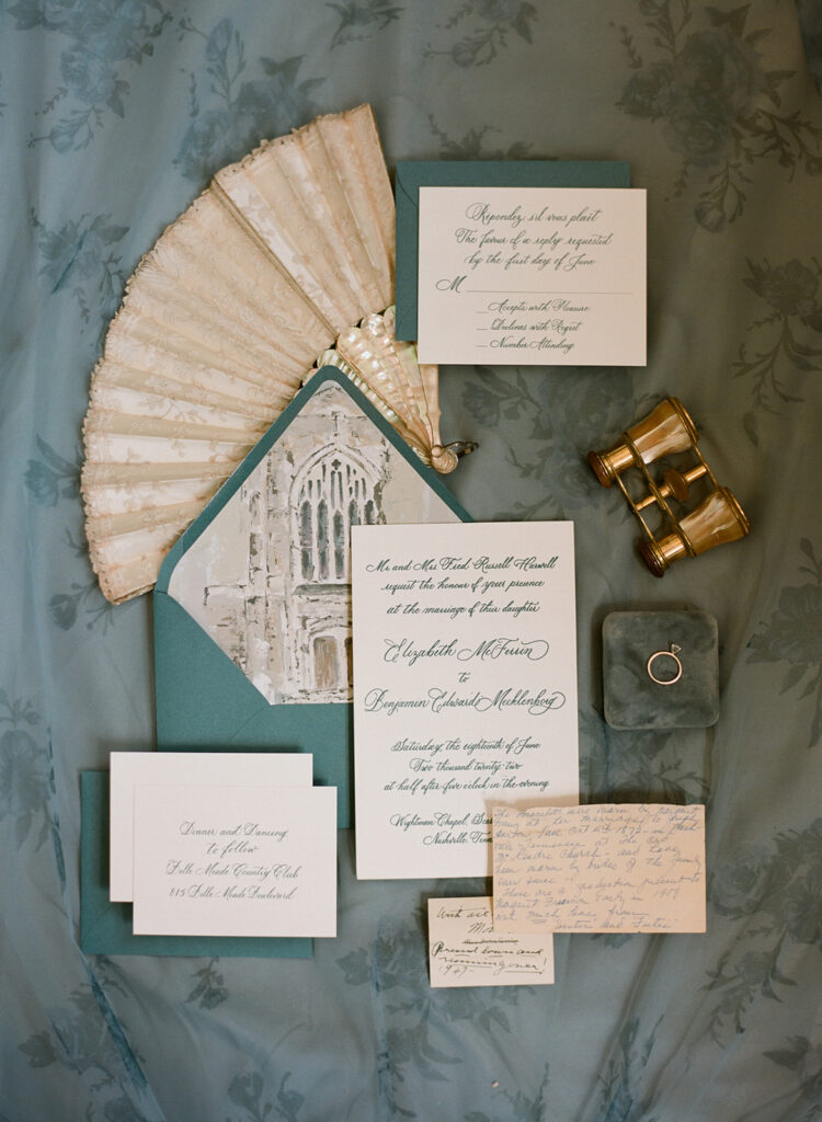
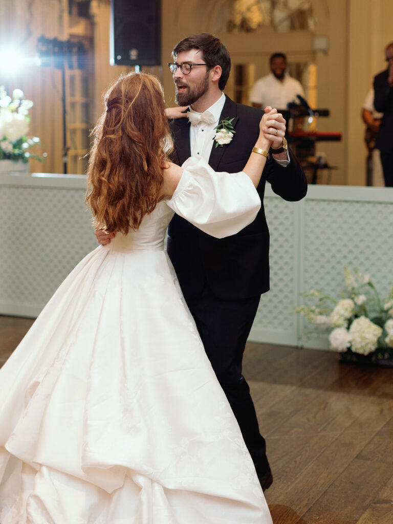
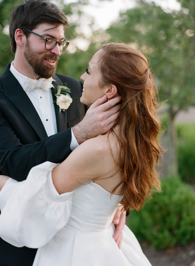
Last summer was filled with a rush of the most breathtaking weddings we have ever seen. Nashville weddings simply do not disappoint. Libby and Ben’s Scarritt Bennett nuptials gives us a glimpse of the amazing wedding season we had as they showcased classic details and unforgettable design that left us speechless.
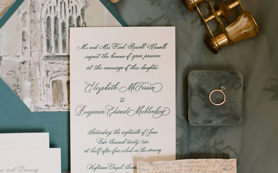
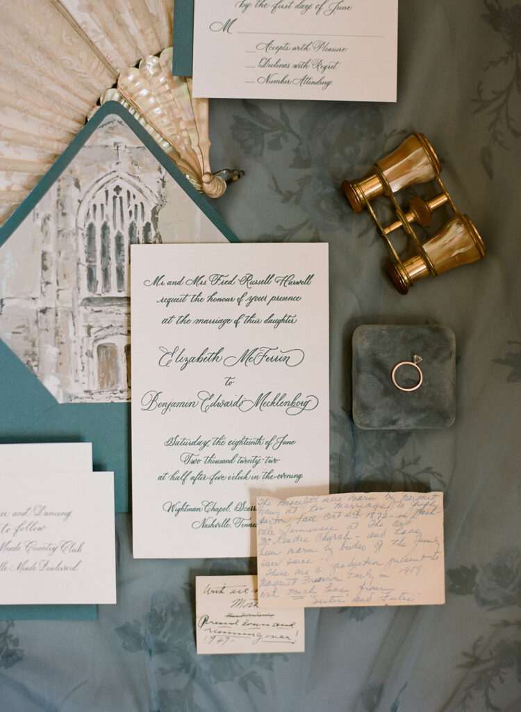
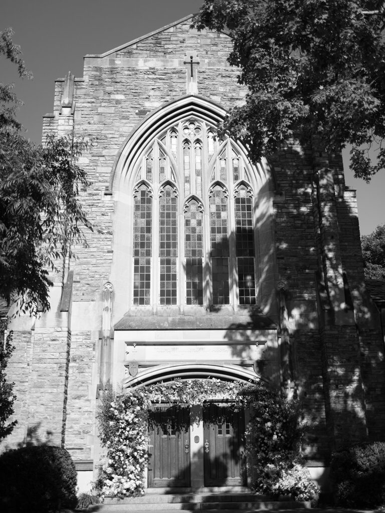
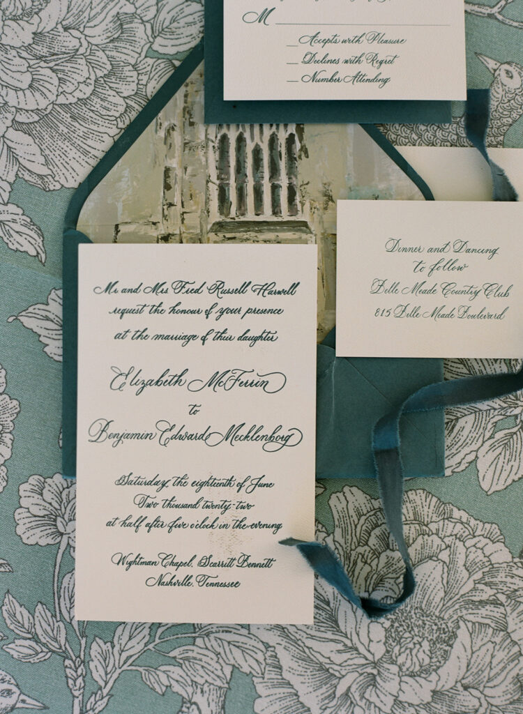
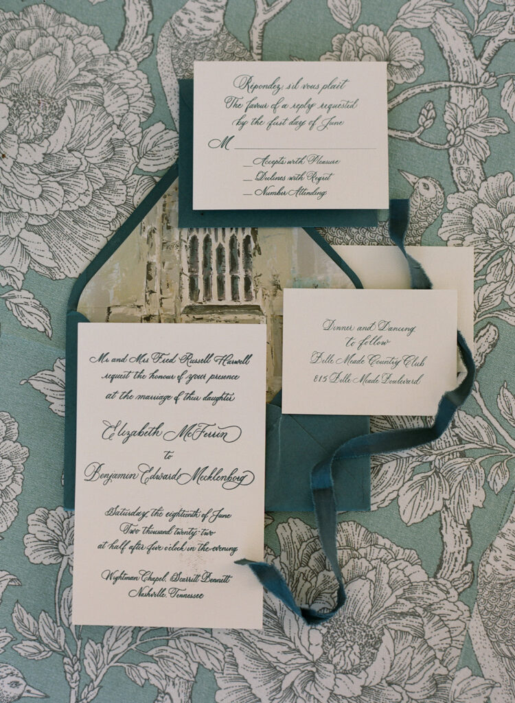
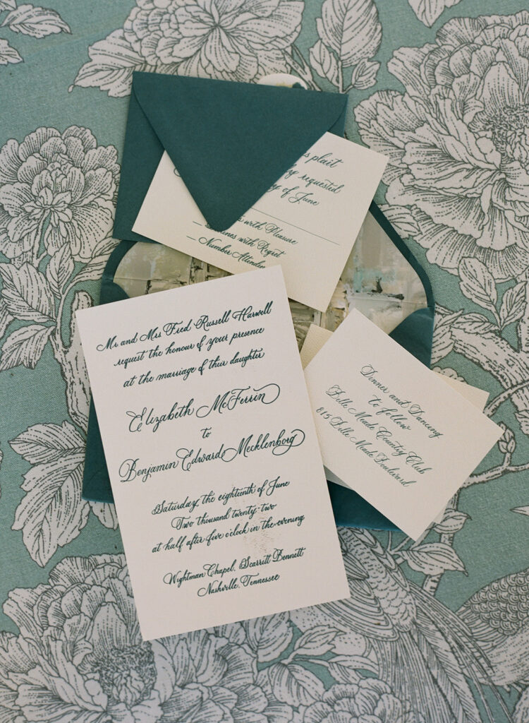
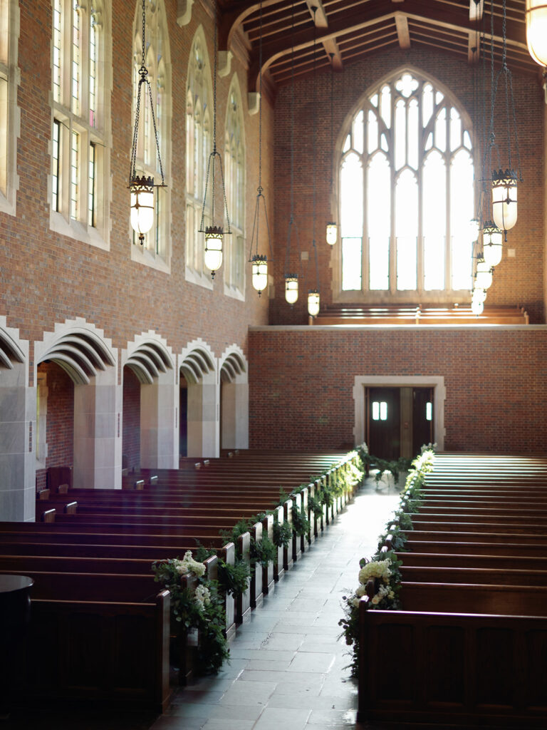
If you are from Nashville, then you are probably familiar with the reputation of Scarritt Bennett as one of Nashville’s most historic and timeless venues. Libby and Ben’s style laced seamlessly together with the design of the gorgeous Wightman Chapel at Scarritt Bennett. So much so, that custom artwork of the famous chapel was printed for the envelope liner in their invitation suites!
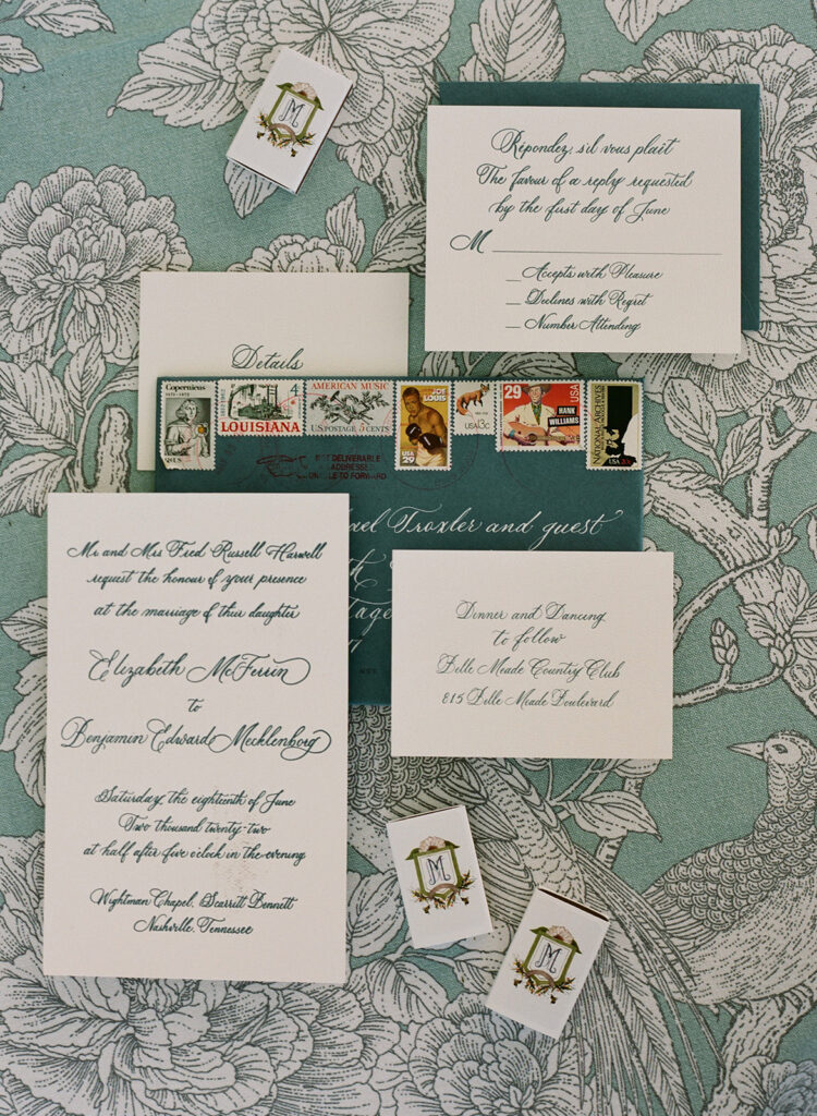
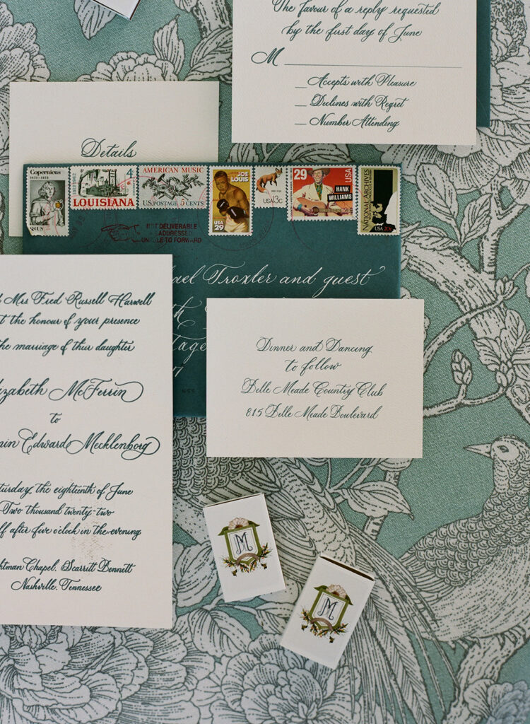
Libby was a bride that was not only excited by calligraphy, but also had a deep appreciation for classic letterpress. (I could cry tears of joy, honestly because- same.) She gave us the green light to design her and Ben’s invitation suites in FULL spot calligraphy and letterpress! In the world of calligraphy, THIS is about as stunning as it gets, folks. Enjoy!
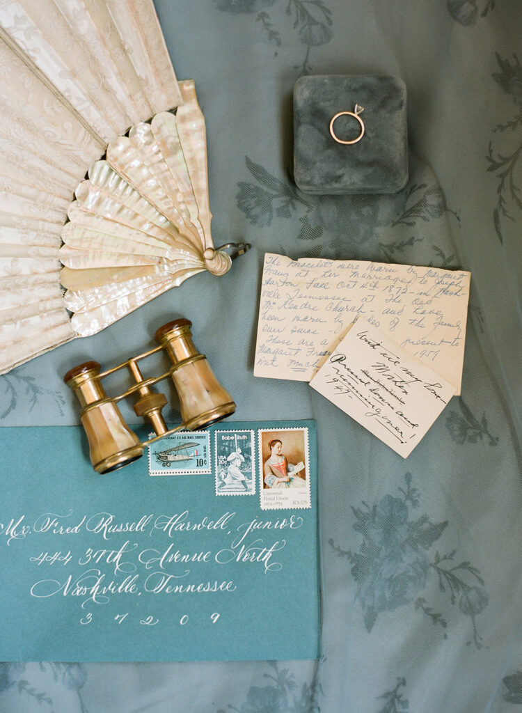
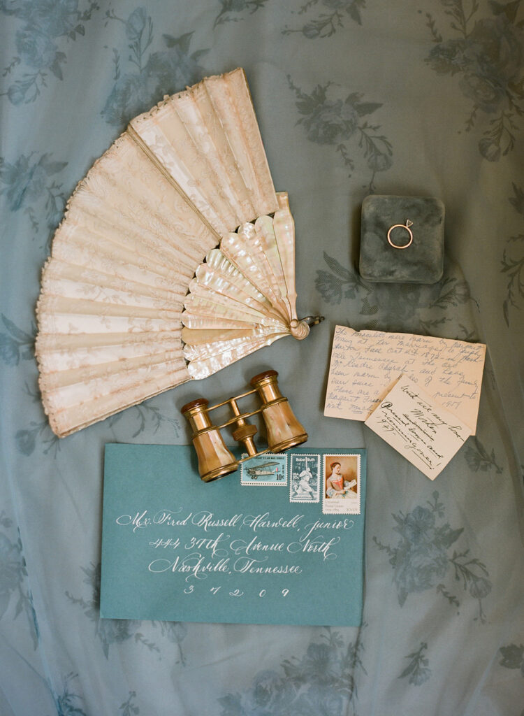
Our couple chose to use envelope calligraphy in white which paired beautifully against the dusty blue envelopes.
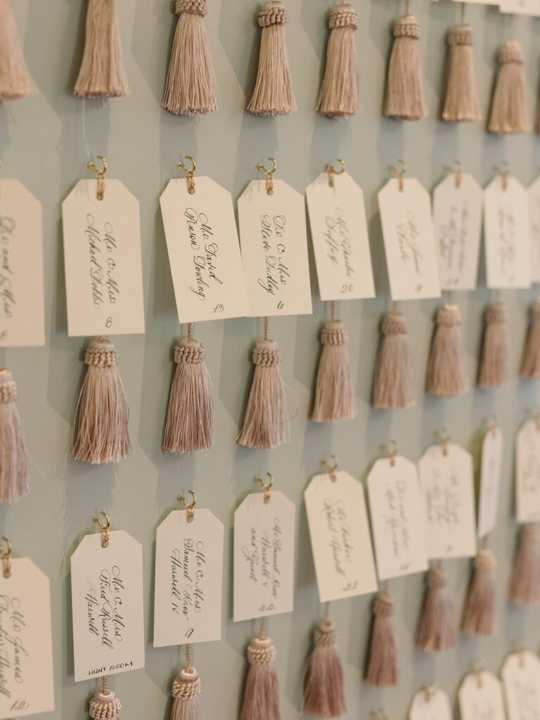
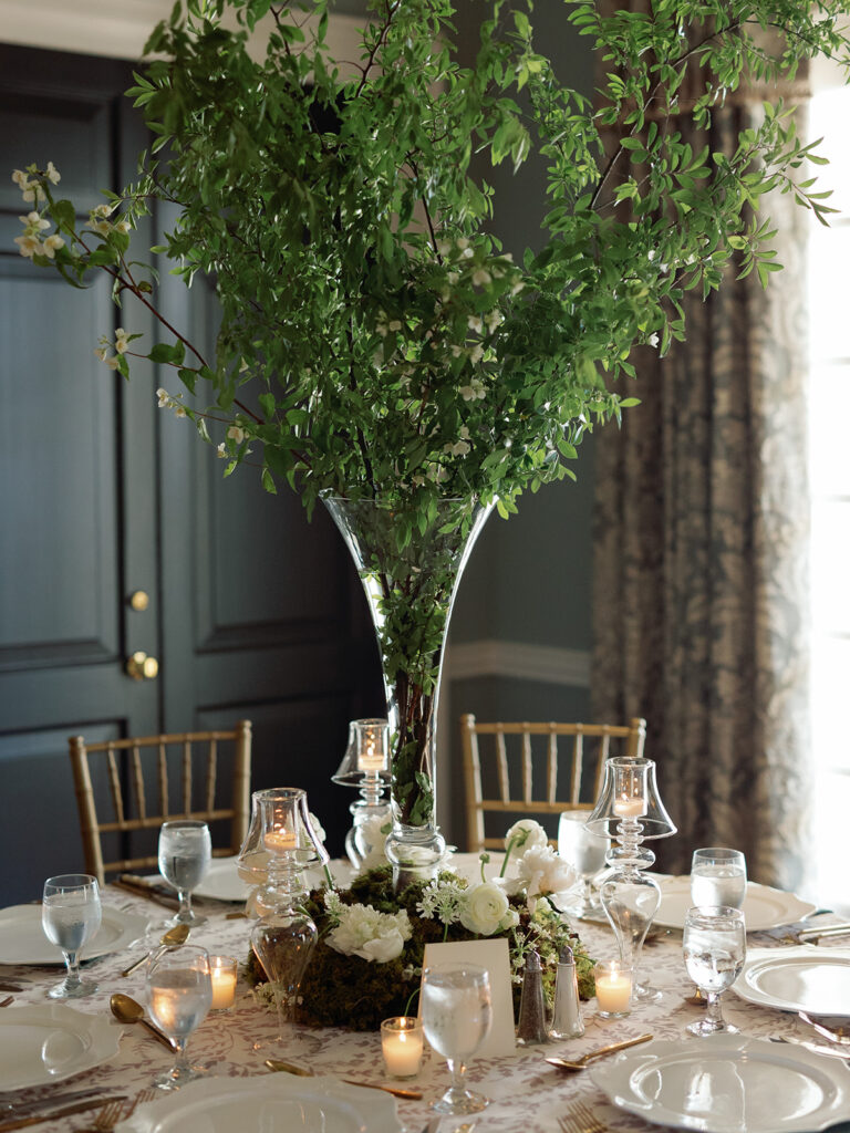
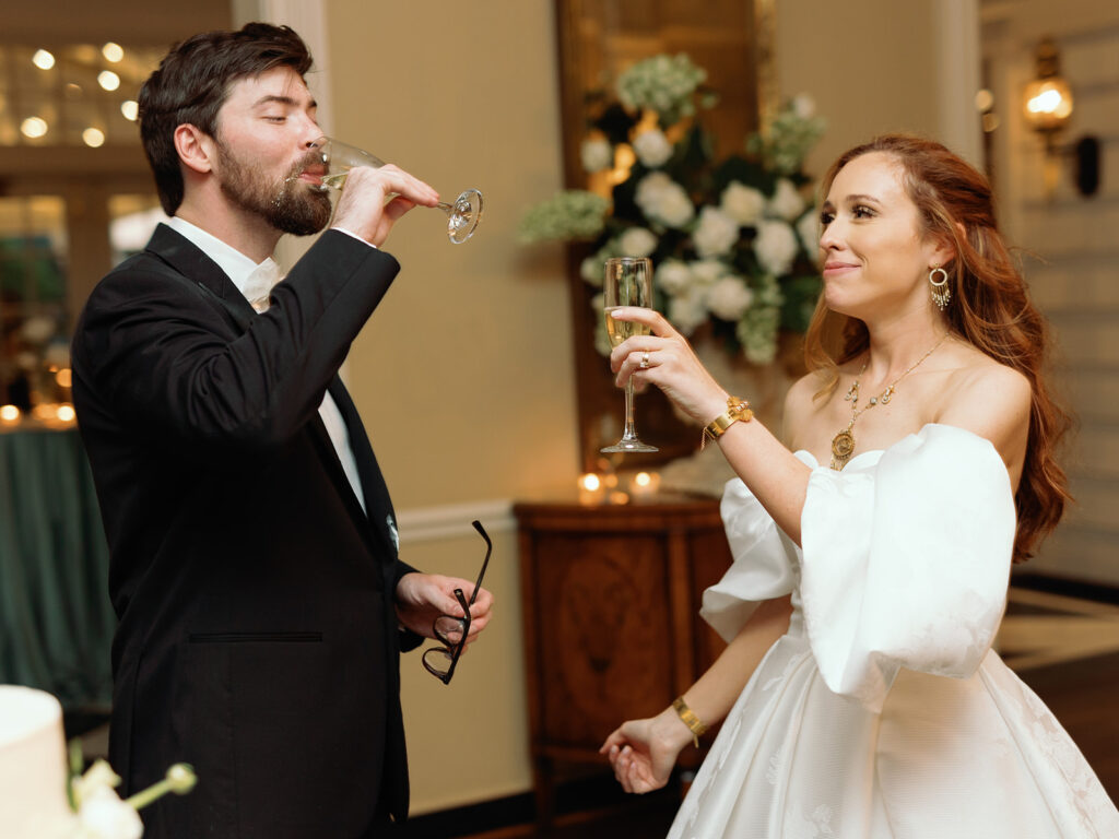
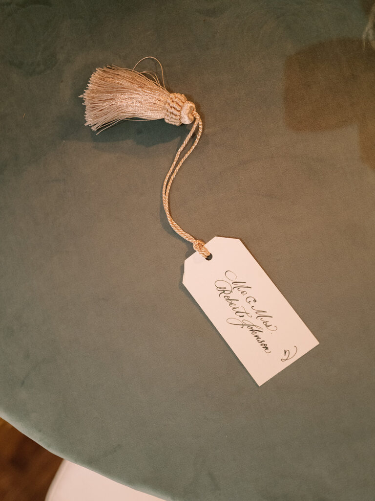
Libby and Ben’s reception venue was at the fabulous Belle Meade Country Club. This location definitely fit with the chic and classic energy of the day. The details flowed together flawlessly throughout the entire event. Absolutely nothing was underdone. We are especially proud to show off the final look of our couple’s seating chart! This is one of our favorite charts to date. The seating chart boasted dozens of brilliant little escort cards complete with custom spot calligraphy and tassels to top it all off. Unique but chic is the name of the game here. And I’m so in love with it.
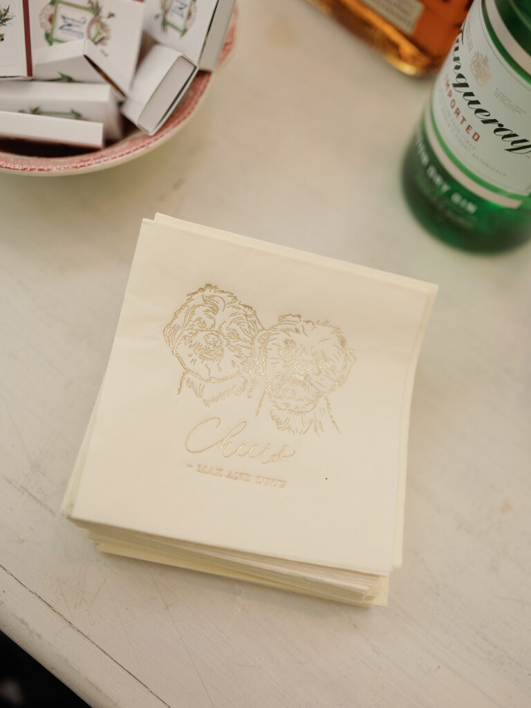
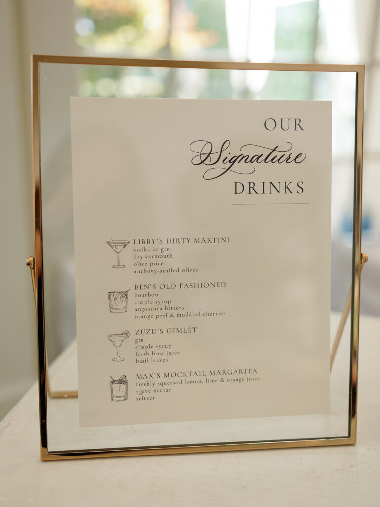
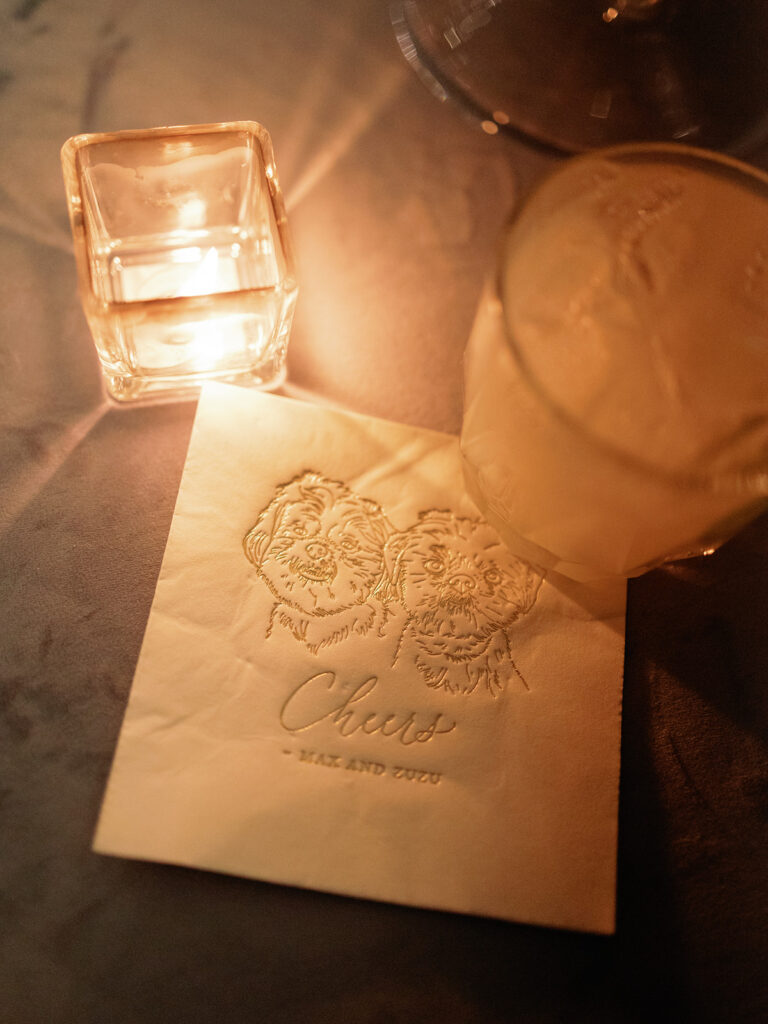
White Ink continued our touch on this special day through details like Libby and Ben’s custom bar signage and some of the most adorable cocktail napkins with prints of the couple’s fur babies, Max and Zuzu. Cocktail hour is the perfect time to include special things like beloved pets! This is quickly becoming a popular theme.
I say it all the time, but White Ink Calligraphy really does have the best couples and clients ever. It was such an honor to work with Libby and Ben throughout the planning process all the way to the big day. I was moved by their appreciation for sophisticated detail and we were happy to make it all happen for these two. We appreciate you! Cheers!
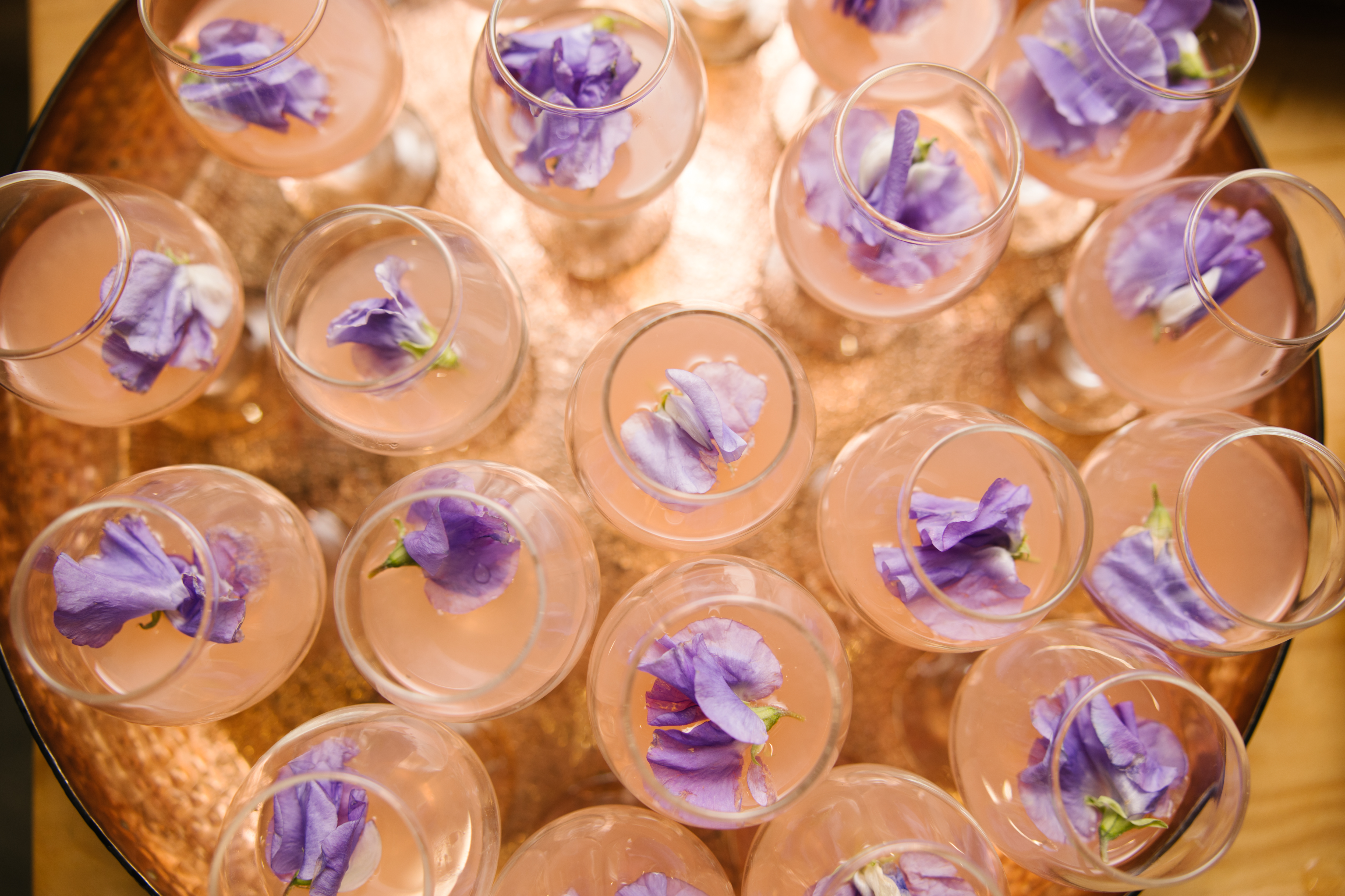
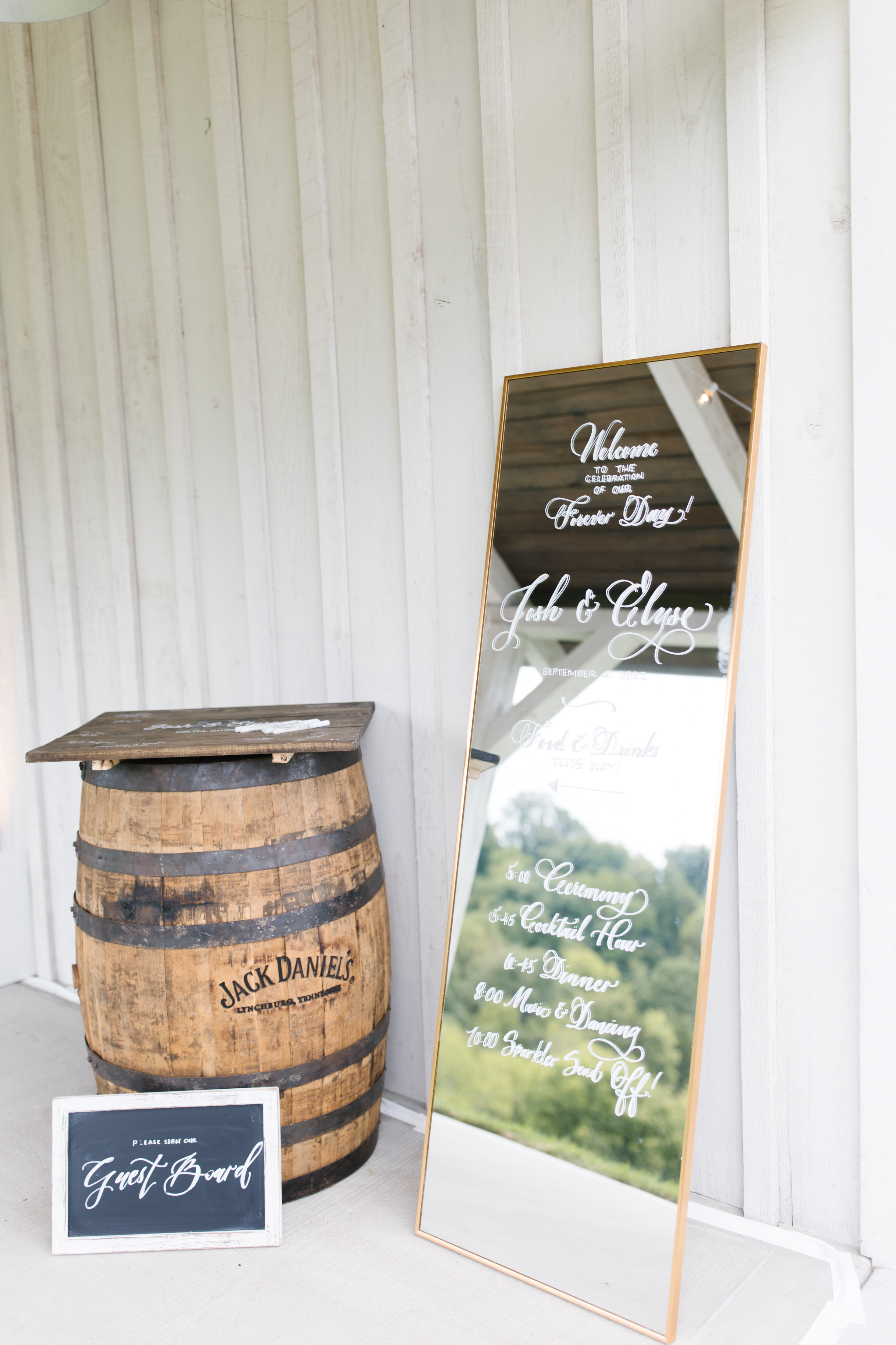
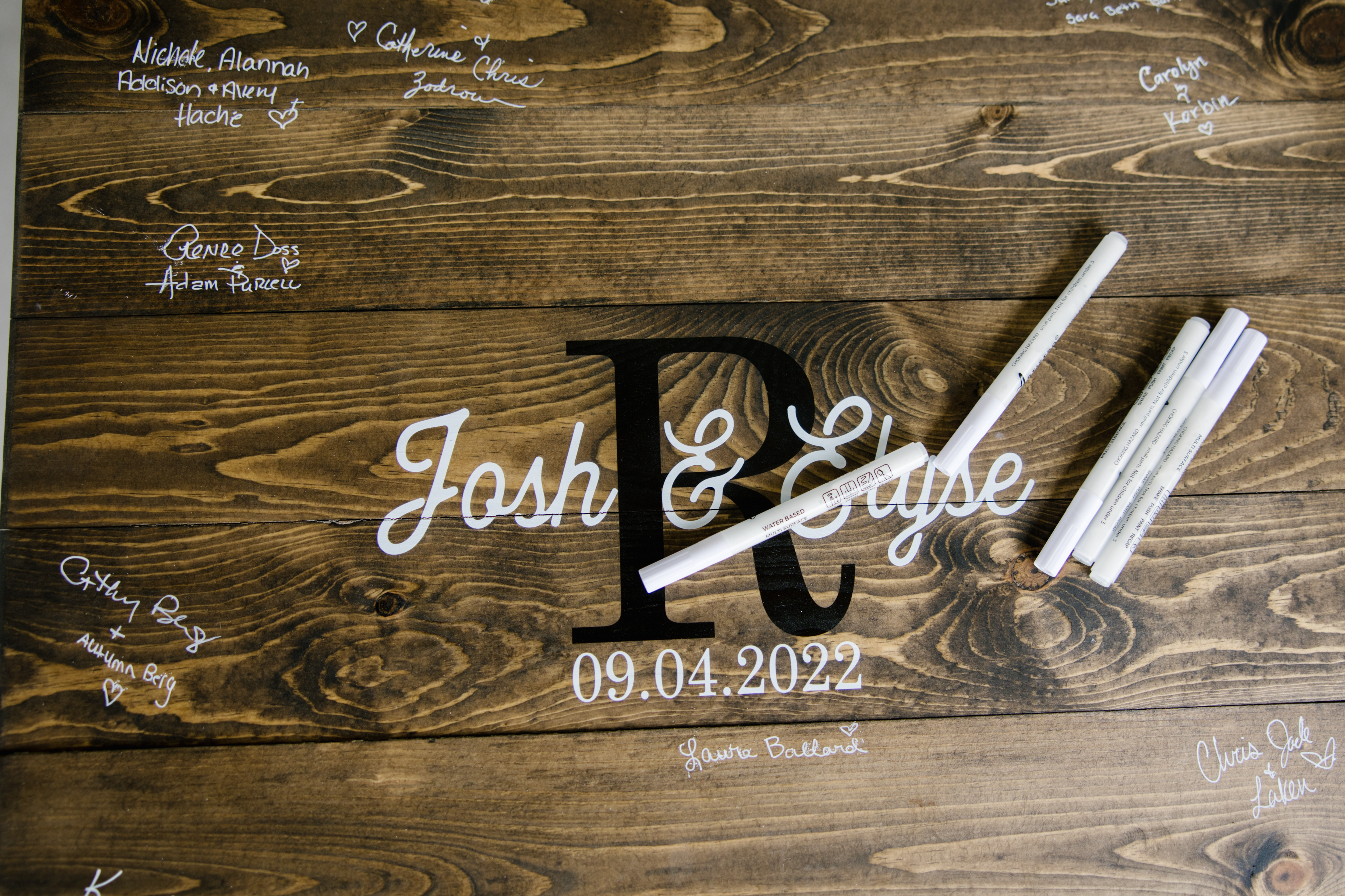
As a calligrapher, I get the unique opportunity to work with people who are putting their best foot forward. My clients are truly dedicated to being intentional with the details of their events. Seeing that side of them is a huge motivating factor while putting in my best work for each client whether they are throwing a holiday event, a business party, or a dream wedding. Working for Elyse and Josh as they were putting together the final touches for their wedding day was a rewarding and heartfelt experience; one that my team and I were honored to be a part of.
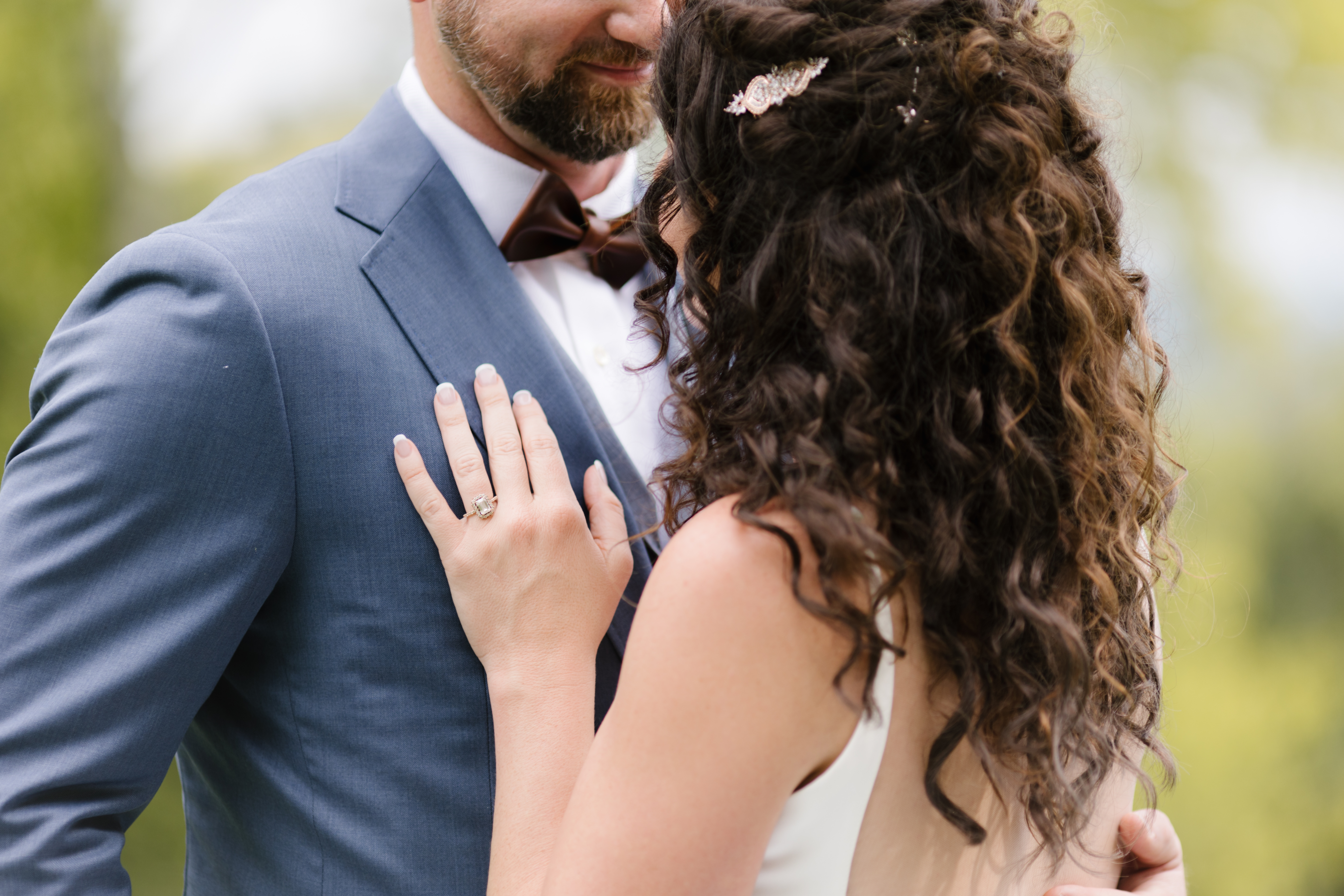
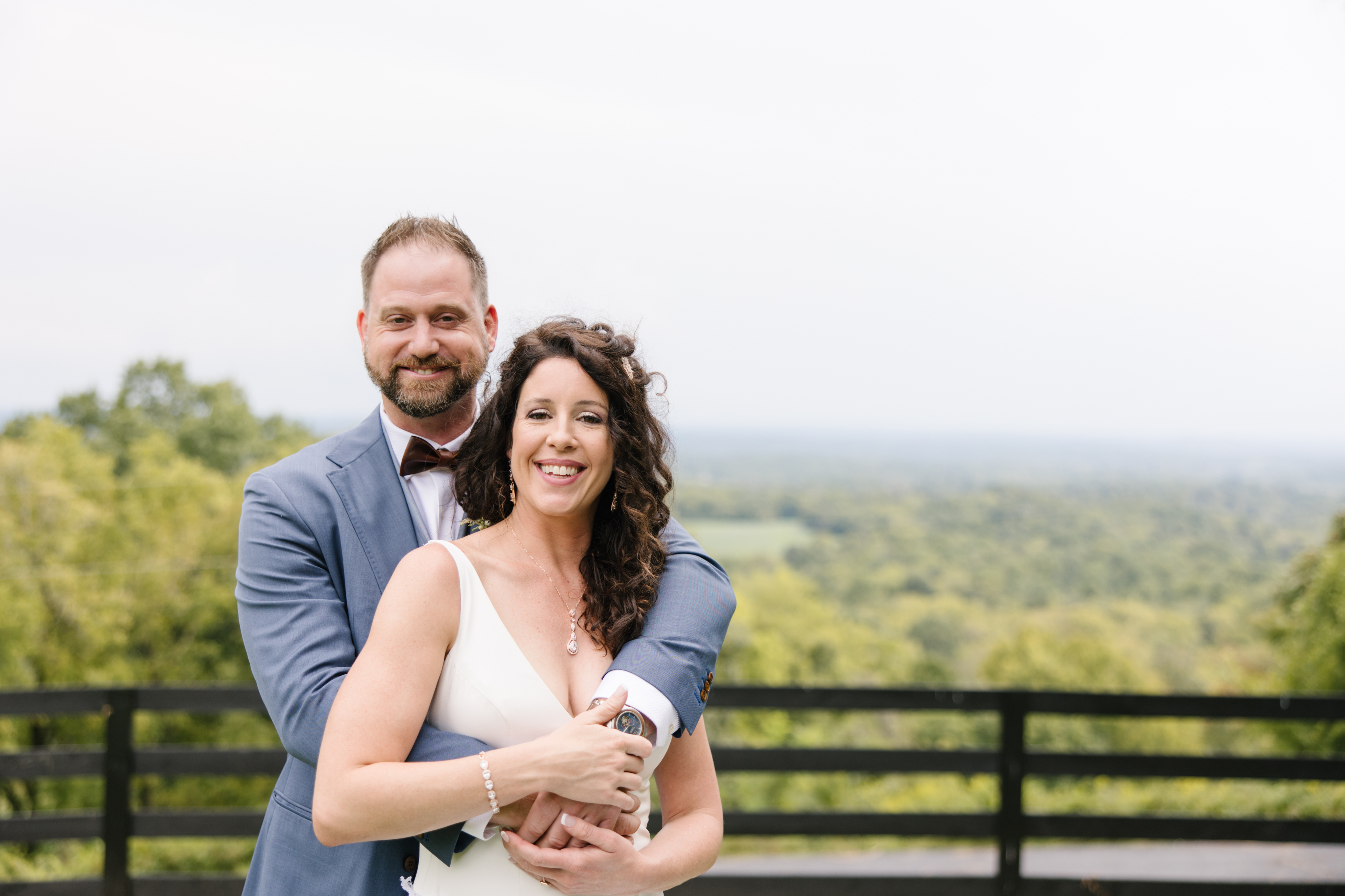
The White Ink team quickly understood that, to Elyse and Josh, family is everything. We think you will enjoy checking out some of the projects we put together to make sure this Tennessee wedding sublimely celebrated the importance of being gathered together.
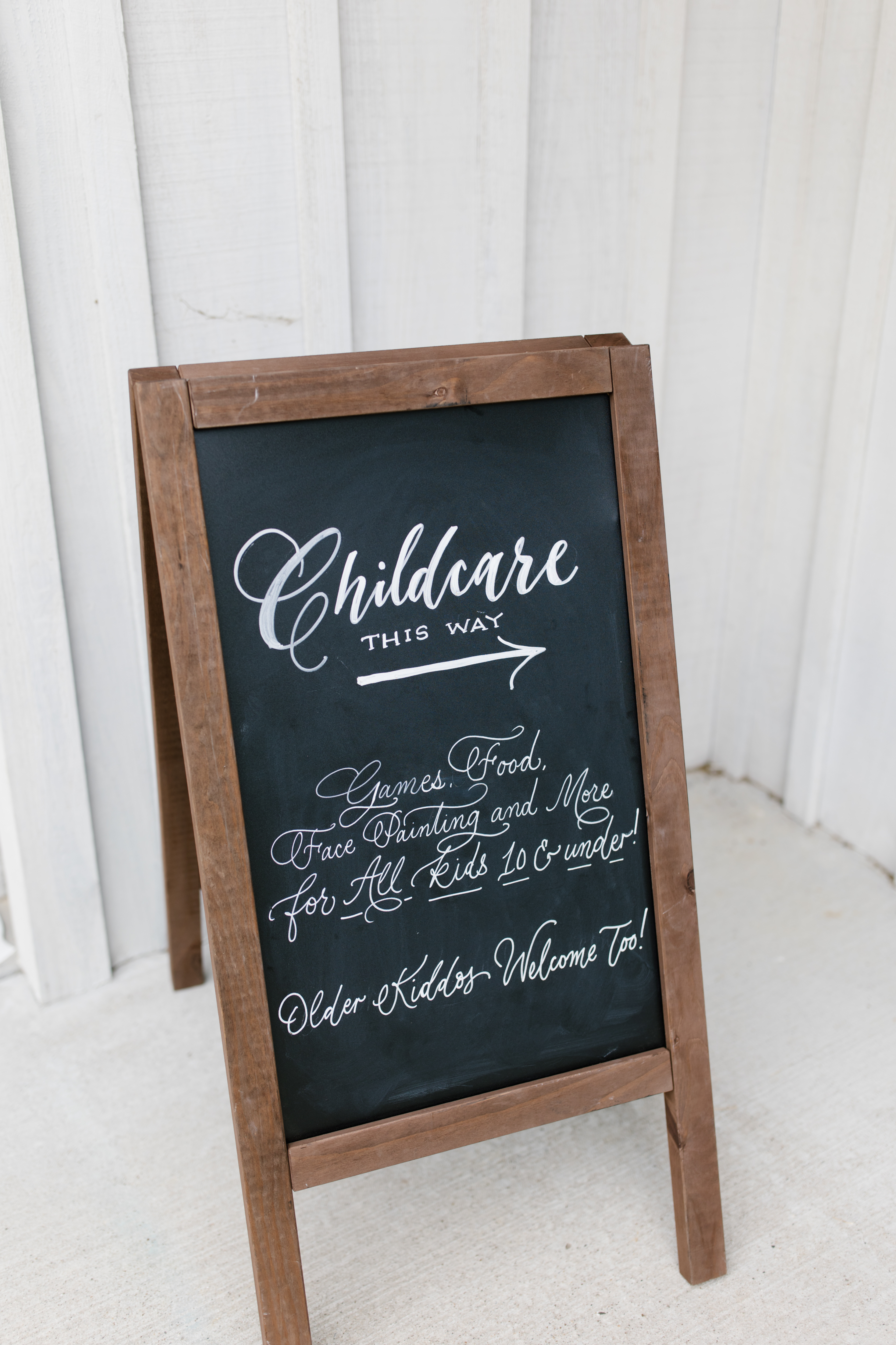
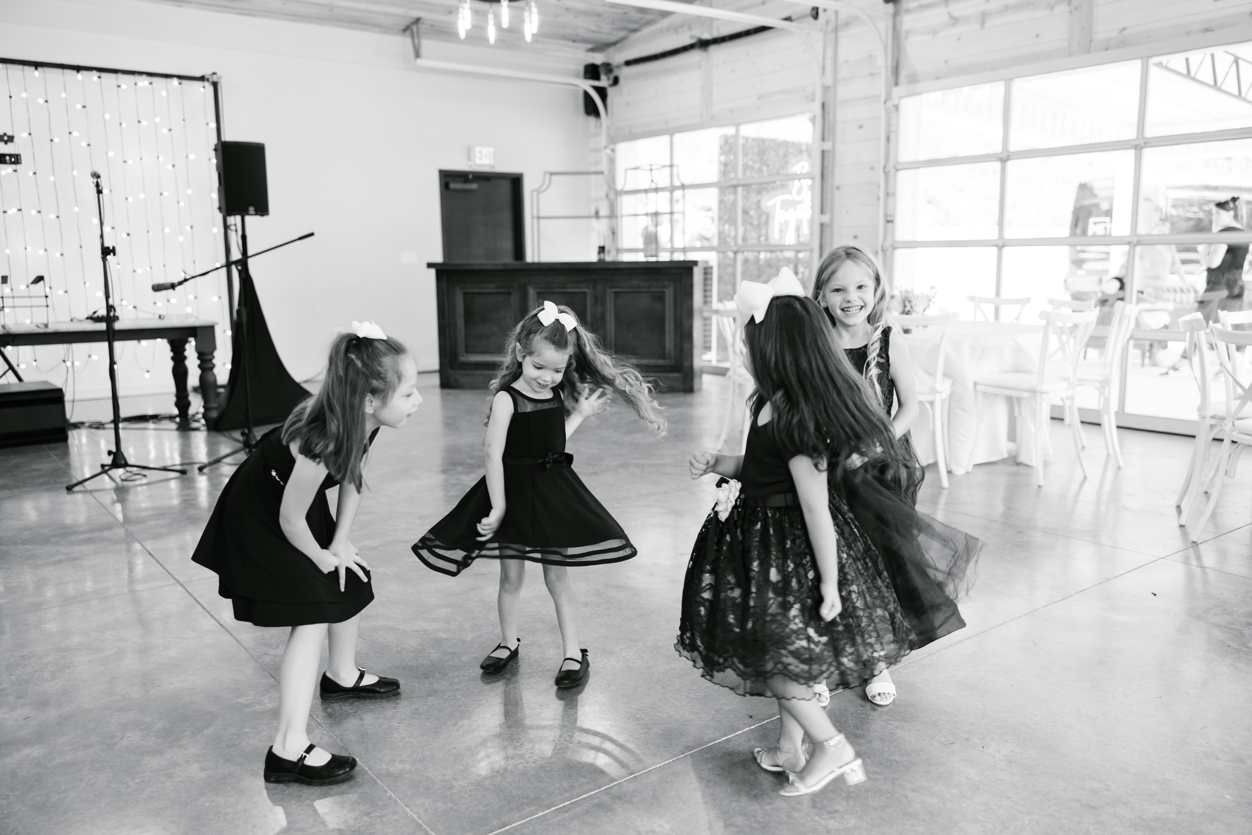
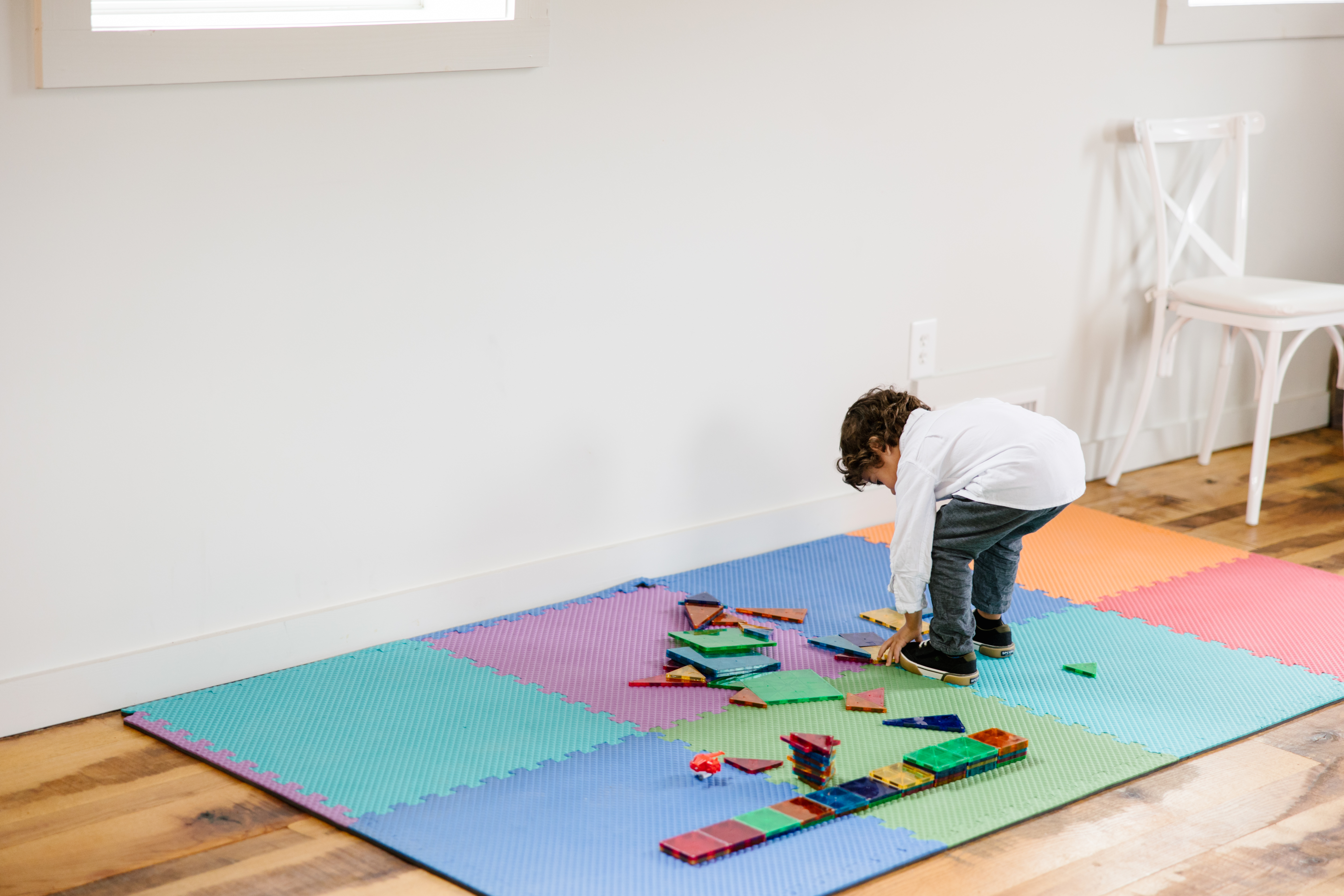
I was really excited about customizing the chalkboard signage for cocktail hour. It fit effortlessly into the southern style of the gorgeous Cranford Hollow barn venue. We also made chalkboard signage to inform the guests of the childcare that was available to parents of little ones! This kind of thoughtfulness is what can separate your event from others. Those parents will always appreciate that this was done for the kiddos.
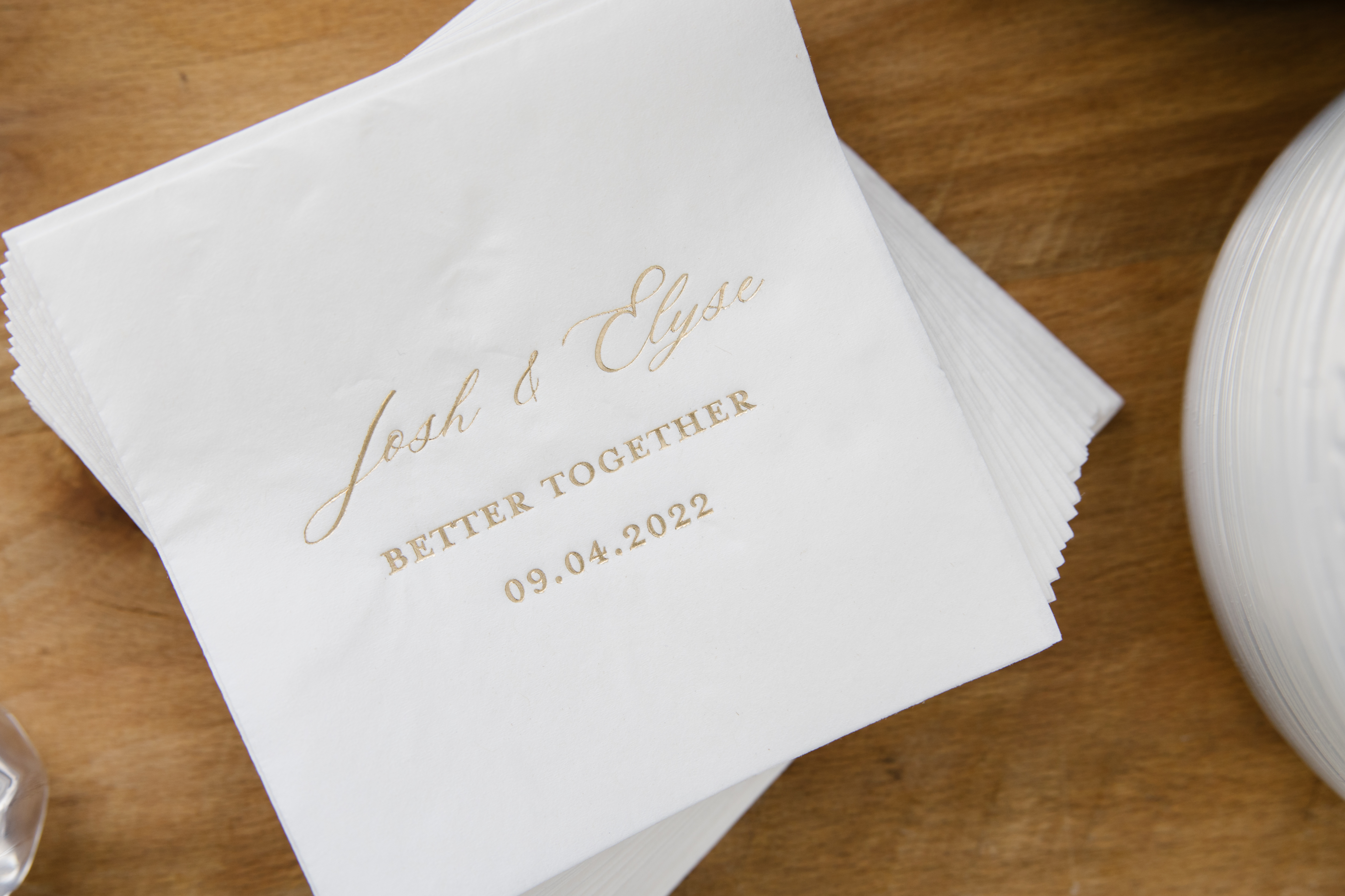
For cocktail hour, Elyse and Josh wanted to display these super cute custom cocktail napkins. I especially love how the gold font jumps off the white napkin. These napkins are a great example of how our clients use small details to leave lasting impressions. I am here for it!
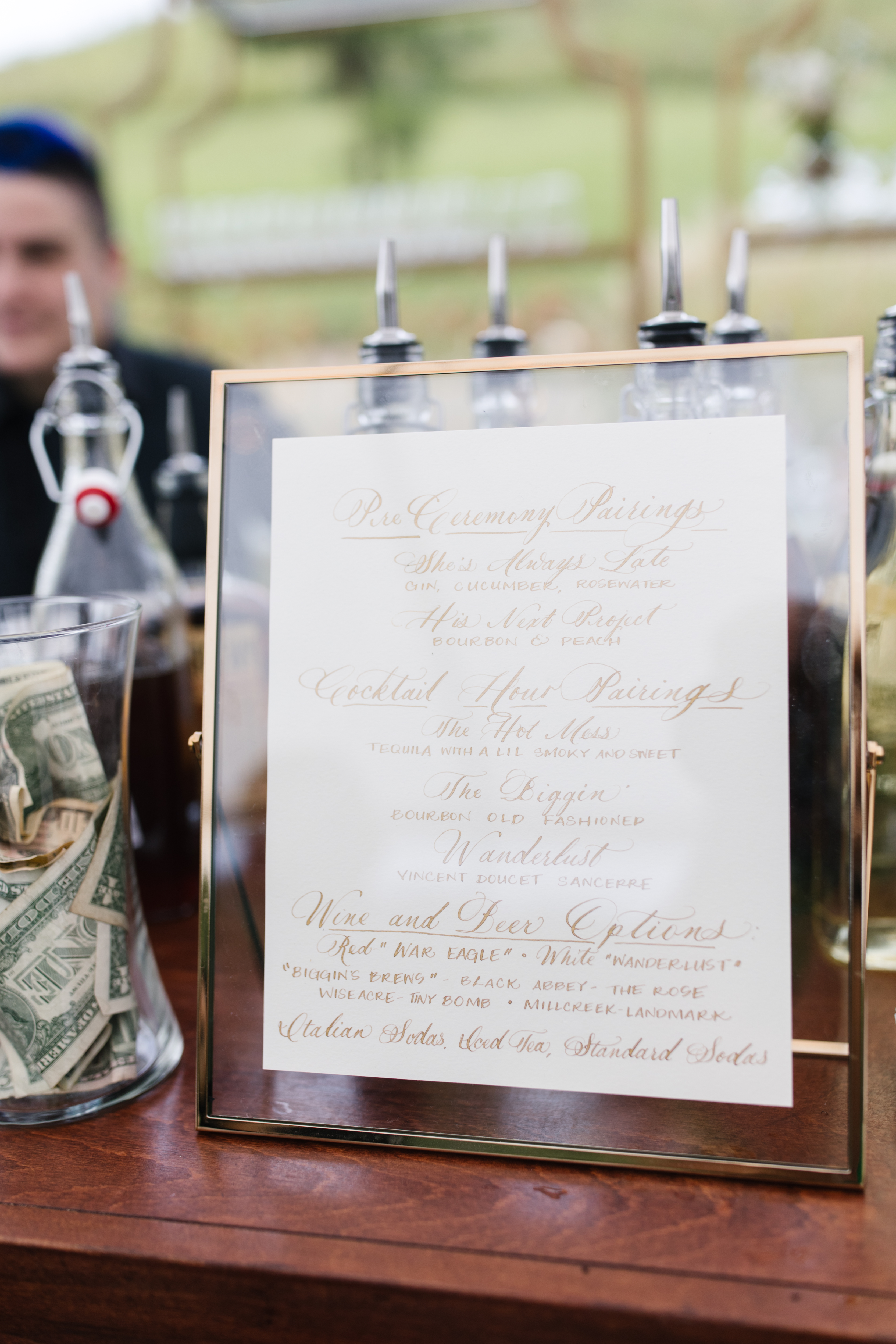
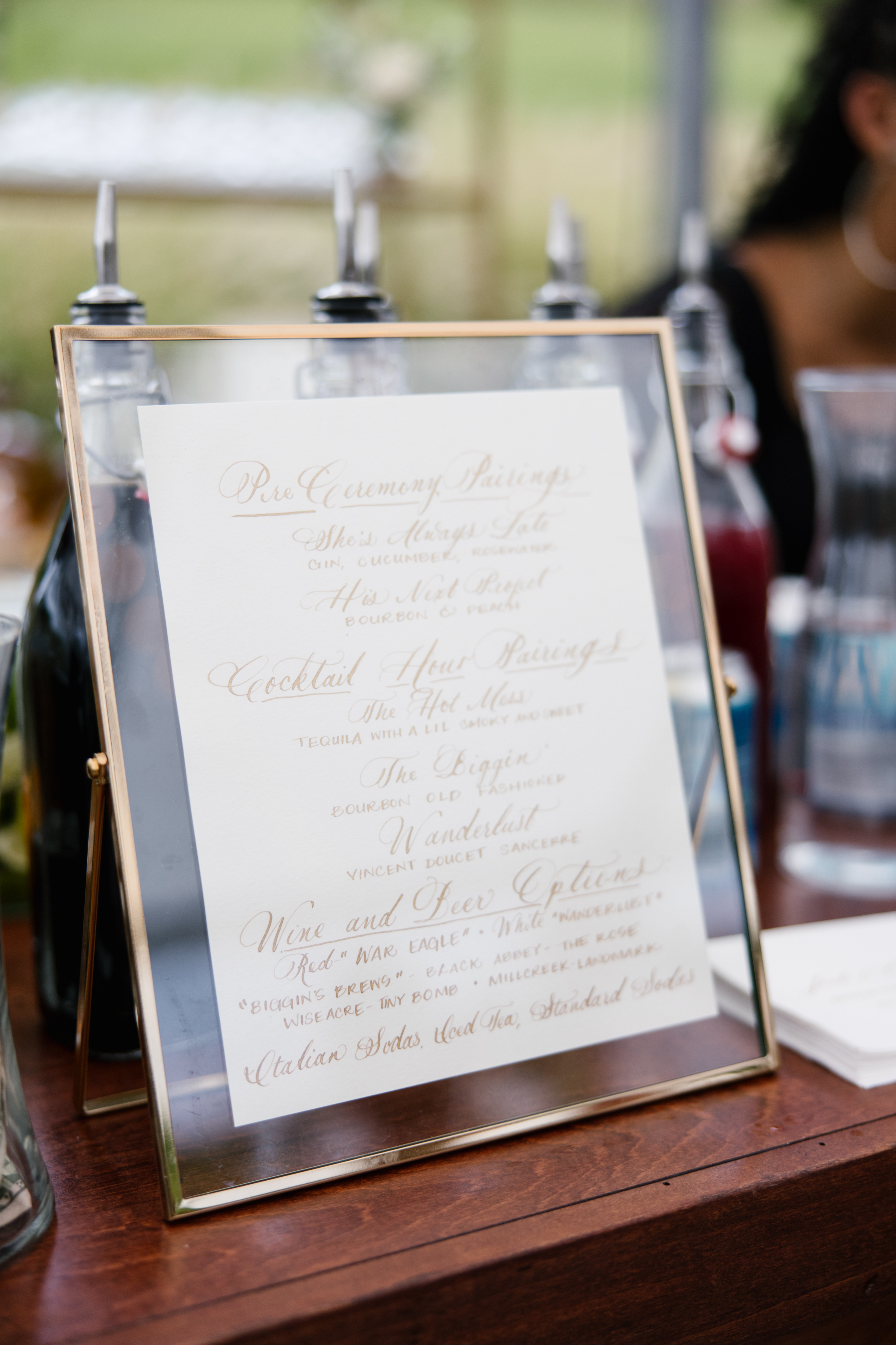
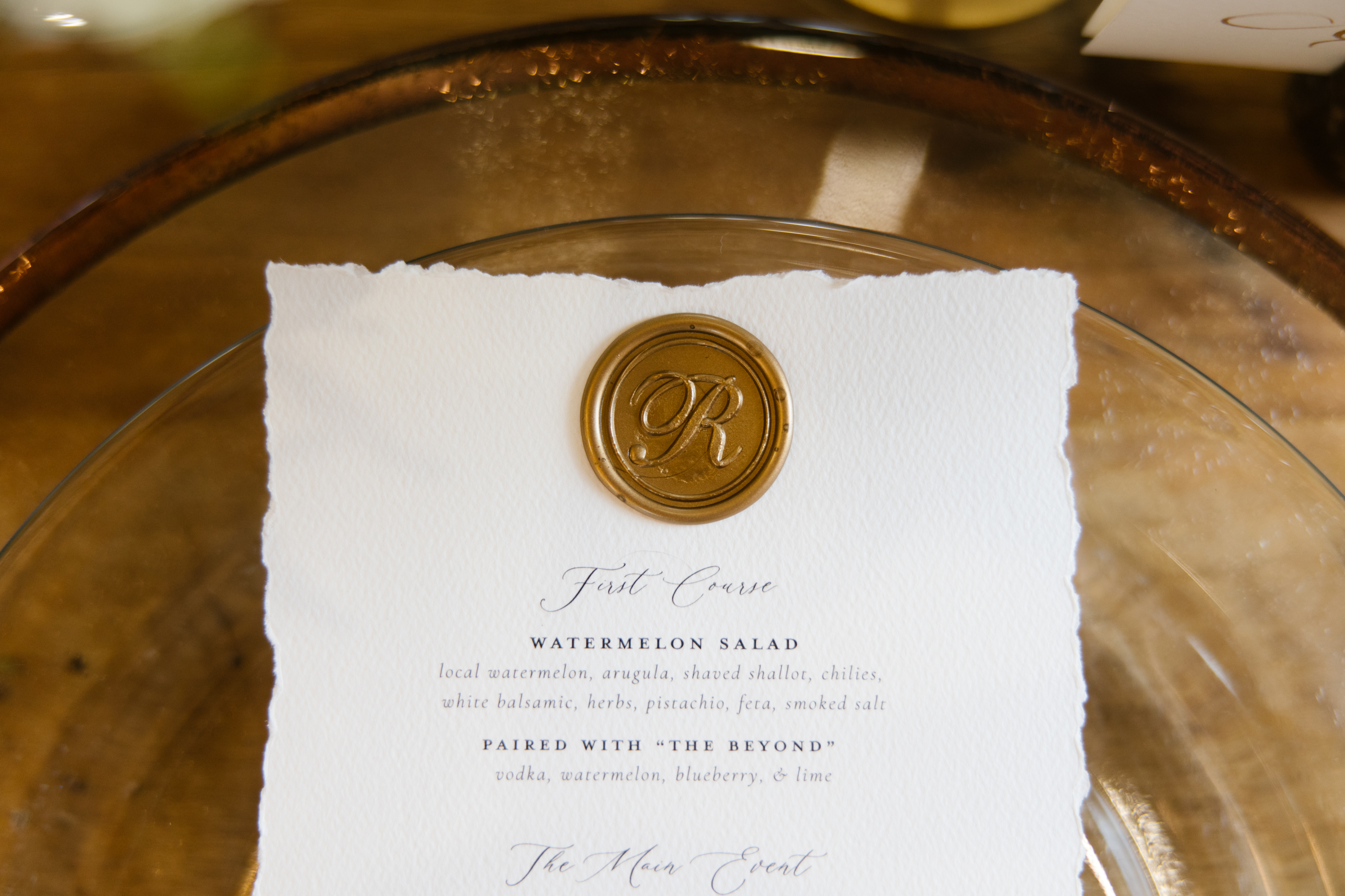
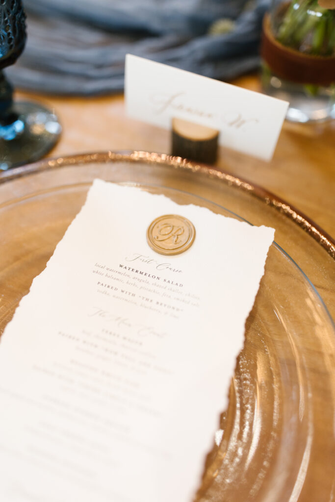
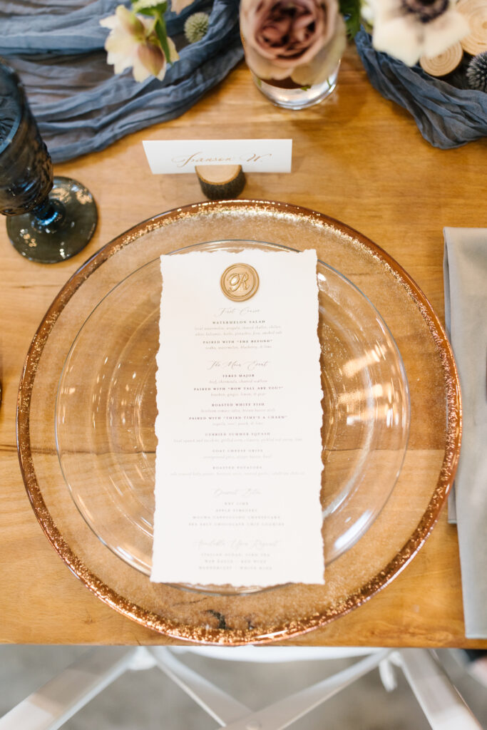
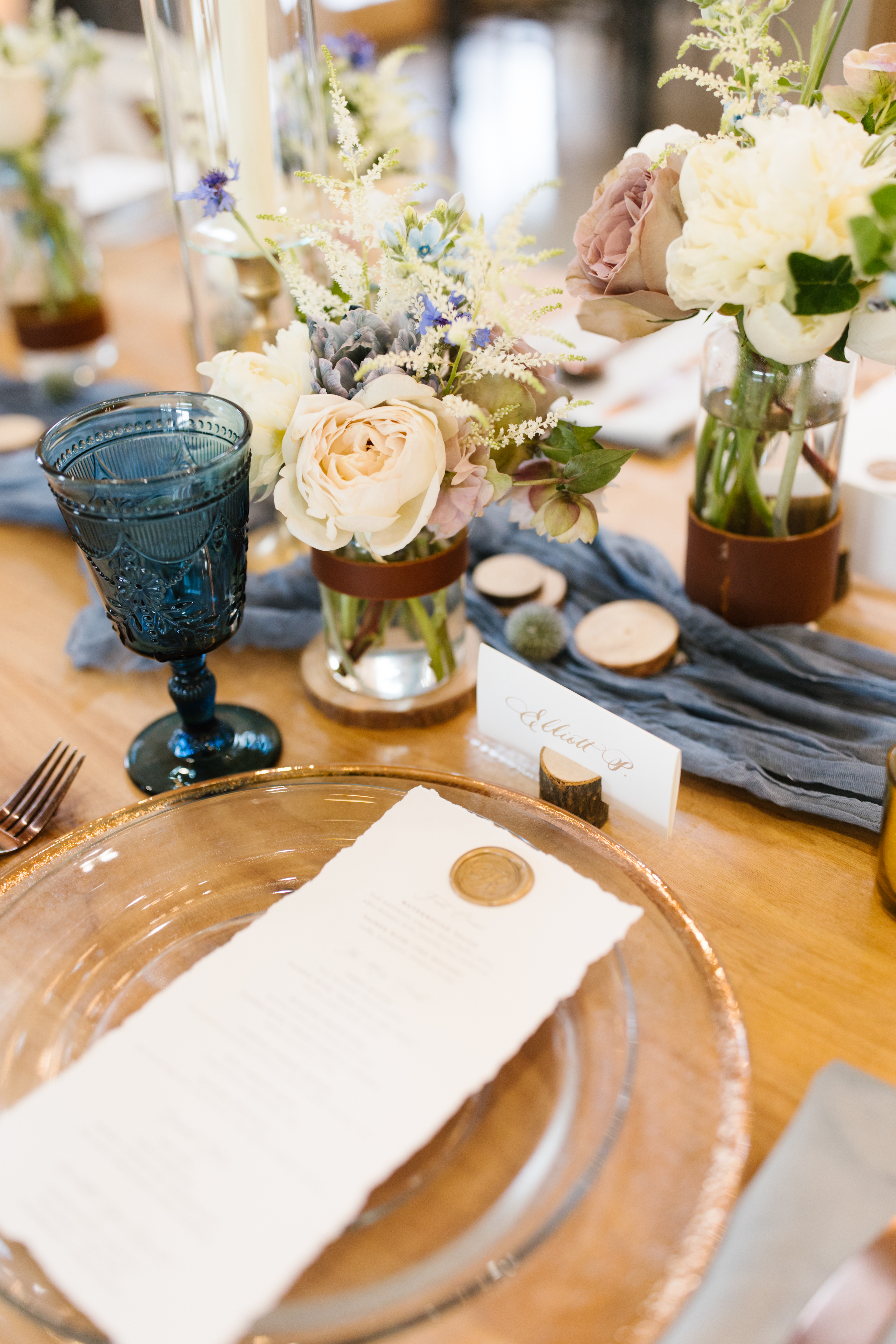
Our couple’s family-centered reception was beautifully elevated by the specially designed menus we made for them. White Ink’s stationary team designed these menus on hand torn paper and coupled it with a classic custom gold seal. Ok, so I kind of still can’t get over how Elyse and Josh included a complete cocktail pairing with each menu item!
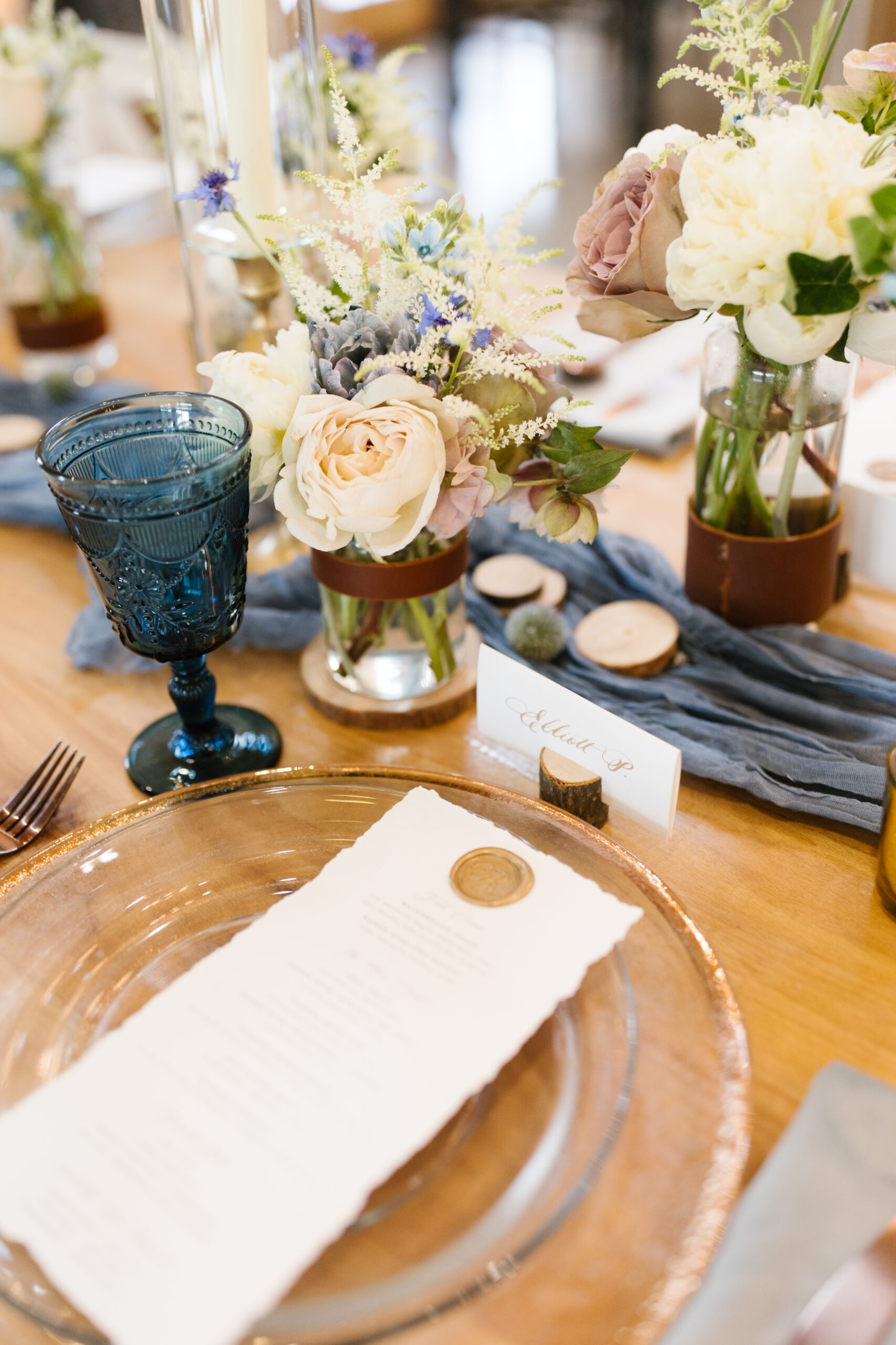
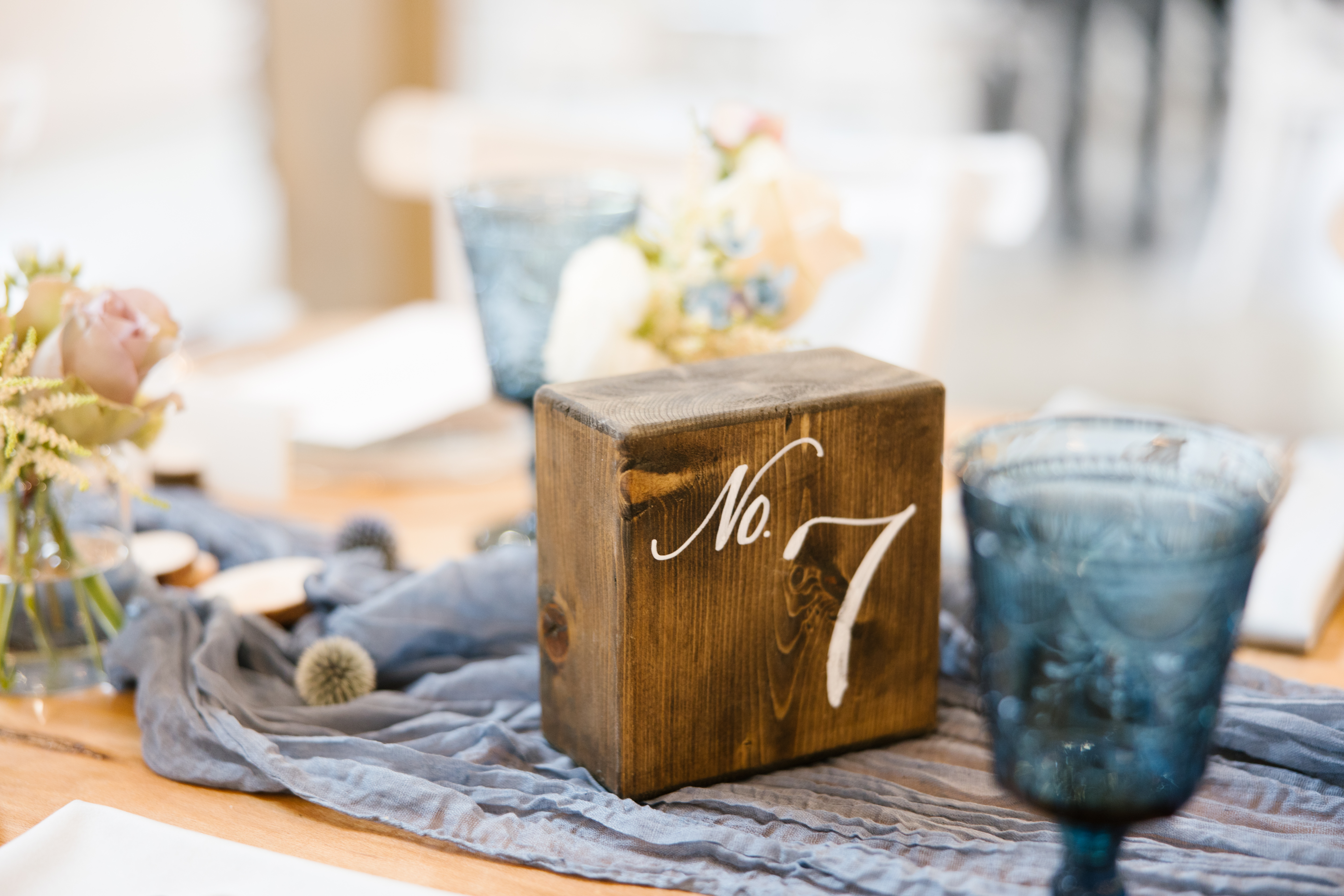
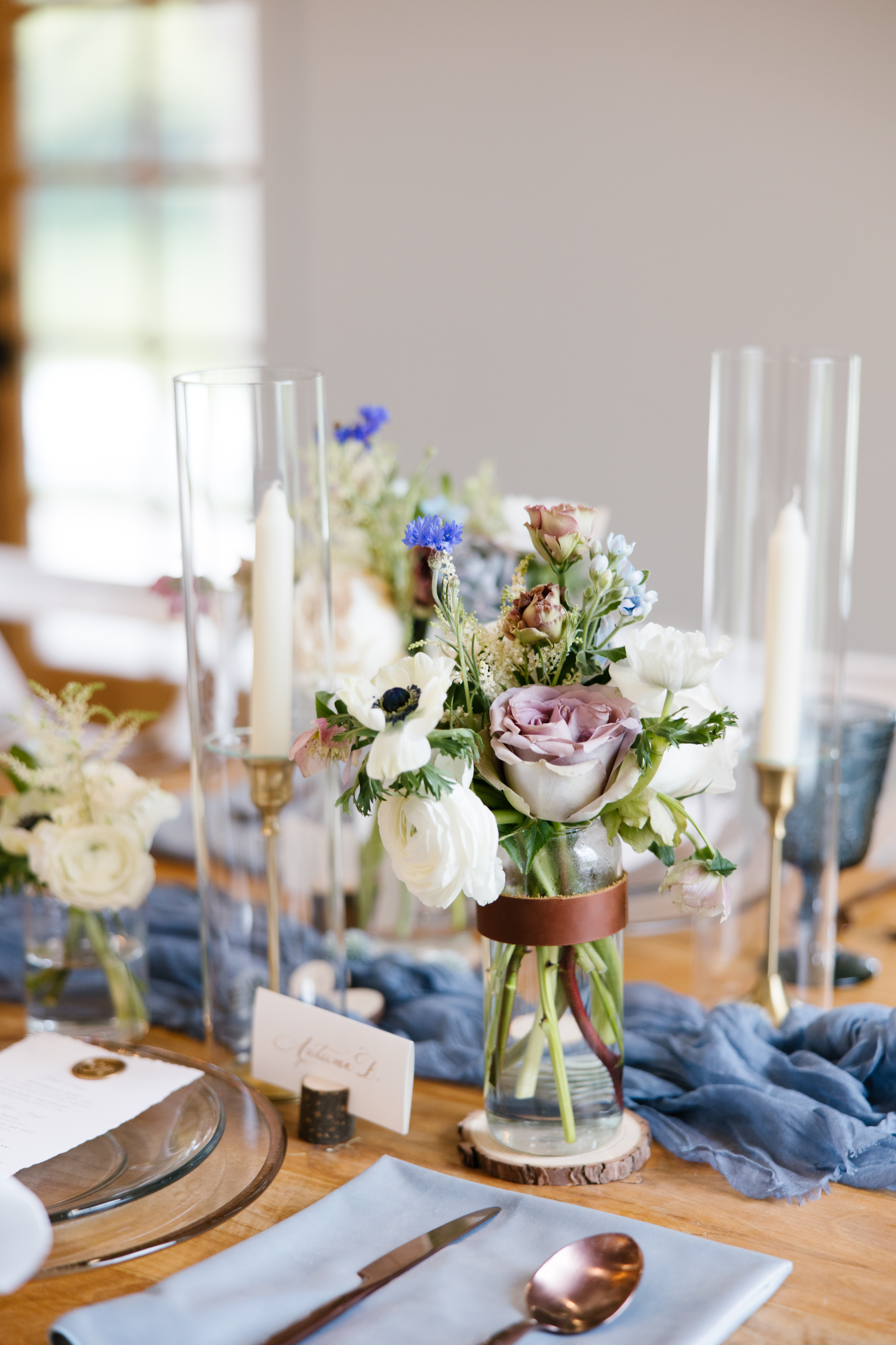
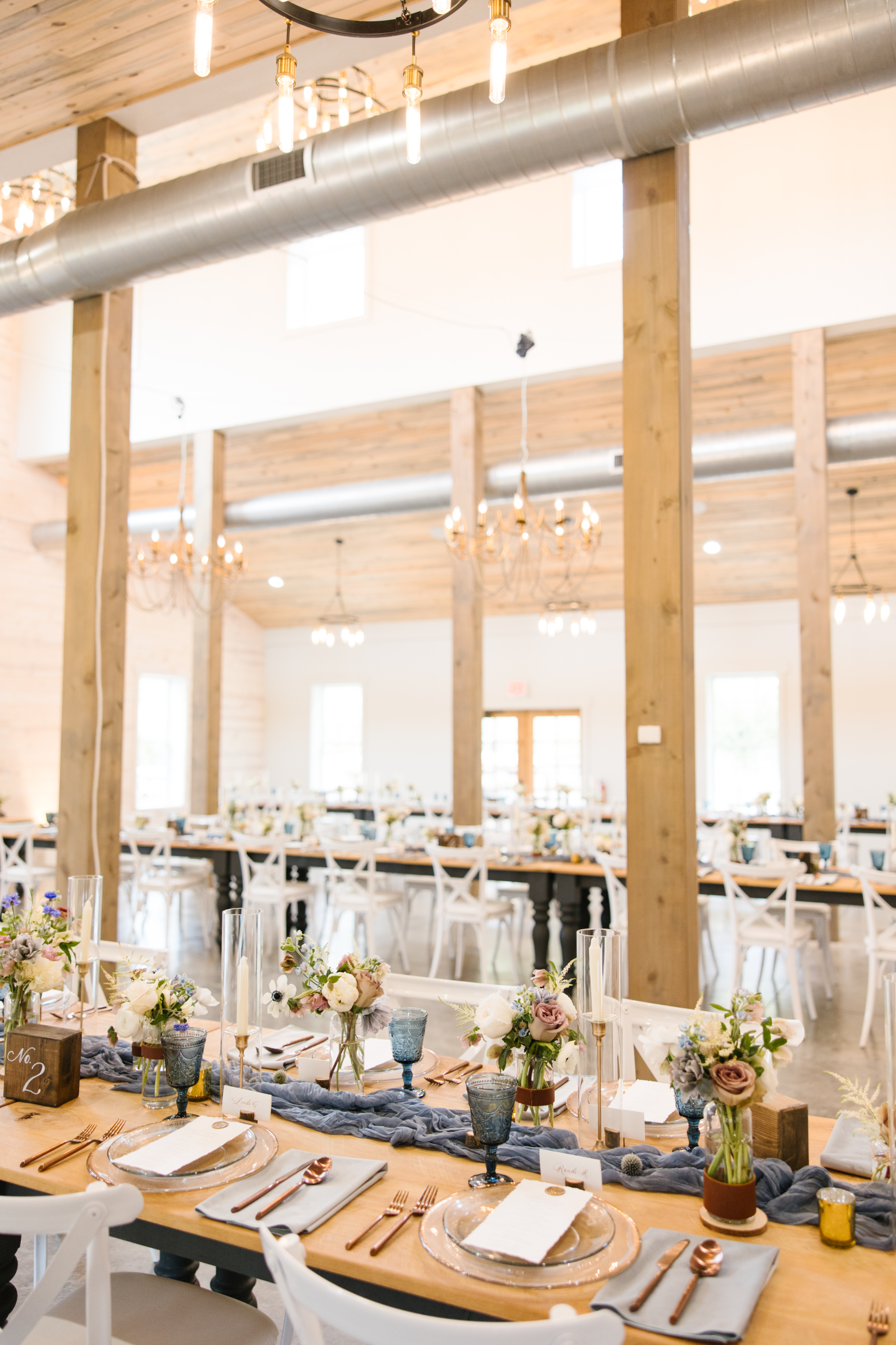
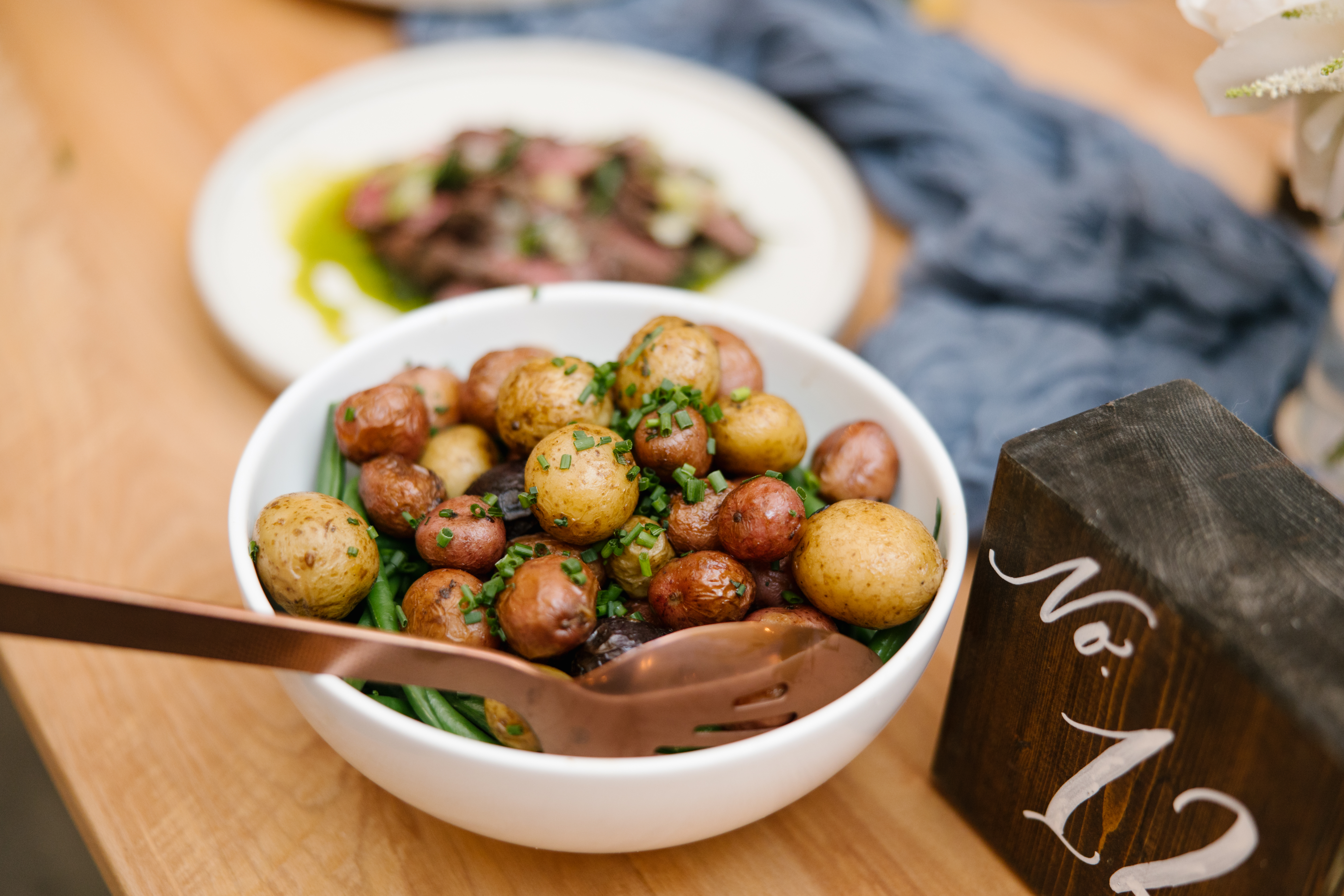
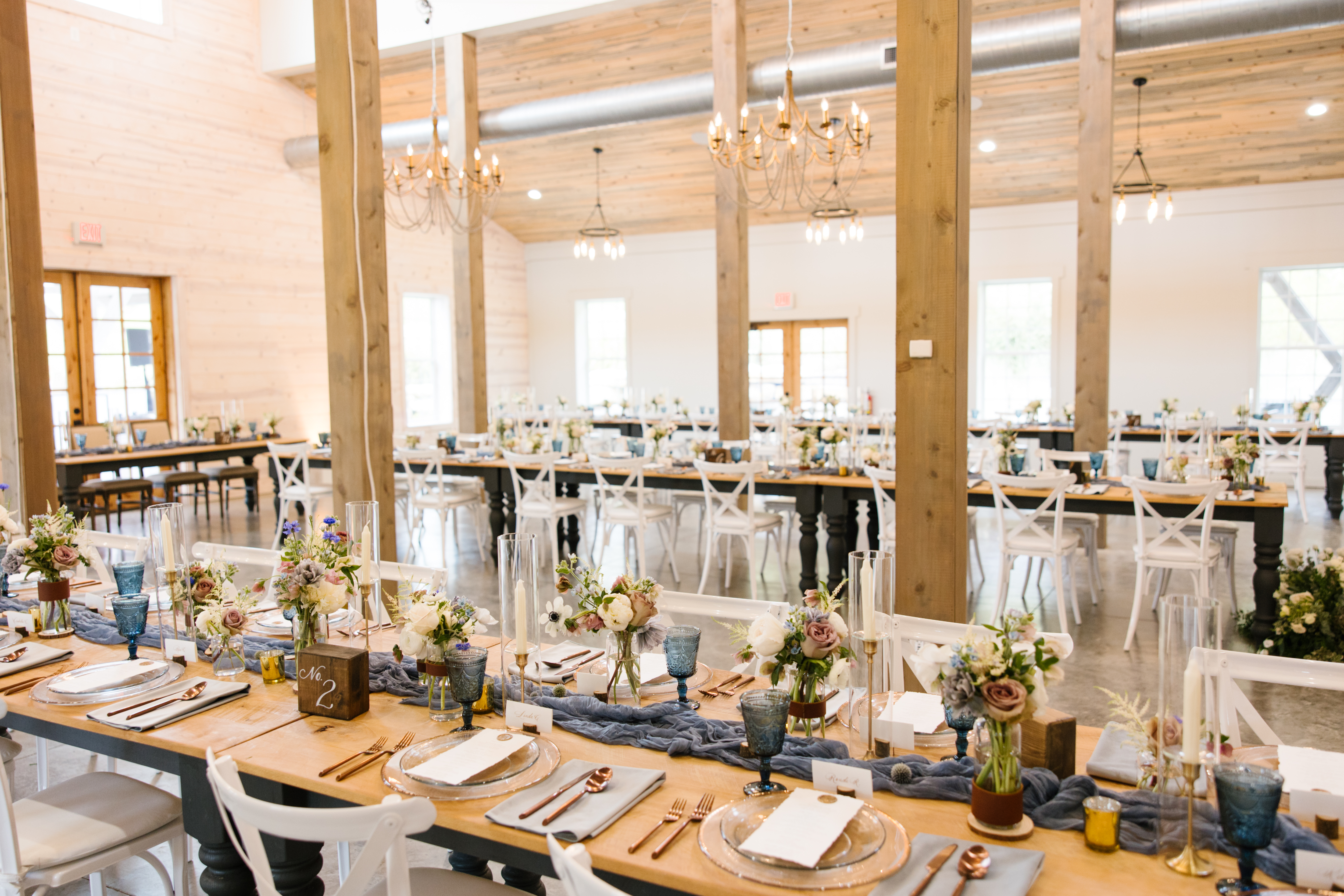
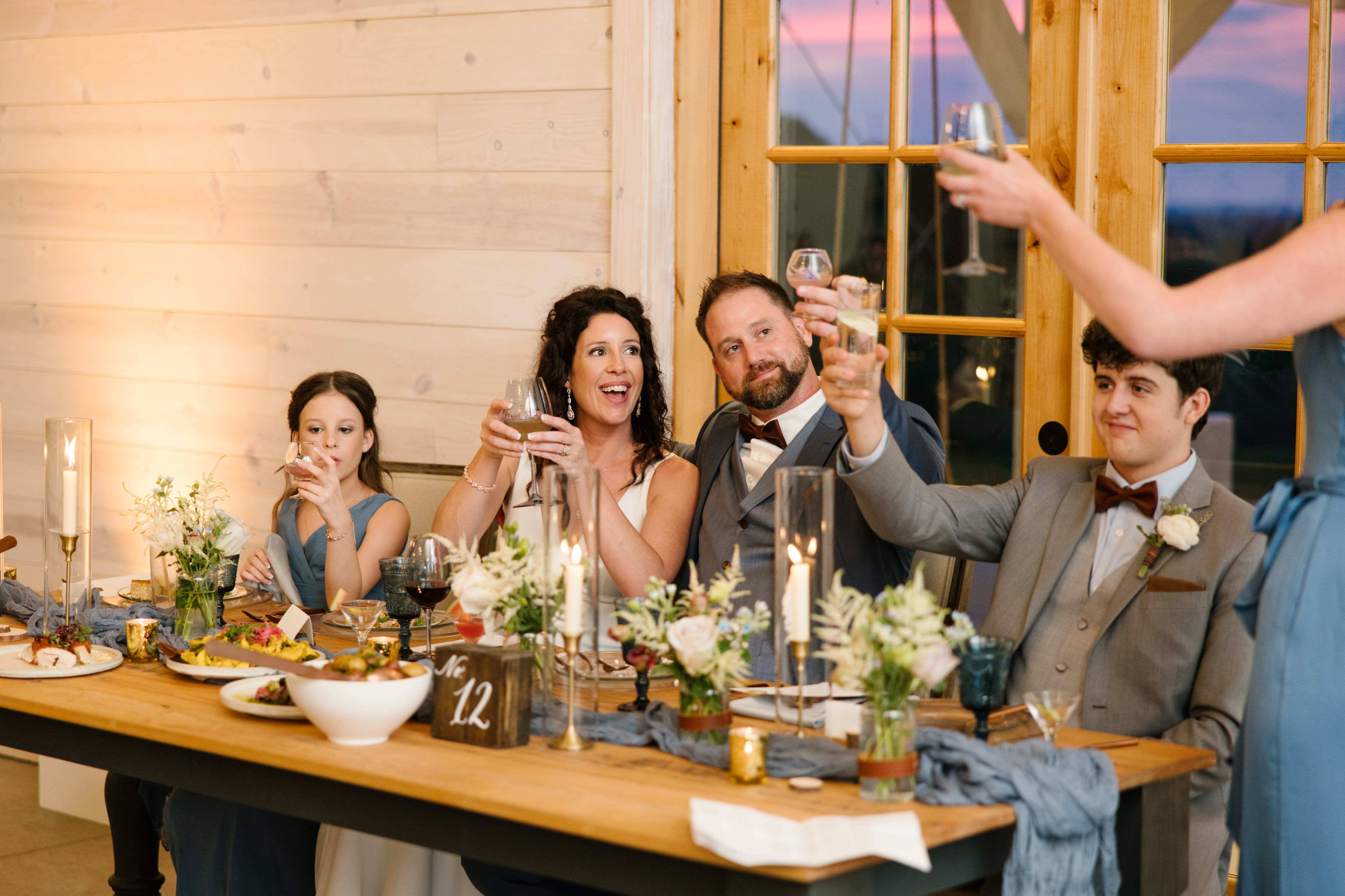
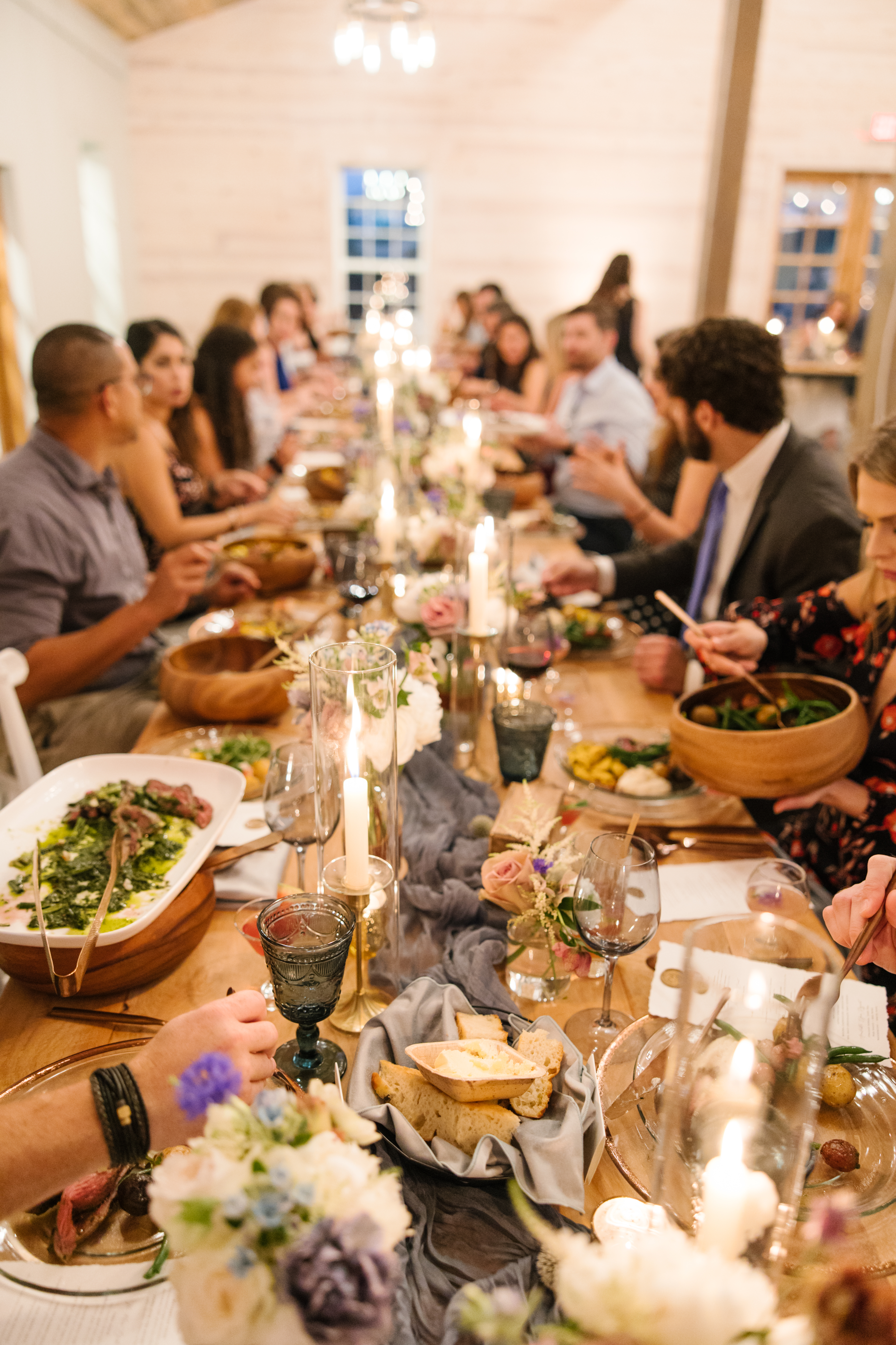
As for the table numbers that White Ink provided for this absolute picture-perfect tablescape, texture was the name of the game. I love it when a table comes together like this. Linen, florals, textured glass, wood, gold, leather- I mean, it’s a chef’s kiss! It was so fun to include these adorable, wooden block table numbers. They were the perfect unique touch to a classically rustic tablescape.
Elyse and Josh are the kind of couple that reminds us that the work we do isn’t just for the client; it’s for family, it’s for friends. Weddings like this are where we show those closest to us that we care about their experience. Because this is where we gather. Cheers!