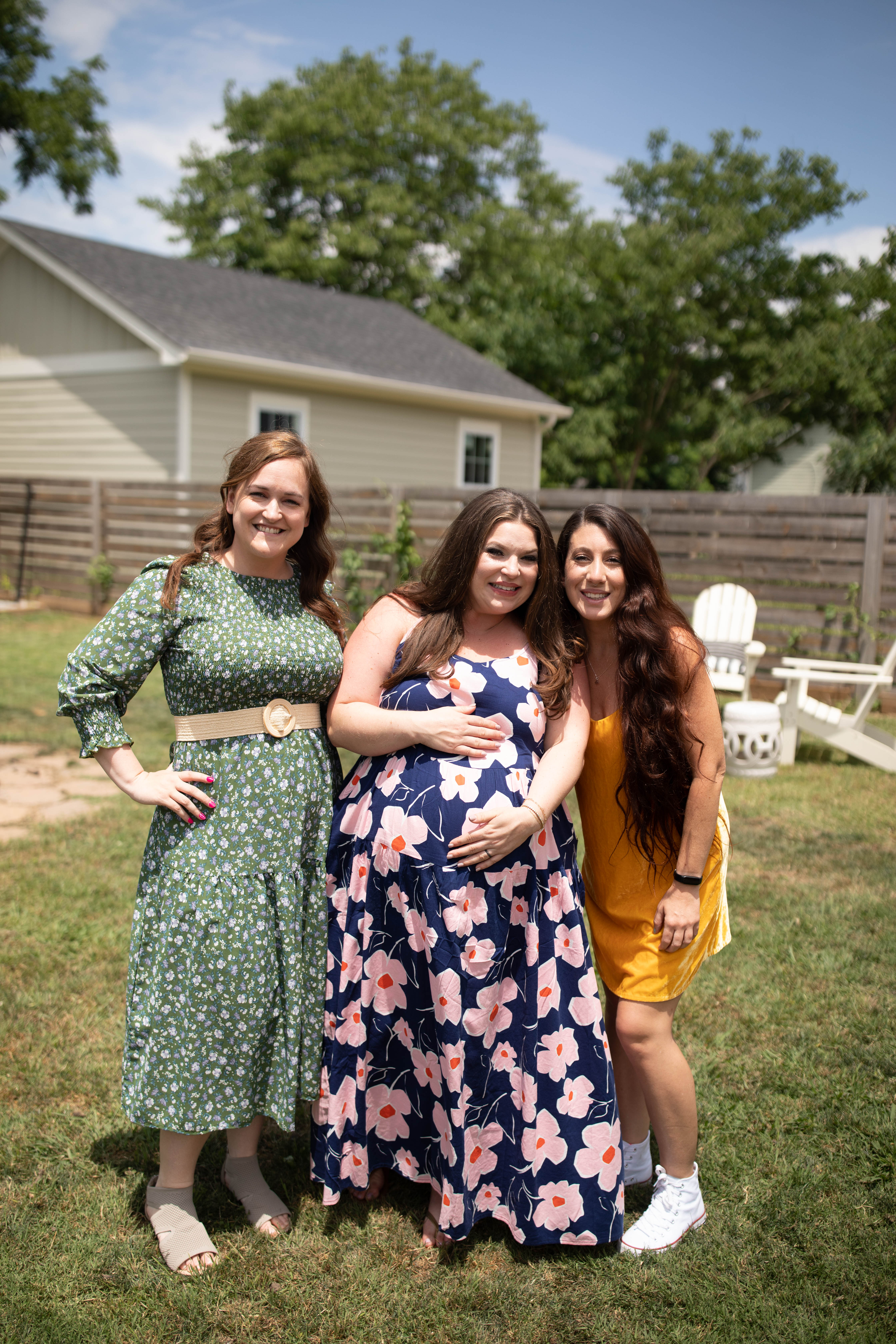
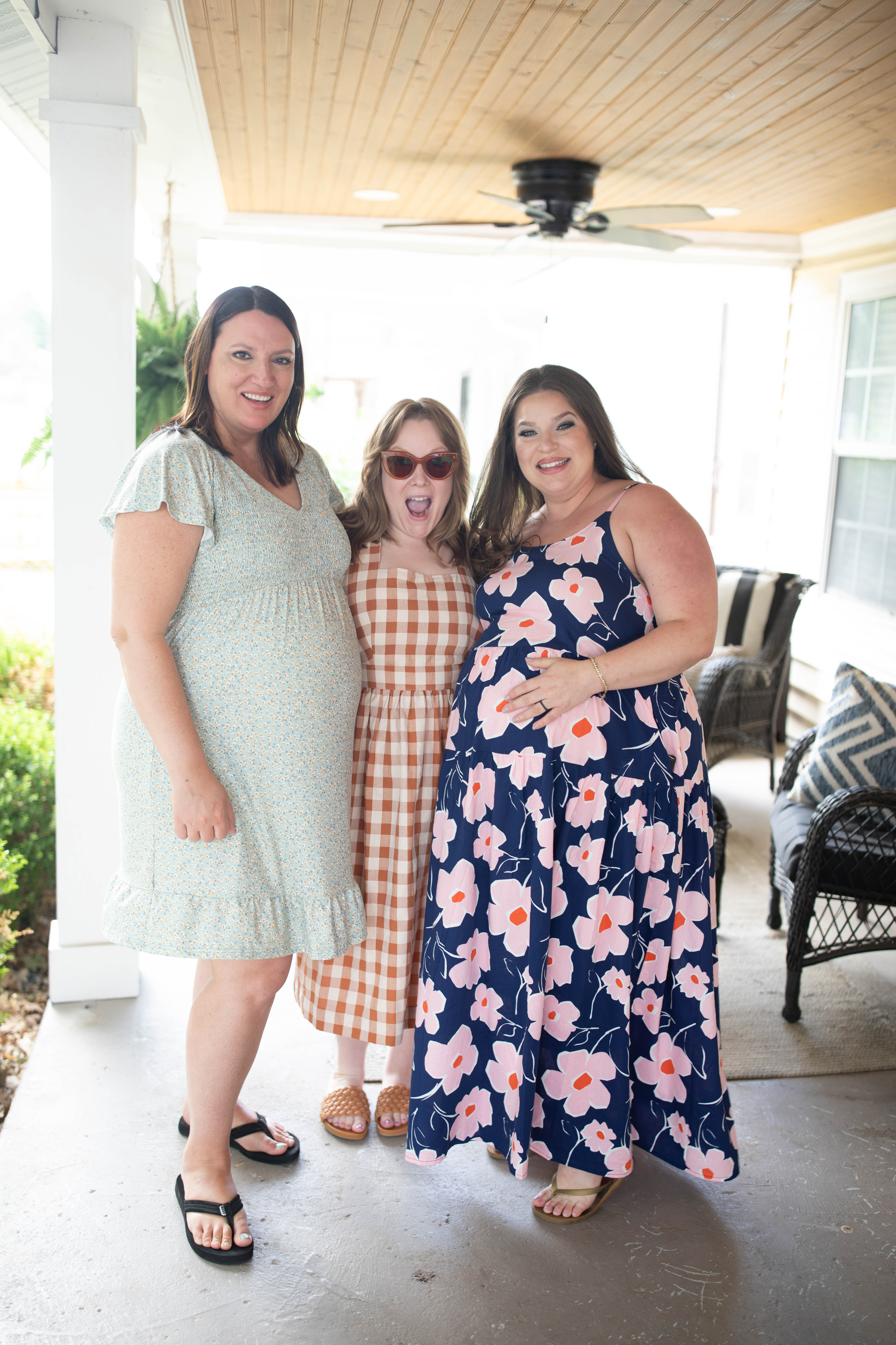
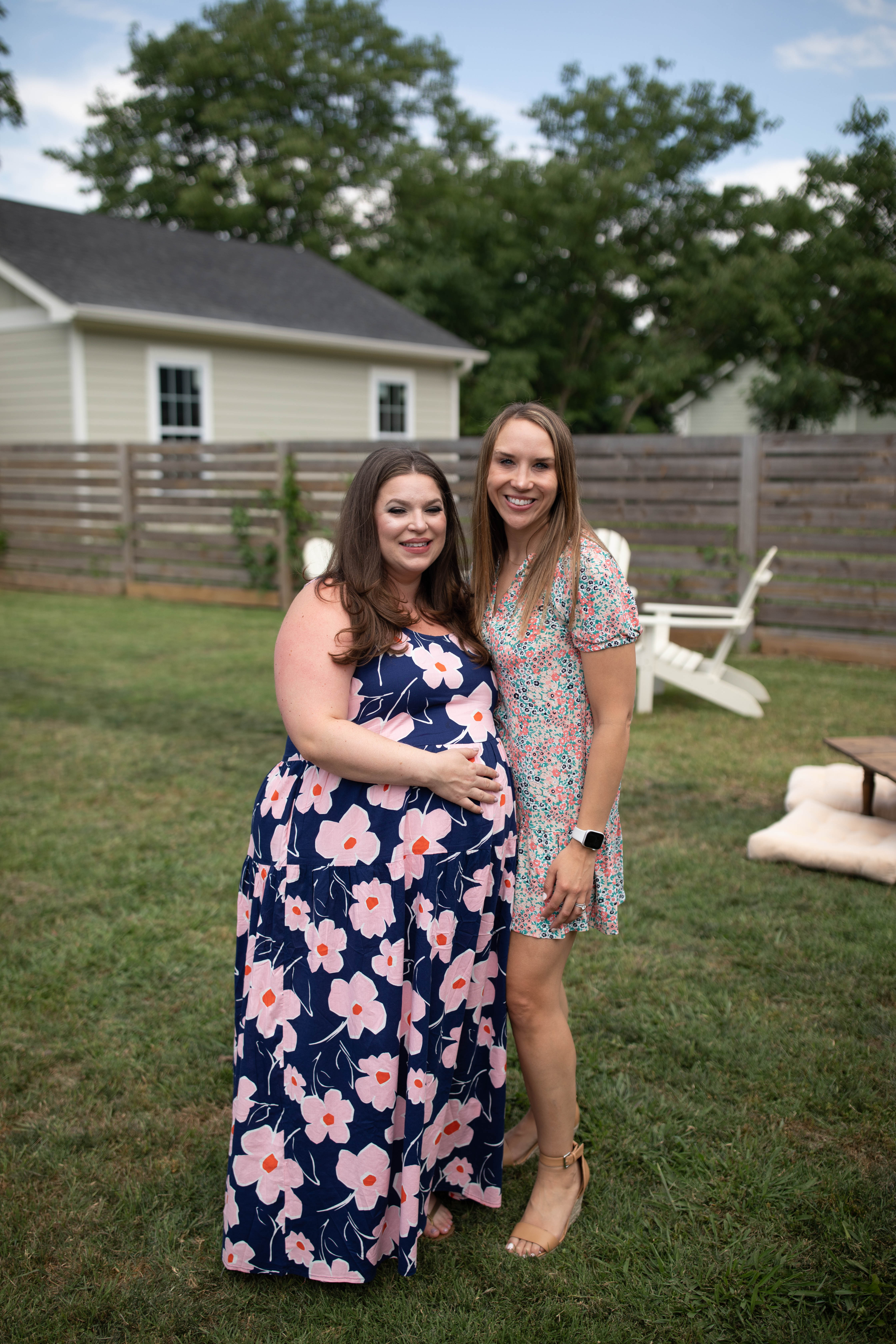
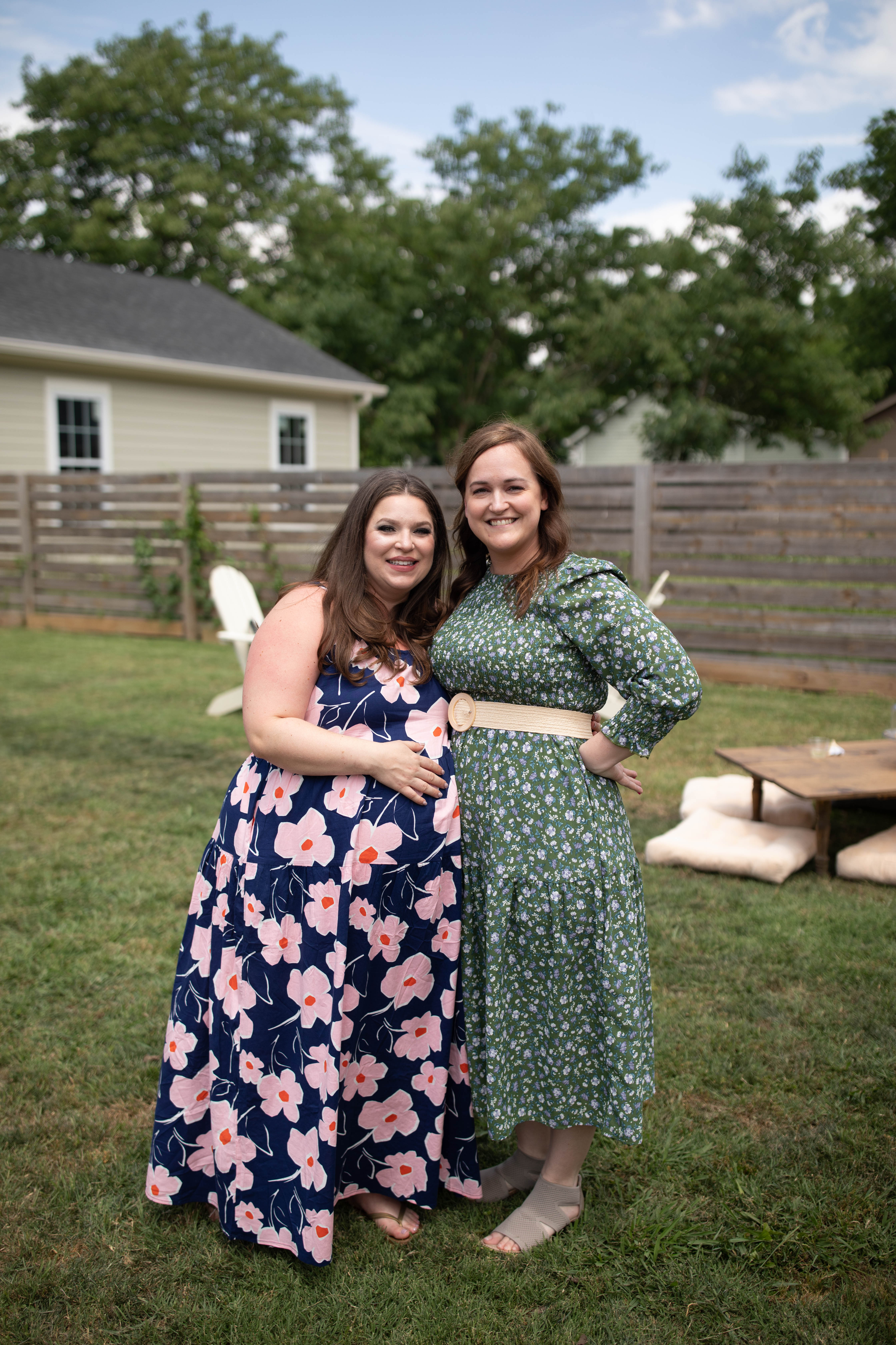
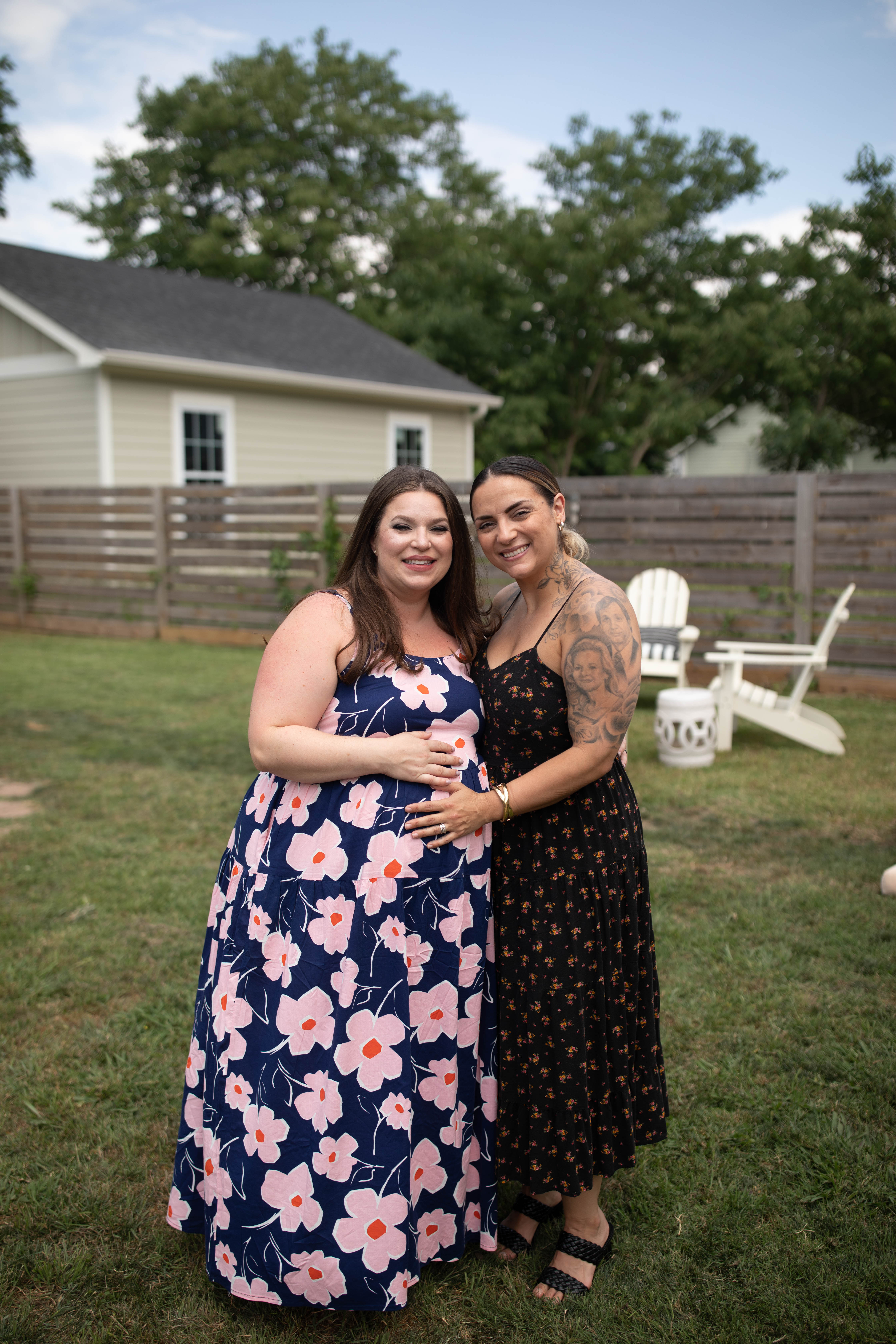
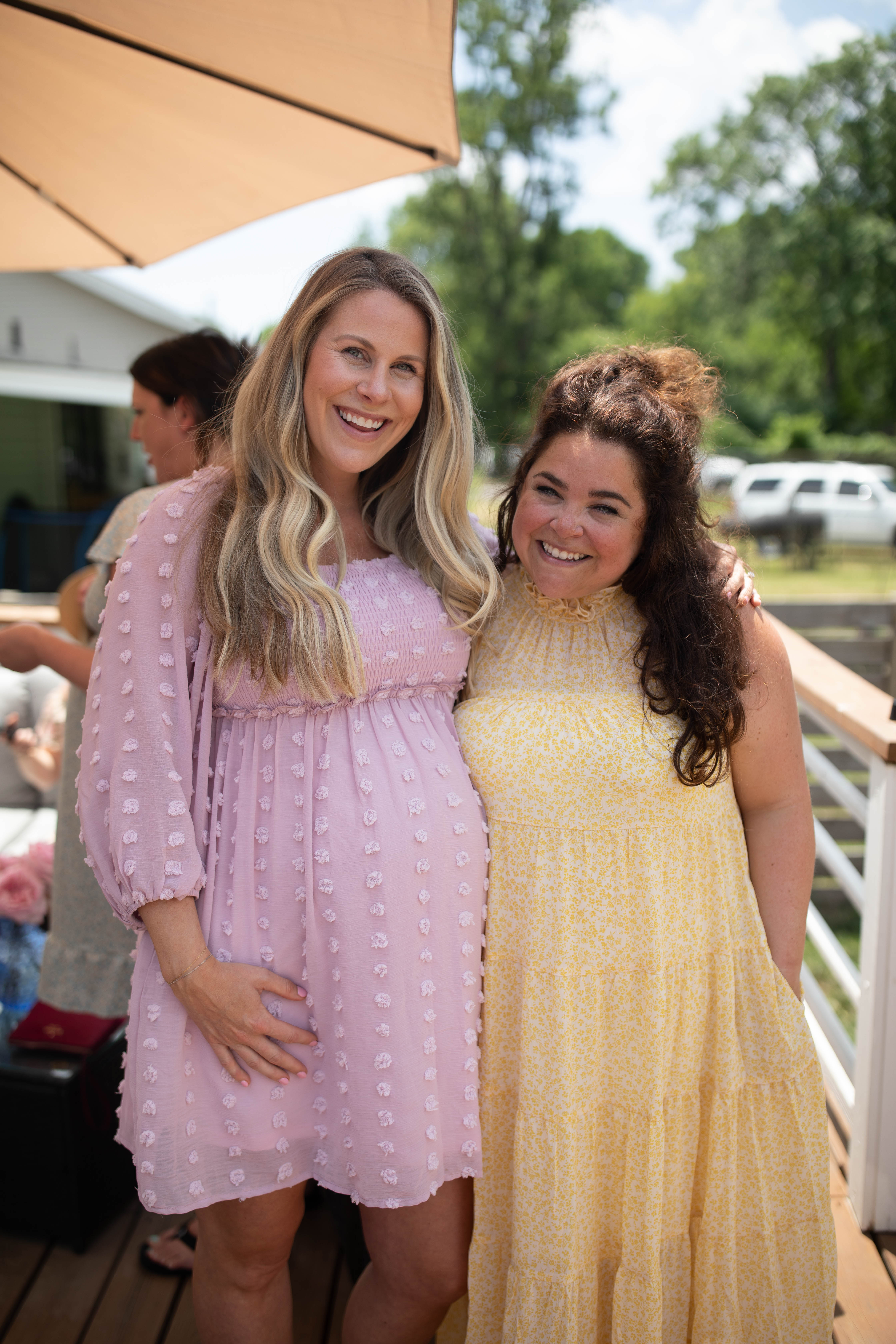
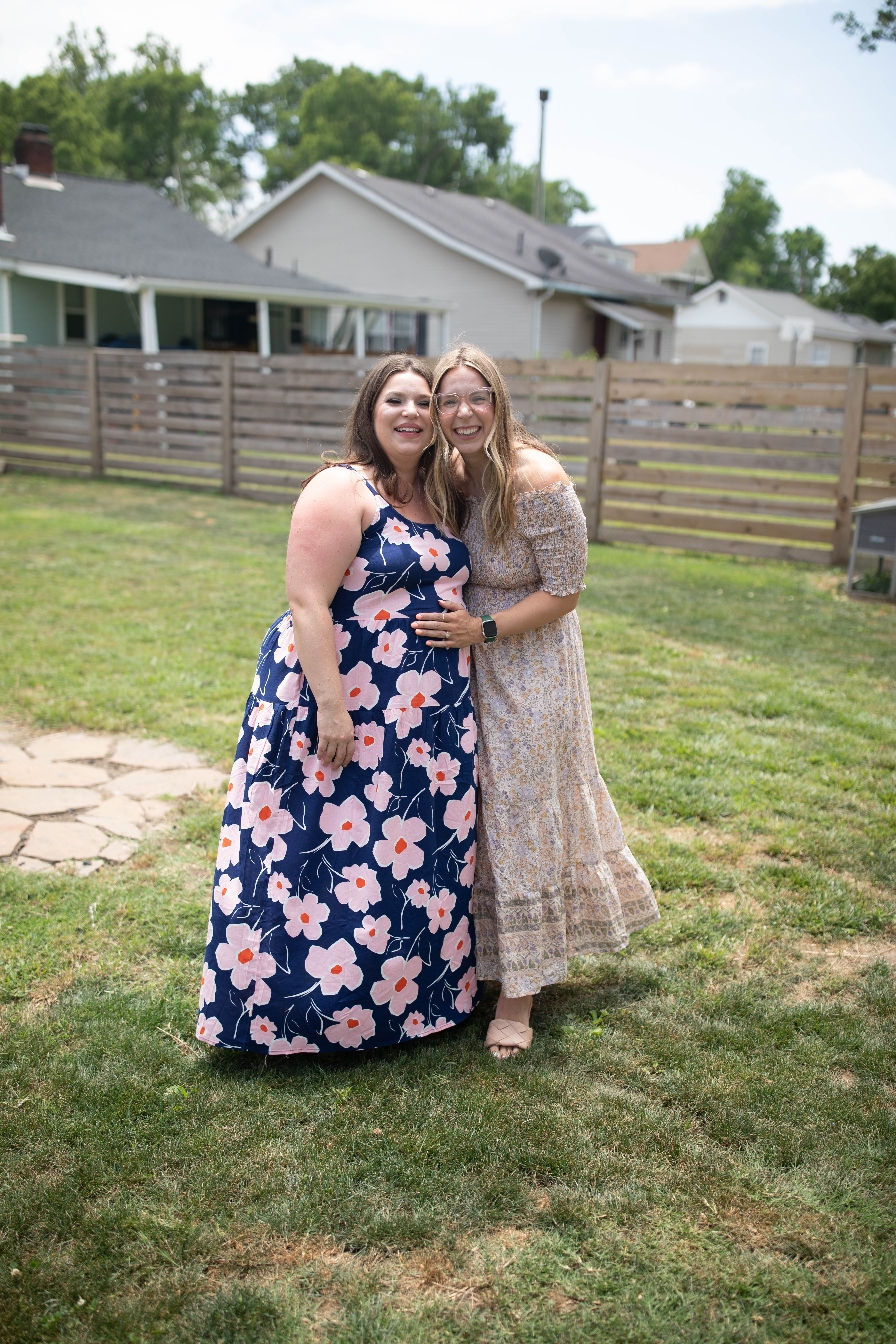
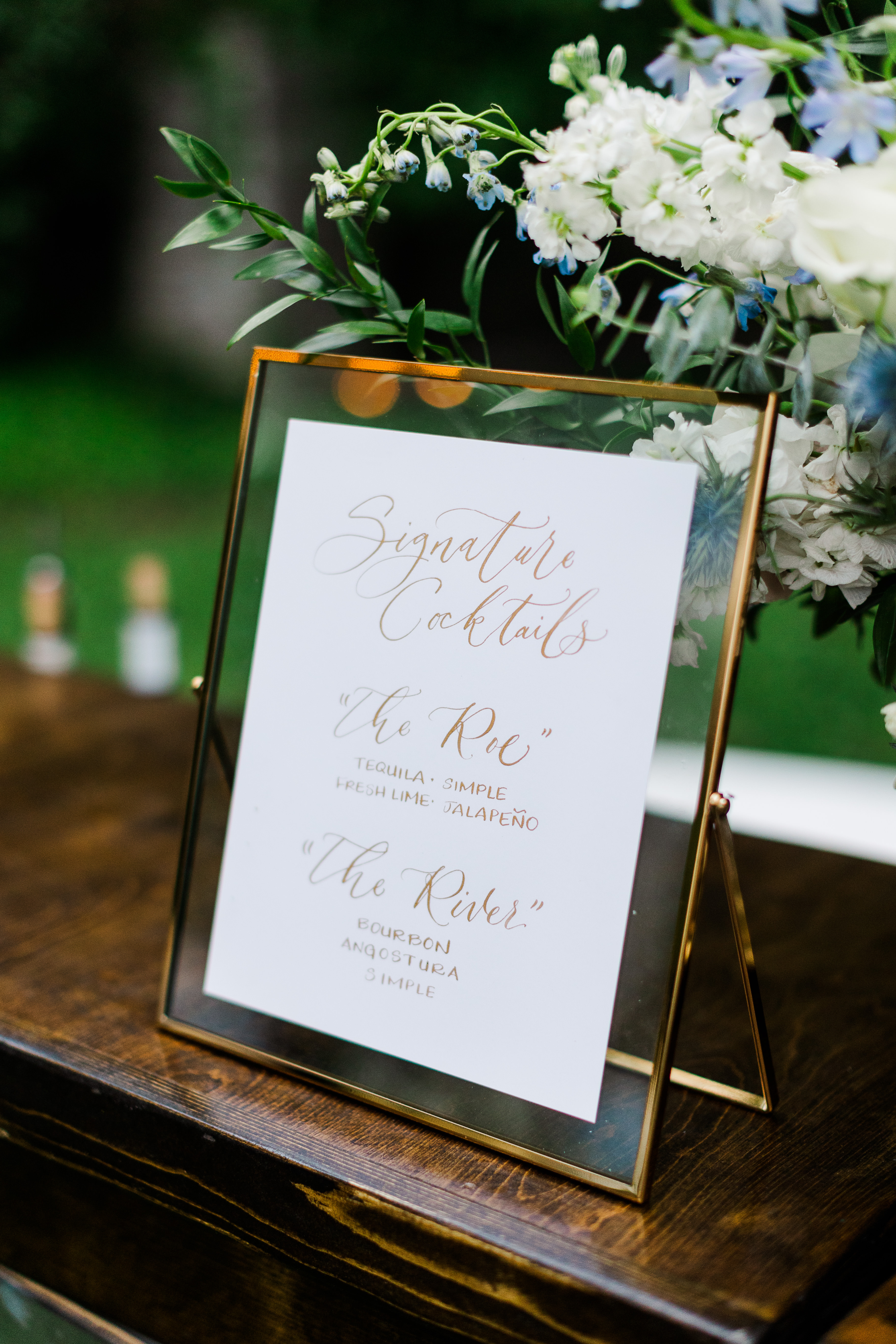
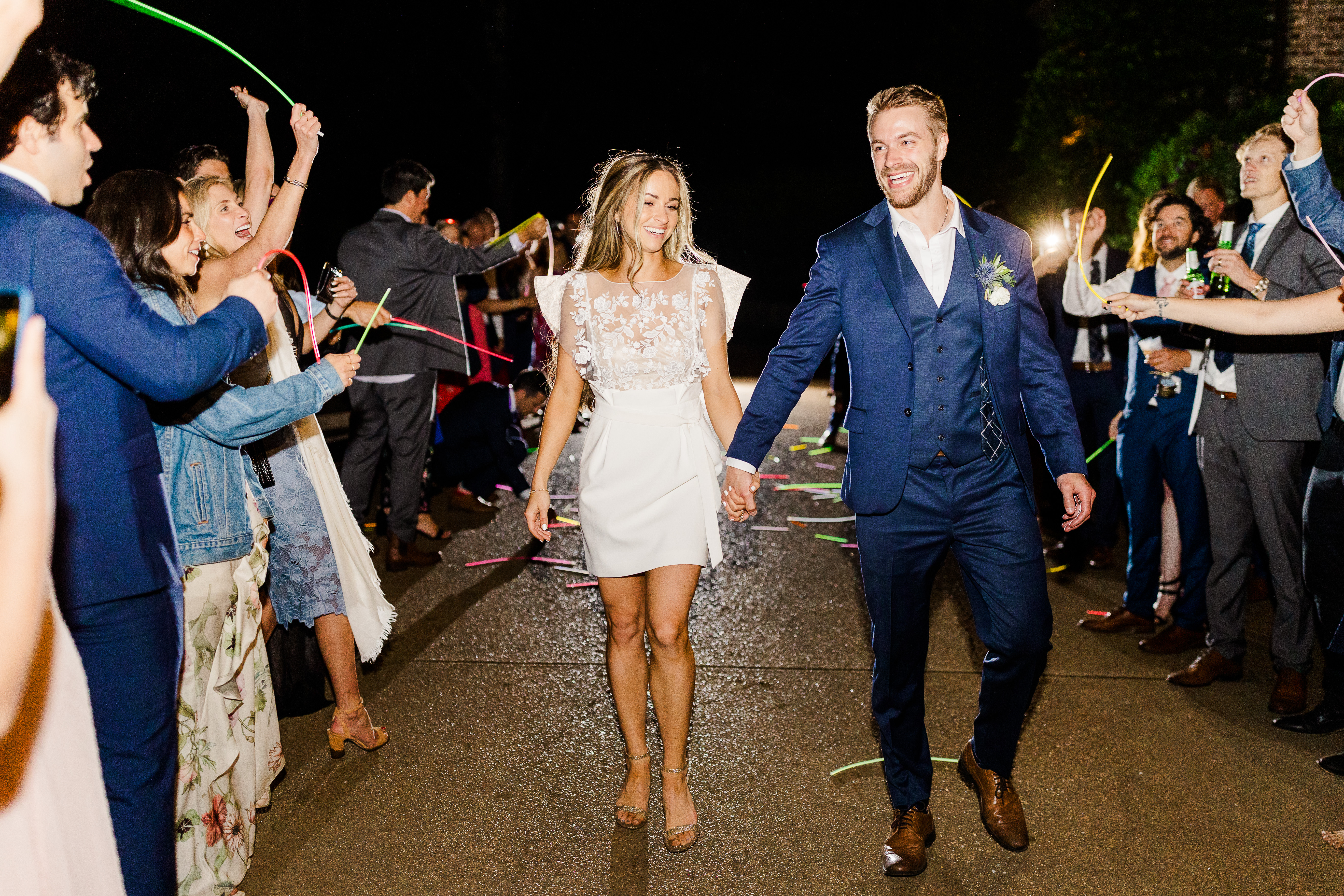
This June I had the honor of hosting the sweetest baby shower for my sister, Townley! Guys, I CANNOT wait to be an aunt. This feels so surreal, and I am drinking up every moment. So many of our clients have had the joy of working with Townley throughout the years as she is a machine behind the scenes at White Ink Calligraphy! She is the heart and soul of our stationary department. Townley continuously dedicates her time assisting our clients with graphic designing and printing services. Whether our couples want a custom wedding invitation suite or one-of-a-kind cocktail napkins, Townley makes it happen! So, now it’s time to celebrate Townley as she glides effortlessly into the beauty of a new role- mother. Enjoy this little peek inside what was an incredibly happy day for us all.
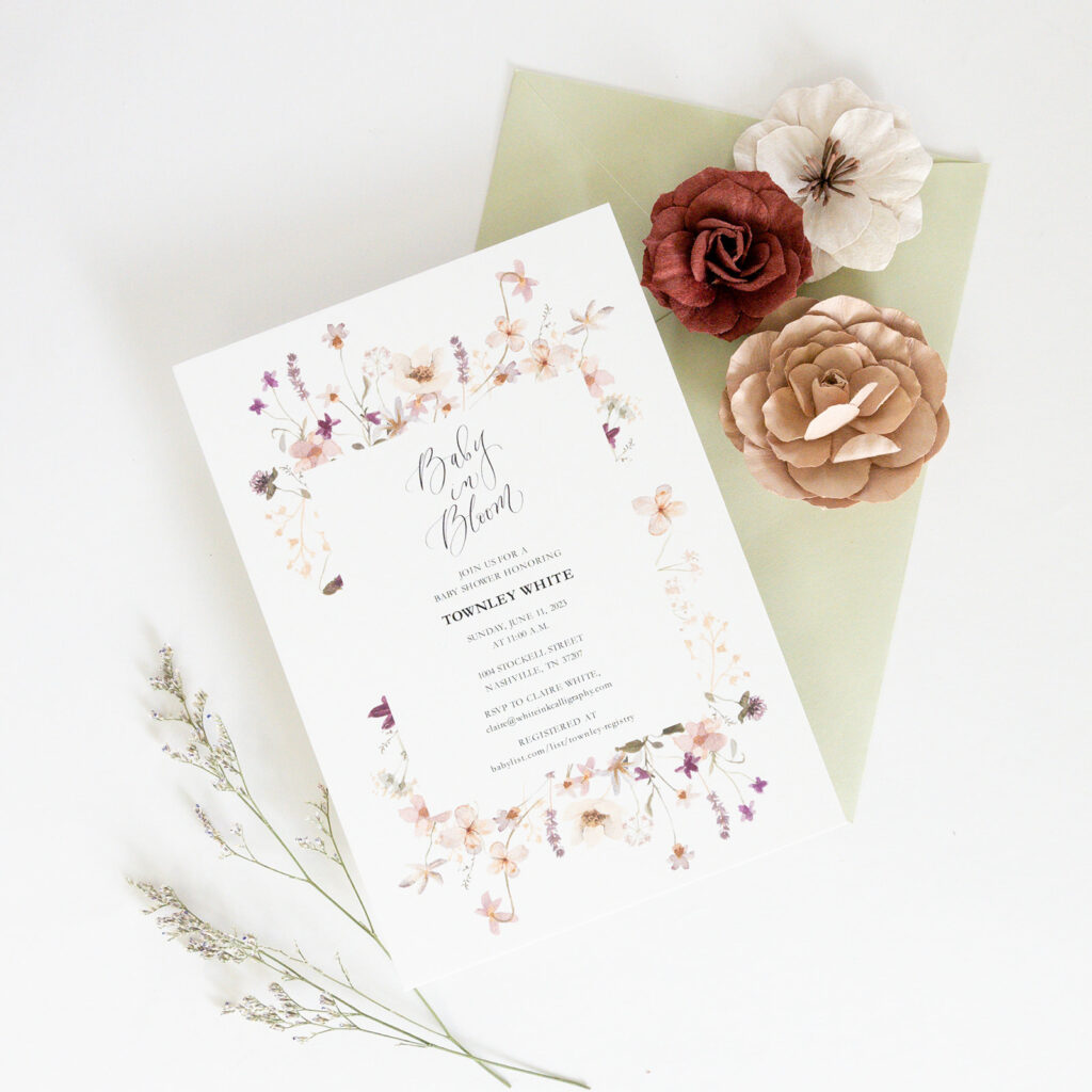
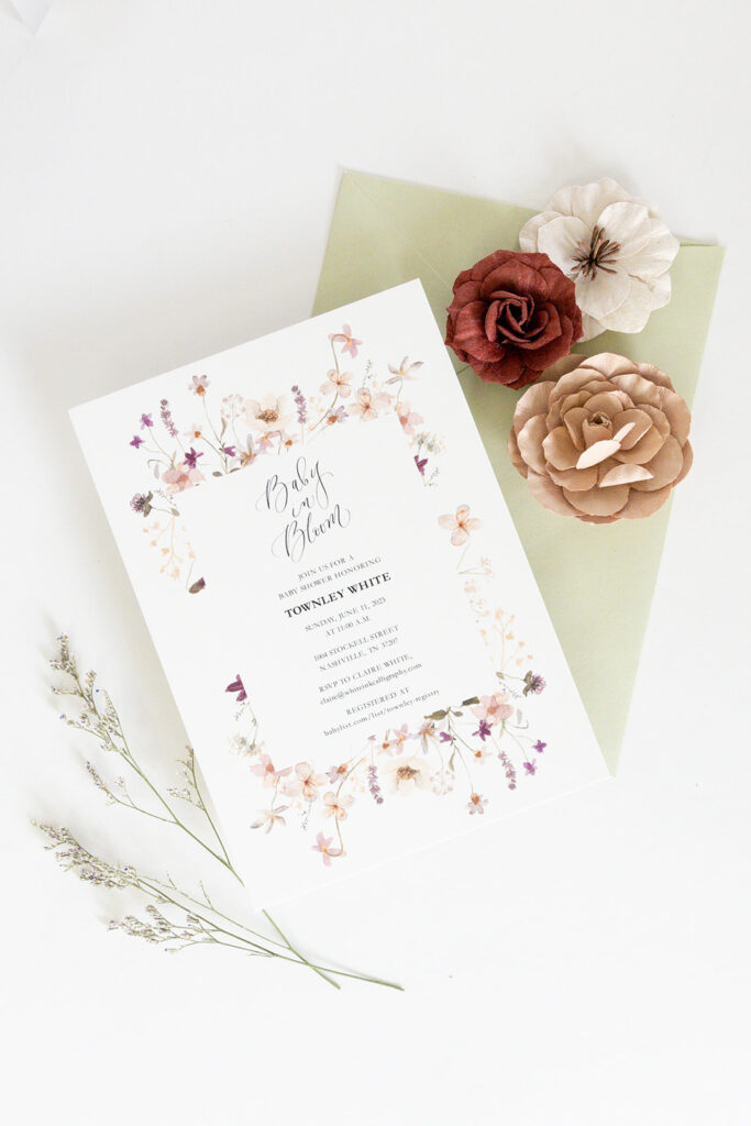
LOVE the invites that we sent out for Townley’s shower. It’s no surprise to anyone that I have always been huge fan of florals on invitations. The flowers bordering the event details are so beautiful and create the most delicate frame. We also really loved using this muted green for the envelopes.
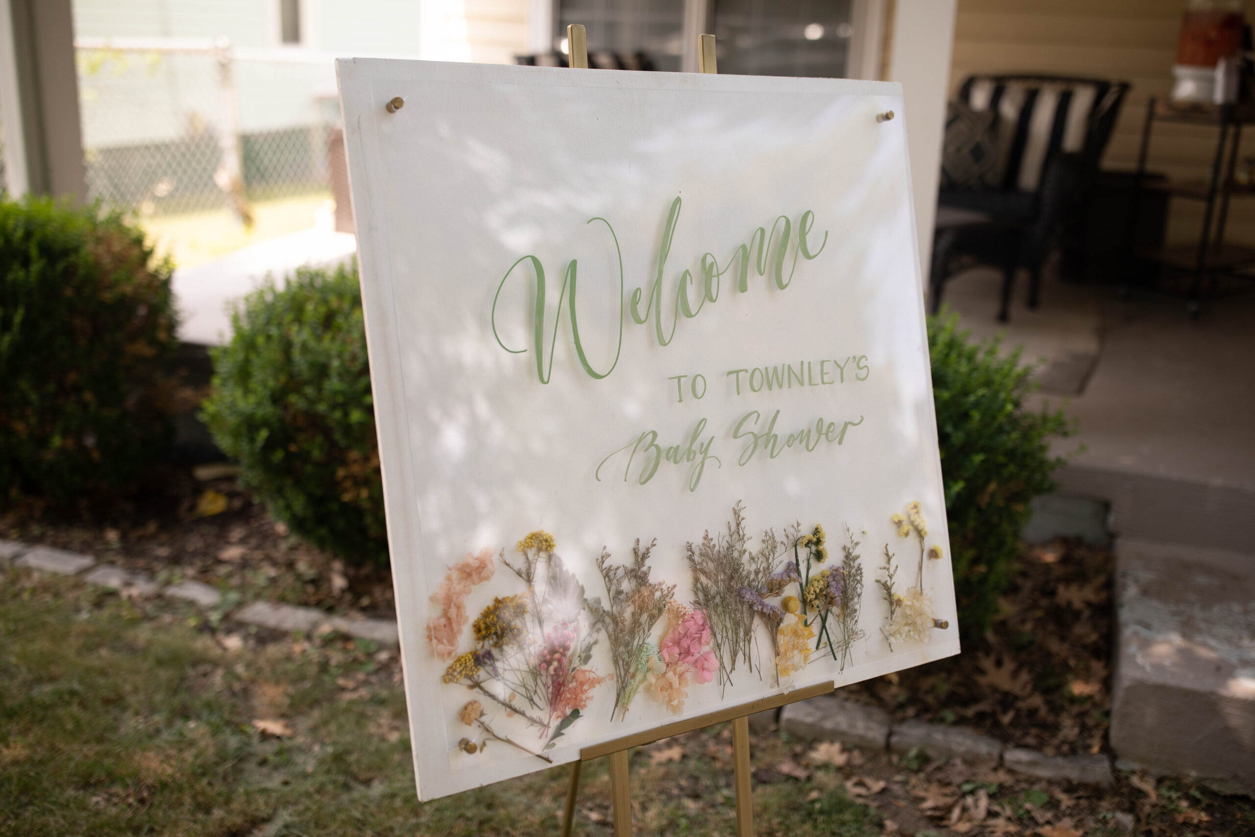
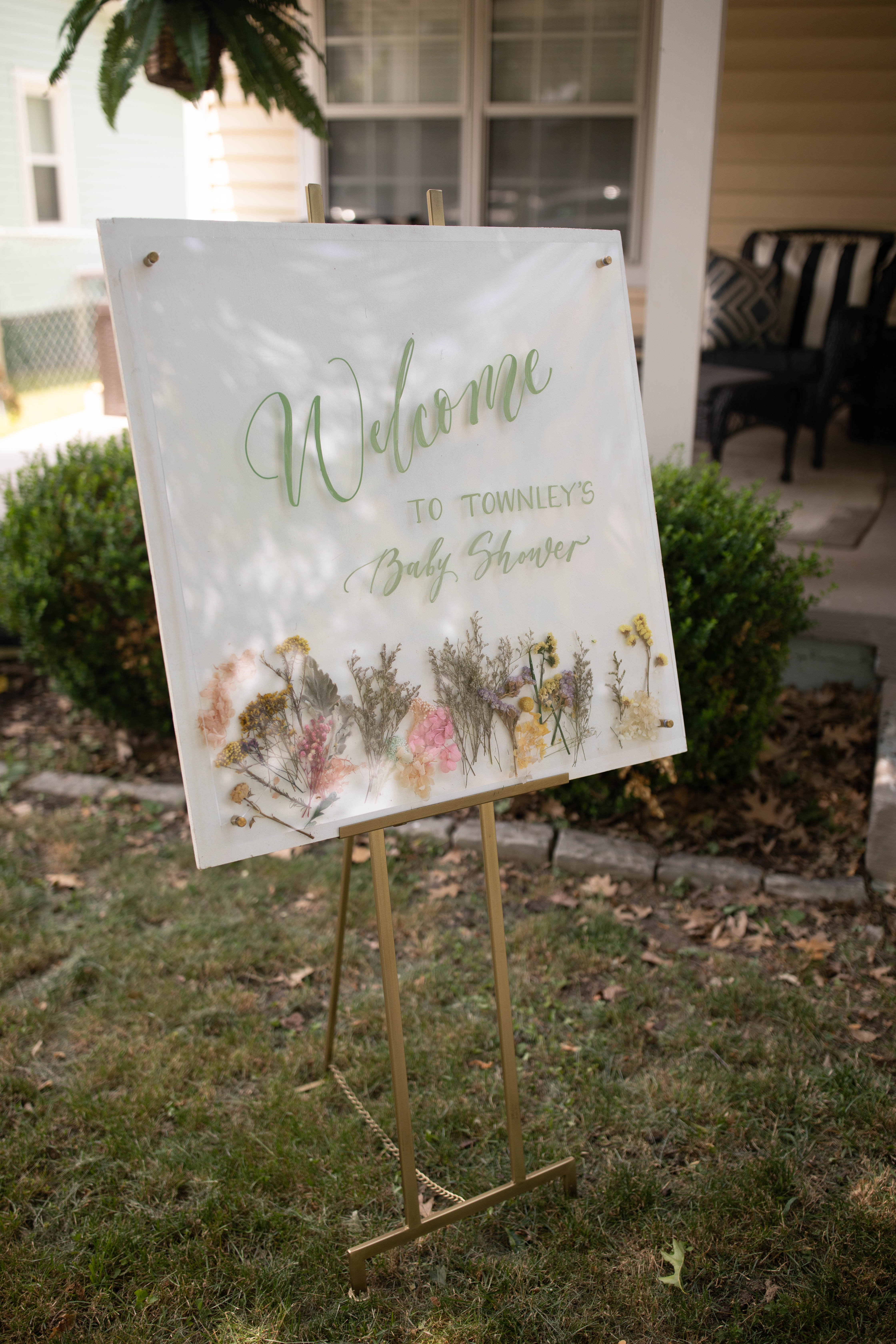
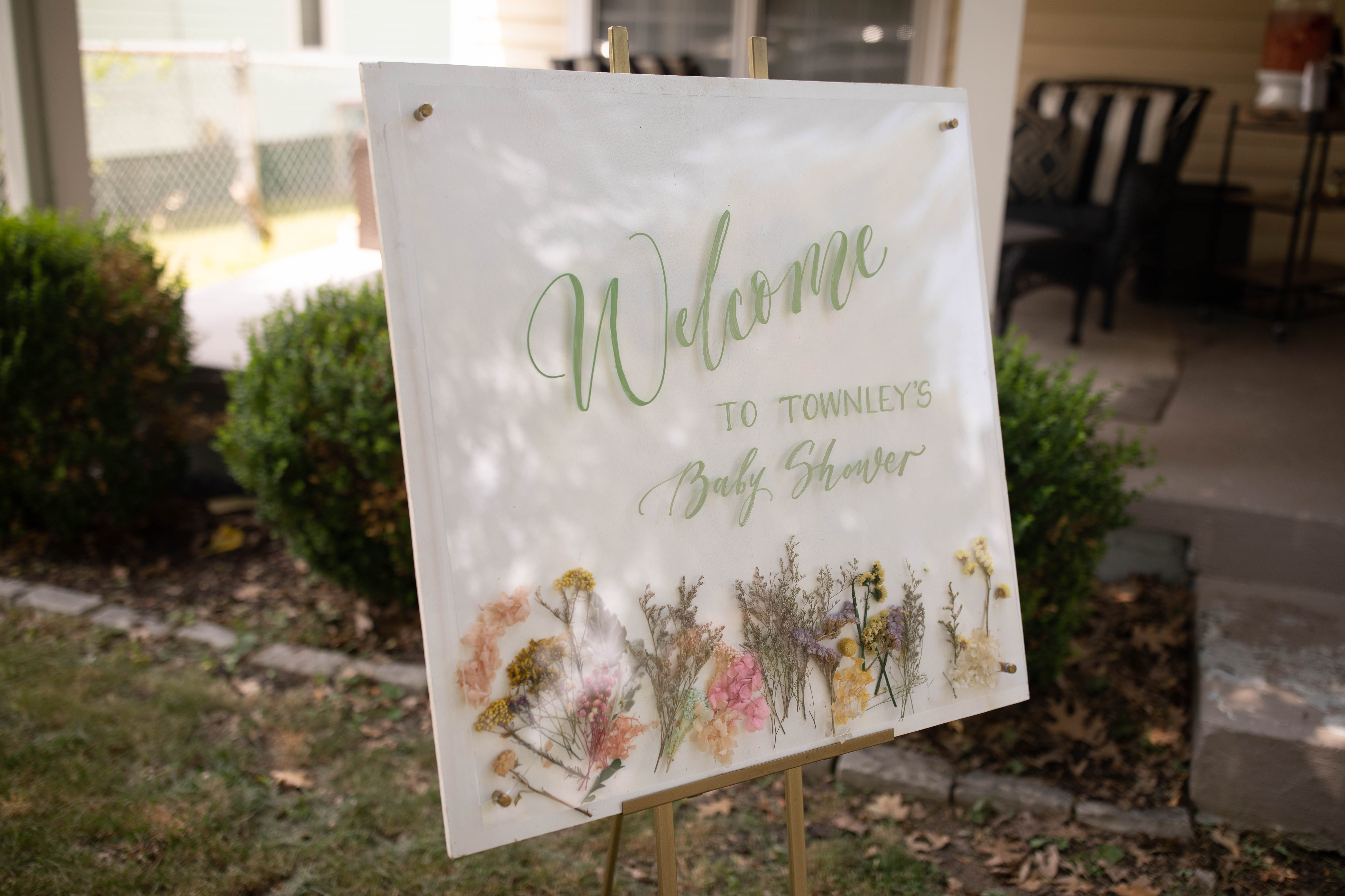
The welcome sign was a true joy to create! The pressed florals between the glass resembles the florals from the invites and the lettering takes on the same muted green from the invitation envelopes. I love when small details connect like this!
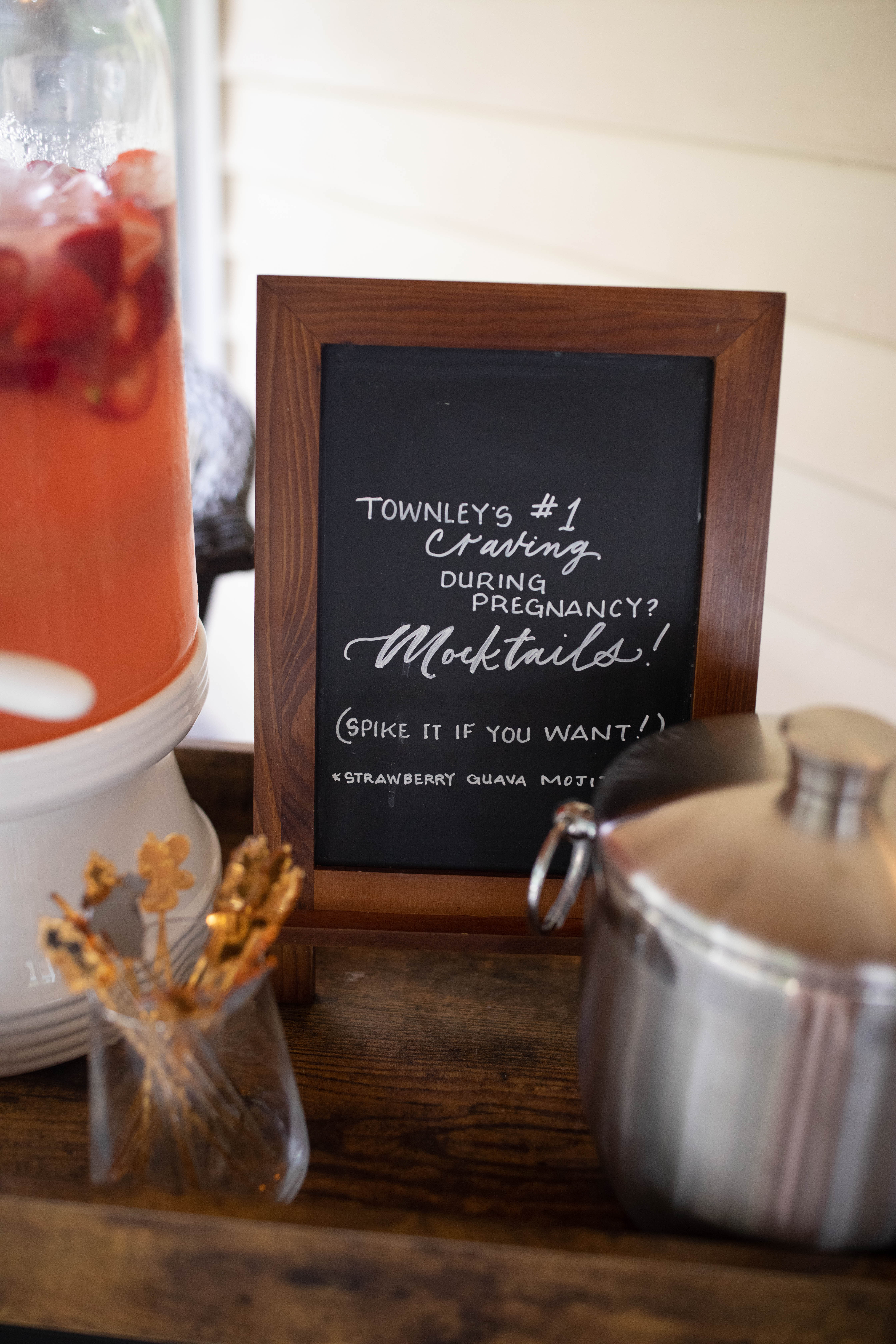
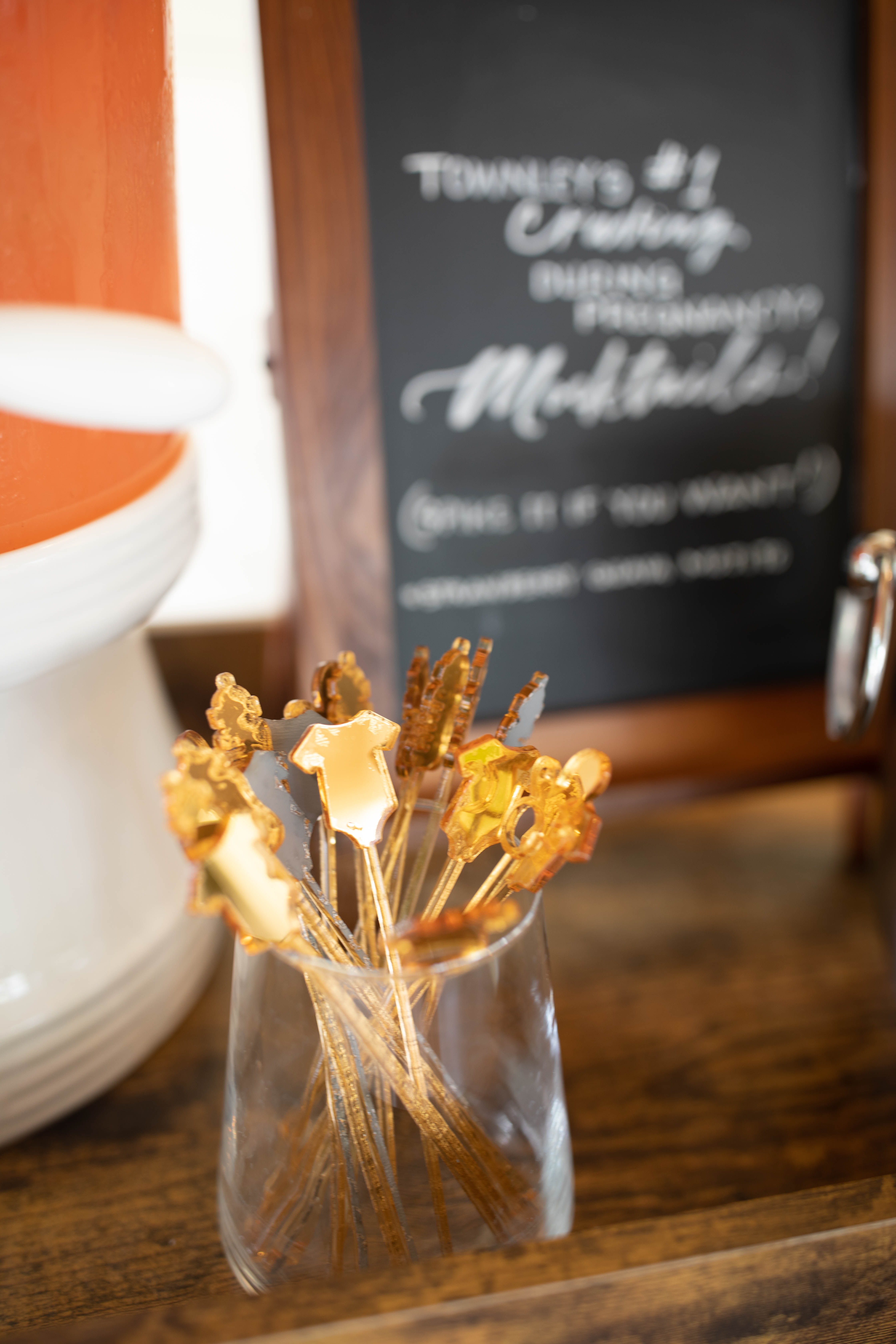
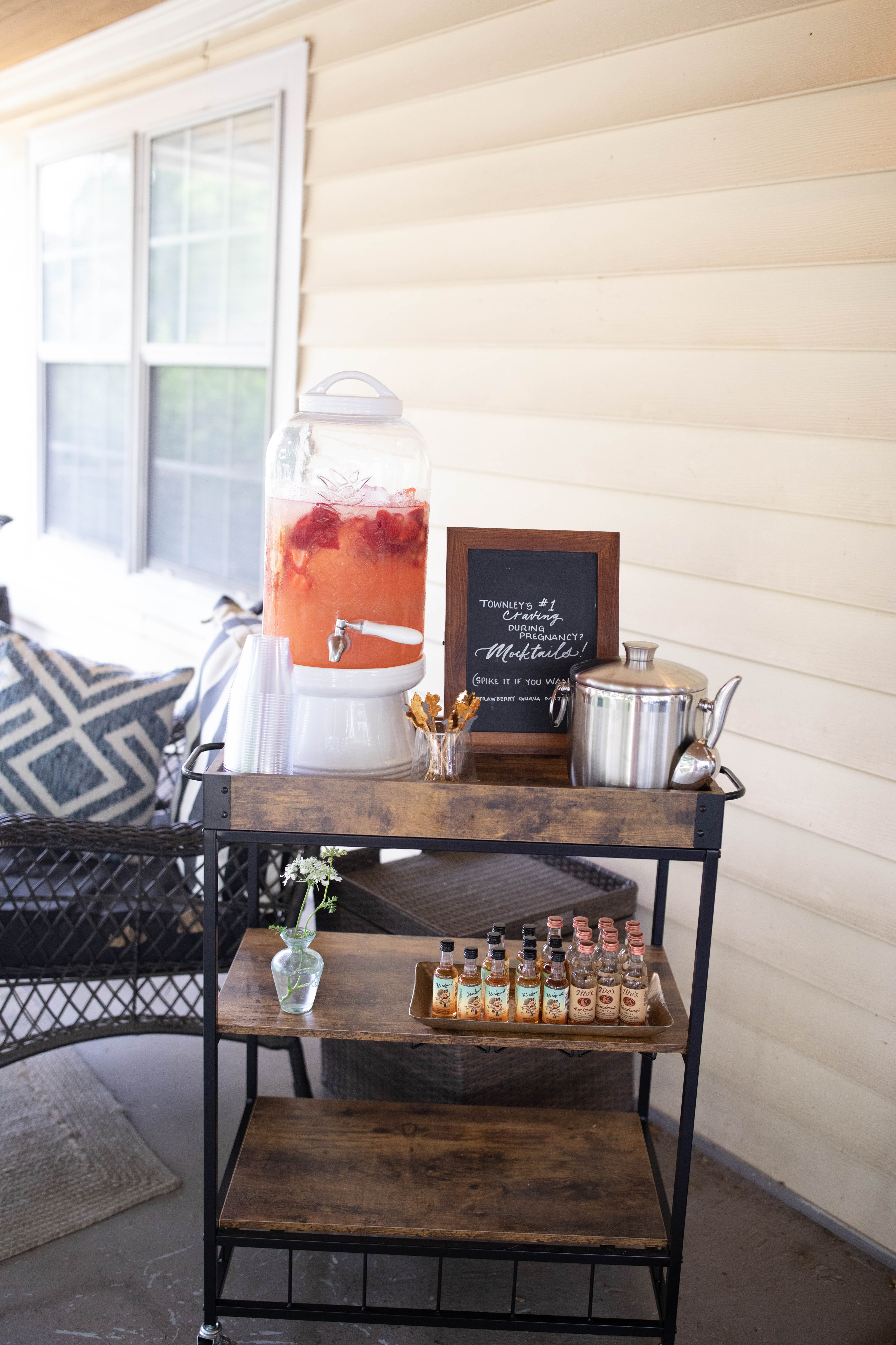
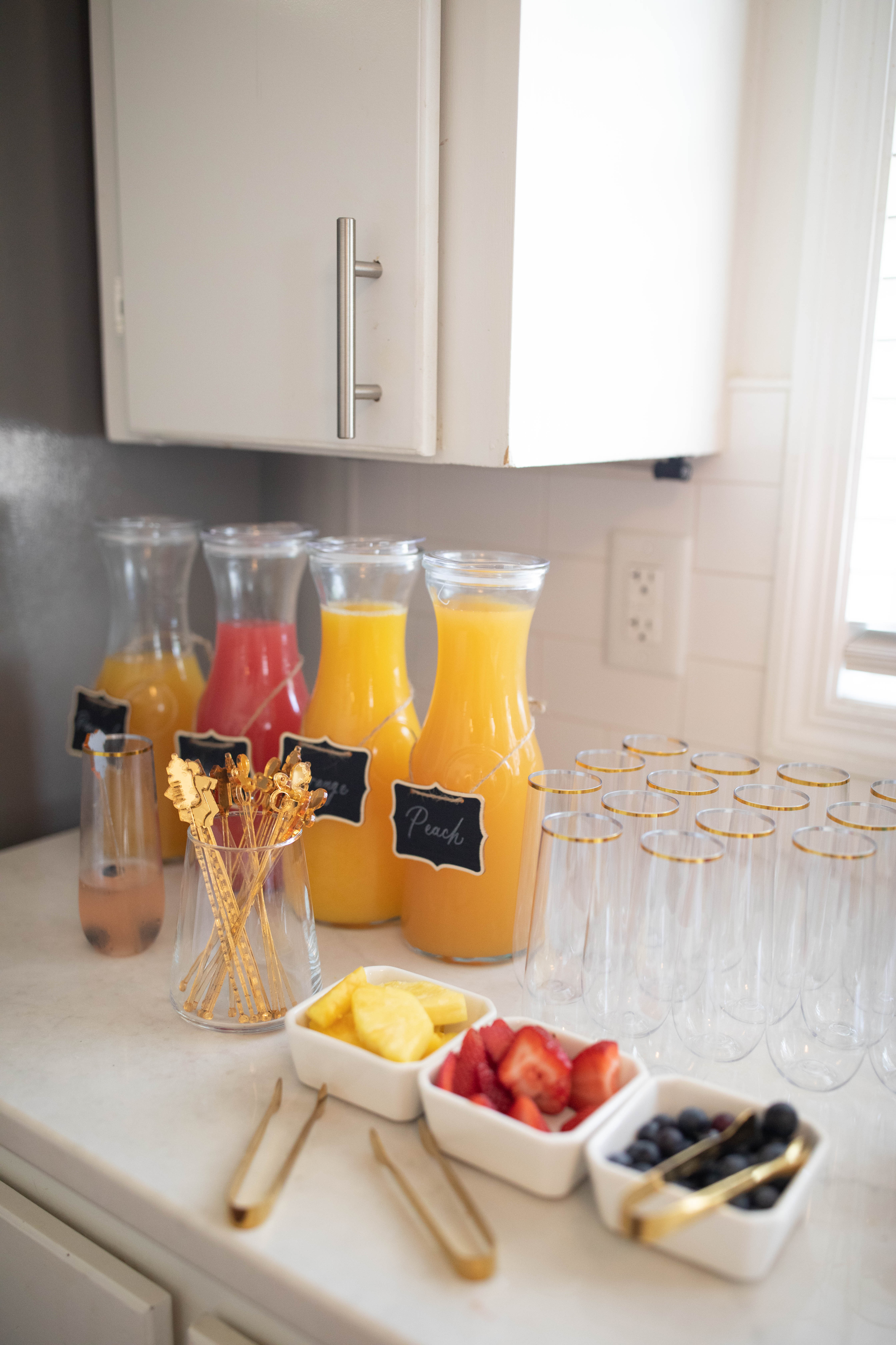
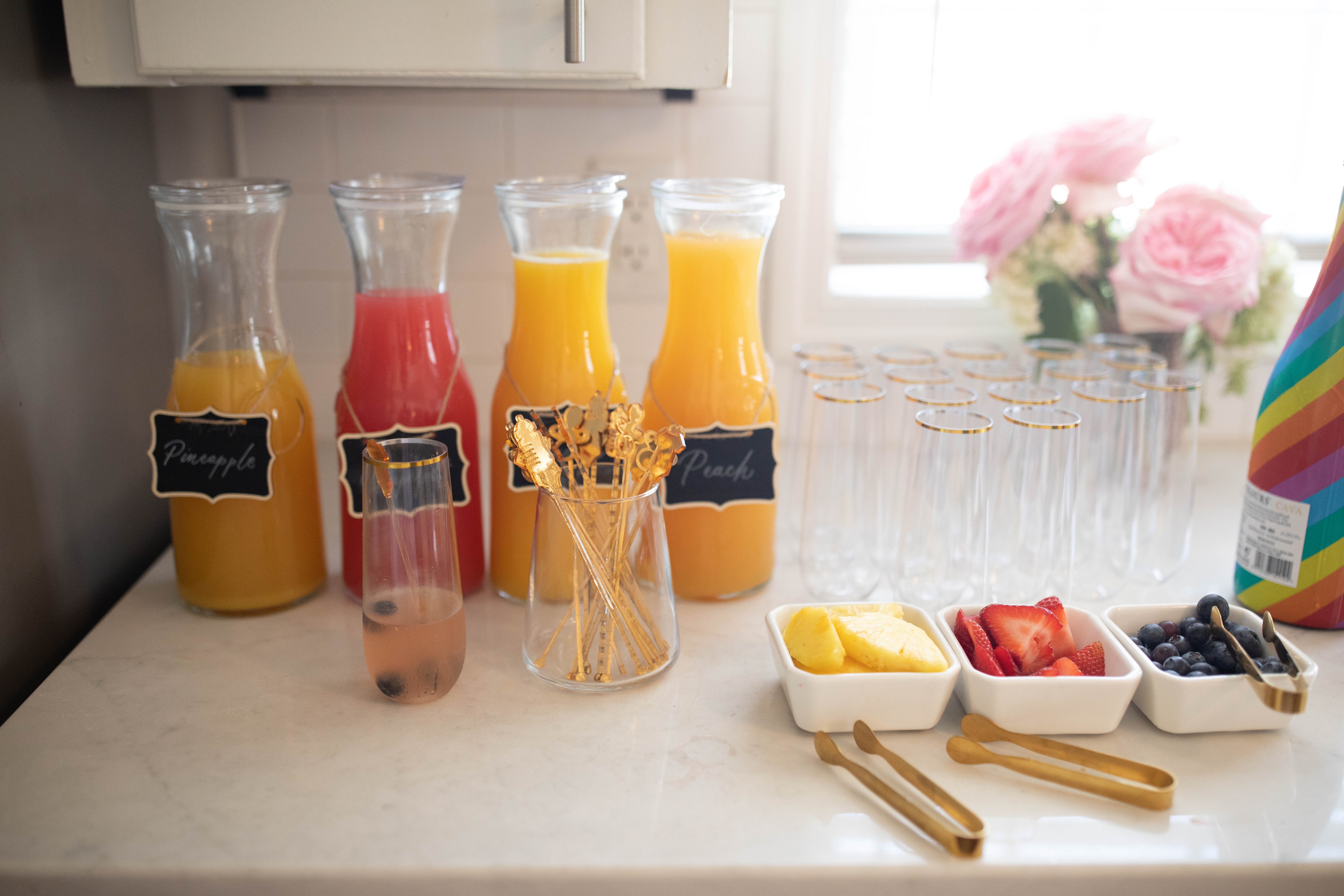
For the mamas out there who experienced pregnancy, did you ever have any food cravings? Townley definitely did….she craved mocktails! That has been her number one food craving throughout her pregnancy. So, naturally, we set up a mocktail bar so she could mocktail to her heart’s content. I especially loved the little onesie, paci, and bottle stirrers!
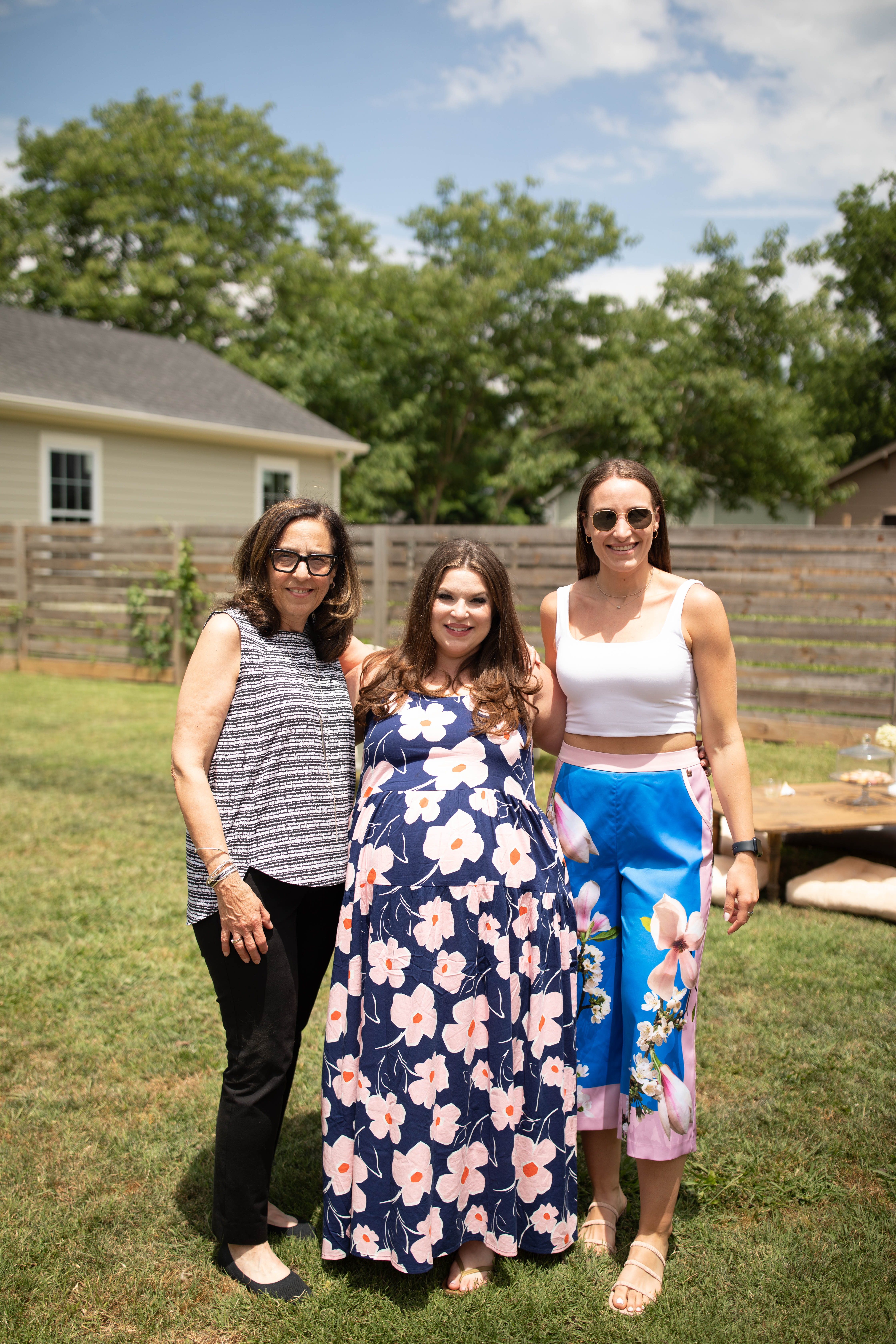
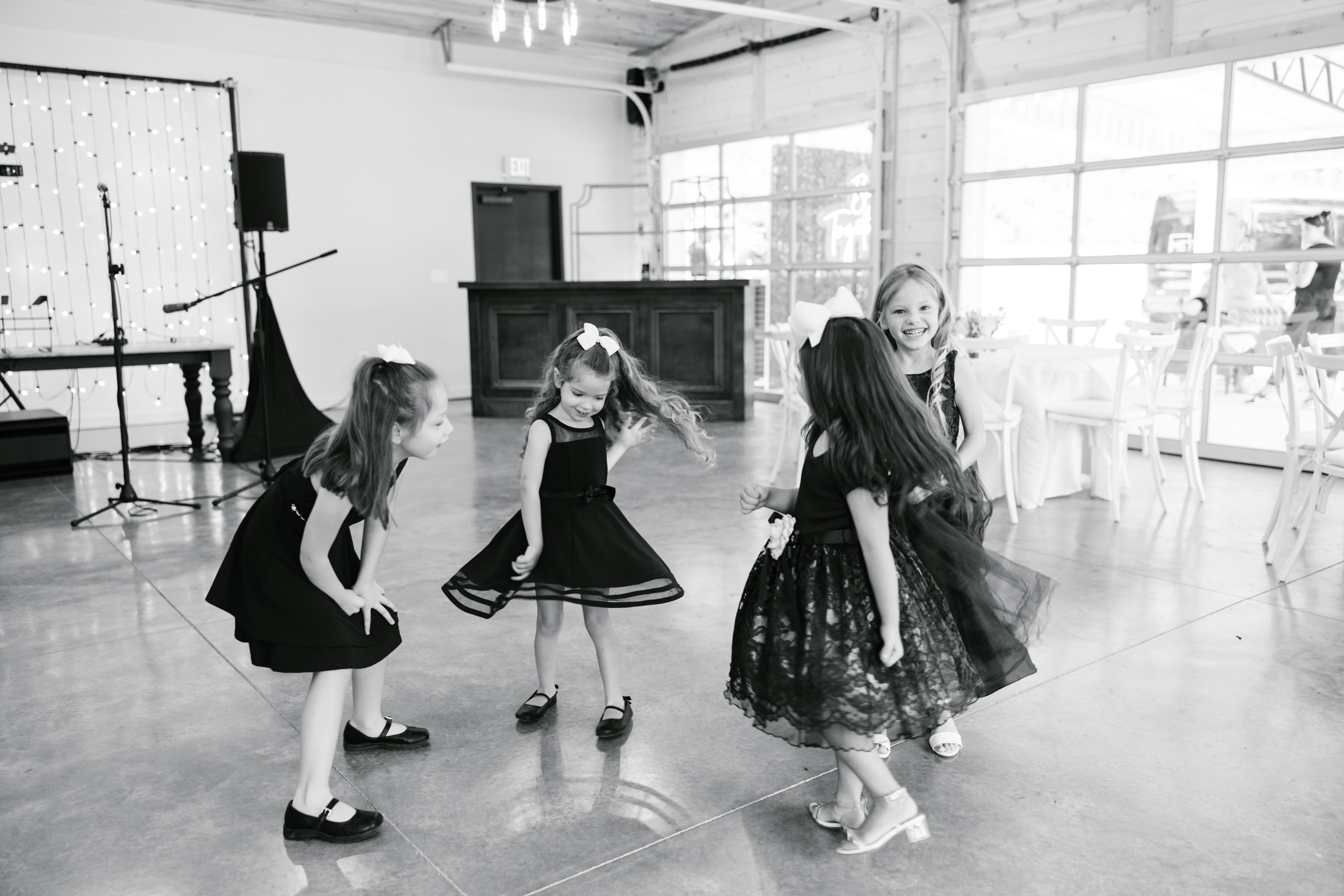
Friends and family surrounded Townley and showed so much support. We were so excited to celebrate baby Goldberg!
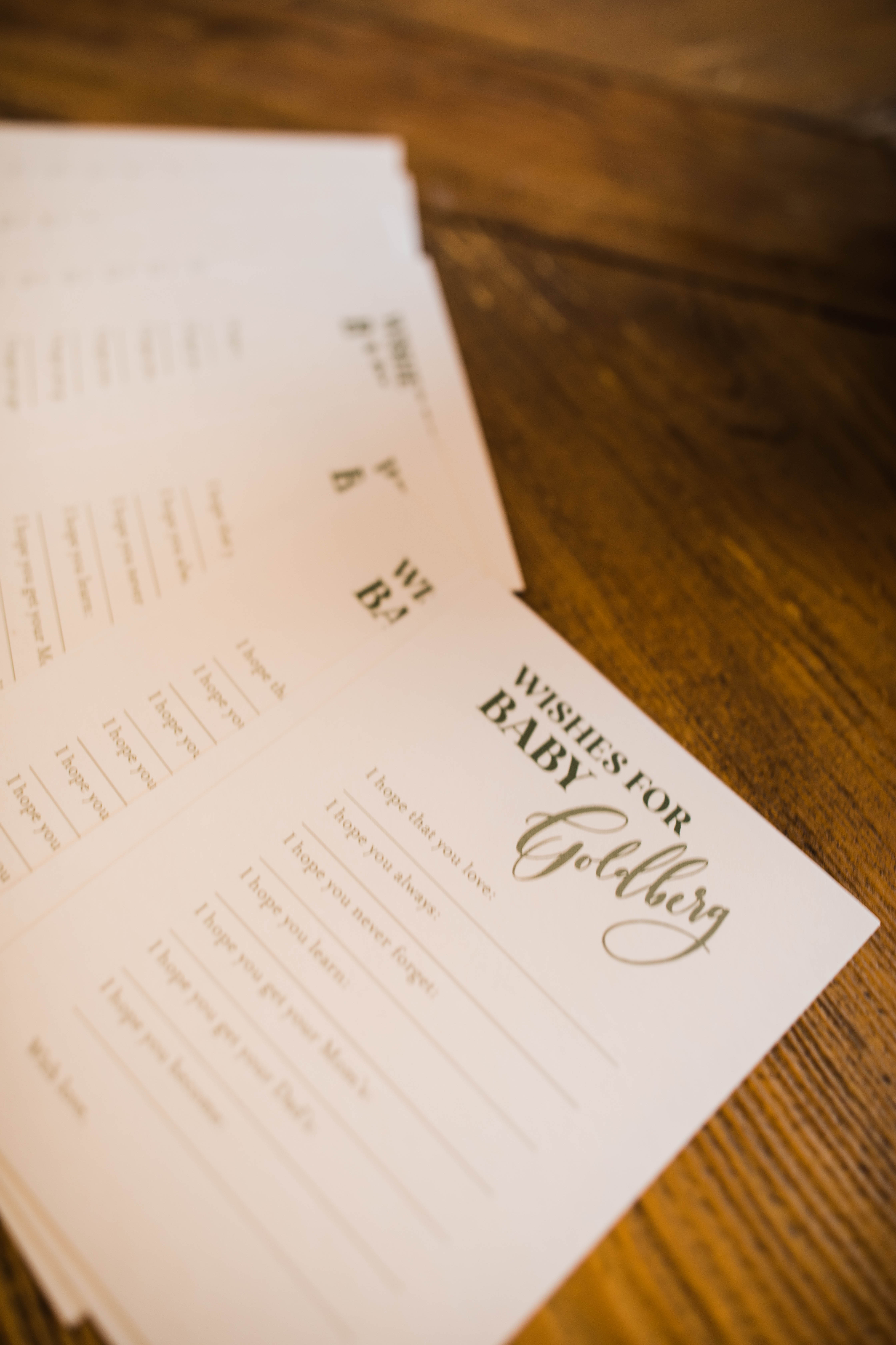
It was so fun having everyone fill out these personal message cards for baby Goldberg. There was so much love shared through these sweet notes! – I hope that you love – I hope you always- I hope you never forget – I hope you learn – I hope you get your mama’s – I hope you get your dad’s – I hope you become –
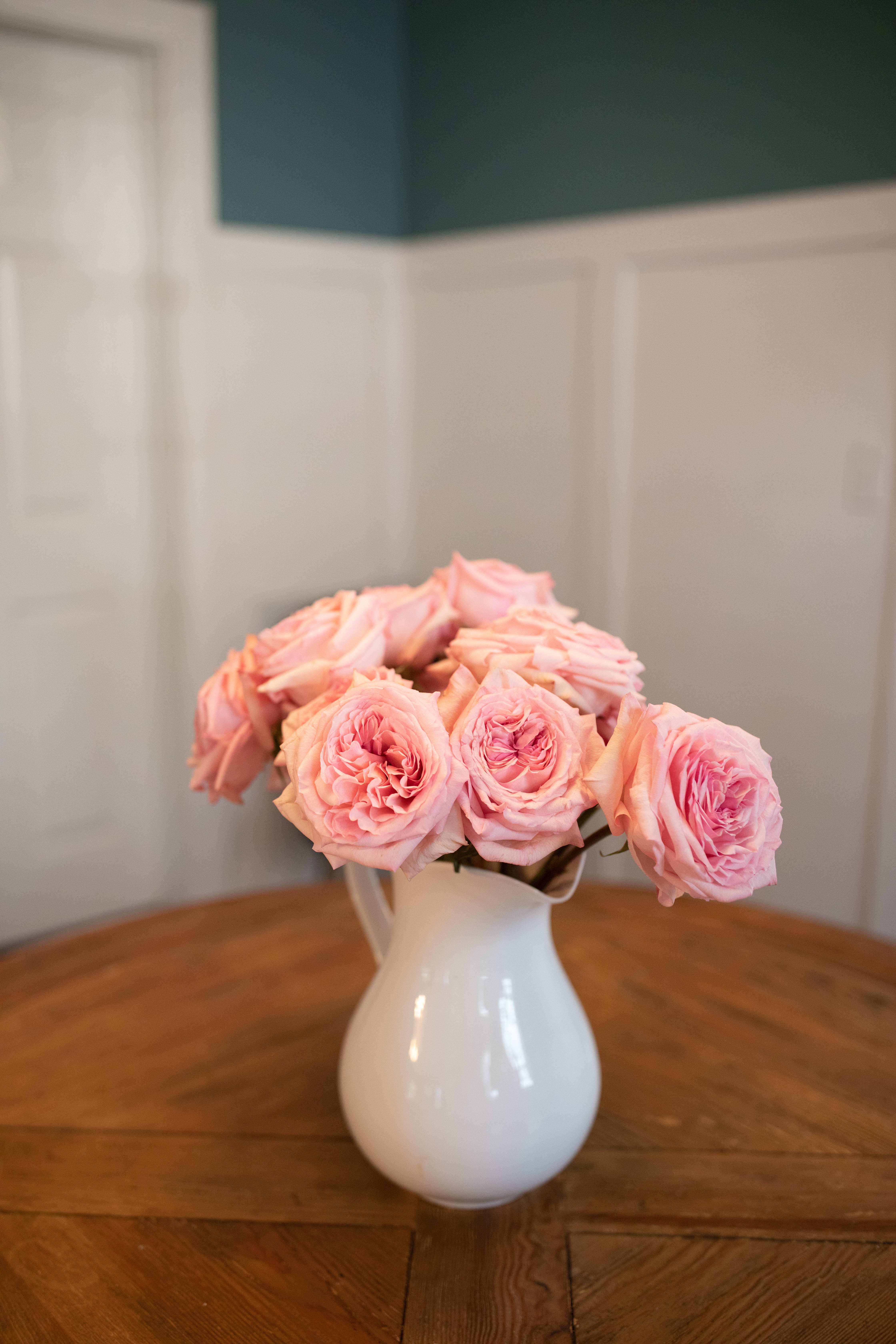
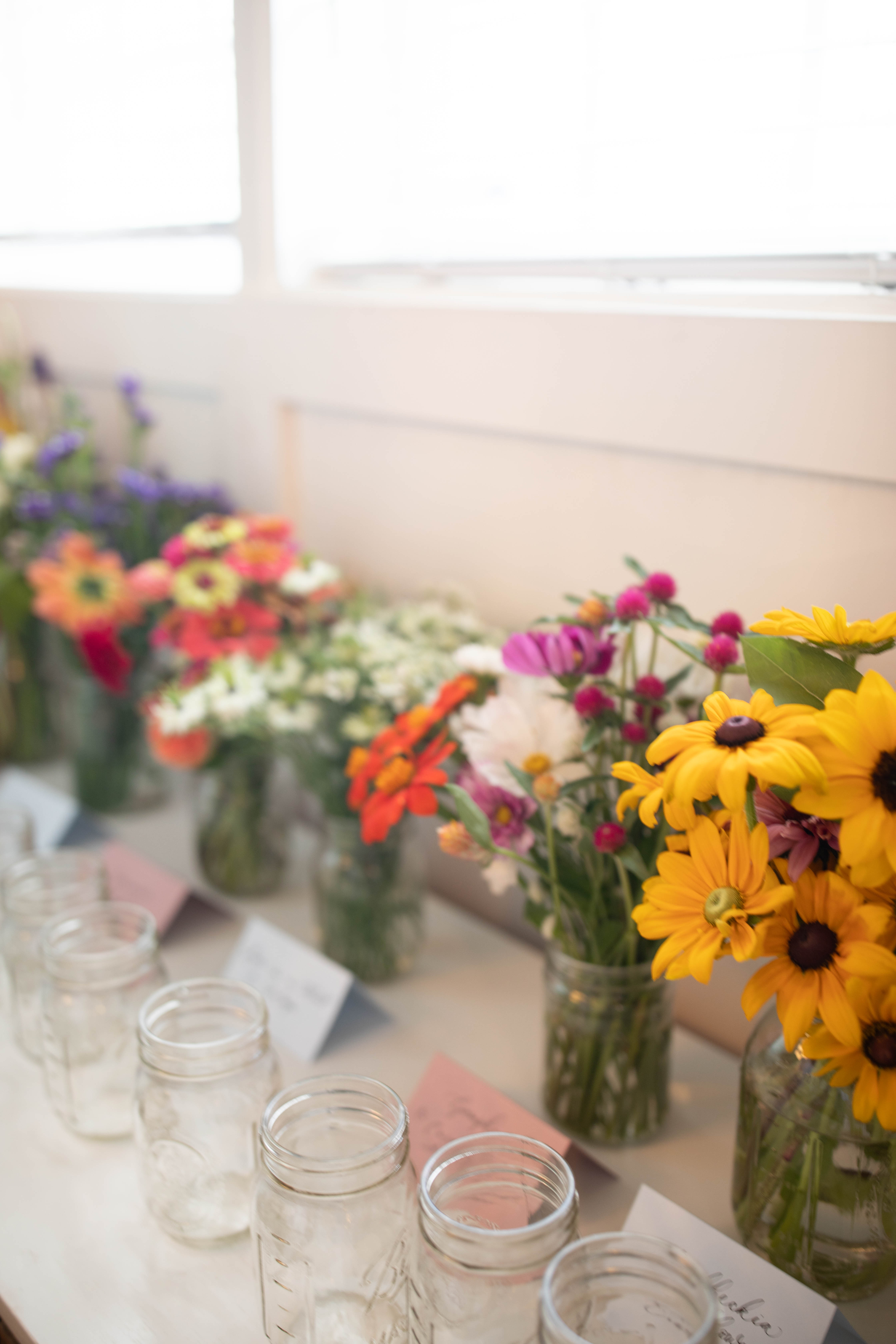
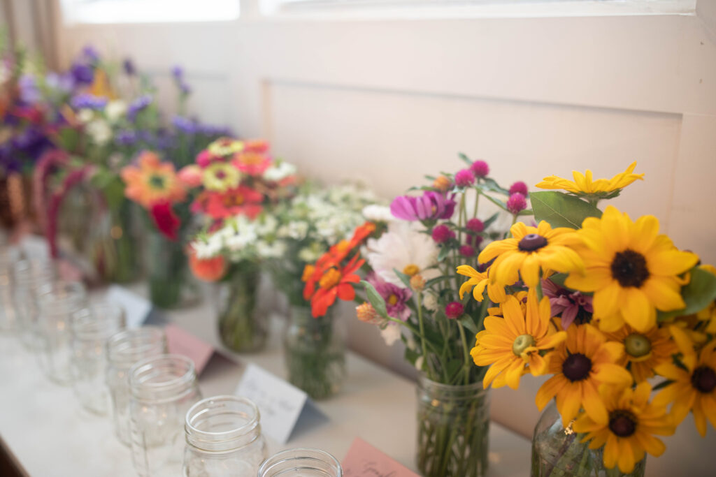
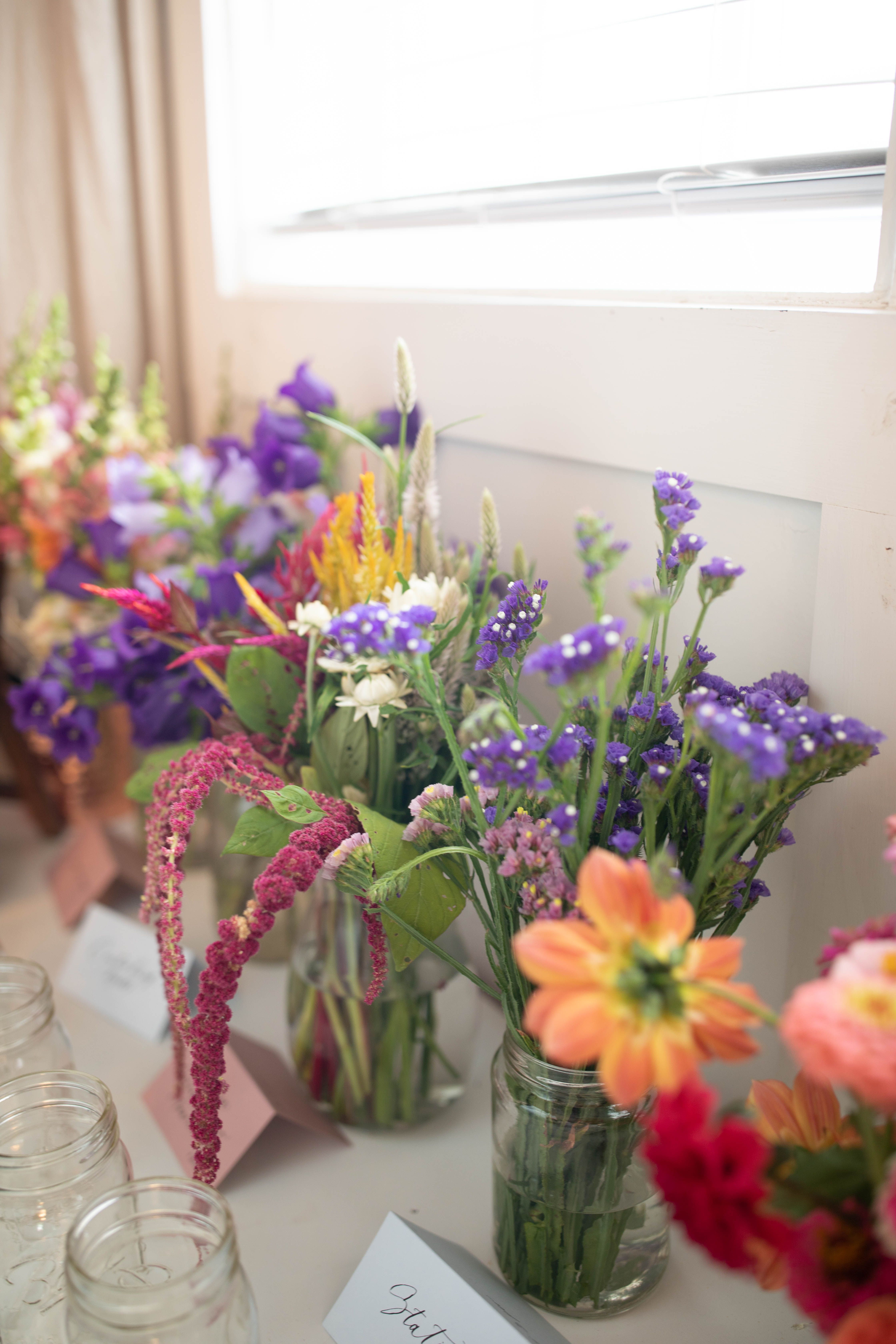
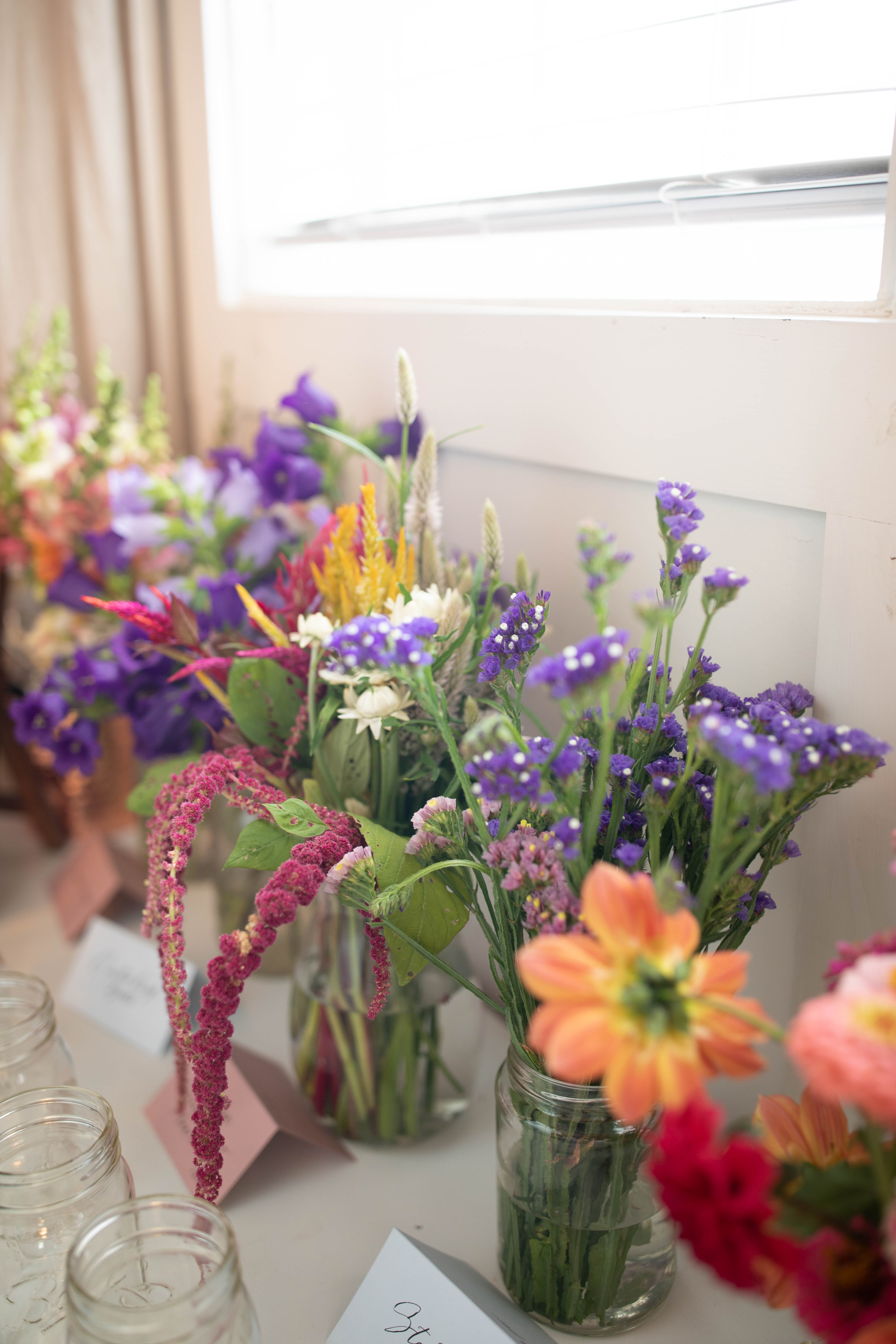
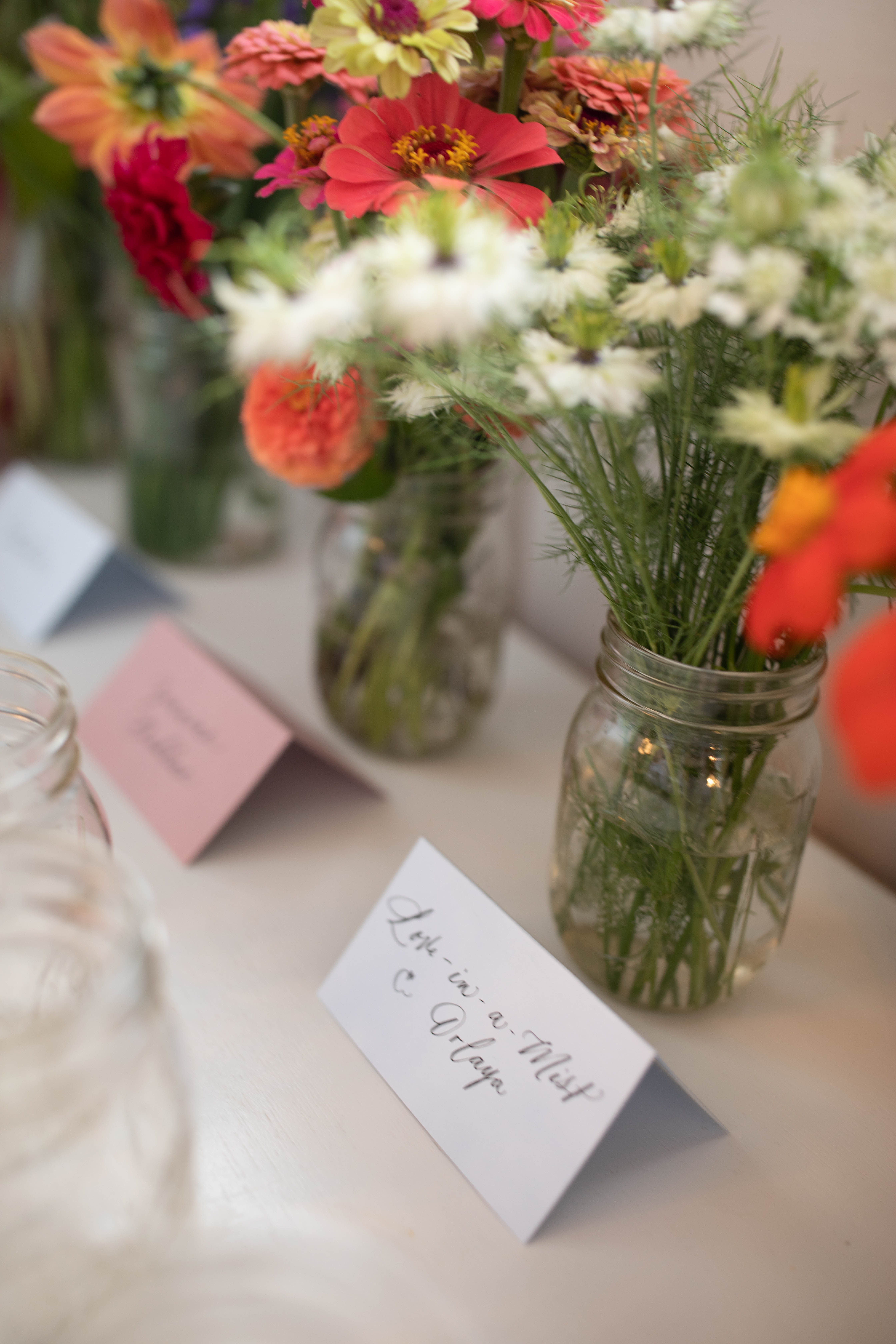
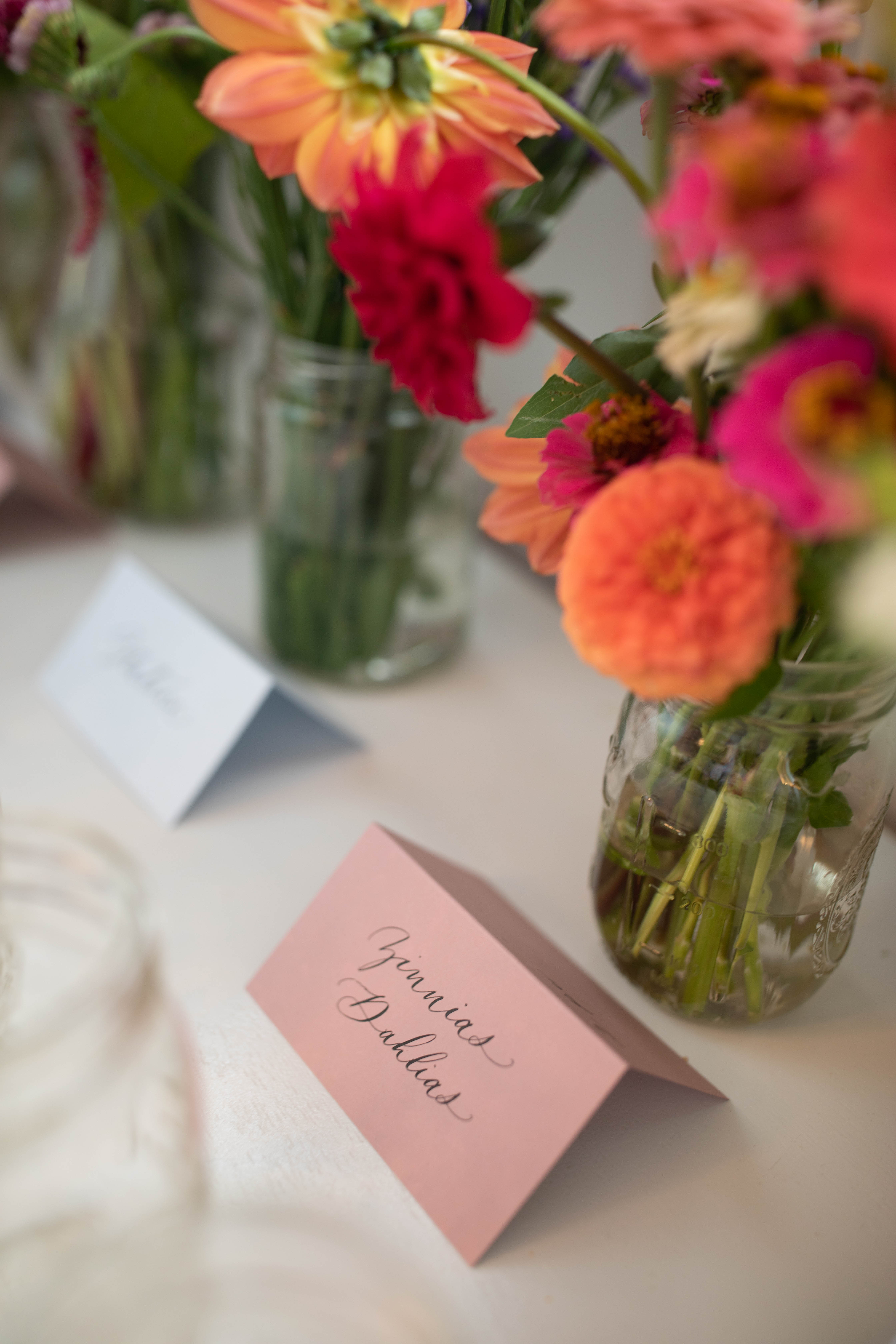
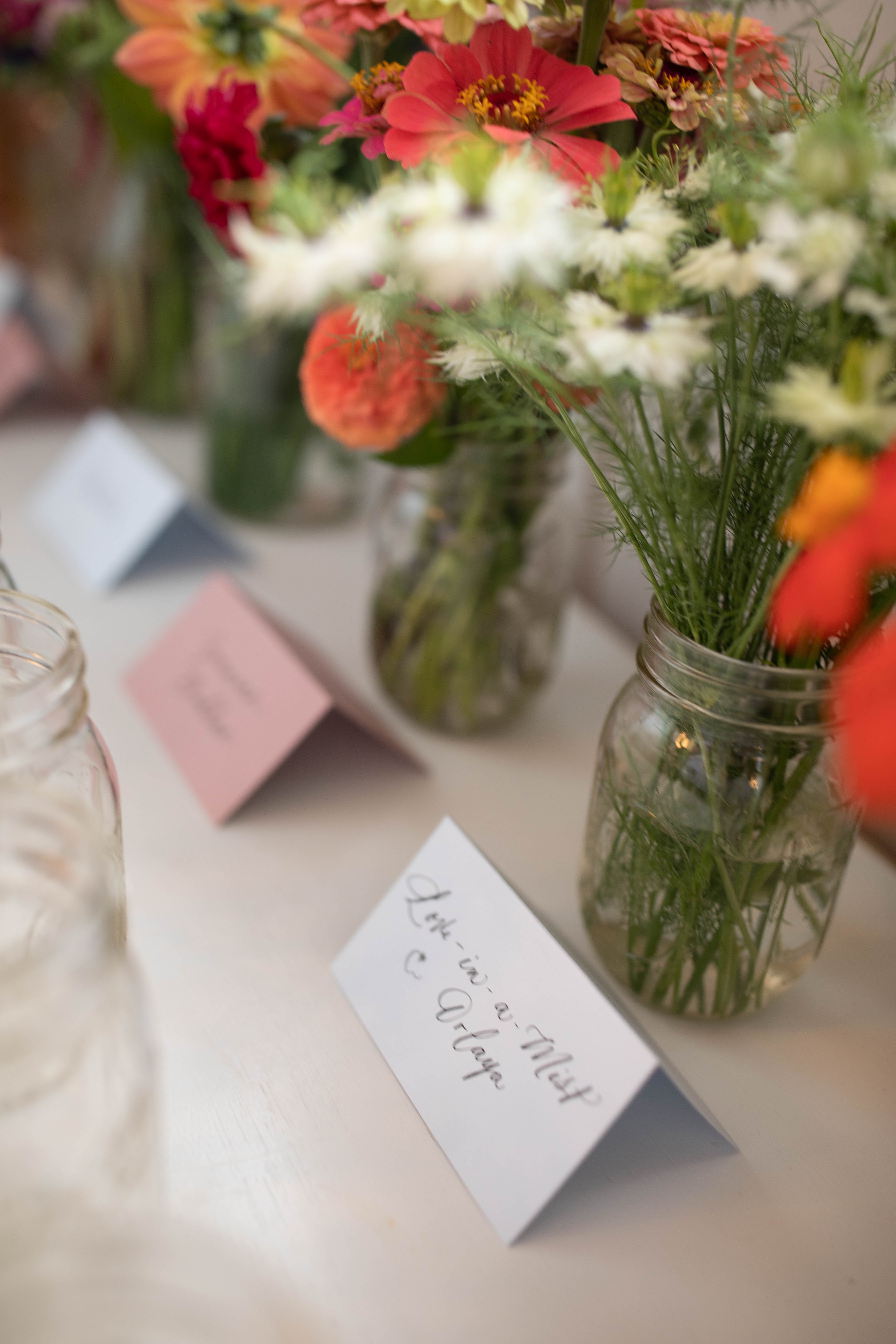
I am so lucky to have a local urban farm right in my neighborhood! Joy House Blooms supplied us with the most GORGEOUS selection of flowers which we used to create a “floral bar”. Guests were encouraged to make their own arrangements that they could take back home with them using this amazing selection of flowers!
The place cards used to identify the flowers looked so good here! The colors, the place cards, the flowers, the mason jars- it’s all just perfection!
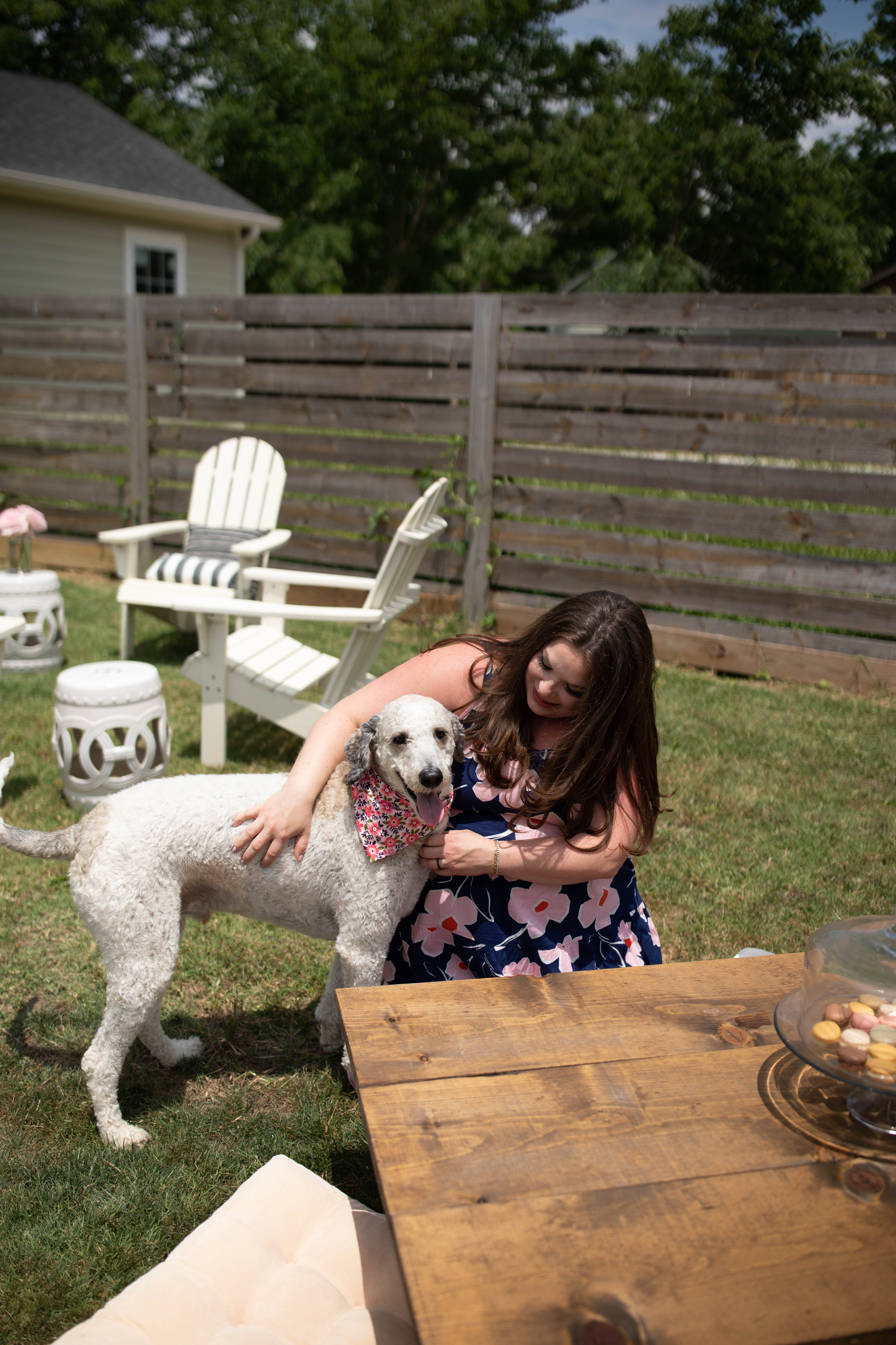
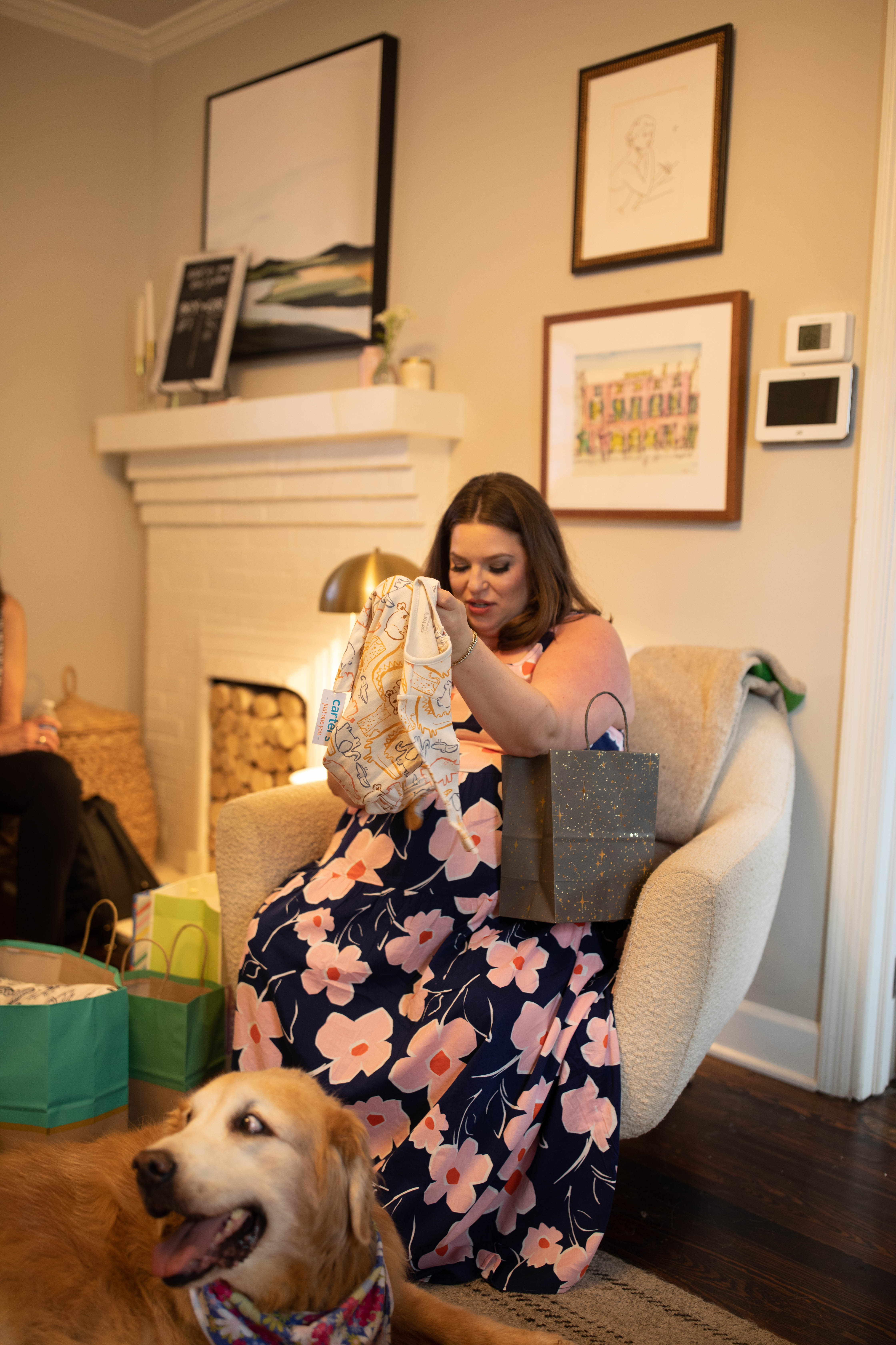
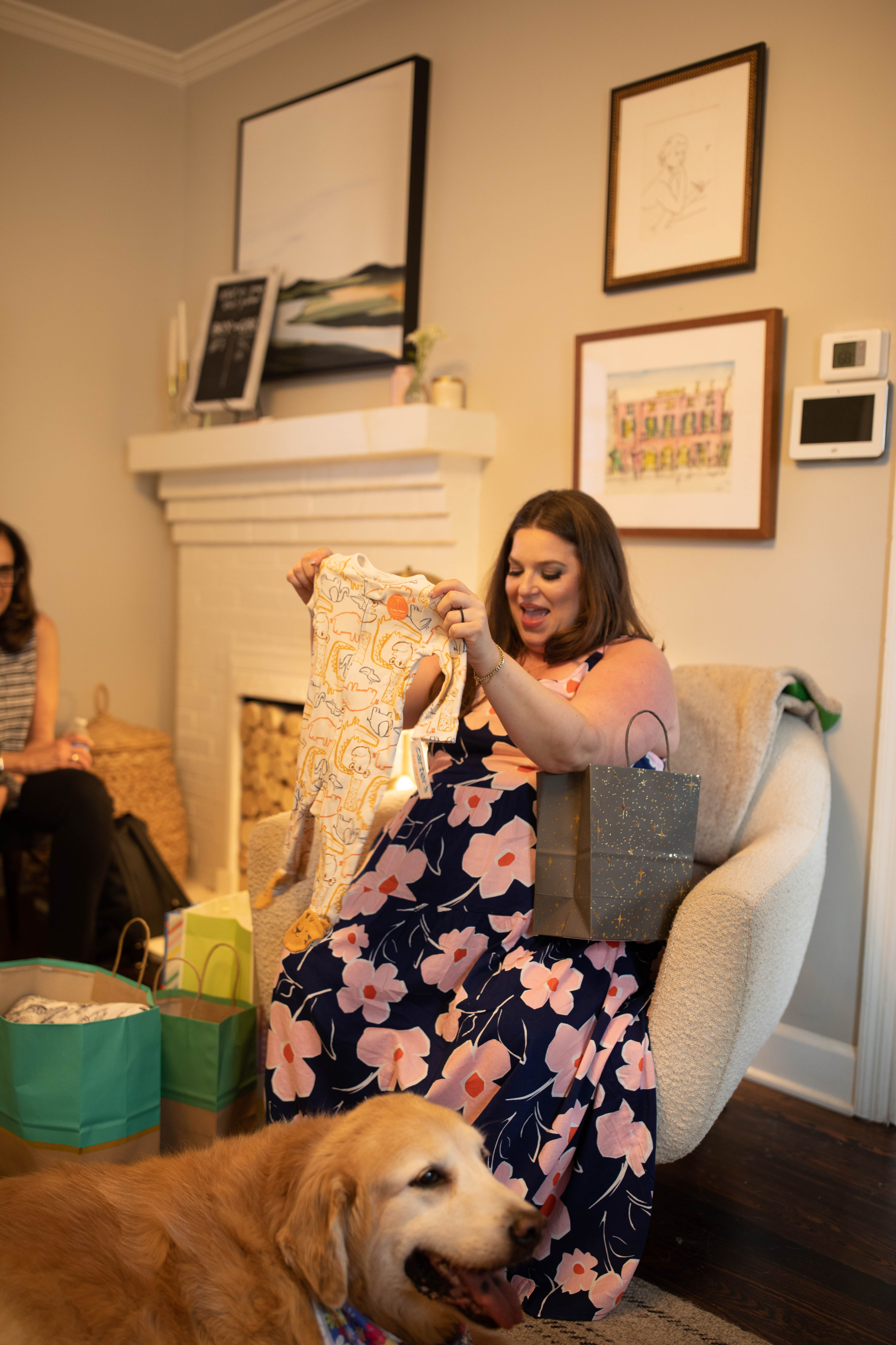
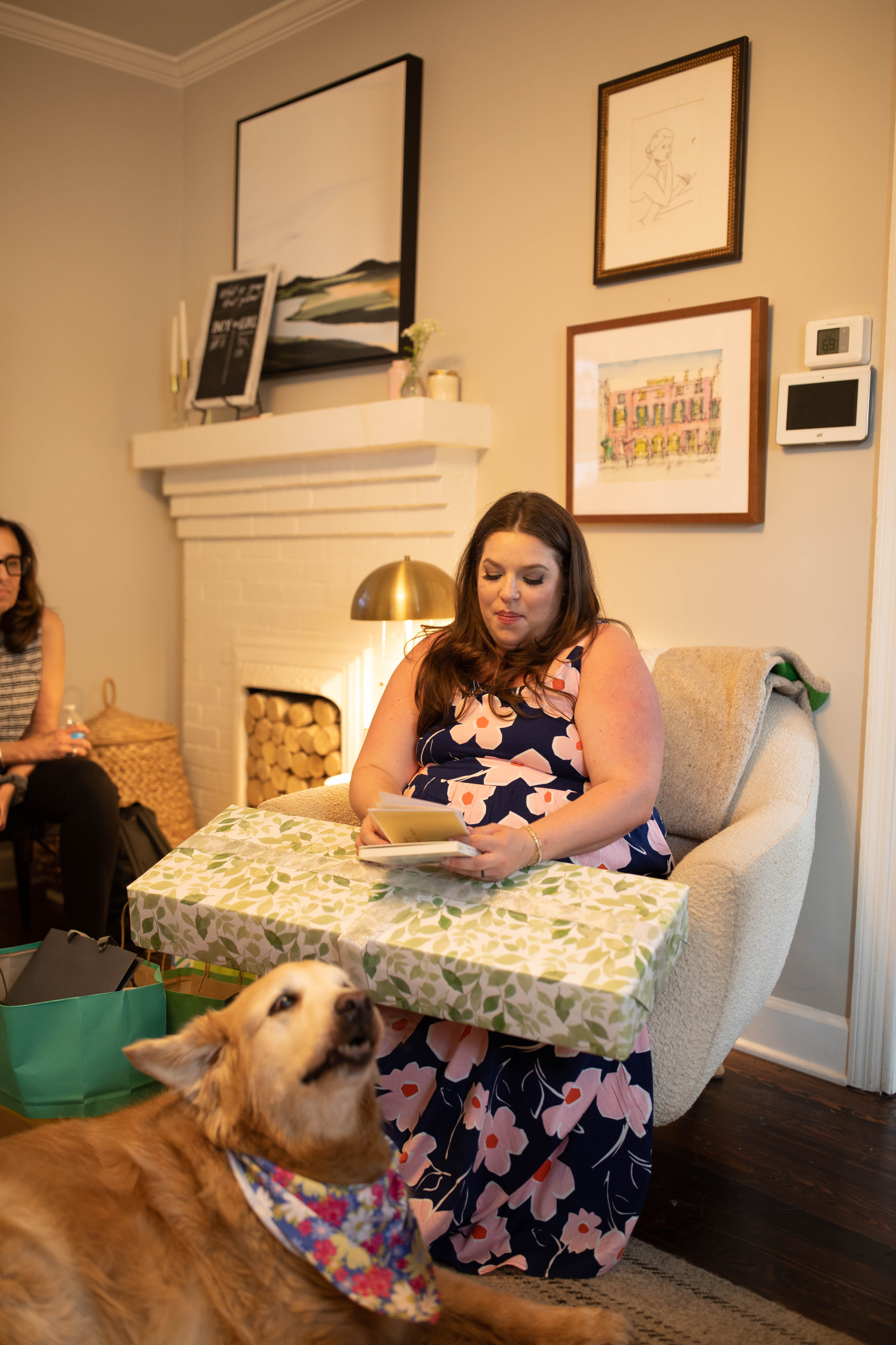
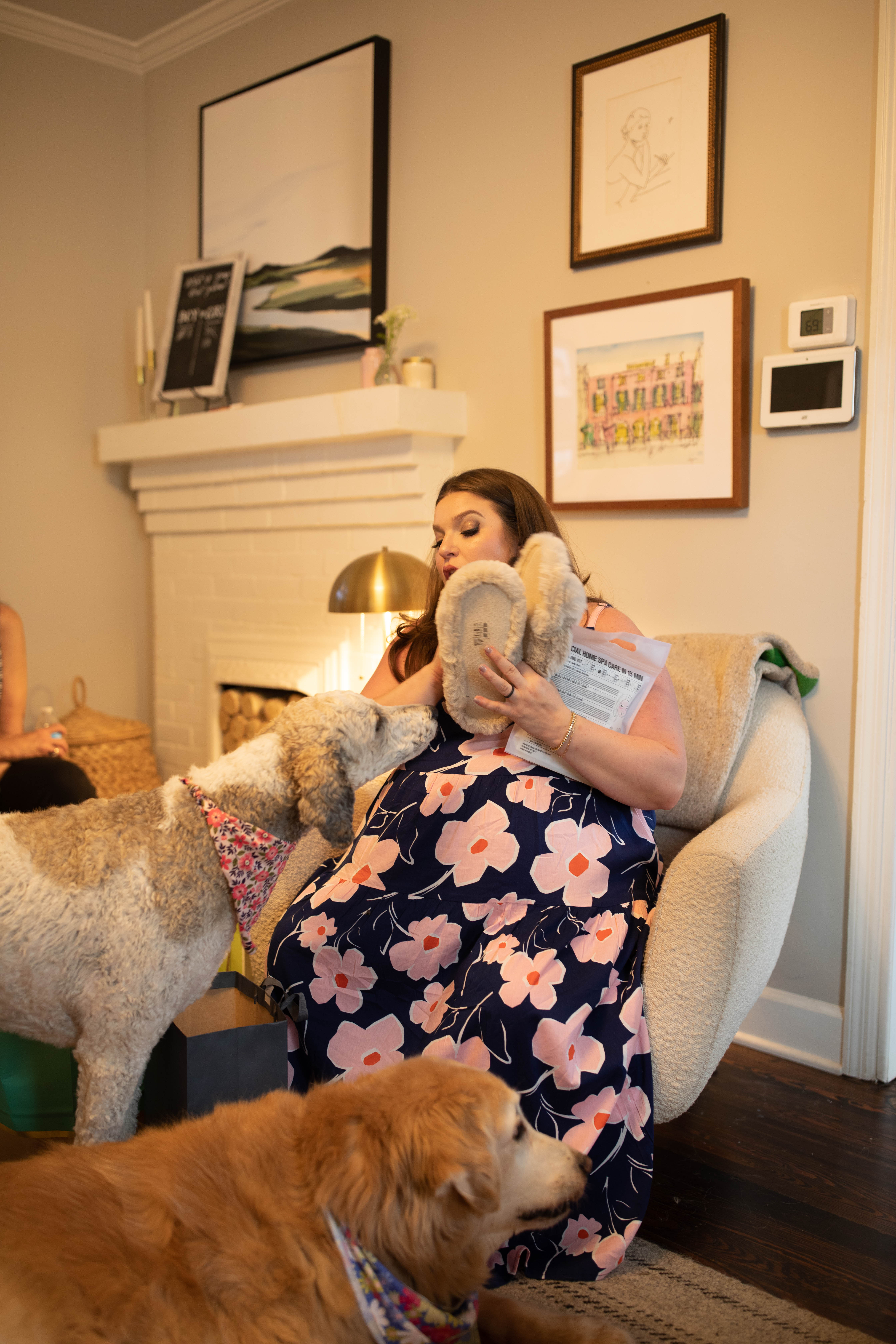
Our dogs definitely tried to steal the spotlight during the gift opening. They’re the cutest little attention stealers though aren’t they?
This will be a day I will always cherish. My sister is like my right hand. White Ink wouldn’t be what it is today without her diligence and dedication. But making me an aunt is the best gift by far! I can’t wait to meet baby Goldberg.
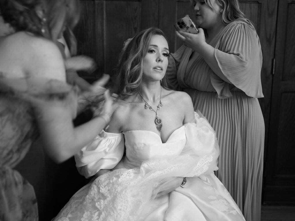
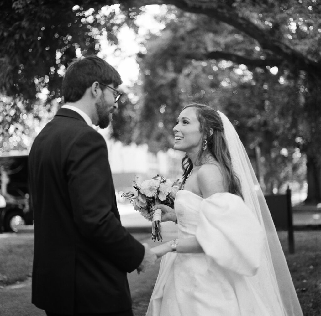
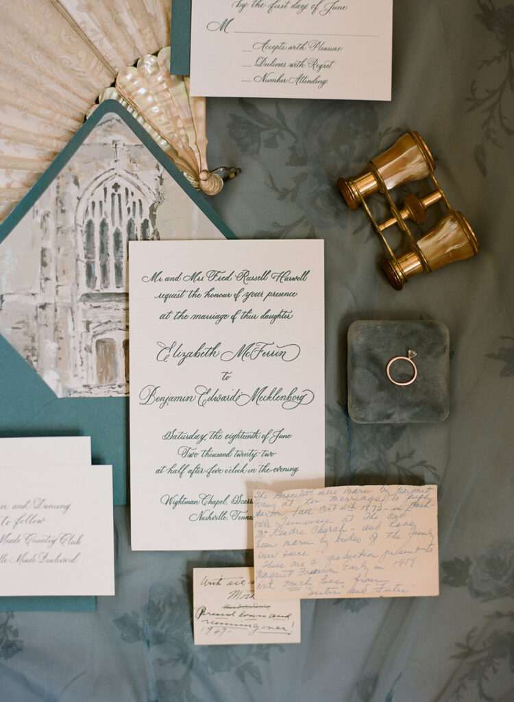
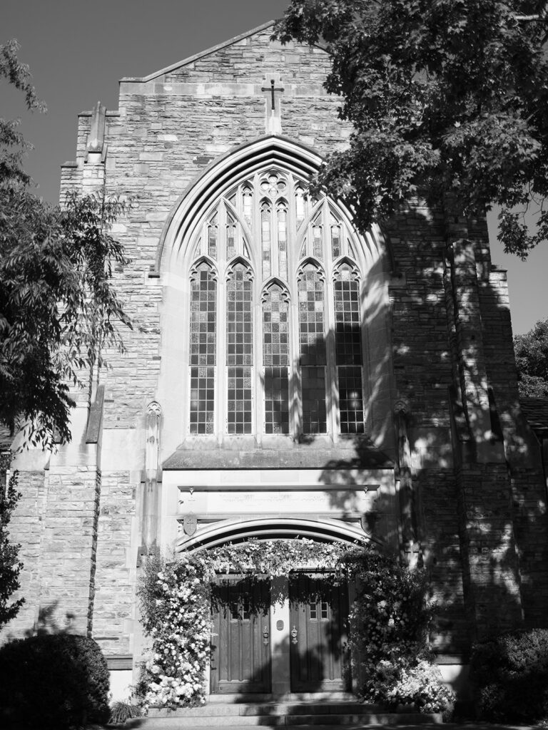
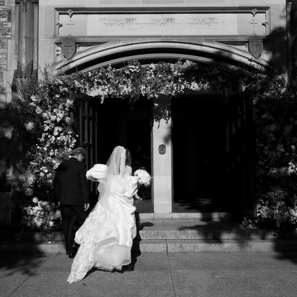
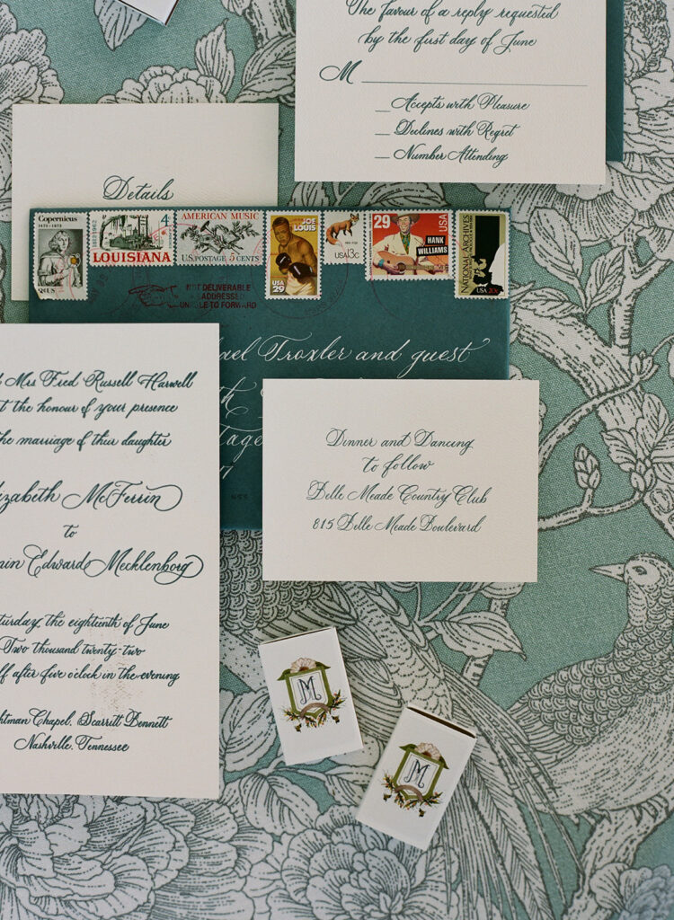
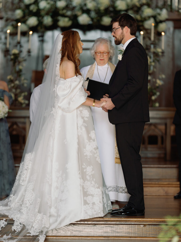
Last summer was filled with a rush of the most breathtaking weddings we have ever seen. Nashville weddings simply do not disappoint. Libby and Ben’s Scarritt Bennett nuptials gives us a glimpse of the amazing wedding season we had as they showcased classic details and unforgettable design that left us speechless.
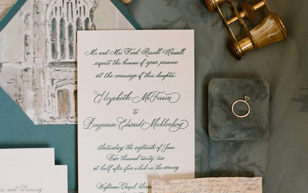
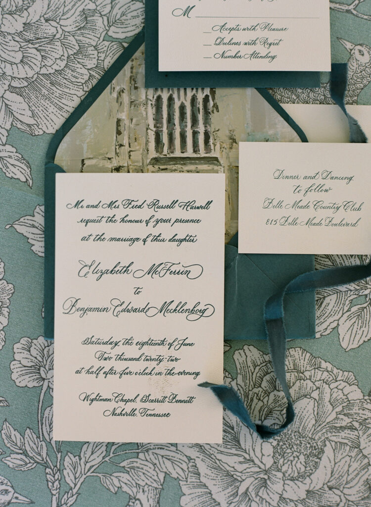
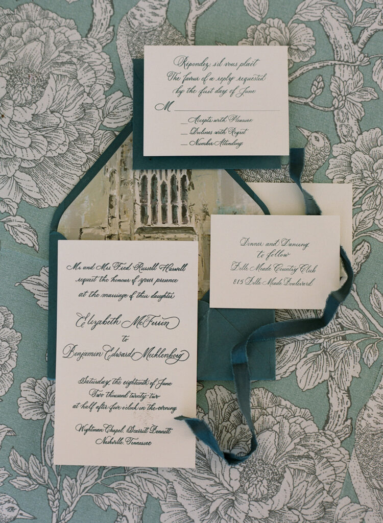
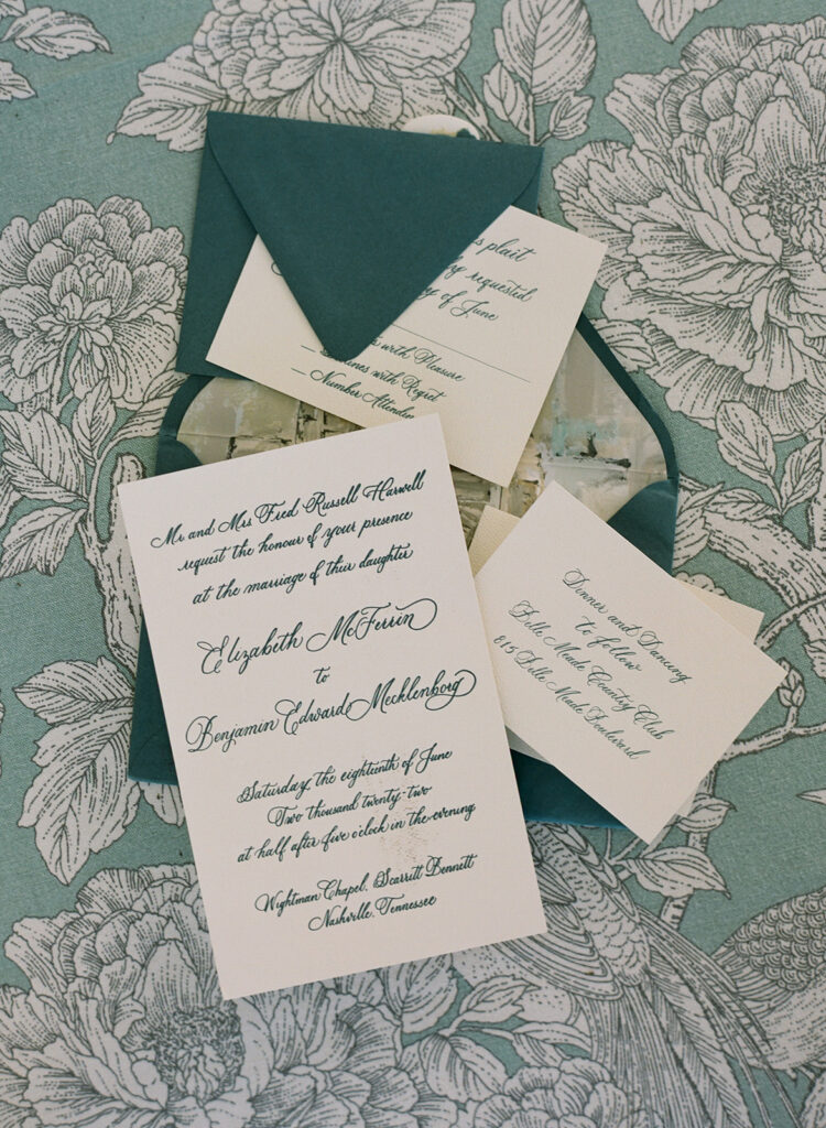
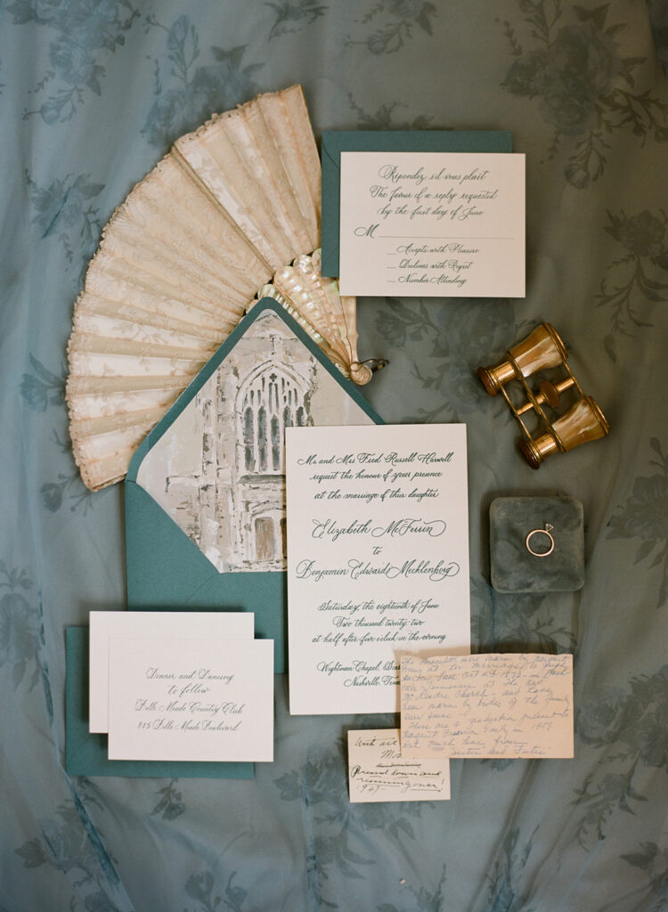
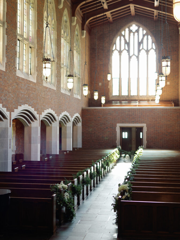
If you are from Nashville, then you are probably familiar with the reputation of Scarritt Bennett as one of Nashville’s most historic and timeless venues. Libby and Ben’s style laced seamlessly together with the design of the gorgeous Wightman Chapel at Scarritt Bennett. So much so, that custom artwork of the famous chapel was printed for the envelope liner in their invitation suites!
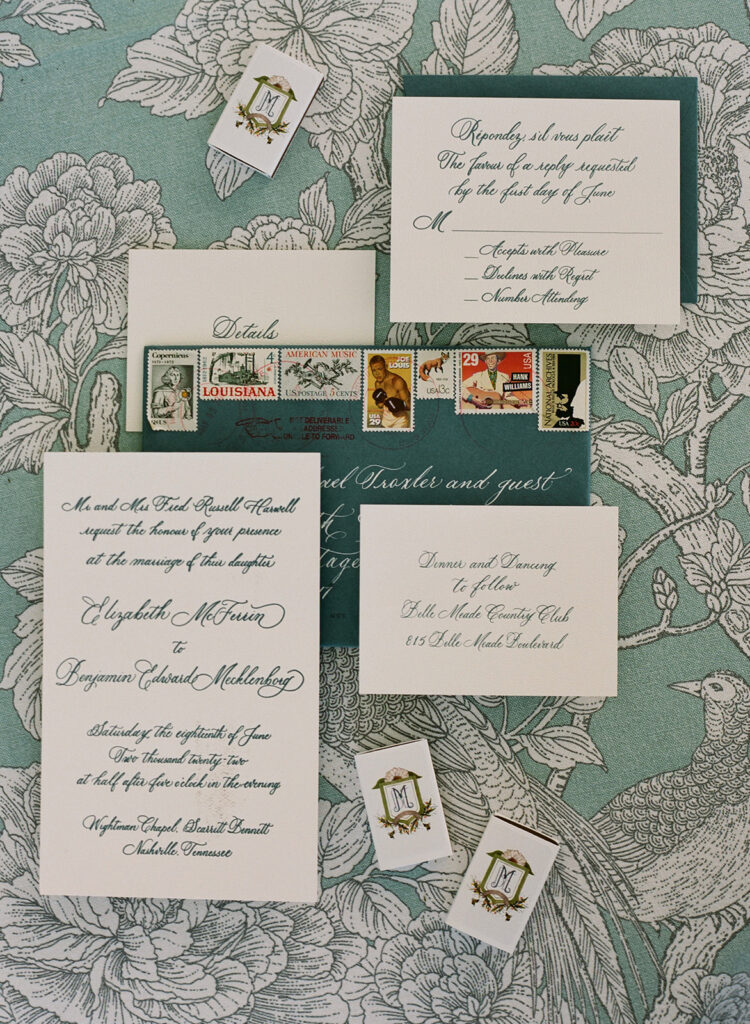
Libby was a bride that was not only excited by calligraphy, but also had a deep appreciation for classic letterpress. (I could cry tears of joy, honestly because- same.) She gave us the green light to design her and Ben’s invitation suites in FULL spot calligraphy and letterpress! In the world of calligraphy, THIS is about as stunning as it gets, folks. Enjoy!
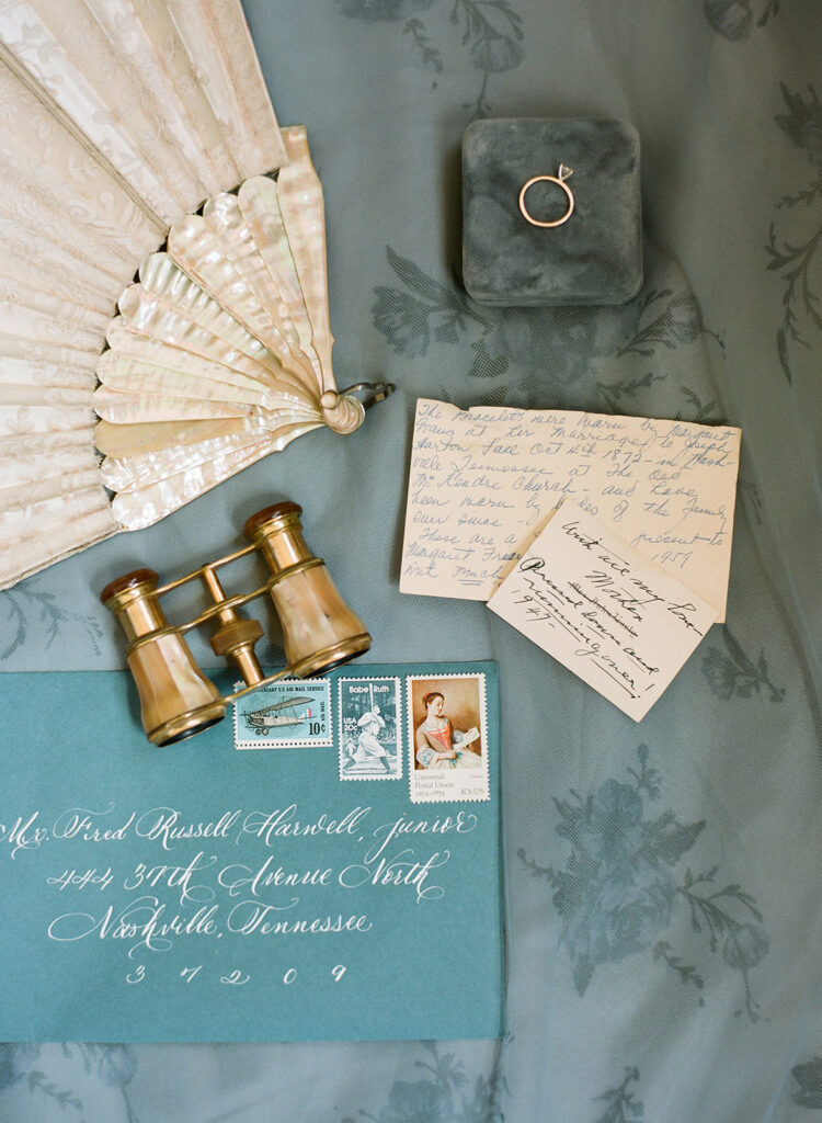
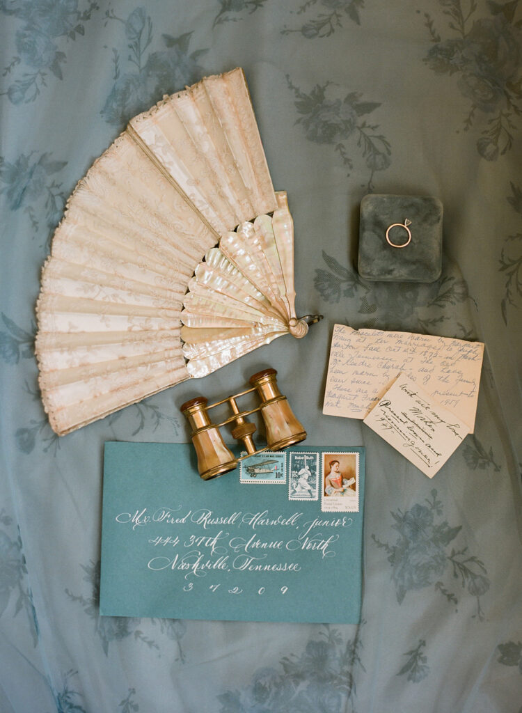
Our couple chose to use envelope calligraphy in white which paired beautifully against the dusty blue envelopes.
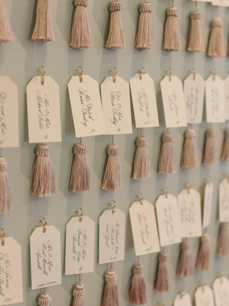
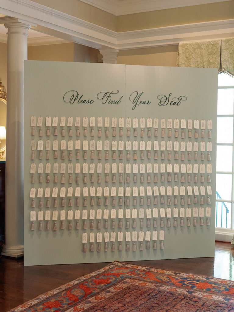
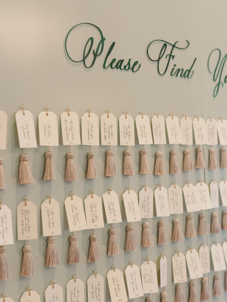
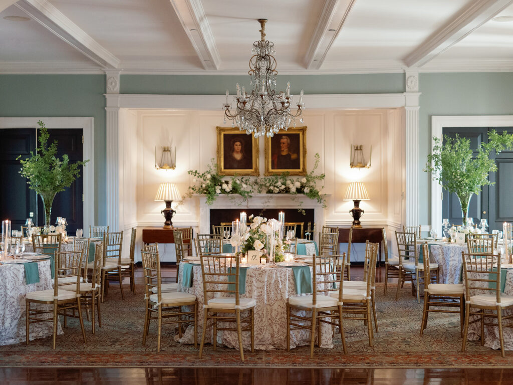
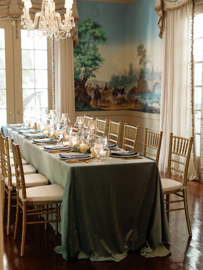
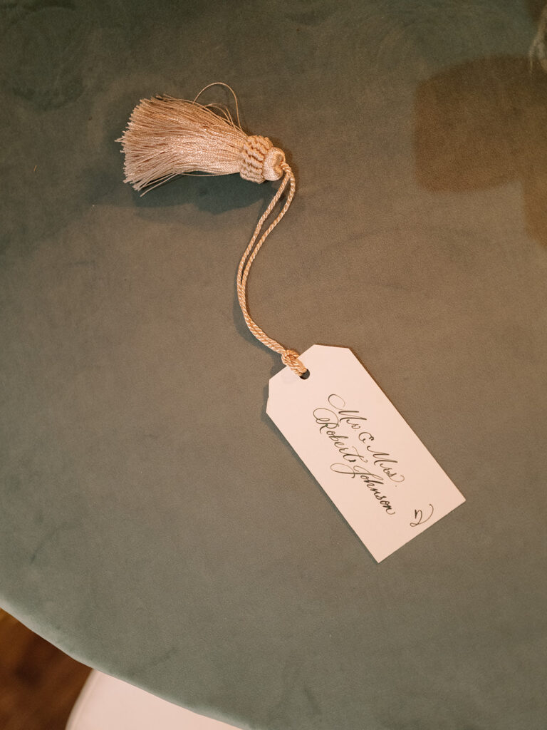
Libby and Ben’s reception venue was at the fabulous Belle Meade Country Club. This location definitely fit with the chic and classic energy of the day. The details flowed together flawlessly throughout the entire event. Absolutely nothing was underdone. We are especially proud to show off the final look of our couple’s seating chart! This is one of our favorite charts to date. The seating chart boasted dozens of brilliant little escort cards complete with custom spot calligraphy and tassels to top it all off. Unique but chic is the name of the game here. And I’m so in love with it.
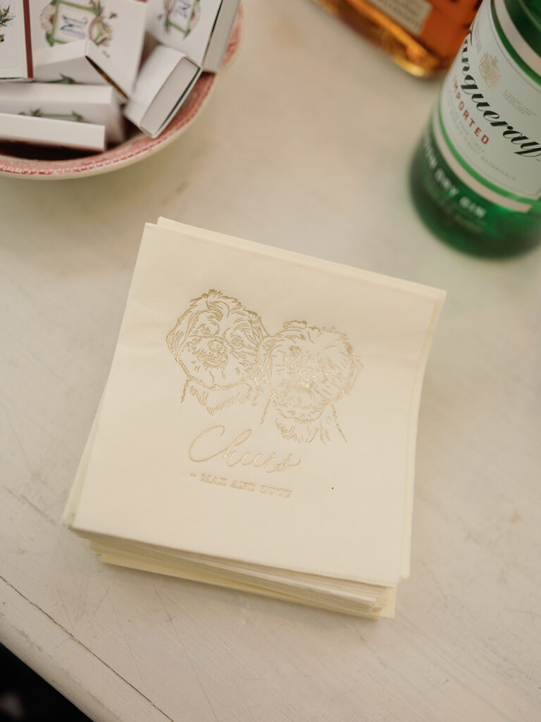
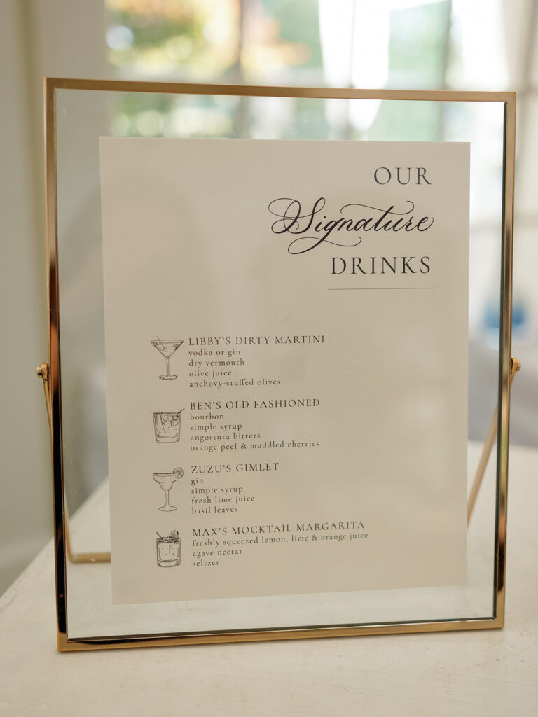
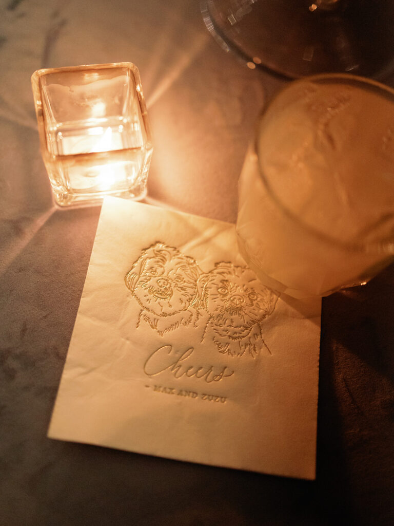
White Ink continued our touch on this special day through details like Libby and Ben’s custom bar signage and some of the most adorable cocktail napkins with prints of the couple’s fur babies, Max and Zuzu. Cocktail hour is the perfect time to include special things like beloved pets! This is quickly becoming a popular theme.
I say it all the time, but White Ink Calligraphy really does have the best couples and clients ever. It was such an honor to work with Libby and Ben throughout the planning process all the way to the big day. I was moved by their appreciation for sophisticated detail and we were happy to make it all happen for these two. We appreciate you! Cheers!
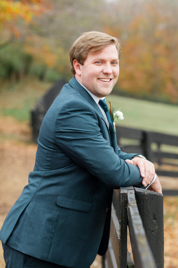
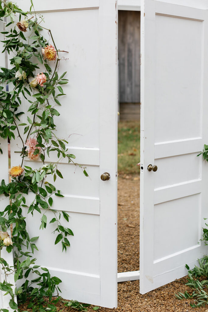
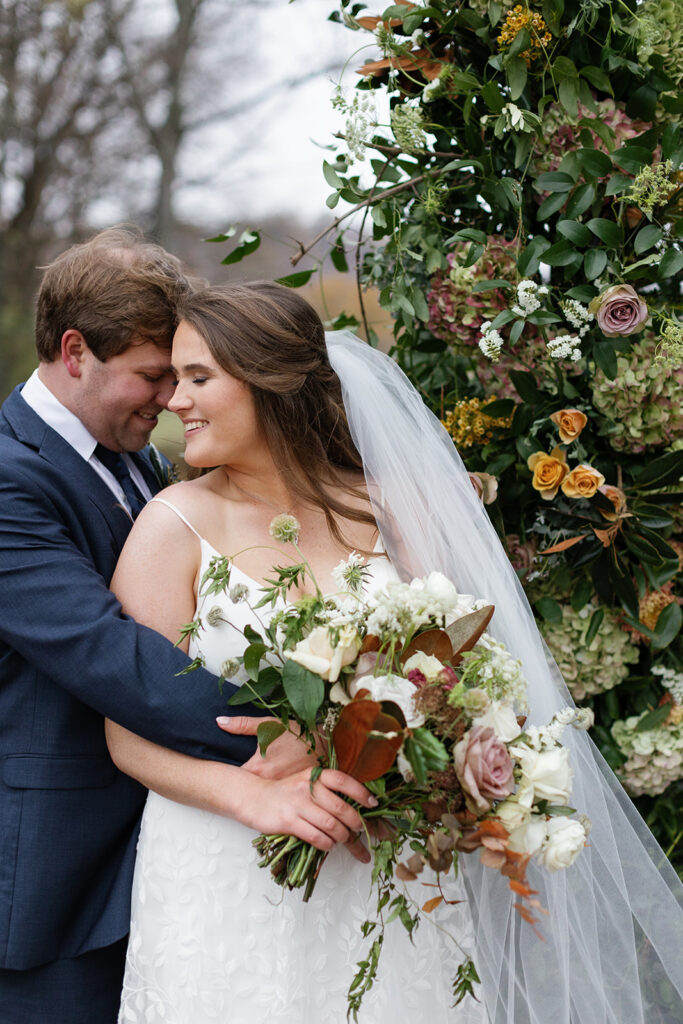
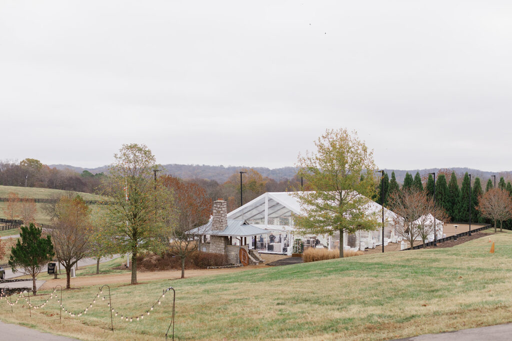
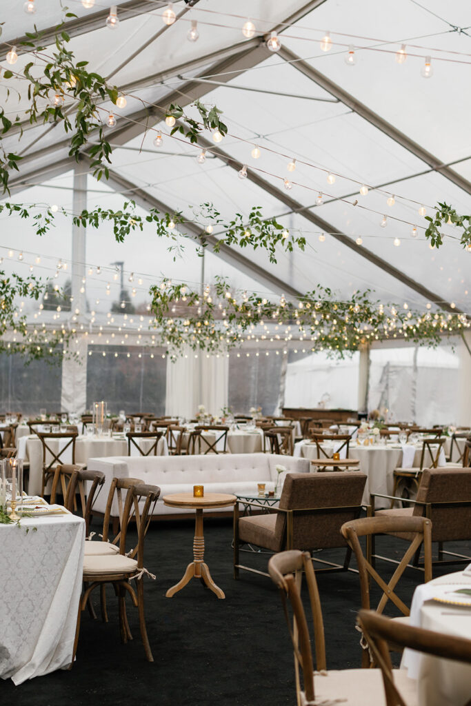
There is no shortage of awe-inspiring, crowd-pleasing, showstopping wedding venues in Nashville. But sometimes, home is exactly where you want to be and simply nothing else will do. Because, as we all know, there’s no place like home. Last fall, Caroline and Landon invited their guests to the family farm where they created an incredibly memorable wedding day and White Ink had the pleasure of elevating this beautiful day with some uniquely exciting details.
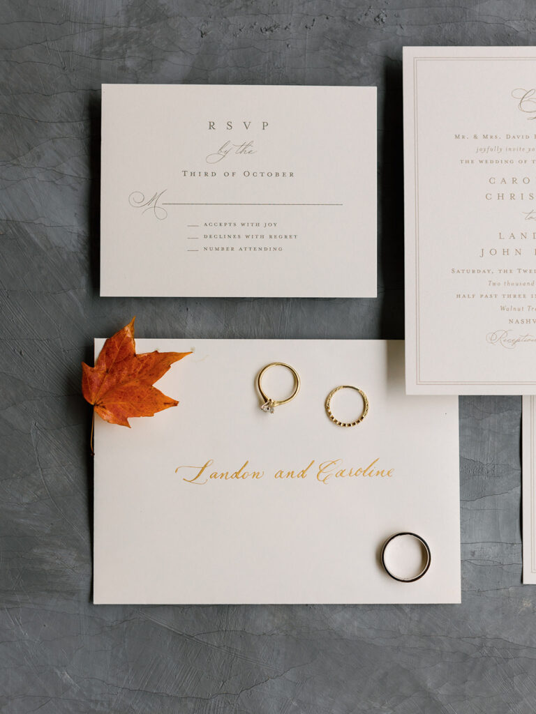
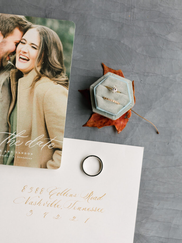
White Ink made an elegantly simple envelope using spot calligraphy in gold which the couple paired with their invites. I love this look because it is crisp and clean and the perfect example of “less is more”. Timeless and always appropriate.
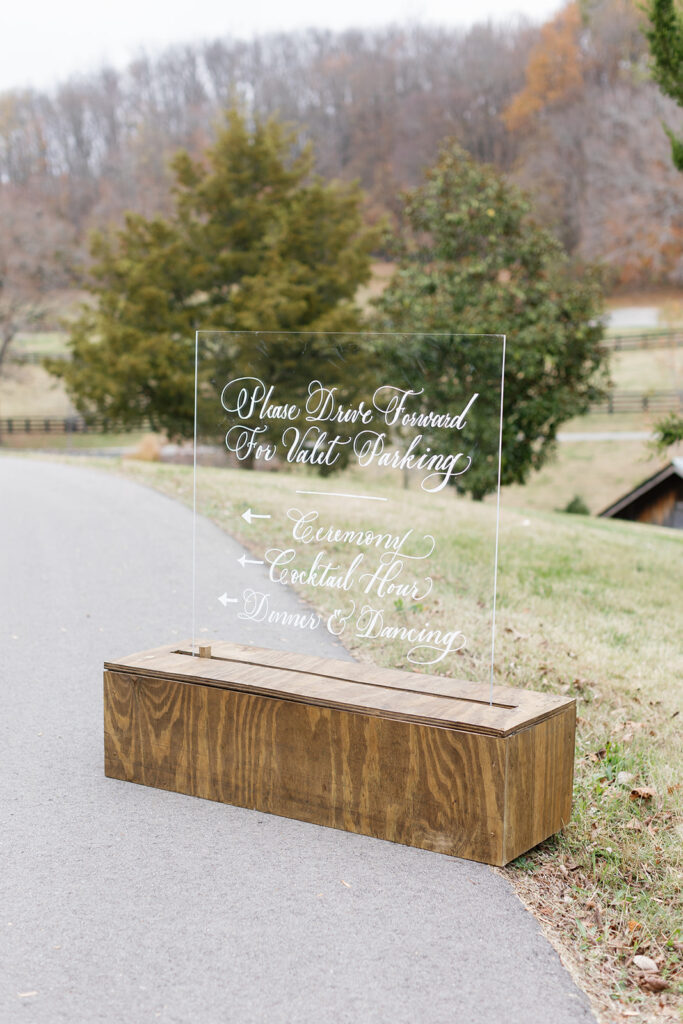
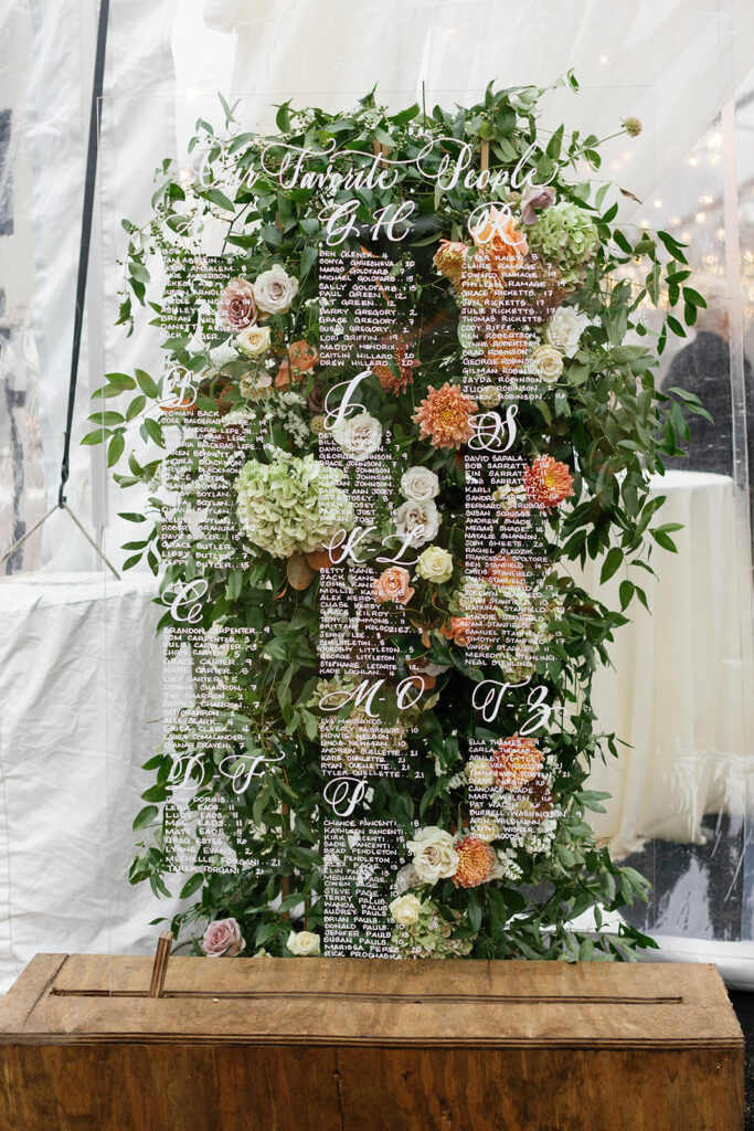
The vast family farm offered the most breathtaking views and open spaces. Caroline and Landon thoughtfully provided a directional sign for their guests so that they could easily get around the farm. White Ink put together this rustic, chic sign. I especially love the look of the acrylic with the wooden case. The custom white calligraphy was the cherry on top!
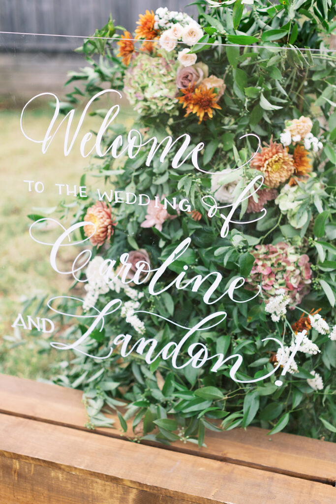
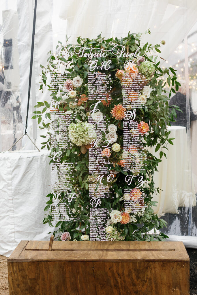
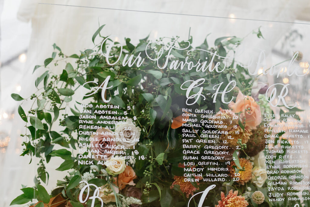
We took the same style as the directional sign to create both the wedding welcome sign and the seating chart. It effortlessly tied these important details together. The only major difference was the POP of florals beautifully peeking through the acrylic welcome sign and seating chart. Mixing florals and calligraphy will forever be my favorite!
“Our Favorite People,” is the cutest way to title a seating chart. It’s an instant smile-maker!
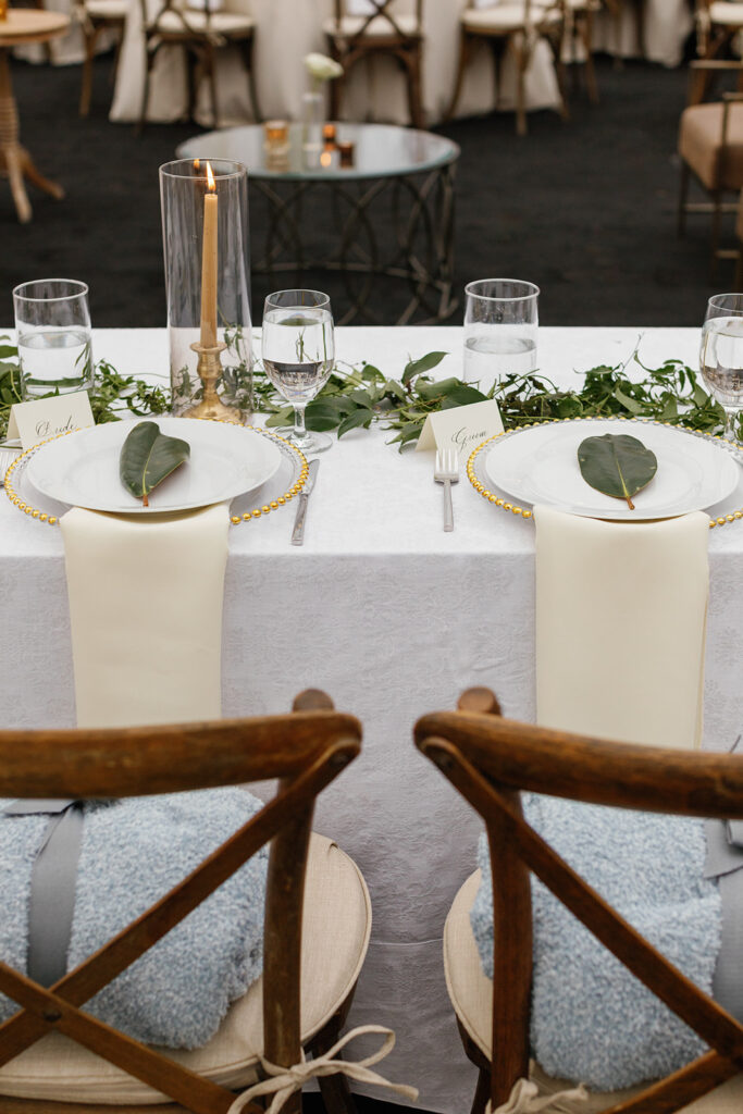
We loved getting to add the sweet bride and groom place cards for the head table. Yes, this is a detail that is subtle, but it holds a lot of meaning- this is Caroline and Landon’s first meal as husband and wife! Our couples are always glad they chose not to overlook the small, customizable details. They’re more important than you might think!
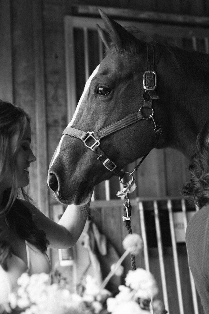
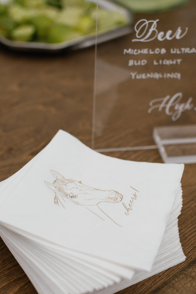
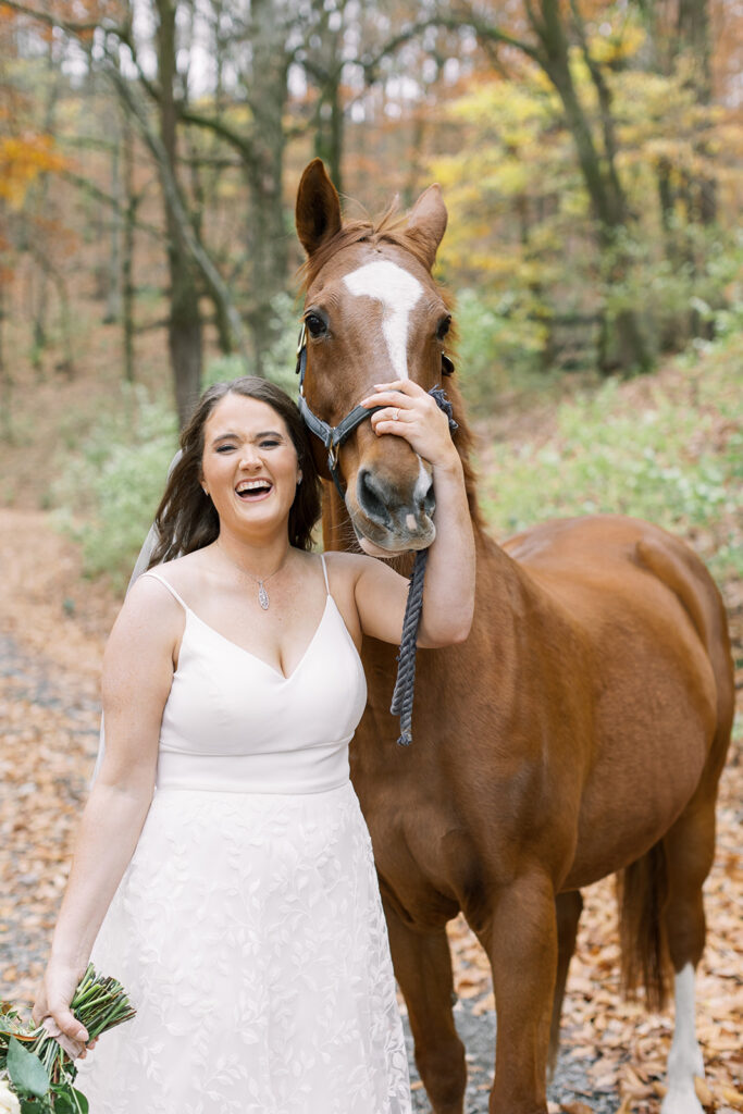
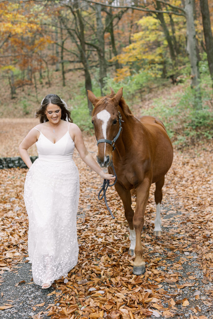
One of my favorite things White Ink did for Caroline and Landon’s reception was create a cocktail napkin where we incorporated the profile of Caroline’s beloved horse! Where are my horse lovers at? Is this not the most adorable way to include your favorite animal in the festivities? These cocktail napkins definitely fit into the scene of the evening.
Home weddings are on the rise. And White Ink is here for it! We are honored each time we are invited into someone’s space, to a place they call their own- a place called home. In some way, the memories are a little bit sweeter. Maybe it’s because home is where the heart is. Congratulations Caroline and Landon!
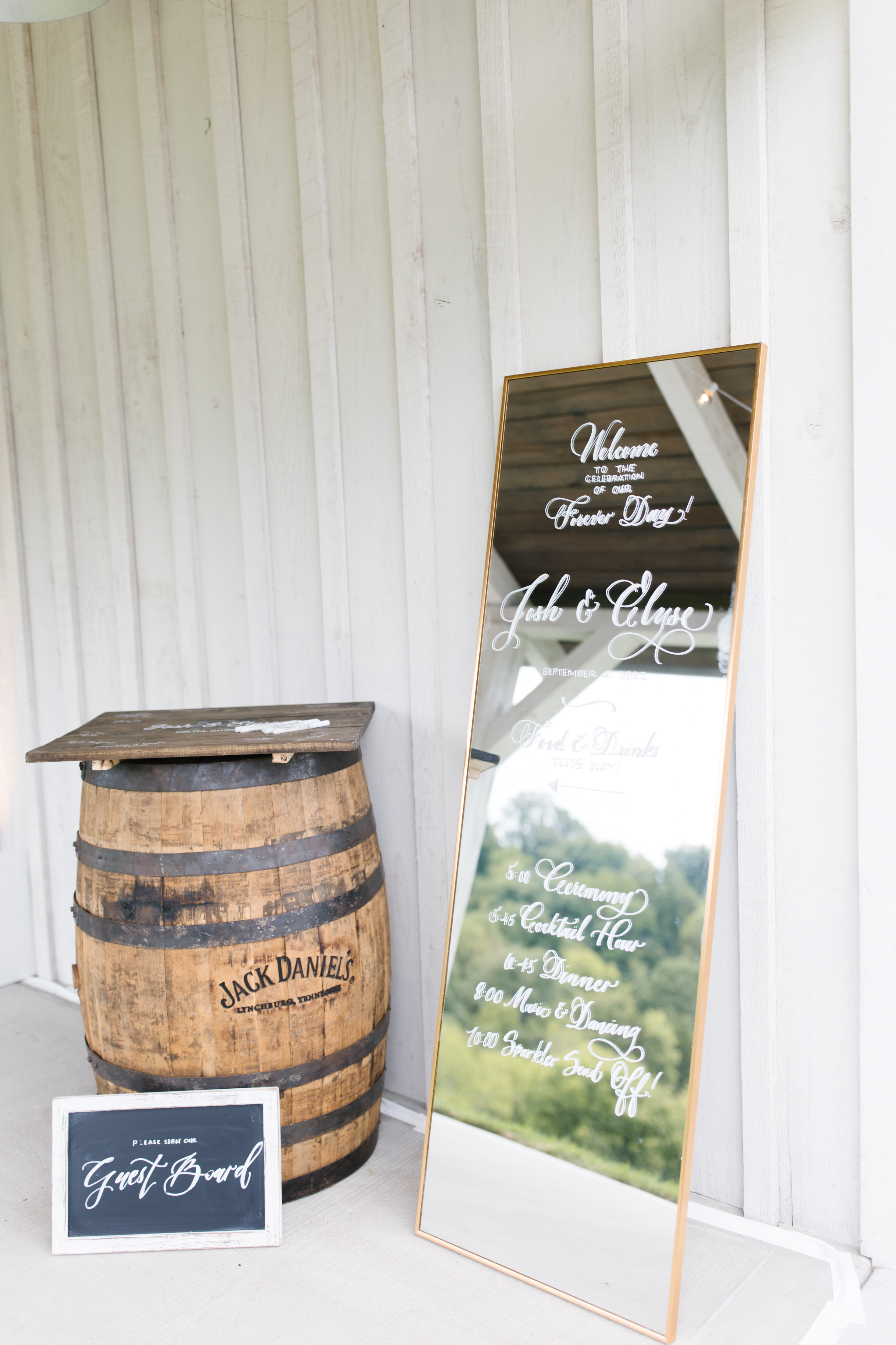
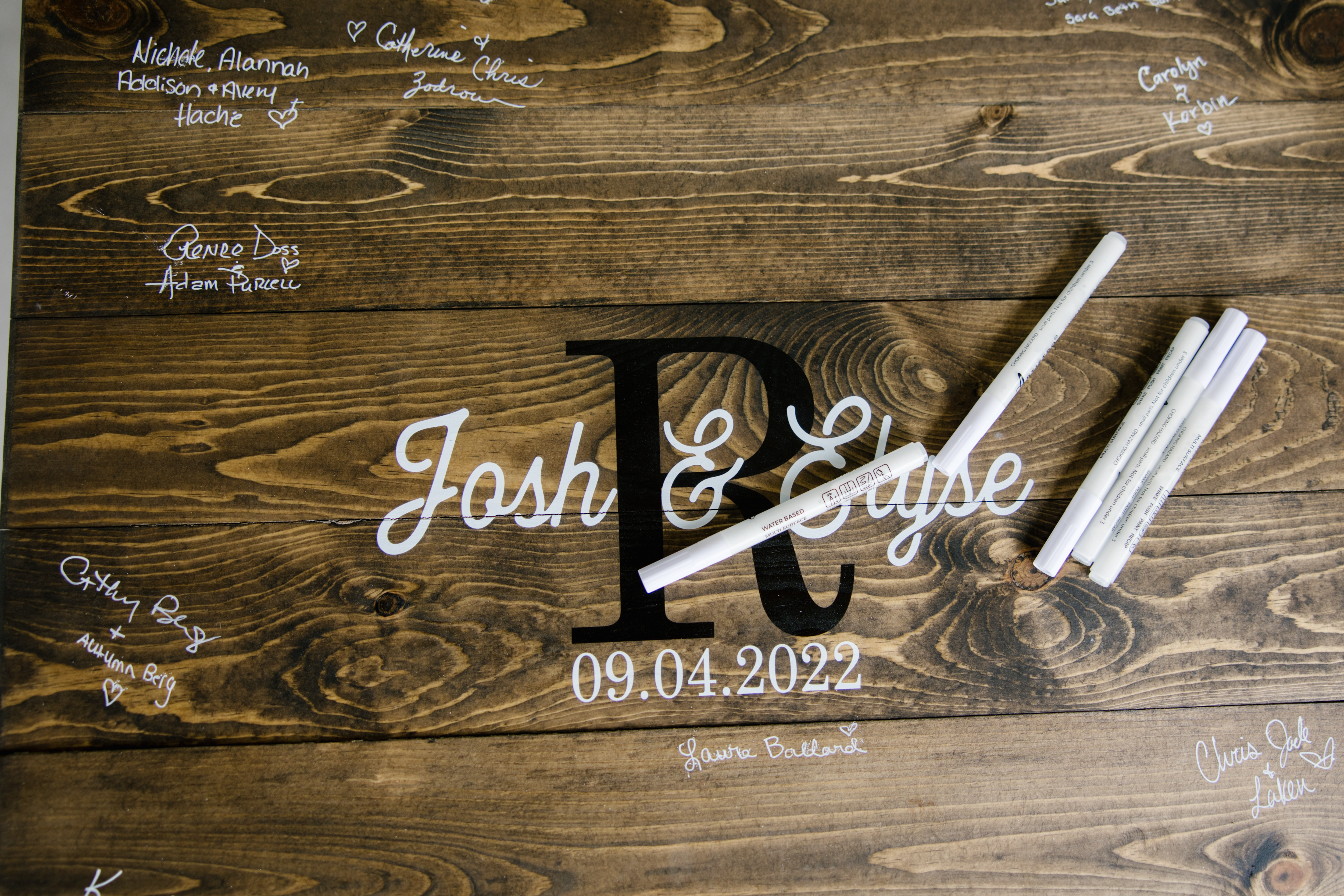
As a calligrapher, I get the unique opportunity to work with people who are putting their best foot forward. My clients are truly dedicated to being intentional with the details of their events. Seeing that side of them is a huge motivating factor while putting in my best work for each client whether they are throwing a holiday event, a business party, or a dream wedding. Working for Elyse and Josh as they were putting together the final touches for their wedding day was a rewarding and heartfelt experience; one that my team and I were honored to be a part of.
The White Ink team quickly understood that, to Elyse and Josh, family is everything. We think you will enjoy checking out some of the projects we put together to make sure this Tennessee wedding sublimely celebrated the importance of being gathered together.
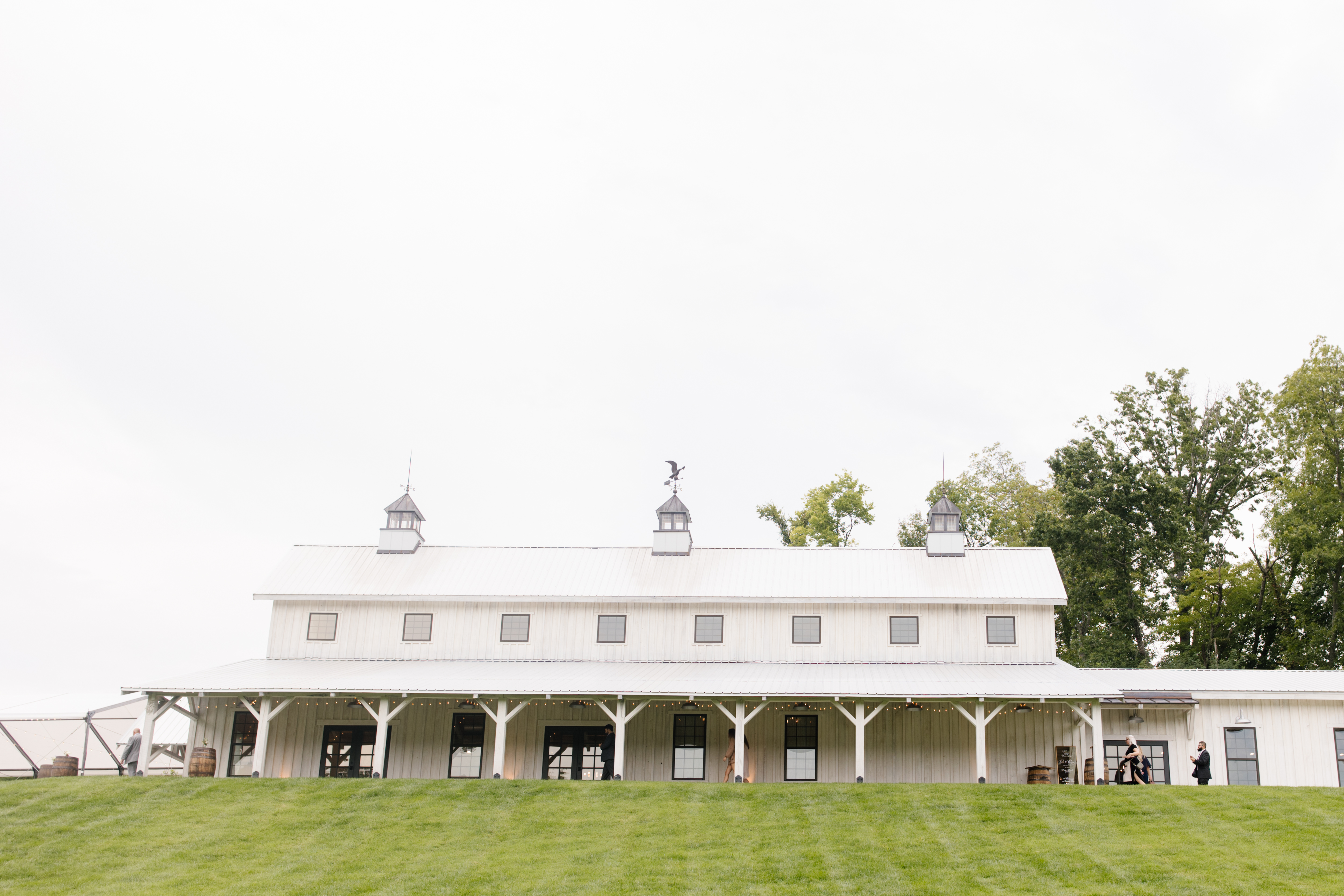
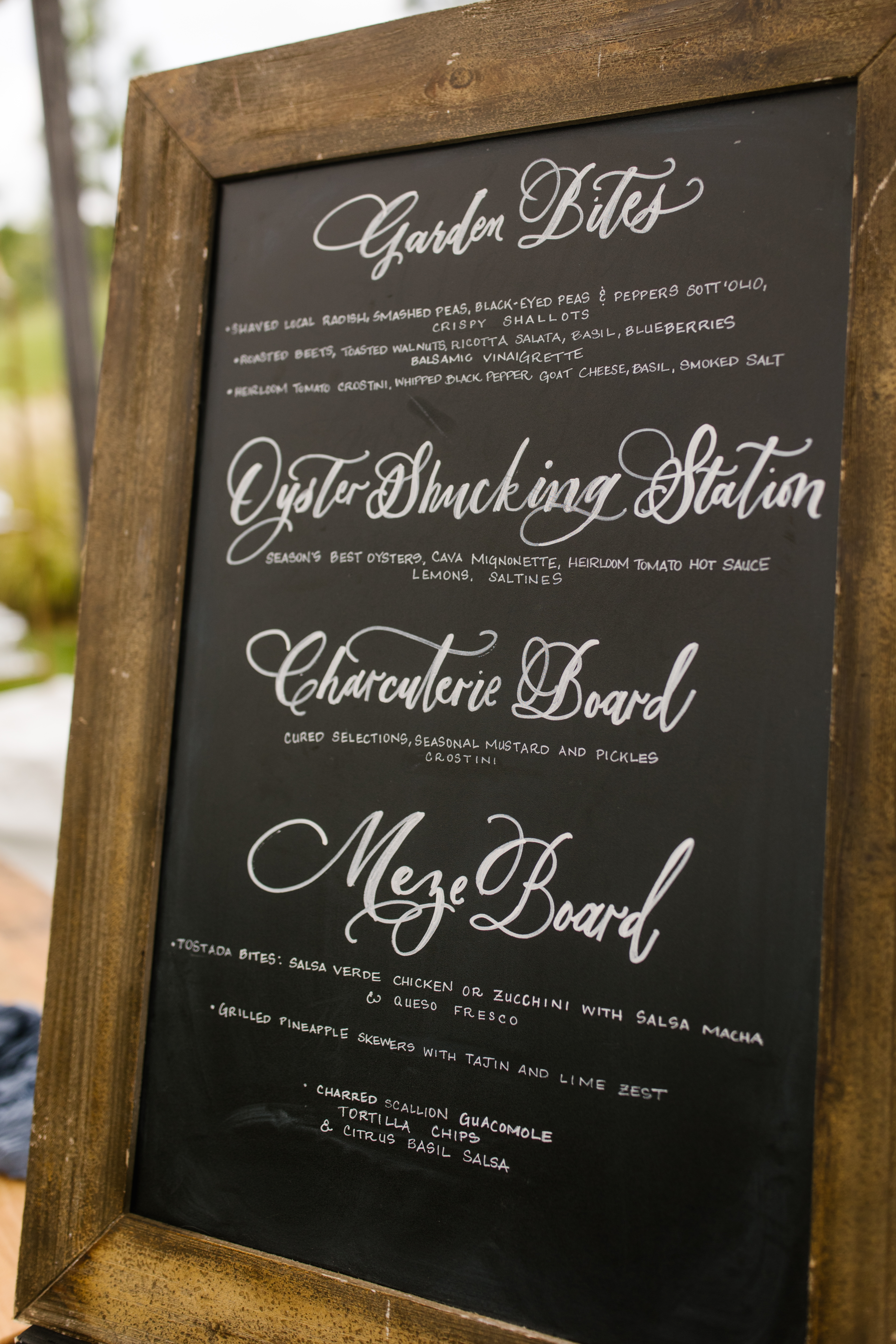
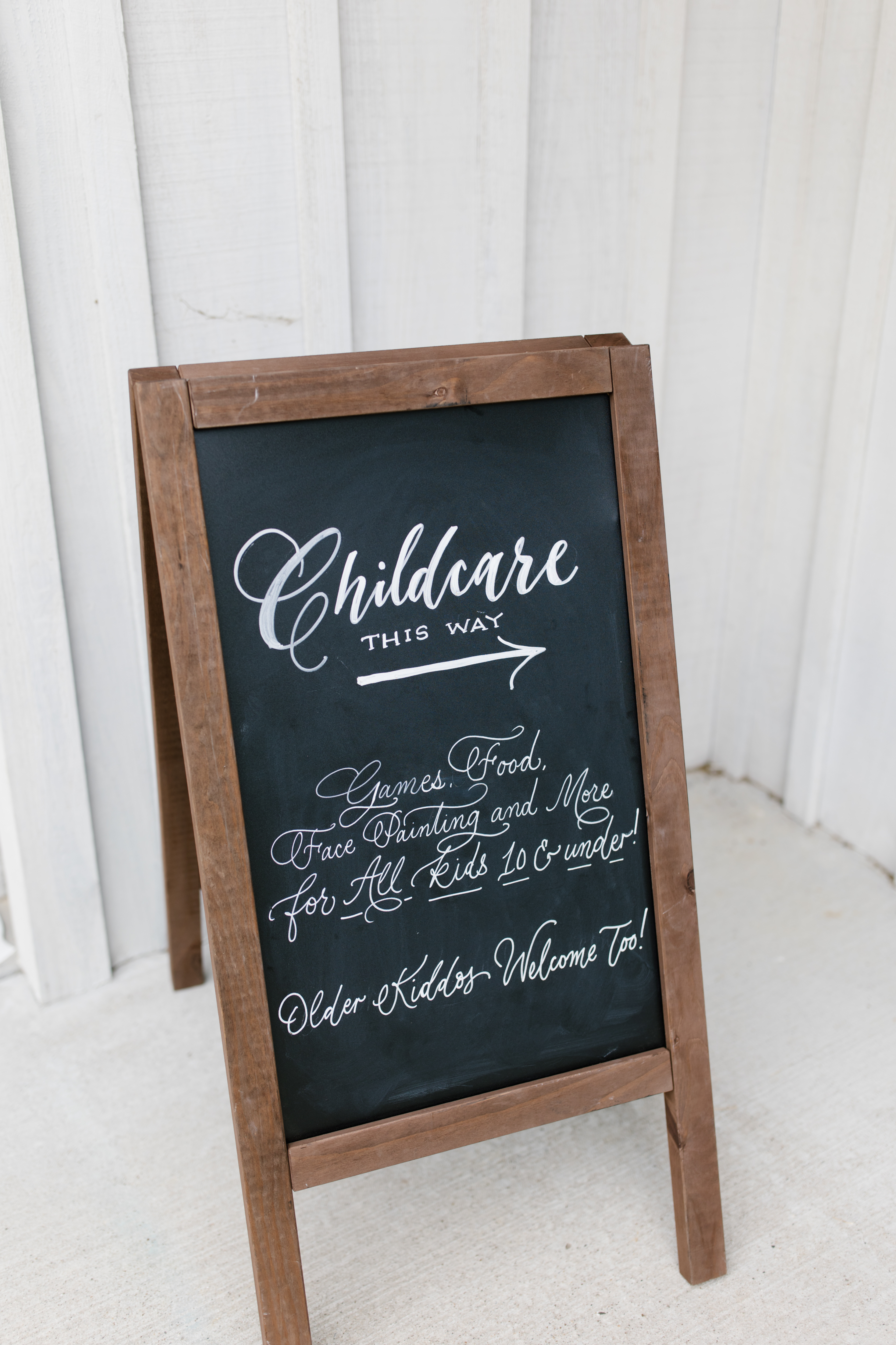
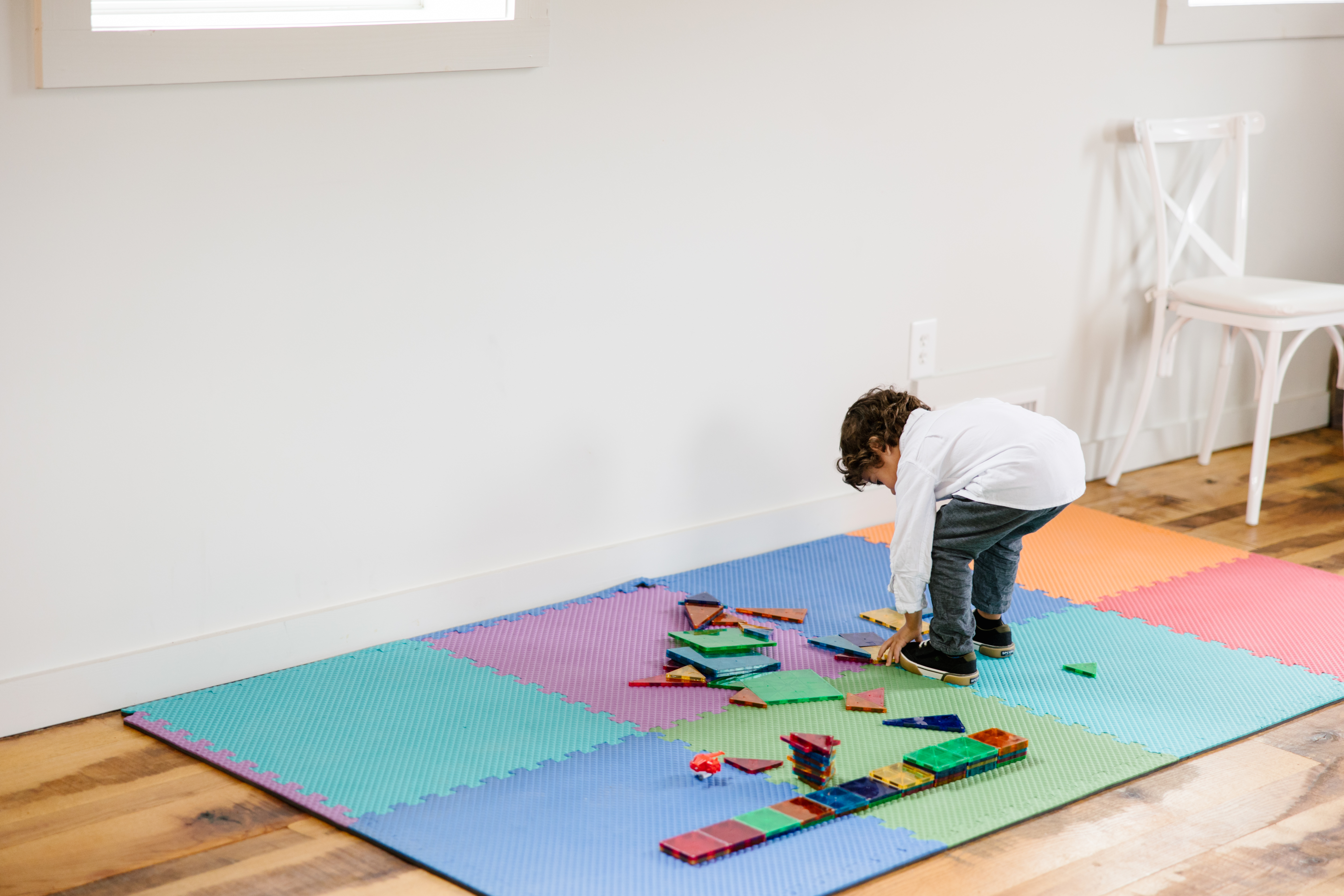
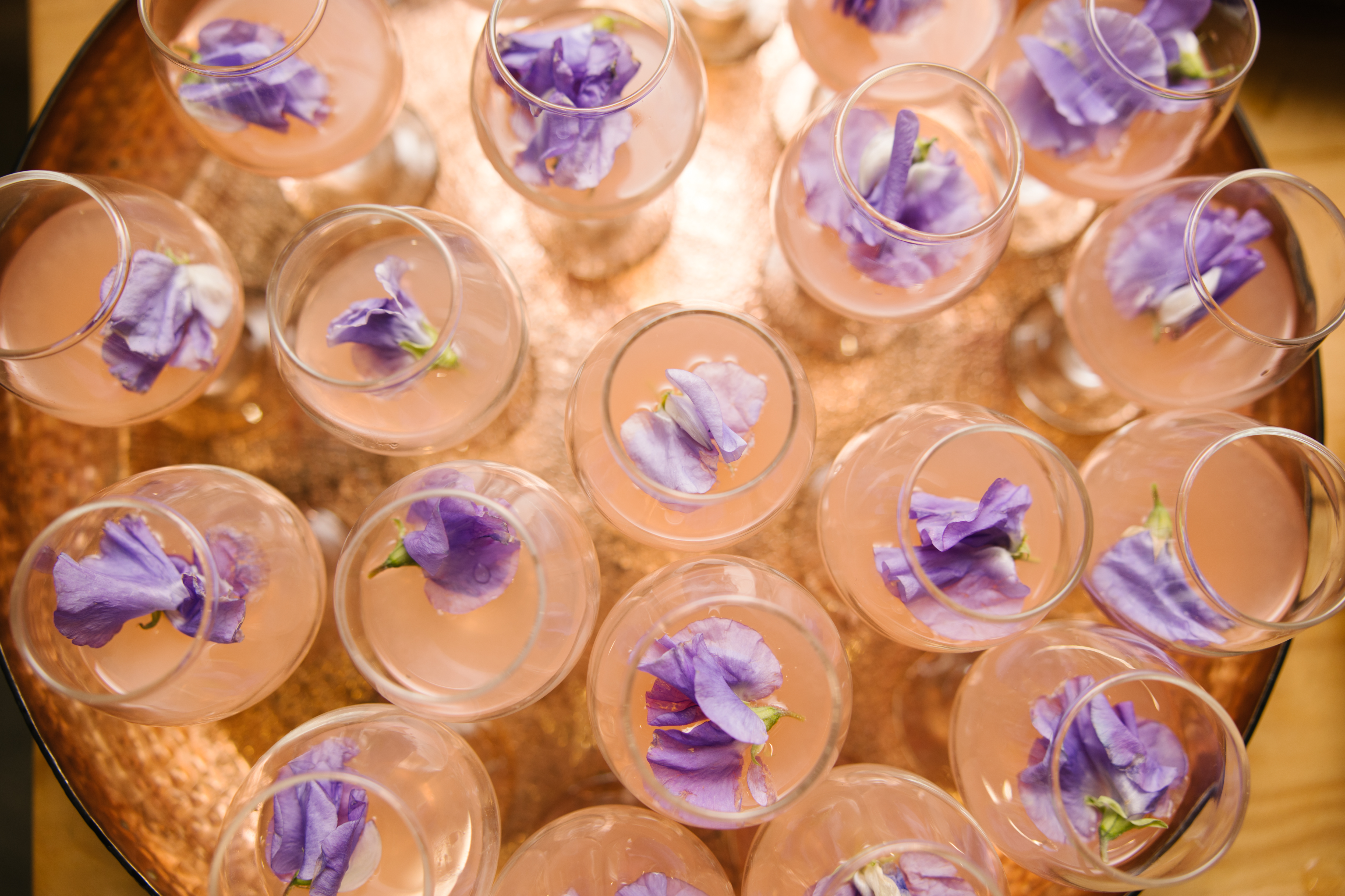
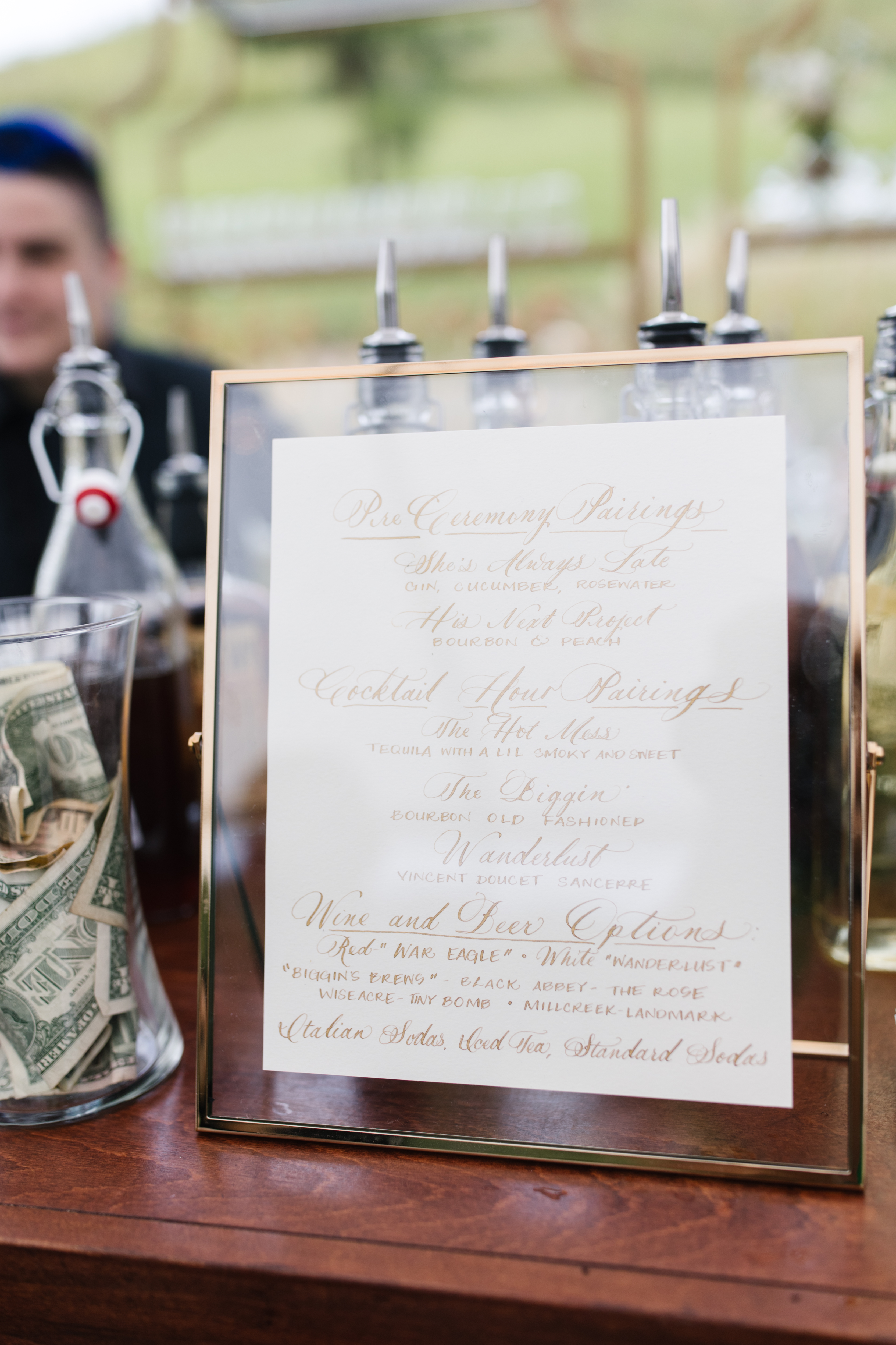
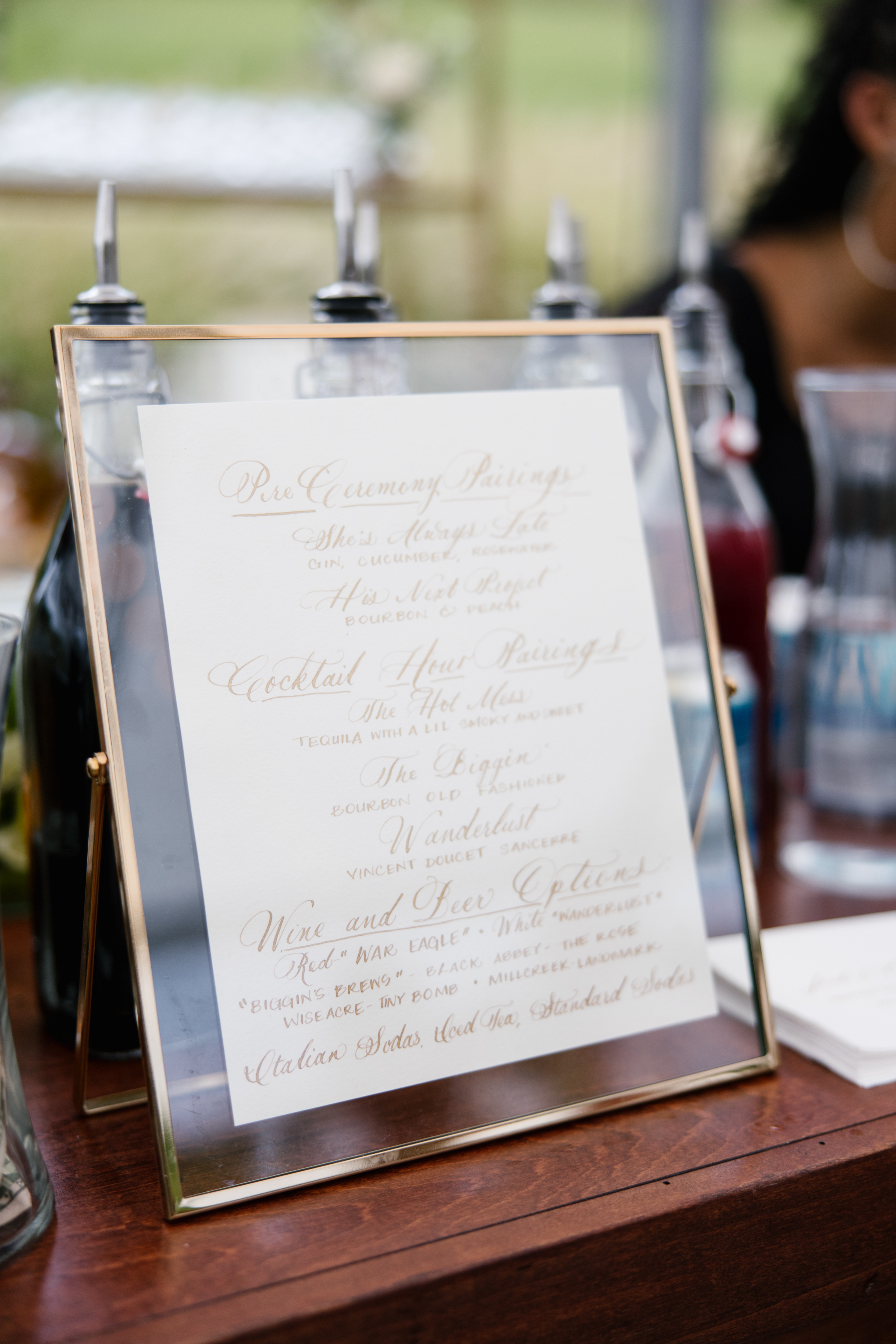
I was really excited about customizing the chalkboard signage for cocktail hour. It fit effortlessly into the southern style of the gorgeous Cranford Hollow barn venue. We also made chalkboard signage to inform the guests of the childcare that was available to parents of little ones! This kind of thoughtfulness is what can separate your event from others. Those parents will always appreciate that this was done for the kiddos.
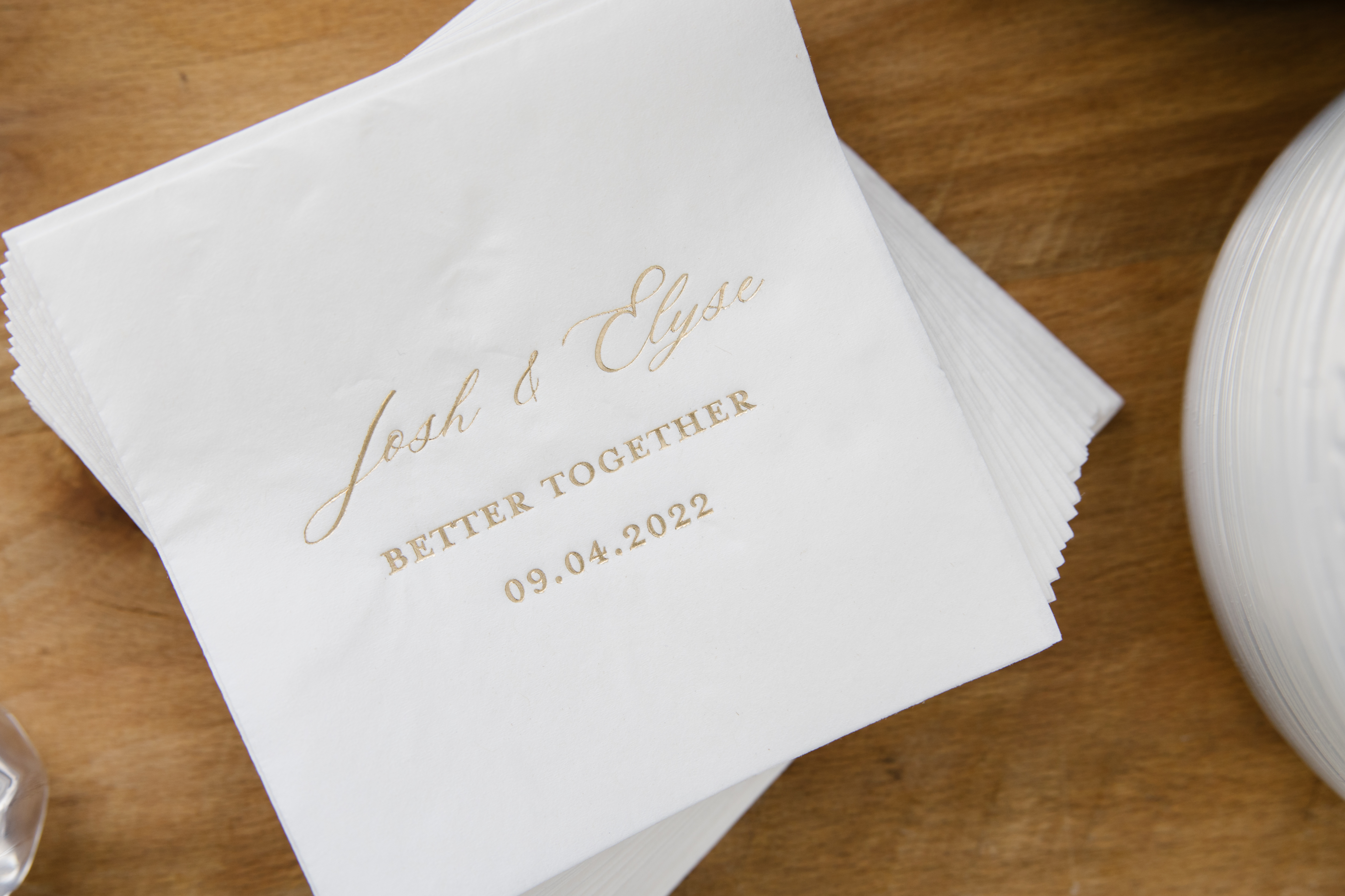
For cocktail hour, Elyse and Josh wanted to display these super cute custom cocktail napkins. I especially love how the gold font jumps off the white napkin. These napkins are a great example of how our clients use small details to leave lasting impressions. I am here for it!
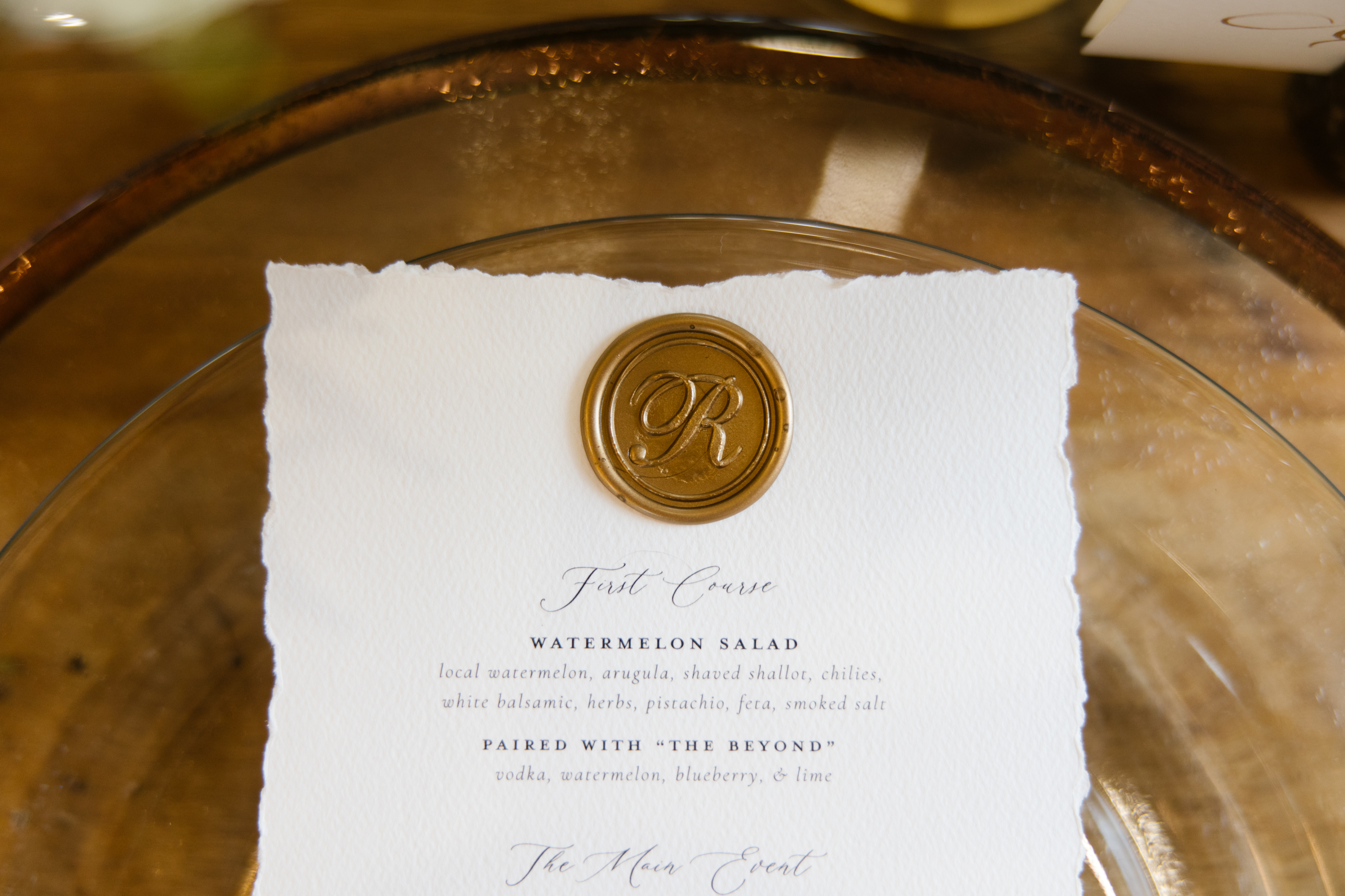
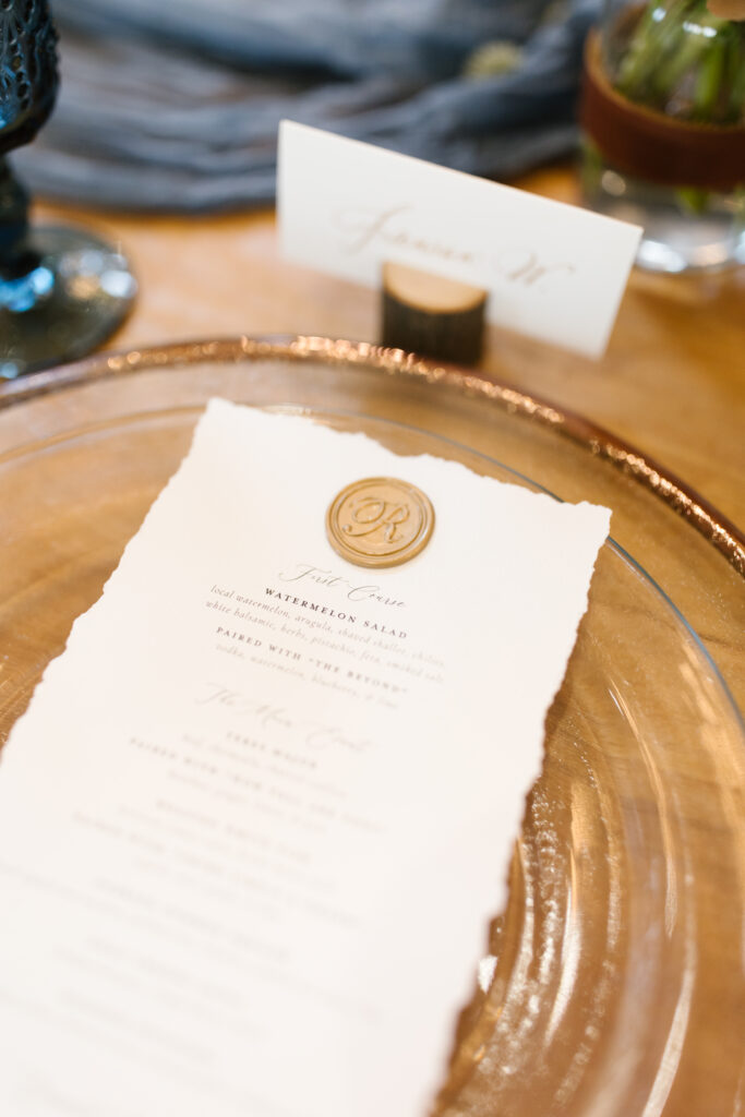
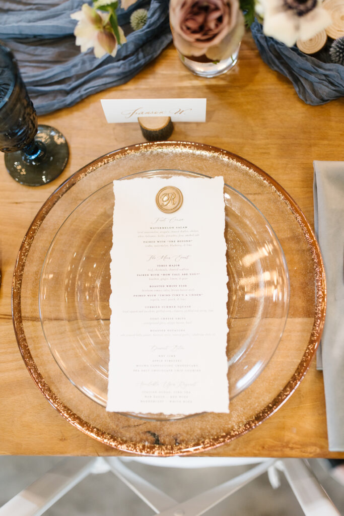
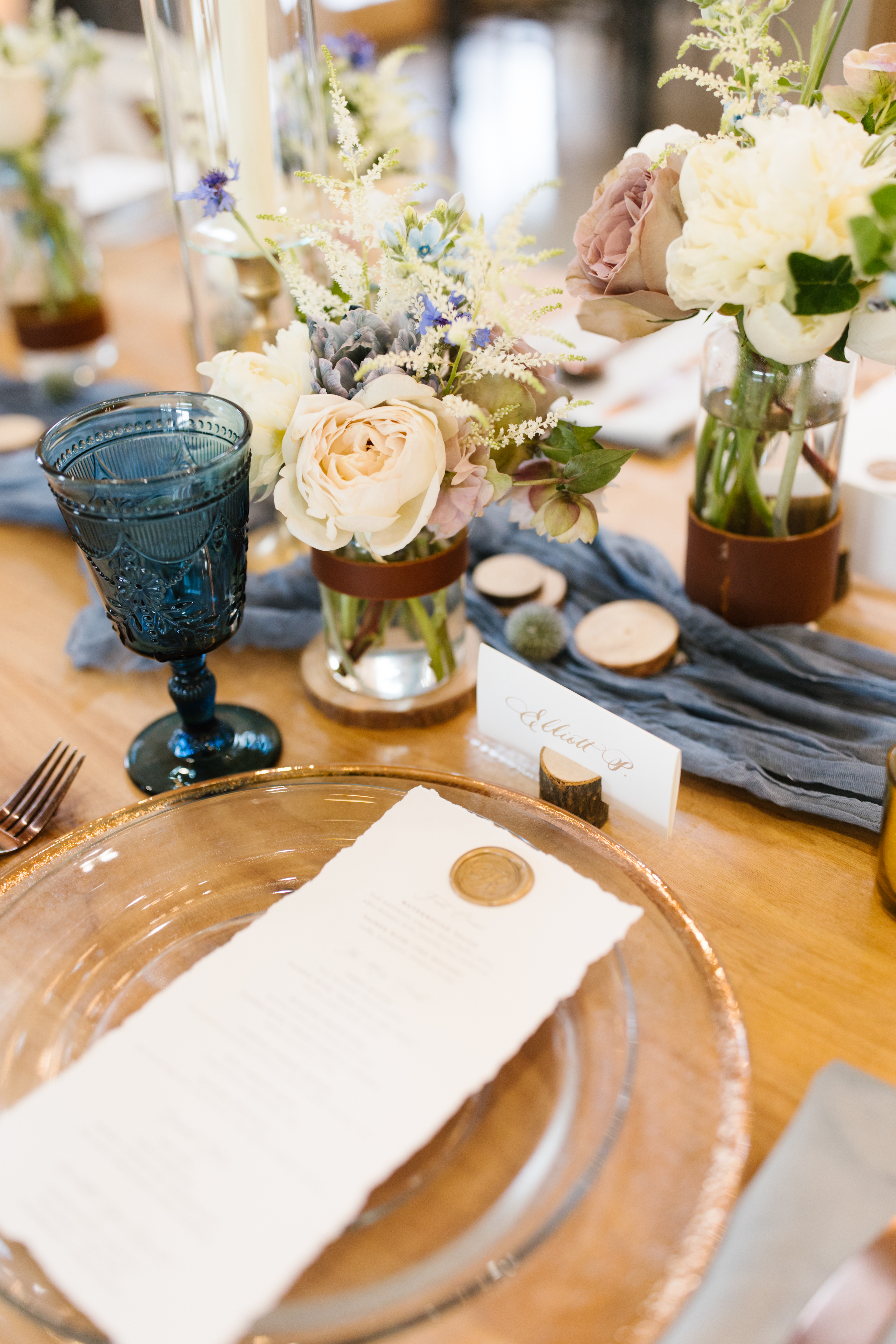
Our couple’s family-centered reception was beautifully elevated by the specially designed menus we made for them. White Ink’s stationary team designed these menus on hand torn paper and coupled it with a classic custom gold seal. Ok, so I kind of still can’t get over how Elyse and Josh included a complete cocktail pairing with each menu item!
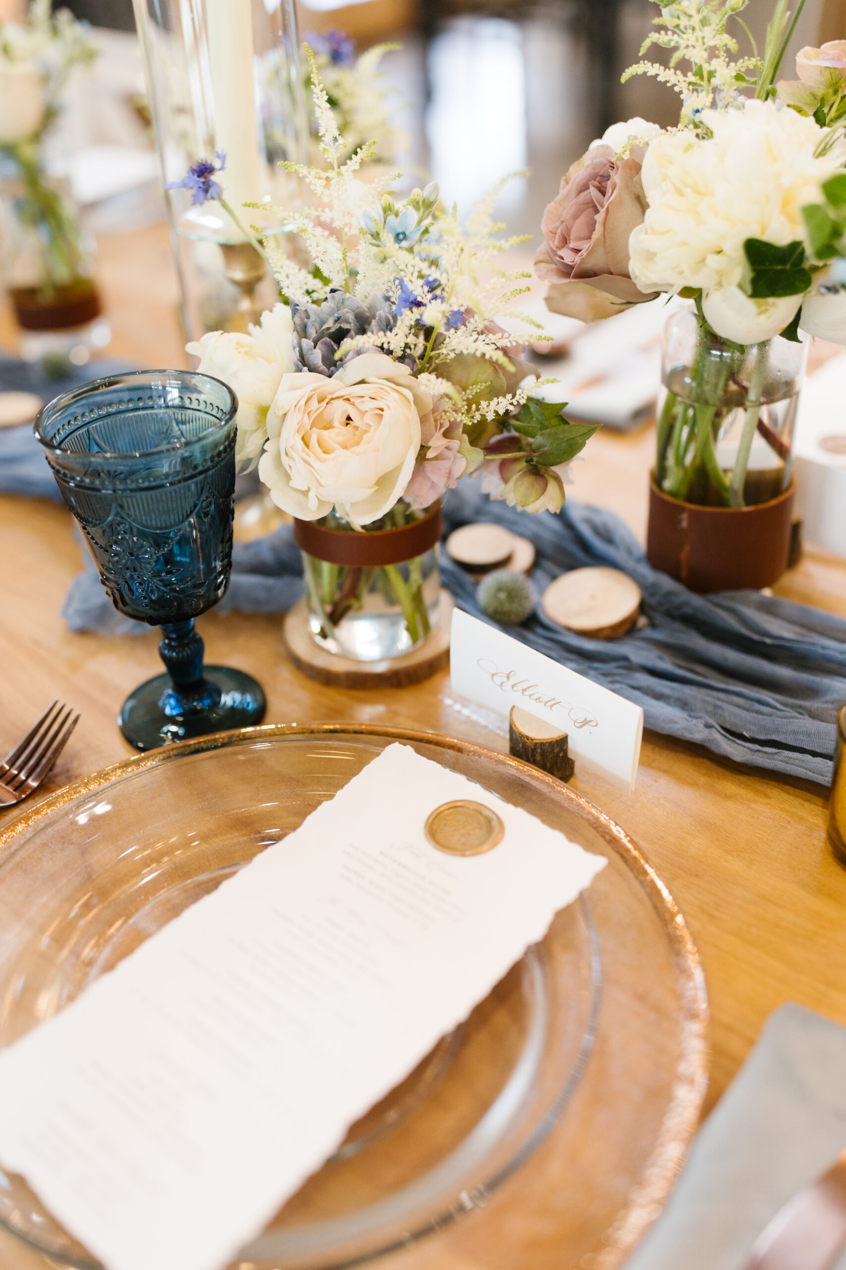
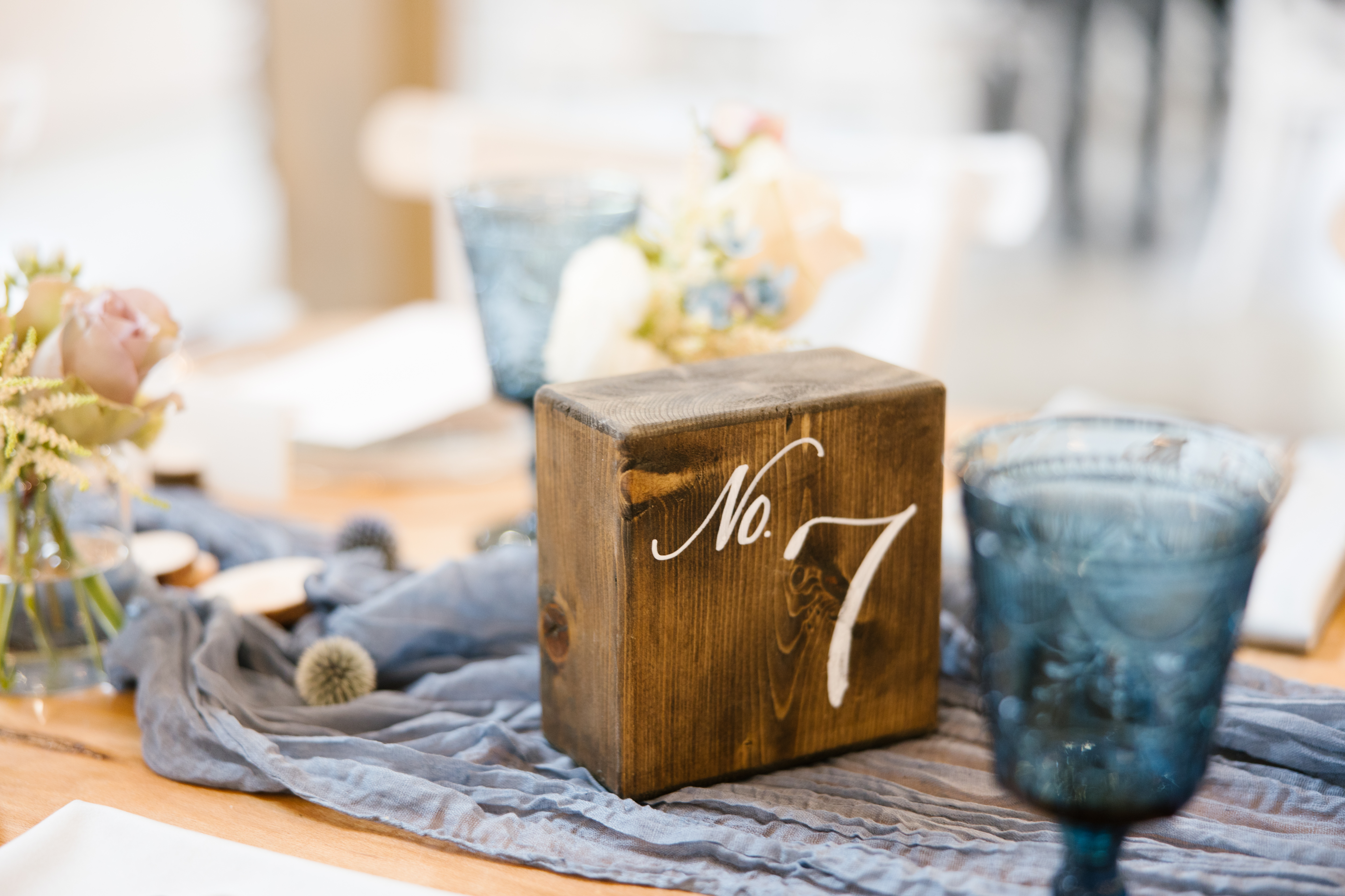
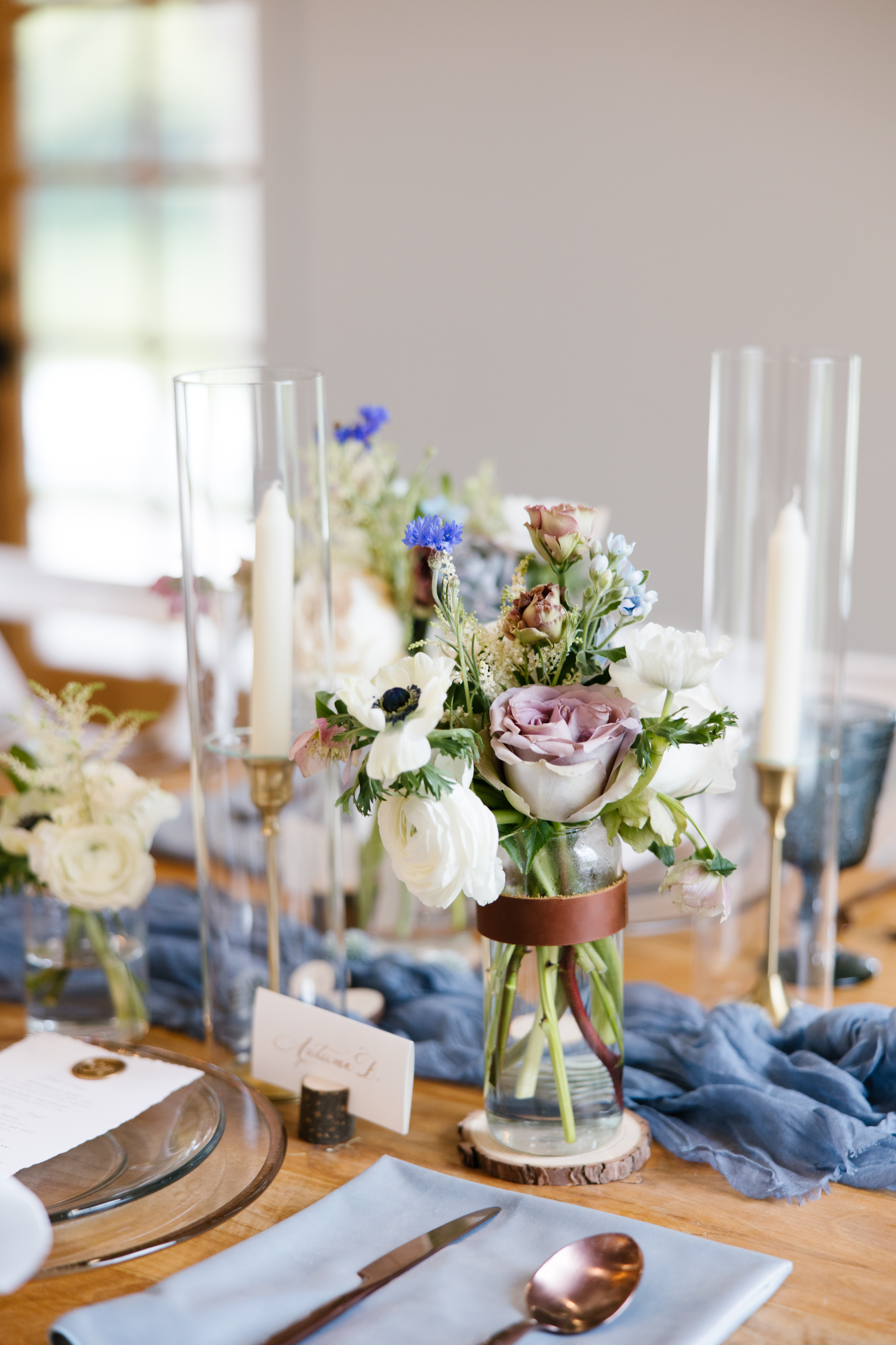
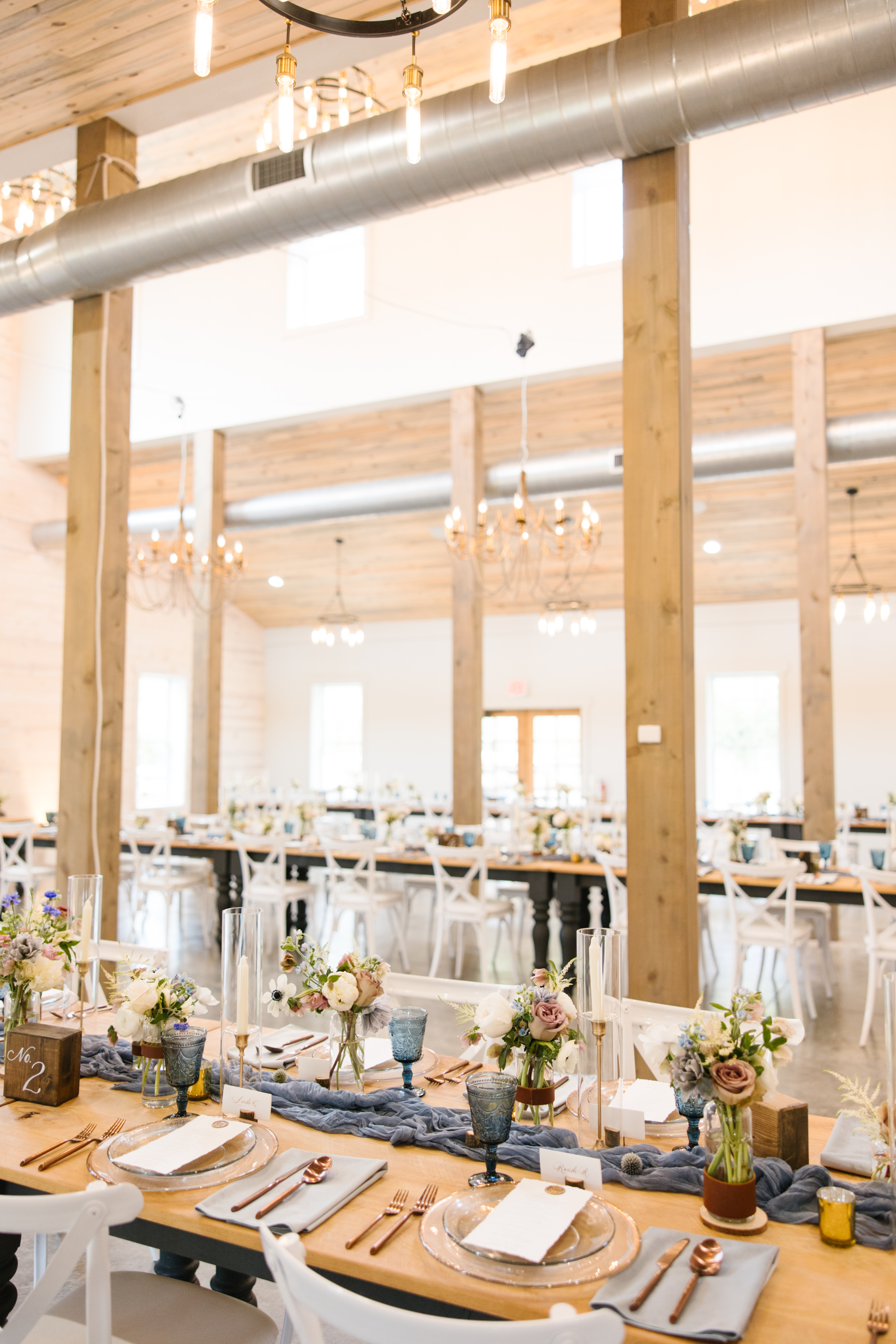
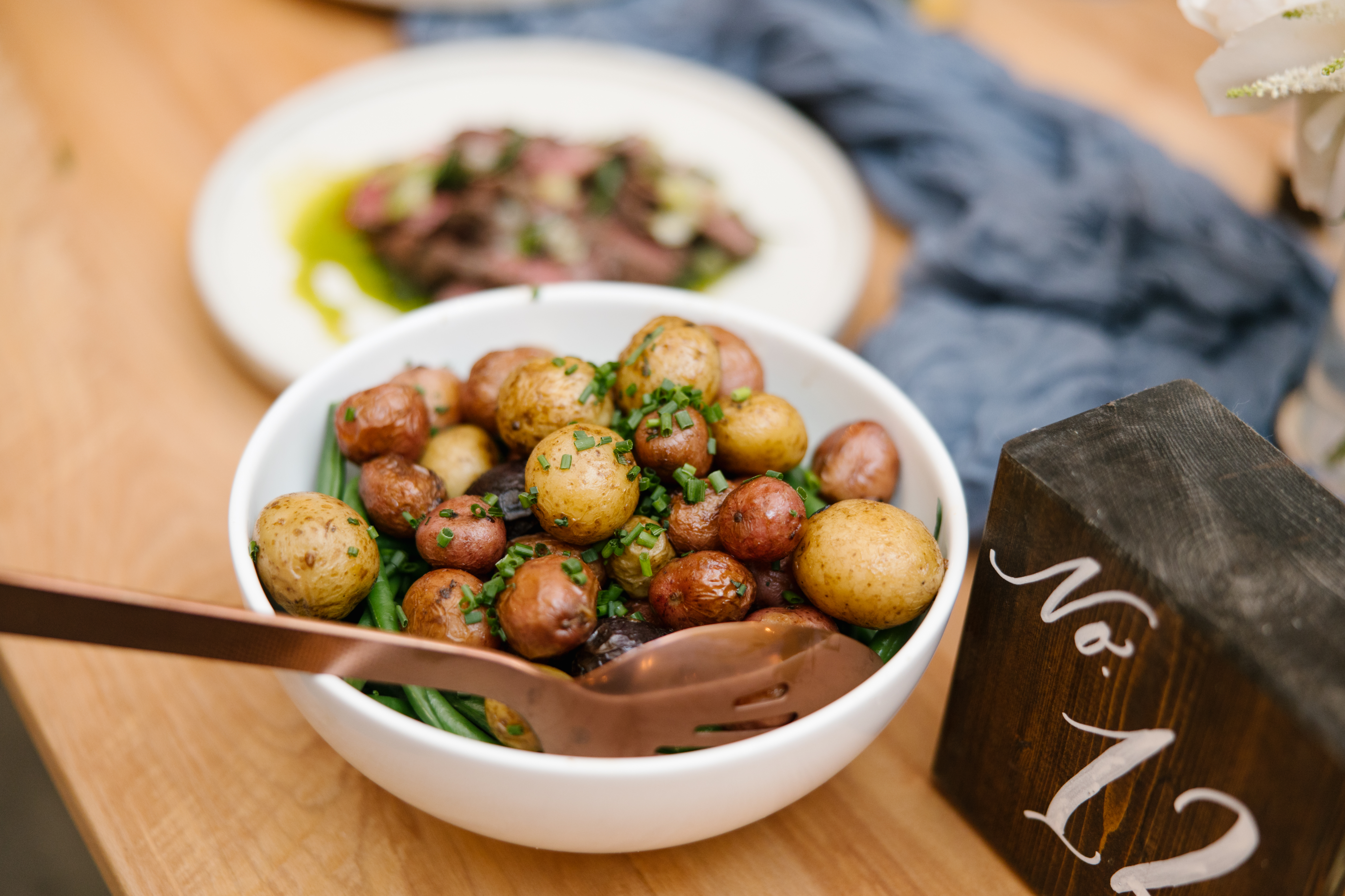
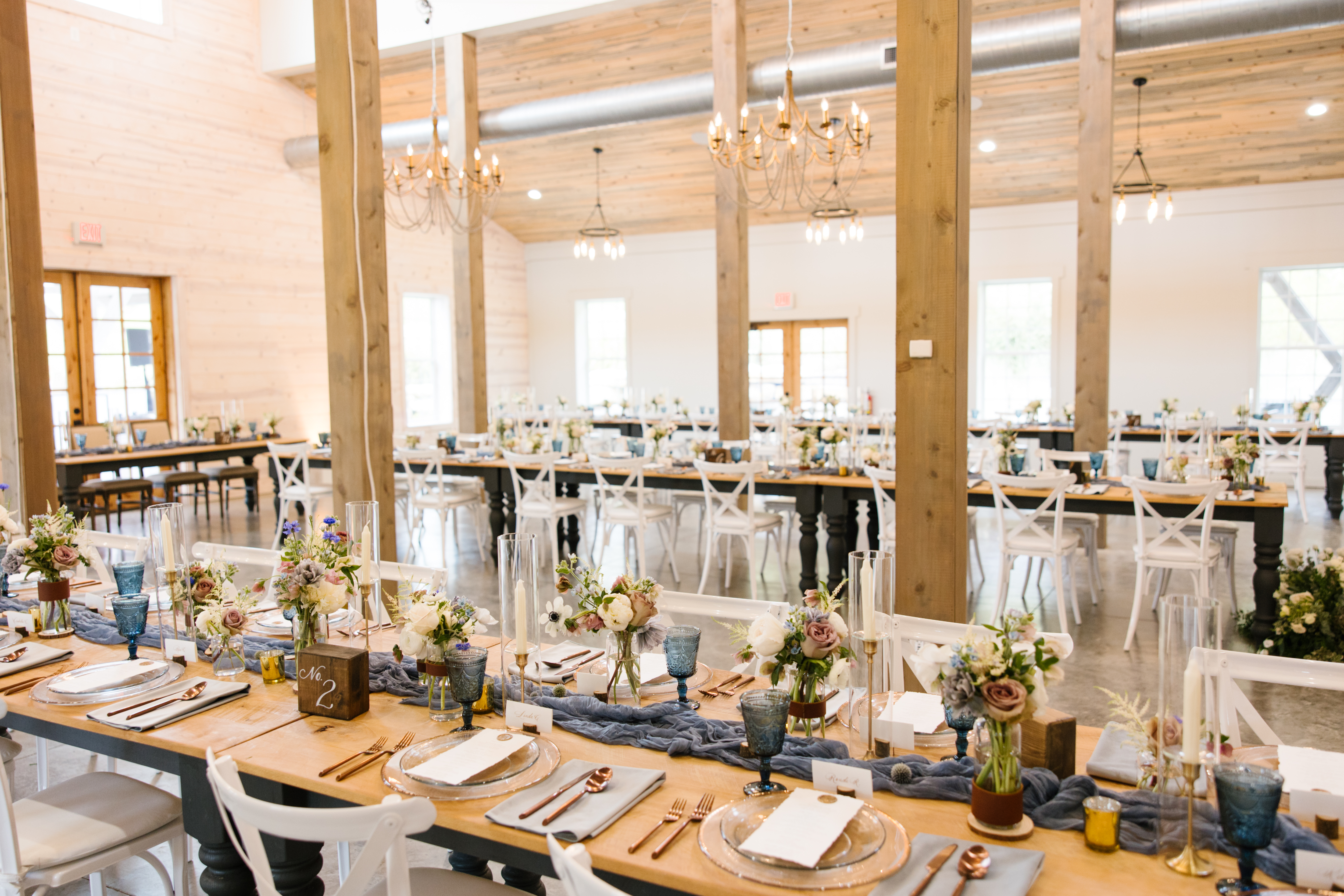
As for the table numbers that White Ink provided for this absolute picture-perfect tablescape, texture was the name of the game. I love it when a table comes together like this. Linen, florals, textured glass, wood, gold, leather- I mean, it’s a chef’s kiss! It was so fun to include these adorable, wooden block table numbers. They were the perfect unique touch to a classically rustic tablescape.
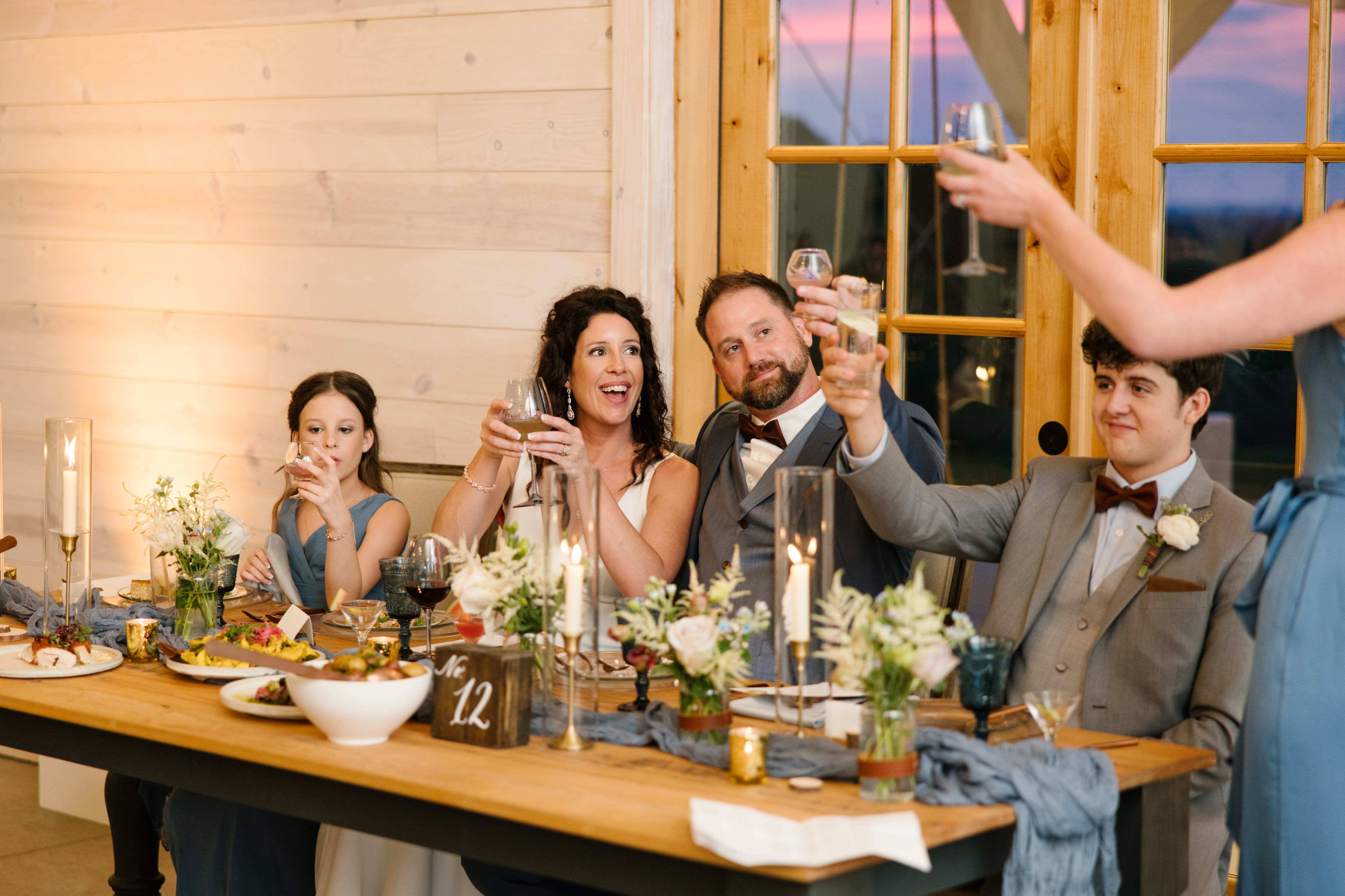
Elyse and Josh are the kind of couple that reminds us that the work we do isn’t just for the client; it’s for family, it’s for friends. Weddings like this are where we show those closest to us that we care about their experience. Because this is where we gather. Cheers!
One of the things that I love about White Ink Calligraphy is that we aren’t just limited to paper. We have a wide range of capabilities that we apply to so many events, and we have so much fun doing it! We have the best clients in the world; they know we’ve got their back when it comes to meeting the expectations around their special day. Robin and Jeffrey are a great example. The White Ink team loved working for this amazing couple on their wedding day, and we know you’re going to love these details!
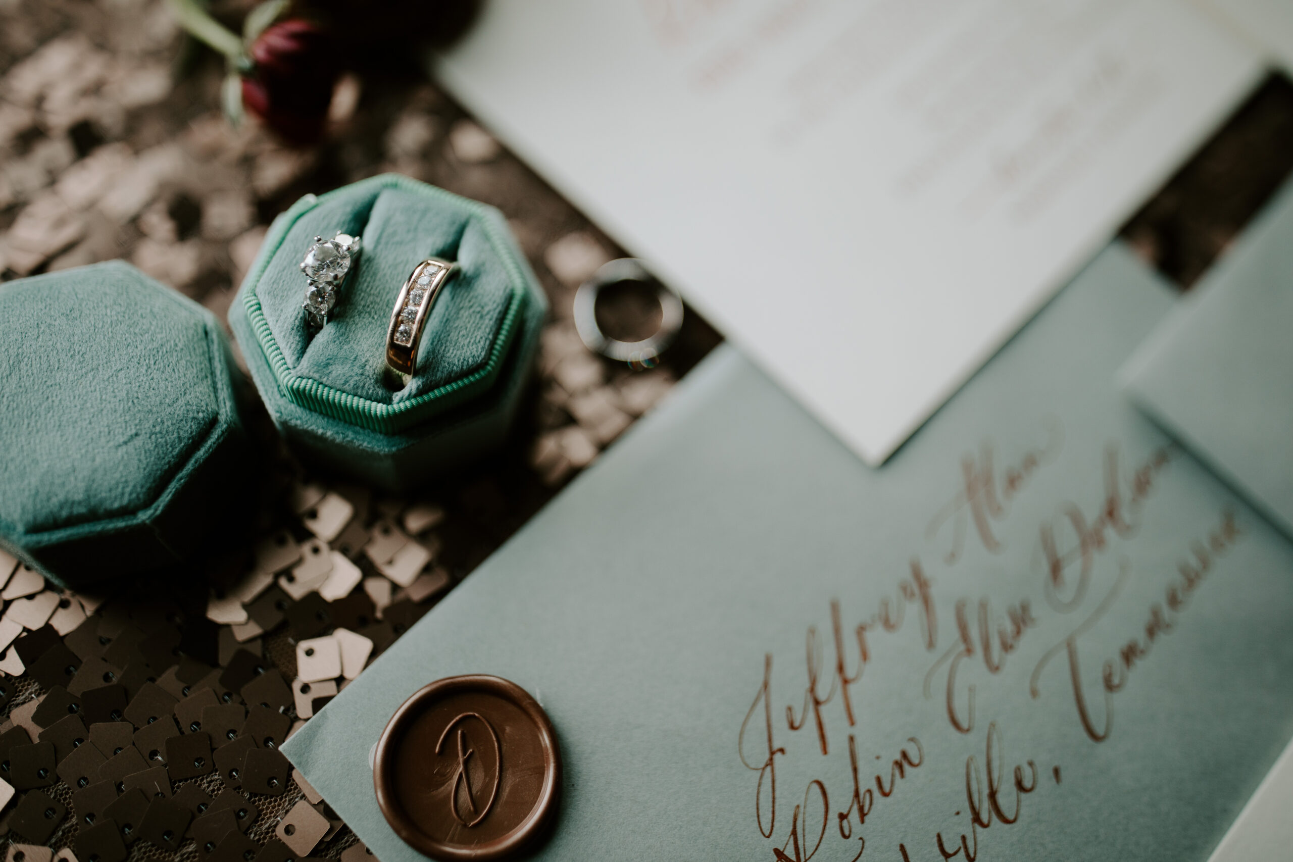
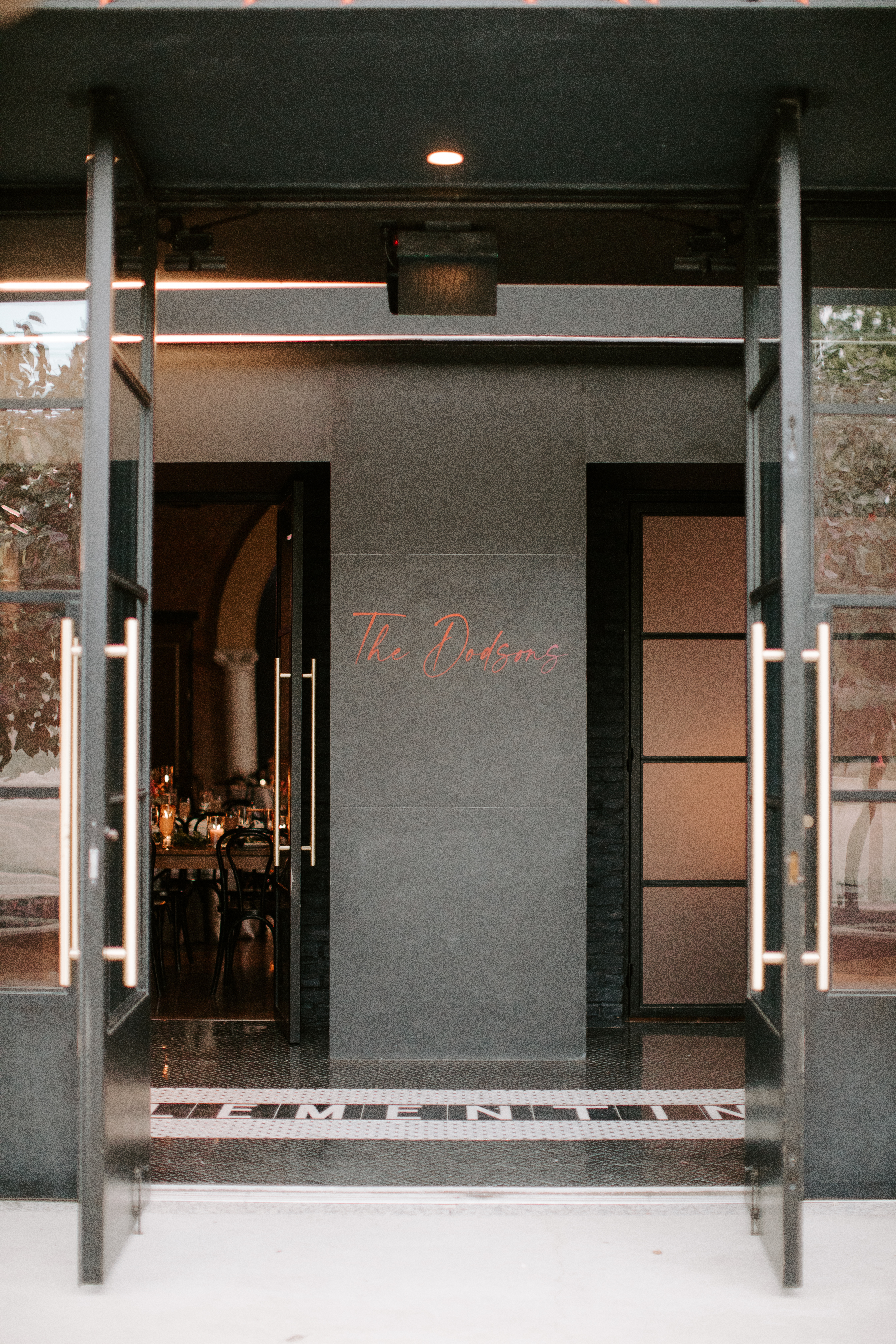
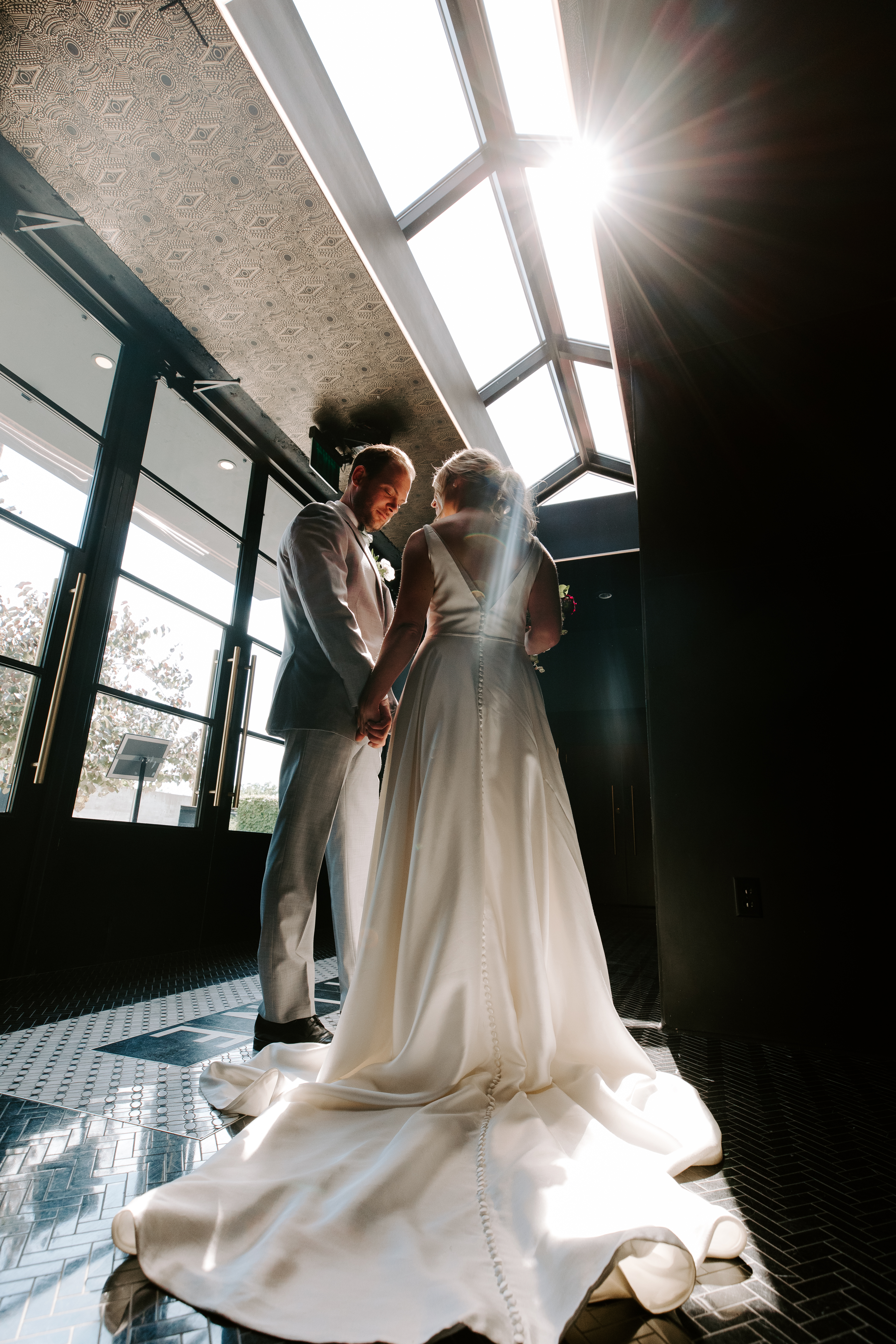
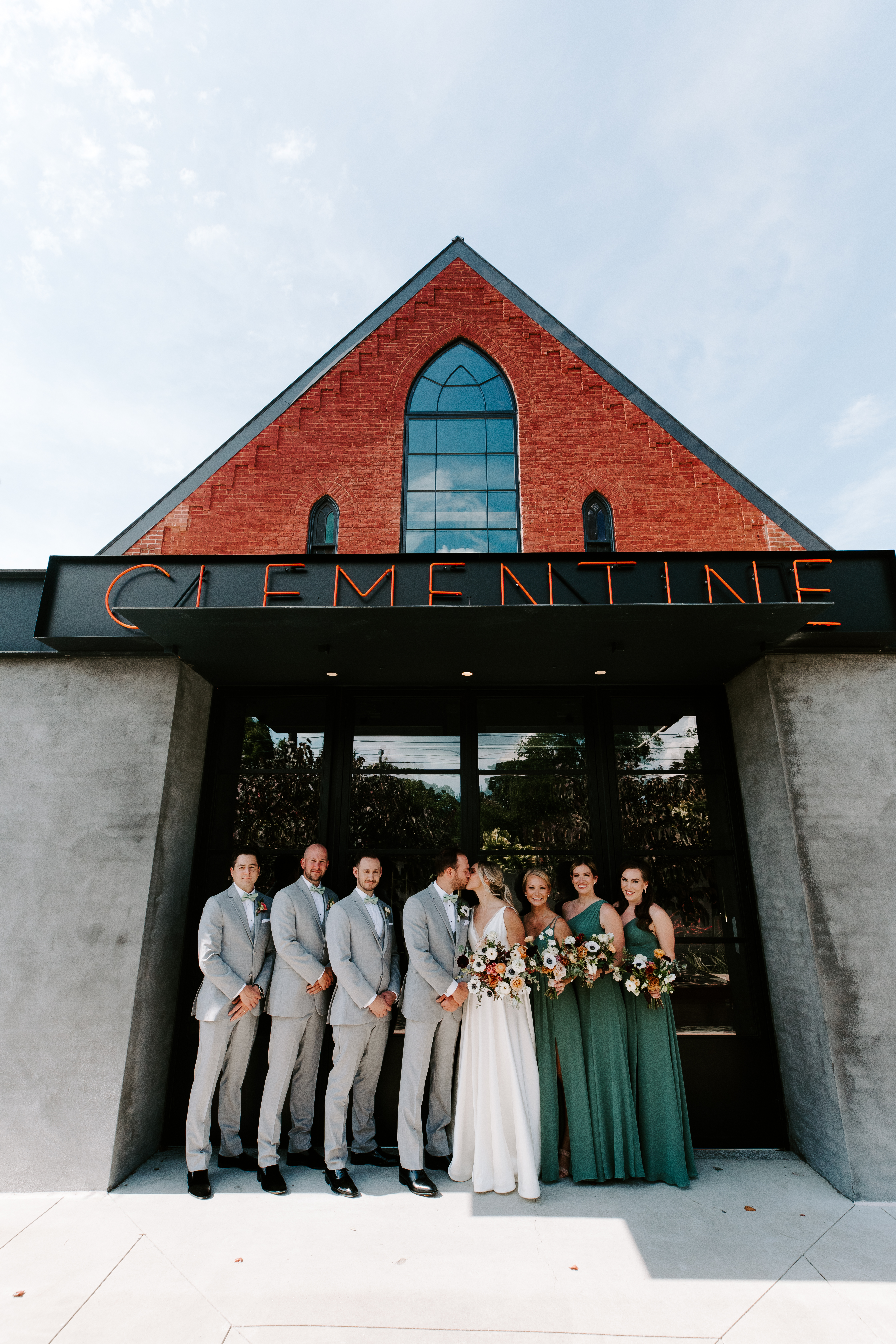
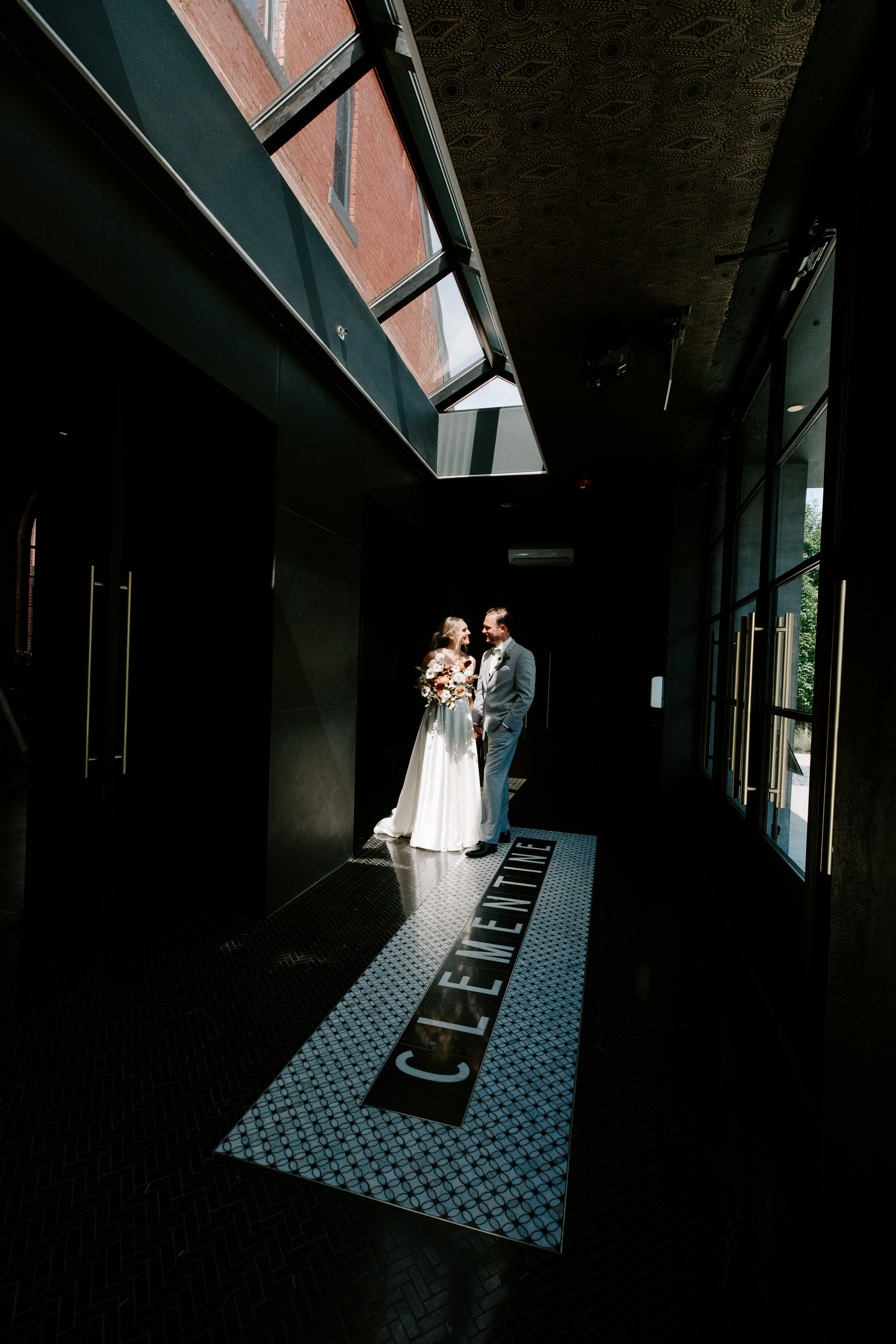
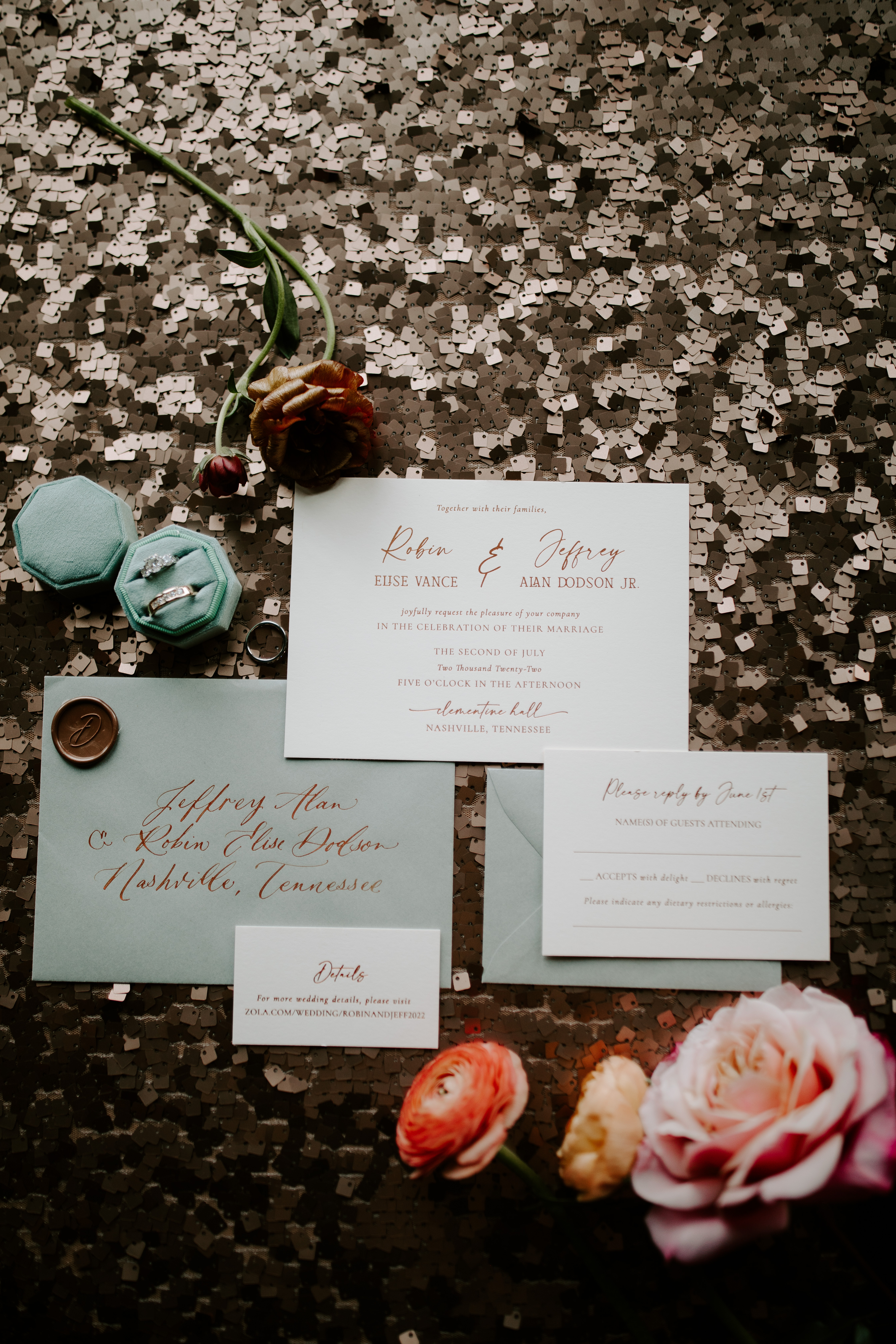
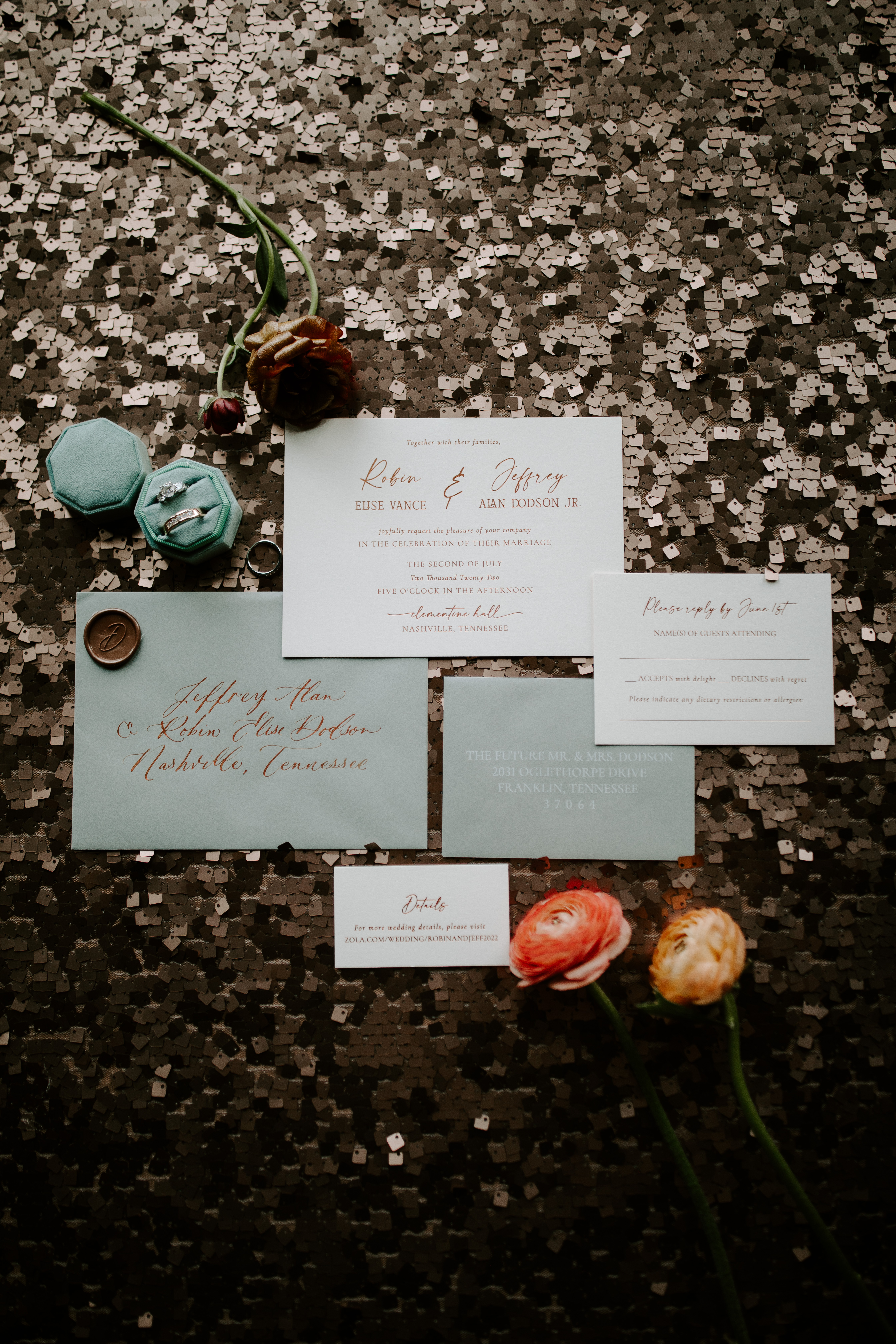
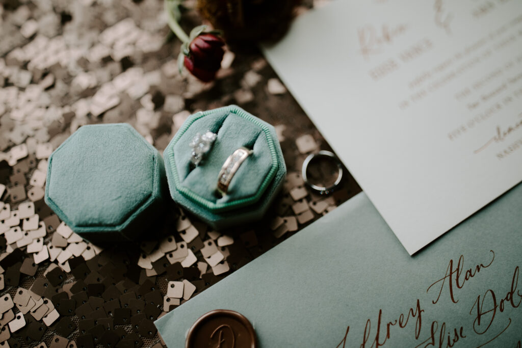
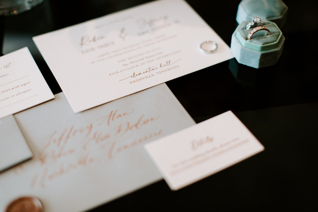
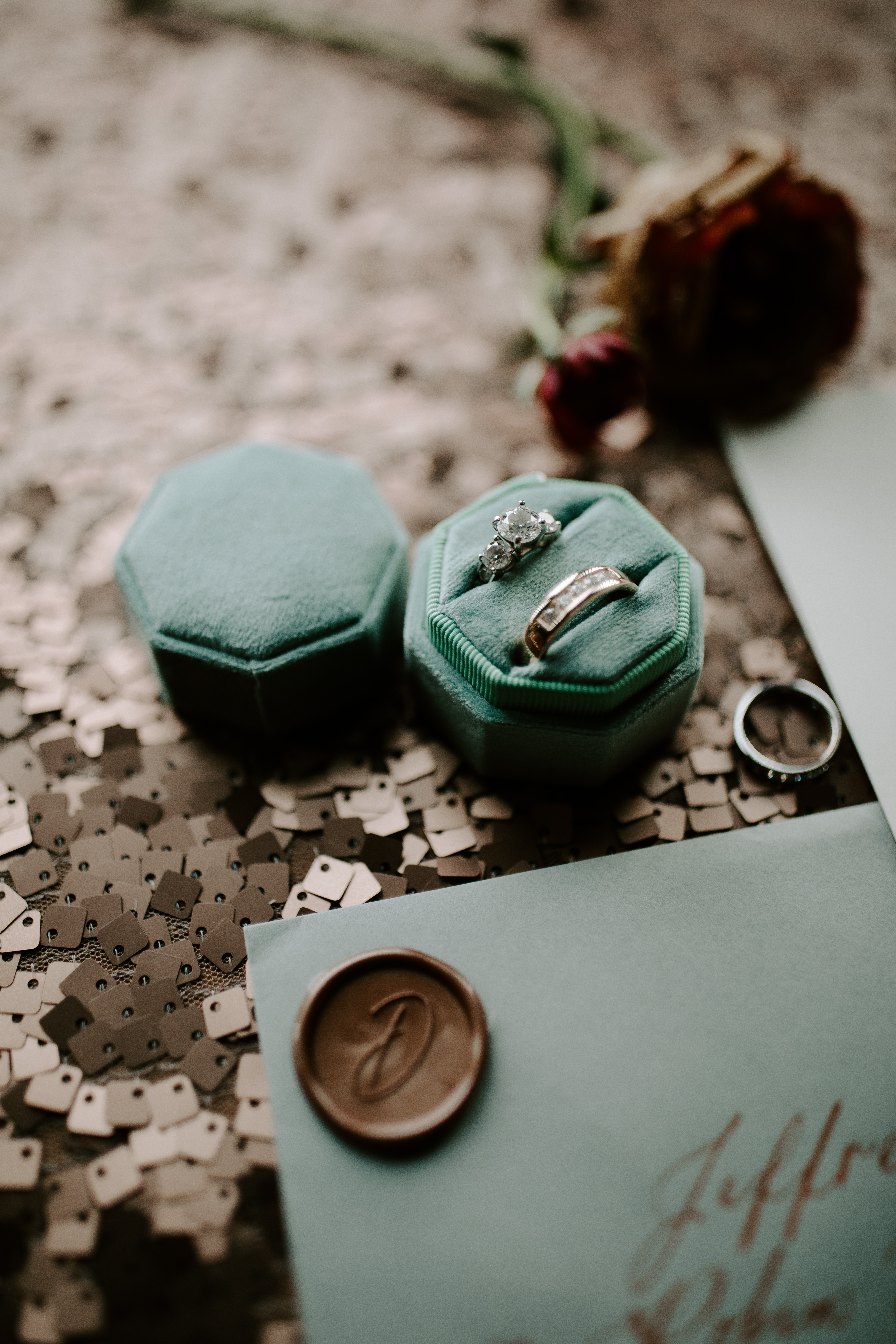
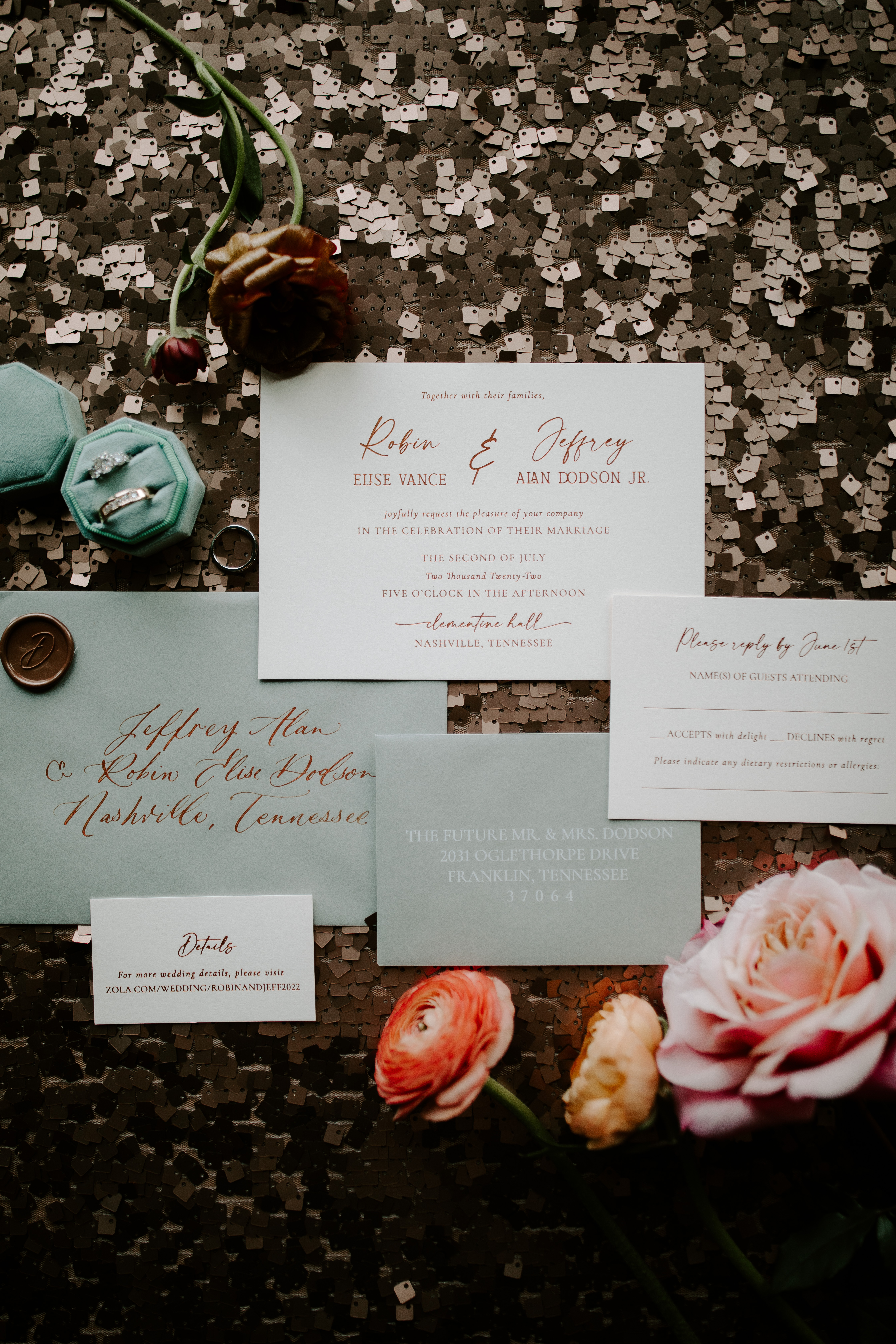
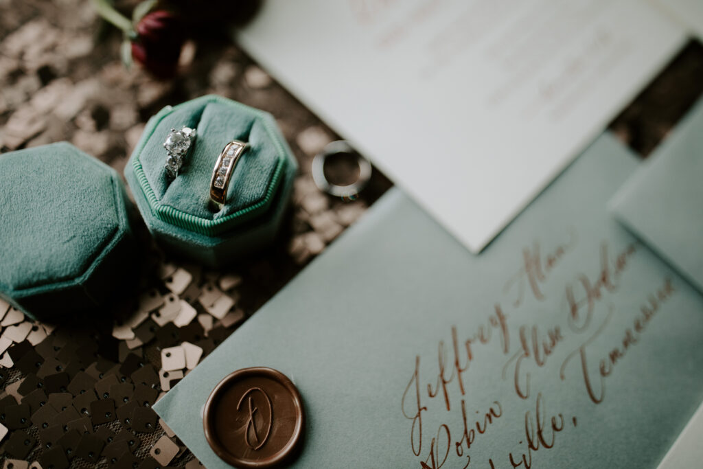
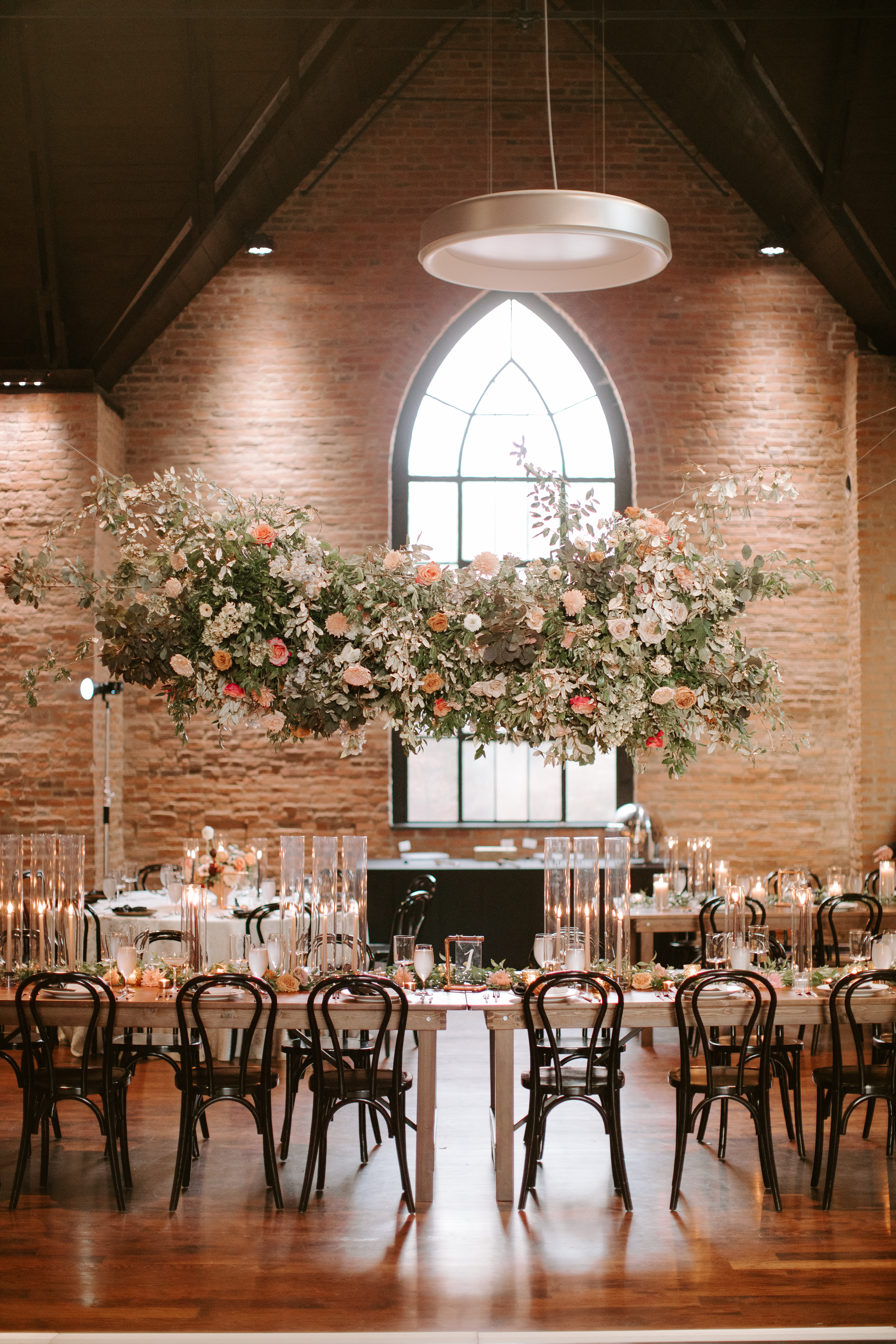
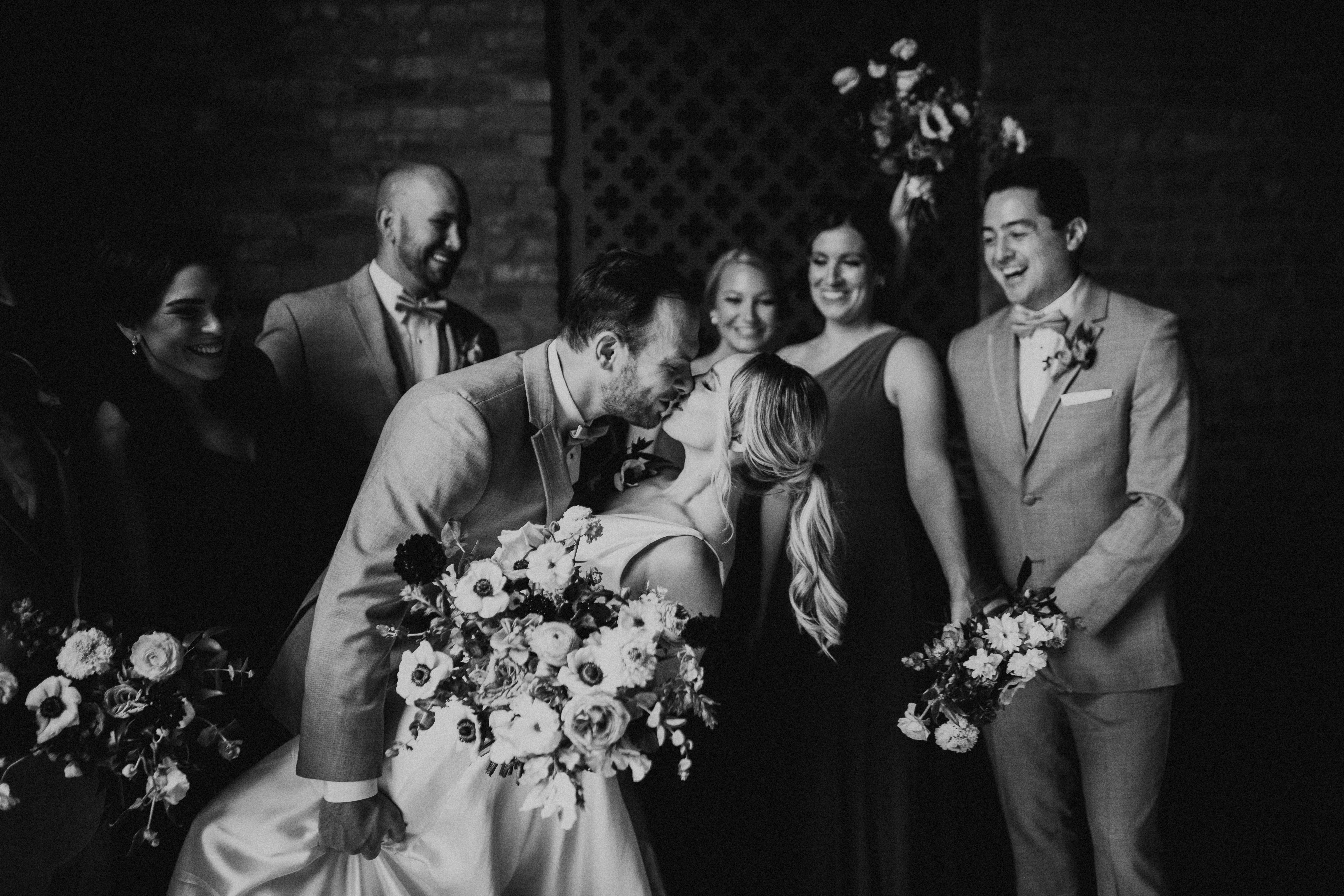
Robin and Jeffrey’s Nashville summer wedding was an absolute feast for the eyes. They chose the gorgeous Clementine Hall in downtown Nashville as their venue which added an array of modern elements to this southern wedding. Venues like the Clementine give White Ink a chance to stretch our creative muscles. Like getting to incorporate copper tones in much of Robin and Jeffrey’s day-of pieces. It all begins with the invitation suite that we created for our perfect pair. Custom envelope calligraphy is a showstopper all on its own, but when you pair that with a brilliant copper ink- whew! Just stunning. These invites were completed with a classic copper wax seal to make this suite as distinctive as our beautiful couple.
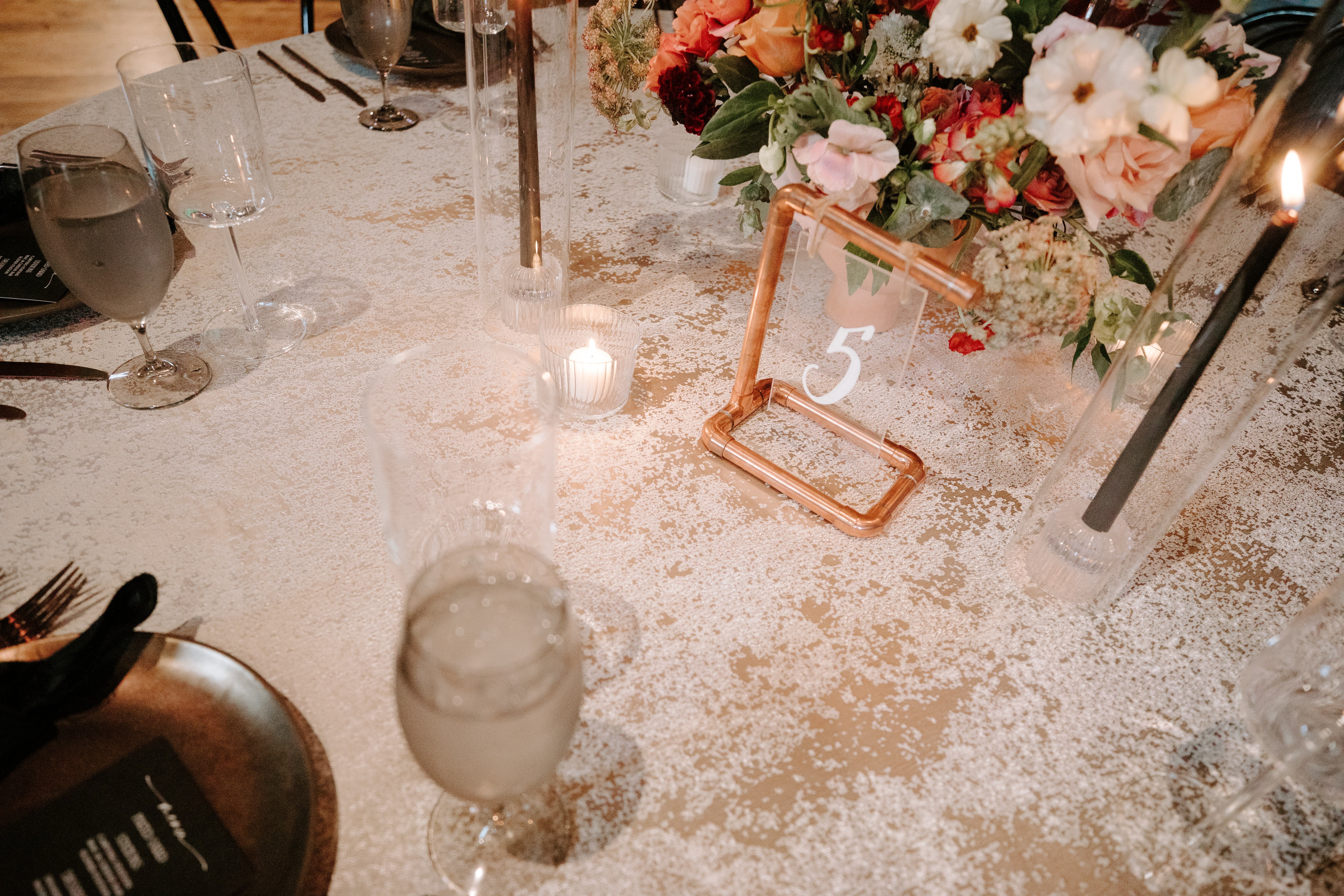
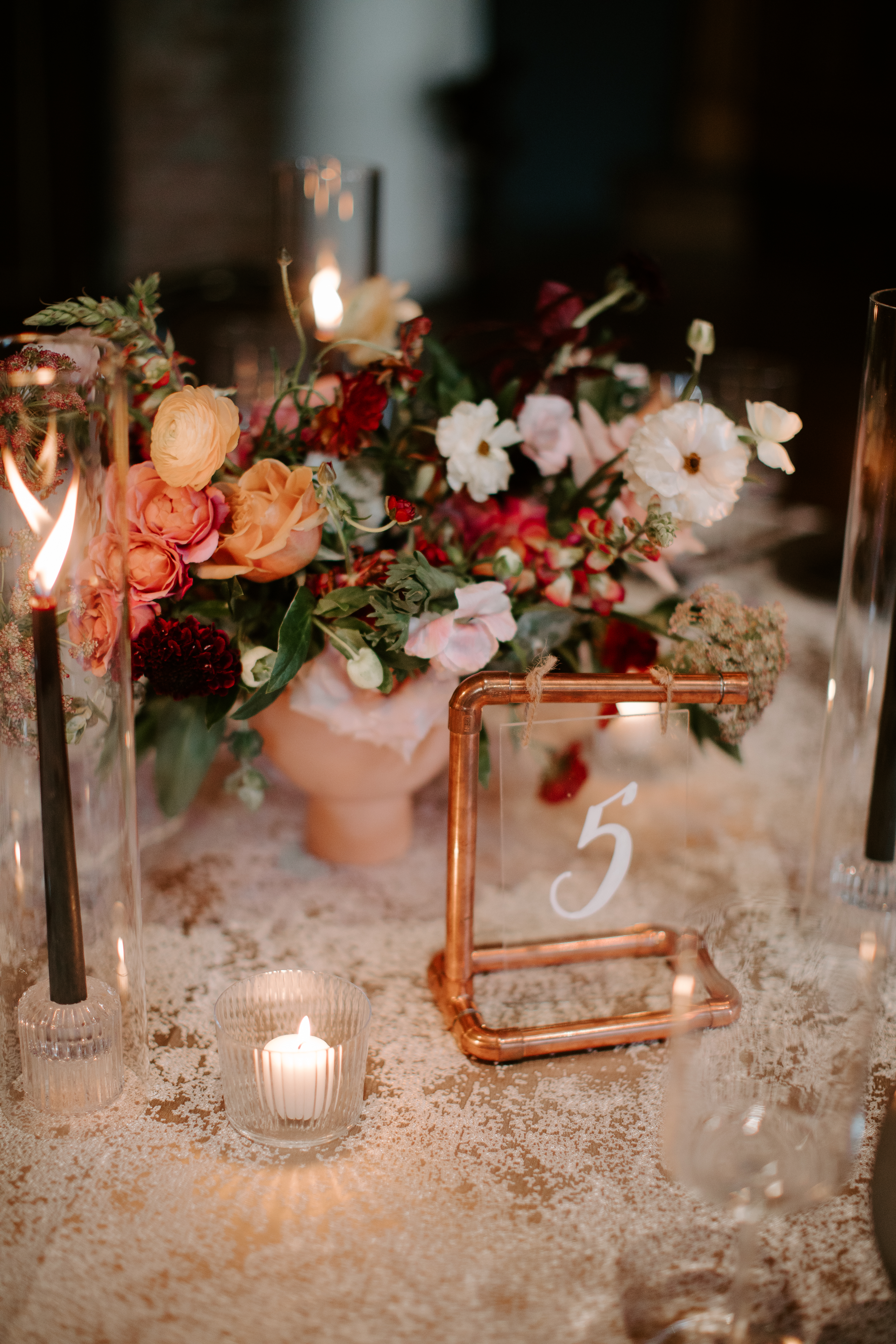
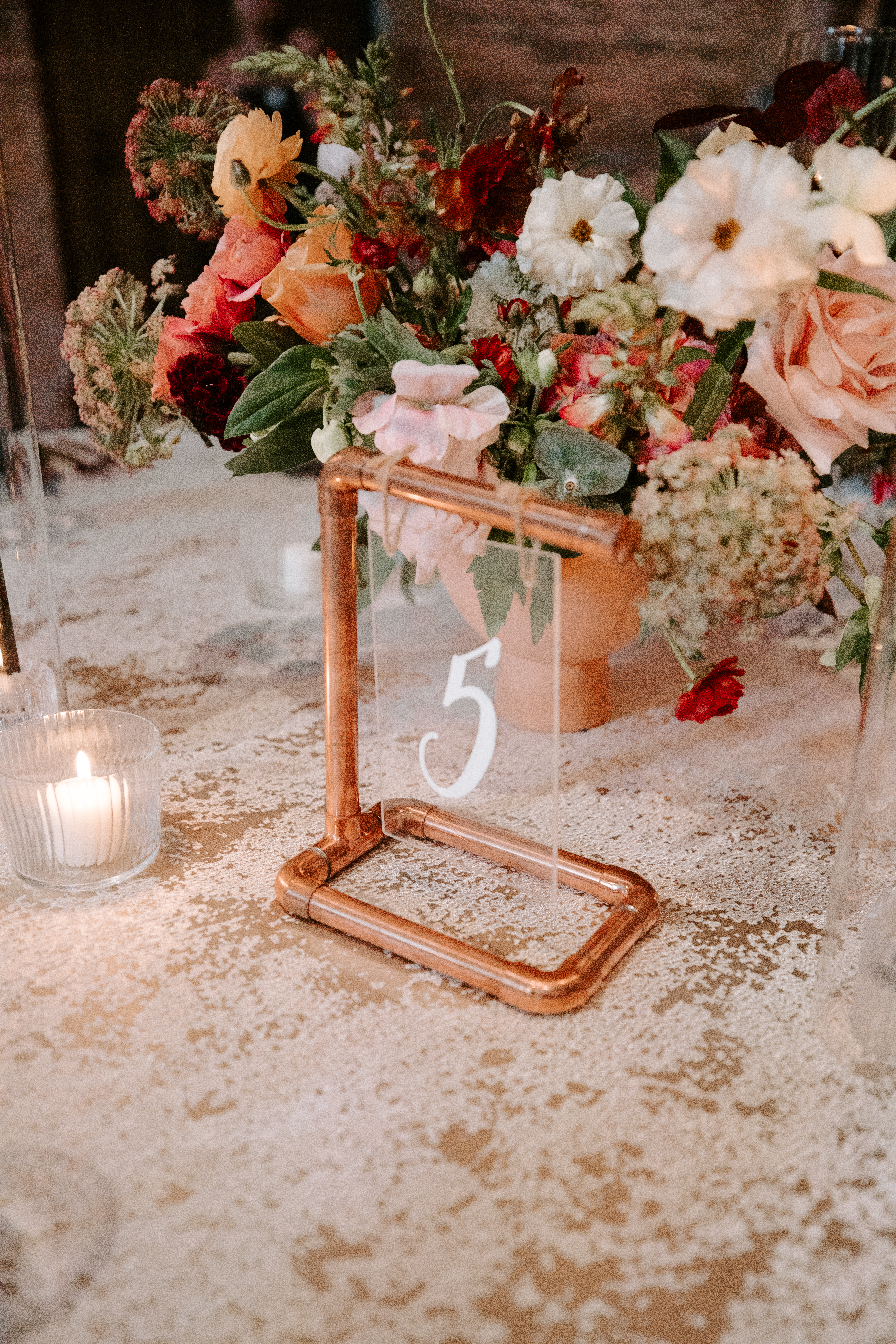
These same copper elements made their appearance again at Robin and Jeffrey’s reception. Guests were wowed by Whtie Ink’s one-of-a-kind table numbers made up of acrylic signage and copper pipe stands. How awesome are these? The way the copper pipes blend in with the florals on the tablescape is a really great example of how different textures can be used together to create an aesthetically delightful style. White Ink used this same acrylic and copper pipe for the bar signage, and we were thrilled with how well it turned out. We love a couple who aren’t afraid to think outside the box in terms of color and how to use it. Well done, Robin and Jeffrey!
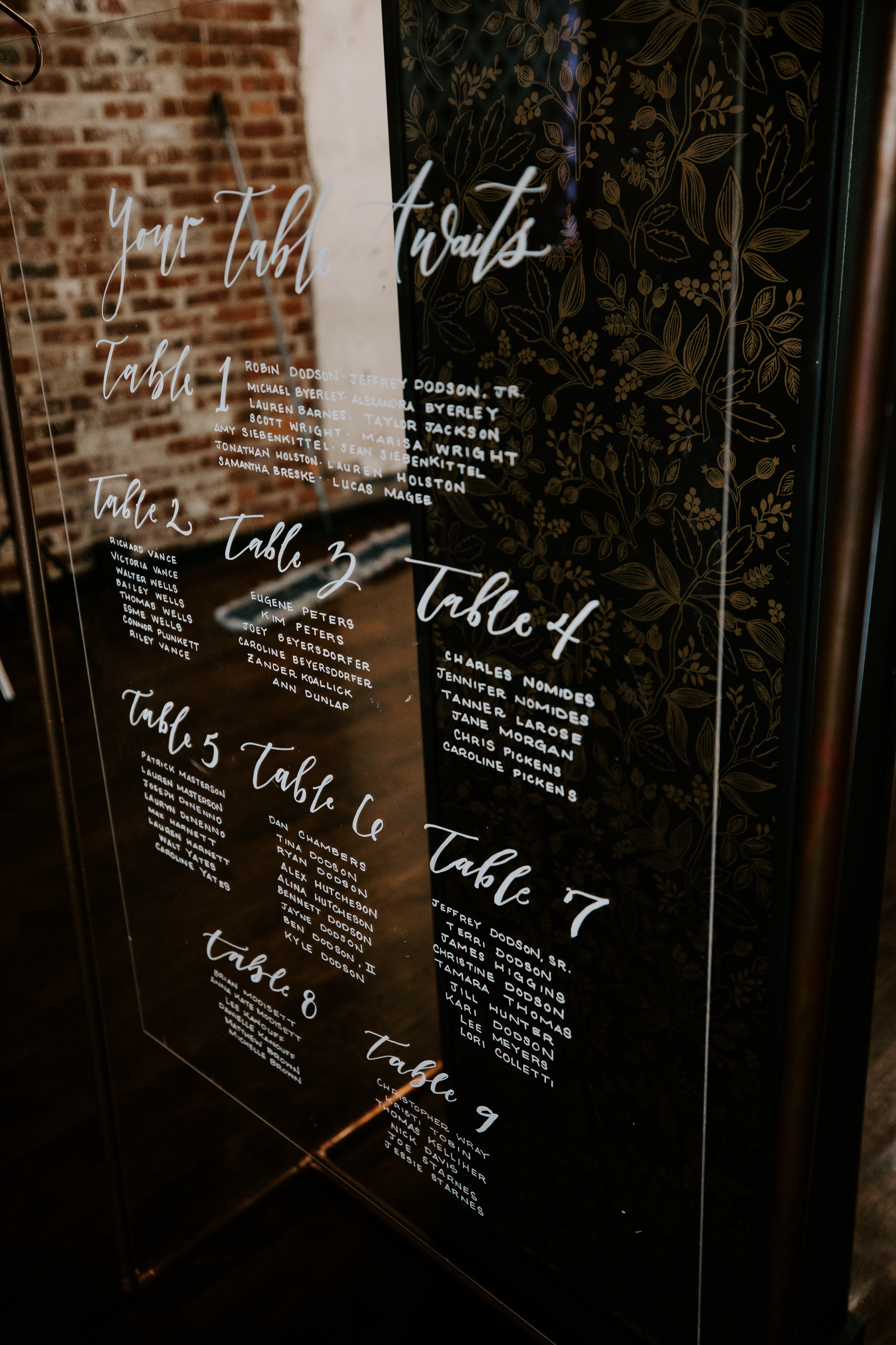
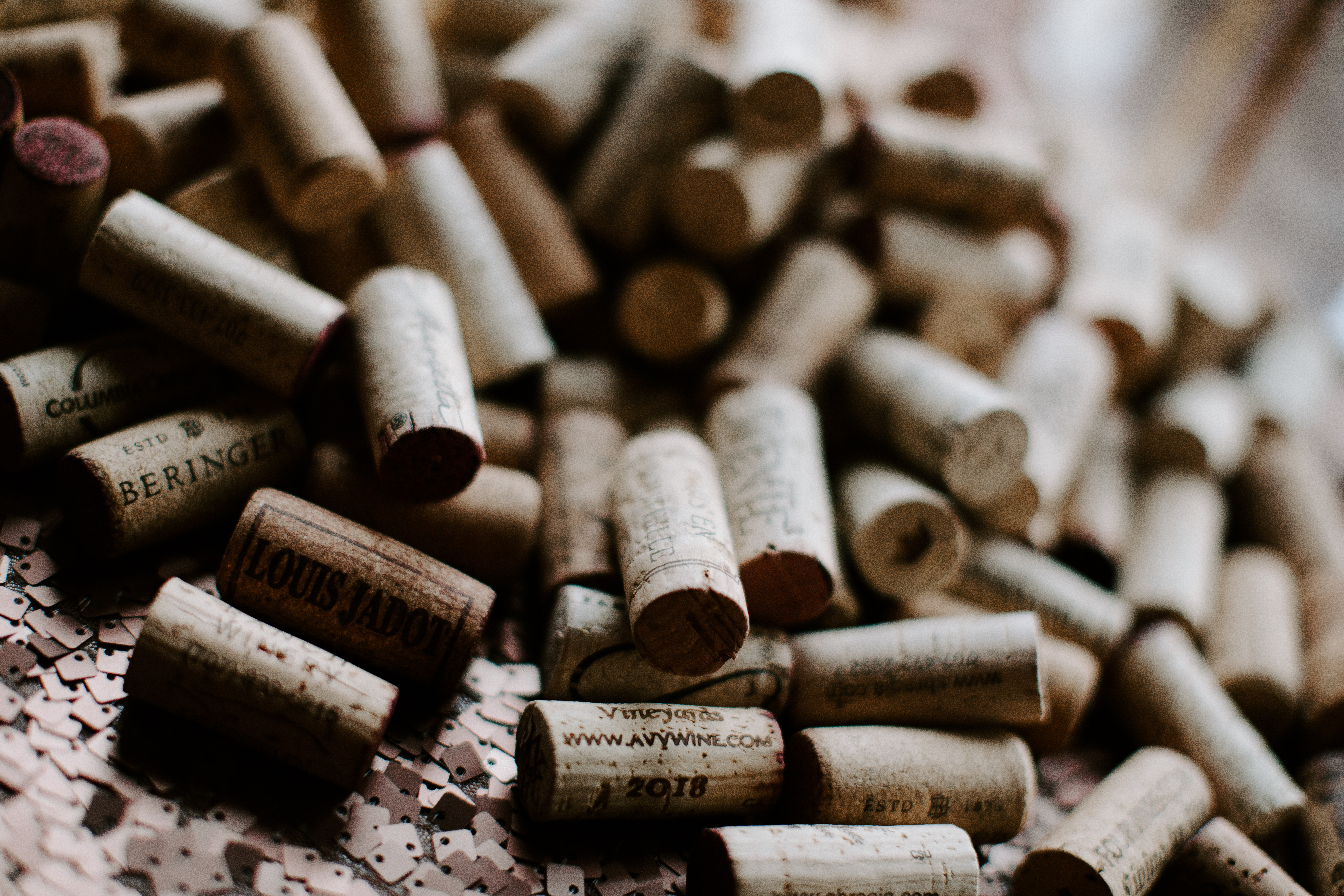
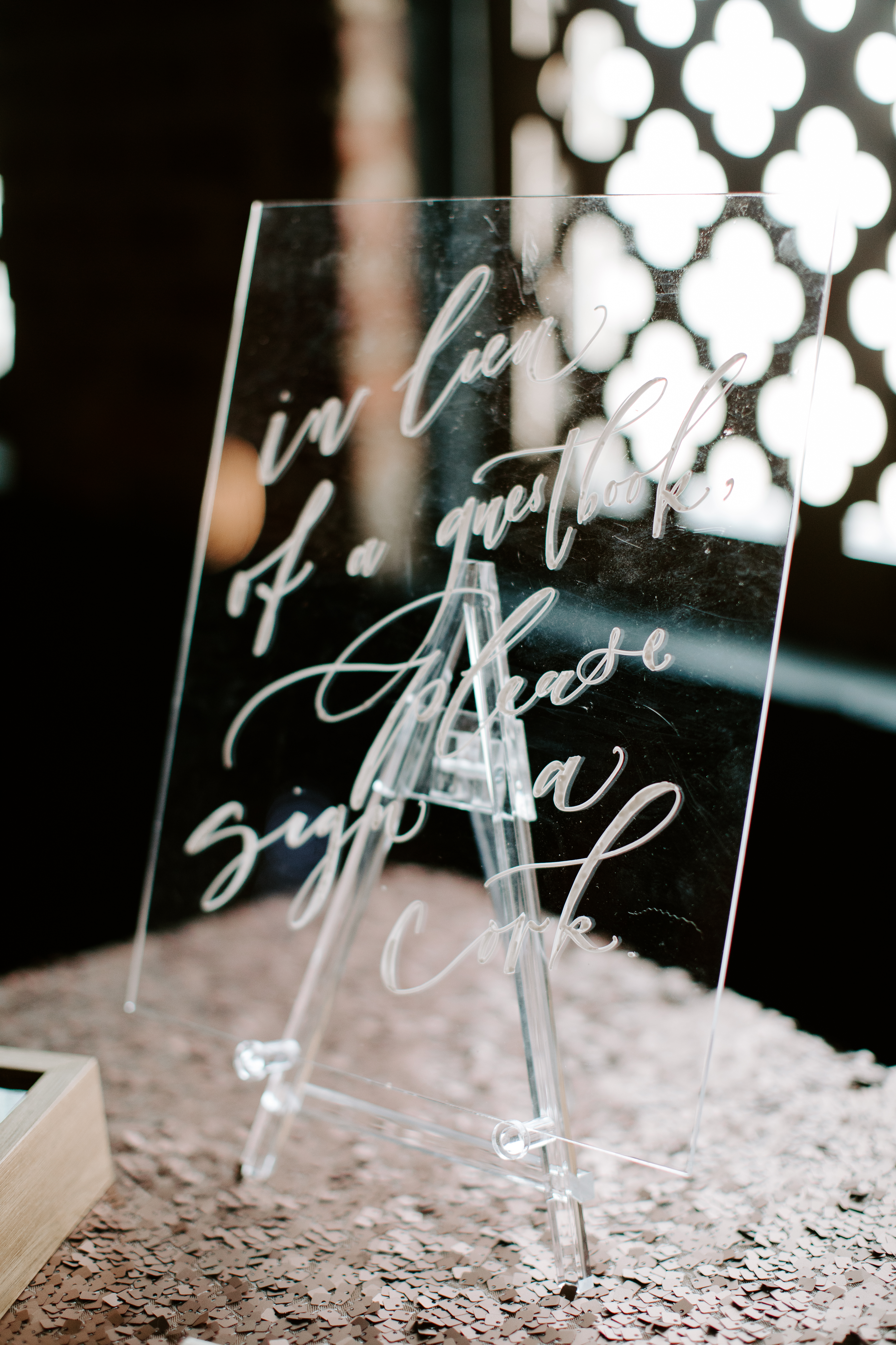
White Ink was happy to supply our bride and groom with an all-acrylic customized table seating chart. It blended perfectly with the style of the day. One of the most novel signs we customized for Robin and Jeffrey was the sign that invited guests to sign their names to a wine bottle cork in lieu of a guestbook. I thought that was such a fantastic way to turn a common wedding tradition into something that was uniquely theirs!
Working with Robin and Jeffery was a great reminder of why we do what we do. We have the skill and the supply to match our clients’ expectations and elevate each event we are asked to be a part of. White Ink is there for you, from the ink to the table- and more.
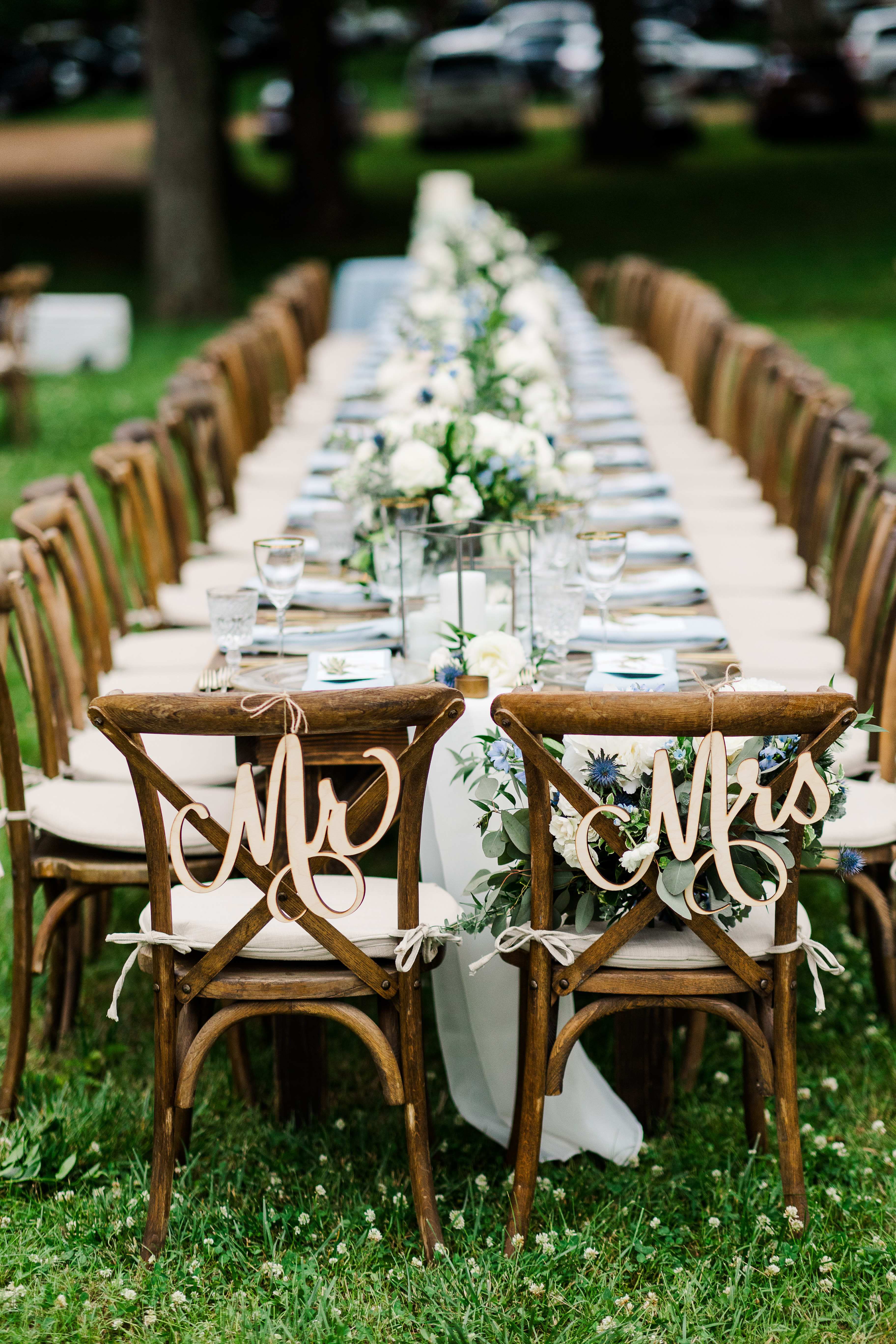
I want to say, whenever our couples take the time to include different textures in their wedding details it is ALWAYS worth the effort. Any creative knows that layered textures are sure to elevate an event. I’m excited to show you what White Ink created for Mae and Casey on their big day!
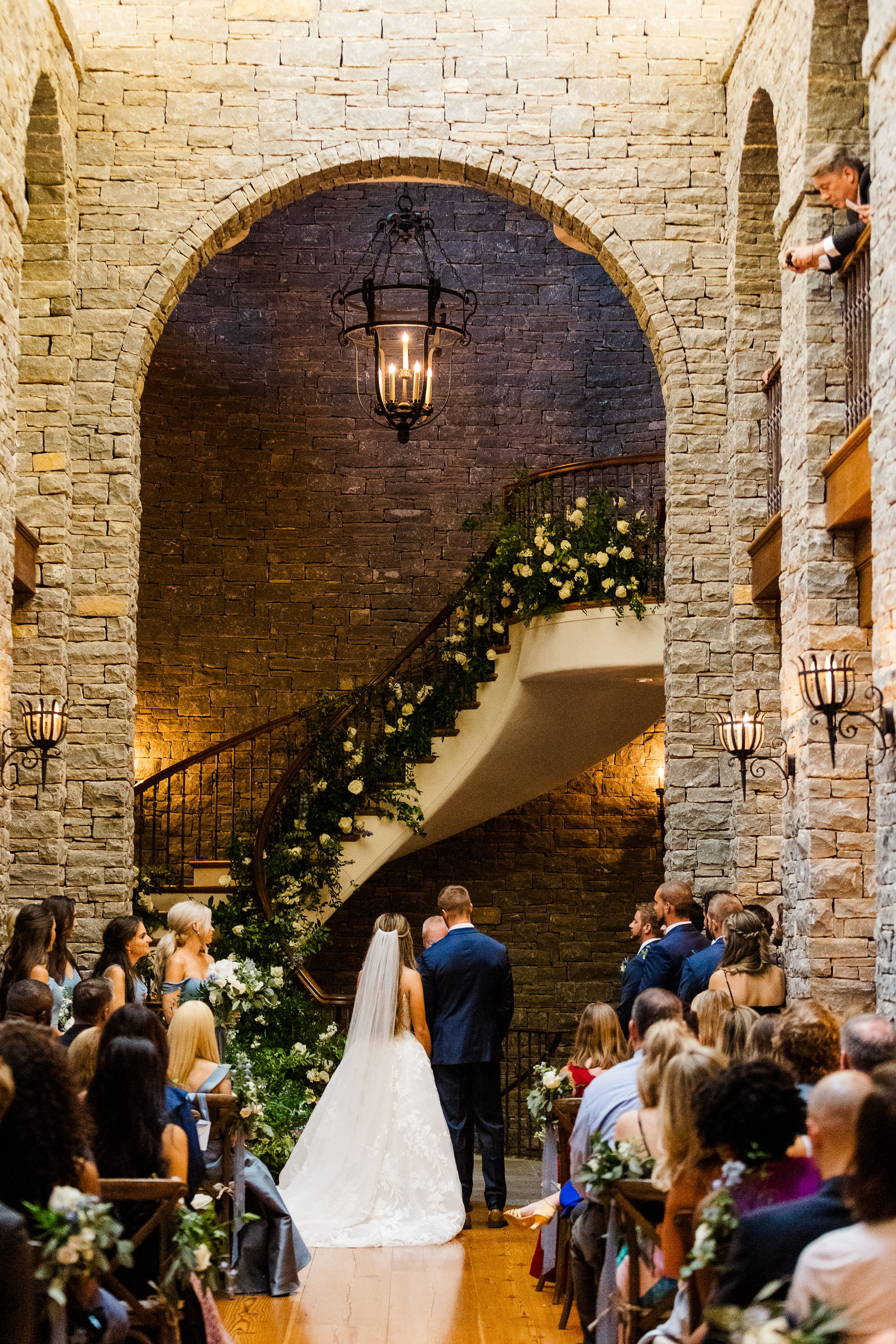
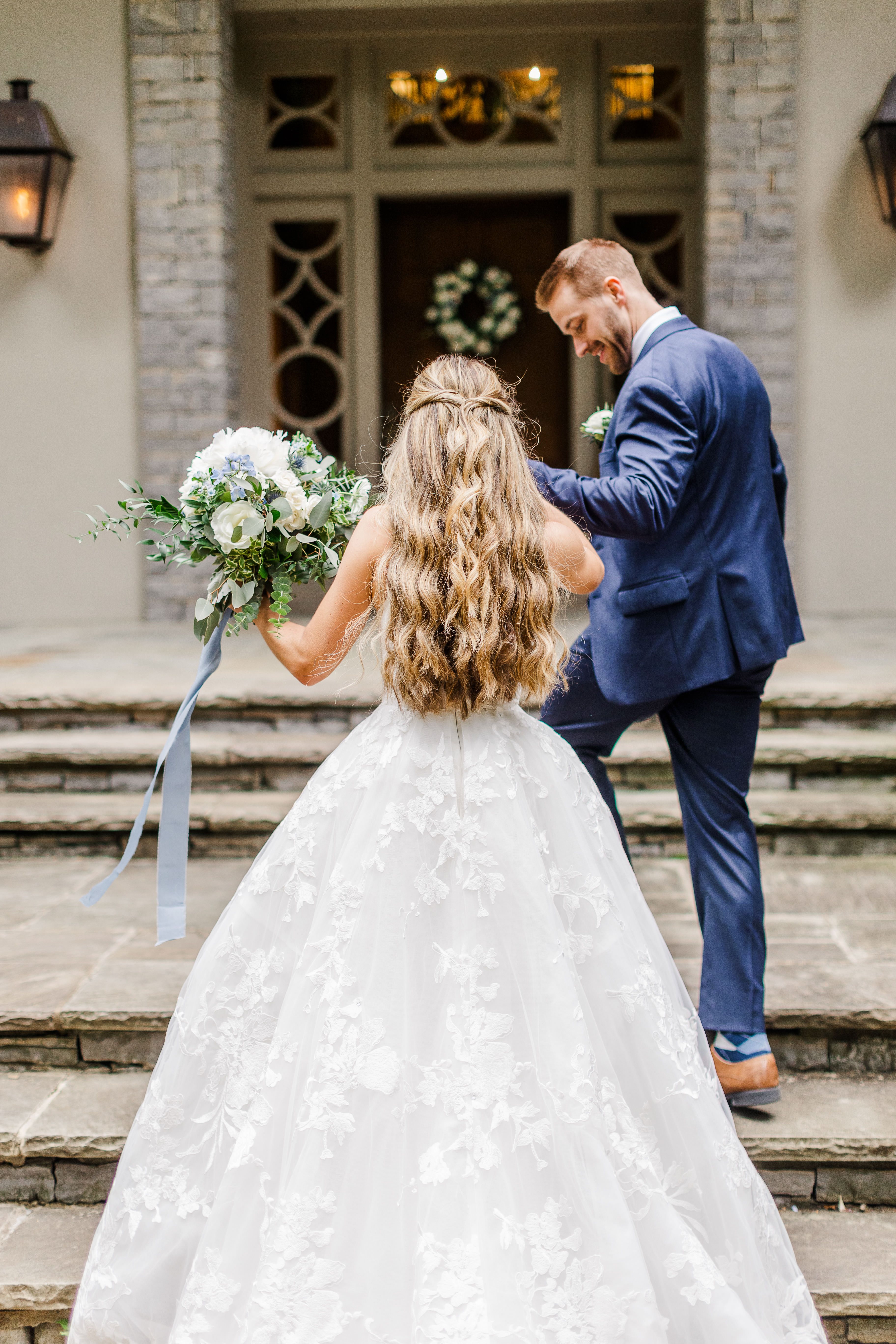
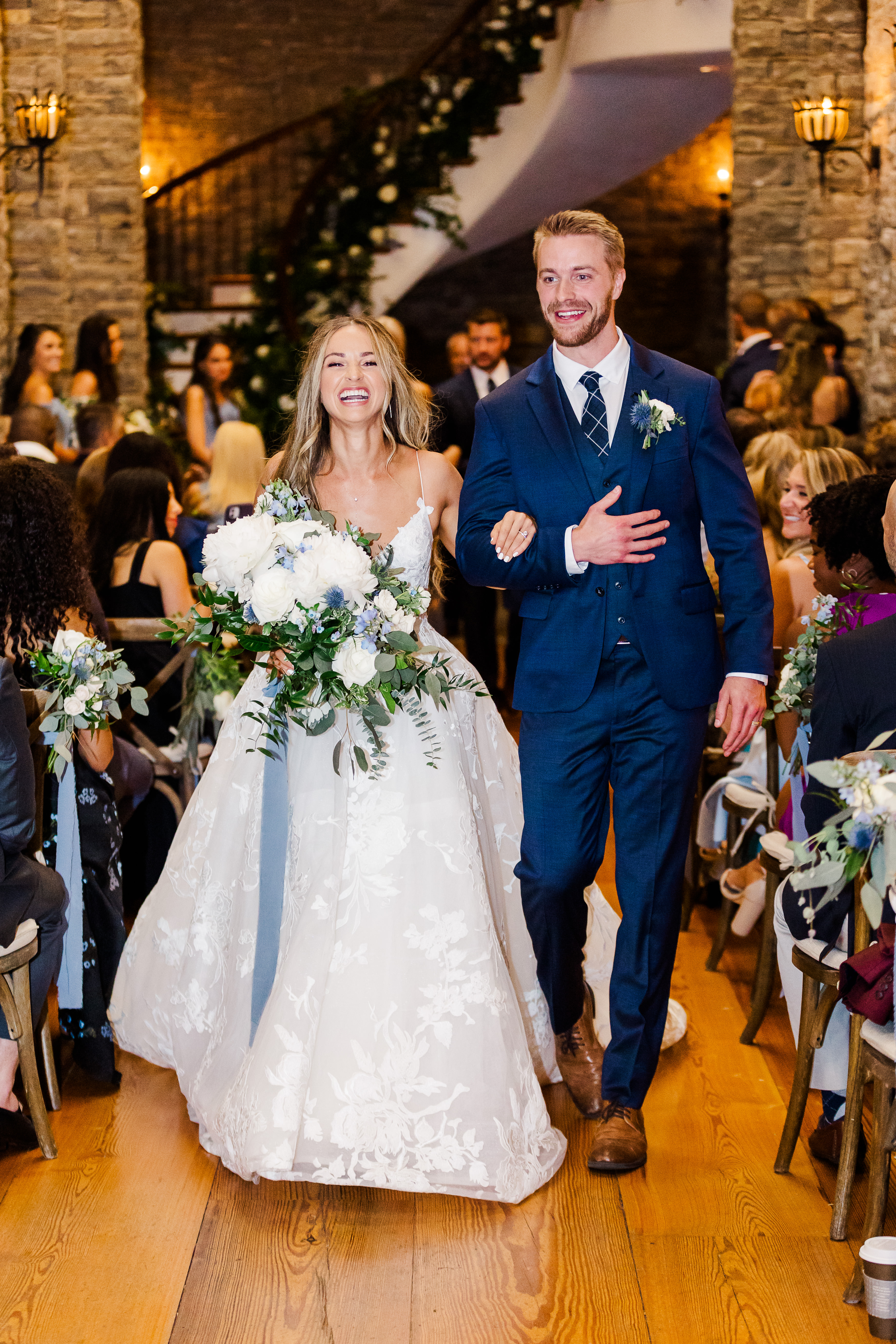
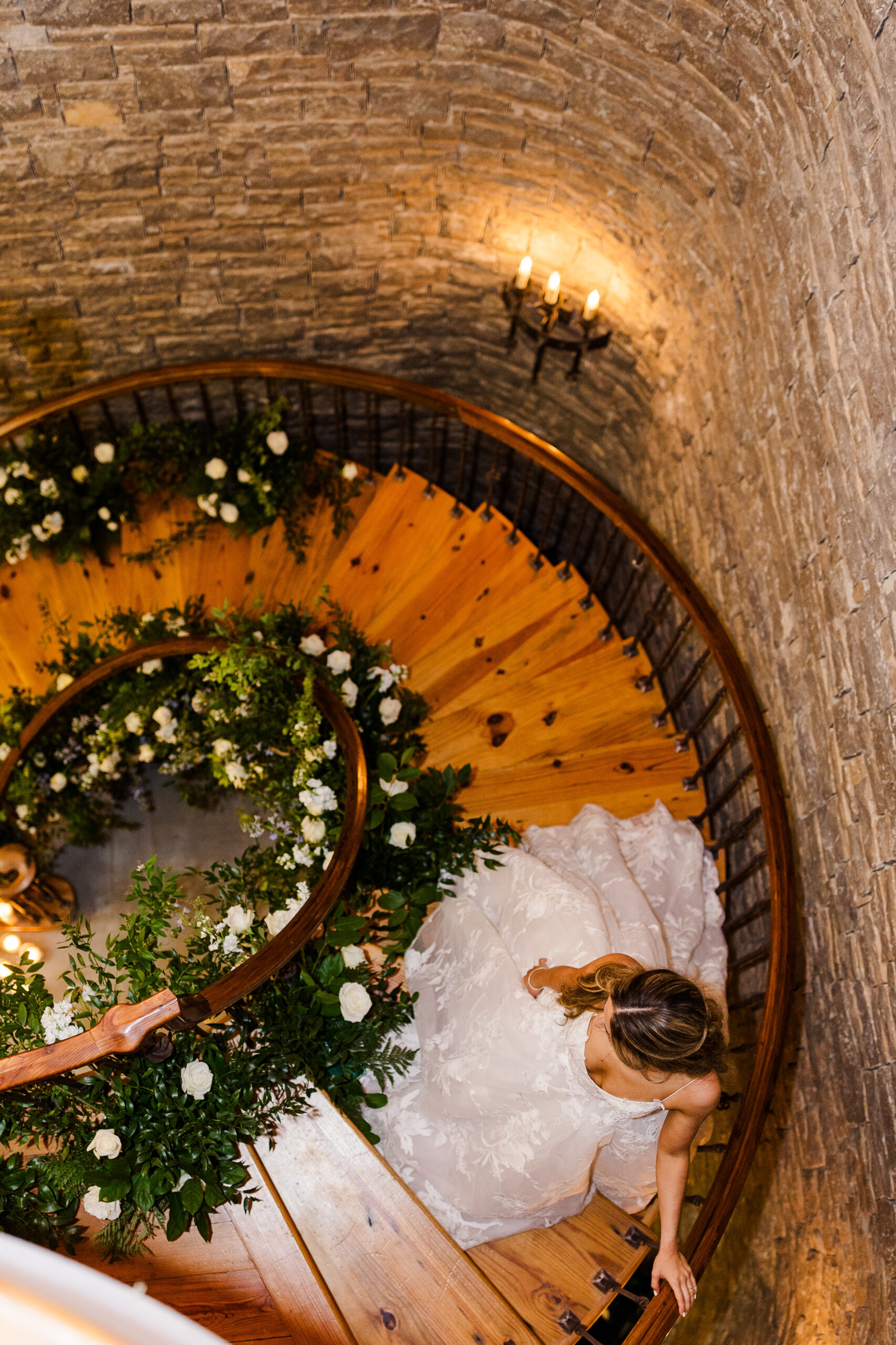
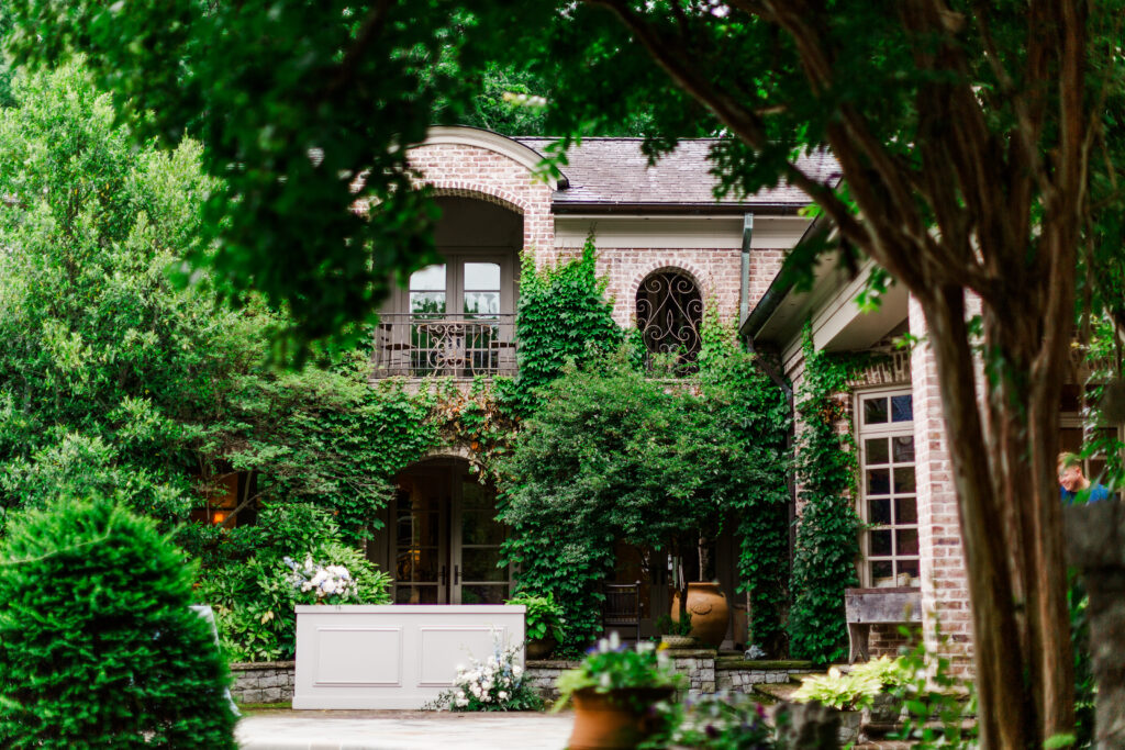
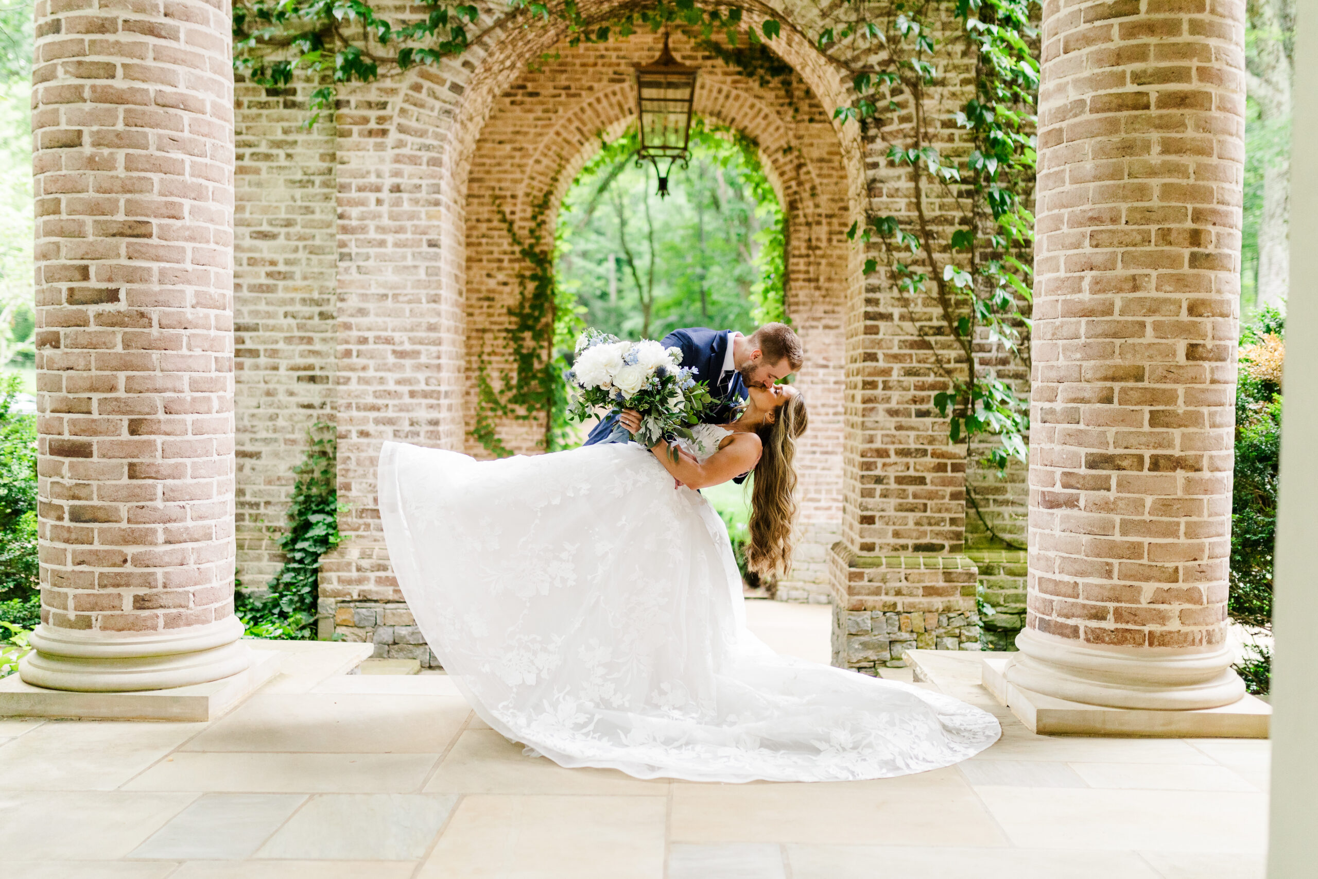
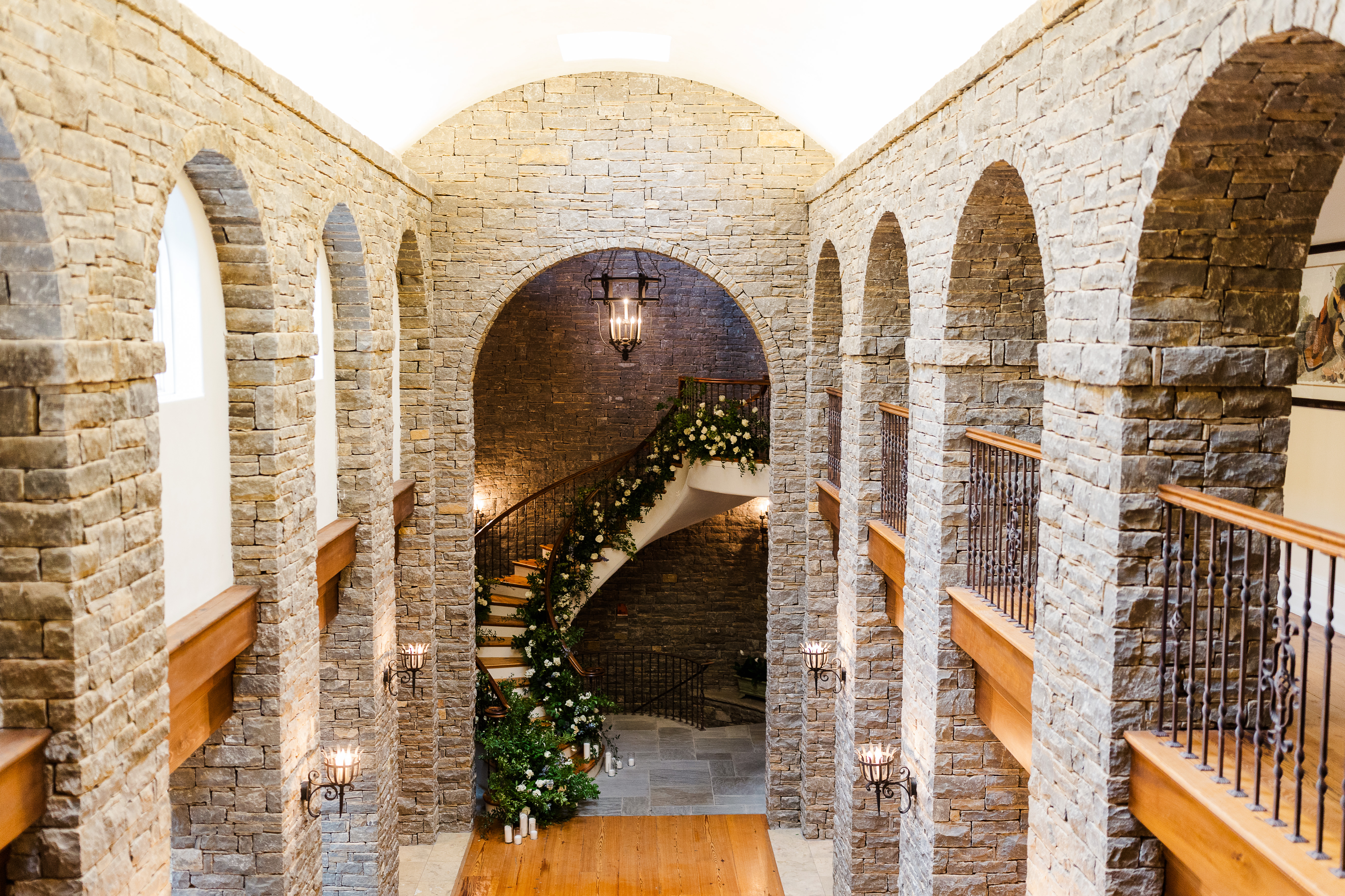
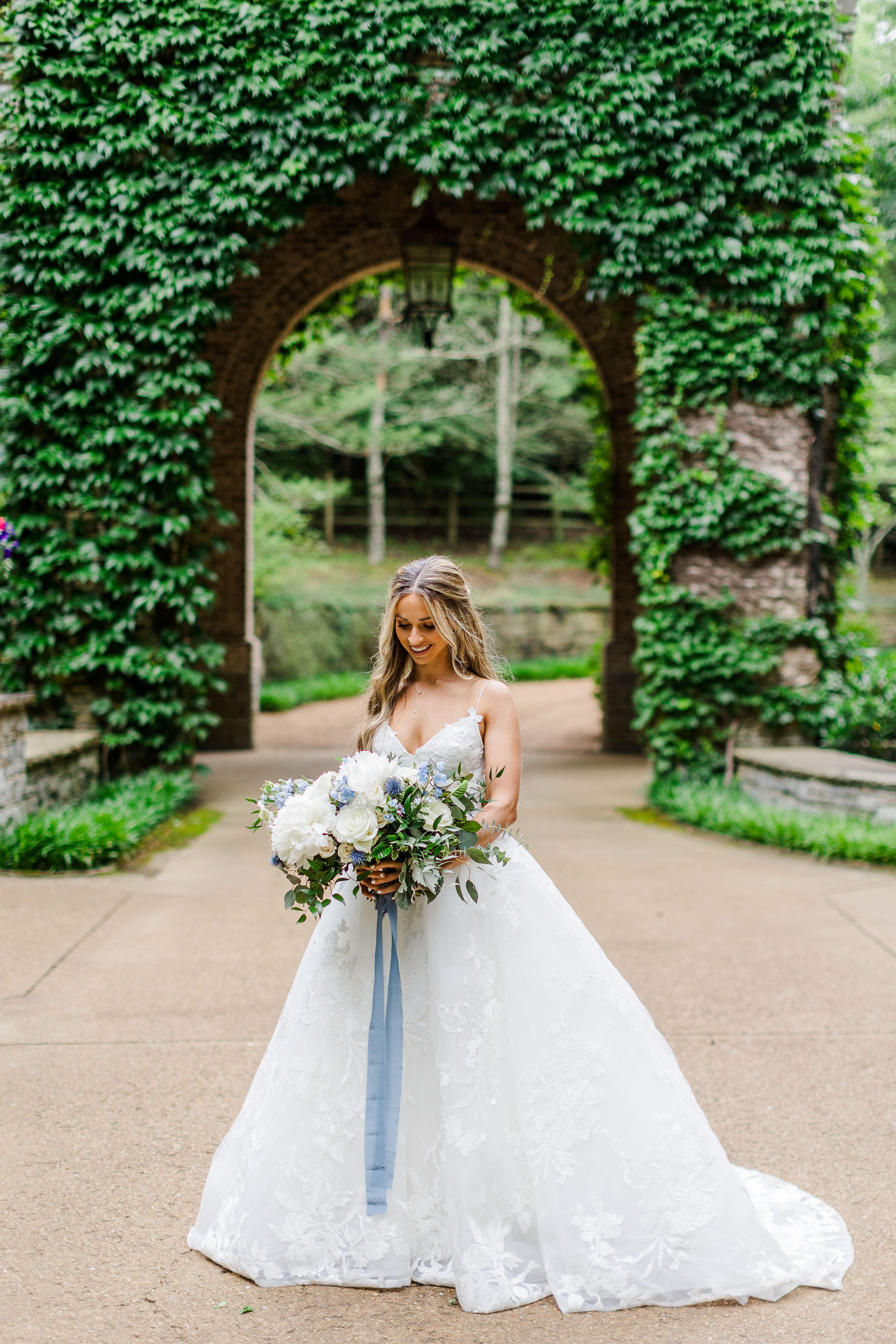
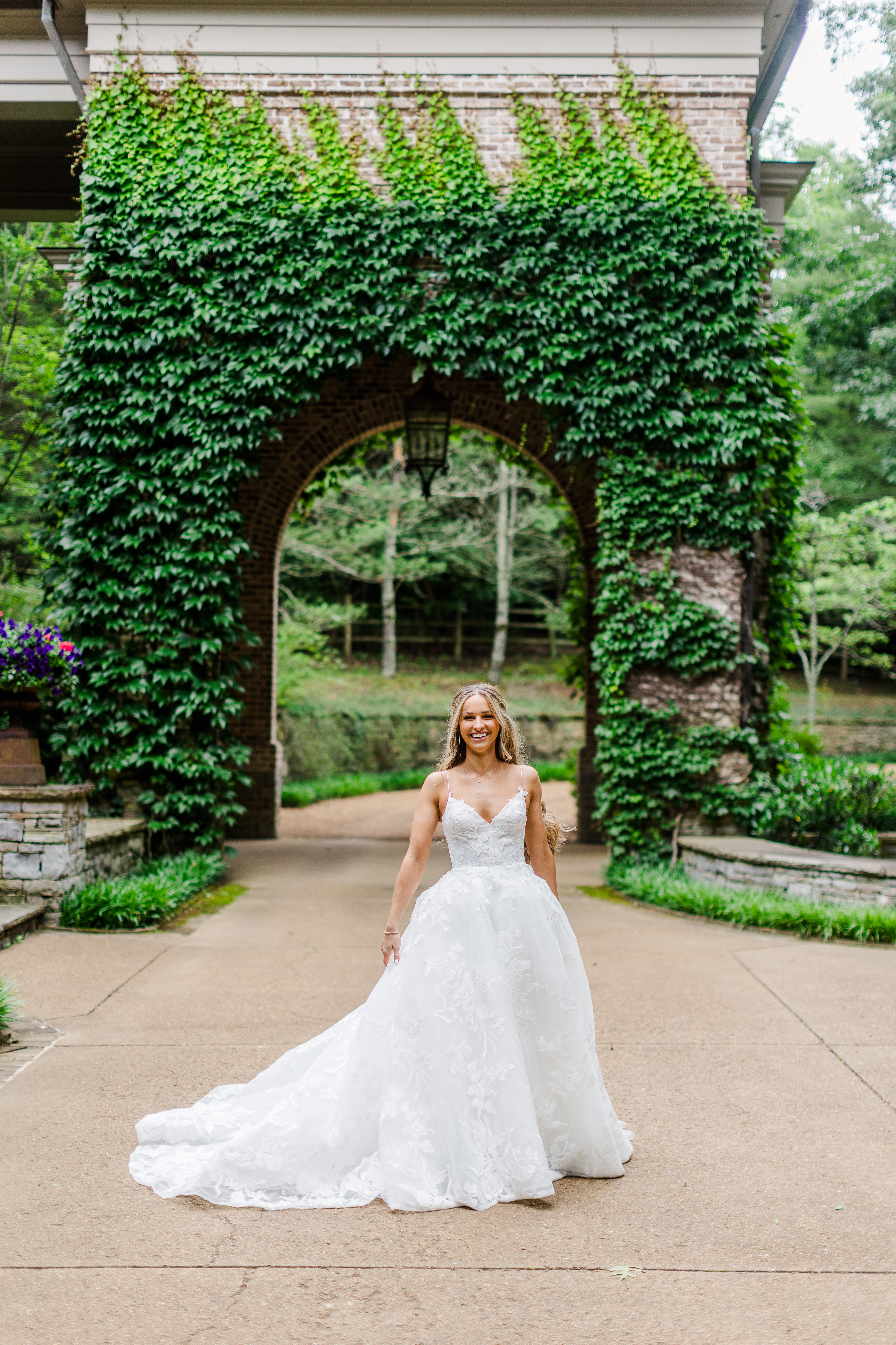
For starters, the home our couple chose as their venue was the most eye-pleasing, awe-inspiring place. There was no shortage of ivy laced brick, beautiful archways, iron gates or spiral staircases; I could go on and on. Fun fact: this home was also filmed in the show, “Nashville”, for all of you fans out there.
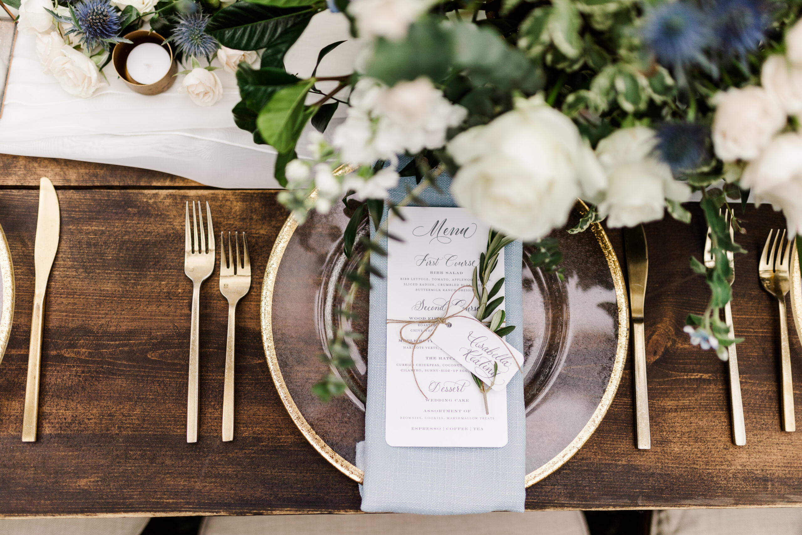
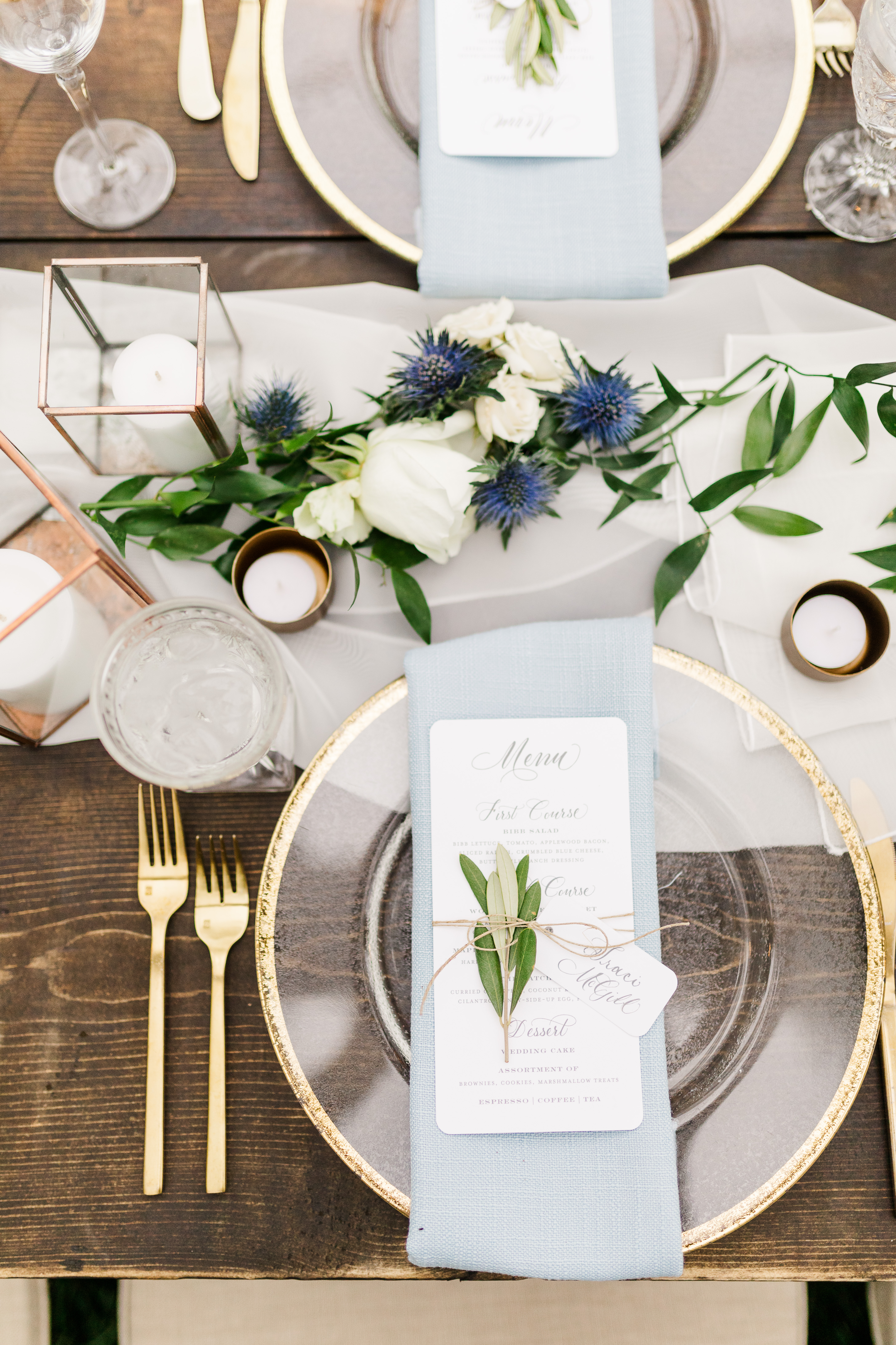
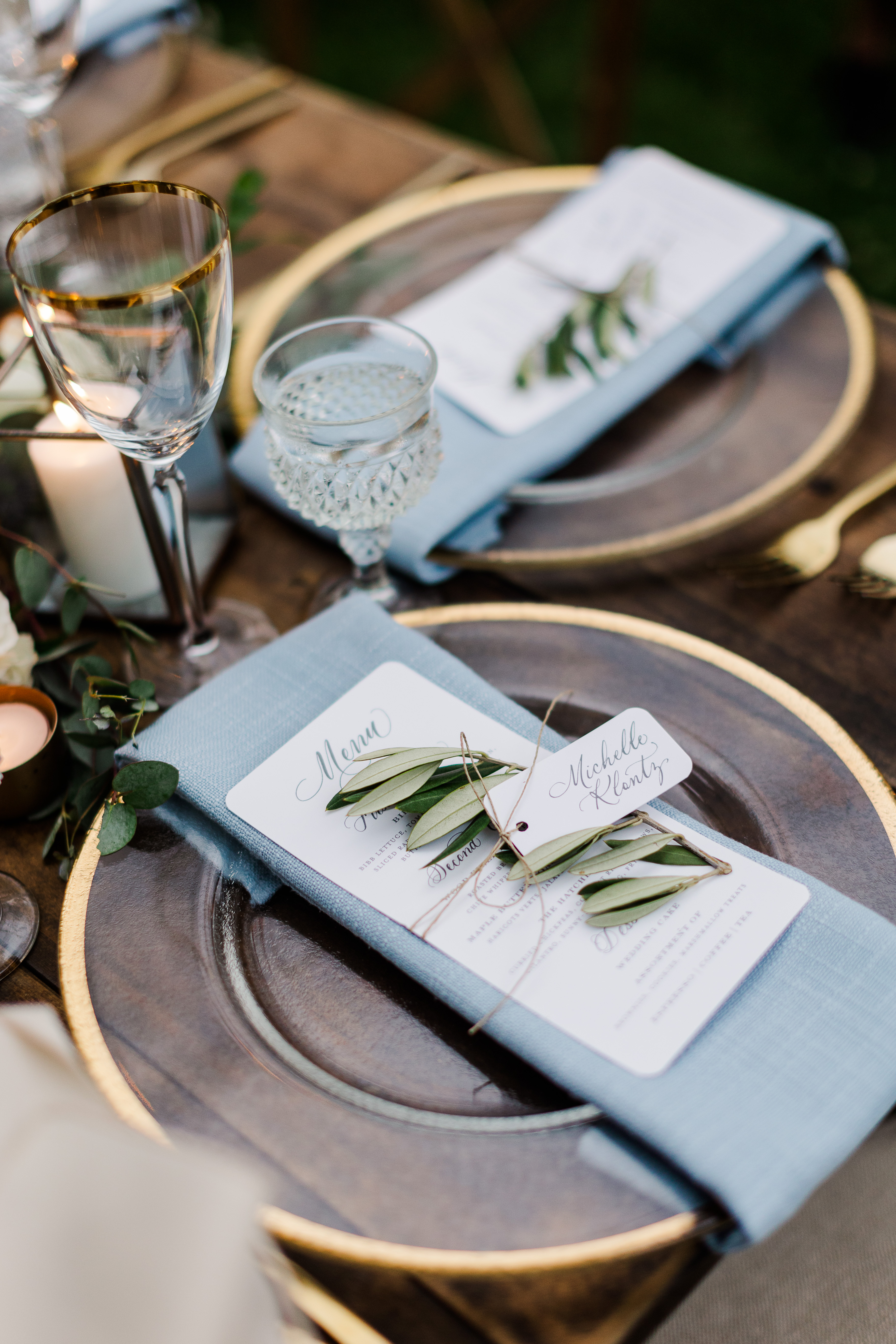
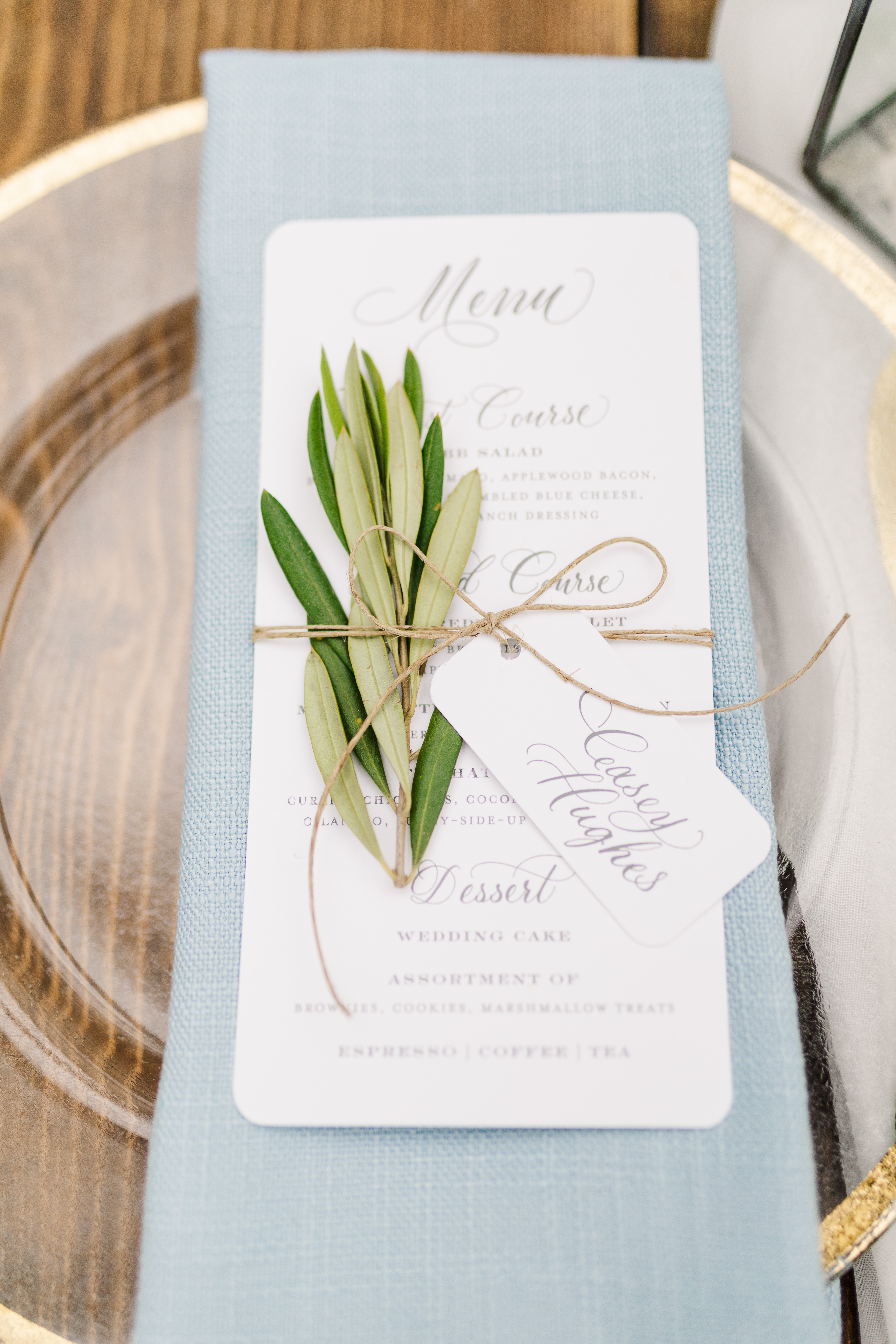
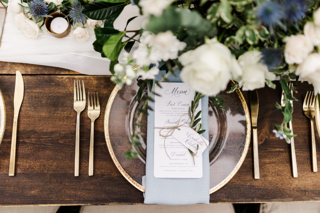
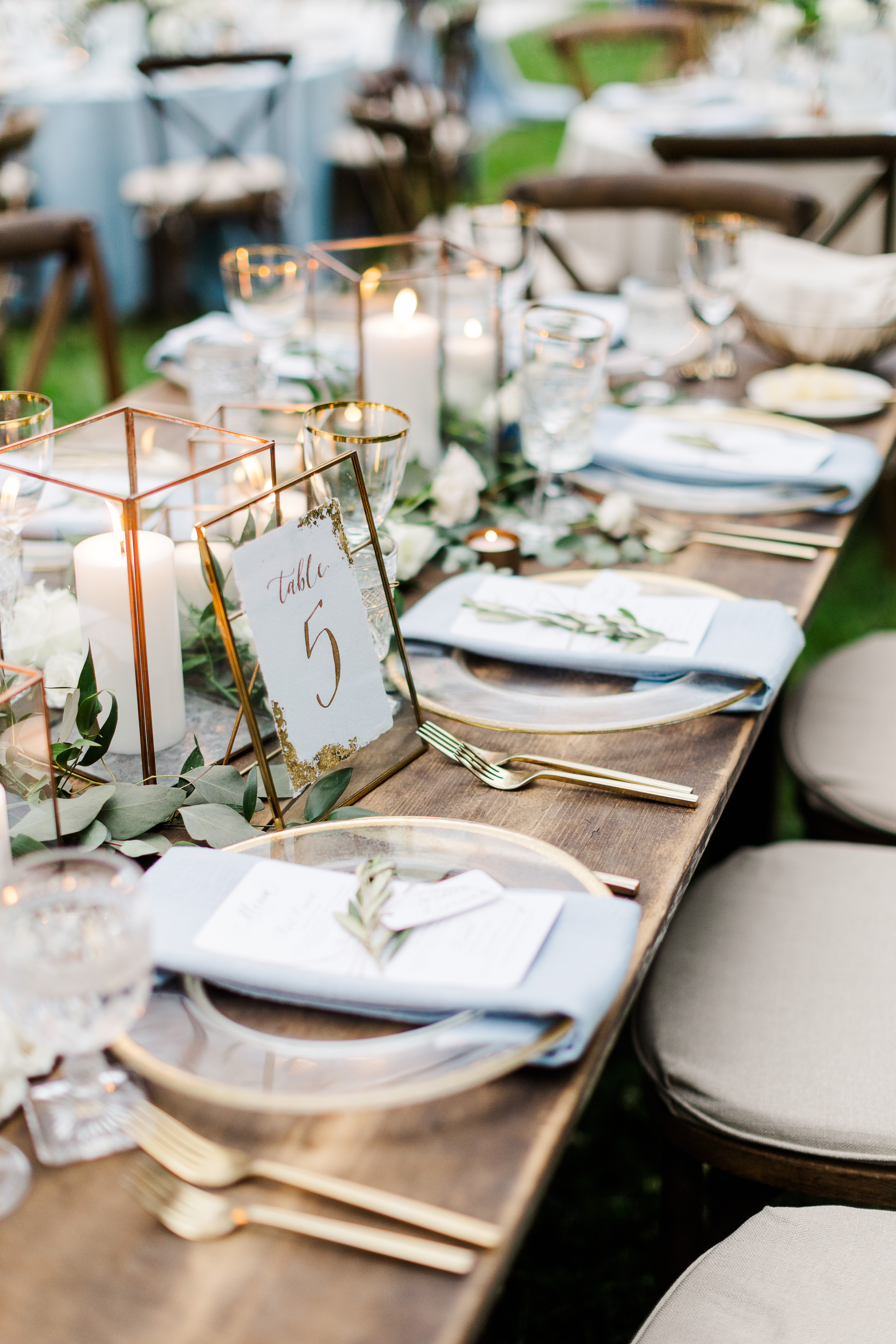
White Ink was thrilled when Mae and Casey asked us to put our own touch on this one-of-a-kind wedding. One of the best things about being a part of it all was getting to show the true beauty behind layering textures. Notice how the custom designed menu was displayed: heavy wooden table, gold rimmed glass charger, soft linen, rounded edged menu with spot calligraphy, and an olive branch all tied together with a single piece of twine. Whew! Now that is how you impress your guests using texture! This display at Mae and Casey’s reception embodied the perfect mixture of bold and gentle to make the dreamiest styled tablescape we have seen in a long time.
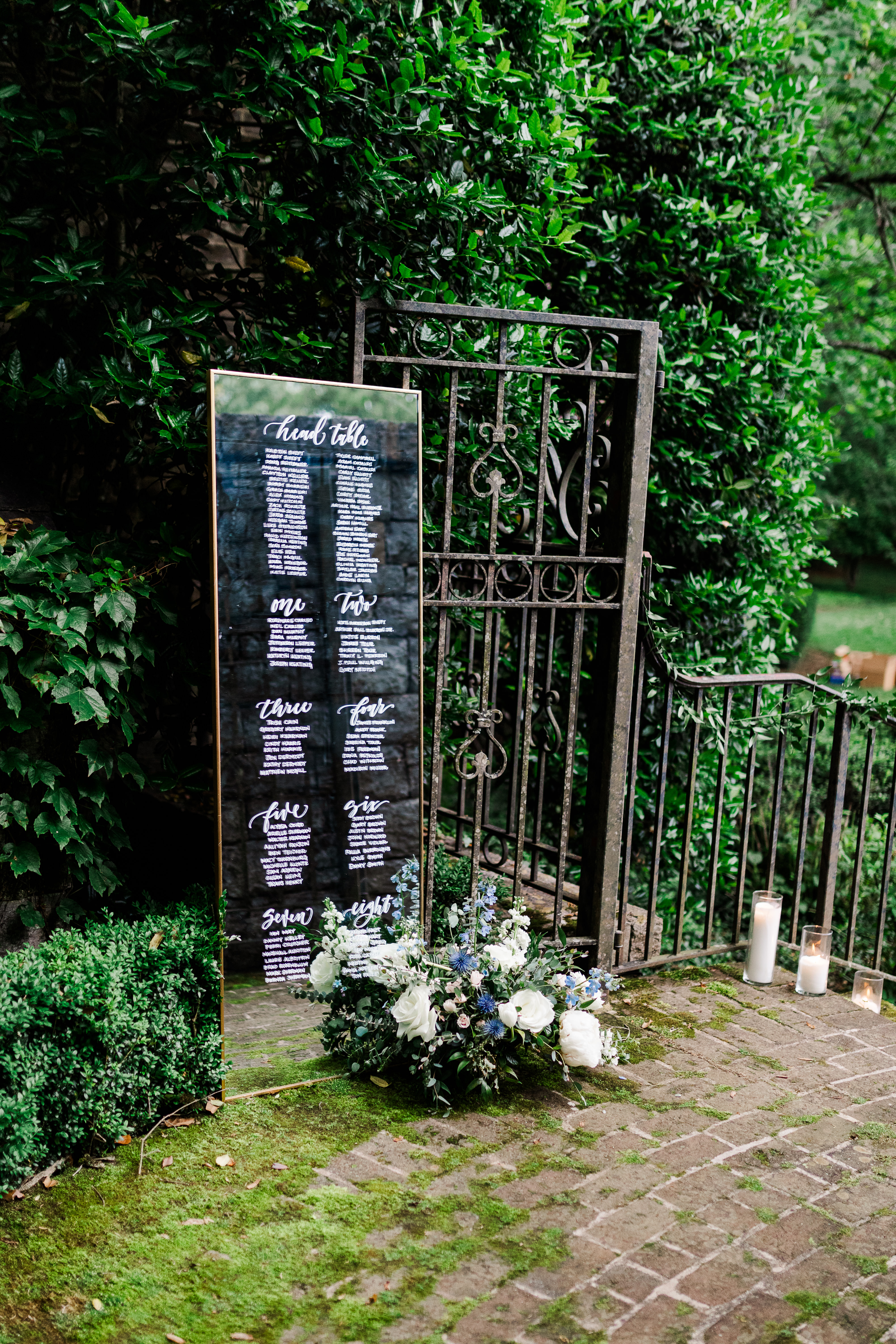
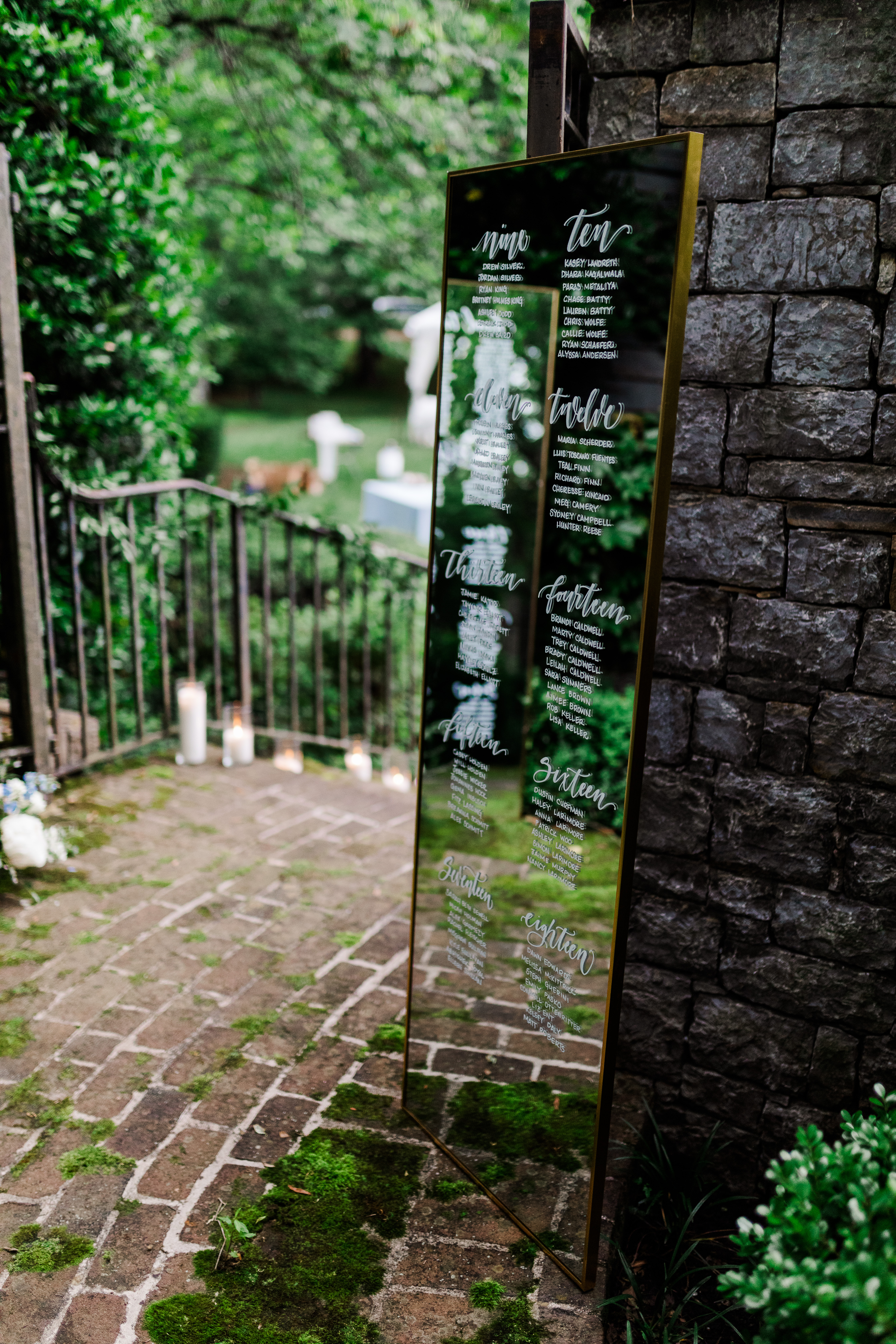
Check out this seating chart! Have you ever seen glass so perfectly placed? I mean this looks like it’s straight out of a fairytale! These gorgeous, gold-trimmed standing mirrors rested softly against iron gates and sat on a cushy bed of moss that was growing atop the stone floors and walls. (I mean, I love that I even get to say that sentence.) Again, layered texture for the win! I love seeing White Ink’s work used like this. It’s just so satisfying.
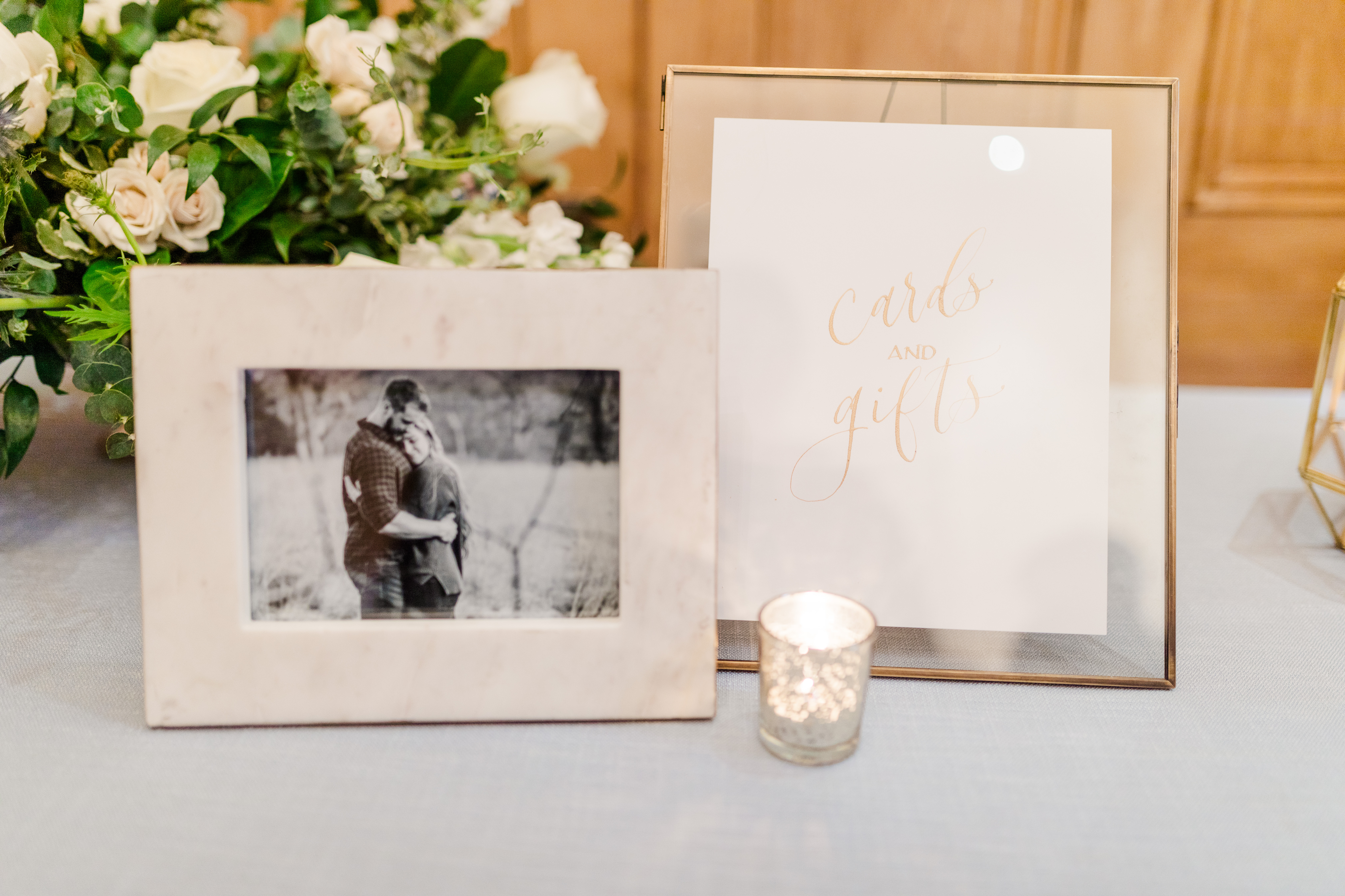
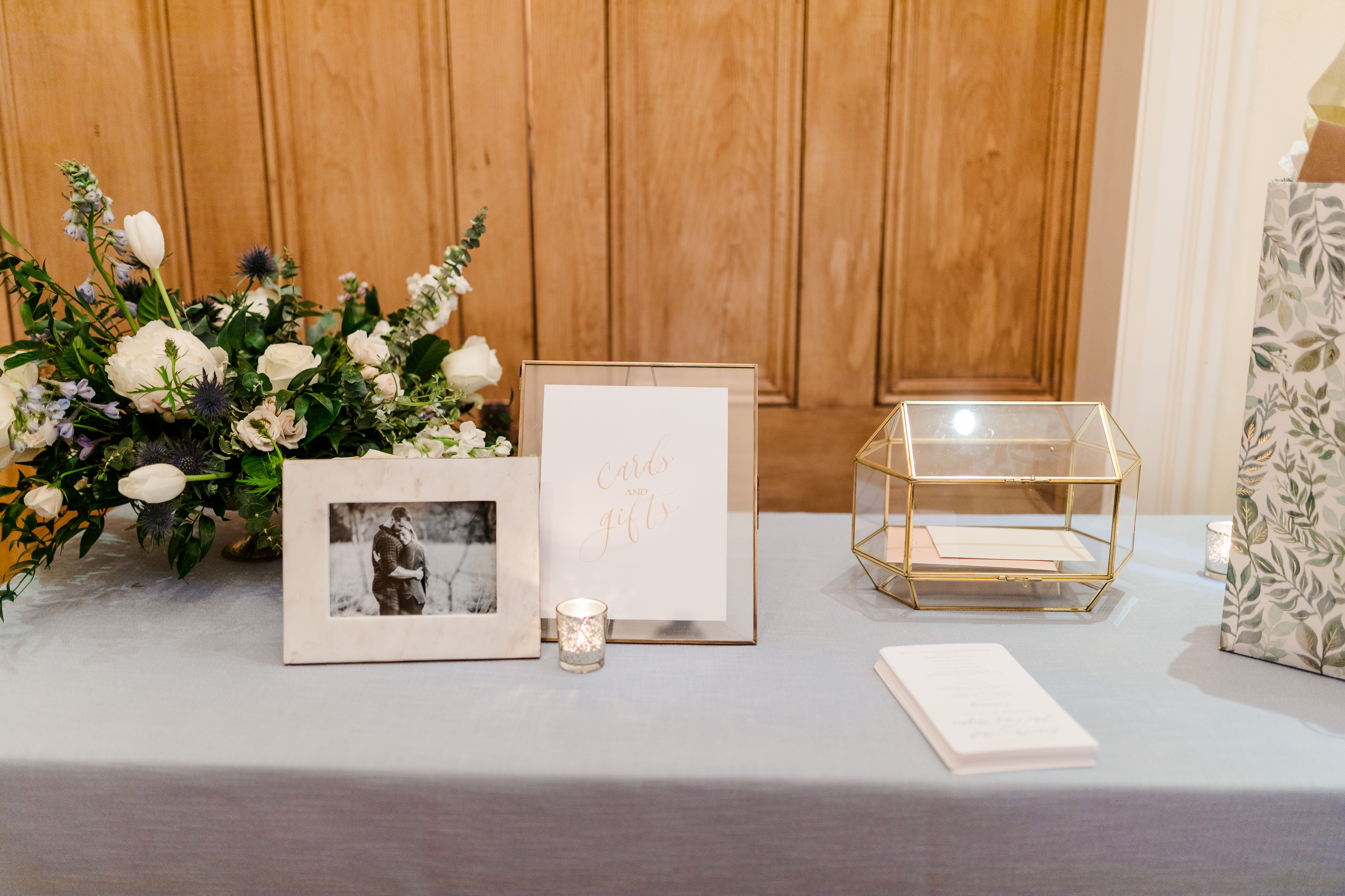
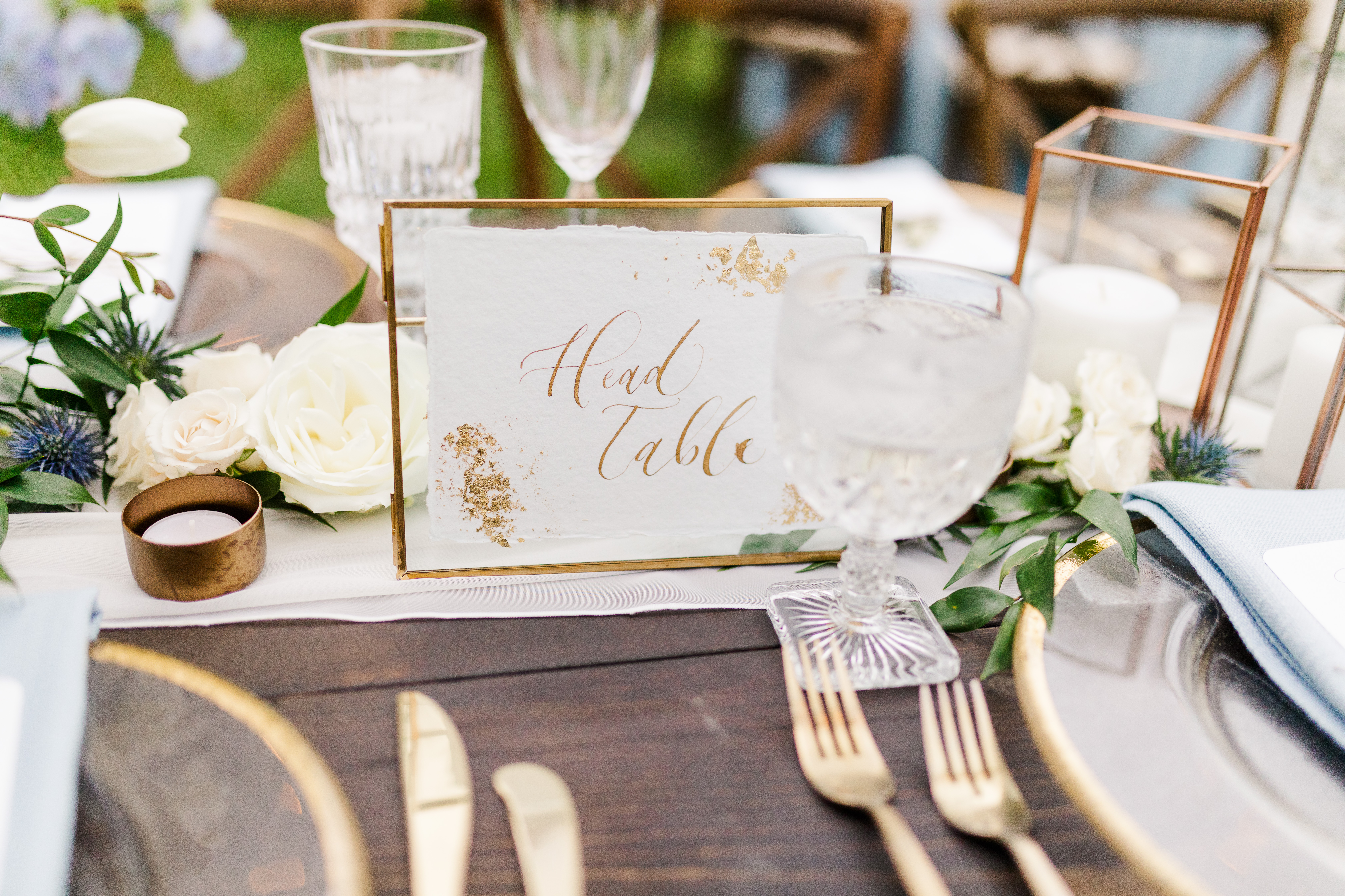
I was excited that Mae and Casey chose one of our card boxes from our extensive rental collection. This particular card box is gold trimmed and went flawlessly together with all of the gold accented décor throughout the ceremony and reception. The table numbers we provided for them were complete with gold flake corners and lettering, as well as the beautiful cocktail signage all done in gold ink calligraphy.
We love watching our couples piece their wedding day together and we love even more that we get to be such a big part of that. And when it comes to using lots of texture, don’t be afraid of it. It might be exactly what you’re looking for!