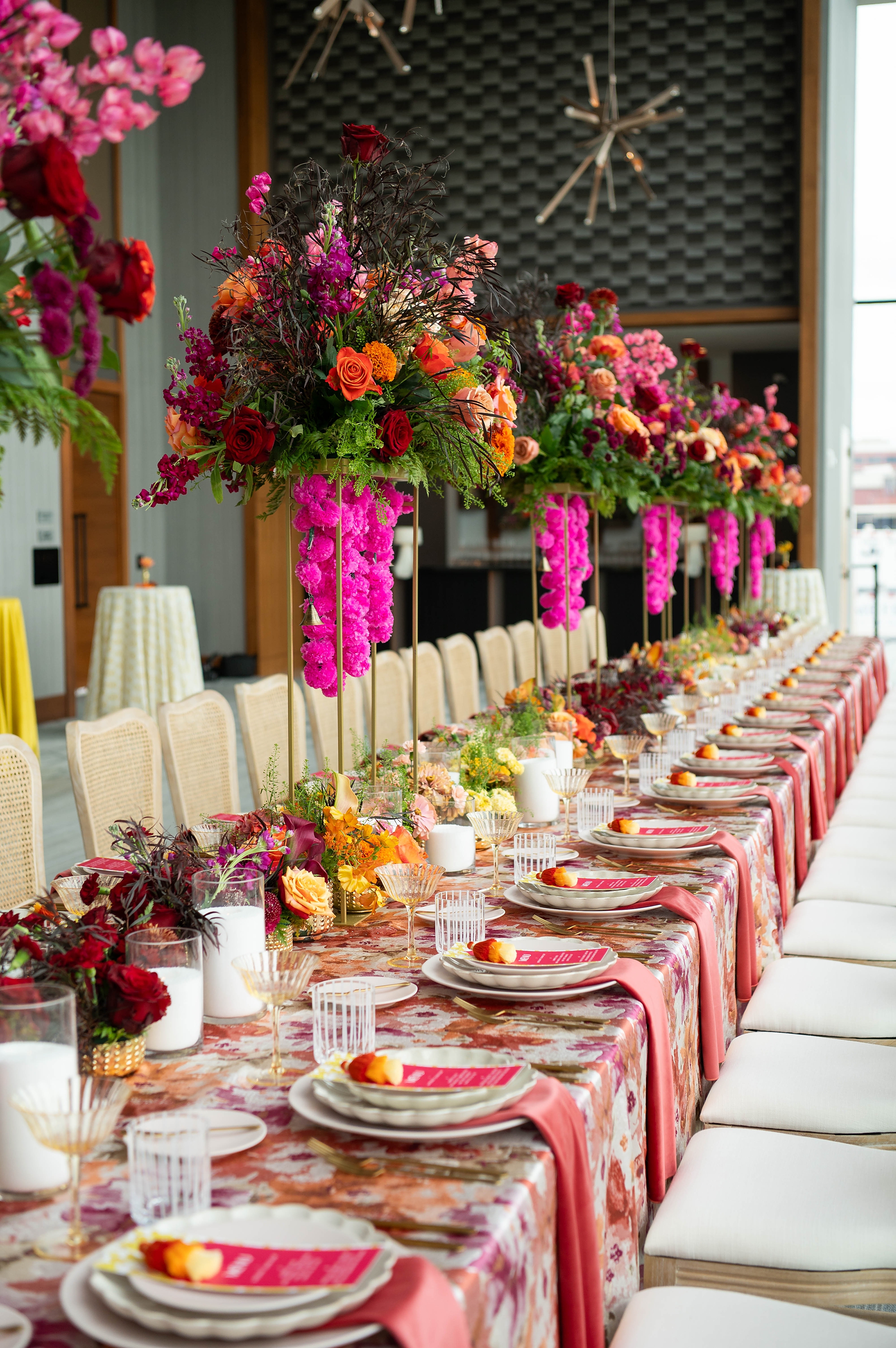
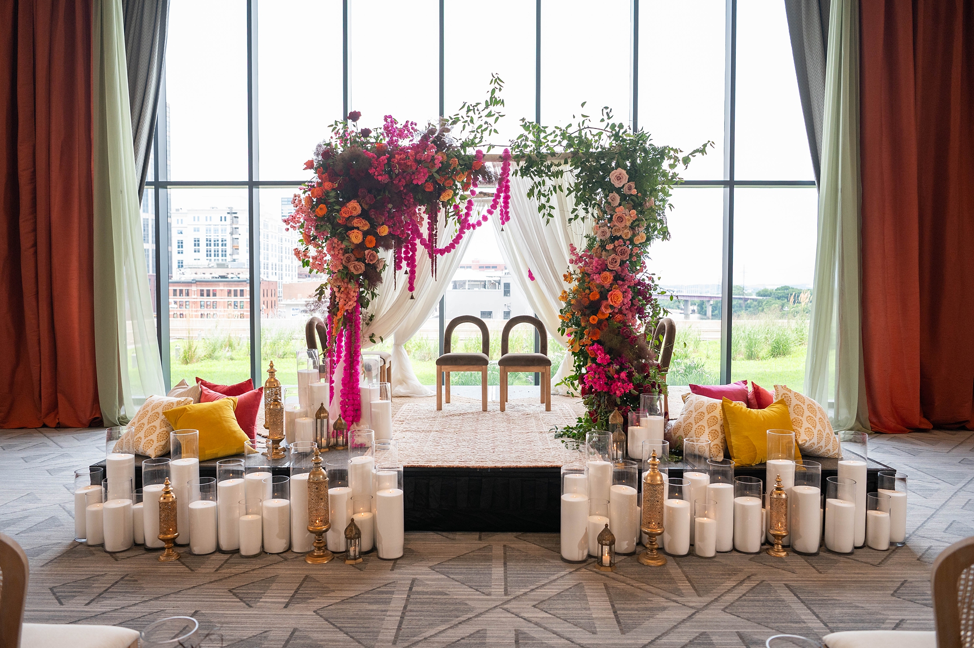
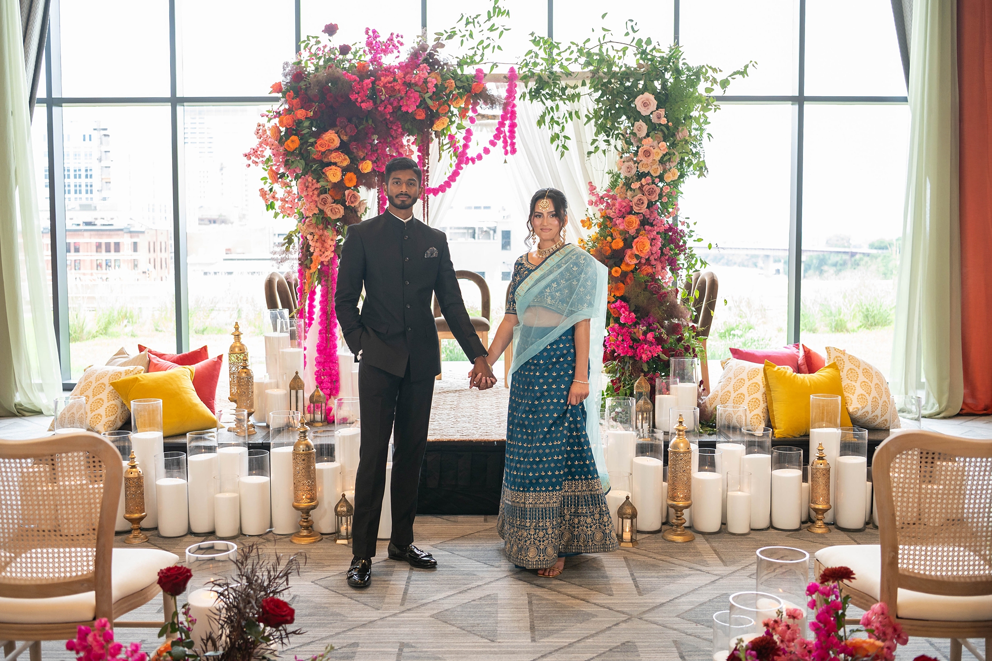
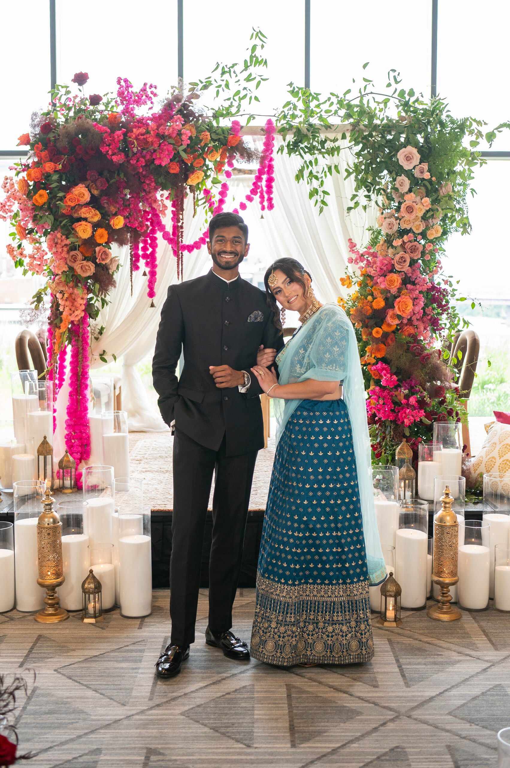
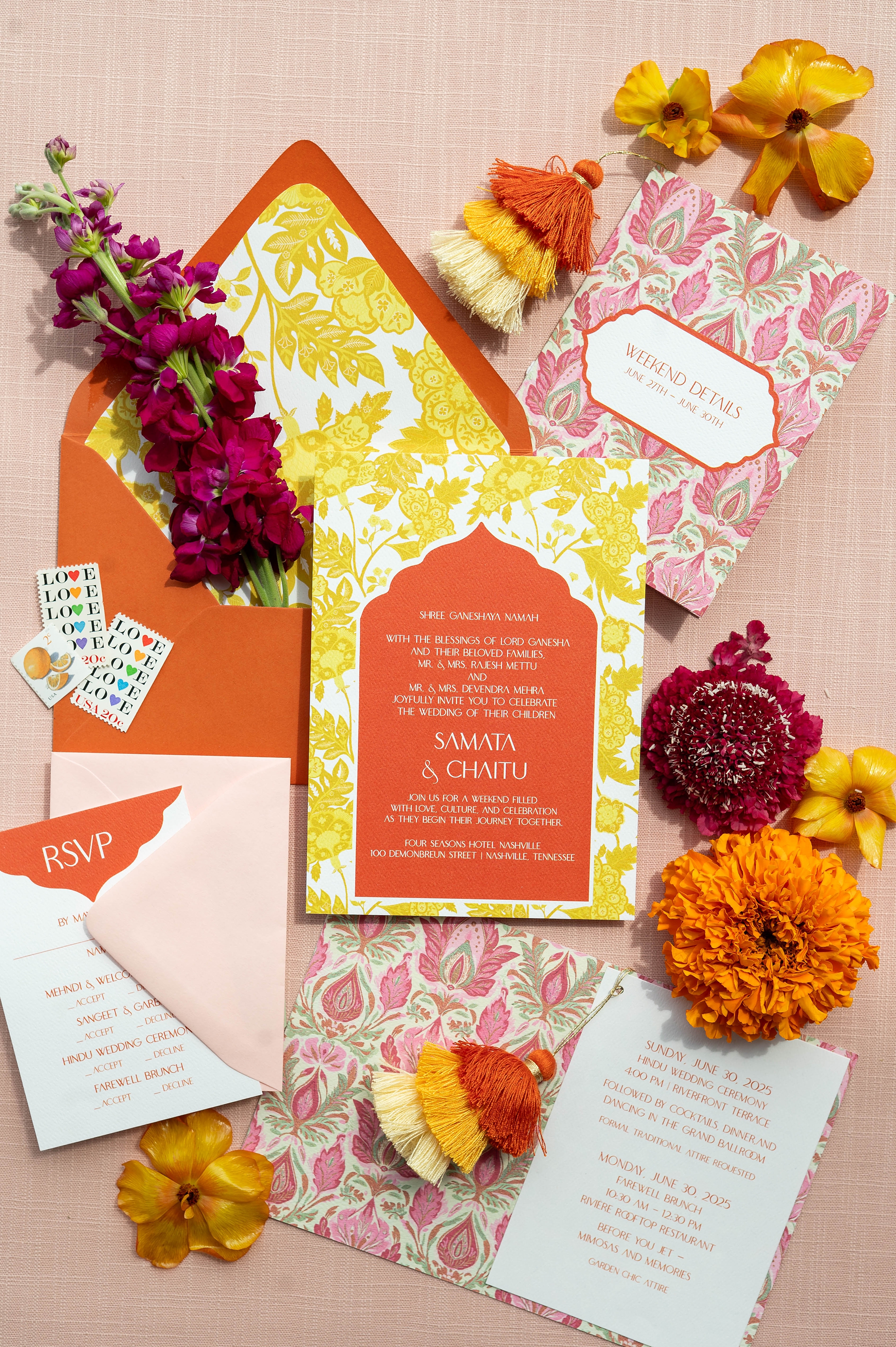
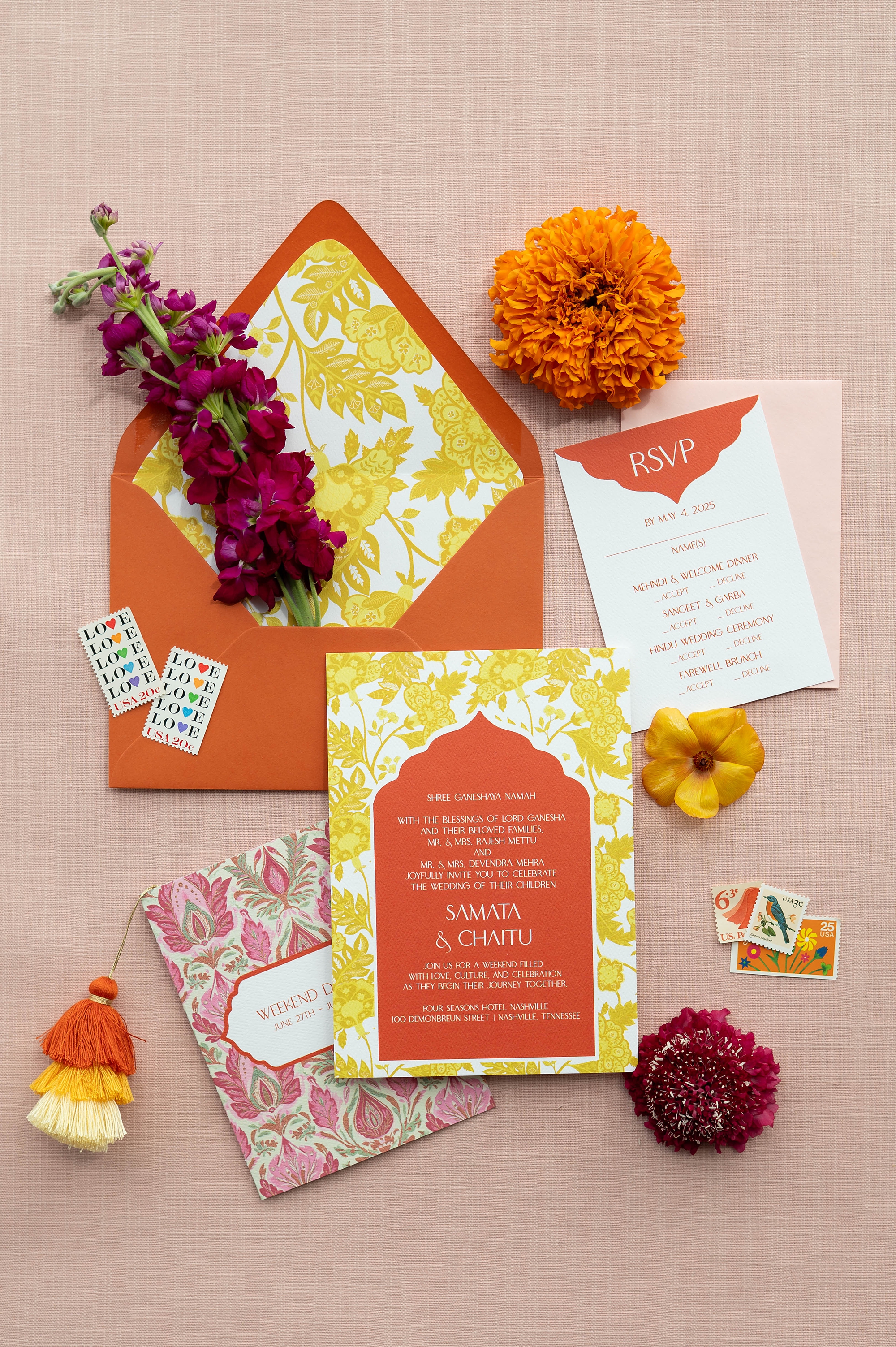
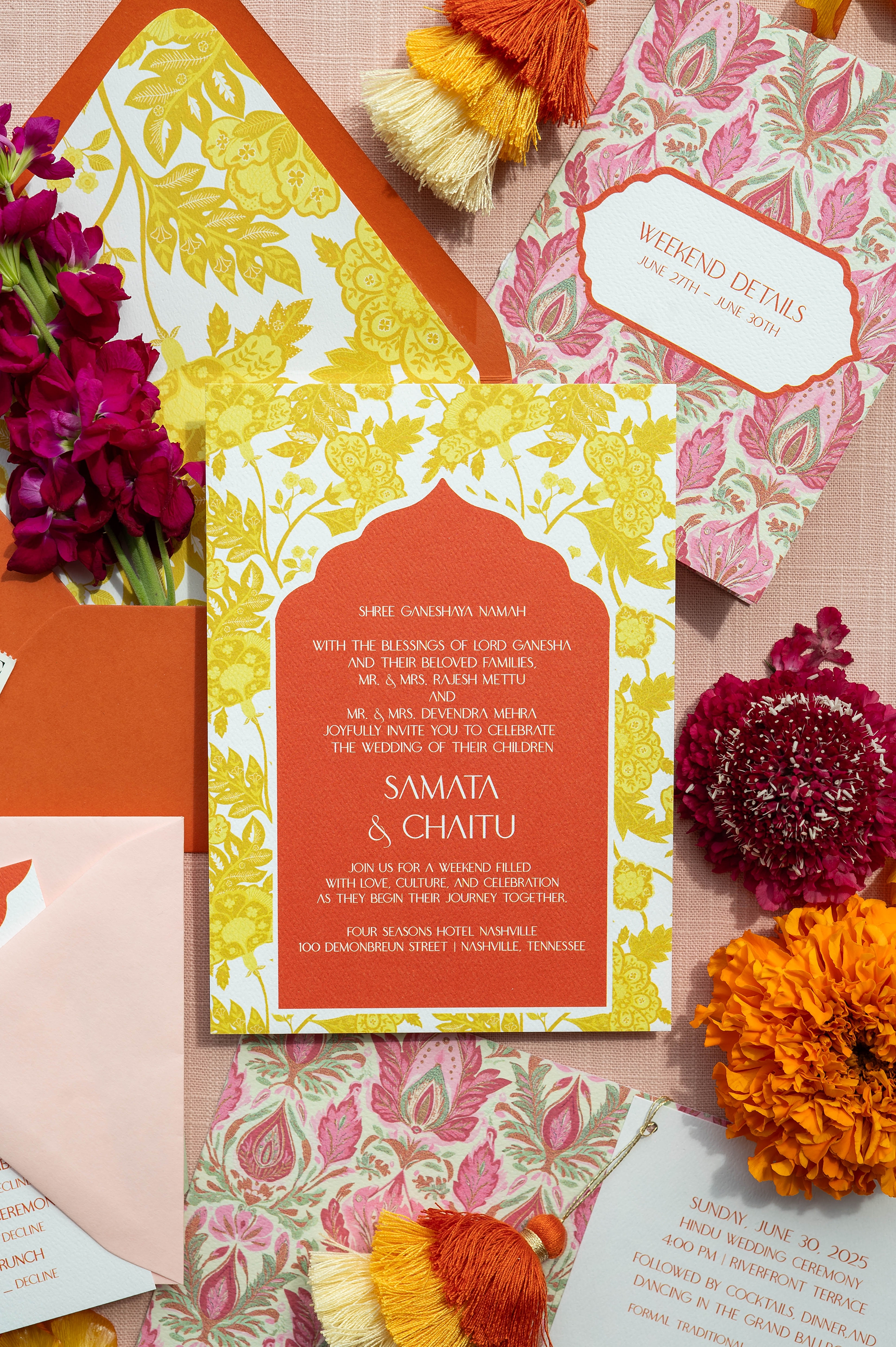
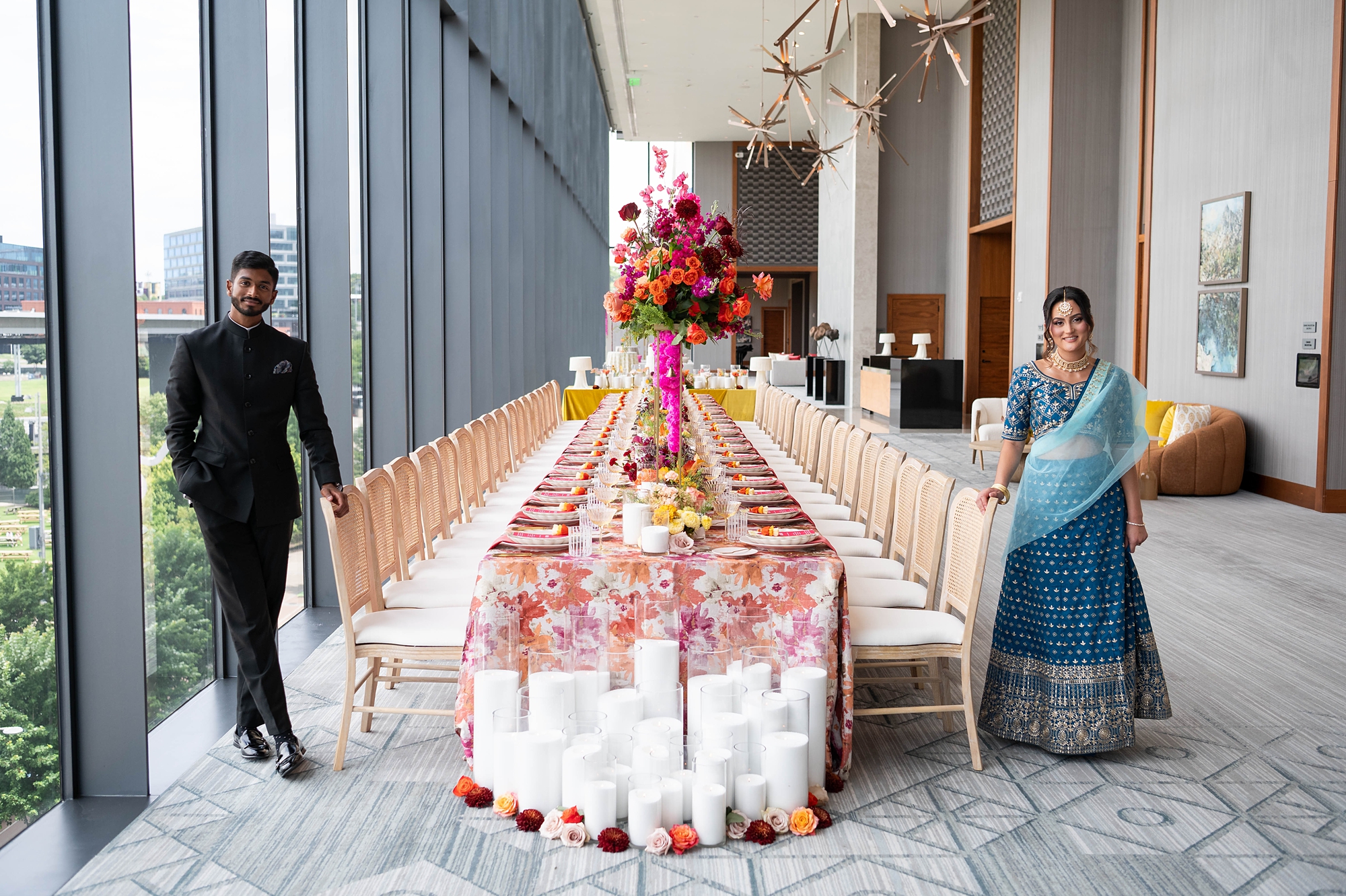
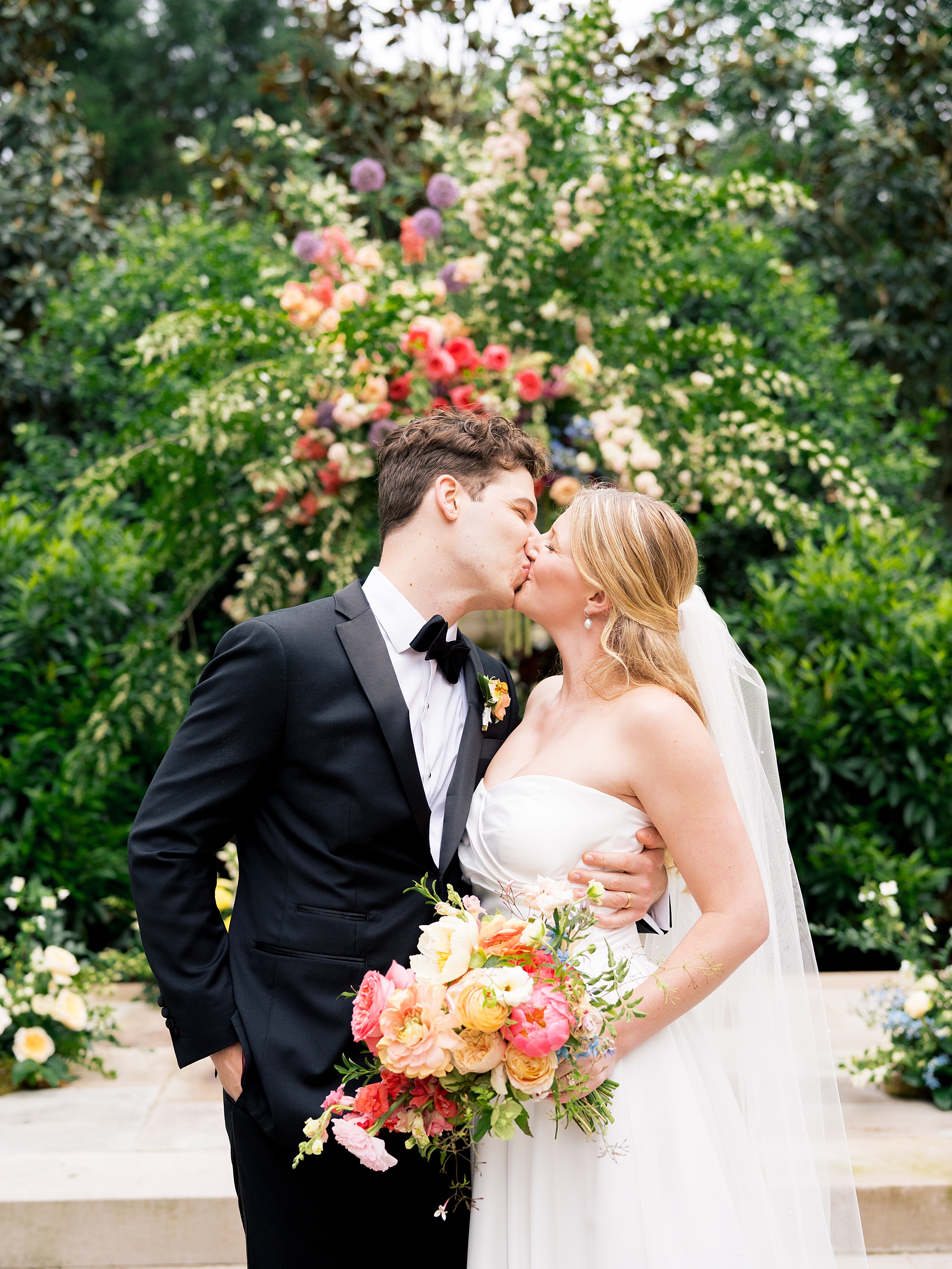
When it comes to wedding design, few things are as breathtaking as the bold colors and traditions of South Asian weddings. This luxury styled wedding at Four Seasons Hotel in Nashville, planned by Let’s Do this Events, was the perfect celebration of vibrancy, culture, and elegance. With an incredible vendor team and a stunning vision, the day overflowed with bright pinks, oranges, yellows, and rich details that set the stage for a joyful and vibrant Hindu wedding.
An Invitation Suite Full of Color
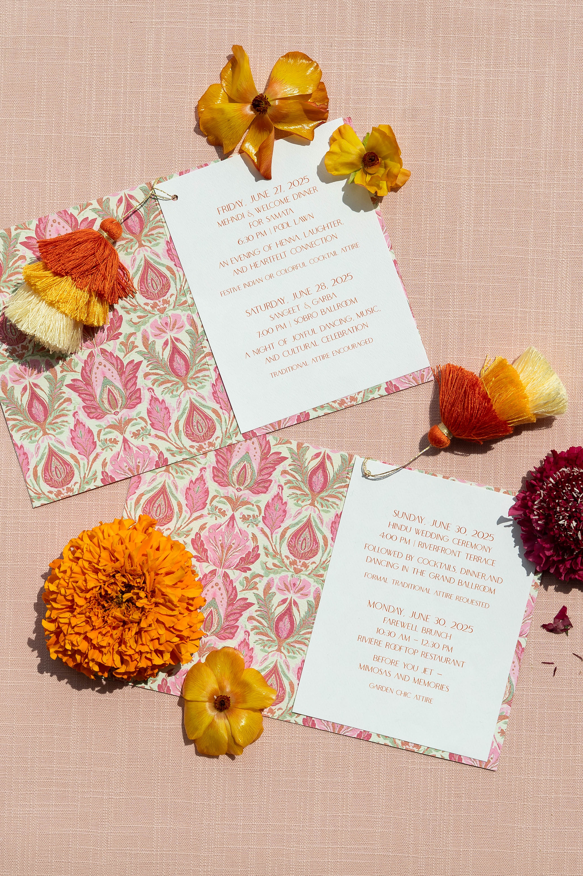
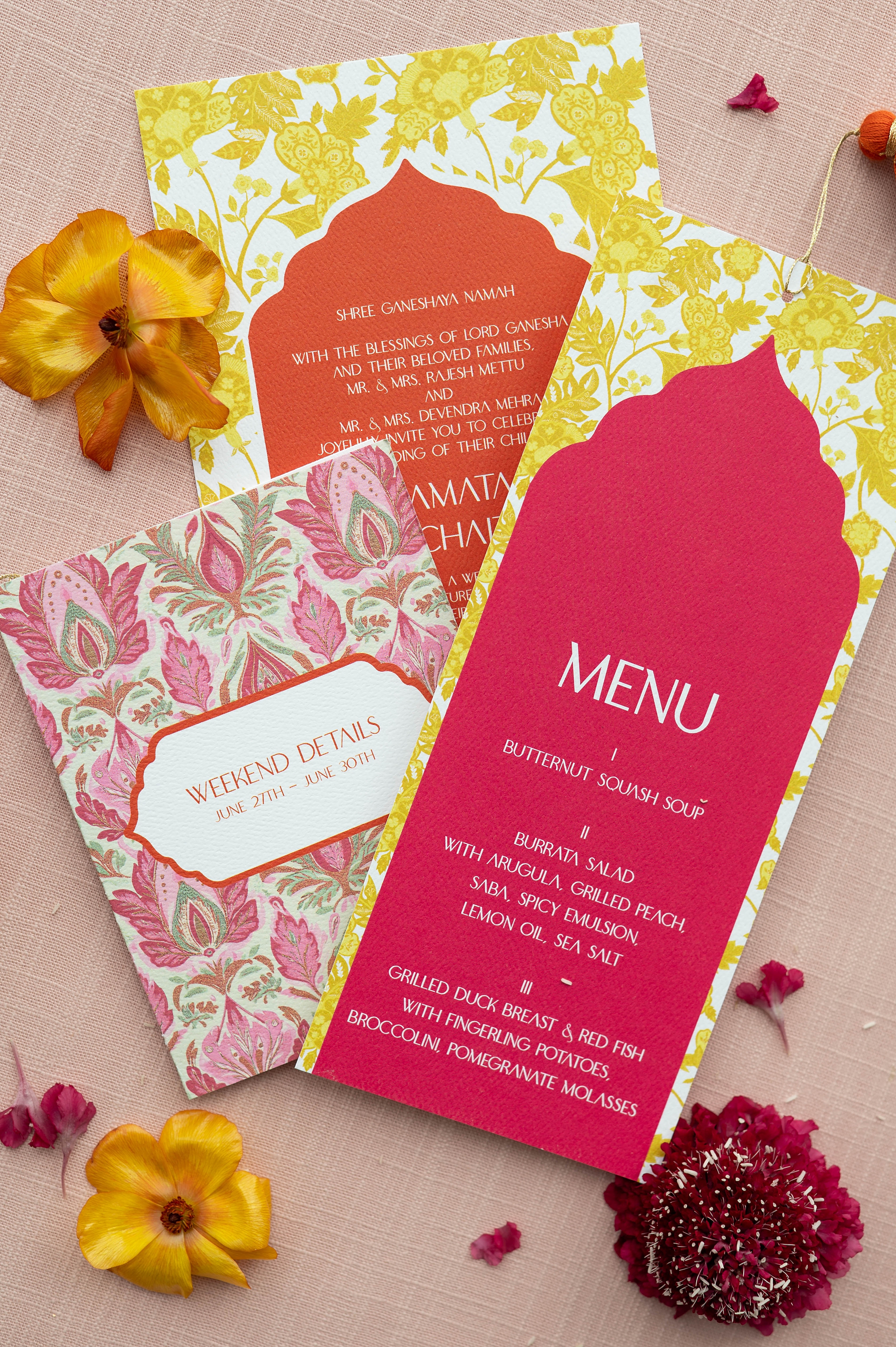
For this editorial, we designed a stationery collection that embraced bold color and cultural patterns in a modern, luxurious way. The invitation suite began with an orange envelope, paired with a striking yellow patterned envelope liner. That same yellow pattern became the base of the invitation, creating a cohesive and eye-catching design.
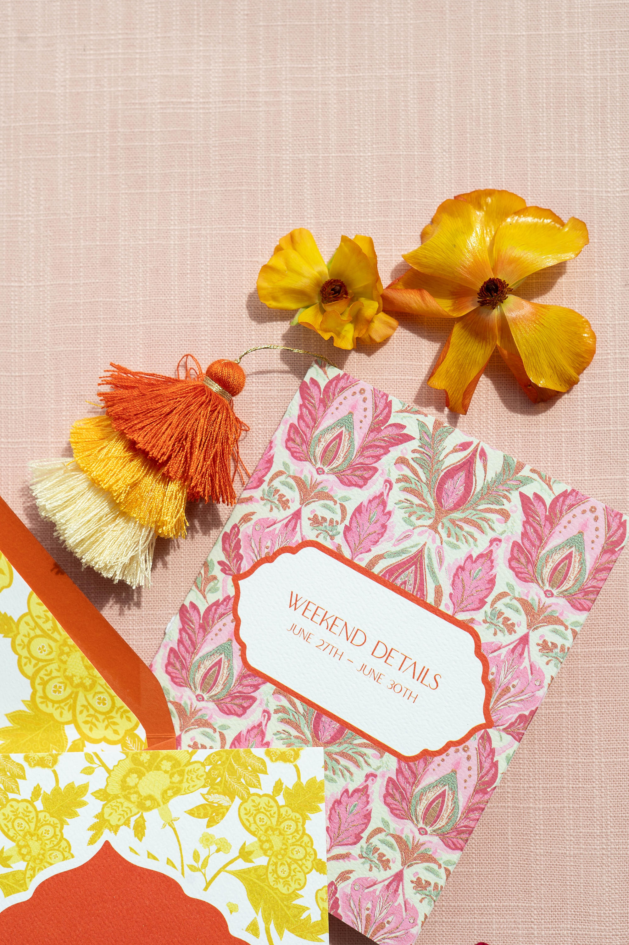
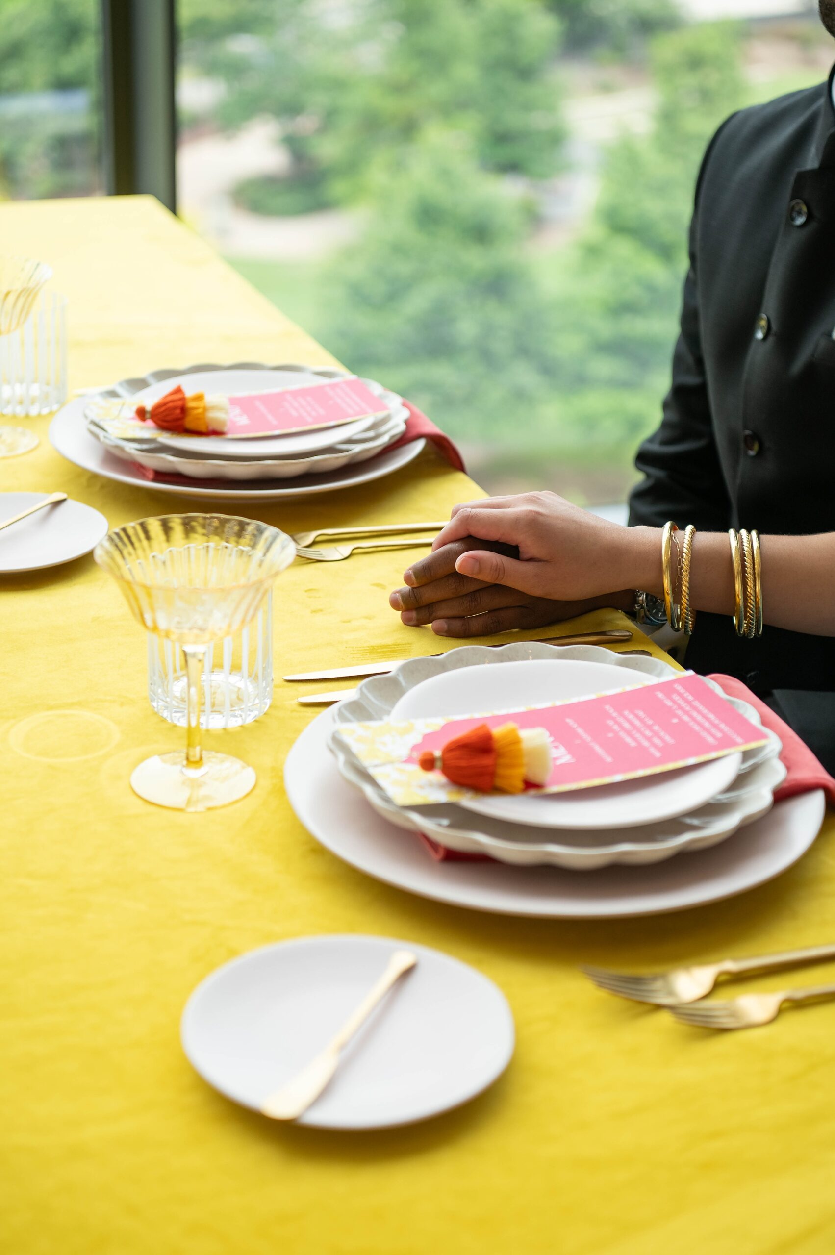
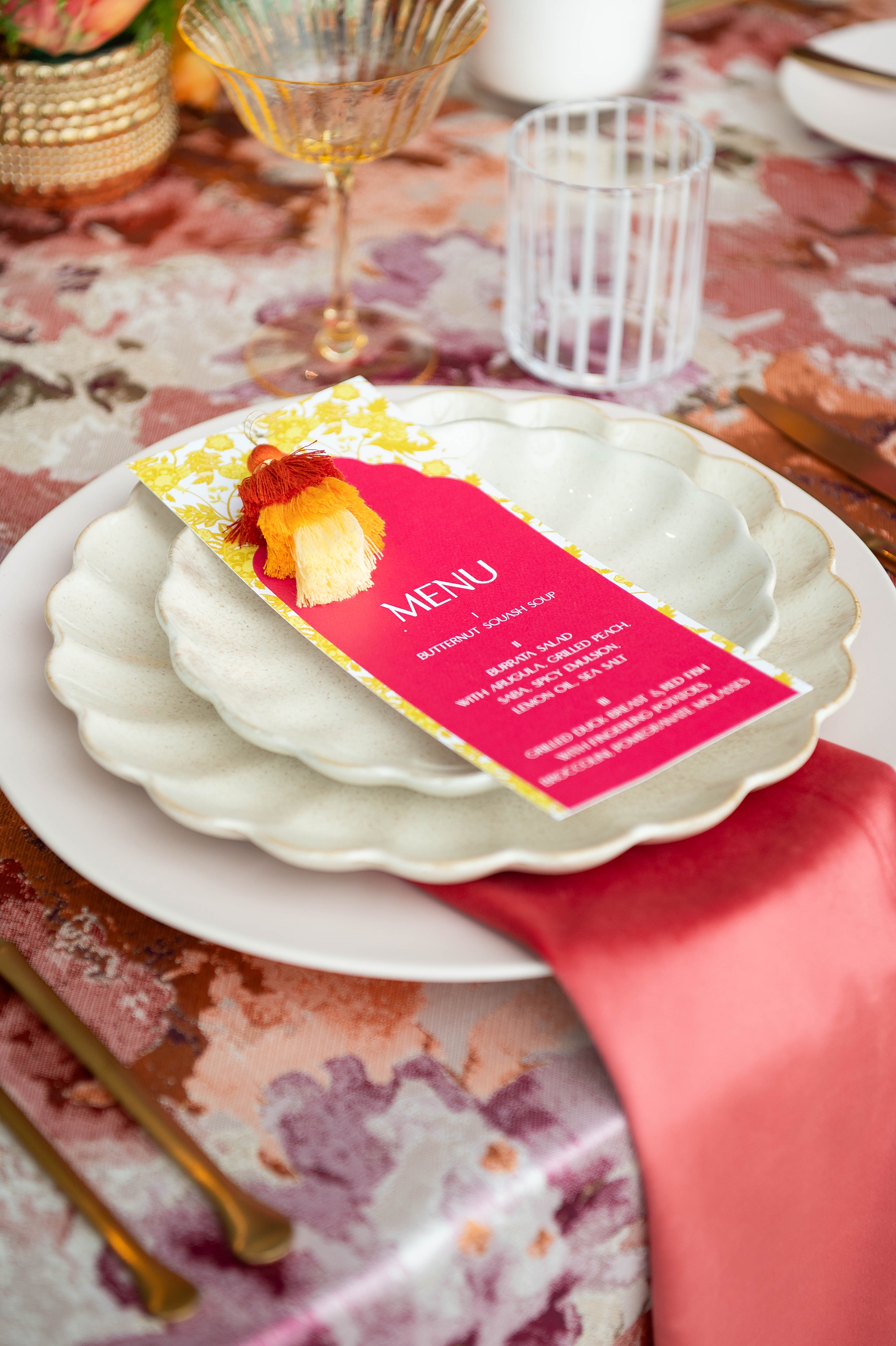
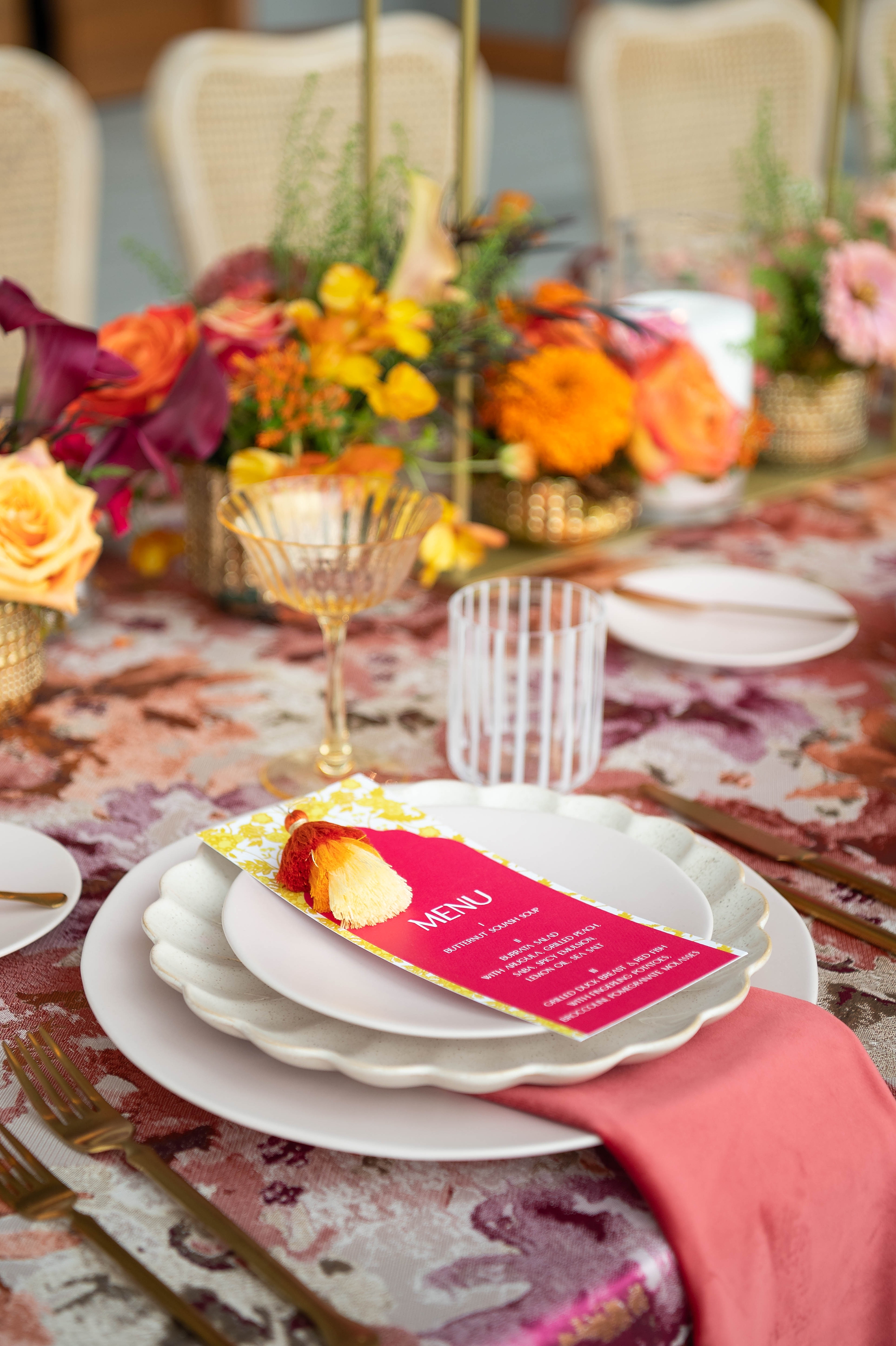
We layered orange paper to match the envelope and lettered the details in crisp white calligraphy. A standout detail was the wedding weekend Details booklet, which featured a pink and light green paisley motif accented with orange, yellow, and cream ombre pom poms attached by hand. This touch added personality, texture, and fun.
Custom Menus
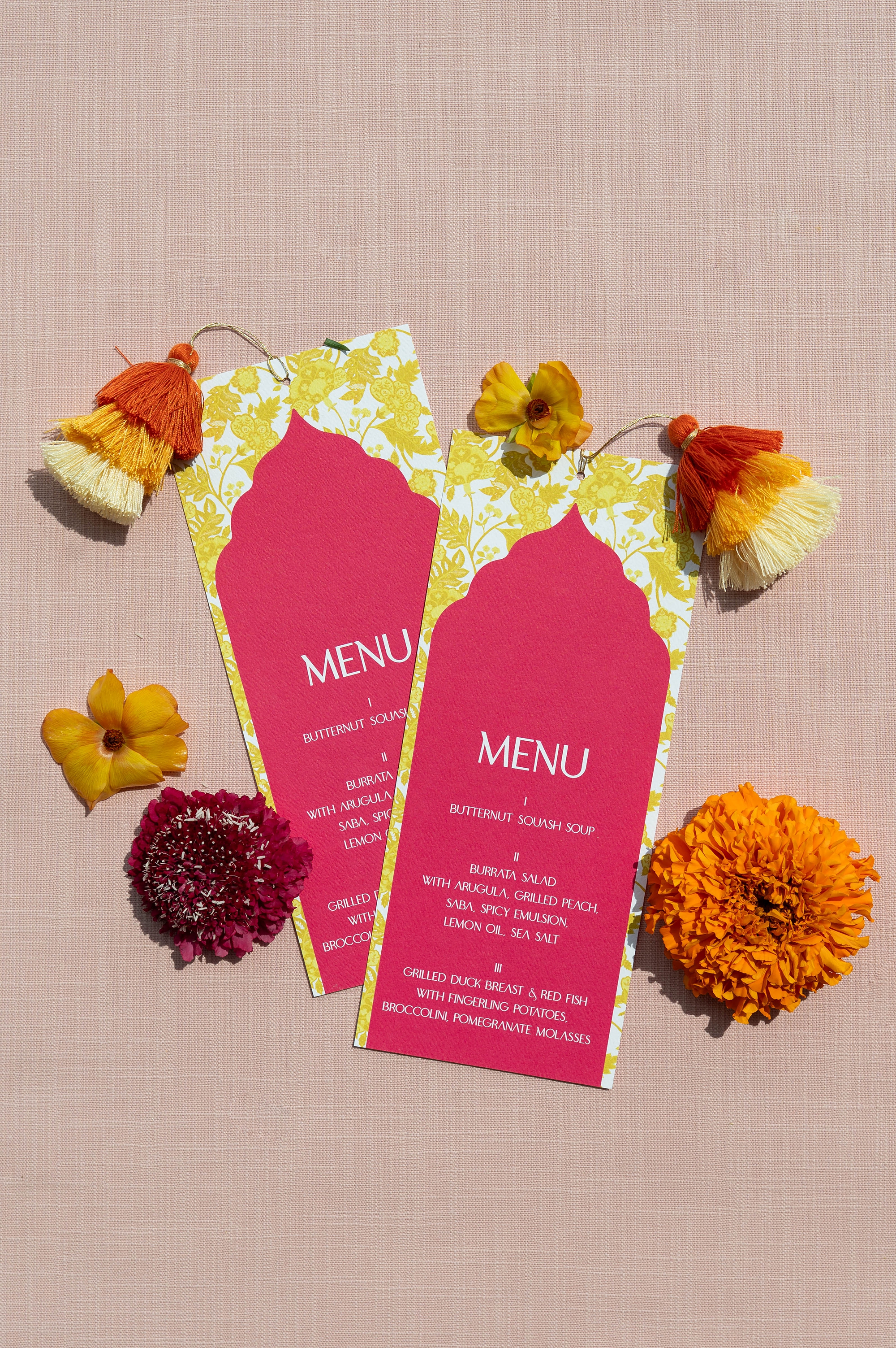
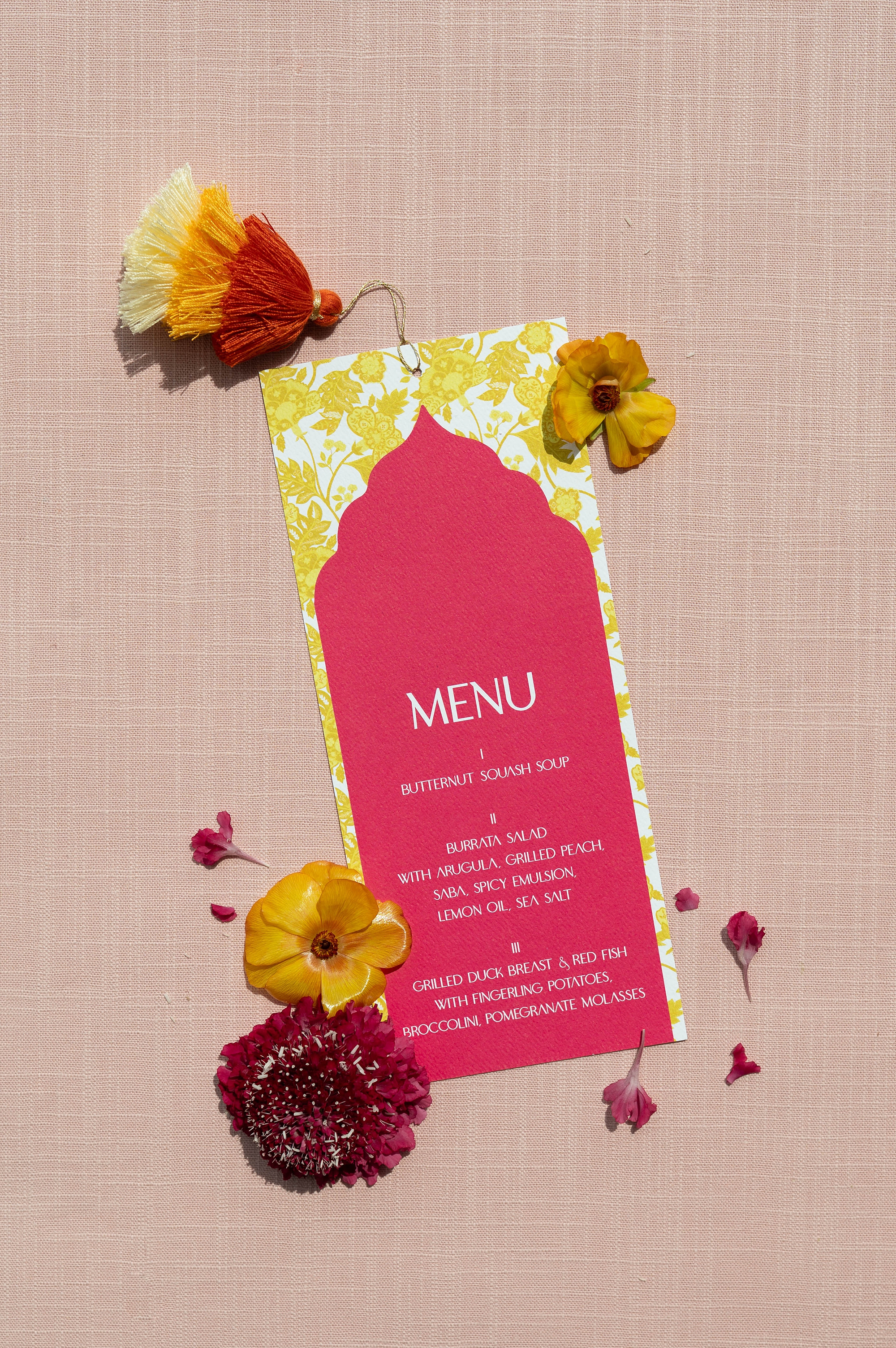
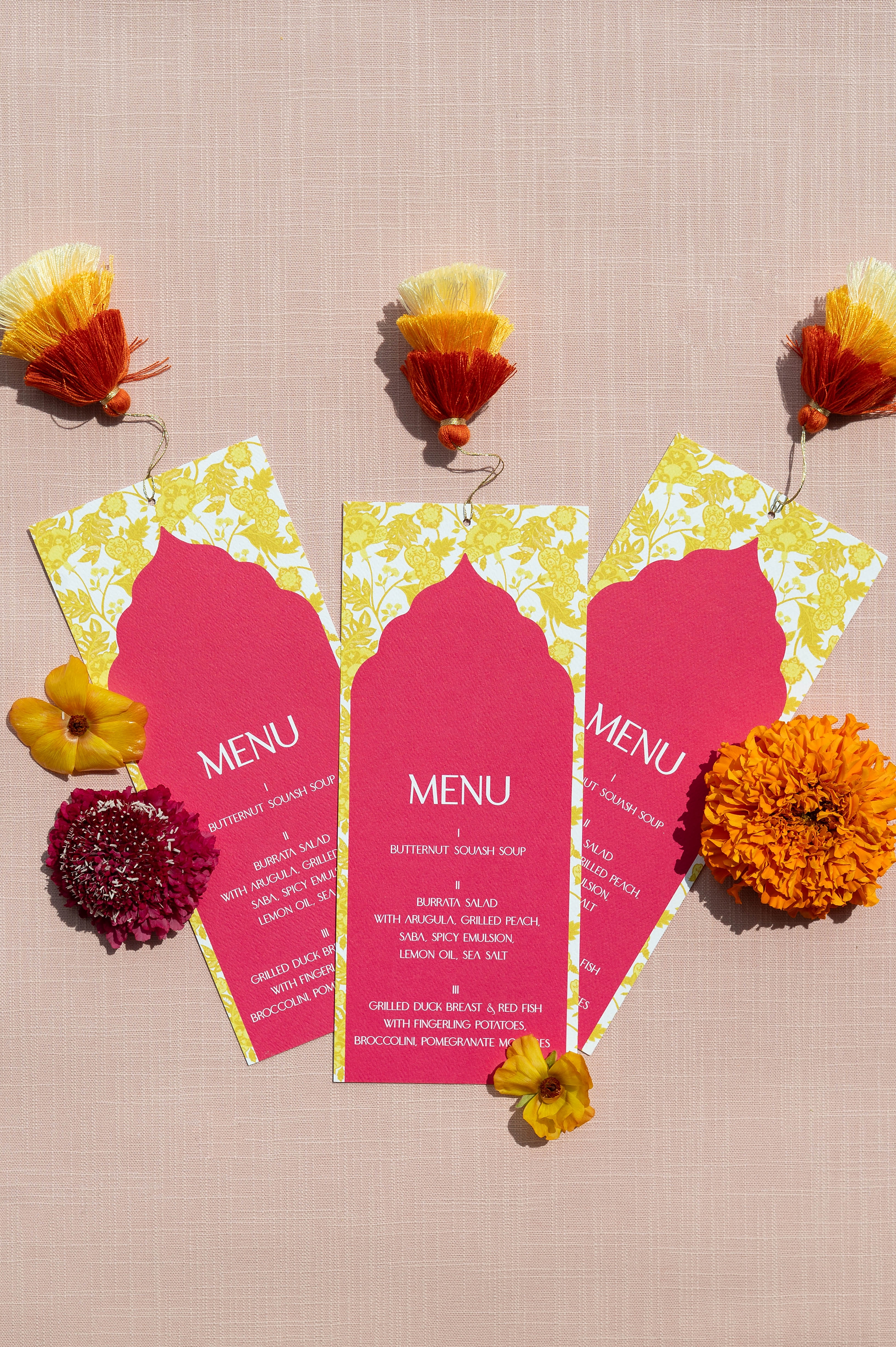
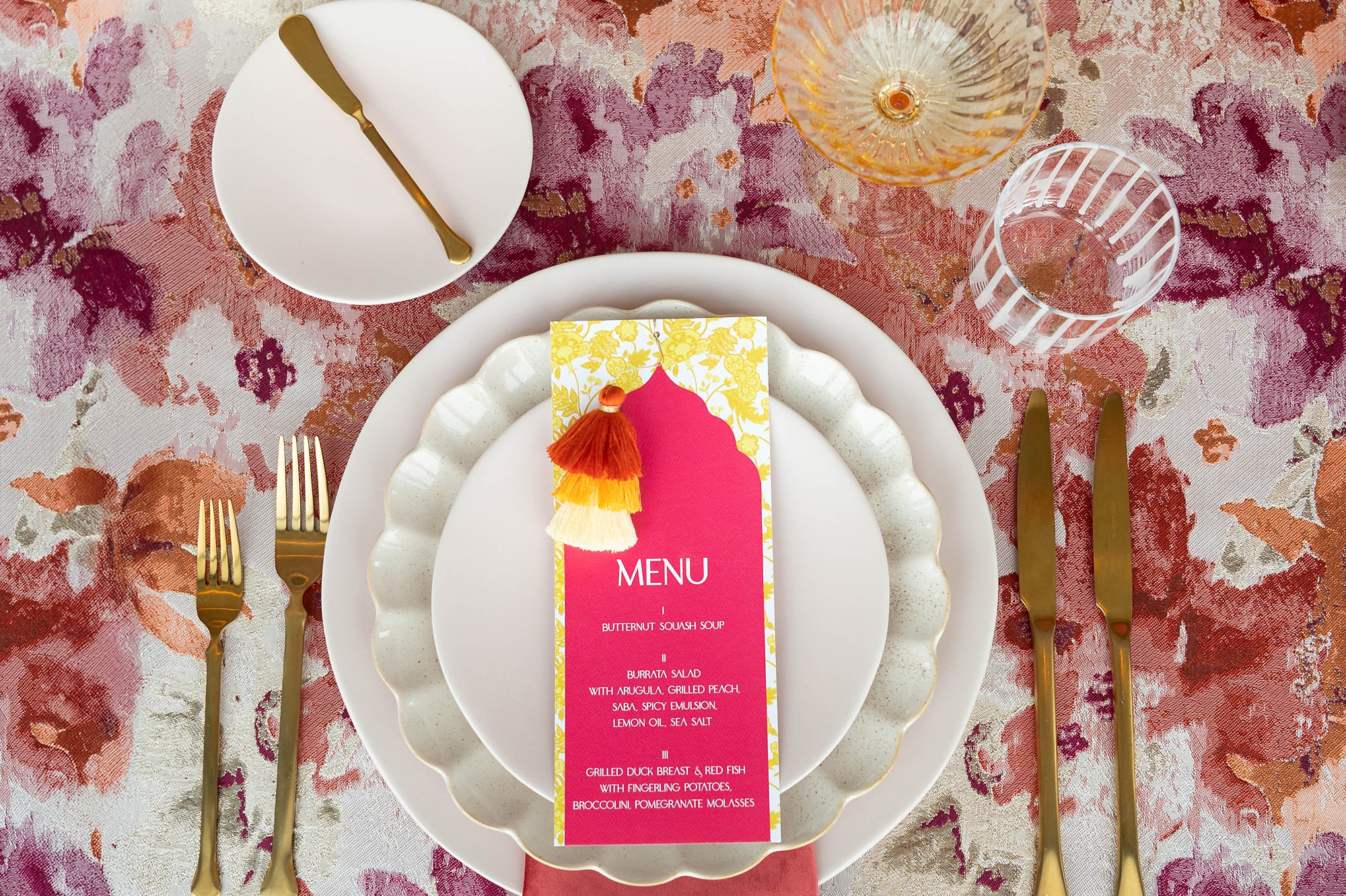
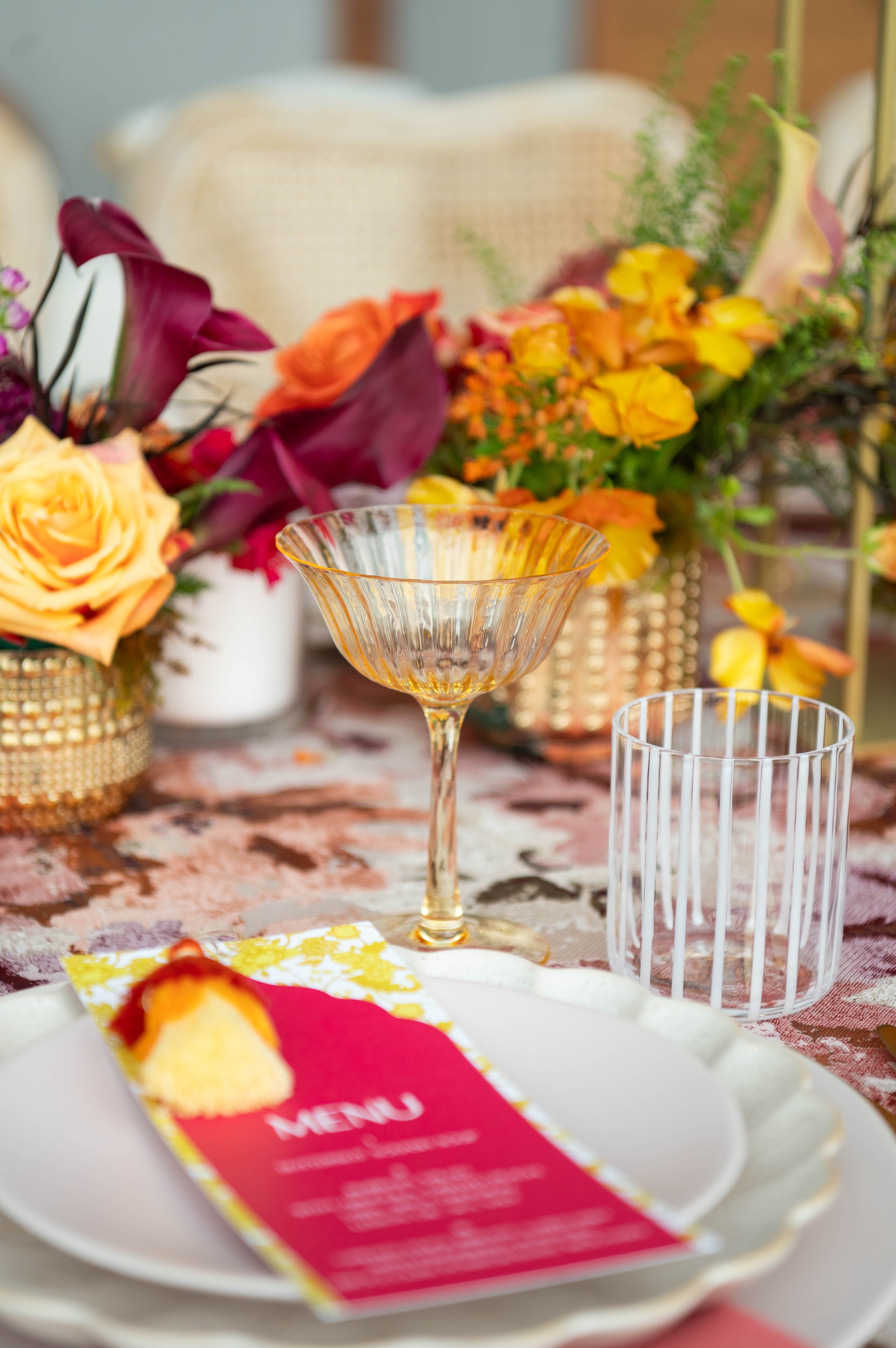
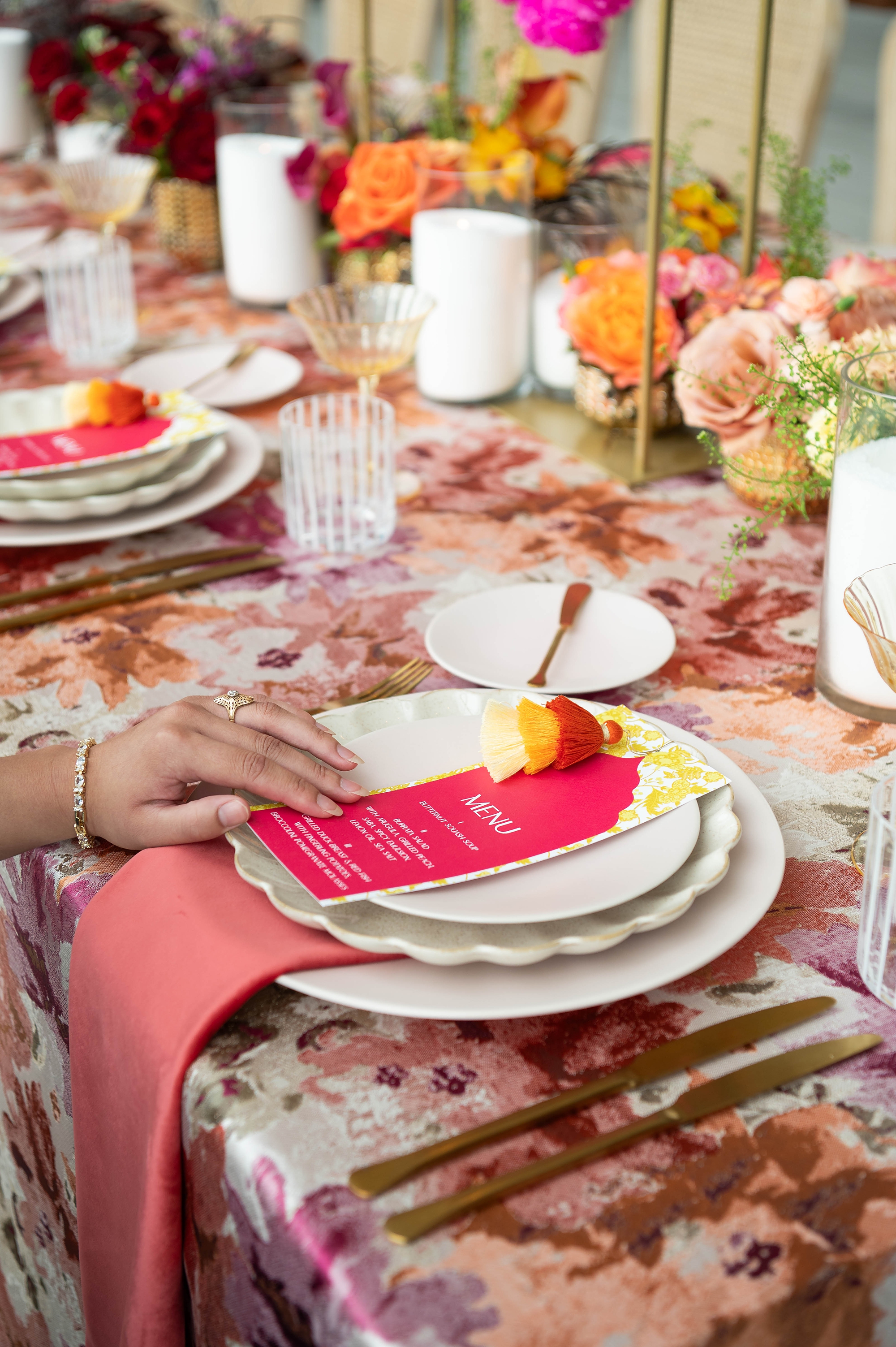
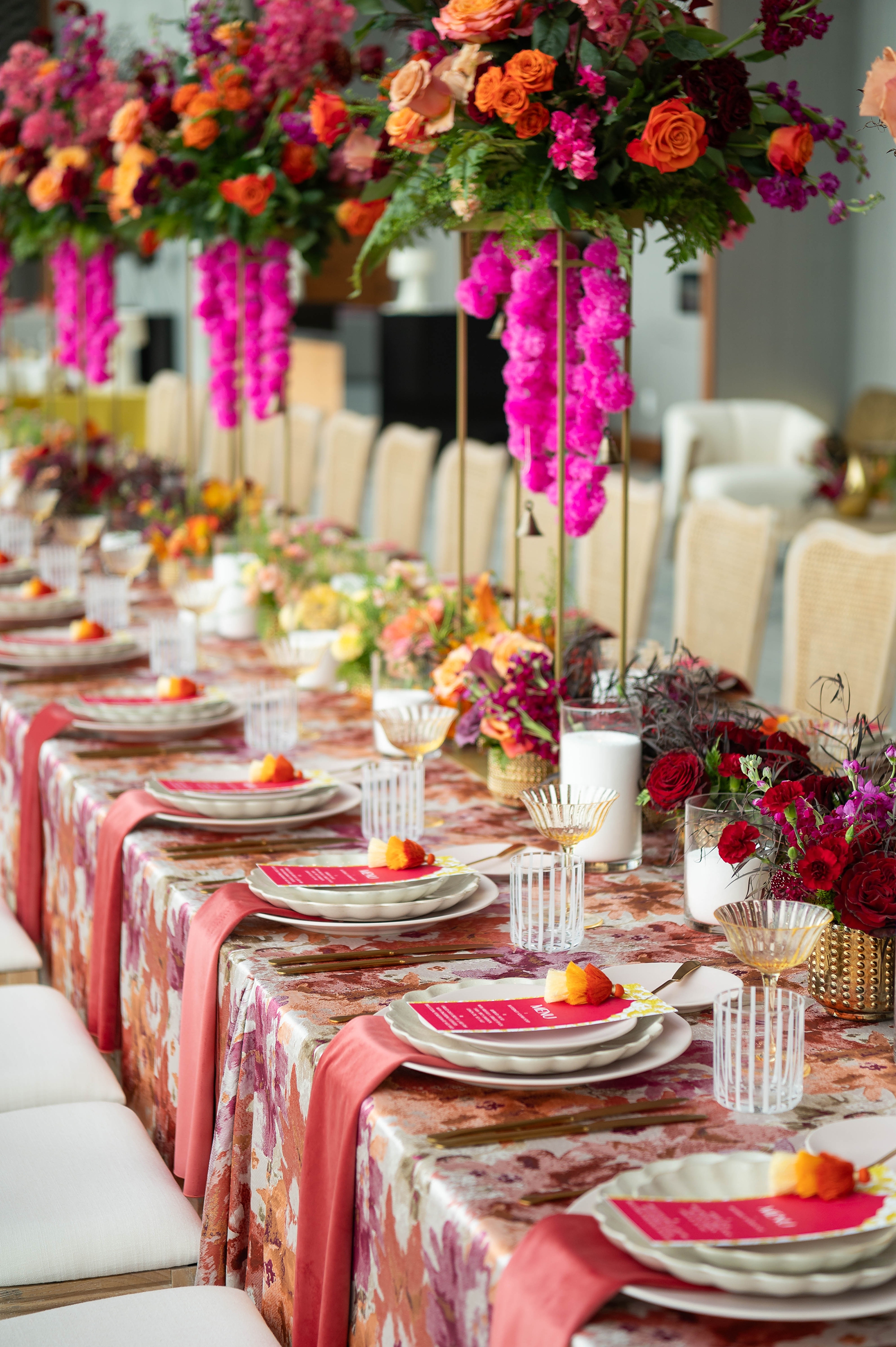
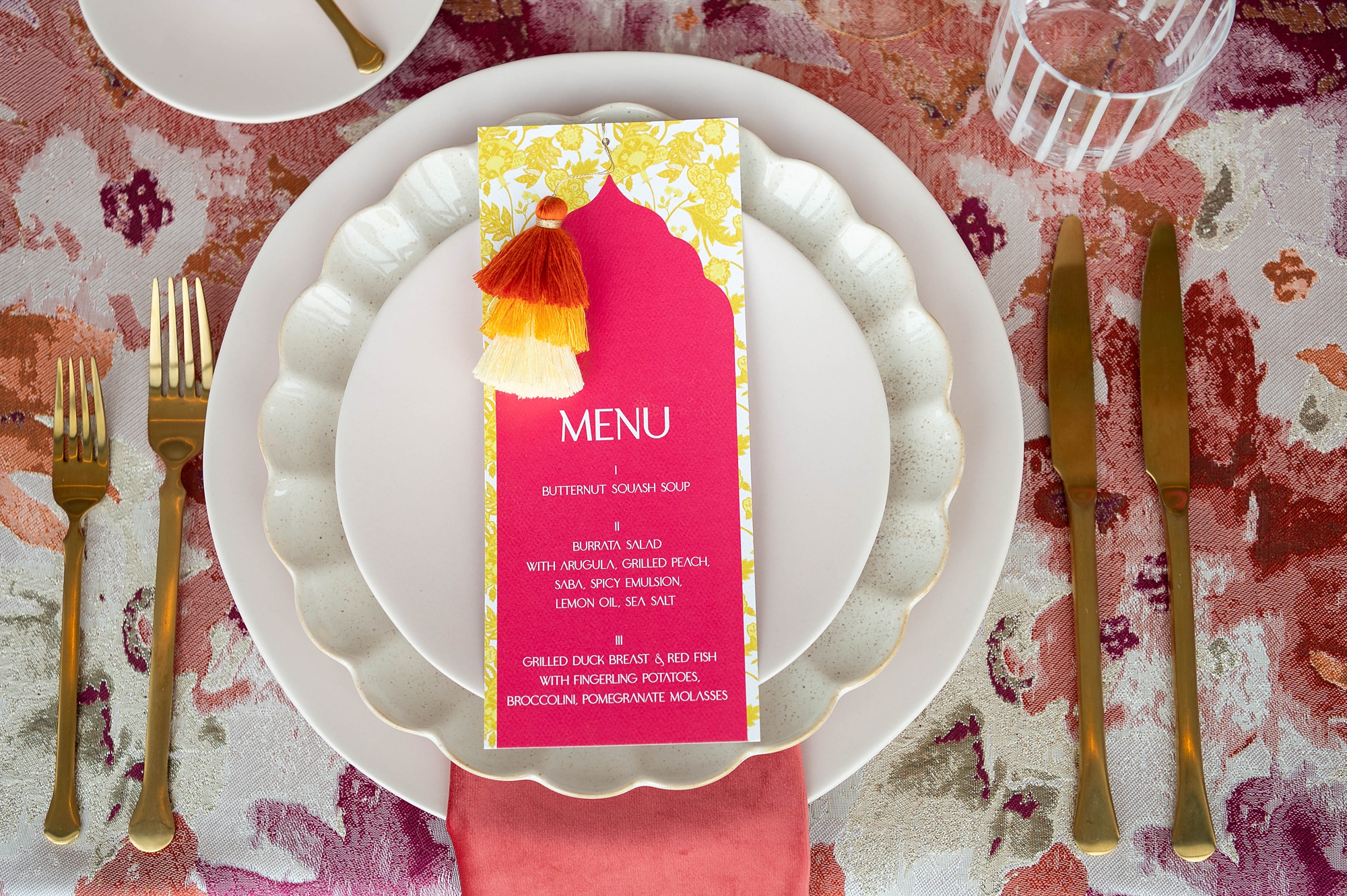
To carry the design through the reception, we created custom menus that incorporated the same yellow pattern from the invitation suite. Each menu featured a layered look with yellow patterned paper beneath bold pink cardstock, topped with elegant white lettering. Of course, the menus wouldn’t be complete without their playful touch – more ombre pom poms!
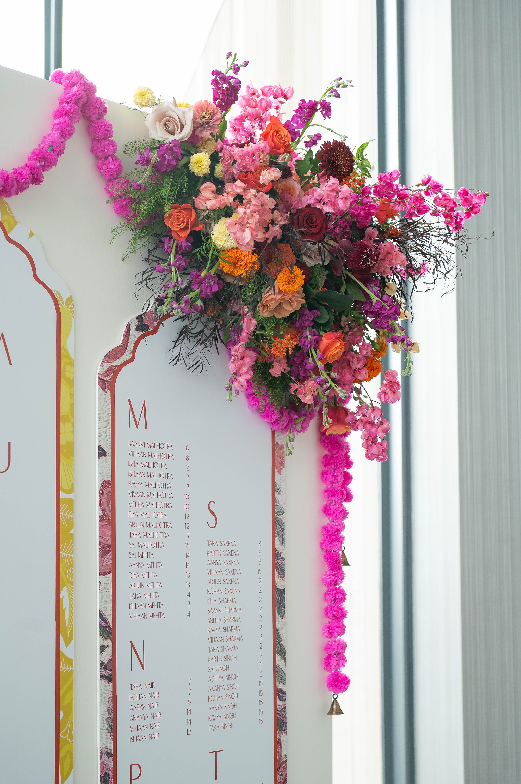
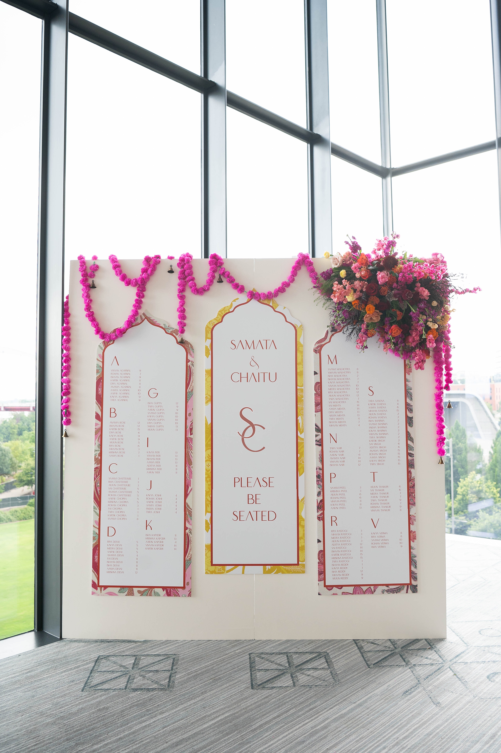
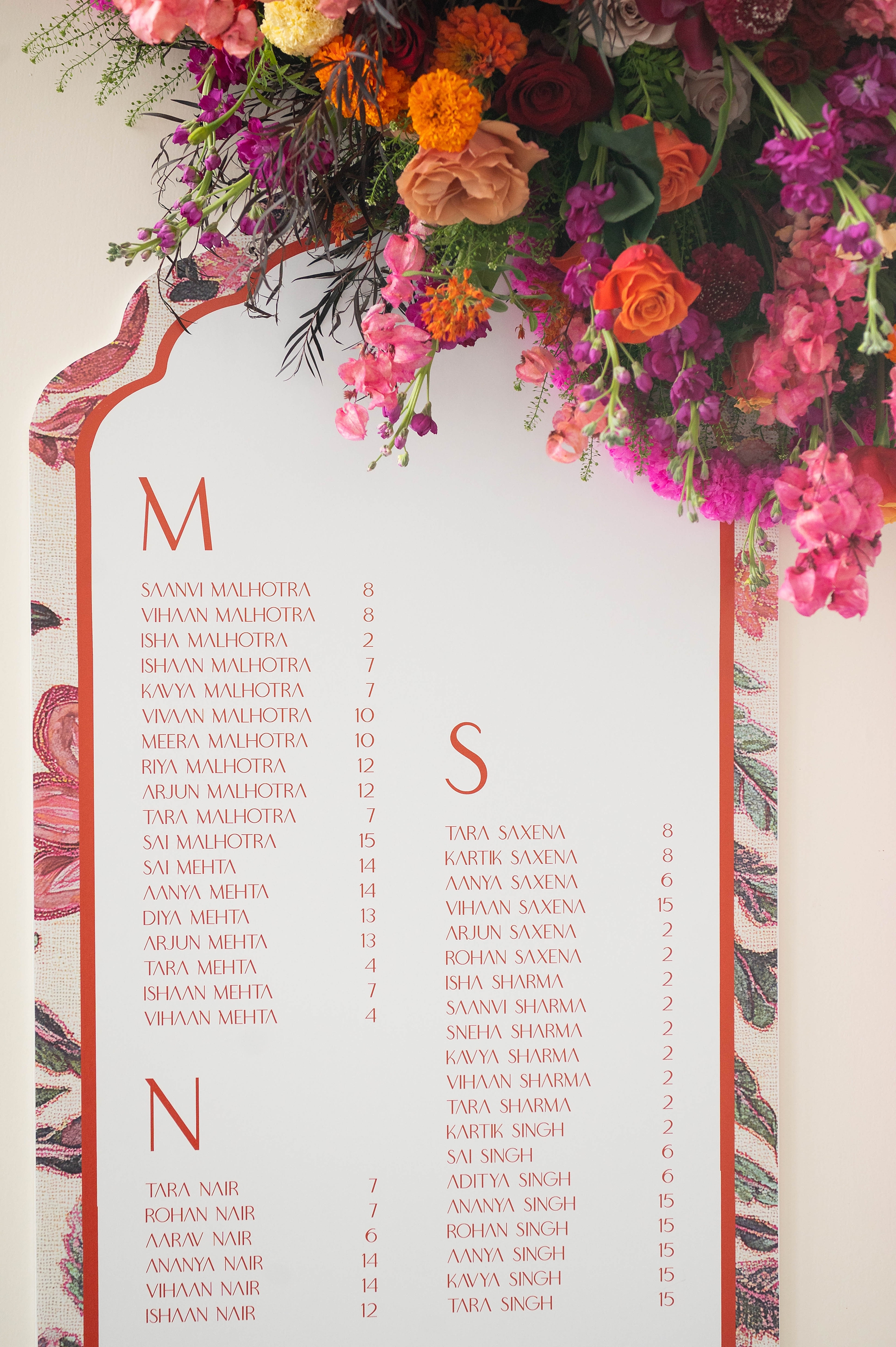
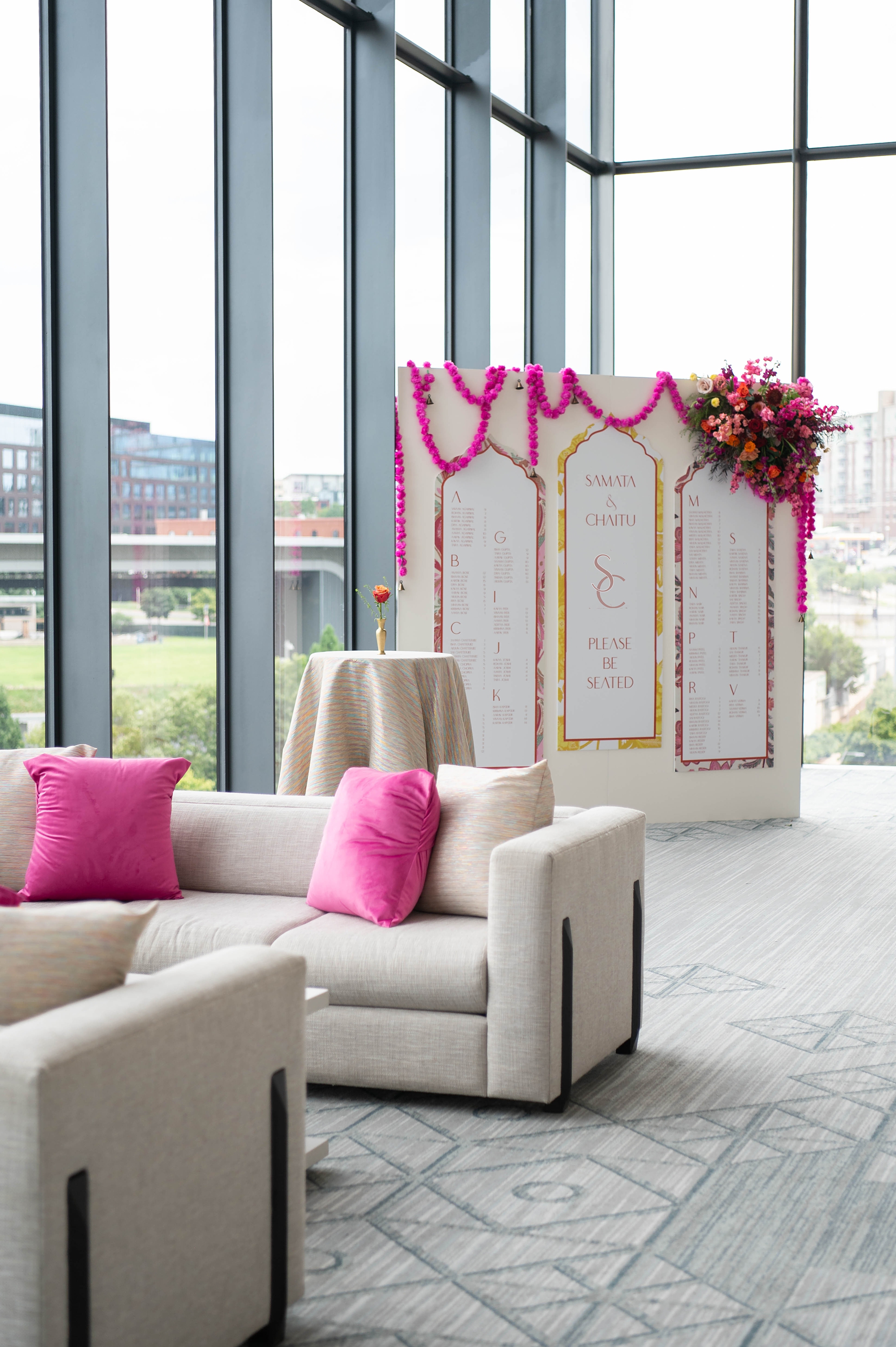
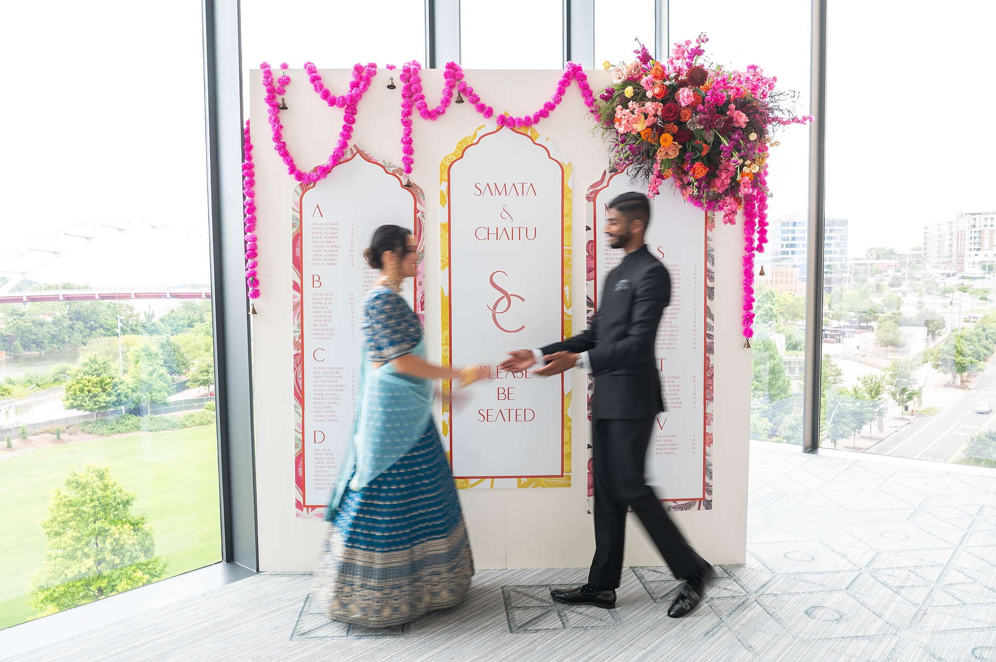
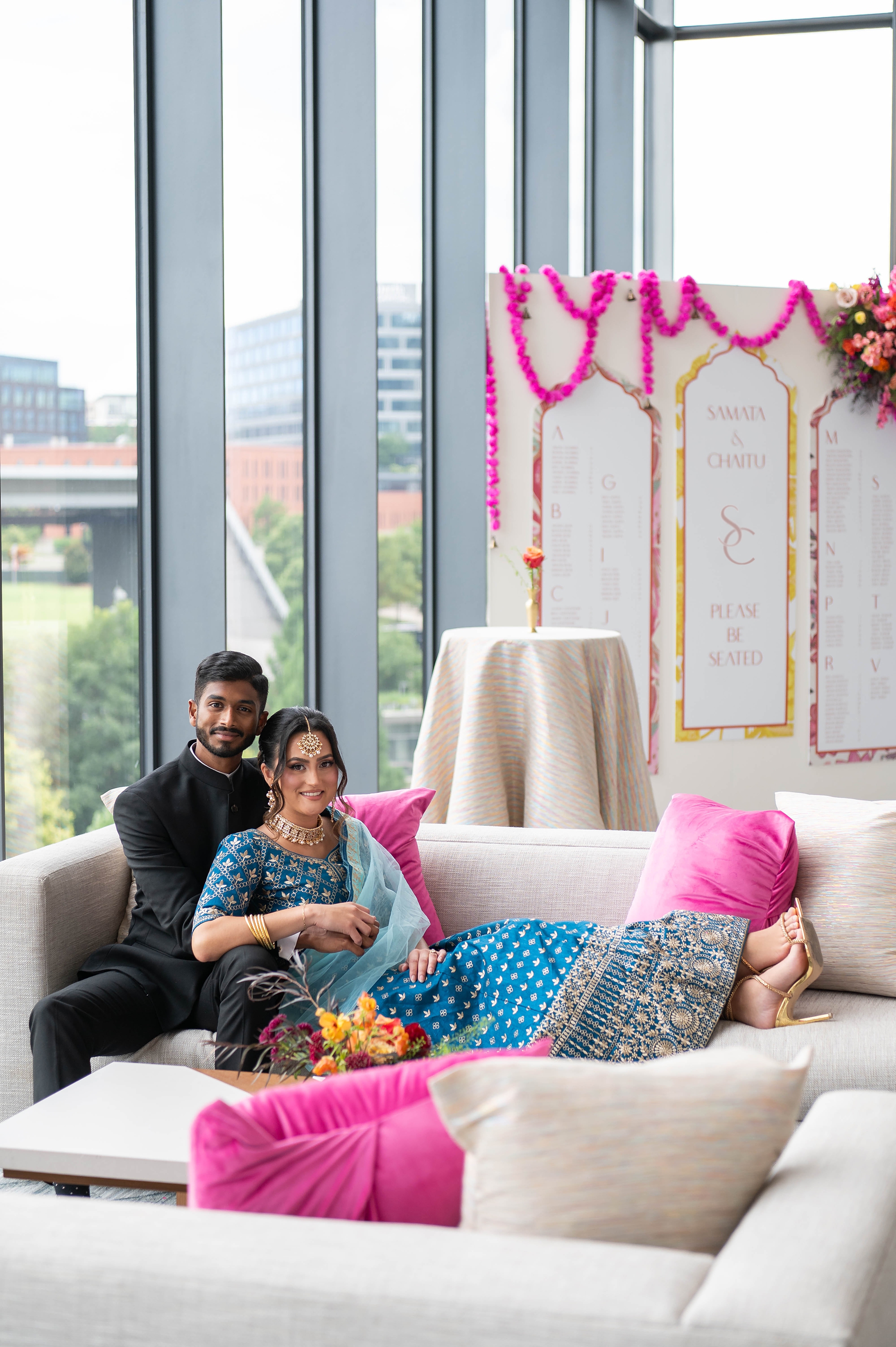
The Seating Chart
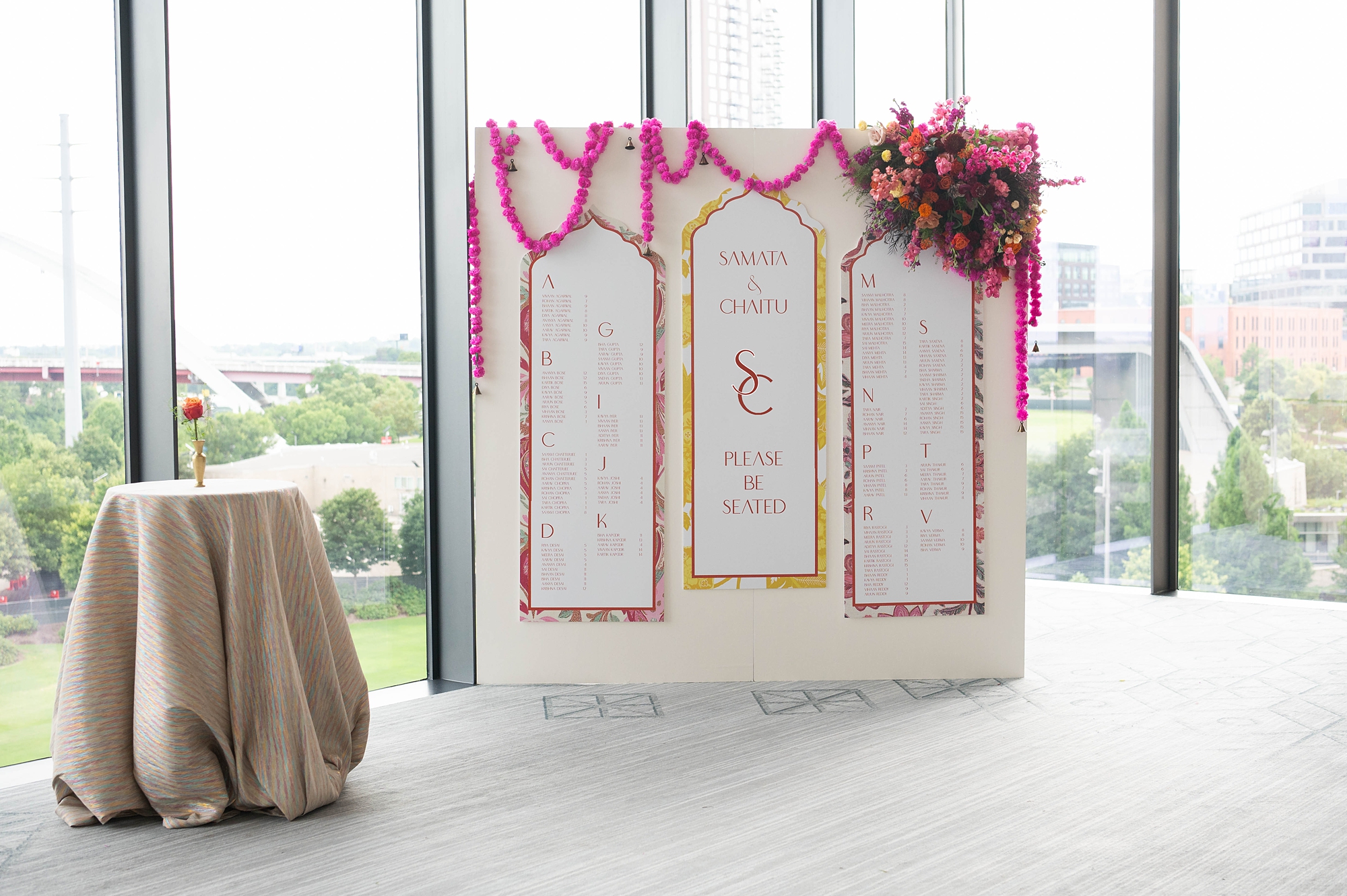
The seating chart wall was a true centerpiece of the event design. Each guest’s name was displayed in pink lettering on either side of the installation, bordered by the paisley design carried over from the stationery. In the center, the couple’s monogram, names, and “Please Be Seated” were framed by the same yellow pattern first introduced in the invitations.
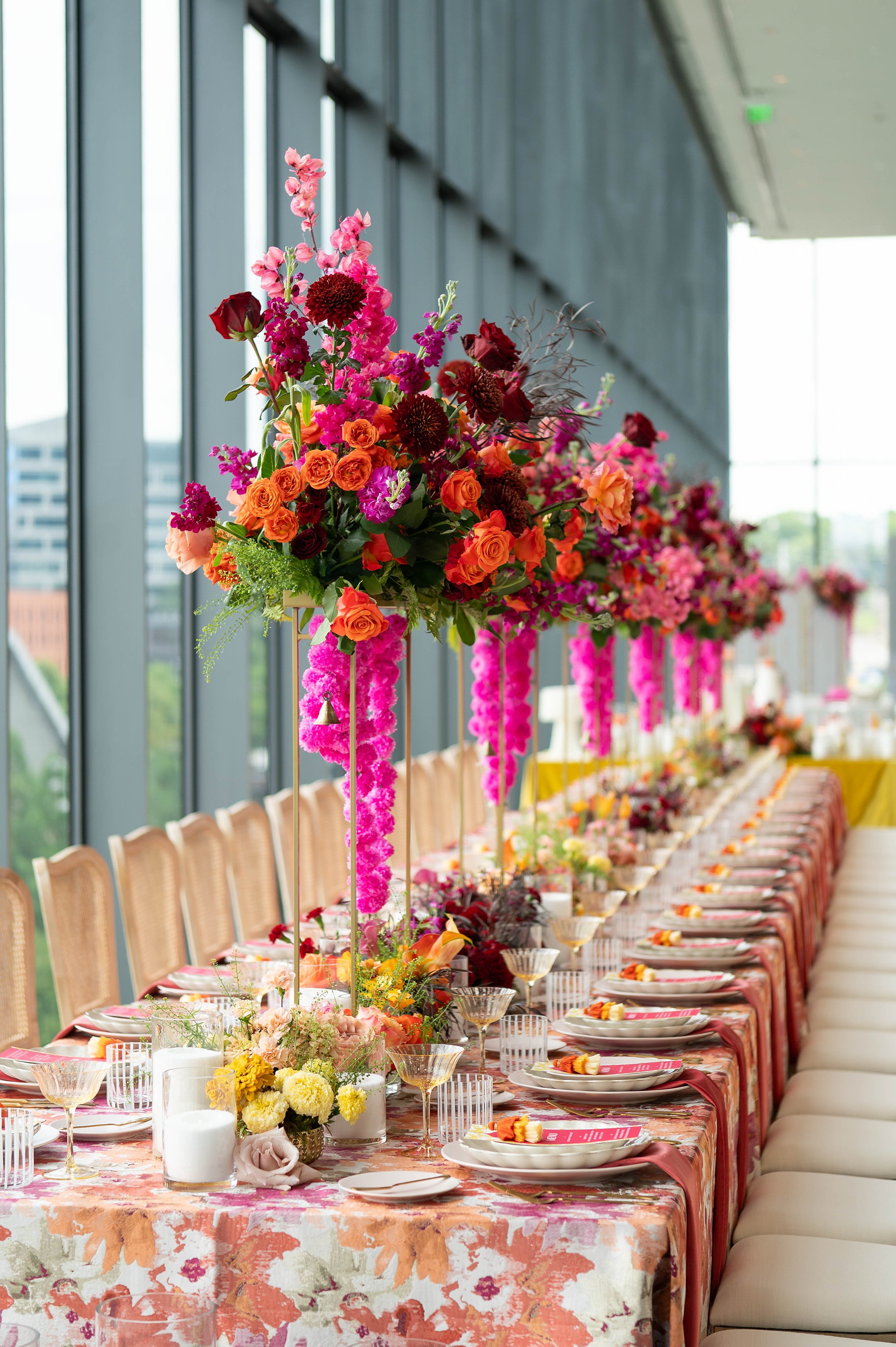
The result was a luxury seating display that beautifully tied together the invitation suite, menus, and overall event design. Surrounded by bold floral arrangements in pinks, oranges, purples, and yellows, this installation made a lasting impression.
Cohesive Design from Start to Finish
From invitations to menus to the seating chart, the stationery details for this Four Seasons Nashville wedding were carefully curated to celebrate the colorful beauty of Hindu weddings while maintaining a luxurious, polished feel. We loved how each element echoed and complemented another.
It was such an honor to collaborate with an incredible team of vendors and to see our stationery designs and day of details come to life.
If you’re planning a wedding in Nashville, or anywhere in the world, we’d love to help you create meaningful, personalized stationery and event details that tell your story. We work with couples worldwide to design details you and your guests will remember forever. Reach out today to learn more about our full-service wedding and event design offerings! We can’t wait to create something unforgettable for you!
If you enjoyed this post, you’ll love these other blogs!
At White Ink Calligraphy + Co., we specialize in creating custom wedding stationery and event details that tell your love story from the very first impression to the last dance of the evening. This elegant spring wedding at Cheekwood Estate and Gardens in Nashville was a perfect example of how thoughtful design can transform a celebration into something unforgettable.
Elegant Spring Wedding Details
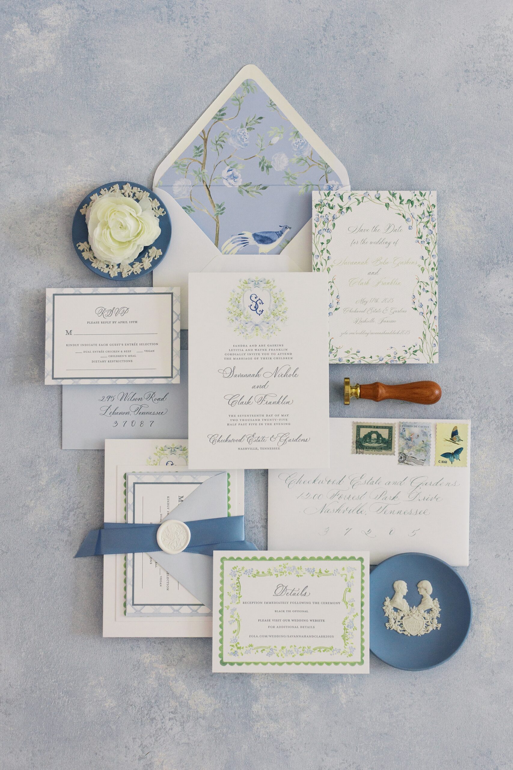
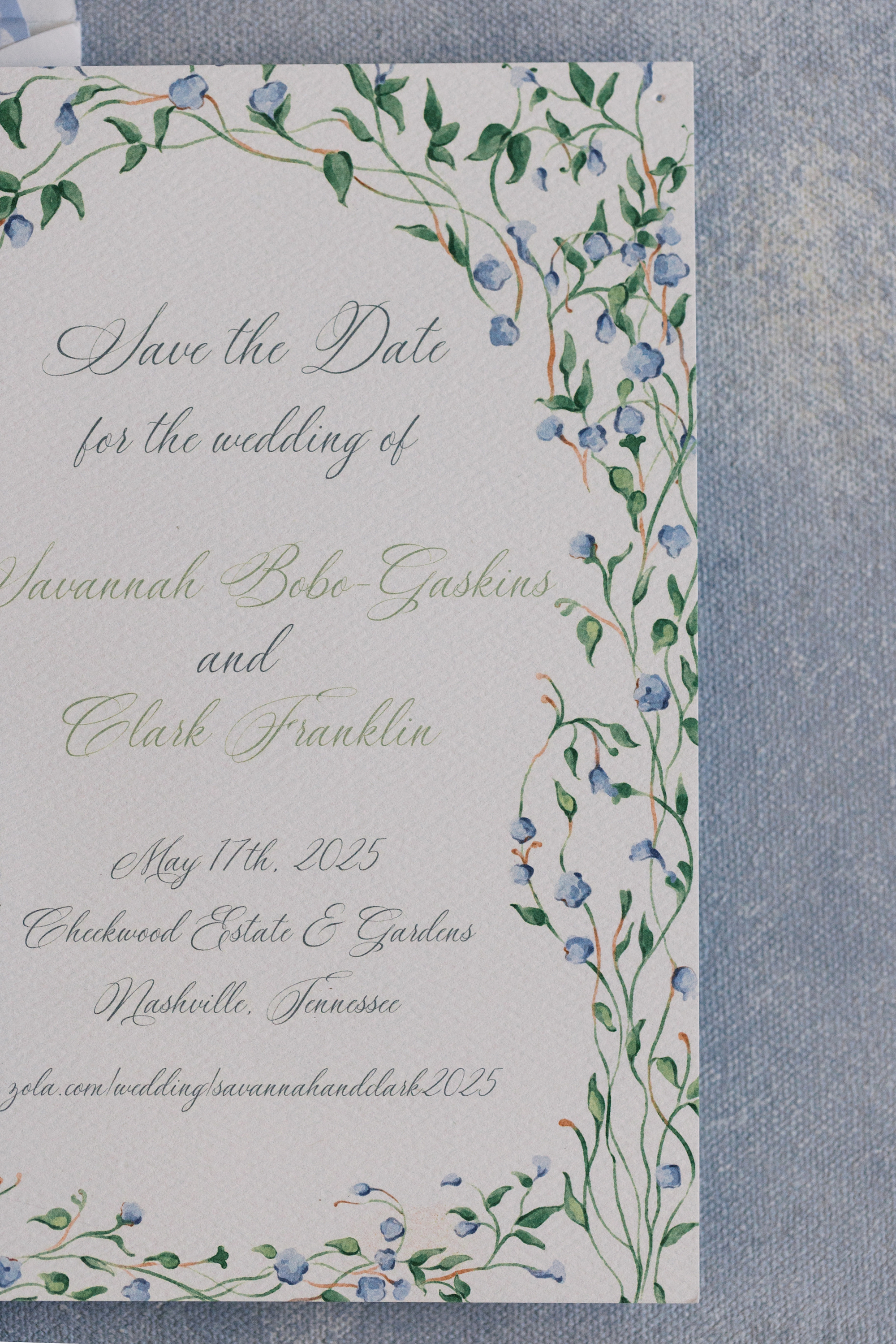
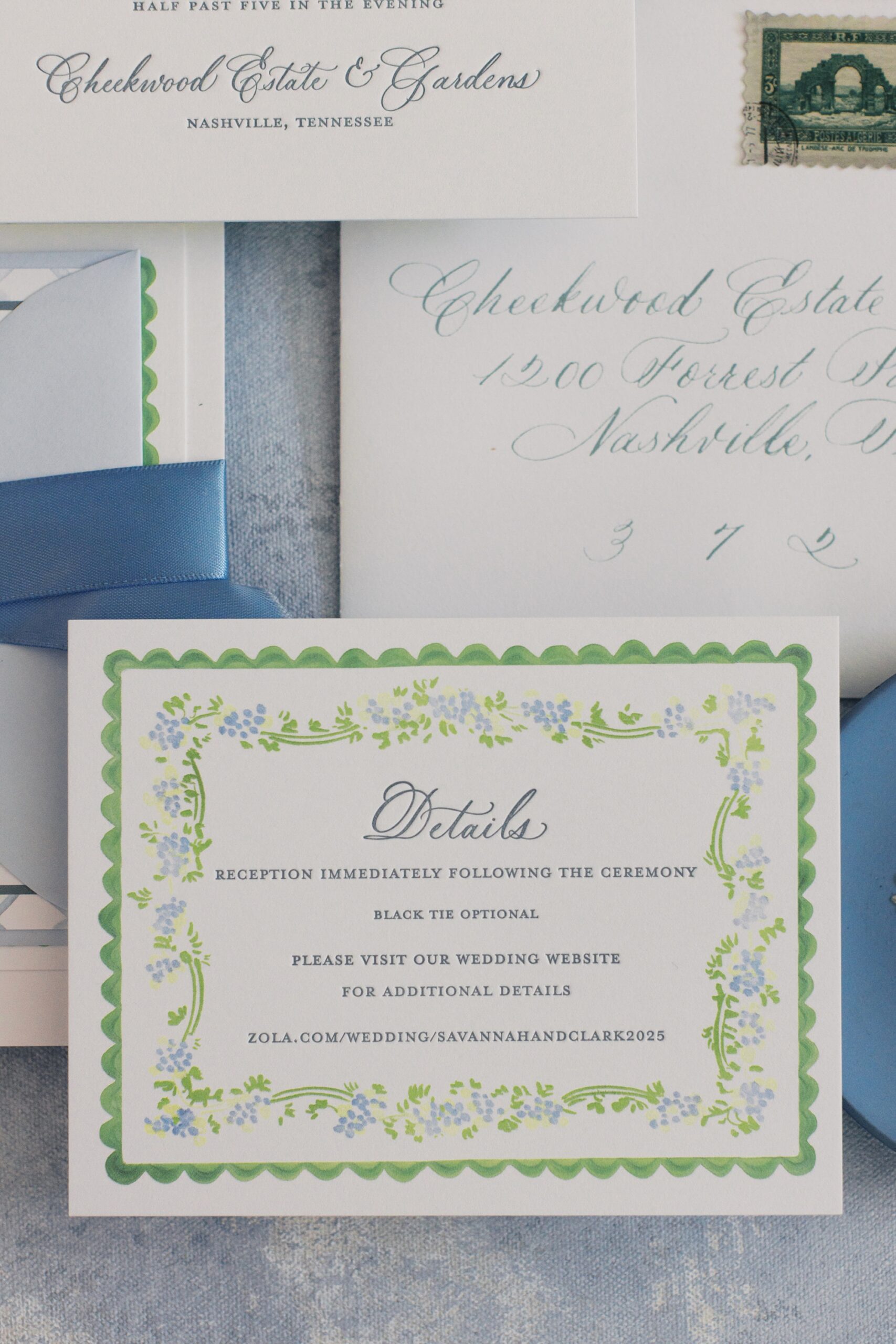
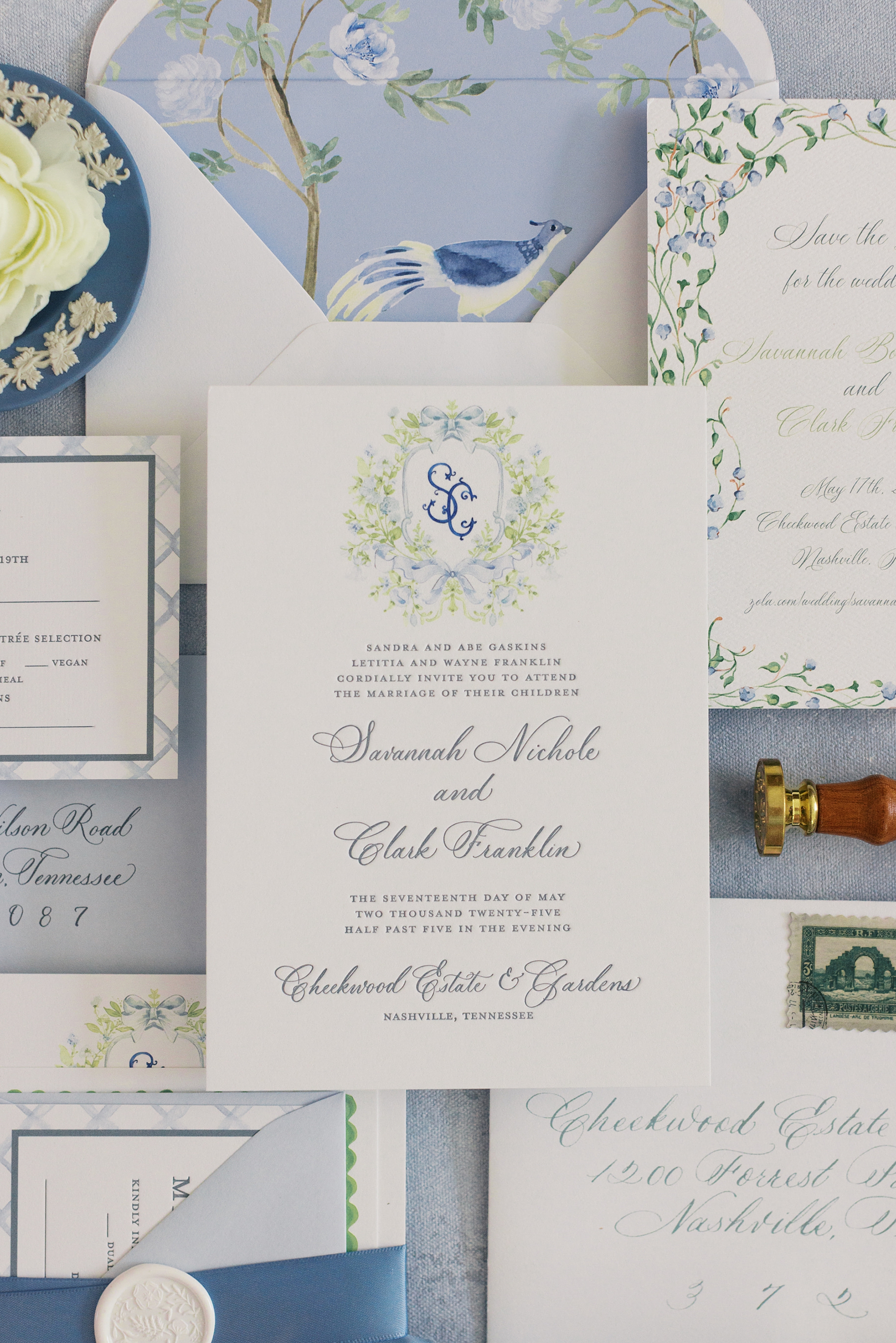
The couple chose a dreamy palette of light blue, white, and soft green accents, perfectly suited for Cheekwood’s lush spring gardens. We carried these colors throughout their entire wedding stationery suite and event signage for a cohesive, elevated look.
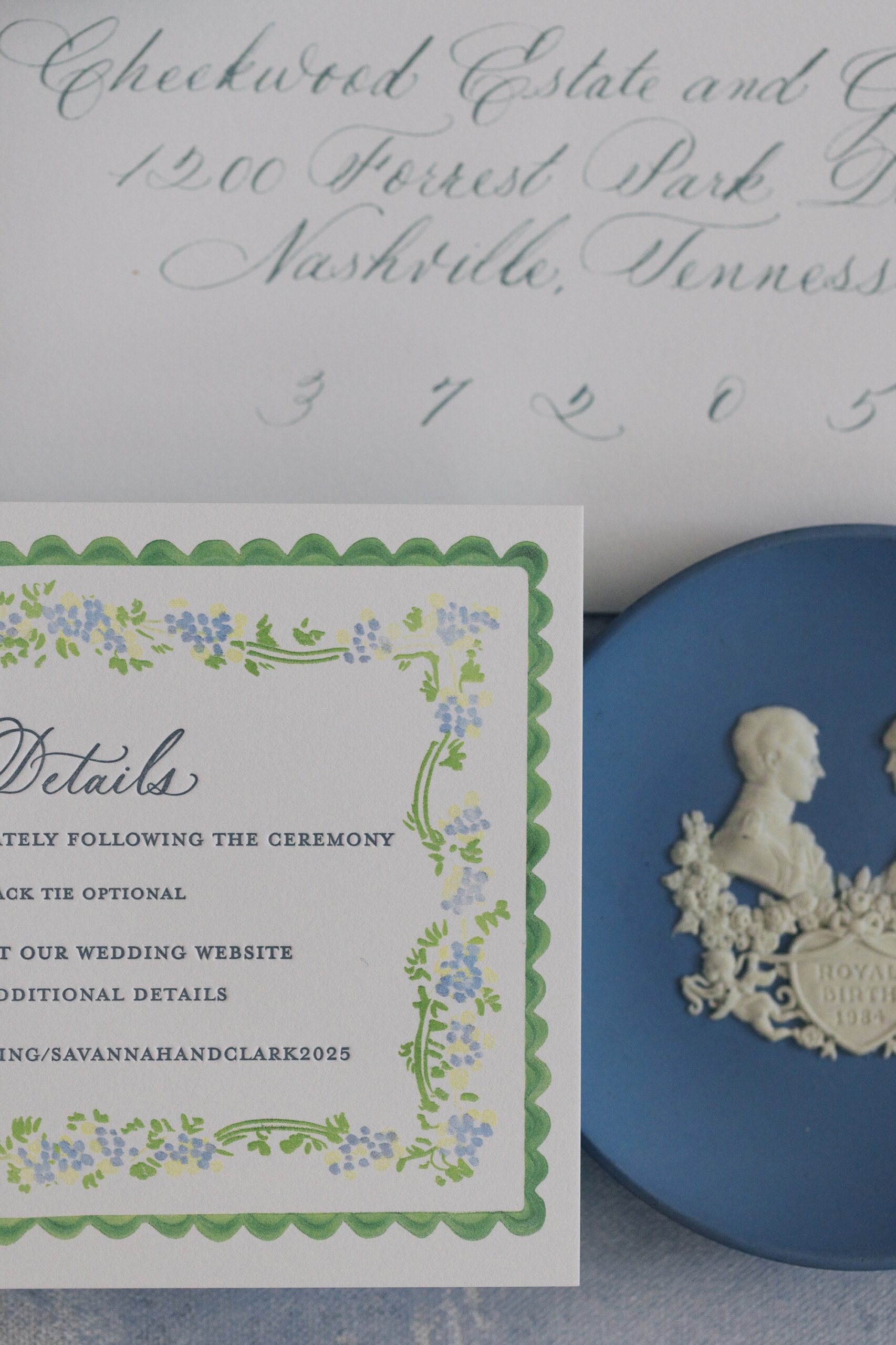
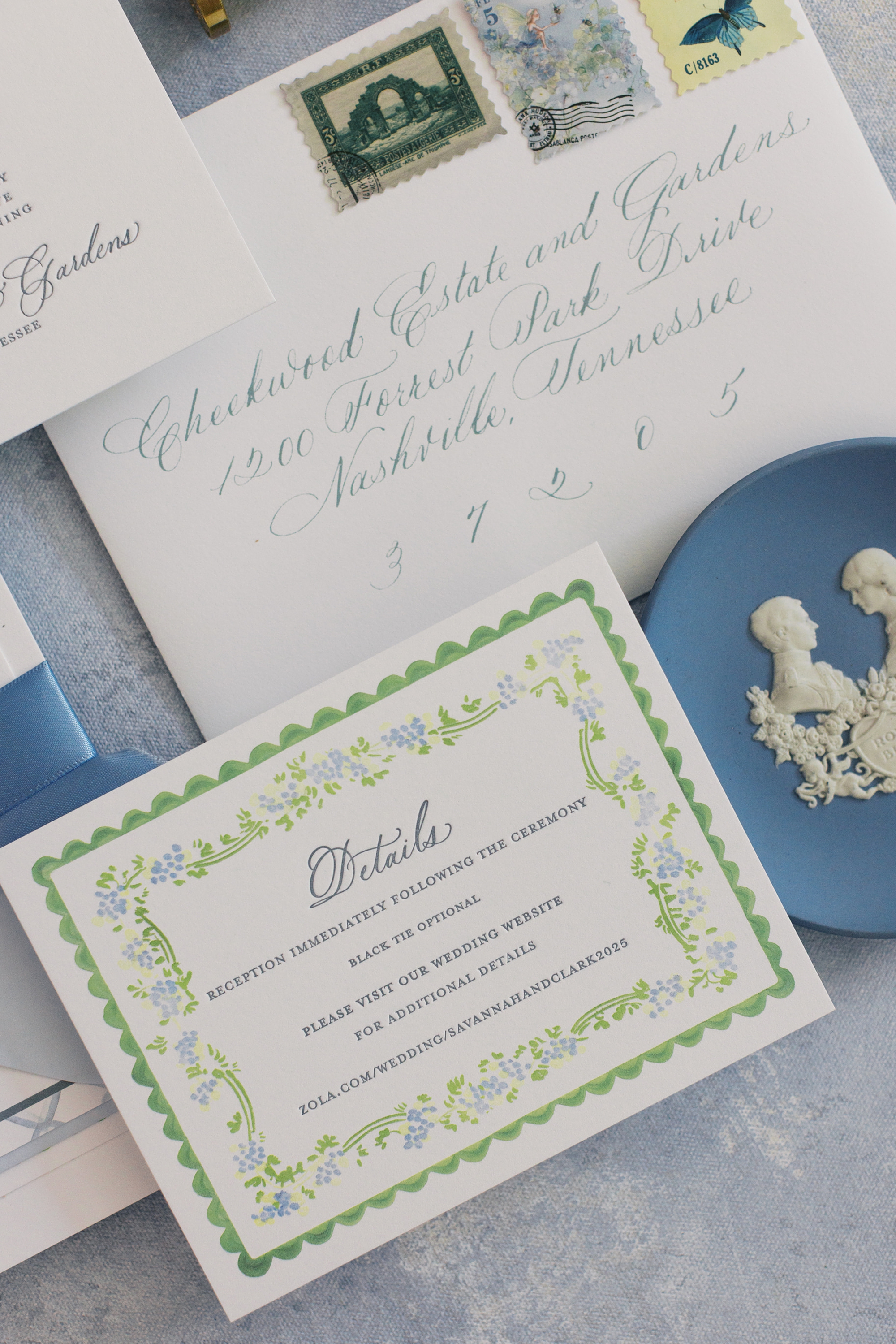
Wedding Invitations | Grand Millennial Maximalism Meets Timeless Elegance
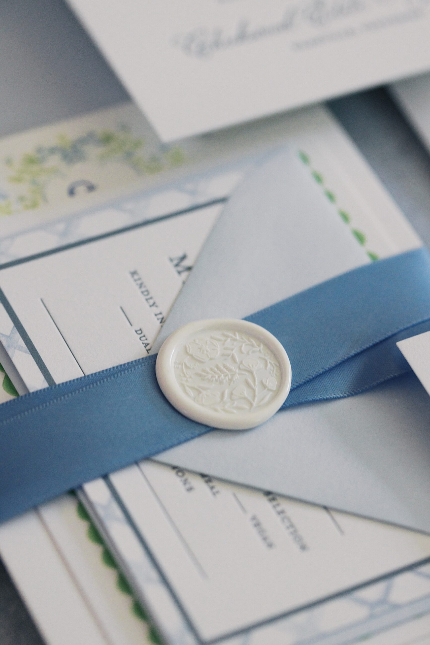
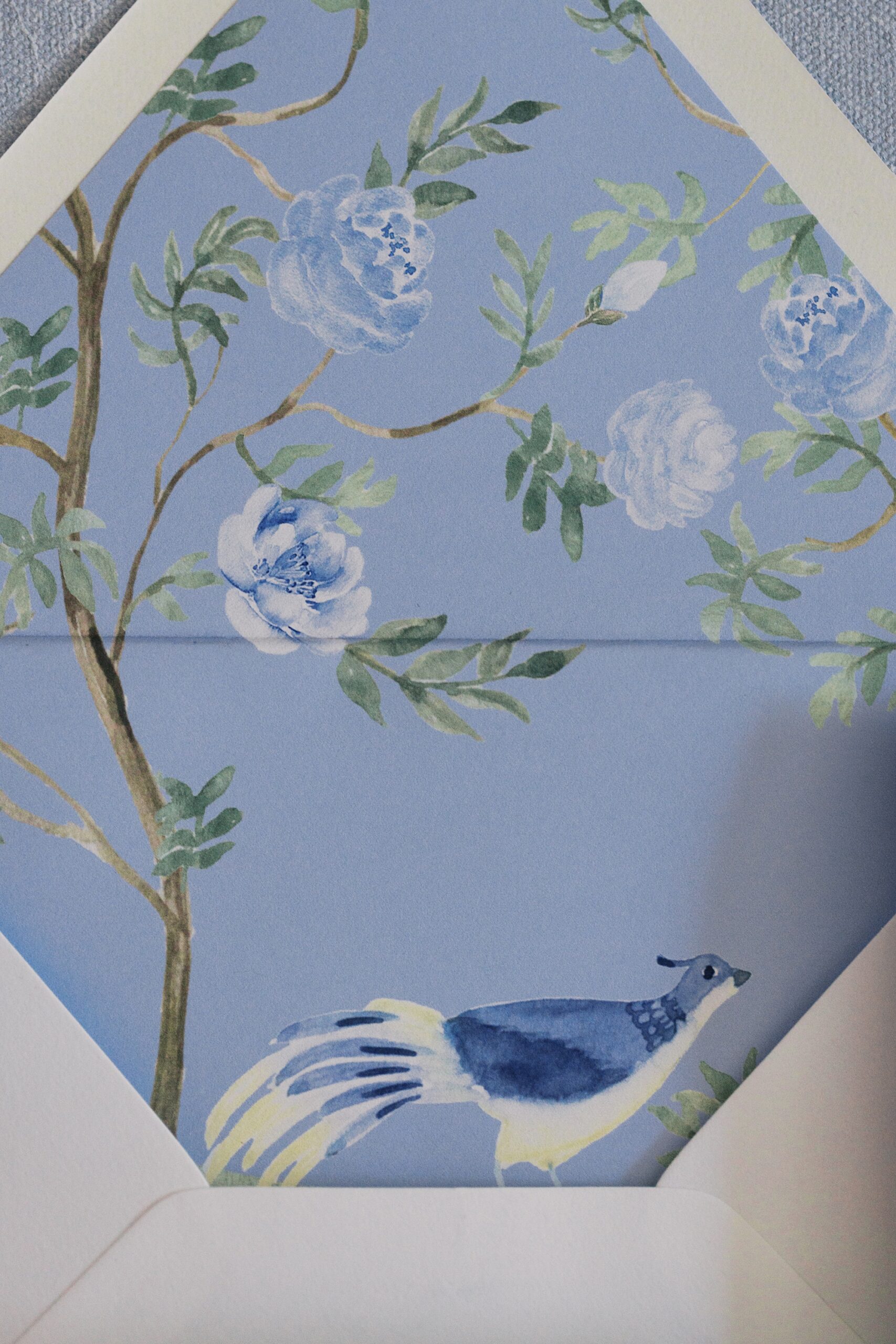
We started with their invitation suite. Featuring letterpress printing, a custom monogram, and an intricate envelope liner adorned with a bird illustration, the design was a nod to grand millennial maximalism. If you aren’t familiar with this design term, it is a trending style right now that combines more traditional elements with a modern twist, creating a detailed, yet polished and refined style.
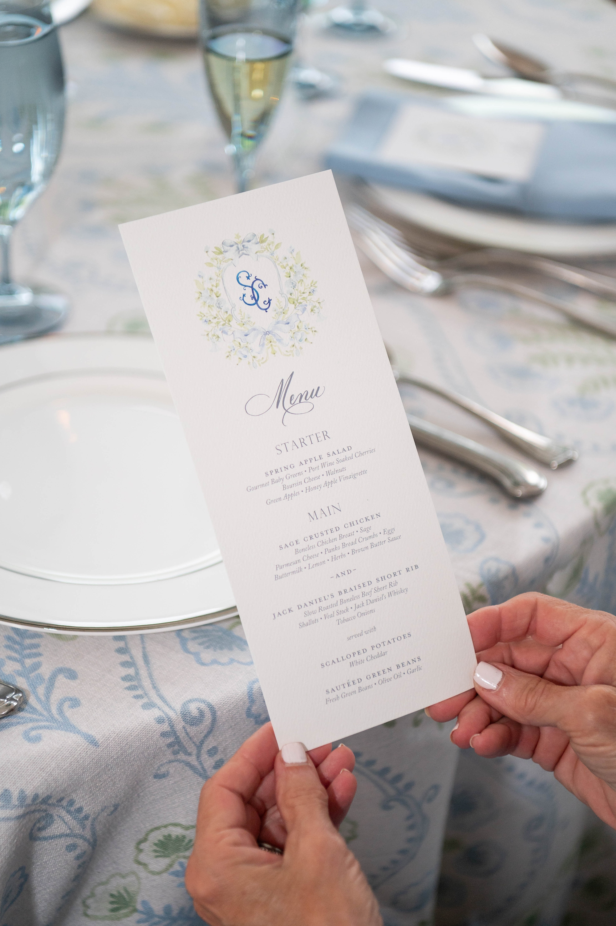
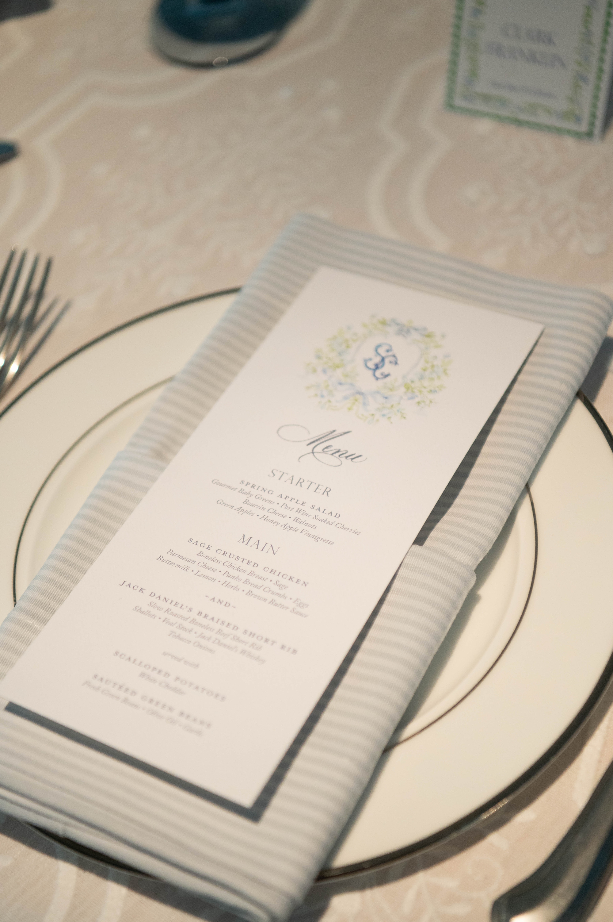
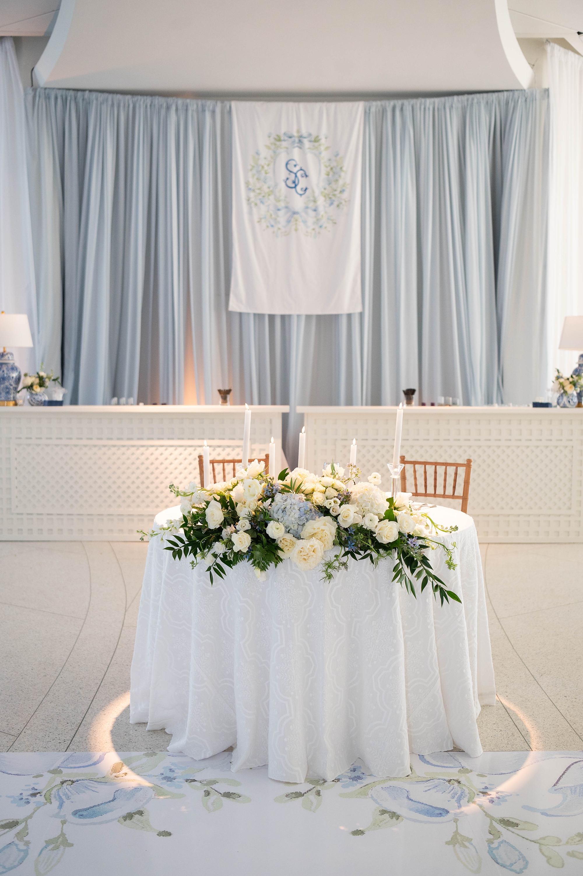
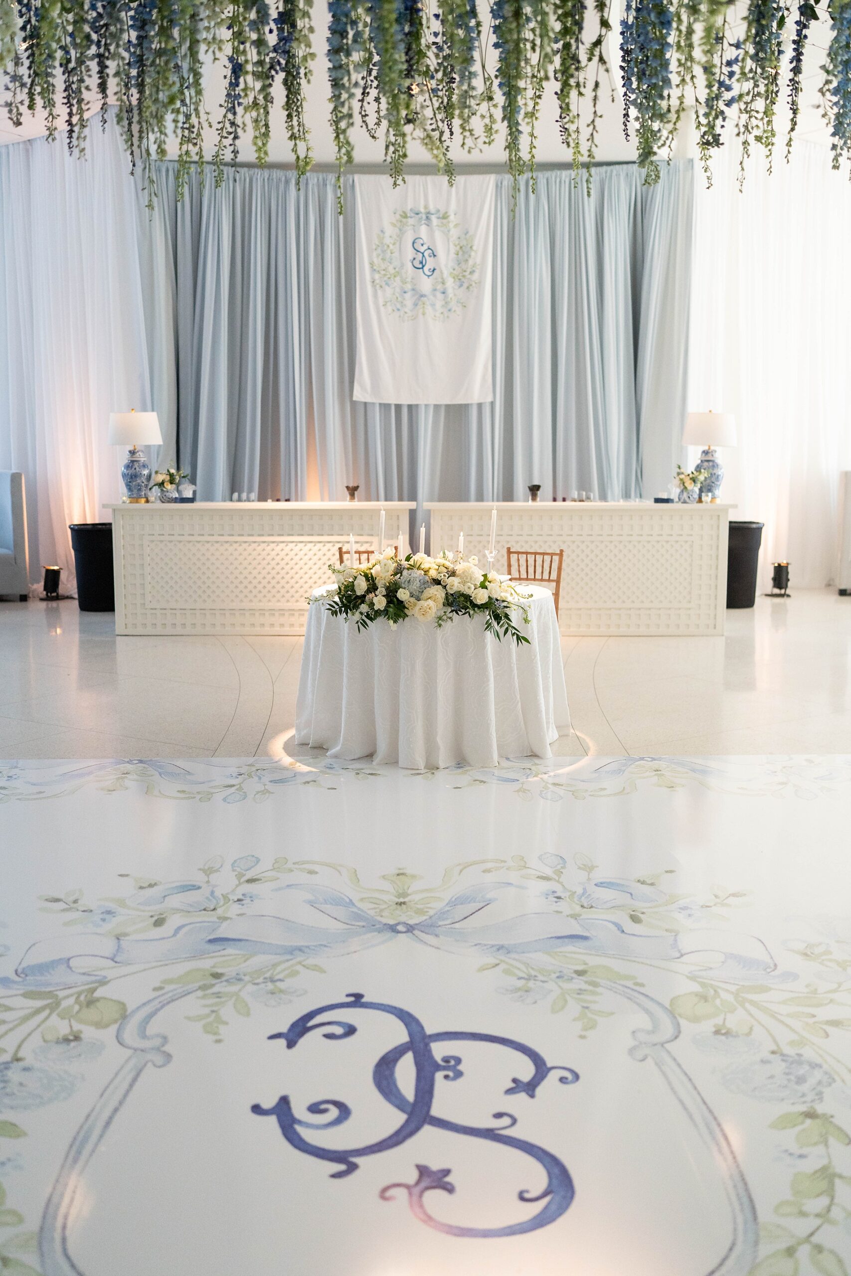
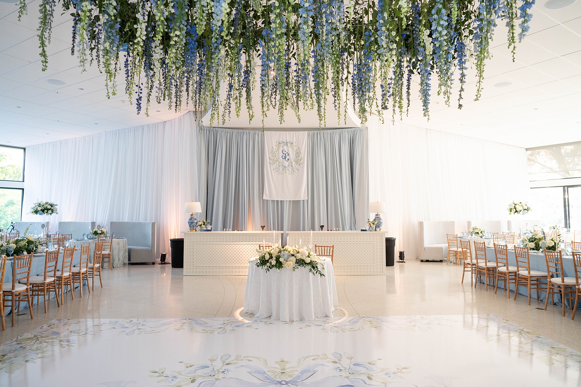
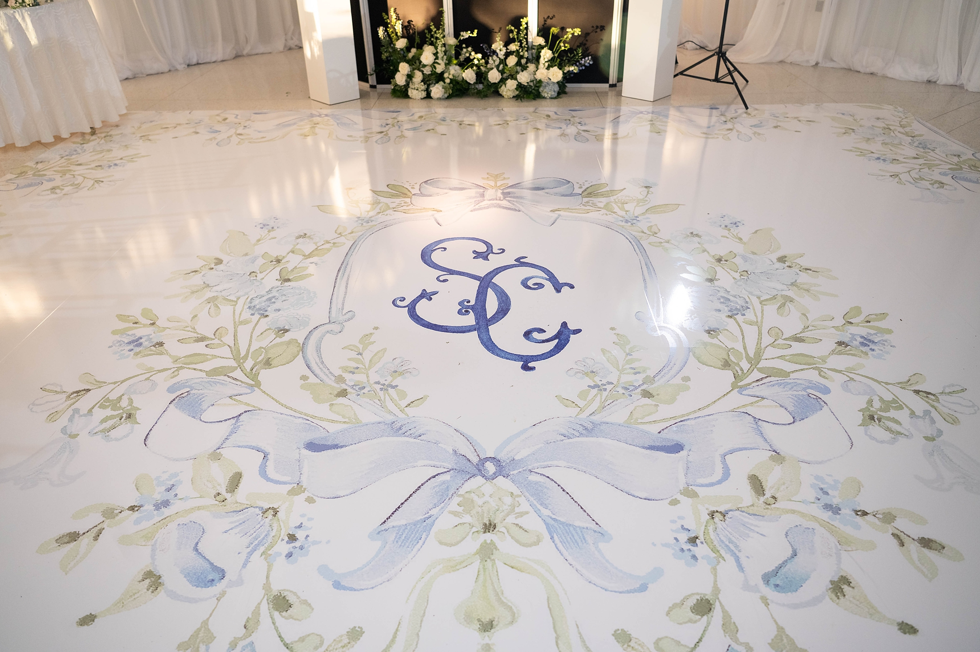
The Custom Monogram
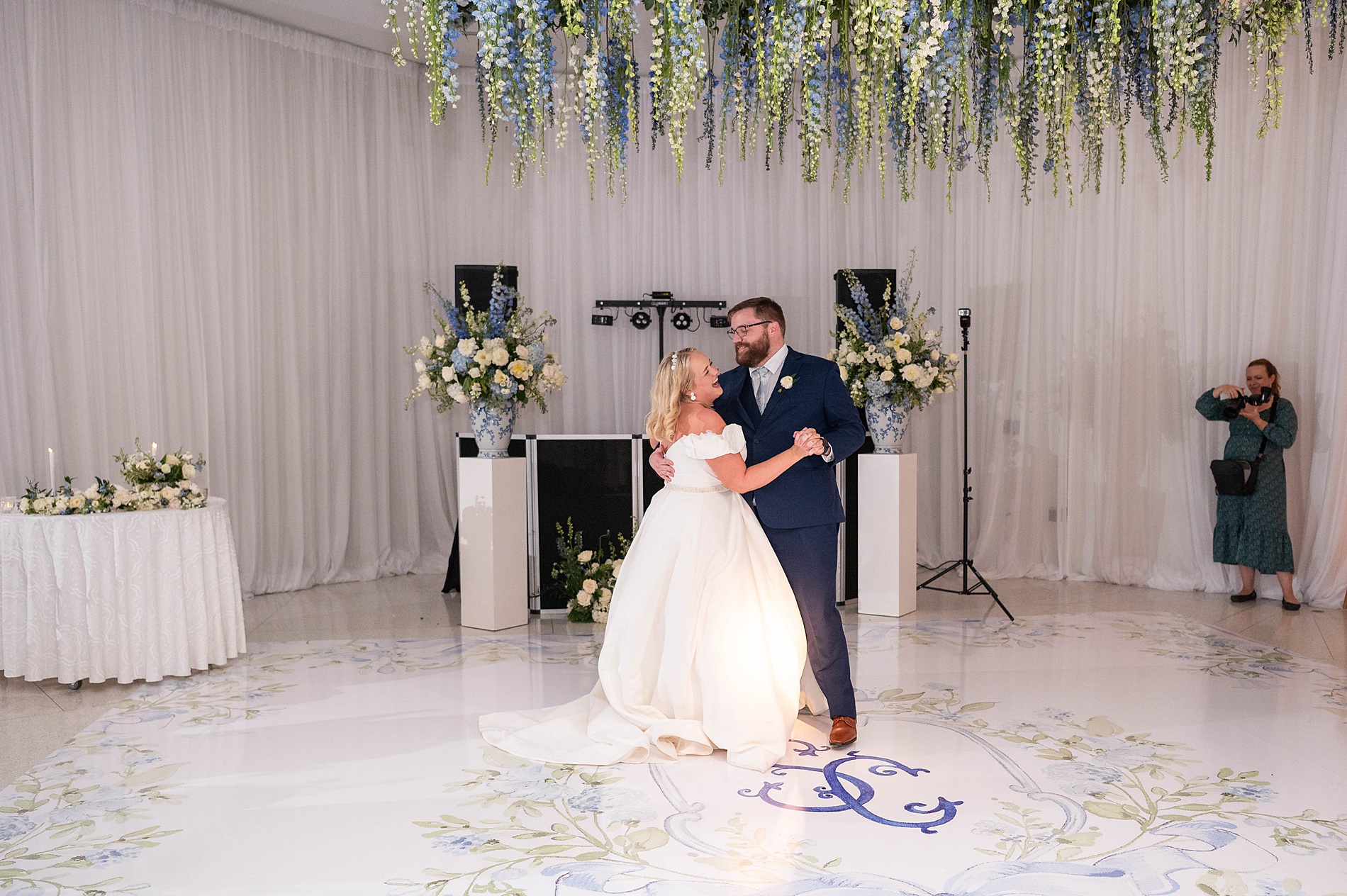
That custom monogram we designed on the invite became a signature design element for the wedding day. It appeared on the menus at each guest’s place setting, a stunning fabric backdrop at the reception, and, my favorite, on the dance floor wrap itself! Seeing our design come to life in such a grand format was a true “pinch-me” moment.
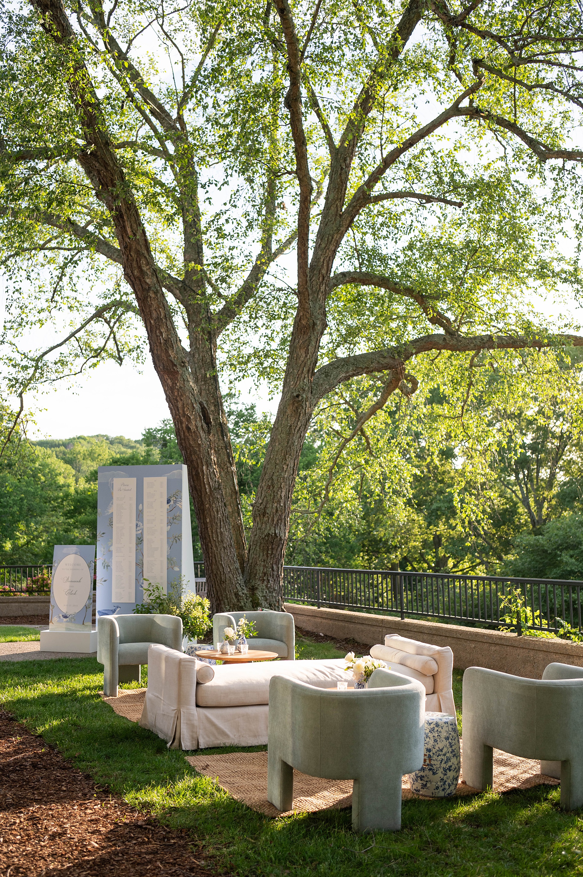
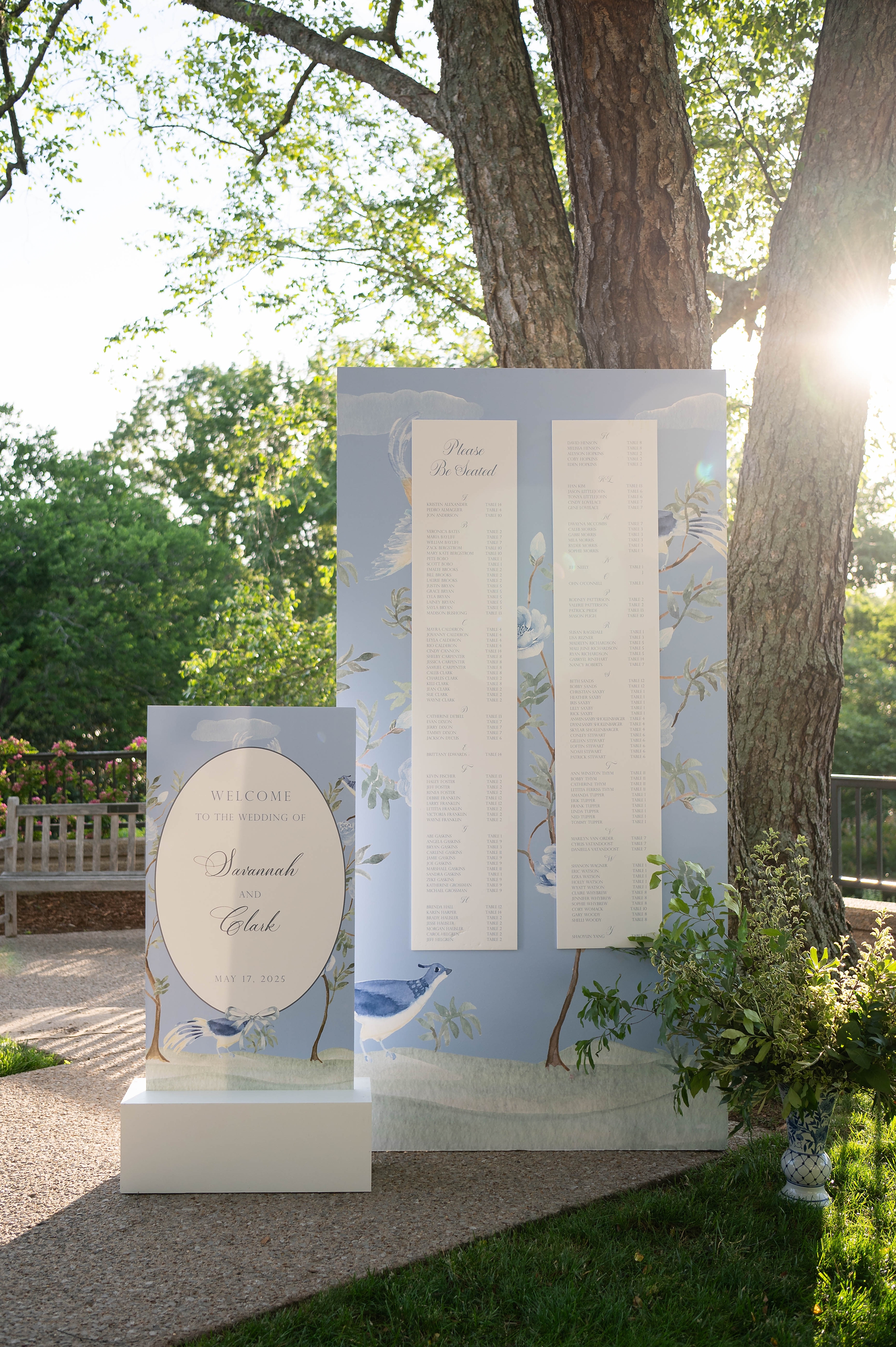
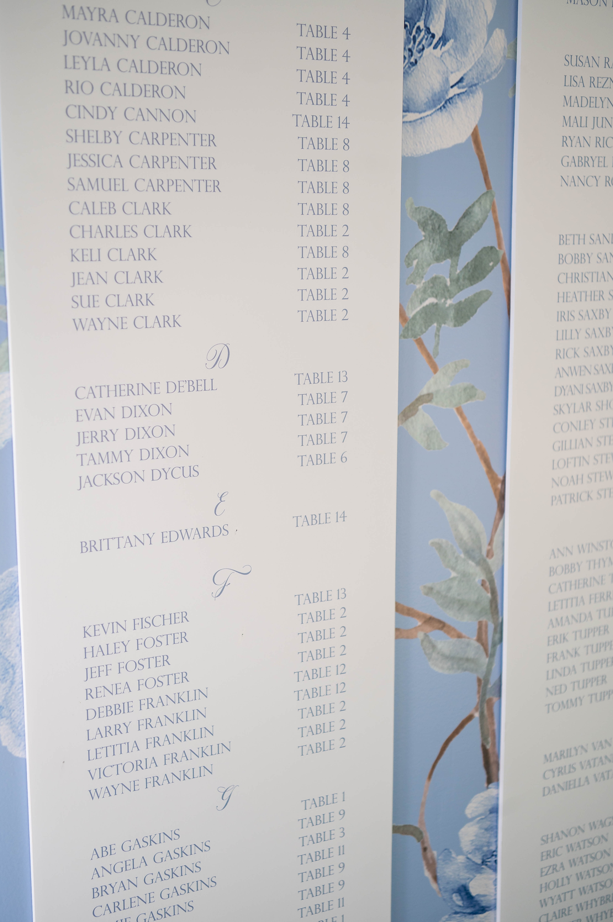
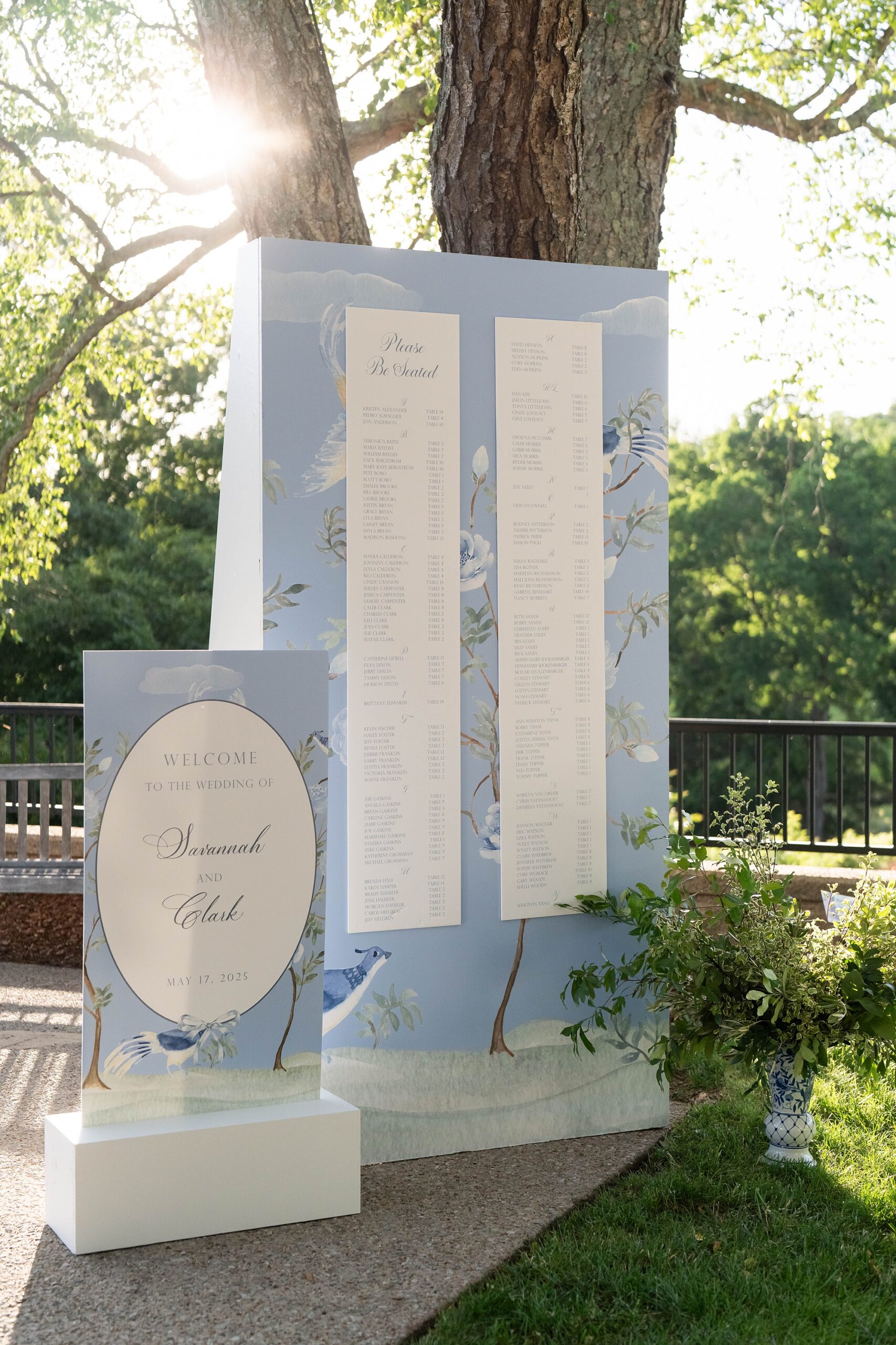
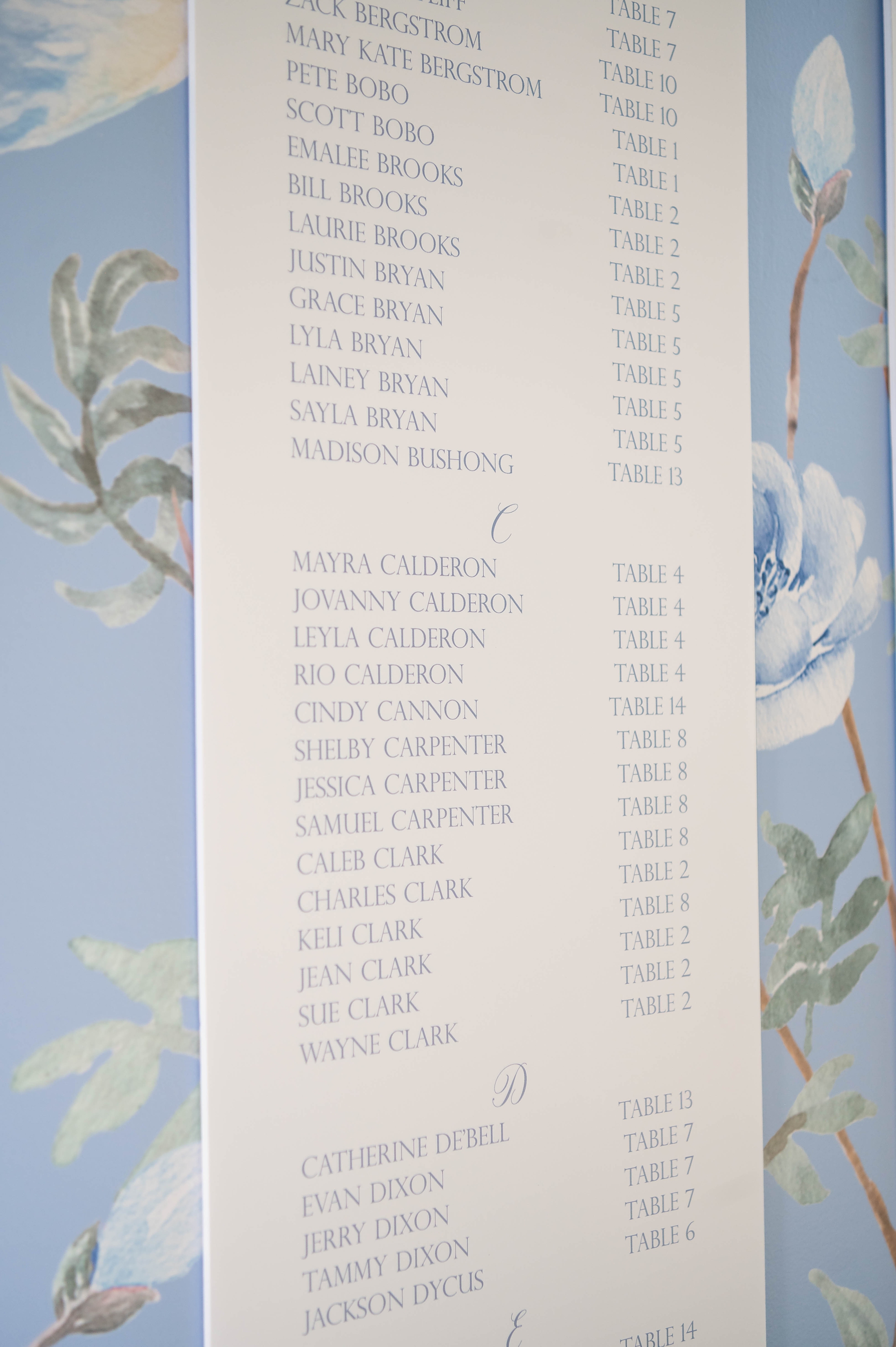
Statement Seating Chart & Welcome Sign
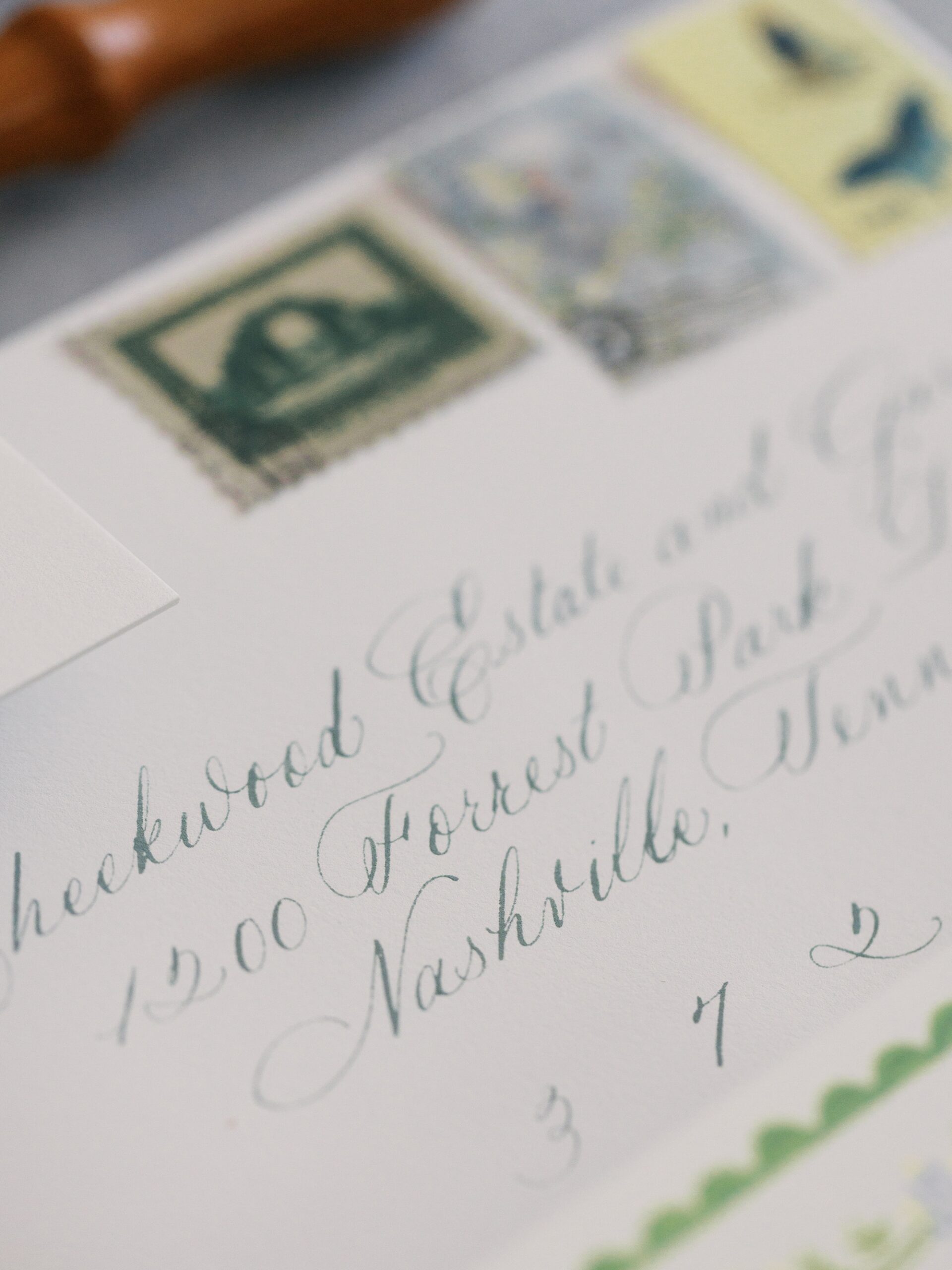
The seating chart was a showstopper! This elegant, tall display had guest names written in light blue calligraphy on a crisp white background. We framed the chart with the same floral-and-bird artwork from the envelope liner, creating a sense of connection between the invitations and the reception space.
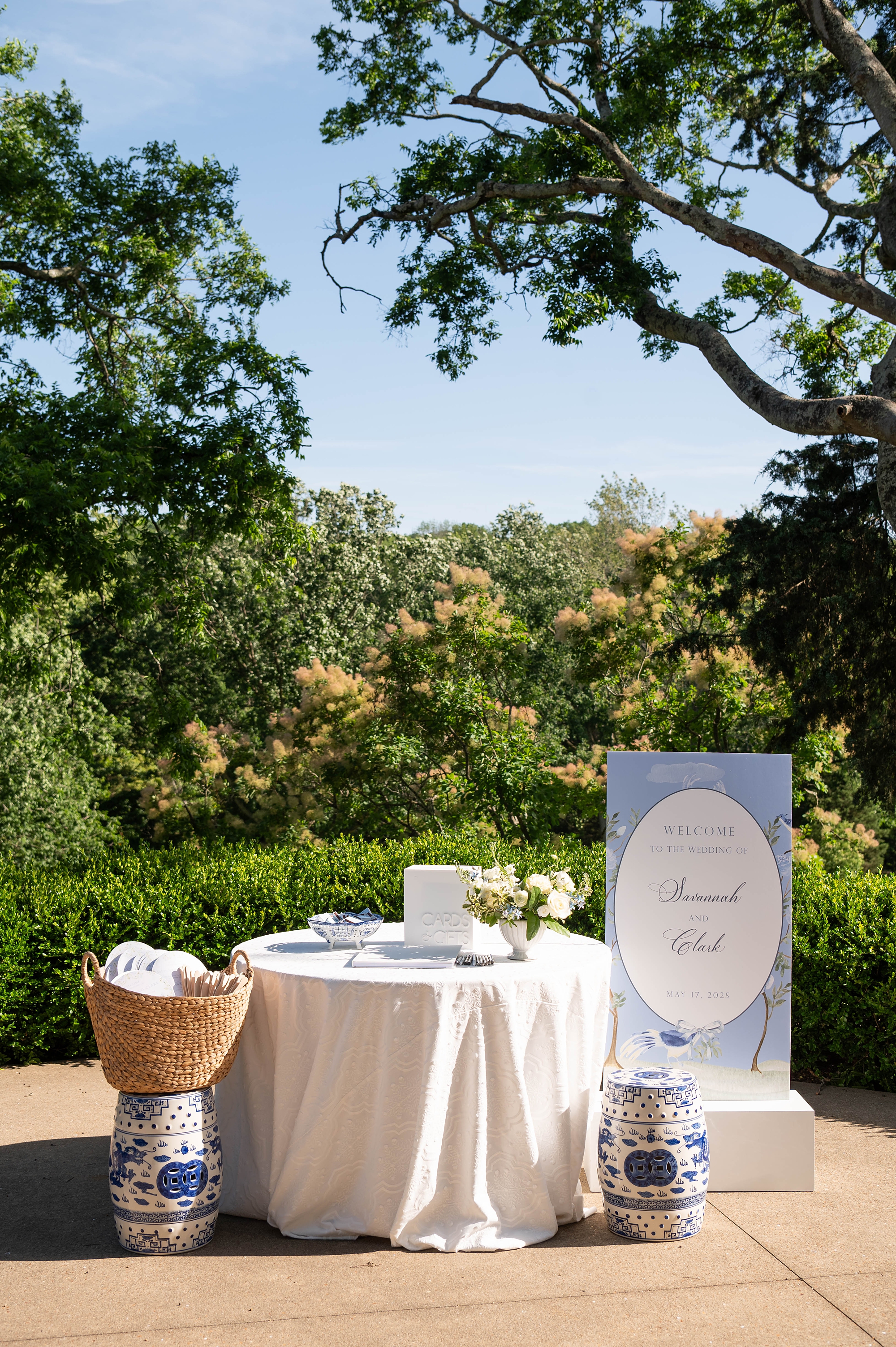
The welcome sign echoed this same border detail, featuring a white oval center with the wording placed inside. It greeted guests and set the tone for the celebration ahead.
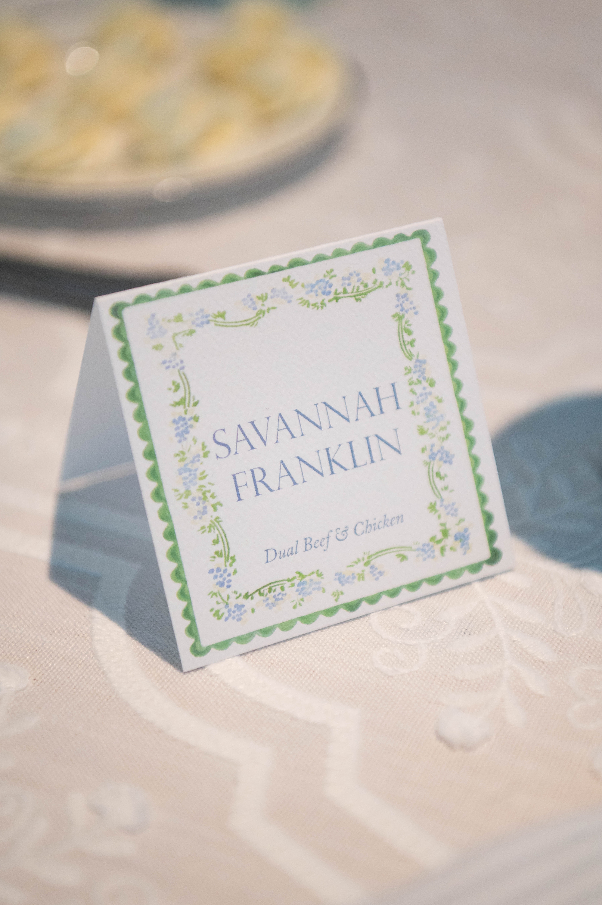
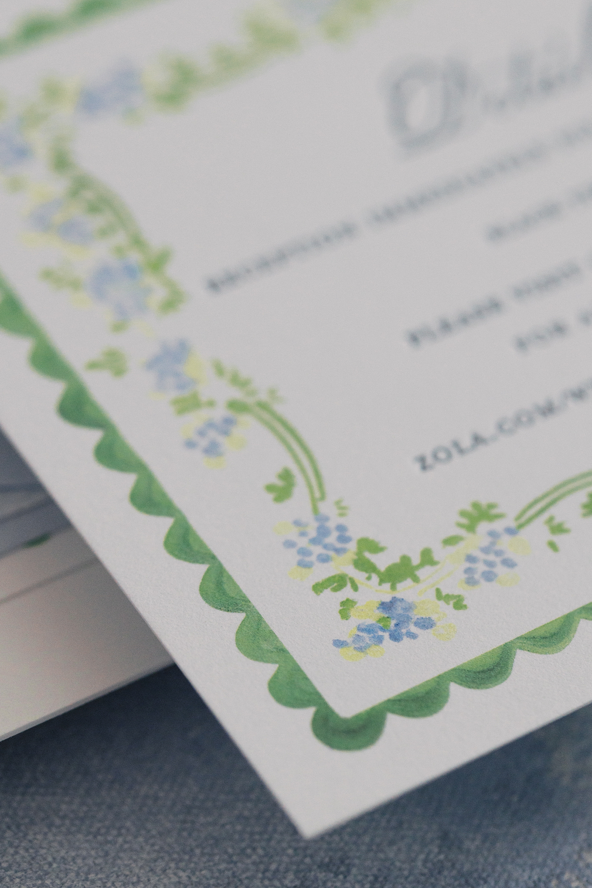
Place Cards with a Pop of Color
For the place cards, folded squares featured guests names in light blue with a soft floral and green border. Peep- The same border design can also be seen on the details card from their invitation suite! This subtle color combination perfectly tied into the tablescape’s springtime elegance, offering a fresh and cheerful finishing touch.
Designing for the Spring Season
When we began designing this suite, it was still the middle of winter, but these invitations gave us serious spring fever and got us SO EXCITED for spring weddings! This wedding was just as beautiful as we imagined and it was an honor to create so many elegant and beautiful details for their Cheekwood wedding day.
If you’re planning a wedding in Nashville, or anywhere in the world, we’d love to help you create meaningful, personalized stationery and event details that tell your story. We work with couples worldwide to design details you and your guests will remember forever. Reach out today to learn more about our full-service wedding and event design offerings! We can’t wait to create something unforgettable for you!
If you enjoyed this post, you’ll love these other blogs:
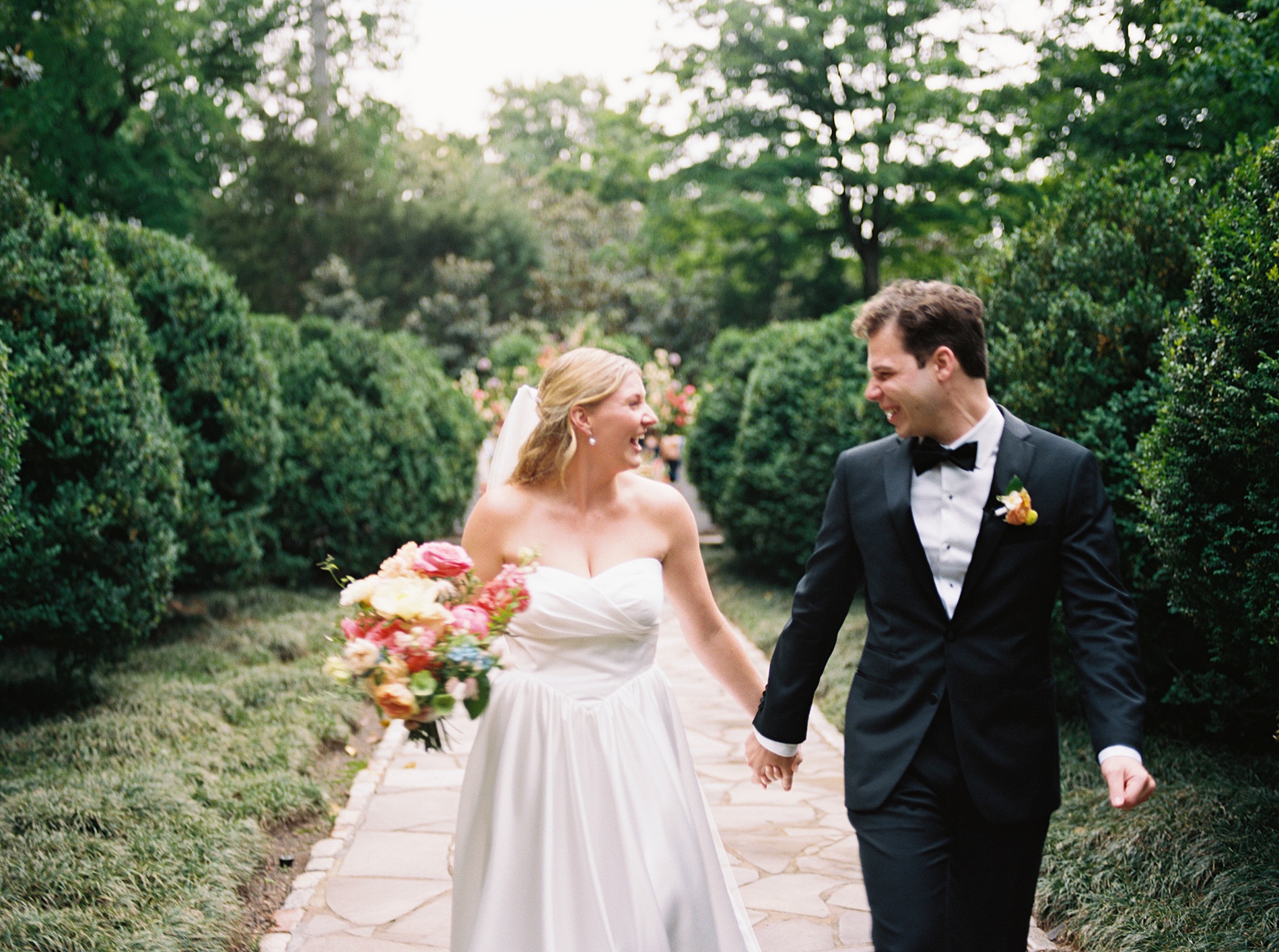
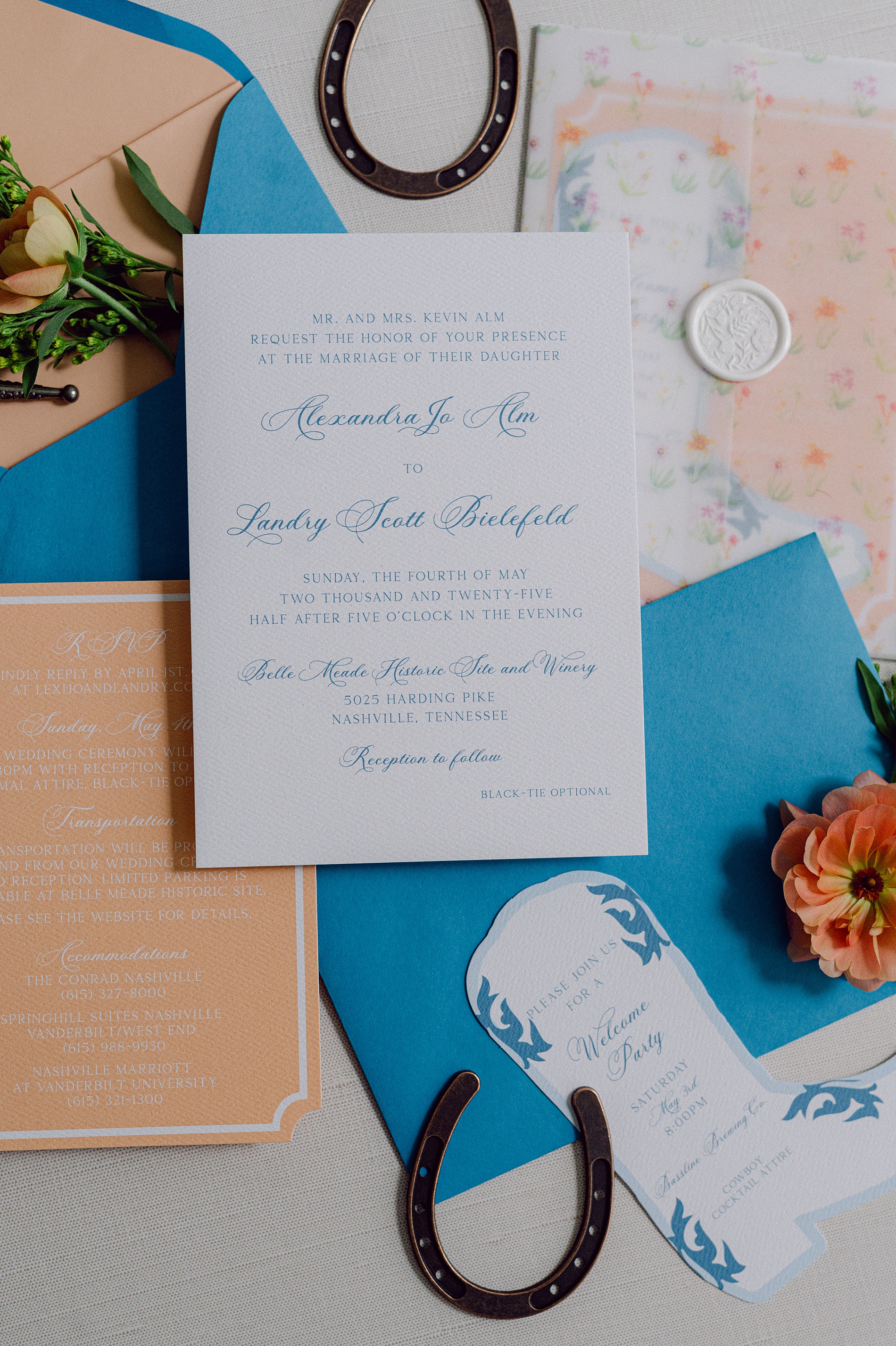
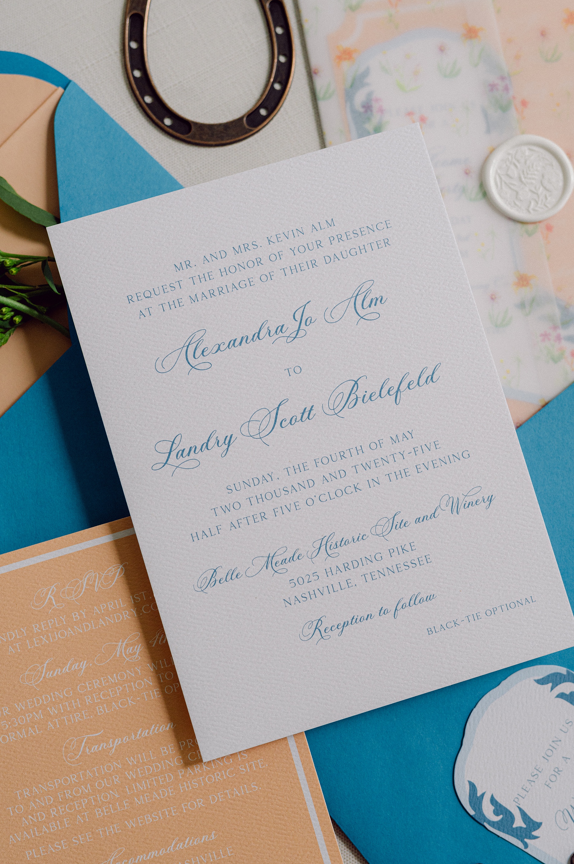
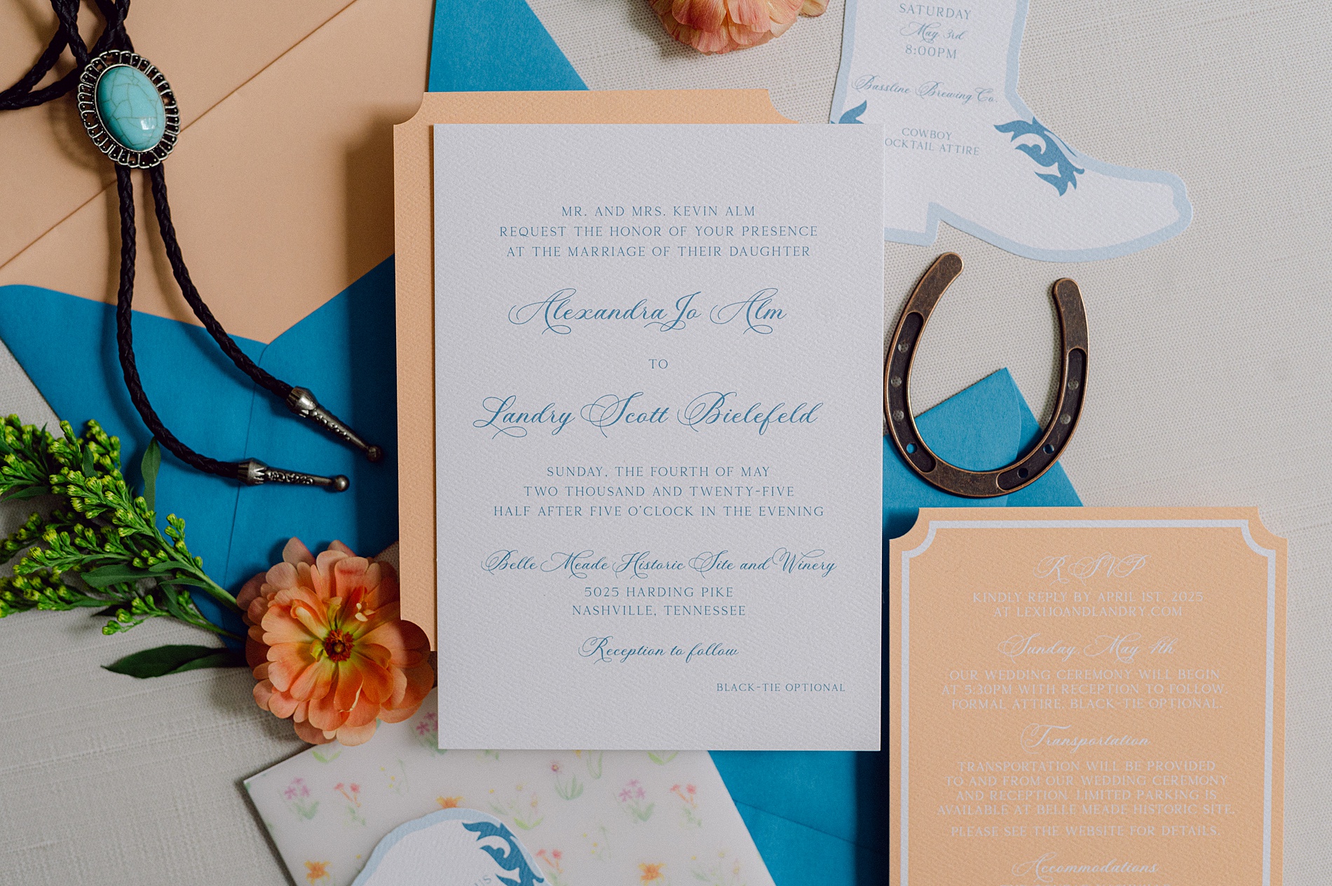
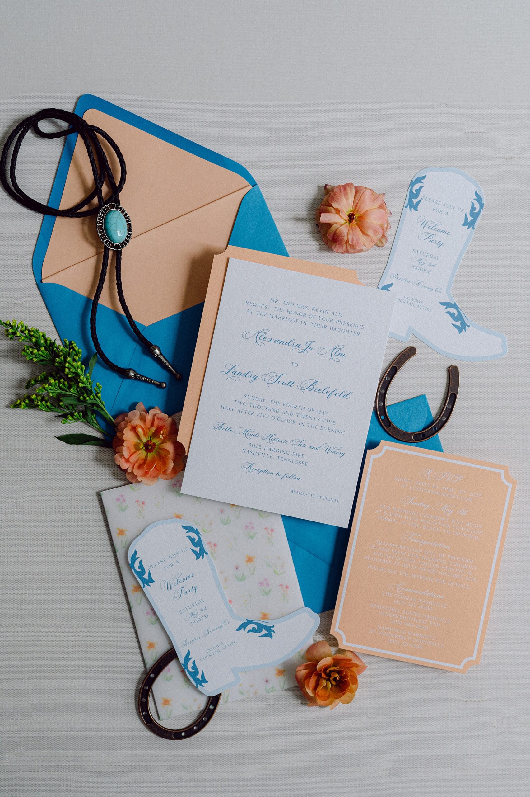
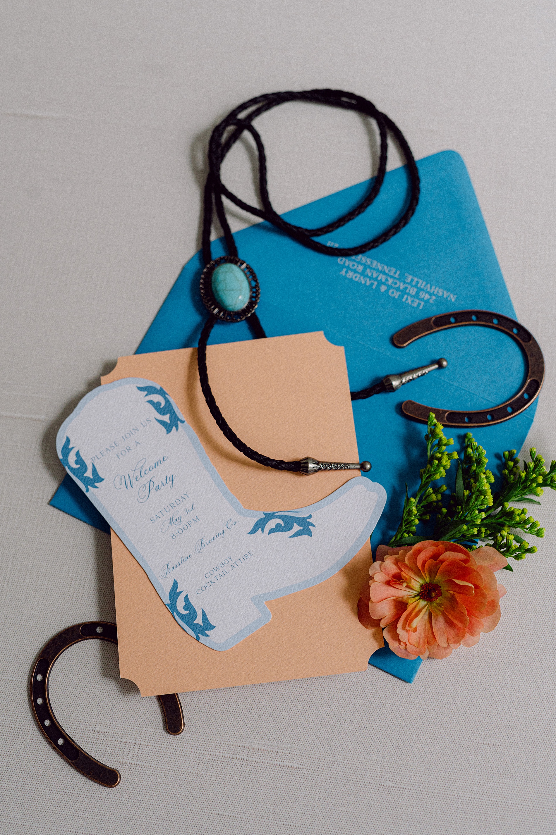
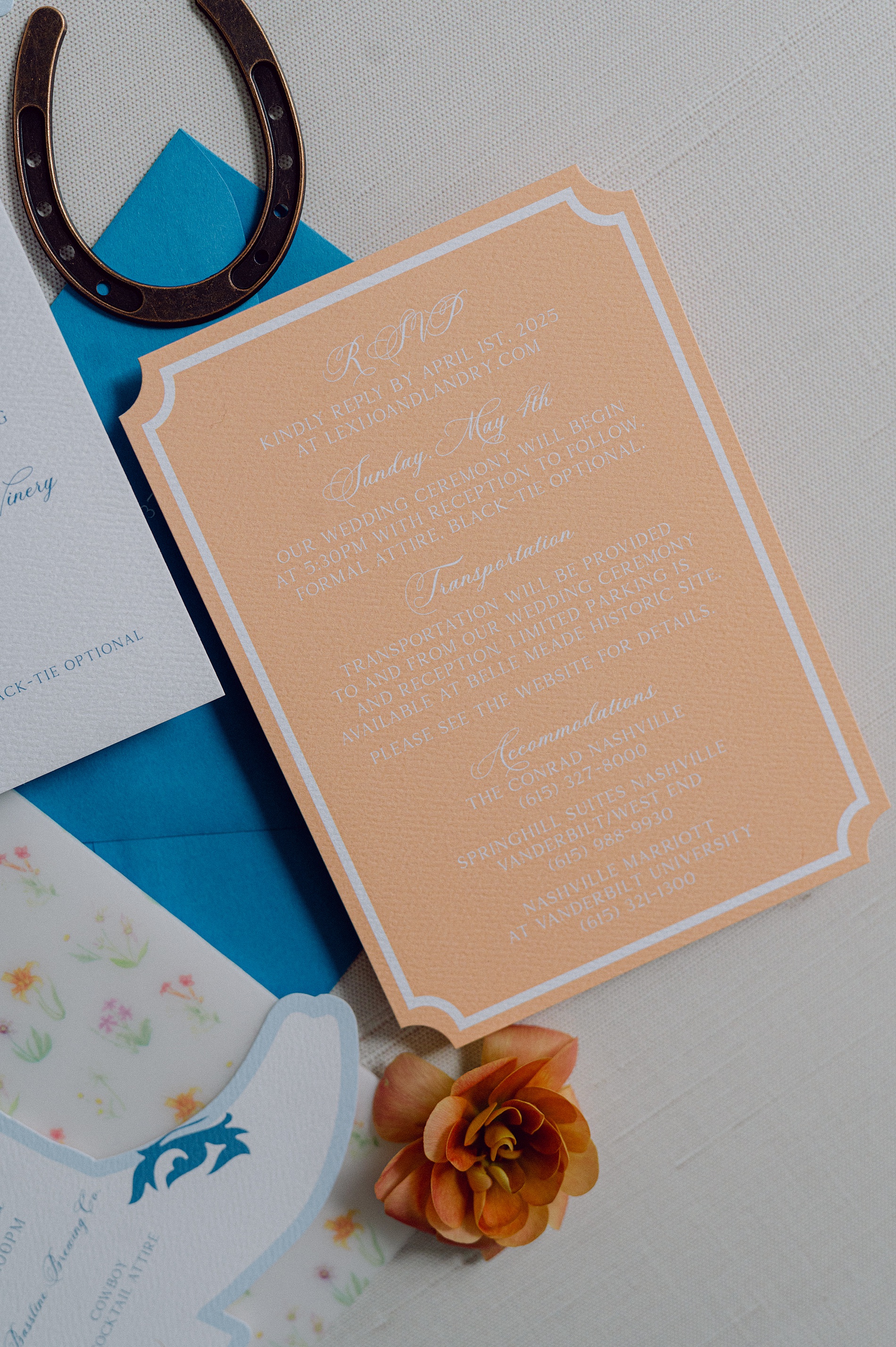
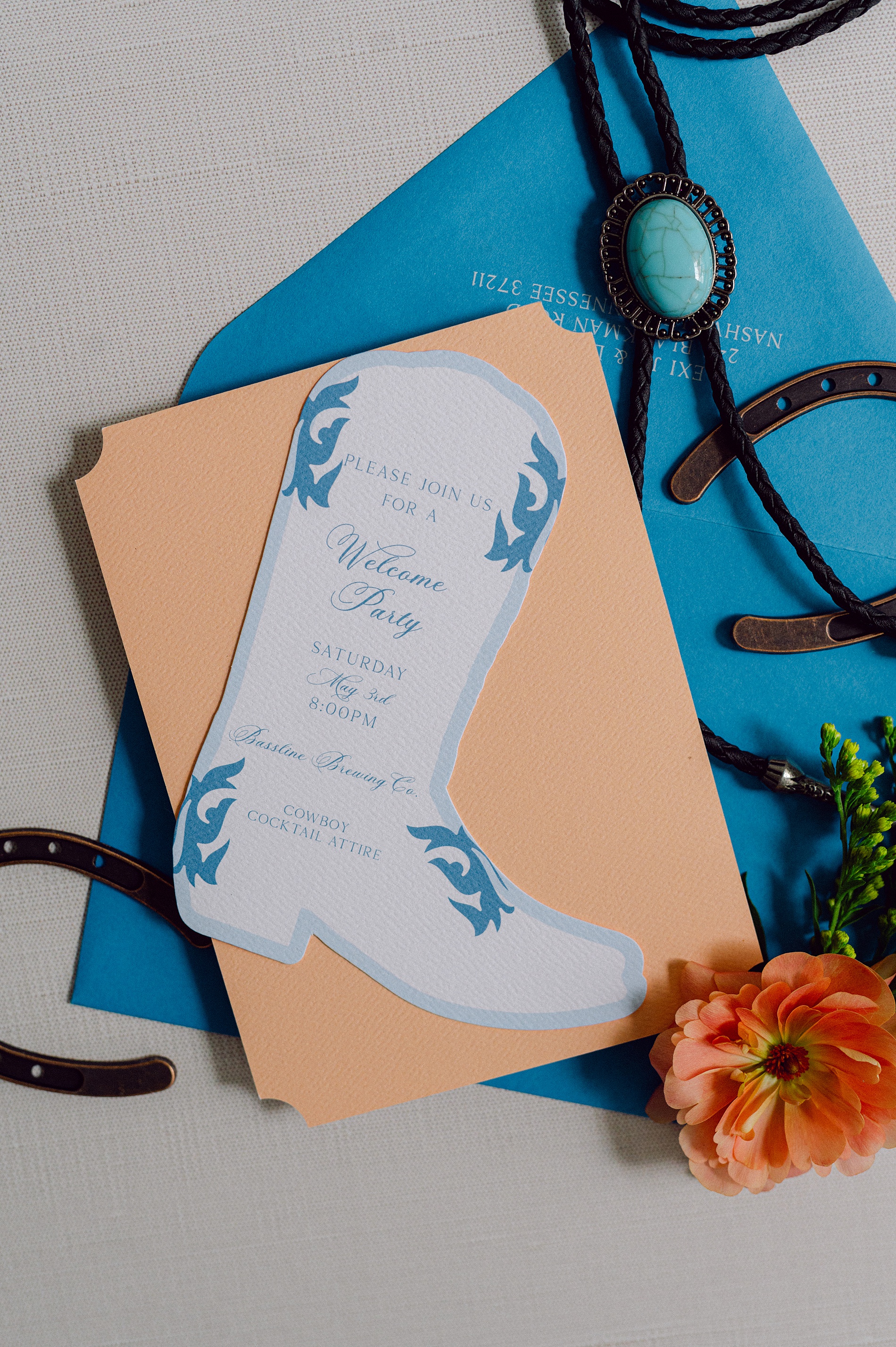
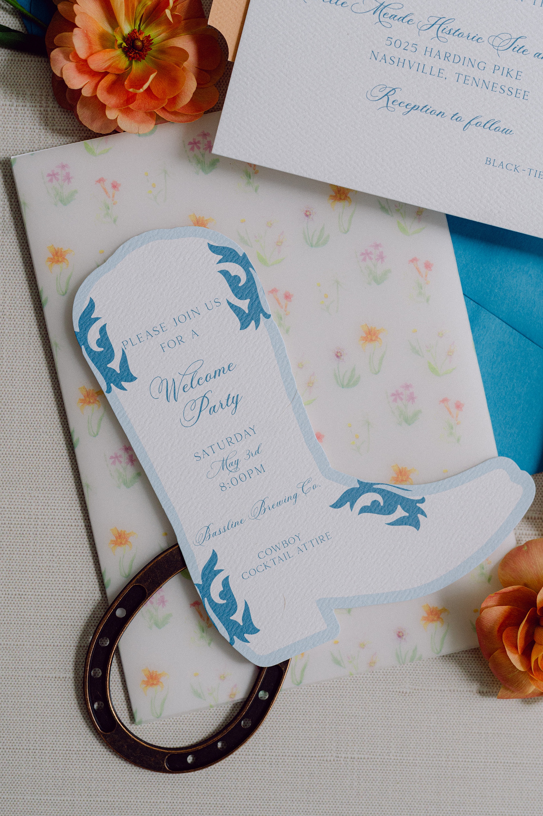
As a full-service wedding design house in Nashville, we love working with couples and planners to create wedding details that reflect each couples’ unique vision. It is such a treat to create custom pieces that tell your story, and are thoughtfully woven into your day. Lexi Jo and Landry’s artistic and colorful wedding at Belle Meade Historic Site in Nashville, Tennessee, was the perfect example of how vibrant colors and meaningful design can come together to create something truly beautiful and unforgettable.
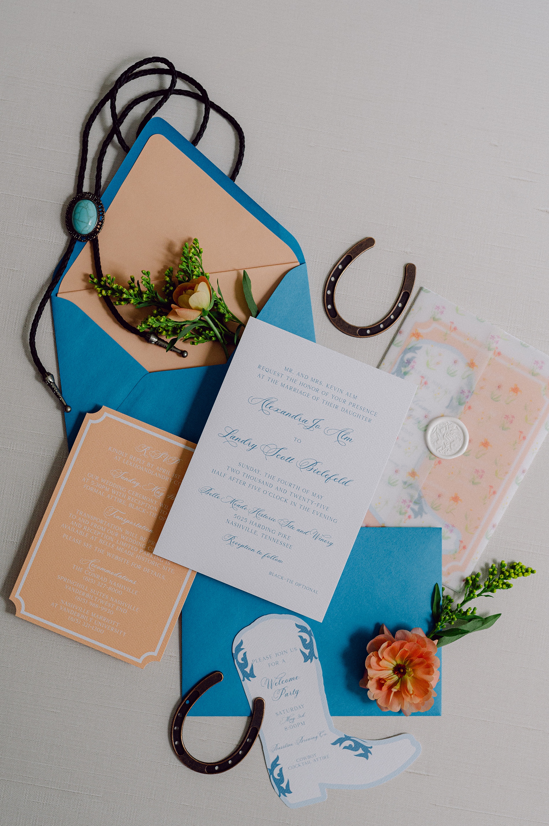
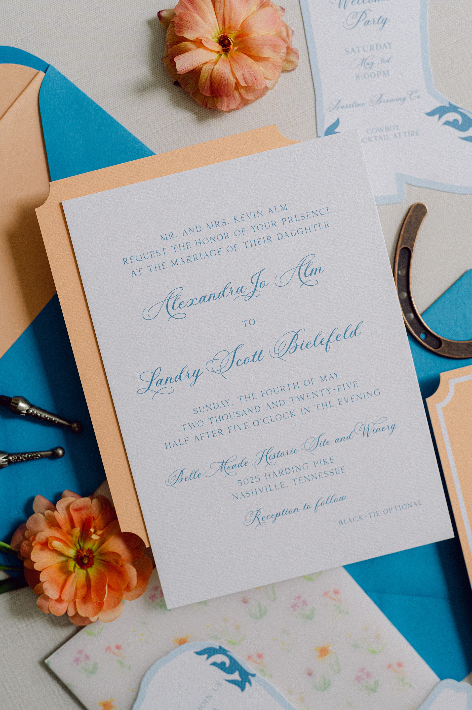
Sherbet Hues and Hand-Painted Details
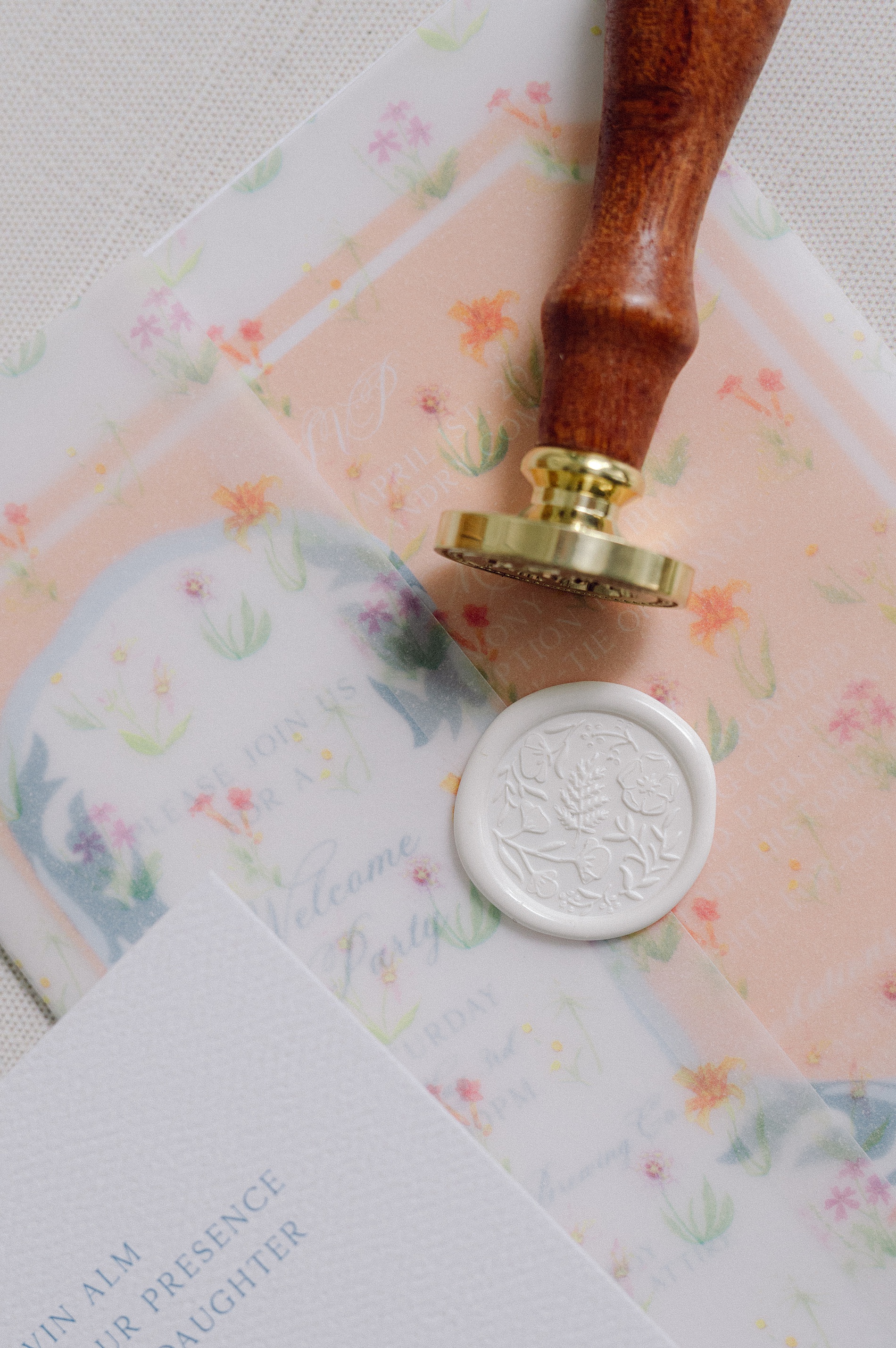
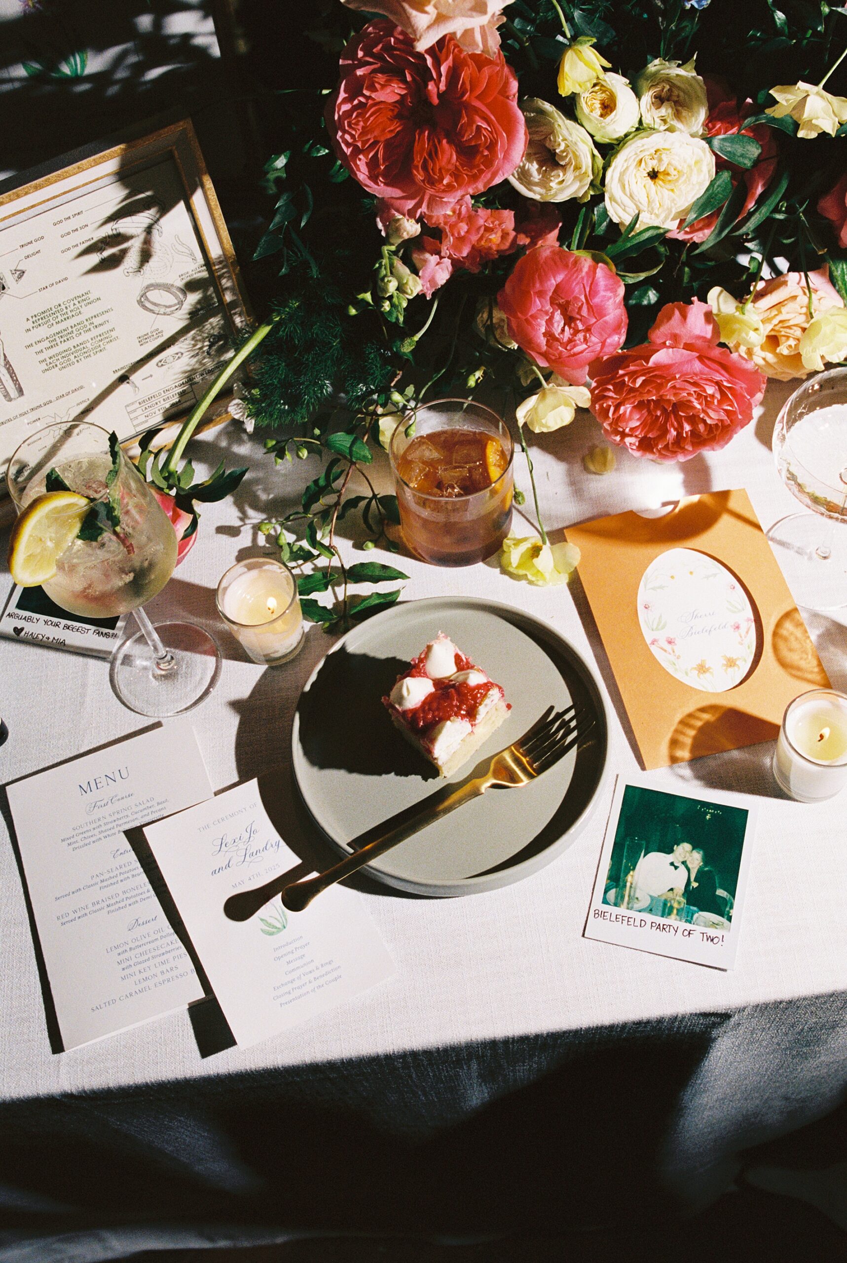
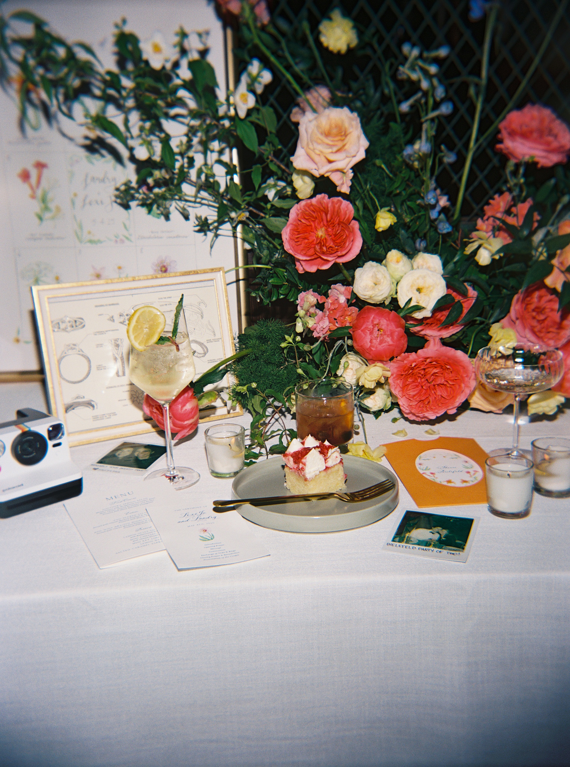
Their wedding invitations were one-of-a-kind. The main invite was both elegant and southern in style with white card stock and blue calligraphy. Then there was the cowboy boot-shaped welcome party piece, which hinted at the fun cowboy cocktail dress code. It was playful, memorable, and full of personality just like the couple! This was the perfect base for the pop of sherbet orange on the rsvp and wedding details card. The combination of white and blue, and the creamy orange hue were carried throughout the day.
However, our favorite moment of this suite was the groom’s hand-painted floral artwork that was included on the vellum overlay (as well as many other wedding details) that held all the paper pieces together with a wax seal.
Day-of Details That Brought the Color Palette to Life
The celebration continued with colorful, cohesive paper goods that carried their sherbet-toned color palette and floral focused design into every space.
Wedding Welcome Sign
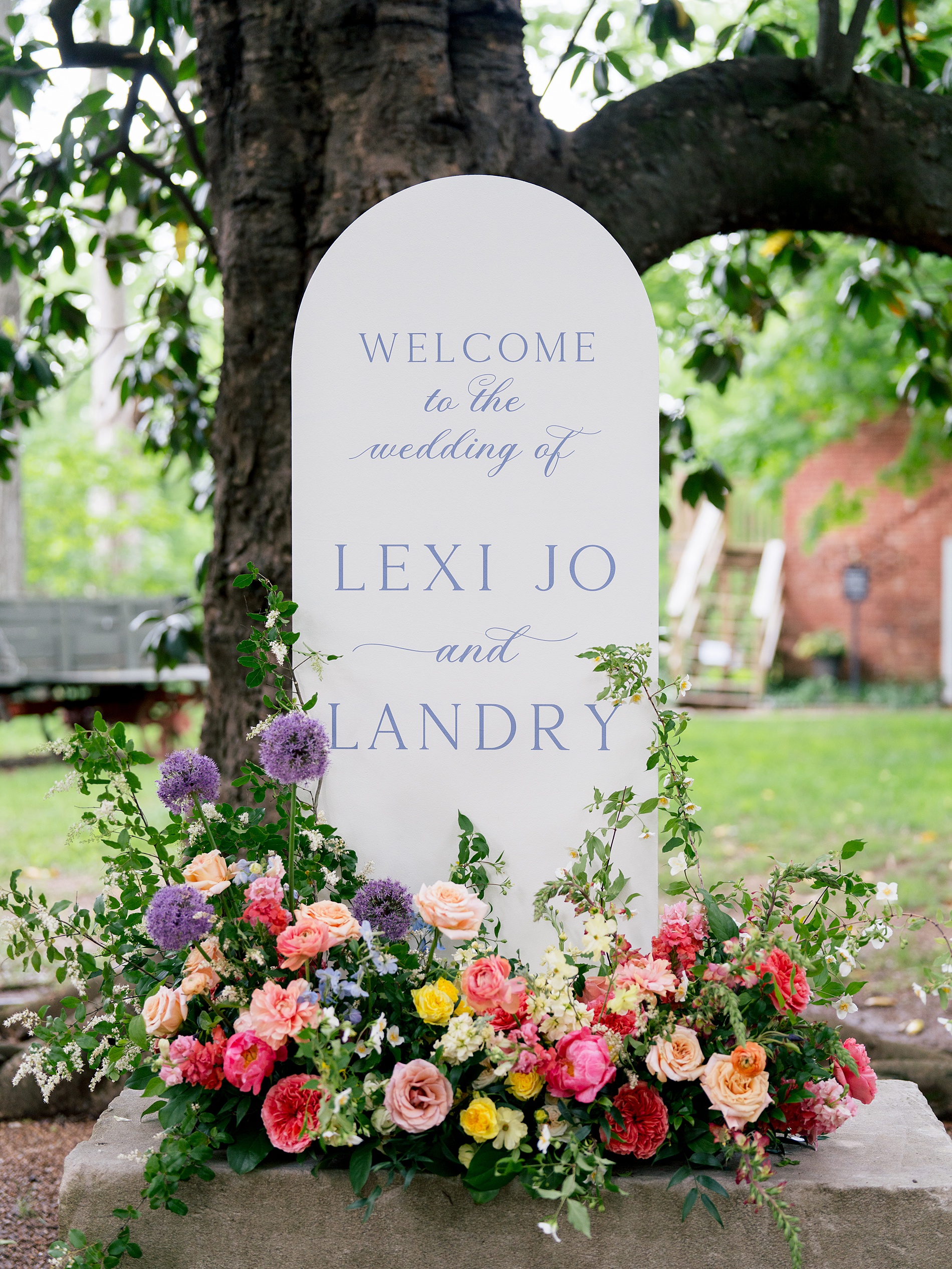
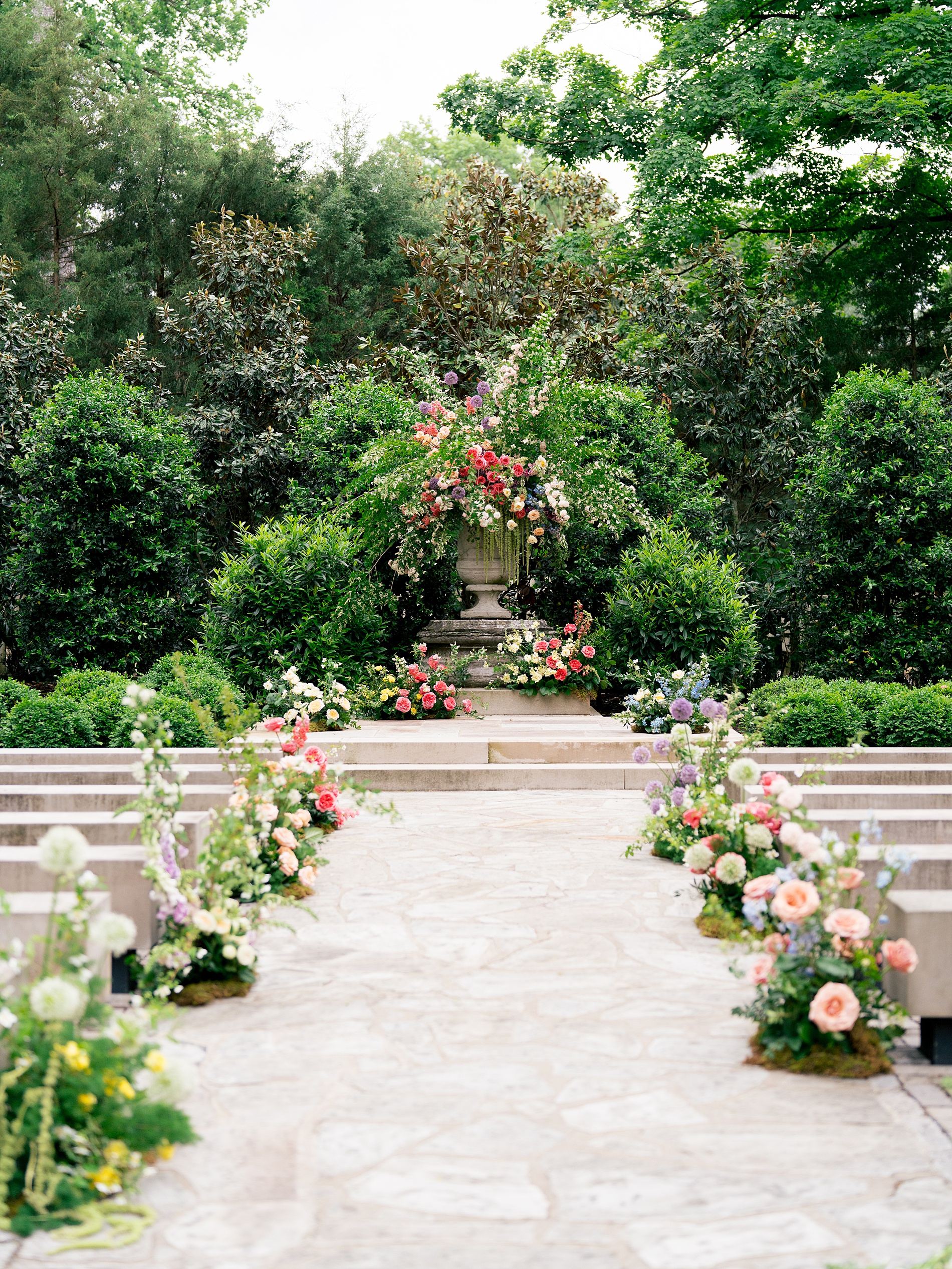
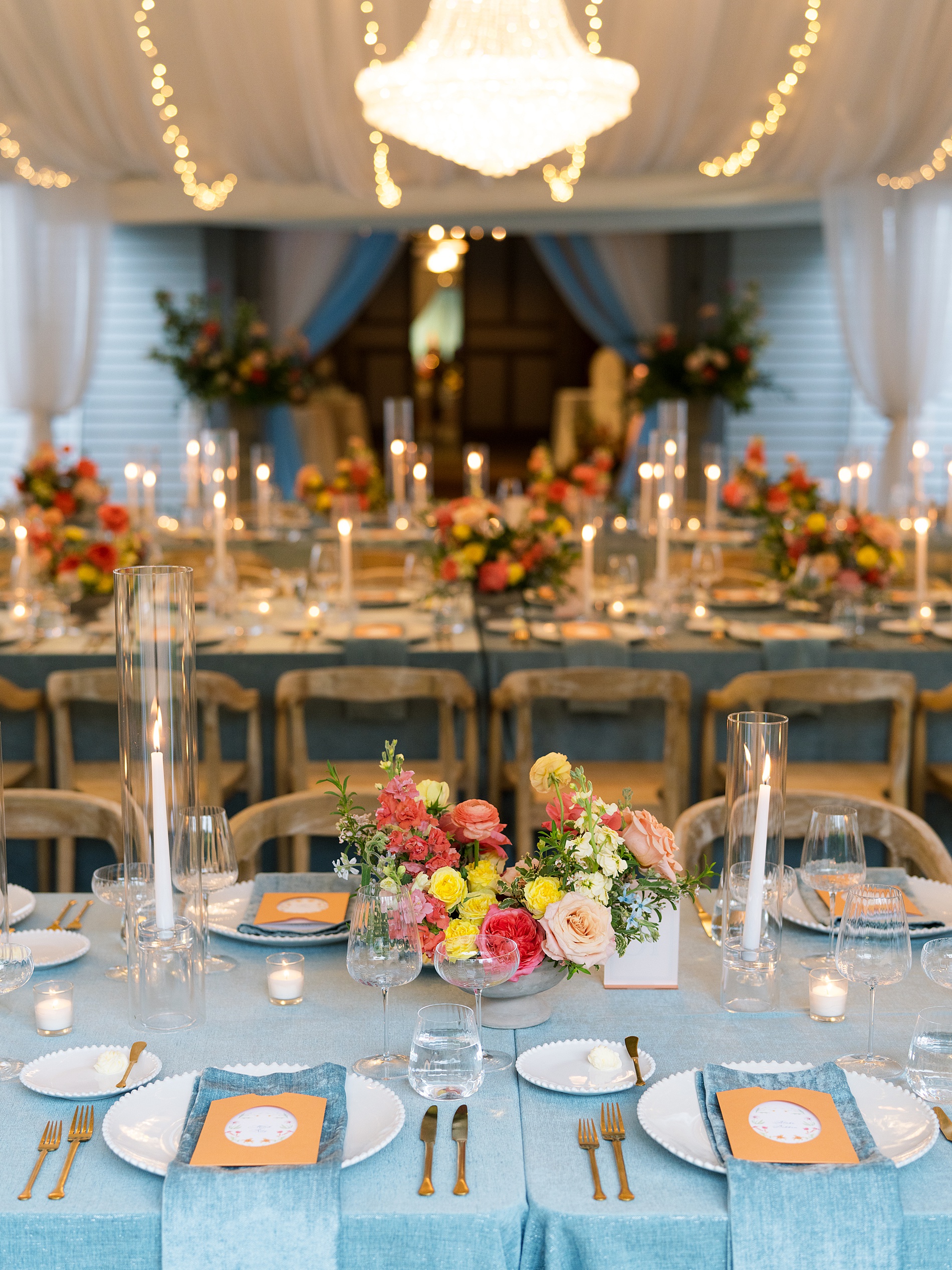
A white, rounded welcome sign featuring Southern-inspired blue calligraphy greeted guests, framed by a stunning floral arrangement bursting with vibrant pinks, purples, and oranges. As guests entered the outdoor ceremony site covered in gorgeous florals they could pick up a wedding program. We designed the programs on classic white paper with blue calligraphy and a floral element from the suite brought a cohesive and elegant finishing touch to the ceremony space.
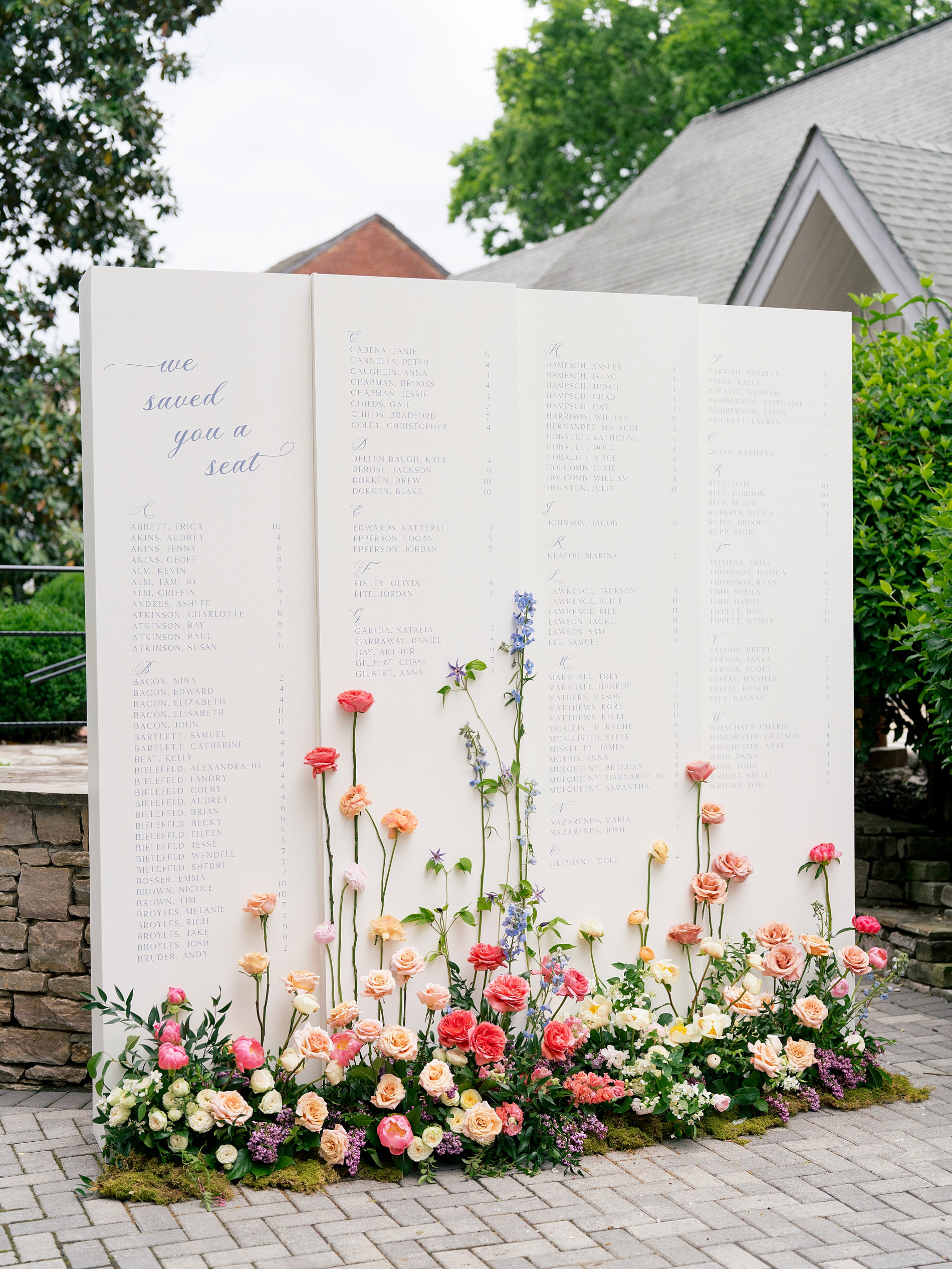
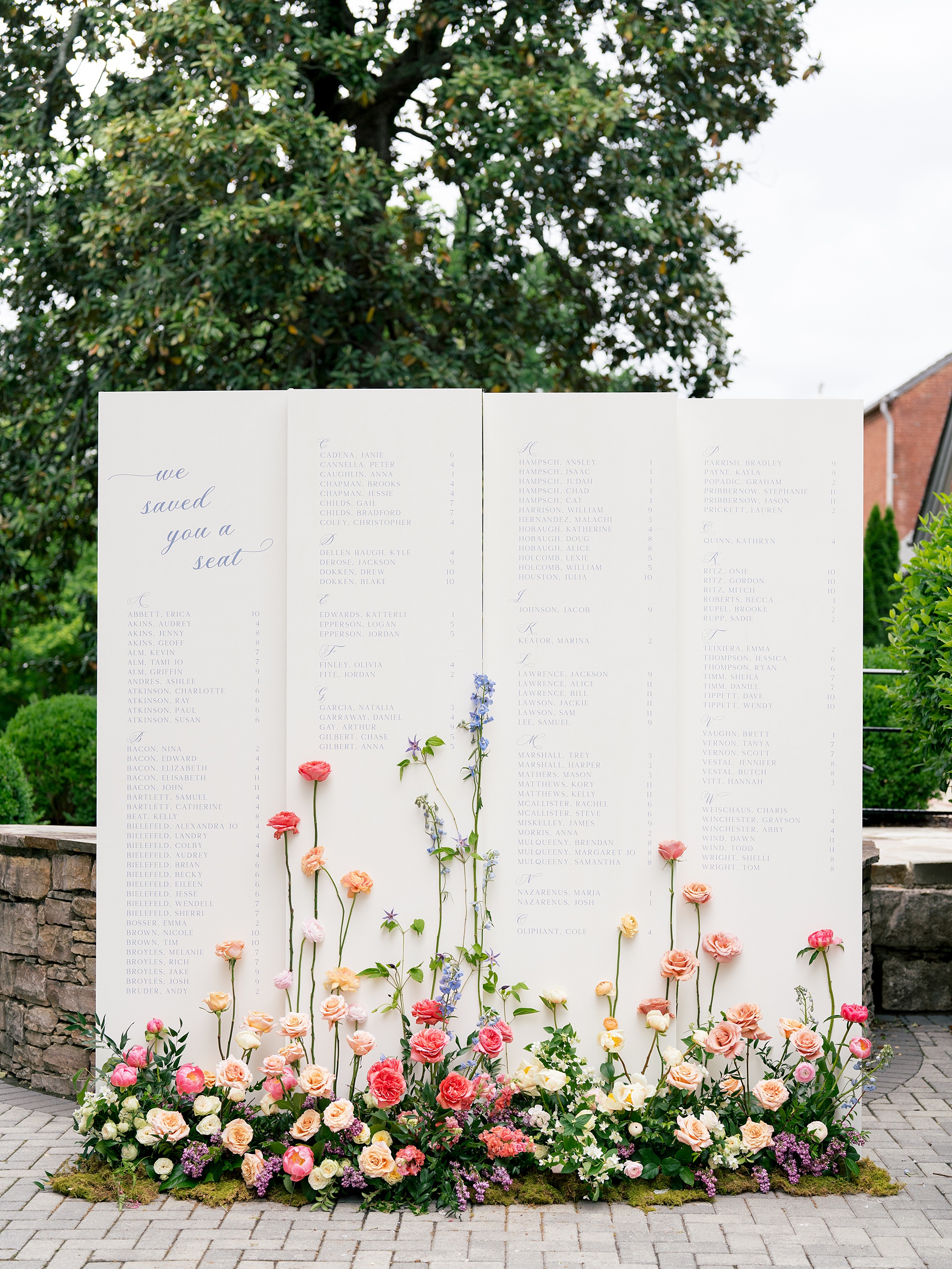
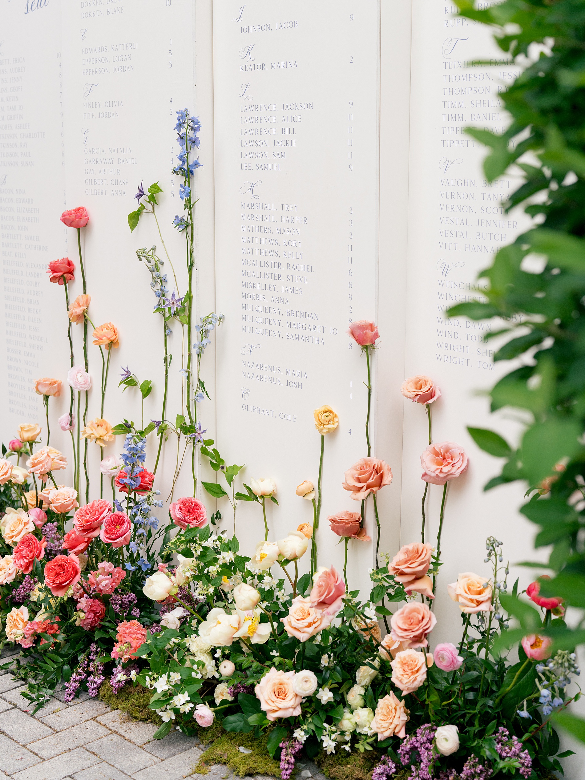
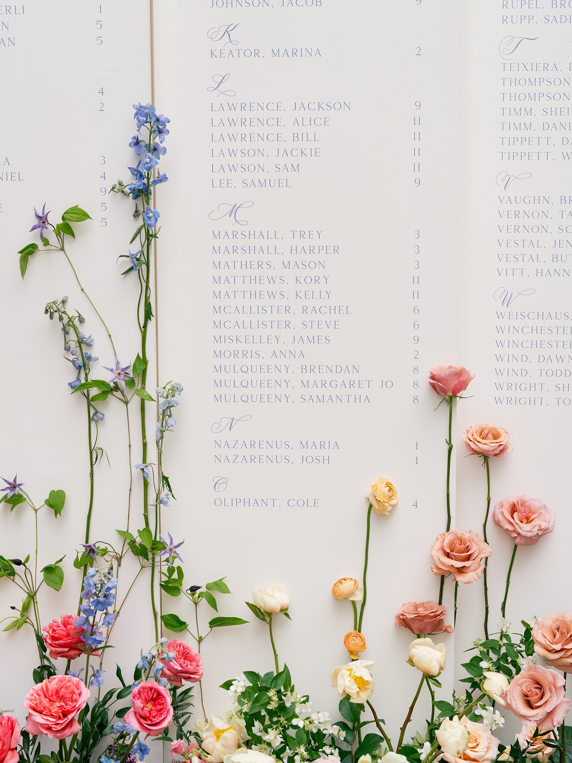
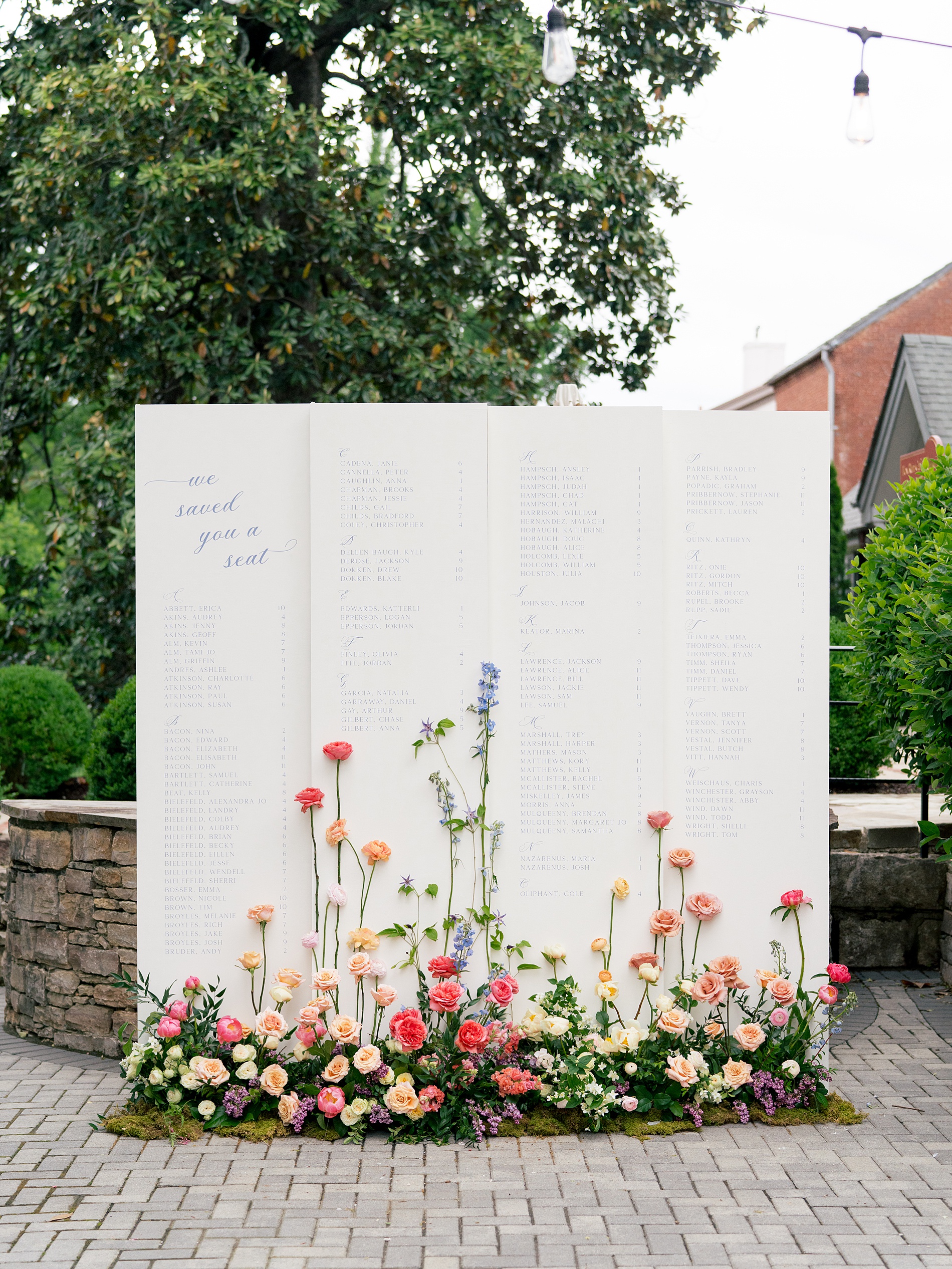
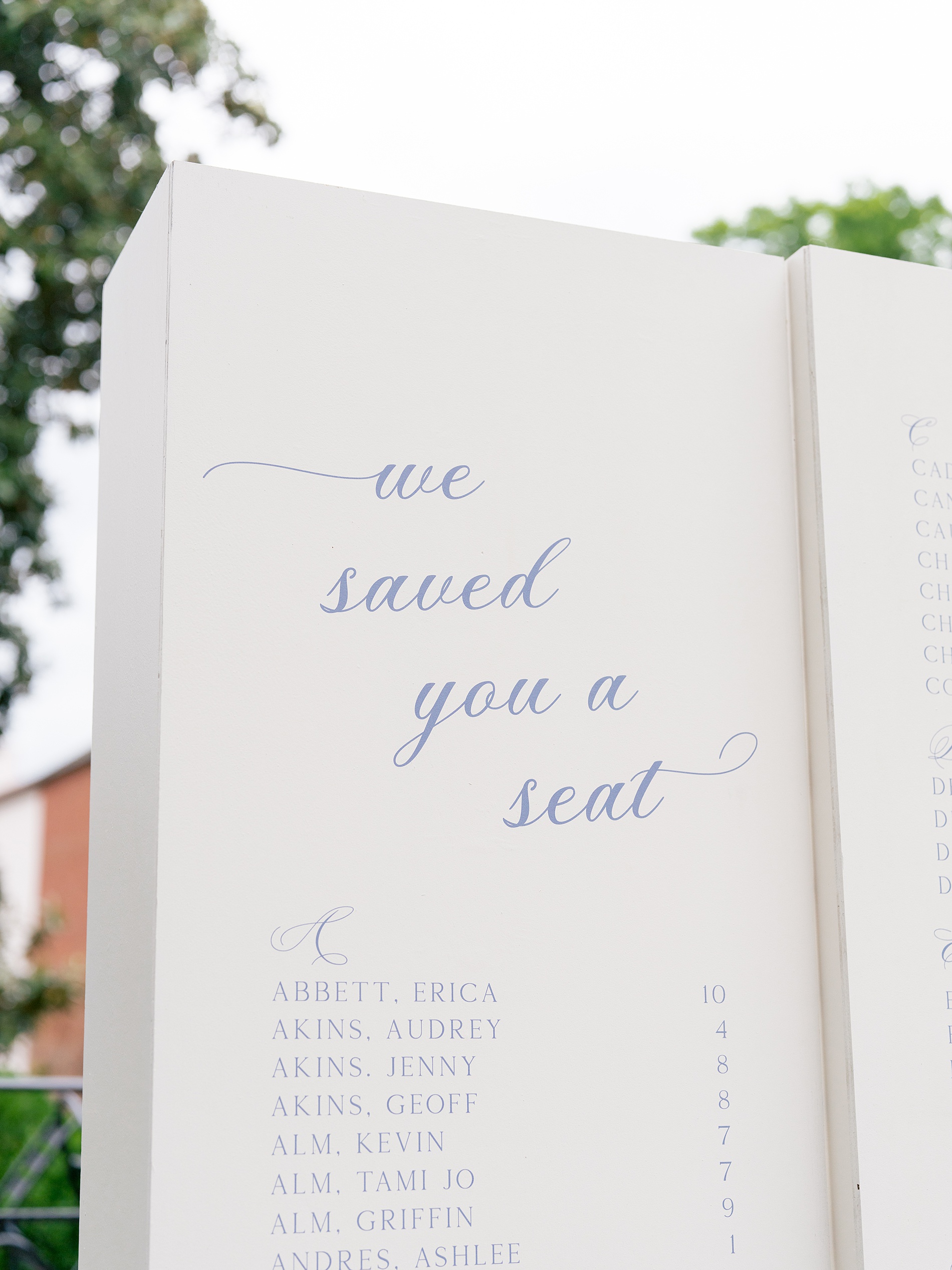
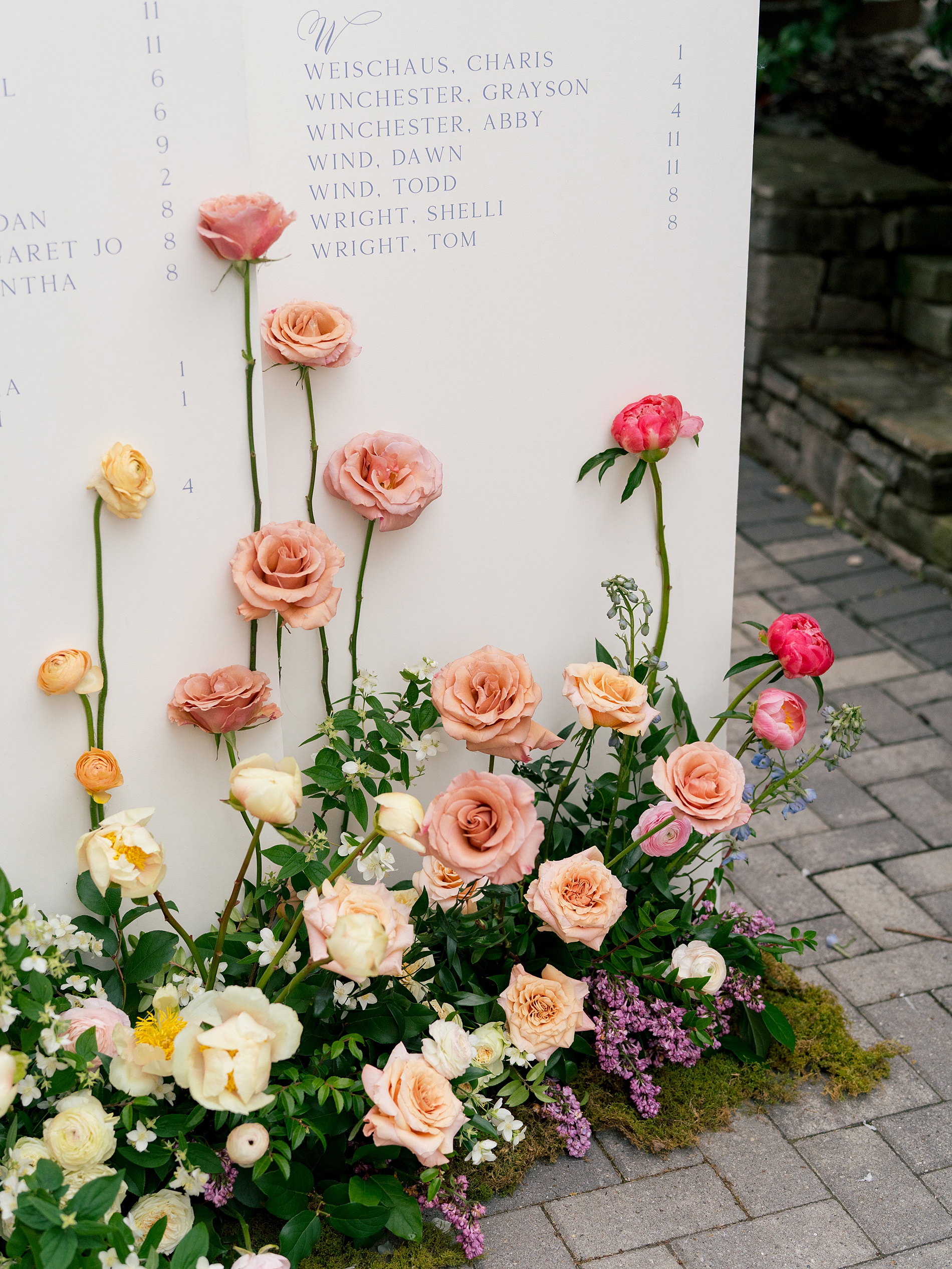
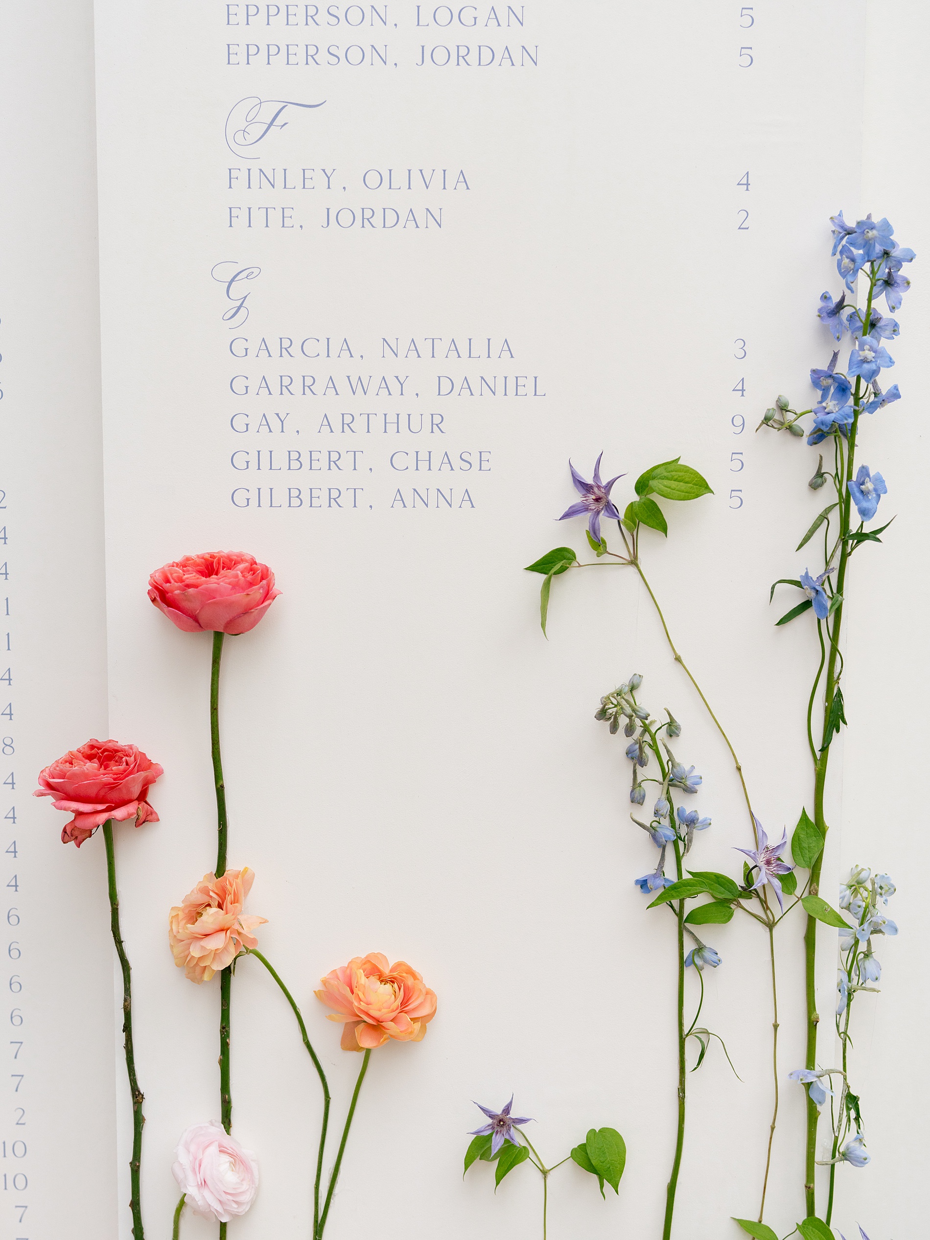
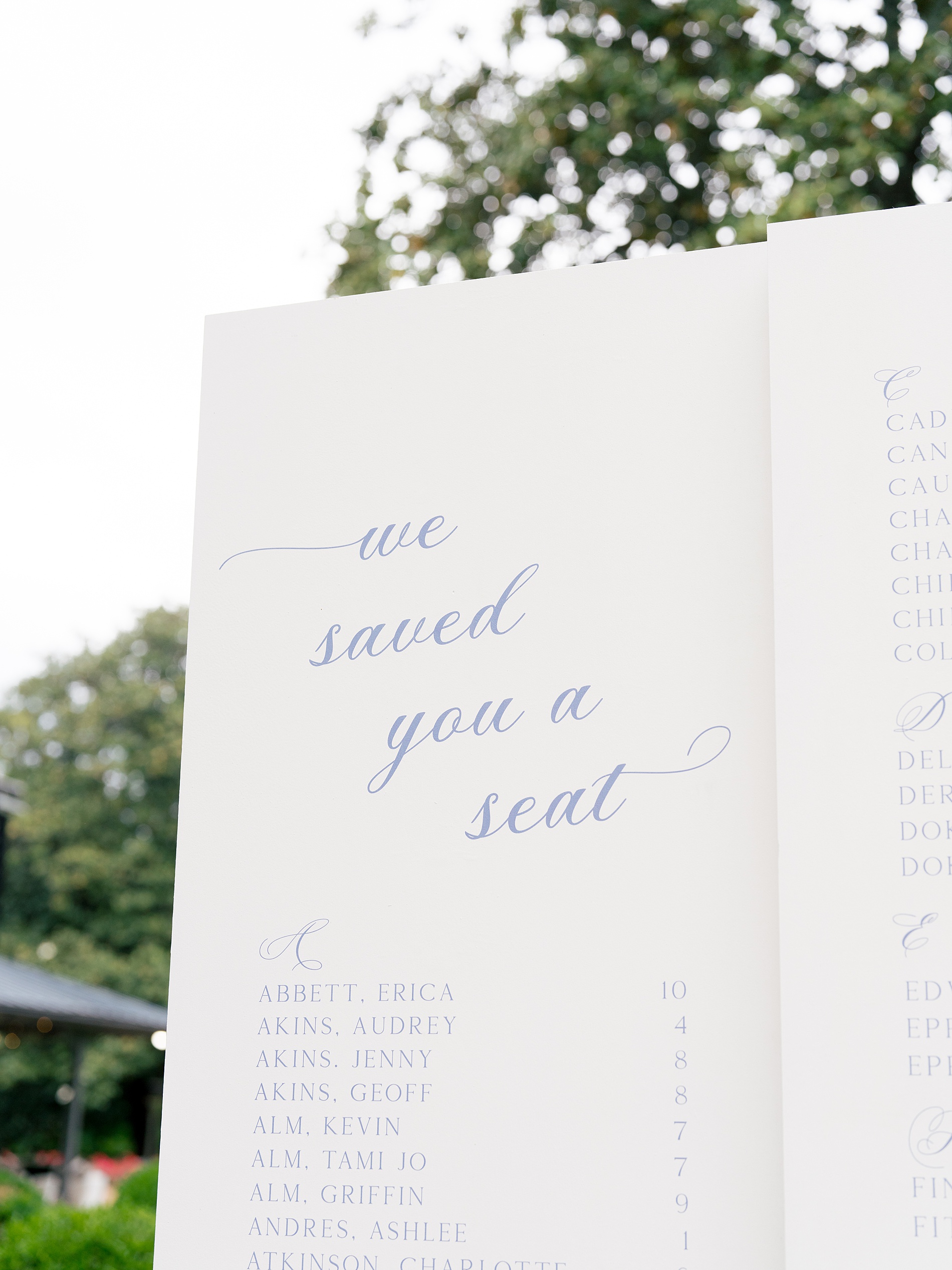
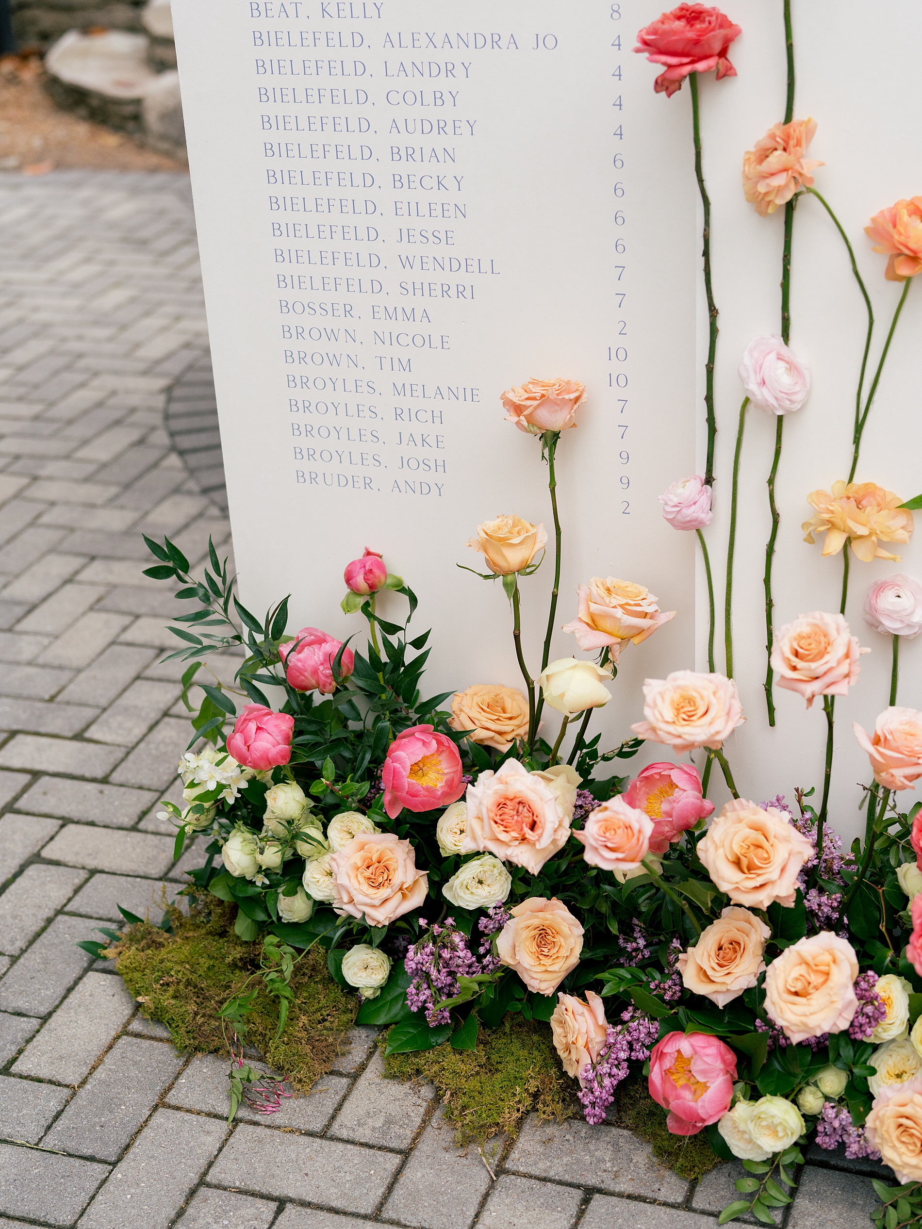
Elegant Seating Chart
The seating chart was a show-stopping display and one of my favorite details. The display featured soft blue lettering on a white background that had a 3D effect with stunning florals arranged at the base. The mix of low florals and tall stemmed blooms created a romantic, layered look that perfectly complemented the venue’s charm.
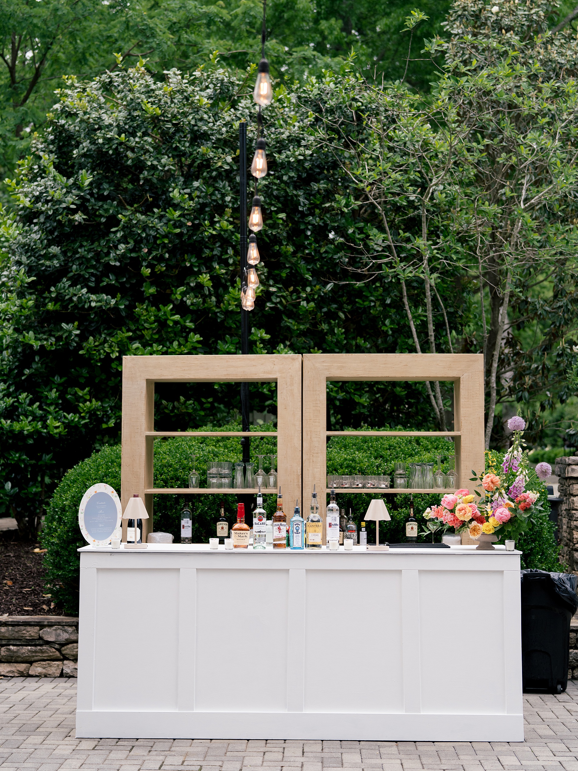
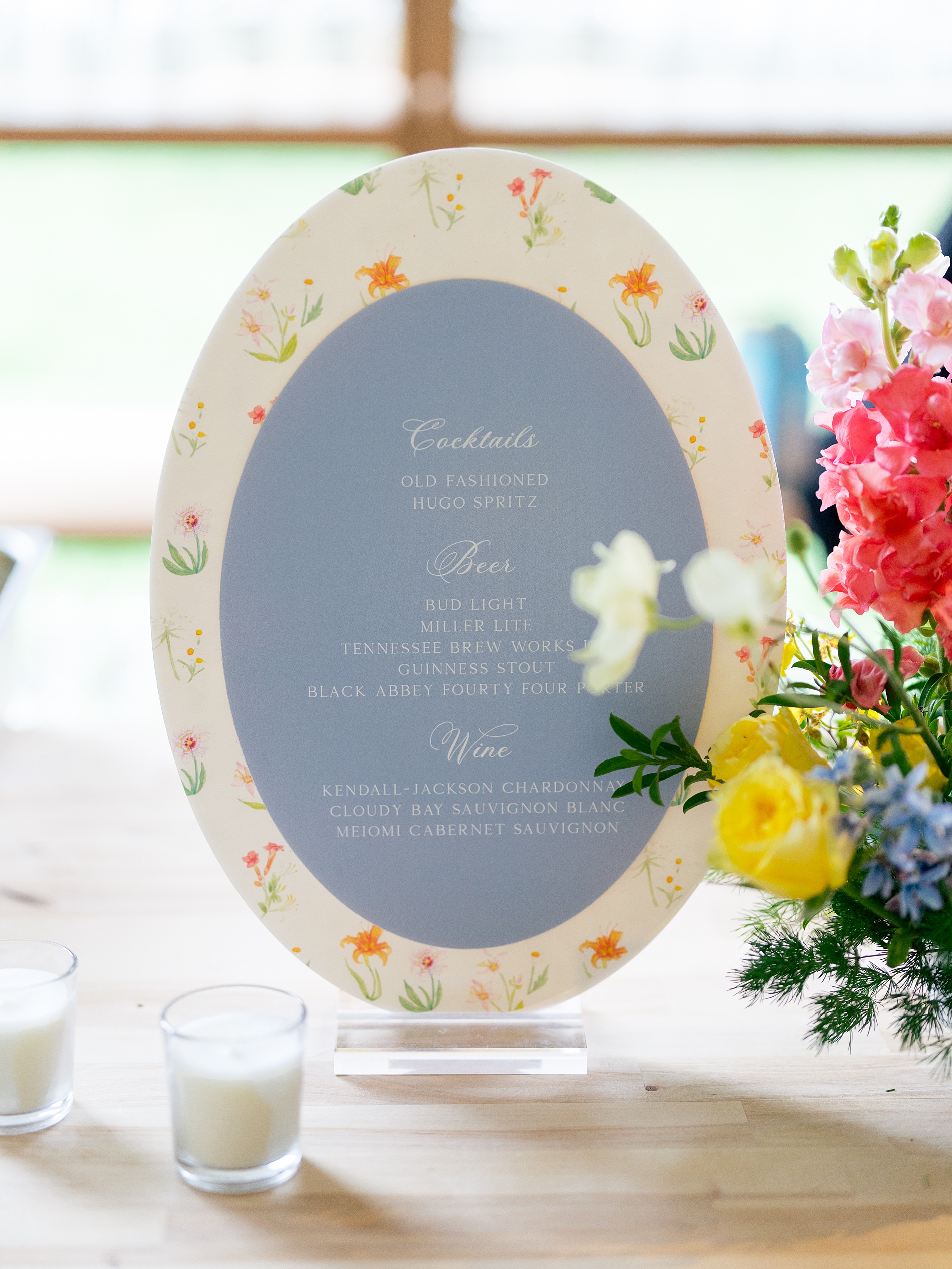
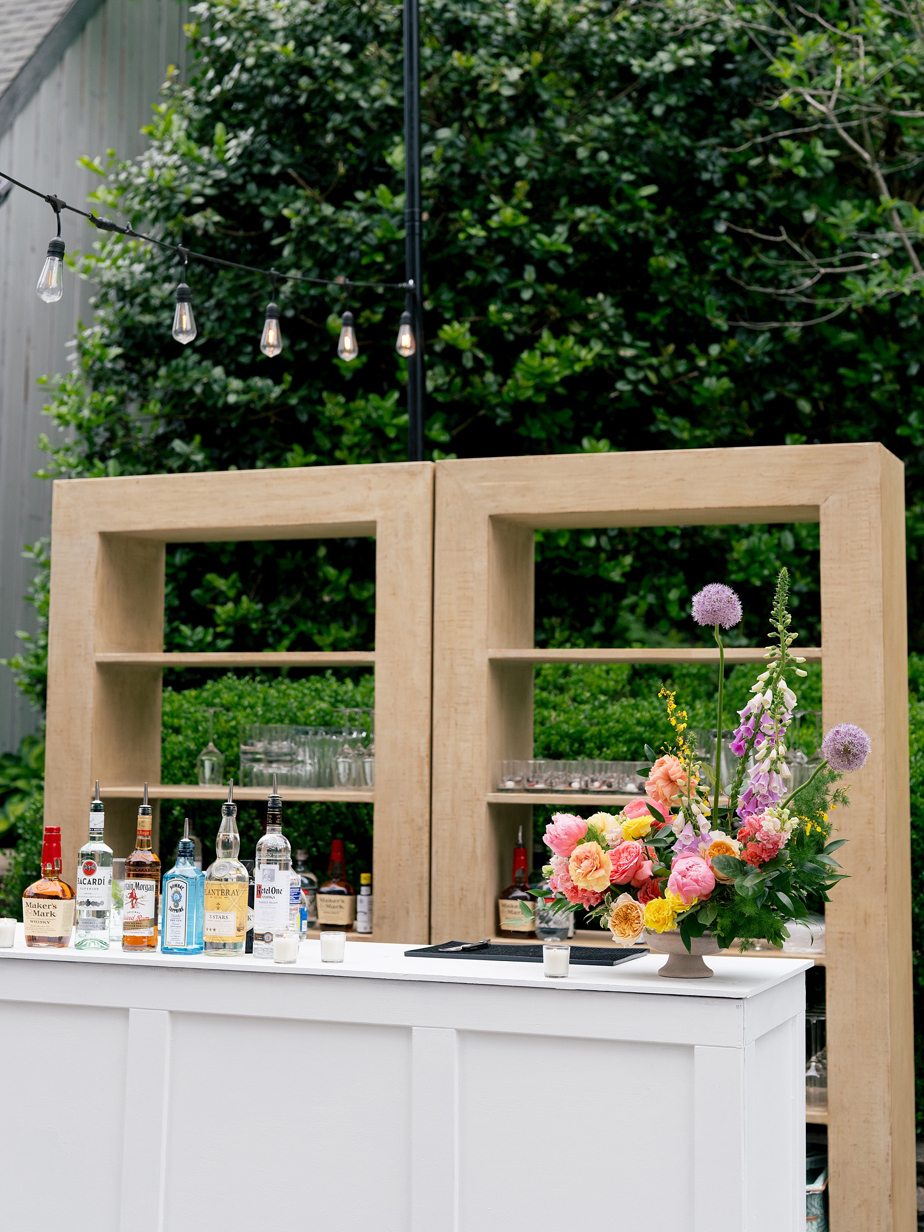
Bar Sign
We created an oval bar sign in steel blue, with white calligraphy framed by the same floral border from the invitation art. This visual tie-in made the entire event feel thoughtfully styled.
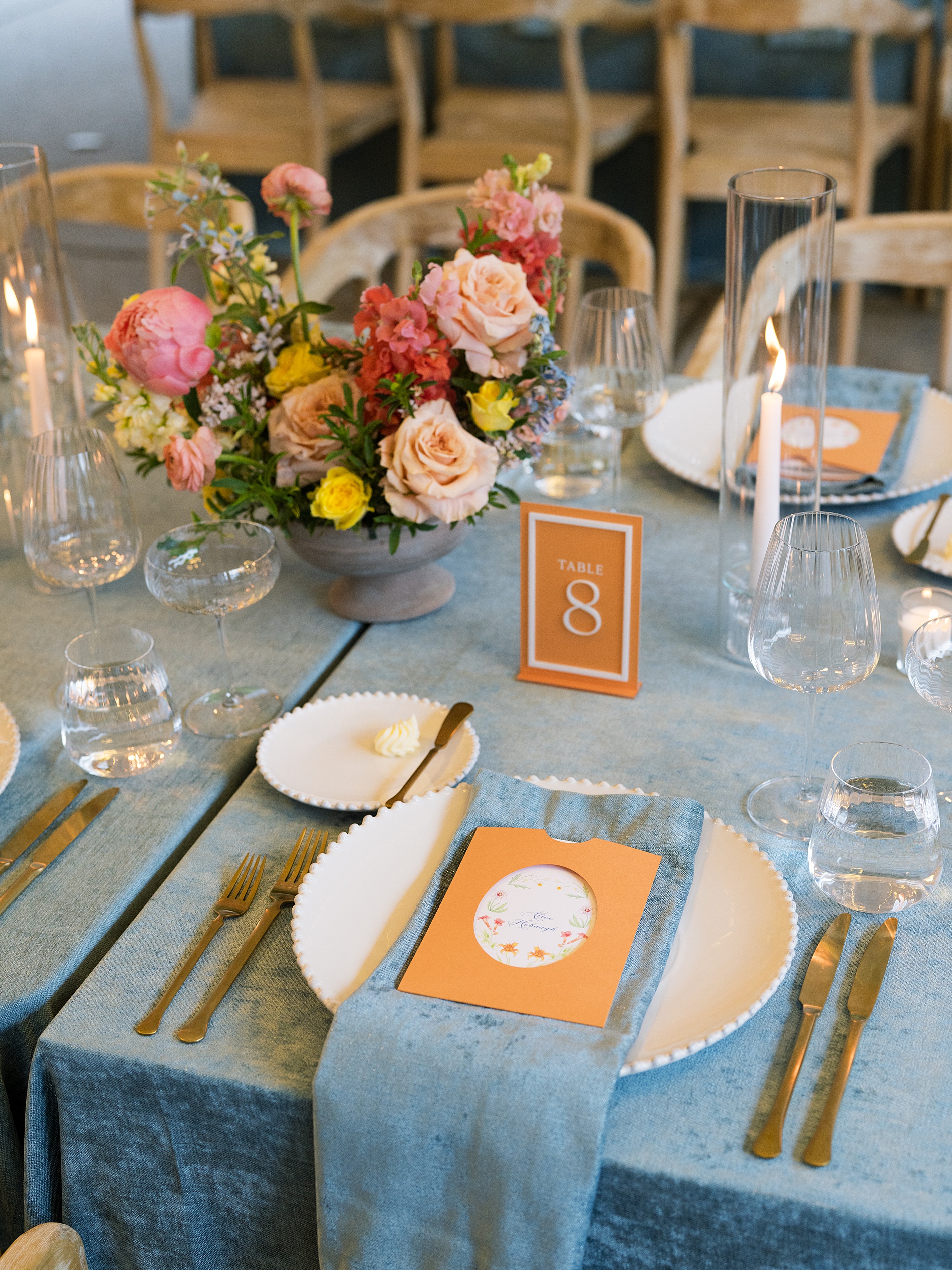
Reception Tablescape and Details
As guests moved inside for the reception they found their menus tucked into a custom die-cut orange pocket, again featuring Landry’s floral artwork. The menus and orange acrylic table numbers popped against the blue linens and tied into the colorful spring floral centerpieces.
Lexi Jo and Landry’s wedding was full of color, romance, and intention. It was a joy to work them, and lean in to their love of color and design, as well as the rest of the amazing vendor team who brought this wedding dream to life!
If you’re looking to add custom, thoughtful touches to your wedding or event, we would love to help make your vision a reality. Reach out today to learn more about our full-service wedding and event design offerings! We can’t wait to create something unforgettable for you!
If you enjoyed this post, you’ll love these other blogs!
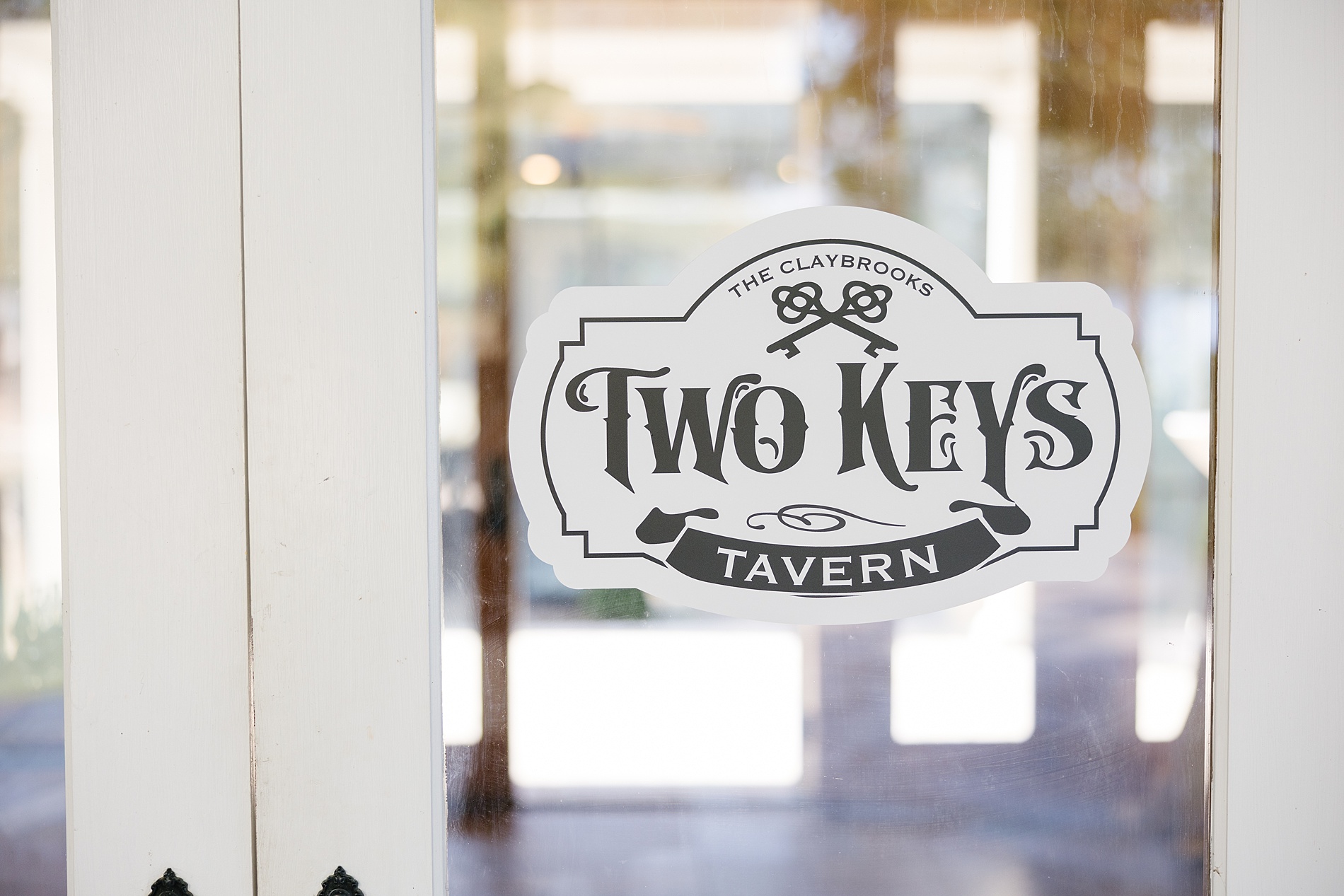
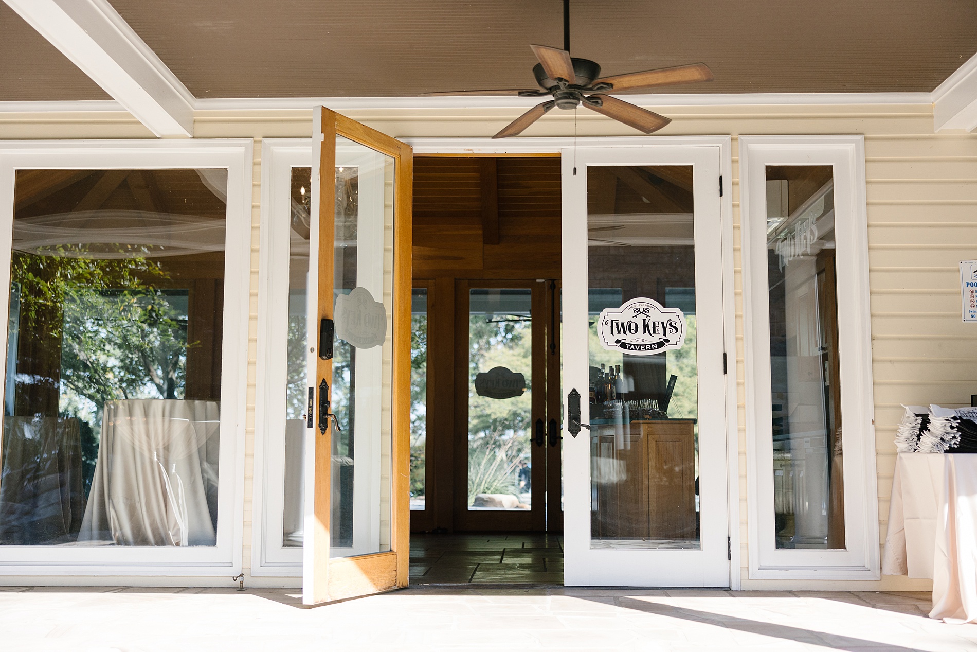
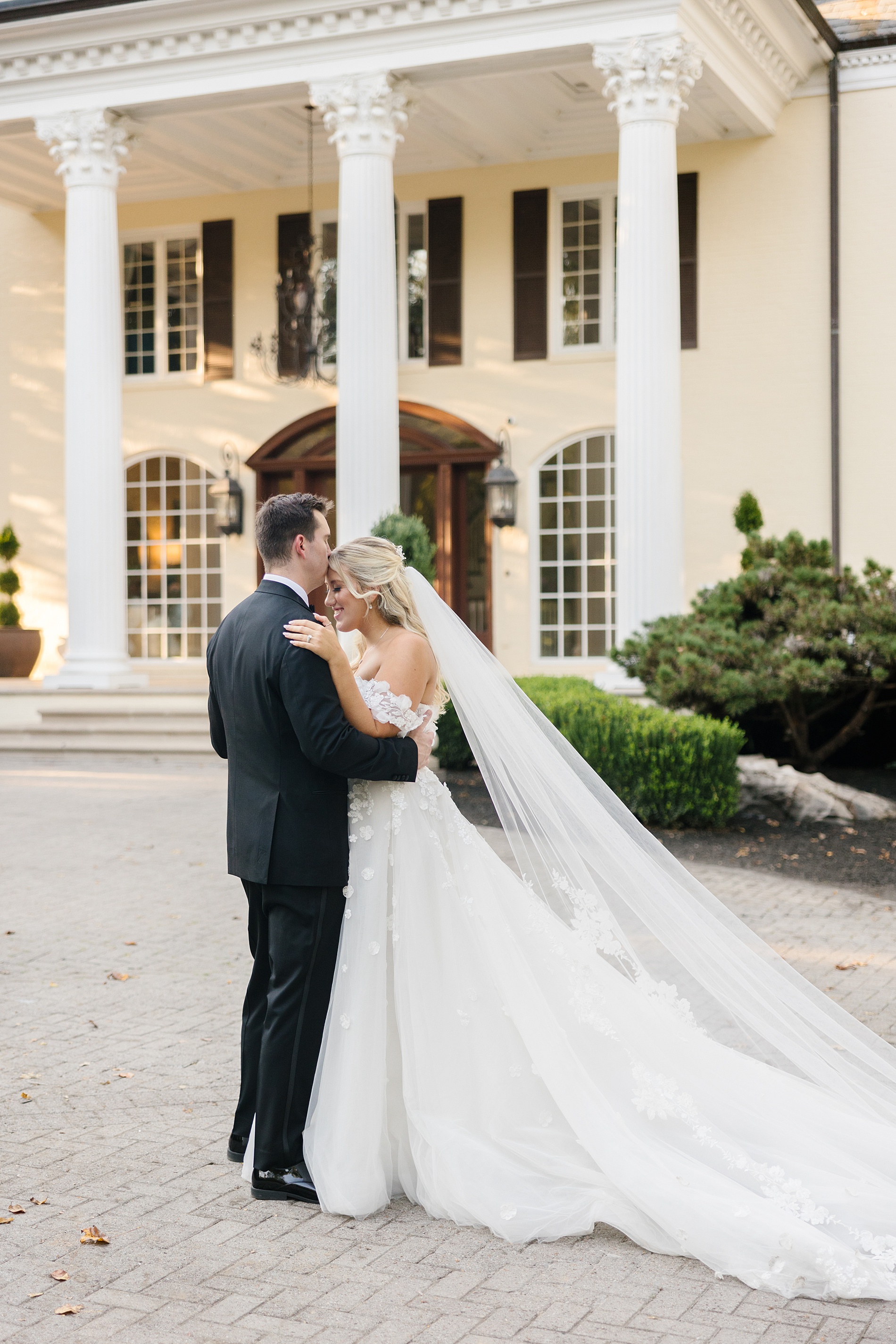
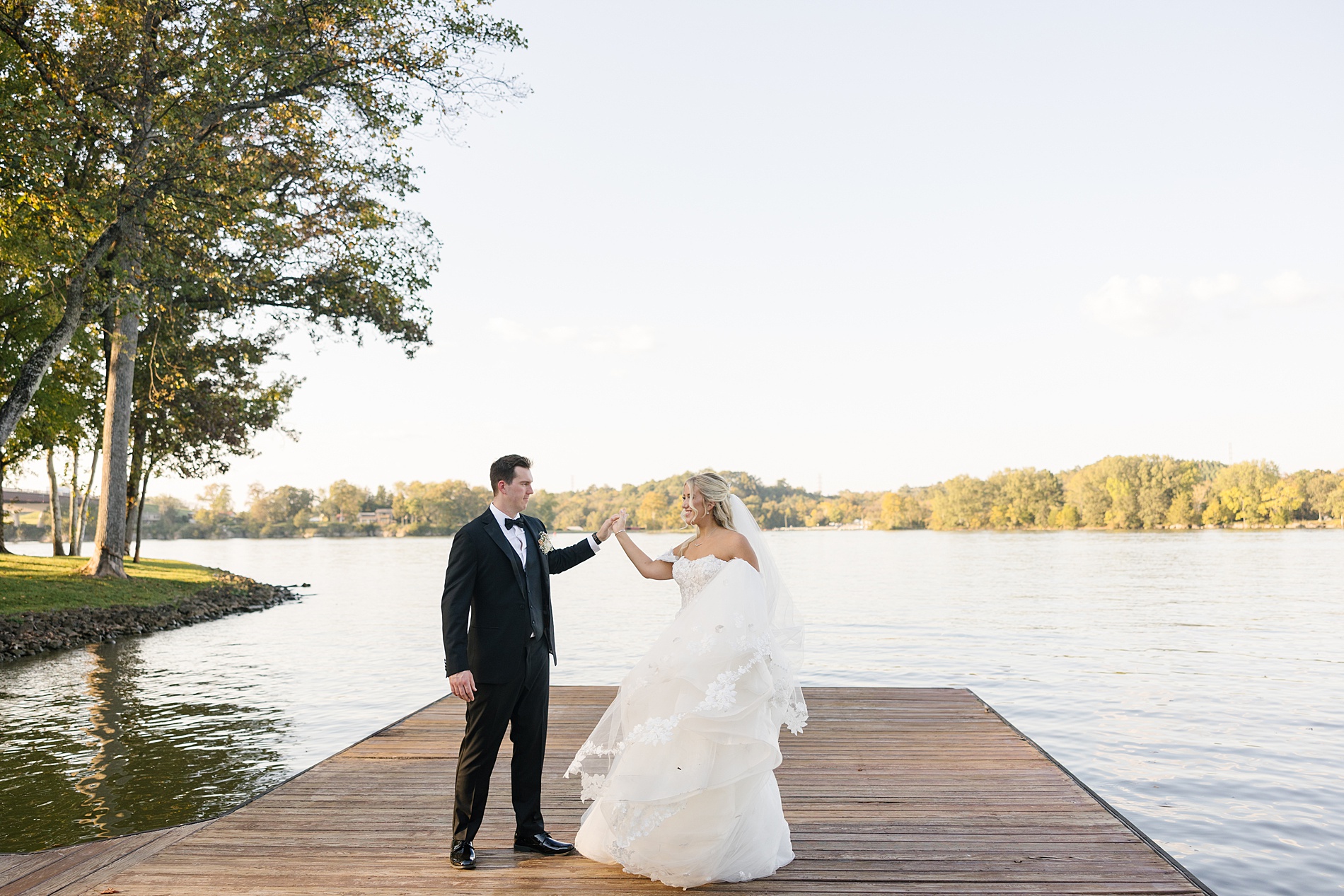
Nashville is home to many amazing wedding venues, but this luxury lakeside venue sitting on 15 beautiful acres is one of my top favorites. The Claybrooks’ luxurious fall wedding at Cherokee Docks combined romantic elegance with interactive fun. Personalized touches and breathtaking details filled the entire weekend, and we were honored to play a part in it all.
We worked closely with the fabulous mother of the bride, Kelly, who planned every last detail of her daughter’s big day with care and intention. Kelly truly had a vision, and bringing that to life through elegant invitations and paper goods, custom signage, and unforgettable installations was such a joy for our team!
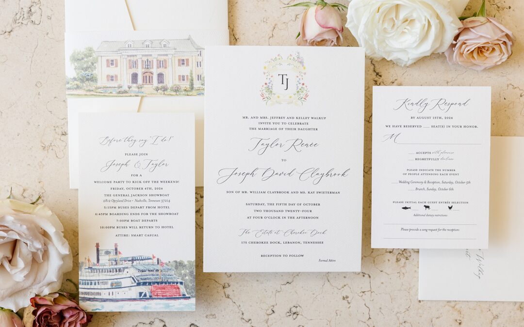
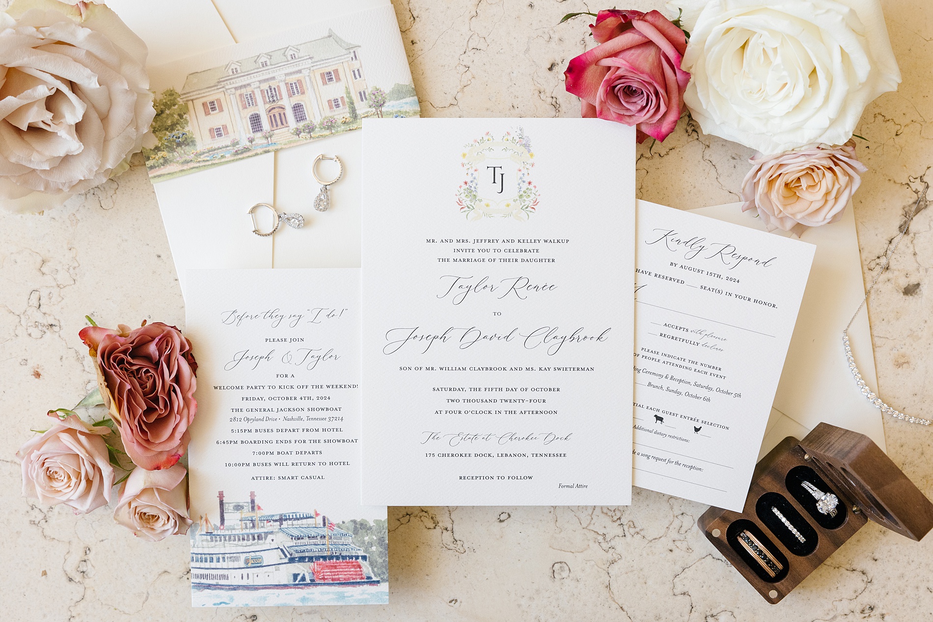
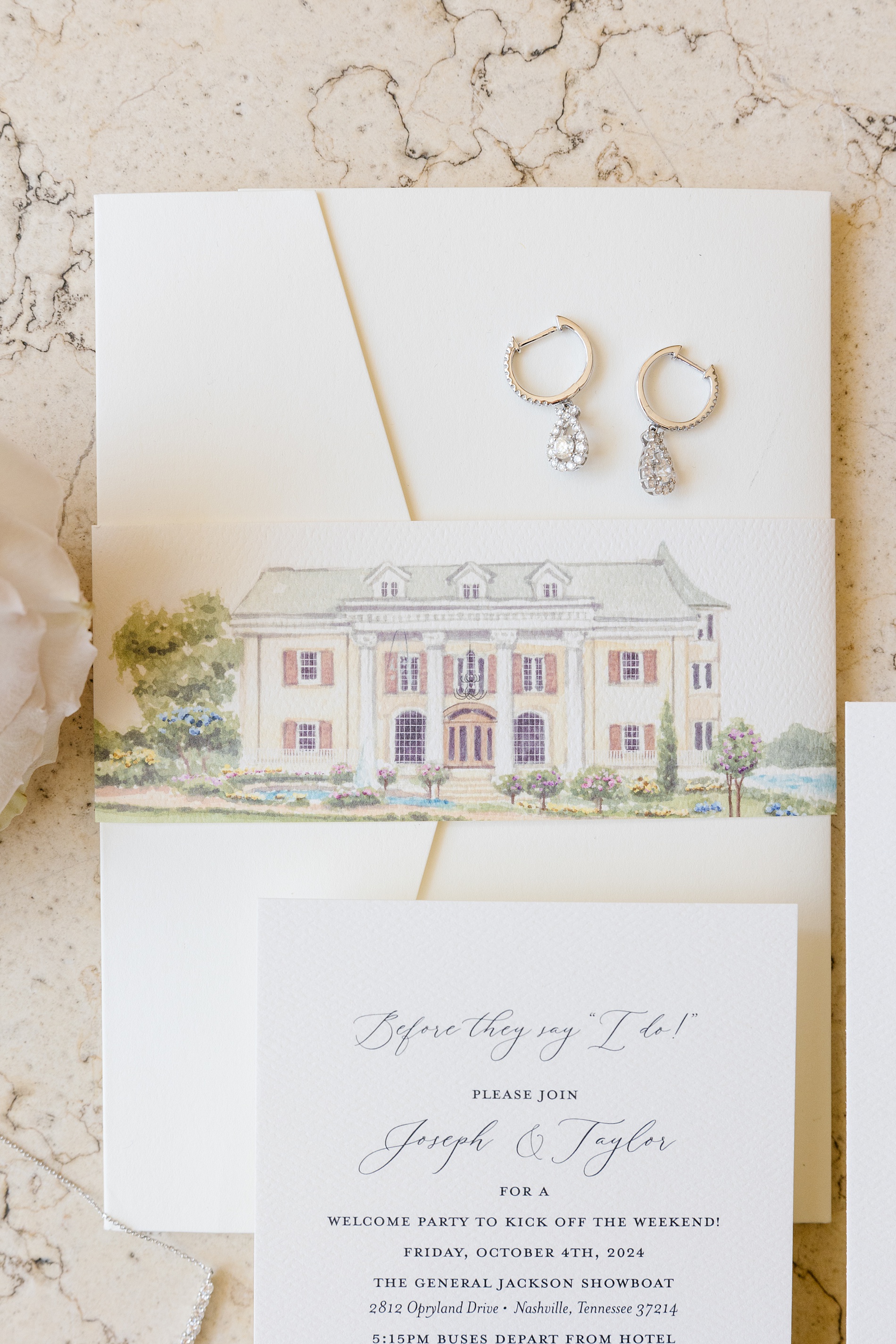
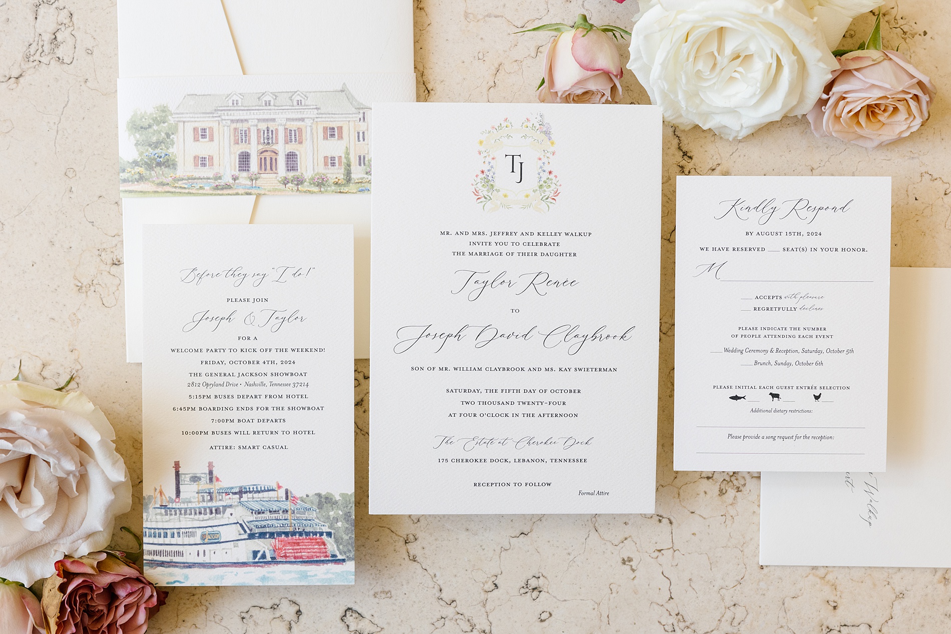
Custom Sketches for an Elegant Invitation Suite
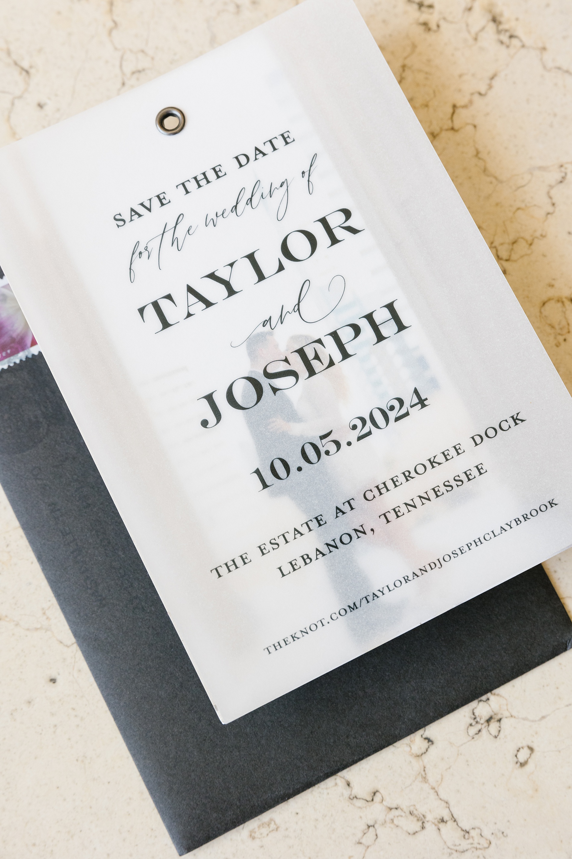
Guests were first introduced to the weekend with a custom save the date featuring an engagement photo underneath a vellum overlay with the event details printed on top. Held together with a gold grommet, this piece was an interactive and modern way to include a photo while keeping the aesthetic cohesive and timeless. Read more about this and other fun and unique Save the Dates here!
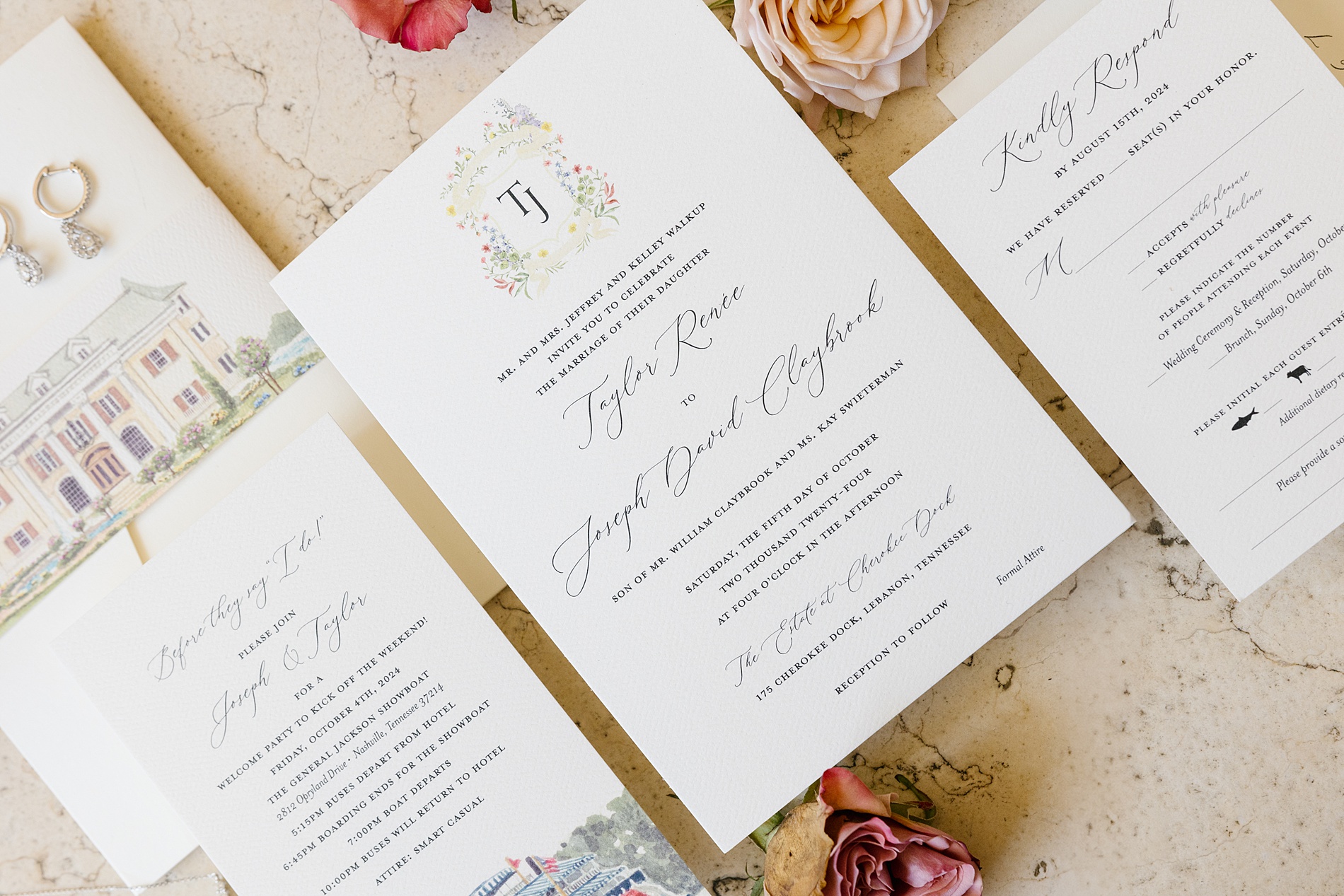
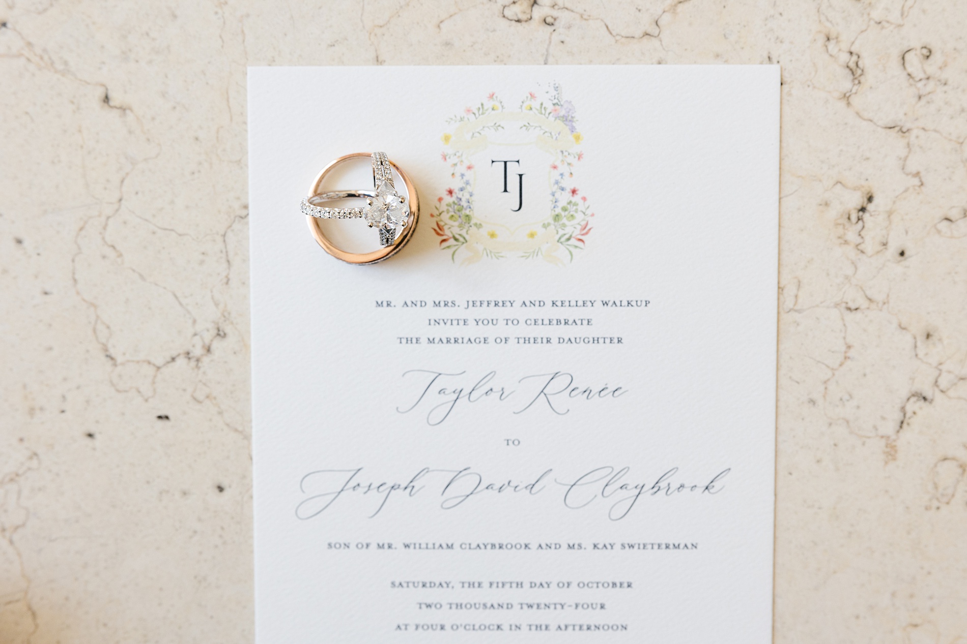
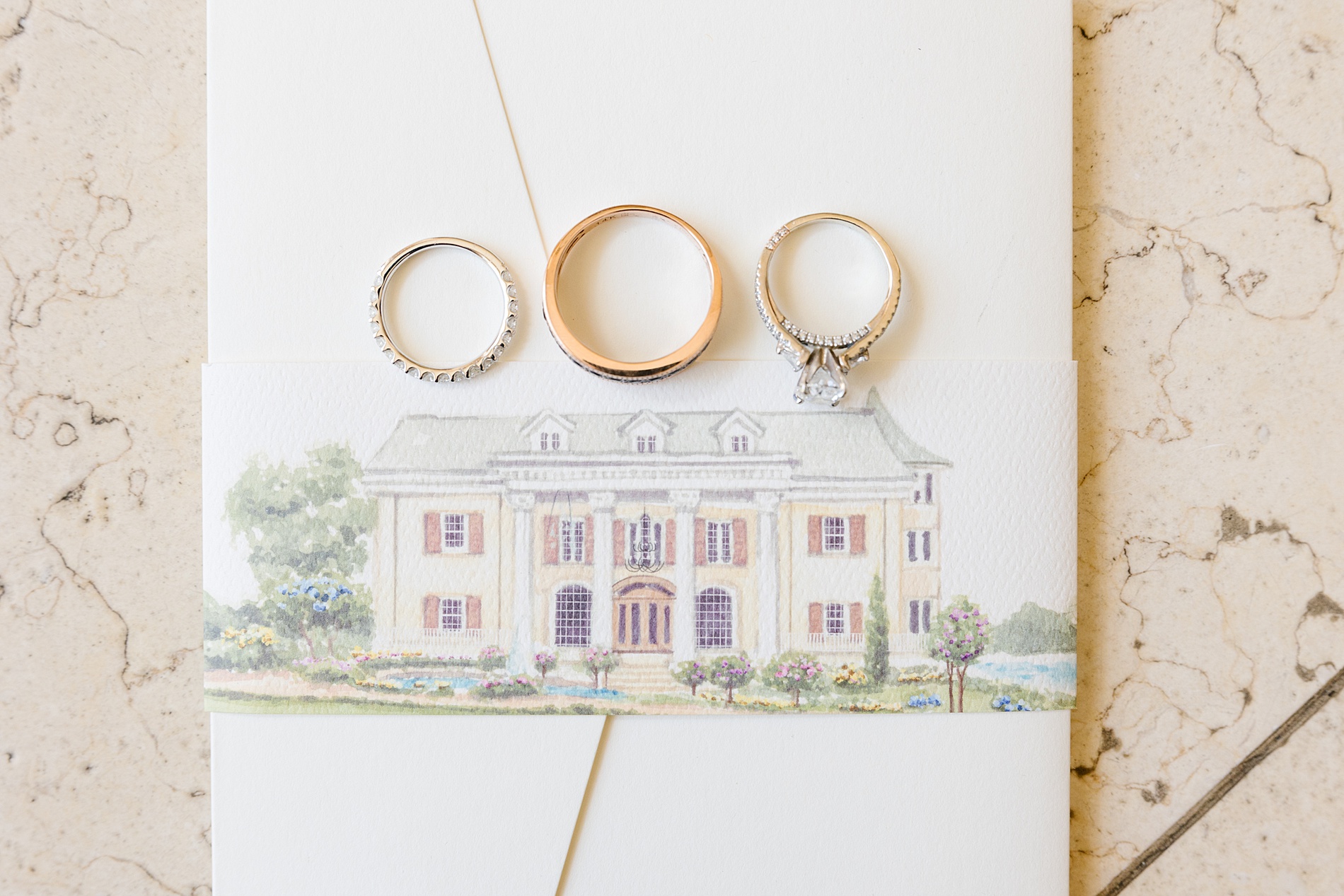
The couple’s invitation suite was a perfect reflection of their classic style. We created a soft, romantic white invitation that featured delicate florals surrounding the couple’s monogram. A custom sketch of the Cherokee Dock venue on the wrap that held the invitation suite pieces together was my favorite detail. It completely elevated the suite! I just love slipping in little details and hints about the wedding day to guests.
To kick off the weekend, we also designed a welcome party invitation featuring a sketch of the General Jackson Showboat, giving guests a peek at the fun to come. From beginning to end, each paper piece was designed to build anticipation and set the tone for the weekend.
Ceremony Details
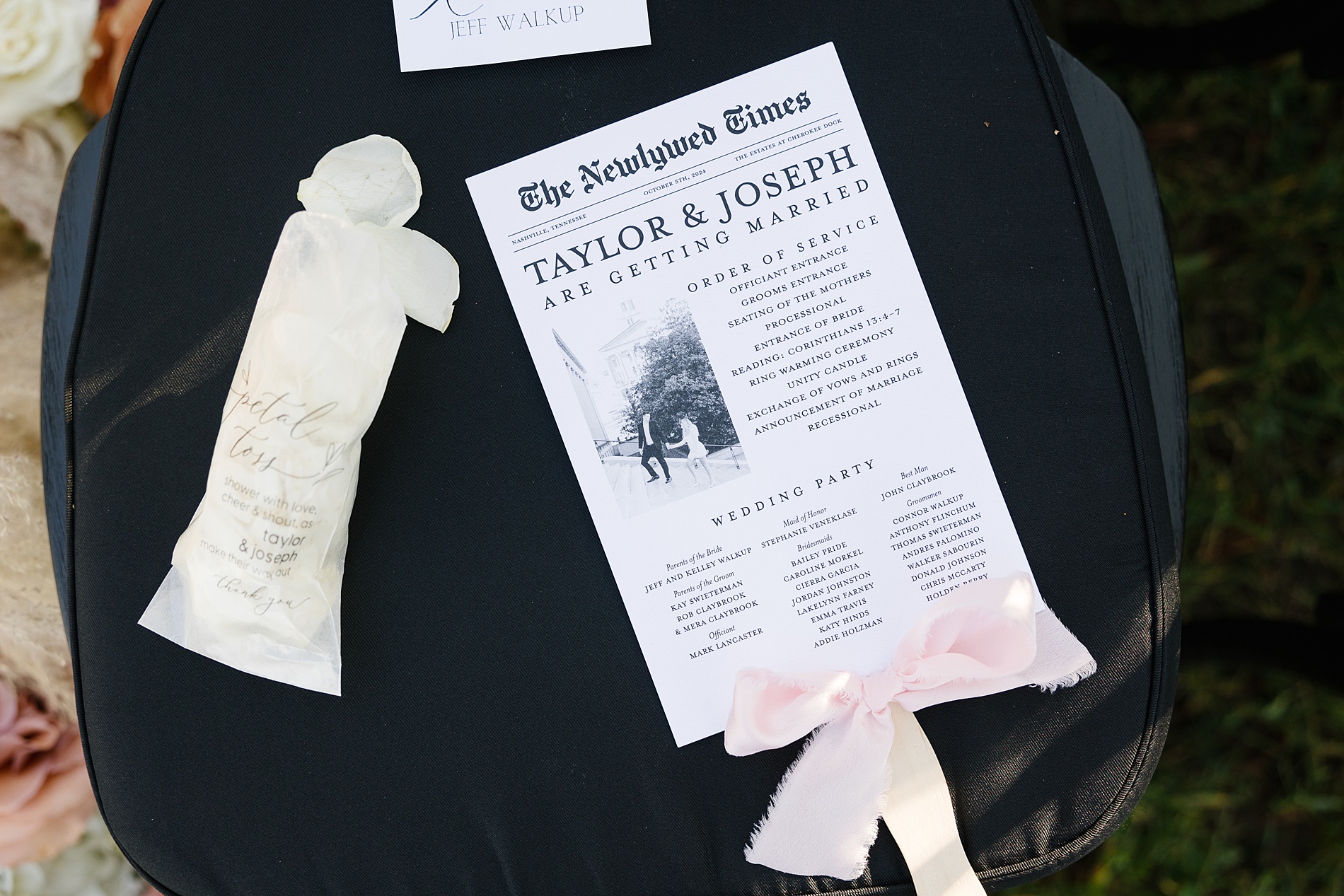
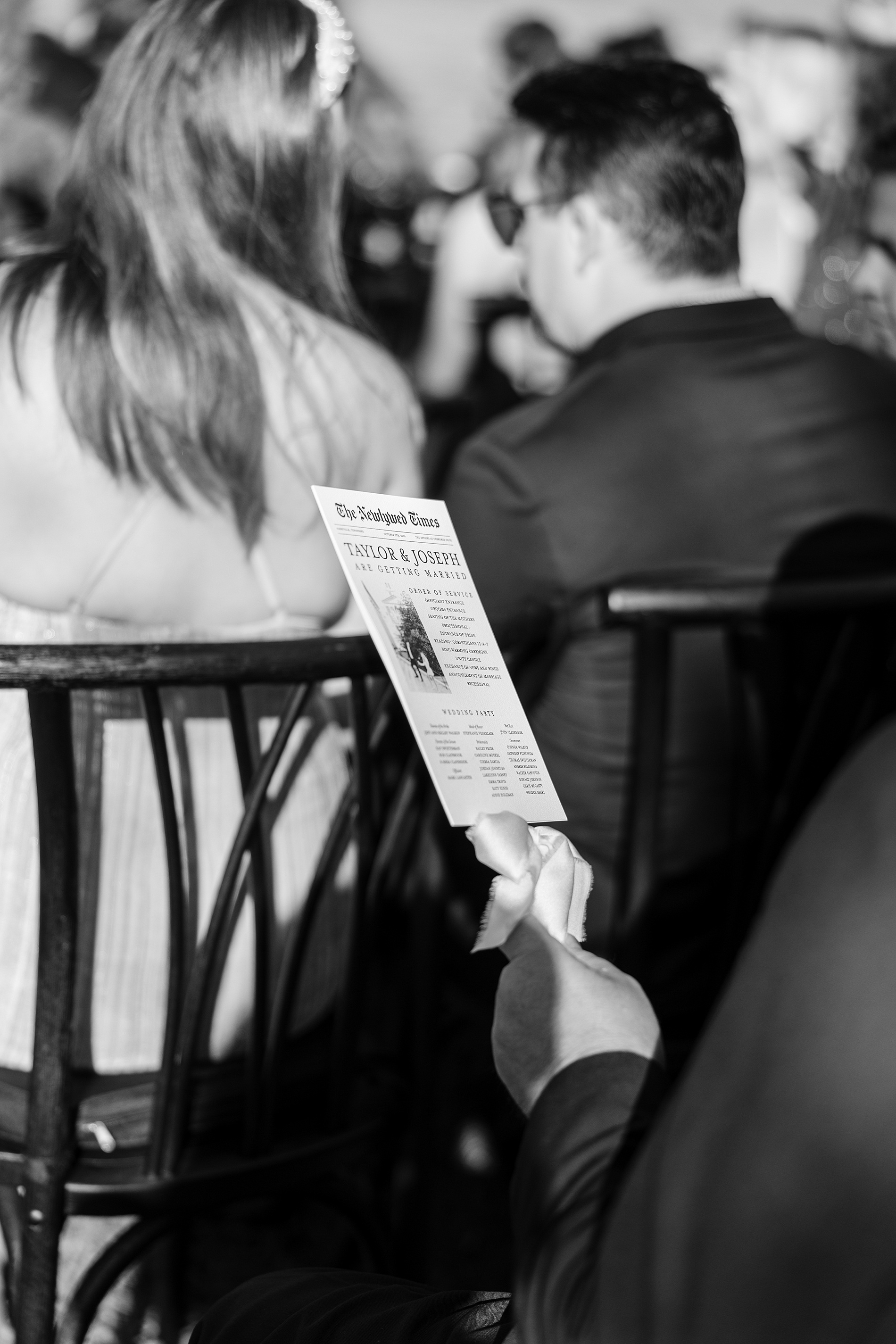
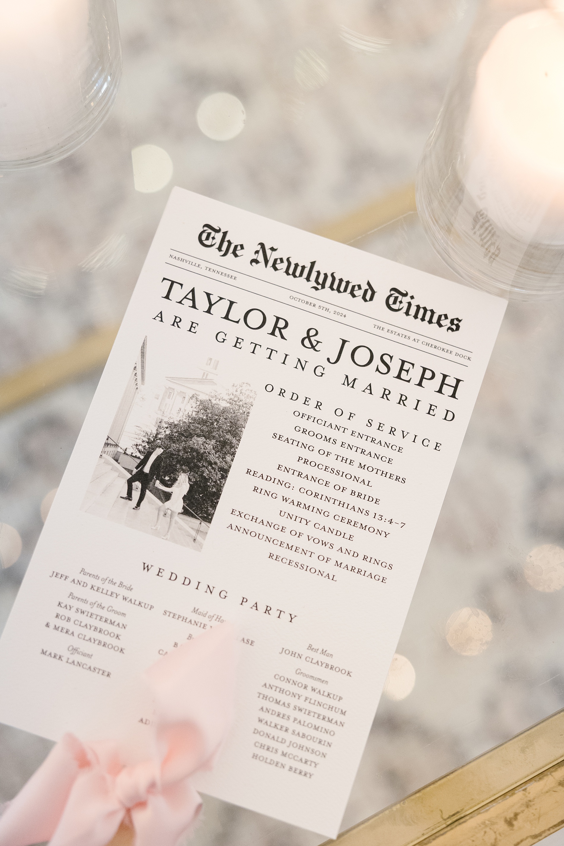
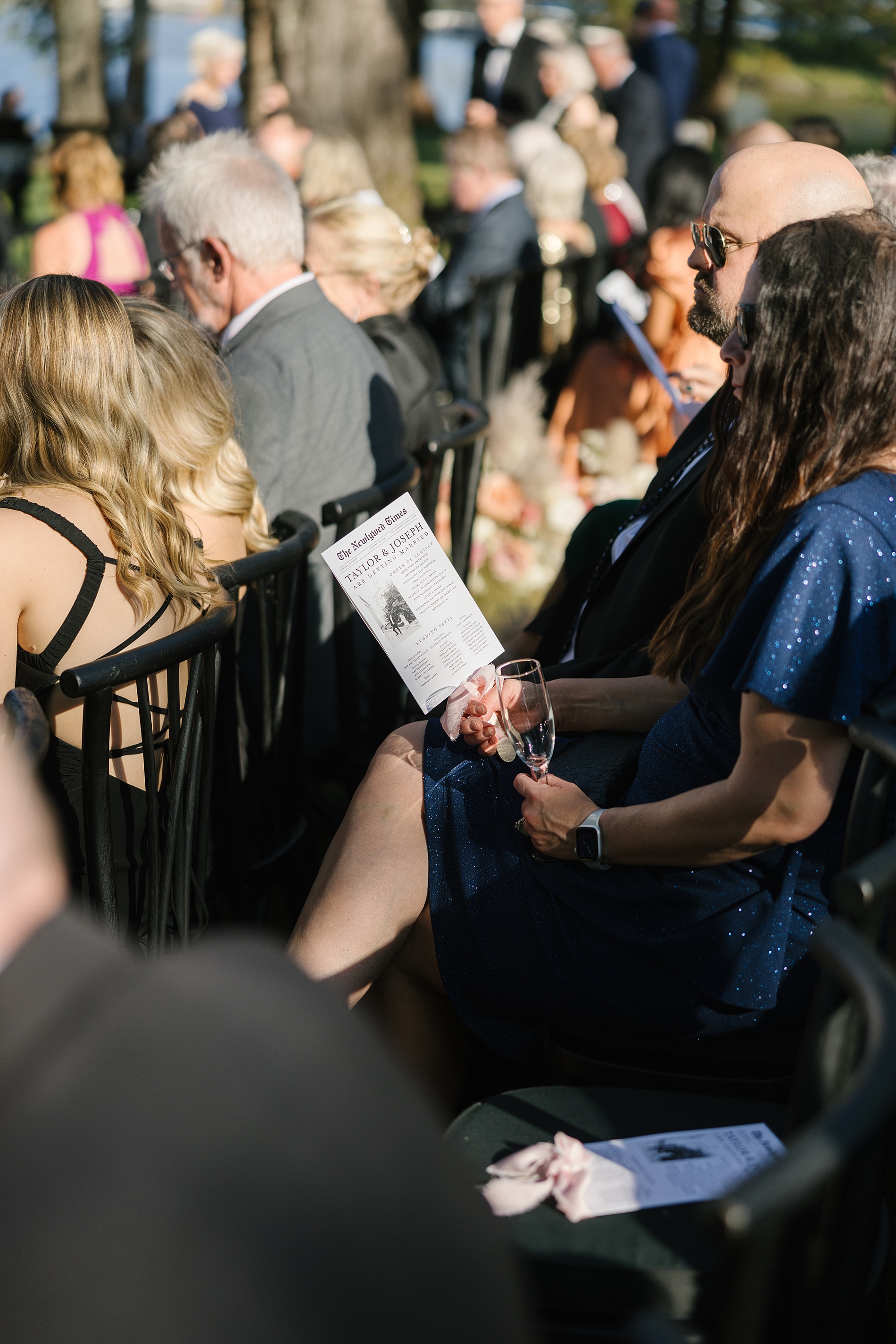
The ceremony wasn’t without its own beautiful paper moments. Guests received newspaper-style fan programs, which doubled as a ceremony timeline and a creative way to showcase an engagement photo. These charming, multi-purpose programs were a total win on a warm fall day.
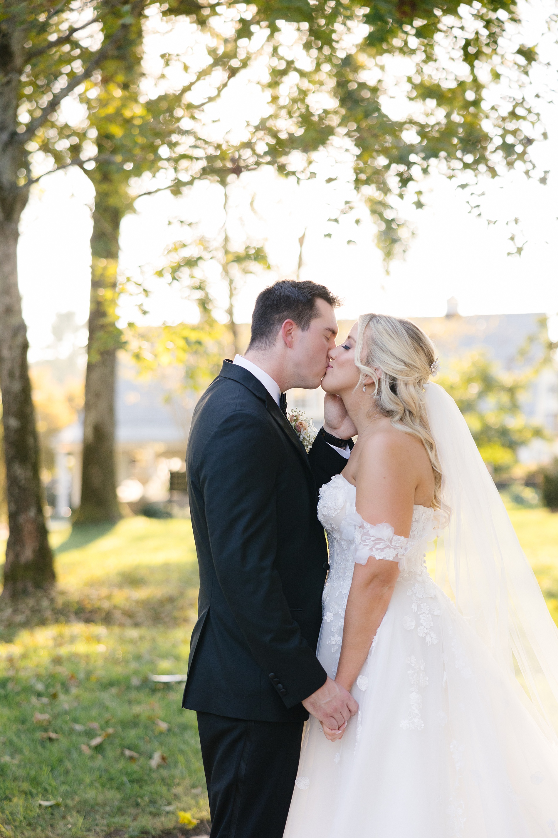
Then there was the ceremony itself which took place outside by the water. Between the leaves changing colors, the sunlight hitting the water, and the beautiful couple so excited to be married, there was so much to love about this wedding,
Interactive Details Guests Will Never Forget
This wedding was full of beautiful, classic moments, but it also had some fun surprises! We loved bringing a little playfulness to the design while still keeping things elevated.
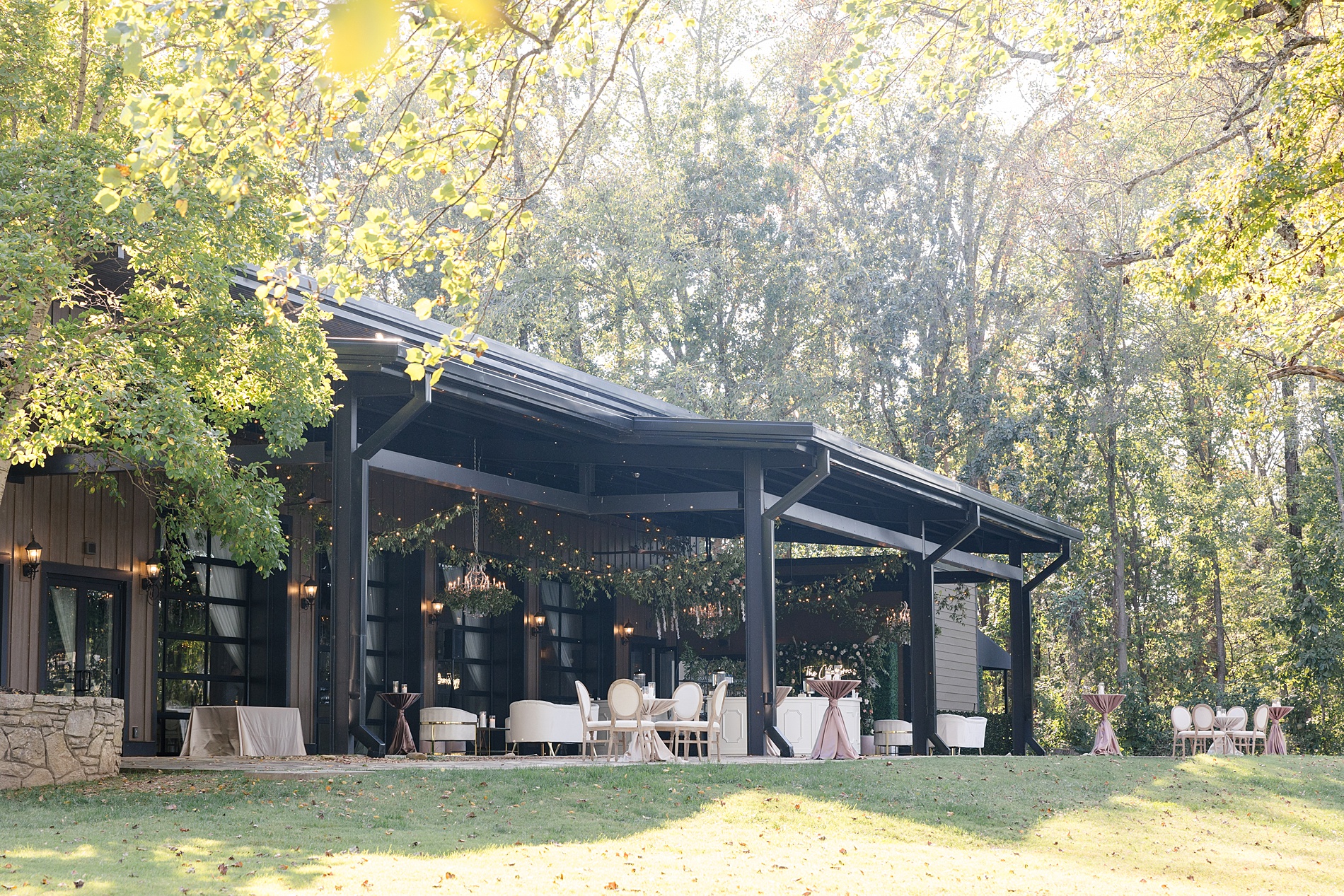
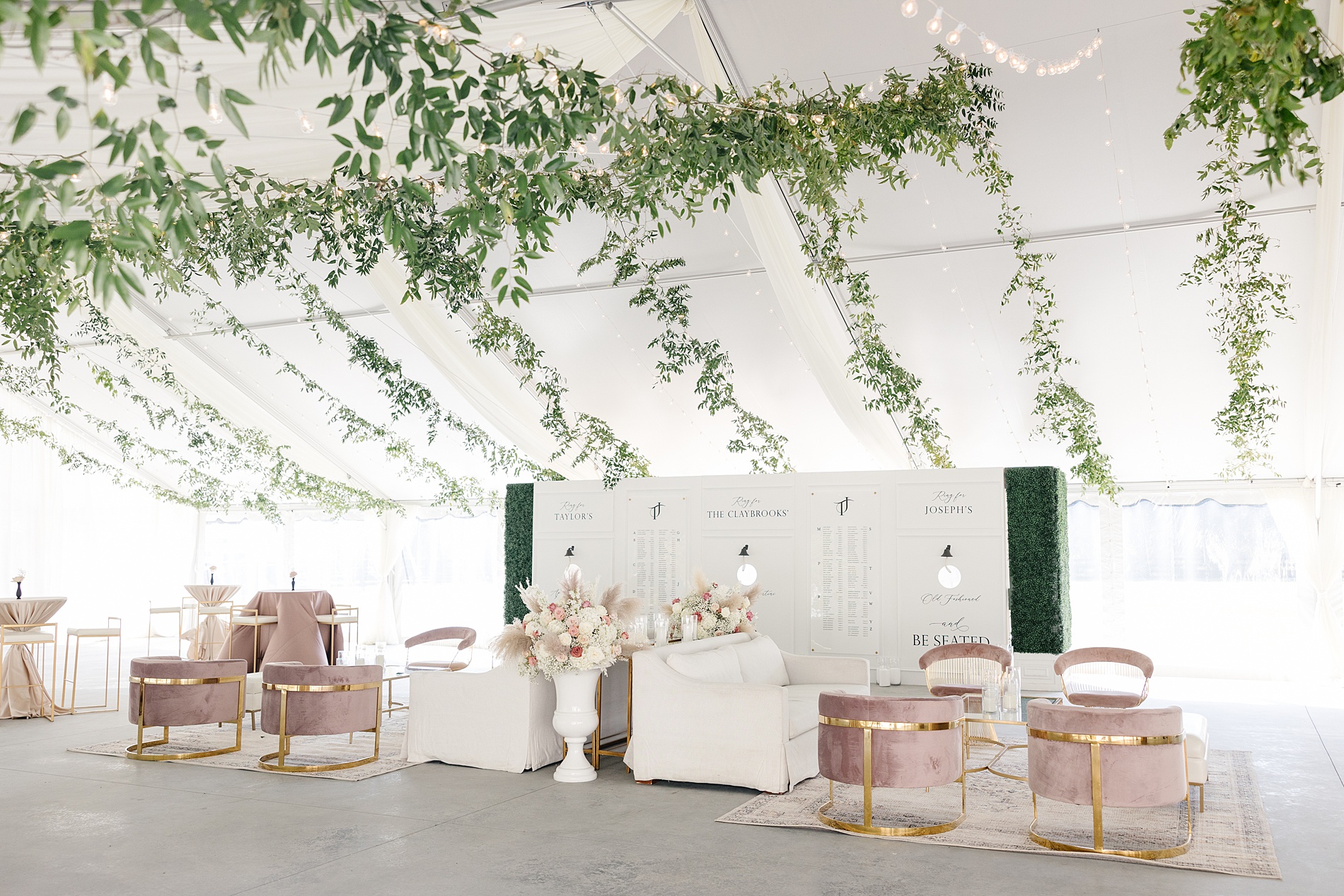
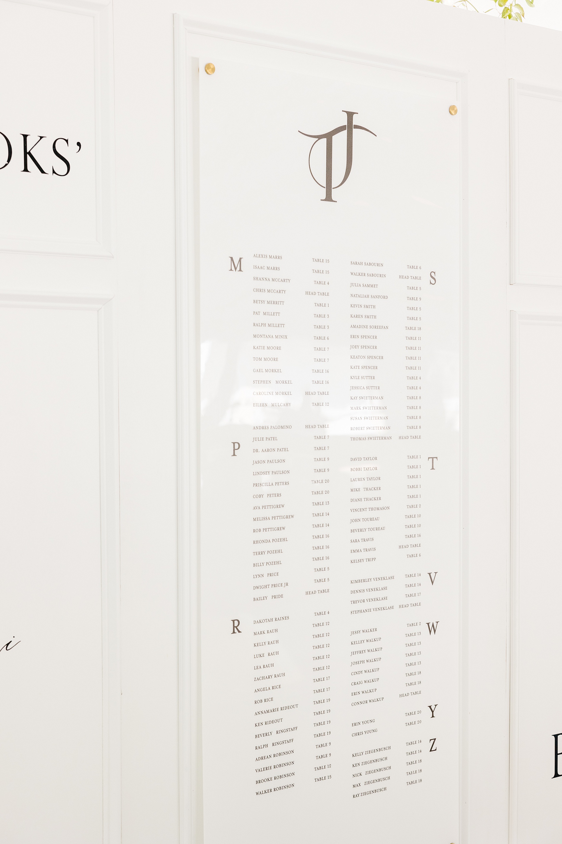
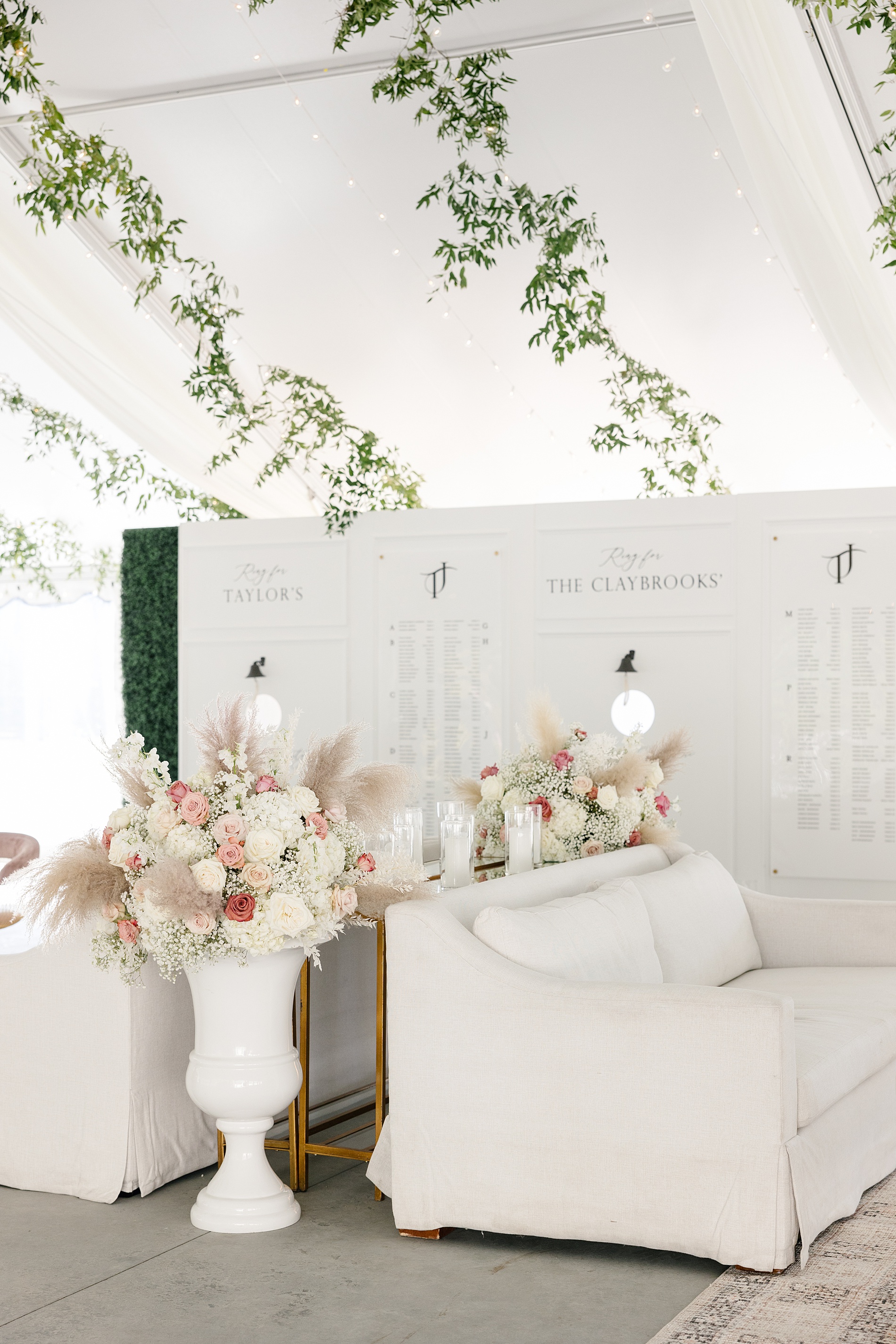
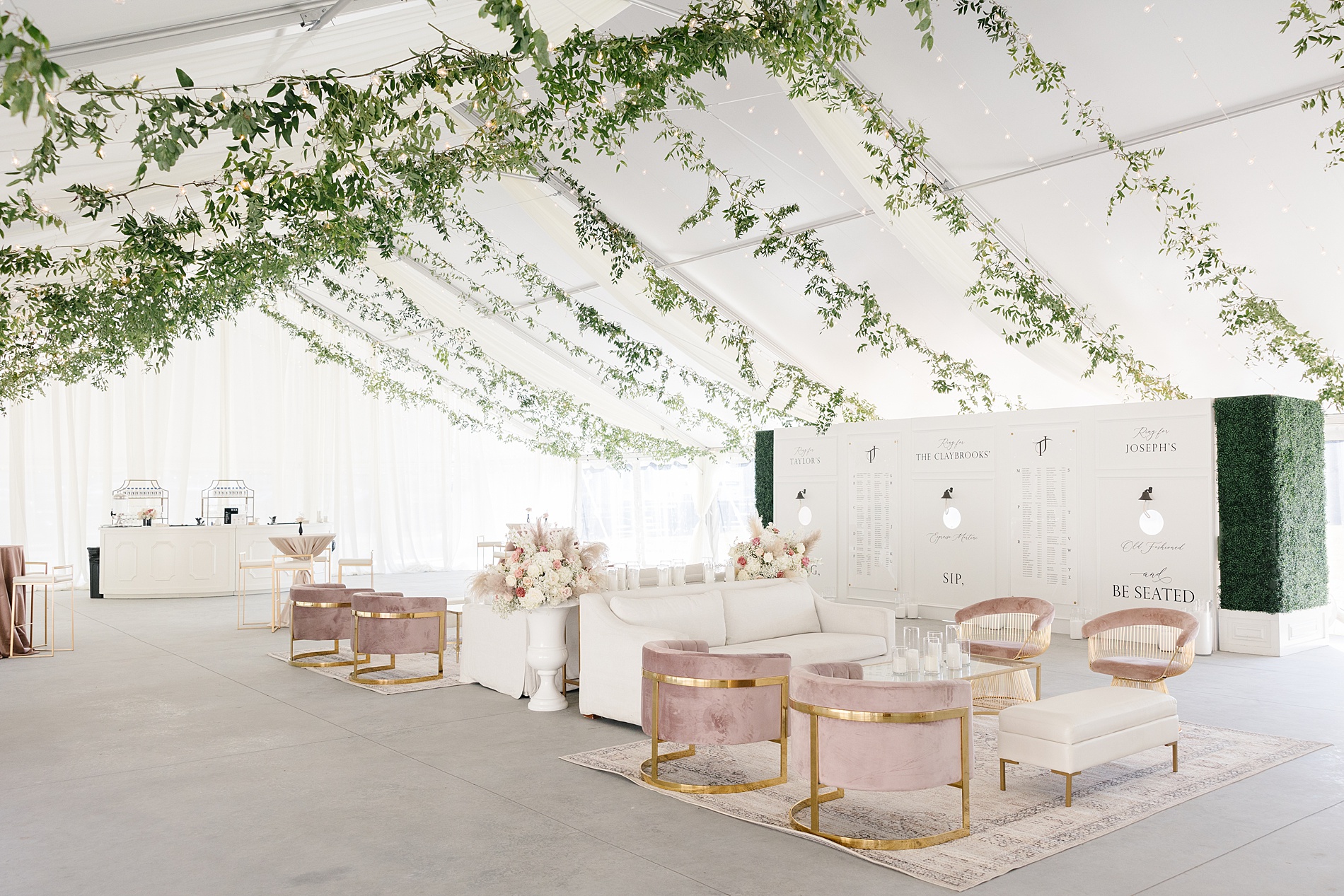
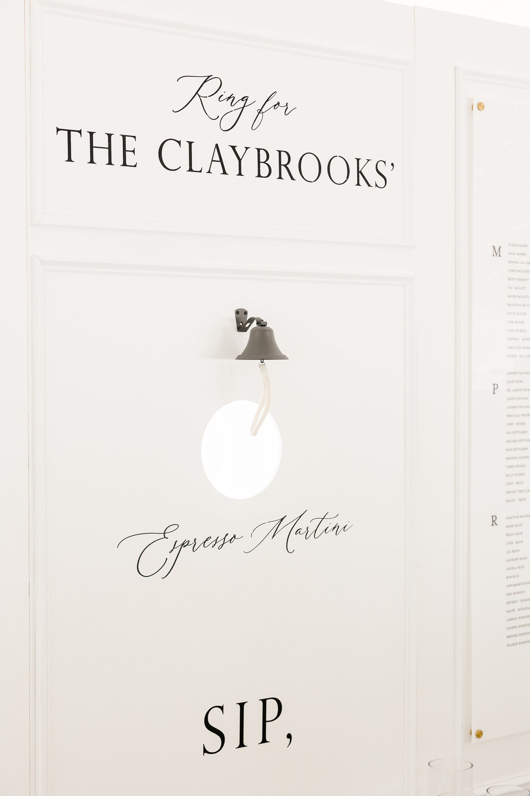
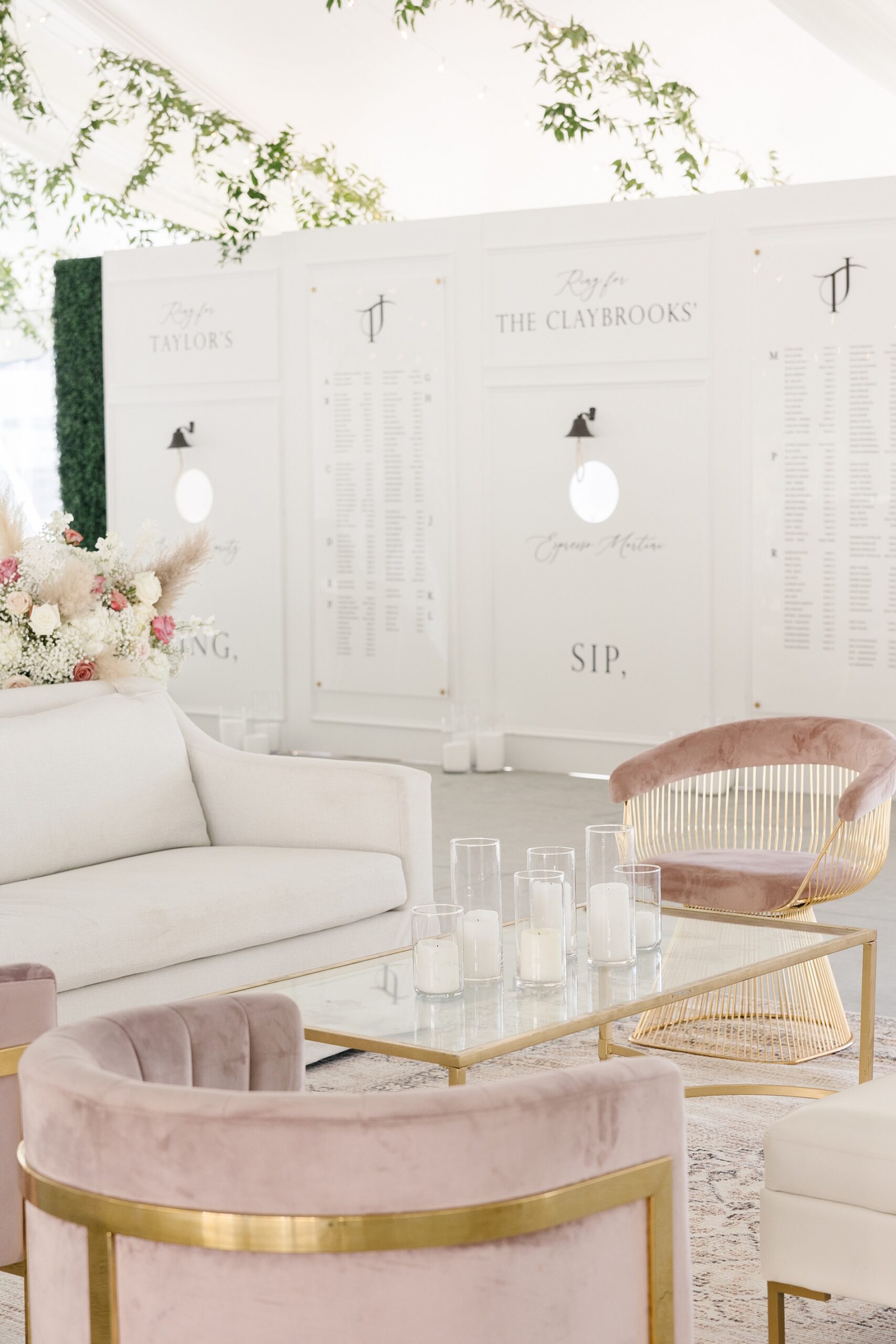
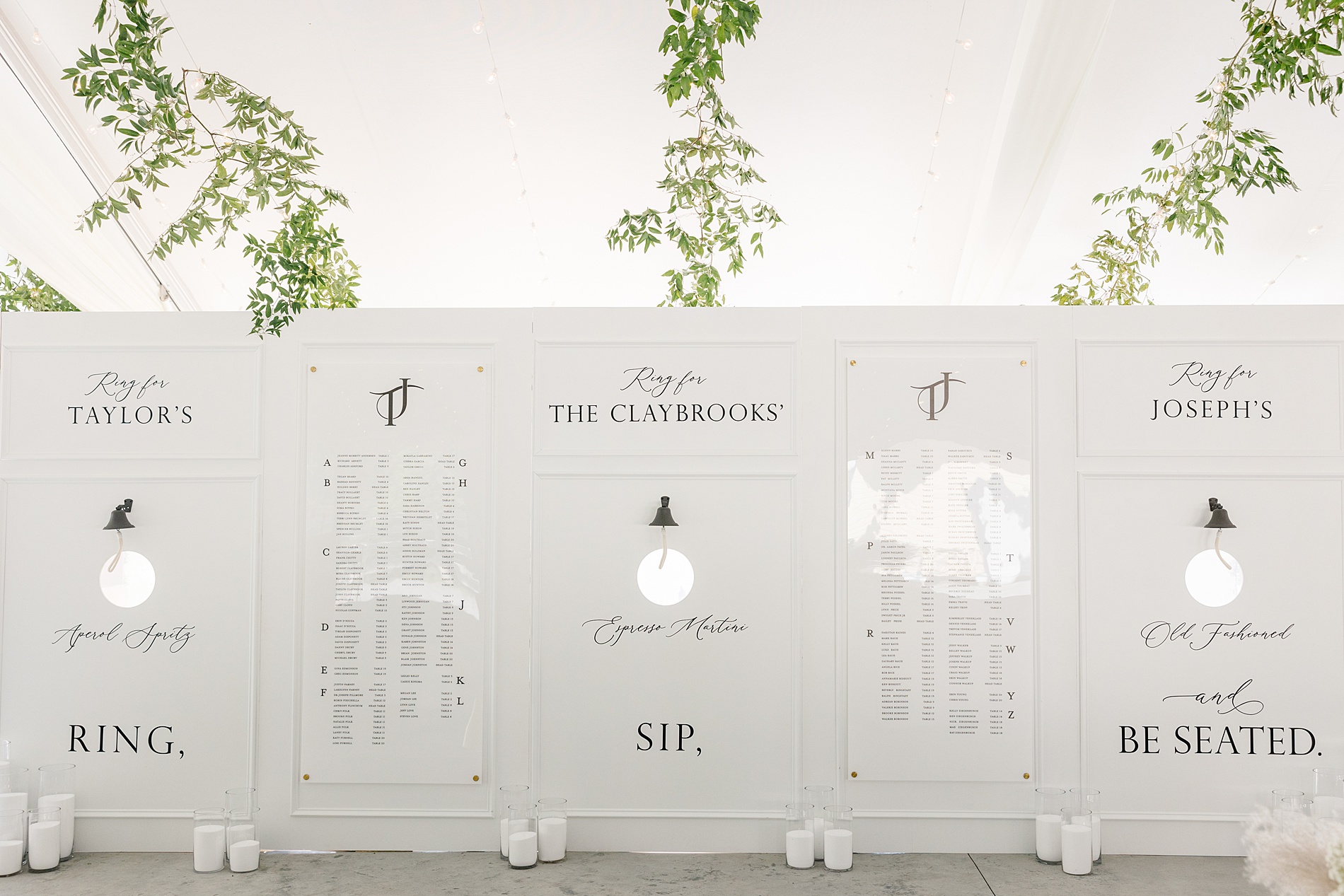
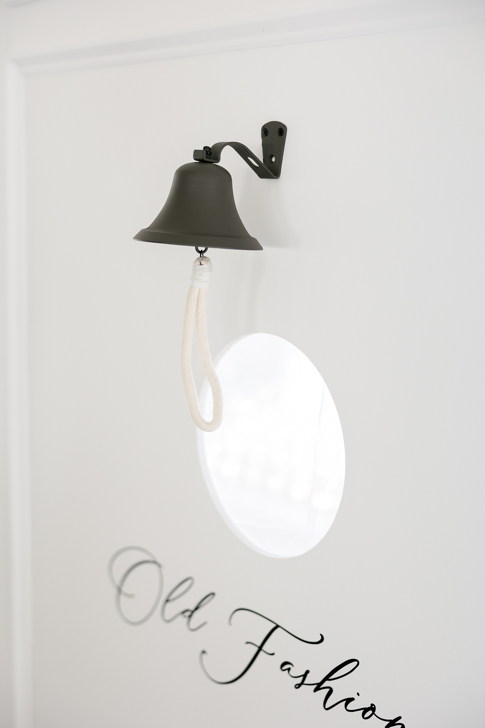
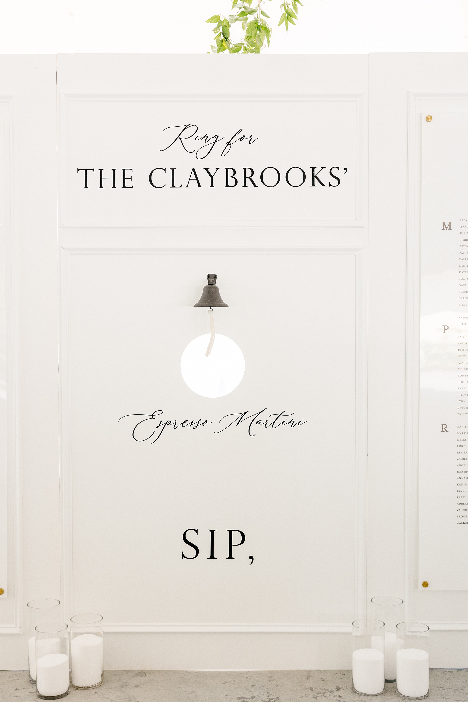
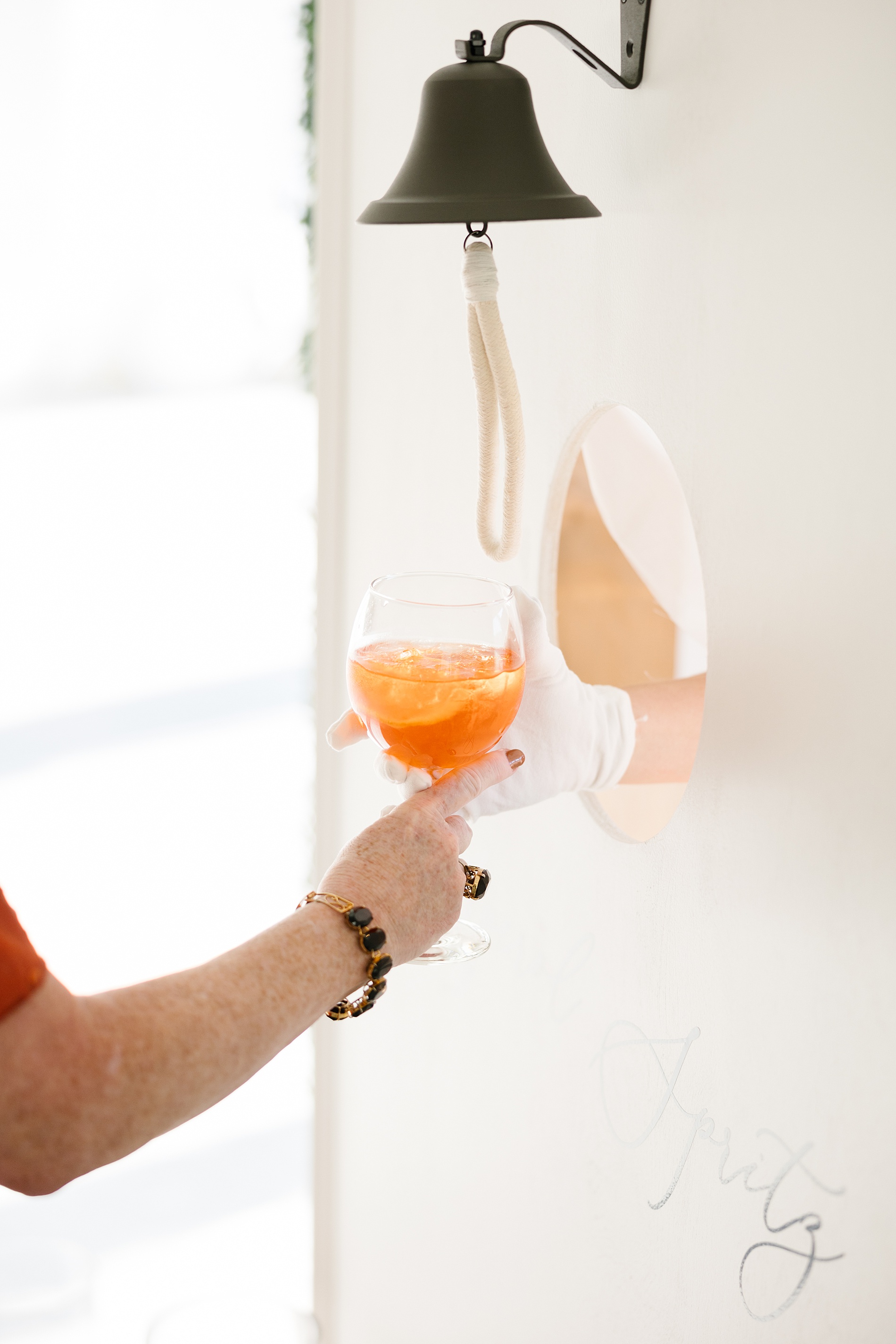
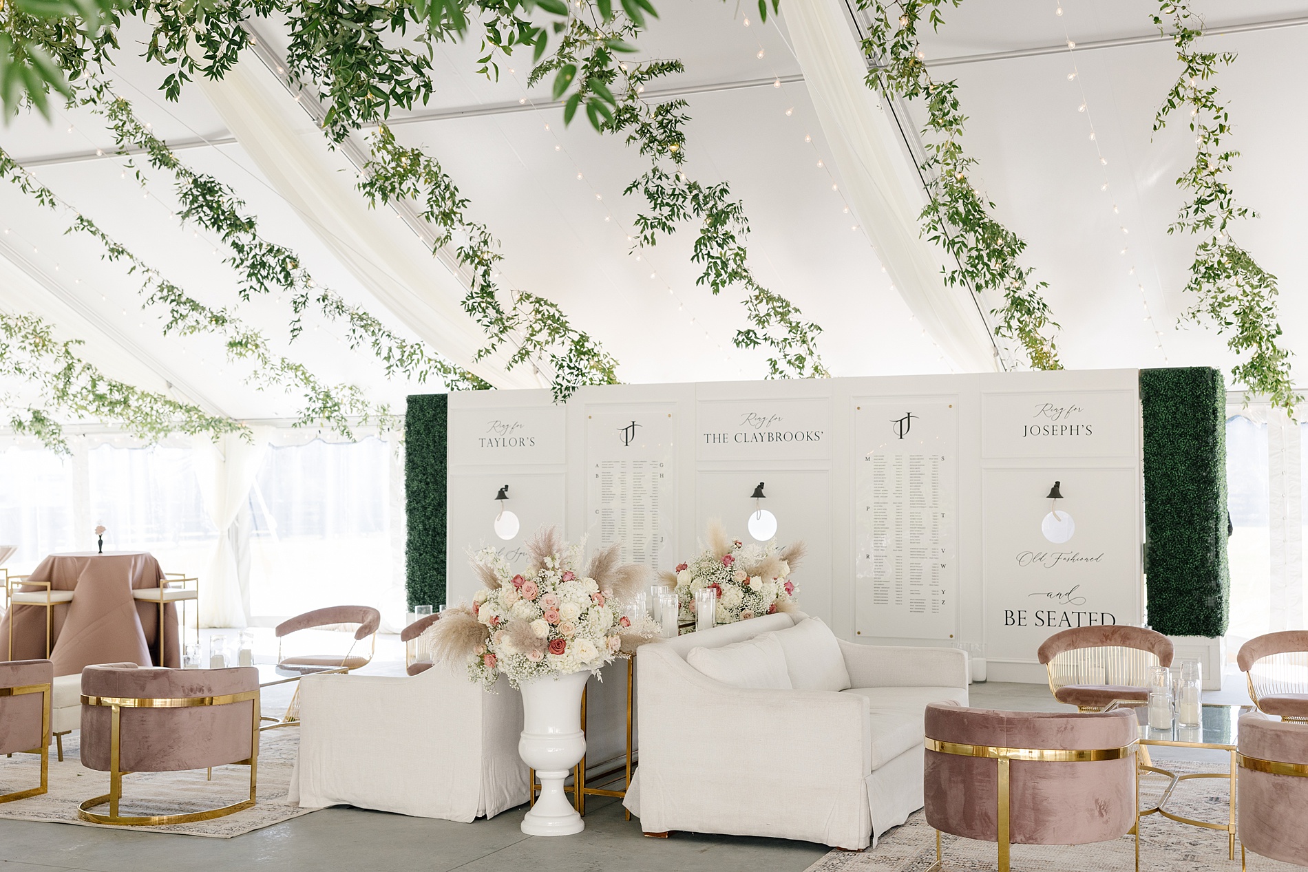
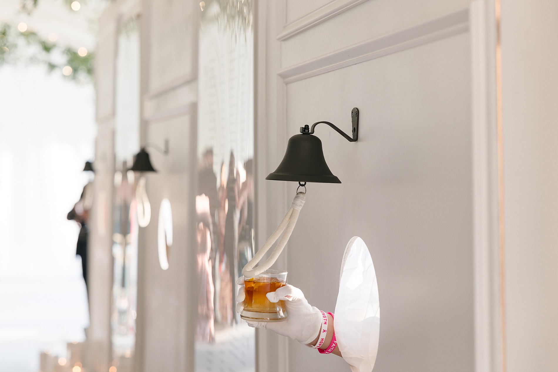
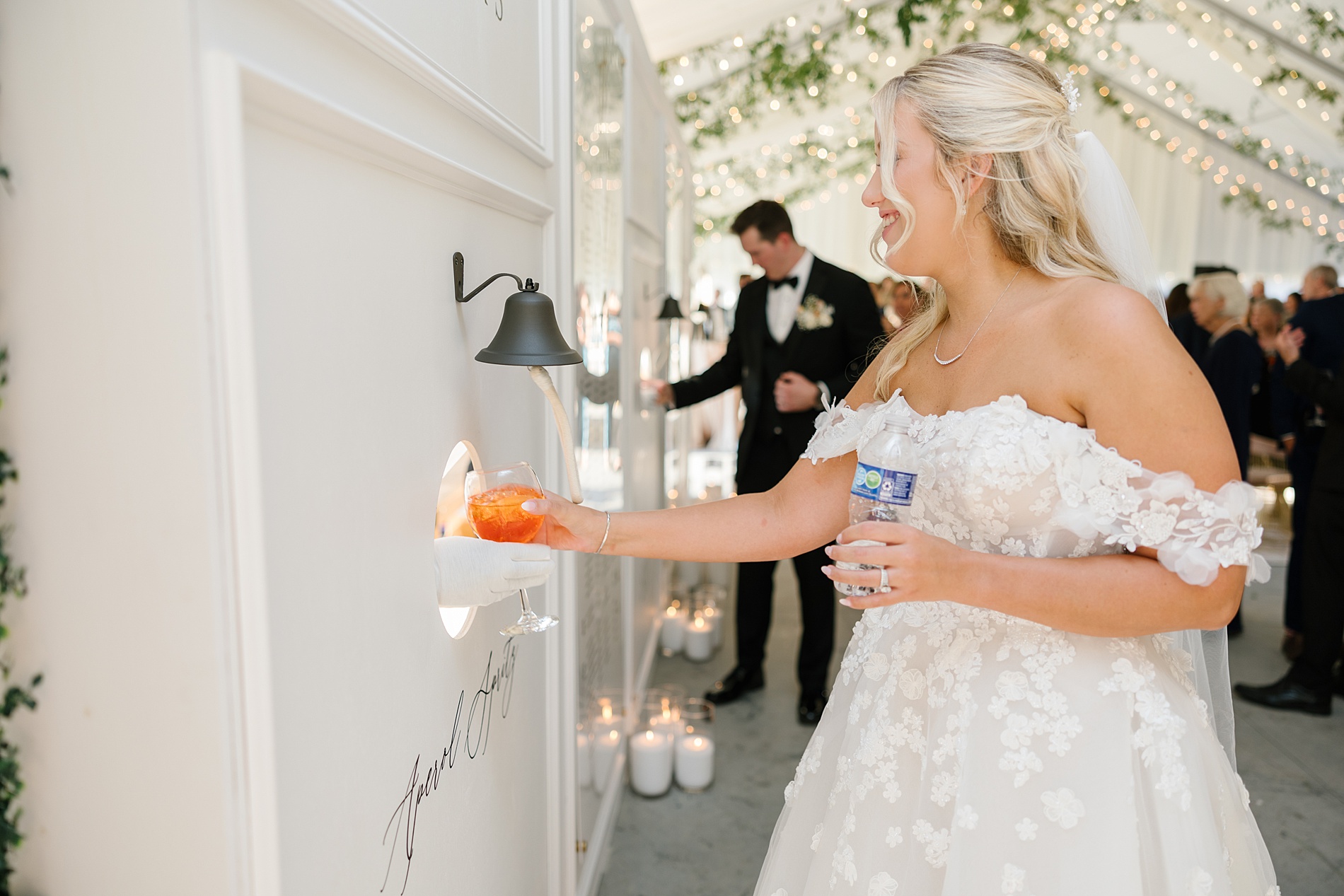
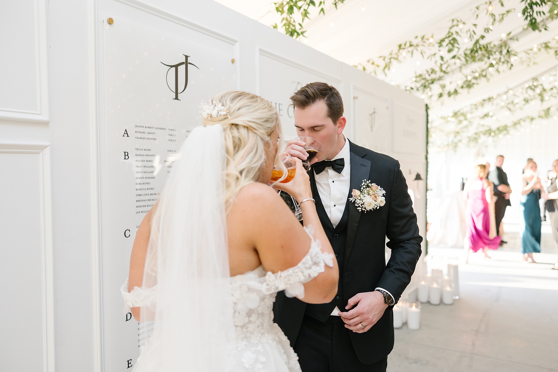
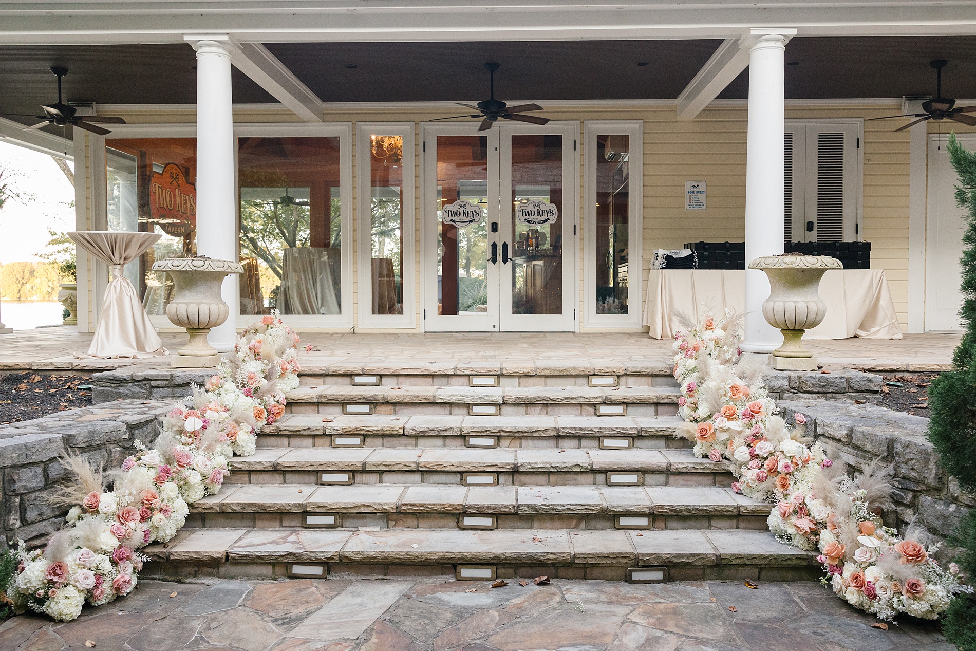
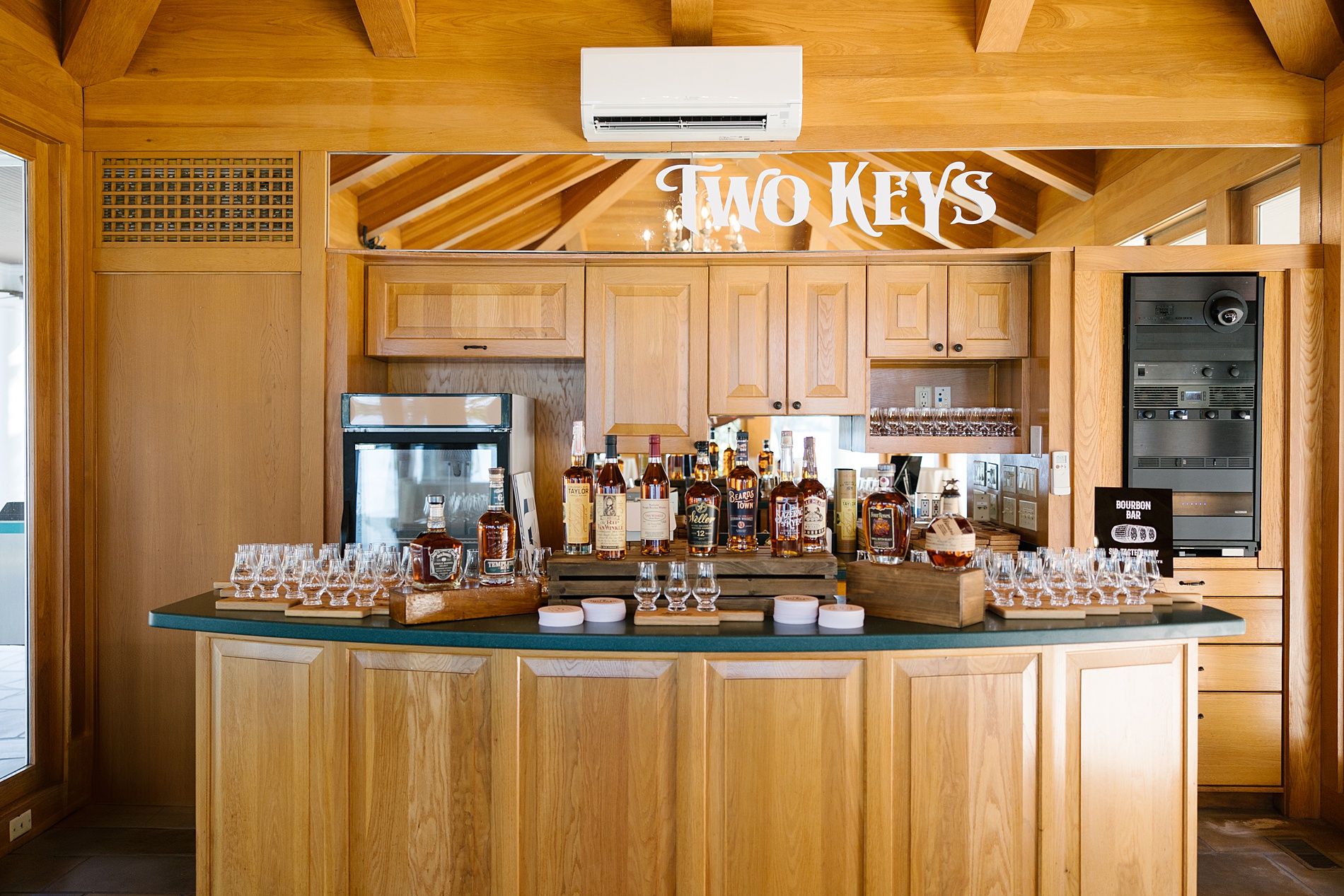
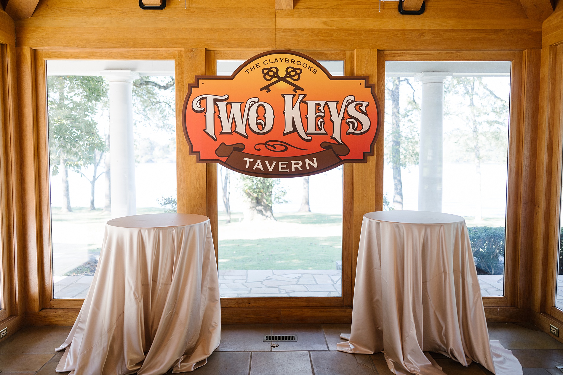
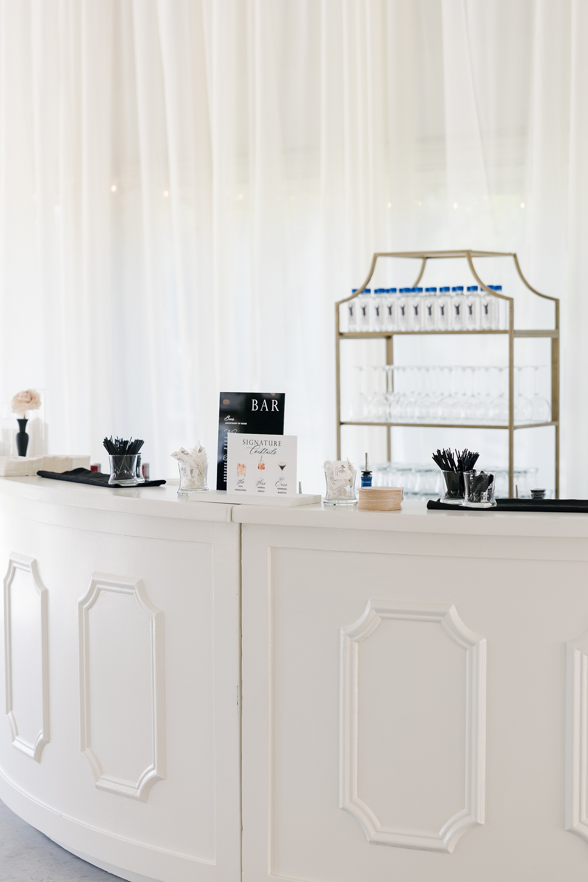
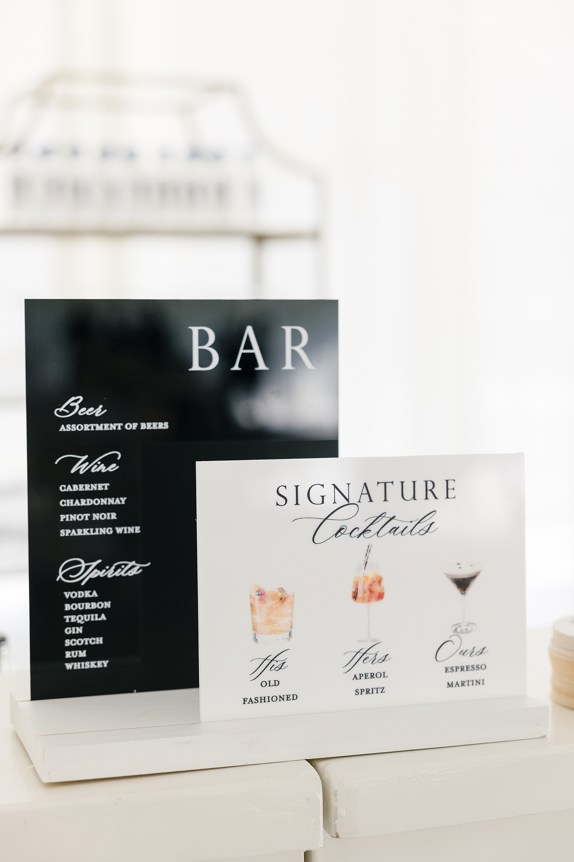
Our favorite feature of the day? A 20-foot cocktail pass-through wall, which is our largest installation to date! This statement piece displayed the seating chart alongside three signature cocktail options. Guests would ring a bell, and a white-gloved bartender on the other side would pass their drink through the wall. It was interactive, elegant, and such a highlight of the evening (a little birdie, aka the MOB, told us it was a MAJOR guest favorite!)
Day of Details
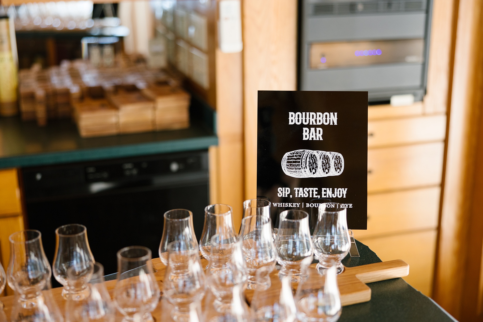
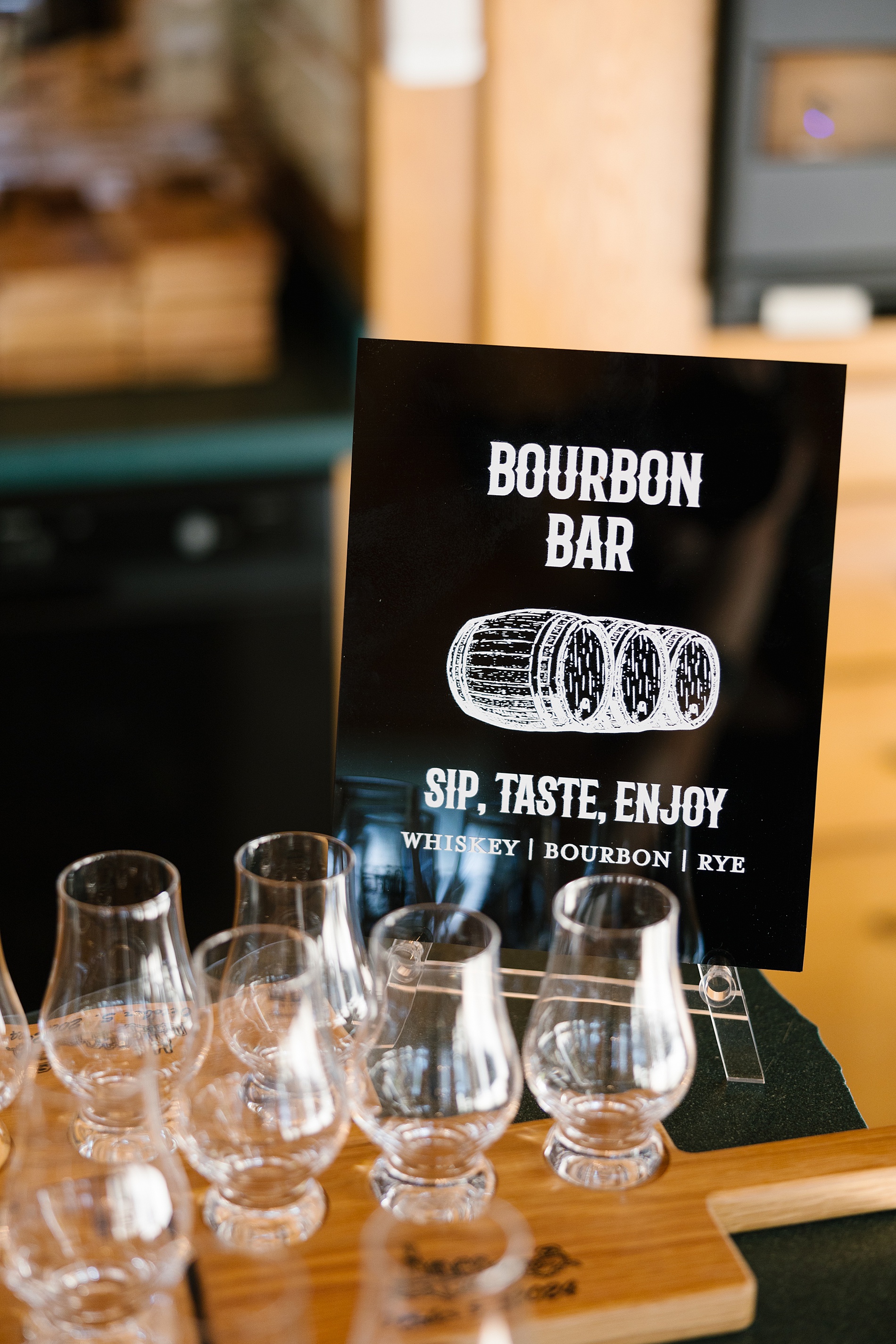
We also had the honor of creating many other day of details that fit flawlessly into their wedding day vision. Guests were greeted by a sleek, black acrylic welcome sign with white calligraphy. It looked so good surrounded by candle light reflecting off the glass. The bar signage and the black acrylic bourbon bar sign were two other reception details we had our hand in creating!
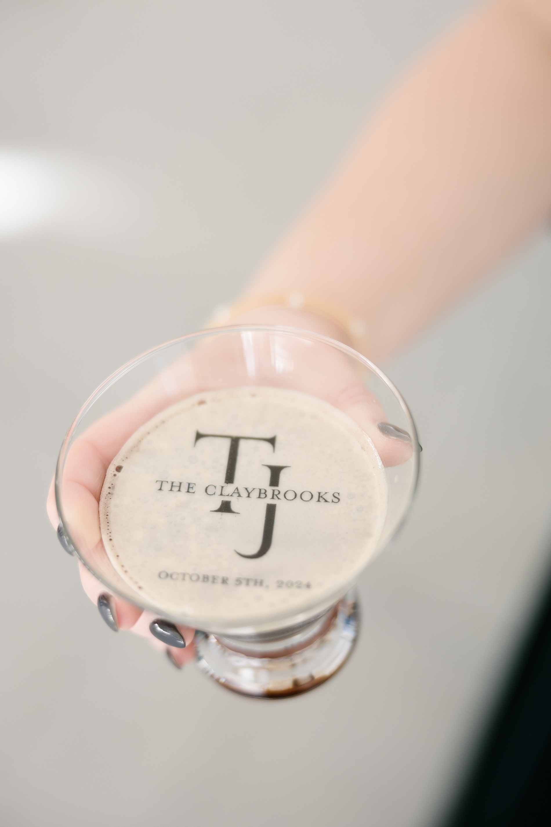
The details didn’t stop there though! Custom foam drink toppers for the espresso martinis (yes, the details even made it to the cocktails!) included their monogram with their last name and wedding date!
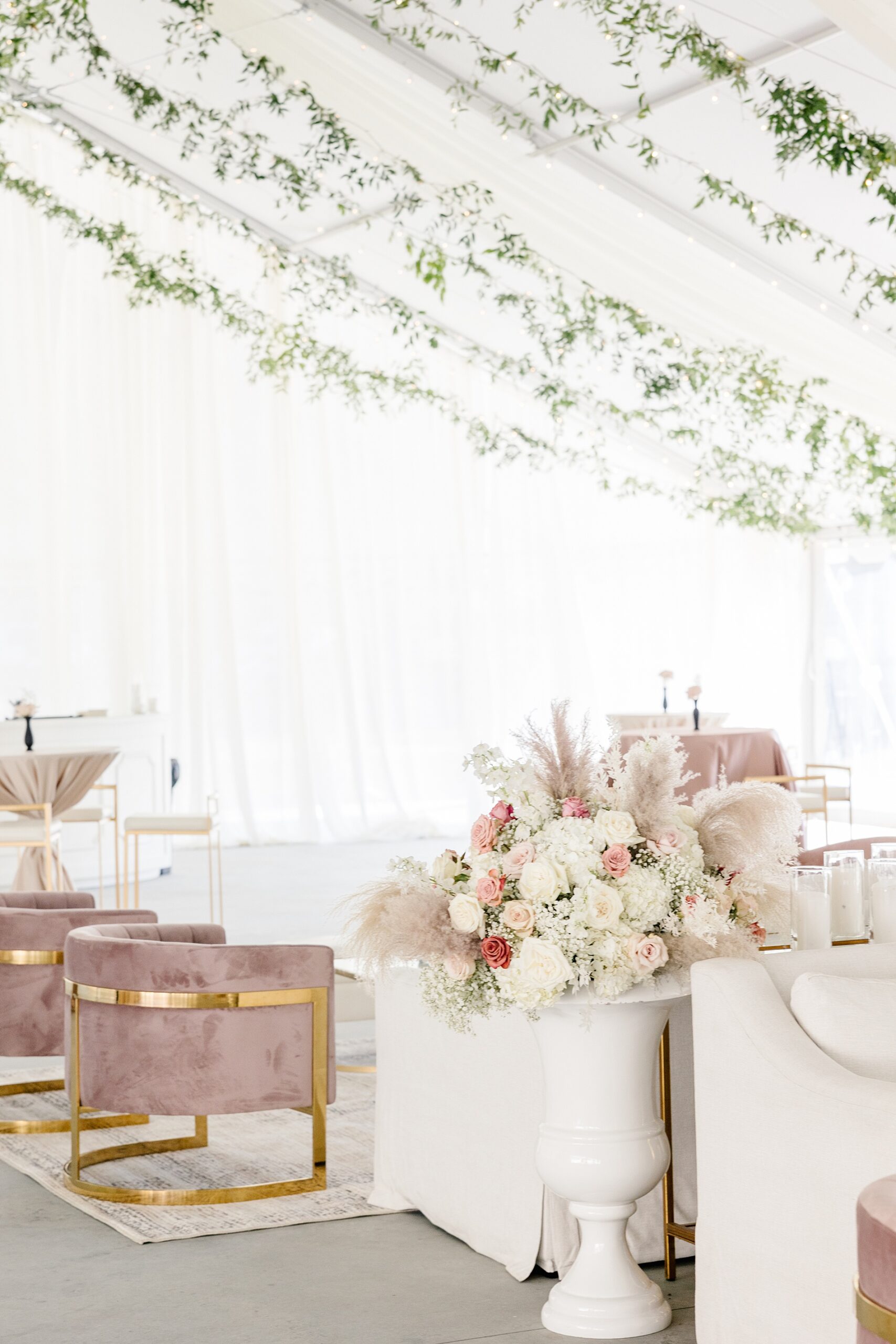
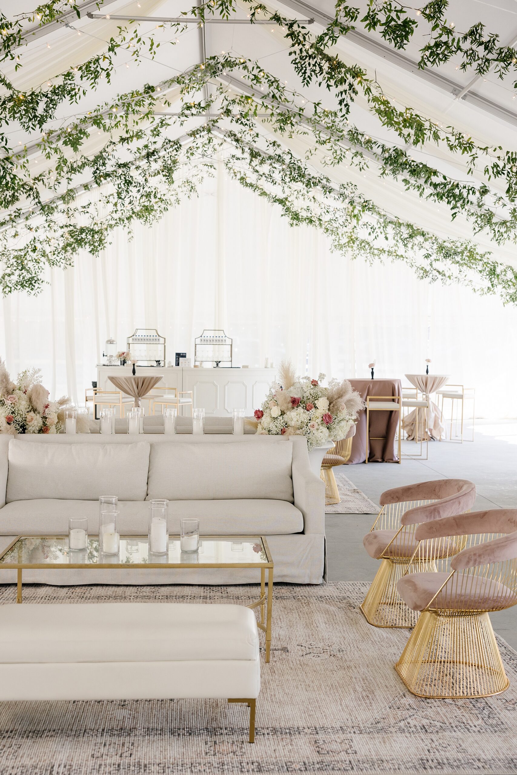
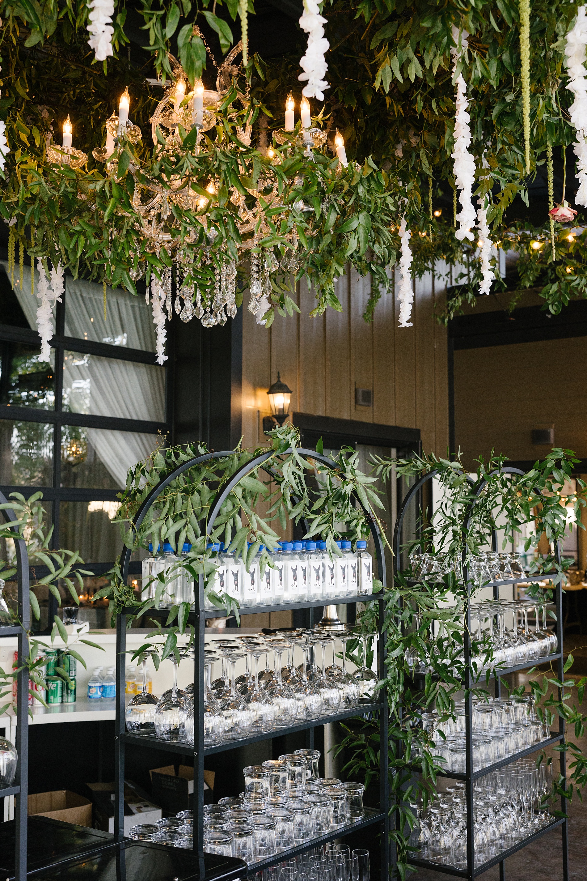
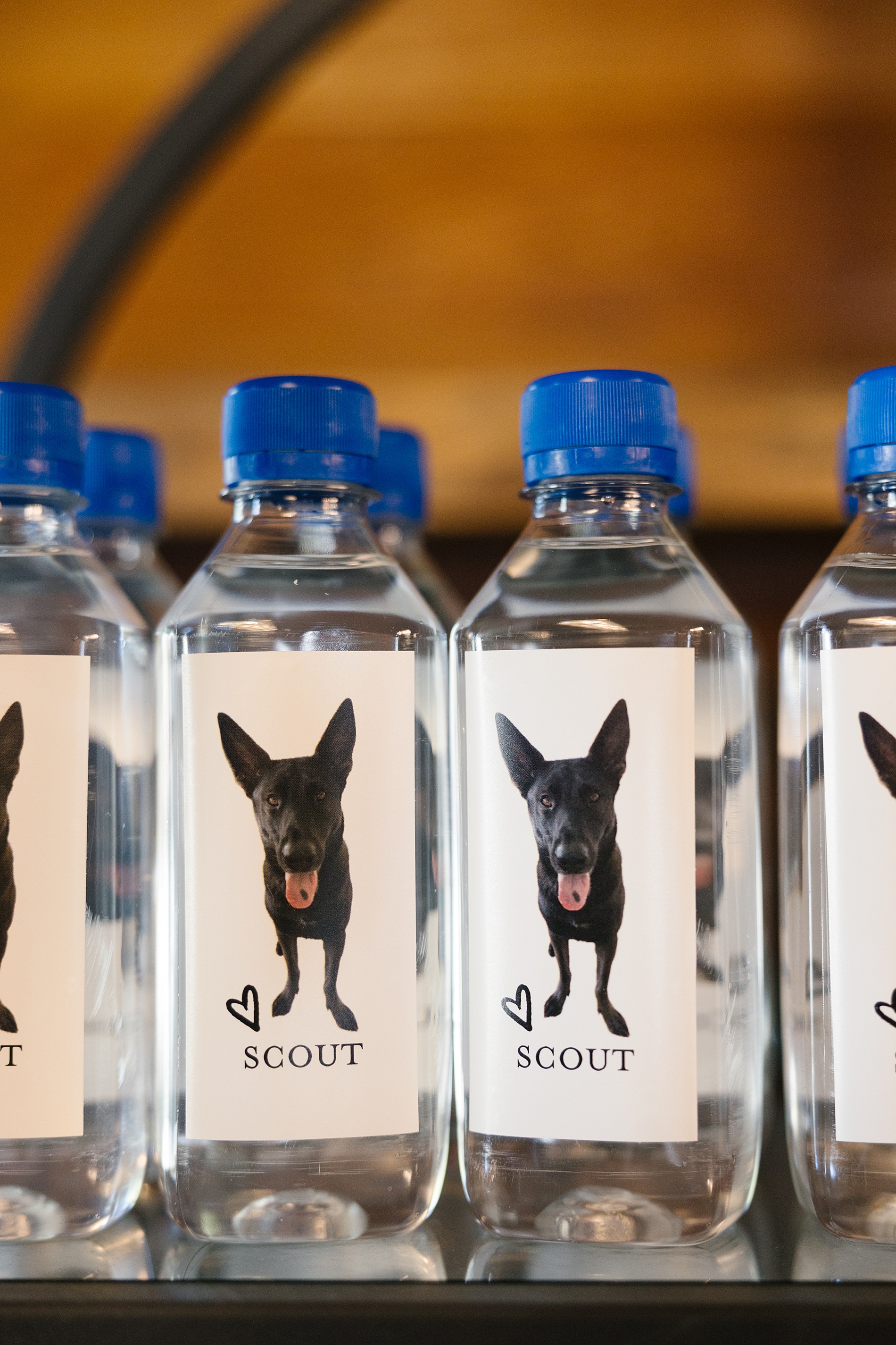
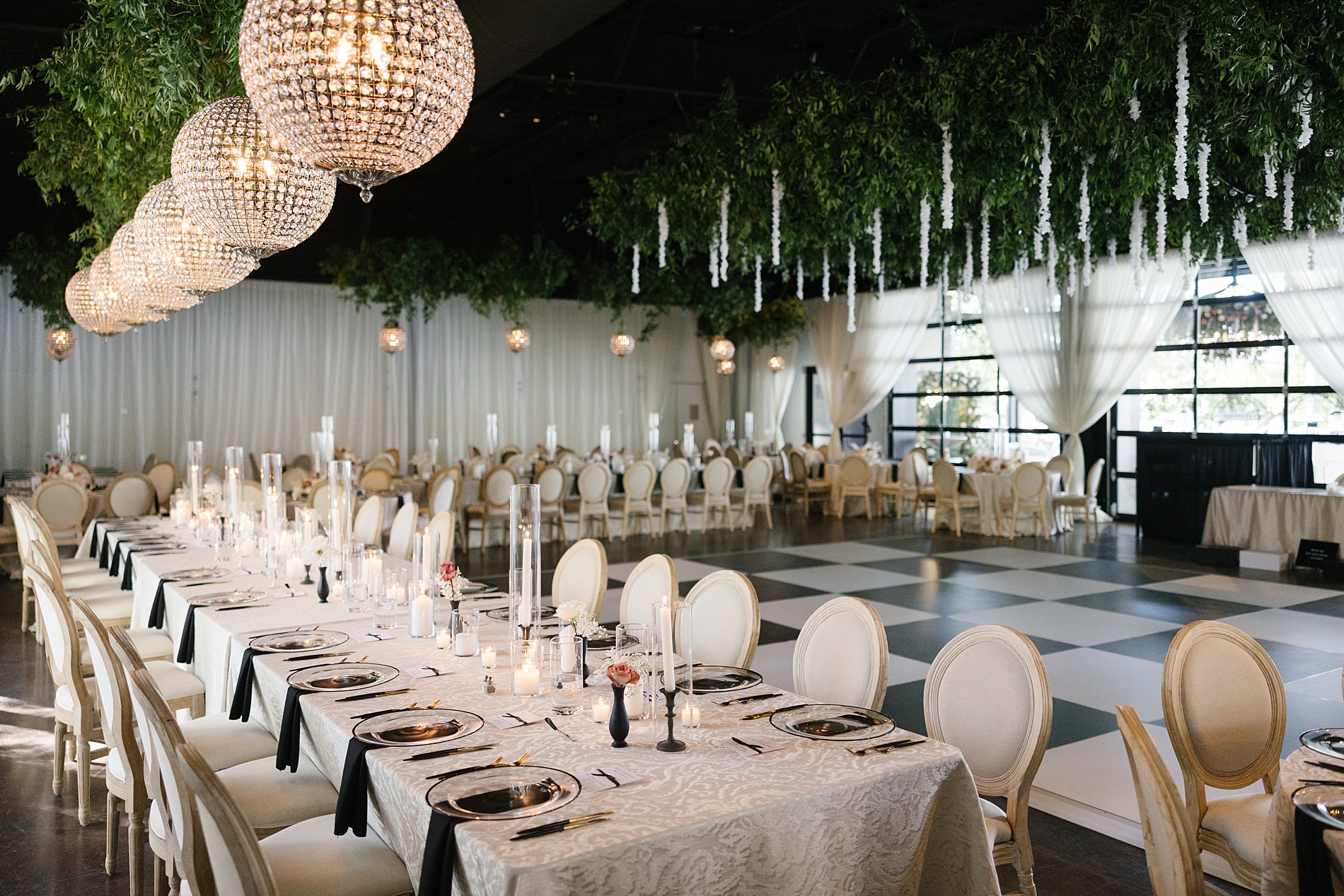
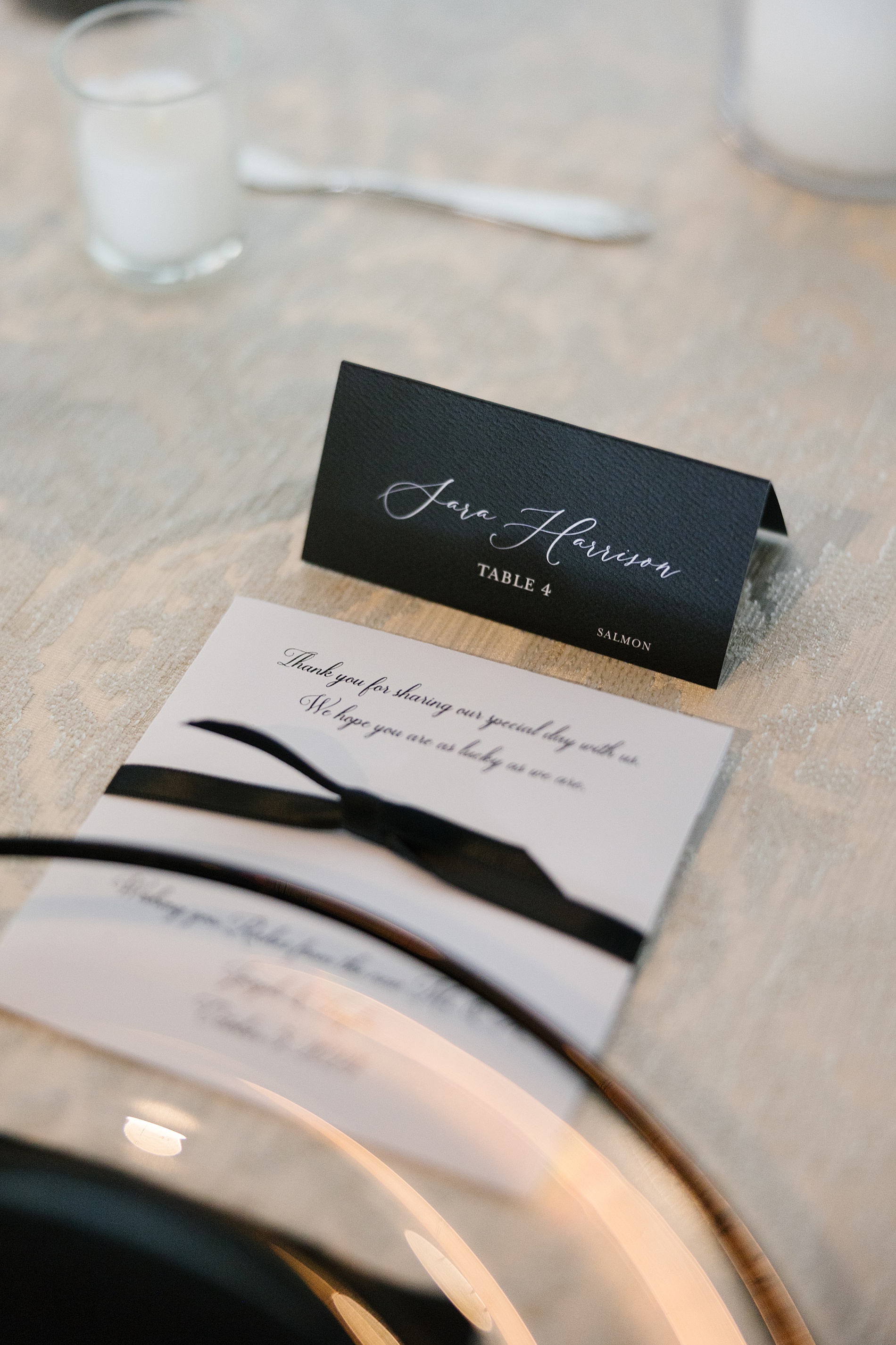
Guests could also grab a refreshing bottle of Fiji water that featured a custom sketch of their beloved dog, Scout, on the label. I love weaving fun and personal details into a wedding day in unique ways. The reception space was stunning with spherical chandeliers and greenery draped from the ceiling. At each table setting there were classic, black place cards in white calligraphy that corresponded with the grand seating chart.
Every single touchpoint of The Claybrooks’ wedding weekend, from the save the dates to the cocktail wall and seating chart, was designed with intention. We were thrilled to help Kelly and her family bring it to life. It’s weddings like this that remind us why we love what we do.
If you’re looking to add custom, thoughtful touches to your wedding or event, we would love to help make your vision a reality. Reach out today to learn more about our full-service design offerings! We can’t wait to create something unforgettable for you!
If you enjoyed this post, you’ll love these other blogs!
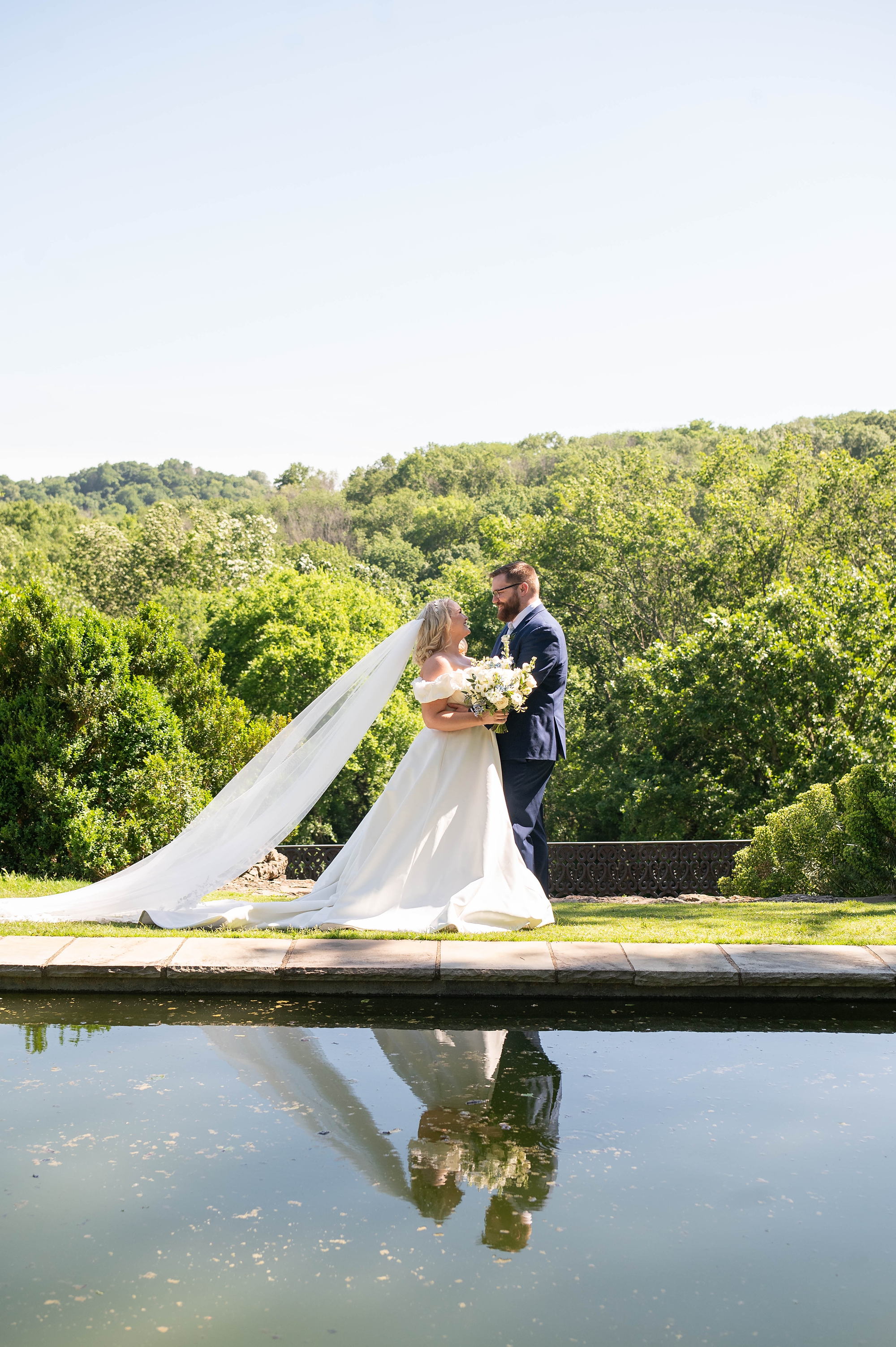
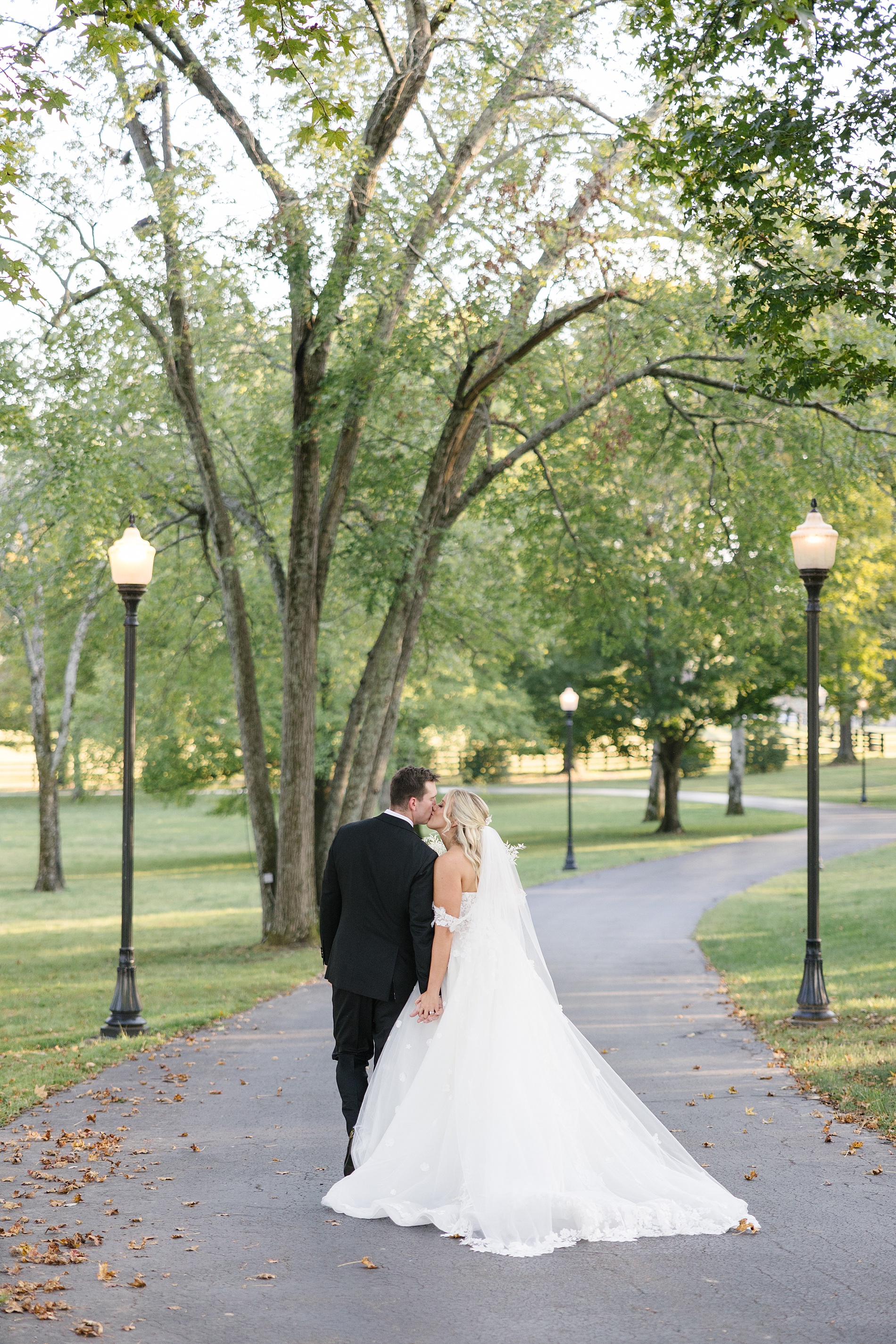
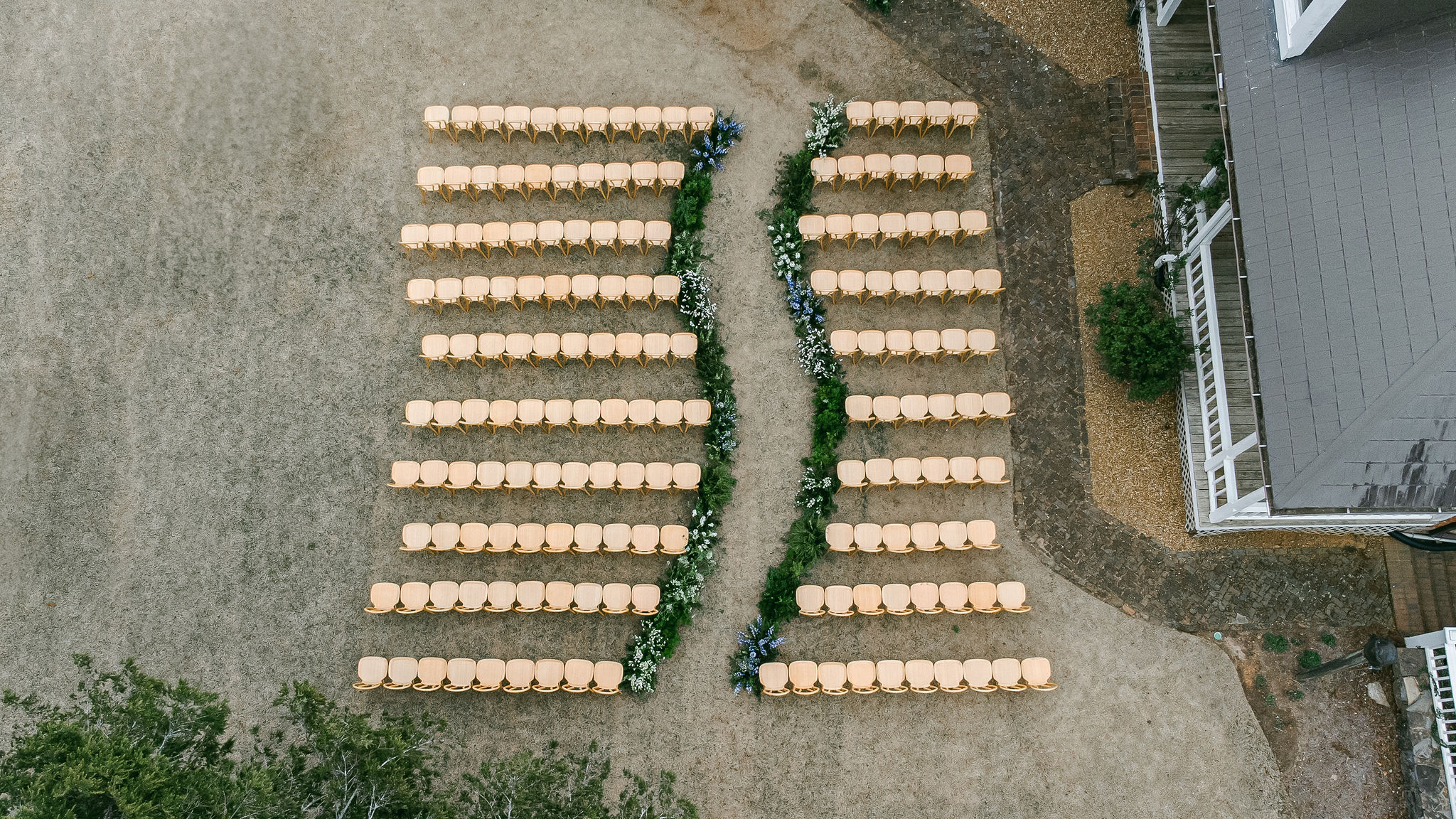
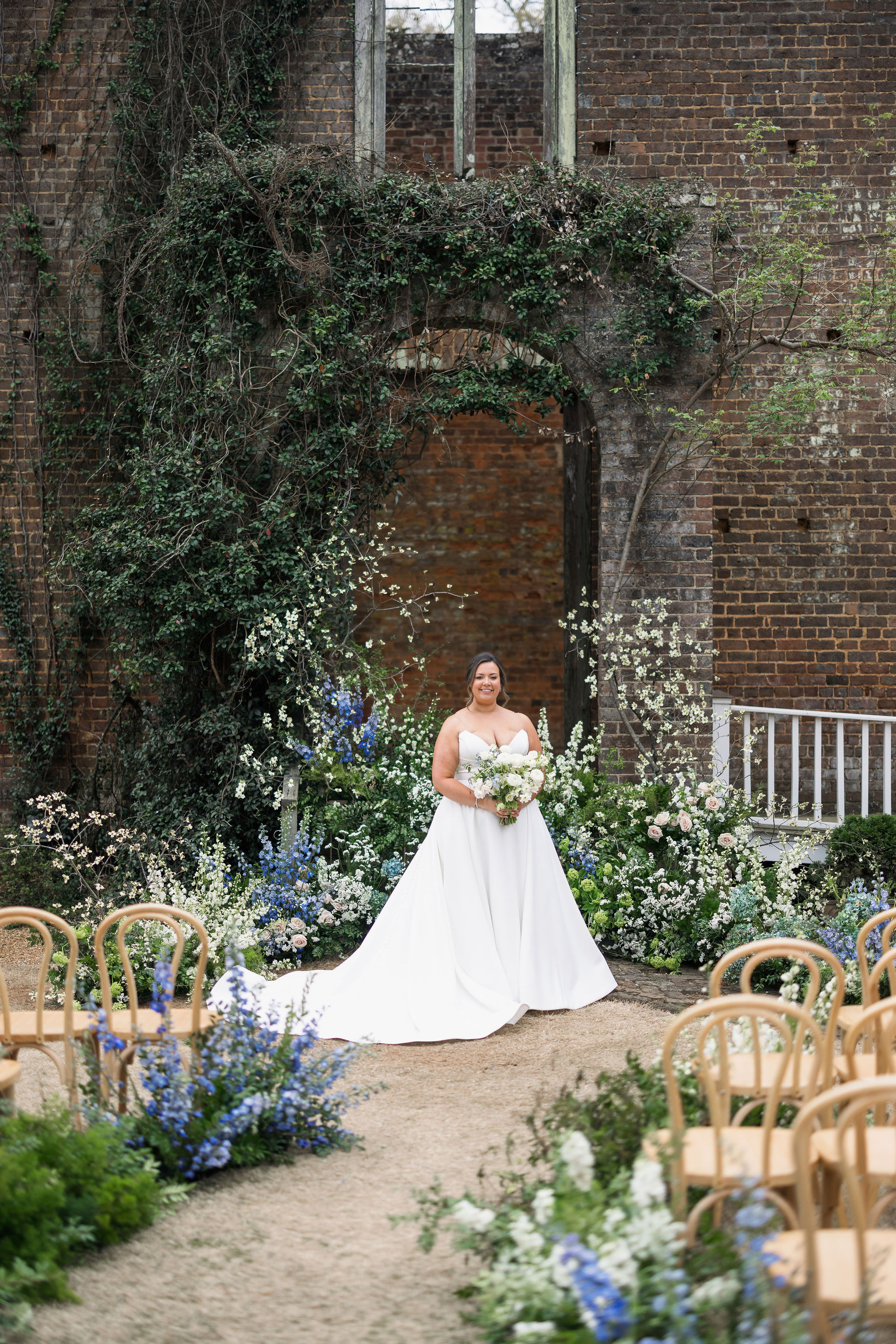
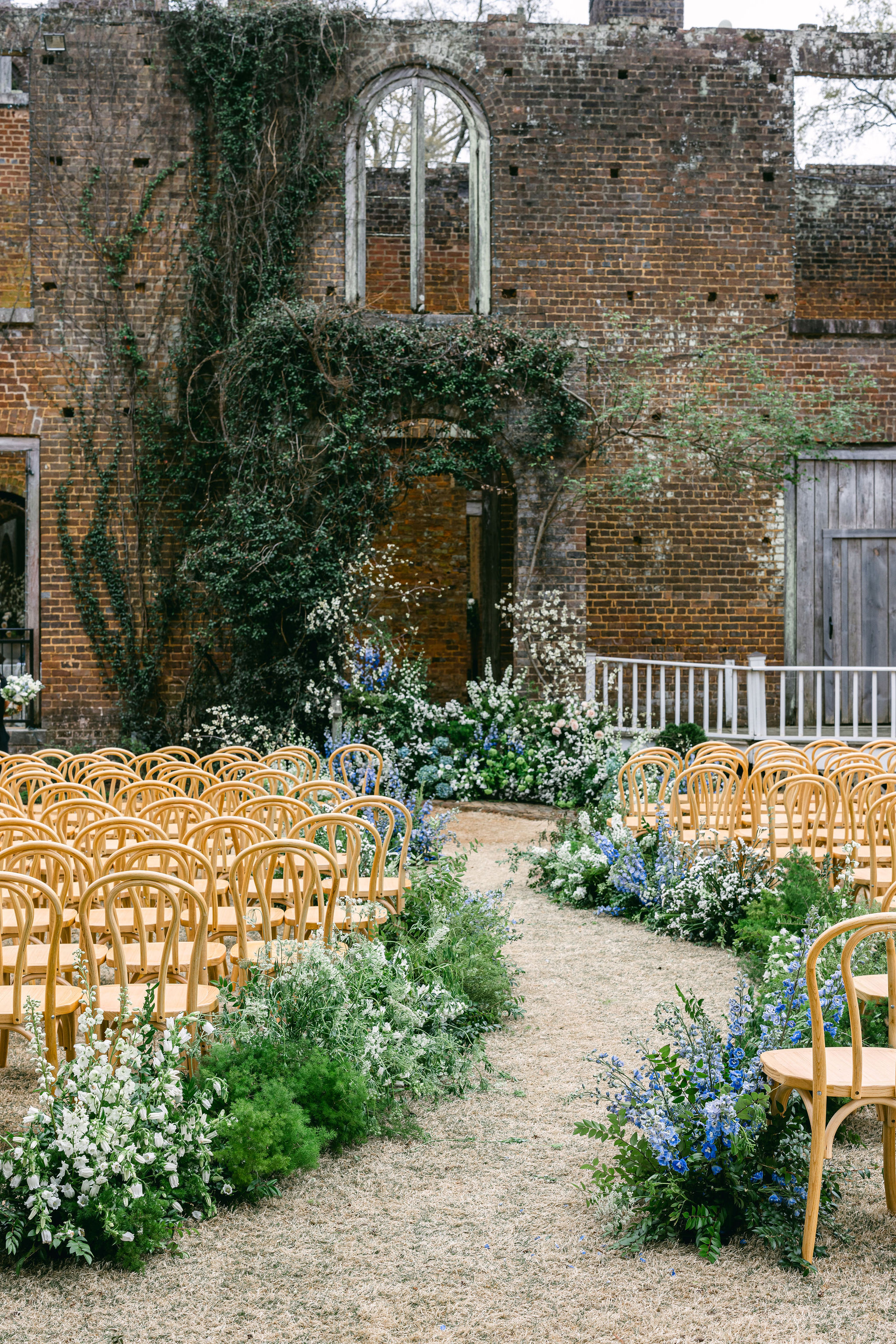
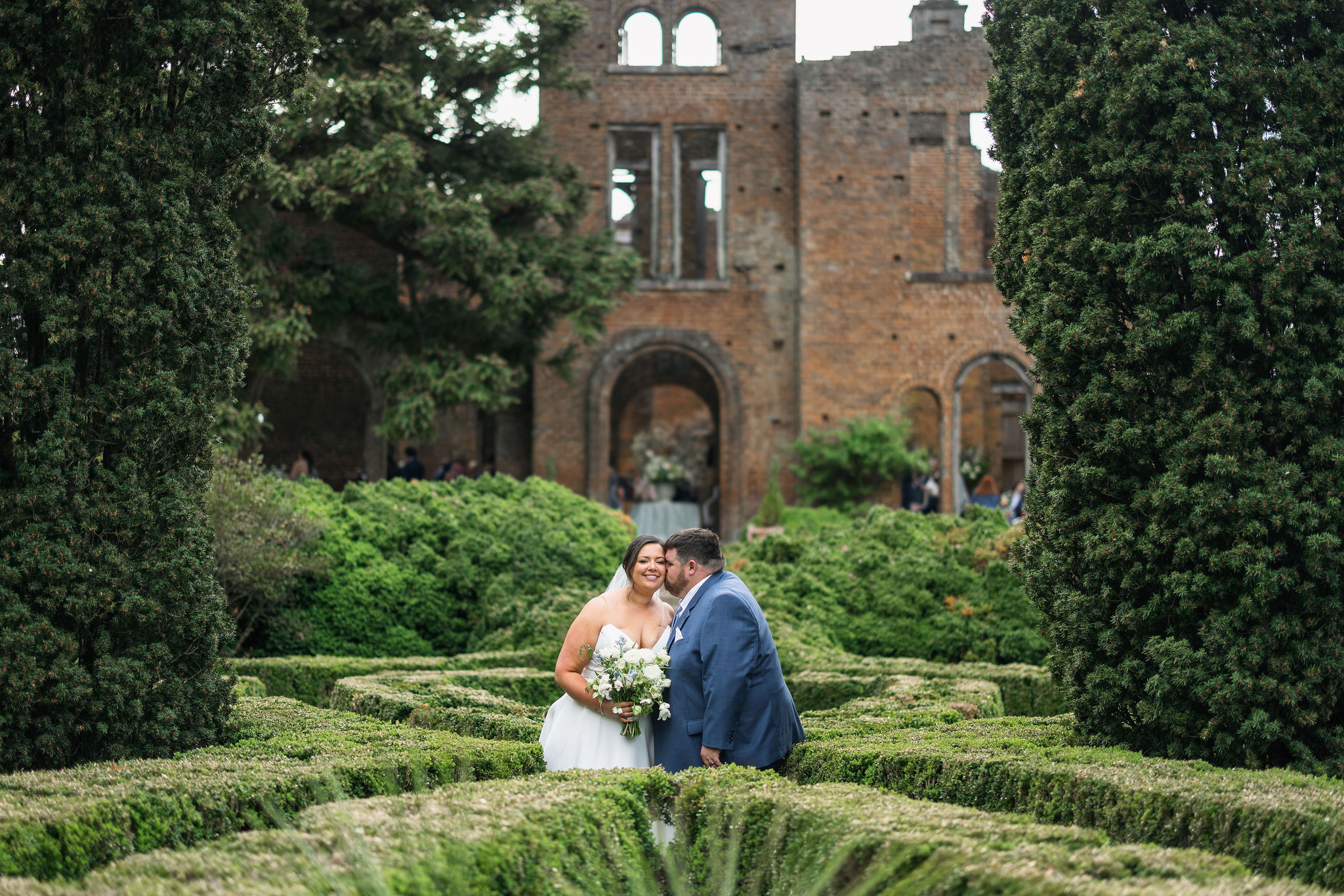
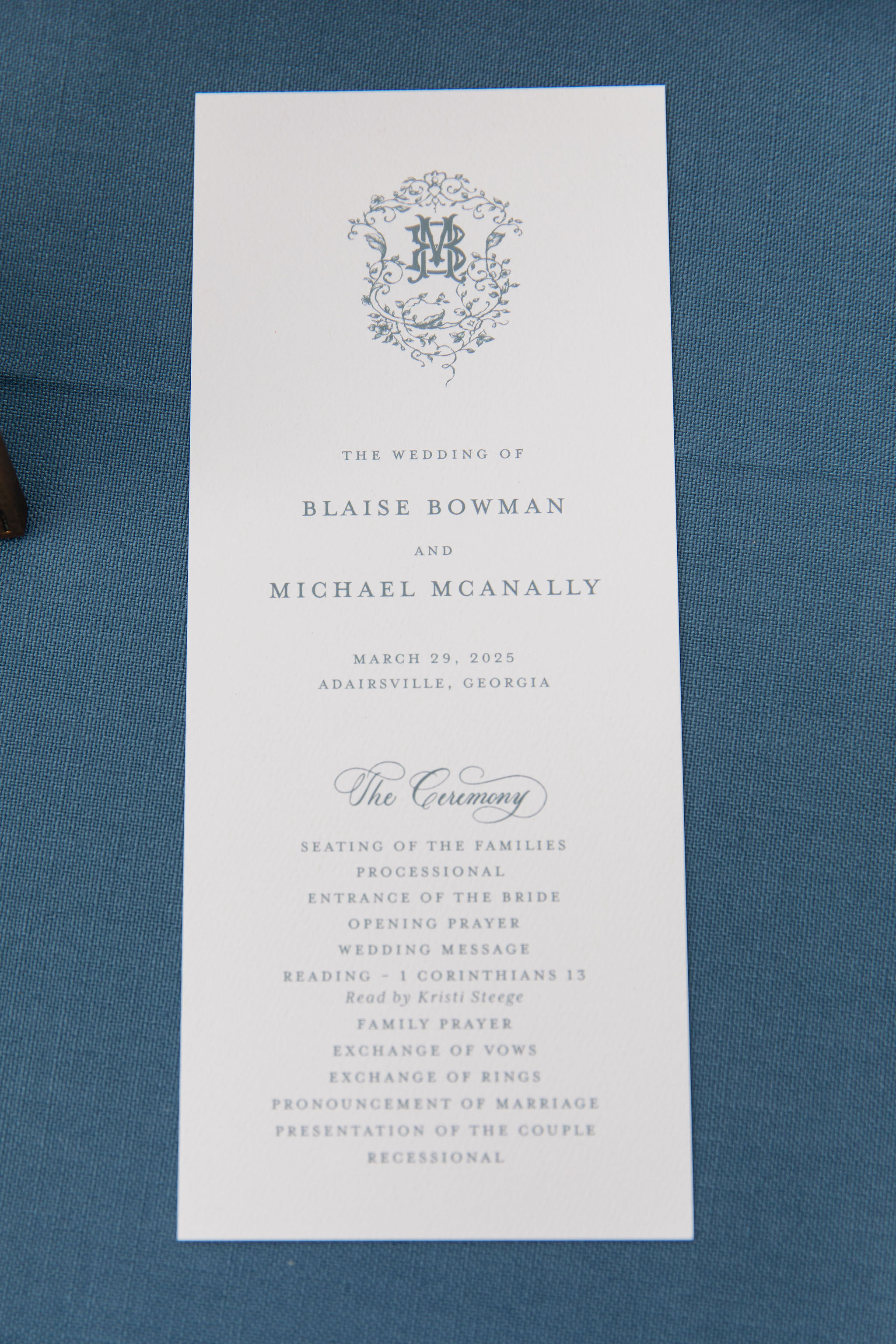
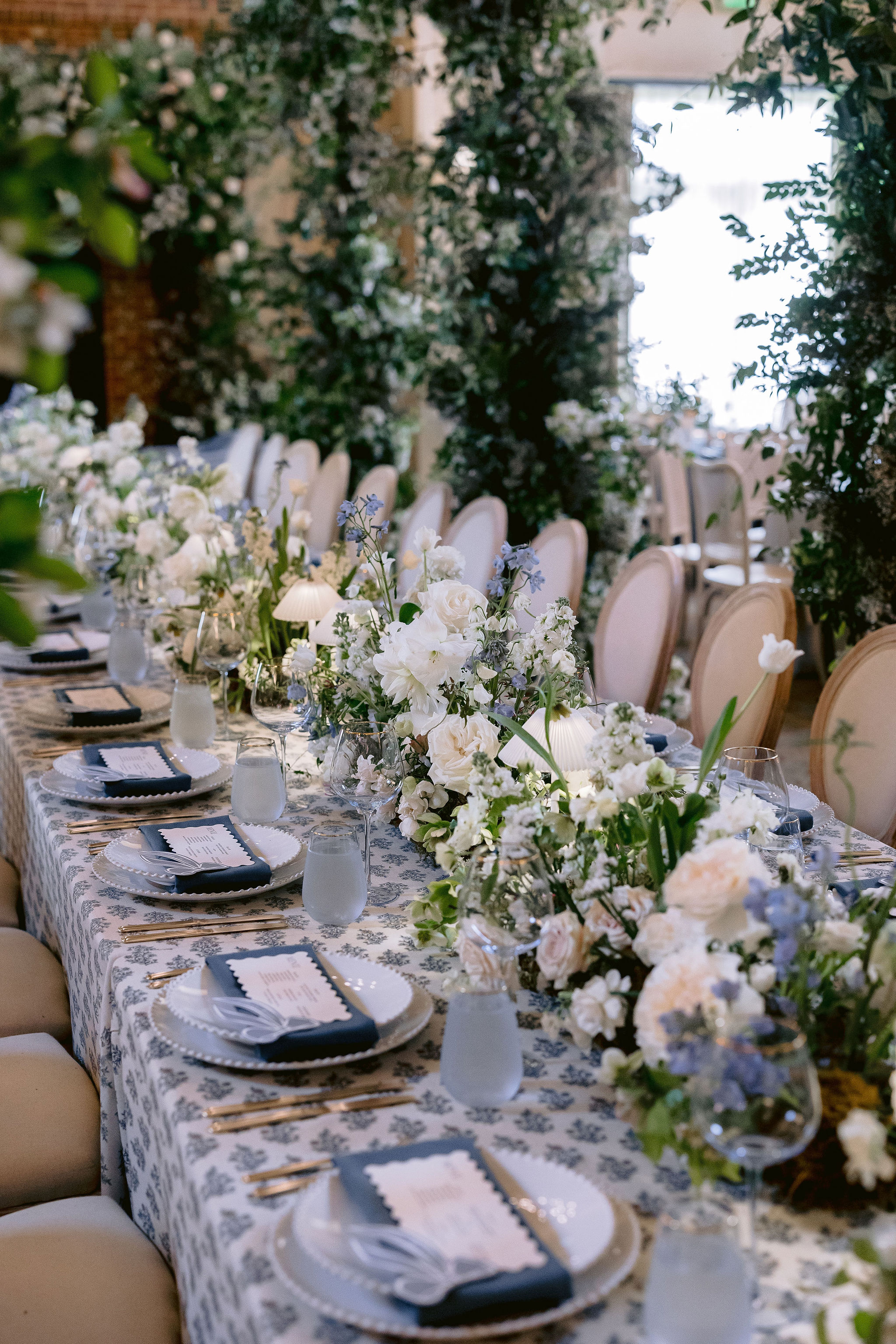
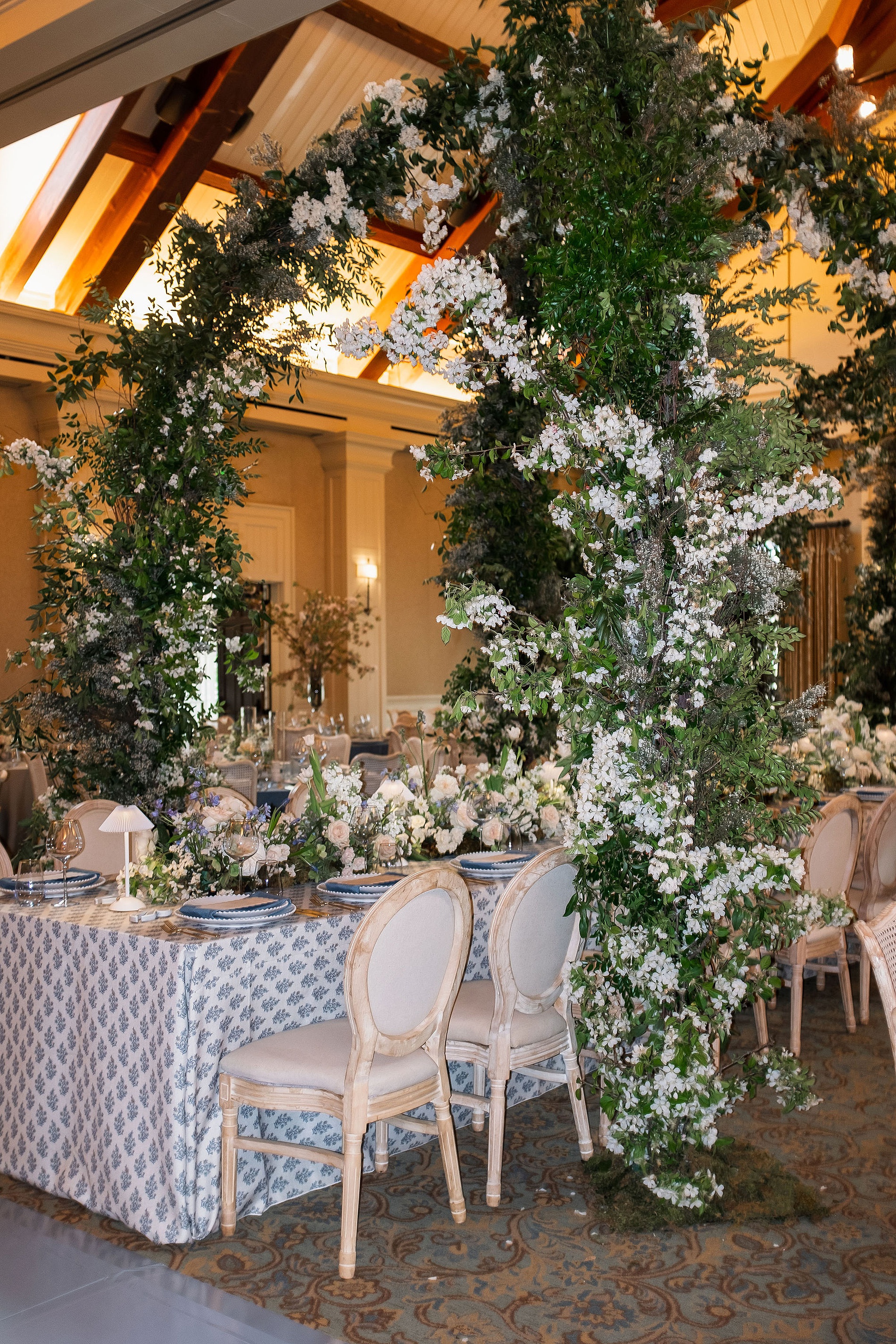
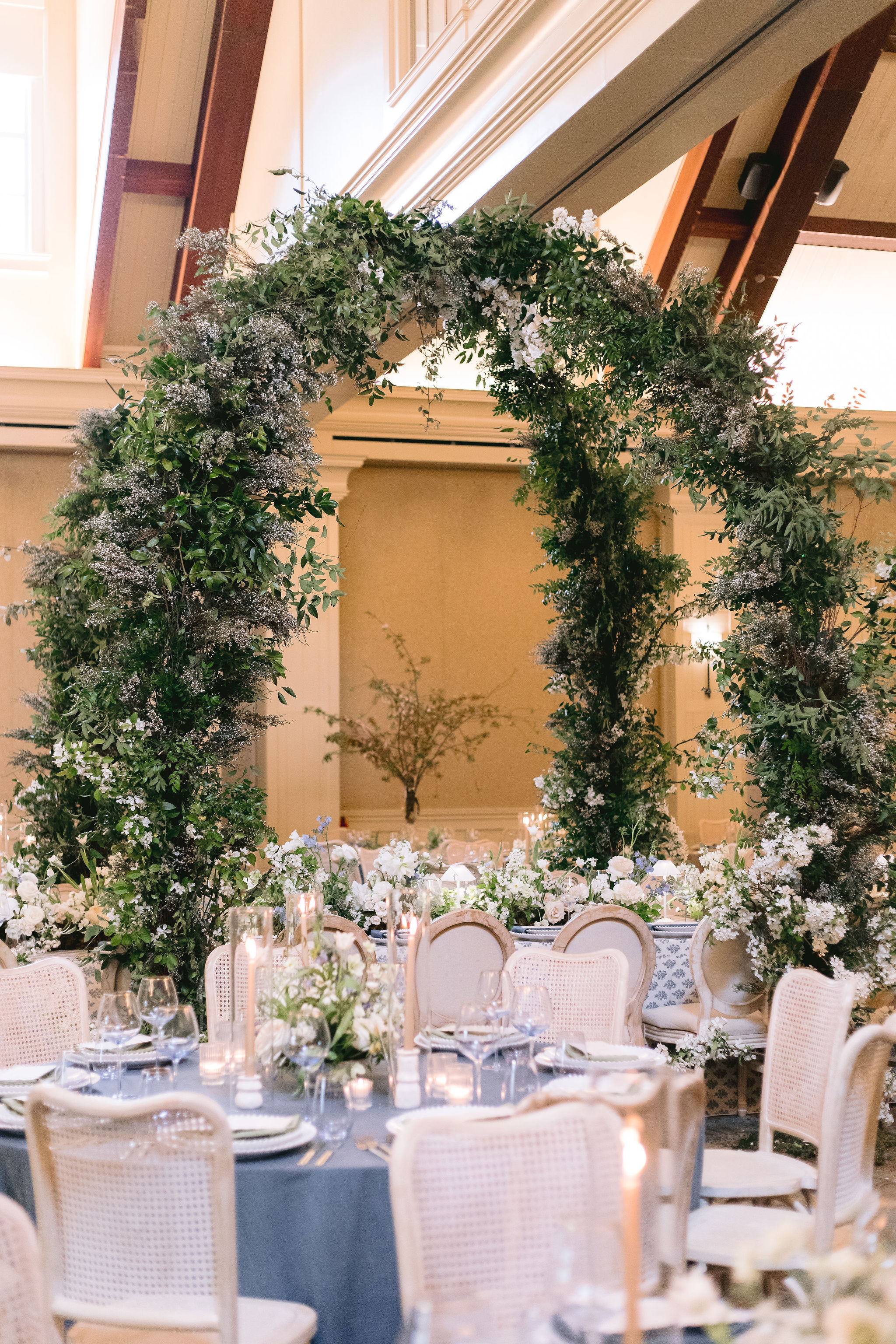
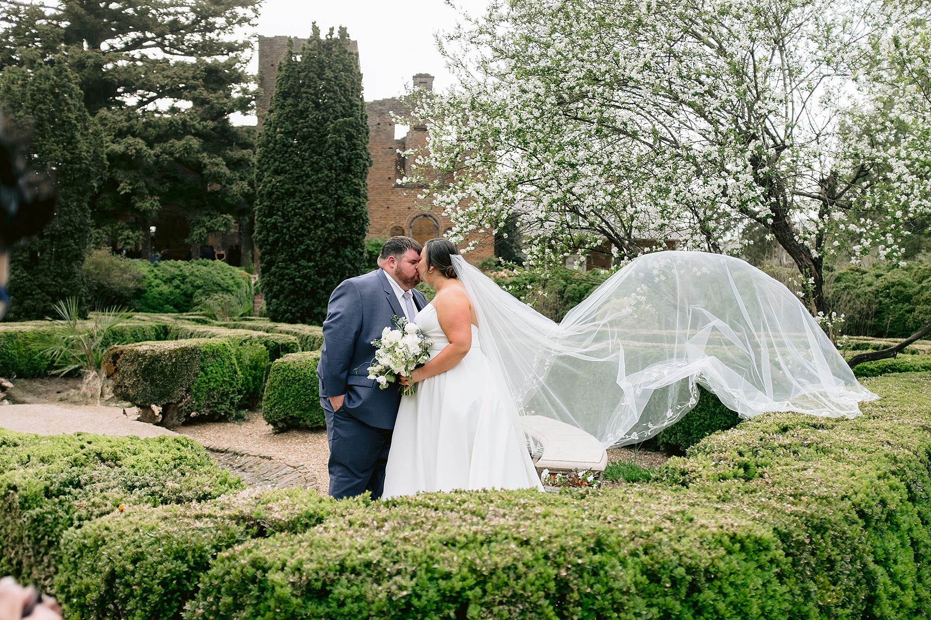
Some weddings are so full of thoughtful details and genuine heart, they stay with you long after it has ended. Blaise and Michael’s romantic Barnsley Resort wedding is absolutely one of those. Their March wedding at the historic Georgia venue was the perfect blend of classic elegance and unique personal touches. Barnsley Resort was the ideal setting for Blaise and Michael’s big day. Nestled in the Georgia countryside, the venue offers the best of both indoor elegance and outdoor romance. Floral arches brimming with greenery and white blooms created a storybook setting for both the ceremony and reception. The lush, vine-covered installations brought a sense of natural whimsy to the space, complementing the aesthetic and details perfectly.
We had the joy of working with Sofia Ocampo Events for the first time on this wedding. She is a talented planner based in Atlanta who we’ve become great friends with through networking events. Getting to collaborate with someone local (and so lovely!) was just the cherry on top of an already meaningful project. Then, there was the beautiful bride, Blaise, who was a dream client! As her elevated vision took shape, I grew more excited to work on each detail of this wedding. I just knew it was going to be spectacular. She fully trusted us to bring her style to life and we had so much fun designing a wide range of paper goods and day of details for this celebration!
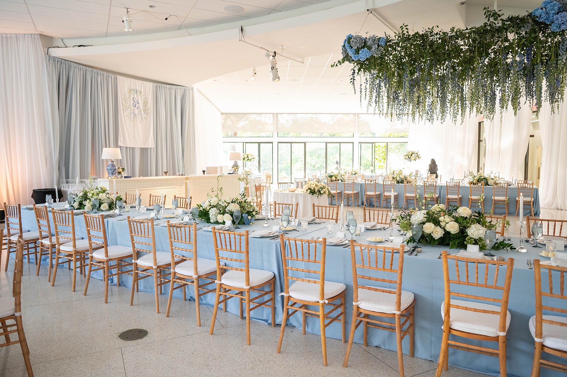
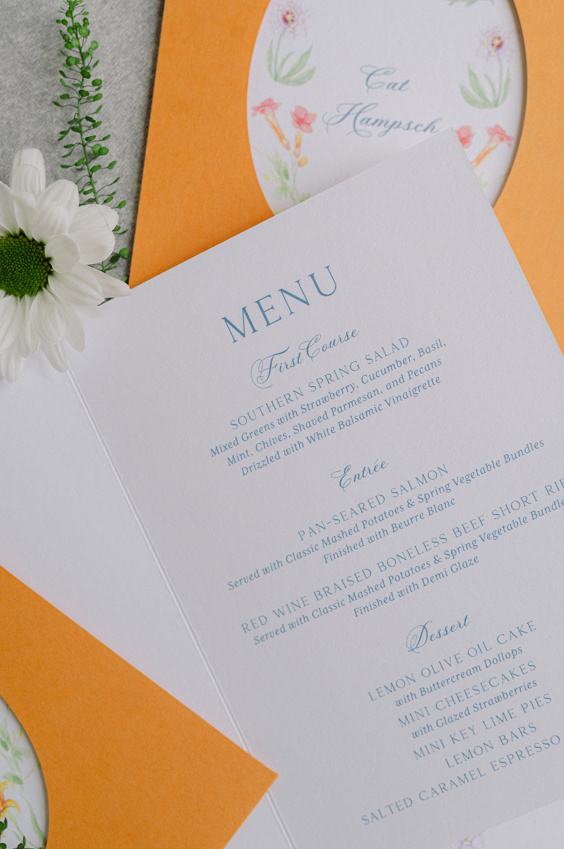
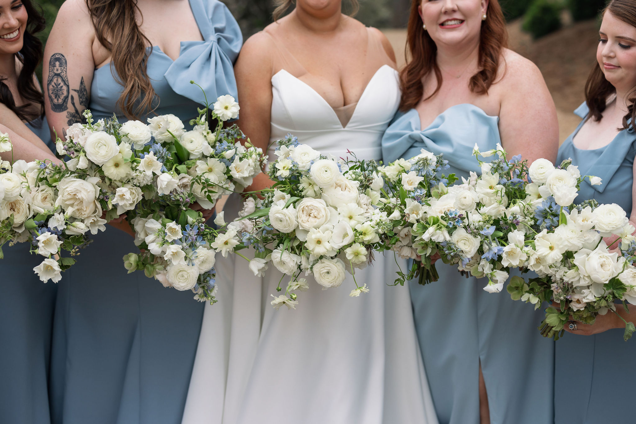
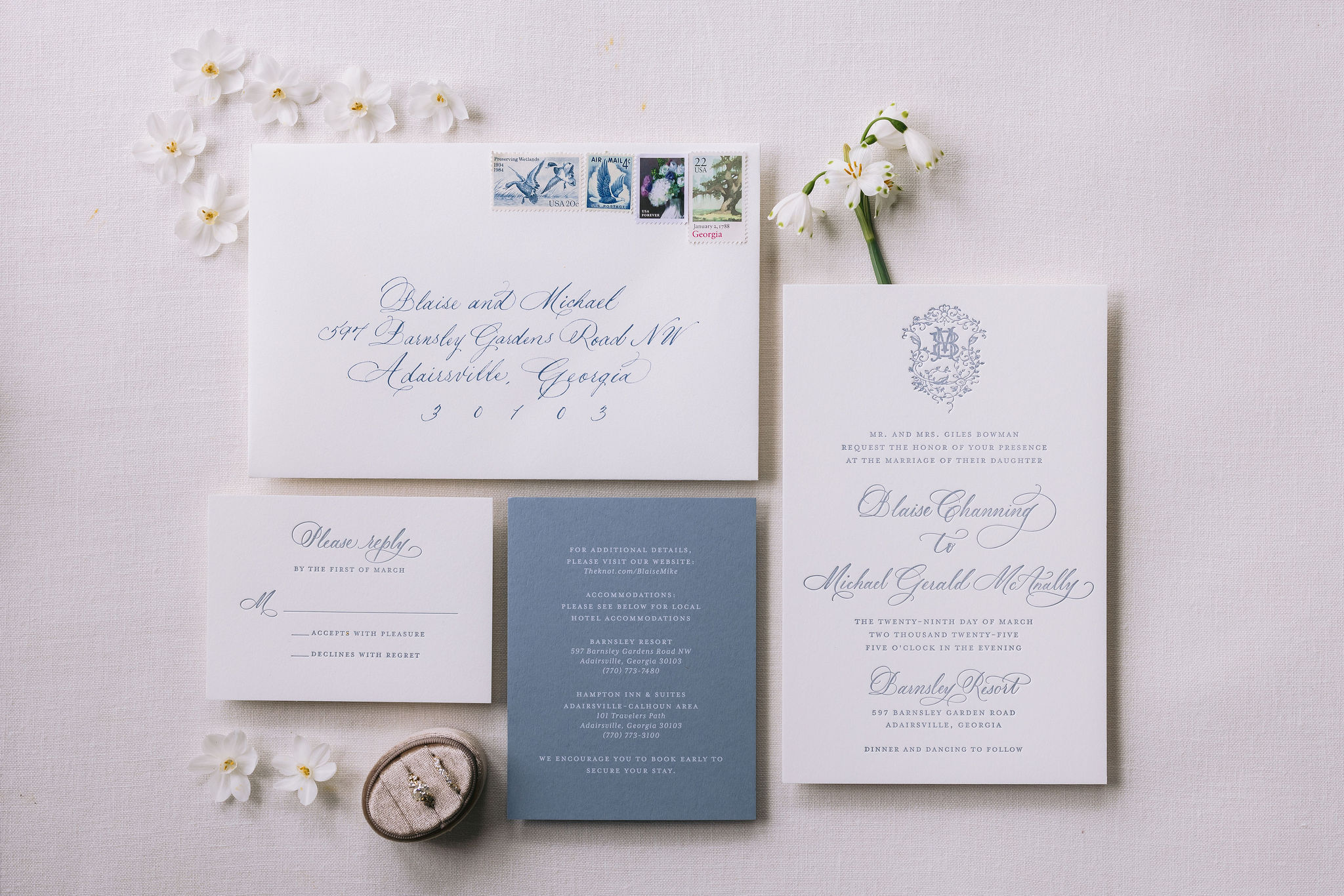
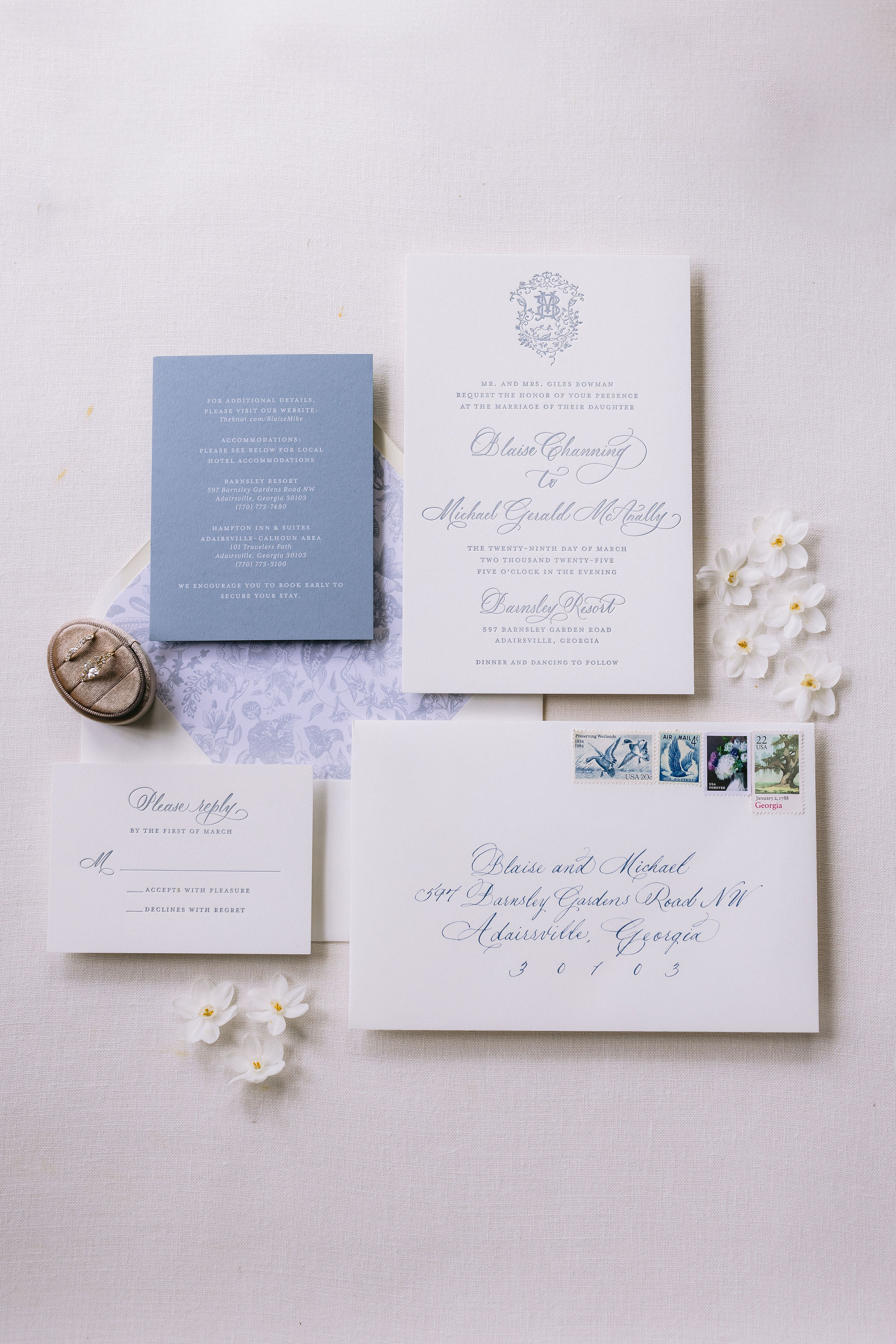
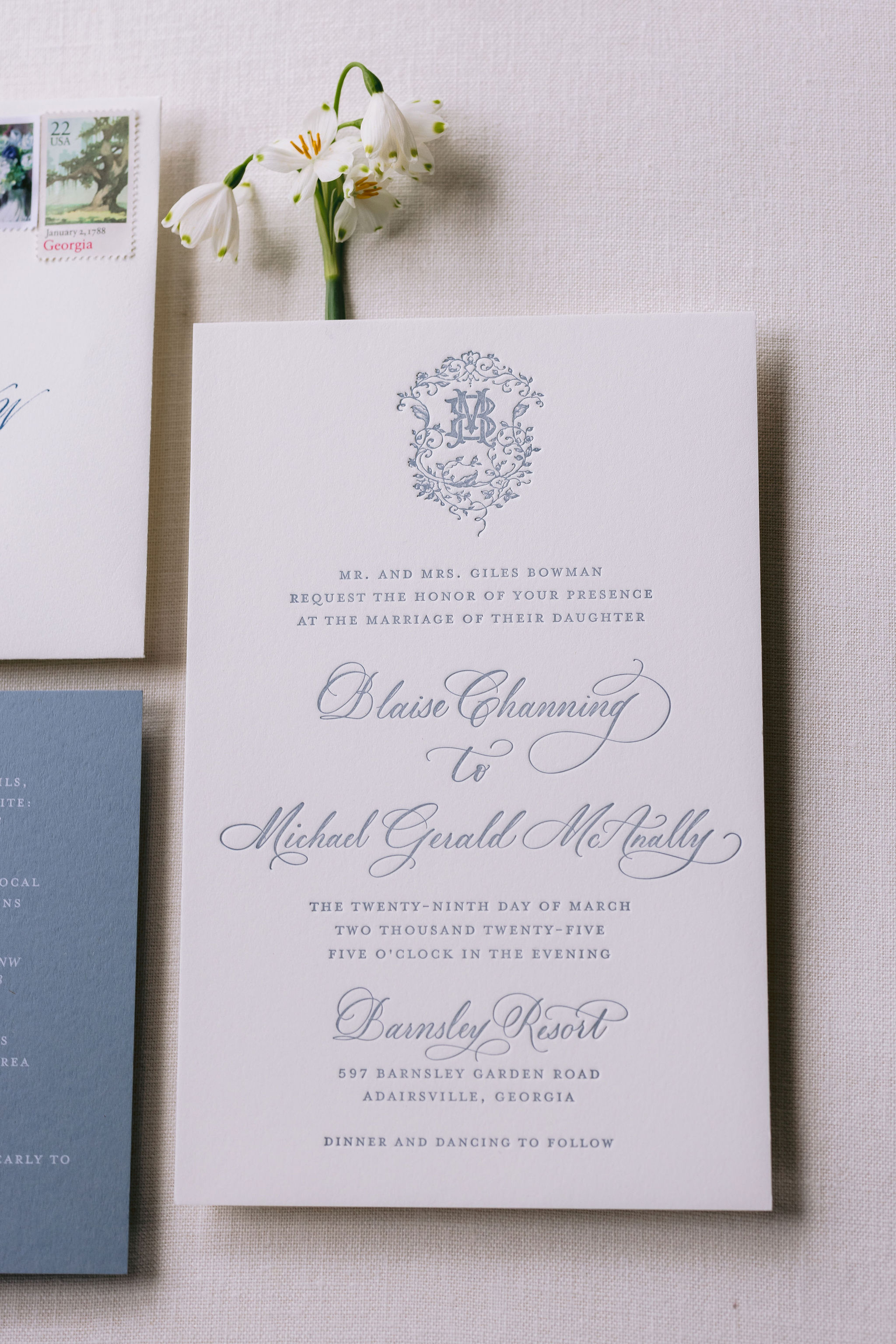
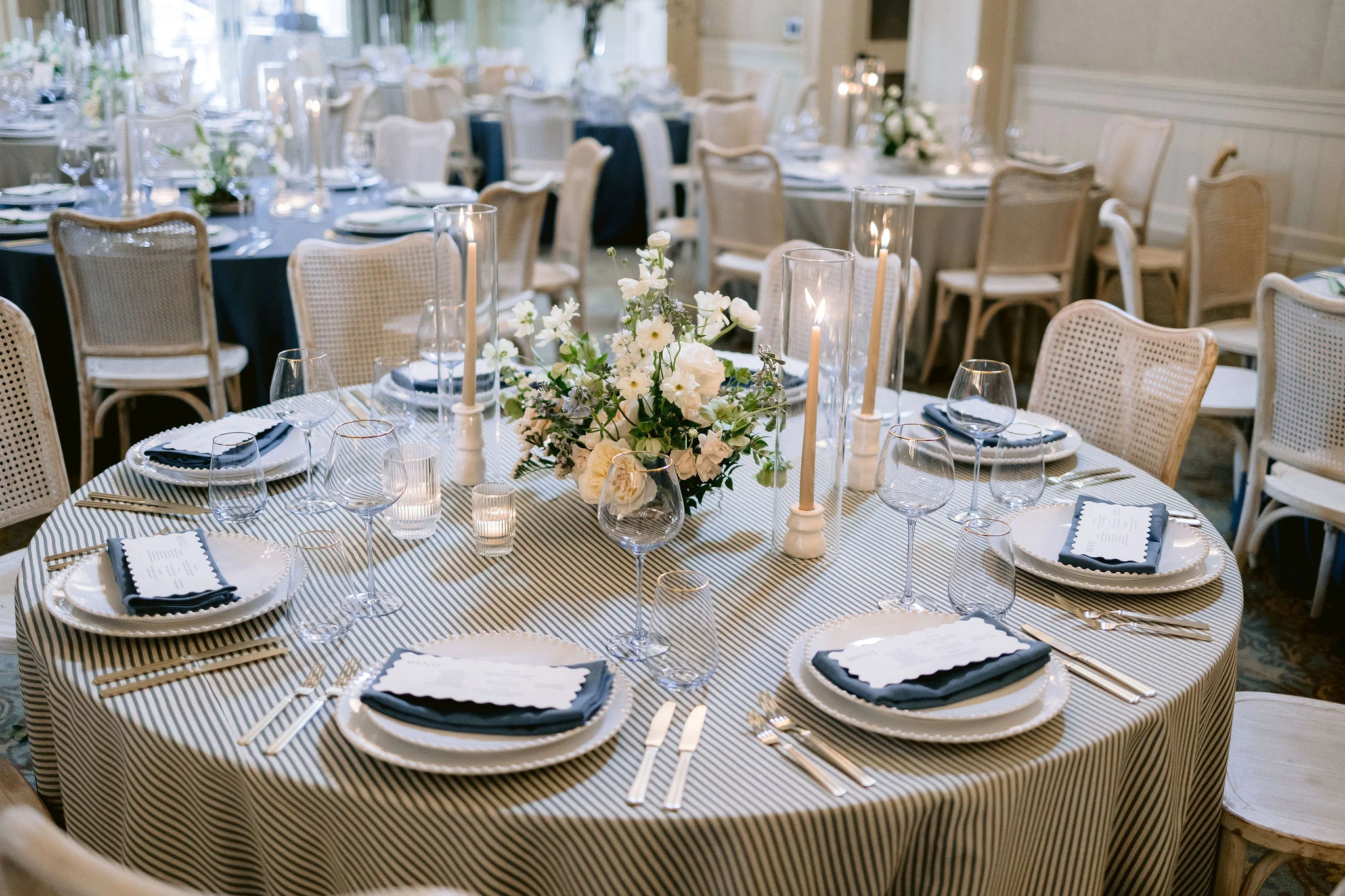
A Soft, Elegant Palette
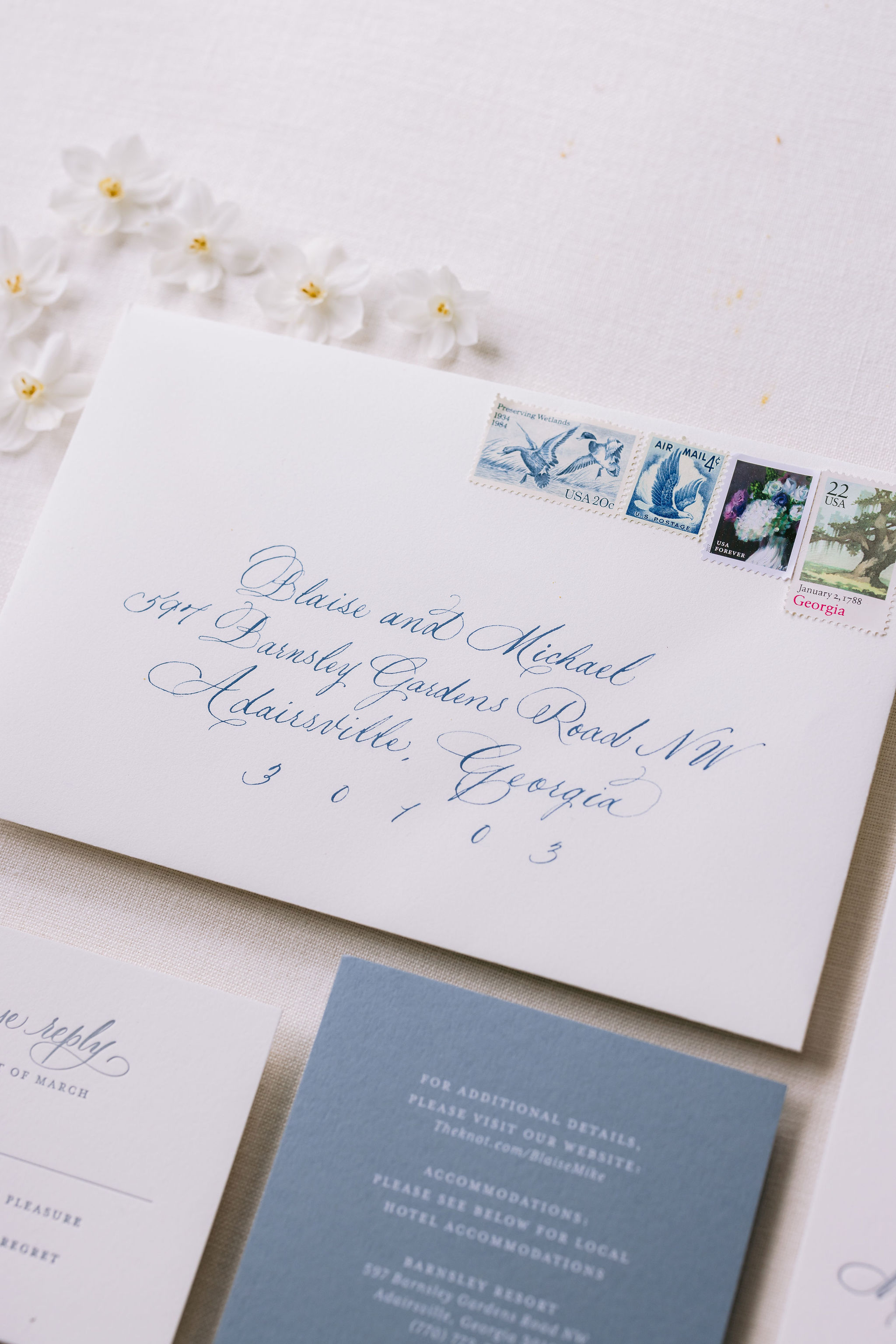
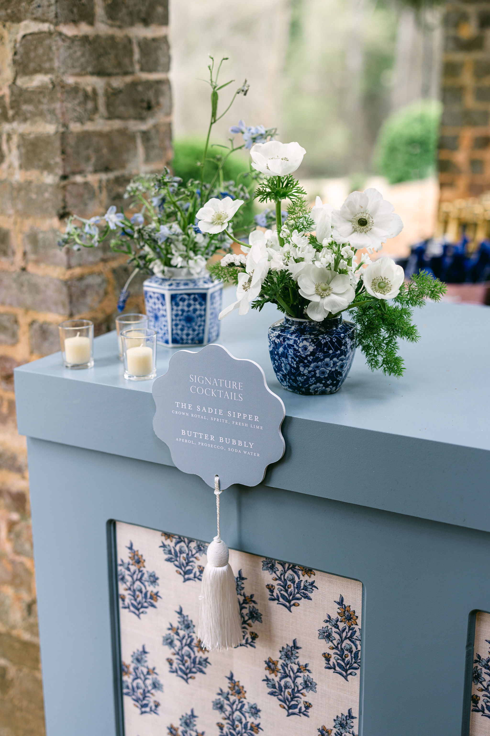
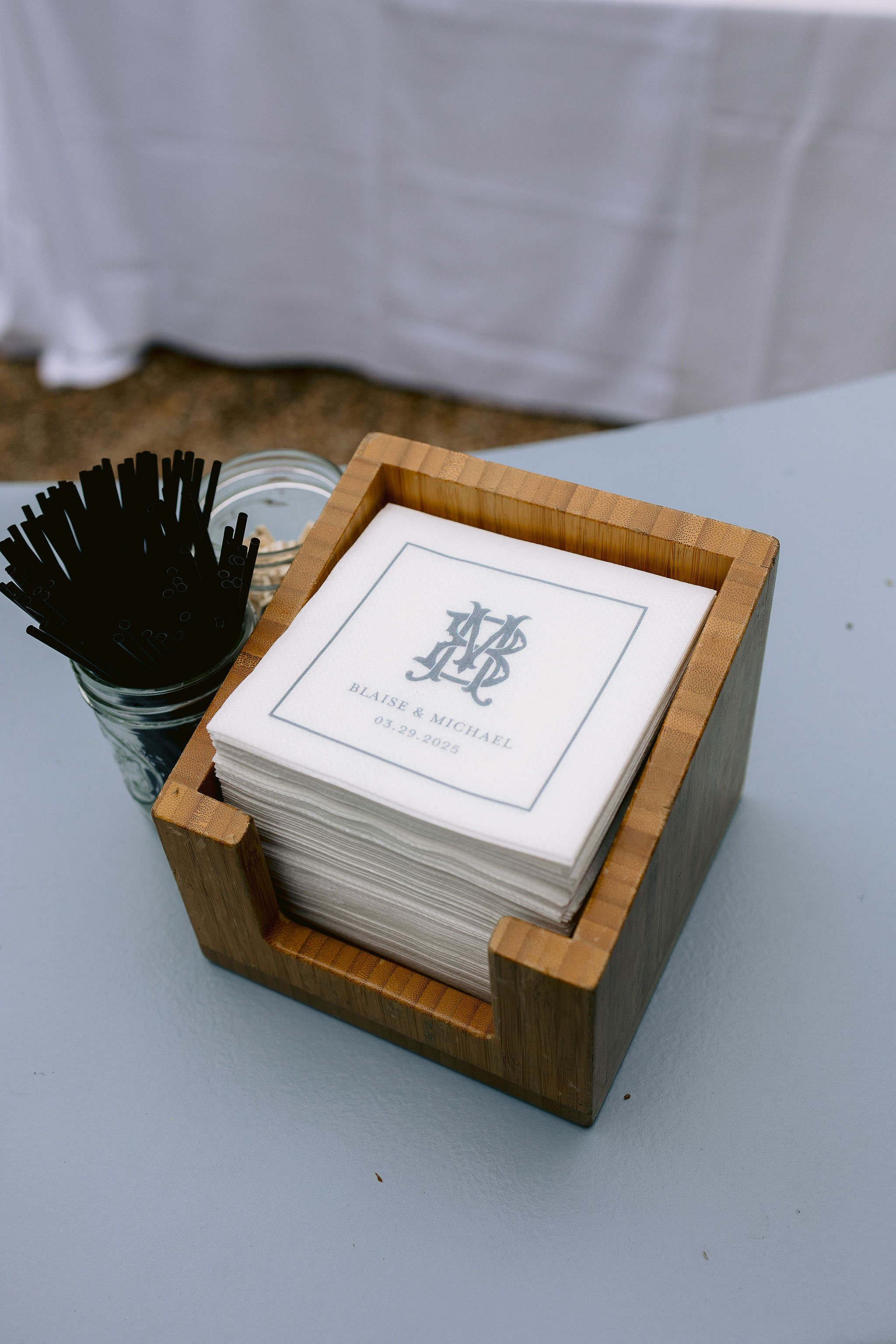
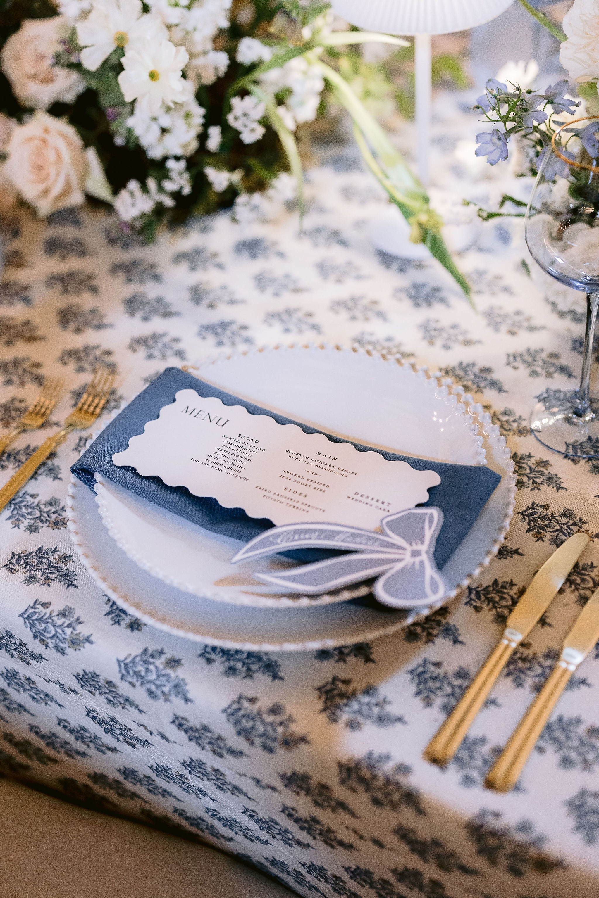
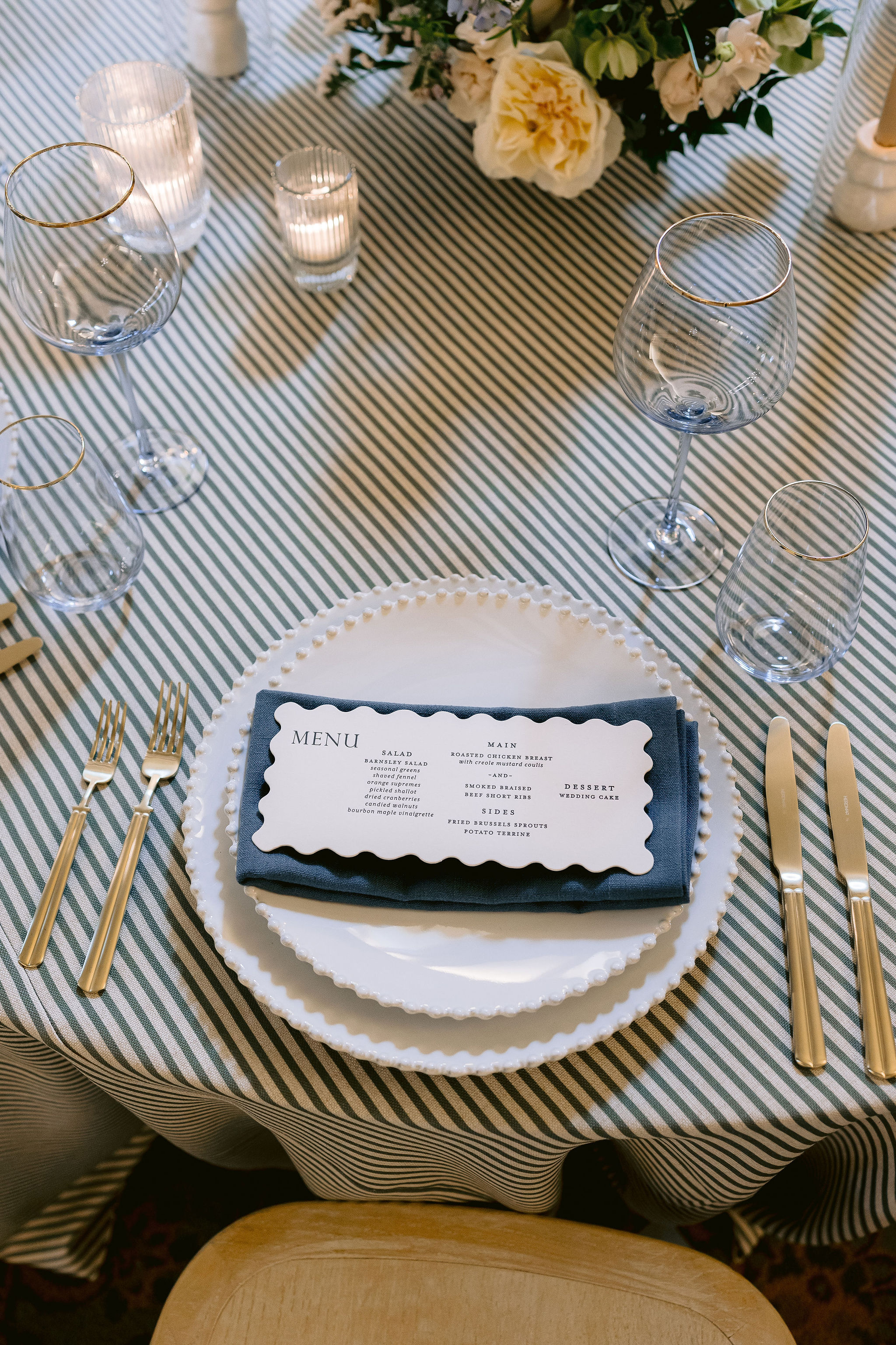
Blaise’s chosen colors of white and steel blue set a calming and sophisticated tone for the day. From the very beginning, we wove these hues into all the details, starting with the letter-pressed invitation suite on soft white and blue cardstock. A custom monogram graced the top of the invitation and made repeat appearances on other details throughout the wedding we created, including the programs and cocktail napkins. When couples are this intentional about design, the whole day feels effortlessly cohesive.
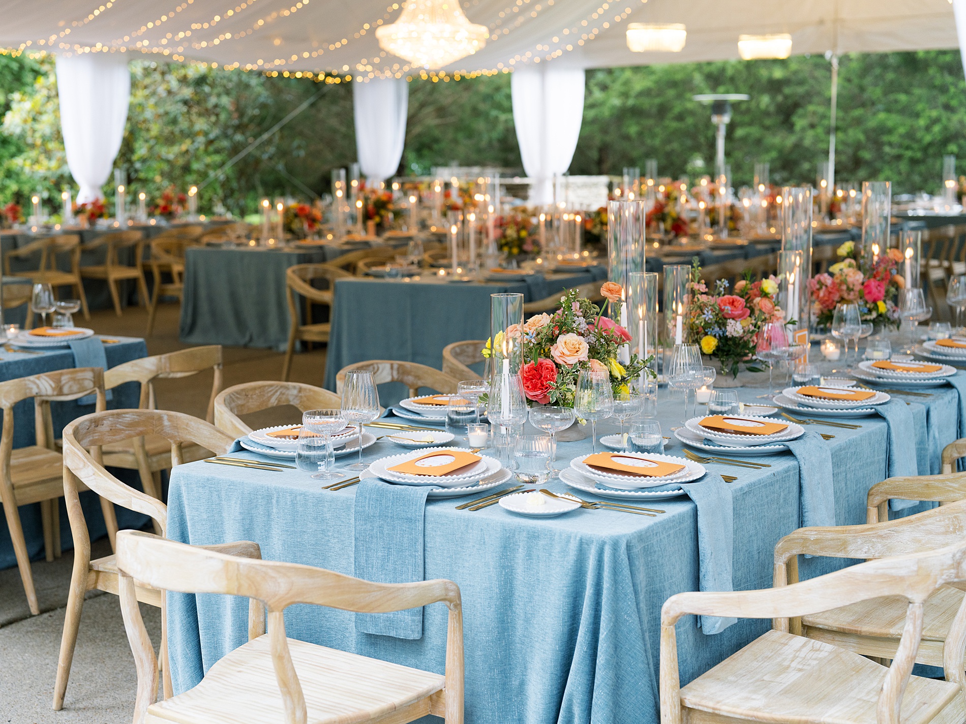
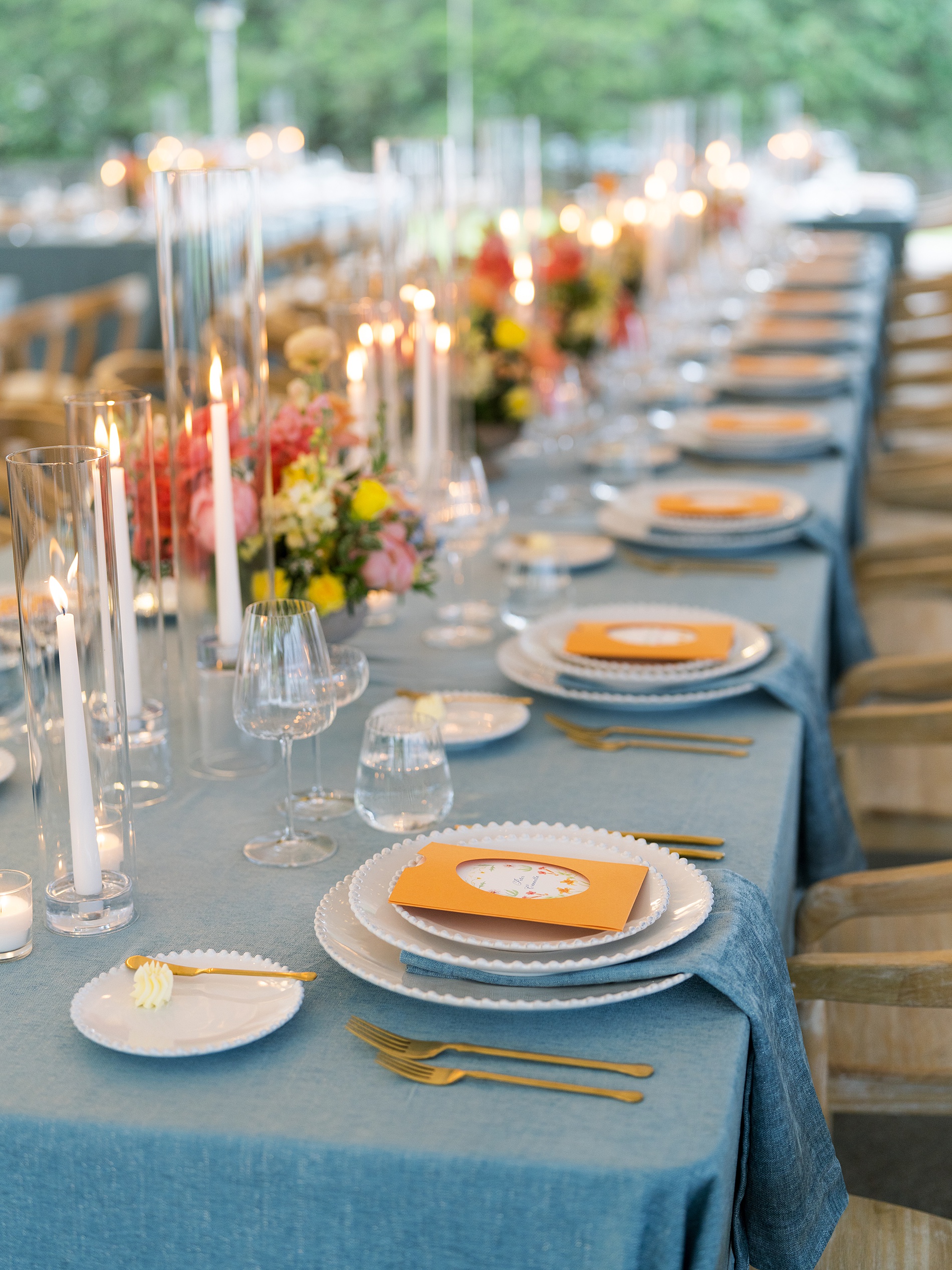
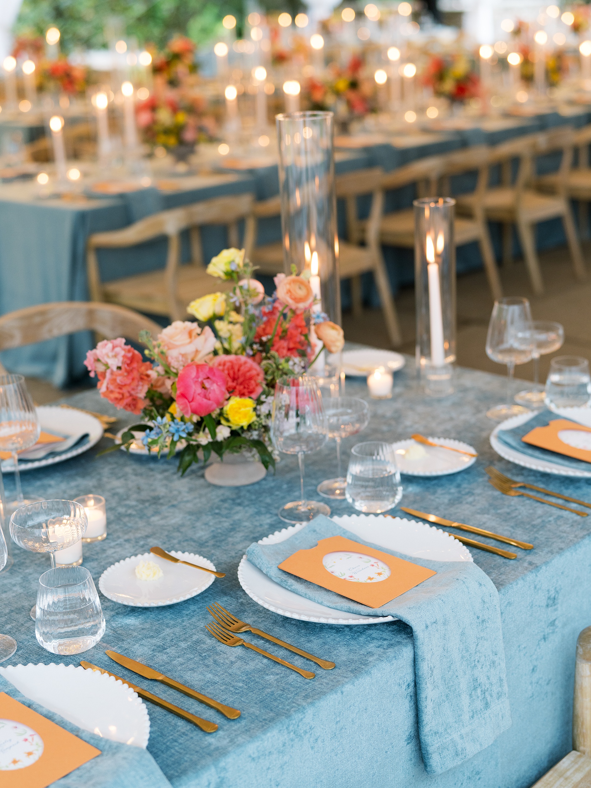
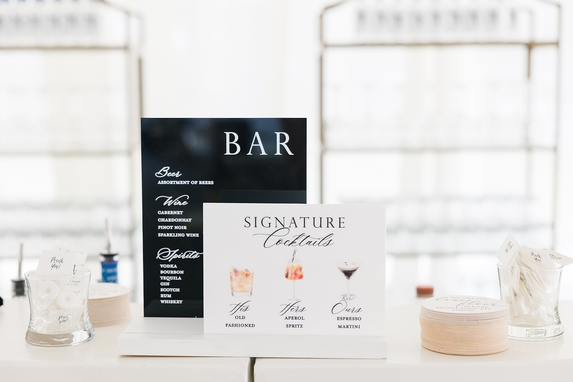
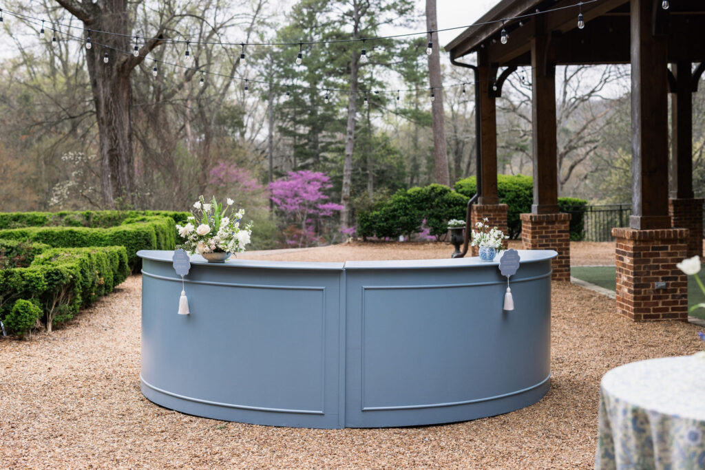
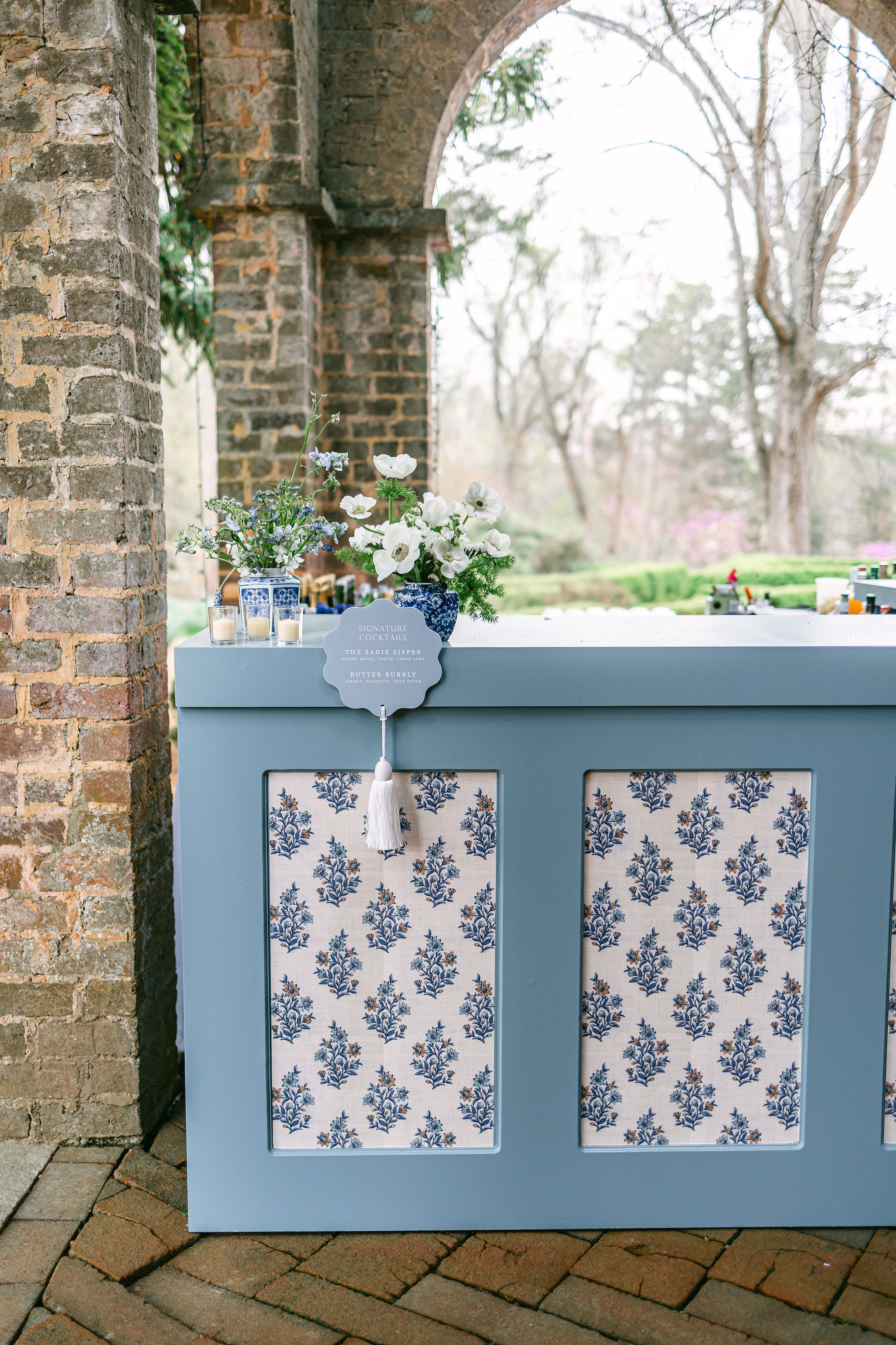
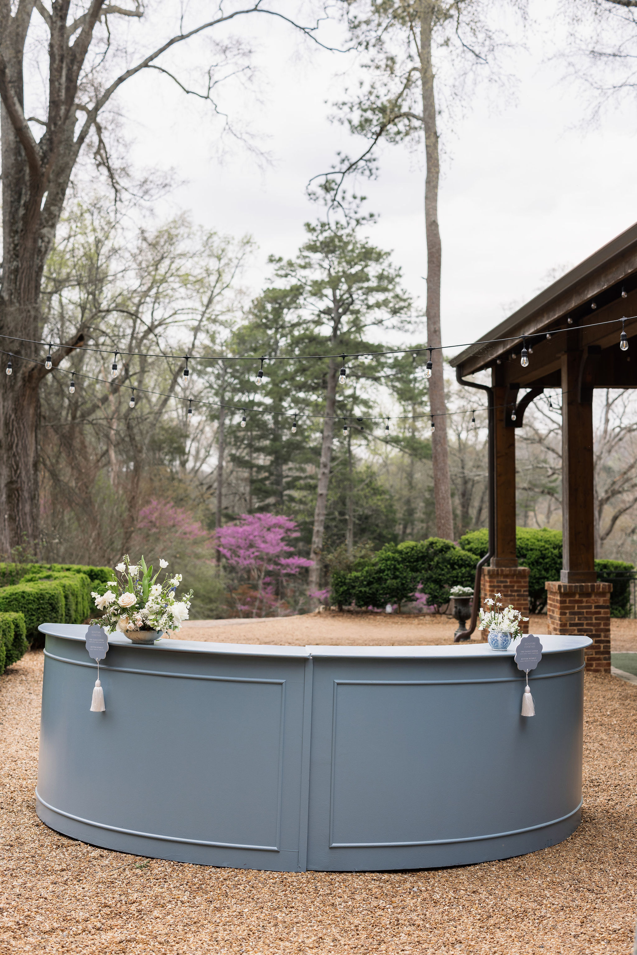
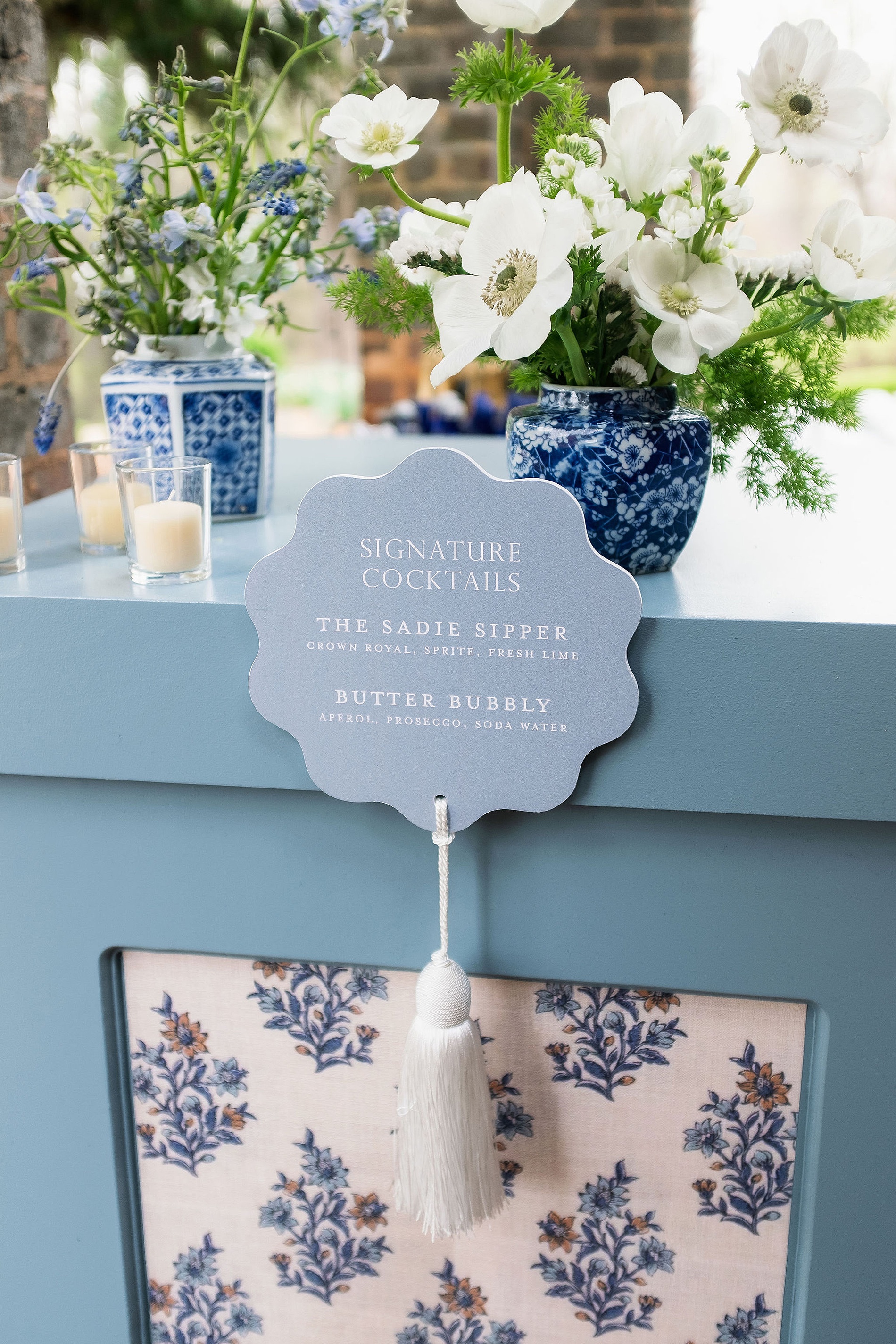
The couple married outside near the gorgeous gardens at the venue. After saying “I do”, guests mingled on the property enjoying cocktails. The signature cocktail bar sign was another one of my favorite details. The steel blue sign with white wording, was made complete with a fun, white tassel. Along with the custom bar signs, we also designed the monogrammed cocktail napkins.
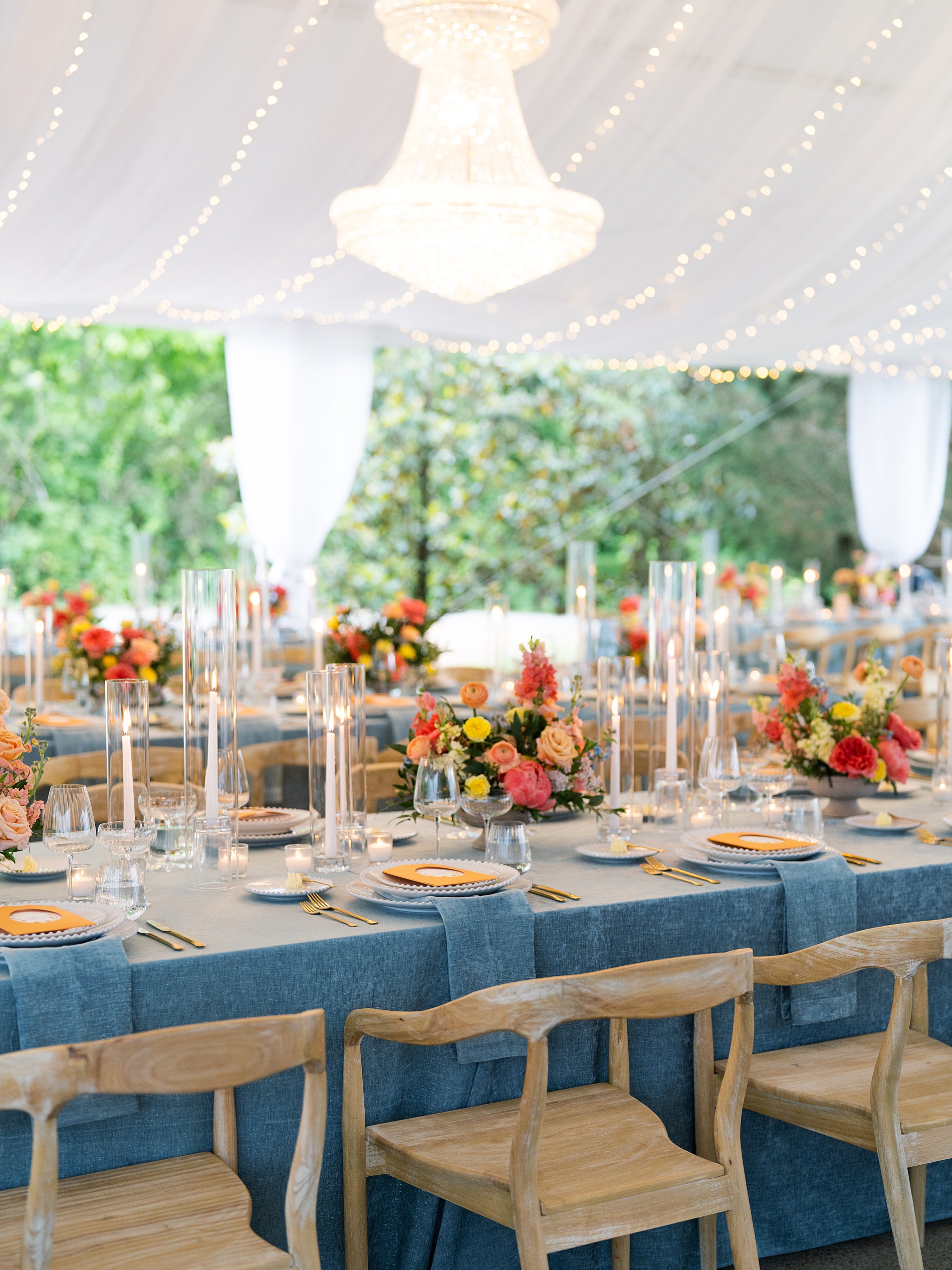
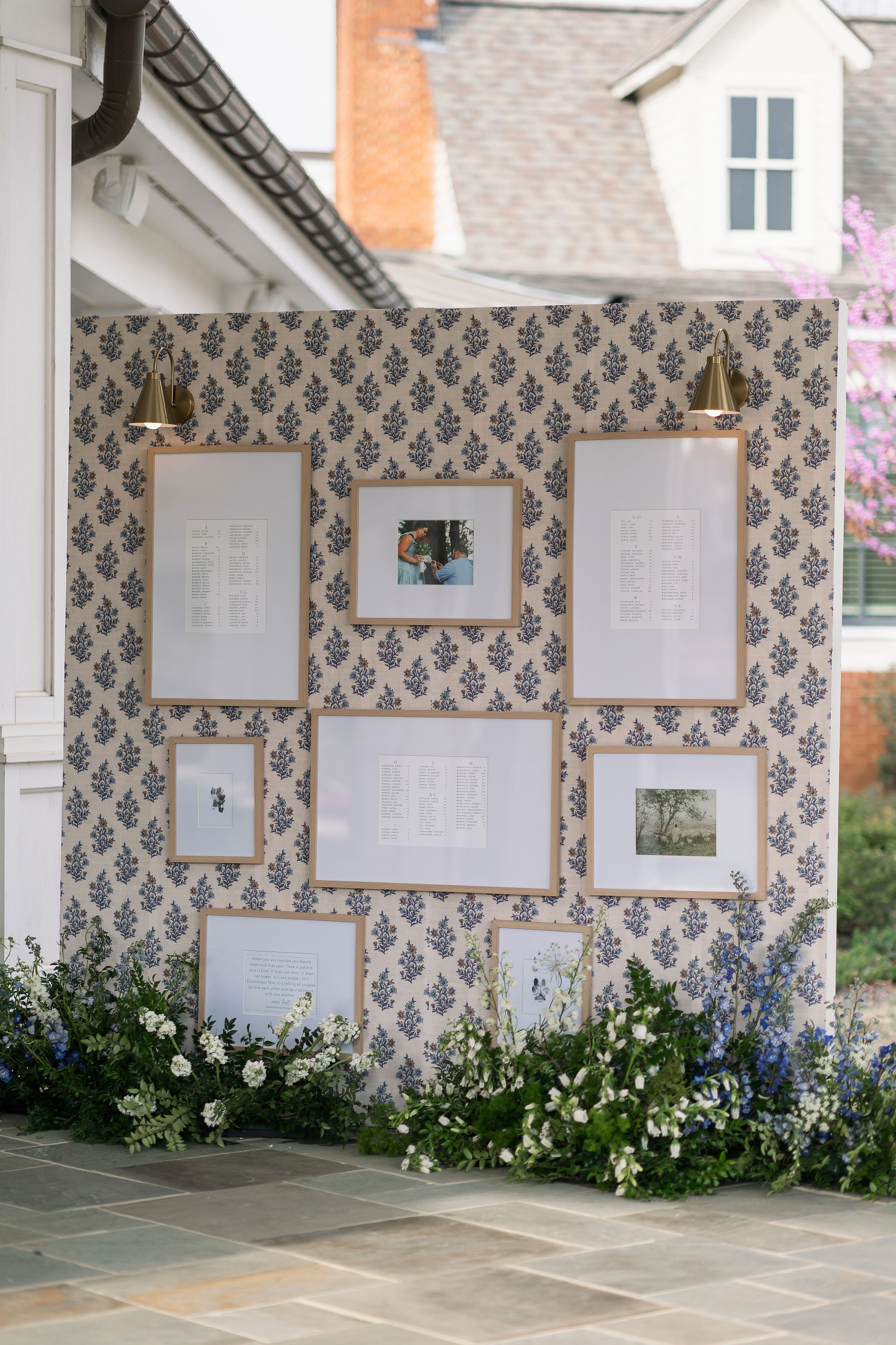
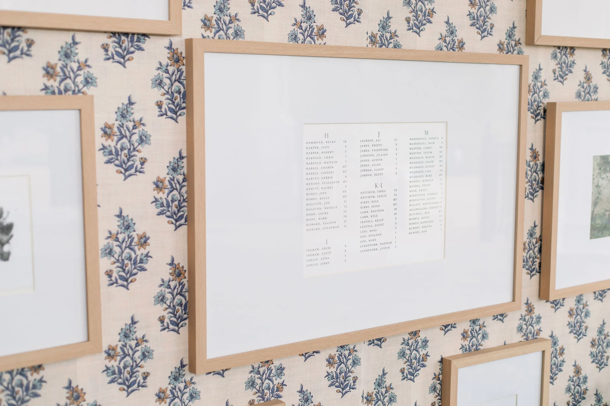
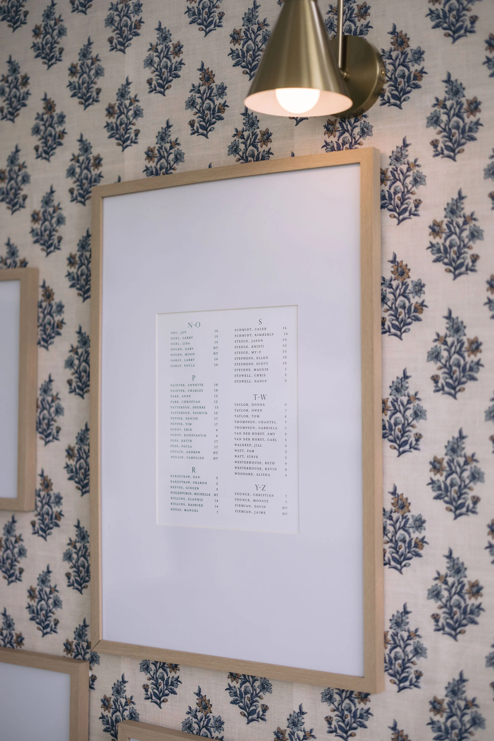
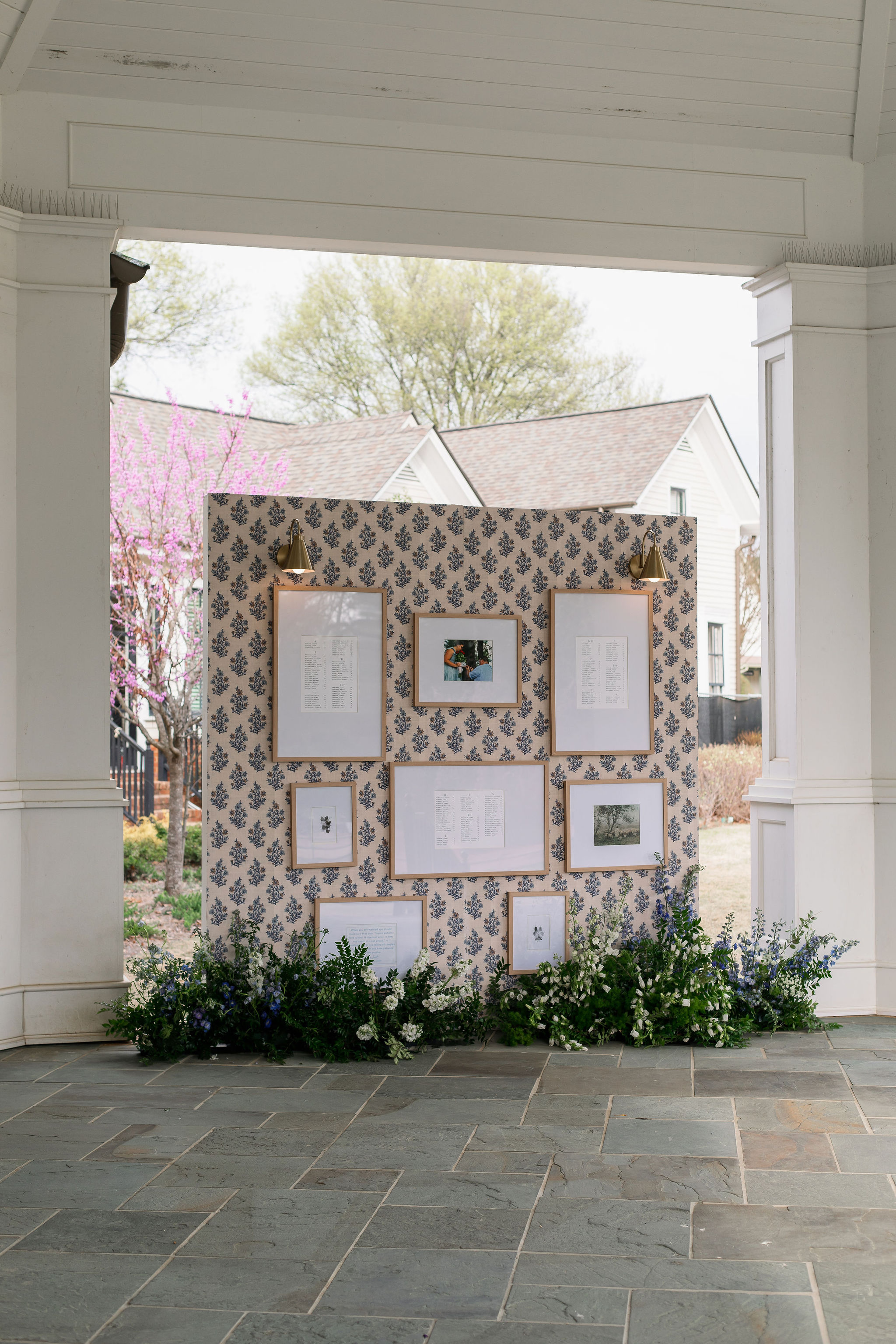
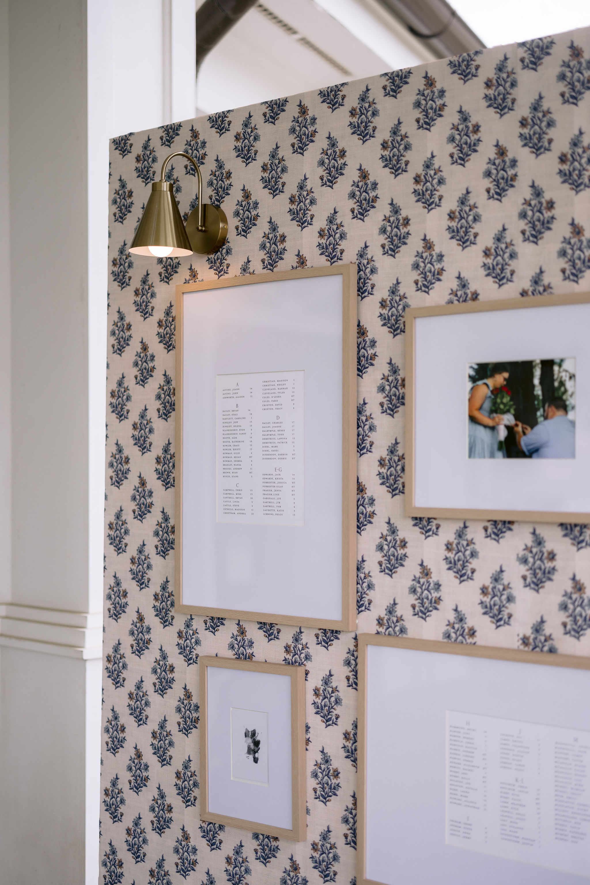
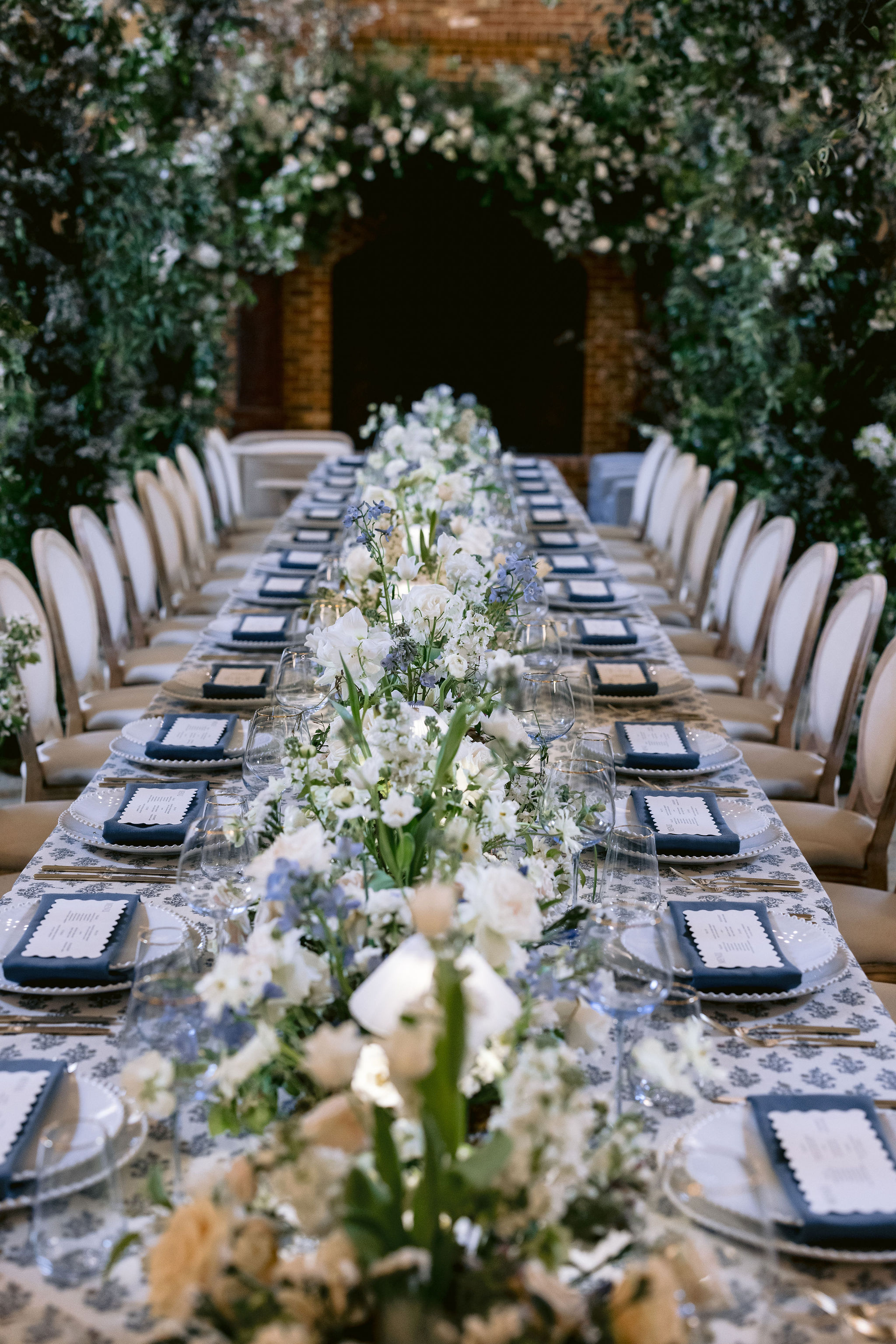
Seating Chart Display
As guests made their way inside for the reception, they were greeted by a wallpapered seating chart display with framed cards listing the table assignments. It was a beautifully curated focal point. I also love that the pattern on the wallpaper made an appearance on several other details, including the inlay of the bars, tablecloths at the reception, and surrounding the monogram detail on the invitations and programs. Absolute perfection!
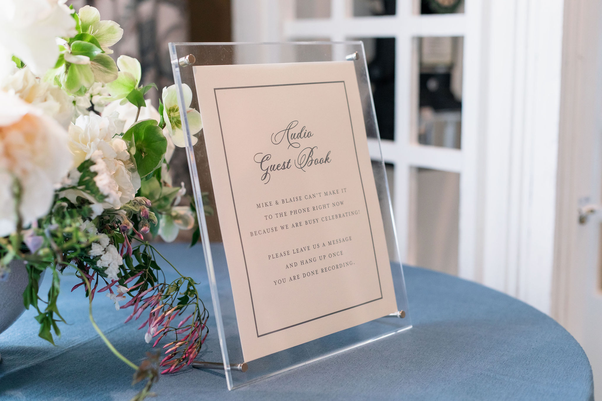
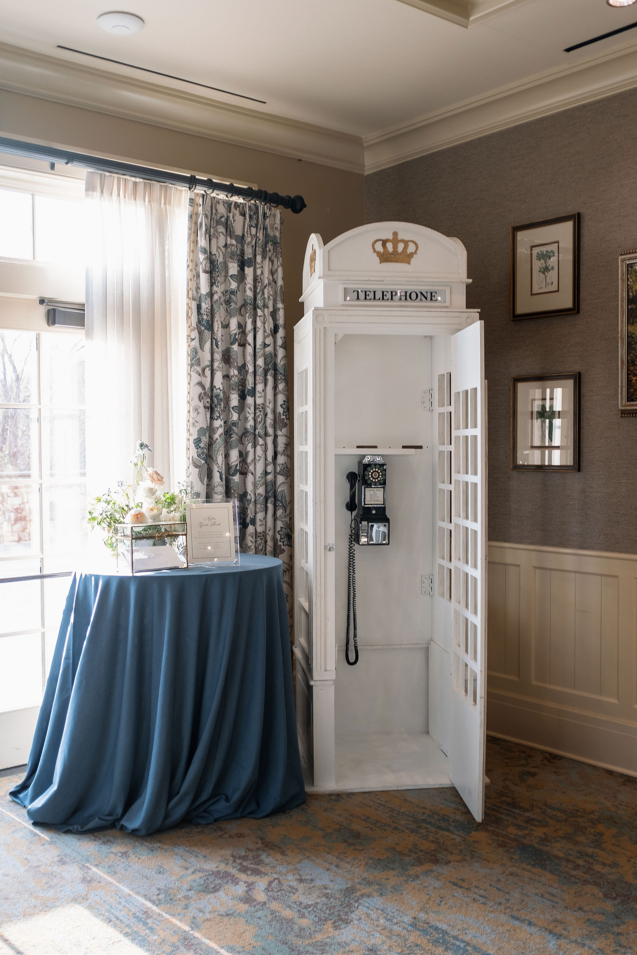
There was also an audio guestbook sign we created that was on display next to an old school telephone booth where guests could leave their messages and well wishes. This was another unique and fun detail that guests loved and really made their wedding stand out.
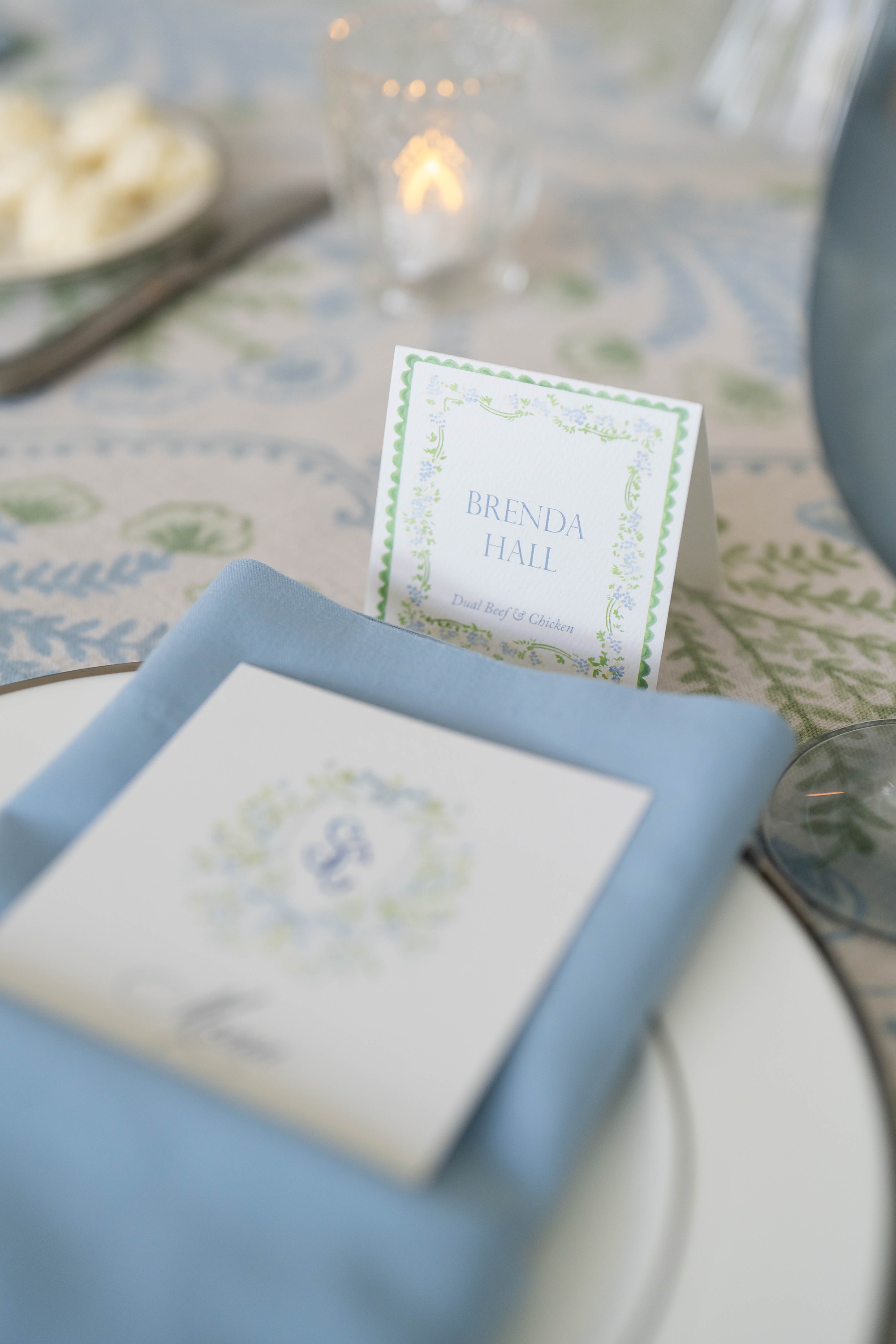
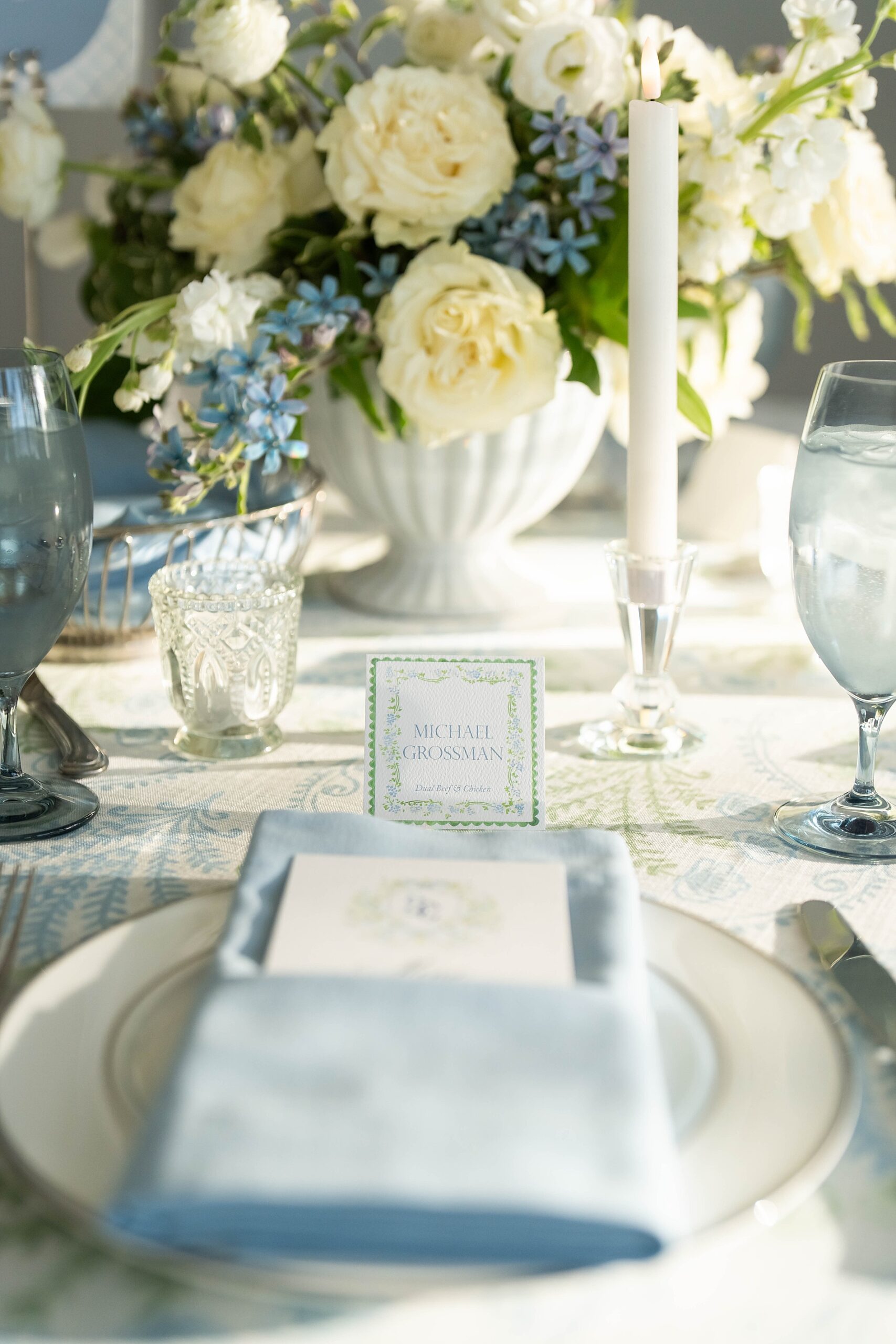
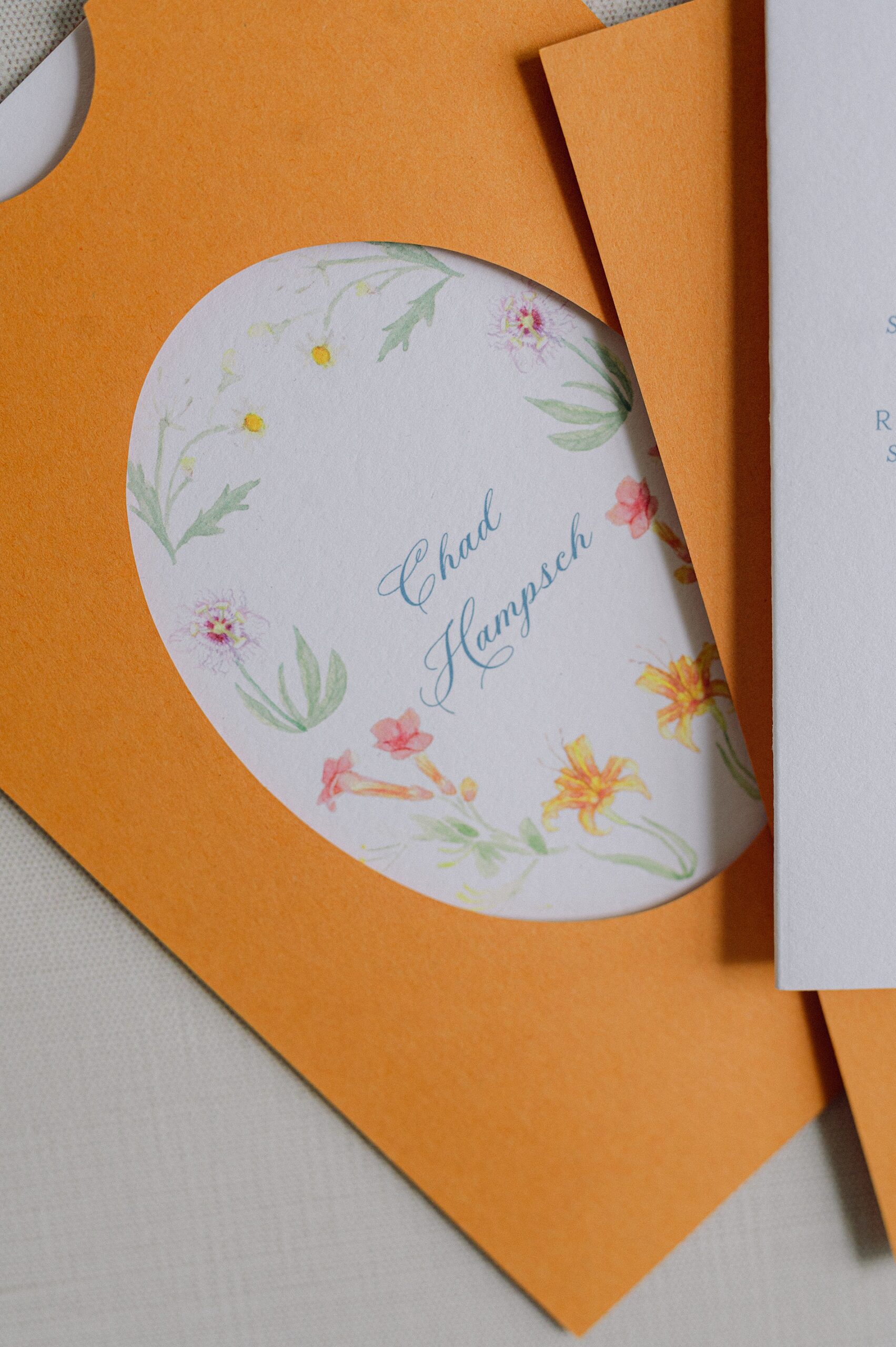
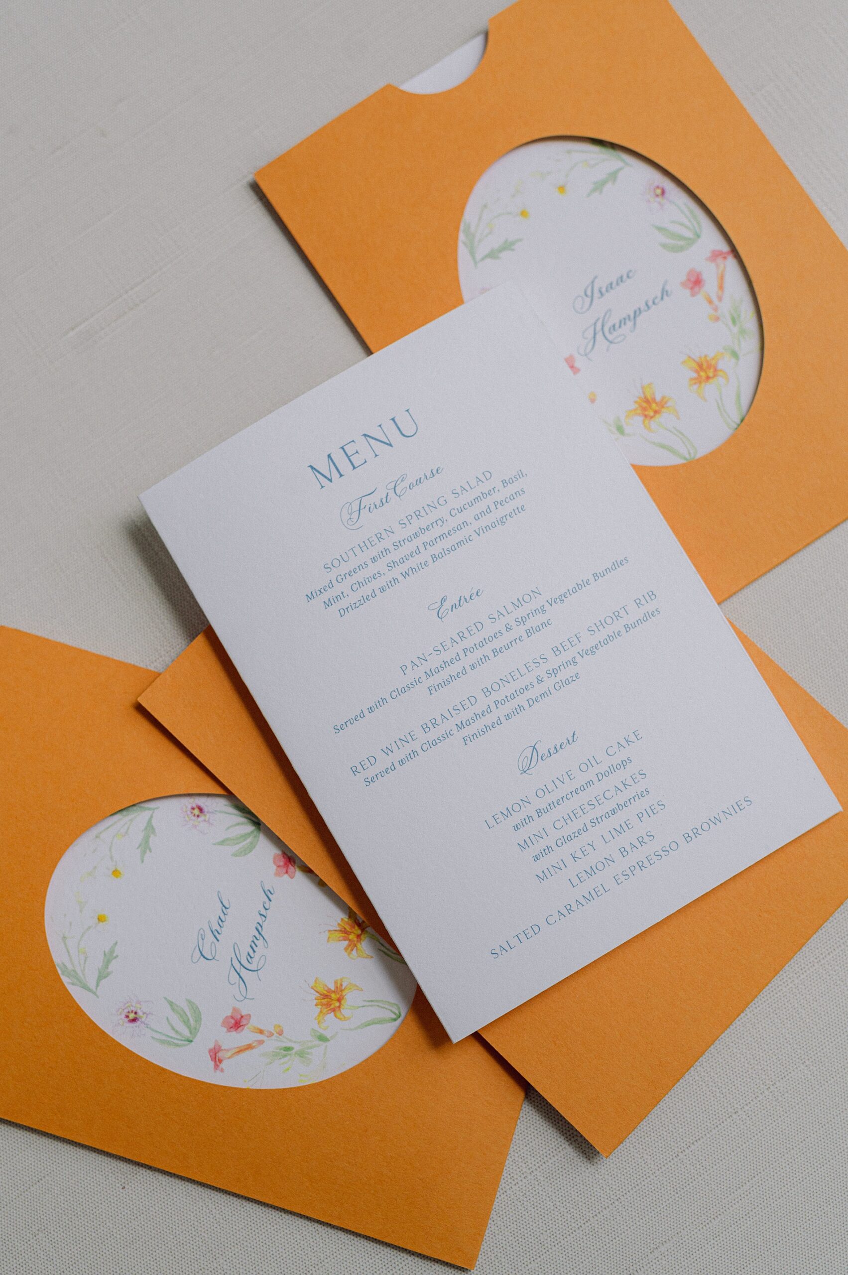
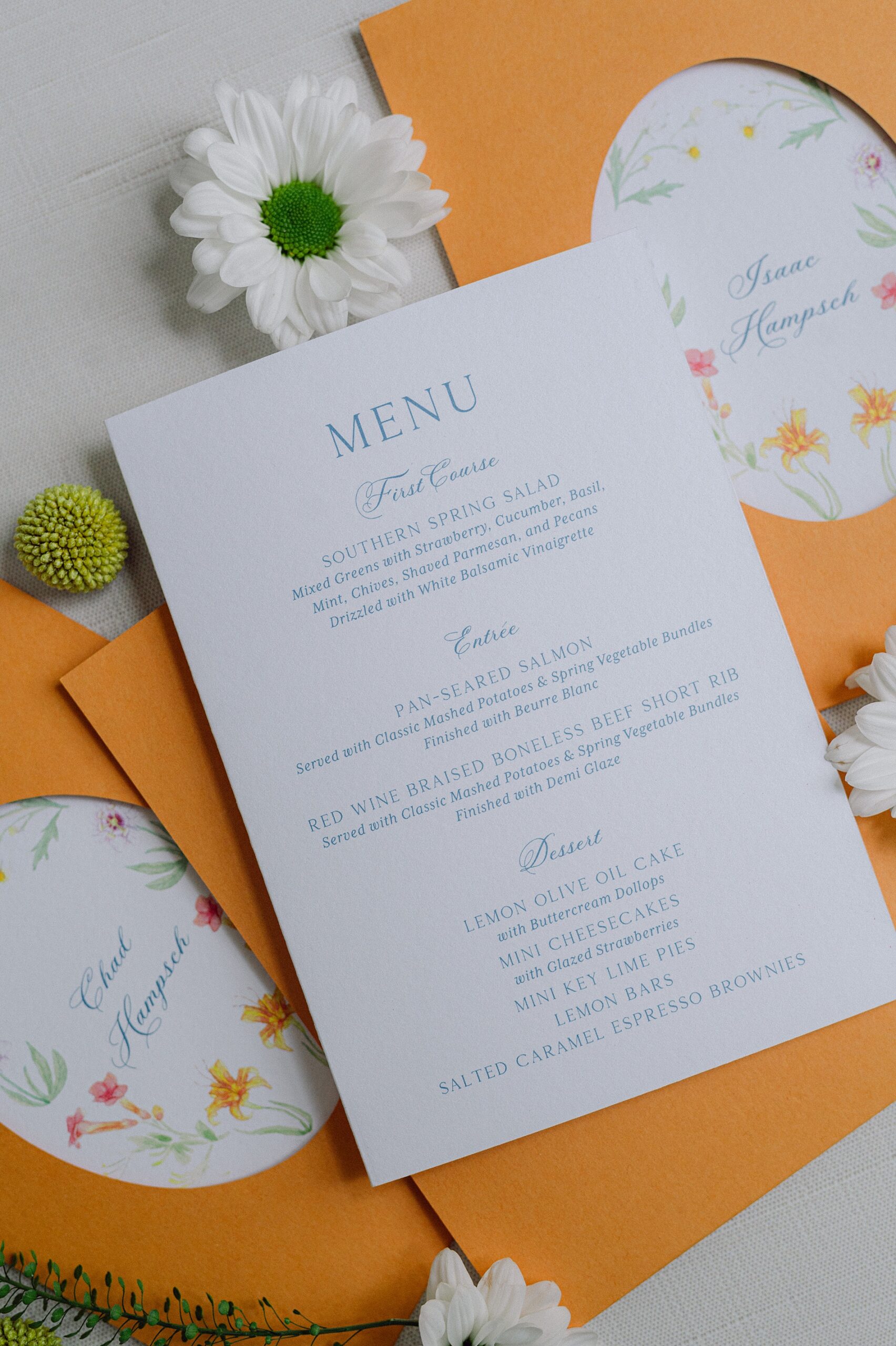
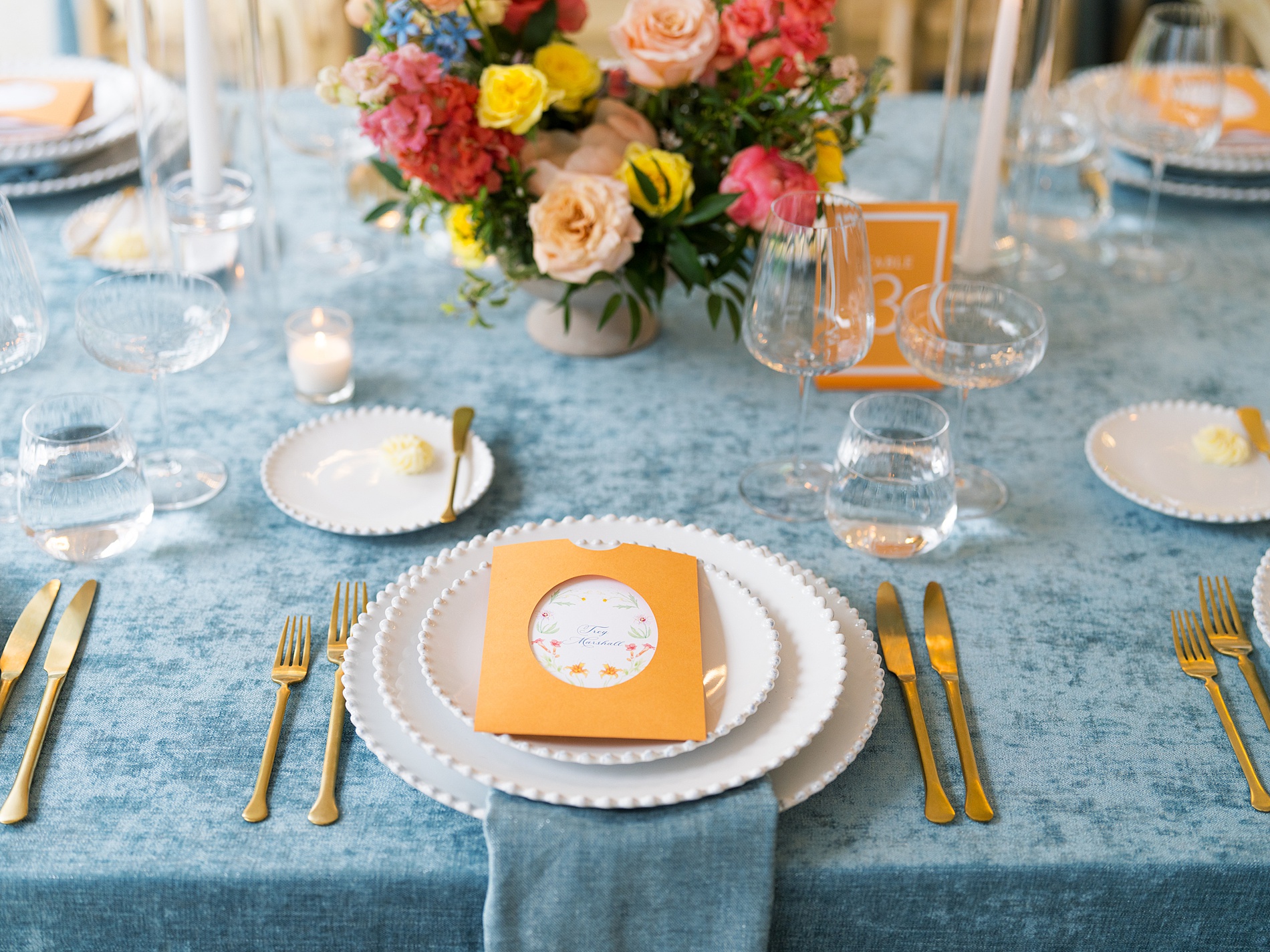
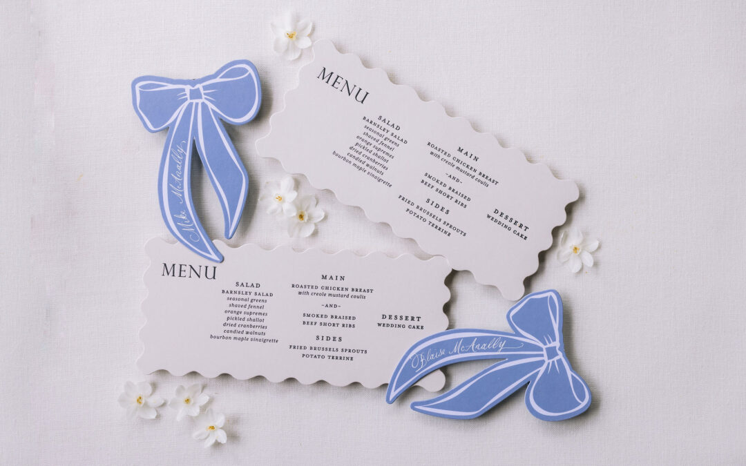
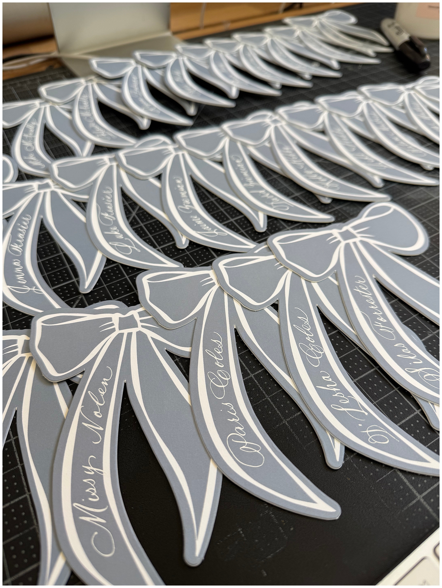
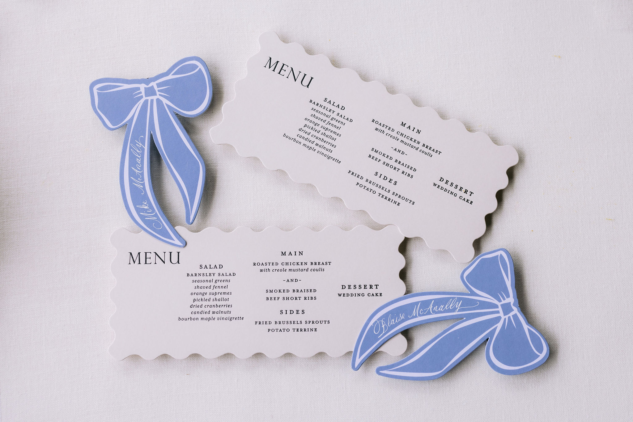
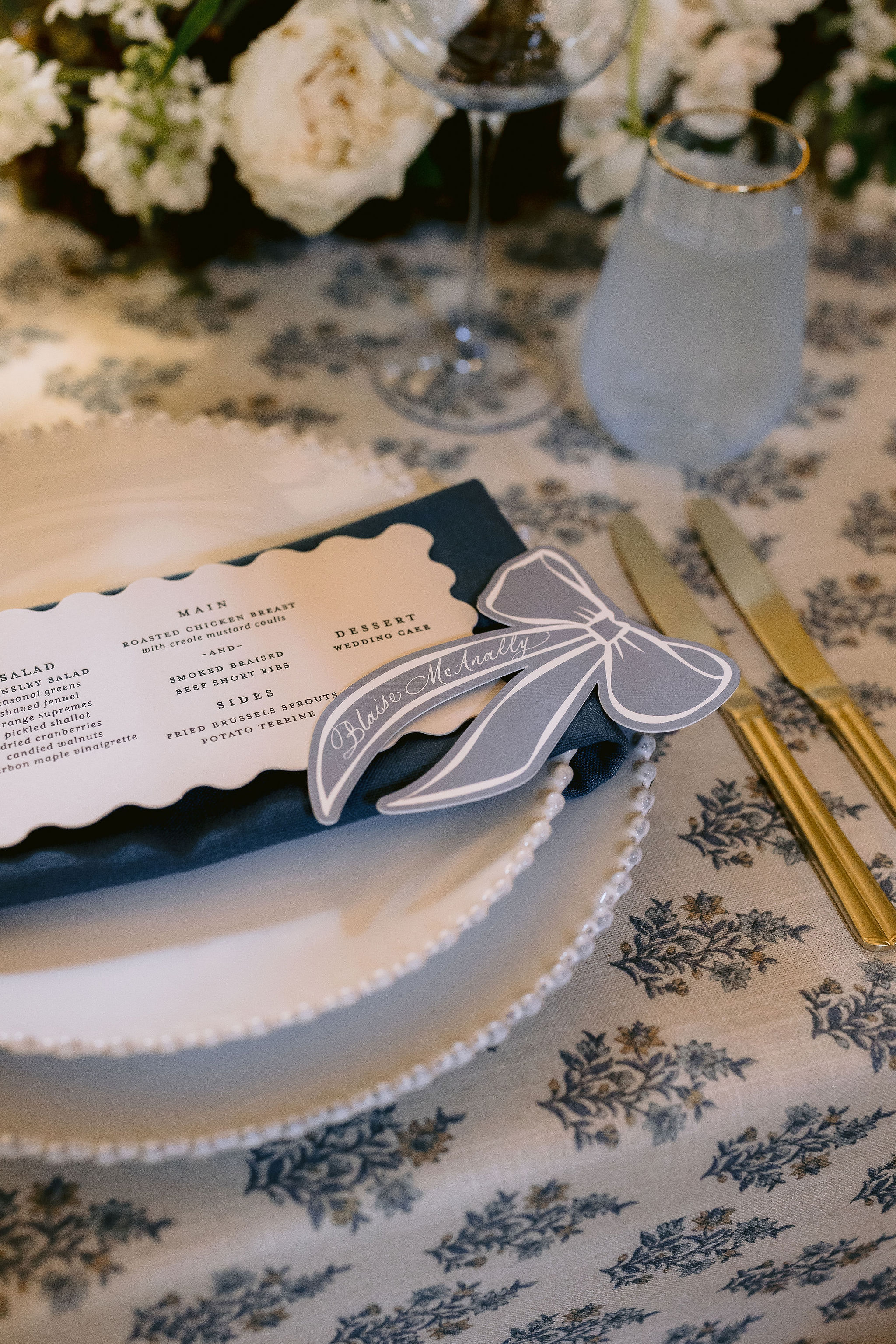
Unique + Custom Ribbon Place Cards
The place cards definitely need their own spotlight because they were just that good! Die-cut ribbon place cards in a light blue color, were each hand-calligraphed with guests’ names. One of my favorite moments was catching a photo of a guest snapping a picture of her place card on her phone, which made my calligrapher heart so happy! These place cards were just so fun and different from the usual, and definitely left an impression on guests!
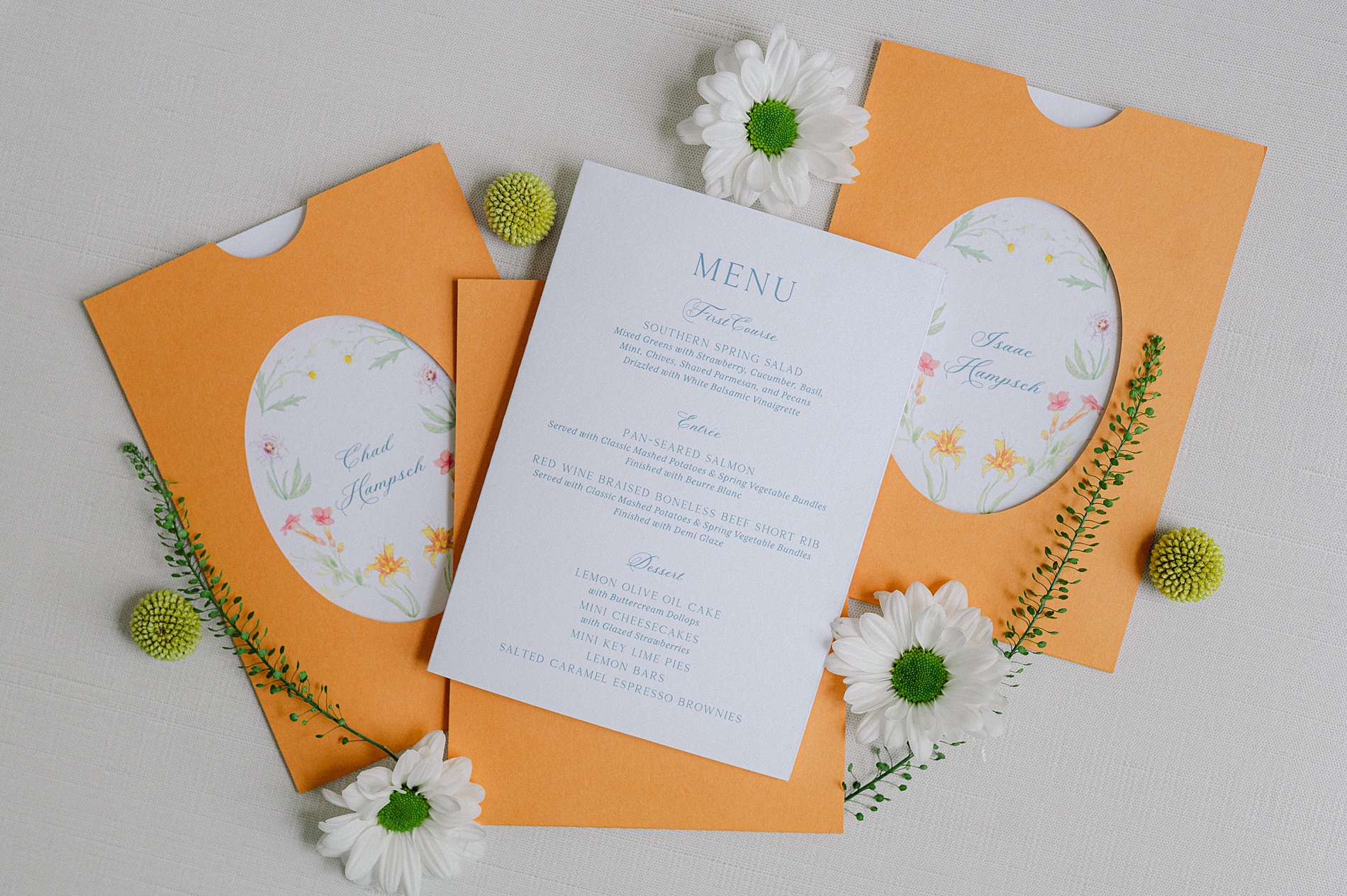
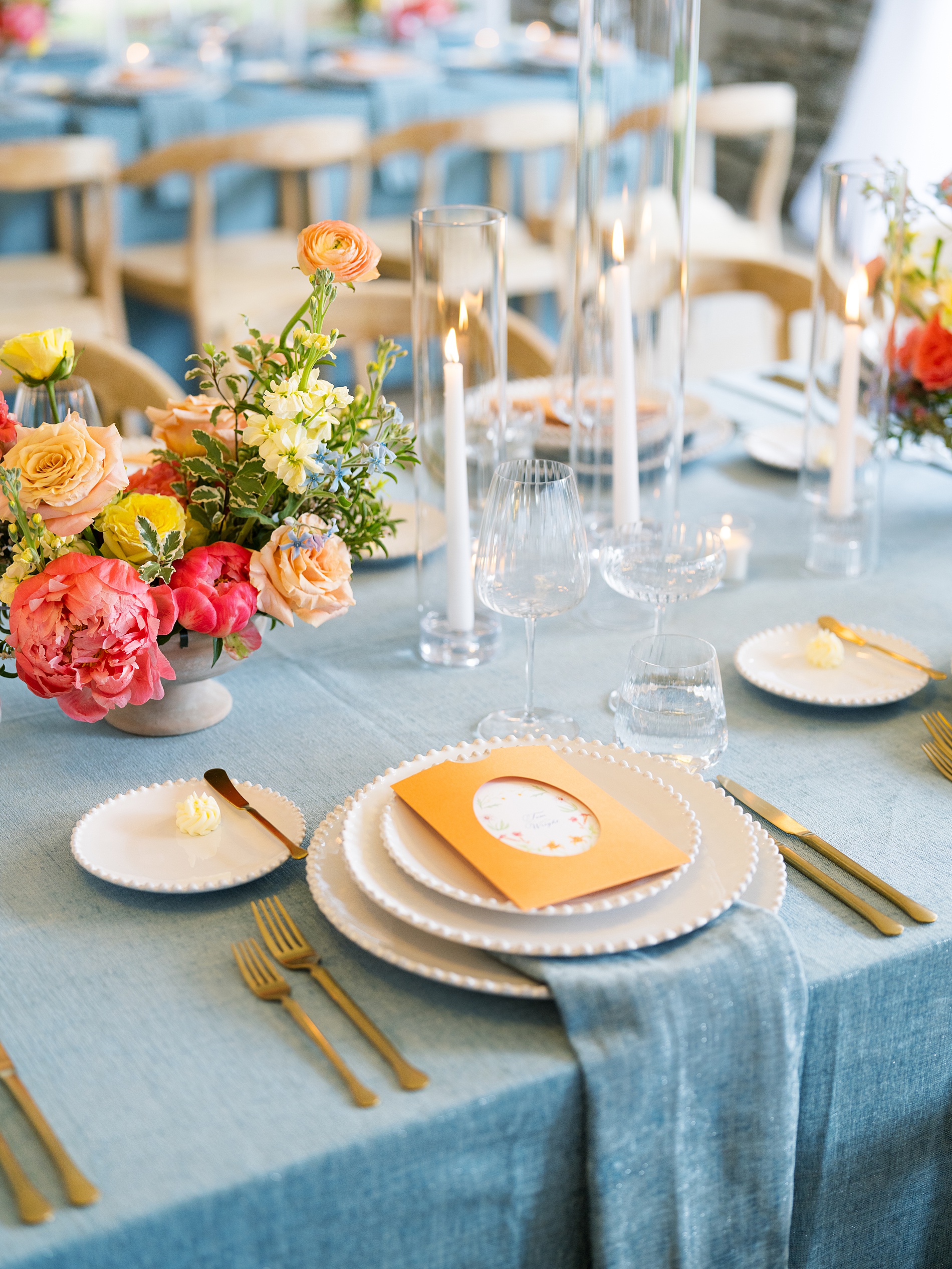
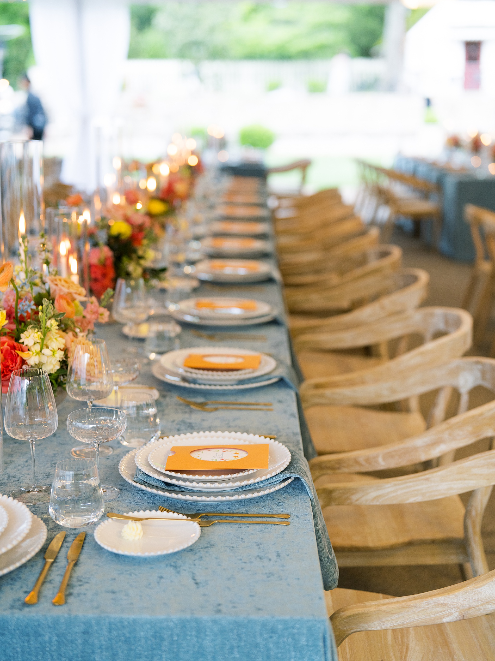
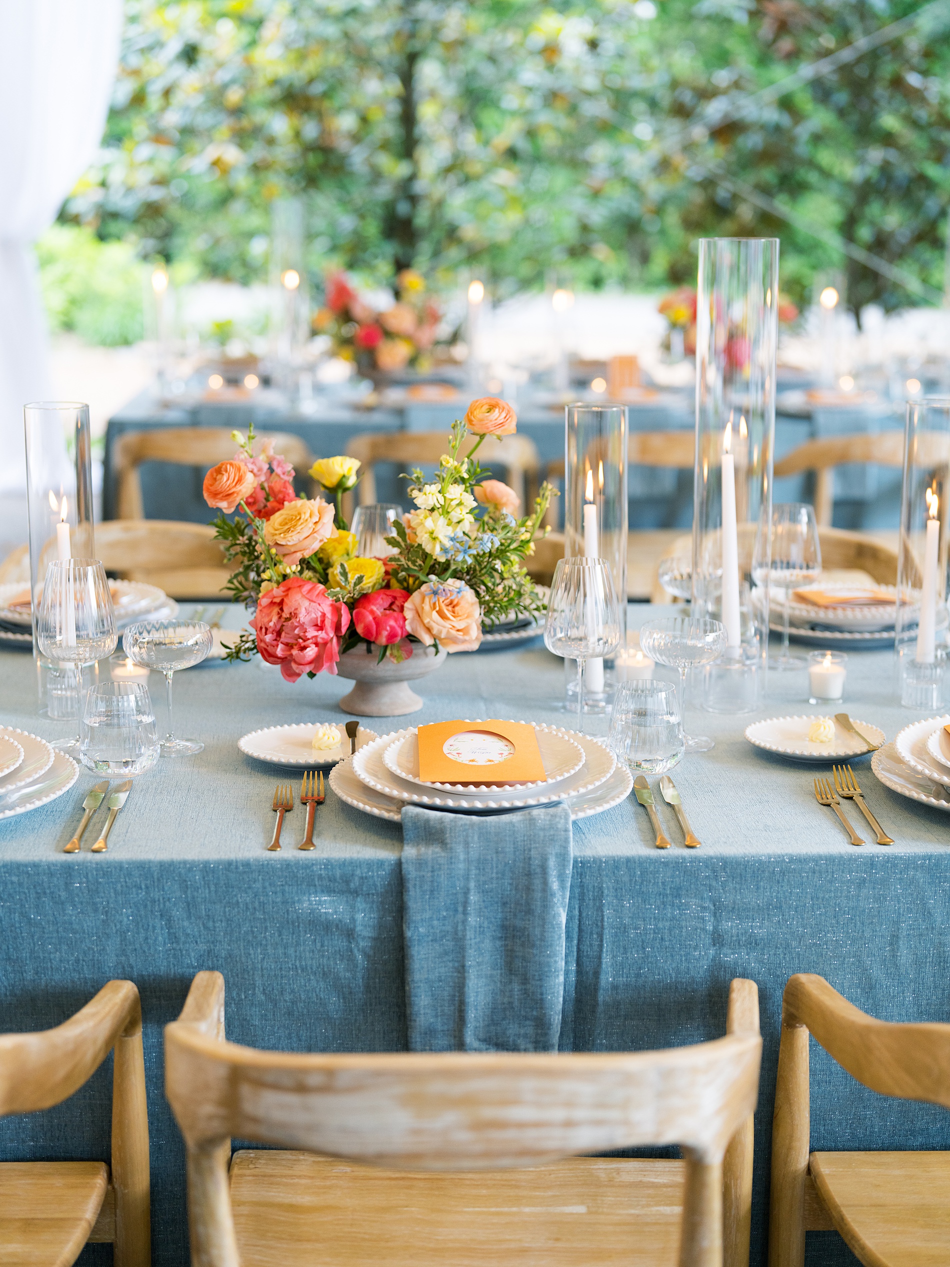
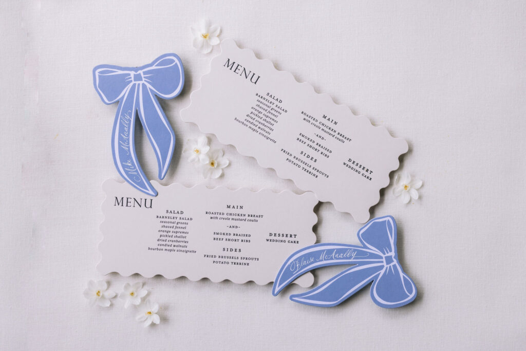
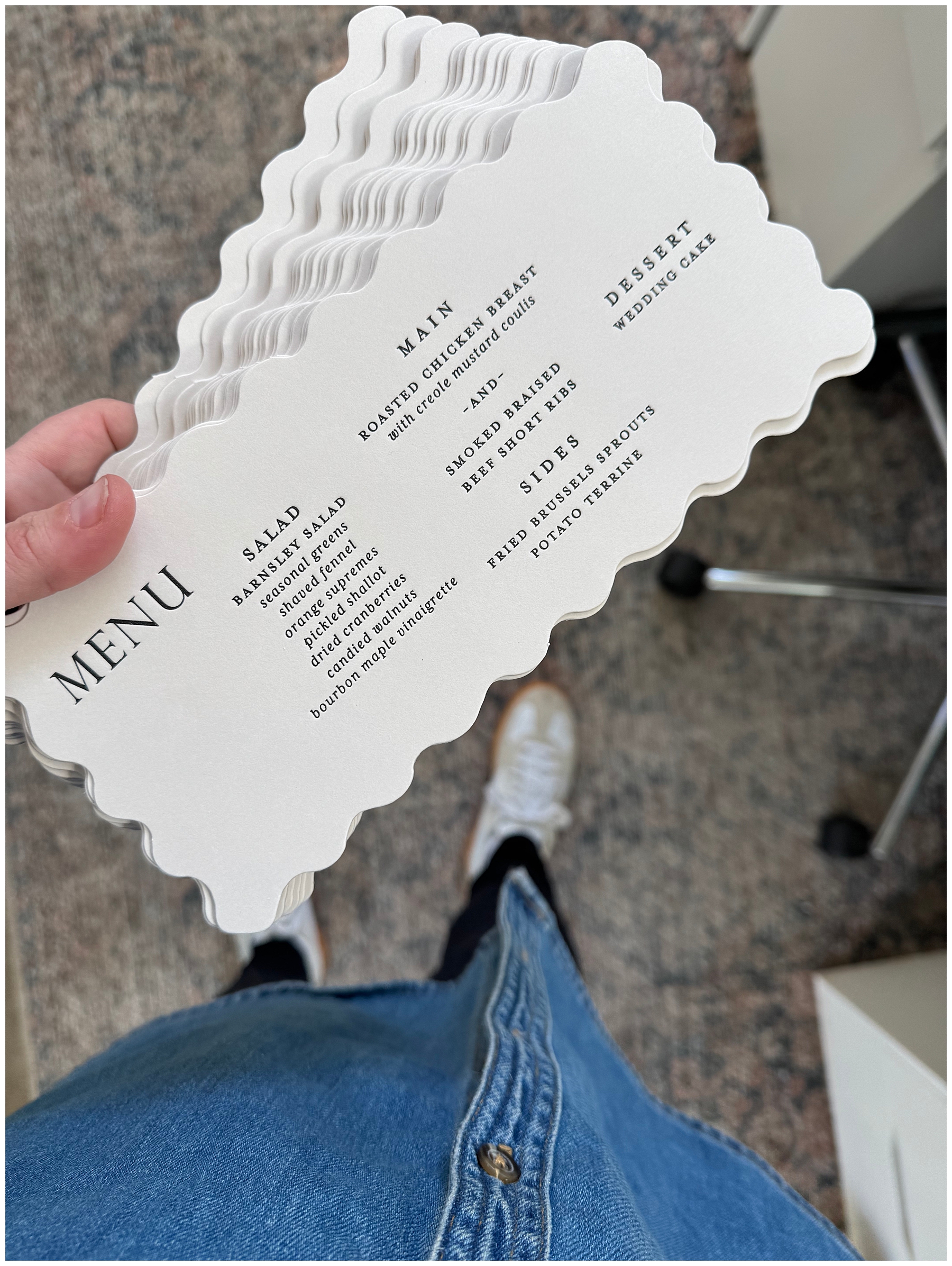
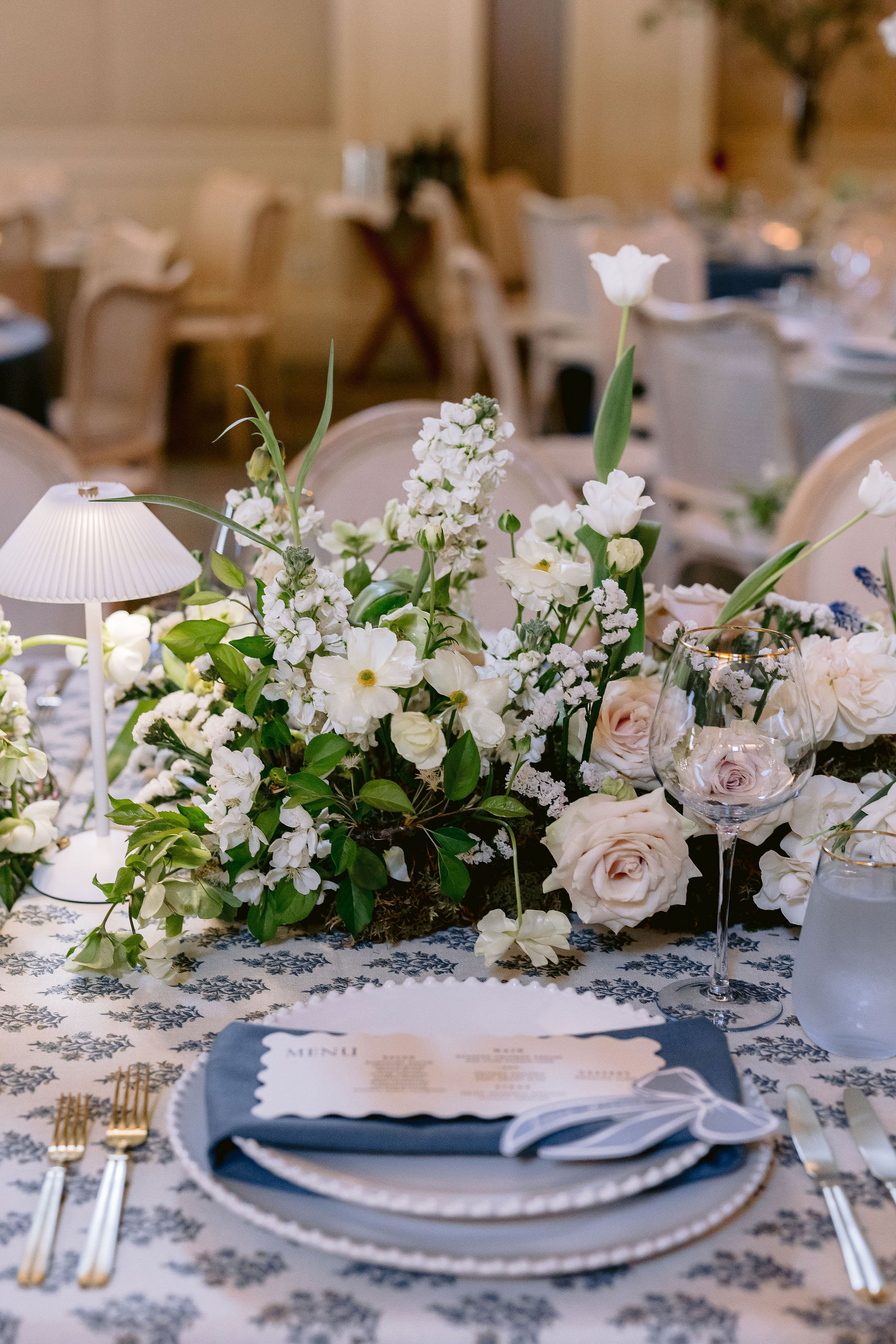
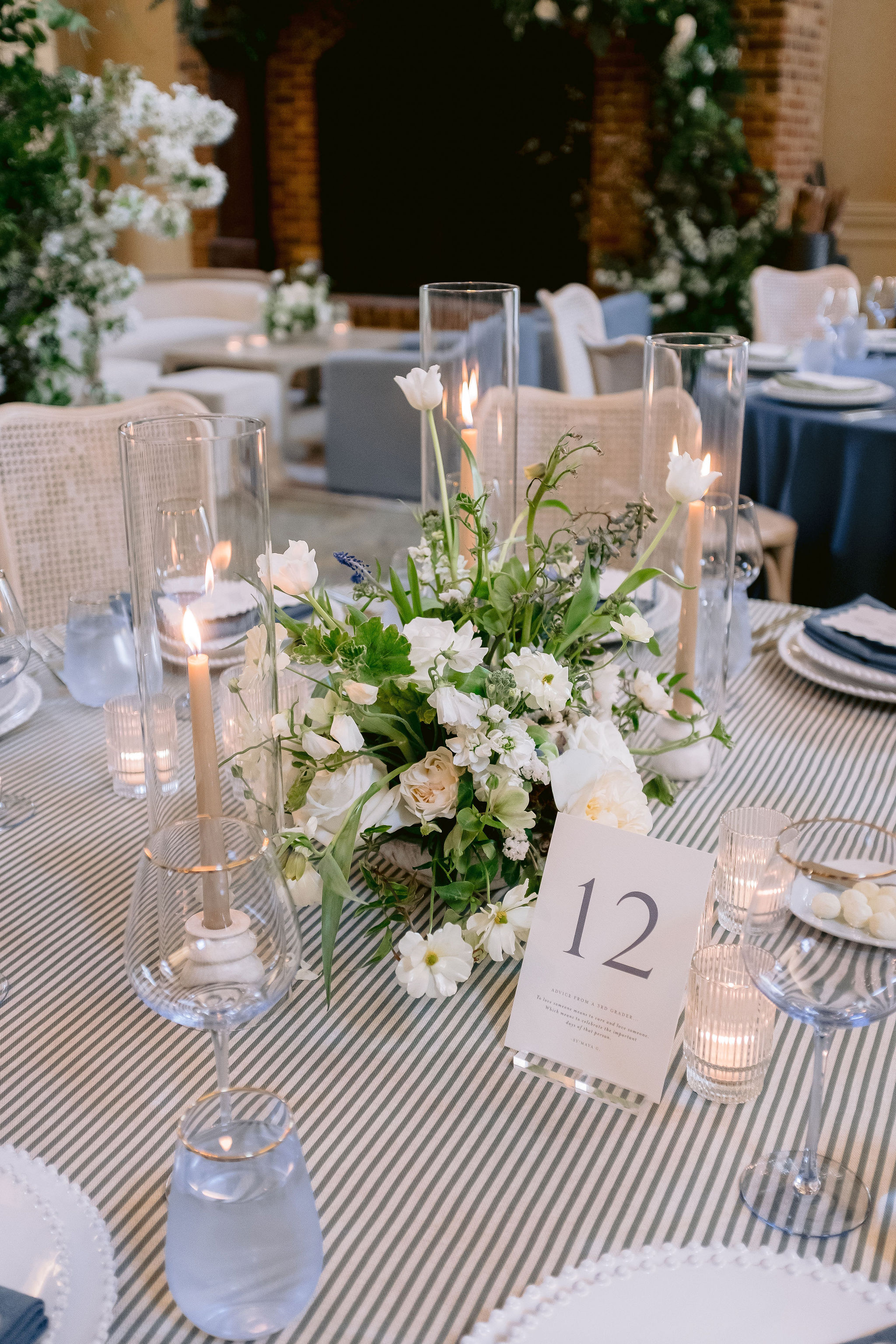
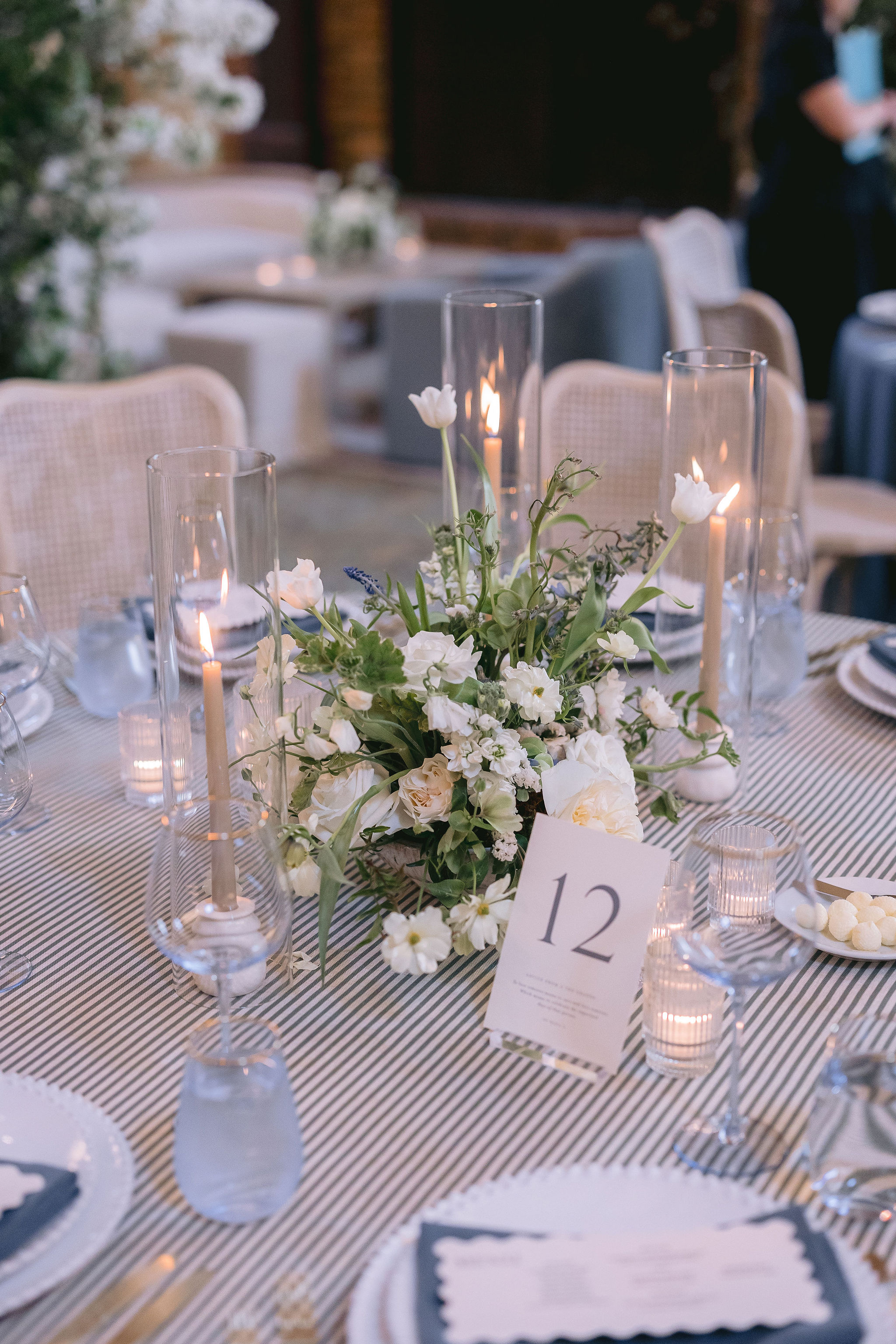
Accompanying the custom place cards, were the die-cut menus that sat atop each napkin at the table, adding a modern spin to the timeless tablescape. These tablescapes were a total highlight, featuring simple white florals with pops of blue and abundant greenery, paired with the paper details that tied everything together.
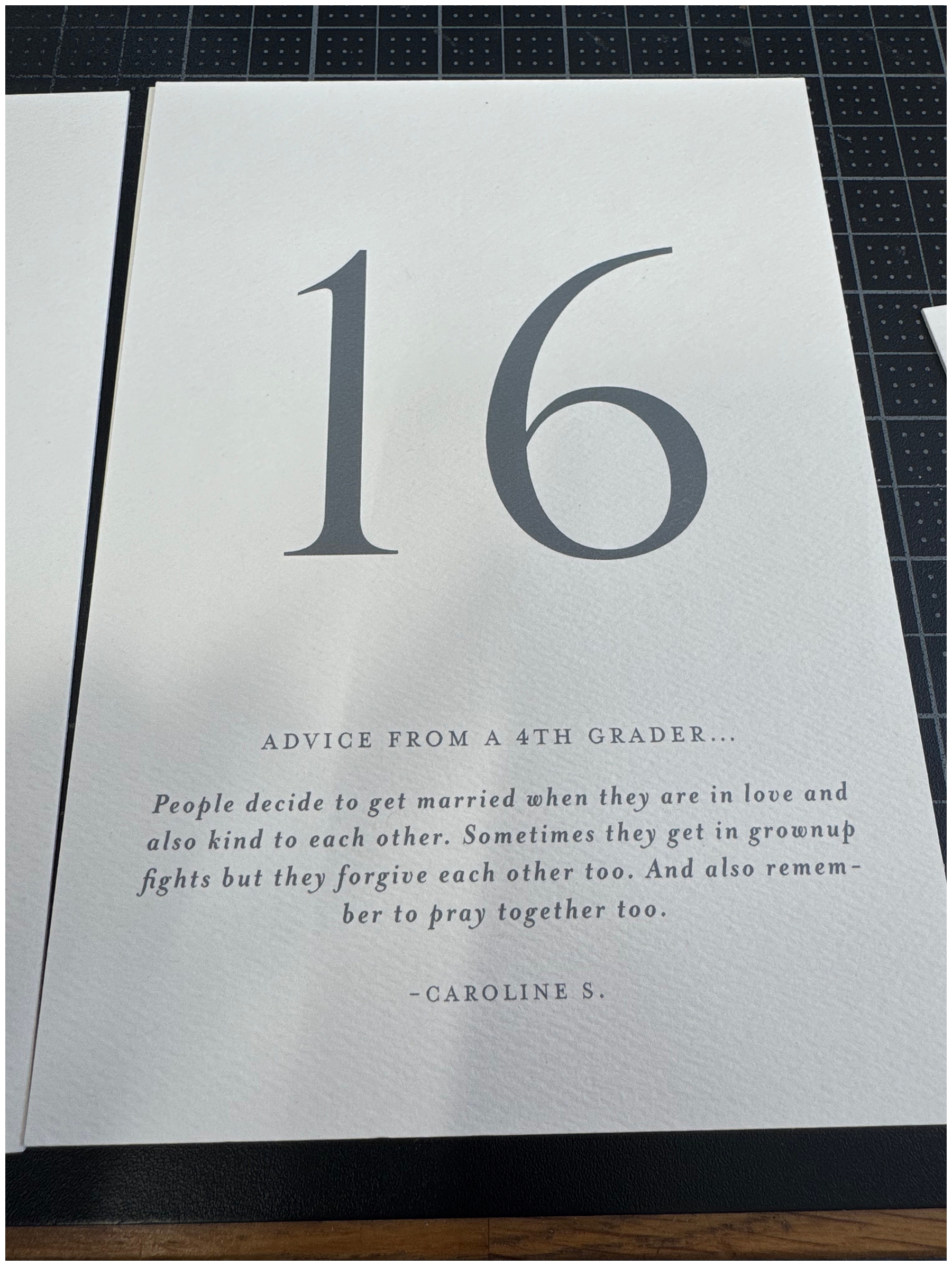
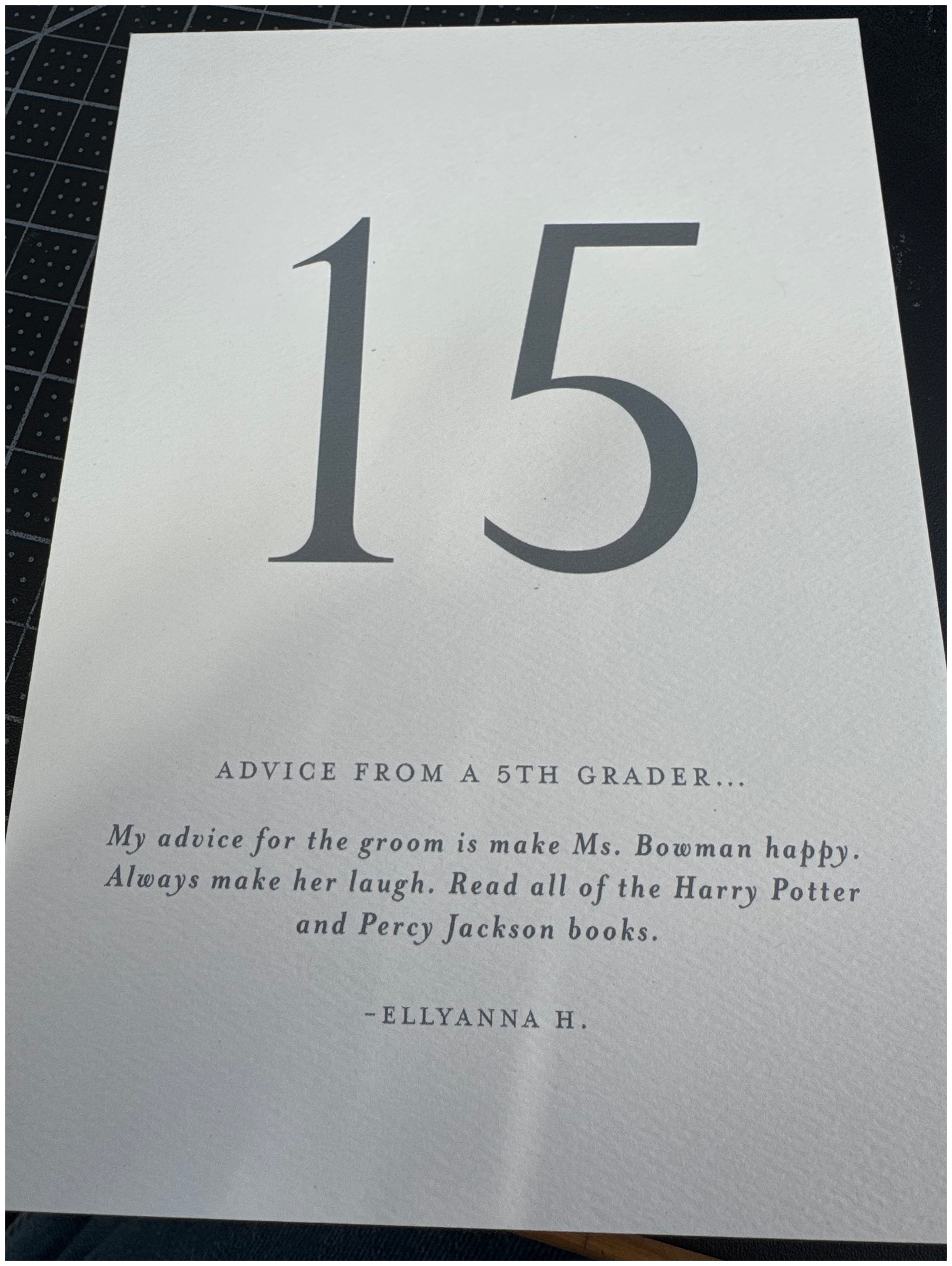
Memorable Custom Table Numbers
One of the most charming and memorable elements was a nod to Blaise’s career as a teacher. Instead of traditional table numbers, she had her third-grade students write “advice” for the couple. Each table featured a different note from her students, and they were as hilarious as they were heartfelt. One of our favorites:
“If you have a fight you should solve it out, hug it out, talk about your point of view and let him talk about his. And ask your dog if you shall forgive him.” – Zareya W.
That is solid advice from a third grader! These custom table numbers added so much personality to the reception. It’s these thoughtful, personal touches that truly make a wedding day unforgettable. I also love that Blaise wanted to include her students in her big day. It says so much about her love and dedication to her students!
From the Invitations to the place cards and everything in between, every element was intentional and cohesive, speaking to the couples’ dreamy wedding day vision. Blaise and Michael’s wedding was one to remember and it was an honor to be a part of it!
If you’re looking to add custom, thoughtful touches to your wedding or event, we would love to help make your vision a reality. Reach out today to learn more about our full-service design offerings—we can’t wait to create something unforgettable for you!
If you enjoyed this post, you’ll love these other blogs!