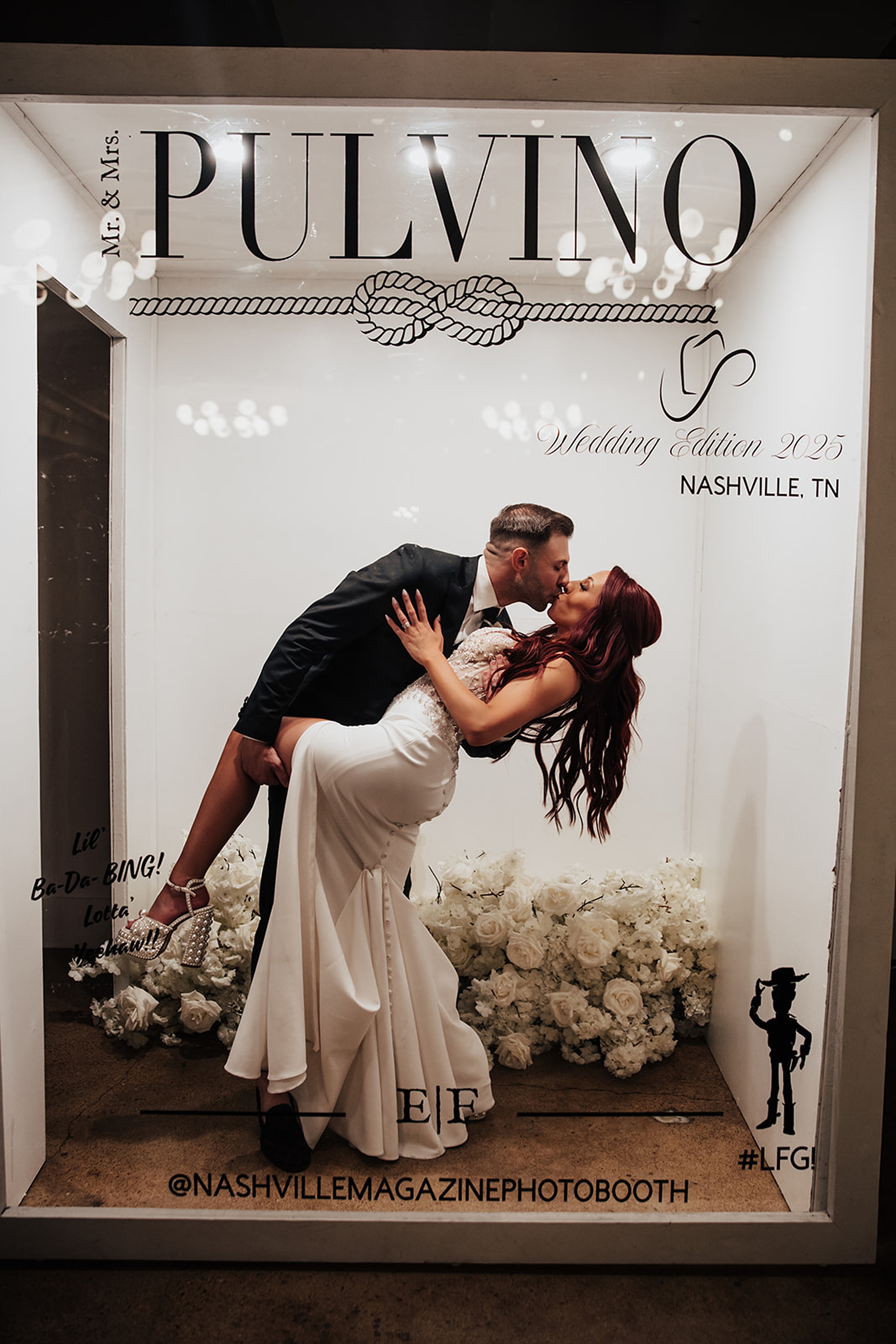
It was such a joy to design classic black and white wedding invitations and day-of details for Eva and Francesco’s Saint Elle Wedding. The entire celebration centered around an timeless and elevated black-and-white palette, and our paper goods became the thread that tied everything together. Everything from the playful save the dates that imitated a plane ticket, to the meaningful displays guests interacted with throughout the day was created with purpose. Eva and Francesco infused their personalities and story into every detail, giving us the opportunity to create something meaningful, elevated, and uniquely them.
Classic, Elevated Invitations With a Modern Edge
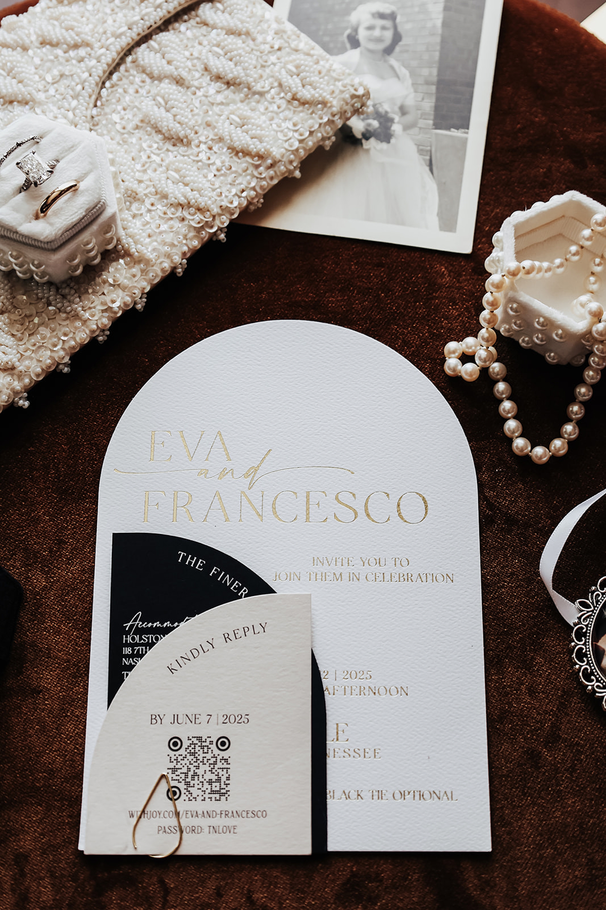
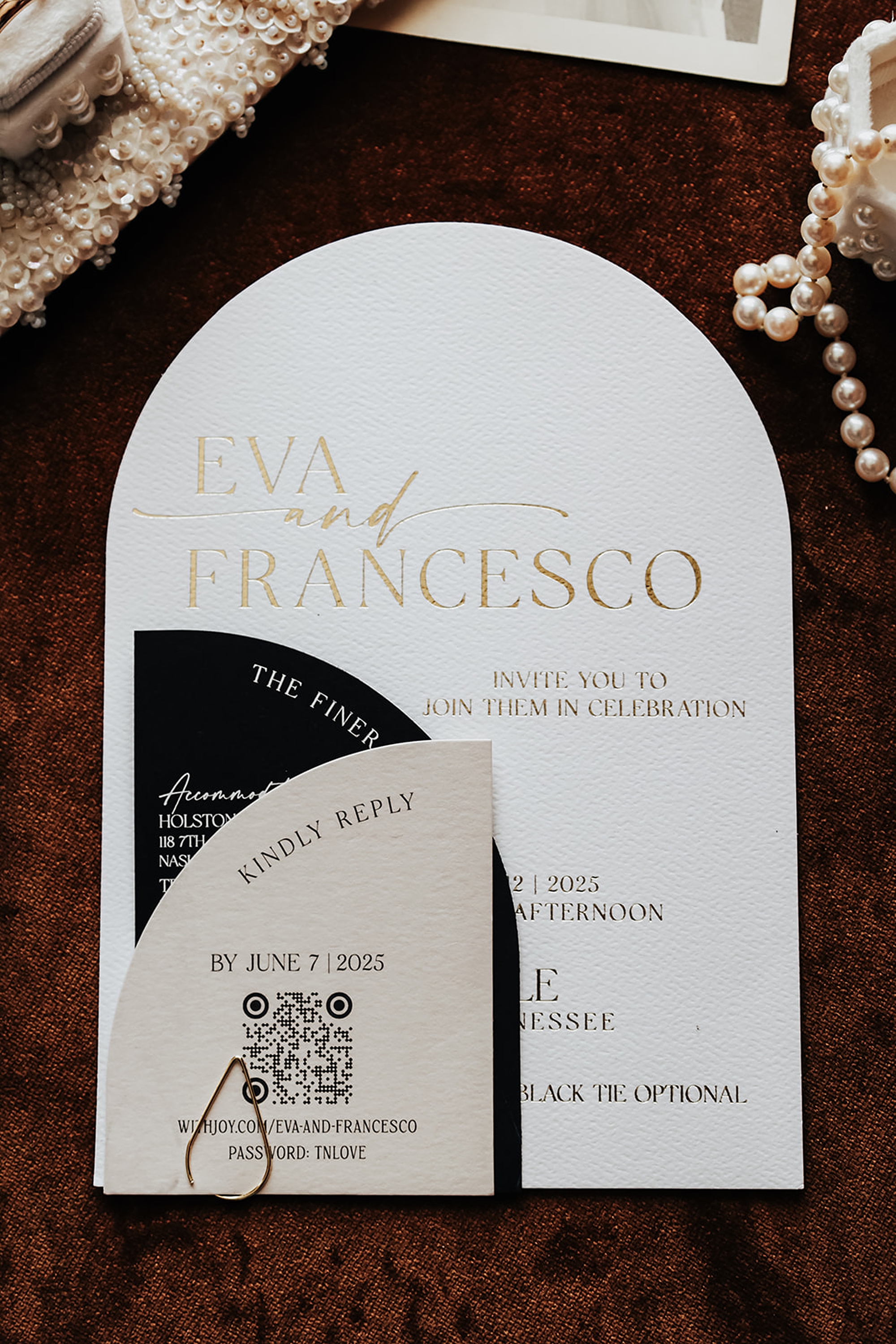
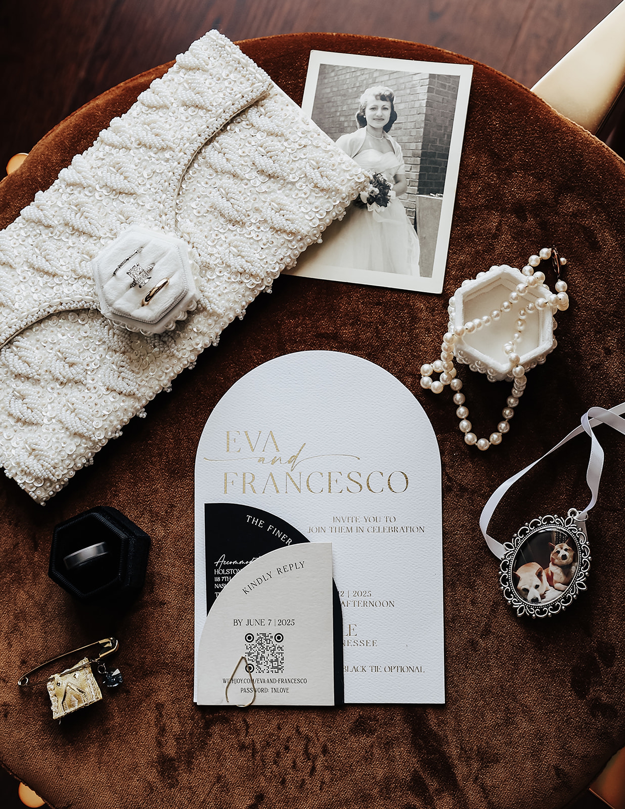
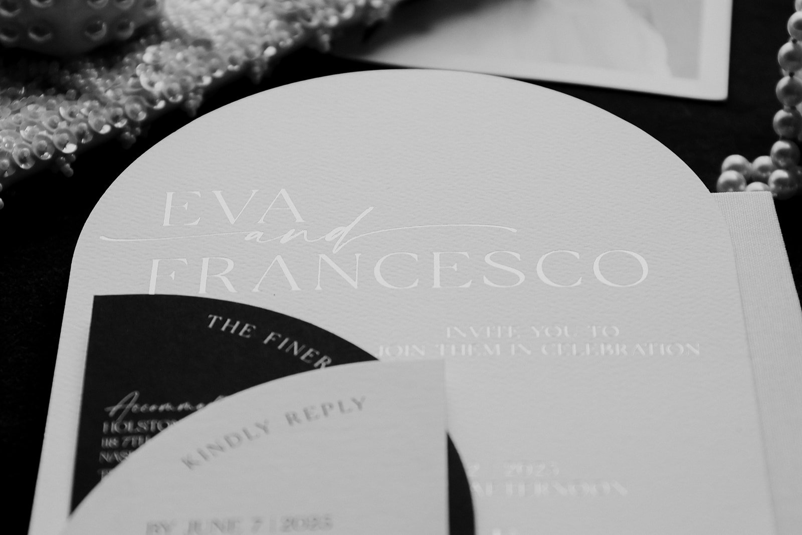
Their invitation suite laid the foundation for the black-and-white theme, with a modern structure and layered textures. Their suite was proof that modern doesn’t mean minimal. Eva & Francesco wanted a suite that felt personal, polished, and completely their own. So we leaned into sculptural shapes, high-contrast tones, and luxe gold foil to make every piece feel intentional. We designed the main invitation in a white tombstone shape for a striking yet classic focal point. The additional paper pieces layered neatly into the suite, and each card alternated in color of white, black, and cream, indicating the main colors of their wedding day. It was the perfect balance of clean, elevated, and effortlessly chic.
And don’t miss the save the date; designed to look like a plane ticket for their destination-inspired day. A first-class way to kick things off, if you ask us.
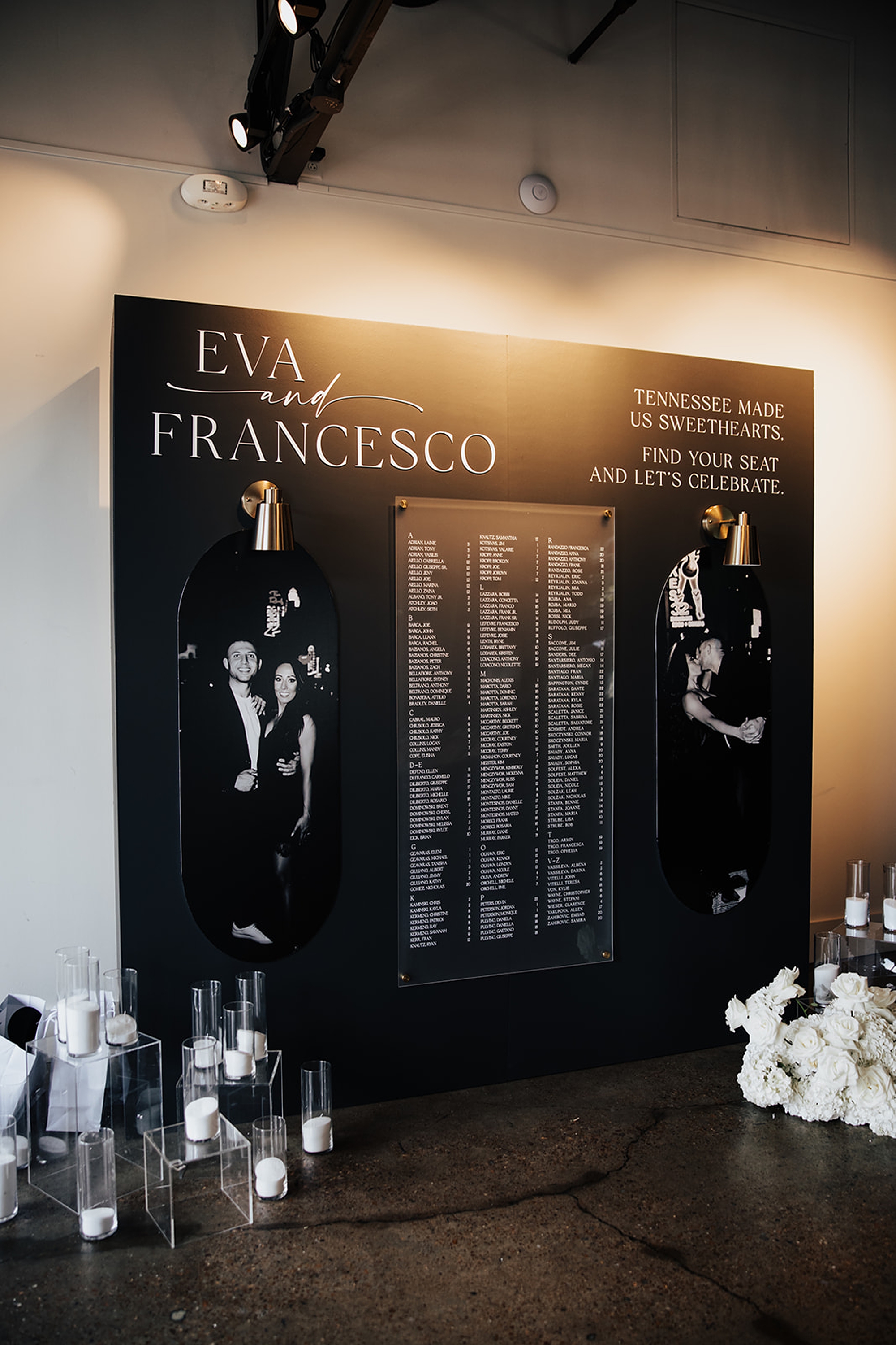
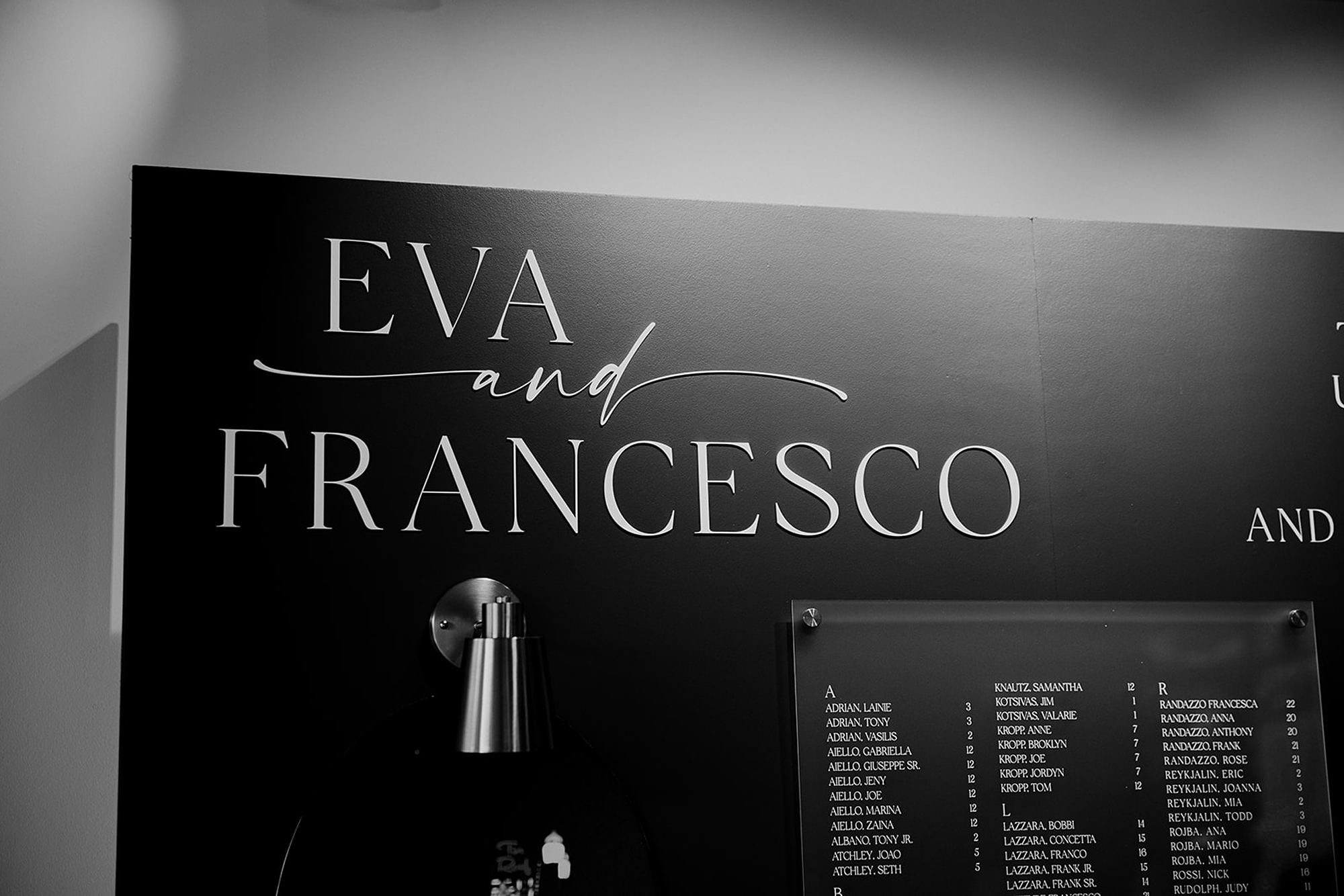
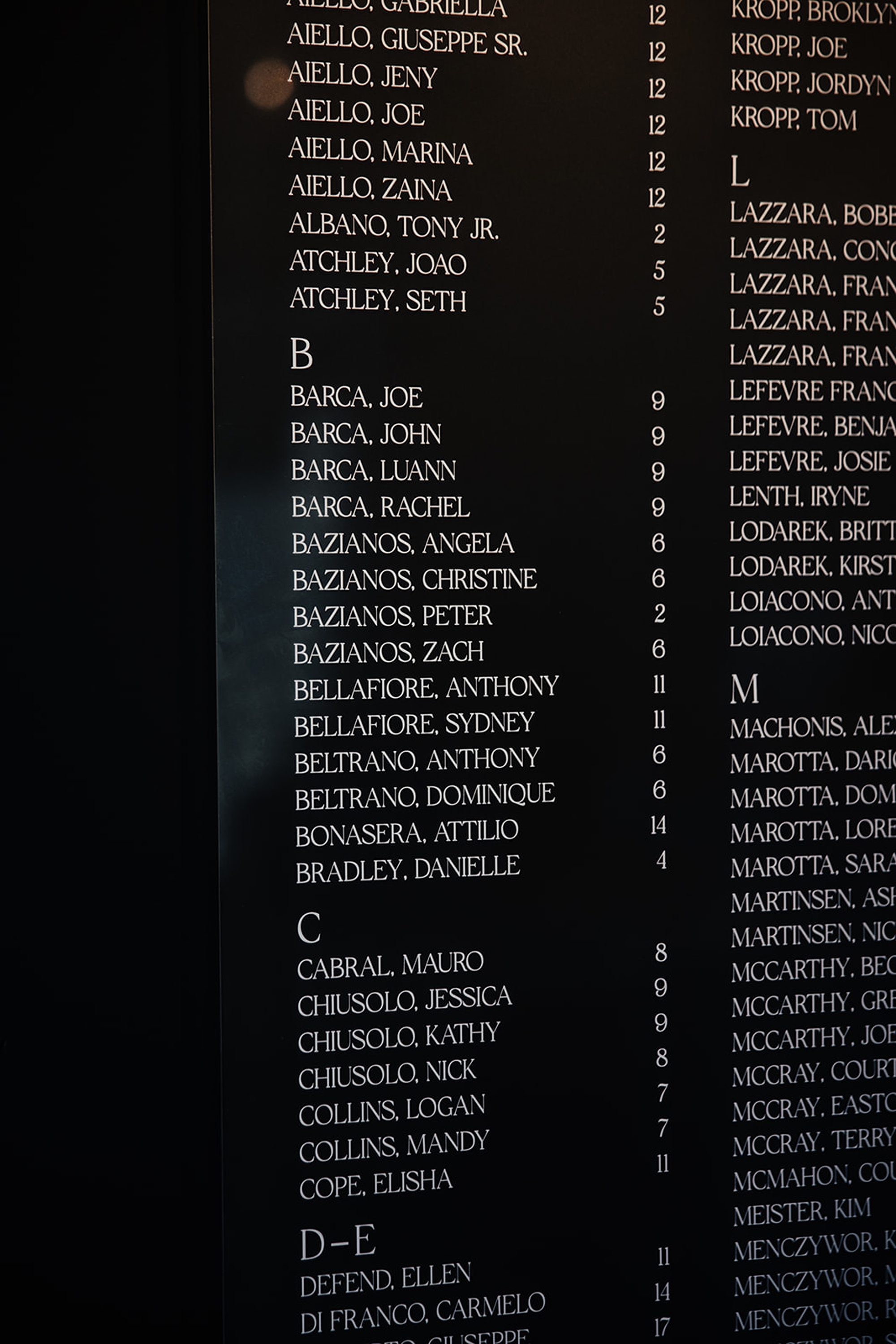
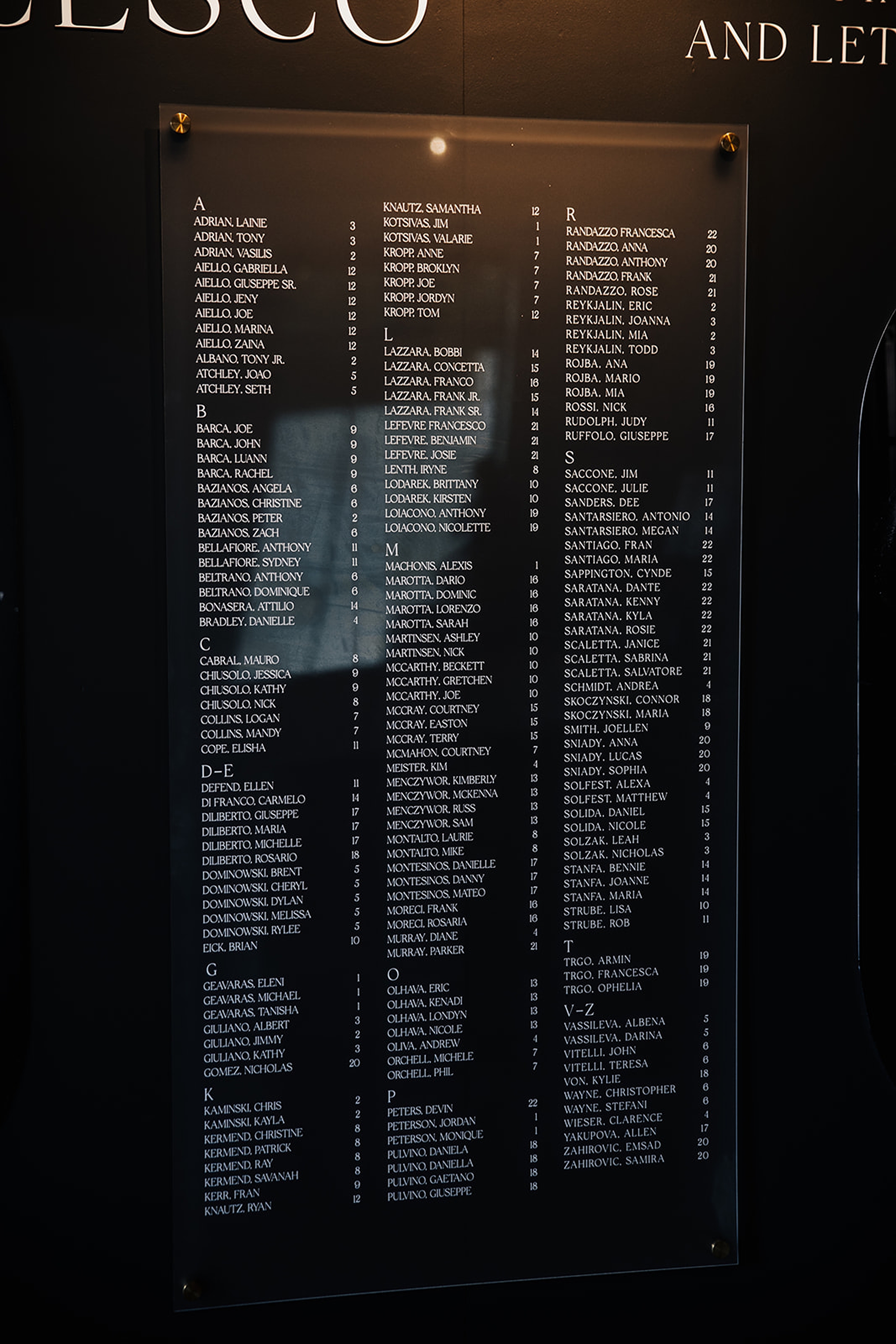
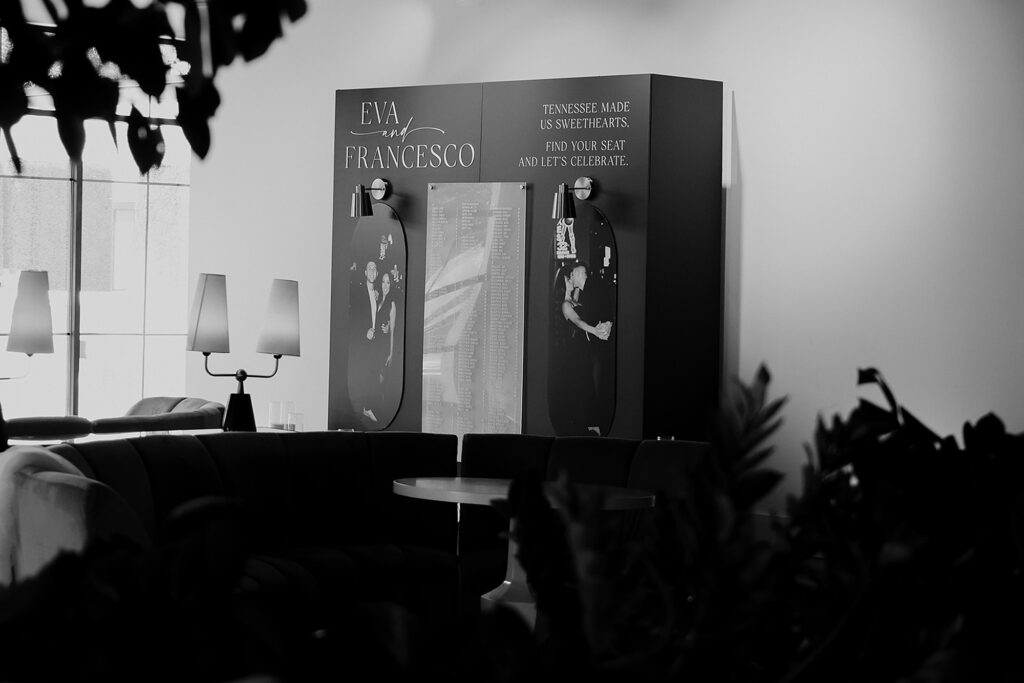
Seating Chart Wall Featuring Their Engagement Photos
This was a first for us, and now we’re obsessed! When the bride asked if we could include their engagement photos on the seating chart, we said absolutely yes. We had fun with this request, designing a seating chart that became an instant showstopper. The result was a black and white moment that felt like part art gallery, part seating chart, and fully them.
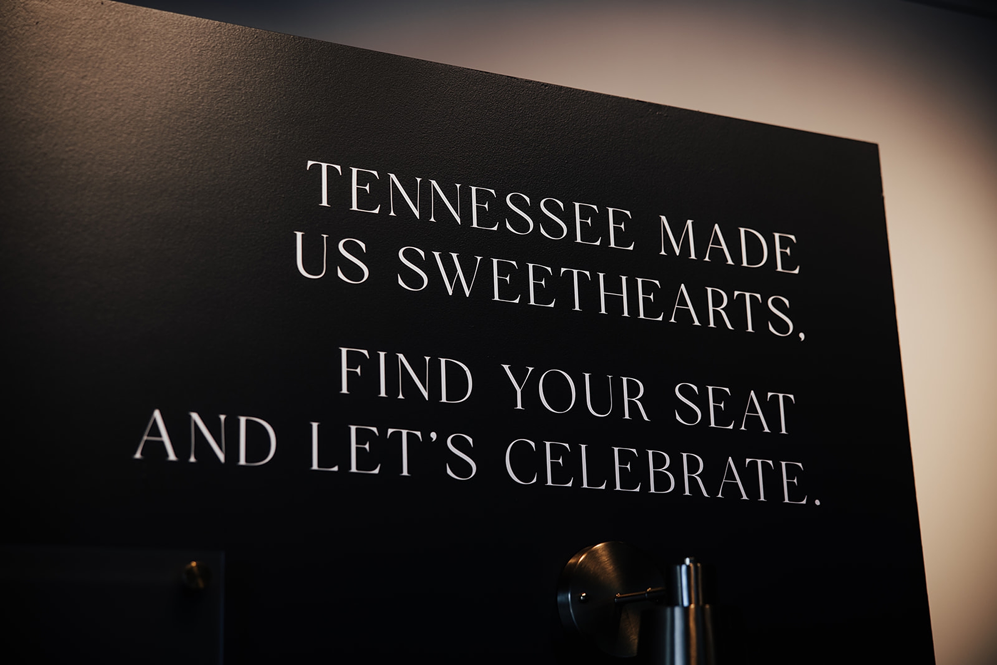
The sleek black display wall, we added the white lettering to display the guest names and their table assignment. Then on each side, framing the display we showcased an engagement photo. At the top corner of the display, their names, Eva & Francesco, framed the design beautifully. On the opposite side, we added a sweet personal touch with the phrase: “Tennessee made us sweethearts. Find your seat and let’s celebrate.”It added warmth, storytelling, and just the right amount of Southern charm.
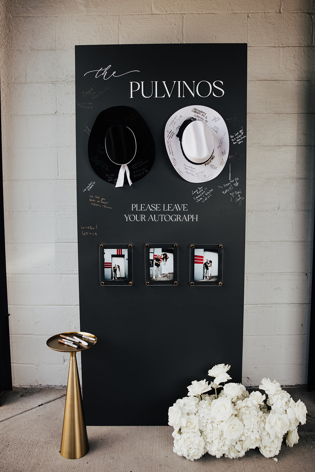
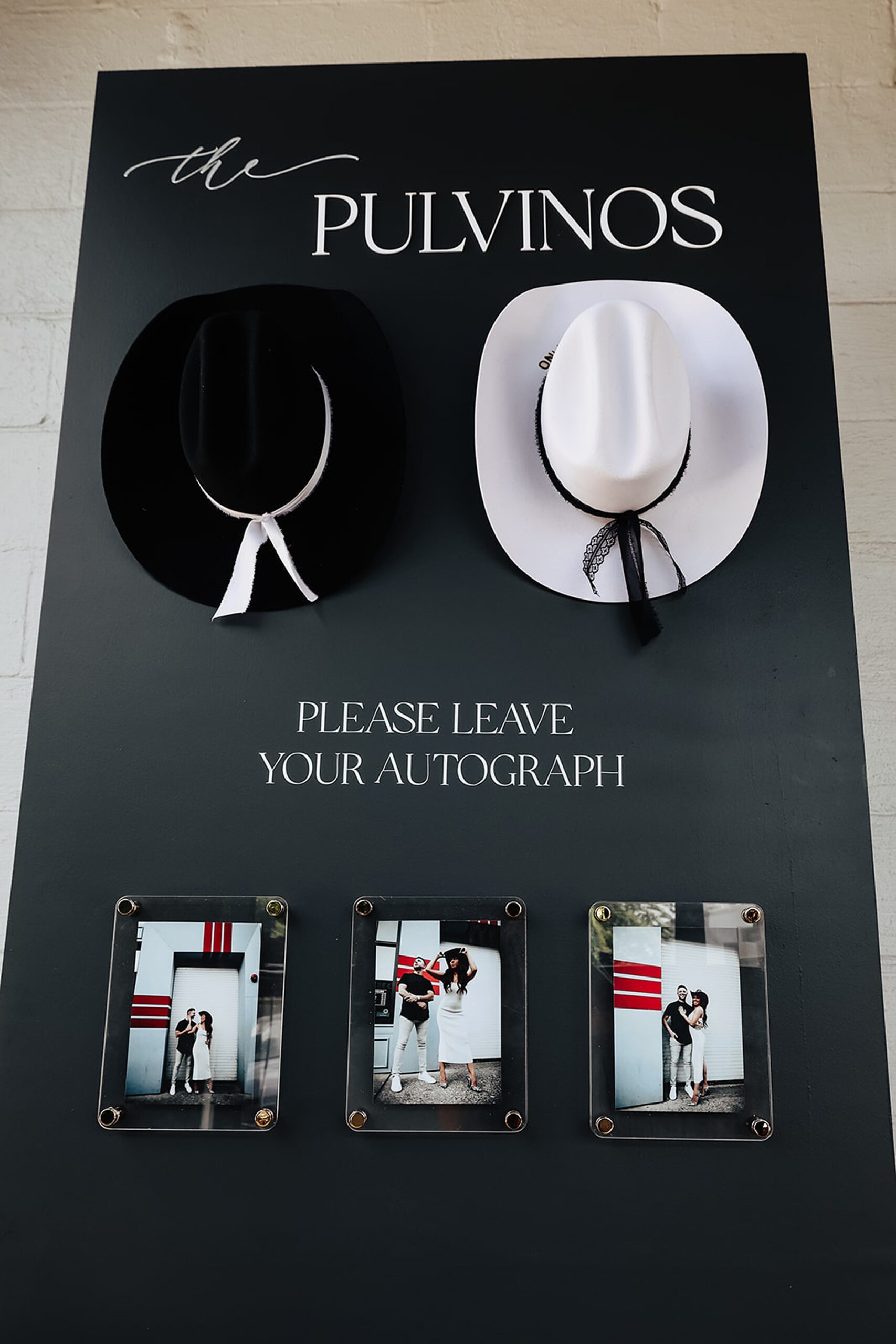
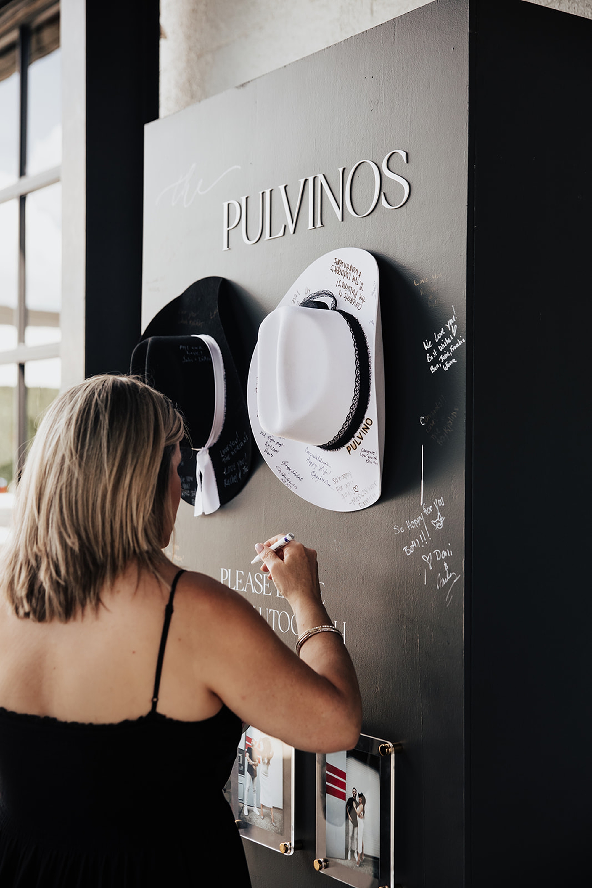
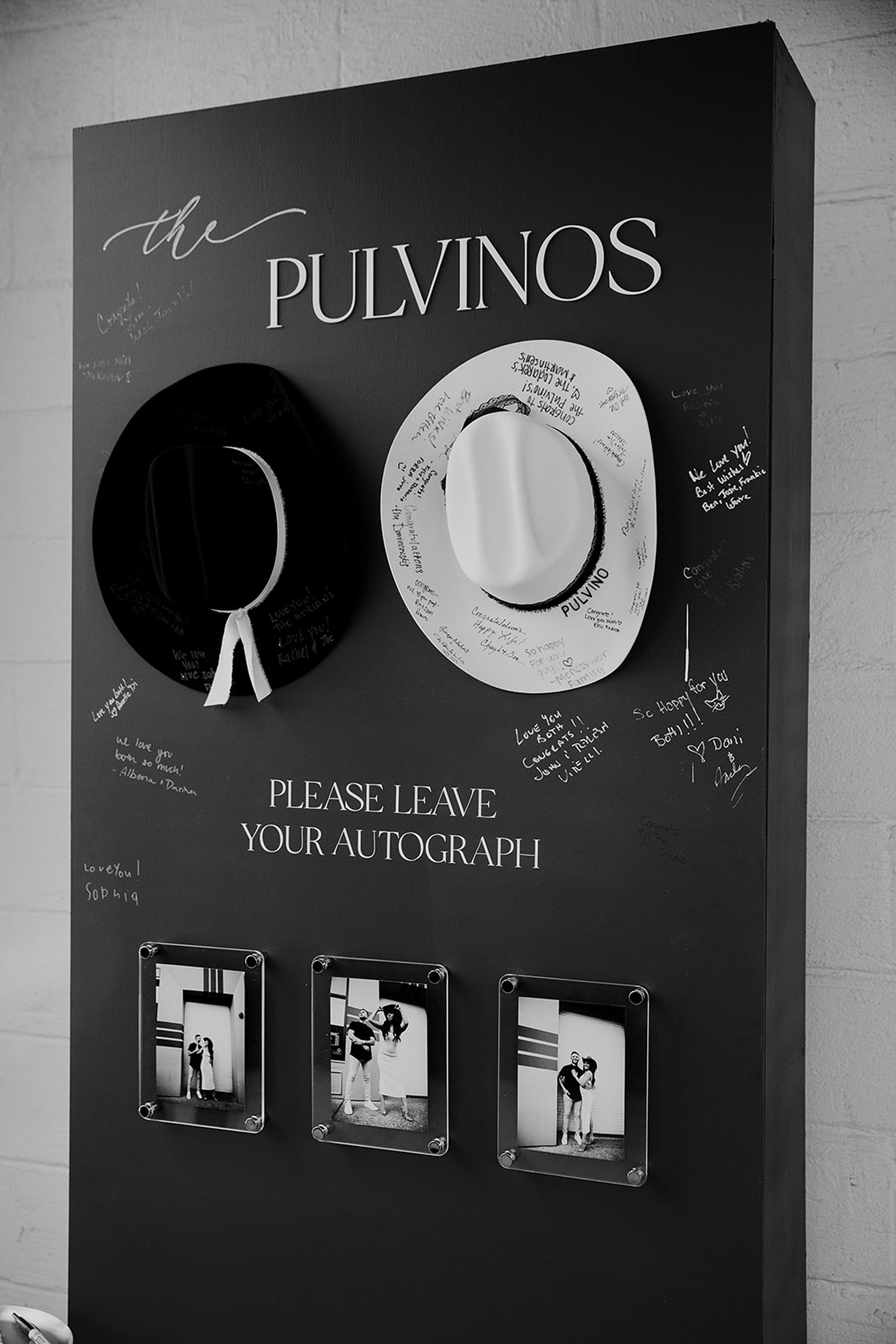
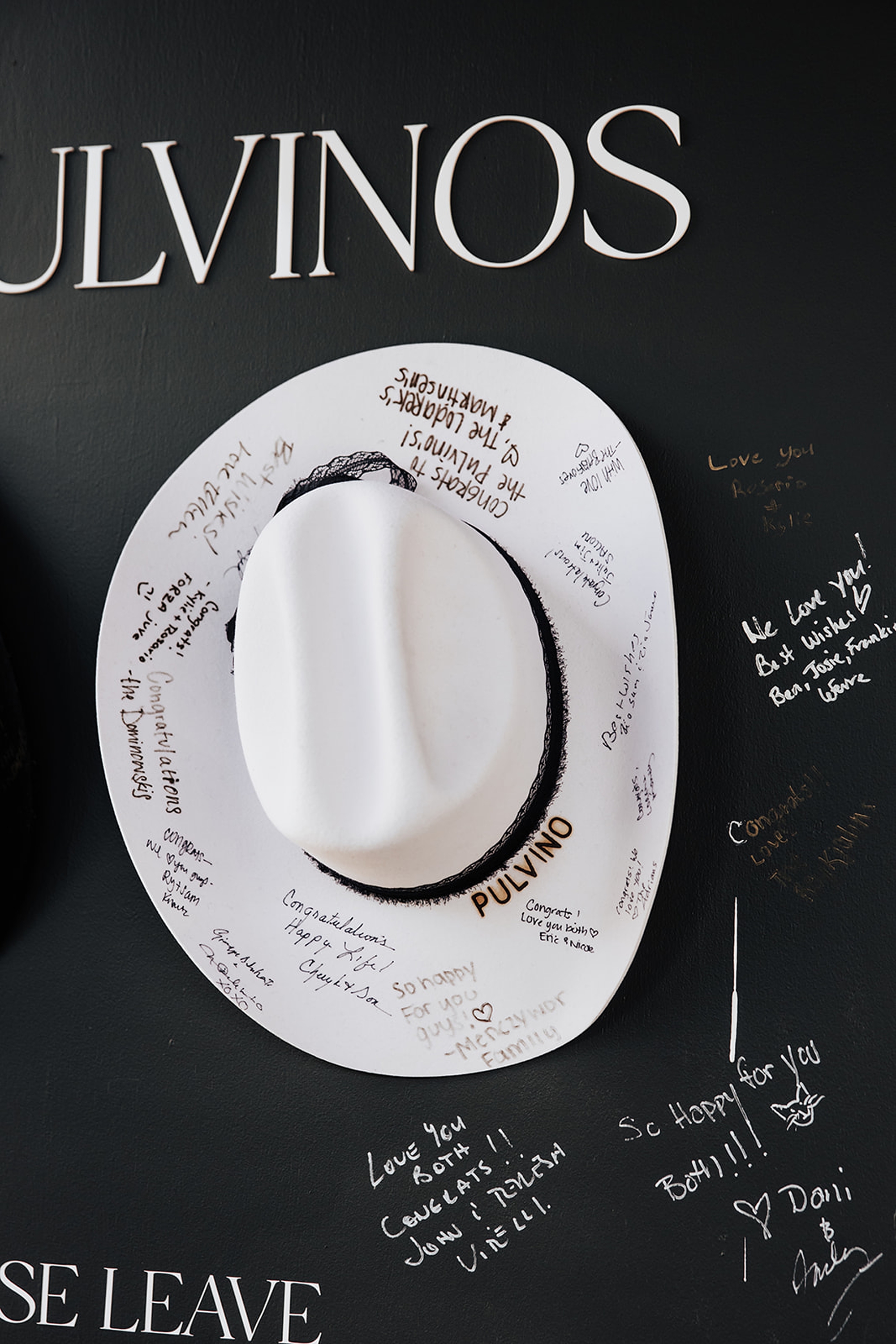
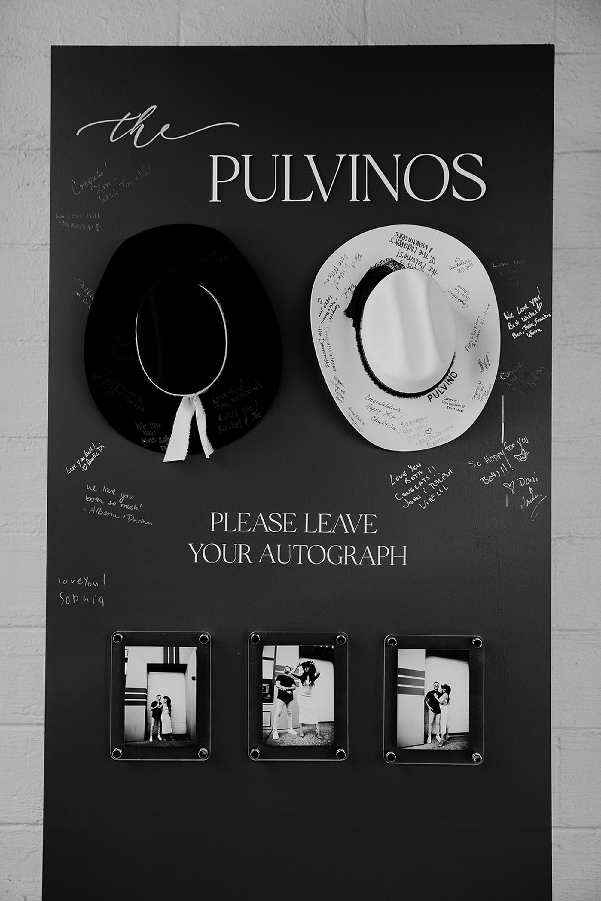
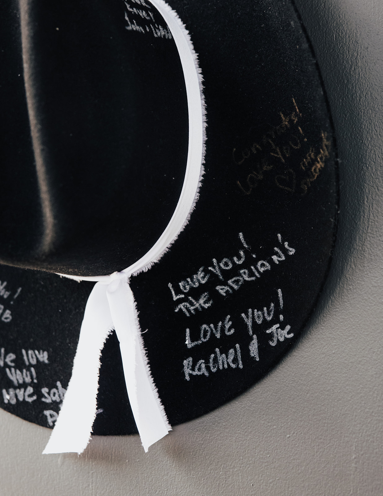
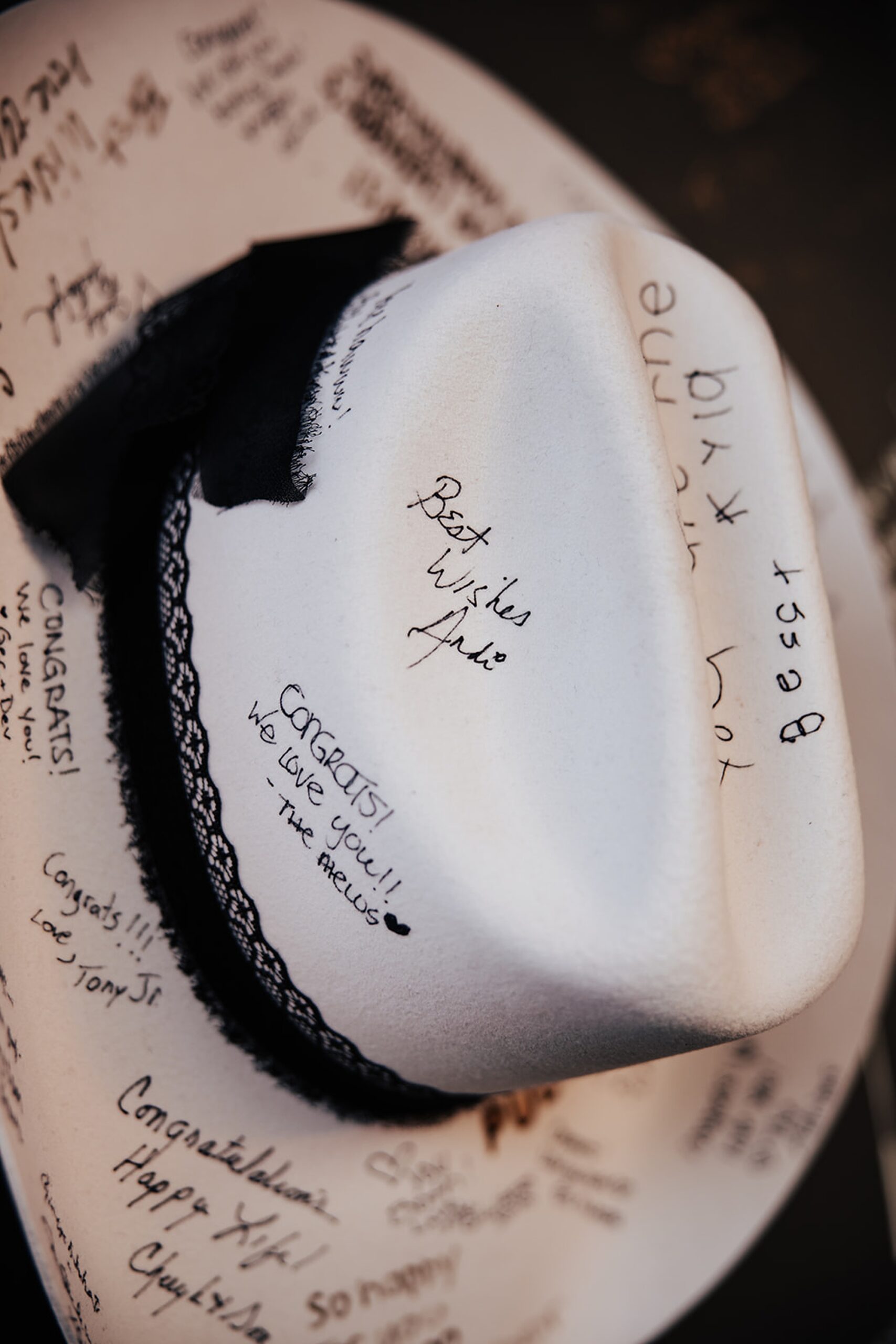
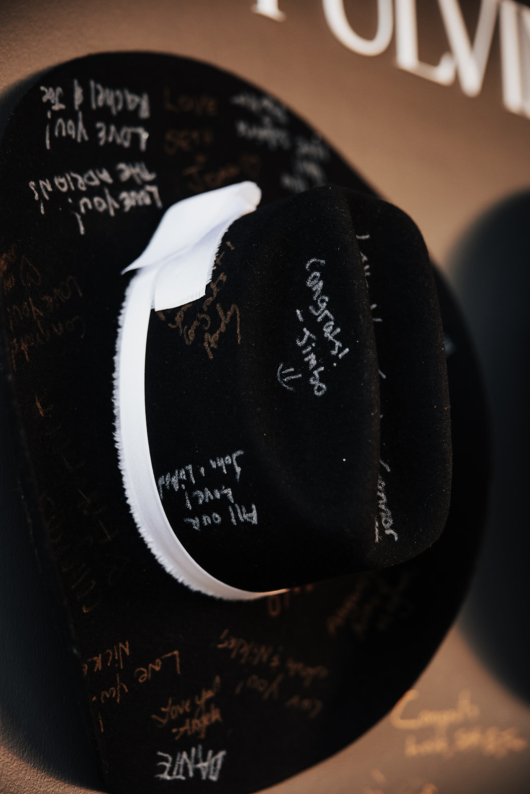
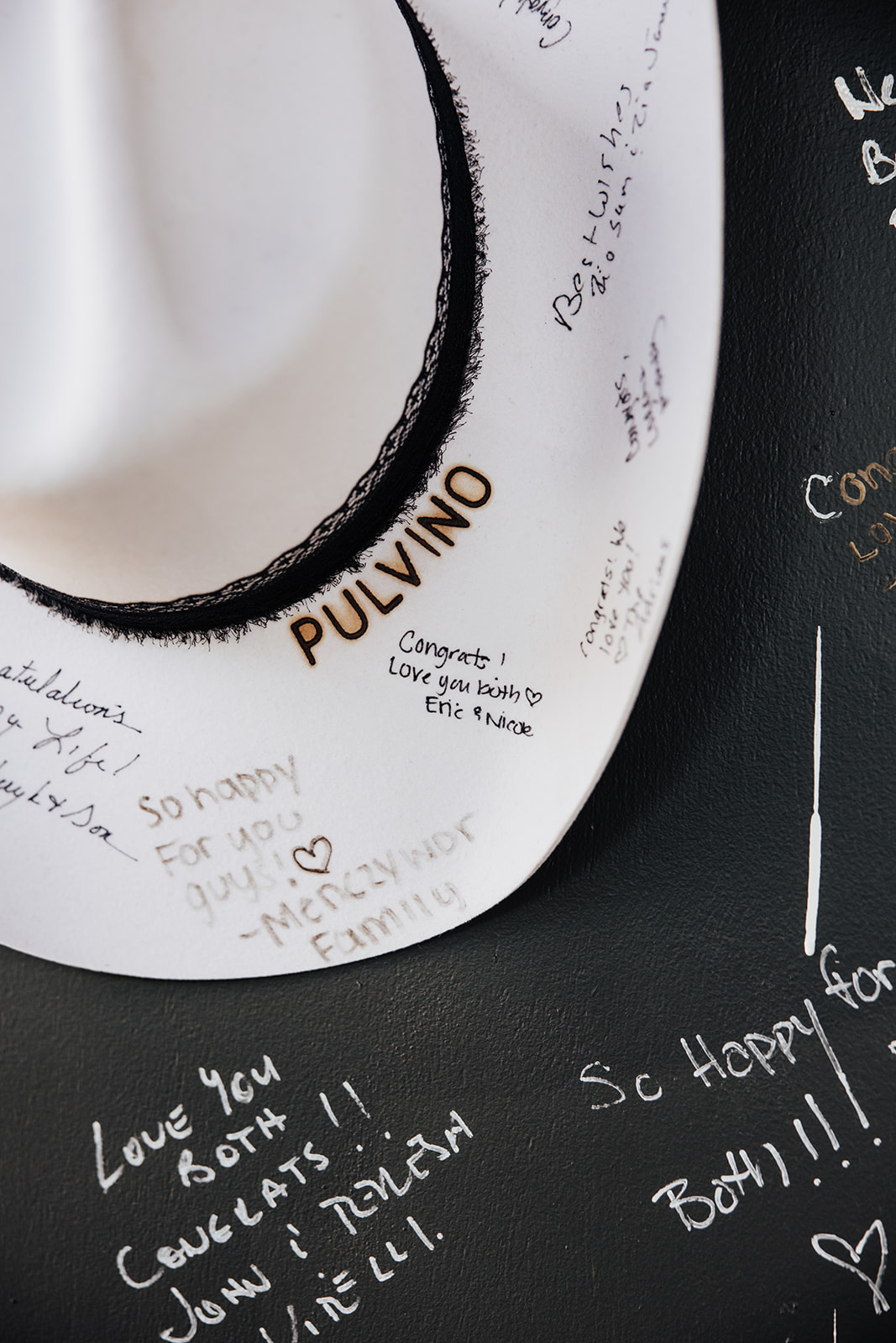
A Cowboy Hat Guestbook Wall
It’s no secret that Nashville is all about country music. To honor a bit of their story, personality, and the city where they tied the knot, they included a cowboy hat guestbook wall, which might have been my favorite detail of the entire day. Not only was it unique and memorable, it created a playful and completely memorable moment for guests, as they couldn’t wait to leave their mark.
The black display wall featured their last name, “The Pulvinos,” in bold white lettering centered at the top. Below, we mounted one black and one white cowboy hat for guests to sign, along with a small cocktail table placed in front to hold pens. It perfectly captured the couple’s love for Nashville while remaining clean and elevated.
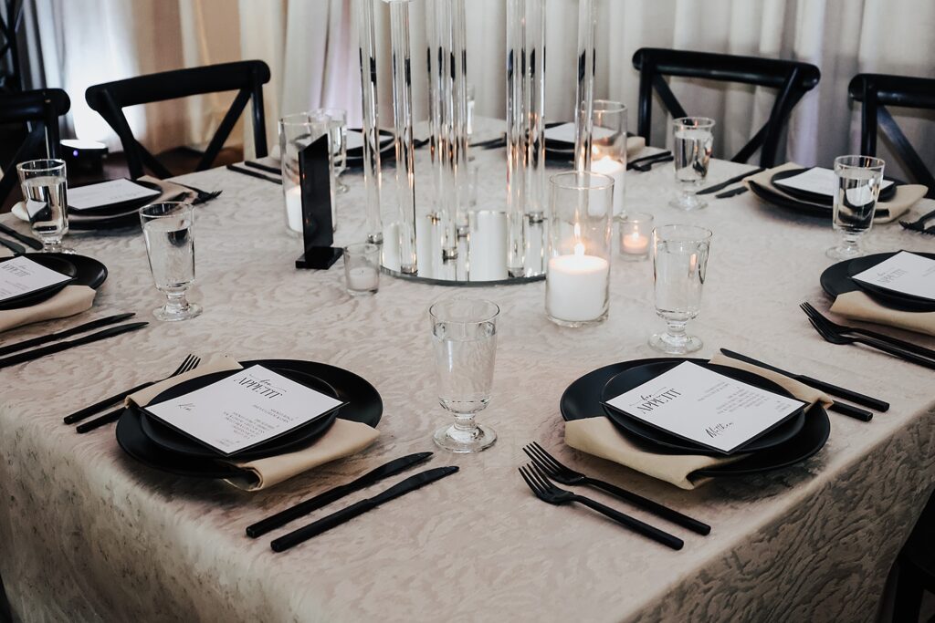
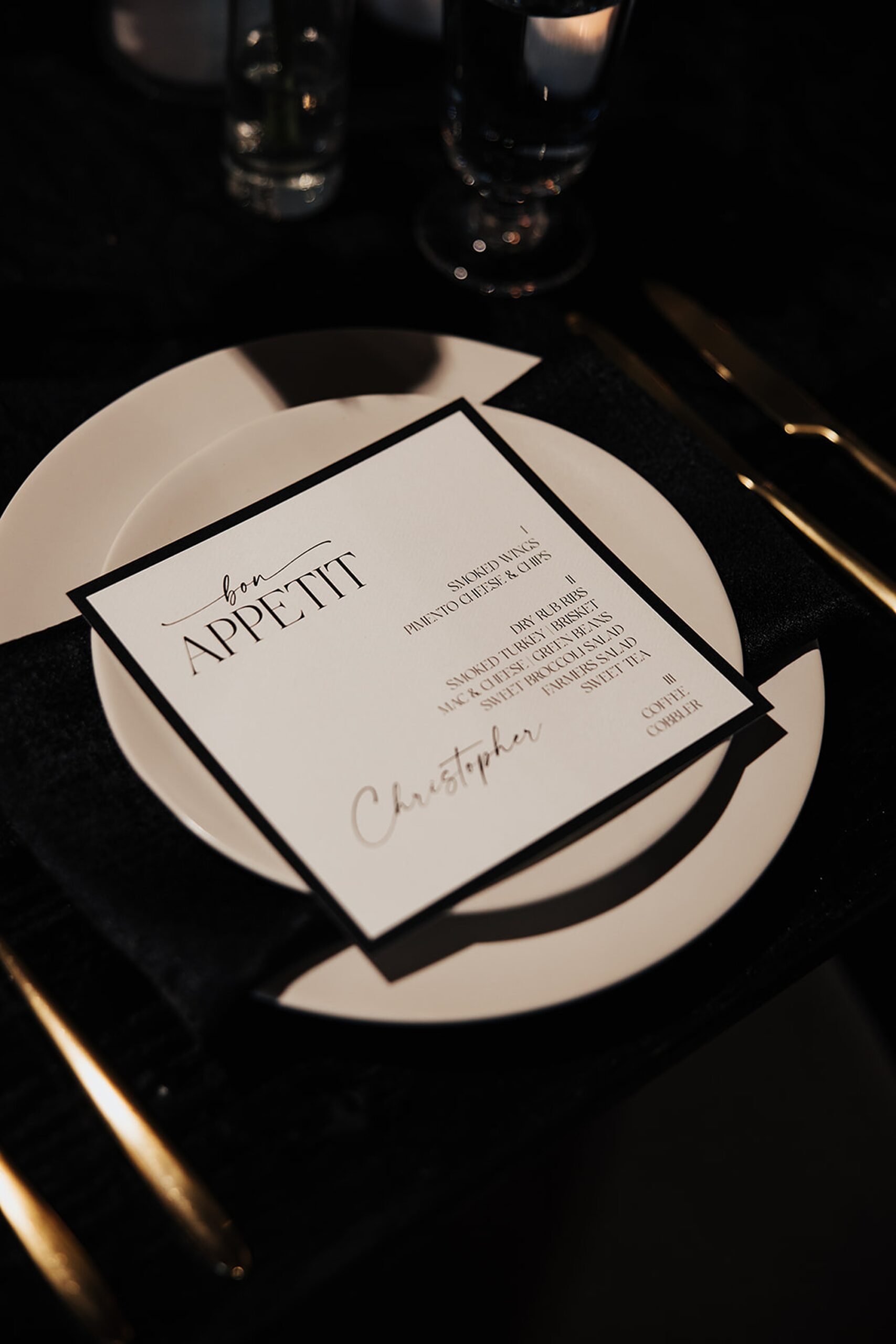
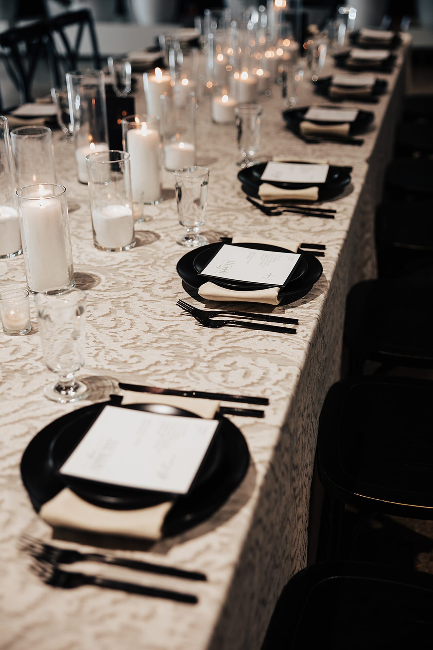
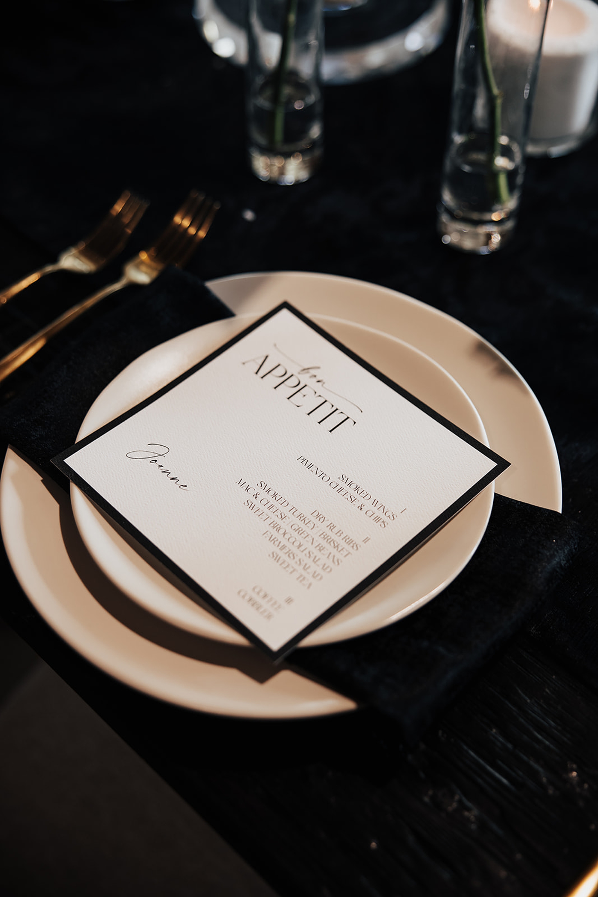
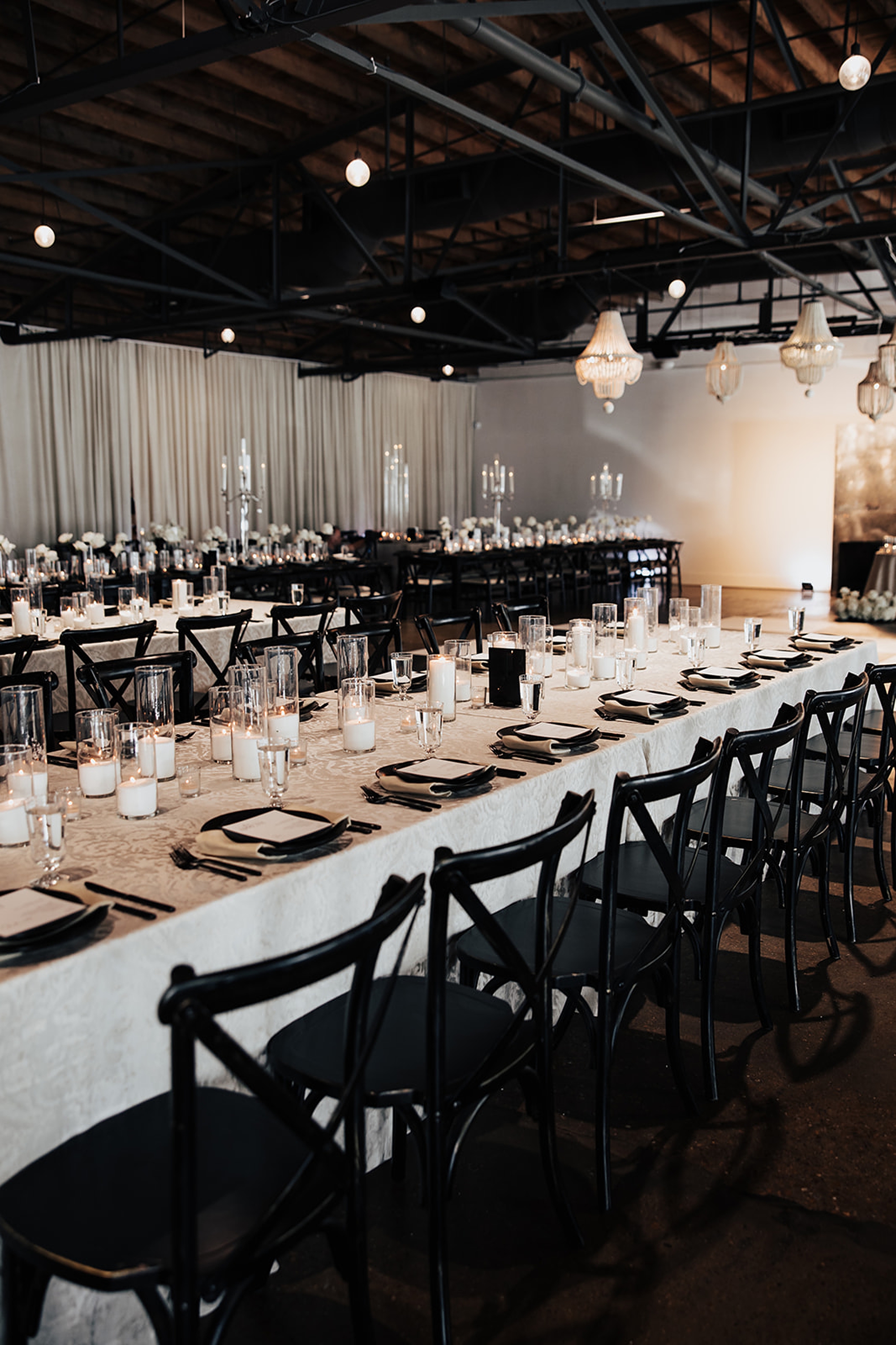
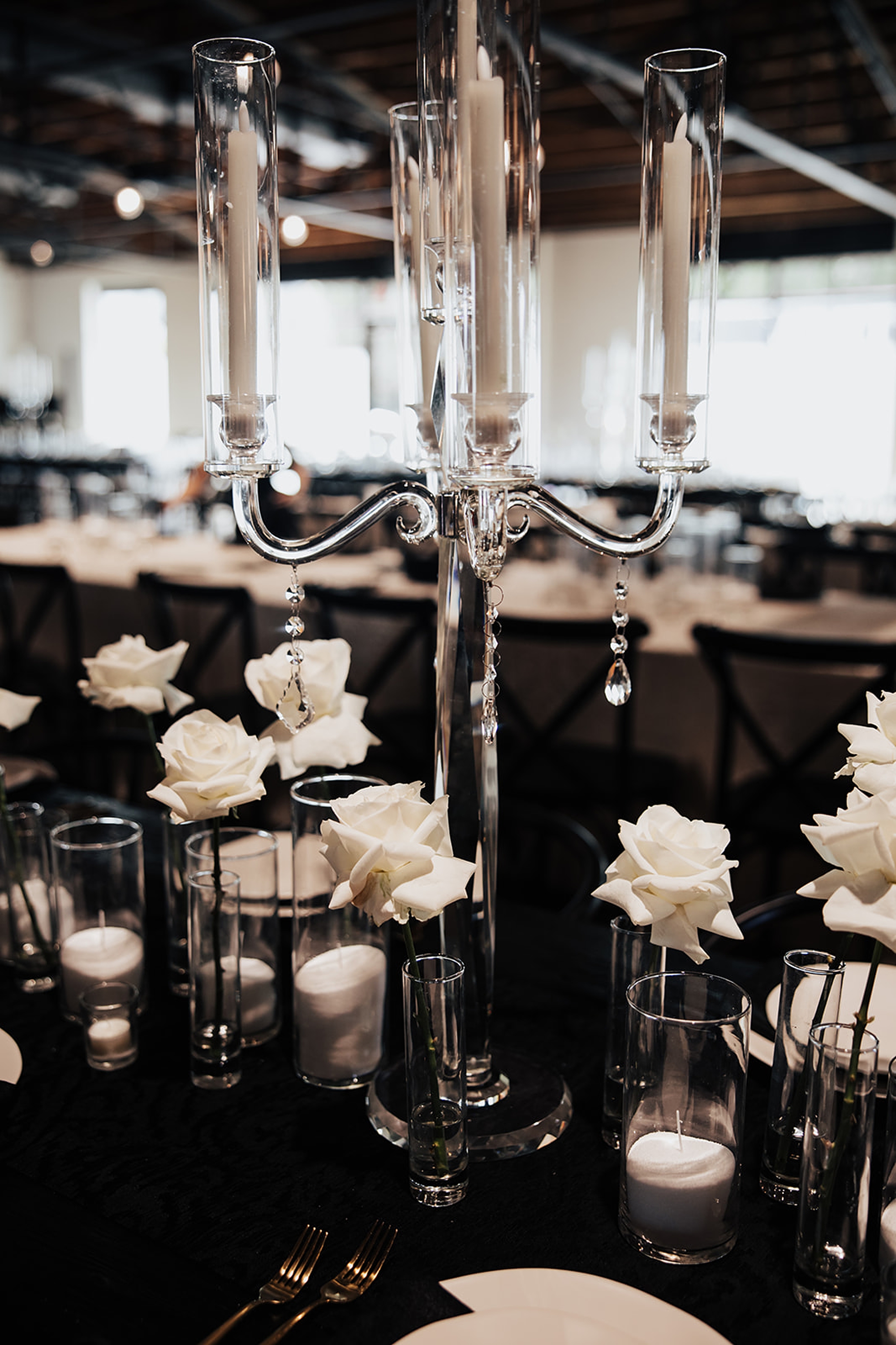
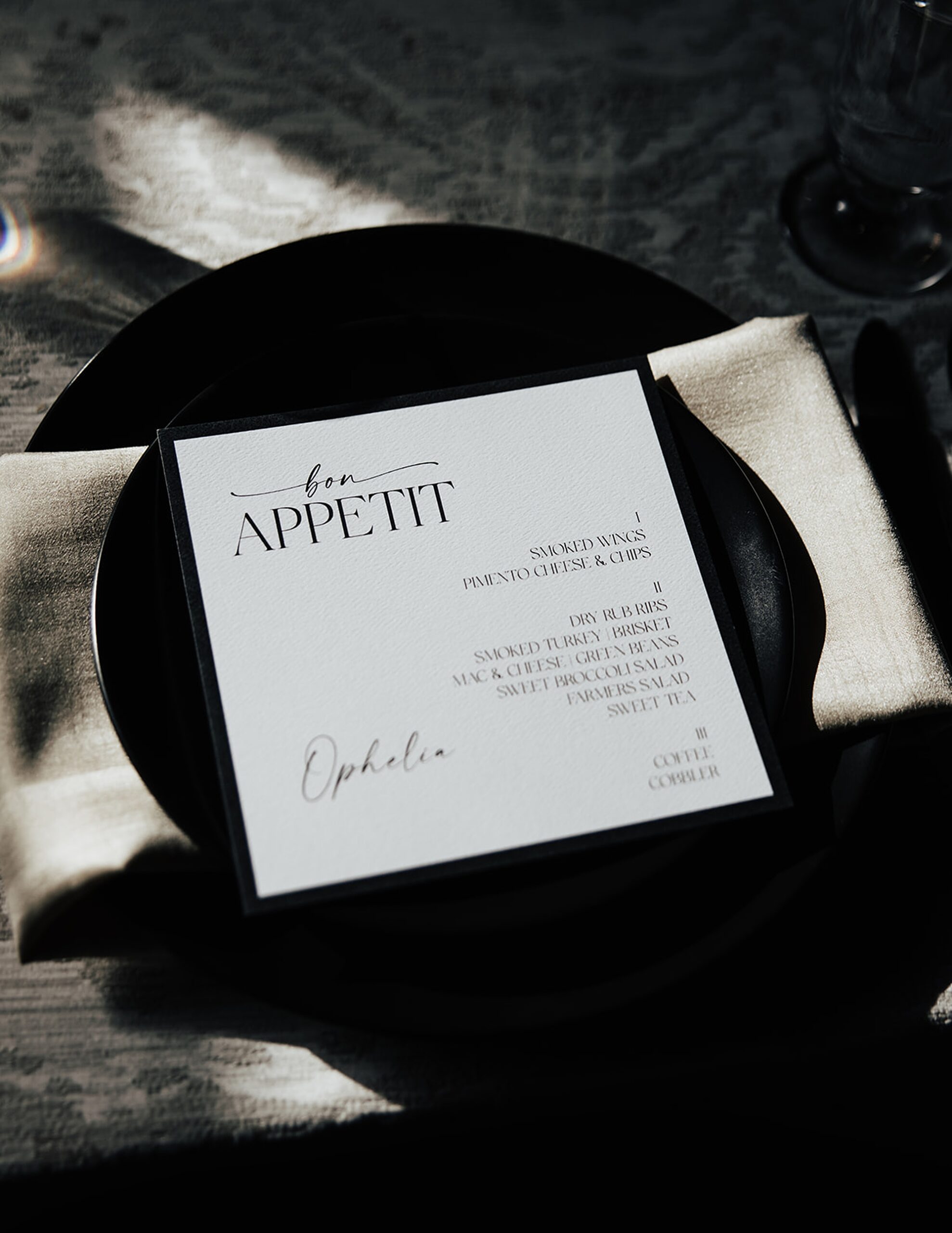
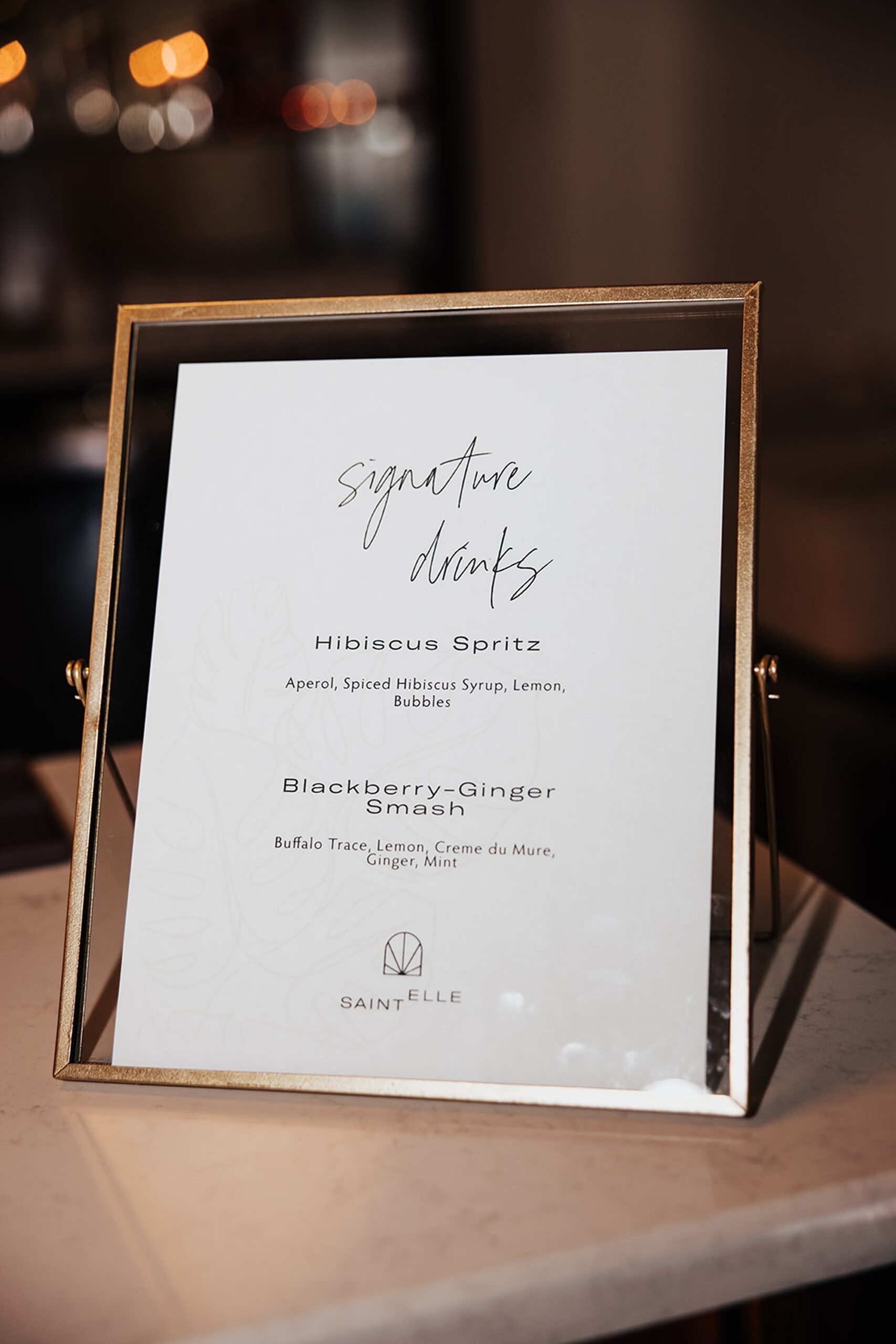
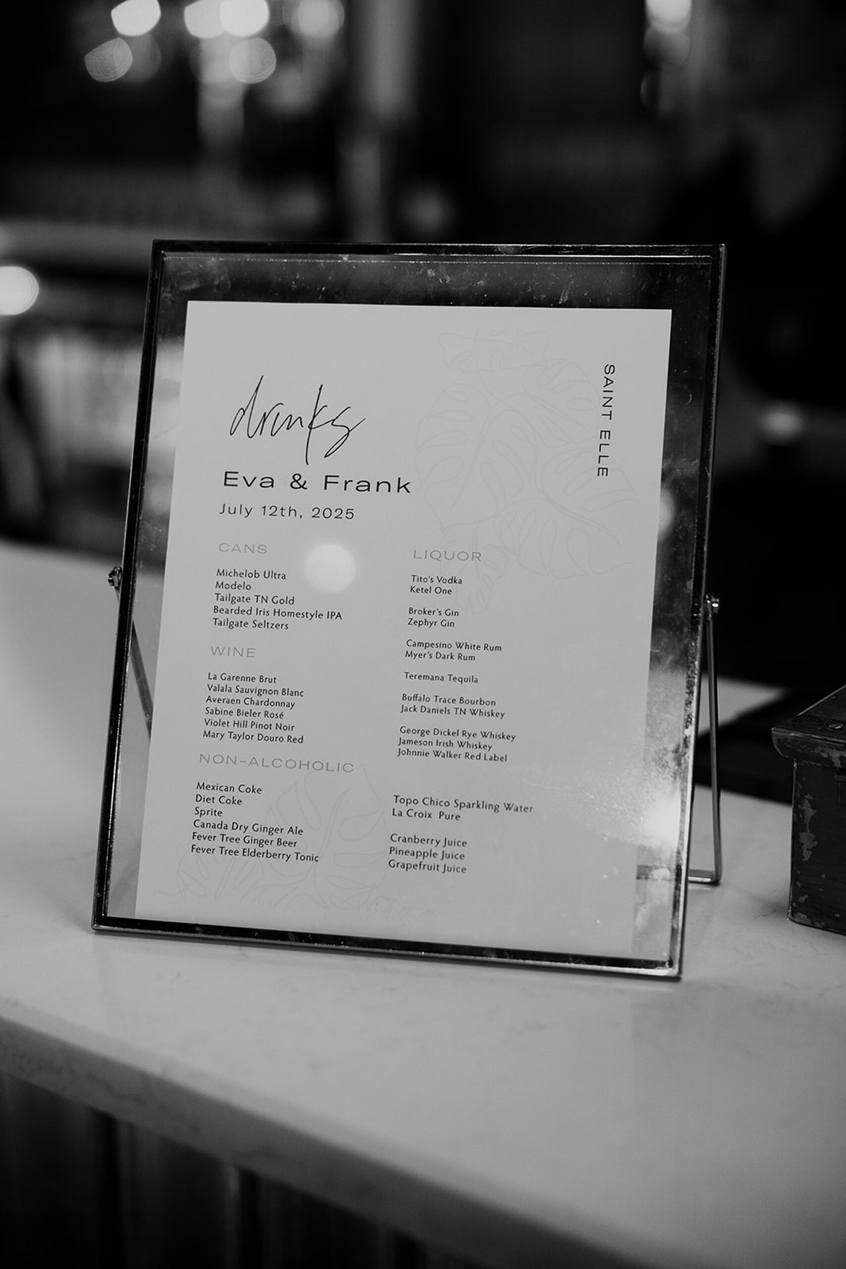
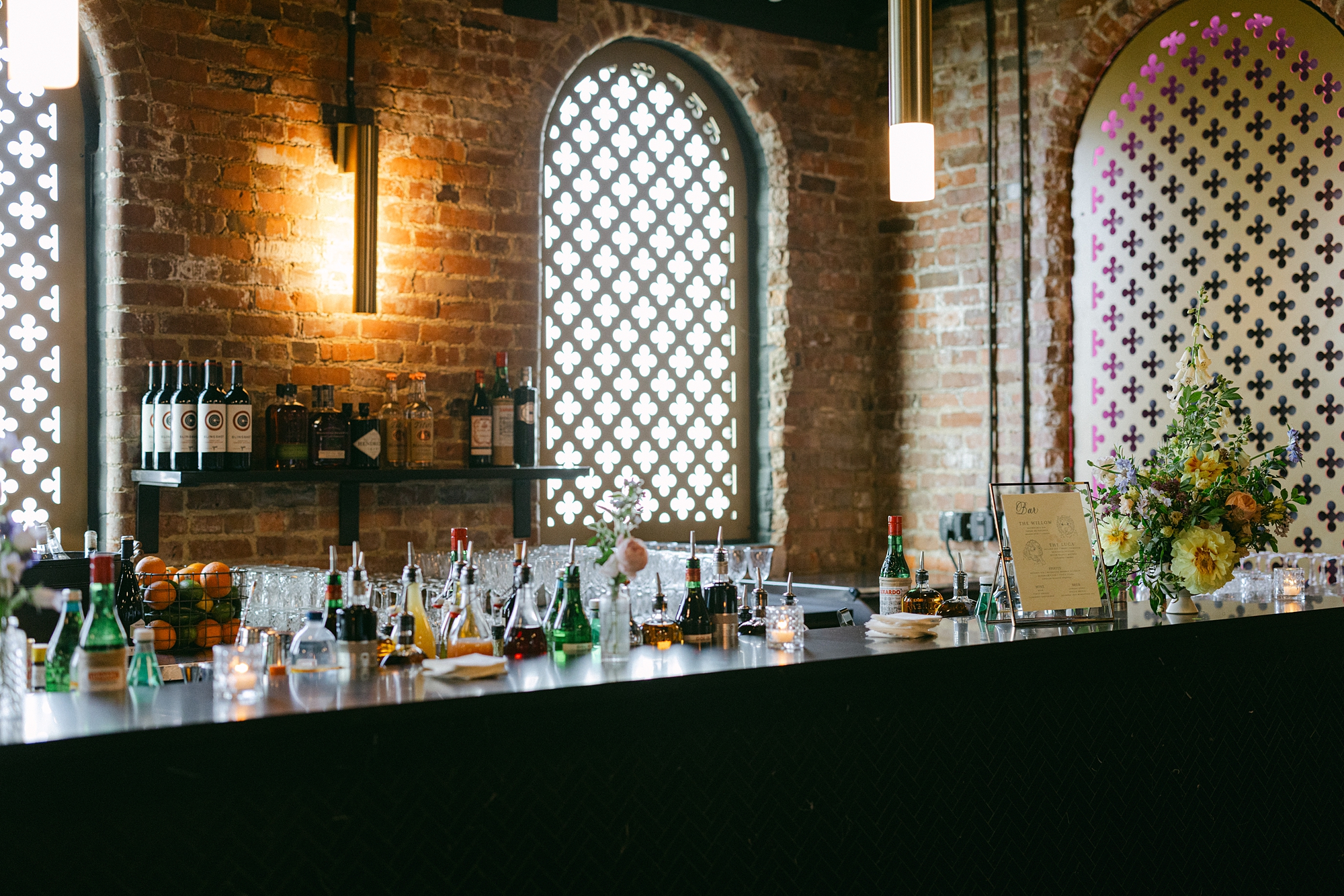
Menus, Bar Signage, & Table Numbers
To round out the day-of details, we carried the black-and-white palette through everything including the welcome sign and classic white menus set against black paper at each place setting. On the elegant tablescape were the table numbers we created that coordinated with the seating chart. The custom bar signage we did featured an adorable illustration of their dog.
Every piece tied back to the invitation suite and the classic, black-and-white destination theme, creating a cohesive, high-end design experience from the moment guests arrived.
This Saint Elle wedding was such a beautiful example of how a classic palette can still feel fresh, modern, and deeply personal. Between the black-and-white details, meaningful installations, and thoughtful touches throughout the day, Eva and Francesco created a celebration that was elevated but still uniquely theirs. It was such an honor to bring their vision to life by designing their invitations and day-of-details.
If you’re planning a wedding in Nashville, or anywhere in the world, we’d love to help you create meaningful, personalized stationery and event details that tell your story.
We work with couples worldwide to design details you and your guests will remember forever. Reach out today to learn more about our full-service wedding and event design offerings! We can’t wait to create something unforgettable for you!
If you enjoyed this post, you’ll love these other blogs!
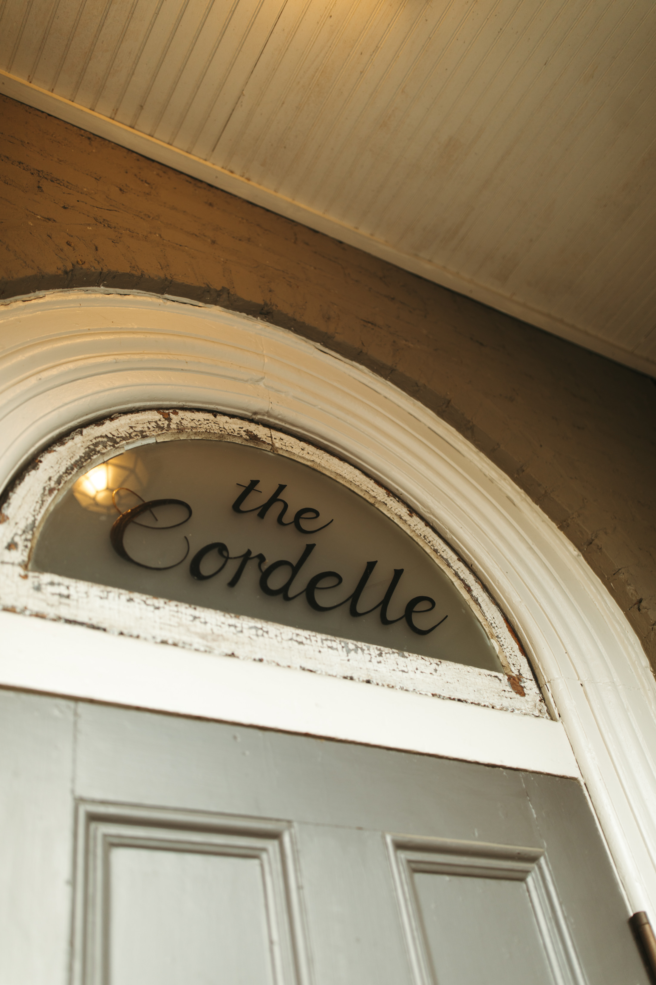
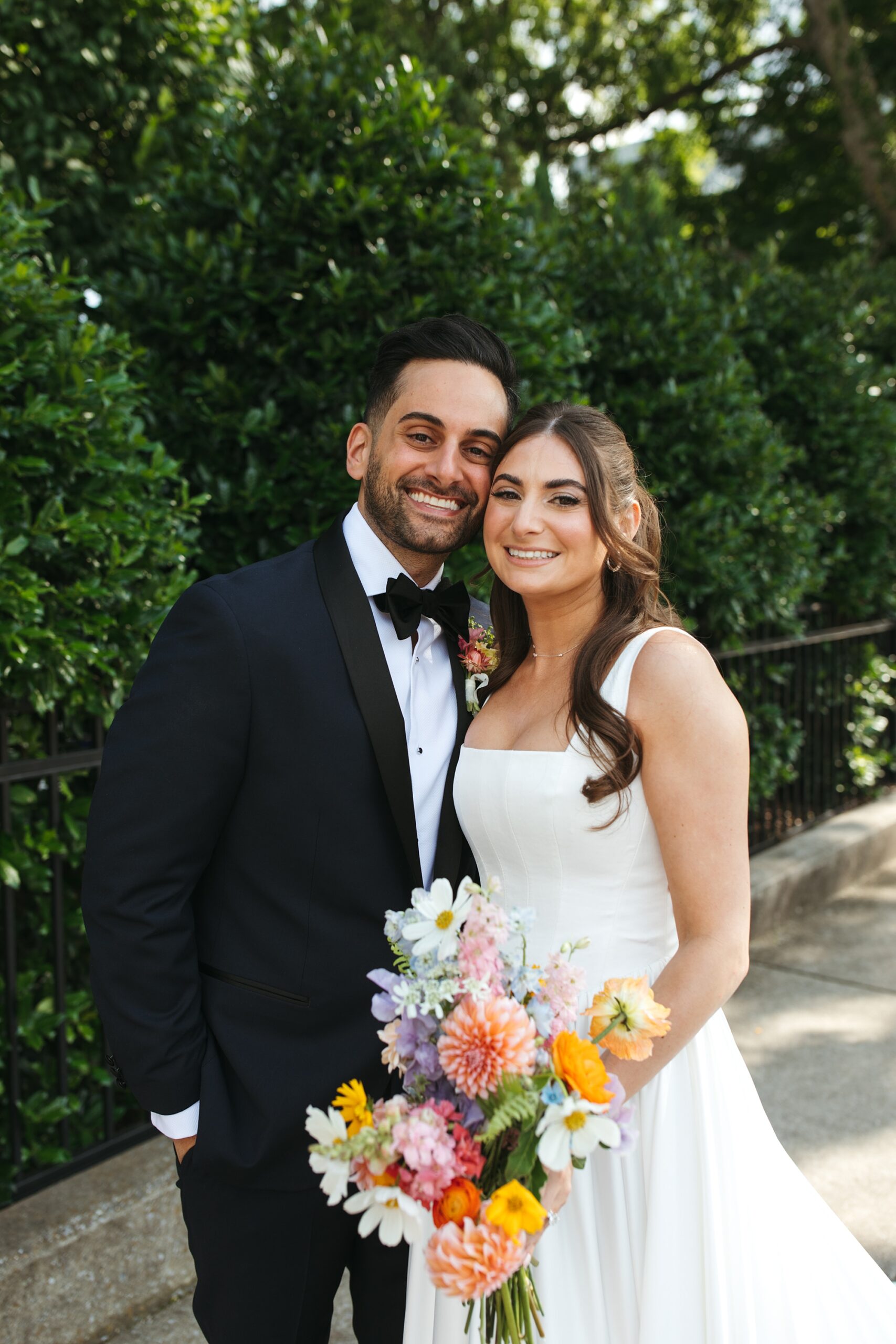
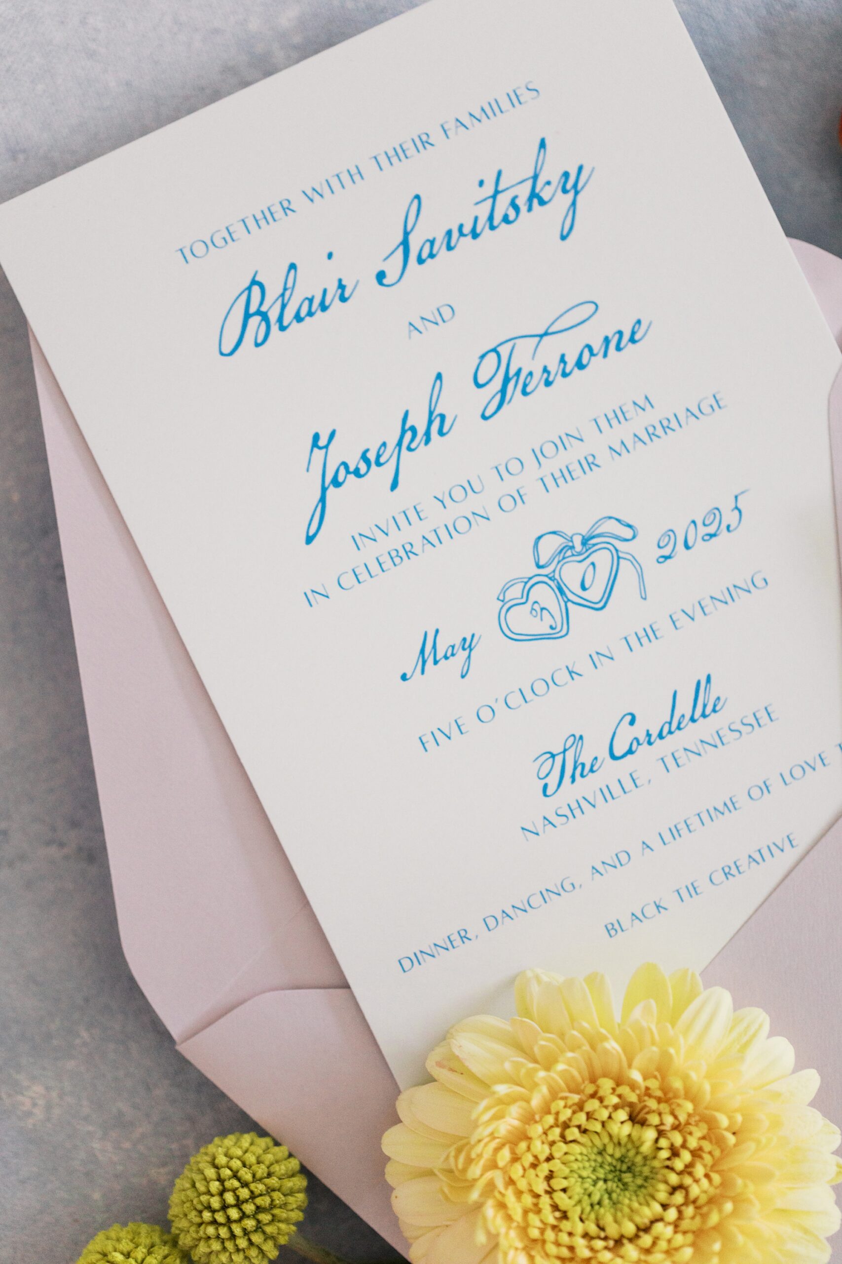
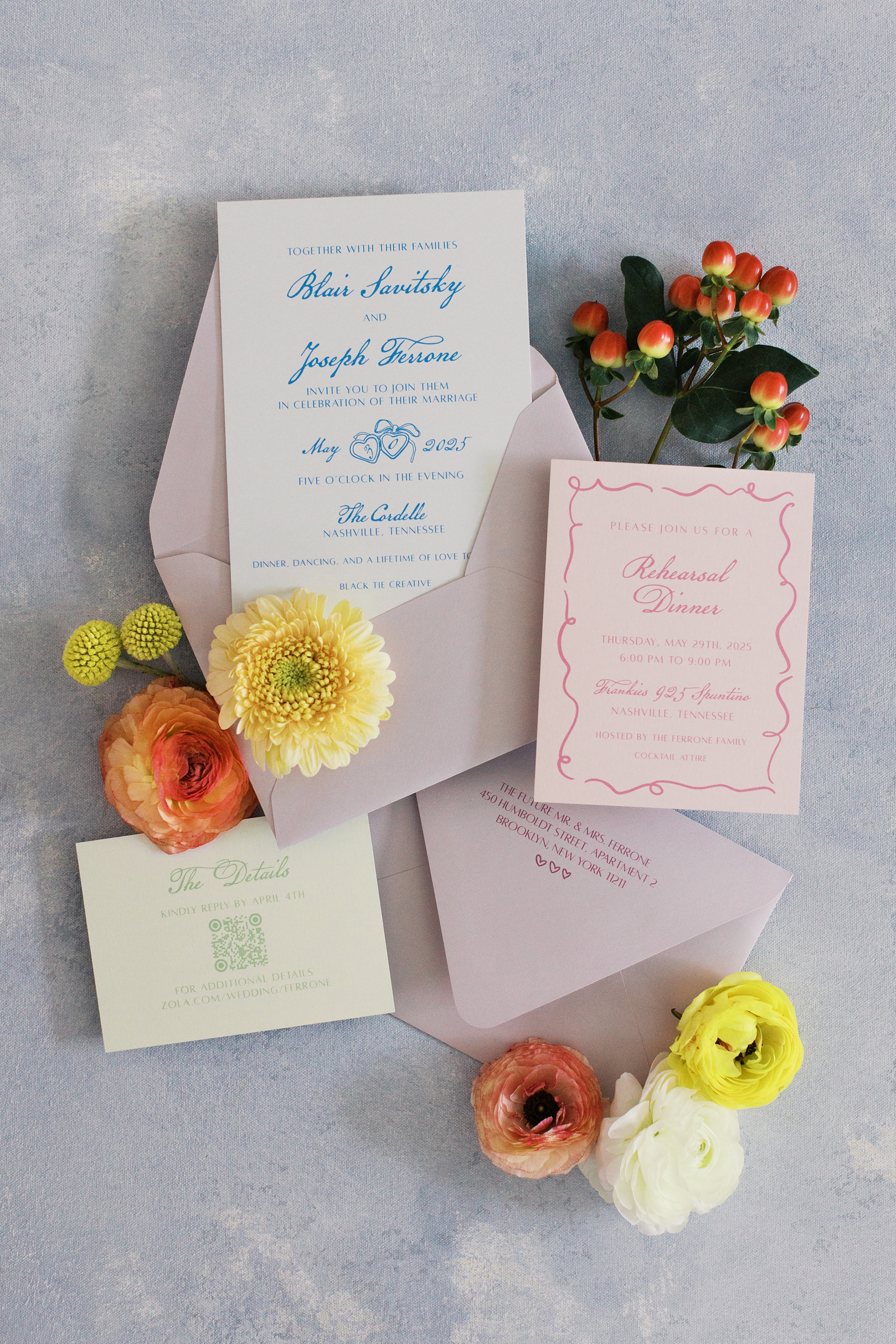
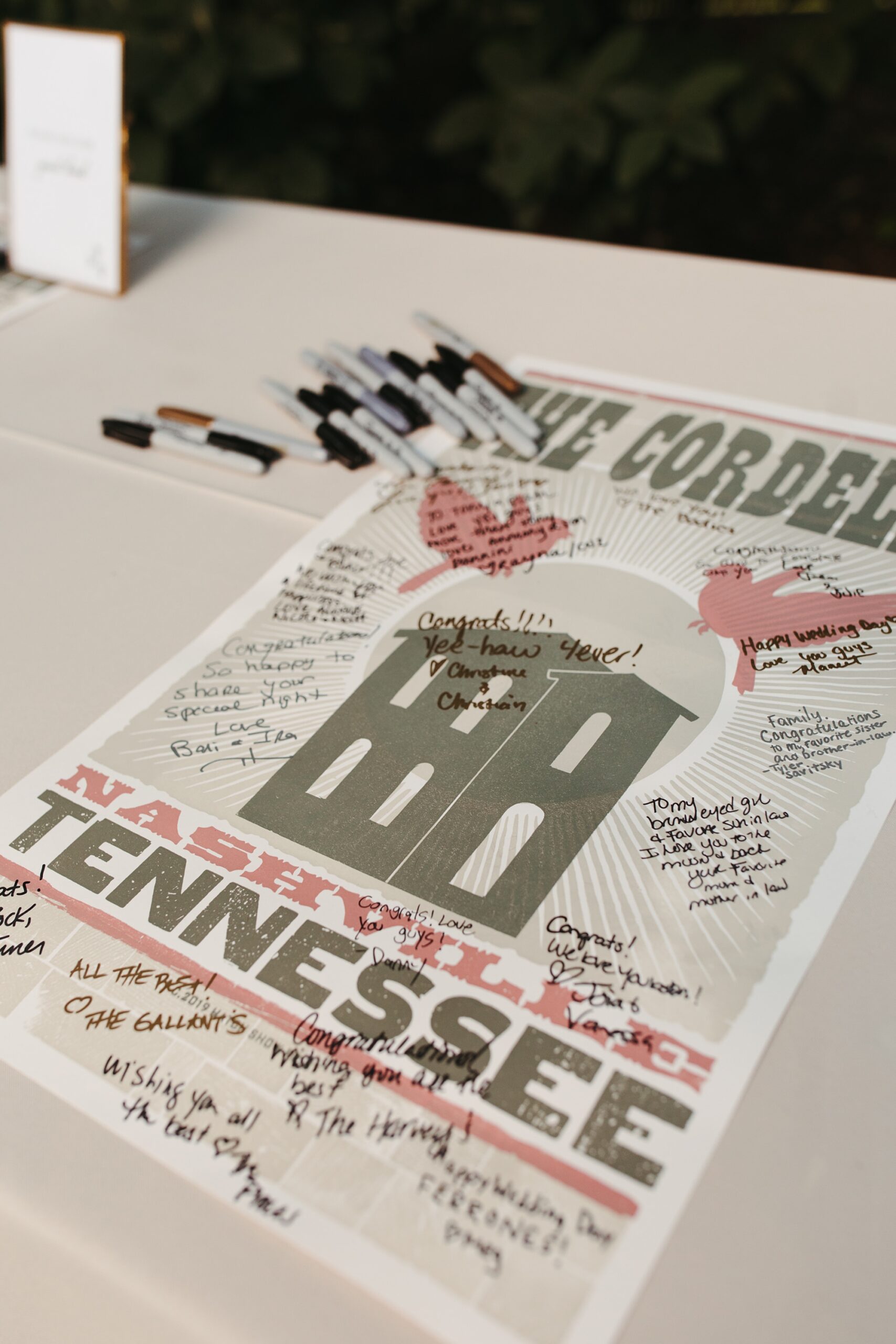
This Nashville wedding at The Cordelle was full of personality, color, and creative design. It perfectly reflected the couple’s playful spirit and love for music. As a team that loves weaving meaning into every detail, we had the best time bringing their vision to life through a collection of custom stationery and day-of details that felt both fun and elevated.
Fun and Playful Invitations
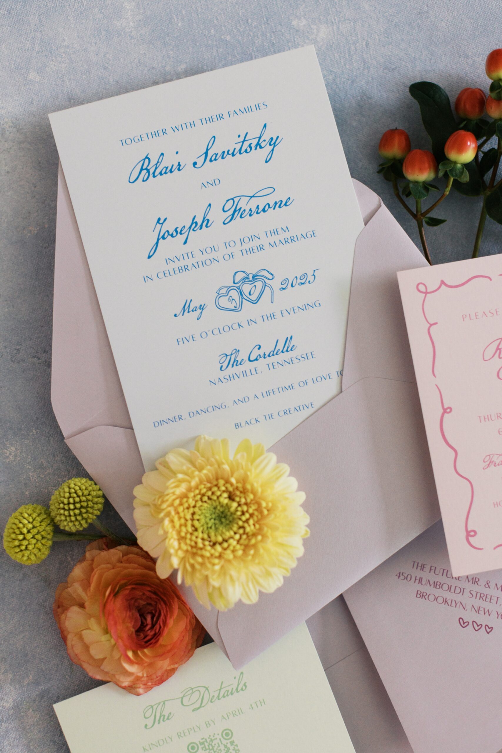
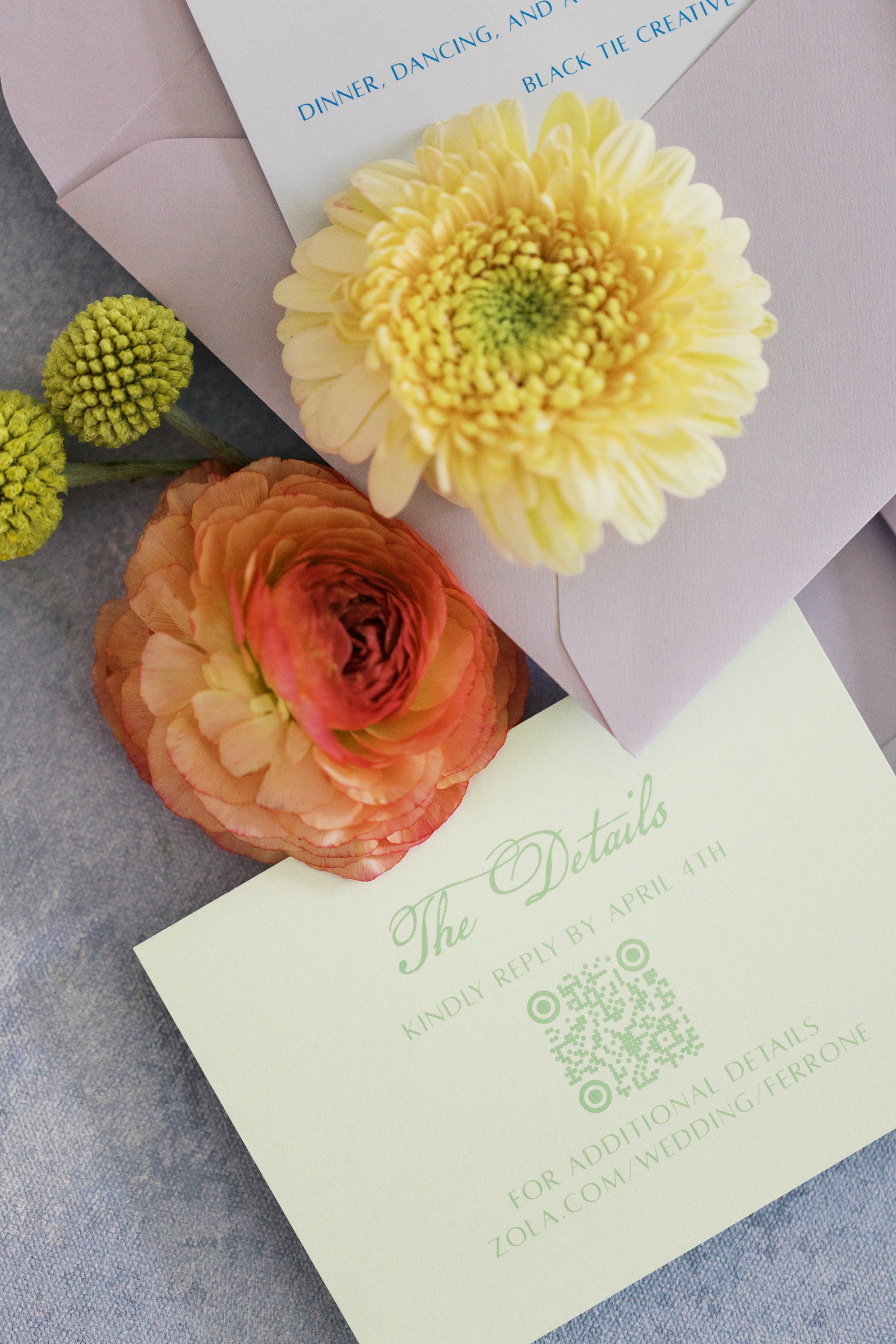
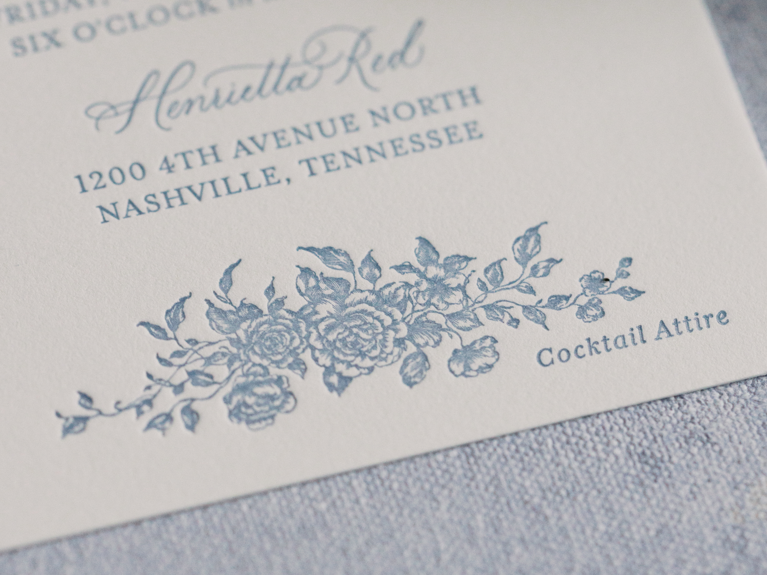
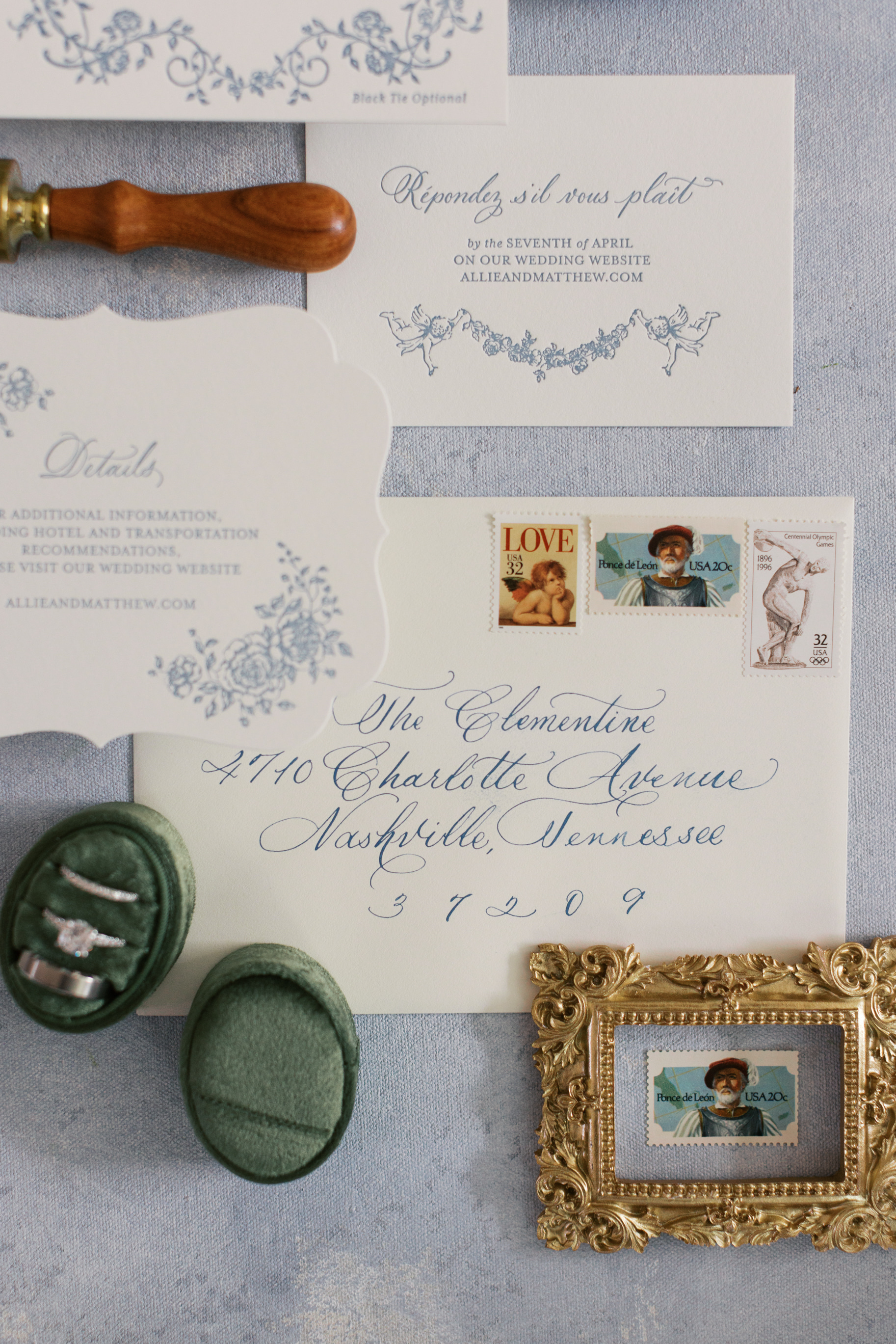
The couple lives in New York but loves the city of Nashville, and chose it as their wedding destination! Their invitation suite set the tone from the very beginning. We combined blue calligraphy on crisp white paper and lavender envelopes. The light green details card and soft pink rehearsal dinner card added pops of color and gave the suite a fresh, fun, playful feel.
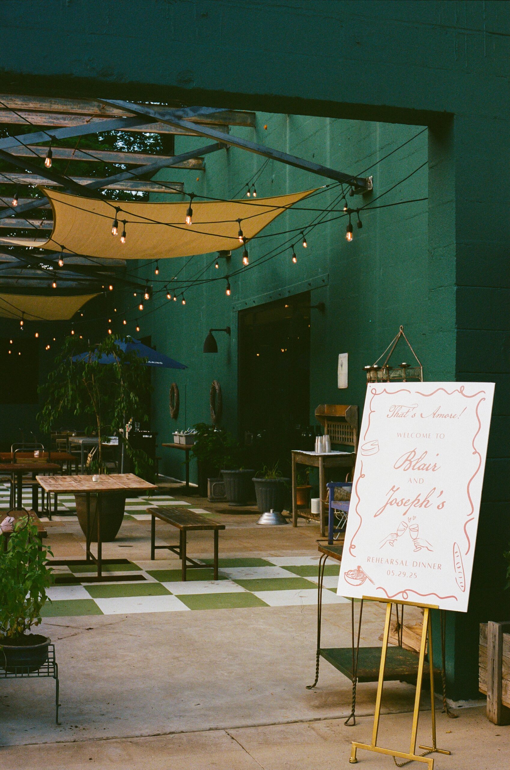
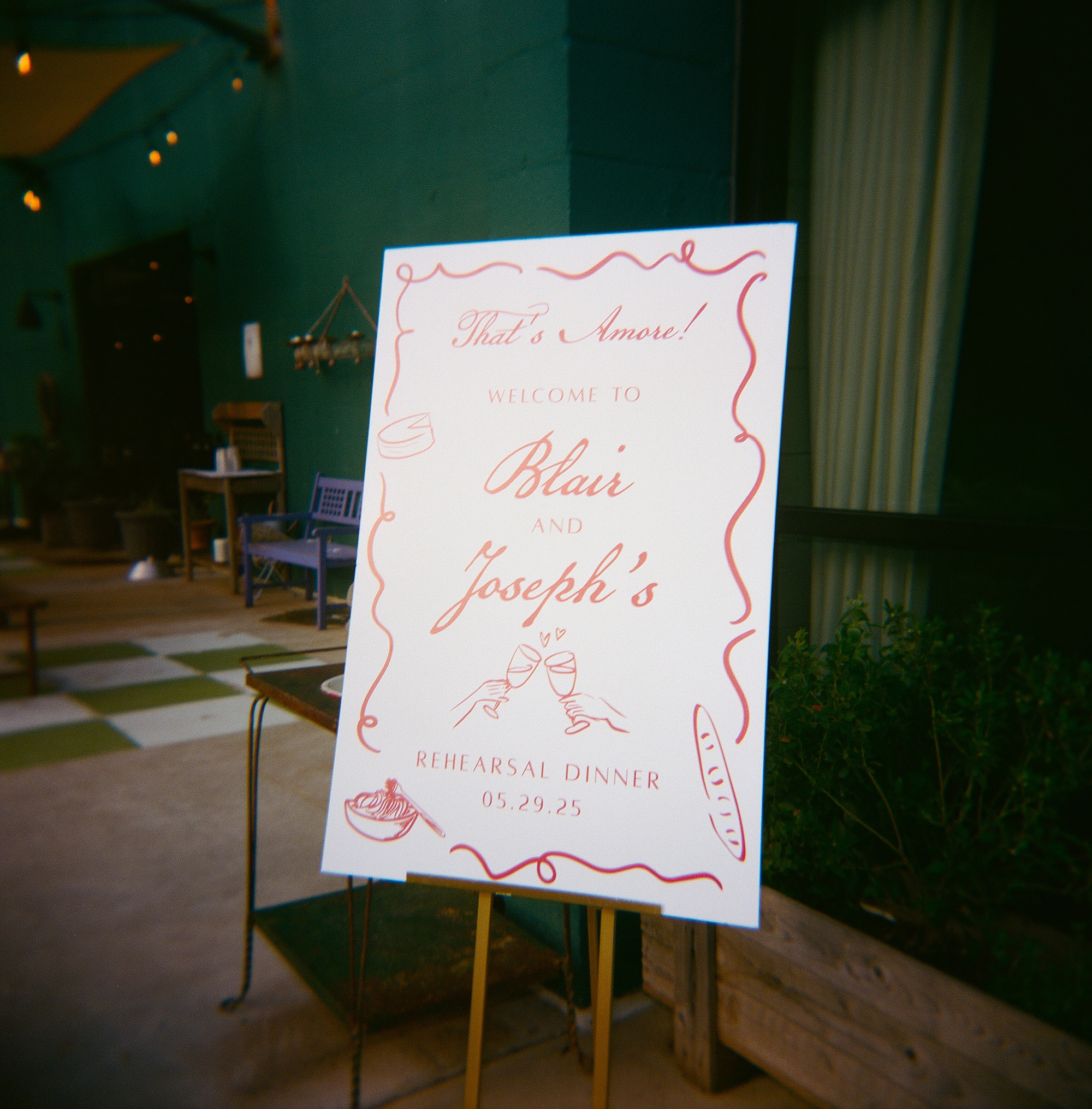
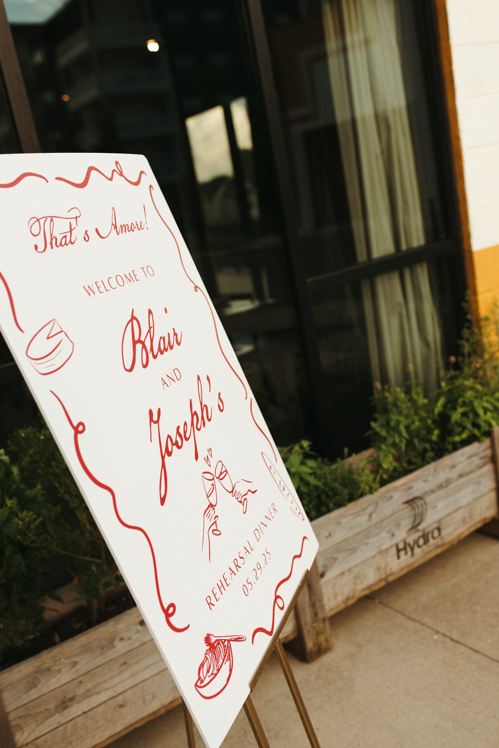
Rehearsal Dinner Welcome Sign
For the rehearsal dinner, guests were welcomed with a custom sign that introduced the weekend’s colorful aesthetic. The border design on the welcome sign also mirrored the border found on the rehearsal dinner card from the invitation suite. It’s truly these tiny details that make your wedding day and that we love to include.
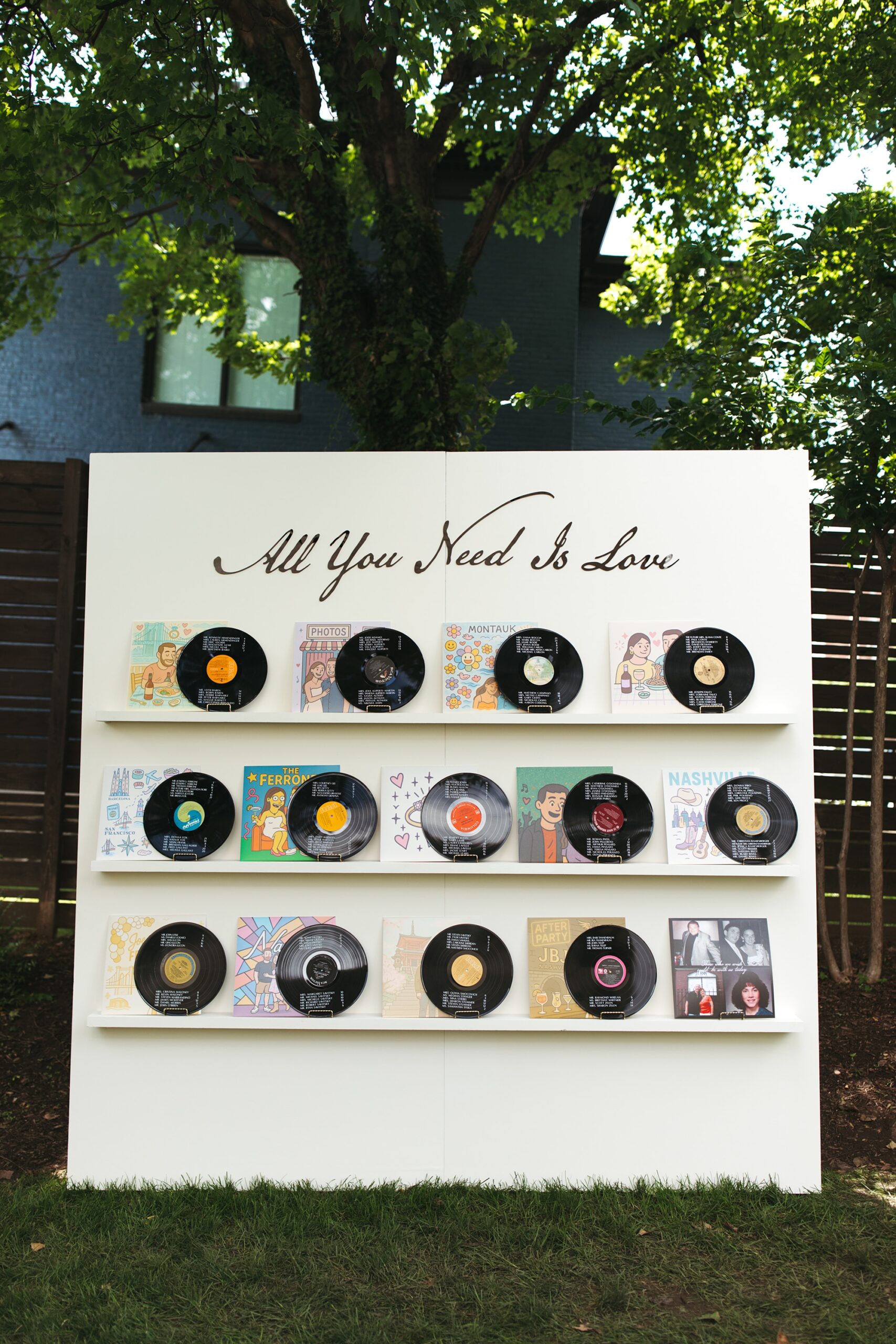
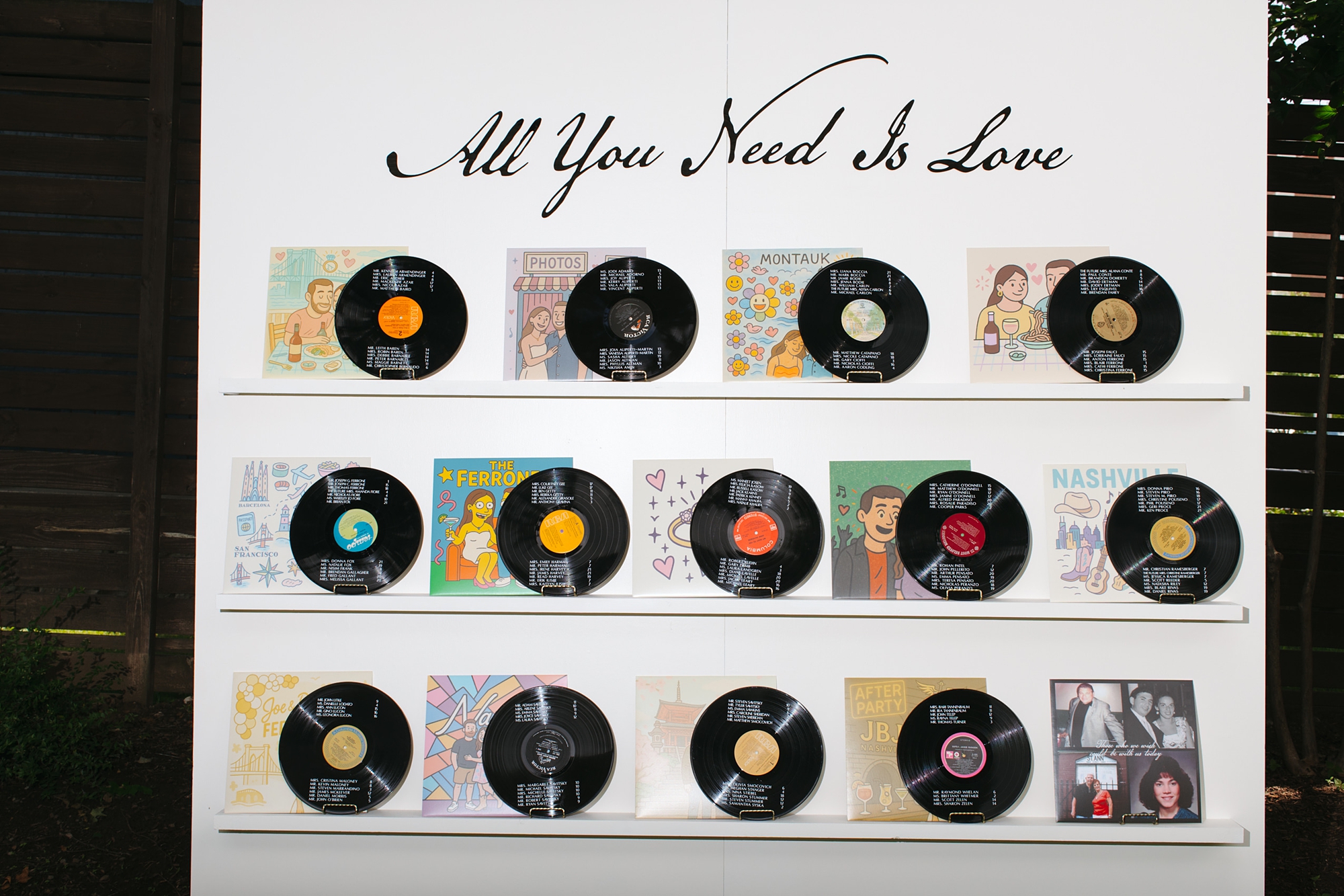
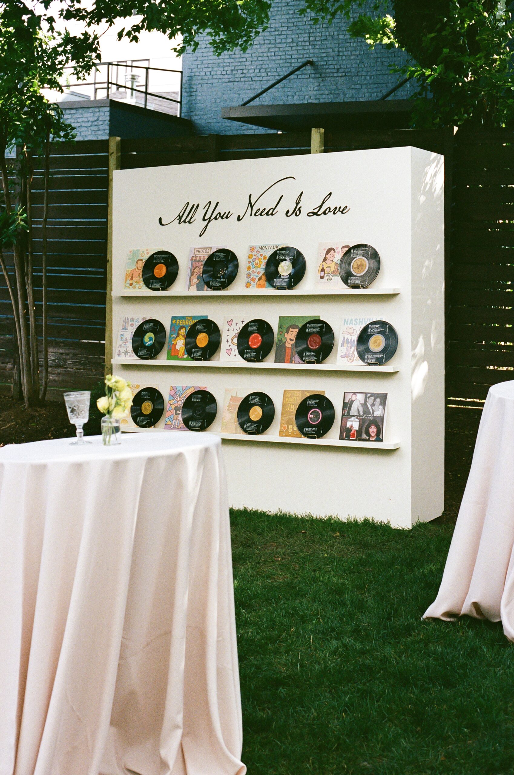
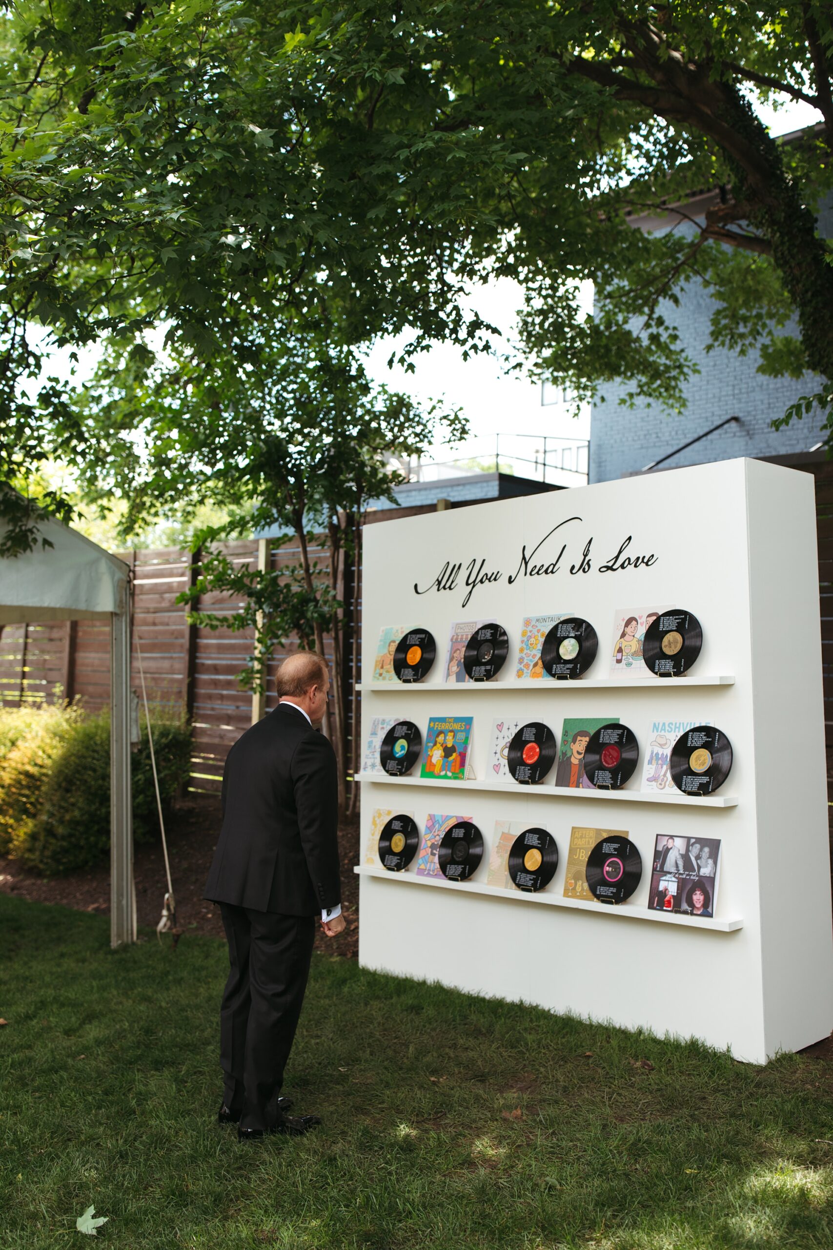
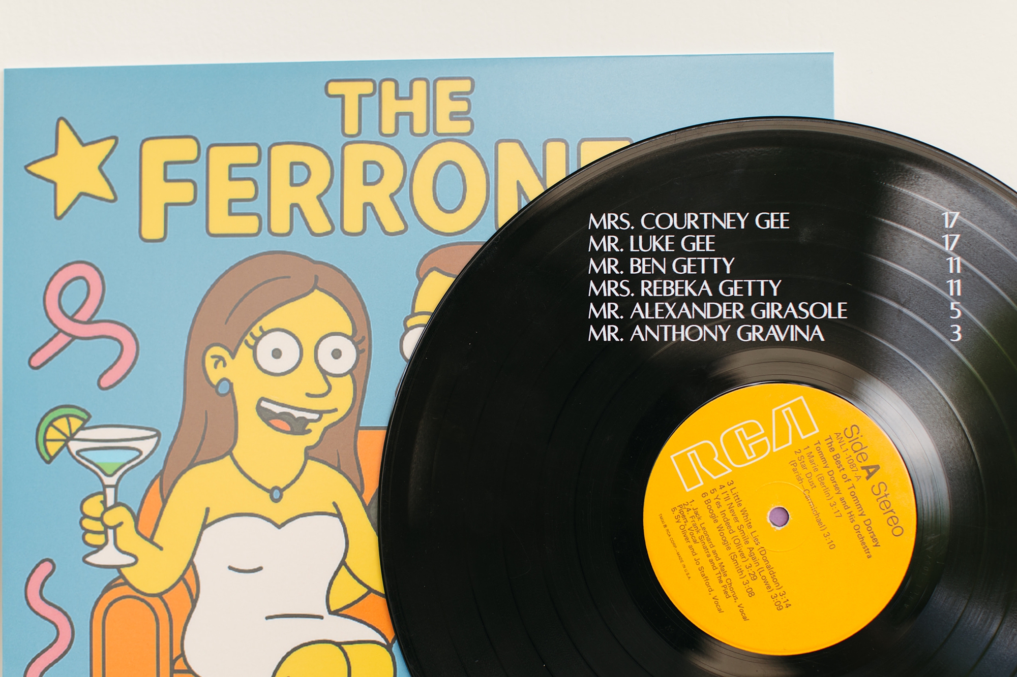
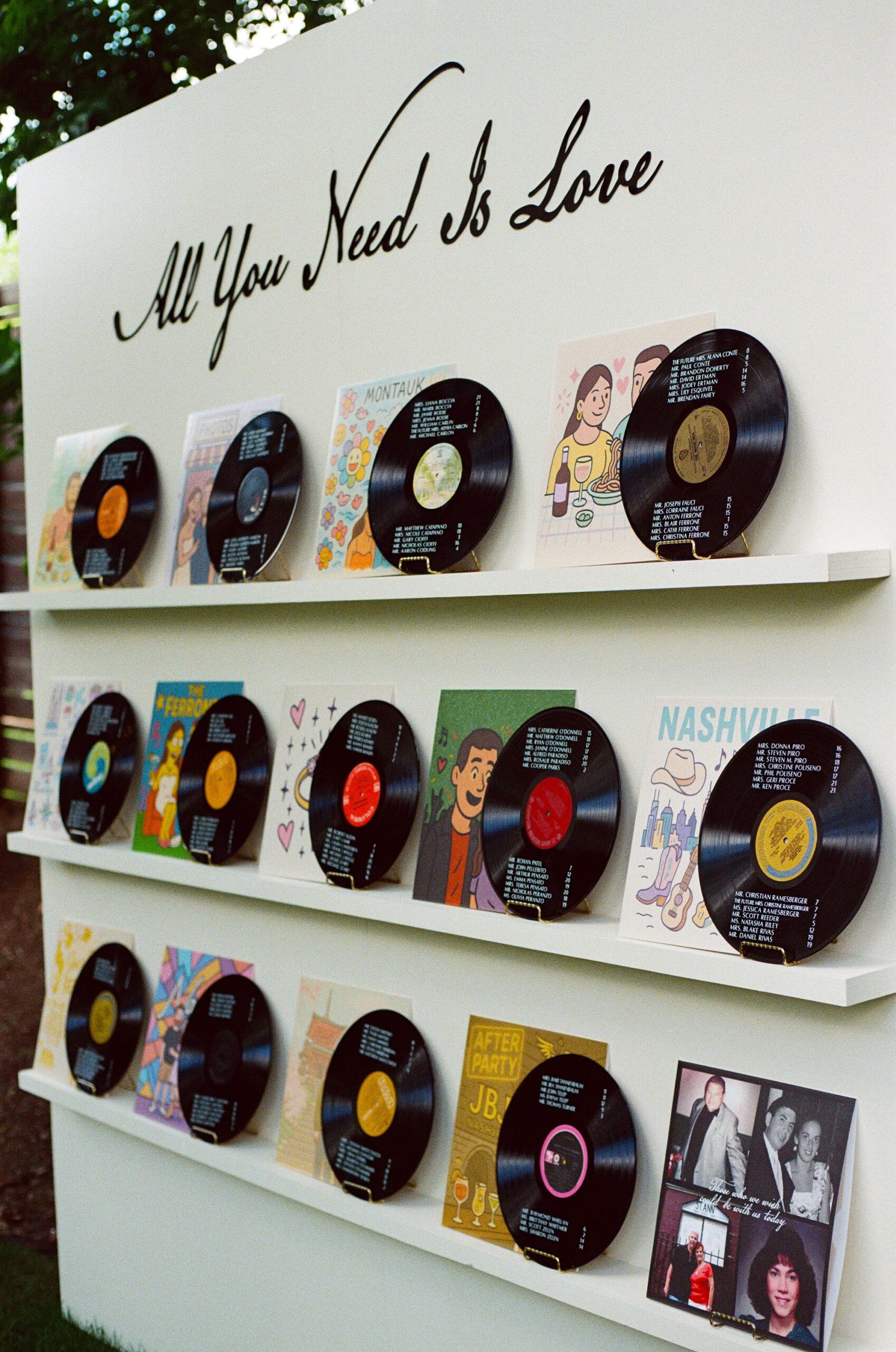
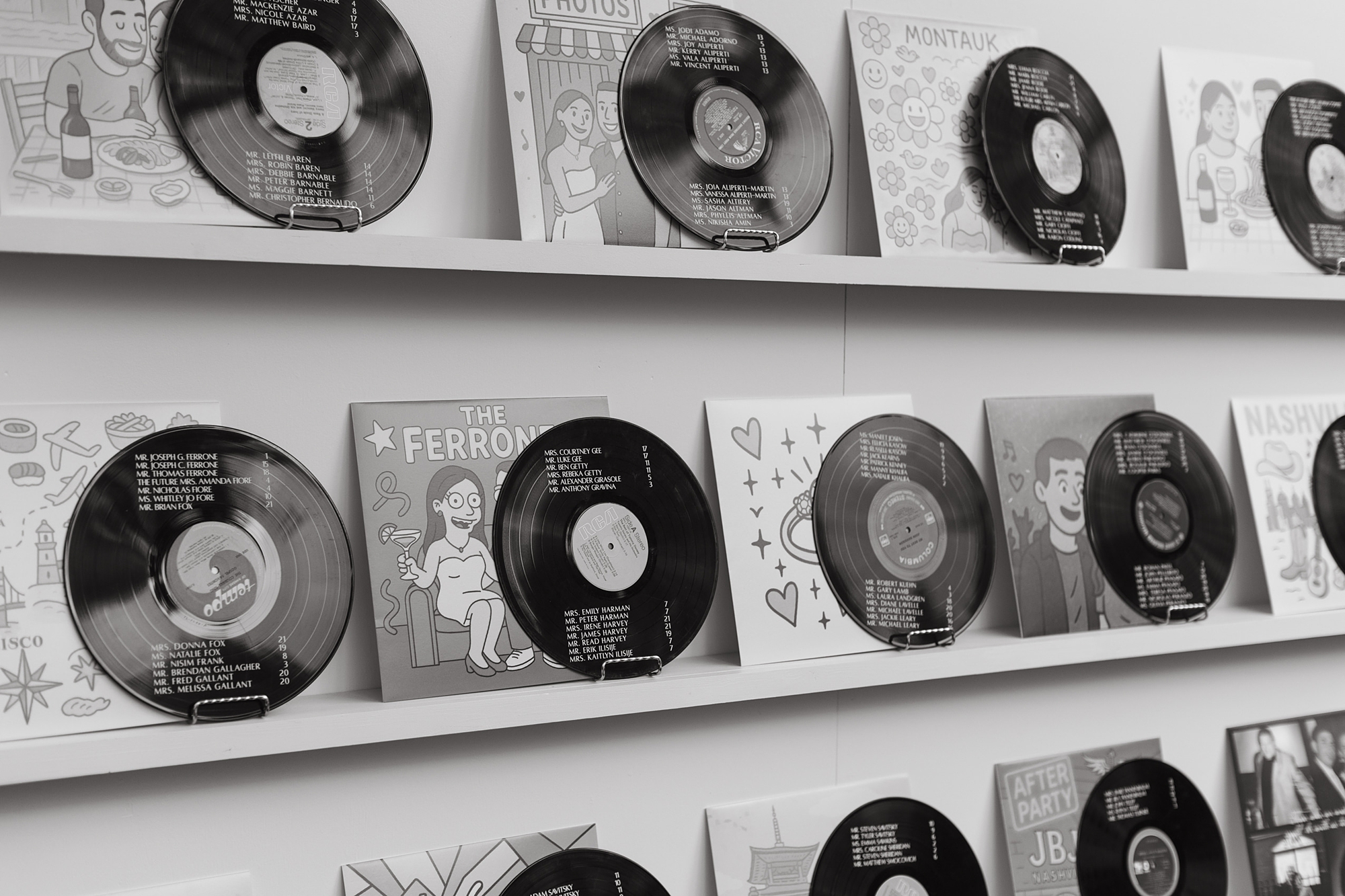
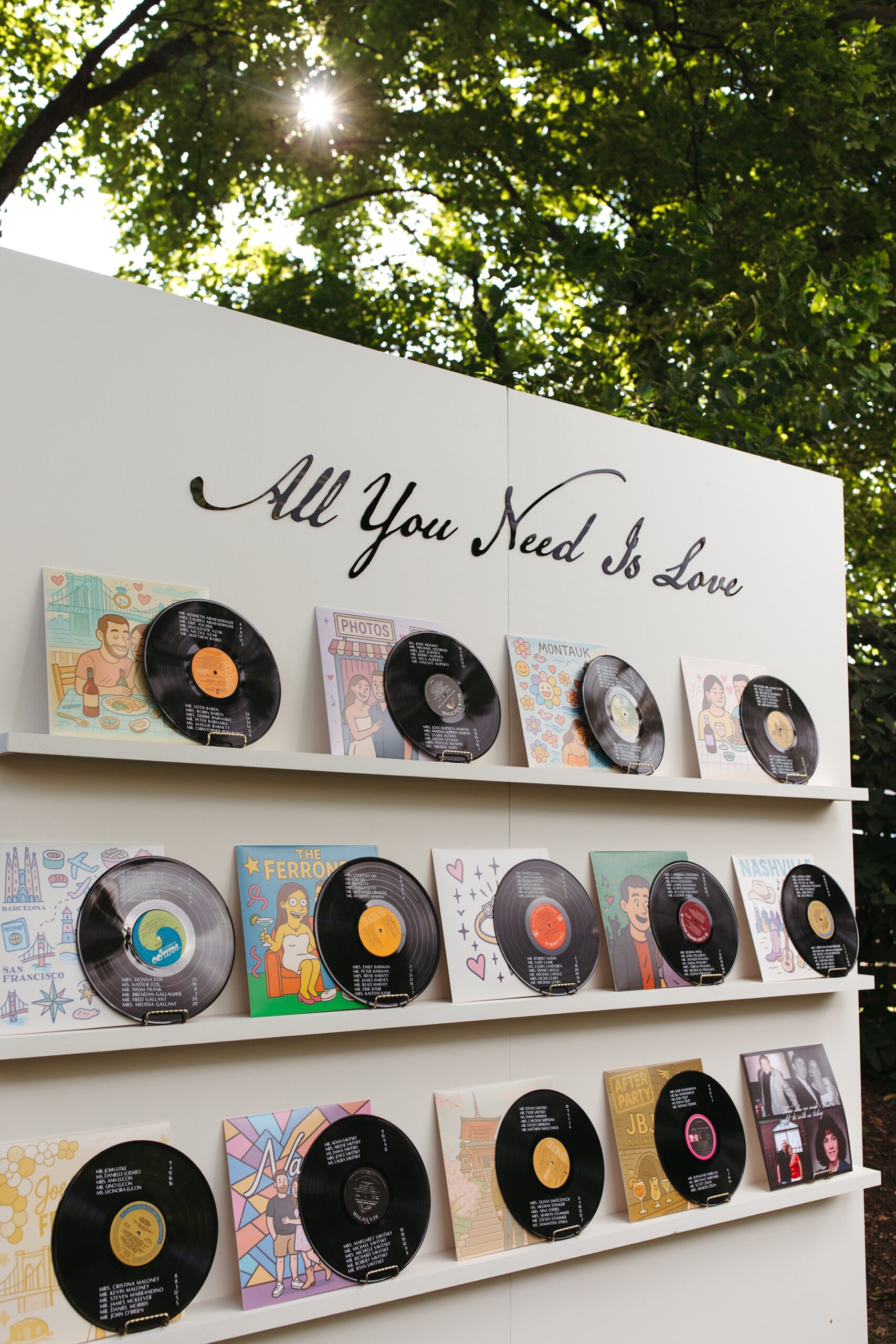
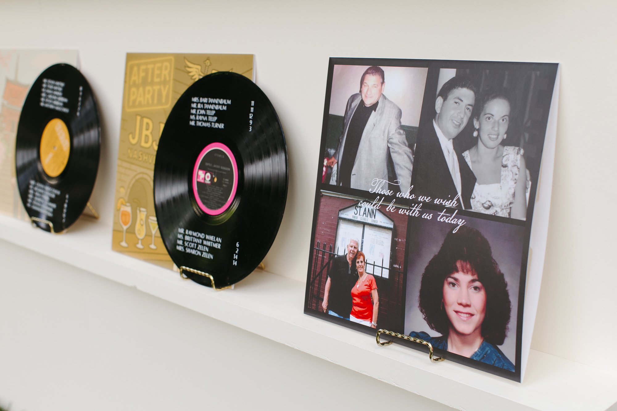
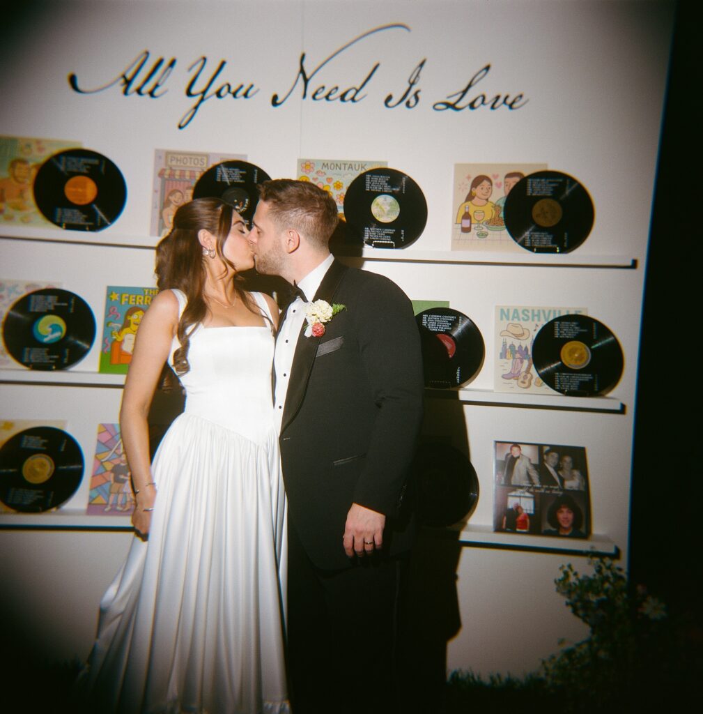
Vinyl Record Wedding Details at The Cordelle
One of our favorite elements was the seating chart wall, which we created entirely from real vinyl records. The couple love vinyl records and color, so naturally we paired the two and leaned into the city’s musical energy while highlighting their love story. Each guest’s name and table assignment were displayed on the vinyl record, and each album cover artwork depicted a special moment in their love story! All of this was beautifully displayed on a white installation with The Beatles song lyrics “All you need is love” written above the display.
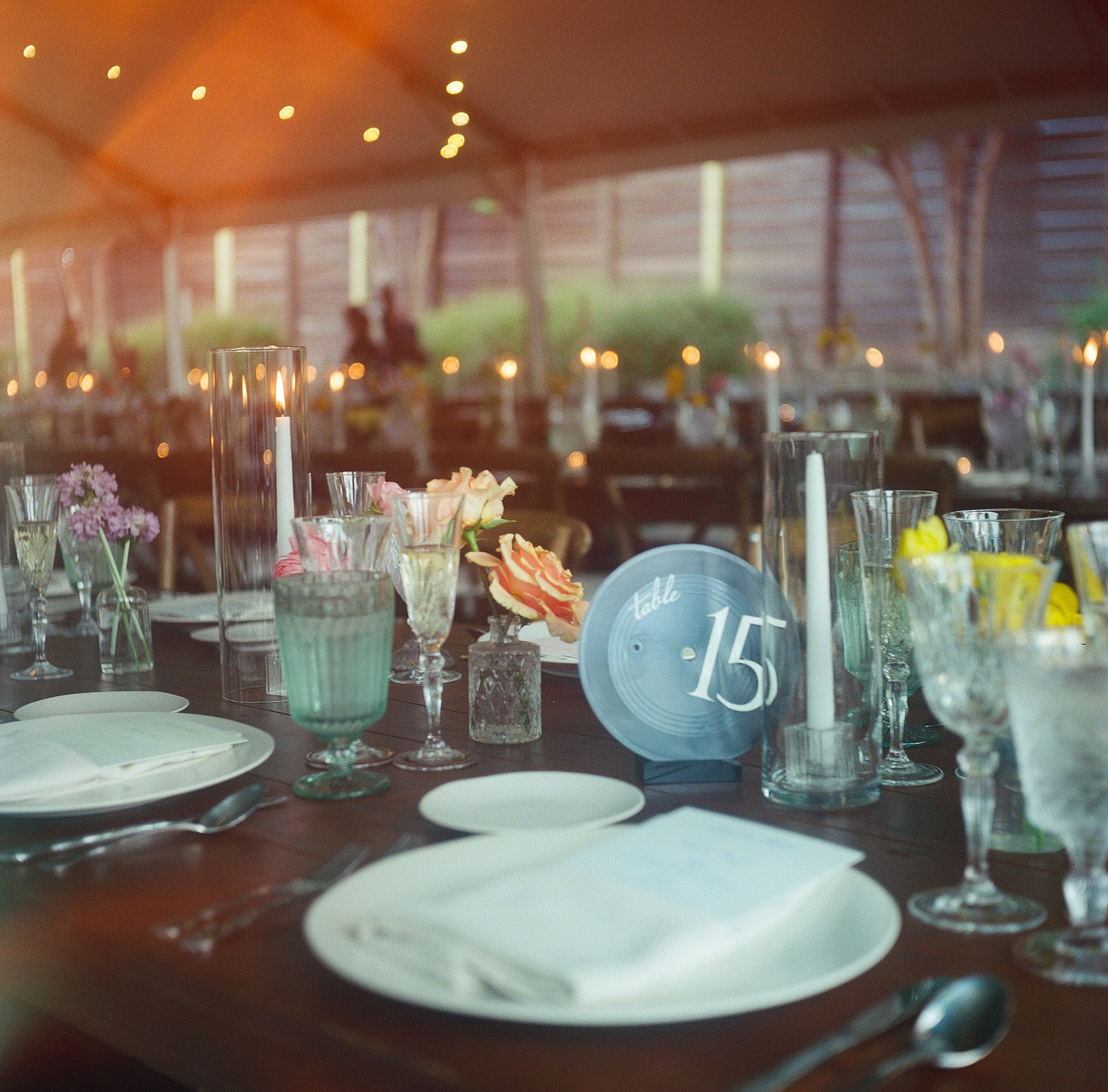
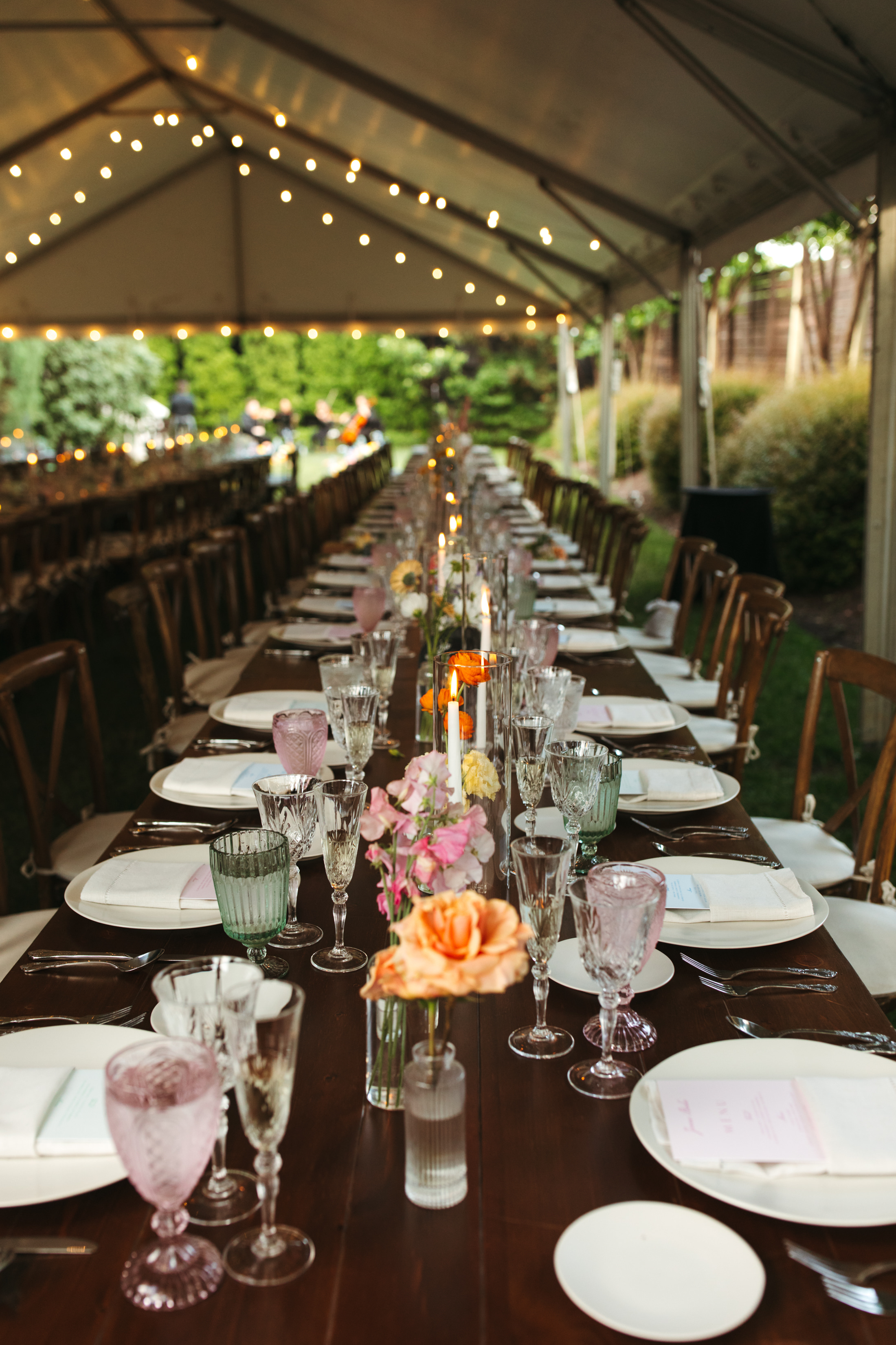
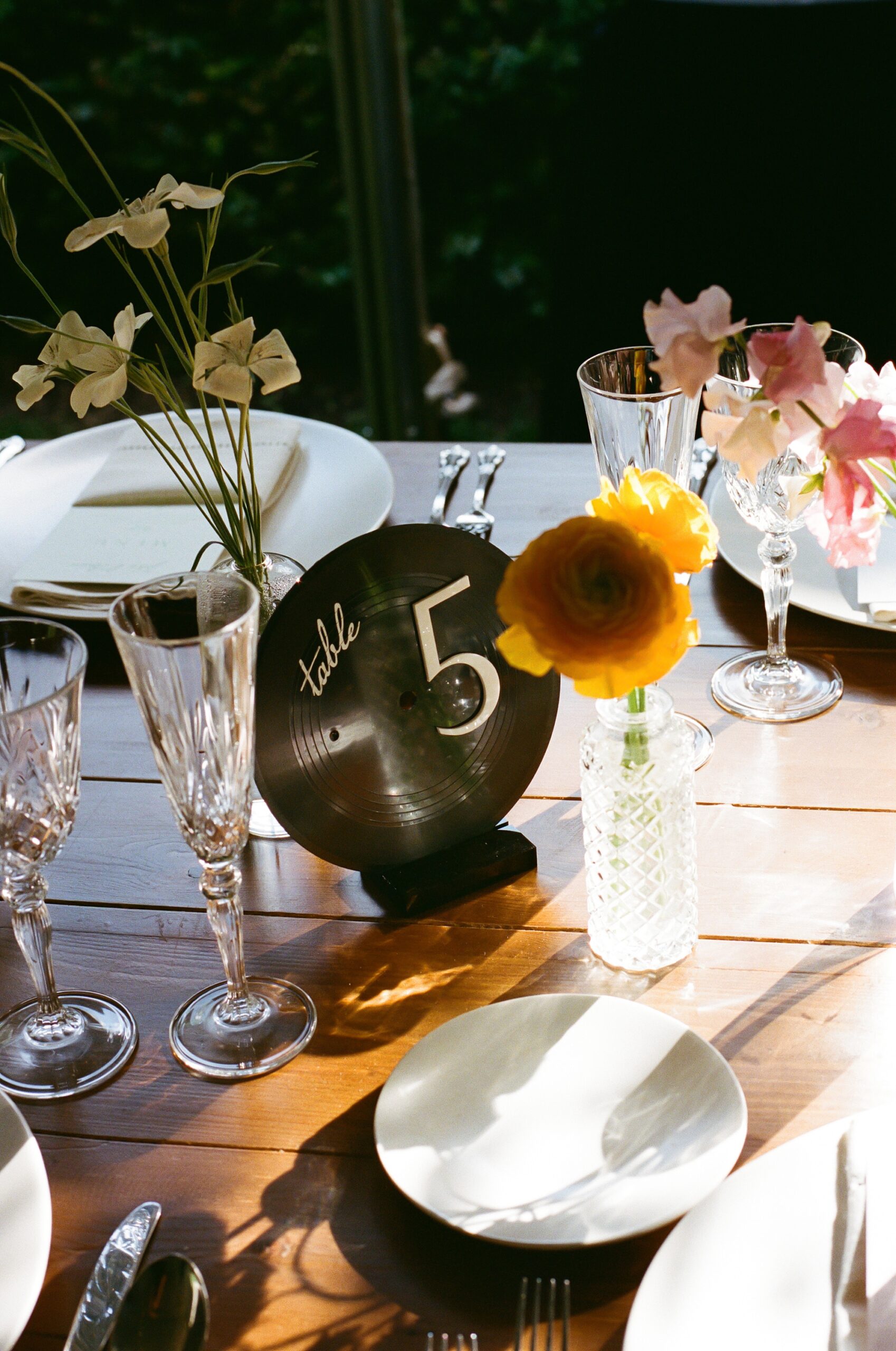
We kept the vinyl record theme going by using them as table numbers as well, tying the whole concept together beautifully. I just love these design concepts that are carried throughout the day! At the dinner table, you could also find the custom menus we created tucked into light pink napkins.
To honor Nashville’s creative roots, we also designed a hatch print–inspired poster for the guestbook. Guests were able to sign the poster as a keepsake for the couple.
This wedding was such a joy to design! We love creating wedding details that reflect the couple and tell a story from beginning to end, and this Cordelle wedding was the perfect example of that.
If you’re planning a wedding in Nashville, or anywhere in the world, we’d love to help you create meaningful, personalized stationery and event details that tell your story. We work with couples worldwide to design details you and your guests will remember forever.Reach out today to learn more about our full-service wedding and event design offerings! We can’t wait to create something unforgettable for you!
If you enjoyed this post, you’ll love these other blogs!
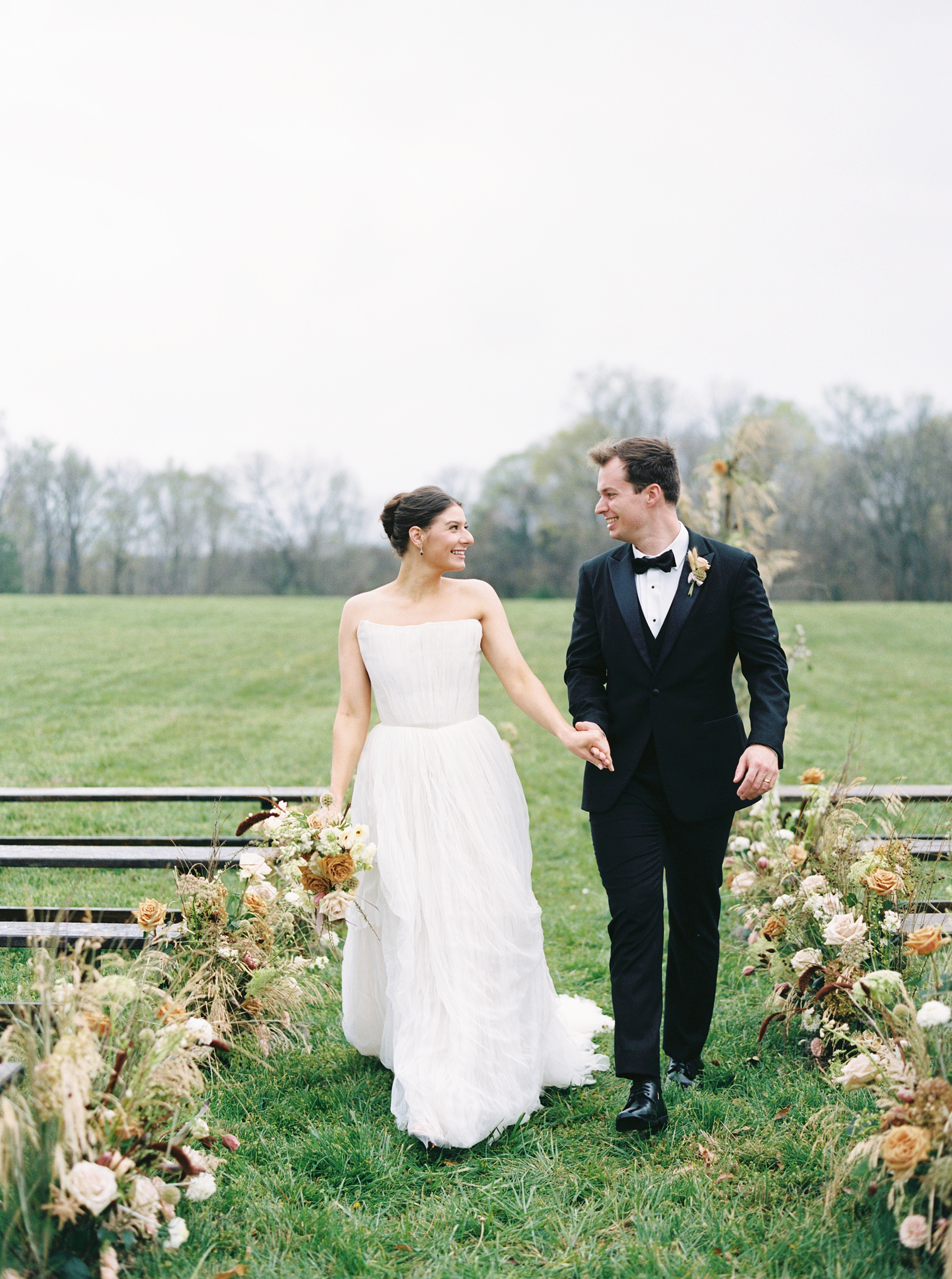
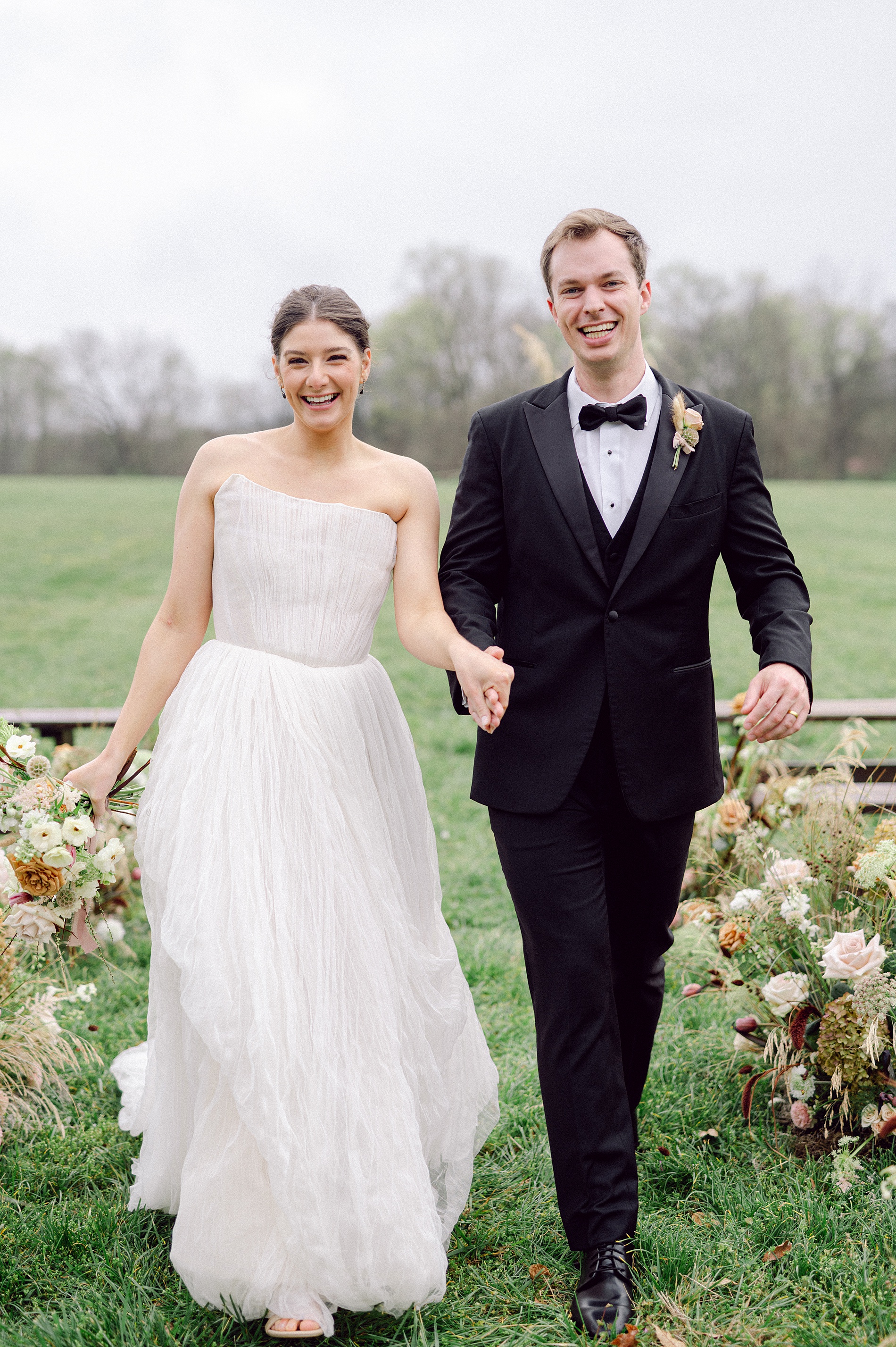
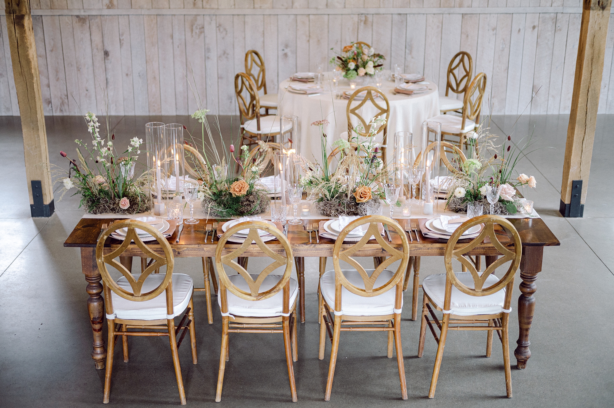
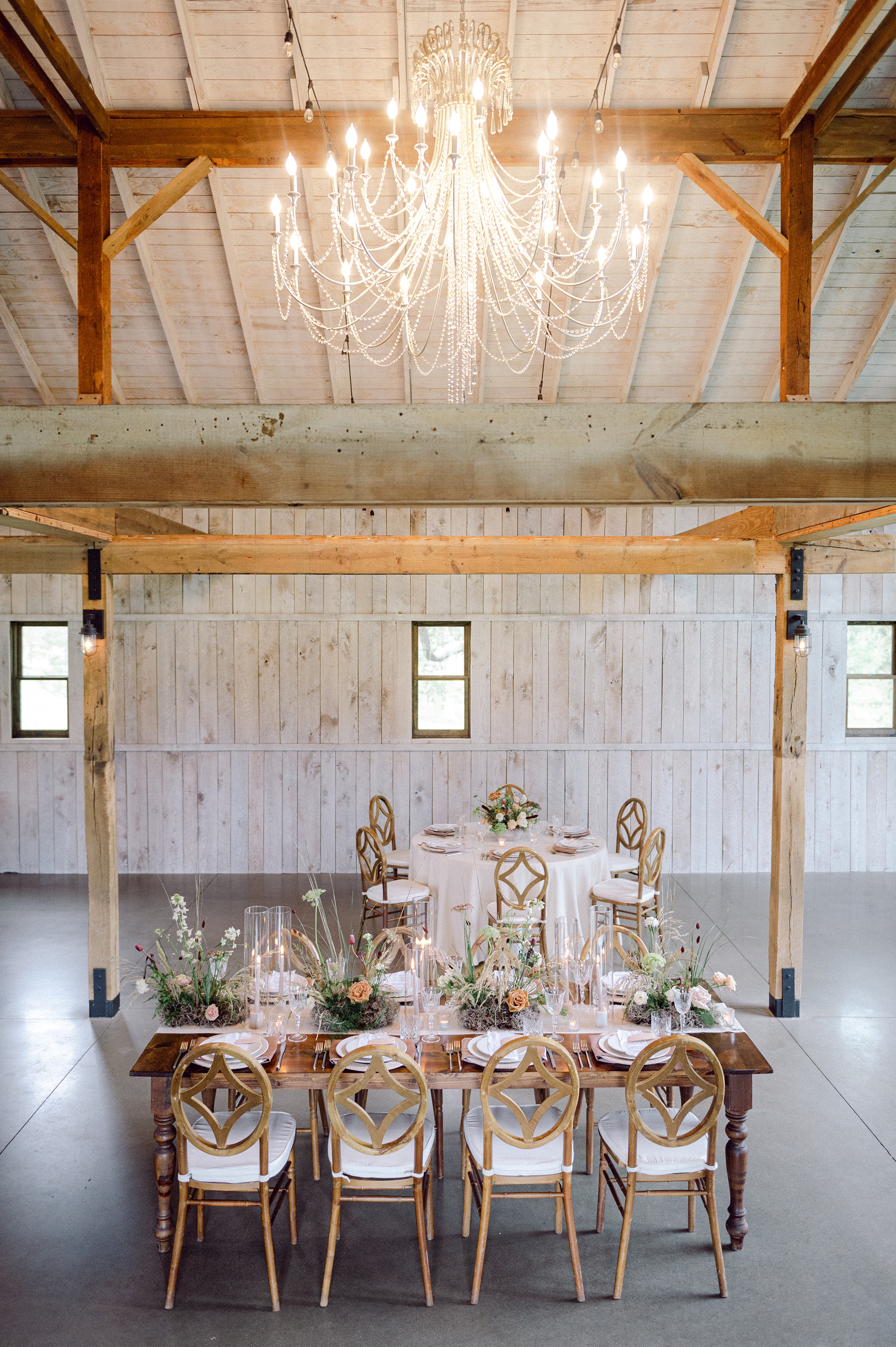
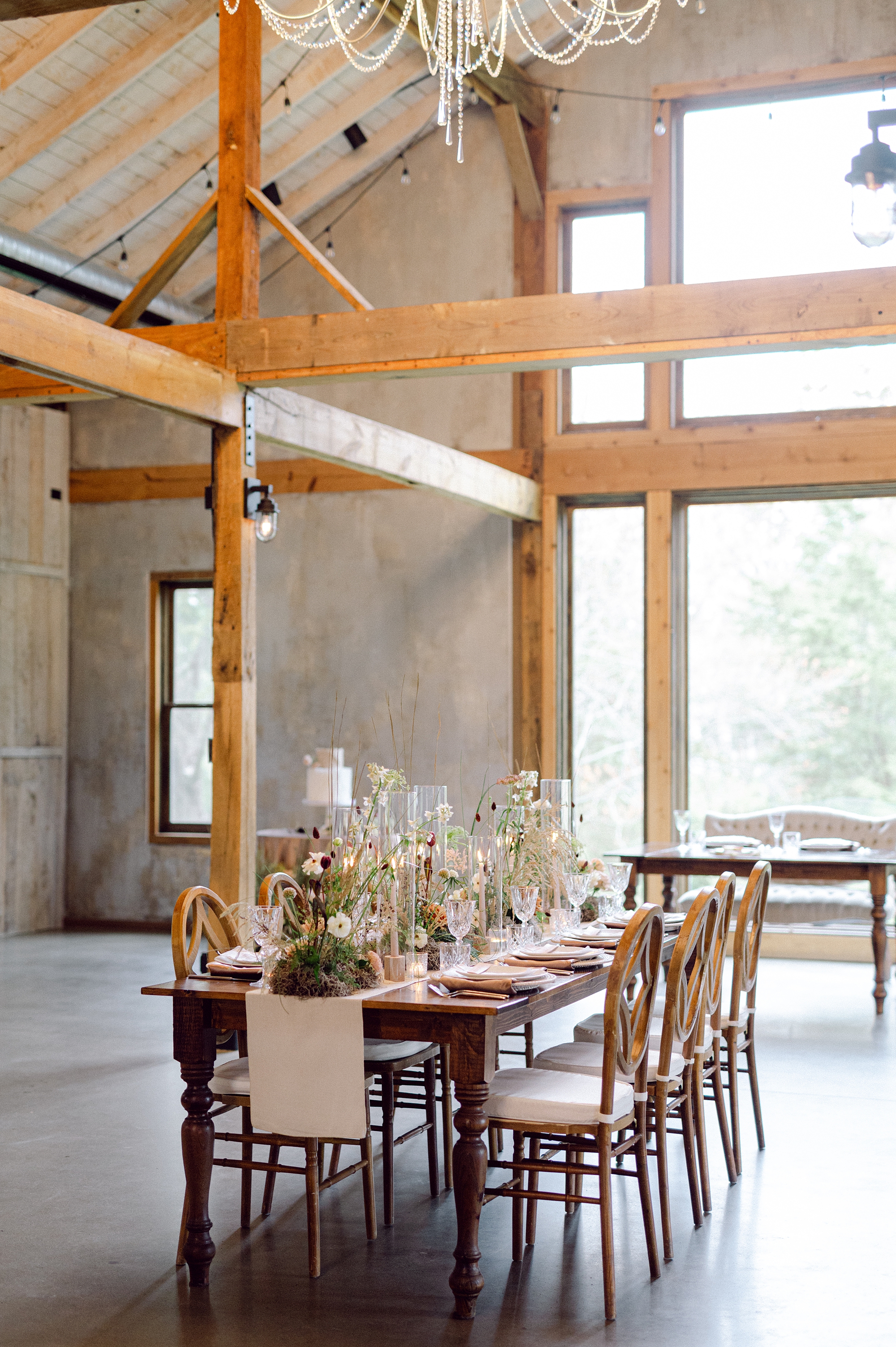
Recently featured in The Wren, this Cedarmont Farm wedding editorial was an absolute dream to create for. The entire design concept centered around texture, warmth, and timeless romance, and we wanted every detail of the paper goods and signage to reflect that. I am in love with the results from these Cedarmont Farm textured wedding details.
A Warm, Earthy Vision for This Cedarmont Farm Wedding
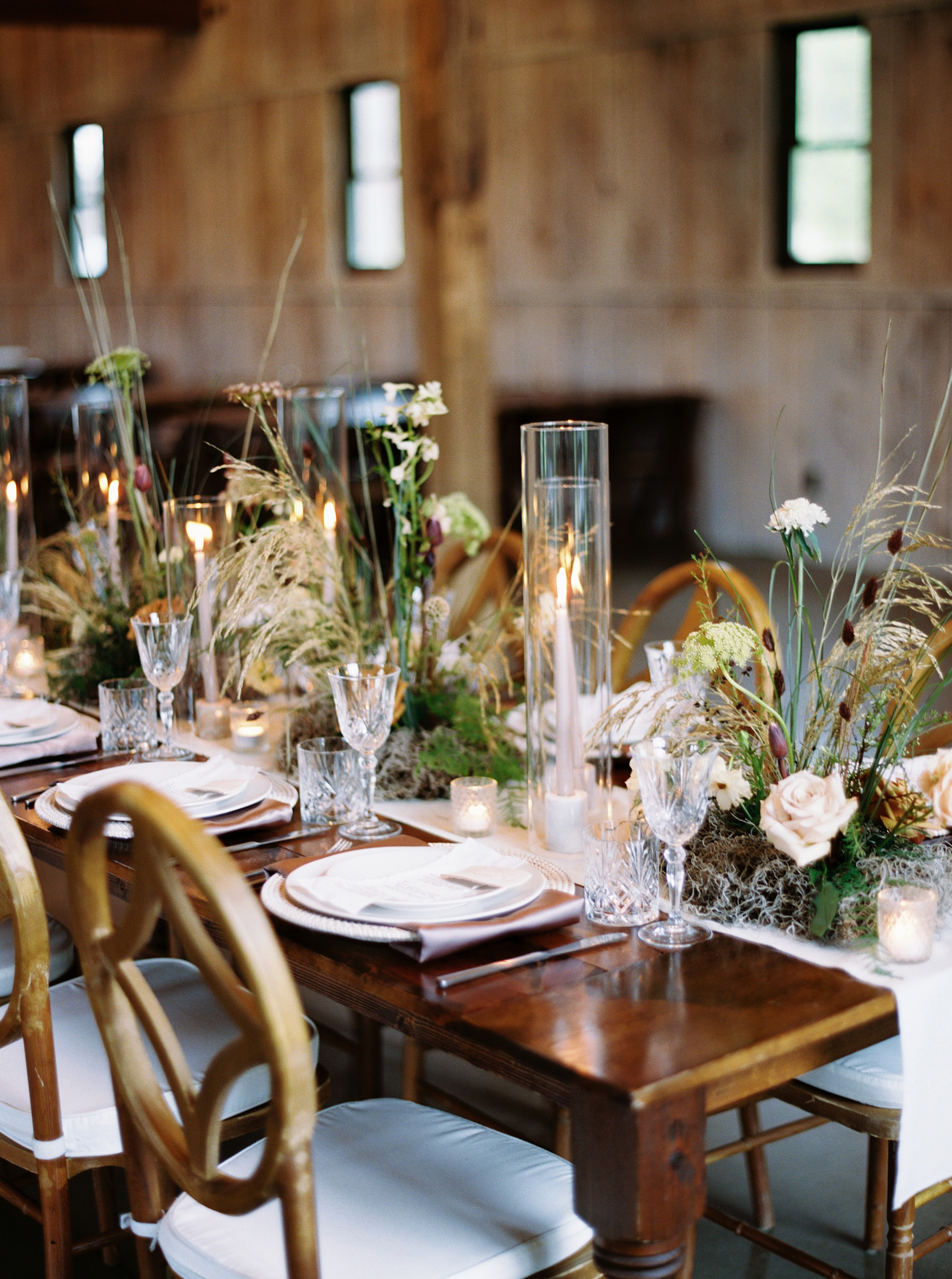
Set among the rolling hills of Franklin, Tennessee, Cedarmont Farm is a venue that beautifully blends historic charm with modern touches. Its elegant interiors made it the perfect backdrop for this editorial. Our goal was to pull as much texture as possible into each stationery and signage element.
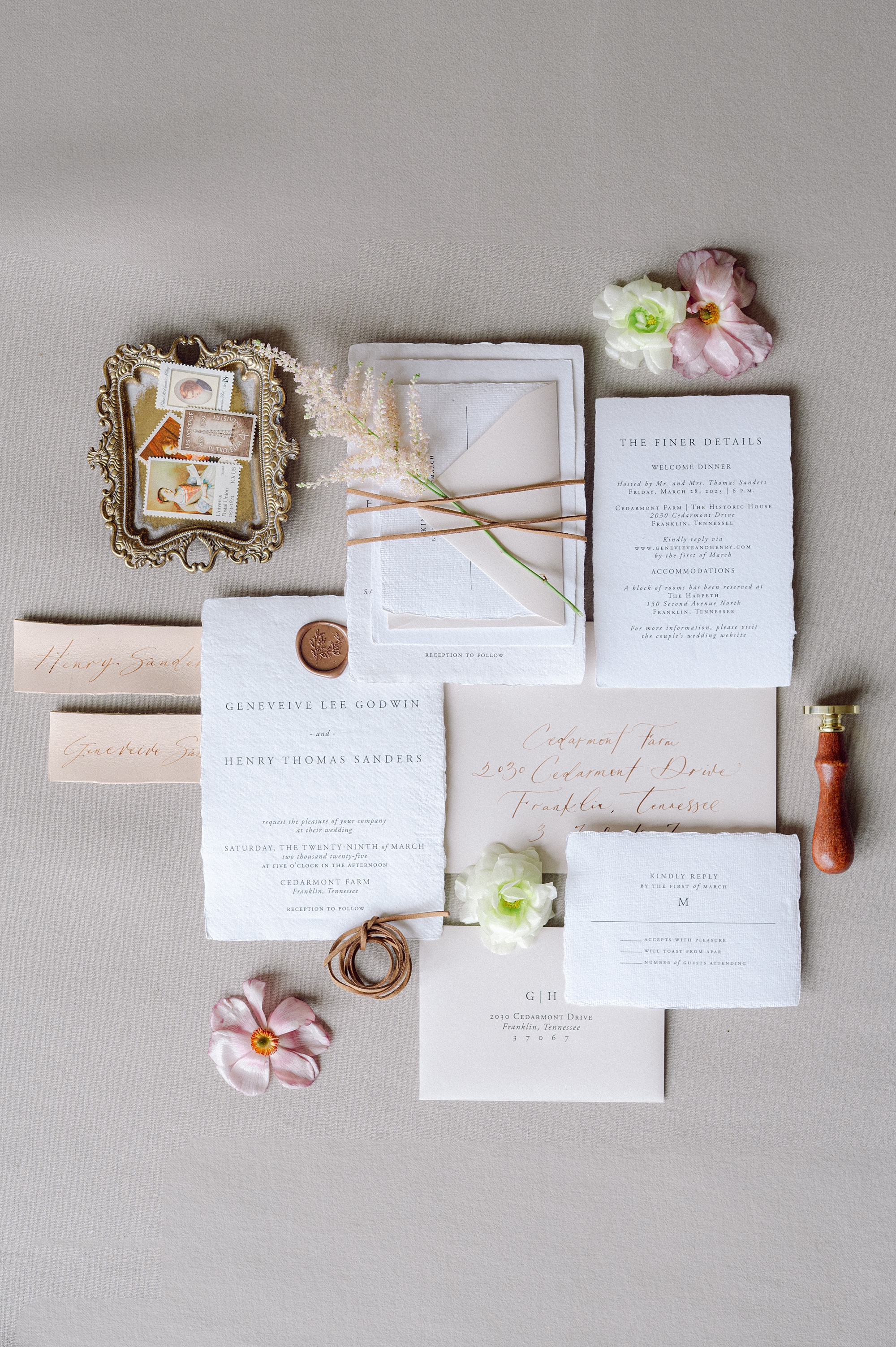
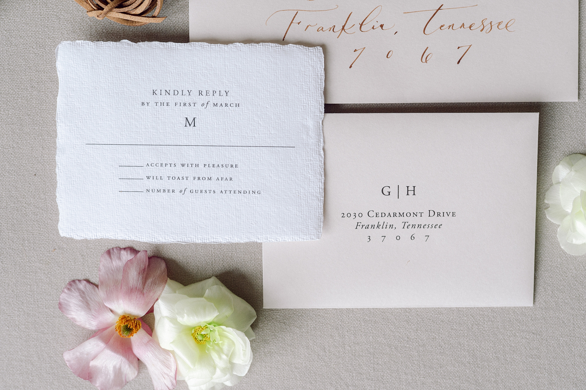
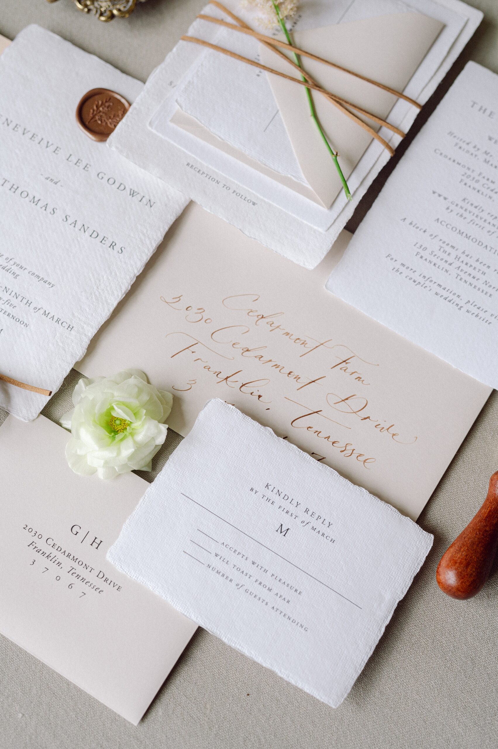
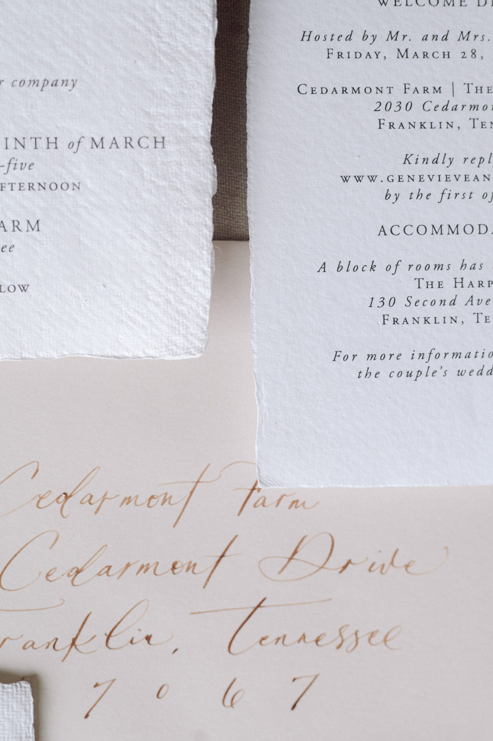
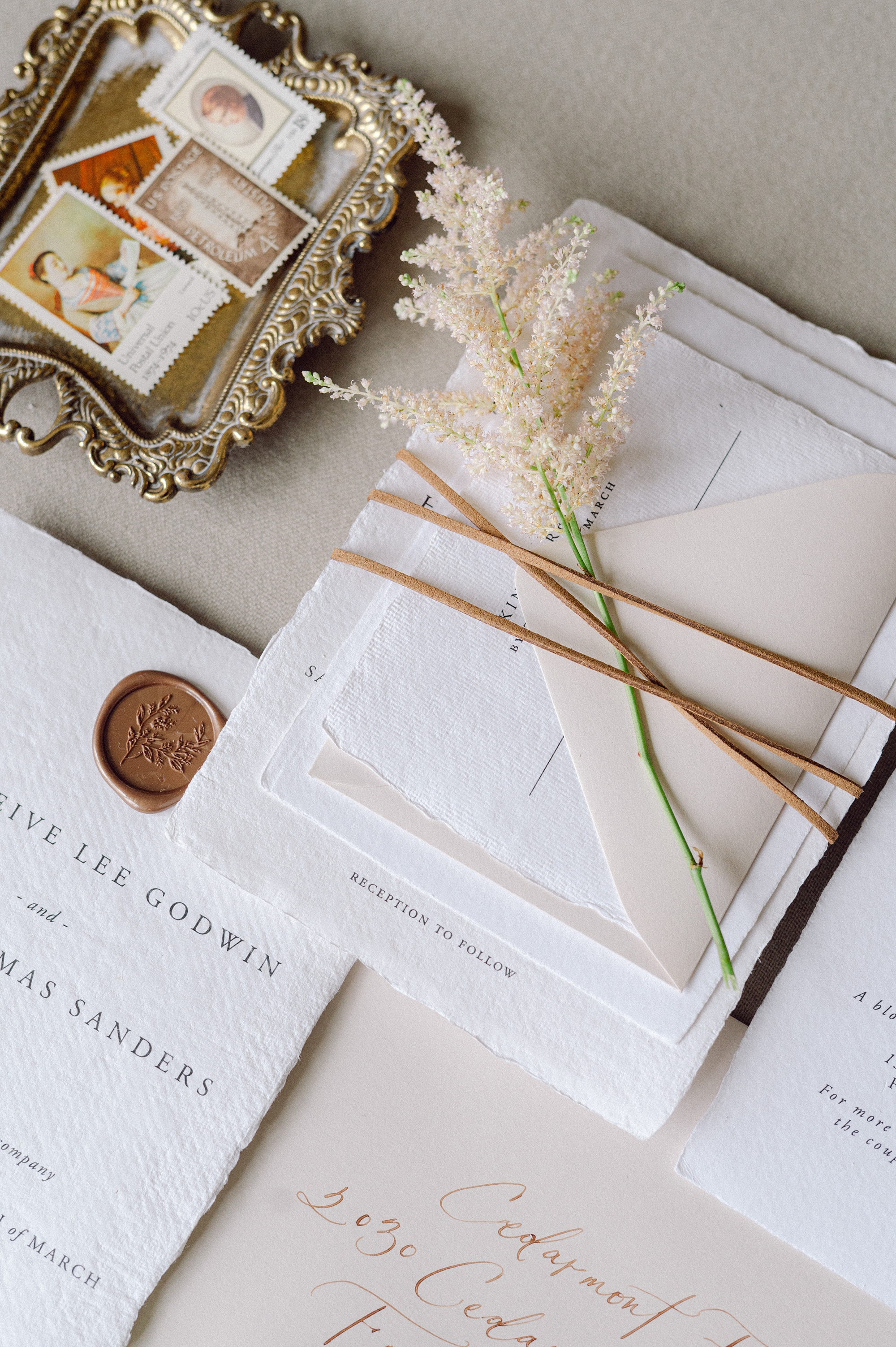
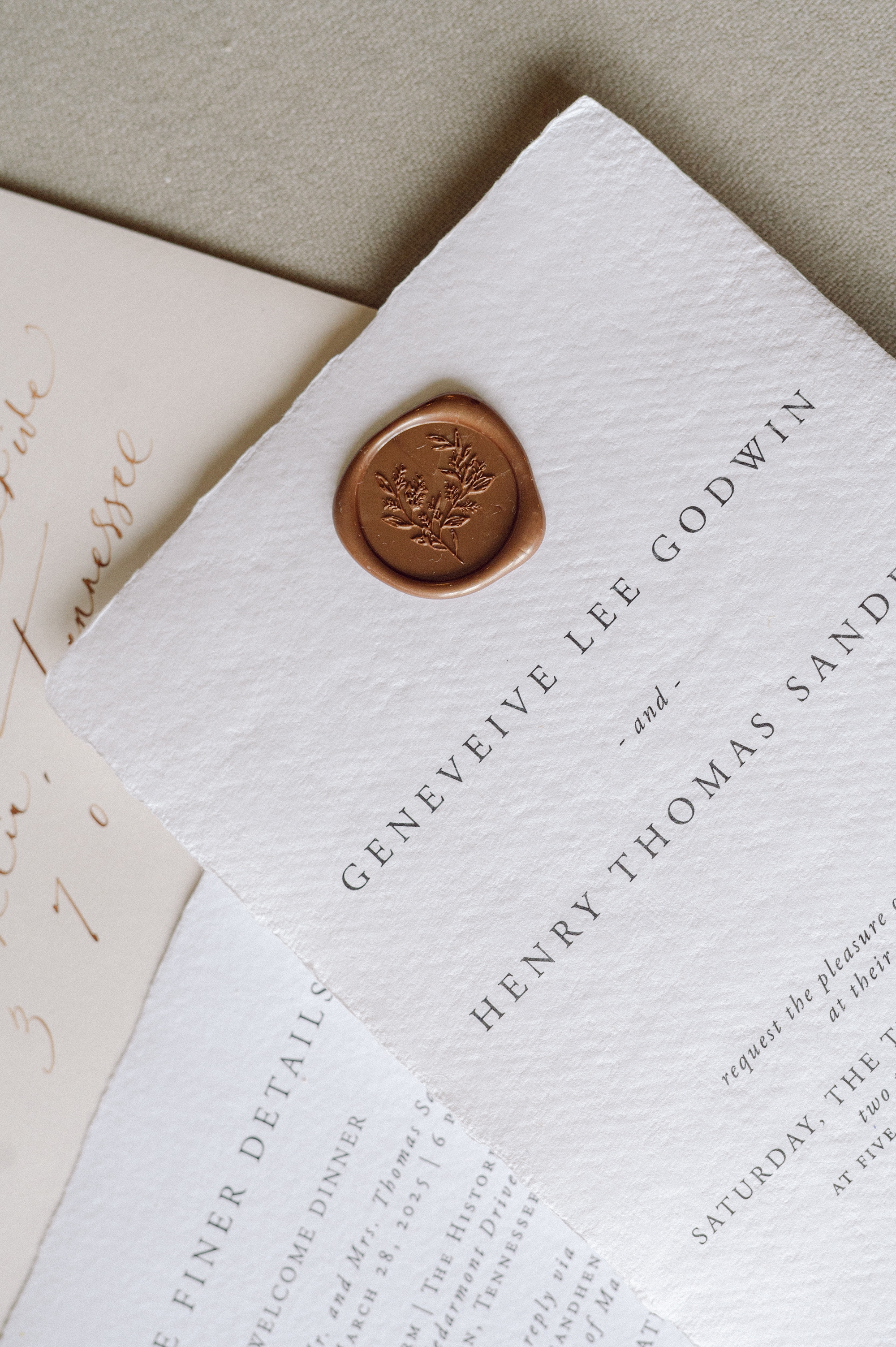
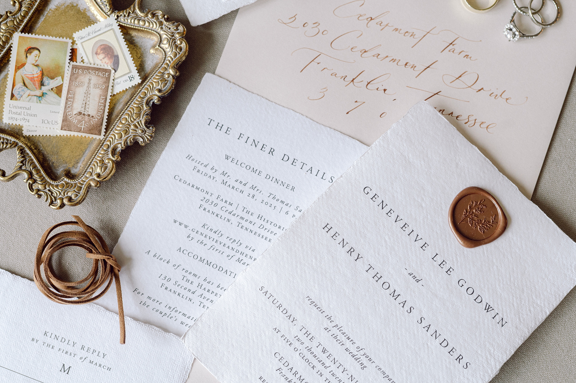
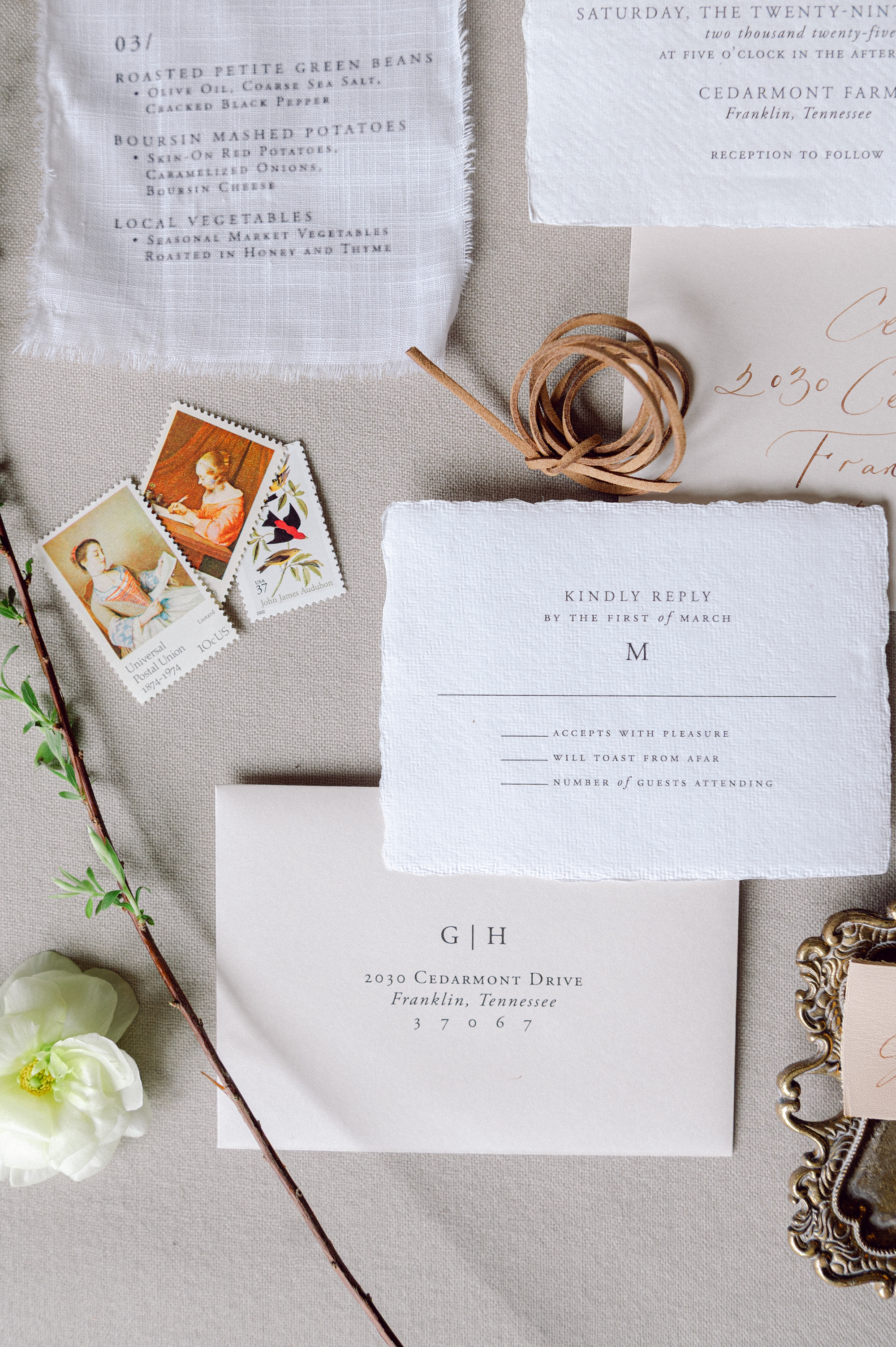
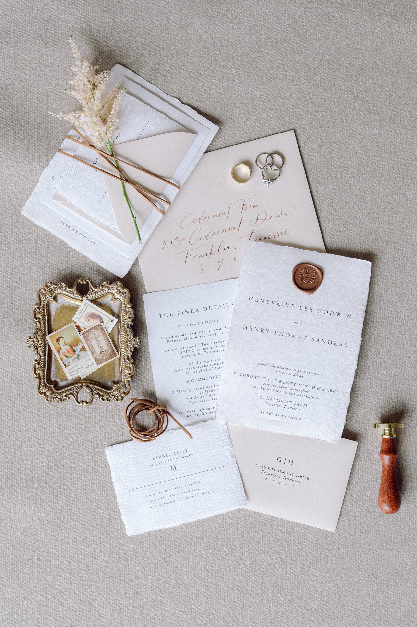
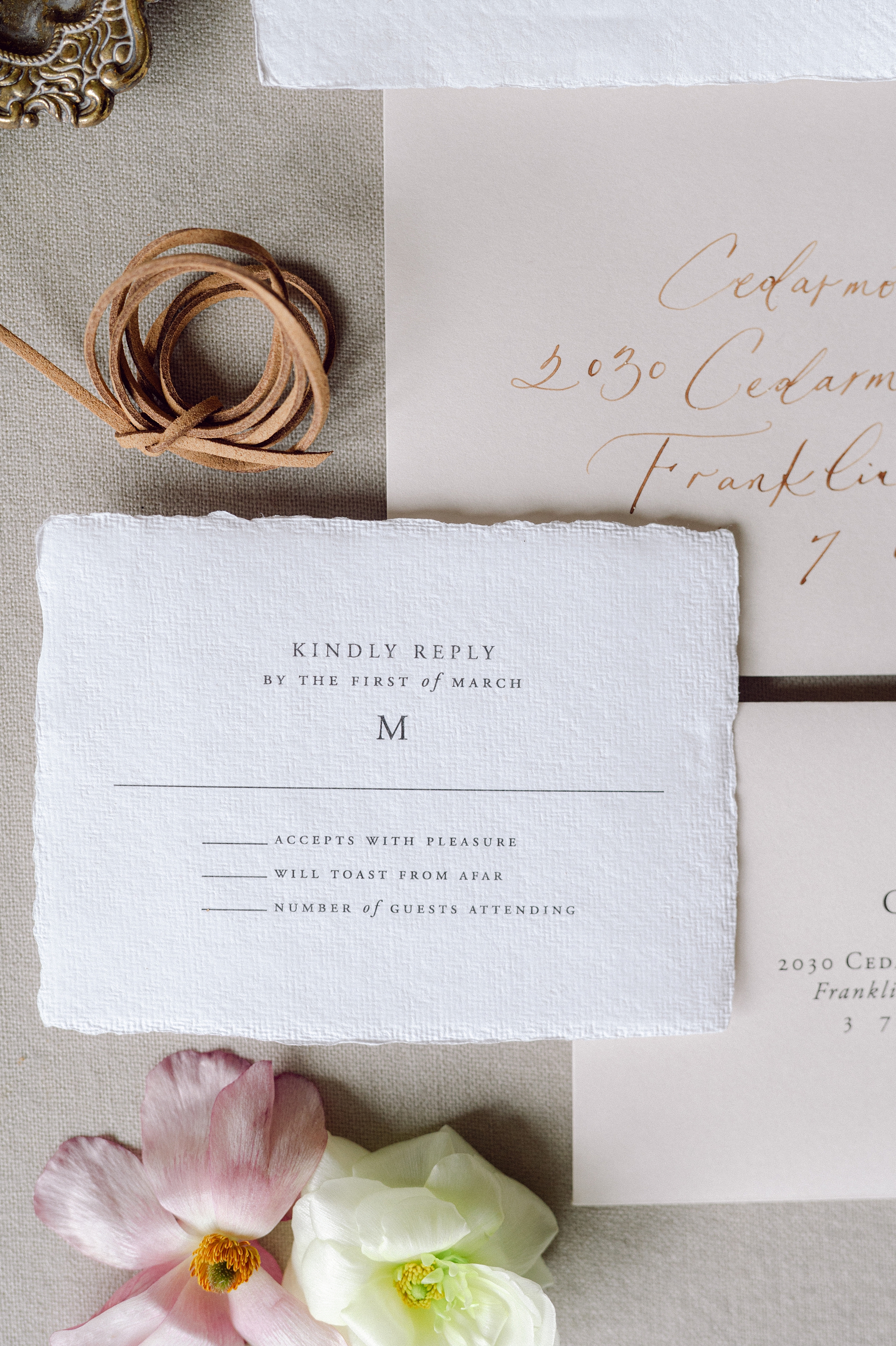
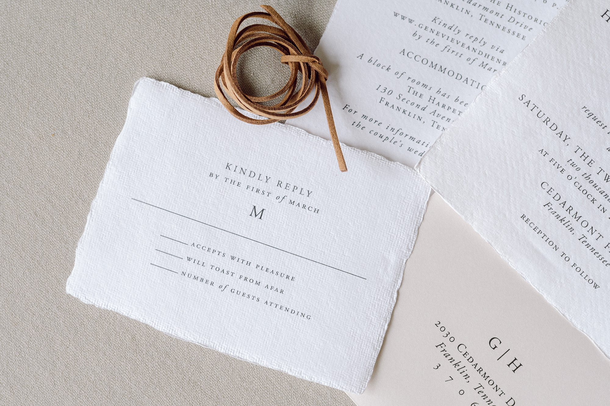
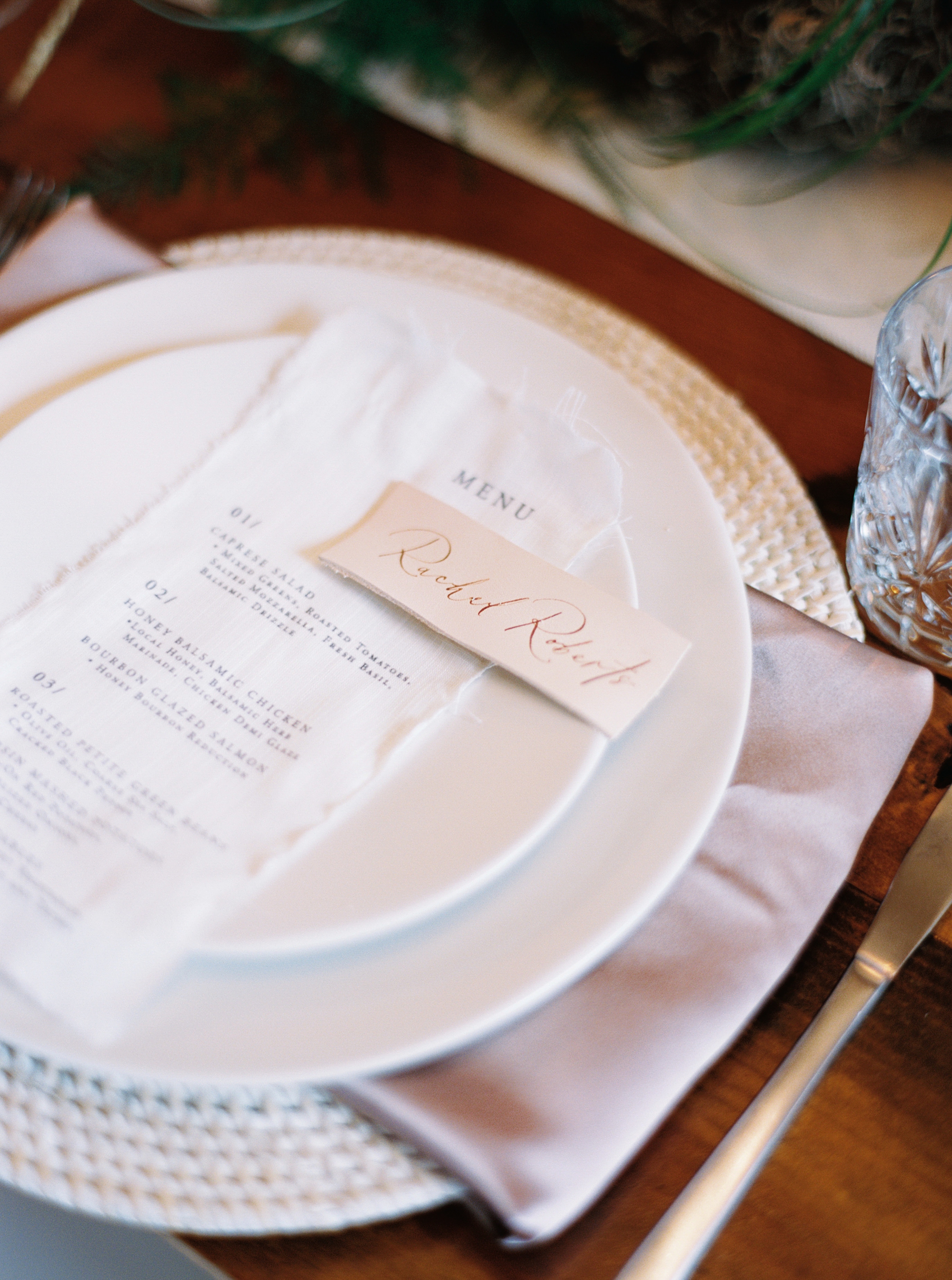
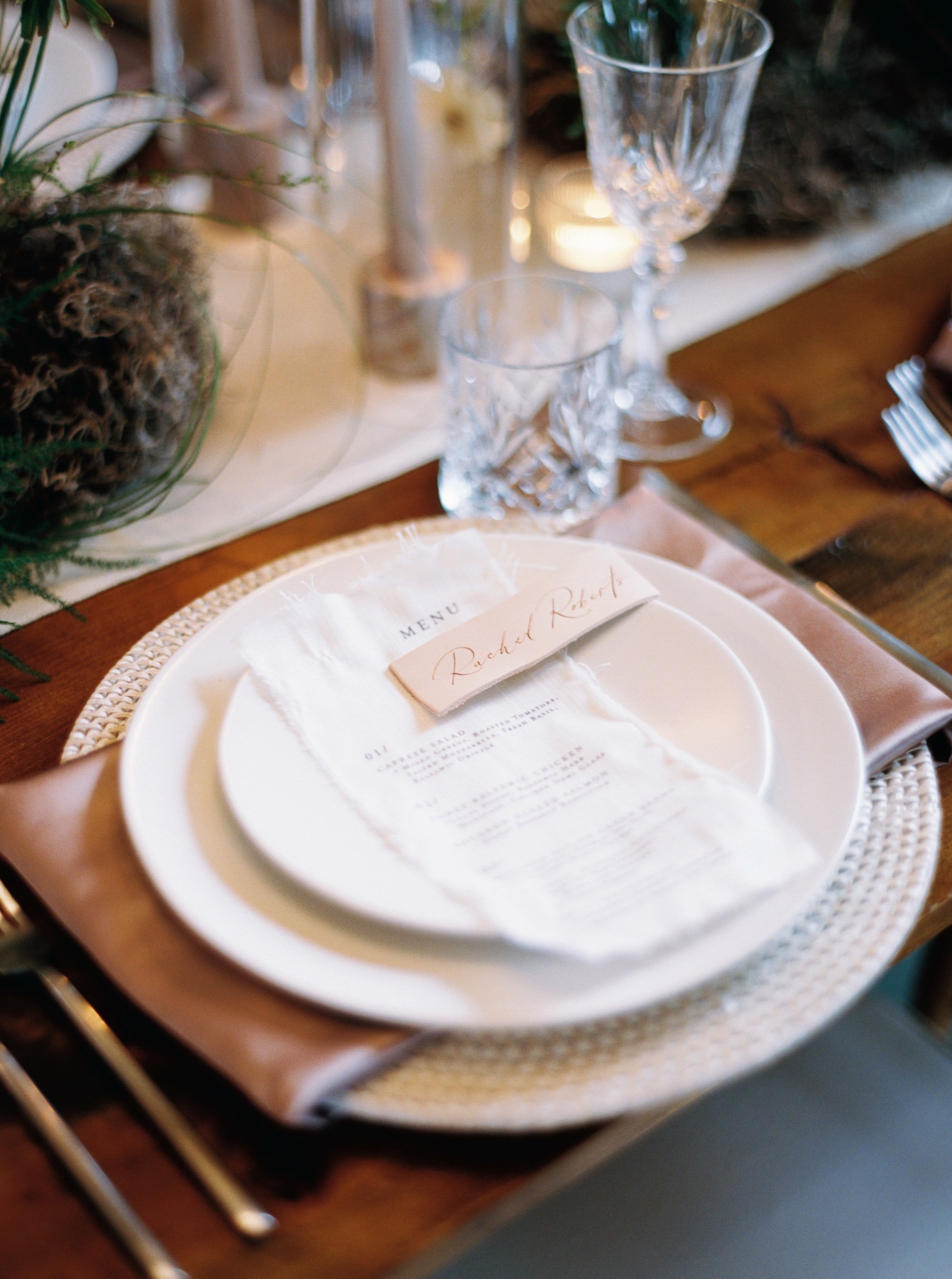
Elegant and Classic Textured Invitation Suite
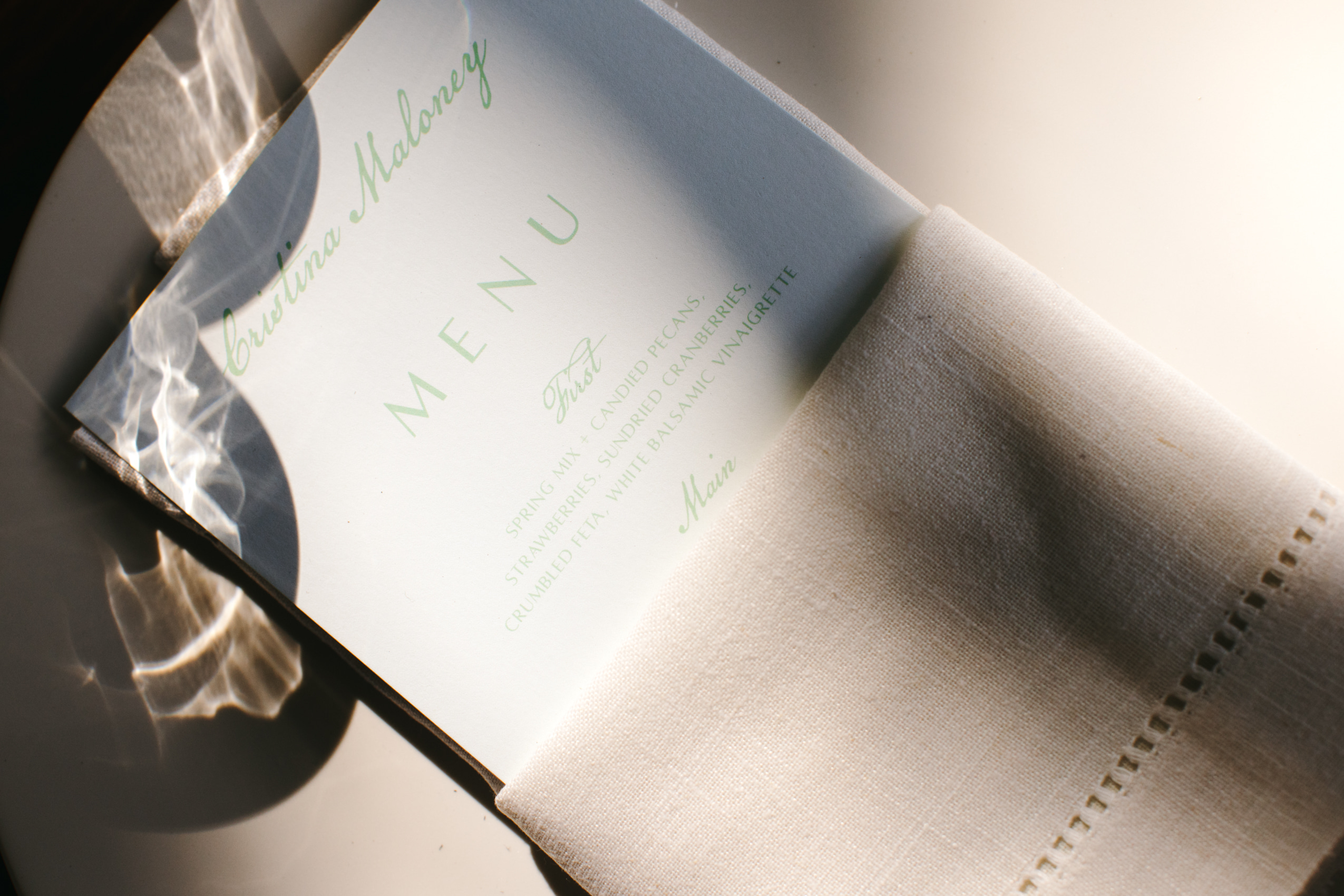
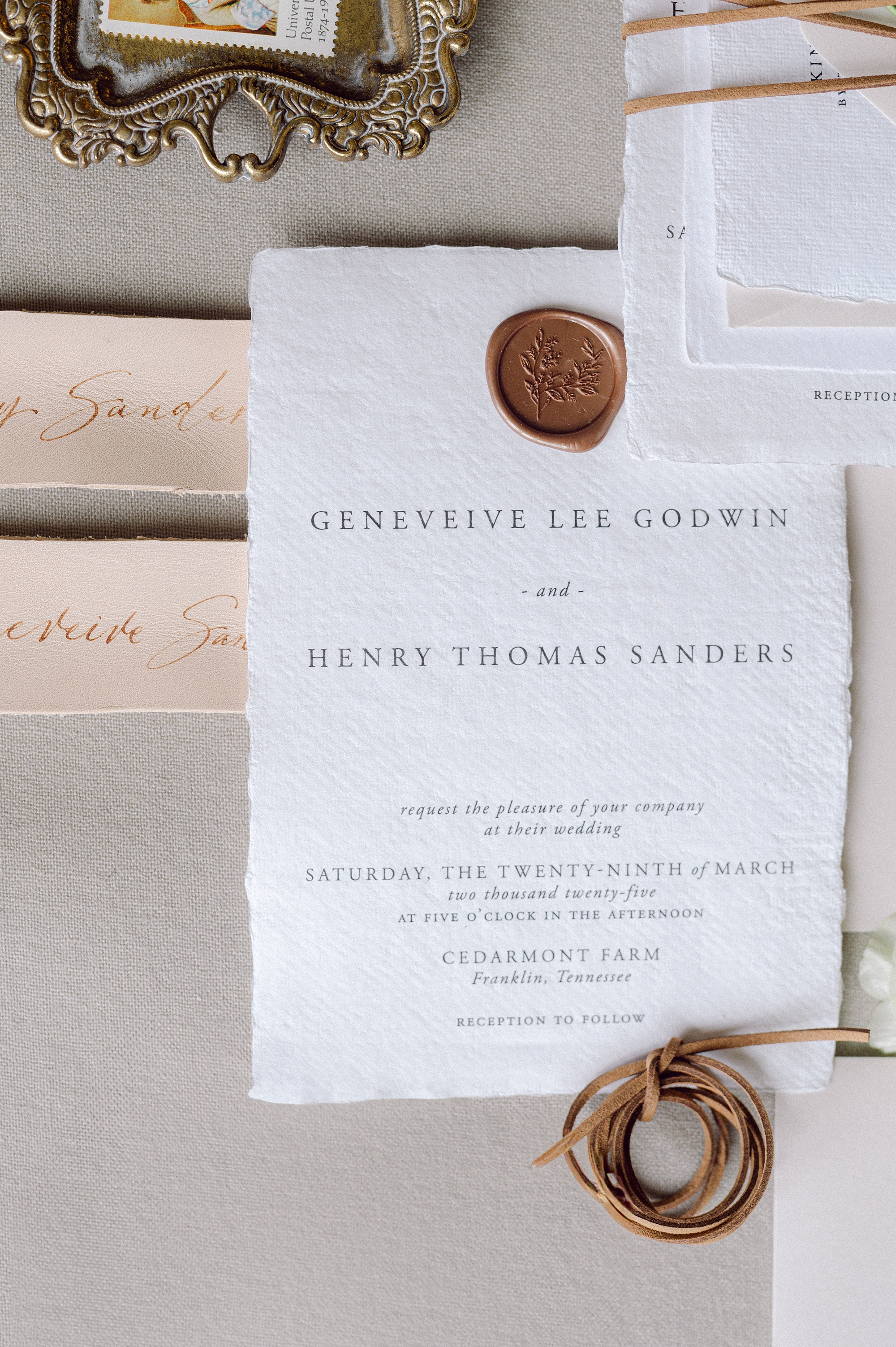
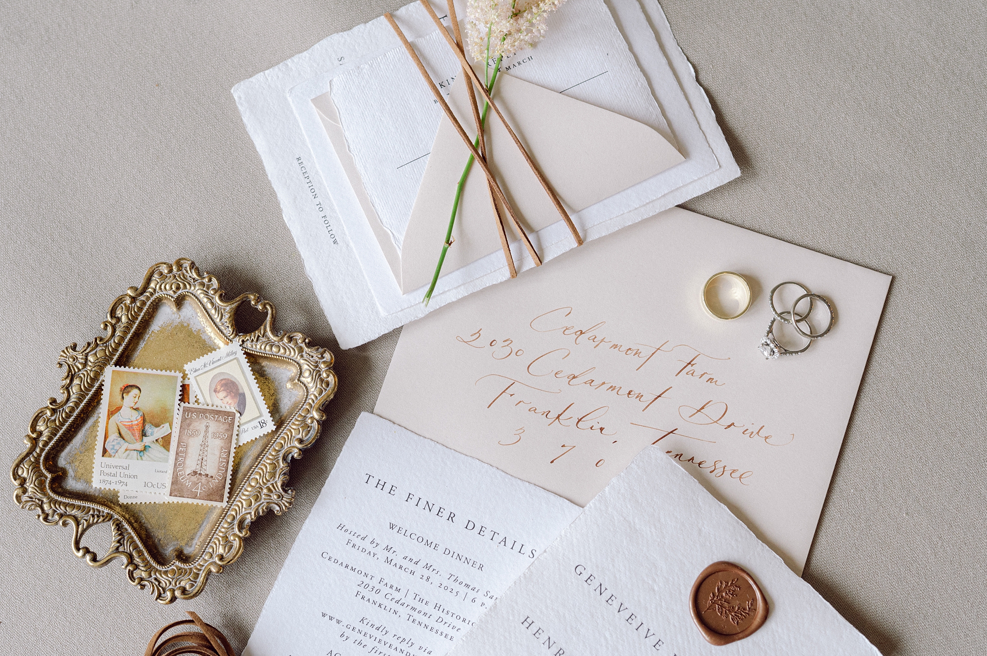
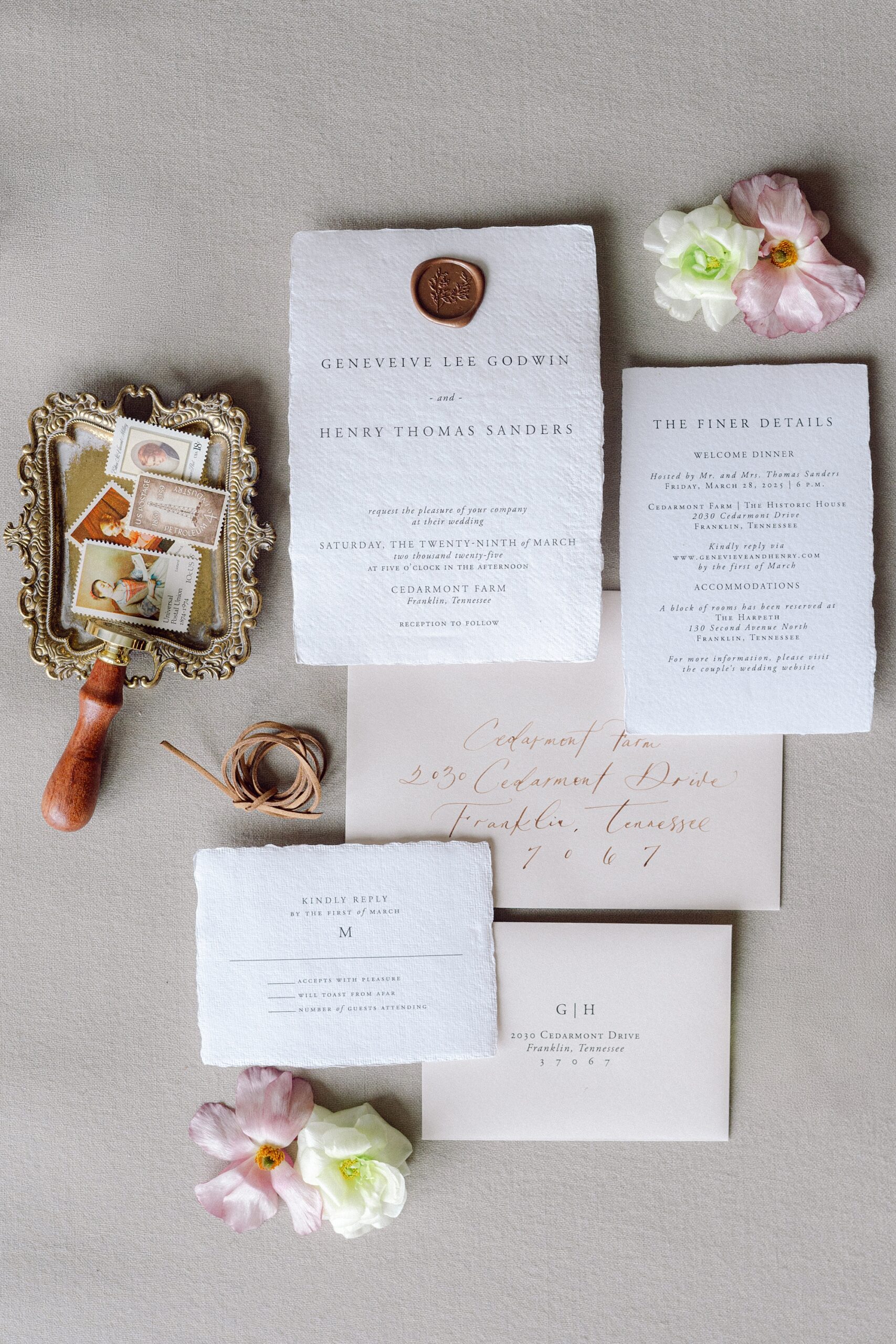
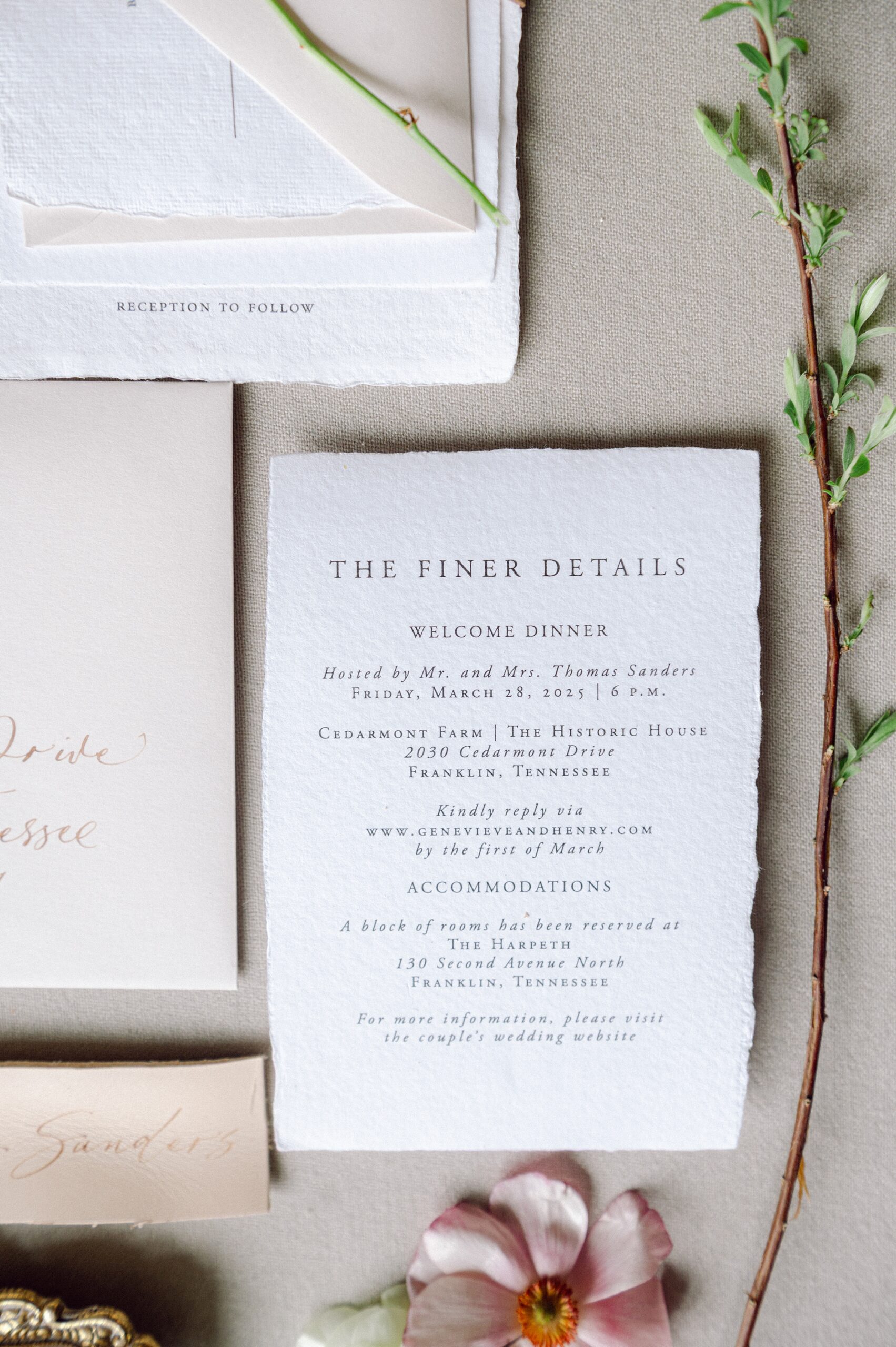
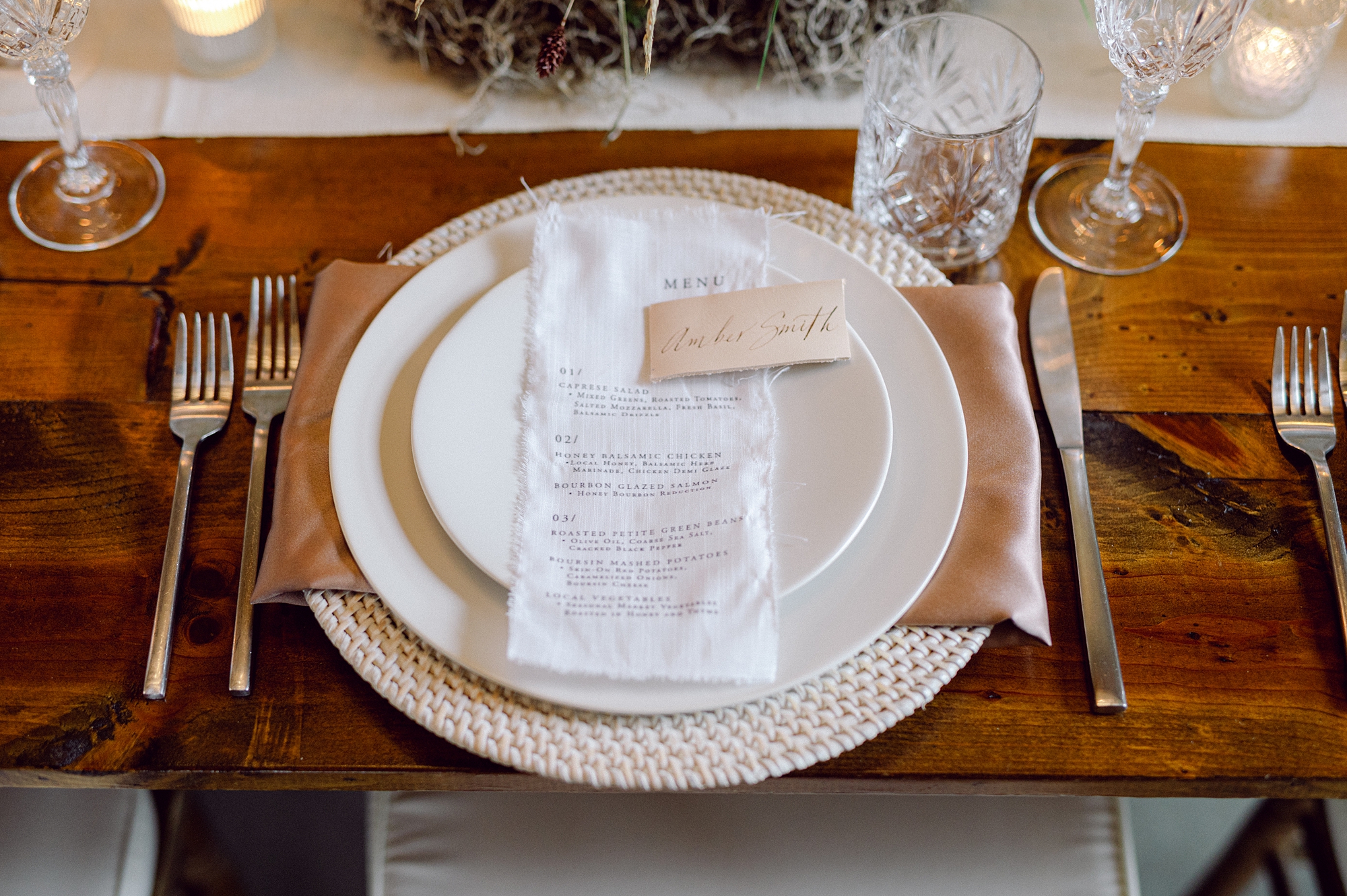
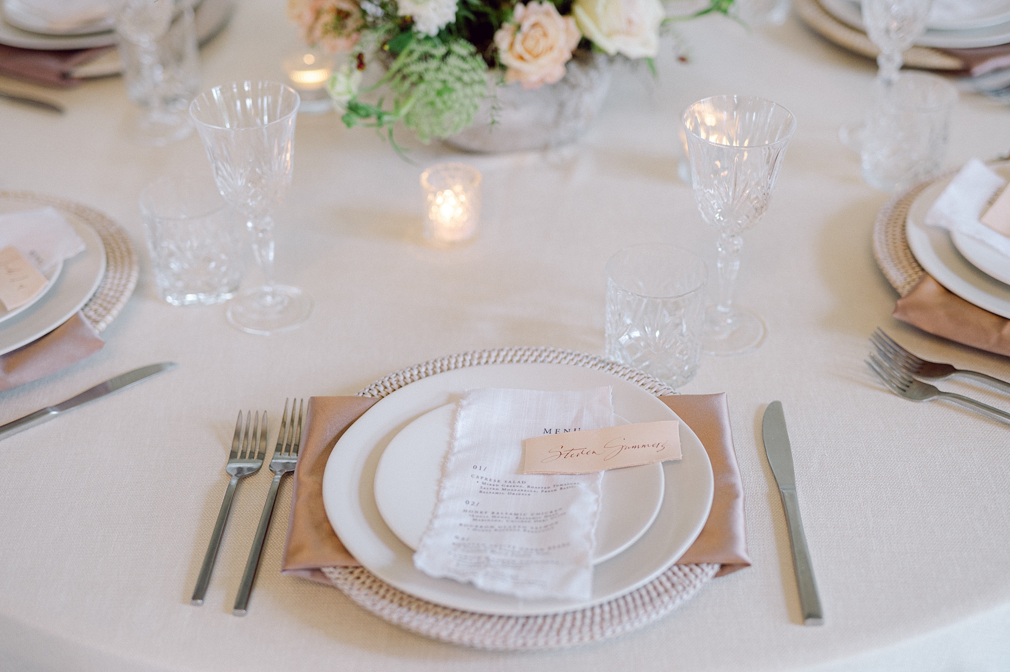
The invitation suite set the tone for the event with handmade, textured paper and a classic wax seal for an organic yet elevated look. We paired the suite with light tan envelopes. The combination of warm neutrals and refined materials perfectly echoed the editorial’s color palette inspired by Pantone’s Mocha Mousse.
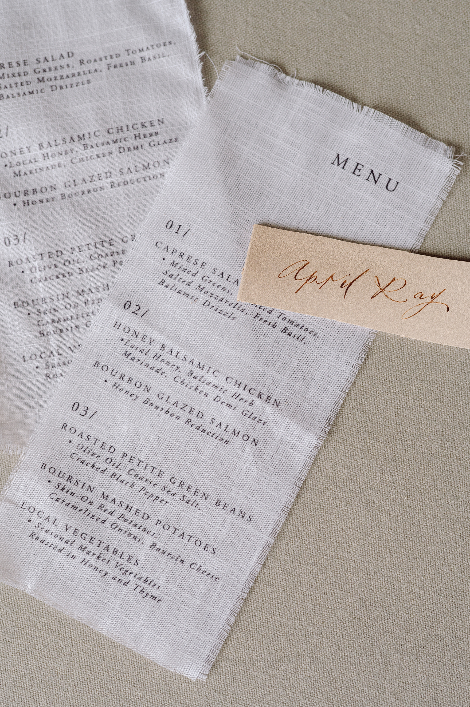
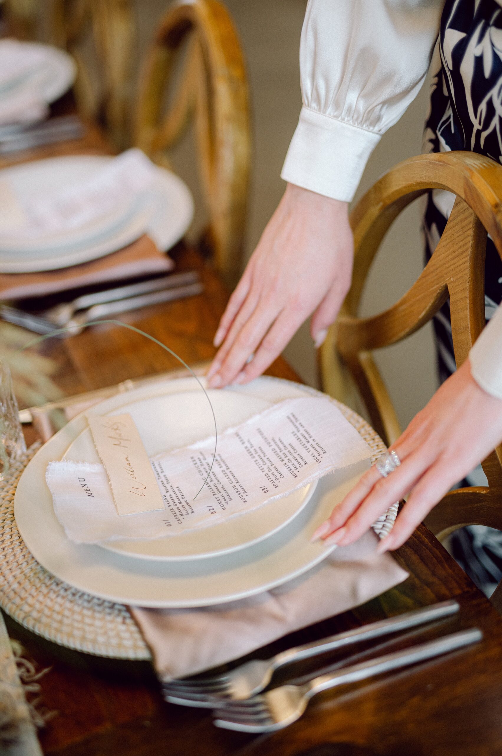
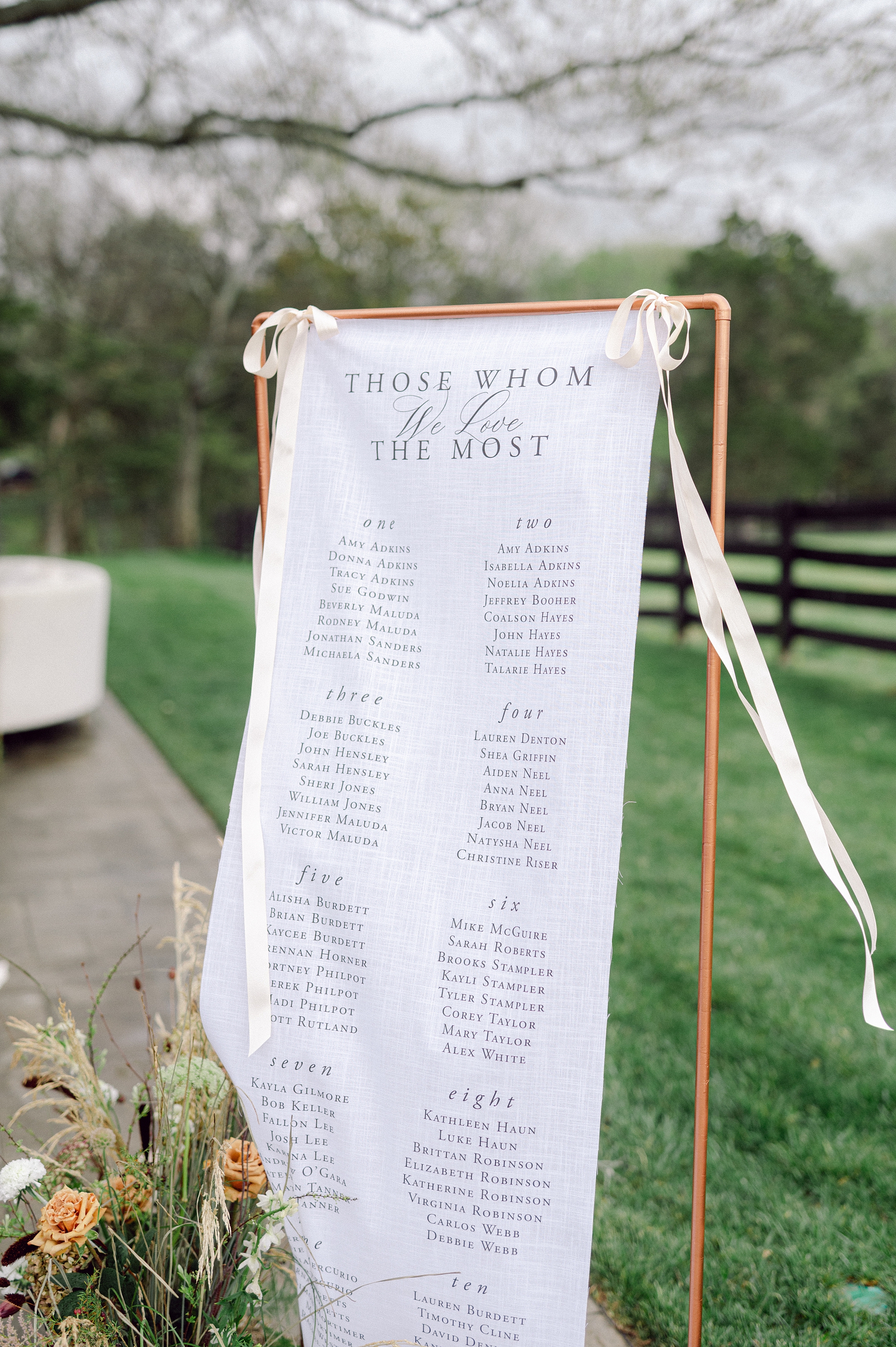
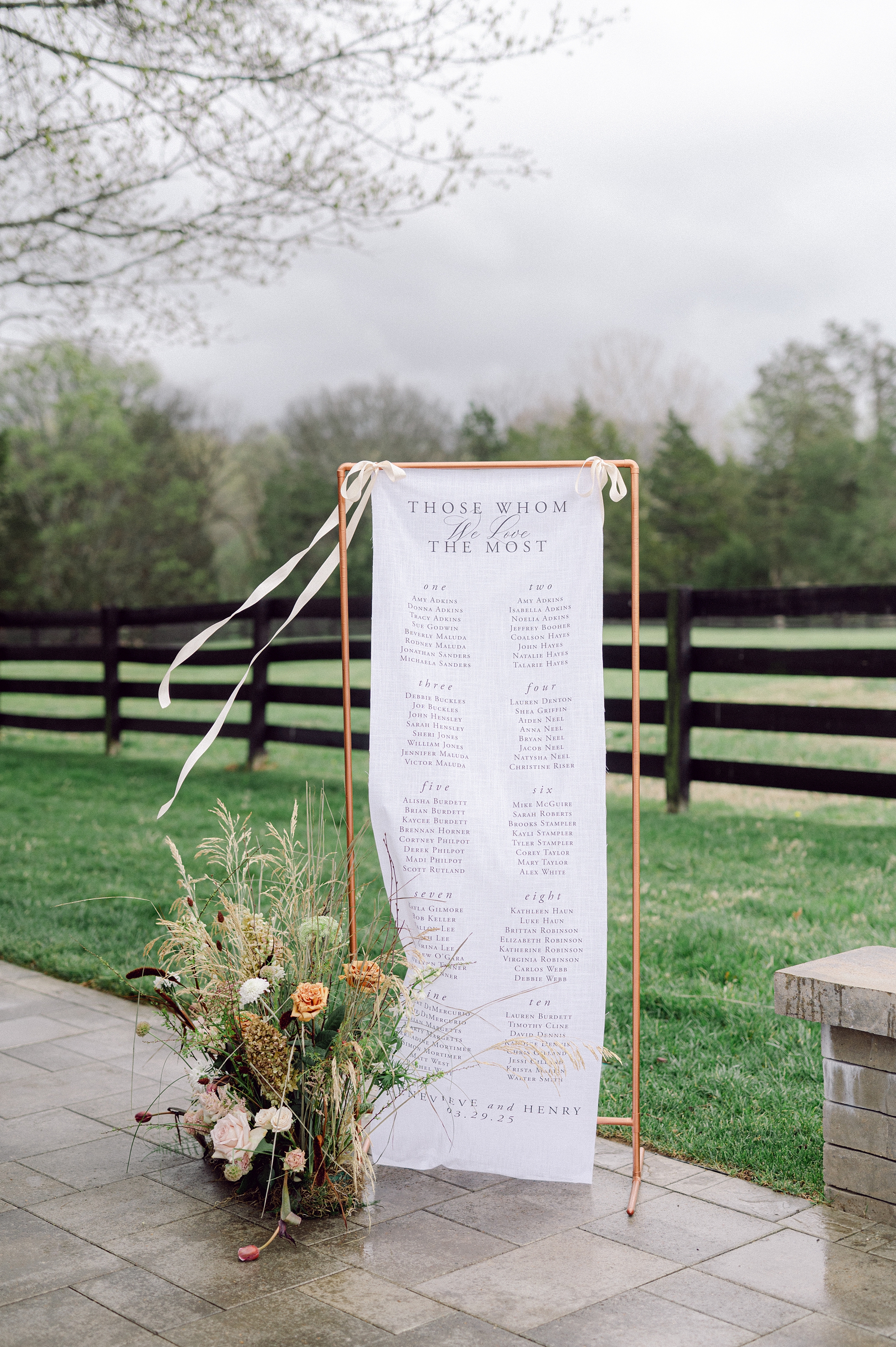
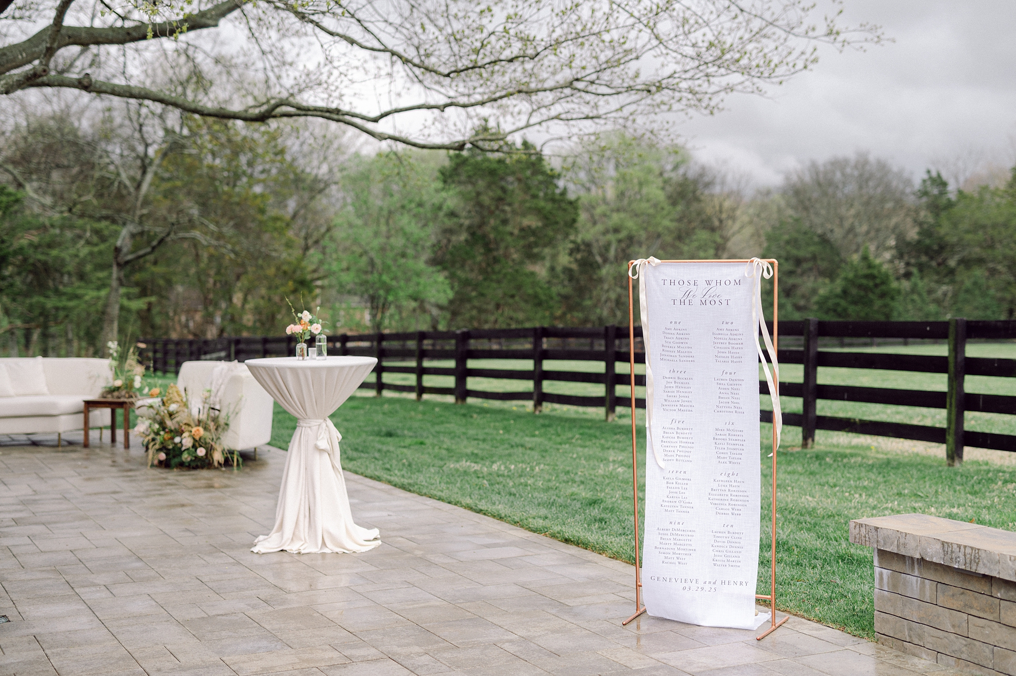
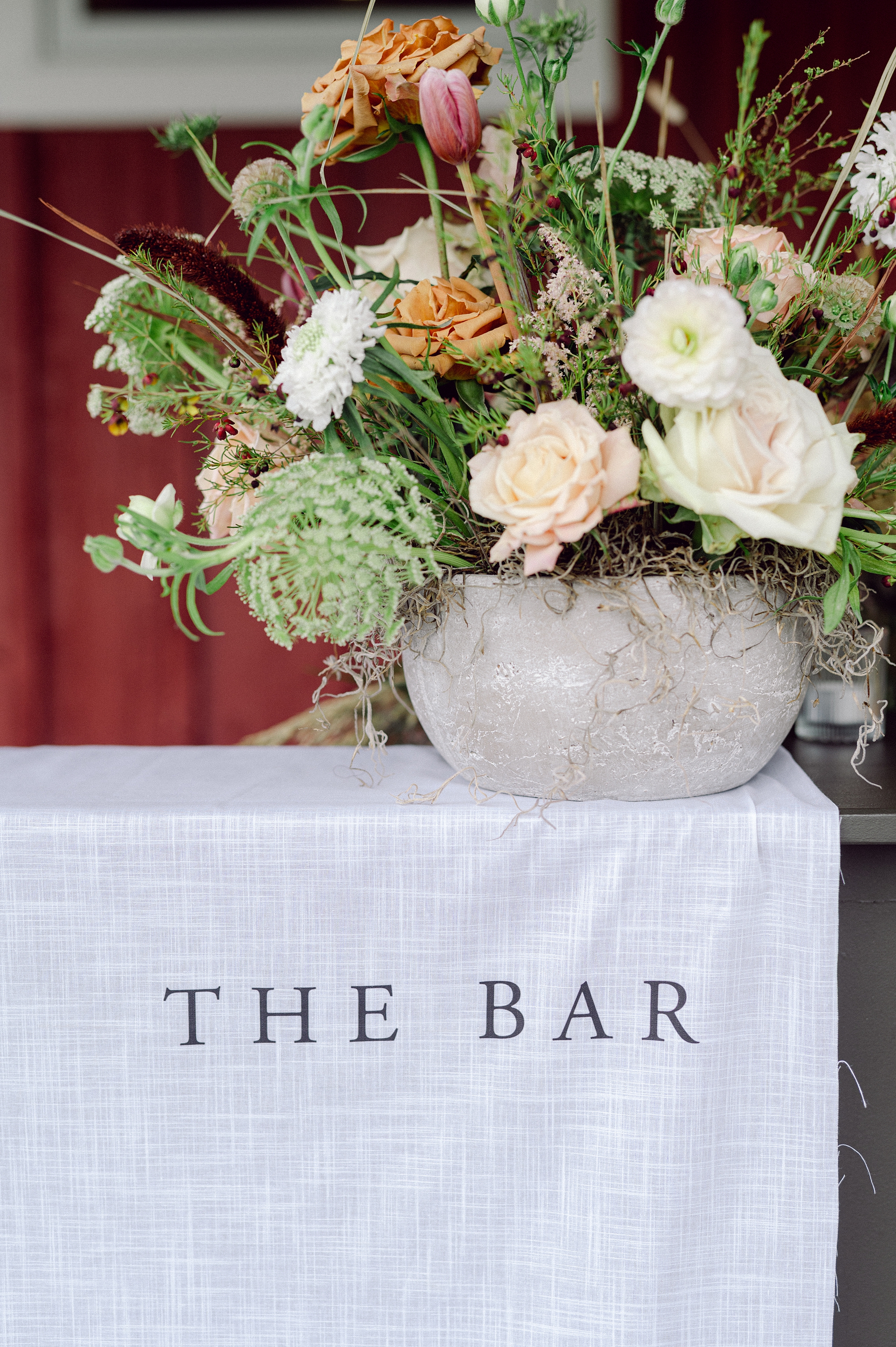
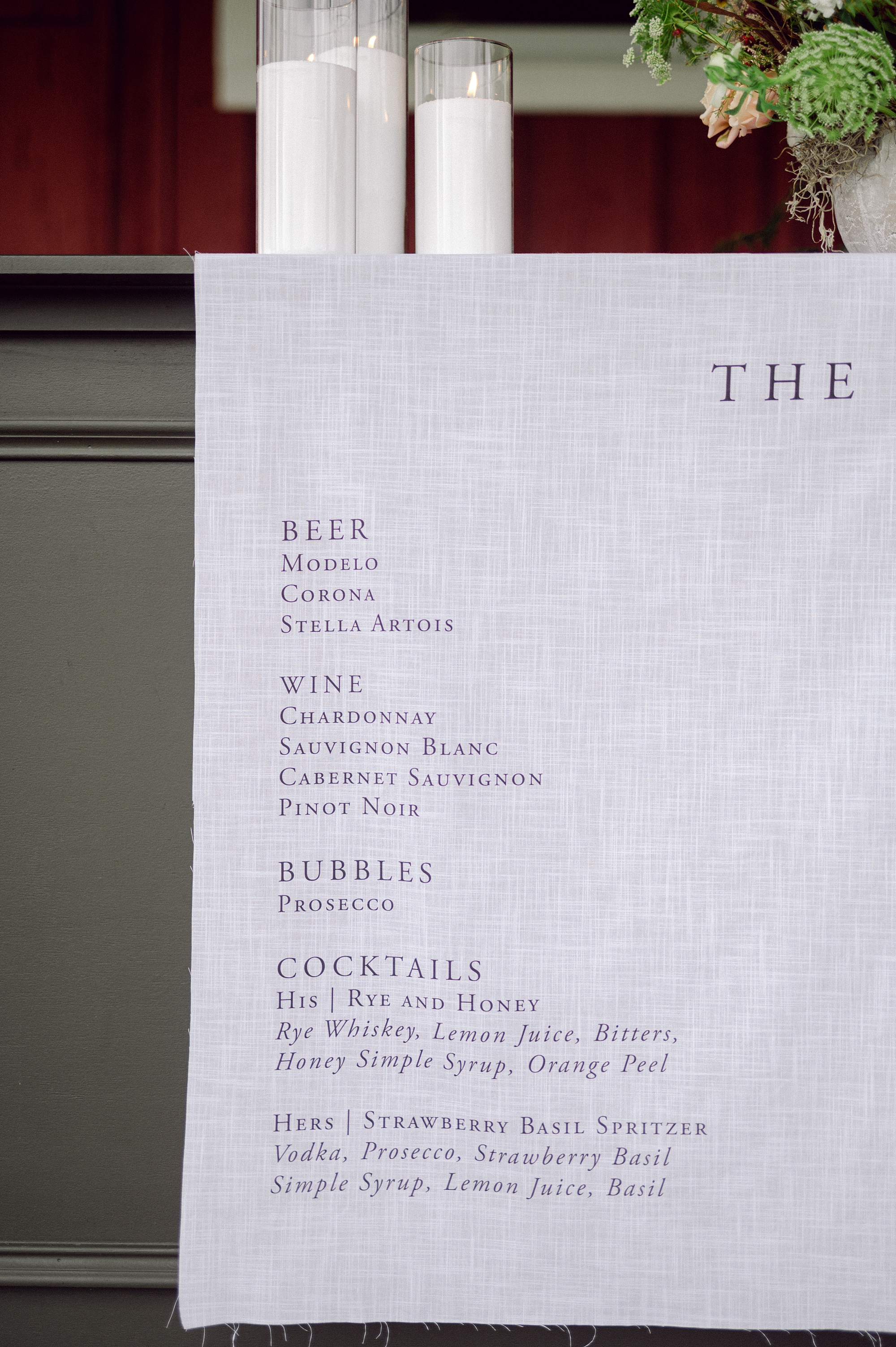
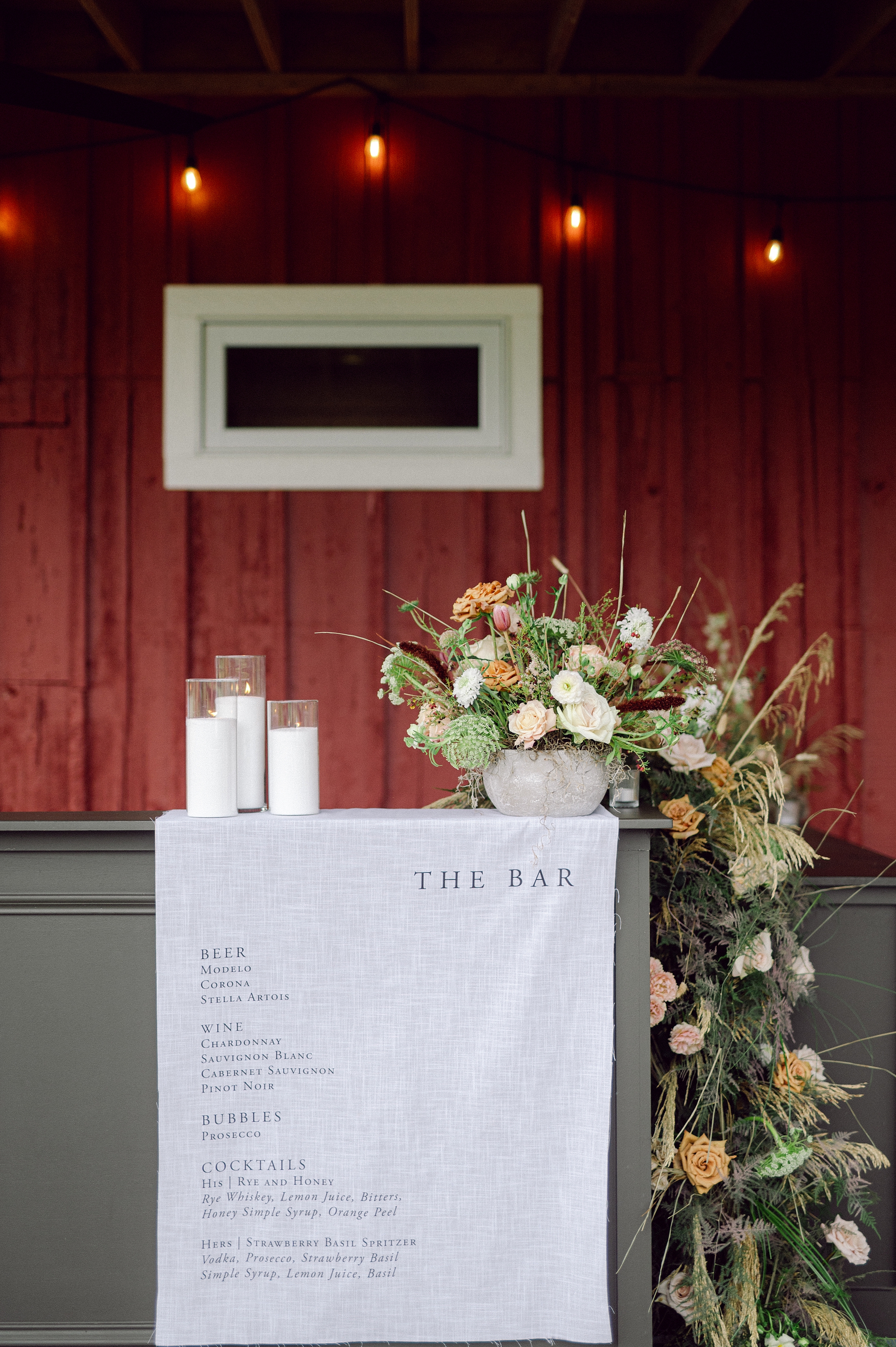
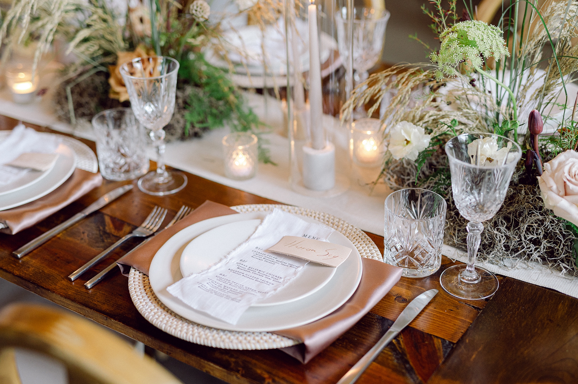
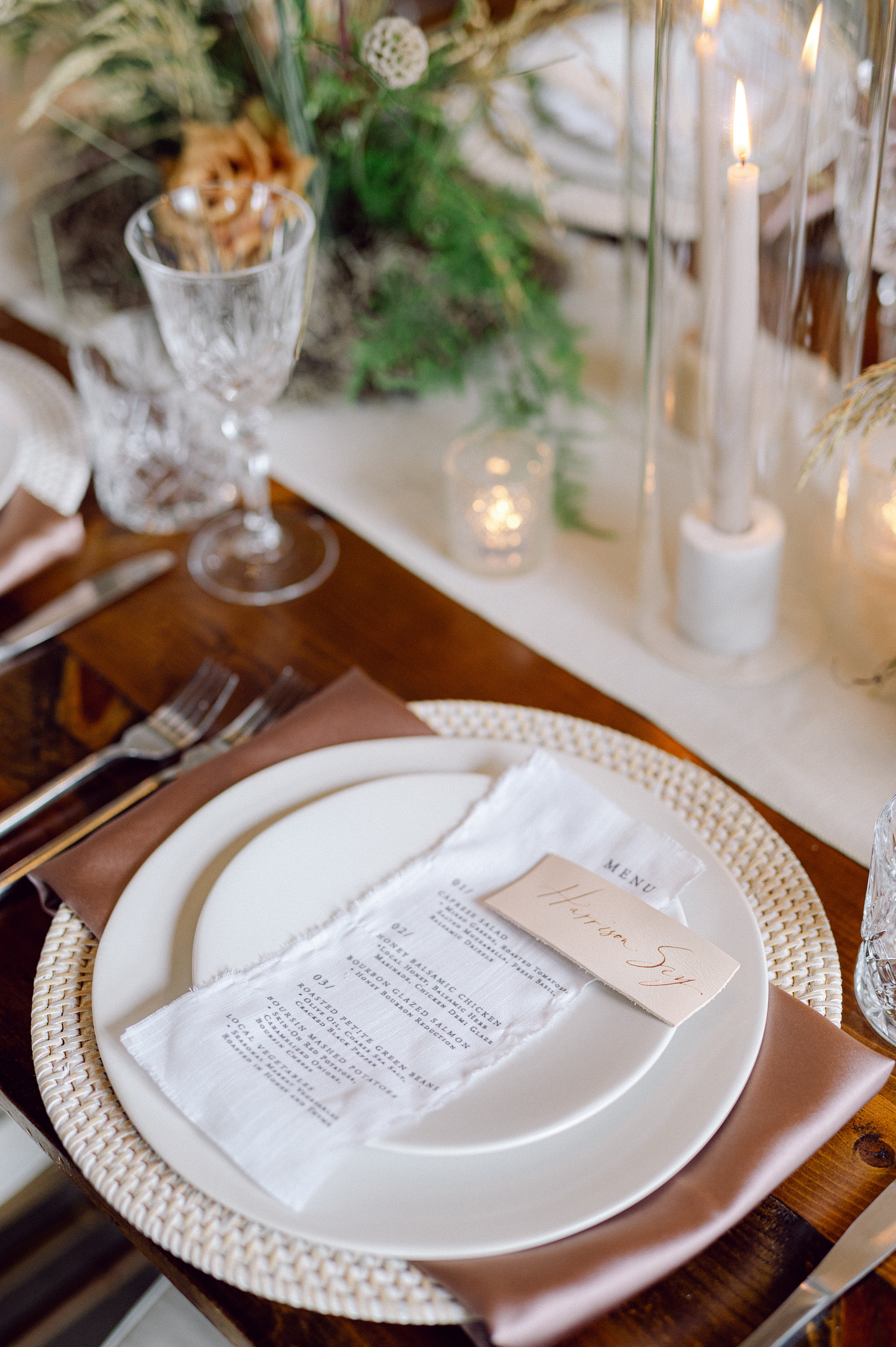
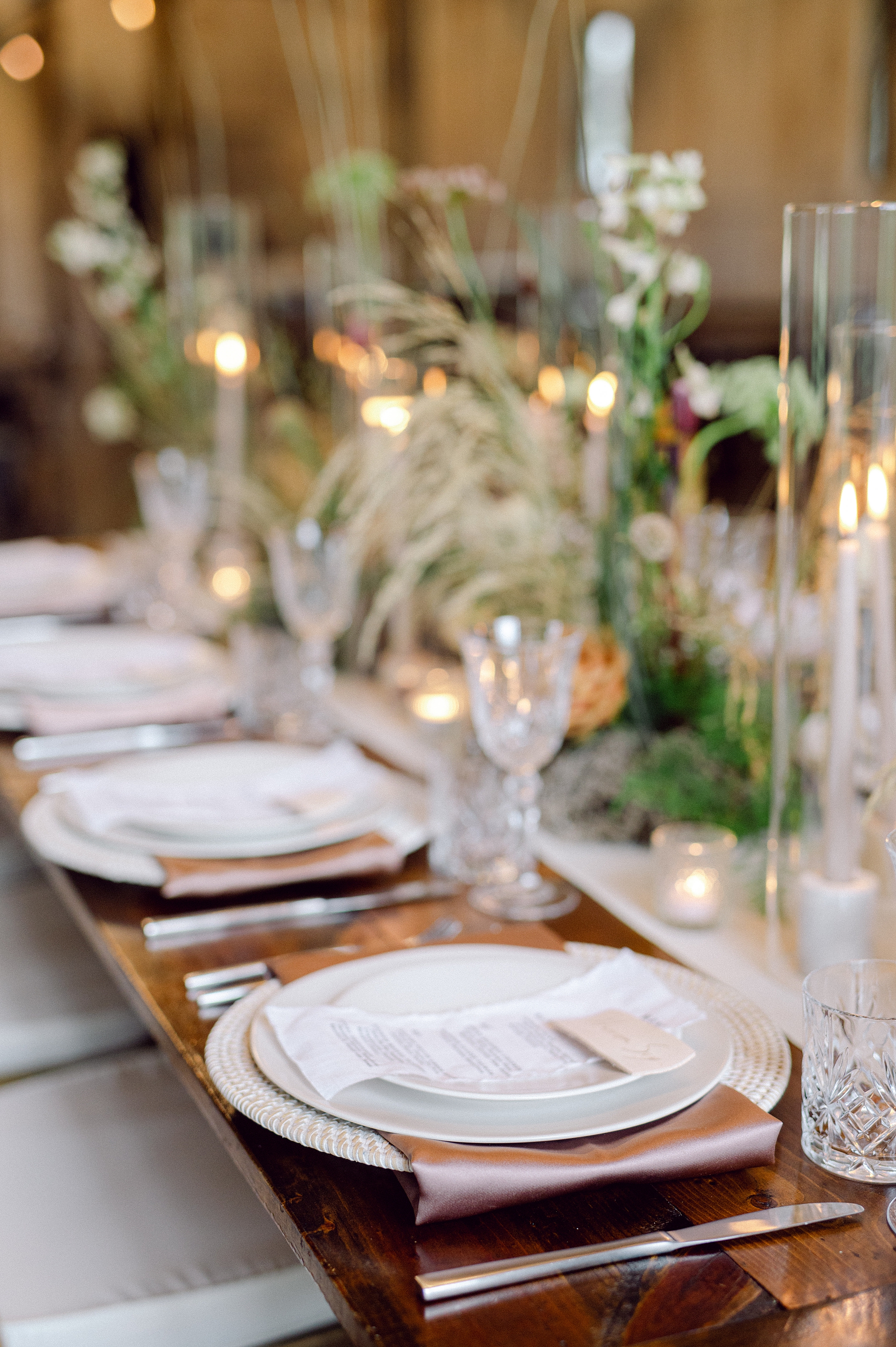
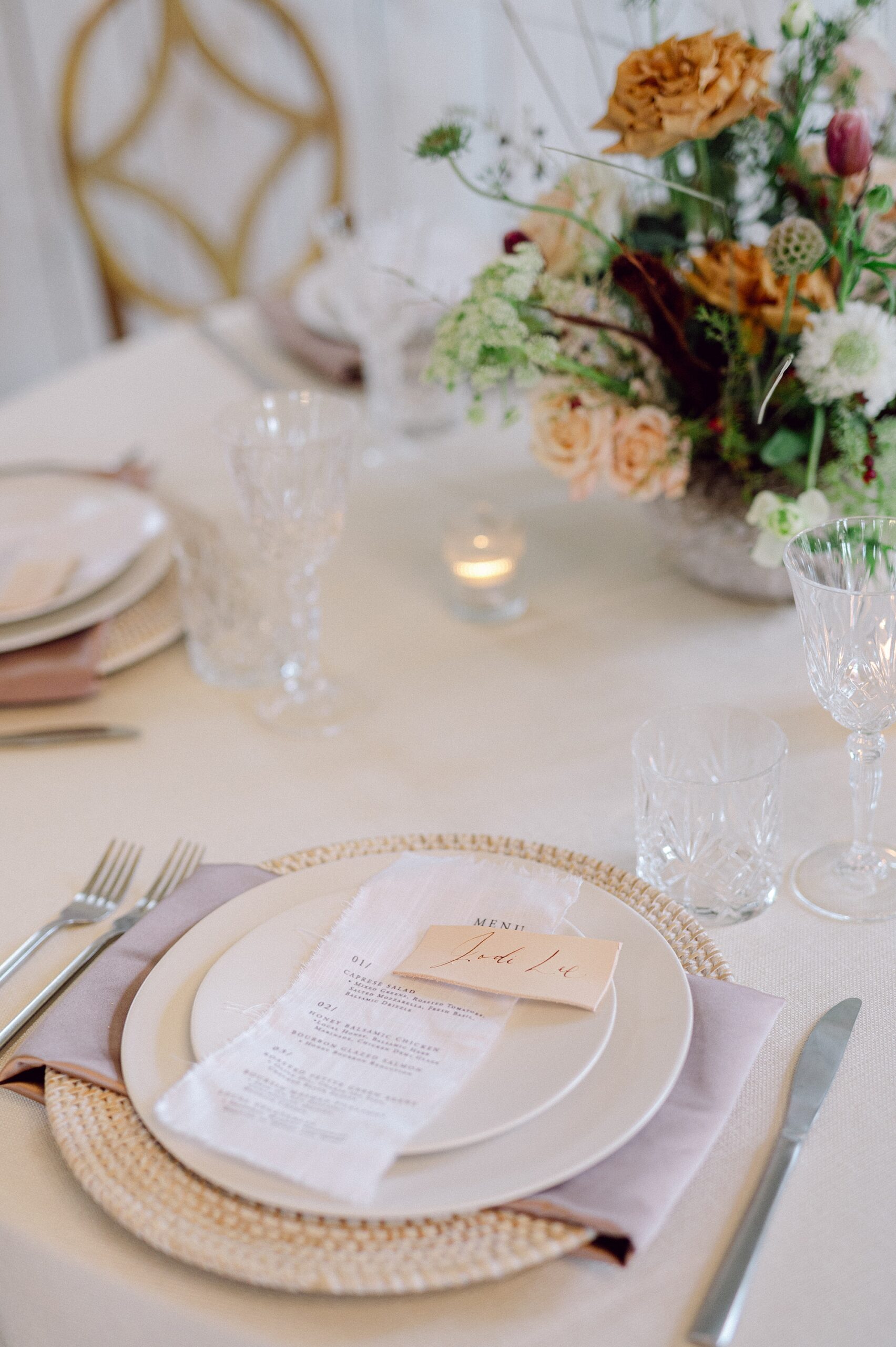
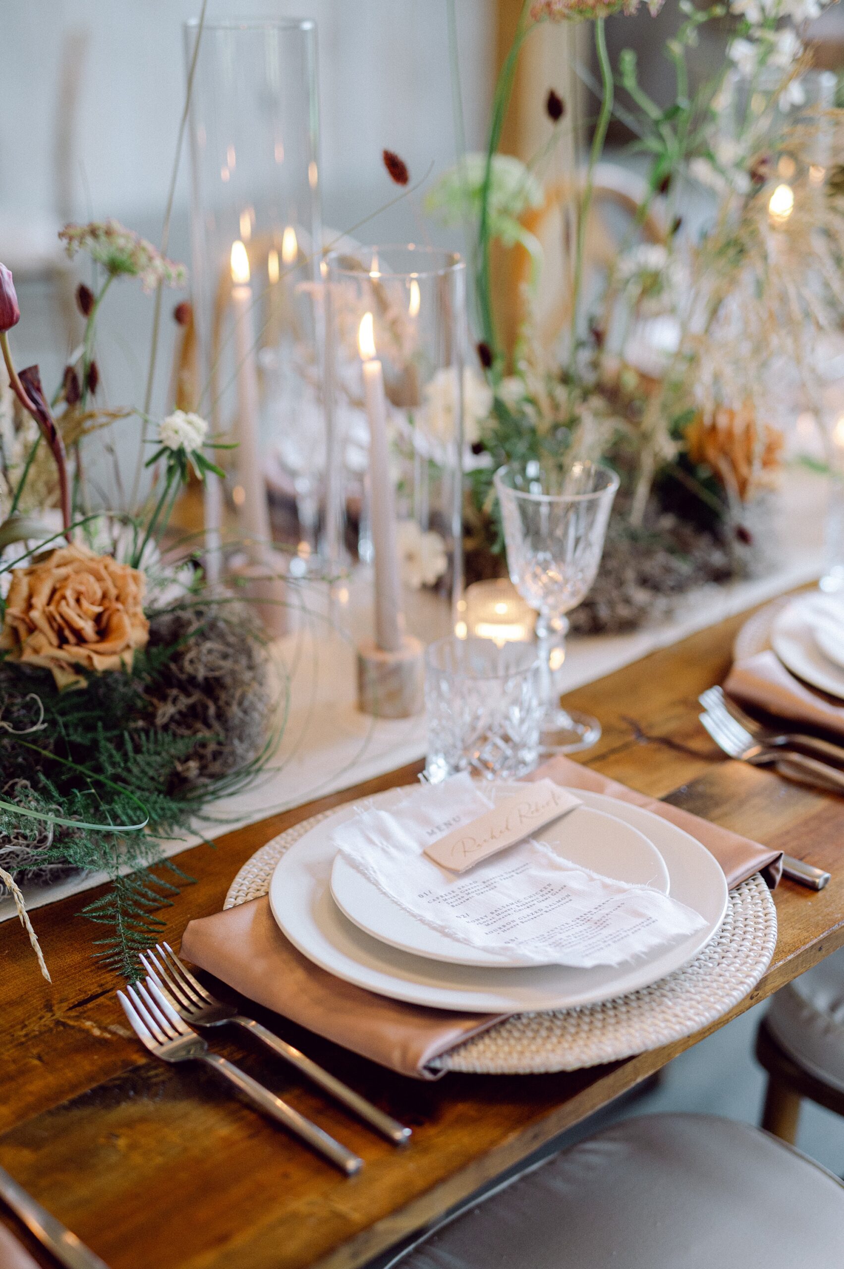
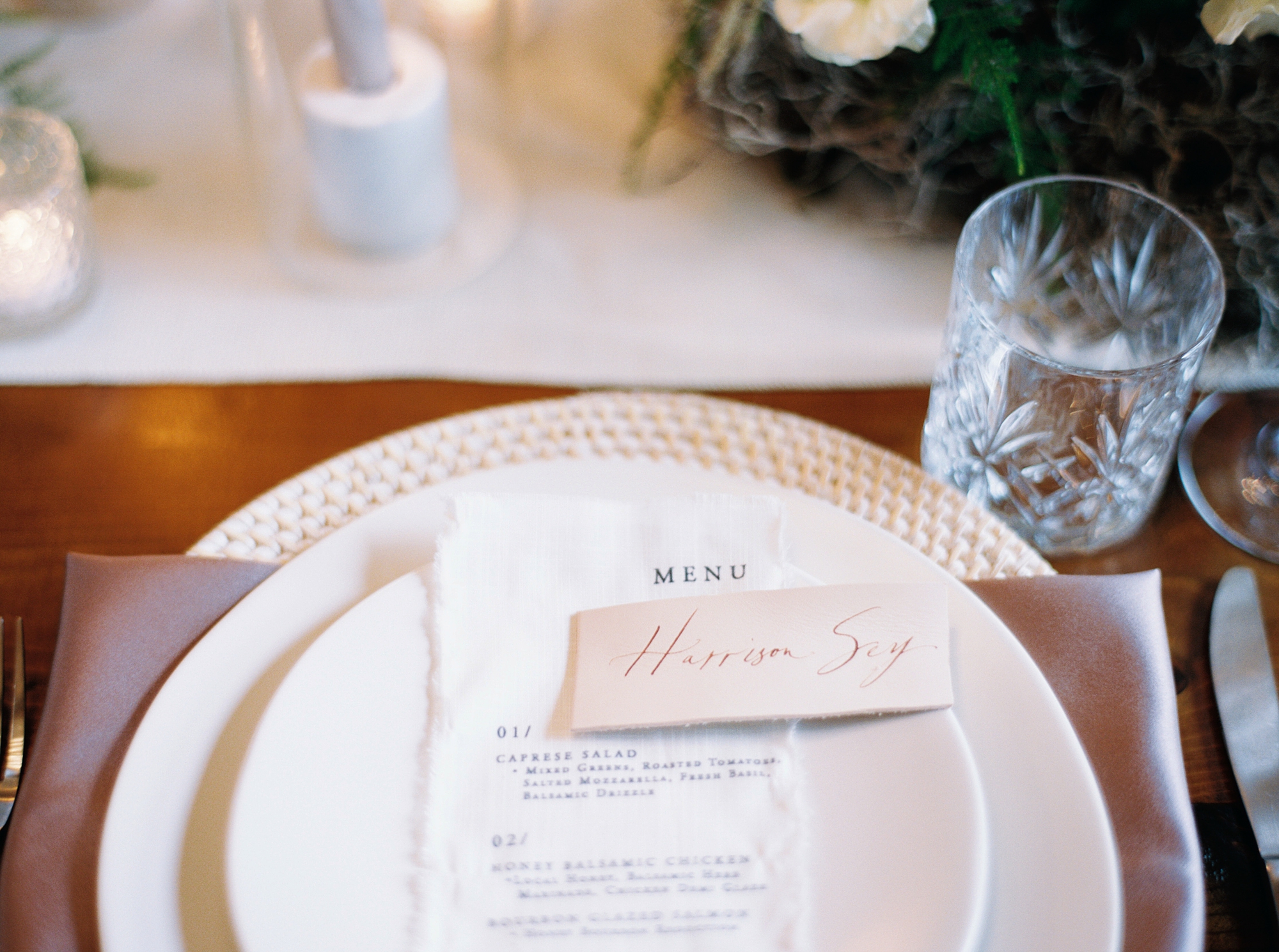
Day-of Details: Fabric Signage
For the bar signage and seating chart, we continued the theme of texture and flow with custom fabric signage, which brought a sense of cohesion to the space. The seating chart flowed in the wind as was placed outside in the seating area. The bar sign was a statement piece as it draped over the front of the bar listing all the beverages available.
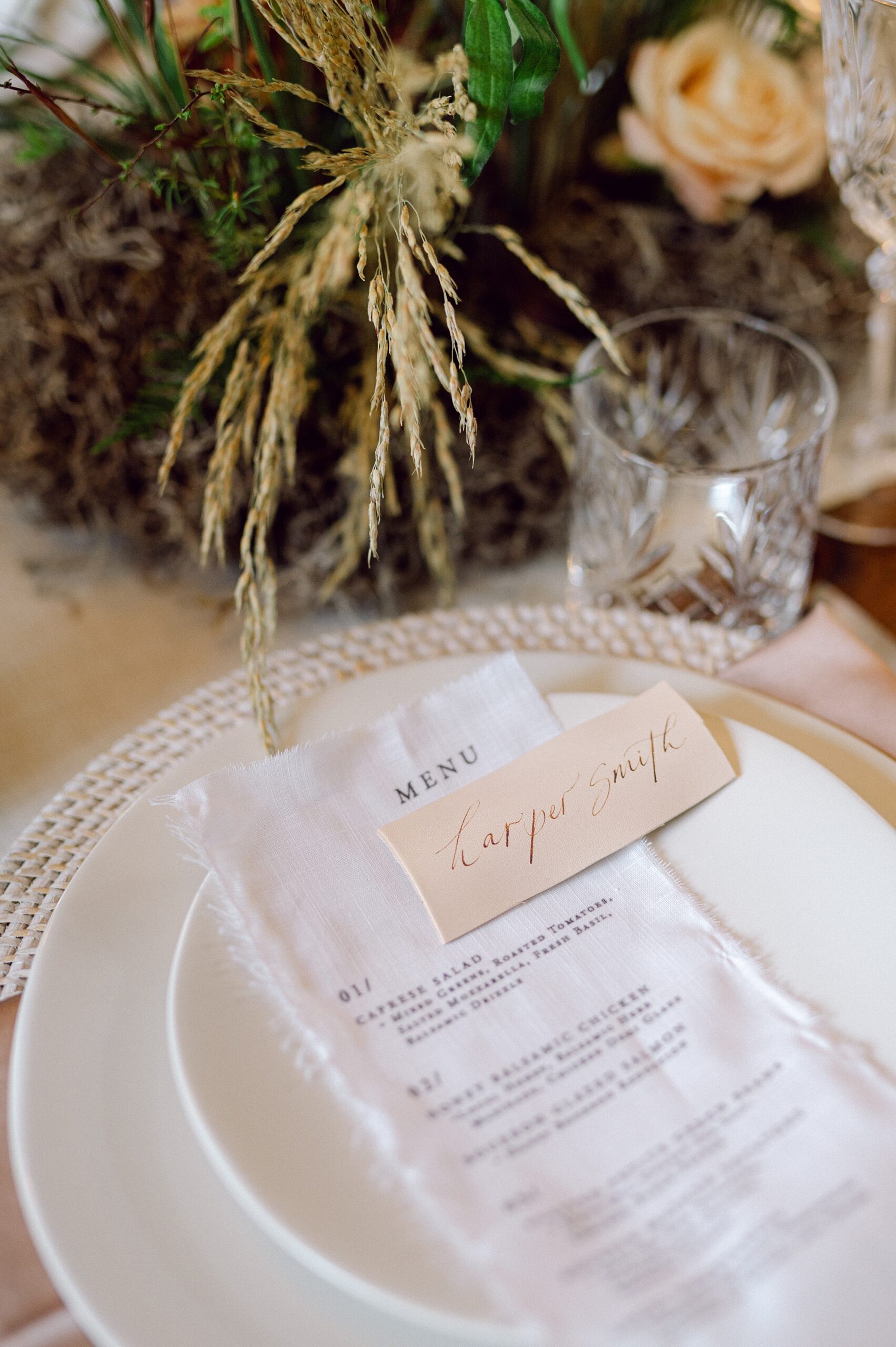
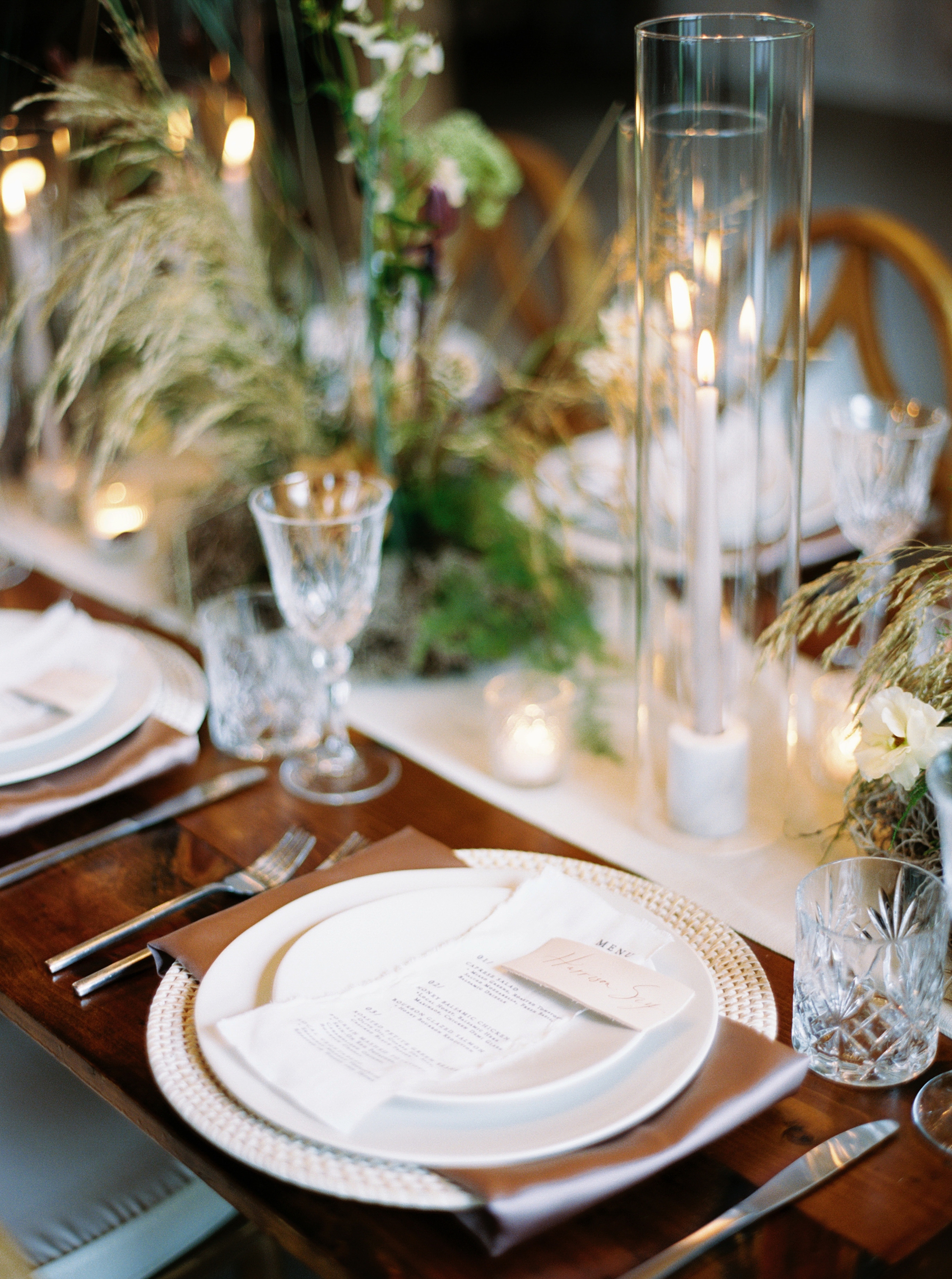
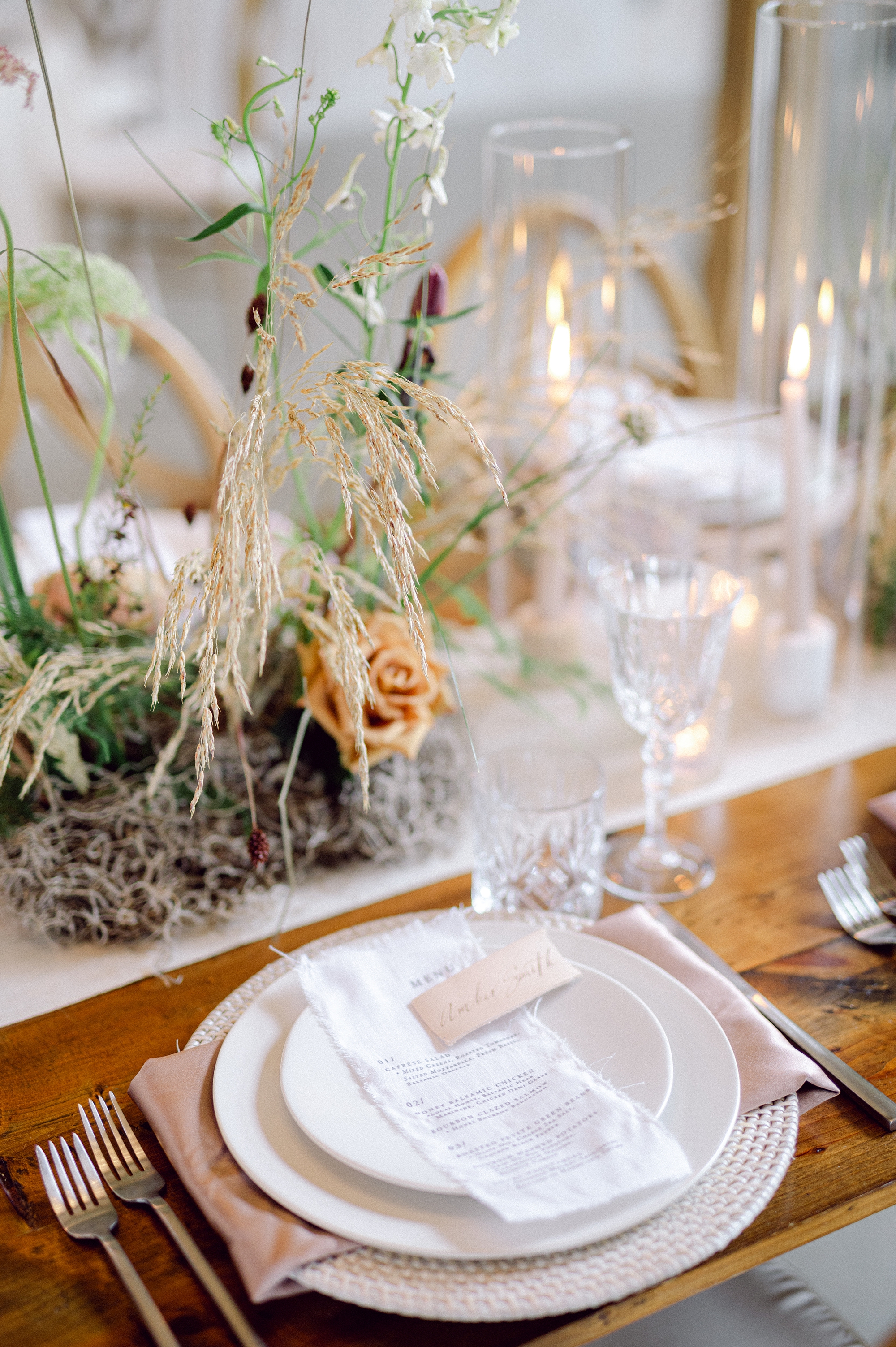
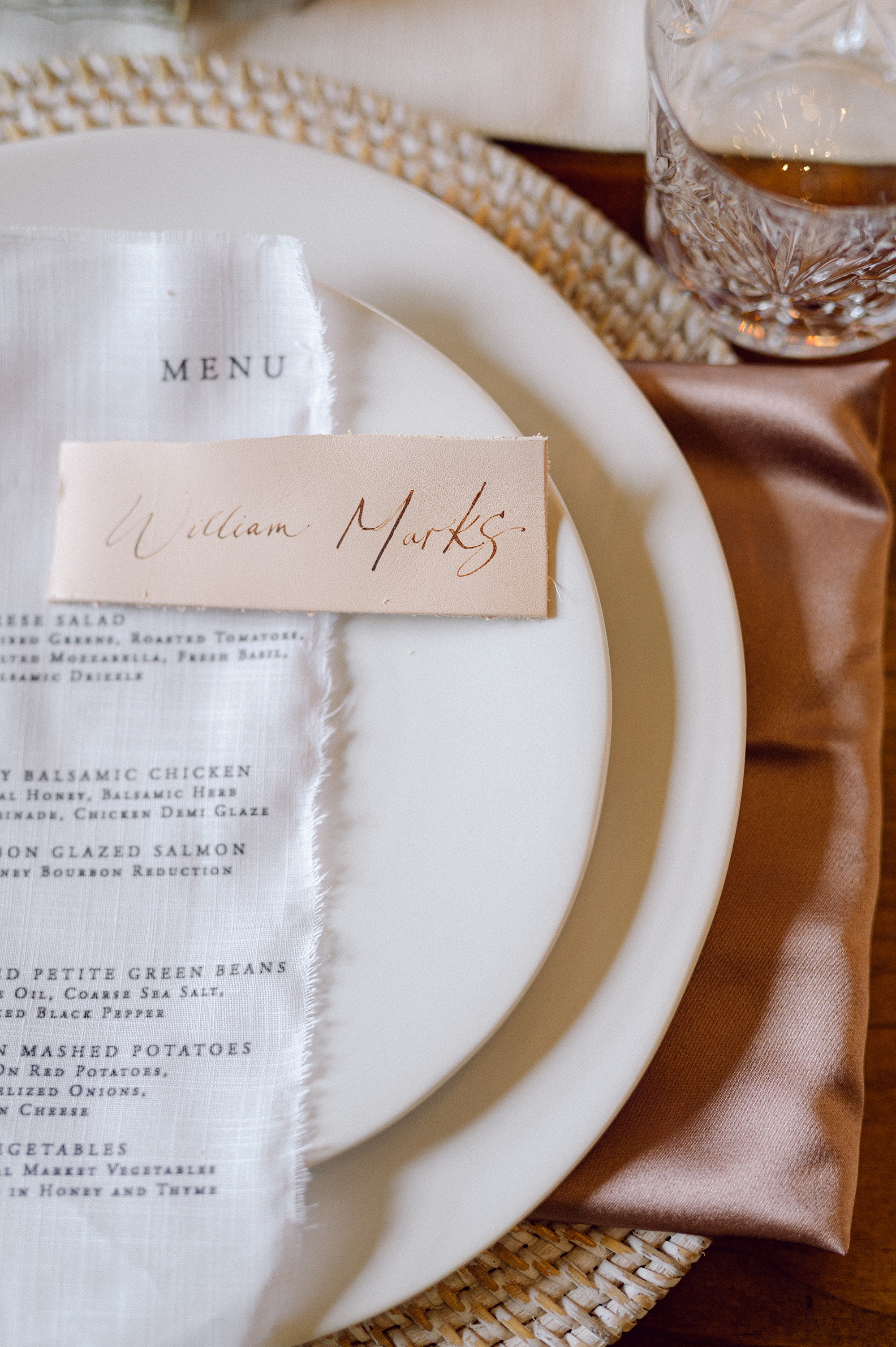
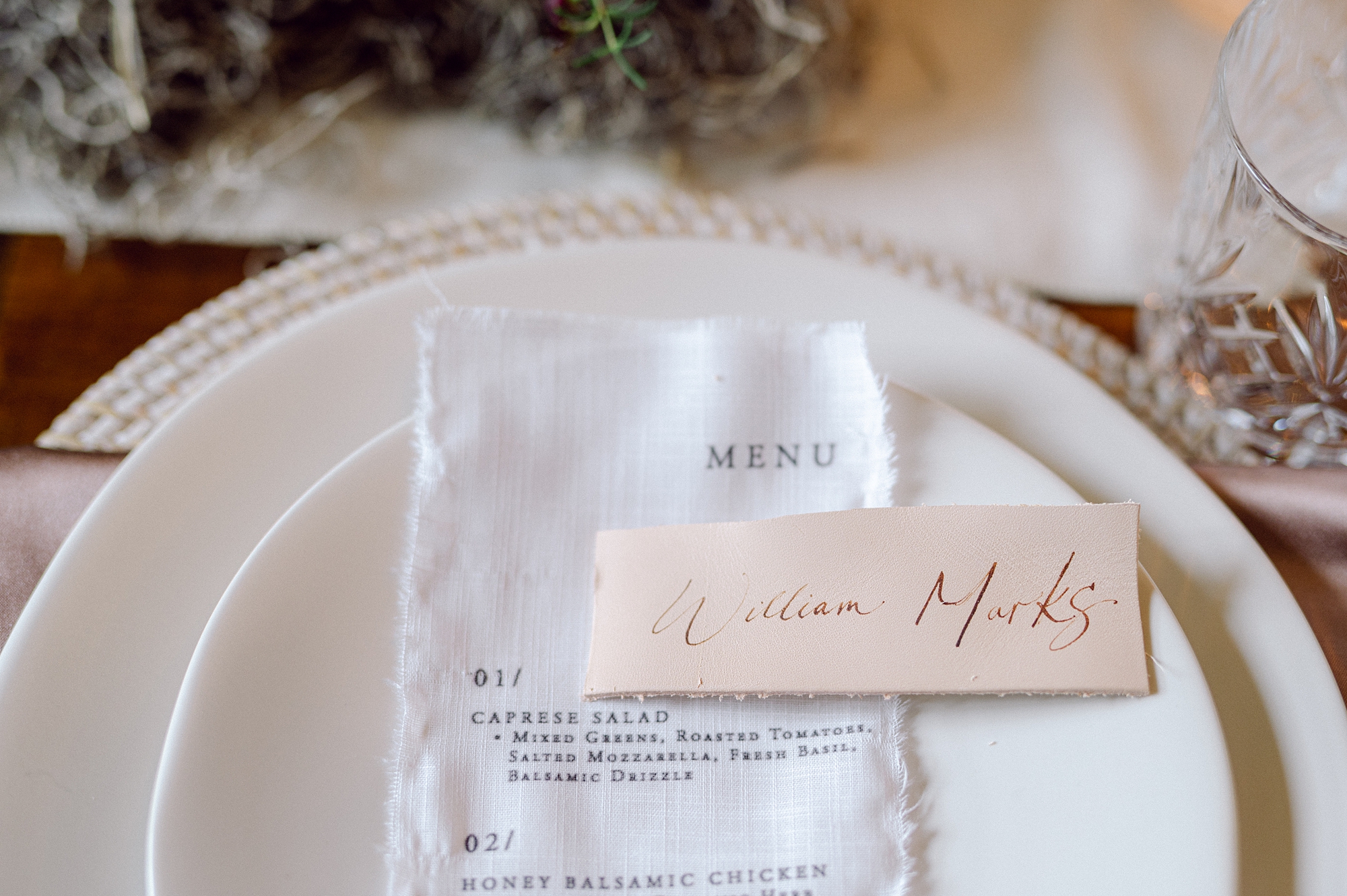
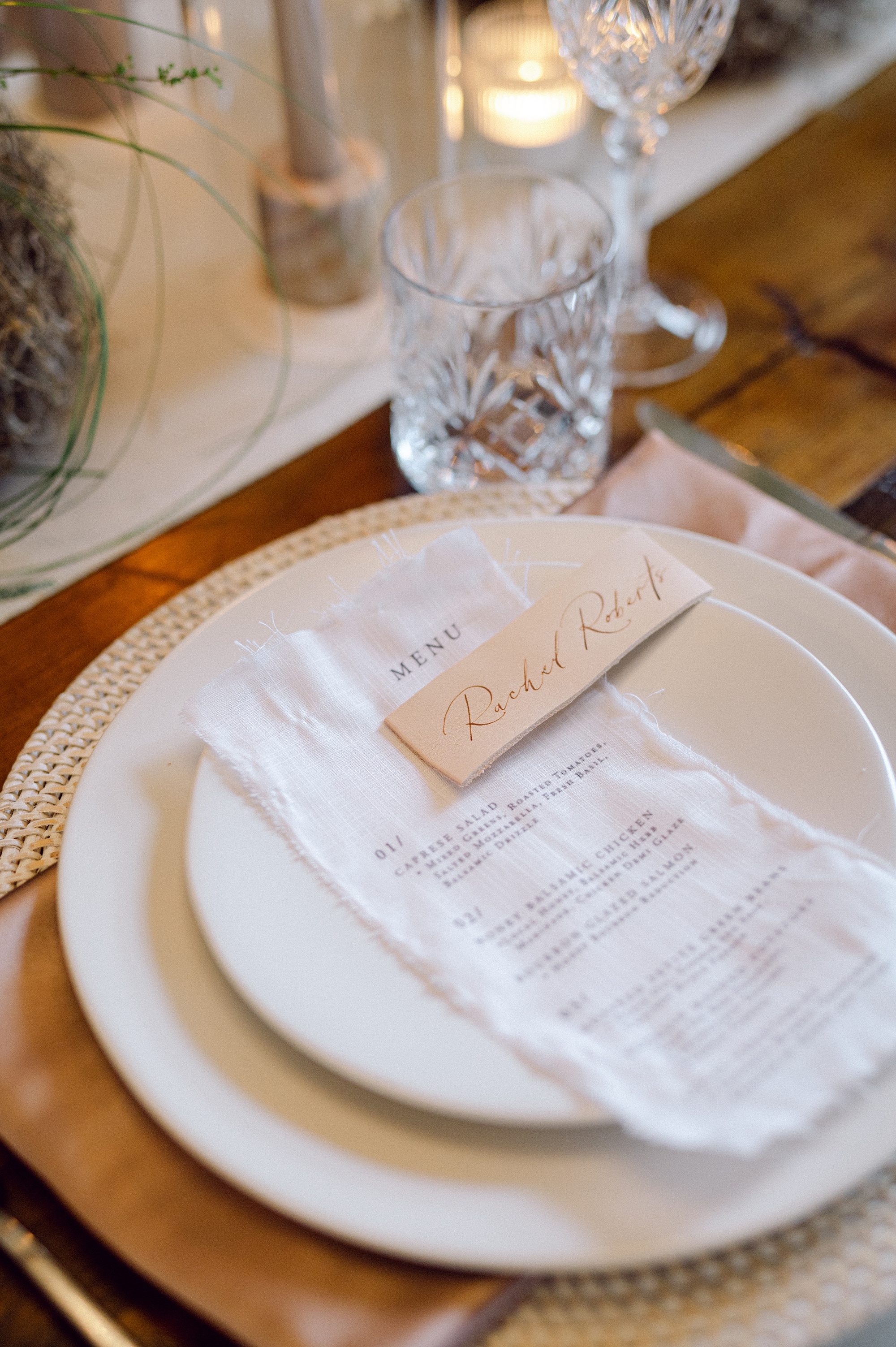
Fabric continued to take center stage as we created fabric menus that draped effortlessly across each place setting, adding softness and movement to the tablescape.
To complement the other design elements, we also incorporated leather place cards. Each detail worked together to create a cohesive visual narrative that invited you to see and feel the design. This vibe was enhanced by the muted floral tones and boho-inspired flower arrangements that decorated the space adding movement and beauty.
It was a dream to collaborate with such a talented team of wedding professionals and bring this vision to life.
If you’re planning a wedding in Nashville, or anywhere in the world, we’d love to help you create meaningful, personalized stationery and event details that tell your story. We work with couples worldwide to design details you and your guests will remember forever. Reach out today to learn more about our full-service wedding and event design offerings! We can’t wait to create something unforgettable for you!
If you enjoyed this post, you’ll love these other blogs!
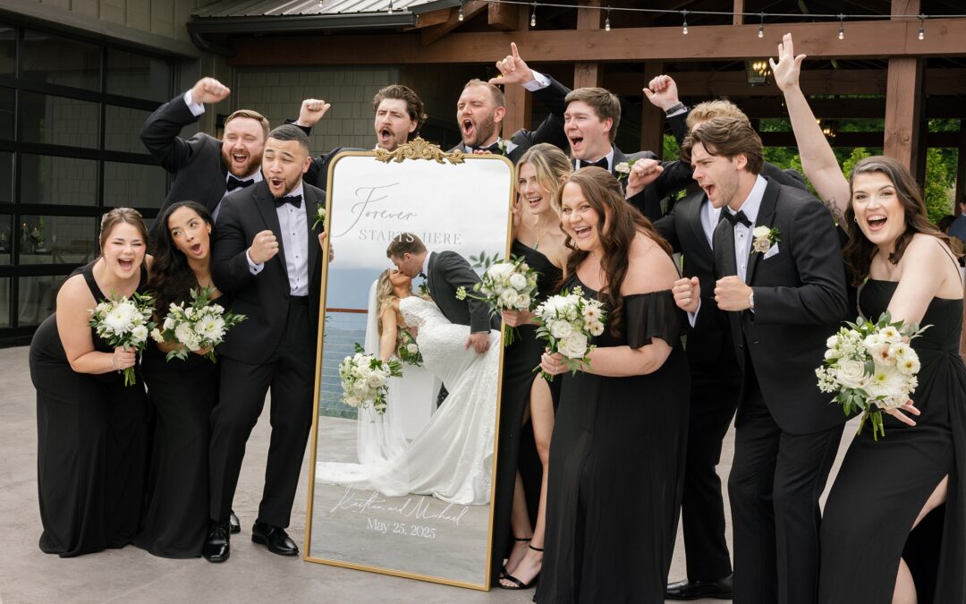
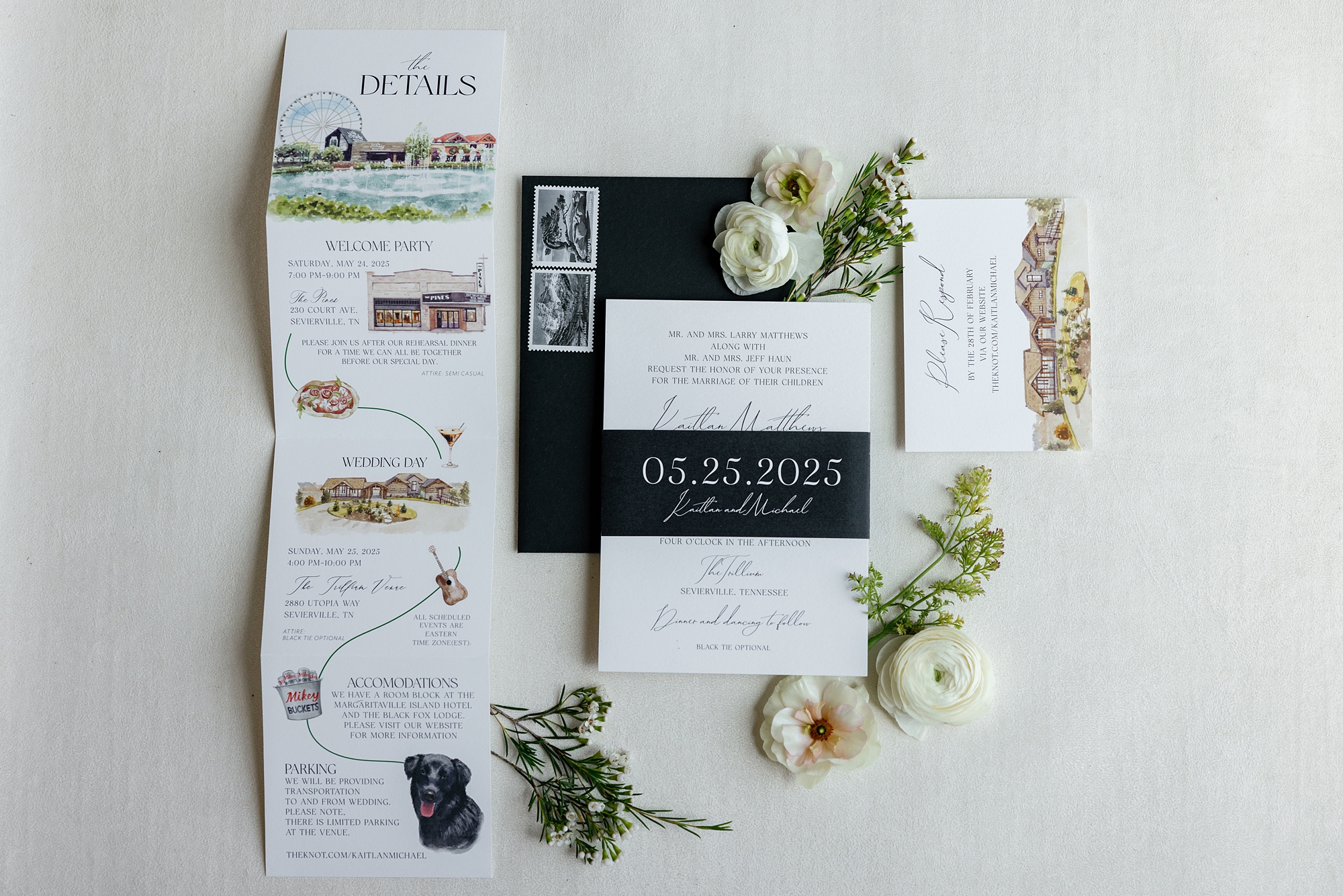
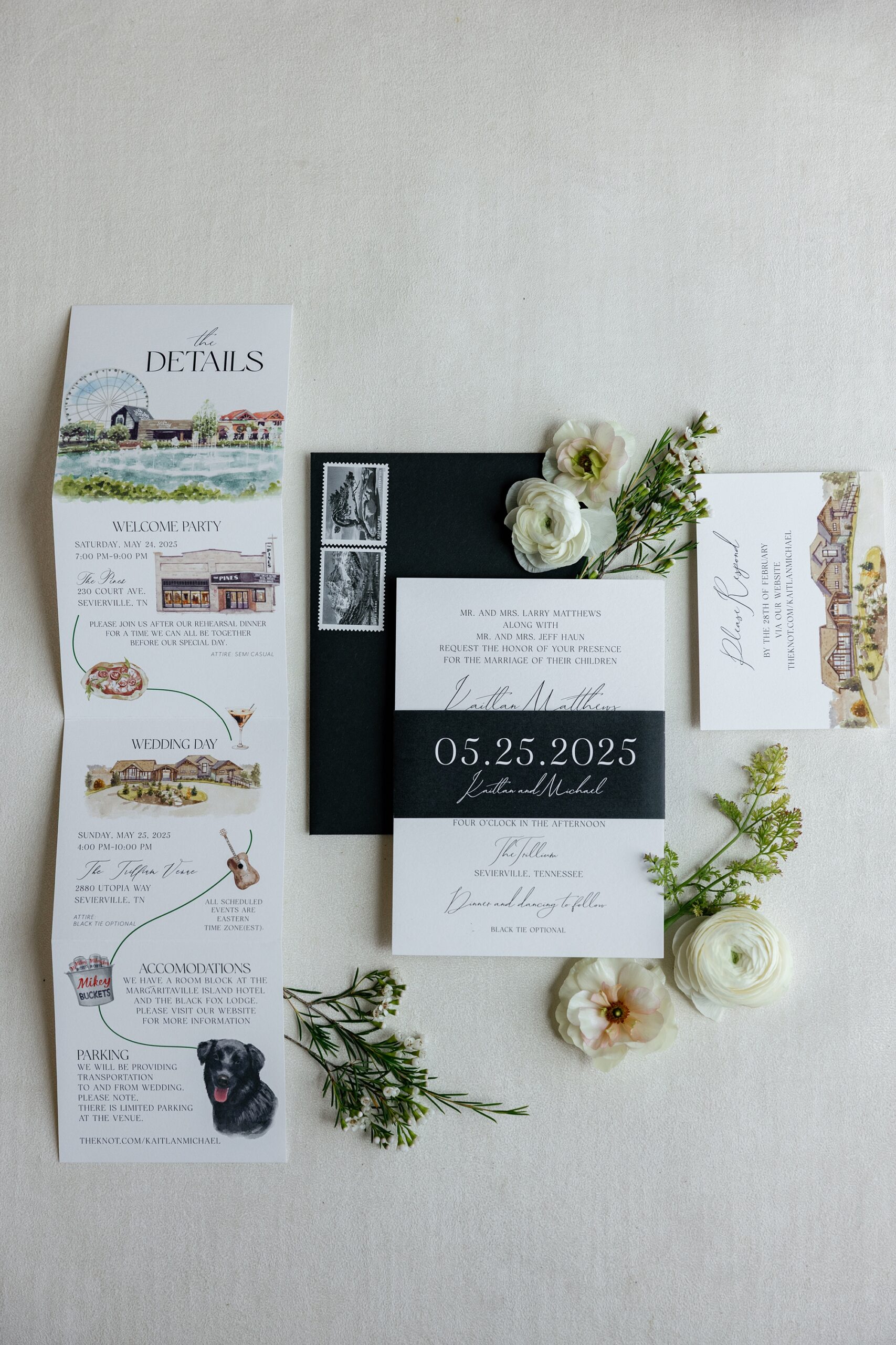
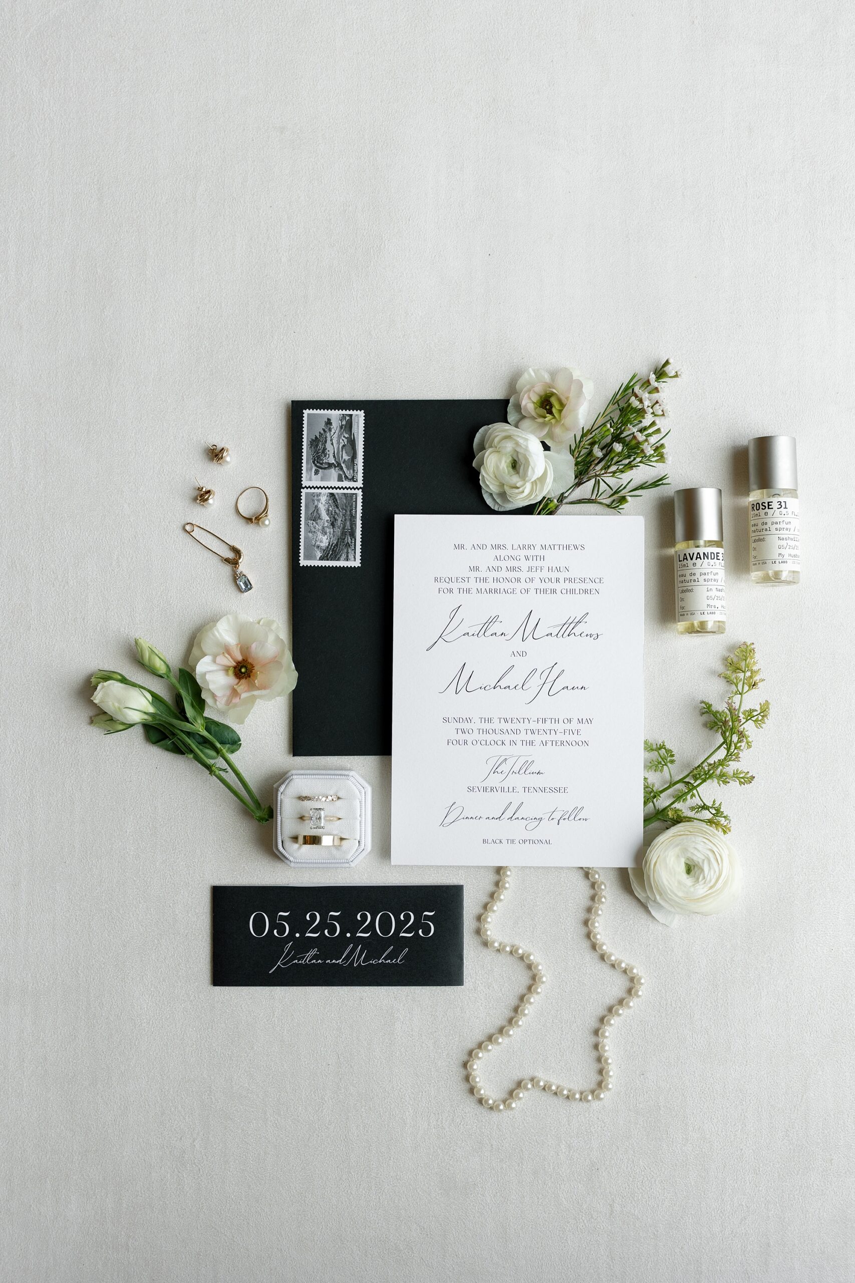
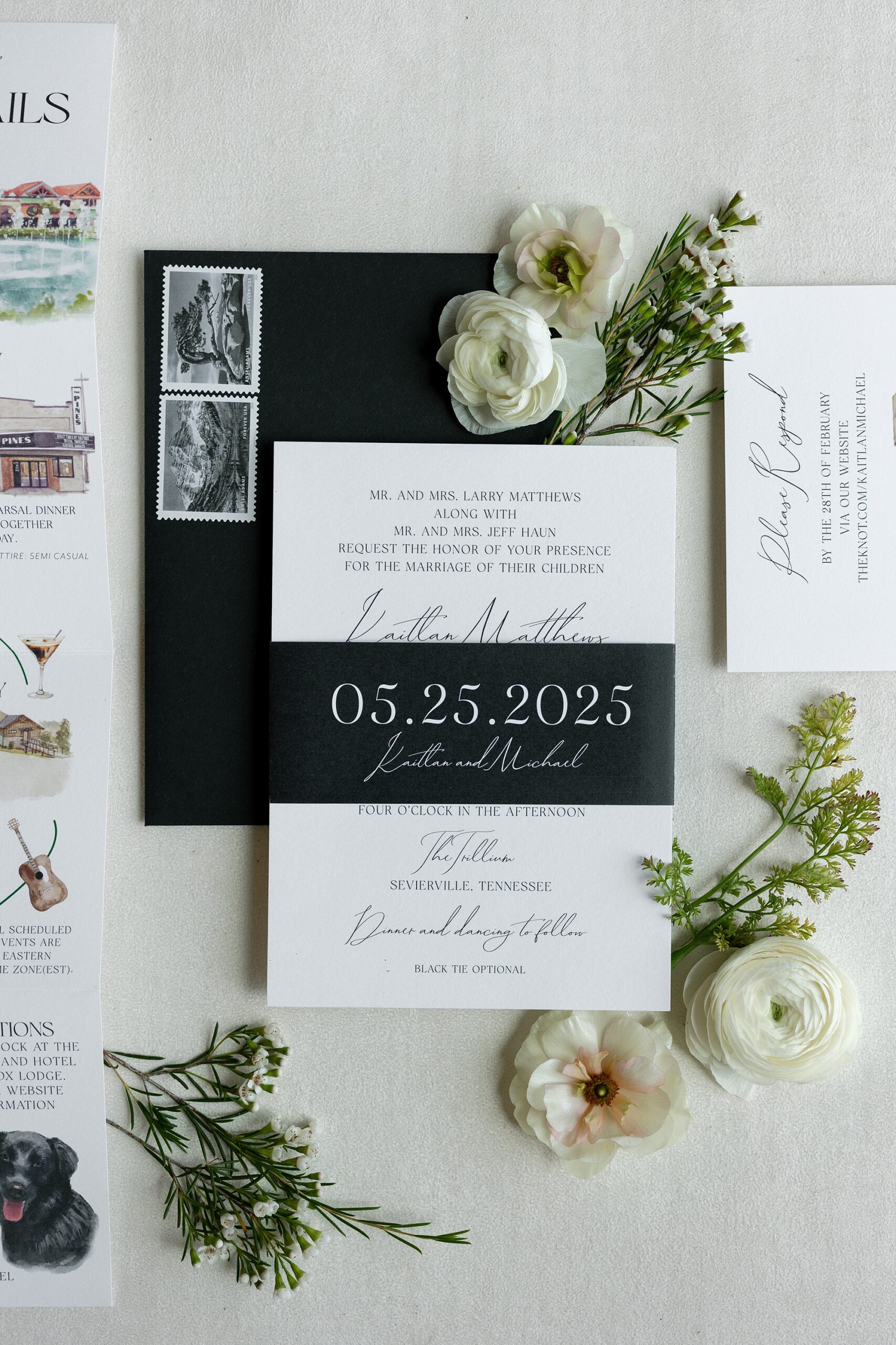
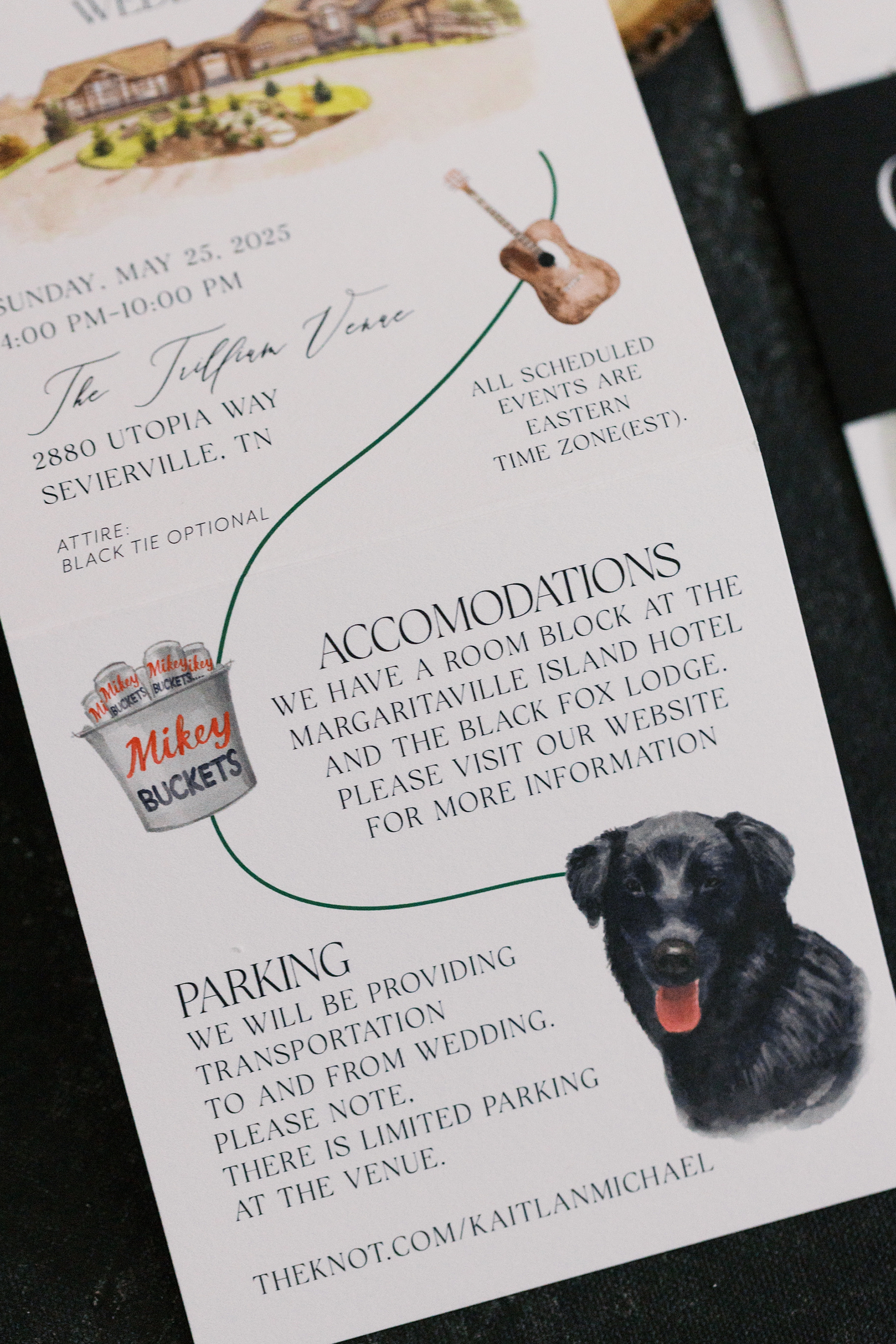
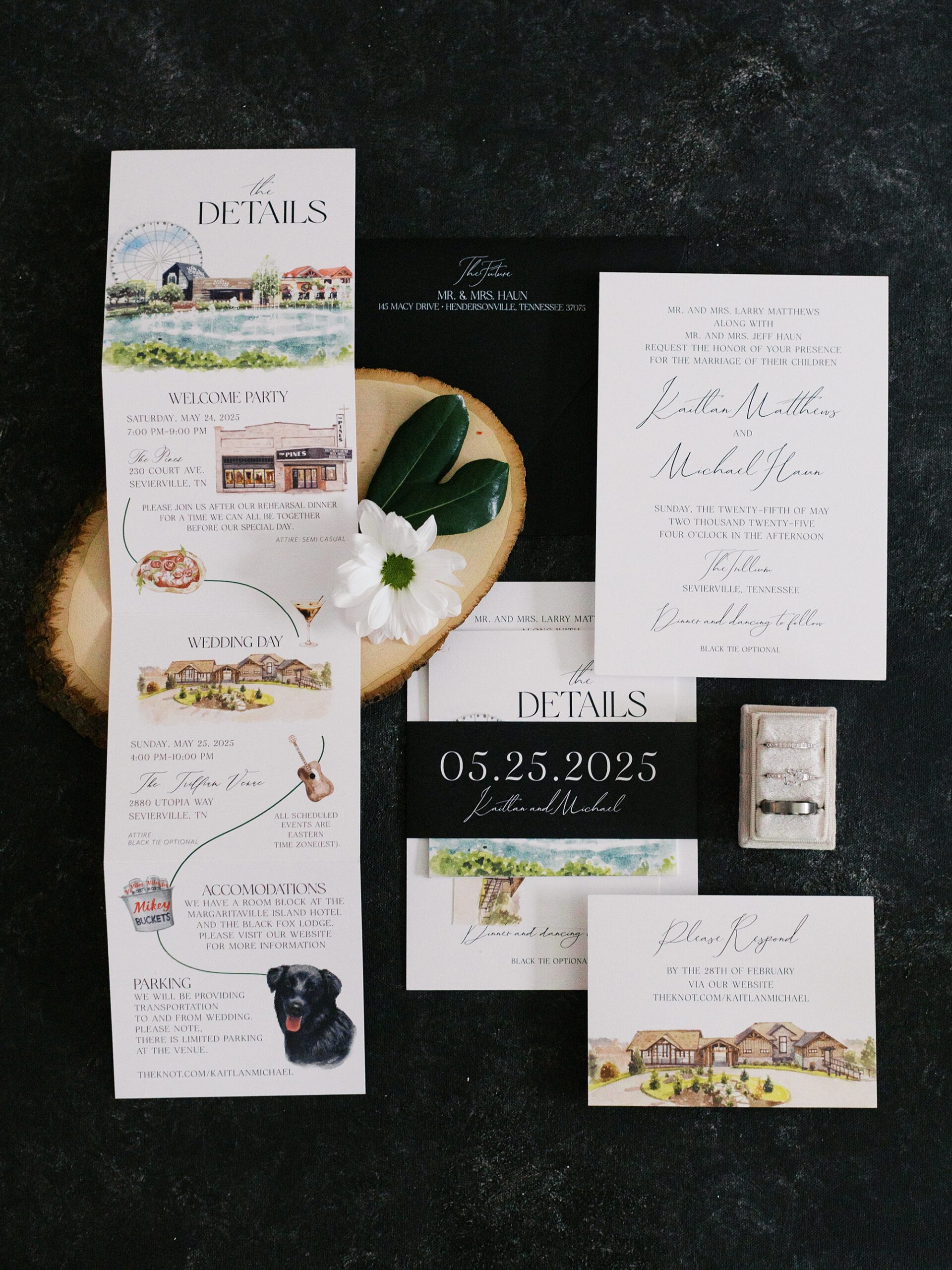
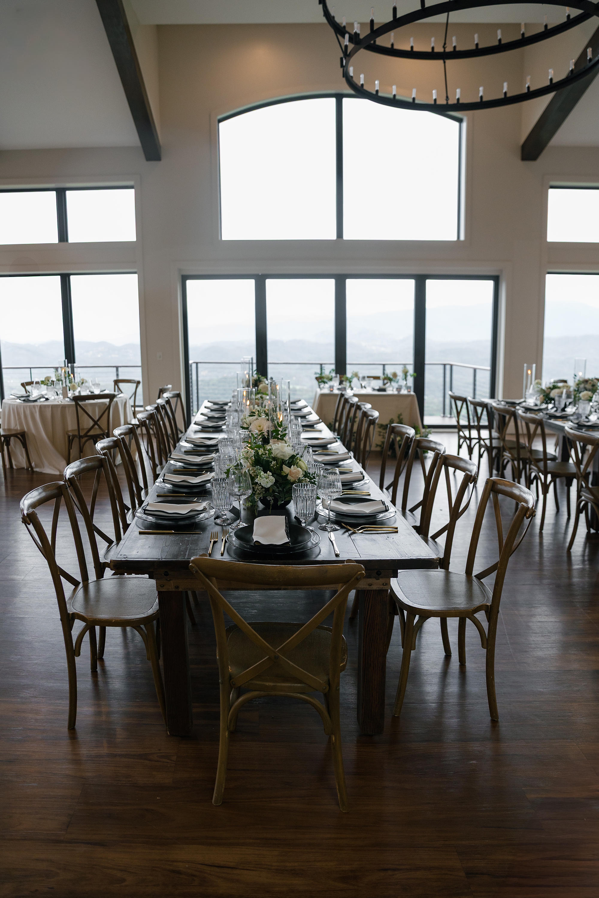
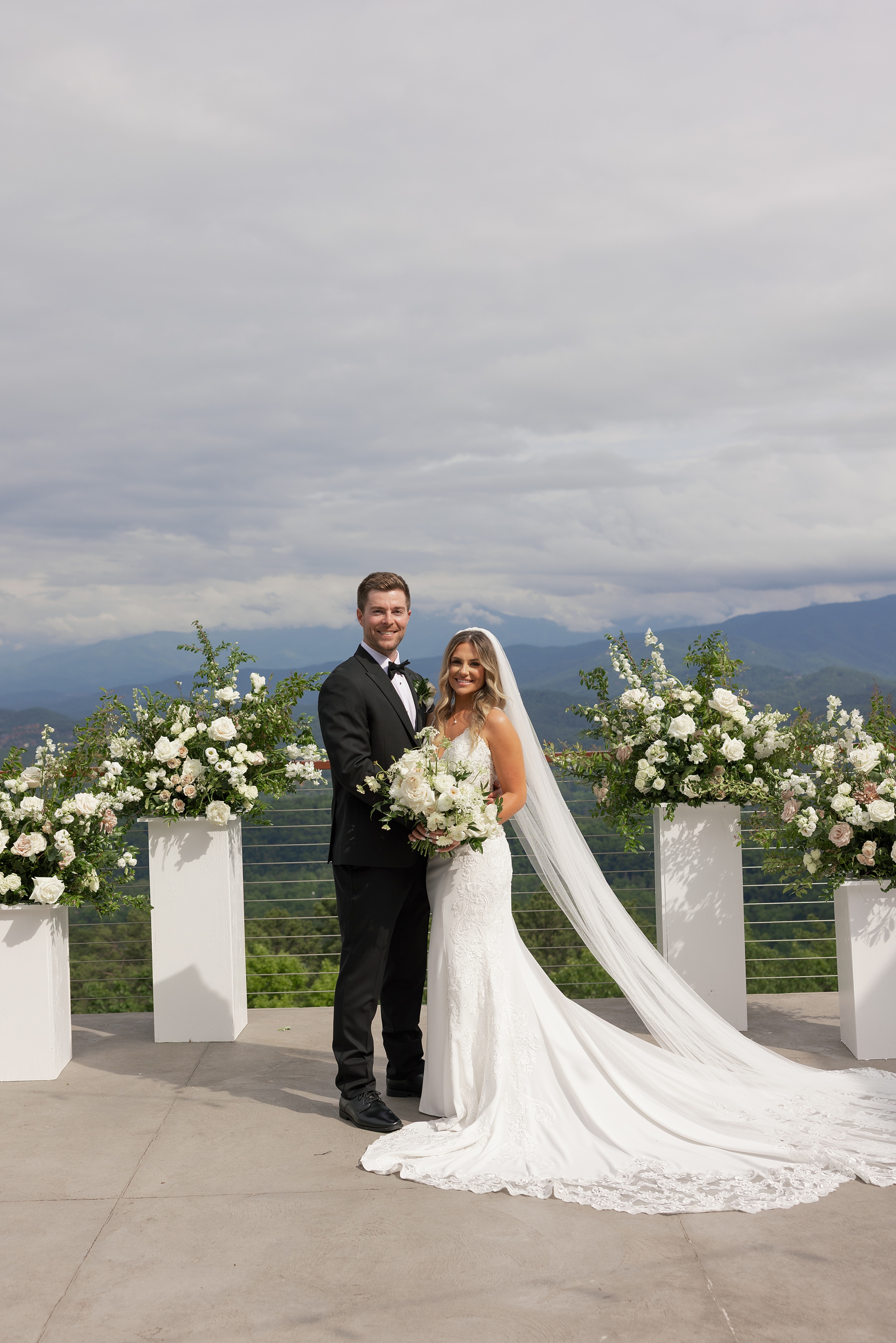
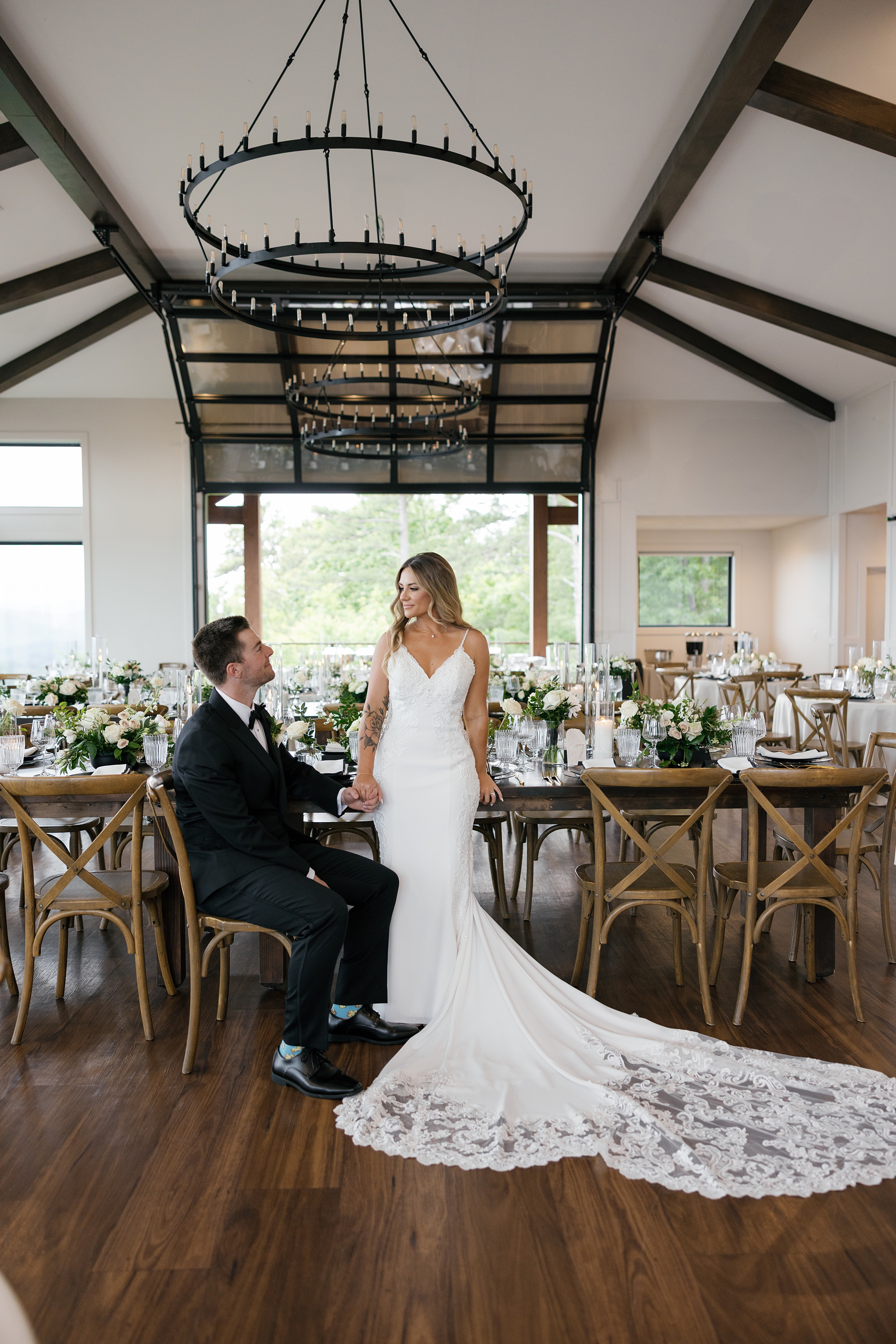
I am so excited to share the details from this timeless black and white wedding at The Trillium Venue in East Tennessee. There is so much to love about this wedding, from the breathtaking views of the Great Smoky Mountains to the detailed artwork and wine seating chart we had the joy of designing. This wedding had a modern, romantic vibe that paired effortlessly with the venue’s architecture, floor-to-ceiling windows, and panoramic backdrop. It’s easy to see why Kaitlan and Michael chose The Trillium as the setting for their gorgeous wedding day.
We had the honor of designing the couple’s custom invitations and day-of wedding details. Every element reflected the elegant, timeless, and classic vision they had for their day.
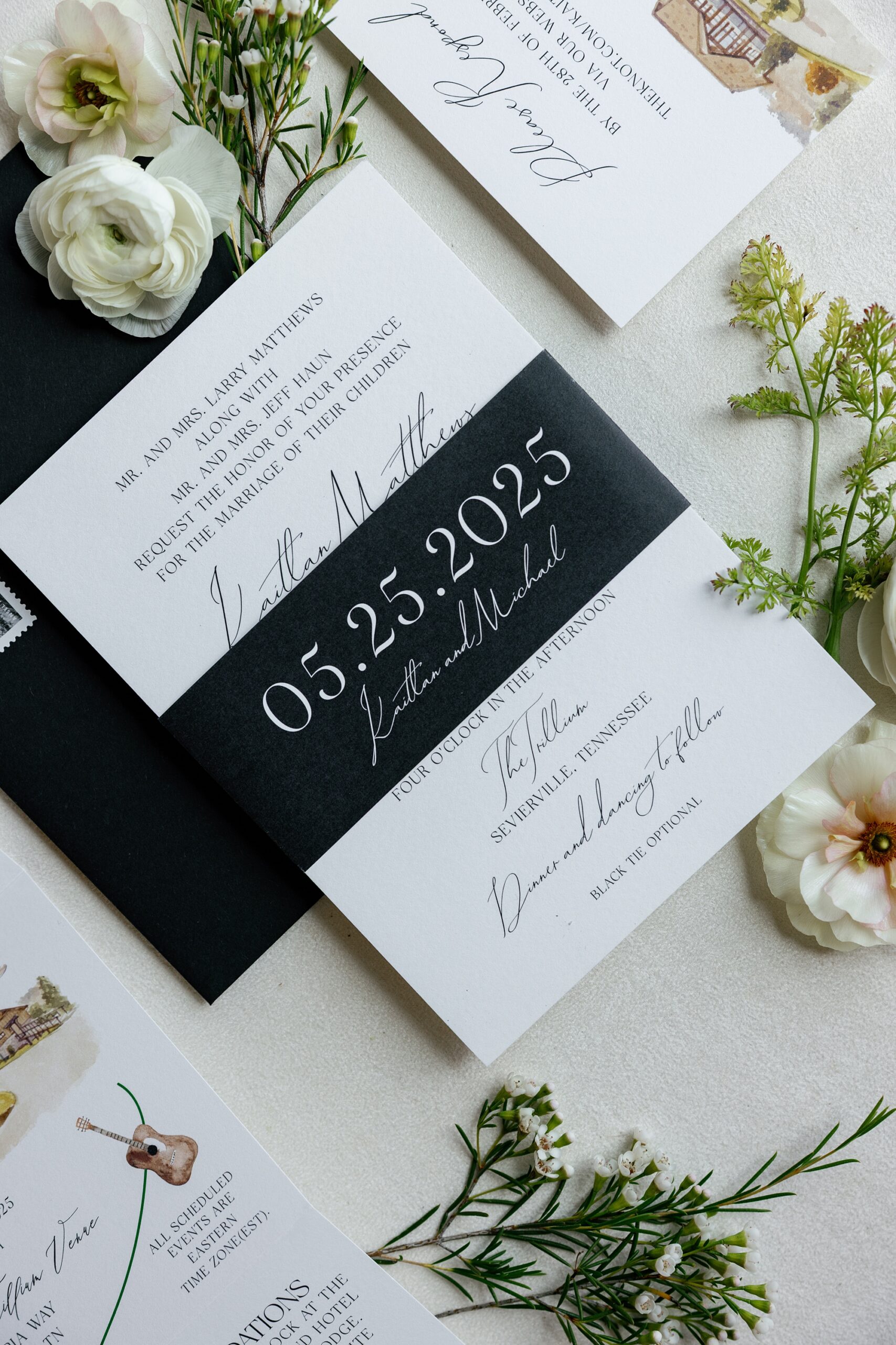
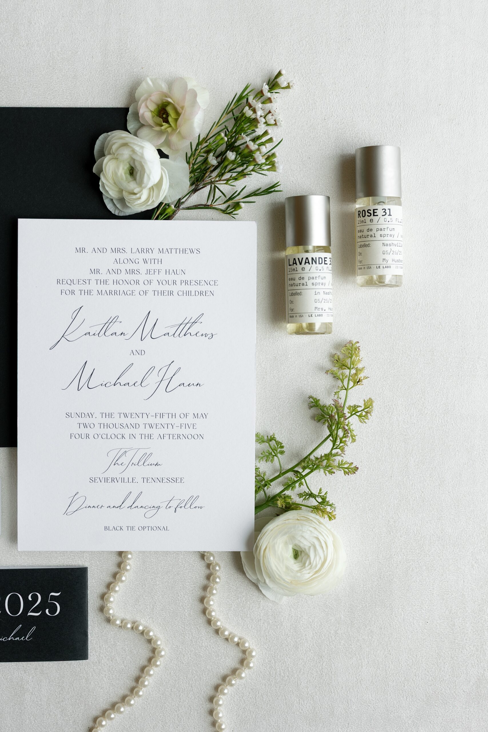
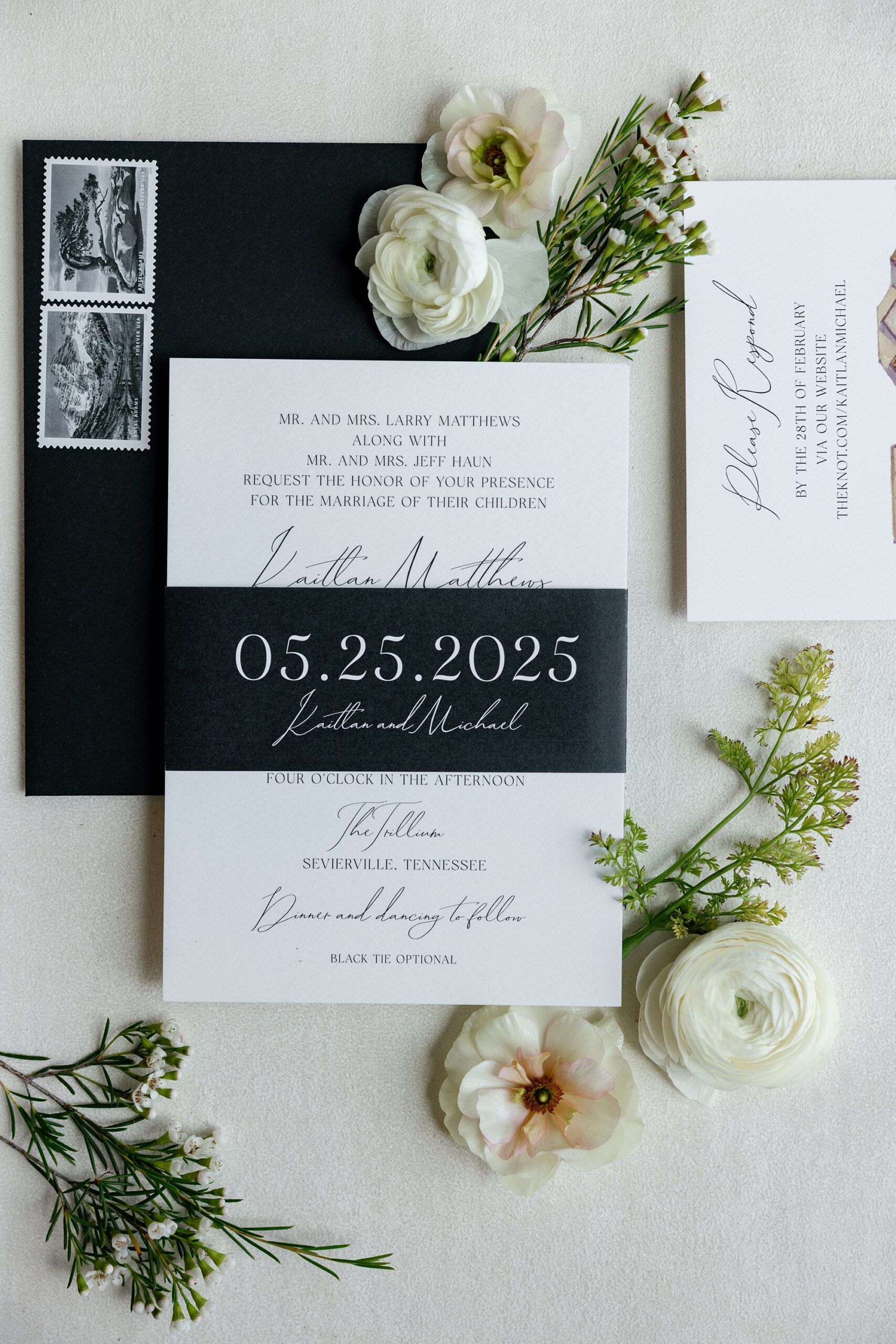
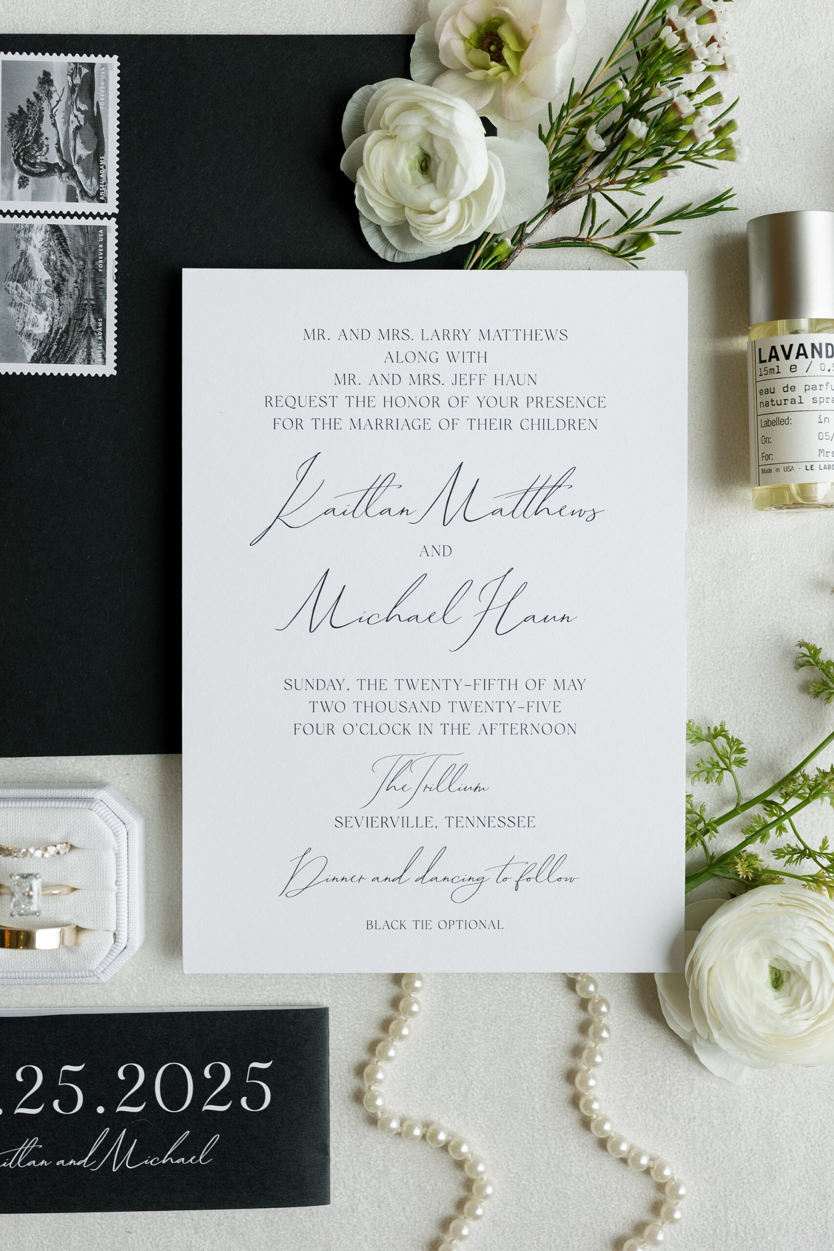
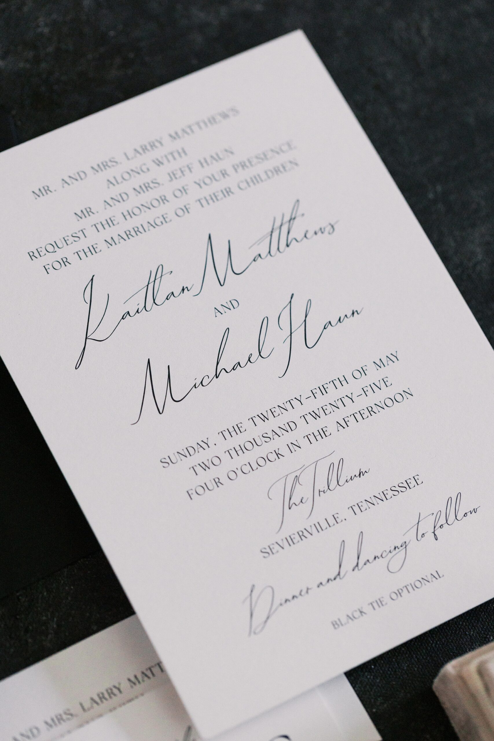
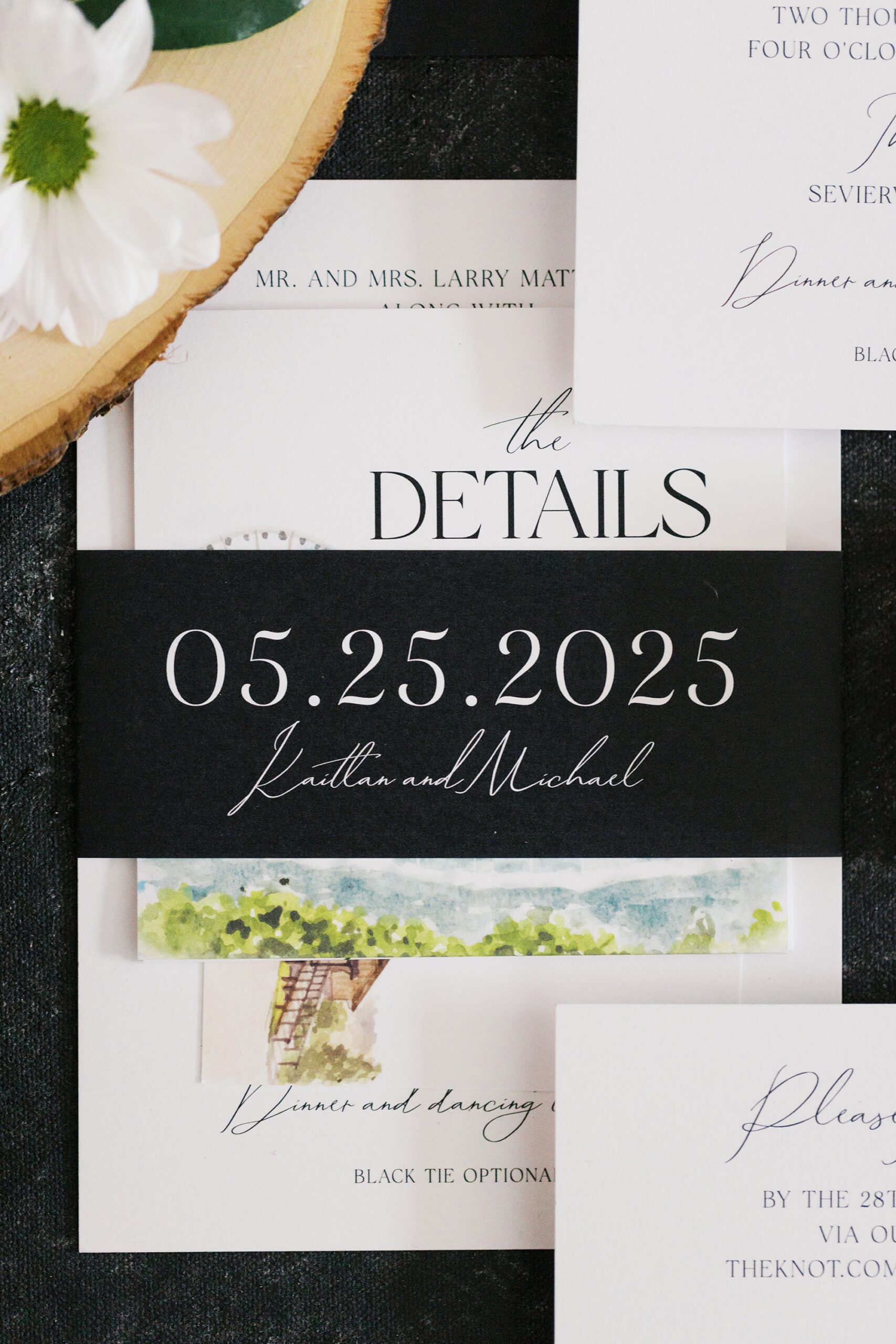
Black and White Invitation Suite with Custom Artwork
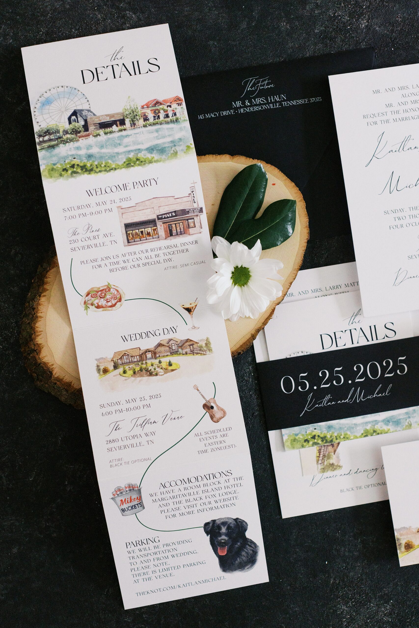
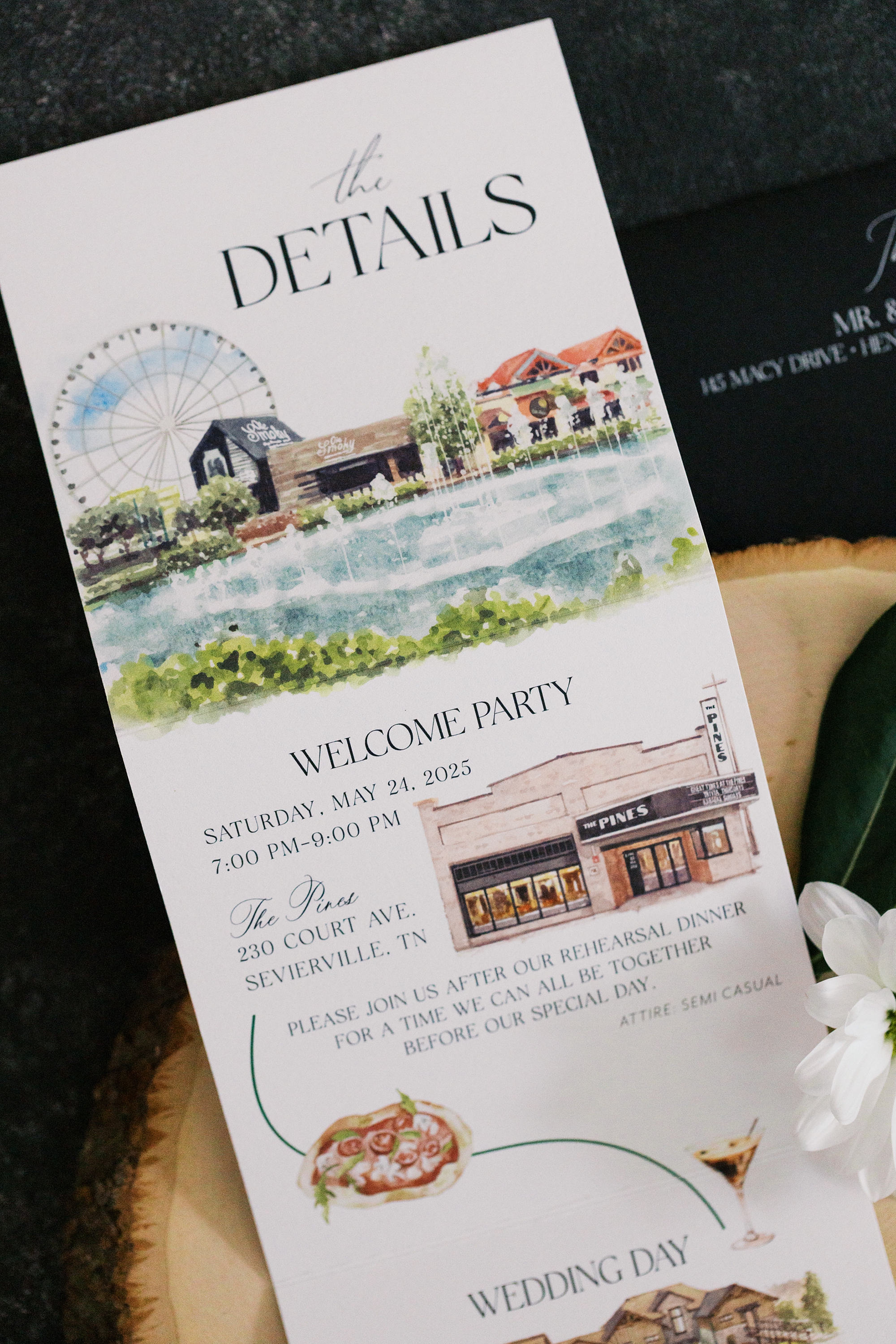
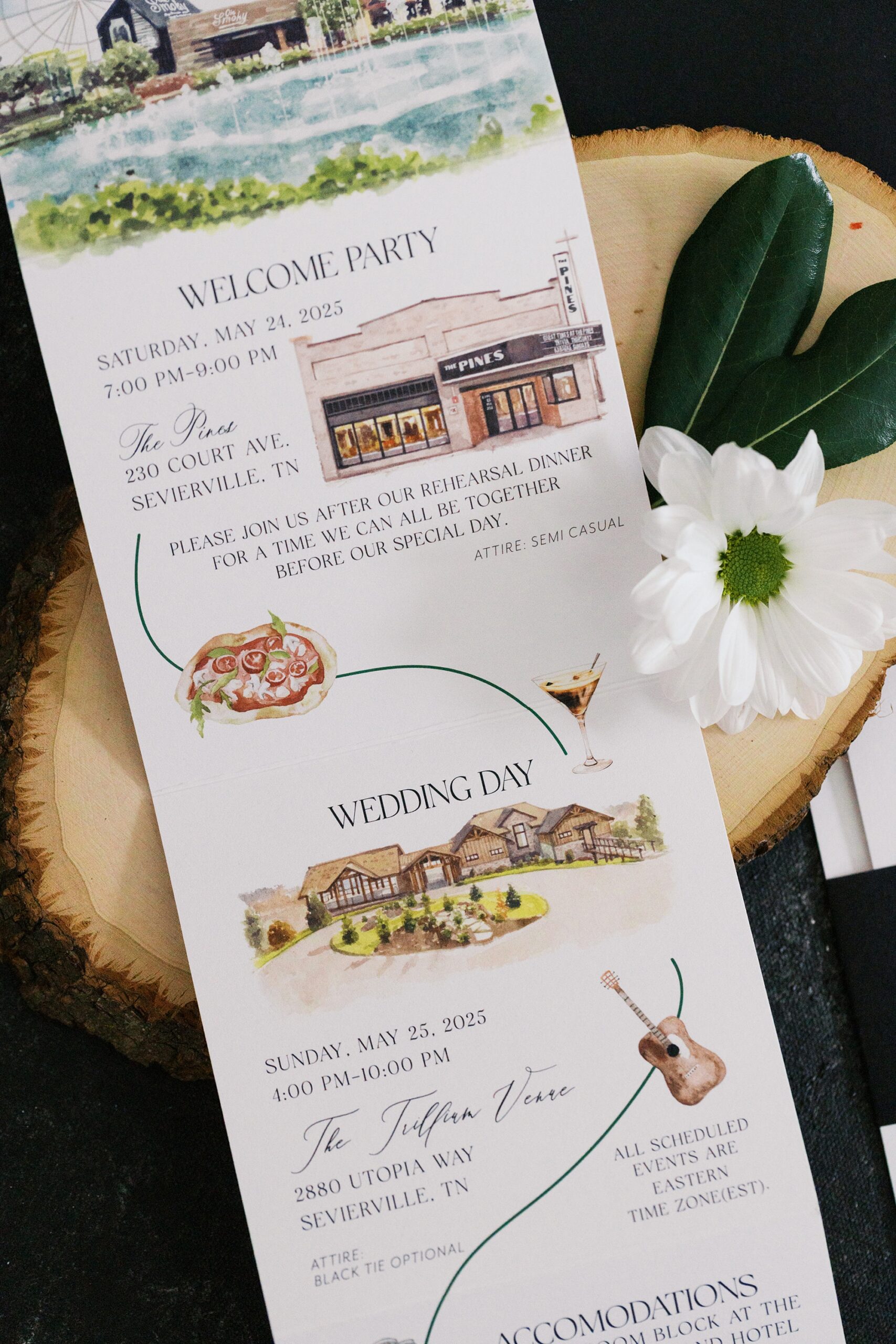
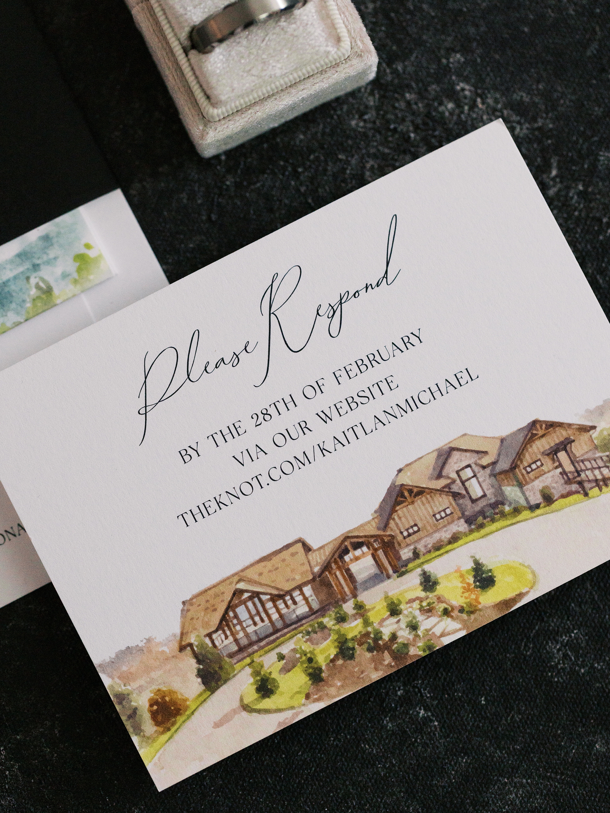
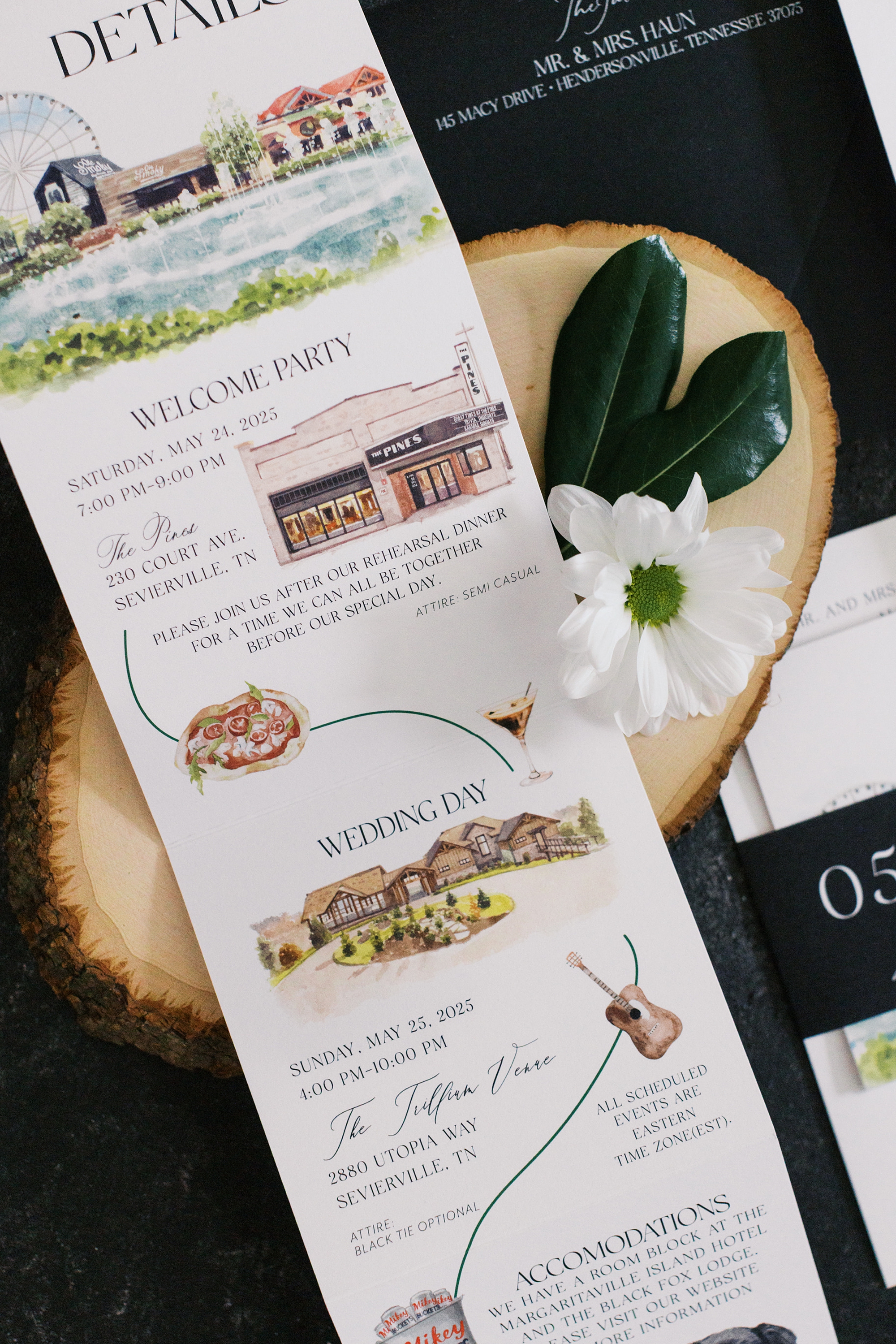
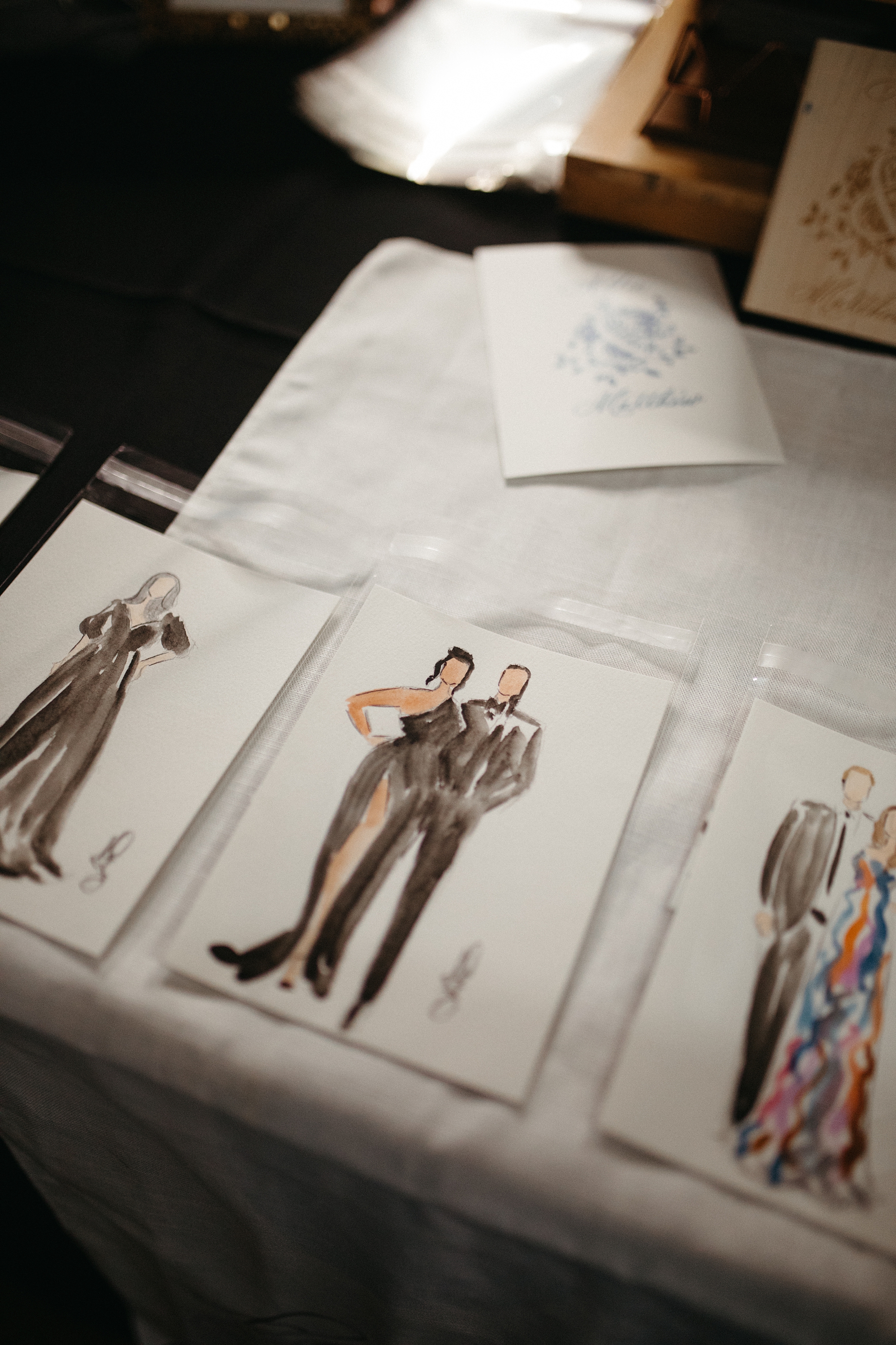
The invitation suite was truly a work of art. Designed in a classic black-and-white palette, the suite featured elegant typography and a custom details card with artwork of significant places from the couple’s wedding weekend.
We designed artwork of The Pines, the charming venue where the rehearsal dinner took place, and The Trillium, where their wedding day unfolded. The event timeline included playful illustrations for food, cocktails, music, and more, giving guests a preview of all that was to come.
A sleek black band held the suite together featuring the couple’s names and wedding date in white. It was simple, refined, and elevated and just like the celebration itself. I love how this wedding invitation set the tone for their wedding day.
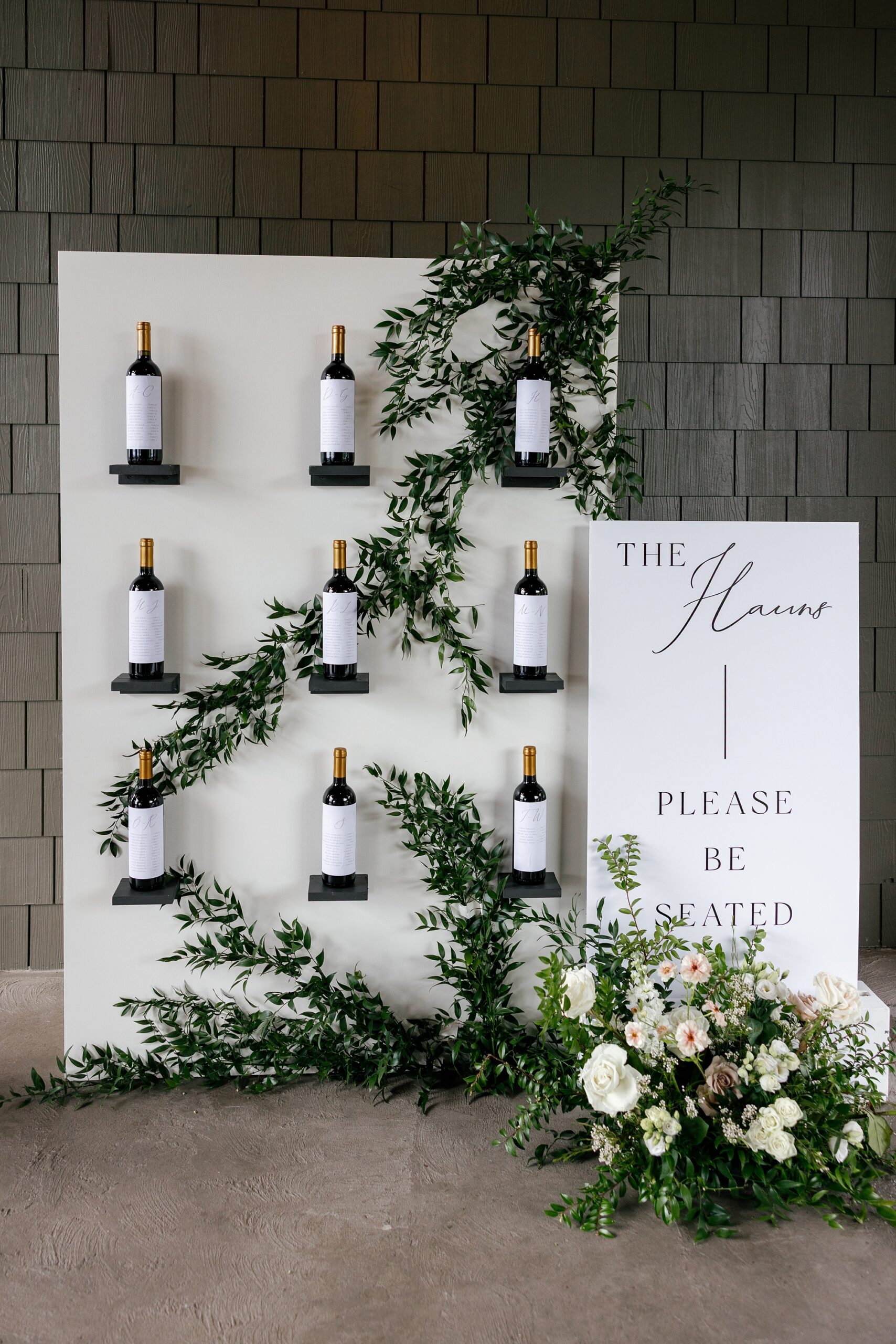
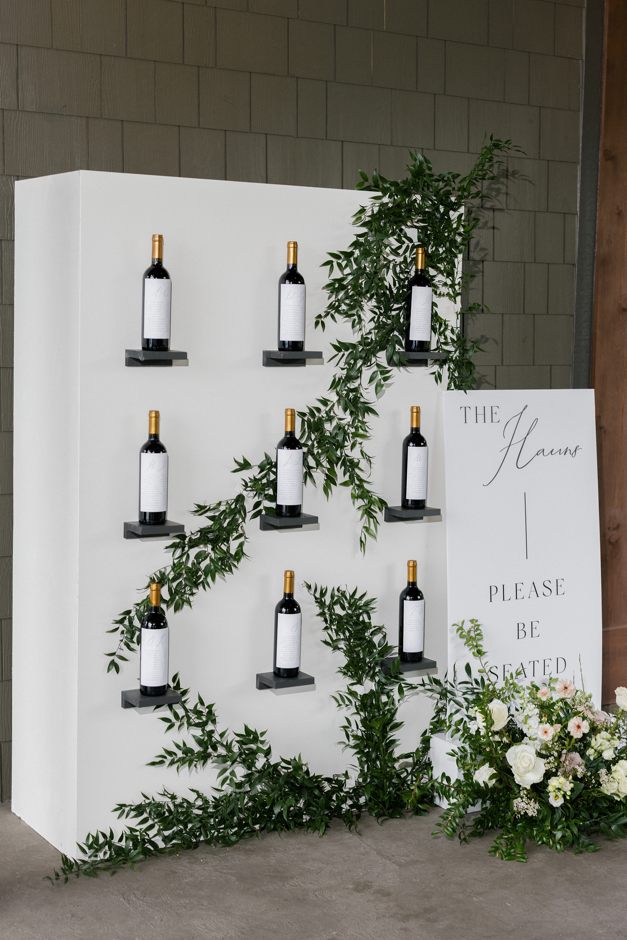
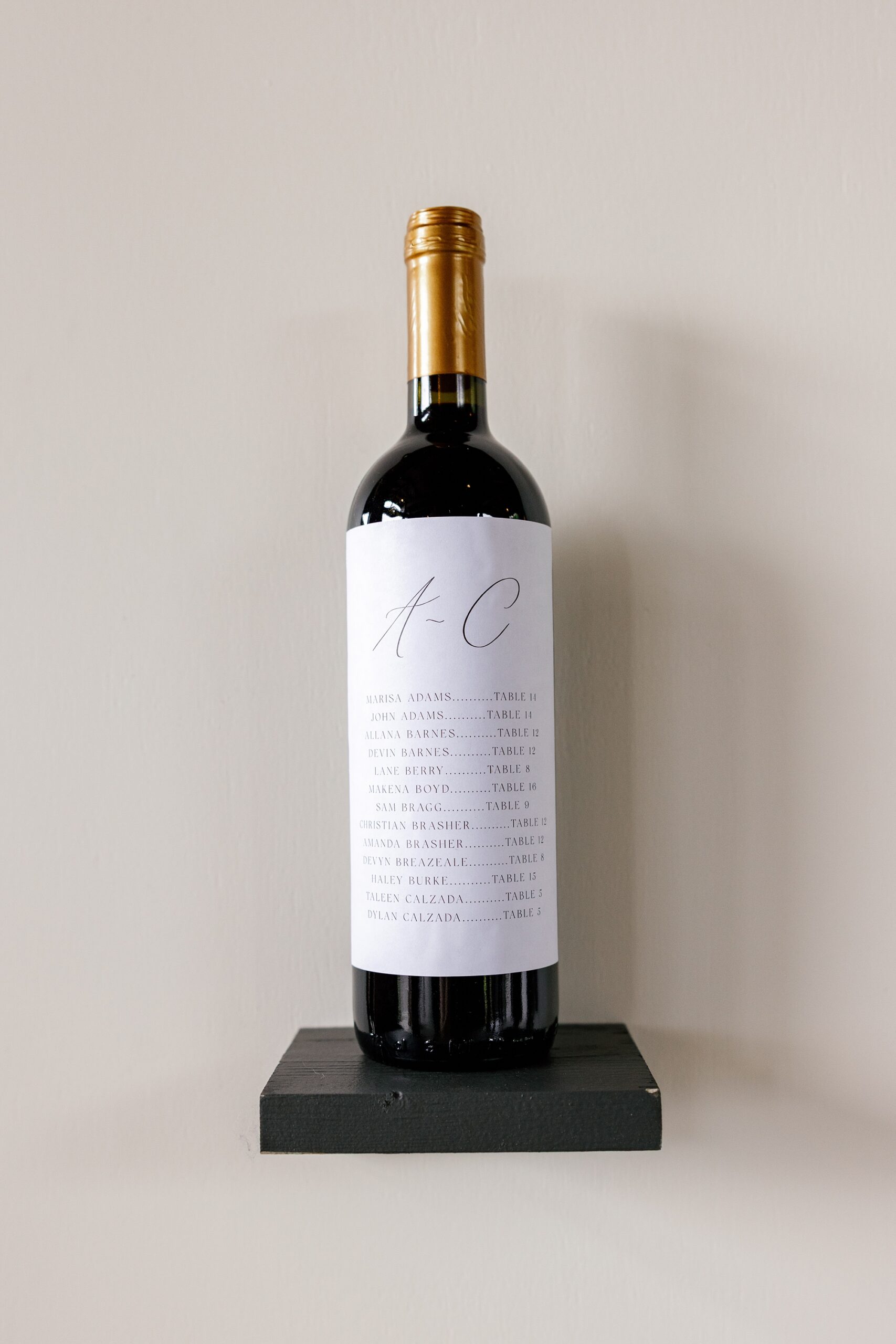
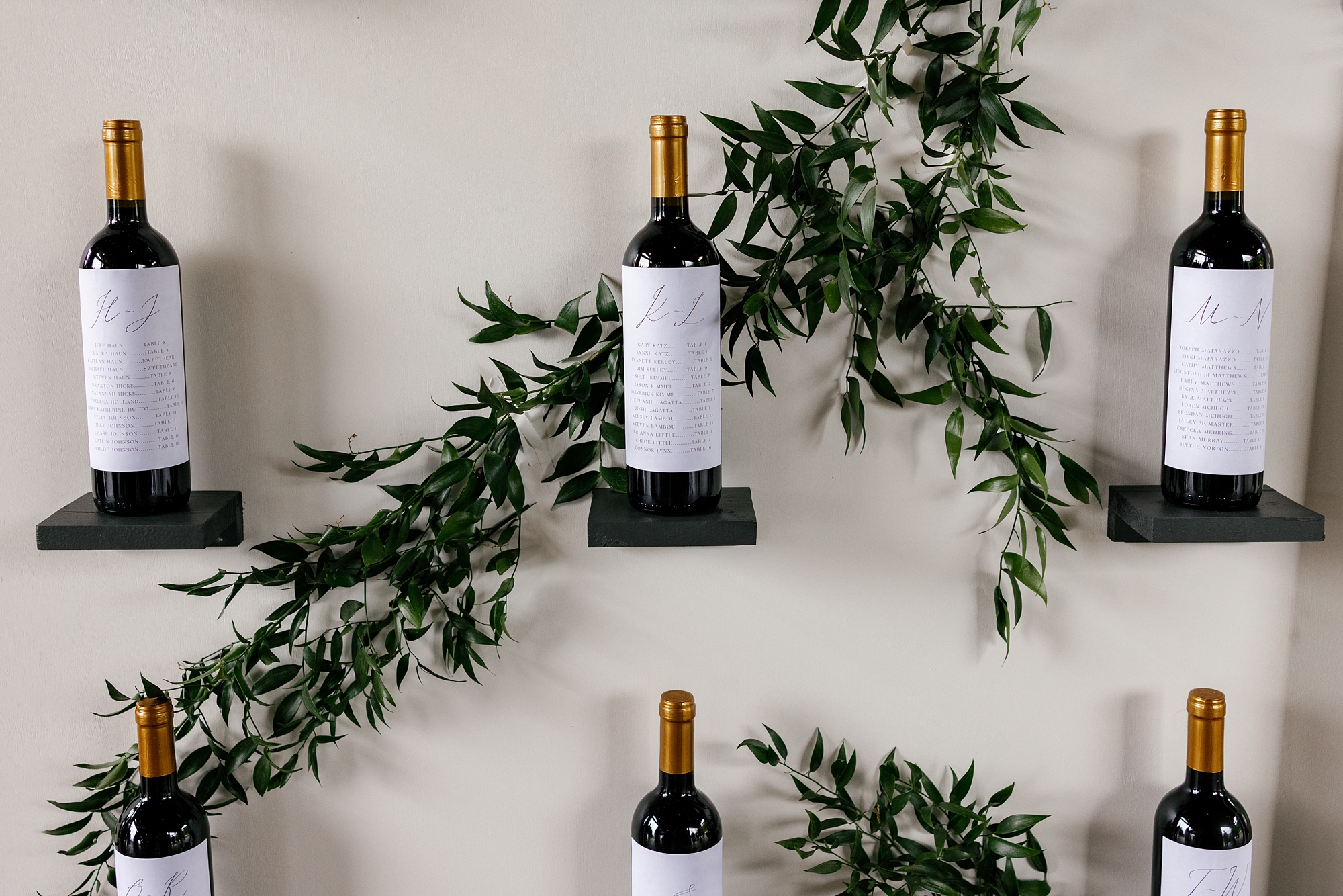
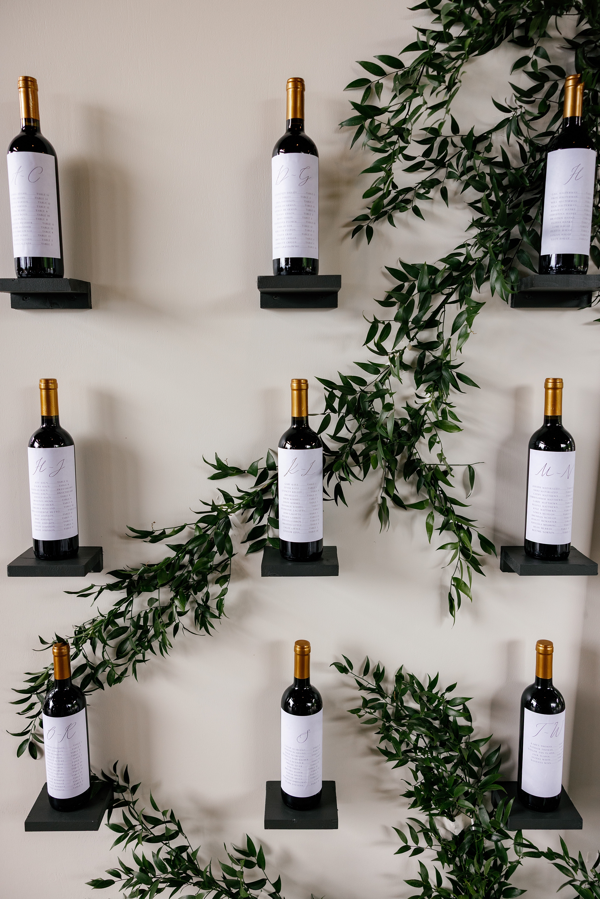
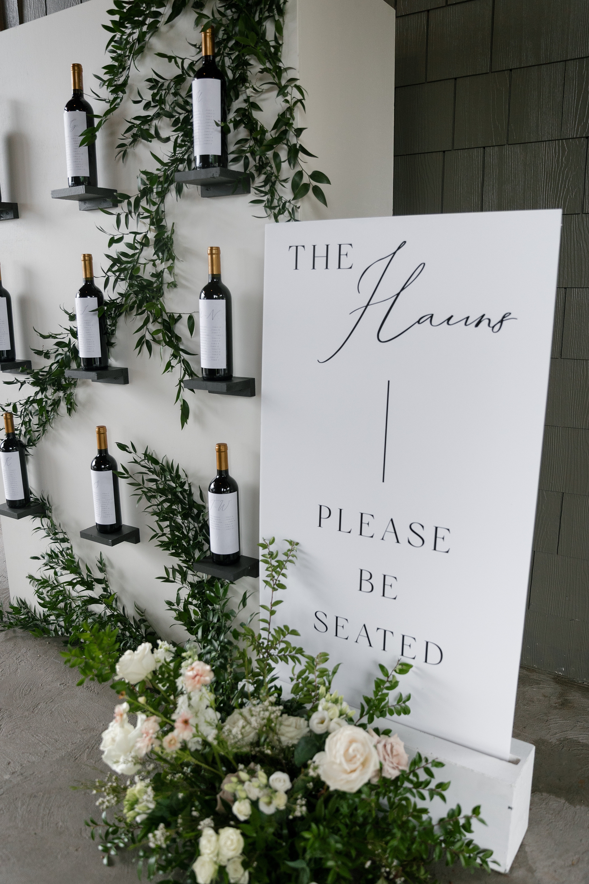
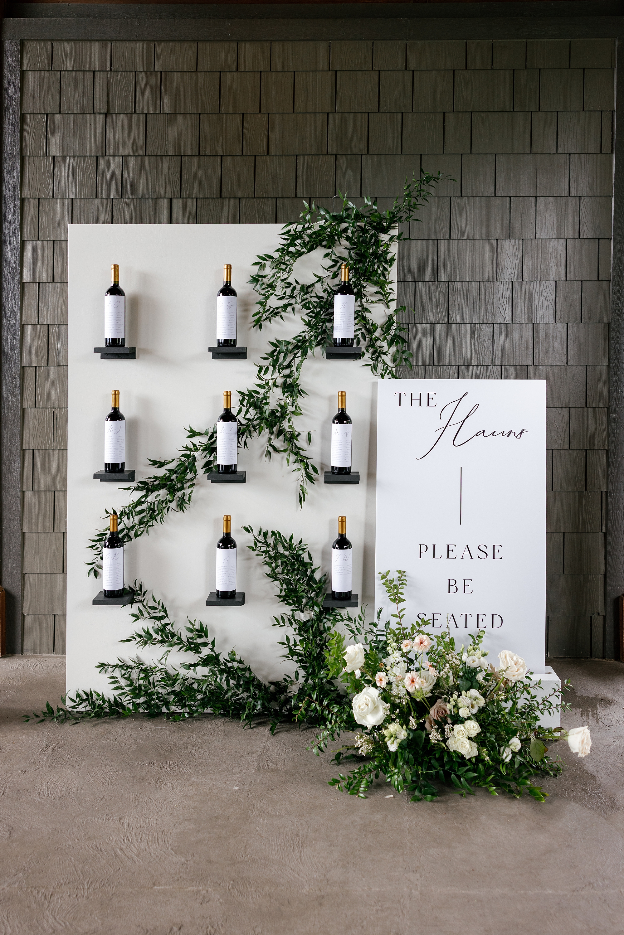
Wine-Inspired Seating Chart
One of our favorite details was the wine bottle seating chart wall, inspired by the bride’s vision. She expressed early on that she dreamed of having a wine seating chart. And we always try to make our clients’ dreams a reality! To make her vision to come to life, we designed and created a packable display that could be transported from Nashville to East Tennessee.
The bride’s father and the groom came to pick up the display before the wedding day, and you could tell it was bonding time for them! They were the absolute sweetest. The father of the bride even shared a little about his upcoming speech for the wedding leaving us all teary-eyed!
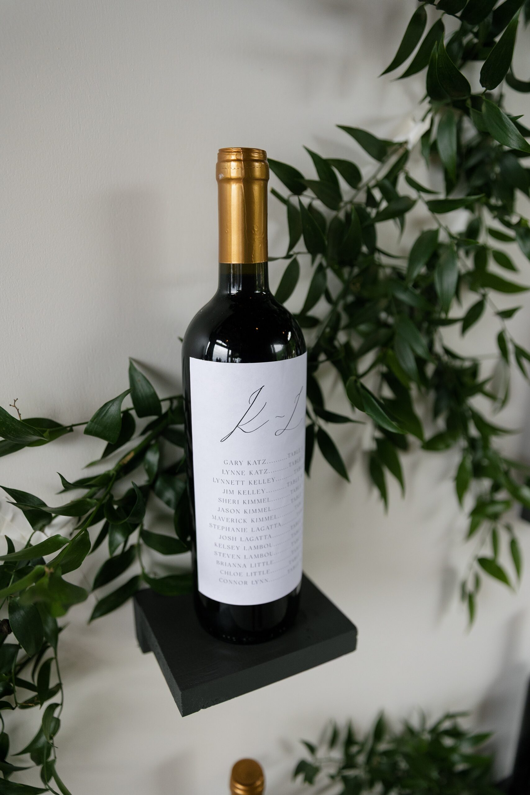
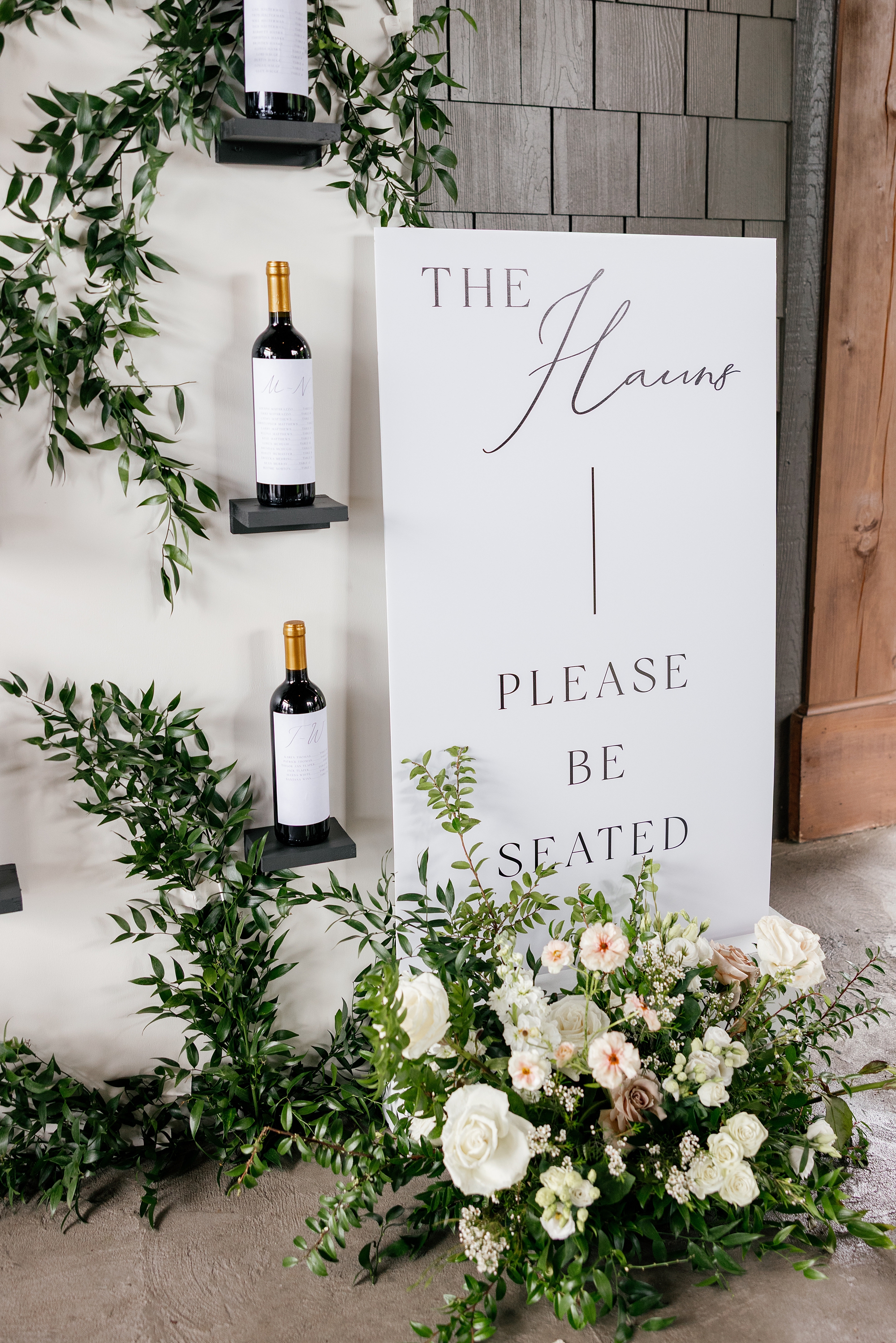
At the wedding, the display featured three rows of three sleek black shelves mounted on a crisp white wall. The nine wine bottles featured each guest’s name in alphabetical order along with their assigned on a custom wine label. Greenery was woven throughout the display for a natural, romantic finish. Beside it stood a clean white title sign with the couple’s last name, The Hauns, and the words “Please Be Seated” in classic black lettering.
Day-of Details: Wedding Signage
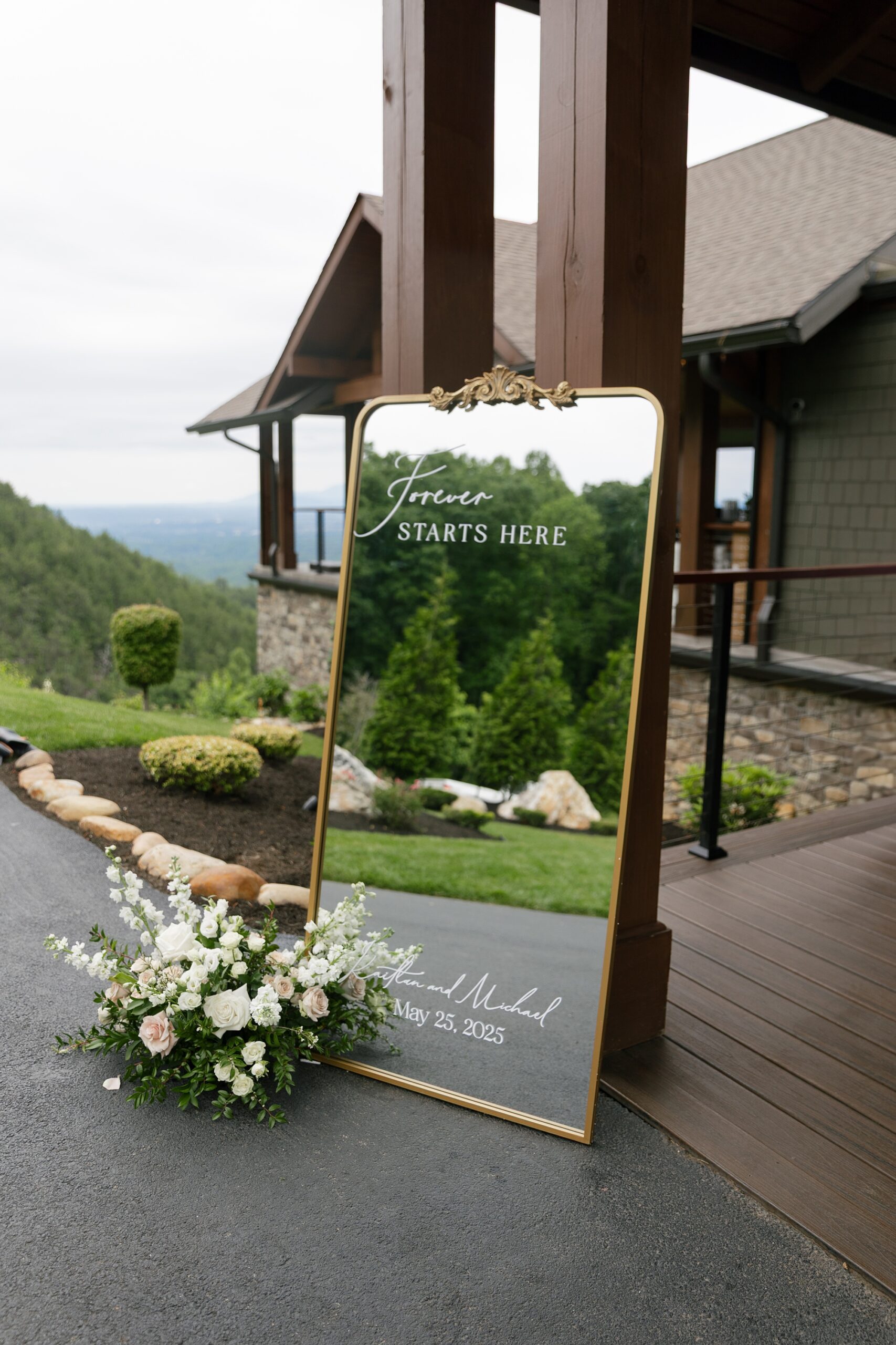
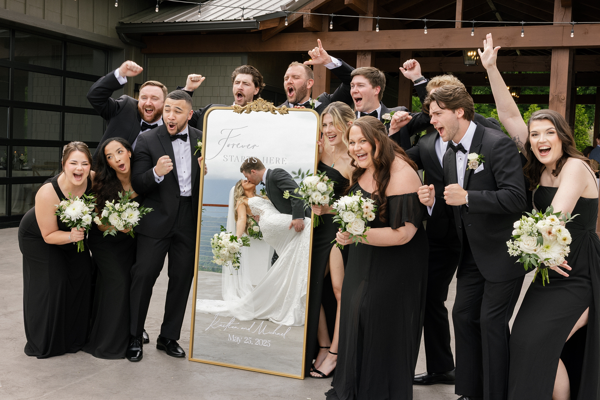
Every detail carried through the couple’s timeless aesthetic. Greeting guests with elegance was the wedding welcome sign, which was a gold-framed mirrored sign featuring “Forever Starts Here” in white calligraphy at the top, along with the couple’s names and wedding date at the bottom.
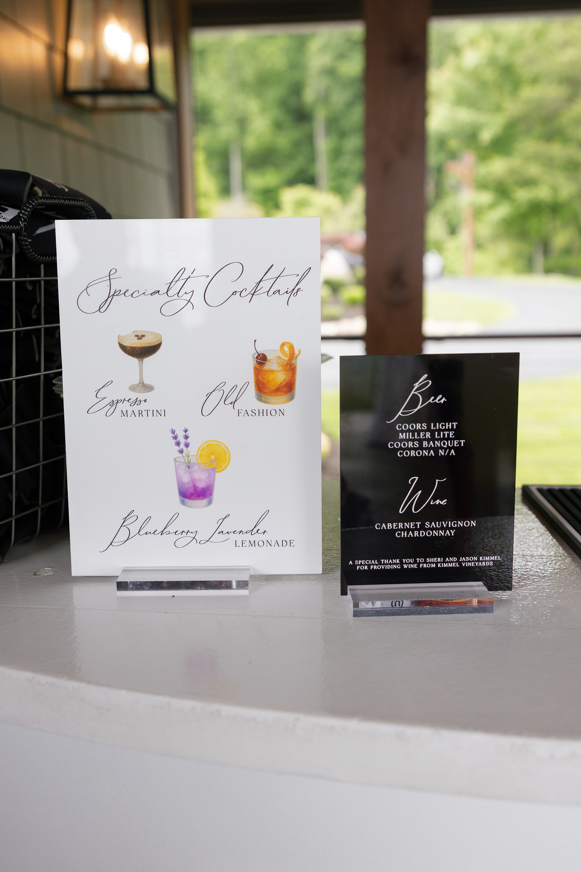
We also created two different bar signs. One was a modern black acrylic sign that listed available drink options in white lettering, keeping things sleek.
The other was a white specialty cocktail sign with black lettering and illustrations of the couple’s signature drinks, which included an Espresso Martini, Old Fashioned, and Blackberry Lemonade.
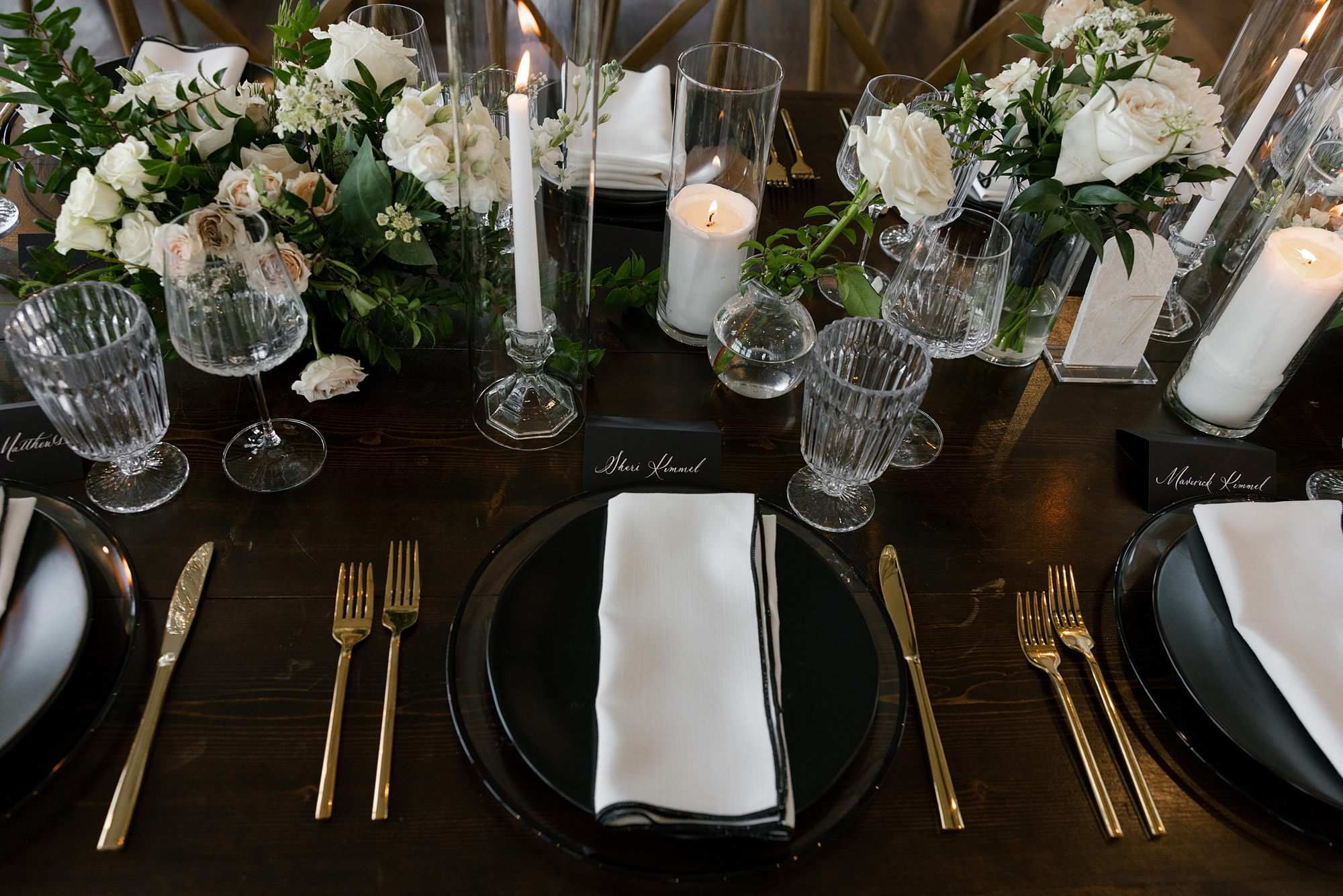
Timeless Black and White Wedding Details
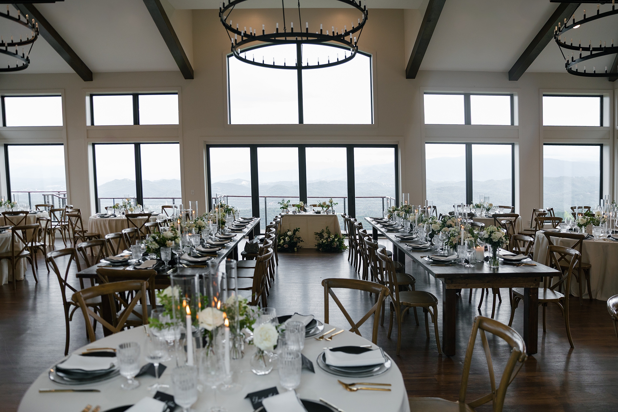
The Trillium Venue is truly stunning inside and out. Even from inside, guests can still take in the scenic mountain views through the floor-to-ceiling windows.
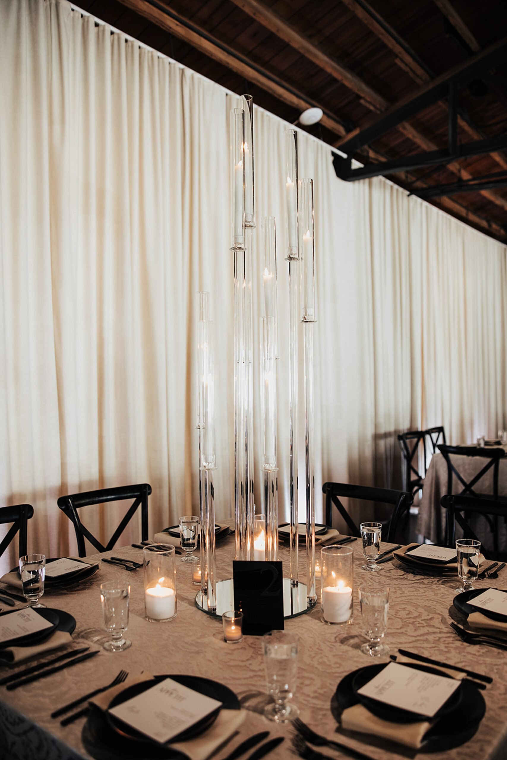
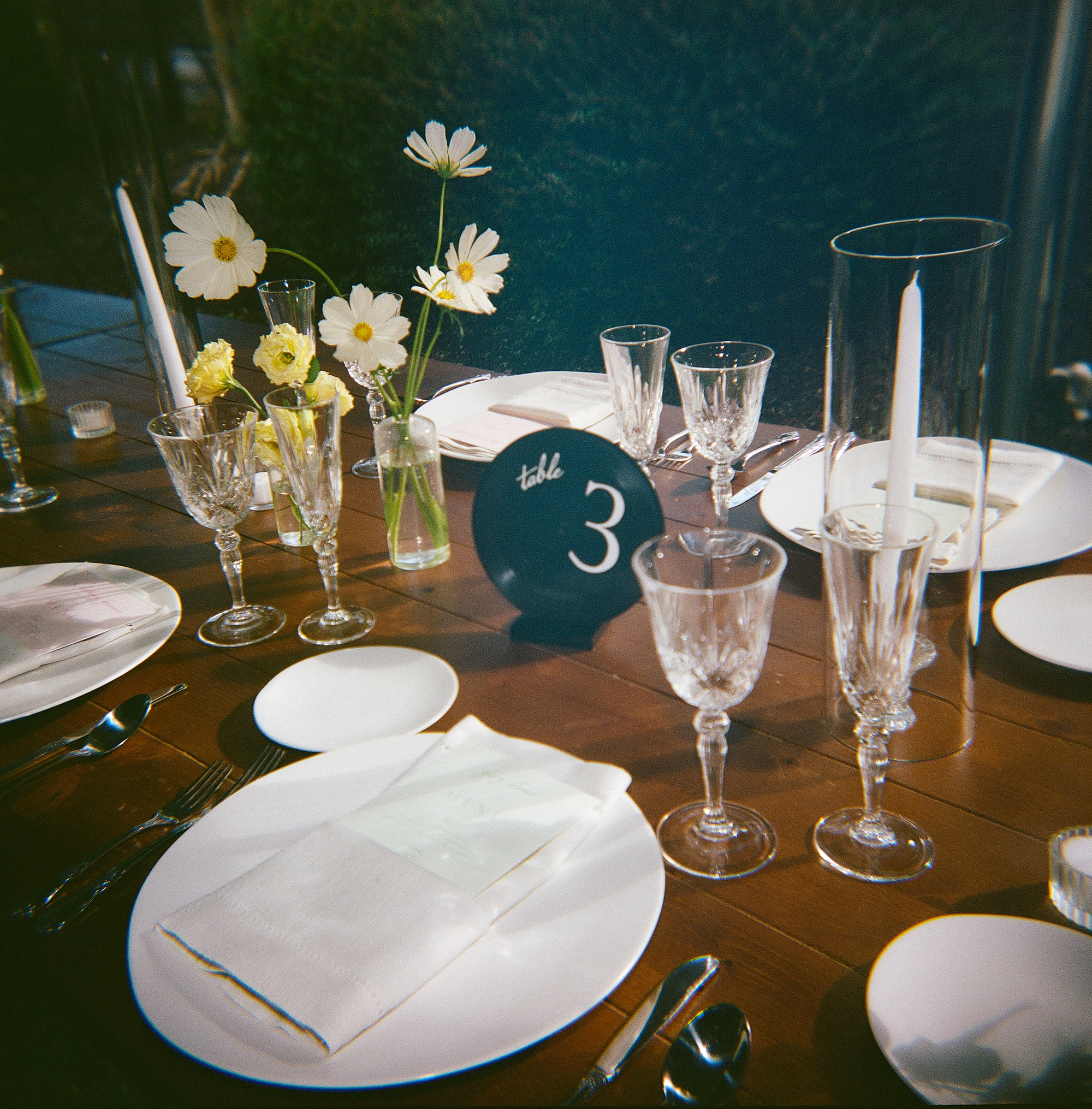
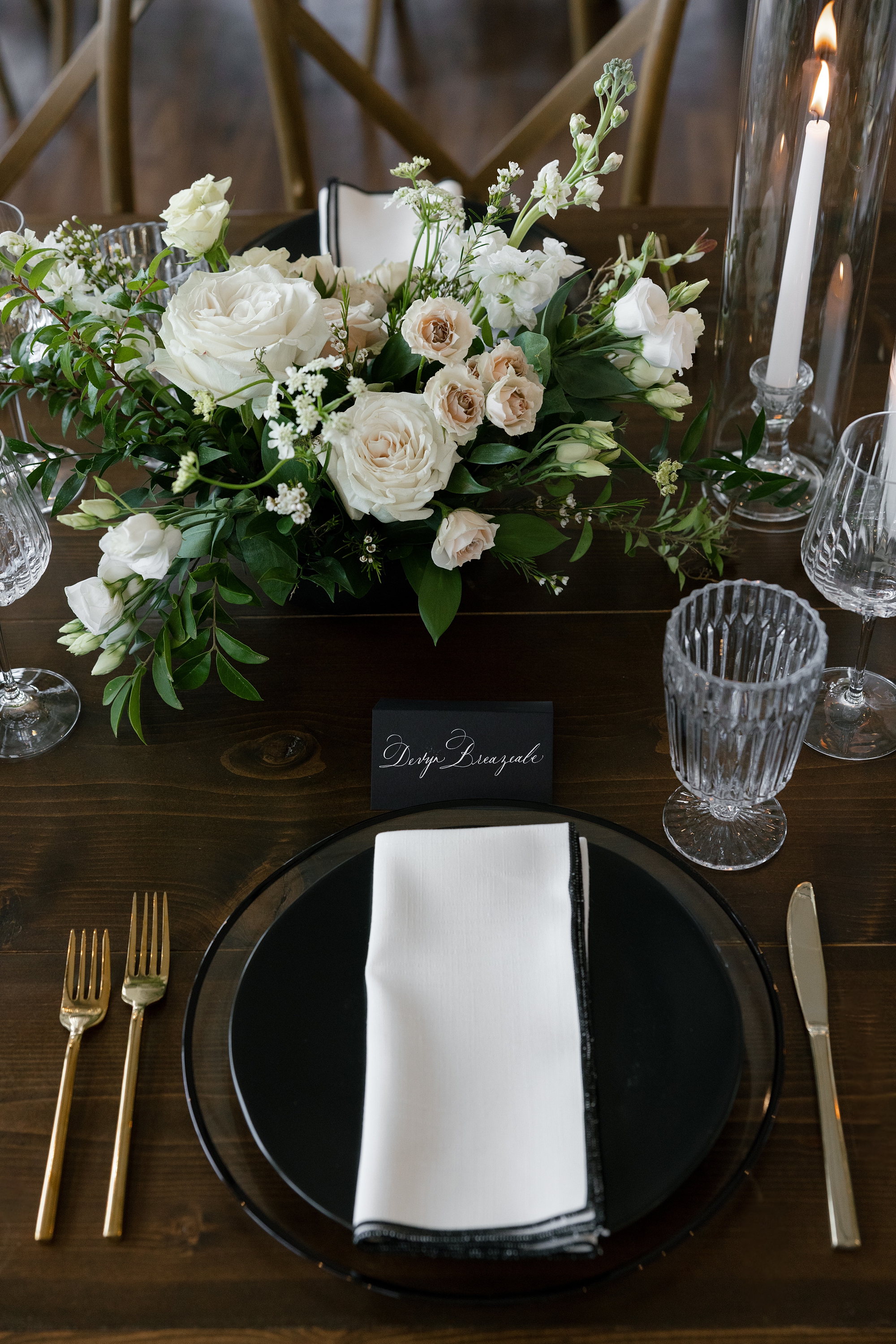
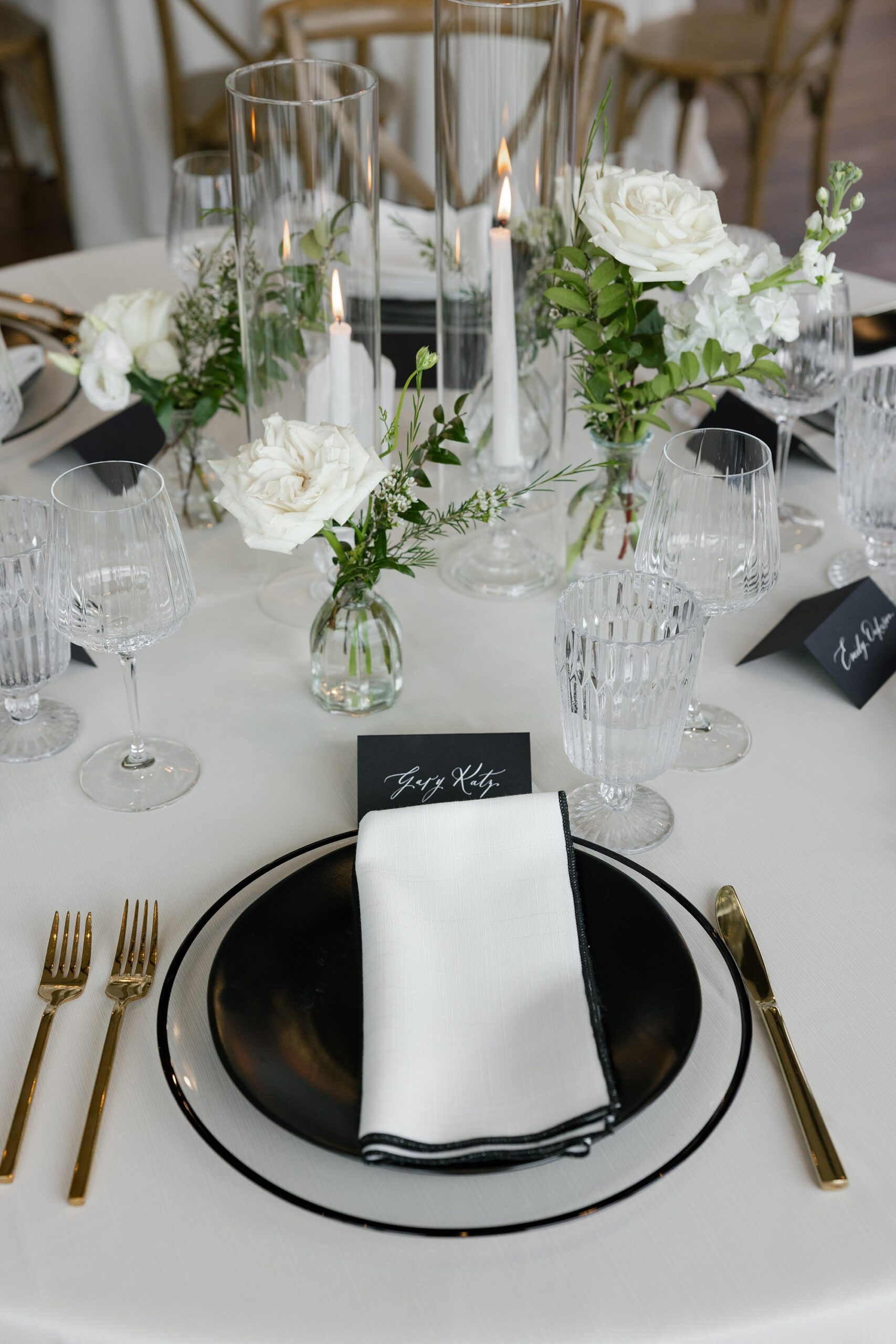
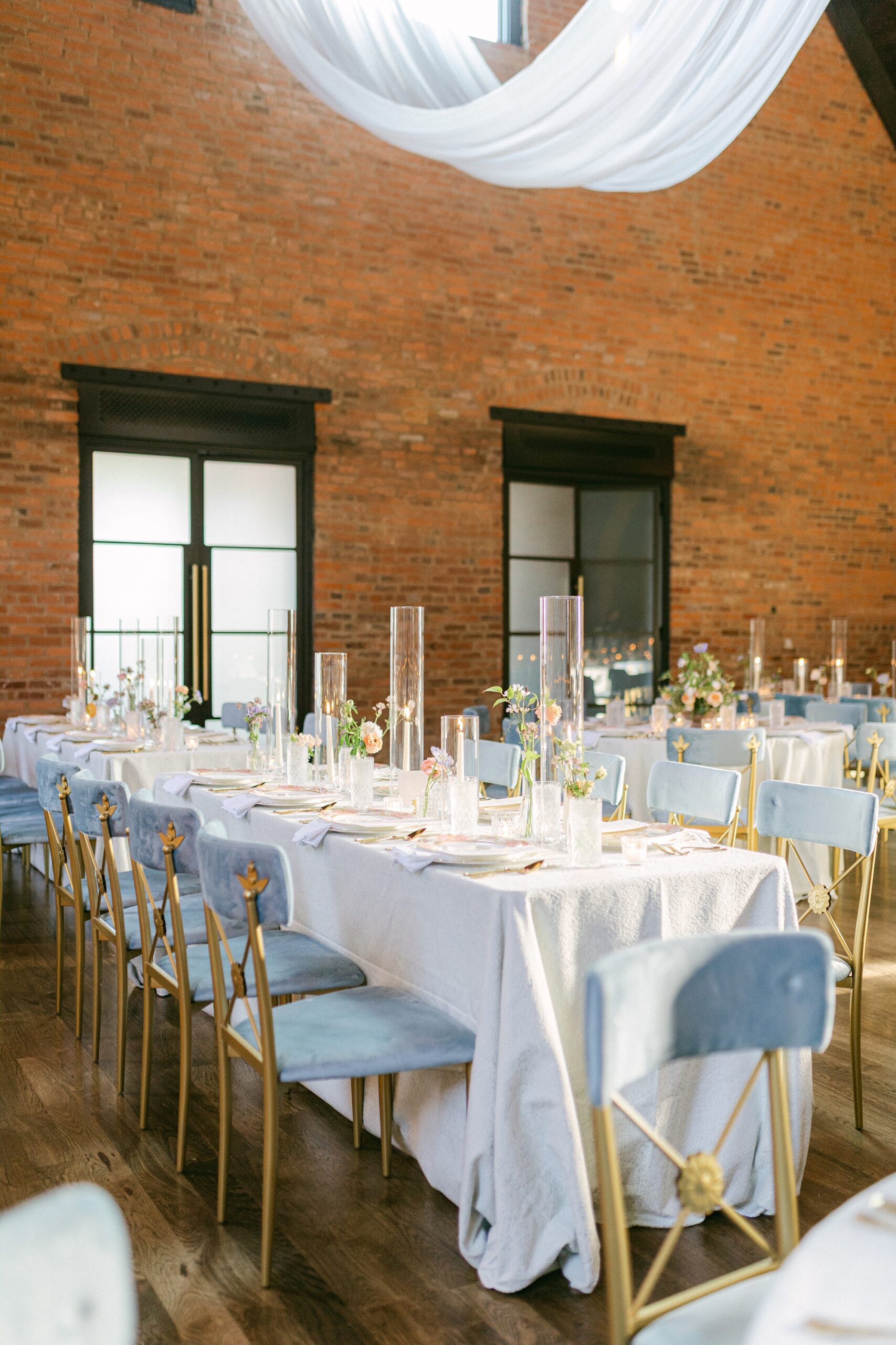
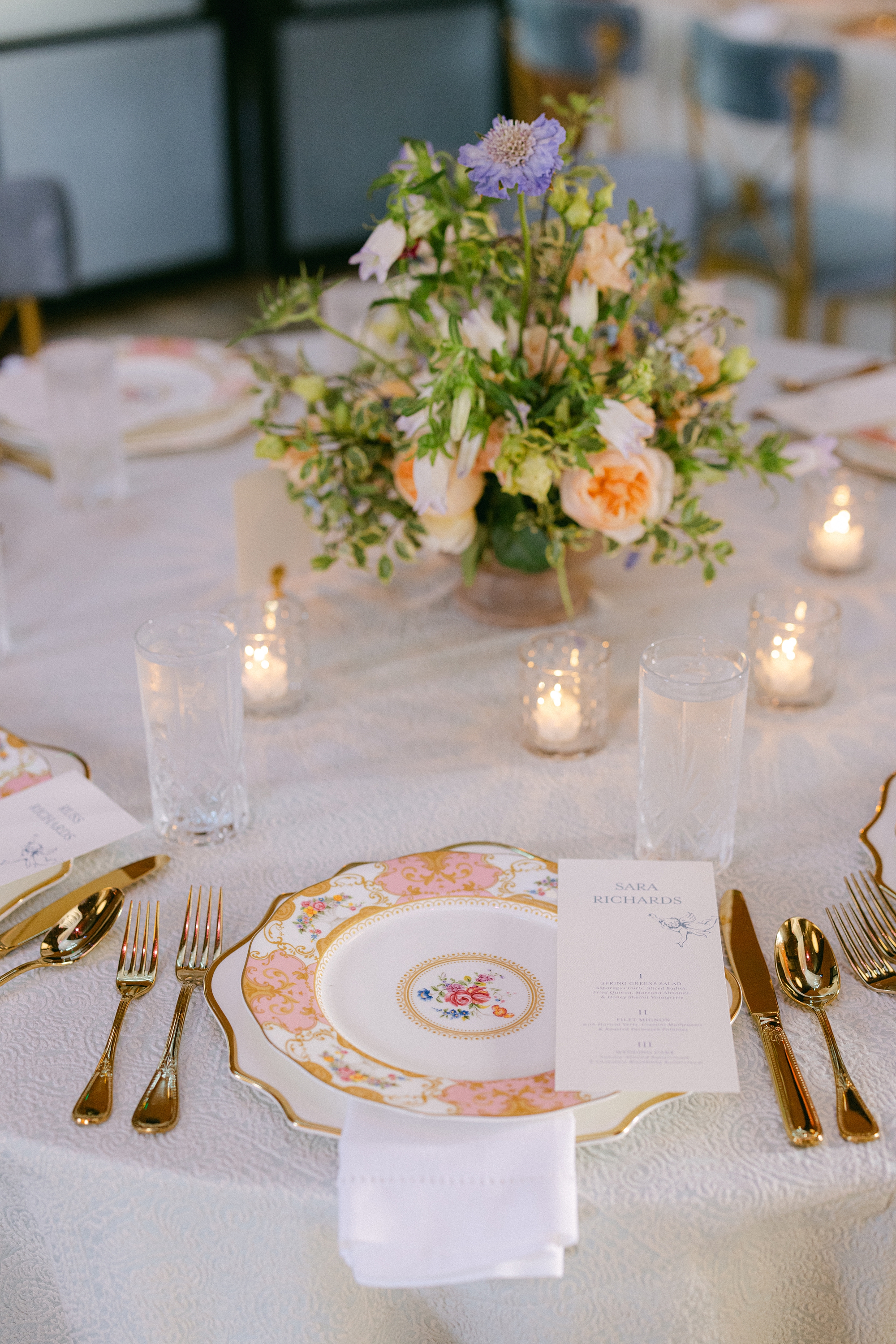
The tablescapes at the reception wove their timeless black and white theme with crisp white napkins sitting atop black plates. black place cards with white calligraphy created a striking contrast. White floral centerpieces and flickering candlelight elevated the romance of the setting.
Every piece of stationery and signage was designed to reflect the couple’s elegant and classic vision, while also including a touch of personality. Weaving in custom details throughout their wedding day added personality, shared their story, and set the stage for a truly unforgettable wedding day.
Kaitlan and Michael, thank you for letting us be a part of your special day!
If you’re planning a wedding in Nashville, or anywhere in the world, we’d love to help you create meaningful, personalized stationery and event details that tell your story. We work with couples worldwide to design details you and your guests will remember forever. Reach out today to learn more about our full-service wedding and event design offerings! We can’t wait to create something unforgettable for you!
If you enjoyed this post, you’ll love these other blogs!
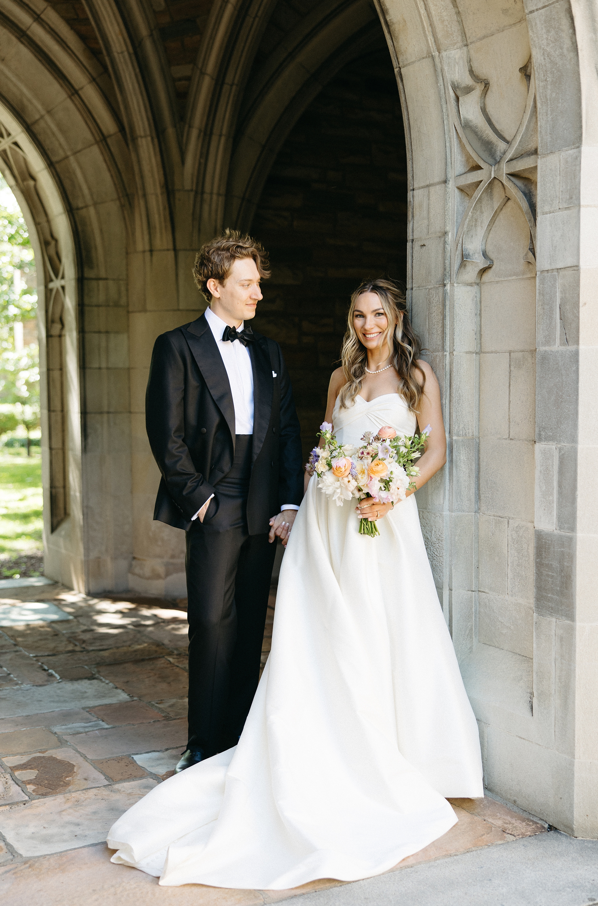
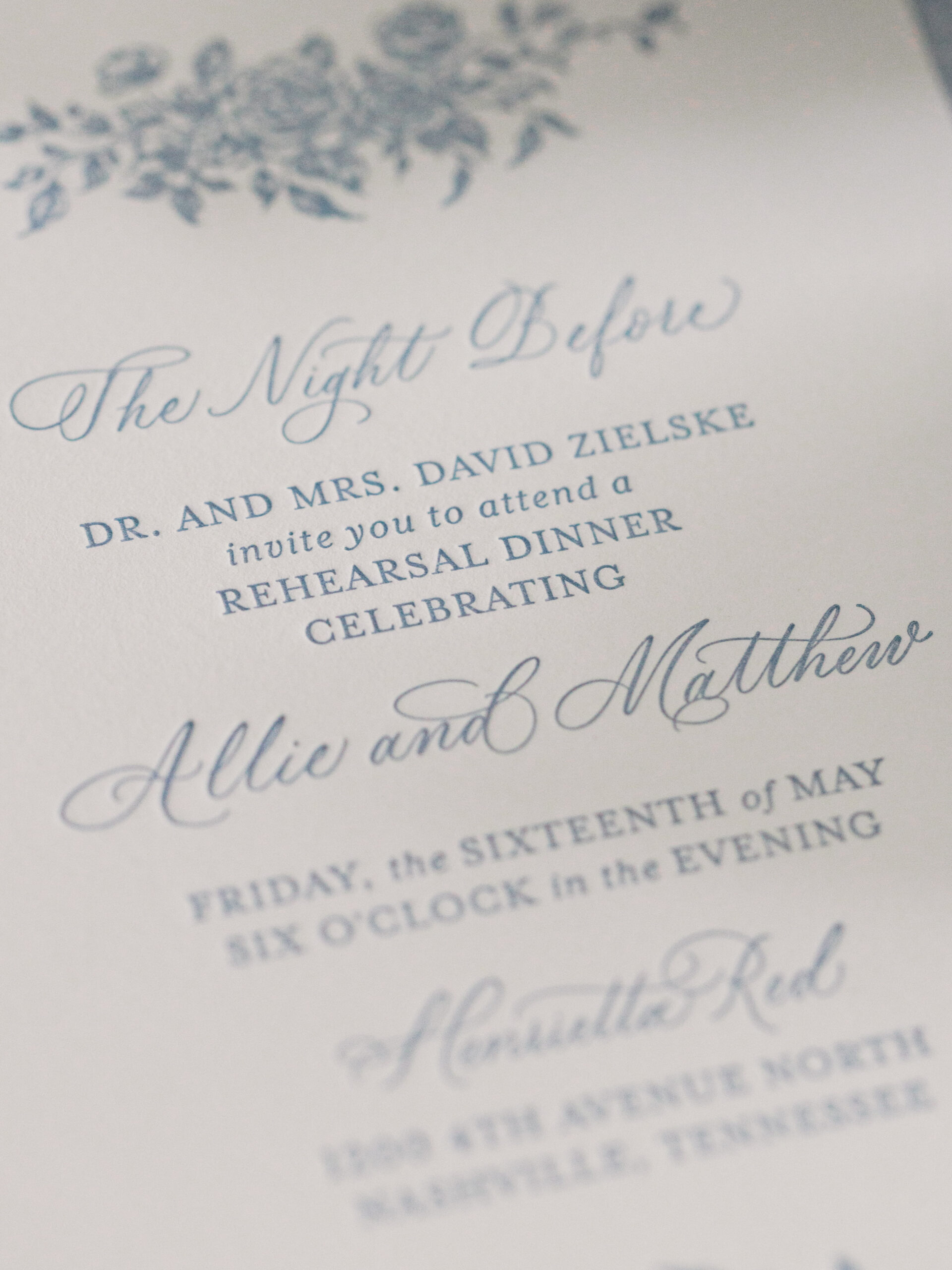
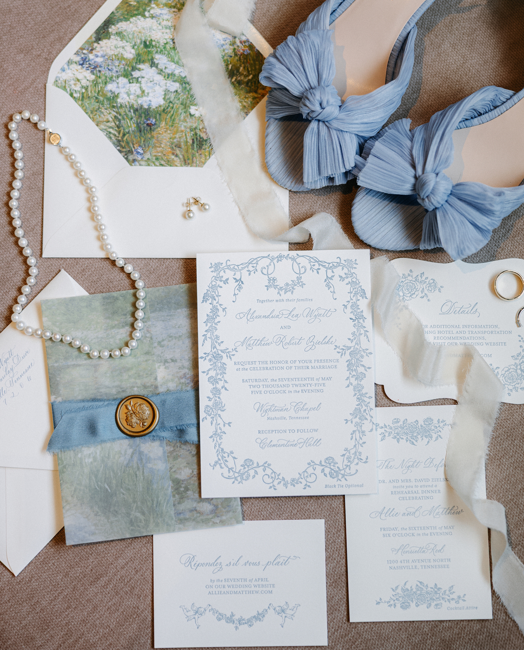
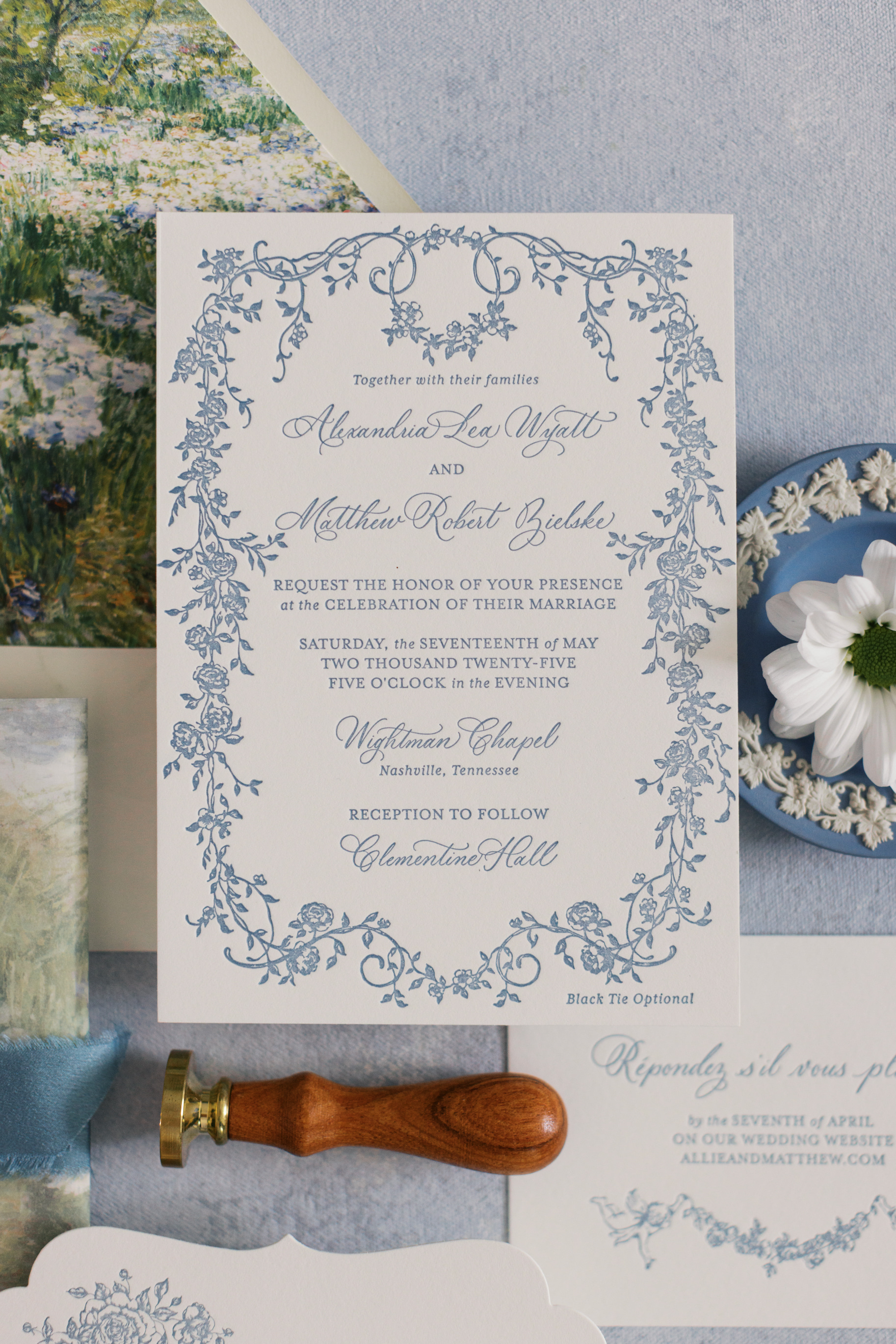
This gorgeous Clementine Hall wedding was a true reflection of creativity, elegance, and personal touches woven throughout the day. We had the joy of designing both their invitation suite and many of their day-of details, and every element wove the couple’s story and style into their big day.
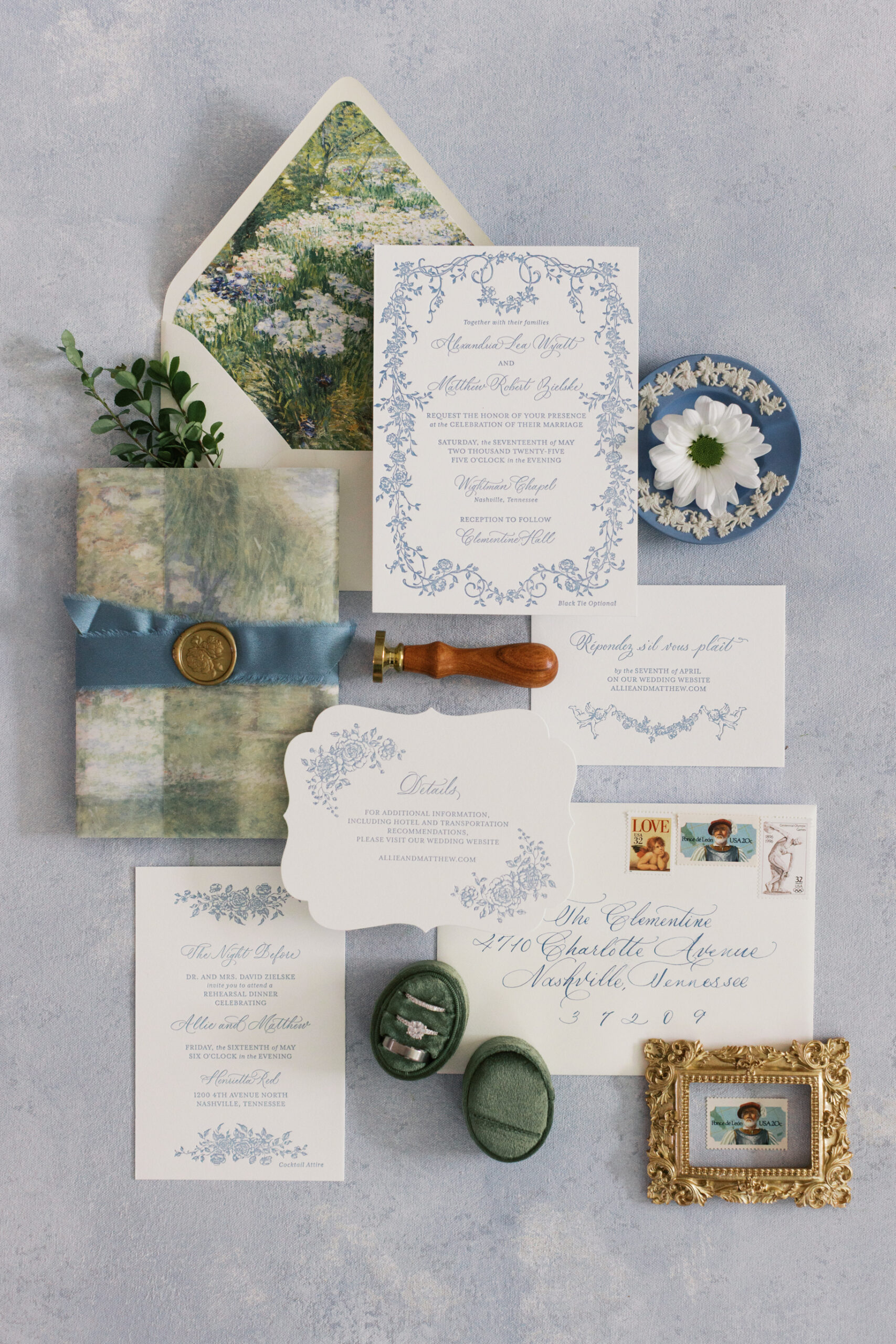
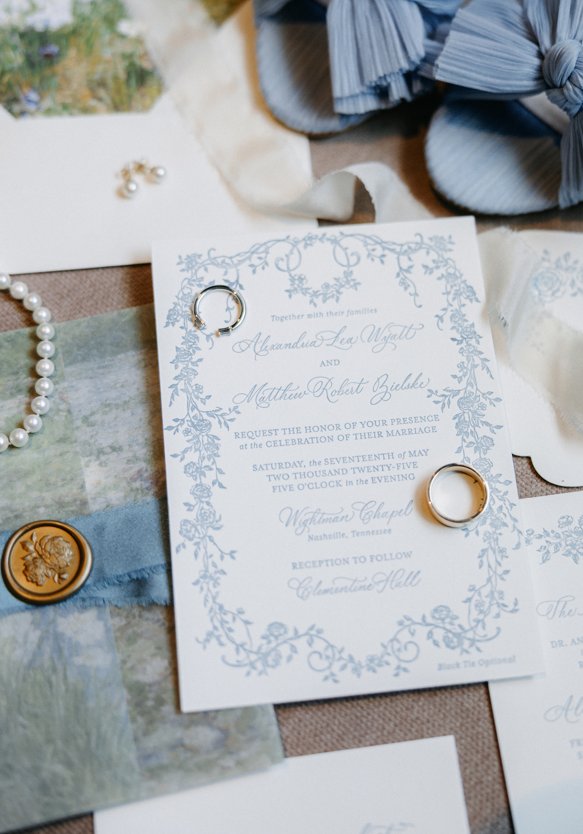
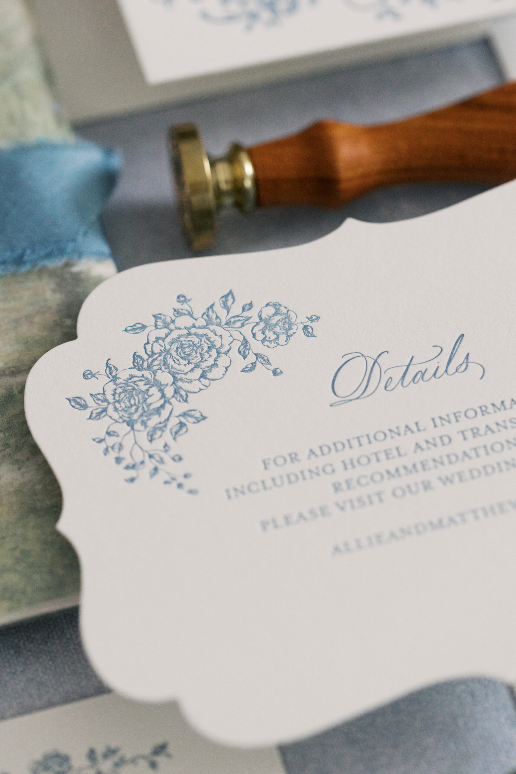
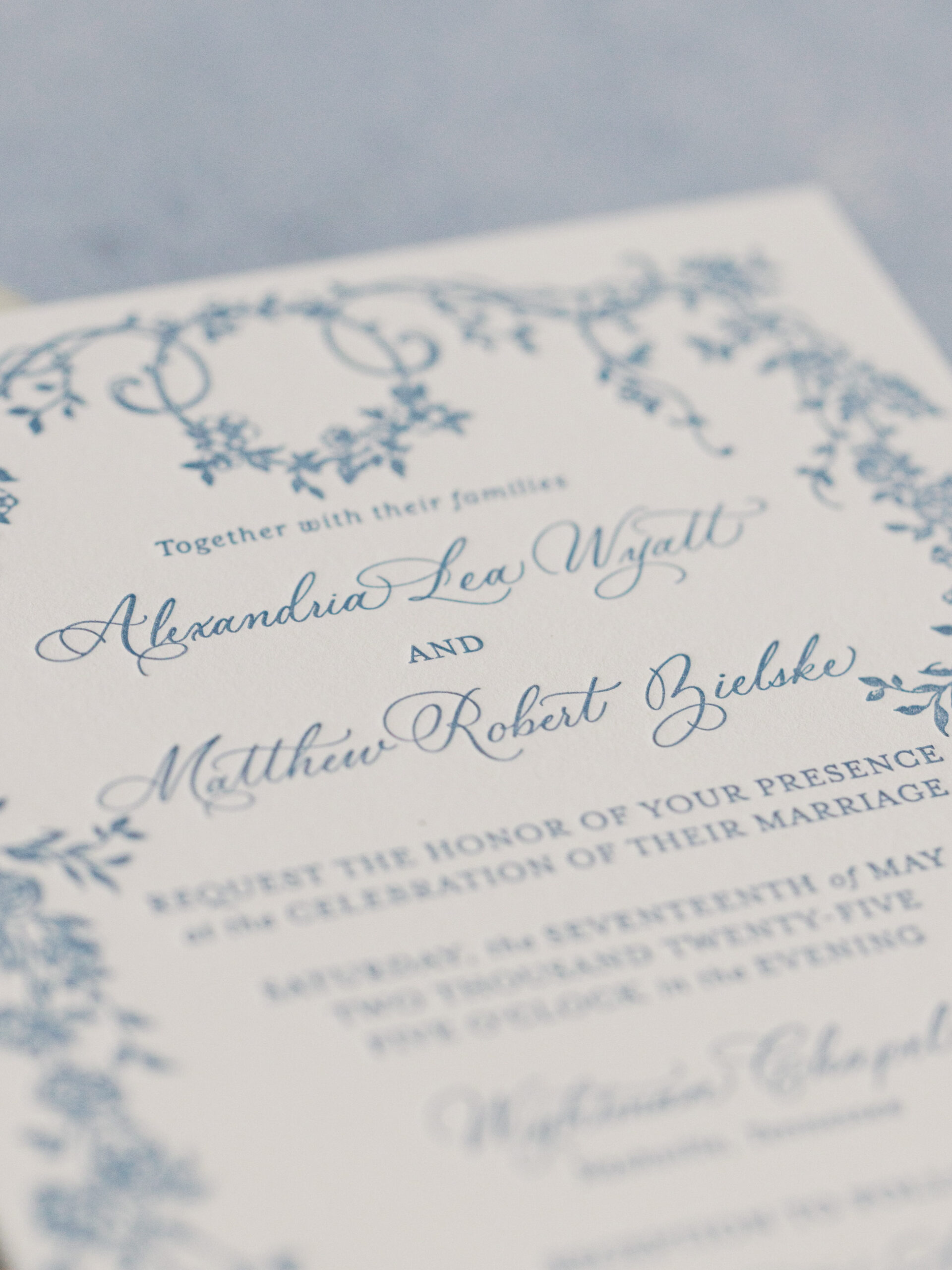
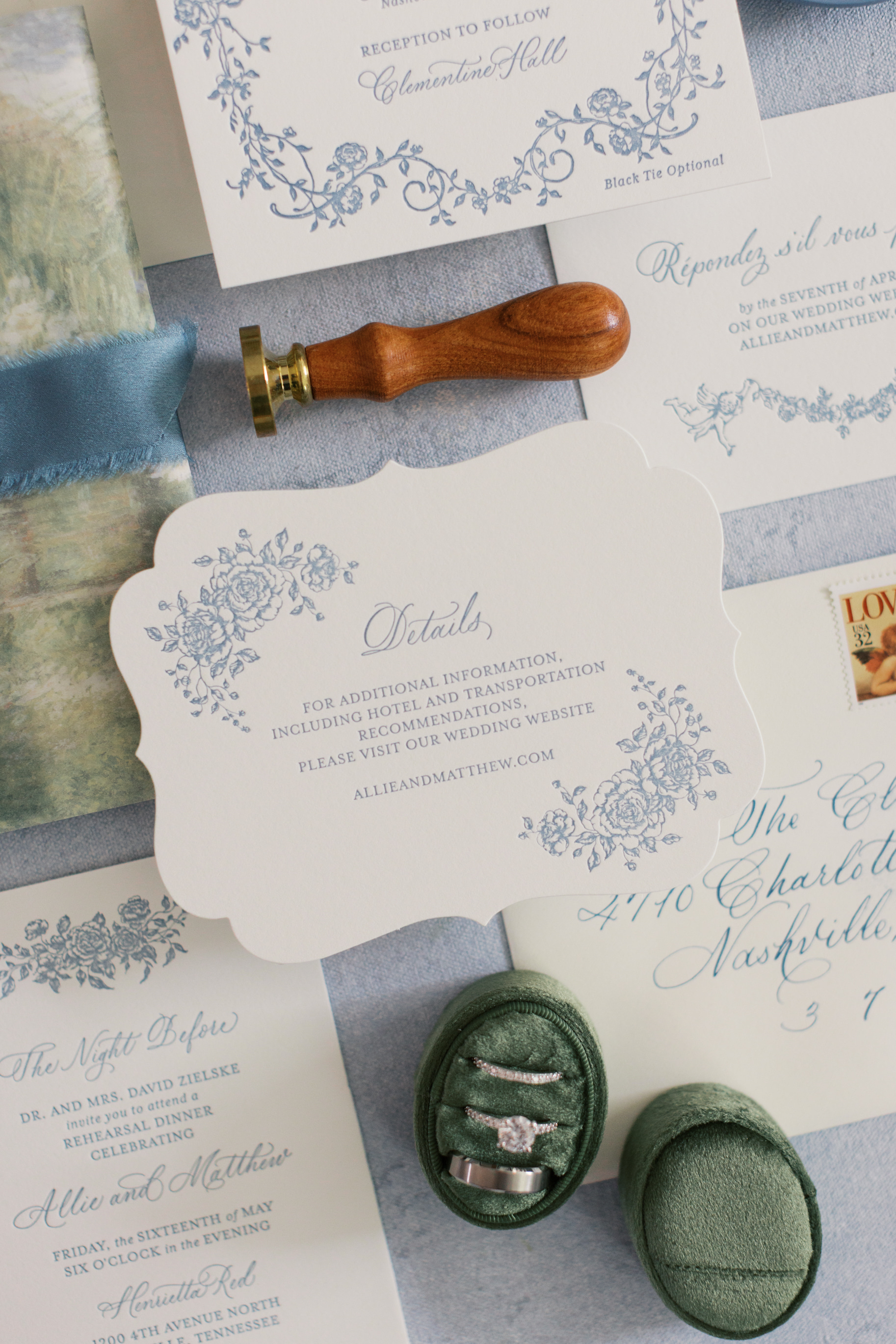
Elegant Letter-Pressed Invitations
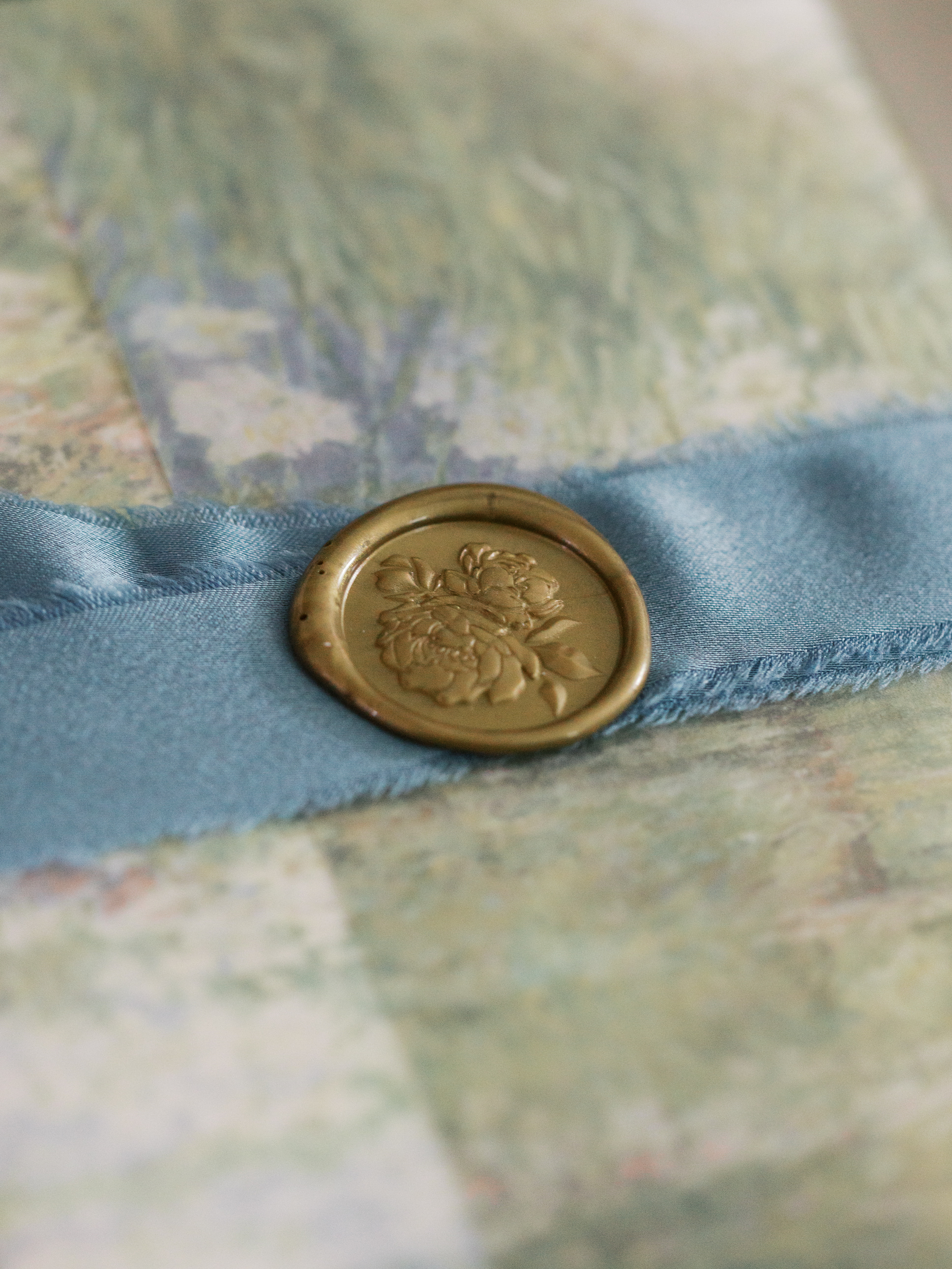
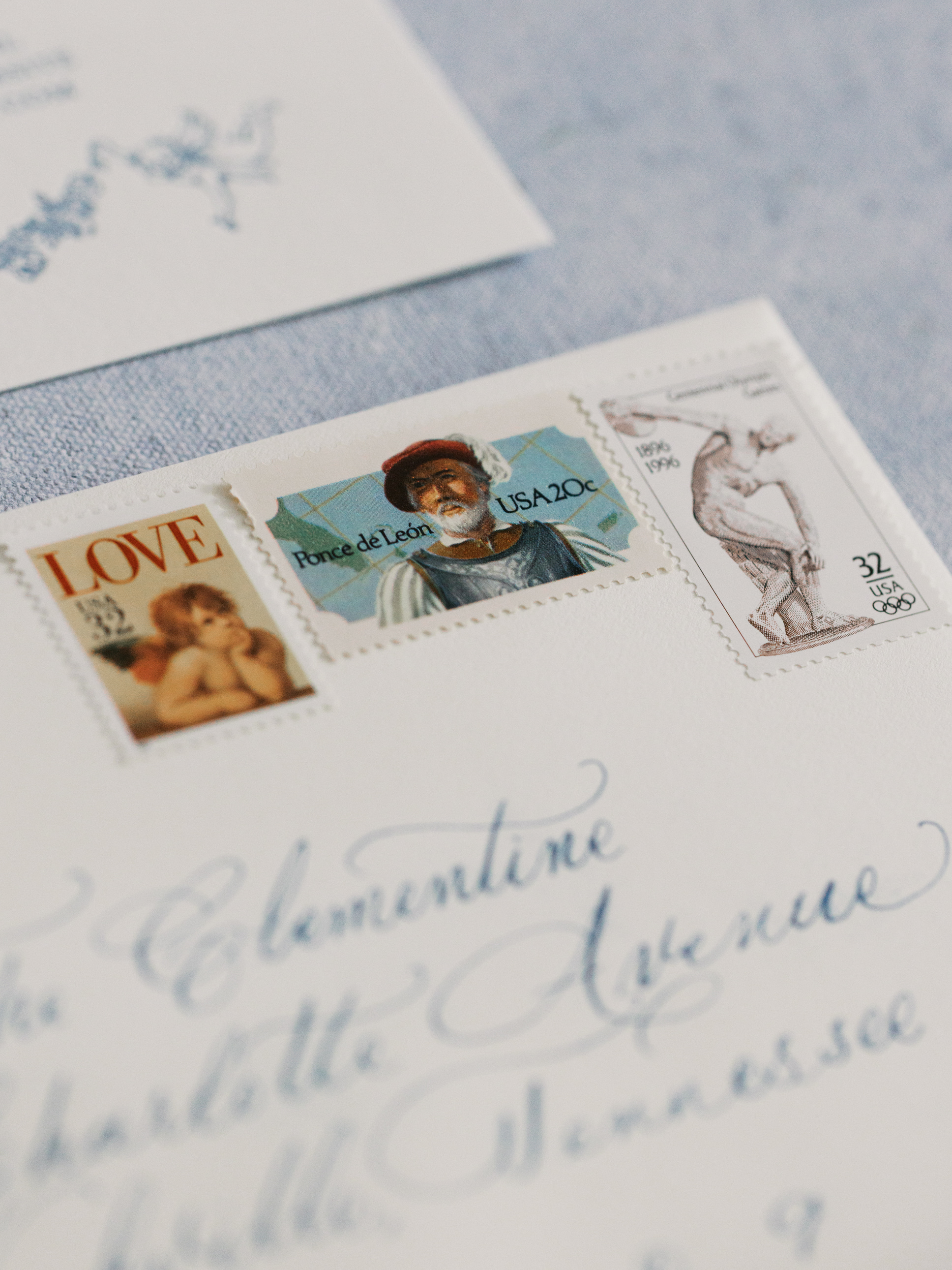
One of our favorite parts of this wedding was how involved the groom was in the design process and the overall aesthetic, which we love! Together, we created a letterpress invitation suite that set the tone for the celebration. A soft blue vine design bordered the invitation, while dreamy light blue lettering paired beautifully with an envelope liner resembling a watercolor field of flowers. The suite was layered with a vellum overlay, tied together with a thick, dusty blue ribbon, and finished with a gold wax seal. It was elevated, romantic, and timeless.
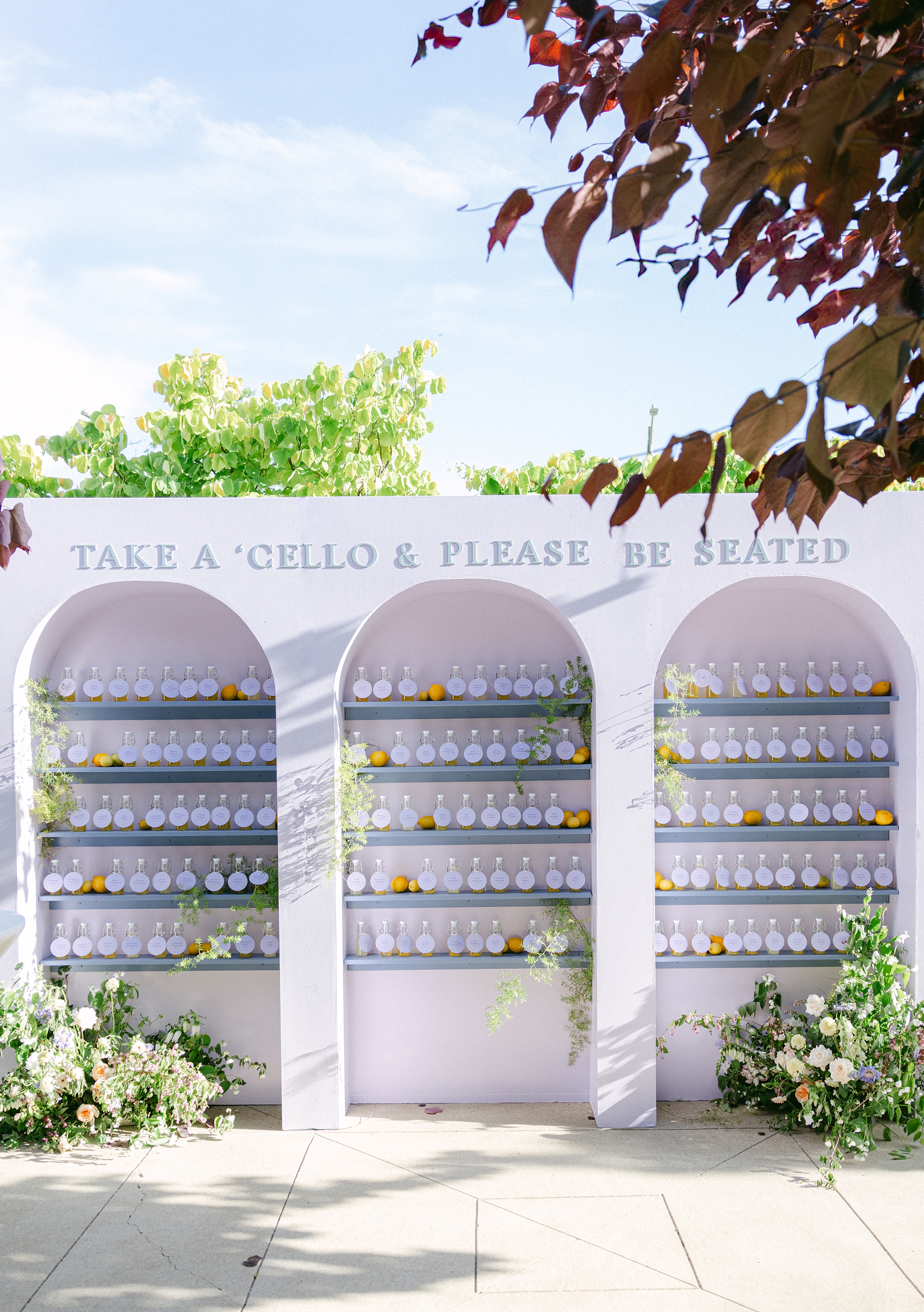
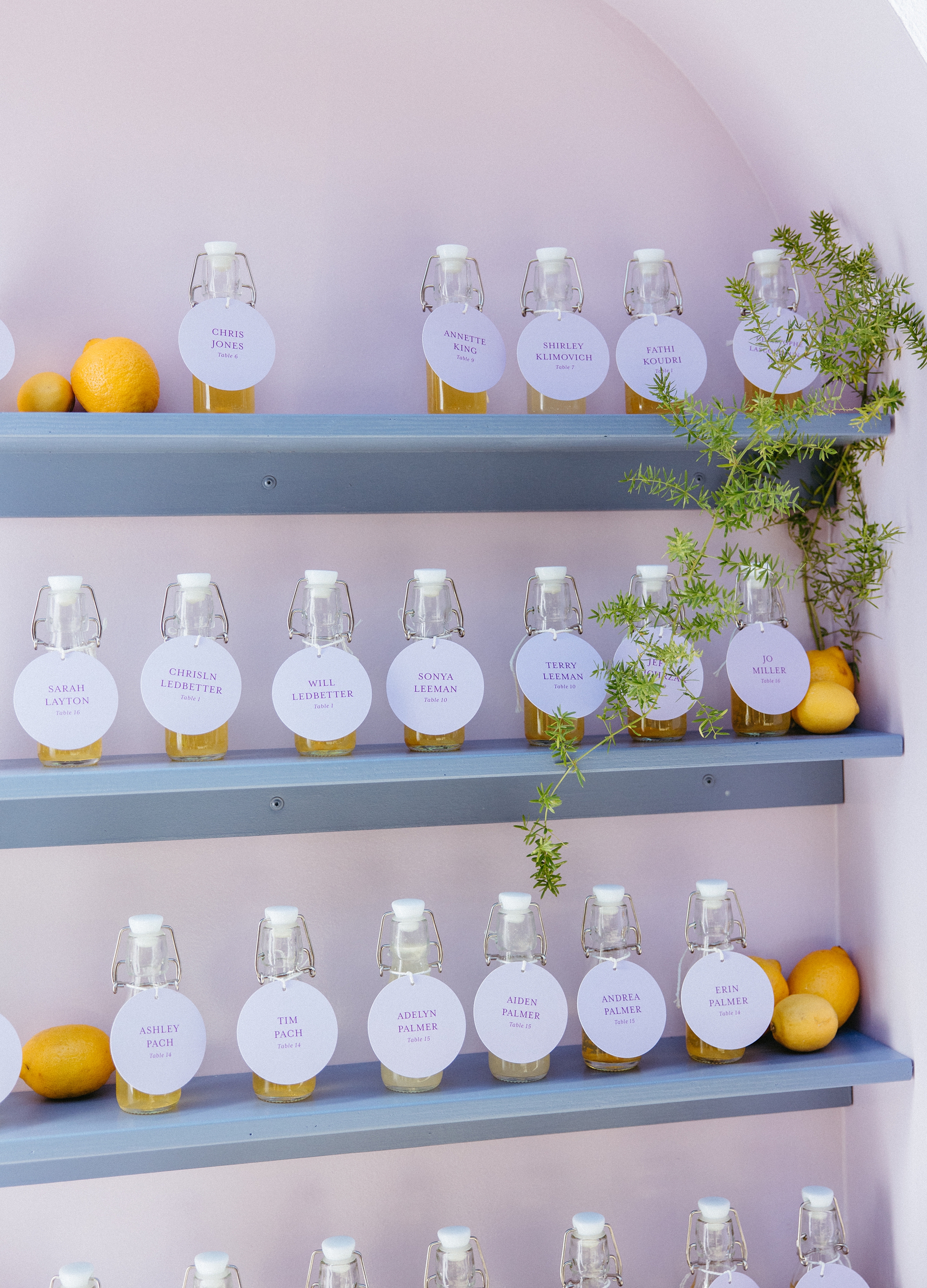
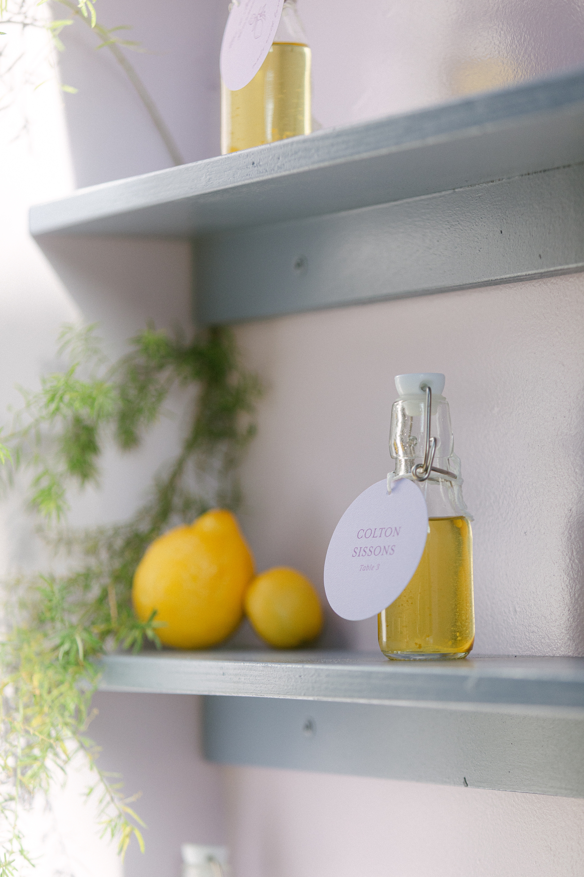
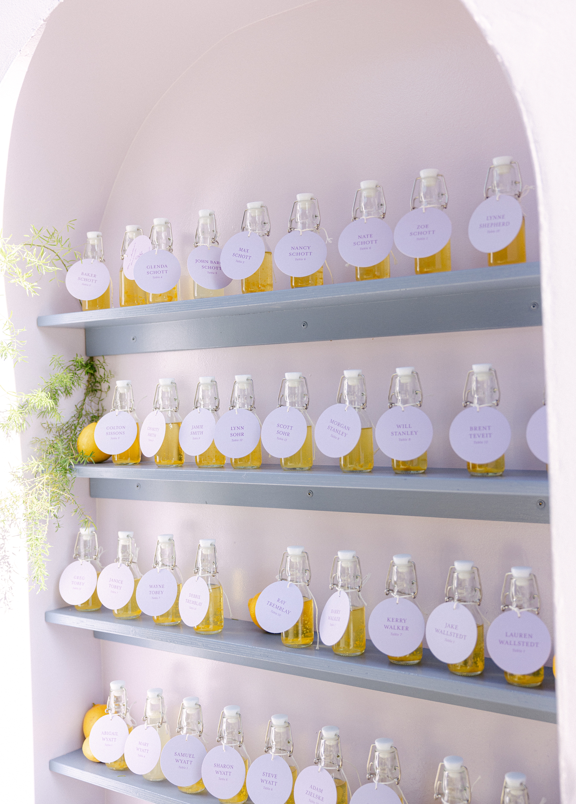
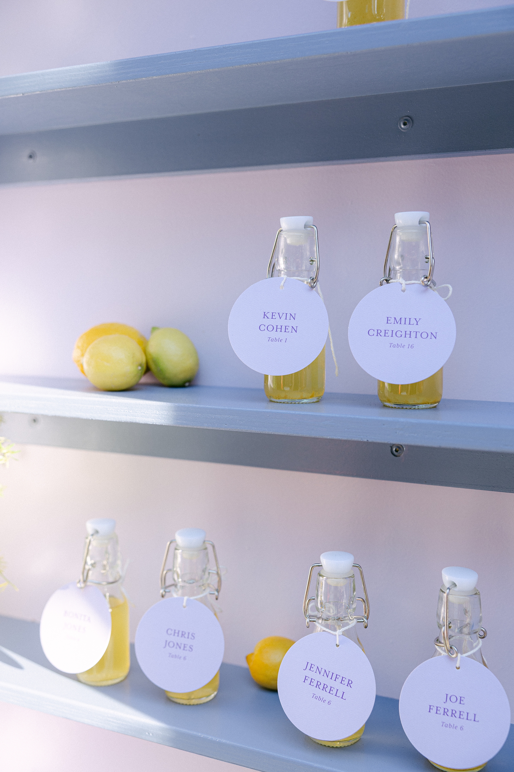
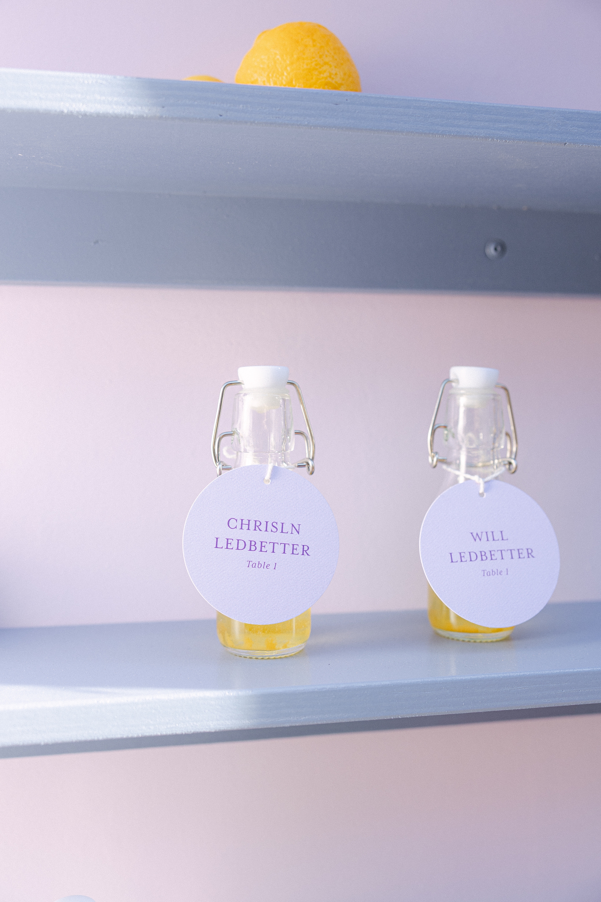
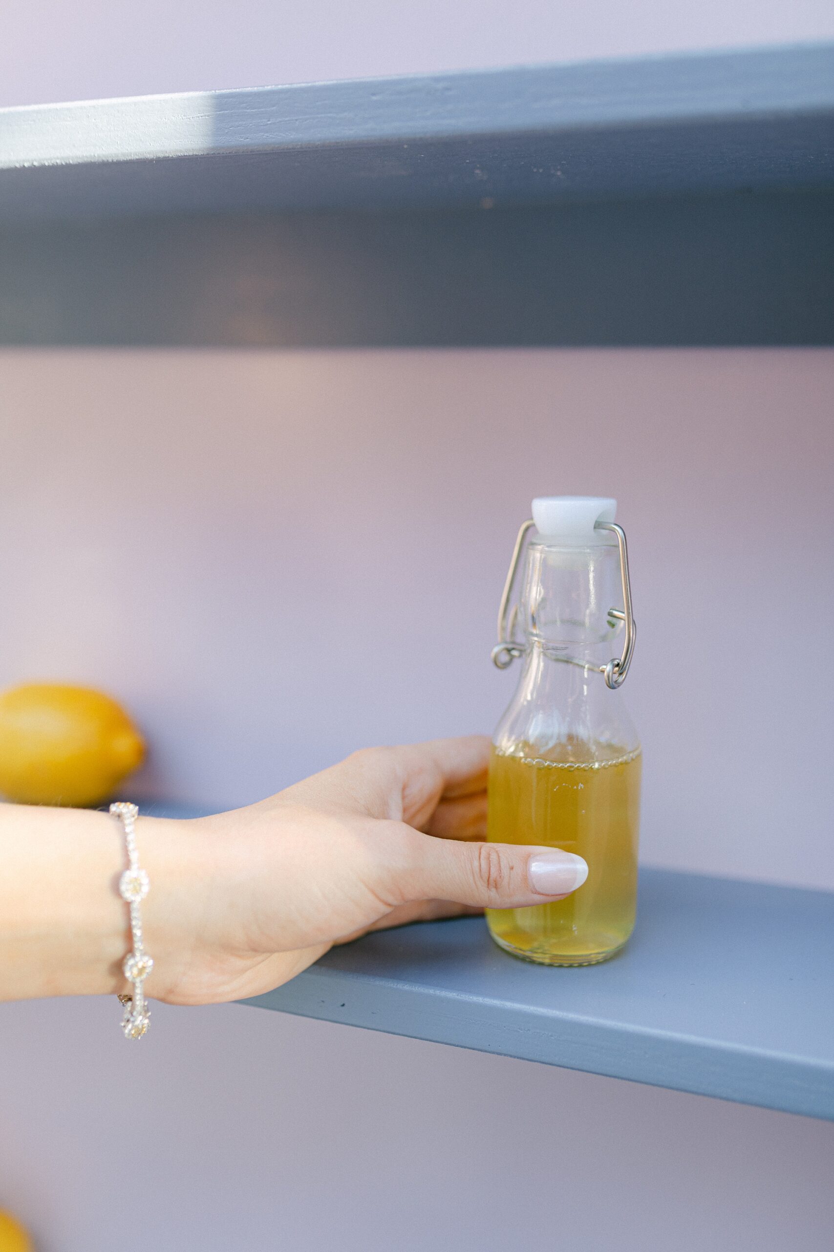
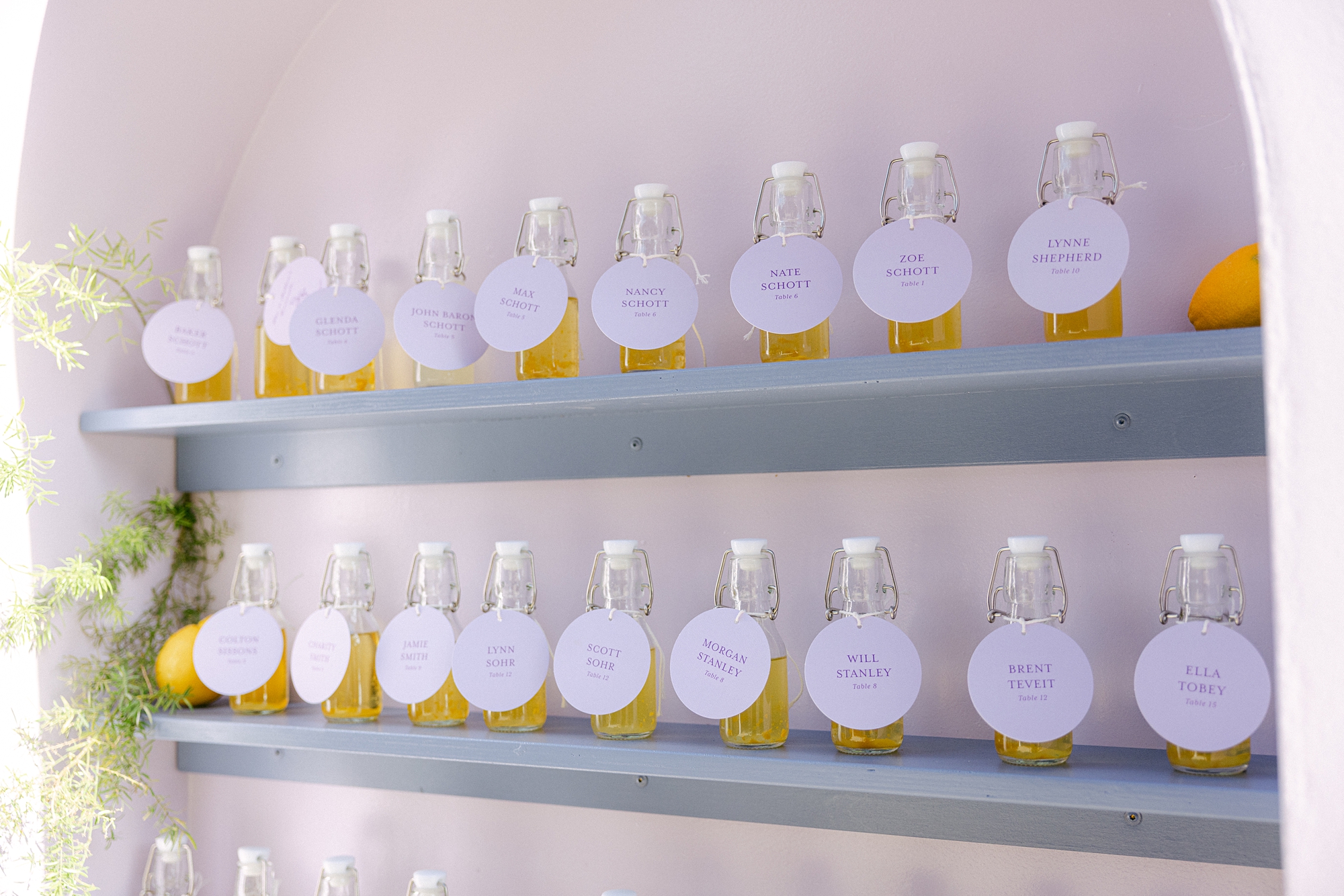
Limoncello Wall + Escort Tags
During our consultation, the couple mentioned that they LOVE limoncello. Naturally, we knew this had to play a starring role in their wedding design, so we designed a custom seating chart around limoncello, and it was better than we envisioned! Guests were welcomed with the seating chart wall display featuring three columns of shelving, each lined with bottles of homemade limoncello (or lemonade for those littles in attendance). Yes, you read that right, the couple made the limoncello themselves!! Talk about a personal touch!
Each bottle featured a circular escort tag with the guest’s name and table assignment. Across the top of the display, we added the playful phrase: “Take a ‘cello and Please Be Seated.” At the base of the installation, lush florals completed the look, making this display not just a seating chart, but a true statement piece and guest favorite.
Day-Of Details: Wedding Signage
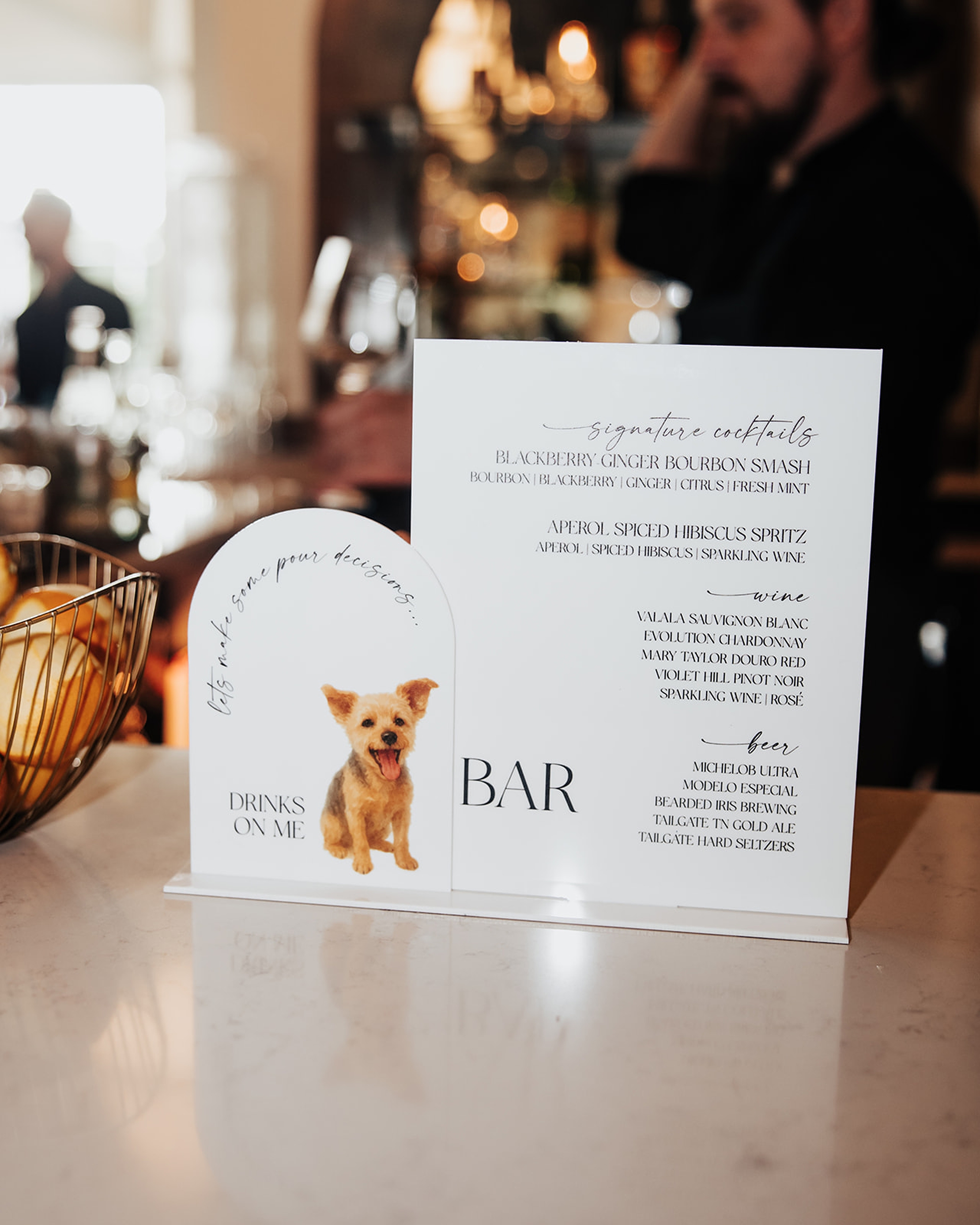
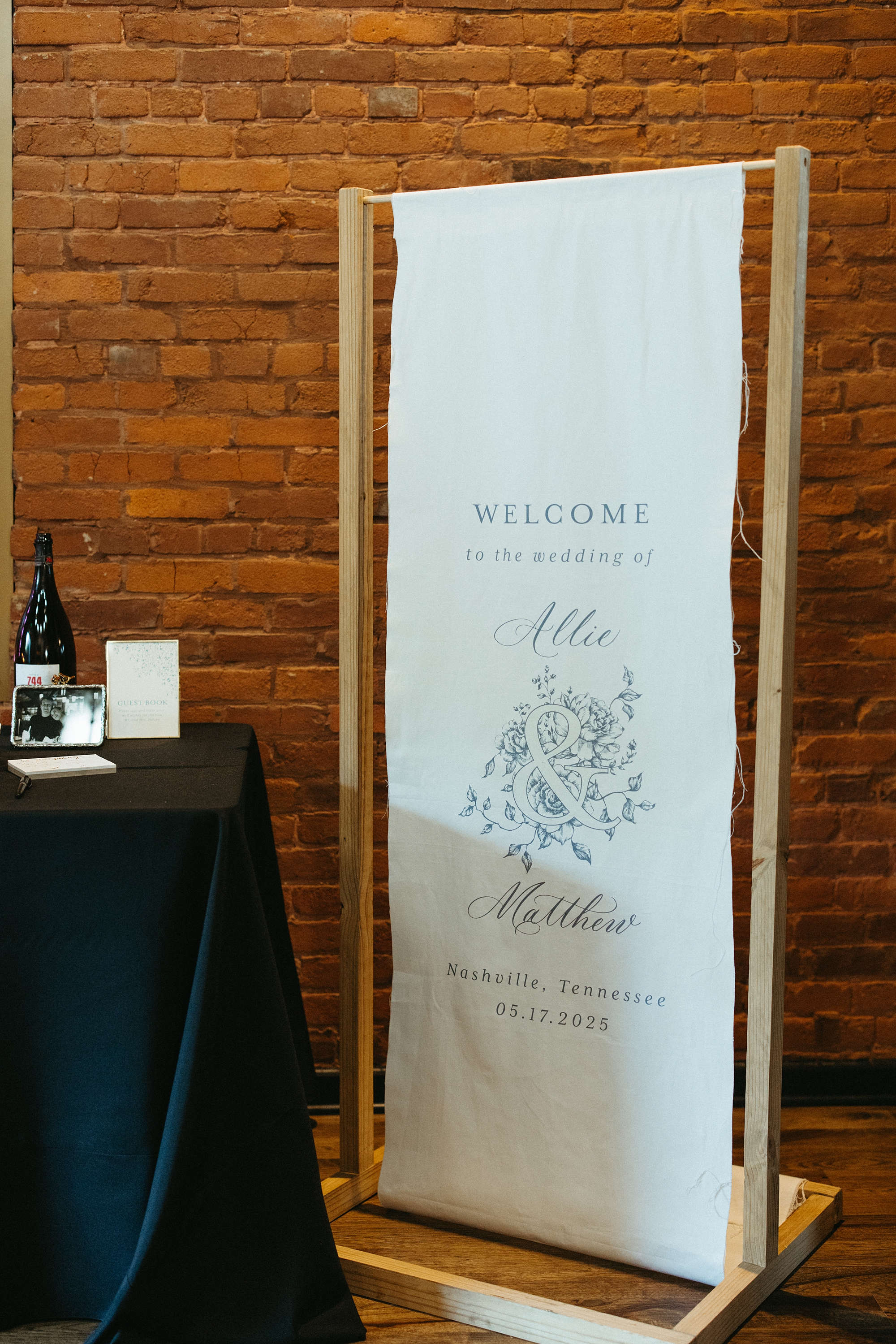
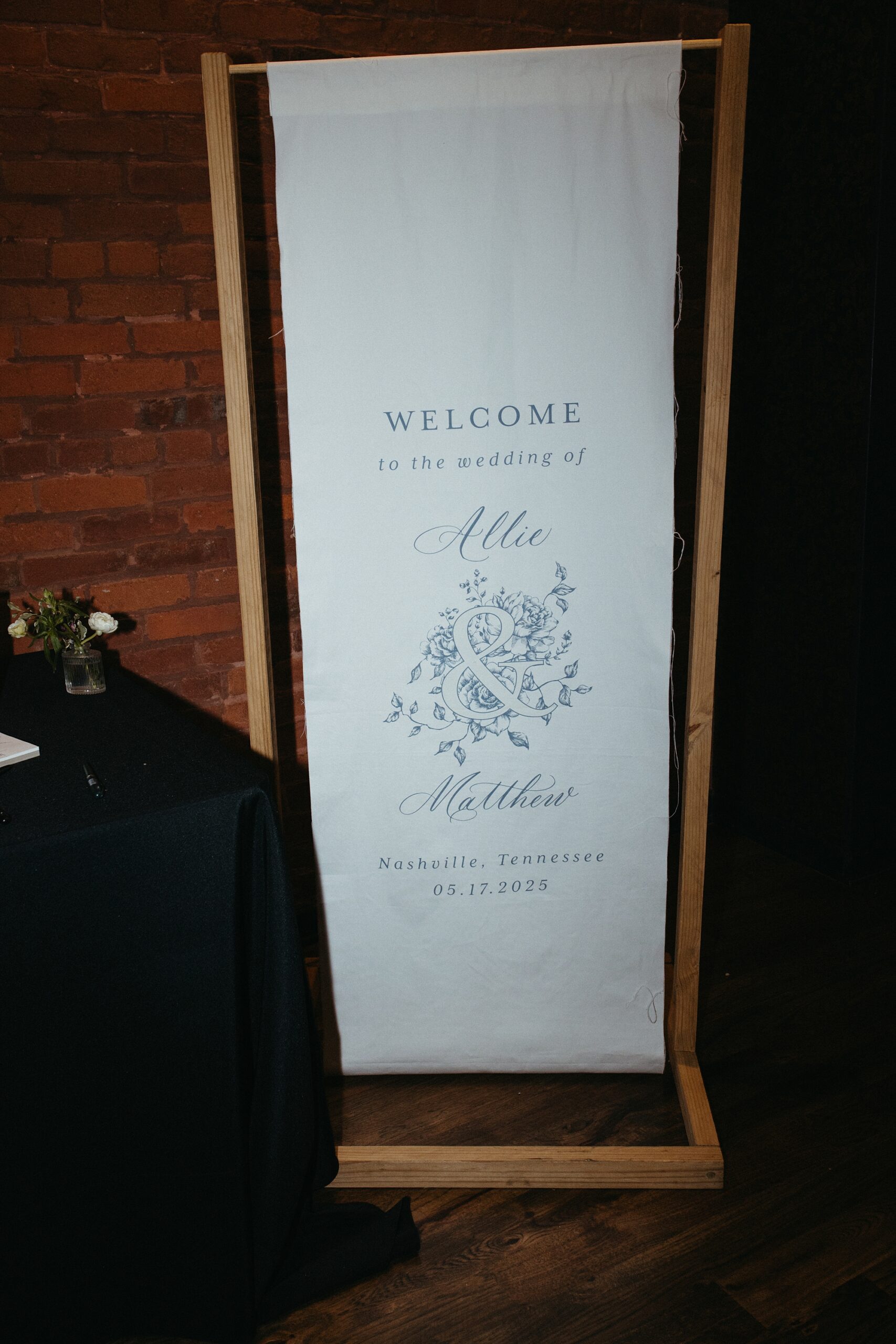
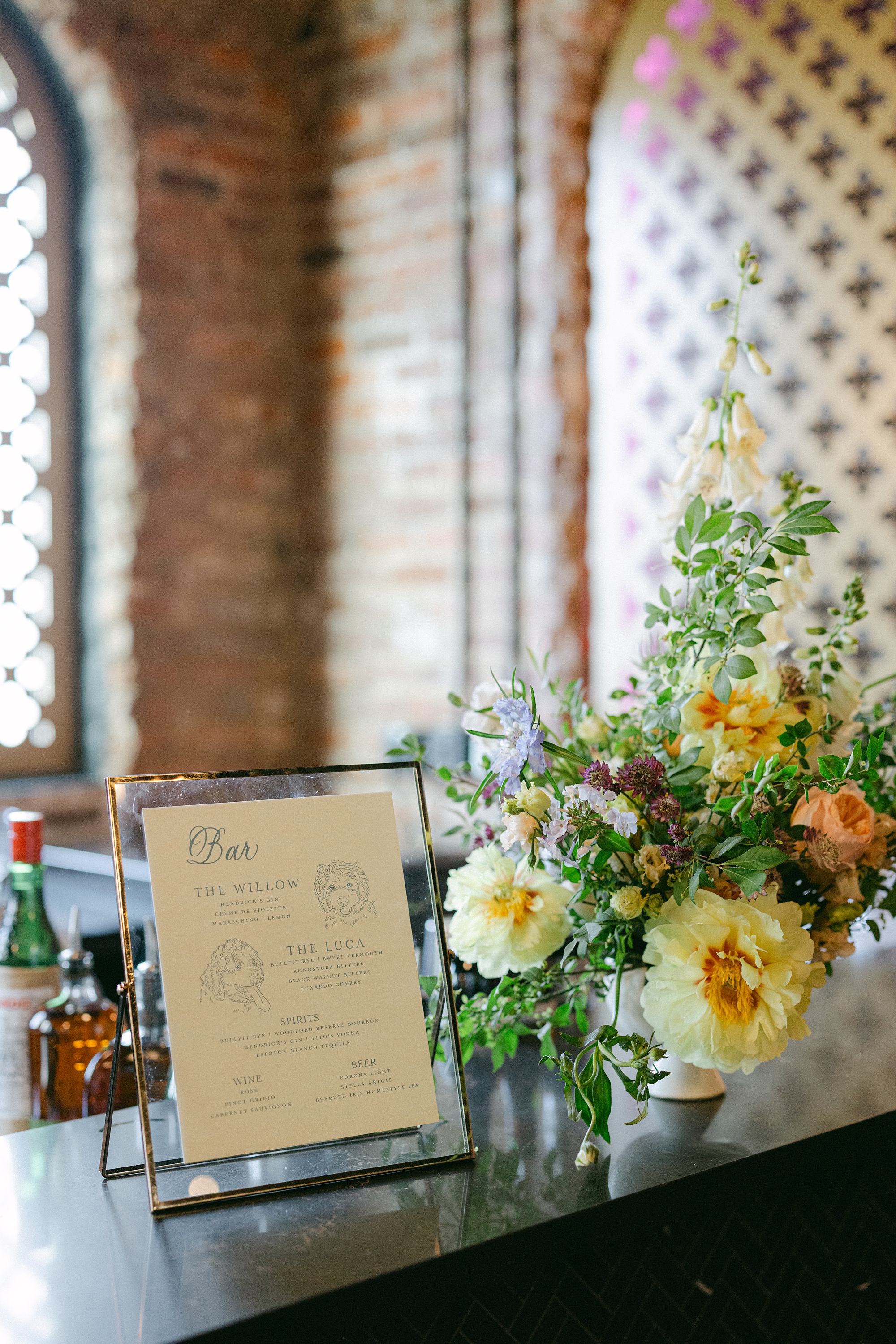
Beyond the invitations and seating chart, we created several custom paper goods and signage to carry the couple’s aesthetic throughout the celebration. A white fabric wedding welcome sign with soft blue lettering set the tone from the moment guests arrived. Bar signage featured signature cocktails inspired by the couple’s beloved dogs, Willow and Luca, complete with hand-sketched portraits. It was a personal detail that had everyone smiling.
Menus and an Elegant Tablescape
Menus sat atop each place setting. The pink, floral patterned plates and gold cutlery added a pop of color to tables draped in textured white linens and surrounded by soft blue chairs. Candlelight and romantic floral centerpieces tied everything together for an atmosphere that was both inviting and elegant.
From the custom invitation suite to the unforgettable limoncello seating chart wall, every design choice reflected the couple’s personality and vision. This was so much fun to create and bring to life. Congratulations to the newlyweds!
If you’re planning a wedding in Nashville, or anywhere in the world, we’d love to help you create meaningful, personalized stationery and event details that tell your story. We work with couples worldwide to design details you and your guests will remember forever. Reach out today to learn more about our full-service wedding and event design offerings! We can’t wait to create something unforgettable for you!
If you enjoyed this post, you’ll love these other blogs!
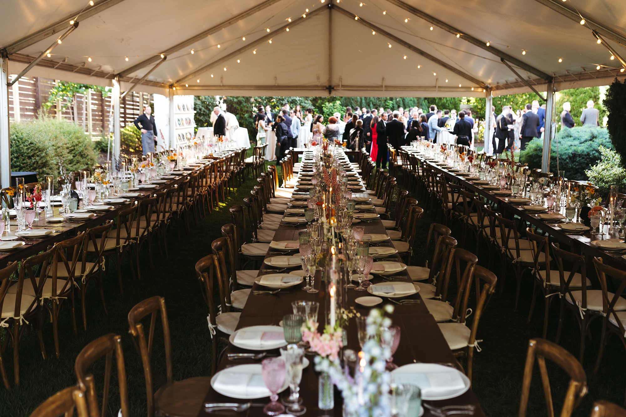
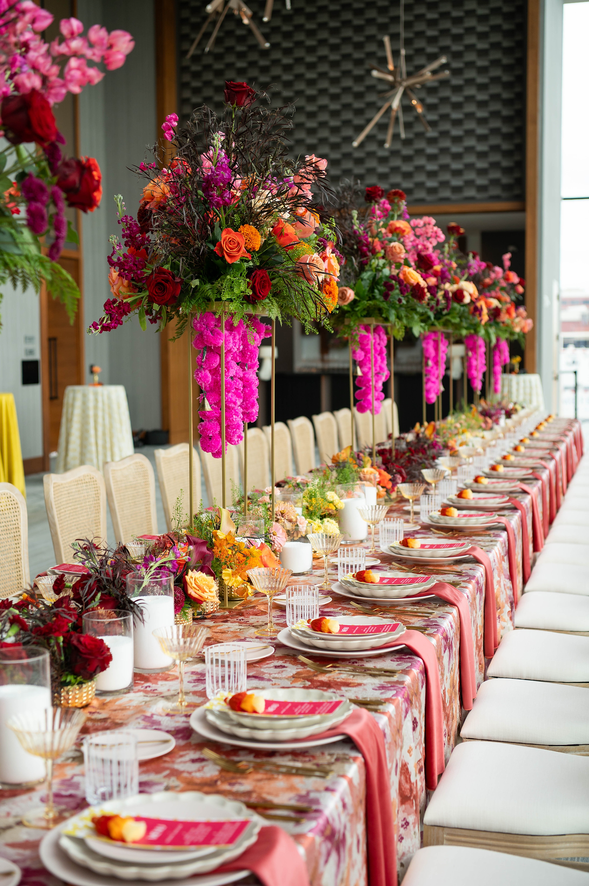
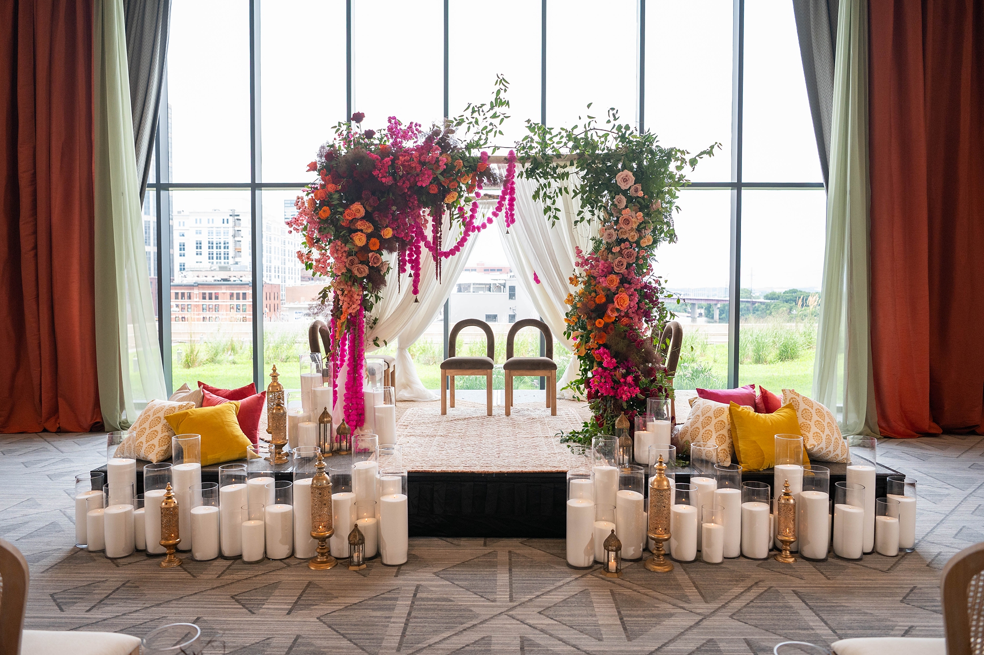
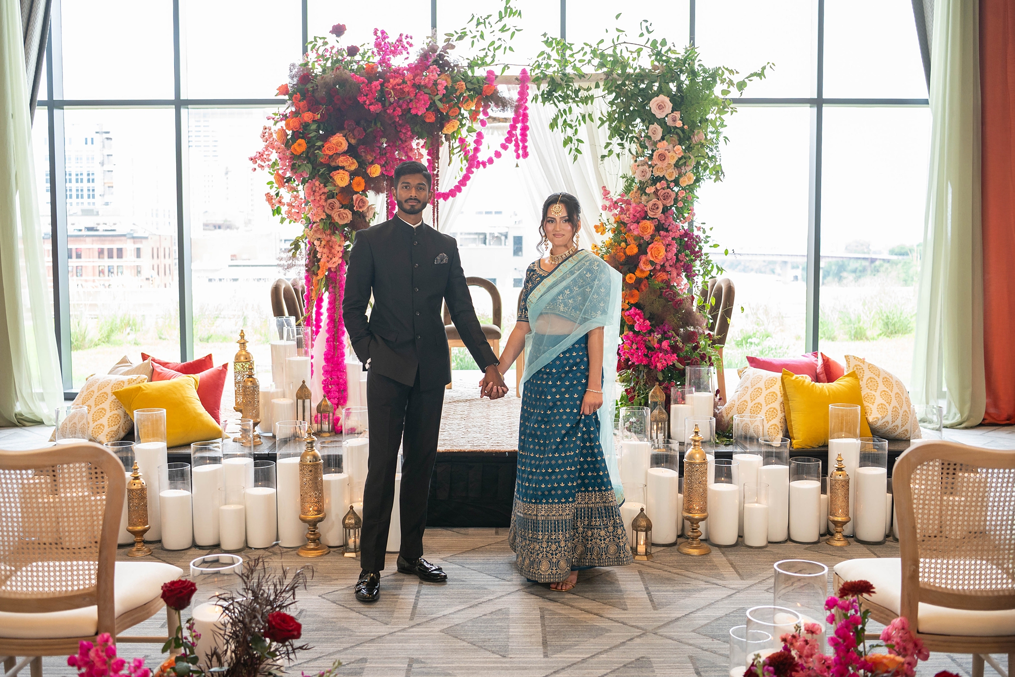
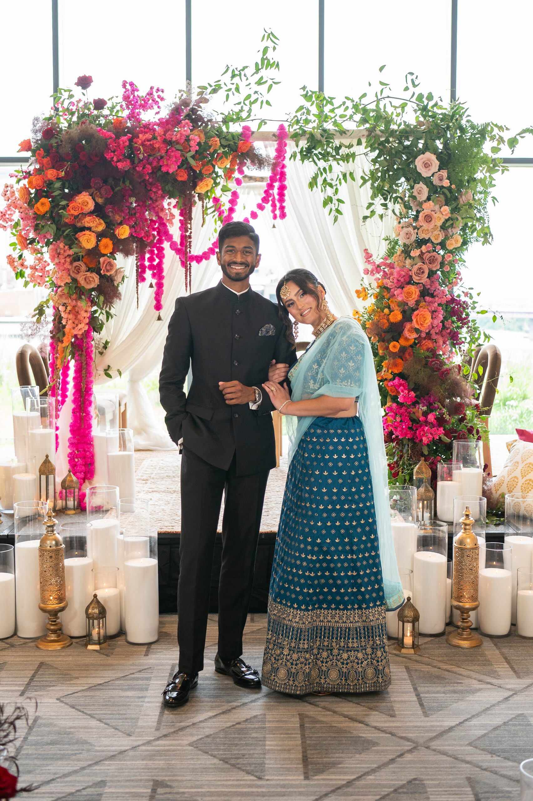
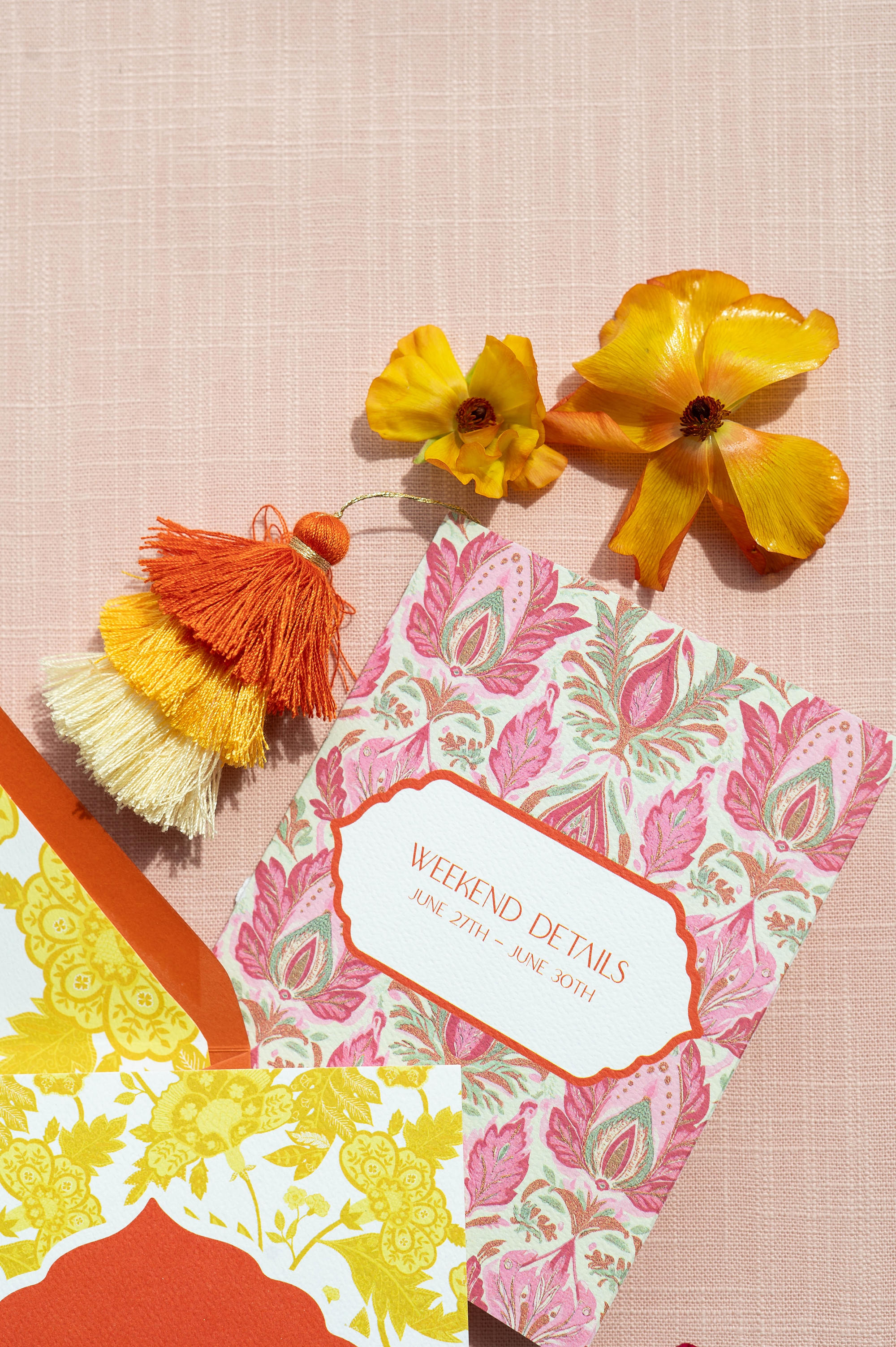
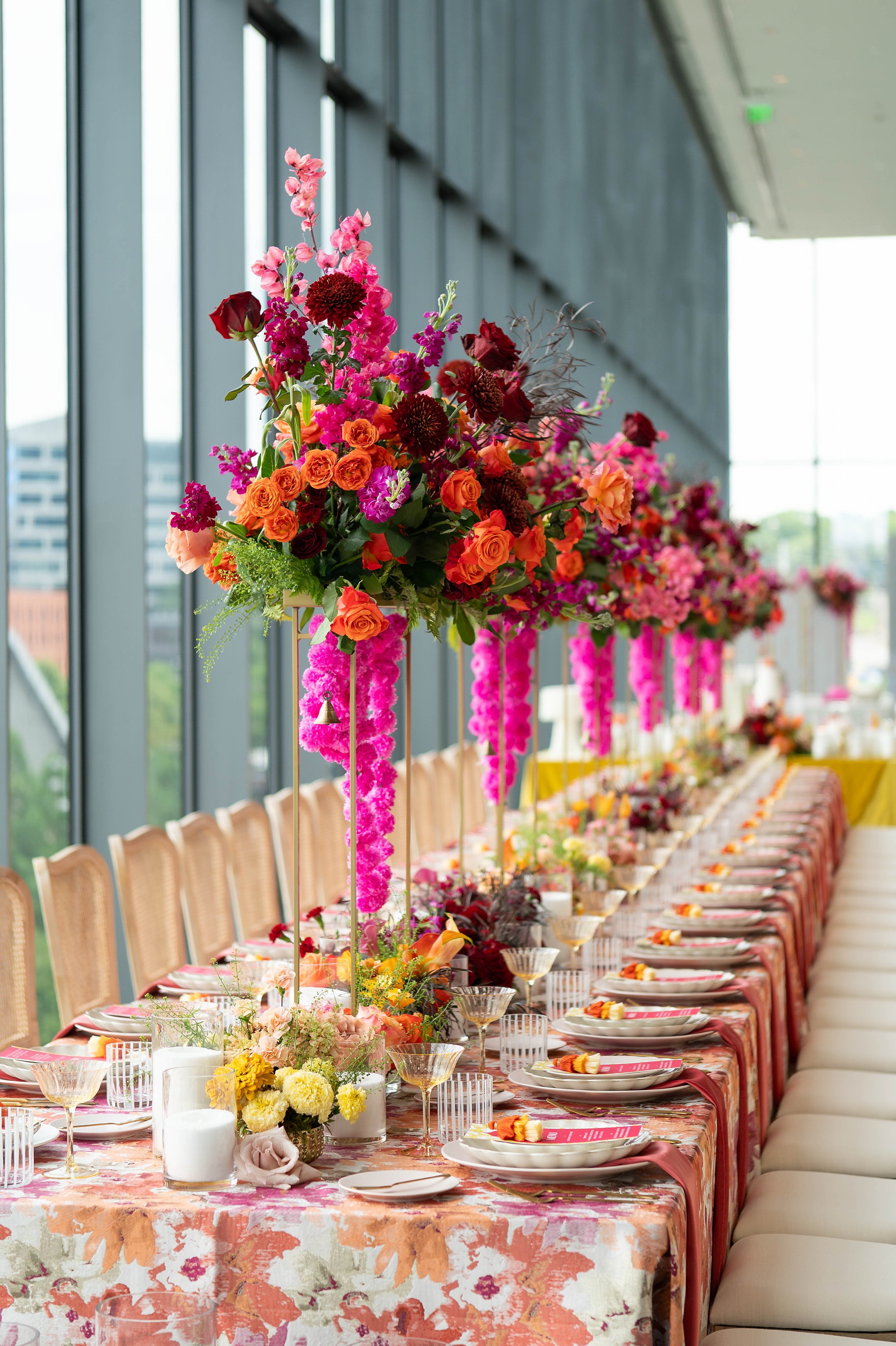
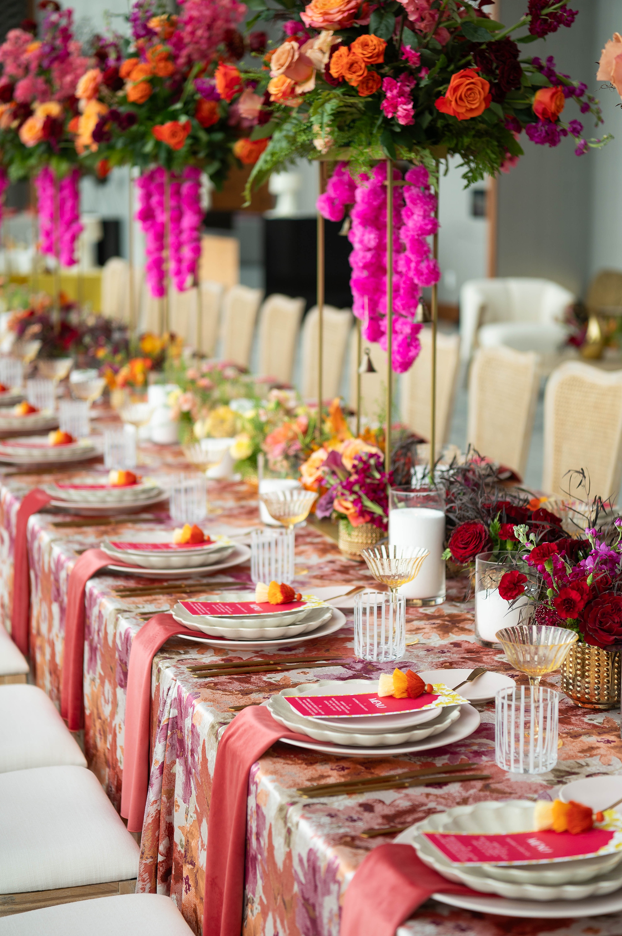
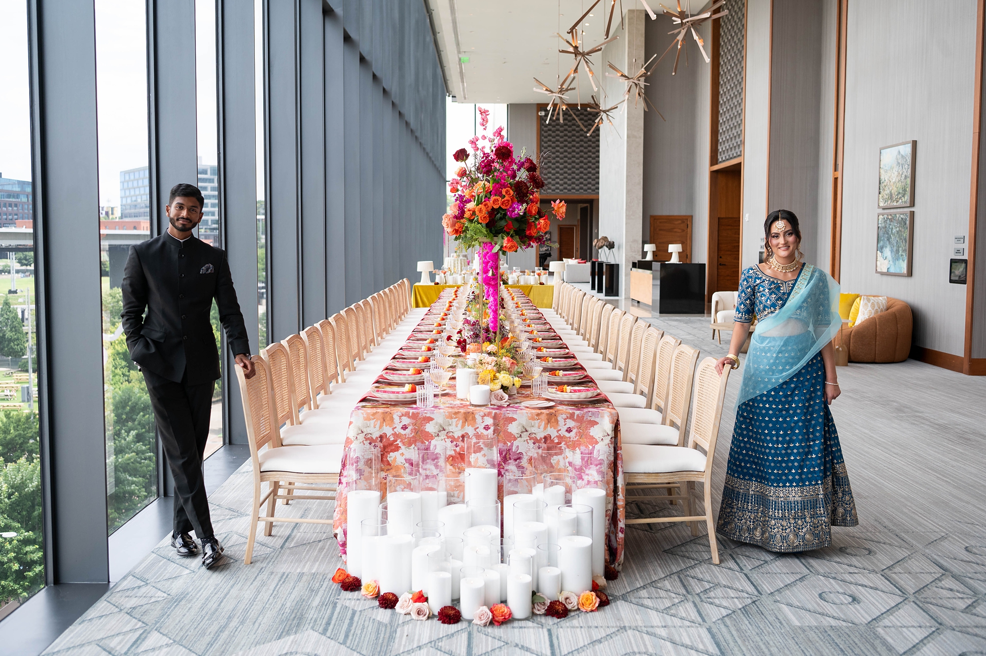
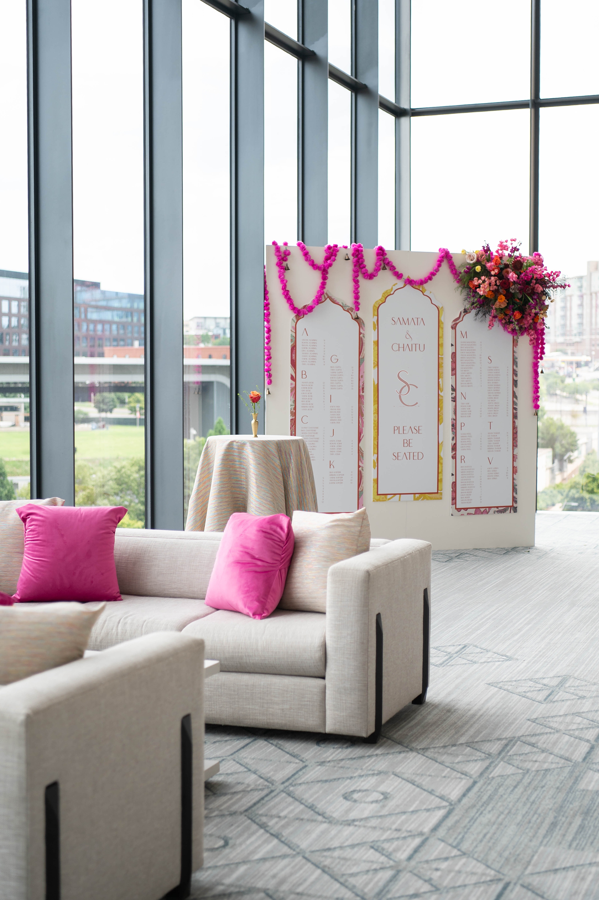
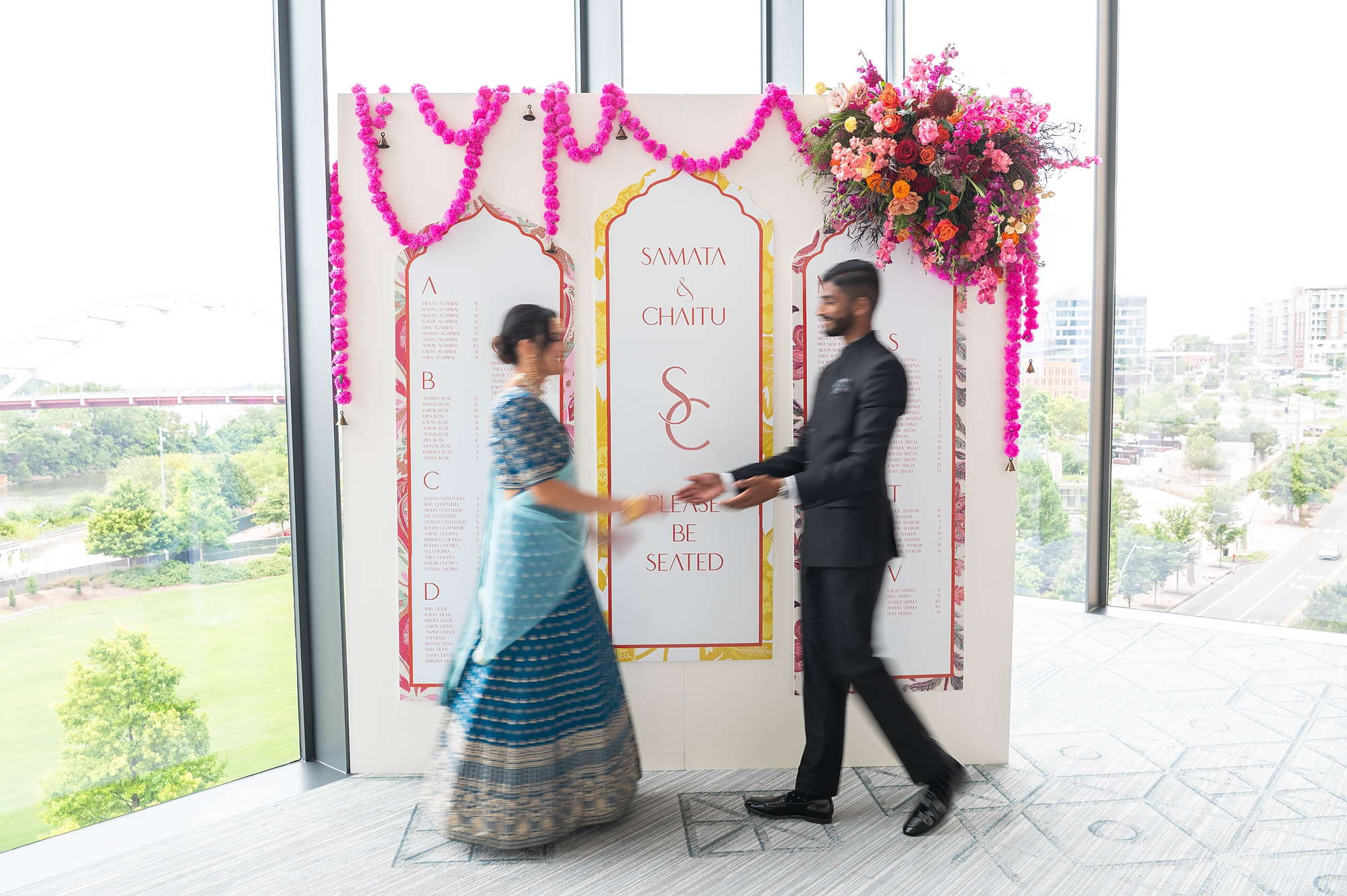
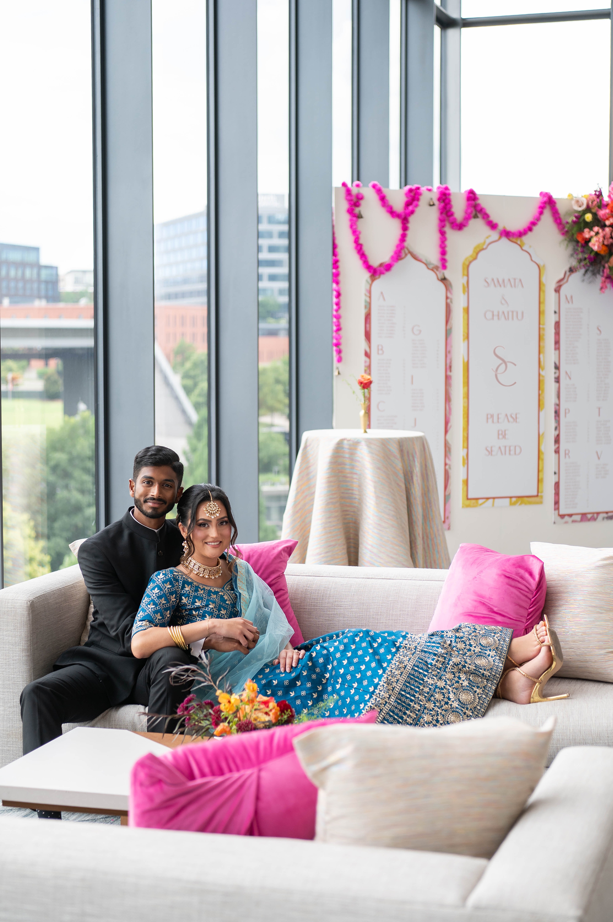
When it comes to wedding design, few things are as breathtaking as the bold colors and traditions of South Asian weddings. This luxury styled wedding at Four Seasons Hotel in Nashville, planned by Let’s Do this Events, was the perfect celebration of vibrancy, culture, and elegance. With an incredible vendor team and a stunning vision, the day overflowed with bright pinks, oranges, yellows, and rich details that set the stage for a joyful and vibrant Hindu wedding.
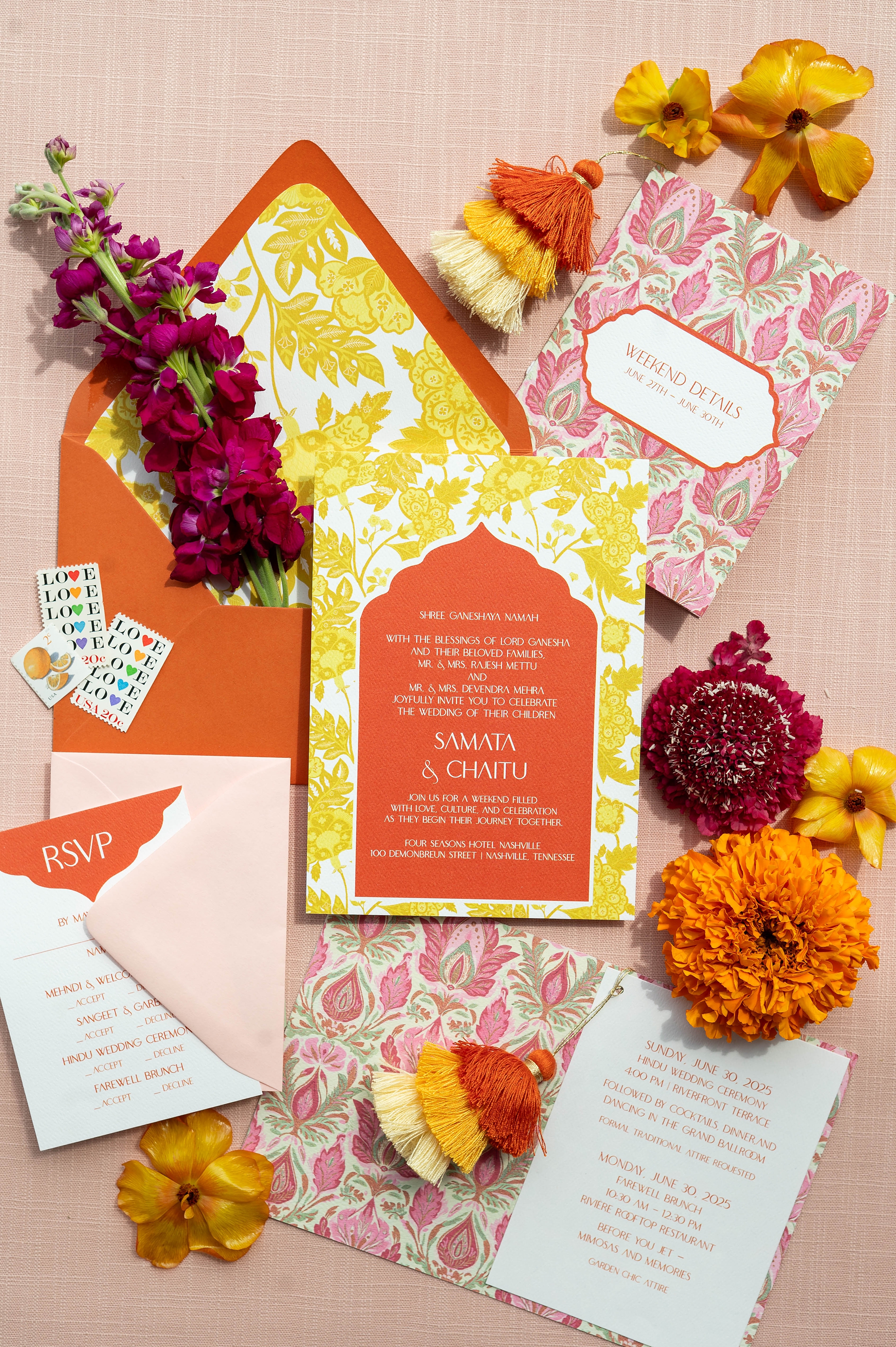
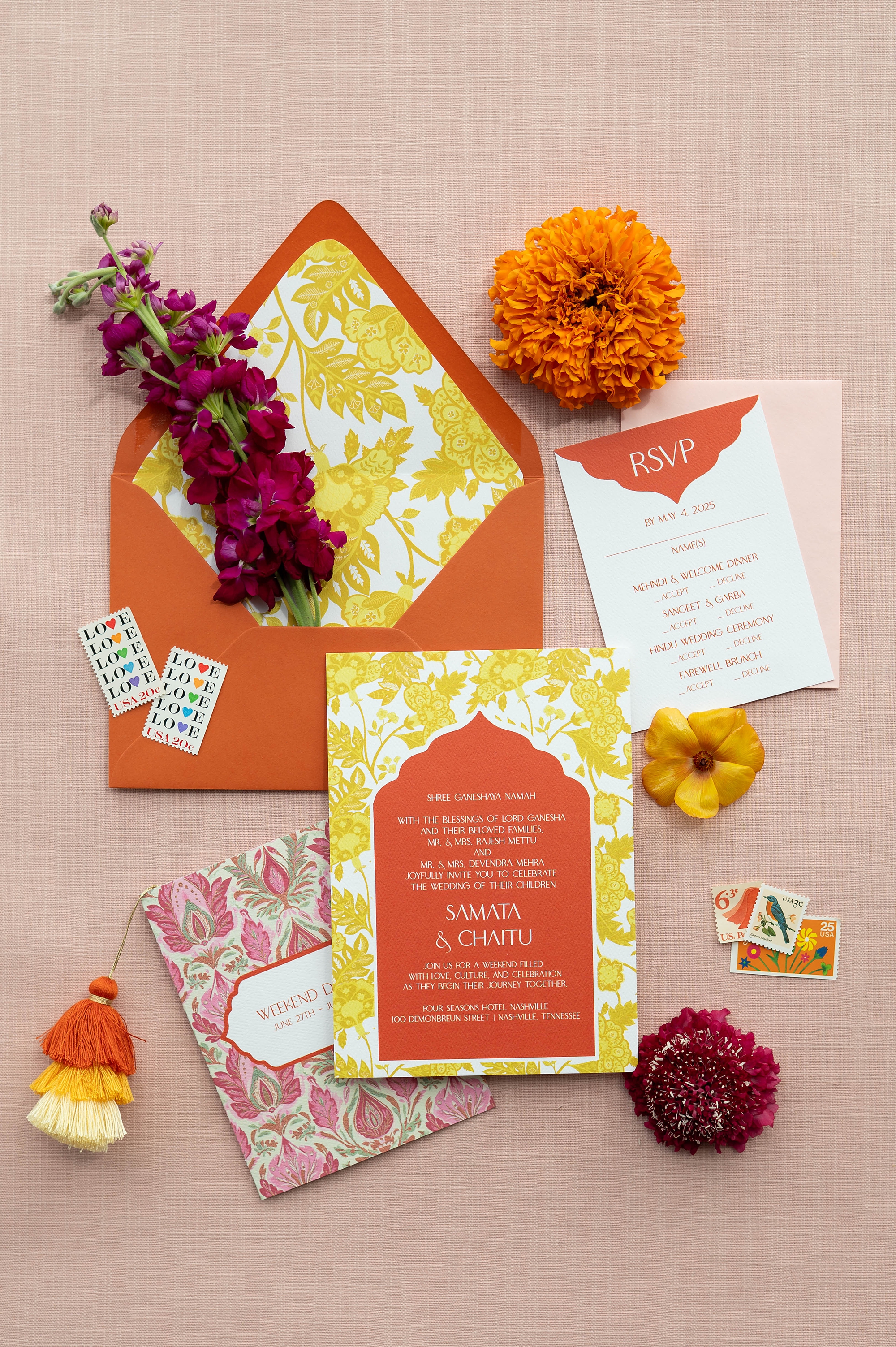
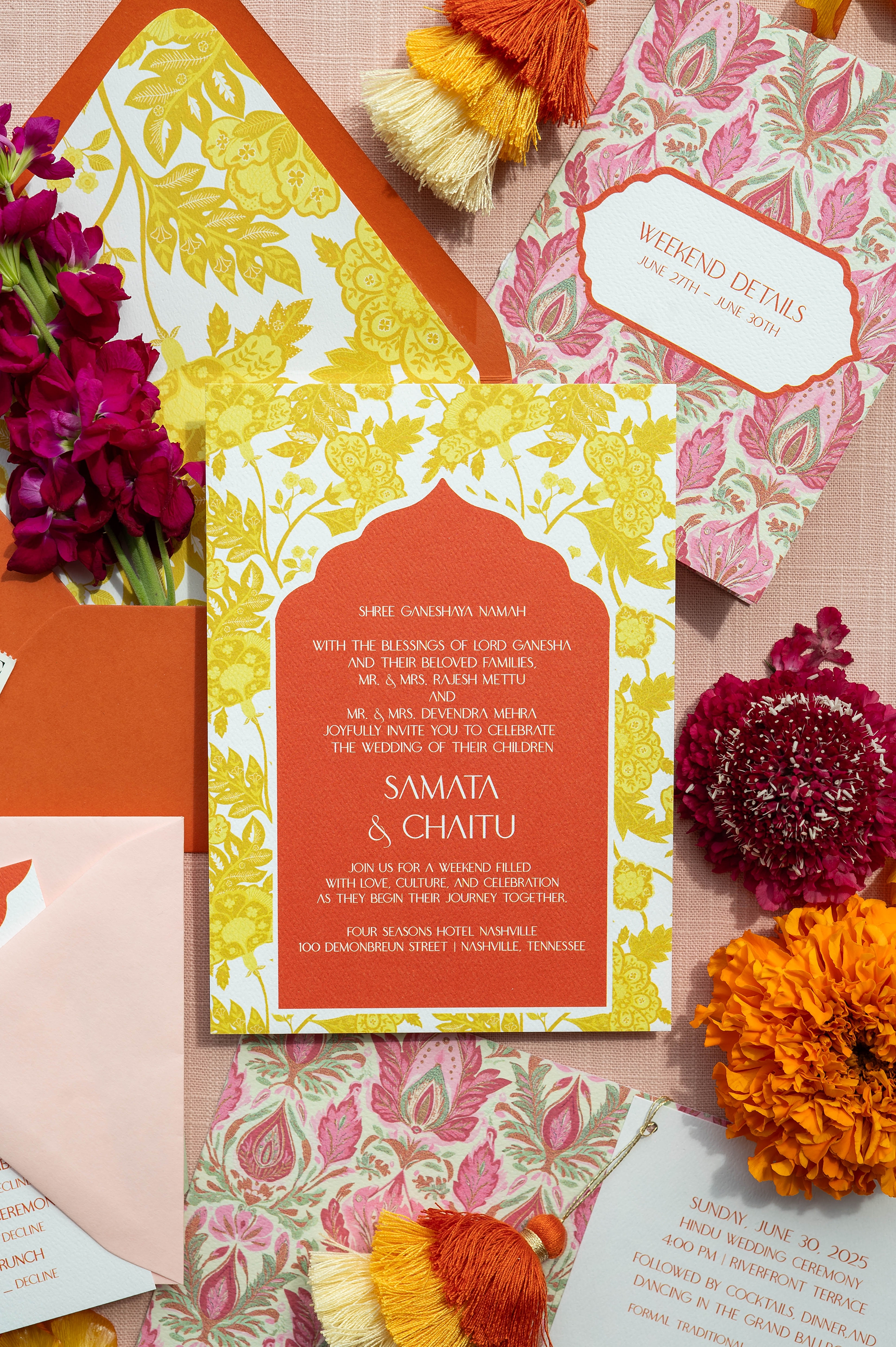
An Invitation Suite Full of Color
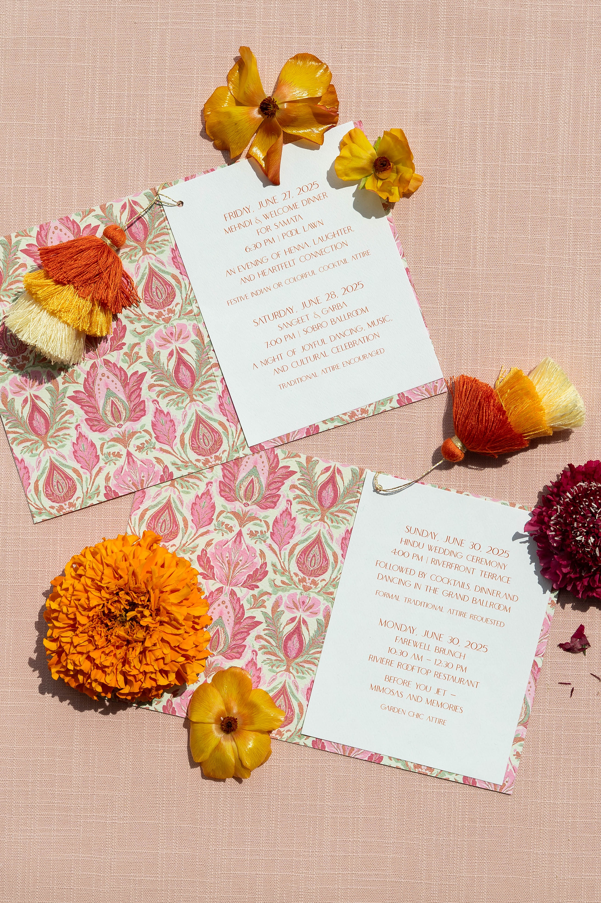
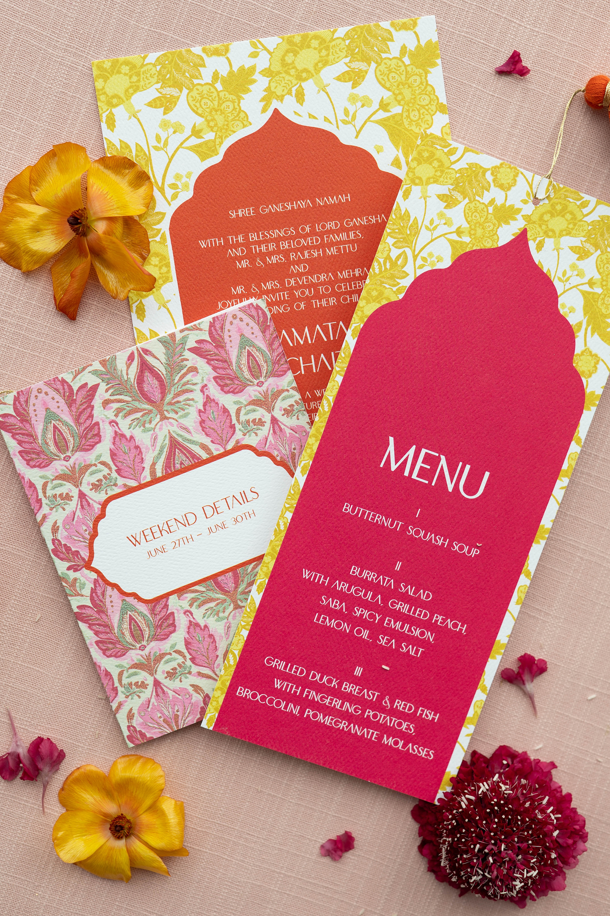
For this editorial, we designed a stationery collection that embraced bold color and cultural patterns in a modern, luxurious way. The invitation suite began with an orange envelope, paired with a striking yellow patterned envelope liner. That same yellow pattern became the base of the invitation, creating a cohesive and eye-catching design.
We layered orange paper to match the envelope and lettered the details in crisp white calligraphy. A standout detail was the wedding weekend Details booklet, which featured a pink and light green paisley motif accented with orange, yellow, and cream ombre pom poms attached by hand. This touch added personality, texture, and fun.
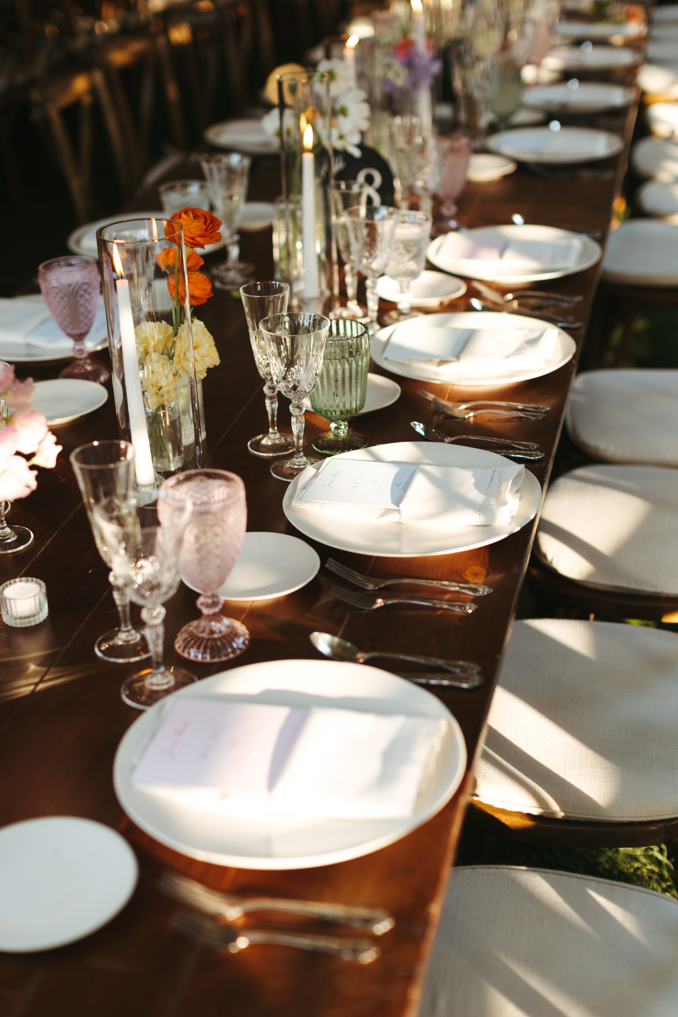
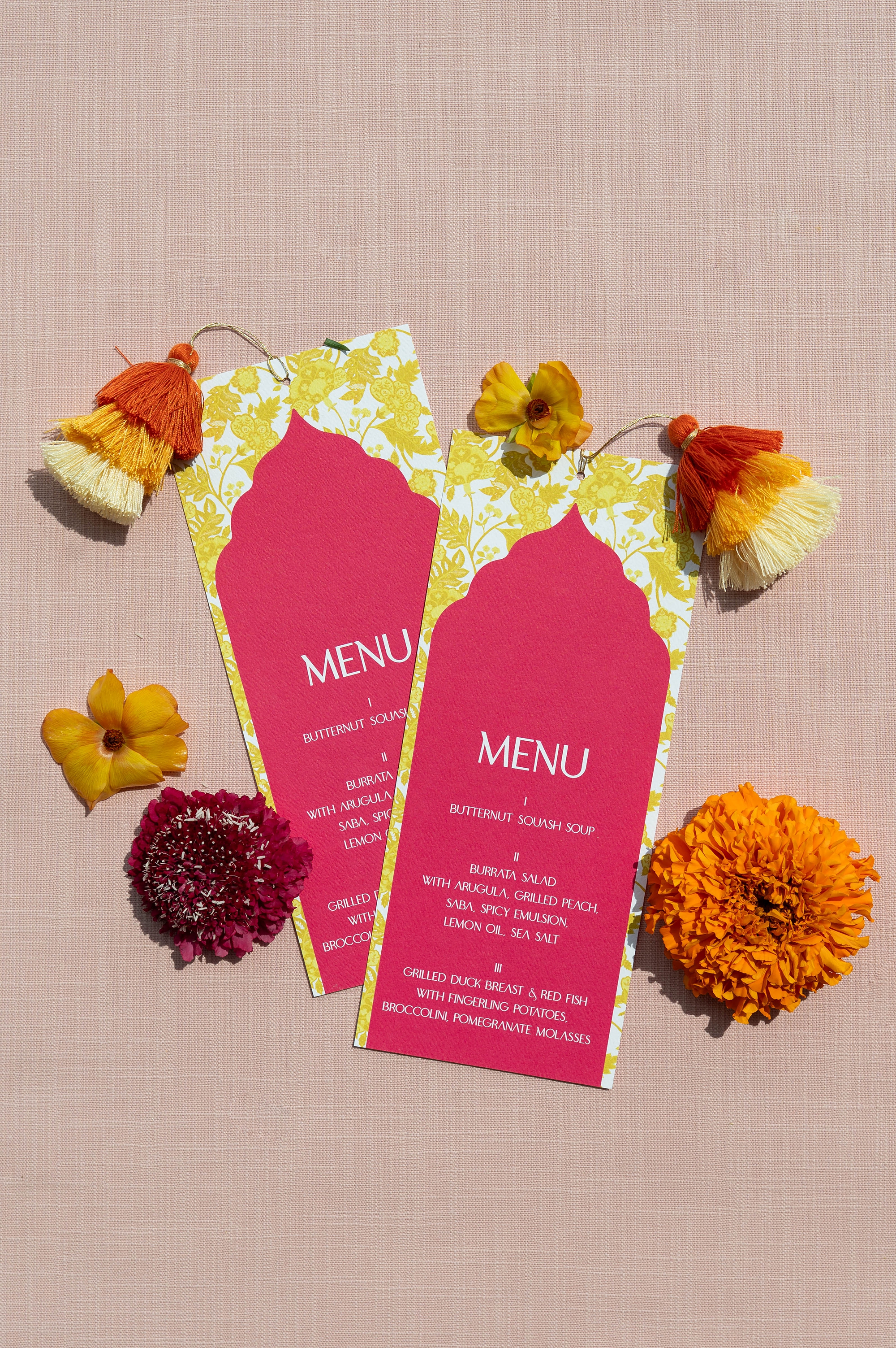
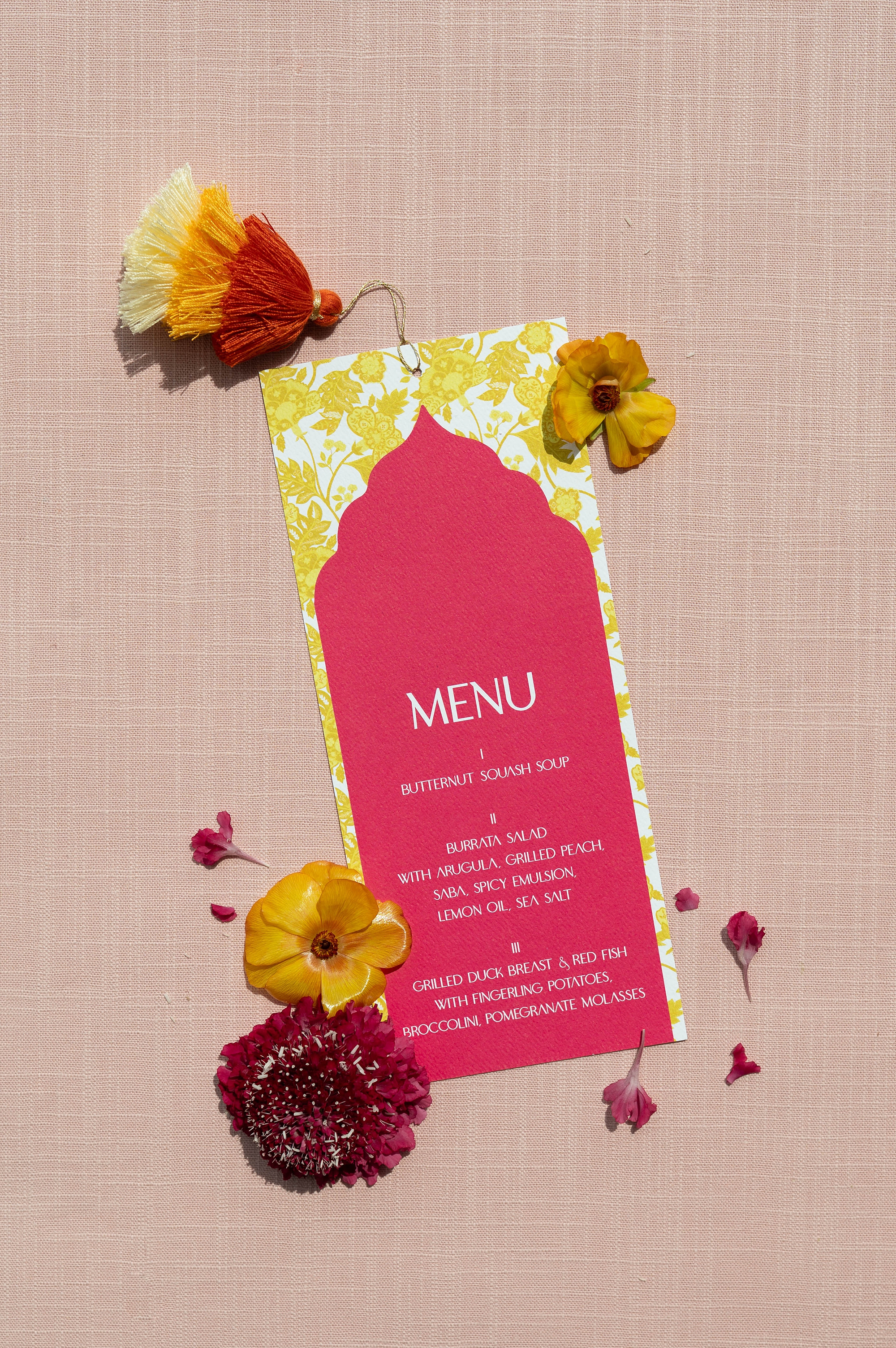
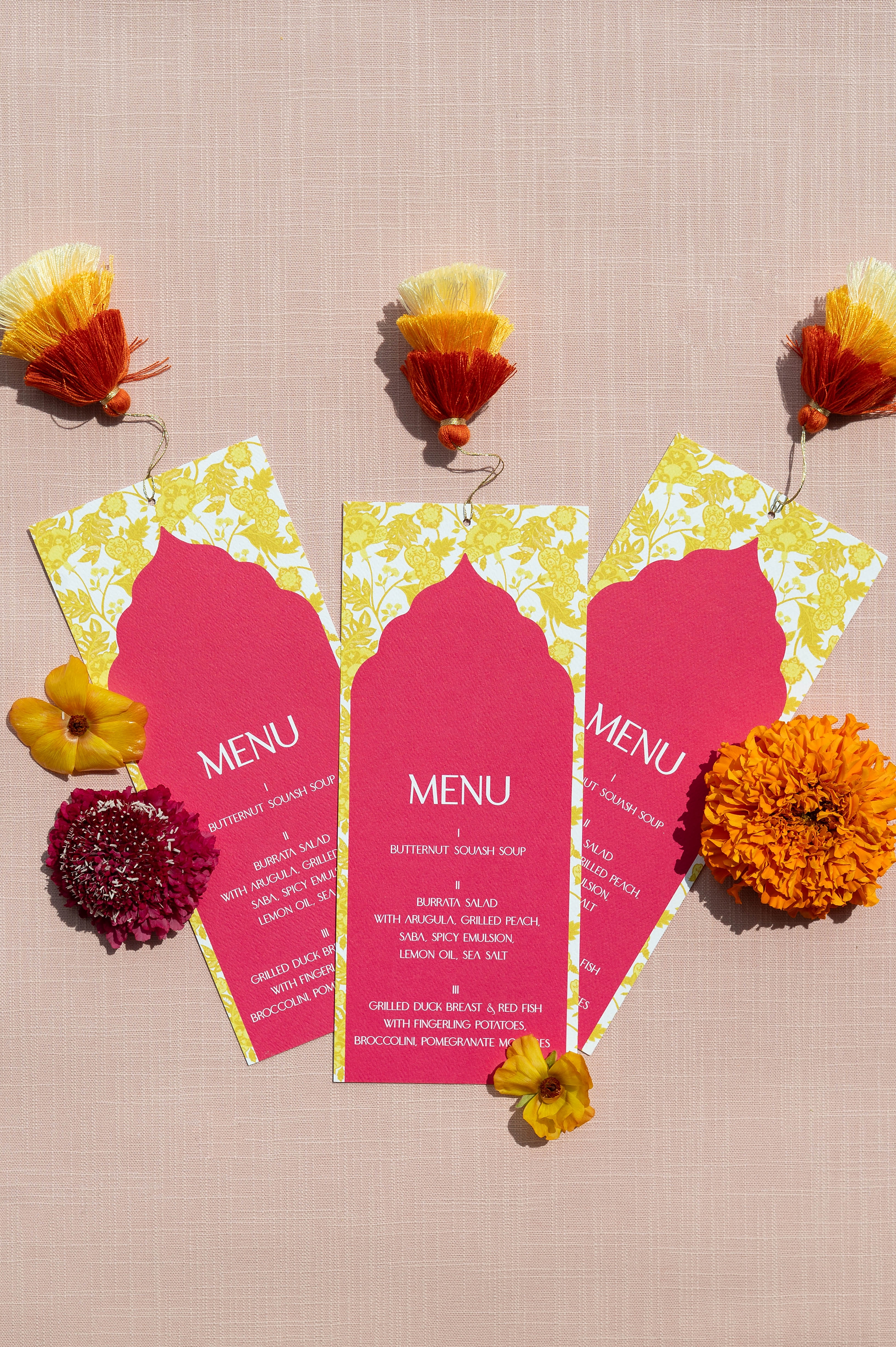
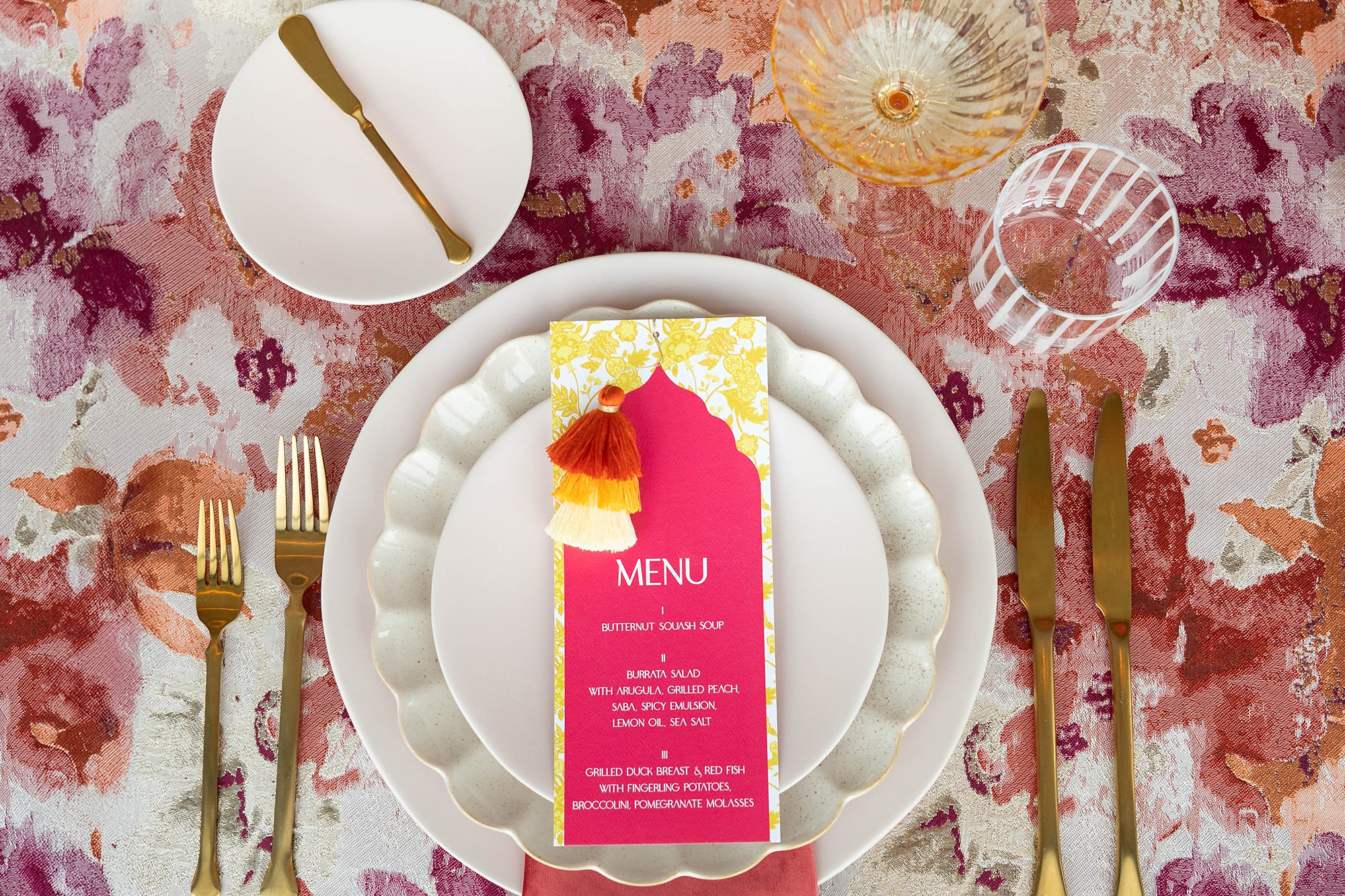
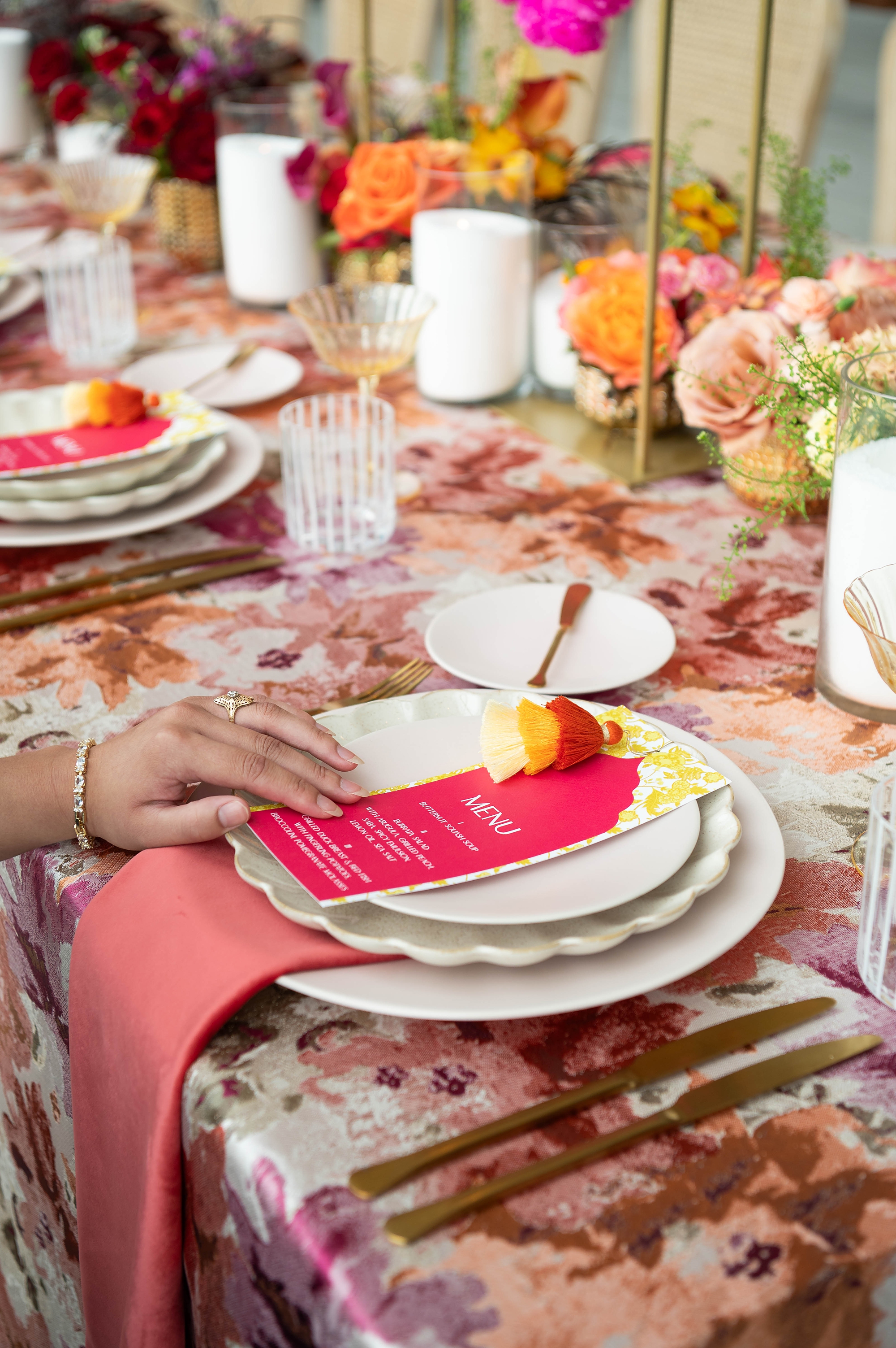
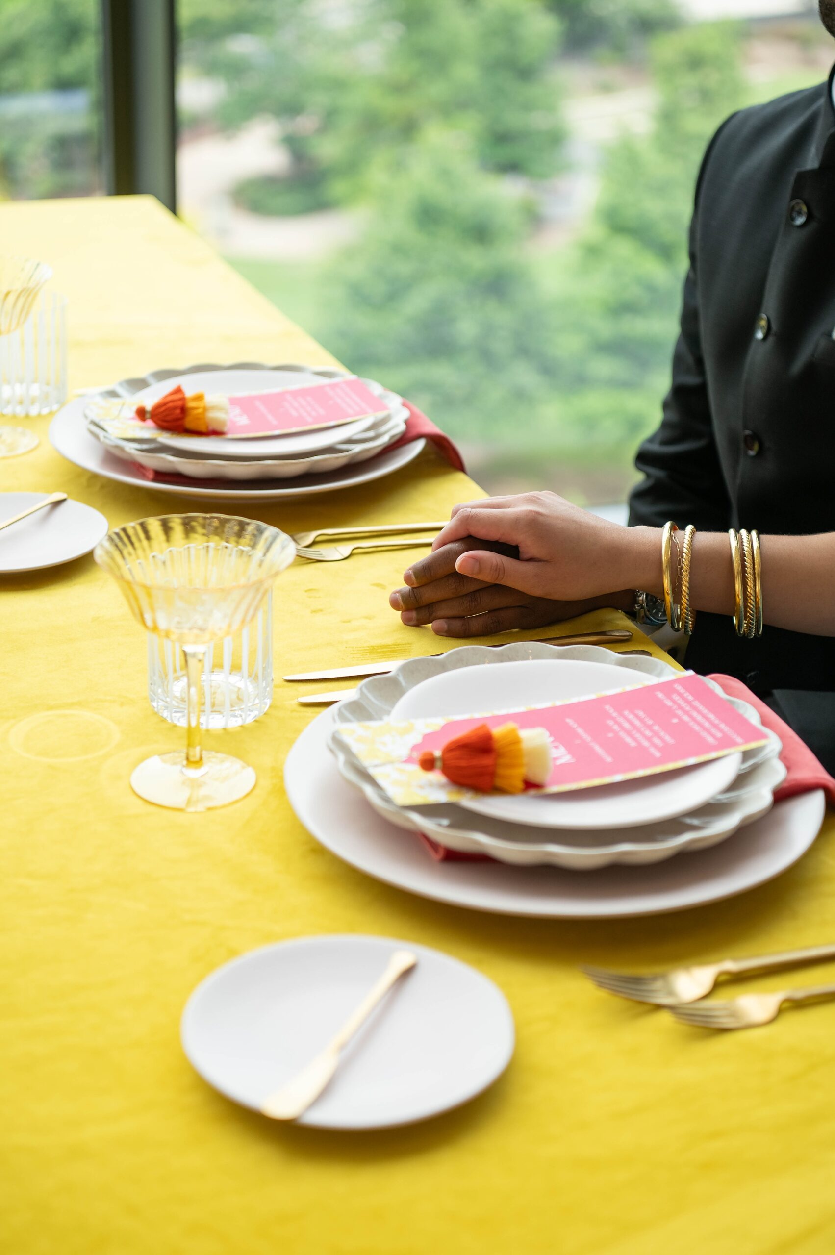
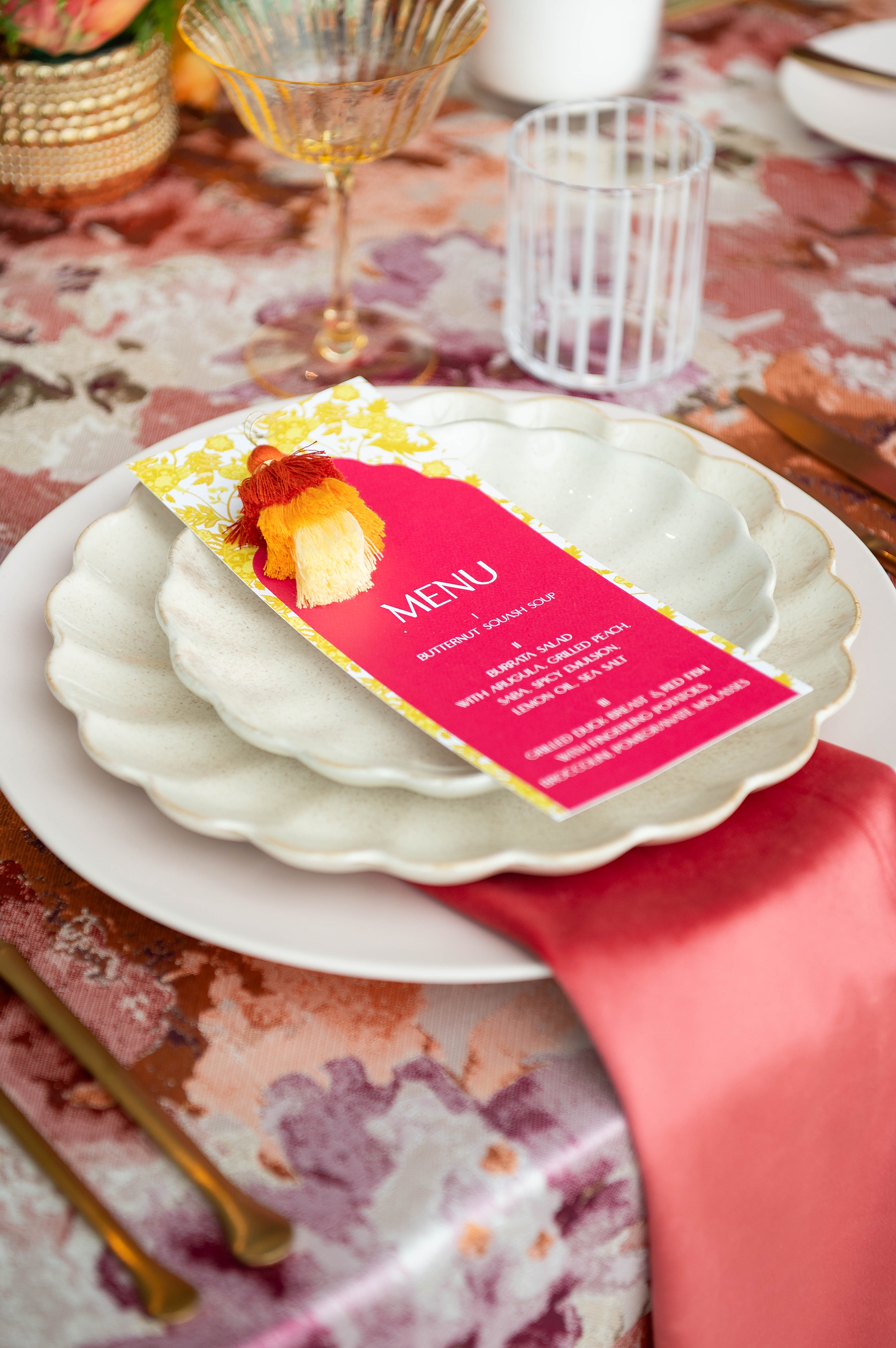
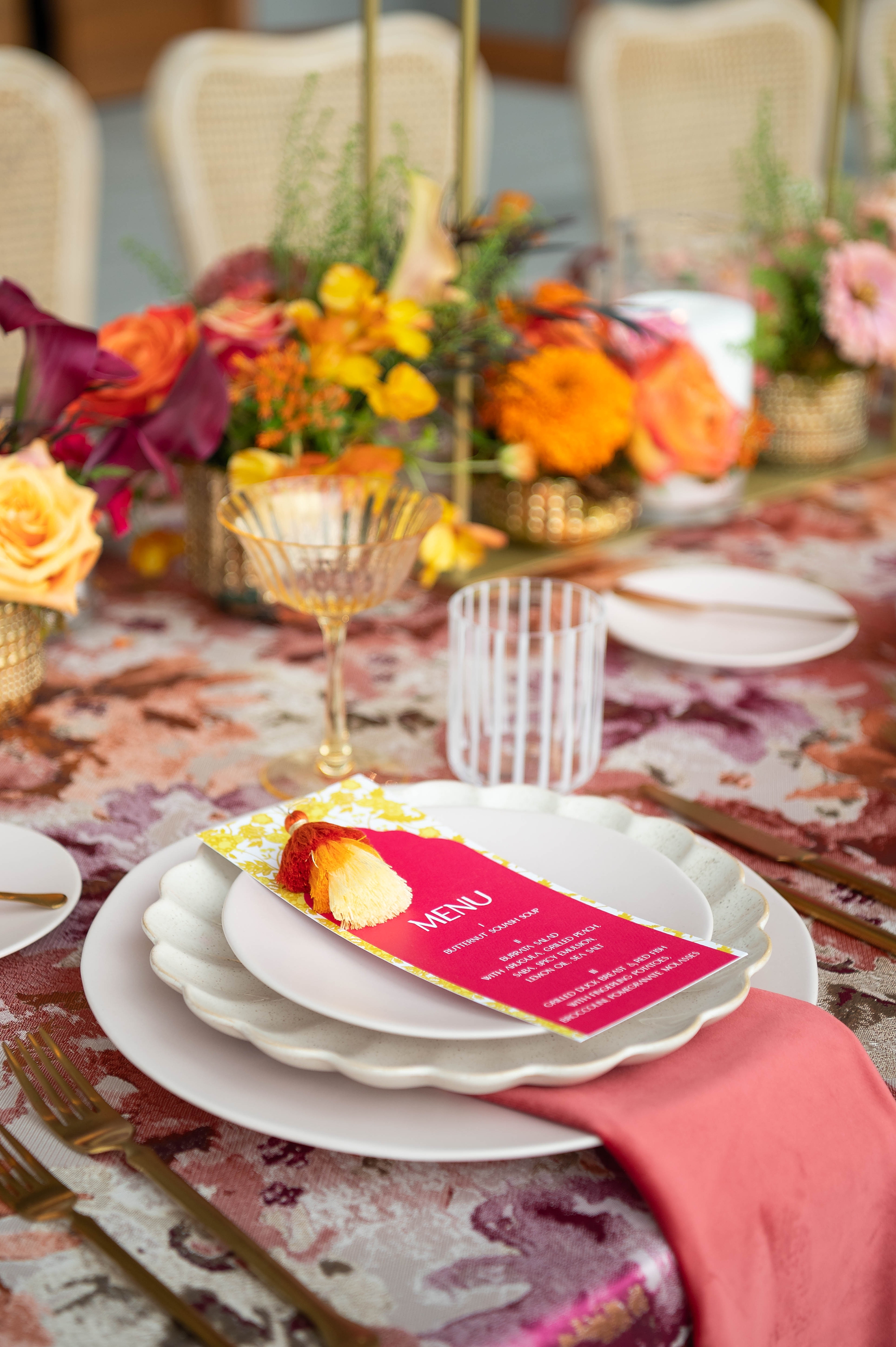
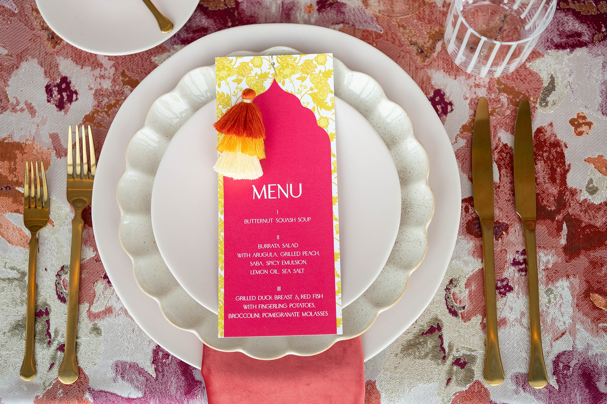
Custom Menus
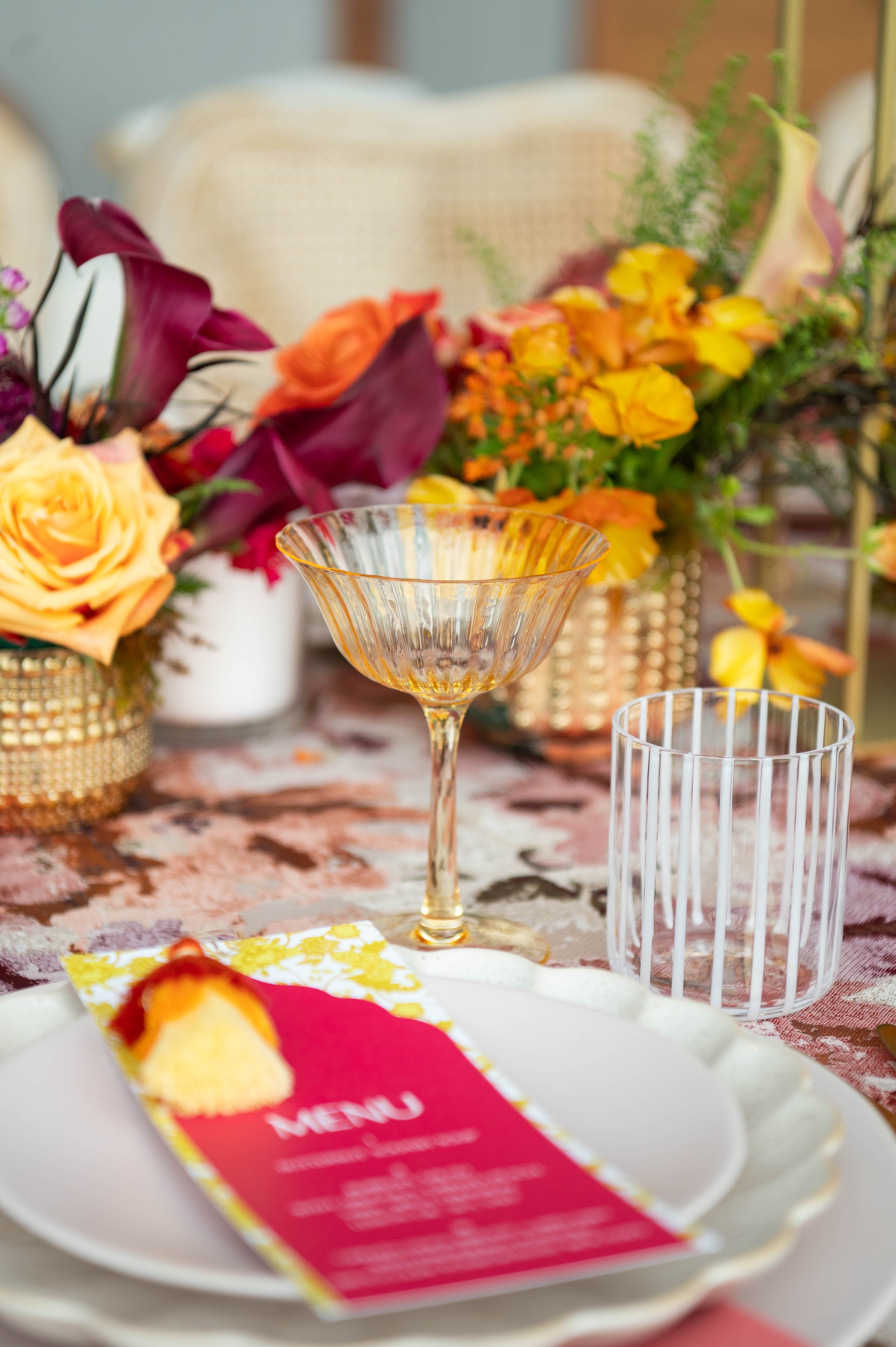
To carry the design through the reception, we created custom menus that incorporated the same yellow pattern from the invitation suite. Each menu featured a layered look with yellow patterned paper beneath bold pink cardstock, topped with elegant white lettering. Of course, the menus wouldn’t be complete without their playful touch – more ombre pom poms!
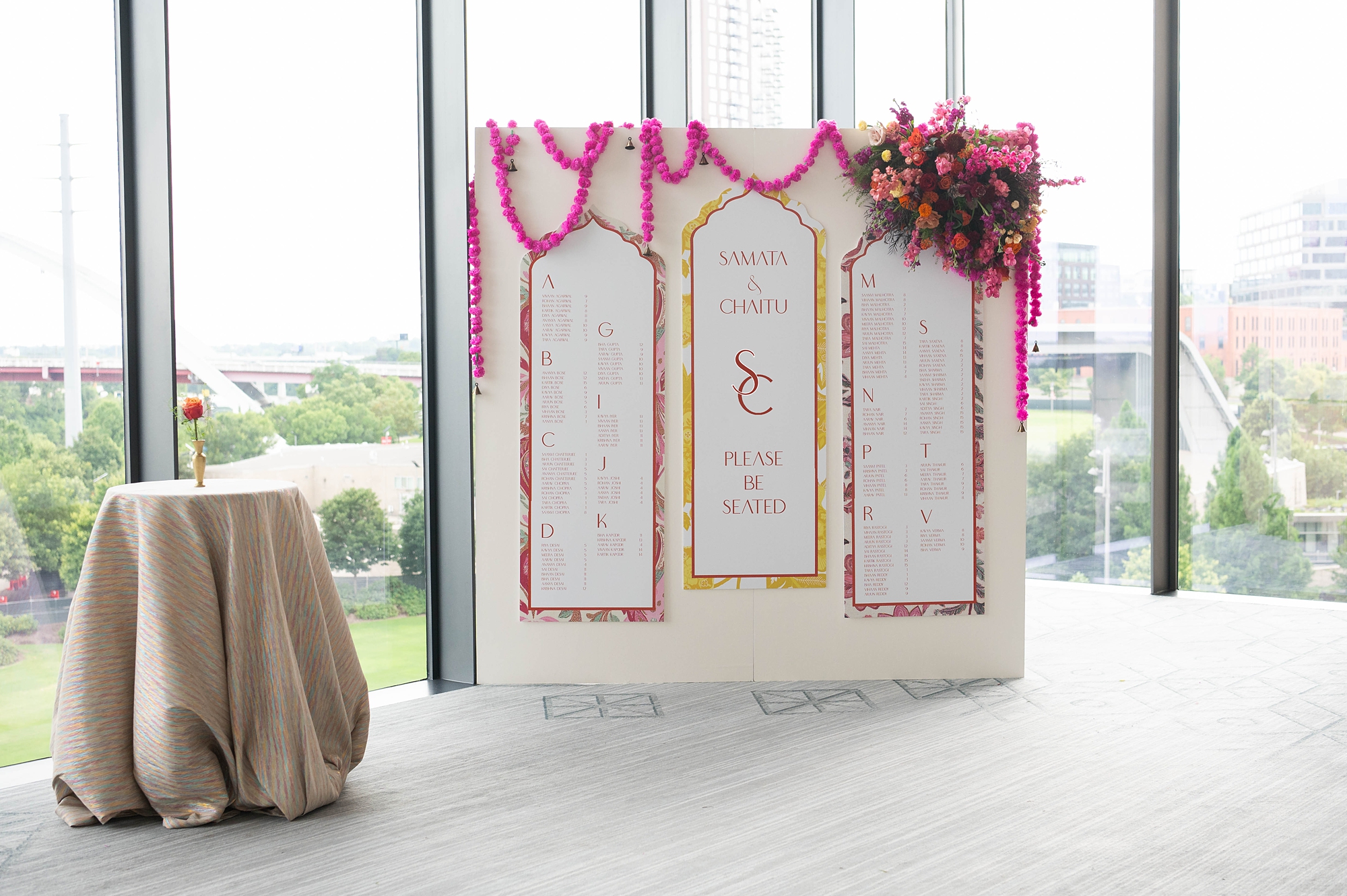
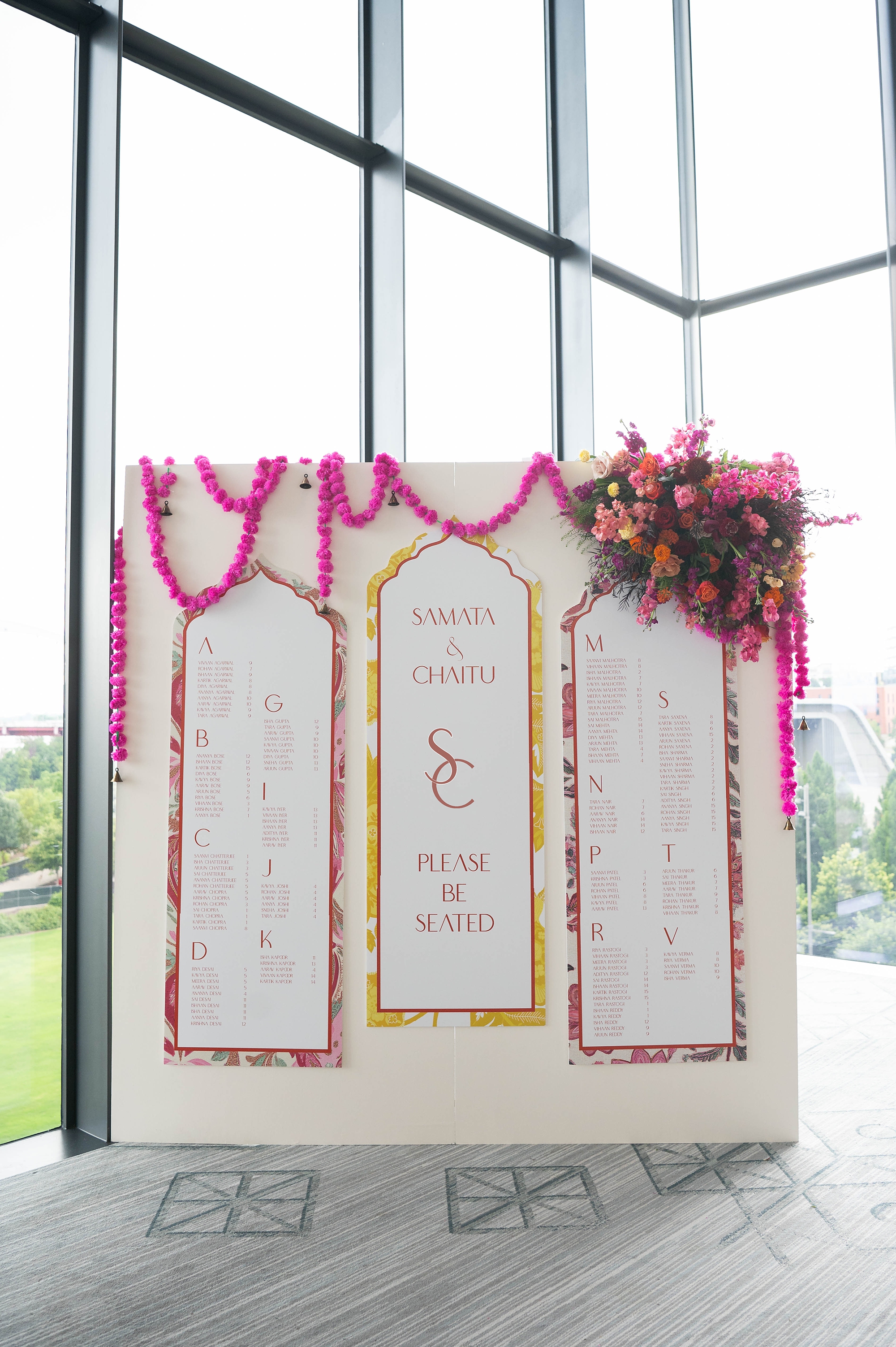
The Seating Chart
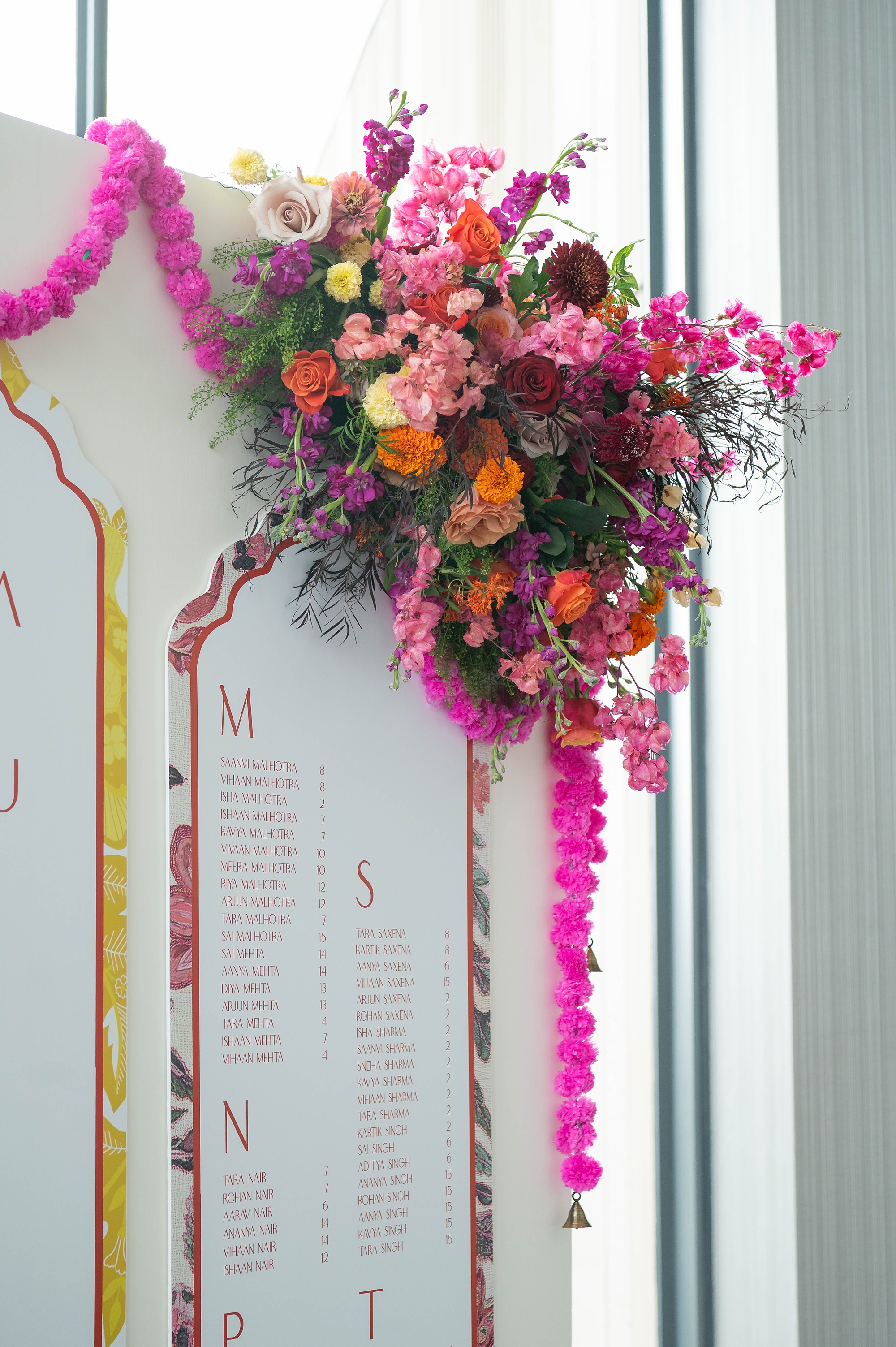
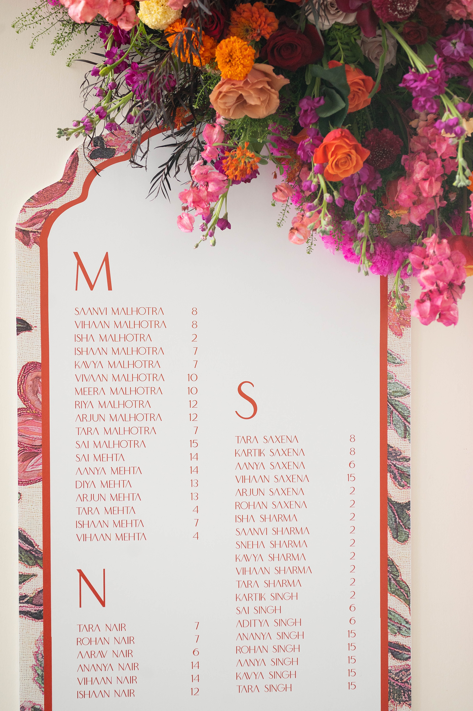
The seating chart wall was a true centerpiece of the event design. Each guest’s name was displayed in pink lettering on either side of the installation, bordered by the paisley design carried over from the stationery. In the center, the couple’s monogram, names, and “Please Be Seated” were framed by the same yellow pattern first introduced in the invitations.
The result was a luxury seating display that beautifully tied together the invitation suite, menus, and overall event design. Surrounded by bold floral arrangements in pinks, oranges, purples, and yellows, this installation made a lasting impression.
Cohesive Design from Start to Finish
From invitations to menus to the seating chart, the stationery details for this Four Seasons Nashville wedding were carefully curated to celebrate the colorful beauty of Hindu weddings while maintaining a luxurious, polished feel. We loved how each element echoed and complemented another.
It was such an honor to collaborate with an incredible team of vendors and to see our stationery designs and day of details come to life.
If you’re planning a wedding in Nashville, or anywhere in the world, we’d love to help you create meaningful, personalized stationery and event details that tell your story. We work with couples worldwide to design details you and your guests will remember forever. Reach out today to learn more about our full-service wedding and event design offerings! We can’t wait to create something unforgettable for you!
If you enjoyed this post, you’ll love these other blogs!