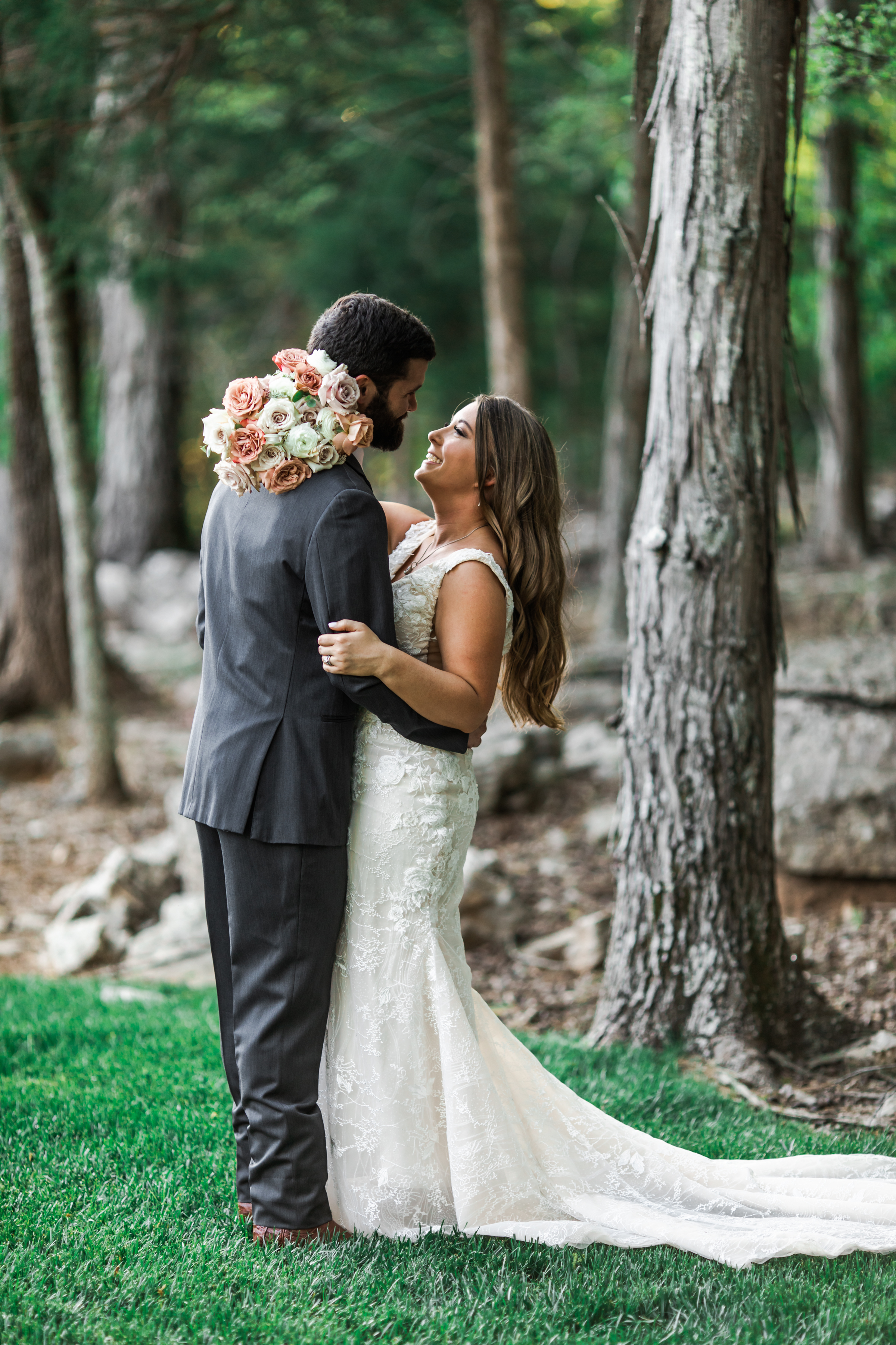
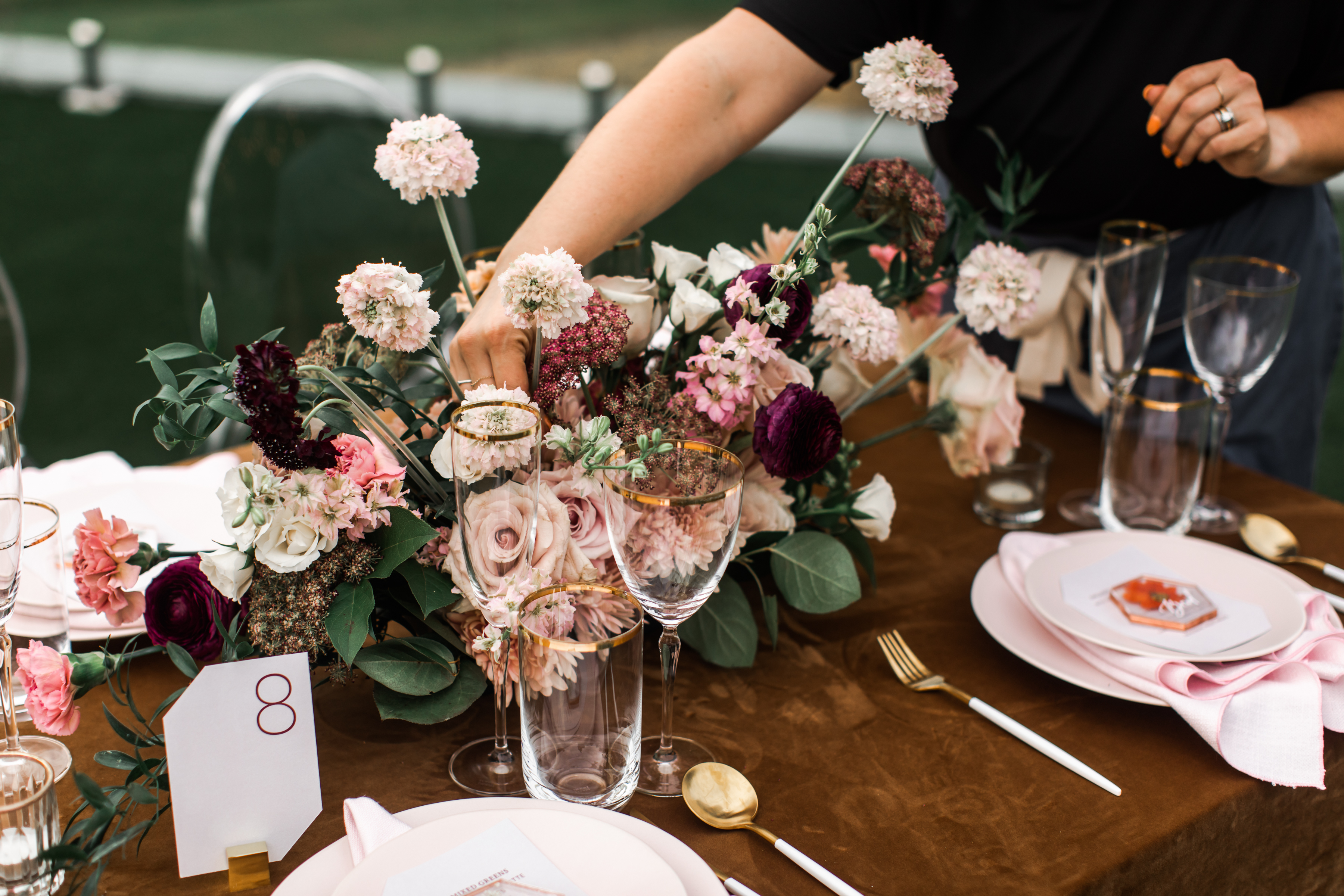
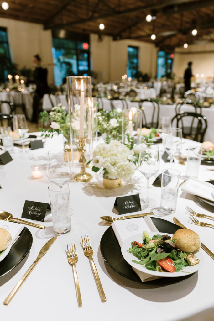
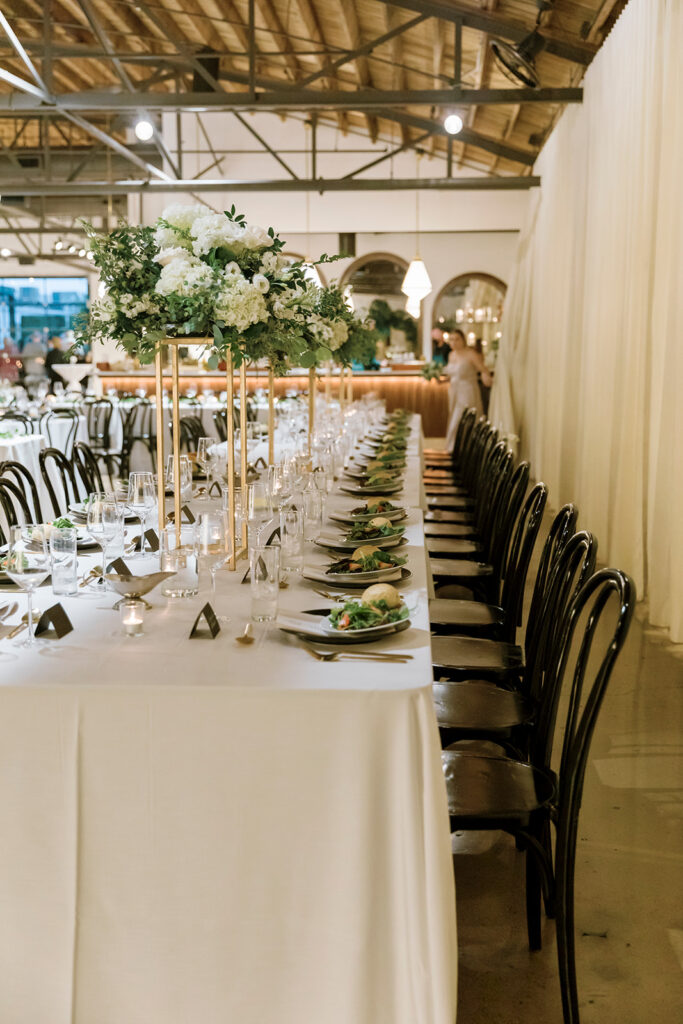
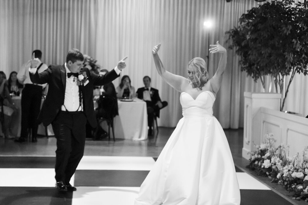
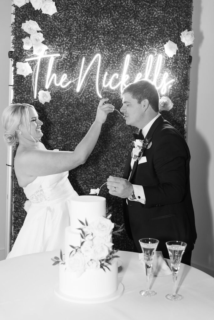
Turning wedding dreams into a reality can be a big job for any couple. The best thing a bride and groom can do is get the right people in their corner to make all of their wedding details come together. When our White Ink couples ask us to be a part of their big day, we are prepared to give them whatever it takes to make their wedding an unforgettable moment!
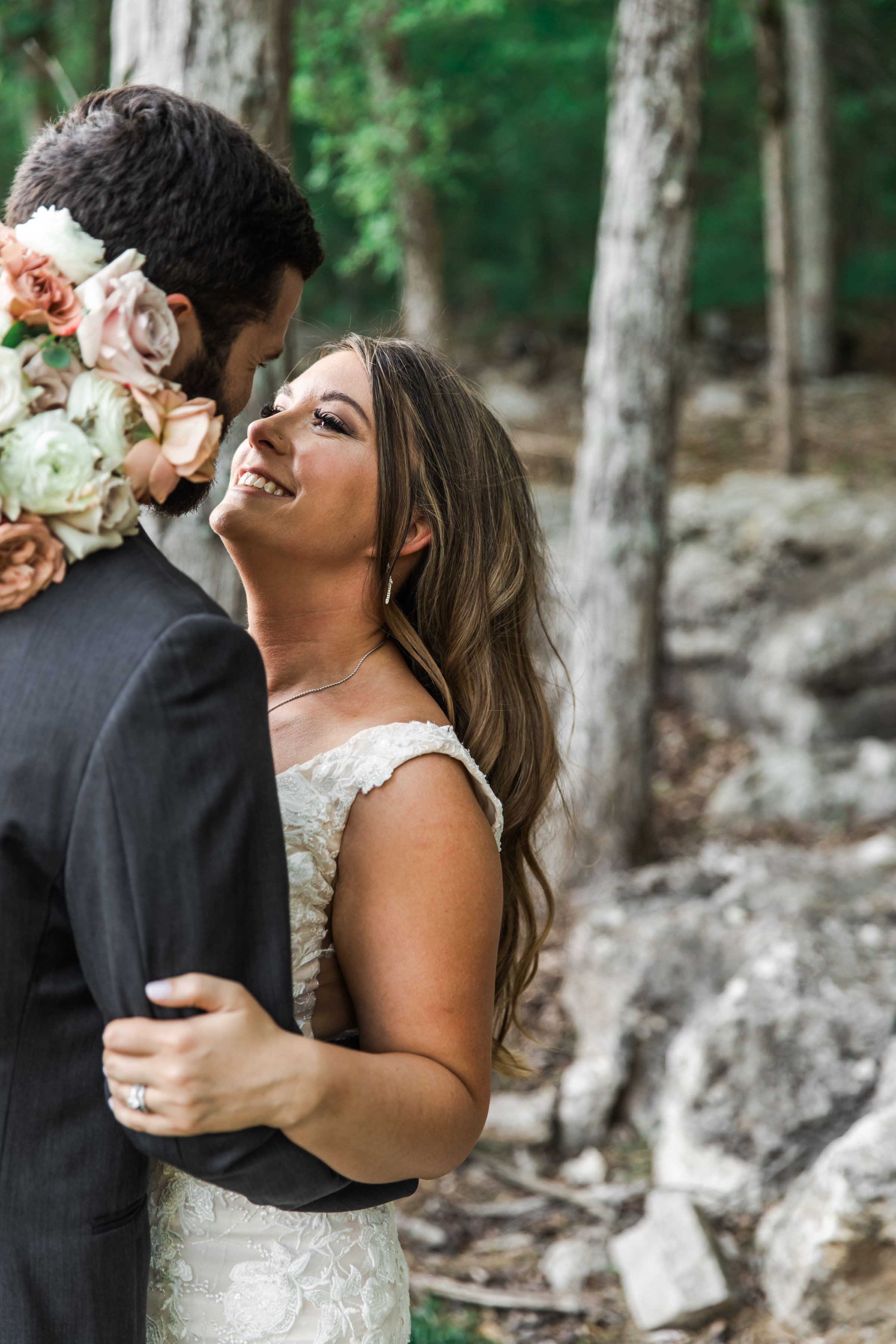
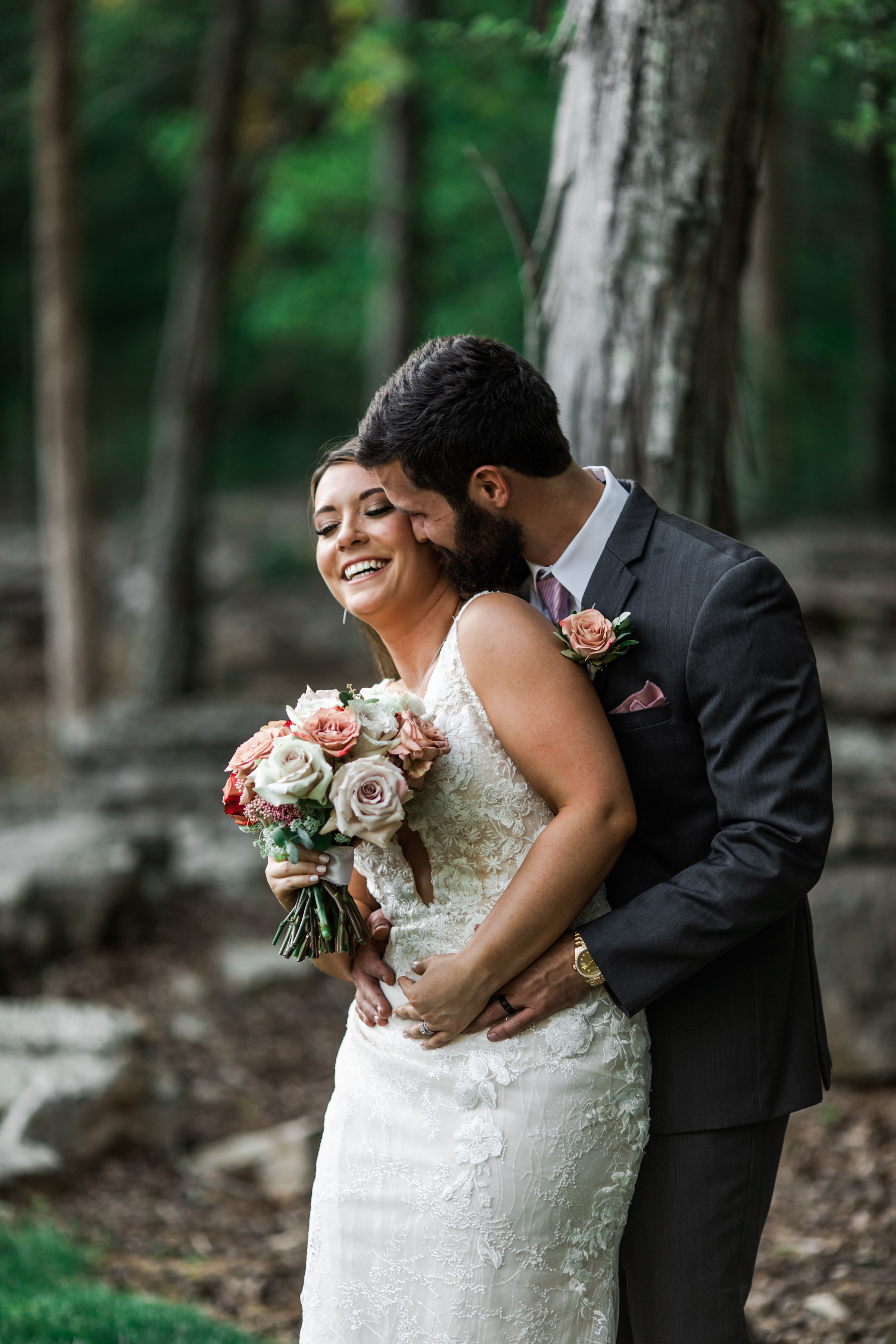
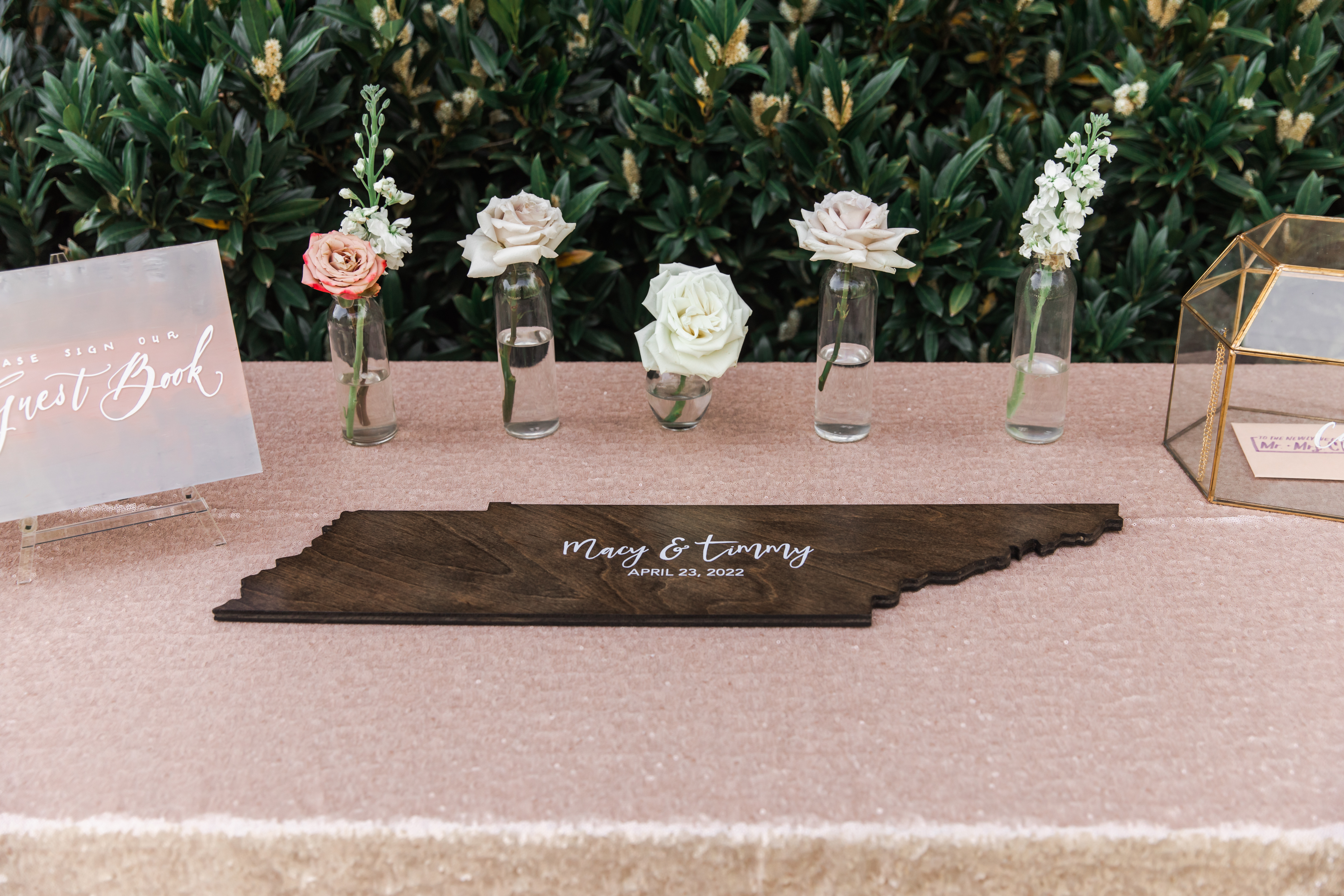
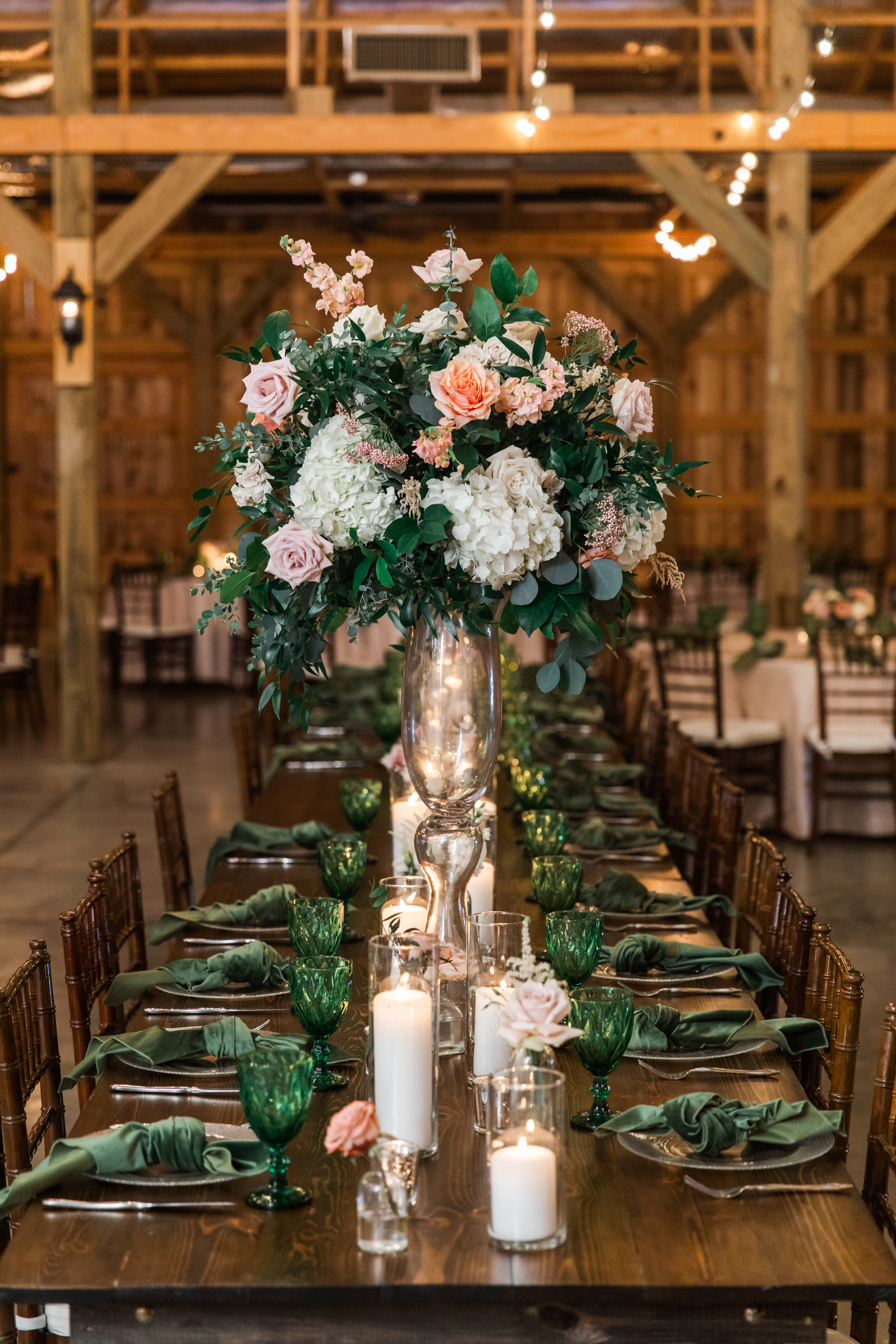
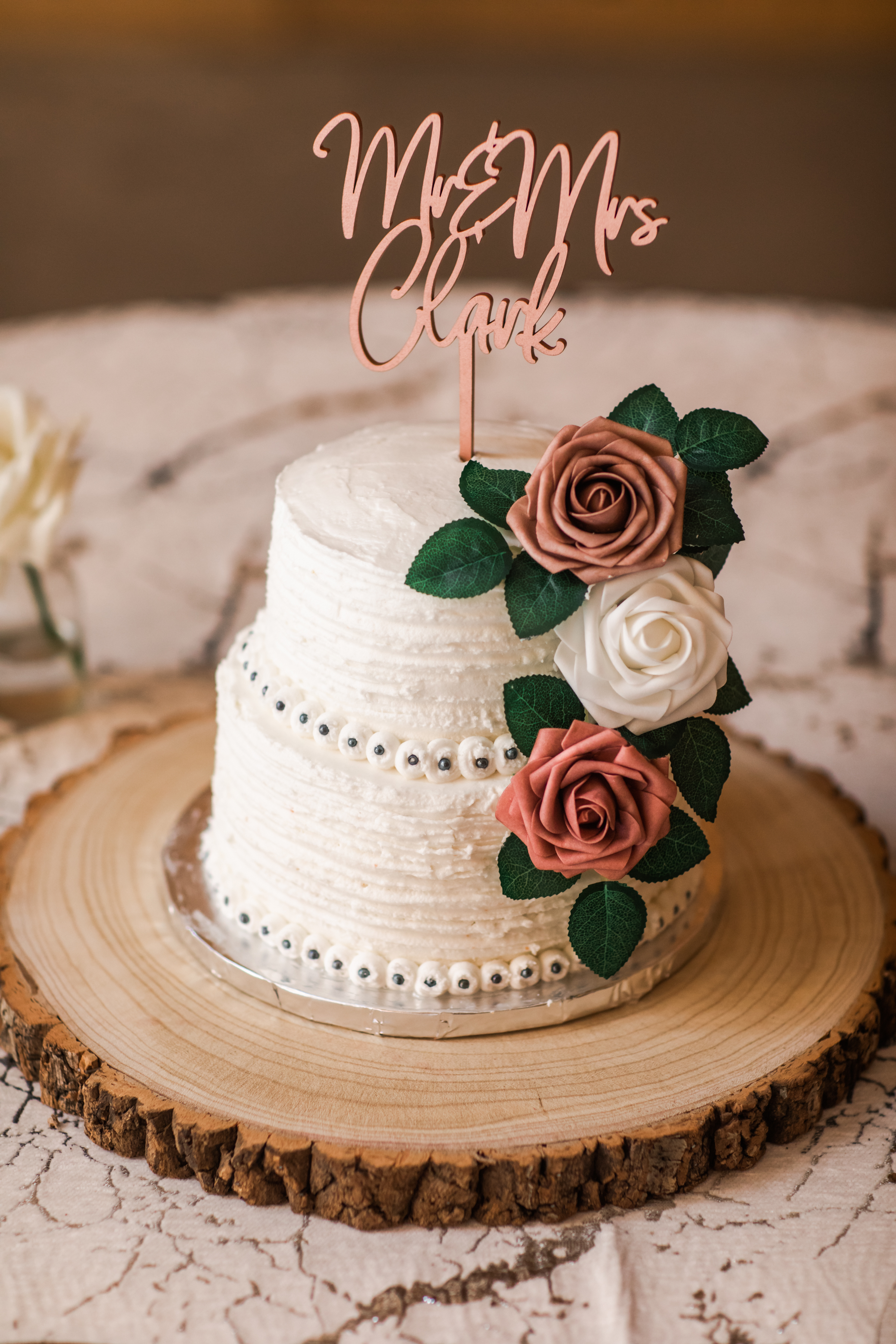
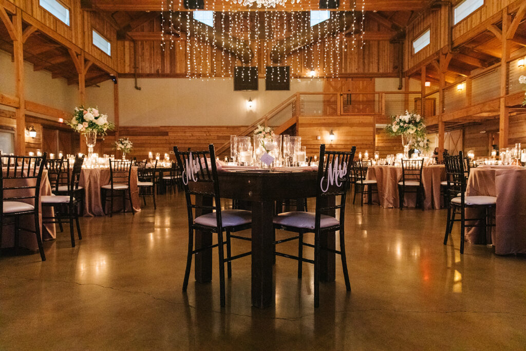
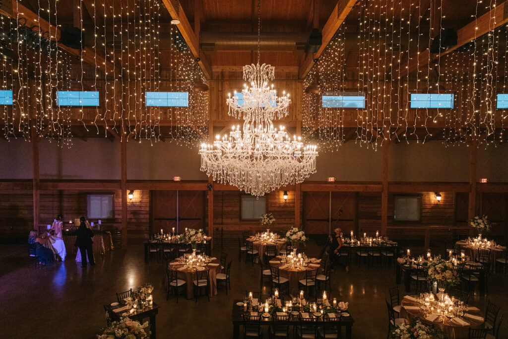
Macy and Timmy are just one of those couples that are a dream to work with. They trusted us to use our expertise in bringing together the finer details that were seamlessly sprinkled throughout the reception. This southern wedding was enjoyed by all, especially the team here at White Ink.
A great way to elevate your wedding theme is to bring the details together throughout the ceremony, reception and even after-parties. For example, Macy and Timmy cleverly used the idea behind their Polaroid style save-the-date and applied it to their one-of-a-kind seating chart! Very fun and inviting for each guest to enjoy.
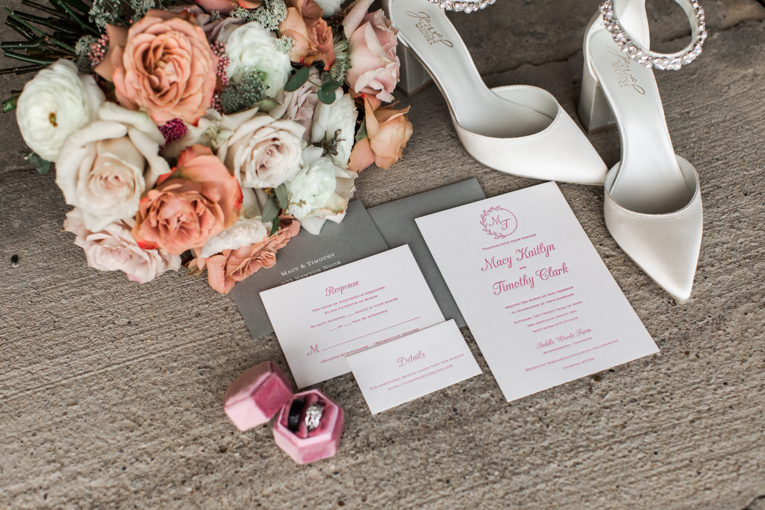
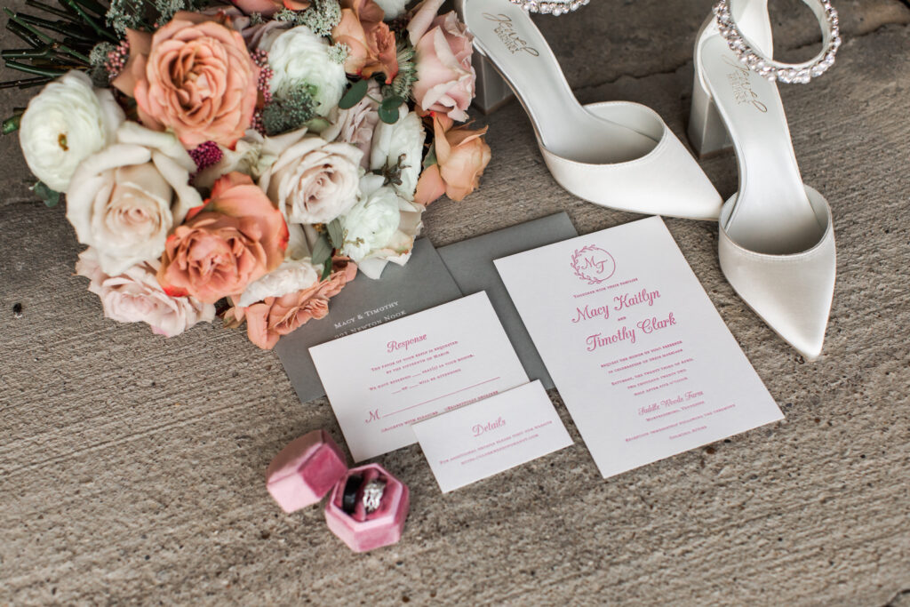
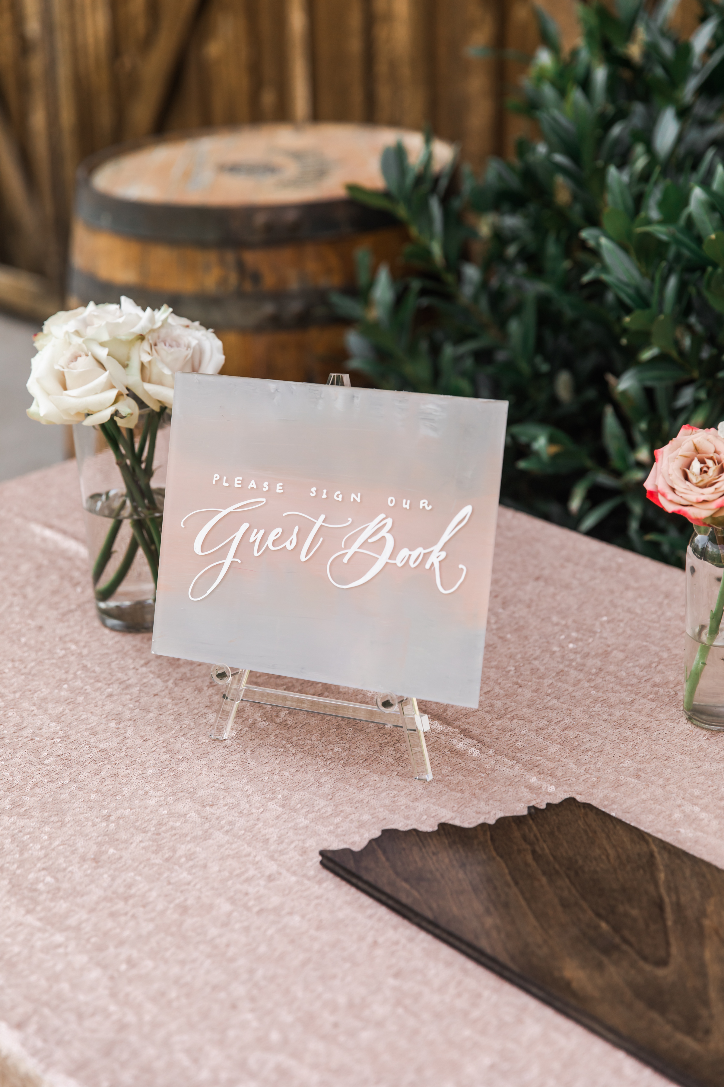
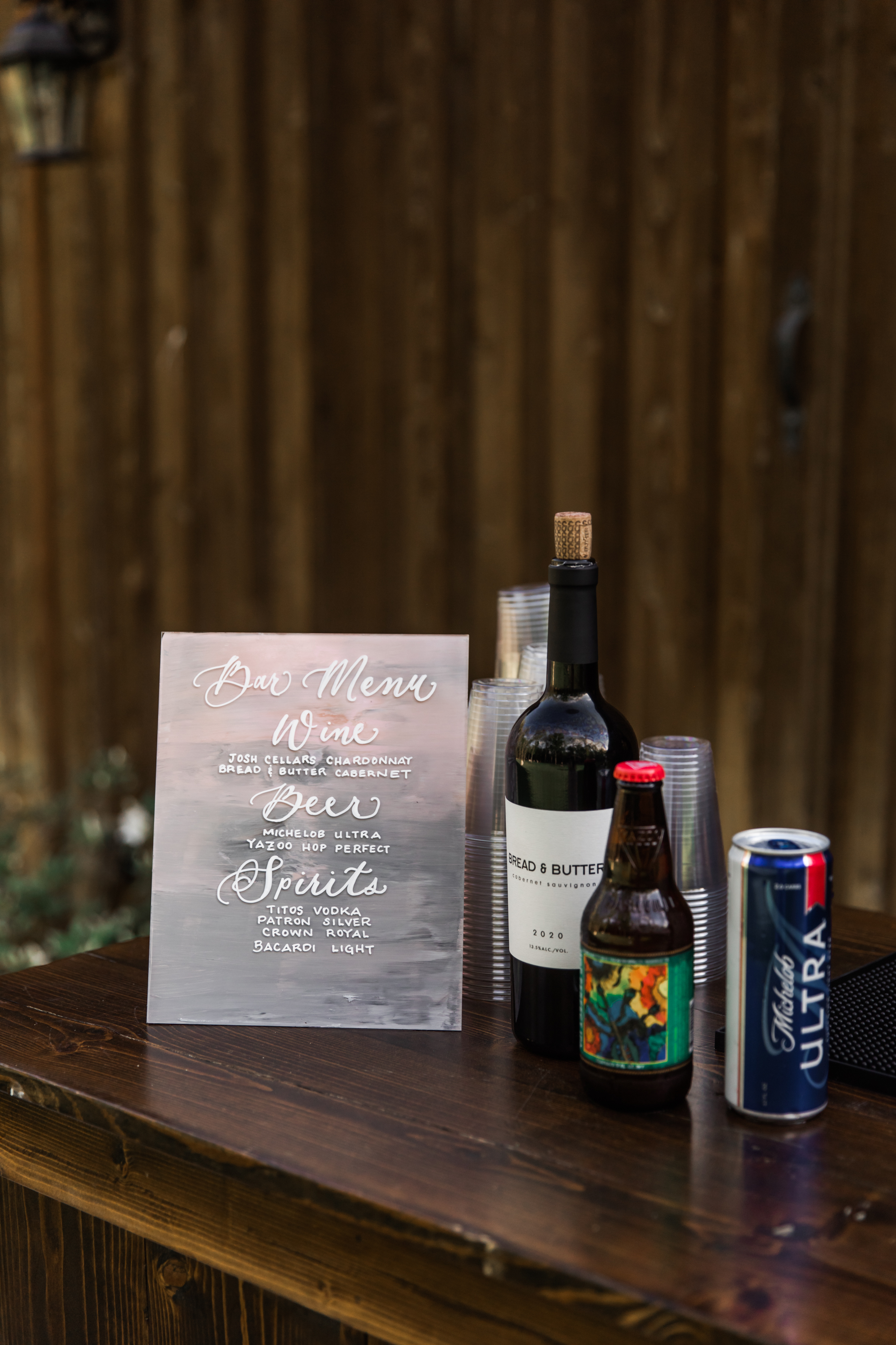
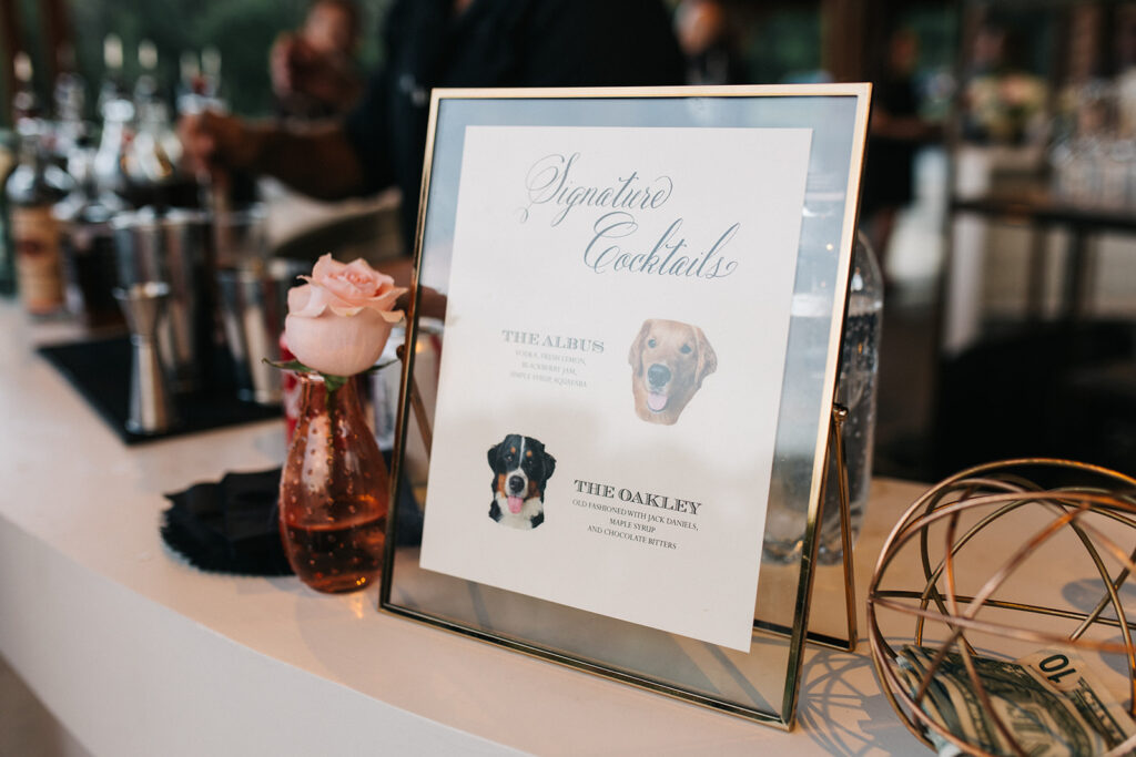
White Ink created Macy and Timmy’s custom invitations complete with rosy hues, wax seals, and letterpress invites. These beautiful color combinations made their appearance again with the custom acrylic signage we designed for them. I absolutely LOVED the way the tabletop signage for their bar menu and guest book pulled from the invitation colors making it a detail that did not go unnoticed. The ombre effect on each sign was a fun conversation starter. Look how perfect these turned out!
The White Ink team also put together these custom cocktail napkins! These were the perfect little additions that gave a fun twist to cocktail hour. Each napkin displayed the same custom initials design that guests first saw in their invites. Again, proving that even small details can tie an event together in a big way.
Macy and Timmy’s beautiful southern wedding gave us the perfect opportunity to point out how meaningful it can be to reuse colors, custom designs and themes throughout your wedding or event. Taking time to perfectly place what represents you and your style can make a lasting impact on your guest’s experience. Details like these make a big difference and that’s a difference White Ink loves to make!
So, what’s the deal with a styled shoot? What makes wedding and event vendors put in the time and effort to throw something together that isn’t an actual event? Well, it’s pretty simple… we want to show you what we’ve got! Putting together a top-notch event is an art form, and we are the creatives behind the scenes. Nashville is one of those places where you don’t have to look very far to find a vendor or creative that is the absolute best at what they do.
For obvious reasons, most of what event vendors create come directly from whatever inspires the client: theme, colors, style, texture, all of it. So, when we are afforded a moment to let our creative juices flow and boast our skills, we will jump at the chance.
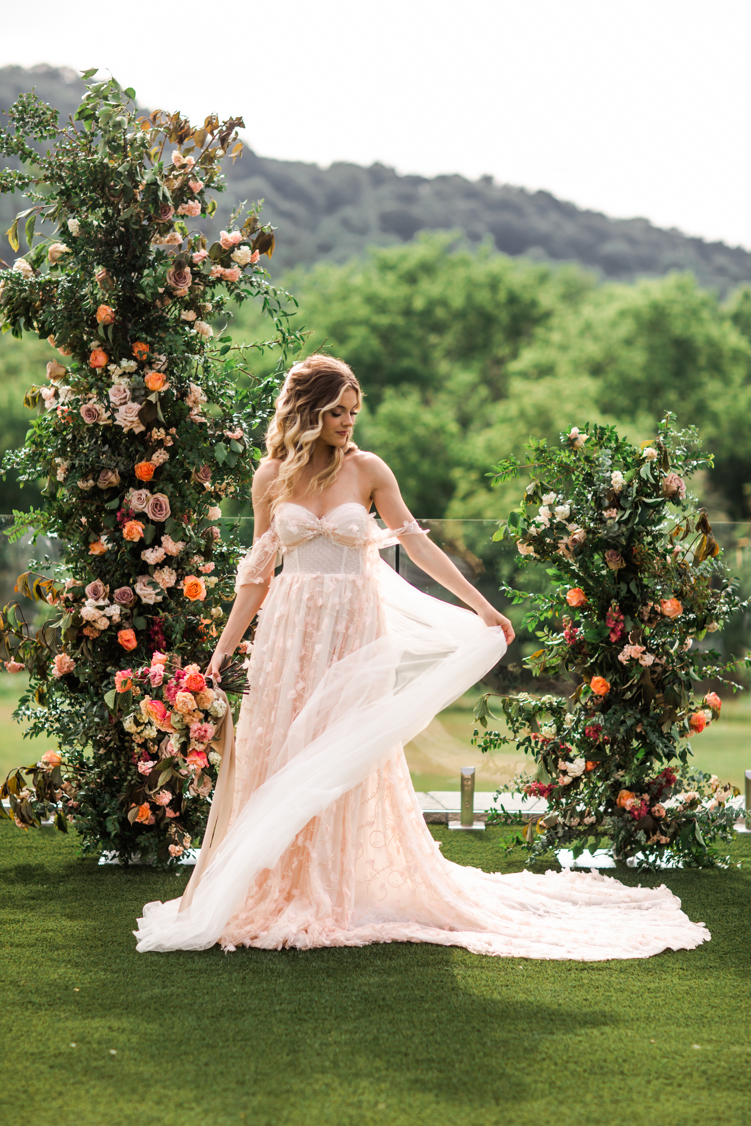
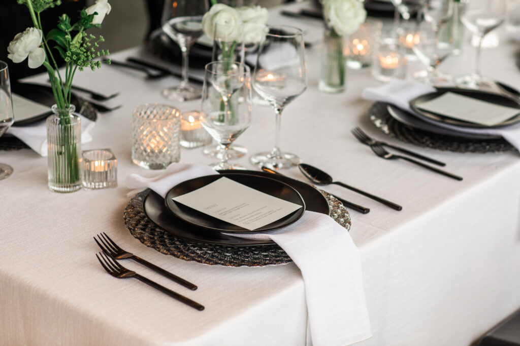
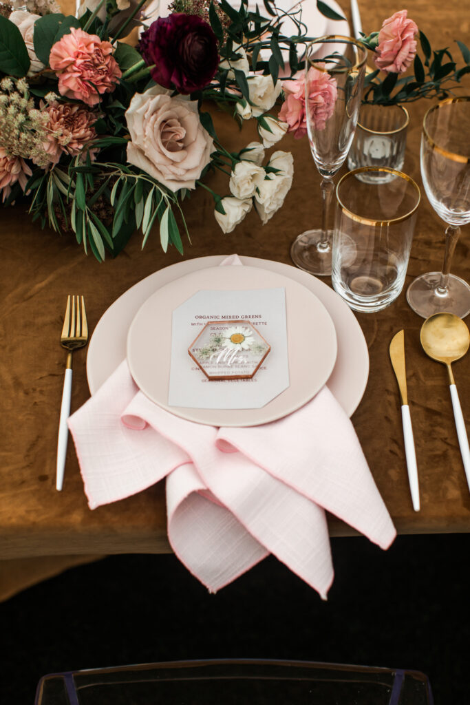
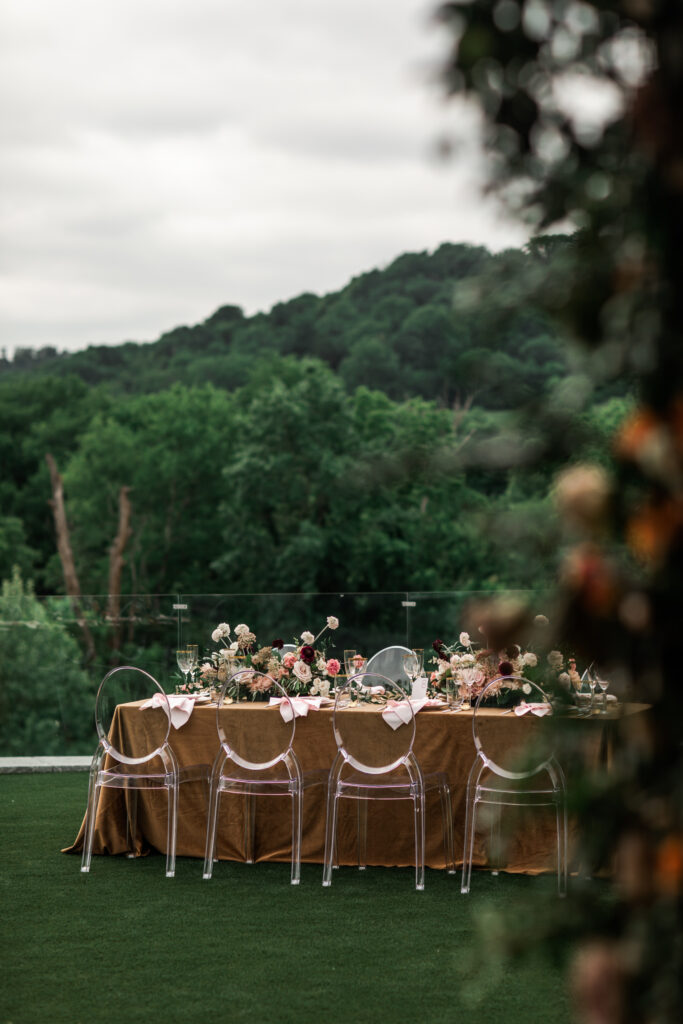
A few of Nashville’s best creatives put our minds together for what turned out to be an amazing display of talent. I hope that you can use our styled shoot at Diamond Creek Farms to pull some inspiration for your next event or wedding. This was a multi-part shoot designed to demonstrate the contrast between gold and black, blush and gold, and black and white styles! I think you’ll agree that what we put together for you is simply stunning. Check it out!
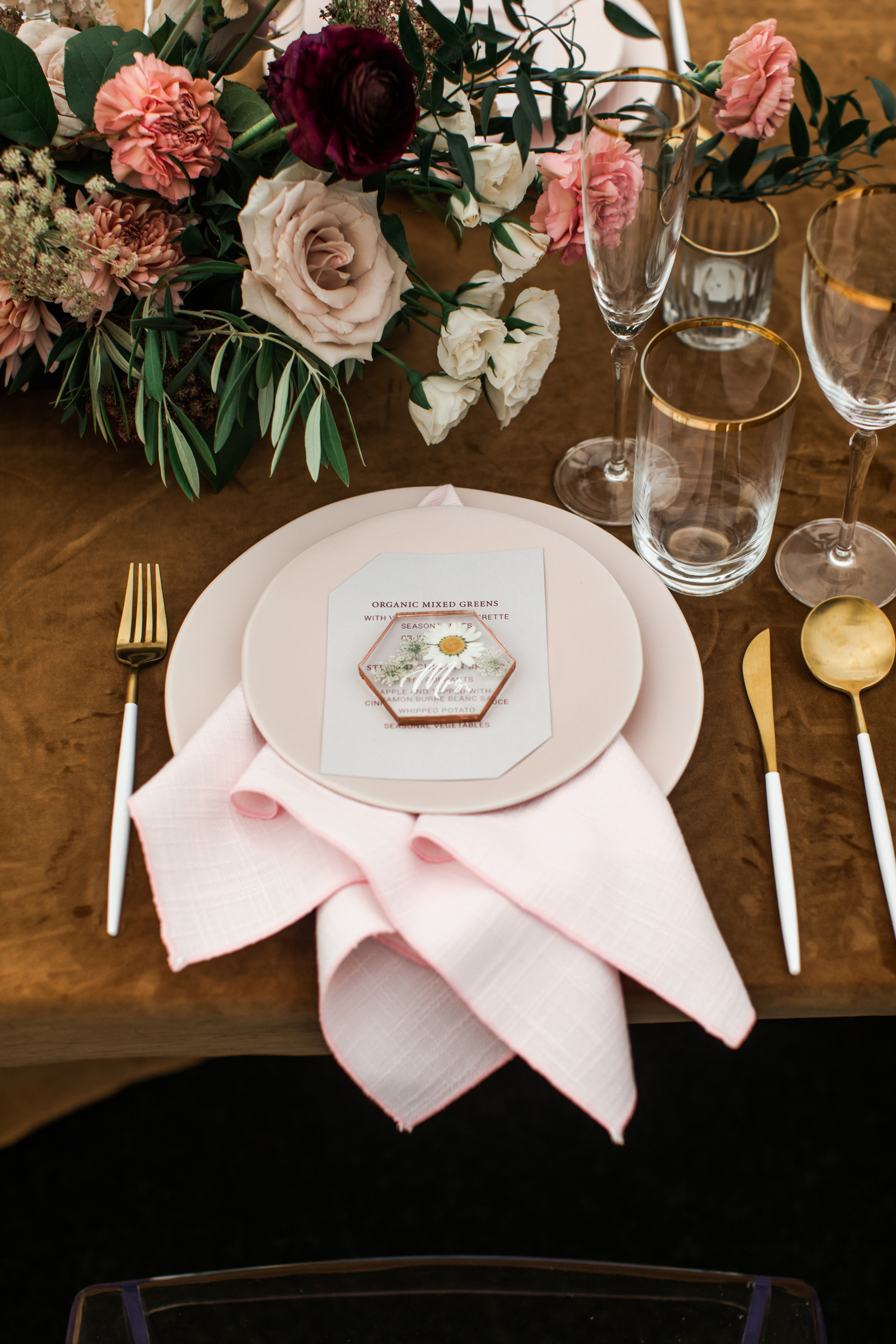
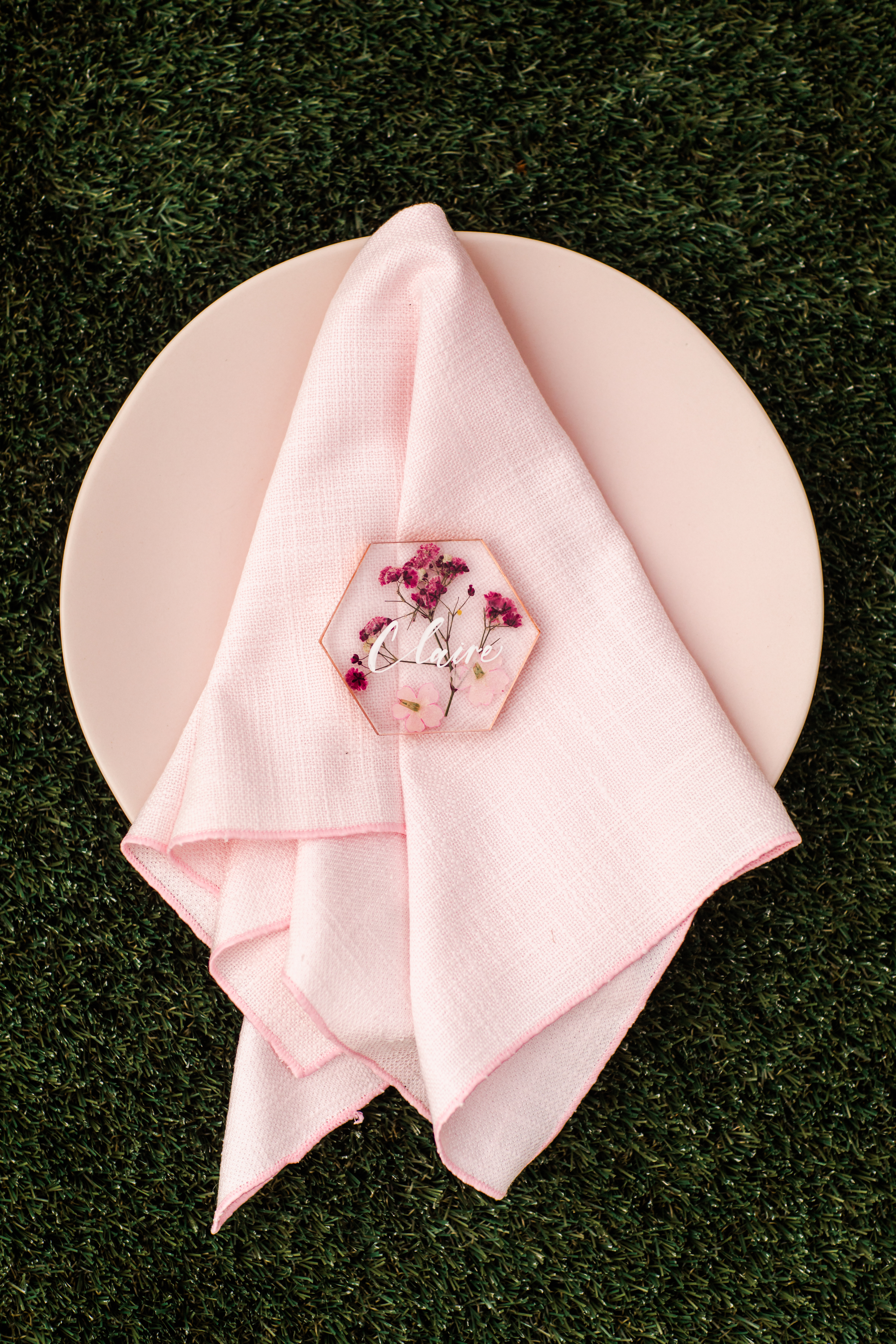
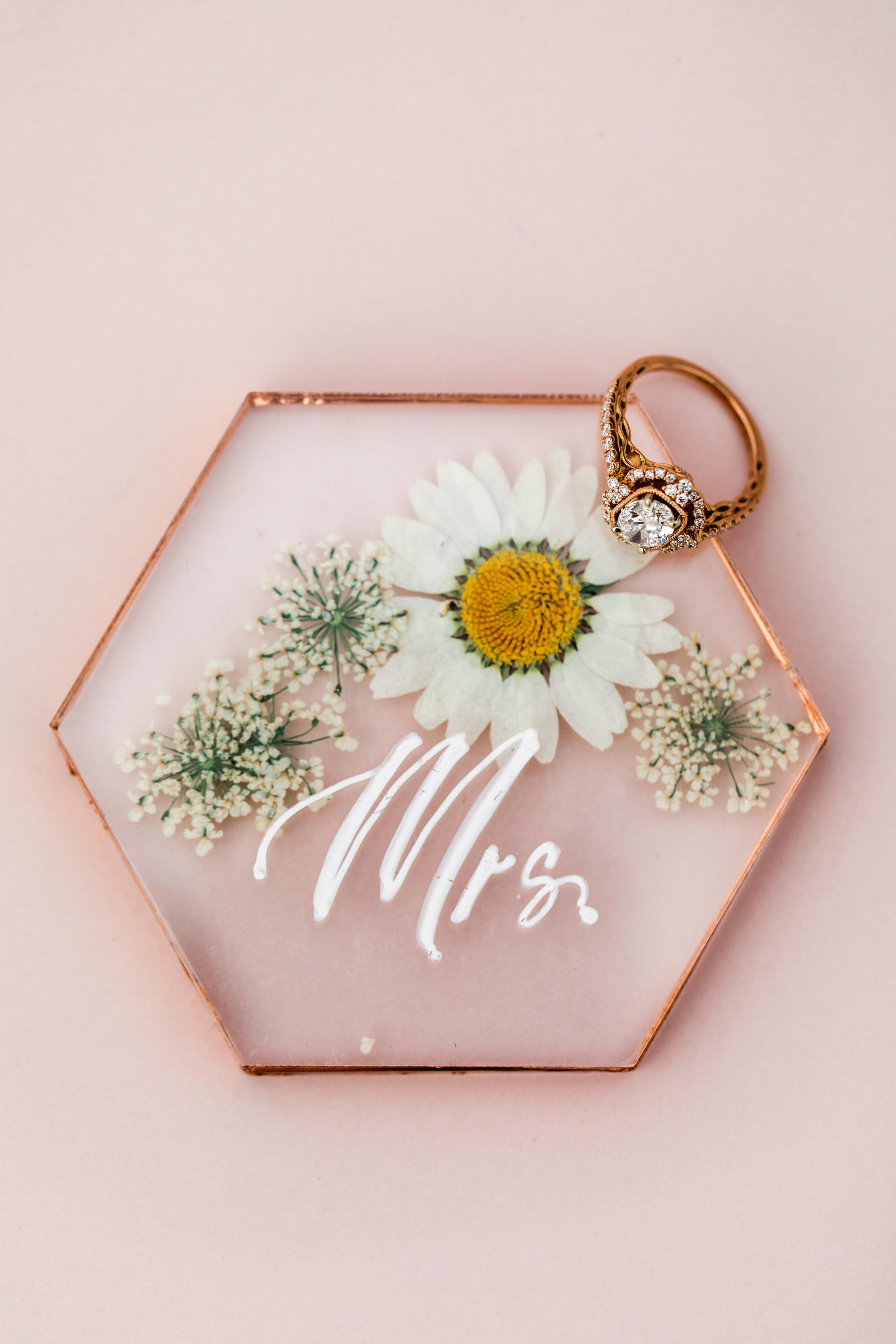
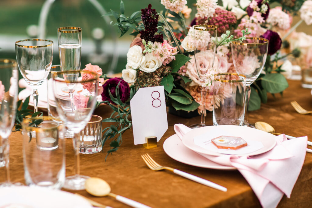
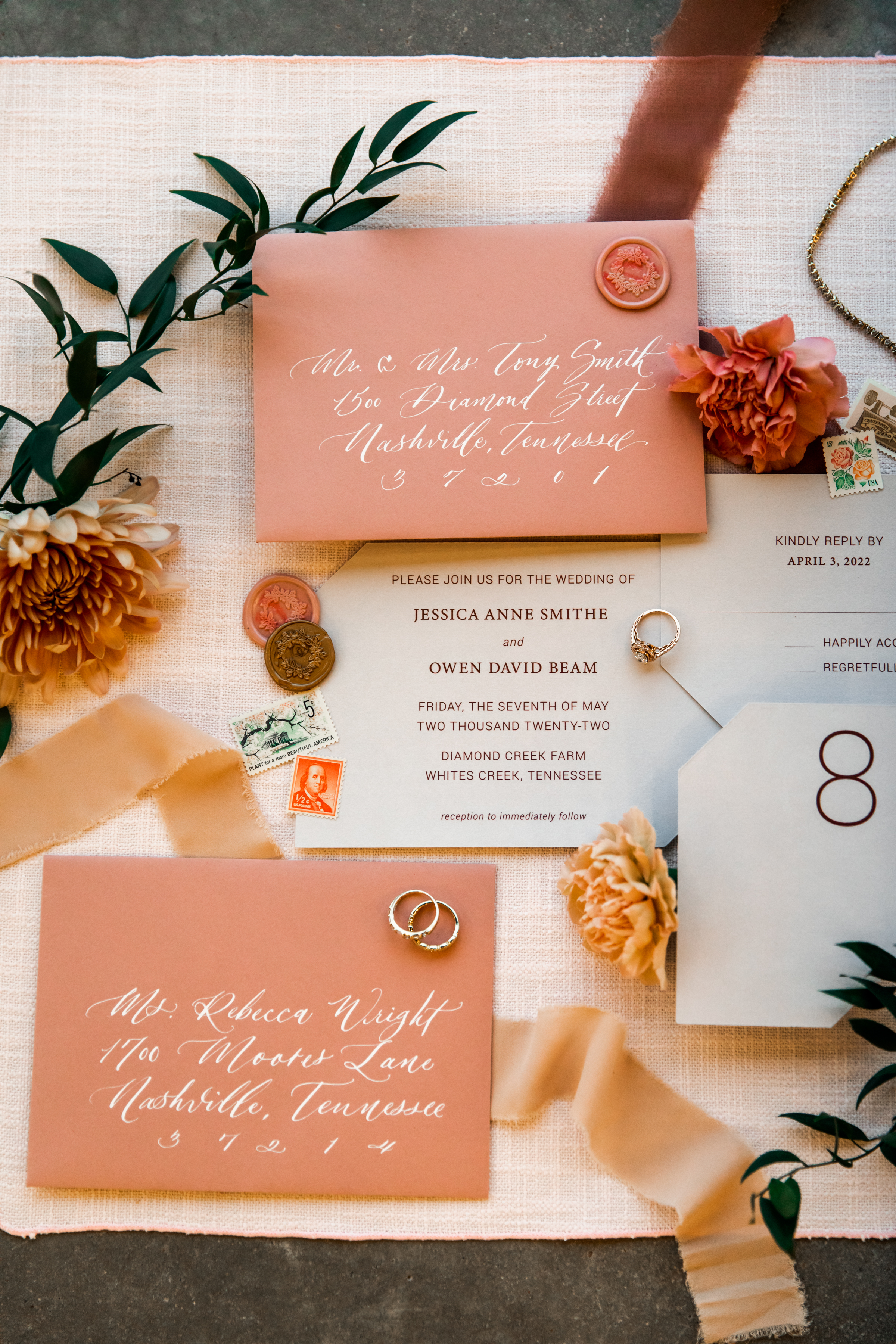
The blush and gold themed invitation suite focused on a balance of gentle and modern. The rosy envelopes with custom calligraphy and wax seals leaned perfectly into the edge-cut papers and print invites. To elevate this combination, White Ink created the most attractive little place cards I think I’ve ever done. We used pressed florals inside acrylic, lined it in gold and used custom spot calligraphy; all resting gorgeously on top of the menu place setting. I’m in love with the idea of using this for an outdoor spring wedding!
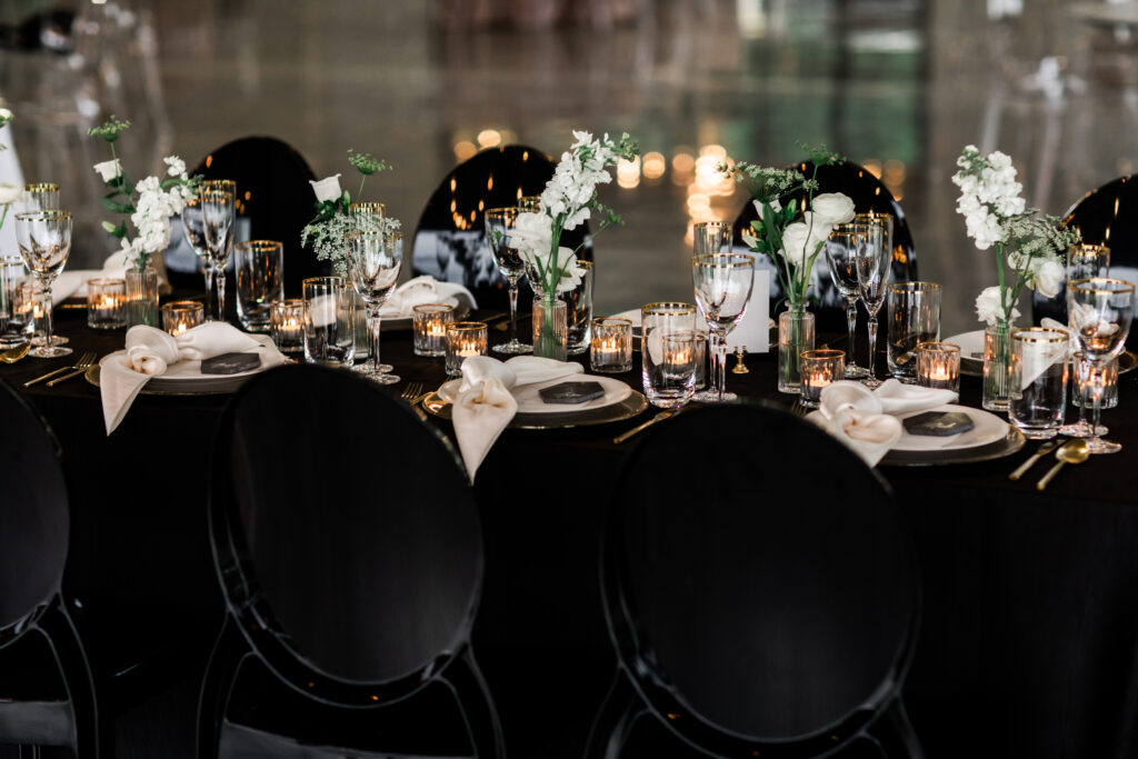
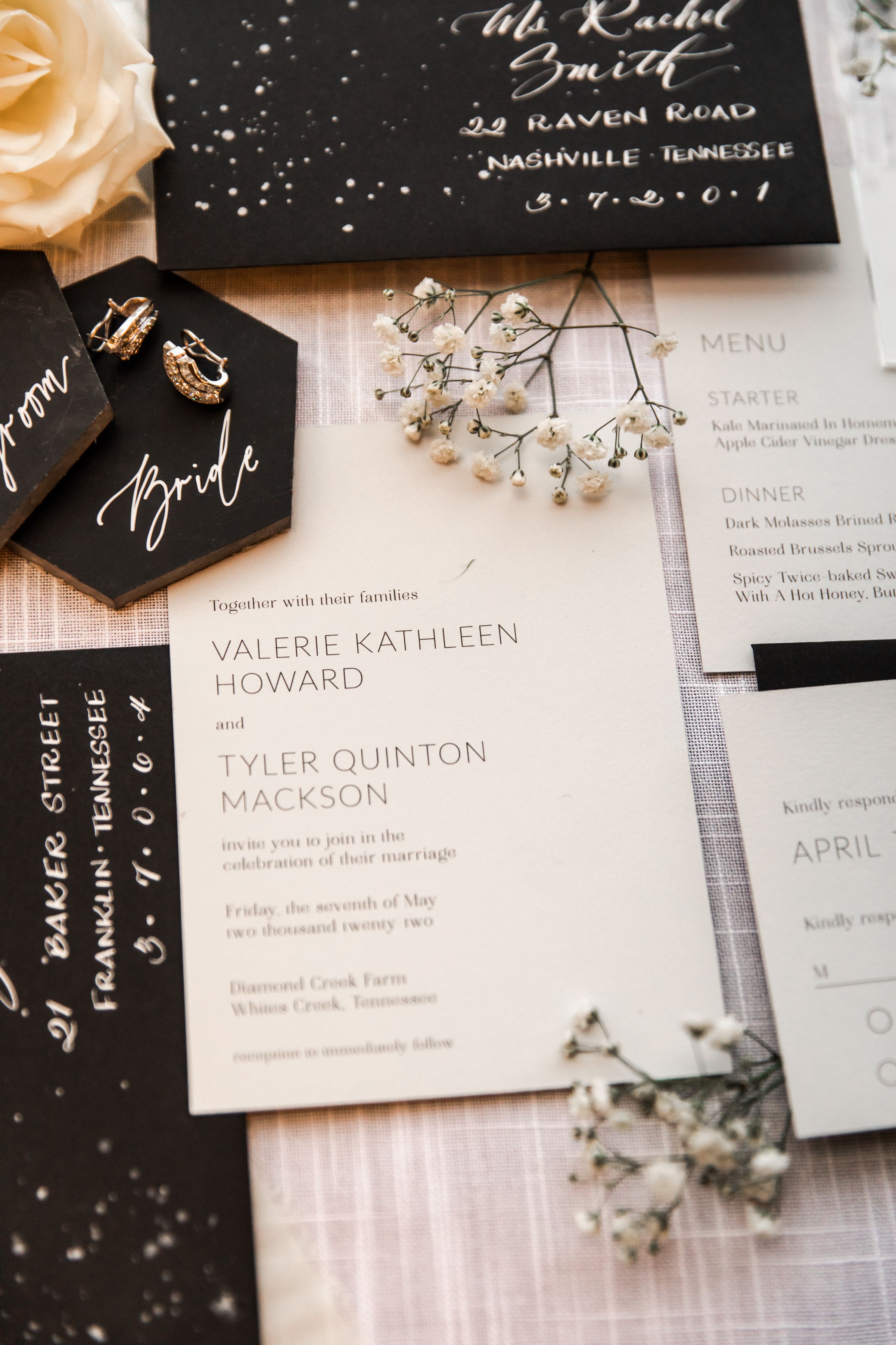
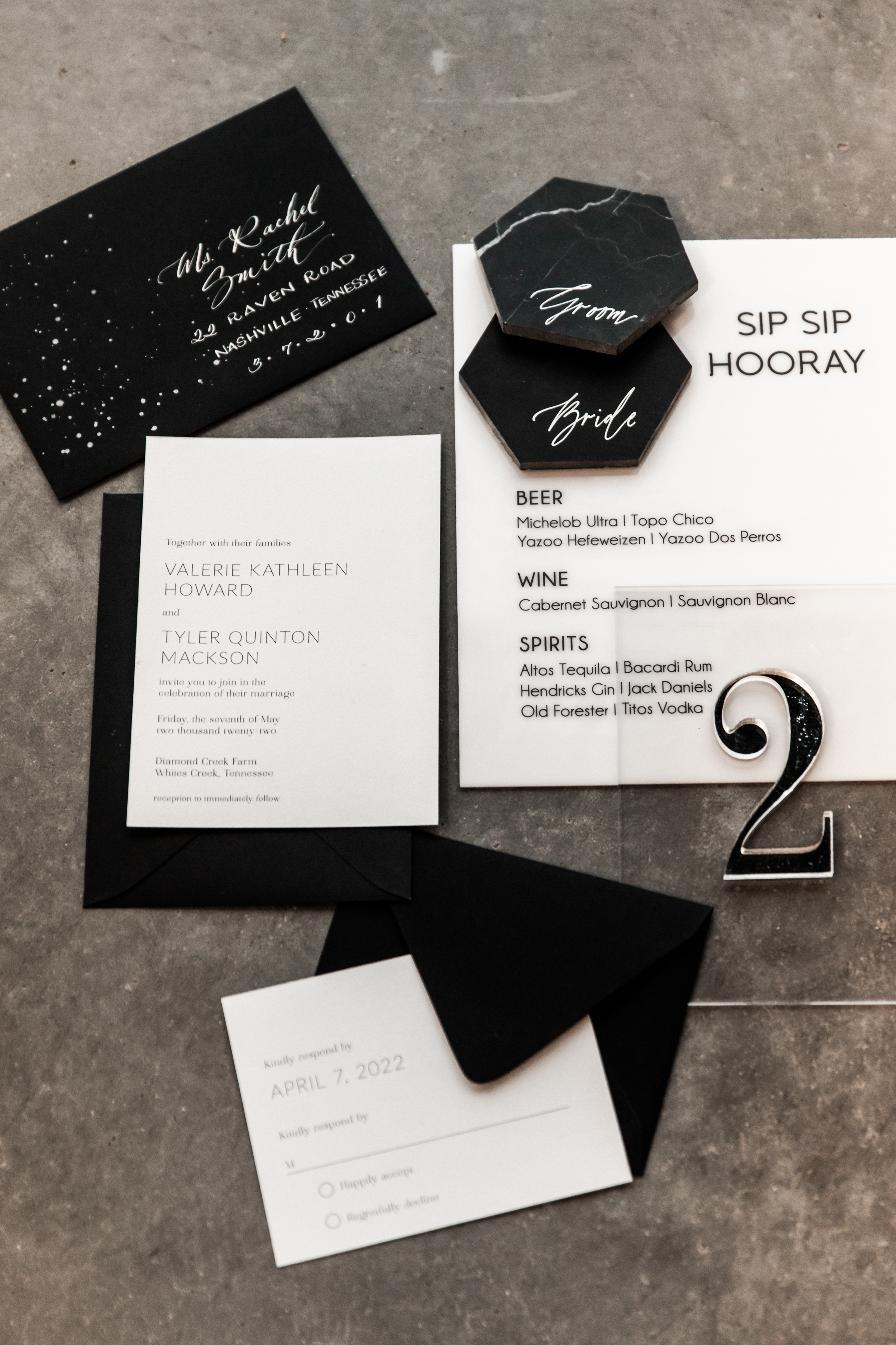
For the black and gold, and black and white portion of the shoot, White Ink really got to have fun and play with some amazing details. For the invitation suite we “pushed the envelope”, if you will, and designed off-centered custom envelope calligraphy while using the added space to make a modern splash. Our stationary team came through with a custom modern font for the invites, making this a truly impressive suite for clients to draw some inspiration from.
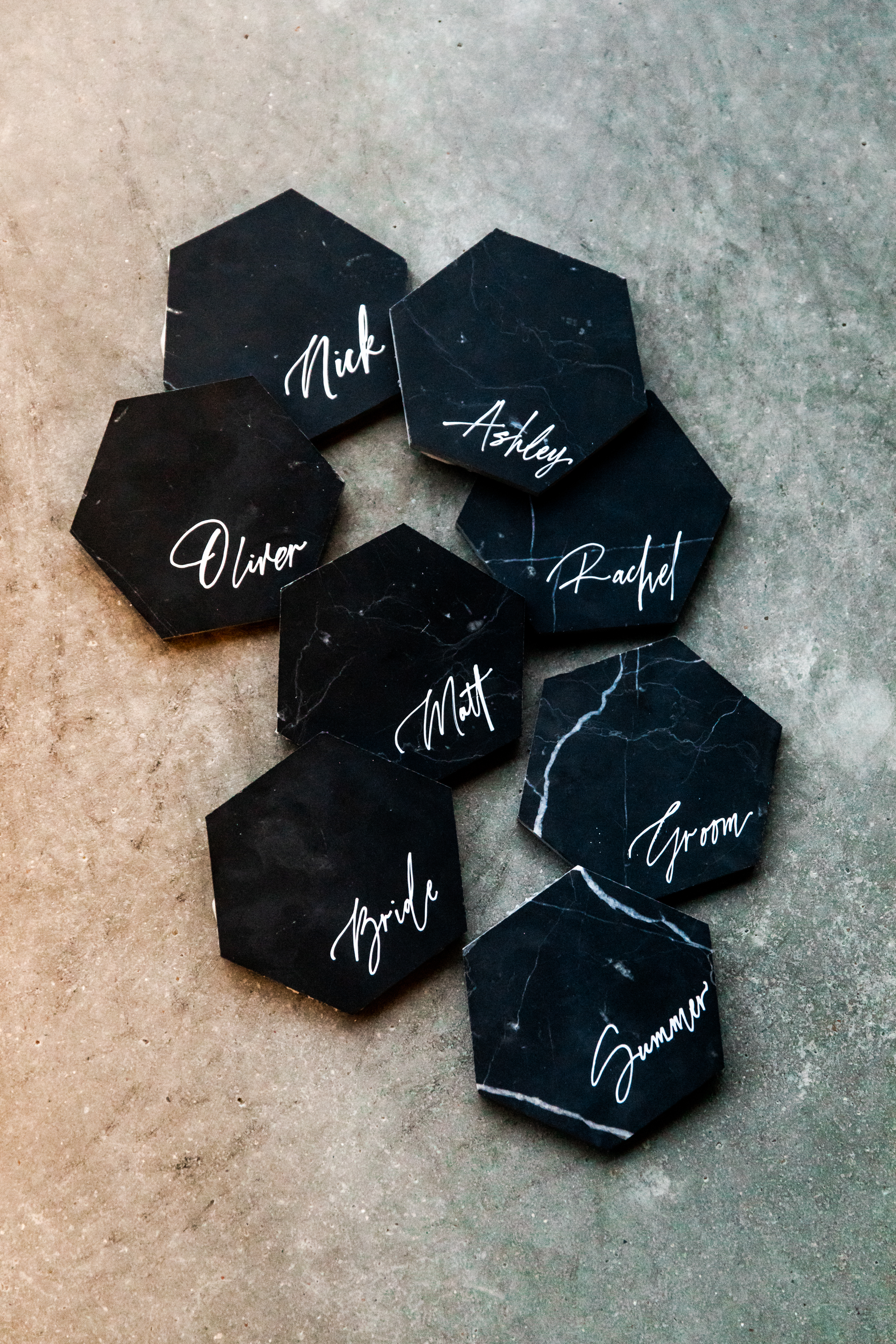
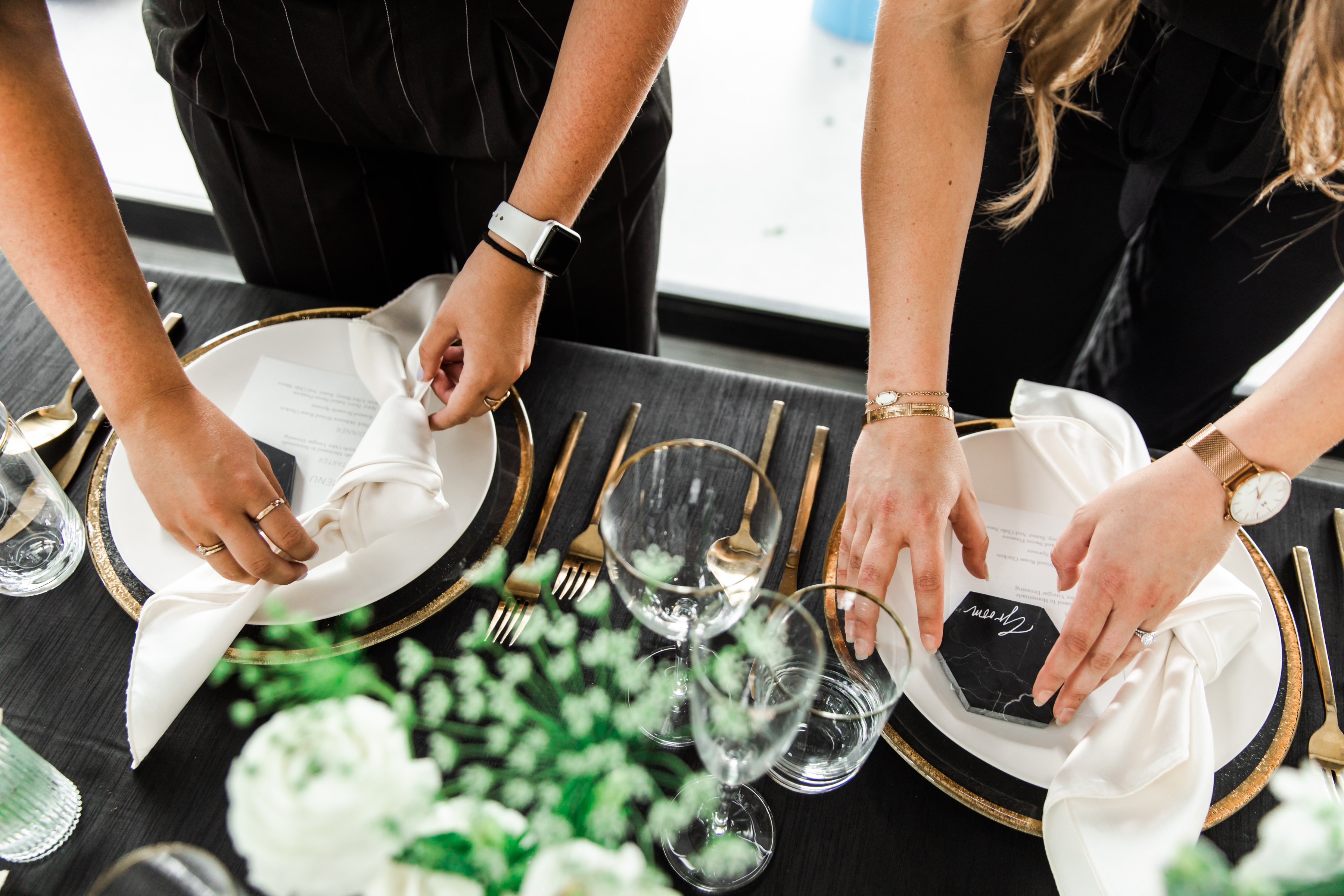
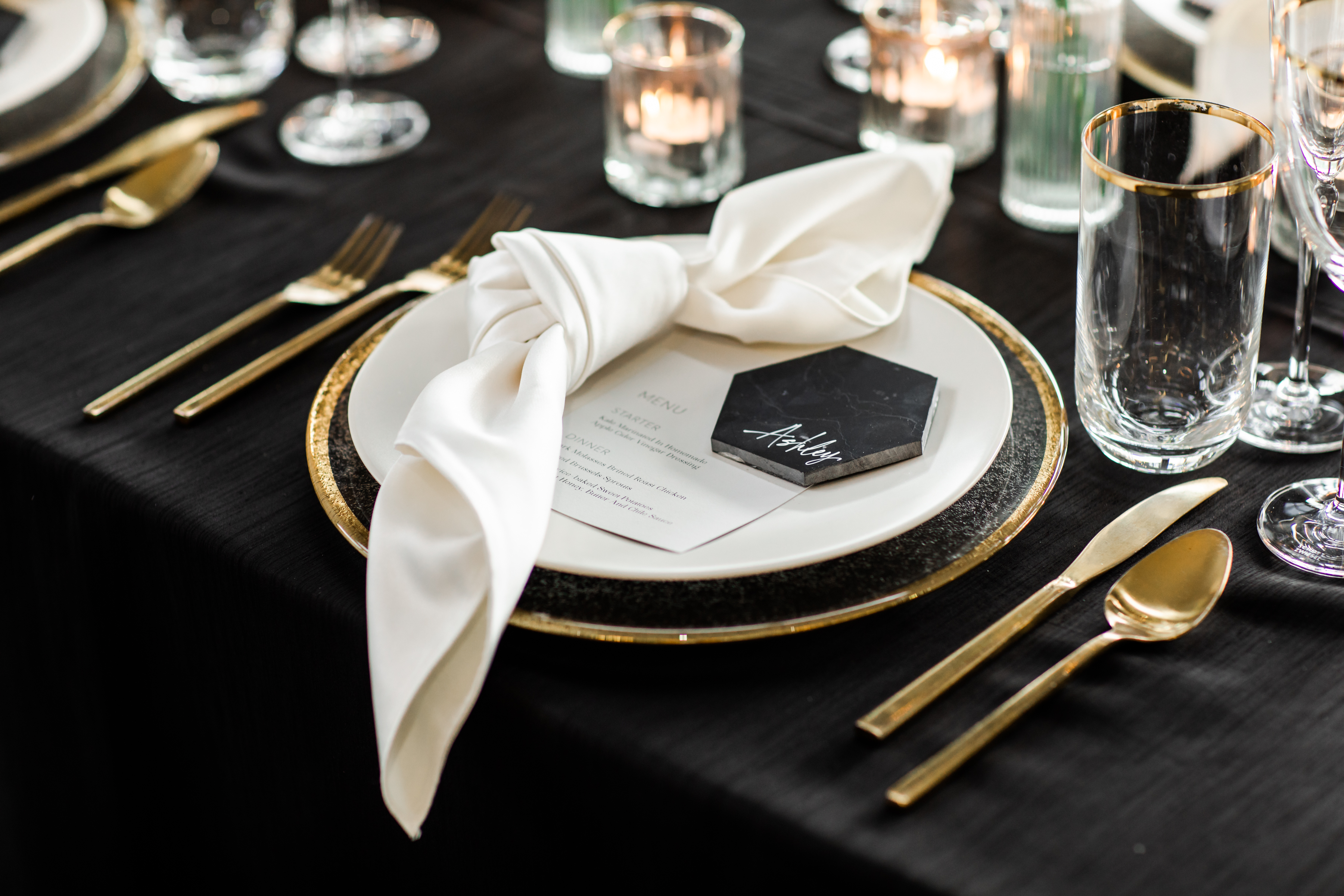
It’s time to talk about these black marble, stand-alone tiles! Details like these babies have an amazing way of keeping your guests chatting about your event for a long time to come. The contrast between the muted black and bright white custom calligraphy is an aesthetic gem. (Sigh). I love using tile place cards as a way to add texture to a reception. And for those outdoor receptions, they can double as paperweights for your menus. Brilliant!
There you have it! Vendors want to help make your wedding and events everything you hoped for. We might even have a few great ideas up our sleeves! We hope you enjoy.
Finally! We get to share all the details from one of White Ink’s most eye-catching projects to date. Our clients, Kelsey and Tanner, brought us in to help fulfill the vision for their wedding and we are still spinning from how amazing it all turned out.
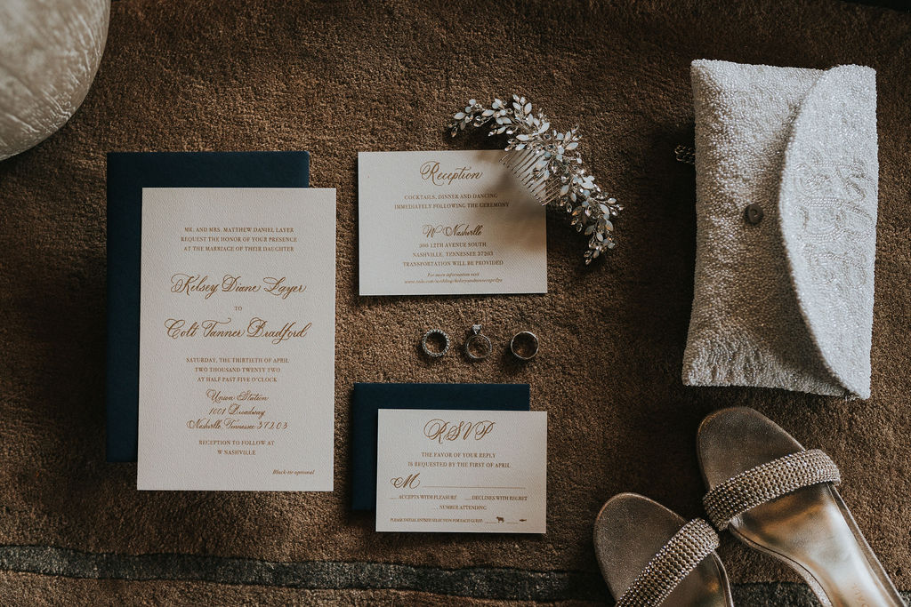
To start, the White Ink stationary team came through with a sophisticated invitation suite complete with gold ink against beautiful textured paper that always pairs elegantly with a classic navy envelope. So many of our White Ink couples have chosen navy envelopes to elevate their invitation suites and you can see why!
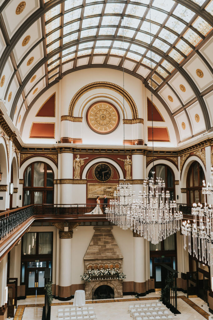
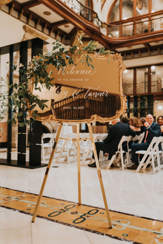
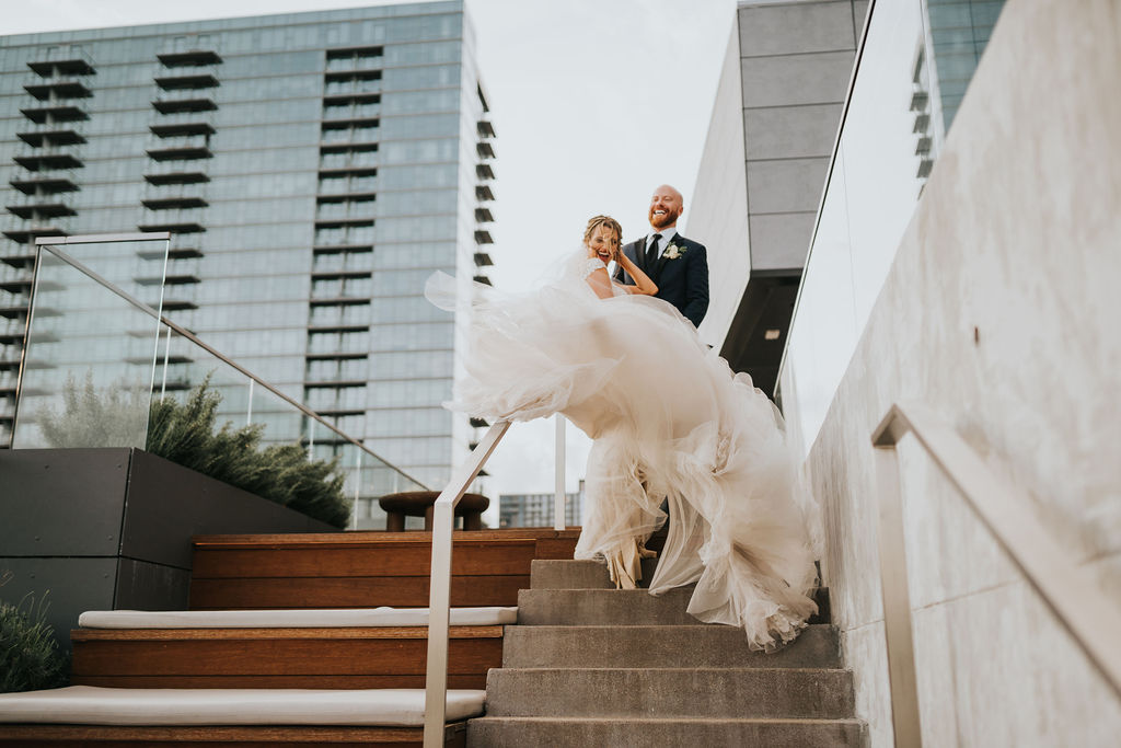
Guests were invited to enjoy Kelsey and Tanner’s ceremony at the Union Station Nashville Yards Hotel which turned out to be an architectural dream for this downtown wedding. This landmark site truly speaks for itself and lacks nothing in the way of décor. Still, we got to put our touch on this stunning venue with a golden, ornamented wedding welcome sign complete with custom calligraphy. Wedding welcome signs like this one can add charm to even the grandest of venues.
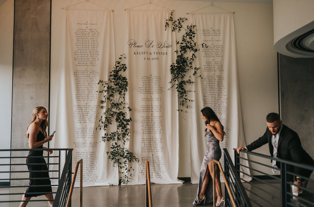
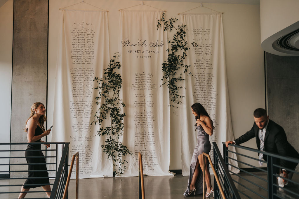
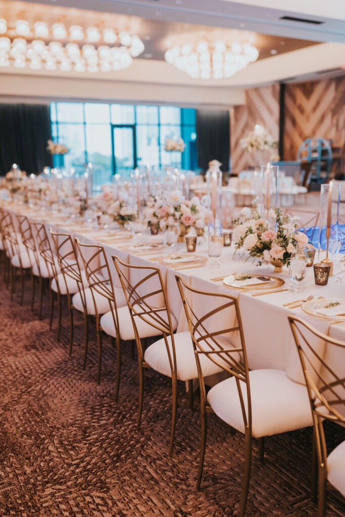
Our couple chose the W Nashville Hotel to host their guests for the reception and it did not disappoint. It’s also where we got to flex our creativity and put on display White Ink’s biggest seating chart we have ever done! This massive, custom project was tailored perfectly to Kelsey and Tanner’s vision with floor to ceiling hanging fabric. It’s very rewarding to have each guest enjoy this creation knowing that they were a part of it as they find their names printed on the king-sized drapery flowing down in front of them. I am still so excited by how this came to fruition. I can tell you, this seating chart is going to stick with me for a long time. I am so proud of our team!
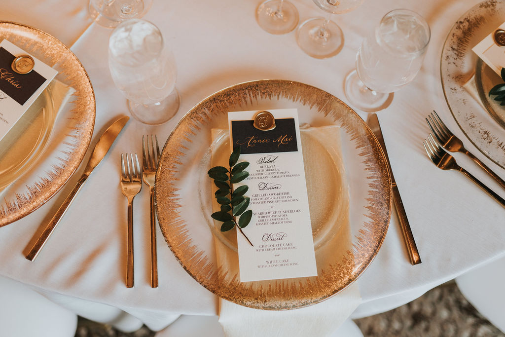
It doesn’t stop there. Our bride and groom asked that we elevate the details of their tablescapes with custom menus, place cards and table numbers. I really love it when our couples blend details together the way Kelsey and Tanner did with the menus and place cards. The place cards were done using custom spot calligraphy in gold ink and paired together with our custom designed menus using gold wax seals.
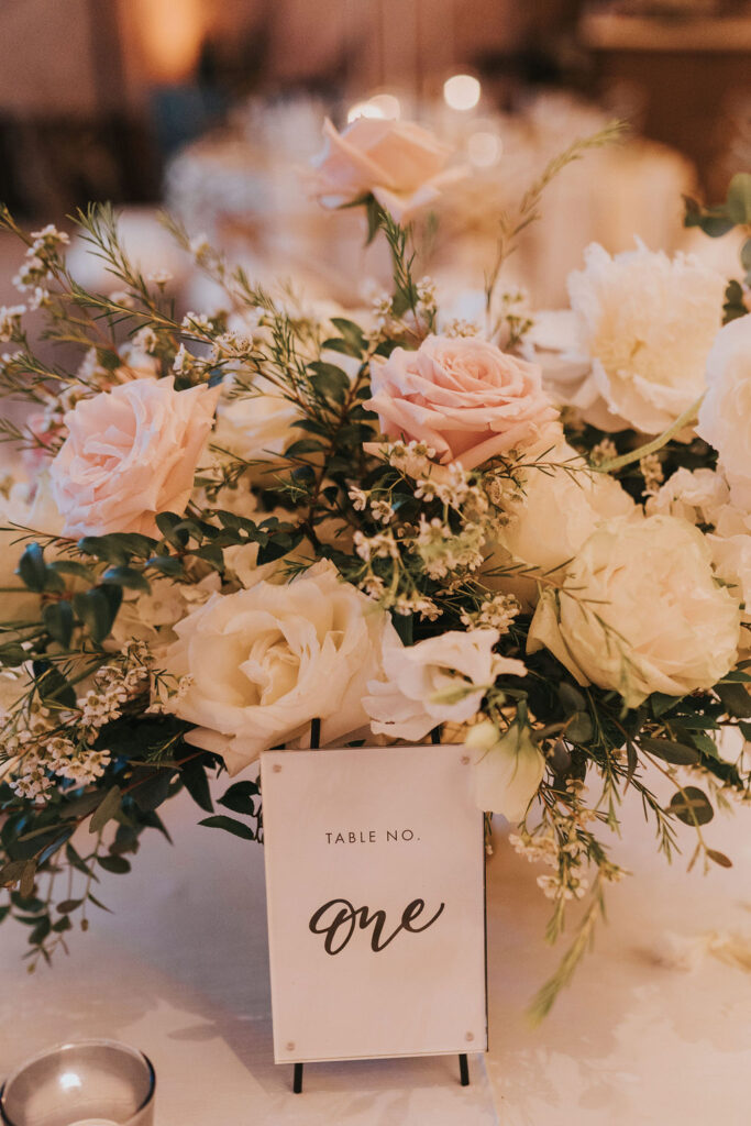
I am excited to show you the table numbers used for this reception because they are the newest addition in our rental collection! The acrylic front and easel stand make these little guys fit very easily into almost any style. They’re my new favorite!
I am so grateful for clients like Kelsey and Tanner who understand our dedication to making dream weddings a reality. We can help you create event details that turn heads. I promise!
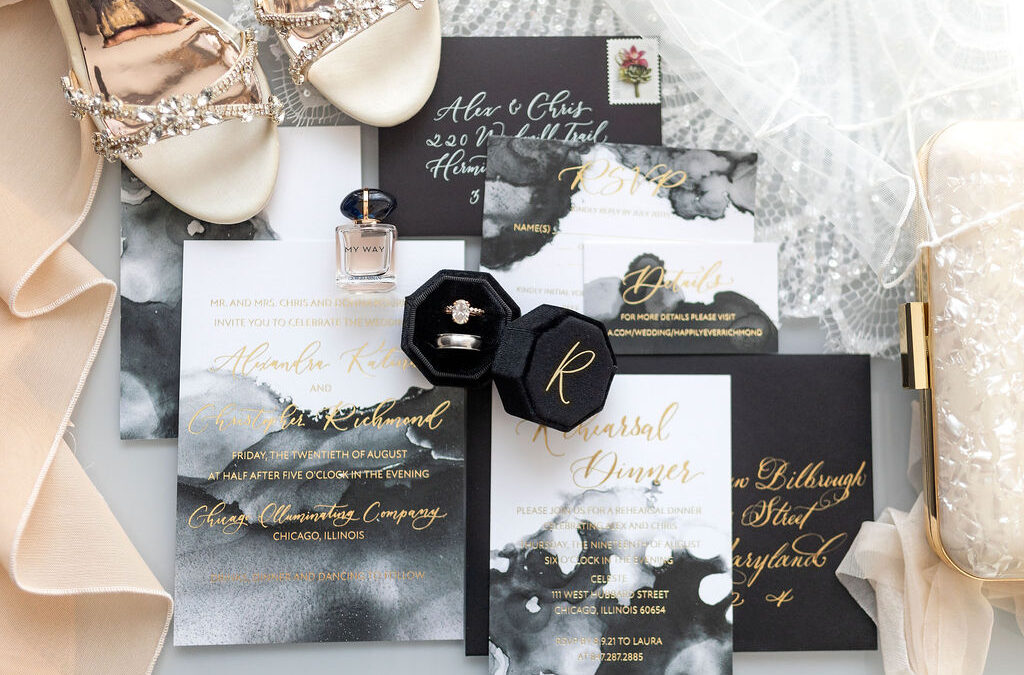
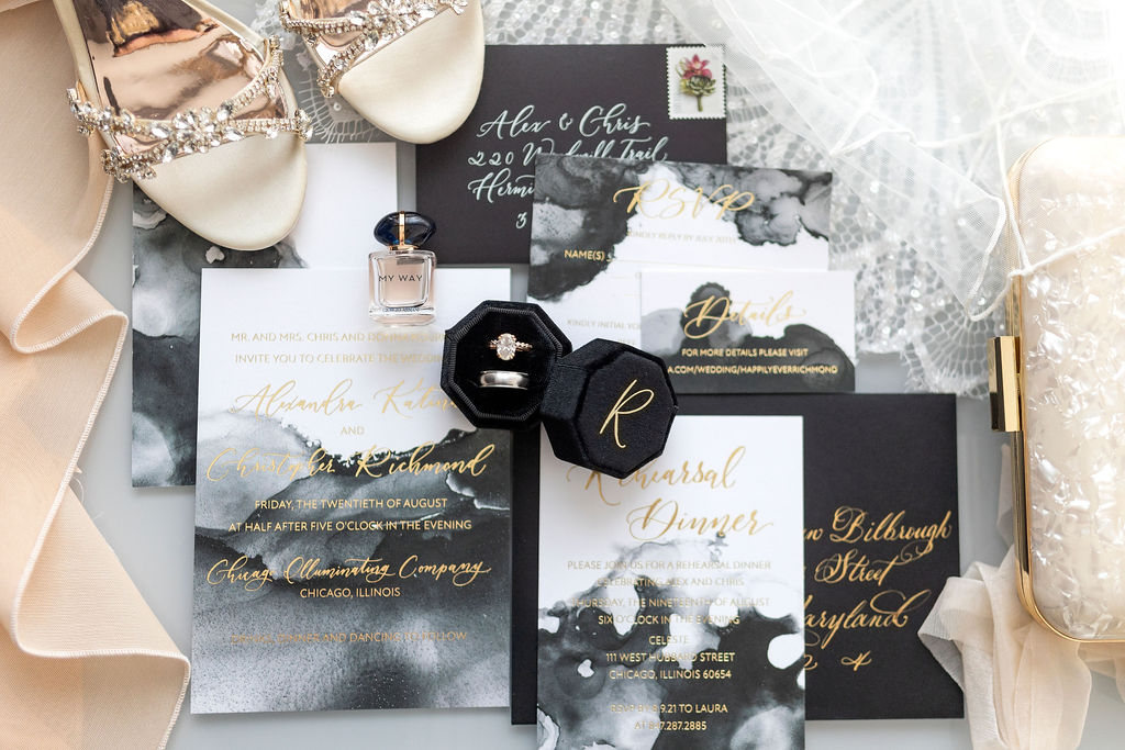
White Ink is in the business of detail. You could say we’re the experts! Our team understands the impact that even the smallest of details can have on any event, invitation or gift. We know the difference between an invite that gets the point across and an invite gives an experience. We work really hard to make sure we achieve exactly what our clients have envisioned for their weddings and other occasions. For Alex and Christopher, White Ink understood the assignment!
Let’s talk about the details of this stunning invitation suite. We really had fun with this one! The boldness of the white, black and gray watercolor background is enough to make any recipient stop what they’re doing and think “WOW!” It’s definitely a small detail that packs a big punch.
We love envelope calligraphy, but we love gold ink calligraphy on black envelopes better than anything. It’s always so satisfying to create with these colors! And the gold continued with the spot calligraphy on the invitations. Just perfect! Taking the time to choose details, like the ones Alex and Christopher used here, gives a lasting impression that your guests will remember for a long time. It also sets the tone for the rest of your event and gives them something they’ll look forward to.
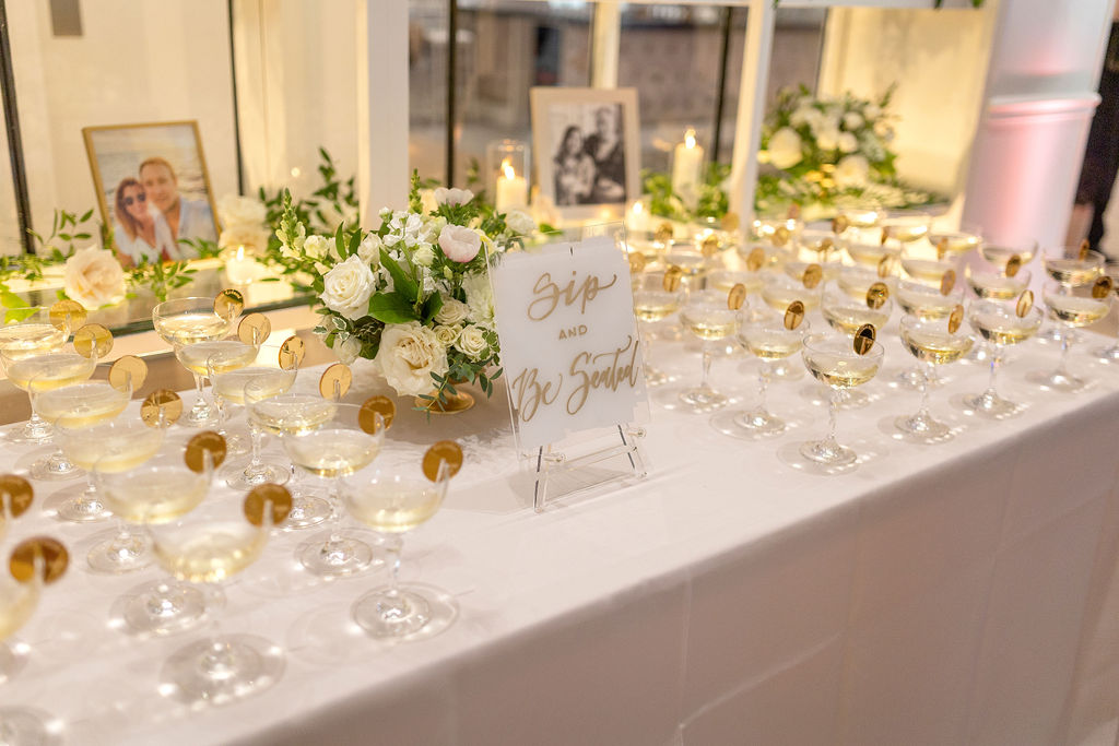
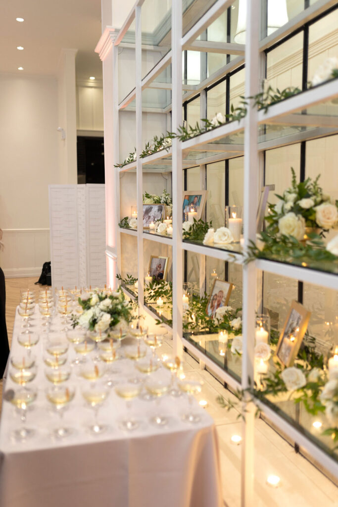
When people talk about wedding signage, they usually mention the welcome signs, or the big amazing seating charts; and those are always fun and memorable, but the small signage that is peppered throughout the ceremony and reception actually have a big job to do. They act like a sort of footnote to your event. For instance, our hand-painted acrylic “Sip and be Seated” sign is the perfect way to subtlety move guests along during cocktail hour. Reminding guests to enjoy the present moment with a sign like, “Welcome. Eyes up, phones down, hearts open,” is not only thoughtful, but it’s a perfect way to keep your guests engaged in the day you’ve worked so hard to put together. It’s all in the detail!
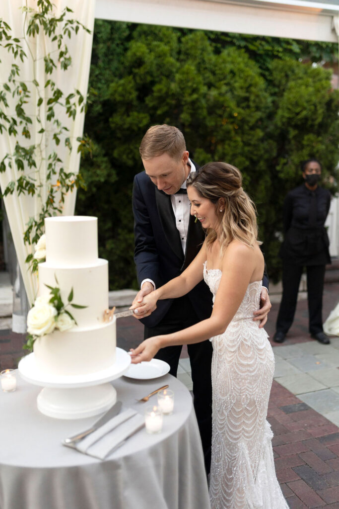
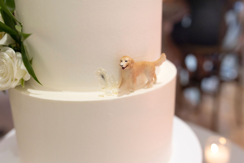
Still, as a fellow golden retriever lover, my favorite detail of Alex and Christopher’s wedding by far is the adorable golden retriever figure on their cake! I CAN’T! They even made it look like he took a bite! So, so adorable. What a fantastic way to use a small detail to make a big impression. White Ink was honored to help Alex and Christopher make their big day a day that left a lasting impression on all who attended. We love to help our clients with each creative detail we can offer, big or small, because they all serve a great purpose. Congrats to our happy couple!
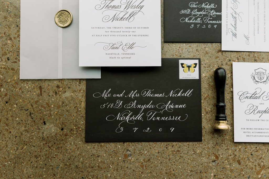
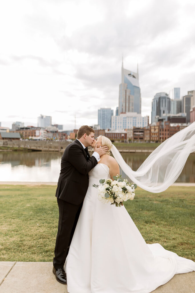
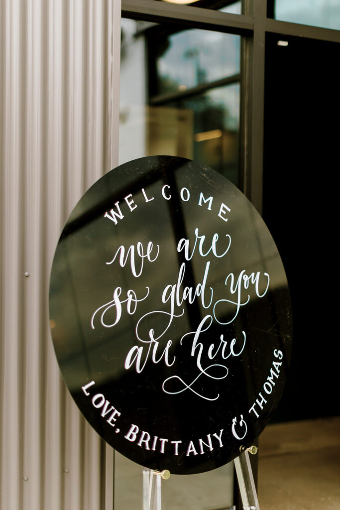
Ya’ll, we love a traditional Nashville style wedding, but there is something so satisfying about watching a wedding with a more modern form come together. Brittany and Thomas did not let us down. Everything they chose, from the invitation suites to place cards, was dripping in the perfect mixture of elegance and boldness. It made my calligrapher heart so happy that the White Ink team had the opportunity to work with this fantastic couple and help make their wedding dream become a reality.
wedding invitation suite
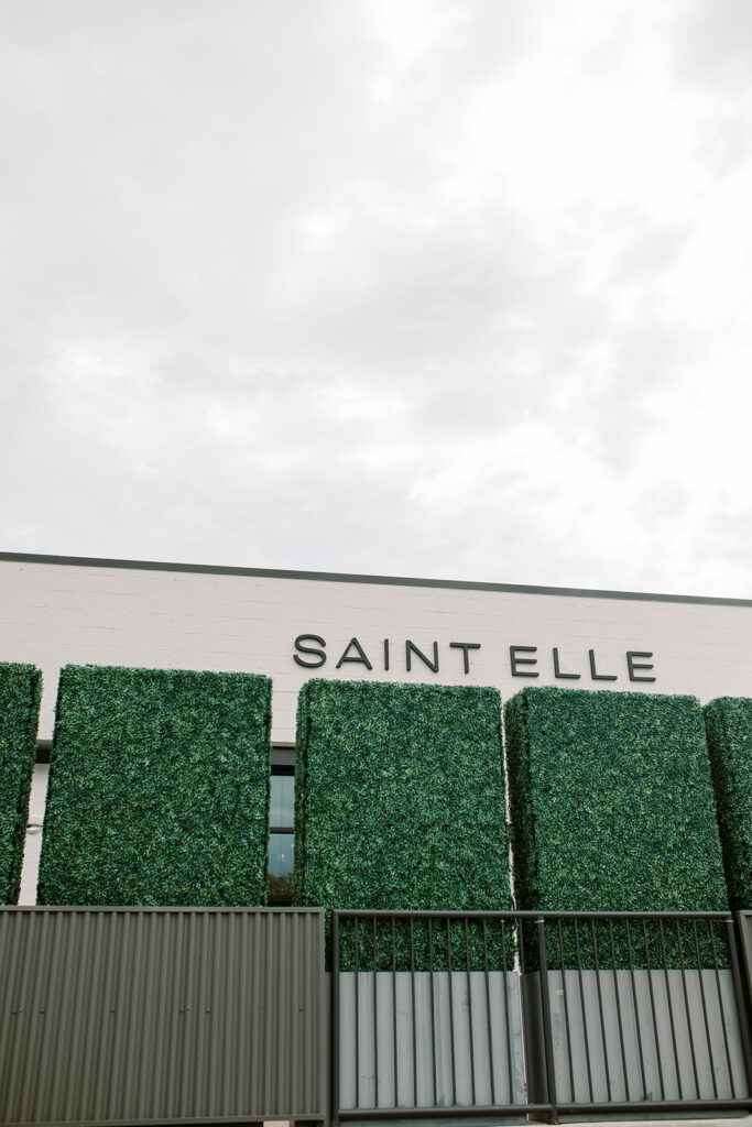
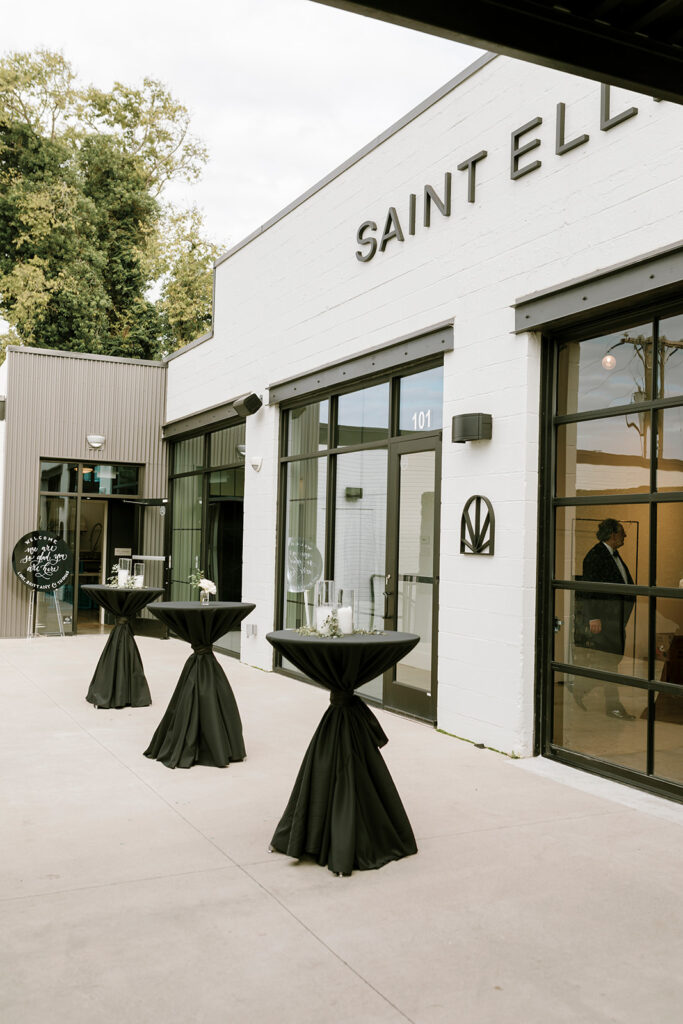
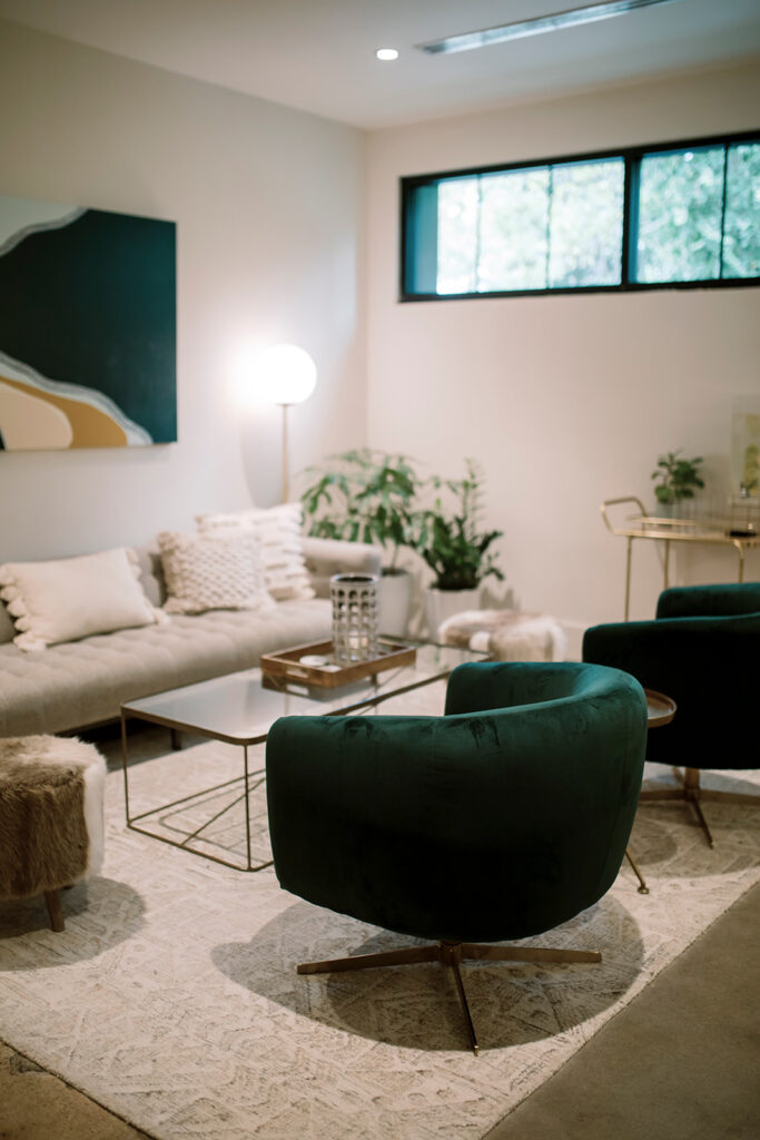
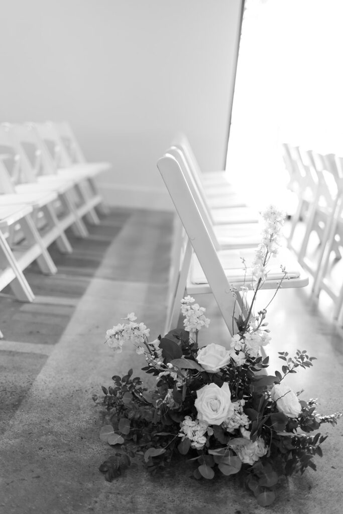
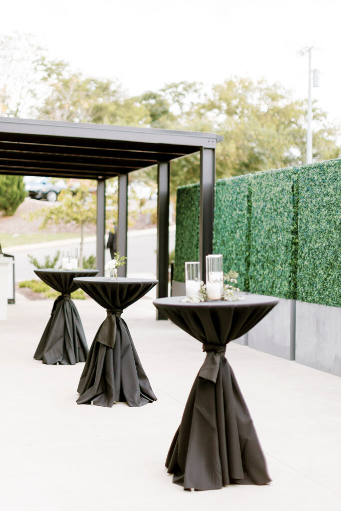
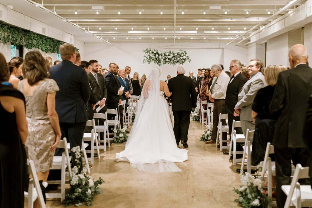
For starters, Brittany and Thomas chose Saint Elle in downtown Nashville as their wedding venue. It’s impossible to go wrong with that location! The furniture, the clean lines, the open spaces, and the abundance of greenery will certainly compliment your modern wedding goals. I love that we got create some really sleek custom calligraphy that flowed with the top-notch décor.
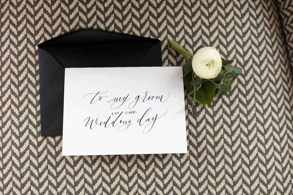
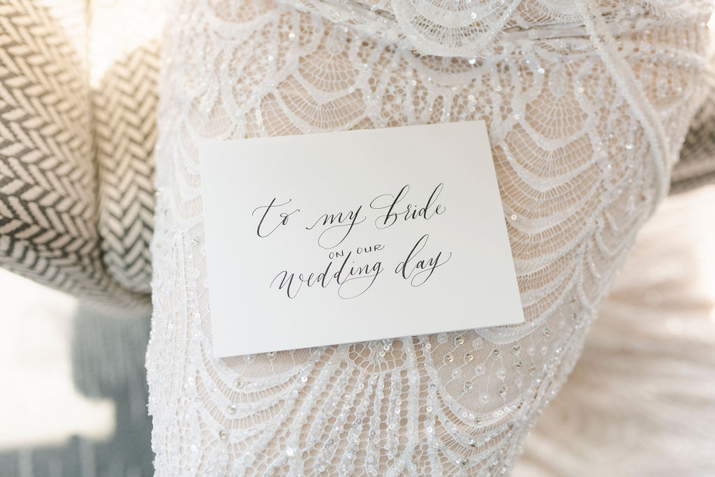
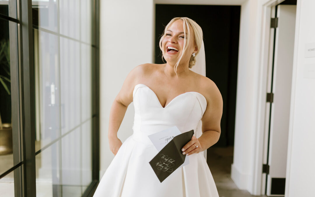
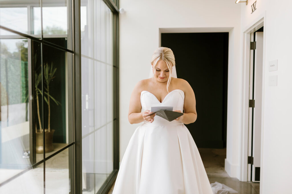
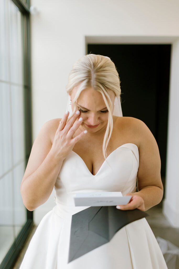
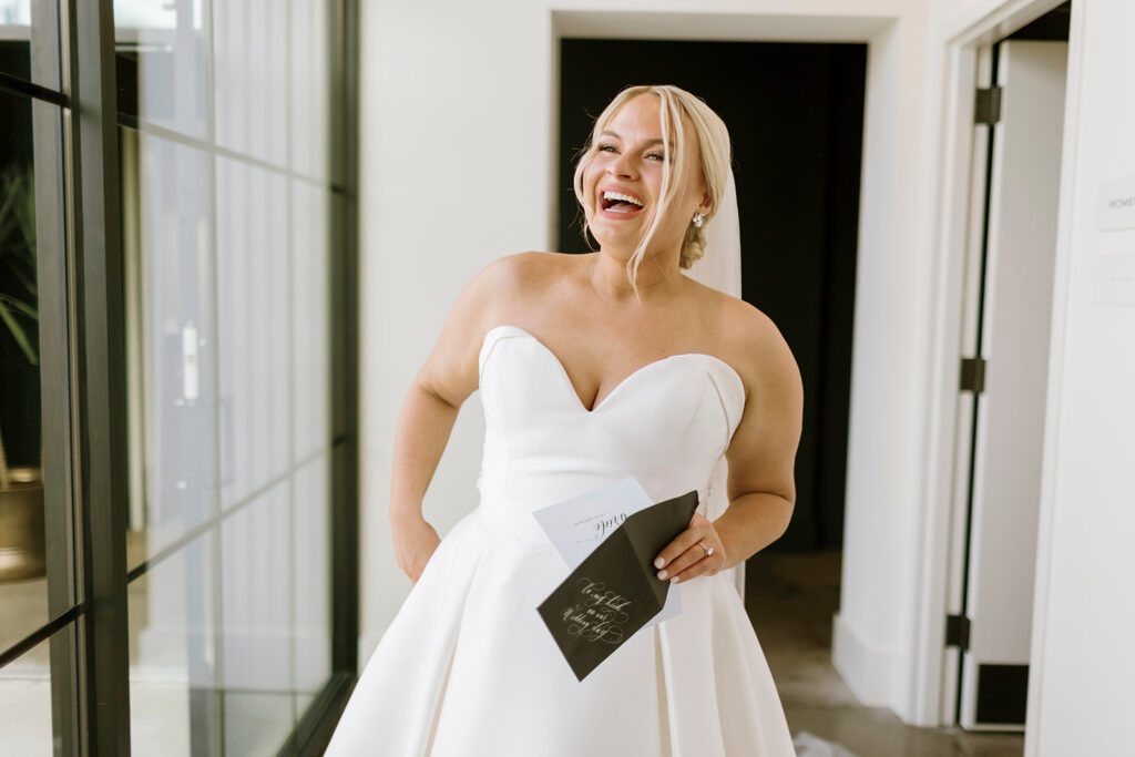
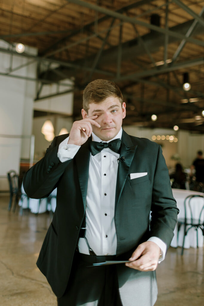
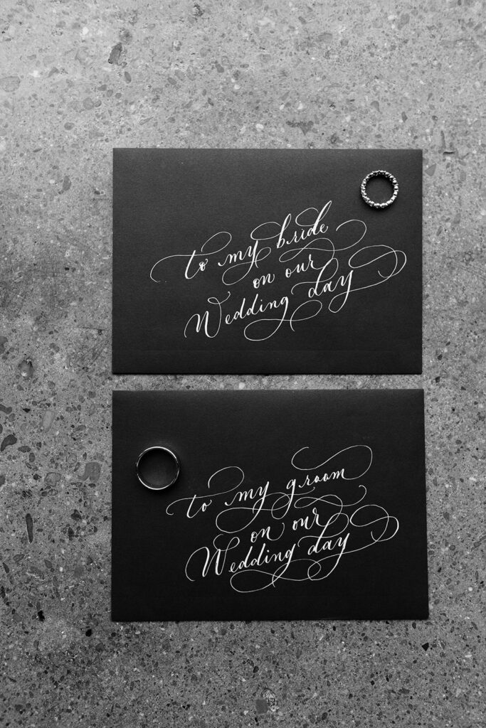
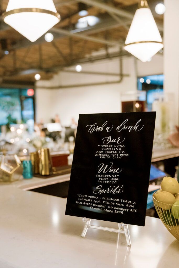
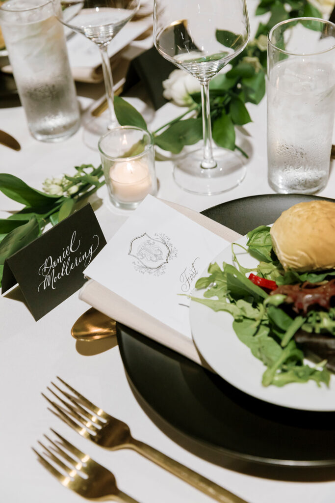
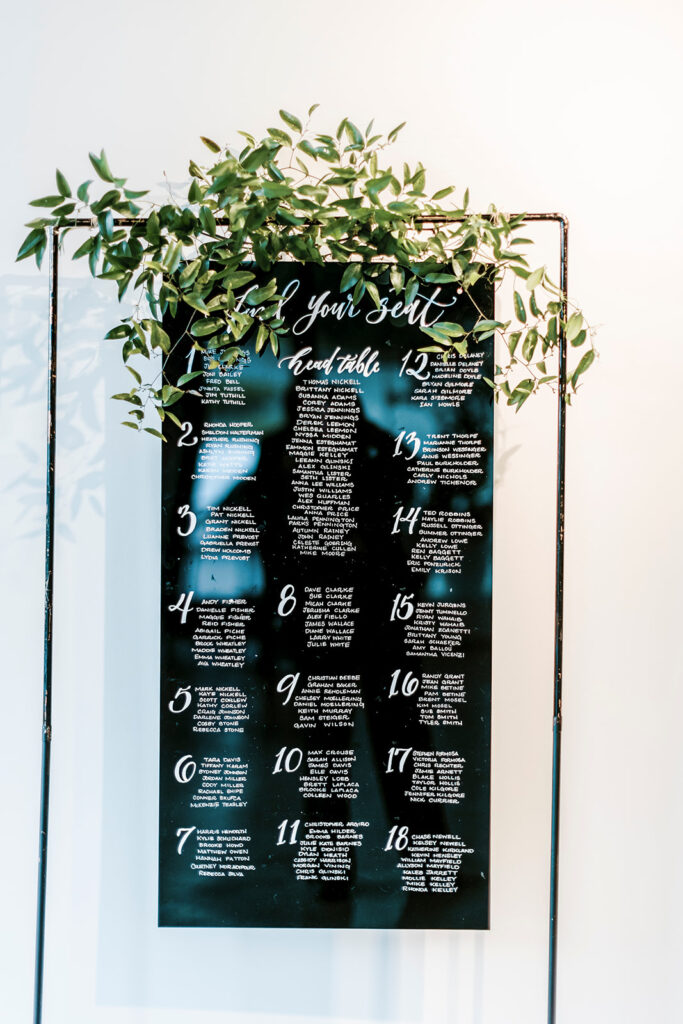
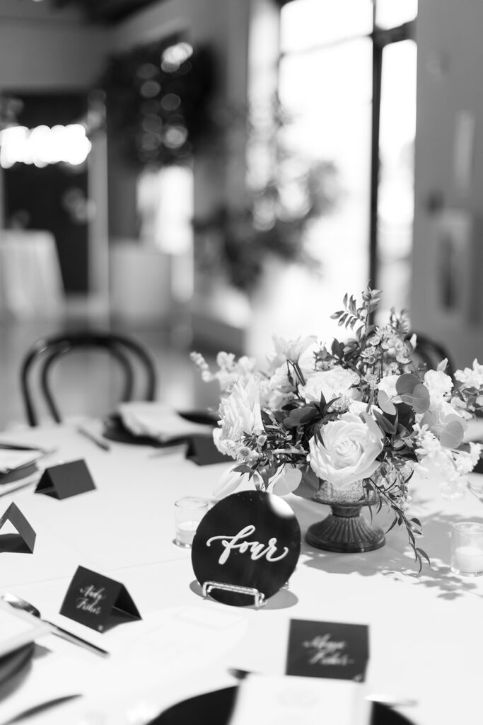
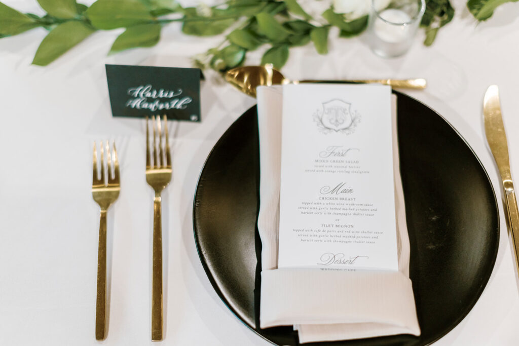
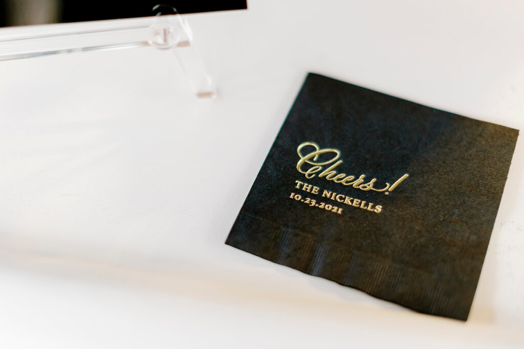
White Ink kept it coming while we put our mark on the super chic welcome sign, seating chart, bar signage, and place cards. I don’t know, but putting white custom calligraphy on top of black just kept blowing my mind. And I want more! We definitely had a lot of favorites at this wedding but getting to customize the envelopes that read, “To my Bride/Groom on our wedding day,” warmed our hearts! Seeing their reaction to such a sweet and delicate moment on the biggest day of their lives really made me appreciate that White Ink had a little part in that.
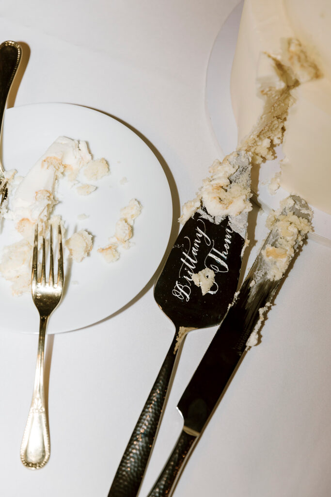
Don’t forget, White Ink can ENGRAVE custom calligraphy on many different surfaces. You have to take a look at Brittany and Thomas’ stunning cake-knife and server set! You don’t have to be a bride or groom to inquire about something like these. This would be a fantastic gift for anyone to give to a special couple on their big day.
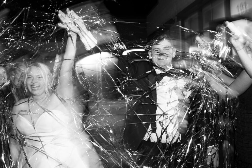
Anytime I think about designing for this wedding it puts a smile on my face. We cannot wait for the next opportunity to design with a modern style in mind because, just like those confetti streamers at our couples exit, this wedding POPPED!
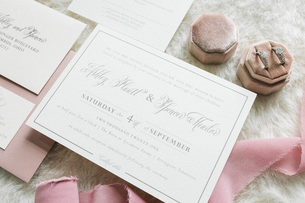
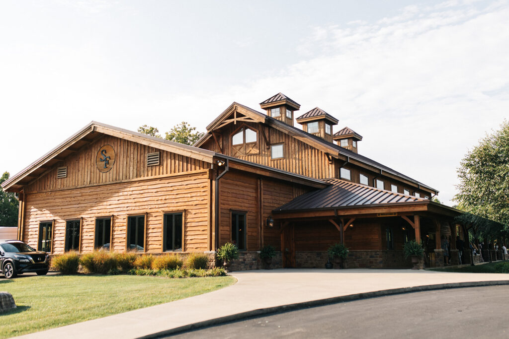
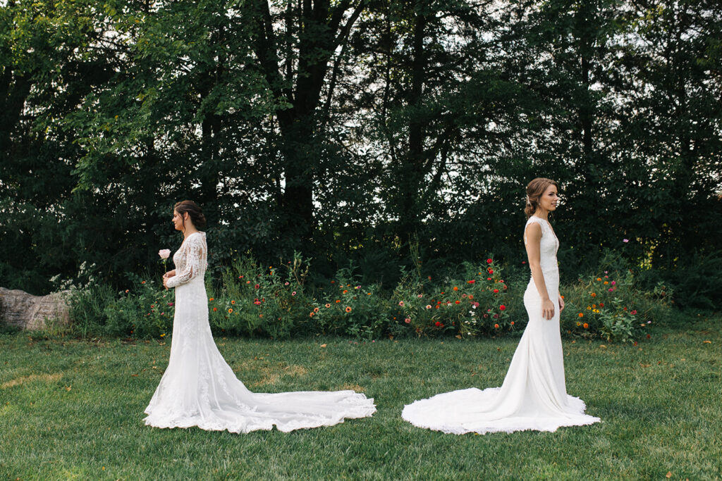
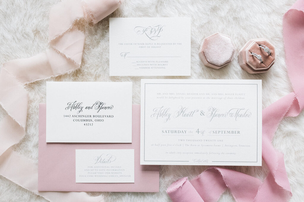
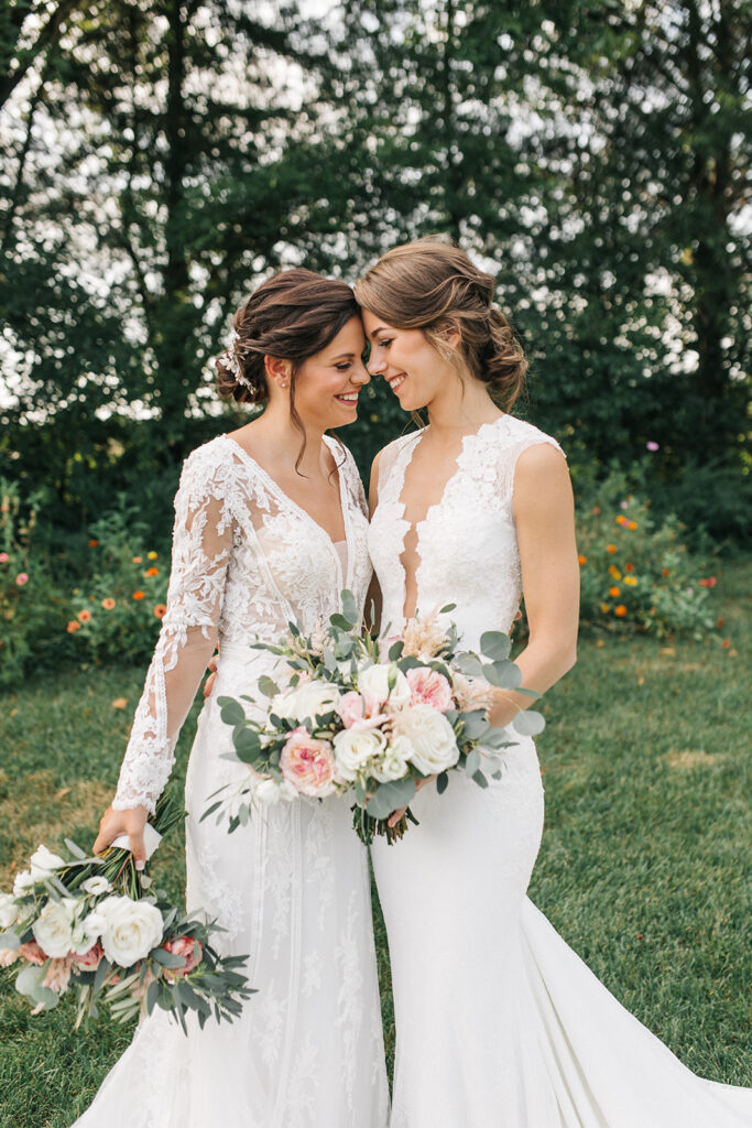
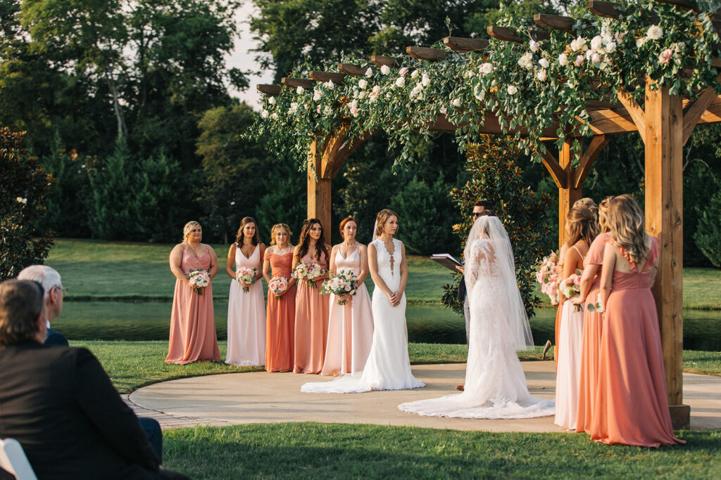
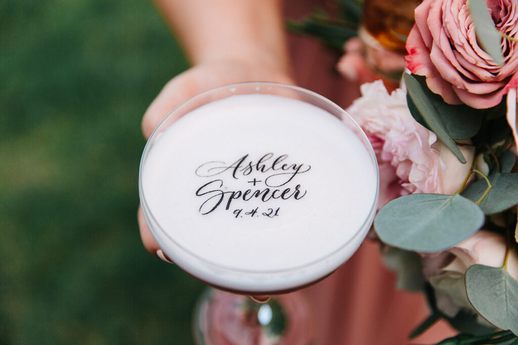
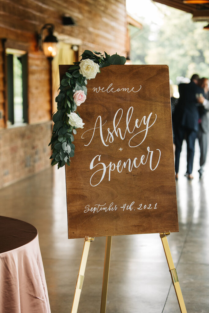
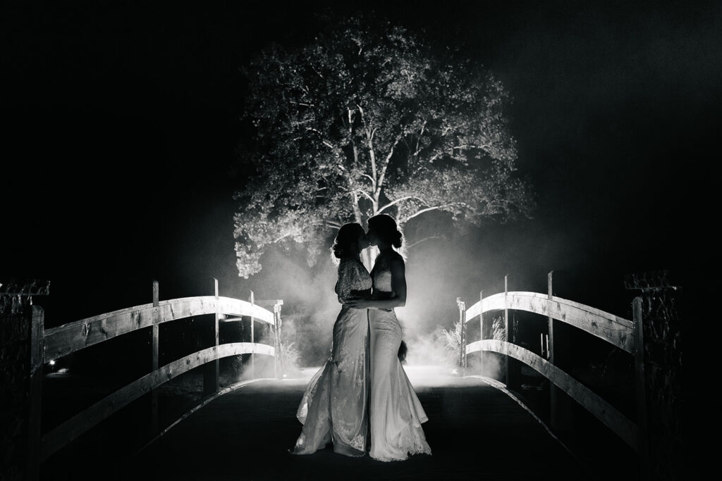
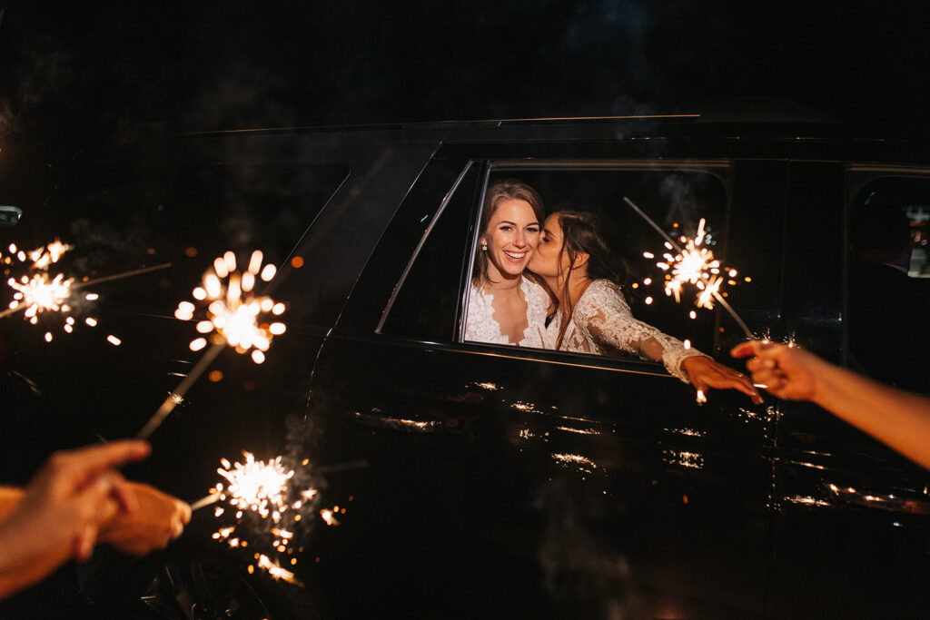
This is a wedding that we’ve been really excited to share with you! Our brides, Ashley and Spencer, were super fun to work with. White Ink was happy to be a part of this incredible day for such a lovely couple. Ashley and Spencer trusted White Ink’s ability to help create some fantastic pieces that fit beautifully into one of the dreamiest weddings we have ever seen.
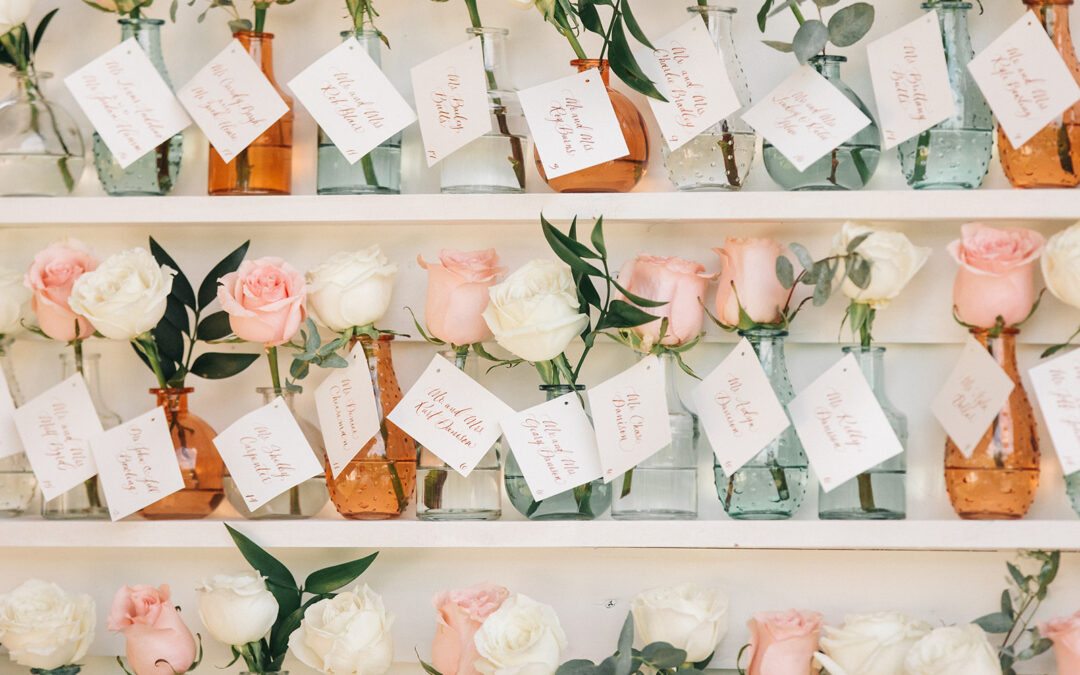
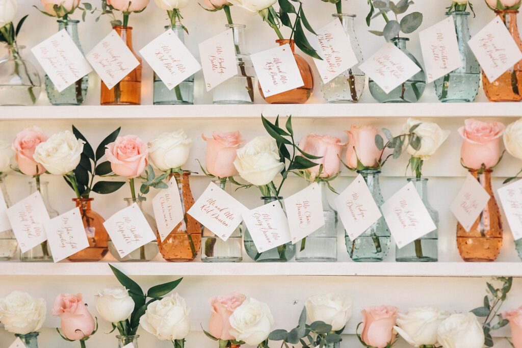
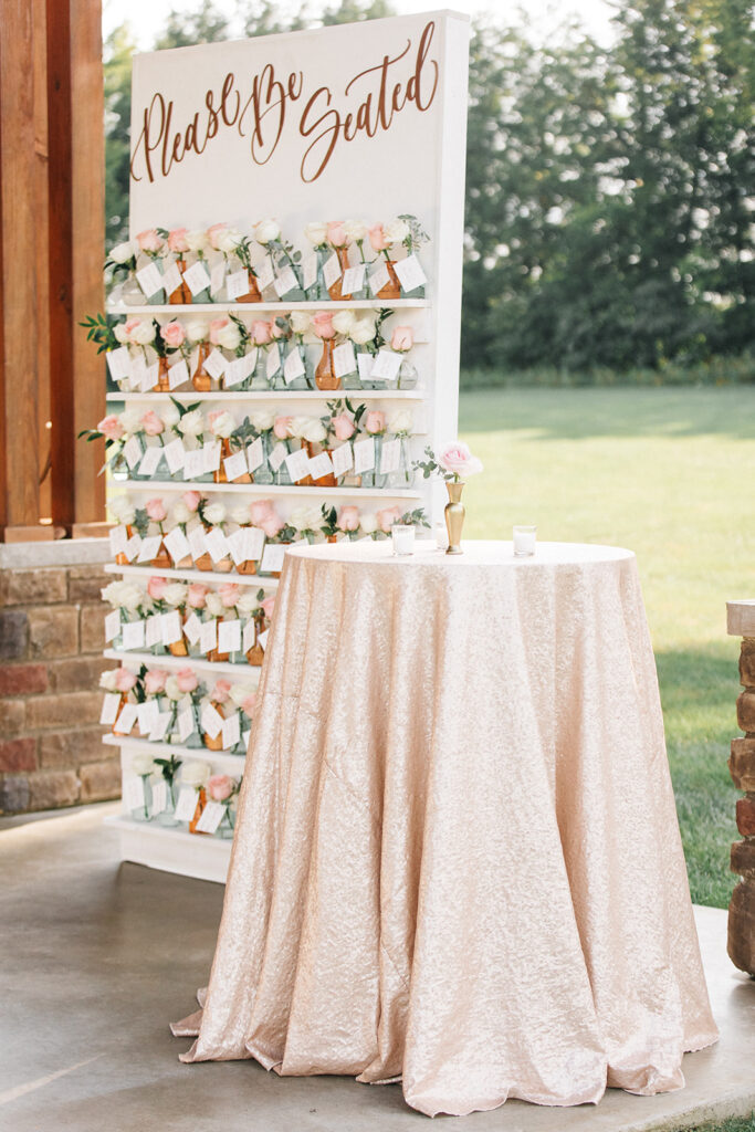
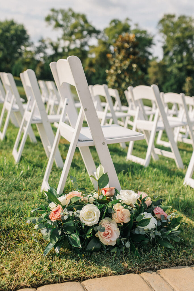
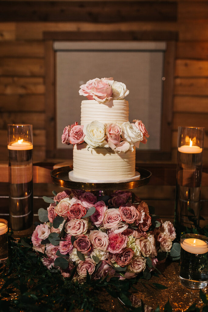
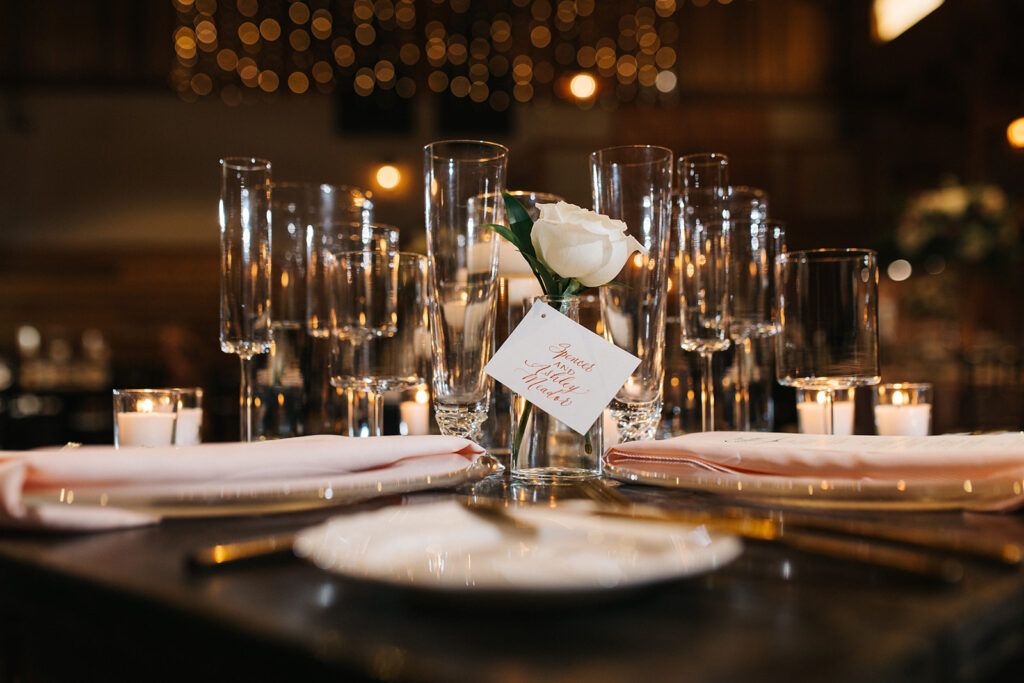
I just have to jump right in and talk about this amazing seating chart that was filled with rows of rose-filled vases! White Ink produced the calligraphy for the escort cards attached to each vase. I could have looked at this display forever and ever and then a little more. What a charming way to lead your guests to their seats! Our brides brilliantly interlaced roses throughout the ceremony and reception. I think our favorite bundle was perhaps the CLOUD of roses that the wedding cake seemed to just float on top of! Just, gorgeous.
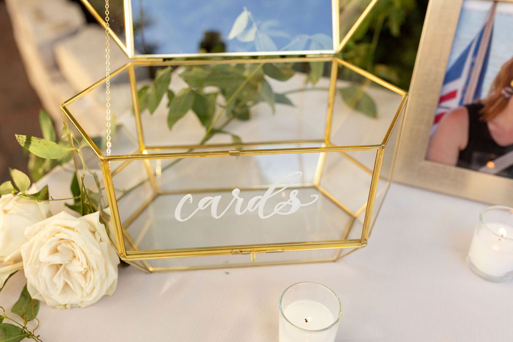
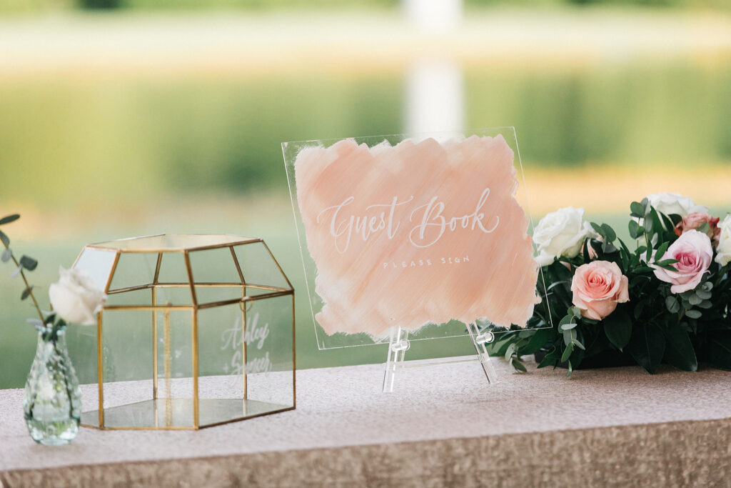
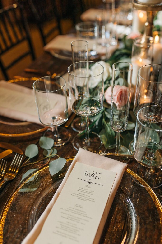
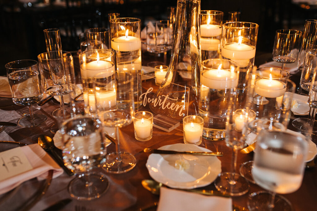
We were delighted that Ashely and Spencer chose to use items like the table numbers and card box from White Ink’s rental collection. The acrylic table numbers are a favorite of ours because they subtly do their job without taking away from the décor of the table. Our team also put together the menus that went perfectly along with the tablescapes adorning fine glasses, gold-trimmed plates and gently placed roses. The wooden welcome sign we did made the white calligraphy just pop. Of course, a garnish of roses only made it even more attractive. We love diving into all the details that help make a wedding stand out. This wedding certainly did not disappoint!
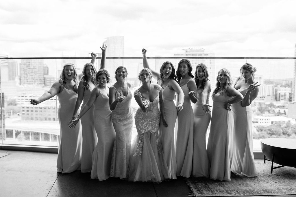
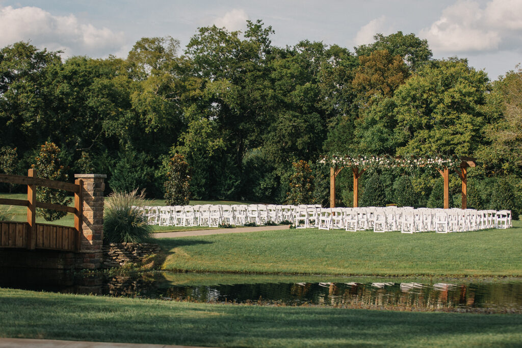
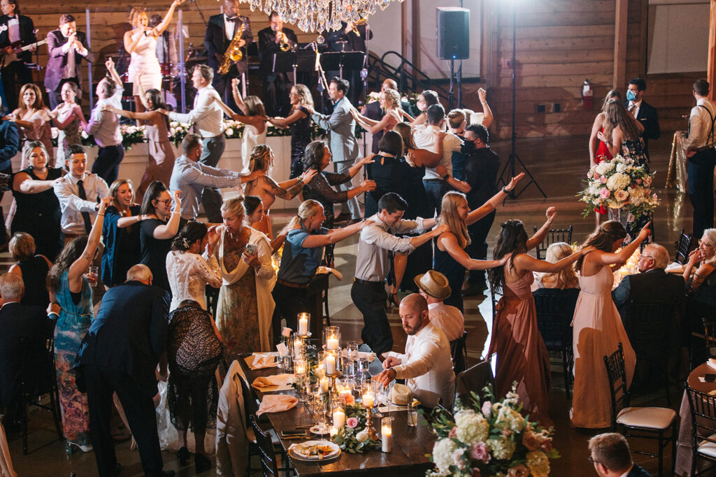
Everything seemed to fit together perfectly on this gorgeous day. We loved the way the brides’ dresses complimented each other so flawlessly. The bridesmaids were stunning in their rosy hues. The live band was on point and the conga line was the absolute cherry on top. Ashely and Spencer put together a wedding of their dreams and then filled it with roses and all the love that was shared between family and friends. What a special day to be a part of!