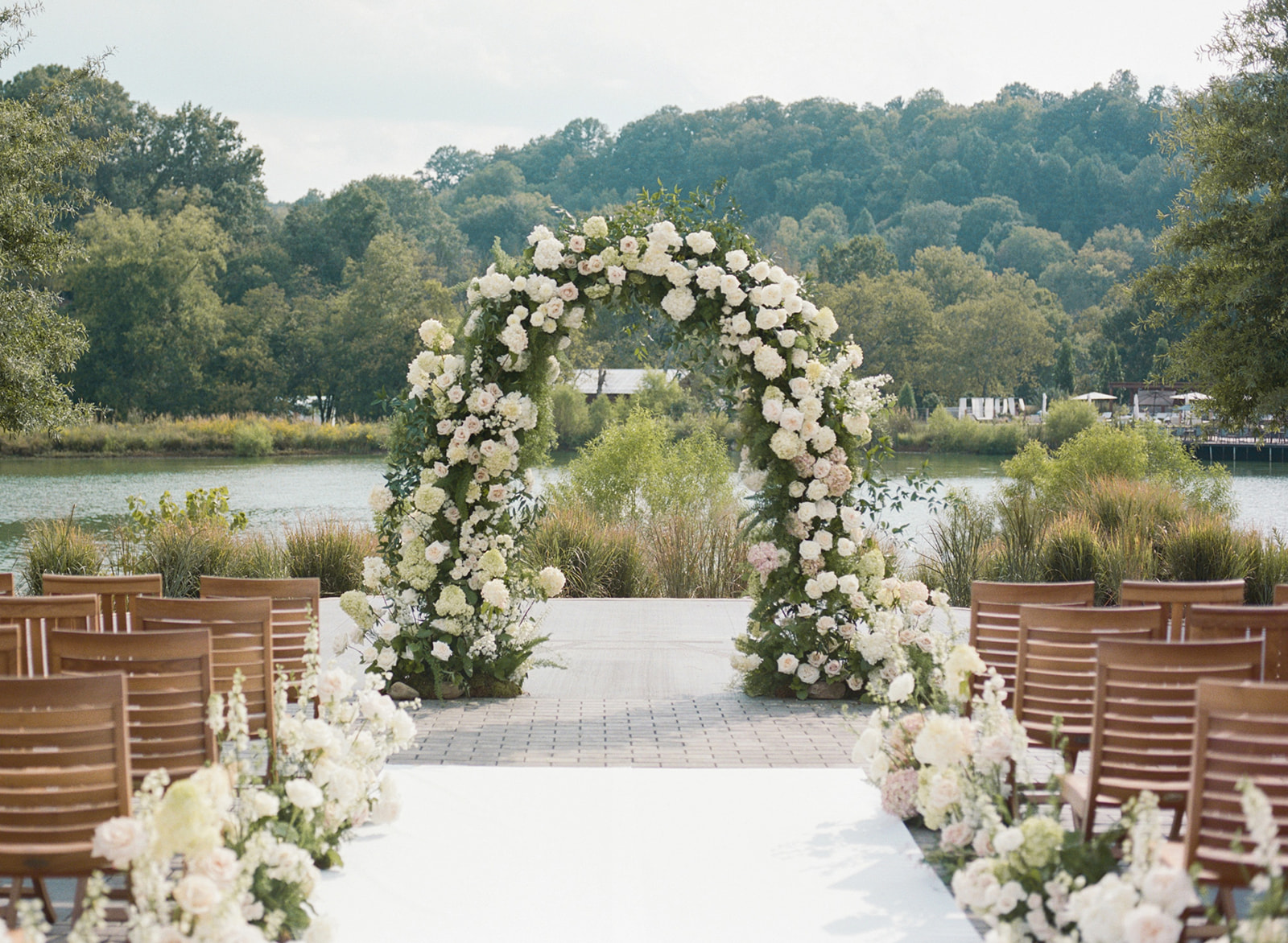
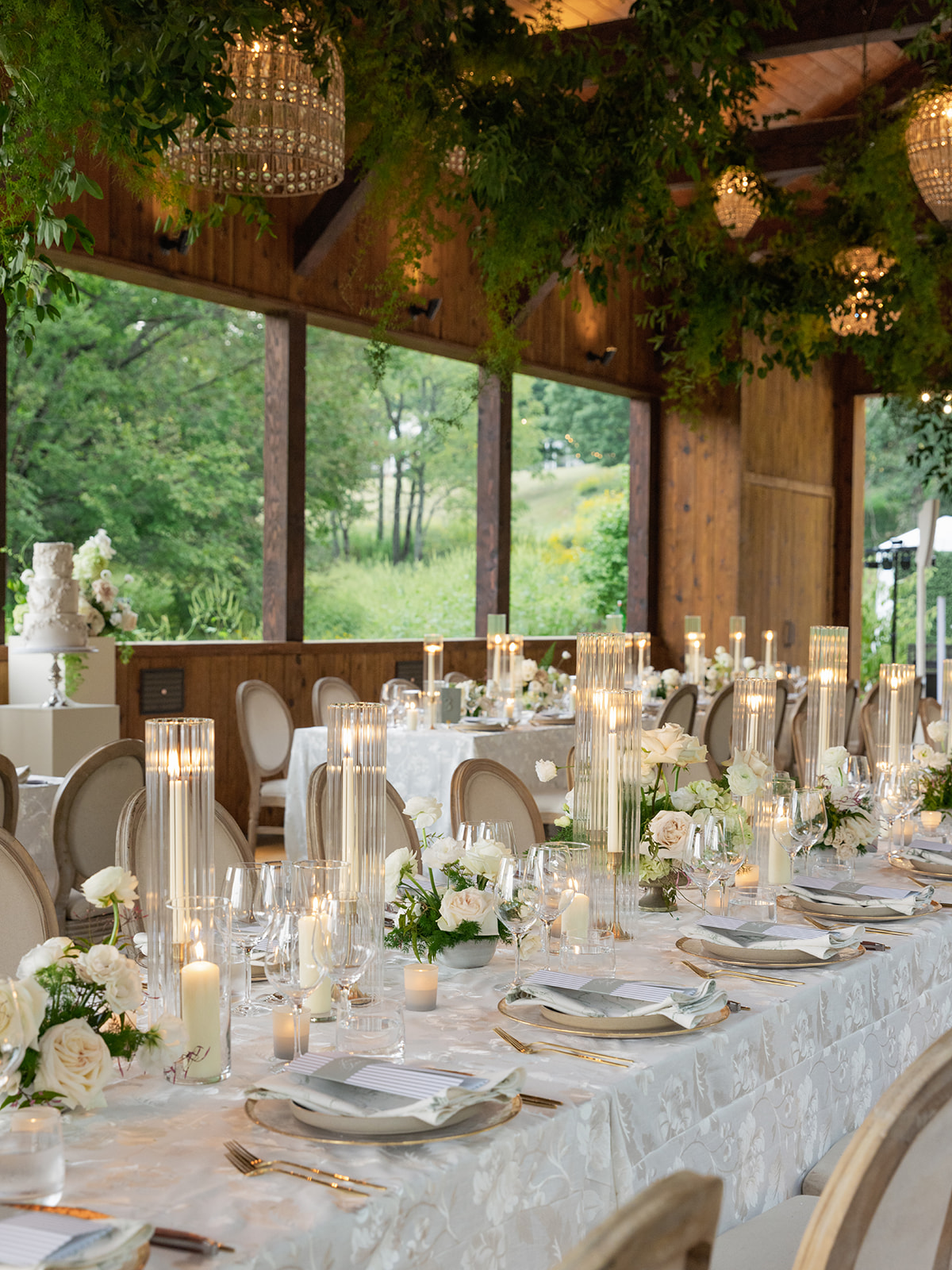
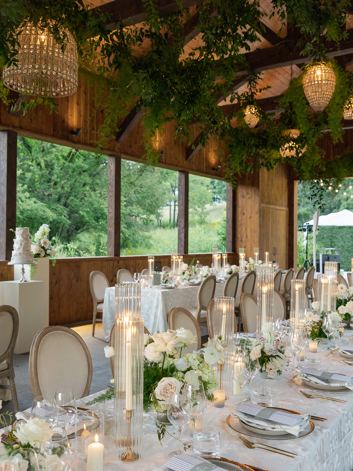
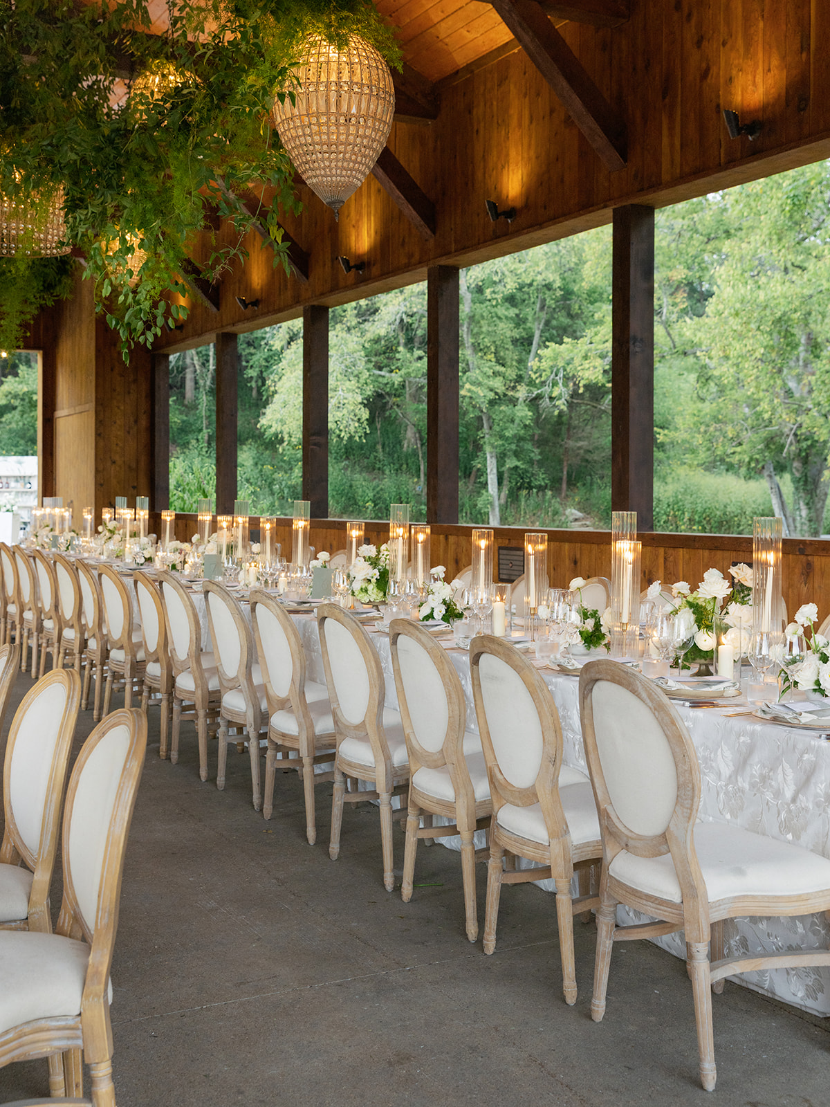
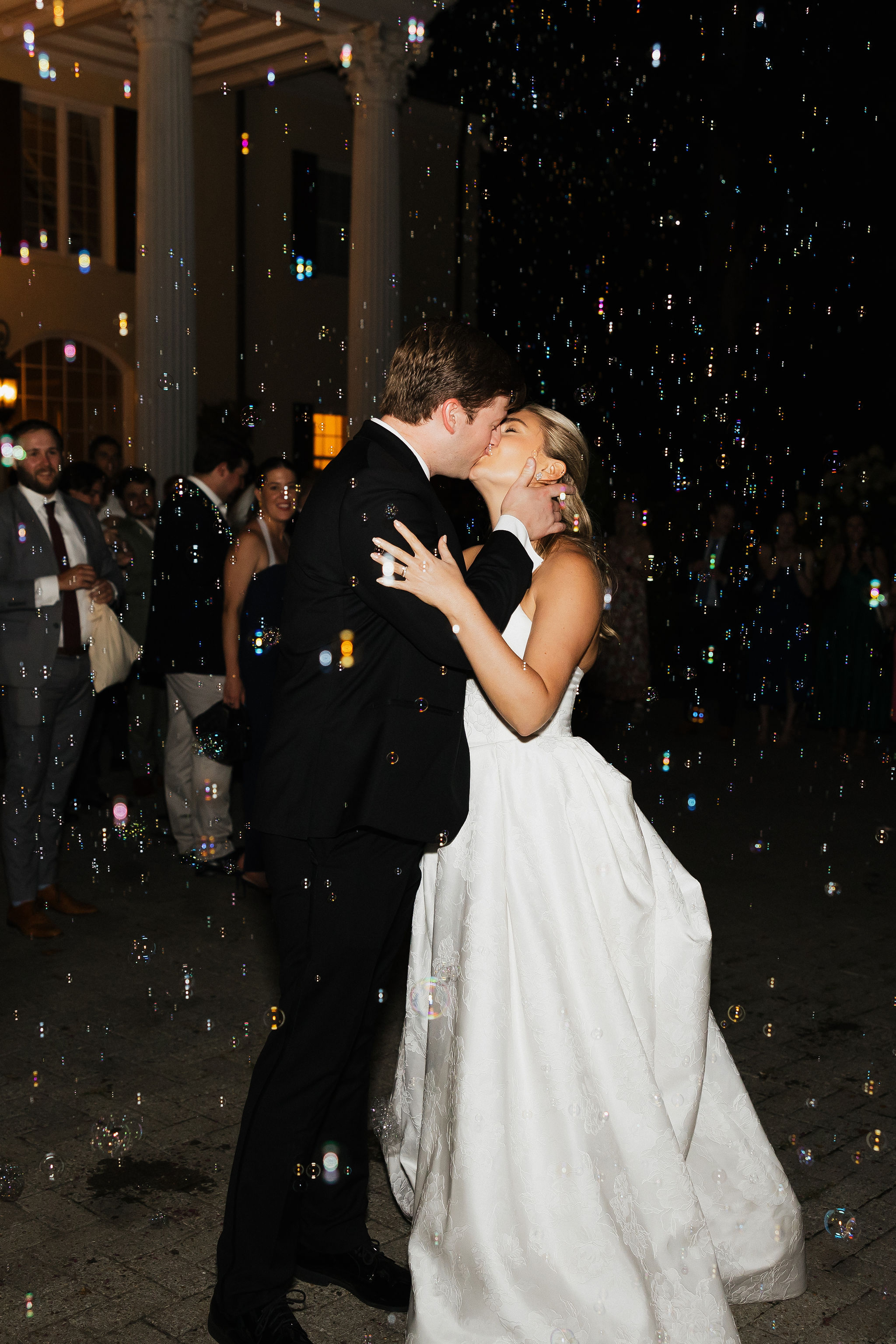
The intentional wedding details from Ella and Connor’s Southall Farm & Inn wedding in Franklin, TN was the definition of thoughtful design. Every element was created with purpose. It wasn’t just to look pretty, but to create moments their guests would remember long after the wedding ended. I love that they valued and were all about intentionality. Everything they dreamed up, from a custom bar and dance floor, to bespoke details like interactive guest menus, we were able to create. The best part was that these moments and details felt true to them AND were unforgettable to their guests.
This celebration proved that intentional design truly elevates the wedding experience. If we’ve said it once, we’ve said it a thousand times, details matter. And this wedding was filled with them. The experience began with the invitations that set the tone. Everything else that followed tied the theme and their vision together.
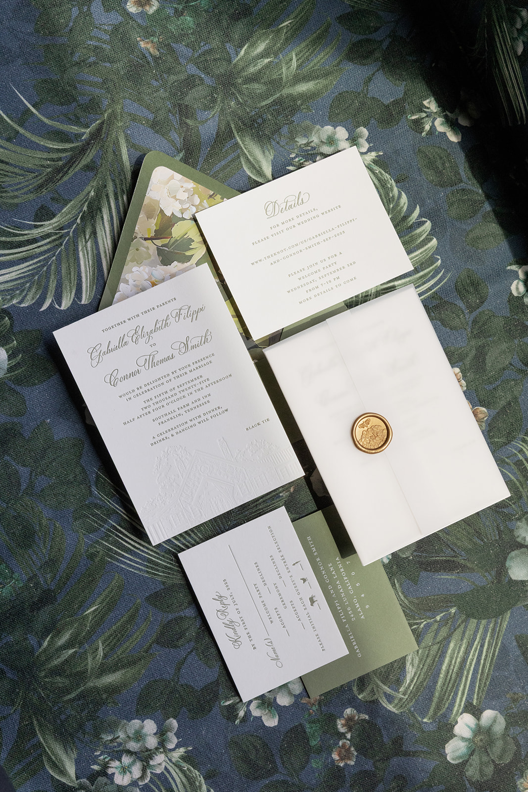
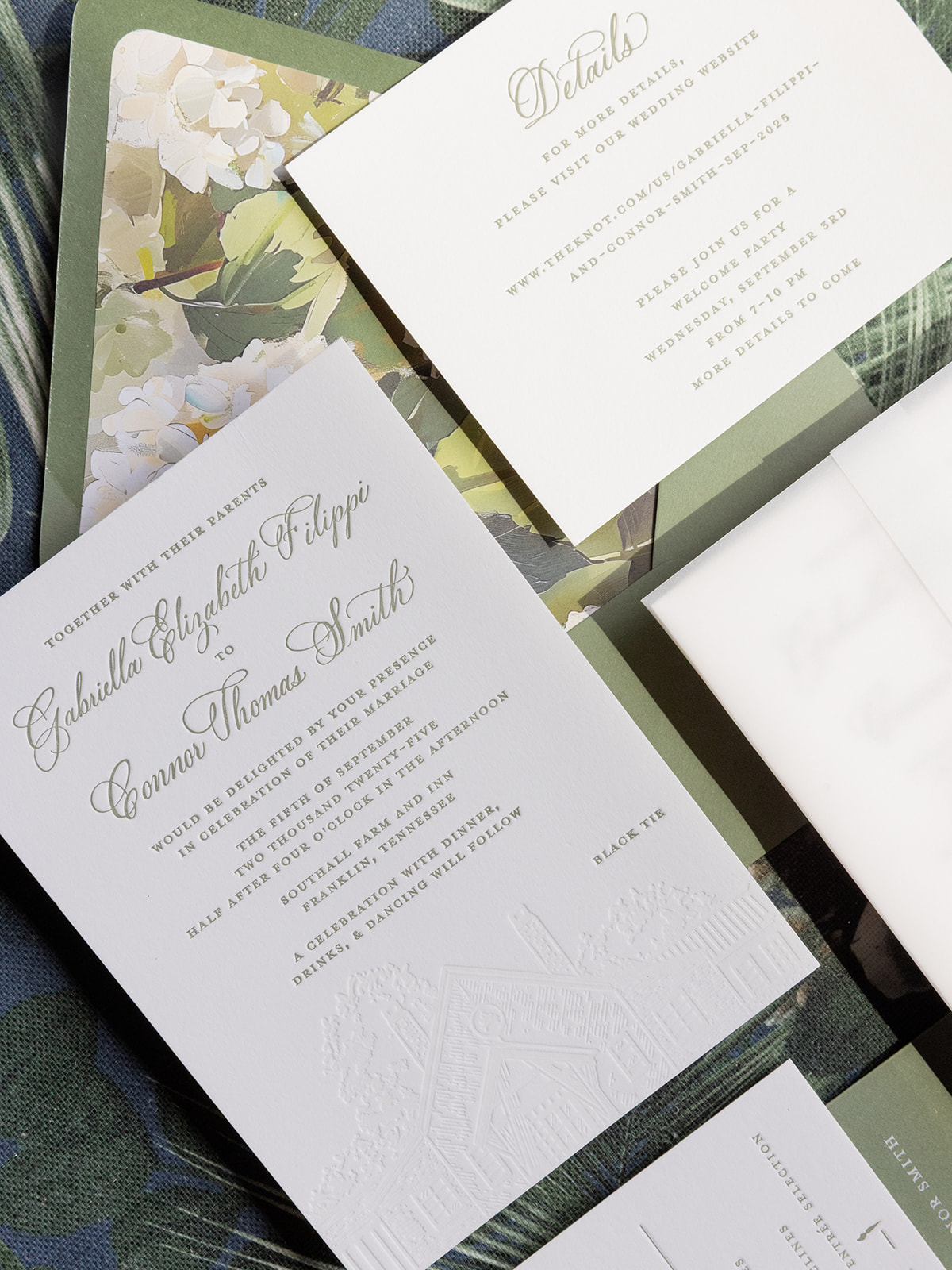
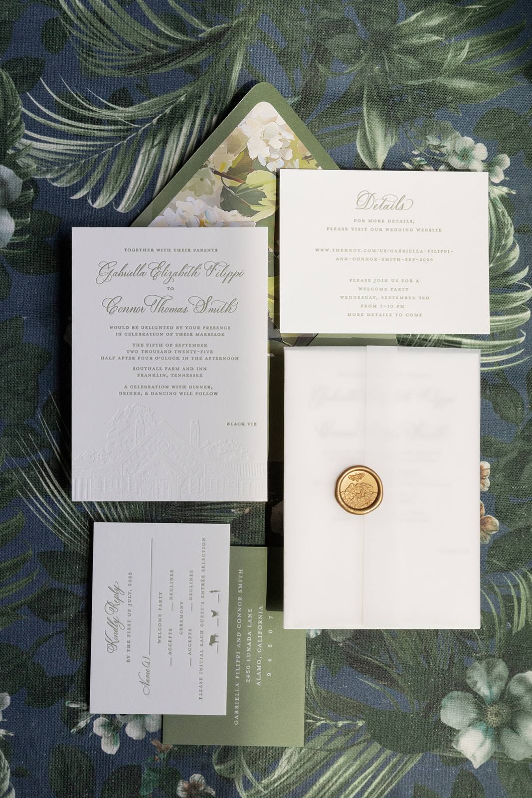
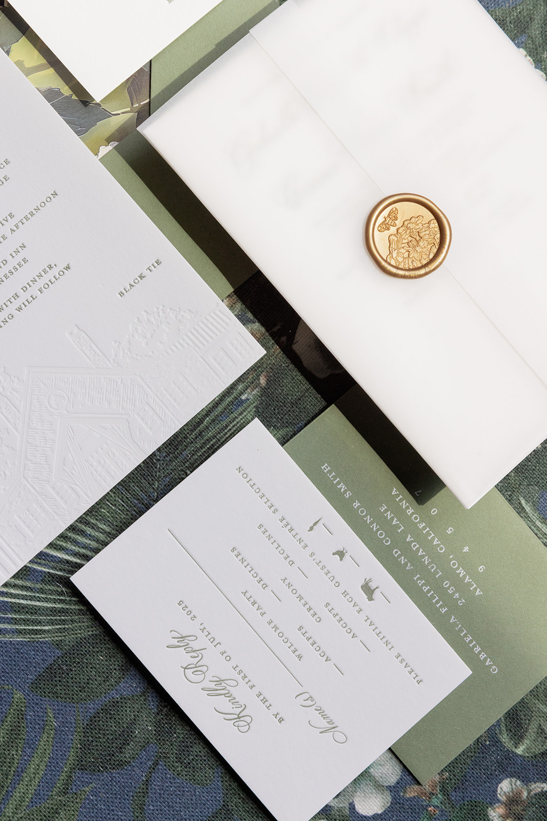
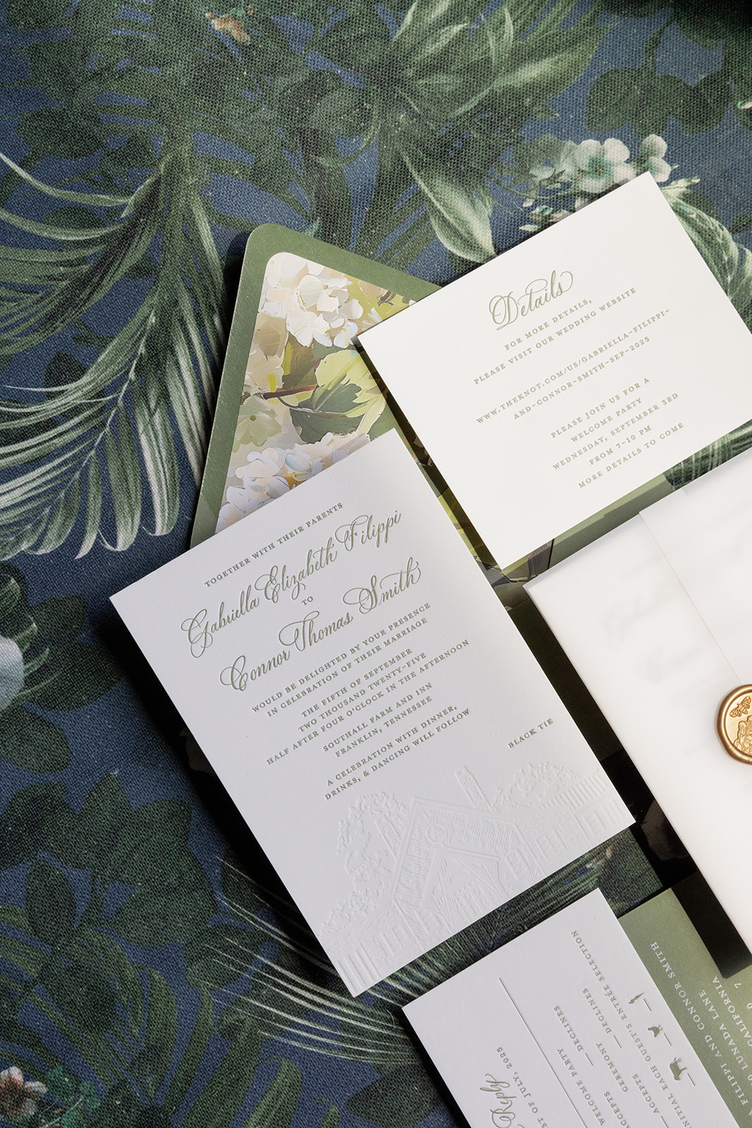
An Invitation Suite That Set the Tone
First, let’s have a moment for these invitations. With a blind letterpress venue illustration of Southall Farm & Inn at the bottom of the main invite, these became more than just pieces of paper. They created a moment where guests could envision what was to come. We paired the suite with a vellum gatefold, a custom floral envelope liner, and a gold wax seal, creating a layered, tactile experience that felt elevated from the moment it was opened.
Since many guests were staying on property, we also designed custom welcome bags for their arrival. Delivering them turned into one of those behind-the-scenes moments we love most, as I ran into the groom while dropping them off and finally got to meet him in person for the first time.
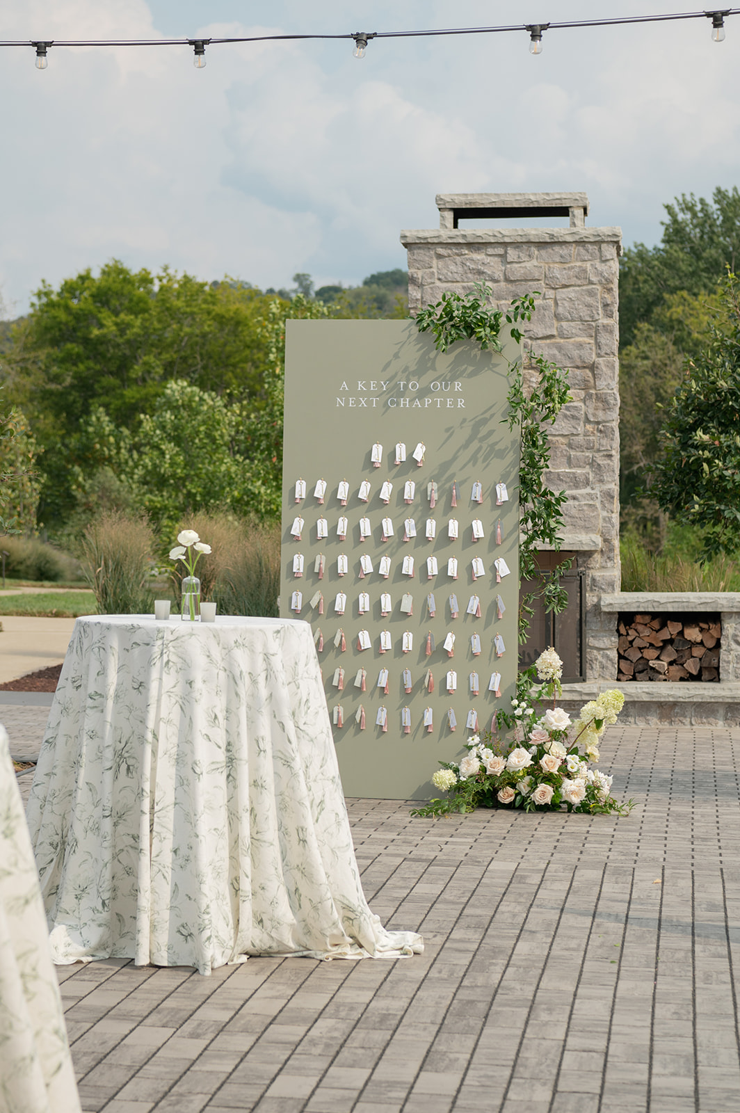
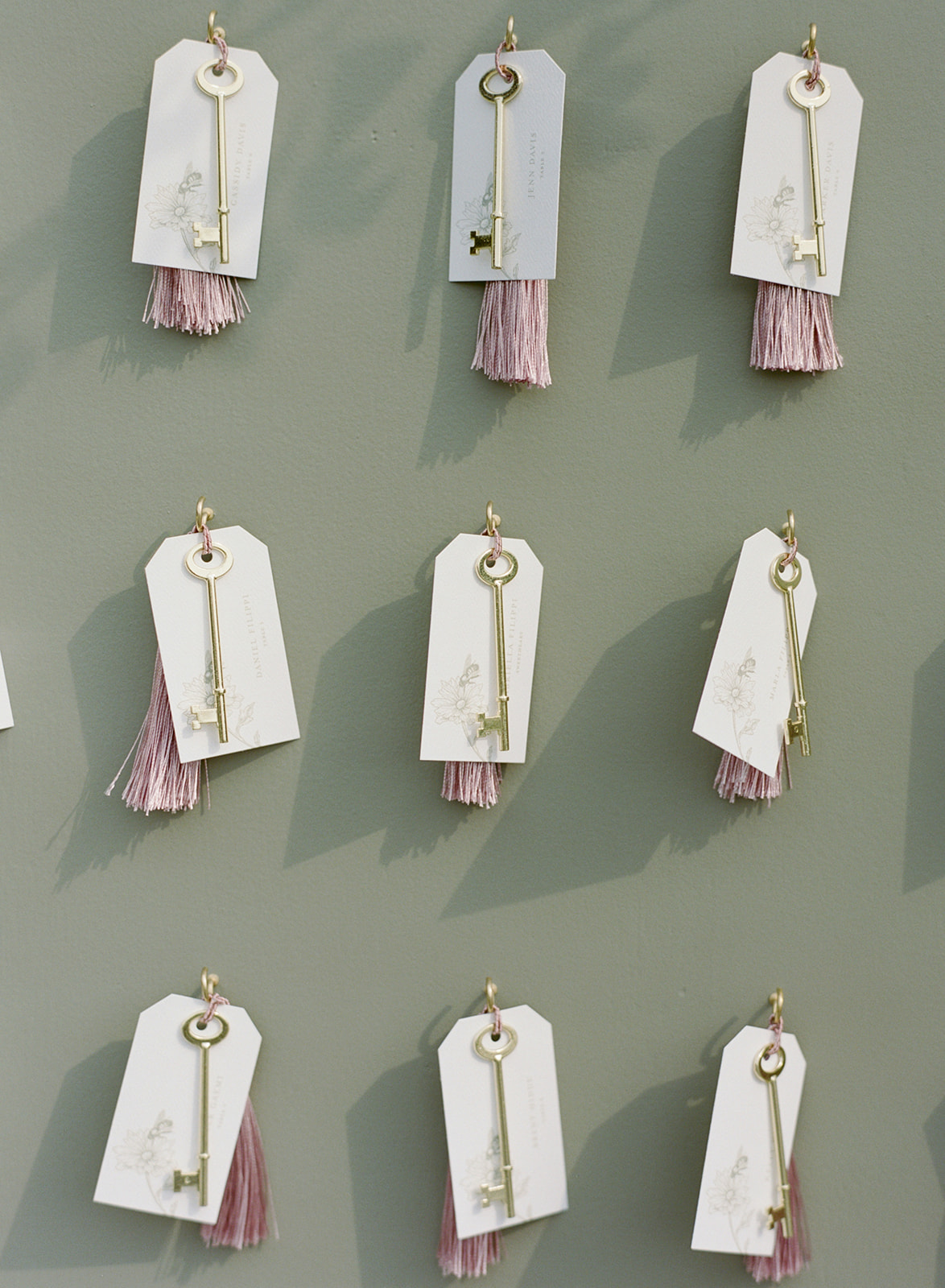
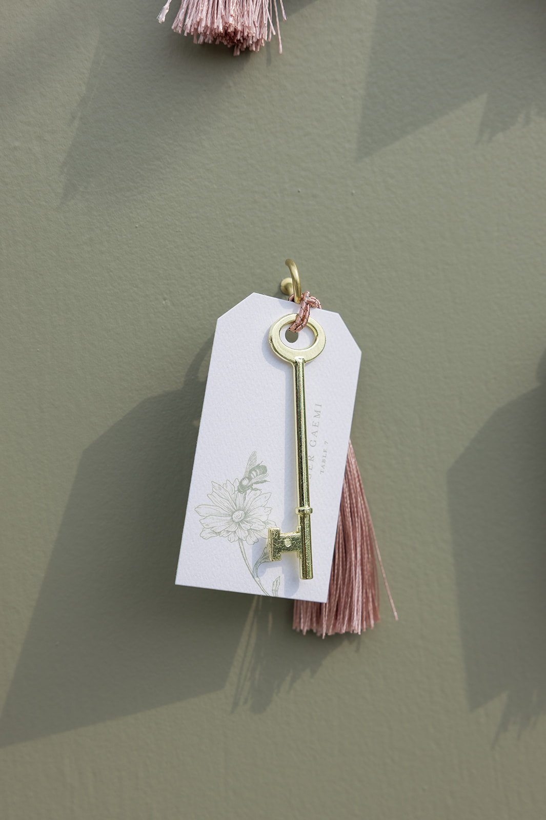
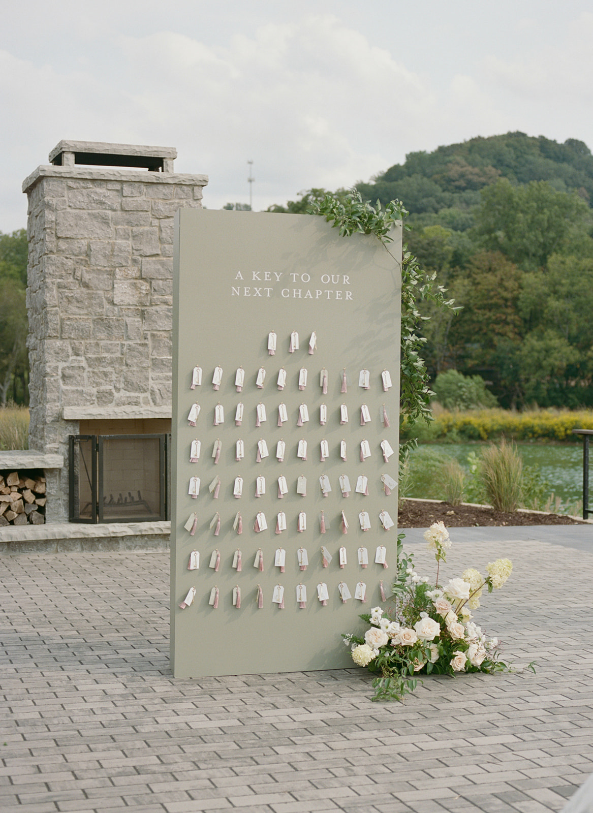
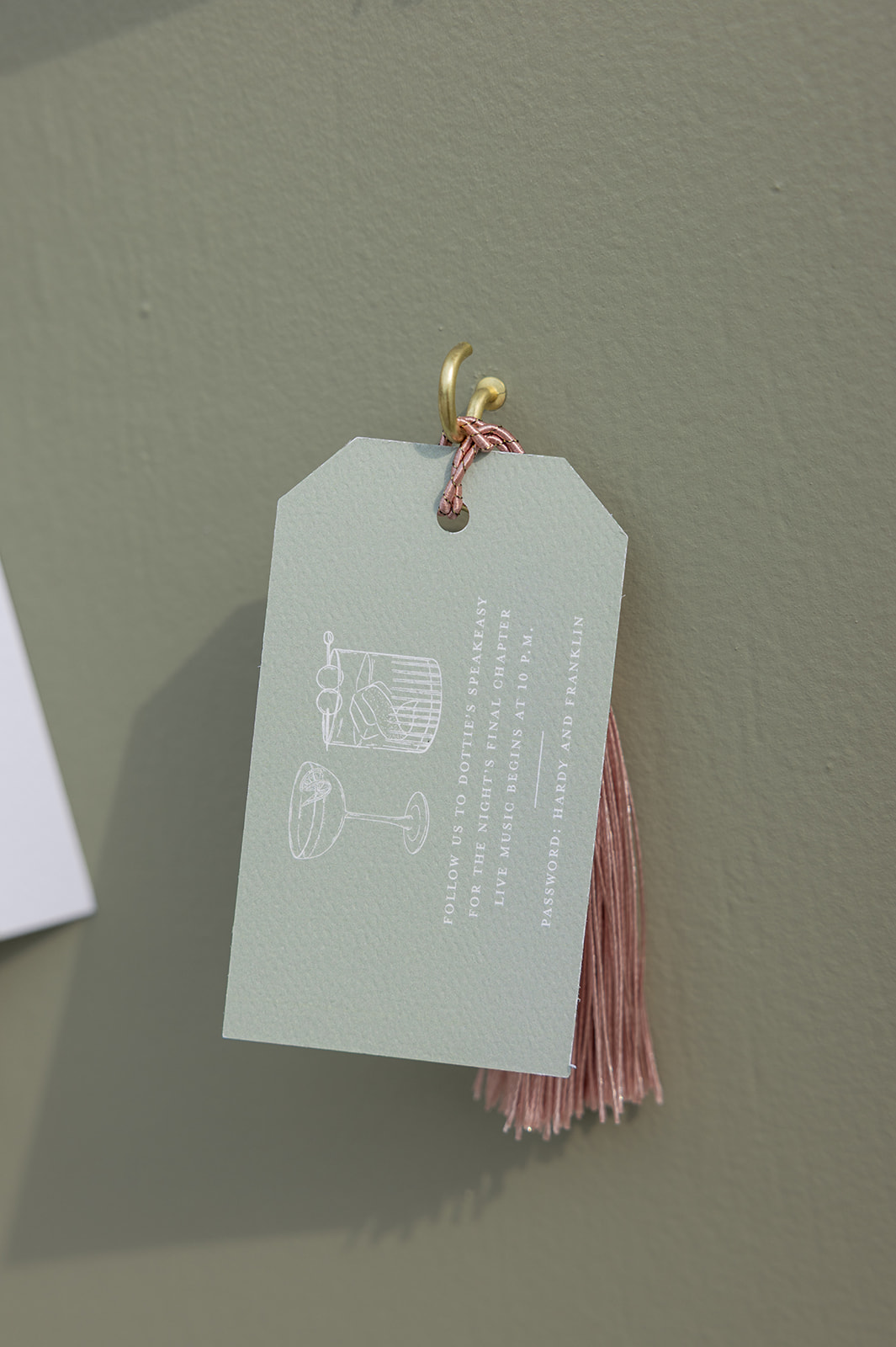
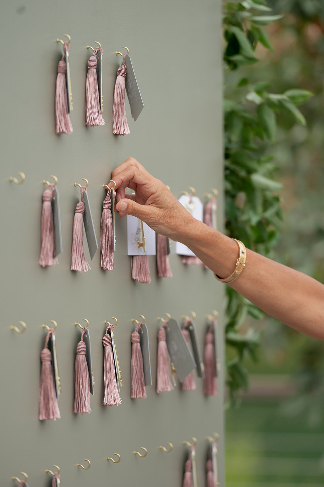
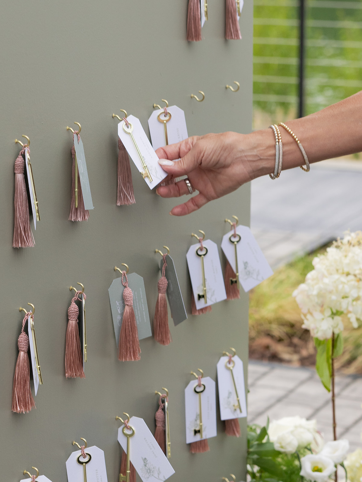
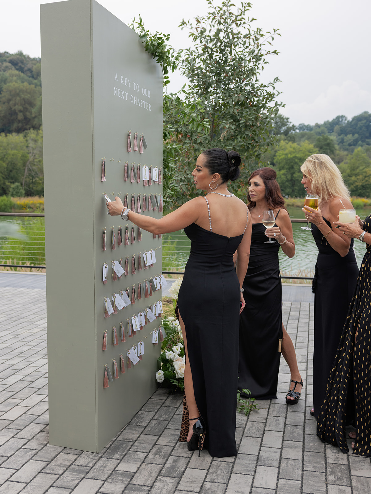
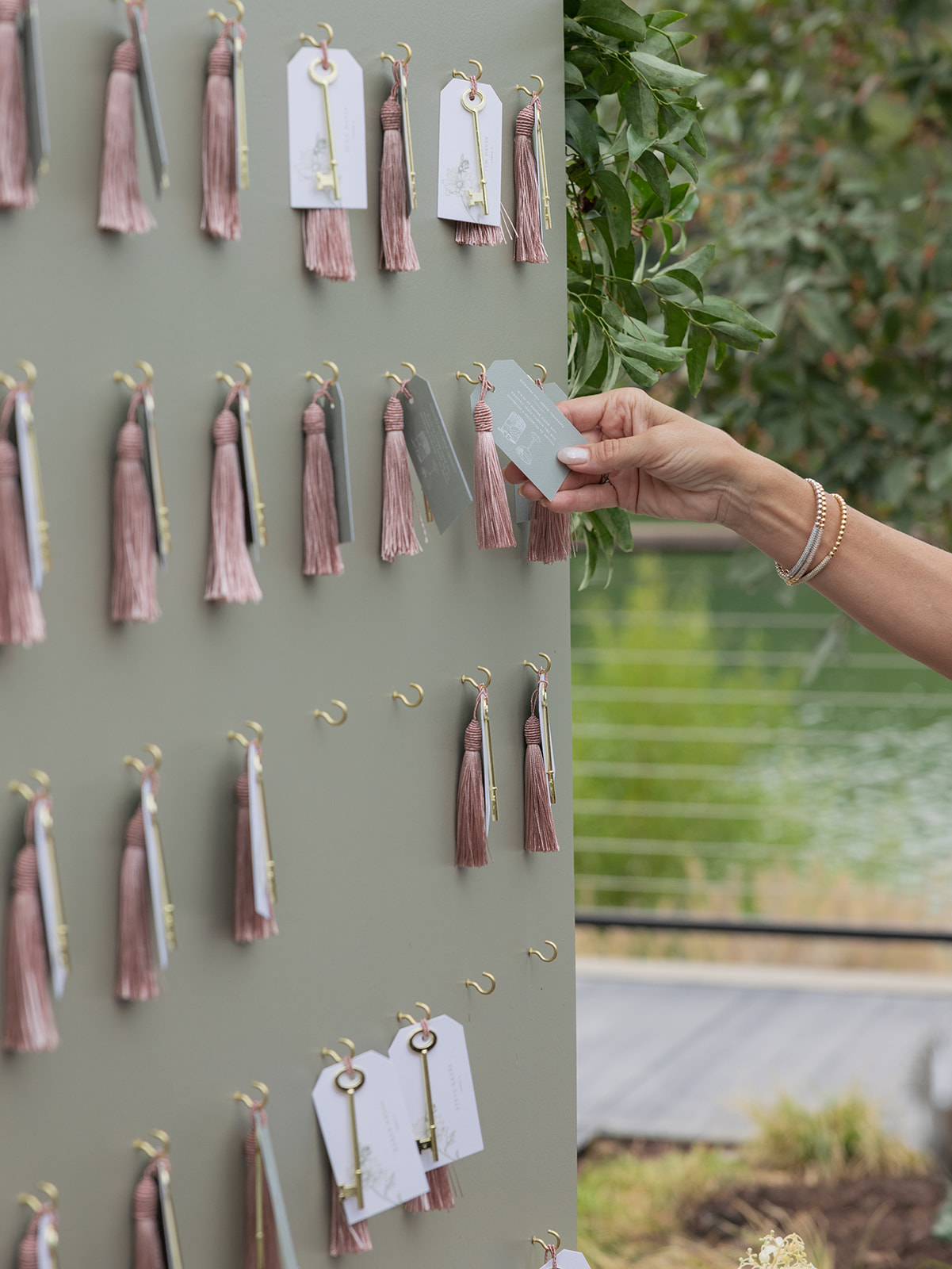
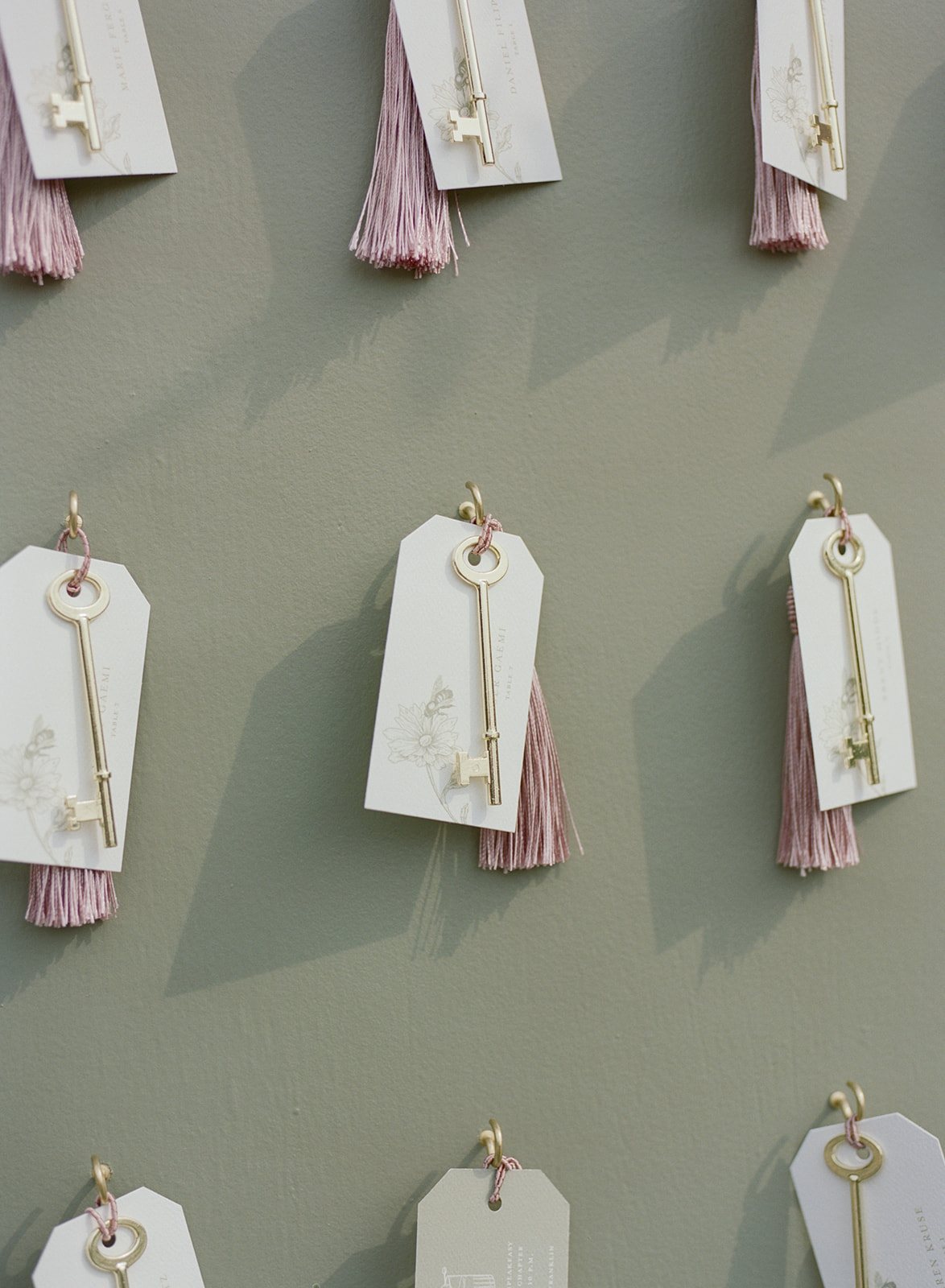
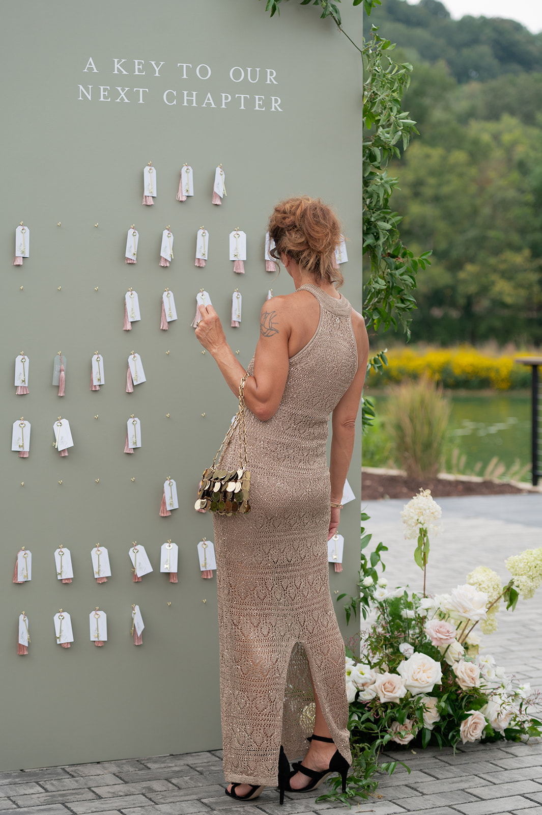
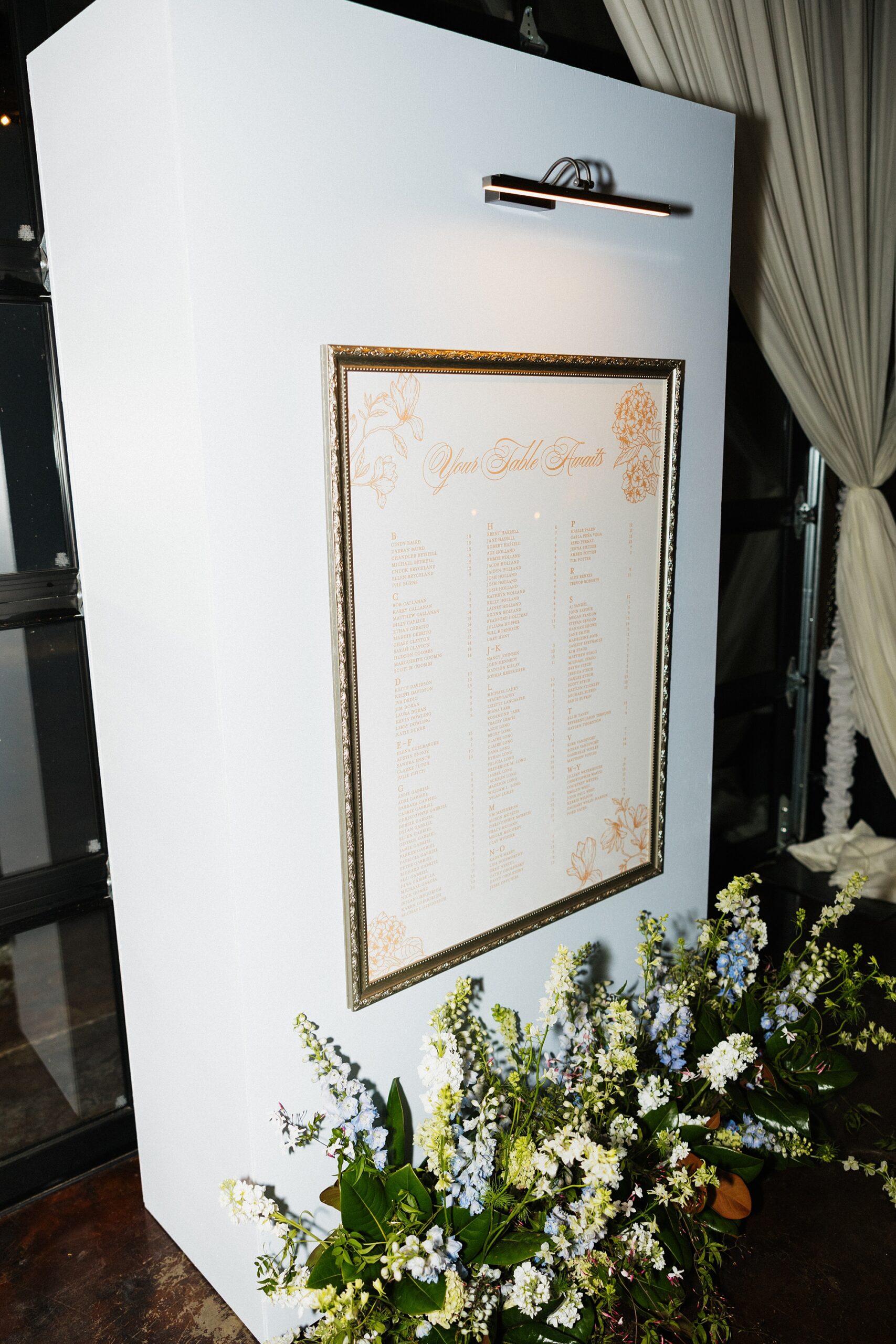
A Seating Chart With Meaning
The custom seating chart was more than functional; it told a story. The sage green seating chart wall featured gold hooks with tags, tassels and a vintage key. The double-sided tag featured guests table assignment on one side and on the other, was a note to the guest to join the newlyweds for a private after party at a speakeasy. The key on the tag was a subtle nod to the location.
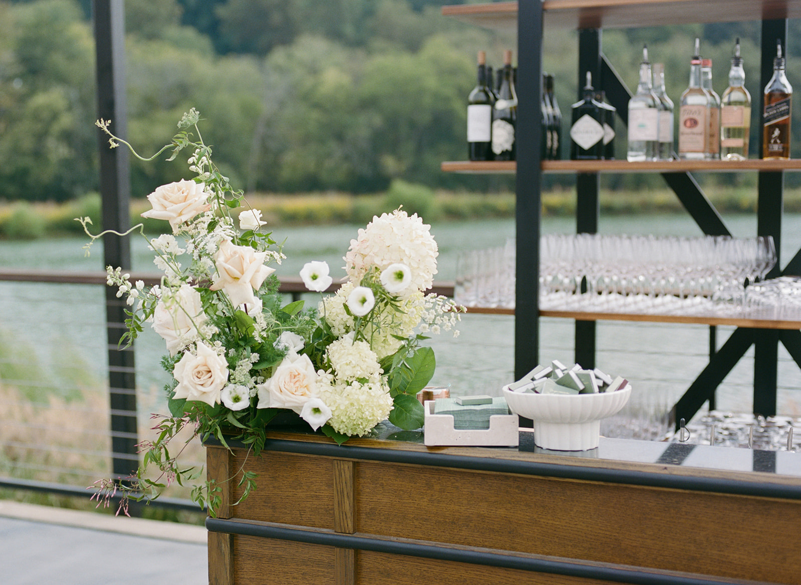
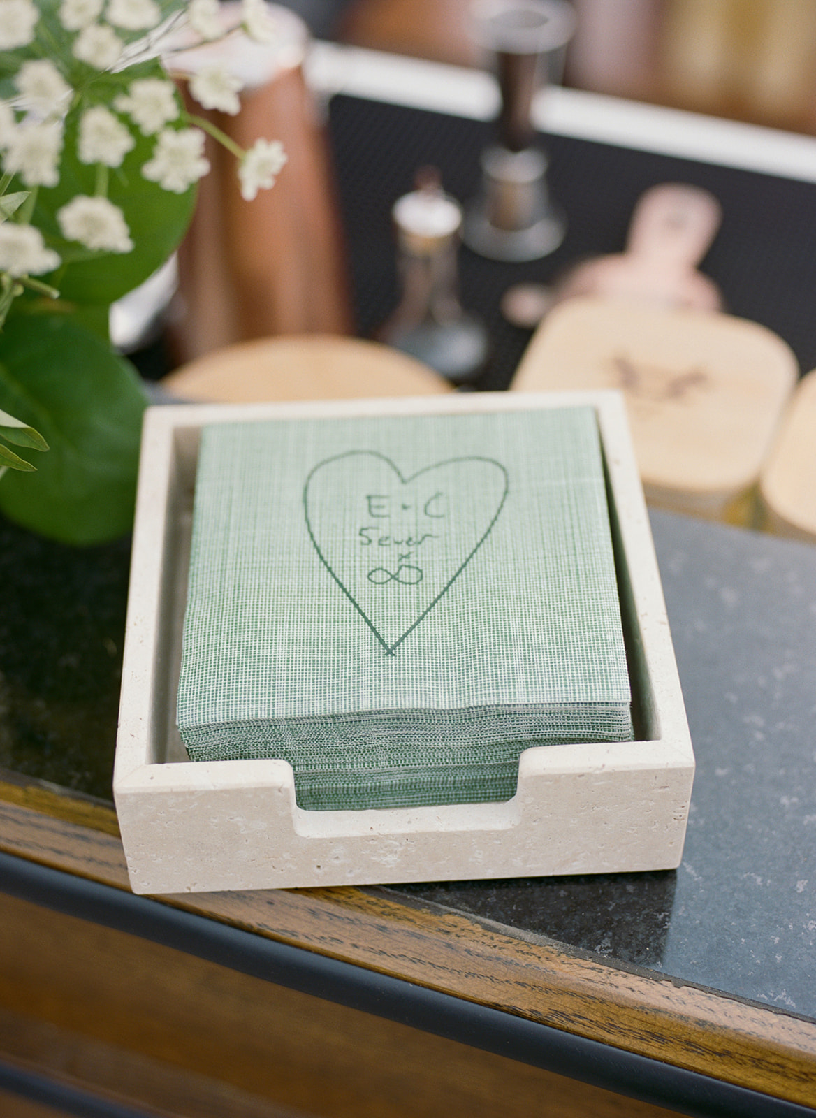
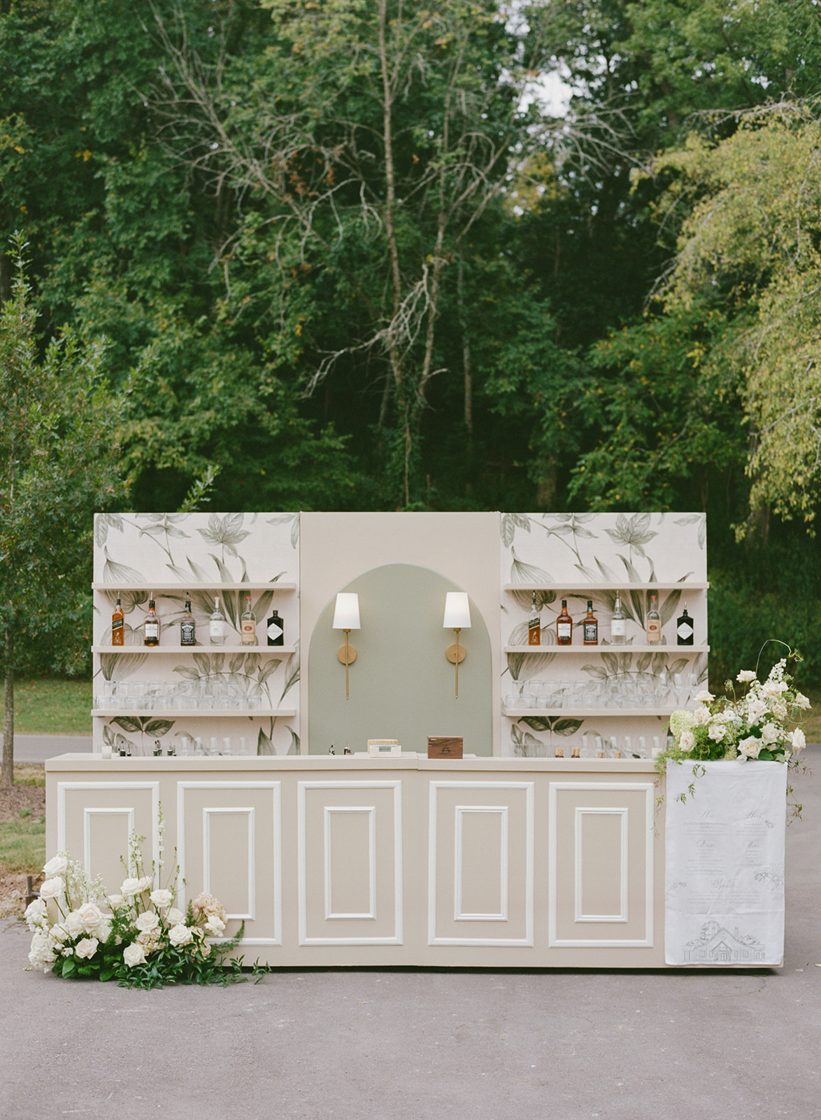
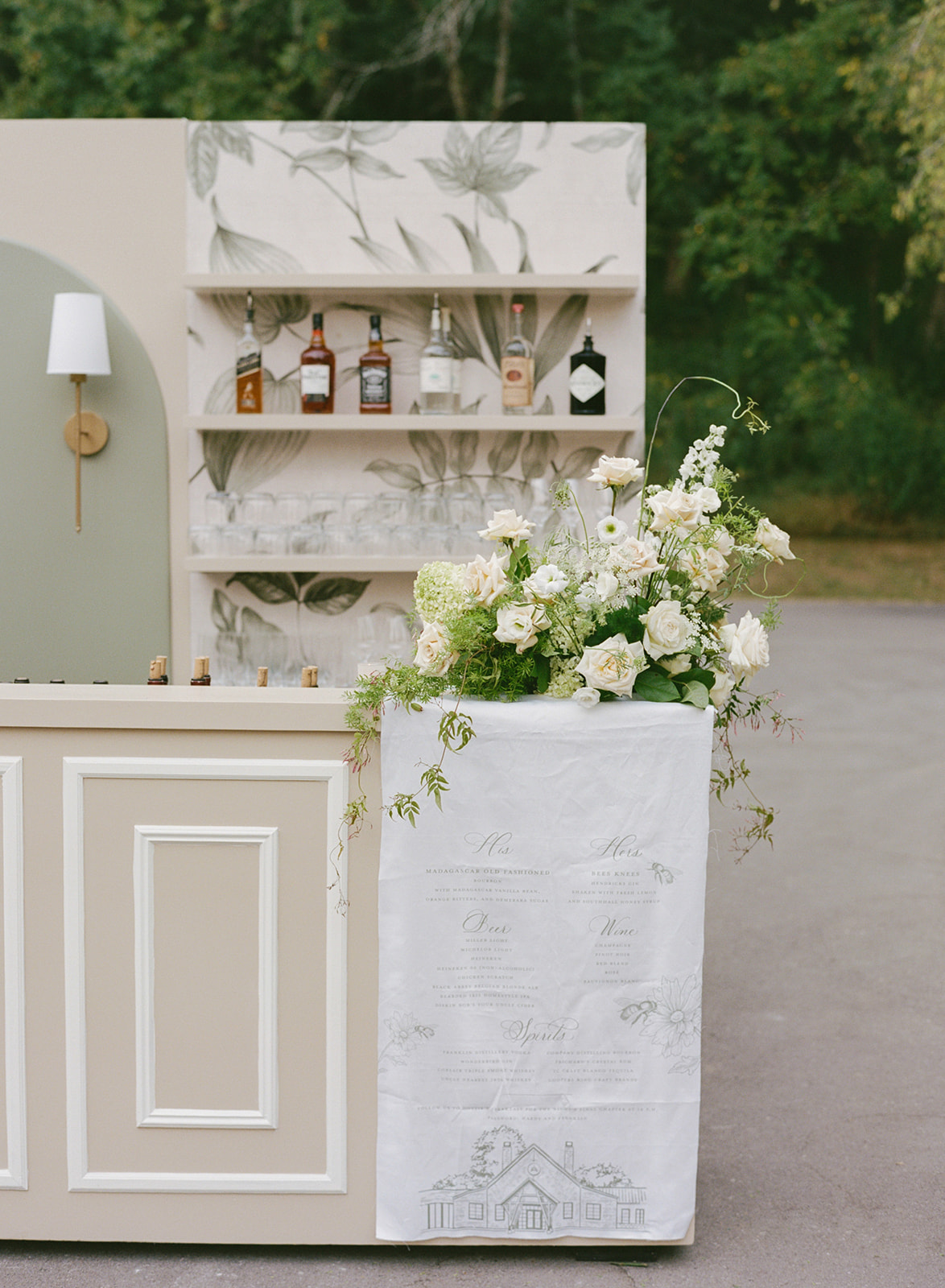
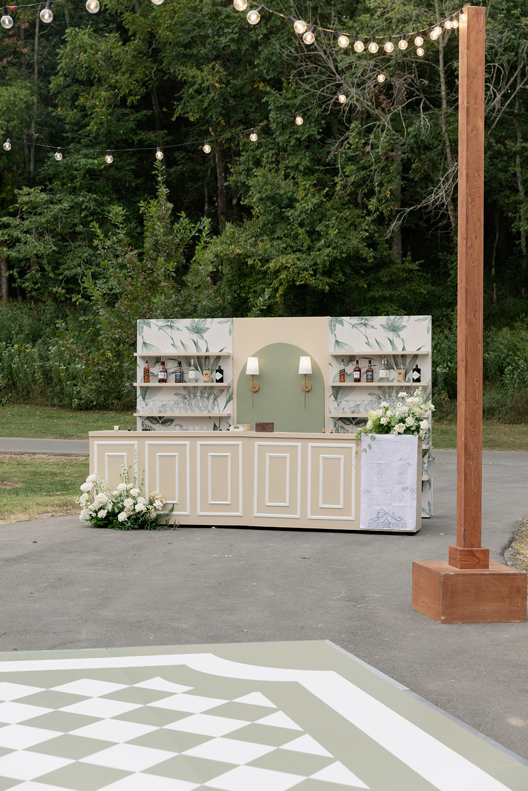
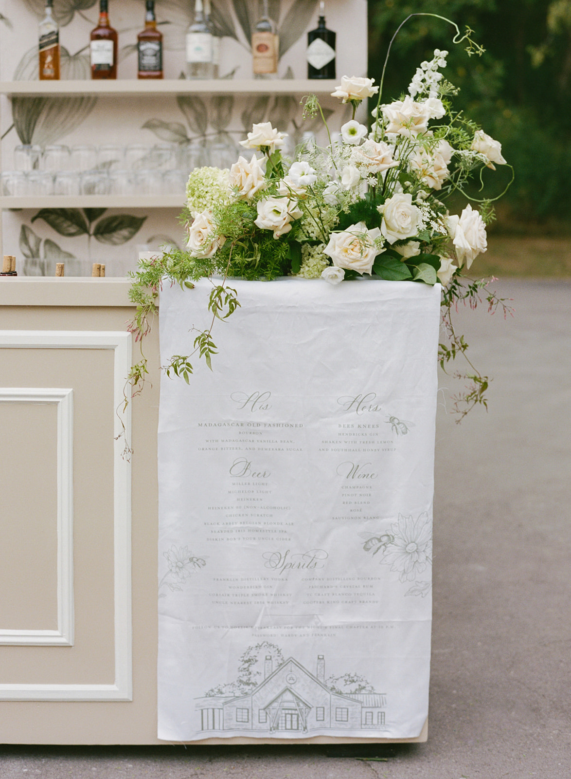
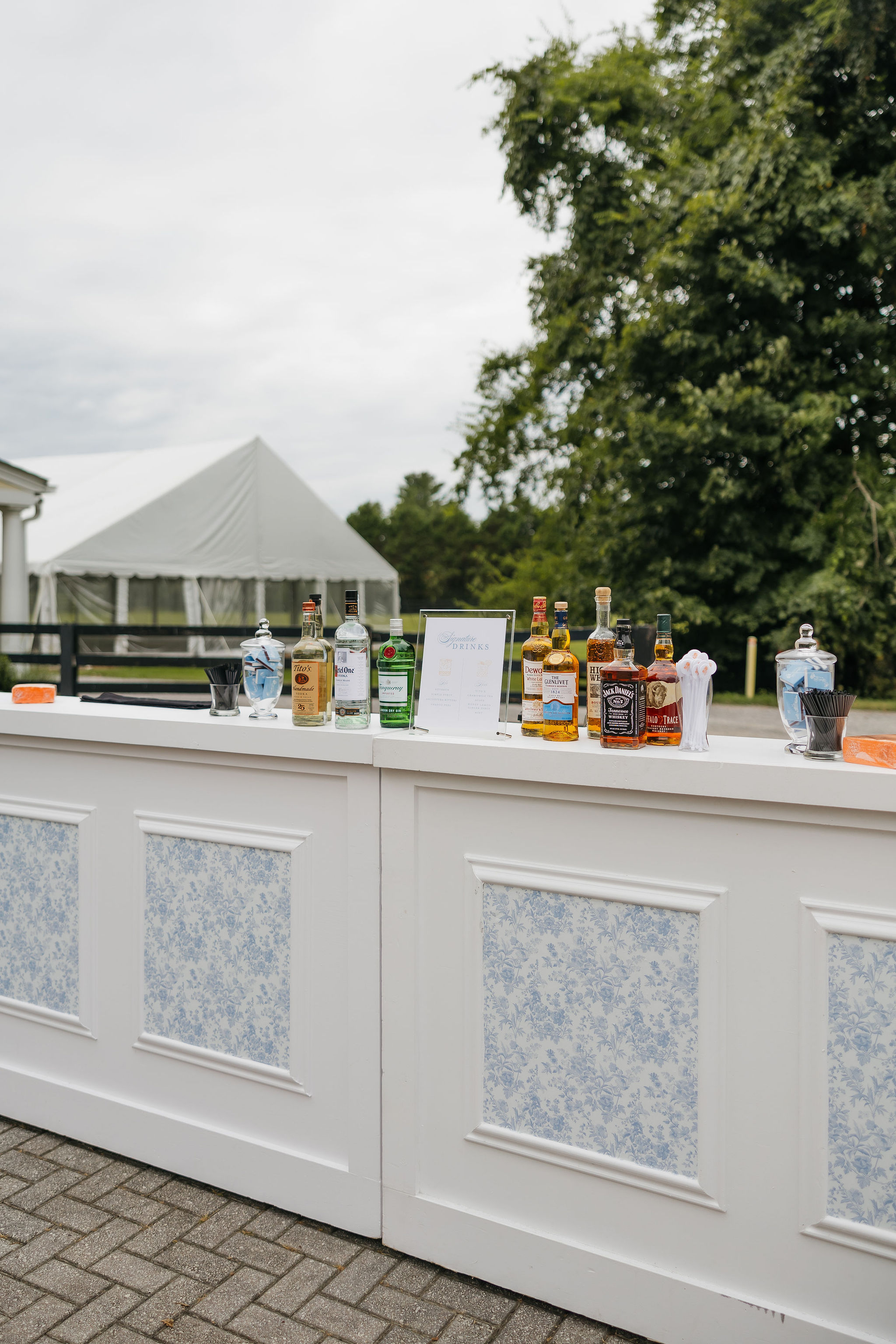
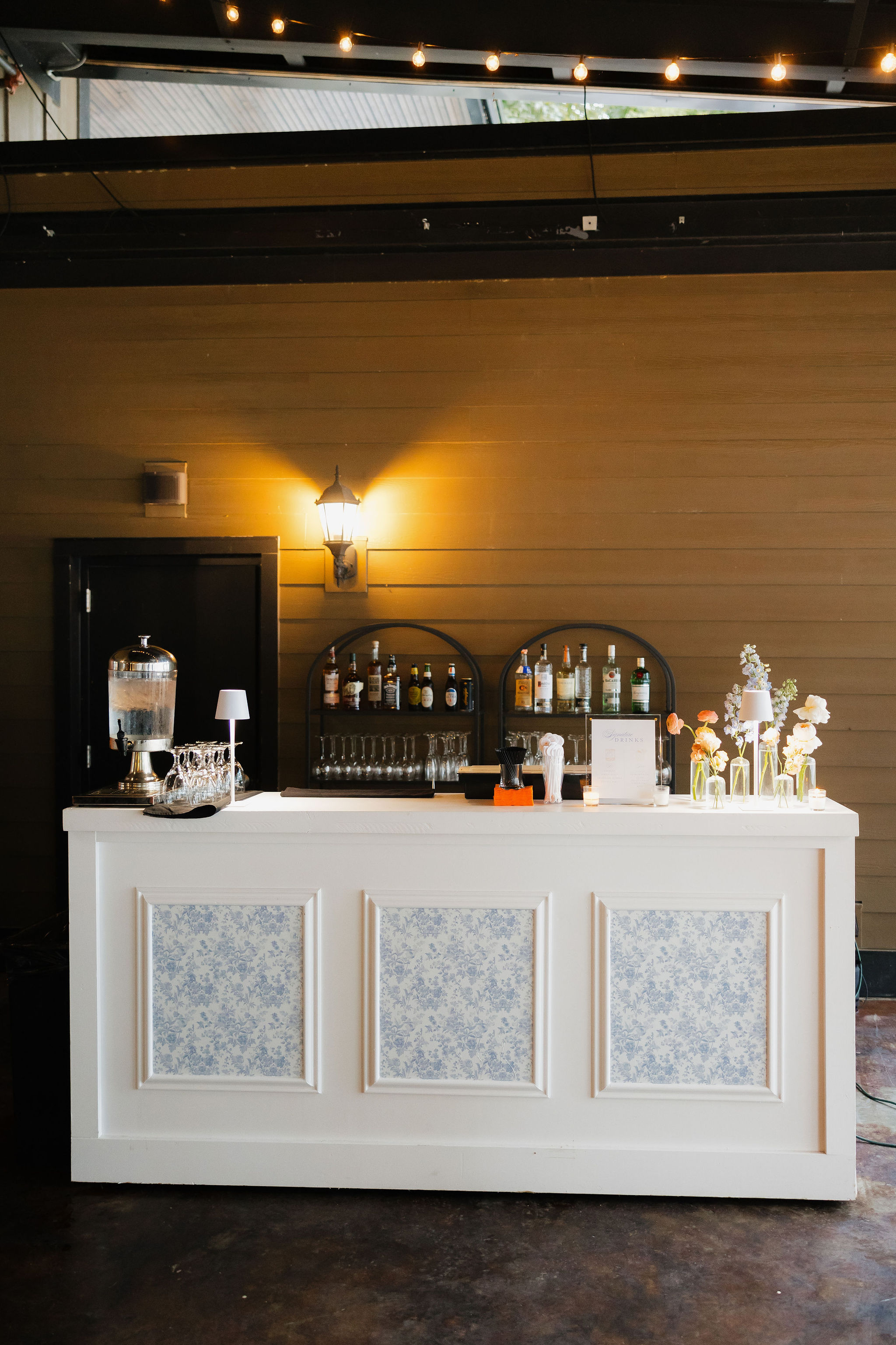
Cocktail Hour Details
For cocktail hour, we designed custom cocktail napkins in a fun tweed print. A fabric bar sign anchored the space, softening the bar design while reinforcing the refined, organic feel of the reception.
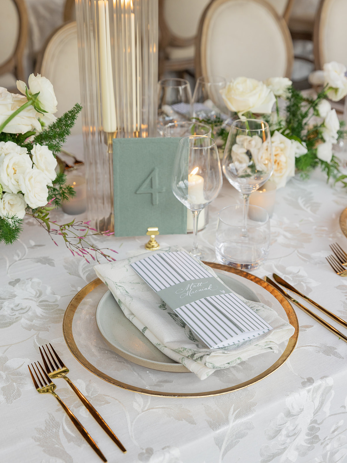
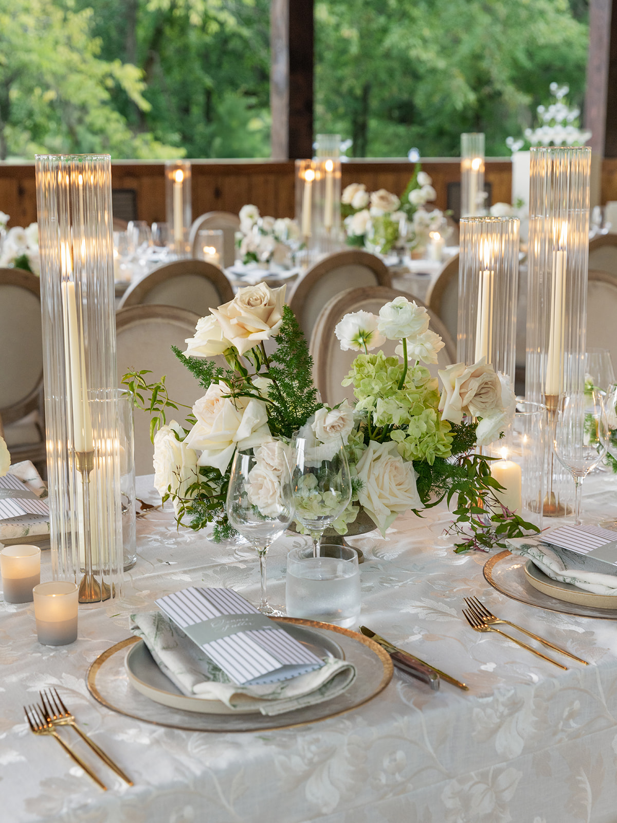
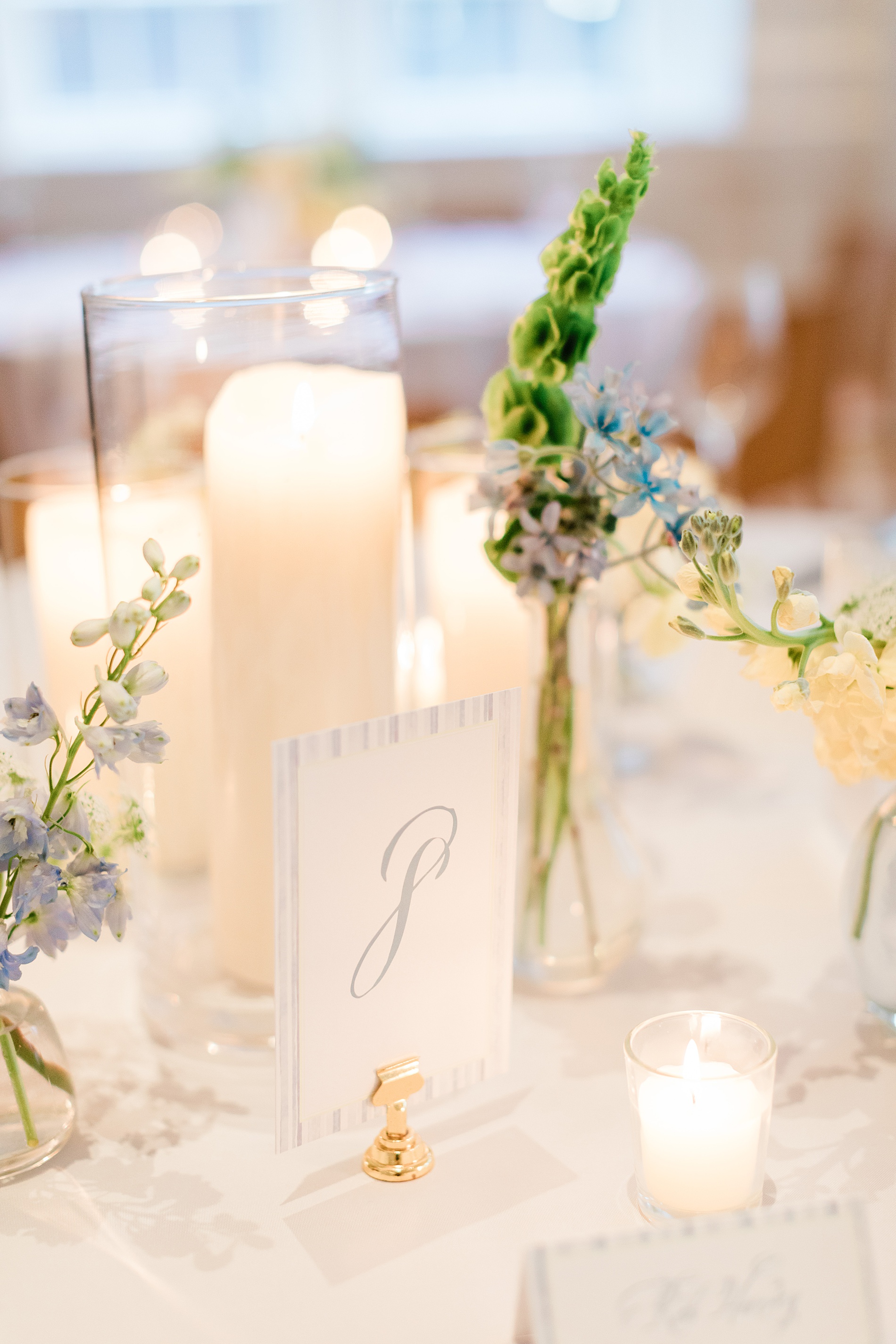
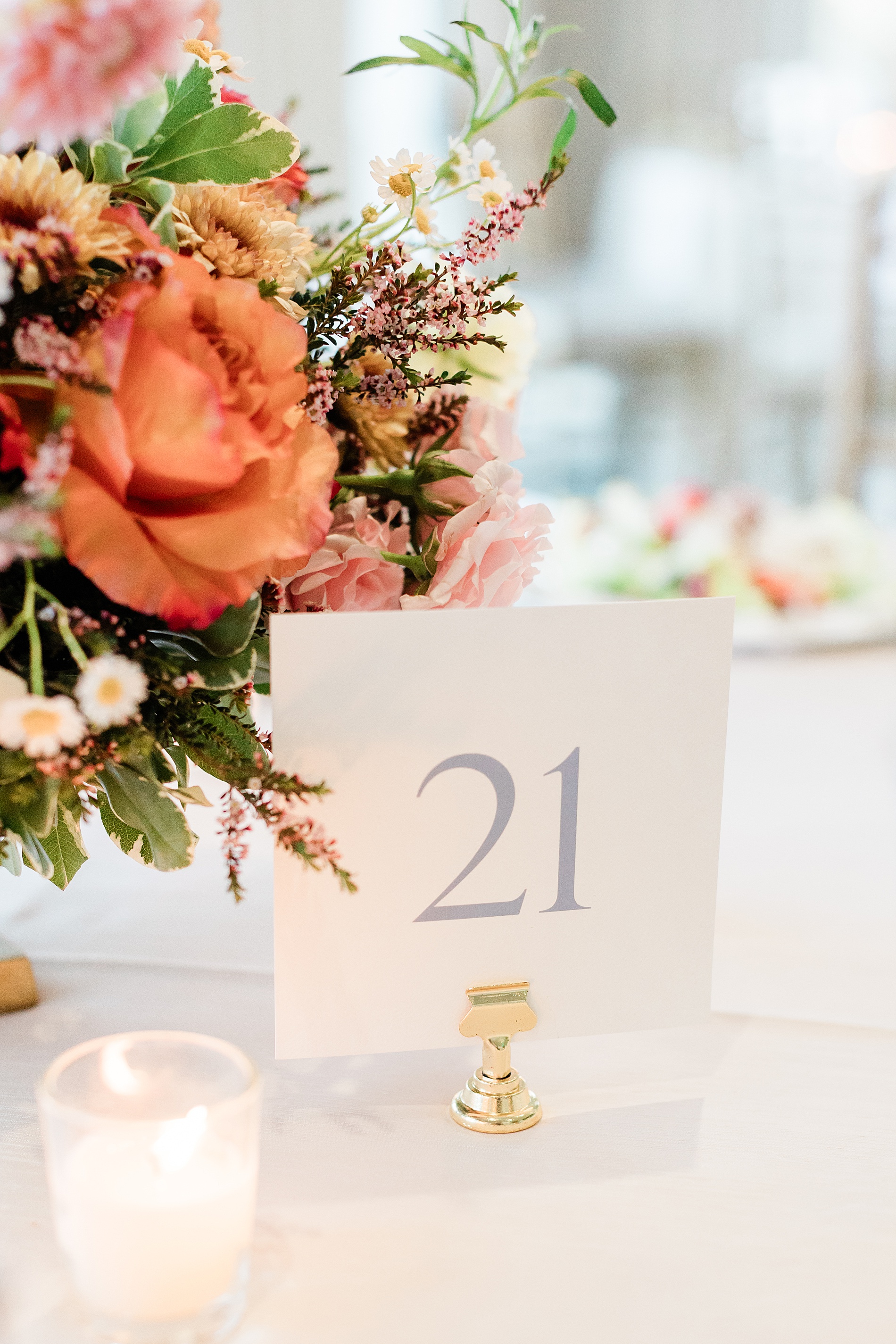
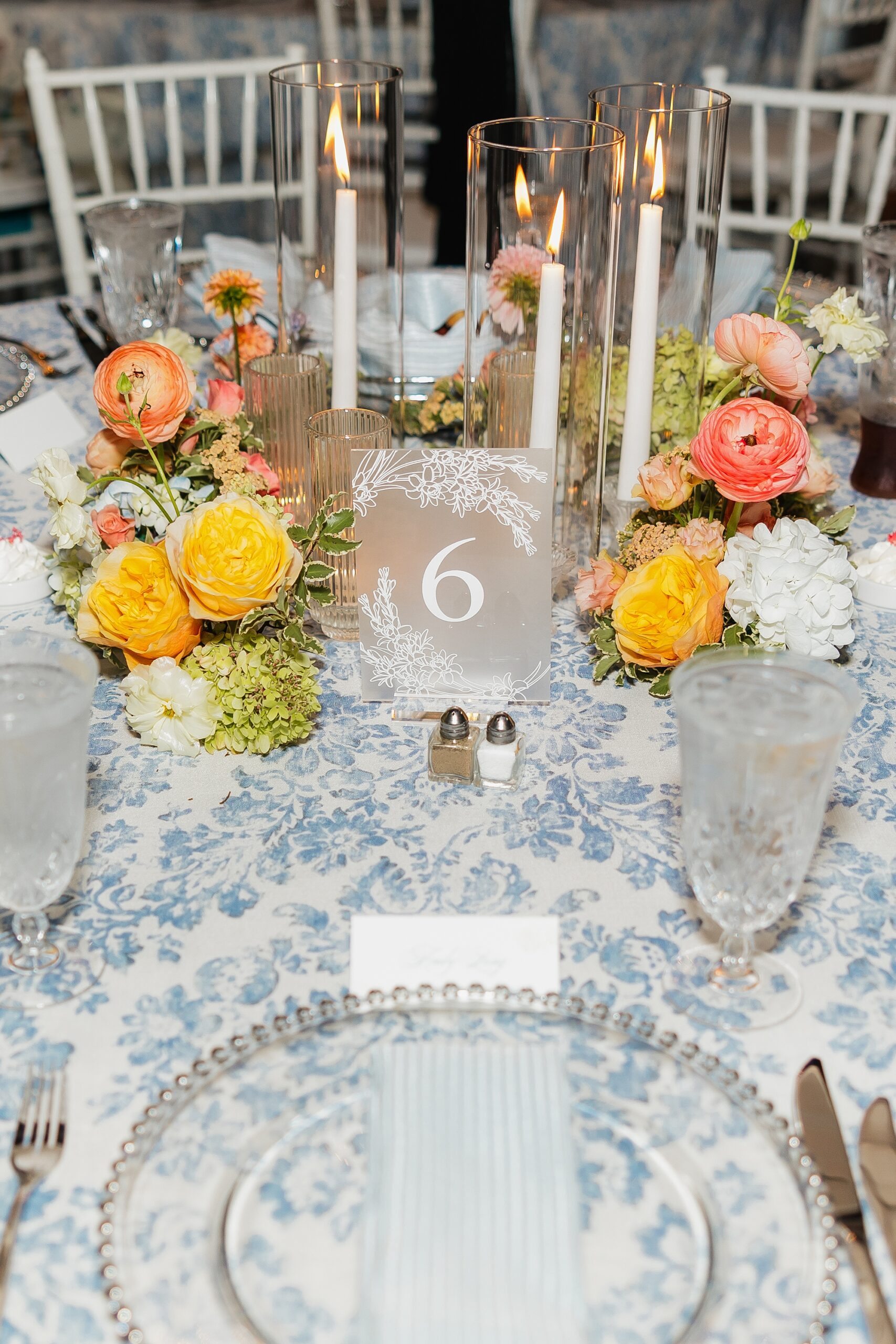
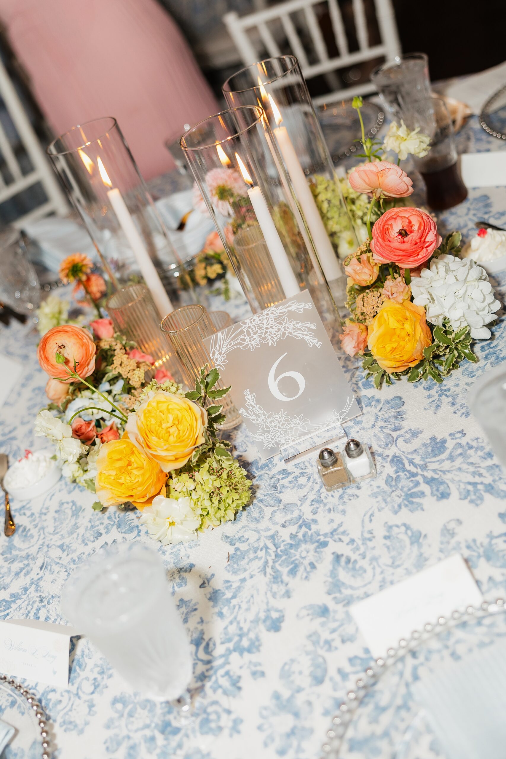
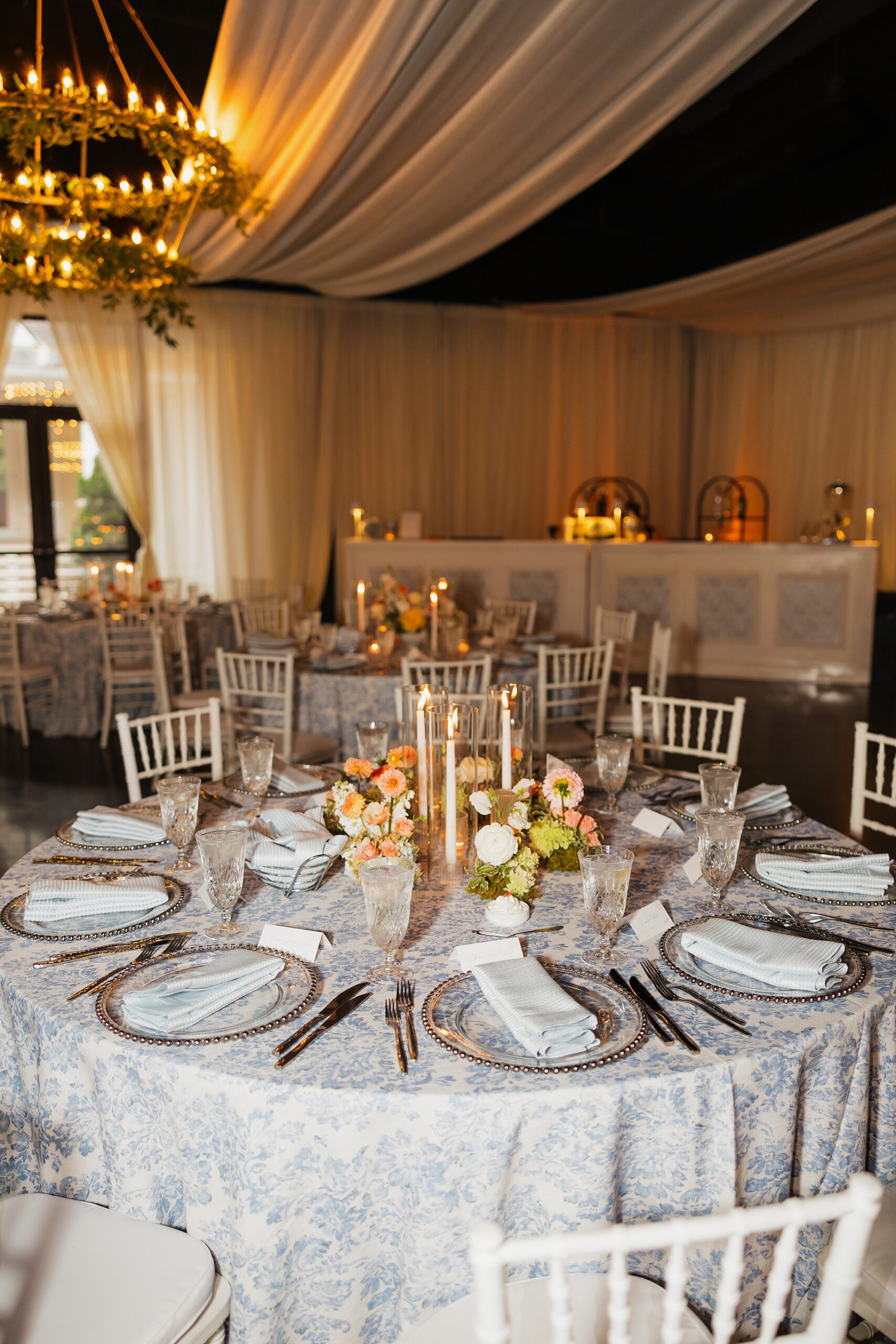
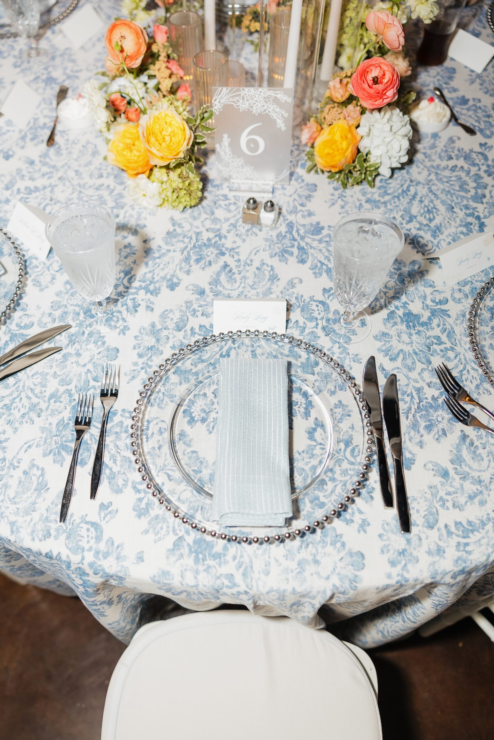
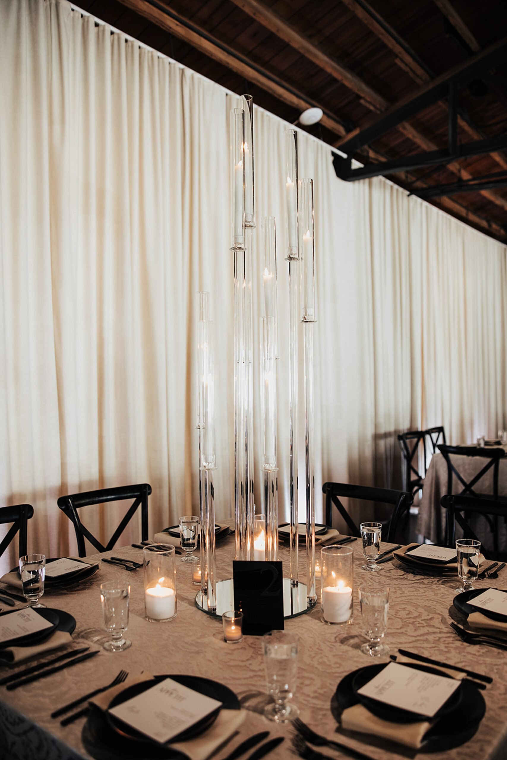
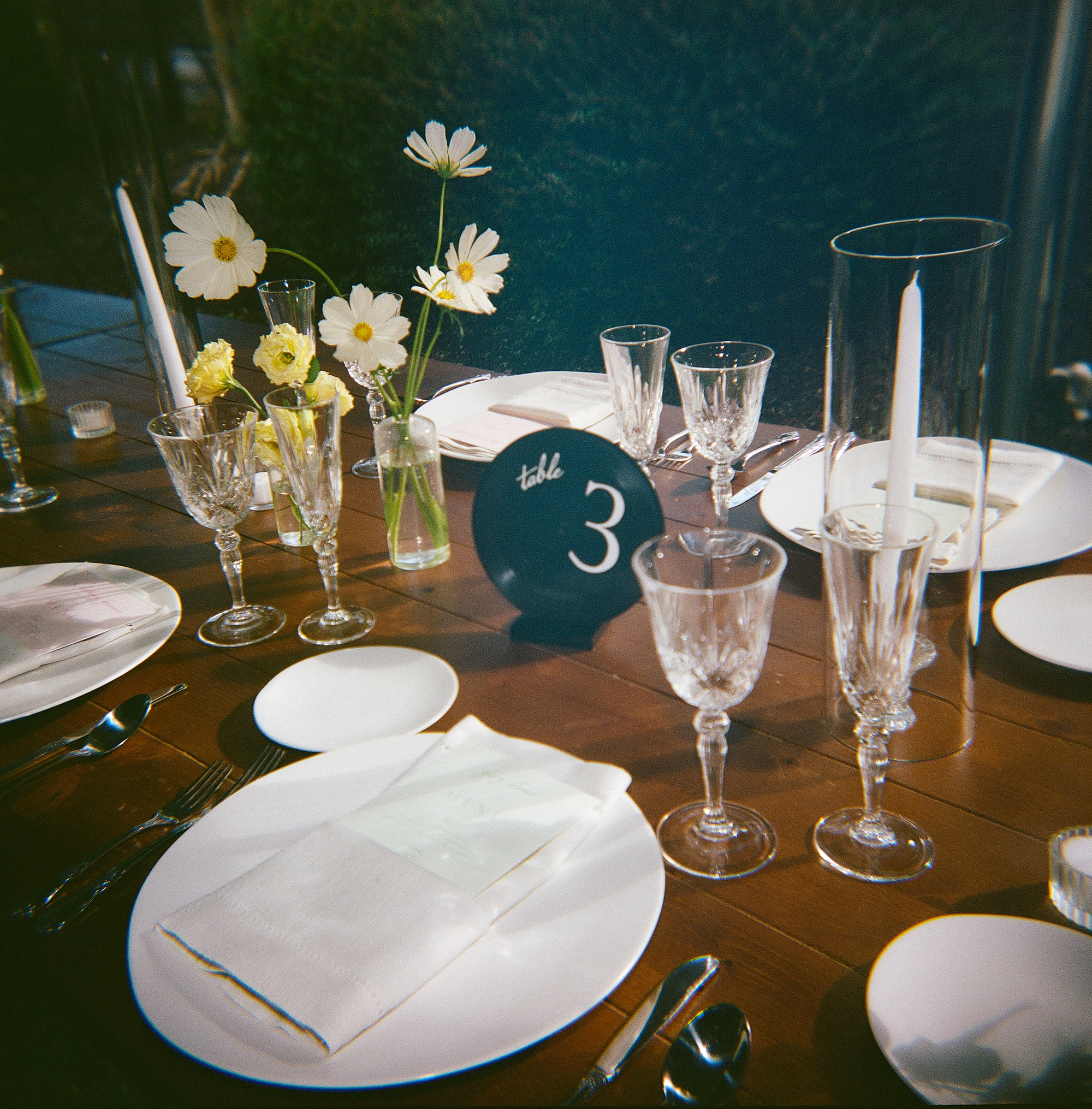
Fabric details continued to make a statement throughout the space, including FABRIC TABLE NUMBERS. This was our first time doing these and we are obsessed with how they turned out on the table. The tablescape was already stunning, and these fabric table numbers fit in beautiful with the already natural, elevated setting.
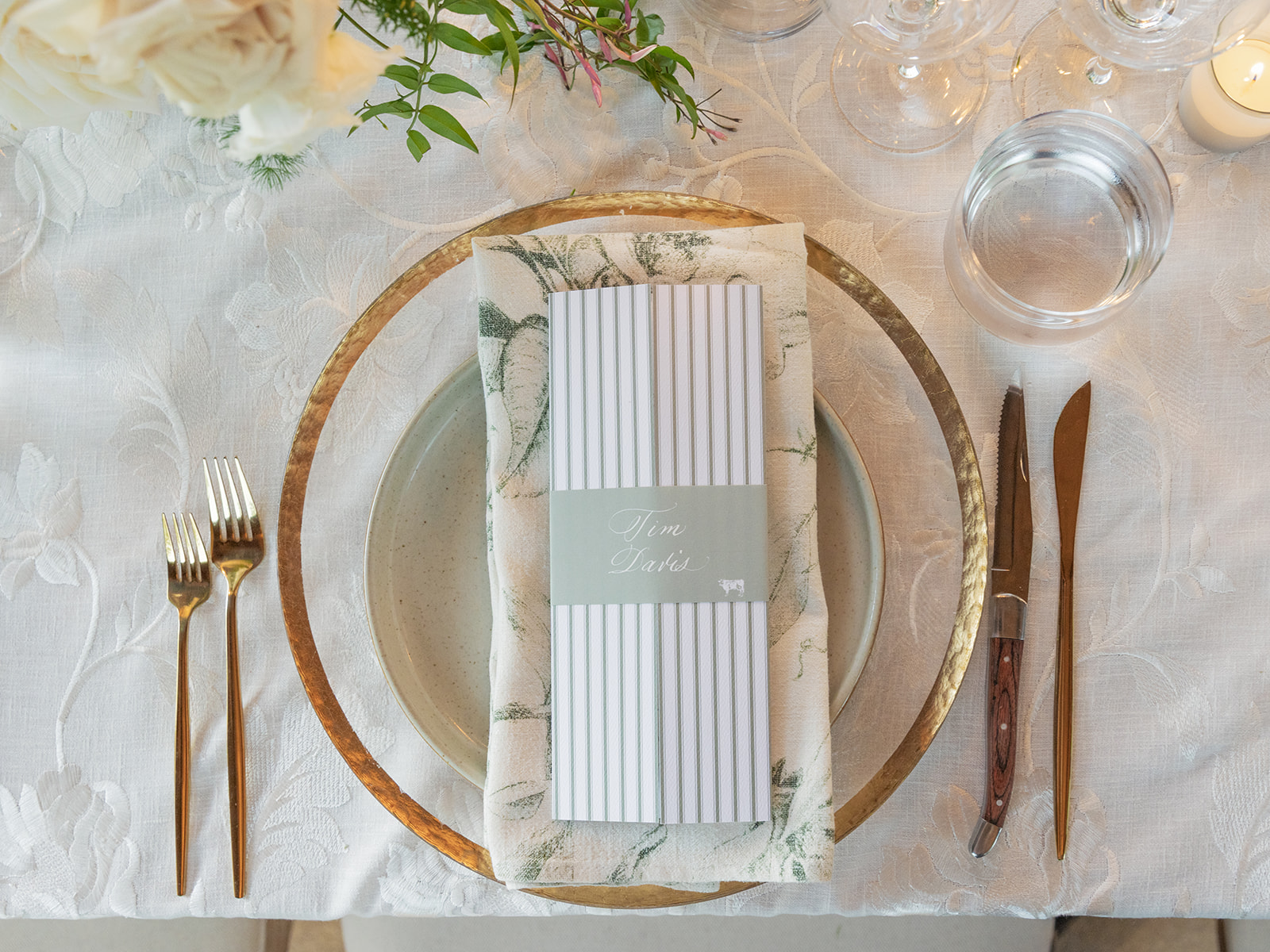
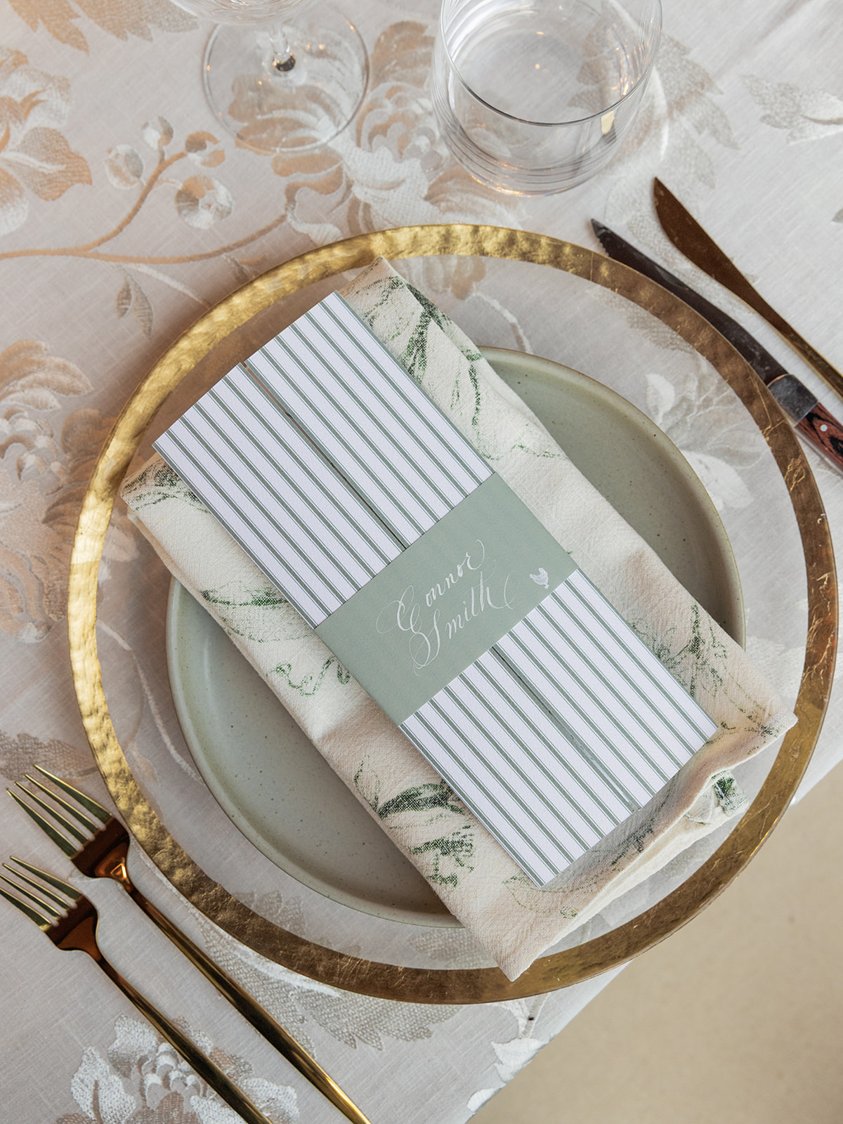
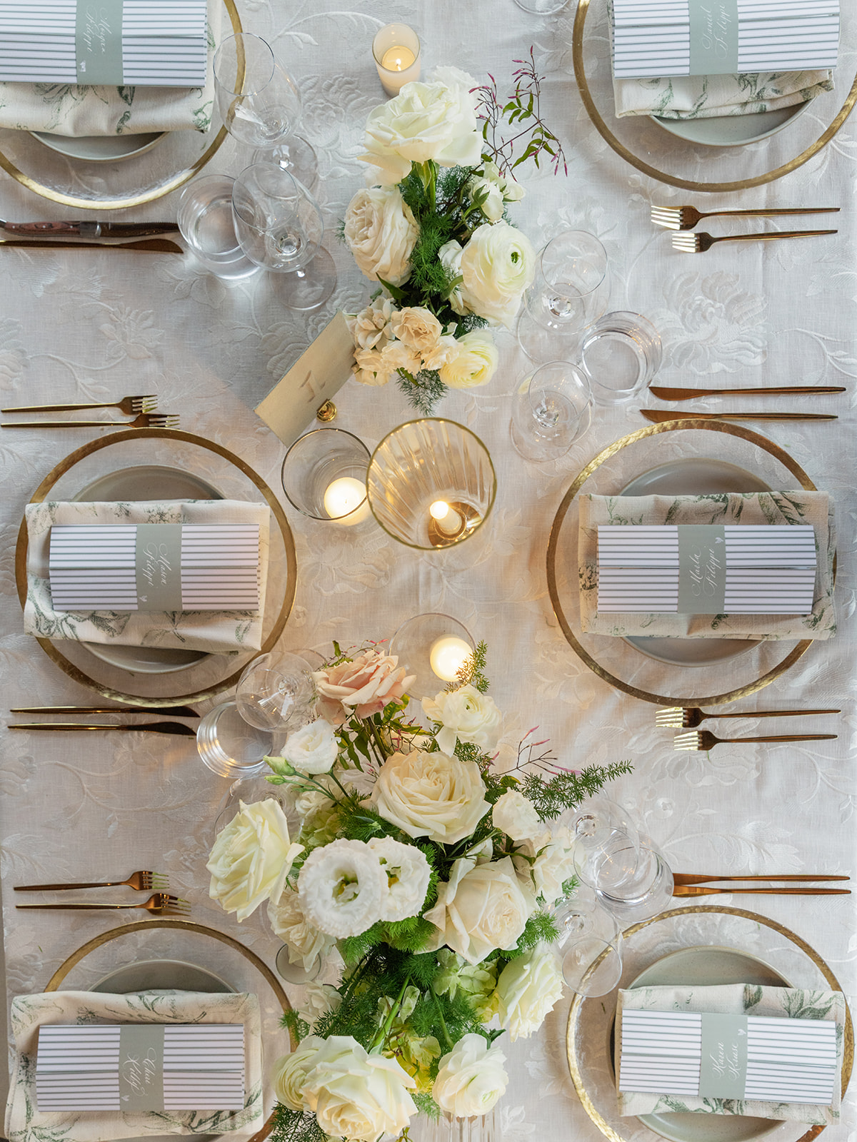
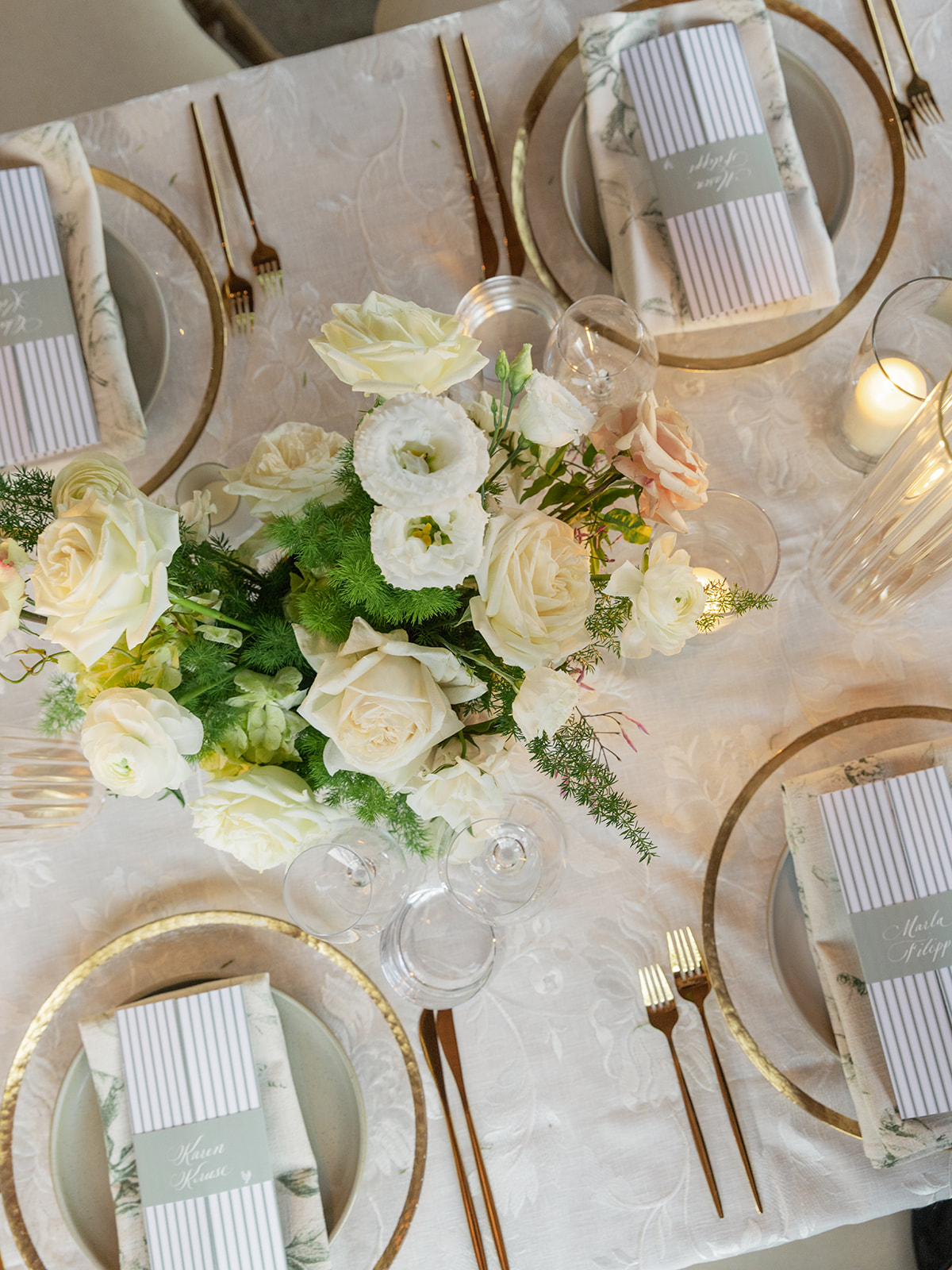
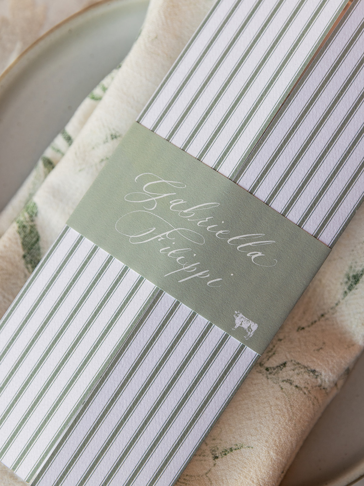
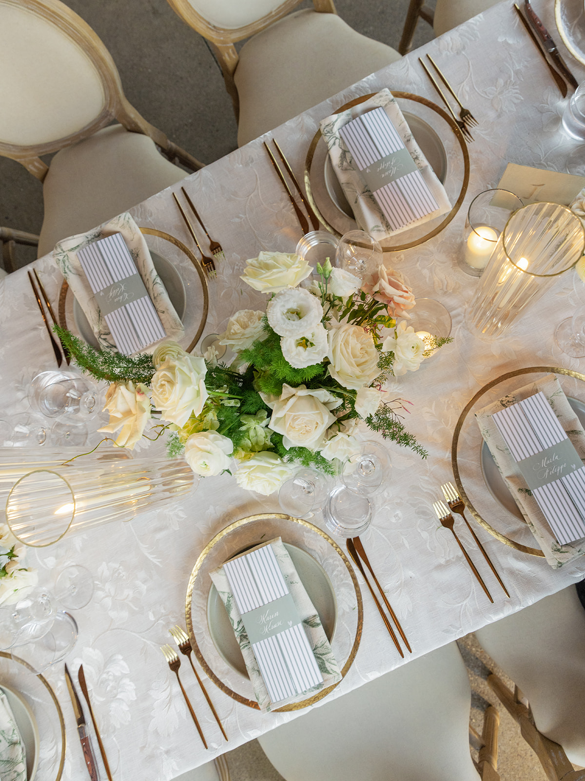
Menus + Place Cards That Stole the Show
If menus set the vibe, calligraphed place cards just elevate everything.
Connor and Ella’s interactive guest menus opened like a gatefold. Then, wrapped around each menu was a calligraphed place card, featuring both the guest’s name and their meal selection, creating a MOMENT for each guest as they sat down. It is these types of personal and intentional details that make an impact on your wedding day. I love that Ella and Connor not only understood that, but made it a major part of their vision.
Congratulations to this amazing couple and thank you for allowing us to create these meaningful details for your beautiful wedding!
Planning Ahead for 2026 Weddings
To all the spring brides, fall brides, and 2026 couples: if you’re dreaming up a tablescape that feels personal and polished, now’s the time to get on our calendar so you’re not rushing in the new year! Intentional design takes time, and the most thoughtful details are never rushed.
Connor and Ella’s Southall Farm & Inn wedding is a beautiful reminder that when design is rooted in intention, the result isn’t just stunning, it’s unforgettable.
If you’re planning a wedding in Nashville, or anywhere in the world, we’d love to help you create meaningful, personalized stationery and event details that tell your story. We work with couples worldwide to design details you and your guests will remember forever.
Reach out today to learn more about our full-service wedding and event design offerings! We can’t wait to create something unforgettable for you!
If you enjoyed this post, you’ll love these other blogs!
Every wedding we work on is such a different experience and always such a treat to see everything come together. For Anna and Ross’s wedding we had the joy of not only creating their wedding day paper goods and day of details, but also had a hand in designing items for their rehearsal dinner too! I love when we have the opportunity to design items for an entire wedding weekend as it really allows for an immersive experience as details are intentionally woven throughout the events.
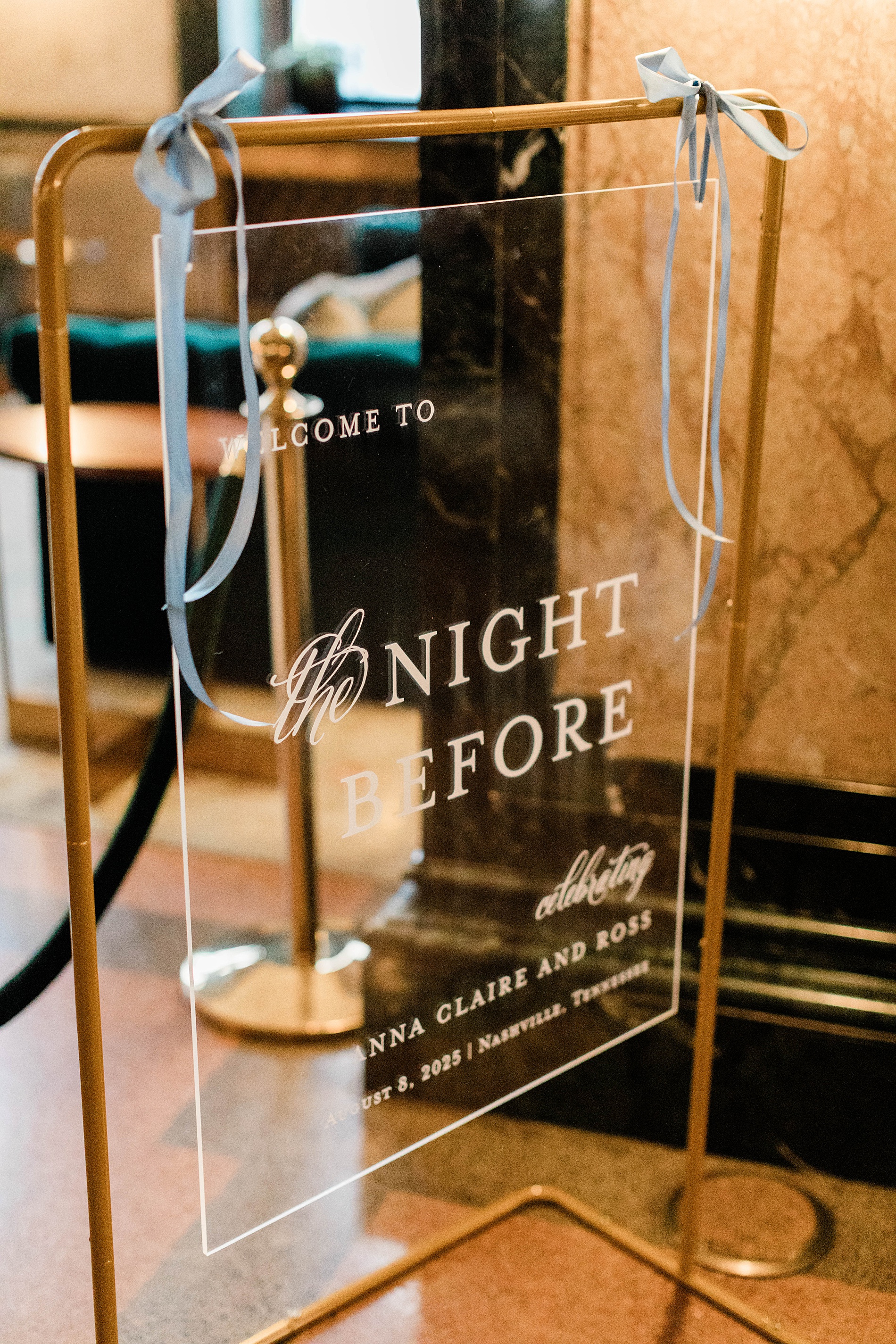
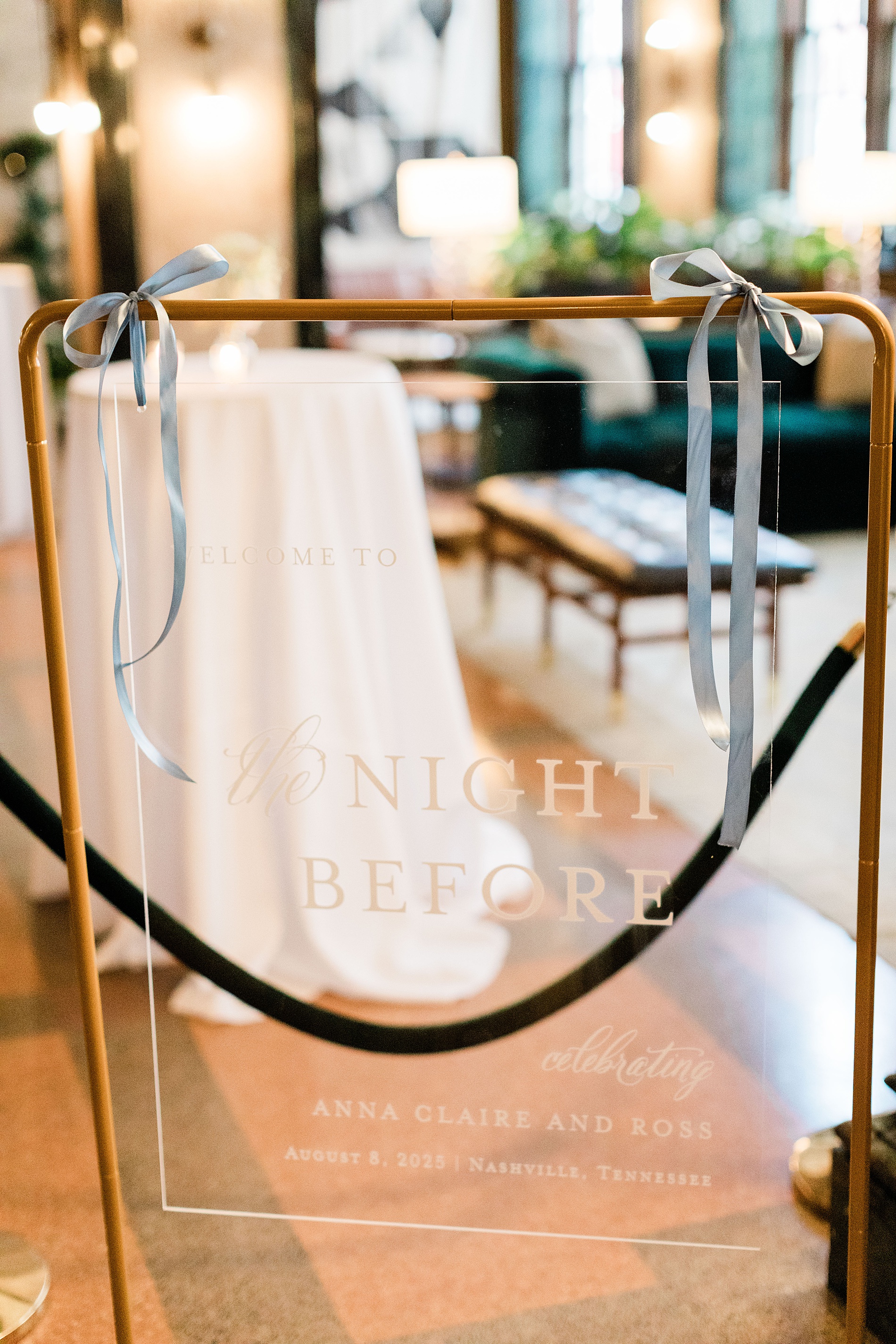
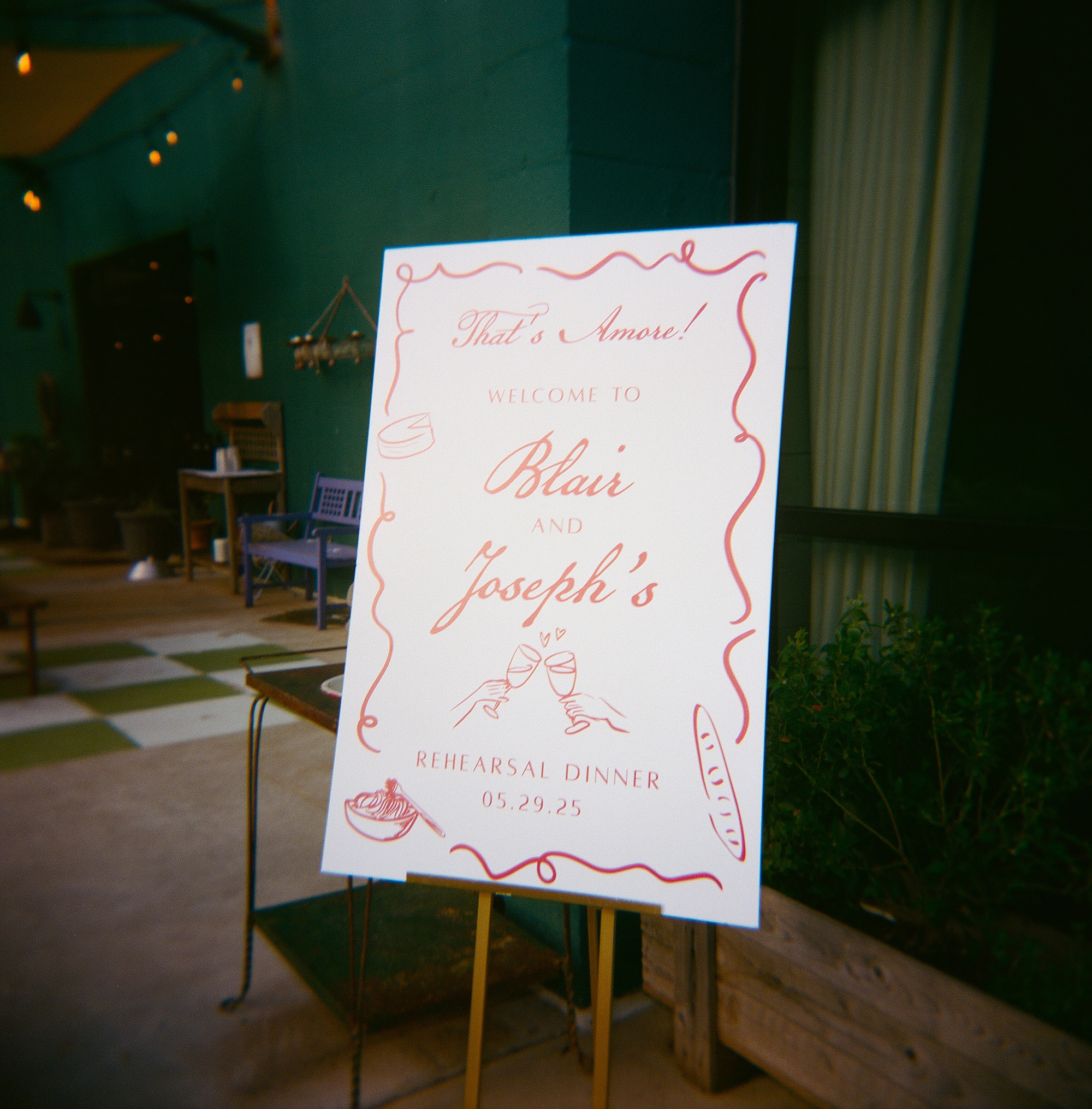
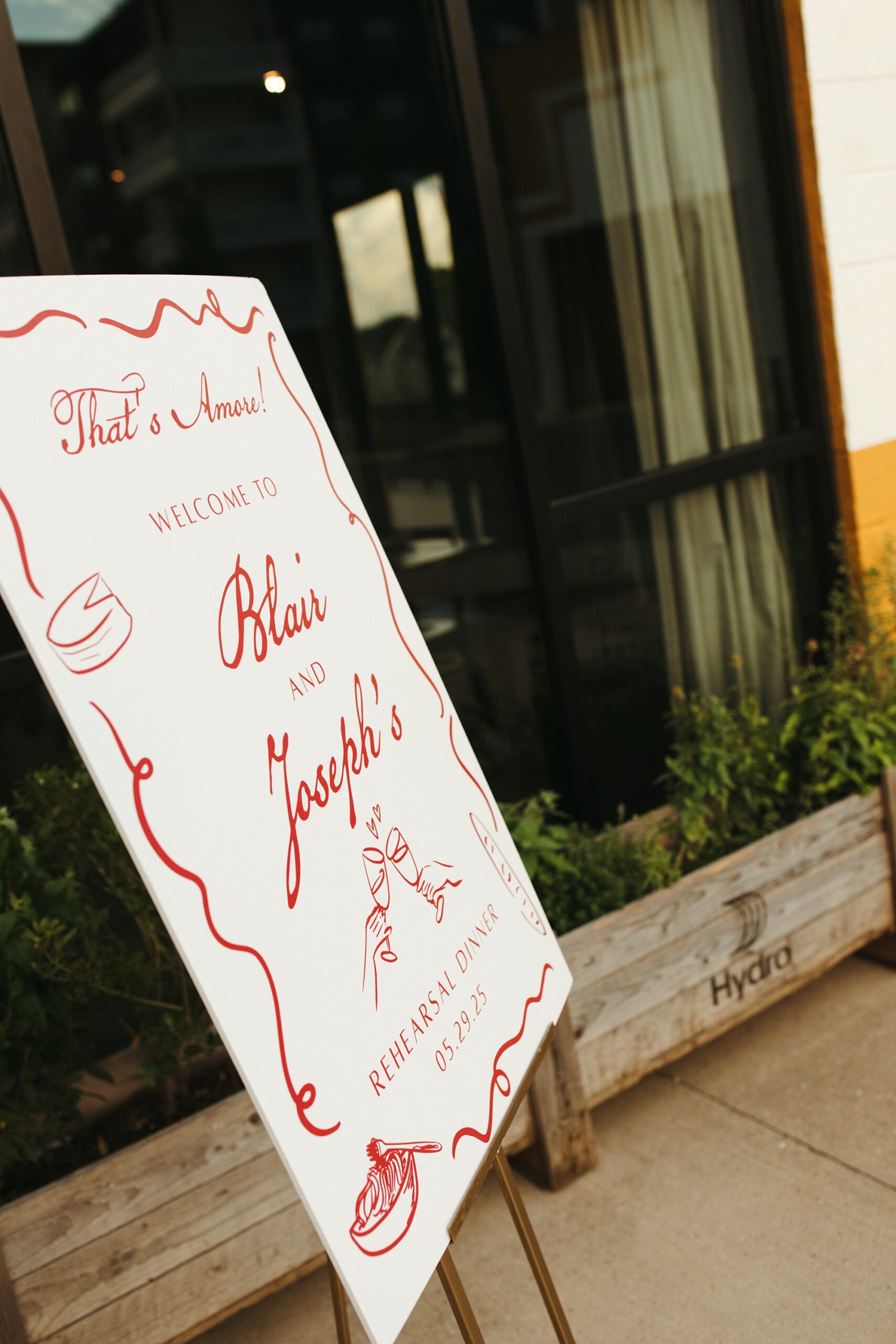
Rehearsal Dinner Details
The rehearsal dinner took place at Noelle Hotel Nashville, which is a gorgeous boutique hotel in downtown. A clear welcome sign with a gold frame greeted guests that read “Welcome to the Night Before”. Light blue ribbons tied at the top corners of the sign gave a subtle hint to the colors that would be seen throughout the evening. We also created the seating chart that mimicked the clear welcome sign with a gold frame and blue ribbons. This was a lovely touch and a foreshadowing of the details to come on their wedding day.
As guests sat down to the rehearsal dinner, the tables were decorated with fresh flowers, greenery, and flickering candle light, which made the light blue and white table numbers and place cards we created stand out beautifully. The entire evening unfolded seamlessly and was a perfect prelude to the wedding day ahead.
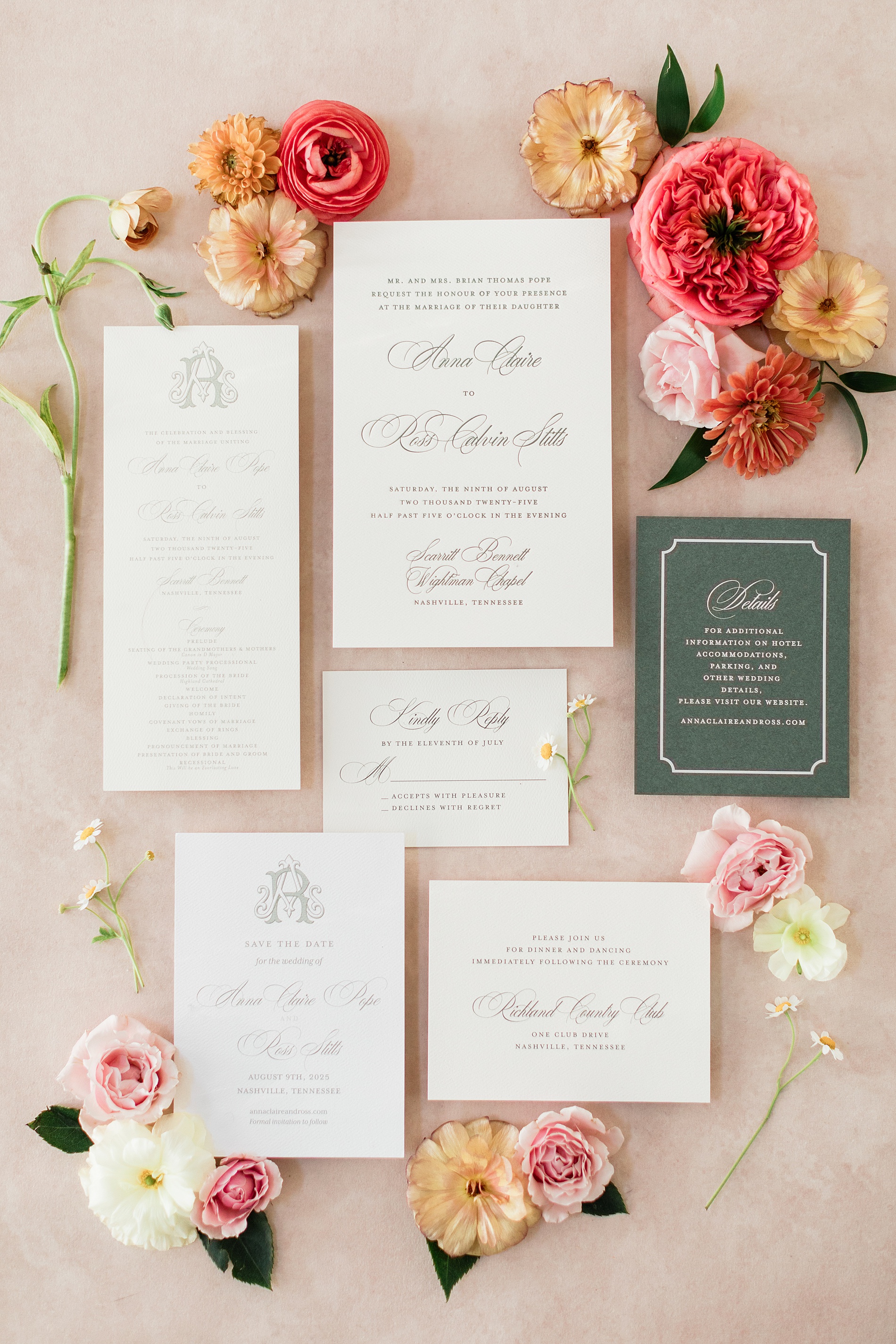
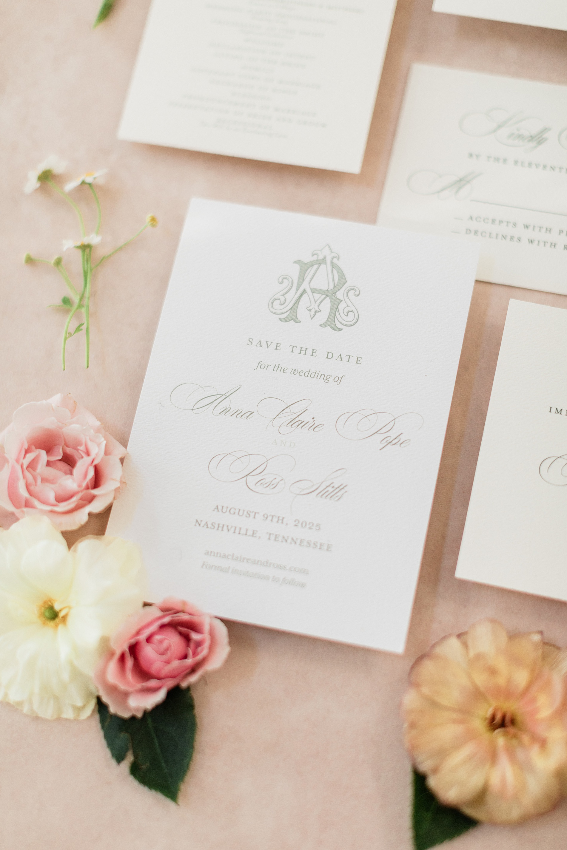
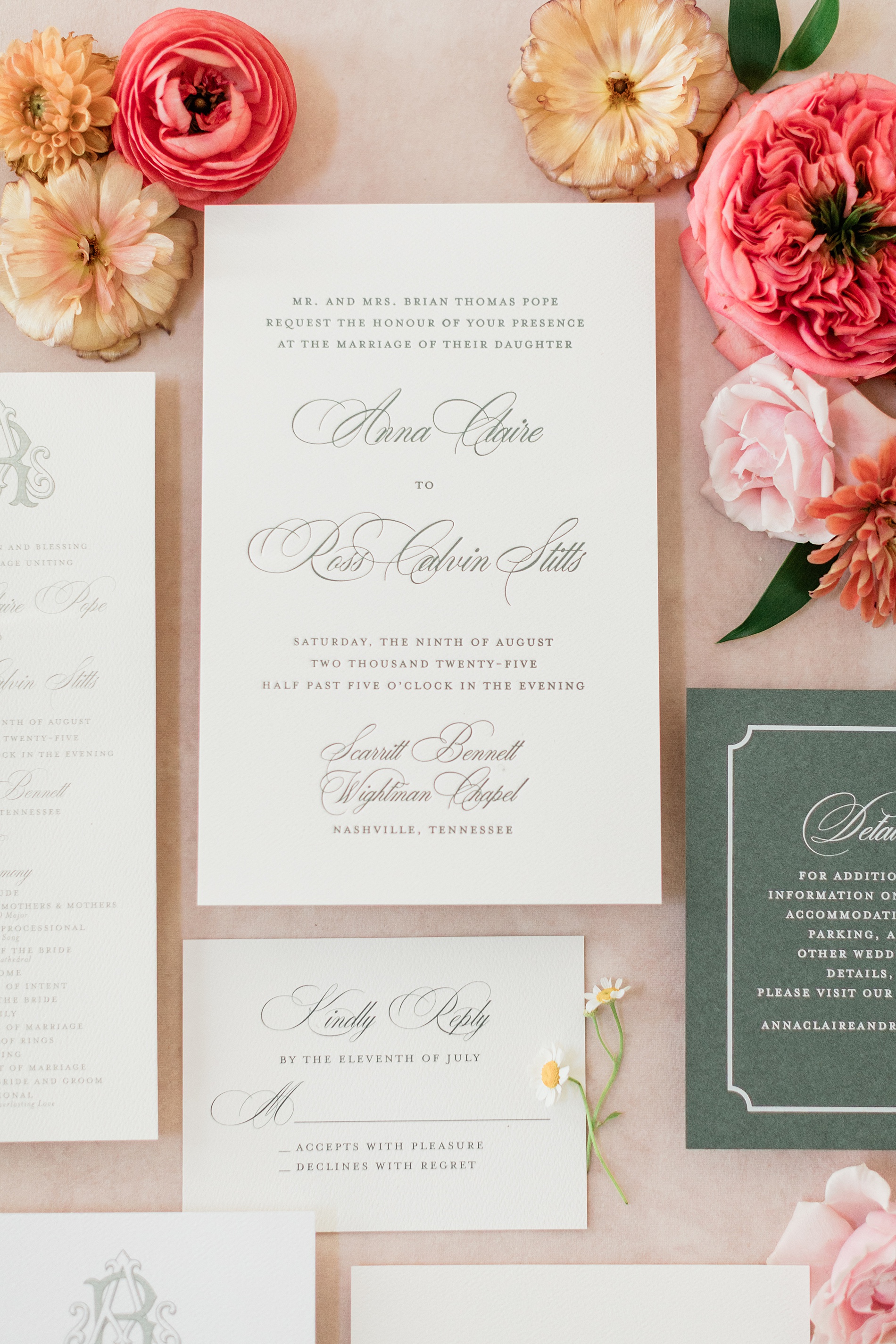
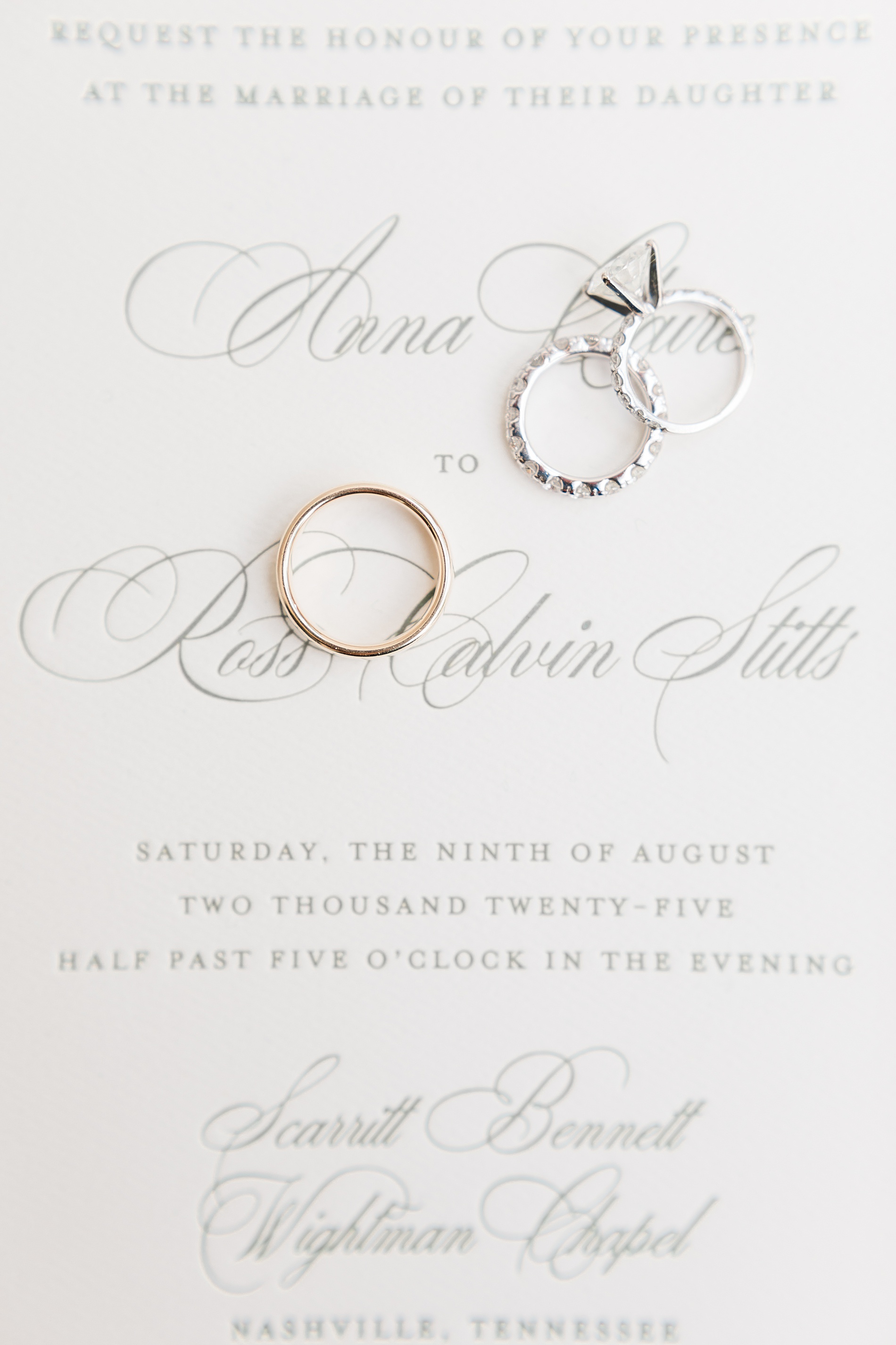
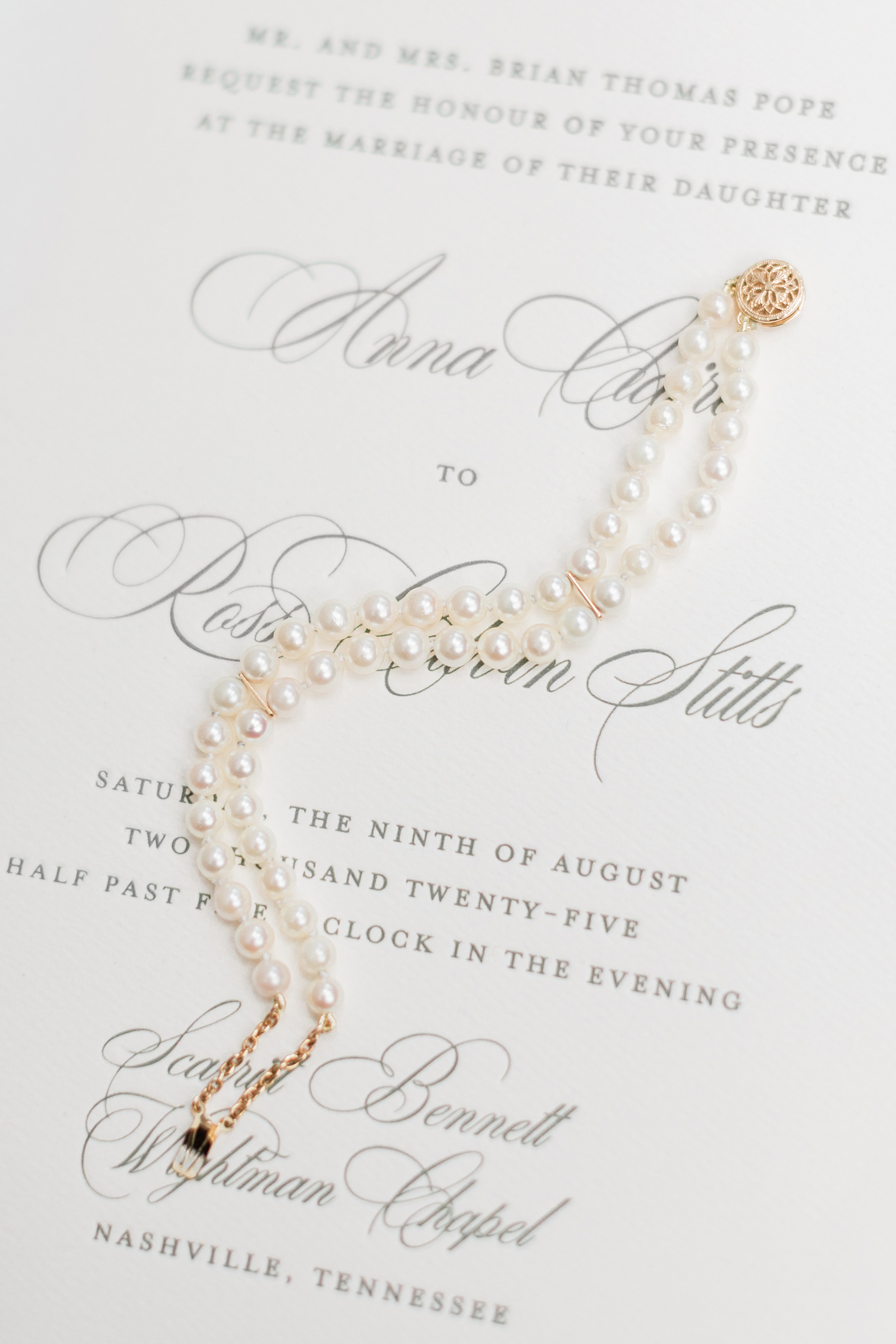
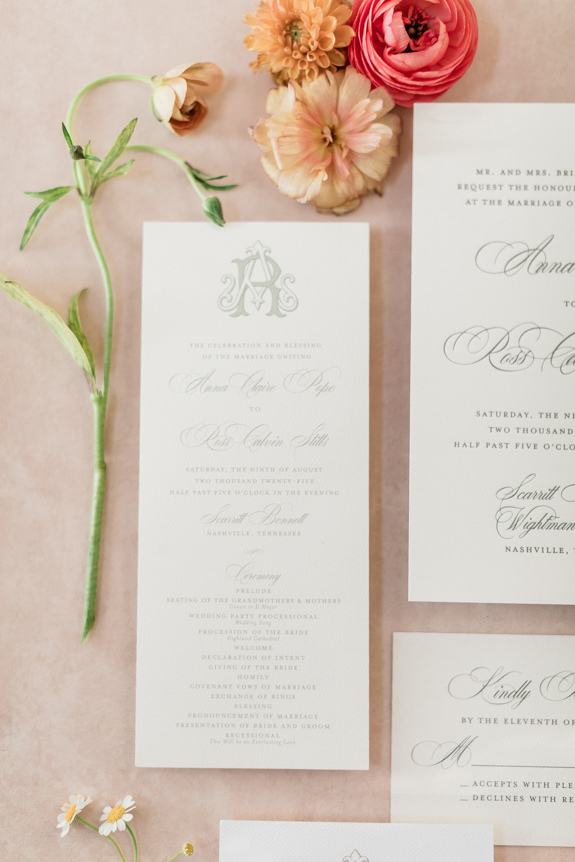
Elegant Letter-Pressed Wedding Invitations
Their classic, letter-pressed wedding invitations set the tone for an elegant evening. The custom monogram on their Save The Dates and Wedding Programs would also make an appearance on other wedding details we created, creating a cohesive design that we just love!
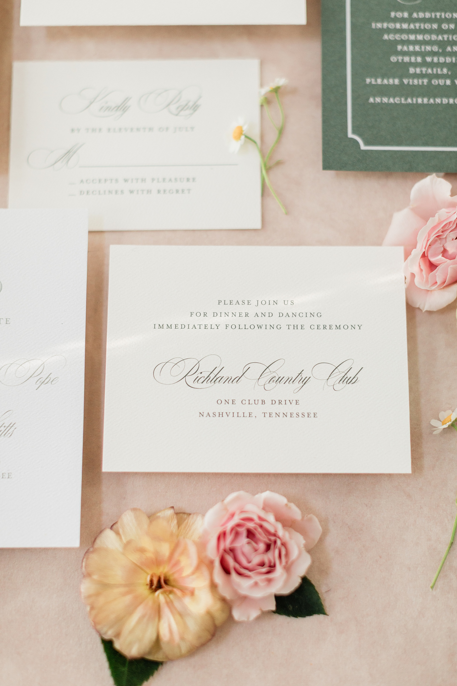
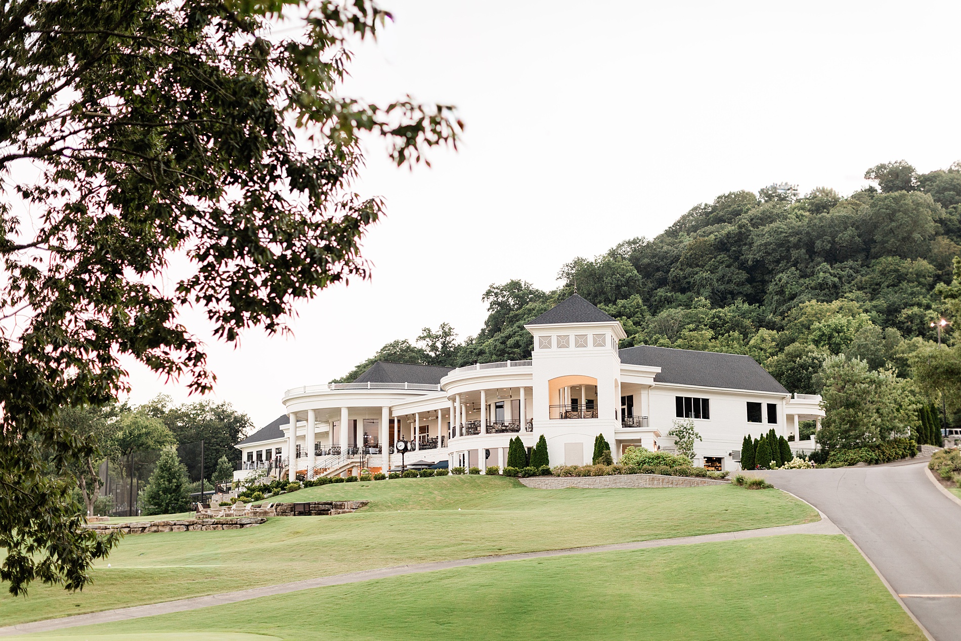
Their wedding took place at the stunning Richland Country Club in Nashville, TN, which is a beautiful venue with a breathtaking property.
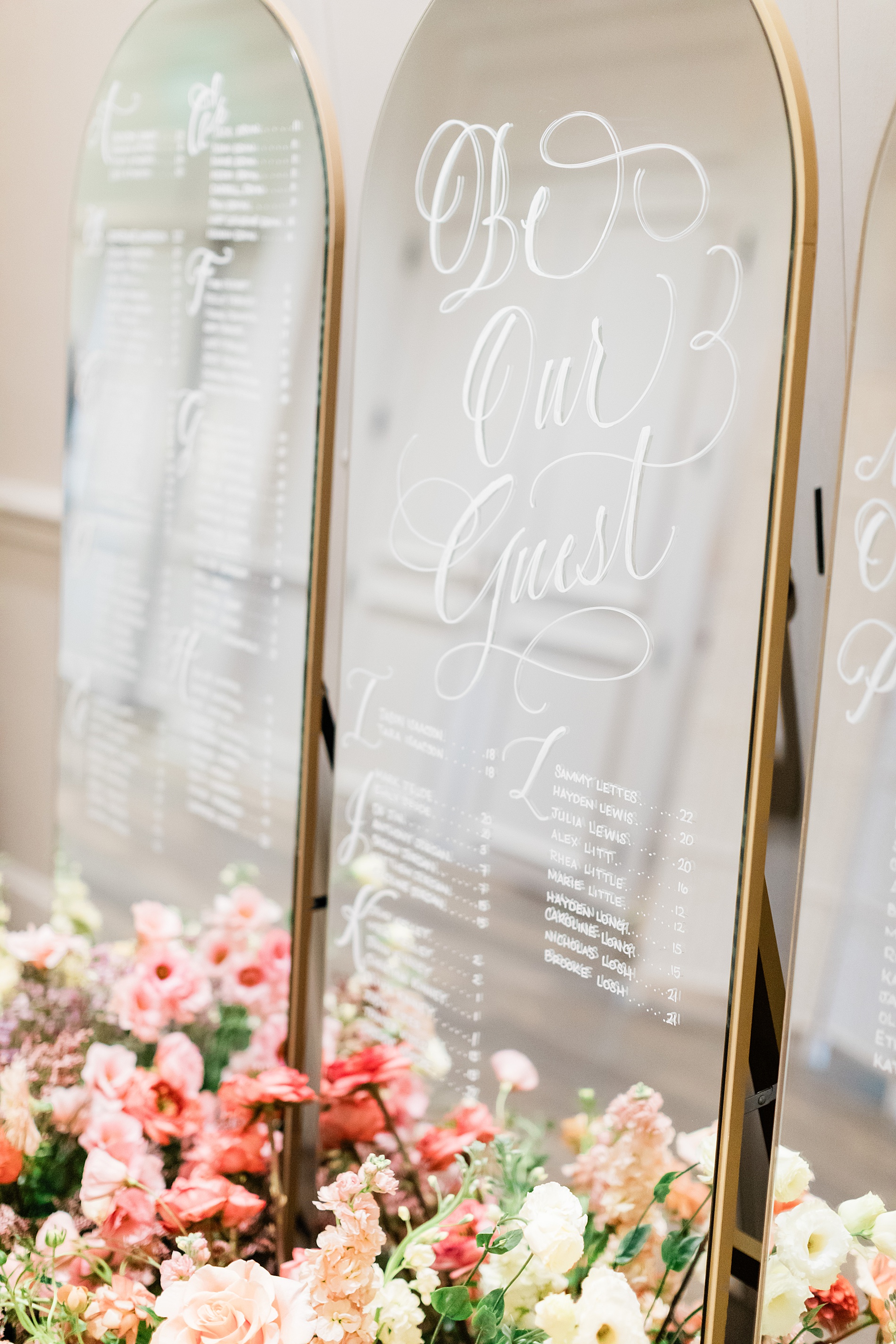
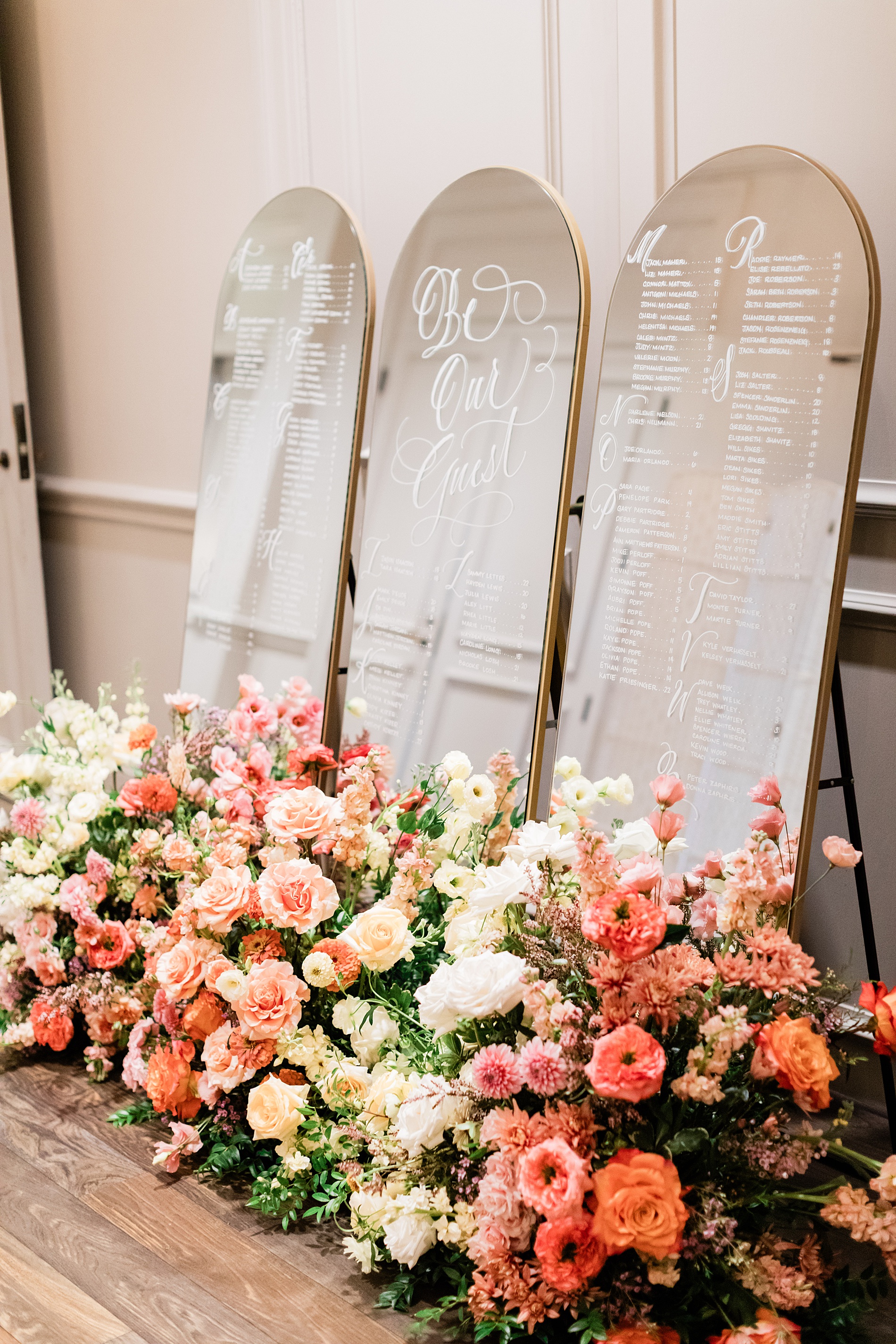
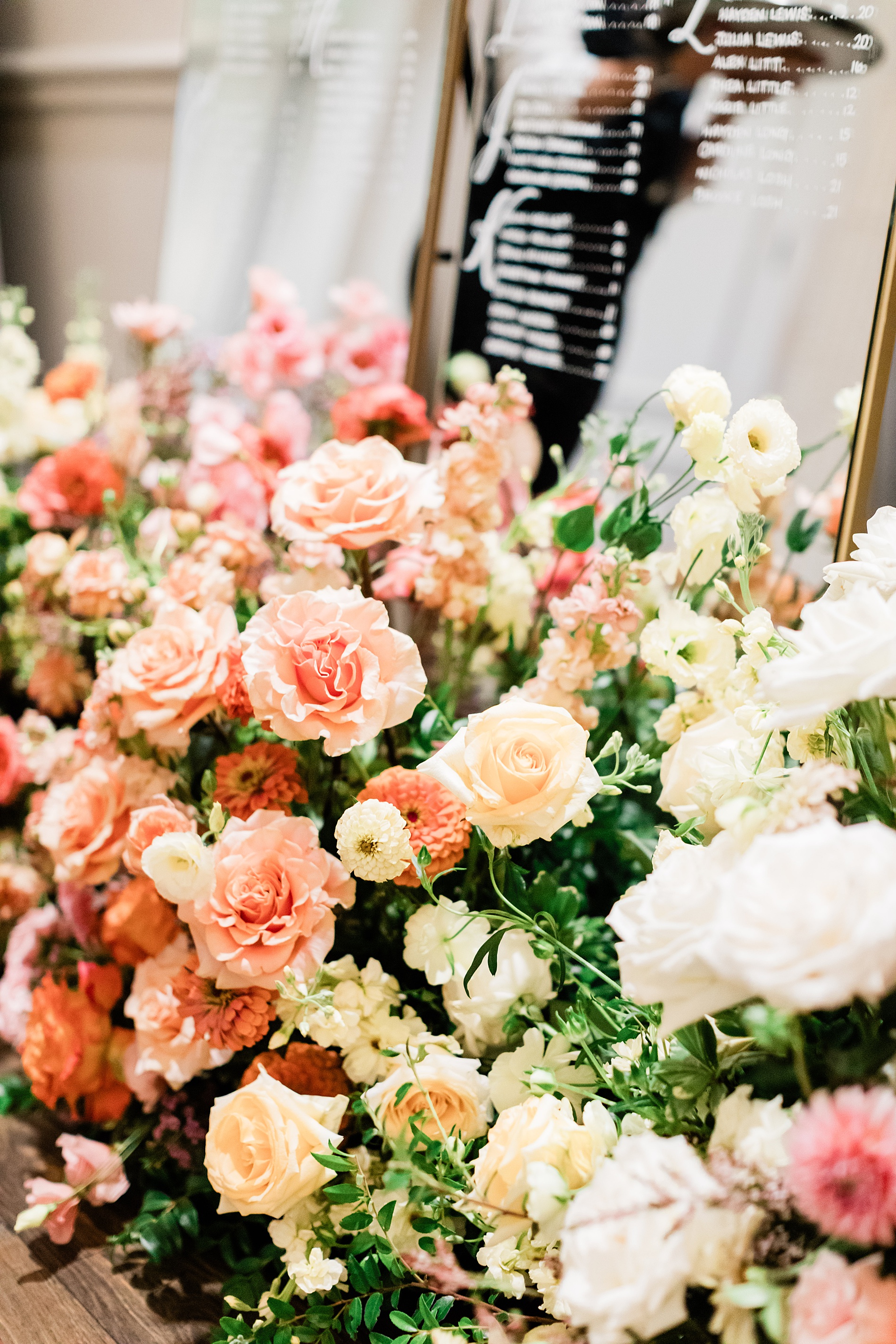
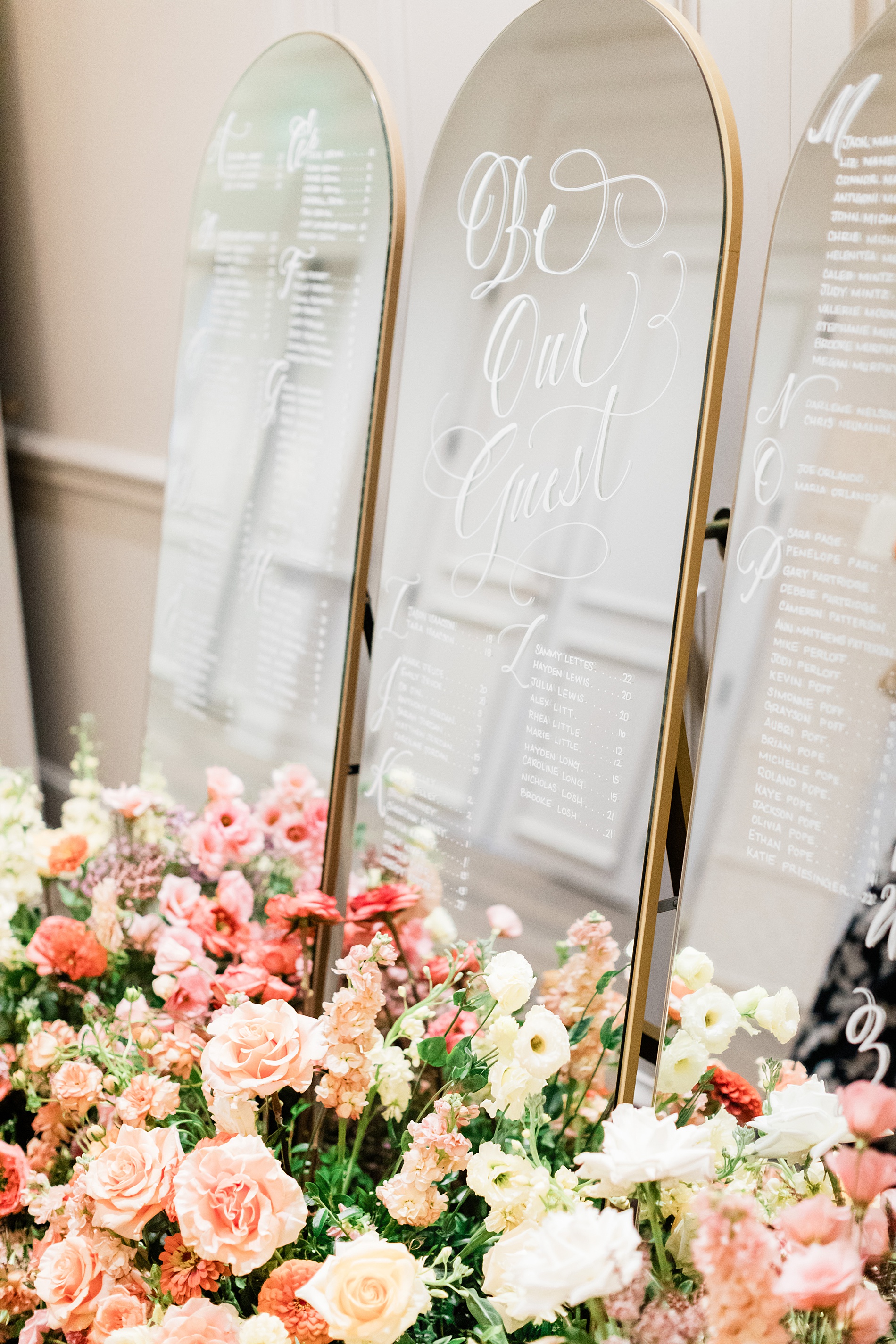
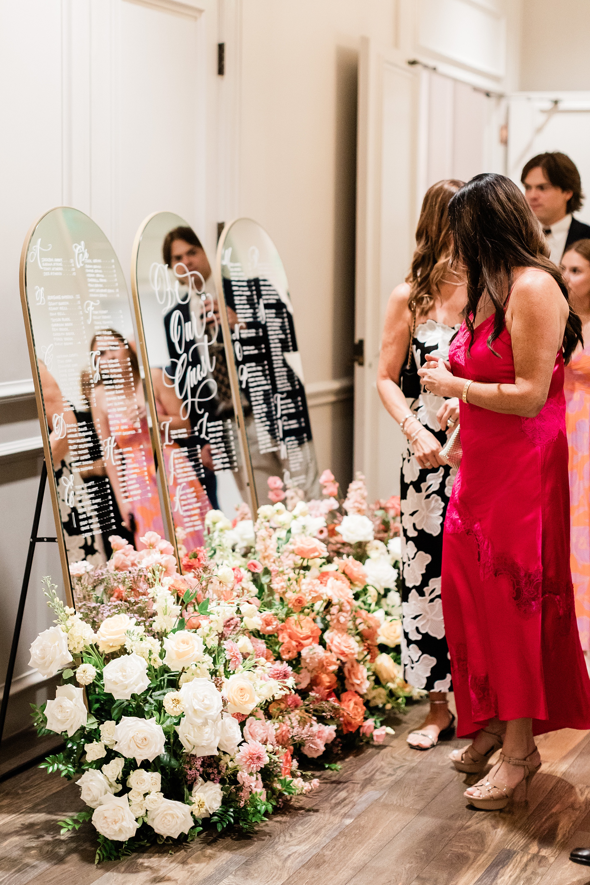
Mirrored Wedding Seating Chart
Their wedding reception featured a three-piece mirrored seating chart. The arched mirrors with gold frames were lettered by hand. A fresh flower display of white, cream, and various pink flowers sat at the base of the seating chart making it an eye-catching display.
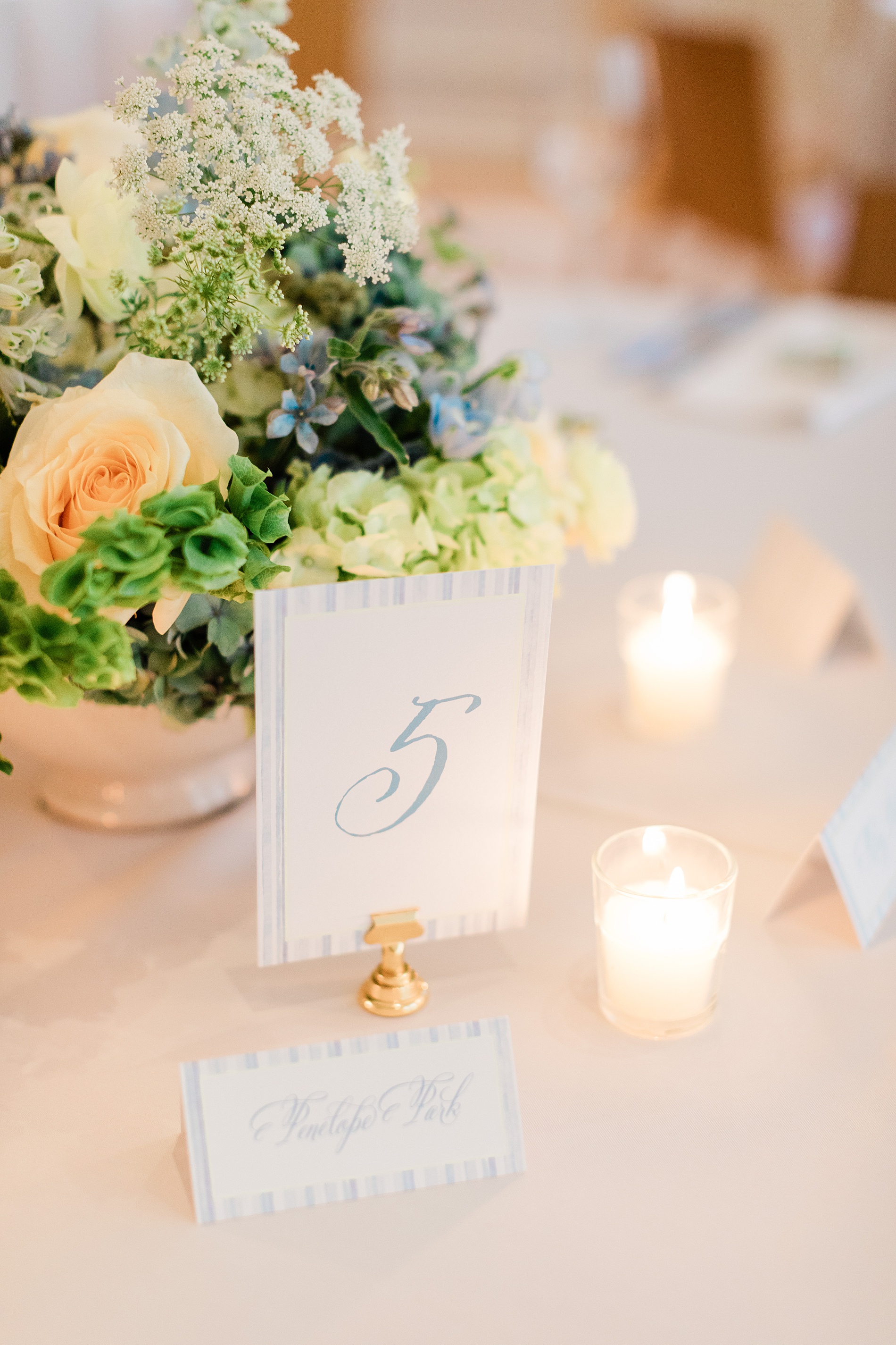
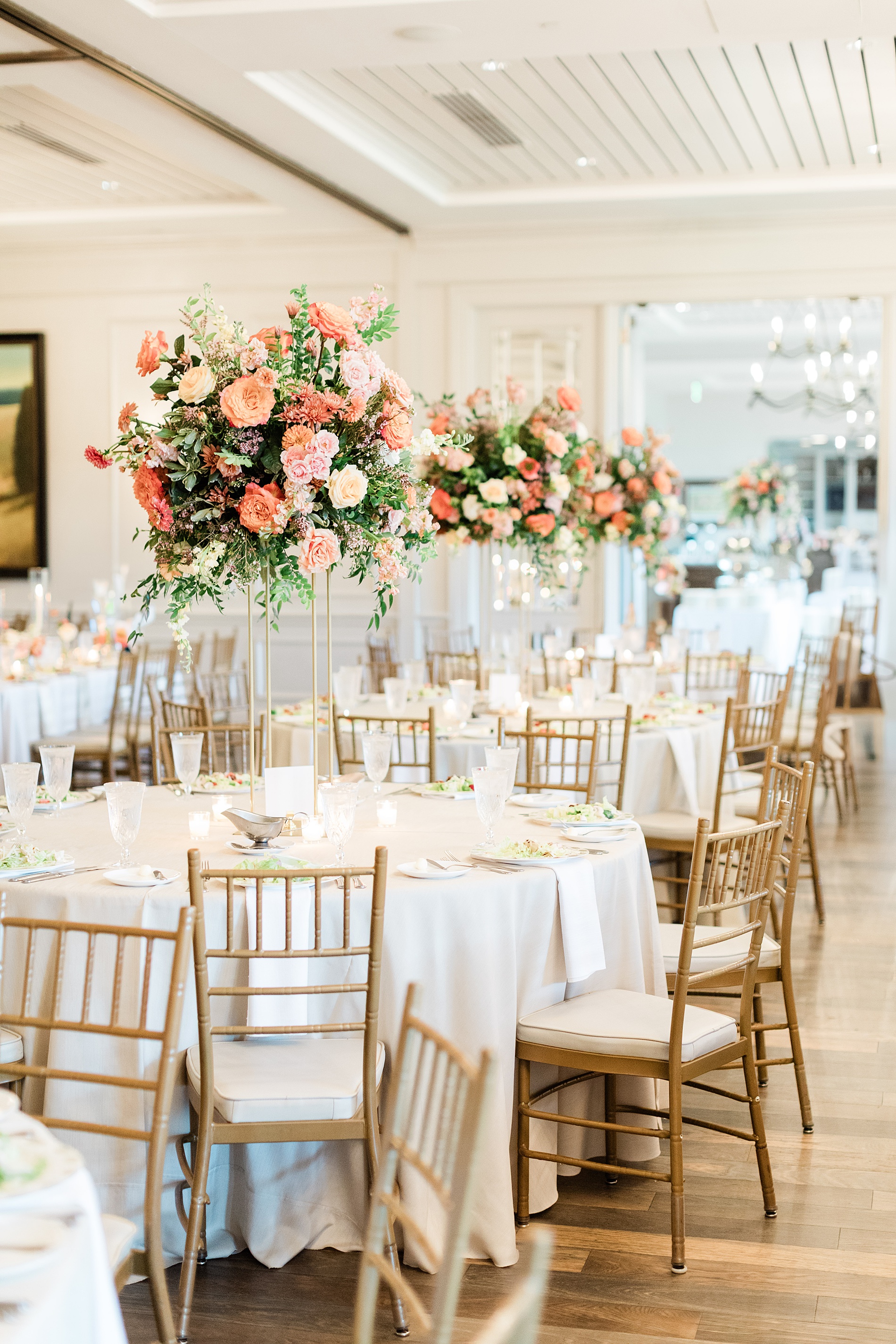
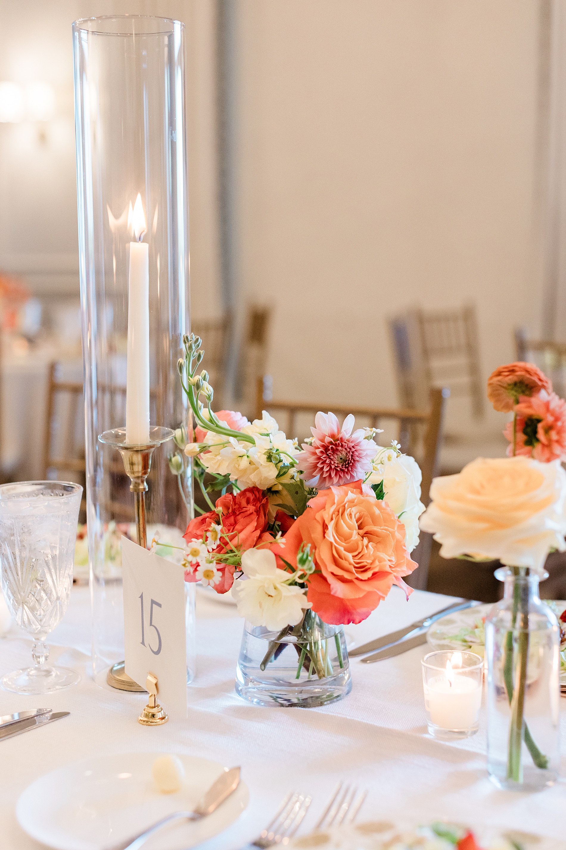
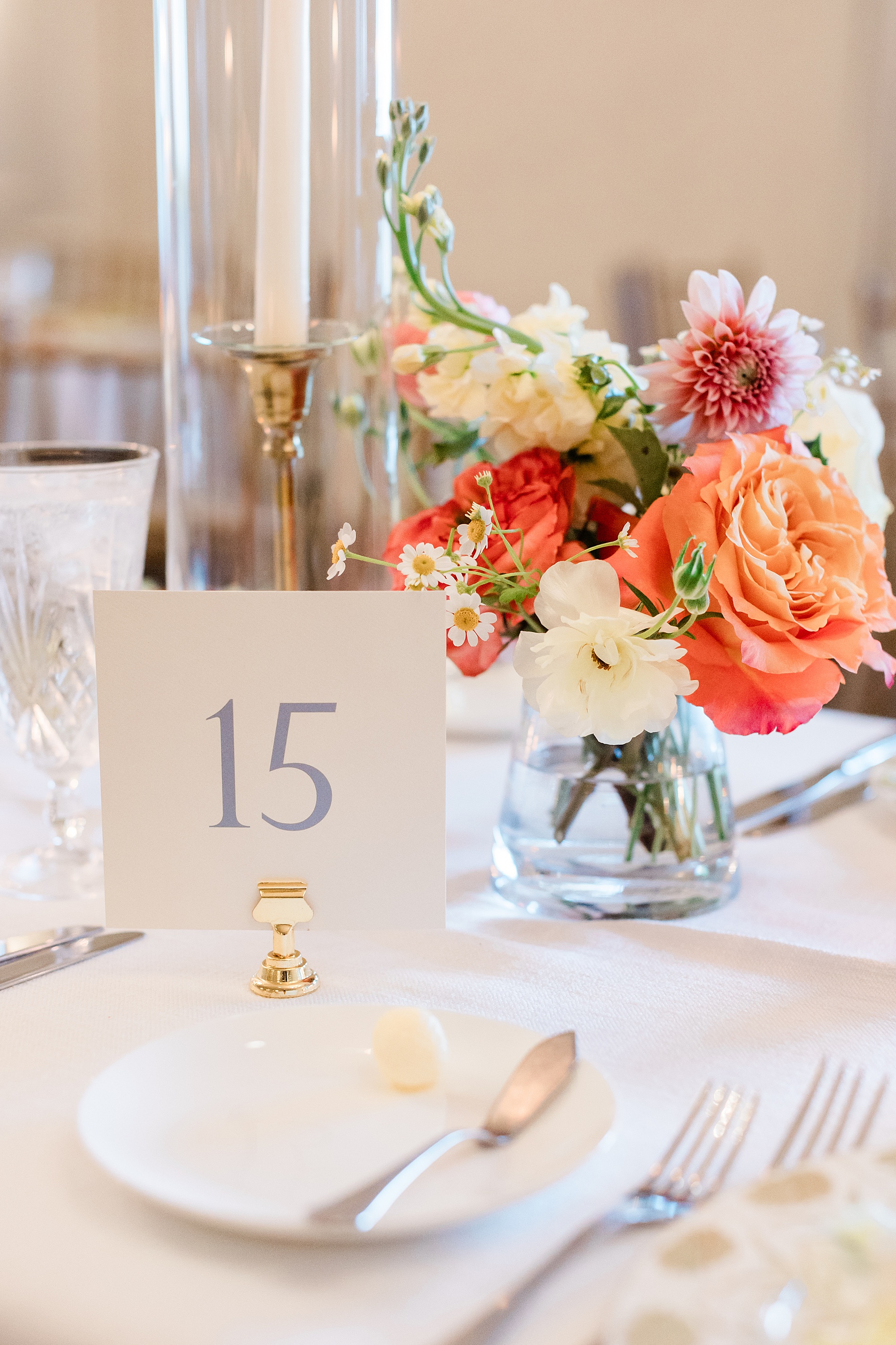
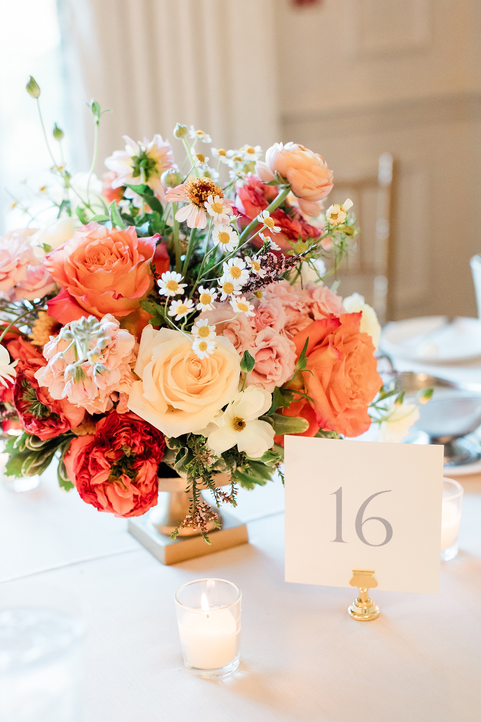
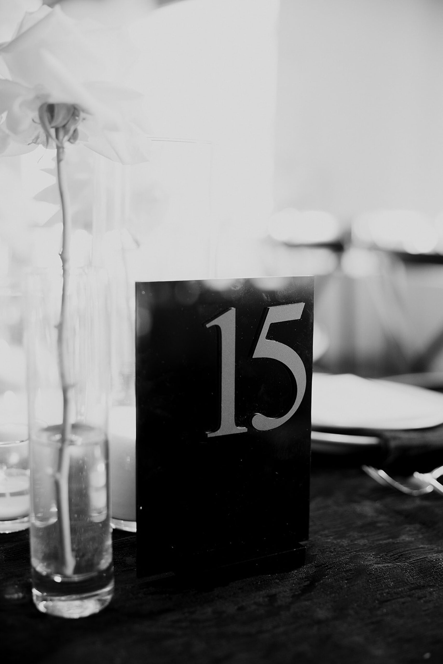
Table Numbers
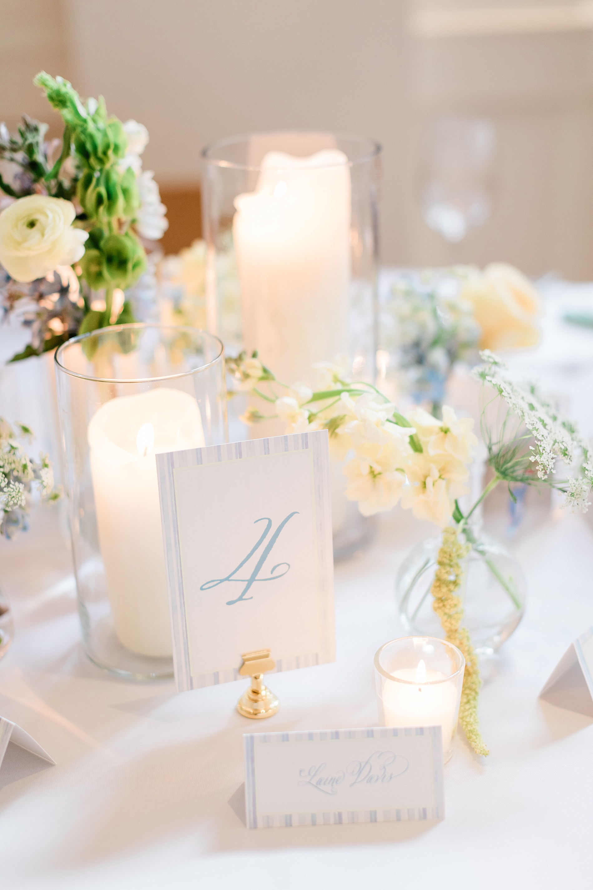
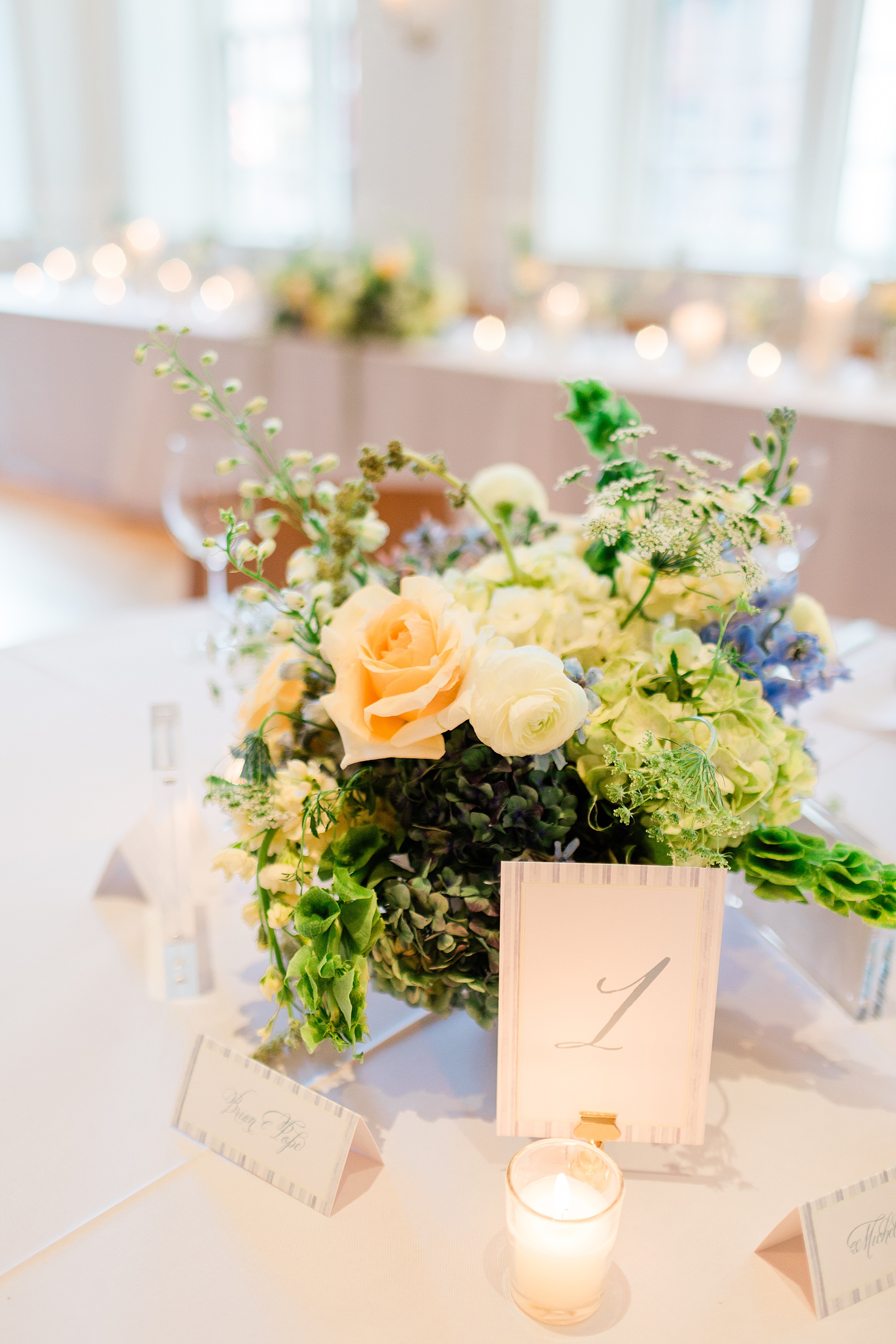
Colorful flower centerpieces decorated the center of each table. The table numbers we designed elegantly completed the tablescape. The white cards with numbers in a dusty blue color were displayed in gold holders tying the look together.
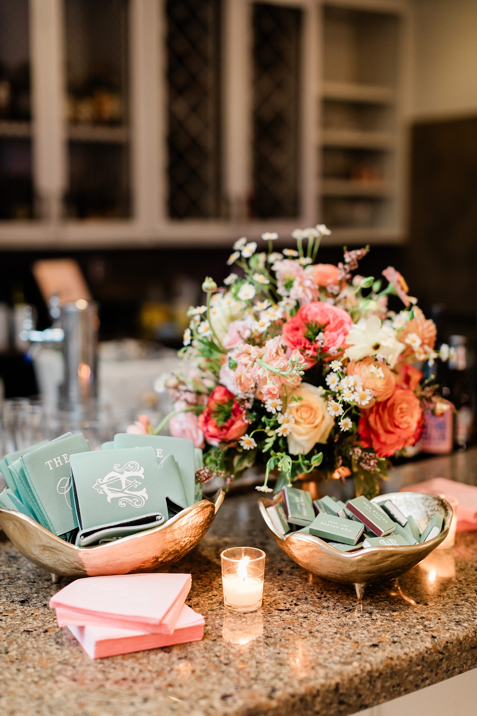
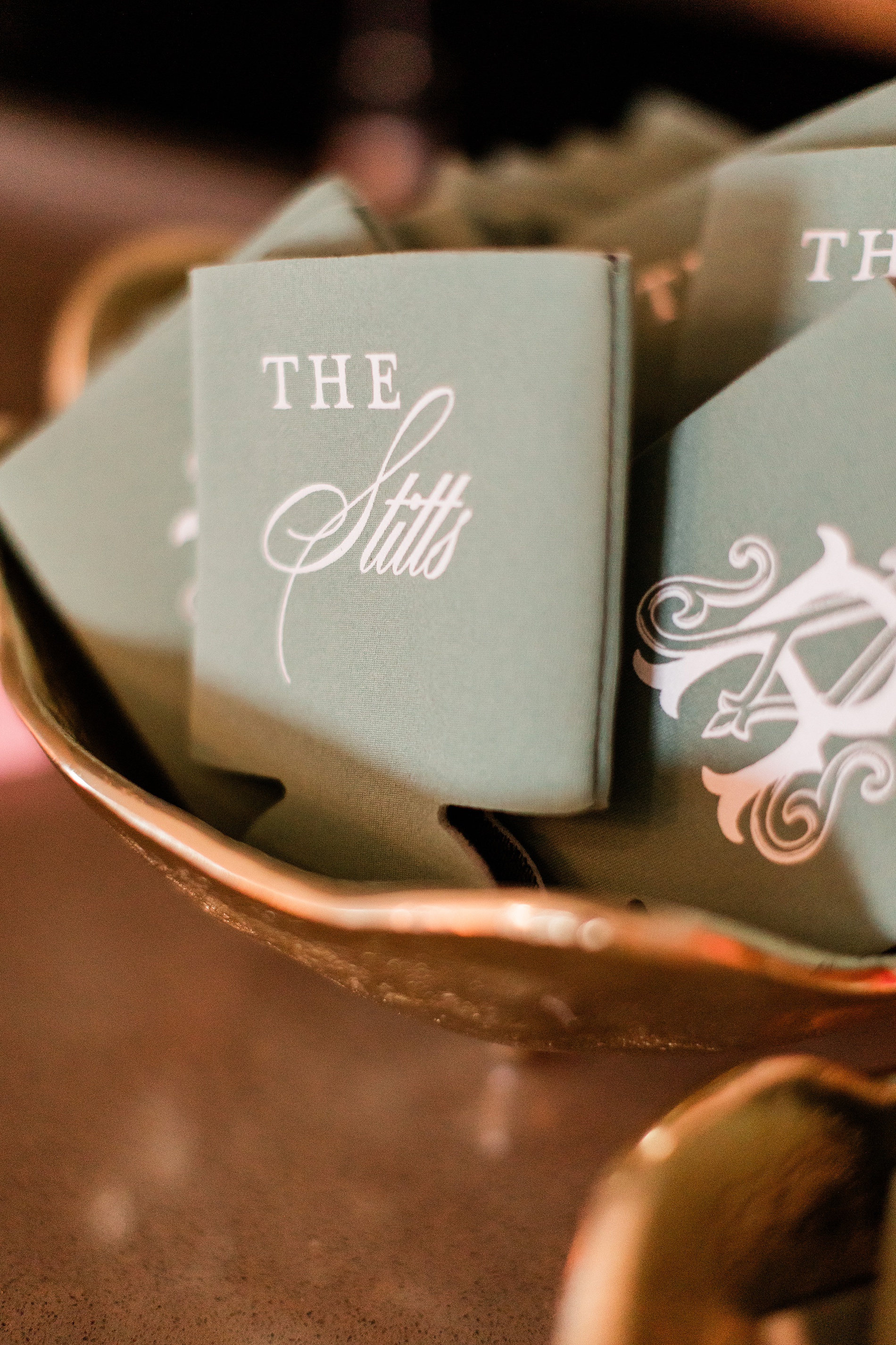
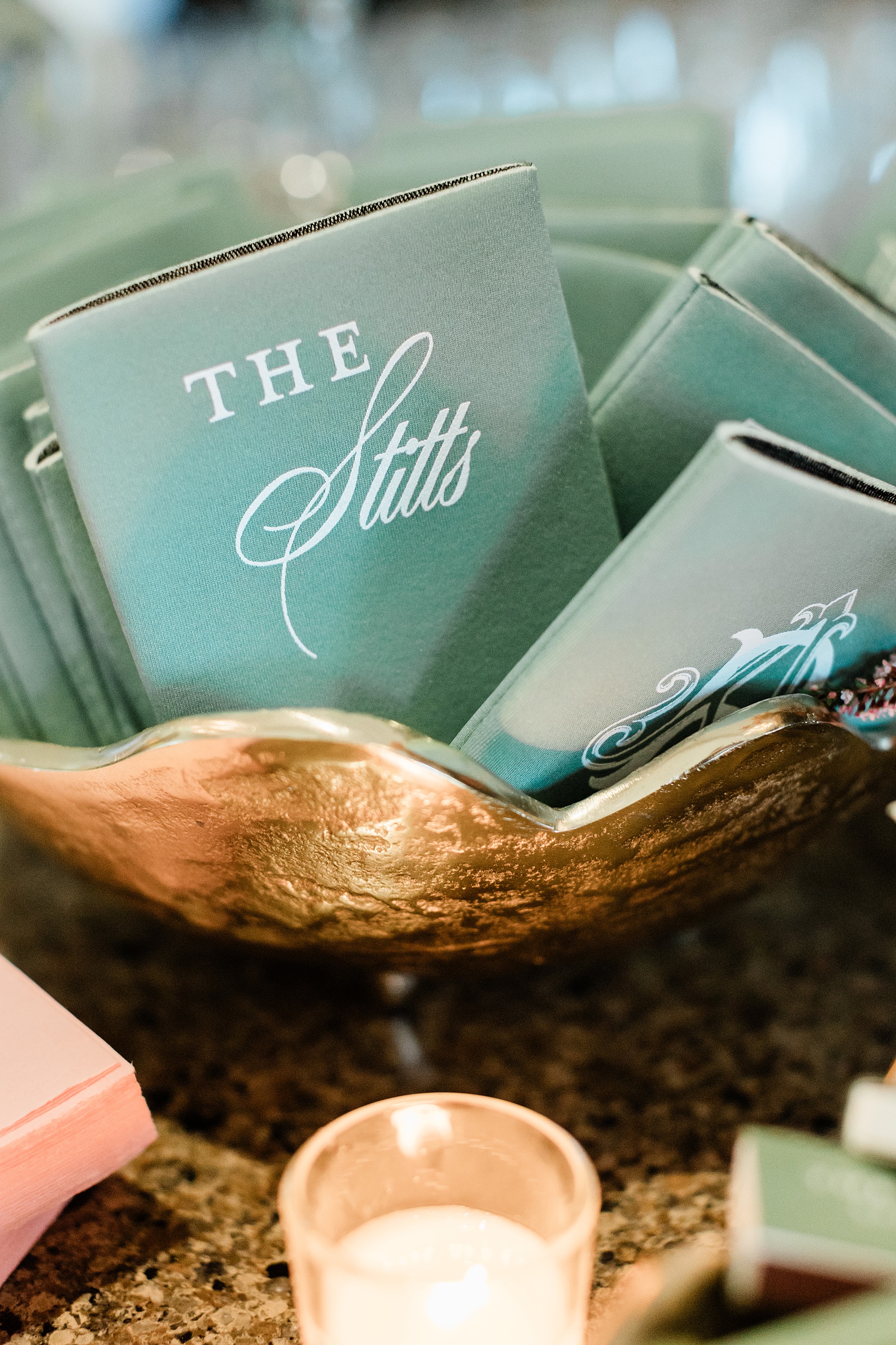
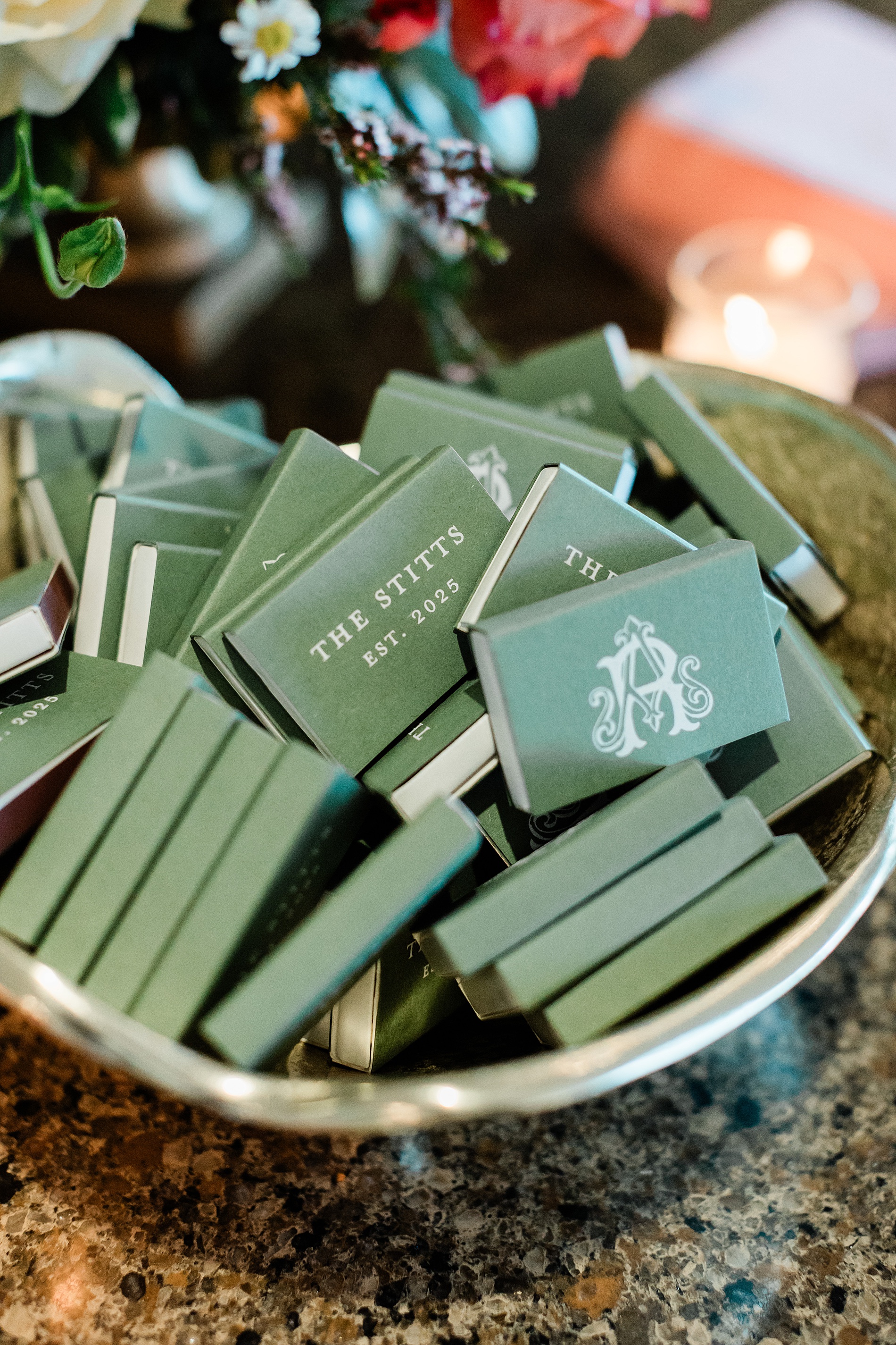
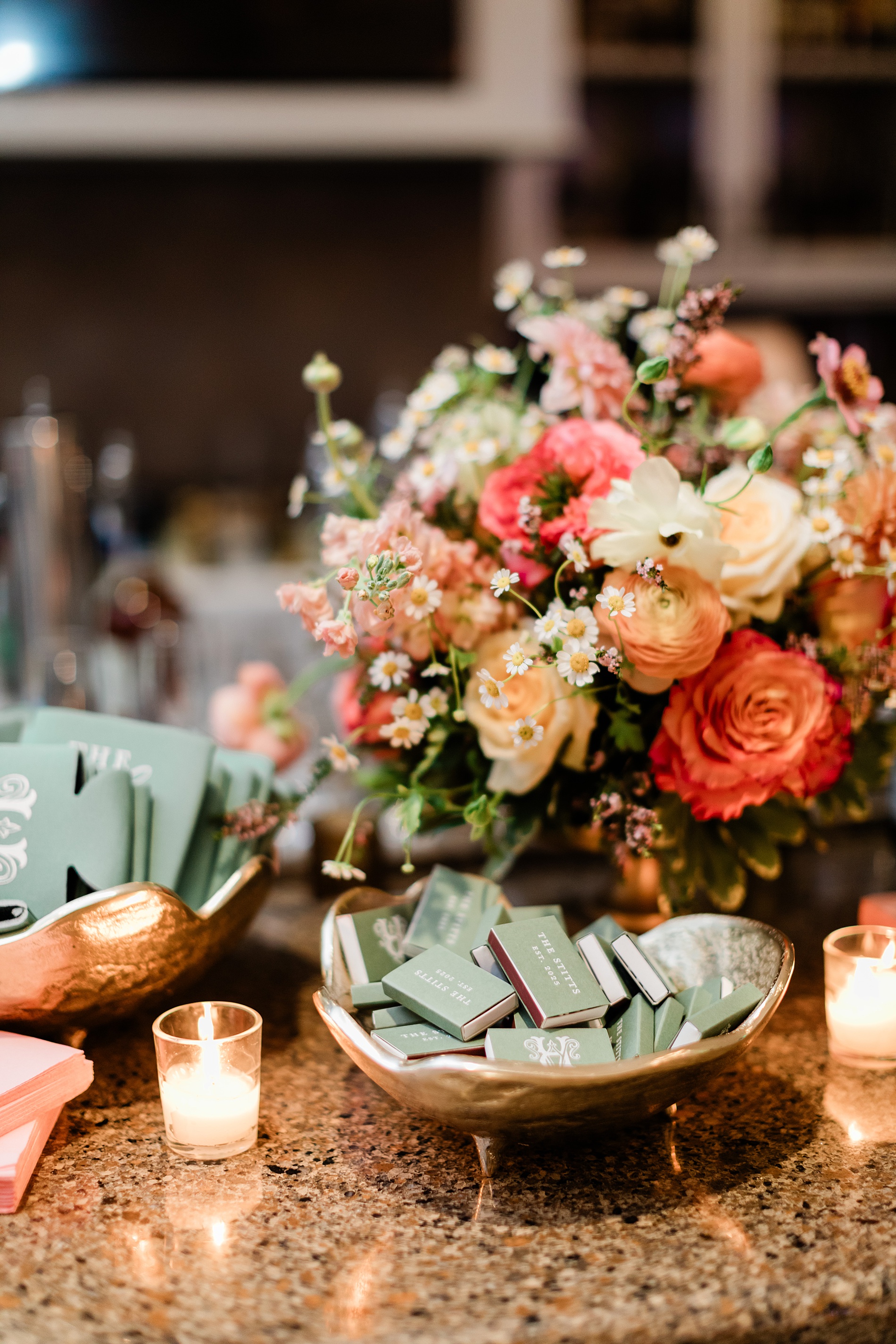
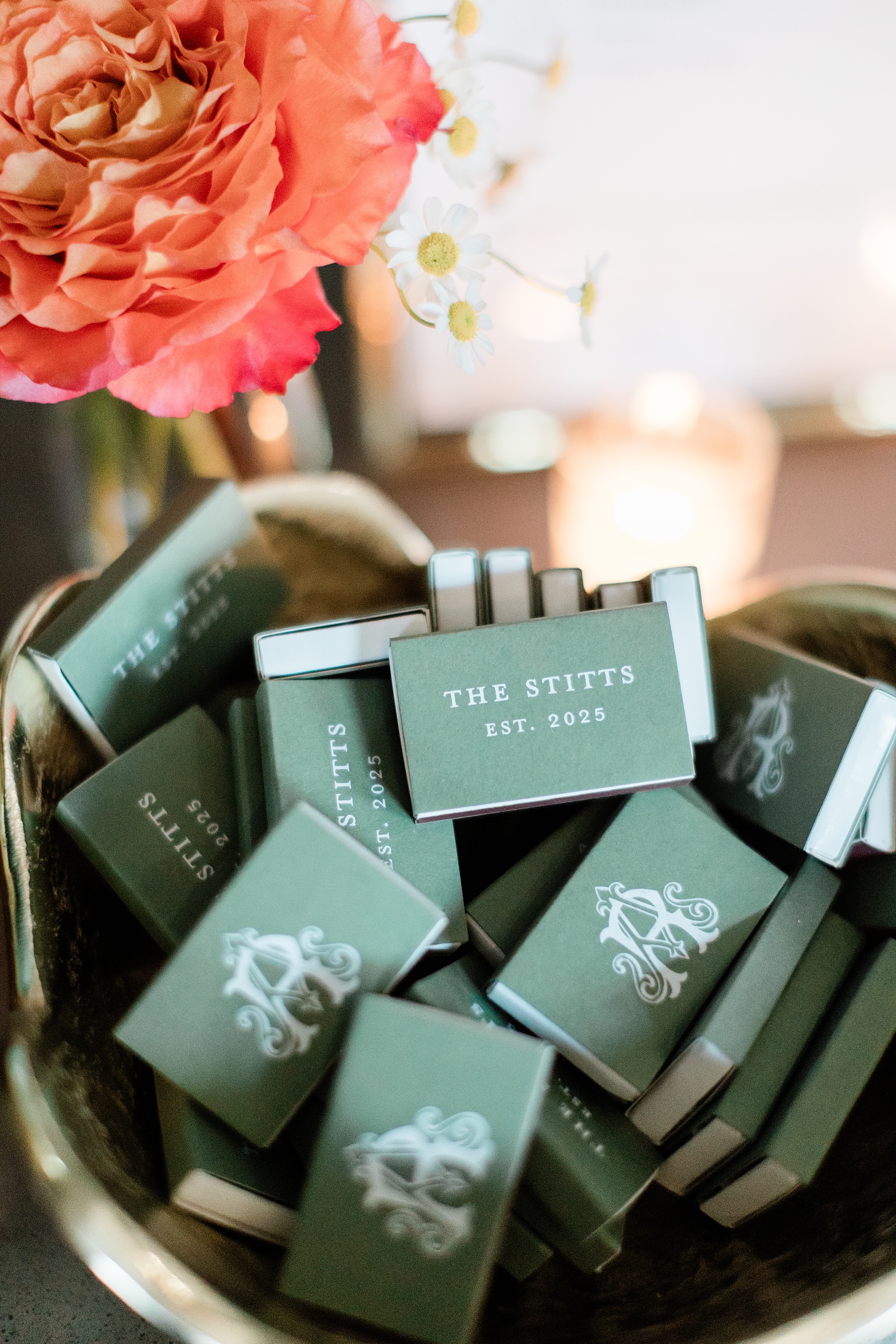
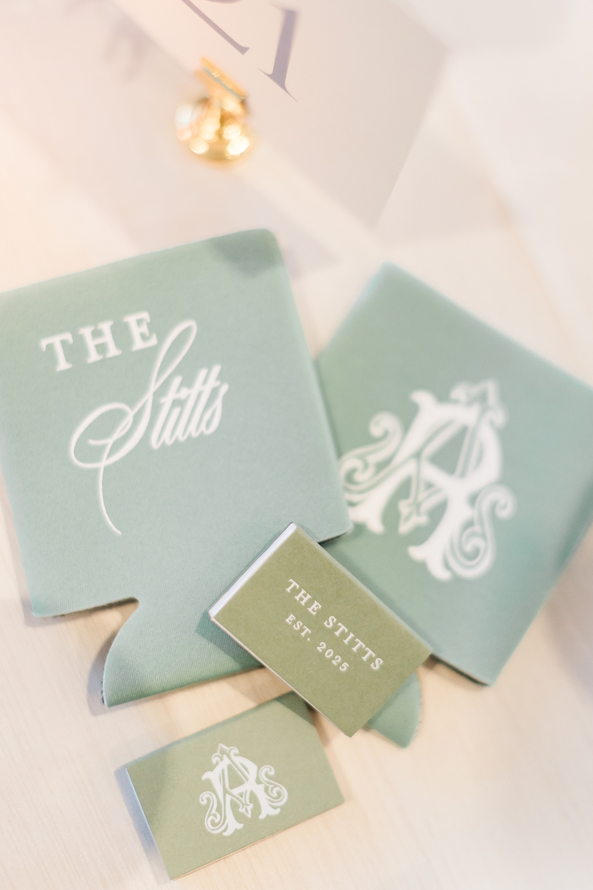
Custom Wedding Favors
Anna and Ross decided on custom drink koozies and matches for their wedding favors. To make them stand out, we put their custom monogram as seen on the invitations and programs on one side of the koozie and match box, and the other side featured their new shared name, The Stitts.
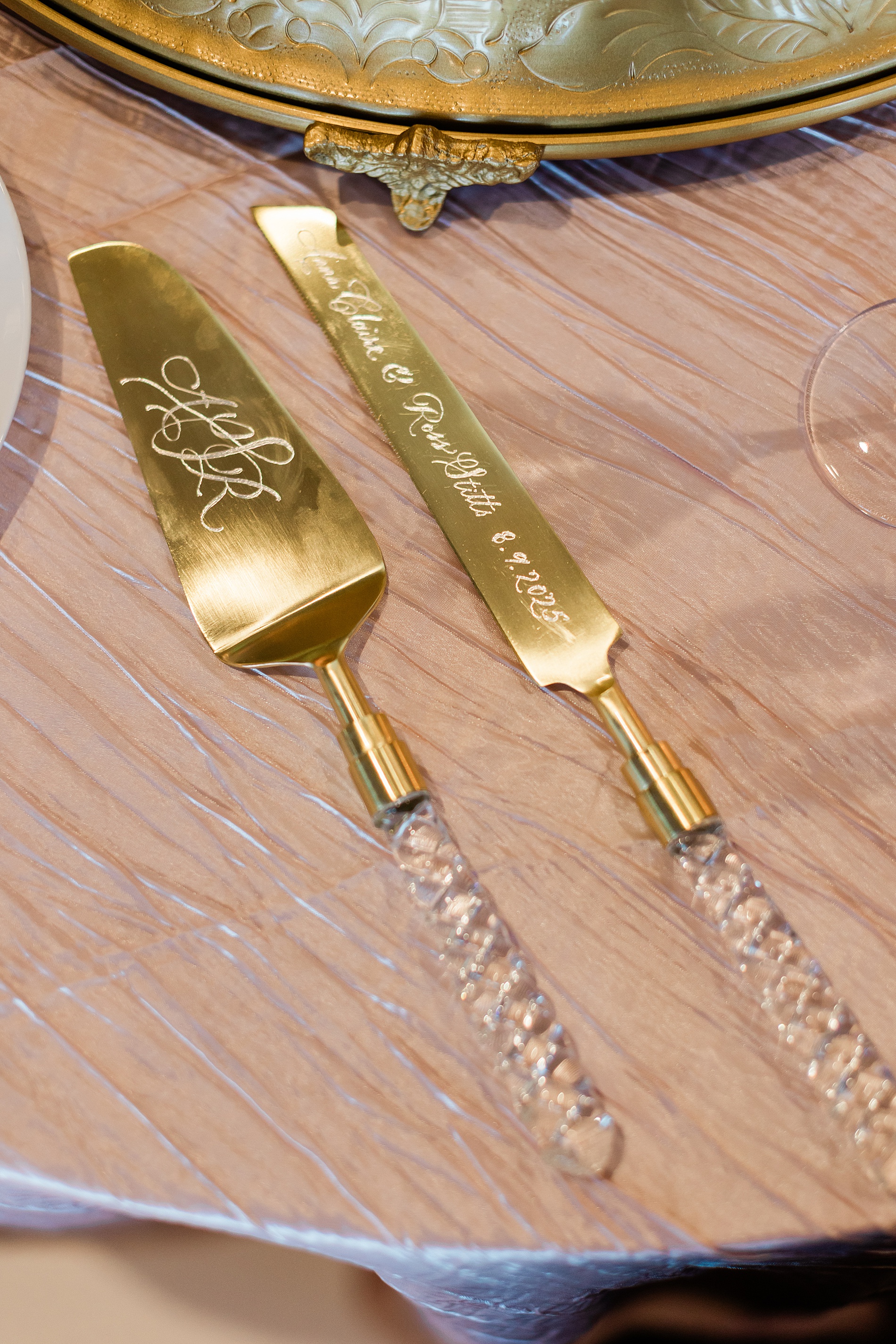
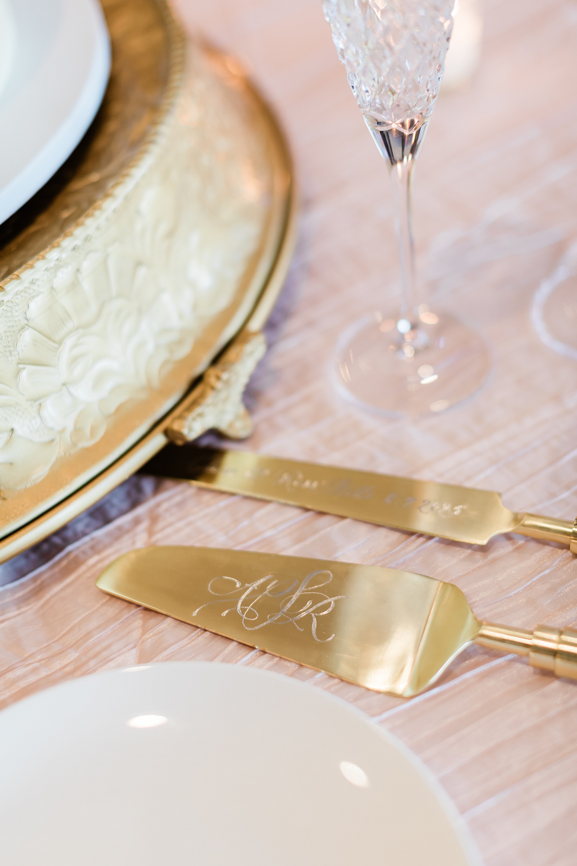
Engraved Cake Serving Set
One of my favorite items from this wedding was the hand-engraved cake serving set, which was a gift from the Mother of the Bride to the couple. The knife was engraved with their names and wedding date, while the cake server was hand engraved with a custom monogram.
Tying all the details together for this wedding weekend was so fun. At White Ink Calligraphy, we love creating experiences for our couples and their guests by artfully weaving threads of the design throughout the weddding day to create a cohesive look.
Congratulations, Anna and Ross, and thank you for trusting us with your wedding invitations and day of details for both your wedding day and the night before!
If you’re planning a wedding in Nashville, or anywhere in the world, we’d love to help you create meaningful, personalized stationery and event details that tell your story. We work with couples worldwide to design details you and your guests will remember forever.
Reach out today to learn more about our full-service wedding and event design offerings! We can’t wait to create something unforgettable for you!
If you enjoyed this post, you’ll love these other blogs!
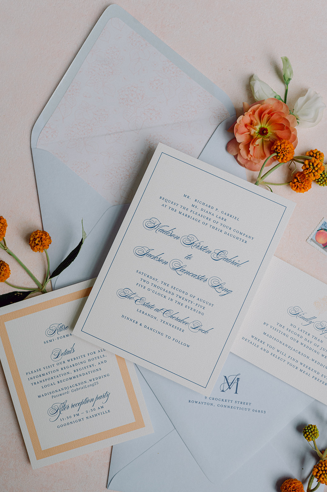
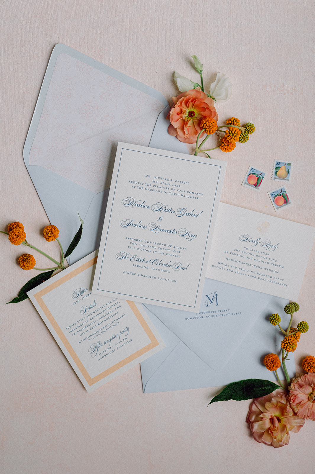
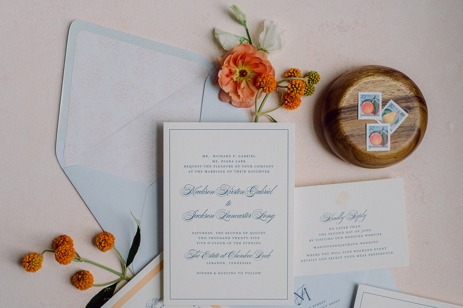
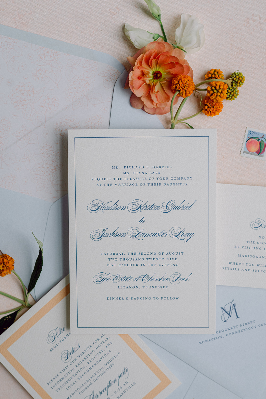
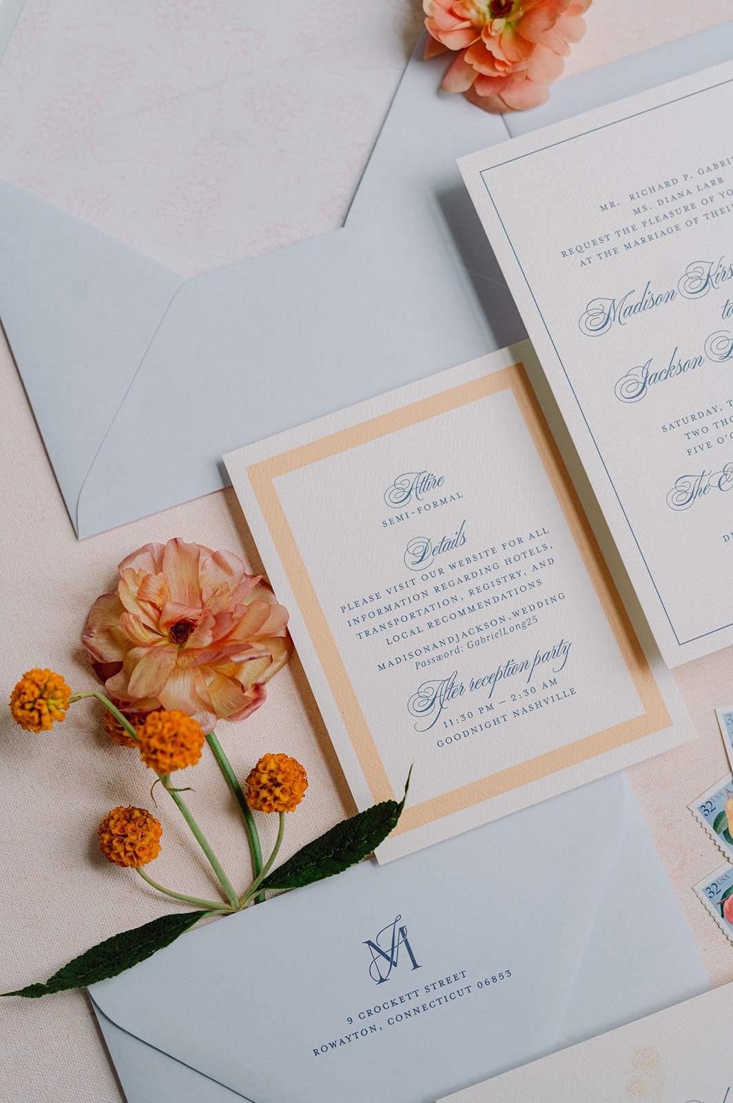
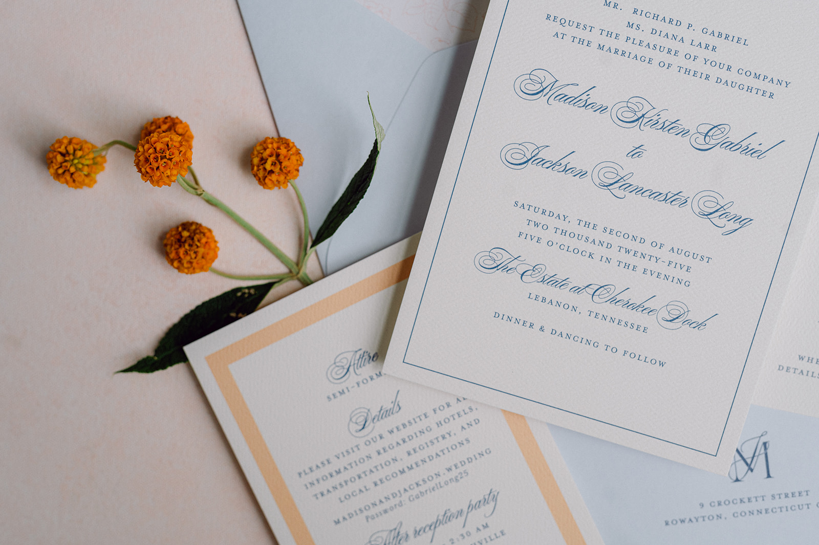
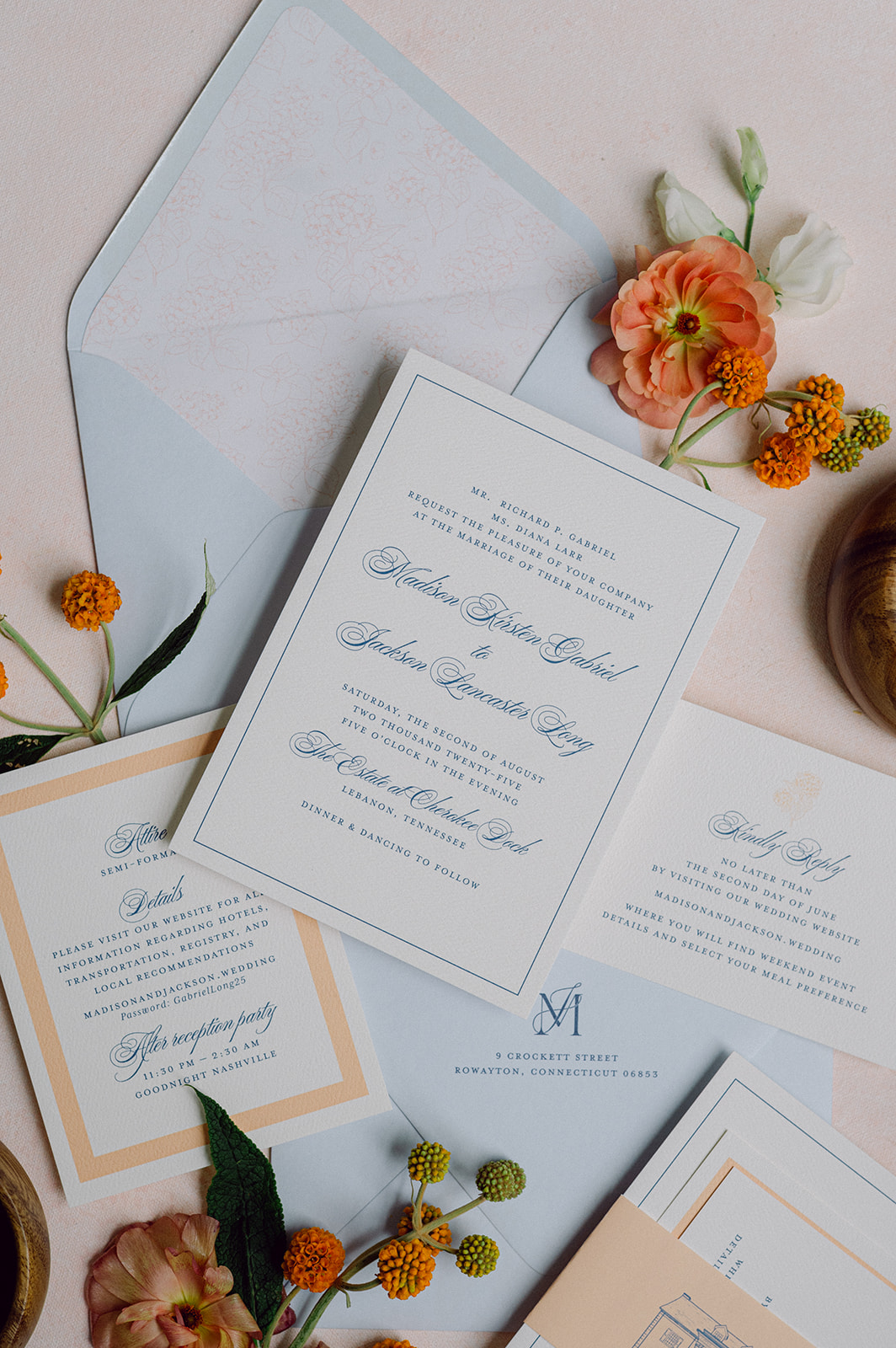
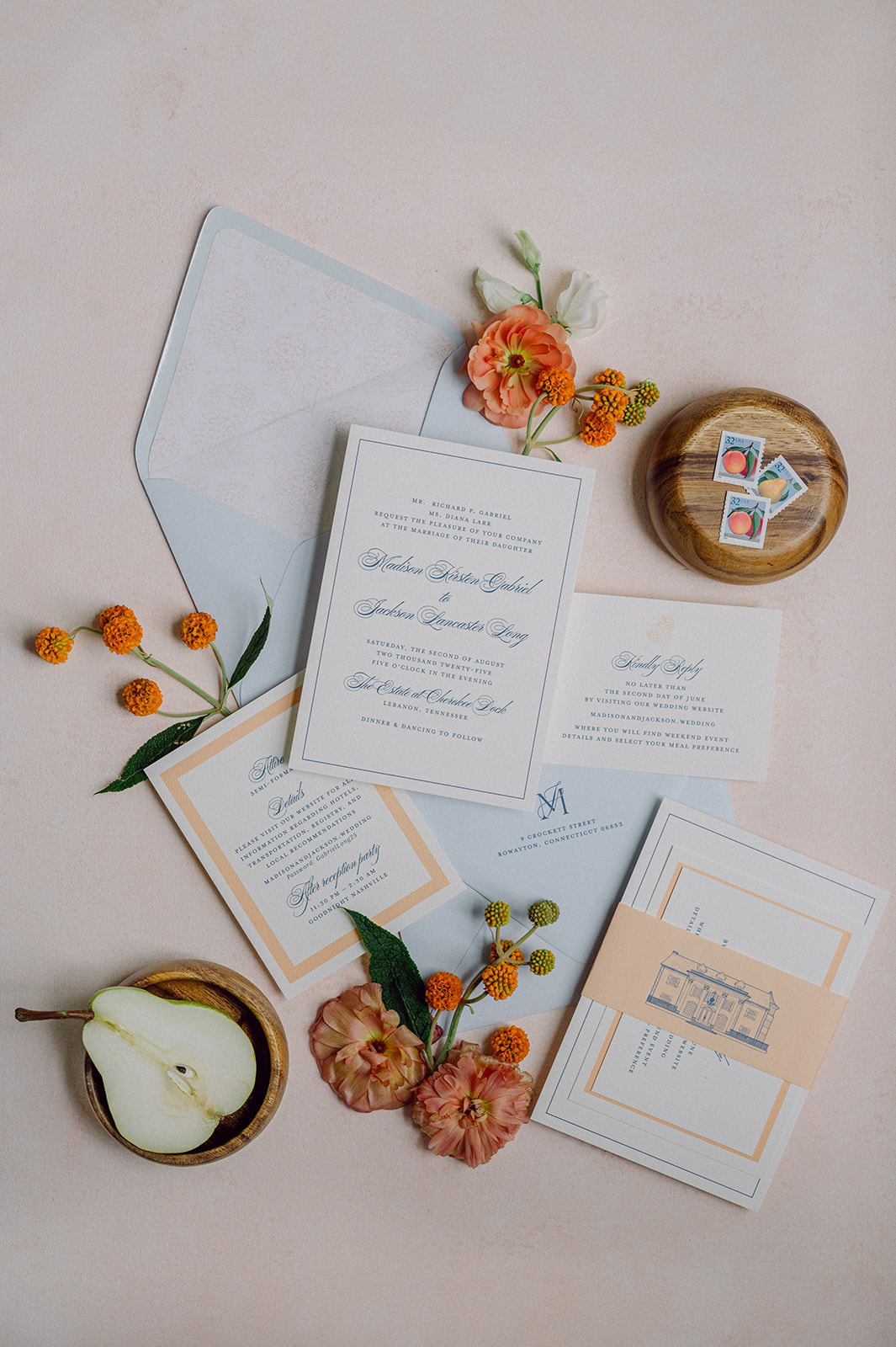
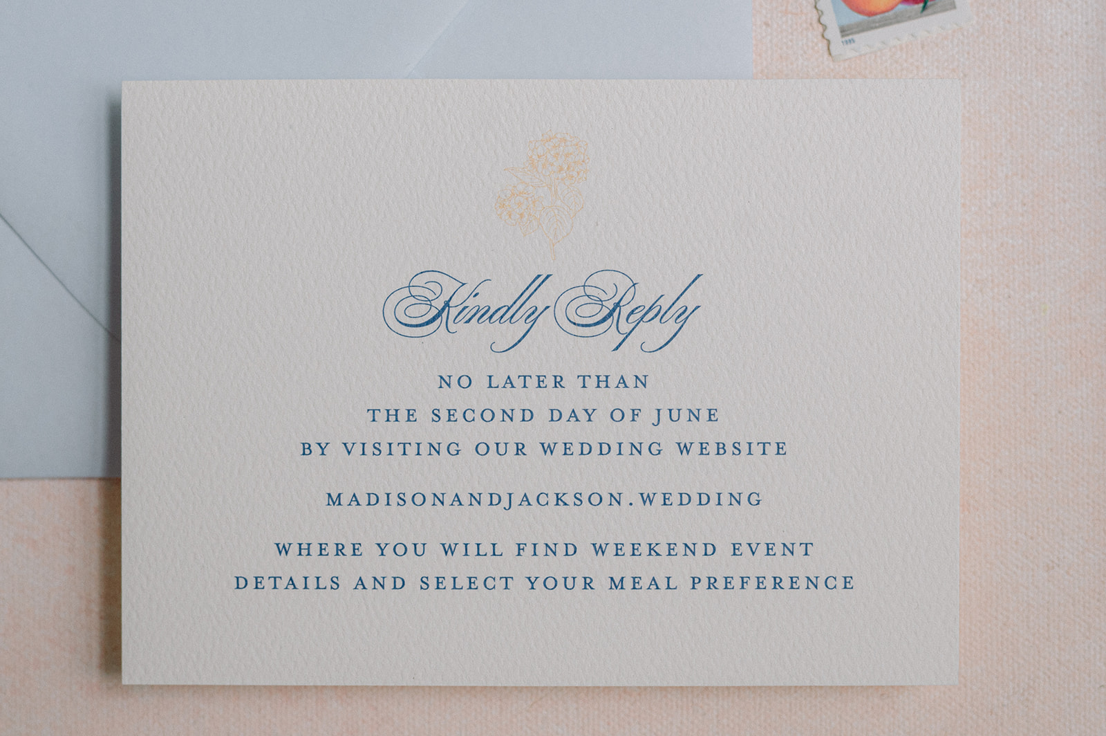
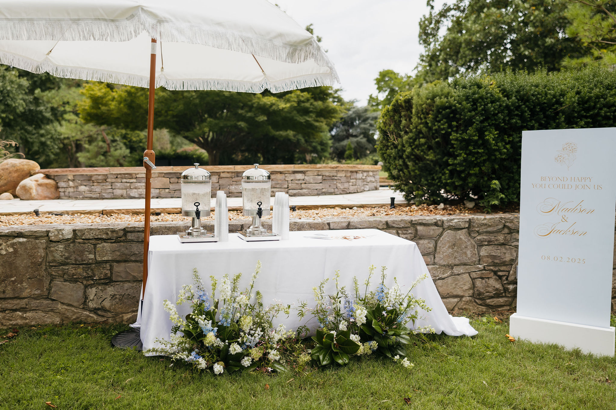
When designing paper goods and day-of details for weddings, we always strive to bring cohesion to the design. We did just that for this Cherokee Dock Nashville wedding. The couple, Madison and Jackson, dreamed of a celebration filled with soft spring colors, thoughtful touches, and a hint of fun. We took their ideas and wove their vision and colors into every element we created, bringing their vision to life. From the invitation suite to the late-night snack boxes, this wedding was full of creativity, color, and personality.
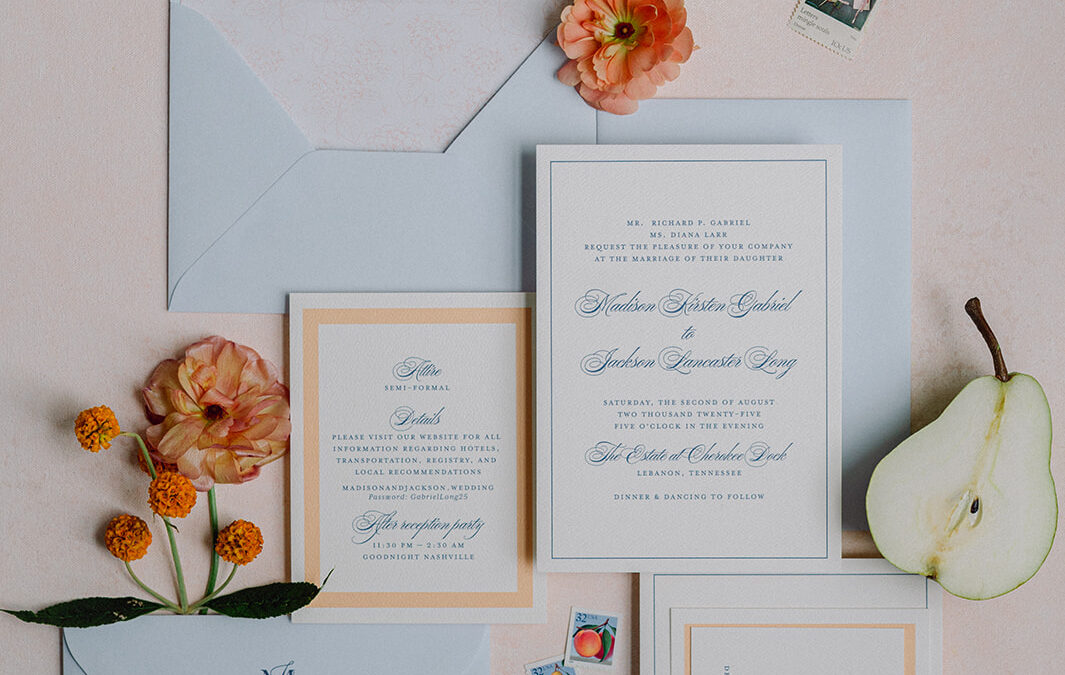
A Soft, Spring-Inspired Invitation Suite
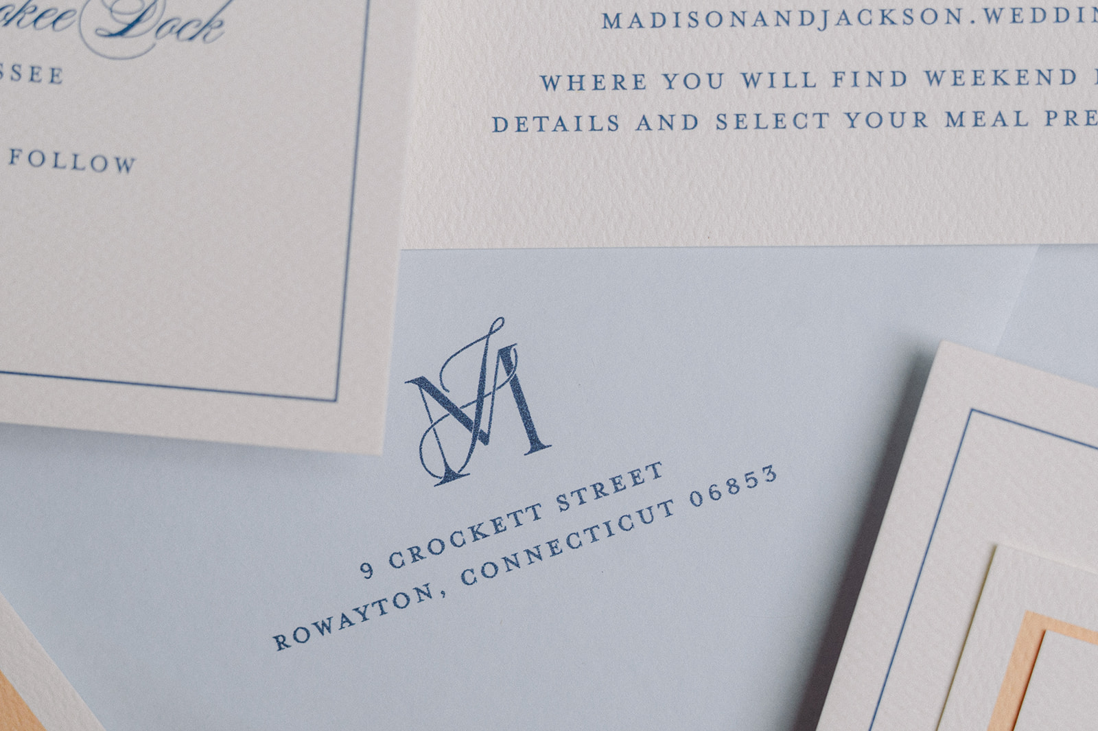
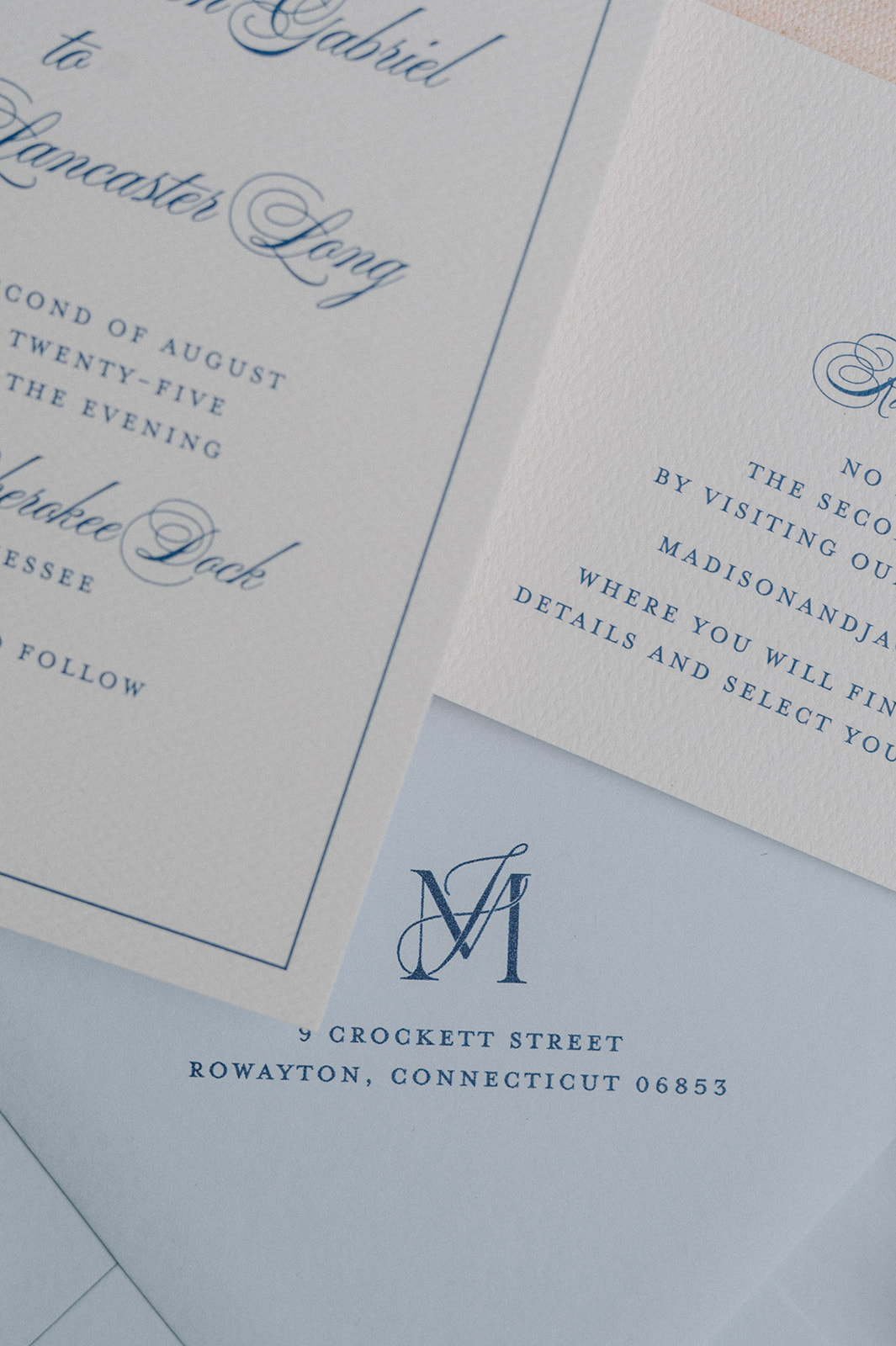
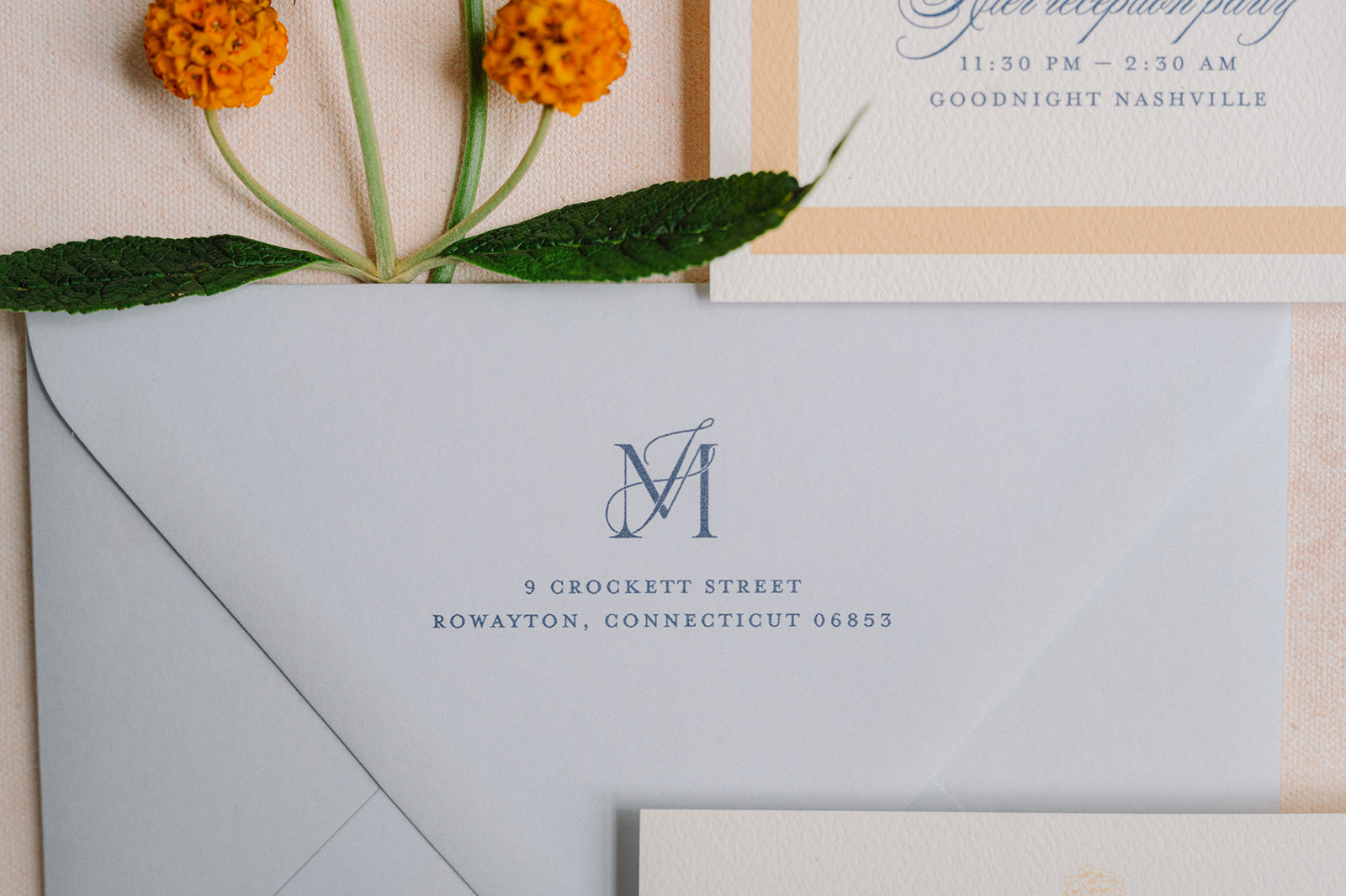
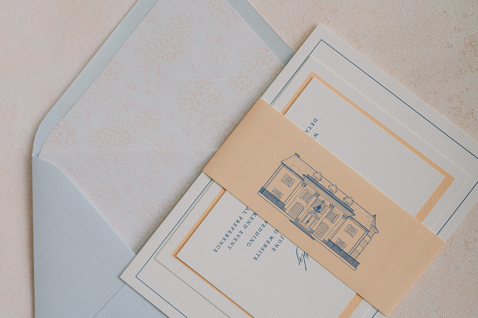
We started with an invitation suite inspired by airy spring hues. The palette centered around light blue, white, and a soft sherbet orange, which instantly set a fresh and joyful tone for the day.
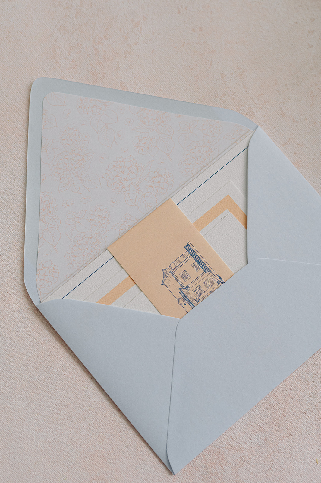
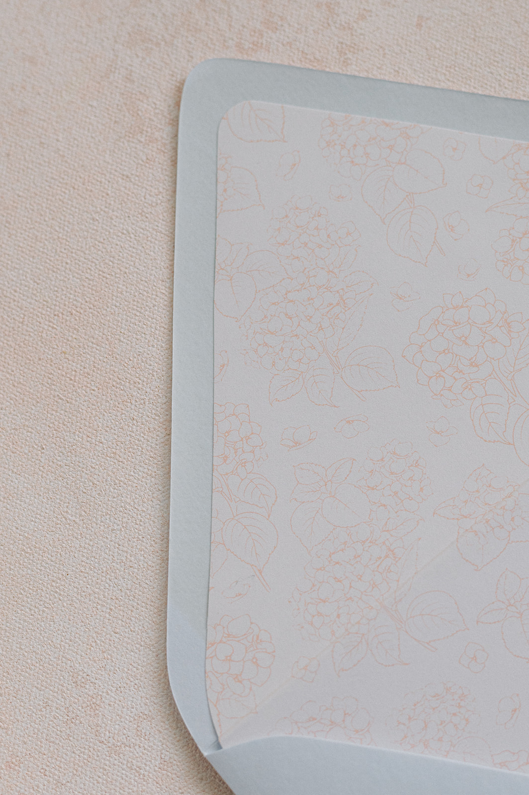
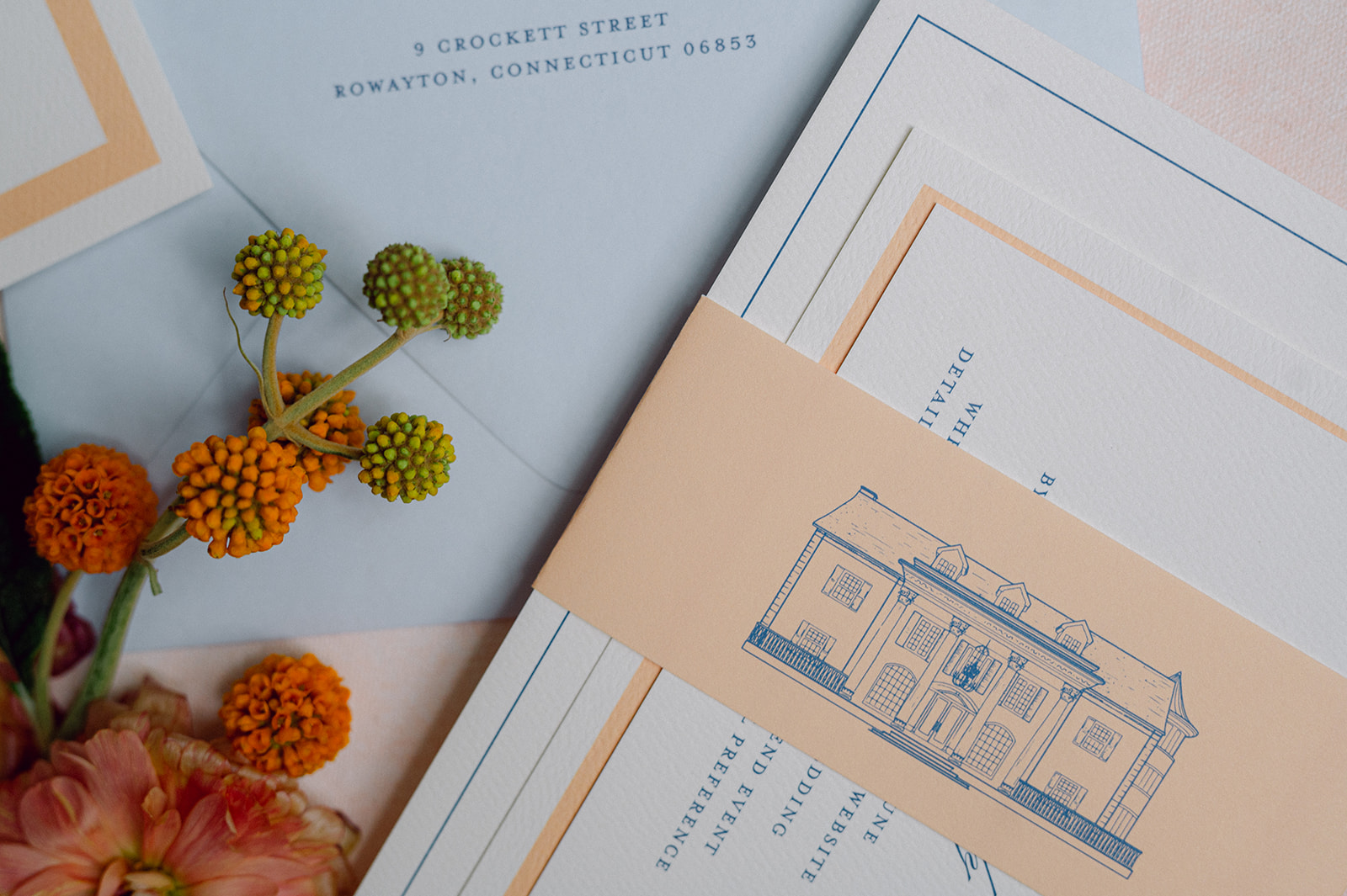
For the envelopes, we used a dusty blue color that was the foundation of the wedding day design. The envelopes featured the couple’s monogram and a custom floral-patterned envelope liner created with the wedding’s signature orange hue accent color.
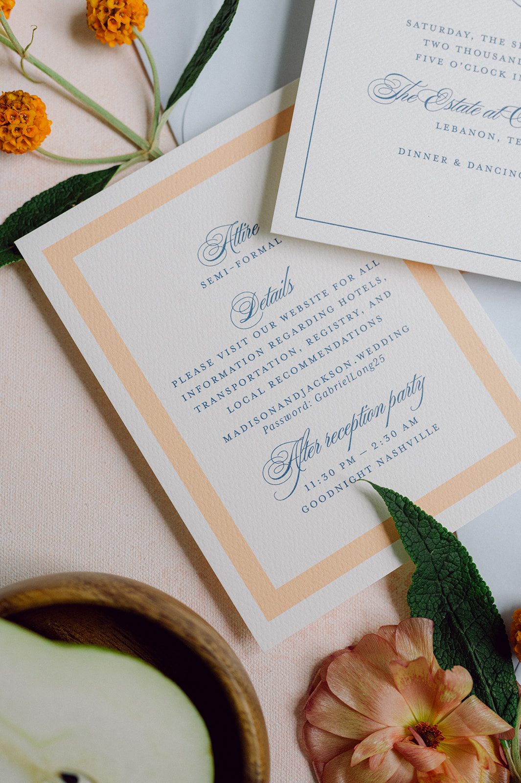
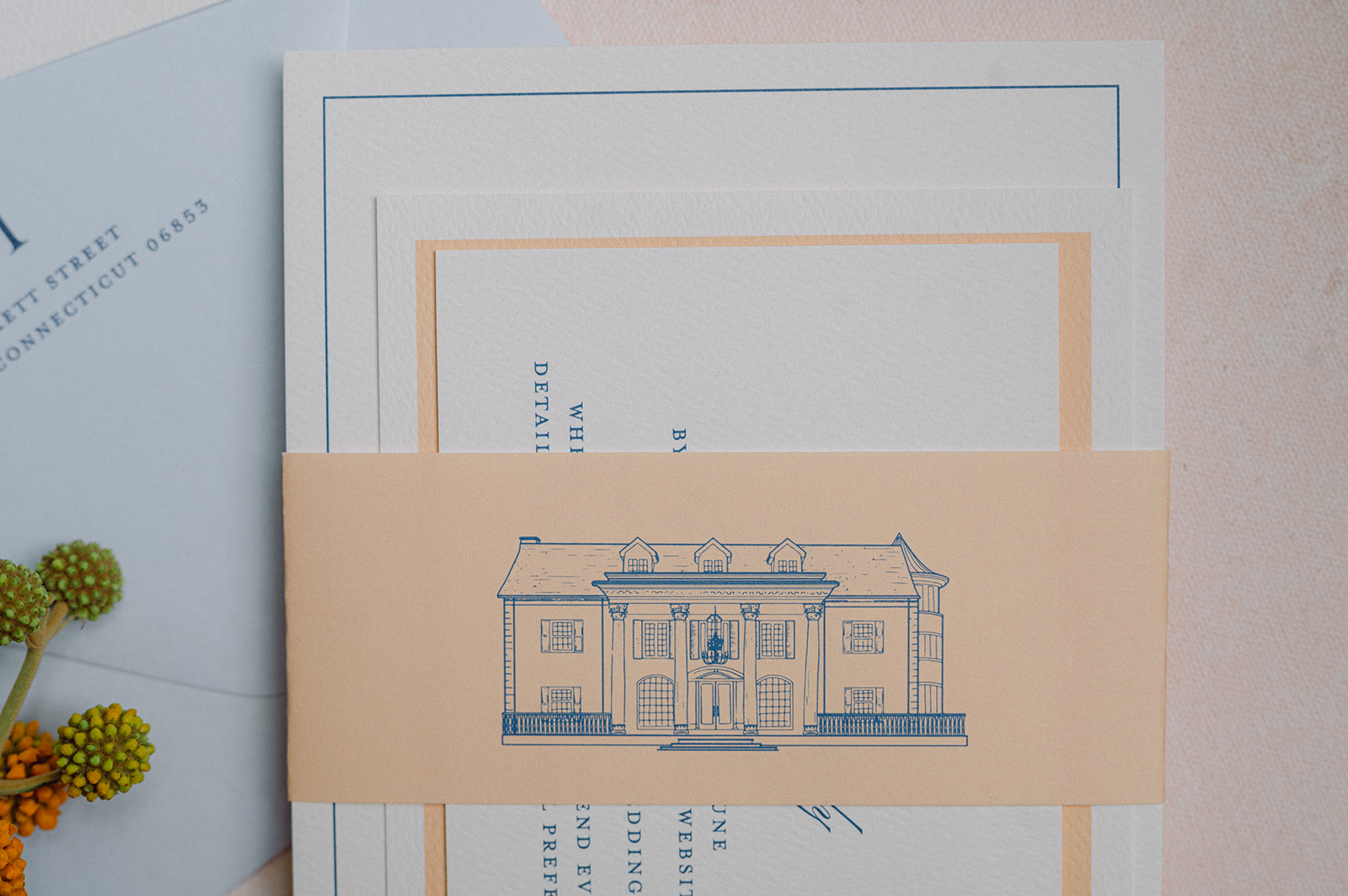
The main invitation was white with light blue calligraphy. The details card was similar but stood out with a thick sherbet-orange border. The entire suite was then wrapped in a vellum band in the same light orange color showcasing a custom sketch of Cherokee Dock in a deep blue.
The suite felt polished yet playful and gave guests an early glimpse into the wedding day ahead.
Wedding Day-of Details
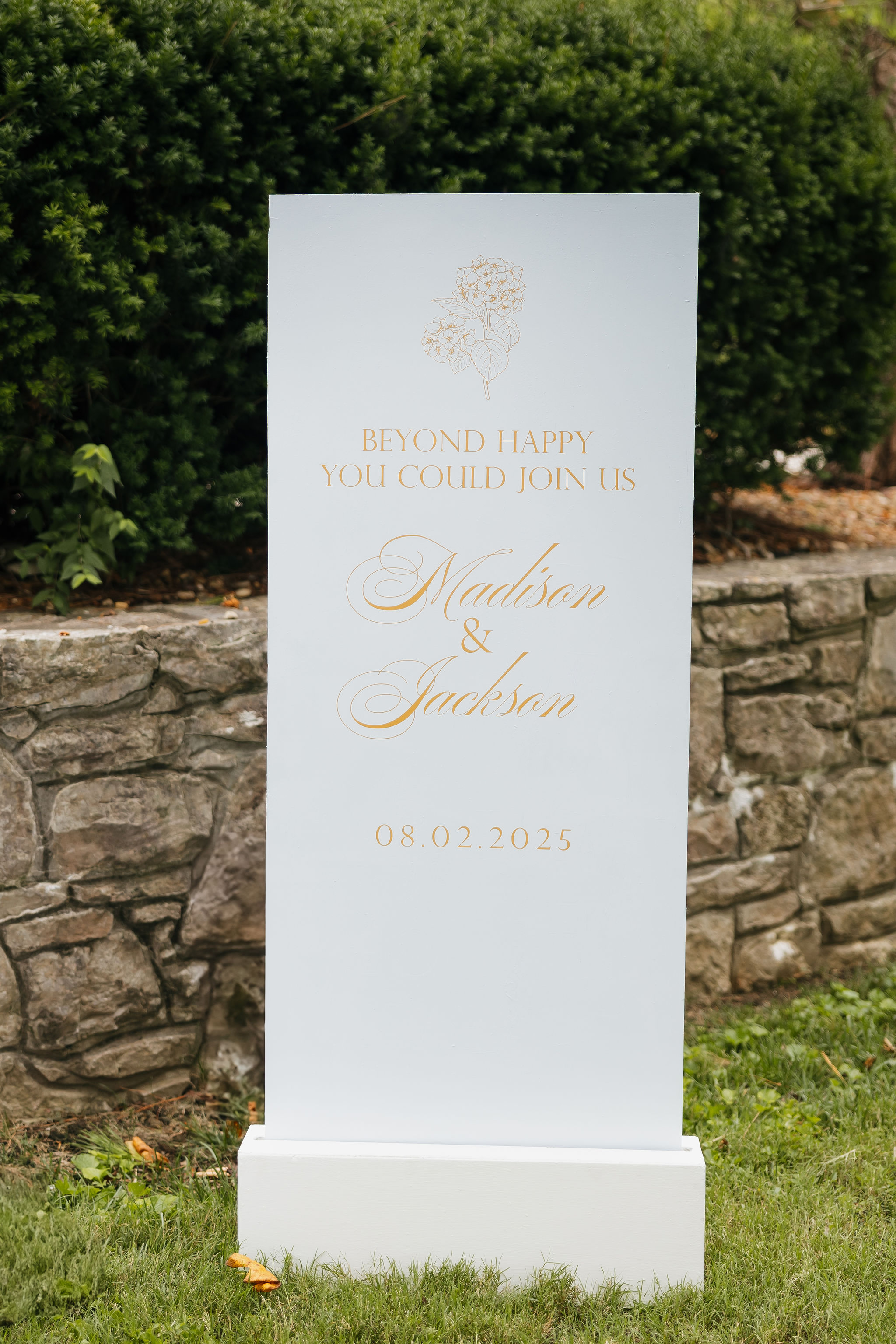
For the ceremony, we designed a white welcome sign featuring sherbet orange lettering, keeping everything soft, clean, and cohesive.
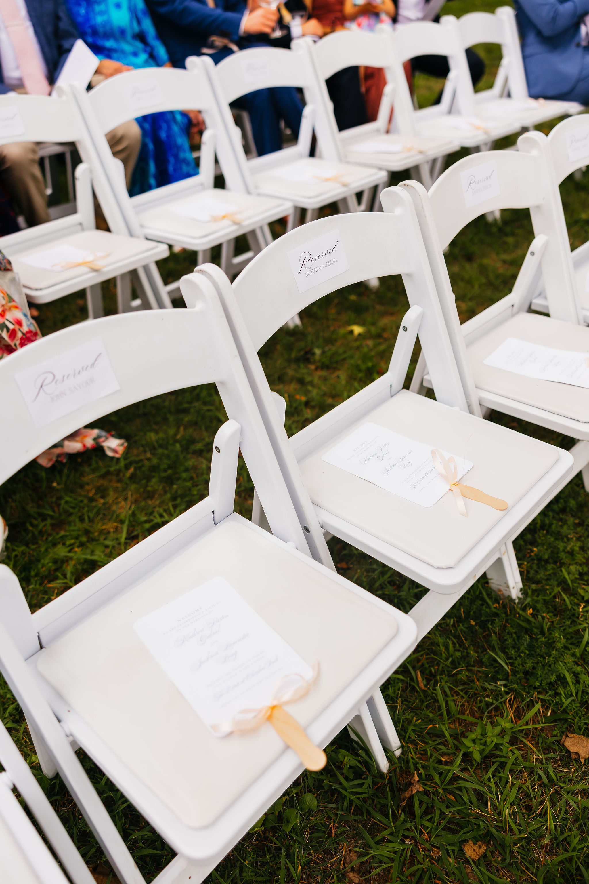
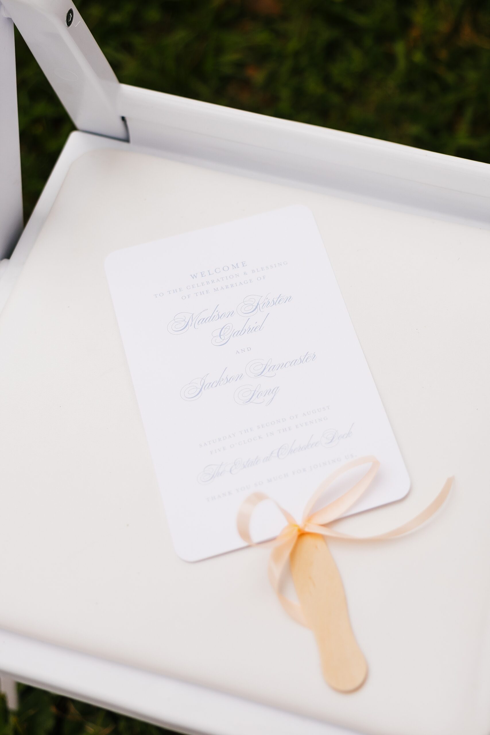
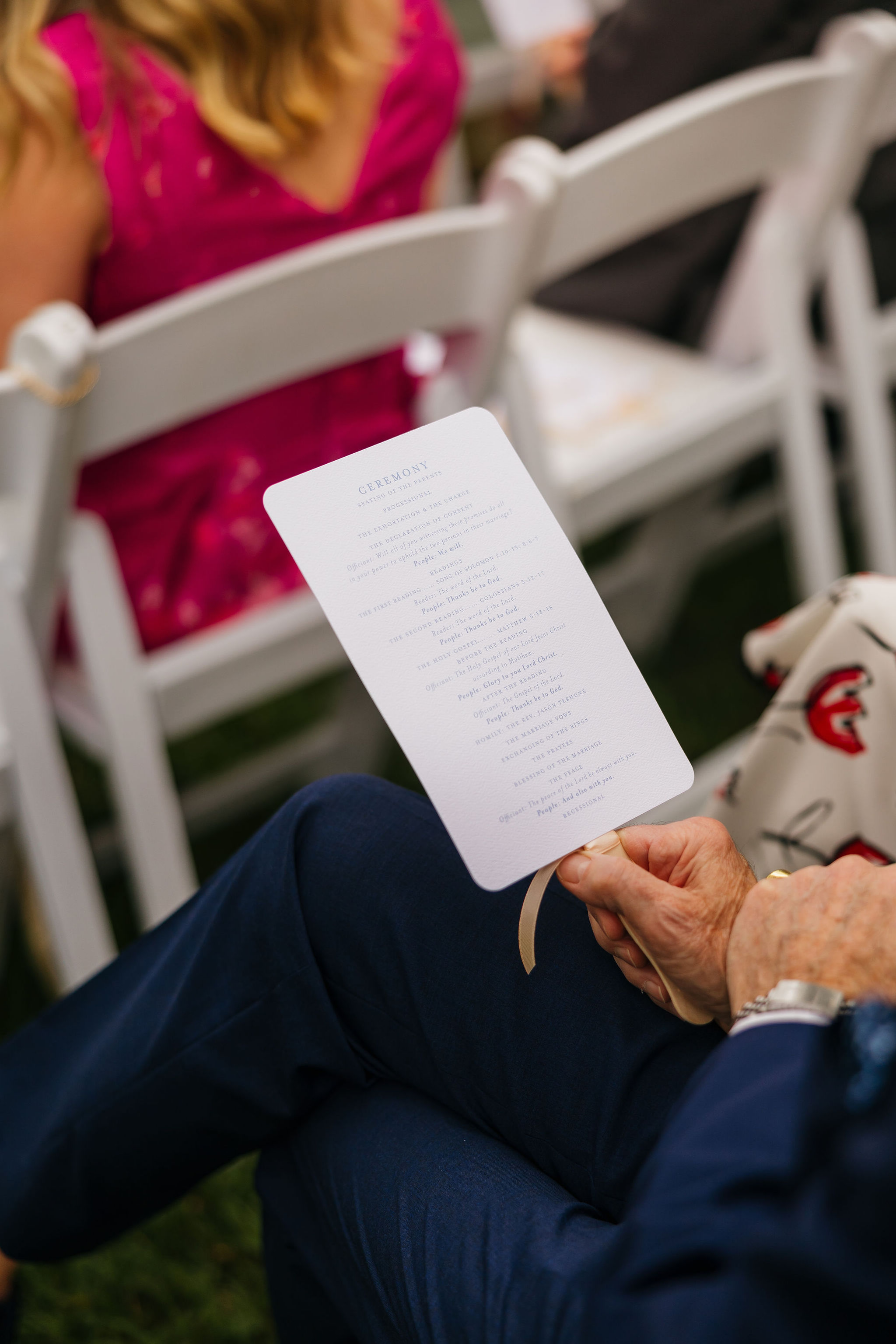
Guests also received program fans, which served a dual purpose of sharing the ceremony details while offering much-needed relief from the Tennessee heat. Practical and beautiful—our favorite combination.
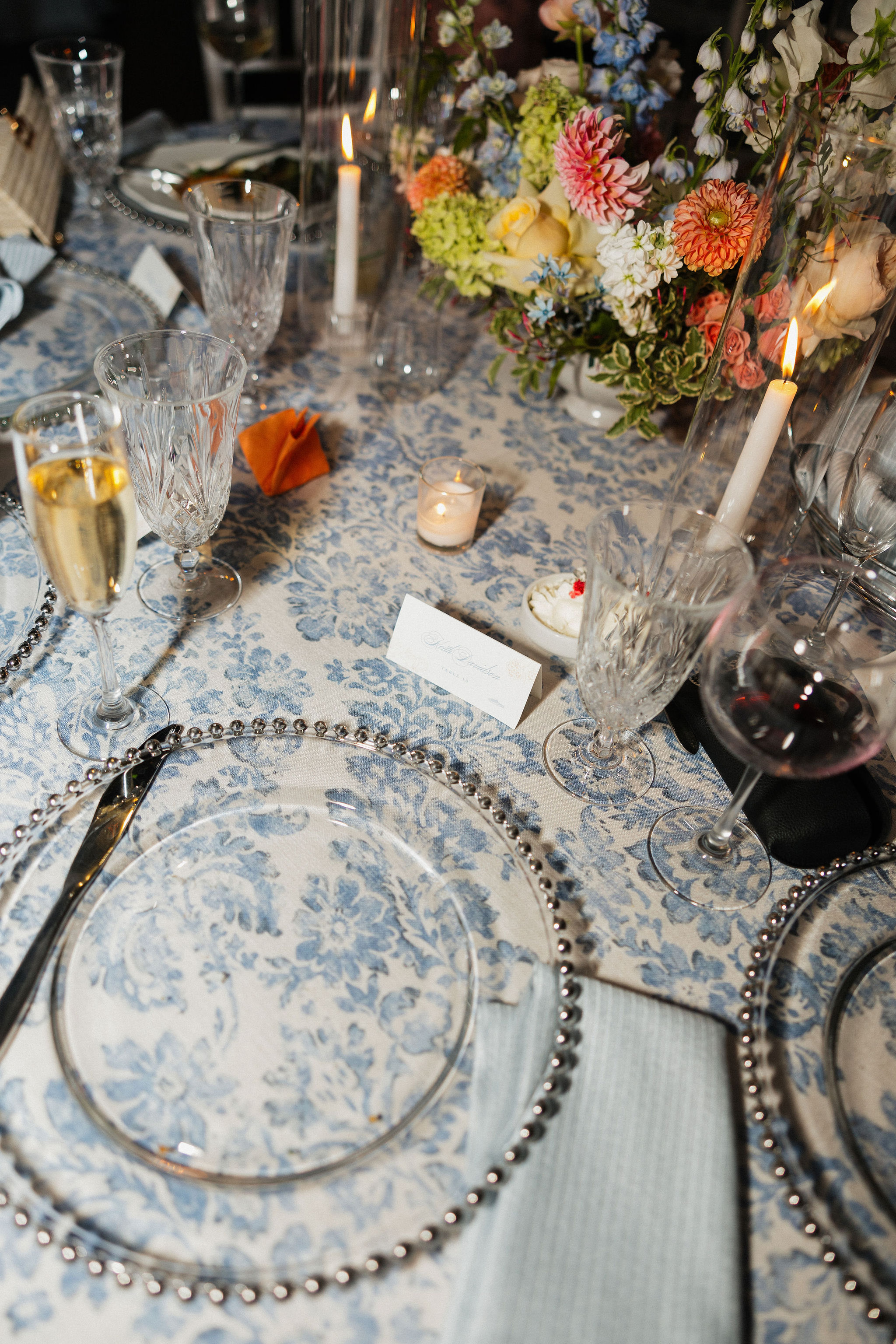
Fun, Colorful Details at the Bar
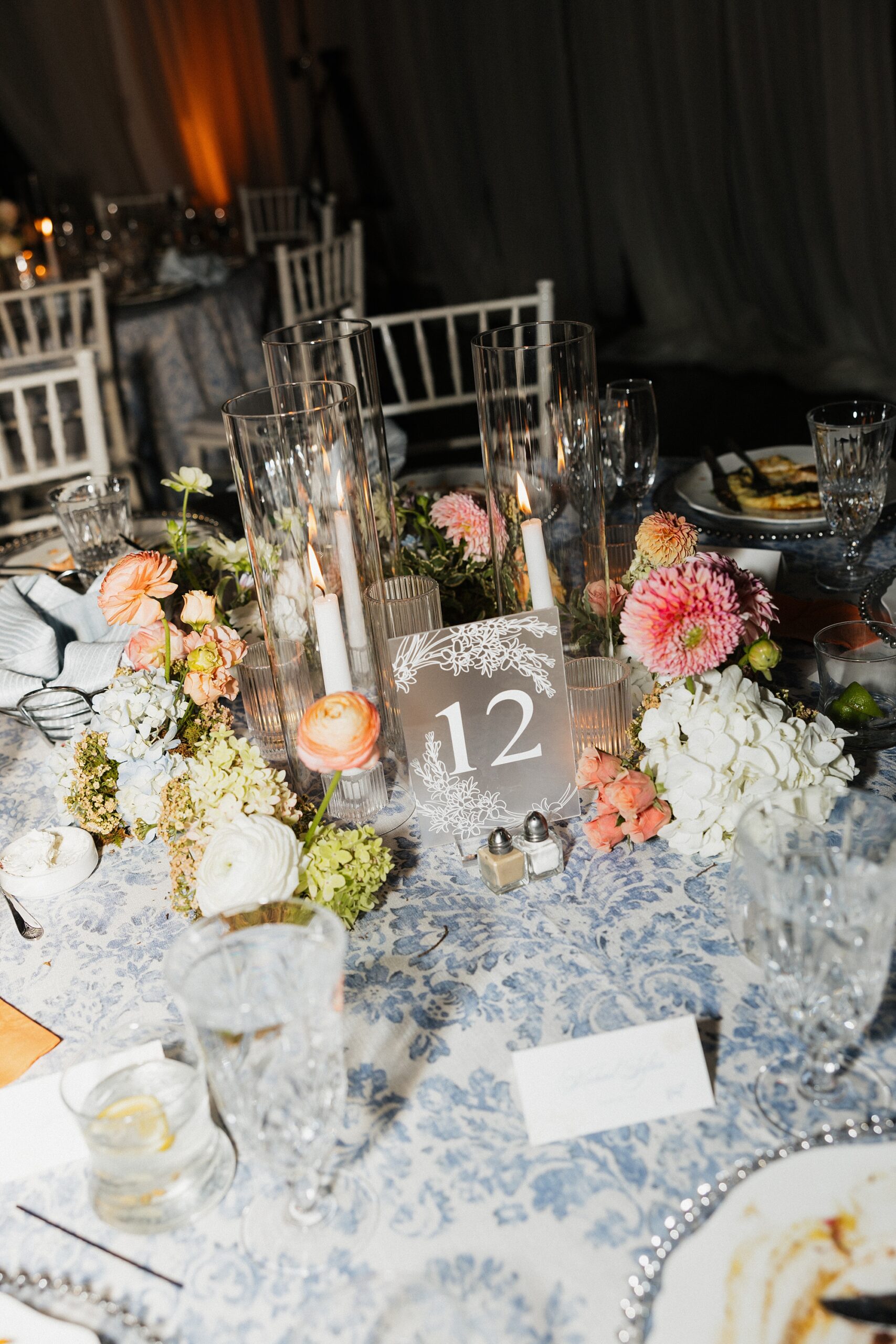
We created bar inserts showcasing the signature light blue color pattern. This same pattern could later be found on the table linens created seamless design that carried through the wedding day. On top of the bar, guests found custom orange napkins and white stir sticks with an orange flower sketch, bringing an extra pop of color. It’s always the small touches that make the biggest impact.
Seating Chart Display
We created a framed seating chart wall with a gallery light, giving it the look of a curated art installation. The clean, structured design brought an elevated feel to the reception entrance.
Reception Details That Tied Everything Together
As guests entered the reception, they located their seats using the frosted acrylic table numbers and white place cards we designed. Notice anything familiar? Here are the table linens I mentioned earlier featuring the same light blue pattern from the bar fronts! The repeating pattern created a seamless, intentional design, which is our speciality.
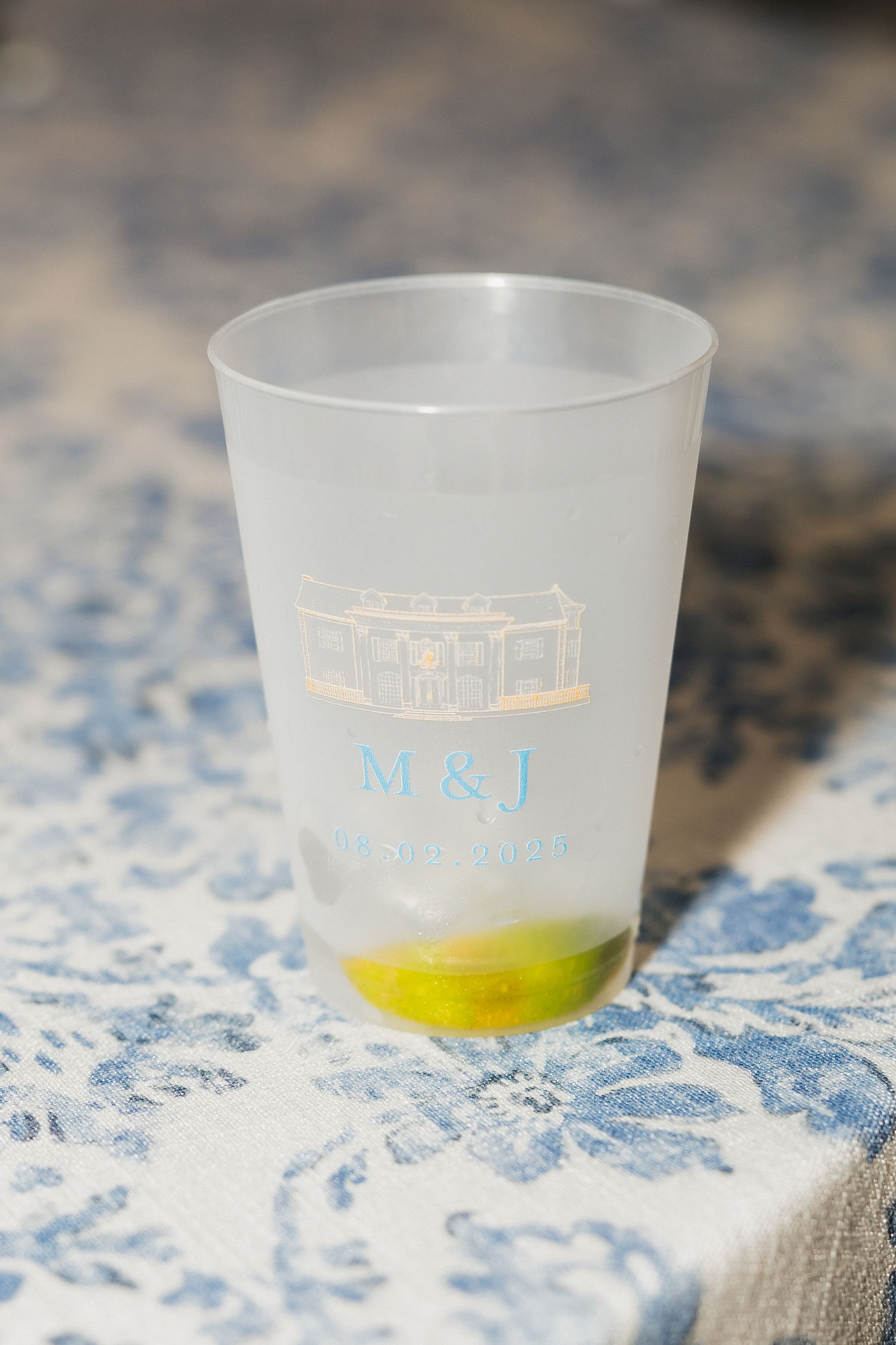
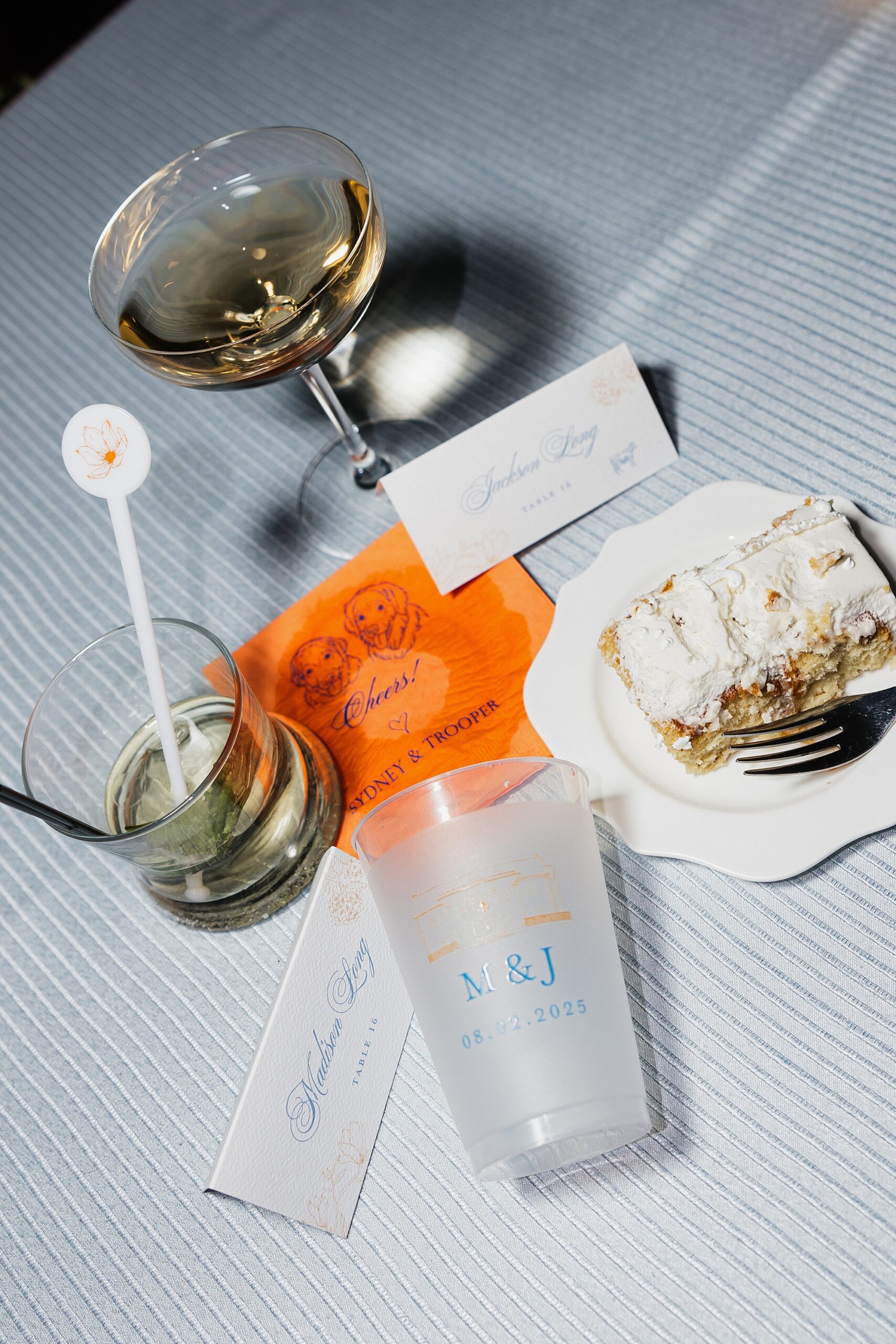
We also designed the frosted cups used throughout the evening, which doubled as wedding favors. Each cup featured the Cherokee Dock sketch from the vellum band, this time printed in light orange, paired with the couple’s initials and wedding date in soft blue. It was the perfect blend of chic and fun.
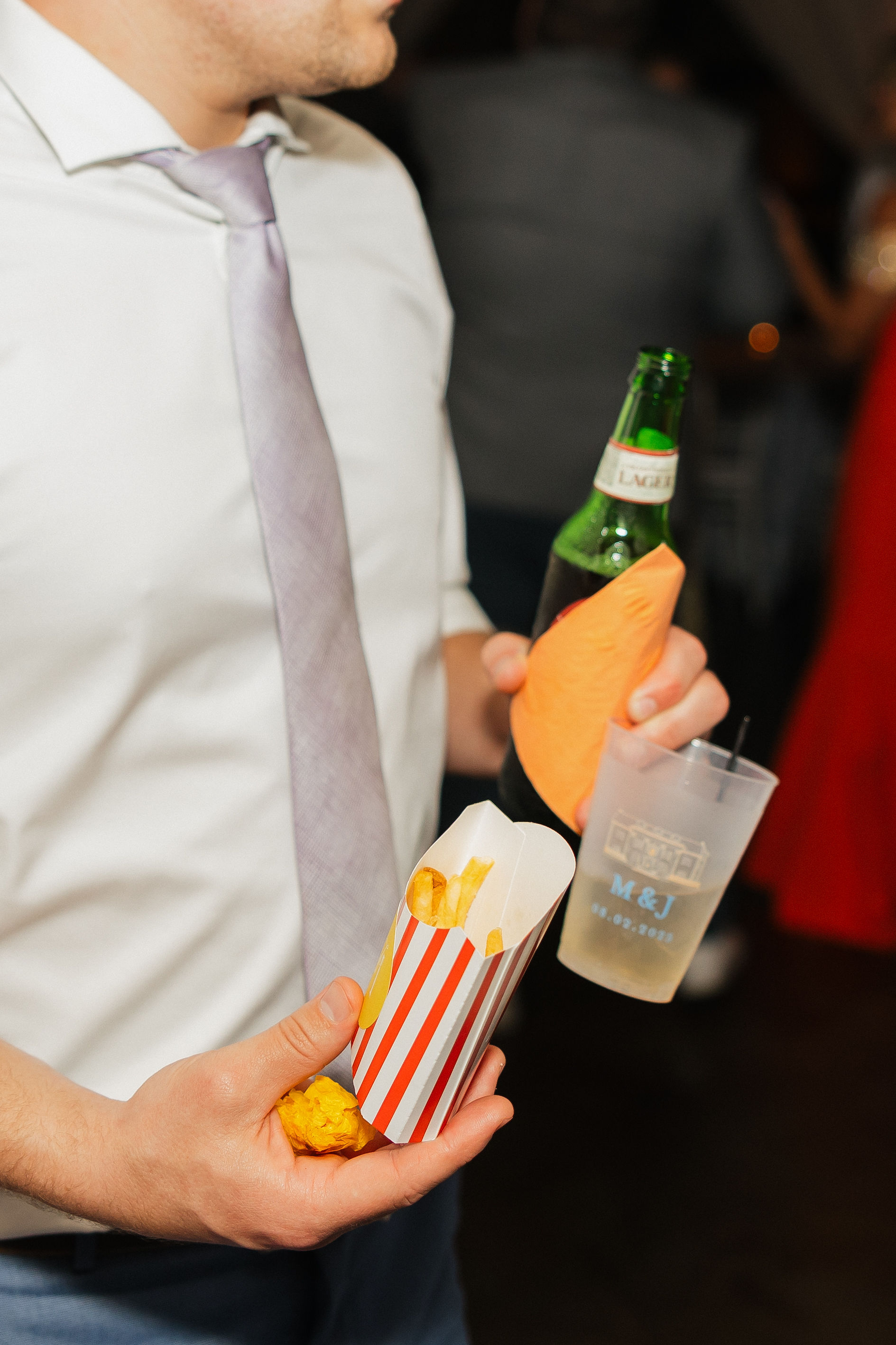
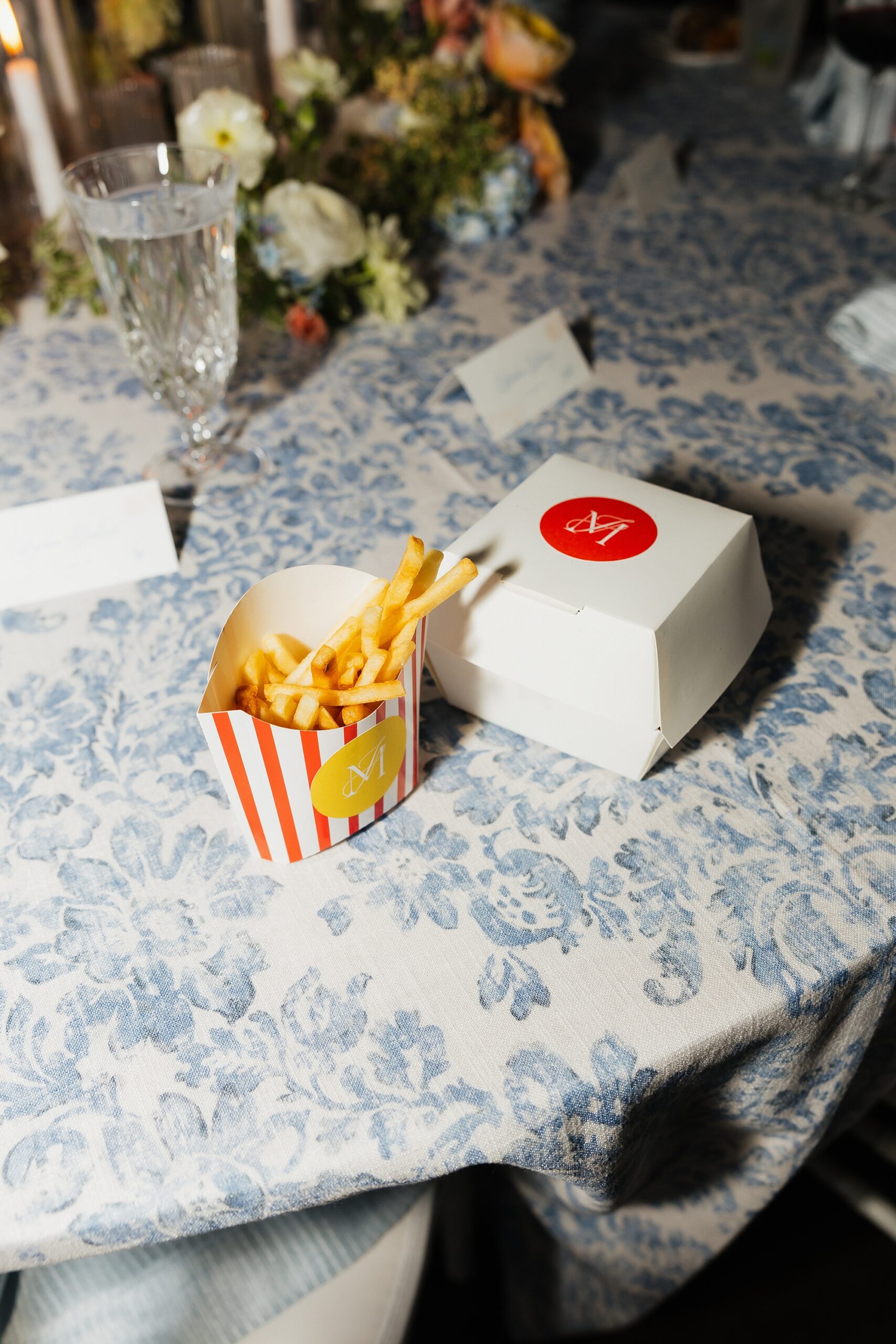
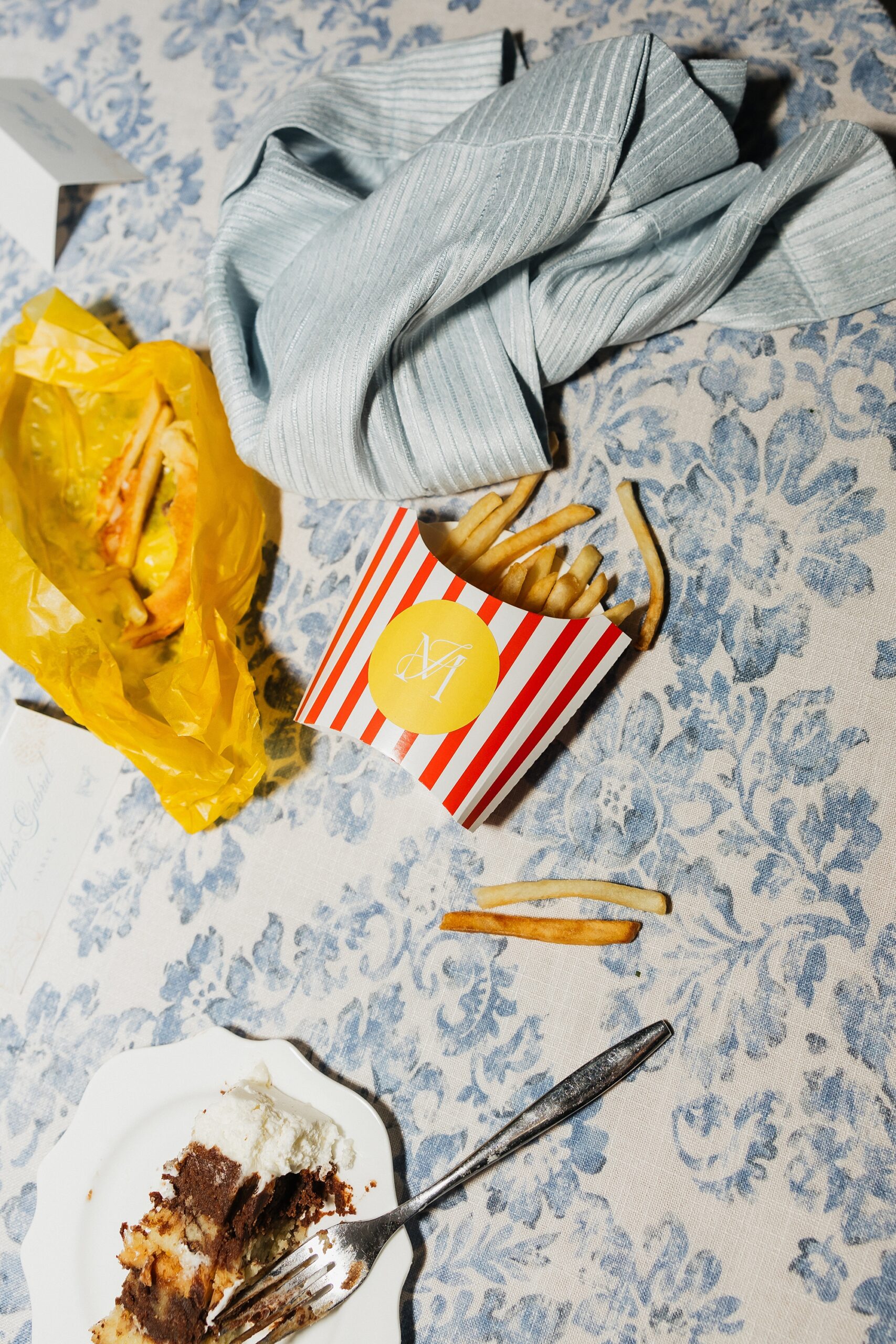
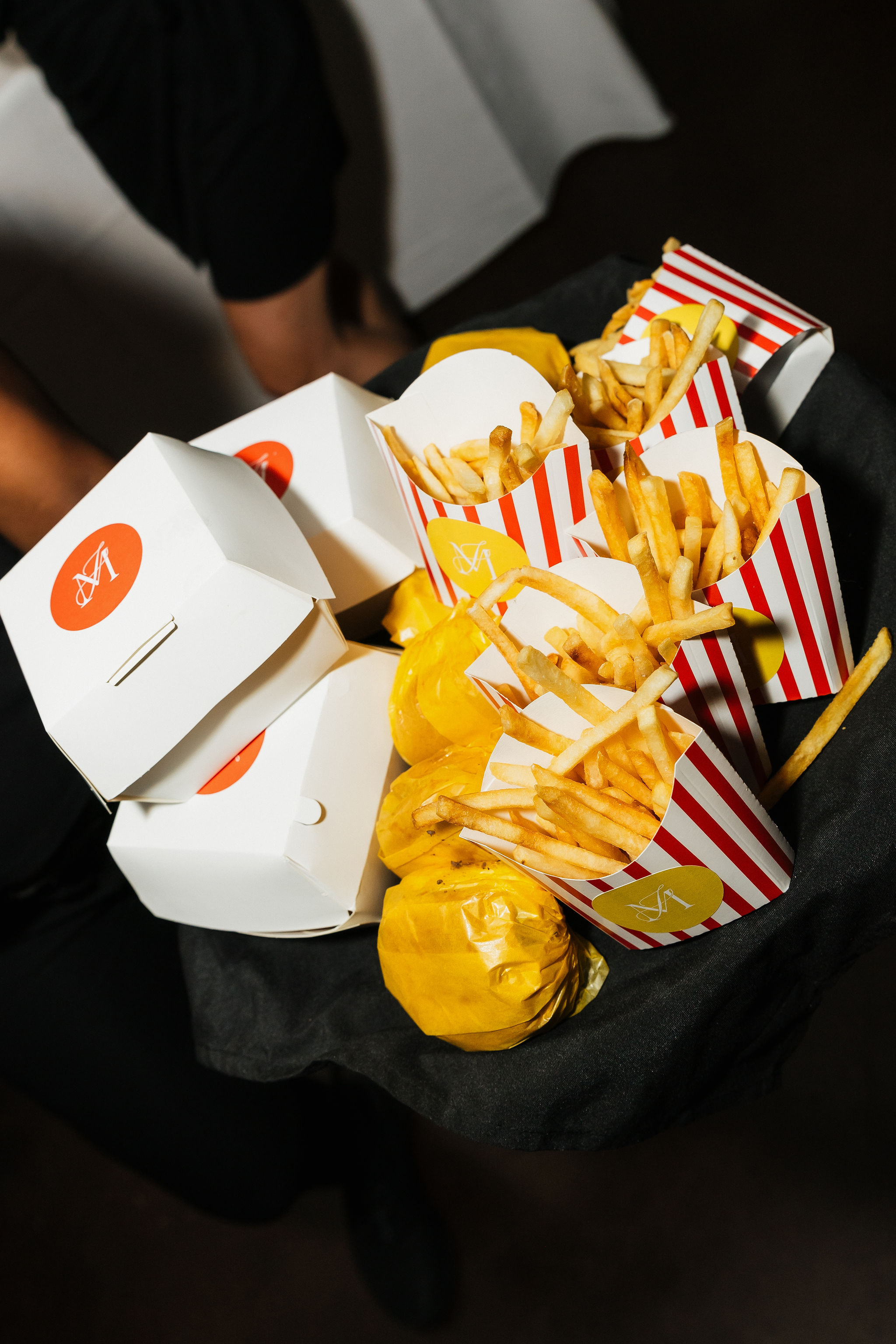
A Playful Late-Night Snack Moment
The wedding ended with a little late night snack of burgers and fries that were served in custom burger and fry boxes we designed! The white burger boxes featured a bold orange circle centered on the lid with the couple’s monogram in white. The fry boxes leaned retro with white-and-red stripes and a yellow circle holding the same monogram.
This final detail brought so much personality and nostalgia. It was impossible not to smile when you saw them. Not only that, but they were truly so much fun to create.
A Spring Wedding Filled With Creativity and Color
This Cherokee Dock celebration was the perfect mix of polished design, soft springtime color, and playful, personalized details. Every piece from the invitations to food packaging was created with intention and cohesive design in mind. It was an honor to bring Madison and Jackson’s wedding vision to life.
If you’re planning a wedding in Nashville, or anywhere in the world, we’d love to help you create meaningful, personalized stationery and event details that tell your story. We work with couples worldwide to design details you and your guests will remember forever.
Reach out today to learn more about our full-service wedding and event design offerings! We can’t wait to create something unforgettable for you!
If you enjoyed this post, you’ll love these other blogs!
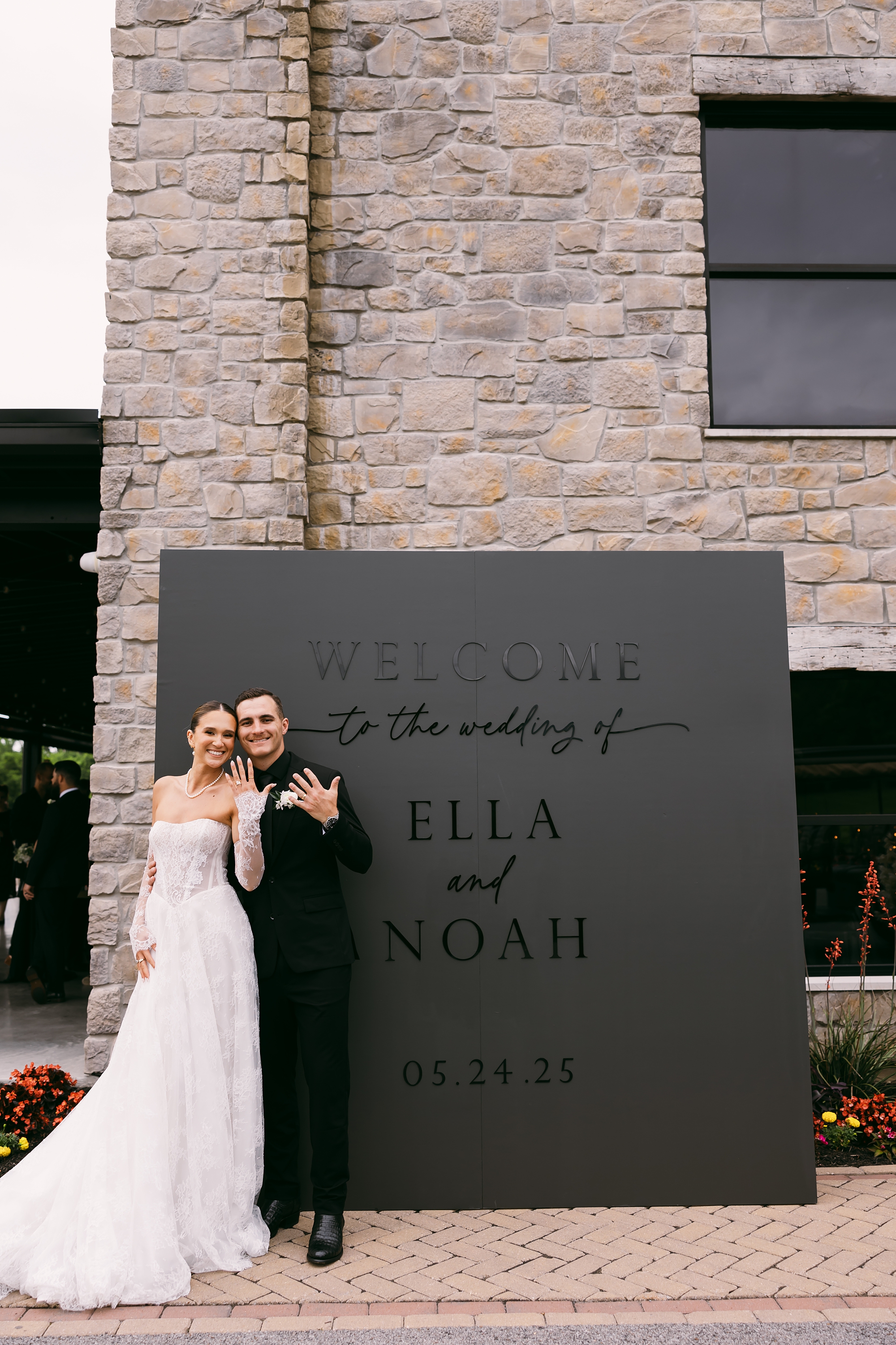
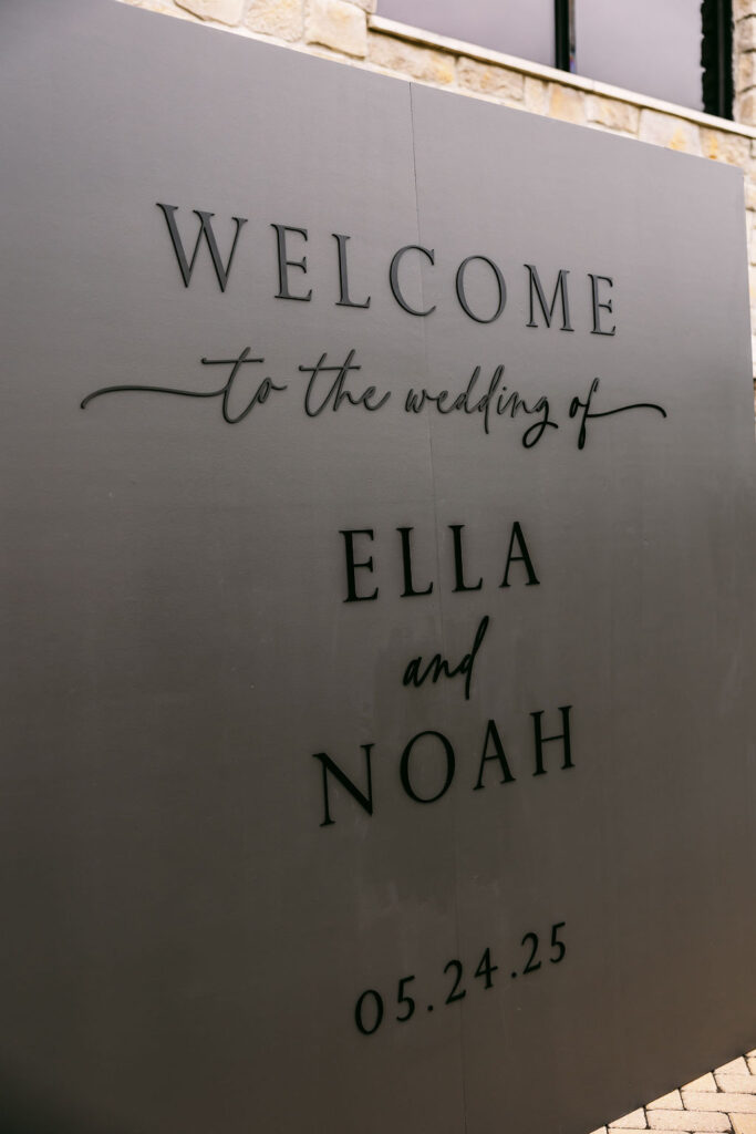
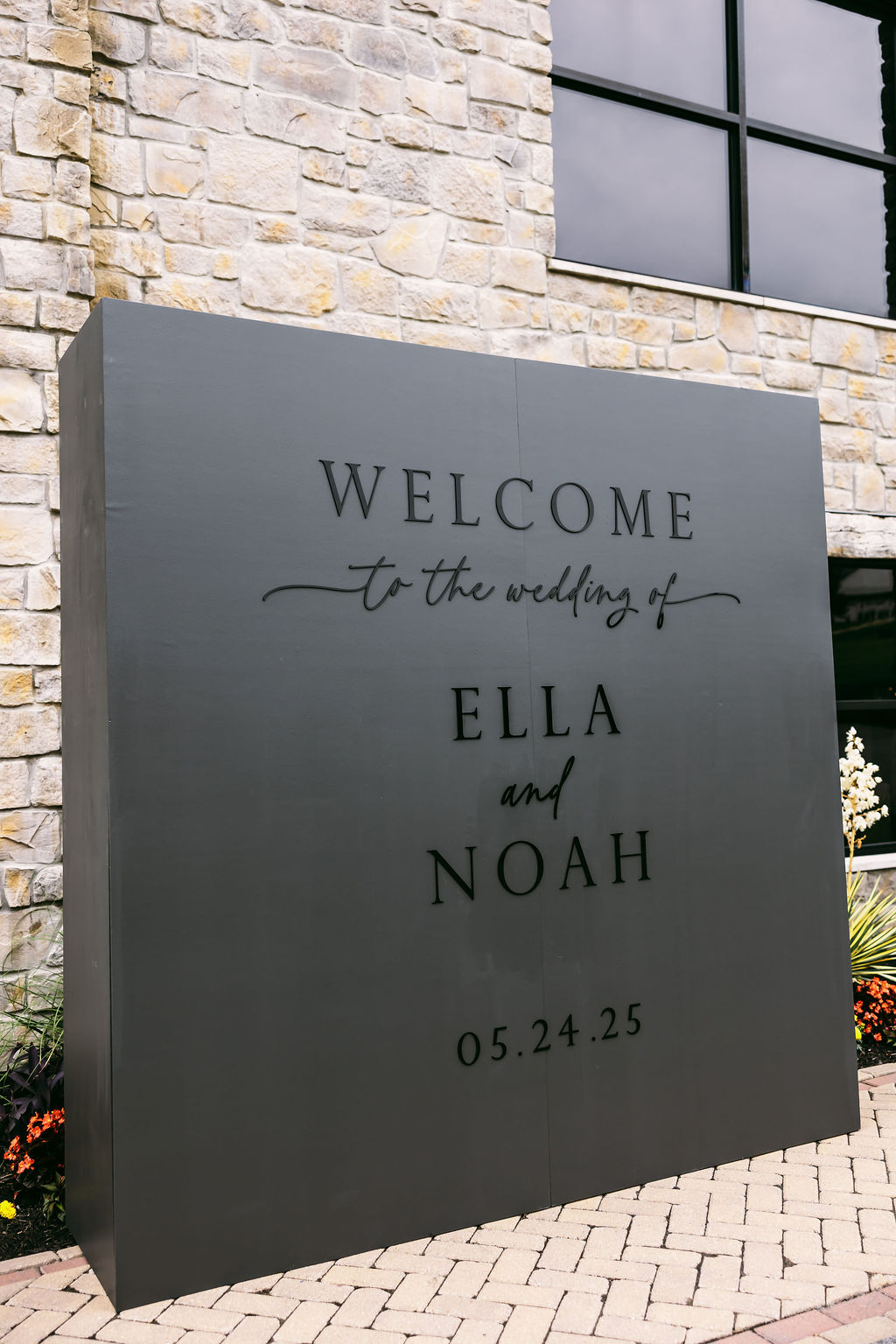
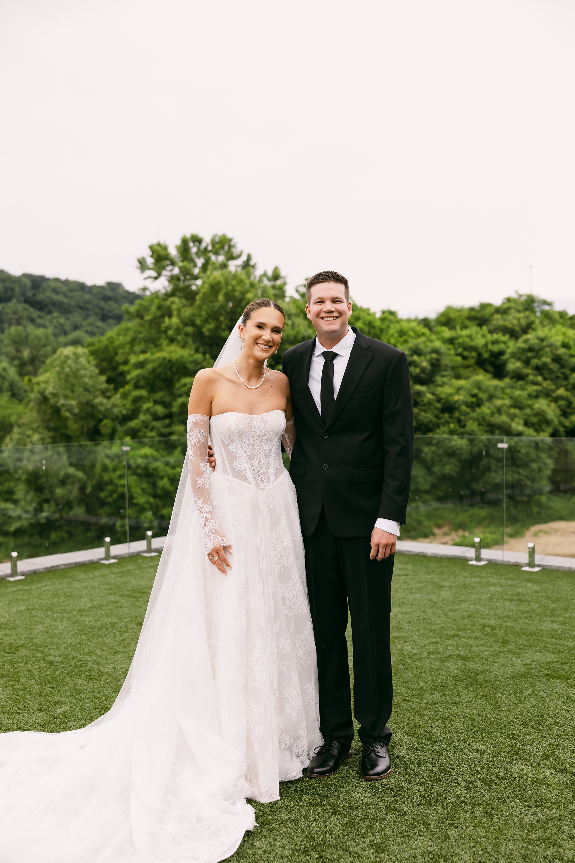
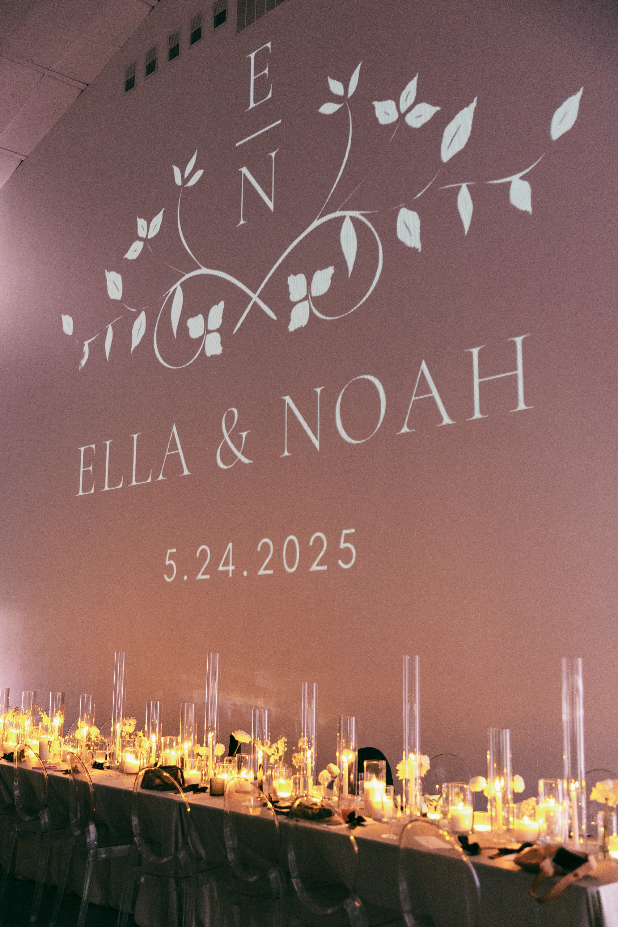
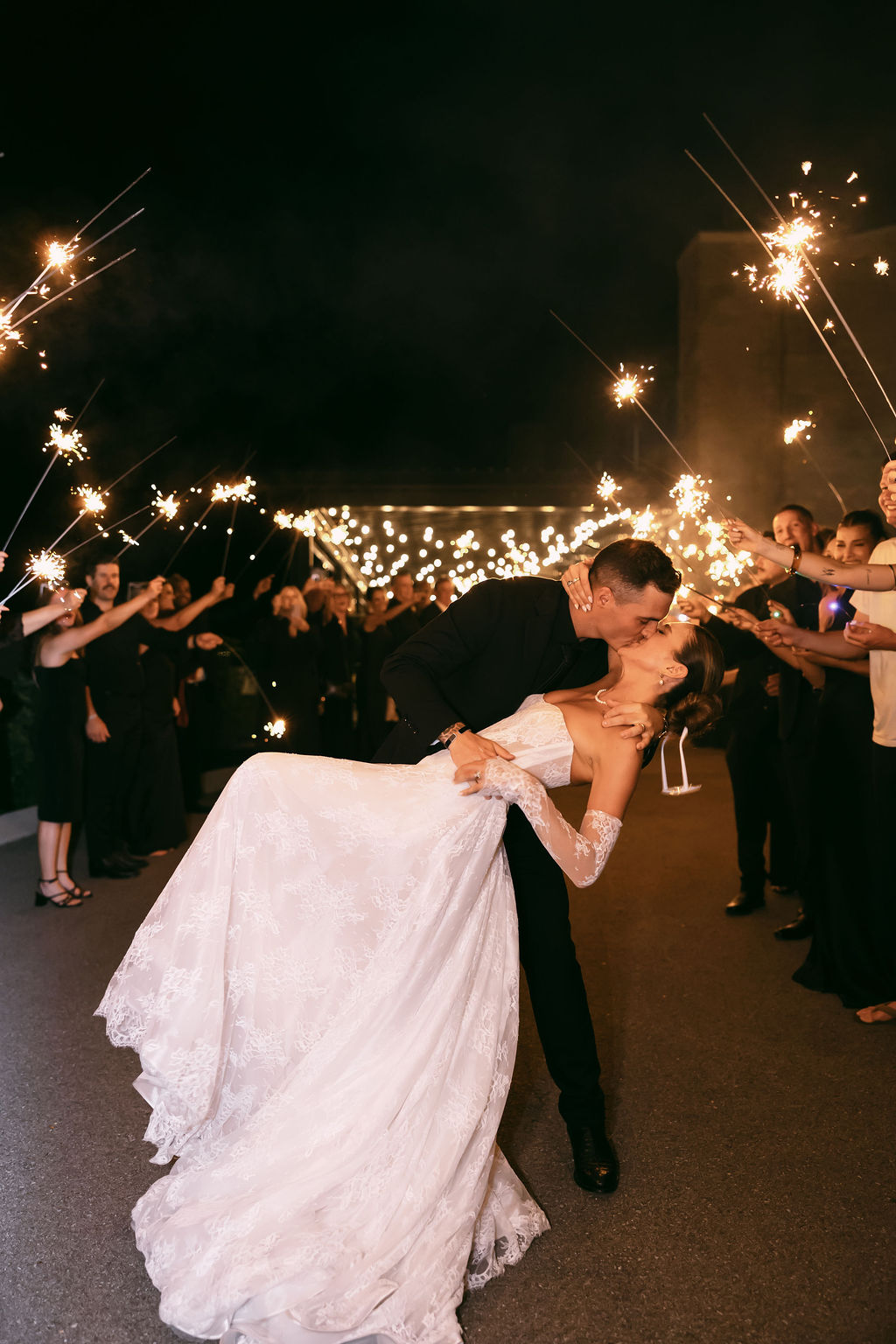
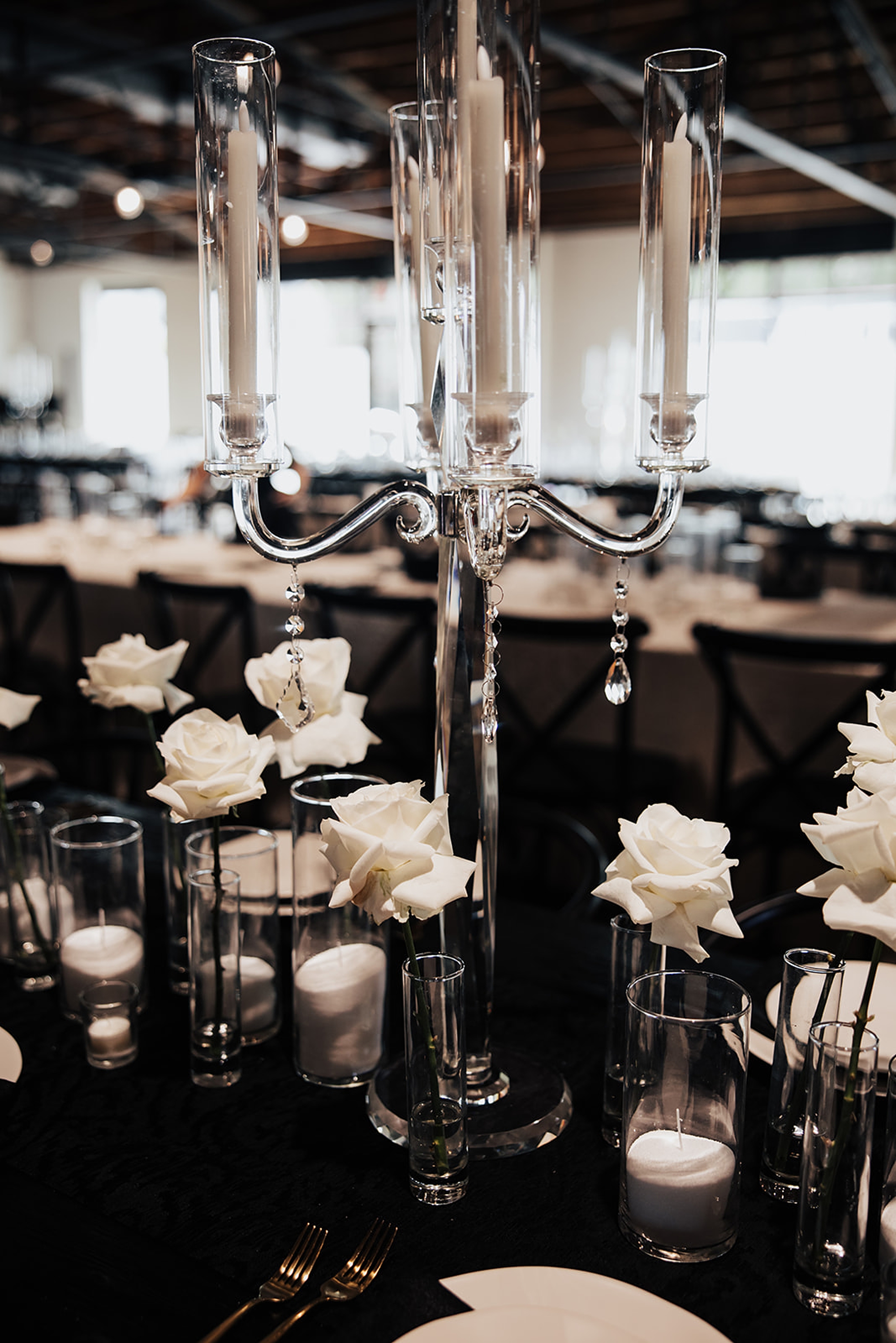
Designing the signage and other day-of wedding details for Ella and Noah’s Diamond Creek Farm wedding was such a joy. Their celebration was timeless, refined, and modern in all the right ways, and every detail reflected that. From the first impression as guests arrived to the final touches inside the ballroom, their design embraced a classic black-and-white palette with subtle Southern elegance.
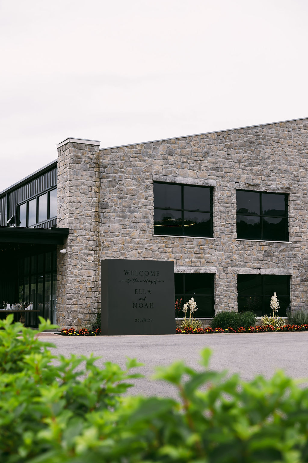
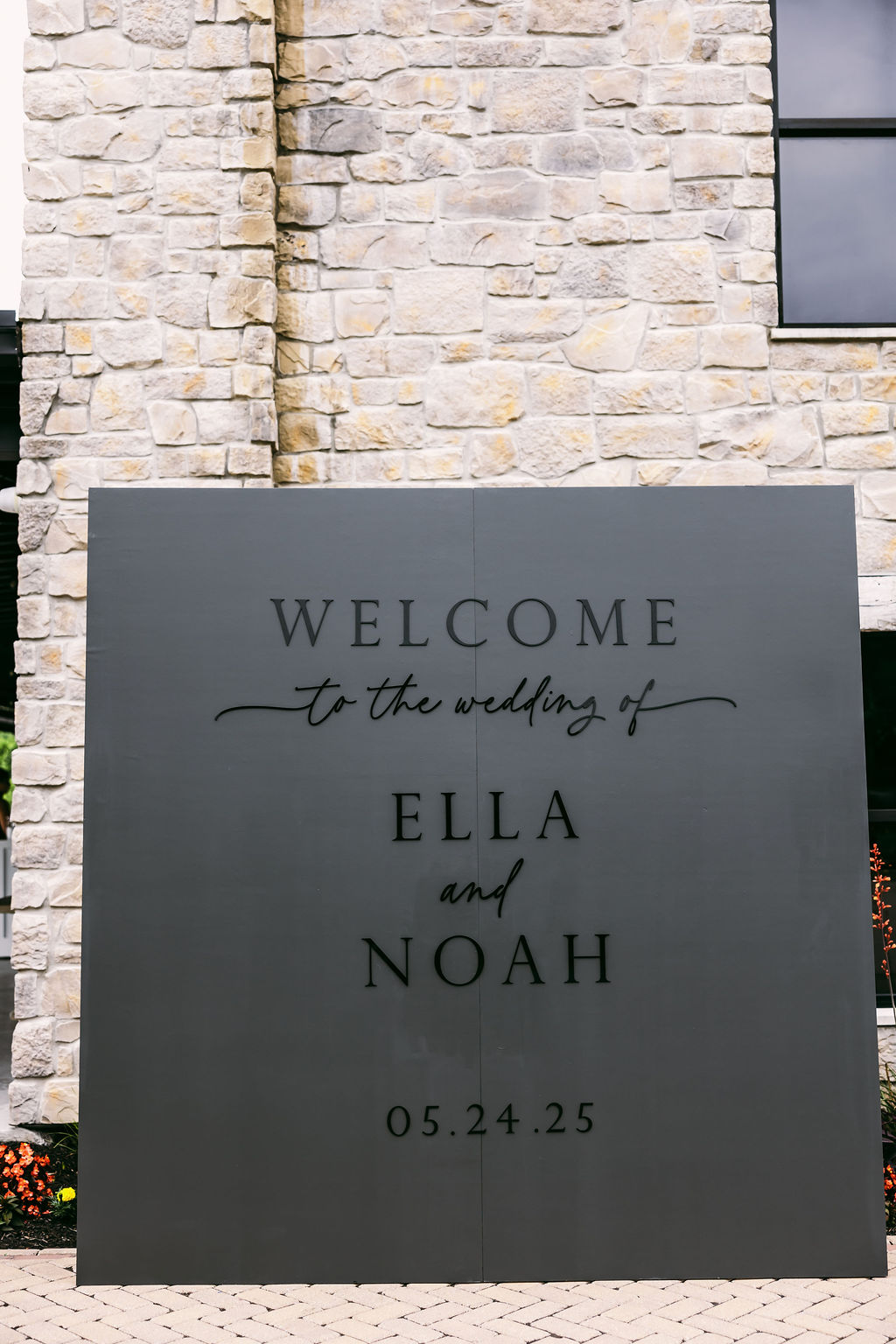
A Striking First Impression: The Black-on-Black Welcome Wall
The second guests arrived, they were greeted to an unforgettable moment. We designed a large black-on-black welcome wall, which stood outside against the venue’s light brick exterior. The contrast made it an instant focal point, and it quickly became a favorite photo backdrop throughout the evening. This installation set the tone for the wedding day: modern, stylish, and beautifully intentional.
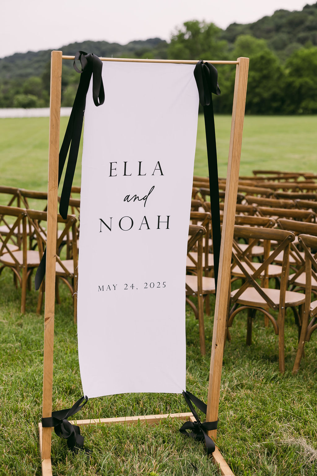
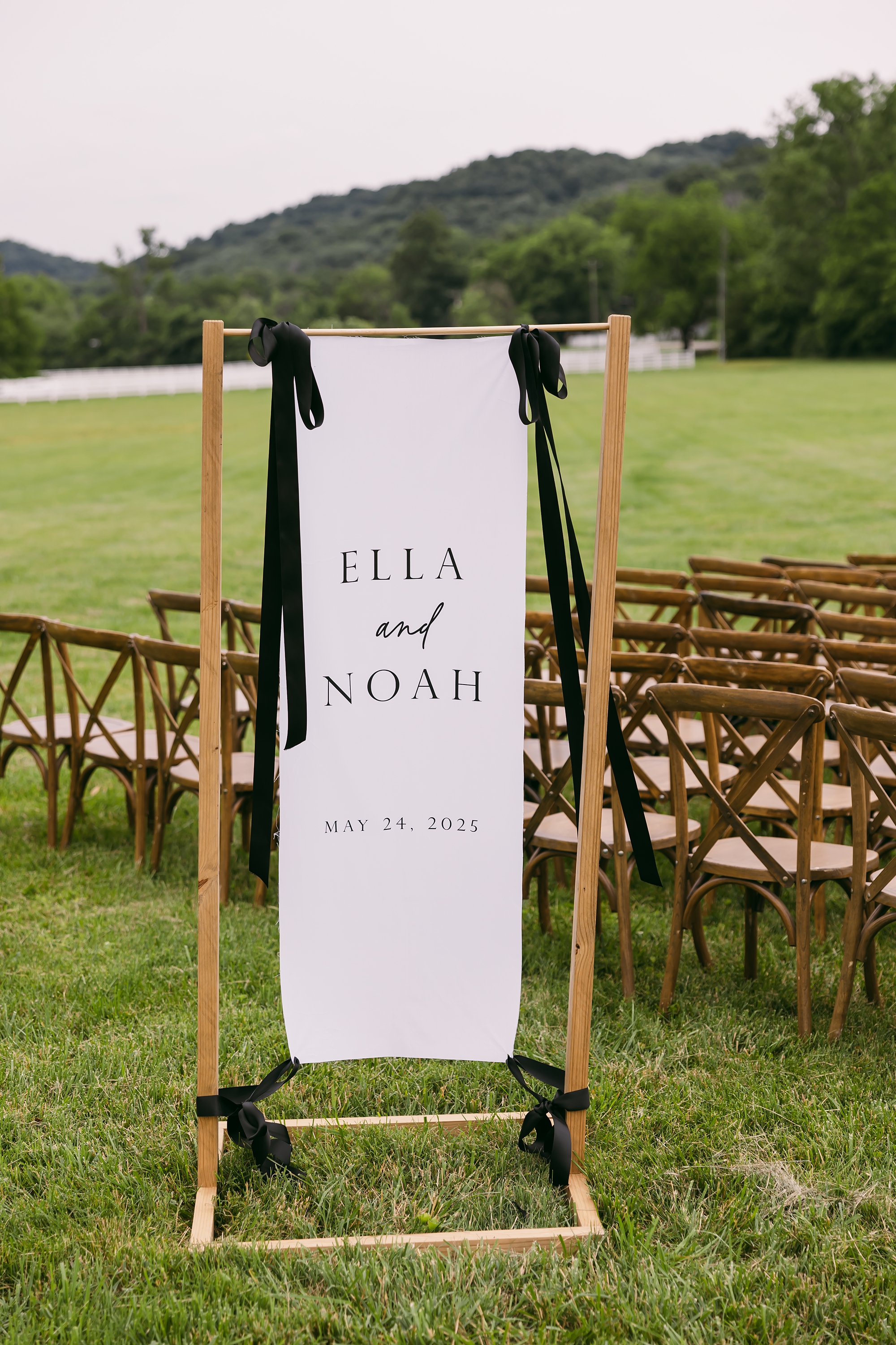
Fabric Welcome Sign for Outdoor Ceremony
For their ceremony overlooking the rolling Tennessee hills, we created a white fabric welcome sign that added softness and movement to the space. A custom wooden frame displayed the sign that attached at the top and bottom with black ribbon so it could still catch the breeze. The gentle movement of the fabric against the natural landscape added a romantic, organic touch that complemented the outdoor setting perfectly.
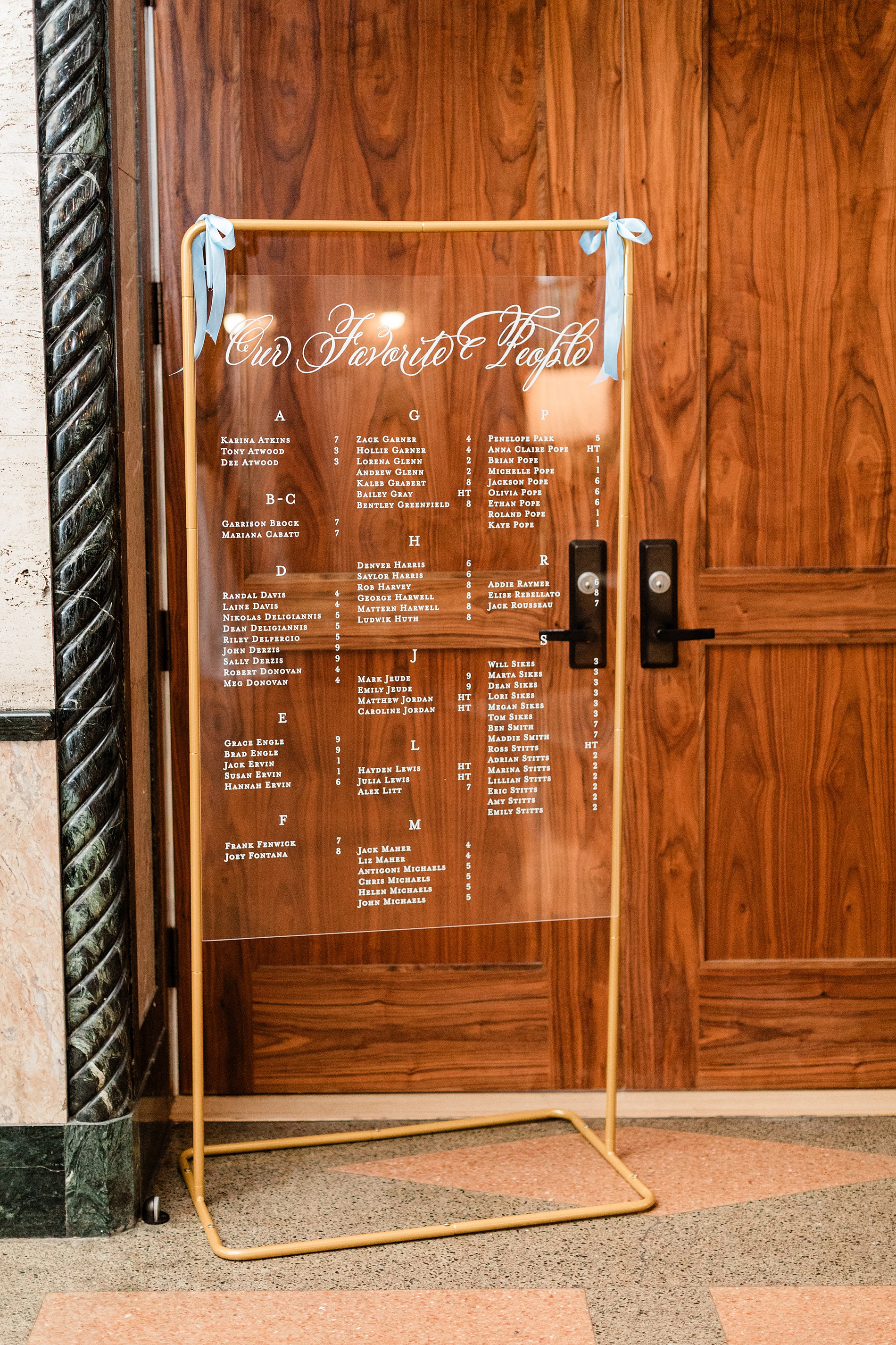
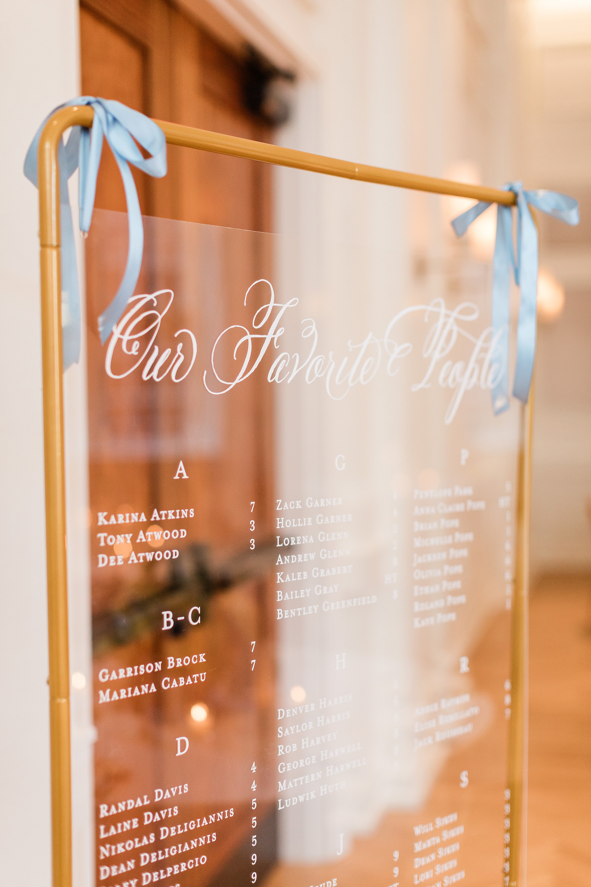
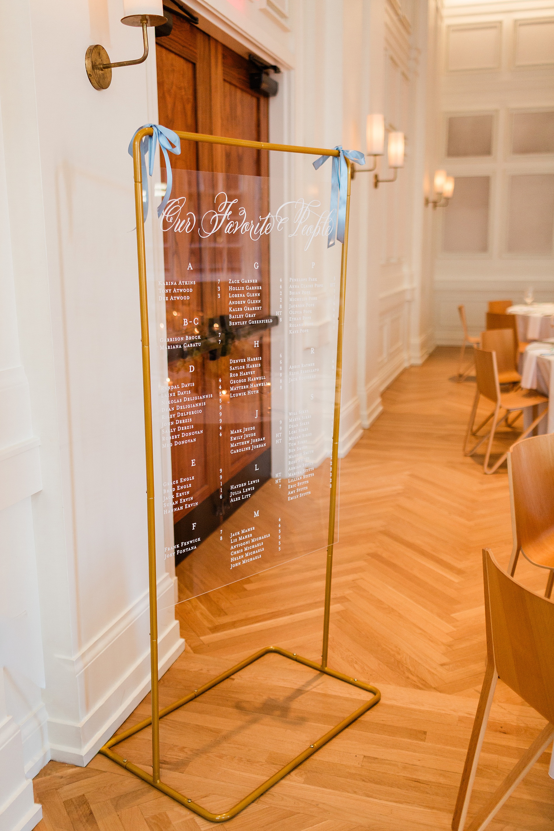
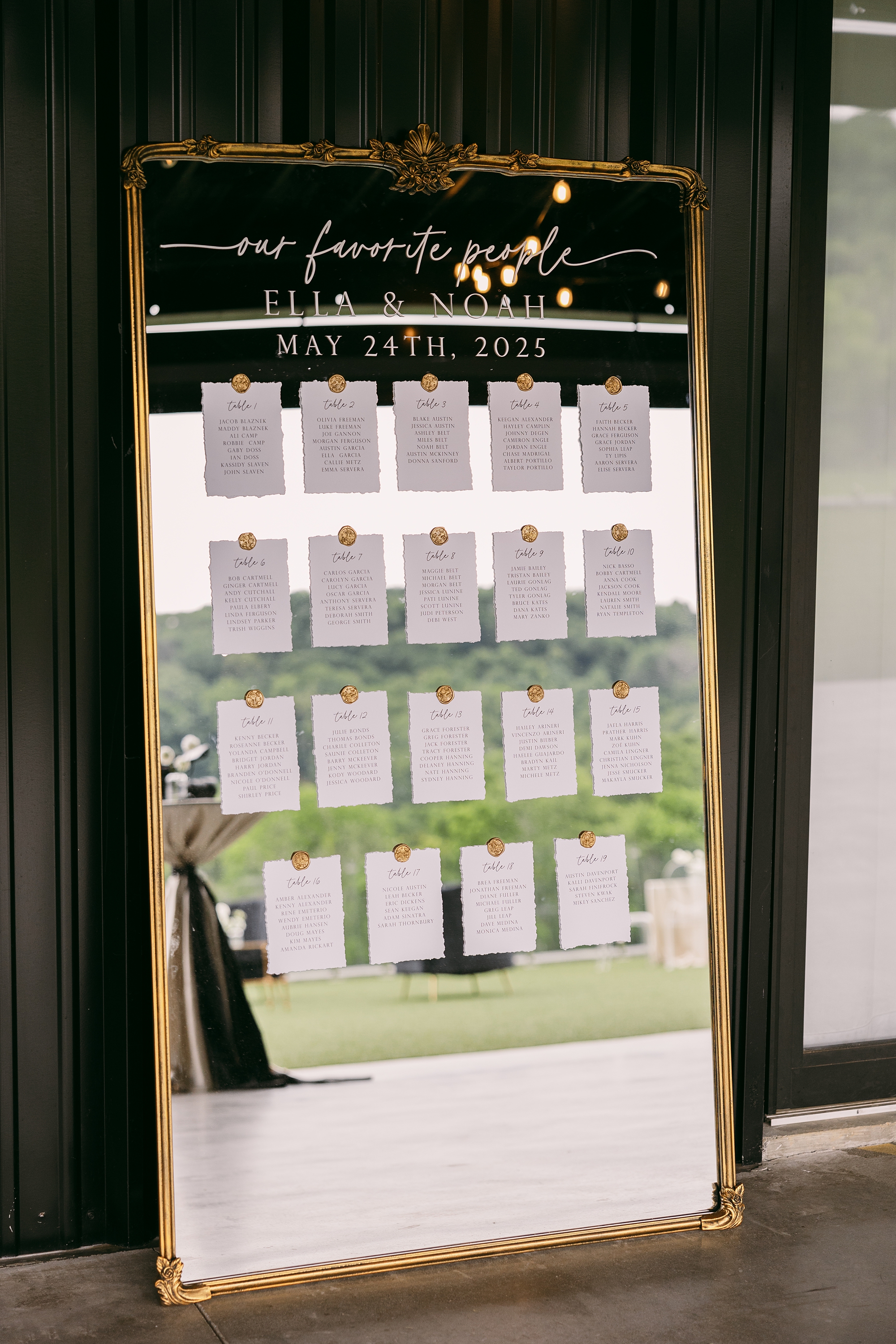
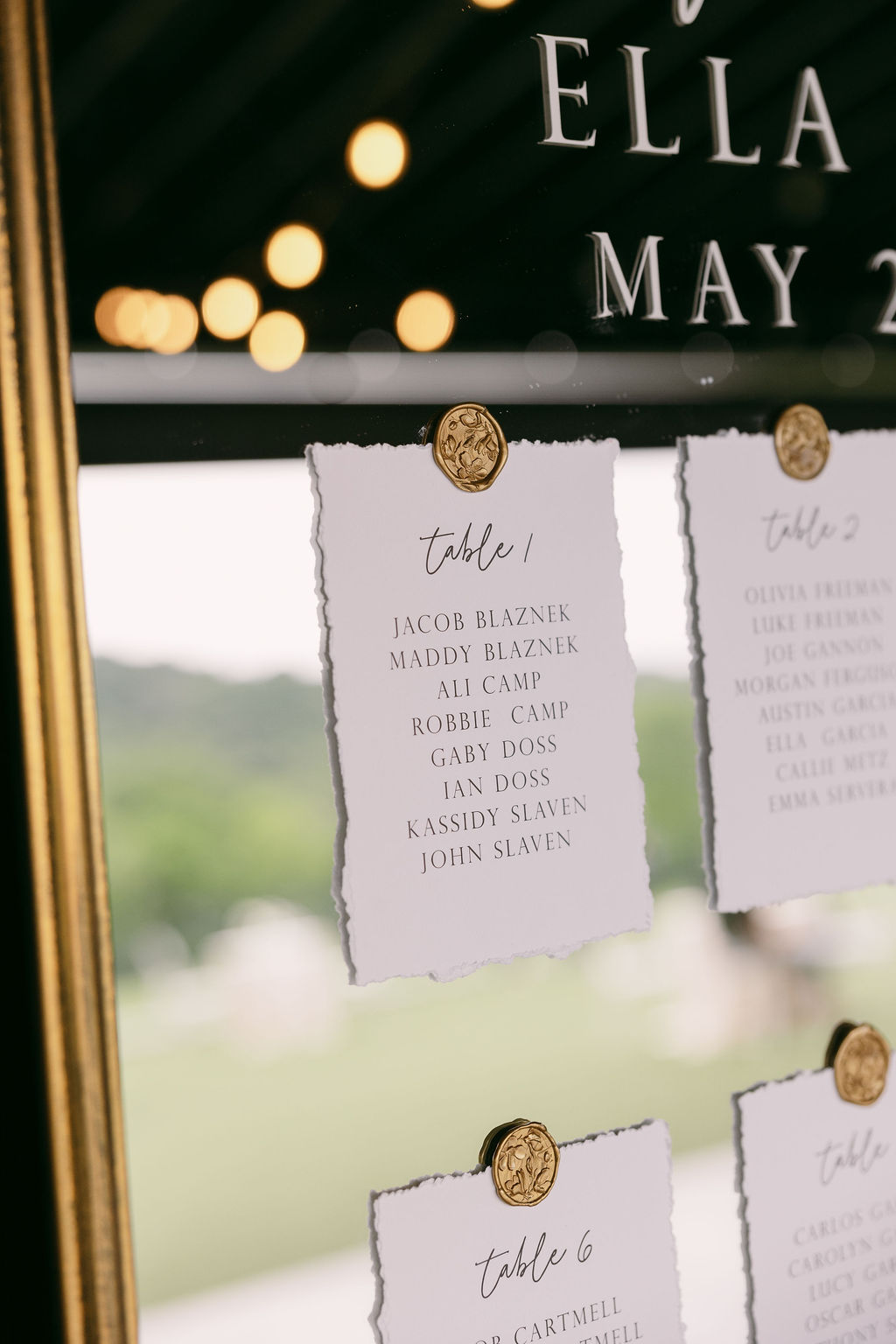
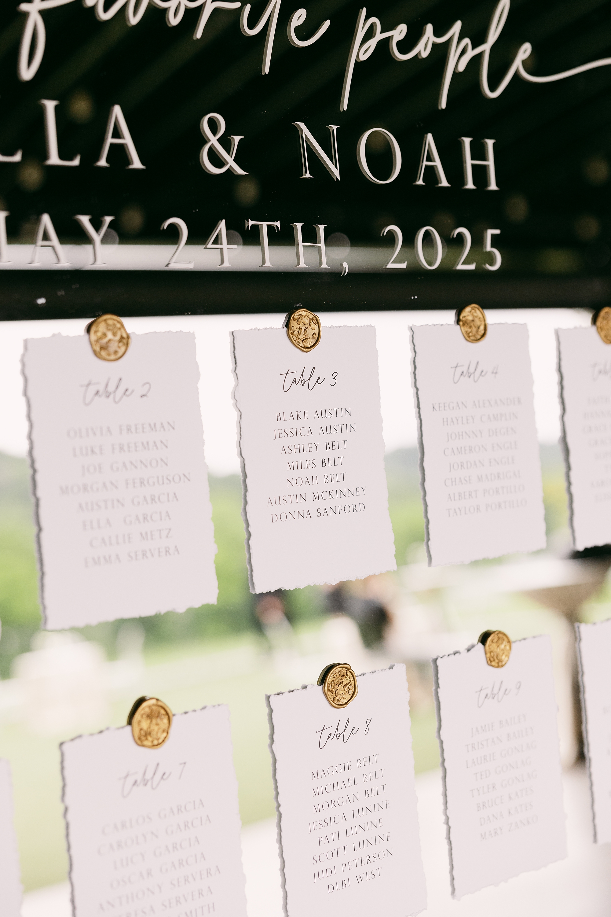
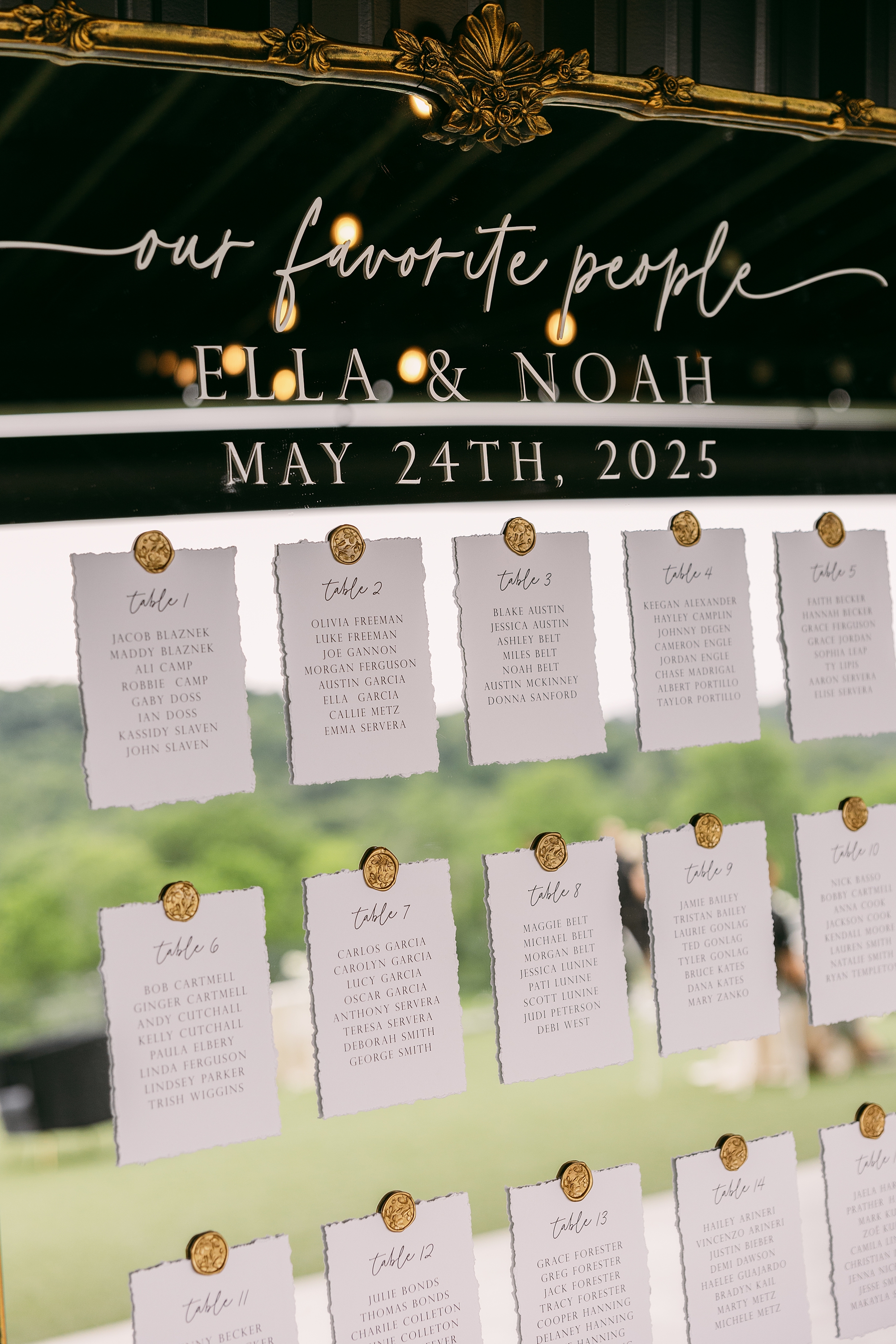
Gold-Framed Mirror Seating Chart
After the ceremony, guests made their way back toward the building, where they found their seating assignments displayed in one of my favorite design moments of the day. We created a seating chart using an oversized gold-framed mirror. In white calligraphy across the glass, it read: “Our Favorite People” followed by the couple’s names and wedding date.
Each table assignment was displayed on handmade paper and attached to the mirror with gold wax seals, creating a layered, elegant look. The combination of textures and warm gold tones made this piece both functional and beautifully timeless.
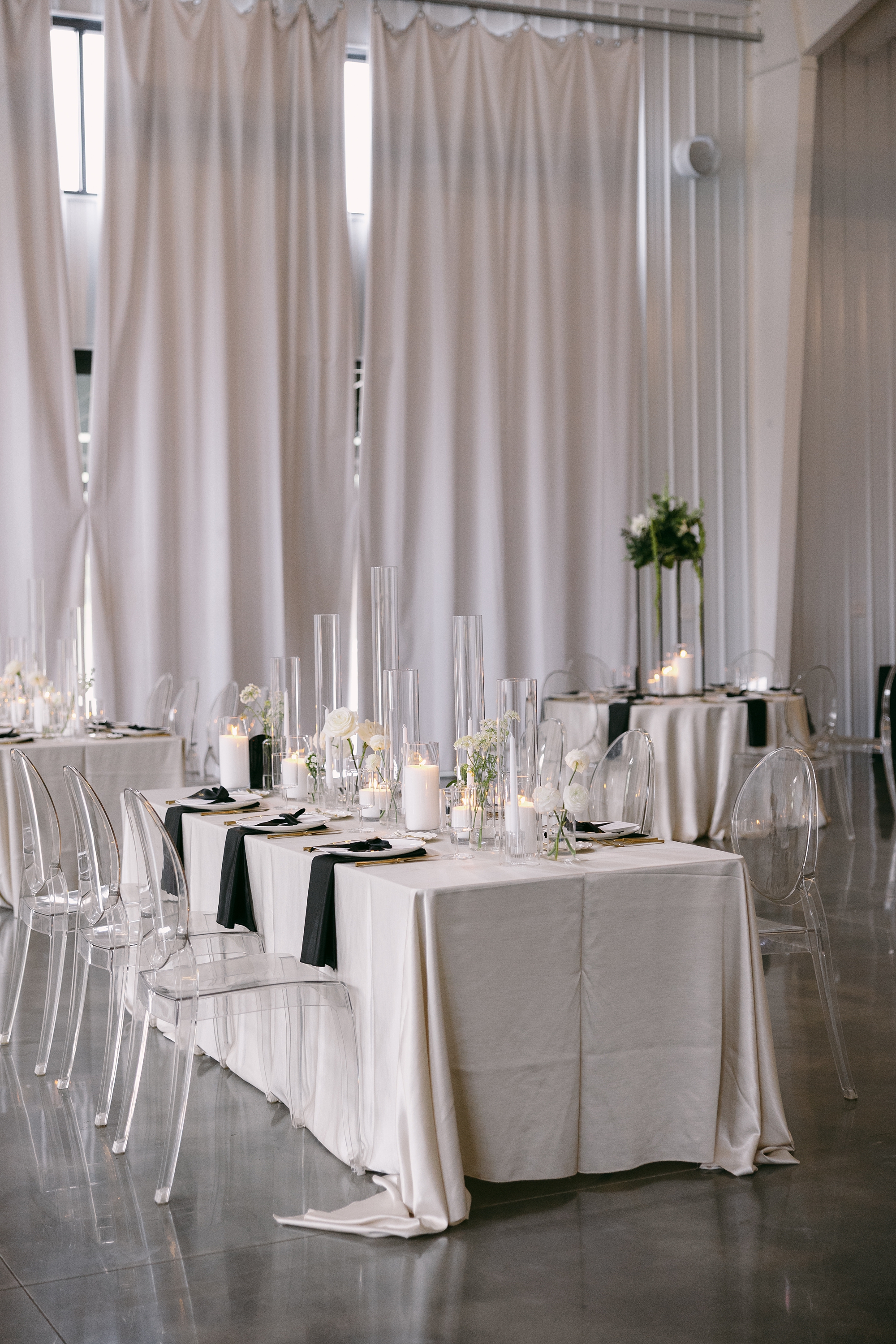
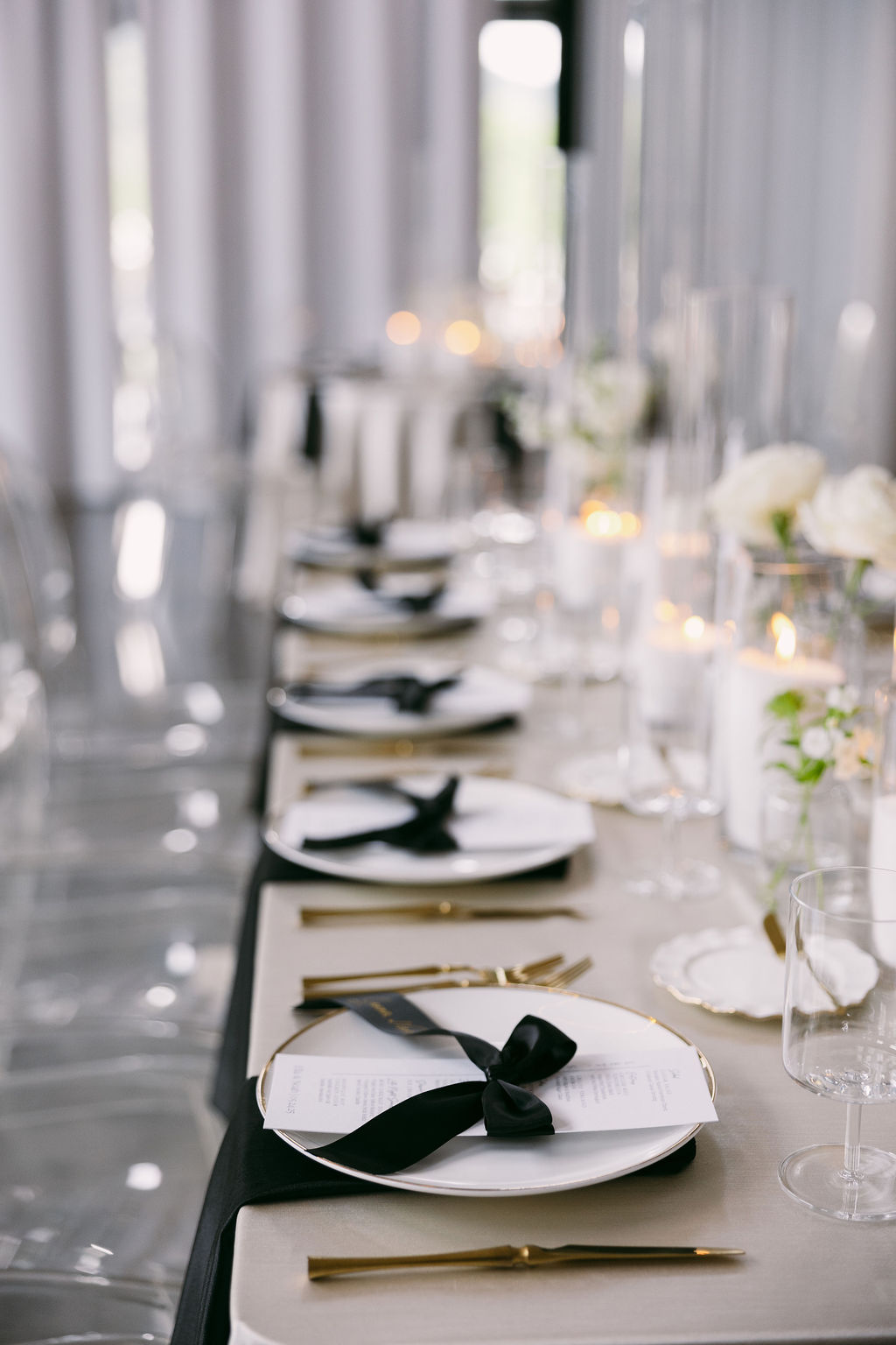
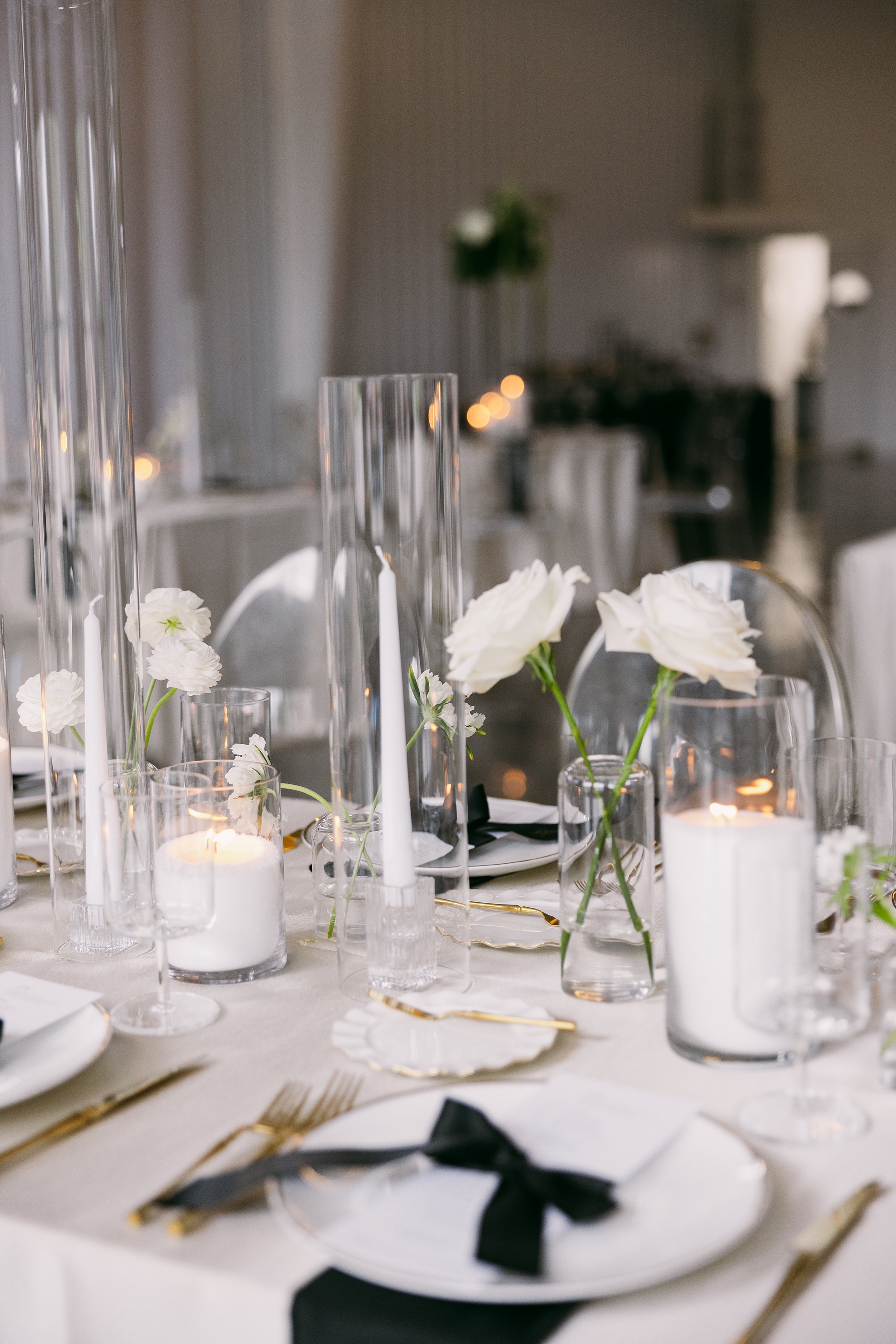
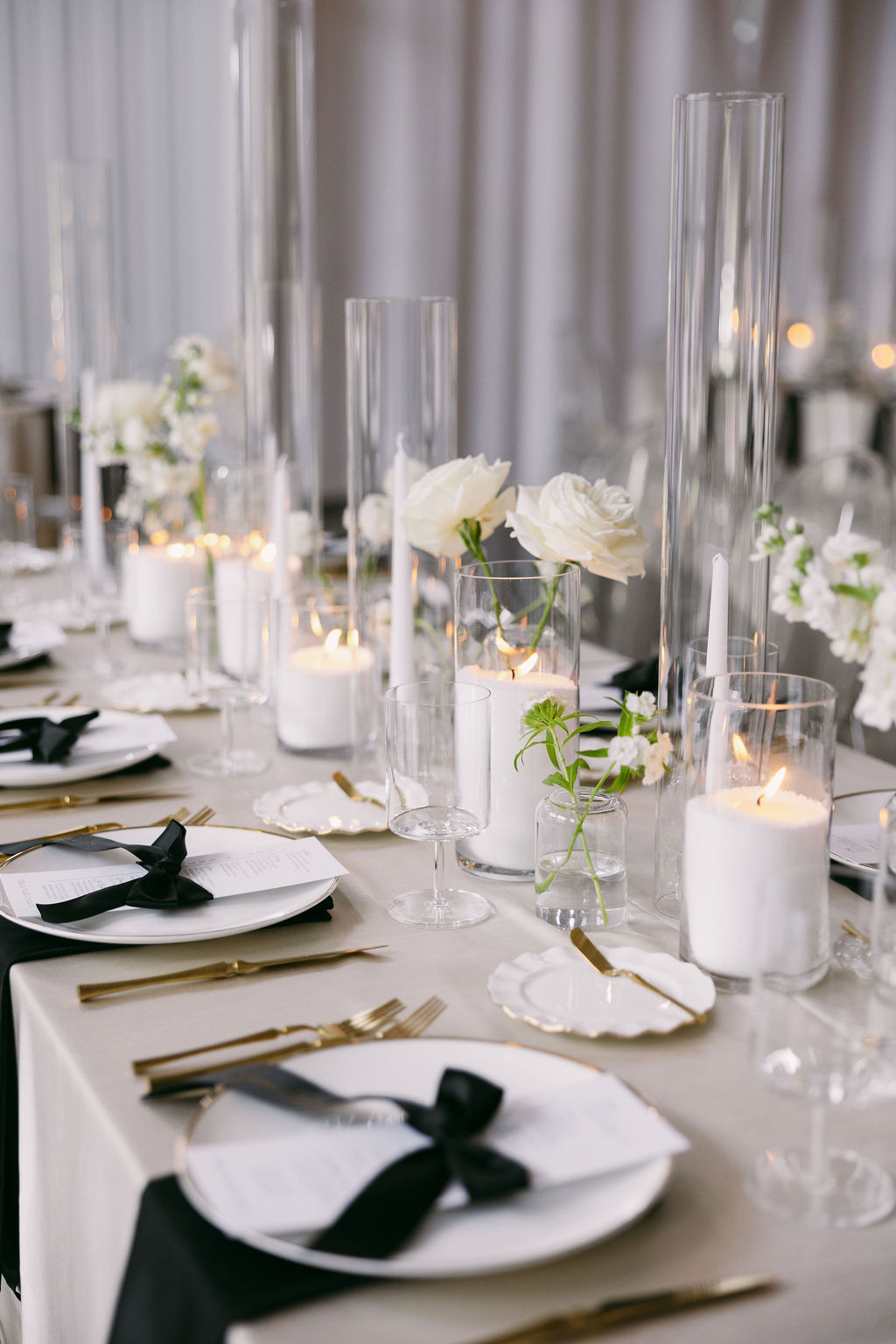
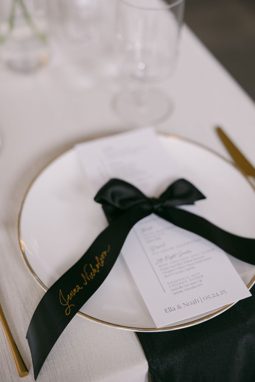
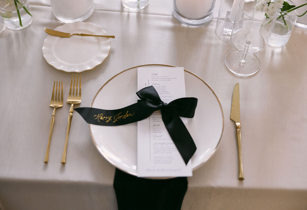
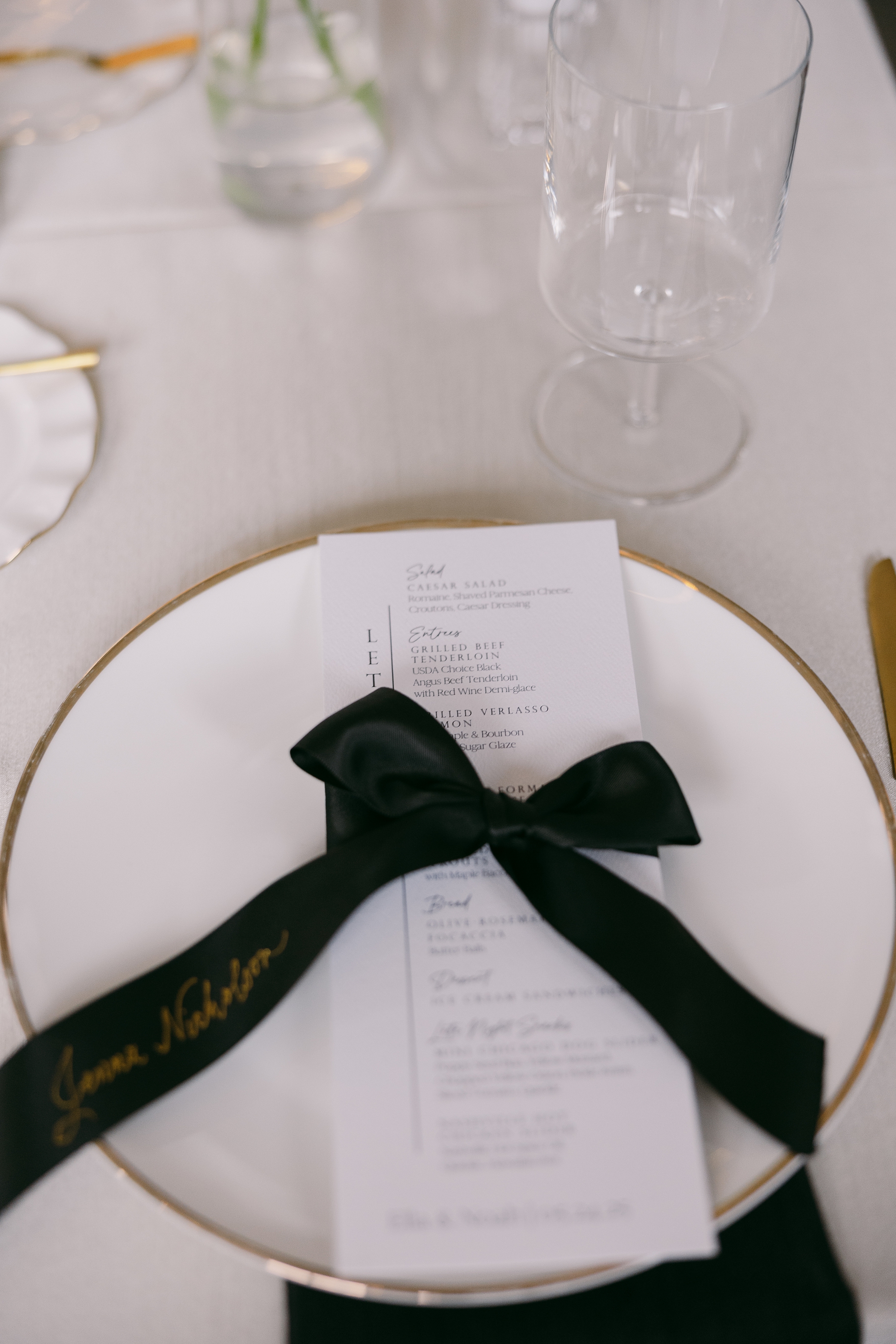
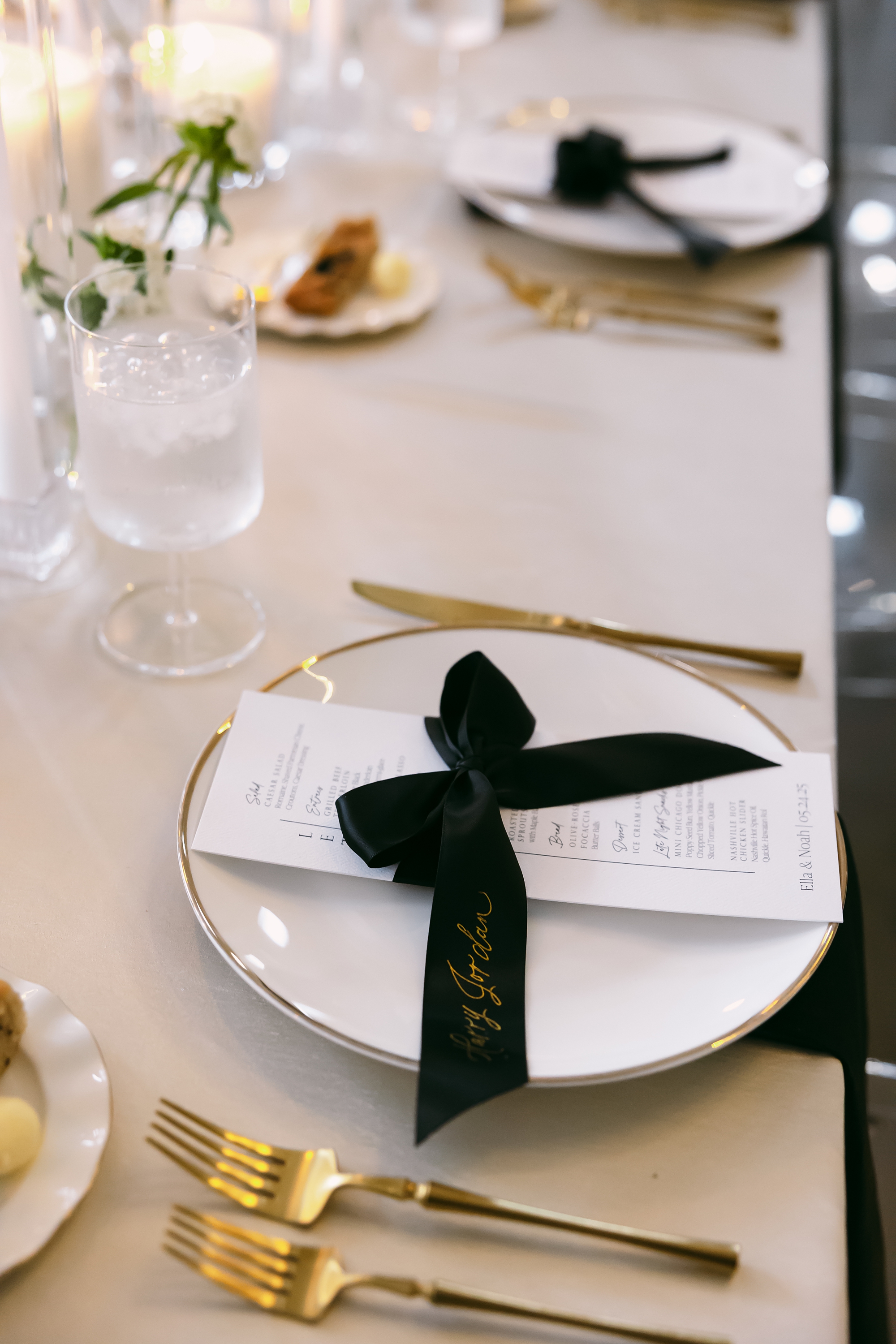
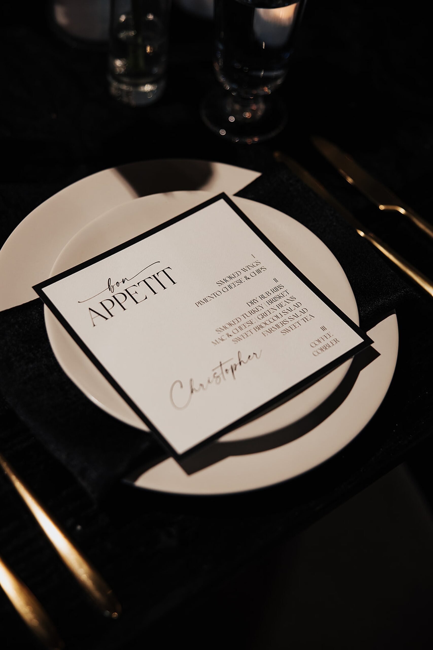
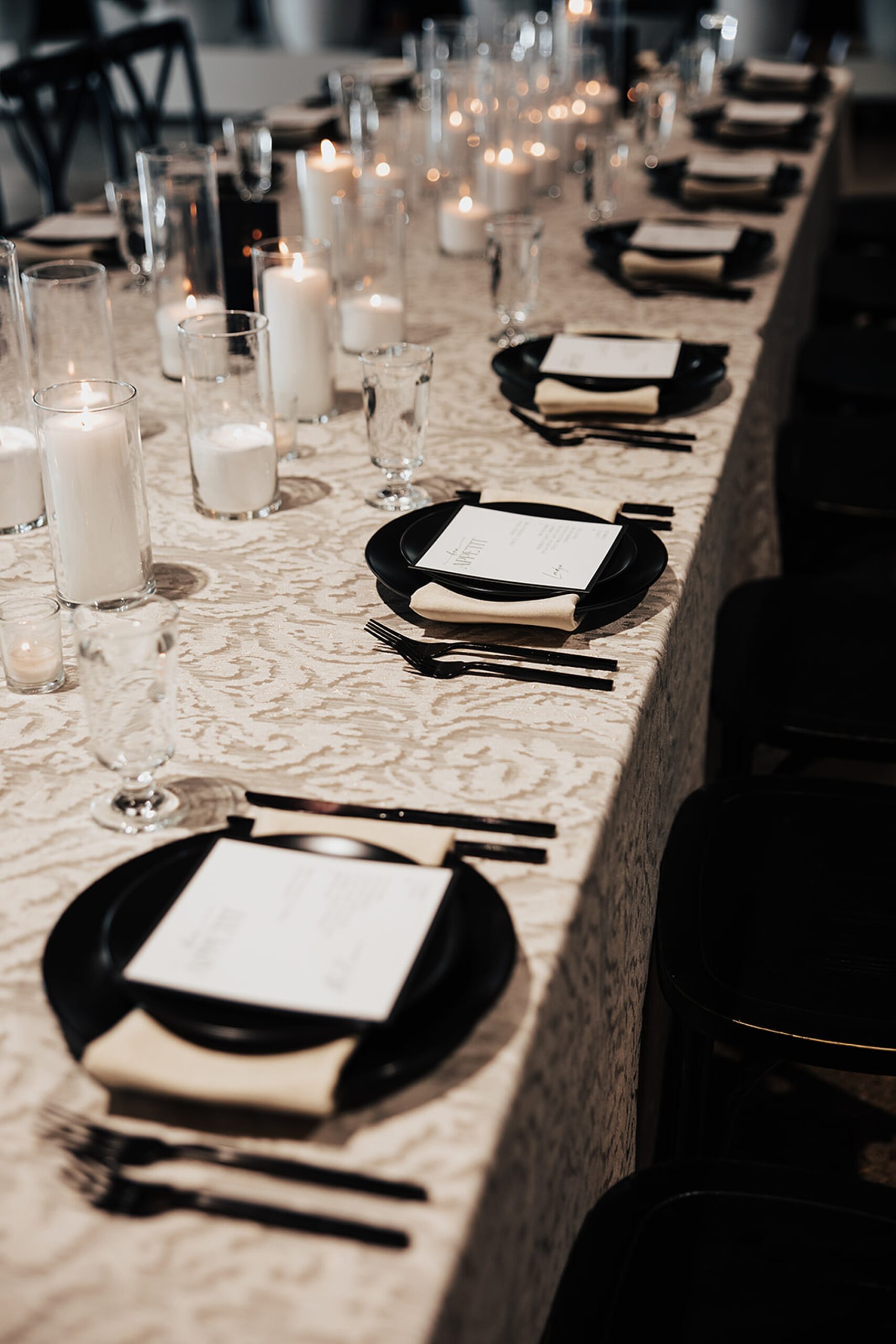
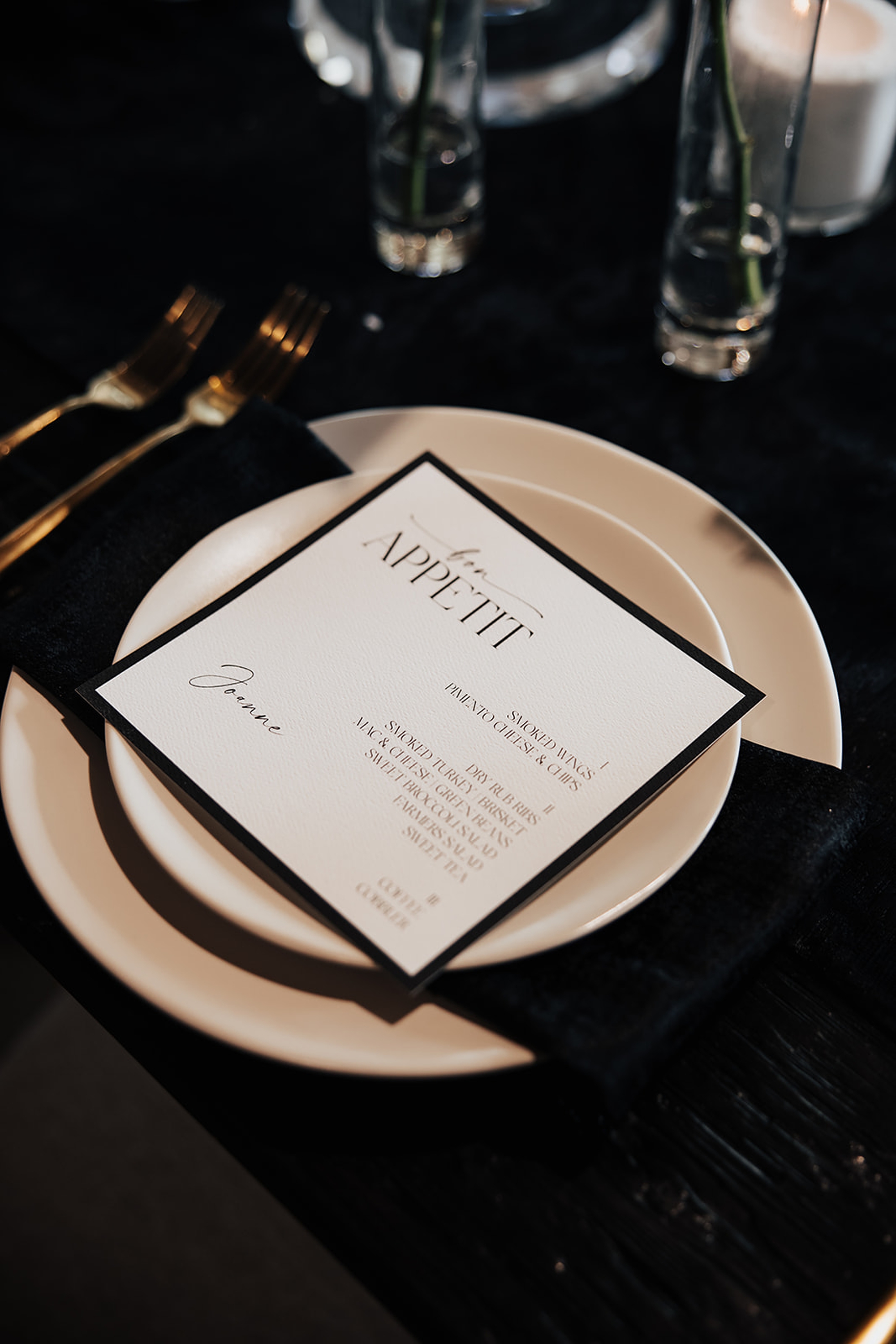
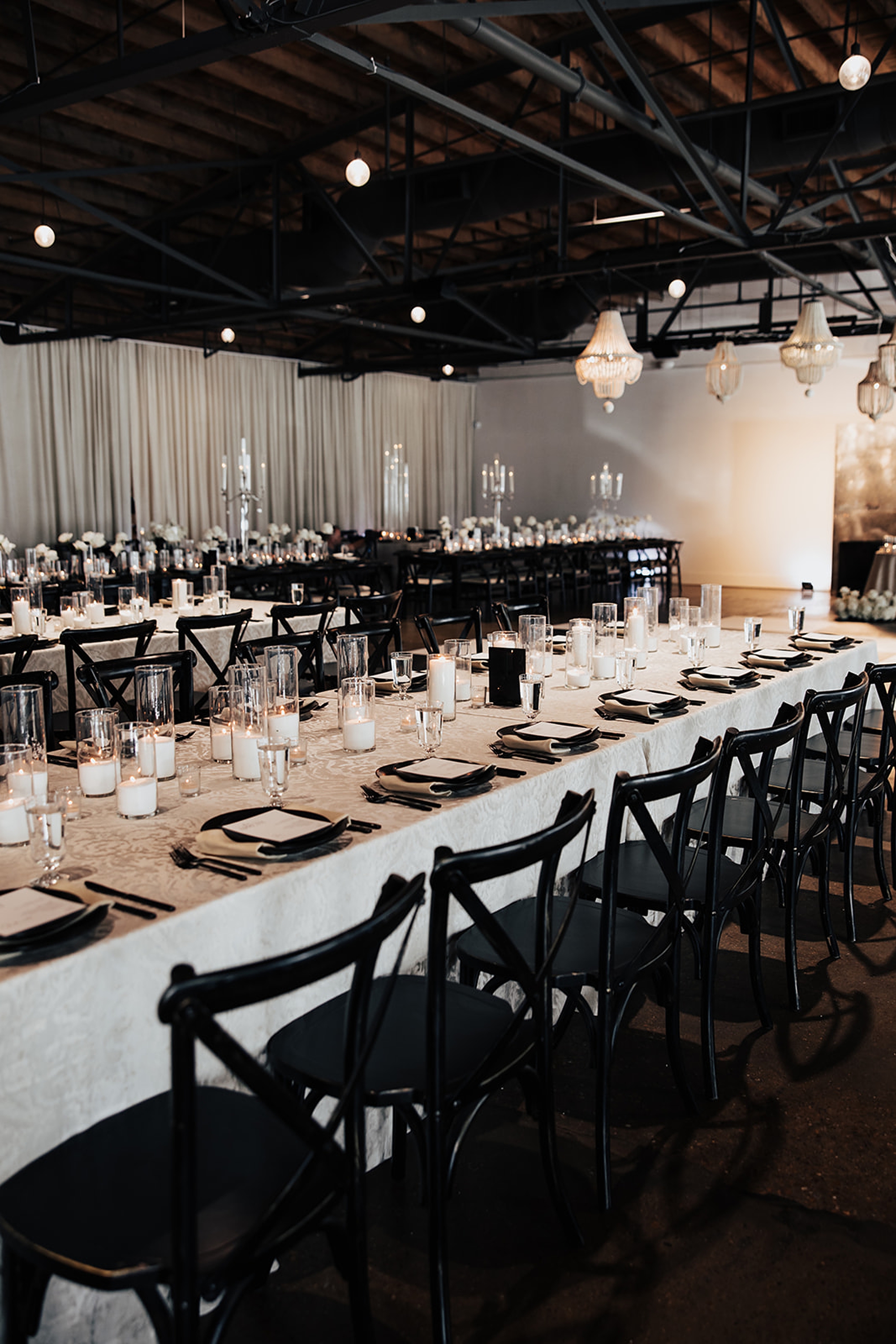
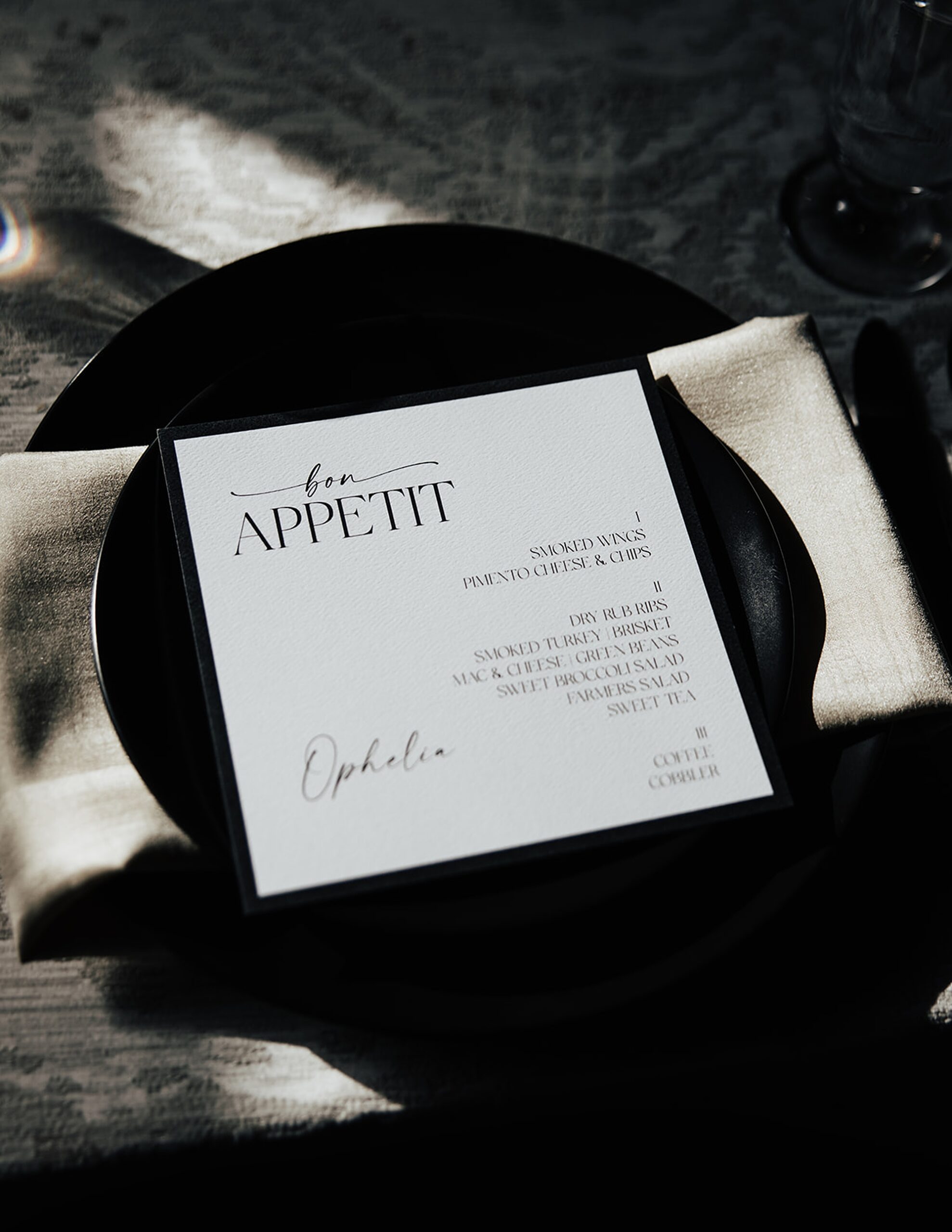
Black-and-White Reception Details
Inside the grand ballroom, the monochrome palette truly came to life. White and black details filled the room and elevated the already stunning space. White drapery and linens covered the space allowing the black napkin and other details to pop.
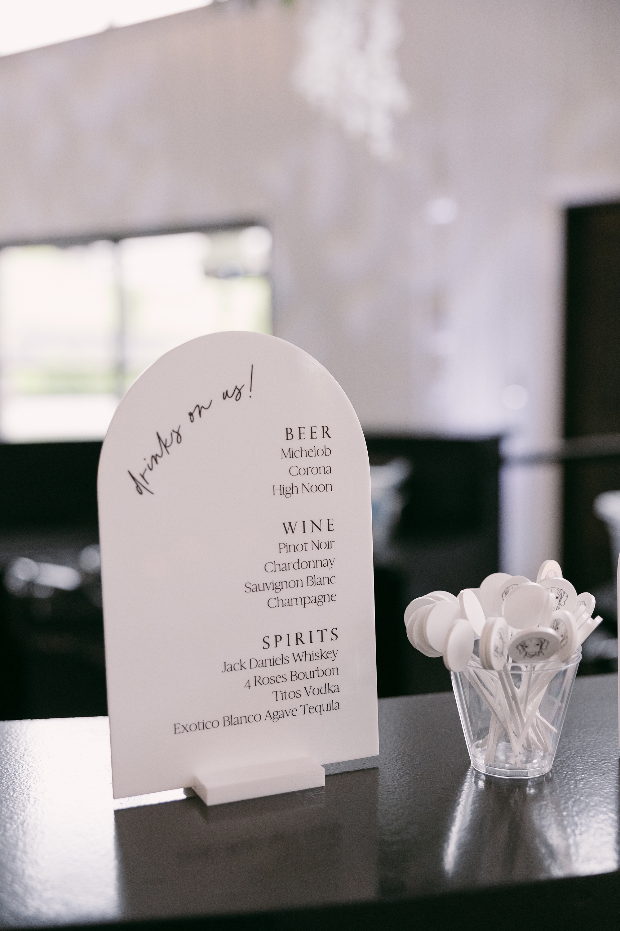
Guests visited the bar where our tombstone-shaped bar signage in white with black calligraphy added a modern touch that tied seamlessly into the overall theme.
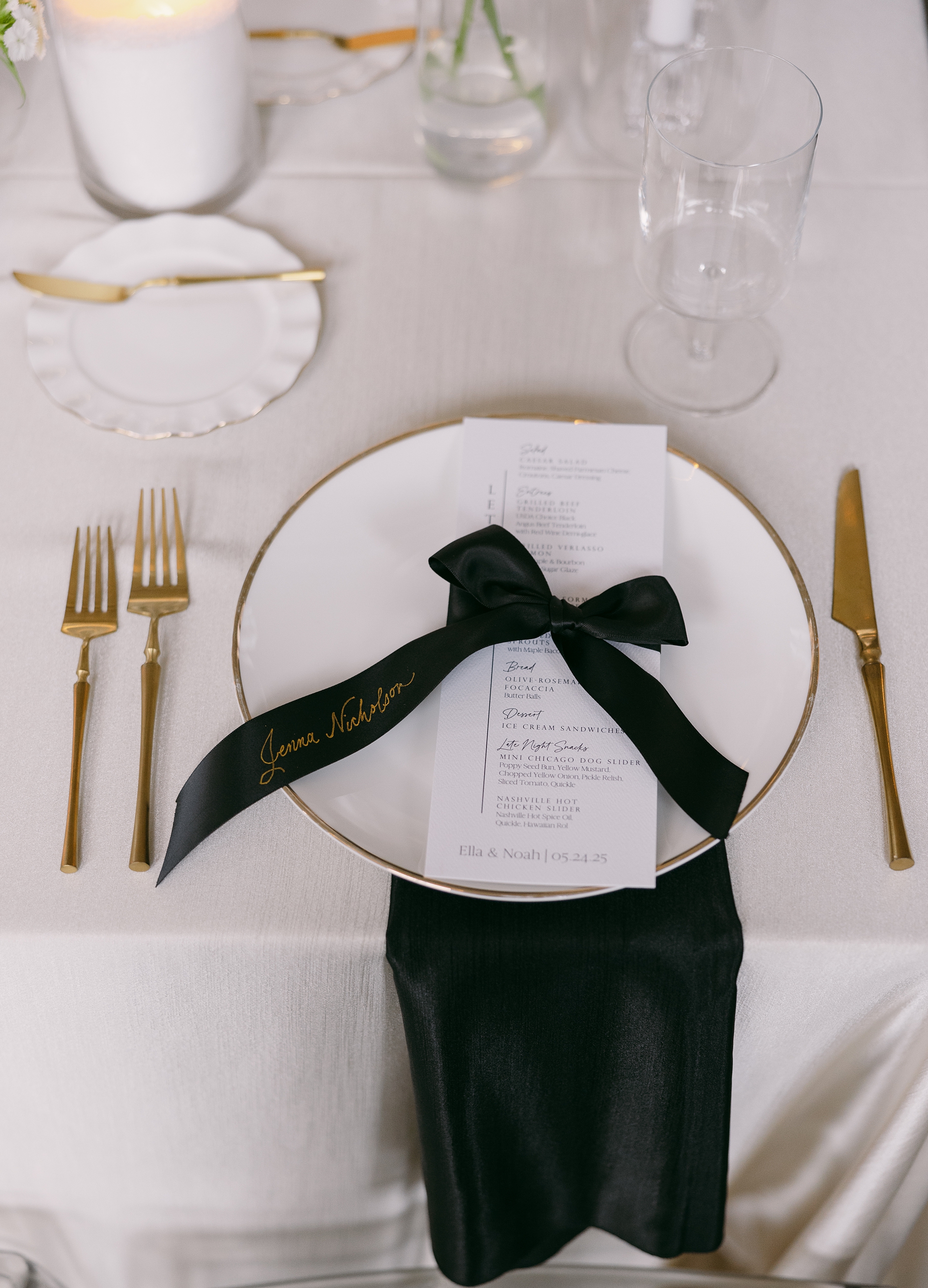
At each place setting, we designed white menus paired with satin, black ribbon place cards tied in delicate bows around the menus. The ribbons featured each guest’s name in gold foil calligraphy. This small but meaningful detail tied together the gold accents, black elements, and classic white foundation for a cohesive, thoughtfully curated look.
Ella and Noah’s wedding was a perfect blend of modern minimalism and elevated Southern charm. Every wedding detail was designed to enhance the atmosphere of Diamond Creek Farm while reflecting the couple’s elegant vision. It was an honor to create these pieces for such a beautiful celebration.
If you’re planning a wedding in Nashville, or anywhere in the world, we’d love to help you create meaningful, personalized stationery and event details that tell your story. We work with couples worldwide to design details you and your guests will remember forever.
Reach out today to learn more about our full-service wedding and event design offerings! We can’t wait to create something unforgettable for you!
If you enjoyed this post, you’ll love these other blogs!
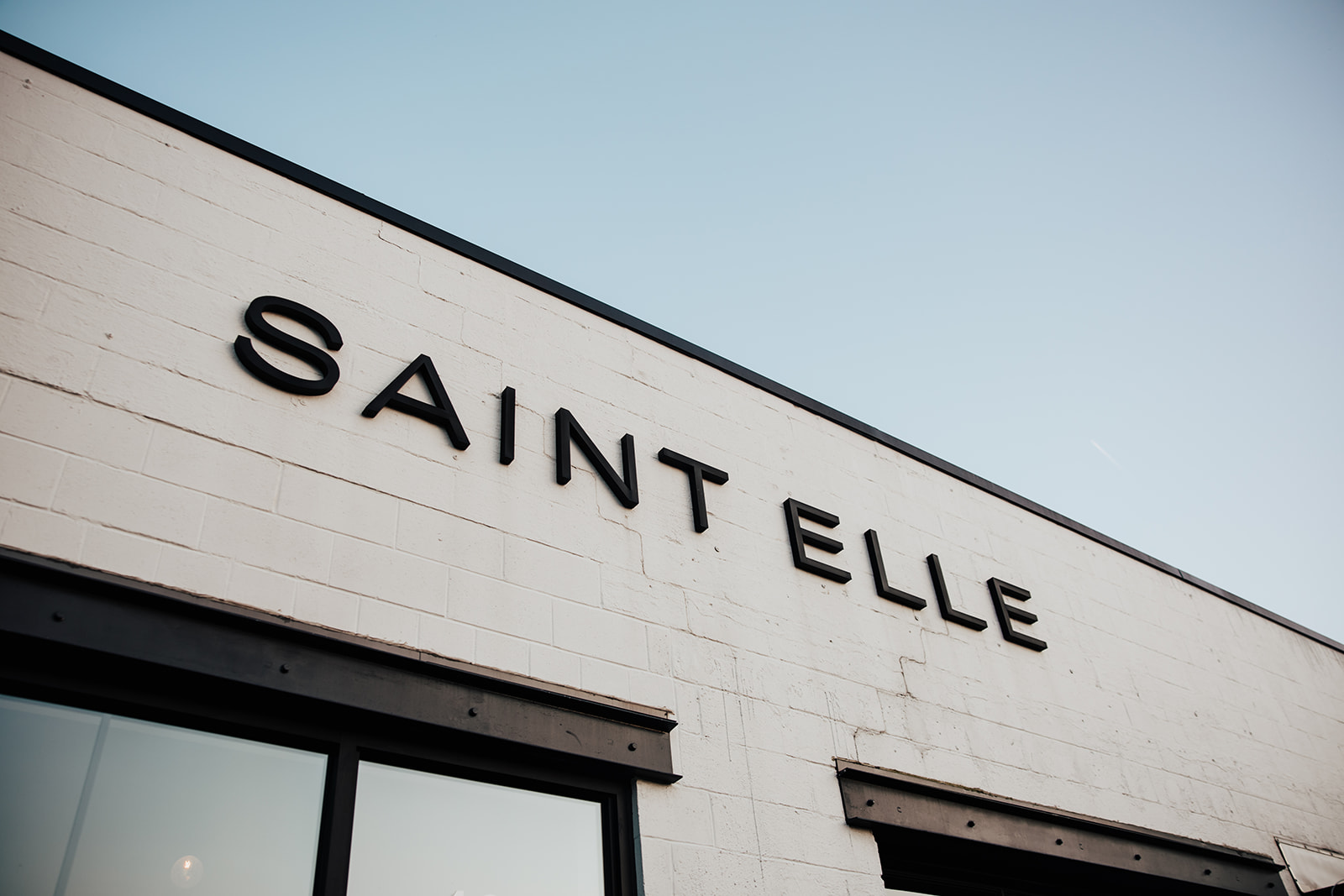
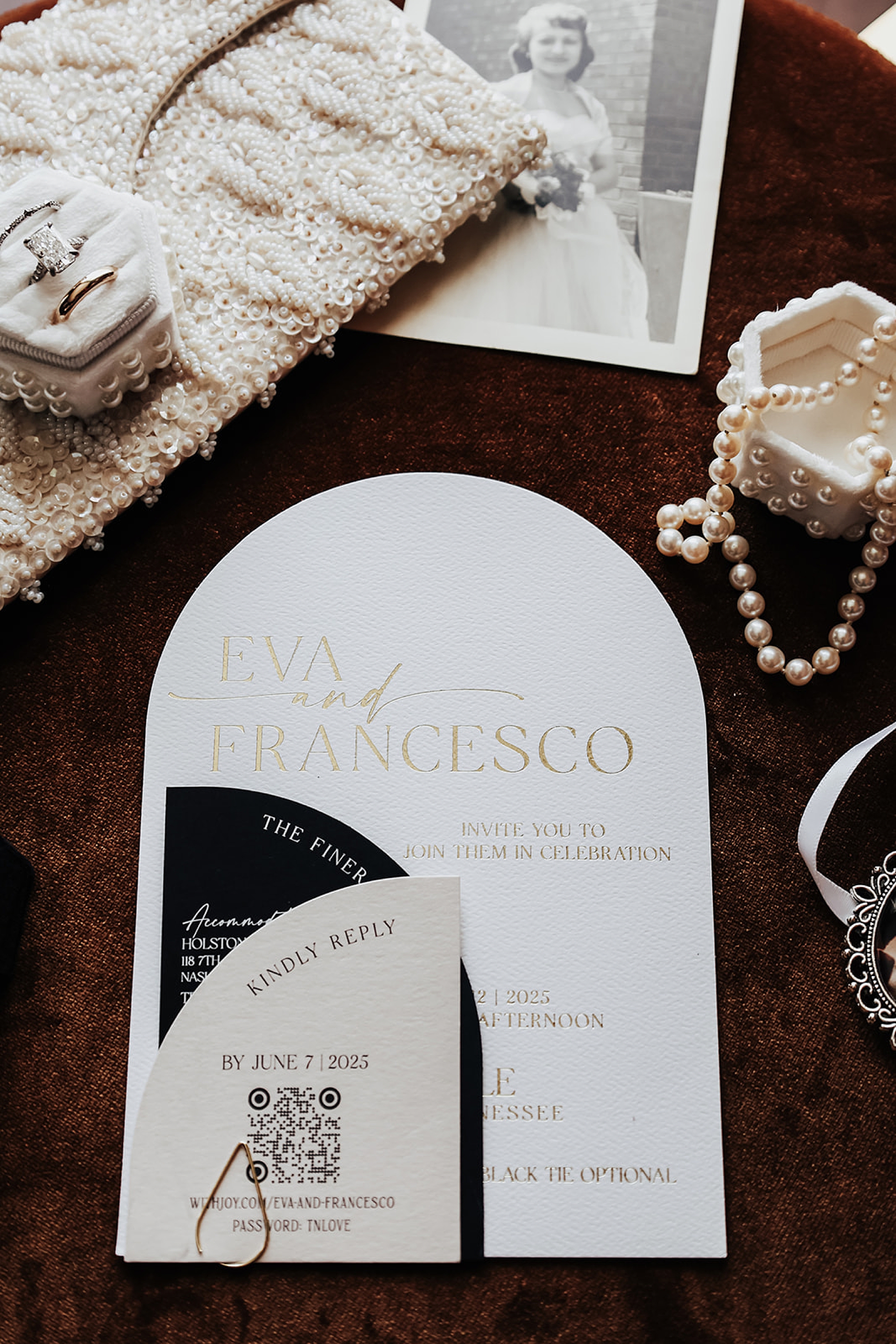
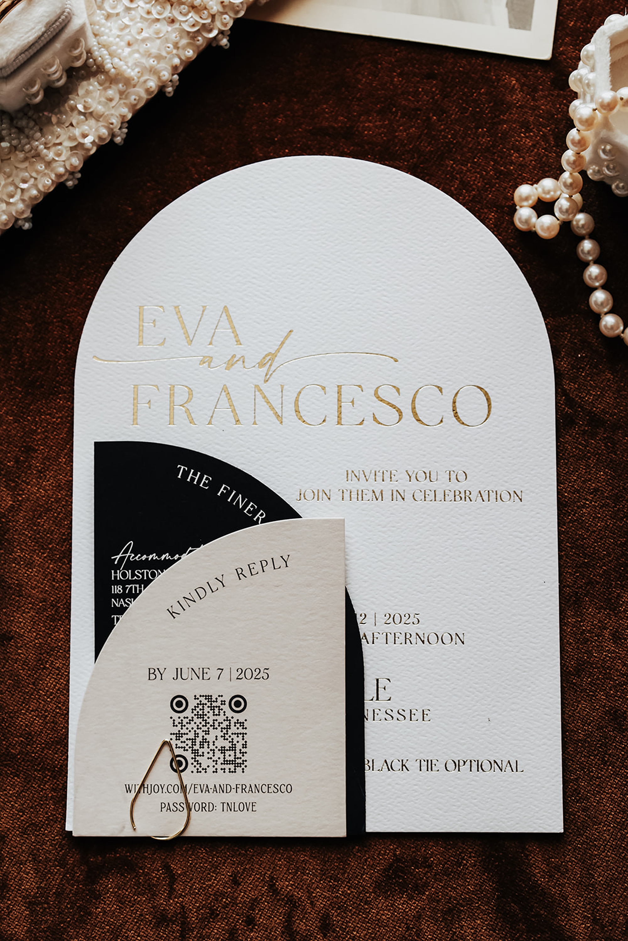
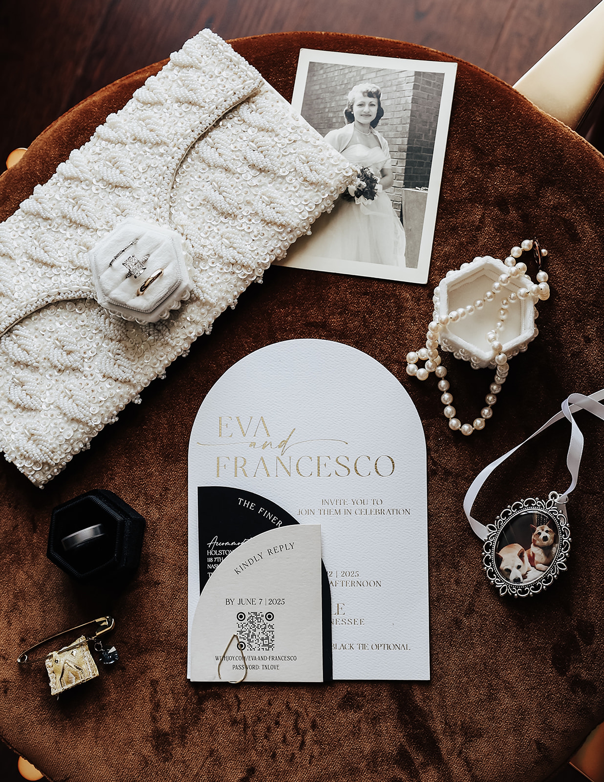
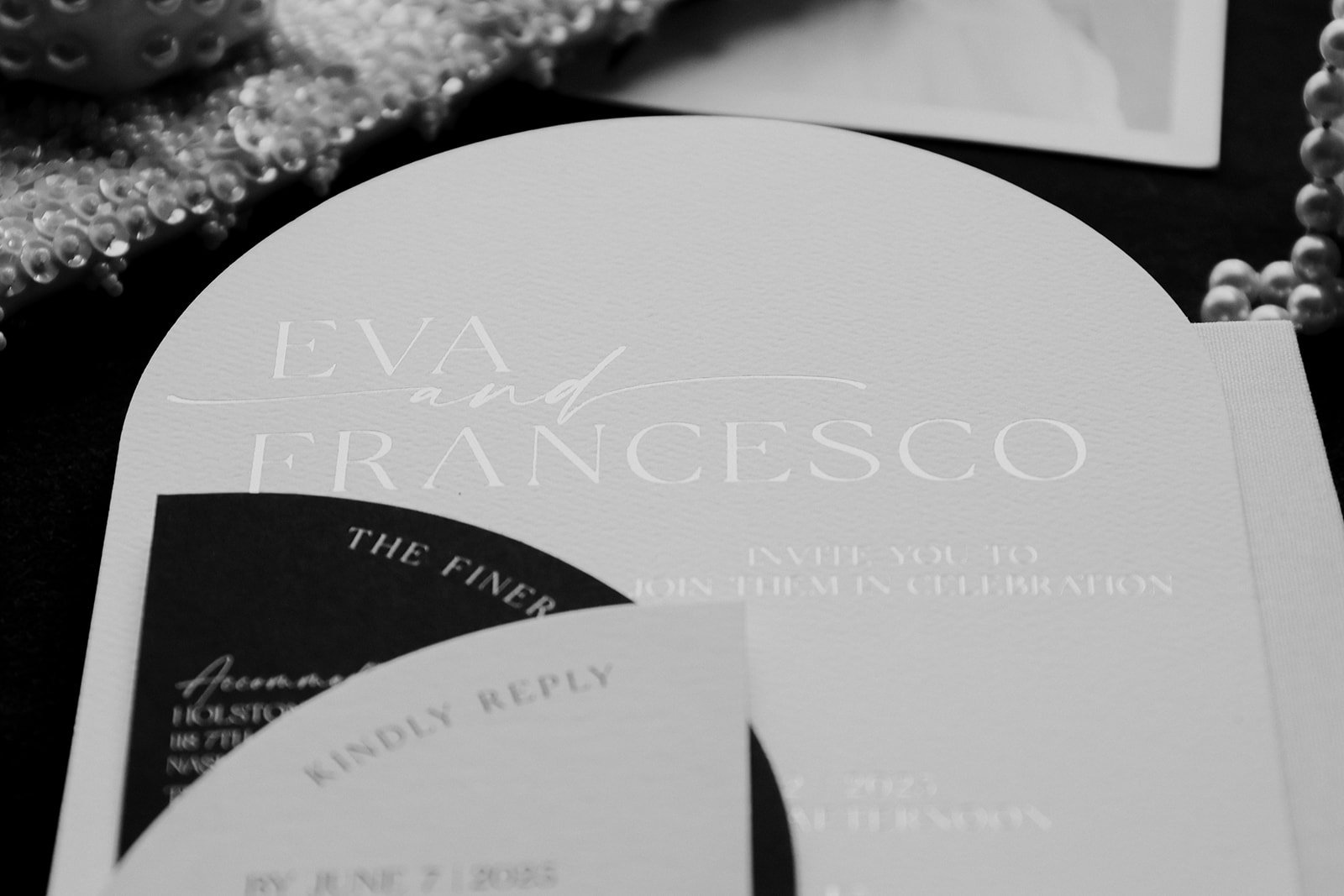
It was such a joy to design classic black and white wedding invitations and day-of details for Eva and Francesco’s Saint Elle Wedding. The entire celebration centered around an timeless and elevated black-and-white palette, and our paper goods became the thread that tied everything together. Everything from the playful save the dates that imitated a plane ticket, to the meaningful displays guests interacted with throughout the day was created with purpose. Eva and Francesco infused their personalities and story into every detail, giving us the opportunity to create something meaningful, elevated, and uniquely them.
Classic, Elevated Invitations With a Modern Edge
Their invitation suite laid the foundation for the black-and-white theme, with a modern structure and layered textures. Their suite was proof that modern doesn’t mean minimal. Eva & Francesco wanted a suite that felt personal, polished, and completely their own. So we leaned into sculptural shapes, high-contrast tones, and luxe gold foil to make every piece feel intentional. We designed the main invitation in a white tombstone shape for a striking yet classic focal point. The additional paper pieces layered neatly into the suite, and each card alternated in color of white, black, and cream, indicating the main colors of their wedding day. It was the perfect balance of clean, elevated, and effortlessly chic.
And don’t miss the save the date; designed to look like a plane ticket for their destination-inspired day. A first-class way to kick things off, if you ask us.
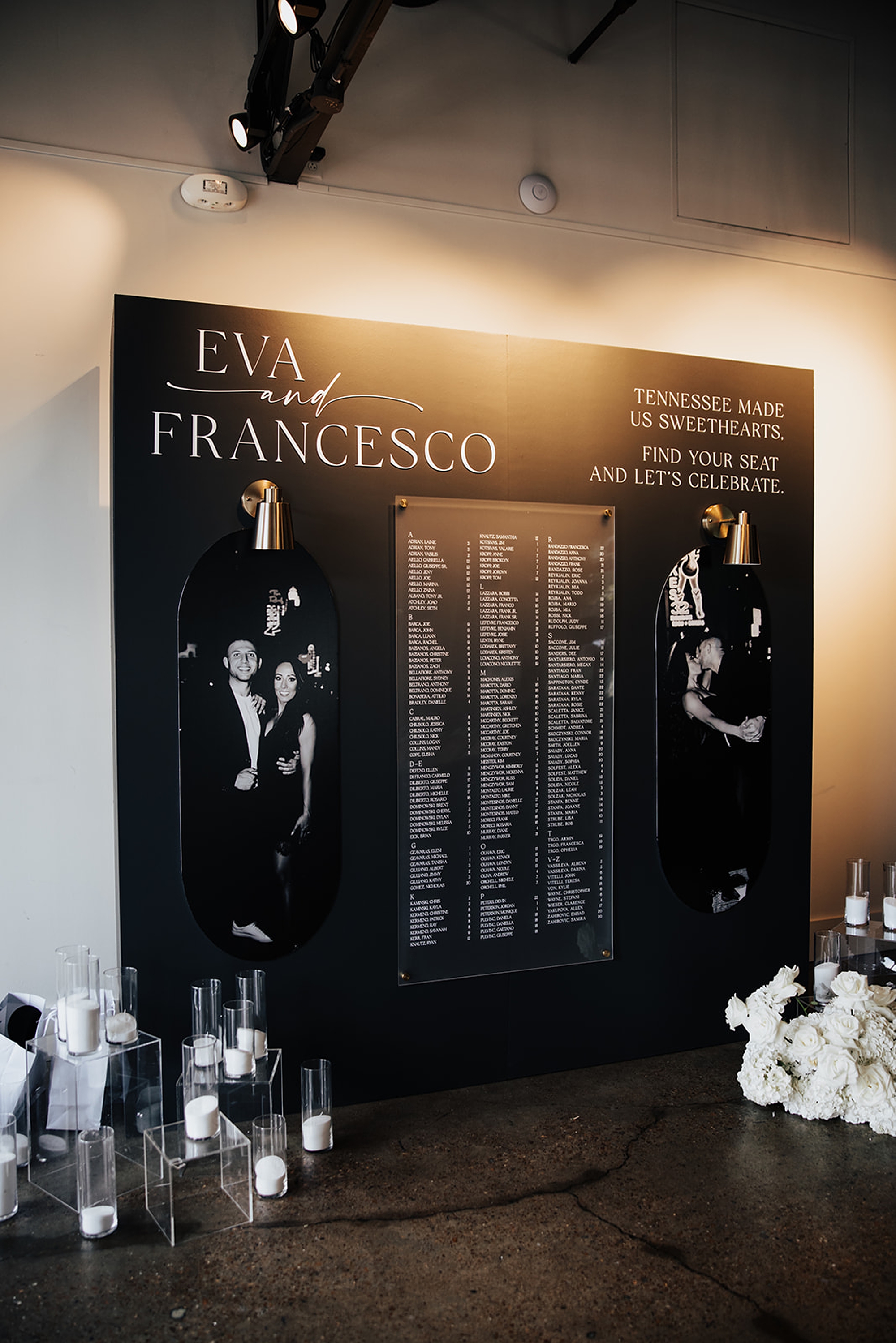
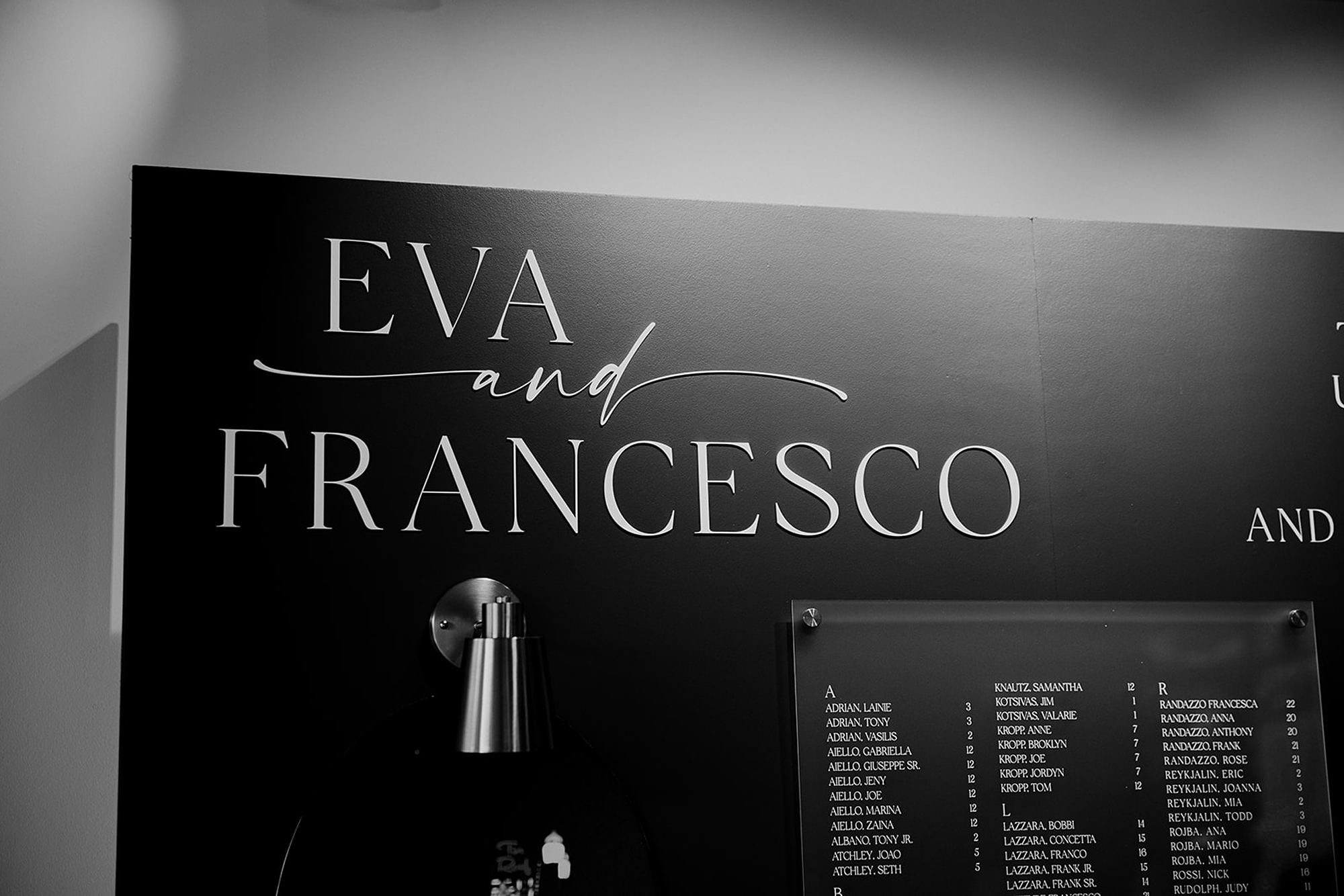
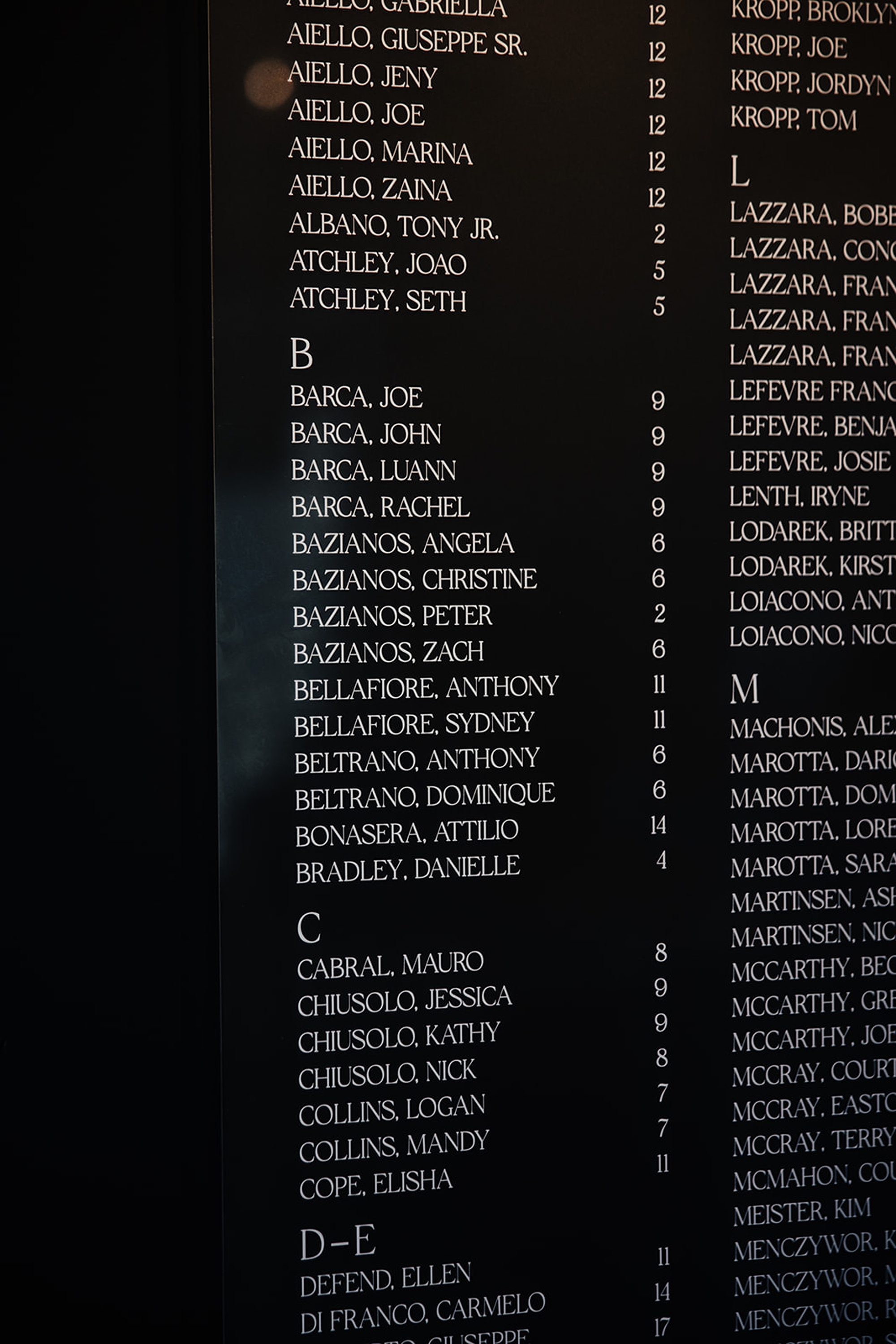
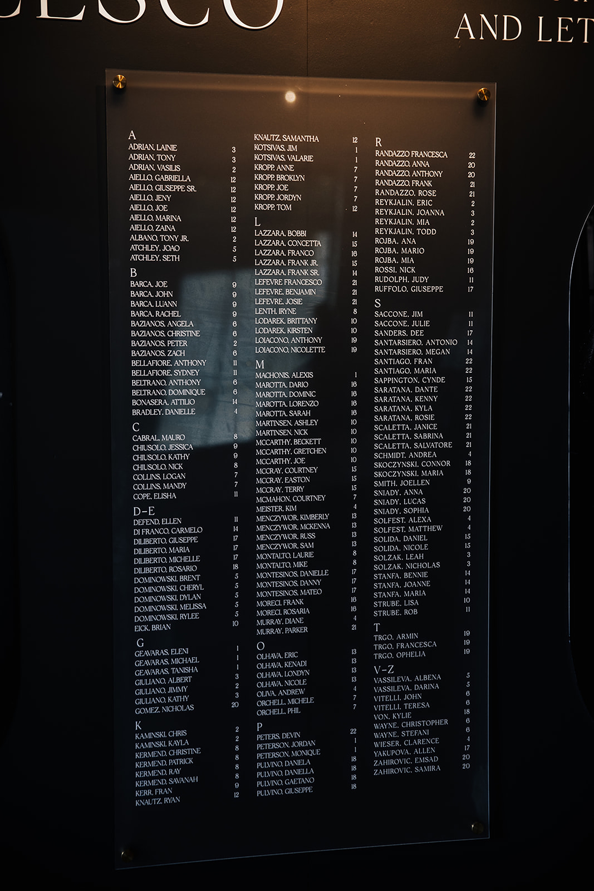
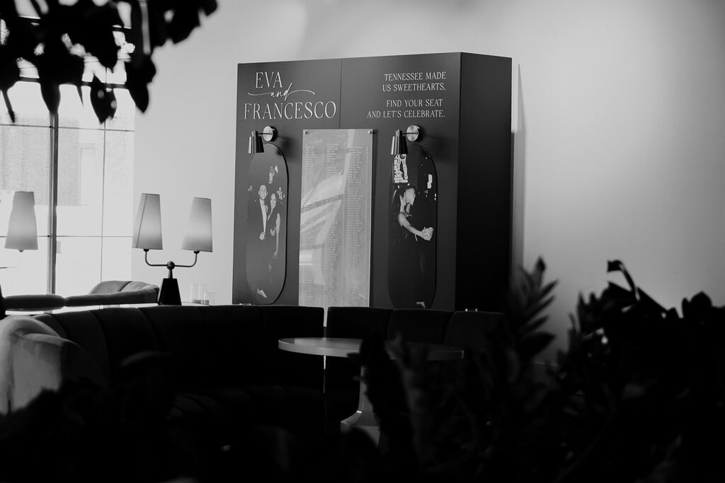
Seating Chart Wall Featuring Their Engagement Photos
This was a first for us, and now we’re obsessed! When the bride asked if we could include their engagement photos on the seating chart, we said absolutely yes. We had fun with this request, designing a seating chart that became an instant showstopper. The result was a black and white moment that felt like part art gallery, part seating chart, and fully them.
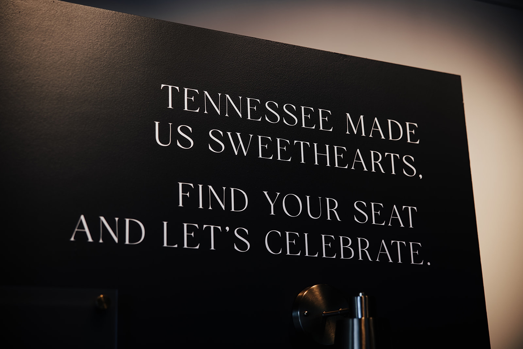
The sleek black display wall, we added the white lettering to display the guest names and their table assignment. Then on each side, framing the display we showcased an engagement photo. At the top corner of the display, their names, Eva & Francesco, framed the design beautifully. On the opposite side, we added a sweet personal touch with the phrase: “Tennessee made us sweethearts. Find your seat and let’s celebrate.”It added warmth, storytelling, and just the right amount of Southern charm.
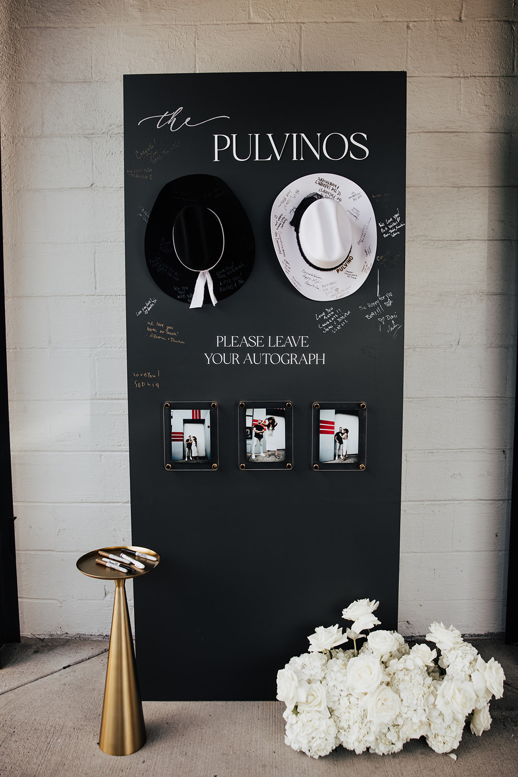
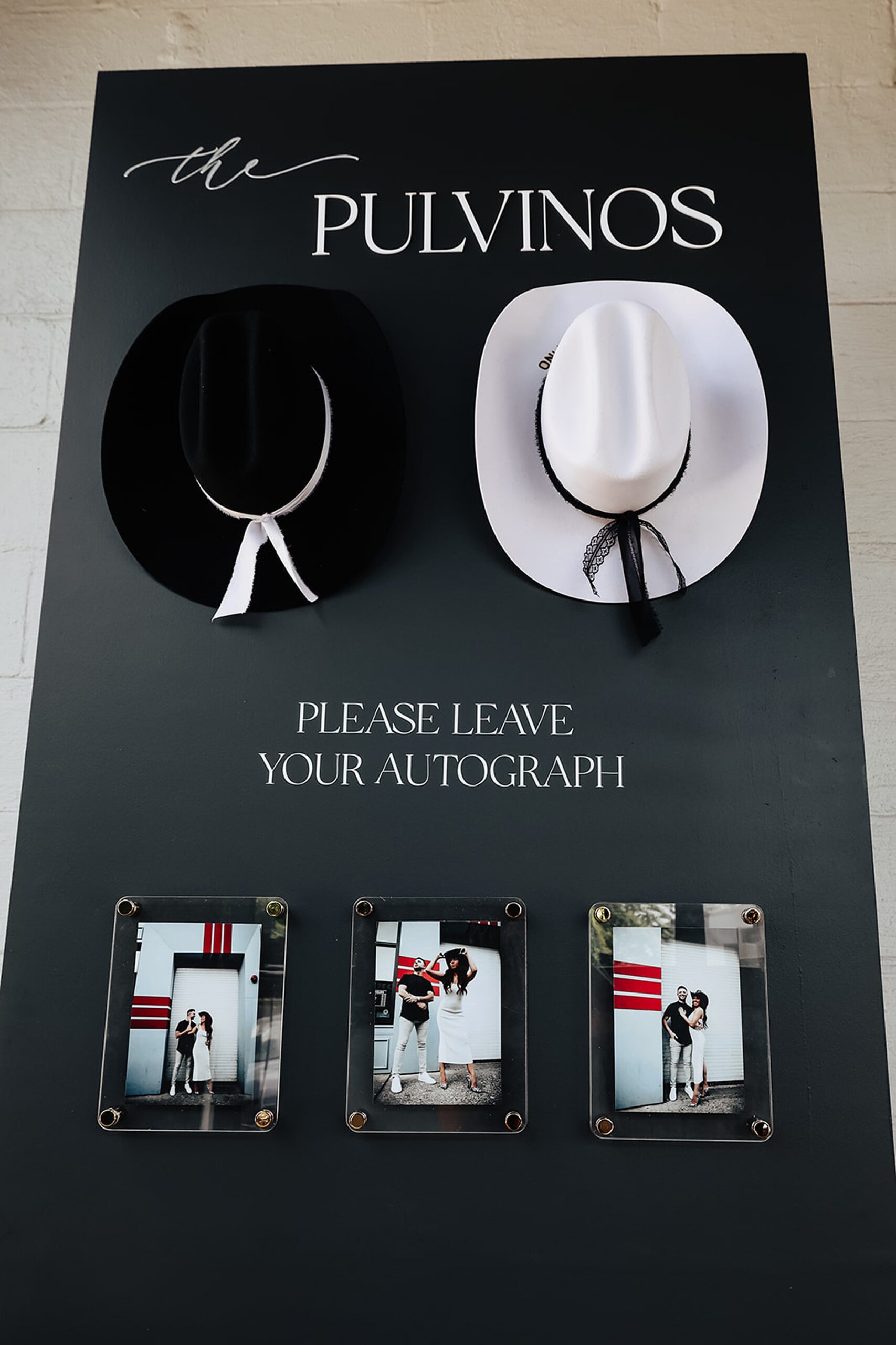
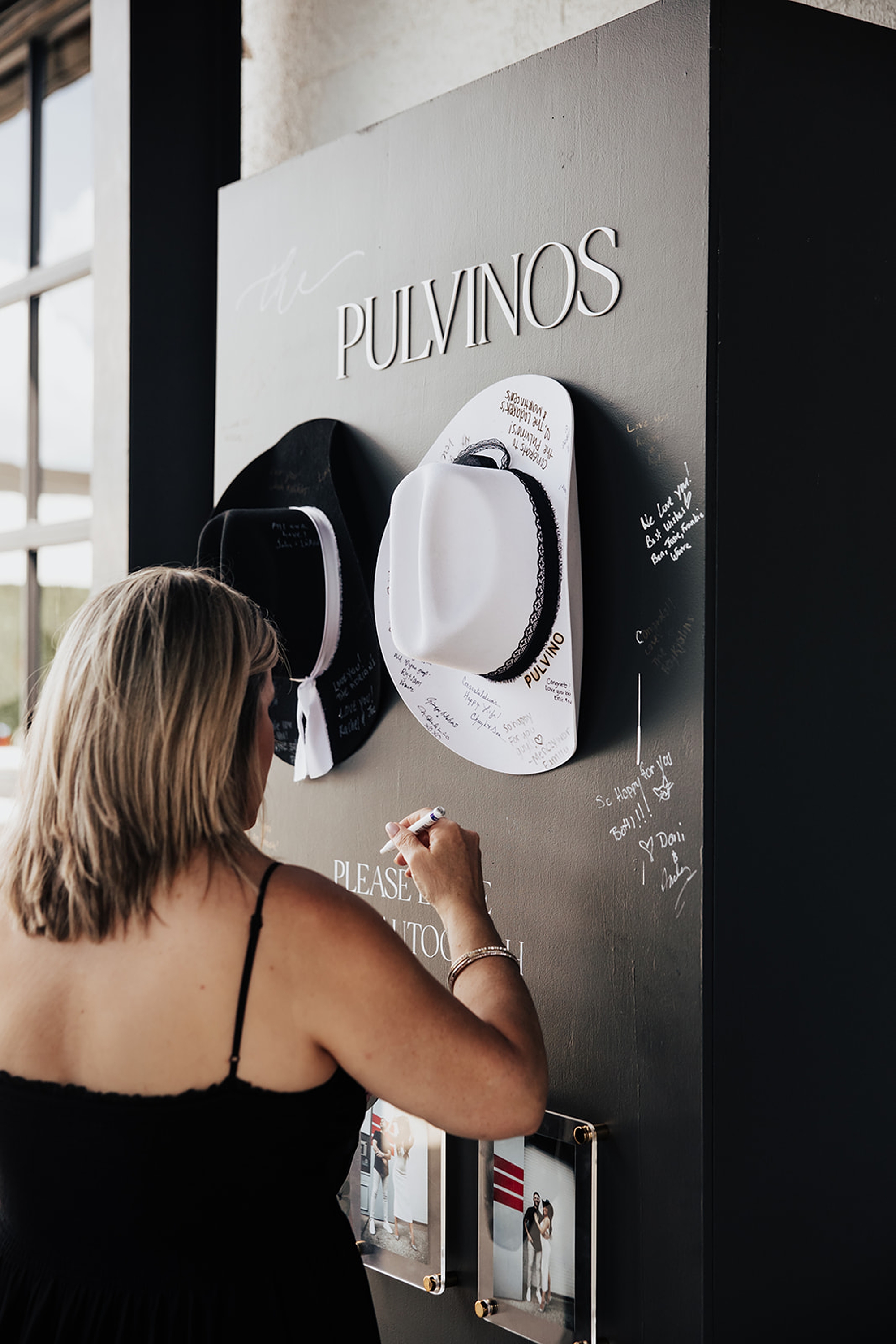
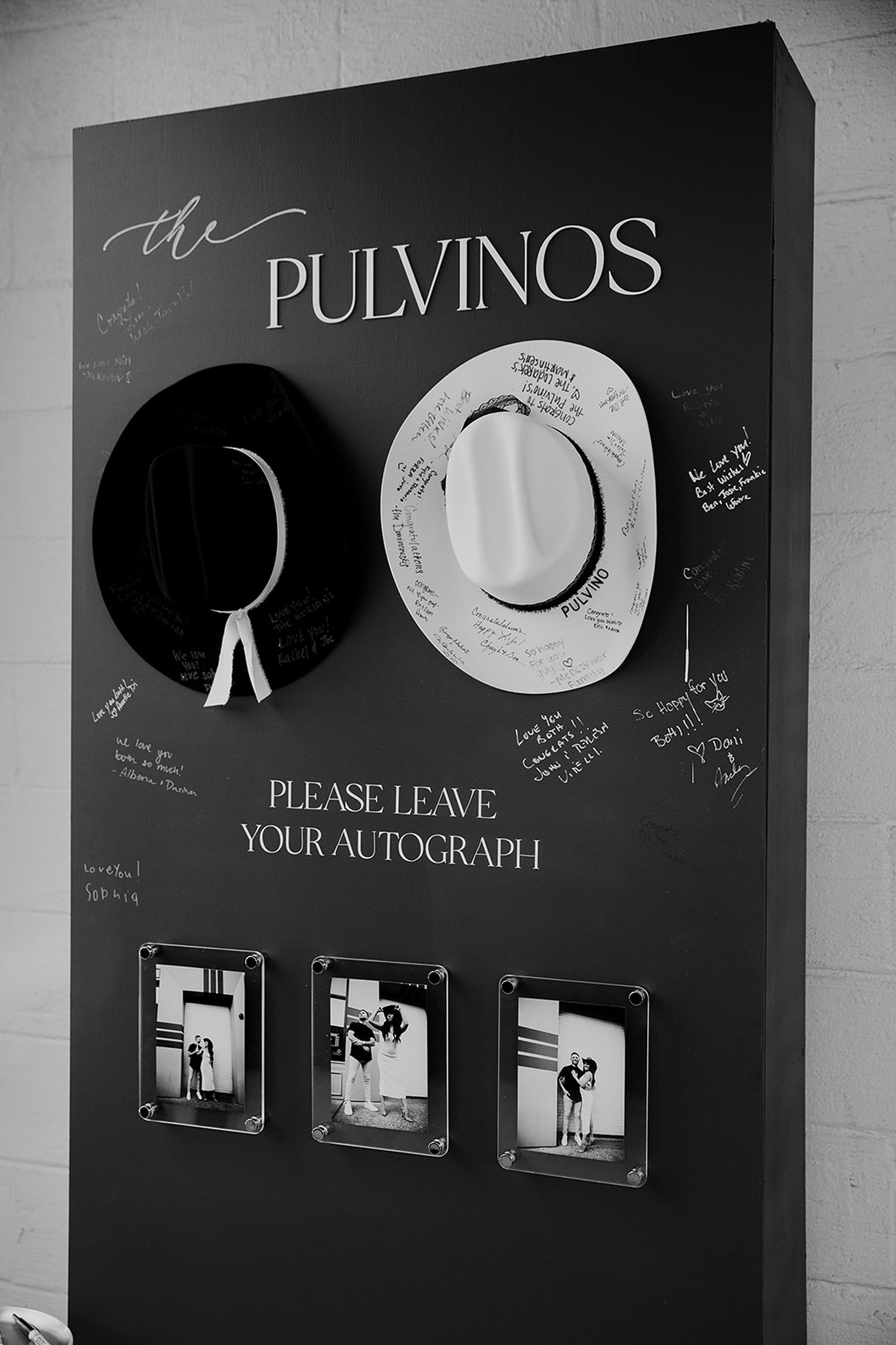
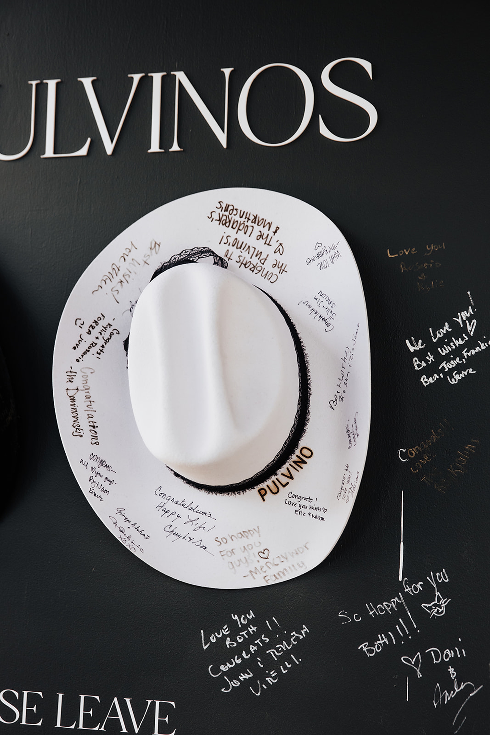
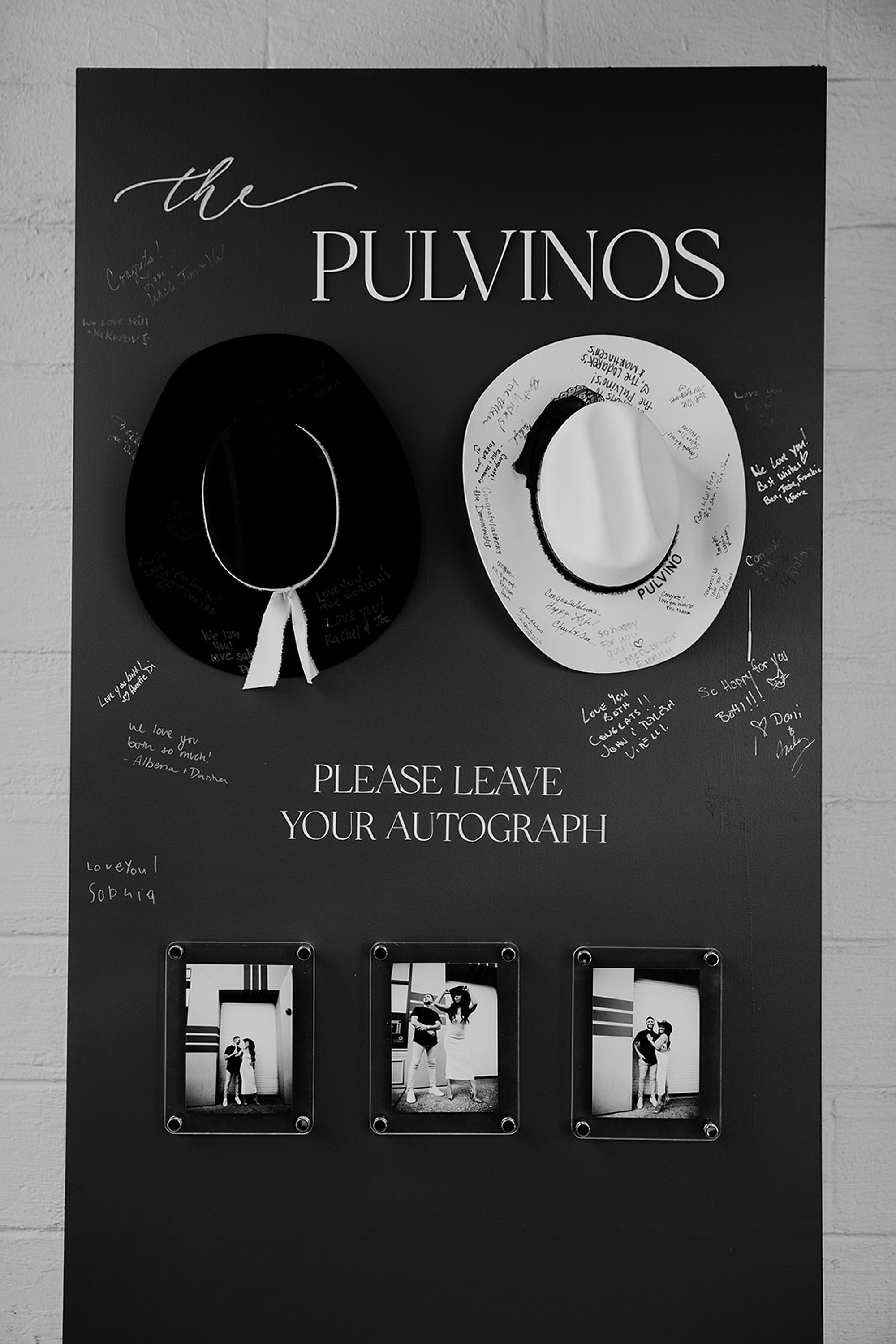
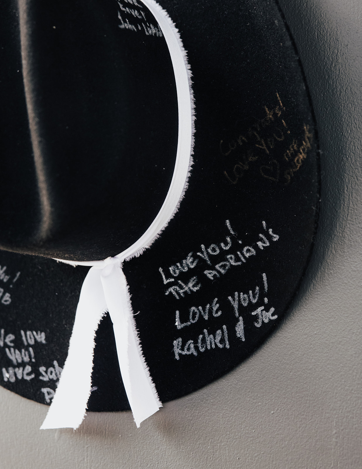
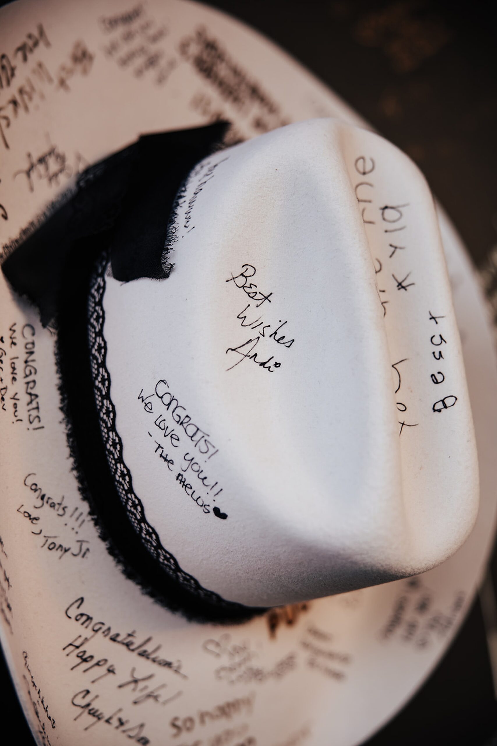
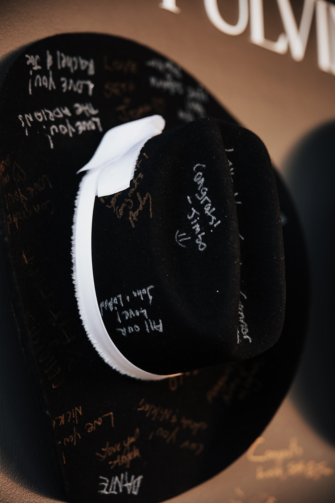
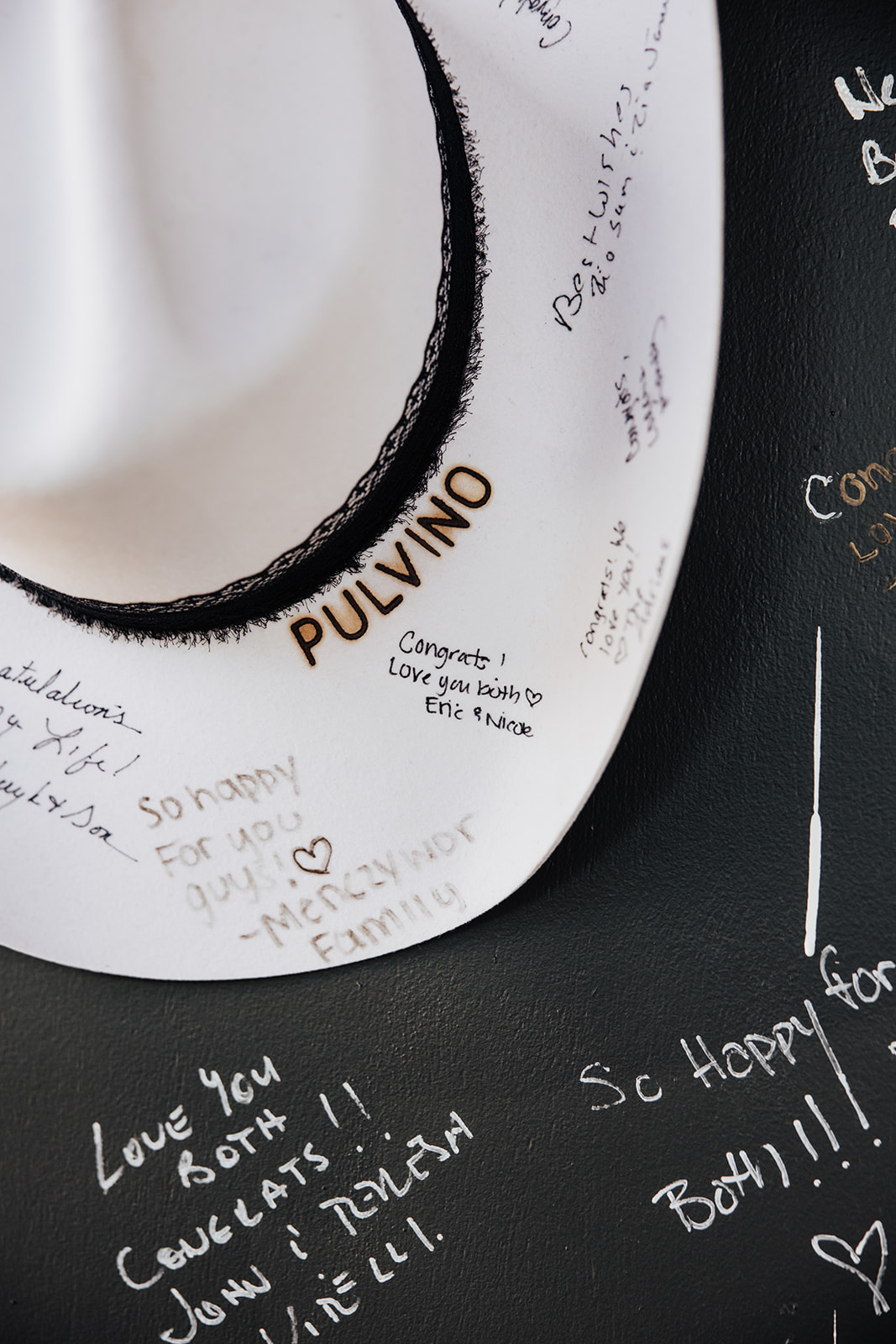
A Cowboy Hat Guestbook Wall
It’s no secret that Nashville is all about country music. To honor a bit of their story, personality, and the city where they tied the knot, they included a cowboy hat guestbook wall, which might have been my favorite detail of the entire day. Not only was it unique and memorable, it created a playful and completely memorable moment for guests, as they couldn’t wait to leave their mark.
The black display wall featured their last name, “The Pulvinos,” in bold white lettering centered at the top. Below, we mounted one black and one white cowboy hat for guests to sign, along with a small cocktail table placed in front to hold pens. It perfectly captured the couple’s love for Nashville while remaining clean and elevated.
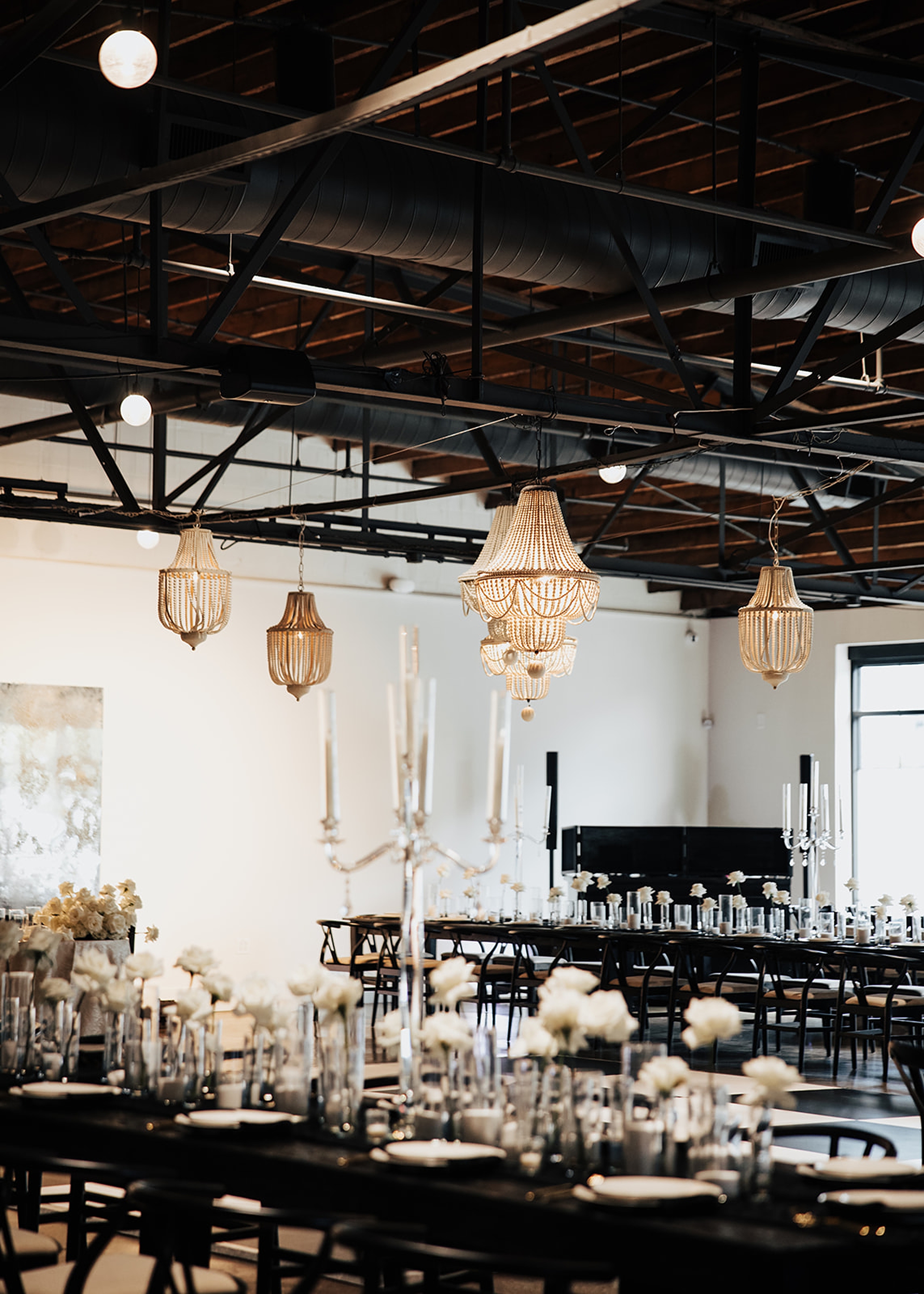
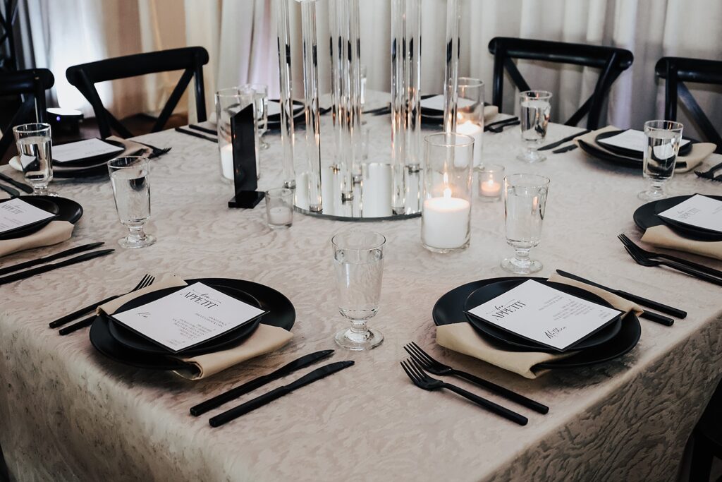
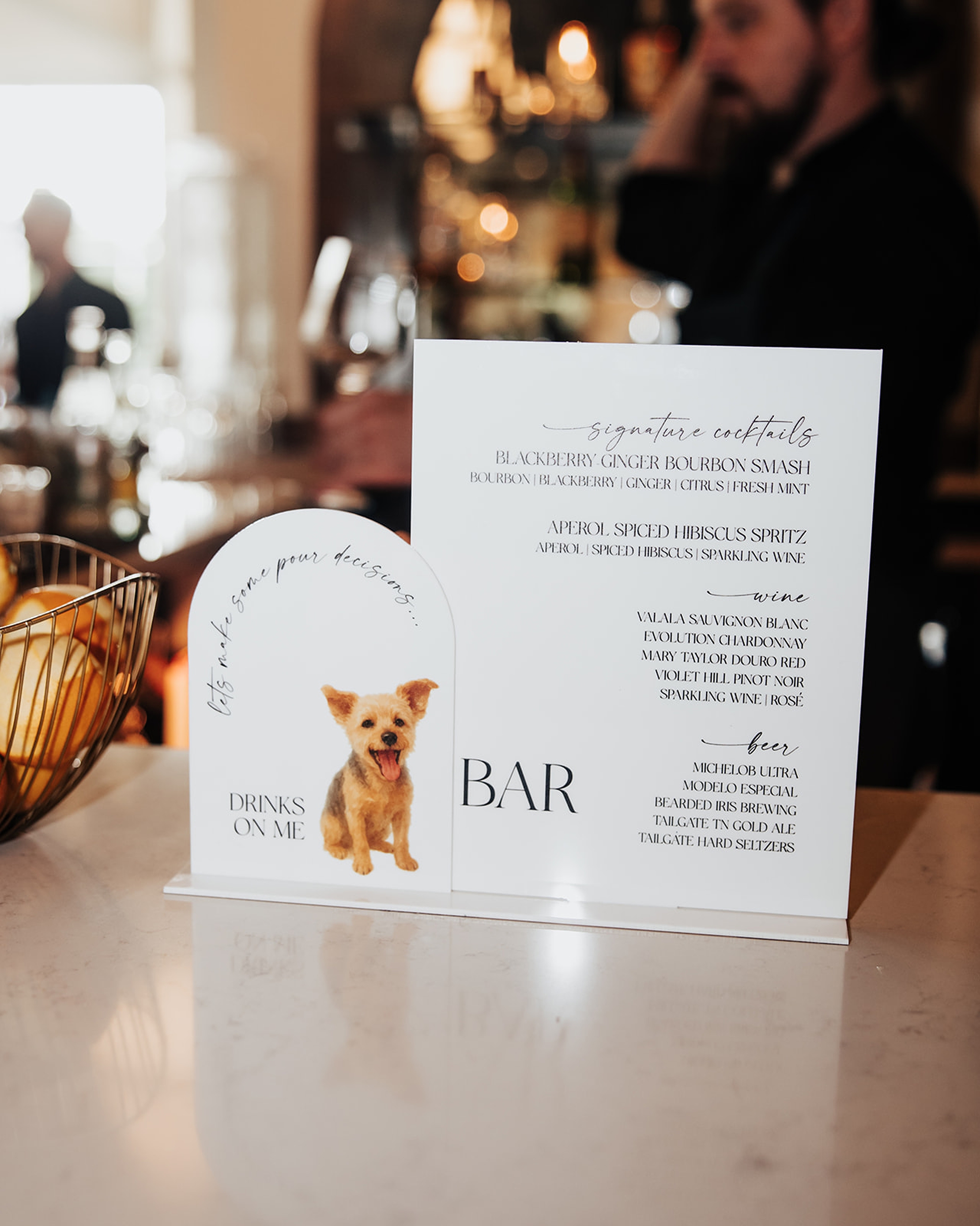
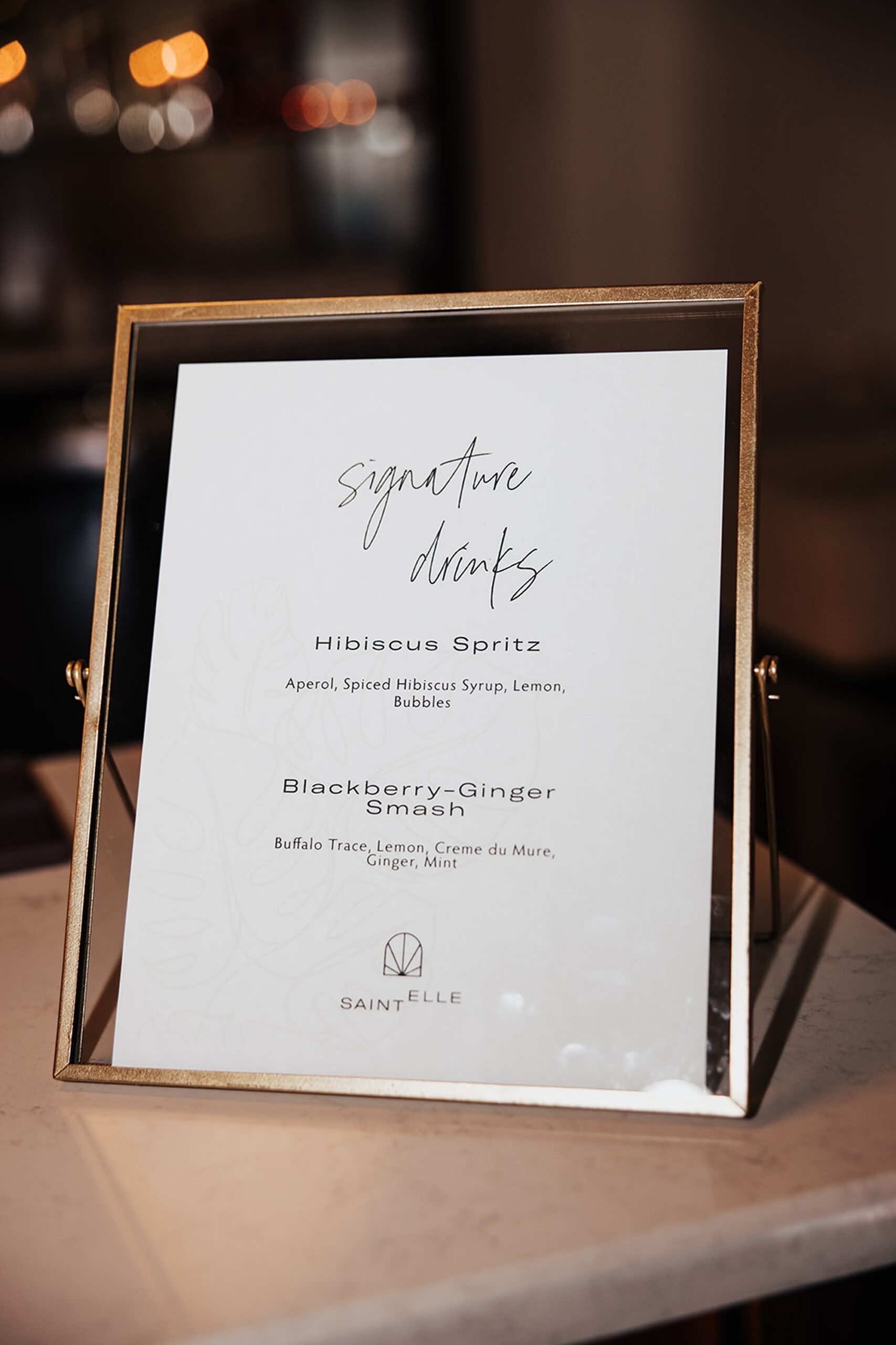
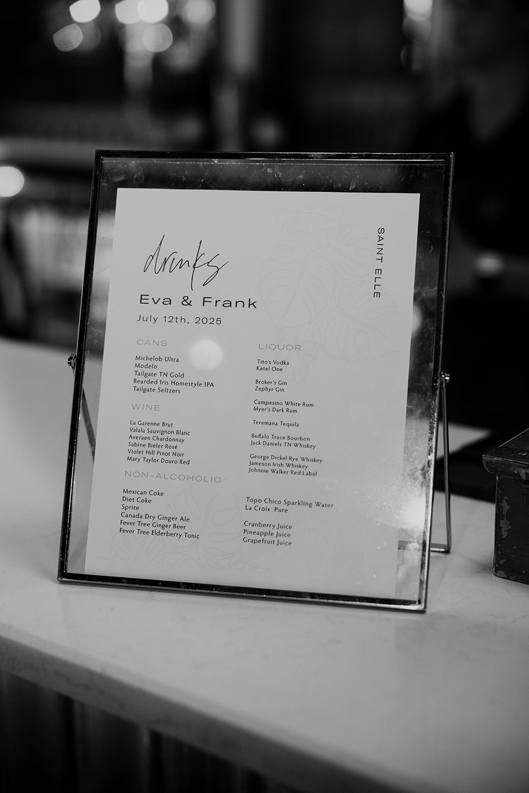
Menus, Bar Signage, & Table Numbers
To round out the day-of details, we carried the black-and-white palette through everything including the welcome sign and classic white menus set against black paper at each place setting. On the elegant tablescape were the table numbers we created that coordinated with the seating chart. The custom bar signage we did featured an adorable illustration of their dog.
Every piece tied back to the invitation suite and the classic, black-and-white destination theme, creating a cohesive, high-end design experience from the moment guests arrived.
This Saint Elle wedding was such a beautiful example of how a classic palette can still feel fresh, modern, and deeply personal. Between the black-and-white details, meaningful installations, and thoughtful touches throughout the day, Eva and Francesco created a celebration that was elevated but still uniquely theirs. It was such an honor to bring their vision to life by designing their invitations and day-of-details.
If you’re planning a wedding in Nashville, or anywhere in the world, we’d love to help you create meaningful, personalized stationery and event details that tell your story.
We work with couples worldwide to design details you and your guests will remember forever. Reach out today to learn more about our full-service wedding and event design offerings! We can’t wait to create something unforgettable for you!
If you enjoyed this post, you’ll love these other blogs!
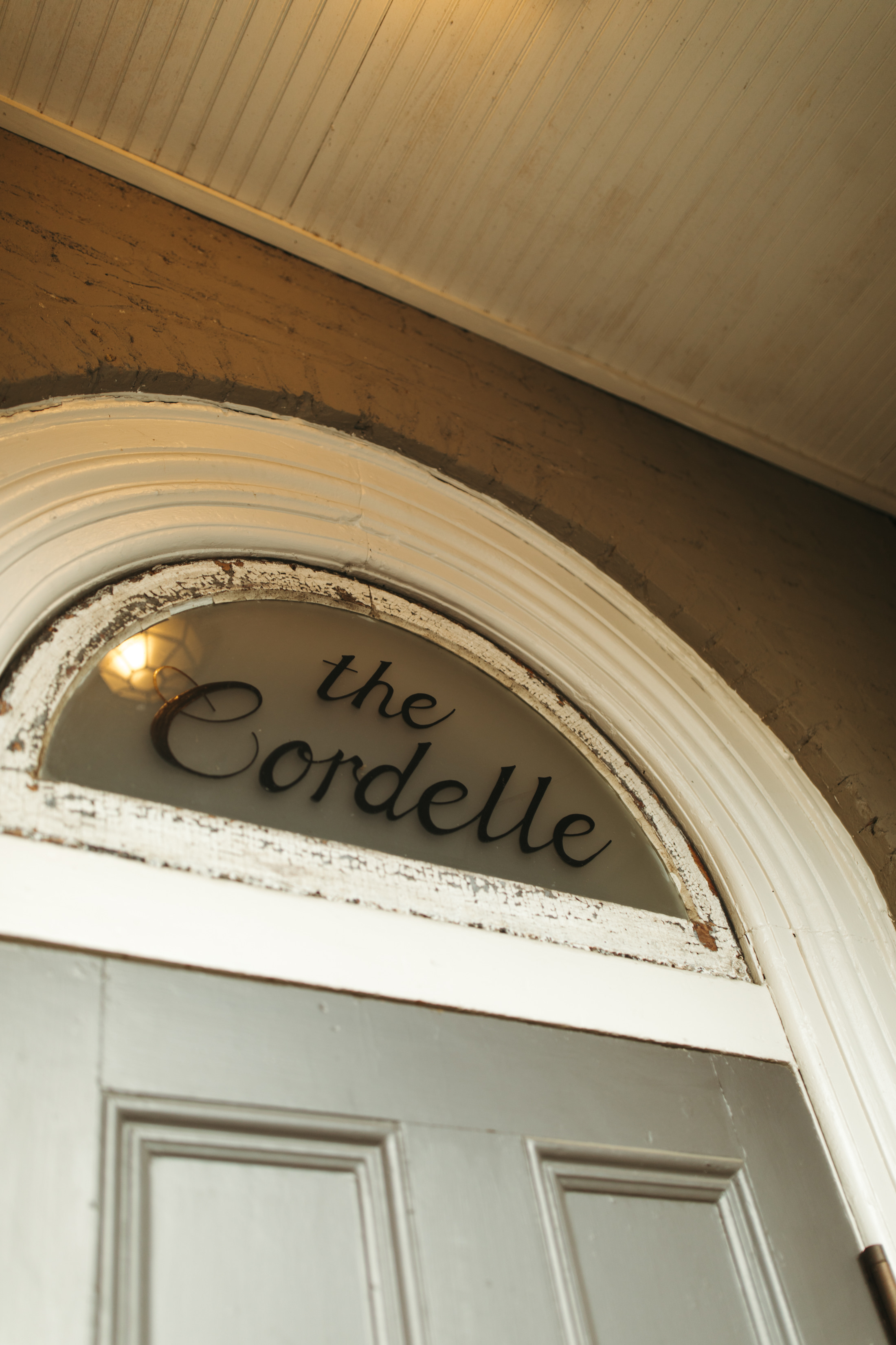
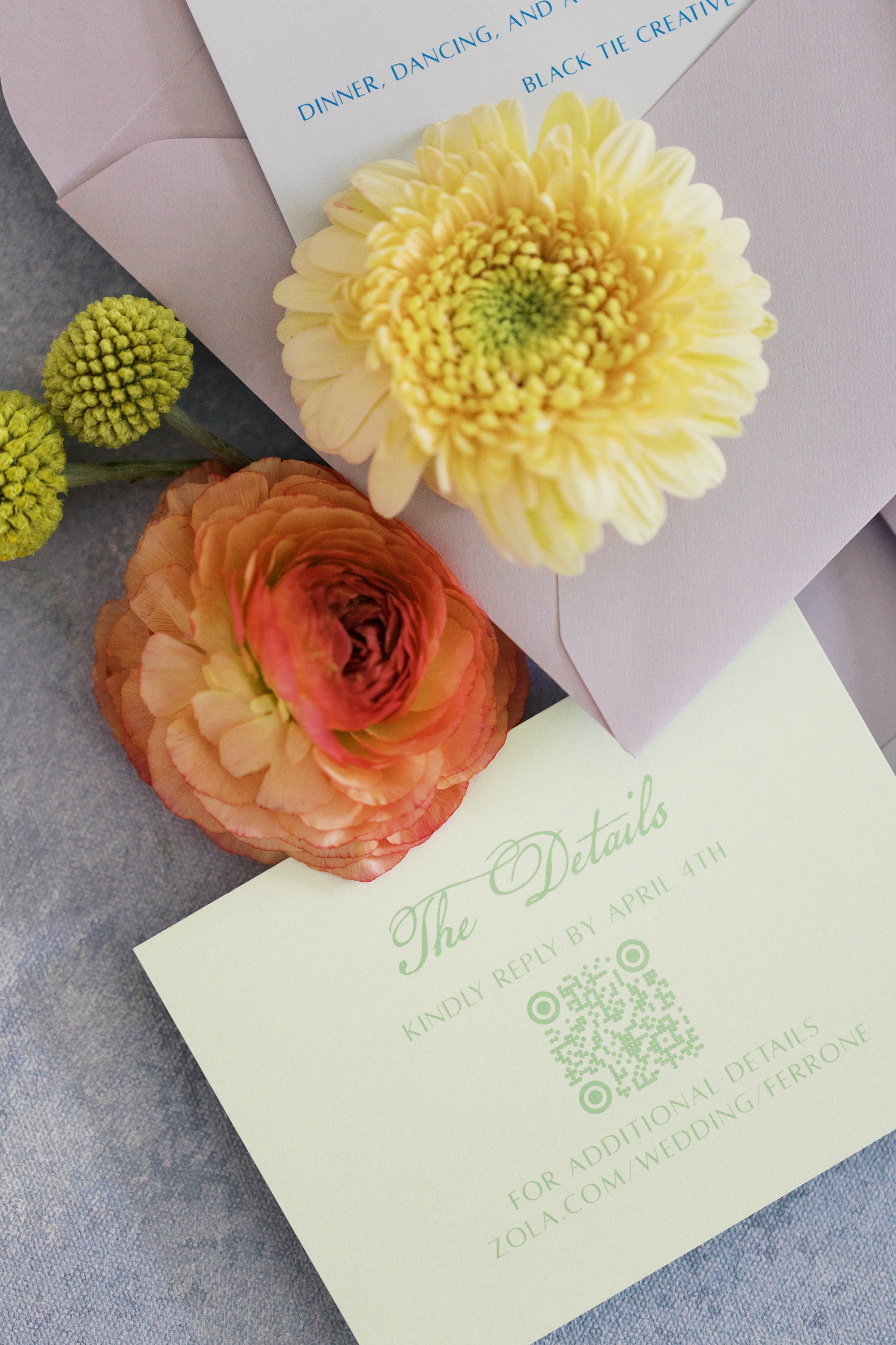
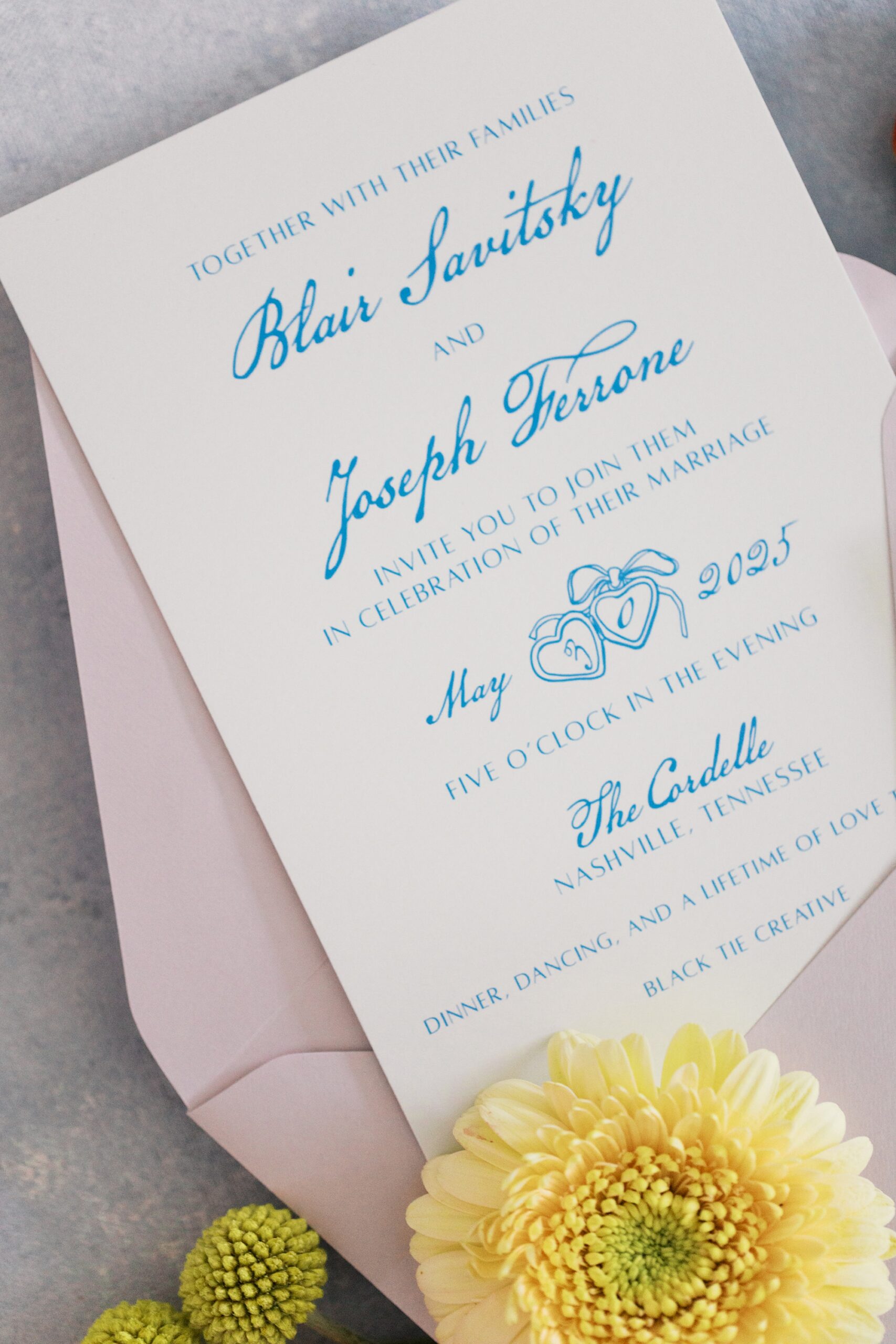
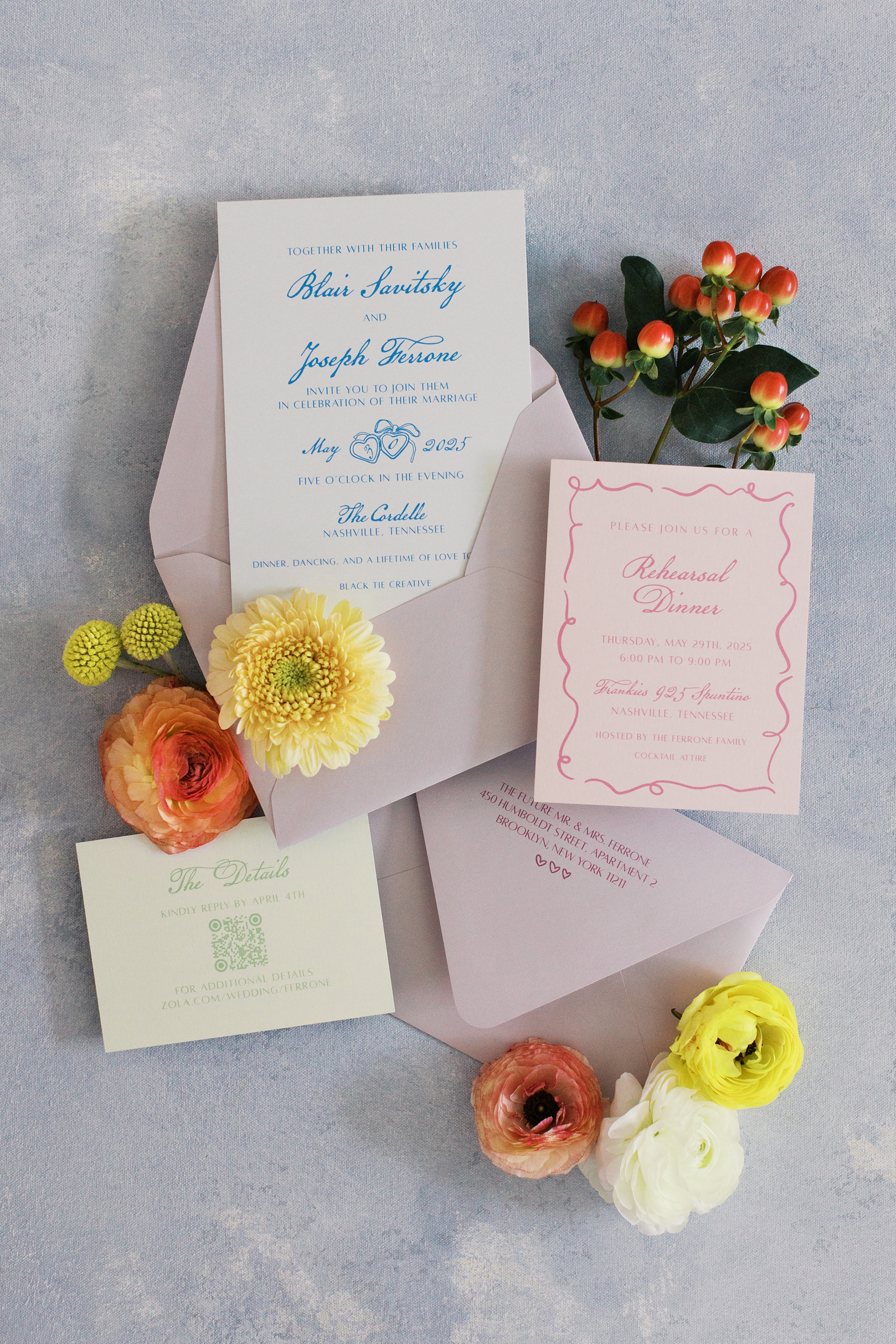
This Nashville wedding at The Cordelle was full of personality, color, and creative design. It perfectly reflected the couple’s playful spirit and love for music. As a team that loves weaving meaning into every detail, we had the best time bringing their vision to life through a collection of custom stationery and day-of details that felt both fun and elevated.
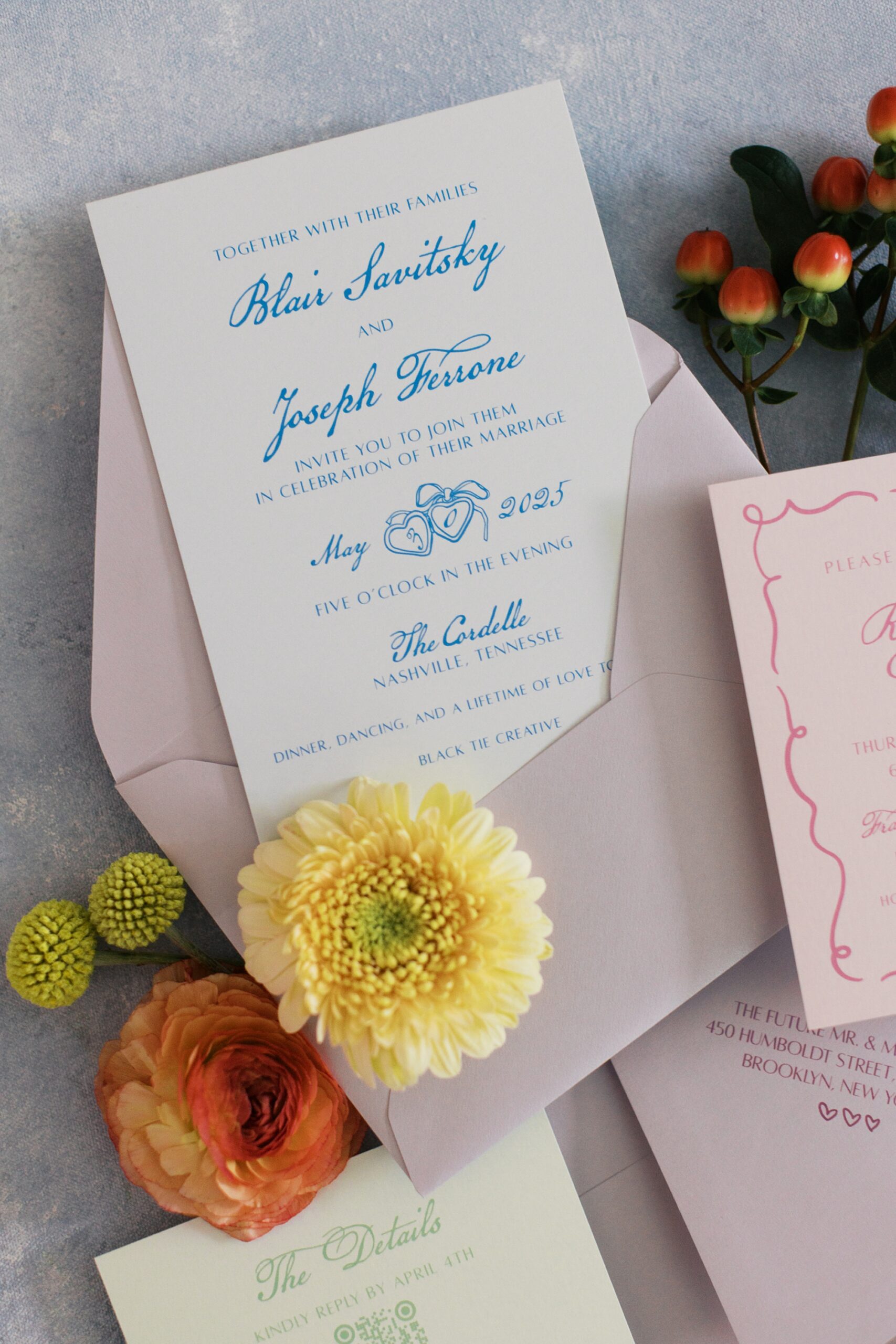
Fun and Playful Invitations
The couple lives in New York but loves the city of Nashville, and chose it as their wedding destination! Their invitation suite set the tone from the very beginning. We combined blue calligraphy on crisp white paper and lavender envelopes. The light green details card and soft pink rehearsal dinner card added pops of color and gave the suite a fresh, fun, playful feel.
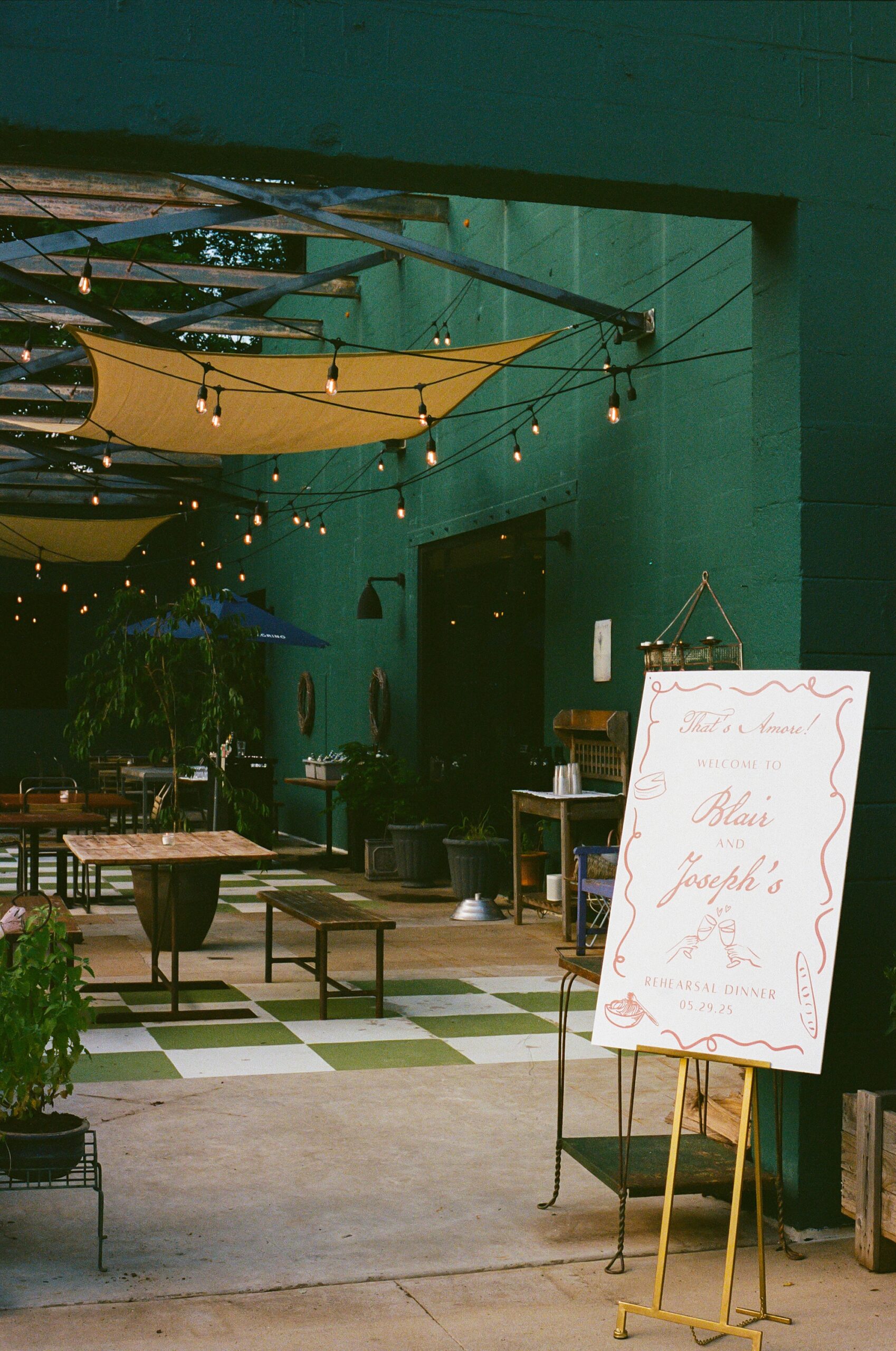
Rehearsal Dinner Welcome Sign
For the rehearsal dinner, guests were welcomed with a custom sign that introduced the weekend’s colorful aesthetic. The border design on the welcome sign also mirrored the border found on the rehearsal dinner card from the invitation suite. It’s truly these tiny details that make your wedding day and that we love to include.
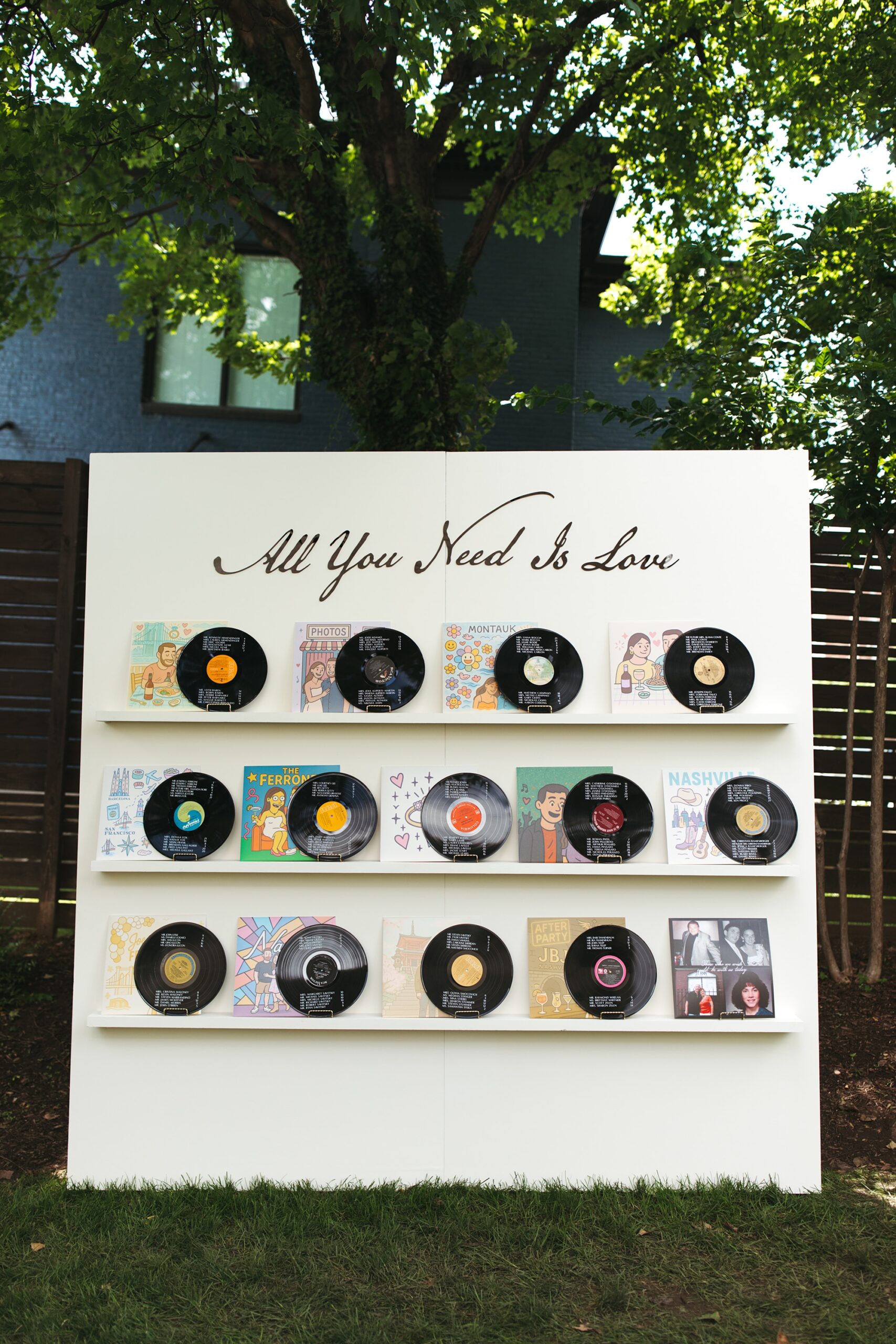
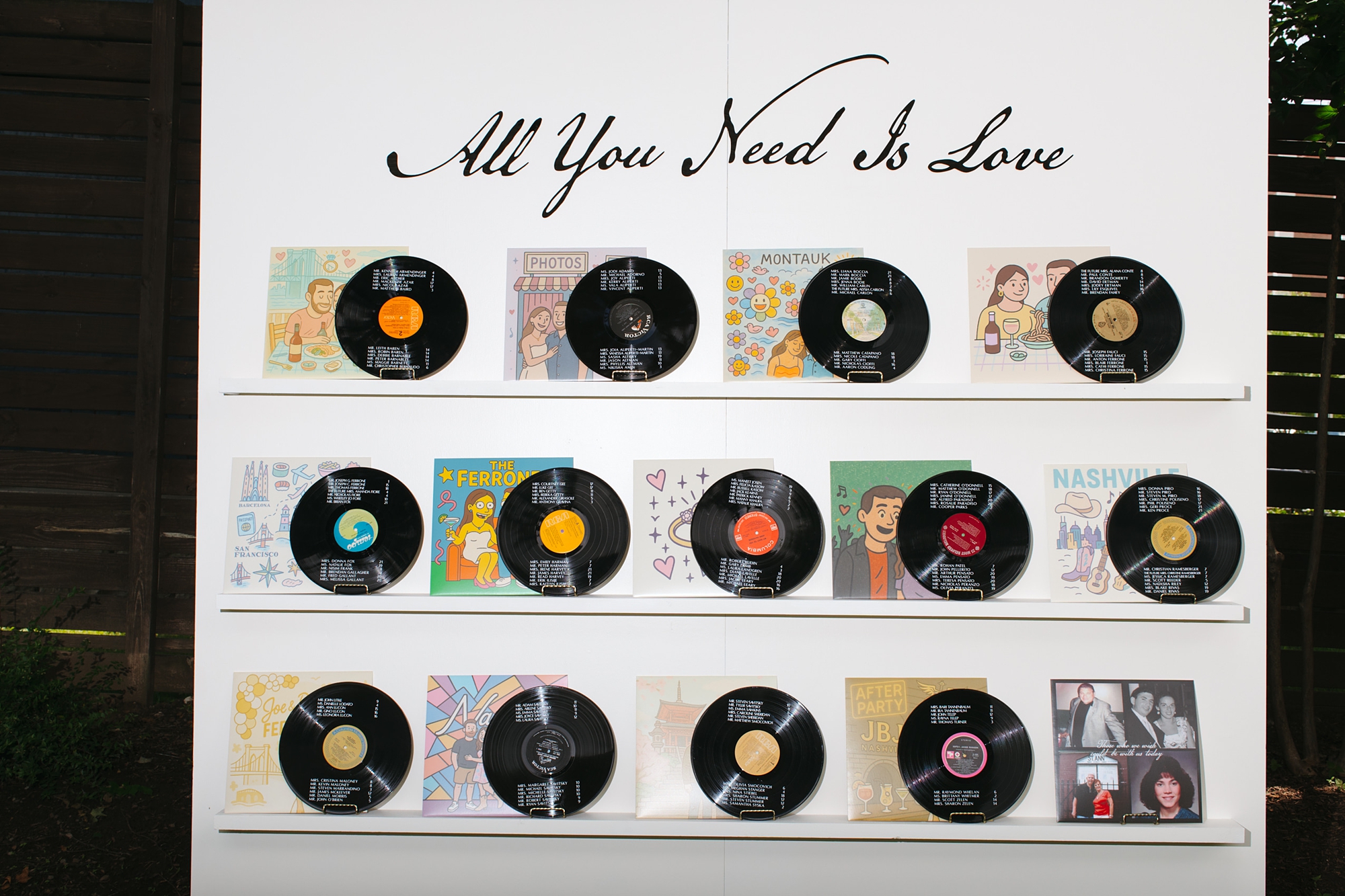
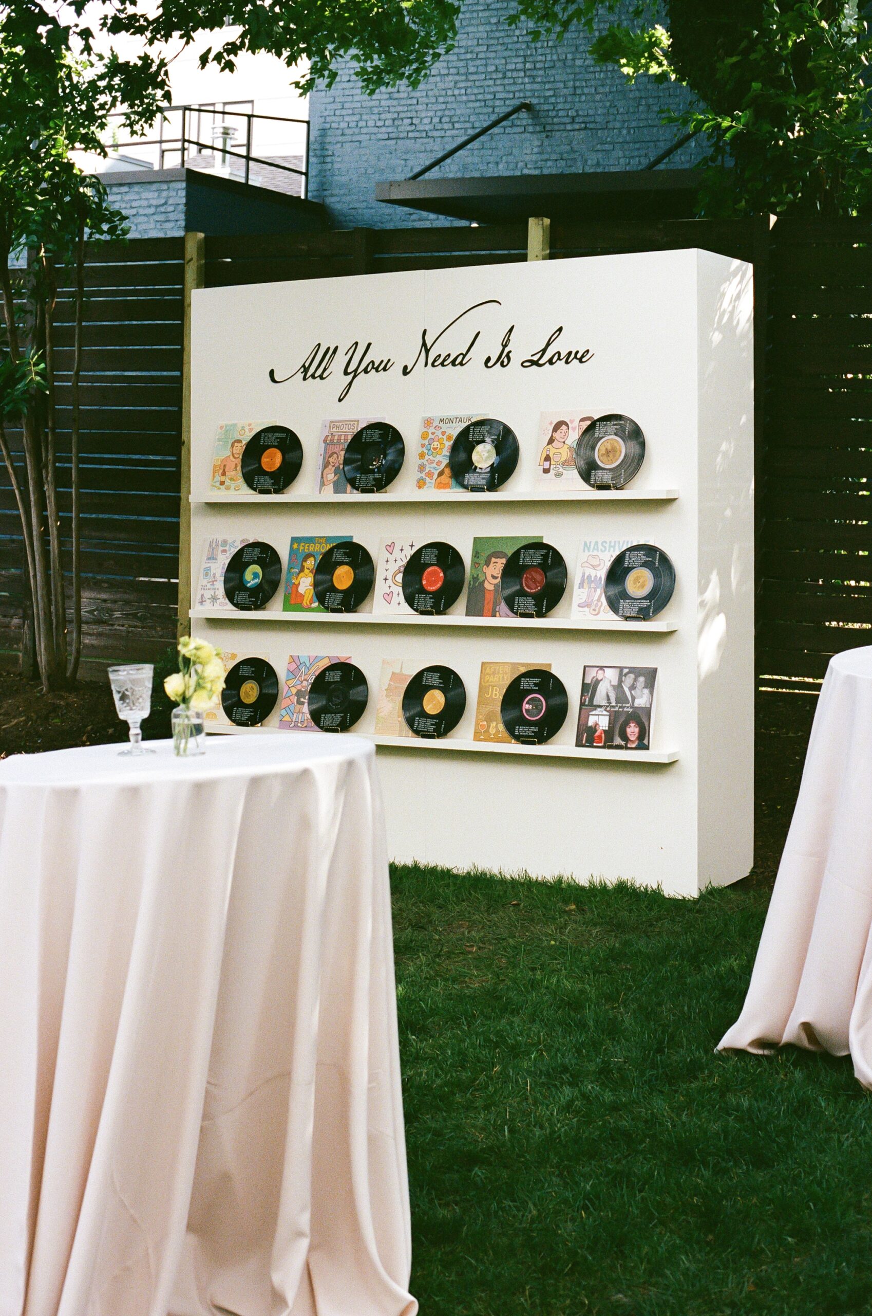
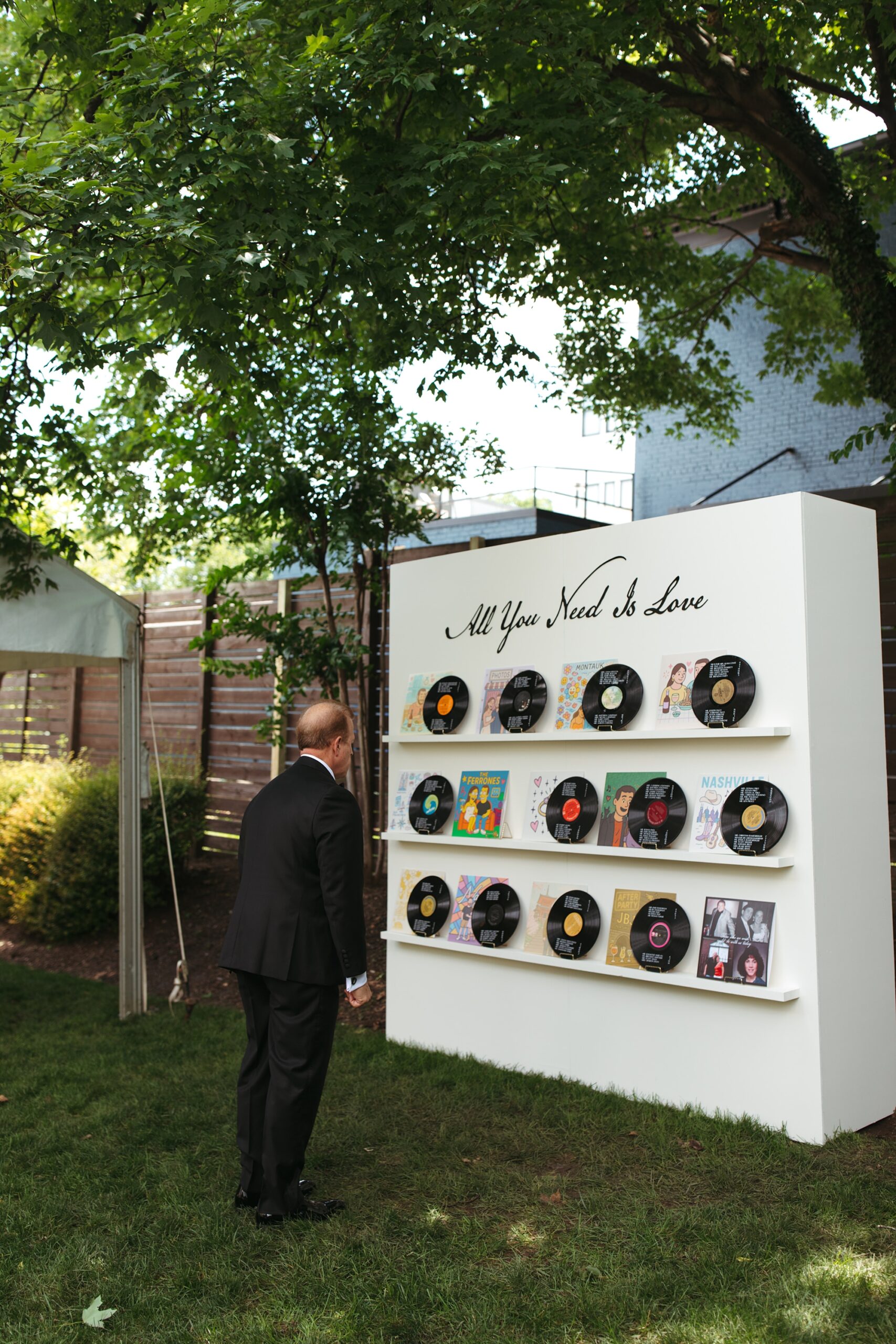
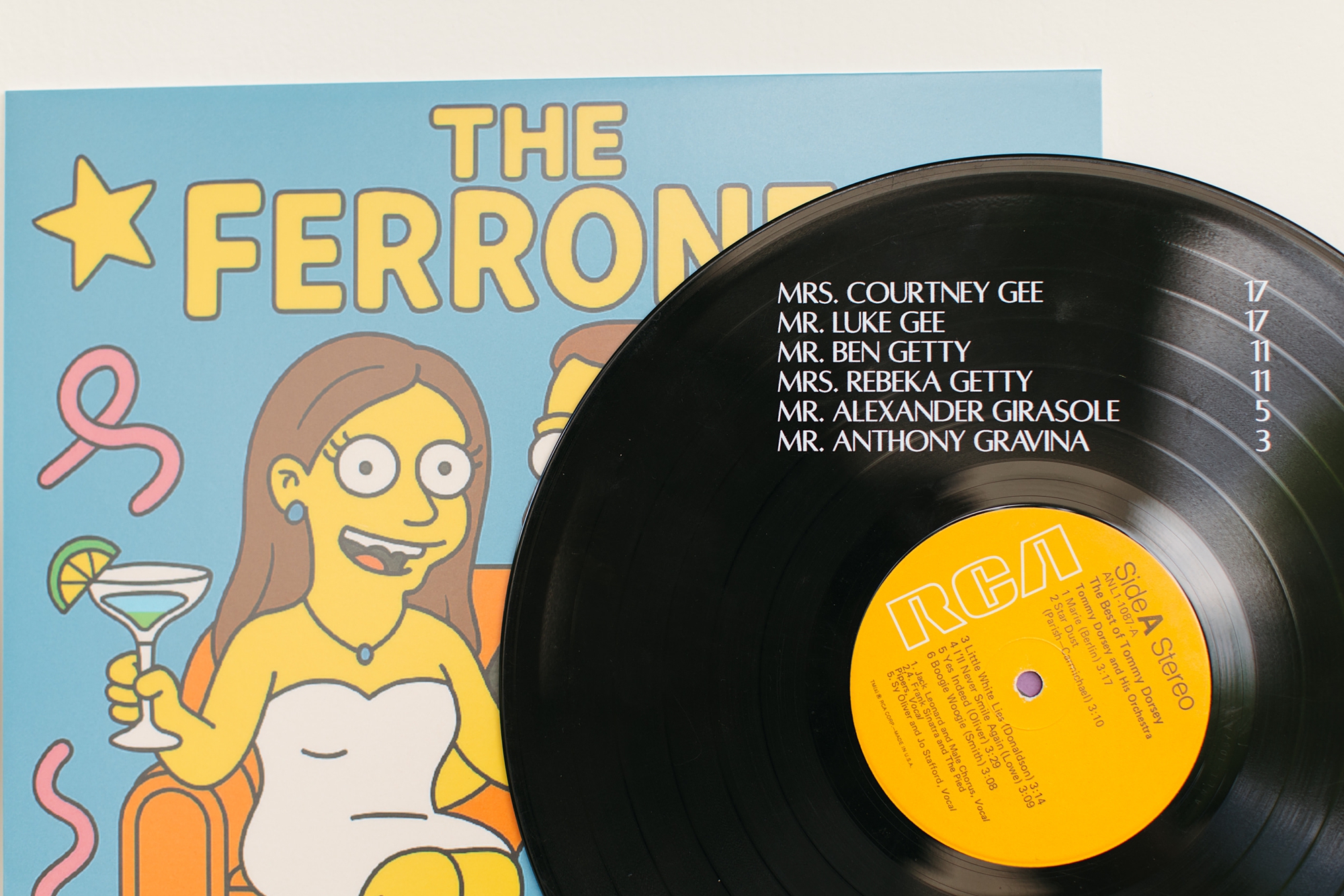
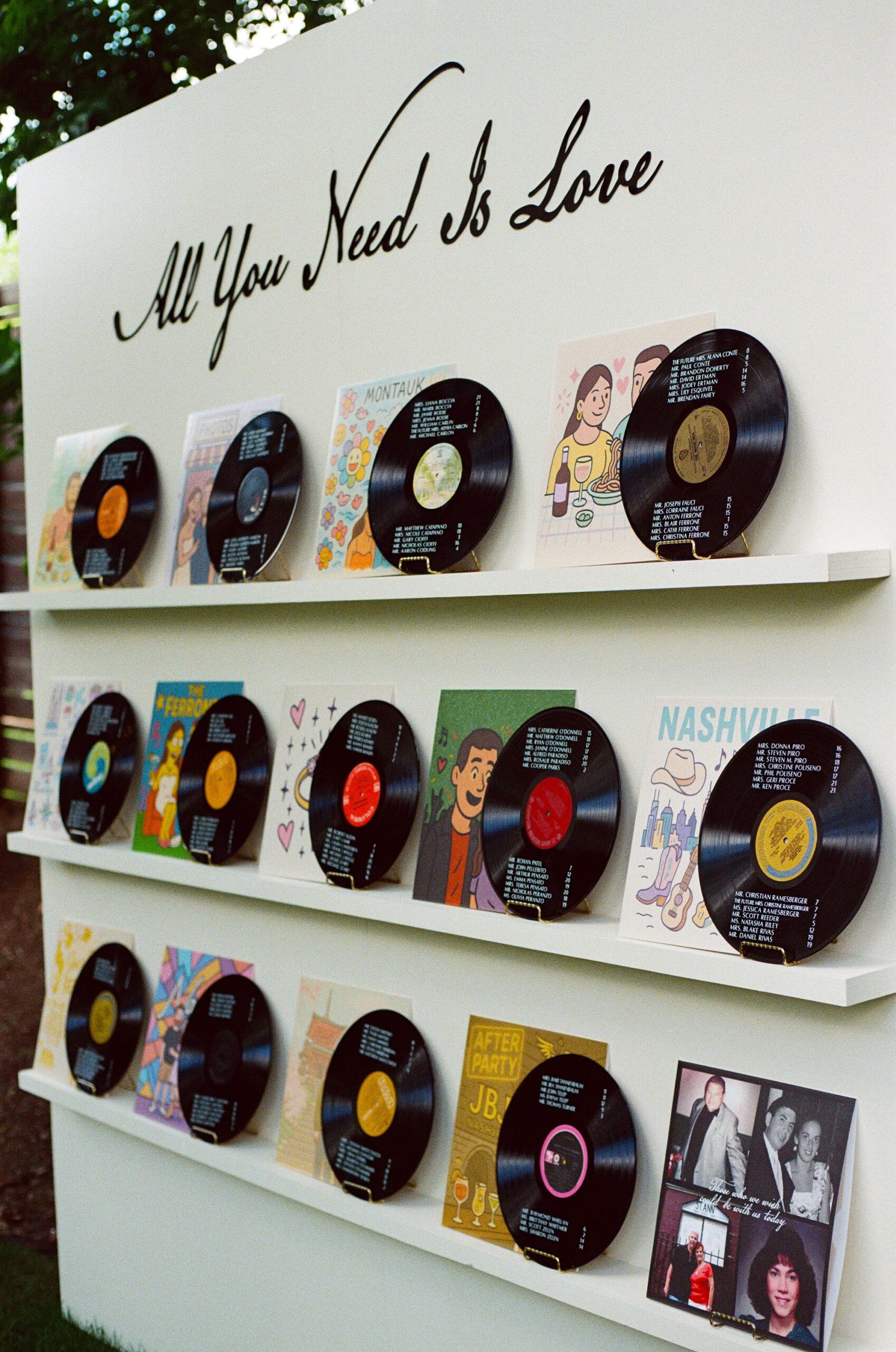
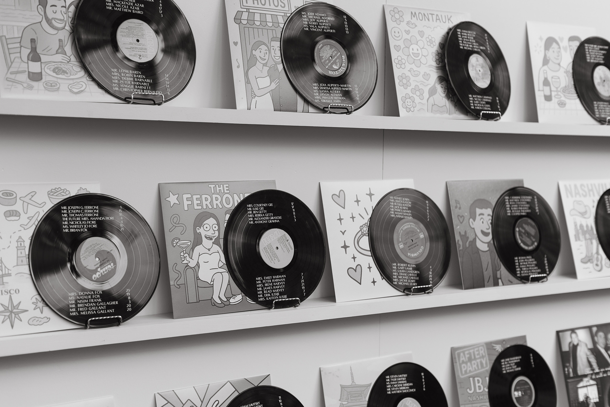
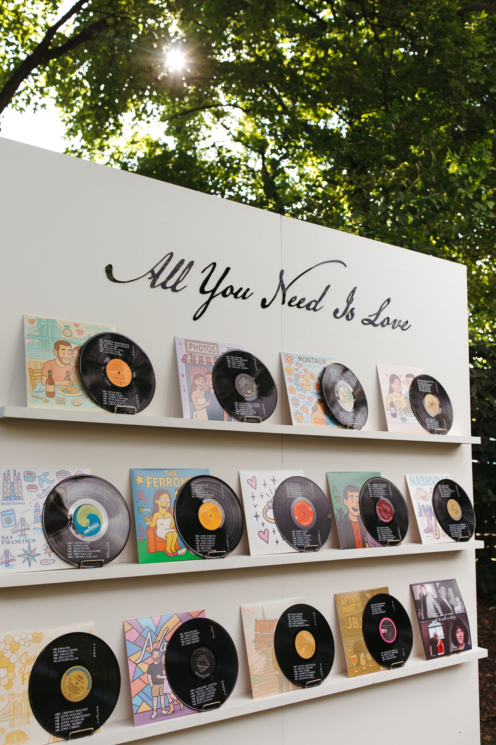
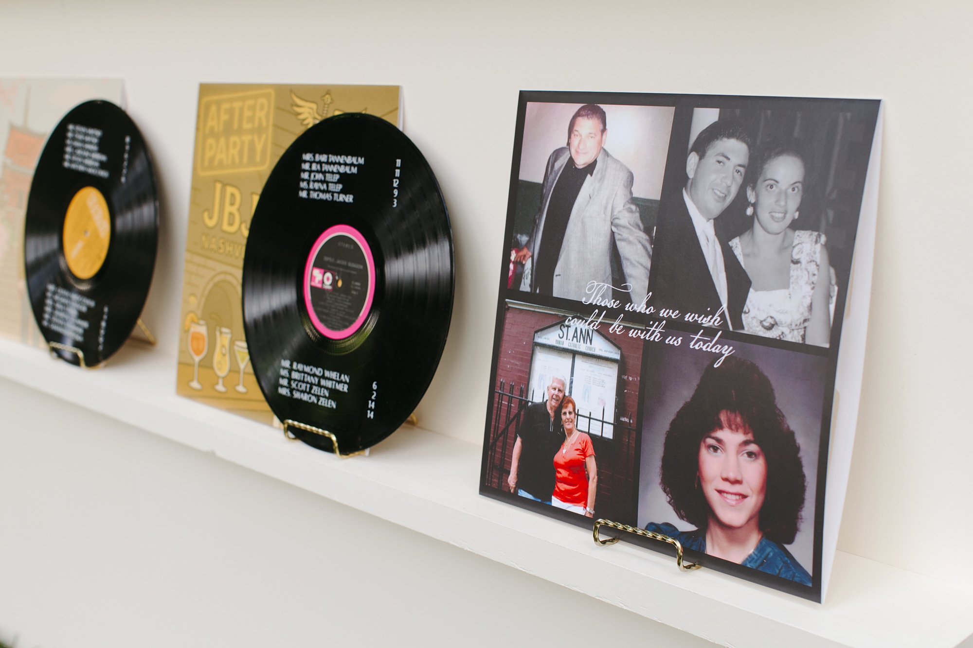
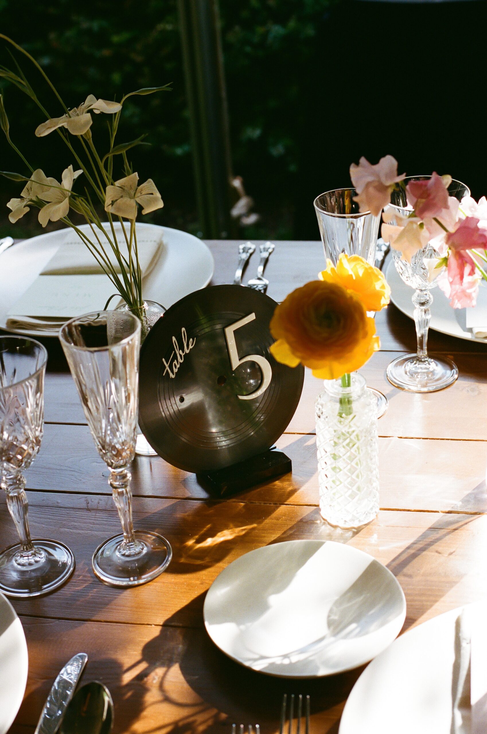
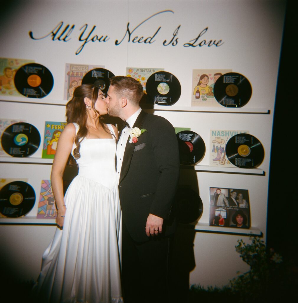
Vinyl Record Wedding Details at The Cordelle
One of our favorite elements was the seating chart wall, which we created entirely from real vinyl records. The couple love vinyl records and color, so naturally we paired the two and leaned into the city’s musical energy while highlighting their love story. Each guest’s name and table assignment were displayed on the vinyl record, and each album cover artwork depicted a special moment in their love story! All of this was beautifully displayed on a white installation with The Beatles song lyrics “All you need is love” written above the display.
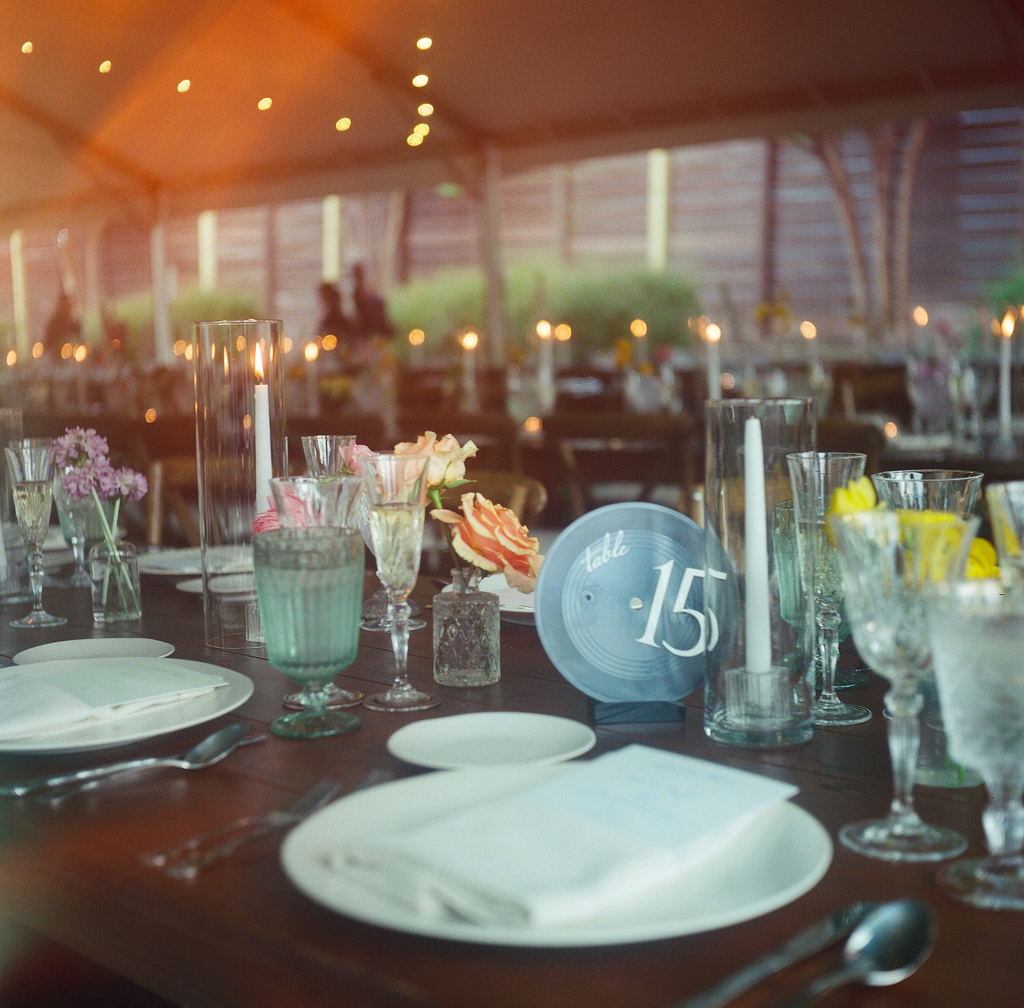
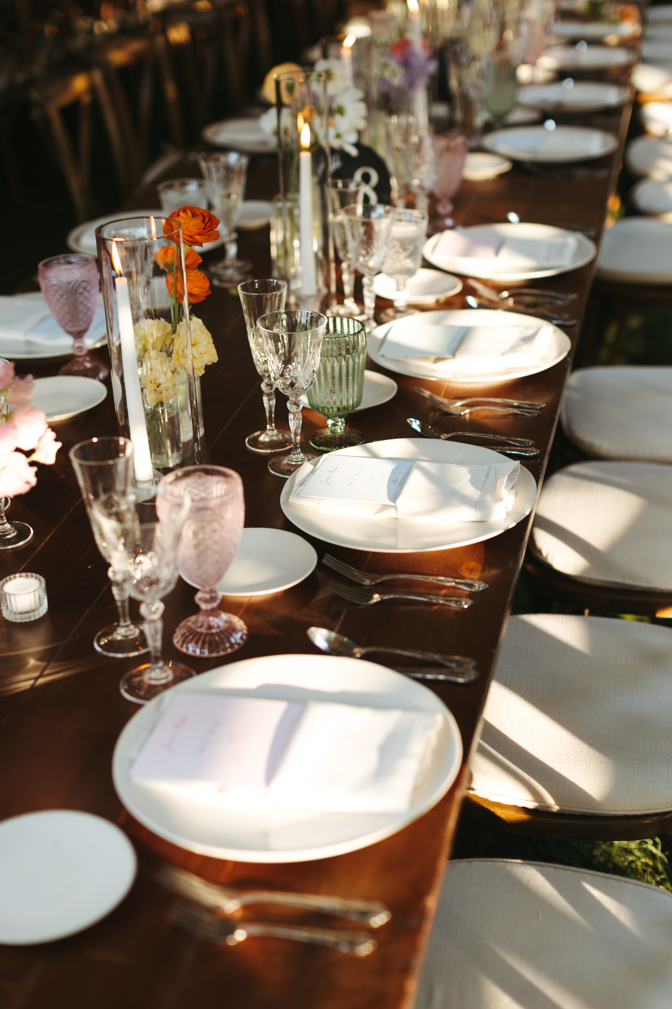
We kept the vinyl record theme going by using them as table numbers as well, tying the whole concept together beautifully. I just love these design concepts that are carried throughout the day! At the dinner table, you could also find the custom menus we created tucked into light pink napkins.
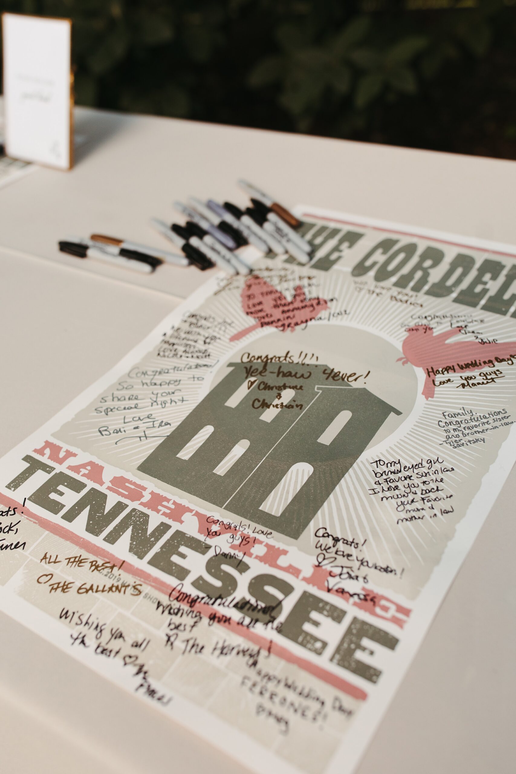
To honor Nashville’s creative roots, we also designed a hatch print–inspired poster for the guestbook. Guests were able to sign the poster as a keepsake for the couple.
This wedding was such a joy to design! We love creating wedding details that reflect the couple and tell a story from beginning to end, and this Cordelle wedding was the perfect example of that.
If you’re planning a wedding in Nashville, or anywhere in the world, we’d love to help you create meaningful, personalized stationery and event details that tell your story. We work with couples worldwide to design details you and your guests will remember forever.Reach out today to learn more about our full-service wedding and event design offerings! We can’t wait to create something unforgettable for you!
If you enjoyed this post, you’ll love these other blogs!