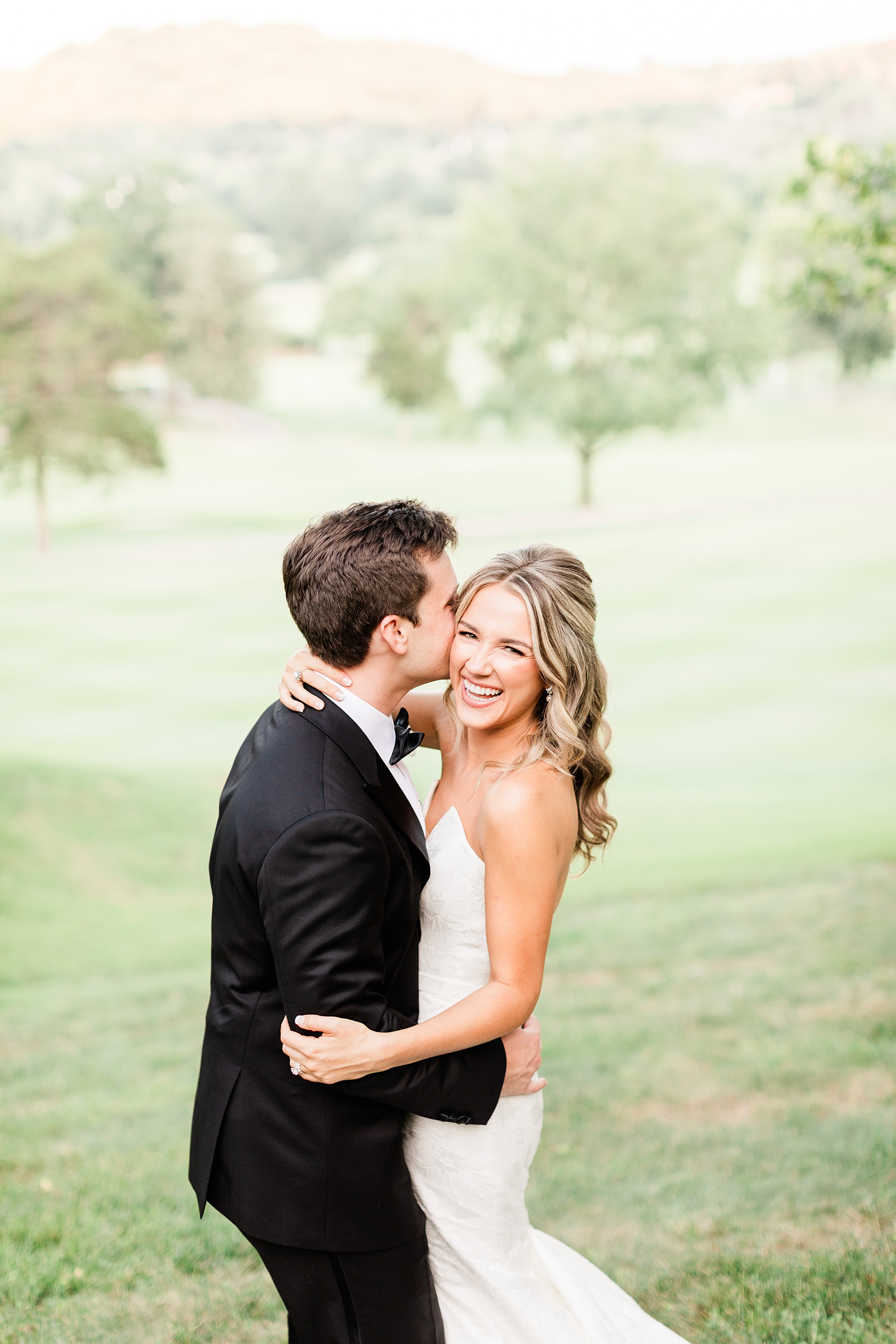
Some weddings feel special from the very beginning, and this Cherokee Dock, Italian-Inspired Wedding was absolutely one of them. The bride is a fellow event industry professional, and we originally met her while she was working at a venue. From that first interaction, we completely fell in love with her. When she reached out about designing the details for her own wedding, it felt like such an honor to be part of the team bringing her vision to life.
Her inspiration for the wedding details was Italian-esque with a timeless, elegant edge. The design leaned into classic textures and thoughtful details with meaningful touches.
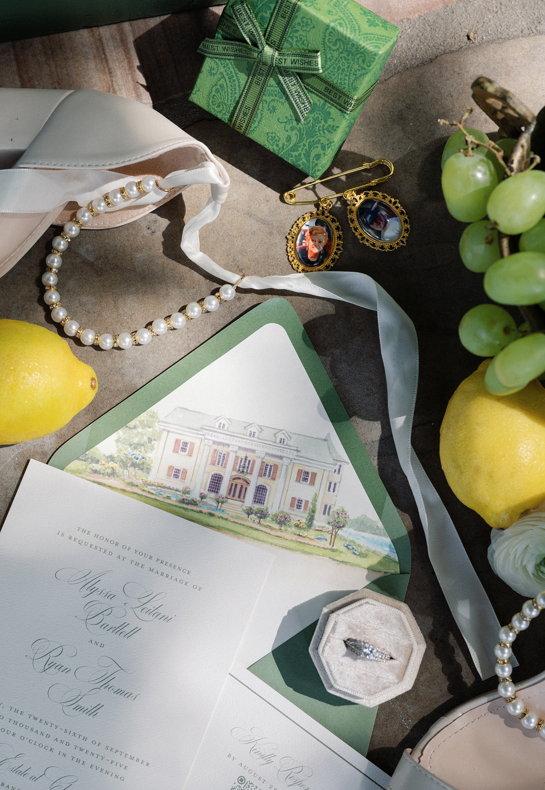
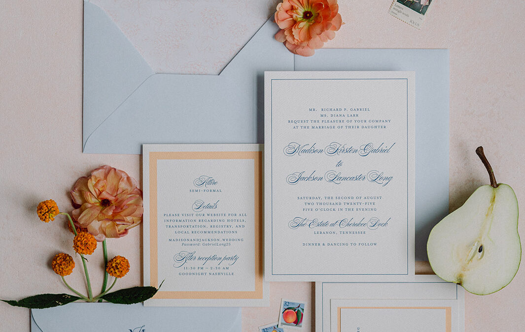
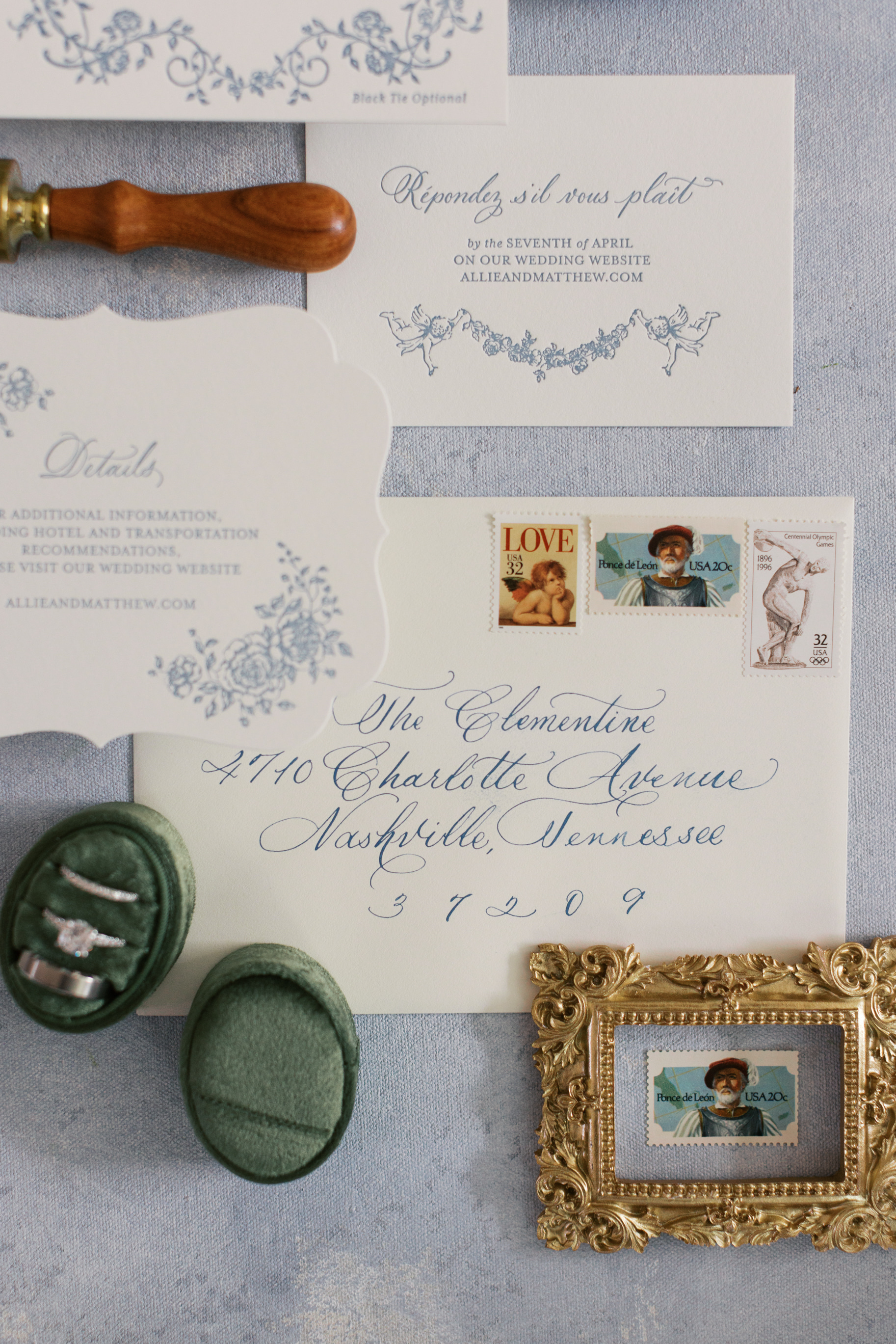
Invitations Inspired by Cherokee Dock
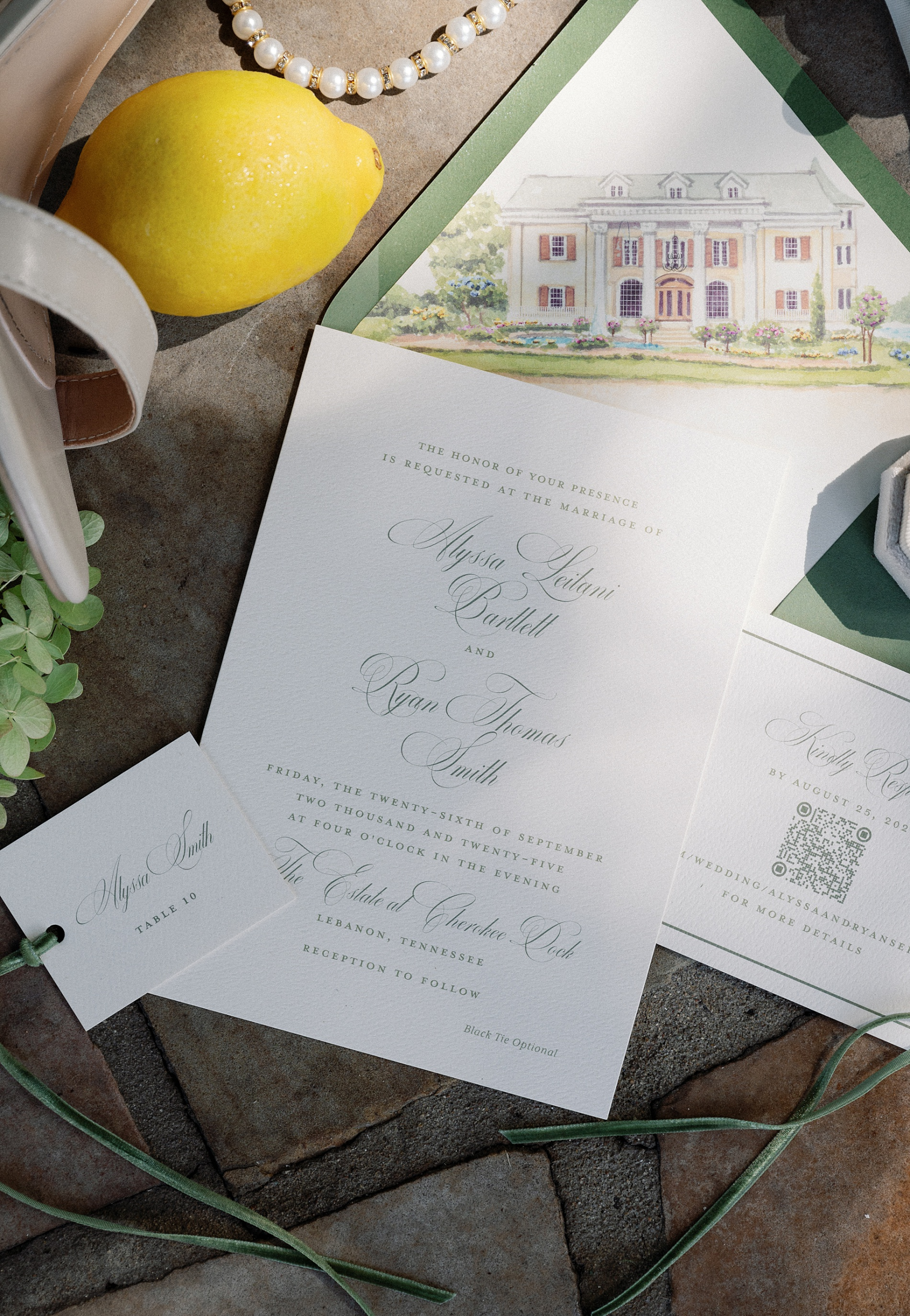
The invitation suite introduced guests to the aesthetic of the day before they ever arrived at the venue. The main invitation was printed on crisp white paper with soft green calligraphy, creating a look that felt both fresh and classic.
Inside the envelope, guests discovered a custom envelope liner featuring artwork of Cherokee Dock, the stunning Tennessee wedding venue where the celebration would take place.
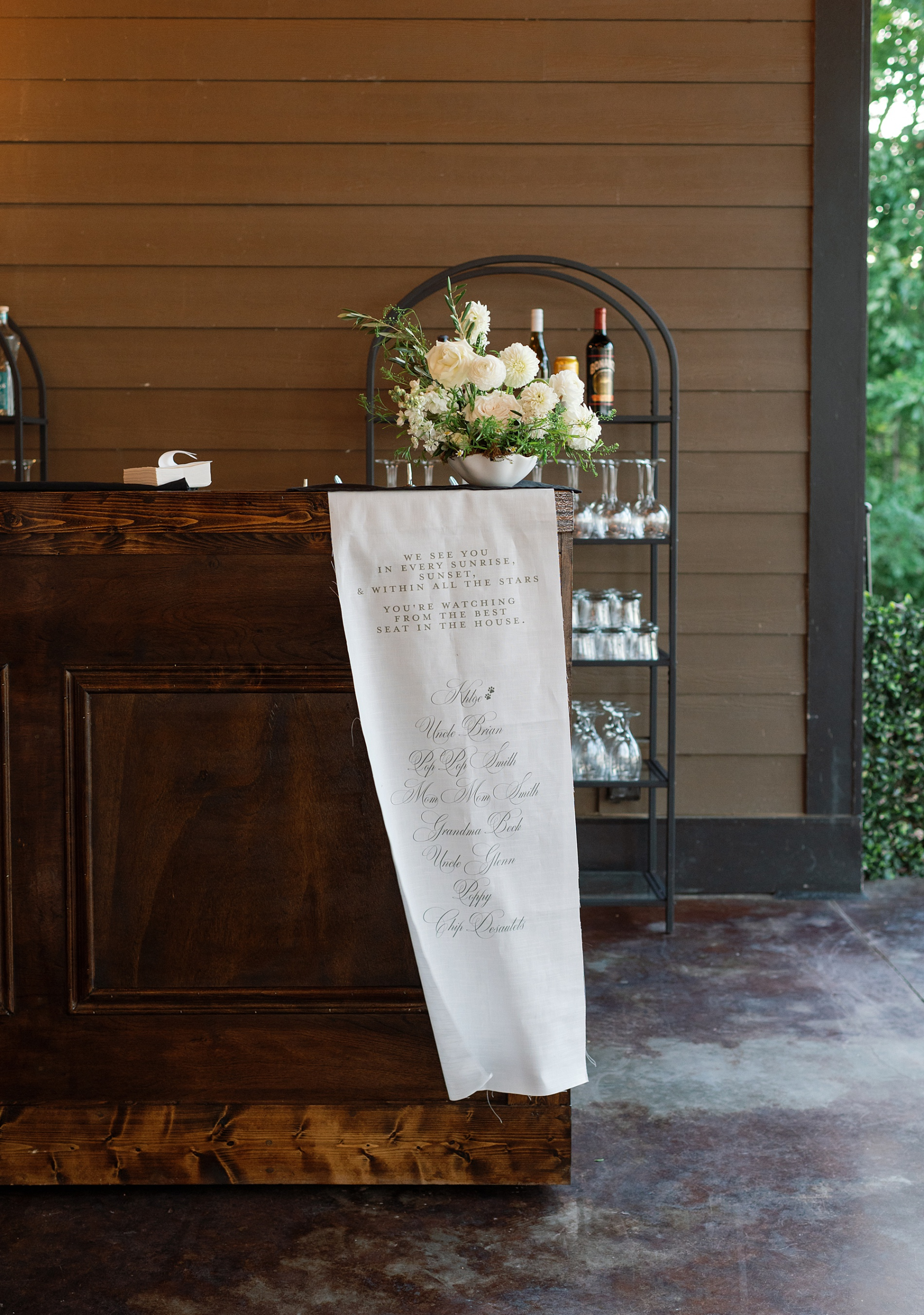
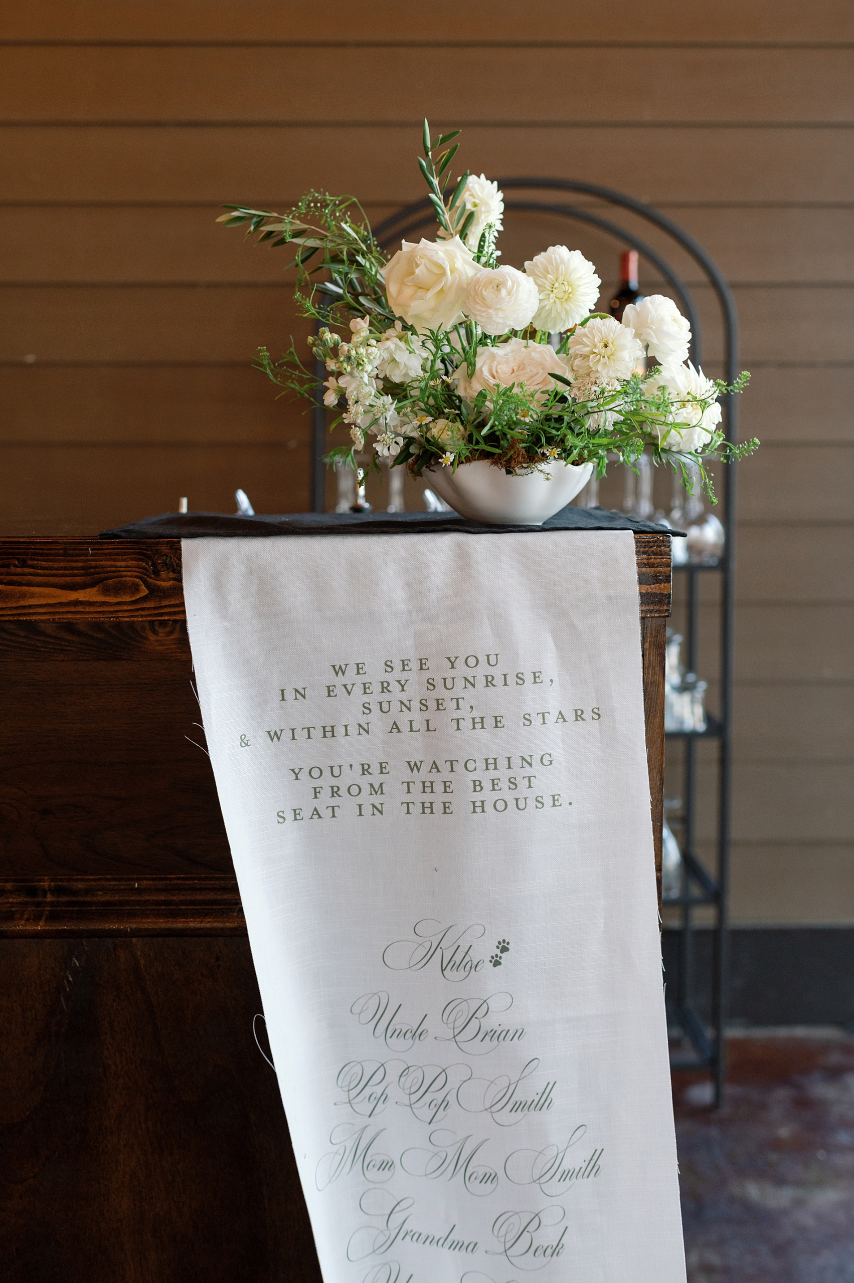
Ceremony Details
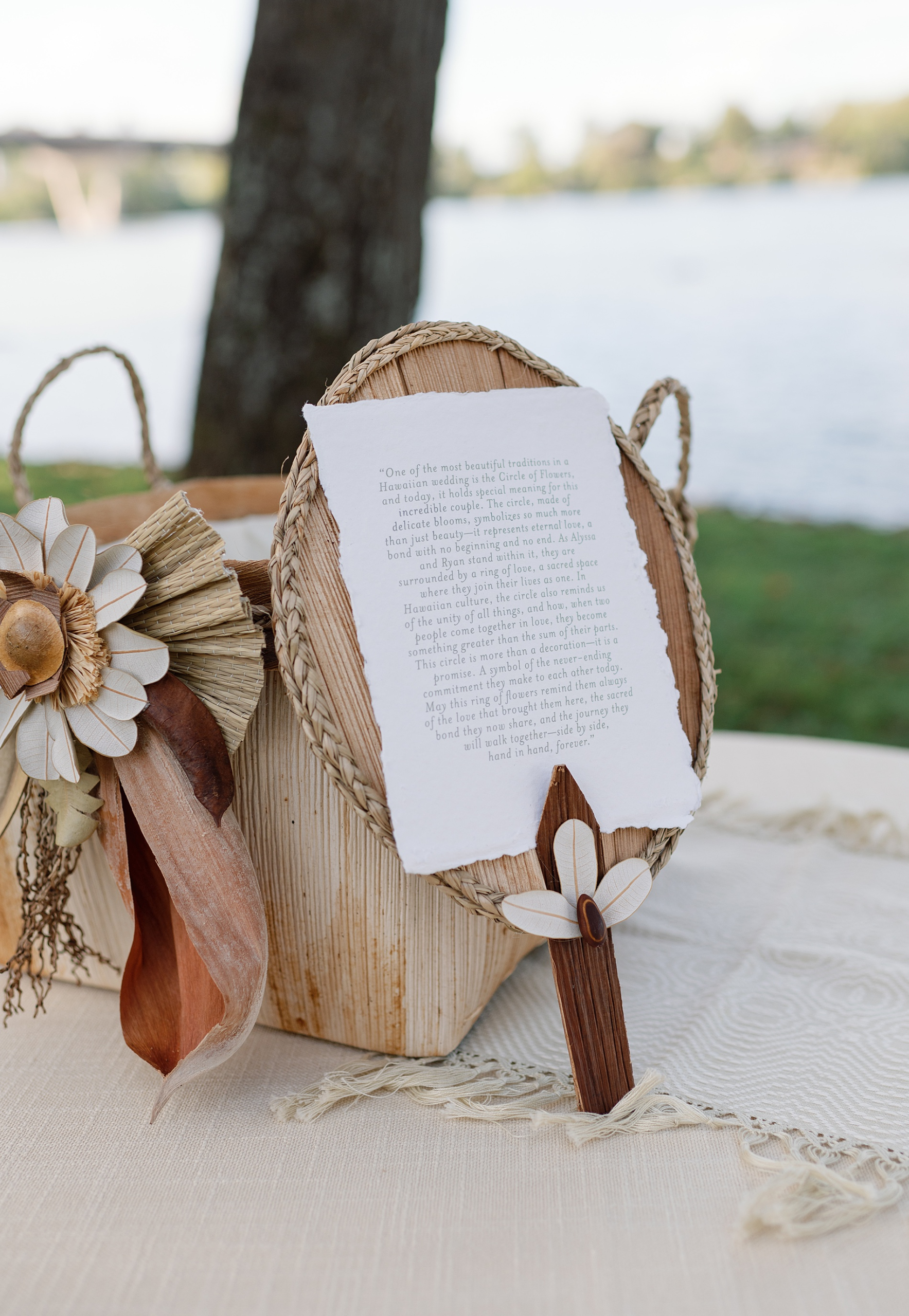
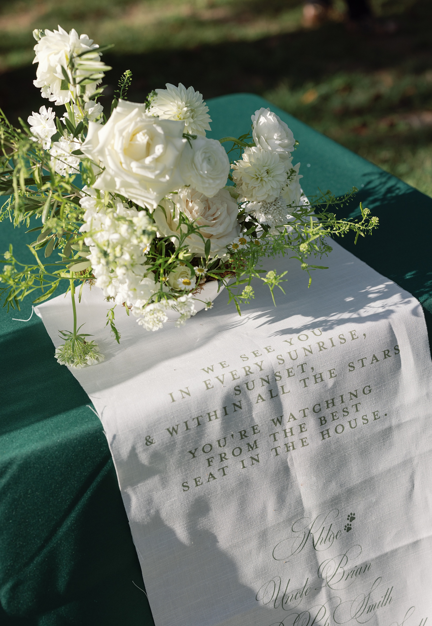
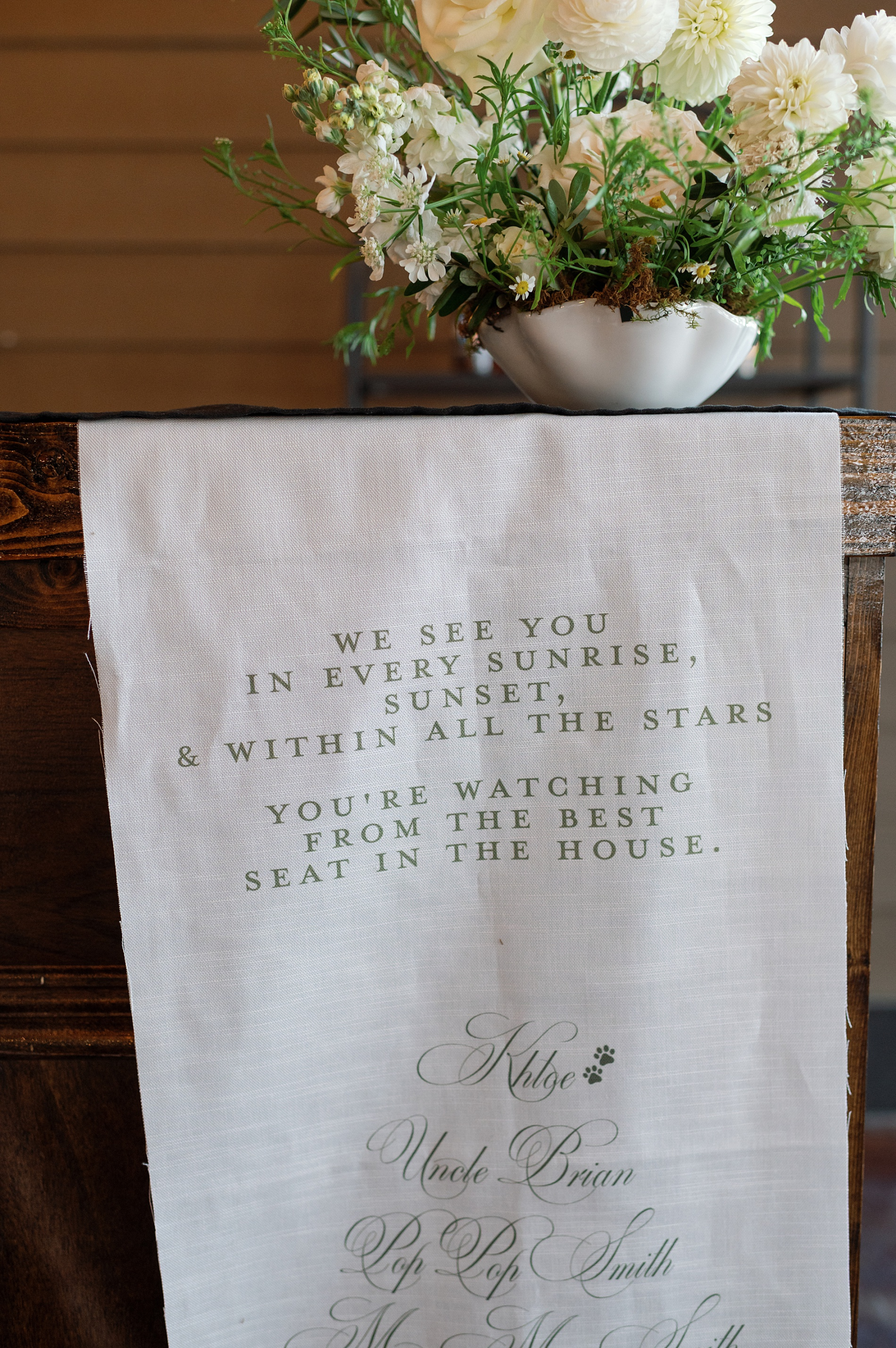
Another special element we created for the ceremony was a flowing fabric memorial sign. Fabric signage has such a soft, romantic presence, and this piece offered a meaningful way to honor loved ones who could not be there.
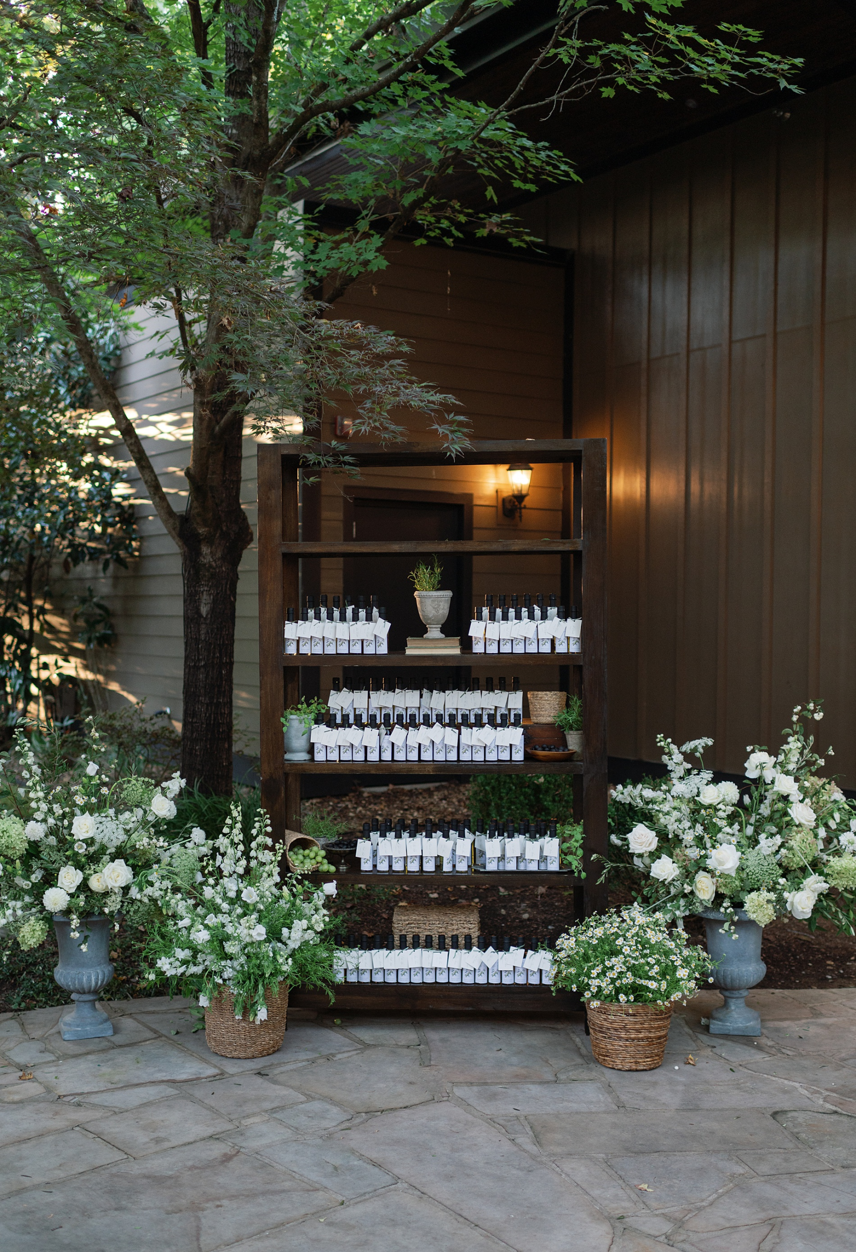
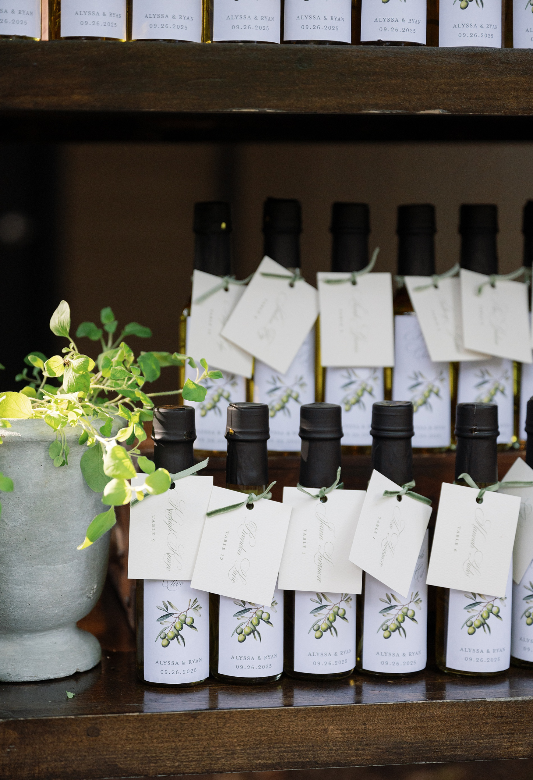
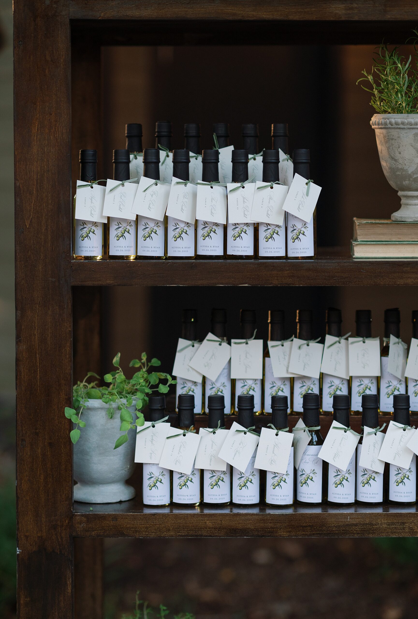
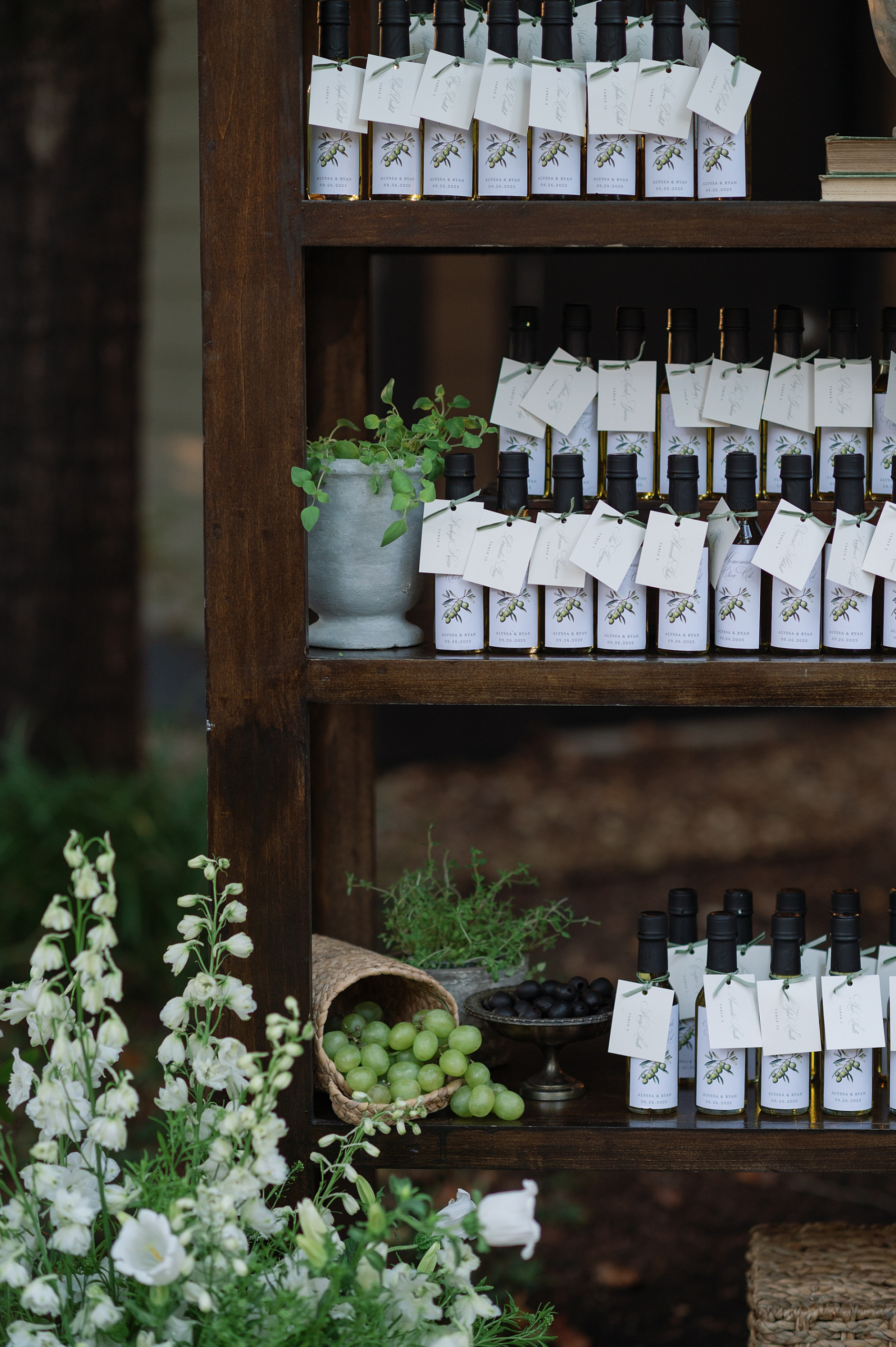
Custom Olive Oil Seating Chart
One of the most memorable elements of the wedding design was the seating chart. Rather than a traditional display, the couple chose something far more personal and interactive.
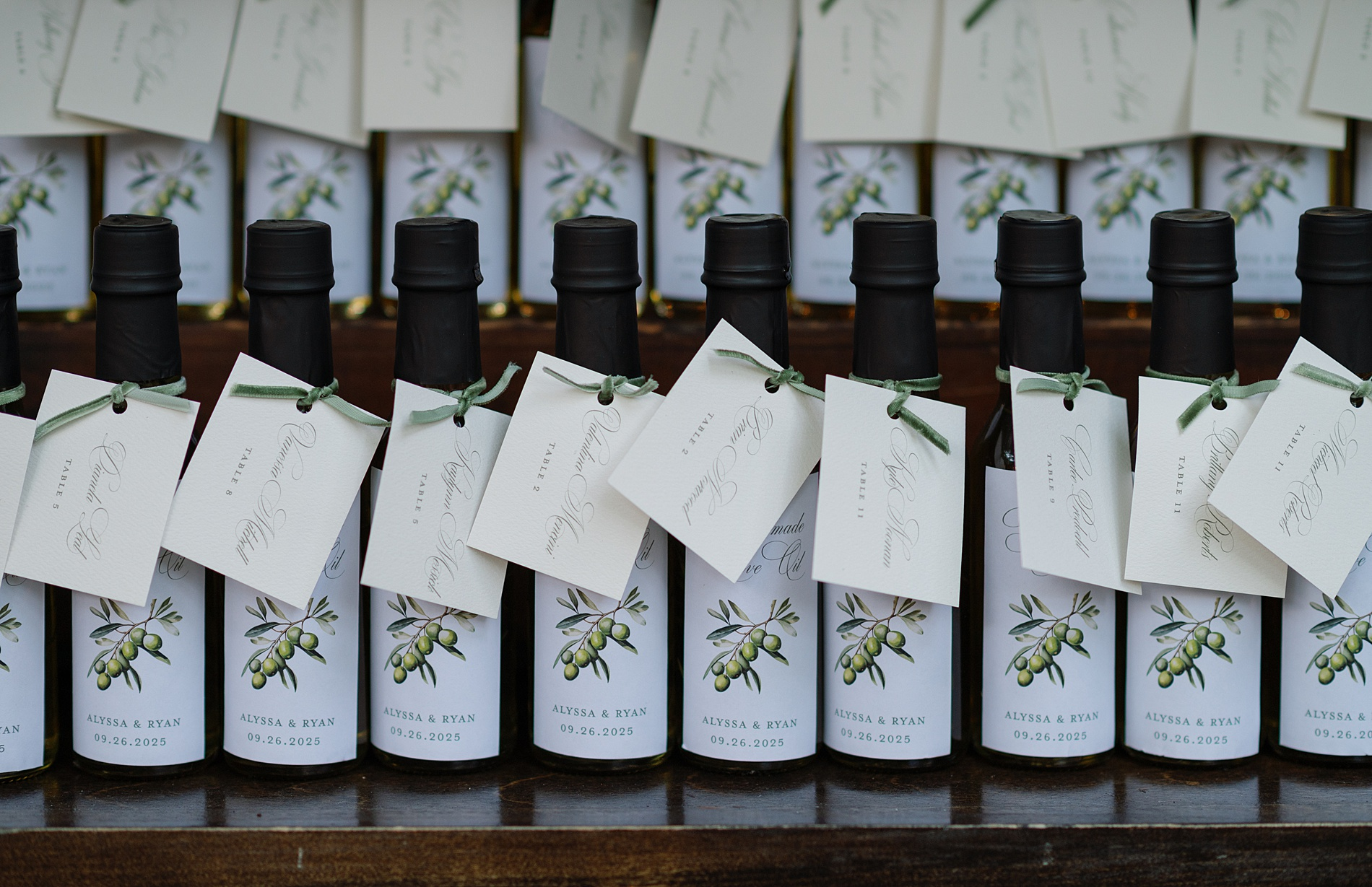
Guests found their table assignments attached to small jars of olive oil, which doubled as their wedding favors. Even more meaningful, the olive oil had been made by a member of the couple’s family.
These kinds of seating charts are some of our favorites to design because they serve multiple purposes by guiding guests, telling a story, and leaving everyone with a thoughtful gift from the day.
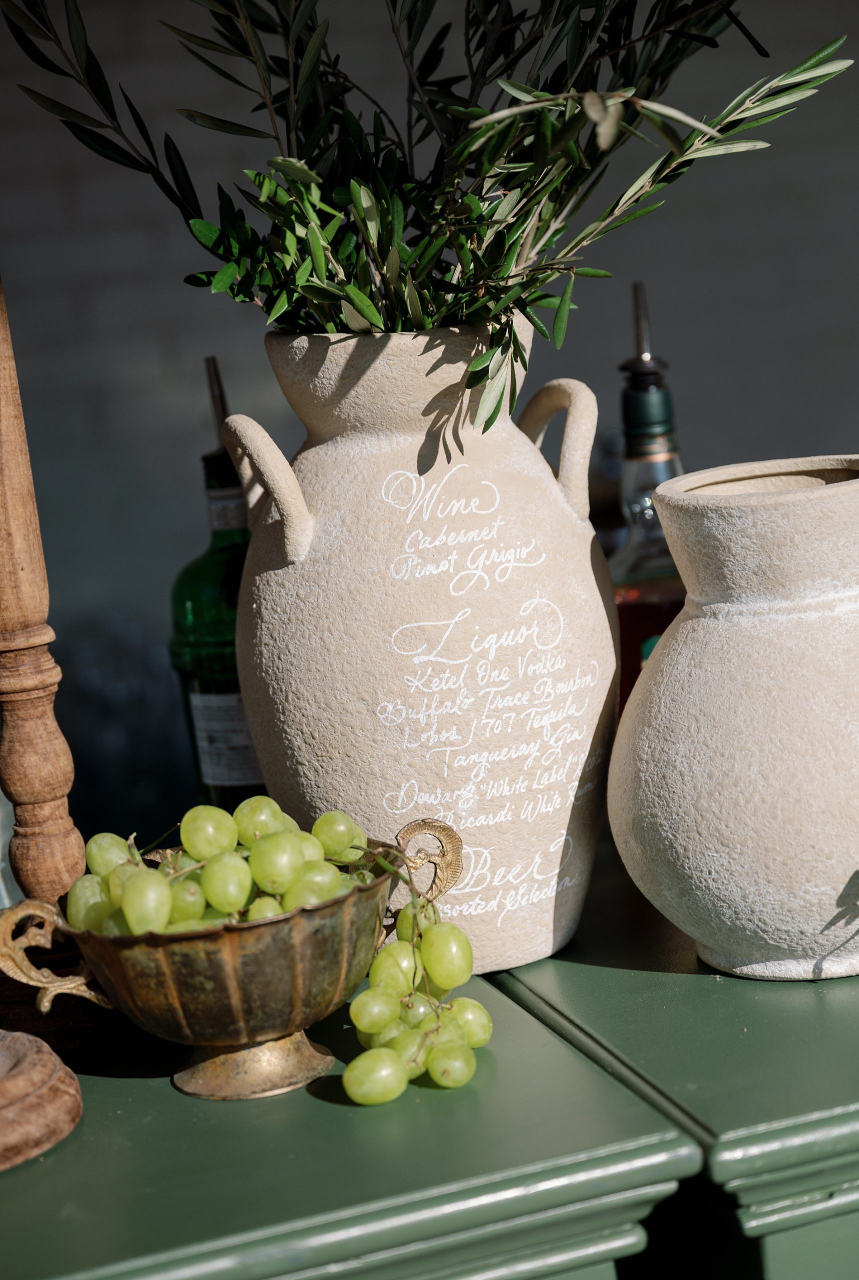
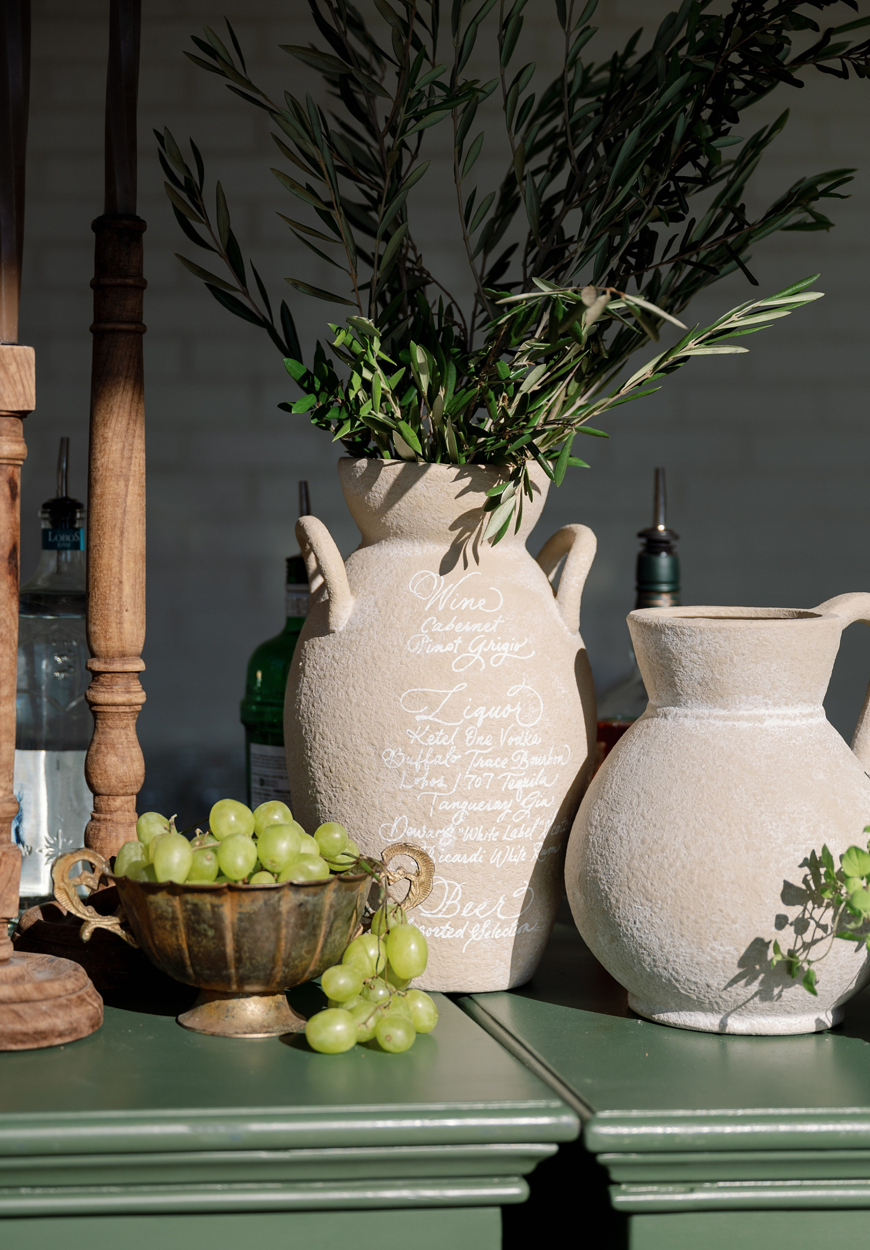
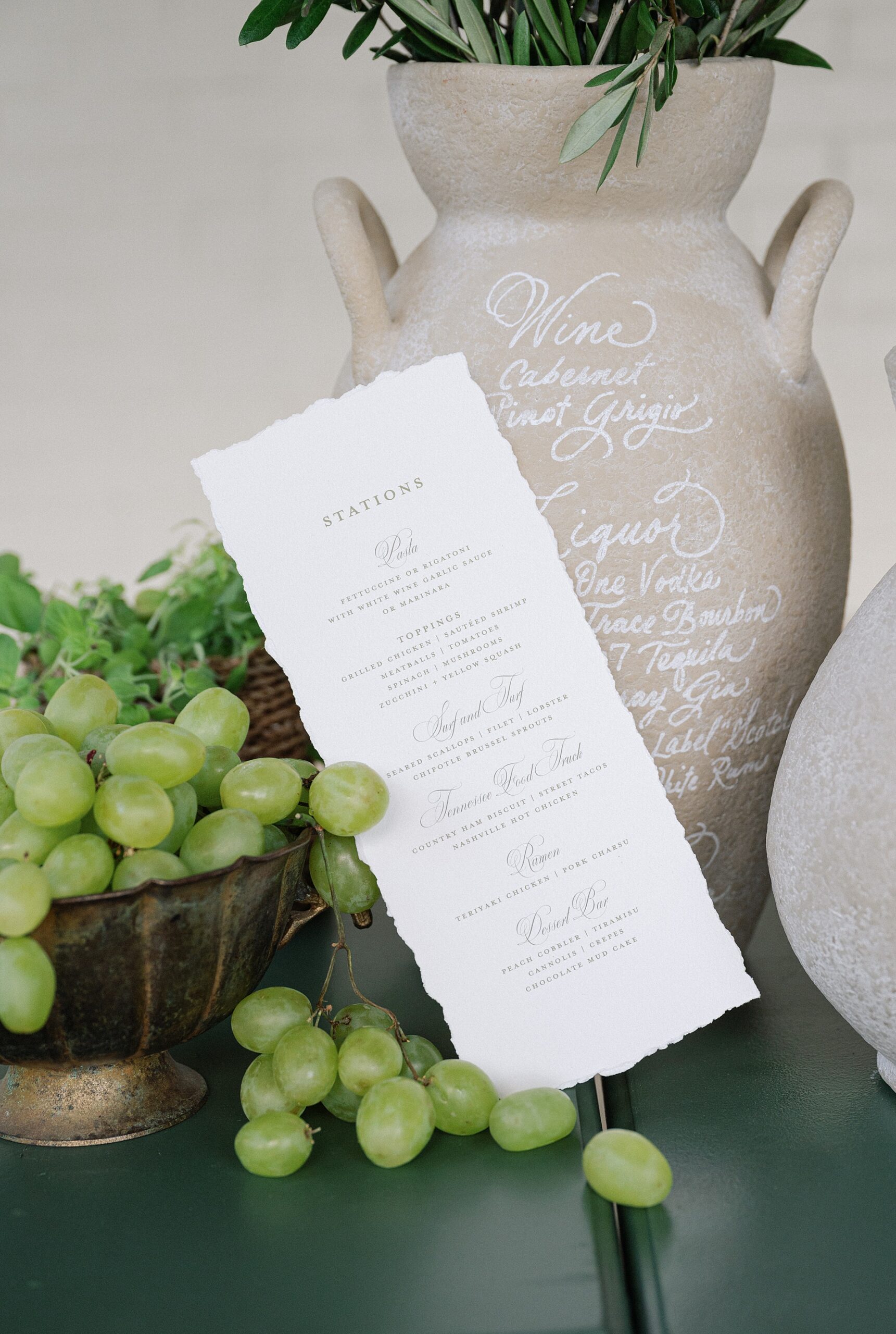
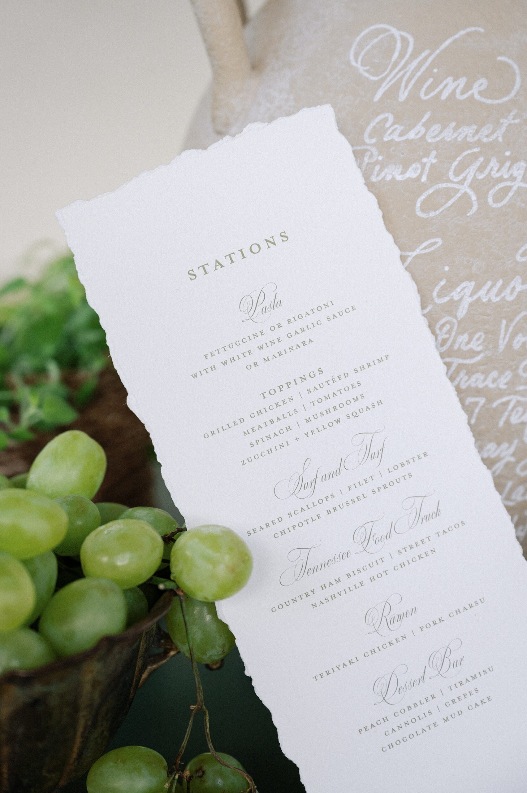
A Hand-Lettered Bar Menu on a Vase
Out of all the details we created, my personal favorite was the hand-lettered bar menu written directly onto a vase.
It was such a unique and artistic way to present the drink offerings, and it fit perfectly with the Italian-inspired aesthetic. Details like this are what make weddings feel truly custom and unforgettable.
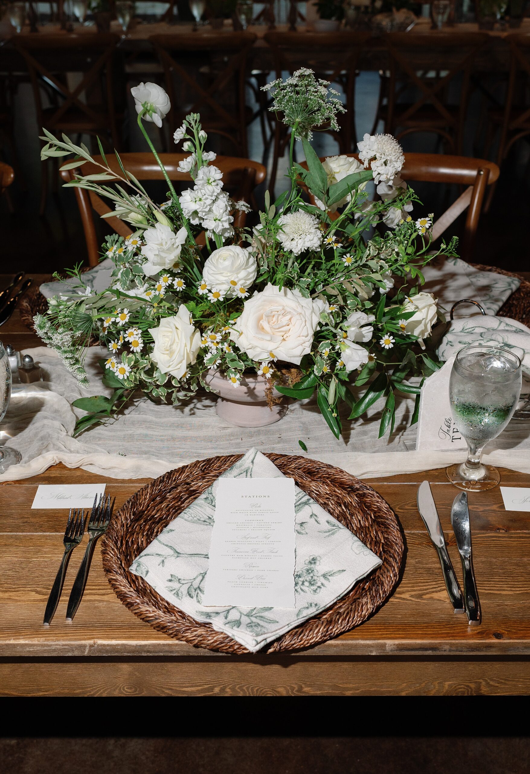
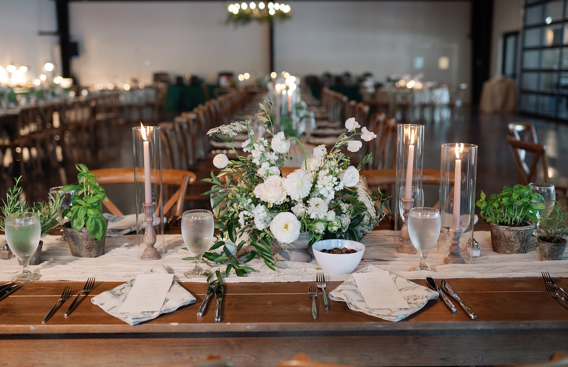
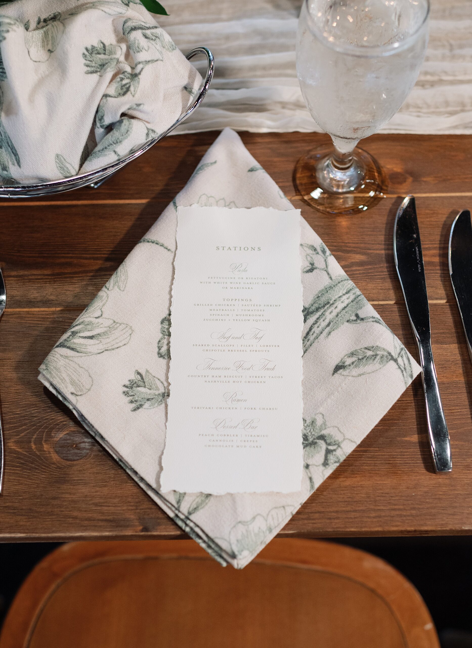
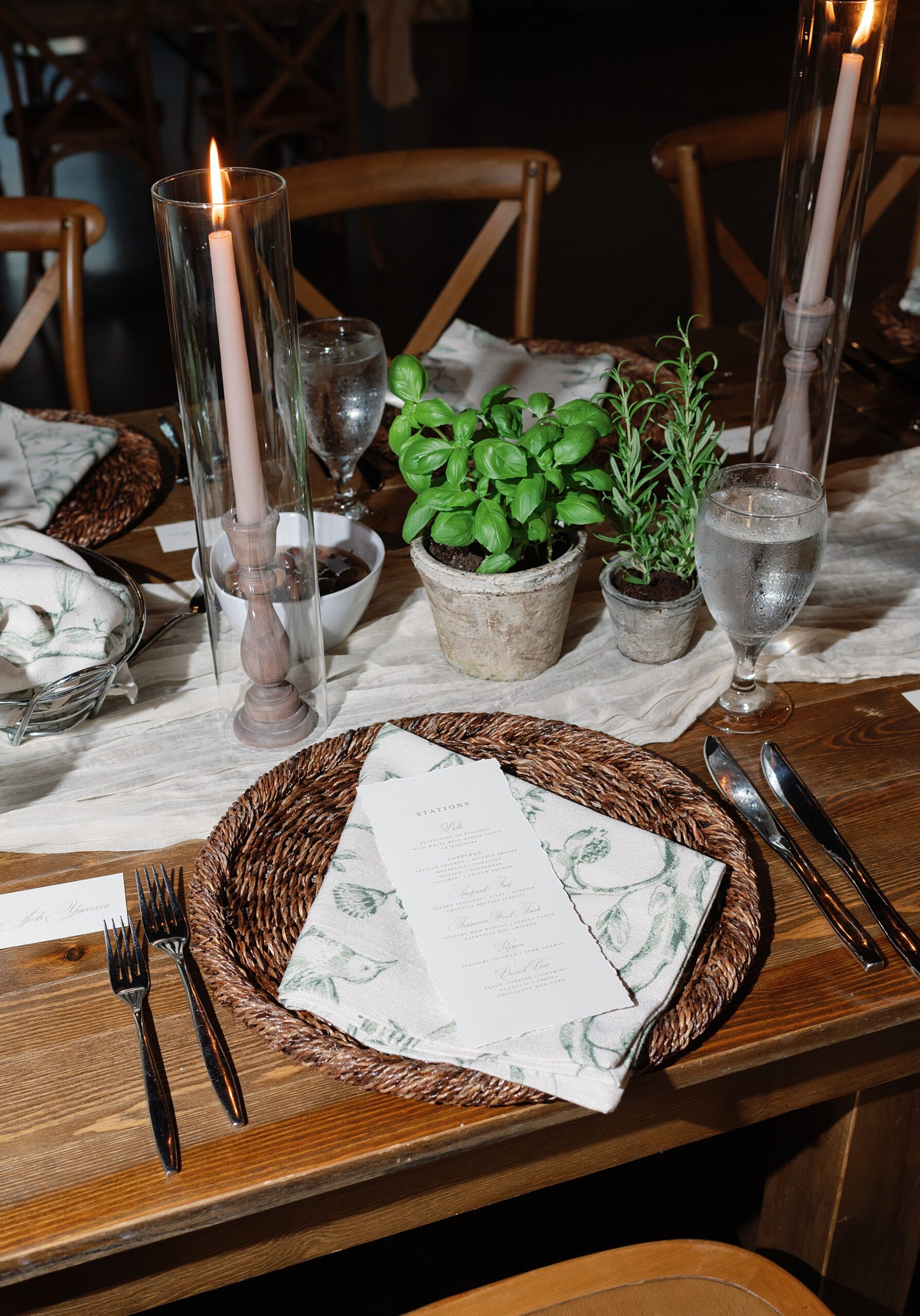
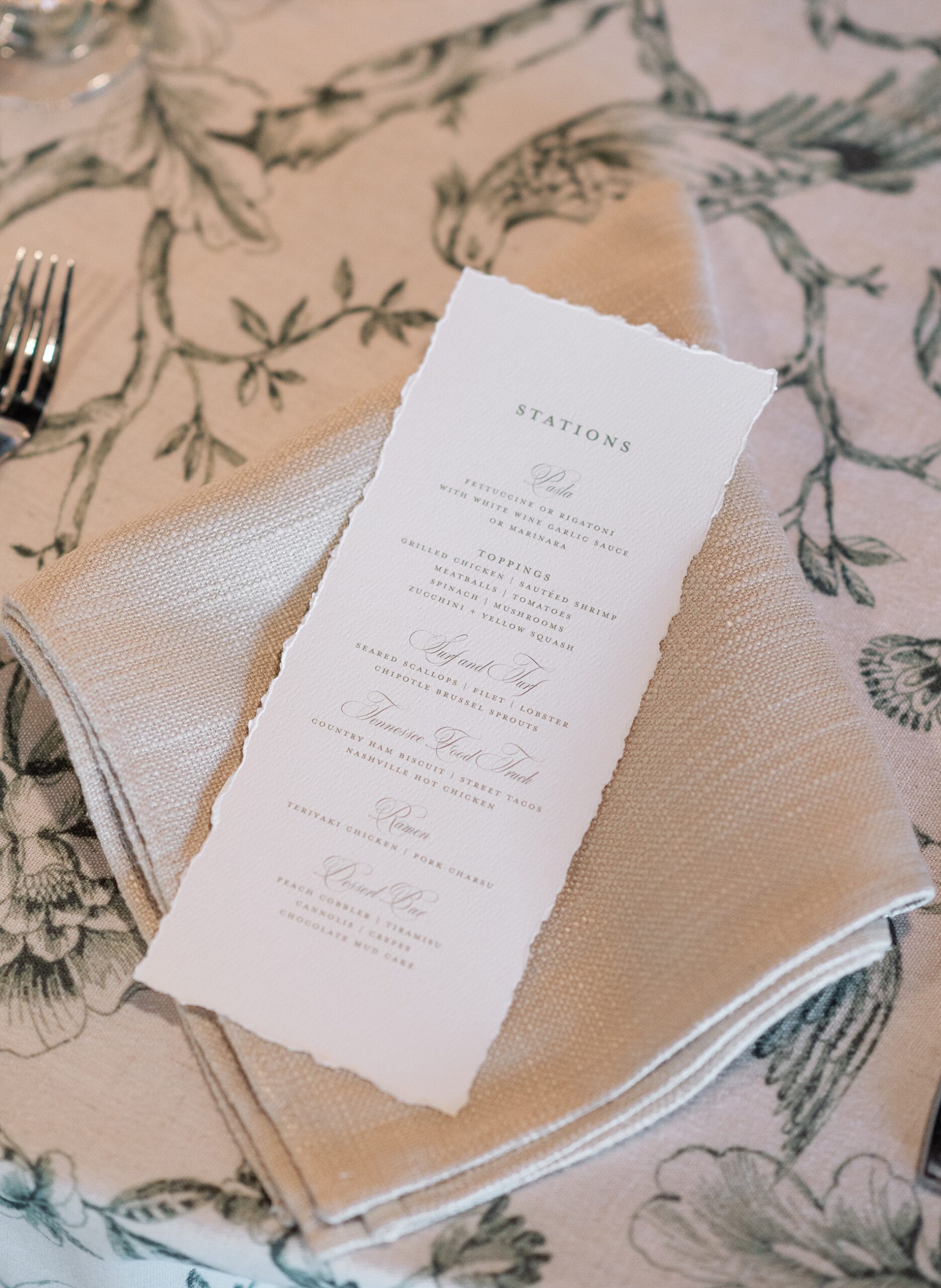
Timeless Hand-Deckled Menus
At the reception tables, guests found hand-deckled menus, a classic detail that instantly elevated the tablescape. The soft, textured edges of the paper added a sense of artistry and timeless elegance that paired beautifully with the rest of the design elements throughout the space.
TimelessItalian-Inspired Wedding Details
Designing the details for this Cherokee Dock wedding was such a joy, especially knowing the bride herself understood what thoughtful event design can bring to a celebration. Being trusted by a fellow wedding industry professional to design such meaningful elements made this entire experience even more special! We were so honored to be a part of it!
If you’re planning a wedding in Nashville, or anywhere in the world, we’d love to help you create meaningful, personalized stationery and event details that tell your story. We work with couples worldwide to design details you and your guests will remember forever.
Reach out today to learn more about our full-service wedding and event design offerings! We can’t wait to create something unforgettable for you!
If you enjoyed this post, you’ll love these other blogs!
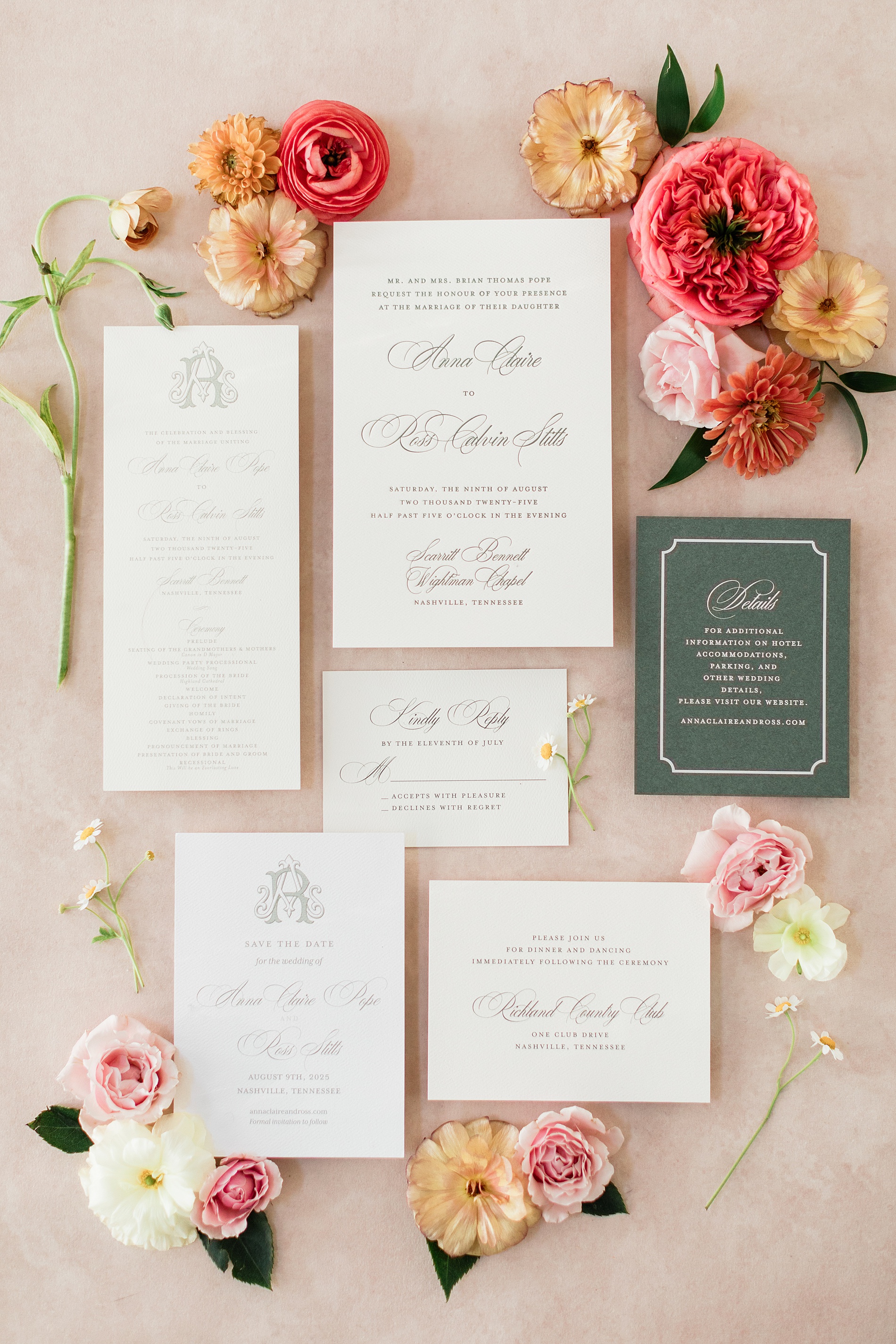
Every wedding we work on is such a different experience and always such a treat to see everything come together. For Anna and Ross’s wedding we had the joy of not only creating their wedding day paper goods and day of details, but also had a hand in designing items for their rehearsal dinner too! I love when we have the opportunity to design items for an entire wedding weekend as it really allows for an immersive experience as details are intentionally woven throughout the events.
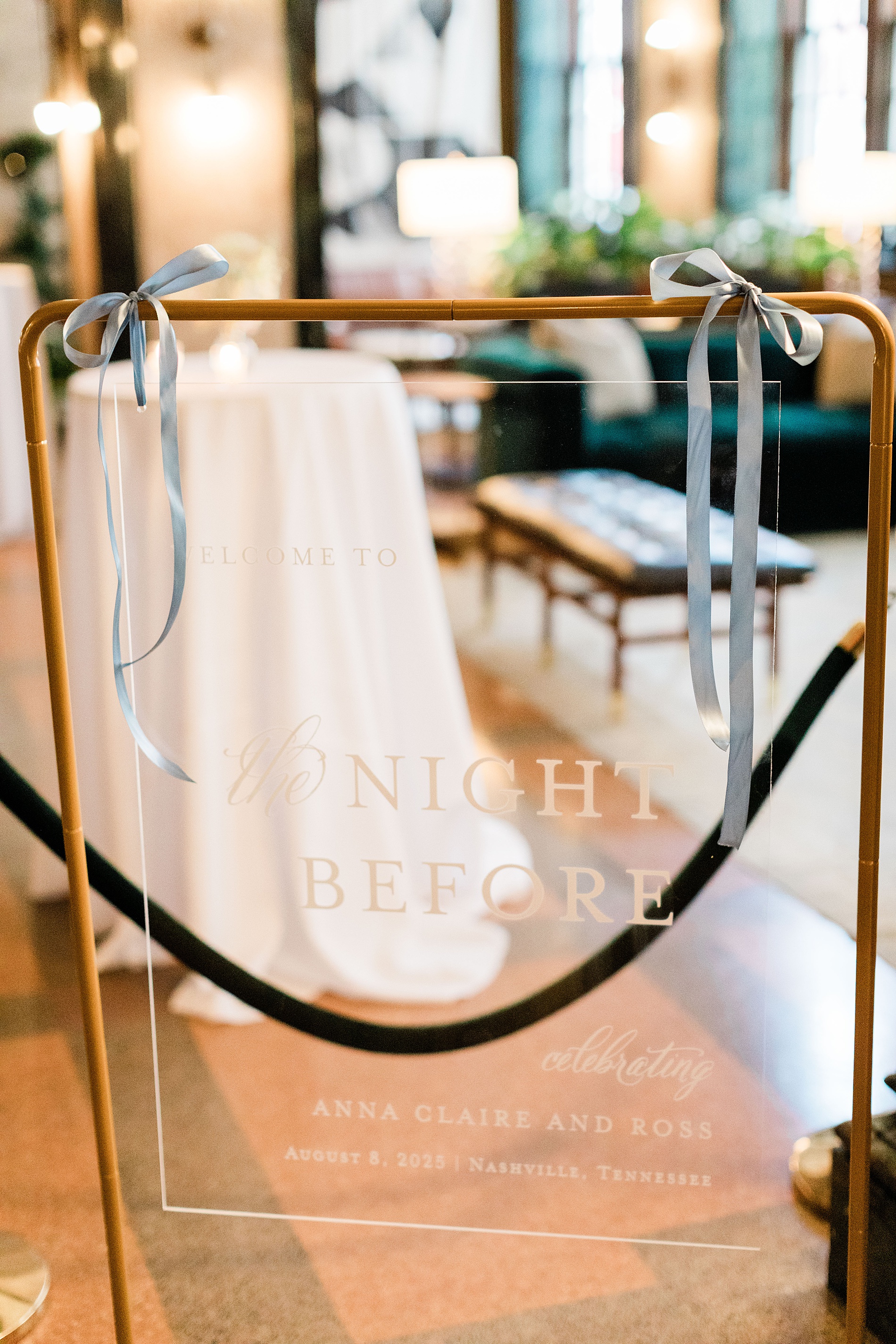
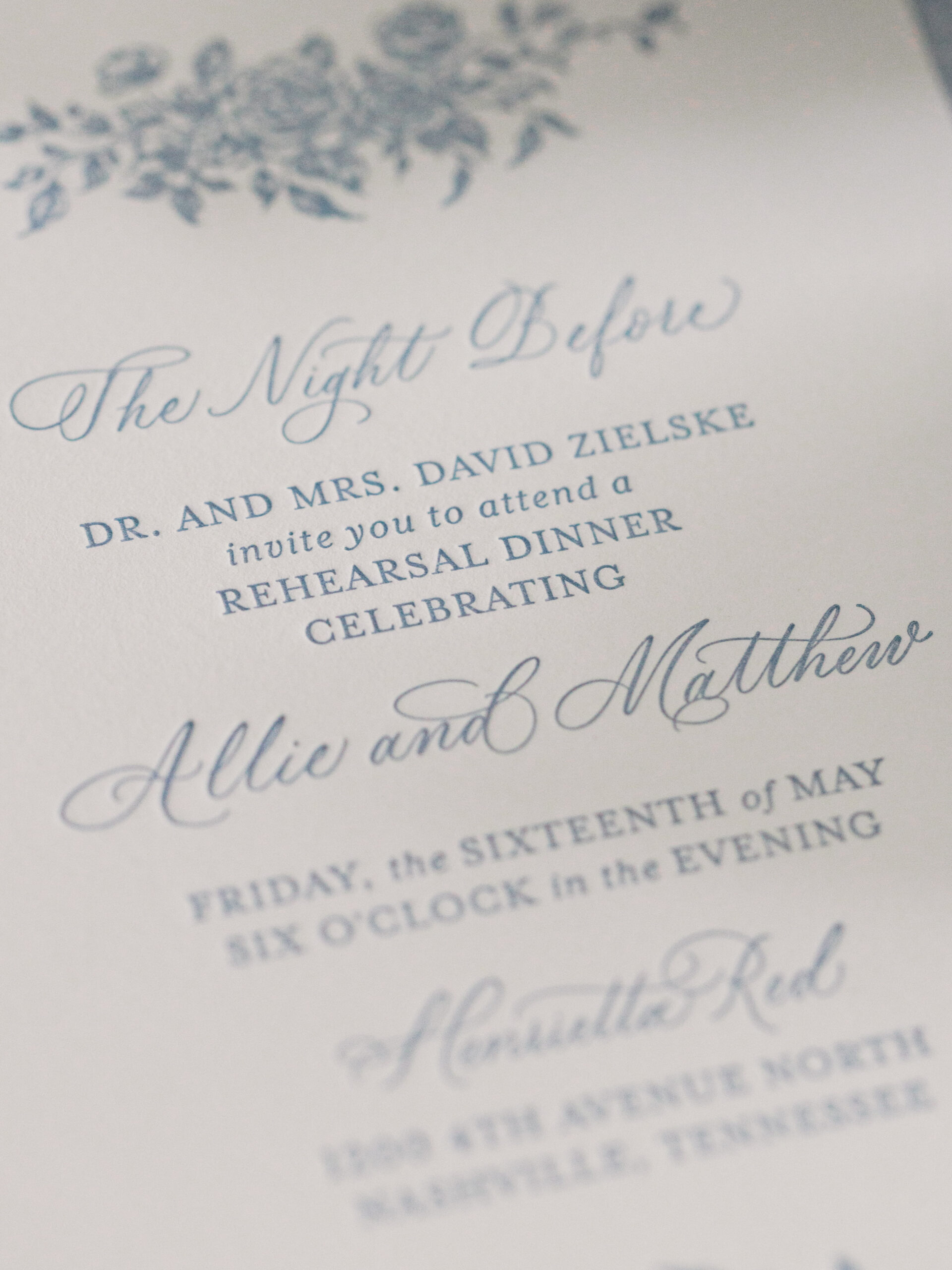
Rehearsal Dinner Details
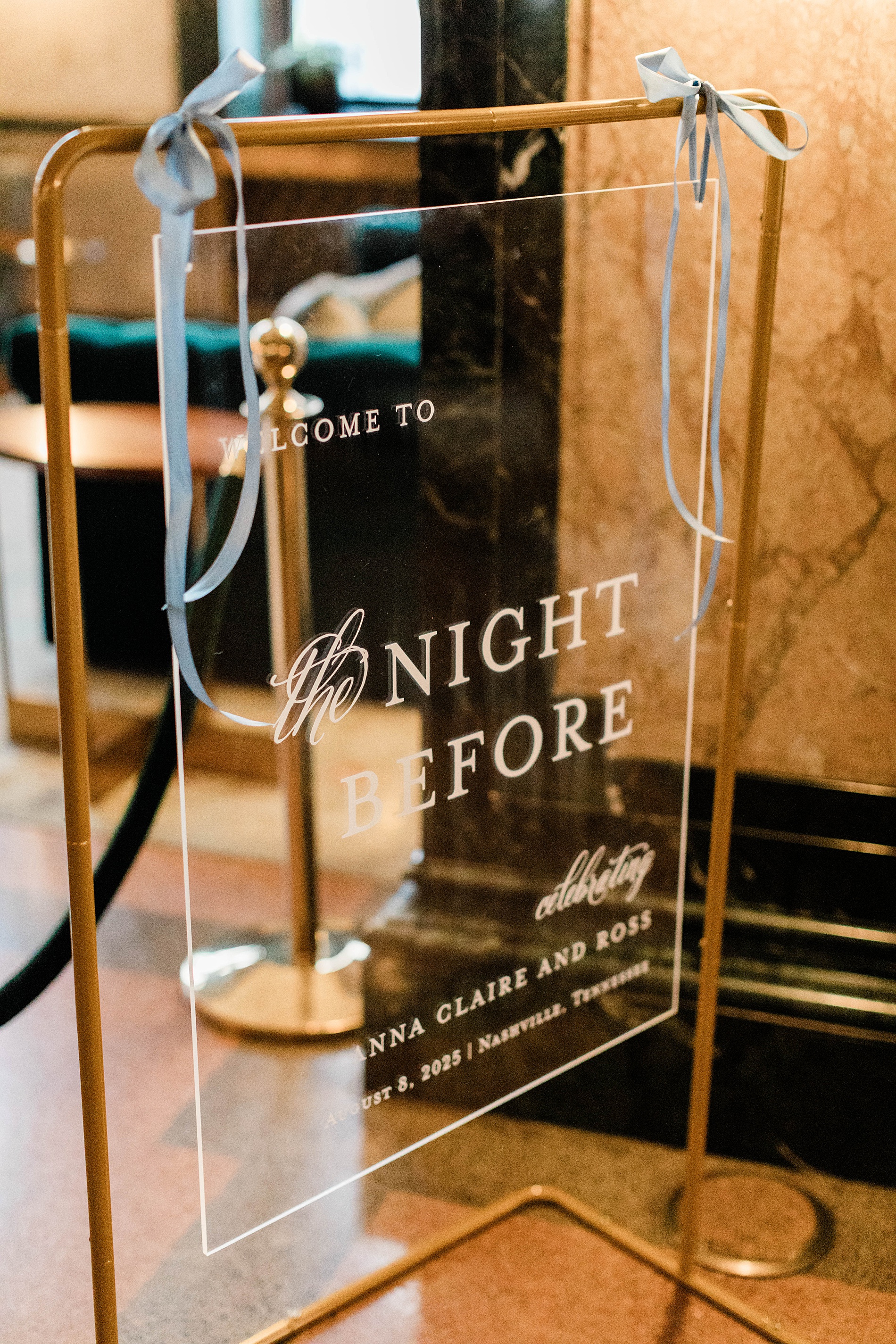
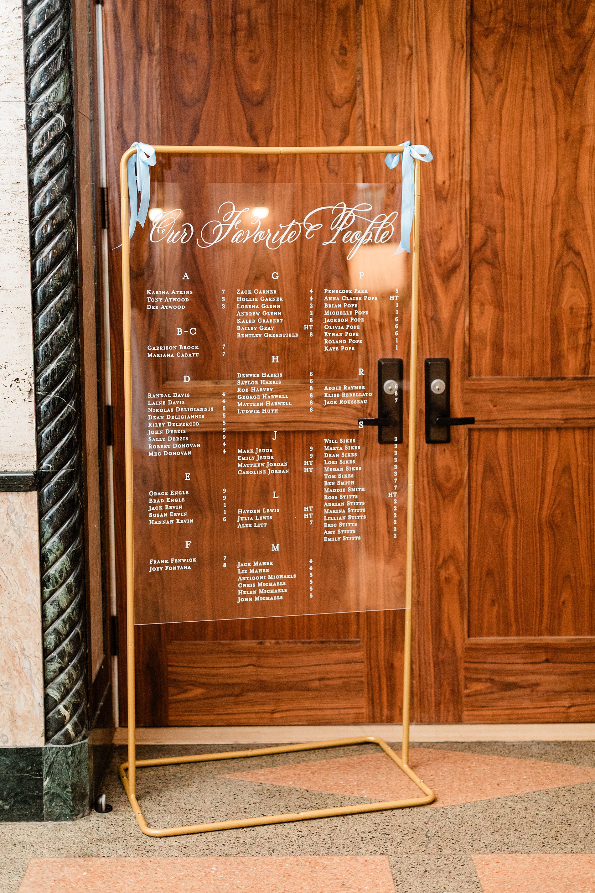
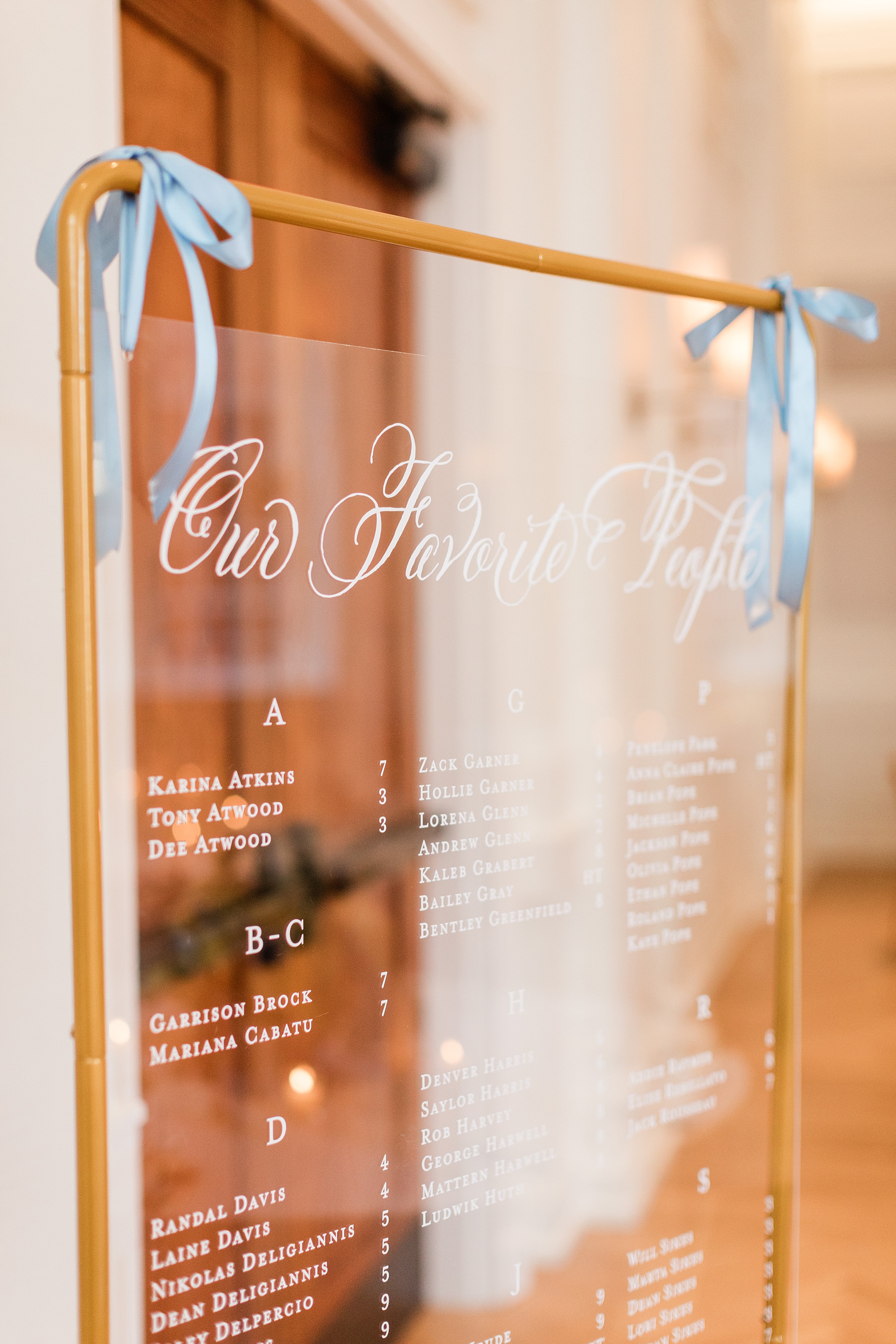
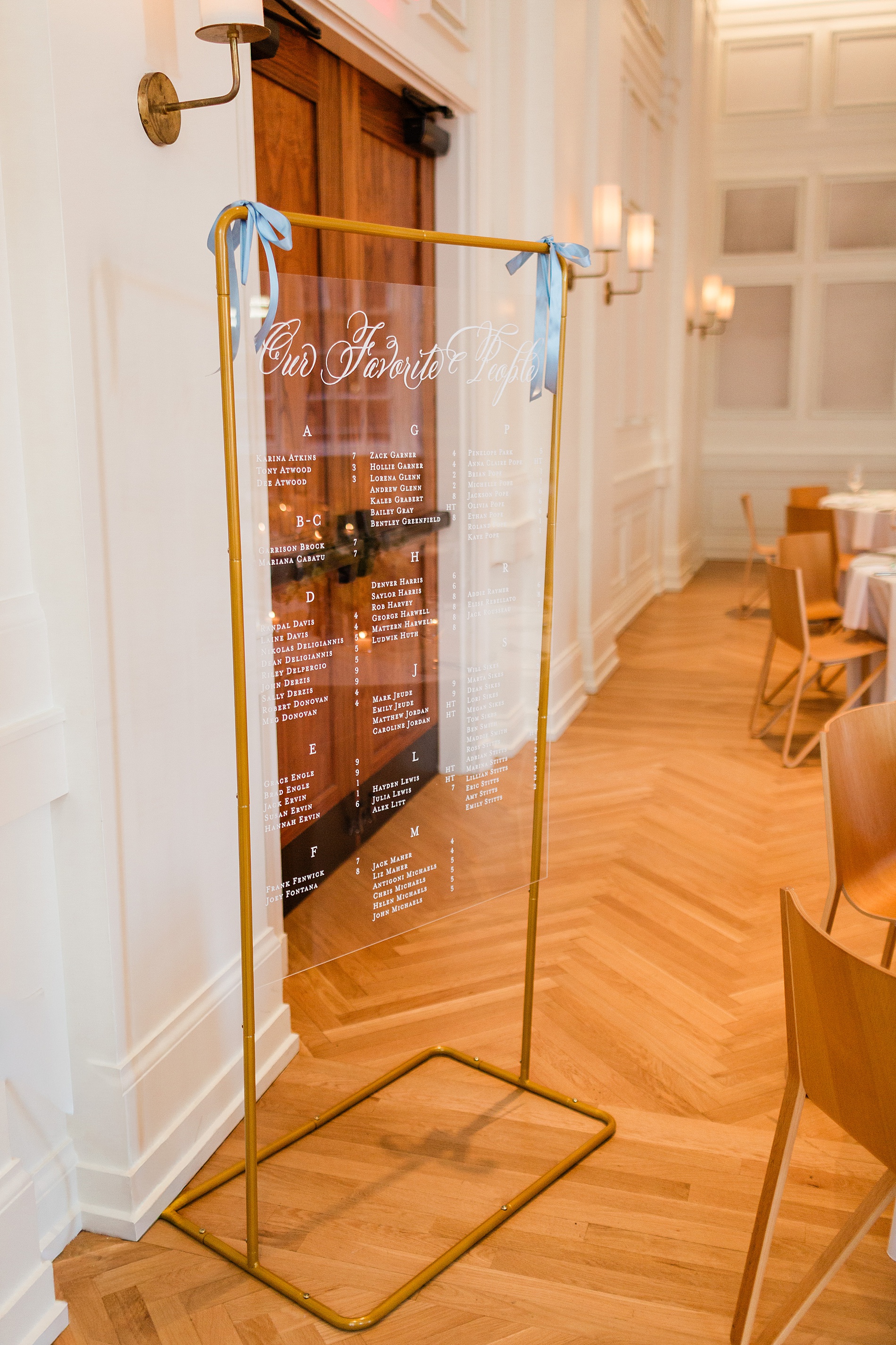
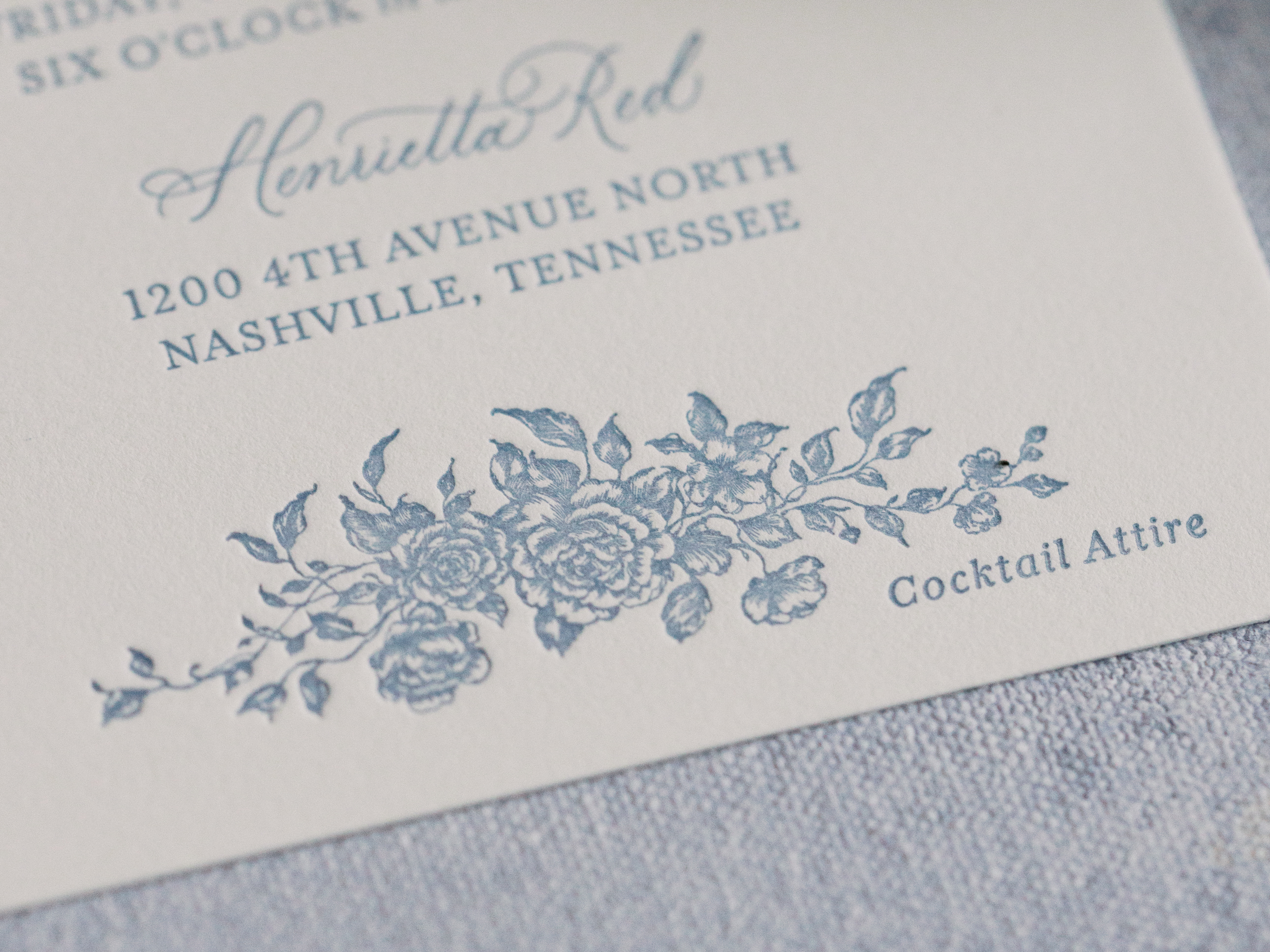
The rehearsal dinner took place at Noelle Hotel Nashville, which is a gorgeous boutique hotel in downtown. A clear welcome sign with a gold frame greeted guests that read “Welcome to the Night Before”. Light blue ribbons tied at the top corners of the sign gave a subtle hint to the colors that would be seen throughout the evening. We also created the seating chart that mimicked the clear welcome sign with a gold frame and blue ribbons. This was a lovely touch and a foreshadowing of the details to come on their wedding day.
As guests sat down to the rehearsal dinner, the tables were decorated with fresh flowers, greenery, and flickering candle light, which made the light blue and white table numbers and place cards we created stand out beautifully. The entire evening unfolded seamlessly and was a perfect prelude to the wedding day ahead.
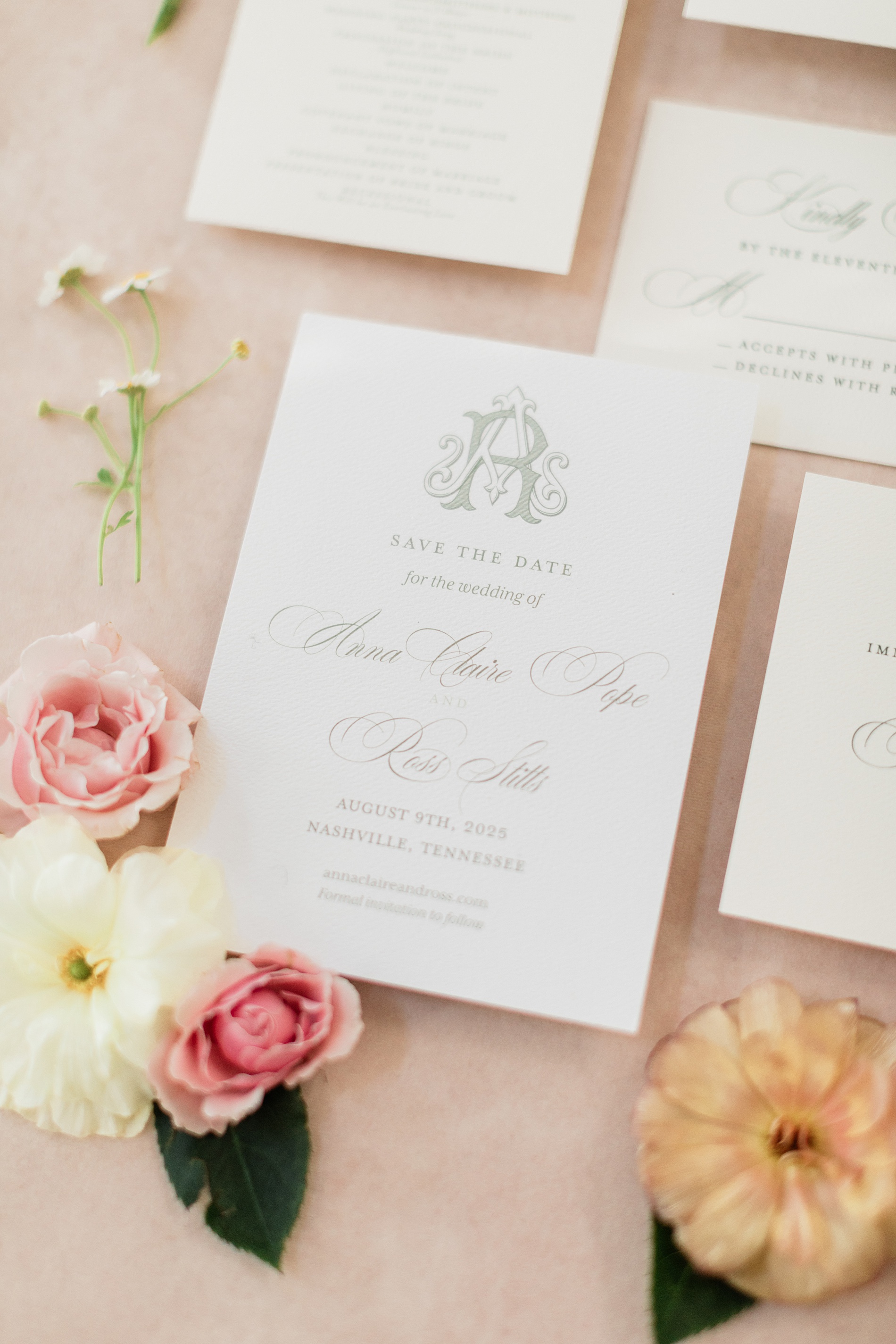
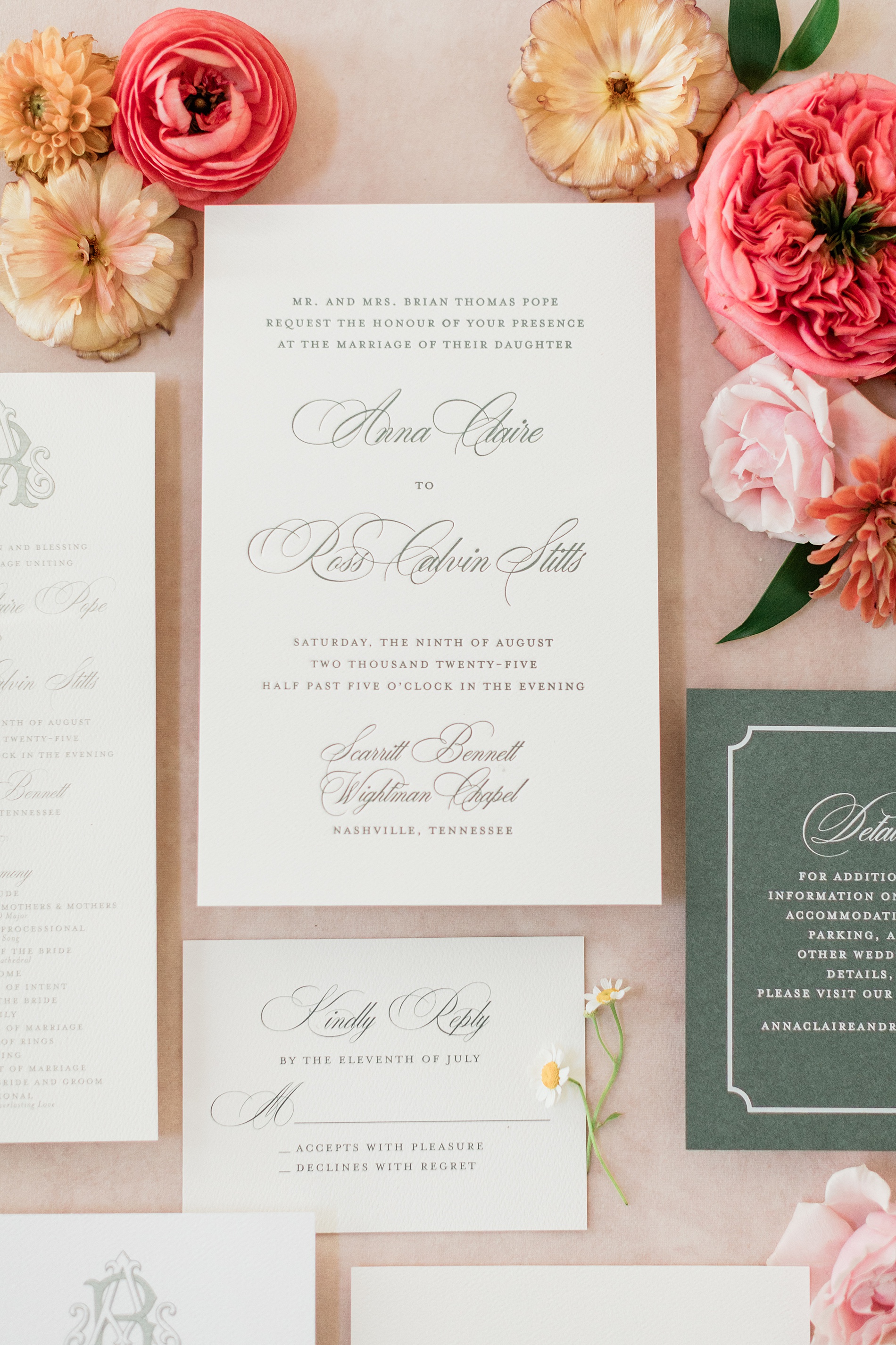
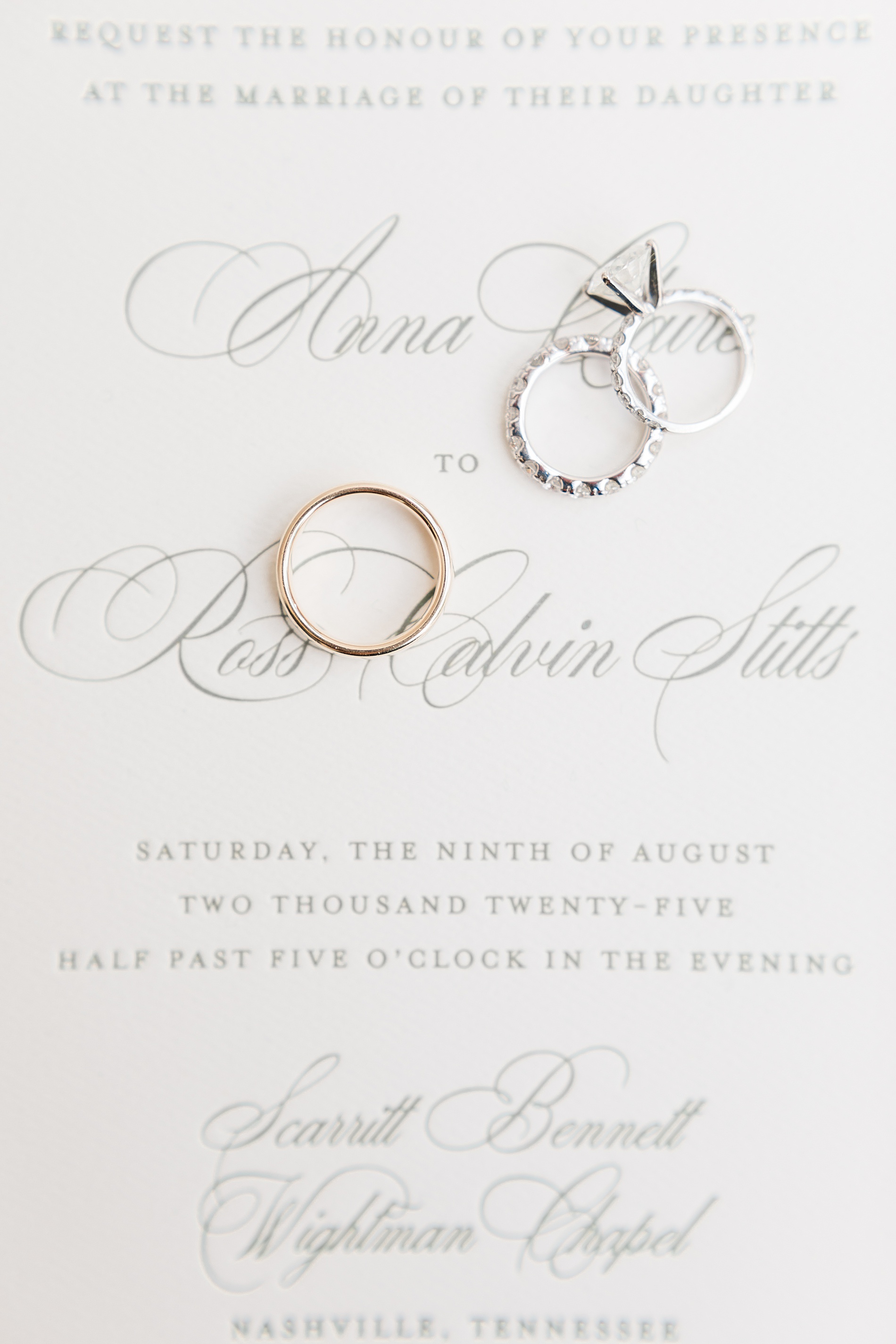
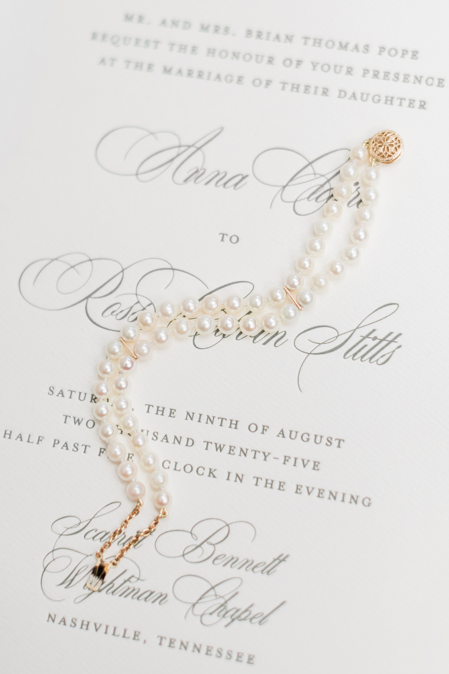
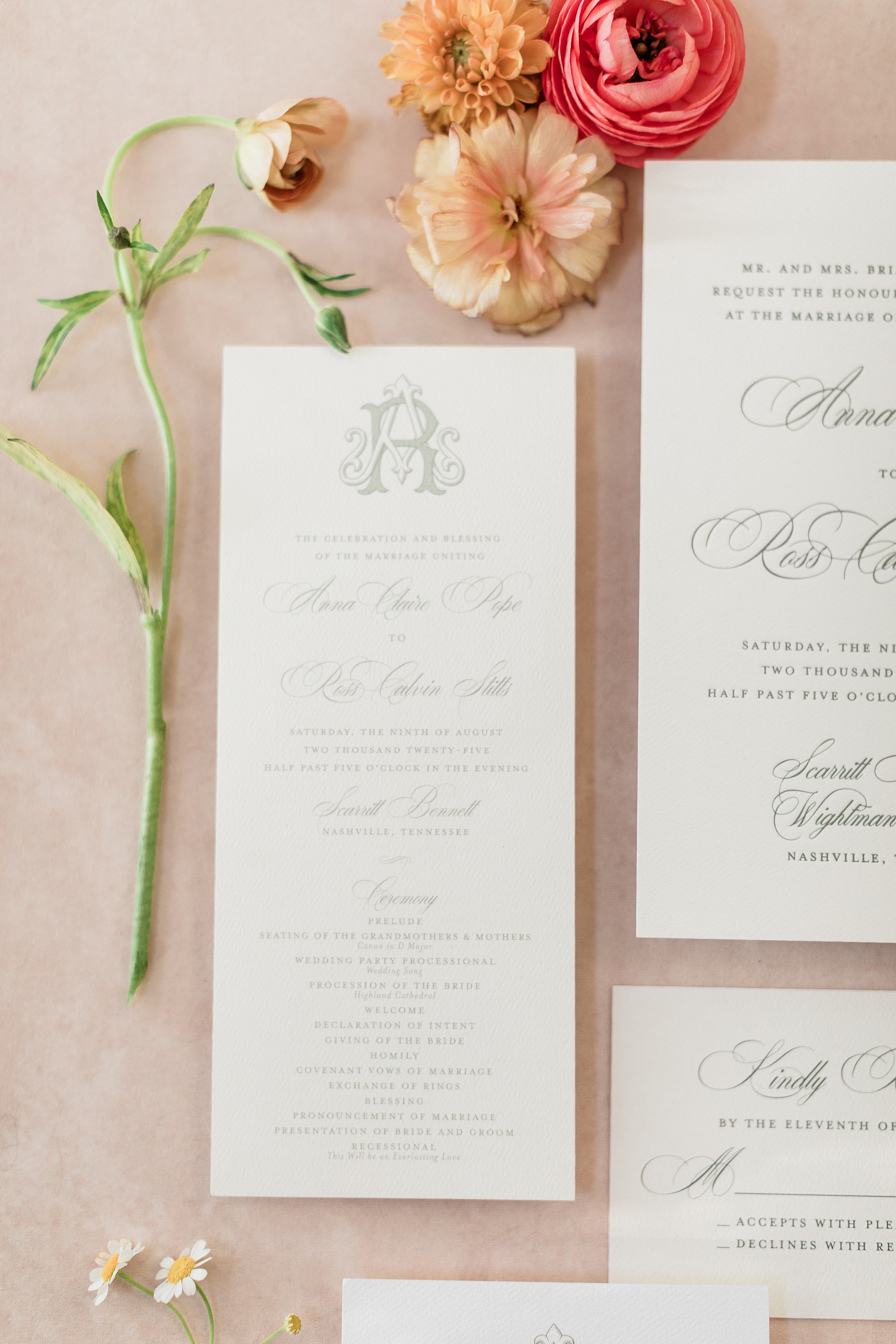
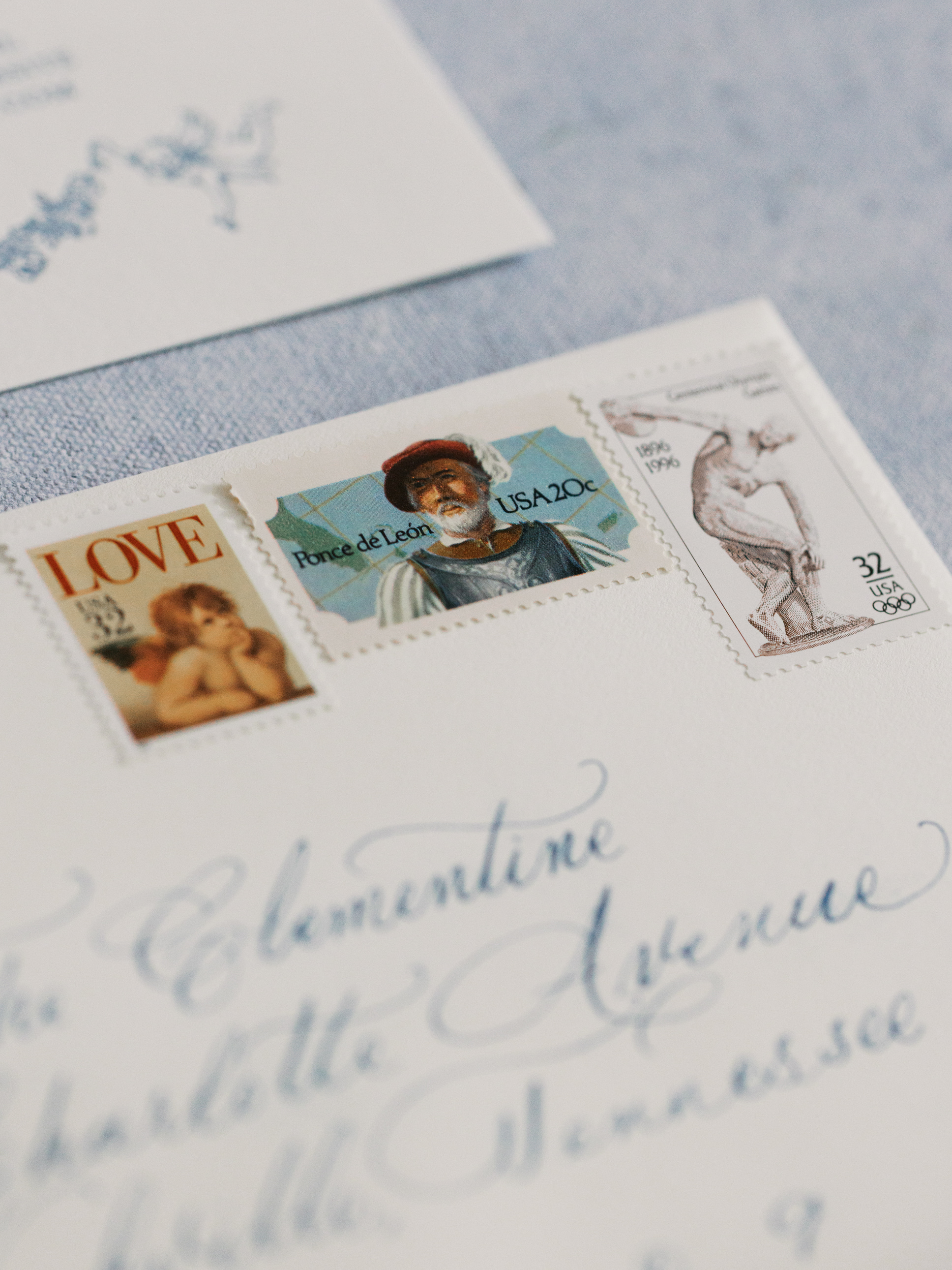
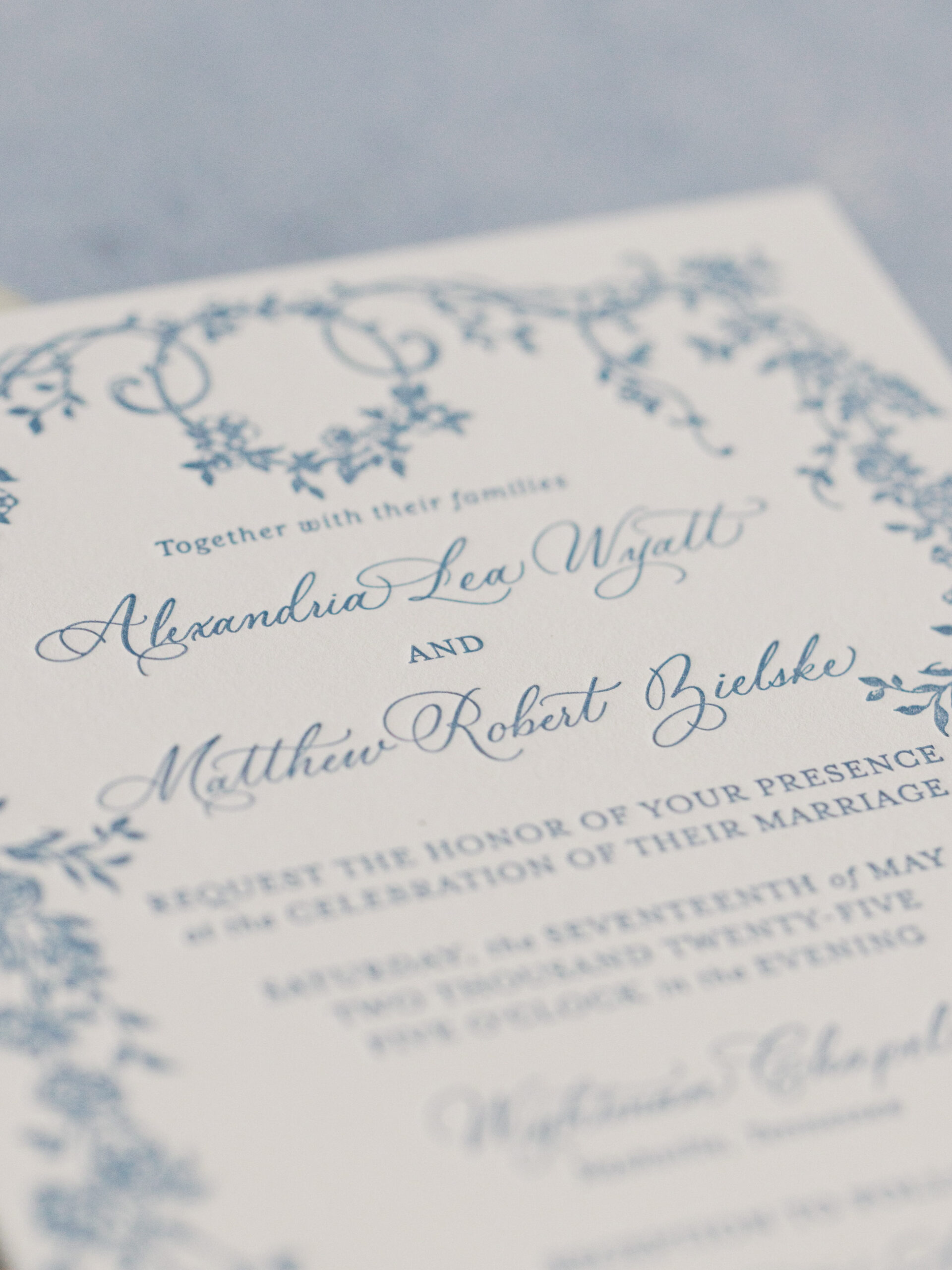
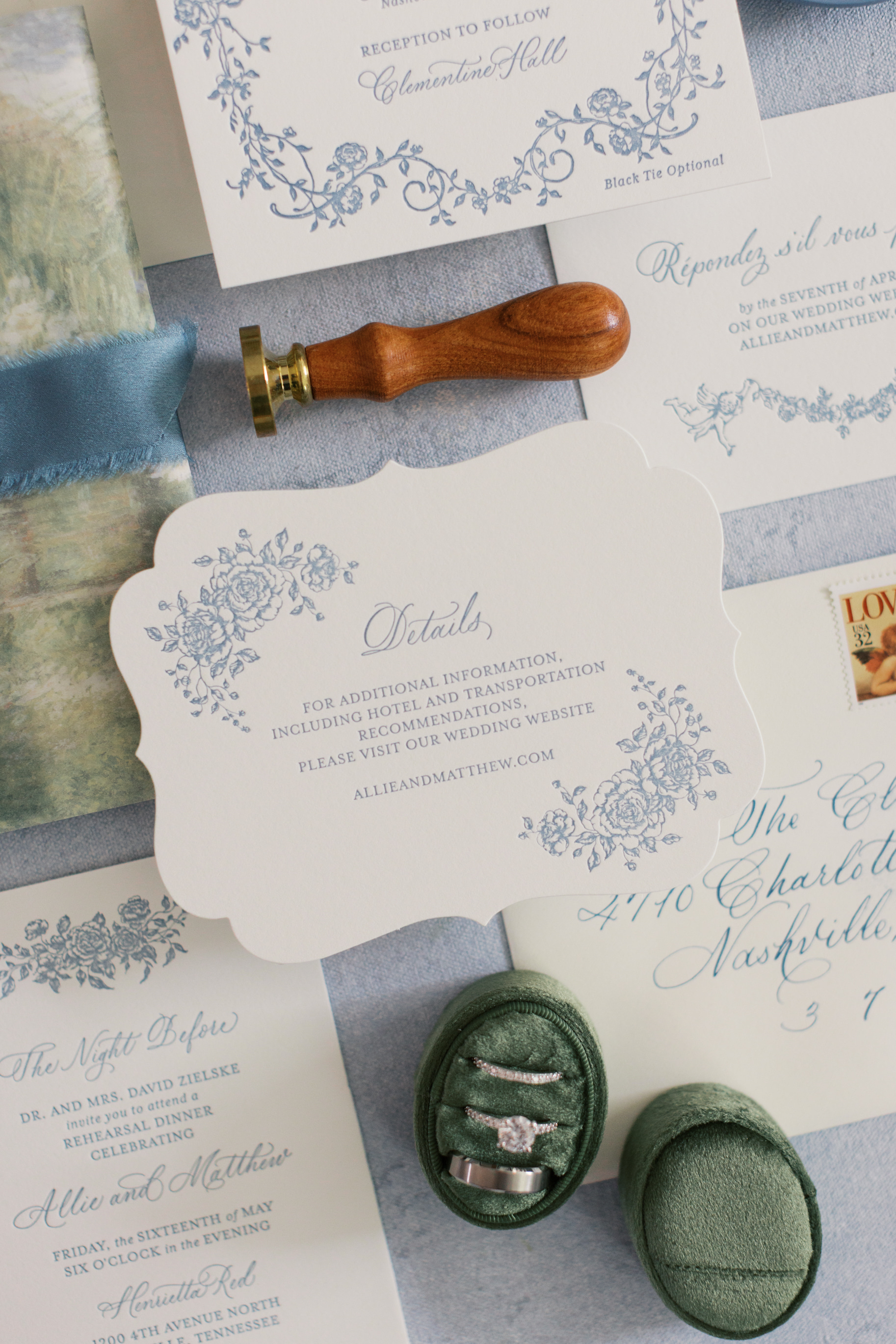
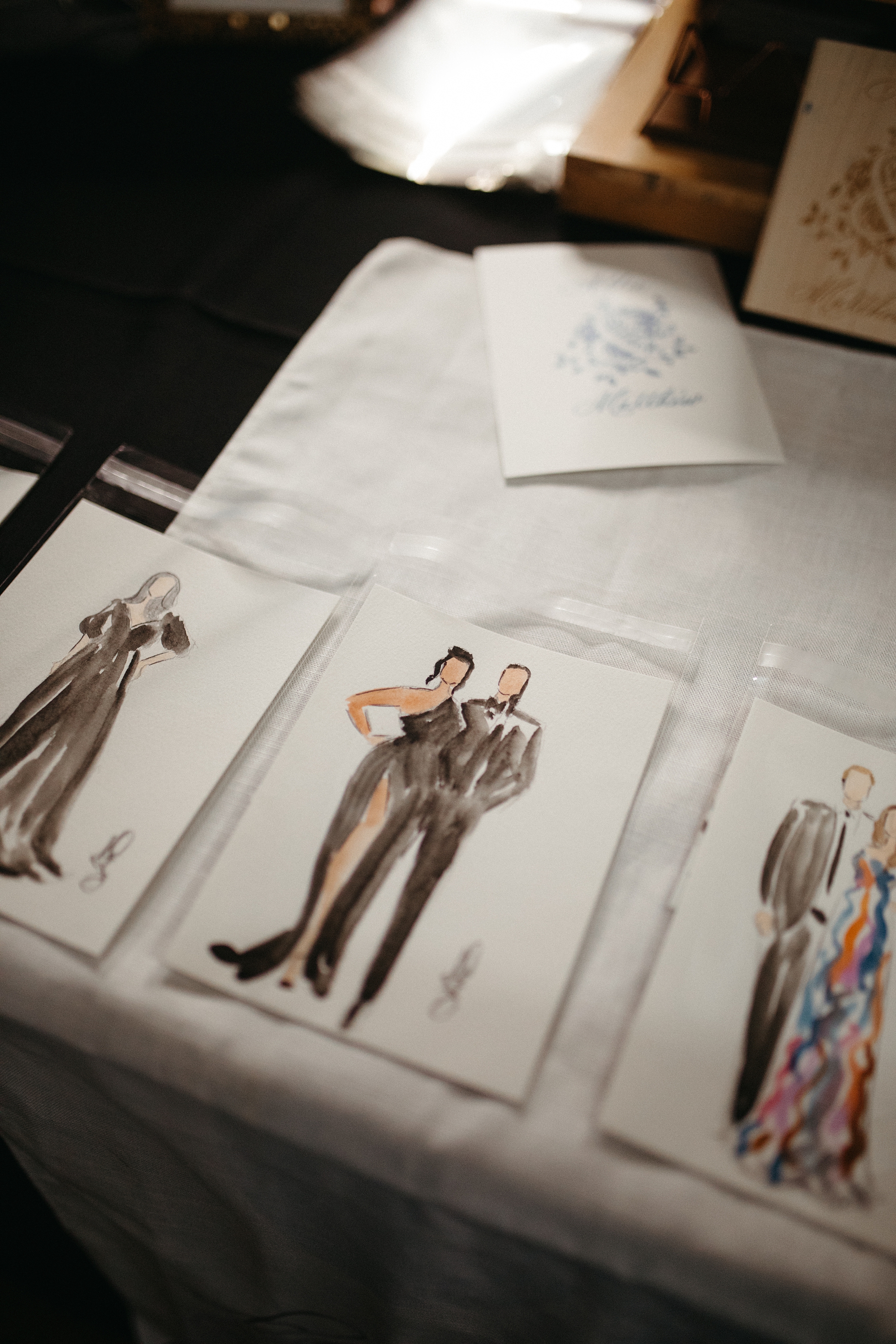
Elegant Letter-Pressed Wedding Invitations
Their classic, letter-pressed wedding invitations set the tone for an elegant evening. The custom monogram on their Save The Dates and Wedding Programs would also make an appearance on other wedding details we created, creating a cohesive design that we just love!
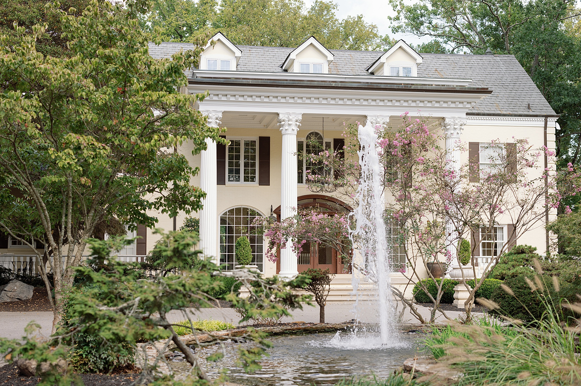
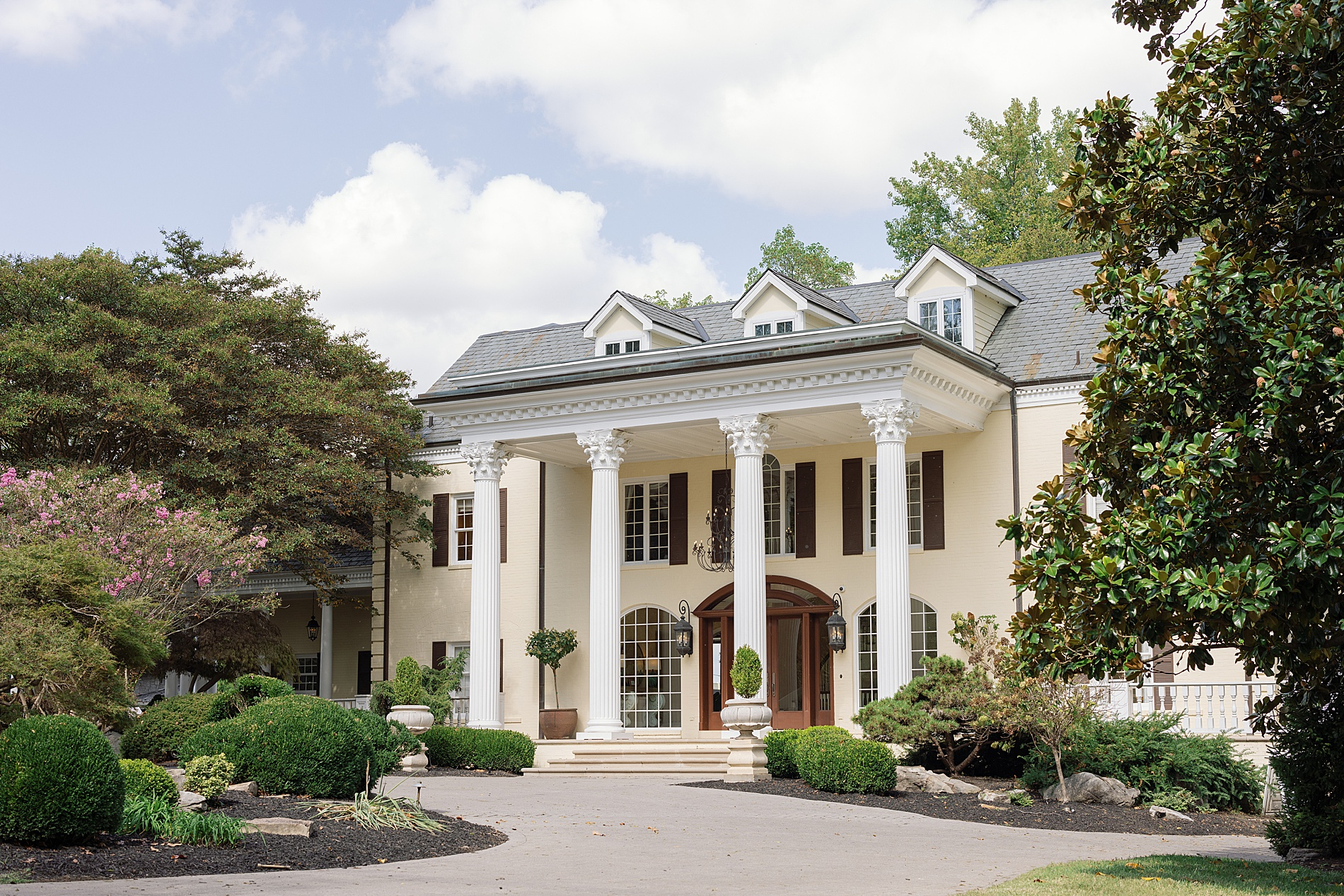
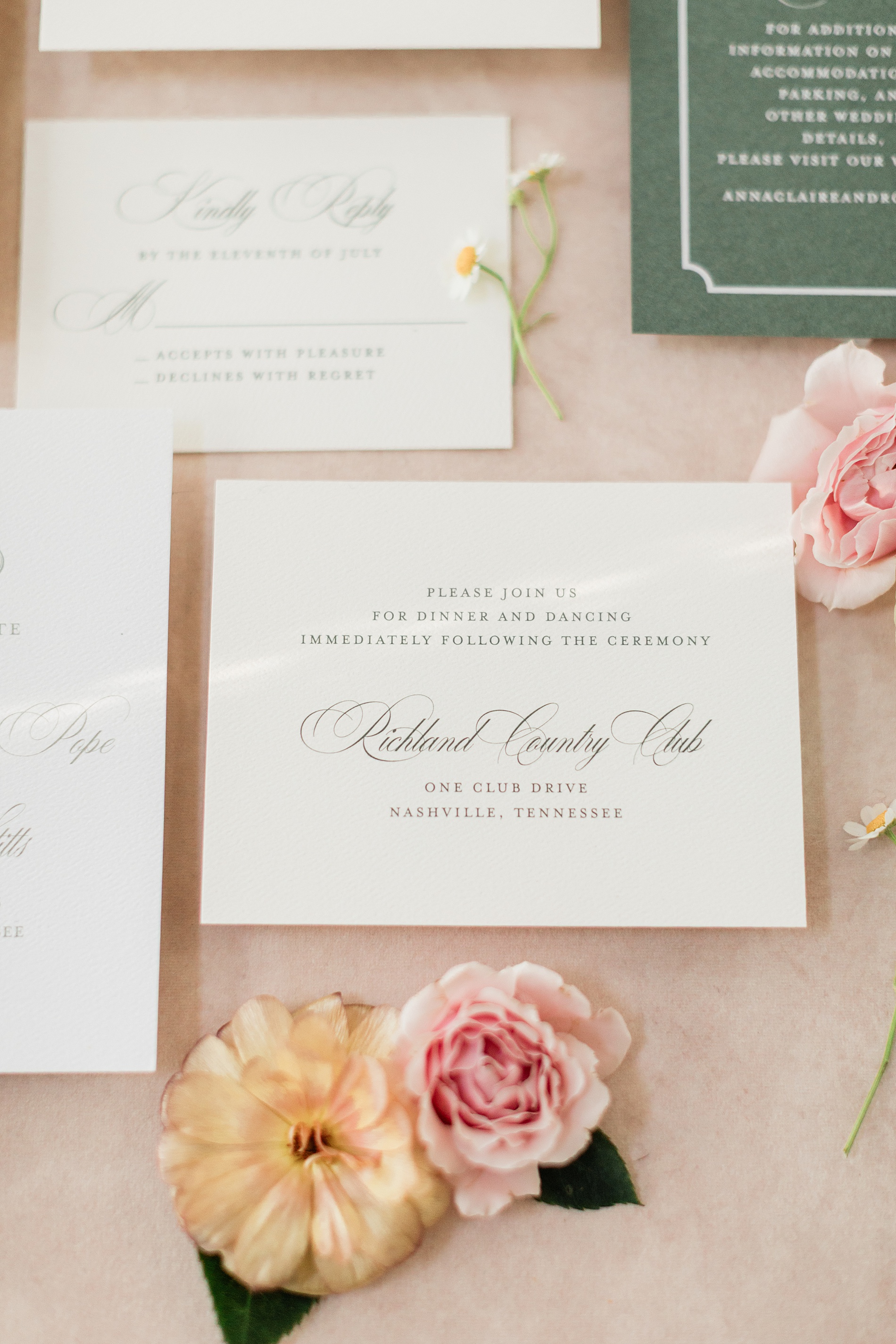
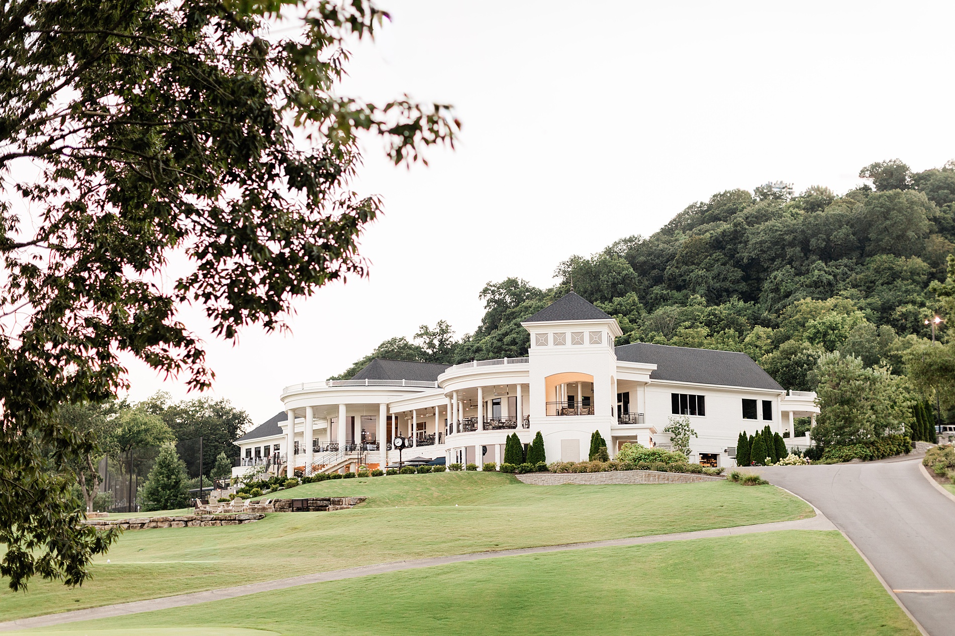
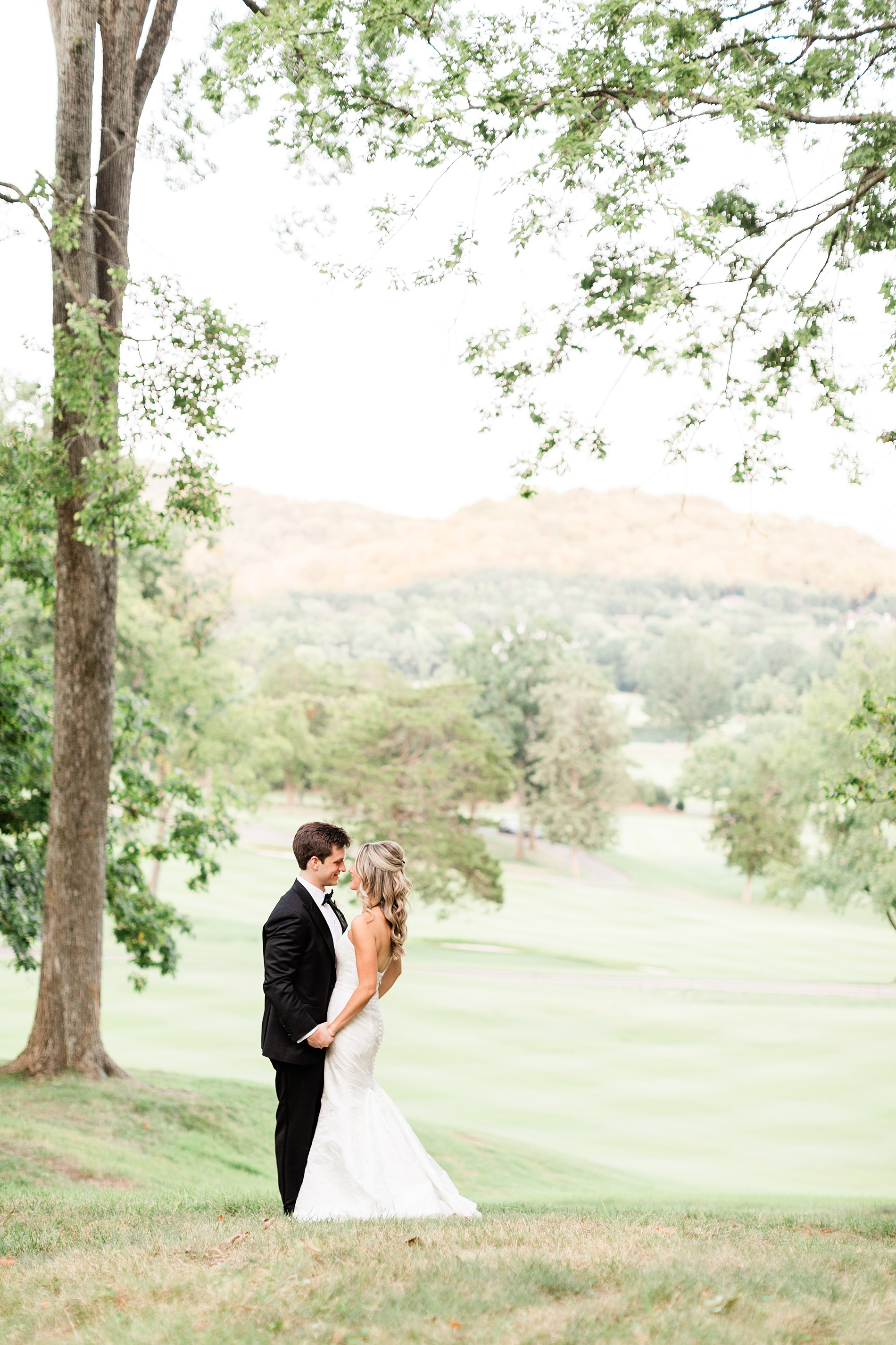
Their wedding took place at the stunning Richland Country Club in Nashville, TN, which is a beautiful venue with a breathtaking property.
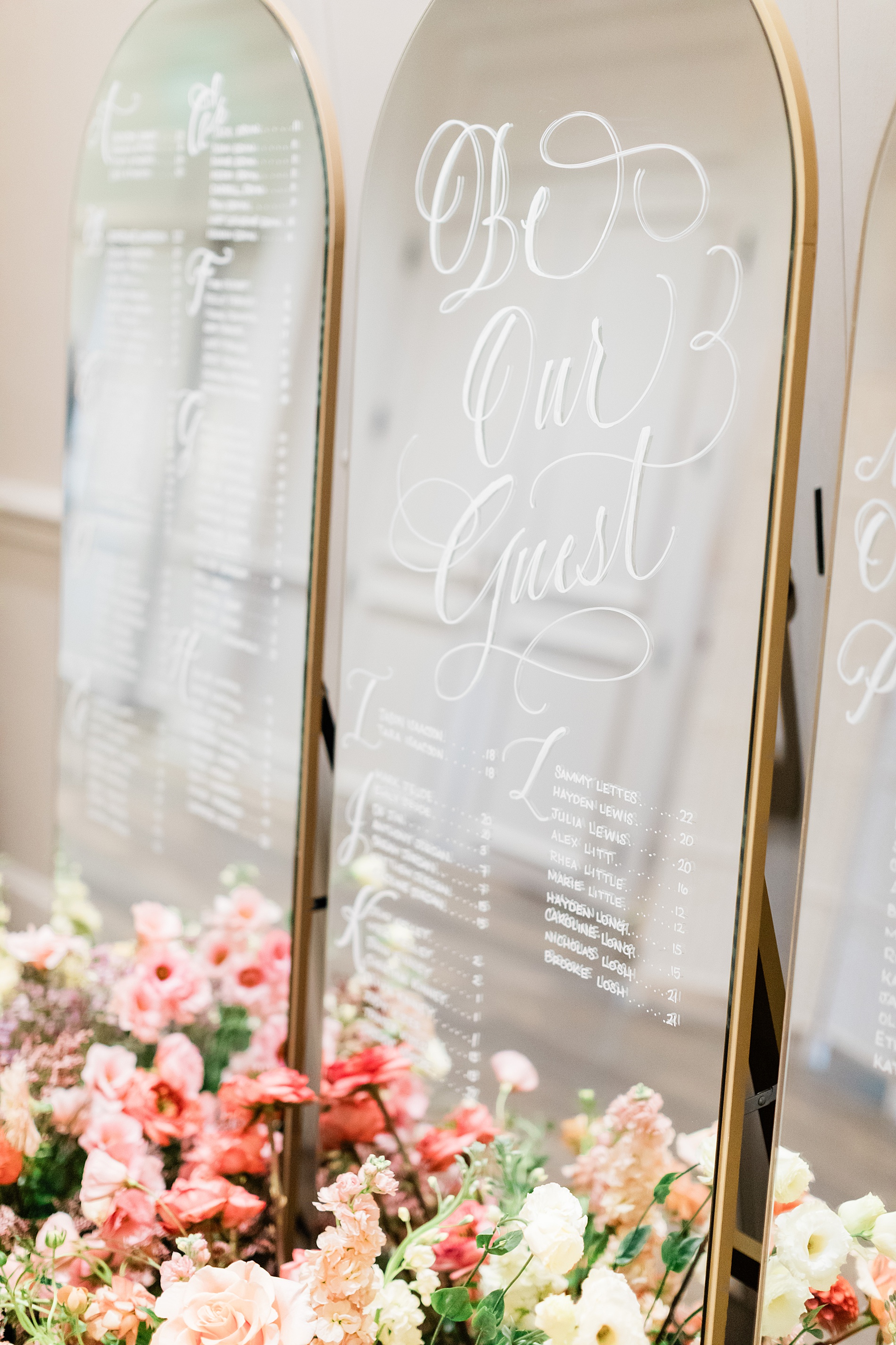
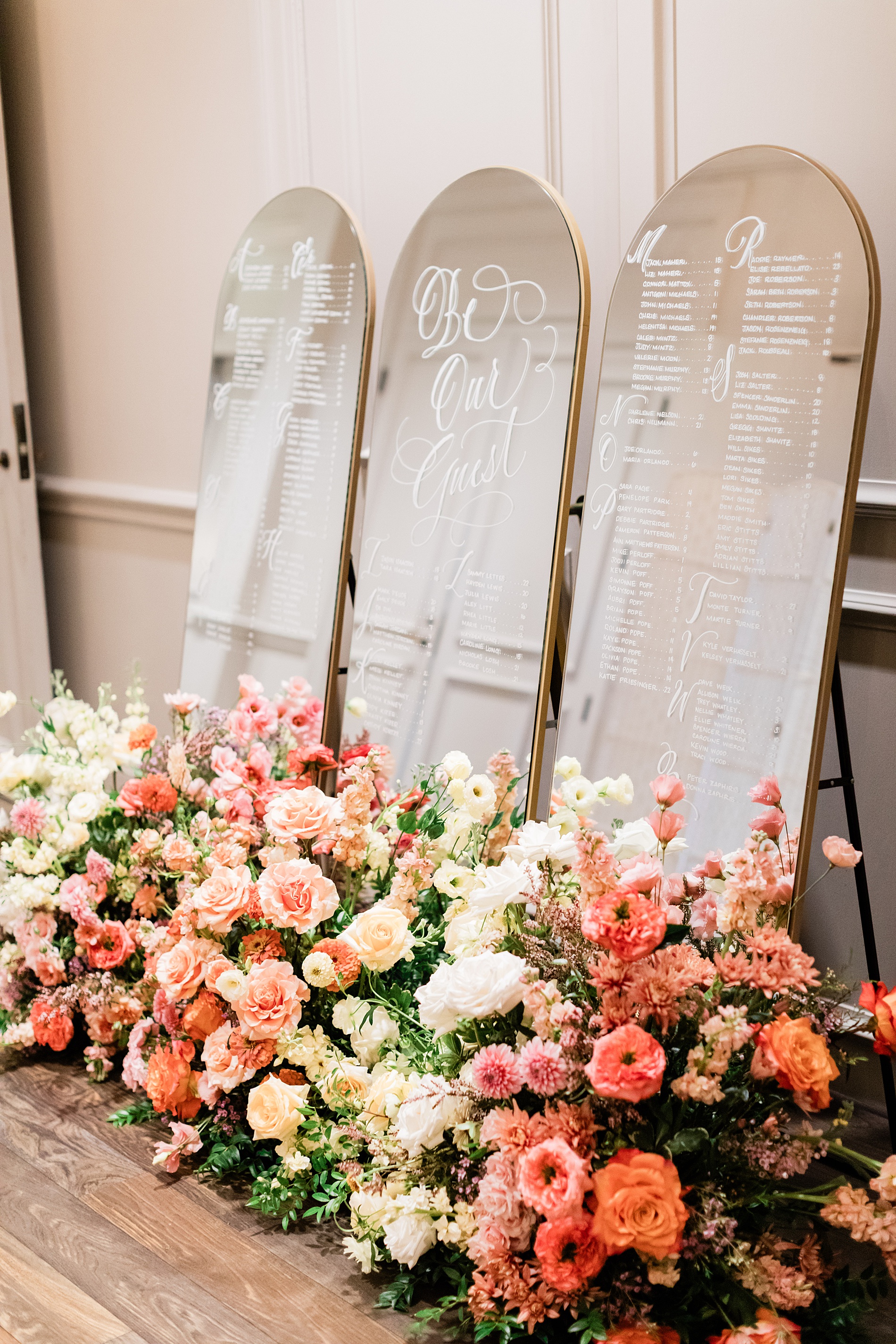
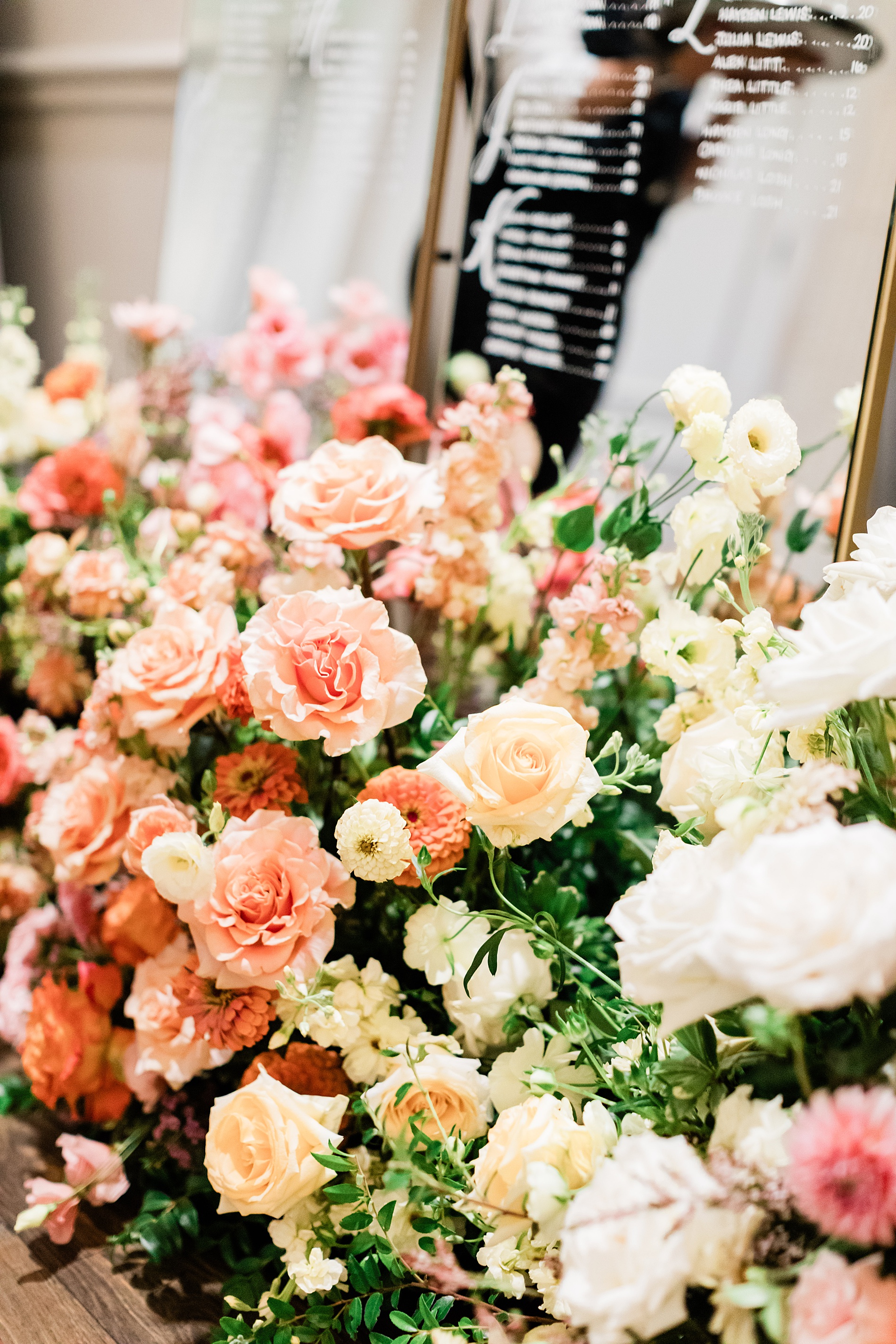
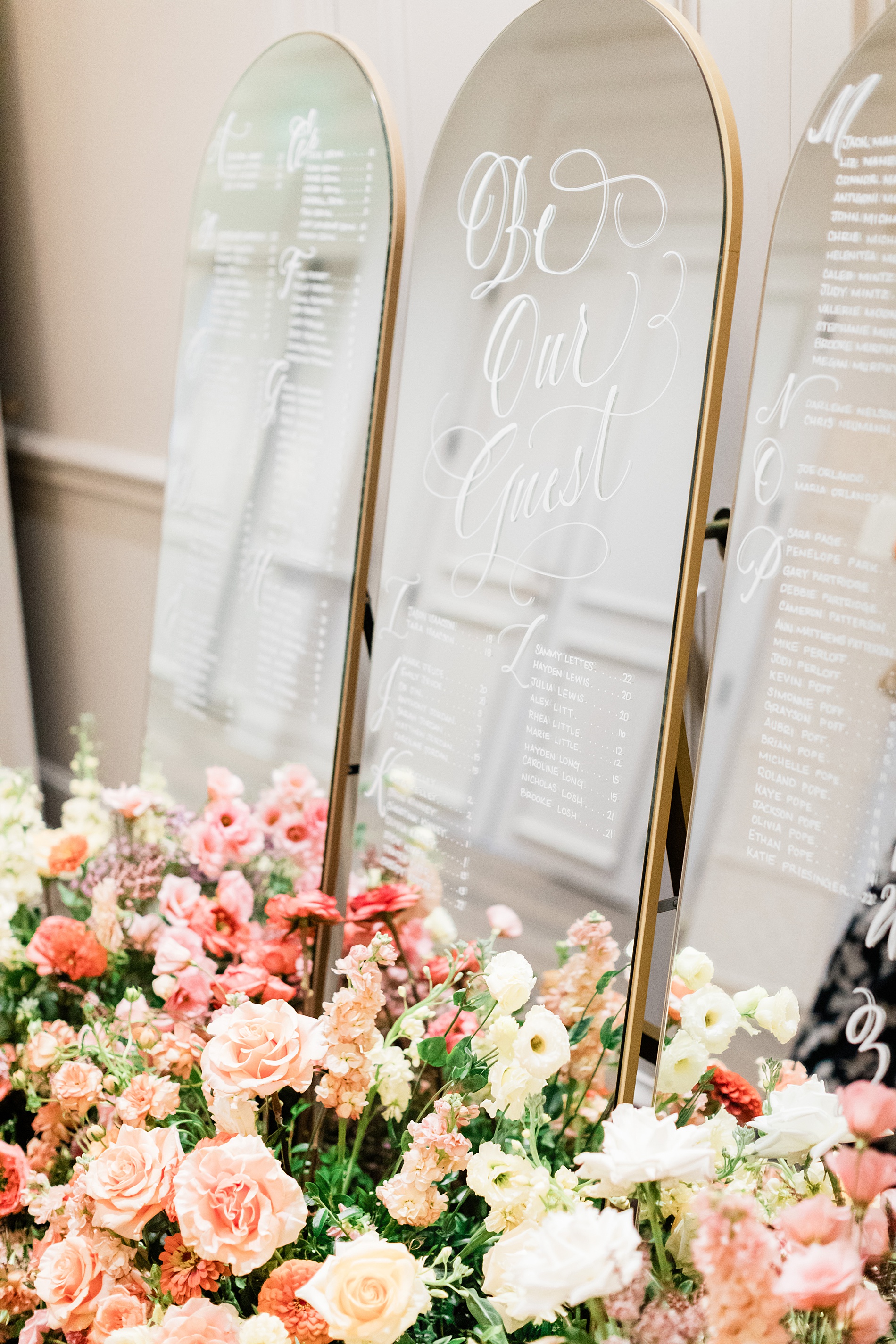
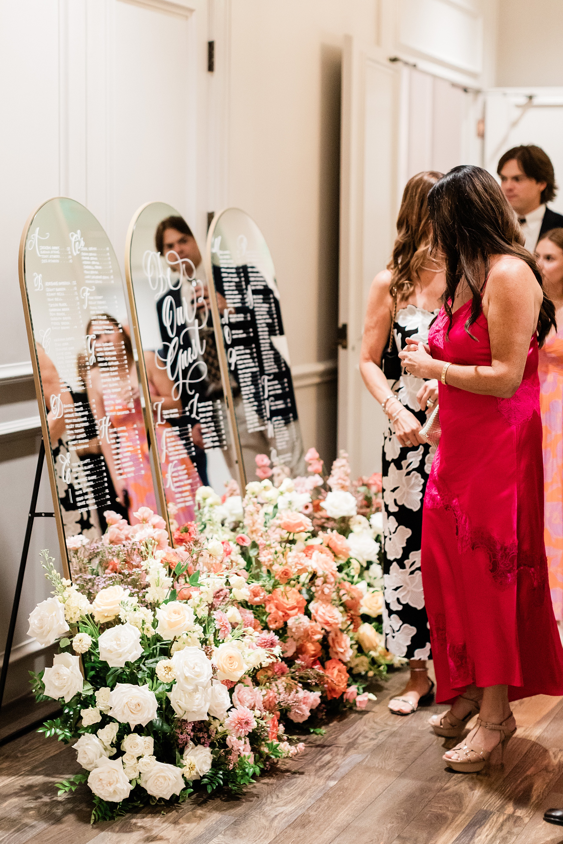
Mirrored Wedding Seating Chart
Their wedding reception featured a three-piece mirrored seating chart. The arched mirrors with gold frames were lettered by hand. A fresh flower display of white, cream, and various pink flowers sat at the base of the seating chart making it an eye-catching display.
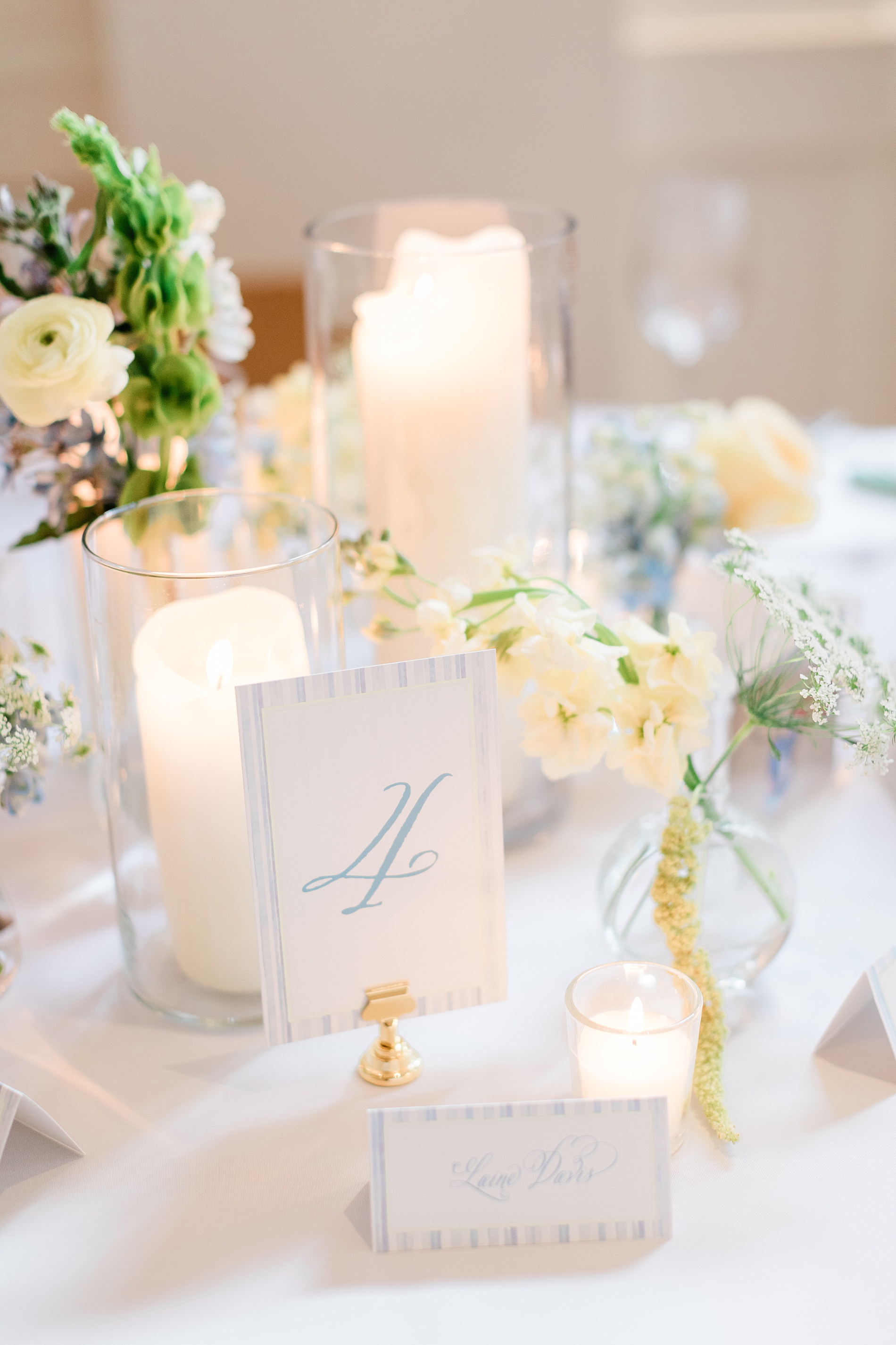
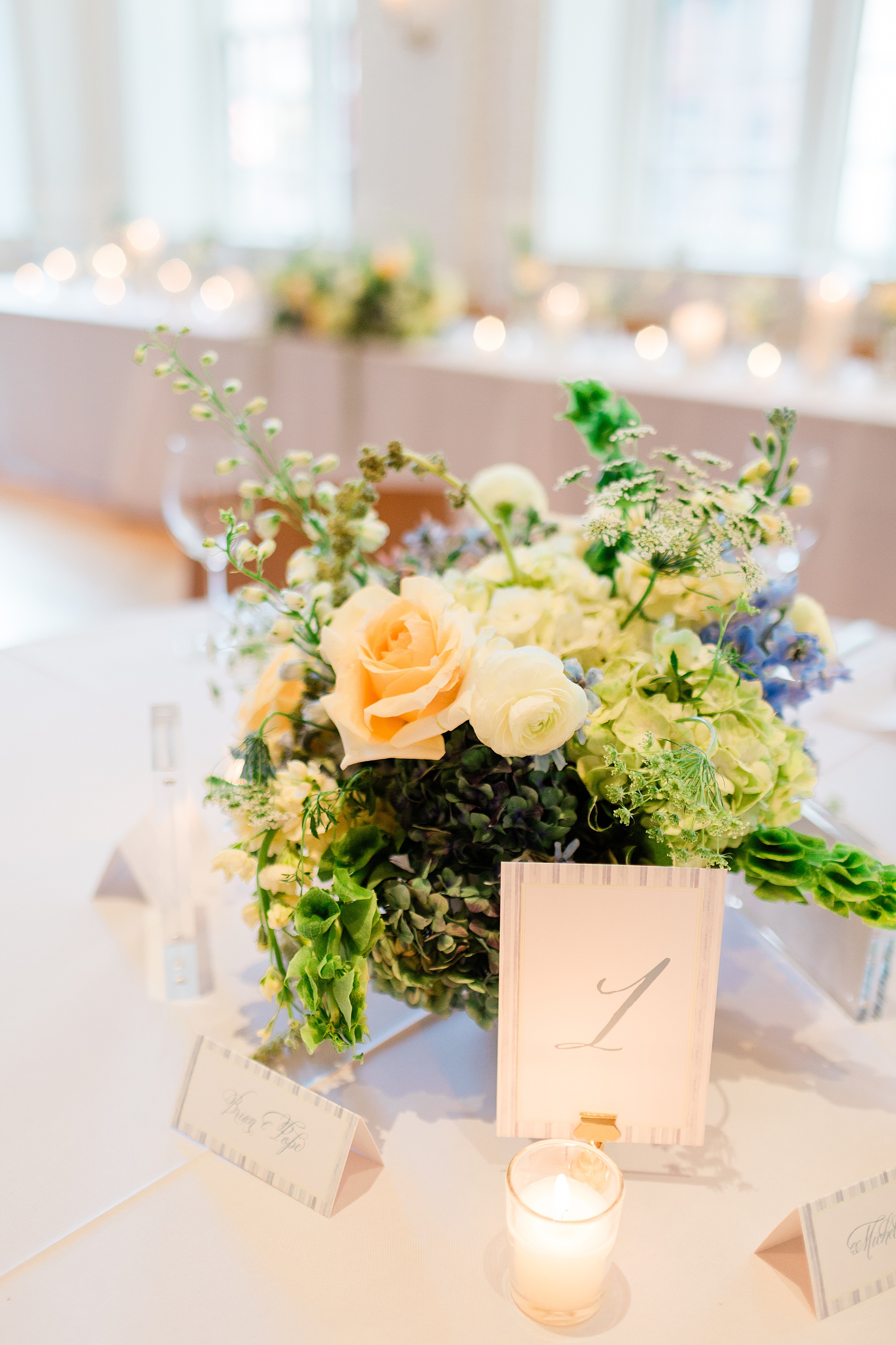
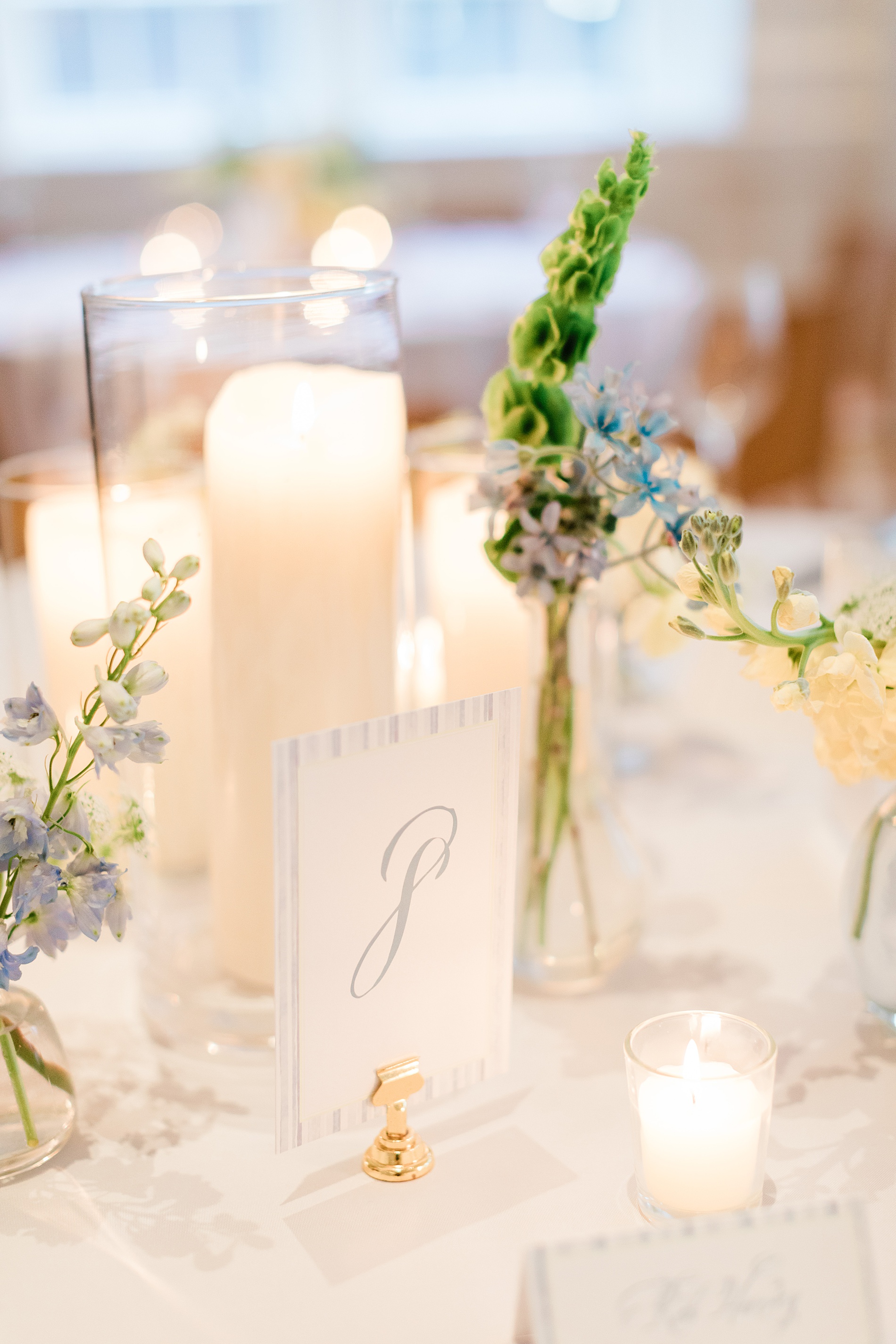
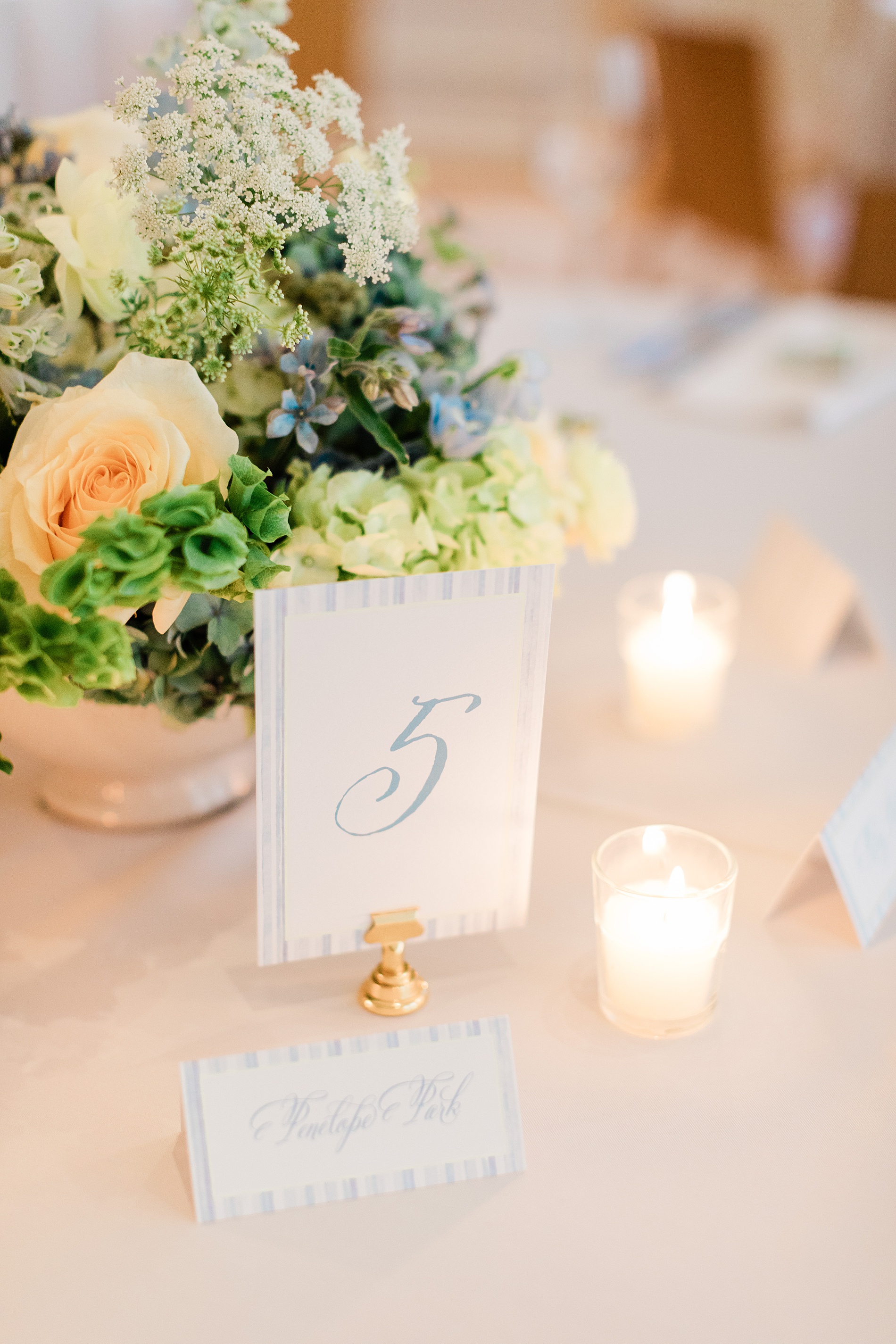
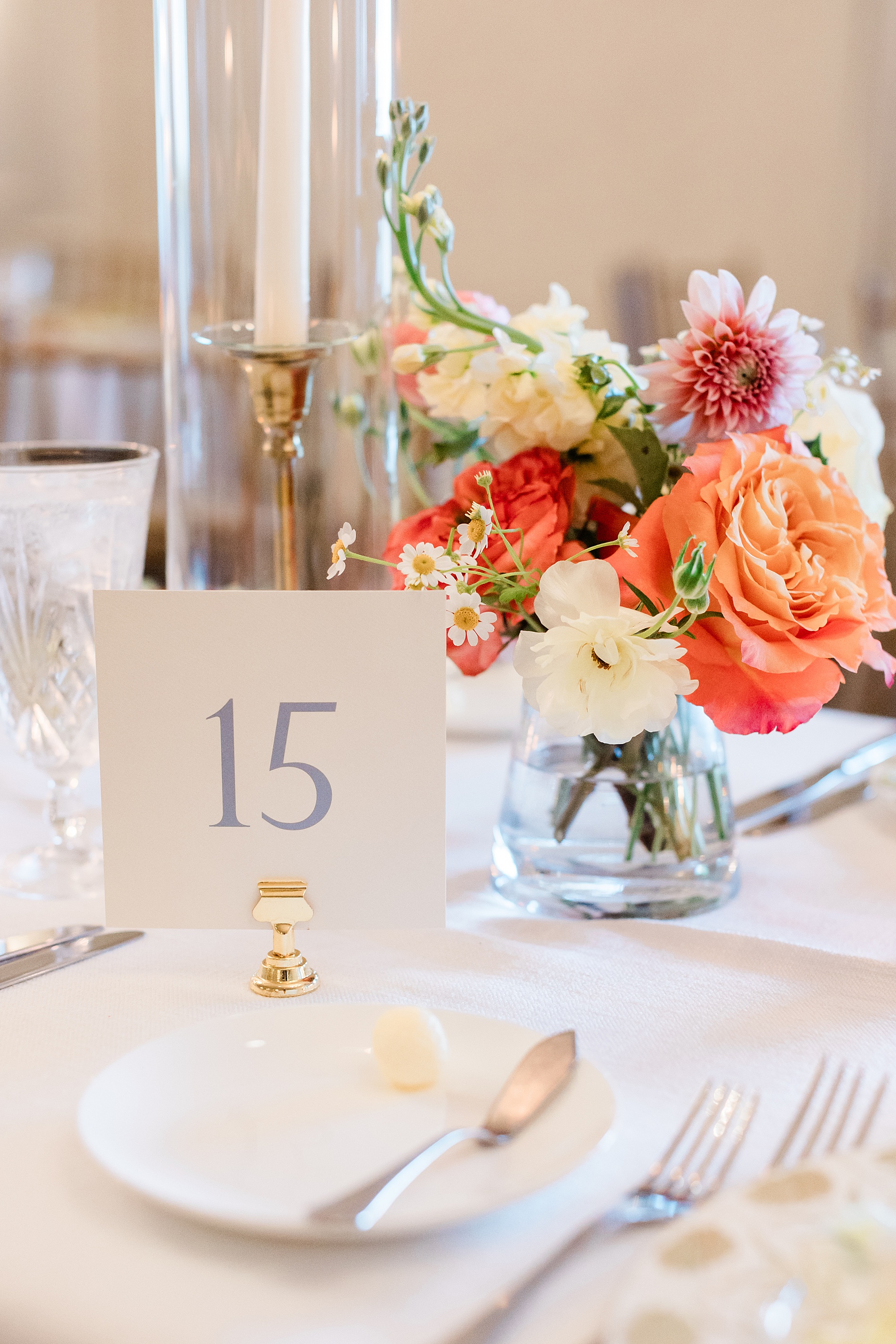
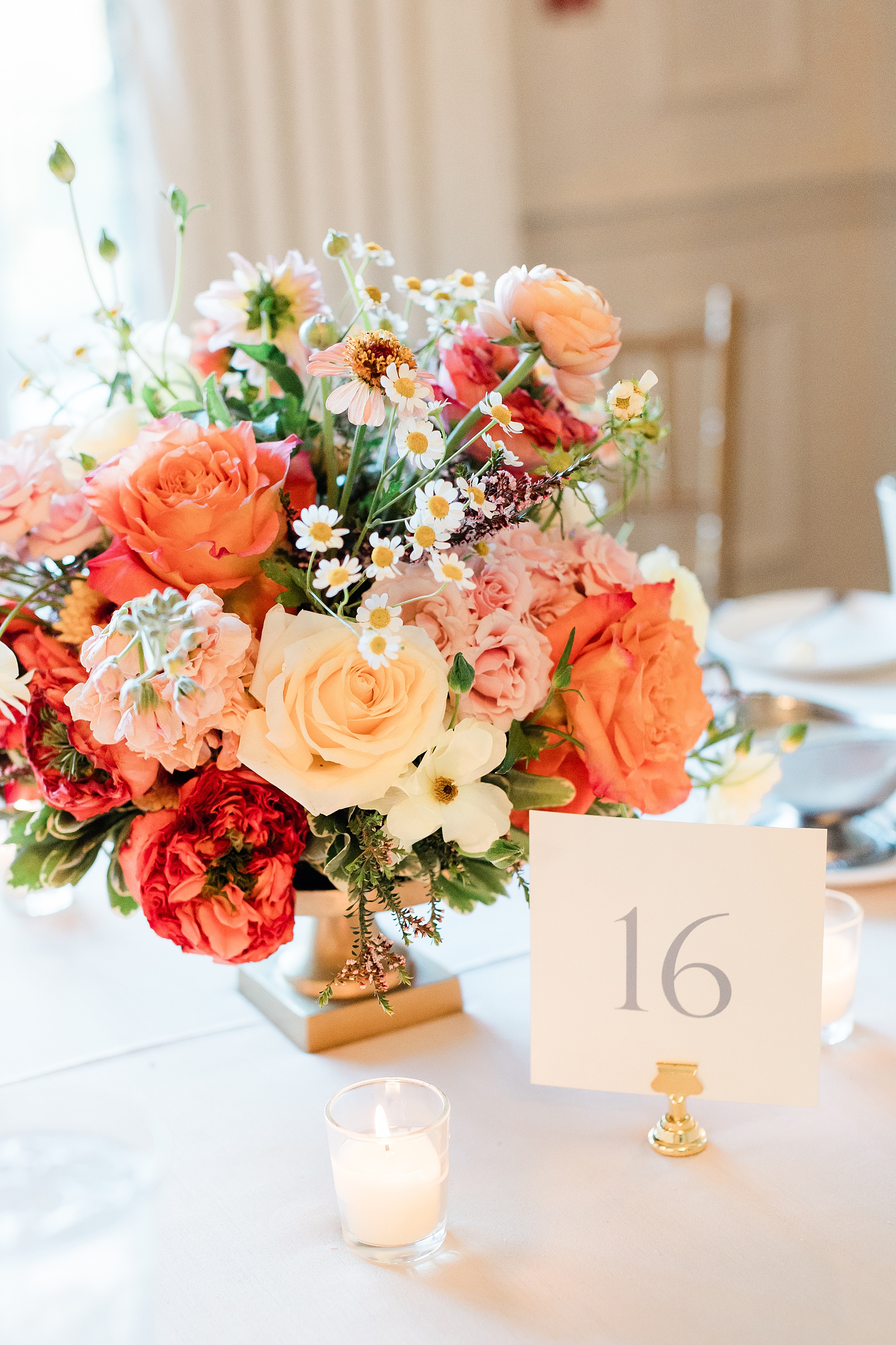
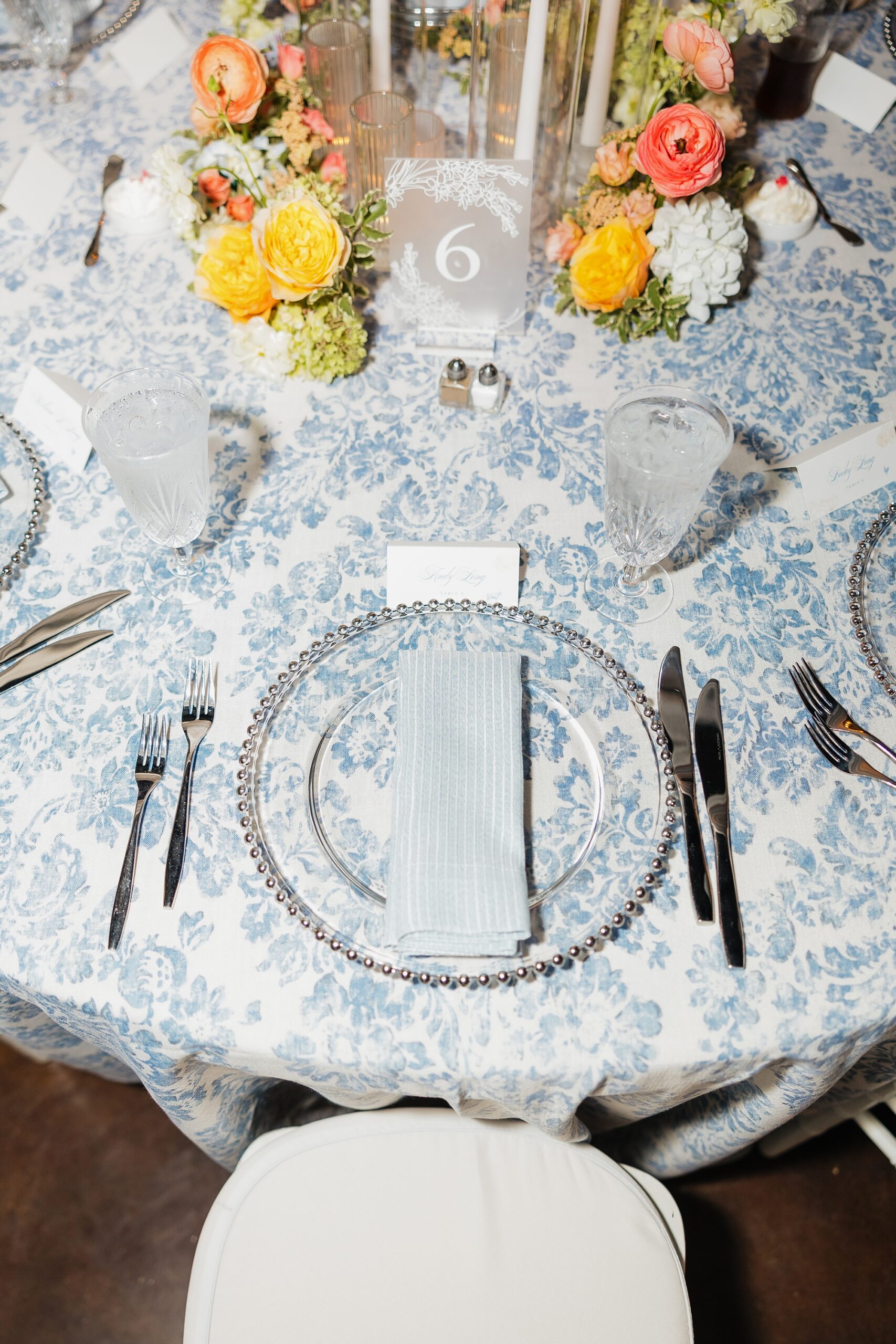
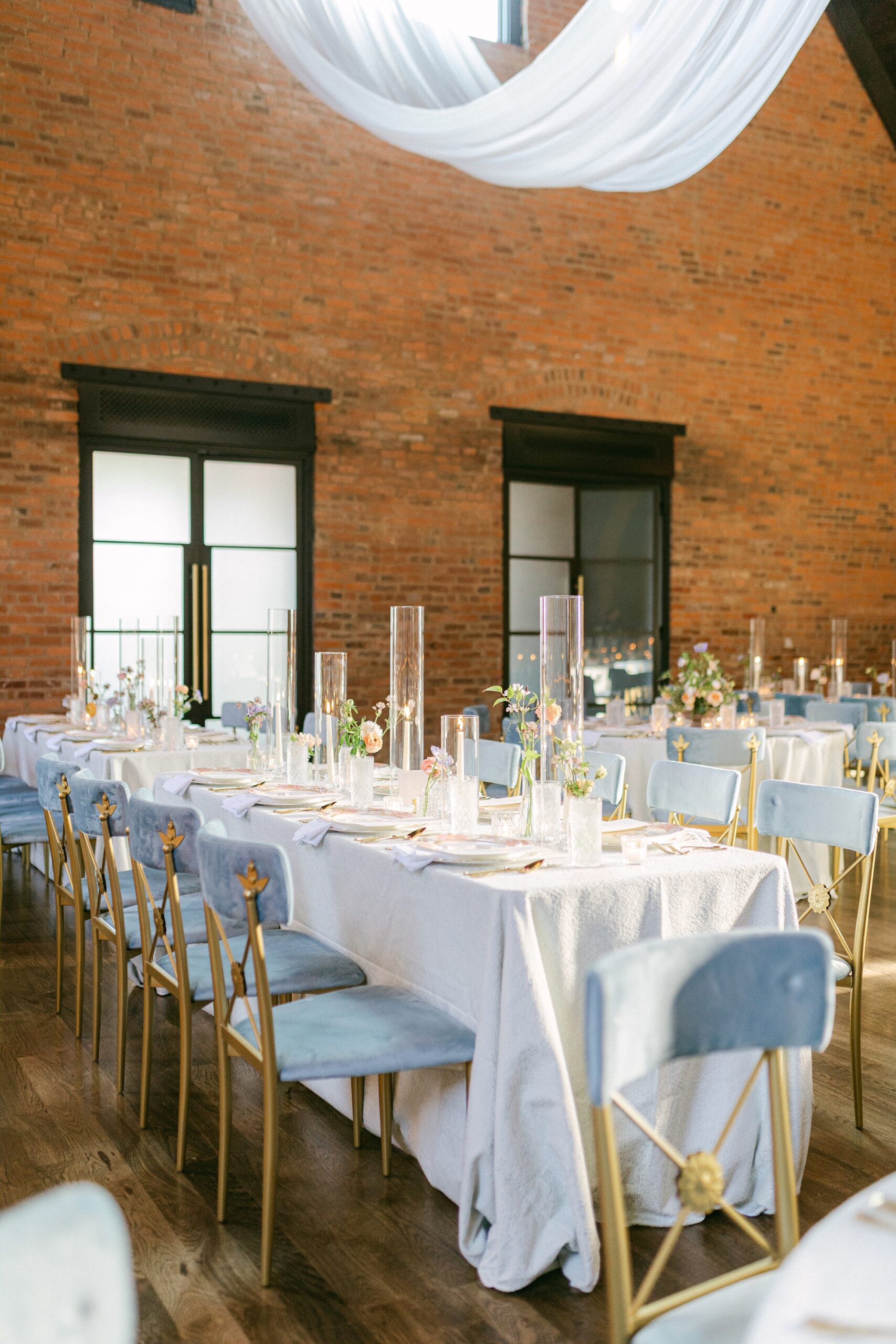
Table Numbers
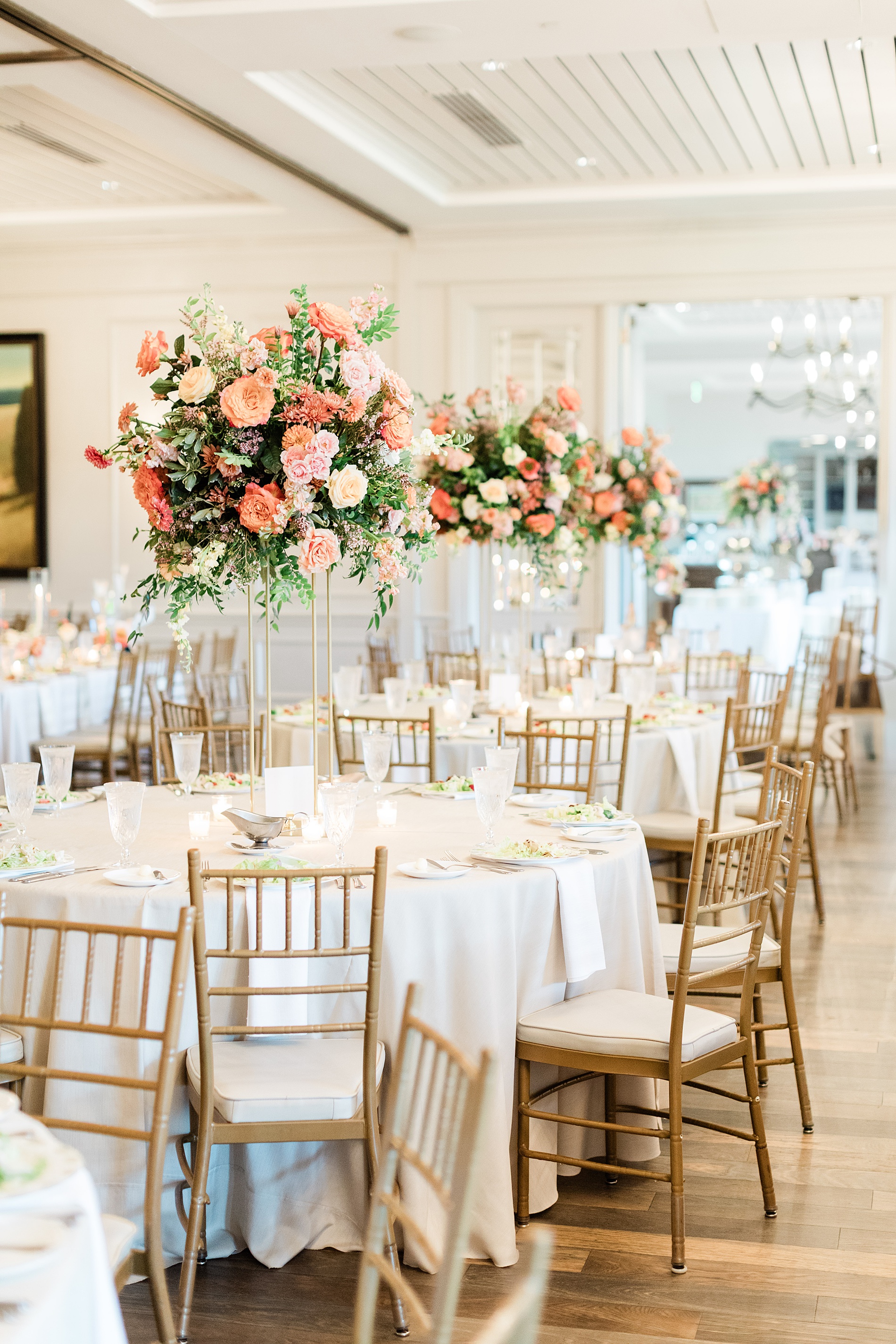
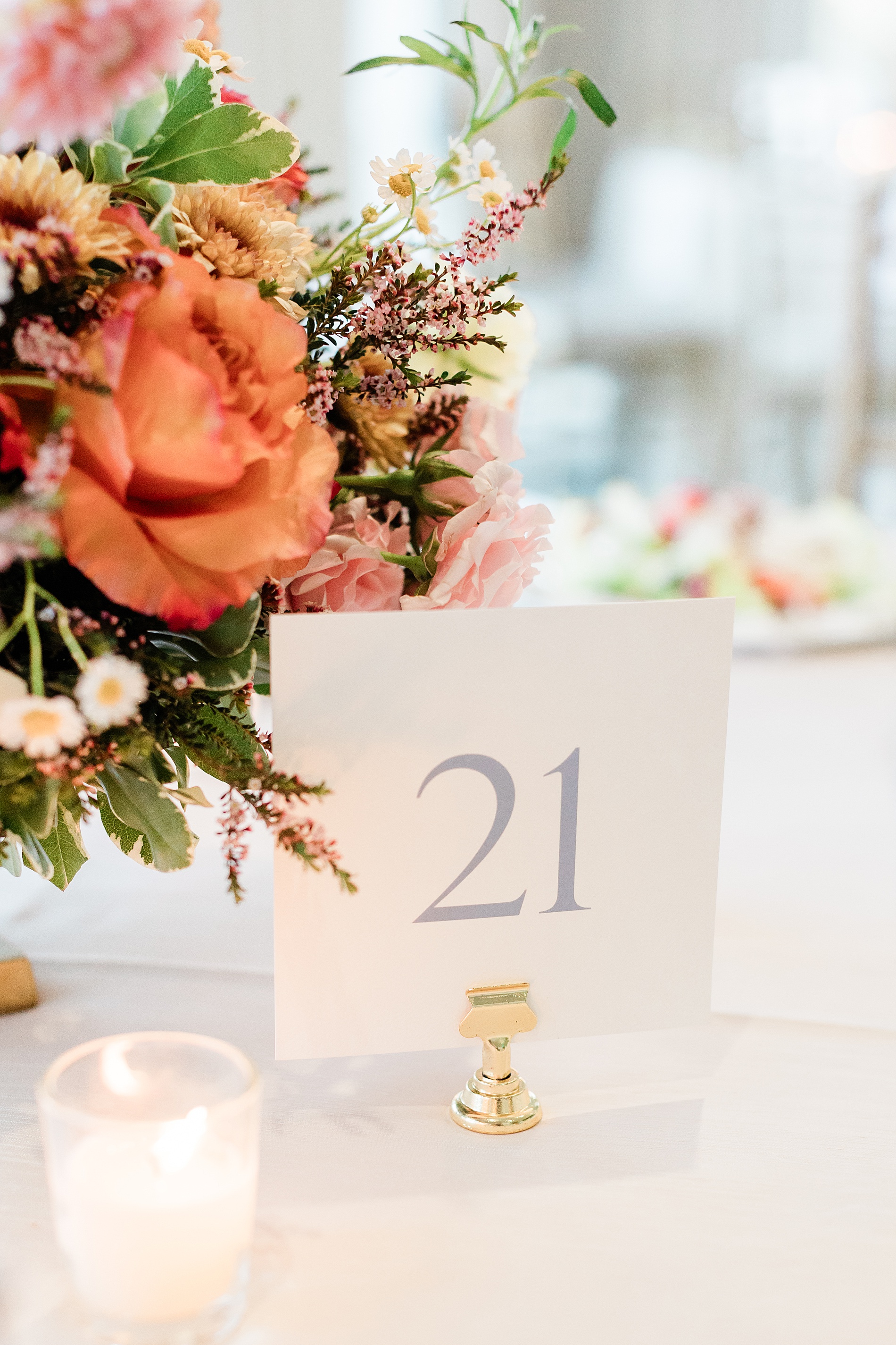
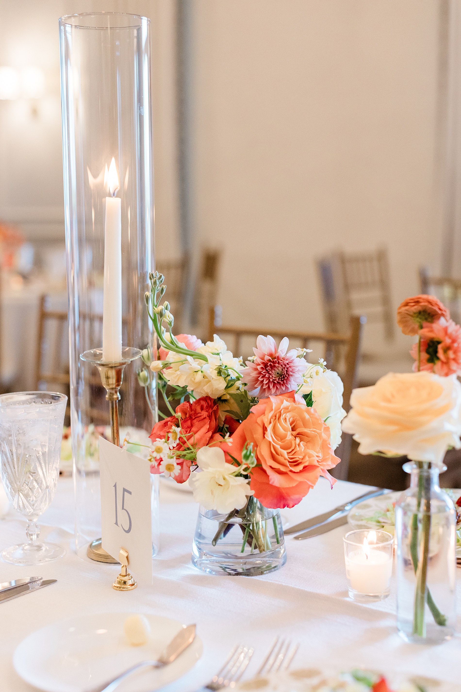
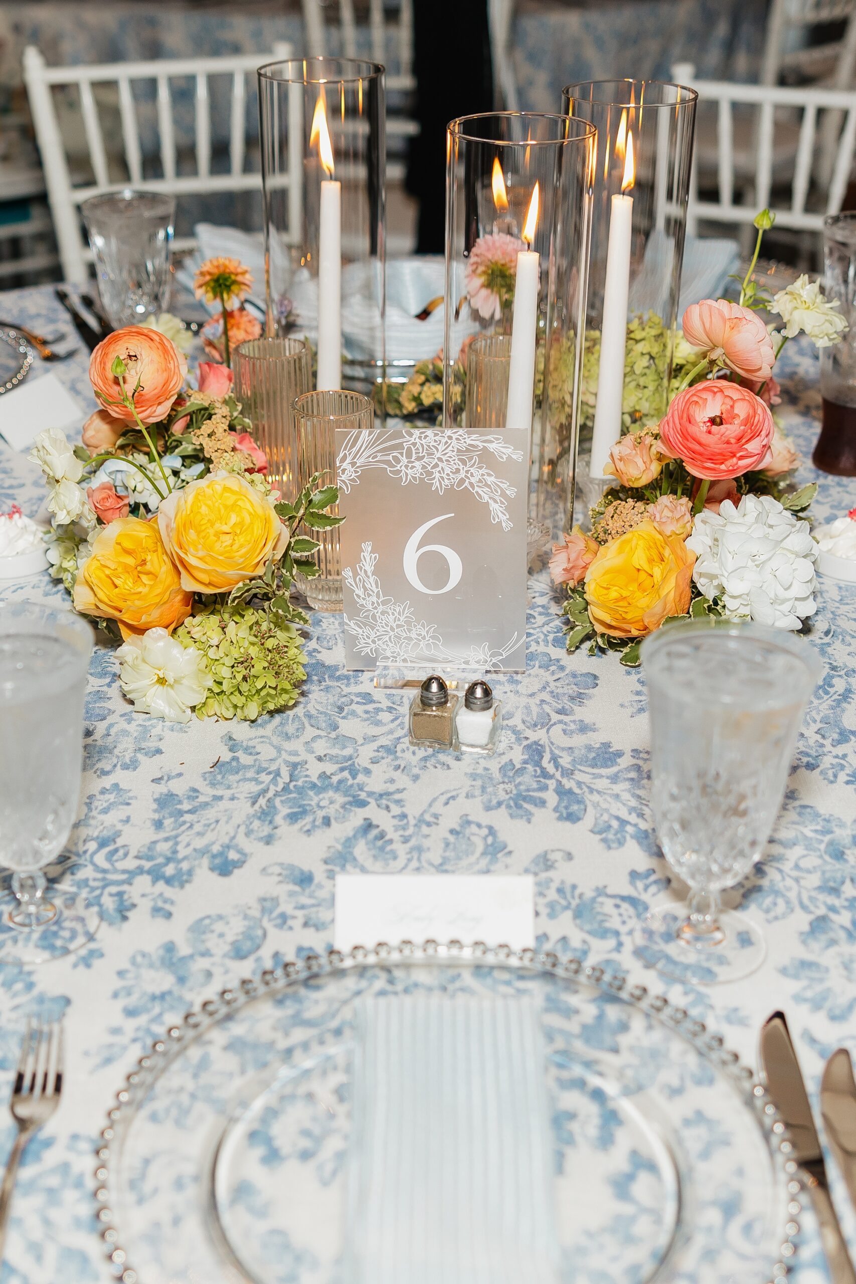
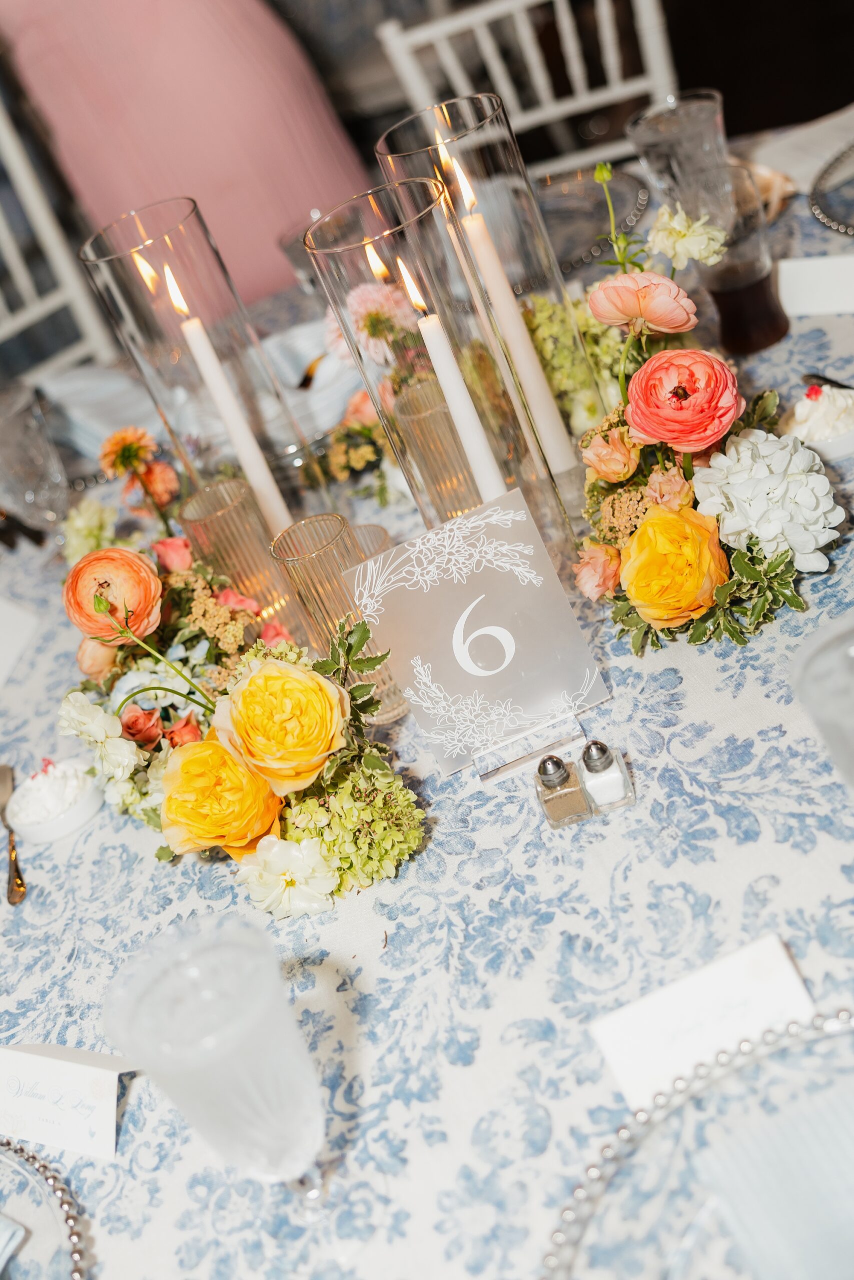
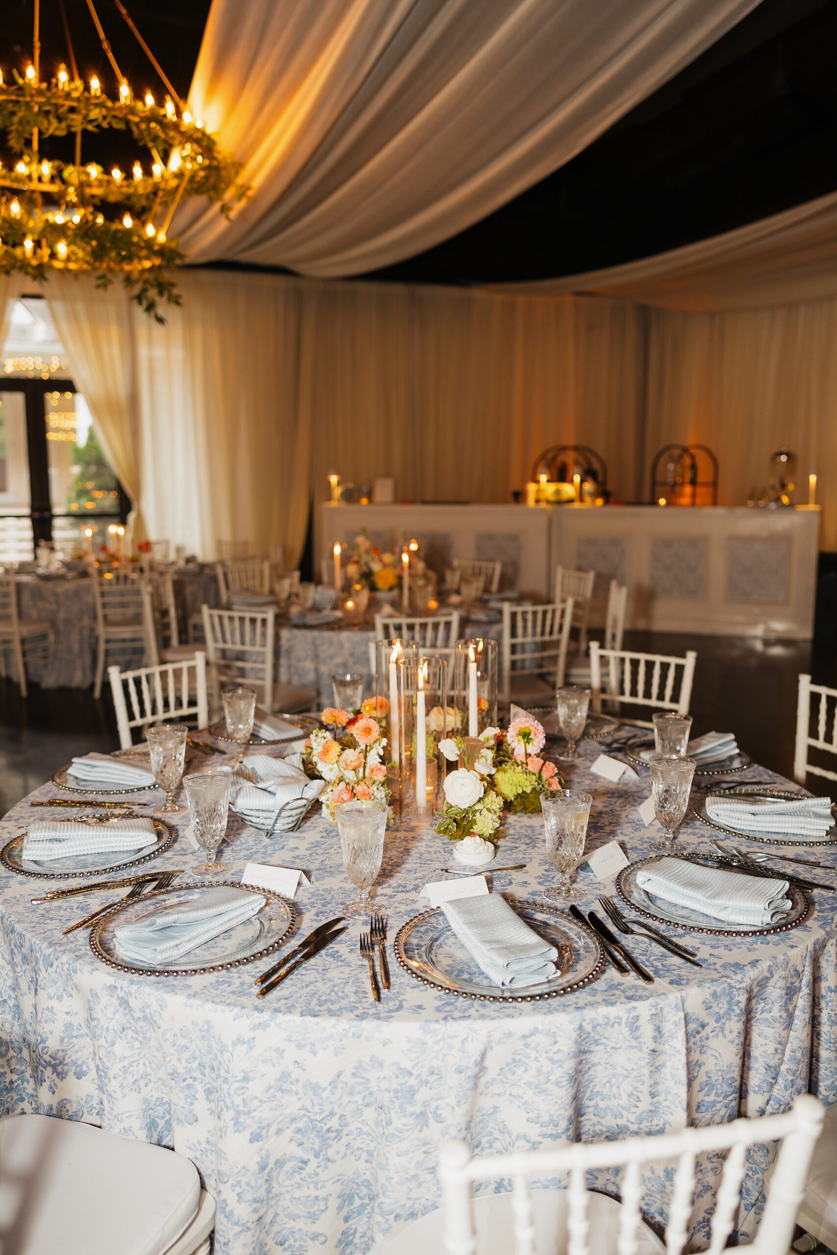
Colorful flower centerpieces decorated the center of each table. The table numbers we designed elegantly completed the tablescape. The white cards with numbers in a dusty blue color were displayed in gold holders tying the look together.
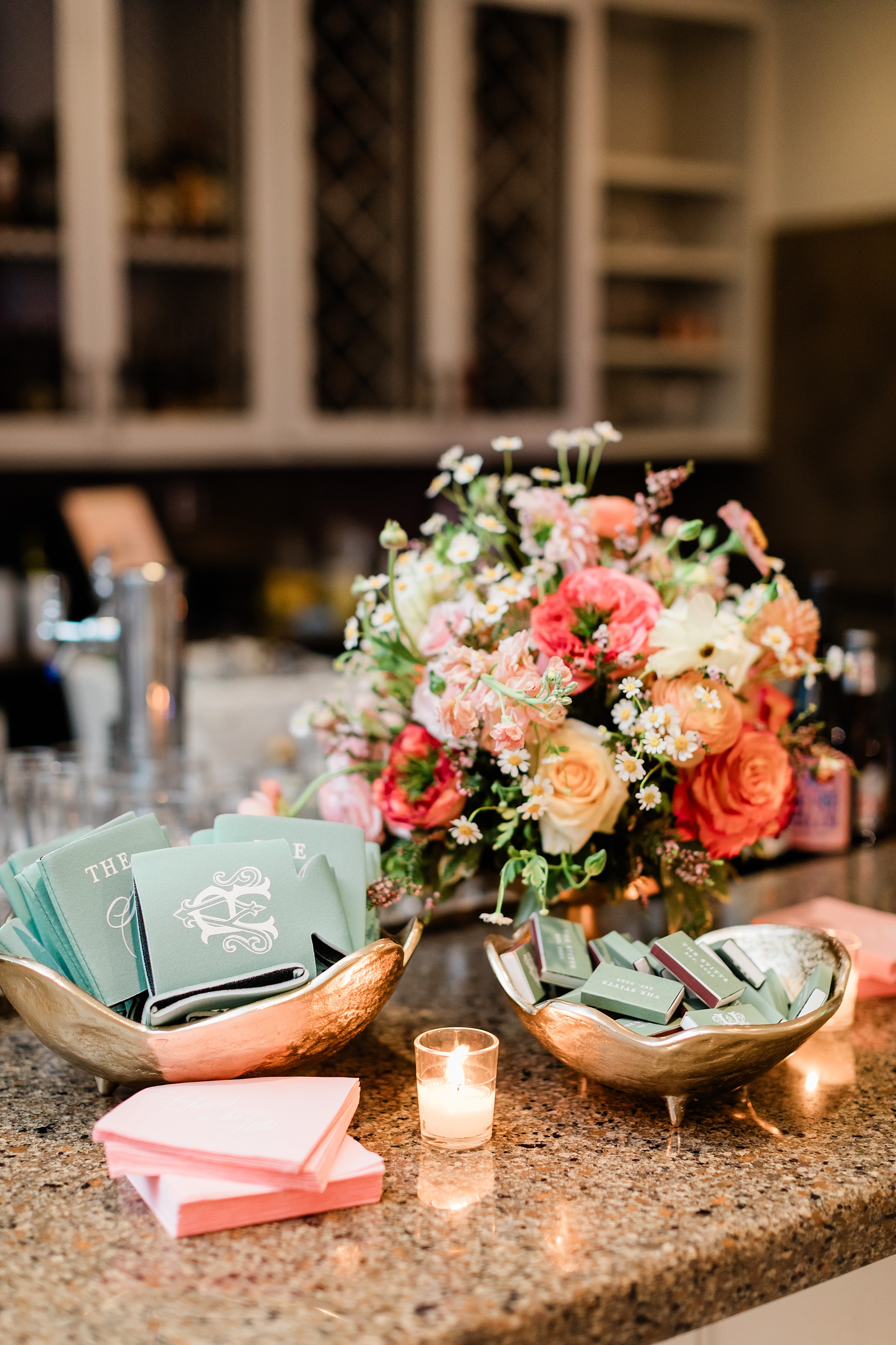
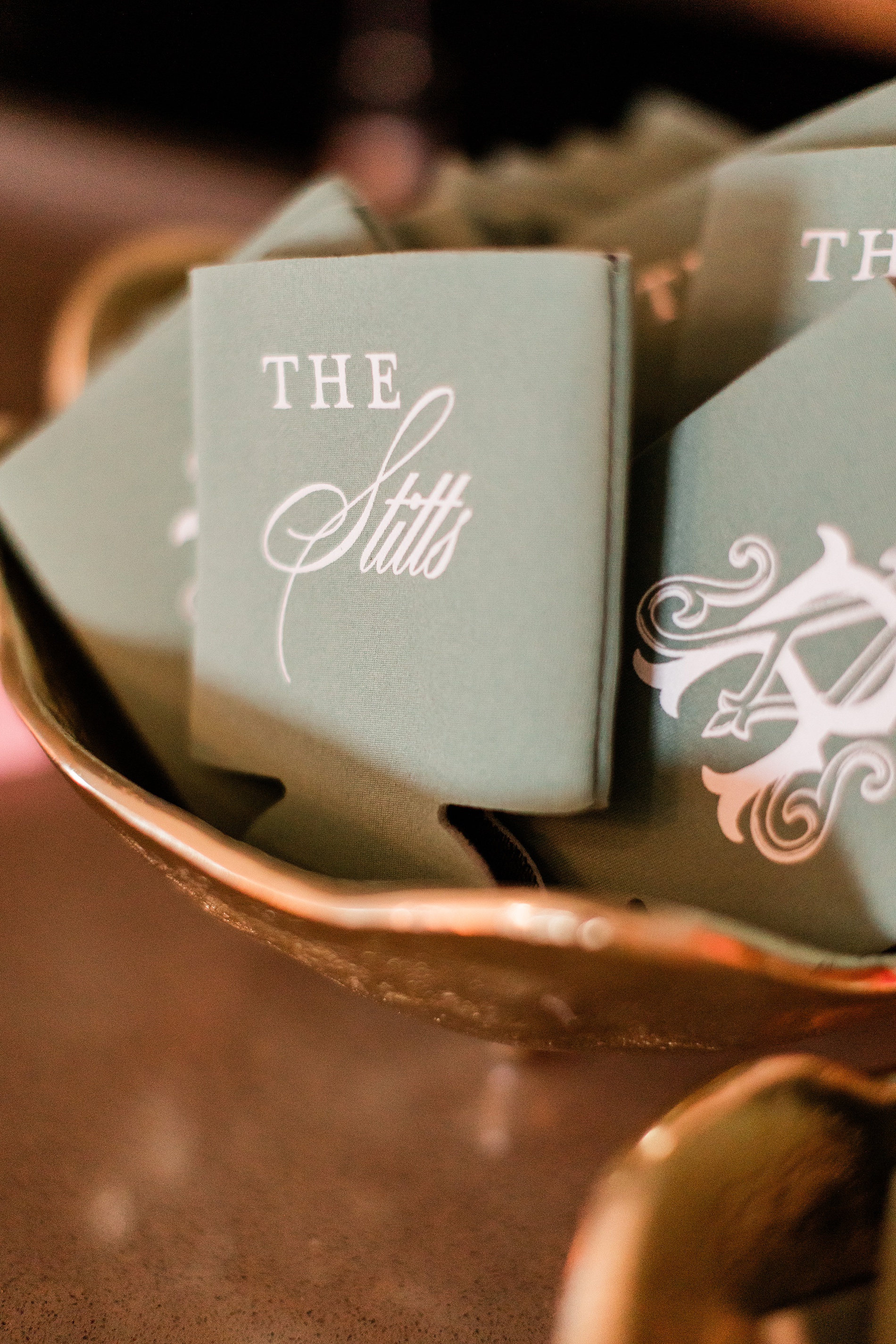
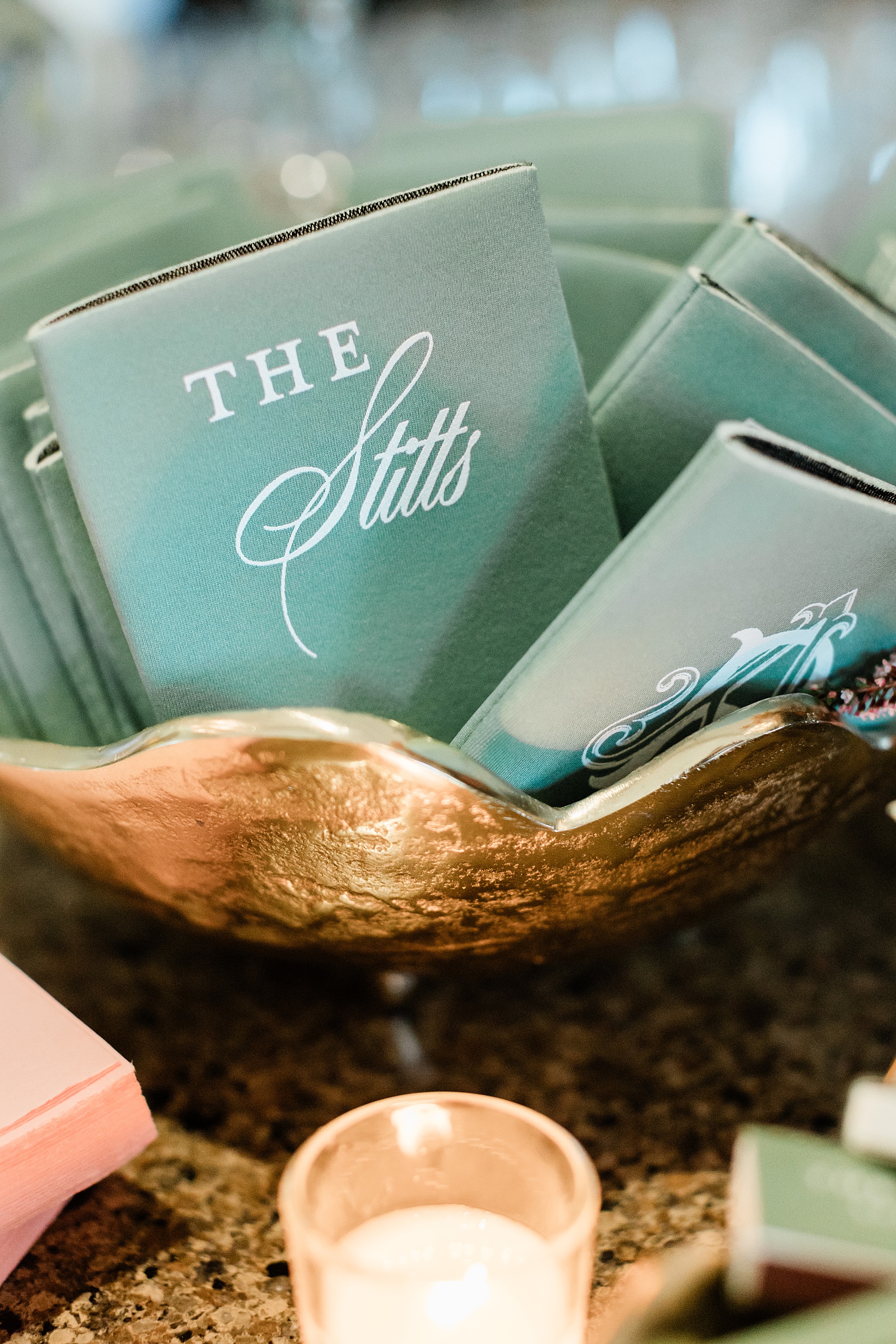
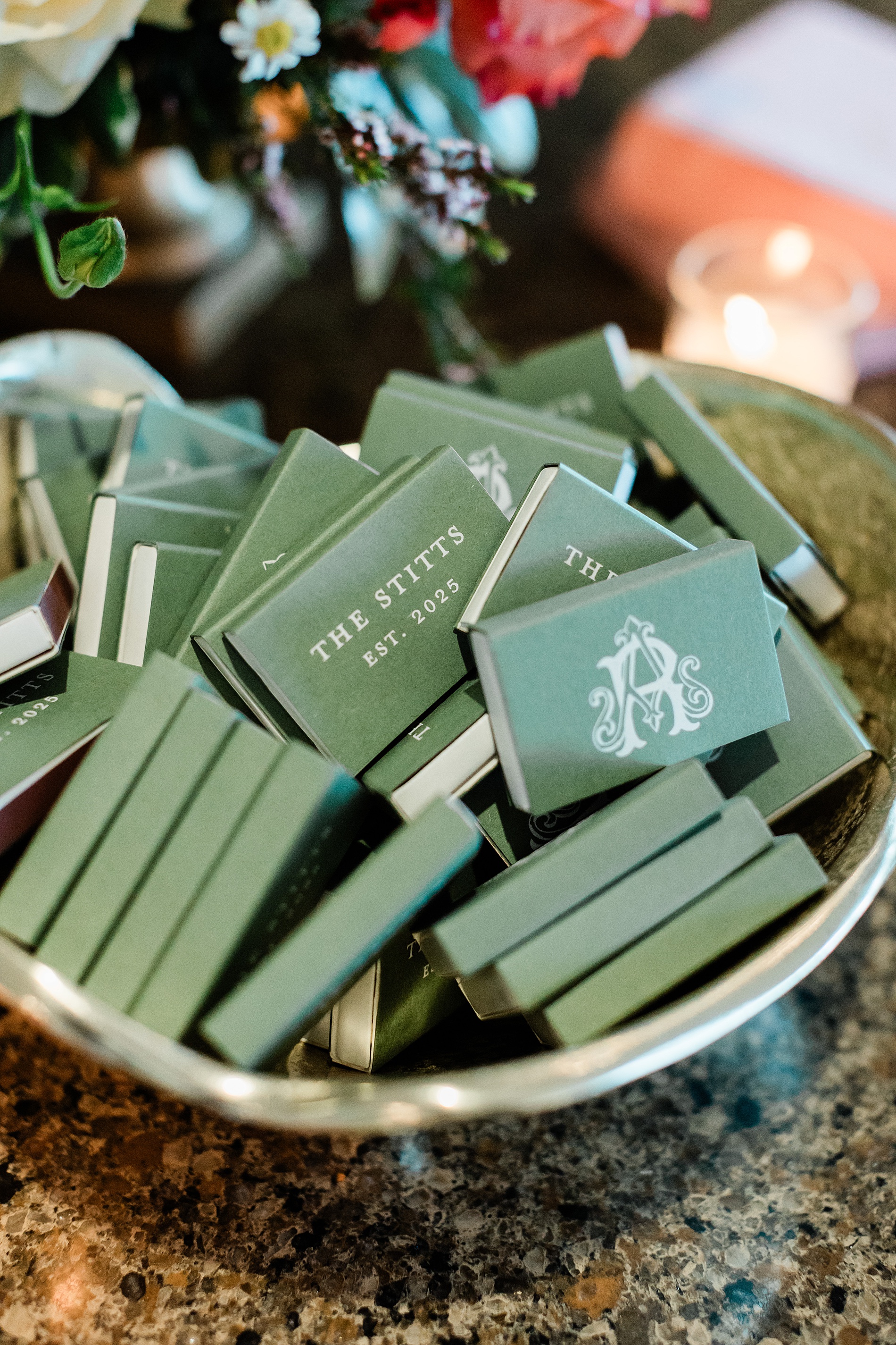
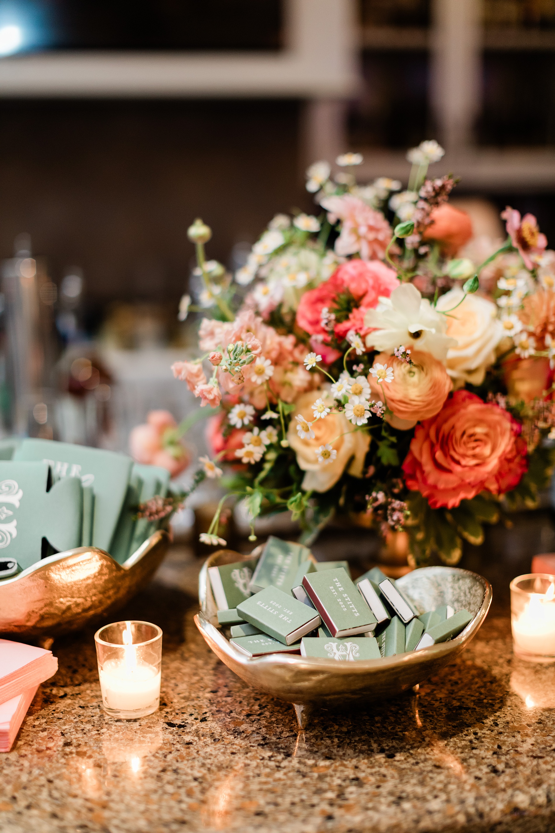
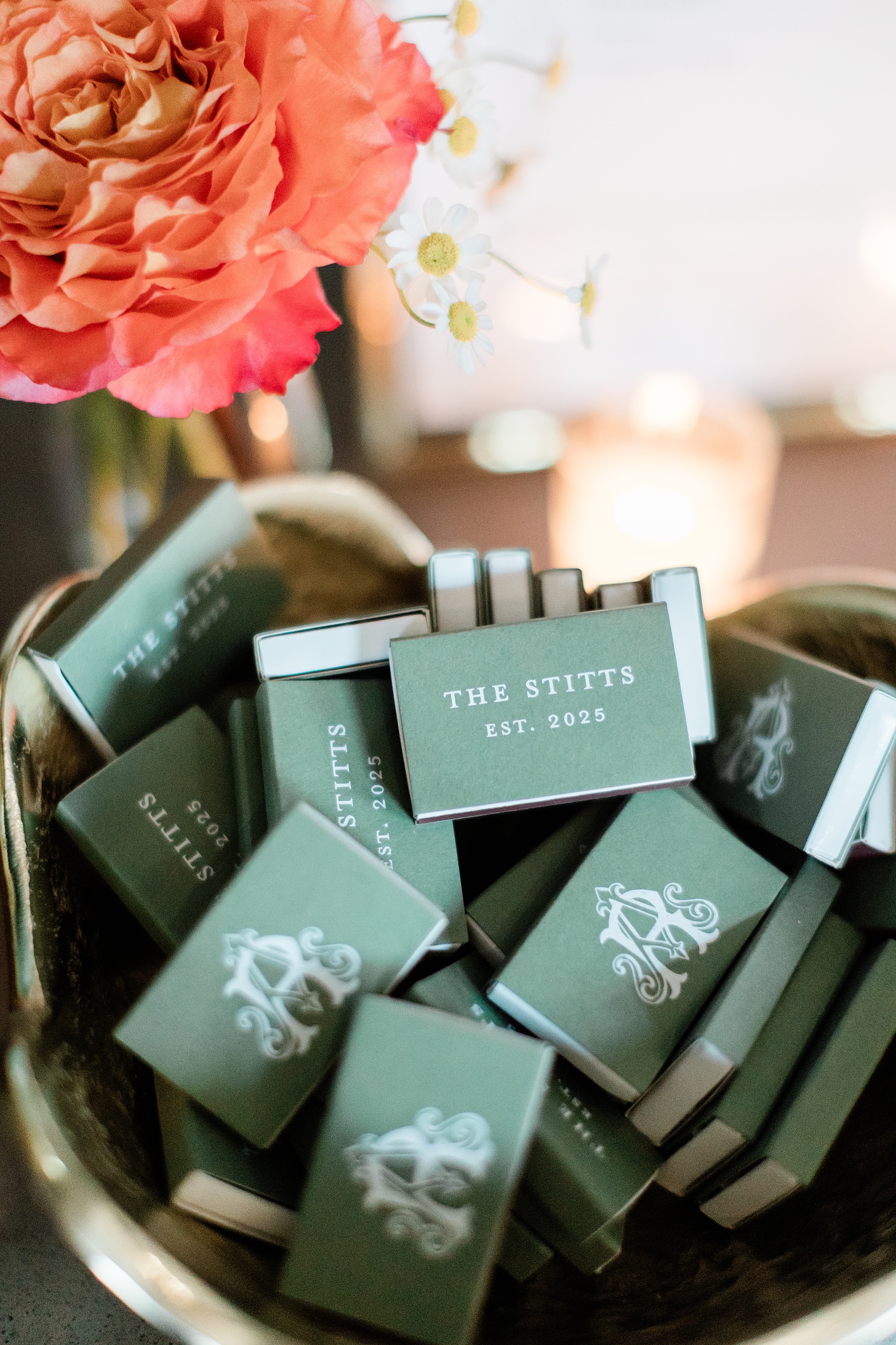
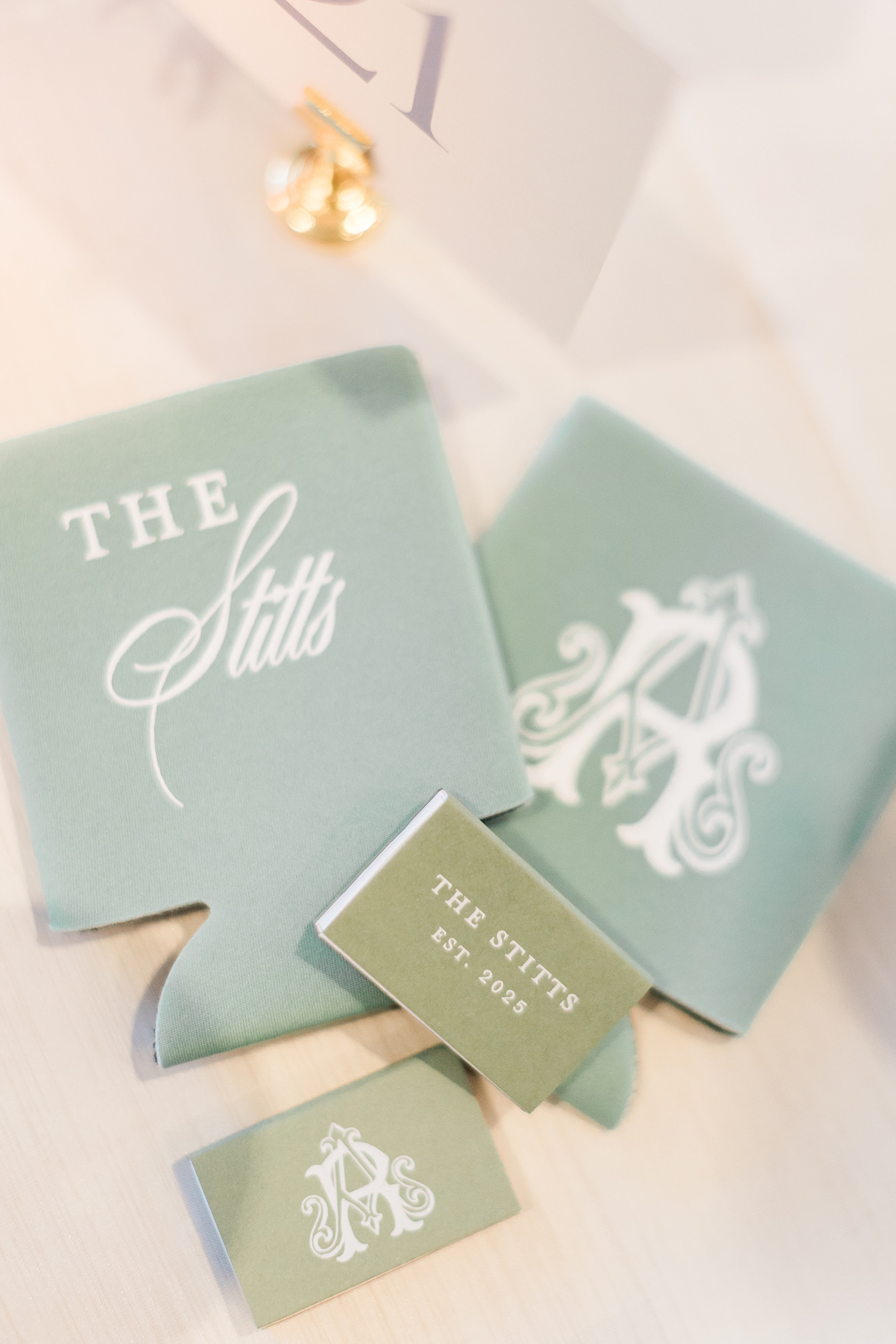
Custom Wedding Favors
Anna and Ross decided on custom drink koozies and matches for their wedding favors. To make them stand out, we put their custom monogram as seen on the invitations and programs on one side of the koozie and match box, and the other side featured their new shared name, The Stitts.
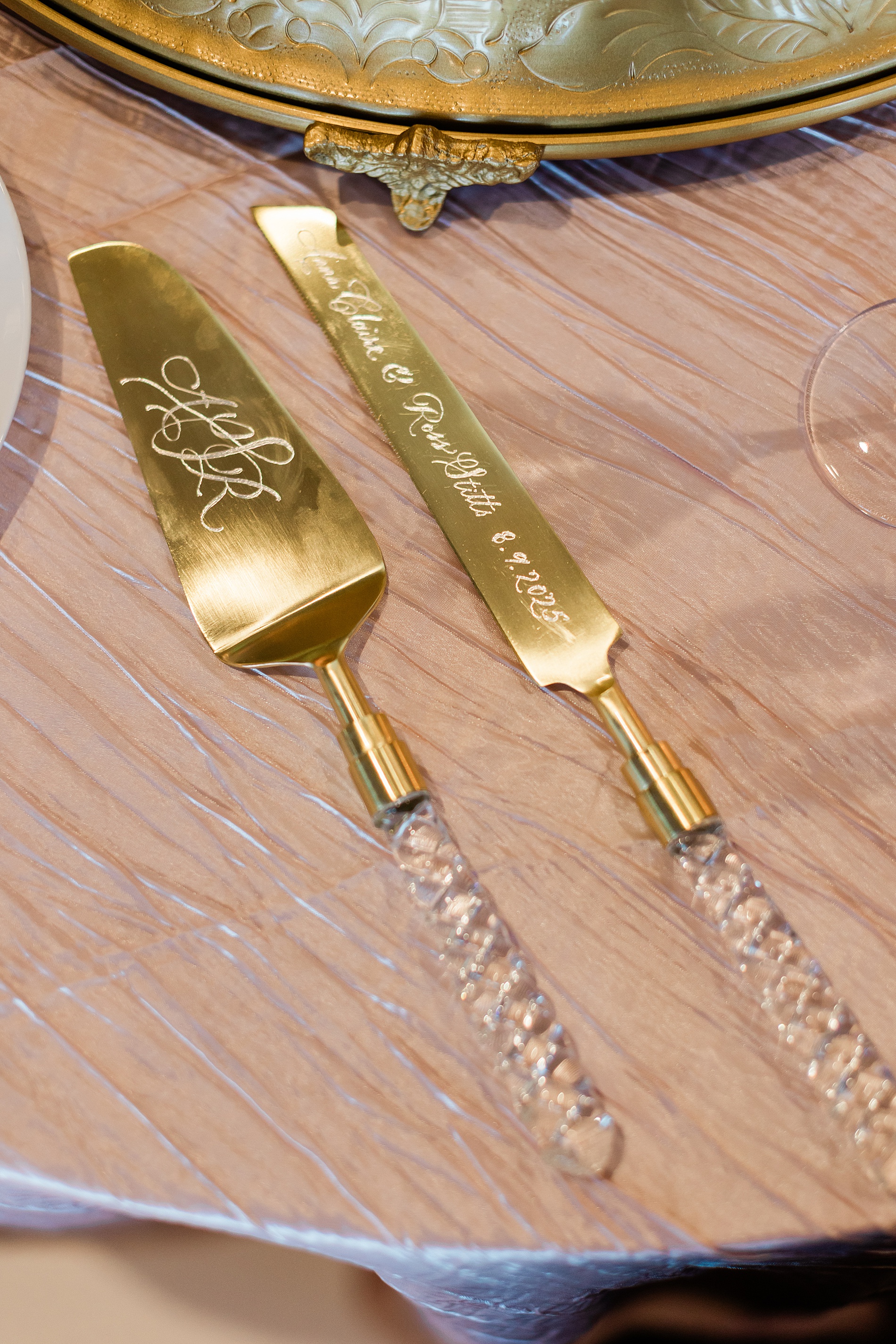
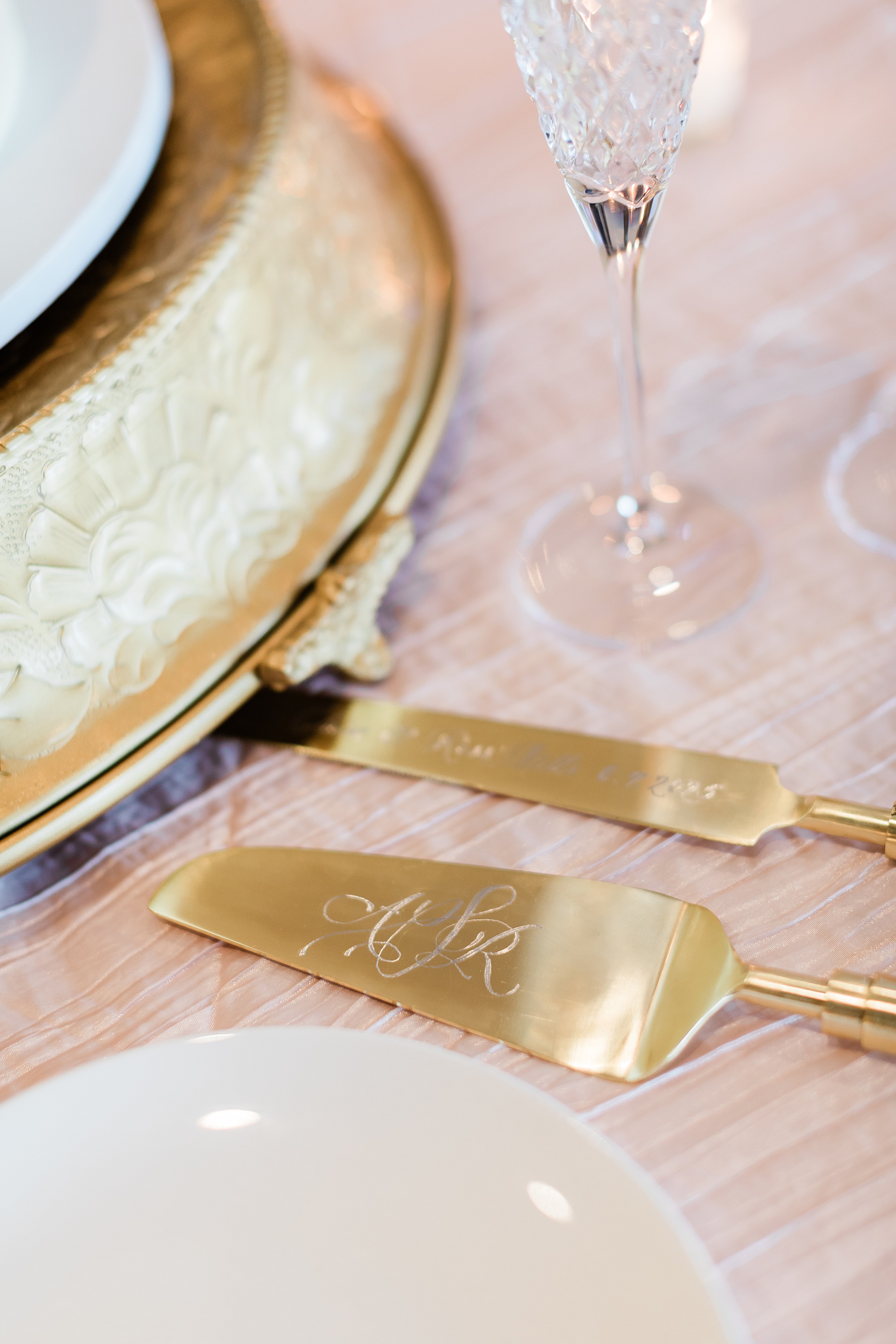
Engraved Cake Serving Set
One of my favorite items from this wedding was the hand-engraved cake serving set, which was a gift from the Mother of the Bride to the couple. The knife was engraved with their names and wedding date, while the cake server was hand engraved with a custom monogram.
Tying all the details together for this wedding weekend was so fun. At White Ink Calligraphy, we love creating experiences for our couples and their guests by artfully weaving threads of the design throughout the weddding day to create a cohesive look.
Congratulations, Anna and Ross, and thank you for trusting us with your wedding invitations and day of details for both your wedding day and the night before!
If you’re planning a wedding in Nashville, or anywhere in the world, we’d love to help you create meaningful, personalized stationery and event details that tell your story. We work with couples worldwide to design details you and your guests will remember forever.
Reach out today to learn more about our full-service wedding and event design offerings! We can’t wait to create something unforgettable for you!
If you enjoyed this post, you’ll love these other blogs!
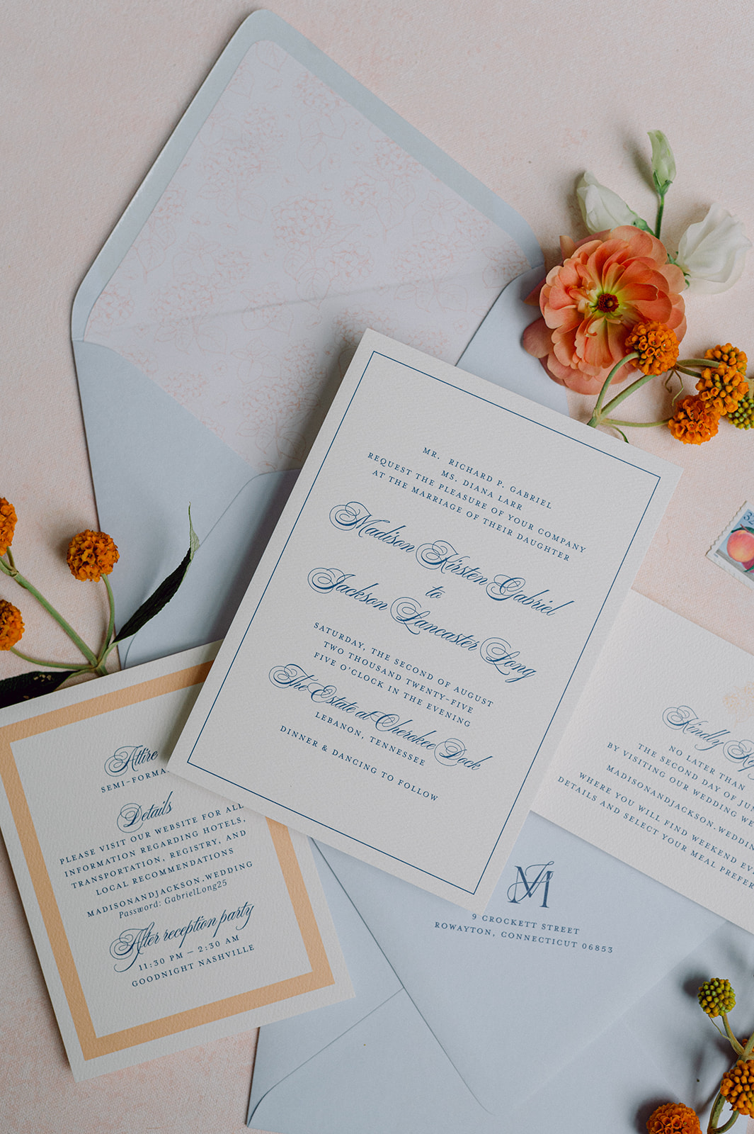
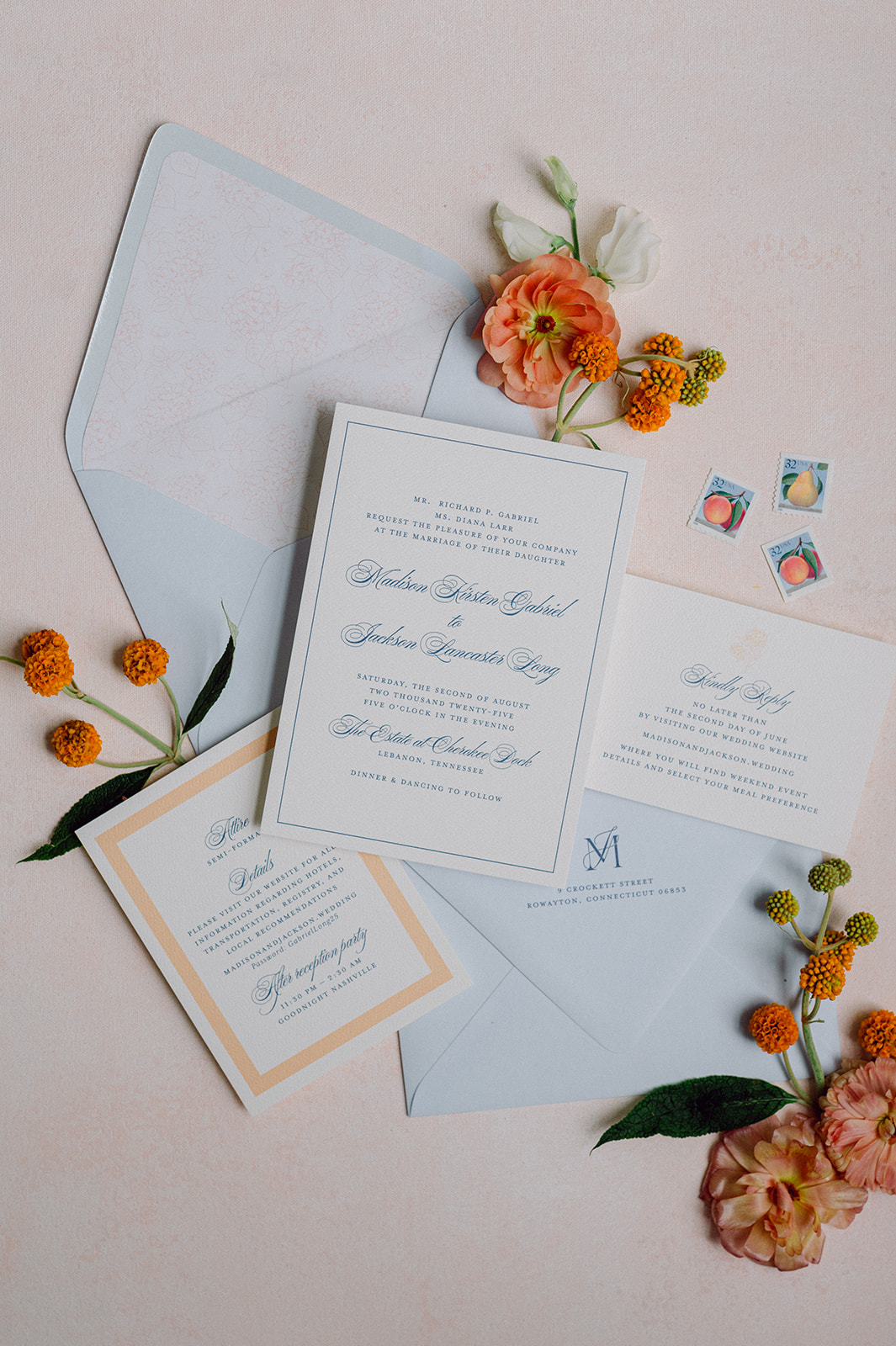
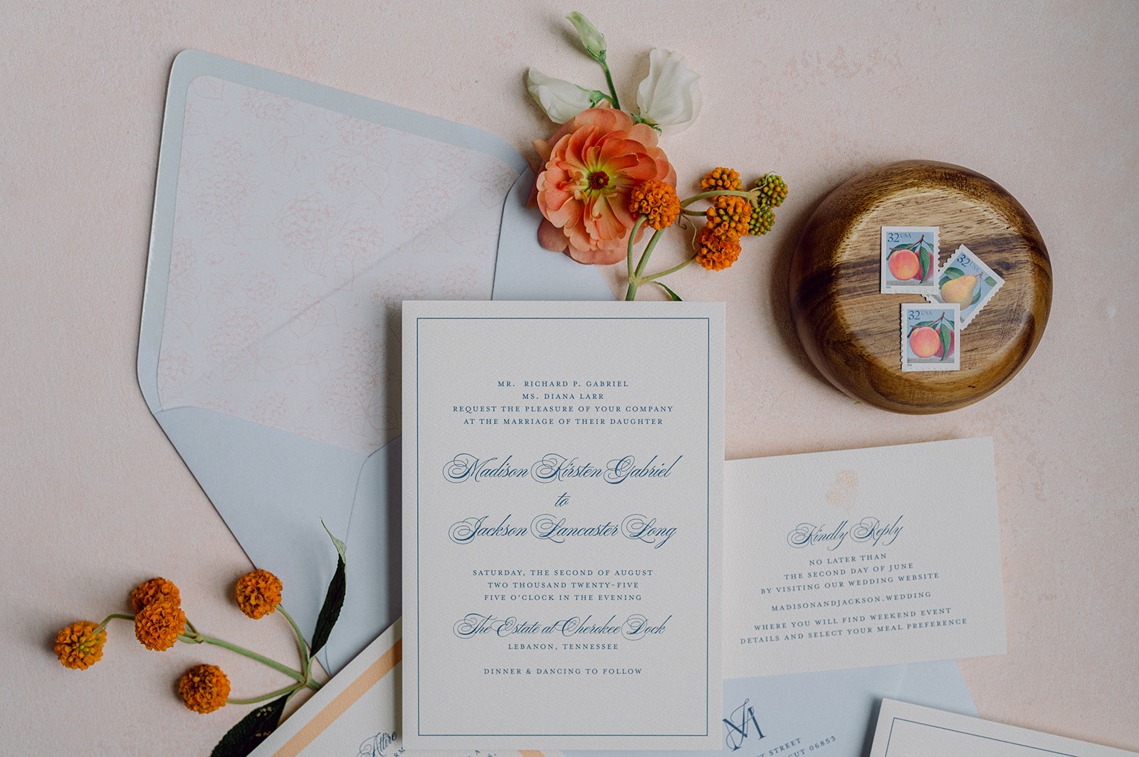
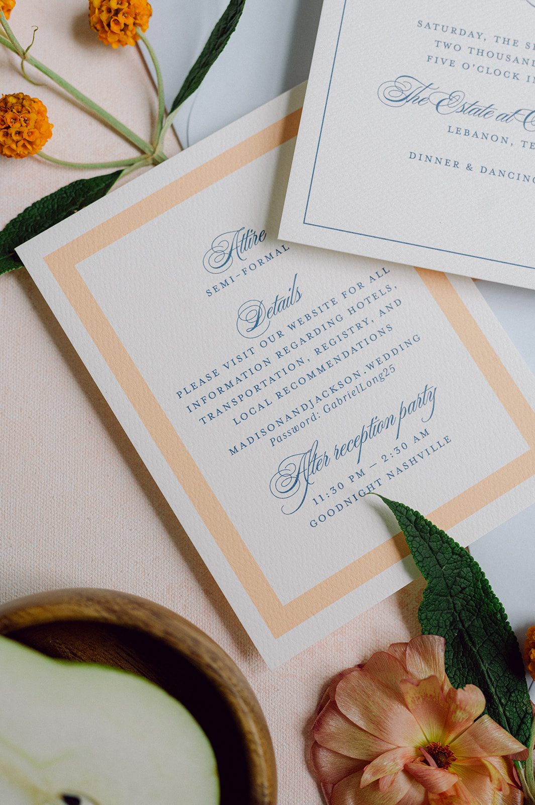
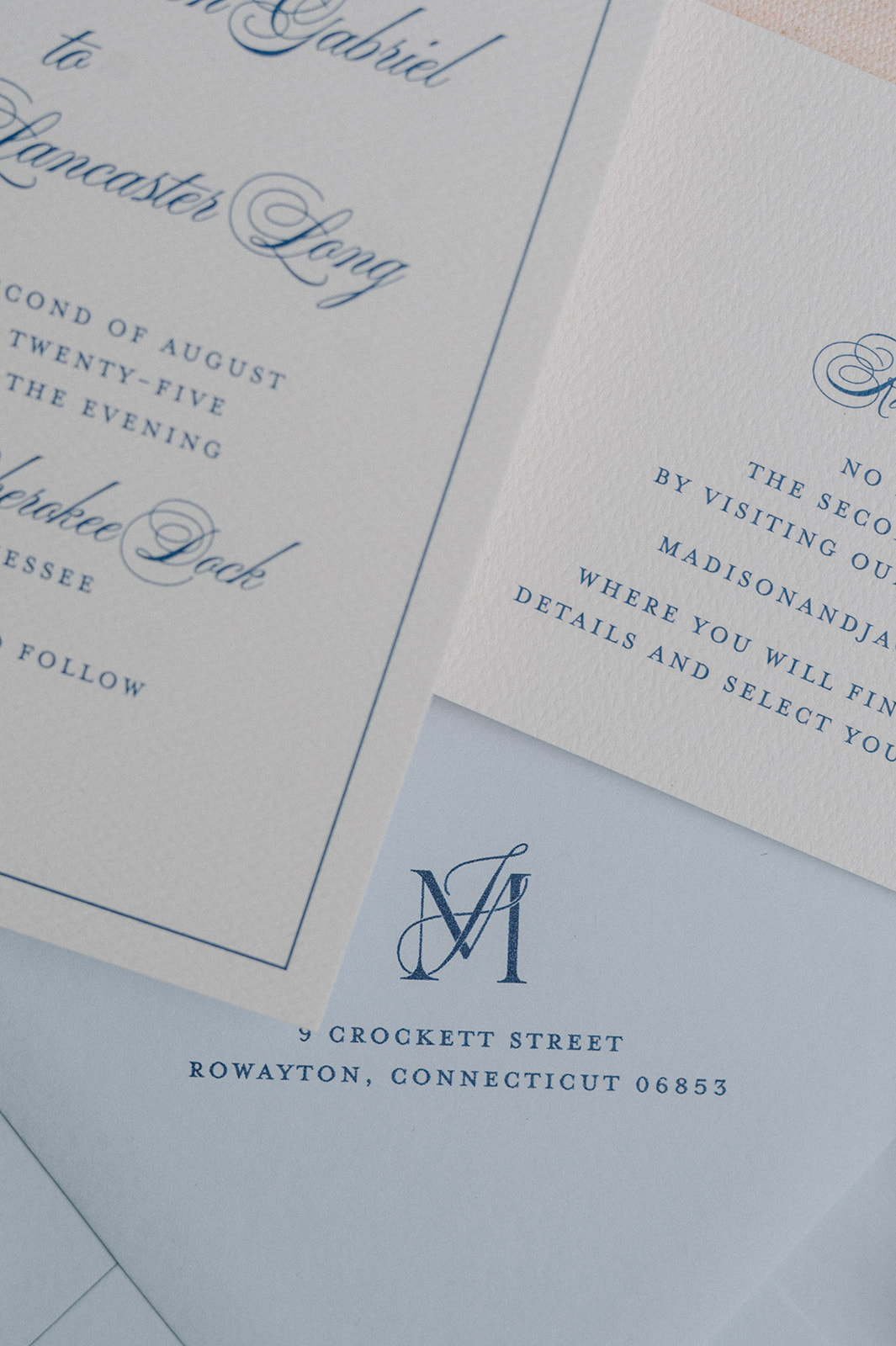
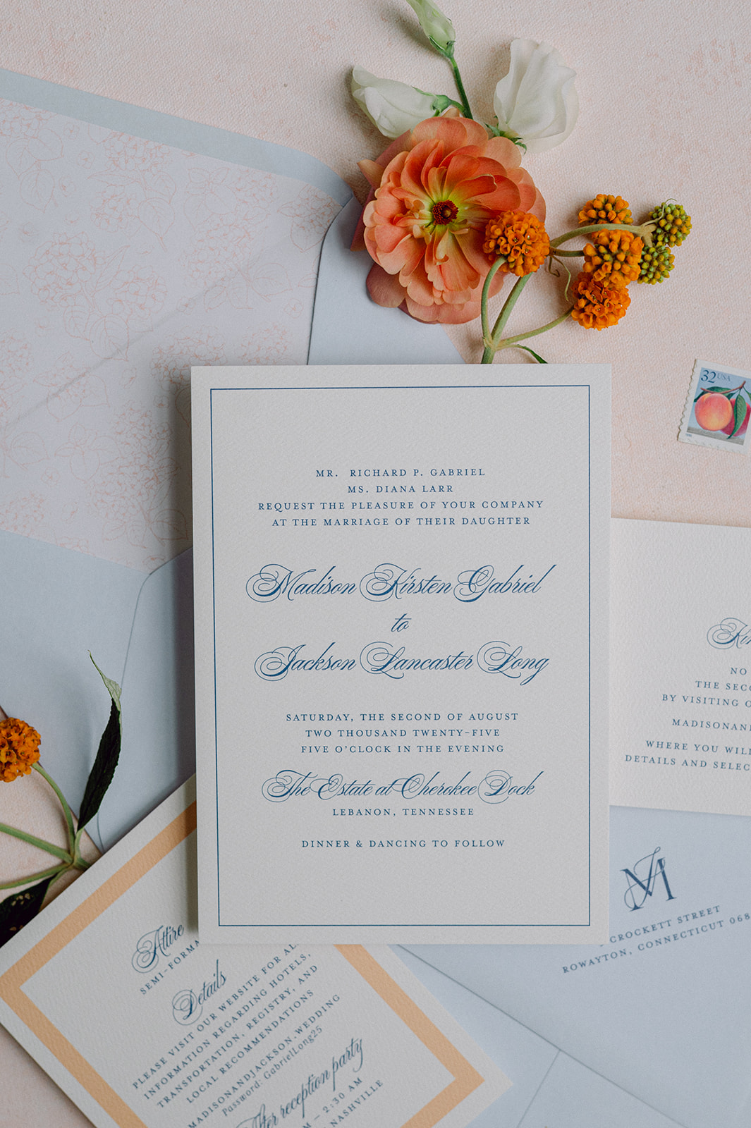
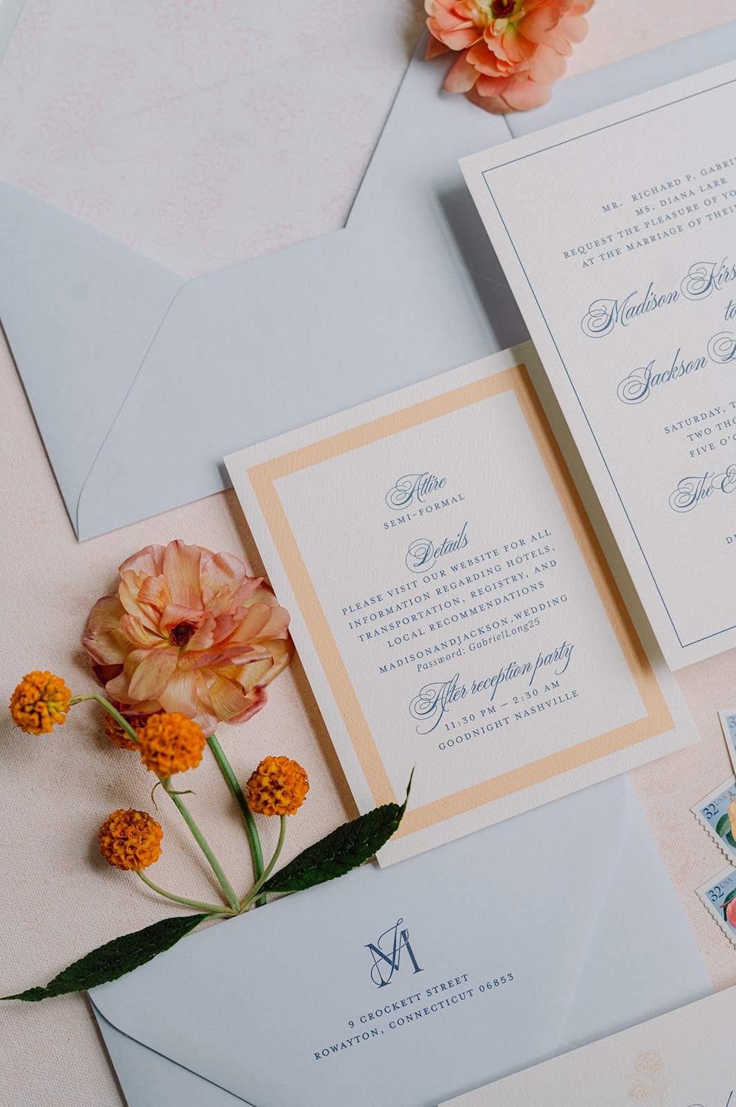
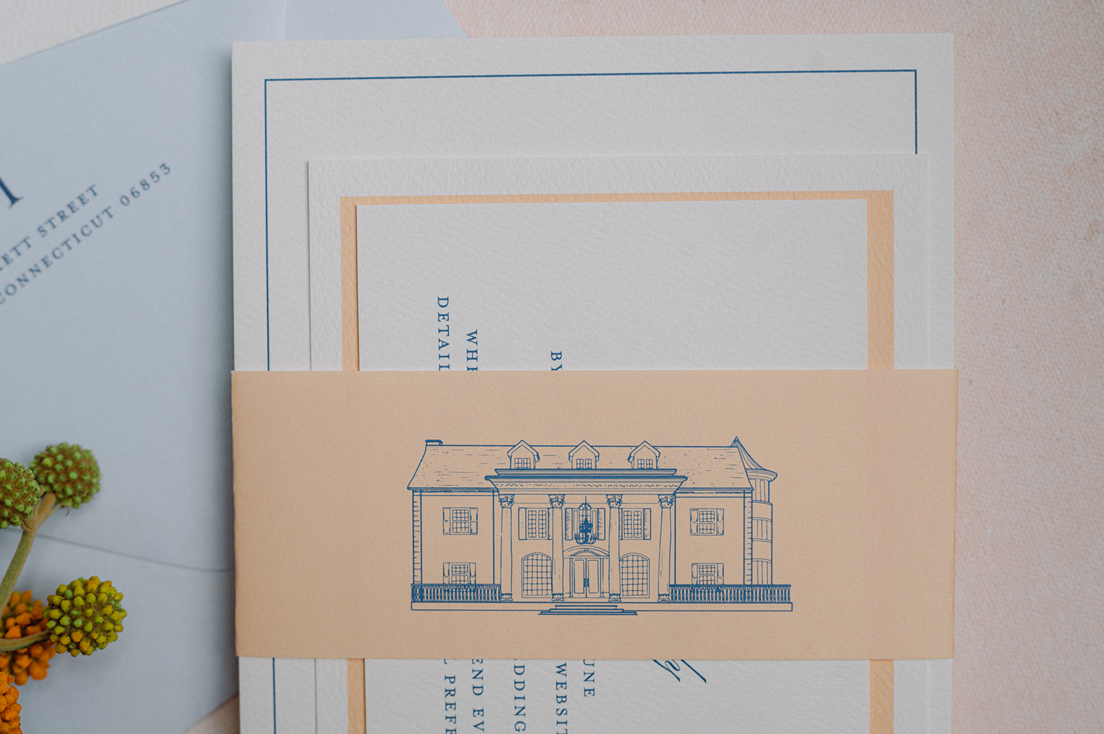
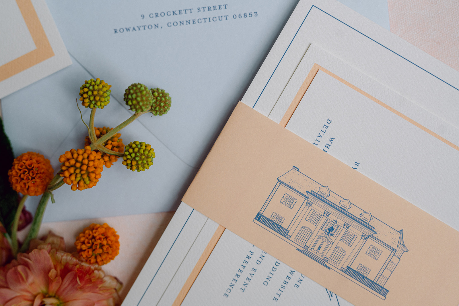
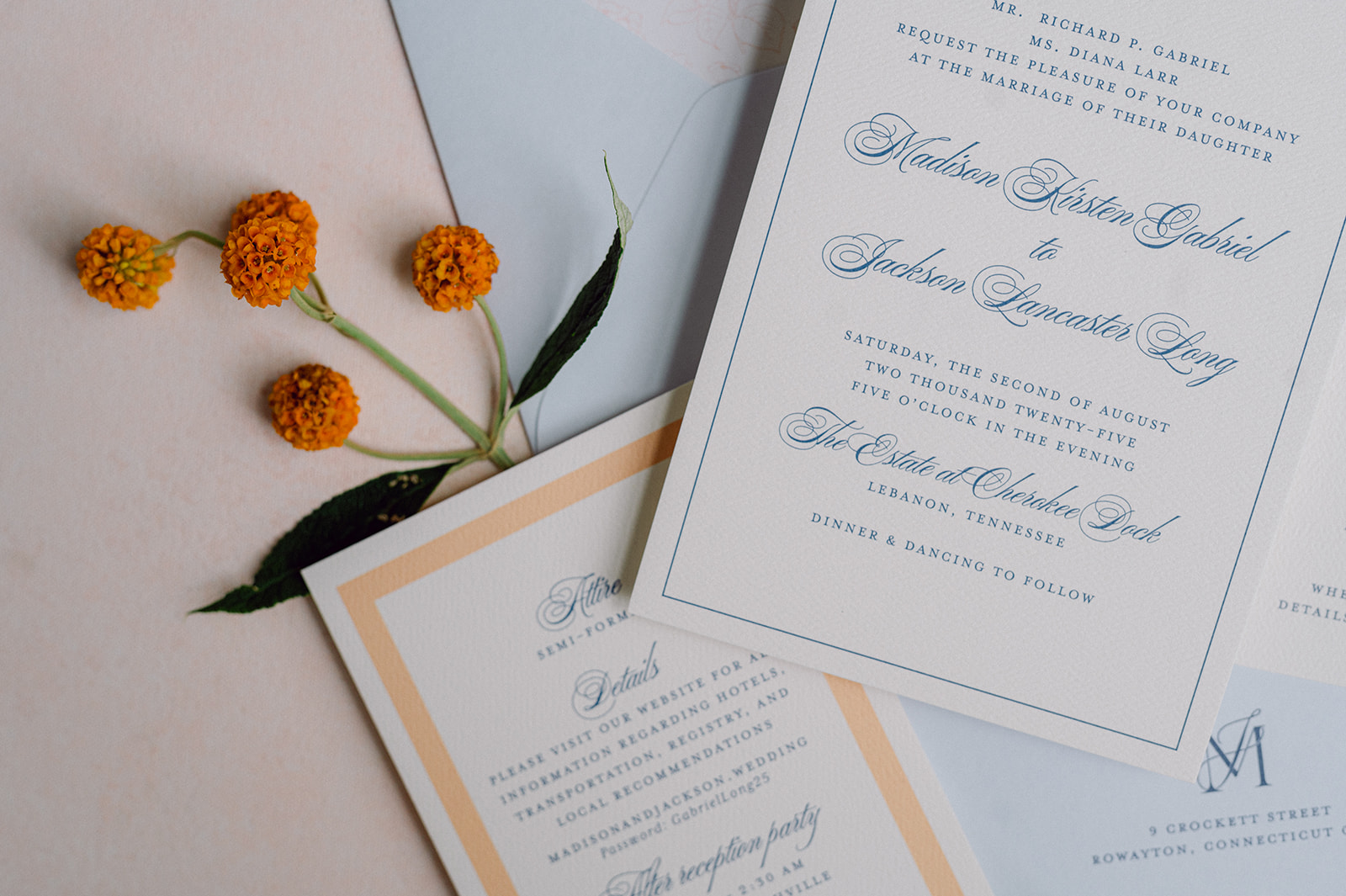
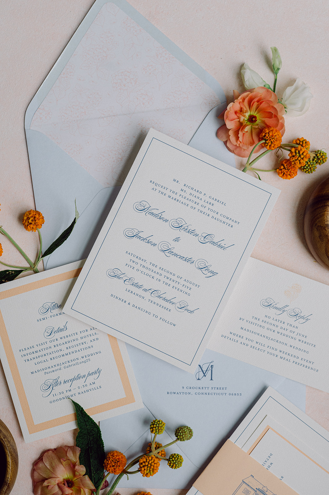
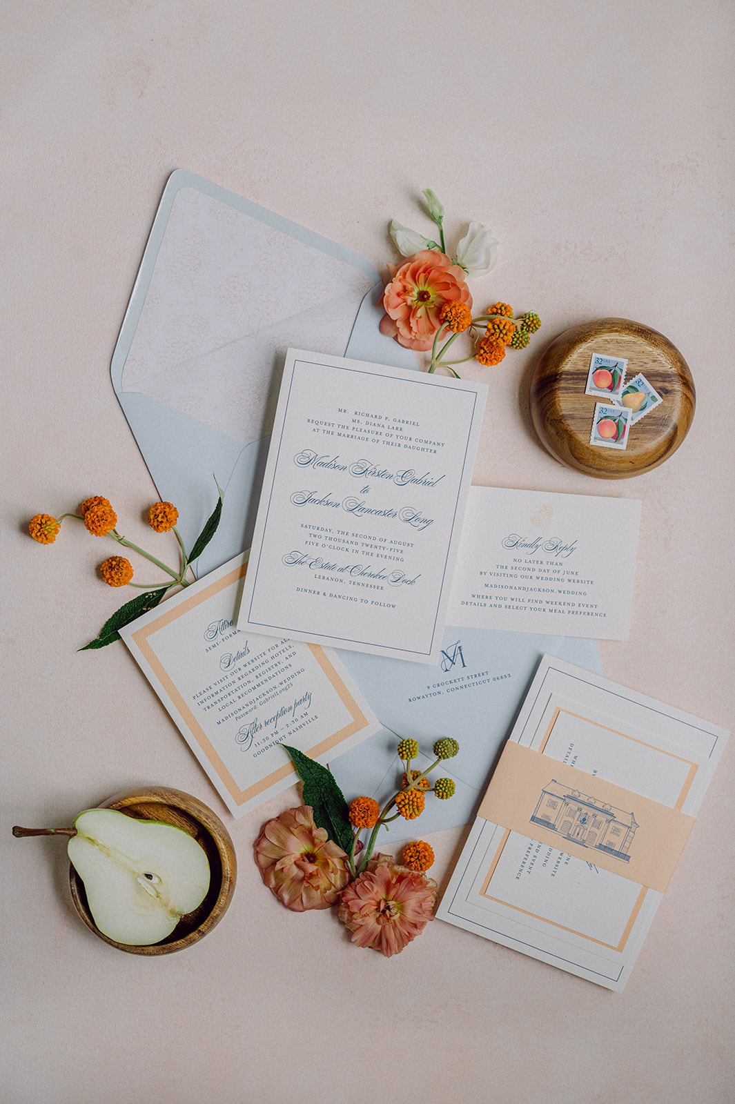
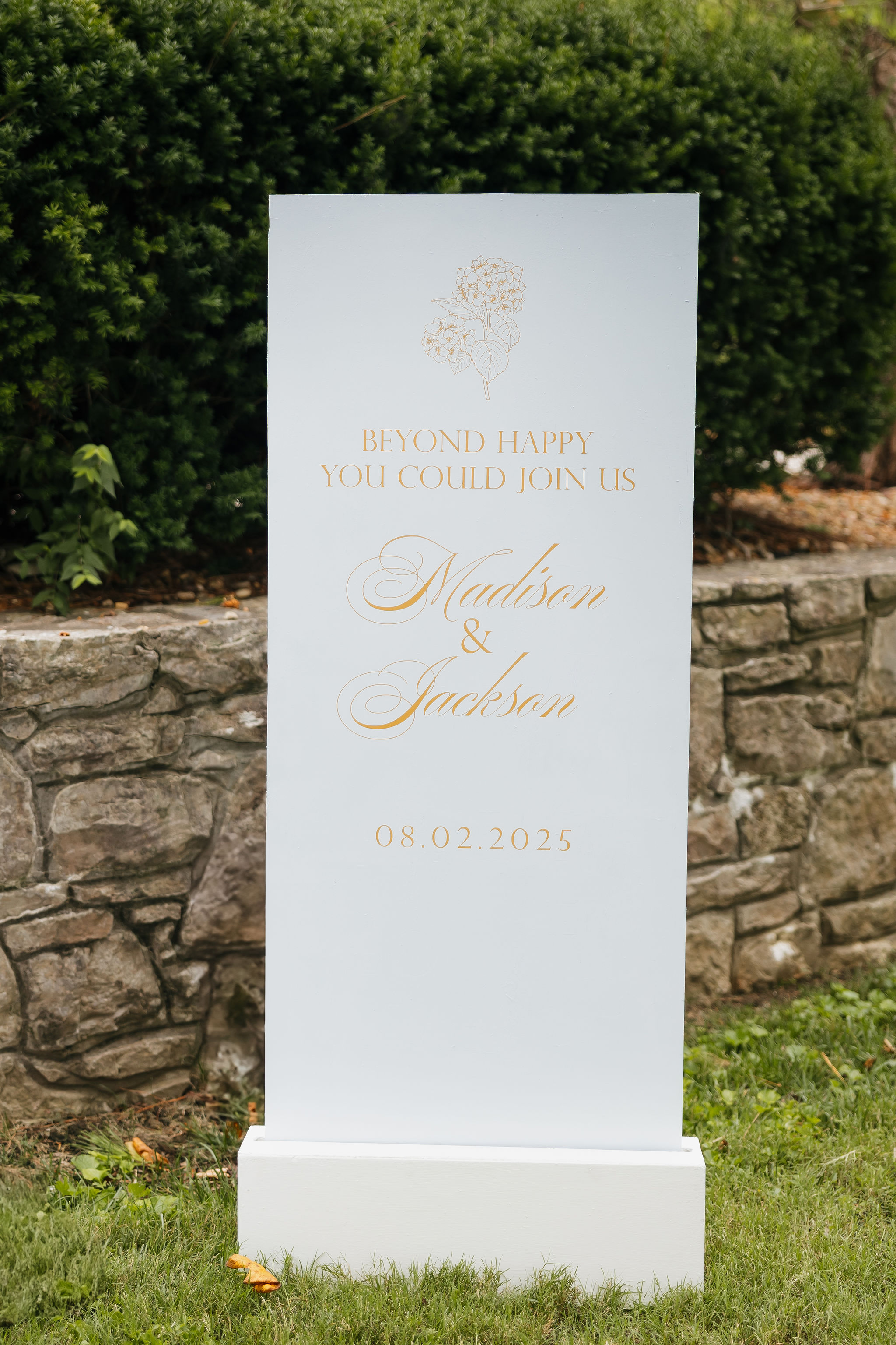
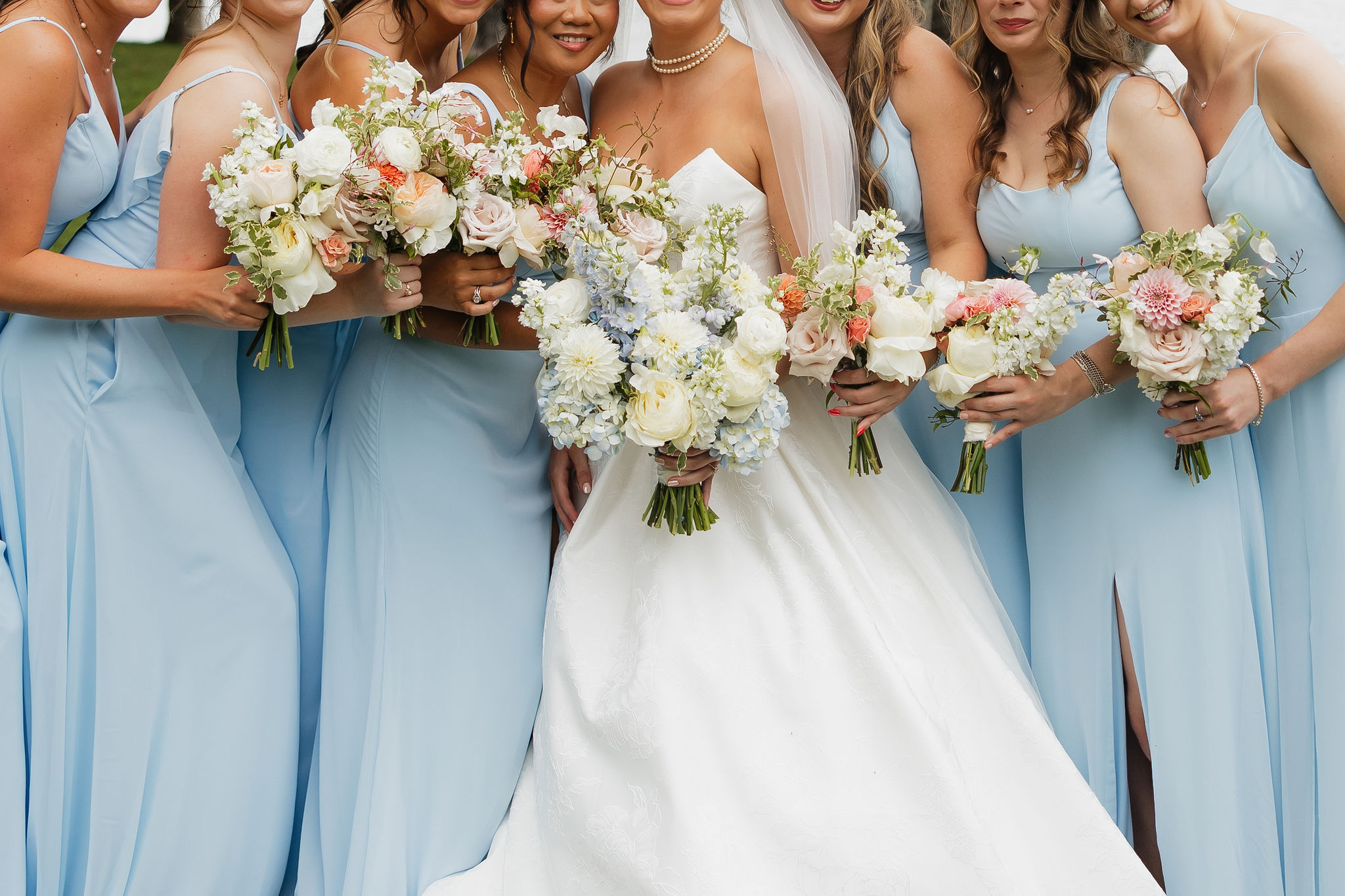
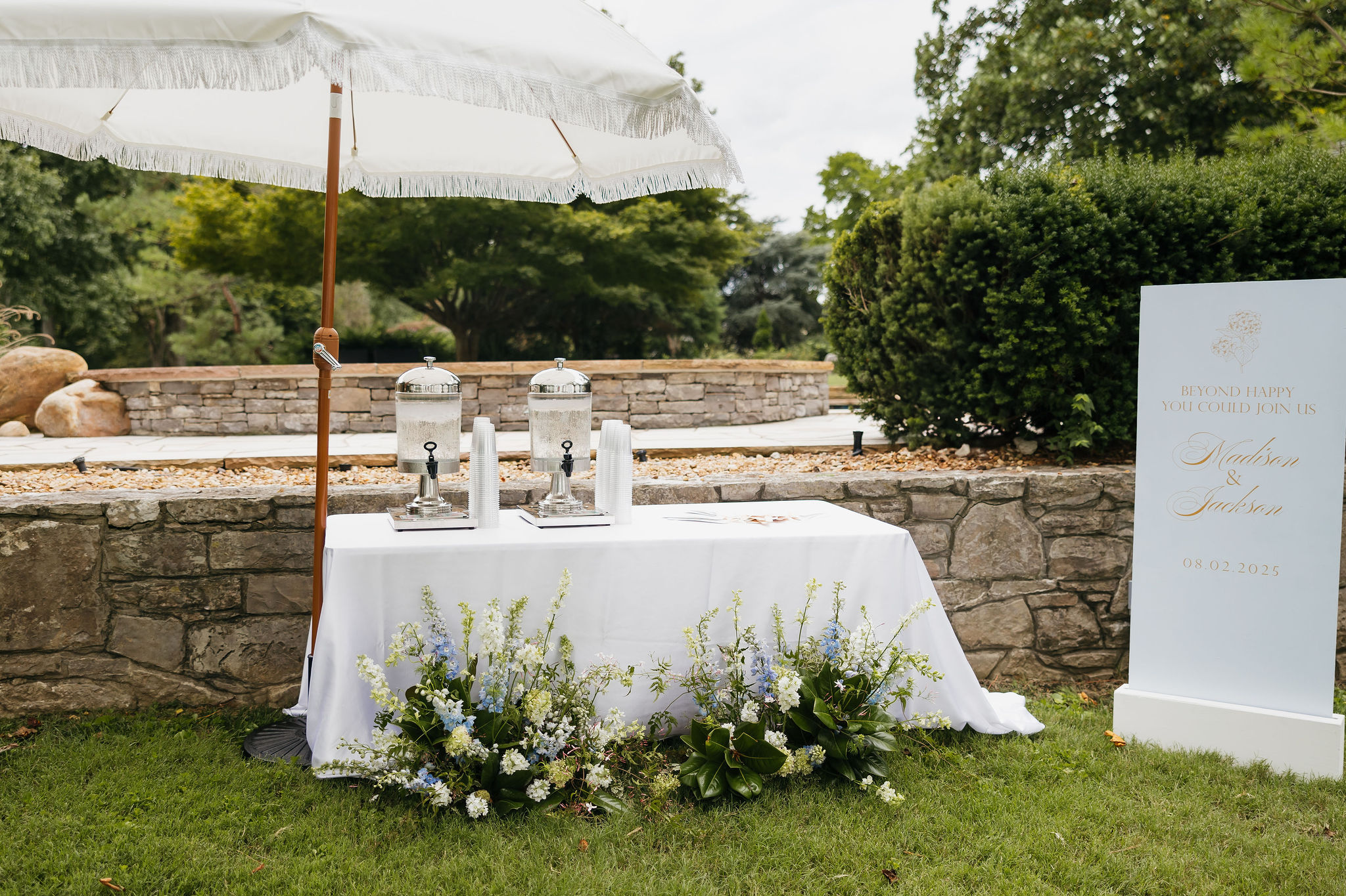
When designing paper goods and day-of details for weddings, we always strive to bring cohesion to the design. We did just that for this Cherokee Dock Nashville wedding. The couple, Madison and Jackson, dreamed of a celebration filled with soft spring colors, thoughtful touches, and a hint of fun. We took their ideas and wove their vision and colors into every element we created, bringing their vision to life. From the invitation suite to the late-night snack boxes, this wedding was full of creativity, color, and personality.
A Soft, Spring-Inspired Invitation Suite
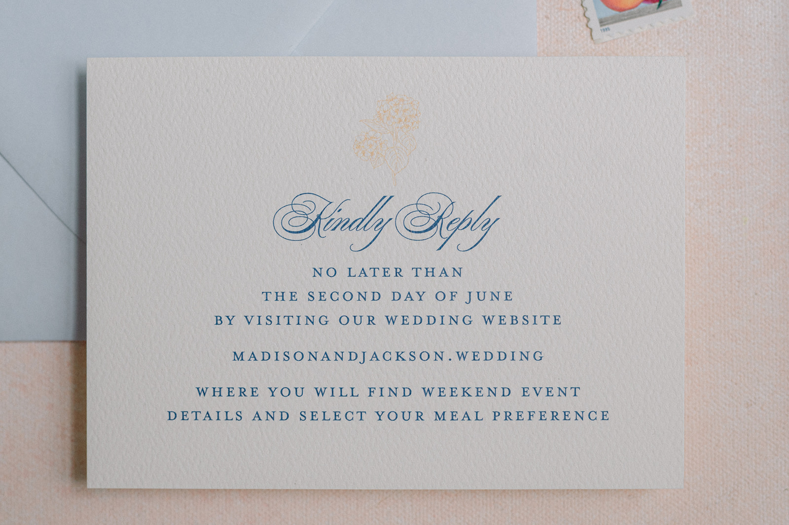
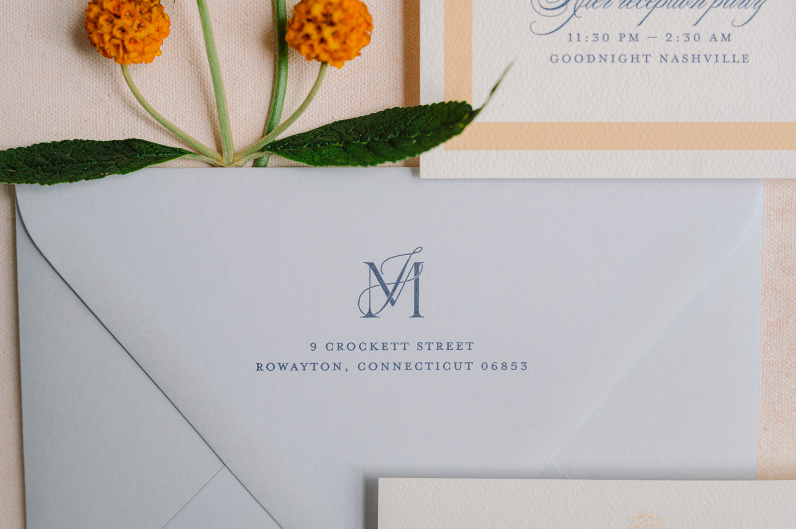
We started with an invitation suite inspired by airy spring hues. The palette centered around light blue, white, and a soft sherbet orange, which instantly set a fresh and joyful tone for the day.
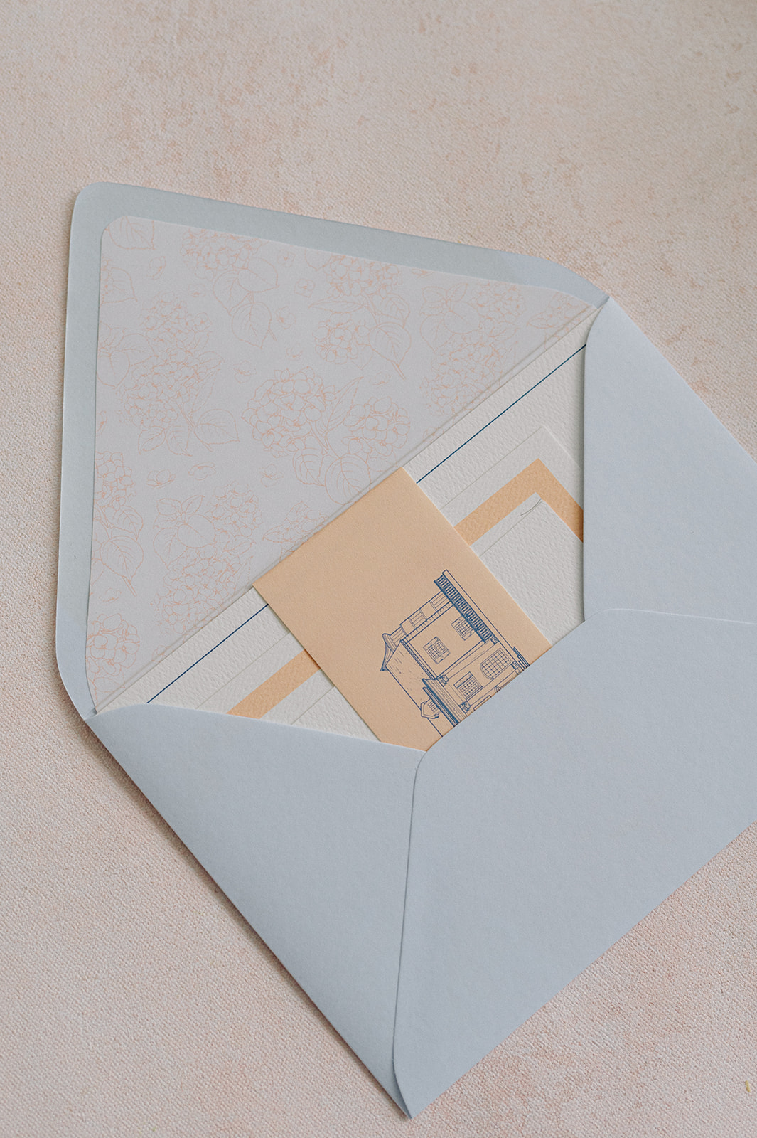
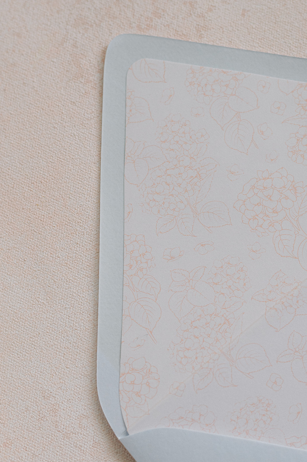
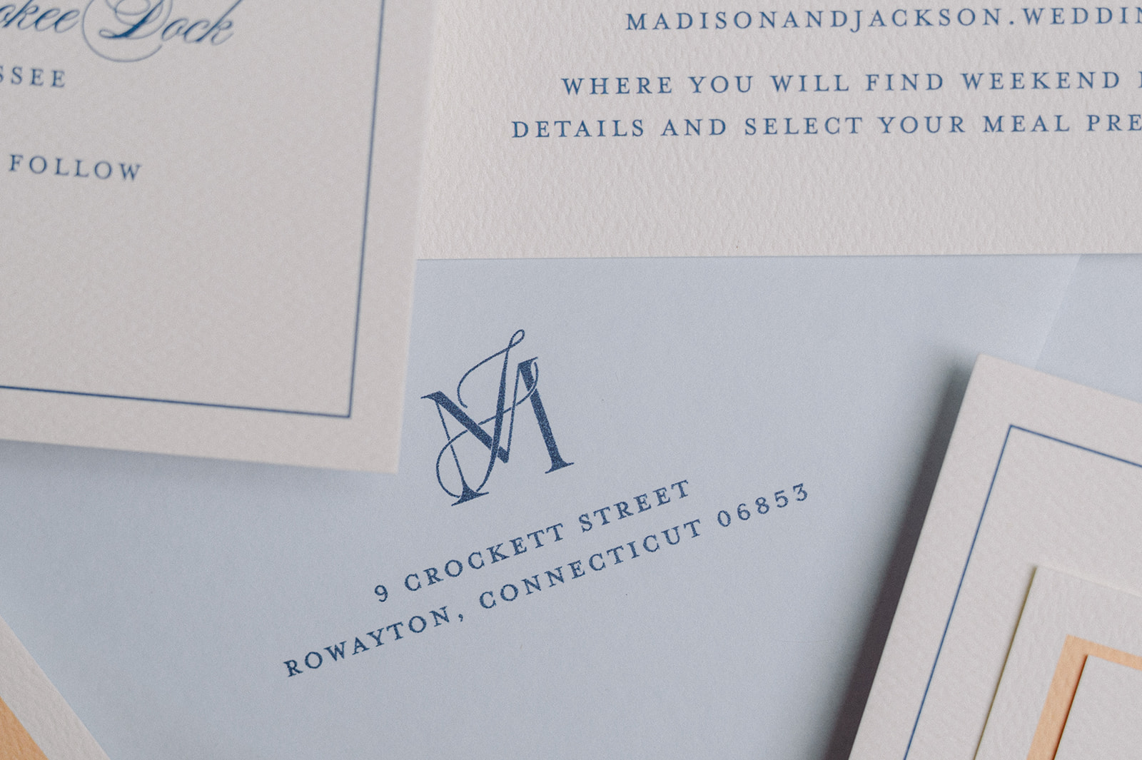
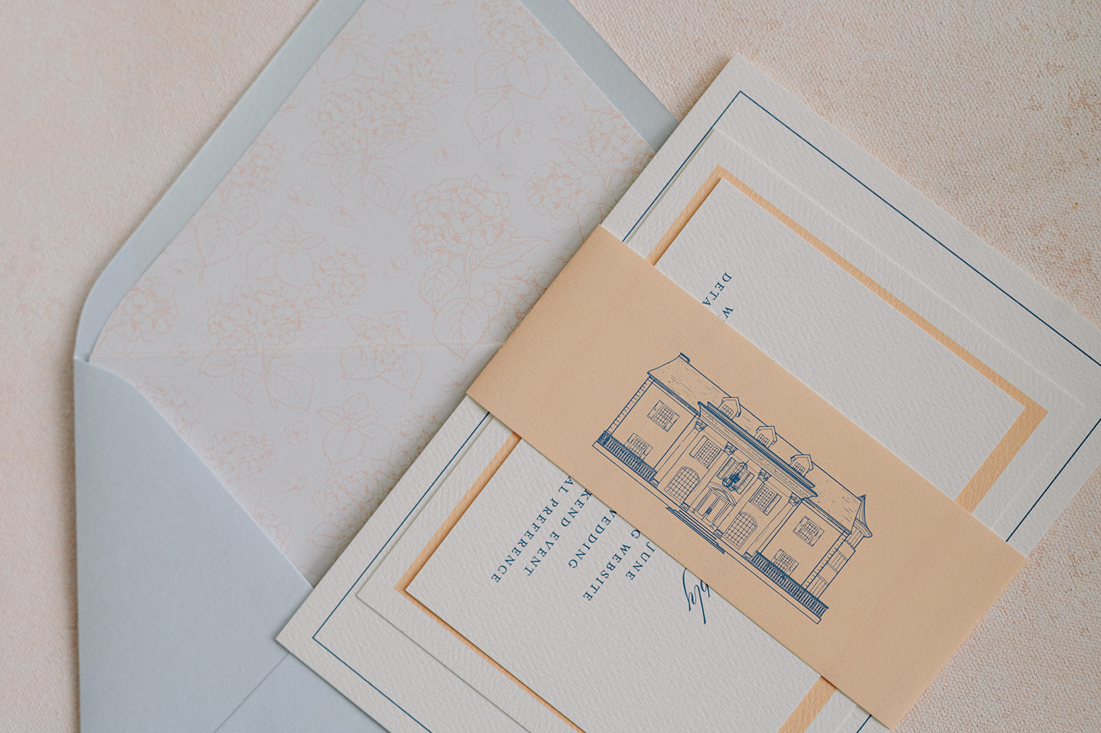
For the envelopes, we used a dusty blue color that was the foundation of the wedding day design. The envelopes featured the couple’s monogram and a custom floral-patterned envelope liner created with the wedding’s signature orange hue accent color.
The main invitation was white with light blue calligraphy. The details card was similar but stood out with a thick sherbet-orange border. The entire suite was then wrapped in a vellum band in the same light orange color showcasing a custom sketch of Cherokee Dock in a deep blue.
The suite felt polished yet playful and gave guests an early glimpse into the wedding day ahead.
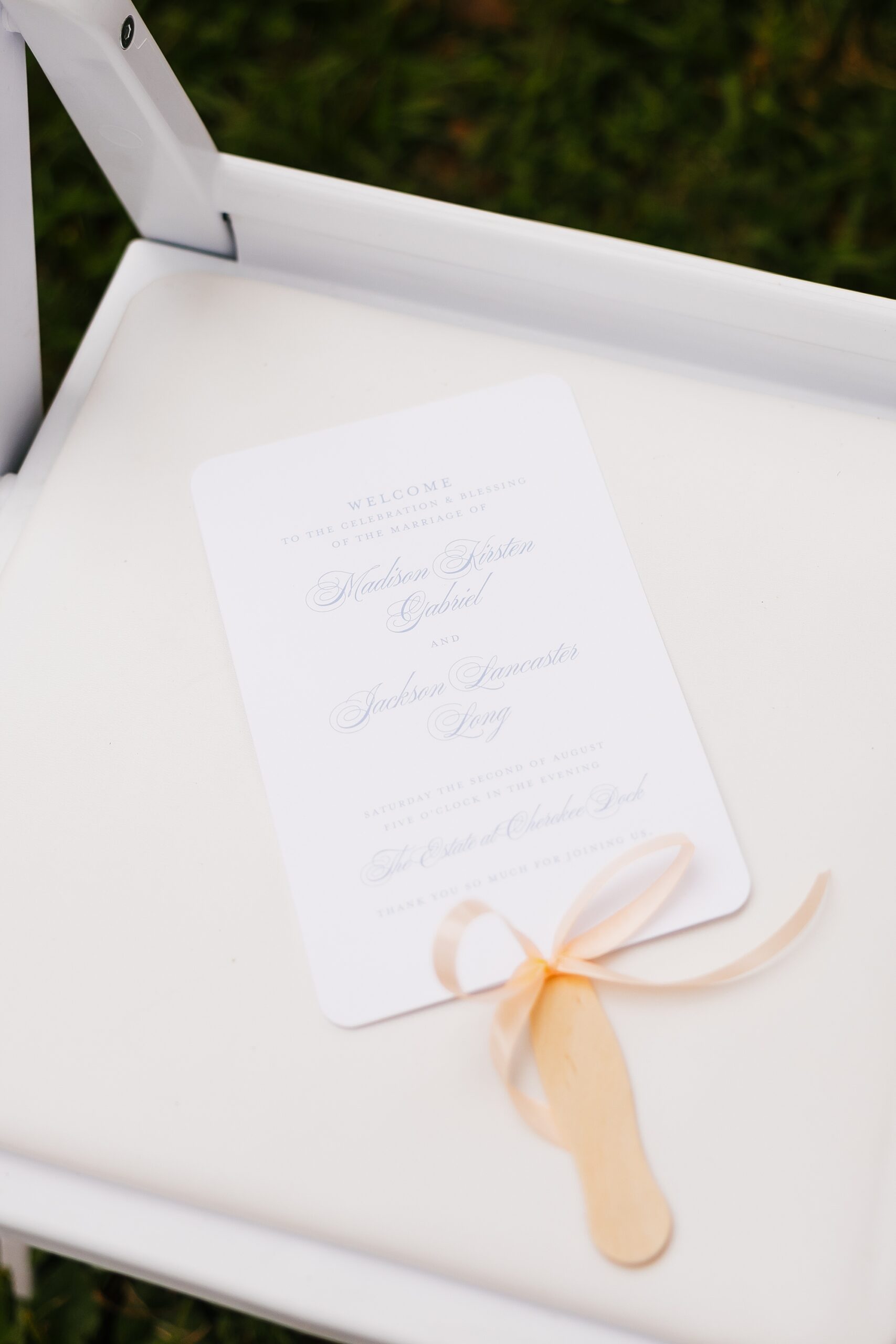
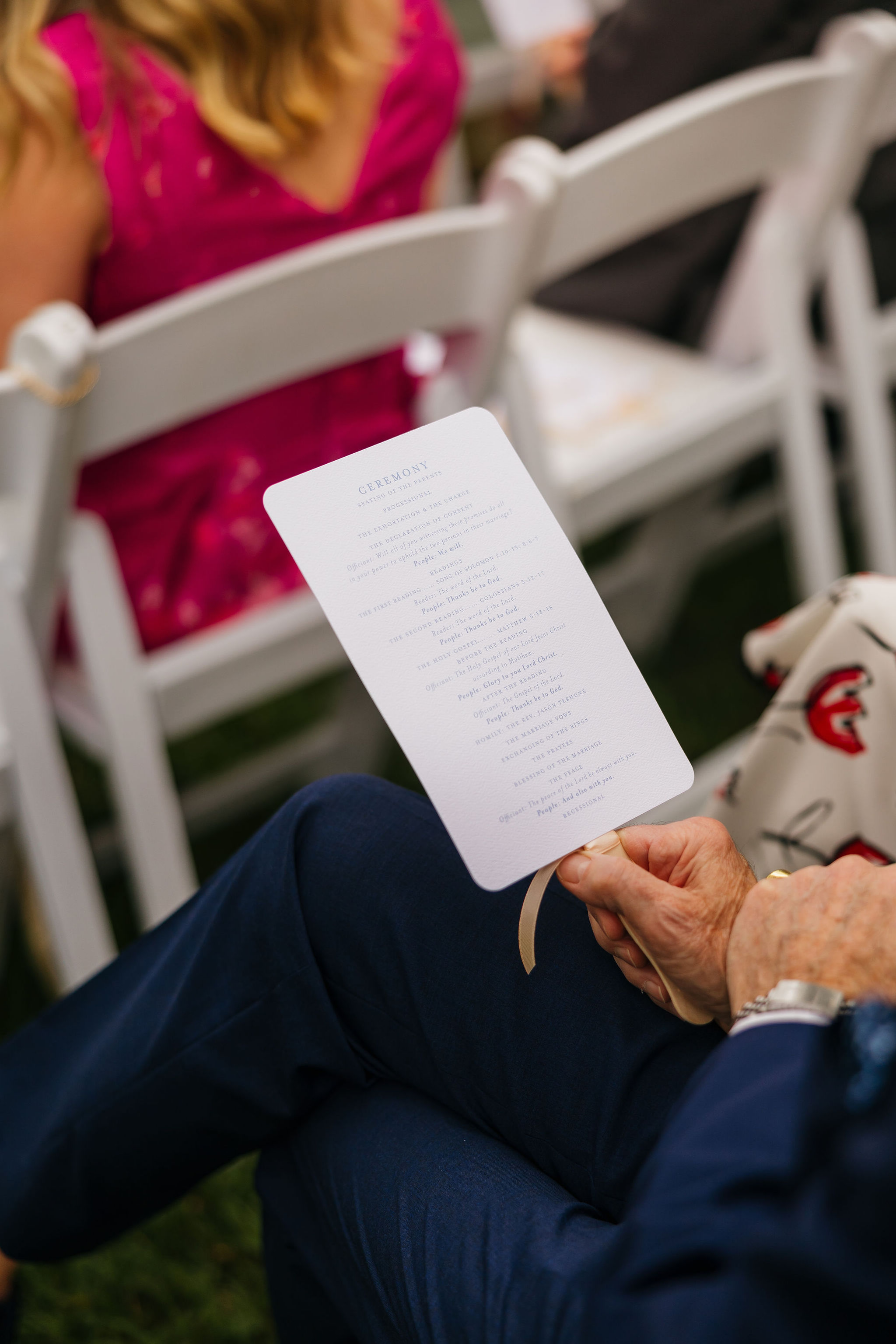
Wedding Day-of Details
For the ceremony, we designed a white welcome sign featuring sherbet orange lettering, keeping everything soft, clean, and cohesive.
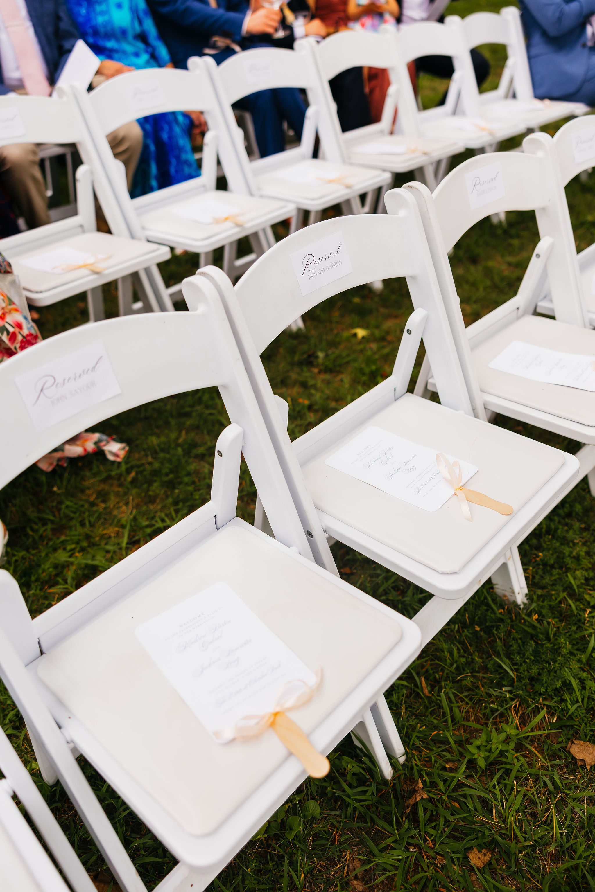
Guests also received program fans, which served a dual purpose of sharing the ceremony details while offering much-needed relief from the Tennessee heat. Practical and beautiful—our favorite combination.
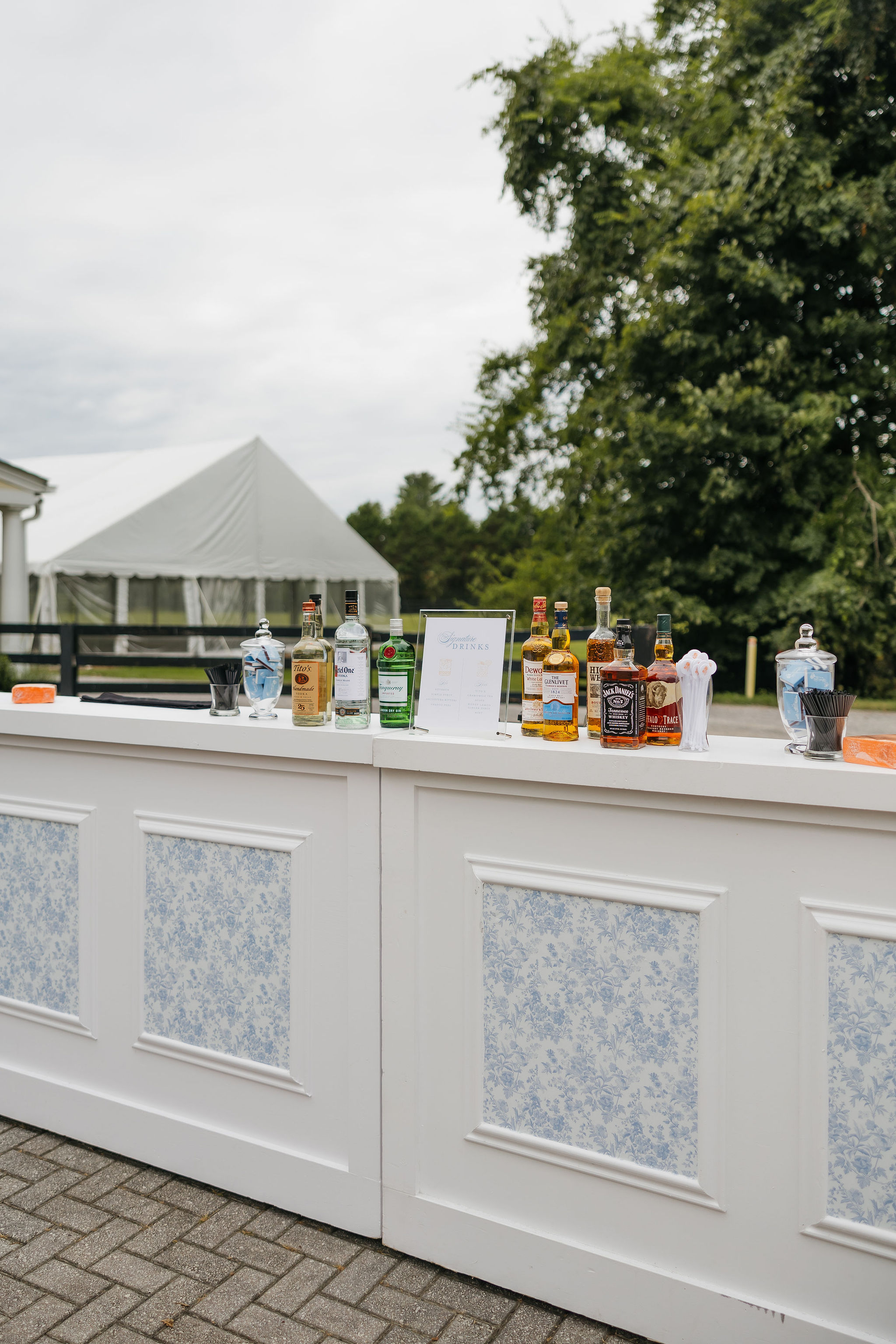
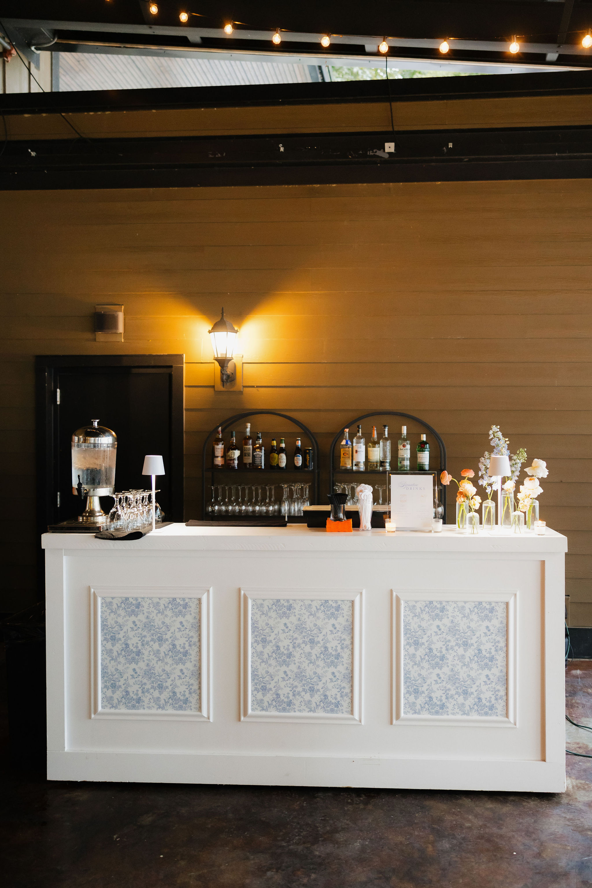
Fun, Colorful Details at the Bar
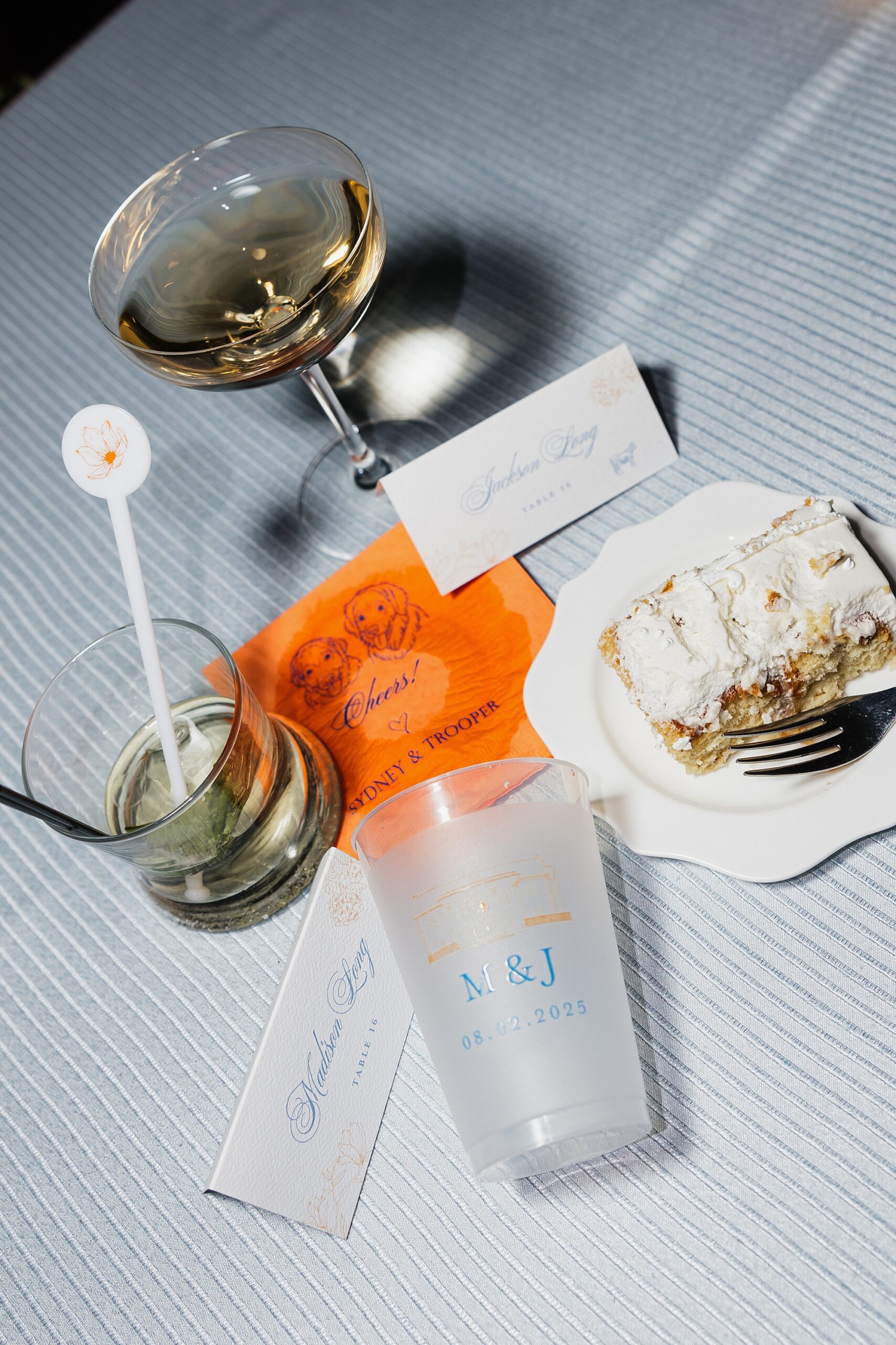
We created bar inserts showcasing the signature light blue color pattern. This same pattern could later be found on the table linens created seamless design that carried through the wedding day. On top of the bar, guests found custom orange napkins and white stir sticks with an orange flower sketch, bringing an extra pop of color. It’s always the small touches that make the biggest impact.
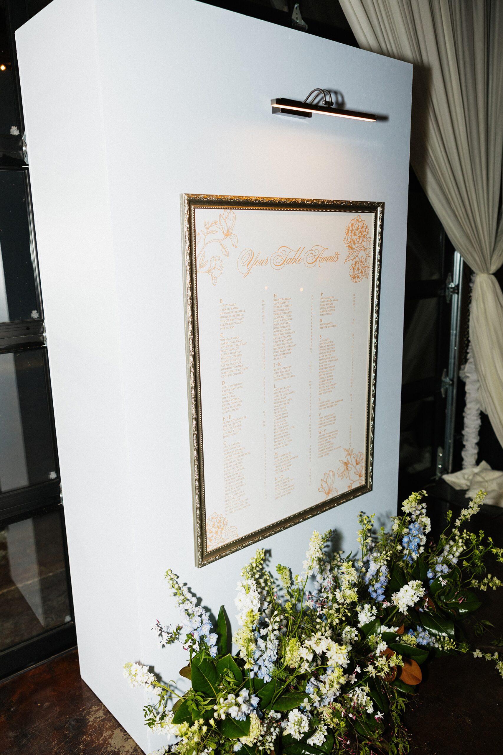
Seating Chart Display
We created a framed seating chart wall with a gallery light, giving it the look of a curated art installation. The clean, structured design brought an elevated feel to the reception entrance.
Reception Details That Tied Everything Together
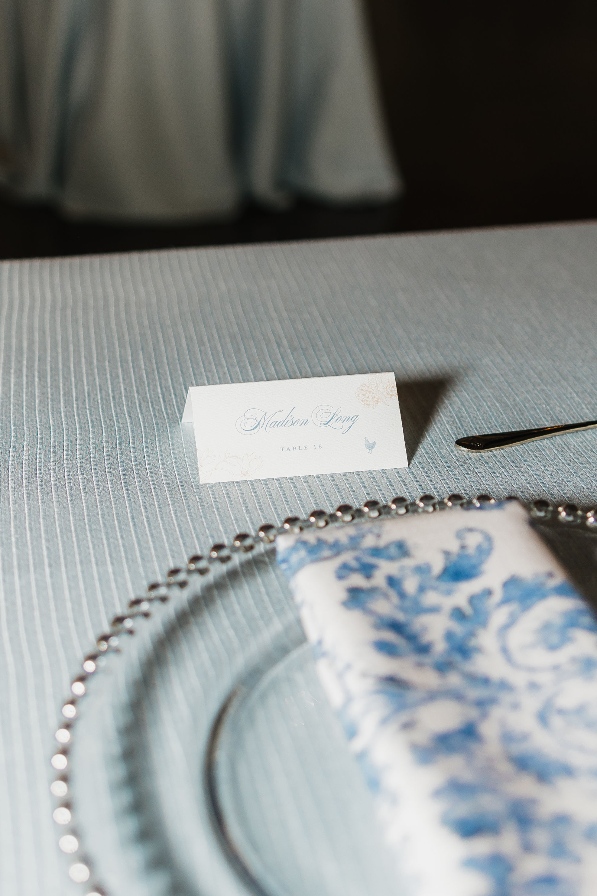
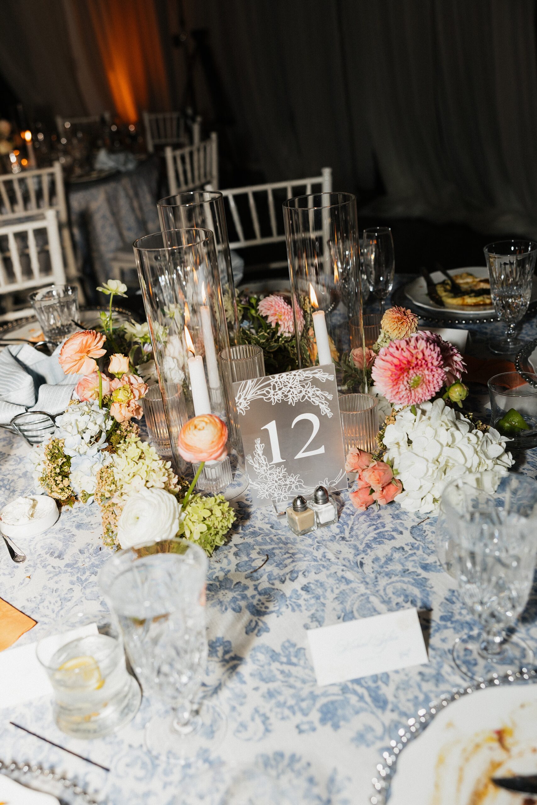
As guests entered the reception, they located their seats using the frosted acrylic table numbers and white place cards we designed. Notice anything familiar? Here are the table linens I mentioned earlier featuring the same light blue pattern from the bar fronts! The repeating pattern created a seamless, intentional design, which is our speciality.
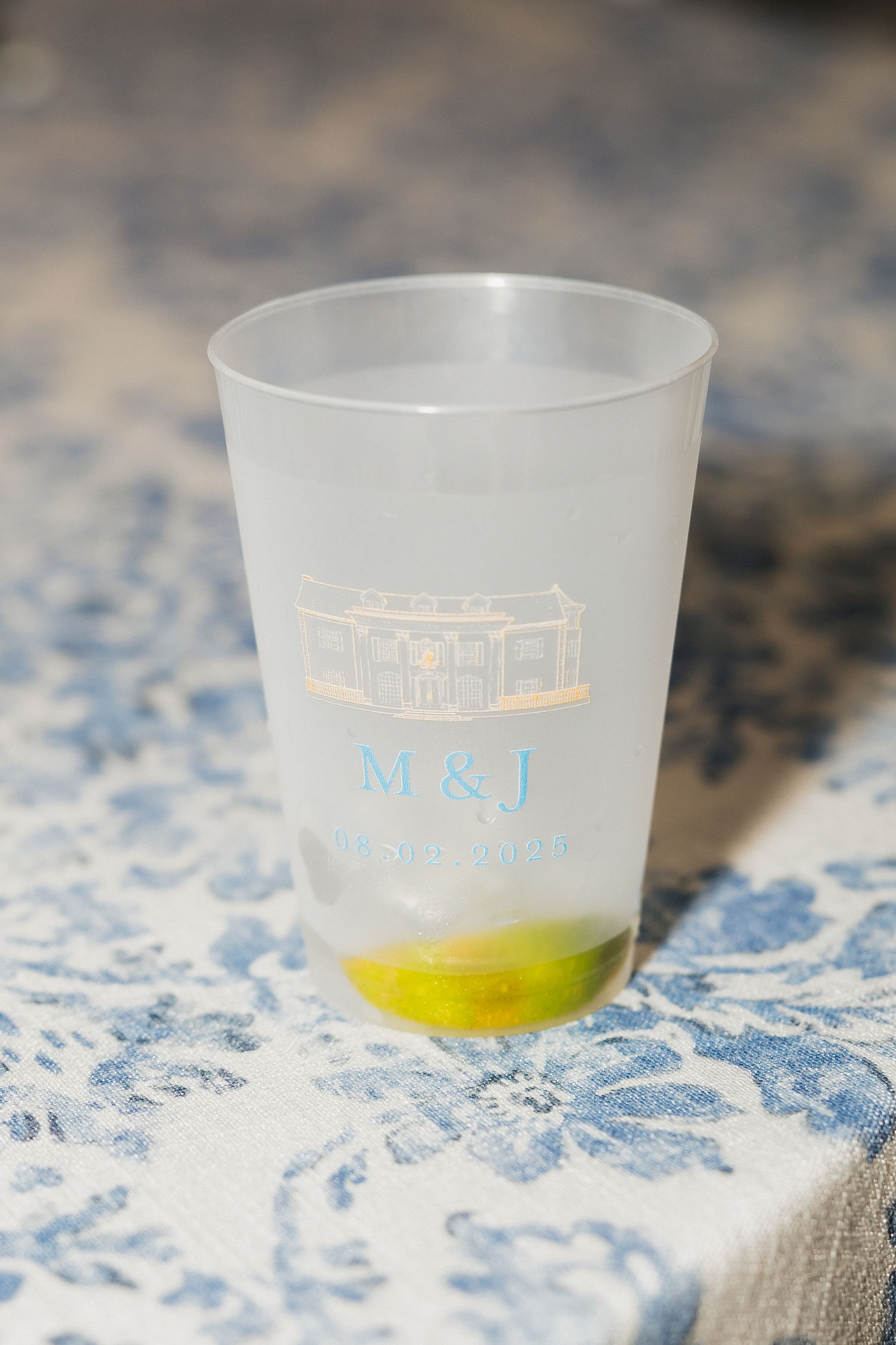
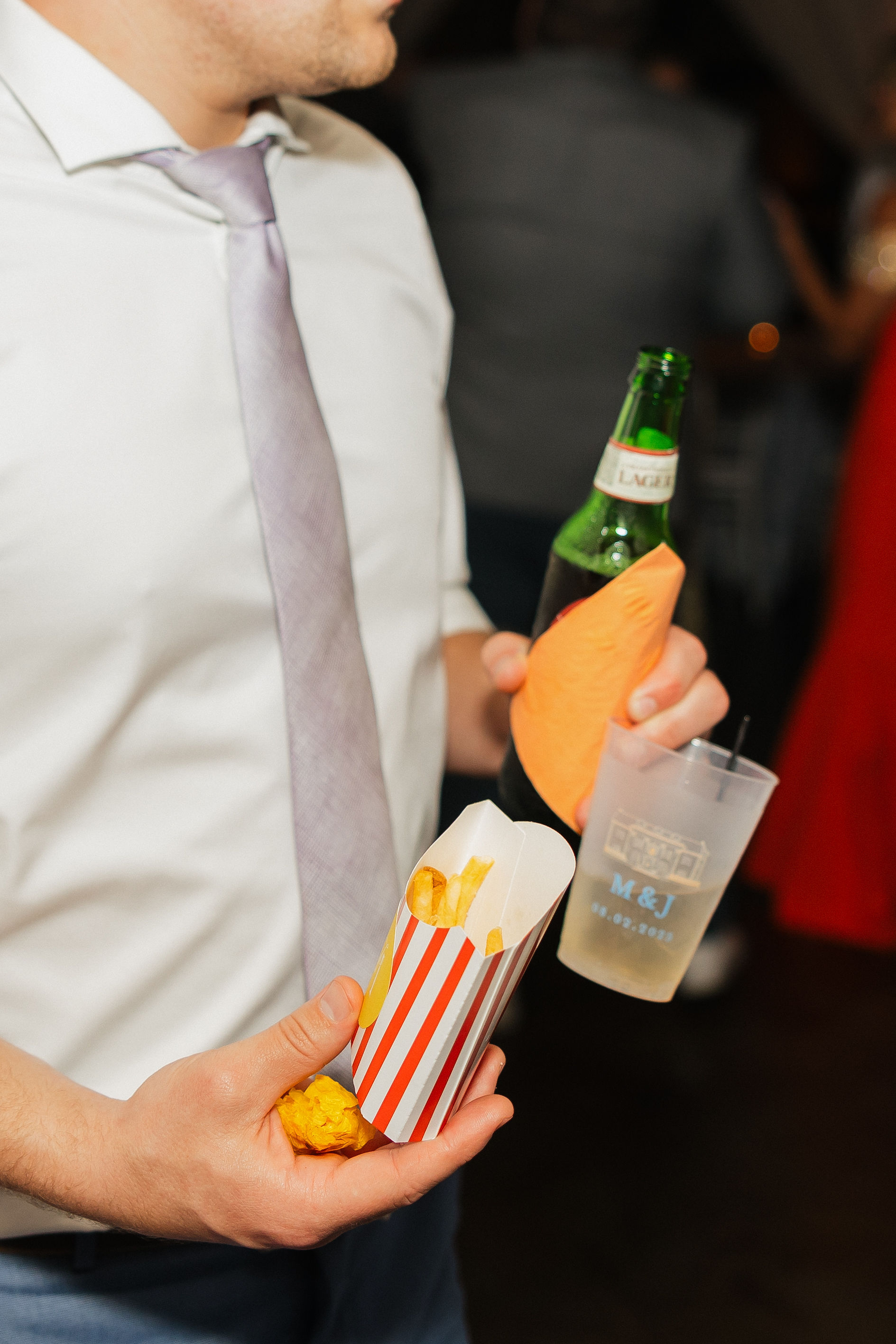
We also designed the frosted cups used throughout the evening, which doubled as wedding favors. Each cup featured the Cherokee Dock sketch from the vellum band, this time printed in light orange, paired with the couple’s initials and wedding date in soft blue. It was the perfect blend of chic and fun.
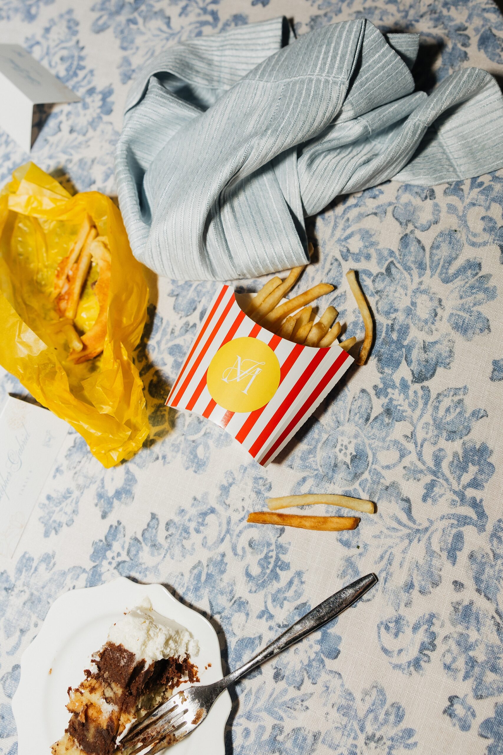
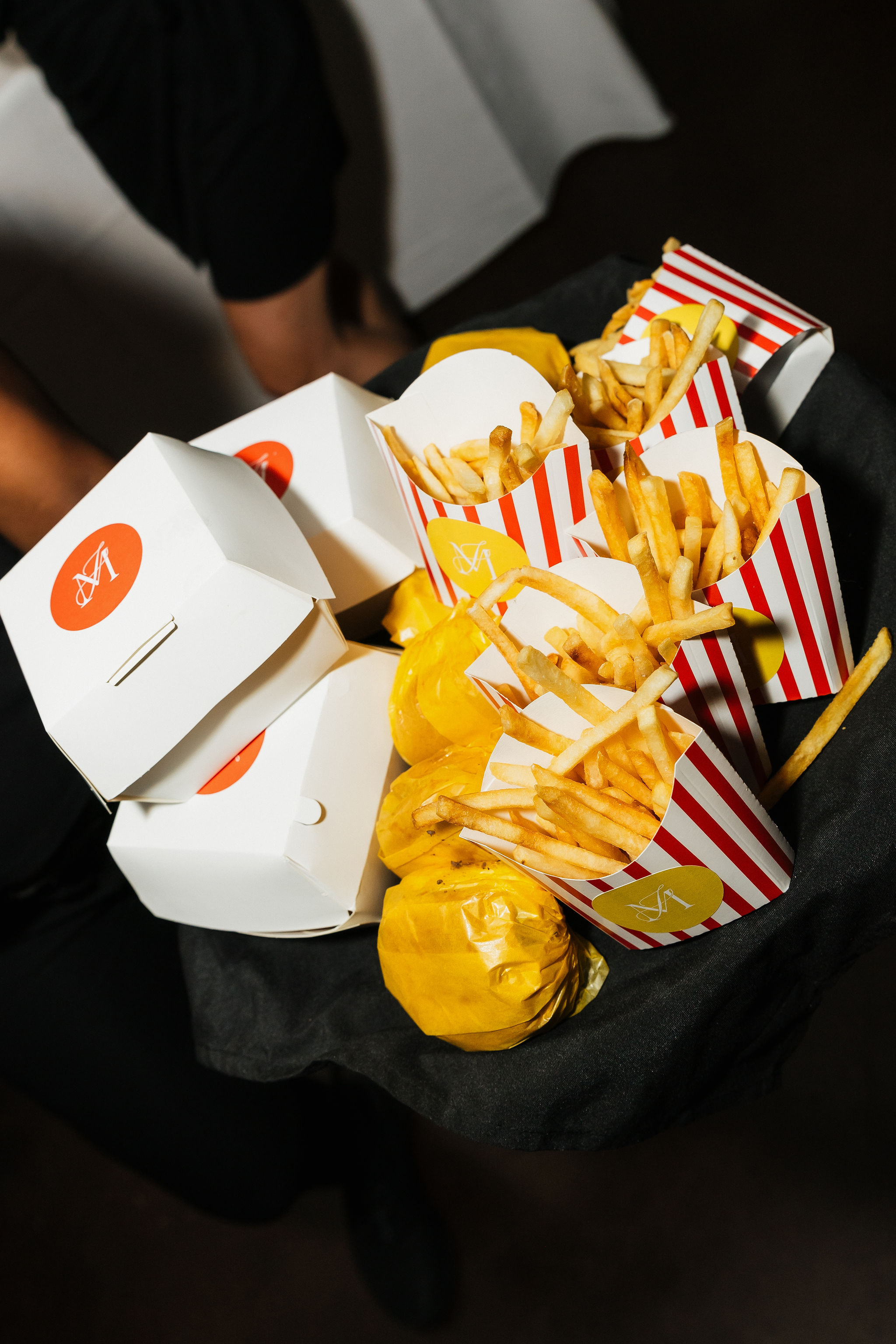
A Playful Late-Night Snack Moment
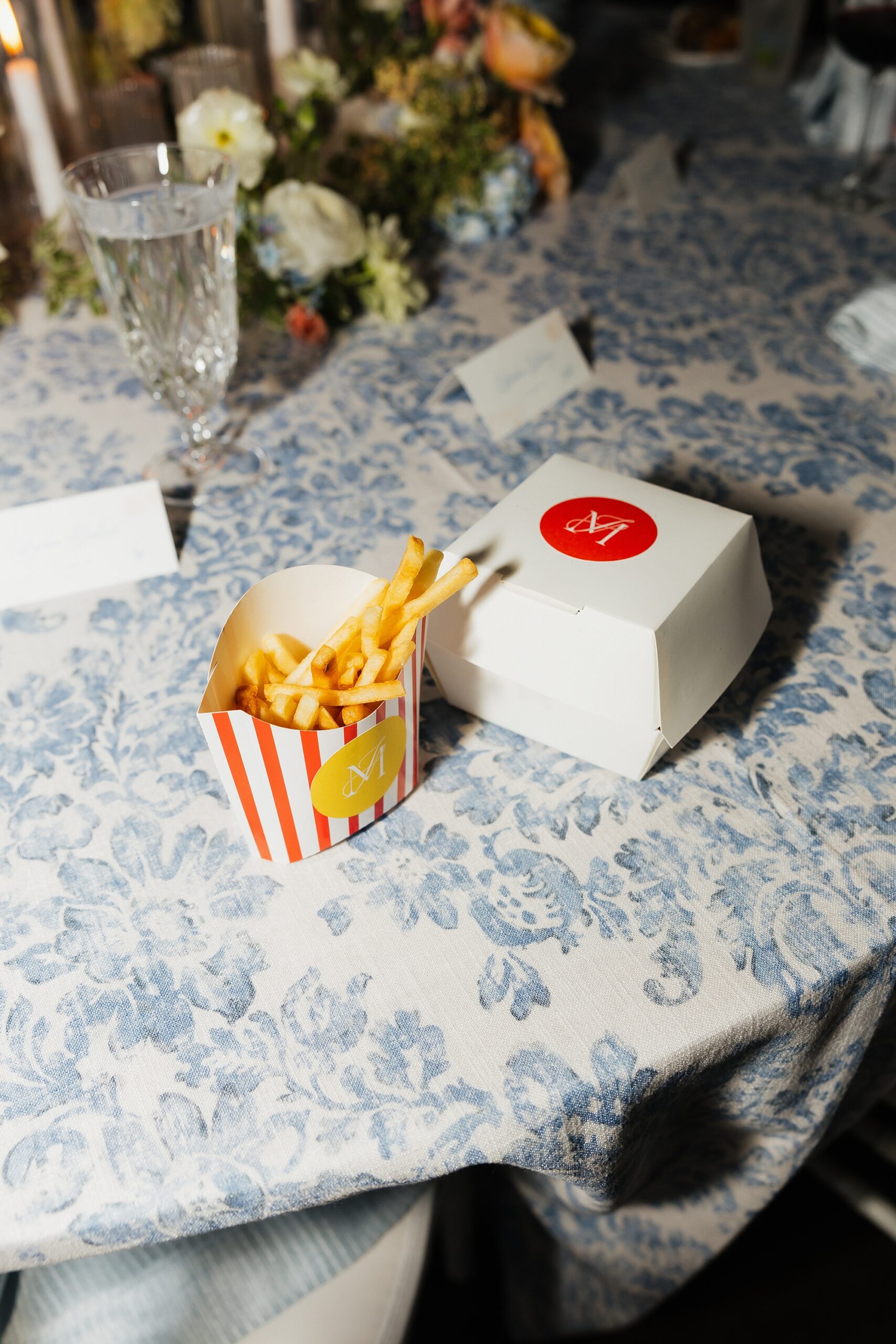
The wedding ended with a little late night snack of burgers and fries that were served in custom burger and fry boxes we designed! The white burger boxes featured a bold orange circle centered on the lid with the couple’s monogram in white. The fry boxes leaned retro with white-and-red stripes and a yellow circle holding the same monogram.
This final detail brought so much personality and nostalgia. It was impossible not to smile when you saw them. Not only that, but they were truly so much fun to create.
A Spring Wedding Filled With Creativity and Color
This Cherokee Dock celebration was the perfect mix of polished design, soft springtime color, and playful, personalized details. Every piece from the invitations to food packaging was created with intention and cohesive design in mind. It was an honor to bring Madison and Jackson’s wedding vision to life.
If you’re planning a wedding in Nashville, or anywhere in the world, we’d love to help you create meaningful, personalized stationery and event details that tell your story. We work with couples worldwide to design details you and your guests will remember forever.
Reach out today to learn more about our full-service wedding and event design offerings! We can’t wait to create something unforgettable for you!
If you enjoyed this post, you’ll love these other blogs!
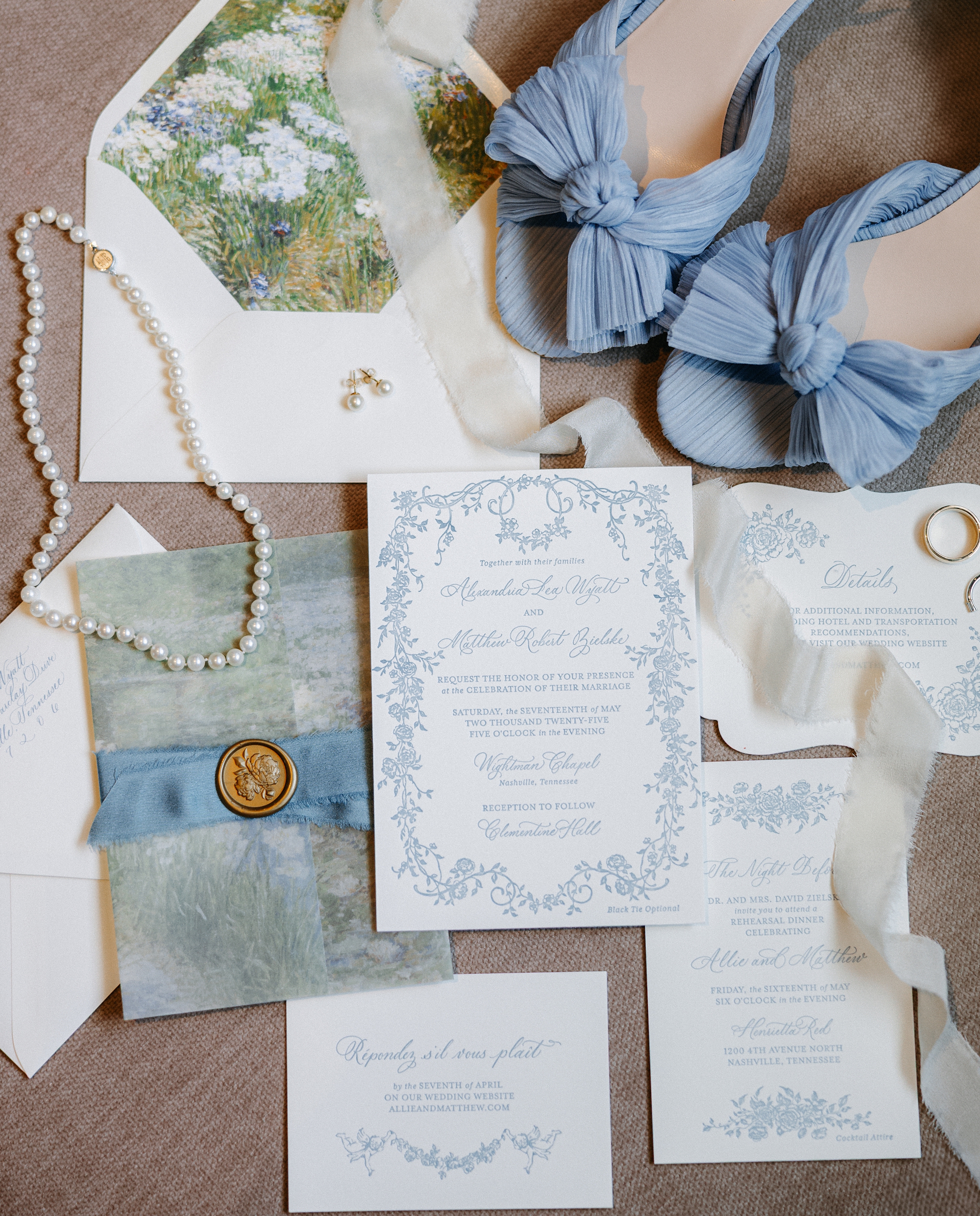
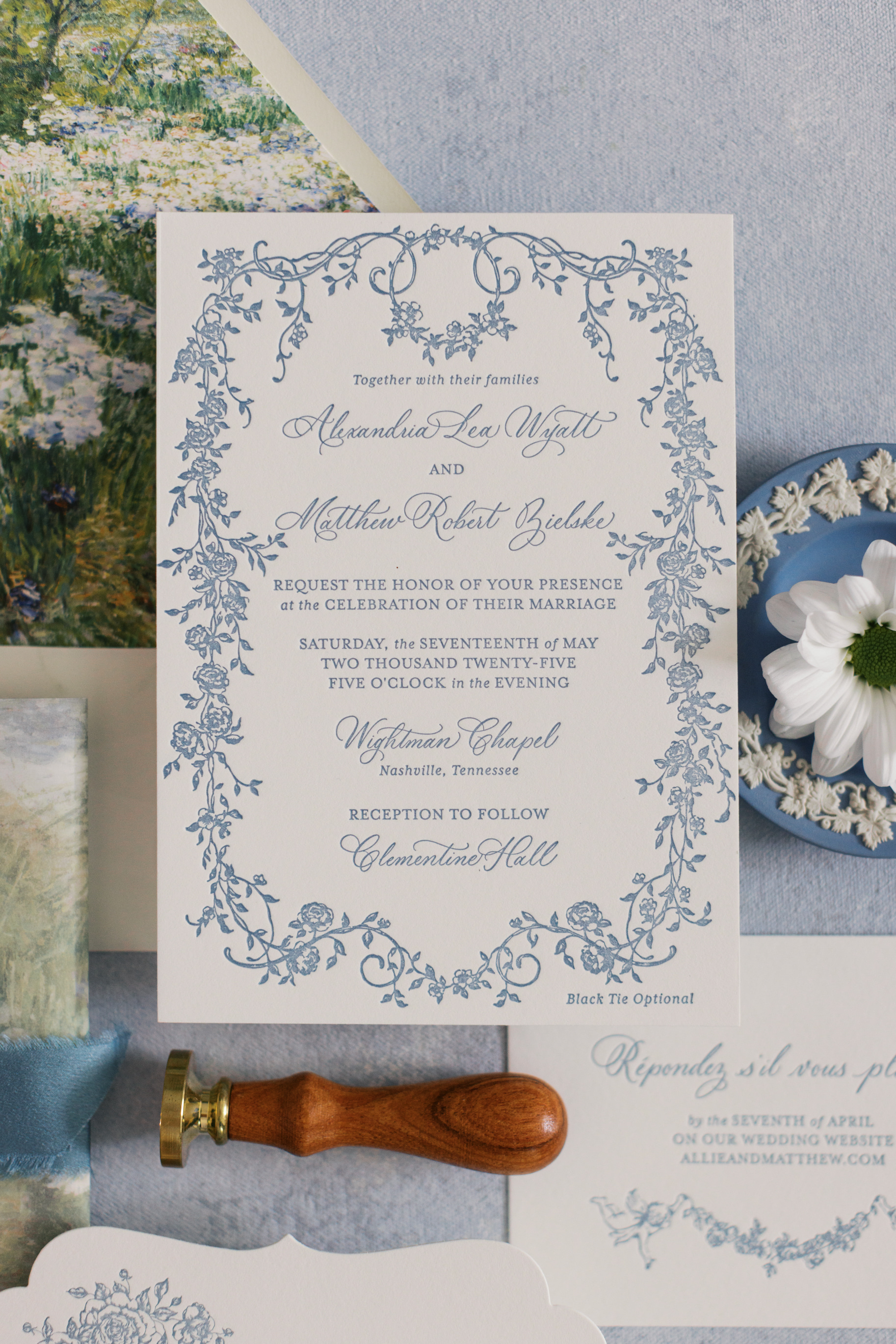
This gorgeous Clementine Hall wedding was a true reflection of creativity, elegance, and personal touches woven throughout the day. We had the joy of designing both their invitation suite and many of their day-of details, and every element wove the couple’s story and style into their big day.
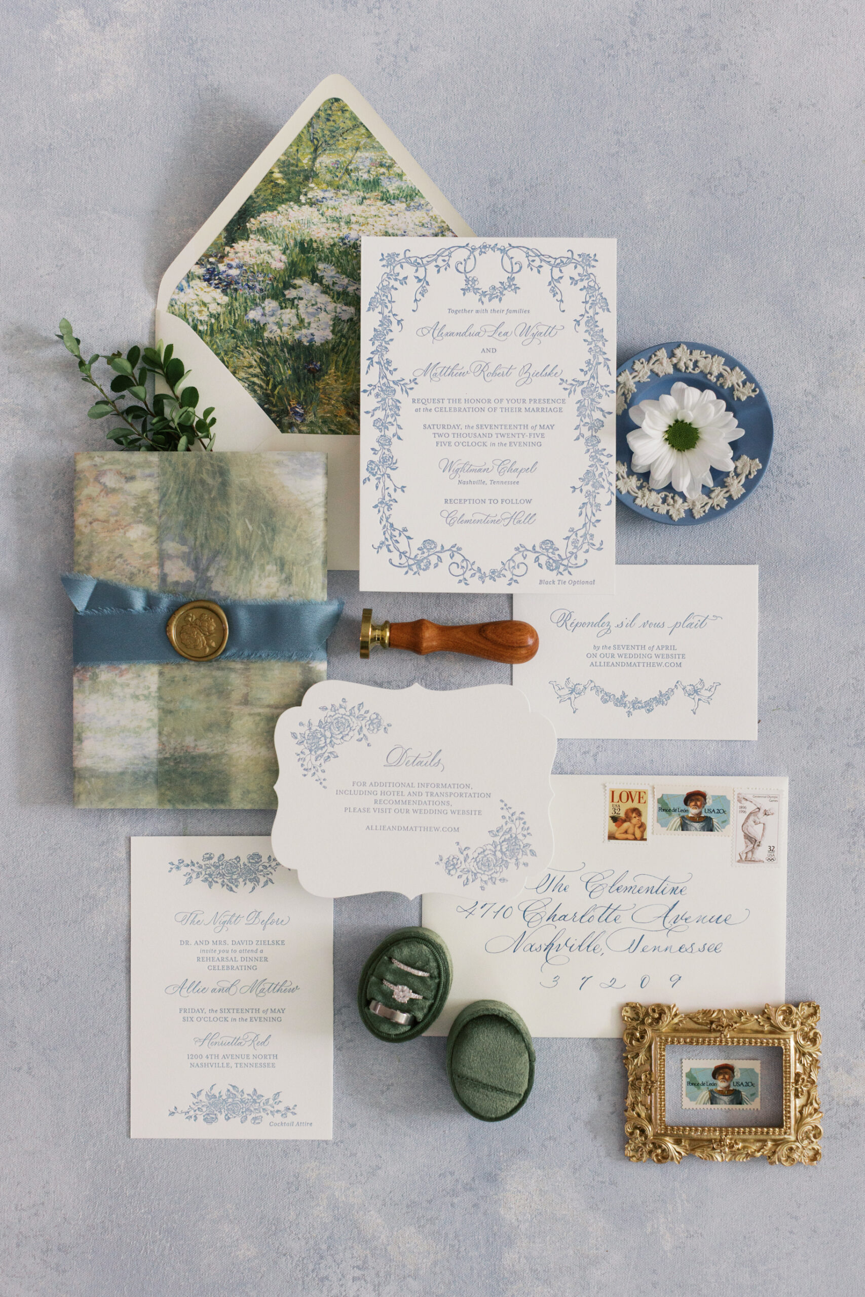
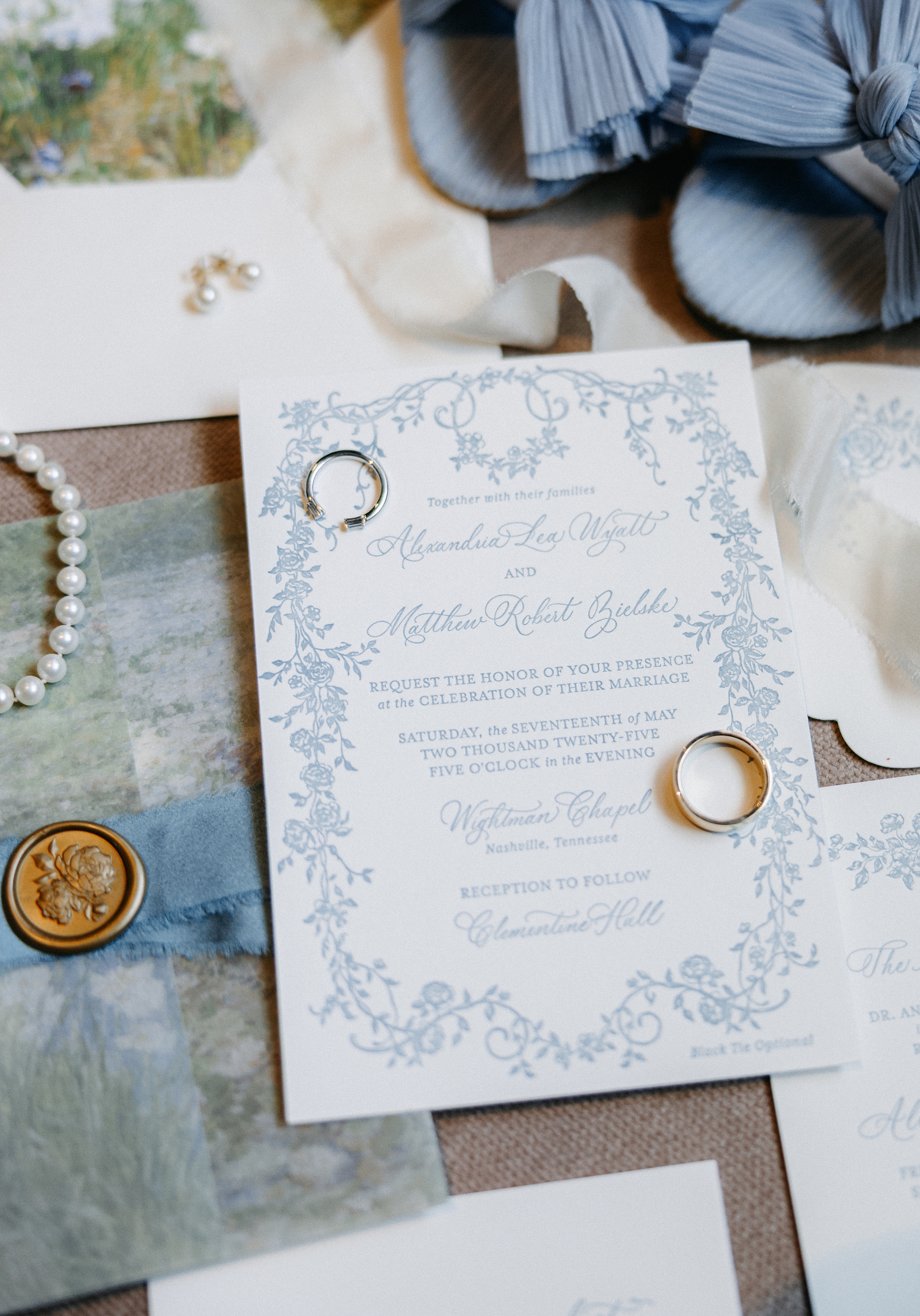
Elegant Letter-Pressed Invitations
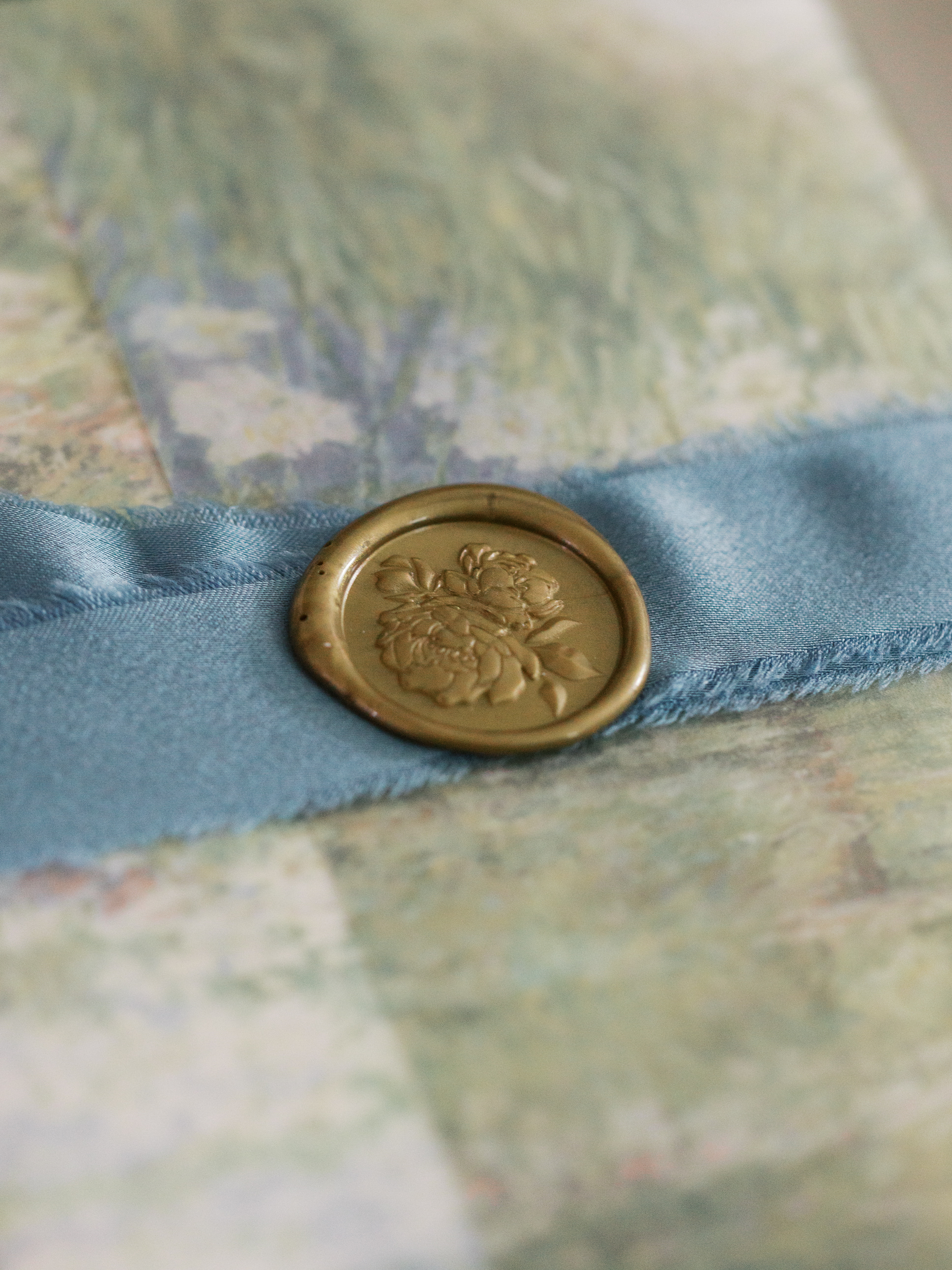
One of our favorite parts of this wedding was how involved the groom was in the design process and the overall aesthetic, which we love! Together, we created a letterpress invitation suite that set the tone for the celebration. A soft blue vine design bordered the invitation, while dreamy light blue lettering paired beautifully with an envelope liner resembling a watercolor field of flowers. The suite was layered with a vellum overlay, tied together with a thick, dusty blue ribbon, and finished with a gold wax seal. It was elevated, romantic, and timeless.
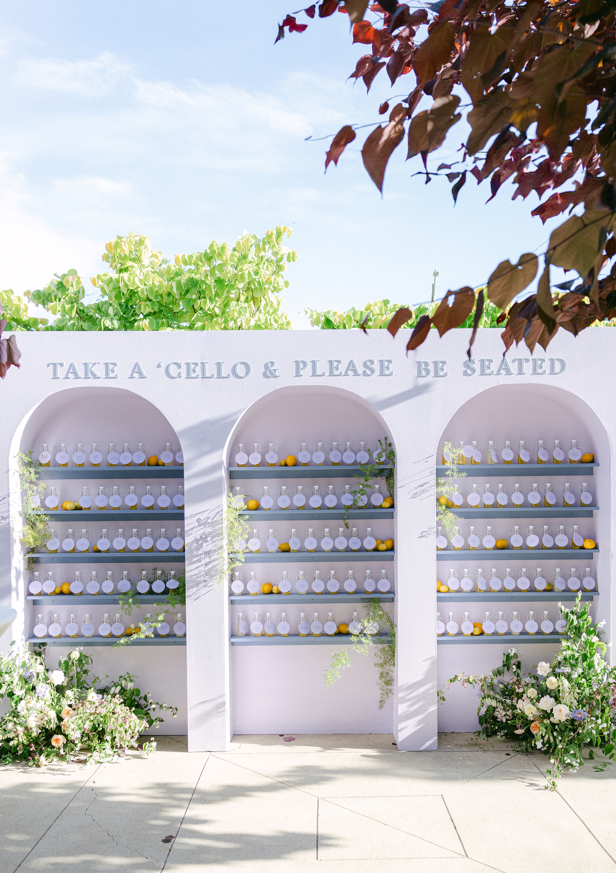
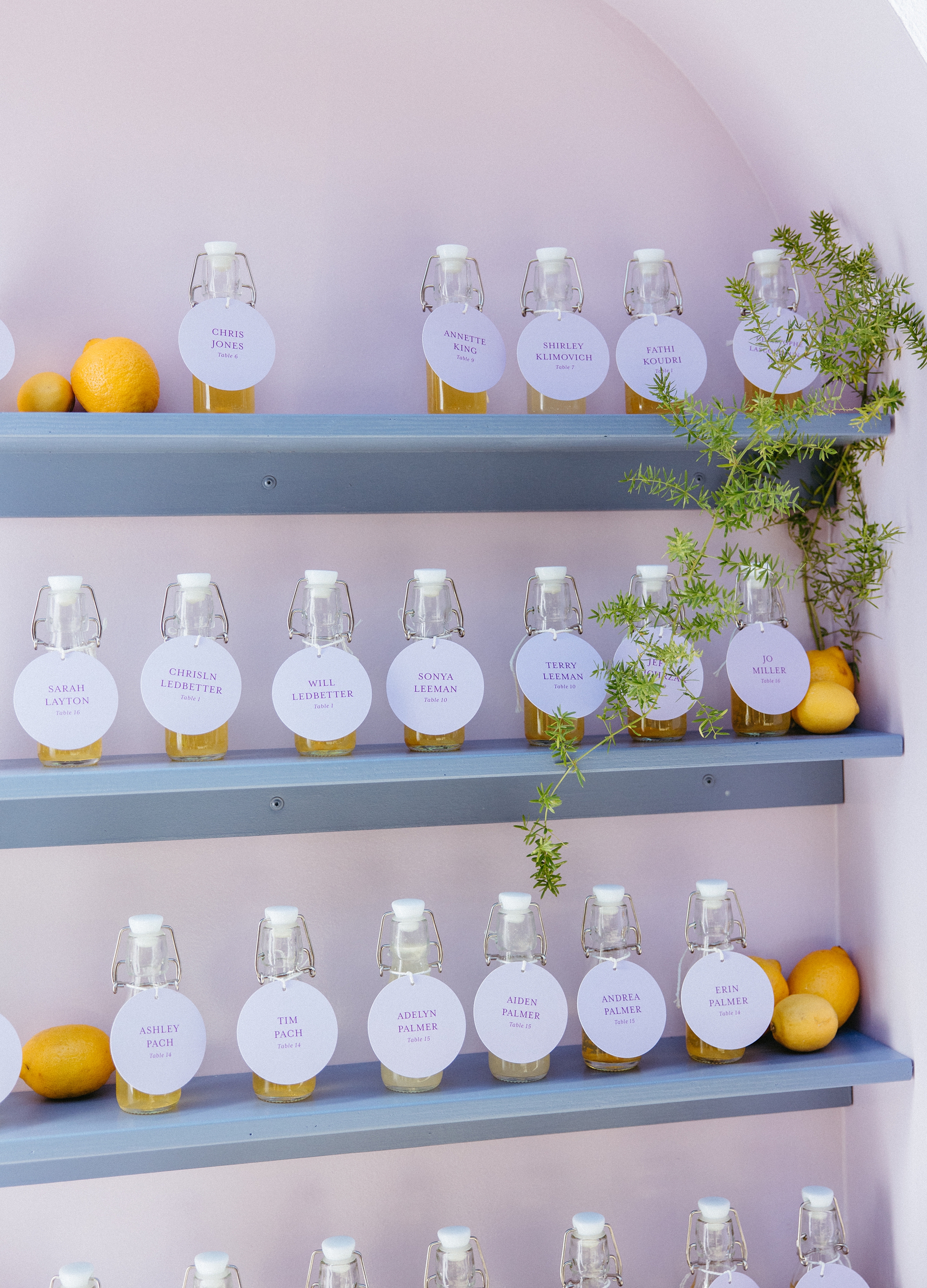
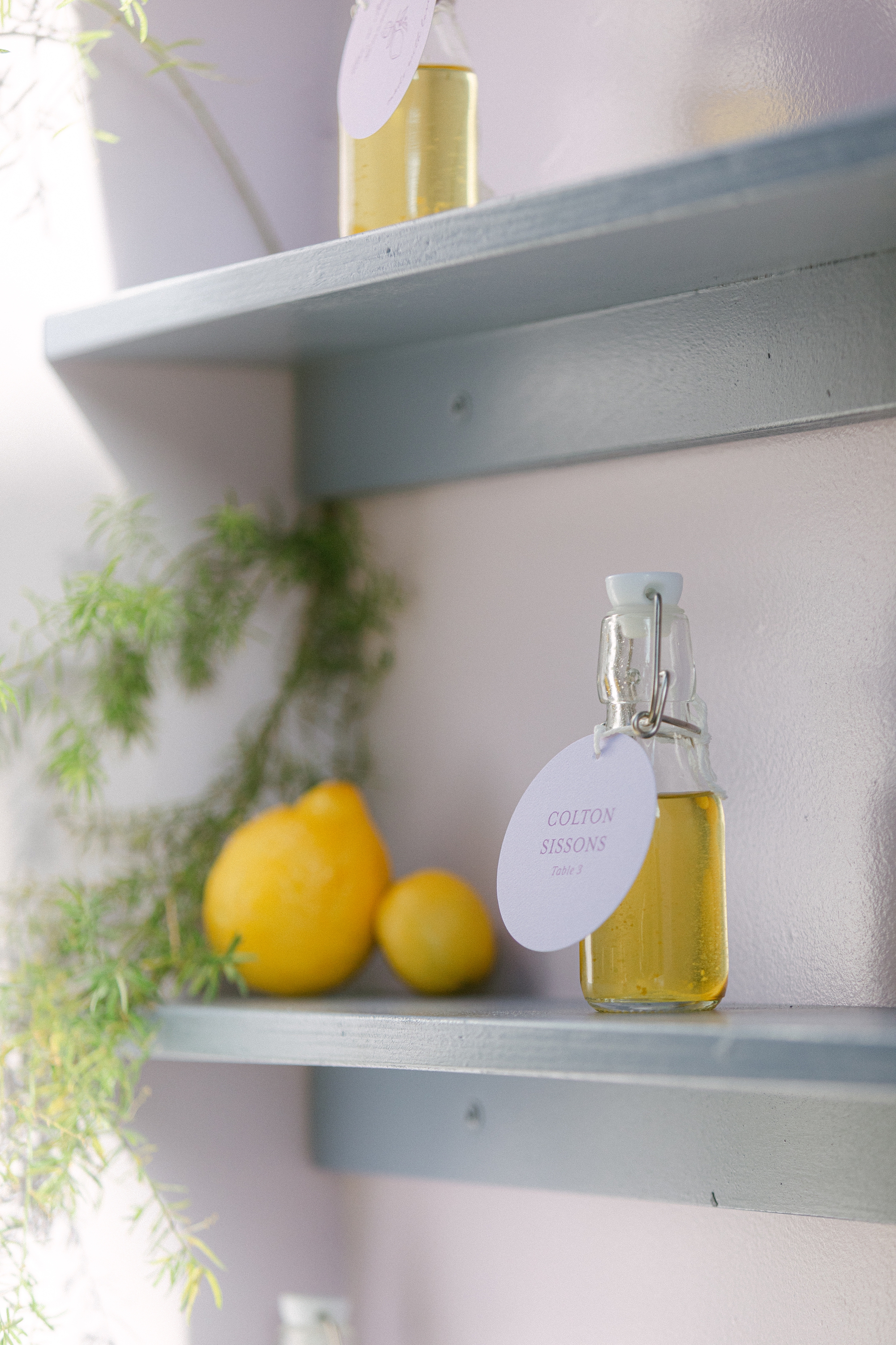
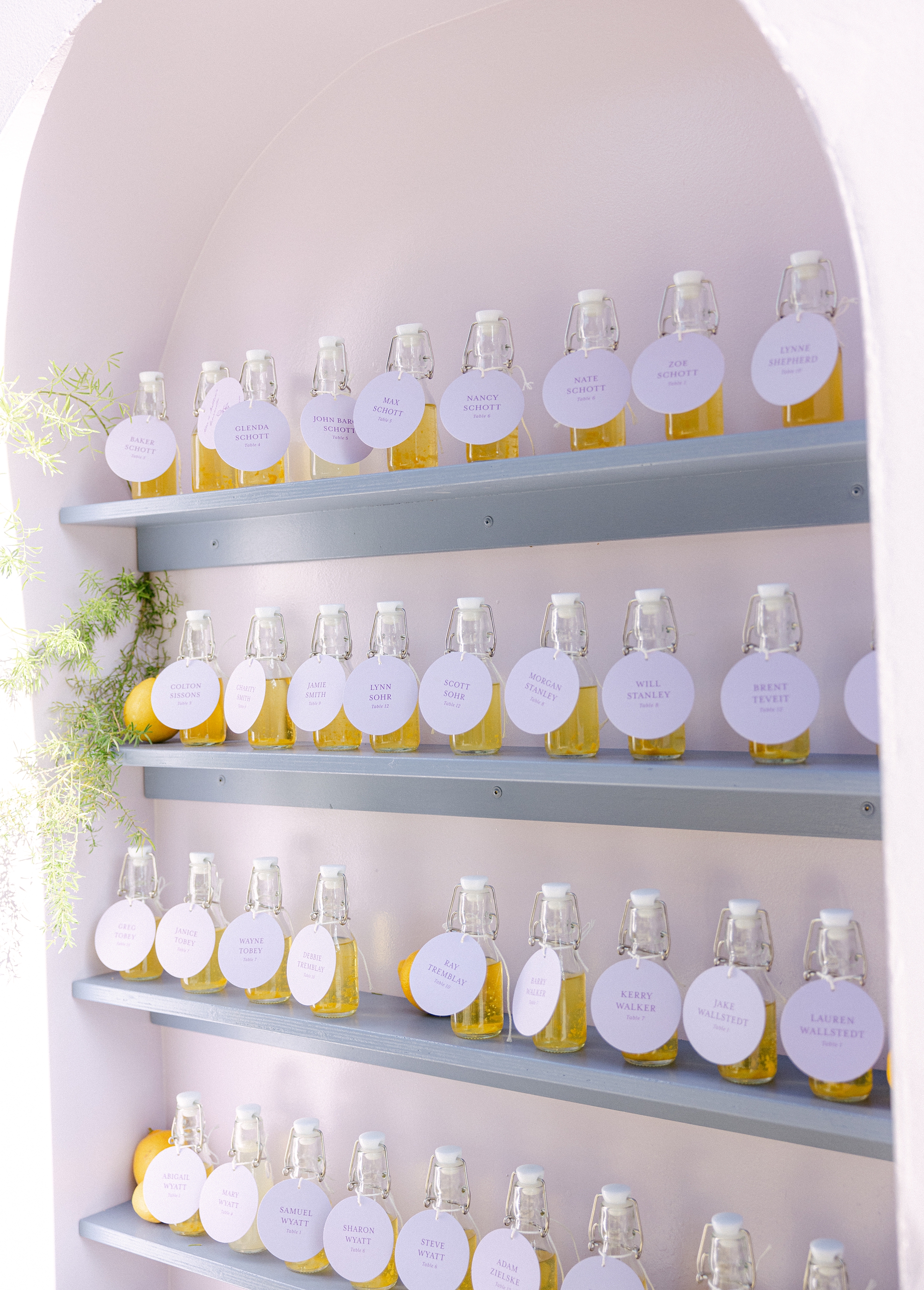
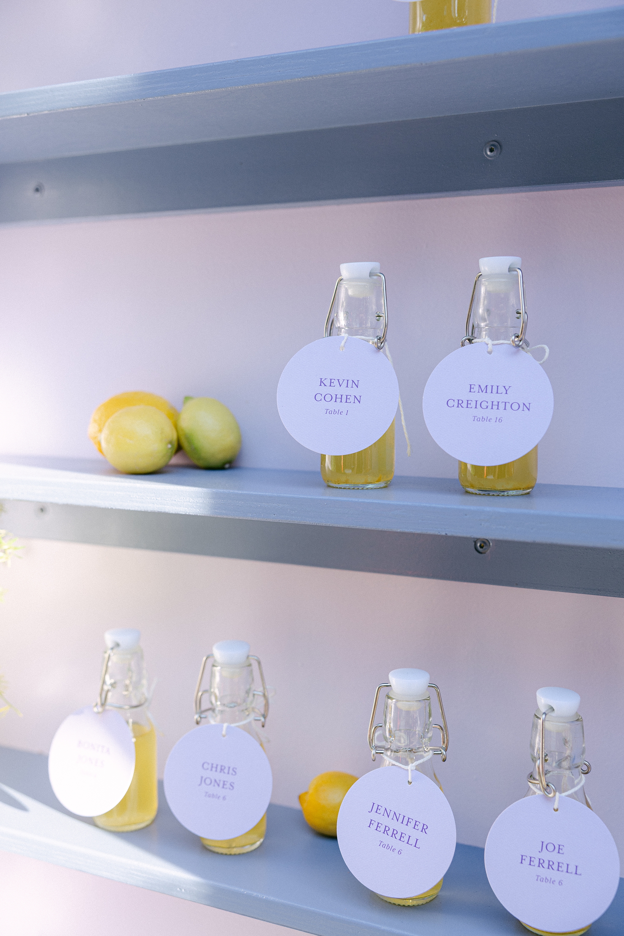
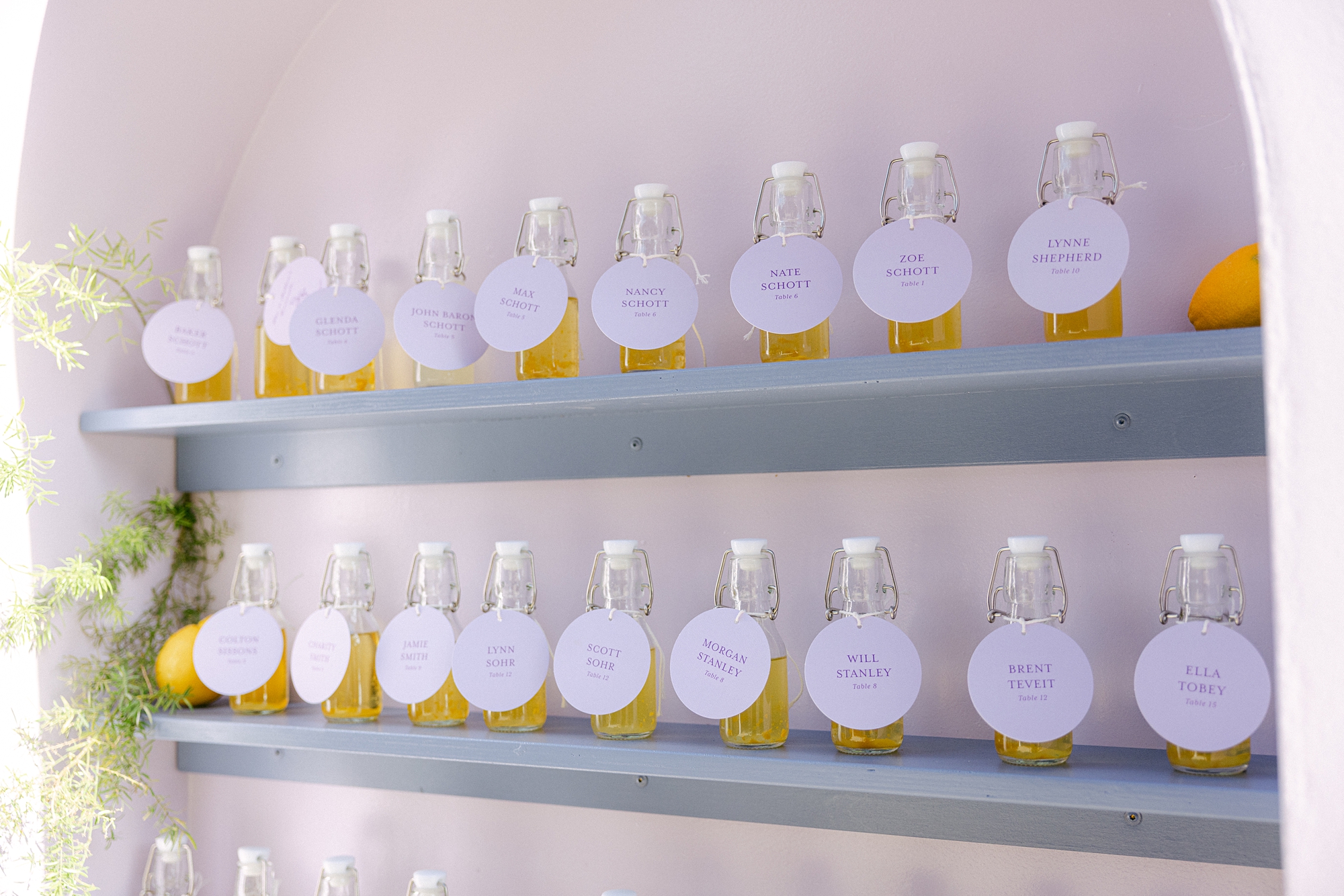
Limoncello Wall + Escort Tags
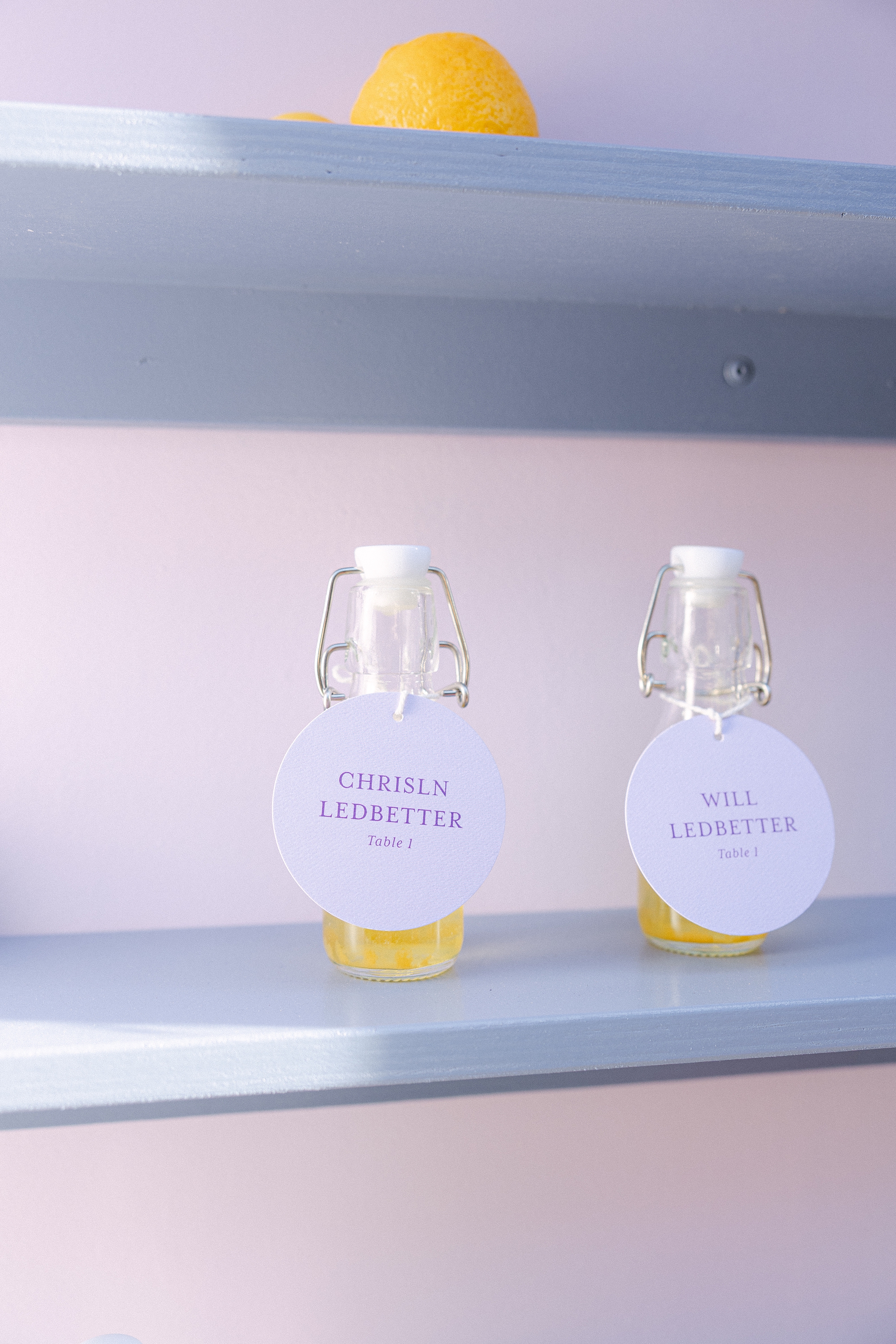
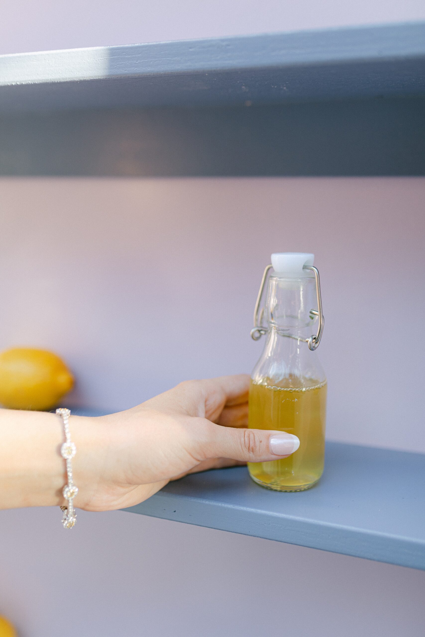
During our consultation, the couple mentioned that they LOVE limoncello. Naturally, we knew this had to play a starring role in their wedding design, so we designed a custom seating chart around limoncello, and it was better than we envisioned! Guests were welcomed with the seating chart wall display featuring three columns of shelving, each lined with bottles of homemade limoncello (or lemonade for those littles in attendance). Yes, you read that right, the couple made the limoncello themselves!! Talk about a personal touch!
Each bottle featured a circular escort tag with the guest’s name and table assignment. Across the top of the display, we added the playful phrase: “Take a ‘cello and Please Be Seated.” At the base of the installation, lush florals completed the look, making this display not just a seating chart, but a true statement piece and guest favorite.
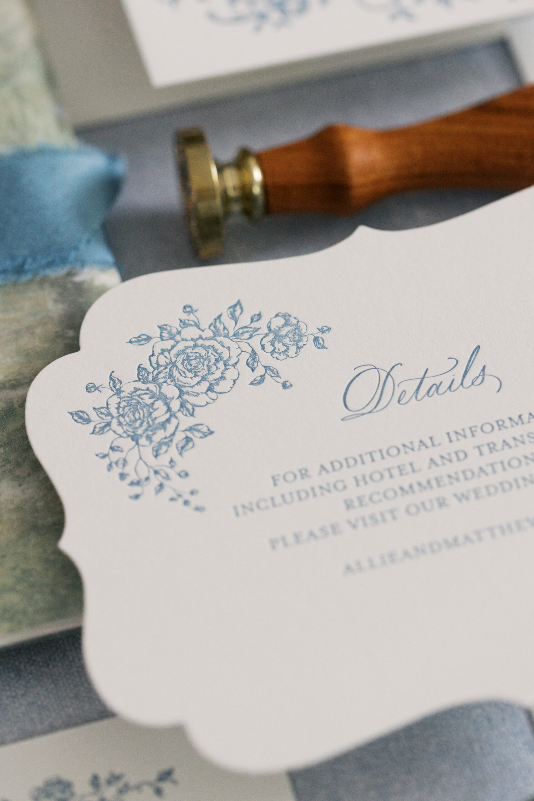
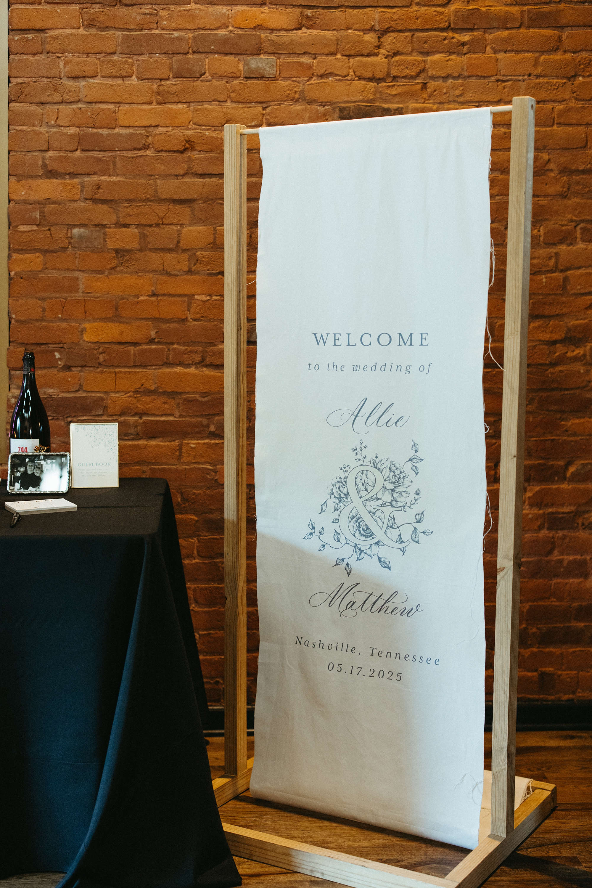
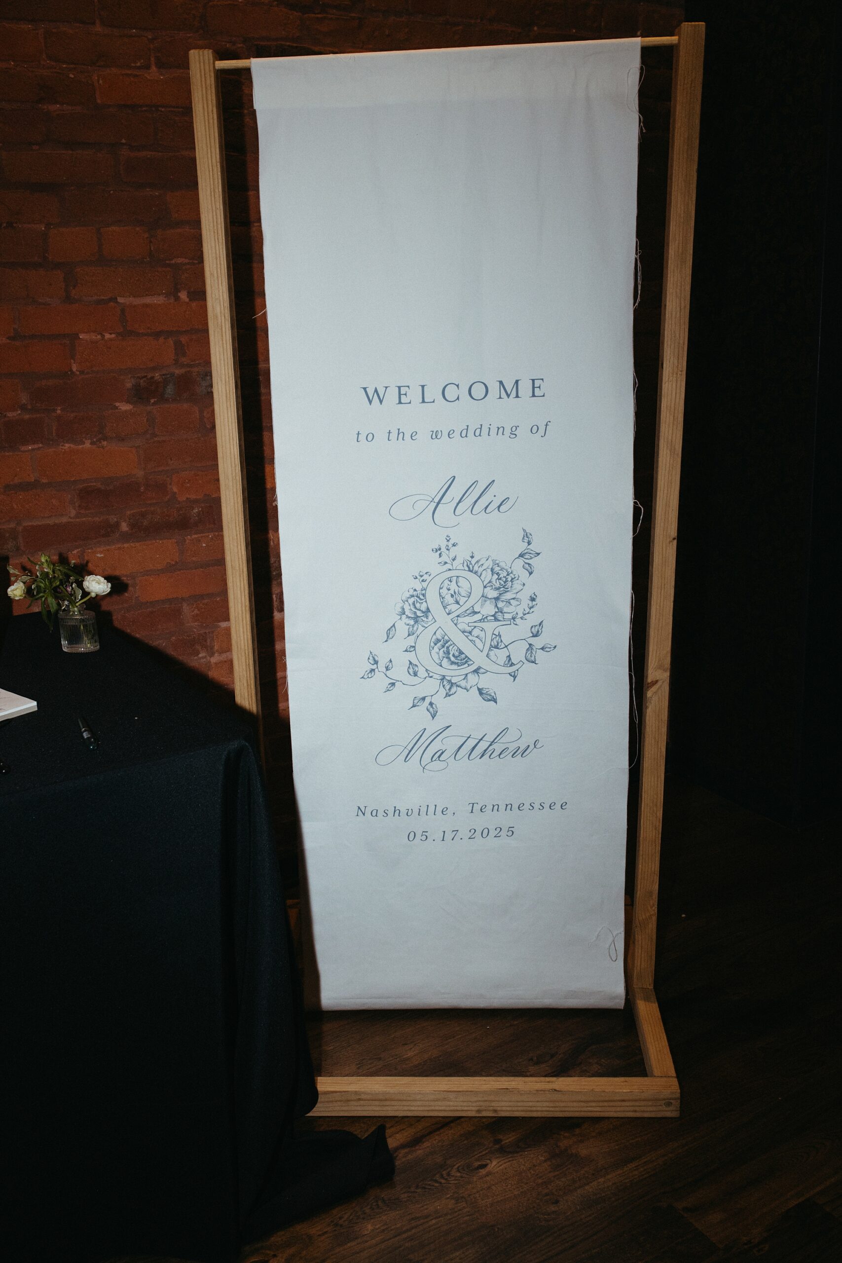
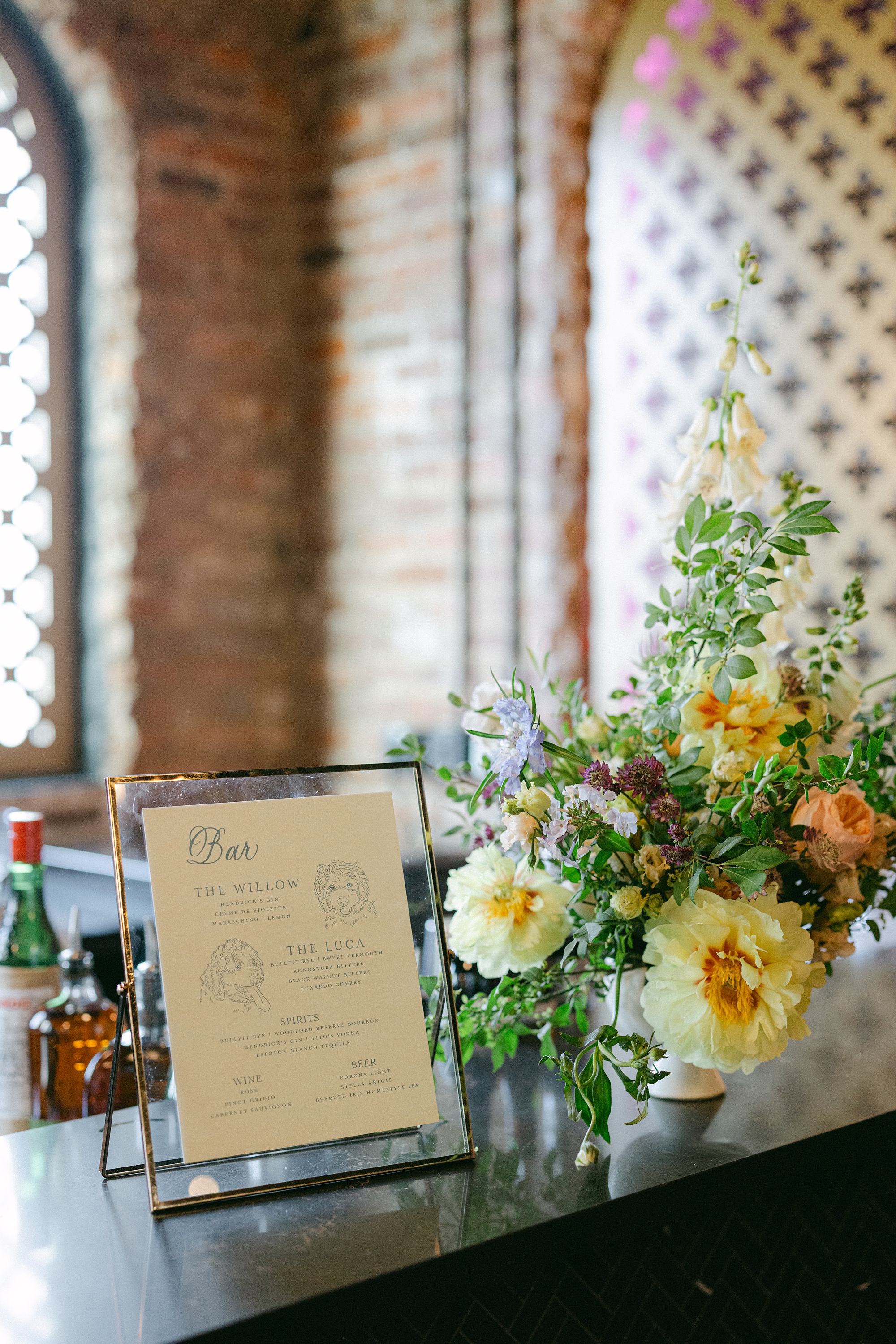
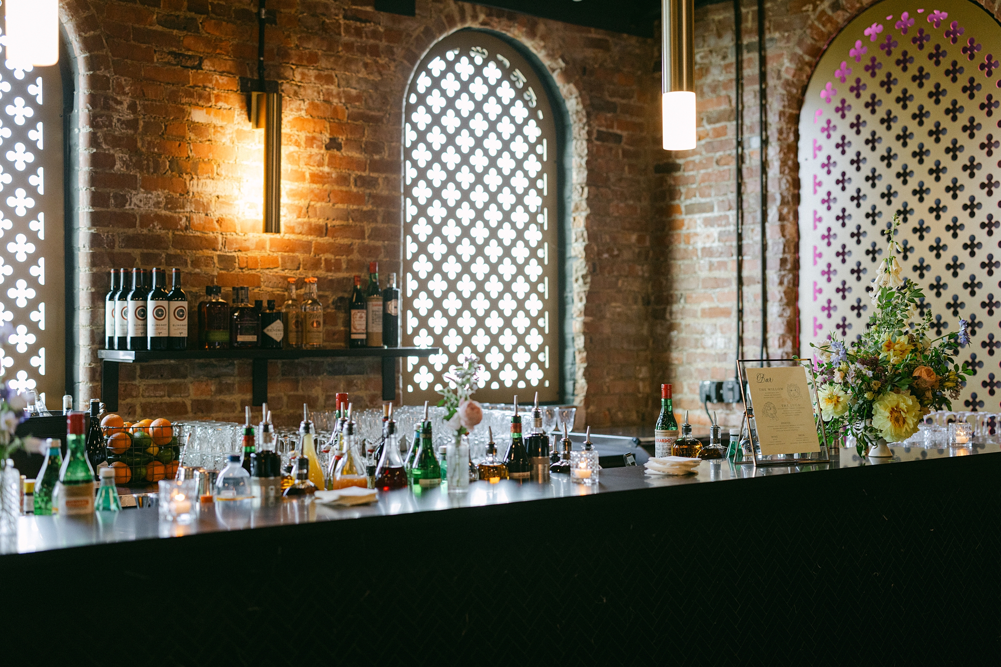
Day-Of Details: Wedding Signage
Beyond the invitations and seating chart, we created several custom paper goods and signage to carry the couple’s aesthetic throughout the celebration. A white fabric wedding welcome sign with soft blue lettering set the tone from the moment guests arrived. Bar signage featured signature cocktails inspired by the couple’s beloved dogs, Willow and Luca, complete with hand-sketched portraits. It was a personal detail that had everyone smiling.
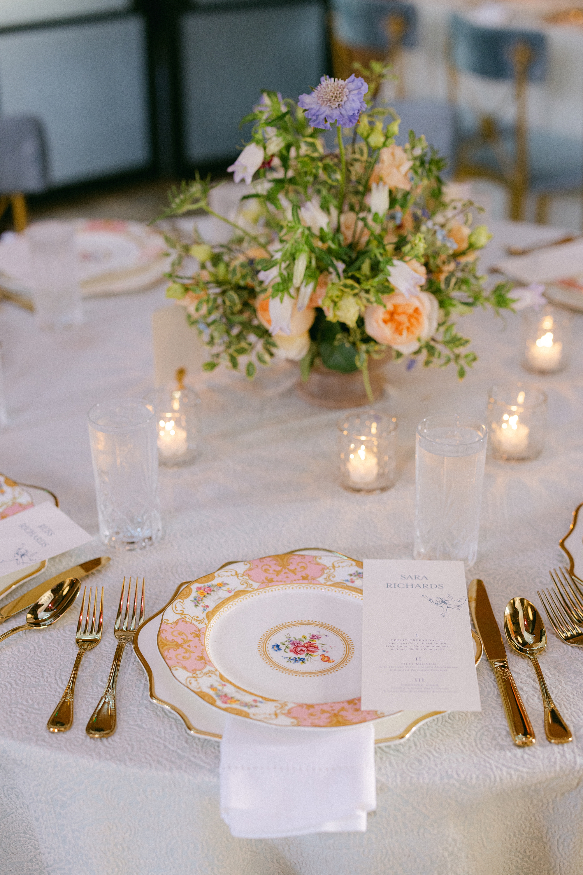
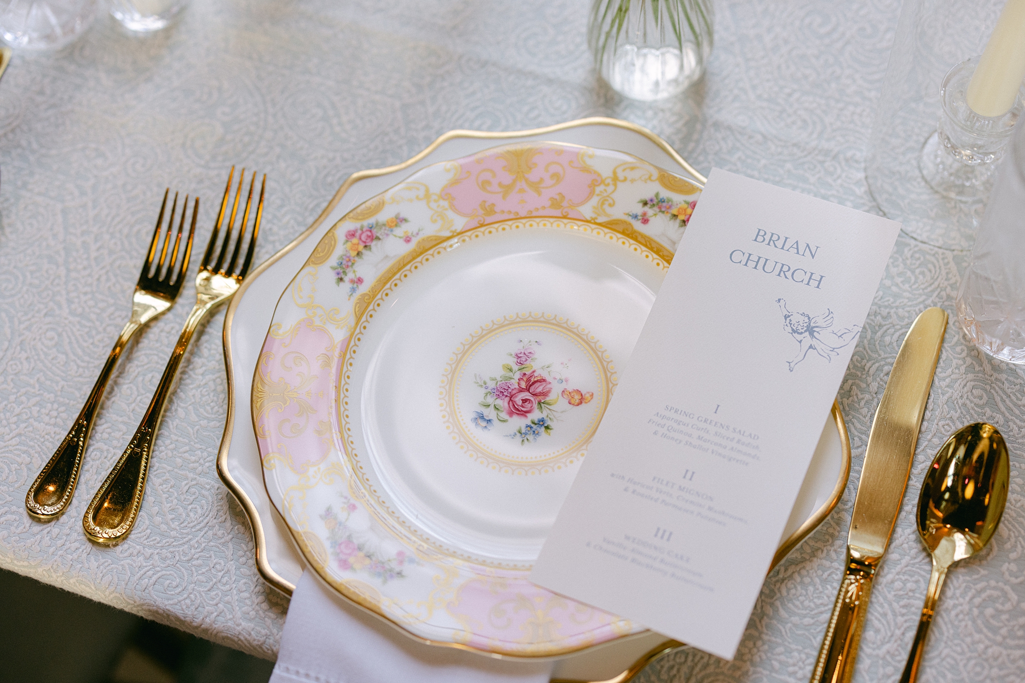
Menus and an Elegant Tablescape
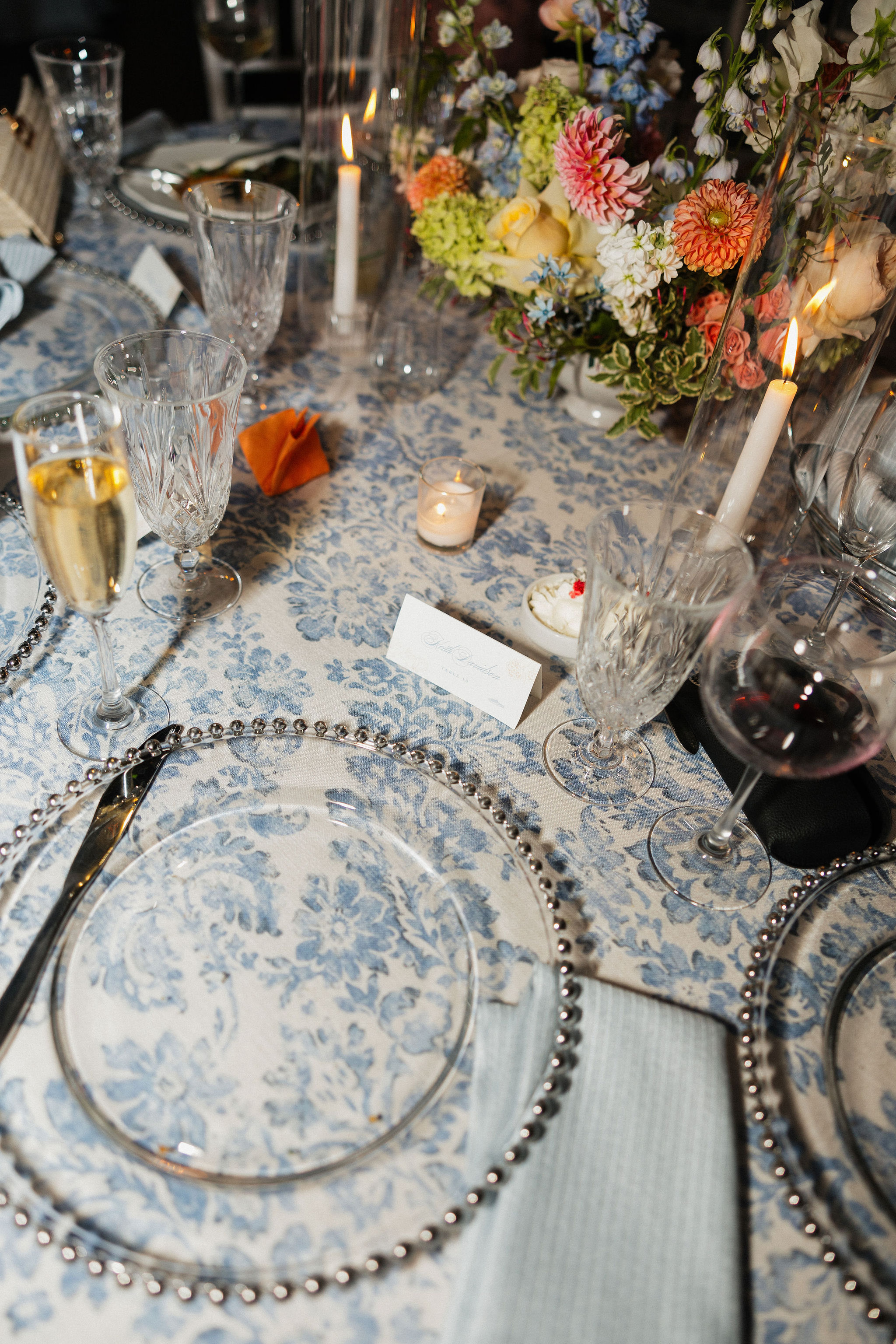
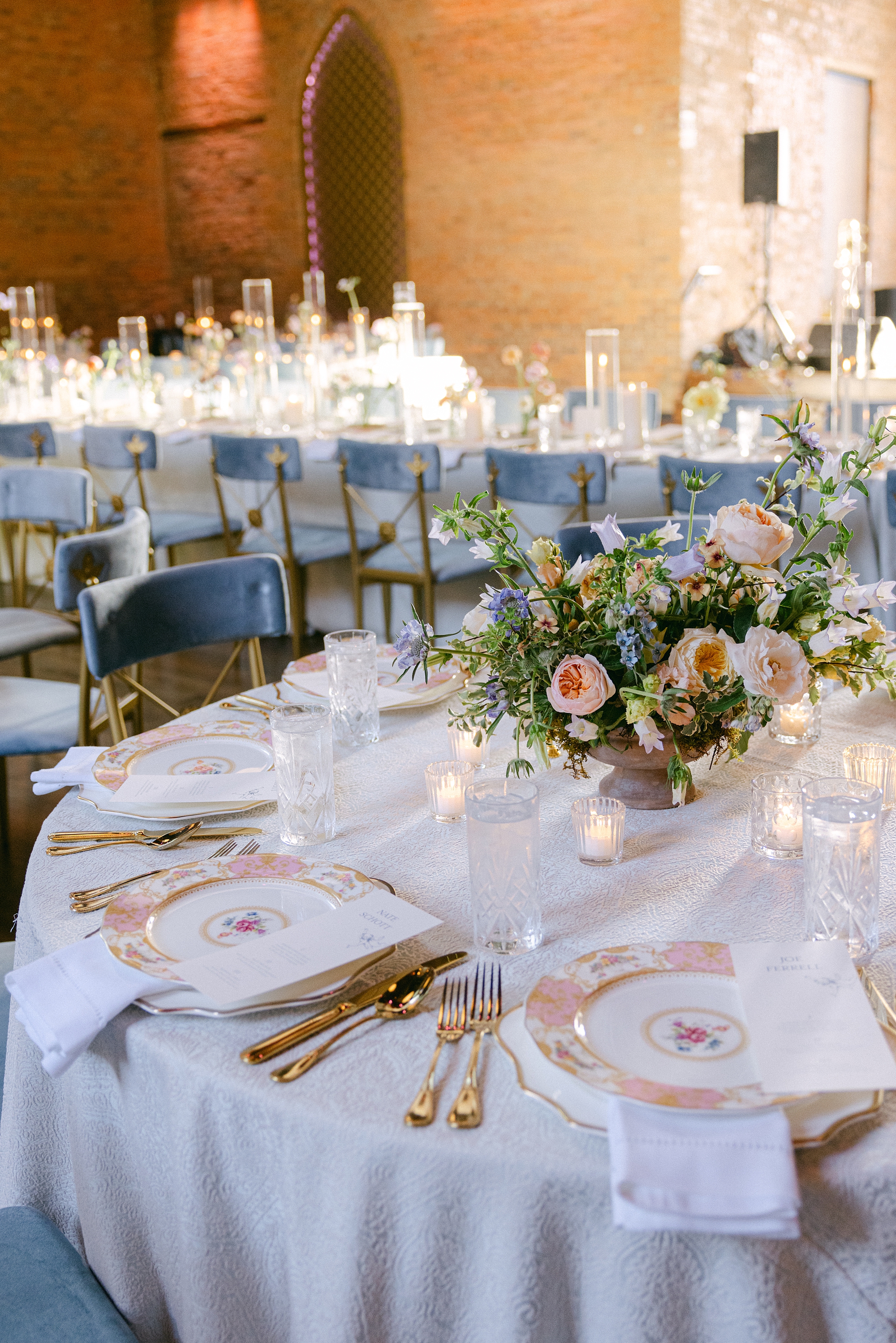
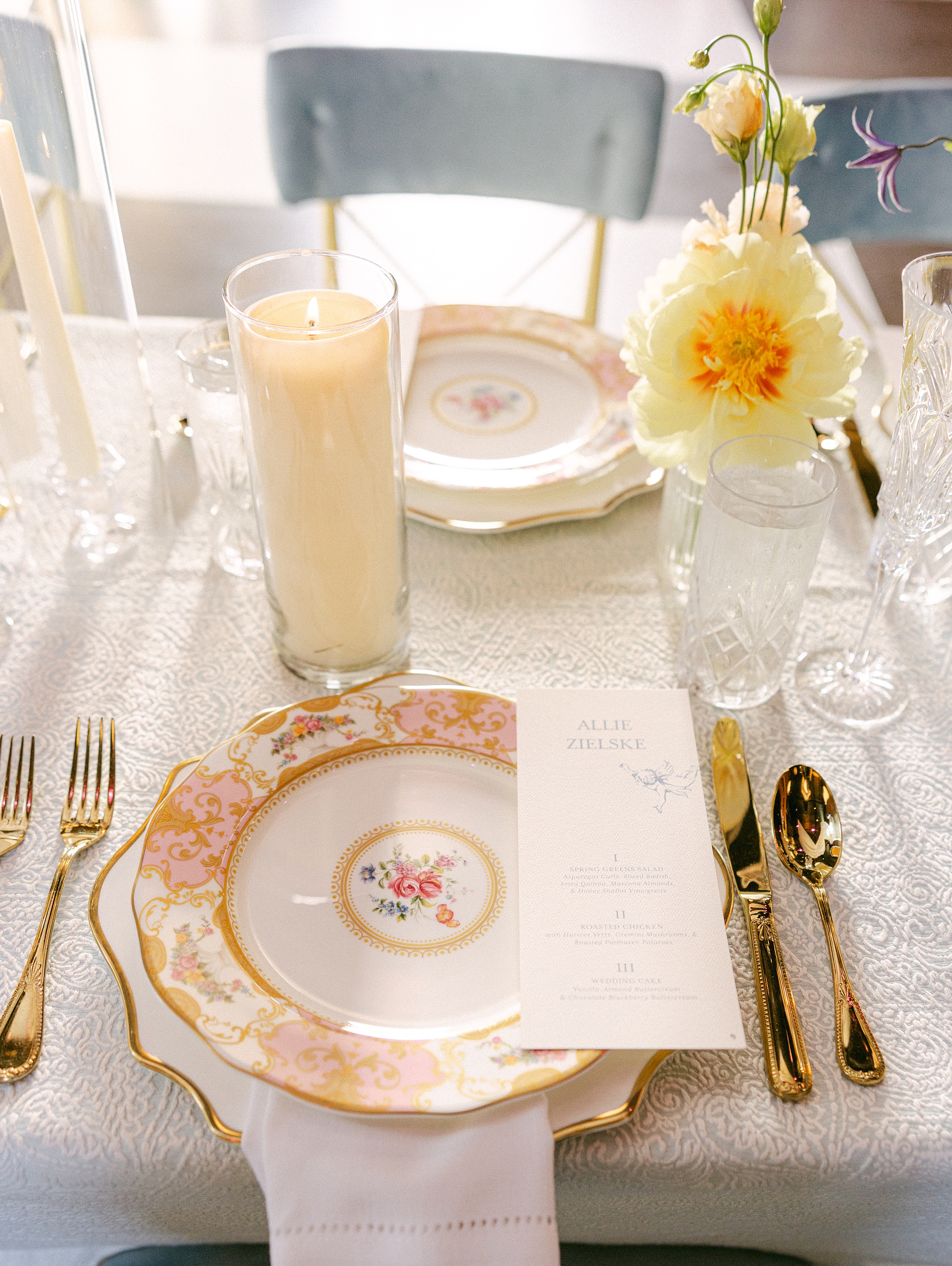
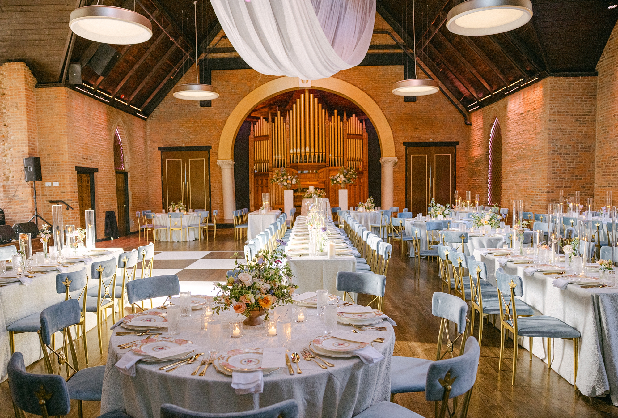
Menus sat atop each place setting. The pink, floral patterned plates and gold cutlery added a pop of color to tables draped in textured white linens and surrounded by soft blue chairs. Candlelight and romantic floral centerpieces tied everything together for an atmosphere that was both inviting and elegant.
From the custom invitation suite to the unforgettable limoncello seating chart wall, every design choice reflected the couple’s personality and vision. This was so much fun to create and bring to life. Congratulations to the newlyweds!
If you’re planning a wedding in Nashville, or anywhere in the world, we’d love to help you create meaningful, personalized stationery and event details that tell your story. We work with couples worldwide to design details you and your guests will remember forever. Reach out today to learn more about our full-service wedding and event design offerings! We can’t wait to create something unforgettable for you!
If you enjoyed this post, you’ll love these other blogs!
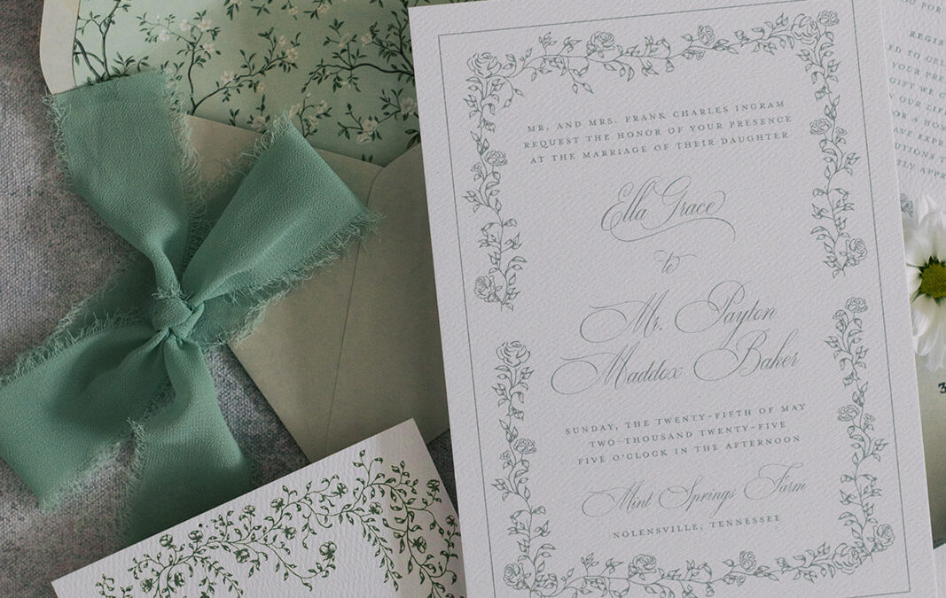
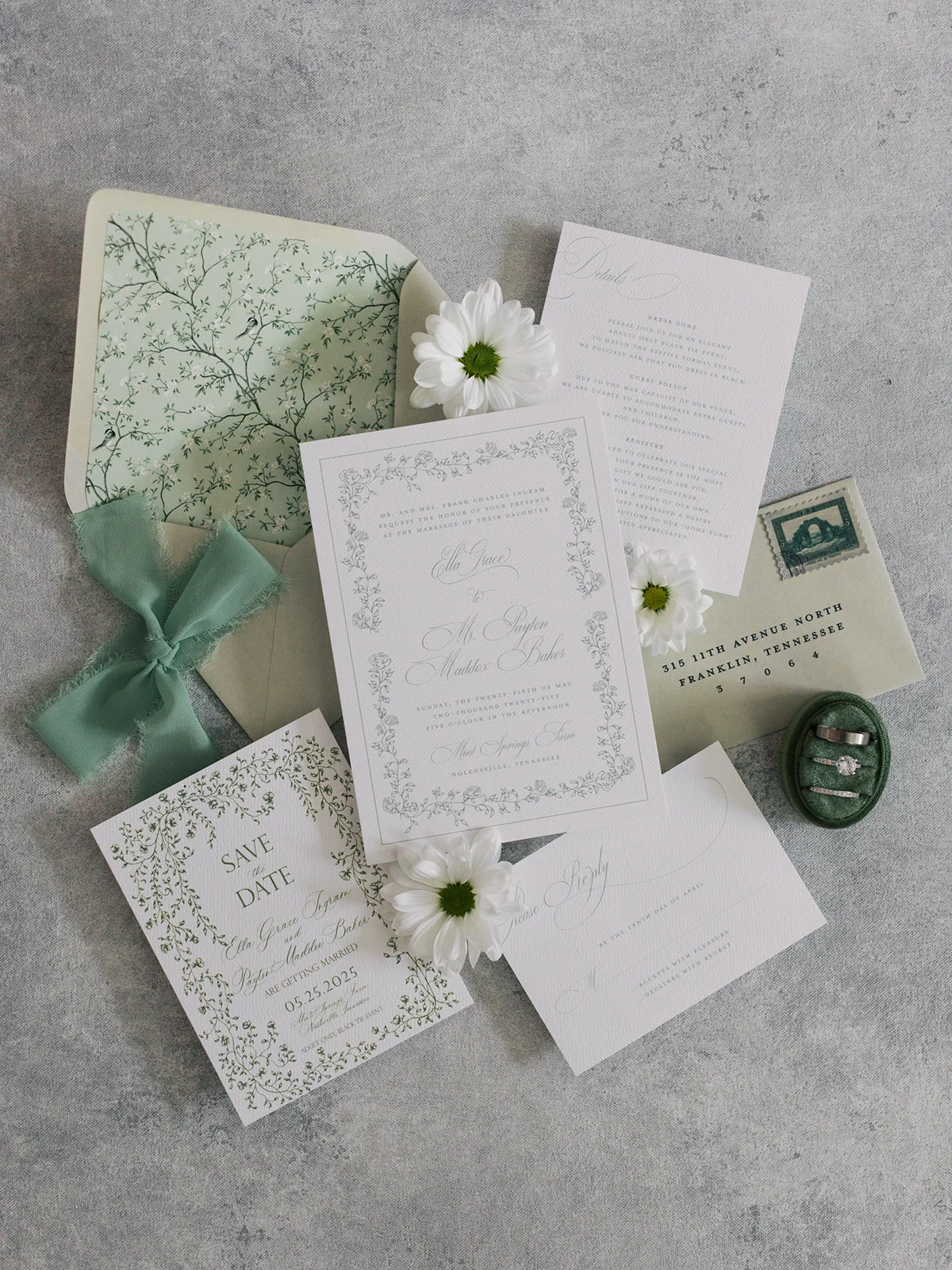
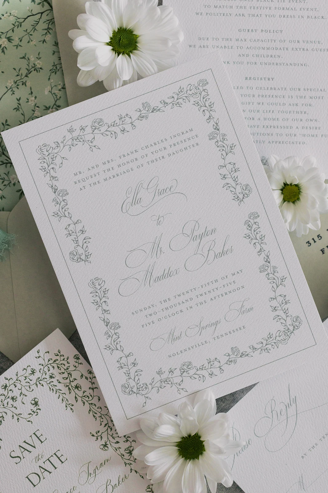
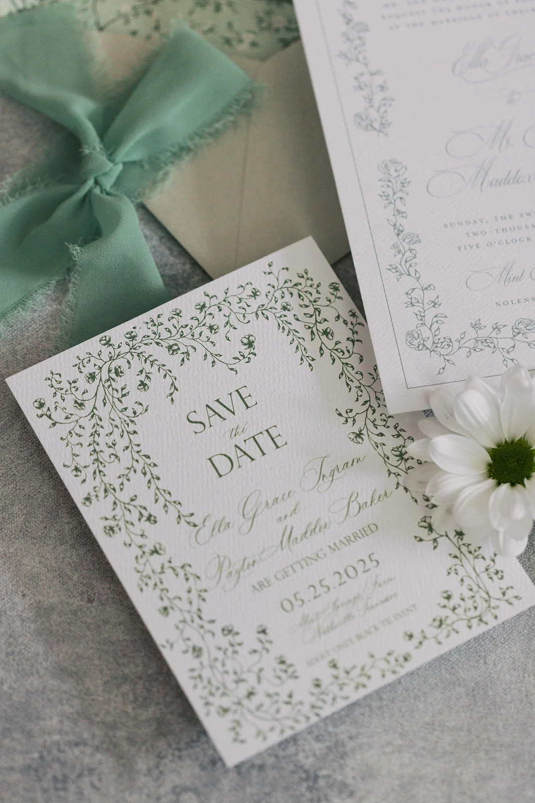
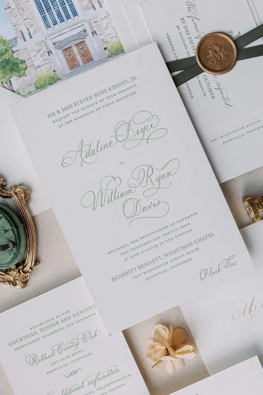
When it comes to wedding invitations, green is a color we’ll never stop reaching for. Whether it’s soft sage, deep emerald, or a muted olive, green truly works like a neutral as it pairs beautifully with florals, practically every color on the spectrum, and even bold patterns. It’s elegant yet still allows for playful creativity. At White Ink Calligraphy + Co., we’ve had the joy of bringing several green invitation suites to life, and we’re sharing a few of our favorites today to show how this gorgeous hue can set the tone for an elevated and memorable celebration.
Green Invitation Suites for Every Wedding Style
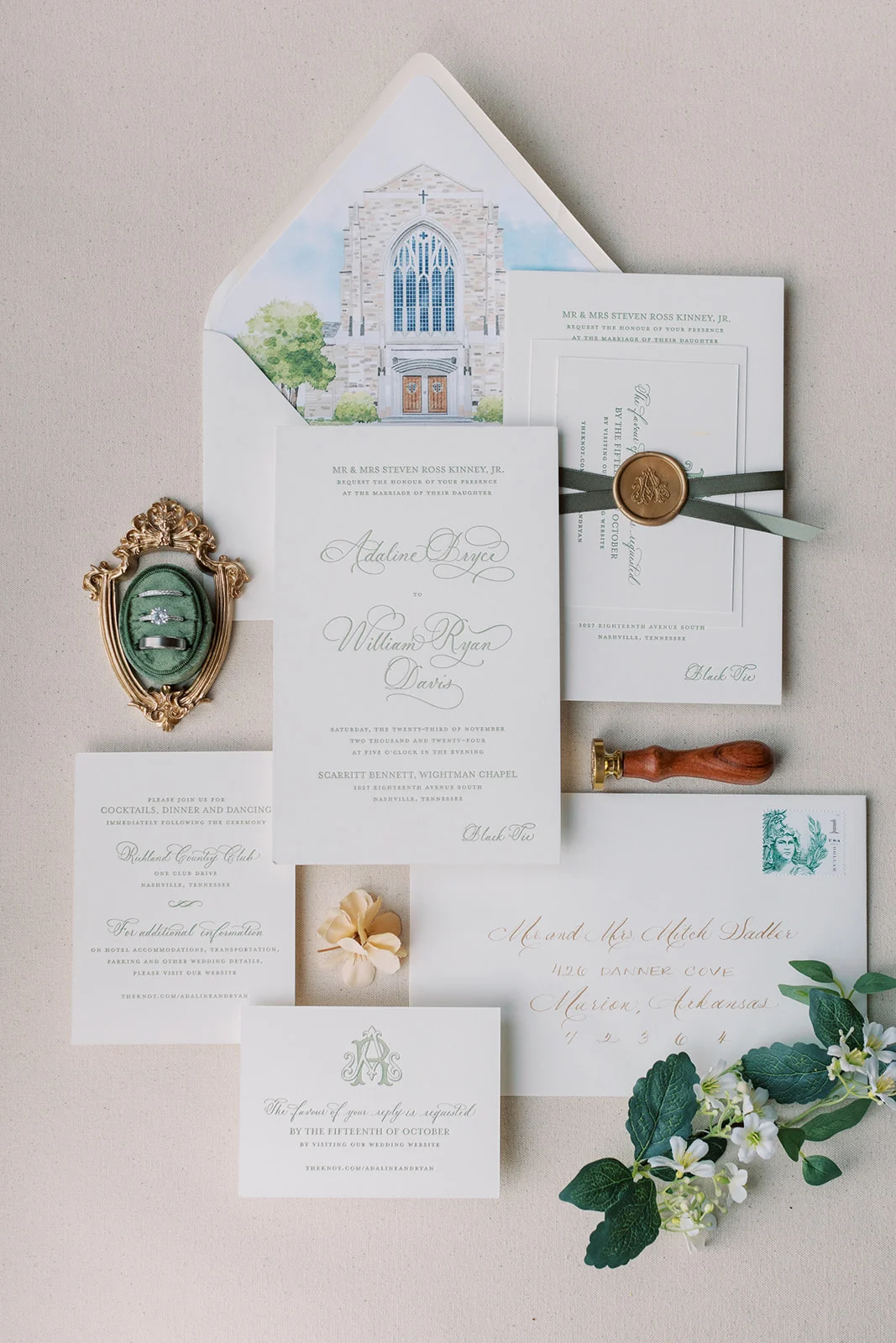
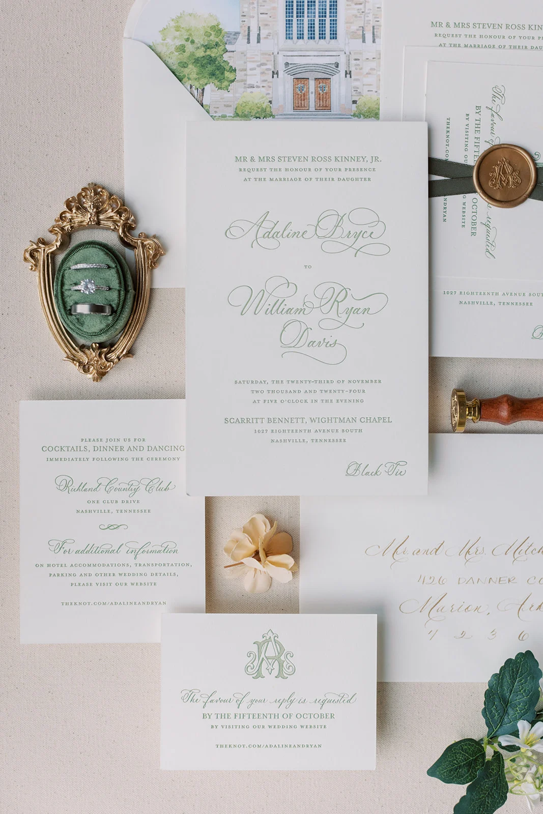
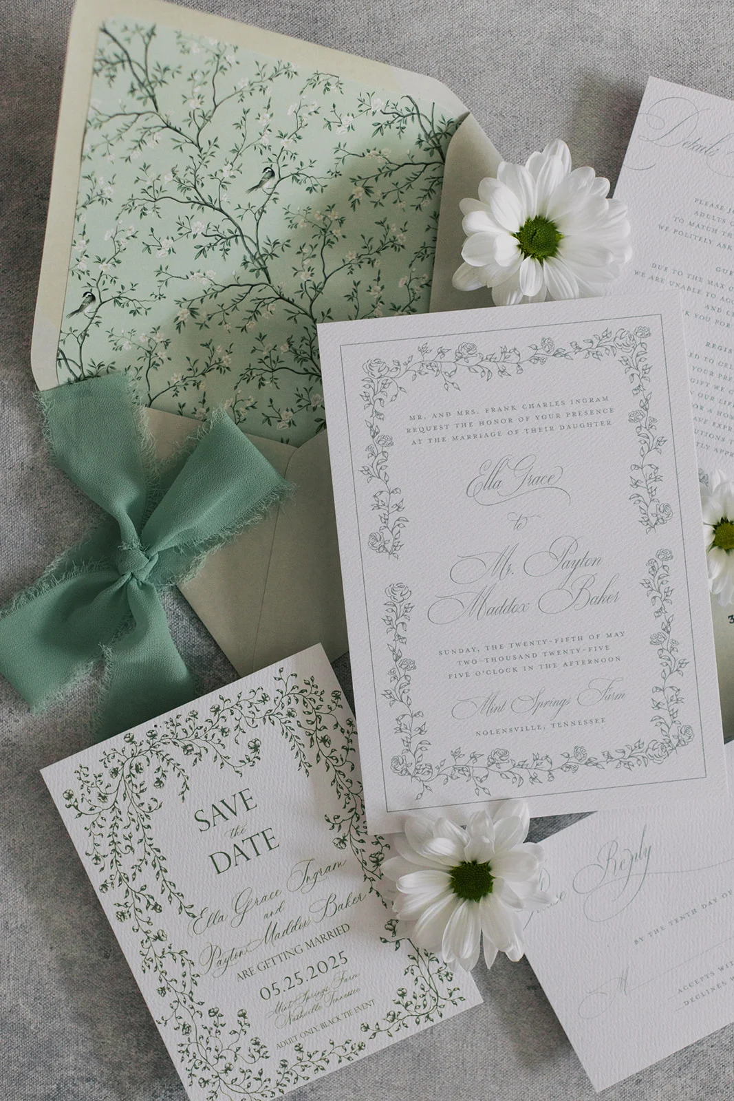
Refined Letterpress Suite
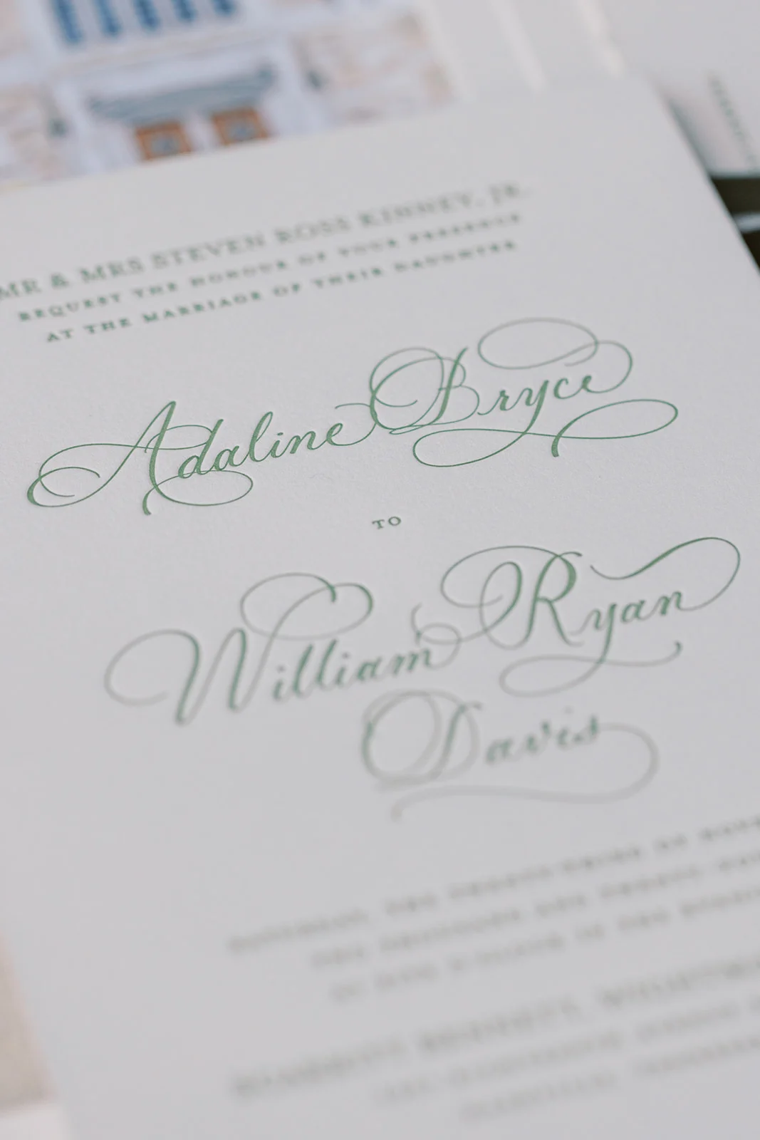
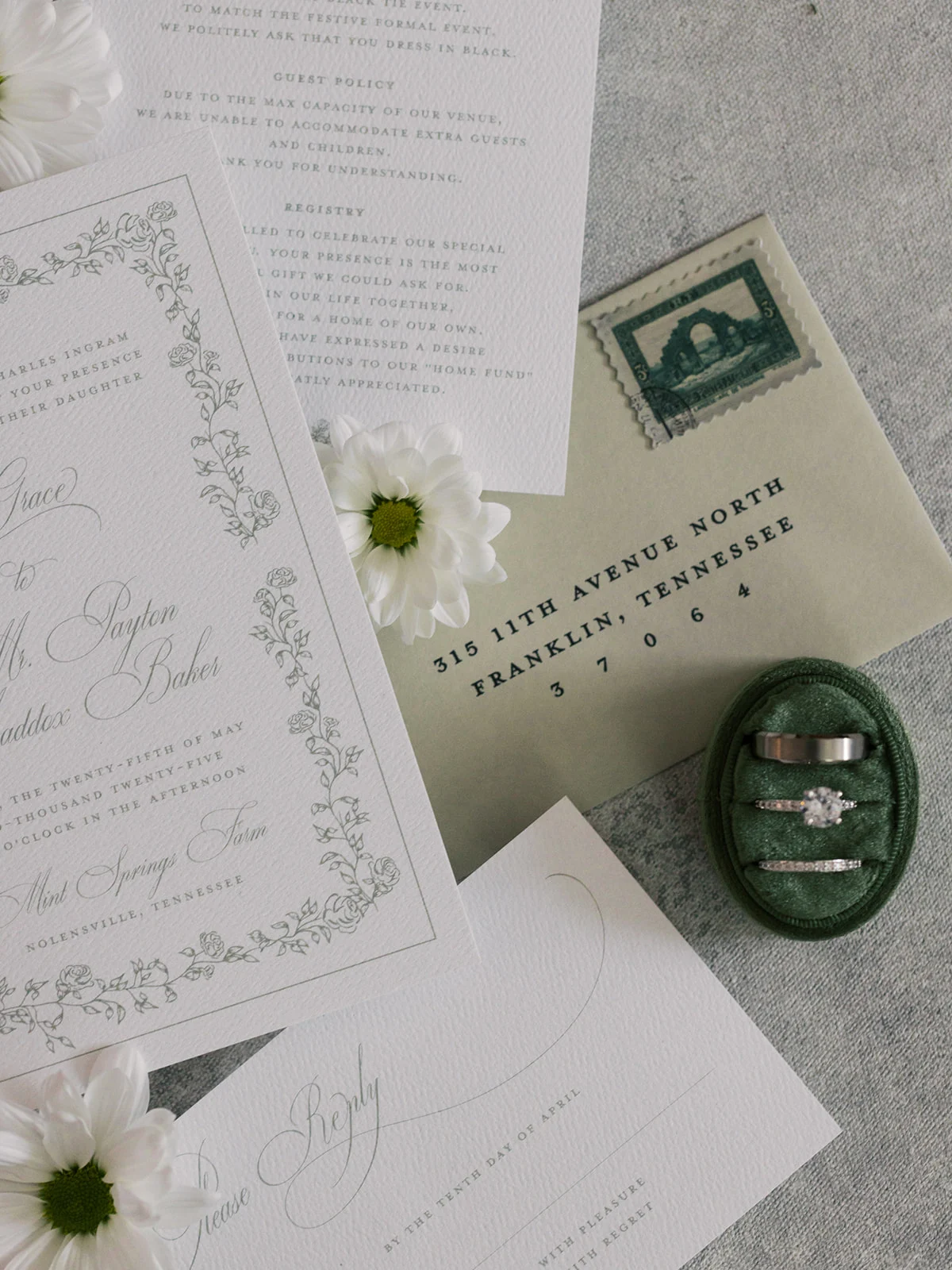
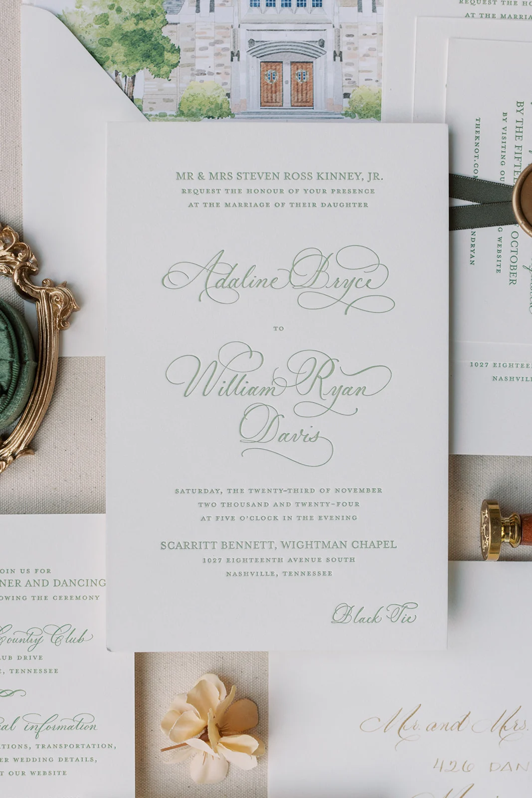
This suite is a perfect example of how green can bring together classic romance and elegance. Designed with luxurious letterpress printing and a custom monogram, Adaline’s suite felt like a work of art from the very first glance.
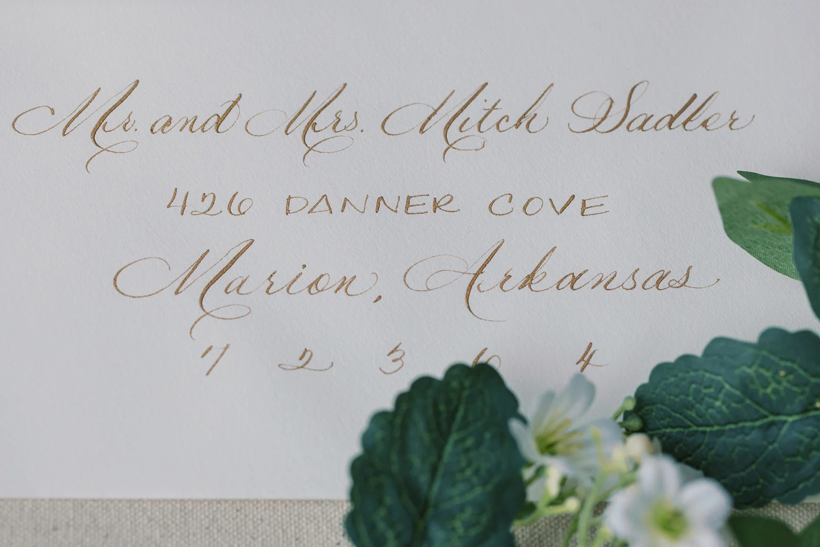
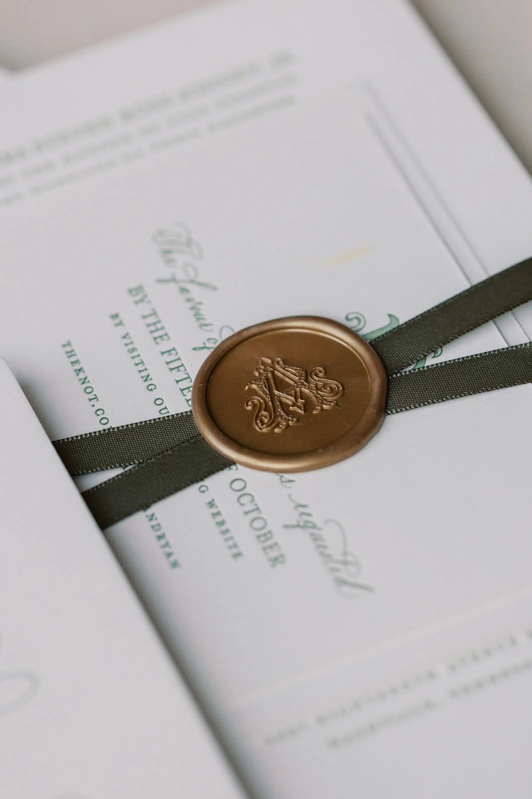
My favorite detail from this suite, besides the color, is the custom watercolor painting of the venue featured on the envelope liner, setting the tone before guests even opened the invitation. Pulling the invitation out from the beautiful envelopes, guests would find the suite tied together with a wax seal and soft ribbon, a finishing touch that felt as elevated as the day itself. We also added spot calligraphy to the main invitation card for a personal, hand-touched feel, along with matching calligraphed envelopes. Every detail reflected the couple’s vision for a refined and heartfelt celebration.
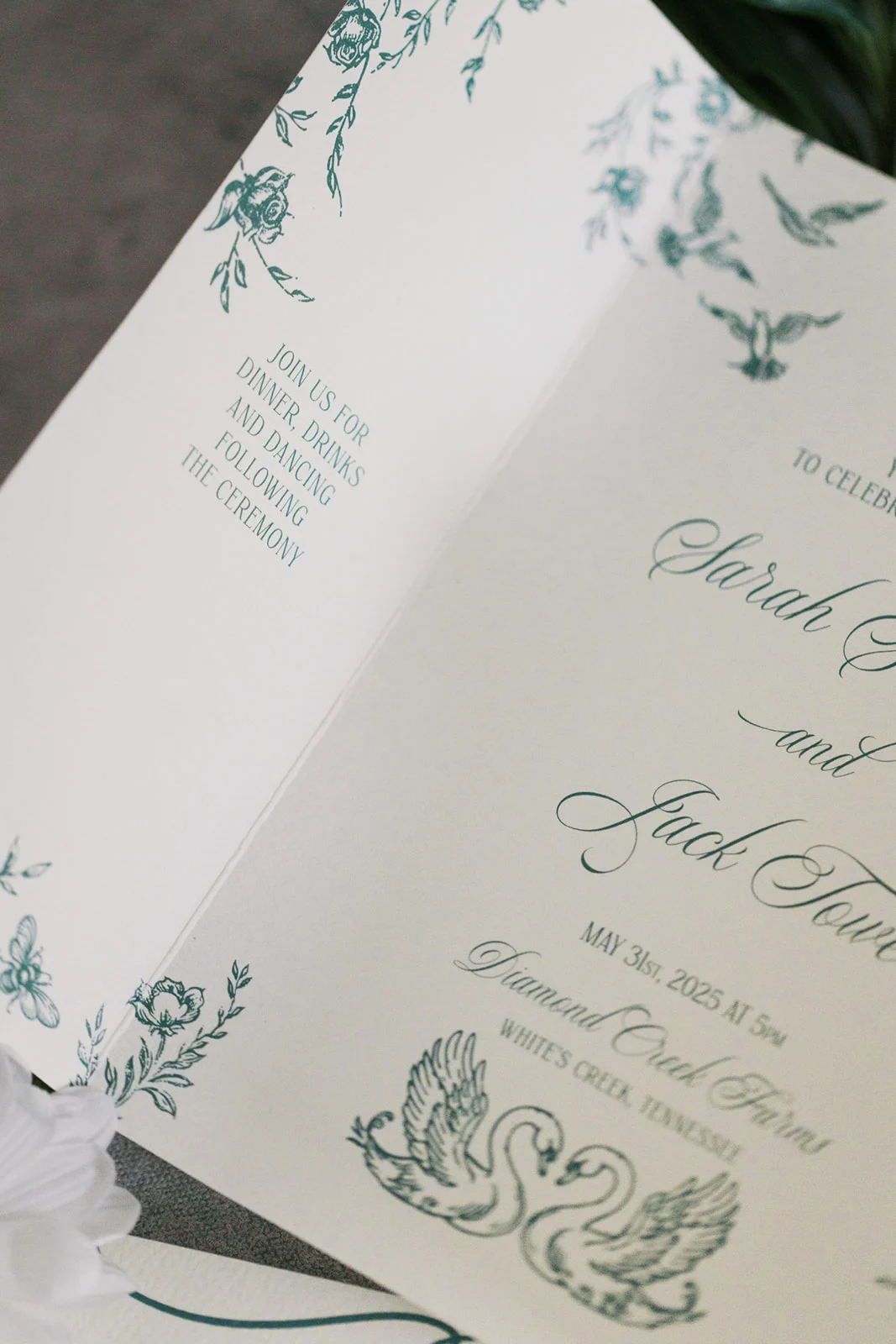
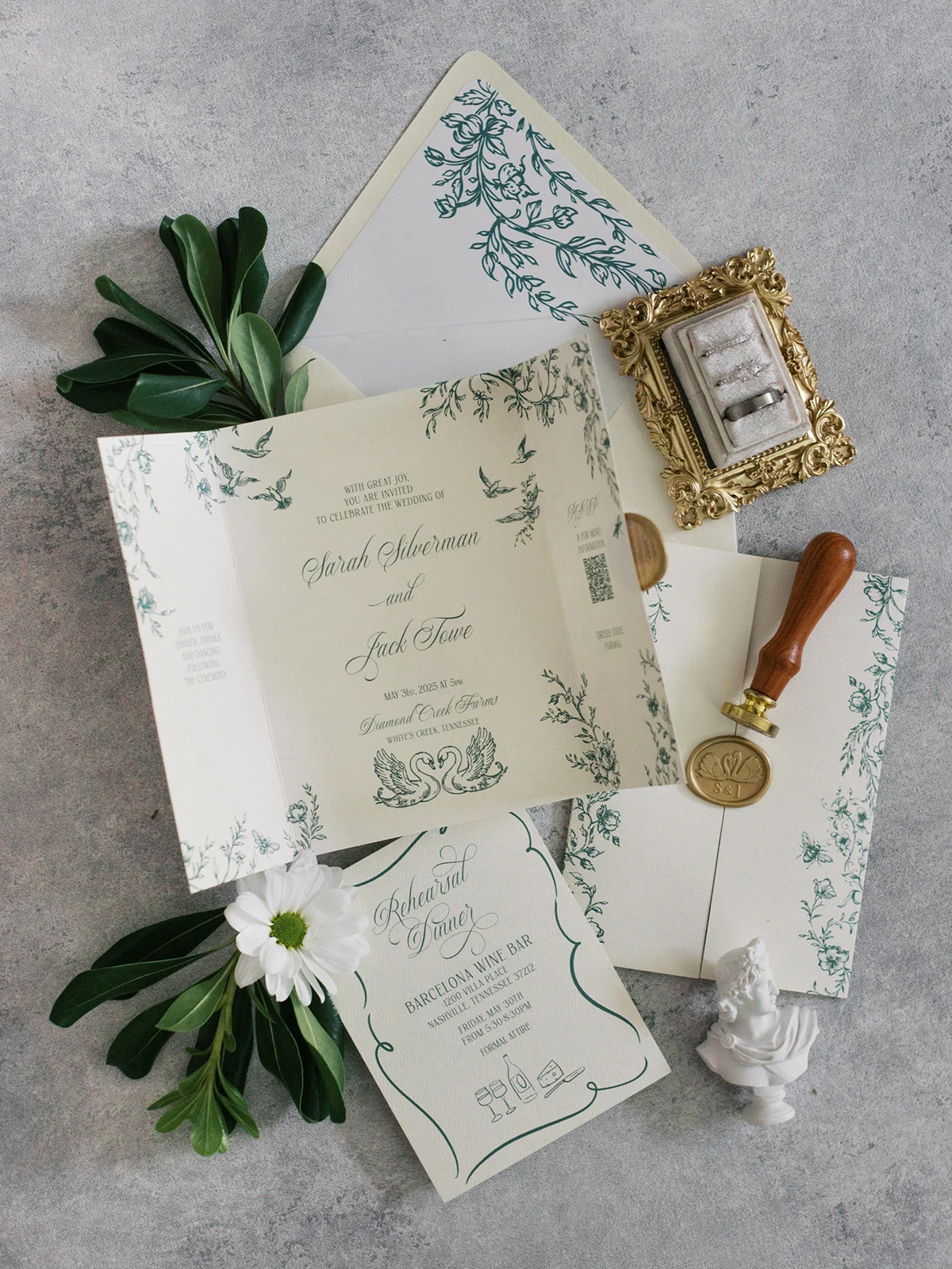
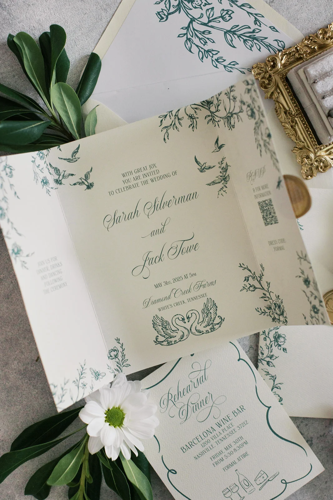
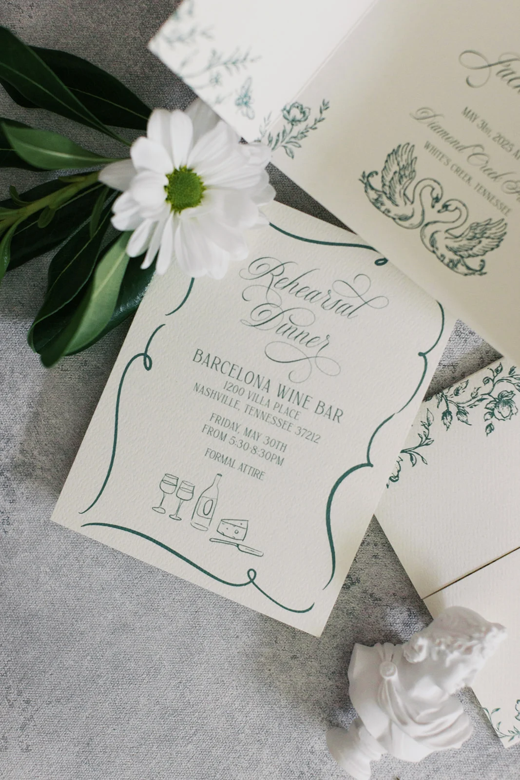
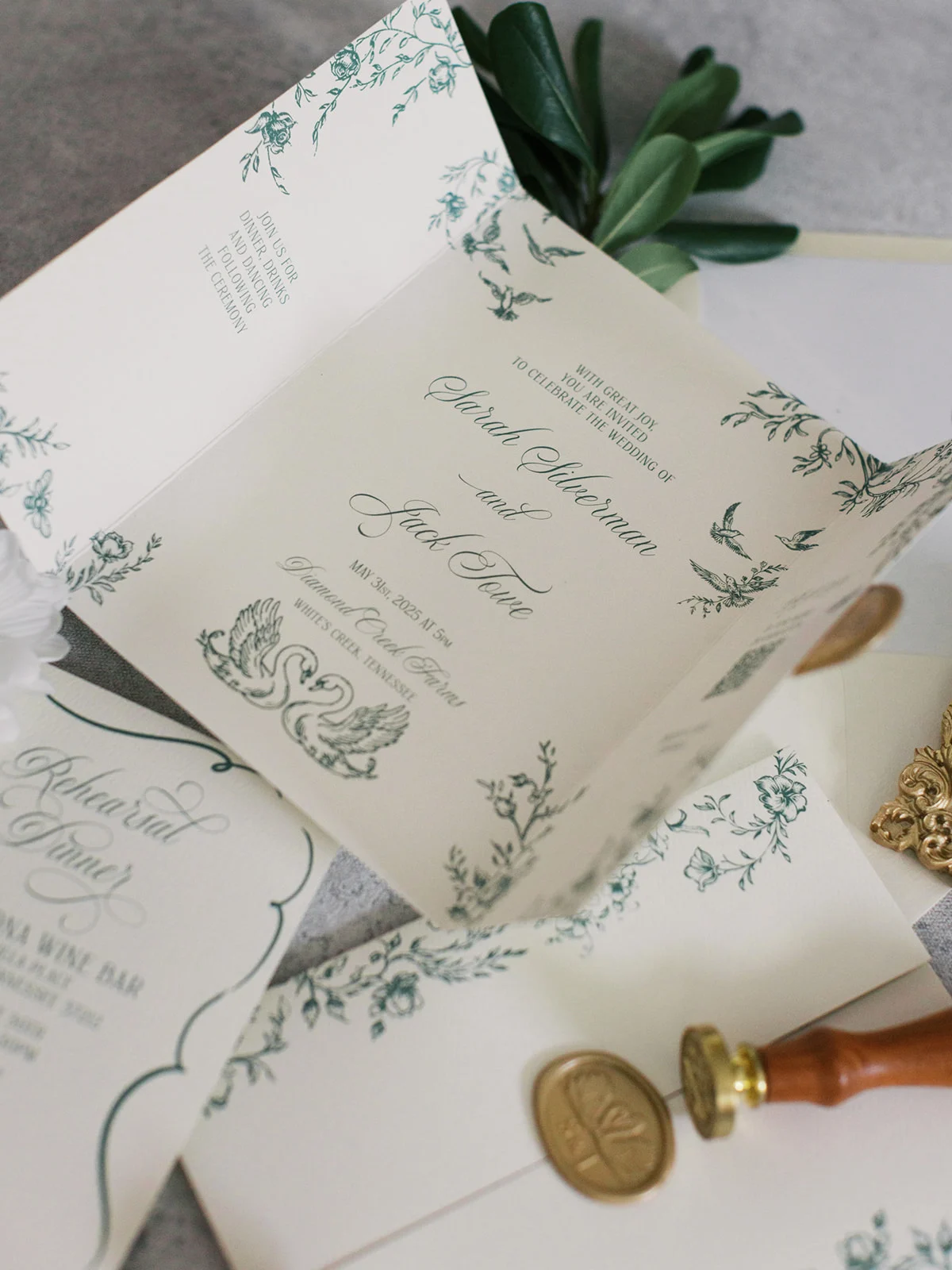
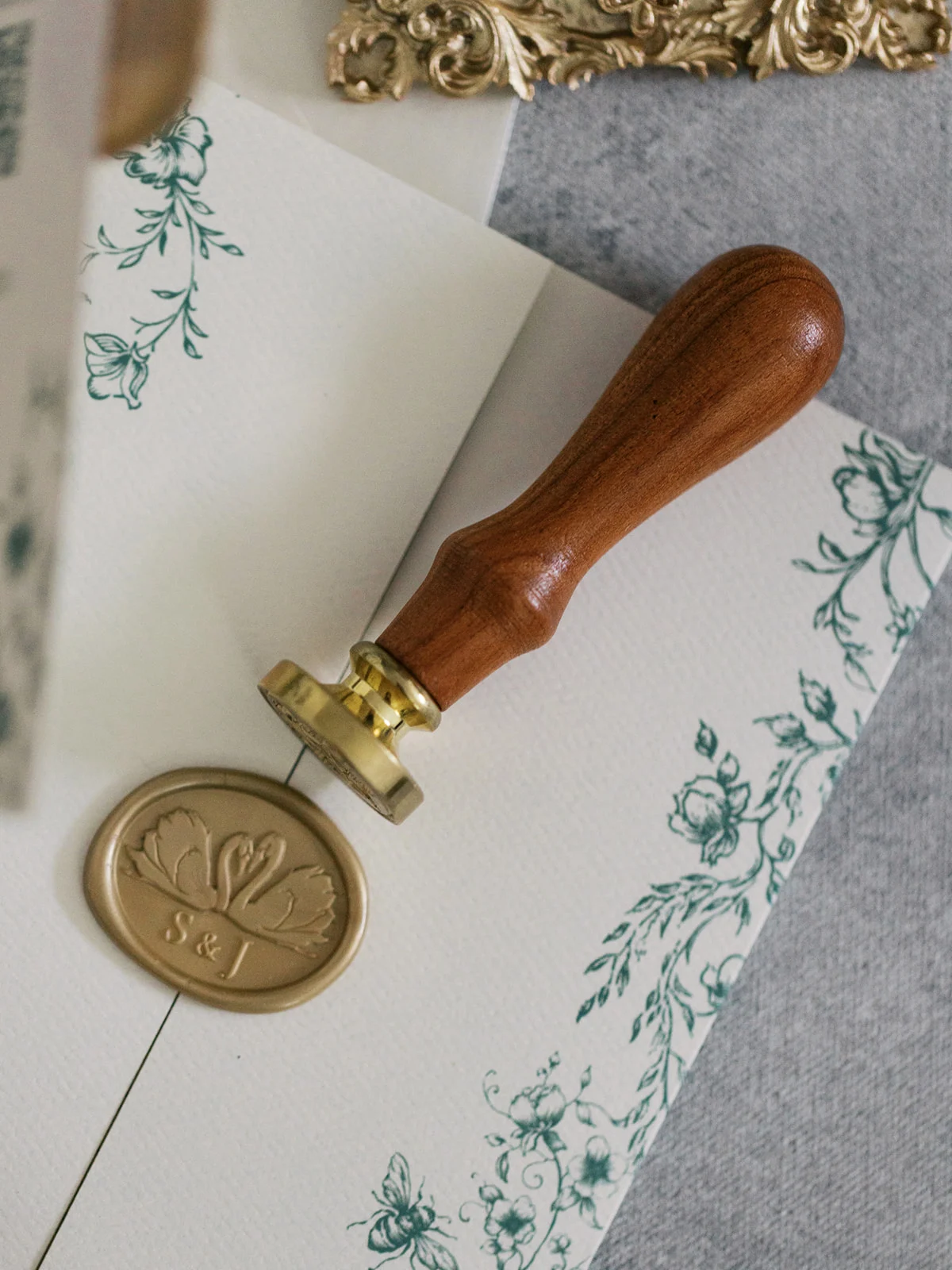
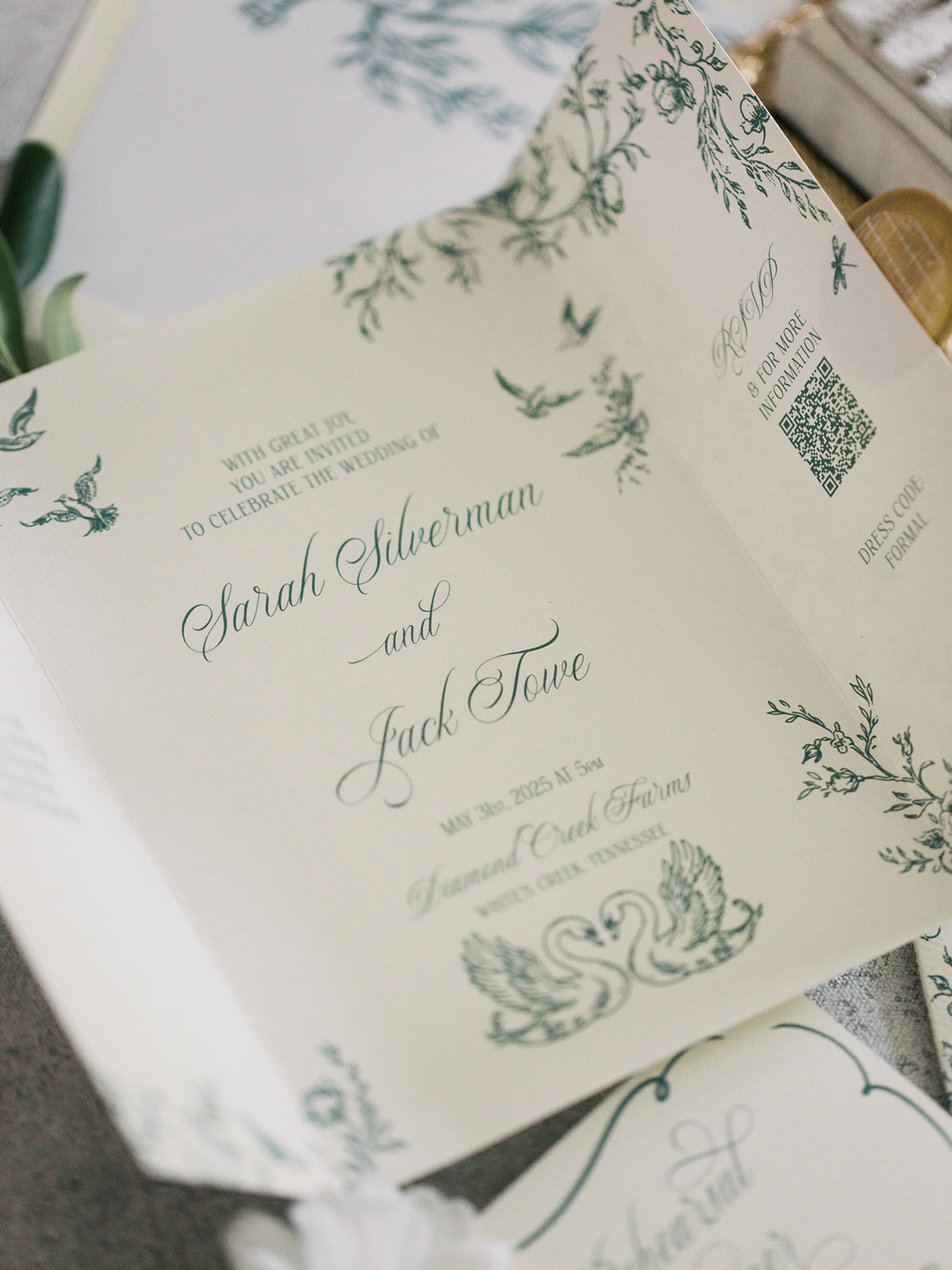
Gatefold Green Suite
This next invitation suite took a modern yet timeless approach. The centerpiece was a single gatefold card printed digitally and sealed with a custom swan wax seal, a charming detail that made an appearance on the invitation as well. A green design of vines and flowers on the custom envelope liner was carried through the invitation design, decorating the cover and the inside of the gatefold invitation. We also designed a coordinating rehearsal dinner card that made the whole suite feel seamless and curated.
Whimsical Invitation Suite
For this whimsical invitation suite it was all about soft, romantic charm. Digitally printed and tied with a delicate chiffon ribbon, the pieces felt light and inviting. The real showstopper was the envelope liner, which featured an illustrated pattern of birds reminiscent of classic chinoiserie prints. It added the perfect touch of whimsy to this otherwise classic design.
We also created matching save the dates that guests received prior to and hinted at the beauty to come. This suite is proof that green doesn’t have to feel overly formal. It can be playful and fun, while still displaying elegance.
Why Green Works for Every Wedding Style
Green’s versatility is what makes it shine. It plays well with every season and complements a wide range of colors and themes, from garden romance and historical venues to modern minimalism and fine art design. It adds a grounded, organic, and elevated feel to the suite, whether it’s worked into the paper, the printing, or the embellishments (hello, ribbon and wax seals!).
At White Ink, we treat green as a neutral not just because it pairs with everything, but because it feels natural, elegant, and rooted in timeless design.
If you’re looking to add custom, thoughtful touches to your wedding or event, we would love to help make your vision a reality. Reach out today to learn more about our full-service design offerings—we can’t wait to create something unforgettable for you!
If you enjoyed this post, you’ll love these other blogs!
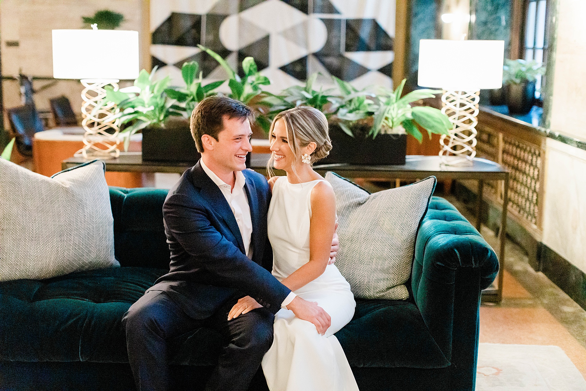
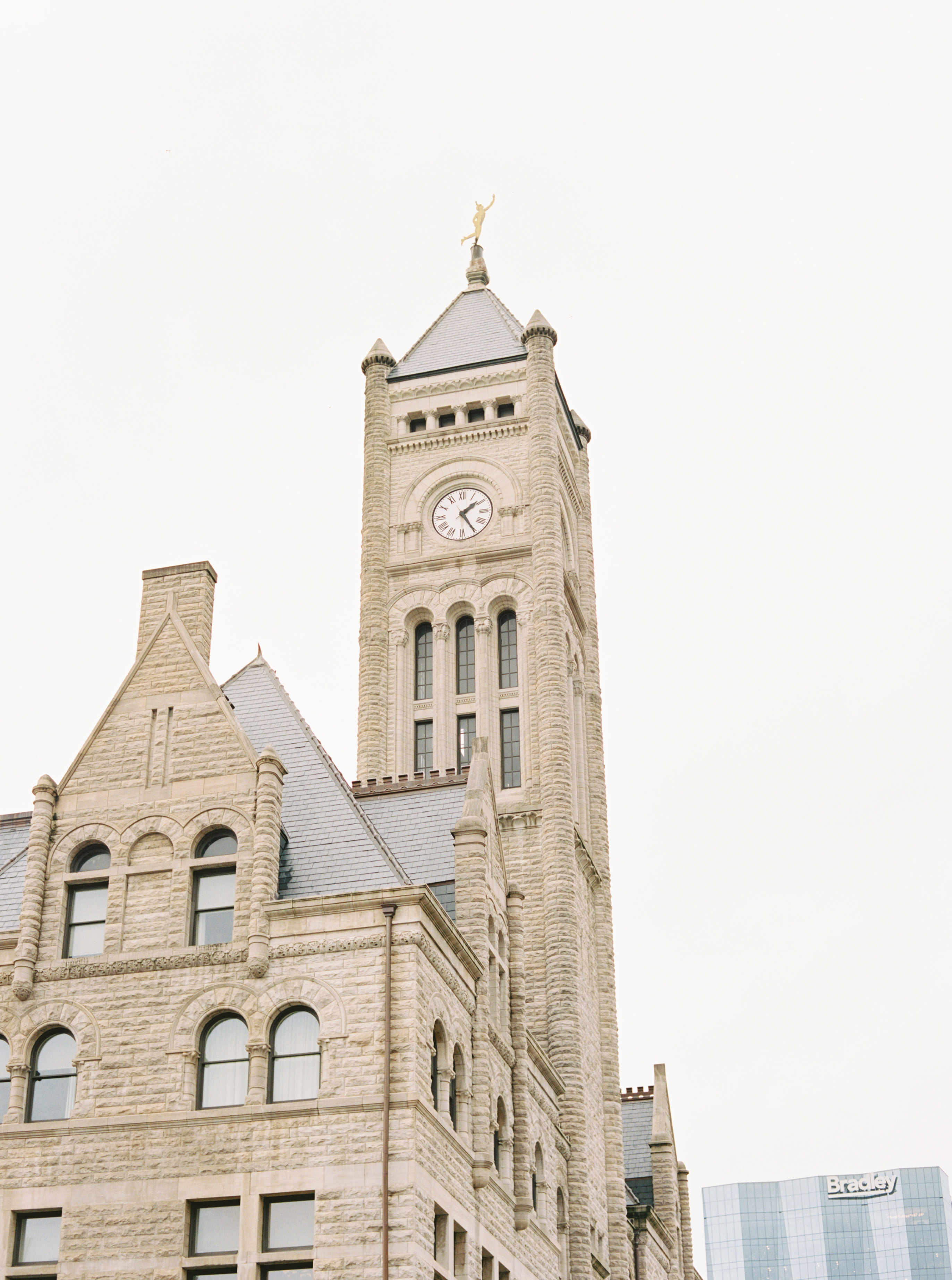
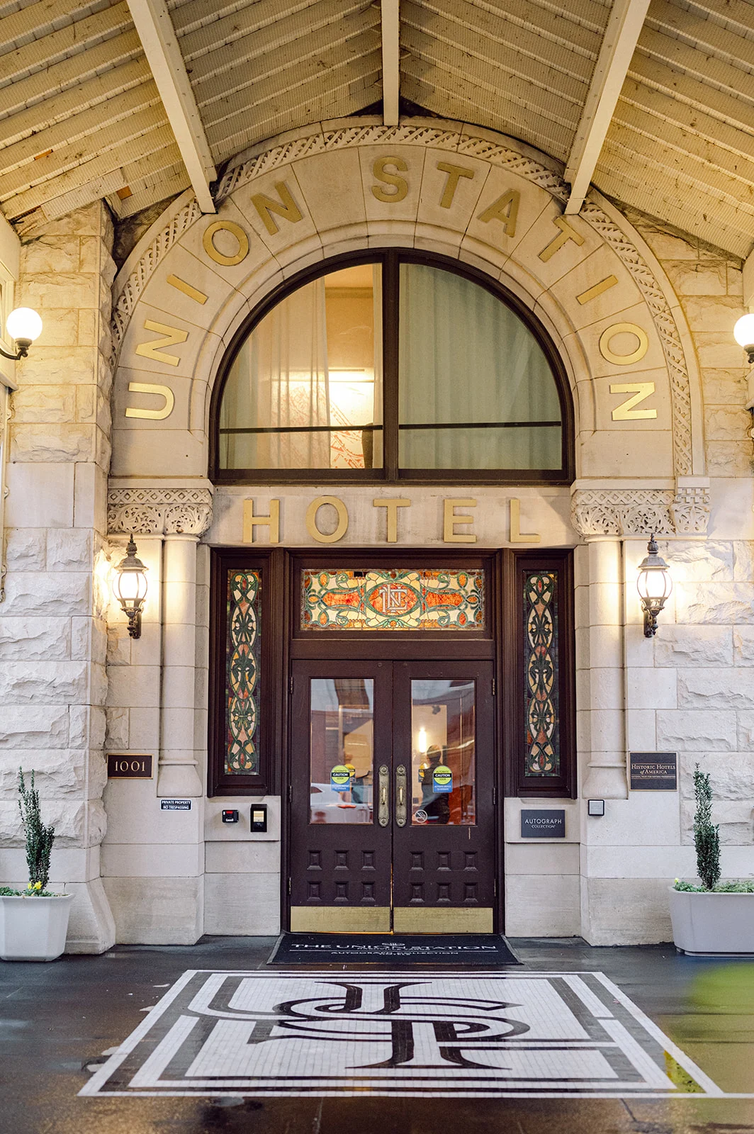
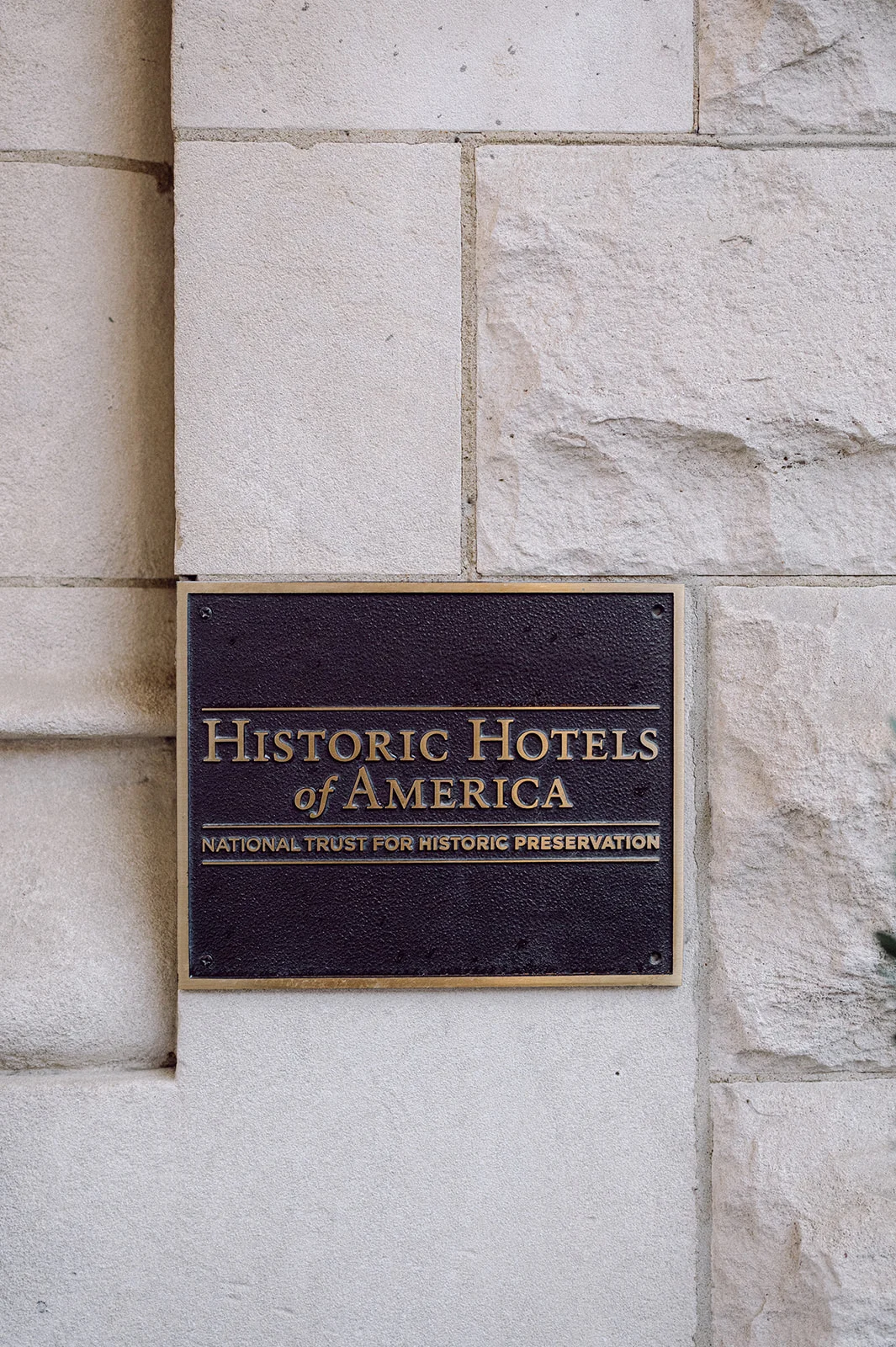
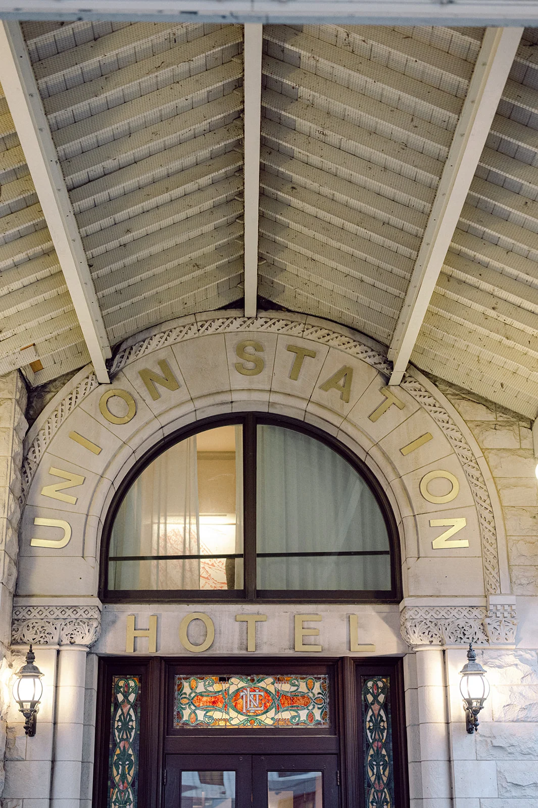
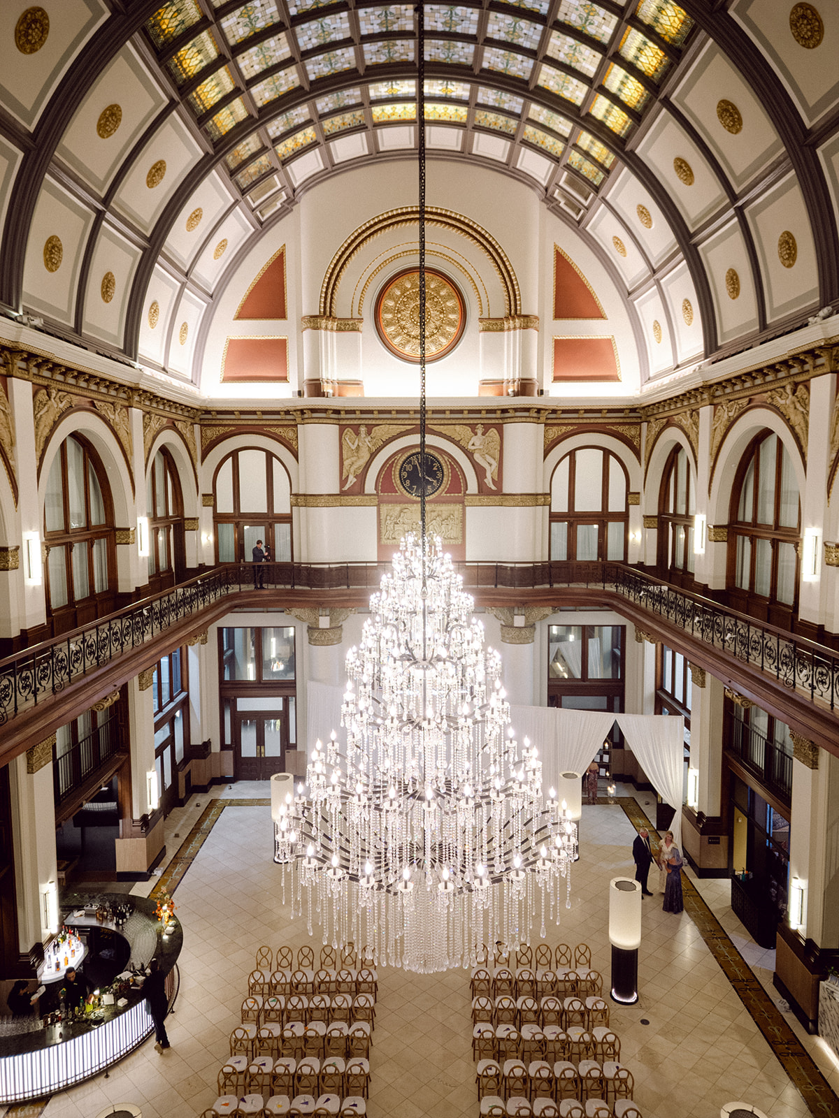
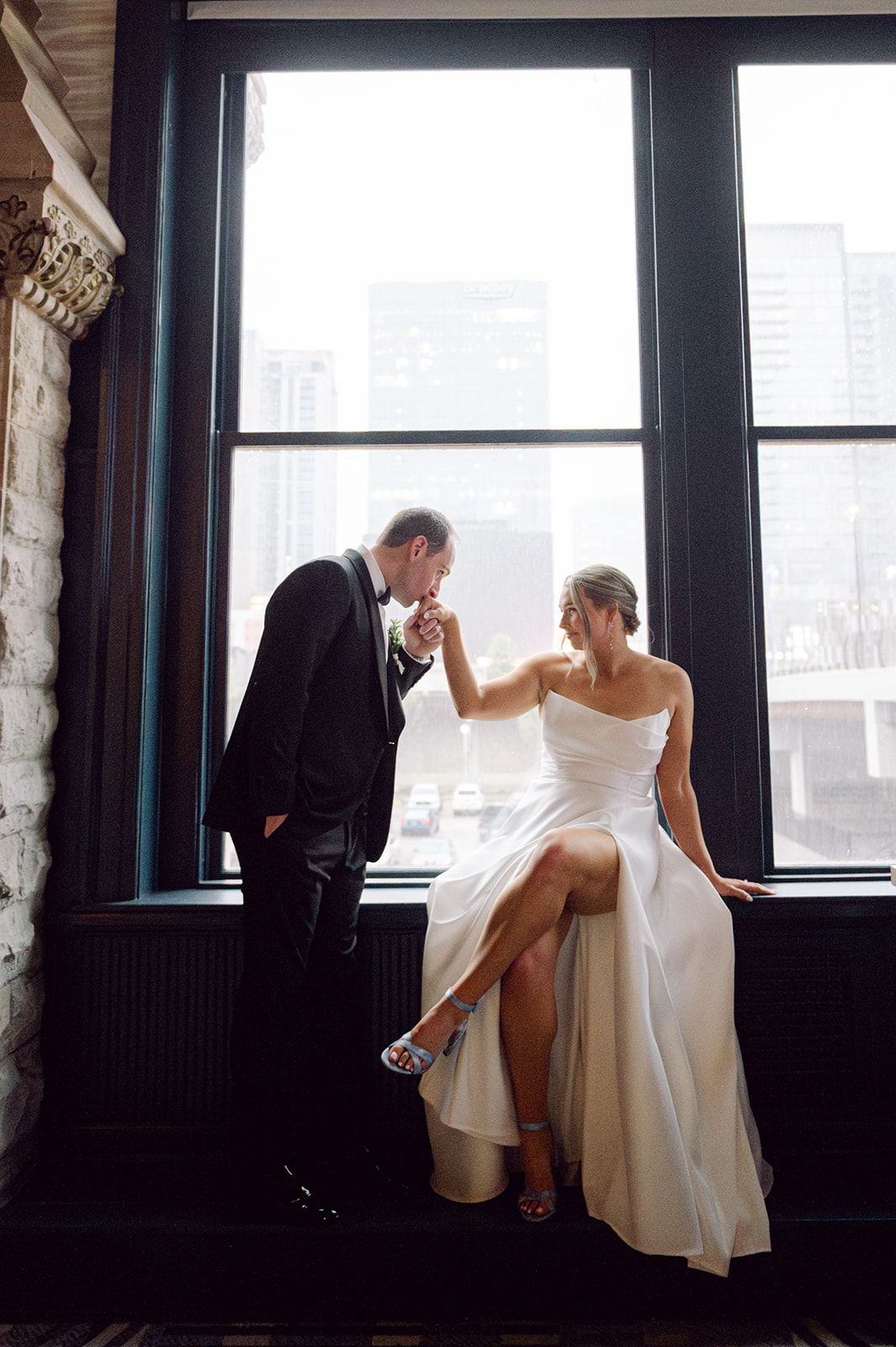
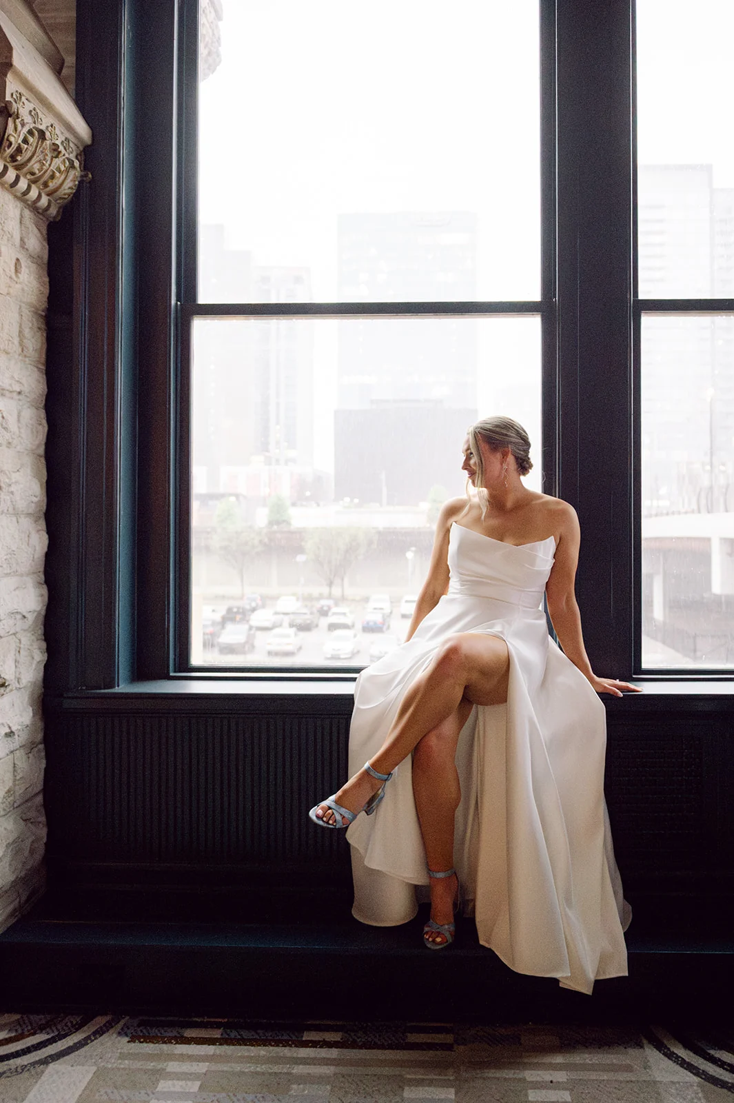
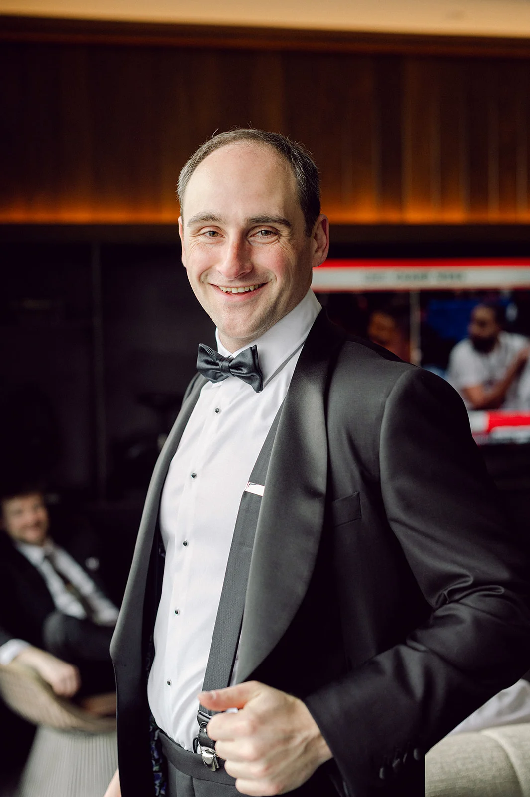
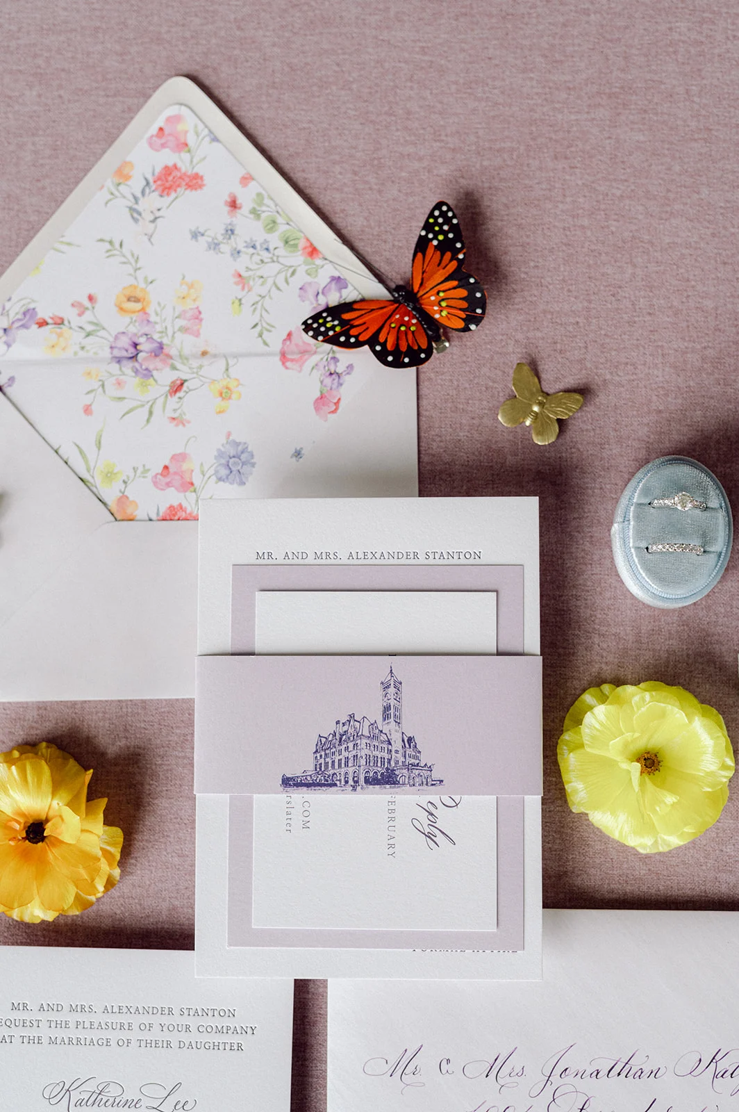
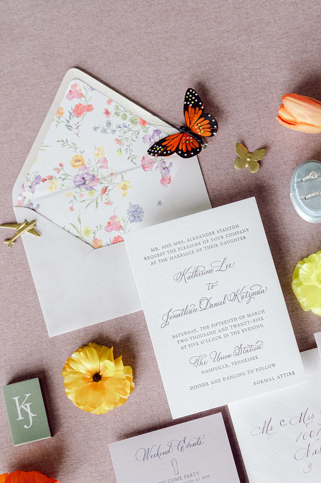
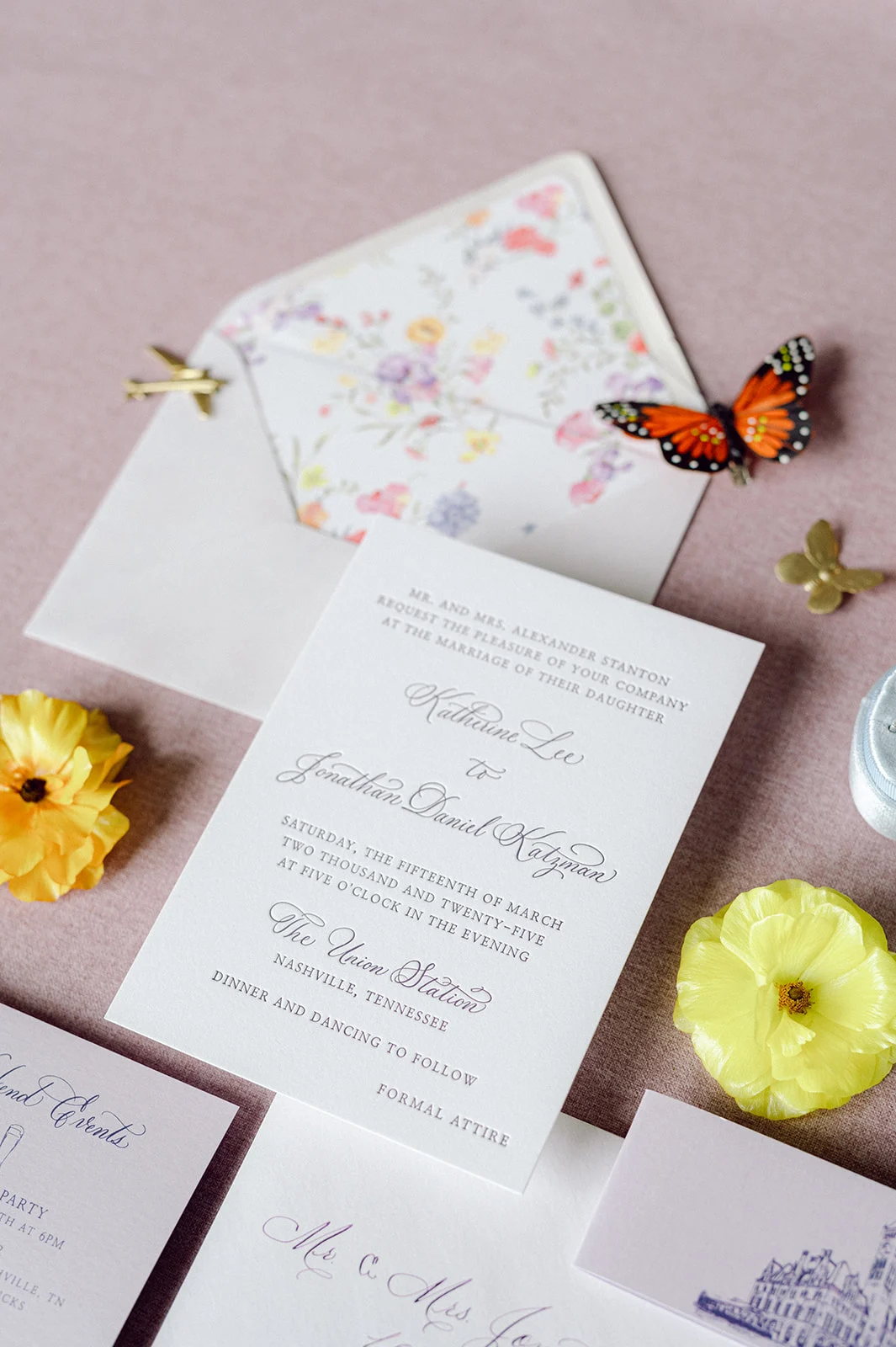
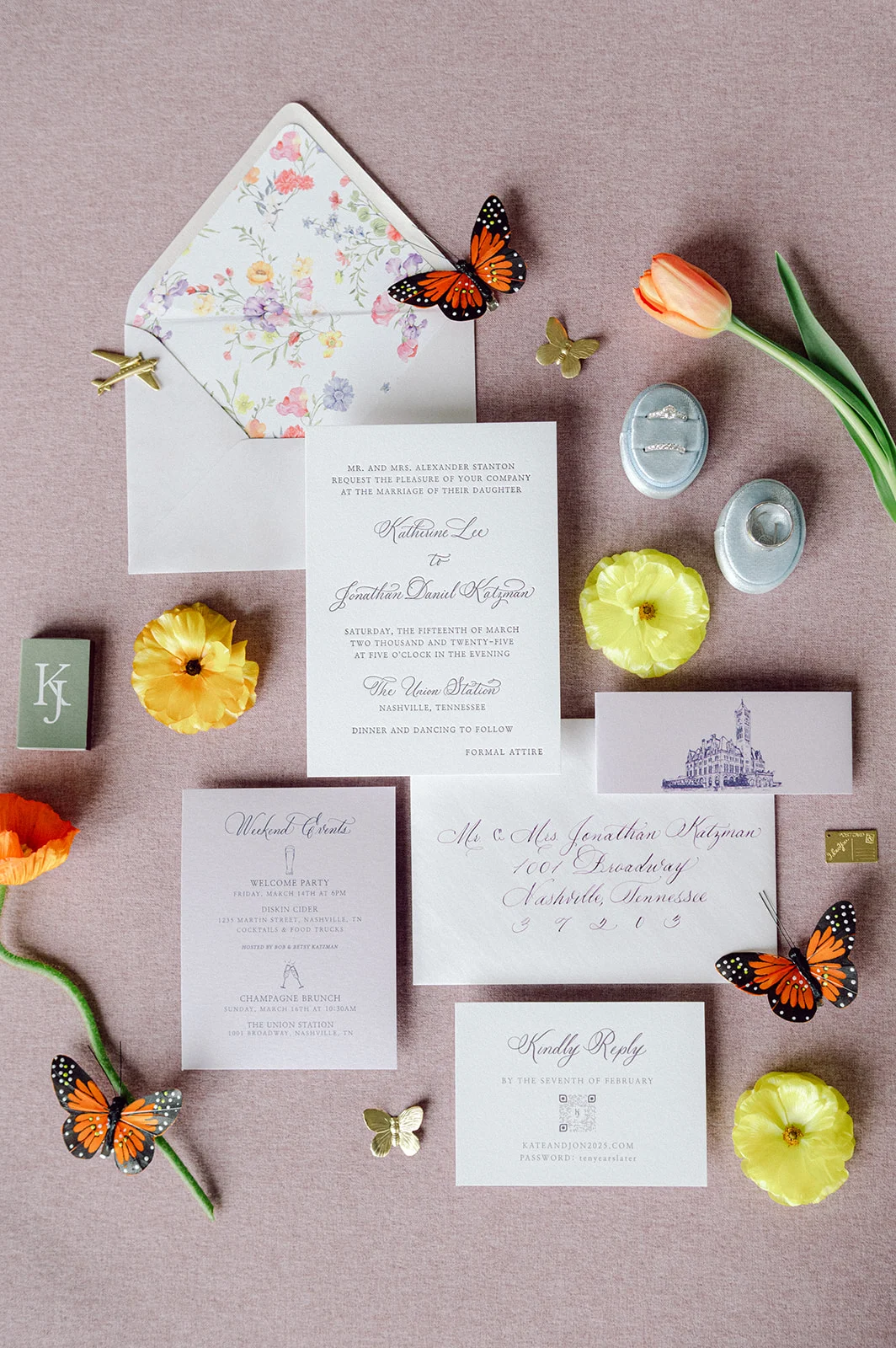
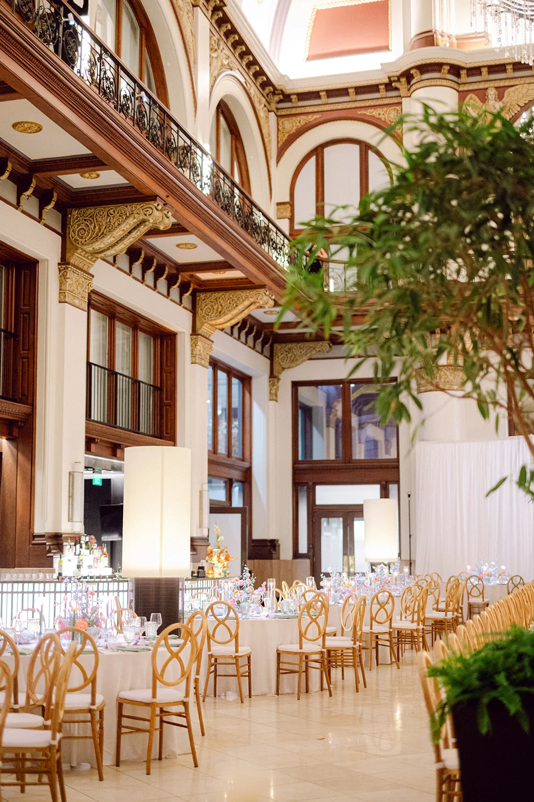
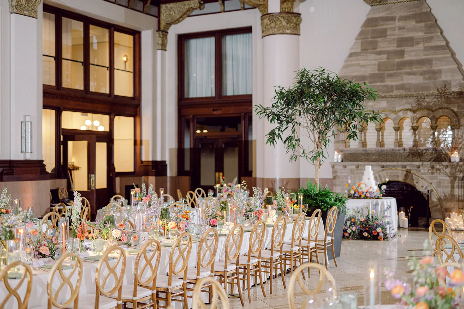
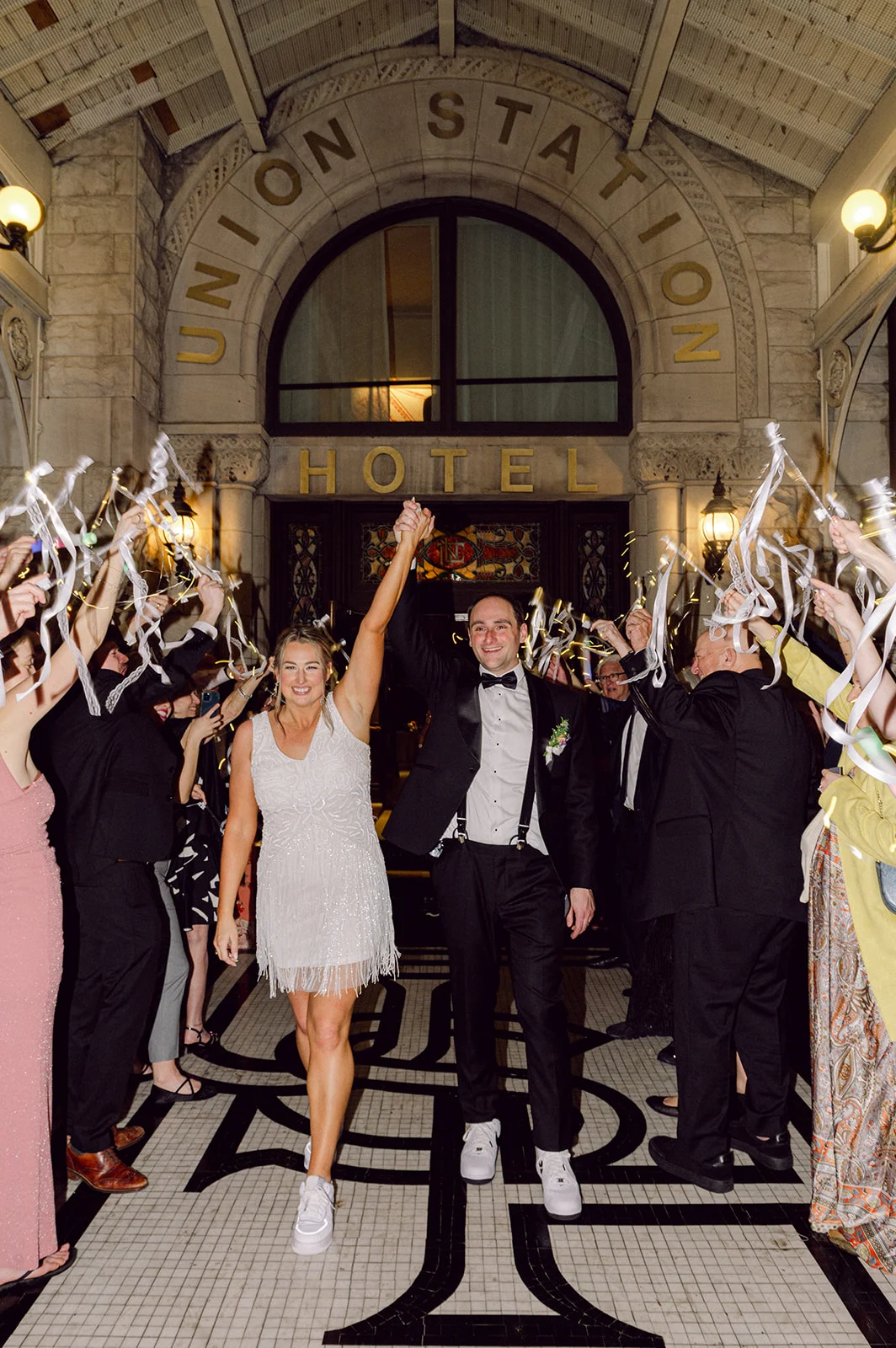
When a wedding takes place in one of the most iconic hotels in Nashville you know it’s going to be a good one! Once a bustling railroad terminal, Union Station Hotel is now a stunning luxury hotel, still brimming with its original architecture, that includes arches, stained-glass windows, and endless historical charm. The gothic exterior design is one that demands attention. It’s a venue where history and elegance collide, setting the perfect tone for a celebration as beautiful and meaningful as Kate and Jon’s dreamy wedding.
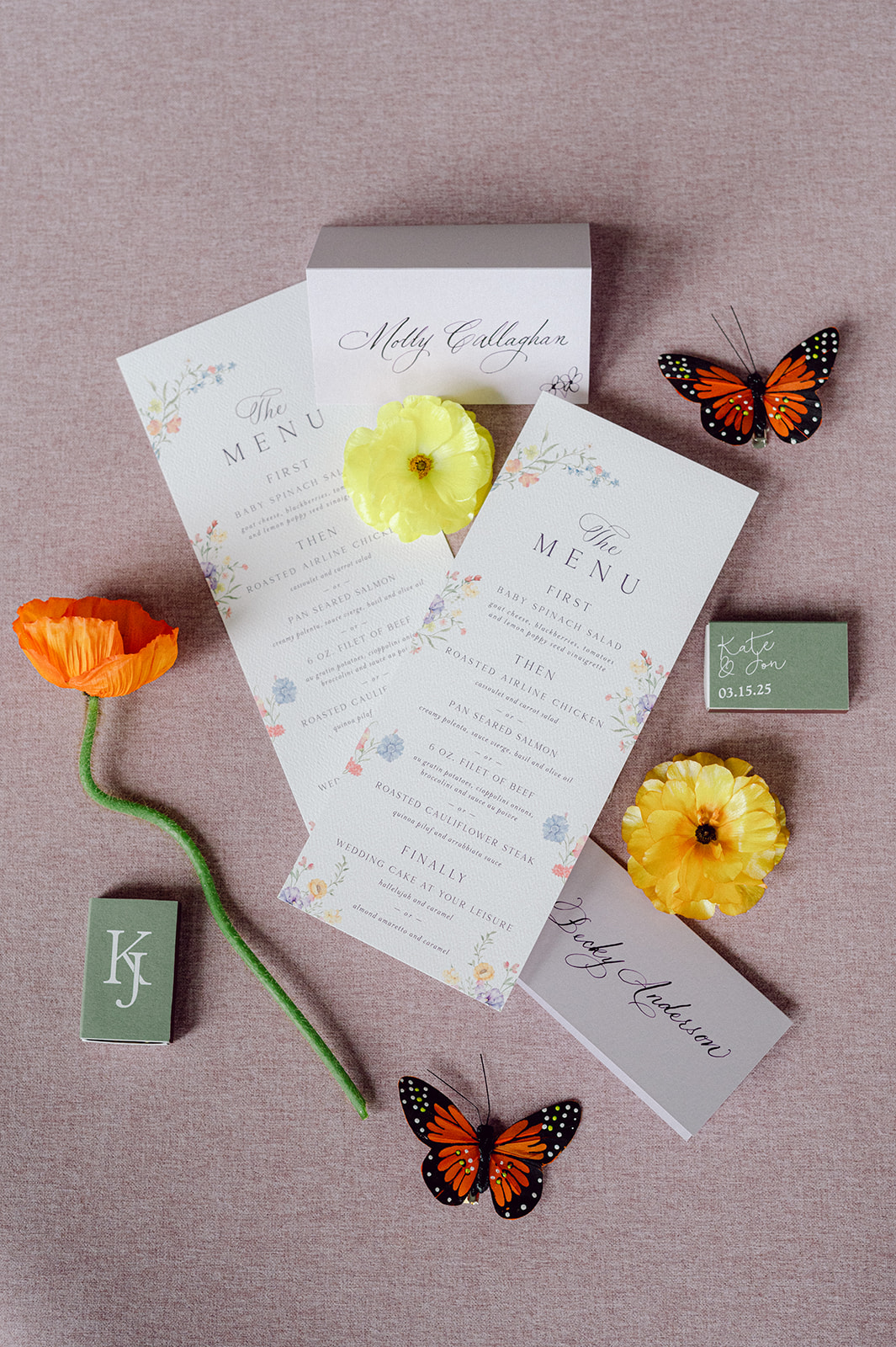
To play a part in their big day by creating their custom invitation suite, menus, and place cards was such an honor. The sweet bride, Kate, found us on Instagram, which is always so flattering! She was a dream to work with, as we couldn’t have asked for a more gracious, fun, and lovely client. Her dreamy wedding day vision paired beautifully with the character and charm of the hotel.
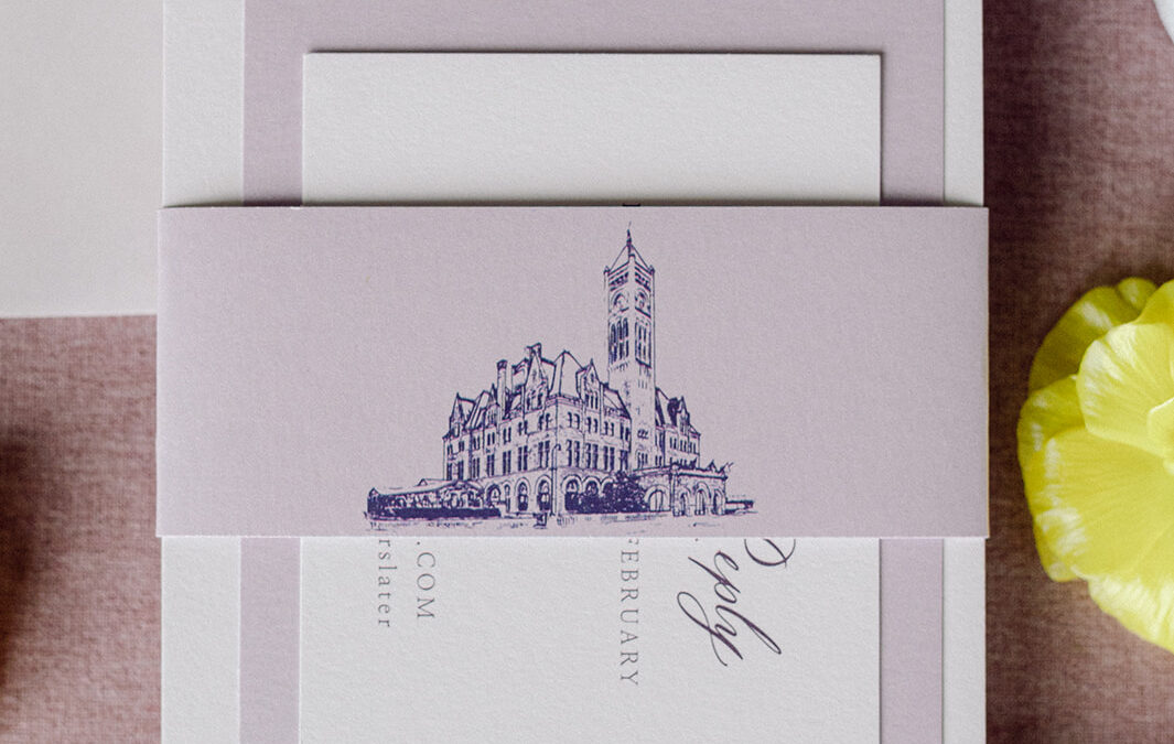
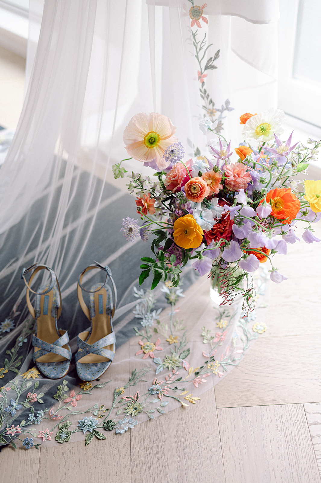
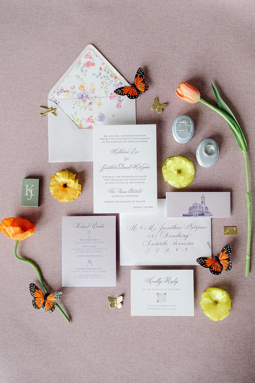
Lavender Wedding Invitations and Details
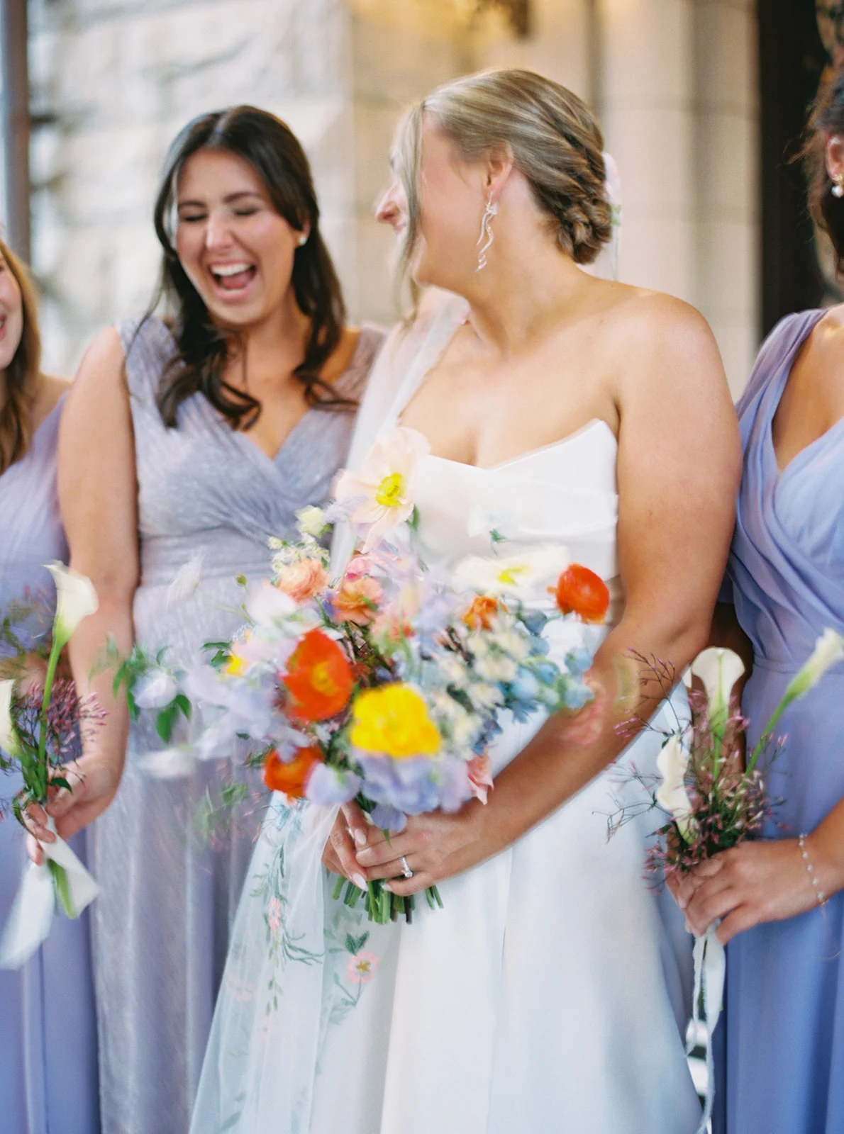
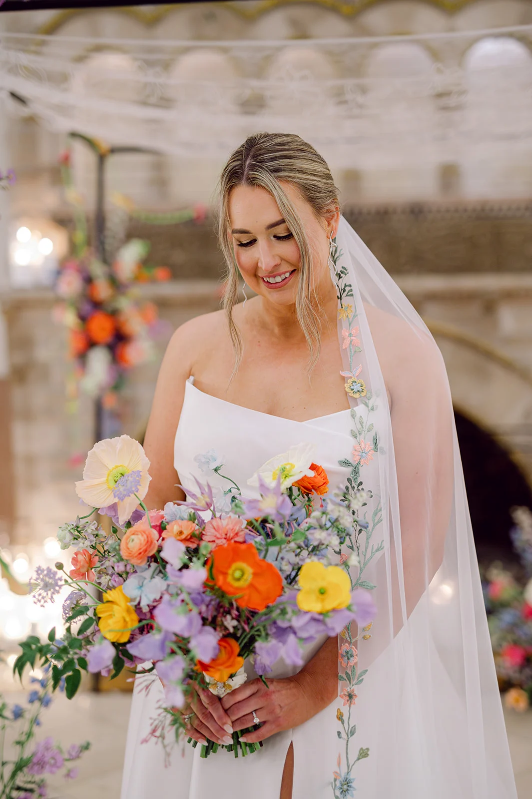
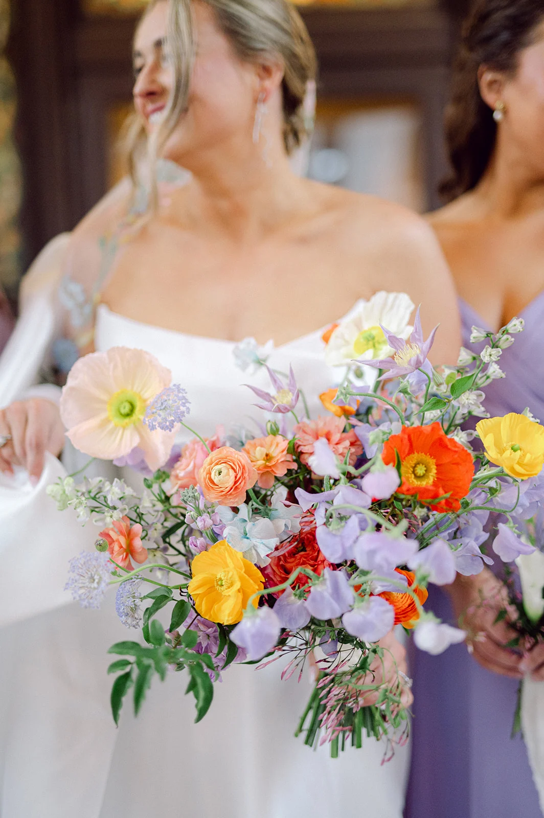
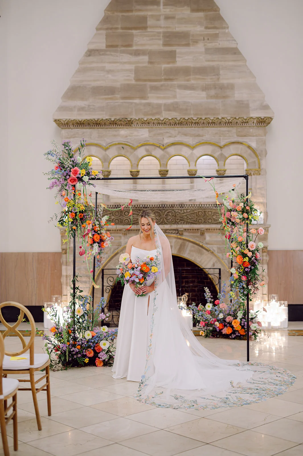
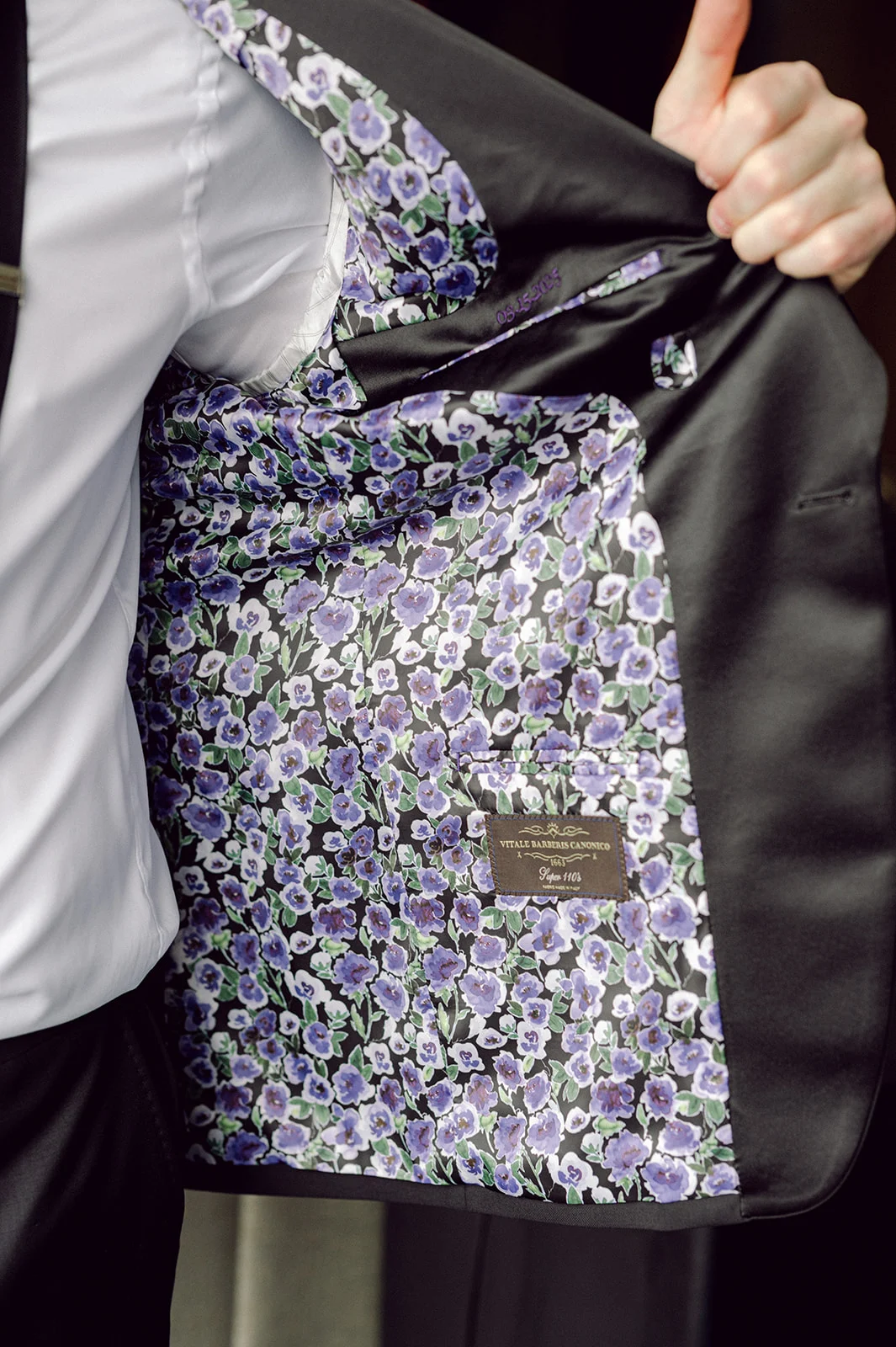
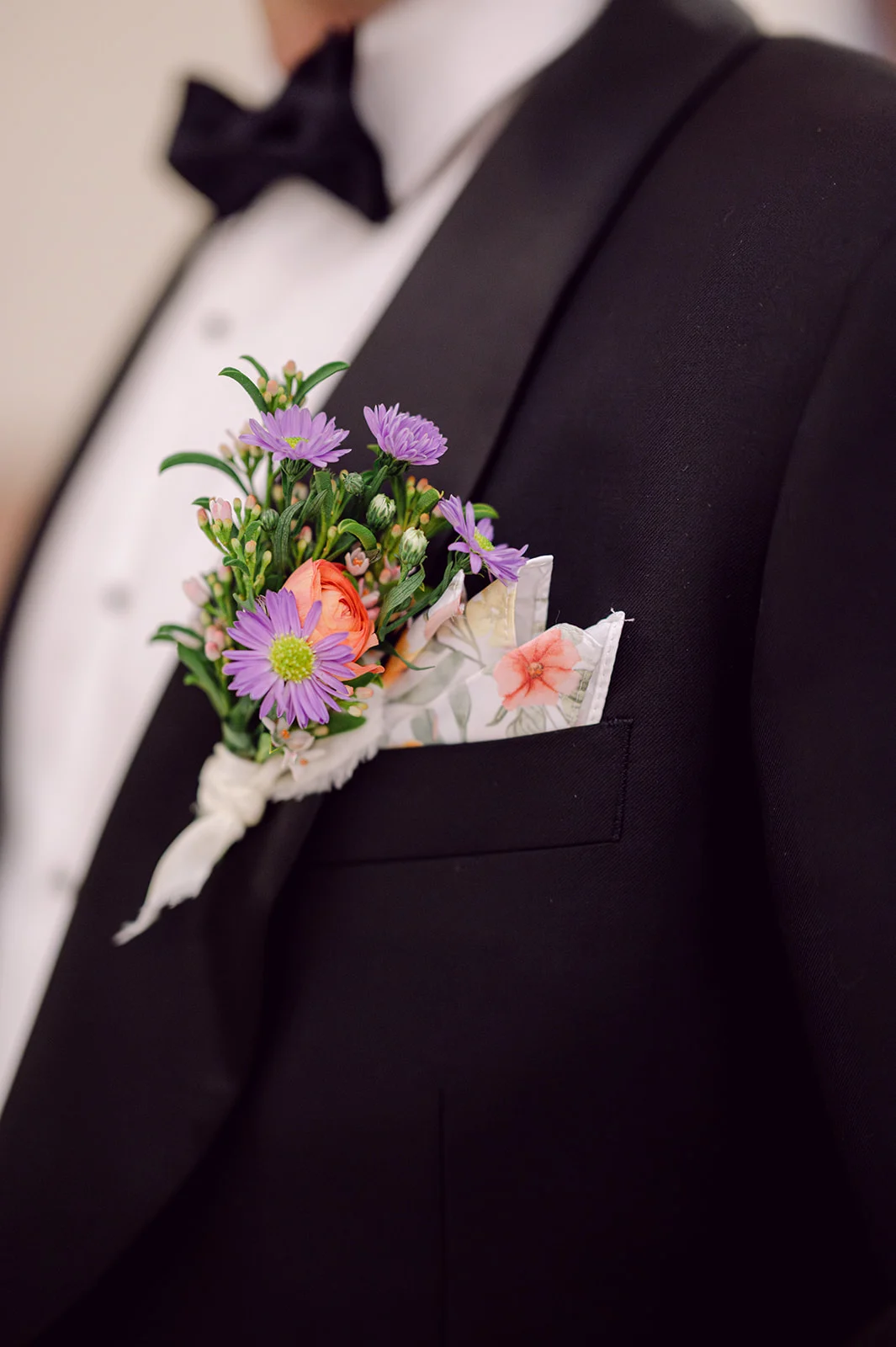
One detail we absolutely adored about this wedding was the color palette. Lavender isn’t a color we get to work with often in invitations. It brought such a fresh, romantic feel to each element. It also beautifully tied into the wedding day itself, where shades of purple were thoughtfully woven throughout the florals, the groom’s custom jacket liner, bridesmaids’ dresses, and even the bride’s veil, which featured the most gorgeous floral embroidery. Seriously, the veil was a work of art!
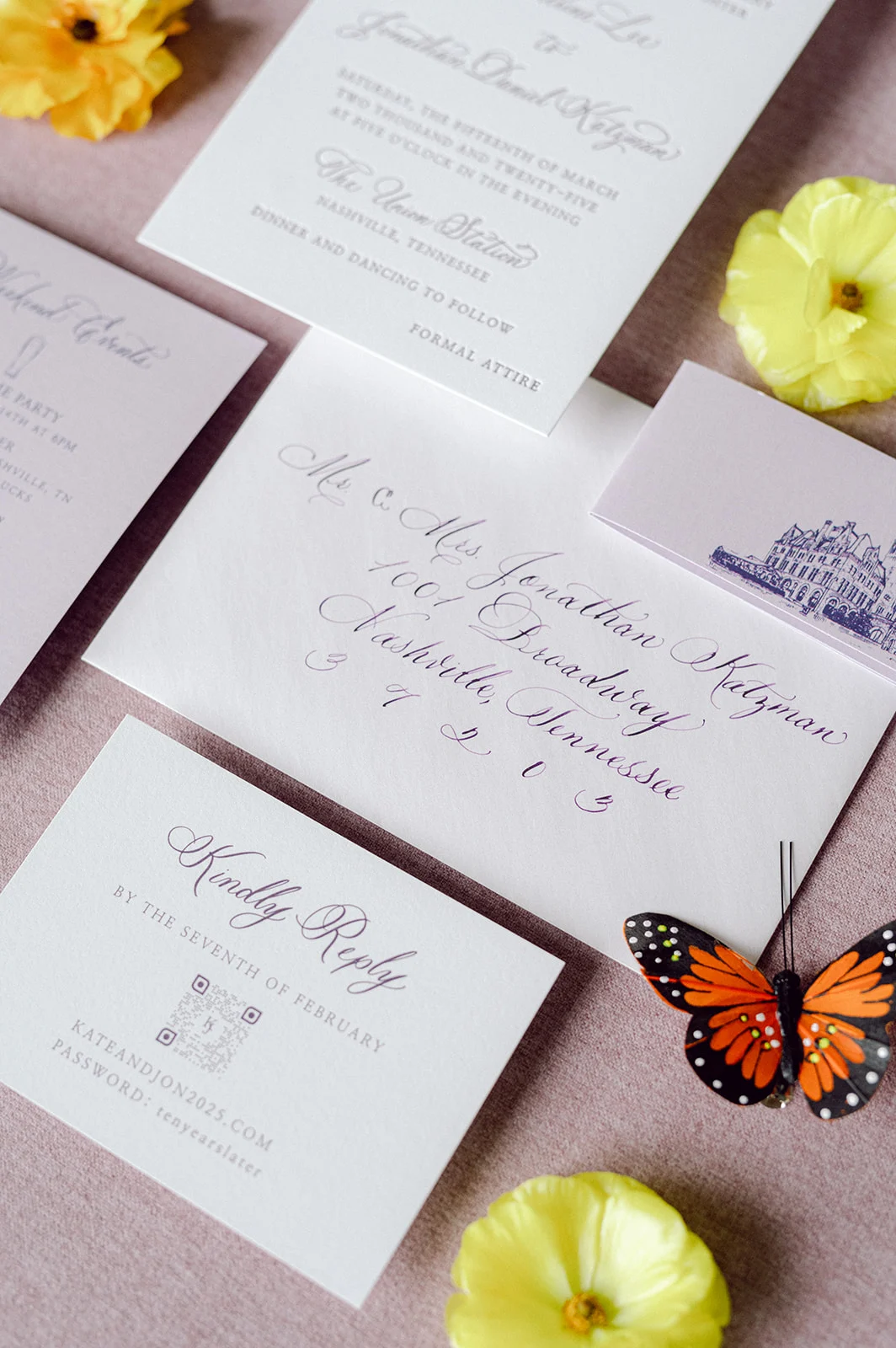
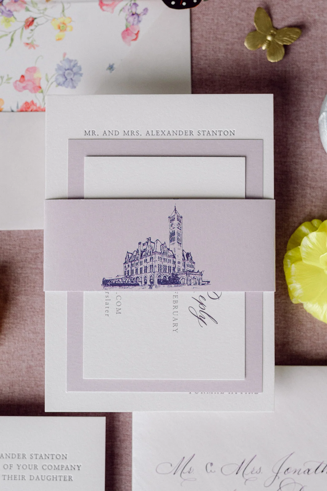
The custom invitation suite featured elegant white and lavender card stock, with delicate calligraphy bringing everything to life. The suite was wrapped with a custom-designed purple band showcasing an illustration of the historic Union Station as a nod to the incredible venue that would set the scene for their day.
Inside, the envelope liner greeted guests with a burst of colorful florals. This offered a playful hint to all the vibrant flower details that would later decorate their ceremony and reception spaces. As a special gesture because we loved working with Kate so much, we shared with her the floral artwork we used for the invitation suite, and she used that to create the groom’s pocket square. It was a small but meaningful detail that spoke volumes about the couple’s thoughtful approach to design.
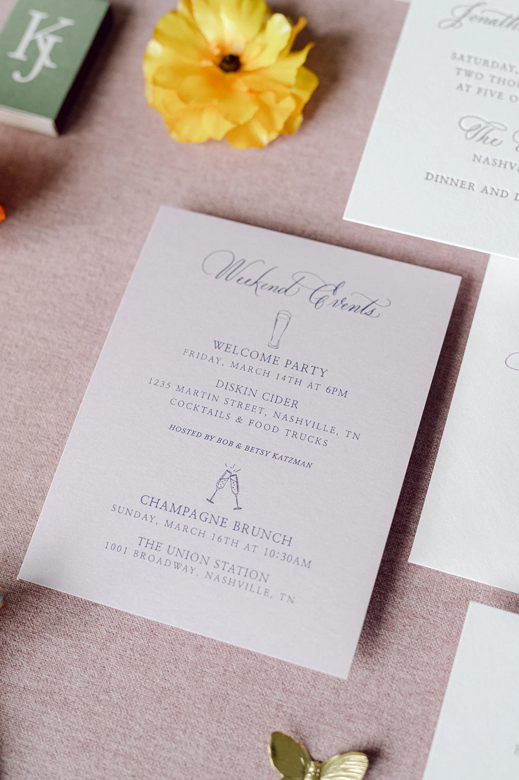
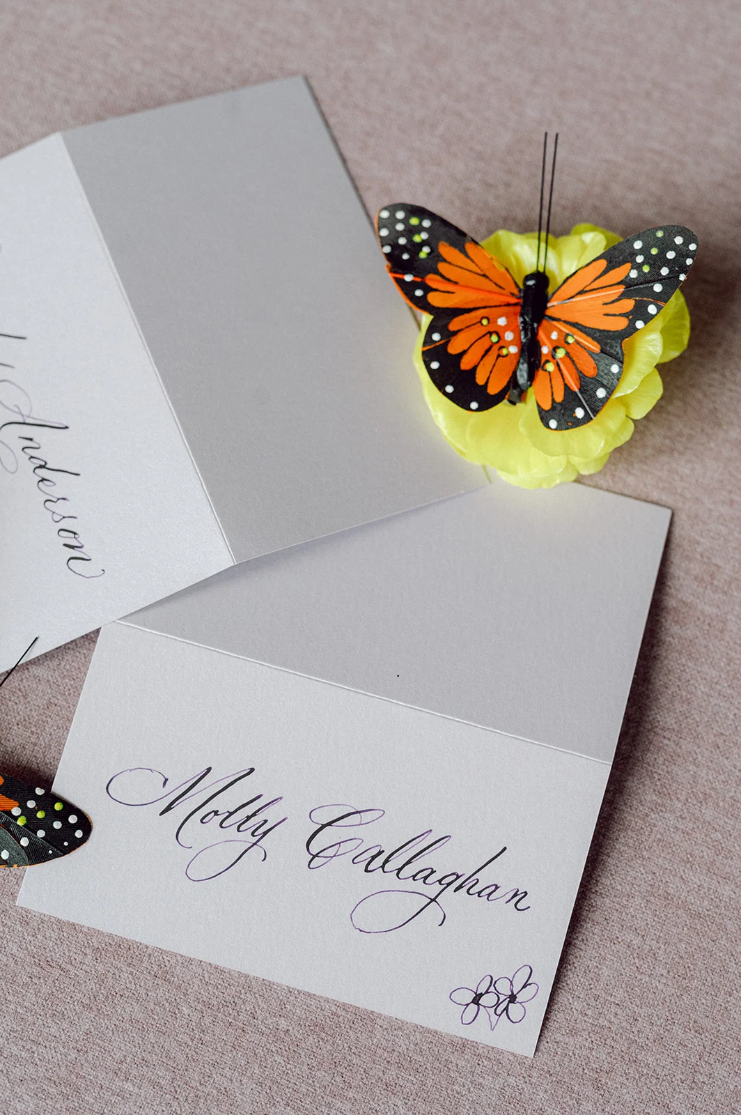
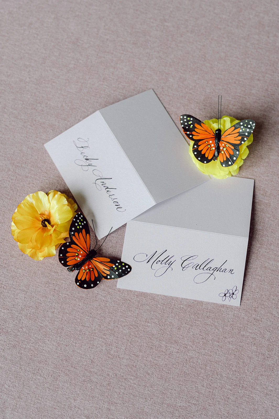
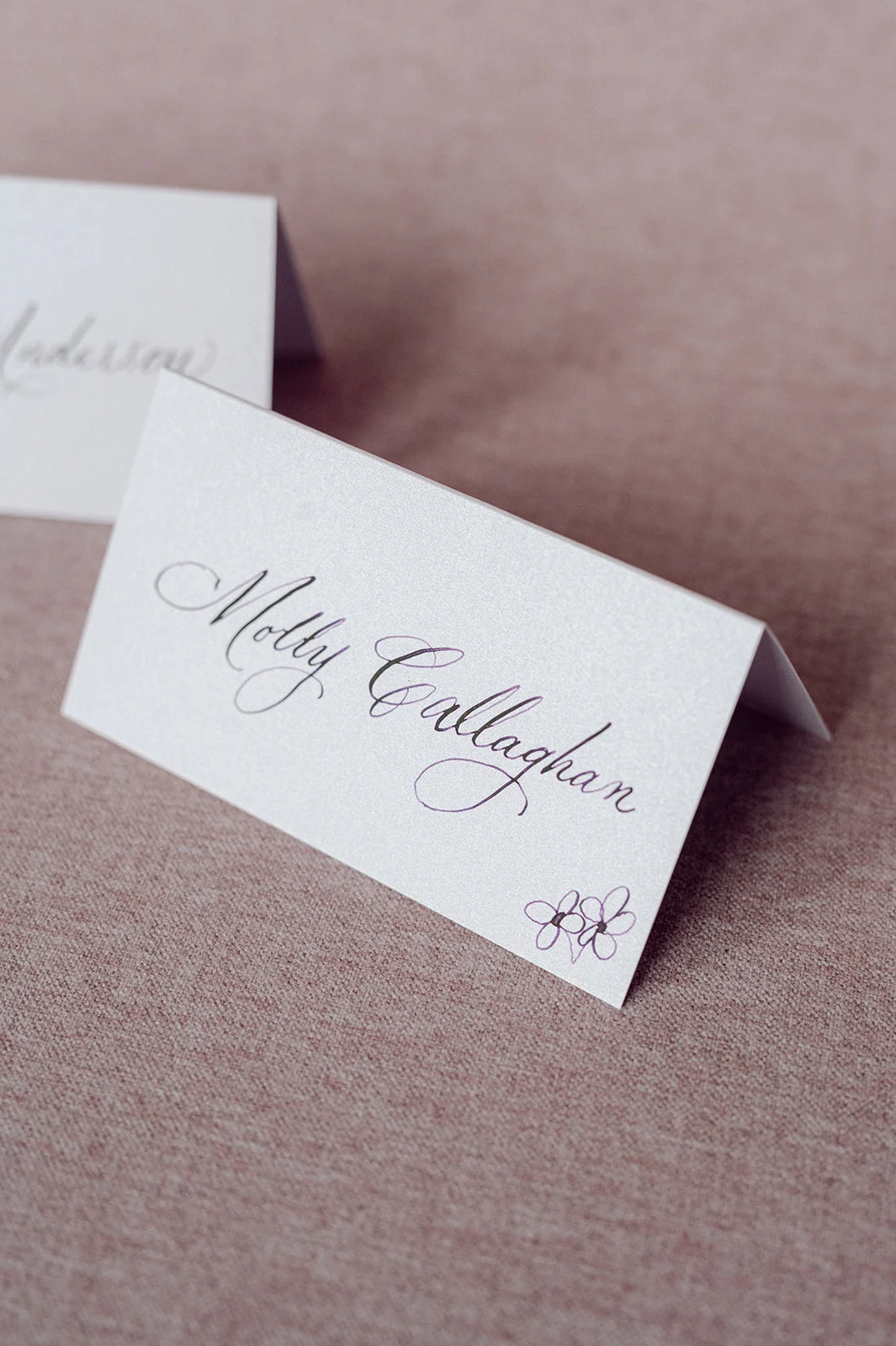
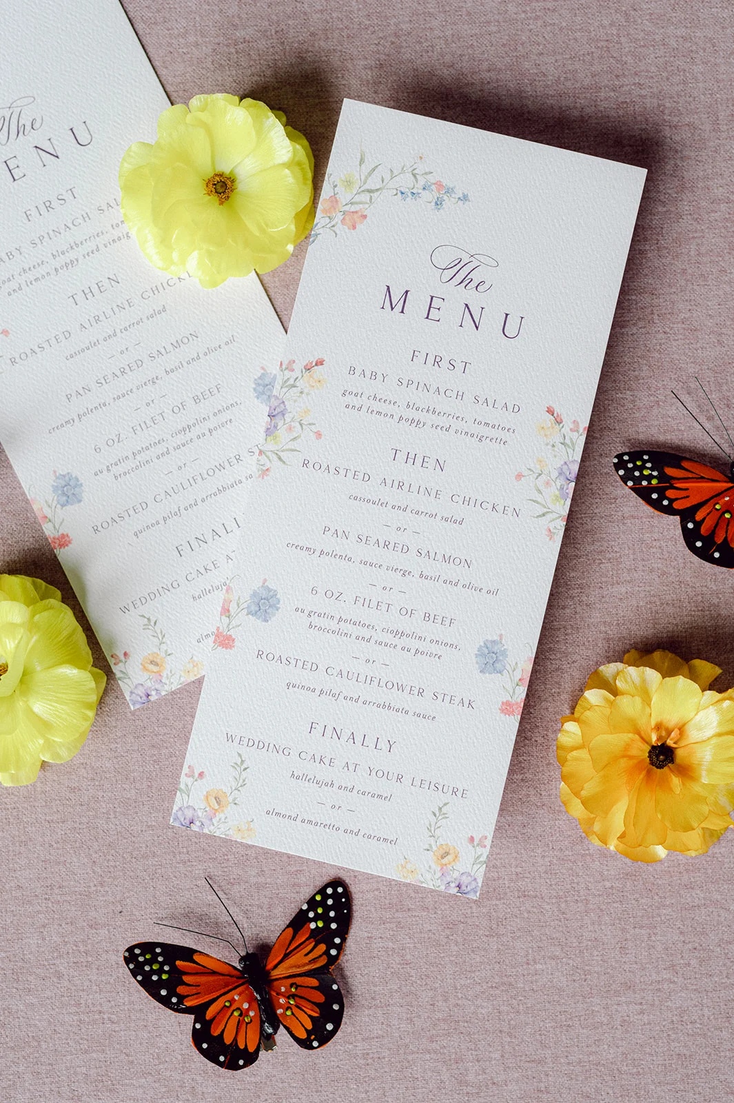
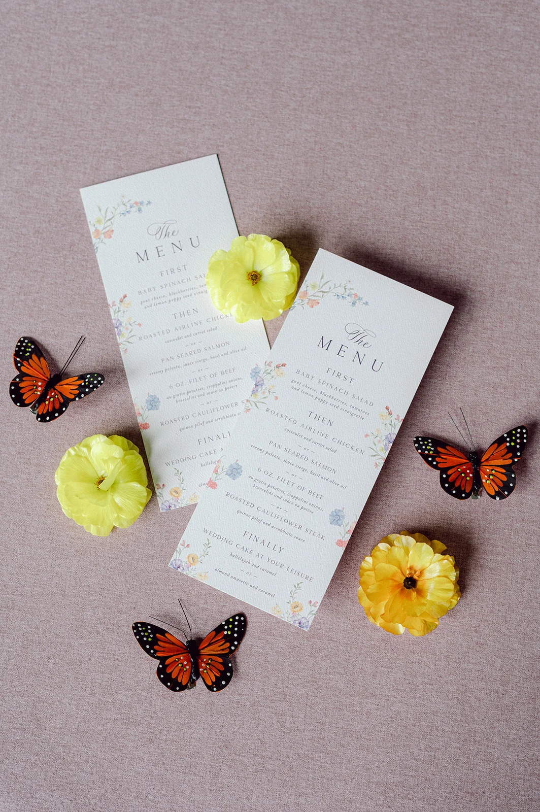
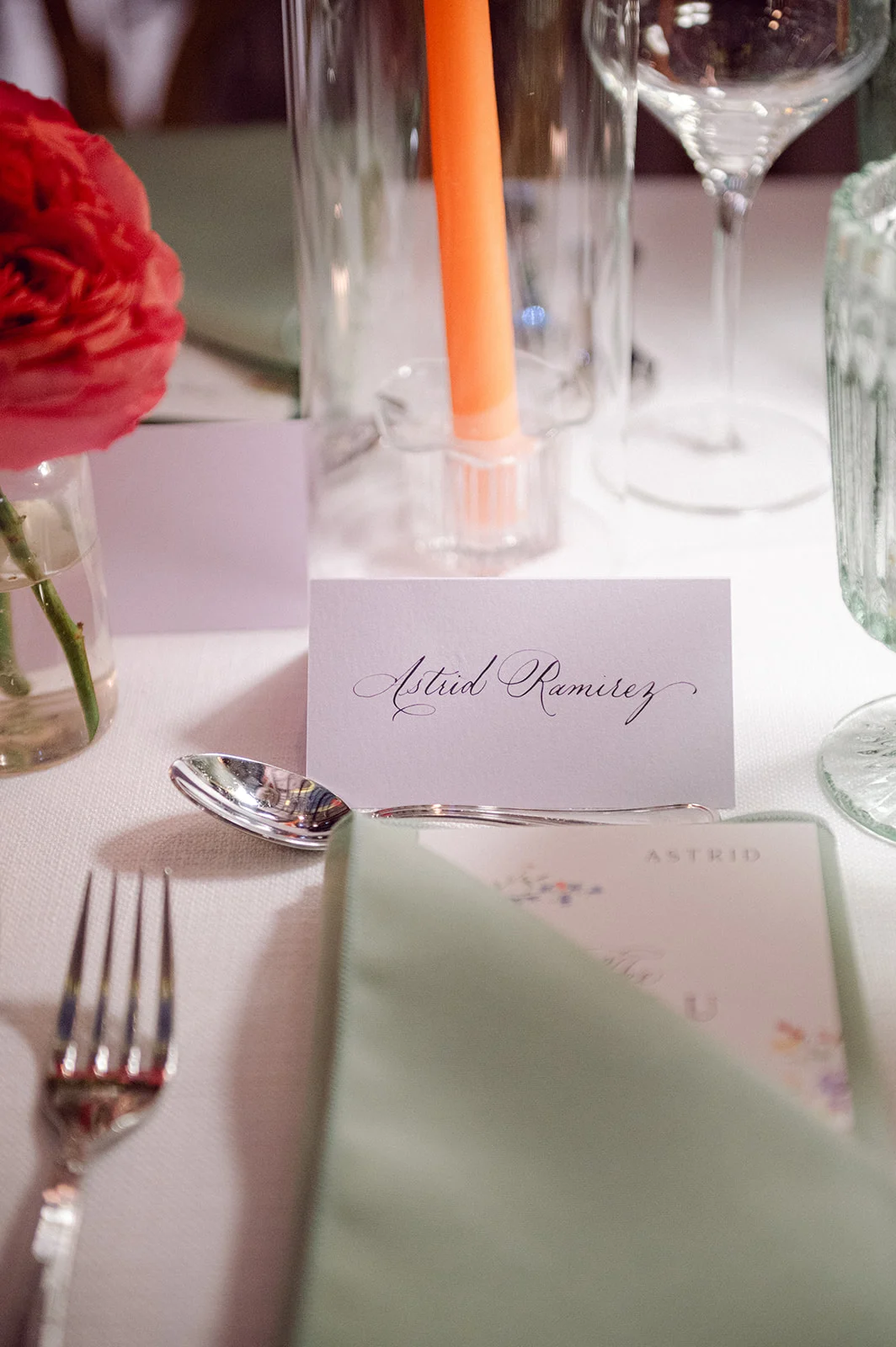
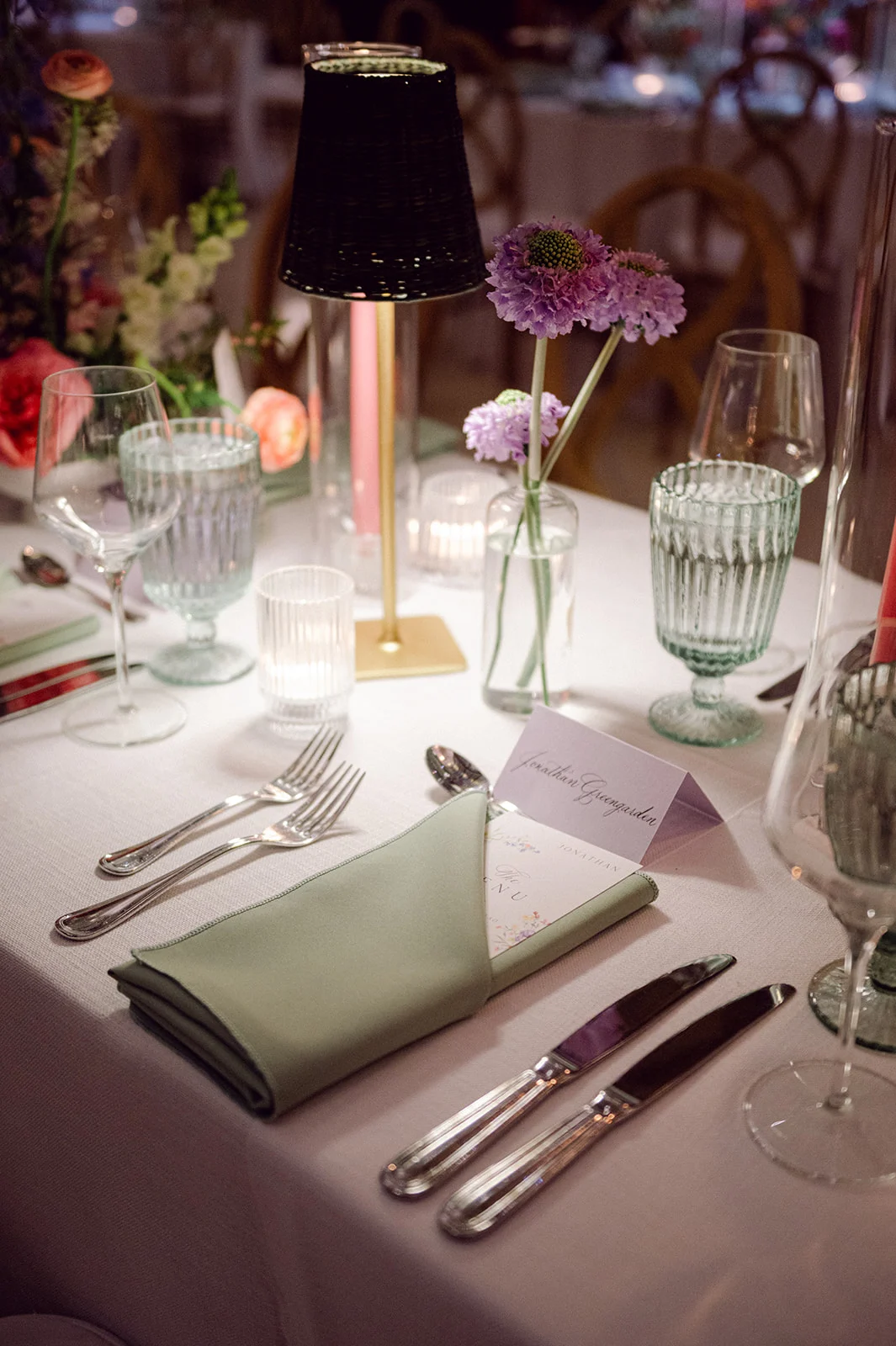
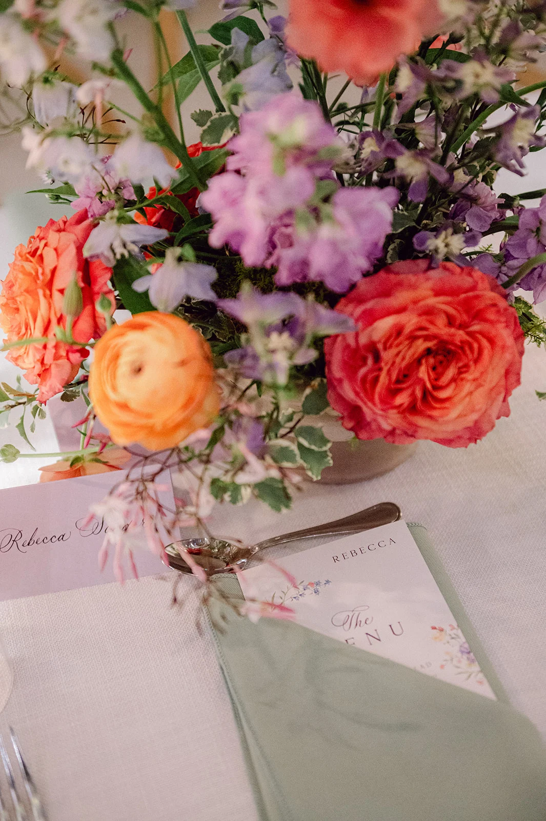
Elegant Day-of Touches
Alongside the invitation suite, we also created the folded place cards, which featured the same elegant calligraphy as the invitations, adding a cohesive and sophisticated touch to the guest tables.
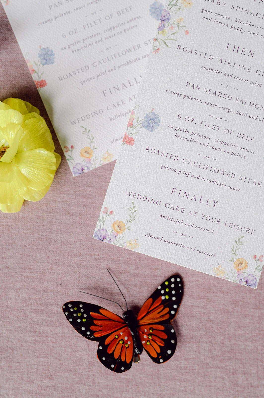
To tie the pieces together, the custom menus we created featured the same colorful floral design that was seen on the envelope liner. At the reception, these menus were tucked into the sage green napkins next to the place cards, creating a beautiful place setting for guests.
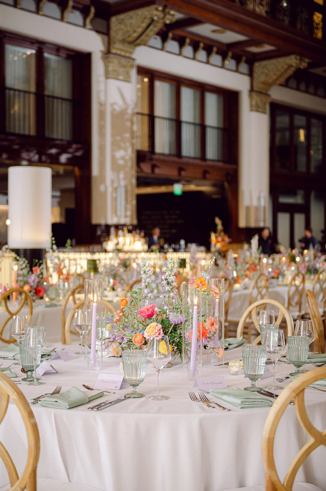
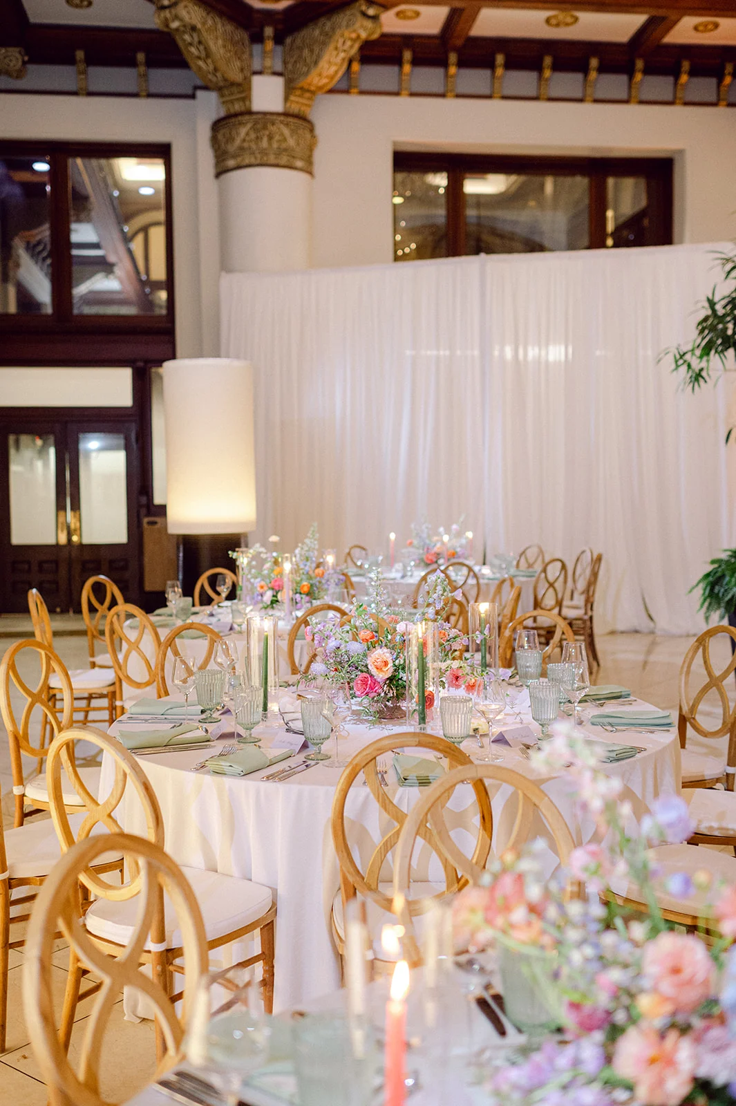
The tablescapes were stunning! Along with the paper goods, stunning floral arrangements decorated the center of the tables, and flickering candlelight added to the romantic setting. EBJ & Company did an amazing job planning and coordinating, as everything came together beautifully.
Kate and Jon’s Union Station wedding blended old-world charm with fresh, personal style in the most perfect way. Being able to contribute to their day was such an honor for our team at White Ink Calligraphy.
If you’re looking to add custom, thoughtful touches to your wedding or event, we would love to help make your vision a reality. Reach out today to learn more about our full-service design offerings—we can’t wait to create something unforgettable for you!
If you enjoyed this post, you’ll love these other blogs!